
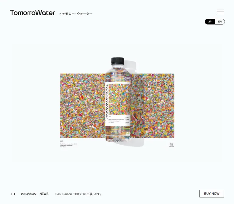
DESIGN REFERENCE
TomorroWater(トゥモロー・ウォーター)
淡いブルーホワイトの余白に、鮮やかなアートと天然水のボトルを展示するブランドサイト。細い黒線、小さな英字ナビゲーション、大きなロゴが美術館のような静かな構成をつくっています。
オリジナルサイトを見るTomorroWater — Style Reference
A quiet exhibition space for natural water, with the artwork carrying the color.
Website / Original URL: tomorrowater.jp Final URL: https://tomorrowater.jp/ Theme: light; cool near-white canvas, black interface, full-color artwork. Inspected capture: September 17, 2026, 04:42:58 JST; September 16, 2026, 19:42:58.926 UTC. Viewports: 1440 × 1000 and 390 × 844 CSS pixels. Scope: the current Japanese homepage, including its opening presentation, About narrative, water-source introduction, six-item product gallery, news, social links, contact information, and oversized brand footer. Visual evidence consists of three desktop captures and two mobile captures; rendered DOM measurements cover additional content between them. Linked product pages, articles, the English edition, and external shops were not inspected.
TomorroWater presents bottled water through the visual conventions of an art exhibition. A very pale blue-white background gives black typography, contour illustrations, and transparent bottles a clean setting. Dense, colorful artwork supplies the strongest contrast. Product information is organized like an exhibition caption: artist, catalog number, title, year, medium, and dimensions, with a small price where provided.
The homepage is a long brand and product website with editorial content and purchase destinations. Its identity comes from generous space, compact navigation, asymmetric story sections, repeated bottle photography, and an unusually large closing wordmark. Preserve the tension between quiet interface details and expressive artwork when extending it.
How to Read This Reference
- Measured values come from the supplied rendered DOM and computed-style records. Coordinates in the tables refer to those records unless explicitly described as screenshot estimates.
- Visual estimates describe image bounds, icon geometry, and details whose computed styles were not supplied. They are approximate CSS-pixel readings from the captures.
- Calculated values are differences or proportions derived from measured rectangles. They are not recovered stylesheet formulas.
- Recommended values and code are implementation guidance. The source breakpoints, complete stylesheet, asset URLs, and application scripts were not supplied.
- Token names beginning with
--color-,--font-, or similar descriptive prefixes are aliases introduced by this reference unless explicitly identified as source properties. - A computed font-family string identifies the declared stack. It does not independently prove which font file supplied every rendered glyph.
- The desktop opening capture shows a colorful artwork presentation; the mobile opening capture shows a large wordmark and short Japanese statement. Their selection mechanism is unverified. Viewport differences and capture timing cannot be separated with the available evidence.
Tokens — Colors
Default Palette
| Name | Value | Suggested token | Evidence and role |
|---|---|---|---|
| Cool Canvas | #f9fcfd |
--color-canvas |
Measured body background, rgb(249, 252, 253), at both viewports. Continues through the narrative, gallery, contact area, and footer. |
| Black Ink | #000000 |
--color-ink |
Measured text color. Also visually used by wordmarks, navigation, social symbols, contour lines, and outlines. |
| Control White | #ffffff |
--color-control |
Measured BUY NOW background and selected JP text color. Slightly brighter than the page canvas. |
| Selected Language | Black fill with white text | Reuse ink and control tokens | The JP half of the language capsule is visibly filled black. The enclosing segment background was not separately measured. |
| Secondary Arrow Gray | Approximately #a0a0a0 |
Optional --color-muted-control |
Visual estimate for the lighter opening-news arrow. This is a small utility detail, not a general body-text color. |
| Photographic Whites | Variable pale gray and white | No flat UI token | Bottle images include their own studio backgrounds, plinths, reflections, and shadows. Preserve these within the image assets. |
The artwork introduces yellow, coral, pink, green, turquoise, blue, and red in intricate combinations. These colors belong to individual works and bottle labels. There is no evidence of a single colorful interface accent shared by the navigation or purchase controls.
The exported custom properties contain generic --wp--preset--* colors, gradients, and shadows, plus --swiper-theme-color: #007aff. Their presence does not establish visible use. Do not import those values into this site's visual palette without element-level evidence.
Theme Behavior
Only the light appearance is evidenced. JP and EN are language links, not theme selectors. No alternate color theme or dark-mode interaction was inspected.
Tokens — Typography
Japanese Body Text
Measured declared stack: "Gothic Medium BBB", HelveticaNeueLTPro-Roman.
Body text uses weight 500, a generous 1.8 line-height, and very slight tracking. The desktop body defaults to 13px; several About paragraphs use 14px. Mobile body copy is generally 12px.
The result is small, measured explanatory text surrounded by large amounts of space. Preserve the clear paragraph structure and line rhythm. A new implementation may increase mobile reading sizes as an accessibility improvement.
English Navigation and Section Labels
Measured family: HelveticaNeueLTPro-Roman.
The uppercase navigation and section headings use a restrained sans-serif voice. Main section labels are regular-looking at computed weight 500, with no extra tracking. Their hierarchy comes from size and separation rather than heavy weight.
Japanese Editorial Headings
Measured declared stack: HelveticaNeueeTextPro-Md, "Futo Go B101".
The spelling above follows the supplied computed styles. Story headings use weight 700; the introductory Japanese promise uses weight 500. Both use 1.6 line-height and 0.05em tracking.
Brand and Partner Wordmarks
TomorroWater uses distinctive geometric lettering with shaped joins and cuts. Its Japanese subtitle is part of the visual lockup. The tall, condensed TIGRIS mark is another graphic identity element.
Treat these as supplied graphic wordmarks. Their visible shapes and empty extracted heading text do not identify a reproducible display font. No original asset paths or file formats were supplied.
Type Scale
| Role | Desktop size / line-height | Mobile size / line-height | Weight | Tracking and notes |
|---|---|---|---|---|
| Default body | 13px / 23.4px |
12px / 21.6px |
500 |
0.13px / 0.12px, equivalent to 0.01em |
| Longer About paragraphs | 14px / 25.2px |
12px / 21.6px |
500 |
Usually 0.02em |
| English navigation | 14px / 25.2px |
14px / 25.2px in menu DOM |
500 |
Normal tracking; mobile menu links were not visibly open |
| Section headings | 30px / 54px |
20px / 36px |
500 |
Normal tracking |
| Japanese story headings | 22px / 35.2px |
16px / 25.6px |
700 |
0.05em |
| Japanese introductory promise | 22px / 35.2px |
16px / 25.6px |
500 |
0.05em |
| English introductory line | 15px / 15px |
13px / 13px |
500 |
0.3px desktop; normal mobile |
| Artwork metadata | 10px / 18px |
10px / 18px |
400 |
0.2px |
| Product price | 12px / 21.6px |
12px / 21.6px |
500 |
Small inherited tracking |
| News date and category | 10px / 18px |
10px / 18px |
600 |
0.2px; HelveticaNeueeTextPro-Md |
| News headline | 13px / 23.4px |
13px / 23.4px |
500 |
0.26px; remains larger than mobile body default |
| Language links | 11px / 19.8px |
10px / 18px |
500 |
Small inherited tracking |
| BUY NOW | 14px / 25.2px |
14px / 14px |
400 |
0.28px |
| Social handles | 13px / 23.4px |
12px / 21.6px |
500 |
Default body tracking |
| Footer statement | 29.16px / 52.488px |
11px / 19.8px |
500 |
0.13px / 0.12px |
The footer statement has a particularly strong responsive change. On desktop it reads as a broad closing declaration; on mobile it becomes two compact lines beneath the logo. The logo itself remains visually dominant.
The two small About detail links have sampled button/link styles declaring Arial at approximately 13.33px. This is a localized computed-style detail, not evidence that Arial is the site's primary typeface.
Tokens — Spacing & Shapes
Spacing Scale
The evidence does not expose a dedicated site spacing scale. The following distances are measured or calculated and can guide reusable tokens.
| Relationship | Desktop | Mobile | Status |
|---|---|---|---|
| Header side inset | 45px |
20px |
Measured header padding |
| Main content side inset | 112.5px |
20px |
Measured section content positions |
| Desktop navigation link gap | 40px |
Not applicable to closed menu | Calculated between adjacent link rectangles |
| Section heading to first gallery/news item | 60px after heading box |
60px |
Calculated |
| Product column gap | 45px |
One column | Calculated |
| Product row/item gap | 70px |
42px |
Calculated between linked tile rectangles |
| News column gap | 45px |
Approximately 20.3px within each row |
Calculated desktop; mobile source gap is 5.7971% |
| Mobile news row gap | — | 20px |
Calculated |
| Social icon-to-handle gap | Approximately 22px |
Approximately 22px |
Visual estimate supported by total link widths |
| Mobile social row gap | — | 40px |
Calculated after a 34px link box |
| Gallery-to-news separation | 156px |
120px |
Calculated from section bounds |
| Contact end to footer start | 167px |
155px |
Calculated |
| Footer bottom padding | 77px |
34px |
Measured |
Use separate tokens for page insets, content gaps, and the much larger editorial pauses. A universal small spacing grid would flatten the observed rhythm.
Border Radius and Rules
| Element | Treatment | Evidence |
|---|---|---|
| Product and news links | Square; no enclosing card chrome | Measured 0px radius and visible presentation |
| BUY NOW | Square white rectangle with a thin black outline | Measured 0px radius; outline visually approximately 1px |
| Language selector | Fully rounded outer capsule with two adjoining halves | Visual observation; exact outer radius unavailable |
| Menu symbol | Three fine horizontal black strokes | Visual observation |
| Social icons | Recognizable black platform symbols | Visual observation; Instagram's rounded silhouette belongs to the icon |
| Content boundaries | Primarily whitespace and image edges | Visual observation |
Layout Measurements
| Element | At 1440 × 1000 | At 390 × 844 | Interpretation |
|---|---|---|---|
| Document height | 6200px |
8039px |
Measured rendered document heights |
| Opening-stage span | First 1000px |
First 844px |
About begins at these document coordinates |
| Header rectangle | x: 0, y: 52, height 25.19px |
x: 0, y: 27, height 39px |
Measured; visual logo extends above the header's top |
| Header brand box | 367 × 23px, at 45, 45.59 |
165 × 35px, at 20, 21.5 |
Measured lockup box; not a text size |
| Main content width | 1215px |
350px |
Desktop equals 84.375% at this viewport; source width formula unknown |
| Gallery tile width | 374.625px |
350px |
Measured linked item widths |
| First three gallery tile heights | 528.02px |
503.39px |
Include the observed price line |
| Last three gallery tile heights | 506.42px |
481.80px |
Price text is absent in the supplied DOM |
| News tile width | Approximately 270px |
350px |
Desktop vertical tiles become mobile horizontal rows |
| BUY NOW | 110 × 33.19px |
103 × 31px |
Measured button bounds |
| Purchase control edge clearance | Right 45px, bottom 30px |
Right 20px, bottom 22px |
Calculated in opening capture |
| Social link height | 34px |
34px |
Measured |
The source's gallery link width is about 0.375px narrower than an equal-third grid built from a 1215px container and two 45px gaps. A conventional grid is a practical approximation; do not present it as the recovered source layout algorithm.
Components
Persistent Header
Role: maintain brand identity and access to the major site areas.
The desktop header places the horizontal TomorroWater lockup at the left and five uppercase navigation links at the right: TOP, ABOUT, PRODUCT GALLERY, NEWS, and CONTACT. The JP/EN capsule follows the navigation. The five links have measured 40px gaps; the language capsule sits approximately 30px beyond CONTACT.
The header has a transparent computed background. It remains at the top of the supplied scrolled captures, strongly indicating persistent positioning. Exact positioning CSS was not included. Content can visibly pass underneath: the footer screenshots show social content close to or overlapping the header identity.
On mobile, the lockup becomes two lines within a 165 × 35px box. A three-line menu symbol replaces the visible desktop navigation. The button box is 50 × 39px; its visible strokes are approximately 32px wide. JP/EN appears below the menu in the opening capture.
The mobile DOM contains the five navigation links in a vertical sequence, but the open menu was not captured. Its background, transition, focus behavior, and dismissal interaction remain unverified.
Language Capsule
Role: navigate between Japanese and English editions.
A small horizontal capsule is visually about 90px wide and 23–25px high. JP occupies the left half with black fill and white text; EN occupies the right half with dark text on the pale background. A thin black outline encloses both segments.
The verified destinations are / and /en/. Use actual links for this navigation. The English page's content and layout were not inspected.
Opening Presentation
Role: establish the relationship between the brand and the artwork before the explanatory sections.
The opening occupies approximately one viewport height. Its outer edges carry the header, a compact news strip at the lower left, and BUY NOW at the lower right. The central field is deliberately sparse.
Desktop visual state: a dense multicolor artwork occupies an estimated 703 × 398px rectangle at approximately x: 369, y: 323. This is about 48.8% of the viewport width. Small artist and artwork captions sit below its left edge. A tiny numbered headphone symbol with an AUDIO GUIDE label appears near its lower right. The screenshot establishes the symbol's appearance, not a working playback control.
The visible artwork rectangle has an approximate ratio of 1.77:1. This is a presentation measurement; it should not be confused with the physical artwork dimensions printed in its caption.
Mobile visual state: a short Japanese statement begins around x: 27, y: 327, followed by a large TomorroWater lockup beginning around y: 398. Its English wordmark spans roughly 334px; the Japanese subtitle sits beneath it. No colorful artwork is visible in this opening mobile frame.
Do not assign a slide order, bottle animation, loading phase, or automatic transition interval to these states. None was verified from the current-page evidence.
Opening News Strip
Role: expose the latest announcement without taking over the opening composition.
On desktop, tiny directional triangles precede a single line containing a date, NEWS, and a Japanese headline. The headline link begins at x: 95px; its measured box extends across a large part of the viewport. The visible text itself occupies much less space.
On mobile, the news region is 234 × 38px at x: 20, y: 784. Date and category sit above the headline, leaving space for the purchase control on the right. The screenshot's small text appears around 10px; the parent link's measured inherited font size is 12px, so these should not be treated as identical measurements.
Three article links share the same recorded position. Together with the desktop arrows, this supports a news-switching interface, but autoplay, transition direction, disabled states, and click results were not tested.
BUY NOW Control and Shop Destinations
Role: provide a compact purchase entry point.
The button is a white, square-cornered rectangle with black text and a thin outline. Its desktop size is 110 × 33.19px, decreasing to 103 × 31px on mobile. The label stays at 14px, weight 400, and 0.02em tracking.
It occupies the lower-right corner in the opening screenshots and remains there in the desktop product-gallery capture. It is absent from the supplied footer captures. The visibility threshold and positioning implementation are unverified.
The DOM includes the phrase オンラインショップをチェック and three external shop links, each with a 212 × 42px rectangle. Their recorded vertical spacing is 55px, implying approximately 13px between links. Destinations are Amazon, Rakuten, and a Suntory direct-shop page.
Those destinations establish purchase options. They do not establish that a particular popup or panel was visibly opened. Panel appearance, trigger behavior, closing behavior, and keyboard handling remain unknown.
About Narrative
Role: explain the product's purpose, the participating artists, the licensing relationship, and the water itself.
The desktop narrative uses changing horizontal alignments. The introductory brand graphic occupies the left portion while the promise and description sit in a right column around x: 853px. A subsequent text block begins around x: 217px; the HERALBONY explanation shifts to approximately x: 697.5px; the water-source text returns to the left.
This creates a paced editorial sequence with substantial empty space. The measured About section begins at y: 1000px, has 151px top padding, and extends for approximately 2095px. On mobile it begins at y: 844px, uses 125px top padding, and extends for approximately 2263px.
At 390px, narrative text blocks share the 20px page inset and 350px content width. Japanese headings change from 22px to 16px and often use two lines. The narrative's full set of illustrations was not visually supplied; do not invent their subjects from empty DOM headings.
The page states that some sales revenue is paid to artists through HERALBONY. This is editorial content about the product relationship, not evidence of website production credit.
Water-Source Feature
Role: give the natural water a specific geographic identity.
The visible desktop feature pairs the heading 湯布院の山が育む、おいしい水 and compact Japanese paragraphs on the left with a black contour-map illustration on the right. Elevation labels including 1583 and 1000 appear inside the linework.
The text column measures 540px wide on desktop. Its heading uses 22px / 35.2px, followed by 14px / 25.2px paragraphs. A small triangular marker introduces the detail link 採水地について.
The link points to /product-gallery/product-01#WaterSource. The destination was not inspected. Preserve the topographic drawing as a precise graphic asset; its fine black lines complement the similarly restrained interface.
Product Gallery
Role: browse the six labeled bottle designs and their underlying artworks.
PRODUCT GALLERY is a 30px desktop section heading. After its 54px line box and 60px gap, six linked tiles form three columns and two rows. Mobile uses one column with 350px tiles and 42px vertical gaps.
Each tile contains:
- A large product photograph, visibly square in the supplied desktop gallery capture.
- An artist name and catalog number.
- Artwork title and year.
- Medium and physical dimensions in small exhibition-style text.
- A price line when present in the source content.
The photographed bottle is upright, transparent, and capped in black. It stands on a white rectangular plinth, with soft directional shadows and a pale studio background. The colorful label is the focal point inside each photograph.
The first three entries are JURI, TAKAHIRO KIMURA, and FUMIE SHIMAOKA. The remaining entries are another TAKAHIRO KIMURA work, RYO NAKAO, and MISAKI OYA. All six have individual product-detail links.
For the first item, the source gives Beautiful chaos of the same rhythm (2014), colored pencils and drawing paper, and 515 × 725 mm. Its metadata uses 10px / 18px text. The first three entries include 138円(税抜) at 12px / 21.6px. The remaining entries have empty price text; availability cannot be inferred from that absence.
Caption paragraphs begin about 77.8px after the inferred square image bottom at both viewports. This interval contains the artist/number treatment and spacing; it is not simply an empty margin.
The tile is a linked composition without a visible filled card surface, surrounding border, rounded corners, or separate action button.
News Section
Role: provide a browsable archive of announcements below the gallery.
The desktop DOM places three approximately 270px-wide links in a row, separated by 45px. They occupy less width than the product grid. Date and NEWS are stacked in 10px, weight 600, above a 13px Japanese headline.
A square-sized media region is suggested by the measured space above the desktop text. Its visual content was not supplied in the screenshots. Treat the media dimensions as a layout inference, not evidence of particular photographs or graphics.
On mobile, each item becomes a horizontal row approximately 350 × 165.36px: media space on the left and roughly 165px of text on the right, with a 20.3px gap. The three rows are separated by 20px. This differs from the product gallery, which stacks complete image-and-caption tiles vertically.
The articles are dated October 1, September 27, and September 26, 2024. These are publication dates in the currently served page, not the inspection date.
Social Links
Role: connect visitors to the brand's X and Instagram accounts.
Each link pairs a large black platform symbol with @tomorrowater_jp. The link boxes are 34px high. Desktop places the two groups horizontally, with approximately 118px between their boxes. Mobile stacks them with 40px of clear space between rows.
Keep the symbols visually stronger than the handles. There is no enclosing button fill or card background.
Contact Block
Role: identify the contact organization and provide direct contact details.
CONTACT is followed by the TIGRIS mark on the left and company details on the right. The original page names ティグリス・ジャパン株式会社, gives a Tokyo address, and displays TEL : 0120-206-066.
The arrangement remains horizontal on mobile, where the logo is approximately 105px wide and the text begins around x: 137px. The company and address text appears particularly small; only the phone link's 12px size is independently measured in the supplied contact details.
The mobile telephone is an actual tel:0120206066 link. No contact form is evidenced. No website design or development credit appears in the inspected contact content.
Closing Brand Footer
Role: end the page with the brand identity and its artist-payment statement.
A large black TomorroWater lockup spans nearly the full content width. On desktop the English lettering is approximately 1215px wide, with the Japanese subtitle aligned toward the right beneath it. The short closing statement follows in measured 29.16px text.
On mobile the lockup spans approximately 350px, followed by the statement in 11px / 19.8px over two lines. The footer retains substantial space above the logo and a measured 34px bottom inset.
Use a properly scaled brand asset. The custom wordmark geometry is central to this component's effect.
Tokens — Motion & Interaction
Measured Transition Declarations
| Target | Supplied computed value | What the evidence establishes |
|---|---|---|
| Many story paragraphs and section headings | opacity 1.8s, transform 1.2s |
Separate opacity and transform transition durations are defined. |
| Desktop introductory graphic heading | opacity 1.8s 0.5s, transform 1.2s 0.5s |
This sampled element includes a 0.5s delay. |
| Header brand heading | 0.5s transition |
A transition is declared; changed properties and trigger were not captured. |
| BUY NOW button and inner label | 0.2s transition |
A short control transition is declared; the hover or active result is unverified. |
| Many ordinary elements | all |
No nonzero duration is established by this shorthand alone. |
| Sampled elements | animation: none |
No CSS animation is active on those sampled nodes; this does not exclude other elements or script-driven motion. |
The story declarations support a fade-and-transform reveal vocabulary. Starting opacity, translation distance, easing, intersection thresholds, replay behavior, and complete sequencing were not supplied.
Interaction Evidence and Limits
- Header links identify homepage anchors, a news index, and the English edition. Navigation was not exercised.
- Product links identify six detail pages. Their hover states and destination layouts remain unverified.
- The opening news arrows and overlapping article rectangles suggest selectable news items. No automatic interval was measured.
- The mobile menu button is visible. Its expanded presentation was not captured.
- Shop links exist in the DOM, but the purchase chooser's visible open state was not captured.
- The small AUDIO GUIDE symbol is visually present in the desktop artwork frame. Audio playback and control semantics were not tested.
- Header persistence is visible across scroll captures. Language and purchase controls are absent from the supplied footer frames; their hide/show rules are unknown.
The supplied capture process waited for loading, finite motion, sampled layout stability, and visible image decoding within bounded time limits. Perpetual animations were temporarily paused during readiness checks and then resumed. This improves capture stability but does not establish a complete animation timeline or guarantee that all delayed states were reached.
Surfaces
| Surface | Appearance | Function |
|---|---|---|
| Page canvas | Solid #f9fcfd |
Continuous exhibition-like background |
| Header | Transparent over the canvas and scrolling content | Persistent identity and navigation |
| Product media | Pale studio photography with real shadows | Gives transparent bottles volume and separates their labels |
| Product/news content | Text and media directly on the canvas | Maintains an open editorial layout |
| Purchase control | White fill, black hairline, square corners | Compact commercial action |
| Language control | Thin outlined capsule with a black selected half | Compact edition state |
| Footer | Same canvas with oversized black graphics | Strong closing identity without a contrasting band |
There is no visible general-purpose shadow or elevation system. Photographic shadows belong to the bottle images. The contact and footer areas continue the same background instead of introducing a separate colored surface.
Imagery
Three image languages work together:
- Expressive artwork: dense hand-drawn marks, irregular shapes, and highly varied color. The current desktop opening frame gives the artwork a large isolated presentation.
- Controlled product photography: consistently upright transparent bottles, black caps, pale backgrounds, white plinths, and soft shadows. The label introduces color within a nearly monochrome photograph.
- Black graphic identity: geometric brand lettering, the TIGRIS mark, social symbols, and fine topographic contours.
Keep the artwork crisp and retain the quiet tonal detail of the product photography. Pixelation, duotone recoloring, heavy filters, or generic gradients would materially alter the observed presentation.
Observed Asset References
No original image URLs or file extensions were supplied. The following is an asset inventory, not a set of recoverable filenames.
| Asset role | Evidence | Implementation guidance |
|---|---|---|
| Header brand lockups | Desktop and mobile captures; measured heading boxes | Provide horizontal and stacked variants with correct proportions. |
| Large brand lockup | Mobile opening and both footer captures | Preserve the original letter shapes and subtitle alignment. |
| JURI artwork presentation | Desktop opening capture and rendered caption | Keep artwork, attribution, and any guide symbol visually associated. |
| Bottle photographs | First three gallery photographs visible; six linked entries in DOM | Use consistent square media frames and preserve the full bottle and plinth. |
| Topographic drawing | Desktop water-source capture | Use the authorized drawing with fine black strokes and elevation labels. |
| TIGRIS identity | Desktop and mobile contact captures | Use the actual mark rather than typesetting an approximation. |
| X and Instagram symbols | Both lower-page captures | Preserve their recognizable black silhouettes. |
| News media | Space inferred from DOM layout; image contents not supplied | Select real article media during implementation; do not invent source imagery. |
Use authorized originals when available. The CSS shell can reproduce spacing and hierarchy, but the brand lettering and artwork supply much of the site's identity.
Layout & Responsive Behavior
Desktop Composition
At 1440px, the header uses 45px side padding while major content sections start at 112.5px. This creates two distinct horizontal frames: a wide utility frame and a narrower editorial frame.
The opening presentation fills the first 1000px. About then uses asymmetric columns and long vertical intervals. PRODUCT GALLERY begins its visible heading around document y: 3105px, with the first tiles around y: 3219px. The gallery uses three columns; news uses narrower tracks; social and contact content occupy only part of the broad canvas.
The footer expands the wordmark across the editorial frame. This increase in graphic scale provides the main closing emphasis.
Mobile Composition
At 390px, the main content width is 350px with 20px side insets. The header logo stacks, desktop navigation is visually replaced by a menu button, and the opening retains a full-height sparse composition.
The responsive changes are component-specific:
- About text becomes a single aligned column with
16pxstory headings. - The six product tiles become one vertical sequence, retaining large images and detailed captions.
- News becomes three horizontal media-and-text rows.
- Social links stack vertically.
- Contact keeps the logo beside the address.
- The closing wordmark remains nearly full width while the supporting statement becomes much smaller.
The resulting document is approximately 8039px high versus 6200px on desktop. Much of that increase comes from the product gallery changing from two rows to six.
Unknown Intermediate Rules
Only the two stated viewports were inspected. The exact navigation breakpoint, intermediate gallery column counts, tablet typography, orientation behavior, and dynamic browser-toolbar behavior are not established.
The mobile export contains source property --vh: 8.44px, numerically equal to one percent of the captured viewport height. It suggests viewport-height handling, but the declaration using it was not supplied.
For a new implementation, choose breakpoints based on content fit and verify the full range. Maintain enough space for the header, language selector, opening news, and purchase control. The observed transparent-header overlap should be considered explicitly when designing anchor offsets and keyboard focus visibility.
Do’s and Don’ts
Do
- Use the measured
#f9fcfdcanvas and black interface consistently. - Let artwork and bottle labels provide the strong color.
- Preserve separate header and main-content insets on desktop.
- Keep the opening composition spacious, with small utility elements at its edges.
- Use authentic brand lockups at sharply different scales.
- Pair product photographs with artist and artwork metadata.
- Keep bottle media consistent in framing, lighting, and square presentation.
- Preserve the distinct mobile structures for products, news, social links, and contact.
- Use the measured
1.8body line-height and restrained sans-serif section labels. - Treat transition declarations and observed interactions as different levels of evidence.
Don’t
- Don't fill the empty canvas with decorative gradients, background patterns, or extra badges.
- Don't turn each product into a rounded, elevated shopping card.
- Don't use an arbitrary bright CTA color.
- Don't redraw the TomorroWater wordmark with a generic font.
- Don't replace the studio photographs with floating bottle cutouts unless creating a clearly separate design.
- Don't apply one stacking rule to every mobile section.
- Don't infer a sold-out state from an empty price field.
- Don't invent the hero's slide sequence, playback timing, or scroll-linked transformations.
- Don't mistake hidden or overlapping DOM entries for simultaneously visible UI.
- Don't treat generic exported CMS palette variables as active design tokens.
- Don't make a headphone graphic behave like a media control unless a real audio experience is implemented.
Recommended Implementation Additions
These are recommendations for a new implementation, not verified features of the original:
- Give the logo links, menu button, news arrows, and any real audio controls accessible names.
- Implement navigation destinations as anchors and disclosure triggers as buttons. Avoid reproducing nested interactive elements suggested by parts of the extracted DOM.
- Add
aria-expandedandaria-controlsto a menu or shop chooser, and define focus and dismissal behavior. - Keep interactive targets at least approximately
44pxhigh where practical while preserving the small visible graphics. - Consider increasing mobile body, contact, and metadata sizes. Recheck line wrapping and overall page length after doing so.
- Add a visible black focus outline and adequate anchor scroll clearance beneath the persistent header.
- Keep all narrative content visible when JavaScript fails. Apply reveal effects only after progressive enhancement is ready.
- Respect reduced-motion preferences and offer a stable representative frame for any implemented hero sequence.
- Preserve artwork attribution in accessible text even if the visual caption is embedded in an image.
- Give images explicit dimensions, responsive sources, and suitable text alternatives. Avoid lazy-loading the initially visible hero asset.
- Prevent purchase controls from covering news, footer statements, or mobile safe areas. The original visibility threshold must be verified before reproducing it.
Agent Prompt Guide
Quick Color Reference
- Canvas and section backgrounds:
#f9fcfd. - Text, graphic identity, icons, and borders:
#000000. - BUY NOW surface and reversed language text:
#ffffff. - Selected JP segment: black with white text.
- Strong color: confined to supplied artwork and bottle-label photography.
- Depth: photographic shadows within product images; no general card elevation.
Overall Prompt
“Create a Japanese natural-water brand homepage inspired by TomorroWater's exhibition-like presentation. Use a continuous cool near-white #f9fcfd canvas, black sans-serif typography, very generous whitespace, and authentic geometric brand graphics. Place compact navigation and a small JP/EN capsule in a persistent transparent header. Give the opening a full-viewport sparse presentation with artwork or an explicitly selected brand frame, small news at the lower left, and a thin outlined BUY NOW control at the lower right. Follow with asymmetric editorial sections, a fine black topographic illustration, six square bottle photographs with artist and artwork captions, news, social links, contact details, and an oversized closing wordmark. Use a three-column desktop product gallery and a single mobile column. Keep mobile news as horizontal media-and-text rows. Preserve image identity and do not invent unverified animation sequences.”
Example Component Prompts
- Product gallery: “Build three desktop columns of pale square studio photographs showing upright transparent bottles on white plinths. Keep a 45px horizontal gap, artist names and catalog numbers below the images, 10px artwork captions with 18px line-height, and optional small price lines. Switch to one 350px-wide column at the supplied mobile reference size. Use square geometry and no enclosing card surface.”
- Header: “Place a horizontal black brand lockup 45px from the desktop left edge, then small uppercase navigation with 40px gaps and a black-and-white JP/EN capsule. On narrow screens, use a stacked 165px-wide brand lockup at a 20px inset and a three-stroke menu symbol at the right. Keep expanded-menu styling separate until its behavior is specified.”
- Water-source feature: “Pair a compact Japanese heading and airy explanatory text with a precise black contour-map drawing. Use a 22px desktop heading, 14px body copy with 1.8 line-height, and a small triangular detail-link marker. Leave generous space around both columns.”
- News: “Use narrow desktop media-over-text tiles with stacked 10px date/category labels and a 13px headline. On mobile, reorganize each item into approximately equal media and text columns with a 20px gap, maintaining 20px between rows.”
- Footer: “Create a pale footer with a very large authentic TomorroWater lockup spanning the content width. Align its Japanese subtitle toward the right and place the artist-payment statement beneath it. Preserve a horizontal company-logo/contact block above and substantial empty space between these regions.”
- Motion: “Use the evidenced reveal durations of 1.8 seconds for opacity and 1.2 seconds for transform. Treat displacement, easing, and trigger thresholds as new design decisions. Start with visible content, support reduced motion, and do not assume hero autoplay or audio playback.”
Quick Start
CSS Custom Properties
This is a practical adaptation of the measured endpoints, not copied source CSS. The 1100px breakpoint, intermediate widths, fallback fonts, focus treatment, and semantic class structure are recommendations. It assumes authorized image assets are supplied separately.
The opening example treats the desktop artwork frame and mobile brand frame as responsive variants for demonstration. Their original selection mechanism is unknown. Replace this assumption with verified state logic if that becomes available.
:root {
  /* Measured colors */
  --color-canvas: #f9fcfd;
  --color-ink: #000000;
  --color-control: #ffffff;

  /* Measured family names, with recommended fallbacks */
  --font-body: 'Gothic Medium BBB', HelveticaNeueLTPro-Roman,
    'Hiragino Kaku Gothic ProN', 'Yu Gothic', sans-serif;
  --font-latin: HelveticaNeueLTPro-Roman, 'Helvetica Neue', Arial, sans-serif;
  --font-heading: HelveticaNeueeTextPro-Md, 'Futo Go B101',
    'Hiragino Kaku Gothic ProN', 'Yu Gothic', sans-serif;
  --font-news-meta: HelveticaNeueeTextPro-Md, 'Helvetica Neue', Arial, sans-serif;

  --text-body: 13px;
  --text-story: 14px;
  --text-section: 30px;
  --text-story-heading: 22px;
  --text-caption: 10px;
  --leading-body: 1.8;
  --leading-heading: 1.6;

  --header-inset: 45px;
  --header-top: 52px;
  --section-gap: 156px;
  --heading-gap: 60px;
  --product-column-gap: 45px;
  --product-row-gap: 70px;
  --rule: 1px;
  --radius-capsule: 999px;
  --safe-bottom: env(safe-area-inset-bottom, 0px);

  /* Measured durations; trigger behavior is not supplied */
  --duration-fade: 1.8s;
  --duration-transform: 1.2s;
  --duration-control: 0.2s;
}

* { box-sizing: border-box; }

body {
  margin: 0;
  color: var(--color-ink);
  background: var(--color-canvas);
  font-family: var(--font-body);
  font-size: var(--text-body);
  font-weight: 500;
  line-height: var(--leading-body);
  letter-spacing: 0.01em;
}

a { color: inherit; }
button { color: inherit; font: inherit; }
img { display: block; max-width: 100%; }
[hidden] { display: none !important; }

.container {
  width: min(84.375%, 1215px);
  margin-inline: auto;
}

.section-title {
  margin: 0 0 var(--heading-gap);
  font: 500 var(--text-section) / 1.8 var(--font-latin);
  letter-spacing: normal;
}

.section + .section { margin-top: var(--section-gap); }

.site-header {
  position: fixed;
  z-index: 20;
  inset: var(--header-top) 0 auto;
  display: flex;
  align-items: center;
  justify-content: flex-end;
  min-height: 25.2px;
  padding-inline: var(--header-inset);
  background: transparent;
}

.header-brand {
  position: absolute;
  top: -6.4px;
  left: var(--header-inset);
  width: 367px;
}

.header-brand img { width: 100%; height: auto; }
.header-actions { display: flex; align-items: center; gap: 30px; }
.desktop-nav { display: flex; gap: 40px; }
.desktop-nav a {
  text-decoration: none;
  font: 500 14px / 1.8 var(--font-latin);
  letter-spacing: normal;
}

.language-switch {
  display: grid;
  grid-template-columns: 1fr 1fr;
  width: 90px;
  height: 25px;
  overflow: hidden;
  border: var(--rule) solid var(--color-ink);
  border-radius: var(--radius-capsule);
}

.language-switch a {
  display: grid;
  place-items: center;
  text-decoration: none;
  font: 500 11px / 1 var(--font-latin);
}

.language-switch [aria-current='page'] {
  color: var(--color-control);
  background: var(--color-ink);
}

.menu-toggle { display: none; }

.hero {
  position: relative;
  min-height: 100vh;
  min-height: 100dvh;
}

/* Approximate composition from the desktop capture */
.hero-art {
  position: absolute;
  top: 32.3%;
  left: 50%;
  width: min(48.82vw, 703px);
  margin: 0;
  transform: translateX(-50%);
}

.hero-art img { width: 100%; height: auto; }
.hero-brand-frame { display: none; }

.hero-news {
  position: absolute;
  left: 95px;
  right: 243px;
  bottom: 32px;
  display: flex;
  gap: 24px;
  align-items: baseline;
  text-decoration: none;
}

.hero-news-meta { display: flex; gap: 16px; white-space: nowrap; }

.purchase-control {
  position: fixed;
  z-index: 30;
  right: 45px;
  bottom: max(30px, var(--safe-bottom));
  display: grid;
  place-items: center;
  width: 110px;
  height: 33.2px;
  padding: 0;
  border: var(--rule) solid var(--color-ink);
  border-radius: 0;
  background: var(--color-control);
  font: 400 14px / 1 var(--font-latin);
  letter-spacing: 0.02em;
  cursor: pointer;
}

/* Application logic must define when this control is hidden. */
.purchase-control[hidden] { display: none; }

.about { padding-block: 151px 158px; }
.story-row {
  display: grid;
  grid-template-columns: repeat(2, minmax(0, 1fr));
  gap: 8vw;
  align-items: start;
}
.story-row + .story-row { margin-top: 150px; }
.story-copy { max-width: 540px; }
.story-copy h2 {
  margin: 0 0 26px;
  font: 700 var(--text-story-heading) / 1.6 var(--font-heading);
  letter-spacing: 0.05em;
}
.story-copy p {
  margin: 0;
  font-size: var(--text-story);
  line-height: 1.8;
  letter-spacing: 0.02em;
}
.detail-link { display: inline-flex; gap: 6px; margin-top: 40px; }

.product-grid {
  display: grid;
  grid-template-columns: repeat(3, minmax(0, 1fr));
  gap: var(--product-row-gap) var(--product-column-gap);
}
.product-card { min-width: 0; text-decoration: none; }
.product-media { margin: 0; aspect-ratio: 1; }
.product-media img {
  width: 100%;
  height: 100%;
  object-fit: contain;
}
.product-identity {
  display: flex;
  justify-content: space-between;
  align-items: center;
  min-height: 77.8px;
  gap: 16px;
}
.product-caption {
  margin: 0;
  font: 400 10px / 18px var(--font-latin);
  letter-spacing: 0.02em;
}
.product-caption span { display: block; }
.product-price {
  margin: 0;
  font: 500 12px / 21.6px var(--font-latin);
}

/* Four equal tracks reproduce the observed narrow news columns.
   Only three items are present in the supplied content. */
.news-grid {
  display: grid;
  grid-template-columns: repeat(4, minmax(0, 1fr));
  gap: 45px;
}
.news-card { min-width: 0; text-decoration: none; }
.news-media { width: 100%; aspect-ratio: 1; object-fit: cover; }
.news-copy { margin-top: 24px; }
.news-meta {
  margin: 0;
  font: 600 10px / 18px var(--font-news-meta);
  letter-spacing: 0.02em;
}
.news-headline {
  margin: 5px 0 0;
  font: 500 13px / 1.8 var(--font-body);
  letter-spacing: 0.02em;
}

.social-links { display: flex; gap: 118px; }
.social-link {
  display: flex;
  align-items: center;
  gap: 22px;
  text-decoration: none;
}
.social-link img { width: 34px; height: 34px; object-fit: contain; }

.contact-row {
  display: grid;
  grid-template-columns: 125px minmax(0, 1fr);
  gap: 29px;
  align-items: center;
}
.contact-row img { width: 100%; height: auto; }
.contact-copy { font-style: normal; }
.contact-copy p { margin: 0; }

.site-footer { margin-top: 167px; padding-bottom: 77px; }
.footer-brand { width: 100%; height: auto; }
.footer-statement {
  margin: 35px 0 0;
  font-size: 29.16px;
  line-height: 1.8;
}

/* Recommended focus and anchor clearance */
:focus-visible { outline: 2px solid currentColor; outline-offset: 4px; }
section[id] { scroll-margin-top: 120px; }

@media (max-width: 1100px) {
  :root {
    --text-body: 12px;
    --text-story: 12px;
    --text-section: 20px;
    --text-story-heading: 16px;
    --header-inset: 20px;
    --header-top: 27px;
    --section-gap: 120px;
    --product-row-gap: 42px;
  }

  .container { width: calc(100% - 40px); }
  .site-header { min-height: 39px; align-items: flex-start; }
  .header-brand { top: -5.5px; width: 165px; }
  .desktop-nav { display: none; }
  .language-switch { position: absolute; top: 39px; right: 20px; height: 23px; }
  .language-switch a { font-size: 10px; }
  .menu-toggle {
    display: grid;
    justify-items: end;
    align-items: start;
    width: 50px;
    height: 39px;
    padding: 0 0 20px;
    border: 0;
    background: transparent;
  }
  .menu-lines { display: grid; width: 32px; gap: 8px; }
  .menu-lines span { display: block; height: 1px; background: currentColor; }

  .hero-art { display: none; }
  .hero-brand-frame { display: block; position: absolute; top: 38.7%; inset-inline: 27px; }
  .hero-brand-frame p { margin: 0 0 36px; font-size: 11px; line-height: 1.6; }
  .hero-brand-frame img { width: 100%; height: auto; }
  .hero-news { left: 20px; right: 136px; bottom: 22px; display: block; font-size: 10px; }
  .hero-news-meta { gap: 12px; }
  .purchase-control { right: 20px; bottom: max(22px, var(--safe-bottom)); width: 103px; height: 31px; }

  .about { padding-block: 125px 140px; }
  .story-row { grid-template-columns: 1fr; gap: 60px; }
  .story-row + .story-row { margin-top: 120px; }
  .story-copy { max-width: none; }
  .story-copy h2 { margin-bottom: 21px; }
  .product-grid { grid-template-columns: 1fr; }

  .news-grid { grid-template-columns: 1fr; gap: 20px; }
  .news-card { display: grid; grid-template-columns: repeat(2, minmax(0, 1fr)); gap: 5.7971%; }
  .news-copy { margin-top: 0; }
  .news-headline { margin-top: 11px; }
  .social-links { flex-direction: column; gap: 40px; }
  .contact-row { grid-template-columns: 105px minmax(0, 1fr); gap: 12px; }
  .site-footer { margin-top: 155px; padding-bottom: 34px; }
  .footer-statement { margin-top: 10px; font-size: 11px; line-height: 1.8; }
}

/* Optional enhancement: set data-reveal only after observers are ready.
   The 12px displacement is a recommendation, not a measured value. */
@media (prefers-reduced-motion: no-preference) {
  [data-reveal] {
    transition: opacity var(--duration-fade), transform var(--duration-transform);
  }
  [data-reveal='pending'] { opacity: 0; transform: translateY(12px); }
  [data-reveal='visible'] { opacity: 1; transform: none; }
}

@media (prefers-reduced-motion: reduce) {
  [data-reveal] { opacity: 1; transform: none; transition: none; }
}
Use a <picture> or equivalent asset selection for the two header lockups. Supply the menu button with an accessible name and three decorative stroke spans. Use a single semantic link for each product or news item. The CSS does not implement a menu, carousel, shop chooser, audio player, or hero timeline.
Tailwind v4 Token Mapping
Optional aliases for a project already using Tailwind v4. This is not evidence that the original site uses Tailwind. Define the custom properties above first.
@theme inline {
  --color-canvas: #f9fcfd;
  --color-ink: #000000;
  --color-control: #ffffff;

  --font-editorial: var(--font-body);
  --font-interface: var(--font-latin);
  --font-story-title: var(--font-heading);

  --text-copy: var(--text-body);
  --text-story-copy: var(--text-story);
  --text-section-title: var(--text-section);
  --text-story-title: var(--text-story-heading);
  --text-art-caption: 10px;

  --spacing-page-edge: var(--header-inset);
  --spacing-section: var(--section-gap);
  --spacing-heading: 60px;
  --spacing-gallery-x: 45px;
  --spacing-gallery-y: var(--product-row-gap);

  --radius-capsule: 999px;
}
Sources & Evidence
- Original and final page: https://tomorrowater.jp/. The supplied inspection reports HTTP
200and an unchanged final URL. - Capture time: September 16, 2026,
19:42:58.926 UTC, equivalent to September 17, 2026,04:42:58.926 JST. - Desktop evidence: three supplied
1440 × 1000captures showing the opening artwork frame, water-source/product-gallery region, and contact/footer region. Rendered DOM reports a6200pxdocument height. - Mobile evidence: two supplied
390 × 844captures showing the opening brand frame and lower social/contact/footer region. Rendered DOM reports an8039pxdocument height. - Computed-style evidence: supplied element rectangles, font-family declarations, sizes, weights, line-heights, tracking, backgrounds, padding, link destinations, transition strings, and custom properties. Image source URLs and complete stylesheets were not supplied.
- Original-page structural references: About, Product Gallery, and Contact are anchor destinations present in the homepage evidence. The product-detail, news, language, and external-shop links were observed as destinations only.
- Inspection limitations: no independent browsing or interaction testing was performed for this reference. Open menus, shop chooser appearance, hover states, audio behavior, hero sequencing, exact responsive breakpoints, and intermediate viewport layouts remain unverified. The supplied inspection disabled service workers and SharedWorkers and used bounded readiness checks.
This reference describes the currently supplied homepage evidence. Measurements, screenshot estimates, calculations, and implementation recommendations are identified separately throughout.
# TomorroWater — Style Reference

> A quiet exhibition space for natural water, with the artwork carrying the color.

**Website / Original URL:** [tomorrowater.jp](https://tomorrowater.jp/)
**Final URL:** [https://tomorrowater.jp/](https://tomorrowater.jp/)
**Theme:** light; cool near-white canvas, black interface, full-color artwork.
**Inspected capture:** September 17, 2026, 04:42:58 JST; September 16, 2026, 19:42:58.926 UTC.
**Viewports:** 1440 × 1000 and 390 × 844 CSS pixels.
**Scope:** the current Japanese homepage, including its opening presentation, About narrative, water-source introduction, six-item product gallery, news, social links, contact information, and oversized brand footer. Visual evidence consists of three desktop captures and two mobile captures; rendered DOM measurements cover additional content between them. Linked product pages, articles, the English edition, and external shops were not inspected.

TomorroWater presents bottled water through the visual conventions of an art exhibition. A very pale blue-white background gives black typography, contour illustrations, and transparent bottles a clean setting. Dense, colorful artwork supplies the strongest contrast. Product information is organized like an exhibition caption: artist, catalog number, title, year, medium, and dimensions, with a small price where provided.

The homepage is a long brand and product website with editorial content and purchase destinations. Its identity comes from generous space, compact navigation, asymmetric story sections, repeated bottle photography, and an unusually large closing wordmark. Preserve the tension between quiet interface details and expressive artwork when extending it.

## How to Read This Reference

- **Measured** values come from the supplied rendered DOM and computed-style records. Coordinates in the tables refer to those records unless explicitly described as screenshot estimates.
- **Visual estimates** describe image bounds, icon geometry, and details whose computed styles were not supplied. They are approximate CSS-pixel readings from the captures.
- **Calculated** values are differences or proportions derived from measured rectangles. They are not recovered stylesheet formulas.
- **Recommended** values and code are implementation guidance. The source breakpoints, complete stylesheet, asset URLs, and application scripts were not supplied.
- Token names beginning with `--color-`, `--font-`, or similar descriptive prefixes are aliases introduced by this reference unless explicitly identified as source properties.
- A computed font-family string identifies the declared stack. It does not independently prove which font file supplied every rendered glyph.
- The desktop opening capture shows a colorful artwork presentation; the mobile opening capture shows a large wordmark and short Japanese statement. Their selection mechanism is unverified. Viewport differences and capture timing cannot be separated with the available evidence.

## Tokens — Colors

### Default Palette

| Name | Value | Suggested token | Evidence and role |
| --- | --- | --- | --- |
| Cool Canvas | `#f9fcfd` | `--color-canvas` | Measured body background, `rgb(249, 252, 253)`, at both viewports. Continues through the narrative, gallery, contact area, and footer. |
| Black Ink | `#000000` | `--color-ink` | Measured text color. Also visually used by wordmarks, navigation, social symbols, contour lines, and outlines. |
| Control White | `#ffffff` | `--color-control` | Measured BUY NOW background and selected JP text color. Slightly brighter than the page canvas. |
| Selected Language | Black fill with white text | Reuse ink and control tokens | The JP half of the language capsule is visibly filled black. The enclosing segment background was not separately measured. |
| Secondary Arrow Gray | Approximately `#a0a0a0` | Optional `--color-muted-control` | Visual estimate for the lighter opening-news arrow. This is a small utility detail, not a general body-text color. |
| Photographic Whites | Variable pale gray and white | No flat UI token | Bottle images include their own studio backgrounds, plinths, reflections, and shadows. Preserve these within the image assets. |

The artwork introduces yellow, coral, pink, green, turquoise, blue, and red in intricate combinations. These colors belong to individual works and bottle labels. There is no evidence of a single colorful interface accent shared by the navigation or purchase controls.

The exported custom properties contain generic `--wp--preset--*` colors, gradients, and shadows, plus `--swiper-theme-color: #007aff`. Their presence does not establish visible use. Do not import those values into this site's visual palette without element-level evidence.

### Theme Behavior

Only the light appearance is evidenced. JP and EN are language links, not theme selectors. No alternate color theme or dark-mode interaction was inspected.

## Tokens — Typography

### Japanese Body Text

**Measured declared stack:** `"Gothic Medium BBB", HelveticaNeueLTPro-Roman`.

Body text uses weight `500`, a generous `1.8` line-height, and very slight tracking. The desktop body defaults to `13px`; several About paragraphs use `14px`. Mobile body copy is generally `12px`.

The result is small, measured explanatory text surrounded by large amounts of space. Preserve the clear paragraph structure and line rhythm. A new implementation may increase mobile reading sizes as an accessibility improvement.

### English Navigation and Section Labels

**Measured family:** `HelveticaNeueLTPro-Roman`.

The uppercase navigation and section headings use a restrained sans-serif voice. Main section labels are regular-looking at computed weight `500`, with no extra tracking. Their hierarchy comes from size and separation rather than heavy weight.

### Japanese Editorial Headings

**Measured declared stack:** `HelveticaNeueeTextPro-Md, "Futo Go B101"`.

The spelling above follows the supplied computed styles. Story headings use weight `700`; the introductory Japanese promise uses weight `500`. Both use `1.6` line-height and `0.05em` tracking.

### Brand and Partner Wordmarks

TomorroWater uses distinctive geometric lettering with shaped joins and cuts. Its Japanese subtitle is part of the visual lockup. The tall, condensed TIGRIS mark is another graphic identity element.

Treat these as supplied graphic wordmarks. Their visible shapes and empty extracted heading text do not identify a reproducible display font. No original asset paths or file formats were supplied.

### Type Scale

| Role | Desktop size / line-height | Mobile size / line-height | Weight | Tracking and notes |
| --- | --- | --- | --- | --- |
| Default body | `13px / 23.4px` | `12px / 21.6px` | `500` | `0.13px` / `0.12px`, equivalent to `0.01em` |
| Longer About paragraphs | `14px / 25.2px` | `12px / 21.6px` | `500` | Usually `0.02em` |
| English navigation | `14px / 25.2px` | `14px / 25.2px` in menu DOM | `500` | Normal tracking; mobile menu links were not visibly open |
| Section headings | `30px / 54px` | `20px / 36px` | `500` | Normal tracking |
| Japanese story headings | `22px / 35.2px` | `16px / 25.6px` | `700` | `0.05em` |
| Japanese introductory promise | `22px / 35.2px` | `16px / 25.6px` | `500` | `0.05em` |
| English introductory line | `15px / 15px` | `13px / 13px` | `500` | `0.3px` desktop; normal mobile |
| Artwork metadata | `10px / 18px` | `10px / 18px` | `400` | `0.2px` |
| Product price | `12px / 21.6px` | `12px / 21.6px` | `500` | Small inherited tracking |
| News date and category | `10px / 18px` | `10px / 18px` | `600` | `0.2px`; `HelveticaNeueeTextPro-Md` |
| News headline | `13px / 23.4px` | `13px / 23.4px` | `500` | `0.26px`; remains larger than mobile body default |
| Language links | `11px / 19.8px` | `10px / 18px` | `500` | Small inherited tracking |
| BUY NOW | `14px / 25.2px` | `14px / 14px` | `400` | `0.28px` |
| Social handles | `13px / 23.4px` | `12px / 21.6px` | `500` | Default body tracking |
| Footer statement | `29.16px / 52.488px` | `11px / 19.8px` | `500` | `0.13px` / `0.12px` |

The footer statement has a particularly strong responsive change. On desktop it reads as a broad closing declaration; on mobile it becomes two compact lines beneath the logo. The logo itself remains visually dominant.

The two small About detail links have sampled button/link styles declaring Arial at approximately `13.33px`. This is a localized computed-style detail, not evidence that Arial is the site's primary typeface.

## Tokens — Spacing & Shapes

### Spacing Scale

The evidence does not expose a dedicated site spacing scale. The following distances are measured or calculated and can guide reusable tokens.

| Relationship | Desktop | Mobile | Status |
| --- | --- | --- | --- |
| Header side inset | `45px` | `20px` | Measured header padding |
| Main content side inset | `112.5px` | `20px` | Measured section content positions |
| Desktop navigation link gap | `40px` | Not applicable to closed menu | Calculated between adjacent link rectangles |
| Section heading to first gallery/news item | `60px` after heading box | `60px` | Calculated |
| Product column gap | `45px` | One column | Calculated |
| Product row/item gap | `70px` | `42px` | Calculated between linked tile rectangles |
| News column gap | `45px` | Approximately `20.3px` within each row | Calculated desktop; mobile source gap is `5.7971%` |
| Mobile news row gap | — | `20px` | Calculated |
| Social icon-to-handle gap | Approximately `22px` | Approximately `22px` | Visual estimate supported by total link widths |
| Mobile social row gap | — | `40px` | Calculated after a `34px` link box |
| Gallery-to-news separation | `156px` | `120px` | Calculated from section bounds |
| Contact end to footer start | `167px` | `155px` | Calculated |
| Footer bottom padding | `77px` | `34px` | Measured |

Use separate tokens for page insets, content gaps, and the much larger editorial pauses. A universal small spacing grid would flatten the observed rhythm.

### Border Radius and Rules

| Element | Treatment | Evidence |
| --- | --- | --- |
| Product and news links | Square; no enclosing card chrome | Measured `0px` radius and visible presentation |
| BUY NOW | Square white rectangle with a thin black outline | Measured `0px` radius; outline visually approximately `1px` |
| Language selector | Fully rounded outer capsule with two adjoining halves | Visual observation; exact outer radius unavailable |
| Menu symbol | Three fine horizontal black strokes | Visual observation |
| Social icons | Recognizable black platform symbols | Visual observation; Instagram's rounded silhouette belongs to the icon |
| Content boundaries | Primarily whitespace and image edges | Visual observation |

### Layout Measurements

| Element | At 1440 × 1000 | At 390 × 844 | Interpretation |
| --- | --- | --- | --- |
| Document height | `6200px` | `8039px` | Measured rendered document heights |
| Opening-stage span | First `1000px` | First `844px` | About begins at these document coordinates |
| Header rectangle | `x: 0, y: 52`, height `25.19px` | `x: 0, y: 27`, height `39px` | Measured; visual logo extends above the header's top |
| Header brand box | `367 × 23px`, at `45, 45.59` | `165 × 35px`, at `20, 21.5` | Measured lockup box; not a text size |
| Main content width | `1215px` | `350px` | Desktop equals `84.375%` at this viewport; source width formula unknown |
| Gallery tile width | `374.625px` | `350px` | Measured linked item widths |
| First three gallery tile heights | `528.02px` | `503.39px` | Include the observed price line |
| Last three gallery tile heights | `506.42px` | `481.80px` | Price text is absent in the supplied DOM |
| News tile width | Approximately `270px` | `350px` | Desktop vertical tiles become mobile horizontal rows |
| BUY NOW | `110 × 33.19px` | `103 × 31px` | Measured button bounds |
| Purchase control edge clearance | Right `45px`, bottom `30px` | Right `20px`, bottom `22px` | Calculated in opening capture |
| Social link height | `34px` | `34px` | Measured |

The source's gallery link width is about `0.375px` narrower than an equal-third grid built from a `1215px` container and two `45px` gaps. A conventional grid is a practical approximation; do not present it as the recovered source layout algorithm.

## Components

### Persistent Header

**Role:** maintain brand identity and access to the major site areas.

The desktop header places the horizontal TomorroWater lockup at the left and five uppercase navigation links at the right: TOP, ABOUT, PRODUCT GALLERY, NEWS, and CONTACT. The JP/EN capsule follows the navigation. The five links have measured `40px` gaps; the language capsule sits approximately `30px` beyond CONTACT.

The header has a transparent computed background. It remains at the top of the supplied scrolled captures, strongly indicating persistent positioning. Exact positioning CSS was not included. Content can visibly pass underneath: the footer screenshots show social content close to or overlapping the header identity.

On mobile, the lockup becomes two lines within a `165 × 35px` box. A three-line menu symbol replaces the visible desktop navigation. The button box is `50 × 39px`; its visible strokes are approximately `32px` wide. JP/EN appears below the menu in the opening capture.

The mobile DOM contains the five navigation links in a vertical sequence, but the open menu was not captured. Its background, transition, focus behavior, and dismissal interaction remain unverified.

### Language Capsule

**Role:** navigate between Japanese and English editions.

A small horizontal capsule is visually about `90px` wide and `23–25px` high. JP occupies the left half with black fill and white text; EN occupies the right half with dark text on the pale background. A thin black outline encloses both segments.

The verified destinations are `/` and `/en/`. Use actual links for this navigation. The English page's content and layout were not inspected.

### Opening Presentation

**Role:** establish the relationship between the brand and the artwork before the explanatory sections.

The opening occupies approximately one viewport height. Its outer edges carry the header, a compact news strip at the lower left, and BUY NOW at the lower right. The central field is deliberately sparse.

**Desktop visual state:** a dense multicolor artwork occupies an estimated `703 × 398px` rectangle at approximately `x: 369, y: 323`. This is about `48.8%` of the viewport width. Small artist and artwork captions sit below its left edge. A tiny numbered headphone symbol with an AUDIO GUIDE label appears near its lower right. The screenshot establishes the symbol's appearance, not a working playback control.

The visible artwork rectangle has an approximate ratio of `1.77:1`. This is a presentation measurement; it should not be confused with the physical artwork dimensions printed in its caption.

**Mobile visual state:** a short Japanese statement begins around `x: 27, y: 327`, followed by a large TomorroWater lockup beginning around `y: 398`. Its English wordmark spans roughly `334px`; the Japanese subtitle sits beneath it. No colorful artwork is visible in this opening mobile frame.

Do not assign a slide order, bottle animation, loading phase, or automatic transition interval to these states. None was verified from the current-page evidence.

### Opening News Strip

**Role:** expose the latest announcement without taking over the opening composition.

On desktop, tiny directional triangles precede a single line containing a date, NEWS, and a Japanese headline. The headline link begins at `x: 95px`; its measured box extends across a large part of the viewport. The visible text itself occupies much less space.

On mobile, the news region is `234 × 38px` at `x: 20, y: 784`. Date and category sit above the headline, leaving space for the purchase control on the right. The screenshot's small text appears around `10px`; the parent link's measured inherited font size is `12px`, so these should not be treated as identical measurements.

Three article links share the same recorded position. Together with the desktop arrows, this supports a news-switching interface, but autoplay, transition direction, disabled states, and click results were not tested.

### BUY NOW Control and Shop Destinations

**Role:** provide a compact purchase entry point.

The button is a white, square-cornered rectangle with black text and a thin outline. Its desktop size is `110 × 33.19px`, decreasing to `103 × 31px` on mobile. The label stays at `14px`, weight `400`, and `0.02em` tracking.

It occupies the lower-right corner in the opening screenshots and remains there in the desktop product-gallery capture. It is absent from the supplied footer captures. The visibility threshold and positioning implementation are unverified.

The DOM includes the phrase `オンラインショップをチェック` and three external shop links, each with a `212 × 42px` rectangle. Their recorded vertical spacing is `55px`, implying approximately `13px` between links. Destinations are Amazon, Rakuten, and a Suntory direct-shop page.

Those destinations establish purchase options. They do not establish that a particular popup or panel was visibly opened. Panel appearance, trigger behavior, closing behavior, and keyboard handling remain unknown.

### About Narrative

**Role:** explain the product's purpose, the participating artists, the licensing relationship, and the water itself.

The desktop narrative uses changing horizontal alignments. The introductory brand graphic occupies the left portion while the promise and description sit in a right column around `x: 853px`. A subsequent text block begins around `x: 217px`; the HERALBONY explanation shifts to approximately `x: 697.5px`; the water-source text returns to the left.

This creates a paced editorial sequence with substantial empty space. The measured About section begins at `y: 1000px`, has `151px` top padding, and extends for approximately `2095px`. On mobile it begins at `y: 844px`, uses `125px` top padding, and extends for approximately `2263px`.

At `390px`, narrative text blocks share the `20px` page inset and `350px` content width. Japanese headings change from `22px` to `16px` and often use two lines. The narrative's full set of illustrations was not visually supplied; do not invent their subjects from empty DOM headings.

The page states that some sales revenue is paid to artists through HERALBONY. This is editorial content about the product relationship, not evidence of website production credit.

### Water-Source Feature

**Role:** give the natural water a specific geographic identity.

The visible desktop feature pairs the heading `湯布院の山が育む、おいしい水` and compact Japanese paragraphs on the left with a black contour-map illustration on the right. Elevation labels including `1583` and `1000` appear inside the linework.

The text column measures `540px` wide on desktop. Its heading uses `22px / 35.2px`, followed by `14px / 25.2px` paragraphs. A small triangular marker introduces the detail link `採水地について`.

The link points to `/product-gallery/product-01#WaterSource`. The destination was not inspected. Preserve the topographic drawing as a precise graphic asset; its fine black lines complement the similarly restrained interface.

### Product Gallery

**Role:** browse the six labeled bottle designs and their underlying artworks.

PRODUCT GALLERY is a `30px` desktop section heading. After its `54px` line box and `60px` gap, six linked tiles form three columns and two rows. Mobile uses one column with `350px` tiles and `42px` vertical gaps.

Each tile contains:

1. A large product photograph, visibly square in the supplied desktop gallery capture.
2. An artist name and catalog number.
3. Artwork title and year.
4. Medium and physical dimensions in small exhibition-style text.
5. A price line when present in the source content.

The photographed bottle is upright, transparent, and capped in black. It stands on a white rectangular plinth, with soft directional shadows and a pale studio background. The colorful label is the focal point inside each photograph.

The first three entries are JURI, TAKAHIRO KIMURA, and FUMIE SHIMAOKA. The remaining entries are another TAKAHIRO KIMURA work, RYO NAKAO, and MISAKI OYA. All six have individual product-detail links.

For the first item, the source gives *Beautiful chaos of the same rhythm (2014)*, colored pencils and drawing paper, and `515 × 725 mm`. Its metadata uses `10px / 18px` text. The first three entries include `138円(税抜)` at `12px / 21.6px`. The remaining entries have empty price text; availability cannot be inferred from that absence.

Caption paragraphs begin about `77.8px` after the inferred square image bottom at both viewports. This interval contains the artist/number treatment and spacing; it is not simply an empty margin.

The tile is a linked composition without a visible filled card surface, surrounding border, rounded corners, or separate action button.

### News Section

**Role:** provide a browsable archive of announcements below the gallery.

The desktop DOM places three approximately `270px`-wide links in a row, separated by `45px`. They occupy less width than the product grid. Date and NEWS are stacked in `10px`, weight `600`, above a `13px` Japanese headline.

A square-sized media region is suggested by the measured space above the desktop text. Its visual content was not supplied in the screenshots. Treat the media dimensions as a layout inference, not evidence of particular photographs or graphics.

On mobile, each item becomes a horizontal row approximately `350 × 165.36px`: media space on the left and roughly `165px` of text on the right, with a `20.3px` gap. The three rows are separated by `20px`. This differs from the product gallery, which stacks complete image-and-caption tiles vertically.

The articles are dated October 1, September 27, and September 26, 2024. These are publication dates in the currently served page, not the inspection date.

### Social Links

**Role:** connect visitors to the brand's X and Instagram accounts.

Each link pairs a large black platform symbol with `@tomorrowater_jp`. The link boxes are `34px` high. Desktop places the two groups horizontally, with approximately `118px` between their boxes. Mobile stacks them with `40px` of clear space between rows.

Keep the symbols visually stronger than the handles. There is no enclosing button fill or card background.

### Contact Block

**Role:** identify the contact organization and provide direct contact details.

CONTACT is followed by the TIGRIS mark on the left and company details on the right. The original page names `ティグリス・ジャパン株式会社`, gives a Tokyo address, and displays `TEL : 0120-206-066`.

The arrangement remains horizontal on mobile, where the logo is approximately `105px` wide and the text begins around `x: 137px`. The company and address text appears particularly small; only the phone link's `12px` size is independently measured in the supplied contact details.

The mobile telephone is an actual `tel:0120206066` link. No contact form is evidenced. No website design or development credit appears in the inspected contact content.

### Closing Brand Footer

**Role:** end the page with the brand identity and its artist-payment statement.

A large black TomorroWater lockup spans nearly the full content width. On desktop the English lettering is approximately `1215px` wide, with the Japanese subtitle aligned toward the right beneath it. The short closing statement follows in measured `29.16px` text.

On mobile the lockup spans approximately `350px`, followed by the statement in `11px / 19.8px` over two lines. The footer retains substantial space above the logo and a measured `34px` bottom inset.

Use a properly scaled brand asset. The custom wordmark geometry is central to this component's effect.

## Tokens — Motion & Interaction

### Measured Transition Declarations

| Target | Supplied computed value | What the evidence establishes |
| --- | --- | --- |
| Many story paragraphs and section headings | `opacity 1.8s, transform 1.2s` | Separate opacity and transform transition durations are defined. |
| Desktop introductory graphic heading | `opacity 1.8s 0.5s, transform 1.2s 0.5s` | This sampled element includes a `0.5s` delay. |
| Header brand heading | `0.5s` transition | A transition is declared; changed properties and trigger were not captured. |
| BUY NOW button and inner label | `0.2s` transition | A short control transition is declared; the hover or active result is unverified. |
| Many ordinary elements | `all` | No nonzero duration is established by this shorthand alone. |
| Sampled elements | `animation: none` | No CSS animation is active on those sampled nodes; this does not exclude other elements or script-driven motion. |

The story declarations support a fade-and-transform reveal vocabulary. Starting opacity, translation distance, easing, intersection thresholds, replay behavior, and complete sequencing were not supplied.

### Interaction Evidence and Limits

- Header links identify homepage anchors, a news index, and the English edition. Navigation was not exercised.
- Product links identify six detail pages. Their hover states and destination layouts remain unverified.
- The opening news arrows and overlapping article rectangles suggest selectable news items. No automatic interval was measured.
- The mobile menu button is visible. Its expanded presentation was not captured.
- Shop links exist in the DOM, but the purchase chooser's visible open state was not captured.
- The small AUDIO GUIDE symbol is visually present in the desktop artwork frame. Audio playback and control semantics were not tested.
- Header persistence is visible across scroll captures. Language and purchase controls are absent from the supplied footer frames; their hide/show rules are unknown.

The supplied capture process waited for loading, finite motion, sampled layout stability, and visible image decoding within bounded time limits. Perpetual animations were temporarily paused during readiness checks and then resumed. This improves capture stability but does not establish a complete animation timeline or guarantee that all delayed states were reached.

## Surfaces

| Surface | Appearance | Function |
| --- | --- | --- |
| Page canvas | Solid `#f9fcfd` | Continuous exhibition-like background |
| Header | Transparent over the canvas and scrolling content | Persistent identity and navigation |
| Product media | Pale studio photography with real shadows | Gives transparent bottles volume and separates their labels |
| Product/news content | Text and media directly on the canvas | Maintains an open editorial layout |
| Purchase control | White fill, black hairline, square corners | Compact commercial action |
| Language control | Thin outlined capsule with a black selected half | Compact edition state |
| Footer | Same canvas with oversized black graphics | Strong closing identity without a contrasting band |

There is no visible general-purpose shadow or elevation system. Photographic shadows belong to the bottle images. The contact and footer areas continue the same background instead of introducing a separate colored surface.

## Imagery

Three image languages work together:

1. **Expressive artwork:** dense hand-drawn marks, irregular shapes, and highly varied color. The current desktop opening frame gives the artwork a large isolated presentation.
2. **Controlled product photography:** consistently upright transparent bottles, black caps, pale backgrounds, white plinths, and soft shadows. The label introduces color within a nearly monochrome photograph.
3. **Black graphic identity:** geometric brand lettering, the TIGRIS mark, social symbols, and fine topographic contours.

Keep the artwork crisp and retain the quiet tonal detail of the product photography. Pixelation, duotone recoloring, heavy filters, or generic gradients would materially alter the observed presentation.

### Observed Asset References

No original image URLs or file extensions were supplied. The following is an asset inventory, not a set of recoverable filenames.

| Asset role | Evidence | Implementation guidance |
| --- | --- | --- |
| Header brand lockups | Desktop and mobile captures; measured heading boxes | Provide horizontal and stacked variants with correct proportions. |
| Large brand lockup | Mobile opening and both footer captures | Preserve the original letter shapes and subtitle alignment. |
| JURI artwork presentation | Desktop opening capture and rendered caption | Keep artwork, attribution, and any guide symbol visually associated. |
| Bottle photographs | First three gallery photographs visible; six linked entries in DOM | Use consistent square media frames and preserve the full bottle and plinth. |
| Topographic drawing | Desktop water-source capture | Use the authorized drawing with fine black strokes and elevation labels. |
| TIGRIS identity | Desktop and mobile contact captures | Use the actual mark rather than typesetting an approximation. |
| X and Instagram symbols | Both lower-page captures | Preserve their recognizable black silhouettes. |
| News media | Space inferred from DOM layout; image contents not supplied | Select real article media during implementation; do not invent source imagery. |

Use authorized originals when available. The CSS shell can reproduce spacing and hierarchy, but the brand lettering and artwork supply much of the site's identity.

## Layout & Responsive Behavior

### Desktop Composition

At `1440px`, the header uses `45px` side padding while major content sections start at `112.5px`. This creates two distinct horizontal frames: a wide utility frame and a narrower editorial frame.

The opening presentation fills the first `1000px`. About then uses asymmetric columns and long vertical intervals. PRODUCT GALLERY begins its visible heading around document `y: 3105px`, with the first tiles around `y: 3219px`. The gallery uses three columns; news uses narrower tracks; social and contact content occupy only part of the broad canvas.

The footer expands the wordmark across the editorial frame. This increase in graphic scale provides the main closing emphasis.

### Mobile Composition

At `390px`, the main content width is `350px` with `20px` side insets. The header logo stacks, desktop navigation is visually replaced by a menu button, and the opening retains a full-height sparse composition.

The responsive changes are component-specific:

- About text becomes a single aligned column with `16px` story headings.
- The six product tiles become one vertical sequence, retaining large images and detailed captions.
- News becomes three horizontal media-and-text rows.
- Social links stack vertically.
- Contact keeps the logo beside the address.
- The closing wordmark remains nearly full width while the supporting statement becomes much smaller.

The resulting document is approximately `8039px` high versus `6200px` on desktop. Much of that increase comes from the product gallery changing from two rows to six.

### Unknown Intermediate Rules

Only the two stated viewports were inspected. The exact navigation breakpoint, intermediate gallery column counts, tablet typography, orientation behavior, and dynamic browser-toolbar behavior are not established.

The mobile export contains source property `--vh: 8.44px`, numerically equal to one percent of the captured viewport height. It suggests viewport-height handling, but the declaration using it was not supplied.

For a new implementation, choose breakpoints based on content fit and verify the full range. Maintain enough space for the header, language selector, opening news, and purchase control. The observed transparent-header overlap should be considered explicitly when designing anchor offsets and keyboard focus visibility.

## Do’s and Don’ts

### Do

- Use the measured `#f9fcfd` canvas and black interface consistently.
- Let artwork and bottle labels provide the strong color.
- Preserve separate header and main-content insets on desktop.
- Keep the opening composition spacious, with small utility elements at its edges.
- Use authentic brand lockups at sharply different scales.
- Pair product photographs with artist and artwork metadata.
- Keep bottle media consistent in framing, lighting, and square presentation.
- Preserve the distinct mobile structures for products, news, social links, and contact.
- Use the measured `1.8` body line-height and restrained sans-serif section labels.
- Treat transition declarations and observed interactions as different levels of evidence.

### Don’t

- Don't fill the empty canvas with decorative gradients, background patterns, or extra badges.
- Don't turn each product into a rounded, elevated shopping card.
- Don't use an arbitrary bright CTA color.
- Don't redraw the TomorroWater wordmark with a generic font.
- Don't replace the studio photographs with floating bottle cutouts unless creating a clearly separate design.
- Don't apply one stacking rule to every mobile section.
- Don't infer a sold-out state from an empty price field.
- Don't invent the hero's slide sequence, playback timing, or scroll-linked transformations.
- Don't mistake hidden or overlapping DOM entries for simultaneously visible UI.
- Don't treat generic exported CMS palette variables as active design tokens.
- Don't make a headphone graphic behave like a media control unless a real audio experience is implemented.

## Recommended Implementation Additions

These are recommendations for a new implementation, not verified features of the original:

- Give the logo links, menu button, news arrows, and any real audio controls accessible names.
- Implement navigation destinations as anchors and disclosure triggers as buttons. Avoid reproducing nested interactive elements suggested by parts of the extracted DOM.
- Add `aria-expanded` and `aria-controls` to a menu or shop chooser, and define focus and dismissal behavior.
- Keep interactive targets at least approximately `44px` high where practical while preserving the small visible graphics.
- Consider increasing mobile body, contact, and metadata sizes. Recheck line wrapping and overall page length after doing so.
- Add a visible black focus outline and adequate anchor scroll clearance beneath the persistent header.
- Keep all narrative content visible when JavaScript fails. Apply reveal effects only after progressive enhancement is ready.
- Respect reduced-motion preferences and offer a stable representative frame for any implemented hero sequence.
- Preserve artwork attribution in accessible text even if the visual caption is embedded in an image.
- Give images explicit dimensions, responsive sources, and suitable text alternatives. Avoid lazy-loading the initially visible hero asset.
- Prevent purchase controls from covering news, footer statements, or mobile safe areas. The original visibility threshold must be verified before reproducing it.

## Agent Prompt Guide

### Quick Color Reference

- Canvas and section backgrounds: `#f9fcfd`.
- Text, graphic identity, icons, and borders: `#000000`.
- BUY NOW surface and reversed language text: `#ffffff`.
- Selected JP segment: black with white text.
- Strong color: confined to supplied artwork and bottle-label photography.
- Depth: photographic shadows within product images; no general card elevation.

### Overall Prompt

“Create a Japanese natural-water brand homepage inspired by TomorroWater's exhibition-like presentation. Use a continuous cool near-white `#f9fcfd` canvas, black sans-serif typography, very generous whitespace, and authentic geometric brand graphics. Place compact navigation and a small JP/EN capsule in a persistent transparent header. Give the opening a full-viewport sparse presentation with artwork or an explicitly selected brand frame, small news at the lower left, and a thin outlined BUY NOW control at the lower right. Follow with asymmetric editorial sections, a fine black topographic illustration, six square bottle photographs with artist and artwork captions, news, social links, contact details, and an oversized closing wordmark. Use a three-column desktop product gallery and a single mobile column. Keep mobile news as horizontal media-and-text rows. Preserve image identity and do not invent unverified animation sequences.”

### Example Component Prompts

1. **Product gallery:** “Build three desktop columns of pale square studio photographs showing upright transparent bottles on white plinths. Keep a 45px horizontal gap, artist names and catalog numbers below the images, 10px artwork captions with 18px line-height, and optional small price lines. Switch to one 350px-wide column at the supplied mobile reference size. Use square geometry and no enclosing card surface.”
2. **Header:** “Place a horizontal black brand lockup 45px from the desktop left edge, then small uppercase navigation with 40px gaps and a black-and-white JP/EN capsule. On narrow screens, use a stacked 165px-wide brand lockup at a 20px inset and a three-stroke menu symbol at the right. Keep expanded-menu styling separate until its behavior is specified.”
3. **Water-source feature:** “Pair a compact Japanese heading and airy explanatory text with a precise black contour-map drawing. Use a 22px desktop heading, 14px body copy with 1.8 line-height, and a small triangular detail-link marker. Leave generous space around both columns.”
4. **News:** “Use narrow desktop media-over-text tiles with stacked 10px date/category labels and a 13px headline. On mobile, reorganize each item into approximately equal media and text columns with a 20px gap, maintaining 20px between rows.”
5. **Footer:** “Create a pale footer with a very large authentic TomorroWater lockup spanning the content width. Align its Japanese subtitle toward the right and place the artist-payment statement beneath it. Preserve a horizontal company-logo/contact block above and substantial empty space between these regions.”
6. **Motion:** “Use the evidenced reveal durations of 1.8 seconds for opacity and 1.2 seconds for transform. Treat displacement, easing, and trigger thresholds as new design decisions. Start with visible content, support reduced motion, and do not assume hero autoplay or audio playback.”

## Quick Start

### CSS Custom Properties

This is a practical adaptation of the measured endpoints, not copied source CSS. The `1100px` breakpoint, intermediate widths, fallback fonts, focus treatment, and semantic class structure are recommendations. It assumes authorized image assets are supplied separately.

The opening example treats the desktop artwork frame and mobile brand frame as responsive variants for demonstration. Their original selection mechanism is unknown. Replace this assumption with verified state logic if that becomes available.

```css
:root {
  /* Measured colors */
  --color-canvas: #f9fcfd;
  --color-ink: #000000;
  --color-control: #ffffff;

  /* Measured family names, with recommended fallbacks */
  --font-body: 'Gothic Medium BBB', HelveticaNeueLTPro-Roman,
    'Hiragino Kaku Gothic ProN', 'Yu Gothic', sans-serif;
  --font-latin: HelveticaNeueLTPro-Roman, 'Helvetica Neue', Arial, sans-serif;
  --font-heading: HelveticaNeueeTextPro-Md, 'Futo Go B101',
    'Hiragino Kaku Gothic ProN', 'Yu Gothic', sans-serif;
  --font-news-meta: HelveticaNeueeTextPro-Md, 'Helvetica Neue', Arial, sans-serif;

  --text-body: 13px;
  --text-story: 14px;
  --text-section: 30px;
  --text-story-heading: 22px;
  --text-caption: 10px;
  --leading-body: 1.8;
  --leading-heading: 1.6;

  --header-inset: 45px;
  --header-top: 52px;
  --section-gap: 156px;
  --heading-gap: 60px;
  --product-column-gap: 45px;
  --product-row-gap: 70px;
  --rule: 1px;
  --radius-capsule: 999px;
  --safe-bottom: env(safe-area-inset-bottom, 0px);

  /* Measured durations; trigger behavior is not supplied */
  --duration-fade: 1.8s;
  --duration-transform: 1.2s;
  --duration-control: 0.2s;
}

* { box-sizing: border-box; }

body {
  margin: 0;
  color: var(--color-ink);
  background: var(--color-canvas);
  font-family: var(--font-body);
  font-size: var(--text-body);
  font-weight: 500;
  line-height: var(--leading-body);
  letter-spacing: 0.01em;
}

a { color: inherit; }
button { color: inherit; font: inherit; }
img { display: block; max-width: 100%; }
[hidden] { display: none !important; }

.container {
  width: min(84.375%, 1215px);
  margin-inline: auto;
}

.section-title {
  margin: 0 0 var(--heading-gap);
  font: 500 var(--text-section) / 1.8 var(--font-latin);
  letter-spacing: normal;
}

.section + .section { margin-top: var(--section-gap); }

.site-header {
  position: fixed;
  z-index: 20;
  inset: var(--header-top) 0 auto;
  display: flex;
  align-items: center;
  justify-content: flex-end;
  min-height: 25.2px;
  padding-inline: var(--header-inset);
  background: transparent;
}

.header-brand {
  position: absolute;
  top: -6.4px;
  left: var(--header-inset);
  width: 367px;
}

.header-brand img { width: 100%; height: auto; }
.header-actions { display: flex; align-items: center; gap: 30px; }
.desktop-nav { display: flex; gap: 40px; }
.desktop-nav a {
  text-decoration: none;
  font: 500 14px / 1.8 var(--font-latin);
  letter-spacing: normal;
}

.language-switch {
  display: grid;
  grid-template-columns: 1fr 1fr;
  width: 90px;
  height: 25px;
  overflow: hidden;
  border: var(--rule) solid var(--color-ink);
  border-radius: var(--radius-capsule);
}

.language-switch a {
  display: grid;
  place-items: center;
  text-decoration: none;
  font: 500 11px / 1 var(--font-latin);
}

.language-switch [aria-current='page'] {
  color: var(--color-control);
  background: var(--color-ink);
}

.menu-toggle { display: none; }

.hero {
  position: relative;
  min-height: 100vh;
  min-height: 100dvh;
}

/* Approximate composition from the desktop capture */
.hero-art {
  position: absolute;
  top: 32.3%;
  left: 50%;
  width: min(48.82vw, 703px);
  margin: 0;
  transform: translateX(-50%);
}

.hero-art img { width: 100%; height: auto; }
.hero-brand-frame { display: none; }

.hero-news {
  position: absolute;
  left: 95px;
  right: 243px;
  bottom: 32px;
  display: flex;
  gap: 24px;
  align-items: baseline;
  text-decoration: none;
}

.hero-news-meta { display: flex; gap: 16px; white-space: nowrap; }

.purchase-control {
  position: fixed;
  z-index: 30;
  right: 45px;
  bottom: max(30px, var(--safe-bottom));
  display: grid;
  place-items: center;
  width: 110px;
  height: 33.2px;
  padding: 0;
  border: var(--rule) solid var(--color-ink);
  border-radius: 0;
  background: var(--color-control);
  font: 400 14px / 1 var(--font-latin);
  letter-spacing: 0.02em;
  cursor: pointer;
}

/* Application logic must define when this control is hidden. */
.purchase-control[hidden] { display: none; }

.about { padding-block: 151px 158px; }
.story-row {
  display: grid;
  grid-template-columns: repeat(2, minmax(0, 1fr));
  gap: 8vw;
  align-items: start;
}
.story-row + .story-row { margin-top: 150px; }
.story-copy { max-width: 540px; }
.story-copy h2 {
  margin: 0 0 26px;
  font: 700 var(--text-story-heading) / 1.6 var(--font-heading);
  letter-spacing: 0.05em;
}
.story-copy p {
  margin: 0;
  font-size: var(--text-story);
  line-height: 1.8;
  letter-spacing: 0.02em;
}
.detail-link { display: inline-flex; gap: 6px; margin-top: 40px; }

.product-grid {
  display: grid;
  grid-template-columns: repeat(3, minmax(0, 1fr));
  gap: var(--product-row-gap) var(--product-column-gap);
}
.product-card { min-width: 0; text-decoration: none; }
.product-media { margin: 0; aspect-ratio: 1; }
.product-media img {
  width: 100%;
  height: 100%;
  object-fit: contain;
}
.product-identity {
  display: flex;
  justify-content: space-between;
  align-items: center;
  min-height: 77.8px;
  gap: 16px;
}
.product-caption {
  margin: 0;
  font: 400 10px / 18px var(--font-latin);
  letter-spacing: 0.02em;
}
.product-caption span { display: block; }
.product-price {
  margin: 0;
  font: 500 12px / 21.6px var(--font-latin);
}

/* Four equal tracks reproduce the observed narrow news columns.
   Only three items are present in the supplied content. */
.news-grid {
  display: grid;
  grid-template-columns: repeat(4, minmax(0, 1fr));
  gap: 45px;
}
.news-card { min-width: 0; text-decoration: none; }
.news-media { width: 100%; aspect-ratio: 1; object-fit: cover; }
.news-copy { margin-top: 24px; }
.news-meta {
  margin: 0;
  font: 600 10px / 18px var(--font-news-meta);
  letter-spacing: 0.02em;
}
.news-headline {
  margin: 5px 0 0;
  font: 500 13px / 1.8 var(--font-body);
  letter-spacing: 0.02em;
}

.social-links { display: flex; gap: 118px; }
.social-link {
  display: flex;
  align-items: center;
  gap: 22px;
  text-decoration: none;
}
.social-link img { width: 34px; height: 34px; object-fit: contain; }

.contact-row {
  display: grid;
  grid-template-columns: 125px minmax(0, 1fr);
  gap: 29px;
  align-items: center;
}
.contact-row img { width: 100%; height: auto; }
.contact-copy { font-style: normal; }
.contact-copy p { margin: 0; }

.site-footer { margin-top: 167px; padding-bottom: 77px; }
.footer-brand { width: 100%; height: auto; }
.footer-statement {
  margin: 35px 0 0;
  font-size: 29.16px;
  line-height: 1.8;
}

/* Recommended focus and anchor clearance */
:focus-visible { outline: 2px solid currentColor; outline-offset: 4px; }
section[id] { scroll-margin-top: 120px; }

@media (max-width: 1100px) {
  :root {
    --text-body: 12px;
    --text-story: 12px;
    --text-section: 20px;
    --text-story-heading: 16px;
    --header-inset: 20px;
    --header-top: 27px;
    --section-gap: 120px;
    --product-row-gap: 42px;
  }

  .container { width: calc(100% - 40px); }
  .site-header { min-height: 39px; align-items: flex-start; }
  .header-brand { top: -5.5px; width: 165px; }
  .desktop-nav { display: none; }
  .language-switch { position: absolute; top: 39px; right: 20px; height: 23px; }
  .language-switch a { font-size: 10px; }
  .menu-toggle {
    display: grid;
    justify-items: end;
    align-items: start;
    width: 50px;
    height: 39px;
    padding: 0 0 20px;
    border: 0;
    background: transparent;
  }
  .menu-lines { display: grid; width: 32px; gap: 8px; }
  .menu-lines span { display: block; height: 1px; background: currentColor; }

  .hero-art { display: none; }
  .hero-brand-frame { display: block; position: absolute; top: 38.7%; inset-inline: 27px; }
  .hero-brand-frame p { margin: 0 0 36px; font-size: 11px; line-height: 1.6; }
  .hero-brand-frame img { width: 100%; height: auto; }
  .hero-news { left: 20px; right: 136px; bottom: 22px; display: block; font-size: 10px; }
  .hero-news-meta { gap: 12px; }
  .purchase-control { right: 20px; bottom: max(22px, var(--safe-bottom)); width: 103px; height: 31px; }

  .about { padding-block: 125px 140px; }
  .story-row { grid-template-columns: 1fr; gap: 60px; }
  .story-row + .story-row { margin-top: 120px; }
  .story-copy { max-width: none; }
  .story-copy h2 { margin-bottom: 21px; }
  .product-grid { grid-template-columns: 1fr; }

  .news-grid { grid-template-columns: 1fr; gap: 20px; }
  .news-card { display: grid; grid-template-columns: repeat(2, minmax(0, 1fr)); gap: 5.7971%; }
  .news-copy { margin-top: 0; }
  .news-headline { margin-top: 11px; }
  .social-links { flex-direction: column; gap: 40px; }
  .contact-row { grid-template-columns: 105px minmax(0, 1fr); gap: 12px; }
  .site-footer { margin-top: 155px; padding-bottom: 34px; }
  .footer-statement { margin-top: 10px; font-size: 11px; line-height: 1.8; }
}

/* Optional enhancement: set data-reveal only after observers are ready.
   The 12px displacement is a recommendation, not a measured value. */
@media (prefers-reduced-motion: no-preference) {
  [data-reveal] {
    transition: opacity var(--duration-fade), transform var(--duration-transform);
  }
  [data-reveal='pending'] { opacity: 0; transform: translateY(12px); }
  [data-reveal='visible'] { opacity: 1; transform: none; }
}

@media (prefers-reduced-motion: reduce) {
  [data-reveal] { opacity: 1; transform: none; transition: none; }
}
```

Use a `<picture>` or equivalent asset selection for the two header lockups. Supply the menu button with an accessible name and three decorative stroke spans. Use a single semantic link for each product or news item. The CSS does not implement a menu, carousel, shop chooser, audio player, or hero timeline.

### Tailwind v4 Token Mapping

Optional aliases for a project already using Tailwind v4. This is not evidence that the original site uses Tailwind. Define the custom properties above first.

```css
@theme inline {
  --color-canvas: #f9fcfd;
  --color-ink: #000000;
  --color-control: #ffffff;

  --font-editorial: var(--font-body);
  --font-interface: var(--font-latin);
  --font-story-title: var(--font-heading);

  --text-copy: var(--text-body);
  --text-story-copy: var(--text-story);
  --text-section-title: var(--text-section);
  --text-story-title: var(--text-story-heading);
  --text-art-caption: 10px;

  --spacing-page-edge: var(--header-inset);
  --spacing-section: var(--section-gap);
  --spacing-heading: 60px;
  --spacing-gallery-x: 45px;
  --spacing-gallery-y: var(--product-row-gap);

  --radius-capsule: 999px;
}
```

## Sources & Evidence

- **Original and final page:** [https://tomorrowater.jp/](https://tomorrowater.jp/). The supplied inspection reports HTTP `200` and an unchanged final URL.
- **Capture time:** September 16, 2026, `19:42:58.926 UTC`, equivalent to September 17, 2026, `04:42:58.926 JST`.
- **Desktop evidence:** three supplied `1440 × 1000` captures showing the opening artwork frame, water-source/product-gallery region, and contact/footer region. Rendered DOM reports a `6200px` document height.
- **Mobile evidence:** two supplied `390 × 844` captures showing the opening brand frame and lower social/contact/footer region. Rendered DOM reports an `8039px` document height.
- **Computed-style evidence:** supplied element rectangles, font-family declarations, sizes, weights, line-heights, tracking, backgrounds, padding, link destinations, transition strings, and custom properties. Image source URLs and complete stylesheets were not supplied.
- **Original-page structural references:** [About](https://tomorrowater.jp/#about), [Product Gallery](https://tomorrowater.jp/#product), and [Contact](https://tomorrowater.jp/#contact) are anchor destinations present in the homepage evidence. The product-detail, news, language, and external-shop links were observed as destinations only.
- **Inspection limitations:** no independent browsing or interaction testing was performed for this reference. Open menus, shop chooser appearance, hover states, audio behavior, hero sequencing, exact responsive breakpoints, and intermediate viewport layouts remain unverified. The supplied inspection disabled service workers and SharedWorkers and used bounded readiness checks.

This reference describes the currently supplied homepage evidence. Measurements, screenshot estimates, calculations, and implementation recommendations are identified separately throughout.