
DESIGN REFERENCE
株式会社白石地所|余白と建築写真を生かした企業サイト
大きな欧文ロゴタイプ、白と黒の明快な切り替え、建築写真、画面下部の固定ナビゲーションが特徴。実測の文字・余白・配色と、モバイルでのレイアウト変化をまとめたデザイン資料。
オリジナルサイトを見るSHIRAISHI / Shiraishi Estate — Style Reference
An architectural corporate index built from generous white space, expansive imagery, and a compact black navigation dock.
Website: shiraishi-gr.jp Original URL: https://www.shiraishi-gr.jp/ Final URL: https://www.shiraishi-gr.jp/ Theme: white main canvas with a near-black feature footer; green and indigo appear primarily in brand artwork. Inspected: September 17, 2026, Japan Standard Time. Supplied retrieval timestamp: September 16, 2026, 19:42:53.047 UTC, equivalent to September 17, 04:42:53.047 JST. Viewports: desktop 1440 × 1000 and mobile 390 × 844 CSS pixels. Scope: the current corporate homepage, including its opening identity, four major content links, company-information links, news, feature footer, and closed bottom navigation. Analysis uses the supplied original-page captures and rendered DOM/computed styles. Destination pages and expanded menu states were not inspected.
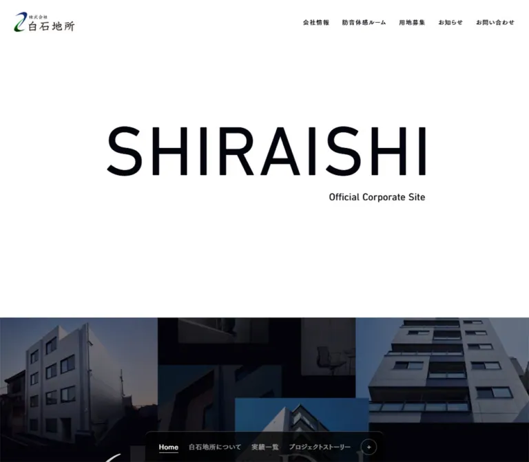
SHIRAISHI presents the company through scale and restraint. A very large Barlow wordmark occupies a mostly empty white opening. Small Japanese navigation sits at the edges, while an English subtitle aligns beneath the wordmark’s right side. The following content uses broad architectural images with brief bilingual captions and small outlined Read More controls.
The page is a corporate gateway with several destinations. Its hierarchy moves from company identity to property and project content, then practical company information and news. A near-black footer repeats four visual entry points. Persistent navigation is split between utility links at the top and a black dock at the bottom; on mobile, the dock contracts to Home, a separator, Menu, and a circled plus.
How to Read This Reference
- Measured means a value appears in the supplied rendered element bounds or computed styles. Decimal values are rounded for readability.
- Calculated means a value follows from those measurements, such as card gutters or the location of media after container padding.
- Estimated means a visual approximation from an original-page screenshot. Brand-artwork colors, dock corner radii, and some overlay details fall into this category.
- Recommended means guidance for a new implementation. The CSS, responsive interpolation, accessible disclosure, and focus treatments below are adaptations.
- Named tokens are descriptive aliases unless an original custom property is explicitly identified.
- Coverage differs by region. Screenshots show the opening, a middle showcase, and the footer. Company-information and news layouts have detailed DOM evidence but no dedicated screenshot in the supplied set.
- Mobile imagery is incomplete in the opening capture. The first large media area appears uniformly gray, while footer images render. Its cause is unverified; this is not evidence of an intentionally empty image design.
Tokens — Colors
Default Palette
| Name | Value | Suggested token | Evidence and role |
|---|---|---|---|
| White canvas | #ffffff |
--color-paper |
Measured body and opening-section background; also footer text. Original white token: --s-color-428538a9. |
| Architectural ink | #04040e |
--color-ink |
Measured wordmark, main captions, utility labels, and footer background. A subtly blue near-black. |
| News text | #333333 |
--color-body |
Measured news-title color. Some structural ancestors also inherit this color, but their children may override it. |
| Muted ink | rgba(4, 4, 14, 0.7) |
--color-muted |
Measured news-date color. Preserve the alpha value when placing it on white. |
| Dock black | Approximately #000000 |
--color-dock |
Visually black desktop dock. Black is also declared as --s-color-52b21a61, but the dock’s computed background was not supplied. |
| Brand green | Approximately #00533f |
--color-brand-green |
Estimated from the original-page brand pattern. An artwork color, not an observed general button fill. |
| Brand indigo | Approximately #140b59 |
--color-brand-indigo |
Estimated from the same pattern. Keep it distinct from the much darker footer ink. |
| Unpainted media gray | Approximately #e5e5e5 |
--color-media-fallback |
Visual estimate for the blank mobile media region. A matching loading-background variable exists, but a causal connection is unverified. |
White and Architectural Ink define the interface. Warm wood, stone, gray upholstery, and glass introduce secondary colors through photography. Green and indigo carry the corporate symbol in the logo-pattern artwork.
Declared Values Without a Confirmed Visible Role
The supplied custom properties also contain #242424, #d0a105, and linear-gradient(90deg, #eae7e4, #ffffff 63%). Their use in the captured homepage components is not established. Do not promote the gold declaration into a primary action color or apply the warm gradient across the page merely because it exists in the token registry.
Theme Behavior
The light main page and dark footer coexist in one document. No user-selectable theme was demonstrated. The body declares a background transition, but this alone does not prove a theme switch or a scroll-driven color change.
Tokens — Typography
Barlow — Identity and English Utilities
Measured family: Barlow, also declared through --s-font-50a4dd3d.
Barlow supplies the large SHIRAISHI wordmark, Official Corporate Site subtitle, Read More labels, dates, Feature Contents heading, and copyright. The wordmark uses weight 500; the subtitle uses 600. Its large size and comparatively restrained weight are central to the opening’s character.
The subtitle is a compact signature beneath the right side of the wordmark. Keep this relationship when changing the company name; centering both lines independently would change the composition.
Ishii Gothic — Japanese Labels and Content
Measured families: "石井ゴシック R" and "石井ゴシック M".
- The R family appears in showcase titles, explanatory text, news titles, footer links, and mobile dock text.
- The M family appears in top navigation, Japanese category labels, feature-card category labels, and desktop dock text.
- Numeric CSS weights remain meaningful evidence: category headings report
700, while top navigation using the M family reports400. - English project names such as Konomi Soleado Hiroo use the R family in the sampled captions. They do not automatically inherit Barlow just because the text is English.
These are named font families found in the computed styles. Their font files and licensing configuration were not supplied. A family declaration alone will not load them into a new project.
Artwork Lettering and Unassigned Families
The Work visual uses large white brush-script lettering over concrete. The 6 Projects Debut visual uses elegant serif lettering over an architectural collage. Their exact text-rendering implementation is not established by the sampled elements; preserve them as artwork-specific treatments until the underlying assets are available.
The registry also declares Cormorant Garamond, "石井ゴシック B", "石井明朝オールドスタイルかな R", "石井明朝オールドスタイルかな L", and "霞青藍 R". Do not assign these families to visible components without element-level evidence. In particular, a serif-looking image title does not establish that it uses the registered Cormorant family.
The root HTML and body report Times defaults, but the visible sampled interface overrides them. Times is not the homepage’s primary visual font.
Type Scale
All values below are measured. Sizes and line heights are CSS pixels.
| Role | Family | Desktop size / line height | Mobile size / line height | Weight | Tracking |
|---|---|---|---|---|---|
| SHIRAISHI wordmark | Barlow | 160 / 160 |
54 / 54 |
500 |
0.02em |
| Official Corporate Site | Barlow | 20 / 28 |
12 / 16.8 |
600 |
Normal |
| Top utility navigation | Ishii Gothic M | 12 / 12 |
Hidden in captured layout | 400 |
0.1em |
| Showcase category | Ishii Gothic M | 12 / 16.8 |
10 / 14 |
700 |
Usually 0.1em |
| Showcase title | Ishii Gothic R | 24 / 24 |
18 / 18 |
400 |
Normal |
| Read More | Barlow | 12 / 16.8 |
10 / 14 |
400 |
0.05em |
| Company-link description | Ishii Gothic R | 14 / 22.4 |
14 / 22.4 |
300 |
0.1em |
| News title | Ishii Gothic R | 16 / 22.4 |
16 / 22.4 |
300 |
0.1em |
| News date | Barlow | 12 / 16.8 |
12 / 16.8 |
400 |
0.05em |
| Feature Contents | Barlow | 36 / 50.4 |
24 / 33.6 |
500 |
Normal |
| Feature-card category | Ishii Gothic M | 12 / 16.8 |
11 / 15.4 |
400 |
0.1em |
| Feature-card title | Ishii Gothic R | 15 / 21 |
12 / 16.8 |
400 |
0.1em |
| Footer navigation | Ishii Gothic R | 15 / 15 |
15 / 15 |
400 |
0.05em |
| Dock destination / Home | M on desktop, R on mobile | 13 / 13 |
13 / 13 |
400 |
0.05em |
| Mobile Menu label | Ishii Gothic R | Not shown | 10 / 10 |
500 |
Normal |
| Copyright | Barlow | 10 / 14 |
10 / 14 |
400 |
0.05em |
The main project-story category is an exception to the usual category tracking: it uses 0.05em, equivalent to 0.6px on desktop and 0.5px on mobile.
Tokens — Spacing & Shapes
Root scale: the inspected root is a conventional 16px. No special fluid rem system is established.
Density: spacious media and section rhythm, with small, precise navigation and captions. Spacing should be assigned by component rather than forcing every value into a single modular scale.
Spacing Scale
| Use | Desktop | Mobile | Evidence |
|---|---|---|---|
| Header padding | 24px 28px |
12px 16px |
Measured |
| Showcase vertical padding | 80px |
32px |
Measured |
| Showcase media-to-caption gap | 20px |
16px |
Measured container gap |
| Showcase caption inset | About 40px |
Title starts at 14px |
Desktop inferred from label/bracket placement; mobile measured title position |
| Dock destination gap | 20px |
Compact mixed gaps | Desktop calculated from adjacent link bounds |
| Feature-grid outer inset | 10px |
0px |
Measured footer padding and card coordinates |
| Feature-grid gutter | 12px |
10px |
Calculated from card coordinates |
| Feature-card title inset | 16px |
8px |
Calculated from card and text bounds |
| Footer major gap | 60px |
40px |
Measured footer gap |
| Footer bottom padding | 80px |
64px |
Measured |
| News row vertical padding | 20px |
20px |
Measured |
| Space between news rows | 40px |
20px |
Calculated from bounds |
| News section opening clearance | 120px |
80px |
Calculated from section and heading positions |
The repeated 80px desktop showcase padding explains the opening image position. The identity section ends at document y = 600px; the first image begins visually at approximately y = 680px, after the next link block’s top padding.
Border Radius
| Element | Value | Status |
|---|---|---|
| Showcase links and feature cards | 0 |
Measured |
| Read More capsule | 16.5px |
Measured on the news archive link |
| Desktop dock plus button | 50%, 32 × 32px |
Measured |
| Mobile dock plus button | 50%, 28 × 28px |
Measured |
| Dock upper corners | Approximately 12–14px |
Screenshot estimate |
| Desktop footer-link text container | 64px |
Measured; transparent in the captured state |
| Mobile footer-link container | 0 |
Measured |
Image cards remain rectangular. Rounded geometry is concentrated in compact controls and the dock. The rounded rectangles inside the diagonal brand pattern belong to the artwork, not to the page’s card system.
Layout Measurements
| Element | Desktop 1440 × 1000 | Mobile 390 × 844 |
|---|---|---|
| Document height | 6615.11px |
4830.77px |
| Header height | 87.42px |
56.84px |
| Visible logo link | 120 × 39.42px at (28, 24) |
100 × 32.84px at (16, 12) |
| Identity section | 1440 × 600px |
390 × 266.80px |
| Wordmark bounds | 751.69 × 160px, y = 240px |
253.70 × 54px, y = 120px |
| Each main showcase link | 1440 × 1000px |
390 × 438px |
| Company-information region | 1440 × 572.34px |
390 × 1269.73px |
| News region | 1440 × 513.58px |
390 × 494.95px |
| Footer | 1440 × 848.19px |
390 × 1006.28px |
| Feature card | 346 × 402.80px |
190 × 221.34px |
| News row | 768 × 63.39px |
350 × 110.58px |
| Read More archive link | 102.95 × 26.80px |
92.97 × 25px |
| Closed dock shell | Approximately 610 × 60px |
Approximately 164 × 49px |
Dock shell dimensions are screenshot estimates; its individual controls have measured bounds. A showcase height of 1000px matches the inspected desktop viewport height, but the underlying sizing formula is not supplied.
Components
Persistent Identity Header
Role: keeps the company identity and practical destinations available while browsing.
The desktop header contains a small logo at the upper left and five links at the upper right: 会社情報, 防音体感ルーム, 用地募集, お知らせ, and お問い合わせ. Text is 12px Ishii Gothic M with 0.1em tracking. Measured horizontal separation between neighboring link boxes is approximately 24px.
The header background is transparent. In the middle capture, both the logo and navigation sit over the green-and-indigo brand artwork. Do not infer a permanent opaque white header from the opening screenshot’s white background.
The logo remains at the same screen location in the supplied scrolled captures, supporting persistent overlay behavior. The exact CSS positioning property was not exported. On mobile, the five utility links are absent from the visible layout and only the 100px-wide logo remains at the top.
The DOM includes two overlapping home-link records at the logo position. The screenshots show one visible logo; those records are not evidence that two logos should be drawn.
Opening Identity
Role: introduces the company before any individual property or content destination.
A white section contains a single large SHIRAISHI wordmark and a much smaller Official Corporate Site subtitle. There is no visible paragraph, image overlay, or primary action inside this opening.
At desktop size, the wordmark’s line box starts at y = 240px and measures 160px high. The subtitle begins at y = 412px, leaving a 12px gap after the wordmark line box. Its right edge is slightly inset from the wordmark element’s right edge, producing an optical alignment with the visible letters.
On mobile, the wordmark starts at y = 120px and becomes 54px. The subtitle starts at y = 178px, a 4px gap after the 54px line box. The section uses 120px 0 72px padding and measures approximately 266.8px tall.
Preserve the large ratio between brand name and subtitle: 8:1 on desktop and 4.5:1 on mobile. The opening’s impact comes from this scale relationship and the surrounding white field.
Full-Width Showcase Link
Role: turns each major content destination into a substantial visual chapter.
Each module is one large anchor containing a media region and a caption area. In source order, the four destinations are:
| Order | Category label | Title | Destination |
|---|---|---|---|
| 1 | プレミアムレジデンス |
Konomi Soleado Hiroo | /Soleado |
| 2 | 実績一覧 |
SHIRAISHI Work | /work |
| 3 | 白石地所について |
We Are | /weare |
| 4 | プロジェクトストーリー |
6 Projects Debut | /6project |
Desktop modules measure 1000px high, including 80px of top and bottom padding. The caption places a small bracketed Japanese category beside a 24px title on the left, with a Read More capsule at the far right. The media height is approximately 793–796px when calculated from the enclosing height, padding, gap, and caption height; its own bounds were not directly supplied.
On mobile, each module measures 438px. The observed geometry resolves into 32px top padding, a 320px media area, a 16px gap, a 38px caption group, and 32px bottom padding. The Japanese category stacks above the 18px title, while Read More remains to the right.
The opening mobile capture paints the media area gray. Its position and reserved dimensions remain observable, but the intended loaded crop cannot be confirmed from that capture. The corresponding interior image is visible in the mobile footer card.
The extracted anchor text sometimes contains inline stylesheet text or Coming Soon. Neither is sufficient evidence of a visible message or a disabled destination. Only the visible captions and actual link targets should guide this component.
Read More Capsule
Role: a quiet navigation cue within larger content regions.
The visible control is a narrow outlined capsule with a small dot and the label Read More. It uses Barlow, 0.05em tracking, and a thin muted outline. The measured archive-link radius is 16.5px, with approximately 103 × 27px desktop and 93 × 25px mobile bounds.
The archive link’s measured desktop padding is 4px 8px 4px 16px, with a 4px internal gap. Mobile padding becomes 4px 8px 5px 16px. Internal icon elements account for part of the overall width.
The DOM includes the icon text arrow_forward, but this does not establish a visible arrow in every captured capsule or an arrow-on-hover transformation. Keep the captured dot treatment as the resting-state reference.
Inside a showcase, implement the capsule as a noninteractive child of the enclosing anchor. The news archive control can be a standalone anchor. Avoid nested links.
Company-Information Links
Role: provides practical routes to company details, the soundproof experience room, and land sourcing.
Three links follow the main showcases. Desktop bounds place them side by side at approximately 480px wide and 571px tall. On mobile, they stack into three full-width blocks, approximately 416px, 416px, and 438px high; the longer land-sourcing description adds another text line.
Each link has a compact category heading in its upper region, followed lower down by a short description and Read More. The heading bounds are narrow and tall: for example, 会社情報 occupies approximately 16.8 × 52.8px. This strongly suggests vertical Japanese typesetting, although writing-mode itself was not included in the exported styles.
Descriptions use 14px Ishii Gothic R, weight 300, 22.4px line height, and 0.1em tracking on both viewports. On mobile, the description is approximately 243px wide, leaving space to its right for the compact action cue.
The supplied screenshots do not show this region directly. Its layout and typography are supported by DOM measurements; the exact upper-region imagery should not be invented.
News List
Role: exposes recent work updates within a restrained editorial block.
The section contains two dated links and an archive link. The observed dates are 2025.03.28 and 2025.02.03. They are content dates, not evidence that the inspected website is discontinued.
Desktop layout places the small section label toward the left and a 768px-wide list to its right. Each row is approximately 63.4px high with 20px vertical padding. A muted 12px Barlow date precedes a 16px Japanese/English update title and an arrow indicator. The title starts about 40px after the date’s text bounds.
On mobile, the date moves above the title. Rows become 350px wide with 20px page margins and approximately 110.6px height. The title occupies about 320px and wraps to two lines. Row spacing decreases from 40px to 20px, while the text sizes remain unchanged.
The archive capsule aligns with the right edge of the list. This gives the block a clear reading order without introducing a large promotional button.
Feature Contents Grid
Role: repeats the homepage’s main visual destinations at the end of the document.
The footer opens with a centered Feature Contents heading and four image links. Desktop uses a single row of four 346 × 402.8px cards, with 12px gutters and 10px outer insets. Mobile uses two columns of 190 × 221.3px cards, separated by 10px gaps and aligned with the viewport edges.
The order differs from the large showcase sequence: residence, work, project stories, then company identity. Preserve that observed footer order when reproducing the current page.
Each card consists of a rectangular image, a dark fade toward the bottom, a small bracketed Japanese category, and a title. Titles sit 16px from the left edge on desktop and 8px on mobile. The two-line caption is close to the bottom, with approximately 16px desktop and 8px mobile clearance after the title line.
The gradient is visible in the screenshots, but its exact stops and whether it is part of the image or a separate overlay were not exported. A CSS overlay is a practical adaptation. Keep the upper image visible and concentrate darkening behind the text.
Footer Navigation and Copyright
Role: completes the corporate information structure.
On desktop, seven links form a centered horizontal row below the feature cards. Labels use 15px Ishii Gothic R, 0.05em tracking, and generous horizontal padding. Their computed containers have a large radius, but the captured resting state shows text on the footer background without a prominent filled-pill treatment.
On mobile, Home occupies a full-width row. The remaining six destinations form three rows of two cells, with thin horizontal rules and a central vertical divider. Each row is approximately 65px high including its rule. Labels align left, and small arrows align toward the right edge of each cell.
The centered copyright reads © SHIRAISHI ESTATE Co.,Ltd. in 10px Barlow with 0.05em tracking. It remains separate from the bottom dock and has visible breathing room around it.
Bottom Navigation Dock
Role: keeps the major content destinations close to the viewport’s lower edge.
The desktop dock is approximately 610px wide, centered, and flush with the bottom edge. Its upper corners are rounded. Five destinations appear in a row: Home, residence, work, project stories, and company identity. Home has a fine underline in the captured state. A 32px outlined circular plus control terminates the row.
The mobile dock is approximately 164px wide and 49px tall. It contains 13px Home text, a short horizontal separator, a 10px Menu label, and a 28px circled plus. The opening capture shows a softer charcoal appearance and a subtle surrounding shadow; the footer capture appears darker. Background compositing and the exact shadow declaration are unverified.
The dock persists in both top and lower-page screenshots. No expanded state, close behavior, keyboard behavior, or destination click was supplied. The plus is an observed control; a full-screen menu, animation direction, or menu content should not be described as verified.
Tokens — Motion & Interaction
Declared Transitions
These values appear in computed styles. They establish timing declarations, not the precise visual effect or trigger.
| Element or region | Desktop declaration | Mobile declaration | Evidence limit |
|---|---|---|---|
| Body background | 0.5s cubic-bezier(0.4, 0.4, 0, 1) |
Same | No background-change trigger demonstrated |
| Header and many interface elements | 0.3s cubic-bezier(0.4, 0.4, 0, 1) |
Same | Changed properties and states were not exercised |
| Top navigation label | 0.2s cubic-bezier(0.19, 1, 0.22, 1) |
Not visible | Hover appearance unverified |
| Residence showcase anchor | 0.8s cubic-bezier(0.4, 0.4, 0, 1) |
Same | No before/after motion sequence supplied |
| Work showcase anchor | 2s, 0.2s delay, standard curve above |
0.8s, no listed delay |
Responsive timing difference is measured |
| We Are showcase anchor | 2s, 0.2s delay |
0.3s, no listed delay |
Trigger and visual transformation unverified |
| Project-story showcase anchor | 2s, 0.6s delay |
0.3s, no listed delay |
Trigger and visual transformation unverified |
| News section | 2s, 0.2s delay |
0.3s, no listed delay |
No reveal sequence captured |
The source repeats transition entries for gradient-related custom properties. This is not evidence that every component visibly animates a gradient.
Observed Interaction States
- Scrolled captures retain the logo/header and bottom dock at the viewport edges.
- Main showcase blocks, news rows, footer cards, and navigation destinations are anchors in the rendered DOM.
- The circled plus is a button in the sampled DOM.
- Home is underlined in the desktop dock’s captured resting state.
- All sampled elements report
animation: none. This does not rule out JavaScript motion, unsampled descendants, pseudo-elements, or transitions between states.
Hover effects, image zoom, parallax, automatic slideshows, menu expansion, and page-transition behavior were not demonstrated. For a new implementation, use the measured timing vocabulary selectively and keep content visible before enhancement. Do not introduce scroll locking or mandatory reveal animations based only on the presence of long transition durations.
Surfaces
| Layer | Appearance | Purpose |
|---|---|---|
| Main canvas | Solid white | Gives the wordmark and architectural imagery ample separation |
| Header | Transparent | Allows identity and utility links to overlay the current section |
| Showcase media | Full-width photographic or graphic field | Carries most of each content destination’s visual identity |
| Showcase caption area | White, compact text, small outline capsule | Identifies the destination without competing with the image |
| Feature footer | Solid #04040e |
Creates a decisive tonal change at the end of the page |
| Feature-card lower area | Dark image fade | Supports white captions over varied imagery |
| Mobile footer navigation | Near-black cells separated by thin rules | Makes destinations easy to scan in two columns |
| Bottom dock | Black or charcoal with rounded upper corners | Separates persistent navigation from page content |
There is no visible general system of raised, rounded cards. Most depth comes from photography and tonal contrast. A subtle shadow is visible around the mobile dock in the opening capture, but this does not justify adding shadows to the showcase or footer cards.
Imagery
The current page combines four distinct visual identities while keeping the surrounding interface consistent.
- Residential interior: a bright, carefully composed living/dining space with pale walls, warm wood, a low glass table, soft upholstery, and daylight through curtains. Perspective and material quality carry the premium tone.
- Work: a gray concrete texture with oversized white handwritten lettering. The texture supplies contrast to the precise interface typography.
- Project stories: a dark montage of building exteriors and interior details, interspersed with black negative space and refined serif lettering.
- Company identity: diagonal rows of rounded logo panels in green, indigo, and white. Cropping makes the pattern continue beyond the frame.
Keep photographic color natural and comparatively restrained. Use edge-to-edge crops within the rectangular media frames. Preserve the interior’s spatial depth and the collage’s black intervals; indiscriminate center cropping can remove their identifying features.
The two-tone curved symbol and Japanese company logotype should be treated as supplied brand artwork. The large SHIRAISHI heading is separately measured live text.
Observed Asset References
The provided DOM includes truncated background-image URLs. The following identifiers are evidence references, not complete downloadable paths.
| Asset family | Available original-page evidence | Implementation consequence |
|---|---|---|
| Residence media | Background filename begins s-2400x1544_v-frms_webp_062d65fe; visible in desktop opening and footer cards |
Obtain the complete authorized asset before implementation |
| Work media | Background filename begins s-2400x1545_v-frms_webp_9c3bcb6b; concrete/script visual appears in footer |
Preserve the lettering and texture together |
| We Are media | Mobile background filename begins s-2400x1545_v-frms_webp_2dd80d0a; large pattern visible in desktop middle capture |
Retain the diagonal composition and brand colors |
| Project-story visual | Architectural collage visible in current desktop and mobile footer cards | Full asset URL and large-module rendering details are unverified |
| Header logo | Visible at measured 120px desktop and 100px mobile widths | Exact image path was not supplied |
The identified background URLs share the visible prefix https://storage.googleapis.com/studio-design-asset-files/projects/1pqDeAV5aj/. Do not complete truncated filenames by guessing. Asset dimensions embedded in a filename are identifiers, not independently verified natural image dimensions.
Layout & Responsive Behavior
Document Structure
The source is a long scrolling homepage, with the following measured section positions. Coordinates refer to document position in the supplied DOM snapshots.
| Region | Desktop start y | Mobile start y |
|---|---|---|
| Opening identity | 0 |
0 |
| Residence showcase | 600 |
266.80 |
| Work showcase | 1600 |
704.80 |
| We Are showcase | 2600 |
1142.80 |
| Project-story showcase | 3600 |
1580.80 |
| Company-information links | 4681 |
2059.80 |
| News | 5253.34 |
3329.53 |
| Feature footer | 5766.92 |
3824.48 |
The top screenshot’s first desktop image begins around y = 680px, and the mobile media field begins around y = 299px. Both positions are consistent with the showcase container starting earlier and adding its own top padding. Do not size the opening section to those image-start coordinates.
Responsive Changes
| Relationship | Desktop | Mobile |
|---|---|---|
| Header identity | 120px logo with five utility links | 100px logo; utility links not visible |
| Opening wordmark | 160px | 54px |
| Showcase sequence | Four large stacked modules | Same content order, shorter 438px modules |
| Showcase caption | Category and title inline | Category above title |
| Corporate links | Three columns | Three stacked blocks |
| News row | Date and title on one horizontal line | Date above wrapping title |
| Feature grid | Four columns | Two columns, two rows |
| Footer links | Centered horizontal row | Full-width Home row plus two-column matrix |
| Dock | Five destinations and plus | Home, separator, Menu, plus |
Feature cards retain nearly the same proportions: measured width-to-height ratios are approximately 0.859 on desktop and 0.858 on mobile. An implementation ratio near 0.86 is a reasonable approximation.
The mobile footer screenshot begins partway through the feature grid. Feature Contents is still present in the mobile DOM at 24px; its absence from that cropped viewport is not evidence that the heading is hidden.
Only the two listed viewport sizes were supplied. A 1250px media-query fragment appears in extracted markup, but it concerns line-break rules and does not establish the breakpoint for every layout change. Tablet behavior and the exact navigation-collapse threshold remain unverified.
Recommended adaptation: choose breakpoints based on available space, reserve clearance around persistent controls, and include safe-area handling. Safe-area support was not established by the exported styles.
Do’s and Don’ts
Do
- Preserve the large Barlow wordmark and its small right-aligned subtitle.
- Use exact white and
#04040efor the main light/dark relationship. - Keep the header small and visually light above the expansive content.
- Let architecture and brand artwork carry color and visual density.
- Retain full-width showcase media with restrained captions below.
- Preserve the Japanese-category/English-title pairing and bracket detail.
- Keep image cards square-cornered and reserve rounded shapes for compact controls.
- Use four footer cards on desktop and two columns on mobile.
- Preserve the distinction between top utility navigation and the bottom content dock.
- Label inferred image behavior and untested interaction states explicitly.
Don’t
- Don’t replace the corporate gateway with a single offer, form, or sales funnel.
- Don’t fill the opening white space with invented copy or promotional badges.
- Don’t use green, indigo, or the declared gold as an unsupported primary CTA system.
- Don’t substitute a heavy display font for the measured medium-weight wordmark.
- Don’t apply rounded cards, glass blur, or elevation shadows throughout the page.
- Don’t infer image carousels, parallax, or scroll snapping from still captures.
- Don’t reproduce the gray mobile media field as the intended finished visual.
- Don’t render extracted CSS text, hidden CONTACT text, or Coming Soon as visible UI without confirmation.
- Don’t treat registered font families as proof that they are used in every matching visual.
- Don’t make the small Read More label the only hit target when its entire showcase is already a link.
Recommended Implementation Additions
These are recommendations for a new implementation, not verified original-site features.
- Use one primary heading for the wordmark and a paragraph for the subtitle. The sampled source uses H1 elements for both; a cleaner semantic hierarchy can preserve the appearance.
- Give the logo link an accessible company/home name and the plus control an explicit menu name. Empty extracted button text does not establish whether the original has an accessible name.
- Preserve the small visible control geometry while providing comfortable touch targets. Aim for approximately 44px interactive areas where practical.
- Add visible focus outlines that remain legible on white, photography, and the dark footer.
- Test header text against the brand pattern and dark photographs. Introduce a deliberate contrast treatment if required; automatic inversion was not verified.
- Keep showcase captions available when images fail. Reserve media dimensions, load visible images promptly, and avoid leaving critical first-screen content dependent on a reveal effect.
- Keep content visible under reduced motion and when enhancement scripts fail. Use transitions for feedback instead of making them a prerequisite for reading.
- Account for device safe areas and dock obstruction, especially at the end of the document and while tabbing through footer links.
- Use a proper disclosure or dialog pattern for the menu. The starter below uses native details as an optional functional adaptation; its open state is newly proposed.
Agent Prompt Guide
Quick Color Reference
- Main page:
#ffffff. - Main ink and footer:
#04040e. - News text:
#333333. - Muted dates:
rgba(4, 4, 14, 0.7). - Dock: visually black; use
#000000as an approximation. - Brand-artwork accents: approximately green
#00533fand indigo#140b59. - Image-caption support: a dark bottom fade, with exact stops chosen for legibility.
- Action treatment: small outlined capsule with a dot and Read More.
Overall Prompt
“Create a Japanese real-estate corporate homepage inspired by the current SHIRAISHI site. Begin with a quiet white identity section containing a very large medium-weight Barlow wordmark and a small subtitle aligned beneath its right side. Use a small company logo at the upper left and compact Japanese utility links at the upper right. Follow with four full-width architectural or brand-artwork showcases, each with a bracketed Japanese category, a restrained title, and an outlined Read More capsule. Add company-information links and a compact dated news list. Finish with a near-black Feature Contents footer: four rectangular image cards on desktop, two columns on mobile, white captions over dark bottom fades, and practical corporate navigation. Keep a centered black navigation dock at the bottom; collapse it to Home, Menu, and a circled plus on mobile. Preserve white space, fine outlines, and small utility typography. Treat motion and expanded-menu behavior as implementation choices requiring separate specification.”
Example Component Prompts
- Identity: “A 600px white desktop opening with SHIRAISHI in Barlow 500 at 160px, 1.0 line height, and 0.02em tracking. Place Official Corporate Site below the right side in 20px Barlow 600. At 390px width, use a 54px wordmark and 12px subtitle, beginning the wordmark around 120px from the top.”
- Showcase: “One full-width link with a large natural-color residential interior image, square corners, and a white caption area below. At left, pair a small bracketed Japanese category with a 24px title. Place a narrow outlined Read More capsule at right. On mobile, stack the category above an 18px title while keeping the action to the right.”
- Feature grid: “A
#04040efooter with a centered Barlow Feature Contents heading. Use four equal portrait-leaning rectangular image links with approximately 0.86 width-to-height ratio and 12px gutters. Each has a dark bottom fade, a small Japanese category, and a tracked white title. Switch to two columns with 10px gutters on mobile.” - News: “A white corporate news section with a small Japanese section label and two spacious linked rows. Use 12px muted Barlow dates and 16px Japanese sans-serif titles. Put dates above titles on mobile without reducing the title size. Align a small archive capsule to the right.”
- Dock: “A centered black navigation dock touching the bottom edge, with rounded upper corners, 13px white destination labels, an understated Home underline, and an outlined circular plus. On mobile, show only Home, a short separator, Menu, and the plus. Reproduce the closed state; specify any expanded state separately.”
- Mobile footer links: “Below a two-column image grid, create a near-black navigation matrix. Home spans the first row; six remaining links fill three two-column rows. Use approximately 65px rows, fine muted white rules, 15px labels, and small right arrows. Center a tiny copyright below.”
Quick Start
CSS Custom Properties
This is an implementation adaptation, not a copy of the original stylesheet. Exact measured colors and typography are combined with clearly chosen approximations for borders, gradients, and responsive interpolation. The 767px and 1100px breakpoints below are recommendations, not verified source breakpoints.
Load authorized Barlow and Ishii Gothic font files separately. The fallback stacks are recommendations and will change text metrics. No original font-file URLs were supplied.
:root {
  /* Measured interface colors */
  --color-paper: #ffffff;
  --color-ink: #04040e;
  --color-body: #333333;
  --color-muted: rgba(4, 4, 14, 0.7);

  /* Visual approximations and implementation choices */
  --color-dock: #000000;
  --color-brand-green: #00533f;
  --color-brand-indigo: #140b59;
  --color-media-fallback: #e5e5e5;
  --rule-light: rgba(4, 4, 14, 0.45);
  --rule-dark: rgba(255, 255, 255, 0.2);

  /* Source families with recommended fallbacks */
  --font-display: 'Barlow', Arial, sans-serif;
  --font-body: '石井ゴシック R', 'Yu Gothic', sans-serif;
  --font-label: '石井ゴシック M', 'Yu Gothic', sans-serif;

  --text-brand: 160px;
  --text-subtitle: 20px;
  --text-showcase: 24px;
  --text-category: 12px;
  --text-action: 12px;
  --text-feature: 36px;
  --text-card-title: 15px;
  --text-card-category: 12px;
  --text-dock: 13px;

  --header-y: 24px;
  --header-x: 28px;
  --showcase-y: 80px;
  --showcase-gap: 20px;
  --caption-x: 40px;
  --feature-gap: 12px;
  --card-inset: 16px;
  --radius-capsule: 16.5px;
  --radius-dock: 14px;

  --ease-standard: cubic-bezier(0.4, 0.4, 0, 1);
  --ease-label: cubic-bezier(0.19, 1, 0.22, 1);
  --duration-ui: 300ms;
  --duration-label: 200ms;
  --safe-top: env(safe-area-inset-top, 0px);
  --safe-bottom: env(safe-area-inset-bottom, 0px);
}

* { box-sizing: border-box; }

html {
  scroll-padding-top: 100px;
  scroll-padding-bottom: 90px;
}

body.shiraishi {
  margin: 0;
  color: var(--color-ink);
  background: var(--color-paper);
  font-family: var(--font-body);
}

.shiraishi img { display: block; max-width: 100%; }
.shiraishi a { color: inherit; }
.shiraishi :where(a, button, summary):focus-visible {
  outline: 2px solid currentColor;
  outline-offset: 4px;
}

.site-header {
  position: fixed;
  z-index: 30;
  inset: 0 0 auto;
  display: flex;
  align-items: center;
  justify-content: space-between;
  padding: calc(var(--header-y) + var(--safe-top))
    var(--header-x) var(--header-y);
  background: transparent;
}

.site-logo { display: block; width: 120px; }
.site-logo img { width: 100%; height: auto; }
.utility-nav { display: flex; align-items: center; gap: 24px; }
.utility-nav a {
  font: 400 12px/1 var(--font-label);
  letter-spacing: 0.1em;
  text-decoration: none;
}

.identity {
  height: 600px;
  padding: 240px 16px 0;
  background: var(--color-paper);
}

.identity__group {
  width: max-content;
  max-width: 100%;
  margin-inline: auto;
  transform: translateX(7.5px);
}

.identity__title {
  margin: 0;
  font: 500 clamp(72px, 11.111vw, var(--text-brand))/1
    var(--font-display);
  letter-spacing: 0.02em;
}

.identity__subtitle {
  margin: 12px 15px 0 0;
  text-align: right;
  font: 600 var(--text-subtitle)/1.4 var(--font-display);
}

.showcase {
  display: grid;
  grid-template-rows: minmax(0, 1fr) auto;
  gap: var(--showcase-gap);
  height: 100vh;
  height: 100svh;
  min-height: 640px;
  padding-block: var(--showcase-y);
  color: var(--color-ink);
  text-decoration: none;
}

.showcase__media {
  min-height: 0;
  margin: 0;
  overflow: hidden;
  background: var(--color-media-fallback);
}

.showcase__media img {
  width: 100%;
  height: 100%;
  object-fit: cover;
  object-position: var(--image-position, center);
}

.showcase__meta {
  display: flex;
  align-items: center;
  justify-content: space-between;
  gap: 24px;
  padding-inline: var(--caption-x);
}

.showcase__labels {
  display: flex;
  align-items: center;
  gap: 20px;
  min-width: 0;
}

.category {
  position: relative;
  margin: 0 0 0 7px;
  font: 700 var(--text-category)/1.4 var(--font-label);
  letter-spacing: 0.1em;
}
.category::before { content: '['; position: absolute; left: -9px; }
.category::after { content: ']'; margin-left: 4px; }
.category--project { letter-spacing: 0.05em; }

.showcase__title {
  margin: 0;
  font: 400 var(--text-showcase)/1 var(--font-body);
}

.read-more {
  display: inline-flex;
  flex: none;
  align-items: center;
  justify-content: center;
  gap: 4px;
  min-width: 103px;
  min-height: 27px;
  padding: 4px 15px;
  border: 1px solid var(--rule-light);
  border-radius: var(--radius-capsule);
  font: 400 var(--text-action)/1.4 var(--font-display);
  letter-spacing: 0.05em;
  text-decoration: none;
  white-space: nowrap;
}
.read-more::before {
  content: '';
  width: 3px;
  height: 3px;
  border-radius: 50%;
  background: currentColor;
}

/* Corporate-link structure; exact media composition requires assets. */
.company-grid {
  display: grid;
  grid-template-columns: repeat(3, minmax(0, 1fr));
  margin-top: 80px;
}
.company-link { display: block; text-decoration: none; }
.company-link__heading {
  writing-mode: vertical-rl;
  margin: 0;
  font: 700 12px/1.4 var(--font-label);
  letter-spacing: 0.1em;
}
.company-link__body {
  display: flex;
  align-items: flex-end;
  gap: 20px;
  padding: 20px;
}
.company-link__description {
  flex: 1;
  min-width: 0;
  margin: 0;
  font: 300 14px/1.6 var(--font-body);
  letter-spacing: 0.1em;
}

.news {
  display: grid;
  grid-template-columns: 216px minmax(0, 1fr);
  gap: 40px;
  width: min(1024px, calc(100% - 40px));
  margin-inline: auto;
  padding-block: 120px;
}
.news__content {
  display: flex;
  flex-direction: column;
  gap: 40px;
  padding-top: 40px;
}
.news__row {
  display: grid;
  grid-template-columns: 94px minmax(0, 1fr) 20px;
  align-items: center;
  gap: 10px;
  padding-block: 20px;
  border-bottom: 1px solid rgba(4, 4, 14, 0.16);
  text-decoration: none;
}
.news__date {
  color: var(--color-muted);
  font: 400 12px/1.4 var(--font-display);
  letter-spacing: 0.05em;
}
.news__title {
  margin: 0;
  color: var(--color-body);
  font: 300 16px/1.4 var(--font-body);
  letter-spacing: 0.1em;
}
.news__archive { align-self: flex-end; }

.site-footer {
  display: flow-root;
  padding: 4px 10px calc(80px + var(--safe-bottom));
  color: white;
  background: var(--color-ink);
}
.feature-heading {
  margin: 60px 0;
  text-align: center;
  font: 500 var(--text-feature)/1.4 var(--font-display);
}
.feature-grid {
  display: grid;
  grid-template-columns: repeat(4, minmax(0, 1fr));
  gap: var(--feature-gap);
}
.feature-card {
  position: relative;
  display: block;
  aspect-ratio: 0.859;
  overflow: hidden;
  color: white;
  background: var(--color-ink);
  text-decoration: none;
}
.feature-card > img {
  width: 100%;
  height: 100%;
  object-fit: cover;
  object-position: var(--image-position, center);
}
.feature-card::after {
  content: '';
  position: absolute;
  inset: 35% 0 0;
  background: linear-gradient(transparent, rgba(0, 0, 0, 0.94));
  pointer-events: none;
}
.feature-card__caption {
  position: absolute;
  z-index: 1;
  inset: auto var(--card-inset) var(--card-inset);
}
.feature-card__category {
  margin: 0;
  font: 400 var(--text-card-category)/1.4 var(--font-label);
  letter-spacing: 0.1em;
}
.feature-card__title {
  margin: 0;
  font: 400 var(--text-card-title)/1.4 var(--font-body);
  letter-spacing: 0.1em;
}

.footer-nav {
  display: flex;
  flex-wrap: wrap;
  justify-content: center;
  gap: 10px;
  margin: 60px auto;
}
.footer-nav a {
  display: flex;
  align-items: center;
  min-height: 38px;
  padding: 10px 24px 11px;
  border-radius: 64px;
  font: 400 15px/1 var(--font-body);
  letter-spacing: 0.05em;
  text-decoration: none;
}
.copyright {
  margin: 0 0 20px;
  text-align: center;
  font: 400 10px/1.4 var(--font-display);
  letter-spacing: 0.05em;
}

.dock {
  position: fixed;
  z-index: 40;
  bottom: 0;
  left: 50%;
  transform: translateX(-50%);
  display: flex;
  align-items: center;
  gap: 20px;
  max-width: calc(100% - 24px);
  padding: 14px 14px calc(14px + var(--safe-bottom)) 28px;
  border-radius: var(--radius-dock) var(--radius-dock) 0 0;
  color: white;
  background: var(--color-dock);
  font: 400 var(--text-dock)/1 var(--font-label);
  letter-spacing: 0.05em;
}
.dock a { text-decoration: none; white-space: nowrap; }
.dock__home[aria-current='page'] {
  text-decoration: underline;
  text-underline-offset: 7px;
  text-decoration-thickness: 1px;
}
.dock__links { display: flex; align-items: center; gap: 20px; }
.dock__separator, .dock__menu-label { display: none; }
.dock__menu summary {
  display: flex;
  align-items: center;
  gap: 6px;
  cursor: pointer;
  list-style: none;
}
.dock__menu summary::-webkit-details-marker { display: none; }
.dock__plus {
  display: grid;
  place-items: center;
  width: 32px;
  height: 32px;
  border: 1px solid rgba(255, 255, 255, 0.45);
  border-radius: 50%;
  font: 400 14px/1 var(--font-display);
}

/* Recommended open disclosure; this state was not captured. */
.dock__panel {
  position: absolute;
  right: 0;
  bottom: calc(100% + 12px);
  width: min(320px, calc(100vw - 32px));
  max-height: 65vh;
  overflow-y: auto;
  padding: 12px;
  border: 1px solid var(--rule-dark);
  border-radius: 12px;
  background: var(--color-ink);
}
.dock__panel a {
  display: block;
  padding: 14px 12px;
  line-height: 1.5;
  white-space: normal;
}

/* Recommended feedback, not a verified original hover state. */
@media (hover: hover) {
  .utility-nav a, .footer-nav a {
    transition: opacity var(--duration-label) var(--ease-label);
  }
  .utility-nav a:hover, .footer-nav a:hover { opacity: 0.7; }
}

/* Chosen intermediate breakpoint to prevent navigation crowding. */
@media (max-width: 1100px) {
  .utility-nav { display: none; }
  .dock__links { display: none; }
  .dock__menu-label { display: inline; font-size: 10px; }
  .dock__separator {
    display: block;
    width: 16px;
    height: 1px;
    background: rgba(255, 255, 255, 0.4);
  }
}

@media (max-width: 767px) {
  :root {
    --text-brand: 54px;
    --text-subtitle: 12px;
    --text-showcase: 18px;
    --text-category: 10px;
    --text-action: 10px;
    --text-feature: 24px;
    --text-card-title: 12px;
    --text-card-category: 11px;
    --header-y: 12px;
    --header-x: 16px;
    --showcase-y: 32px;
    --showcase-gap: 16px;
    --caption-x: 14px;
    --feature-gap: 10px;
    --card-inset: 8px;
  }

  .site-logo { width: 100px; }
  .identity { height: auto; padding: 120px 12px 72px; }
  .identity__group { transform: translateX(2.5px); }
  .identity__title {
    font-size: clamp(40px, 13.846vw, var(--text-brand));
  }
  .identity__subtitle { margin: 4px 5px 0 0; }

  .showcase {
    height: auto;
    min-height: 0;
    grid-template-rows: 320px auto;
  }
  .showcase__meta { gap: 12px; }
  .showcase__labels {
    flex-direction: column;
    align-items: flex-start;
    gap: 6px;
  }
  .showcase__labels .category { margin-left: 9px; }
  .read-more { min-width: 93px; min-height: 25px; padding: 4px 15px 5px; }

  .company-grid { grid-template-columns: 1fr; margin-top: 40px; }
  .news {
    grid-template-columns: 1fr;
    gap: 20px;
    padding-block: 80px;
  }
  .news__content { gap: 20px; padding-top: 0; }
  .news__row {
    grid-template-columns: minmax(0, 1fr) 20px;
    gap: 8px 10px;
  }
  .news__date { grid-column: 1 / -1; }
  .news__archive { margin-top: 12px; }

  .site-footer { padding: 4px 0 calc(64px + var(--safe-bottom)); }
  .feature-heading { margin: 60px 0 37px; }
  .feature-grid { grid-template-columns: repeat(2, minmax(0, 1fr)); }
  .footer-nav {
    display: grid;
    grid-template-columns: repeat(2, minmax(0, 1fr));
    gap: 0;
    margin: 40px 0;
    border-top: 1px solid var(--rule-dark);
  }
  .footer-nav a {
    justify-content: space-between;
    gap: 8px;
    min-height: 65px;
    padding: 12px 16px;
    border-bottom: 1px solid var(--rule-dark);
    border-radius: 0;
    line-height: 1.4;
  }
  .footer-nav a:first-child { grid-column: 1 / -1; }
  .footer-nav a:nth-child(even) { border-right: 1px solid var(--rule-dark); }
  .footer-nav a::after { content: '→'; font-size: 13px; }
  .copyright { margin: 0; }

  .dock {
    gap: 8px;
    padding: 10px 16px calc(10px + var(--safe-bottom)) 20px;
    font-family: var(--font-body);
  }
  .dock__home[aria-current='page'] { text-decoration: none; }
  .dock__plus { width: 28px; height: 28px; }
  .dock__panel {
    right: auto;
    left: 50%;
    transform: translateX(-50%);
  }
}

@media (prefers-reduced-motion: reduce) {
  .shiraishi *, .shiraishi *::before, .shiraishi *::after {
    animation: none !important;
    transition: none !important;
    scroll-behavior: auto !important;
  }
}
Component Markup
This example demonstrates the expected nesting and avoids a link inside a link. Replace YOUR_AUTHORIZED_INTERIOR_IMAGE_URL with an actual approved asset URL; it is an integration placeholder, not an observed path. Repeat the showcase structure for the other destinations.
The native disclosure is a recommended functional menu. Its open panel is not a reconstruction of an inspected original state.
<section class='identity' aria-labelledby='site-title'>
  <div class='identity__group'>
    <h1 class='identity__title' id='site-title'>SHIRAISHI</h1>
    <p class='identity__subtitle'>Official Corporate Site</p>
  </div>
</section>

<a class='showcase' href='https://www.shiraishi-gr.jp/Soleado'>
  <figure class='showcase__media'>
    <img
      src='YOUR_AUTHORIZED_INTERIOR_IMAGE_URL'
      alt='A sunlit living and dining room with pale finishes and warm wood'
      decoding='async'
    >
  </figure>
  <div class='showcase__meta'>
    <div class='showcase__labels'>
      <p class='category' lang='ja'>プレミアムレジデンス</p>
      <h2 class='showcase__title'>Konomi Soleado Hiroo</h2>
    </div>
    <span class='read-more' aria-hidden='true'>Read More</span>
  </div>
</a>

<nav class='dock' aria-label='Primary navigation'>
  <a class='dock__home' href='https://www.shiraishi-gr.jp/'
     aria-current='page'>Home</a>
  <div class='dock__links' lang='ja'>
    <a href='https://www.shiraishi-gr.jp/Soleado'>プレミアムレジデンス</a>
    <a href='https://www.shiraishi-gr.jp/work'>実績一覧</a>
    <a href='https://www.shiraishi-gr.jp/6project'>プロジェクトストーリー</a>
    <a href='https://www.shiraishi-gr.jp/weare'>白石地所について</a>
  </div>
  <span class='dock__separator' aria-hidden='true'></span>
  <details class='dock__menu'>
    <summary aria-label='Additional navigation'>
      <span class='dock__menu-label'>Menu</span>
      <span class='dock__plus' aria-hidden='true'>+</span>
    </summary>
    <div class='dock__panel' lang='ja'>
      <a href='https://www.shiraishi-gr.jp/Soleado'>プレミアムレジデンス</a>
      <a href='https://www.shiraishi-gr.jp/work'>実績一覧</a>
      <a href='https://www.shiraishi-gr.jp/6project'>プロジェクトストーリー</a>
      <a href='https://www.shiraishi-gr.jp/weare'>白石地所について</a>
      <a href='https://www.shiraishi-gr.jp/company'>会社情報</a>
      <a href='https://www.shiraishi-gr.jp/soundproof'>防音体感ルーム</a>
      <a href='https://www.shiraishi-gr.jp/landsourcing'>用地募集</a>
      <a href='https://www.shiraishi-gr.jp/news'>お知らせ</a>
      <a href='https://www.shiraishi-gr.jp/contact'>お問い合わせ</a>
    </div>
  </details>
</nav>
Tailwind v4 Token Mapping
Optional aliases for a project already using Tailwind v4. This does not claim that the original website uses Tailwind. Define the custom properties above first.
@theme inline {
  --color-paper: #ffffff;
  --color-ink: #04040e;
  --color-dock: #000000;
  --color-muted: rgba(4, 4, 14, 0.7);

  --font-display: 'Barlow', Arial, sans-serif;
  --font-body: '石井ゴシック R', 'Yu Gothic', sans-serif;
  --font-label: '石井ゴシック M', 'Yu Gothic', sans-serif;

  --text-brand-display: var(--text-brand);
  --text-showcase-title: var(--text-showcase);
  --text-feature-heading: var(--text-feature);
  --text-utility: var(--text-action);

  --spacing-showcase: var(--showcase-y);
  --spacing-feature-gutter: var(--feature-gap);
  --spacing-card-caption: var(--card-inset);
  --radius-capsule: 16.5px;
  --radius-dock: 14px;
}
Sources & Evidence
- Inspected original and final page: SHIRAISHI corporate homepage. The supplied observation reports HTTP 200 and identical original/final URLs.
- Capture record: retrieved at
2026-09-16T19:42:53.047Z; September 17, 2026 in Japan. Desktop viewport: 1440 × 1000. Mobile viewport: 390 × 844. Supplied original-page screenshots cover the opening, a middle showcase, and footer regions. - Rendered evidence: page title, visible-text extract, anchor destinations, document heights, element bounds, computed colors, font families, font sizes, weights, line heights, letter spacing, padding, gaps, radii, and transition declarations at both viewports.
- Observed state coverage: resting and scrolled page captures with persistent header/logo and bottom dock. No supplied click, hover, keyboard, or expanded-menu sequence establishes additional behavior.
- Capture limitations: readiness checks waited for document load, finite motion, sampled layout/text stability, and visible image decoding within bounded time limits. These checks do not prove all delayed content rendered. Perpetual animations were paused during readiness checks and then resumed; SharedWorkers and service workers were disabled.
- Specific uncertainty: large mobile media areas were not painted with their expected imagery in the opening capture, while footer images were visible. Exact causes, full asset URLs, untested responsive widths, and interaction outcomes remain unverified.
This reference describes the current homepage represented by the supplied original-page evidence. Measured values, visual estimates, calculated relationships, and recommended implementation choices are identified separately throughout.
# SHIRAISHI / Shiraishi Estate — Style Reference

> An architectural corporate index built from generous white space, expansive imagery, and a compact black navigation dock.

**Website:** [shiraishi-gr.jp](https://www.shiraishi-gr.jp/)
**Original URL:** https://www.shiraishi-gr.jp/
**Final URL:** https://www.shiraishi-gr.jp/
**Theme:** white main canvas with a near-black feature footer; green and indigo appear primarily in brand artwork.
**Inspected:** September 17, 2026, Japan Standard Time. Supplied retrieval timestamp: September 16, 2026, 19:42:53.047 UTC, equivalent to September 17, 04:42:53.047 JST.
**Viewports:** desktop 1440 × 1000 and mobile 390 × 844 CSS pixels.
**Scope:** the current corporate homepage, including its opening identity, four major content links, company-information links, news, feature footer, and closed bottom navigation. Analysis uses the supplied original-page captures and rendered DOM/computed styles. Destination pages and expanded menu states were not inspected.

SHIRAISHI presents the company through scale and restraint. A very large Barlow wordmark occupies a mostly empty white opening. Small Japanese navigation sits at the edges, while an English subtitle aligns beneath the wordmark’s right side. The following content uses broad architectural images with brief bilingual captions and small outlined Read More controls.

The page is a corporate gateway with several destinations. Its hierarchy moves from company identity to property and project content, then practical company information and news. A near-black footer repeats four visual entry points. Persistent navigation is split between utility links at the top and a black dock at the bottom; on mobile, the dock contracts to Home, a separator, Menu, and a circled plus.

## How to Read This Reference

- **Measured** means a value appears in the supplied rendered element bounds or computed styles. Decimal values are rounded for readability.
- **Calculated** means a value follows from those measurements, such as card gutters or the location of media after container padding.
- **Estimated** means a visual approximation from an original-page screenshot. Brand-artwork colors, dock corner radii, and some overlay details fall into this category.
- **Recommended** means guidance for a new implementation. The CSS, responsive interpolation, accessible disclosure, and focus treatments below are adaptations.
- **Named tokens** are descriptive aliases unless an original custom property is explicitly identified.
- **Coverage differs by region.** Screenshots show the opening, a middle showcase, and the footer. Company-information and news layouts have detailed DOM evidence but no dedicated screenshot in the supplied set.
- **Mobile imagery is incomplete in the opening capture.** The first large media area appears uniformly gray, while footer images render. Its cause is unverified; this is not evidence of an intentionally empty image design.

## Tokens — Colors

### Default Palette

| Name | Value | Suggested token | Evidence and role |
| --- | --- | --- | --- |
| White canvas | `#ffffff` | `--color-paper` | Measured body and opening-section background; also footer text. Original white token: `--s-color-428538a9`. |
| Architectural ink | `#04040e` | `--color-ink` | Measured wordmark, main captions, utility labels, and footer background. A subtly blue near-black. |
| News text | `#333333` | `--color-body` | Measured news-title color. Some structural ancestors also inherit this color, but their children may override it. |
| Muted ink | `rgba(4, 4, 14, 0.7)` | `--color-muted` | Measured news-date color. Preserve the alpha value when placing it on white. |
| Dock black | Approximately `#000000` | `--color-dock` | Visually black desktop dock. Black is also declared as `--s-color-52b21a61`, but the dock’s computed background was not supplied. |
| Brand green | Approximately `#00533f` | `--color-brand-green` | Estimated from the original-page brand pattern. An artwork color, not an observed general button fill. |
| Brand indigo | Approximately `#140b59` | `--color-brand-indigo` | Estimated from the same pattern. Keep it distinct from the much darker footer ink. |
| Unpainted media gray | Approximately `#e5e5e5` | `--color-media-fallback` | Visual estimate for the blank mobile media region. A matching loading-background variable exists, but a causal connection is unverified. |

White and Architectural Ink define the interface. Warm wood, stone, gray upholstery, and glass introduce secondary colors through photography. Green and indigo carry the corporate symbol in the logo-pattern artwork.

### Declared Values Without a Confirmed Visible Role

The supplied custom properties also contain `#242424`, `#d0a105`, and `linear-gradient(90deg, #eae7e4, #ffffff 63%)`. Their use in the captured homepage components is not established. Do not promote the gold declaration into a primary action color or apply the warm gradient across the page merely because it exists in the token registry.

### Theme Behavior

The light main page and dark footer coexist in one document. No user-selectable theme was demonstrated. The body declares a background transition, but this alone does not prove a theme switch or a scroll-driven color change.

## Tokens — Typography

### Barlow — Identity and English Utilities

**Measured family:** `Barlow`, also declared through `--s-font-50a4dd3d`.

Barlow supplies the large SHIRAISHI wordmark, Official Corporate Site subtitle, Read More labels, dates, Feature Contents heading, and copyright. The wordmark uses weight `500`; the subtitle uses `600`. Its large size and comparatively restrained weight are central to the opening’s character.

The subtitle is a compact signature beneath the right side of the wordmark. Keep this relationship when changing the company name; centering both lines independently would change the composition.

### Ishii Gothic — Japanese Labels and Content

**Measured families:** `"石井ゴシック R"` and `"石井ゴシック M"`.

- The R family appears in showcase titles, explanatory text, news titles, footer links, and mobile dock text.
- The M family appears in top navigation, Japanese category labels, feature-card category labels, and desktop dock text.
- Numeric CSS weights remain meaningful evidence: category headings report `700`, while top navigation using the M family reports `400`.
- English project names such as Konomi Soleado Hiroo use the R family in the sampled captions. They do not automatically inherit Barlow just because the text is English.

These are named font families found in the computed styles. Their font files and licensing configuration were not supplied. A family declaration alone will not load them into a new project.

### Artwork Lettering and Unassigned Families

The Work visual uses large white brush-script lettering over concrete. The 6 Projects Debut visual uses elegant serif lettering over an architectural collage. Their exact text-rendering implementation is not established by the sampled elements; preserve them as artwork-specific treatments until the underlying assets are available.

The registry also declares `Cormorant Garamond`, `"石井ゴシック B"`, `"石井明朝オールドスタイルかな R"`, `"石井明朝オールドスタイルかな L"`, and `"霞青藍 R"`. Do not assign these families to visible components without element-level evidence. In particular, a serif-looking image title does not establish that it uses the registered Cormorant family.

The root HTML and body report Times defaults, but the visible sampled interface overrides them. Times is not the homepage’s primary visual font.

### Type Scale

All values below are measured. Sizes and line heights are CSS pixels.

| Role | Family | Desktop size / line height | Mobile size / line height | Weight | Tracking |
| --- | --- | --- | --- | --- | --- |
| SHIRAISHI wordmark | Barlow | `160 / 160` | `54 / 54` | `500` | `0.02em` |
| Official Corporate Site | Barlow | `20 / 28` | `12 / 16.8` | `600` | Normal |
| Top utility navigation | Ishii Gothic M | `12 / 12` | Hidden in captured layout | `400` | `0.1em` |
| Showcase category | Ishii Gothic M | `12 / 16.8` | `10 / 14` | `700` | Usually `0.1em` |
| Showcase title | Ishii Gothic R | `24 / 24` | `18 / 18` | `400` | Normal |
| Read More | Barlow | `12 / 16.8` | `10 / 14` | `400` | `0.05em` |
| Company-link description | Ishii Gothic R | `14 / 22.4` | `14 / 22.4` | `300` | `0.1em` |
| News title | Ishii Gothic R | `16 / 22.4` | `16 / 22.4` | `300` | `0.1em` |
| News date | Barlow | `12 / 16.8` | `12 / 16.8` | `400` | `0.05em` |
| Feature Contents | Barlow | `36 / 50.4` | `24 / 33.6` | `500` | Normal |
| Feature-card category | Ishii Gothic M | `12 / 16.8` | `11 / 15.4` | `400` | `0.1em` |
| Feature-card title | Ishii Gothic R | `15 / 21` | `12 / 16.8` | `400` | `0.1em` |
| Footer navigation | Ishii Gothic R | `15 / 15` | `15 / 15` | `400` | `0.05em` |
| Dock destination / Home | M on desktop, R on mobile | `13 / 13` | `13 / 13` | `400` | `0.05em` |
| Mobile Menu label | Ishii Gothic R | Not shown | `10 / 10` | `500` | Normal |
| Copyright | Barlow | `10 / 14` | `10 / 14` | `400` | `0.05em` |

The main project-story category is an exception to the usual category tracking: it uses `0.05em`, equivalent to `0.6px` on desktop and `0.5px` on mobile.

## Tokens — Spacing & Shapes

**Root scale:** the inspected root is a conventional `16px`. No special fluid rem system is established.

**Density:** spacious media and section rhythm, with small, precise navigation and captions. Spacing should be assigned by component rather than forcing every value into a single modular scale.

### Spacing Scale

| Use | Desktop | Mobile | Evidence |
| --- | --- | --- | --- |
| Header padding | `24px 28px` | `12px 16px` | Measured |
| Showcase vertical padding | `80px` | `32px` | Measured |
| Showcase media-to-caption gap | `20px` | `16px` | Measured container gap |
| Showcase caption inset | About `40px` | Title starts at `14px` | Desktop inferred from label/bracket placement; mobile measured title position |
| Dock destination gap | `20px` | Compact mixed gaps | Desktop calculated from adjacent link bounds |
| Feature-grid outer inset | `10px` | `0px` | Measured footer padding and card coordinates |
| Feature-grid gutter | `12px` | `10px` | Calculated from card coordinates |
| Feature-card title inset | `16px` | `8px` | Calculated from card and text bounds |
| Footer major gap | `60px` | `40px` | Measured footer gap |
| Footer bottom padding | `80px` | `64px` | Measured |
| News row vertical padding | `20px` | `20px` | Measured |
| Space between news rows | `40px` | `20px` | Calculated from bounds |
| News section opening clearance | `120px` | `80px` | Calculated from section and heading positions |

The repeated `80px` desktop showcase padding explains the opening image position. The identity section ends at document y = `600px`; the first image begins visually at approximately y = `680px`, after the next link block’s top padding.

### Border Radius

| Element | Value | Status |
| --- | --- | --- |
| Showcase links and feature cards | `0` | Measured |
| Read More capsule | `16.5px` | Measured on the news archive link |
| Desktop dock plus button | `50%`, `32 × 32px` | Measured |
| Mobile dock plus button | `50%`, `28 × 28px` | Measured |
| Dock upper corners | Approximately `12–14px` | Screenshot estimate |
| Desktop footer-link text container | `64px` | Measured; transparent in the captured state |
| Mobile footer-link container | `0` | Measured |

Image cards remain rectangular. Rounded geometry is concentrated in compact controls and the dock. The rounded rectangles inside the diagonal brand pattern belong to the artwork, not to the page’s card system.

### Layout Measurements

| Element | Desktop 1440 × 1000 | Mobile 390 × 844 |
| --- | --- | --- |
| Document height | `6615.11px` | `4830.77px` |
| Header height | `87.42px` | `56.84px` |
| Visible logo link | `120 × 39.42px` at `(28, 24)` | `100 × 32.84px` at `(16, 12)` |
| Identity section | `1440 × 600px` | `390 × 266.80px` |
| Wordmark bounds | `751.69 × 160px`, y = `240px` | `253.70 × 54px`, y = `120px` |
| Each main showcase link | `1440 × 1000px` | `390 × 438px` |
| Company-information region | `1440 × 572.34px` | `390 × 1269.73px` |
| News region | `1440 × 513.58px` | `390 × 494.95px` |
| Footer | `1440 × 848.19px` | `390 × 1006.28px` |
| Feature card | `346 × 402.80px` | `190 × 221.34px` |
| News row | `768 × 63.39px` | `350 × 110.58px` |
| Read More archive link | `102.95 × 26.80px` | `92.97 × 25px` |
| Closed dock shell | Approximately `610 × 60px` | Approximately `164 × 49px` |

Dock shell dimensions are screenshot estimates; its individual controls have measured bounds. A showcase height of 1000px matches the inspected desktop viewport height, but the underlying sizing formula is not supplied.

## Components

### Persistent Identity Header

**Role:** keeps the company identity and practical destinations available while browsing.

The desktop header contains a small logo at the upper left and five links at the upper right: `会社情報`, `防音体感ルーム`, `用地募集`, `お知らせ`, and `お問い合わせ`. Text is 12px Ishii Gothic M with 0.1em tracking. Measured horizontal separation between neighboring link boxes is approximately 24px.

The header background is transparent. In the middle capture, both the logo and navigation sit over the green-and-indigo brand artwork. Do not infer a permanent opaque white header from the opening screenshot’s white background.

The logo remains at the same screen location in the supplied scrolled captures, supporting persistent overlay behavior. The exact CSS positioning property was not exported. On mobile, the five utility links are absent from the visible layout and only the 100px-wide logo remains at the top.

The DOM includes two overlapping home-link records at the logo position. The screenshots show one visible logo; those records are not evidence that two logos should be drawn.

### Opening Identity

**Role:** introduces the company before any individual property or content destination.

A white section contains a single large SHIRAISHI wordmark and a much smaller Official Corporate Site subtitle. There is no visible paragraph, image overlay, or primary action inside this opening.

At desktop size, the wordmark’s line box starts at y = 240px and measures 160px high. The subtitle begins at y = 412px, leaving a 12px gap after the wordmark line box. Its right edge is slightly inset from the wordmark element’s right edge, producing an optical alignment with the visible letters.

On mobile, the wordmark starts at y = 120px and becomes 54px. The subtitle starts at y = 178px, a 4px gap after the 54px line box. The section uses `120px 0 72px` padding and measures approximately 266.8px tall.

Preserve the large ratio between brand name and subtitle: 8:1 on desktop and 4.5:1 on mobile. The opening’s impact comes from this scale relationship and the surrounding white field.

### Full-Width Showcase Link

**Role:** turns each major content destination into a substantial visual chapter.

Each module is one large anchor containing a media region and a caption area. In source order, the four destinations are:

| Order | Category label | Title | Destination |
| --- | --- | --- | --- |
| 1 | `プレミアムレジデンス` | Konomi Soleado Hiroo | `/Soleado` |
| 2 | `実績一覧` | SHIRAISHI Work | `/work` |
| 3 | `白石地所について` | We Are | `/weare` |
| 4 | `プロジェクトストーリー` | 6 Projects Debut | `/6project` |

Desktop modules measure 1000px high, including 80px of top and bottom padding. The caption places a small bracketed Japanese category beside a 24px title on the left, with a Read More capsule at the far right. The media height is approximately 793–796px when calculated from the enclosing height, padding, gap, and caption height; its own bounds were not directly supplied.

On mobile, each module measures 438px. The observed geometry resolves into 32px top padding, a 320px media area, a 16px gap, a 38px caption group, and 32px bottom padding. The Japanese category stacks above the 18px title, while Read More remains to the right.

The opening mobile capture paints the media area gray. Its position and reserved dimensions remain observable, but the intended loaded crop cannot be confirmed from that capture. The corresponding interior image is visible in the mobile footer card.

The extracted anchor text sometimes contains inline stylesheet text or Coming Soon. Neither is sufficient evidence of a visible message or a disabled destination. Only the visible captions and actual link targets should guide this component.

### Read More Capsule

**Role:** a quiet navigation cue within larger content regions.

The visible control is a narrow outlined capsule with a small dot and the label Read More. It uses Barlow, 0.05em tracking, and a thin muted outline. The measured archive-link radius is 16.5px, with approximately 103 × 27px desktop and 93 × 25px mobile bounds.

The archive link’s measured desktop padding is `4px 8px 4px 16px`, with a 4px internal gap. Mobile padding becomes `4px 8px 5px 16px`. Internal icon elements account for part of the overall width.

The DOM includes the icon text `arrow_forward`, but this does not establish a visible arrow in every captured capsule or an arrow-on-hover transformation. Keep the captured dot treatment as the resting-state reference.

Inside a showcase, implement the capsule as a noninteractive child of the enclosing anchor. The news archive control can be a standalone anchor. Avoid nested links.

### Company-Information Links

**Role:** provides practical routes to company details, the soundproof experience room, and land sourcing.

Three links follow the main showcases. Desktop bounds place them side by side at approximately 480px wide and 571px tall. On mobile, they stack into three full-width blocks, approximately 416px, 416px, and 438px high; the longer land-sourcing description adds another text line.

Each link has a compact category heading in its upper region, followed lower down by a short description and Read More. The heading bounds are narrow and tall: for example, `会社情報` occupies approximately 16.8 × 52.8px. This strongly suggests vertical Japanese typesetting, although `writing-mode` itself was not included in the exported styles.

Descriptions use 14px Ishii Gothic R, weight 300, 22.4px line height, and 0.1em tracking on both viewports. On mobile, the description is approximately 243px wide, leaving space to its right for the compact action cue.

The supplied screenshots do not show this region directly. Its layout and typography are supported by DOM measurements; the exact upper-region imagery should not be invented.

### News List

**Role:** exposes recent work updates within a restrained editorial block.

The section contains two dated links and an archive link. The observed dates are 2025.03.28 and 2025.02.03. They are content dates, not evidence that the inspected website is discontinued.

Desktop layout places the small section label toward the left and a 768px-wide list to its right. Each row is approximately 63.4px high with 20px vertical padding. A muted 12px Barlow date precedes a 16px Japanese/English update title and an arrow indicator. The title starts about 40px after the date’s text bounds.

On mobile, the date moves above the title. Rows become 350px wide with 20px page margins and approximately 110.6px height. The title occupies about 320px and wraps to two lines. Row spacing decreases from 40px to 20px, while the text sizes remain unchanged.

The archive capsule aligns with the right edge of the list. This gives the block a clear reading order without introducing a large promotional button.

### Feature Contents Grid

**Role:** repeats the homepage’s main visual destinations at the end of the document.

The footer opens with a centered Feature Contents heading and four image links. Desktop uses a single row of four 346 × 402.8px cards, with 12px gutters and 10px outer insets. Mobile uses two columns of 190 × 221.3px cards, separated by 10px gaps and aligned with the viewport edges.

The order differs from the large showcase sequence: residence, work, project stories, then company identity. Preserve that observed footer order when reproducing the current page.

Each card consists of a rectangular image, a dark fade toward the bottom, a small bracketed Japanese category, and a title. Titles sit 16px from the left edge on desktop and 8px on mobile. The two-line caption is close to the bottom, with approximately 16px desktop and 8px mobile clearance after the title line.

The gradient is visible in the screenshots, but its exact stops and whether it is part of the image or a separate overlay were not exported. A CSS overlay is a practical adaptation. Keep the upper image visible and concentrate darkening behind the text.

### Footer Navigation and Copyright

**Role:** completes the corporate information structure.

On desktop, seven links form a centered horizontal row below the feature cards. Labels use 15px Ishii Gothic R, 0.05em tracking, and generous horizontal padding. Their computed containers have a large radius, but the captured resting state shows text on the footer background without a prominent filled-pill treatment.

On mobile, Home occupies a full-width row. The remaining six destinations form three rows of two cells, with thin horizontal rules and a central vertical divider. Each row is approximately 65px high including its rule. Labels align left, and small arrows align toward the right edge of each cell.

The centered copyright reads `© SHIRAISHI ESTATE Co.,Ltd.` in 10px Barlow with 0.05em tracking. It remains separate from the bottom dock and has visible breathing room around it.

### Bottom Navigation Dock

**Role:** keeps the major content destinations close to the viewport’s lower edge.

The desktop dock is approximately 610px wide, centered, and flush with the bottom edge. Its upper corners are rounded. Five destinations appear in a row: Home, residence, work, project stories, and company identity. Home has a fine underline in the captured state. A 32px outlined circular plus control terminates the row.

The mobile dock is approximately 164px wide and 49px tall. It contains 13px Home text, a short horizontal separator, a 10px Menu label, and a 28px circled plus. The opening capture shows a softer charcoal appearance and a subtle surrounding shadow; the footer capture appears darker. Background compositing and the exact shadow declaration are unverified.

The dock persists in both top and lower-page screenshots. No expanded state, close behavior, keyboard behavior, or destination click was supplied. The plus is an observed control; a full-screen menu, animation direction, or menu content should not be described as verified.

## Tokens — Motion & Interaction

### Declared Transitions

These values appear in computed styles. They establish timing declarations, not the precise visual effect or trigger.

| Element or region | Desktop declaration | Mobile declaration | Evidence limit |
| --- | --- | --- | --- |
| Body background | `0.5s cubic-bezier(0.4, 0.4, 0, 1)` | Same | No background-change trigger demonstrated |
| Header and many interface elements | `0.3s cubic-bezier(0.4, 0.4, 0, 1)` | Same | Changed properties and states were not exercised |
| Top navigation label | `0.2s cubic-bezier(0.19, 1, 0.22, 1)` | Not visible | Hover appearance unverified |
| Residence showcase anchor | `0.8s cubic-bezier(0.4, 0.4, 0, 1)` | Same | No before/after motion sequence supplied |
| Work showcase anchor | `2s`, `0.2s` delay, standard curve above | `0.8s`, no listed delay | Responsive timing difference is measured |
| We Are showcase anchor | `2s`, `0.2s` delay | `0.3s`, no listed delay | Trigger and visual transformation unverified |
| Project-story showcase anchor | `2s`, `0.6s` delay | `0.3s`, no listed delay | Trigger and visual transformation unverified |
| News section | `2s`, `0.2s` delay | `0.3s`, no listed delay | No reveal sequence captured |

The source repeats transition entries for gradient-related custom properties. This is not evidence that every component visibly animates a gradient.

### Observed Interaction States

- Scrolled captures retain the logo/header and bottom dock at the viewport edges.
- Main showcase blocks, news rows, footer cards, and navigation destinations are anchors in the rendered DOM.
- The circled plus is a button in the sampled DOM.
- Home is underlined in the desktop dock’s captured resting state.
- All sampled elements report `animation: none`. This does not rule out JavaScript motion, unsampled descendants, pseudo-elements, or transitions between states.

Hover effects, image zoom, parallax, automatic slideshows, menu expansion, and page-transition behavior were not demonstrated. For a new implementation, use the measured timing vocabulary selectively and keep content visible before enhancement. Do not introduce scroll locking or mandatory reveal animations based only on the presence of long transition durations.

## Surfaces

| Layer | Appearance | Purpose |
| --- | --- | --- |
| Main canvas | Solid white | Gives the wordmark and architectural imagery ample separation |
| Header | Transparent | Allows identity and utility links to overlay the current section |
| Showcase media | Full-width photographic or graphic field | Carries most of each content destination’s visual identity |
| Showcase caption area | White, compact text, small outline capsule | Identifies the destination without competing with the image |
| Feature footer | Solid `#04040e` | Creates a decisive tonal change at the end of the page |
| Feature-card lower area | Dark image fade | Supports white captions over varied imagery |
| Mobile footer navigation | Near-black cells separated by thin rules | Makes destinations easy to scan in two columns |
| Bottom dock | Black or charcoal with rounded upper corners | Separates persistent navigation from page content |

There is no visible general system of raised, rounded cards. Most depth comes from photography and tonal contrast. A subtle shadow is visible around the mobile dock in the opening capture, but this does not justify adding shadows to the showcase or footer cards.

## Imagery

The current page combines four distinct visual identities while keeping the surrounding interface consistent.

1. **Residential interior:** a bright, carefully composed living/dining space with pale walls, warm wood, a low glass table, soft upholstery, and daylight through curtains. Perspective and material quality carry the premium tone.
2. **Work:** a gray concrete texture with oversized white handwritten lettering. The texture supplies contrast to the precise interface typography.
3. **Project stories:** a dark montage of building exteriors and interior details, interspersed with black negative space and refined serif lettering.
4. **Company identity:** diagonal rows of rounded logo panels in green, indigo, and white. Cropping makes the pattern continue beyond the frame.

Keep photographic color natural and comparatively restrained. Use edge-to-edge crops within the rectangular media frames. Preserve the interior’s spatial depth and the collage’s black intervals; indiscriminate center cropping can remove their identifying features.

The two-tone curved symbol and Japanese company logotype should be treated as supplied brand artwork. The large SHIRAISHI heading is separately measured live text.

### Observed Asset References

The provided DOM includes truncated background-image URLs. The following identifiers are evidence references, not complete downloadable paths.

| Asset family | Available original-page evidence | Implementation consequence |
| --- | --- | --- |
| Residence media | Background filename begins `s-2400x1544_v-frms_webp_062d65fe`; visible in desktop opening and footer cards | Obtain the complete authorized asset before implementation |
| Work media | Background filename begins `s-2400x1545_v-frms_webp_9c3bcb6b`; concrete/script visual appears in footer | Preserve the lettering and texture together |
| We Are media | Mobile background filename begins `s-2400x1545_v-frms_webp_2dd80d0a`; large pattern visible in desktop middle capture | Retain the diagonal composition and brand colors |
| Project-story visual | Architectural collage visible in current desktop and mobile footer cards | Full asset URL and large-module rendering details are unverified |
| Header logo | Visible at measured 120px desktop and 100px mobile widths | Exact image path was not supplied |

The identified background URLs share the visible prefix `https://storage.googleapis.com/studio-design-asset-files/projects/1pqDeAV5aj/`. Do not complete truncated filenames by guessing. Asset dimensions embedded in a filename are identifiers, not independently verified natural image dimensions.

## Layout & Responsive Behavior

### Document Structure

The source is a long scrolling homepage, with the following measured section positions. Coordinates refer to document position in the supplied DOM snapshots.

| Region | Desktop start y | Mobile start y |
| --- | --- | --- |
| Opening identity | `0` | `0` |
| Residence showcase | `600` | `266.80` |
| Work showcase | `1600` | `704.80` |
| We Are showcase | `2600` | `1142.80` |
| Project-story showcase | `3600` | `1580.80` |
| Company-information links | `4681` | `2059.80` |
| News | `5253.34` | `3329.53` |
| Feature footer | `5766.92` | `3824.48` |

The top screenshot’s first desktop image begins around y = 680px, and the mobile media field begins around y = 299px. Both positions are consistent with the showcase container starting earlier and adding its own top padding. Do not size the opening section to those image-start coordinates.

### Responsive Changes

| Relationship | Desktop | Mobile |
| --- | --- | --- |
| Header identity | 120px logo with five utility links | 100px logo; utility links not visible |
| Opening wordmark | 160px | 54px |
| Showcase sequence | Four large stacked modules | Same content order, shorter 438px modules |
| Showcase caption | Category and title inline | Category above title |
| Corporate links | Three columns | Three stacked blocks |
| News row | Date and title on one horizontal line | Date above wrapping title |
| Feature grid | Four columns | Two columns, two rows |
| Footer links | Centered horizontal row | Full-width Home row plus two-column matrix |
| Dock | Five destinations and plus | Home, separator, Menu, plus |

Feature cards retain nearly the same proportions: measured width-to-height ratios are approximately 0.859 on desktop and 0.858 on mobile. An implementation ratio near `0.86` is a reasonable approximation.

The mobile footer screenshot begins partway through the feature grid. Feature Contents is still present in the mobile DOM at 24px; its absence from that cropped viewport is not evidence that the heading is hidden.

Only the two listed viewport sizes were supplied. A 1250px media-query fragment appears in extracted markup, but it concerns line-break rules and does not establish the breakpoint for every layout change. Tablet behavior and the exact navigation-collapse threshold remain unverified.

**Recommended adaptation:** choose breakpoints based on available space, reserve clearance around persistent controls, and include safe-area handling. Safe-area support was not established by the exported styles.

## Do’s and Don’ts

### Do

- Preserve the large Barlow wordmark and its small right-aligned subtitle.
- Use exact white and `#04040e` for the main light/dark relationship.
- Keep the header small and visually light above the expansive content.
- Let architecture and brand artwork carry color and visual density.
- Retain full-width showcase media with restrained captions below.
- Preserve the Japanese-category/English-title pairing and bracket detail.
- Keep image cards square-cornered and reserve rounded shapes for compact controls.
- Use four footer cards on desktop and two columns on mobile.
- Preserve the distinction between top utility navigation and the bottom content dock.
- Label inferred image behavior and untested interaction states explicitly.

### Don’t

- Don’t replace the corporate gateway with a single offer, form, or sales funnel.
- Don’t fill the opening white space with invented copy or promotional badges.
- Don’t use green, indigo, or the declared gold as an unsupported primary CTA system.
- Don’t substitute a heavy display font for the measured medium-weight wordmark.
- Don’t apply rounded cards, glass blur, or elevation shadows throughout the page.
- Don’t infer image carousels, parallax, or scroll snapping from still captures.
- Don’t reproduce the gray mobile media field as the intended finished visual.
- Don’t render extracted CSS text, hidden CONTACT text, or Coming Soon as visible UI without confirmation.
- Don’t treat registered font families as proof that they are used in every matching visual.
- Don’t make the small Read More label the only hit target when its entire showcase is already a link.

## Recommended Implementation Additions

These are recommendations for a new implementation, not verified original-site features.

- Use one primary heading for the wordmark and a paragraph for the subtitle. The sampled source uses H1 elements for both; a cleaner semantic hierarchy can preserve the appearance.
- Give the logo link an accessible company/home name and the plus control an explicit menu name. Empty extracted button text does not establish whether the original has an accessible name.
- Preserve the small visible control geometry while providing comfortable touch targets. Aim for approximately 44px interactive areas where practical.
- Add visible focus outlines that remain legible on white, photography, and the dark footer.
- Test header text against the brand pattern and dark photographs. Introduce a deliberate contrast treatment if required; automatic inversion was not verified.
- Keep showcase captions available when images fail. Reserve media dimensions, load visible images promptly, and avoid leaving critical first-screen content dependent on a reveal effect.
- Keep content visible under reduced motion and when enhancement scripts fail. Use transitions for feedback instead of making them a prerequisite for reading.
- Account for device safe areas and dock obstruction, especially at the end of the document and while tabbing through footer links.
- Use a proper disclosure or dialog pattern for the menu. The starter below uses native details as an optional functional adaptation; its open state is newly proposed.

## Agent Prompt Guide

### Quick Color Reference

- Main page: `#ffffff`.
- Main ink and footer: `#04040e`.
- News text: `#333333`.
- Muted dates: `rgba(4, 4, 14, 0.7)`.
- Dock: visually black; use `#000000` as an approximation.
- Brand-artwork accents: approximately green `#00533f` and indigo `#140b59`.
- Image-caption support: a dark bottom fade, with exact stops chosen for legibility.
- Action treatment: small outlined capsule with a dot and Read More.

### Overall Prompt

“Create a Japanese real-estate corporate homepage inspired by the current SHIRAISHI site. Begin with a quiet white identity section containing a very large medium-weight Barlow wordmark and a small subtitle aligned beneath its right side. Use a small company logo at the upper left and compact Japanese utility links at the upper right. Follow with four full-width architectural or brand-artwork showcases, each with a bracketed Japanese category, a restrained title, and an outlined Read More capsule. Add company-information links and a compact dated news list. Finish with a near-black Feature Contents footer: four rectangular image cards on desktop, two columns on mobile, white captions over dark bottom fades, and practical corporate navigation. Keep a centered black navigation dock at the bottom; collapse it to Home, Menu, and a circled plus on mobile. Preserve white space, fine outlines, and small utility typography. Treat motion and expanded-menu behavior as implementation choices requiring separate specification.”

### Example Component Prompts

1. **Identity:** “A 600px white desktop opening with SHIRAISHI in Barlow 500 at 160px, 1.0 line height, and 0.02em tracking. Place Official Corporate Site below the right side in 20px Barlow 600. At 390px width, use a 54px wordmark and 12px subtitle, beginning the wordmark around 120px from the top.”
2. **Showcase:** “One full-width link with a large natural-color residential interior image, square corners, and a white caption area below. At left, pair a small bracketed Japanese category with a 24px title. Place a narrow outlined Read More capsule at right. On mobile, stack the category above an 18px title while keeping the action to the right.”
3. **Feature grid:** “A `#04040e` footer with a centered Barlow Feature Contents heading. Use four equal portrait-leaning rectangular image links with approximately 0.86 width-to-height ratio and 12px gutters. Each has a dark bottom fade, a small Japanese category, and a tracked white title. Switch to two columns with 10px gutters on mobile.”
4. **News:** “A white corporate news section with a small Japanese section label and two spacious linked rows. Use 12px muted Barlow dates and 16px Japanese sans-serif titles. Put dates above titles on mobile without reducing the title size. Align a small archive capsule to the right.”
5. **Dock:** “A centered black navigation dock touching the bottom edge, with rounded upper corners, 13px white destination labels, an understated Home underline, and an outlined circular plus. On mobile, show only Home, a short separator, Menu, and the plus. Reproduce the closed state; specify any expanded state separately.”
6. **Mobile footer links:** “Below a two-column image grid, create a near-black navigation matrix. Home spans the first row; six remaining links fill three two-column rows. Use approximately 65px rows, fine muted white rules, 15px labels, and small right arrows. Center a tiny copyright below.”

## Quick Start

### CSS Custom Properties

This is an implementation adaptation, not a copy of the original stylesheet. Exact measured colors and typography are combined with clearly chosen approximations for borders, gradients, and responsive interpolation. The 767px and 1100px breakpoints below are recommendations, not verified source breakpoints.

Load authorized Barlow and Ishii Gothic font files separately. The fallback stacks are recommendations and will change text metrics. No original font-file URLs were supplied.

```css
:root {
  /* Measured interface colors */
  --color-paper: #ffffff;
  --color-ink: #04040e;
  --color-body: #333333;
  --color-muted: rgba(4, 4, 14, 0.7);

  /* Visual approximations and implementation choices */
  --color-dock: #000000;
  --color-brand-green: #00533f;
  --color-brand-indigo: #140b59;
  --color-media-fallback: #e5e5e5;
  --rule-light: rgba(4, 4, 14, 0.45);
  --rule-dark: rgba(255, 255, 255, 0.2);

  /* Source families with recommended fallbacks */
  --font-display: 'Barlow', Arial, sans-serif;
  --font-body: '石井ゴシック R', 'Yu Gothic', sans-serif;
  --font-label: '石井ゴシック M', 'Yu Gothic', sans-serif;

  --text-brand: 160px;
  --text-subtitle: 20px;
  --text-showcase: 24px;
  --text-category: 12px;
  --text-action: 12px;
  --text-feature: 36px;
  --text-card-title: 15px;
  --text-card-category: 12px;
  --text-dock: 13px;

  --header-y: 24px;
  --header-x: 28px;
  --showcase-y: 80px;
  --showcase-gap: 20px;
  --caption-x: 40px;
  --feature-gap: 12px;
  --card-inset: 16px;
  --radius-capsule: 16.5px;
  --radius-dock: 14px;

  --ease-standard: cubic-bezier(0.4, 0.4, 0, 1);
  --ease-label: cubic-bezier(0.19, 1, 0.22, 1);
  --duration-ui: 300ms;
  --duration-label: 200ms;
  --safe-top: env(safe-area-inset-top, 0px);
  --safe-bottom: env(safe-area-inset-bottom, 0px);
}

* { box-sizing: border-box; }

html {
  scroll-padding-top: 100px;
  scroll-padding-bottom: 90px;
}

body.shiraishi {
  margin: 0;
  color: var(--color-ink);
  background: var(--color-paper);
  font-family: var(--font-body);
}

.shiraishi img { display: block; max-width: 100%; }
.shiraishi a { color: inherit; }
.shiraishi :where(a, button, summary):focus-visible {
  outline: 2px solid currentColor;
  outline-offset: 4px;
}

.site-header {
  position: fixed;
  z-index: 30;
  inset: 0 0 auto;
  display: flex;
  align-items: center;
  justify-content: space-between;
  padding: calc(var(--header-y) + var(--safe-top))
    var(--header-x) var(--header-y);
  background: transparent;
}

.site-logo { display: block; width: 120px; }
.site-logo img { width: 100%; height: auto; }
.utility-nav { display: flex; align-items: center; gap: 24px; }
.utility-nav a {
  font: 400 12px/1 var(--font-label);
  letter-spacing: 0.1em;
  text-decoration: none;
}

.identity {
  height: 600px;
  padding: 240px 16px 0;
  background: var(--color-paper);
}

.identity__group {
  width: max-content;
  max-width: 100%;
  margin-inline: auto;
  transform: translateX(7.5px);
}

.identity__title {
  margin: 0;
  font: 500 clamp(72px, 11.111vw, var(--text-brand))/1
    var(--font-display);
  letter-spacing: 0.02em;
}

.identity__subtitle {
  margin: 12px 15px 0 0;
  text-align: right;
  font: 600 var(--text-subtitle)/1.4 var(--font-display);
}

.showcase {
  display: grid;
  grid-template-rows: minmax(0, 1fr) auto;
  gap: var(--showcase-gap);
  height: 100vh;
  height: 100svh;
  min-height: 640px;
  padding-block: var(--showcase-y);
  color: var(--color-ink);
  text-decoration: none;
}

.showcase__media {
  min-height: 0;
  margin: 0;
  overflow: hidden;
  background: var(--color-media-fallback);
}

.showcase__media img {
  width: 100%;
  height: 100%;
  object-fit: cover;
  object-position: var(--image-position, center);
}

.showcase__meta {
  display: flex;
  align-items: center;
  justify-content: space-between;
  gap: 24px;
  padding-inline: var(--caption-x);
}

.showcase__labels {
  display: flex;
  align-items: center;
  gap: 20px;
  min-width: 0;
}

.category {
  position: relative;
  margin: 0 0 0 7px;
  font: 700 var(--text-category)/1.4 var(--font-label);
  letter-spacing: 0.1em;
}
.category::before { content: '['; position: absolute; left: -9px; }
.category::after { content: ']'; margin-left: 4px; }
.category--project { letter-spacing: 0.05em; }

.showcase__title {
  margin: 0;
  font: 400 var(--text-showcase)/1 var(--font-body);
}

.read-more {
  display: inline-flex;
  flex: none;
  align-items: center;
  justify-content: center;
  gap: 4px;
  min-width: 103px;
  min-height: 27px;
  padding: 4px 15px;
  border: 1px solid var(--rule-light);
  border-radius: var(--radius-capsule);
  font: 400 var(--text-action)/1.4 var(--font-display);
  letter-spacing: 0.05em;
  text-decoration: none;
  white-space: nowrap;
}
.read-more::before {
  content: '';
  width: 3px;
  height: 3px;
  border-radius: 50%;
  background: currentColor;
}

/* Corporate-link structure; exact media composition requires assets. */
.company-grid {
  display: grid;
  grid-template-columns: repeat(3, minmax(0, 1fr));
  margin-top: 80px;
}
.company-link { display: block; text-decoration: none; }
.company-link__heading {
  writing-mode: vertical-rl;
  margin: 0;
  font: 700 12px/1.4 var(--font-label);
  letter-spacing: 0.1em;
}
.company-link__body {
  display: flex;
  align-items: flex-end;
  gap: 20px;
  padding: 20px;
}
.company-link__description {
  flex: 1;
  min-width: 0;
  margin: 0;
  font: 300 14px/1.6 var(--font-body);
  letter-spacing: 0.1em;
}

.news {
  display: grid;
  grid-template-columns: 216px minmax(0, 1fr);
  gap: 40px;
  width: min(1024px, calc(100% - 40px));
  margin-inline: auto;
  padding-block: 120px;
}
.news__content {
  display: flex;
  flex-direction: column;
  gap: 40px;
  padding-top: 40px;
}
.news__row {
  display: grid;
  grid-template-columns: 94px minmax(0, 1fr) 20px;
  align-items: center;
  gap: 10px;
  padding-block: 20px;
  border-bottom: 1px solid rgba(4, 4, 14, 0.16);
  text-decoration: none;
}
.news__date {
  color: var(--color-muted);
  font: 400 12px/1.4 var(--font-display);
  letter-spacing: 0.05em;
}
.news__title {
  margin: 0;
  color: var(--color-body);
  font: 300 16px/1.4 var(--font-body);
  letter-spacing: 0.1em;
}
.news__archive { align-self: flex-end; }

.site-footer {
  display: flow-root;
  padding: 4px 10px calc(80px + var(--safe-bottom));
  color: white;
  background: var(--color-ink);
}
.feature-heading {
  margin: 60px 0;
  text-align: center;
  font: 500 var(--text-feature)/1.4 var(--font-display);
}
.feature-grid {
  display: grid;
  grid-template-columns: repeat(4, minmax(0, 1fr));
  gap: var(--feature-gap);
}
.feature-card {
  position: relative;
  display: block;
  aspect-ratio: 0.859;
  overflow: hidden;
  color: white;
  background: var(--color-ink);
  text-decoration: none;
}
.feature-card > img {
  width: 100%;
  height: 100%;
  object-fit: cover;
  object-position: var(--image-position, center);
}
.feature-card::after {
  content: '';
  position: absolute;
  inset: 35% 0 0;
  background: linear-gradient(transparent, rgba(0, 0, 0, 0.94));
  pointer-events: none;
}
.feature-card__caption {
  position: absolute;
  z-index: 1;
  inset: auto var(--card-inset) var(--card-inset);
}
.feature-card__category {
  margin: 0;
  font: 400 var(--text-card-category)/1.4 var(--font-label);
  letter-spacing: 0.1em;
}
.feature-card__title {
  margin: 0;
  font: 400 var(--text-card-title)/1.4 var(--font-body);
  letter-spacing: 0.1em;
}

.footer-nav {
  display: flex;
  flex-wrap: wrap;
  justify-content: center;
  gap: 10px;
  margin: 60px auto;
}
.footer-nav a {
  display: flex;
  align-items: center;
  min-height: 38px;
  padding: 10px 24px 11px;
  border-radius: 64px;
  font: 400 15px/1 var(--font-body);
  letter-spacing: 0.05em;
  text-decoration: none;
}
.copyright {
  margin: 0 0 20px;
  text-align: center;
  font: 400 10px/1.4 var(--font-display);
  letter-spacing: 0.05em;
}

.dock {
  position: fixed;
  z-index: 40;
  bottom: 0;
  left: 50%;
  transform: translateX(-50%);
  display: flex;
  align-items: center;
  gap: 20px;
  max-width: calc(100% - 24px);
  padding: 14px 14px calc(14px + var(--safe-bottom)) 28px;
  border-radius: var(--radius-dock) var(--radius-dock) 0 0;
  color: white;
  background: var(--color-dock);
  font: 400 var(--text-dock)/1 var(--font-label);
  letter-spacing: 0.05em;
}
.dock a { text-decoration: none; white-space: nowrap; }
.dock__home[aria-current='page'] {
  text-decoration: underline;
  text-underline-offset: 7px;
  text-decoration-thickness: 1px;
}
.dock__links { display: flex; align-items: center; gap: 20px; }
.dock__separator, .dock__menu-label { display: none; }
.dock__menu summary {
  display: flex;
  align-items: center;
  gap: 6px;
  cursor: pointer;
  list-style: none;
}
.dock__menu summary::-webkit-details-marker { display: none; }
.dock__plus {
  display: grid;
  place-items: center;
  width: 32px;
  height: 32px;
  border: 1px solid rgba(255, 255, 255, 0.45);
  border-radius: 50%;
  font: 400 14px/1 var(--font-display);
}

/* Recommended open disclosure; this state was not captured. */
.dock__panel {
  position: absolute;
  right: 0;
  bottom: calc(100% + 12px);
  width: min(320px, calc(100vw - 32px));
  max-height: 65vh;
  overflow-y: auto;
  padding: 12px;
  border: 1px solid var(--rule-dark);
  border-radius: 12px;
  background: var(--color-ink);
}
.dock__panel a {
  display: block;
  padding: 14px 12px;
  line-height: 1.5;
  white-space: normal;
}

/* Recommended feedback, not a verified original hover state. */
@media (hover: hover) {
  .utility-nav a, .footer-nav a {
    transition: opacity var(--duration-label) var(--ease-label);
  }
  .utility-nav a:hover, .footer-nav a:hover { opacity: 0.7; }
}

/* Chosen intermediate breakpoint to prevent navigation crowding. */
@media (max-width: 1100px) {
  .utility-nav { display: none; }
  .dock__links { display: none; }
  .dock__menu-label { display: inline; font-size: 10px; }
  .dock__separator {
    display: block;
    width: 16px;
    height: 1px;
    background: rgba(255, 255, 255, 0.4);
  }
}

@media (max-width: 767px) {
  :root {
    --text-brand: 54px;
    --text-subtitle: 12px;
    --text-showcase: 18px;
    --text-category: 10px;
    --text-action: 10px;
    --text-feature: 24px;
    --text-card-title: 12px;
    --text-card-category: 11px;
    --header-y: 12px;
    --header-x: 16px;
    --showcase-y: 32px;
    --showcase-gap: 16px;
    --caption-x: 14px;
    --feature-gap: 10px;
    --card-inset: 8px;
  }

  .site-logo { width: 100px; }
  .identity { height: auto; padding: 120px 12px 72px; }
  .identity__group { transform: translateX(2.5px); }
  .identity__title {
    font-size: clamp(40px, 13.846vw, var(--text-brand));
  }
  .identity__subtitle { margin: 4px 5px 0 0; }

  .showcase {
    height: auto;
    min-height: 0;
    grid-template-rows: 320px auto;
  }
  .showcase__meta { gap: 12px; }
  .showcase__labels {
    flex-direction: column;
    align-items: flex-start;
    gap: 6px;
  }
  .showcase__labels .category { margin-left: 9px; }
  .read-more { min-width: 93px; min-height: 25px; padding: 4px 15px 5px; }

  .company-grid { grid-template-columns: 1fr; margin-top: 40px; }
  .news {
    grid-template-columns: 1fr;
    gap: 20px;
    padding-block: 80px;
  }
  .news__content { gap: 20px; padding-top: 0; }
  .news__row {
    grid-template-columns: minmax(0, 1fr) 20px;
    gap: 8px 10px;
  }
  .news__date { grid-column: 1 / -1; }
  .news__archive { margin-top: 12px; }

  .site-footer { padding: 4px 0 calc(64px + var(--safe-bottom)); }
  .feature-heading { margin: 60px 0 37px; }
  .feature-grid { grid-template-columns: repeat(2, minmax(0, 1fr)); }
  .footer-nav {
    display: grid;
    grid-template-columns: repeat(2, minmax(0, 1fr));
    gap: 0;
    margin: 40px 0;
    border-top: 1px solid var(--rule-dark);
  }
  .footer-nav a {
    justify-content: space-between;
    gap: 8px;
    min-height: 65px;
    padding: 12px 16px;
    border-bottom: 1px solid var(--rule-dark);
    border-radius: 0;
    line-height: 1.4;
  }
  .footer-nav a:first-child { grid-column: 1 / -1; }
  .footer-nav a:nth-child(even) { border-right: 1px solid var(--rule-dark); }
  .footer-nav a::after { content: '→'; font-size: 13px; }
  .copyright { margin: 0; }

  .dock {
    gap: 8px;
    padding: 10px 16px calc(10px + var(--safe-bottom)) 20px;
    font-family: var(--font-body);
  }
  .dock__home[aria-current='page'] { text-decoration: none; }
  .dock__plus { width: 28px; height: 28px; }
  .dock__panel {
    right: auto;
    left: 50%;
    transform: translateX(-50%);
  }
}

@media (prefers-reduced-motion: reduce) {
  .shiraishi *, .shiraishi *::before, .shiraishi *::after {
    animation: none !important;
    transition: none !important;
    scroll-behavior: auto !important;
  }
}
```

### Component Markup

This example demonstrates the expected nesting and avoids a link inside a link. Replace `YOUR_AUTHORIZED_INTERIOR_IMAGE_URL` with an actual approved asset URL; it is an integration placeholder, not an observed path. Repeat the showcase structure for the other destinations.

The native disclosure is a recommended functional menu. Its open panel is not a reconstruction of an inspected original state.

```html
<section class='identity' aria-labelledby='site-title'>
  <div class='identity__group'>
    <h1 class='identity__title' id='site-title'>SHIRAISHI</h1>
    <p class='identity__subtitle'>Official Corporate Site</p>
  </div>
</section>

<a class='showcase' href='https://www.shiraishi-gr.jp/Soleado'>
  <figure class='showcase__media'>
    <img
      src='YOUR_AUTHORIZED_INTERIOR_IMAGE_URL'
      alt='A sunlit living and dining room with pale finishes and warm wood'
      decoding='async'
    >
  </figure>
  <div class='showcase__meta'>
    <div class='showcase__labels'>
      <p class='category' lang='ja'>プレミアムレジデンス</p>
      <h2 class='showcase__title'>Konomi Soleado Hiroo</h2>
    </div>
    <span class='read-more' aria-hidden='true'>Read More</span>
  </div>
</a>

<nav class='dock' aria-label='Primary navigation'>
  <a class='dock__home' href='https://www.shiraishi-gr.jp/'
     aria-current='page'>Home</a>
  <div class='dock__links' lang='ja'>
    <a href='https://www.shiraishi-gr.jp/Soleado'>プレミアムレジデンス</a>
    <a href='https://www.shiraishi-gr.jp/work'>実績一覧</a>
    <a href='https://www.shiraishi-gr.jp/6project'>プロジェクトストーリー</a>
    <a href='https://www.shiraishi-gr.jp/weare'>白石地所について</a>
  </div>
  <span class='dock__separator' aria-hidden='true'></span>
  <details class='dock__menu'>
    <summary aria-label='Additional navigation'>
      <span class='dock__menu-label'>Menu</span>
      <span class='dock__plus' aria-hidden='true'>+</span>
    </summary>
    <div class='dock__panel' lang='ja'>
      <a href='https://www.shiraishi-gr.jp/Soleado'>プレミアムレジデンス</a>
      <a href='https://www.shiraishi-gr.jp/work'>実績一覧</a>
      <a href='https://www.shiraishi-gr.jp/6project'>プロジェクトストーリー</a>
      <a href='https://www.shiraishi-gr.jp/weare'>白石地所について</a>
      <a href='https://www.shiraishi-gr.jp/company'>会社情報</a>
      <a href='https://www.shiraishi-gr.jp/soundproof'>防音体感ルーム</a>
      <a href='https://www.shiraishi-gr.jp/landsourcing'>用地募集</a>
      <a href='https://www.shiraishi-gr.jp/news'>お知らせ</a>
      <a href='https://www.shiraishi-gr.jp/contact'>お問い合わせ</a>
    </div>
  </details>
</nav>
```

### Tailwind v4 Token Mapping

Optional aliases for a project already using Tailwind v4. This does not claim that the original website uses Tailwind. Define the custom properties above first.

```css
@theme inline {
  --color-paper: #ffffff;
  --color-ink: #04040e;
  --color-dock: #000000;
  --color-muted: rgba(4, 4, 14, 0.7);

  --font-display: 'Barlow', Arial, sans-serif;
  --font-body: '石井ゴシック R', 'Yu Gothic', sans-serif;
  --font-label: '石井ゴシック M', 'Yu Gothic', sans-serif;

  --text-brand-display: var(--text-brand);
  --text-showcase-title: var(--text-showcase);
  --text-feature-heading: var(--text-feature);
  --text-utility: var(--text-action);

  --spacing-showcase: var(--showcase-y);
  --spacing-feature-gutter: var(--feature-gap);
  --spacing-card-caption: var(--card-inset);
  --radius-capsule: 16.5px;
  --radius-dock: 14px;
}
```

## Sources & Evidence

- **Inspected original and final page:** [SHIRAISHI corporate homepage](https://www.shiraishi-gr.jp/). The supplied observation reports HTTP 200 and identical original/final URLs.
- **Capture record:** retrieved at `2026-09-16T19:42:53.047Z`; September 17, 2026 in Japan. Desktop viewport: 1440 × 1000. Mobile viewport: 390 × 844. Supplied original-page screenshots cover the opening, a middle showcase, and footer regions.
- **Rendered evidence:** page title, visible-text extract, anchor destinations, document heights, element bounds, computed colors, font families, font sizes, weights, line heights, letter spacing, padding, gaps, radii, and transition declarations at both viewports.
- **Observed state coverage:** resting and scrolled page captures with persistent header/logo and bottom dock. No supplied click, hover, keyboard, or expanded-menu sequence establishes additional behavior.
- **Capture limitations:** readiness checks waited for document load, finite motion, sampled layout/text stability, and visible image decoding within bounded time limits. These checks do not prove all delayed content rendered. Perpetual animations were paused during readiness checks and then resumed; SharedWorkers and service workers were disabled.
- **Specific uncertainty:** large mobile media areas were not painted with their expected imagery in the opening capture, while footer images were visible. Exact causes, full asset URLs, untested responsive widths, and interaction outcomes remain unverified.

This reference describes the current homepage represented by the supplied original-page evidence. Measured values, visual estimates, calculated relationships, and recommended implementation choices are identified separately throughout.