
DESIGN REFERENCE
音更電設株式会社|TOKACHI LIGHT.
十勝の電気インフラを支える音更電設の企業サイト。大胆な英字見出しと縦書きコピー、青い作業着の人物写真、黄色の光とレコード形の周年導線が特徴。スマートフォンでは円形の人物ビジュアルと縦積みの情報構成に切り替わります。
オリジナルサイトを見るOtoden / TOKACHI LIGHT. — Style Reference
An electrical contractor presented through worker portraits, yellow light, and the visual language of a record sleeve.
Website: otoden.co.jp Original URL: https://www.otoden.co.jp/ Final URL: https://www.otoden.co.jp/ Theme: predominantly light, with photographic sections and reversed text; no selectable theme was verified. Inspected: September 12, 2026, at 11:19:18 UTC / 20:19:18 JST, according to the supplied capture record. Viewports: 1440 × 1000 desktop and 390 × 844 mobile, in CSS pixels. Scope: the current corporate homepage: opening identity composition, introduction, company overview, company/work links, people sequence, social and recruitment links, anniversary feature, and footer. Visual captures cover the desktop opening, company/work cards, desktop footer, mobile opening, and mobile footer. Other sections have rendered DOM and computed-style evidence, but no supplied visual close-up. Linked pages and external destinations were not inspected.
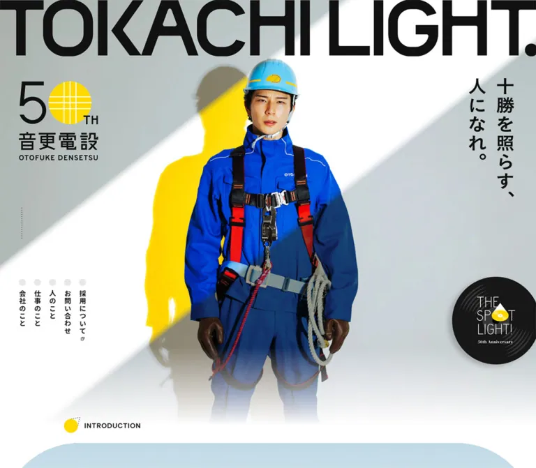
Otoden combines the scale of a campaign poster with the navigation and information structure of a corporate website. The opening places a worker in bright blue workwear beneath an enormous black TOKACHI LIGHT. wordmark. Vertical Japanese copy, a yellow anniversary emblem, and a black record-shaped link surround the portrait. On desktop, diagonal light and a yellow silhouette make the worker feel staged under a spotlight. On mobile, a different portrait sits inside an oversized yellow circle beneath a two-line wordmark.
The rest of the page softens that opening with fine-grained off-white surfaces, substantial whitespace, rounded white photo cards, and restrained black navigation. Circles connect the anniversary identity, section markers, menu buttons, and record graphics. The footer repeats the opening’s typography and vertical copy, then resolves into thin rules, ordinary company information, and a small illustrated return-to-top control.
This is a corporate homepage with recruitment and anniversary entry points. Its reusable structure should preserve company, work, people, and contact navigation alongside the more expressive brand storytelling.
How to Read This Reference
- Measured means a value appears in the supplied computed styles or element rectangles. Values are rounded for readability where appropriate.
- Source-declared means a custom property or transition was supplied. Its existence does not establish that every relevant component uses it.
- Visual estimate means a proportion or treatment was read from the original-page captures without pixel sampling.
- Recommendation means an implementation choice for a new project. The Quick Start belongs to this category.
- Named tokens are descriptive aliases unless explicitly identified as source variables.
- DOM-only observations establish content, dimensions, declarations, and link destinations. They do not prove that an element was visible or that its interaction was exercised.
The source root is 10px on desktop and 9.75px at the inspected mobile width. Consequently, one source rem is not a conventional 16px rem. The complete root-size formula was not supplied.
Some headline containers have a computed font size of 10px while displaying large graphic lettering. Several headings also have empty text strings in the extraction. Treat wordmarks and image-based copy as graphic assets; their parent font declarations do not describe the visible letterforms. Transformed and offscreen rectangles likewise should not be copied blindly as layout coordinates.
Tokens — Colors
Primary Palette
| Name | Value | Evidence | Role / implementation alias |
|---|---|---|---|
| Ink | #111111 |
Computed body text; source --color-txt |
Main typography, icons, active pagination, black hero menu; --color-ink |
| Paper | #f4f4f3 |
Computed main and footer backgrounds | Slightly warm neutral canvas beneath the visible texture; --color-paper |
| White | #ffffff |
Computed body and company/work card backgrounds | Clean cards, opening negative space, decorative footer lettering; --color-white |
| Menu Yellow | #ffd900 |
Computed circular header-button background | Small, high-visibility navigation control; --color-yellow-ui |
| Light Yellow | #ffe100 |
Source --color-main2 |
Reusable yellow matching the broader light motif; --color-yellow-light |
| Reversed Text | #f2f2f2 |
Source --color-txt3; computed anniversary-link text |
Text over the anniversary feature; --color-reversed |
| Inactive Dot | #e1e1e1 |
Computed people-pagination backgrounds | Inactive position indicators; --color-dot |
The source explicitly distinguishes #ffd900 from #ffe100. Preserve that distinction in a faithful implementation. The mobile yellow disc and desktop yellow shadow visually belong to the same yellow family, but their exact image pixels were not measured.
Supporting Colors
| Name | Value | Evidence and limits |
|---|---|---|
| Instagram caption blue | #7899b5 |
Computed color of the account handle |
| Recruitment caption green | #64a546 |
Computed color of the LINE recruitment caption |
| Muted blue | #88a5be |
Source --color-accent; application not established for every visible blue area |
| Deep blue | #366083 |
Source --color-accent6; not a measured color for the worker’s uniform |
| Pale gray | #eaeaea |
Source --color-bg7 |
| Secondary line | #d8d8d8 |
Source --color-line4 |
| Gray rule | #7b7b7b |
Source --solid: solid 1px #7b7b7b |
| Shadow color | rgba(0, 0, 0, 0.3) |
Source --color-shadow2; individual shadow recipes vary |
Blue workwear is a major photographic color, not a single verified CSS fill. The green mobile recruitment pill is also visually distinct from the muted green caption; do not assign the caption’s measured color to the pill as an exact match.
Keep most structural UI in paper, white, black, and yellow. Blue enters strongly through photography, while service-specific colors appear in social and recruitment details.
Tokens — Typography
Japanese Interface and Body Copy
- Computed family:
'Noto Sans JP', sans-serif. - Base weight:
500; important statements and vertical card titles use700. - Character: clear, relatively firm Japanese sans-serif typography, with generous leading in narrative sections.
- Source alternative stack:
--font-gothic2: YakuHanJP, 'Noto Sans JP', sans-serif. The sampled body does not include YakuHanJP in its computed stack. - Recommended alias:
--font-jp.
Do not use the 10px body inheritance as the reading-text size. Actual paragraphs override it, commonly to 16–20px on desktop and approximately 13–14px on mobile.
English Interface Labels
- Confirmed family:
'Albert Sans', sans-serif. - Confirmed roles: menu-entry English labels, social destination headings, account handles, and the mobile anniversary View more label.
- Weights: generally
700for these labels; the DOM menu heading uses500. - Tracking: examples include
0.06emon menu-entry labels and0.02emon social headings. - Recommended alias:
--font-latin.
The oversized TOKACHI LIGHT. lettering is visually a heavy sans-serif graphic. Its precise face is not established by the supplied text-element styles. Use the authorized graphic to retain its proportions.
Numeric and Editorial Accents
- People indices:
Arvo, serif, weight400, with0.1emtracking. This is a localized serif accent within an otherwise predominantly sans-serif interface. - Anniversary prose: computed
'Noto Serif', serif, weight600. Preserve the declared name; a different Japanese serif family should not be reported as the source font. - Corporate wordmark: the italic OTOFUKE DENSETSU mark is graphic identity, not ordinary body typography.
Computed font stacks confirm declarations. They do not independently prove downloaded font files or the exact fallback used for every glyph.
Type Scale
Values below are computed text styles, except where explicitly labeled otherwise.
| Role | Desktop | Mobile | Weight / tracking |
|---|---|---|---|
| Header navigation | 14px / 14px |
Desktop link row absent from the mobile capture | 500, 0.08em |
| Section-heading container | 15px / 15px |
14.625px / 14.625px |
500; child lettering may differ |
| Introduction prose | 20px / 46px |
13.65px / 30.225px |
500; 0.12em desktop, 0.08em mobile |
| About prose | 16px / 38px |
13.65px / 31.2px |
500, 0.04em |
| Statement before company/work cards | 29px / 62px |
19.5px / 39px |
700, 0.08em |
| Vertical company/work title | 22px / 22px |
17.55px / 17.55px |
700, 0.14em |
| People introduction | 18px / 35px |
12.675px / 24.375px |
500, normal tracking |
| People index | 25.043px / 25.043px |
20.475px / 20.475px |
Arvo 400, 0.1em |
| Social destination heading | 28px / 28px |
17.55px / 17.55px |
Albert Sans 700, 0.02em |
| Instagram handle | 16px / 16px |
10px / 10px |
Albert Sans 700 |
| Anniversary prose | 18px / 37px |
11.7px / 25.35px |
Noto Serif 600; 0.04em / 0.02em |
| Footer navigation | 14px / 14px |
13.65px / 13.65px |
500 desktop, 600 mobile; 0.04em |
| Mobile company address | Not included in sampled desktop styles | 11.7px / 19.5px |
400 |
The hero title occupies approximately 154px of graphic height on desktop and 136px across two lines on mobile. These are graphic/container dimensions, not measured font sizes.
Tokens — Spacing & Shapes
Spacing Strategy
The site uses several content widths rather than one universal container. The opening is full bleed. Company/work cards occupy a narrower centered region. Editorial copy has its own inset, while the desktop footer uses a wider frame.
| Use | Desktop measurement | Mobile measurement |
|---|---|---|
| Compact header logo position | 32px left, 30px top |
15.59px left, 16.56px top |
| Header circular controls | 58 × 58px |
39 × 39px |
| Introduction heading inset | Approximately 170px |
39px |
| About text width | 493px |
312px |
| Company/work grid outer inset | 170px |
29.25px |
| Company/work gap | 88px horizontally |
13.64px vertically, calculated from rectangles |
| Company/work card padding | 43px 43px 44px |
Anchor declares 0 0 19.5px; internal elements have additional offsets |
| Card English-marker gap | 18px |
13.65px |
| General section-marker gap | 18px |
10.725px |
| Social-card gap | 45px horizontally |
16.56px vertically, calculated |
| Footer principal inset | 96px |
48.75px |
Large section spacing is part of the composition. The About section has measured desktop padding of 306px above and 220px below; mobile uses 21.45px and 128.7px, with its graphic and text rearranged vertically. This is evidence of restructuring, not uniform scaling.
Shape Scale
| Element / source token | Desktop | Mobile | Evidence |
|---|---|---|---|
| Company/work card | 40px radius |
19.5px radius |
Computed element styles |
| Card photograph | Approximately 16px radius |
Not visually established | Desktop visual estimate |
| Record links and menu buttons | 50% radius |
50% radius |
Computed styles |
| Recruitment / related-site pill | Fully rounded | 1000px radius on sampled links |
Computed mobile styles |
--radius-3xs |
0.72rem = 7.2px |
0.5rem = 4.875px |
Source-declared |
--radius-2xs |
1rem = 10px |
0.5rem = 4.875px |
Source-declared |
--radius-xs2 |
2rem = 20px |
1.5rem = 14.625px |
Source-declared |
--radius-sm |
4rem = 40px |
2rem = 19.5px |
Source-declared; agrees with the large link cards |
--radius-lg |
10rem = 100px |
4rem = 39px |
Source-declared; specific application unverified |
Layout Measurements
| Element | Desktop | Mobile |
|---|---|---|
| Document height | 10123.47px |
8087.06px |
| Introduction start | y ≈ 1127.39px |
y ≈ 822.89px |
| Hero anniversary logo | 213.11 × 212.77px |
87.75 × 87.61px |
| Hero vertical-copy graphic | 120.96 × 319.08px |
24.38 × 307.86px |
| Hero record link | 236.16 × 236.14px |
112.13 × 112.11px |
| Company/work card | 506 × 579.70px |
331.5 × 237.52px |
| Desktop card header | 420 × 193px |
Different compact arrangement |
| Desktop card photo | Approximately 420 × 300px |
Image rectangle not supplied |
| Social destination card | 577.5 × 278px |
331.5 × 161.84px |
| People pagination dot | 9px |
6.8125px |
| Footer | 1440 × 913.72px |
390 × 1005.33px |
| Footer corporate wordmark | 390 × 32.06px |
283.72 × 23.31px |
These are captured dimensions, not fixed requirements for every viewport. In particular, the opening is taller than the desktop capture: setting it unconditionally to 100vh would change the observed composition.
Components
Desktop Opening Composition
Role: establish the company’s people, trade, regional identity, and anniversary theme.
The opening has six major layers:
- A full-width photographic scene with diagonal white light across a gray field.
- A centrally placed worker in vivid blue workwear, helmet, gloves, and safety equipment.
- A huge single-line TOKACHI LIGHT. graphic touching the upper edge.
- The yellow-and-black 50th-anniversary company mark at upper left.
- Vertical Japanese copy, 「十勝を照らす、人になれ。」, at upper right.
- Secondary navigation at lower left and a large black record-shaped anniversary link at lower right.
The photographed worker remains the center of gravity. Harness straps, ropes, and the helmet supply specific occupational detail. The yellow silhouette behind the worker ties the photographic scene to the identity color without recoloring the blue uniform.
The five lower-left links are narrow vertical columns, each introduced by a pale circular dot. Their measured columns are about 18px wide with 40px between successive left edges. The destinations are company, work, people, contact, and recruitment. These dots accompany navigation; they should not be interpreted as a slideshow indicator.
A dotted vertical cue ending in a small diamond appears farther up the left edge. Its scroll-related appearance is visible, but click behavior was not tested.
Mobile Opening Composition
Role: preserve the opening’s impact within a portrait screen.
The wordmark becomes two lines at approximately 16px from the left. The anniversary mark sits below it, around x = 18.5px, y = 158px. A black circular menu control occupies the open area to the right of the second wordmark line, with a measured 39px diameter.
The worker’s pose differs from the desktop image. A yellow circular field, visually estimated at roughly 540–550px in diameter, extends beyond both sides of the 390px viewport. The worker and the circular crop form one composition. The Japanese message becomes a single narrow vertical column on the right, measured at approximately 24.38 × 307.86px.
The large record link overlaps the lower-right edge of the portrait and extends slightly beyond the viewport. The introduction marker becomes visible at the very bottom of the 844px capture.
Use separate art direction for this state. Shrinking the desktop scene would lose the circle, the alternate portrait, the two-line title, and the revised control placement.
Compact Persistent Header
Role: keep navigation available deeper in the long homepage.
The compact header remains at the top of the supplied scrolled captures. Its implementation is consistent with fixed or sticky positioning; the positioning property and activation threshold were not included.
On desktop, an approximately 80 × 80px anniversary logo sits at the upper left. At upper right, a pale translucent pill contains five horizontal links, followed by a black anniversary record and a yellow circular menu button. The pill is visually about 557 × 58px. Link text is measured at 14px, with 10px vertical padding and approximately 20px between neighboring links.
On mobile, the horizontal link pill disappears. The visible scrolled header contains a smaller logo, a green LINE recruitment pill, a small record link, and a yellow menu button. The measured recruitment link is 61.20 × 40.39px; record and menu controls are 39px circles.
The desktop logo appears light over the dark photographic strip in the footer capture and dark over the light card section. Preserve contrast-aware identity variants; the exact switching mechanism was not verified. The initial hero and compact header are separate visible states, so do not overlay all of their controls at once.
Menu Content — DOM Evidence Only
A menu-content structure exists in the DOM with English/Japanese destinations for company, work, people, contact, and recruitment, plus home and social links. Sampled entry rectangles form two columns at both inspected widths.
Desktop entry rectangles are approximately 236 × 146px; mobile entries are approximately 163 × 124px. English labels use Albert Sans at 18px desktop and 13.65px mobile. Japanese secondary labels use 12px and 10px, respectively.
No open-menu capture or activation result was supplied. Overlay placement, background treatment, dismissal, focus handling, and the relationship between these entries and the menu button remain unverified. Nonzero DOM rectangles do not establish that this menu was visible in the opening capture.
Section Marker
Role: introduce editorial sections without competing with major imagery.
A yellow circle leads a small uppercase English label such as INTRODUCTION, ABOUT, COMPANY, WORK, or PEOPLE. The circle has a small dotted geometric extension, suggesting a light source or directed beam.
Desktop section-marker containers are generally 36px high with an 18px gap. Mobile containers are approximately 21.44px high with a 10.725px gap. In the company/work card capture, the yellow circle itself is visually about 33px across.
Keep the circle, dotted accent, and label as one component. A plain bullet captures only part of its character.
Introduction and About
Role: connect the electrical trade to everyday life in Tokachi.
The introduction is a long narrative section with short, deliberately broken paragraphs. Computed text is white, with 20px / 46px typography on desktop and 13.65px / 30.225px on mobile. The sampled containers are biased toward the right side of the page. Their background imagery is not shown in the supplied close-ups, so its precise content and treatment cannot be specified here.
About returns to black text. Desktop prose occupies a 493px column beginning at x = 125px, while a separate graphic sits to the right. Mobile moves the graphic above a 312px text column with 39px side insets. The paragraph uses unusually open leading: 38px desktop and 31.2px mobile.
The statement preceding the photo cards is larger and bolder. Its mobile line breaks differ from desktop. Preserve readable Japanese phrase boundaries instead of relying exclusively on incidental browser wrapping.
Company / Work Photo Link Card
Role: direct visitors into the two principal business-information areas.
The entire card is an anchor. Its desktop anatomy is:
- A white
506 × 579.70pxsurface with40pxcorners. 43pxtop and horizontal padding, and44pxbottom padding.- A
420 × 193pxheader region. - A yellow section marker and English label at the upper left.
- A bold Japanese title set vertically at the upper right.
- An approximately
420 × 300pxphotograph below the header, with smaller rounded corners. - A broad, soft shadow spreading below and to the left.
The company photograph shows an office conversation between a worker and a colleague. The work photograph shows two workers in an elevated bucket using equipment near overhead lines. These images communicate working relationships and actual work, giving the large white cards a concrete purpose.
Desktop cards sit side by side in a 1100px region with an 88px gap. On mobile they stack and become much shorter: 331.5 × 237.52px, with a 19.5px radius. The Japanese title retains a narrow right-side arrangement in the sampled geometry. No mobile card screenshot was provided, so the exact photo crop and internal image dimensions remain unverified.
The source declares a 300ms background-color transition on the anchor. The hovered color was not captured.
People Sequence — DOM Evidence Only
Role: introduce individual employees as personalities as well as workers.
The section combines a graphic, a 37 PEOPLE identity treatment, introductory copy, a profile sequence, pagination, previous/next controls, and a link to the people page.
The extracted content includes eight numbered profile entries. Each contains an index, a personality headline, repeated Latin-name text, a joining year, a Japanese name, role and hometown information, and personal questions or interests. The repeated names may support a decorative treatment, but their movement was not verified. The extraction also does not establish whether all profile details appear on the initial face, after selection, or in another state.
Offscreen entries and differing transformed rectangles support a horizontally arranged presentation. A precise visual reconstruction of the card shapes, portrait treatment, or rotation angles is not supported by the supplied screenshots.
Eight pagination buttons are present. The first is black and the others are light gray in the sampled state. Dot diameters are 9px desktop and approximately 6.81px mobile. Two additional buttons sit on opposite sides of the sequence. The displayed 37 PEOPLE label should not be confused with the eight sampled pagination positions or treated as independently verified current staffing data.
Social and Recruitment Links — DOM Evidence Only
Role: route news readers and job seekers to active communication channels.
Two large anchors lead to Instagram and a LINE recruitment destination. Each contains a small black circular NEWS treatment, an English destination heading, and supporting text. The recruitment entry also includes a compact speech-bubble message.
Desktop entries are 577.5 × 278px and sit side by side. Mobile entries are 331.5 × 161.84px and stack. The destination heading changes from Albert Sans 28px to 17.55px. Supporting account text falls to 10px on mobile, while the small recruitment bubble has a computed size of approximately 6.28px.
The links and their content are confirmed; their complete rendered surfaces and hover responses are not shown. Treat the tiny mobile message as a visual detail to improve in a new accessible implementation.
Anniversary Record Link
Role: provide a recurring entrance to THE SPOT LIGHT! anniversary content.
The black record graphic combines fine circular grooves, narrow white lettering, a yellow center, and small anniversary text. It appears as a large overlapping link in the opening and as a much smaller header utility.
The graphic carries much of the site’s personality. Preserve its internal artwork and silhouette rather than replacing it with a generic black circular button. The large hero instances have an observed circular anchor boundary and a visible shadow. Their partial clipping at the right edge is part of the captured composition, although a new implementation should keep the essential label and focus target accessible.
The linked route is /spotlight/. Nothing in the evidence establishes that the record controls audio.
Anniversary Feature — Primarily DOM Evidence
Role: give the 50th-anniversary content a substantial feature near the end of the homepage.
The whole section is a link to /spotlight/. It contains a SPECIAL CONTENTS marker, 2026 and 50th Anniversary text, a graphic title, serif prose, and a View more treatment. The end of a dark photographic area is visible above the desktop footer, but the full feature image is not included.
The section measures 1214px high on desktop and approximately 914.55px on mobile. Desktop text uses wide 96px side insets; mobile uses 39px. The mobile View more element is a roughly 142.35px circle with rgba(255, 255, 255, 0.1) fill and small white Albert Sans text.
The title graphic changes from a wide desktop rectangle to a nearly square mobile rectangle in the sampled DOM. Use separate aspect ratios or assets rather than squeezing the desktop graphic into the phone layout.
Footer
Role: repeat the brand statement, then provide a clear corporate directory and contact block.
The footer uses the measured paper background with a visible fine texture. An enormous white TOKACHI LIGHT. graphic spans its upper region. Black vertical Japanese copy sits to the left, and the italic corporate wordmark sits lower and to the right on desktop. This intentionally low-contrast white lettering functions as atmosphere; navigation and legal information remain dark.
Below the brand area, two thin horizontal rules frame the navigation. Desktop links form one row, with Instagram separated at the far right by a short vertical rule. The company name, address, telephone number, and copyright sit beneath. A white H.S.T. pill links to /s_tokachi/, and a small illustrated character marks GO TOP at the far right.
Mobile keeps the brand repetition but centers the corporate wordmark. Seven footer links stack with approximately 34.125px between successive top edges. Instagram remains to their right. A second rule separates navigation from the company details. The related-site pill and copyright stack below, while the illustrated return-to-top link stays at lower right.
The footer independently identifies the operator as 音更電設株式会社. No production-credit claim is established by the inspected original-page evidence. The H.S.T. badge is a linked graphic, not evidence of a website-production role.
Tokens — Motion & Interaction
Computed Element Transitions
| Treatment | Supplied value | What is established |
|---|---|---|
| Compact header items | 300ms width, opacity, visibility, transform |
Transition declarations; state thresholds unverified |
| Standard logo / utility links | 300ms opacity |
A fade-capable link treatment; final hover opacity not measured |
| Hero wordmark | 800ms opacity and transform, 330ms delay |
Staggered entrance declaration |
| Hero anniversary logo | 800ms, 460ms delay |
Later entrance stage |
| Hero vertical message | 800ms, 590ms delay |
Later entrance stage |
| Hero record | 800ms, 980ms delay |
Late entrance stage |
| Mobile hero menu | 600ms cubic-bezier(0.25, 0.46, 0.45, 0.94), 1110ms delay |
Transform transition declaration |
| Introduction paragraphs | 800ms opacity and transform |
Reveal-capable text; exact trigger not supplied |
| Company/work anchor | 300ms background-color |
Color-change capability; hovered fill unknown |
| Small record link | 700ms cubic-bezier(0.86, 0, 0.07, 1) transform |
Transform-capable response; target transform unknown |
| Profile headline / index | 500ms cubic-bezier(0.77, 0, 0.175, 1) opacity |
Profile-state transition declaration |
| People pagination | 300ms background-color and transform |
Position-state styling; click results not supplied |
Source-Declared Motion Tokens
| Source token | Value | Limitation |
|---|---|---|
--animation-rotate-record |
8s cubic-bezier(0.77, 0, 0.175, 1) infinite |
Named rotation recipe; applied keyframes and angular travel were not supplied |
--transition-slider-bg |
1200ms cubic-bezier(0.25, 0.46, 0.45, 0.94) |
Does not establish a slideshow interval |
--animatino-slider-zoom |
8000ms linear forwards |
Source spelling retained; affected element and scale range unverified |
--transition-modal |
760ms cubic-bezier(0.25, 0.46, 0.45, 0.94) |
Does not prove that a modal was opened |
--transition-modal-change |
700ms with the same easing |
Unexercised state change |
--transition-scale |
1300ms with the same easing |
General source recipe |
--transition-fade |
1300ms ease |
General source recipe |
--transition-hover-slow |
500ms ease |
General source recipe |
The motion vocabulary is staged fading, transformation, and long image-related transitions. Exact translation distances, slider timing, autoplay, pointer following, parallax, menu opening, and record rotation were not demonstrated through an interaction sequence.
The capture process waited for document loading, finite motion, layout stability, and visible image decoding within stated limits. Perpetual animations were paused during readiness checks and resumed afterward. These procedures improve screenshot readiness but do not prove that every delayed state or interaction was inspected.
For a new implementation, start with the confirmed short link transitions and an optional staggered opening. Add continuous animation only when it serves a clear purpose, with reduced-motion and pause behavior.
Surfaces
| Layer | Appearance | Evidence / reuse guidance |
|---|---|---|
| Opening scene | Gray photographic space, diagonal white light, yellow shadow | Visually confirmed on desktop; preserve photographic lighting |
| Mobile portrait field | Oversized yellow circle on white | Visually confirmed; exact yellow pixels unmeasured |
| Main canvas | #f4f4f3 with fine grain |
Computed base plus visible texture |
| Company/work card | White, large rounded corners, strong diffuse shadow | Confirmed desktop treatment |
| Compact navigation pill | Pale translucent rounded surface | Visually confirmed; opacity and blur implementation unmeasured |
| Record link | Black circular artwork with yellow center and shadow | Visually confirmed |
| Anniversary feature | Reversed text associated with photographic content | Computed text; only a small image portion visible |
| Footer directory | Same paper, thin dark rules | Visually confirmed |
Source shadow tokens are directional. For example, desktop --shadow4 declares drop-shadow(-15px 9px 9px rgba(0, 0, 0, 0.2)); at the inspected mobile root it becomes approximately drop-shadow(-9.75px 6.825px 6.825px rgba(0, 0, 0, 0.2)). Other declared recipes use larger offsets. Their exact association with the visible cards is not established.
The source declares --texture-size: 20rem 20rem, equivalent to 200 × 200px on desktop and 195 × 195px on mobile. This is a declared tiling size, not proof of a particular image file or blending method.
Use texture quietly enough that white cards and black rules remain crisp. Reserve the strongest shadows for the substantial cards and record artwork rather than applying identical elevation to every link.
Imagery
The imagery makes electrical infrastructure personal. The opening portrait presents the worker with the attention usually given to a performer: large scale, deliberate lighting, recognizable gear, and confident posture. Supporting images shift toward everyday collaboration and work in progress.
Observed Asset Roles
No original image-file URLs were supplied. The following are asset requirements inferred from visible artwork, not downloadable path references.
| Asset role | Observed content | Implementation guidance |
|---|---|---|
| Desktop hero photograph | Front-facing worker, blue uniform, harness, helmet, diagonal light, yellow silhouette | Preserve the lighting and surrounding negative space |
| Mobile hero photograph | Different worker pose looking upward, composed within a yellow disc | Provide a separate crop or art-directed asset |
| TOKACHI LIGHT. graphic | Wide desktop lockup, two-line mobile lockup, white footer variants | Preserve letterforms and breakpoint-specific proportions |
| Anniversary company mark | 50th identity with a yellow circular grid motif | Use authorized artwork with an accessible company label |
| Company card photo | Workplace conversation | Crop for both participants and the relationship between them |
| Work card photo | Two workers in an elevated bucket with tools | Keep equipment, people, and overhead context legible |
| Record artwork | Black grooves, thin white typography, yellow center | Retain as artwork; avoid generic disc substitution |
| Corporate wordmark | Italic OTOFUKE DENSETSU lettering and emblem | Preserve aspect ratio |
| Footer character | Small illustrated figure above GO TOP | Keep the character as the return-to-top affordance |
| Background texture | Fine neutral grain | Use an approved subtle texture; file and compositing method unknown |
Do not apply pixelated rendering to these photographs or logos. Clean image decoding and sufficient resolution matter. Keep faces and work equipment sharp while allowing the background grain to remain subtle.
For a new project, commission or select photography that preserves occupational specificity. Generic office stock photography would not carry the same identity. Separate essential text from decorative artwork where possible, and provide accessible equivalents for image-based Japanese copy.
Layout & Responsive Behavior
Confirmed Changes
| Area | Desktop | Mobile |
|---|---|---|
| Hero wordmark | Single very wide line | Two lines |
| Hero image | Full scene with diagonal light and shadow | Alternate portrait in an oversized yellow circle |
| Hero copy | Two-column vertical graphic | One narrow vertical column |
| Opening navigation | Five vertical links at lower left | Those links absent; black menu control near the title |
| Compact header | Horizontal navigation pill, record, menu | Recruitment pill, record, menu |
| About | Text left, separate graphic right | Graphic above text |
| Company/work links | Two tall cards | Two compact stacked cards |
| People introduction | Graphic and text in separate horizontal regions | Graphic above centered heading and copy |
| Social links | Two columns | One column |
| Anniversary title graphic | Wide rectangle | Nearly square rectangle |
| Footer directory | Horizontal links and distributed information | Stacked links and company information |
The source declares --mqDown-md: 767 and other breakpoint tokens, but the complete media-query rules were not supplied. The Quick Start adopts 767px as a recommended implementation boundary; behavior at widths between the two inspected viewports remains untested.
Mobile content insets vary by purpose: 39px for much editorial copy, 29.25px for cards, and 48.75px for the footer. These correspond to 10%, 7.5%, and 12.5% of the captured width. Preserve this hierarchy rather than forcing every component into the same horizontal gutter.
Although content wraps more on mobile, the document becomes shorter overall because major graphic sections and cards are compressed. The footer becomes taller, increasing from about 914px to 1005px. Responsive behavior is therefore section-specific.
For implementation, clip decorative overflow within the hero or graphic wrapper. Do not hide overflow on the entire document merely to conceal an incorrectly sized carousel or menu. Essential navigation and focus outlines should remain reachable.
Do’s and Don’ts
Do
- Make the worker portrait and actual electrical-work equipment central to the identity.
- Preserve the relationship between black typography, yellow light, blue workwear, and off-white paper.
- Use separate desktop and mobile hero compositions.
- Keep vertical Japanese copy as a deliberate spatial element with readable text alternatives.
- Retain the distinction between the anniversary logo, corporate wordmark, and TOKACHI LIGHT. graphic.
- Use generous desktop card padding, a tall header area, rounded photos, and diffuse directional shadows.
- Preserve the smaller dotted yellow section marker throughout the page.
- Keep corporate navigation, recruitment, people, and anniversary destinations distinct.
- Repeat the identity in the footer while keeping directory and contact information simple.
- Treat captured values, source tokens, visual estimates, and new implementation choices as different evidence classes.
Don’t
- Don’t replace the corporate information structure with a single conversion funnel.
- Don’t reduce the mobile layout to a scaled desktop screenshot.
- Don’t infer the hero font from its 10px parent container.
- Don’t replace the worker portraits with generic office imagery.
- Don’t flatten every surface into shadowless rectangles or give every utility link a heavy card shadow.
- Don’t turn the yellow accent into a large collection of unrelated button colors.
- Don’t interpret the hero navigation dots as slider pagination.
- Don’t assume the record graphic plays music.
- Don’t report menu, carousel, modal, or hover behavior as tested when only declarations are available.
- Don’t invent asset filenames, production credits, or exact colors sampled from photographs.
- Don’t use low-contrast decorative footer lettering as the sole accessible company identity.
- Don’t copy source
remvalues into a project with a 16px root without conversion.
Recommended Implementation Additions
These are recommendations for a new implementation, not verified features or audit conclusions about the original website.
- Give the image-based company heading an accessible name and provide a text equivalent for the vertical hero message.
- Use real anchors for destination cards and record links. Give icon-only menu, social, and return-to-top controls descriptive accessible names.
- Expand the hit areas around the observed 39px mobile controls and tiny pagination dots. Aim for at least 44px touch targets without enlarging the visible dot artwork.
- Implement menu expanded state, focus management, Escape dismissal, and appropriate background inertness. Keep unshown menu content outside the active tab order.
- If the people sequence advances automatically, provide pause and manual navigation. Announce changes without repeatedly reading decorative name copies.
- Hide duplicate decorative lettering from assistive technology while retaining one meaningful accessible name.
- Use
prefers-reduced-motionto remove continuous rotation and large transformations. Content should remain visible when enhancement scripts fail. - Increase very small supporting mobile text where practical, especially the recruitment bubble and social captions. Check their contrast on the actual rendered background.
- Use separate mobile and desktop image sources, explicit dimensions, and responsive image sizes. Prioritize the opening portrait; defer lower-page photography.
- Keep text-based contact information selectable. A telephone link can be added as a usability enhancement; its presence was not established by the supplied link list.
- Test the compact header over both light and dark content, as well as at intermediate widths and enlarged text settings.
Agent Prompt Guide
Quick Color Reference
- Main text and linework:
#111111. - Main neutral canvas:
#f4f4f3. - Cards and clean negative space:
#ffffff. - Measured yellow menu fill:
#ffd900. - Source secondary yellow:
#ffe100. - Anniversary reversed text:
#f2f2f2. - Blue belongs primarily to worker photography; do not force it into one invented exact uniform-color token.
- Surface texture is fine and quiet. Card shadows are diffuse and directional.
Overall Prompt
“Create a Japanese electrical-contractor corporate homepage with the visual confidence of a worker portrait poster. Use a near-black and yellow identity on fine-grained off-white paper, with vivid blue workwear in the photographs. Build a desktop opening around a central worker, diagonal light, an oversized single-line wordmark graphic, a 50th-anniversary mark, vertical Japanese copy, narrow vertical navigation, and an overlapping black record-shaped anniversary link. Give mobile its own two-line wordmark and alternate portrait inside an oversized yellow disc. Follow with spacious narrative sections, rounded company/work photo links, people content, social recruitment links, an anniversary feature, and a ruled corporate footer. Use Noto Sans JP for confirmed Japanese UI roles and Albert Sans for confirmed English utility roles. Treat the large wordmarks as supplied artwork.”
Example Component Prompts
- Company/work card: “Create an entire-card link on a white surface with 40px desktop corners, 43px insets, a yellow dotted section marker at upper left, a bold vertical Japanese title at upper right, and a 7:5 workplace photograph below a tall header area. Add a broad soft shadow. Use two 506px cards with an 88px gap at the 1440px reference width. On mobile, switch to compact stacked cards with about 20px corners; verify the photo arrangement separately.”
- Mobile opening: “Compose a 390px-wide worker portrait poster with a two-line black wordmark at the top, a small anniversary logo below left, and one narrow vertical Japanese message on the right. Place an alternate worker photograph over a yellow circle approximately 140% of viewport width. Overlap the circle’s lower-right edge with a black anniversary record link. Preserve the portrait’s face, helmet, and safety harness.”
- Compact header: “Create a floating corporate header with an anniversary logo at left and a pale rounded navigation pill at right, followed by two circular controls. On mobile, replace the link row with a compact recruitment pill while retaining the record and menu controls. Provide contrast-aware logo variants and accessible names. Header activation and menu behavior are implementation decisions, not verified source interactions.”
- Footer: “Use a textured off-white footer with a very large decorative white wordmark, black vertical Japanese copy, and an italic corporate logo. Separate the navigation and company information using fine horizontal rules. Place Instagram in a side slot and a small illustrated GO TOP link at lower right. Stack the directory on mobile while keeping the company details readable.”
- Motion adaptation: “Use 300ms link feedback and optional 800ms opacity/transform entrances with short staggered delays. Preserve content visibility without JavaScript. Continuous record motion is optional and must have reduced-motion handling. Do not invent autoplay, audio, parallax, or modal behavior from the visual reference.”
Quick Start
CSS Custom Properties
This is an implementation scaffold, not extracted production CSS. It uses conventional document sizing and reproduces selected desktop/mobile anchors without claiming to recover the unknown root-size formula. Hero artwork, logos, photography, texture files, menu logic, and carousel behavior must be supplied separately.
The desktop hero image should contain the intended light-and-shadow scene. The mobile source should be prepared for the circular composition. Use responsive picture sources for both the portrait and wordmark graphics. The optional shadow, hover fill, mobile photo ratio, and breakpoint behavior below are recommendations.
:root {
  /* Measured colors and explicitly declared source yellow */
  --color-ink: #111111;
  --color-paper: #f4f4f3;
  --color-white: #ffffff;
  --color-yellow-ui: #ffd900;
  --color-yellow-light: #ffe100;
  --color-reversed: #f2f2f2;
  --color-dot: #e1e1e1;

  /* Confirmed family declarations; load approved font files separately */
  --font-jp: 'Noto Sans JP', sans-serif;
  --font-latin: 'Albert Sans', sans-serif;
  --font-index: 'Arvo', serif;
  --font-feature: 'Noto Serif', serif;

  --radius-card: 40px;
  --radius-photo: 16px;
  --control-size: 58px;
  --marker-size: 33px;
  --marker-gap: 18px;
  --card-gap: 88px;
  --footer-width: 1248px;

  /* Recommended approximation of the visible card shadow */
  --shadow-card: -15px 18px 28px rgb(0 0 0 / 22%);

  /* Timings supported by the supplied declarations */
  --motion-link: 300ms;
  --motion-reveal: 800ms;
  --ease-out: cubic-bezier(0.25, 0.46, 0.45, 0.94);
}

.otoden-page,
.otoden-page * {
  box-sizing: border-box;
}

.otoden-page {
  margin: 0;
  color: var(--color-ink);
  background: var(--color-paper);
  font-family: var(--font-jp);
  font-size: 16px;
  font-weight: 500;
  line-height: 1.8;
}

.otoden-page img {
  display: block;
  max-width: 100%;
  height: auto;
}

.otoden-page a {
  color: inherit;
}

.otoden-page :focus-visible {
  outline: 3px solid var(--color-ink);
  outline-offset: 5px;
}

/* Supply a prepared texture through this optional custom property. */
.paper-surface {
  background-color: var(--color-paper);
  background-image: var(--paper-texture, none);
  background-size: 200px 200px;
}

/* Toggle the native hidden attribute through application state. */
.site-header {
  position: fixed;
  z-index: 50;
  inset: 30px 32px auto;
  display: flex;
  justify-content: space-between;
  align-items: flex-start;
  gap: 24px;
  pointer-events: none;
}

.site-header[hidden] {
  display: none;
}

.site-header a,
.site-header button {
  pointer-events: auto;
}

.site-header__brand {
  display: block;
  width: 80px;
  flex: 0 0 auto;
}

.site-header__tools {
  display: flex;
  align-items: center;
  gap: 11px;
}

.site-header__nav {
  display: flex;
  align-items: center;
  gap: 20px;
  padding: 12px 34px 12px 38px;
  border-radius: 999px;
  background: rgb(255 255 255 / 72%);
}

.site-header__nav a {
  padding-block: 10px;
  font-size: 14px;
  line-height: 1;
  letter-spacing: 0.08em;
  text-decoration: none;
  white-space: nowrap;
  transition: opacity var(--motion-link);
}

.site-header__recruit {
  display: none;
}

.circle-control {
  display: grid;
  place-items: center;
  flex: 0 0 auto;
  width: var(--control-size);
  height: var(--control-size);
  padding: 0;
  border: 0;
  border-radius: 50%;
  color: var(--color-ink);
  background: var(--color-yellow-ui);
  cursor: pointer;
}

.circle-control__lines {
  width: 100%;
  height: 18px;
  border-block: 1px solid var(--color-white);
  position: relative;
}

.circle-control__lines::after {
  content: '';
  position: absolute;
  inset: 50% 0 auto;
  border-top: 1px solid var(--color-white);
}

/* Graphic children require authorized image or vector artwork. */
.hero {
  position: relative;
  isolation: isolate;
  aspect-ratio: 1440 / 1127.39;
  min-height: 720px;
  overflow: hidden;
  background: var(--color-white);
}

.hero__scene {
  position: absolute;
  z-index: -1;
  inset: 0;
}

.hero__scene picture,
.hero__scene img {
  display: block;
  width: 100%;
  height: 100%;
}

.hero__scene img {
  object-fit: cover;
}

.hero__wordmark {
  position: absolute;
  inset: 0 auto auto 50%;
  width: 100.67%;
  transform: translateX(-50%);
}

.hero__logo {
  position: absolute;
  top: 19.33%;
  left: 3.533%;
  width: 14.8%;
  margin: 0;
}

.hero__tagline {
  position: absolute;
  top: 18.65%;
  right: 4.13%;
  width: 8.4%;
  margin: 0;
}

.hero__record {
  position: absolute;
  top: 65%;
  right: -0.733%;
  width: 16.4%;
  aspect-ratio: 1;
  border-radius: 50%;
  filter: drop-shadow(-8px 10px 9px rgb(0 0 0 / 20%));
}

.hero__nav {
  position: absolute;
  top: 65.7%;
  left: 3.533%;
  display: flex;
  gap: 22px;
}

.hero__nav a {
  display: flex;
  flex-direction: column;
  align-items: center;
  gap: 11px;
  text-decoration: none;
}

.hero__nav a::before {
  content: '';
  width: 18px;
  height: 18px;
  border-radius: 50%;
  background: #e8e8e8;
}

.hero__nav span {
  writing-mode: vertical-rl;
  font-size: 18px;
  font-weight: 700;
  line-height: 1;
  letter-spacing: 0.1em;
}

.hero__menu {
  display: none;
}

.section-label {
  display: flex;
  align-items: center;
  gap: var(--marker-gap);
  margin: 0;
  font-family: var(--font-latin);
  font-size: 18px;
  font-weight: 700;
  line-height: 1.2;
  letter-spacing: 0.04em;
  text-transform: uppercase;
}

/* Simplified geometric marker; use the original graphic if available. */
.section-label::before {
  content: '';
  flex: 0 0 auto;
  width: var(--marker-size);
  height: var(--marker-size);
  border-radius: 50%;
  background: var(--color-yellow-ui);
  outline: 1px dotted rgb(17 17 17 / 45%);
  outline-offset: 3px;
}

.editorial-copy {
  max-width: 493px;
  font-size: 16px;
  line-height: 2.375;
  letter-spacing: 0.04em;
}

.portal-grid {
  display: grid;
  grid-template-columns: repeat(2, minmax(0, 1fr));
  gap: var(--card-gap);
  width: min(1100px, calc(100% - 64px));
  margin-inline: auto;
}

.portal-card {
  position: relative;
  display: block;
  min-width: 0;
  padding: 43px 43px 44px;
  border-radius: var(--radius-card);
  color: var(--color-ink);
  background: var(--color-white);
  box-shadow: var(--shadow-card);
  text-decoration: none;
  transition: background-color var(--motion-link);
}

.portal-card__header {
  display: flex;
  justify-content: space-between;
  align-items: flex-start;
  min-height: 193px;
}

.portal-card__header .section-label {
  margin-top: 6px;
}

.portal-card__title {
  margin: 0;
  writing-mode: vertical-rl;
  font-size: 22px;
  font-weight: 700;
  line-height: 1;
  letter-spacing: 0.14em;
}

.portal-card__media {
  margin: 0;
  aspect-ratio: 7 / 5;
  overflow: hidden;
  border-radius: var(--radius-photo);
}

.portal-card__media img {
  width: 100%;
  height: 100%;
  object-fit: cover;
}

.social-grid {
  display: grid;
  grid-template-columns: repeat(2, minmax(0, 1fr));
  gap: 45px;
  width: min(1200px, calc(100% - 64px));
  margin-inline: auto;
}

/* The original social-card surface was not visually established. */
.social-link {
  display: flex;
  align-items: center;
  min-height: 278px;
  padding: 40px 70px;
  text-decoration: none;
}

.social-link__title {
  font-family: var(--font-latin);
  font-size: 28px;
  font-weight: 700;
  line-height: 1;
  letter-spacing: 0.02em;
}

.site-footer {
  padding-block: 84px 82px;
}

.site-footer__inner {
  width: min(var(--footer-width), calc(100% - 64px));
  margin-inline: auto;
}

.site-footer__brand-stage {
  position: relative;
  min-height: 460px;
}

.site-footer__wordmark {
  width: 100%;
}

.site-footer__corporate-mark {
  position: absolute;
  right: 3px;
  bottom: 150px;
  width: 390px;
  max-width: 100%;
}

.site-footer__nav {
  display: grid;
  grid-template-columns: minmax(0, 1fr) auto;
  align-items: center;
  gap: 24px;
  padding-block: 60px;
  border-block: 1px solid var(--color-ink);
}

.site-footer__links {
  display: flex;
  flex-wrap: wrap;
  gap: 18px;
  margin: 0;
  padding: 0;
  list-style: none;
}

.site-footer__links a {
  font-size: 14px;
  line-height: 1;
  letter-spacing: 0.04em;
  text-decoration: none;
}

.site-footer__social {
  display: grid;
  place-items: center;
  min-width: 74px;
  min-height: 45px;
  border-left: 1px solid var(--color-ink);
}

.site-footer__details {
  display: flex;
  justify-content: space-between;
  align-items: flex-end;
  gap: 32px;
  margin-top: 60px;
}

/* Recommended feedback; the source hover endpoints were not captured. */
@media (hover: hover) {
  .site-header__nav a:hover {
    opacity: 0.55;
  }

  .portal-card:hover {
    background: #fffbed;
  }
}

/* A content-visible default avoids dependence on reveal JavaScript. */
.reveal {
  opacity: 1;
  transform: none;
  transition:
    opacity var(--motion-reveal),
    transform var(--motion-reveal);
}

@media (max-width: 767px) {
  :root {
    --radius-card: 19.5px;
    --radius-photo: 12px;
    --control-size: 39px;
    --marker-size: 21.45px;
    --marker-gap: 13.65px;
    --card-gap: 13.65px;
  }

  .paper-surface {
    background-size: 195px 195px;
  }

  .site-header {
    inset: 15.6px 13.65px auto 15.6px;
    gap: 12px;
  }

  .site-header__brand {
    width: 62.4px;
  }

  .site-header__tools {
    gap: 6px;
  }

  .site-header__nav {
    display: none;
  }

  .site-header__recruit {
    display: block;
    width: 61.2px;
    border-radius: 999px;
  }

  .hero {
    aspect-ratio: 390 / 822.89;
    min-height: 0;
  }

  .hero__scene {
    inset: 55vw auto auto 50%;
    width: 140vw;
    height: 140vw;
    overflow: hidden;
    border-radius: 50%;
    background: var(--color-yellow-light);
    transform: translateX(-50%);
  }

  .hero__wordmark {
    top: 8.8px;
    width: calc(100% - 32px);
  }

  .hero__logo {
    top: 40.5vw;
    left: 4.75%;
    width: 22.5%;
  }

  .hero__tagline {
    top: 42vw;
    right: 5.75%;
    width: 6.25%;
  }

  .hero__record {
    top: 82%;
    right: -2.5%;
    width: 28.75%;
  }

  .hero__nav {
    display: none;
  }

  .hero__menu {
    position: absolute;
    top: 24vw;
    right: 3.5%;
    display: grid;
    background: var(--color-ink);
  }

  .section-label {
    font-size: 13.65px;
  }

  .editorial-copy {
    width: 80%;
    max-width: none;
    margin-inline: auto;
    font-size: 13.65px;
    line-height: 2.2857;
  }

  .portal-grid {
    grid-template-columns: 1fr;
    width: 85%;
  }

  /* Recommended compact arrangement; mobile image geometry is unverified. */
  .portal-card {
    padding: 24.375px 77.025px 19.5px 22.425px;
  }

  .portal-card__header {
    display: block;
    min-height: 21.45px;
  }

  .portal-card__header .section-label {
    margin-top: 0;
  }

  .portal-card__title {
    position: absolute;
    top: 27.3px;
    right: 28px;
    font-size: 17.55px;
  }

  .portal-card__media {
    margin-top: 19.5px;
    aspect-ratio: 3 / 2;
  }

  .social-grid {
    grid-template-columns: 1fr;
    gap: 16.56px;
    width: 85%;
  }

  .social-link {
    min-height: 161.84px;
    padding: 28px 32px;
  }

  .social-link__title {
    font-size: 17.55px;
  }

  .site-footer {
    padding-block: 64.35px 70.2px;
  }

  .site-footer__inner {
    width: 75%;
  }

  .site-footer__brand-stage {
    min-height: 325px;
  }

  .site-footer__corporate-mark {
    right: 1.5%;
    bottom: 35px;
    width: 97%;
  }

  .site-footer__nav {
    align-items: start;
    gap: 16px;
    padding-block: 40px 48px;
  }

  .site-footer__links {
    flex-direction: column;
    align-items: flex-start;
    gap: 20.475px;
  }

  .site-footer__links a {
    font-size: 13.65px;
    font-weight: 600;
  }

  .site-footer__social {
    min-width: 50px;
    min-height: 33px;
  }

  .site-footer__details {
    flex-direction: column;
    align-items: flex-start;
    margin-top: 46px;
  }
}

@media (prefers-reduced-motion: reduce) {
  .otoden-page *,
  .otoden-page *::before,
  .otoden-page *::after {
    animation: none !important;
    transition: none !important;
    scroll-behavior: auto !important;
  }

  .reveal {
    opacity: 1 !important;
    transform: none !important;
  }
}
Component Markup
This minimal card demonstrates the CSS anatomy. Insert an authorized photograph into the reserved media region; no original asset path was supplied. The linked company route is present in the inspected homepage evidence.
<a class='portal-card' href='/company/'>
  <header class='portal-card__header'>
    <p class='section-label'>Company</p>
    <h3 class='portal-card__title' lang='ja'>会社のこと</h3>
  </header>
  <figure class='portal-card__media'>
    <!-- Insert an authorized image with meaningful alternative text. -->
  </figure>
</a>
For the hero, provide .hero__scene > picture > img, a responsive .hero__wordmark graphic, .hero__logo, .hero__tagline, and a linked .hero__record. Keep accessible text in the document even when the visible treatment uses graphics. The starter intentionally leaves interactive state logic to the host application.
Tailwind v4 Token Mapping
Optional aliases for a project already using Tailwind v4. This does not identify the original site’s framework. Define the properties above first.
@theme inline {
  --color-paper: #f4f4f3;
  --color-ink: #111111;
  --color-light-yellow: #ffe100;
  --color-menu-yellow: #ffd900;
  --color-reversed: #f2f2f2;

  --font-japanese: 'Noto Sans JP', sans-serif;
  --font-latin: 'Albert Sans', sans-serif;
  --font-index: 'Arvo', serif;
  --font-feature: 'Noto Serif', serif;

  --radius-portal: var(--radius-card);
  --radius-photograph: var(--radius-photo);
  --spacing-control: var(--control-size);
  --spacing-portal-gap: var(--card-gap);
  --shadow-portal: var(--shadow-card);
}
Sources & Evidence
- Inspected original page: 音更電設株式会社. The supplied record reports HTTP 200 and the same original and final URL.
- Capture timestamp: September 12, 2026,
11:19:18.288Z, equivalent to20:19:18.288JST. - Desktop evidence: 1440 × 1000 CSS-pixel viewport; opening, company/work-card region, and footer captures; rendered document height approximately
10123.47px. - Mobile evidence: 390 × 844 CSS-pixel viewport; opening and footer captures; rendered document height approximately
8087.06px. - Computed evidence: element rectangles, text, anchor destinations, font declarations, colors, spacing, radii, transitions, and a supplied subset of custom properties at both widths.
- Original-page destinations observed in anchors:
/company/,/work/,/people/,/contact/,/spotlight/,/s_tokachi/, and/#document-top, plus social and recruitment links. These destinations were identified from the homepage; their pages were not inspected. - Capture preparation: initial observation of at least five seconds, bounded waits for loading and finite motion, sampled layout/text stability, and visible-image decoding. Intermediate scroll positions were traversed. SharedWorkers and service workers were disabled during inspection.
- Interaction limits: no supplied click-through results, open-menu capture, verified hover endpoints, carousel operation, audio playback, or modal sequence. CSS declarations establish available transitions, not complete interaction behavior.
- Analysis limits: no additional browsing, command execution, file access, image-file retrieval, font-file verification, or CSS execution was performed for this reference. The Quick Start is an untested adaptation and requires integration with authorized assets and application behavior.
This reference describes the current homepage represented by the supplied original-page captures and DOM evidence. Visual estimates and implementation recommendations are explicitly separated from measured source values.
# Otoden / TOKACHI LIGHT. — Style Reference

> An electrical contractor presented through worker portraits, yellow light, and the visual language of a record sleeve.

**Website:** [otoden.co.jp](https://www.otoden.co.jp/)
**Original URL:** https://www.otoden.co.jp/
**Final URL:** https://www.otoden.co.jp/
**Theme:** predominantly light, with photographic sections and reversed text; no selectable theme was verified.
**Inspected:** September 12, 2026, at 11:19:18 UTC / 20:19:18 JST, according to the supplied capture record.
**Viewports:** 1440 × 1000 desktop and 390 × 844 mobile, in CSS pixels.
**Scope:** the current corporate homepage: opening identity composition, introduction, company overview, company/work links, people sequence, social and recruitment links, anniversary feature, and footer. Visual captures cover the desktop opening, company/work cards, desktop footer, mobile opening, and mobile footer. Other sections have rendered DOM and computed-style evidence, but no supplied visual close-up. Linked pages and external destinations were not inspected.

Otoden combines the scale of a campaign poster with the navigation and information structure of a corporate website. The opening places a worker in bright blue workwear beneath an enormous black TOKACHI LIGHT. wordmark. Vertical Japanese copy, a yellow anniversary emblem, and a black record-shaped link surround the portrait. On desktop, diagonal light and a yellow silhouette make the worker feel staged under a spotlight. On mobile, a different portrait sits inside an oversized yellow circle beneath a two-line wordmark.

The rest of the page softens that opening with fine-grained off-white surfaces, substantial whitespace, rounded white photo cards, and restrained black navigation. Circles connect the anniversary identity, section markers, menu buttons, and record graphics. The footer repeats the opening’s typography and vertical copy, then resolves into thin rules, ordinary company information, and a small illustrated return-to-top control.

This is a corporate homepage with recruitment and anniversary entry points. Its reusable structure should preserve company, work, people, and contact navigation alongside the more expressive brand storytelling.

## How to Read This Reference

- **Measured** means a value appears in the supplied computed styles or element rectangles. Values are rounded for readability where appropriate.
- **Source-declared** means a custom property or transition was supplied. Its existence does not establish that every relevant component uses it.
- **Visual estimate** means a proportion or treatment was read from the original-page captures without pixel sampling.
- **Recommendation** means an implementation choice for a new project. The Quick Start belongs to this category.
- **Named tokens** are descriptive aliases unless explicitly identified as source variables.
- **DOM-only observations** establish content, dimensions, declarations, and link destinations. They do not prove that an element was visible or that its interaction was exercised.

The source root is **10px on desktop** and **9.75px at the inspected mobile width**. Consequently, one source `rem` is not a conventional 16px rem. The complete root-size formula was not supplied.

Some headline containers have a computed font size of 10px while displaying large graphic lettering. Several headings also have empty text strings in the extraction. Treat wordmarks and image-based copy as graphic assets; their parent font declarations do not describe the visible letterforms. Transformed and offscreen rectangles likewise should not be copied blindly as layout coordinates.

## Tokens — Colors

### Primary Palette

| Name | Value | Evidence | Role / implementation alias |
| --- | --- | --- | --- |
| Ink | `#111111` | Computed body text; source `--color-txt` | Main typography, icons, active pagination, black hero menu; `--color-ink` |
| Paper | `#f4f4f3` | Computed main and footer backgrounds | Slightly warm neutral canvas beneath the visible texture; `--color-paper` |
| White | `#ffffff` | Computed body and company/work card backgrounds | Clean cards, opening negative space, decorative footer lettering; `--color-white` |
| Menu Yellow | `#ffd900` | Computed circular header-button background | Small, high-visibility navigation control; `--color-yellow-ui` |
| Light Yellow | `#ffe100` | Source `--color-main2` | Reusable yellow matching the broader light motif; `--color-yellow-light` |
| Reversed Text | `#f2f2f2` | Source `--color-txt3`; computed anniversary-link text | Text over the anniversary feature; `--color-reversed` |
| Inactive Dot | `#e1e1e1` | Computed people-pagination backgrounds | Inactive position indicators; `--color-dot` |

The source explicitly distinguishes `#ffd900` from `#ffe100`. Preserve that distinction in a faithful implementation. The mobile yellow disc and desktop yellow shadow visually belong to the same yellow family, but their exact image pixels were not measured.

### Supporting Colors

| Name | Value | Evidence and limits |
| --- | --- | --- |
| Instagram caption blue | `#7899b5` | Computed color of the account handle |
| Recruitment caption green | `#64a546` | Computed color of the LINE recruitment caption |
| Muted blue | `#88a5be` | Source `--color-accent`; application not established for every visible blue area |
| Deep blue | `#366083` | Source `--color-accent6`; not a measured color for the worker’s uniform |
| Pale gray | `#eaeaea` | Source `--color-bg7` |
| Secondary line | `#d8d8d8` | Source `--color-line4` |
| Gray rule | `#7b7b7b` | Source `--solid: solid 1px #7b7b7b` |
| Shadow color | `rgba(0, 0, 0, 0.3)` | Source `--color-shadow2`; individual shadow recipes vary |

Blue workwear is a major photographic color, not a single verified CSS fill. The green mobile recruitment pill is also visually distinct from the muted green caption; do not assign the caption’s measured color to the pill as an exact match.

Keep most structural UI in paper, white, black, and yellow. Blue enters strongly through photography, while service-specific colors appear in social and recruitment details.

## Tokens — Typography

### Japanese Interface and Body Copy

- **Computed family:** `'Noto Sans JP', sans-serif`.
- **Base weight:** `500`; important statements and vertical card titles use `700`.
- **Character:** clear, relatively firm Japanese sans-serif typography, with generous leading in narrative sections.
- **Source alternative stack:** `--font-gothic2: YakuHanJP, 'Noto Sans JP', sans-serif`. The sampled body does not include YakuHanJP in its computed stack.
- **Recommended alias:** `--font-jp`.

Do not use the 10px body inheritance as the reading-text size. Actual paragraphs override it, commonly to 16–20px on desktop and approximately 13–14px on mobile.

### English Interface Labels

- **Confirmed family:** `'Albert Sans', sans-serif`.
- **Confirmed roles:** menu-entry English labels, social destination headings, account handles, and the mobile anniversary View more label.
- **Weights:** generally `700` for these labels; the DOM menu heading uses `500`.
- **Tracking:** examples include `0.06em` on menu-entry labels and `0.02em` on social headings.
- **Recommended alias:** `--font-latin`.

The oversized TOKACHI LIGHT. lettering is visually a heavy sans-serif graphic. Its precise face is not established by the supplied text-element styles. Use the authorized graphic to retain its proportions.

### Numeric and Editorial Accents

- **People indices:** `Arvo, serif`, weight `400`, with `0.1em` tracking. This is a localized serif accent within an otherwise predominantly sans-serif interface.
- **Anniversary prose:** computed `'Noto Serif', serif`, weight `600`. Preserve the declared name; a different Japanese serif family should not be reported as the source font.
- **Corporate wordmark:** the italic OTOFUKE DENSETSU mark is graphic identity, not ordinary body typography.

Computed font stacks confirm declarations. They do not independently prove downloaded font files or the exact fallback used for every glyph.

### Type Scale

Values below are computed text styles, except where explicitly labeled otherwise.

| Role | Desktop | Mobile | Weight / tracking |
| --- | --- | --- | --- |
| Header navigation | `14px / 14px` | Desktop link row absent from the mobile capture | `500`, `0.08em` |
| Section-heading container | `15px / 15px` | `14.625px / 14.625px` | `500`; child lettering may differ |
| Introduction prose | `20px / 46px` | `13.65px / 30.225px` | `500`; `0.12em` desktop, `0.08em` mobile |
| About prose | `16px / 38px` | `13.65px / 31.2px` | `500`, `0.04em` |
| Statement before company/work cards | `29px / 62px` | `19.5px / 39px` | `700`, `0.08em` |
| Vertical company/work title | `22px / 22px` | `17.55px / 17.55px` | `700`, `0.14em` |
| People introduction | `18px / 35px` | `12.675px / 24.375px` | `500`, normal tracking |
| People index | `25.043px / 25.043px` | `20.475px / 20.475px` | Arvo `400`, `0.1em` |
| Social destination heading | `28px / 28px` | `17.55px / 17.55px` | Albert Sans `700`, `0.02em` |
| Instagram handle | `16px / 16px` | `10px / 10px` | Albert Sans `700` |
| Anniversary prose | `18px / 37px` | `11.7px / 25.35px` | Noto Serif `600`; `0.04em` / `0.02em` |
| Footer navigation | `14px / 14px` | `13.65px / 13.65px` | `500` desktop, `600` mobile; `0.04em` |
| Mobile company address | Not included in sampled desktop styles | `11.7px / 19.5px` | `400` |

The hero title occupies approximately 154px of graphic height on desktop and 136px across two lines on mobile. These are graphic/container dimensions, not measured font sizes.

## Tokens — Spacing & Shapes

### Spacing Strategy

The site uses several content widths rather than one universal container. The opening is full bleed. Company/work cards occupy a narrower centered region. Editorial copy has its own inset, while the desktop footer uses a wider frame.

| Use | Desktop measurement | Mobile measurement |
| --- | --- | --- |
| Compact header logo position | `32px` left, `30px` top | `15.59px` left, `16.56px` top |
| Header circular controls | `58 × 58px` | `39 × 39px` |
| Introduction heading inset | Approximately `170px` | `39px` |
| About text width | `493px` | `312px` |
| Company/work grid outer inset | `170px` | `29.25px` |
| Company/work gap | `88px` horizontally | `13.64px` vertically, calculated from rectangles |
| Company/work card padding | `43px 43px 44px` | Anchor declares `0 0 19.5px`; internal elements have additional offsets |
| Card English-marker gap | `18px` | `13.65px` |
| General section-marker gap | `18px` | `10.725px` |
| Social-card gap | `45px` horizontally | `16.56px` vertically, calculated |
| Footer principal inset | `96px` | `48.75px` |

Large section spacing is part of the composition. The About section has measured desktop padding of `306px` above and `220px` below; mobile uses `21.45px` and `128.7px`, with its graphic and text rearranged vertically. This is evidence of restructuring, not uniform scaling.

### Shape Scale

| Element / source token | Desktop | Mobile | Evidence |
| --- | --- | --- | --- |
| Company/work card | `40px` radius | `19.5px` radius | Computed element styles |
| Card photograph | Approximately `16px` radius | Not visually established | Desktop visual estimate |
| Record links and menu buttons | `50%` radius | `50%` radius | Computed styles |
| Recruitment / related-site pill | Fully rounded | `1000px` radius on sampled links | Computed mobile styles |
| `--radius-3xs` | `0.72rem = 7.2px` | `0.5rem = 4.875px` | Source-declared |
| `--radius-2xs` | `1rem = 10px` | `0.5rem = 4.875px` | Source-declared |
| `--radius-xs2` | `2rem = 20px` | `1.5rem = 14.625px` | Source-declared |
| `--radius-sm` | `4rem = 40px` | `2rem = 19.5px` | Source-declared; agrees with the large link cards |
| `--radius-lg` | `10rem = 100px` | `4rem = 39px` | Source-declared; specific application unverified |

### Layout Measurements

| Element | Desktop | Mobile |
| --- | --- | --- |
| Document height | `10123.47px` | `8087.06px` |
| Introduction start | `y ≈ 1127.39px` | `y ≈ 822.89px` |
| Hero anniversary logo | `213.11 × 212.77px` | `87.75 × 87.61px` |
| Hero vertical-copy graphic | `120.96 × 319.08px` | `24.38 × 307.86px` |
| Hero record link | `236.16 × 236.14px` | `112.13 × 112.11px` |
| Company/work card | `506 × 579.70px` | `331.5 × 237.52px` |
| Desktop card header | `420 × 193px` | Different compact arrangement |
| Desktop card photo | Approximately `420 × 300px` | Image rectangle not supplied |
| Social destination card | `577.5 × 278px` | `331.5 × 161.84px` |
| People pagination dot | `9px` | `6.8125px` |
| Footer | `1440 × 913.72px` | `390 × 1005.33px` |
| Footer corporate wordmark | `390 × 32.06px` | `283.72 × 23.31px` |

These are captured dimensions, not fixed requirements for every viewport. In particular, the opening is taller than the desktop capture: setting it unconditionally to `100vh` would change the observed composition.

## Components

### Desktop Opening Composition

**Role:** establish the company’s people, trade, regional identity, and anniversary theme.

The opening has six major layers:

1. A full-width photographic scene with diagonal white light across a gray field.
2. A centrally placed worker in vivid blue workwear, helmet, gloves, and safety equipment.
3. A huge single-line TOKACHI LIGHT. graphic touching the upper edge.
4. The yellow-and-black 50th-anniversary company mark at upper left.
5. Vertical Japanese copy, 「十勝を照らす、人になれ。」, at upper right.
6. Secondary navigation at lower left and a large black record-shaped anniversary link at lower right.

The photographed worker remains the center of gravity. Harness straps, ropes, and the helmet supply specific occupational detail. The yellow silhouette behind the worker ties the photographic scene to the identity color without recoloring the blue uniform.

The five lower-left links are narrow vertical columns, each introduced by a pale circular dot. Their measured columns are about `18px` wide with `40px` between successive left edges. The destinations are company, work, people, contact, and recruitment. These dots accompany navigation; they should not be interpreted as a slideshow indicator.

A dotted vertical cue ending in a small diamond appears farther up the left edge. Its scroll-related appearance is visible, but click behavior was not tested.

### Mobile Opening Composition

**Role:** preserve the opening’s impact within a portrait screen.

The wordmark becomes two lines at approximately `16px` from the left. The anniversary mark sits below it, around `x = 18.5px`, `y = 158px`. A black circular menu control occupies the open area to the right of the second wordmark line, with a measured `39px` diameter.

The worker’s pose differs from the desktop image. A yellow circular field, visually estimated at roughly `540–550px` in diameter, extends beyond both sides of the 390px viewport. The worker and the circular crop form one composition. The Japanese message becomes a single narrow vertical column on the right, measured at approximately `24.38 × 307.86px`.

The large record link overlaps the lower-right edge of the portrait and extends slightly beyond the viewport. The introduction marker becomes visible at the very bottom of the 844px capture.

Use separate art direction for this state. Shrinking the desktop scene would lose the circle, the alternate portrait, the two-line title, and the revised control placement.

### Compact Persistent Header

**Role:** keep navigation available deeper in the long homepage.

The compact header remains at the top of the supplied scrolled captures. Its implementation is consistent with fixed or sticky positioning; the positioning property and activation threshold were not included.

On desktop, an approximately `80 × 80px` anniversary logo sits at the upper left. At upper right, a pale translucent pill contains five horizontal links, followed by a black anniversary record and a yellow circular menu button. The pill is visually about `557 × 58px`. Link text is measured at `14px`, with `10px` vertical padding and approximately `20px` between neighboring links.

On mobile, the horizontal link pill disappears. The visible scrolled header contains a smaller logo, a green LINE recruitment pill, a small record link, and a yellow menu button. The measured recruitment link is `61.20 × 40.39px`; record and menu controls are `39px` circles.

The desktop logo appears light over the dark photographic strip in the footer capture and dark over the light card section. Preserve contrast-aware identity variants; the exact switching mechanism was not verified. The initial hero and compact header are separate visible states, so do not overlay all of their controls at once.

### Menu Content — DOM Evidence Only

A menu-content structure exists in the DOM with English/Japanese destinations for company, work, people, contact, and recruitment, plus home and social links. Sampled entry rectangles form two columns at both inspected widths.

Desktop entry rectangles are approximately `236 × 146px`; mobile entries are approximately `163 × 124px`. English labels use Albert Sans at `18px` desktop and `13.65px` mobile. Japanese secondary labels use `12px` and `10px`, respectively.

No open-menu capture or activation result was supplied. Overlay placement, background treatment, dismissal, focus handling, and the relationship between these entries and the menu button remain unverified. Nonzero DOM rectangles do not establish that this menu was visible in the opening capture.

### Section Marker

**Role:** introduce editorial sections without competing with major imagery.

A yellow circle leads a small uppercase English label such as INTRODUCTION, ABOUT, COMPANY, WORK, or PEOPLE. The circle has a small dotted geometric extension, suggesting a light source or directed beam.

Desktop section-marker containers are generally `36px` high with an `18px` gap. Mobile containers are approximately `21.44px` high with a `10.725px` gap. In the company/work card capture, the yellow circle itself is visually about `33px` across.

Keep the circle, dotted accent, and label as one component. A plain bullet captures only part of its character.

### Introduction and About

**Role:** connect the electrical trade to everyday life in Tokachi.

The introduction is a long narrative section with short, deliberately broken paragraphs. Computed text is white, with `20px / 46px` typography on desktop and `13.65px / 30.225px` on mobile. The sampled containers are biased toward the right side of the page. Their background imagery is not shown in the supplied close-ups, so its precise content and treatment cannot be specified here.

About returns to black text. Desktop prose occupies a `493px` column beginning at `x = 125px`, while a separate graphic sits to the right. Mobile moves the graphic above a `312px` text column with `39px` side insets. The paragraph uses unusually open leading: `38px` desktop and `31.2px` mobile.

The statement preceding the photo cards is larger and bolder. Its mobile line breaks differ from desktop. Preserve readable Japanese phrase boundaries instead of relying exclusively on incidental browser wrapping.

### Company / Work Photo Link Card

**Role:** direct visitors into the two principal business-information areas.

The entire card is an anchor. Its desktop anatomy is:

- A white `506 × 579.70px` surface with `40px` corners.
- `43px` top and horizontal padding, and `44px` bottom padding.
- A `420 × 193px` header region.
- A yellow section marker and English label at the upper left.
- A bold Japanese title set vertically at the upper right.
- An approximately `420 × 300px` photograph below the header, with smaller rounded corners.
- A broad, soft shadow spreading below and to the left.

The company photograph shows an office conversation between a worker and a colleague. The work photograph shows two workers in an elevated bucket using equipment near overhead lines. These images communicate working relationships and actual work, giving the large white cards a concrete purpose.

Desktop cards sit side by side in a `1100px` region with an `88px` gap. On mobile they stack and become much shorter: `331.5 × 237.52px`, with a `19.5px` radius. The Japanese title retains a narrow right-side arrangement in the sampled geometry. No mobile card screenshot was provided, so the exact photo crop and internal image dimensions remain unverified.

The source declares a `300ms` background-color transition on the anchor. The hovered color was not captured.

### People Sequence — DOM Evidence Only

**Role:** introduce individual employees as personalities as well as workers.

The section combines a graphic, a 37 PEOPLE identity treatment, introductory copy, a profile sequence, pagination, previous/next controls, and a link to the people page.

The extracted content includes eight numbered profile entries. Each contains an index, a personality headline, repeated Latin-name text, a joining year, a Japanese name, role and hometown information, and personal questions or interests. The repeated names may support a decorative treatment, but their movement was not verified. The extraction also does not establish whether all profile details appear on the initial face, after selection, or in another state.

Offscreen entries and differing transformed rectangles support a horizontally arranged presentation. A precise visual reconstruction of the card shapes, portrait treatment, or rotation angles is not supported by the supplied screenshots.

Eight pagination buttons are present. The first is black and the others are light gray in the sampled state. Dot diameters are `9px` desktop and approximately `6.81px` mobile. Two additional buttons sit on opposite sides of the sequence. The displayed 37 PEOPLE label should not be confused with the eight sampled pagination positions or treated as independently verified current staffing data.

### Social and Recruitment Links — DOM Evidence Only

**Role:** route news readers and job seekers to active communication channels.

Two large anchors lead to Instagram and a LINE recruitment destination. Each contains a small black circular NEWS treatment, an English destination heading, and supporting text. The recruitment entry also includes a compact speech-bubble message.

Desktop entries are `577.5 × 278px` and sit side by side. Mobile entries are `331.5 × 161.84px` and stack. The destination heading changes from Albert Sans `28px` to `17.55px`. Supporting account text falls to `10px` on mobile, while the small recruitment bubble has a computed size of approximately `6.28px`.

The links and their content are confirmed; their complete rendered surfaces and hover responses are not shown. Treat the tiny mobile message as a visual detail to improve in a new accessible implementation.

### Anniversary Record Link

**Role:** provide a recurring entrance to THE SPOT LIGHT! anniversary content.

The black record graphic combines fine circular grooves, narrow white lettering, a yellow center, and small anniversary text. It appears as a large overlapping link in the opening and as a much smaller header utility.

The graphic carries much of the site’s personality. Preserve its internal artwork and silhouette rather than replacing it with a generic black circular button. The large hero instances have an observed circular anchor boundary and a visible shadow. Their partial clipping at the right edge is part of the captured composition, although a new implementation should keep the essential label and focus target accessible.

The linked route is `/spotlight/`. Nothing in the evidence establishes that the record controls audio.

### Anniversary Feature — Primarily DOM Evidence

**Role:** give the 50th-anniversary content a substantial feature near the end of the homepage.

The whole section is a link to `/spotlight/`. It contains a SPECIAL CONTENTS marker, 2026 and 50th Anniversary text, a graphic title, serif prose, and a View more treatment. The end of a dark photographic area is visible above the desktop footer, but the full feature image is not included.

The section measures `1214px` high on desktop and approximately `914.55px` on mobile. Desktop text uses wide `96px` side insets; mobile uses `39px`. The mobile View more element is a roughly `142.35px` circle with `rgba(255, 255, 255, 0.1)` fill and small white Albert Sans text.

The title graphic changes from a wide desktop rectangle to a nearly square mobile rectangle in the sampled DOM. Use separate aspect ratios or assets rather than squeezing the desktop graphic into the phone layout.

### Footer

**Role:** repeat the brand statement, then provide a clear corporate directory and contact block.

The footer uses the measured paper background with a visible fine texture. An enormous white TOKACHI LIGHT. graphic spans its upper region. Black vertical Japanese copy sits to the left, and the italic corporate wordmark sits lower and to the right on desktop. This intentionally low-contrast white lettering functions as atmosphere; navigation and legal information remain dark.

Below the brand area, two thin horizontal rules frame the navigation. Desktop links form one row, with Instagram separated at the far right by a short vertical rule. The company name, address, telephone number, and copyright sit beneath. A white H.S.T. pill links to `/s_tokachi/`, and a small illustrated character marks GO TOP at the far right.

Mobile keeps the brand repetition but centers the corporate wordmark. Seven footer links stack with approximately `34.125px` between successive top edges. Instagram remains to their right. A second rule separates navigation from the company details. The related-site pill and copyright stack below, while the illustrated return-to-top link stays at lower right.

The footer independently identifies the operator as 音更電設株式会社. No production-credit claim is established by the inspected original-page evidence. The H.S.T. badge is a linked graphic, not evidence of a website-production role.

## Tokens — Motion & Interaction

### Computed Element Transitions

| Treatment | Supplied value | What is established |
| --- | --- | --- |
| Compact header items | `300ms` width, opacity, visibility, transform | Transition declarations; state thresholds unverified |
| Standard logo / utility links | `300ms` opacity | A fade-capable link treatment; final hover opacity not measured |
| Hero wordmark | `800ms` opacity and transform, `330ms` delay | Staggered entrance declaration |
| Hero anniversary logo | `800ms`, `460ms` delay | Later entrance stage |
| Hero vertical message | `800ms`, `590ms` delay | Later entrance stage |
| Hero record | `800ms`, `980ms` delay | Late entrance stage |
| Mobile hero menu | `600ms cubic-bezier(0.25, 0.46, 0.45, 0.94)`, `1110ms` delay | Transform transition declaration |
| Introduction paragraphs | `800ms` opacity and transform | Reveal-capable text; exact trigger not supplied |
| Company/work anchor | `300ms` background-color | Color-change capability; hovered fill unknown |
| Small record link | `700ms cubic-bezier(0.86, 0, 0.07, 1)` transform | Transform-capable response; target transform unknown |
| Profile headline / index | `500ms cubic-bezier(0.77, 0, 0.175, 1)` opacity | Profile-state transition declaration |
| People pagination | `300ms` background-color and transform | Position-state styling; click results not supplied |

### Source-Declared Motion Tokens

| Source token | Value | Limitation |
| --- | --- | --- |
| `--animation-rotate-record` | `8s cubic-bezier(0.77, 0, 0.175, 1) infinite` | Named rotation recipe; applied keyframes and angular travel were not supplied |
| `--transition-slider-bg` | `1200ms cubic-bezier(0.25, 0.46, 0.45, 0.94)` | Does not establish a slideshow interval |
| `--animatino-slider-zoom` | `8000ms linear forwards` | Source spelling retained; affected element and scale range unverified |
| `--transition-modal` | `760ms cubic-bezier(0.25, 0.46, 0.45, 0.94)` | Does not prove that a modal was opened |
| `--transition-modal-change` | `700ms` with the same easing | Unexercised state change |
| `--transition-scale` | `1300ms` with the same easing | General source recipe |
| `--transition-fade` | `1300ms ease` | General source recipe |
| `--transition-hover-slow` | `500ms ease` | General source recipe |

The motion vocabulary is staged fading, transformation, and long image-related transitions. Exact translation distances, slider timing, autoplay, pointer following, parallax, menu opening, and record rotation were not demonstrated through an interaction sequence.

The capture process waited for document loading, finite motion, layout stability, and visible image decoding within stated limits. Perpetual animations were paused during readiness checks and resumed afterward. These procedures improve screenshot readiness but do not prove that every delayed state or interaction was inspected.

For a new implementation, start with the confirmed short link transitions and an optional staggered opening. Add continuous animation only when it serves a clear purpose, with reduced-motion and pause behavior.

## Surfaces

| Layer | Appearance | Evidence / reuse guidance |
| --- | --- | --- |
| Opening scene | Gray photographic space, diagonal white light, yellow shadow | Visually confirmed on desktop; preserve photographic lighting |
| Mobile portrait field | Oversized yellow circle on white | Visually confirmed; exact yellow pixels unmeasured |
| Main canvas | `#f4f4f3` with fine grain | Computed base plus visible texture |
| Company/work card | White, large rounded corners, strong diffuse shadow | Confirmed desktop treatment |
| Compact navigation pill | Pale translucent rounded surface | Visually confirmed; opacity and blur implementation unmeasured |
| Record link | Black circular artwork with yellow center and shadow | Visually confirmed |
| Anniversary feature | Reversed text associated with photographic content | Computed text; only a small image portion visible |
| Footer directory | Same paper, thin dark rules | Visually confirmed |

Source shadow tokens are directional. For example, desktop `--shadow4` declares `drop-shadow(-15px 9px 9px rgba(0, 0, 0, 0.2))`; at the inspected mobile root it becomes approximately `drop-shadow(-9.75px 6.825px 6.825px rgba(0, 0, 0, 0.2))`. Other declared recipes use larger offsets. Their exact association with the visible cards is not established.

The source declares `--texture-size: 20rem 20rem`, equivalent to `200 × 200px` on desktop and `195 × 195px` on mobile. This is a declared tiling size, not proof of a particular image file or blending method.

Use texture quietly enough that white cards and black rules remain crisp. Reserve the strongest shadows for the substantial cards and record artwork rather than applying identical elevation to every link.

## Imagery

The imagery makes electrical infrastructure personal. The opening portrait presents the worker with the attention usually given to a performer: large scale, deliberate lighting, recognizable gear, and confident posture. Supporting images shift toward everyday collaboration and work in progress.

### Observed Asset Roles

No original image-file URLs were supplied. The following are asset requirements inferred from visible artwork, not downloadable path references.

| Asset role | Observed content | Implementation guidance |
| --- | --- | --- |
| Desktop hero photograph | Front-facing worker, blue uniform, harness, helmet, diagonal light, yellow silhouette | Preserve the lighting and surrounding negative space |
| Mobile hero photograph | Different worker pose looking upward, composed within a yellow disc | Provide a separate crop or art-directed asset |
| TOKACHI LIGHT. graphic | Wide desktop lockup, two-line mobile lockup, white footer variants | Preserve letterforms and breakpoint-specific proportions |
| Anniversary company mark | 50th identity with a yellow circular grid motif | Use authorized artwork with an accessible company label |
| Company card photo | Workplace conversation | Crop for both participants and the relationship between them |
| Work card photo | Two workers in an elevated bucket with tools | Keep equipment, people, and overhead context legible |
| Record artwork | Black grooves, thin white typography, yellow center | Retain as artwork; avoid generic disc substitution |
| Corporate wordmark | Italic OTOFUKE DENSETSU lettering and emblem | Preserve aspect ratio |
| Footer character | Small illustrated figure above GO TOP | Keep the character as the return-to-top affordance |
| Background texture | Fine neutral grain | Use an approved subtle texture; file and compositing method unknown |

Do not apply pixelated rendering to these photographs or logos. Clean image decoding and sufficient resolution matter. Keep faces and work equipment sharp while allowing the background grain to remain subtle.

For a new project, commission or select photography that preserves occupational specificity. Generic office stock photography would not carry the same identity. Separate essential text from decorative artwork where possible, and provide accessible equivalents for image-based Japanese copy.

## Layout & Responsive Behavior

### Confirmed Changes

| Area | Desktop | Mobile |
| --- | --- | --- |
| Hero wordmark | Single very wide line | Two lines |
| Hero image | Full scene with diagonal light and shadow | Alternate portrait in an oversized yellow circle |
| Hero copy | Two-column vertical graphic | One narrow vertical column |
| Opening navigation | Five vertical links at lower left | Those links absent; black menu control near the title |
| Compact header | Horizontal navigation pill, record, menu | Recruitment pill, record, menu |
| About | Text left, separate graphic right | Graphic above text |
| Company/work links | Two tall cards | Two compact stacked cards |
| People introduction | Graphic and text in separate horizontal regions | Graphic above centered heading and copy |
| Social links | Two columns | One column |
| Anniversary title graphic | Wide rectangle | Nearly square rectangle |
| Footer directory | Horizontal links and distributed information | Stacked links and company information |

The source declares `--mqDown-md: 767` and other breakpoint tokens, but the complete media-query rules were not supplied. The Quick Start adopts `767px` as a recommended implementation boundary; behavior at widths between the two inspected viewports remains untested.

Mobile content insets vary by purpose: `39px` for much editorial copy, `29.25px` for cards, and `48.75px` for the footer. These correspond to 10%, 7.5%, and 12.5% of the captured width. Preserve this hierarchy rather than forcing every component into the same horizontal gutter.

Although content wraps more on mobile, the document becomes shorter overall because major graphic sections and cards are compressed. The footer becomes taller, increasing from about `914px` to `1005px`. Responsive behavior is therefore section-specific.

For implementation, clip decorative overflow within the hero or graphic wrapper. Do not hide overflow on the entire document merely to conceal an incorrectly sized carousel or menu. Essential navigation and focus outlines should remain reachable.

## Do’s and Don’ts

### Do

- Make the worker portrait and actual electrical-work equipment central to the identity.
- Preserve the relationship between black typography, yellow light, blue workwear, and off-white paper.
- Use separate desktop and mobile hero compositions.
- Keep vertical Japanese copy as a deliberate spatial element with readable text alternatives.
- Retain the distinction between the anniversary logo, corporate wordmark, and TOKACHI LIGHT. graphic.
- Use generous desktop card padding, a tall header area, rounded photos, and diffuse directional shadows.
- Preserve the smaller dotted yellow section marker throughout the page.
- Keep corporate navigation, recruitment, people, and anniversary destinations distinct.
- Repeat the identity in the footer while keeping directory and contact information simple.
- Treat captured values, source tokens, visual estimates, and new implementation choices as different evidence classes.

### Don’t

- Don’t replace the corporate information structure with a single conversion funnel.
- Don’t reduce the mobile layout to a scaled desktop screenshot.
- Don’t infer the hero font from its 10px parent container.
- Don’t replace the worker portraits with generic office imagery.
- Don’t flatten every surface into shadowless rectangles or give every utility link a heavy card shadow.
- Don’t turn the yellow accent into a large collection of unrelated button colors.
- Don’t interpret the hero navigation dots as slider pagination.
- Don’t assume the record graphic plays music.
- Don’t report menu, carousel, modal, or hover behavior as tested when only declarations are available.
- Don’t invent asset filenames, production credits, or exact colors sampled from photographs.
- Don’t use low-contrast decorative footer lettering as the sole accessible company identity.
- Don’t copy source `rem` values into a project with a 16px root without conversion.

## Recommended Implementation Additions

These are recommendations for a new implementation, not verified features or audit conclusions about the original website.

- Give the image-based company heading an accessible name and provide a text equivalent for the vertical hero message.
- Use real anchors for destination cards and record links. Give icon-only menu, social, and return-to-top controls descriptive accessible names.
- Expand the hit areas around the observed 39px mobile controls and tiny pagination dots. Aim for at least 44px touch targets without enlarging the visible dot artwork.
- Implement menu expanded state, focus management, Escape dismissal, and appropriate background inertness. Keep unshown menu content outside the active tab order.
- If the people sequence advances automatically, provide pause and manual navigation. Announce changes without repeatedly reading decorative name copies.
- Hide duplicate decorative lettering from assistive technology while retaining one meaningful accessible name.
- Use `prefers-reduced-motion` to remove continuous rotation and large transformations. Content should remain visible when enhancement scripts fail.
- Increase very small supporting mobile text where practical, especially the recruitment bubble and social captions. Check their contrast on the actual rendered background.
- Use separate mobile and desktop image sources, explicit dimensions, and responsive image sizes. Prioritize the opening portrait; defer lower-page photography.
- Keep text-based contact information selectable. A telephone link can be added as a usability enhancement; its presence was not established by the supplied link list.
- Test the compact header over both light and dark content, as well as at intermediate widths and enlarged text settings.

## Agent Prompt Guide

### Quick Color Reference

- Main text and linework: `#111111`.
- Main neutral canvas: `#f4f4f3`.
- Cards and clean negative space: `#ffffff`.
- Measured yellow menu fill: `#ffd900`.
- Source secondary yellow: `#ffe100`.
- Anniversary reversed text: `#f2f2f2`.
- Blue belongs primarily to worker photography; do not force it into one invented exact uniform-color token.
- Surface texture is fine and quiet. Card shadows are diffuse and directional.

### Overall Prompt

“Create a Japanese electrical-contractor corporate homepage with the visual confidence of a worker portrait poster. Use a near-black and yellow identity on fine-grained off-white paper, with vivid blue workwear in the photographs. Build a desktop opening around a central worker, diagonal light, an oversized single-line wordmark graphic, a 50th-anniversary mark, vertical Japanese copy, narrow vertical navigation, and an overlapping black record-shaped anniversary link. Give mobile its own two-line wordmark and alternate portrait inside an oversized yellow disc. Follow with spacious narrative sections, rounded company/work photo links, people content, social recruitment links, an anniversary feature, and a ruled corporate footer. Use Noto Sans JP for confirmed Japanese UI roles and Albert Sans for confirmed English utility roles. Treat the large wordmarks as supplied artwork.”

### Example Component Prompts

1. **Company/work card:** “Create an entire-card link on a white surface with 40px desktop corners, 43px insets, a yellow dotted section marker at upper left, a bold vertical Japanese title at upper right, and a 7:5 workplace photograph below a tall header area. Add a broad soft shadow. Use two 506px cards with an 88px gap at the 1440px reference width. On mobile, switch to compact stacked cards with about 20px corners; verify the photo arrangement separately.”
2. **Mobile opening:** “Compose a 390px-wide worker portrait poster with a two-line black wordmark at the top, a small anniversary logo below left, and one narrow vertical Japanese message on the right. Place an alternate worker photograph over a yellow circle approximately 140% of viewport width. Overlap the circle’s lower-right edge with a black anniversary record link. Preserve the portrait’s face, helmet, and safety harness.”
3. **Compact header:** “Create a floating corporate header with an anniversary logo at left and a pale rounded navigation pill at right, followed by two circular controls. On mobile, replace the link row with a compact recruitment pill while retaining the record and menu controls. Provide contrast-aware logo variants and accessible names. Header activation and menu behavior are implementation decisions, not verified source interactions.”
4. **Footer:** “Use a textured off-white footer with a very large decorative white wordmark, black vertical Japanese copy, and an italic corporate logo. Separate the navigation and company information using fine horizontal rules. Place Instagram in a side slot and a small illustrated GO TOP link at lower right. Stack the directory on mobile while keeping the company details readable.”
5. **Motion adaptation:** “Use 300ms link feedback and optional 800ms opacity/transform entrances with short staggered delays. Preserve content visibility without JavaScript. Continuous record motion is optional and must have reduced-motion handling. Do not invent autoplay, audio, parallax, or modal behavior from the visual reference.”

## Quick Start

### CSS Custom Properties

This is an implementation scaffold, not extracted production CSS. It uses conventional document sizing and reproduces selected desktop/mobile anchors without claiming to recover the unknown root-size formula. Hero artwork, logos, photography, texture files, menu logic, and carousel behavior must be supplied separately.

The desktop hero image should contain the intended light-and-shadow scene. The mobile source should be prepared for the circular composition. Use responsive `picture` sources for both the portrait and wordmark graphics. The optional shadow, hover fill, mobile photo ratio, and breakpoint behavior below are recommendations.

```css
:root {
  /* Measured colors and explicitly declared source yellow */
  --color-ink: #111111;
  --color-paper: #f4f4f3;
  --color-white: #ffffff;
  --color-yellow-ui: #ffd900;
  --color-yellow-light: #ffe100;
  --color-reversed: #f2f2f2;
  --color-dot: #e1e1e1;

  /* Confirmed family declarations; load approved font files separately */
  --font-jp: 'Noto Sans JP', sans-serif;
  --font-latin: 'Albert Sans', sans-serif;
  --font-index: 'Arvo', serif;
  --font-feature: 'Noto Serif', serif;

  --radius-card: 40px;
  --radius-photo: 16px;
  --control-size: 58px;
  --marker-size: 33px;
  --marker-gap: 18px;
  --card-gap: 88px;
  --footer-width: 1248px;

  /* Recommended approximation of the visible card shadow */
  --shadow-card: -15px 18px 28px rgb(0 0 0 / 22%);

  /* Timings supported by the supplied declarations */
  --motion-link: 300ms;
  --motion-reveal: 800ms;
  --ease-out: cubic-bezier(0.25, 0.46, 0.45, 0.94);
}

.otoden-page,
.otoden-page * {
  box-sizing: border-box;
}

.otoden-page {
  margin: 0;
  color: var(--color-ink);
  background: var(--color-paper);
  font-family: var(--font-jp);
  font-size: 16px;
  font-weight: 500;
  line-height: 1.8;
}

.otoden-page img {
  display: block;
  max-width: 100%;
  height: auto;
}

.otoden-page a {
  color: inherit;
}

.otoden-page :focus-visible {
  outline: 3px solid var(--color-ink);
  outline-offset: 5px;
}

/* Supply a prepared texture through this optional custom property. */
.paper-surface {
  background-color: var(--color-paper);
  background-image: var(--paper-texture, none);
  background-size: 200px 200px;
}

/* Toggle the native hidden attribute through application state. */
.site-header {
  position: fixed;
  z-index: 50;
  inset: 30px 32px auto;
  display: flex;
  justify-content: space-between;
  align-items: flex-start;
  gap: 24px;
  pointer-events: none;
}

.site-header[hidden] {
  display: none;
}

.site-header a,
.site-header button {
  pointer-events: auto;
}

.site-header__brand {
  display: block;
  width: 80px;
  flex: 0 0 auto;
}

.site-header__tools {
  display: flex;
  align-items: center;
  gap: 11px;
}

.site-header__nav {
  display: flex;
  align-items: center;
  gap: 20px;
  padding: 12px 34px 12px 38px;
  border-radius: 999px;
  background: rgb(255 255 255 / 72%);
}

.site-header__nav a {
  padding-block: 10px;
  font-size: 14px;
  line-height: 1;
  letter-spacing: 0.08em;
  text-decoration: none;
  white-space: nowrap;
  transition: opacity var(--motion-link);
}

.site-header__recruit {
  display: none;
}

.circle-control {
  display: grid;
  place-items: center;
  flex: 0 0 auto;
  width: var(--control-size);
  height: var(--control-size);
  padding: 0;
  border: 0;
  border-radius: 50%;
  color: var(--color-ink);
  background: var(--color-yellow-ui);
  cursor: pointer;
}

.circle-control__lines {
  width: 100%;
  height: 18px;
  border-block: 1px solid var(--color-white);
  position: relative;
}

.circle-control__lines::after {
  content: '';
  position: absolute;
  inset: 50% 0 auto;
  border-top: 1px solid var(--color-white);
}

/* Graphic children require authorized image or vector artwork. */
.hero {
  position: relative;
  isolation: isolate;
  aspect-ratio: 1440 / 1127.39;
  min-height: 720px;
  overflow: hidden;
  background: var(--color-white);
}

.hero__scene {
  position: absolute;
  z-index: -1;
  inset: 0;
}

.hero__scene picture,
.hero__scene img {
  display: block;
  width: 100%;
  height: 100%;
}

.hero__scene img {
  object-fit: cover;
}

.hero__wordmark {
  position: absolute;
  inset: 0 auto auto 50%;
  width: 100.67%;
  transform: translateX(-50%);
}

.hero__logo {
  position: absolute;
  top: 19.33%;
  left: 3.533%;
  width: 14.8%;
  margin: 0;
}

.hero__tagline {
  position: absolute;
  top: 18.65%;
  right: 4.13%;
  width: 8.4%;
  margin: 0;
}

.hero__record {
  position: absolute;
  top: 65%;
  right: -0.733%;
  width: 16.4%;
  aspect-ratio: 1;
  border-radius: 50%;
  filter: drop-shadow(-8px 10px 9px rgb(0 0 0 / 20%));
}

.hero__nav {
  position: absolute;
  top: 65.7%;
  left: 3.533%;
  display: flex;
  gap: 22px;
}

.hero__nav a {
  display: flex;
  flex-direction: column;
  align-items: center;
  gap: 11px;
  text-decoration: none;
}

.hero__nav a::before {
  content: '';
  width: 18px;
  height: 18px;
  border-radius: 50%;
  background: #e8e8e8;
}

.hero__nav span {
  writing-mode: vertical-rl;
  font-size: 18px;
  font-weight: 700;
  line-height: 1;
  letter-spacing: 0.1em;
}

.hero__menu {
  display: none;
}

.section-label {
  display: flex;
  align-items: center;
  gap: var(--marker-gap);
  margin: 0;
  font-family: var(--font-latin);
  font-size: 18px;
  font-weight: 700;
  line-height: 1.2;
  letter-spacing: 0.04em;
  text-transform: uppercase;
}

/* Simplified geometric marker; use the original graphic if available. */
.section-label::before {
  content: '';
  flex: 0 0 auto;
  width: var(--marker-size);
  height: var(--marker-size);
  border-radius: 50%;
  background: var(--color-yellow-ui);
  outline: 1px dotted rgb(17 17 17 / 45%);
  outline-offset: 3px;
}

.editorial-copy {
  max-width: 493px;
  font-size: 16px;
  line-height: 2.375;
  letter-spacing: 0.04em;
}

.portal-grid {
  display: grid;
  grid-template-columns: repeat(2, minmax(0, 1fr));
  gap: var(--card-gap);
  width: min(1100px, calc(100% - 64px));
  margin-inline: auto;
}

.portal-card {
  position: relative;
  display: block;
  min-width: 0;
  padding: 43px 43px 44px;
  border-radius: var(--radius-card);
  color: var(--color-ink);
  background: var(--color-white);
  box-shadow: var(--shadow-card);
  text-decoration: none;
  transition: background-color var(--motion-link);
}

.portal-card__header {
  display: flex;
  justify-content: space-between;
  align-items: flex-start;
  min-height: 193px;
}

.portal-card__header .section-label {
  margin-top: 6px;
}

.portal-card__title {
  margin: 0;
  writing-mode: vertical-rl;
  font-size: 22px;
  font-weight: 700;
  line-height: 1;
  letter-spacing: 0.14em;
}

.portal-card__media {
  margin: 0;
  aspect-ratio: 7 / 5;
  overflow: hidden;
  border-radius: var(--radius-photo);
}

.portal-card__media img {
  width: 100%;
  height: 100%;
  object-fit: cover;
}

.social-grid {
  display: grid;
  grid-template-columns: repeat(2, minmax(0, 1fr));
  gap: 45px;
  width: min(1200px, calc(100% - 64px));
  margin-inline: auto;
}

/* The original social-card surface was not visually established. */
.social-link {
  display: flex;
  align-items: center;
  min-height: 278px;
  padding: 40px 70px;
  text-decoration: none;
}

.social-link__title {
  font-family: var(--font-latin);
  font-size: 28px;
  font-weight: 700;
  line-height: 1;
  letter-spacing: 0.02em;
}

.site-footer {
  padding-block: 84px 82px;
}

.site-footer__inner {
  width: min(var(--footer-width), calc(100% - 64px));
  margin-inline: auto;
}

.site-footer__brand-stage {
  position: relative;
  min-height: 460px;
}

.site-footer__wordmark {
  width: 100%;
}

.site-footer__corporate-mark {
  position: absolute;
  right: 3px;
  bottom: 150px;
  width: 390px;
  max-width: 100%;
}

.site-footer__nav {
  display: grid;
  grid-template-columns: minmax(0, 1fr) auto;
  align-items: center;
  gap: 24px;
  padding-block: 60px;
  border-block: 1px solid var(--color-ink);
}

.site-footer__links {
  display: flex;
  flex-wrap: wrap;
  gap: 18px;
  margin: 0;
  padding: 0;
  list-style: none;
}

.site-footer__links a {
  font-size: 14px;
  line-height: 1;
  letter-spacing: 0.04em;
  text-decoration: none;
}

.site-footer__social {
  display: grid;
  place-items: center;
  min-width: 74px;
  min-height: 45px;
  border-left: 1px solid var(--color-ink);
}

.site-footer__details {
  display: flex;
  justify-content: space-between;
  align-items: flex-end;
  gap: 32px;
  margin-top: 60px;
}

/* Recommended feedback; the source hover endpoints were not captured. */
@media (hover: hover) {
  .site-header__nav a:hover {
    opacity: 0.55;
  }

  .portal-card:hover {
    background: #fffbed;
  }
}

/* A content-visible default avoids dependence on reveal JavaScript. */
.reveal {
  opacity: 1;
  transform: none;
  transition:
    opacity var(--motion-reveal),
    transform var(--motion-reveal);
}

@media (max-width: 767px) {
  :root {
    --radius-card: 19.5px;
    --radius-photo: 12px;
    --control-size: 39px;
    --marker-size: 21.45px;
    --marker-gap: 13.65px;
    --card-gap: 13.65px;
  }

  .paper-surface {
    background-size: 195px 195px;
  }

  .site-header {
    inset: 15.6px 13.65px auto 15.6px;
    gap: 12px;
  }

  .site-header__brand {
    width: 62.4px;
  }

  .site-header__tools {
    gap: 6px;
  }

  .site-header__nav {
    display: none;
  }

  .site-header__recruit {
    display: block;
    width: 61.2px;
    border-radius: 999px;
  }

  .hero {
    aspect-ratio: 390 / 822.89;
    min-height: 0;
  }

  .hero__scene {
    inset: 55vw auto auto 50%;
    width: 140vw;
    height: 140vw;
    overflow: hidden;
    border-radius: 50%;
    background: var(--color-yellow-light);
    transform: translateX(-50%);
  }

  .hero__wordmark {
    top: 8.8px;
    width: calc(100% - 32px);
  }

  .hero__logo {
    top: 40.5vw;
    left: 4.75%;
    width: 22.5%;
  }

  .hero__tagline {
    top: 42vw;
    right: 5.75%;
    width: 6.25%;
  }

  .hero__record {
    top: 82%;
    right: -2.5%;
    width: 28.75%;
  }

  .hero__nav {
    display: none;
  }

  .hero__menu {
    position: absolute;
    top: 24vw;
    right: 3.5%;
    display: grid;
    background: var(--color-ink);
  }

  .section-label {
    font-size: 13.65px;
  }

  .editorial-copy {
    width: 80%;
    max-width: none;
    margin-inline: auto;
    font-size: 13.65px;
    line-height: 2.2857;
  }

  .portal-grid {
    grid-template-columns: 1fr;
    width: 85%;
  }

  /* Recommended compact arrangement; mobile image geometry is unverified. */
  .portal-card {
    padding: 24.375px 77.025px 19.5px 22.425px;
  }

  .portal-card__header {
    display: block;
    min-height: 21.45px;
  }

  .portal-card__header .section-label {
    margin-top: 0;
  }

  .portal-card__title {
    position: absolute;
    top: 27.3px;
    right: 28px;
    font-size: 17.55px;
  }

  .portal-card__media {
    margin-top: 19.5px;
    aspect-ratio: 3 / 2;
  }

  .social-grid {
    grid-template-columns: 1fr;
    gap: 16.56px;
    width: 85%;
  }

  .social-link {
    min-height: 161.84px;
    padding: 28px 32px;
  }

  .social-link__title {
    font-size: 17.55px;
  }

  .site-footer {
    padding-block: 64.35px 70.2px;
  }

  .site-footer__inner {
    width: 75%;
  }

  .site-footer__brand-stage {
    min-height: 325px;
  }

  .site-footer__corporate-mark {
    right: 1.5%;
    bottom: 35px;
    width: 97%;
  }

  .site-footer__nav {
    align-items: start;
    gap: 16px;
    padding-block: 40px 48px;
  }

  .site-footer__links {
    flex-direction: column;
    align-items: flex-start;
    gap: 20.475px;
  }

  .site-footer__links a {
    font-size: 13.65px;
    font-weight: 600;
  }

  .site-footer__social {
    min-width: 50px;
    min-height: 33px;
  }

  .site-footer__details {
    flex-direction: column;
    align-items: flex-start;
    margin-top: 46px;
  }
}

@media (prefers-reduced-motion: reduce) {
  .otoden-page *,
  .otoden-page *::before,
  .otoden-page *::after {
    animation: none !important;
    transition: none !important;
    scroll-behavior: auto !important;
  }

  .reveal {
    opacity: 1 !important;
    transform: none !important;
  }
}
```

### Component Markup

This minimal card demonstrates the CSS anatomy. Insert an authorized photograph into the reserved media region; no original asset path was supplied. The linked company route is present in the inspected homepage evidence.

```html
<a class='portal-card' href='/company/'>
  <header class='portal-card__header'>
    <p class='section-label'>Company</p>
    <h3 class='portal-card__title' lang='ja'>会社のこと</h3>
  </header>
  <figure class='portal-card__media'>
    <!-- Insert an authorized image with meaningful alternative text. -->
  </figure>
</a>
```

For the hero, provide `.hero__scene > picture > img`, a responsive `.hero__wordmark` graphic, `.hero__logo`, `.hero__tagline`, and a linked `.hero__record`. Keep accessible text in the document even when the visible treatment uses graphics. The starter intentionally leaves interactive state logic to the host application.

### Tailwind v4 Token Mapping

Optional aliases for a project already using Tailwind v4. This does not identify the original site’s framework. Define the properties above first.

```css
@theme inline {
  --color-paper: #f4f4f3;
  --color-ink: #111111;
  --color-light-yellow: #ffe100;
  --color-menu-yellow: #ffd900;
  --color-reversed: #f2f2f2;

  --font-japanese: 'Noto Sans JP', sans-serif;
  --font-latin: 'Albert Sans', sans-serif;
  --font-index: 'Arvo', serif;
  --font-feature: 'Noto Serif', serif;

  --radius-portal: var(--radius-card);
  --radius-photograph: var(--radius-photo);
  --spacing-control: var(--control-size);
  --spacing-portal-gap: var(--card-gap);
  --shadow-portal: var(--shadow-card);
}
```

## Sources & Evidence

- **Inspected original page:** [音更電設株式会社](https://www.otoden.co.jp/). The supplied record reports HTTP 200 and the same original and final URL.
- **Capture timestamp:** September 12, 2026, `11:19:18.288Z`, equivalent to `20:19:18.288` JST.
- **Desktop evidence:** 1440 × 1000 CSS-pixel viewport; opening, company/work-card region, and footer captures; rendered document height approximately `10123.47px`.
- **Mobile evidence:** 390 × 844 CSS-pixel viewport; opening and footer captures; rendered document height approximately `8087.06px`.
- **Computed evidence:** element rectangles, text, anchor destinations, font declarations, colors, spacing, radii, transitions, and a supplied subset of custom properties at both widths.
- **Original-page destinations observed in anchors:** `/company/`, `/work/`, `/people/`, `/contact/`, `/spotlight/`, `/s_tokachi/`, and `/#document-top`, plus social and recruitment links. These destinations were identified from the homepage; their pages were not inspected.
- **Capture preparation:** initial observation of at least five seconds, bounded waits for loading and finite motion, sampled layout/text stability, and visible-image decoding. Intermediate scroll positions were traversed. SharedWorkers and service workers were disabled during inspection.
- **Interaction limits:** no supplied click-through results, open-menu capture, verified hover endpoints, carousel operation, audio playback, or modal sequence. CSS declarations establish available transitions, not complete interaction behavior.
- **Analysis limits:** no additional browsing, command execution, file access, image-file retrieval, font-file verification, or CSS execution was performed for this reference. The Quick Start is an untested adaptation and requires integration with authorized assets and application behavior.

This reference describes the current homepage represented by the supplied original-page captures and DOM evidence. Visual estimates and implementation recommendations are explicitly separated from measured source values.