DESIGN REFERENCE
fluence(フルエンス)|富山のウェブサイト制作・システム開発
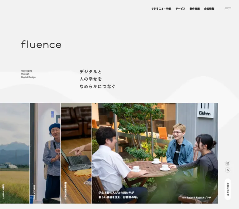
淡いグレーの余白に白い波形と地域の写真を配した制作会社サイト。重なり合う写真パネル、控えめな和欧文タイポグラフィ、縦書きの問い合わせ導線が特徴。
オリジナルサイトを見るfluence — Style Reference
Quiet gray space, soft white waves, and overlapping photographs of people and place.
Original URL: https://fluence.co.jp/ Final URL: https://fluence.co.jp/ Response: HTTP 200; no redirect recorded. Theme: observed light presentation. Inspected: September 12, 2026, at 07:12:21.994 UTC / 16:12:21.994 JST, according to the supplied browser record. Viewports: desktop 1440 × 1000 and mobile 390 × 844 CSS pixels. Scope: the current corporate homepage, including its identity area, interview panels, works index, services, FAQ previews, journal, contact section, footer, and persistent utilities. Visual evidence consists of three desktop captures and two mobile captures. Additional section geometry and typography come from the supplied rendered DOM and computed styles.
fluence presents a web production and systems business through restrained typography, local photography, and unusually generous empty space. The interface stays almost entirely gray and white. Green foliage, warm timber, people, and blue mountain layers supply the color. Its lowercase wordmark sits apart from the navigation, followed by a small English statement and a three-line Japanese message rather than an oversized headline.
The homepage is a long corporate and editorial index. Its distinguishing structures are overlapping photographic panels, small bilingual section headings, a four-column desktop works grid, narrow vertical labels, and a persistent white contact capsule. Broad white waves pass behind the content and reappear in the footer. On mobile, the photographic overlap changes direction, the works index becomes two columns, and the footer rearranges its identity and address beneath the navigation.
How to Read This Reference
- Measured means reported by the supplied computed styles or element rectangles. Values are CSS pixels unless stated otherwise.
- Calculated means derived from those measurements, such as grid gaps or the appearance of a translucent surface over the page background.
- Estimated means visually assessed from a screenshot. Wave colors, some logo dimensions, and the desktop promotional banner dimensions fall into this category.
- Recommended means implementation guidance for a new project. The Quick Start is an adaptation, not recovered source code.
- Font stacks are declared/computed family names. The evidence does not independently identify which font rendered every glyph.
- Element bounds alone do not establish visibility. The extraction includes duplicated navigation, concealed menu/filter content, and elements with reveal transitions. These are not treated as screenshots of open controls.
- No menu opening, filtering result, hover sequence, banner dismissal, or linked-page visit was supplied. Interaction triggers and resulting states remain unverified.
Tokens — Colors
Default Palette
| Name | Value | Source or implementation alias | Role and evidence |
|---|---|---|---|
| Light Gray Canvas | #f2f2f2 |
Source --c-background, --c-gray-light |
Measured body background at both viewports; the dominant page surface |
| Charcoal Text | #424242 |
Source --c-base |
Measured body text, headings, footer links, and contact-tab text |
| White | #ffffff |
Source --c-white |
Measured contact-tab background and text over story/service panels |
| Standard Rule | #bdbdbd |
Source --c-border, --border |
Declared border color; source shorthand is 1px solid #bdbdbd |
| Light Rule | #dadada |
Source --c-border-light, --border-light |
Declared lighter separator color |
| FAQ Surface | rgba(255,255,255,.45) |
Measured FAQ-card background | Subtle white lift without a border, radius, or shadow |
| Composited FAQ Surface | Approximately #f8f8f8 |
Calculated direct-color equivalent | White at 45% over #f2f2f2, rounded to eight-bit RGB |
| Wave Surface | Approximately #f8f8f8 in the captures |
Recommended alias --fluence-wave |
Screenshot estimate; the original wave fill and compositing are not supplied |
| Difference Text Input | #e0e0e0 |
Source --c-text-difference |
Measured input color on desktop navigation links; their visible screenshot appearance is dark |
The desktop navigation needs special care: its computed text is #e0e0e0, but it appears near-black against the gray canvas. The supplied variable name suggests a contrast/compositing treatment, but the actual blend declaration is absent. A direct-color adaptation should use charcoal for readable navigation rather than copying the pale input color literally.
The stylesheet also declares black #000000 and an error color #c0392b. The error color is not evidenced as a visible homepage accent. Keep it out of the normal brand palette.
Theme Presets
Only the light presentation is evidenced. No theme selector or alternative palette is shown. The body has a background-color transition, but that declaration does not establish a dark mode or user-selectable themes.
Tokens — Typography
Declared Body and Strong Families
- Body stack:
aktiv-grotesk, "FP-KoburinaGoStdN-W3", sans-serifthrough source--ff-base. - Strong stack:
aktiv-grotesk, "FP-KoburinaGoStdN-W6", sans-serifthrough source--ff-bold. - Measured weights:
300for body text and secondary links;600for navigation, important labels, and most headings. - Character: compact, lightly drawn sans-serif body copy paired with firmer headings. Hierarchy relies on weight and spacing more than large differences in size.
- Tracking: source
--ls: .04emand--ls-tight: .02em. Individual elements use different values; these are not universal body settings.
The HTML element reports Times, but visible body content explicitly overrides that family. Times is not evidence of a serif design direction.
A separate form stack is declared as system-ui, -apple-system, "Segoe UI", "Hiragino Sans", "Yu Gothic UI", "Noto Sans JP", sans-serif. The linked contact form was not inspected, so this is a declared resource rather than a verified form treatment.
Type Scale
The following sizes and line heights are measured. Desktop and mobile values are separate observations, not a single proportional scaling rule.
| Role | Desktop size / line height | Mobile size / line height | Weight | Tracking |
|---|---|---|---|---|
| Body | 15 / 31.5px |
13.52 / 28.392px |
300 | Normal |
| Primary desktop navigation | 15 / 31.5px |
Hidden in the mobile capture | 600 | Normal |
| Hero English statement | 12 / 19.2px |
9.36 / 14.976px |
600 | .04em |
| Hero Japanese statement | 26 / 44.2px |
16.64 / 28.288px |
600 | .02em |
| Section English kicker | 13 / 13px |
11.44 / 11.44px |
600 | .04em |
| Main section heading | 28 / 47.6px |
21.84 / 37.128px |
600 | .02em |
| Works title | 16 / 27.2px |
14.56 / 24.752px |
600 | .02em |
| Story headline | 16 / 27.2px |
12.48 / 21.216px |
600 | .02em |
| Service promise | 17 / 28.9px |
12.48 / 21.216px |
600 | .06em |
| FAQ question | 16 / 27.2px |
13.52 / 22.984px |
600 | .02em |
| FAQ excerpt | 13 / 22.1px |
11.44 / 19.448px |
300 | Normal |
| Featured journal headline | 18 / 30.6px |
15.6 / 26.52px |
600 | .02em |
| Standard journal headline | 18 / 30.6px |
14.56 / 24.752px |
600 | .02em |
| Journal descriptive paragraph | 14 / 28px |
12.48 / 24.96px |
300 | Normal |
| Footer primary link | 17 / 25.84px |
15.6 / 23.712px |
600 | Normal |
| Footer utility link | 13 / 23.4px |
11.44 / 20.592px |
300 | .02em |
Body leading is spacious: 2.1 for the general body and 2 for journal descriptions. Headlines commonly use 1.7. Avoid tightening everything to a conventional compact marketing scale.
Wordmark and Hidden Headings
The visible lowercase fluence wordmark has a thin, open, widely spaced appearance. Its desktop hero width is approximately 240px; the mobile hero width is approximately 140px. These are visual estimates, not a declared font size or verified asset dimension.
The homepage also contains a descriptive H1 with a measured 1 × 1px box. The interview section has a similarly small heading. These serve a different role from the visible wordmark and photo content. Do not render their extracted text as additional large headings.
Use authorized brand artwork when reproducing the wordmark. Its source file, format, and underlying typeface were not supplied.
Tokens — Spacing & Shapes
Responsive Unit
The desktop HTML font size is 16px; the mobile HTML font size is 16.64px. The mobile value is consistent with 16 × 390 / 375, and the source declares --viewport-mobile: 375. The complete root-size rule and its breakpoint boundaries are not included.
The content-width variables are directly supplied:
/* Observed desktop variable */
--inner-width: calc(1170 * 100vw / 1440);

/* Observed mobile variables */
--inner-width: calc(100vw - 3.75rem);
--margin-offset: -1.875rem;
At desktop, the content width is 1170px with 135px side margins. At mobile, 390 - 3.75 × 16.64 = 327.6px, leaving approximately 31.2px per side.
A source --inner-max: 1440px is declared. Its application at wider viewports was not tested. The Quick Start uses it as a recommended maximum rather than claiming verified behavior beyond the supplied widths.
Spacing Scale
These are repeated measured dimensions and calculated gaps, not evidence of a single global spacing scale.
| Use | Desktop | Mobile | Status |
|---|---|---|---|
| General content side inset | 135px |
About 31.2px |
Measured |
| Extra hero left inset | 0 |
15.6px |
Measured |
| Hero header to story deck | 75px |
78px |
Calculated from bounds |
| Story deck to works section | 180px |
About 93.6px |
Calculated |
| Works horizontal gap | 49px |
About 24.95px |
Calculated |
| Works row gap after tallest card | 75px |
About 43.33px |
Calculated |
| FAQ vertical-label separation | 52px |
27.04px |
Measured |
| FAQ card separation | About 54px horizontally |
About 24.95px vertically |
Calculated |
| FAQ internal padding | 36px 36px 40px |
33.28px 31.2px |
Measured |
| Standard journal-row padding | 54px 0 |
43.68px 0 |
Measured |
| Footer top / bottom padding | 180 / 166px |
109.2 / 93.6px |
Measured |
Border Radius
| Element | Desktop | Mobile | Evidence |
|---|---|---|---|
| Story links, works links, FAQ cards | 0 |
0 |
Measured |
| Social controls | 50% |
50% |
Measured |
| Works filter button | 16px |
16.64px |
Measured |
| Contact-form CTA | 30px |
29.12px |
Measured |
| Persistent contact tab | Approximately half its width | 18.72px |
Desktop estimate; mobile measured |
Rounded shapes identify compact controls. Content surfaces and photography retain square edges.
Layout Measurements
| Element | Desktop 1440 × 1000 | Mobile 390 × 844 |
|---|---|---|
| Document height | 7906.25px |
7250.03px |
| Main content width | 1170px |
327.59px |
| Hero header top | 240px |
149.75px |
| Hero header height | 297.56px |
238.02px |
| Story-deck section | 1305 × 600px |
About 389.97 × 501.23px |
| Individual story-link box | 750 × 600px |
About 385.81 × 308.64px |
| Works card width | 255.75px |
About 151.32px |
| FAQ card | About 330.16 × 250.75px |
About 281.84 × 213.08px |
| Menu button box | 72 × 72px |
About 62.39 × 62.39px |
| Social circle | 30 × 30px |
About 24.95 × 24.95px |
| Contact-form CTA | About 240.78 × 60px |
About 229.92 × 58.23px |
| Persistent contact tab | Approximately 36 × 128px |
About 37.44 × 132.66px |
| Footer height | 1046.06px |
1046.63px |
Story and service rectangles overlap. Their dimensions must not be added together as if they were ordinary non-overlapping grid columns.
Components
Fixed Navigation and Menu Trigger
Role: provide compact navigation while keeping the main identity area open.
The desktop header puts four primary links in the upper-right region: できること・特長, サービス, 制作実績, and 会社情報. Each uses 15px strong text with 15px 13px padding. The first measured link begins near x903px. A separate 72px square menu button sits at x1338px, y14px.
The visible menu symbol consists of two unequal horizontal strokes. It is deliberately small inside a much larger button box. There is no visible filled header bar; the navigation sits over the page and remains at the top in the scrolled captures.
On mobile, the desktop links disappear and the menu button occupies approximately 62.39px square at the top-right edge. Its icon remains visually restrained.
The DOM includes service sublinks and a larger navigation structure. Their presence does not verify a hover dropdown or an opened menu. Do not build an asserted menu animation from these records alone.
Hero Identity and Mission
Role: establish the company’s tone before introducing its work and relationships.
The wordmark begins around x135px, y240px on desktop. Beneath it, a small English statement sits at x135px, y413px. The Japanese message begins farther right at x480.91px, y405px:
デジタルと
人の幸せを
なめらかにつなぐ
The English statement reads Well-being / through / Digital Design across three lines. Its smaller size makes it a quiet counterpart to the Japanese copy.
On mobile, the wordmark and English statement align near x46.8px. The Japanese statement begins at x161.52px. The three-line relationship survives; the content is recomposed within a smaller area rather than centered into a single stack.
The white wave field crosses behind the message and continues toward the story deck. It is a broad atmospheric shape, with no visible outline, texture, or sharp crest. Its exact geometry and any movement are unverified.
Overlapping Story Deck
Role: introduce interviews and editorial stories through photography.
Desktop contains four measured story-link boxes, each 750 × 600px, beginning at x0, x185, x370, and x555. Their combined visible arrangement occupies 1305px, leaving the right-side utility rail clear. The screenshot shows three narrow photographic strips followed by a much wider panel featuring people around an outdoor table.
The measured boxes overlap by 565px. This is the key structural fact: the visible narrow strips are not simply narrow source images. A layered or clipped presentation exposes parts of larger link panels.
Each story includes a compact organization/category label and a short headline in white. Some desktop label bounds are only 13px wide and tall enough to support a vertical arrangement. The main captions sit near the panels’ lower edges, mostly below the initial desktop screenshot.
Mobile rotates the arrangement into a vertical overlap. All four links share approximately x2.09px and a width of 385.81px. Their recorded y positions are approximately 464.95, 529.42, 593.89, and 658.36px when read from the frontmost story backward. The frontmost fil / 株式会社富山市民プラザ story is a broad photograph; the other panels expose horizontal portions beneath it. The interval is about 64.47px.
White mobile captions appear over a darkened lower image region, with about 16.6px inset from the panel’s left edge. The screenshot supports this contrast treatment, but its exact gradient is not supplied.
The links lead to journal articles. Hover expansion, automatic cycling, dragging, and the rule that chooses the frontmost item were not exercised. Refer to it as an overlapping story deck, not a verified autoplay carousel.
Works Index and Filter Control
Role: provide a compact, categorized portfolio overview.
The section heading pairs Works with 制作実績. A small rounded 絞り込み button aligns to the right. Its desktop box is 94 × 32px, with 13px strong text, a 2px internal gap, and 2px 8px 2px 15px padding.
Desktop has eight measured work links arranged in four columns over two rows. Each column is 255.75px wide, with a 49px gap. A card contains a visual region, a strong 16px project title, and service/industry metadata. Examples include ほとり座, Harbor Line Tour, TOYAMA ADC, and GUNTE Lab..
Mobile exposes four work links in two columns, approximately 151.32px wide with a 24.95px gap. The remaining desktop entries are not present as visible work links in the mobile extraction. Do not assume all eight are simply pushed farther down the same mobile grid.
A 4:5 visual region plus an 18px desktop or 15.6px mobile title gap is consistent with the measured title offsets. This is a calculated layout inference; image-element bounds and native image dimensions were not supplied.
The filter data includes service types and industries. Several option rectangles overlap the normal card region, so they do not establish that the filter panel was open. The option links point to #; actual filtering behavior remains unverified.
The section ends with the right-aligned link 制作実績一覧, using strong text and a measured 12px desktop icon gap.
Service Panels and Company Links
Role: summarize three service areas and lead into company information.
The DOM records three overlapping service links with white text:
ウェブサイト制作システム・アプリ開発運用支援・保守
Desktop link boxes measure 400 × 500px and start at x135, x292.83, and x450.66px. On mobile, they measure about 249.59 × 312px and start at x31.2, x85.8, and x140.39px. The mobile composition reaches the right viewport edge.
Each panel contains a narrow, tall title region, a short benefit statement, and a list of capabilities. The benefit text uses 17px strong type with .06em tracking on desktop and 12.48px on mobile. These are not equally spaced independent cards.
The supplied screenshots do not show this section. Its background imagery, exact clipping, and visual state cannot be confirmed from the text and link rectangles.
Three company links occupy a separate area on desktop: フルエンスの特長, 会社概要, and スタッフ紹介. They are approximately 350.34px wide, with 24px 0 padding. Mobile moves them beneath the service panels as full content-width rows with 20.8px vertical padding.
FAQ Preview Cards
Role: answer common purchasing questions without leaving the homepage’s quiet rhythm.
A narrow vertical Pick up Question label sits beside three preview links. Desktop places the cards side by side; mobile stacks them while retaining the narrow label column on the left.
The desktop cards are approximately 330.16 × 250.75px, with square corners and a white background at 45% opacity. Padding is 36px on the top and sides and 40px at the bottom. Questions use 16px strong text. Excerpts use 13px text with 22.1px leading, limited to approximately three lines.
The screenshot shows the excerpt fading toward its bottom edge. The exact masking or overlay implementation is not supplied. An underlined 続きを読む link treatment sits toward the lower-right of each card.
Mobile cards narrow to approximately 281.84px and use 33.28px 31.2px padding. The three cards have about 24.95px between them. Their questions use 13.52px text and excerpts 11.44px.
Each whole preview is an anchor to a specific FAQ fragment, such as /faq/#5. This is evidence of linked previews, not an inline accordion.
Landscape Separator
Role: pause the content sequence and reinforce a sense of place.
The middle desktop capture shows a wide mountain photograph between the FAQ area and the journal. It begins at the viewport’s left edge and ends at x1305px, matching the story deck’s asymmetric right edge.
Its visible dimensions are approximately 1305 × 359px, estimated from the screenshot. Layered blue ridges, a pale overcast sky, and soft atmospheric contrast create depth without adding UI decoration. Broad empty space surrounds the photograph.
No source asset URL, mobile crop, or parallax behavior is supplied. Preserve the panoramic role and subdued color relationship; do not infer a scrolling effect from the composition.
Journal Index
Role: give the company a continuing editorial presence through interviews, columns, and announcements.
The heading pairs Journal with フルエンス定期便. Desktop category links align at the right: すべて, インタビュー, お役立ちコラム, and お知らせ. In the middle screenshot, すべて has a short underline. Mobile places the category row beneath the heading, with a measured 37.44px header gap.
The featured article is a full-width link with category/date metadata, a Pick up label, a headline, an explanatory paragraph, and topic tags. Its desktop link measures 1170 × 549.34px, with 75px top and 90px bottom padding. The descriptive text begins at x690.44px and occupies about 548.56px, supporting a side-by-side composition.
On mobile, the featured article becomes approximately 327.59 × 652.73px. The headline and paragraph occupy the full content width below the preceding content. The headline uses 15.6px type; the paragraph uses 12.48px with 24.96px leading.
Three standard article rows follow. Desktop rows are about 302.31px high with 54px vertical padding. Mobile rows are about 282.34px high with 43.68px vertical padding. Their metadata/content order changes in the mobile extraction.
Most of this section is documented through DOM measurements, not screenshots. Exact thumbnail crops, tag styling, and hover feedback are unverified. Category links with # targets do not prove a tested filtering implementation.
Contact Section
Role: offer a direct conversation and a secondary company-document download.
The section pairs Contact with お問い合わせ, followed by a short invitation and an お問い合わせフォーム link. The desktop content begins at x255px, a deeper inset than the regular x135px content edge.
The form CTA is a horizontal capsule approximately 240.78 × 60px, with a 30px radius, 36px horizontal padding, 17px strong text, and a measured #f2f2f2 fill. The surrounding surface is not shown in the supplied screenshots, so its contrast treatment should not be inferred from the button alone.
On mobile, the contact content begins at x78px. The CTA follows the paragraph vertically and measures about 229.92 × 58.23px. A separate document-download block follows with explanatory text.
This is a homepage entry point to a form, not an inspected form component. Field styling, validation, submission behavior, and confirmation states are outside scope.
Persistent Contact and Social Controls
Role: keep a contact route available while the user browses a long page.
The screenshots show a tall white capsule labeled お問い合わせ near the lower-right edge. Its text is vertical and charcoal. On mobile, the measured box is 37.44 × 132.66px, with an 18.72px radius, 24.96px vertical padding, and about 18.72px right / 31.19px bottom clearance.
Desktop shows outlined Instagram and X circles above this capsule in a persistent right-side rail. Additional social controls appear within the footer. Their repeated appearance belongs to distinct navigation contexts.
Mobile places social circles beside the hero copy and again below the footer address. The contact capsule remains near the bottom-right in both mobile captures. Do not treat every extracted social-link rectangle as the position of one global fixed element.
The circles are visually small: 30px on desktop and approximately 24.95px on mobile. Fine outlines and light icon strokes keep them secondary to the content.
Website Diagnosis Teaser
Role: promote the company’s free diagnosis tool as a compact persistent utility.
The lower-left banner combines a laptop image, two short lines of Japanese text, and a small outlined arrow on a charcoal-looking field. It is visible in the scrolled desktop captures and both mobile captures, but absent from the initial desktop image.
The desktop banner is approximately 315 × 72px, with 15px left and bottom clearance, estimated from the screenshots. The measured mobile link is 270.39 × 61.8px, positioned about 13.52px from the left and 31.19px from the bottom.
A small white circular close symbol overlaps the mobile banner’s upper-right corner. Its button box is approximately 31.19px square, including 6.24px padding. Dismissal was not tested. The banner’s appearance trigger and persistence after closing are also unknown.
The anchor leads to /diagnosis/. Its extracted text is empty, but this does not establish whether the underlying image has an alternative text. The banner overlaps story text in the mobile capture; a new implementation should manage that collision explicitly.
Footer
Role: provide a complete site directory, identity, location, and social links.
The desktop footer uses two text columns toward the left and a wordmark toward the upper-right. Site Contents begins near x135px; Journal begins around x457px in the screenshot. Strong primary links alternate with lighter service and utility links. Fine underlines distinguish diagnosis, document, FAQ, privacy, and map links.
A broad white wave crosses behind the directory. It does not become a dark footer band. The address sits near the bottom-left, while social circles and a small copyright line occupy the right side. The original page independently identifies the operator through © fluence LLC..
Mobile retains two navigation columns, beginning near x31.2 and x210.59px. The wordmark then moves below the directory to the left, followed by the address, a separate Google Map line, social circles, and copyright.
The mobile footer wordmark link measures approximately 135.19 × 25.55px. The footer remains expansive: its measured total height is about 1046.63px, close to the desktop footer’s height despite the reordered content.
Tokens — Motion & Interaction
The evidence supplies transition declarations, not recordings of the full interaction sequences.
| Target | Measured declaration | What it establishes |
|---|---|---|
| Body opacity | 0.3s cubic-bezier(.22,1,.36,1) |
An opacity transition is available; trigger unverified |
| Body background | 0.8s cubic-bezier(.22,1,.36,1) .3s |
A delayed background transition; not proof of themes |
| Primary navigation links | Opacity, 0.3s cubic-bezier(.22,1,.36,1) |
Short link feedback declaration |
| Story labels and headlines | Transform and opacity, 1.2s cubic-bezier(.22,1,.36,1) |
Coordinated caption movement/fading is defined |
| Section header wrapper | Transform and opacity, 1.8s cubic-bezier(.22,1,.36,1) |
A slower header transition is defined |
| Section English kicker | Transform and opacity, 1.4s cubic-bezier(.22,1,.36,1) |
Separate kicker reveal treatment |
| Section Japanese heading | Same 1.4s, with .15s delay |
A stagger relative to the kicker is defined |
| Social controls | Background, border, and color, 0.6s cubic-bezier(.22,1,.36,1) |
Color-based feedback declaration |
| Filter and contact-form CTA | Background, border, and color, 0.6s cubic-bezier(.22,1,.36,1) |
Compact-control feedback declaration |
| FAQ card | Background, 0.6s cubic-bezier(.22,1,.36,1) |
Surface transition without measured elevation |
| Mobile service heading | Right position, 0.6s cubic-bezier(.22,1,.36,1) |
Positional change is defined; activation unverified |
| Teaser close button | Opacity and transform, 0.3s cubic-bezier(.22,1,.36,1) |
Short close-control feedback declaration |
Source motion variables include --duration-move: 1.2s, --duration-scale: .6s, --ease-rich and --ease-out both set to cubic-bezier(.22,1,.36,1), --ease-smooth: cubic-bezier(.16,1,.3,1), and --ease-in: cubic-bezier(.3,0,.6,1).
These curves support a soft arrival and deceleration. No sampled element reports an active CSS keyframe animation, but that does not rule out JavaScript-driven motion, ancestor effects, or perpetual decoration.
The capture process waited for finite motion and sampled layout stability, temporarily pausing perpetual animation during readiness checks before resuming it. Static screenshots therefore cannot establish wave speed, autoplay timing, hover expansion, or a scroll-linked choreography. Keep those claims out of a reproduction brief until tested.
Surfaces
| Layer | Appearance | Design role |
|---|---|---|
| Main canvas | Solid #f2f2f2 |
Unifies the entire page, including the footer |
| Decorative waves | Very pale white forms; exact fill unverified | Adds softness and continuity behind content |
| Photographic panels | Square-edged, overlapping image regions | Carries most of the visual contrast and color |
| Story-caption region | White text over a visibly darkened image area on mobile | Makes editorial labels readable |
| FAQ cards | White at 45% opacity; square corners | Separates excerpts with minimal visual weight |
| Social/filter controls | Compact outlines and rounded geometry | Identifies utility controls without strong color |
| Persistent contact | Opaque white vertical capsule | Creates a consistent contact landmark |
| Diagnosis teaser | Charcoal-looking rectangular banner | A small high-contrast promotional interruption |
There is no evidenced general shadow-based elevation system. Content hierarchy comes from spacing, typography, photographic boundaries, subtle surface changes, and a few rounded controls. Any slight banner shadow should remain local rather than becoming a card-system default.
Imagery
Photography gives the neutral interface its warmth and locality. The first desktop capture juxtaposes mountain scenery, a person in an interview setting, a hand near a computer, and a group talking outdoors beside greenery. The mobile crop emphasizes the outdoor conversation and its table, plants, and surrounding building.
The mountain separator uses muted blue-gray ridgelines and atmospheric distance. These are photographic colors, not measured interface tokens. Preserve natural tonal variation instead of tinting every image into one flat brand color.
Image edges remain square. The story deck relies on cropping and overlap, so choose source images with enough horizontal and vertical tolerance to survive both desktop strips and mobile panels. Keep faces and meaningful gestures away from the edges that other panels cover.
The thin lowercase wordmark and fine outlined utility icons complement the photography. Avoid adding decorative icon sets throughout the body where the source instead relies on words, whitespace, and images.
Observed Asset References
No actual image-file URLs were included in the evidence. The destinations below identify linked content, not downloadable image assets.
| Visual | Evidence | Associated content destination |
|---|---|---|
| Hero and footer wordmark | Desktop and mobile captures; mobile footer link dimensions | https://fluence.co.jp/ |
| Mountain/editorial story image | First desktop story strip | https://fluence.co.jp/journal/fluence-branding/ |
| Interview portrait/setting | Second desktop story strip | https://fluence.co.jp/journal/interview-toyama-adc/ |
| Computer and work scene | Third desktop story strip | https://fluence.co.jp/journal/interview-kachiboshi/ |
| Outdoor conversation | Wide desktop panel and front mobile panel | https://fluence.co.jp/journal/interview-fil/ |
| Panoramic mountain separator | Middle desktop capture | Image file and separate destination not supplied |
| Laptop diagnosis banner | Scrolled desktop and mobile captures | https://fluence.co.jp/diagnosis/ |
| Works thumbnails | Layout inferred from card/title geometry; not pictured in supplied captures | Individual links under /works/ |
Use authorized photography and brand artwork when available. The CSS shell can reproduce the relationships, but substitute imagery changes the sense of place and the editorial character.
Layout & Responsive Behavior
The page alternates between a centered content column, photographs that bleed to the left edge, full-width section wrappers, and a reserved desktop utility rail. This asymmetry is essential: the principal photographs end at x1305px on a 1440px desktop rather than stretching to both viewport edges.
| Region | Desktop observation | Mobile observation |
|---|---|---|
| Navigation | Four text links plus separate menu button | Menu button only |
| Hero | Wordmark and mission within a 1170px inner area | Extra left inset; English and Japanese remain side by side |
| Stories | Horizontal overlapping panels at 185px intervals | Vertical overlap at about 64.47px intervals |
| Works | Four columns, eight visible links | Two columns, four visible links |
| Services | Overlapping 400px-wide panels with company links to the right | Smaller overlapping panels; company links move below |
| FAQ | Three cards alongside a vertical section label | Three stacked cards with the label retained at left |
| Journal controls | Categories to the right of the heading | Categories below the heading |
| Featured journal article | Side-by-side content geometry | Full-width stacked content |
| Contact | Paragraph and CTA separated horizontally | CTA below the paragraph |
| Footer | Directory left, wordmark upper-right, address lower-left | Two directory columns, then wordmark/address/social stack |
| Social controls | Persistent right rail plus footer controls | Hero and footer placements |
| Contact tab | Lower-right persistent capsule | Lower-right persistent capsule |
The mobile document is shorter overall despite several stacked sections. The shorter story area and reduced visible works set are part of the observed change; mobile is not simply the desktop page stretched into one column.
The supplied widths do not identify the actual media-query threshold. Any 768px breakpoint in the Quick Start is a recommended implementation choice. Tablet behavior, landscape phones, ultrawide screens, text zoom, and browser safe-area handling remain untested.
Do’s and Don’ts
Do
- Start with the exact gray canvas
#f2f2f2and charcoal text#424242. - Let photography provide most of the color and visual density.
- Keep the hero wordmark separate from the upper-right navigation.
- Preserve the small English statement beside the three-line Japanese message.
- Maintain broad, pale waves behind content and through the footer.
- Reproduce the overlapping story geometry in both horizontal and vertical forms.
- Keep the desktop works grid at four columns and the observed mobile grid at two.
- Use small bilingual section headings, generous leading, and clear weight changes.
- Keep FAQ cards square and only slightly lighter than the canvas.
- Reserve rounded shapes for filters, social circles, and contact controls.
- Preserve the footer’s directory hierarchy and responsive reordering.
- Separate measured transition values from untested interaction behavior.
Don’t
- Don’t recast the homepage as a single-purpose conversion page with an enormous headline.
- Don’t replace the overlapping photographs with identical floating cards.
- Don’t make every desktop image bleed to both viewport edges.
- Don’t introduce saturated button colors or multicolored category badges.
- Don’t apply rounded corners and large shadows to the works and FAQ content.
- Don’t copy the computed
#e0e0e0navigation color without its missing compositing context. - Don’t treat the wordmark as ordinary body text in a guessed font.
- Don’t describe the FAQ previews as an accordion or the story deck as an autoplay carousel.
- Don’t expose hidden menu/filter text merely because it appears in the DOM extraction.
- Don’t reproduce the raw glyph inventory at the end of the text extraction as page content.
- Don’t let a promotional banner permanently cover essential mobile captions or focused links.
Recommended Implementation Additions
These are recommendations for a new implementation, not verified features of the original site.
- Keep essential mobile copy comfortably readable. The measured 9.36px English statement and 11.44px secondary text are fidelity references, not accessibility targets.
- Expand the interactive area around approximately 25px social circles and the narrow contact tab. A 44px target can retain a smaller visual icon.
- Give icon controls and the diagnosis banner explicit accessible names. Verify image alternatives rather than assuming an empty text extraction means no accessible label exists.
- Use
aria-expandedand an associated region for the menu and filter. If the menu behaves as a modal, implement focus management, Escape dismissal, and focus restoration. - Preserve meaningful reading and focus order through the overlapping decks. A covered link should become visible before it receives focus, or have an equivalent accessible route elsewhere.
- Supply a visible focus indicator independent of subtle opacity changes.
- Keep content visible without animation initialization. Under reduced motion, show the completed layout and remove nonessential movement.
- Use real filter behavior and state labels in a new build; do not leave functional controls as bare
#links. - Reserve space for persistent utilities near the bottom of mobile content and respect safe-area insets. Verify banner dismissal and persistence if implemented.
- Check white caption contrast against every authorized image crop, including the mobile crop.
Agent Prompt Guide
Quick Color Reference
- Main canvas:
#f2f2f2. - Body text and direct-color navigation:
#424242. - White contact capsule and photo captions:
#ffffff. - Standard outline:
#bdbdbd; lighter separators:#dadada. - FAQ card:
rgba(255,255,255,.45)over the canvas. - Wave approximation: very pale white, approximately
#f8f8f8in the supplied captures. - Photography: natural greens, warm timber, and muted blue mountain layers; no invented brand accent.
Overall Prompt
“Create a corporate homepage for a regional digital design and development company, using fluence’s observed visual relationships. Use a light gray #f2f2f2 canvas, charcoal #424242 typography, generous empty space, and broad white waves behind content. Place a thin lowercase brand artwork well below a compact upper-right navigation. Pair a tiny three-line English statement with a modest three-line Japanese mission. Follow it with overlapping photographic story panels that bleed left while preserving a desktop utility rail. Use a four-column works grid, overlapping service panels, square translucent FAQ previews, an editorial journal, a quiet contact section, and an expansive directory footer. On mobile, turn the story overlap vertical, use two works columns, stack the FAQ cards, and move the footer identity below its navigation. Keep the white vertical contact capsule visible. Treat motion triggers as a separate implementation decision.”
Example Component Prompts
- Hero: “A pale gray corporate identity area with a thin lowercase logo at the left, extensive space above and below, a 12px English statement beside a 26px Japanese statement, and broad pale waves behind the lower half. Use explicit three-line copy; no large filled CTA in this area.”
- Story deck: “Four square-edged photographic links on desktop, each based on a 750 × 600 panel, overlapping at 185px intervals within a 1305px visible region. Expose three narrow strips and one wide outdoor-conversation image. On a 390px phone, use nearly full-width 5:4 panels with approximately 64.5px vertical offsets.”
- Works index: “A small English kicker over a Japanese section heading, with a compact outlined filter capsule at the right. Below, use four 255.75px desktop columns separated by 49px; switch to two approximately 151px mobile columns. Keep titles charcoal and surfaces unboxed.”
- FAQ previews: “A narrow vertical English label beside three square translucent-white preview cards. Use 36px desktop insets, strong compact questions, three-line excerpts fading at the bottom, and a small underlined read-more label. Stack the cards on mobile while preserving the left label column.”
- Footer: “A very spacious gray footer with two directory columns, pale waves crossing behind them, thin underlines on utility links, and a lowercase logo at upper-right. On mobile, place the logo, two-line address, map link, social circles, and copyright below the directory.”
- Persistent contact: “A narrow white capsule near the lower-right edge containing the vertical Japanese label
お問い合わせ. Use charcoal strong text, fully rounded ends, and enough surrounding clearance to avoid blocking page content.”
Quick Start
CSS Custom Properties
This is a practical adaptation of the measured palette, type hierarchy, and main layout relationships. It keeps a conventional root font size and uses --u to approximate the mobile scaling. The breakpoint, scaling clamps, direct-color navigation, image masks, and wave paths are recommendations.
Use the declared fonts only when available and appropriately licensed. Otherwise, choose a project fallback and expect different text widths. Supply your own authorized wordmark and photographs; no original asset files are bundled here.
Suggested structure: a .page-main containing .page-inner, with .hero, .interview-deck, and subsequent .section elements. Each story anchor uses .story-card and an index such as style='--i: 0' through --i: 3. Put the final/frontmost story at index 3. This reproduces a static overlap state; it does not implement a carousel or expansion interaction.
:root {
  /* Measured palette, with descriptive implementation aliases */
  --fluence-canvas: #f2f2f2;
  --fluence-ink: #424242;
  --fluence-white: #ffffff;
  --fluence-border: #bdbdbd;
  --fluence-border-light: #dadada;
  --fluence-card: rgb(255 255 255 / 45%);

  /* Declared source stacks; font files are not included */
  --font-body: aktiv-grotesk, 'FP-KoburinaGoStdN-W3', sans-serif;
  --font-strong: aktiv-grotesk, 'FP-KoburinaGoStdN-W6', sans-serif;
  --weight-body: 300;
  --weight-strong: 600;
  --type-body: 15px;
  --type-hero: 26px;
  --type-kicker: 13px;
  --type-heading: 28px;
  --type-work: 16px;
  --type-story: 16px;
  --type-faq-title: 16px;
  --type-small: 13px;

  /* Matches the inspected desktop width; maximum is an adaptation */
  --u: 1px;
  --inner: min(81.25vw, 1440px);
  --gutter: max(0px, calc((100vw - var(--inner)) / 2));
  --section-gap: 180px;
  --works-gap: 49px;
  --story-width: 57.471264%;

  /* Measured motion values; interaction triggers are separate */
  --ease-out: cubic-bezier(.22, 1, .36, 1);
  --duration-feedback: .6s;
  --duration-caption: 1.2s;
  --duration-reveal: 1.4s;
}

* { box-sizing: border-box; }

body {
  margin: 0;
  color: var(--fluence-ink);
  background: var(--fluence-canvas);
  font-family: var(--font-body);
  font-size: var(--type-body);
  font-weight: var(--weight-body);
  line-height: 2.1;
}

img { display: block; max-width: 100%; }
a { color: inherit; }
button { font: inherit; }

.page-main { padding-block-start: 240px; }
.page-inner { width: var(--inner); margin-inline: auto; }
.section { margin-block-start: var(--section-gap); }

.visually-hidden {
  position: absolute;
  width: 1px;
  height: 1px;
  padding: 0;
  overflow: hidden;
  clip-path: inset(50%);
  white-space: nowrap;
  border: 0;
}

.site-header {
  position: fixed;
  z-index: 50;
  top: 14px;
  right: 30px;
  display: flex;
  align-items: center;
  gap: 33px;
}

.primary-nav { display: flex; }
.primary-nav a {
  padding: 15px 13px;
  font-family: var(--font-strong);
  font-weight: 600;
  text-decoration: none;
  transition: opacity .3s var(--ease-out);
}

.menu-button {
  position: relative;
  width: 72px;
  height: 72px;
  padding: 0;
  border: 0;
  color: inherit;
  background: transparent;
  cursor: pointer;
}

.menu-button::before,
.menu-button::after {
  content: '';
  position: absolute;
  left: 25%;
  height: 2px;
  background: currentColor;
}
.menu-button::before { top: 44%; width: 50%; }
.menu-button::after { top: 53%; width: 25%; }

.hero { position: relative; isolation: isolate; }
.wordmark { display: block; width: 240px; }
.wordmark img,
.wordmark svg { display: block; width: 100%; height: auto; }

.hero__copy {
  display: grid;
  grid-template-columns: 29.565% minmax(0, 1fr);
  margin-block-start: 120px;
}
.hero__copy p { margin: 0; }
.hero__eyebrow {
  padding-block-start: 8px;
  font: 600 1.6 / 1.6 var(--font-strong);
  font-size: 12px;
  line-height: 1.6;
  letter-spacing: .04em;
}
.hero__statement {
  font-family: var(--font-strong);
  font-size: var(--type-hero);
  font-weight: 600;
  line-height: 1.7;
  letter-spacing: .02em;
}

.wave-field {
  position: absolute;
  z-index: -1;
  left: calc(-1 * var(--gutter));
  bottom: -75px;
  width: 100vw;
  height: 300px;
  pointer-events: none;
}
.wave-field svg { display: block; width: 100%; height: 100%; }

.interview-deck {
  position: relative;
  width: calc(100% + var(--gutter));
  height: 600px;
  margin-top: 75px;
  margin-left: calc(-1 * var(--gutter));
  isolation: isolate;
}
.story-card {
  position: absolute;
  z-index: calc(var(--i) + 1);
  top: 0;
  left: calc(var(--i) * ((100% - var(--story-width)) / 3));
  width: var(--story-width);
  height: 100%;
  overflow: hidden;
  border-right: 1px solid white;
  color: white;
  text-decoration: none;
}
.story-card > img { width: 100%; height: 100%; object-fit: cover; }
.story-card::after {
  /* Recommended approximation of the visible caption darkening */
  content: '';
  position: absolute;
  inset: 0;
  background: linear-gradient(to top, rgb(0 0 0 / 45%), transparent 60%);
  pointer-events: none;
}
.story-caption {
  position: absolute;
  z-index: 1;
  inset: auto 40px 24px;
  font-family: var(--font-strong);
  font-weight: 600;
}
.story-caption p { margin: 0; }
.story-caption__label { font-size: 13px; letter-spacing: .03em; }
.story-caption__title {
  font-size: var(--type-story);
  line-height: 1.7;
  letter-spacing: .02em;
}

.section-header {
  display: flex;
  align-items: end;
  justify-content: space-between;
  gap: 24px;
}
.section-kicker {
  margin: 0;
  font-family: var(--font-strong);
  font-size: var(--type-kicker);
  font-weight: 600;
  line-height: 1;
  letter-spacing: .04em;
}
.section-title {
  margin: 8px 0 0;
  font-family: var(--font-strong);
  font-size: var(--type-heading);
  font-weight: 600;
  line-height: 1.7;
  letter-spacing: .02em;
}
.filter-button {
  display: inline-flex;
  align-items: center;
  gap: 2px;
  min-height: 32px;
  padding: 2px 8px 2px 15px;
  border: 1px solid var(--fluence-border);
  border-radius: 999px;
  color: inherit;
  background: transparent;
  font-family: var(--font-strong);
  font-size: var(--type-small);
  font-weight: 600;
}

.works-grid {
  display: grid;
  grid-template-columns: repeat(4, minmax(0, 1fr));
  gap: 75px var(--works-gap);
  margin-top: 84px;
}
.work-card { min-width: 0; text-decoration: none; }
.work-card img {
  width: 100%;
  aspect-ratio: 4 / 5;
  object-fit: cover;
}
.work-card h3 {
  margin: 18px 0 0;
  font-family: var(--font-strong);
  font-size: var(--type-work);
  font-weight: 600;
  line-height: 1.7;
  letter-spacing: .02em;
}
.work-card__meta { font-size: var(--type-small); line-height: 1.7; }

.faq {
  display: grid;
  grid-template-columns: 19.5px minmax(0, 1fr);
  gap: 52px;
}
.faq__label {
  margin: 0;
  writing-mode: vertical-rl;
  font-family: var(--font-strong);
  font-size: 13px;
  font-weight: 600;
  line-height: 1.5;
  letter-spacing: .04em;
}
.faq__list { display: grid; grid-template-columns: repeat(3, 1fr); gap: 54px; }
.faq-card {
  display: flex;
  flex-direction: column;
  min-width: 0;
  padding: 36px 36px 40px;
  background: var(--fluence-card);
  text-decoration: none;
  transition: background var(--duration-feedback) var(--ease-out);
}
.faq-card h3 {
  margin: 0;
  font-family: var(--font-strong);
  font-size: var(--type-faq-title);
  font-weight: 600;
  line-height: 1.7;
  letter-spacing: .02em;
}
.faq-card__excerpt {
  display: -webkit-box;
  -webkit-box-orient: vertical;
  -webkit-line-clamp: 3;
  overflow: hidden;
  margin: 20px 0 16px;
  font-size: var(--type-small);
  line-height: 1.7;
  mask-image: linear-gradient(#000 45%, transparent);
}
.faq-card__more {
  align-self: end;
  margin-top: auto;
  font-size: var(--type-small);
  text-decoration: underline;
  text-decoration-color: var(--fluence-border);
  text-underline-offset: 4px;
}

.social-link {
  display: inline-flex;
  align-items: center;
  justify-content: center;
  width: 30px;
  height: 30px;
  border: 1px solid var(--fluence-border);
  border-radius: 50%;
  text-decoration: none;
}
.contact-tab {
  position: fixed;
  z-index: 60;
  right: max(20px, calc(var(--gutter) / 2 - 18px));
  bottom: max(54px, env(safe-area-inset-bottom, 0px));
  display: flex;
  align-items: center;
  justify-content: center;
  width: 36px;
  min-height: 128px;
  padding-block: 24px;
  border-radius: 999px;
  color: var(--fluence-ink);
  background: white;
  font-family: var(--font-strong);
  font-size: 13px;
  font-weight: 600;
  text-decoration: none;
}
.contact-tab span { writing-mode: vertical-rl; letter-spacing: .02em; }

.site-footer { padding-block: 180px 166px; }
.footer-grid {
  display: grid;
  grid-template-columns: 250px 250px minmax(0, 1fr);
  gap: 72px;
}
.footer-brand { justify-self: end; width: 190px; }
.footer-links { display: grid; align-content: start; gap: 24px; }
.footer-links a { text-decoration: none; }
.footer-links .utility-link { text-decoration: underline; text-underline-offset: 4px; }

/* Recommended feedback; the original final hover colors are unverified */
@media (hover: hover) {
  .primary-nav a:hover { opacity: .65; }
  .faq-card:hover { background: rgb(255 255 255 / 75%); }
}
:where(a, button):focus-visible {
  outline: 2px solid var(--fluence-ink);
  outline-offset: 5px;
}

/* Recommended breakpoint and bounds; only 390px mobile was inspected */
@media (max-width: 767px) {
  :root {
    --u: clamp(.9px, .2666667vw, 1.2px);
    --inner: calc(100vw - 60 * var(--u));
    --gutter: calc(30 * var(--u));
    --section-gap: calc(90 * var(--u));
    --works-gap: calc(24 * var(--u));
    --type-body: calc(13 * var(--u));
    --type-hero: calc(16 * var(--u));
    --type-kicker: calc(11 * var(--u));
    --type-heading: calc(21 * var(--u));
    --type-work: calc(14 * var(--u));
    --type-story: calc(12 * var(--u));
    --type-faq-title: calc(13 * var(--u));
    --type-small: calc(11 * var(--u));
  }
  .page-main { padding-top: calc(144 * var(--u)); }
  .site-header { top: 0; right: 0; }
  .primary-nav { display: none; }
  .menu-button { width: calc(60 * var(--u)); height: calc(60 * var(--u)); }
  .hero { padding-left: calc(15 * var(--u)); }
  .wordmark { width: calc(135 * var(--u)); }
  .hero__copy {
    grid-template-columns: calc(110.3 * var(--u)) minmax(0, 1fr);
    margin-top: calc(120 * var(--u));
  }
  .hero__eyebrow { padding-top: calc(3.5 * var(--u)); font-size: calc(9 * var(--u)); }
  .wave-field { bottom: calc(-75 * var(--u)); height: calc(170 * var(--u)); }
  .interview-deck {
    width: 100vw;
    height: calc((100vw - 4 * var(--u)) * .8 + 186 * var(--u));
    margin-top: calc(75 * var(--u));
  }
  .story-card {
    top: calc((3 - var(--i)) * 62 * var(--u));
    left: calc(2 * var(--u));
    width: calc(100% - 4 * var(--u));
    height: auto;
    aspect-ratio: 5 / 4;
    border-right: 0;
    border-bottom: 1px solid white;
  }
  .story-caption { inset: auto calc(16 * var(--u)) calc(12 * var(--u)); }
  .story-caption__label { font-size: calc(10 * var(--u)); }
  .works-grid { grid-template-columns: repeat(2, minmax(0, 1fr)); gap: 42px var(--works-gap); margin-top: 44px; }
  .work-card h3 { margin-top: calc(15 * var(--u)); }
  .faq { grid-template-columns: calc(18 * var(--u)) minmax(0, 1fr); gap: calc(26 * var(--u)); }
  .faq__label { font-size: calc(12 * var(--u)); }
  .faq__list { grid-template-columns: 1fr; gap: calc(24 * var(--u)); }
  .faq-card { padding: calc(32 * var(--u)) calc(30 * var(--u)); }
  .faq-card__excerpt { margin-top: calc(10 * var(--u)); }
  .social-link { width: calc(24 * var(--u)); height: calc(24 * var(--u)); }
  .contact-tab {
    right: calc(18 * var(--u));
    bottom: max(calc(30 * var(--u)), env(safe-area-inset-bottom, 0px));
    width: calc(36 * var(--u));
    min-height: calc(127.56 * var(--u));
    padding-block: calc(24 * var(--u));
    font-size: calc(13 * var(--u));
  }
  .site-footer { padding-block: calc(105 * var(--u)) calc(90 * var(--u)); }
  .footer-grid { grid-template-columns: repeat(2, minmax(0, 1fr)); gap: calc(60 * var(--u)) calc(30 * var(--u)); }
  .footer-brand { grid-column: 1 / -1; justify-self: start; width: calc(130 * var(--u)); }
}

/* Recommended: optional reveals must never hide content by default */
@media (prefers-reduced-motion: reduce) {
  .primary-nav a,
  .faq-card,
  .story-caption { transition: none; }
  [data-reveal] { opacity: 1; transform: none; }
}
The .hero__eyebrow should use the explicit font-family, font-weight, font-size, and line-height properties when adapting the snippet; the intended values are the declared strong family, weight 600, 12px desktop size, and 1.6 leading. Preserve explicit line breaks in the two hero statements.
For the wave field, the following SVG is an original approximation, not the site’s recovered artwork. Use it inside .wave-field and keep it decorative. It can also inform a separately positioned footer wave.
<svg viewBox="0 0 1440 360" preserveAspectRatio="none" aria-hidden="true">
  <path fill="white" fill-opacity=".45"
    d="M0 160 C180 220 255 145 430 225 S650 370 790 230 S1080 40 1230 130 S1380 280 1440 290 L1440 360 L0 360Z" />
  <path fill="white" fill-opacity=".45"
    d="M0 255 C190 120 300 80 475 210 S660 390 825 295 S1090 70 1240 95 S1380 180 1440 225 L1440 360 L0 360Z" />
</svg>
The starter leaves service-panel behavior, journal filtering, menu states, and diagnosis-banner logic to a separate implementation. Keep all content reachable before adding overlap interaction or reveal effects. Apply focus management to the story deck before shipping it as an interactive component.
Tailwind v4 Token Mapping
Optional aliases for a project already using Tailwind v4. This does not imply the original site uses Tailwind. Define the preceding custom properties first.
@theme inline {
  --color-canvas: var(--fluence-canvas);
  --color-ink: var(--fluence-ink);
  --color-rule: var(--fluence-border);
  --color-rule-light: var(--fluence-border-light);
  --font-sans: var(--font-body);
  --font-strong: aktiv-grotesk, 'FP-KoburinaGoStdN-W6', sans-serif;
  --text-site-body: var(--type-body);
  --text-site-hero: var(--type-hero);
  --text-site-heading: var(--type-heading);
  --text-site-kicker: var(--type-kicker);
  --spacing-site-section: var(--section-gap);
  --spacing-site-grid: var(--works-gap);
  --radius-control: 999px;
}
Sources & Evidence
- Inspected original page: https://fluence.co.jp/. The supplied record reports HTTP 200 and the same final URL.
- Capture timestamp: September 12, 2026, 07:12:21.994 UTC / 16:12:21.994 JST.
- Desktop evidence: 1440 × 1000 CSS-pixel viewport; top, middle, and footer screenshots; rendered document height approximately 7906.25px; supplied text, links, custom properties, computed styles, and element rectangles.
- Mobile evidence: 390 × 844 CSS-pixel viewport; top and footer screenshots; rendered document height approximately 7250.03px; supplied text, links, custom properties, computed styles, and element rectangles.
- Observed navigation destinations: on-page links to
/works/,/service/,/journal/,/faq/,/contact/,/document/, and/diagnosis/, including article and FAQ-fragment links documented above. These destinations were not separately inspected. - Inspection conditions: document load, finite-motion readiness, sampled layout/text stability, and visible image decoding were checked within bounded waits. Scrolling traversed intermediate positions. Perpetual animations were paused during readiness checks and resumed afterward. SharedWorkers and service workers were disabled.
- Limitations: screenshots are static samples, and several lower-page sections have DOM evidence without corresponding supplied screenshots. Full stylesheets, image source files, exact wave geometry, verified font-glyph resolution, menu/filter outcomes, hover behavior, banner dismissal, and additional responsive widths are unavailable.
This reference describes the current homepage represented by the supplied September 12 captures. Measured styles, calculated relationships, visual estimates, and recommended implementation choices are identified separately throughout.
# fluence — Style Reference

> Quiet gray space, soft white waves, and overlapping photographs of people and place.

**Original URL:** [https://fluence.co.jp/](https://fluence.co.jp/)
**Final URL:** [https://fluence.co.jp/](https://fluence.co.jp/)
**Response:** HTTP 200; no redirect recorded.
**Theme:** observed light presentation.
**Inspected:** September 12, 2026, at 07:12:21.994 UTC / 16:12:21.994 JST, according to the supplied browser record.
**Viewports:** desktop 1440 × 1000 and mobile 390 × 844 CSS pixels.
**Scope:** the current corporate homepage, including its identity area, interview panels, works index, services, FAQ previews, journal, contact section, footer, and persistent utilities. Visual evidence consists of three desktop captures and two mobile captures. Additional section geometry and typography come from the supplied rendered DOM and computed styles.

fluence presents a web production and systems business through restrained typography, local photography, and unusually generous empty space. The interface stays almost entirely gray and white. Green foliage, warm timber, people, and blue mountain layers supply the color. Its lowercase wordmark sits apart from the navigation, followed by a small English statement and a three-line Japanese message rather than an oversized headline.

The homepage is a long corporate and editorial index. Its distinguishing structures are overlapping photographic panels, small bilingual section headings, a four-column desktop works grid, narrow vertical labels, and a persistent white contact capsule. Broad white waves pass behind the content and reappear in the footer. On mobile, the photographic overlap changes direction, the works index becomes two columns, and the footer rearranges its identity and address beneath the navigation.

## How to Read This Reference

- **Measured** means reported by the supplied computed styles or element rectangles. Values are CSS pixels unless stated otherwise.
- **Calculated** means derived from those measurements, such as grid gaps or the appearance of a translucent surface over the page background.
- **Estimated** means visually assessed from a screenshot. Wave colors, some logo dimensions, and the desktop promotional banner dimensions fall into this category.
- **Recommended** means implementation guidance for a new project. The Quick Start is an adaptation, not recovered source code.
- Font stacks are declared/computed family names. The evidence does not independently identify which font rendered every glyph.
- Element bounds alone do not establish visibility. The extraction includes duplicated navigation, concealed menu/filter content, and elements with reveal transitions. These are not treated as screenshots of open controls.
- No menu opening, filtering result, hover sequence, banner dismissal, or linked-page visit was supplied. Interaction triggers and resulting states remain unverified.

## Tokens — Colors

### Default Palette

| Name | Value | Source or implementation alias | Role and evidence |
| --- | --- | --- | --- |
| Light Gray Canvas | `#f2f2f2` | Source `--c-background`, `--c-gray-light` | Measured body background at both viewports; the dominant page surface |
| Charcoal Text | `#424242` | Source `--c-base` | Measured body text, headings, footer links, and contact-tab text |
| White | `#ffffff` | Source `--c-white` | Measured contact-tab background and text over story/service panels |
| Standard Rule | `#bdbdbd` | Source `--c-border`, `--border` | Declared border color; source shorthand is `1px solid #bdbdbd` |
| Light Rule | `#dadada` | Source `--c-border-light`, `--border-light` | Declared lighter separator color |
| FAQ Surface | `rgba(255,255,255,.45)` | Measured FAQ-card background | Subtle white lift without a border, radius, or shadow |
| Composited FAQ Surface | Approximately `#f8f8f8` | Calculated direct-color equivalent | White at 45% over `#f2f2f2`, rounded to eight-bit RGB |
| Wave Surface | Approximately `#f8f8f8` in the captures | Recommended alias `--fluence-wave` | Screenshot estimate; the original wave fill and compositing are not supplied |
| Difference Text Input | `#e0e0e0` | Source `--c-text-difference` | Measured input color on desktop navigation links; their visible screenshot appearance is dark |

The desktop navigation needs special care: its computed text is `#e0e0e0`, but it appears near-black against the gray canvas. The supplied variable name suggests a contrast/compositing treatment, but the actual blend declaration is absent. A direct-color adaptation should use charcoal for readable navigation rather than copying the pale input color literally.

The stylesheet also declares black `#000000` and an error color `#c0392b`. The error color is not evidenced as a visible homepage accent. Keep it out of the normal brand palette.

### Theme Presets

Only the light presentation is evidenced. No theme selector or alternative palette is shown. The body has a background-color transition, but that declaration does not establish a dark mode or user-selectable themes.

## Tokens — Typography

### Declared Body and Strong Families

- **Body stack:** `aktiv-grotesk, "FP-KoburinaGoStdN-W3", sans-serif` through source `--ff-base`.
- **Strong stack:** `aktiv-grotesk, "FP-KoburinaGoStdN-W6", sans-serif` through source `--ff-bold`.
- **Measured weights:** `300` for body text and secondary links; `600` for navigation, important labels, and most headings.
- **Character:** compact, lightly drawn sans-serif body copy paired with firmer headings. Hierarchy relies on weight and spacing more than large differences in size.
- **Tracking:** source `--ls: .04em` and `--ls-tight: .02em`. Individual elements use different values; these are not universal body settings.

The HTML element reports Times, but visible body content explicitly overrides that family. Times is not evidence of a serif design direction.

A separate form stack is declared as `system-ui, -apple-system, "Segoe UI", "Hiragino Sans", "Yu Gothic UI", "Noto Sans JP", sans-serif`. The linked contact form was not inspected, so this is a declared resource rather than a verified form treatment.

### Type Scale

The following sizes and line heights are measured. Desktop and mobile values are separate observations, not a single proportional scaling rule.

| Role | Desktop size / line height | Mobile size / line height | Weight | Tracking |
| --- | --- | --- | --- | --- |
| Body | `15 / 31.5px` | `13.52 / 28.392px` | 300 | Normal |
| Primary desktop navigation | `15 / 31.5px` | Hidden in the mobile capture | 600 | Normal |
| Hero English statement | `12 / 19.2px` | `9.36 / 14.976px` | 600 | `.04em` |
| Hero Japanese statement | `26 / 44.2px` | `16.64 / 28.288px` | 600 | `.02em` |
| Section English kicker | `13 / 13px` | `11.44 / 11.44px` | 600 | `.04em` |
| Main section heading | `28 / 47.6px` | `21.84 / 37.128px` | 600 | `.02em` |
| Works title | `16 / 27.2px` | `14.56 / 24.752px` | 600 | `.02em` |
| Story headline | `16 / 27.2px` | `12.48 / 21.216px` | 600 | `.02em` |
| Service promise | `17 / 28.9px` | `12.48 / 21.216px` | 600 | `.06em` |
| FAQ question | `16 / 27.2px` | `13.52 / 22.984px` | 600 | `.02em` |
| FAQ excerpt | `13 / 22.1px` | `11.44 / 19.448px` | 300 | Normal |
| Featured journal headline | `18 / 30.6px` | `15.6 / 26.52px` | 600 | `.02em` |
| Standard journal headline | `18 / 30.6px` | `14.56 / 24.752px` | 600 | `.02em` |
| Journal descriptive paragraph | `14 / 28px` | `12.48 / 24.96px` | 300 | Normal |
| Footer primary link | `17 / 25.84px` | `15.6 / 23.712px` | 600 | Normal |
| Footer utility link | `13 / 23.4px` | `11.44 / 20.592px` | 300 | `.02em` |

Body leading is spacious: `2.1` for the general body and `2` for journal descriptions. Headlines commonly use `1.7`. Avoid tightening everything to a conventional compact marketing scale.

### Wordmark and Hidden Headings

The visible lowercase `fluence` wordmark has a thin, open, widely spaced appearance. Its desktop hero width is approximately 240px; the mobile hero width is approximately 140px. These are visual estimates, not a declared font size or verified asset dimension.

The homepage also contains a descriptive H1 with a measured `1 × 1px` box. The interview section has a similarly small heading. These serve a different role from the visible wordmark and photo content. Do not render their extracted text as additional large headings.

Use authorized brand artwork when reproducing the wordmark. Its source file, format, and underlying typeface were not supplied.

## Tokens — Spacing & Shapes

### Responsive Unit

The desktop HTML font size is `16px`; the mobile HTML font size is `16.64px`. The mobile value is consistent with `16 × 390 / 375`, and the source declares `--viewport-mobile: 375`. The complete root-size rule and its breakpoint boundaries are not included.

The content-width variables are directly supplied:

```css
/* Observed desktop variable */
--inner-width: calc(1170 * 100vw / 1440);

/* Observed mobile variables */
--inner-width: calc(100vw - 3.75rem);
--margin-offset: -1.875rem;
```

At desktop, the content width is 1170px with 135px side margins. At mobile, `390 - 3.75 × 16.64 = 327.6px`, leaving approximately 31.2px per side.

A source `--inner-max: 1440px` is declared. Its application at wider viewports was not tested. The Quick Start uses it as a recommended maximum rather than claiming verified behavior beyond the supplied widths.

### Spacing Scale

These are repeated measured dimensions and calculated gaps, not evidence of a single global spacing scale.

| Use | Desktop | Mobile | Status |
| --- | --- | --- | --- |
| General content side inset | `135px` | About `31.2px` | Measured |
| Extra hero left inset | `0` | `15.6px` | Measured |
| Hero header to story deck | `75px` | `78px` | Calculated from bounds |
| Story deck to works section | `180px` | About `93.6px` | Calculated |
| Works horizontal gap | `49px` | About `24.95px` | Calculated |
| Works row gap after tallest card | `75px` | About `43.33px` | Calculated |
| FAQ vertical-label separation | `52px` | `27.04px` | Measured |
| FAQ card separation | About `54px` horizontally | About `24.95px` vertically | Calculated |
| FAQ internal padding | `36px 36px 40px` | `33.28px 31.2px` | Measured |
| Standard journal-row padding | `54px 0` | `43.68px 0` | Measured |
| Footer top / bottom padding | `180 / 166px` | `109.2 / 93.6px` | Measured |

### Border Radius

| Element | Desktop | Mobile | Evidence |
| --- | --- | --- | --- |
| Story links, works links, FAQ cards | `0` | `0` | Measured |
| Social controls | `50%` | `50%` | Measured |
| Works filter button | `16px` | `16.64px` | Measured |
| Contact-form CTA | `30px` | `29.12px` | Measured |
| Persistent contact tab | Approximately half its width | `18.72px` | Desktop estimate; mobile measured |

Rounded shapes identify compact controls. Content surfaces and photography retain square edges.

### Layout Measurements

| Element | Desktop 1440 × 1000 | Mobile 390 × 844 |
| --- | --- | --- |
| Document height | `7906.25px` | `7250.03px` |
| Main content width | `1170px` | `327.59px` |
| Hero header top | `240px` | `149.75px` |
| Hero header height | `297.56px` | `238.02px` |
| Story-deck section | `1305 × 600px` | About `389.97 × 501.23px` |
| Individual story-link box | `750 × 600px` | About `385.81 × 308.64px` |
| Works card width | `255.75px` | About `151.32px` |
| FAQ card | About `330.16 × 250.75px` | About `281.84 × 213.08px` |
| Menu button box | `72 × 72px` | About `62.39 × 62.39px` |
| Social circle | `30 × 30px` | About `24.95 × 24.95px` |
| Contact-form CTA | About `240.78 × 60px` | About `229.92 × 58.23px` |
| Persistent contact tab | Approximately `36 × 128px` | About `37.44 × 132.66px` |
| Footer height | `1046.06px` | `1046.63px` |

Story and service rectangles overlap. Their dimensions must not be added together as if they were ordinary non-overlapping grid columns.

## Components

### Fixed Navigation and Menu Trigger

**Role:** provide compact navigation while keeping the main identity area open.

The desktop header puts four primary links in the upper-right region: `できること・特長`, `サービス`, `制作実績`, and `会社情報`. Each uses 15px strong text with `15px 13px` padding. The first measured link begins near x903px. A separate 72px square menu button sits at x1338px, y14px.

The visible menu symbol consists of two unequal horizontal strokes. It is deliberately small inside a much larger button box. There is no visible filled header bar; the navigation sits over the page and remains at the top in the scrolled captures.

On mobile, the desktop links disappear and the menu button occupies approximately 62.39px square at the top-right edge. Its icon remains visually restrained.

The DOM includes service sublinks and a larger navigation structure. Their presence does not verify a hover dropdown or an opened menu. Do not build an asserted menu animation from these records alone.

### Hero Identity and Mission

**Role:** establish the company’s tone before introducing its work and relationships.

The wordmark begins around x135px, y240px on desktop. Beneath it, a small English statement sits at x135px, y413px. The Japanese message begins farther right at x480.91px, y405px:

> デジタルと
> 人の幸せを
> なめらかにつなぐ

The English statement reads `Well-being / through / Digital Design` across three lines. Its smaller size makes it a quiet counterpart to the Japanese copy.

On mobile, the wordmark and English statement align near x46.8px. The Japanese statement begins at x161.52px. The three-line relationship survives; the content is recomposed within a smaller area rather than centered into a single stack.

The white wave field crosses behind the message and continues toward the story deck. It is a broad atmospheric shape, with no visible outline, texture, or sharp crest. Its exact geometry and any movement are unverified.

### Overlapping Story Deck

**Role:** introduce interviews and editorial stories through photography.

Desktop contains four measured story-link boxes, each `750 × 600px`, beginning at x0, x185, x370, and x555. Their combined visible arrangement occupies 1305px, leaving the right-side utility rail clear. The screenshot shows three narrow photographic strips followed by a much wider panel featuring people around an outdoor table.

The measured boxes overlap by 565px. This is the key structural fact: the visible narrow strips are not simply narrow source images. A layered or clipped presentation exposes parts of larger link panels.

Each story includes a compact organization/category label and a short headline in white. Some desktop label bounds are only 13px wide and tall enough to support a vertical arrangement. The main captions sit near the panels’ lower edges, mostly below the initial desktop screenshot.

Mobile rotates the arrangement into a vertical overlap. All four links share approximately x2.09px and a width of 385.81px. Their recorded y positions are approximately 464.95, 529.42, 593.89, and 658.36px when read from the frontmost story backward. The frontmost `fil / 株式会社富山市民プラザ` story is a broad photograph; the other panels expose horizontal portions beneath it. The interval is about 64.47px.

White mobile captions appear over a darkened lower image region, with about 16.6px inset from the panel’s left edge. The screenshot supports this contrast treatment, but its exact gradient is not supplied.

The links lead to journal articles. Hover expansion, automatic cycling, dragging, and the rule that chooses the frontmost item were not exercised. Refer to it as an overlapping story deck, not a verified autoplay carousel.

### Works Index and Filter Control

**Role:** provide a compact, categorized portfolio overview.

The section heading pairs `Works` with `制作実績`. A small rounded `絞り込み` button aligns to the right. Its desktop box is `94 × 32px`, with 13px strong text, a 2px internal gap, and `2px 8px 2px 15px` padding.

Desktop has eight measured work links arranged in four columns over two rows. Each column is 255.75px wide, with a 49px gap. A card contains a visual region, a strong 16px project title, and service/industry metadata. Examples include `ほとり座`, `Harbor Line Tour`, `TOYAMA ADC`, and `GUNTE Lab.`.

Mobile exposes four work links in two columns, approximately 151.32px wide with a 24.95px gap. The remaining desktop entries are not present as visible work links in the mobile extraction. Do not assume all eight are simply pushed farther down the same mobile grid.

A 4:5 visual region plus an 18px desktop or 15.6px mobile title gap is consistent with the measured title offsets. This is a calculated layout inference; image-element bounds and native image dimensions were not supplied.

The filter data includes service types and industries. Several option rectangles overlap the normal card region, so they do not establish that the filter panel was open. The option links point to `#`; actual filtering behavior remains unverified.

The section ends with the right-aligned link `制作実績一覧`, using strong text and a measured 12px desktop icon gap.

### Service Panels and Company Links

**Role:** summarize three service areas and lead into company information.

The DOM records three overlapping service links with white text:

- `ウェブサイト制作`
- `システム・アプリ開発`
- `運用支援・保守`

Desktop link boxes measure `400 × 500px` and start at x135, x292.83, and x450.66px. On mobile, they measure about `249.59 × 312px` and start at x31.2, x85.8, and x140.39px. The mobile composition reaches the right viewport edge.

Each panel contains a narrow, tall title region, a short benefit statement, and a list of capabilities. The benefit text uses 17px strong type with `.06em` tracking on desktop and 12.48px on mobile. These are not equally spaced independent cards.

The supplied screenshots do not show this section. Its background imagery, exact clipping, and visual state cannot be confirmed from the text and link rectangles.

Three company links occupy a separate area on desktop: `フルエンスの特長`, `会社概要`, and `スタッフ紹介`. They are approximately 350.34px wide, with `24px 0` padding. Mobile moves them beneath the service panels as full content-width rows with `20.8px` vertical padding.

### FAQ Preview Cards

**Role:** answer common purchasing questions without leaving the homepage’s quiet rhythm.

A narrow vertical `Pick up Question` label sits beside three preview links. Desktop places the cards side by side; mobile stacks them while retaining the narrow label column on the left.

The desktop cards are approximately `330.16 × 250.75px`, with square corners and a white background at 45% opacity. Padding is 36px on the top and sides and 40px at the bottom. Questions use 16px strong text. Excerpts use 13px text with 22.1px leading, limited to approximately three lines.

The screenshot shows the excerpt fading toward its bottom edge. The exact masking or overlay implementation is not supplied. An underlined `続きを読む` link treatment sits toward the lower-right of each card.

Mobile cards narrow to approximately 281.84px and use `33.28px 31.2px` padding. The three cards have about 24.95px between them. Their questions use 13.52px text and excerpts 11.44px.

Each whole preview is an anchor to a specific FAQ fragment, such as `/faq/#5`. This is evidence of linked previews, not an inline accordion.

### Landscape Separator

**Role:** pause the content sequence and reinforce a sense of place.

The middle desktop capture shows a wide mountain photograph between the FAQ area and the journal. It begins at the viewport’s left edge and ends at x1305px, matching the story deck’s asymmetric right edge.

Its visible dimensions are approximately `1305 × 359px`, estimated from the screenshot. Layered blue ridges, a pale overcast sky, and soft atmospheric contrast create depth without adding UI decoration. Broad empty space surrounds the photograph.

No source asset URL, mobile crop, or parallax behavior is supplied. Preserve the panoramic role and subdued color relationship; do not infer a scrolling effect from the composition.

### Journal Index

**Role:** give the company a continuing editorial presence through interviews, columns, and announcements.

The heading pairs `Journal` with `フルエンス定期便`. Desktop category links align at the right: `すべて`, `インタビュー`, `お役立ちコラム`, and `お知らせ`. In the middle screenshot, `すべて` has a short underline. Mobile places the category row beneath the heading, with a measured 37.44px header gap.

The featured article is a full-width link with category/date metadata, a `Pick up` label, a headline, an explanatory paragraph, and topic tags. Its desktop link measures `1170 × 549.34px`, with 75px top and 90px bottom padding. The descriptive text begins at x690.44px and occupies about 548.56px, supporting a side-by-side composition.

On mobile, the featured article becomes approximately `327.59 × 652.73px`. The headline and paragraph occupy the full content width below the preceding content. The headline uses 15.6px type; the paragraph uses 12.48px with 24.96px leading.

Three standard article rows follow. Desktop rows are about 302.31px high with 54px vertical padding. Mobile rows are about 282.34px high with 43.68px vertical padding. Their metadata/content order changes in the mobile extraction.

Most of this section is documented through DOM measurements, not screenshots. Exact thumbnail crops, tag styling, and hover feedback are unverified. Category links with `#` targets do not prove a tested filtering implementation.

### Contact Section

**Role:** offer a direct conversation and a secondary company-document download.

The section pairs `Contact` with `お問い合わせ`, followed by a short invitation and an `お問い合わせフォーム` link. The desktop content begins at x255px, a deeper inset than the regular x135px content edge.

The form CTA is a horizontal capsule approximately `240.78 × 60px`, with a 30px radius, 36px horizontal padding, 17px strong text, and a measured `#f2f2f2` fill. The surrounding surface is not shown in the supplied screenshots, so its contrast treatment should not be inferred from the button alone.

On mobile, the contact content begins at x78px. The CTA follows the paragraph vertically and measures about `229.92 × 58.23px`. A separate document-download block follows with explanatory text.

This is a homepage entry point to a form, not an inspected form component. Field styling, validation, submission behavior, and confirmation states are outside scope.

### Persistent Contact and Social Controls

**Role:** keep a contact route available while the user browses a long page.

The screenshots show a tall white capsule labeled `お問い合わせ` near the lower-right edge. Its text is vertical and charcoal. On mobile, the measured box is `37.44 × 132.66px`, with an 18.72px radius, 24.96px vertical padding, and about 18.72px right / 31.19px bottom clearance.

Desktop shows outlined Instagram and X circles above this capsule in a persistent right-side rail. Additional social controls appear within the footer. Their repeated appearance belongs to distinct navigation contexts.

Mobile places social circles beside the hero copy and again below the footer address. The contact capsule remains near the bottom-right in both mobile captures. Do not treat every extracted social-link rectangle as the position of one global fixed element.

The circles are visually small: 30px on desktop and approximately 24.95px on mobile. Fine outlines and light icon strokes keep them secondary to the content.

### Website Diagnosis Teaser

**Role:** promote the company’s free diagnosis tool as a compact persistent utility.

The lower-left banner combines a laptop image, two short lines of Japanese text, and a small outlined arrow on a charcoal-looking field. It is visible in the scrolled desktop captures and both mobile captures, but absent from the initial desktop image.

The desktop banner is approximately `315 × 72px`, with 15px left and bottom clearance, estimated from the screenshots. The measured mobile link is `270.39 × 61.8px`, positioned about 13.52px from the left and 31.19px from the bottom.

A small white circular close symbol overlaps the mobile banner’s upper-right corner. Its button box is approximately 31.19px square, including 6.24px padding. Dismissal was not tested. The banner’s appearance trigger and persistence after closing are also unknown.

The anchor leads to `/diagnosis/`. Its extracted text is empty, but this does not establish whether the underlying image has an alternative text. The banner overlaps story text in the mobile capture; a new implementation should manage that collision explicitly.

### Footer

**Role:** provide a complete site directory, identity, location, and social links.

The desktop footer uses two text columns toward the left and a wordmark toward the upper-right. `Site Contents` begins near x135px; `Journal` begins around x457px in the screenshot. Strong primary links alternate with lighter service and utility links. Fine underlines distinguish diagnosis, document, FAQ, privacy, and map links.

A broad white wave crosses behind the directory. It does not become a dark footer band. The address sits near the bottom-left, while social circles and a small copyright line occupy the right side. The original page independently identifies the operator through `© fluence LLC.`.

Mobile retains two navigation columns, beginning near x31.2 and x210.59px. The wordmark then moves below the directory to the left, followed by the address, a separate `Google Map` line, social circles, and copyright.

The mobile footer wordmark link measures approximately `135.19 × 25.55px`. The footer remains expansive: its measured total height is about 1046.63px, close to the desktop footer’s height despite the reordered content.

## Tokens — Motion & Interaction

The evidence supplies transition declarations, not recordings of the full interaction sequences.

| Target | Measured declaration | What it establishes |
| --- | --- | --- |
| Body opacity | `0.3s cubic-bezier(.22,1,.36,1)` | An opacity transition is available; trigger unverified |
| Body background | `0.8s cubic-bezier(.22,1,.36,1) .3s` | A delayed background transition; not proof of themes |
| Primary navigation links | Opacity, `0.3s cubic-bezier(.22,1,.36,1)` | Short link feedback declaration |
| Story labels and headlines | Transform and opacity, `1.2s cubic-bezier(.22,1,.36,1)` | Coordinated caption movement/fading is defined |
| Section header wrapper | Transform and opacity, `1.8s cubic-bezier(.22,1,.36,1)` | A slower header transition is defined |
| Section English kicker | Transform and opacity, `1.4s cubic-bezier(.22,1,.36,1)` | Separate kicker reveal treatment |
| Section Japanese heading | Same `1.4s`, with `.15s` delay | A stagger relative to the kicker is defined |
| Social controls | Background, border, and color, `0.6s cubic-bezier(.22,1,.36,1)` | Color-based feedback declaration |
| Filter and contact-form CTA | Background, border, and color, `0.6s cubic-bezier(.22,1,.36,1)` | Compact-control feedback declaration |
| FAQ card | Background, `0.6s cubic-bezier(.22,1,.36,1)` | Surface transition without measured elevation |
| Mobile service heading | Right position, `0.6s cubic-bezier(.22,1,.36,1)` | Positional change is defined; activation unverified |
| Teaser close button | Opacity and transform, `0.3s cubic-bezier(.22,1,.36,1)` | Short close-control feedback declaration |

Source motion variables include `--duration-move: 1.2s`, `--duration-scale: .6s`, `--ease-rich` and `--ease-out` both set to `cubic-bezier(.22,1,.36,1)`, `--ease-smooth: cubic-bezier(.16,1,.3,1)`, and `--ease-in: cubic-bezier(.3,0,.6,1)`.

These curves support a soft arrival and deceleration. No sampled element reports an active CSS keyframe animation, but that does not rule out JavaScript-driven motion, ancestor effects, or perpetual decoration.

The capture process waited for finite motion and sampled layout stability, temporarily pausing perpetual animation during readiness checks before resuming it. Static screenshots therefore cannot establish wave speed, autoplay timing, hover expansion, or a scroll-linked choreography. Keep those claims out of a reproduction brief until tested.

## Surfaces

| Layer | Appearance | Design role |
| --- | --- | --- |
| Main canvas | Solid `#f2f2f2` | Unifies the entire page, including the footer |
| Decorative waves | Very pale white forms; exact fill unverified | Adds softness and continuity behind content |
| Photographic panels | Square-edged, overlapping image regions | Carries most of the visual contrast and color |
| Story-caption region | White text over a visibly darkened image area on mobile | Makes editorial labels readable |
| FAQ cards | White at 45% opacity; square corners | Separates excerpts with minimal visual weight |
| Social/filter controls | Compact outlines and rounded geometry | Identifies utility controls without strong color |
| Persistent contact | Opaque white vertical capsule | Creates a consistent contact landmark |
| Diagnosis teaser | Charcoal-looking rectangular banner | A small high-contrast promotional interruption |

There is no evidenced general shadow-based elevation system. Content hierarchy comes from spacing, typography, photographic boundaries, subtle surface changes, and a few rounded controls. Any slight banner shadow should remain local rather than becoming a card-system default.

## Imagery

Photography gives the neutral interface its warmth and locality. The first desktop capture juxtaposes mountain scenery, a person in an interview setting, a hand near a computer, and a group talking outdoors beside greenery. The mobile crop emphasizes the outdoor conversation and its table, plants, and surrounding building.

The mountain separator uses muted blue-gray ridgelines and atmospheric distance. These are photographic colors, not measured interface tokens. Preserve natural tonal variation instead of tinting every image into one flat brand color.

Image edges remain square. The story deck relies on cropping and overlap, so choose source images with enough horizontal and vertical tolerance to survive both desktop strips and mobile panels. Keep faces and meaningful gestures away from the edges that other panels cover.

The thin lowercase wordmark and fine outlined utility icons complement the photography. Avoid adding decorative icon sets throughout the body where the source instead relies on words, whitespace, and images.

### Observed Asset References

No actual image-file URLs were included in the evidence. The destinations below identify linked content, not downloadable image assets.

| Visual | Evidence | Associated content destination |
| --- | --- | --- |
| Hero and footer wordmark | Desktop and mobile captures; mobile footer link dimensions | `https://fluence.co.jp/` |
| Mountain/editorial story image | First desktop story strip | `https://fluence.co.jp/journal/fluence-branding/` |
| Interview portrait/setting | Second desktop story strip | `https://fluence.co.jp/journal/interview-toyama-adc/` |
| Computer and work scene | Third desktop story strip | `https://fluence.co.jp/journal/interview-kachiboshi/` |
| Outdoor conversation | Wide desktop panel and front mobile panel | `https://fluence.co.jp/journal/interview-fil/` |
| Panoramic mountain separator | Middle desktop capture | Image file and separate destination not supplied |
| Laptop diagnosis banner | Scrolled desktop and mobile captures | `https://fluence.co.jp/diagnosis/` |
| Works thumbnails | Layout inferred from card/title geometry; not pictured in supplied captures | Individual links under `/works/` |

Use authorized photography and brand artwork when available. The CSS shell can reproduce the relationships, but substitute imagery changes the sense of place and the editorial character.

## Layout & Responsive Behavior

The page alternates between a centered content column, photographs that bleed to the left edge, full-width section wrappers, and a reserved desktop utility rail. This asymmetry is essential: the principal photographs end at x1305px on a 1440px desktop rather than stretching to both viewport edges.

| Region | Desktop observation | Mobile observation |
| --- | --- | --- |
| Navigation | Four text links plus separate menu button | Menu button only |
| Hero | Wordmark and mission within a 1170px inner area | Extra left inset; English and Japanese remain side by side |
| Stories | Horizontal overlapping panels at 185px intervals | Vertical overlap at about 64.47px intervals |
| Works | Four columns, eight visible links | Two columns, four visible links |
| Services | Overlapping 400px-wide panels with company links to the right | Smaller overlapping panels; company links move below |
| FAQ | Three cards alongside a vertical section label | Three stacked cards with the label retained at left |
| Journal controls | Categories to the right of the heading | Categories below the heading |
| Featured journal article | Side-by-side content geometry | Full-width stacked content |
| Contact | Paragraph and CTA separated horizontally | CTA below the paragraph |
| Footer | Directory left, wordmark upper-right, address lower-left | Two directory columns, then wordmark/address/social stack |
| Social controls | Persistent right rail plus footer controls | Hero and footer placements |
| Contact tab | Lower-right persistent capsule | Lower-right persistent capsule |

The mobile document is shorter overall despite several stacked sections. The shorter story area and reduced visible works set are part of the observed change; mobile is not simply the desktop page stretched into one column.

The supplied widths do not identify the actual media-query threshold. Any 768px breakpoint in the Quick Start is a recommended implementation choice. Tablet behavior, landscape phones, ultrawide screens, text zoom, and browser safe-area handling remain untested.

## Do’s and Don’ts

### Do

- Start with the exact gray canvas `#f2f2f2` and charcoal text `#424242`.
- Let photography provide most of the color and visual density.
- Keep the hero wordmark separate from the upper-right navigation.
- Preserve the small English statement beside the three-line Japanese message.
- Maintain broad, pale waves behind content and through the footer.
- Reproduce the overlapping story geometry in both horizontal and vertical forms.
- Keep the desktop works grid at four columns and the observed mobile grid at two.
- Use small bilingual section headings, generous leading, and clear weight changes.
- Keep FAQ cards square and only slightly lighter than the canvas.
- Reserve rounded shapes for filters, social circles, and contact controls.
- Preserve the footer’s directory hierarchy and responsive reordering.
- Separate measured transition values from untested interaction behavior.

### Don’t

- Don’t recast the homepage as a single-purpose conversion page with an enormous headline.
- Don’t replace the overlapping photographs with identical floating cards.
- Don’t make every desktop image bleed to both viewport edges.
- Don’t introduce saturated button colors or multicolored category badges.
- Don’t apply rounded corners and large shadows to the works and FAQ content.
- Don’t copy the computed `#e0e0e0` navigation color without its missing compositing context.
- Don’t treat the wordmark as ordinary body text in a guessed font.
- Don’t describe the FAQ previews as an accordion or the story deck as an autoplay carousel.
- Don’t expose hidden menu/filter text merely because it appears in the DOM extraction.
- Don’t reproduce the raw glyph inventory at the end of the text extraction as page content.
- Don’t let a promotional banner permanently cover essential mobile captions or focused links.

## Recommended Implementation Additions

These are recommendations for a new implementation, not verified features of the original site.

- Keep essential mobile copy comfortably readable. The measured 9.36px English statement and 11.44px secondary text are fidelity references, not accessibility targets.
- Expand the interactive area around approximately 25px social circles and the narrow contact tab. A 44px target can retain a smaller visual icon.
- Give icon controls and the diagnosis banner explicit accessible names. Verify image alternatives rather than assuming an empty text extraction means no accessible label exists.
- Use `aria-expanded` and an associated region for the menu and filter. If the menu behaves as a modal, implement focus management, Escape dismissal, and focus restoration.
- Preserve meaningful reading and focus order through the overlapping decks. A covered link should become visible before it receives focus, or have an equivalent accessible route elsewhere.
- Supply a visible focus indicator independent of subtle opacity changes.
- Keep content visible without animation initialization. Under reduced motion, show the completed layout and remove nonessential movement.
- Use real filter behavior and state labels in a new build; do not leave functional controls as bare `#` links.
- Reserve space for persistent utilities near the bottom of mobile content and respect safe-area insets. Verify banner dismissal and persistence if implemented.
- Check white caption contrast against every authorized image crop, including the mobile crop.

## Agent Prompt Guide

### Quick Color Reference

- Main canvas: `#f2f2f2`.
- Body text and direct-color navigation: `#424242`.
- White contact capsule and photo captions: `#ffffff`.
- Standard outline: `#bdbdbd`; lighter separators: `#dadada`.
- FAQ card: `rgba(255,255,255,.45)` over the canvas.
- Wave approximation: very pale white, approximately `#f8f8f8` in the supplied captures.
- Photography: natural greens, warm timber, and muted blue mountain layers; no invented brand accent.

### Overall Prompt

“Create a corporate homepage for a regional digital design and development company, using fluence’s observed visual relationships. Use a light gray `#f2f2f2` canvas, charcoal `#424242` typography, generous empty space, and broad white waves behind content. Place a thin lowercase brand artwork well below a compact upper-right navigation. Pair a tiny three-line English statement with a modest three-line Japanese mission. Follow it with overlapping photographic story panels that bleed left while preserving a desktop utility rail. Use a four-column works grid, overlapping service panels, square translucent FAQ previews, an editorial journal, a quiet contact section, and an expansive directory footer. On mobile, turn the story overlap vertical, use two works columns, stack the FAQ cards, and move the footer identity below its navigation. Keep the white vertical contact capsule visible. Treat motion triggers as a separate implementation decision.”

### Example Component Prompts

1. **Hero:** “A pale gray corporate identity area with a thin lowercase logo at the left, extensive space above and below, a 12px English statement beside a 26px Japanese statement, and broad pale waves behind the lower half. Use explicit three-line copy; no large filled CTA in this area.”
2. **Story deck:** “Four square-edged photographic links on desktop, each based on a 750 × 600 panel, overlapping at 185px intervals within a 1305px visible region. Expose three narrow strips and one wide outdoor-conversation image. On a 390px phone, use nearly full-width 5:4 panels with approximately 64.5px vertical offsets.”
3. **Works index:** “A small English kicker over a Japanese section heading, with a compact outlined filter capsule at the right. Below, use four 255.75px desktop columns separated by 49px; switch to two approximately 151px mobile columns. Keep titles charcoal and surfaces unboxed.”
4. **FAQ previews:** “A narrow vertical English label beside three square translucent-white preview cards. Use 36px desktop insets, strong compact questions, three-line excerpts fading at the bottom, and a small underlined read-more label. Stack the cards on mobile while preserving the left label column.”
5. **Footer:** “A very spacious gray footer with two directory columns, pale waves crossing behind them, thin underlines on utility links, and a lowercase logo at upper-right. On mobile, place the logo, two-line address, map link, social circles, and copyright below the directory.”
6. **Persistent contact:** “A narrow white capsule near the lower-right edge containing the vertical Japanese label `お問い合わせ`. Use charcoal strong text, fully rounded ends, and enough surrounding clearance to avoid blocking page content.”

## Quick Start

### CSS Custom Properties

This is a practical adaptation of the measured palette, type hierarchy, and main layout relationships. It keeps a conventional root font size and uses `--u` to approximate the mobile scaling. The breakpoint, scaling clamps, direct-color navigation, image masks, and wave paths are recommendations.

Use the declared fonts only when available and appropriately licensed. Otherwise, choose a project fallback and expect different text widths. Supply your own authorized wordmark and photographs; no original asset files are bundled here.

Suggested structure: a `.page-main` containing `.page-inner`, with `.hero`, `.interview-deck`, and subsequent `.section` elements. Each story anchor uses `.story-card` and an index such as `style='--i: 0'` through `--i: 3`. Put the final/frontmost story at index 3. This reproduces a static overlap state; it does not implement a carousel or expansion interaction.

```css
:root {
  /* Measured palette, with descriptive implementation aliases */
  --fluence-canvas: #f2f2f2;
  --fluence-ink: #424242;
  --fluence-white: #ffffff;
  --fluence-border: #bdbdbd;
  --fluence-border-light: #dadada;
  --fluence-card: rgb(255 255 255 / 45%);

  /* Declared source stacks; font files are not included */
  --font-body: aktiv-grotesk, 'FP-KoburinaGoStdN-W3', sans-serif;
  --font-strong: aktiv-grotesk, 'FP-KoburinaGoStdN-W6', sans-serif;
  --weight-body: 300;
  --weight-strong: 600;
  --type-body: 15px;
  --type-hero: 26px;
  --type-kicker: 13px;
  --type-heading: 28px;
  --type-work: 16px;
  --type-story: 16px;
  --type-faq-title: 16px;
  --type-small: 13px;

  /* Matches the inspected desktop width; maximum is an adaptation */
  --u: 1px;
  --inner: min(81.25vw, 1440px);
  --gutter: max(0px, calc((100vw - var(--inner)) / 2));
  --section-gap: 180px;
  --works-gap: 49px;
  --story-width: 57.471264%;

  /* Measured motion values; interaction triggers are separate */
  --ease-out: cubic-bezier(.22, 1, .36, 1);
  --duration-feedback: .6s;
  --duration-caption: 1.2s;
  --duration-reveal: 1.4s;
}

* { box-sizing: border-box; }

body {
  margin: 0;
  color: var(--fluence-ink);
  background: var(--fluence-canvas);
  font-family: var(--font-body);
  font-size: var(--type-body);
  font-weight: var(--weight-body);
  line-height: 2.1;
}

img { display: block; max-width: 100%; }
a { color: inherit; }
button { font: inherit; }

.page-main { padding-block-start: 240px; }
.page-inner { width: var(--inner); margin-inline: auto; }
.section { margin-block-start: var(--section-gap); }

.visually-hidden {
  position: absolute;
  width: 1px;
  height: 1px;
  padding: 0;
  overflow: hidden;
  clip-path: inset(50%);
  white-space: nowrap;
  border: 0;
}

.site-header {
  position: fixed;
  z-index: 50;
  top: 14px;
  right: 30px;
  display: flex;
  align-items: center;
  gap: 33px;
}

.primary-nav { display: flex; }
.primary-nav a {
  padding: 15px 13px;
  font-family: var(--font-strong);
  font-weight: 600;
  text-decoration: none;
  transition: opacity .3s var(--ease-out);
}

.menu-button {
  position: relative;
  width: 72px;
  height: 72px;
  padding: 0;
  border: 0;
  color: inherit;
  background: transparent;
  cursor: pointer;
}

.menu-button::before,
.menu-button::after {
  content: '';
  position: absolute;
  left: 25%;
  height: 2px;
  background: currentColor;
}
.menu-button::before { top: 44%; width: 50%; }
.menu-button::after { top: 53%; width: 25%; }

.hero { position: relative; isolation: isolate; }
.wordmark { display: block; width: 240px; }
.wordmark img,
.wordmark svg { display: block; width: 100%; height: auto; }

.hero__copy {
  display: grid;
  grid-template-columns: 29.565% minmax(0, 1fr);
  margin-block-start: 120px;
}
.hero__copy p { margin: 0; }
.hero__eyebrow {
  padding-block-start: 8px;
  font: 600 1.6 / 1.6 var(--font-strong);
  font-size: 12px;
  line-height: 1.6;
  letter-spacing: .04em;
}
.hero__statement {
  font-family: var(--font-strong);
  font-size: var(--type-hero);
  font-weight: 600;
  line-height: 1.7;
  letter-spacing: .02em;
}

.wave-field {
  position: absolute;
  z-index: -1;
  left: calc(-1 * var(--gutter));
  bottom: -75px;
  width: 100vw;
  height: 300px;
  pointer-events: none;
}
.wave-field svg { display: block; width: 100%; height: 100%; }

.interview-deck {
  position: relative;
  width: calc(100% + var(--gutter));
  height: 600px;
  margin-top: 75px;
  margin-left: calc(-1 * var(--gutter));
  isolation: isolate;
}
.story-card {
  position: absolute;
  z-index: calc(var(--i) + 1);
  top: 0;
  left: calc(var(--i) * ((100% - var(--story-width)) / 3));
  width: var(--story-width);
  height: 100%;
  overflow: hidden;
  border-right: 1px solid white;
  color: white;
  text-decoration: none;
}
.story-card > img { width: 100%; height: 100%; object-fit: cover; }
.story-card::after {
  /* Recommended approximation of the visible caption darkening */
  content: '';
  position: absolute;
  inset: 0;
  background: linear-gradient(to top, rgb(0 0 0 / 45%), transparent 60%);
  pointer-events: none;
}
.story-caption {
  position: absolute;
  z-index: 1;
  inset: auto 40px 24px;
  font-family: var(--font-strong);
  font-weight: 600;
}
.story-caption p { margin: 0; }
.story-caption__label { font-size: 13px; letter-spacing: .03em; }
.story-caption__title {
  font-size: var(--type-story);
  line-height: 1.7;
  letter-spacing: .02em;
}

.section-header {
  display: flex;
  align-items: end;
  justify-content: space-between;
  gap: 24px;
}
.section-kicker {
  margin: 0;
  font-family: var(--font-strong);
  font-size: var(--type-kicker);
  font-weight: 600;
  line-height: 1;
  letter-spacing: .04em;
}
.section-title {
  margin: 8px 0 0;
  font-family: var(--font-strong);
  font-size: var(--type-heading);
  font-weight: 600;
  line-height: 1.7;
  letter-spacing: .02em;
}
.filter-button {
  display: inline-flex;
  align-items: center;
  gap: 2px;
  min-height: 32px;
  padding: 2px 8px 2px 15px;
  border: 1px solid var(--fluence-border);
  border-radius: 999px;
  color: inherit;
  background: transparent;
  font-family: var(--font-strong);
  font-size: var(--type-small);
  font-weight: 600;
}

.works-grid {
  display: grid;
  grid-template-columns: repeat(4, minmax(0, 1fr));
  gap: 75px var(--works-gap);
  margin-top: 84px;
}
.work-card { min-width: 0; text-decoration: none; }
.work-card img {
  width: 100%;
  aspect-ratio: 4 / 5;
  object-fit: cover;
}
.work-card h3 {
  margin: 18px 0 0;
  font-family: var(--font-strong);
  font-size: var(--type-work);
  font-weight: 600;
  line-height: 1.7;
  letter-spacing: .02em;
}
.work-card__meta { font-size: var(--type-small); line-height: 1.7; }

.faq {
  display: grid;
  grid-template-columns: 19.5px minmax(0, 1fr);
  gap: 52px;
}
.faq__label {
  margin: 0;
  writing-mode: vertical-rl;
  font-family: var(--font-strong);
  font-size: 13px;
  font-weight: 600;
  line-height: 1.5;
  letter-spacing: .04em;
}
.faq__list { display: grid; grid-template-columns: repeat(3, 1fr); gap: 54px; }
.faq-card {
  display: flex;
  flex-direction: column;
  min-width: 0;
  padding: 36px 36px 40px;
  background: var(--fluence-card);
  text-decoration: none;
  transition: background var(--duration-feedback) var(--ease-out);
}
.faq-card h3 {
  margin: 0;
  font-family: var(--font-strong);
  font-size: var(--type-faq-title);
  font-weight: 600;
  line-height: 1.7;
  letter-spacing: .02em;
}
.faq-card__excerpt {
  display: -webkit-box;
  -webkit-box-orient: vertical;
  -webkit-line-clamp: 3;
  overflow: hidden;
  margin: 20px 0 16px;
  font-size: var(--type-small);
  line-height: 1.7;
  mask-image: linear-gradient(#000 45%, transparent);
}
.faq-card__more {
  align-self: end;
  margin-top: auto;
  font-size: var(--type-small);
  text-decoration: underline;
  text-decoration-color: var(--fluence-border);
  text-underline-offset: 4px;
}

.social-link {
  display: inline-flex;
  align-items: center;
  justify-content: center;
  width: 30px;
  height: 30px;
  border: 1px solid var(--fluence-border);
  border-radius: 50%;
  text-decoration: none;
}
.contact-tab {
  position: fixed;
  z-index: 60;
  right: max(20px, calc(var(--gutter) / 2 - 18px));
  bottom: max(54px, env(safe-area-inset-bottom, 0px));
  display: flex;
  align-items: center;
  justify-content: center;
  width: 36px;
  min-height: 128px;
  padding-block: 24px;
  border-radius: 999px;
  color: var(--fluence-ink);
  background: white;
  font-family: var(--font-strong);
  font-size: 13px;
  font-weight: 600;
  text-decoration: none;
}
.contact-tab span { writing-mode: vertical-rl; letter-spacing: .02em; }

.site-footer { padding-block: 180px 166px; }
.footer-grid {
  display: grid;
  grid-template-columns: 250px 250px minmax(0, 1fr);
  gap: 72px;
}
.footer-brand { justify-self: end; width: 190px; }
.footer-links { display: grid; align-content: start; gap: 24px; }
.footer-links a { text-decoration: none; }
.footer-links .utility-link { text-decoration: underline; text-underline-offset: 4px; }

/* Recommended feedback; the original final hover colors are unverified */
@media (hover: hover) {
  .primary-nav a:hover { opacity: .65; }
  .faq-card:hover { background: rgb(255 255 255 / 75%); }
}
:where(a, button):focus-visible {
  outline: 2px solid var(--fluence-ink);
  outline-offset: 5px;
}

/* Recommended breakpoint and bounds; only 390px mobile was inspected */
@media (max-width: 767px) {
  :root {
    --u: clamp(.9px, .2666667vw, 1.2px);
    --inner: calc(100vw - 60 * var(--u));
    --gutter: calc(30 * var(--u));
    --section-gap: calc(90 * var(--u));
    --works-gap: calc(24 * var(--u));
    --type-body: calc(13 * var(--u));
    --type-hero: calc(16 * var(--u));
    --type-kicker: calc(11 * var(--u));
    --type-heading: calc(21 * var(--u));
    --type-work: calc(14 * var(--u));
    --type-story: calc(12 * var(--u));
    --type-faq-title: calc(13 * var(--u));
    --type-small: calc(11 * var(--u));
  }
  .page-main { padding-top: calc(144 * var(--u)); }
  .site-header { top: 0; right: 0; }
  .primary-nav { display: none; }
  .menu-button { width: calc(60 * var(--u)); height: calc(60 * var(--u)); }
  .hero { padding-left: calc(15 * var(--u)); }
  .wordmark { width: calc(135 * var(--u)); }
  .hero__copy {
    grid-template-columns: calc(110.3 * var(--u)) minmax(0, 1fr);
    margin-top: calc(120 * var(--u));
  }
  .hero__eyebrow { padding-top: calc(3.5 * var(--u)); font-size: calc(9 * var(--u)); }
  .wave-field { bottom: calc(-75 * var(--u)); height: calc(170 * var(--u)); }
  .interview-deck {
    width: 100vw;
    height: calc((100vw - 4 * var(--u)) * .8 + 186 * var(--u));
    margin-top: calc(75 * var(--u));
  }
  .story-card {
    top: calc((3 - var(--i)) * 62 * var(--u));
    left: calc(2 * var(--u));
    width: calc(100% - 4 * var(--u));
    height: auto;
    aspect-ratio: 5 / 4;
    border-right: 0;
    border-bottom: 1px solid white;
  }
  .story-caption { inset: auto calc(16 * var(--u)) calc(12 * var(--u)); }
  .story-caption__label { font-size: calc(10 * var(--u)); }
  .works-grid { grid-template-columns: repeat(2, minmax(0, 1fr)); gap: 42px var(--works-gap); margin-top: 44px; }
  .work-card h3 { margin-top: calc(15 * var(--u)); }
  .faq { grid-template-columns: calc(18 * var(--u)) minmax(0, 1fr); gap: calc(26 * var(--u)); }
  .faq__label { font-size: calc(12 * var(--u)); }
  .faq__list { grid-template-columns: 1fr; gap: calc(24 * var(--u)); }
  .faq-card { padding: calc(32 * var(--u)) calc(30 * var(--u)); }
  .faq-card__excerpt { margin-top: calc(10 * var(--u)); }
  .social-link { width: calc(24 * var(--u)); height: calc(24 * var(--u)); }
  .contact-tab {
    right: calc(18 * var(--u));
    bottom: max(calc(30 * var(--u)), env(safe-area-inset-bottom, 0px));
    width: calc(36 * var(--u));
    min-height: calc(127.56 * var(--u));
    padding-block: calc(24 * var(--u));
    font-size: calc(13 * var(--u));
  }
  .site-footer { padding-block: calc(105 * var(--u)) calc(90 * var(--u)); }
  .footer-grid { grid-template-columns: repeat(2, minmax(0, 1fr)); gap: calc(60 * var(--u)) calc(30 * var(--u)); }
  .footer-brand { grid-column: 1 / -1; justify-self: start; width: calc(130 * var(--u)); }
}

/* Recommended: optional reveals must never hide content by default */
@media (prefers-reduced-motion: reduce) {
  .primary-nav a,
  .faq-card,
  .story-caption { transition: none; }
  [data-reveal] { opacity: 1; transform: none; }
}
```

The `.hero__eyebrow` should use the explicit `font-family`, `font-weight`, `font-size`, and `line-height` properties when adapting the snippet; the intended values are the declared strong family, weight 600, 12px desktop size, and 1.6 leading. Preserve explicit line breaks in the two hero statements.

For the wave field, the following SVG is an original approximation, not the site’s recovered artwork. Use it inside `.wave-field` and keep it decorative. It can also inform a separately positioned footer wave.

```html
<svg viewBox="0 0 1440 360" preserveAspectRatio="none" aria-hidden="true">
  <path fill="white" fill-opacity=".45"
    d="M0 160 C180 220 255 145 430 225 S650 370 790 230 S1080 40 1230 130 S1380 280 1440 290 L1440 360 L0 360Z" />
  <path fill="white" fill-opacity=".45"
    d="M0 255 C190 120 300 80 475 210 S660 390 825 295 S1090 70 1240 95 S1380 180 1440 225 L1440 360 L0 360Z" />
</svg>
```

The starter leaves service-panel behavior, journal filtering, menu states, and diagnosis-banner logic to a separate implementation. Keep all content reachable before adding overlap interaction or reveal effects. Apply focus management to the story deck before shipping it as an interactive component.

### Tailwind v4 Token Mapping

Optional aliases for a project already using Tailwind v4. This does not imply the original site uses Tailwind. Define the preceding custom properties first.

```css
@theme inline {
  --color-canvas: var(--fluence-canvas);
  --color-ink: var(--fluence-ink);
  --color-rule: var(--fluence-border);
  --color-rule-light: var(--fluence-border-light);
  --font-sans: var(--font-body);
  --font-strong: aktiv-grotesk, 'FP-KoburinaGoStdN-W6', sans-serif;
  --text-site-body: var(--type-body);
  --text-site-hero: var(--type-hero);
  --text-site-heading: var(--type-heading);
  --text-site-kicker: var(--type-kicker);
  --spacing-site-section: var(--section-gap);
  --spacing-site-grid: var(--works-gap);
  --radius-control: 999px;
}
```

## Sources & Evidence

- **Inspected original page:** [https://fluence.co.jp/](https://fluence.co.jp/). The supplied record reports HTTP 200 and the same final URL.
- **Capture timestamp:** September 12, 2026, 07:12:21.994 UTC / 16:12:21.994 JST.
- **Desktop evidence:** 1440 × 1000 CSS-pixel viewport; top, middle, and footer screenshots; rendered document height approximately 7906.25px; supplied text, links, custom properties, computed styles, and element rectangles.
- **Mobile evidence:** 390 × 844 CSS-pixel viewport; top and footer screenshots; rendered document height approximately 7250.03px; supplied text, links, custom properties, computed styles, and element rectangles.
- **Observed navigation destinations:** on-page links to `/works/`, `/service/`, `/journal/`, `/faq/`, `/contact/`, `/document/`, and `/diagnosis/`, including article and FAQ-fragment links documented above. These destinations were not separately inspected.
- **Inspection conditions:** document load, finite-motion readiness, sampled layout/text stability, and visible image decoding were checked within bounded waits. Scrolling traversed intermediate positions. Perpetual animations were paused during readiness checks and resumed afterward. SharedWorkers and service workers were disabled.
- **Limitations:** screenshots are static samples, and several lower-page sections have DOM evidence without corresponding supplied screenshots. Full stylesheets, image source files, exact wave geometry, verified font-glyph resolution, menu/filter outcomes, hover behavior, banner dismissal, and additional responsive widths are unavailable.

This reference describes the current homepage represented by the supplied September 12 captures. Measured styles, calculated relationships, visual estimates, and recommended implementation choices are identified separately throughout.