
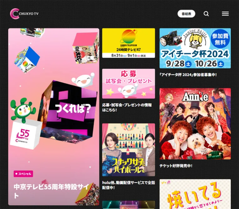
DESIGN REFERENCE
中京テレビ|黒いドット背景とマゼンタの放送局ポータル
非対称の番組・キャンペーン一覧、極太の日本語見出し、大きな角丸セクションが特徴。スマートフォンでは主役のバナーと独立した2列の一覧に再構成され、鮮やかなマゼンタのフッターへ続きます。
オリジナルサイトを見るChukyo TV — Style Reference
A colorful television noticeboard on charcoal dots, followed by broad editorial sections and a vivid magenta footer.
Original URL: https://www.ctv.co.jp/
Final URL: https://www.ctv.co.jp/
Theme: a mixed palette of dark promotional areas, pink section surfaces, white news content, and a magenta footer; no theme switch was evidenced.
Inspected: September 17, 2026, Japan Standard Time. The supplied browser evidence was retrieved at 2026-09-16T20:16:53.419Z, equivalent to 2026-09-17 05:16:53.419 JST.
Viewports: desktop 1440 × 1000 CSS pixels and mobile 390 × 844 CSS pixels.
Scope: the current broadcaster homepage, including its opening promotions, program-section measurements, desktop news and event transition, lower information banners, and desktop/mobile footer. Announcer and service sections are supported by rendered text and links, but their complete visual layouts are not shown in the supplied captures. Menu, search, notification settings, and linked destination pages were not exercised.
Chukyo TV presents a busy regional broadcaster through a relatively restrained interface. Program artwork supplies the faces, colors, titles, and entertainment graphics. The surrounding system uses charcoal, white, pink, heavy Japanese sans-serif text, and simple geometric controls. A fine repeating dot pattern gives the opening background texture without turning it into another promotional image.
The opening composition has three unequal desktop columns: a prominent campaign image, a narrow program column, and a wider program column. Each program column advances independently according to its images and text. On mobile, the campaign moves above two equal columns. Farther down, large rounded section boundaries and oversized headings create pauses between programs, news, events, and services. The footer changes the whole canvas to magenta and places a pale notification panel above corporate and policy links.
How to Read This Reference
- Measured means a value appears in the supplied rendered element bounds or computed styles. Values describe the captured viewport, not necessarily a universal source rule.
- Calculated means simple geometry derived from those measurements, such as gaps between adjacent elements.
- Estimated means a visual approximation from the supplied current-page screenshots. Footer dimensions, several colors, and news typography fall into this category.
- Recommended means an implementation choice for reuse. Breakpoints, accessible focus treatments, and unverified interaction endpoints are recommendations.
- Named tokens are descriptive aliases introduced here. The supplied custom-property extraction was empty; these are not claimed source variable names.
- Only two viewport sizes were inspected. Intermediate layouts, exact media queries, zoom behavior, and landscape behavior remain unverified.
Tokens — Colors
Core Palette
| Name | Value | Suggested token | Role and evidence |
|---|---|---|---|
| Charcoal | #1a1a1a |
--ctv-ink |
Measured main background and default body text; also visually matches the footer buttons and lower dark section |
| White | #ffffff |
--ctv-white |
Measured body background, header text, schedule pill, program heading, and detail-button surfaces |
| Brand Magenta | #e50a84 |
--ctv-brand |
Measured active 総合トップ navigation fill; a useful approximation for the visually similar footer, whose computed fill was not supplied |
| Program Pink | #f848aa |
--ctv-program |
Measured program-section background; visibly lighter than the main magenta accent |
| Pale Pink | #fdecf6 |
--ctv-pale |
Literal color present in an inline decorative SVG style; approximate match for the notification panel, not a measured panel fill |
| Event Gray | approximately #dddddd |
--ctv-event |
Estimated event-section background from the desktop capture |
| Timestamp Gray | approximately #999999 |
--ctv-muted |
Estimated news-date color; distinguish it from primary charcoal text |
| Dot Texture | low-opacity light gray | --ctv-dot |
Visually observed over charcoal; exact color, opacity, and tile dimensions were not supplied |
Keep the two pinks distinct. The active navigation chip uses a saturated magenta; the measured program section uses a lighter pink. White and gray editorial surfaces provide substantial contrast with both.
The image artwork contains many additional colors. Those belong to individual shows, campaigns, and photographs, rather than to a larger interface-token palette. Preserve those assets in full color.
Texture Treatment
The opening background has a small, regular dot pattern, with a visually estimated repeat of roughly 4–5px. The dots remain subordinate to both photographs and white captions.
A recommended approximation is a 5px repeating radial gradient with a light dot about 1px across. The supplied evidence does not establish whether the original uses CSS, an image tile, or another rendering method.
Tokens — Typography
Japanese Sans-Serif Interface
Measured family stack:
'Noto Sans JP Variable', 'Hiragino Kaku Gothic ProN',
'Hiragino Sans', Meiryo, sans-serif
The computed stack explicitly names Noto Sans JP Variable. Font files and the actual face selected for every glyph were not independently inspected.
Use three weight levels:
400for supporting text and inherited defaults.700for navigation, subtitles, and utility emphasis.900for opening promotional captions and major section headings.
The heavy captions are a defining part of the composition. They hold their own beneath visually dense television graphics, without requiring surrounding card panels or badges.
Artwork and Brand Lettering
The header logo and program titles embedded in promotional images are artwork. Their lettering should not be treated as evidence for additional interface fonts.
The footer includes a huge, partially cropped CHUKYO TV wordmark with prominent serifs. Its font or asset implementation was not supplied. Use authorized brand artwork where available; a generic heavy serif is only an approximation for a prototype.
Type Scale
| Role | Desktop | Mobile | Weight / leading | Evidence |
|---|---|---|---|---|
| Main navigation | 14px |
Not visible in the opening header | 700 / 19.6px |
Measured desktop |
| Schedule label | 14px |
10px |
700 / 1 |
Measured both |
| Promotion caption | 20px |
14px |
900 / 1.4 |
Measured both |
| Program section heading | 80px |
56px |
900 / 1.4 |
Measured both |
| Program subtitle | 24px |
16px |
700 / 1.4 |
Measured both |
| News headline | About 20px |
Not visually supplied | Bold, about 28px leading |
Desktop estimate |
| News timestamp | About 14px |
Not visually supplied | About 20px leading |
Desktop estimate |
| Notification heading | About 20px |
About 16px |
Bold | Screenshot estimates |
| Notification instruction | About 12px |
About 12px |
Regular, room for two mobile lines | Screenshot estimates |
| Footer action label | About 16px |
About 16px |
Bold | Screenshot estimates |
| Footer policy link | About 14px |
About 12px |
Bold | Screenshot estimates |
Do not use the body’s computed size as the visible type scale. The captured desktop root/body sizes were 14.4px / 12.6px; mobile reported 32px / 26px. Explicit component styles nevertheless produced 14px mobile promotion captions and a 10px schedule label. Likewise, the sampled parent of a program-detail control does not establish the size of its inner label.
The Quick Start uses ordinary pixel-based component tokens and leaves the surrounding document’s root-size convention intact. No complete responsive font formula was provided.
Tokens — Spacing & Shapes
Spacing Scale
| Use | Desktop | Mobile | Evidence |
|---|---|---|---|
| Opening content side inset | 59.41px |
12px |
Measured bounds |
| Header logo left inset | 44px |
24px |
Measured |
| Header logo top inset | 36px |
24px |
Measured |
| Lead-to-feed horizontal gap | 18px |
Lead stacks above feeds | Calculated |
| Gap between promotion columns | 20px |
12px |
Calculated |
| Gap between cards in one column | 50px |
24px |
Calculated from successive link bounds |
| Image-to-caption separation | About 15px |
About 10px |
Derived from image proportions and caption bounds |
| Lead-to-feed vertical separation | Not applicable | 4px |
Calculated |
| Program section top padding | 160px |
64px |
Measured |
| Program section bottom padding | 200px |
124px |
Measured |
| Heading-to-subtitle gap | 16px |
8px |
Calculated |
| Subtitle-to-program-row gap | 48px |
40px |
Calculated |
| Program tile horizontal gap | 20px |
8px |
Calculated |
| Gap between program rows | 20px |
8px |
Calculated |
| Footer side padding | About 40px |
About 20px |
Screenshot estimates |
| Footer start to notification panel | About 120px |
About 50px |
Screenshot estimates |
| Notification panel to corporate links | About 80px |
About 48px |
Screenshot estimates |
This is a deliberately mixed density system: compact promotion gutters, large gaps between stacked desktop cards, and much larger pauses at section transitions.
Border Radius
| Element | Value | Evidence |
|---|---|---|
| Lead campaign link | 8px |
Measured both viewports |
| Active navigation item | 30px |
Measured |
| Schedule pill | 40px |
Measured both |
| Program detail control | 100px |
Measured both |
| Program section upper corners | 32px desktop; 24px mobile |
Measured |
| Other promotional thumbnails | About 4px |
Visual estimate |
| Notification panel | About 8px |
Visual estimate |
| Corporate and notification actions | Capsule shape | Visual observation |
| Back-to-top control | Circle | Visual observation |
Reserve broad corner radii for section boundaries and capsules. Image corners are much quieter.
Layout Measurements
| Element | Desktop 1440 × 1000 |
Mobile 390 × 844 |
|---|---|---|
| Document height | 9841.31px |
8231.56px |
| Main top padding | 124px |
74px |
| First campaign position | x 59.41, y 124 |
x 12, y 94 |
| Campaign link size | 540 × 344.72px |
366 × 234.56px |
| Narrow promotion column | 315.95px |
177px |
| Wide promotion column | 427.23px |
177px |
| Promotion-column starts | 617.41px, 953.36px |
12px, 201px |
| Logo link bounds | 125 × 50.20px |
83 × 34.27px |
| Schedule link bounds | 78 × 34px |
50 × 22px |
| Search button bounds | 32 × 32px |
22 × 22px |
| Menu button bounds | 80 × 80px |
56 × 56px |
| Program tile bounds | 400 × 210px |
320 × 180px |
| Program detail link | 152 × 54.39px |
152 × 54.39px |
The mobile campaign begins 20px below the opening section’s recorded top. Its image width spans both feed columns and the gutter: 177 + 12 + 177 = 366px.
The program section begins before the opening section’s measured box ends: an 80px overlap on desktop and 64px on mobile. This establishes overlapping section geometry, but does not by itself identify the original margin, transform, or positioning rule.
Components
Site Header
Role: broadcaster identity, category access, and essential utility controls.
At desktop, place the logo toward the upper left, eight category links across the center, and schedule, search, and menu controls at the right. The current page’s 総合トップ link uses a magenta capsule with white bold text. Other navigation links sit directly on the dark background.
Navigation links use 8px 16px padding and 14px / 19.6px bold type. The schedule control reverses to a white capsule with charcoal text. Its measured 78 × 34px box is visually separate from the adjacent search icon.
At mobile, the category row disappears from the visible header. The logo, 番組表, search, and menu remain. The logo becomes 83px wide; schedule type reduces to 10px. The menu’s 56px button box is considerably larger than its visible three-line icon.
The desktop menu stays in the upper-right area in the supplied scrolled captures. It appears as dark lines on a white square over lower content, while its opening state has white lines over the dark background. The exact scroll threshold and state-change mechanism were not supplied. The complete logo/navigation row is not visible in those lower captures.
Lead Campaign Tile
Role: the largest opening promotion.
The current campaign is one linked image with an 8px outer radius. Its illustration combines a pale blue seasonal background, a product prize strip, large embedded numerals, and a mascot. These are part of the asset, not independently styled HTML labels.
At desktop, the tile occupies a 540px column and leaves substantial dark space beneath it in the first viewport. At mobile, it spans the 366px content width above both promotion columns. Preserve the asset’s natural proportions, approximately 1.56:1 in the captured link bounds.
No sticky behavior, campaign rotation, or automatic replacement was demonstrated. A prominent static tile is sufficient for the evidenced state.
Promotion Feed Card
Role: an image-led link to a show, special broadcast, event, or campaign.
Anatomy:
- A linked promotional image with a small corner radius.
- A white, weight-
900caption beneath it. - Broadcast timing or supporting information within the same caption.
- Open dark space before the next card.
Cards have no separate panel fill, border, internal padding, or visible elevation. Their images and captions sit directly on the dotted charcoal canvas.
Many visible images are approximately 16:9, but the feed also contains taller artwork. Preserve per-asset proportions. The desktop drama caption wraps into three lines in the narrower column; the wider variety-show caption fits on one line. Mobile captions wrap naturally at 14px / 19.6px.
Maintain two independent vertical stacks. On mobile, the second card starts at about y 525 in the left stack and y 505 in the right stack because the preceding captions have different heights. Equal-height grid rows would erase this observed rhythm.
Program Section
Role: a large, colorful gateway into the program catalog.
The measured section has a #f848aa fill, rounded upper corners, a centered 番組 heading, and the subtitle オリジナル番組をお見逃しなく. Its heading is 80px / 112px on desktop and 56px / 78.4px on mobile, both weight 900.
Below the title group are two horizontal rows of program tiles. Desktop tile bounds are 400 × 210px, separated by 20px. Mobile tiles are 320 × 180px, separated by 8px. These dimensions establish different viewport treatments; do not assume the desktop and mobile tiles share one aspect ratio.
A white 番組詳細 capsule has a measured 152 × 54.39px box, 16px 24px 16px 32px padding, a 16px internal gap, and a 100px radius. Its coordinates place it centrally within a tile. Whether its visible state depends on hover was not established.
The DOM contains repeated tile groups and offscreen instances. This supports a track-based structure, but does not verify autoplay speed, direction, drag support, or pause behavior. Do not interpret every duplicate link as a separate program.
News Feature and Story List
Role: provide an editorial break and direct access to regional reporting.
The desktop news area uses a white background and a two-part composition. A large lead story sits at the left; three compact image-and-text rows sit at the right.
Screenshot estimates:
- Lead media region: about
504 × 285pxat the shared left content edge. - Gap between lead and list: about
54px. - Small story thumbnails: about
204 × 115px. - Thumbnail-to-copy gap: about
20px. - Space between list rows: about
20px.
The lead photograph is a portrait composition inside a black landscape region. Retain that framing instead of cropping the subject to fill a landscape photograph.
Place a bold headline beneath the lead image, followed by a quieter gray timestamp. Compact story rows place the headline and timestamp to the right of the thumbnail. One long story is visibly shortened with an ellipsis; the full text remains present in the rendered evidence. The exact truncation rule is unverified.
A centered black 中京テレビNEWS NNN capsule closes the section. It is approximately 274 × 73px, with white text and a small magenta circle containing an external-link symbol. Roughly 120px of white space follows it before the next section begins.
Event Section
Role: introduce ticketed entertainment and regional activities.
The desktop capture shows a pale gray full-width section with large rounded upper corners, a centered イベント heading, and the subtitle 今週もイベント目白押し!. The heading appears comparable in size and weight to the measured desktop program heading.
White cards begin in a horizontal row beneath the heading. Their visible upper edges suggest approximately 352px widths, 16px gaps, and 8px radii. Three complete card widths and part of a fourth are visible across the capture. This establishes lateral overflow, but not a specific slider interaction.
Rendered link text supplies the content anatomy: ticket status such as チケット発売中, event name, date, and venue. The lower card interiors are outside the supplied screenshot, so badge colors, internal type sizes, and complete card heights are unverified.
Announcer and Service Gateways
Role: extend the homepage beyond programs and news.
Rendered evidence confirms an announcer section with profile links, a personal-service section with four named offerings, a business-service gateway, a mascot link, and a social-account index.
The service entries pair a name with a short explanation. The business gateway mentions advertising, program purchasing, and new-business inquiries. Preserve that content hierarchy when adapting the page.
Repeated announcer links may belong to a repeated track, but their motion and arrangement are not established by the supplied images. Do not assign an invented portrait-grid layout, card size, or section color.
Lower Information Banner Area
Role: collect secondary public-information and utility destinations.
The desktop footer capture shows a row of bright rectangular banners on a solid dark surface. Visible subjects include media-literacy participation, data broadcasting, a local district destination, and an anti-piracy campaign.
This dark area ends in large rounded lower corners before the magenta footer. The desktop curve is approximately 32px; the mobile capture suggests approximately 24px. These corner treatments visually connect it with the larger section shapes above.
Notification Panel
Role: invite visitors to enable program and event notifications.
The pale pink panel contains three desktop regions: a phone illustration, a copy group, and a black capsule action. The copy group includes the heading 番組・イベントの情報を便利に受け取ろう!, an iOS instruction, and the underlined マニュアルはこちら link.
Desktop screenshot estimates are 1360 × 134px for the panel, 40px outer side margins, and roughly 192 × 54px for the 通知を設定する button. The panel has a small radius and no obvious surrounding shadow. Soft shadows and gradients belong to the phone illustration itself.
Mobile changes the component into a centered vertical composition. The panel is about 350 × 367px, inset 20px from the viewport. The phone art comes first, then the heading and instruction, then the black button. The manual link occupies its own line in the captured mobile state.
The button’s presence is verified; the browser permission flow, subscription result, and platform-specific behavior are not. Keep the linked instructions adjacent to the action.
Corporate and Policy Footer
Role: institutional navigation and page closure.
The footer uses a vivid magenta field with white text. Two outlined capsules, 企業情報 and 採用情報, sit together below the notification panel. They appear approximately 152 × 60px, with a 24px desktop gap and 16px mobile gap. Each contains an external-link glyph.
Below them, policy and contact links form one centered desktop row and two centered mobile rows. A separate プライバシー設定変更 control includes a small gear symbol. The copyright reads ©︎中京テレビ.
A huge lighter-pink CHUKYO TV wordmark is cropped by the bottom and side edges. It operates as decoration behind the lower footer, while the copyright remains legible above it.
Back-to-Top Control
Role: provide a compact return affordance at the end of a long page.
A dark circle containing a white upward arrow appears at the lower right. Its estimated diameter is 60px on desktop and 48px on mobile, with approximately 40px and 20px edge offsets respectively.
The visual affordance is established. Click behavior, scroll duration, and the point at which it becomes visible were not tested.
Tokens — Motion & Interaction
Measured Transition Declarations
| Target | Supplied computed declaration | What is established |
|---|---|---|
| Inactive desktop navigation links | color 0.25s cubic-bezier(0.48, 0.21, 0.55, 0.95) |
Short color interpolation is declared |
| Schedule link | Color, border color, and background color at 0.25s with the same easing |
Multiple visual properties can transition |
| Search and menu buttons | Color at 0.25s with the same easing |
Icon-color feedback is declared |
| Promotion image/text wrappers | Transform at 0.3s; background size at 0.25s, both with the same easing |
Movement or background-based emphasis is supported by declarations |
| Program detail links | Background color at 0.25s with the same easing |
Surface-color feedback is declared |
Shared easing token: cubic-bezier(0.48, 0.21, 0.55, 0.95).
The transition declarations do not expose the target hover transforms, colors, or background sizes. Do not claim a particular zoom factor, underline sweep, or lift distance. Bare transition: all entries elsewhere do not establish a meaningful duration.
Interaction Evidence and Limits
- Promotion, news, event, service, corporate, and manual destinations are present as links.
- Search and menu controls are present as buttons. Open states were not supplied.
- Scrolled desktop captures show the menu in a white surface treatment.
- Repeated program and announcer entries suggest track-oriented components. No temporal sequence establishes their automatic movement.
- Sampled nodes report
animation: none; this does not rule out animation on unsampled wrappers, pseudo-elements, or JavaScript-managed tracks. - The inspection process waited for finite motion and temporarily paused perpetual motion during readiness checks. It is not a record of all animation behavior.
For a new implementation, retain short, restrained control transitions. Any autoplay, smooth scrolling, image zoom, or menu animation should be separately specified and labeled as an addition.
Surfaces
| Layer | Appearance | Purpose |
|---|---|---|
| Opening canvas | Charcoal with fine regular dots | Unifies many unrelated promotional graphics |
| Promotion card | Image and white caption directly on the canvas | Avoids adding another frame around dense artwork |
| Program section | Lighter pink with rounded upper corners | Creates a major catalog gateway |
| News section | White with charcoal headlines and gray dates | Gives editorial stories a quieter context |
| Event section | Light gray with white card surfaces | Separates ticketed content from news |
| Lower banner area | Solid charcoal with rounded lower corners | Groups secondary information destinations |
| Footer | Saturated magenta | Strong branded ending to the long page |
| Notification panel | Pale pink with dark text | A readable information and action island inside the footer |
| Utility actions | Black, white, or outlined capsules | Clear destinations without a general elevation system |
The interface does not depend on a general drop-shadow hierarchy. Photographs, image boundaries, color changes, large spacing, and section corners do most of the grouping.
Imagery
Program art is intentionally heterogeneous: dramatic portraits, crowded variety-show casts, exaggerated expressions, large logos, tropical travel scenes, and colorful prize graphics. Preserve each campaign’s identity rather than recoloring all assets into the interface palette.
Most opening images are landscape compositions. Some are taller, and the lead campaign has its own ratio. Let the image define its height unless a verified component requires a fixed frame. Embedded broadcast dates and show names need sufficient resolution, especially in the 177px mobile columns.
News imagery follows a different standard: documentary photographs, clear rectangular framing, and textual headlines outside the image. Preserve meaningful letterboxing where present. The phone illustration in the footer uses a pale cyan screen, pink utility symbols, and a notification card; it is a distinct explanatory asset.
Do not apply pixelated image rendering, global monochrome filters, or decorative gradients to these photographs. The background dots are a shell treatment, not an image-processing effect.
Observed Asset References
Image file URLs were not included in the supplied evidence. The following are observed link destinations associated with visible artwork, not downloadable asset paths and not independently inspected destination pages.
| Visible artwork | Observed destination | Handling |
|---|---|---|
| Header broadcaster logo | Homepage | Preserve the supplied mark and proportions |
| Lead seasonal prize campaign | Campaign | Natural image proportions; 8px outer radius |
| Drama portrait artwork | Drama page | Landscape artwork with a separate HTML caption |
| Colorful comedy artwork | PS Gold | Preserve embedded title lettering and faces |
| Large cast montage | Omoumai Mise | Occupies the wider desktop feed column |
| Quiz-show artwork | Save Money | Preserve the image’s full composition |
| Notification illustration context | Notification manual | Manual destination only; illustration asset URL unknown |
Use authorized image files from the implementation’s asset inventory. Do not derive filenames from these page URLs.
Layout & Responsive Behavior
Desktop Opening
The opening content spans approximately 1321.19px, centered within 1440px. Its three visible columns are approximately 540px, 315.95px, and 427.23px, separated by 18px and 20px.
The lead image anchors the left. Two independent lists occupy the remaining width. Their first images align at y 124, but subsequent items do not form shared rows. This asymmetry is structural, not an accidental alignment problem.
The header shares the dark canvas, but its logo starts farther left than the content grid. Preserve that distinction rather than forcing every element onto one uniform inset.
Mobile Opening
At 390px, the content inset is 12px. The lead image appears at y 94 and spans 366px. The two promotion columns start at y 332.56, only 4px after the lead link’s measured bottom.
Each column is 177px wide. Captions reduce from 20px to 14px, and vertical card separation reduces from 50px to 24px. The source keeps two columns rather than switching the feed into a single full-width list.
Large Section Scaling
The program heading reduces from 80px to 56px, its subtitle from 24px to 16px, and top padding from 160px to 64px. Upper corner radii change from 32px to 24px.
Program tiles remain wide enough to extend beyond the mobile viewport when arranged in a track. A repeated horizontal sequence should not be squeezed into many tiny thumbnails just to fit one screen.
Footer Reflow
The notification panel changes from a short horizontal strip into a much taller vertical card. Corporate actions remain side by side. Policy links wrap into two rows, and the manual link gets its own line.
The footer keeps generous vertical intervals despite the narrow viewport. Its decoration is clipped, while functional text stays inside the content area. The back-to-top circle becomes smaller and moves closer to the screen edges.
Untested Ranges
The exact navigation-collapse and content-stack breakpoints are unknown. The Quick Start uses 1200px and 767px as recommended starting points, not source measurements. Validate intermediate widths using real captions and artwork. Mobile news, event, announcer, and service layouts were not visually documented in the supplied captures.
Do’s and Don’ts
Do
- Preserve the unequal desktop promotion columns and independent vertical stacks.
- Put the lead campaign above two equal feed columns on mobile.
- Use the measured Japanese sans-serif stack and weight
900for promotion captions. - Keep promotional imagery in full color with its embedded lettering intact.
- Maintain the fine, low-contrast dots over charcoal in the opening area.
- Use white captions directly on the dark canvas without adding panel padding.
- Make major section changes visible through large color fields and broad corner radii.
- Keep news dates subordinate to bold, readable headlines.
- Preserve the notification panel’s substantial mobile reflow.
- Keep the footer’s corporate actions, policy links, and privacy control distinct.
- Treat the giant footer wordmark as clipped decoration.
- Separate confirmed transition timings from unverified interaction behavior.
Don’t
- Don’t replace the homepage with a generic headline-and-CTA landing-page composition.
- Don’t normalize all promotional cards to equal heights or shared rows.
- Don’t crop every asset into one aspect ratio.
- Don’t remove the mobile two-column feed simply because a single column is easier to implement.
- Don’t give every image a large rounded container or floating shadow.
- Don’t treat the pink footer as evidence of a sitewide pink background.
- Don’t recreate program logos with ordinary interface text.
- Don’t apply the mobile body’s inherited
26pxsize to visible captions. - Don’t infer autoplay, drag gestures, hover zoom, or permission outcomes from static captures.
- Don’t display repeated track clones as separate editorial entries.
- Don’t turn hidden fallback text from container extraction into a visible error banner without visual evidence.
Recommended Implementation Additions
These are recommendations for a new implementation, not verified original features:
- Give search, menu, external-link symbols, and back-to-top controls accessible names. Expose menu expansion state and support keyboard closing and focus return.
- Expand the effective mobile search and schedule hit areas toward
44pxwithout enlarging their visible graphics or allowing adjacent targets to overlap. - Provide a visible focus treatment that works on white, charcoal, pink, and image backgrounds.
- Keep captions and destination names accessible independently of embedded image lettering. Supply meaningful alternatives for campaign-only image links.
- If repeated tracks animate, provide pause and reduced-motion behavior. Hide visual clones from the accessibility tree and remove them from keyboard navigation.
- Give notification setup clear unsupported, denied, and enabled states. Preserve the visible iOS guidance and request permission only after the user activates the control.
- Check the contrast of timestamps and small footer labels. A darker gray than the visually estimated timestamp color may be appropriate for new content.
- Use responsive image sources and intrinsic dimensions. Prioritize opening images and defer lower-page artwork without shifting captions as images load.
- Test long Japanese titles and mixed Latin/Japanese names at intermediate widths and browser zoom levels.
Agent Prompt Guide
Quick Color Reference
- Opening canvas and dark utility fills:
#1a1a1a. - Active navigation accent: measured
#e50a84. - Program-section background: measured
#f848aa. - Main light surface and reversed labels:
#ffffff. - Event gray approximation:
#dddddd. - Notification-panel approximation:
#fdecf6. - Opening texture: subtle regularly repeated light dots.
Overall Prompt
“Create a Japanese broadcaster homepage inspired by the current Chukyo TV composition. Use a charcoal dotted opening canvas, a compact logo and navigation header, and an asymmetric promotion layout: a large campaign image at left, a narrower independent image-and-caption stack in the middle, and a wider stack at right. Captions use Noto Sans JP Variable or the supplied Japanese sans-serif fallbacks, weight 900, at 20px on desktop and 14px on mobile. On a 390px viewport, place the campaign above two 177px columns with a 12px gutter. Continue into large rounded section surfaces for programs, news, and events. Finish with a vivid magenta footer, a pale notification panel, outlined corporate links, and an oversized cropped decorative wordmark. Use full-color authorized artwork and distinguish measured behavior from recommended interactions.”
Example Component Prompts
- Opening feed: “Build two independent vertical stacks of linked promotional images and bold white captions on a subtly dotted charcoal background. Desktop stack widths are approximately 316px and 427px, with a 20px gutter and 50px gaps between cards. On mobile, use two equal 177px stacks, a 12px gutter, and 24px vertical gaps. Preserve each image’s proportions.”
- Header: “Place the broadcaster logo at left, a magenta active navigation capsule among white category links, and a white schedule pill followed by search and menu icons at right. At mobile sizes, retain the logo and three utilities while hiding the inline category row. Keep the visible graphics compact and give icon buttons generous hit areas.”
- Program section: “Create a #f848aa section with 32px rounded upper corners, a centered 80px weight-900 heading, and a 24px bold subtitle. Add two horizontal program-art rows with 400 by 210px desktop tiles. On mobile, use 24px section corners, a 56px heading, and 320 by 180px tiles. Do not assume autoplay.”
- News block: “On white, place a large lead story at left and three compact thumbnail-and-headline rows at right. Use bold charcoal headlines and small gray timestamps. Keep the lead photograph’s black letterboxing. Finish with a centered black capsule containing the news destination label and a magenta external-link circle.”
- Notification panel: “Build a pale pink panel with phone illustration, bold explanatory copy, a small iOS instruction and underlined manual link, and a black pill button. At desktop it is a short horizontal strip. At 390px it becomes a 350px-wide centered vertical card with the illustration first and the manual link on its own line.”
- Footer: “Use a saturated magenta background, two white outlined corporate capsules, centered policy links that wrap on mobile, a separate privacy-settings control, and a small copyright. Crop a huge lighter-pink CHUKYO TV decorative wordmark at the bottom. Add a dark circular upward-arrow control without covering the functional links.”
Quick Start
CSS Custom Properties
This is a reusable adaptation, not recovered source CSS. Exact colors, type sizes, easing, and several component dimensions come from the measurements above. Texture values, some footer colors, responsive breakpoints, focus styling, and hover endpoints are recommendations.
Load the named font through an authorized asset or an existing project font definition. No font-file URL was supplied.
:root {
  /* Measured interface colors */
  --ctv-ink: #1a1a1a;
  --ctv-white: #ffffff;
  --ctv-brand: #e50a84;
  --ctv-program: #f848aa;

  /* Approximate surfaces and recommended texture */
  --ctv-pale: #fdecf6;
  --ctv-event: #dddddd;
  --ctv-dot: rgb(255 255 255 / 0.18);
  --ctv-muted-readable: #707070;

  --ctv-font: 'Noto Sans JP Variable',
    'Hiragino Kaku Gothic ProN', 'Hiragino Sans',
    Meiryo, sans-serif;
  --ctv-weight-bold: 700;
  --ctv-weight-heavy: 900;
  --ctv-caption: 20px;
  --ctv-heading: 80px;
  --ctv-subtitle: 24px;

  /* Desktop geometry; maximum width is an adaptation */
  --ctv-inset: clamp(24px, 4.125vw, 80px);
  --ctv-content-max: 1321.2px;
  --ctv-feed-gap: 20px;
  --ctv-card-gap: 50px;
  --ctv-section-radius: 32px;
  --ctv-image-radius: 4px;
  --ctv-panel-radius: 8px;

  --ctv-ease: cubic-bezier(0.48, 0.21, 0.55, 0.95);
  --ctv-color-duration: 250ms;
  --ctv-transform-duration: 300ms;
}
Component CSS
Expected structure: .feature-layout contains one .lead-promo link and one .feature-feeds wrapper. The feeds wrapper contains exactly two .promo-column lists, each holding .promo-card links. A card contains .promo-media and .promo-title. The notification panel contains artwork, a copy group, and its action. Keep decorative wordmarks and icons separate from accessible labels.
The program and event rows below use native horizontal overflow as a recommended functional baseline. They do not implement or claim the original track animation.
.ctv-page,
.ctv-page * {
  box-sizing: border-box;
}

.ctv-page {
  position: relative;
  color: var(--ctv-ink);
  background: var(--ctv-white);
  font-family: var(--ctv-font);
  font-size: 16px;
  line-height: 1.4;
}

.ctv-page button {
  font: inherit;
  cursor: pointer;
}

.ctv-container {
  width: calc(100% - 2 * var(--ctv-inset));
  max-width: var(--ctv-content-max);
  margin-inline: auto;
}

/* Opening canvas and independent promotion columns */
.feature-section {
  padding: 124px 0 200px;
  color: var(--ctv-white);
  background-color: var(--ctv-ink);
  background-image: radial-gradient(
    circle, var(--ctv-dot) 0.55px, transparent 0.7px
  );
  background-size: 5px 5px;
}

.feature-layout {
  display: grid;
  grid-template-columns:
    minmax(0, 540fr) minmax(0, 763.1875fr);
  align-items: start;
  gap: 18px;
}

.lead-promo {
  display: block;
  overflow: hidden;
  border-radius: var(--ctv-panel-radius);
}

.lead-promo img,
.promo-media img {
  display: block;
  width: 100%;
  height: auto;
}

.feature-feeds {
  display: grid;
  grid-template-columns:
    minmax(0, 315.953125fr) minmax(0, 427.234375fr);
  align-items: start;
  gap: var(--ctv-feed-gap);
}

.promo-column {
  display: flex;
  flex-direction: column;
  gap: var(--ctv-card-gap);
  min-width: 0;
  margin: 0;
  padding: 0;
  list-style: none;
}

.promo-card {
  display: block;
  min-width: 0;
  color: inherit;
  text-decoration: none;
}

.promo-media {
  overflow: hidden;
  border-radius: var(--ctv-image-radius);
}

.promo-title {
  margin: 15px 0 0;
  font-size: var(--ctv-caption);
  font-weight: var(--ctv-weight-heavy);
  line-height: 1.4;
  overflow-wrap: anywhere;
}

/* Header positions approximate the inspected desktop geometry */
.site-header {
  position: absolute;
  inset: 0 0 auto;
  z-index: 10;
  height: 120px;
  color: var(--ctv-white);
}

.site-brand {
  position: absolute;
  top: 36px;
  left: 44px;
  width: 125px;
}

.site-brand img {
  display: block;
  width: 100%;
  height: auto;
}

.primary-nav {
  position: absolute;
  top: 42px;
  left: calc(50% - 50px);
  display: flex;
  width: max-content;
  transform: translateX(-50%);
}

.primary-nav a {
  padding: 8px 16px;
  border-radius: 30px;
  color: inherit;
  font-size: 14px;
  font-weight: 700;
  line-height: 1.4;
  text-decoration: none;
  transition: color 250ms var(--ctv-ease);
}

.primary-nav a[aria-current='page'] {
  color: var(--ctv-white);
  background: var(--ctv-brand);
}

.schedule-link {
  position: absolute;
  top: 43px;
  right: 192px;
  display: grid;
  place-items: center;
  width: 78px;
  height: 34px;
  border: 2px solid #dddddd;
  border-radius: 40px;
  color: var(--ctv-ink);
  background: var(--ctv-white);
  font-size: 14px;
  font-weight: 700;
  line-height: 1;
  text-decoration: none;
  transition:
    color 250ms var(--ctv-ease),
    background-color 250ms var(--ctv-ease),
    border-color 250ms var(--ctv-ease);
}

.search-button,
.menu-button {
  display: grid;
  place-items: center;
  padding: 0;
  border: 0;
  color: inherit;
  background: transparent;
  transition: color 250ms var(--ctv-ease);
}

.search-button {
  position: absolute;
  top: 44px;
  right: 128px;
  width: 32px;
  height: 32px;
}

.menu-button {
  position: fixed;
  top: 20px;
  right: 20px;
  z-index: 30;
  width: 80px;
  height: 80px;
  color: var(--ctv-white);
}

/* Apply this state through separately implemented scroll logic */
.ctv-page[data-scrolled='true'] .menu-button {
  border-radius: 4px;
  color: var(--ctv-ink);
  background: var(--ctv-white);
}

/* Large section surfaces */
.ctv-section {
  position: relative;
  padding: 160px 0 200px;
  border-radius:
    var(--ctv-section-radius) var(--ctv-section-radius) 0 0;
}

.section-heading {
  margin: 0;
  font-size: var(--ctv-heading);
  font-weight: var(--ctv-weight-heavy);
  line-height: 1.4;
  text-align: center;
}

.section-subtitle {
  margin: 16px 0 0;
  font-size: var(--ctv-subtitle);
  font-weight: 700;
  line-height: 1.4;
  text-align: center;
}

.program-section {
  margin-top: -80px;
  color: var(--ctv-white);
  background: var(--ctv-program);
}

.program-rail {
  display: grid;
  gap: 20px;
  margin-top: 48px;
}

.program-row {
  display: flex;
  gap: 20px;
  overflow-x: auto;
  padding-inline: 10px;
}

.program-item {
  position: relative;
  flex: 0 0 400px;
  height: 210px;
}

.program-item img {
  display: block;
  width: 100%;
  height: 100%;
  object-fit: contain;
}

/* Persistent detail access is a recommended baseline */
.program-detail {
  position: absolute;
  top: 50%;
  left: 50%;
  display: inline-flex;
  align-items: center;
  justify-content: center;
  gap: 16px;
  width: 152px;
  min-height: 54px;
  padding: 16px 24px 16px 32px;
  border-radius: 100px;
  color: var(--ctv-ink);
  background: var(--ctv-white);
  font-size: 16px;
  font-weight: 700;
  text-decoration: none;
  transform: translate(-50%, -50%);
  transition: background-color 250ms var(--ctv-ease);
}

/* News dimensions below are screenshot-based approximations */
.news-layout {
  display: grid;
  grid-template-columns: minmax(0, 504fr) minmax(0, 763fr);
  gap: 54px;
}

.news-photo {
  display: block;
  width: 100%;
  aspect-ratio: 16 / 9;
  border-radius: 4px;
  background: #111111;
  object-fit: contain;
}

.news-list {
  display: grid;
  align-content: start;
  gap: 20px;
}

.news-row {
  display: grid;
  grid-template-columns: 204px minmax(0, 1fr);
  align-items: center;
  gap: 20px;
}

.news-headline {
  margin: 0;
  font-size: 20px;
  font-weight: 700;
  line-height: 1.4;
}

.news-lead .news-headline {
  margin-top: 20px;
}

.news-date {
  display: block;
  margin-top: 8px;
  color: var(--ctv-muted-readable);
  font-size: 14px;
  line-height: 1.4;
}

.event-section {
  background: var(--ctv-event);
}

.event-track {
  display: flex;
  gap: 16px;
  overflow-x: auto;
  margin-top: 40px;
  padding-inline: var(--ctv-inset);
}

.event-card {
  flex: 0 0 352px;
  padding: 16px;
  border-radius: 8px;
  background: var(--ctv-white);
}

/* Footer dimensions and fills are screenshot approximations */
.ctv-footer {
  position: relative;
  isolation: isolate;
  overflow: hidden;
  padding: 120px 40px 56px;
  color: var(--ctv-white);
  background: var(--ctv-brand);
}

.notification-panel {
  display: grid;
  grid-template-columns: 314px minmax(0, 1fr) 192px;
  align-items: center;
  gap: 20px;
  min-height: 134px;
  padding-inline: 80px;
  border-radius: 8px;
  color: var(--ctv-ink);
  background: var(--ctv-pale);
}

.notification-art {
  display: block;
  width: 100%;
  height: 134px;
  object-fit: contain;
}

.notification-title {
  margin: 0;
  font-size: 20px;
  font-weight: 700;
  line-height: 1.4;
}

.notification-note {
  margin: 4px 0 0;
  font-size: 12px;
  line-height: 1.7;
}

.notification-note a {
  color: inherit;
  text-decoration: underline;
}

.pill-action {
  display: inline-flex;
  align-items: center;
  justify-content: center;
  gap: 8px;
  min-height: 54px;
  padding: 14px 32px;
  border: 0;
  border-radius: 100px;
  color: var(--ctv-white);
  background: var(--ctv-ink);
  font-size: 16px;
  font-weight: 700;
  line-height: 1.4;
  text-decoration: none;
}

.footer-corporate {
  display: flex;
  justify-content: center;
  gap: 24px;
  margin-top: 80px;
}

.outline-pill {
  min-width: 152px;
  min-height: 60px;
  border: 2px solid currentColor;
  background: transparent;
}

.footer-links {
  display: flex;
  flex-wrap: wrap;
  justify-content: center;
  gap: 16px 24px;
  margin: 40px 0 0;
  padding: 0;
  list-style: none;
  font-size: 14px;
  font-weight: 700;
}

.footer-links a {
  color: inherit;
  text-decoration: none;
}

.footer-privacy {
  display: block;
  margin: 16px auto 0;
  padding: 0;
  border: 0;
  color: inherit;
  background: transparent;
  font-size: 14px;
  font-weight: 700;
}

.footer-copyright {
  position: relative;
  margin: 140px 0 0;
  font-size: 14px;
  text-align: center;
}

/* Prefer authorized brand artwork; serif is a prototype fallback */
.footer-wordmark {
  position: absolute;
  z-index: -1;
  bottom: -0.12em;
  left: 50%;
  color: var(--ctv-program);
  font-family: serif;
  font-size: clamp(56px, 14vw, 200px);
  font-weight: 900;
  line-height: 1;
  white-space: nowrap;
  pointer-events: none;
  transform: translateX(-50%);
}

.back-to-top {
  position: fixed;
  right: 40px;
  bottom: 40px;
  z-index: 20;
  display: grid;
  place-items: center;
  width: 60px;
  height: 60px;
  border: 0;
  border-radius: 50%;
  color: var(--ctv-white);
  background: var(--ctv-ink);
  text-decoration: none;
}

/* Recommended feedback; original hover endpoints were not supplied */
@media (hover: hover) {
  .promo-card:hover .promo-title,
  .footer-links a:hover {
    text-decoration: underline;
    text-underline-offset: 0.2em;
  }
}

.ctv-page :focus-visible {
  outline: 2px solid white;
  outline-offset: 2px;
  box-shadow: 0 0 0 4px var(--ctv-ink);
}

/* Recommended intermediate-width behavior */
@media (max-width: 1200px) {
  .primary-nav {
    display: none;
  }

  .notification-panel {
    grid-template-columns: 220px minmax(0, 1fr) 192px;
    padding-inline: 24px;
  }

  .news-row {
    grid-template-columns: minmax(100px, 30%) minmax(0, 1fr);
  }
}

/* Recommended breakpoint; values target the inspected mobile state */
@media (max-width: 767px) {
  .ctv-page {
    --ctv-inset: 12px;
    --ctv-caption: 14px;
    --ctv-heading: 56px;
    --ctv-subtitle: 16px;
    --ctv-feed-gap: 12px;
    --ctv-card-gap: 24px;
    --ctv-section-radius: 24px;
  }

  .feature-section {
    padding: 94px 0 124px;
  }

  .feature-layout {
    grid-template-columns: minmax(0, 1fr);
    gap: 4px;
  }

  .feature-feeds {
    grid-template-columns: repeat(2, minmax(0, 1fr));
  }

  .promo-title {
    margin-top: 10px;
  }

  .site-brand {
    top: 24px;
    left: 24px;
    width: 83px;
  }

  .schedule-link {
    top: 29px;
    right: 132px;
    width: 50px;
    height: 22px;
    font-size: 10px;
  }

  .search-button {
    top: 29px;
    right: 94px;
    width: 22px;
    height: 22px;
  }

  .menu-button {
    top: 12px;
    right: 12px;
    width: 56px;
    height: 56px;
  }

  /* Expand hit targets while preserving the visible control bounds */
  .search-button::after,
  .schedule-link::after {
    position: absolute;
    top: 50%;
    left: 50%;
    width: max(100%, 44px);
    height: 44px;
    content: '';
    transform: translate(-50%, -50%);
  }

  .ctv-section {
    padding-block: 64px 124px;
  }

  .program-section {
    margin-top: -64px;
  }

  .section-subtitle {
    margin-top: 8px;
  }

  .program-rail {
    gap: 8px;
    margin-top: 40px;
  }

  .program-row {
    gap: 8px;
  }

  .program-item {
    flex-basis: 320px;
    height: 180px;
  }

  /* Mobile news layout is a recommendation, not a captured state */
  .news-layout {
    grid-template-columns: minmax(0, 1fr);
    gap: 32px;
  }

  .news-headline {
    font-size: 16px;
  }

  .event-card {
    flex-basis: min(320px, 85vw);
  }

  .ctv-footer {
    padding: 50px 20px 32px;
  }

  .notification-panel {
    grid-template-columns: minmax(0, 1fr);
    justify-items: center;
    gap: 20px;
    padding: 20px 30px 24px;
    text-align: center;
  }

  .notification-art {
    width: min(100%, 280px);
    height: 168px;
  }

  .notification-title {
    font-size: 16px;
  }

  .notification-manual {
    display: block;
  }

  .notification-panel .pill-action {
    min-width: 192px;
  }

  .footer-corporate {
    flex-wrap: wrap;
    gap: 16px;
    margin-top: 48px;
  }

  .footer-links {
    gap: 16px 20px;
    font-size: 12px;
    line-height: 1.5;
  }

  .footer-privacy {
    margin-top: 32px;
    font-size: 12px;
    line-height: 1.5;
  }

  .footer-copyright {
    margin-top: 60px;
    font-size: 12px;
    line-height: 1.5;
  }

  .back-to-top {
    right: 20px;
    bottom: 20px;
    width: 48px;
    height: 48px;
  }
}

/* Recommended reduced-motion baseline */
@media (prefers-reduced-motion: reduce) {
  .ctv-page *,
  .ctv-page *::before,
  .ctv-page *::after {
    animation: none !important;
    transition-duration: 0.01ms !important;
    scroll-behavior: auto !important;
  }
}
Use actual links for destinations and buttons for settings or menus. The back-to-top control can link to an existing page-top anchor. Search, menu management, notification subscriptions, optional track movement, and scroll-state updates require separate behavior; this CSS does not implement them.
Tailwind v4 Token Mapping
Optional mapping for a project already using Tailwind v4. These are adaptation tokens, not evidence that the original site uses Tailwind. Define the custom properties above first.
@theme inline {
  --color-ctv-ink: var(--ctv-ink);
  --color-ctv-white: var(--ctv-white);
  --color-ctv-brand: var(--ctv-brand);
  --color-ctv-program: var(--ctv-program);
  --color-ctv-pale: var(--ctv-pale);
  --color-ctv-event: var(--ctv-event);

  --font-ctv: var(--ctv-font);
  --text-promo: var(--ctv-caption);
  --text-section: var(--ctv-heading);
  --text-section-subtitle: var(--ctv-subtitle);

  --spacing-feed-gap: var(--ctv-feed-gap);
  --spacing-card-gap: var(--ctv-card-gap);
  --radius-section: var(--ctv-section-radius);
  --radius-media: var(--ctv-image-radius);
  --radius-panel: var(--ctv-panel-radius);
  --ease-ctv: var(--ctv-ease);
}
Sources & Evidence
- Chukyo TV homepage: original and final inspected URL, with supplied HTTP status
200. The document title and visible footer identify the site as中京テレビ. - Supplied browser evidence retrieved at
2026-09-16T20:16:53.419Z, corresponding to September 17, 2026 in Japan. - Three current-page desktop captures at
1440 × 1000: the opening promotion area, the news-to-event transition, and the lower banner/footer area. - Two current-page mobile captures at
390 × 844: the opening promotion area and footer. - Rendered DOM evidence at both viewports: link destinations, computed family stacks, explicit component type sizes and weights, element rectangles, section padding and radii, and transition declarations.
- Detailed element samples concentrate on the header, opening promotions, and program tracks. Later-page measurements in this reference are explicitly identified as screenshot estimates where computed styles were unavailable.
The supplied inspection waited for document readiness, visible image decoding, and sampled layout/text stability. It traversed intermediate scroll positions and temporarily paused perpetual animations during readiness checks. SharedWorkers and service workers were disabled. These conditions do not establish semantic completeness, every delayed state, or the full behavior of notifications and animation.
Container text includes hidden menu content, fallback messages, and embedded script/style text. Their presence alone is not evidence that visitors saw those strings. The original-page captures show populated promotional images rather than a pagewide loading failure.
This reference was prepared from the supplied evidence without additional browsing, command execution, file inspection, or interaction testing. Asset file paths, exact breakpoints, hover endpoints, open overlays, and linked-page designs remain unverified.
# Chukyo TV — Style Reference

> A colorful television noticeboard on charcoal dots, followed by broad editorial sections and a vivid magenta footer.

**Original URL:** [https://www.ctv.co.jp/](https://www.ctv.co.jp/)
**Final URL:** [https://www.ctv.co.jp/](https://www.ctv.co.jp/)
**Theme:** a mixed palette of dark promotional areas, pink section surfaces, white news content, and a magenta footer; no theme switch was evidenced.
**Inspected:** September 17, 2026, Japan Standard Time. The supplied browser evidence was retrieved at `2026-09-16T20:16:53.419Z`, equivalent to `2026-09-17 05:16:53.419 JST`.
**Viewports:** desktop `1440 × 1000` CSS pixels and mobile `390 × 844` CSS pixels.
**Scope:** the current broadcaster homepage, including its opening promotions, program-section measurements, desktop news and event transition, lower information banners, and desktop/mobile footer. Announcer and service sections are supported by rendered text and links, but their complete visual layouts are not shown in the supplied captures. Menu, search, notification settings, and linked destination pages were not exercised.

Chukyo TV presents a busy regional broadcaster through a relatively restrained interface. Program artwork supplies the faces, colors, titles, and entertainment graphics. The surrounding system uses charcoal, white, pink, heavy Japanese sans-serif text, and simple geometric controls. A fine repeating dot pattern gives the opening background texture without turning it into another promotional image.

The opening composition has three unequal desktop columns: a prominent campaign image, a narrow program column, and a wider program column. Each program column advances independently according to its images and text. On mobile, the campaign moves above two equal columns. Farther down, large rounded section boundaries and oversized headings create pauses between programs, news, events, and services. The footer changes the whole canvas to magenta and places a pale notification panel above corporate and policy links.

## How to Read This Reference

- **Measured** means a value appears in the supplied rendered element bounds or computed styles. Values describe the captured viewport, not necessarily a universal source rule.
- **Calculated** means simple geometry derived from those measurements, such as gaps between adjacent elements.
- **Estimated** means a visual approximation from the supplied current-page screenshots. Footer dimensions, several colors, and news typography fall into this category.
- **Recommended** means an implementation choice for reuse. Breakpoints, accessible focus treatments, and unverified interaction endpoints are recommendations.
- **Named tokens** are descriptive aliases introduced here. The supplied custom-property extraction was empty; these are not claimed source variable names.
- Only two viewport sizes were inspected. Intermediate layouts, exact media queries, zoom behavior, and landscape behavior remain unverified.

## Tokens — Colors

### Core Palette

| Name | Value | Suggested token | Role and evidence |
| --- | --- | --- | --- |
| Charcoal | `#1a1a1a` | `--ctv-ink` | Measured main background and default body text; also visually matches the footer buttons and lower dark section |
| White | `#ffffff` | `--ctv-white` | Measured body background, header text, schedule pill, program heading, and detail-button surfaces |
| Brand Magenta | `#e50a84` | `--ctv-brand` | Measured active `総合トップ` navigation fill; a useful approximation for the visually similar footer, whose computed fill was not supplied |
| Program Pink | `#f848aa` | `--ctv-program` | Measured program-section background; visibly lighter than the main magenta accent |
| Pale Pink | `#fdecf6` | `--ctv-pale` | Literal color present in an inline decorative SVG style; approximate match for the notification panel, not a measured panel fill |
| Event Gray | approximately `#dddddd` | `--ctv-event` | Estimated event-section background from the desktop capture |
| Timestamp Gray | approximately `#999999` | `--ctv-muted` | Estimated news-date color; distinguish it from primary charcoal text |
| Dot Texture | low-opacity light gray | `--ctv-dot` | Visually observed over charcoal; exact color, opacity, and tile dimensions were not supplied |

Keep the two pinks distinct. The active navigation chip uses a saturated magenta; the measured program section uses a lighter pink. White and gray editorial surfaces provide substantial contrast with both.

The image artwork contains many additional colors. Those belong to individual shows, campaigns, and photographs, rather than to a larger interface-token palette. Preserve those assets in full color.

### Texture Treatment

The opening background has a small, regular dot pattern, with a visually estimated repeat of roughly `4–5px`. The dots remain subordinate to both photographs and white captions.

A recommended approximation is a `5px` repeating radial gradient with a light dot about `1px` across. The supplied evidence does not establish whether the original uses CSS, an image tile, or another rendering method.

## Tokens — Typography

### Japanese Sans-Serif Interface

**Measured family stack:**

```css
'Noto Sans JP Variable', 'Hiragino Kaku Gothic ProN',
'Hiragino Sans', Meiryo, sans-serif
```

The computed stack explicitly names Noto Sans JP Variable. Font files and the actual face selected for every glyph were not independently inspected.

Use three weight levels:

- `400` for supporting text and inherited defaults.
- `700` for navigation, subtitles, and utility emphasis.
- `900` for opening promotional captions and major section headings.

The heavy captions are a defining part of the composition. They hold their own beneath visually dense television graphics, without requiring surrounding card panels or badges.

### Artwork and Brand Lettering

The header logo and program titles embedded in promotional images are artwork. Their lettering should not be treated as evidence for additional interface fonts.

The footer includes a huge, partially cropped `CHUKYO TV` wordmark with prominent serifs. Its font or asset implementation was not supplied. Use authorized brand artwork where available; a generic heavy serif is only an approximation for a prototype.

### Type Scale

| Role | Desktop | Mobile | Weight / leading | Evidence |
| --- | --- | --- | --- | --- |
| Main navigation | `14px` | Not visible in the opening header | `700 / 19.6px` | Measured desktop |
| Schedule label | `14px` | `10px` | `700 / 1` | Measured both |
| Promotion caption | `20px` | `14px` | `900 / 1.4` | Measured both |
| Program section heading | `80px` | `56px` | `900 / 1.4` | Measured both |
| Program subtitle | `24px` | `16px` | `700 / 1.4` | Measured both |
| News headline | About `20px` | Not visually supplied | Bold, about `28px` leading | Desktop estimate |
| News timestamp | About `14px` | Not visually supplied | About `20px` leading | Desktop estimate |
| Notification heading | About `20px` | About `16px` | Bold | Screenshot estimates |
| Notification instruction | About `12px` | About `12px` | Regular, room for two mobile lines | Screenshot estimates |
| Footer action label | About `16px` | About `16px` | Bold | Screenshot estimates |
| Footer policy link | About `14px` | About `12px` | Bold | Screenshot estimates |

**Do not use the body’s computed size as the visible type scale.** The captured desktop root/body sizes were `14.4px / 12.6px`; mobile reported `32px / 26px`. Explicit component styles nevertheless produced `14px` mobile promotion captions and a `10px` schedule label. Likewise, the sampled parent of a program-detail control does not establish the size of its inner label.

The Quick Start uses ordinary pixel-based component tokens and leaves the surrounding document’s root-size convention intact. No complete responsive font formula was provided.

## Tokens — Spacing & Shapes

### Spacing Scale

| Use | Desktop | Mobile | Evidence |
| --- | --- | --- | --- |
| Opening content side inset | `59.41px` | `12px` | Measured bounds |
| Header logo left inset | `44px` | `24px` | Measured |
| Header logo top inset | `36px` | `24px` | Measured |
| Lead-to-feed horizontal gap | `18px` | Lead stacks above feeds | Calculated |
| Gap between promotion columns | `20px` | `12px` | Calculated |
| Gap between cards in one column | `50px` | `24px` | Calculated from successive link bounds |
| Image-to-caption separation | About `15px` | About `10px` | Derived from image proportions and caption bounds |
| Lead-to-feed vertical separation | Not applicable | `4px` | Calculated |
| Program section top padding | `160px` | `64px` | Measured |
| Program section bottom padding | `200px` | `124px` | Measured |
| Heading-to-subtitle gap | `16px` | `8px` | Calculated |
| Subtitle-to-program-row gap | `48px` | `40px` | Calculated |
| Program tile horizontal gap | `20px` | `8px` | Calculated |
| Gap between program rows | `20px` | `8px` | Calculated |
| Footer side padding | About `40px` | About `20px` | Screenshot estimates |
| Footer start to notification panel | About `120px` | About `50px` | Screenshot estimates |
| Notification panel to corporate links | About `80px` | About `48px` | Screenshot estimates |

This is a deliberately mixed density system: compact promotion gutters, large gaps between stacked desktop cards, and much larger pauses at section transitions.

### Border Radius

| Element | Value | Evidence |
| --- | --- | --- |
| Lead campaign link | `8px` | Measured both viewports |
| Active navigation item | `30px` | Measured |
| Schedule pill | `40px` | Measured both |
| Program detail control | `100px` | Measured both |
| Program section upper corners | `32px` desktop; `24px` mobile | Measured |
| Other promotional thumbnails | About `4px` | Visual estimate |
| Notification panel | About `8px` | Visual estimate |
| Corporate and notification actions | Capsule shape | Visual observation |
| Back-to-top control | Circle | Visual observation |

Reserve broad corner radii for section boundaries and capsules. Image corners are much quieter.

### Layout Measurements

| Element | Desktop `1440 × 1000` | Mobile `390 × 844` |
| --- | --- | --- |
| Document height | `9841.31px` | `8231.56px` |
| Main top padding | `124px` | `74px` |
| First campaign position | `x 59.41, y 124` | `x 12, y 94` |
| Campaign link size | `540 × 344.72px` | `366 × 234.56px` |
| Narrow promotion column | `315.95px` | `177px` |
| Wide promotion column | `427.23px` | `177px` |
| Promotion-column starts | `617.41px`, `953.36px` | `12px`, `201px` |
| Logo link bounds | `125 × 50.20px` | `83 × 34.27px` |
| Schedule link bounds | `78 × 34px` | `50 × 22px` |
| Search button bounds | `32 × 32px` | `22 × 22px` |
| Menu button bounds | `80 × 80px` | `56 × 56px` |
| Program tile bounds | `400 × 210px` | `320 × 180px` |
| Program detail link | `152 × 54.39px` | `152 × 54.39px` |

The mobile campaign begins `20px` below the opening section’s recorded top. Its image width spans both feed columns and the gutter: `177 + 12 + 177 = 366px`.

The program section begins before the opening section’s measured box ends: an `80px` overlap on desktop and `64px` on mobile. This establishes overlapping section geometry, but does not by itself identify the original margin, transform, or positioning rule.

## Components

### Site Header

**Role:** broadcaster identity, category access, and essential utility controls.

At desktop, place the logo toward the upper left, eight category links across the center, and schedule, search, and menu controls at the right. The current page’s `総合トップ` link uses a magenta capsule with white bold text. Other navigation links sit directly on the dark background.

Navigation links use `8px 16px` padding and `14px / 19.6px` bold type. The schedule control reverses to a white capsule with charcoal text. Its measured `78 × 34px` box is visually separate from the adjacent search icon.

At mobile, the category row disappears from the visible header. The logo, `番組表`, search, and menu remain. The logo becomes `83px` wide; schedule type reduces to `10px`. The menu’s `56px` button box is considerably larger than its visible three-line icon.

The desktop menu stays in the upper-right area in the supplied scrolled captures. It appears as dark lines on a white square over lower content, while its opening state has white lines over the dark background. The exact scroll threshold and state-change mechanism were not supplied. The complete logo/navigation row is not visible in those lower captures.

### Lead Campaign Tile

**Role:** the largest opening promotion.

The current campaign is one linked image with an `8px` outer radius. Its illustration combines a pale blue seasonal background, a product prize strip, large embedded numerals, and a mascot. These are part of the asset, not independently styled HTML labels.

At desktop, the tile occupies a `540px` column and leaves substantial dark space beneath it in the first viewport. At mobile, it spans the `366px` content width above both promotion columns. Preserve the asset’s natural proportions, approximately `1.56:1` in the captured link bounds.

No sticky behavior, campaign rotation, or automatic replacement was demonstrated. A prominent static tile is sufficient for the evidenced state.

### Promotion Feed Card

**Role:** an image-led link to a show, special broadcast, event, or campaign.

Anatomy:

1. A linked promotional image with a small corner radius.
2. A white, weight-`900` caption beneath it.
3. Broadcast timing or supporting information within the same caption.
4. Open dark space before the next card.

Cards have no separate panel fill, border, internal padding, or visible elevation. Their images and captions sit directly on the dotted charcoal canvas.

Many visible images are approximately `16:9`, but the feed also contains taller artwork. Preserve per-asset proportions. The desktop drama caption wraps into three lines in the narrower column; the wider variety-show caption fits on one line. Mobile captions wrap naturally at `14px / 19.6px`.

Maintain two independent vertical stacks. On mobile, the second card starts at about `y 525` in the left stack and `y 505` in the right stack because the preceding captions have different heights. Equal-height grid rows would erase this observed rhythm.

### Program Section

**Role:** a large, colorful gateway into the program catalog.

The measured section has a `#f848aa` fill, rounded upper corners, a centered `番組` heading, and the subtitle `オリジナル番組をお見逃しなく`. Its heading is `80px / 112px` on desktop and `56px / 78.4px` on mobile, both weight `900`.

Below the title group are two horizontal rows of program tiles. Desktop tile bounds are `400 × 210px`, separated by `20px`. Mobile tiles are `320 × 180px`, separated by `8px`. These dimensions establish different viewport treatments; do not assume the desktop and mobile tiles share one aspect ratio.

A white `番組詳細` capsule has a measured `152 × 54.39px` box, `16px 24px 16px 32px` padding, a `16px` internal gap, and a `100px` radius. Its coordinates place it centrally within a tile. Whether its visible state depends on hover was not established.

The DOM contains repeated tile groups and offscreen instances. This supports a track-based structure, but does not verify autoplay speed, direction, drag support, or pause behavior. Do not interpret every duplicate link as a separate program.

### News Feature and Story List

**Role:** provide an editorial break and direct access to regional reporting.

The desktop news area uses a white background and a two-part composition. A large lead story sits at the left; three compact image-and-text rows sit at the right.

Screenshot estimates:

- Lead media region: about `504 × 285px` at the shared left content edge.
- Gap between lead and list: about `54px`.
- Small story thumbnails: about `204 × 115px`.
- Thumbnail-to-copy gap: about `20px`.
- Space between list rows: about `20px`.

The lead photograph is a portrait composition inside a black landscape region. Retain that framing instead of cropping the subject to fill a landscape photograph.

Place a bold headline beneath the lead image, followed by a quieter gray timestamp. Compact story rows place the headline and timestamp to the right of the thumbnail. One long story is visibly shortened with an ellipsis; the full text remains present in the rendered evidence. The exact truncation rule is unverified.

A centered black `中京テレビNEWS NNN` capsule closes the section. It is approximately `274 × 73px`, with white text and a small magenta circle containing an external-link symbol. Roughly `120px` of white space follows it before the next section begins.

### Event Section

**Role:** introduce ticketed entertainment and regional activities.

The desktop capture shows a pale gray full-width section with large rounded upper corners, a centered `イベント` heading, and the subtitle `今週もイベント目白押し!`. The heading appears comparable in size and weight to the measured desktop program heading.

White cards begin in a horizontal row beneath the heading. Their visible upper edges suggest approximately `352px` widths, `16px` gaps, and `8px` radii. Three complete card widths and part of a fourth are visible across the capture. This establishes lateral overflow, but not a specific slider interaction.

Rendered link text supplies the content anatomy: ticket status such as `チケット発売中`, event name, date, and venue. The lower card interiors are outside the supplied screenshot, so badge colors, internal type sizes, and complete card heights are unverified.

### Announcer and Service Gateways

**Role:** extend the homepage beyond programs and news.

Rendered evidence confirms an announcer section with profile links, a personal-service section with four named offerings, a business-service gateway, a mascot link, and a social-account index.

The service entries pair a name with a short explanation. The business gateway mentions advertising, program purchasing, and new-business inquiries. Preserve that content hierarchy when adapting the page.

Repeated announcer links may belong to a repeated track, but their motion and arrangement are not established by the supplied images. Do not assign an invented portrait-grid layout, card size, or section color.

### Lower Information Banner Area

**Role:** collect secondary public-information and utility destinations.

The desktop footer capture shows a row of bright rectangular banners on a solid dark surface. Visible subjects include media-literacy participation, data broadcasting, a local district destination, and an anti-piracy campaign.

This dark area ends in large rounded lower corners before the magenta footer. The desktop curve is approximately `32px`; the mobile capture suggests approximately `24px`. These corner treatments visually connect it with the larger section shapes above.

### Notification Panel

**Role:** invite visitors to enable program and event notifications.

The pale pink panel contains three desktop regions: a phone illustration, a copy group, and a black capsule action. The copy group includes the heading `番組・イベントの情報を便利に受け取ろう!`, an iOS instruction, and the underlined `マニュアルはこちら` link.

Desktop screenshot estimates are `1360 × 134px` for the panel, `40px` outer side margins, and roughly `192 × 54px` for the `通知を設定する` button. The panel has a small radius and no obvious surrounding shadow. Soft shadows and gradients belong to the phone illustration itself.

Mobile changes the component into a centered vertical composition. The panel is about `350 × 367px`, inset `20px` from the viewport. The phone art comes first, then the heading and instruction, then the black button. The manual link occupies its own line in the captured mobile state.

The button’s presence is verified; the browser permission flow, subscription result, and platform-specific behavior are not. Keep the linked instructions adjacent to the action.

### Corporate and Policy Footer

**Role:** institutional navigation and page closure.

The footer uses a vivid magenta field with white text. Two outlined capsules, `企業情報` and `採用情報`, sit together below the notification panel. They appear approximately `152 × 60px`, with a `24px` desktop gap and `16px` mobile gap. Each contains an external-link glyph.

Below them, policy and contact links form one centered desktop row and two centered mobile rows. A separate `プライバシー設定変更` control includes a small gear symbol. The copyright reads `©︎中京テレビ`.

A huge lighter-pink `CHUKYO TV` wordmark is cropped by the bottom and side edges. It operates as decoration behind the lower footer, while the copyright remains legible above it.

### Back-to-Top Control

**Role:** provide a compact return affordance at the end of a long page.

A dark circle containing a white upward arrow appears at the lower right. Its estimated diameter is `60px` on desktop and `48px` on mobile, with approximately `40px` and `20px` edge offsets respectively.

The visual affordance is established. Click behavior, scroll duration, and the point at which it becomes visible were not tested.

## Tokens — Motion & Interaction

### Measured Transition Declarations

| Target | Supplied computed declaration | What is established |
| --- | --- | --- |
| Inactive desktop navigation links | `color 0.25s cubic-bezier(0.48, 0.21, 0.55, 0.95)` | Short color interpolation is declared |
| Schedule link | Color, border color, and background color at `0.25s` with the same easing | Multiple visual properties can transition |
| Search and menu buttons | Color at `0.25s` with the same easing | Icon-color feedback is declared |
| Promotion image/text wrappers | Transform at `0.3s`; background size at `0.25s`, both with the same easing | Movement or background-based emphasis is supported by declarations |
| Program detail links | Background color at `0.25s` with the same easing | Surface-color feedback is declared |

**Shared easing token:** `cubic-bezier(0.48, 0.21, 0.55, 0.95)`.

The transition declarations do not expose the target hover transforms, colors, or background sizes. Do not claim a particular zoom factor, underline sweep, or lift distance. Bare `transition: all` entries elsewhere do not establish a meaningful duration.

### Interaction Evidence and Limits

- Promotion, news, event, service, corporate, and manual destinations are present as links.
- Search and menu controls are present as buttons. Open states were not supplied.
- Scrolled desktop captures show the menu in a white surface treatment.
- Repeated program and announcer entries suggest track-oriented components. No temporal sequence establishes their automatic movement.
- Sampled nodes report `animation: none`; this does not rule out animation on unsampled wrappers, pseudo-elements, or JavaScript-managed tracks.
- The inspection process waited for finite motion and temporarily paused perpetual motion during readiness checks. It is not a record of all animation behavior.

For a new implementation, retain short, restrained control transitions. Any autoplay, smooth scrolling, image zoom, or menu animation should be separately specified and labeled as an addition.

## Surfaces

| Layer | Appearance | Purpose |
| --- | --- | --- |
| Opening canvas | Charcoal with fine regular dots | Unifies many unrelated promotional graphics |
| Promotion card | Image and white caption directly on the canvas | Avoids adding another frame around dense artwork |
| Program section | Lighter pink with rounded upper corners | Creates a major catalog gateway |
| News section | White with charcoal headlines and gray dates | Gives editorial stories a quieter context |
| Event section | Light gray with white card surfaces | Separates ticketed content from news |
| Lower banner area | Solid charcoal with rounded lower corners | Groups secondary information destinations |
| Footer | Saturated magenta | Strong branded ending to the long page |
| Notification panel | Pale pink with dark text | A readable information and action island inside the footer |
| Utility actions | Black, white, or outlined capsules | Clear destinations without a general elevation system |

The interface does not depend on a general drop-shadow hierarchy. Photographs, image boundaries, color changes, large spacing, and section corners do most of the grouping.

## Imagery

Program art is intentionally heterogeneous: dramatic portraits, crowded variety-show casts, exaggerated expressions, large logos, tropical travel scenes, and colorful prize graphics. Preserve each campaign’s identity rather than recoloring all assets into the interface palette.

Most opening images are landscape compositions. Some are taller, and the lead campaign has its own ratio. Let the image define its height unless a verified component requires a fixed frame. Embedded broadcast dates and show names need sufficient resolution, especially in the `177px` mobile columns.

News imagery follows a different standard: documentary photographs, clear rectangular framing, and textual headlines outside the image. Preserve meaningful letterboxing where present. The phone illustration in the footer uses a pale cyan screen, pink utility symbols, and a notification card; it is a distinct explanatory asset.

Do not apply pixelated image rendering, global monochrome filters, or decorative gradients to these photographs. The background dots are a shell treatment, not an image-processing effect.

### Observed Asset References

Image file URLs were not included in the supplied evidence. The following are **observed link destinations associated with visible artwork**, not downloadable asset paths and not independently inspected destination pages.

| Visible artwork | Observed destination | Handling |
| --- | --- | --- |
| Header broadcaster logo | [Homepage](https://www.ctv.co.jp/) | Preserve the supplied mark and proportions |
| Lead seasonal prize campaign | [Campaign](https://www.ctv.co.jp/chu_cp/?utm_source=topbanner) | Natural image proportions; `8px` outer radius |
| Drama portrait artwork | [Drama page](https://www.ctv.co.jp/kamenkyoushi/?utm_source=topbanner) | Landscape artwork with a separate HTML caption |
| Colorful comedy artwork | [PS Gold](https://www.ctv.co.jp/psgold/?utm_source=topbanner) | Preserve embedded title lettering and faces |
| Large cast montage | [Omoumai Mise](https://www.ctv.co.jp/omouma/?utm_source=topbanner) | Occupies the wider desktop feed column |
| Quiz-show artwork | [Save Money](https://www.ctv.co.jp/savemoney/?utm_source=topbanner) | Preserve the image’s full composition |
| Notification illustration context | [Notification manual](https://www.ctv.co.jp/pushone_howto.html) | Manual destination only; illustration asset URL unknown |

Use authorized image files from the implementation’s asset inventory. Do not derive filenames from these page URLs.

## Layout & Responsive Behavior

### Desktop Opening

The opening content spans approximately `1321.19px`, centered within `1440px`. Its three visible columns are approximately `540px`, `315.95px`, and `427.23px`, separated by `18px` and `20px`.

The lead image anchors the left. Two independent lists occupy the remaining width. Their first images align at `y 124`, but subsequent items do not form shared rows. This asymmetry is structural, not an accidental alignment problem.

The header shares the dark canvas, but its logo starts farther left than the content grid. Preserve that distinction rather than forcing every element onto one uniform inset.

### Mobile Opening

At `390px`, the content inset is `12px`. The lead image appears at `y 94` and spans `366px`. The two promotion columns start at `y 332.56`, only `4px` after the lead link’s measured bottom.

Each column is `177px` wide. Captions reduce from `20px` to `14px`, and vertical card separation reduces from `50px` to `24px`. The source keeps two columns rather than switching the feed into a single full-width list.

### Large Section Scaling

The program heading reduces from `80px` to `56px`, its subtitle from `24px` to `16px`, and top padding from `160px` to `64px`. Upper corner radii change from `32px` to `24px`.

Program tiles remain wide enough to extend beyond the mobile viewport when arranged in a track. A repeated horizontal sequence should not be squeezed into many tiny thumbnails just to fit one screen.

### Footer Reflow

The notification panel changes from a short horizontal strip into a much taller vertical card. Corporate actions remain side by side. Policy links wrap into two rows, and the manual link gets its own line.

The footer keeps generous vertical intervals despite the narrow viewport. Its decoration is clipped, while functional text stays inside the content area. The back-to-top circle becomes smaller and moves closer to the screen edges.

### Untested Ranges

The exact navigation-collapse and content-stack breakpoints are unknown. The Quick Start uses `1200px` and `767px` as recommended starting points, not source measurements. Validate intermediate widths using real captions and artwork. Mobile news, event, announcer, and service layouts were not visually documented in the supplied captures.

## Do’s and Don’ts

### Do

- Preserve the unequal desktop promotion columns and independent vertical stacks.
- Put the lead campaign above two equal feed columns on mobile.
- Use the measured Japanese sans-serif stack and weight `900` for promotion captions.
- Keep promotional imagery in full color with its embedded lettering intact.
- Maintain the fine, low-contrast dots over charcoal in the opening area.
- Use white captions directly on the dark canvas without adding panel padding.
- Make major section changes visible through large color fields and broad corner radii.
- Keep news dates subordinate to bold, readable headlines.
- Preserve the notification panel’s substantial mobile reflow.
- Keep the footer’s corporate actions, policy links, and privacy control distinct.
- Treat the giant footer wordmark as clipped decoration.
- Separate confirmed transition timings from unverified interaction behavior.

### Don’t

- Don’t replace the homepage with a generic headline-and-CTA landing-page composition.
- Don’t normalize all promotional cards to equal heights or shared rows.
- Don’t crop every asset into one aspect ratio.
- Don’t remove the mobile two-column feed simply because a single column is easier to implement.
- Don’t give every image a large rounded container or floating shadow.
- Don’t treat the pink footer as evidence of a sitewide pink background.
- Don’t recreate program logos with ordinary interface text.
- Don’t apply the mobile body’s inherited `26px` size to visible captions.
- Don’t infer autoplay, drag gestures, hover zoom, or permission outcomes from static captures.
- Don’t display repeated track clones as separate editorial entries.
- Don’t turn hidden fallback text from container extraction into a visible error banner without visual evidence.

## Recommended Implementation Additions

These are recommendations for a new implementation, not verified original features:

- Give search, menu, external-link symbols, and back-to-top controls accessible names. Expose menu expansion state and support keyboard closing and focus return.
- Expand the effective mobile search and schedule hit areas toward `44px` without enlarging their visible graphics or allowing adjacent targets to overlap.
- Provide a visible focus treatment that works on white, charcoal, pink, and image backgrounds.
- Keep captions and destination names accessible independently of embedded image lettering. Supply meaningful alternatives for campaign-only image links.
- If repeated tracks animate, provide pause and reduced-motion behavior. Hide visual clones from the accessibility tree and remove them from keyboard navigation.
- Give notification setup clear unsupported, denied, and enabled states. Preserve the visible iOS guidance and request permission only after the user activates the control.
- Check the contrast of timestamps and small footer labels. A darker gray than the visually estimated timestamp color may be appropriate for new content.
- Use responsive image sources and intrinsic dimensions. Prioritize opening images and defer lower-page artwork without shifting captions as images load.
- Test long Japanese titles and mixed Latin/Japanese names at intermediate widths and browser zoom levels.

## Agent Prompt Guide

### Quick Color Reference

- Opening canvas and dark utility fills: `#1a1a1a`.
- Active navigation accent: measured `#e50a84`.
- Program-section background: measured `#f848aa`.
- Main light surface and reversed labels: `#ffffff`.
- Event gray approximation: `#dddddd`.
- Notification-panel approximation: `#fdecf6`.
- Opening texture: subtle regularly repeated light dots.

### Overall Prompt

“Create a Japanese broadcaster homepage inspired by the current Chukyo TV composition. Use a charcoal dotted opening canvas, a compact logo and navigation header, and an asymmetric promotion layout: a large campaign image at left, a narrower independent image-and-caption stack in the middle, and a wider stack at right. Captions use Noto Sans JP Variable or the supplied Japanese sans-serif fallbacks, weight 900, at 20px on desktop and 14px on mobile. On a 390px viewport, place the campaign above two 177px columns with a 12px gutter. Continue into large rounded section surfaces for programs, news, and events. Finish with a vivid magenta footer, a pale notification panel, outlined corporate links, and an oversized cropped decorative wordmark. Use full-color authorized artwork and distinguish measured behavior from recommended interactions.”

### Example Component Prompts

1. **Opening feed:** “Build two independent vertical stacks of linked promotional images and bold white captions on a subtly dotted charcoal background. Desktop stack widths are approximately 316px and 427px, with a 20px gutter and 50px gaps between cards. On mobile, use two equal 177px stacks, a 12px gutter, and 24px vertical gaps. Preserve each image’s proportions.”
2. **Header:** “Place the broadcaster logo at left, a magenta active navigation capsule among white category links, and a white schedule pill followed by search and menu icons at right. At mobile sizes, retain the logo and three utilities while hiding the inline category row. Keep the visible graphics compact and give icon buttons generous hit areas.”
3. **Program section:** “Create a #f848aa section with 32px rounded upper corners, a centered 80px weight-900 heading, and a 24px bold subtitle. Add two horizontal program-art rows with 400 by 210px desktop tiles. On mobile, use 24px section corners, a 56px heading, and 320 by 180px tiles. Do not assume autoplay.”
4. **News block:** “On white, place a large lead story at left and three compact thumbnail-and-headline rows at right. Use bold charcoal headlines and small gray timestamps. Keep the lead photograph’s black letterboxing. Finish with a centered black capsule containing the news destination label and a magenta external-link circle.”
5. **Notification panel:** “Build a pale pink panel with phone illustration, bold explanatory copy, a small iOS instruction and underlined manual link, and a black pill button. At desktop it is a short horizontal strip. At 390px it becomes a 350px-wide centered vertical card with the illustration first and the manual link on its own line.”
6. **Footer:** “Use a saturated magenta background, two white outlined corporate capsules, centered policy links that wrap on mobile, a separate privacy-settings control, and a small copyright. Crop a huge lighter-pink CHUKYO TV decorative wordmark at the bottom. Add a dark circular upward-arrow control without covering the functional links.”

## Quick Start

### CSS Custom Properties

This is a reusable adaptation, not recovered source CSS. Exact colors, type sizes, easing, and several component dimensions come from the measurements above. Texture values, some footer colors, responsive breakpoints, focus styling, and hover endpoints are recommendations.

Load the named font through an authorized asset or an existing project font definition. No font-file URL was supplied.

```css
:root {
  /* Measured interface colors */
  --ctv-ink: #1a1a1a;
  --ctv-white: #ffffff;
  --ctv-brand: #e50a84;
  --ctv-program: #f848aa;

  /* Approximate surfaces and recommended texture */
  --ctv-pale: #fdecf6;
  --ctv-event: #dddddd;
  --ctv-dot: rgb(255 255 255 / 0.18);
  --ctv-muted-readable: #707070;

  --ctv-font: 'Noto Sans JP Variable',
    'Hiragino Kaku Gothic ProN', 'Hiragino Sans',
    Meiryo, sans-serif;
  --ctv-weight-bold: 700;
  --ctv-weight-heavy: 900;
  --ctv-caption: 20px;
  --ctv-heading: 80px;
  --ctv-subtitle: 24px;

  /* Desktop geometry; maximum width is an adaptation */
  --ctv-inset: clamp(24px, 4.125vw, 80px);
  --ctv-content-max: 1321.2px;
  --ctv-feed-gap: 20px;
  --ctv-card-gap: 50px;
  --ctv-section-radius: 32px;
  --ctv-image-radius: 4px;
  --ctv-panel-radius: 8px;

  --ctv-ease: cubic-bezier(0.48, 0.21, 0.55, 0.95);
  --ctv-color-duration: 250ms;
  --ctv-transform-duration: 300ms;
}
```

### Component CSS

Expected structure: `.feature-layout` contains one `.lead-promo` link and one `.feature-feeds` wrapper. The feeds wrapper contains exactly two `.promo-column` lists, each holding `.promo-card` links. A card contains `.promo-media` and `.promo-title`. The notification panel contains artwork, a copy group, and its action. Keep decorative wordmarks and icons separate from accessible labels.

The program and event rows below use native horizontal overflow as a recommended functional baseline. They do not implement or claim the original track animation.

```css
.ctv-page,
.ctv-page * {
  box-sizing: border-box;
}

.ctv-page {
  position: relative;
  color: var(--ctv-ink);
  background: var(--ctv-white);
  font-family: var(--ctv-font);
  font-size: 16px;
  line-height: 1.4;
}

.ctv-page button {
  font: inherit;
  cursor: pointer;
}

.ctv-container {
  width: calc(100% - 2 * var(--ctv-inset));
  max-width: var(--ctv-content-max);
  margin-inline: auto;
}

/* Opening canvas and independent promotion columns */
.feature-section {
  padding: 124px 0 200px;
  color: var(--ctv-white);
  background-color: var(--ctv-ink);
  background-image: radial-gradient(
    circle, var(--ctv-dot) 0.55px, transparent 0.7px
  );
  background-size: 5px 5px;
}

.feature-layout {
  display: grid;
  grid-template-columns:
    minmax(0, 540fr) minmax(0, 763.1875fr);
  align-items: start;
  gap: 18px;
}

.lead-promo {
  display: block;
  overflow: hidden;
  border-radius: var(--ctv-panel-radius);
}

.lead-promo img,
.promo-media img {
  display: block;
  width: 100%;
  height: auto;
}

.feature-feeds {
  display: grid;
  grid-template-columns:
    minmax(0, 315.953125fr) minmax(0, 427.234375fr);
  align-items: start;
  gap: var(--ctv-feed-gap);
}

.promo-column {
  display: flex;
  flex-direction: column;
  gap: var(--ctv-card-gap);
  min-width: 0;
  margin: 0;
  padding: 0;
  list-style: none;
}

.promo-card {
  display: block;
  min-width: 0;
  color: inherit;
  text-decoration: none;
}

.promo-media {
  overflow: hidden;
  border-radius: var(--ctv-image-radius);
}

.promo-title {
  margin: 15px 0 0;
  font-size: var(--ctv-caption);
  font-weight: var(--ctv-weight-heavy);
  line-height: 1.4;
  overflow-wrap: anywhere;
}

/* Header positions approximate the inspected desktop geometry */
.site-header {
  position: absolute;
  inset: 0 0 auto;
  z-index: 10;
  height: 120px;
  color: var(--ctv-white);
}

.site-brand {
  position: absolute;
  top: 36px;
  left: 44px;
  width: 125px;
}

.site-brand img {
  display: block;
  width: 100%;
  height: auto;
}

.primary-nav {
  position: absolute;
  top: 42px;
  left: calc(50% - 50px);
  display: flex;
  width: max-content;
  transform: translateX(-50%);
}

.primary-nav a {
  padding: 8px 16px;
  border-radius: 30px;
  color: inherit;
  font-size: 14px;
  font-weight: 700;
  line-height: 1.4;
  text-decoration: none;
  transition: color 250ms var(--ctv-ease);
}

.primary-nav a[aria-current='page'] {
  color: var(--ctv-white);
  background: var(--ctv-brand);
}

.schedule-link {
  position: absolute;
  top: 43px;
  right: 192px;
  display: grid;
  place-items: center;
  width: 78px;
  height: 34px;
  border: 2px solid #dddddd;
  border-radius: 40px;
  color: var(--ctv-ink);
  background: var(--ctv-white);
  font-size: 14px;
  font-weight: 700;
  line-height: 1;
  text-decoration: none;
  transition:
    color 250ms var(--ctv-ease),
    background-color 250ms var(--ctv-ease),
    border-color 250ms var(--ctv-ease);
}

.search-button,
.menu-button {
  display: grid;
  place-items: center;
  padding: 0;
  border: 0;
  color: inherit;
  background: transparent;
  transition: color 250ms var(--ctv-ease);
}

.search-button {
  position: absolute;
  top: 44px;
  right: 128px;
  width: 32px;
  height: 32px;
}

.menu-button {
  position: fixed;
  top: 20px;
  right: 20px;
  z-index: 30;
  width: 80px;
  height: 80px;
  color: var(--ctv-white);
}

/* Apply this state through separately implemented scroll logic */
.ctv-page[data-scrolled='true'] .menu-button {
  border-radius: 4px;
  color: var(--ctv-ink);
  background: var(--ctv-white);
}

/* Large section surfaces */
.ctv-section {
  position: relative;
  padding: 160px 0 200px;
  border-radius:
    var(--ctv-section-radius) var(--ctv-section-radius) 0 0;
}

.section-heading {
  margin: 0;
  font-size: var(--ctv-heading);
  font-weight: var(--ctv-weight-heavy);
  line-height: 1.4;
  text-align: center;
}

.section-subtitle {
  margin: 16px 0 0;
  font-size: var(--ctv-subtitle);
  font-weight: 700;
  line-height: 1.4;
  text-align: center;
}

.program-section {
  margin-top: -80px;
  color: var(--ctv-white);
  background: var(--ctv-program);
}

.program-rail {
  display: grid;
  gap: 20px;
  margin-top: 48px;
}

.program-row {
  display: flex;
  gap: 20px;
  overflow-x: auto;
  padding-inline: 10px;
}

.program-item {
  position: relative;
  flex: 0 0 400px;
  height: 210px;
}

.program-item img {
  display: block;
  width: 100%;
  height: 100%;
  object-fit: contain;
}

/* Persistent detail access is a recommended baseline */
.program-detail {
  position: absolute;
  top: 50%;
  left: 50%;
  display: inline-flex;
  align-items: center;
  justify-content: center;
  gap: 16px;
  width: 152px;
  min-height: 54px;
  padding: 16px 24px 16px 32px;
  border-radius: 100px;
  color: var(--ctv-ink);
  background: var(--ctv-white);
  font-size: 16px;
  font-weight: 700;
  text-decoration: none;
  transform: translate(-50%, -50%);
  transition: background-color 250ms var(--ctv-ease);
}

/* News dimensions below are screenshot-based approximations */
.news-layout {
  display: grid;
  grid-template-columns: minmax(0, 504fr) minmax(0, 763fr);
  gap: 54px;
}

.news-photo {
  display: block;
  width: 100%;
  aspect-ratio: 16 / 9;
  border-radius: 4px;
  background: #111111;
  object-fit: contain;
}

.news-list {
  display: grid;
  align-content: start;
  gap: 20px;
}

.news-row {
  display: grid;
  grid-template-columns: 204px minmax(0, 1fr);
  align-items: center;
  gap: 20px;
}

.news-headline {
  margin: 0;
  font-size: 20px;
  font-weight: 700;
  line-height: 1.4;
}

.news-lead .news-headline {
  margin-top: 20px;
}

.news-date {
  display: block;
  margin-top: 8px;
  color: var(--ctv-muted-readable);
  font-size: 14px;
  line-height: 1.4;
}

.event-section {
  background: var(--ctv-event);
}

.event-track {
  display: flex;
  gap: 16px;
  overflow-x: auto;
  margin-top: 40px;
  padding-inline: var(--ctv-inset);
}

.event-card {
  flex: 0 0 352px;
  padding: 16px;
  border-radius: 8px;
  background: var(--ctv-white);
}

/* Footer dimensions and fills are screenshot approximations */
.ctv-footer {
  position: relative;
  isolation: isolate;
  overflow: hidden;
  padding: 120px 40px 56px;
  color: var(--ctv-white);
  background: var(--ctv-brand);
}

.notification-panel {
  display: grid;
  grid-template-columns: 314px minmax(0, 1fr) 192px;
  align-items: center;
  gap: 20px;
  min-height: 134px;
  padding-inline: 80px;
  border-radius: 8px;
  color: var(--ctv-ink);
  background: var(--ctv-pale);
}

.notification-art {
  display: block;
  width: 100%;
  height: 134px;
  object-fit: contain;
}

.notification-title {
  margin: 0;
  font-size: 20px;
  font-weight: 700;
  line-height: 1.4;
}

.notification-note {
  margin: 4px 0 0;
  font-size: 12px;
  line-height: 1.7;
}

.notification-note a {
  color: inherit;
  text-decoration: underline;
}

.pill-action {
  display: inline-flex;
  align-items: center;
  justify-content: center;
  gap: 8px;
  min-height: 54px;
  padding: 14px 32px;
  border: 0;
  border-radius: 100px;
  color: var(--ctv-white);
  background: var(--ctv-ink);
  font-size: 16px;
  font-weight: 700;
  line-height: 1.4;
  text-decoration: none;
}

.footer-corporate {
  display: flex;
  justify-content: center;
  gap: 24px;
  margin-top: 80px;
}

.outline-pill {
  min-width: 152px;
  min-height: 60px;
  border: 2px solid currentColor;
  background: transparent;
}

.footer-links {
  display: flex;
  flex-wrap: wrap;
  justify-content: center;
  gap: 16px 24px;
  margin: 40px 0 0;
  padding: 0;
  list-style: none;
  font-size: 14px;
  font-weight: 700;
}

.footer-links a {
  color: inherit;
  text-decoration: none;
}

.footer-privacy {
  display: block;
  margin: 16px auto 0;
  padding: 0;
  border: 0;
  color: inherit;
  background: transparent;
  font-size: 14px;
  font-weight: 700;
}

.footer-copyright {
  position: relative;
  margin: 140px 0 0;
  font-size: 14px;
  text-align: center;
}

/* Prefer authorized brand artwork; serif is a prototype fallback */
.footer-wordmark {
  position: absolute;
  z-index: -1;
  bottom: -0.12em;
  left: 50%;
  color: var(--ctv-program);
  font-family: serif;
  font-size: clamp(56px, 14vw, 200px);
  font-weight: 900;
  line-height: 1;
  white-space: nowrap;
  pointer-events: none;
  transform: translateX(-50%);
}

.back-to-top {
  position: fixed;
  right: 40px;
  bottom: 40px;
  z-index: 20;
  display: grid;
  place-items: center;
  width: 60px;
  height: 60px;
  border: 0;
  border-radius: 50%;
  color: var(--ctv-white);
  background: var(--ctv-ink);
  text-decoration: none;
}

/* Recommended feedback; original hover endpoints were not supplied */
@media (hover: hover) {
  .promo-card:hover .promo-title,
  .footer-links a:hover {
    text-decoration: underline;
    text-underline-offset: 0.2em;
  }
}

.ctv-page :focus-visible {
  outline: 2px solid white;
  outline-offset: 2px;
  box-shadow: 0 0 0 4px var(--ctv-ink);
}

/* Recommended intermediate-width behavior */
@media (max-width: 1200px) {
  .primary-nav {
    display: none;
  }

  .notification-panel {
    grid-template-columns: 220px minmax(0, 1fr) 192px;
    padding-inline: 24px;
  }

  .news-row {
    grid-template-columns: minmax(100px, 30%) minmax(0, 1fr);
  }
}

/* Recommended breakpoint; values target the inspected mobile state */
@media (max-width: 767px) {
  .ctv-page {
    --ctv-inset: 12px;
    --ctv-caption: 14px;
    --ctv-heading: 56px;
    --ctv-subtitle: 16px;
    --ctv-feed-gap: 12px;
    --ctv-card-gap: 24px;
    --ctv-section-radius: 24px;
  }

  .feature-section {
    padding: 94px 0 124px;
  }

  .feature-layout {
    grid-template-columns: minmax(0, 1fr);
    gap: 4px;
  }

  .feature-feeds {
    grid-template-columns: repeat(2, minmax(0, 1fr));
  }

  .promo-title {
    margin-top: 10px;
  }

  .site-brand {
    top: 24px;
    left: 24px;
    width: 83px;
  }

  .schedule-link {
    top: 29px;
    right: 132px;
    width: 50px;
    height: 22px;
    font-size: 10px;
  }

  .search-button {
    top: 29px;
    right: 94px;
    width: 22px;
    height: 22px;
  }

  .menu-button {
    top: 12px;
    right: 12px;
    width: 56px;
    height: 56px;
  }

  /* Expand hit targets while preserving the visible control bounds */
  .search-button::after,
  .schedule-link::after {
    position: absolute;
    top: 50%;
    left: 50%;
    width: max(100%, 44px);
    height: 44px;
    content: '';
    transform: translate(-50%, -50%);
  }

  .ctv-section {
    padding-block: 64px 124px;
  }

  .program-section {
    margin-top: -64px;
  }

  .section-subtitle {
    margin-top: 8px;
  }

  .program-rail {
    gap: 8px;
    margin-top: 40px;
  }

  .program-row {
    gap: 8px;
  }

  .program-item {
    flex-basis: 320px;
    height: 180px;
  }

  /* Mobile news layout is a recommendation, not a captured state */
  .news-layout {
    grid-template-columns: minmax(0, 1fr);
    gap: 32px;
  }

  .news-headline {
    font-size: 16px;
  }

  .event-card {
    flex-basis: min(320px, 85vw);
  }

  .ctv-footer {
    padding: 50px 20px 32px;
  }

  .notification-panel {
    grid-template-columns: minmax(0, 1fr);
    justify-items: center;
    gap: 20px;
    padding: 20px 30px 24px;
    text-align: center;
  }

  .notification-art {
    width: min(100%, 280px);
    height: 168px;
  }

  .notification-title {
    font-size: 16px;
  }

  .notification-manual {
    display: block;
  }

  .notification-panel .pill-action {
    min-width: 192px;
  }

  .footer-corporate {
    flex-wrap: wrap;
    gap: 16px;
    margin-top: 48px;
  }

  .footer-links {
    gap: 16px 20px;
    font-size: 12px;
    line-height: 1.5;
  }

  .footer-privacy {
    margin-top: 32px;
    font-size: 12px;
    line-height: 1.5;
  }

  .footer-copyright {
    margin-top: 60px;
    font-size: 12px;
    line-height: 1.5;
  }

  .back-to-top {
    right: 20px;
    bottom: 20px;
    width: 48px;
    height: 48px;
  }
}

/* Recommended reduced-motion baseline */
@media (prefers-reduced-motion: reduce) {
  .ctv-page *,
  .ctv-page *::before,
  .ctv-page *::after {
    animation: none !important;
    transition-duration: 0.01ms !important;
    scroll-behavior: auto !important;
  }
}
```

Use actual links for destinations and buttons for settings or menus. The back-to-top control can link to an existing page-top anchor. Search, menu management, notification subscriptions, optional track movement, and scroll-state updates require separate behavior; this CSS does not implement them.

### Tailwind v4 Token Mapping

Optional mapping for a project already using Tailwind v4. These are adaptation tokens, not evidence that the original site uses Tailwind. Define the custom properties above first.

```css
@theme inline {
  --color-ctv-ink: var(--ctv-ink);
  --color-ctv-white: var(--ctv-white);
  --color-ctv-brand: var(--ctv-brand);
  --color-ctv-program: var(--ctv-program);
  --color-ctv-pale: var(--ctv-pale);
  --color-ctv-event: var(--ctv-event);

  --font-ctv: var(--ctv-font);
  --text-promo: var(--ctv-caption);
  --text-section: var(--ctv-heading);
  --text-section-subtitle: var(--ctv-subtitle);

  --spacing-feed-gap: var(--ctv-feed-gap);
  --spacing-card-gap: var(--ctv-card-gap);
  --radius-section: var(--ctv-section-radius);
  --radius-media: var(--ctv-image-radius);
  --radius-panel: var(--ctv-panel-radius);
  --ease-ctv: var(--ctv-ease);
}
```

## Sources & Evidence

- [Chukyo TV homepage](https://www.ctv.co.jp/): original and final inspected URL, with supplied HTTP status `200`. The document title and visible footer identify the site as `中京テレビ`.
- Supplied browser evidence retrieved at `2026-09-16T20:16:53.419Z`, corresponding to September 17, 2026 in Japan.
- Three current-page desktop captures at `1440 × 1000`: the opening promotion area, the news-to-event transition, and the lower banner/footer area.
- Two current-page mobile captures at `390 × 844`: the opening promotion area and footer.
- Rendered DOM evidence at both viewports: link destinations, computed family stacks, explicit component type sizes and weights, element rectangles, section padding and radii, and transition declarations.
- Detailed element samples concentrate on the header, opening promotions, and program tracks. Later-page measurements in this reference are explicitly identified as screenshot estimates where computed styles were unavailable.

The supplied inspection waited for document readiness, visible image decoding, and sampled layout/text stability. It traversed intermediate scroll positions and temporarily paused perpetual animations during readiness checks. SharedWorkers and service workers were disabled. These conditions do not establish semantic completeness, every delayed state, or the full behavior of notifications and animation.

Container text includes hidden menu content, fallback messages, and embedded script/style text. Their presence alone is not evidence that visitors saw those strings. The original-page captures show populated promotional images rather than a pagewide loading failure.

This reference was prepared from the supplied evidence without additional browsing, command execution, file inspection, or interaction testing. Asset file paths, exact breakpoints, hover endpoints, open overlays, and linked-page designs remain unverified.