DESIGN REFERENCE
デニムかるた | 45R
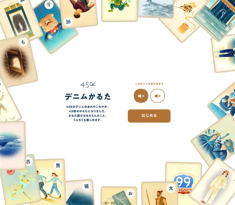
45Rのデニムを45枚のかるたで紹介する体験型コンテンツ。白い余白と紺の文字、茶色の操作ボタンを、紙の風合いを持つ色彩豊かな絵札が囲みます。
オリジナルサイトを見る45R / Denim Karuta — Style Reference
A quiet white play space surrounded by a colorful collection of illustrated denim cards.
Original URL: 45r.jp/ja/45denim-karuta/ Final URL: 45r.jp/ja/45denim-karuta/ Theme: white canvas, deep navy typography, warm brown controls, and cream-toned card illustrations. Inspected: supplied capture bundle dated September 13, 2026, 04:56:23.857 JST; September 12, 2026, 19:56:23.857 UTC. Viewports: 1440 × 1000 and 390 × 844 CSS pixels. Scope: desktop loading presentation, desktop and mobile title screens, and supplied DOM/computed-style records for additional application states. Sound changes, starting the game, dragging cards, answering questions, and opening the collection were not demonstrated.
Denim Karuta introduces 45R's denim knowledge through 45 illustrated playing cards. Its opening screen places a compact introduction and sound/start controls inside a generous white center. Around that center, overlapping portrait cards show people wearing denim, fabric, objects, and small narrative scenes. Their warm paper edges and painterly shading make the collection feel tangible.
The interface has a deliberately limited palette while the illustrations remain richly colored. Deep navy gives the Japanese title and introduction a dense, friendly presence. Warm brown identifies the sound controls and the single start action. The thin 45R mark supplies a lighter counterpoint above the bold title.
This is a full-viewport entry to a branded play experience. On desktop, identity and controls sit side by side. On mobile, the same material forms one centered vertical stack while the illustrated frame remains at the edges.
How to Read This Reference
- Measured values come from the supplied rendered DOM and computed styles. Tables round decimals where additional precision would not help implementation.
- Observed appearance comes from the original-page captures: desktop images 1–3 and mobile images 4–5.
- Estimated values describe visual proportions that lack corresponding element measurements, especially the illustrated cards.
- DOM only identifies elements present in the supplied record but absent from the visible title-screen captures. Their bounds and styles do not prove that their scene was active.
- Recommended choices belong to a new implementation. The Quick Start uses an explicitly chosen breakpoint and layout rules because the original responsive formulas were not supplied.
- Token names below are descriptive implementation aliases, not recovered source variable names.
Tokens — Colors
Default Palette
| Name | Value | Suggested token | Evidence and role |
|---|---|---|---|
| White Canvas | #ffffff |
--color-canvas |
Measured HTML background; the large central field and unfilled sound control |
| Denim Ink | #193854 |
--color-ink |
Measured title, introduction, base text, and several secondary navigation elements |
| Warm Brown | #b37337 |
--color-action |
Measured sound notice, sound-control fill/foreground, and start-button background |
| Card Cream | #faedcd |
--color-paper |
Measured secondary-state text and related-card link backgrounds; DOM-only applications |
| Copyright Gray | #bfbfbf |
--color-muted |
Measured copyright text |
The page canvas is white. Cream belongs to the illustrated card world and specific secondary-state elements. Filling the entire opening screen with cream would remove the clear separation between the white play space and the warm paper cards.
The illustrations introduce orange, teal, blue, green, yellow, and brown. These are image colors rather than evidence of a broad interface-token palette. Preserve the restricted navy/brown controls even when the surrounding artwork is colorful.
State Palette Limits
The recorded quiz and feedback elements often use cream text, and related-card links use cream backgrounds with navy text. Their surrounding active-scene surfaces were not captured. A navy or brown full-screen quiz background cannot be established from those text colors alone.
The custom-property dump also includes generic utility values such as a blue ring color and transparent shadow defaults. They are not evidence of visible blue focus rings or an elevation system in this page.
Tokens — Typography
A1 Gothic M — Interface Text
- Reported family:
"A1 Gothic M", sans-serif. - Typical computed weight:
400. - Roles: sound notice, start label, copyright, loading number, and many secondary-state labels.
- Character: soft, substantial Japanese sans-serif forms with an approachable printed quality.
- Evidence limit: the family declaration is measured; font-file URLs and independent verification of the rendered font face were not supplied.
A1 Gothic B — Title and Introduction
- Reported family:
"A1 Gothic B", sans-serif. - Title weight:
700. - Introduction weight:
400, despite its visibly heavy appearance and the family name ending in B. - Other recorded roles: practice instructions and the collection heading.
Preserve the distinction between the named font family and font-weight. Converting every B-family element to an arbitrary heavier weight can change the original appearance.
Brand Mark
The 45R mark uses thin, angular linework. Its measured container is approximately 93.09 × 35px on desktop and 54.81 × 20.61px on mobile. The evidence does not identify its asset format. Treat it as separate brand artwork rather than assuming the interface font can reproduce it.
Type Scale
All sizes below are measured CSS pixels. Desktop means 1440 × 1000; mobile means 390 × 844.
| Role | Desktop size / line height | Mobile size / line height | Family and details |
|---|---|---|---|
| Title | 48.00 / 52.79px |
29.84 / 32.82px |
A1 Gothic B, weight 700 |
| Four-line introduction | 18 / 27px |
12.28 / 18.42px |
A1 Gothic B, weight 400; 0.04em tracking |
| Sound notice | 16.00 / 24.00px |
10.53 / 15.80px |
A1 Gothic M, weight 400 |
| Start label | 24.00 / 36.01px |
14.04 / 21.06px |
A1 Gothic M, weight 400 |
| Copyright | 12.00 / 17.99px |
10.53 / 15.80px |
A1 Gothic M, weight 400; 0.02em tracking |
| Body default | 16.57 / 24.85px |
13.16 / 19.74px |
A1 Gothic M, weight 400 |
| Loading number | 35.33 / 38.86px |
Not captured | A1 Gothic M, weight 400 |
| Question sentence — DOM only | 22.08 / 28.70px |
17.55 / 22.81px |
A1 Gothic M, weight 400 |
| Correct-answer message — DOM only | 35.33 / 38.86px |
28.08 / 30.89px |
A1 Gothic M, weight 400 |
| DRAG / SCROLL label — DOM only | 17.67 / 19.44px |
14.04 / 15.45px |
A1 Gothic M, weight 400 |
| Gesture explanation — DOM only | 13.25 / 19.88px |
10.53 / 15.80px |
A1 Gothic M, weight 700; 0.04em tracking |
| Collection heading — DOM only | 22.08 / 33.12px |
17.55 / 26.32px |
A1 Gothic B, weight 400 |
The source HTML root remains 16px at both viewports. The decimal body sizes are not evidence of an unusually small root rem system.
The introduction preserves four short centered lines in both captures:
45Rのデニムのあれやこれやが、
45枚のかるたになりました。
かるた遊びはもちろんのこと、
うんちくも楽しめます。
Those intentional line breaks are part of the compact composition. A wide, freely wrapping paragraph would produce a different silhouette.
Tokens — Spacing & Shapes
Density: sparse central interface, dense illustration at the perimeter. Geometric character: centered text, softly rounded controls, and irregularly angled physical-card imagery.
Spacing Scale
These are component-specific distances calculated from measured element rectangles, not evidence of a universal source spacing scale.
| Relationship | Desktop | Mobile |
|---|---|---|
| Brand bottom to title top | 33.98px |
21.94px |
| Title bottom to introduction top | 20.00px |
9.20px |
| Introduction bottom to sound notice | Separate desktop columns | 24.13px |
| Sound notice bottom to controls | 17.00px |
8.77px |
| Gap between sound controls | 11.03px |
8.77px |
| Sound controls bottom to start button | 40.00px |
31.14px |
| Gap between desktop identity and action columns | 101.00px |
Stacked |
| Footer bottom padding | 22.08px |
17.55px |
The mobile control stack does not simply use every desktop gap at the same reduction ratio. In particular, the space before the start button remains generous relative to the smaller controls.
Border Radius
| Element | Desktop | Mobile | Evidence |
|---|---|---|---|
| Sound controls | 38.00px |
22.38px |
Measured computed radius |
| Start button | 16.00px |
17.99px |
Measured; mobile is more rounded despite being smaller |
| Related-card link | 28.15px |
22.38px |
Measured, DOM only |
| Illustrated cards | Softly rounded paper corners | Softly rounded paper corners | Visual observation; CSS radius and image boundaries were not measured |
The sound controls are near-circular rounded rectangles. Their width and height differ slightly, and their reported radius is not 50%.
Layout Measurements
| Element | Desktop rectangle | Mobile rectangle |
|---|---|---|
| Main stage | 1440 × 1000px |
390 × 844px |
| Brand container | x 491.94, y 375.11; 93.09 × 35px |
x 167.58, y 254.47; 54.81 × 20.61px |
| Title | x 394.52, y 444.09; 287.95 × 52.80px |
x 105.50, y 297.02; 178.98 × 32.83px |
| Introduction | x 405.45, y 516.89; 266.06 × 108px |
x 104.23, y 339.05; 181.52 × 73.69px |
| Each sound control | 87.98 × 85px |
50.89 × 49.58px |
| Start button | x 783.47, y 542.02; 262 × 81.97px |
x 118.66, y 542.14; 152.67 × 47.38px |
| Copyright line | y 959.92; 18px high |
y 810.66; 15.80px high |
Combining the central element bounds gives a desktop group of approximately 650.95 × 249.78px, centered around (720, 500). The mobile group is approximately 181.52 × 335.05px, centered around (195, 422). These are calculated unions, not measured wrapper dimensions.
The nearly identical start-button y-coordinate in these two captures is a consequence of their different centered compositions. It should not be turned into a universal top: 542px rule.
Source Scaling Evidence
| Recorded custom property | Desktop | Mobile |
|---|---|---|
--s-sx |
1 |
1.35 |
--s-sy |
1.06 |
1.35 |
--s-minh |
720 |
195 |
The declarations that consume these values were not supplied. Their units, formulas, and exact responsibilities cannot be reconstructed from their names.
Components
Full-Viewport Title Stage
Role: introduces the experience and lets the visitor choose sound before starting.
The main element occupies the entire recorded viewport. Its computed display is grid, with one full-width column. Document height equals viewport height in both snapshots, so no additional vertical title-page sections are evidenced below the opening screen.
The visible stage has three visual layers: the white canvas, the illustrated perimeter, and the central interface. A small copyright line sits at the bottom center. An empty header element appears in the DOM, but the captures show no conventional navigation bar.
For an adaptation, keep the central interface in a coherent layout group and place decorative cards in a separate edge layer. This makes it possible to change the frame without disturbing reading order or control alignment.
Illustrated Card Perimeter
Role: communicates the subject, variety, and collectible character of the experience.
Portrait cards overlap along all four viewport edges. Many extend beyond the crop; some appear upside down or at substantial angles. Each card combines a warm paper field, a substantial beige edge, rounded corners, and a detailed illustration. Small white circular labels containing Japanese characters appear on many cards.
The central content stays free of artwork. On desktop, the top and bottom runs of cards are particularly prominent, while side cards enter as larger diagonal fragments. On mobile, a narrower white opening remains between cropped side cards, with additional cards extending through the top and bottom boundaries.
Estimated scale: many desktop cards are roughly 175–200px wide before rotation; mobile examples are roughly 110–140px wide. These estimates are affected by clipping and transforms. Intrinsic dimensions and exact aspect ratios were not provided.
Use the artwork's existing paper shading. There is no measured CSS shadow specification for these cards.
Identity and Introduction
Role: names the experience and explains its promise in a small, readable unit.
Stack the thin 45R mark, the bold title デニムかるた, and the four-line introduction. All three are centered on the same axis. On desktop this axis is approximately x = 538.49px; on mobile it becomes the viewport center at x = 195px.
The desktop title is about 288px wide, with a slightly narrower introduction beneath it. On mobile the introduction is marginally wider than the title. Preserve those proportions rather than forcing both into an arbitrary wide text column.
The introduction is visually emphatic despite its small size. Its 1.5 line height and 0.04em tracking keep the dense Japanese lettering separated.
Sound Choice Group
Role: presents audio as an explicit choice before entry.
The notice このサイトは音が出ます sits above two icon-only buttons. The left button shows a speaker with sound marks, white on a brown fill. The right shows a muted speaker, brown on white with a brown outline.
Desktop controls measure approximately 88 × 85px; mobile controls measure 50.89 × 49.58px. Both buttons are native BUTTON elements in the supplied DOM. The visible outline appears approximately 2px on desktop and 1px on mobile; those border widths are visual estimates rather than reported border measurements.
The filled left control suggests an active sound-on choice, but playback, state changes, persistence, and mutual exclusivity were not tested. Accessible names were not included in the supplied extraction, so their presence or absence cannot be determined.
For a new implementation, use an explicitly labeled mutually exclusive preference and keep the visual selection synchronized with actual audio behavior.
Start Button
Role: enters the experience after the sound decision.
A single warm brown rounded rectangle carries the white label はじめる. The desktop button is 262 × 81.97px, with approximately 23px 83px computed padding. The mobile version is 152.67 × 47.38px, with approximately 13.16px 48.26px padding.
The desktop radius is approximately 16px; mobile uses approximately 18px. That makes the phone button feel softer and closer to a capsule without becoming fully pill-shaped.
The button is centered below the sound pair with a larger vertical gap than the notice-to-controls spacing. No visible hover, press, focus, or destination state was supplied.
Loading Presentation
Role: gives startup a small branded illustration instead of a generic loading skeleton.
The first desktop image shows a mostly empty white screen with a navy numeric readout, curved brown Now loading... lettering, and a small fan of illustrated cards beneath the number. The card fan is approximately 110 × 120px by visual estimate.
The screenshot reads 42, while the separately sampled DOM records 41 R. These are different sampled moments; the evidence does not establish a percentage, a progress formula, or a timed counter sequence. Do not add a percent sign based on the number alone.
Later desktop captures show the completed title screen. The transition between these states, the behavior of the curved lettering, and any movement of the card fan remain unmeasured.
Copyright
Role: quiet attribution at the viewport's lower edge.
The line reads ©45rpm studio co., ltd. in light gray. It is centered across the viewport and sits over the lower composition without a separate footer panel, divider, or navigation row.
Desktop text is approximately 12px; mobile text is 10.53px. Both use 0.02em tracking. The captured rectangles establish bottom alignment, but the source positioning method was not supplied.
Additional Application States — DOM Only
The DOM contains content for a practice exercise, a five-question result flow, answer review, and a denim collection. These elements should be documented as application states, not combined into a long visible page.
| State represented in the DOM | Actual labels or content | What can be established |
|---|---|---|
| Practice instructions | 練習問題, 絵札を選んでみましょう! |
Instructions ask the visitor to read a sentence and select an illustrated card; the transition was not tested |
| Card-search guidance | DRAG, ドラッグして探せます |
Dragging is described as a search method; gesture behavior and boundaries are unknown |
| Question content | アマテラスとスサノオが穿くデニム and other denim-related sentences |
Question text exists, with measured typography; the active card-field layout is not visible |
| Correct-answer feedback | あっぱれ!正解です! |
Cream-colored feedback text and continuation controls exist |
| Results | 5問中, Q1 through Q5, 正解を見る |
The DOM supports five-question results and review; no actual completed session was observed |
| Replay and collection choices | もう一度チャレンジする, すべての札を見る |
Separate button targets exist; their illustrated appearance is unverified |
| Collection | 45Rデニム図鑑, SCROLL, スクロールしてください |
A collection state and scrolling instruction exist; scrolling behavior was not exercised |
| Collection navigation | タイトルへ戻る, 図鑑を閉じる |
Return and close controls exist; mobile text is recorded with shorter line breaks |
The text extraction separates some Japanese phrases into individual characters. This does not establish vertical writing or a particular character animation.
The replay and collection-choice targets have large square bounding boxes: approximately 488 × 488px and 405 × 405px on desktop, and 241.30 × 241.30px and 200.44 × 200.44px on mobile. Those rectangles do not establish circular shapes or the appearance of their internal artwork.
Related-Card Link — DOM Only
Role: connects a selected card to related content.
The recorded anchor label is この札に関連するページを見る. It has a cream background, navy text, and a pill-like radius.
| Property | Desktop | Mobile |
|---|---|---|
| Bounding size | 299.72 × 52.44px |
238.19 × 41.66px |
| Font size / line height | 16.57 / 18.22px |
13.16 / 14.48px |
| Padding | 17.12px 22.63px |
13.60px 17.99px |
| Radius | 28.15px |
22.38px |
The supplied anchors have empty href values. Their destinations and whether those values are populated after selection are unverified.
Tokens — Motion & Interaction
| Treatment | Evidence | Limit |
|---|---|---|
| Loading to title | Both states appear in supplied desktop captures | Duration, easing, and reveal sequence were not recorded |
| Loading number | Screenshot and DOM contain different numeric readings | No verified unit, progress mapping, or animation implementation |
| Angled perimeter cards | Static images show varied rotations | Rotation in a still image is not evidence of continuous motion |
| Sound selection | Two controls are visible | Click result, audible playback, and saved preference are unverified |
| Game entry | Native start button is visible | Subsequent screen transition was not exercised |
| Card dragging | DOM instruction describes dragging | Pointer behavior, touch support, inertia, and hit testing are unknown |
| Collection scrolling | DOM instruction describes scrolling | No collection scroll interaction was demonstrated |
| Review-related link | opacity 0.3s cubic-bezier(0.47, 0.16, 0.24, 1) |
Computed transition only; trigger and opacity endpoints unknown |
| Collection-related link | opacity 0.3s cubic-bezier(0.26, 0.06, 0, 1) |
Computed transition only; trigger and opacity endpoints unknown |
Many sampled elements report animation: none and a transition summary of all. That is insufficient to specify a duration and does not rule out animation on unsampled wrappers, images, or JavaScript-controlled layers.
Capture readiness checks temporarily paused perpetual animations and then resumed them. They also waited for certain finite animations and image decoding within stated limits. These procedures do not establish that every application state or delayed animation was captured.
Recommended motion direction: keep the title composition stable, use restrained state changes, and provide reduced-motion behavior for any added card movement. Exact movement patterns should be defined and tested rather than attributed to these still captures.
Surfaces
| Layer | Appearance | Purpose |
|---|---|---|
| Main canvas | Flat white | Creates a calm central play space |
| Illustrated cards | Warm paper, beige edges, painterly shading | Supplies physicality, subject matter, and visual richness |
| Filled sound control | Brown with white icon | Distinguishes one visible audio choice |
| Outlined sound control | White with brown icon and edge | Presents the alternate audio choice |
| Start action | Brown with white text | Provides the primary entry target |
| Related-card link — DOM only | Cream with navy text | Secondary content navigation |
| Footer | Transparent surface with gray lettering | Keeps the copyright visually subordinate |
There is no visible general-purpose UI card or shadow hierarchy in the title screen. Depth is concentrated in the overlapping illustrated objects.
Imagery
The artwork combines fashion, familiar objects, and small stories. Current original-page captures show figures wearing denim, a raised-leg pose, a seated older figure, a person seen from behind, folded blue fabric, a record player, patches, and scenes involving sky or water. These images turn fabric knowledge into memorable cards rather than presenting conventional product photography.
Color transitions are soft and textured. Clothing has visible folds and blue tonal variation; faces and objects are simplified but expressive. Cream paper and beige card edges visually unite illustrations that otherwise use different colors and subjects.
The arrangement is deliberately irregular: cards overlap, lean, invert, and disappear outside the viewport. The perimeter feels abundant while the central copy remains protected.
Observed Asset References
No original image, icon, logo, audio, or font-file URLs were included in the supplied evidence. The references below identify visible asset roles without inventing paths.
| Asset role | Original-page evidence | Implementation implication |
|---|---|---|
| 45R mark | Thin navy mark above the title in desktop and mobile captures | Use authorized brand artwork; asset format is unknown |
| Perimeter card illustrations | Colorful portrait cards around the title screen | Preserve full card artwork, including paper edges and shading |
| Loading card fan | Small overlapping cards in the desktop loading capture | Requires artwork separate from the general page layout |
| Sound icons | Speaker with sound marks and muted speaker | Match the simple solid silhouette; SVG or another format would be an implementation choice |
| Japanese interface fonts | Computed A1 Gothic family declarations | Provision the fonts separately where available and authorized |
| Audio | Sound warning and controls | Audio files and playback implementation were not supplied |
For decorative perimeter images in a new implementation, use empty alternative text and keep them outside the interactive reading order. Cards used as game answers require their own accessible interaction model. These are recommendations, not verified source semantics.
Layout & Responsive Behavior
Desktop
The central group is approximately 651px wide. The identity column is about 288px wide and the action column about 262px wide, separated by approximately 101px. Both columns are vertically centered as a group around the middle of the viewport.
The left stack extends from the brand near y = 375px to the introduction bottom near y = 625px. The right stack extends from the sound notice near y = 376px to the start-button bottom near y = 624px. This close alignment makes the two different stacks read as a balanced pair.
Mobile
At 390 × 844, the content becomes one column. Its complete sequence is brand, title, four-line introduction, sound notice, paired sound controls, and start button. The group runs approximately from y = 254px to y = 590px and remains centered around the viewport midpoint.
The sound buttons remain side by side. The main button stays relatively narrow instead of expanding to the full screen width. The title reduces to roughly 30px, and the introduction to roughly 12.3px.
The perimeter exposes different card placements and crops at the narrower viewport. The evidence does not identify whether those changes use separate assets, breakpoint-specific positions, transforms, or another mechanism.
Responsive Limits
Only two viewports were supplied. The original breakpoint, intermediate-width behavior, short landscape handling, safe-area strategy, zoom behavior, and viewport-height units are unknown.
Several measurements change by different proportions: the introduction, title, sound controls, and footer do not share one universal scale factor. A single transform applied to the entire desktop composition would not reproduce the phone capture.
Recommended adaptation: use a two-column layout at wider widths and a centered stack below a chosen breakpoint. Keep overflow clipping on the decorative frame, while allowing functional content to remain reachable on short screens and at increased text zoom.
Do’s and Don’ts
Do
- Keep the opening canvas pure white and the interface primarily navy and brown.
- Preserve the four-line introduction and its centered alignment.
- Give the thin brand mark breathing room above the heavy title.
- Keep the sound notice, paired controls, and start action together.
- Use the measured desktop and mobile control geometry as separate targets.
- Maintain a quiet central region inside the illustrated perimeter.
- Preserve the paper edges, expressive figures, and varied angles of the cards.
- Treat loading as a small branded presentation.
- Distinguish visible title-screen findings from secondary-state DOM evidence.
Don’t
- Don’t replace the surrounding physical cards with a regular grid of generic interface panels.
- Don’t color the entire opening canvas cream.
- Don’t add unrelated accent colors to controls because they appear inside illustrations.
- Don’t substitute ordinary text for the 45R mark when visual fidelity matters.
- Don’t put cards behind the title or sound controls where they reduce legibility.
- Don’t use one uniform desktop-to-mobile scale factor.
- Don’t infer spinning, parallax, shuffling, or drag physics from still card positions.
- Don’t turn every DOM state into a visible section beneath the title.
- Don’t invent asset paths, audio behavior, quiz surfaces, or link destinations.
Recommended Implementation Additions
These recommendations are not verified features of the original page:
- Give the sound buttons explicit accessible names and expose the chosen state. Ensure that changing the visual state changes actual playback behavior.
- Require a deliberate user action before audible playback and preserve an available mute control during play.
- Move keyboard focus to the next active scene after starting, and prevent inactive scenes from remaining in the tab order or accessibility tree.
- Give selectable game cards keyboard-operable targets and provide a practical alternative to drag-only exploration.
- Add a visible navy focus indicator around controls.
- Review small-text contrast. Calculated from the reported colors, brown against white is approximately
3.9:1, and copyright gray against white approximately1.8:1. The mobile notice and start label need particular attention when adapting the design for accessible small text. - Increase essential mobile text sizes where needed and test the resulting layout rather than assuming the measured small sizes fit every reading need.
- Respect reduced-motion preferences for any added card or scene animation.
- Clip only decorative overflow. Keep controls reachable with short viewport heights, browser zoom, and larger text settings.
- Treat the loading readout as a real status indicator only when its meaning can be communicated accurately; provide recovery behavior if assets fail.
Agent Prompt Guide
Quick Color Reference
- Canvas: white
#ffffff. - Title and introduction: navy
#193854. - Sound notice, selected sound fill, and start button: brown
#b37337. - Unselected sound control: white with brown icon and outline.
- Secondary related-card surface: cream
#faedcd, evidenced in the DOM. - Copyright: gray
#bfbfbf. - Artwork: full-color painterly illustrations inside warm paper cards.
Overall Prompt
“Create a full-viewport introduction for an illustrated Japanese denim card experience. Use a pure white canvas, navy #193854 typography, and warm brown #b37337 controls. Surround the viewport with overlapping portrait playing cards that have cream paper, beige edges, expressive painted figures, denim objects, and varied rotations. Keep a generous empty center. On desktop, place a thin brand mark, bold Japanese title, and four short centered lines in a left column, with a sound notice, two rounded sound controls, and one start button in a right column. On mobile, stack those groups on the center axis while retaining the illustrated perimeter. Use the supplied typography and measurements where available. Do not invent animation or game-screen styling from the opening still image.”
Example Component Prompts
- Title group: “Build a centered identity stack with a thin navy brand artwork slot, a roughly 48px bold Japanese title, and four lines of 18px copy at 27px line height with 0.04em tracking. At the mobile reference size, reduce the title to about 29.84px and copy to 12.28px. Keep the source line breaks.”
- Sound choice: “Place a brown sound notice above two adjacent near-circular buttons. At desktop size, use approximately 88 × 85px buttons with a 38px radius and 11px gap. The on choice is brown with a white speaker; the off choice is white with a brown muted speaker and outline. Add accessible labels and a mutually exclusive state as implementation requirements.”
- Start action: “Create a brown start button labeled ‘はじめる’, 262 × 82px with a 16px radius and white 24px text. Use approximately 153 × 47px, an 18px radius, and 14px text for the measured phone composition. Place it clearly below the sound controls and review the small-text contrast for production.”
- Illustrated frame: “Arrange authorized portrait card artwork around all viewport edges. Use varied angles, partial clipping, overlaps, warm paper borders, and expressive denim scenes. Keep the central reading area free of artwork. Treat placement as responsive composition; do not add continuous movement unless it is separately specified.”
- Loading presentation: “On white, show a small navy numeric status near the center with a curved brown loading label and a compact illustrated card fan below it. Define the status meaning explicitly. Animation timing and percentage behavior are not established by the reference.”
Quick Start
CSS Custom Properties
This is an implementation adaptation of the observed title screen, not an extraction of the original stylesheet. Desktop and mobile tokens reproduce the two recorded sizes approximately. The 700px breakpoint is a recommendation, not a recovered source value.
The layout keeps a conventional root font size. It allows document growth when the content cannot fit, and confines clipping to the decorative frame. Font files, authorized illustrations, the real wordmark, and application behavior must be supplied separately.
:root {
  /* Measured interface colors */
  --color-canvas: #ffffff;
  --color-ink: #193854;
  --color-action: #b37337;
  --color-paper: #faedcd;
  --color-muted: #bfbfbf;

  /* Reported source families; font files are not bundled */
  --font-interface: "A1 Gothic M", sans-serif;
  --font-emphasis: "A1 Gothic B", sans-serif;

  /* Desktop snapshot targets */
  --intro-width: 287.95px;
  --action-width: 262px;
  --column-gap: 101px;
  --brand-width: 93.09px;
  --brand-height: 35px;
  --text-title: 47.9952px;
  --text-copy: 18px;
  --text-notice: 15.9984px;
  --text-action: 24.0048px;
  --text-footer: 11.9952px;
  --gap-brand-title: 33.984px;
  --gap-title-copy: 20px;
  --gap-notice-audio: 17px;
  --gap-audio-start: 40px;
  --audio-width: 87.984px;
  --audio-height: 85px;
  --audio-gap: 11.031px;
  --radius-audio: 38.0016px;
  --start-height: 81.969px;
  --radius-start: 15.9984px;
  --footer-inset: 22.0798px;

  /* Visual estimates for the adaptation */
  --audio-border: 2px;
  --audio-icon: 36px;
  --card-width: 180px;
}

* {
  box-sizing: border-box;
}

body {
  margin: 0;
  color: var(--color-ink);
  background: var(--color-canvas);
  font-family: var(--font-interface);
}

button {
  font: inherit;
}

.karuta-shell {
  position: relative;
  isolation: isolate;
  display: grid;
  place-items: center;
  min-block-size: 100vh;
  min-block-size: 100svh;
  padding: 80px 24px;
  background: var(--color-canvas);
}

.karuta-frame {
  position: absolute;
  inset: 0;
  z-index: 0;
  overflow: hidden;
  pointer-events: none;
  user-select: none;
}

/* Assign edge positions individually for each authorized image. */
.karuta-frame img {
  position: absolute;
  left: var(--card-x, 0%);
  top: var(--card-y, 0%);
  display: block;
  width: var(--card-width);
  height: auto;
  transform:
    translate(-50%, -50%)
    rotate(var(--card-angle, 0deg));
}

.karuta-entry {
  position: relative;
  z-index: 1;
  display: grid;
  grid-template-columns: var(--intro-width) var(--action-width);
  align-items: center;
  gap: var(--column-gap);
  max-inline-size: 100%;
  text-align: center;
}

.karuta-intro {
  min-inline-size: 0;
}

.karuta-brand {
  display: grid;
  place-items: center;
  inline-size: var(--brand-width);
  block-size: var(--brand-height);
  margin-inline: auto;
}

.karuta-brand img,
.karuta-brand svg {
  display: block;
  inline-size: 100%;
  block-size: 100%;
  object-fit: contain;
}

/* Temporary text only; replace with the actual brand artwork. */
.karuta-brand-placeholder {
  font-size: calc(var(--brand-height) * 0.9);
  font-weight: 400;
  line-height: 1;
}

.karuta-title {
  margin: var(--gap-brand-title) 0 var(--gap-title-copy);
  font-family: var(--font-emphasis);
  font-size: var(--text-title);
  font-weight: 700;
  line-height: 1.1;
}

.karuta-copy {
  inline-size: max-content;
  max-inline-size: 100%;
  margin: 0 auto;
  font-family: var(--font-emphasis);
  font-size: var(--text-copy);
  font-weight: 400;
  line-height: 1.5;
  letter-spacing: 0.04em;
}

.karuta-actions {
  justify-self: center;
  inline-size: var(--action-width);
  max-inline-size: 100%;
}

.karuta-sound-notice {
  margin: 0 0 var(--gap-notice-audio);
  color: var(--color-action);
  font-size: var(--text-notice);
  line-height: 1.5;
}

.karuta-sound-options {
  display: flex;
  justify-content: center;
  gap: var(--audio-gap);
  margin-block-end: var(--gap-audio-start);
}

.karuta-audio {
  display: grid;
  place-items: center;
  flex: none;
  inline-size: var(--audio-width);
  block-size: var(--audio-height);
  padding: 0;
  border: var(--audio-border) solid var(--color-action);
  border-radius: var(--radius-audio);
  color: var(--color-action);
  background: var(--color-canvas);
  cursor: pointer;
}

/* Recommended explicit selection semantics */
.karuta-audio[aria-pressed="true"] {
  color: var(--color-canvas);
  background: var(--color-action);
}

.karuta-audio svg {
  display: block;
  inline-size: var(--audio-icon);
  block-size: var(--audio-icon);
}

.karuta-start {
  display: grid;
  place-items: center;
  inline-size: 100%;
  min-block-size: var(--start-height);
  padding: 0 12px;
  border: 0;
  border-radius: var(--radius-start);
  color: var(--color-canvas);
  background: var(--color-action);
  font-size: var(--text-action);
  font-weight: 400;
  line-height: 1.5;
  cursor: pointer;
}

.karuta-footer {
  position: absolute;
  inset-inline: 0;
  bottom: var(--footer-inset);
  z-index: 1;
  margin: 0;
  color: var(--color-muted);
  font-size: var(--text-footer);
  line-height: 1.5;
  letter-spacing: 0.02em;
  text-align: center;
}

/* Recommended keyboard focus treatment */
.karuta-shell :focus-visible {
  outline: 3px solid var(--color-ink);
  outline-offset: 4px;
}

/* Chosen adaptation breakpoint; the source breakpoint is unknown. */
@media (max-width: 700px) {
  .karuta-shell {
    --intro-width: 181.52px;
    --action-width: 152.672px;
    --brand-width: 54.813px;
    --brand-height: 20.609px;
    --text-title: 29.8368px;
    --text-copy: 12.2832px;
    --text-notice: 10.53px;
    --text-action: 14.0418px;
    --text-footer: 10.53px;
    --gap-brand-title: 21.9375px;
    --gap-title-copy: 9.203px;
    --gap-notice-audio: 8.766px;
    --gap-audio-start: 31.141px;
    --audio-width: 50.891px;
    --audio-height: 49.578px;
    --audio-gap: 8.766px;
    --radius-audio: 22.3762px;
    --start-height: 47.375px;
    --radius-start: 17.9905px;
    --footer-inset: 17.5482px;
    --audio-border: 1px;
    --audio-icon: 22px;
    --card-width: 120px;
    padding-block: 64px;
  }

  .karuta-entry {
    grid-template-columns: minmax(0, var(--intro-width));
    gap: 24.125px;
  }
}
The card-frame variables describe placement for a new implementation. Position approved images using per-image --card-x, --card-y, and --card-angle values; adjust those positions for mobile. The evidence does not supply original placement coordinates or image URLs.
Minimal Markup
This markup is a static visual shell. The sound-state and start handlers are intentionally outside its scope. The inline speaker drawings are simple implementation approximations, and the text brand placeholder must be replaced for visual fidelity.
<main class="karuta-shell" lang="ja">
  <div class="karuta-frame" aria-hidden="true">
    <!-- Insert authorized card images with empty alt attributes. -->
  </div>

  <section class="karuta-entry" aria-labelledby="karuta-title">
    <div class="karuta-intro">
      <div class="karuta-brand" aria-label="45R">
        <!-- Replace this placeholder with authorized brand artwork. -->
        <span class="karuta-brand-placeholder" aria-hidden="true">45R</span>
      </div>
      <h1 class="karuta-title" id="karuta-title">デニムかるた</h1>
      <p class="karuta-copy">
        45Rのデニムのあれやこれやが、<br>
        45枚のかるたになりました。<br>
        かるた遊びはもちろんのこと、<br>
        うんちくも楽しめます。
      </p>
    </div>

    <div class="karuta-actions">
      <p class="karuta-sound-notice" id="sound-notice">
        このサイトは音が出ます
      </p>
      <div class="karuta-sound-options"
           role="group" aria-labelledby="sound-notice">
        <button class="karuta-audio" type="button"
                aria-label="Sound on" aria-pressed="true">
          <svg viewBox="0 0 28 28" aria-hidden="true" focusable="false">
            <path d="M3 10h5l6-4v16l-6-4H3z" fill="currentColor" />
            <path d="M18 11v6m4-9v12m4-14v16"
                  fill="none" stroke="currentColor" stroke-width="2" />
          </svg>
        </button>
        <button class="karuta-audio" type="button"
                aria-label="Sound off" aria-pressed="false">
          <svg viewBox="0 0 28 28" aria-hidden="true" focusable="false">
            <path d="M3 10h5l6-4v16l-6-4H3z" fill="currentColor" />
            <path d="m18 10 7 8m0-8-7 8"
                  fill="none" stroke="currentColor" stroke-width="2" />
          </svg>
        </button>
      </div>
      <button class="karuta-start" type="button">はじめる</button>
    </div>
  </section>

  <p class="karuta-footer">©45rpm studio co., ltd.</p>
</main>
The initial pressed-state values model the captured filled/outlined appearance. They are not evidence that the original page starts audible playback. An implementation must connect these controls to a real, accessible preference model.
Tailwind v4 Token Mapping
Optional aliases for a project using Tailwind v4. This mapping does not identify the original framework or version. Define the properties above first.
@theme inline {
  --color-karuta-canvas: var(--color-canvas);
  --color-karuta-ink: var(--color-ink);
  --color-karuta-action: var(--color-action);
  --color-karuta-paper: var(--color-paper);
  --color-karuta-muted: var(--color-muted);

  --font-karuta-ui: var(--font-interface);
  --font-karuta-emphasis: var(--font-emphasis);

  --text-karuta-title: var(--text-title);
  --text-karuta-copy: var(--text-copy);
  --text-karuta-notice: var(--text-notice);
  --text-karuta-action: var(--text-action);

  --radius-karuta-audio: var(--radius-audio);
  --radius-karuta-start: var(--radius-start);
}
Sources & Evidence
- Original and final website: デニムかるた | 45R. The supplied response was HTTP 200, with no URL change.
- Capture bundle timestamp:
2026-09-12T19:56:23.857Z, equivalent to September 13, 2026, 04:56:23.857 JST. Separate timestamps for individual images were not supplied. - Desktop evidence: 1440 × 1000 CSS-pixel snapshot with a 1000px document height; one loading capture and two title-screen captures.
- Mobile evidence: 390 × 844 CSS-pixel snapshot with an 844px document height; two title-screen captures.
- Rendered evidence: supplied text extraction, element rectangles, computed colors, font declarations, sizes, line heights, tracking, padding, radii, display values, transition strings, and custom properties.
- Interaction limits: no demonstrated sound toggle, audible playback, start action, card drag, completed question, result review, collection opening, or collection scroll. Related-card anchors had empty destinations in the supplied record.
- Inspection limits: image and animation readiness checks had finite waiting limits; delayed content may remain unobserved. SharedWorkers and service workers were disabled during the supplied inspection. Asset URLs, full stylesheets, source responsive formulas, and animation implementations were not included.
This reference describes the current original-page evidence supplied for these two viewports. The visible title screen is the authority for composition and imagery; secondary-state findings remain explicitly limited to the DOM. CSS, accessible semantics, breakpoint selection, and implementation prompts are adaptations where identified.
# 45R / Denim Karuta — Style Reference

> A quiet white play space surrounded by a colorful collection of illustrated denim cards.

**Original URL:** [45r.jp/ja/45denim-karuta/](https://45r.jp/ja/45denim-karuta/)
**Final URL:** [45r.jp/ja/45denim-karuta/](https://45r.jp/ja/45denim-karuta/)
**Theme:** white canvas, deep navy typography, warm brown controls, and cream-toned card illustrations.
**Inspected:** supplied capture bundle dated September 13, 2026, 04:56:23.857 JST; September 12, 2026, 19:56:23.857 UTC.
**Viewports:** 1440 × 1000 and 390 × 844 CSS pixels.
**Scope:** desktop loading presentation, desktop and mobile title screens, and supplied DOM/computed-style records for additional application states. Sound changes, starting the game, dragging cards, answering questions, and opening the collection were not demonstrated.

Denim Karuta introduces 45R's denim knowledge through 45 illustrated playing cards. Its opening screen places a compact introduction and sound/start controls inside a generous white center. Around that center, overlapping portrait cards show people wearing denim, fabric, objects, and small narrative scenes. Their warm paper edges and painterly shading make the collection feel tangible.

The interface has a deliberately limited palette while the illustrations remain richly colored. Deep navy gives the Japanese title and introduction a dense, friendly presence. Warm brown identifies the sound controls and the single start action. The thin 45R mark supplies a lighter counterpoint above the bold title.

This is a full-viewport entry to a branded play experience. On desktop, identity and controls sit side by side. On mobile, the same material forms one centered vertical stack while the illustrated frame remains at the edges.

## How to Read This Reference

- **Measured** values come from the supplied rendered DOM and computed styles. Tables round decimals where additional precision would not help implementation.
- **Observed** appearance comes from the original-page captures: desktop images 1–3 and mobile images 4–5.
- **Estimated** values describe visual proportions that lack corresponding element measurements, especially the illustrated cards.
- **DOM only** identifies elements present in the supplied record but absent from the visible title-screen captures. Their bounds and styles do not prove that their scene was active.
- **Recommended** choices belong to a new implementation. The Quick Start uses an explicitly chosen breakpoint and layout rules because the original responsive formulas were not supplied.
- Token names below are descriptive implementation aliases, not recovered source variable names.

## Tokens — Colors

### Default Palette

| Name | Value | Suggested token | Evidence and role |
| --- | --- | --- | --- |
| White Canvas | `#ffffff` | `--color-canvas` | Measured HTML background; the large central field and unfilled sound control |
| Denim Ink | `#193854` | `--color-ink` | Measured title, introduction, base text, and several secondary navigation elements |
| Warm Brown | `#b37337` | `--color-action` | Measured sound notice, sound-control fill/foreground, and start-button background |
| Card Cream | `#faedcd` | `--color-paper` | Measured secondary-state text and related-card link backgrounds; DOM-only applications |
| Copyright Gray | `#bfbfbf` | `--color-muted` | Measured copyright text |

The page canvas is white. Cream belongs to the illustrated card world and specific secondary-state elements. Filling the entire opening screen with cream would remove the clear separation between the white play space and the warm paper cards.

The illustrations introduce orange, teal, blue, green, yellow, and brown. These are image colors rather than evidence of a broad interface-token palette. Preserve the restricted navy/brown controls even when the surrounding artwork is colorful.

### State Palette Limits

The recorded quiz and feedback elements often use cream text, and related-card links use cream backgrounds with navy text. Their surrounding active-scene surfaces were not captured. A navy or brown full-screen quiz background cannot be established from those text colors alone.

The custom-property dump also includes generic utility values such as a blue ring color and transparent shadow defaults. They are not evidence of visible blue focus rings or an elevation system in this page.

## Tokens — Typography

### A1 Gothic M — Interface Text

- **Reported family:** `"A1 Gothic M", sans-serif`.
- **Typical computed weight:** `400`.
- **Roles:** sound notice, start label, copyright, loading number, and many secondary-state labels.
- **Character:** soft, substantial Japanese sans-serif forms with an approachable printed quality.
- **Evidence limit:** the family declaration is measured; font-file URLs and independent verification of the rendered font face were not supplied.

### A1 Gothic B — Title and Introduction

- **Reported family:** `"A1 Gothic B", sans-serif`.
- **Title weight:** `700`.
- **Introduction weight:** `400`, despite its visibly heavy appearance and the family name ending in B.
- **Other recorded roles:** practice instructions and the collection heading.

Preserve the distinction between the named font family and `font-weight`. Converting every B-family element to an arbitrary heavier weight can change the original appearance.

### Brand Mark

The 45R mark uses thin, angular linework. Its measured container is approximately `93.09 × 35px` on desktop and `54.81 × 20.61px` on mobile. The evidence does not identify its asset format. Treat it as separate brand artwork rather than assuming the interface font can reproduce it.

### Type Scale

All sizes below are measured CSS pixels. Desktop means 1440 × 1000; mobile means 390 × 844.

| Role | Desktop size / line height | Mobile size / line height | Family and details |
| --- | --- | --- | --- |
| Title | `48.00 / 52.79px` | `29.84 / 32.82px` | A1 Gothic B, weight 700 |
| Four-line introduction | `18 / 27px` | `12.28 / 18.42px` | A1 Gothic B, weight 400; `0.04em` tracking |
| Sound notice | `16.00 / 24.00px` | `10.53 / 15.80px` | A1 Gothic M, weight 400 |
| Start label | `24.00 / 36.01px` | `14.04 / 21.06px` | A1 Gothic M, weight 400 |
| Copyright | `12.00 / 17.99px` | `10.53 / 15.80px` | A1 Gothic M, weight 400; `0.02em` tracking |
| Body default | `16.57 / 24.85px` | `13.16 / 19.74px` | A1 Gothic M, weight 400 |
| Loading number | `35.33 / 38.86px` | Not captured | A1 Gothic M, weight 400 |
| Question sentence — DOM only | `22.08 / 28.70px` | `17.55 / 22.81px` | A1 Gothic M, weight 400 |
| Correct-answer message — DOM only | `35.33 / 38.86px` | `28.08 / 30.89px` | A1 Gothic M, weight 400 |
| DRAG / SCROLL label — DOM only | `17.67 / 19.44px` | `14.04 / 15.45px` | A1 Gothic M, weight 400 |
| Gesture explanation — DOM only | `13.25 / 19.88px` | `10.53 / 15.80px` | A1 Gothic M, weight 700; `0.04em` tracking |
| Collection heading — DOM only | `22.08 / 33.12px` | `17.55 / 26.32px` | A1 Gothic B, weight 400 |

The source HTML root remains `16px` at both viewports. The decimal body sizes are not evidence of an unusually small root `rem` system.

The introduction preserves four short centered lines in both captures:

> 45Rのデニムのあれやこれやが、
> 45枚のかるたになりました。
> かるた遊びはもちろんのこと、
> うんちくも楽しめます。

Those intentional line breaks are part of the compact composition. A wide, freely wrapping paragraph would produce a different silhouette.

## Tokens — Spacing & Shapes

**Density:** sparse central interface, dense illustration at the perimeter.
**Geometric character:** centered text, softly rounded controls, and irregularly angled physical-card imagery.

### Spacing Scale

These are component-specific distances calculated from measured element rectangles, not evidence of a universal source spacing scale.

| Relationship | Desktop | Mobile |
| --- | --- | --- |
| Brand bottom to title top | `33.98px` | `21.94px` |
| Title bottom to introduction top | `20.00px` | `9.20px` |
| Introduction bottom to sound notice | Separate desktop columns | `24.13px` |
| Sound notice bottom to controls | `17.00px` | `8.77px` |
| Gap between sound controls | `11.03px` | `8.77px` |
| Sound controls bottom to start button | `40.00px` | `31.14px` |
| Gap between desktop identity and action columns | `101.00px` | Stacked |
| Footer bottom padding | `22.08px` | `17.55px` |

The mobile control stack does not simply use every desktop gap at the same reduction ratio. In particular, the space before the start button remains generous relative to the smaller controls.

### Border Radius

| Element | Desktop | Mobile | Evidence |
| --- | --- | --- | --- |
| Sound controls | `38.00px` | `22.38px` | Measured computed radius |
| Start button | `16.00px` | `17.99px` | Measured; mobile is more rounded despite being smaller |
| Related-card link | `28.15px` | `22.38px` | Measured, DOM only |
| Illustrated cards | Softly rounded paper corners | Softly rounded paper corners | Visual observation; CSS radius and image boundaries were not measured |

The sound controls are near-circular rounded rectangles. Their width and height differ slightly, and their reported radius is not `50%`.

### Layout Measurements

| Element | Desktop rectangle | Mobile rectangle |
| --- | --- | --- |
| Main stage | `1440 × 1000px` | `390 × 844px` |
| Brand container | `x 491.94, y 375.11; 93.09 × 35px` | `x 167.58, y 254.47; 54.81 × 20.61px` |
| Title | `x 394.52, y 444.09; 287.95 × 52.80px` | `x 105.50, y 297.02; 178.98 × 32.83px` |
| Introduction | `x 405.45, y 516.89; 266.06 × 108px` | `x 104.23, y 339.05; 181.52 × 73.69px` |
| Each sound control | `87.98 × 85px` | `50.89 × 49.58px` |
| Start button | `x 783.47, y 542.02; 262 × 81.97px` | `x 118.66, y 542.14; 152.67 × 47.38px` |
| Copyright line | `y 959.92; 18px` high | `y 810.66; 15.80px` high |

Combining the central element bounds gives a desktop group of approximately `650.95 × 249.78px`, centered around `(720, 500)`. The mobile group is approximately `181.52 × 335.05px`, centered around `(195, 422)`. These are calculated unions, not measured wrapper dimensions.

The nearly identical start-button y-coordinate in these two captures is a consequence of their different centered compositions. It should not be turned into a universal `top: 542px` rule.

### Source Scaling Evidence

| Recorded custom property | Desktop | Mobile |
| --- | --- | --- |
| `--s-sx` | `1` | `1.35` |
| `--s-sy` | `1.06` | `1.35` |
| `--s-minh` | `720` | `195` |

The declarations that consume these values were not supplied. Their units, formulas, and exact responsibilities cannot be reconstructed from their names.

## Components

### Full-Viewport Title Stage

**Role:** introduces the experience and lets the visitor choose sound before starting.

The main element occupies the entire recorded viewport. Its computed display is grid, with one full-width column. Document height equals viewport height in both snapshots, so no additional vertical title-page sections are evidenced below the opening screen.

The visible stage has three visual layers: the white canvas, the illustrated perimeter, and the central interface. A small copyright line sits at the bottom center. An empty header element appears in the DOM, but the captures show no conventional navigation bar.

For an adaptation, keep the central interface in a coherent layout group and place decorative cards in a separate edge layer. This makes it possible to change the frame without disturbing reading order or control alignment.

### Illustrated Card Perimeter

**Role:** communicates the subject, variety, and collectible character of the experience.

Portrait cards overlap along all four viewport edges. Many extend beyond the crop; some appear upside down or at substantial angles. Each card combines a warm paper field, a substantial beige edge, rounded corners, and a detailed illustration. Small white circular labels containing Japanese characters appear on many cards.

The central content stays free of artwork. On desktop, the top and bottom runs of cards are particularly prominent, while side cards enter as larger diagonal fragments. On mobile, a narrower white opening remains between cropped side cards, with additional cards extending through the top and bottom boundaries.

**Estimated scale:** many desktop cards are roughly 175–200px wide before rotation; mobile examples are roughly 110–140px wide. These estimates are affected by clipping and transforms. Intrinsic dimensions and exact aspect ratios were not provided.

Use the artwork's existing paper shading. There is no measured CSS shadow specification for these cards.

### Identity and Introduction

**Role:** names the experience and explains its promise in a small, readable unit.

Stack the thin 45R mark, the bold title `デニムかるた`, and the four-line introduction. All three are centered on the same axis. On desktop this axis is approximately `x = 538.49px`; on mobile it becomes the viewport center at `x = 195px`.

The desktop title is about 288px wide, with a slightly narrower introduction beneath it. On mobile the introduction is marginally wider than the title. Preserve those proportions rather than forcing both into an arbitrary wide text column.

The introduction is visually emphatic despite its small size. Its 1.5 line height and `0.04em` tracking keep the dense Japanese lettering separated.

### Sound Choice Group

**Role:** presents audio as an explicit choice before entry.

The notice `このサイトは音が出ます` sits above two icon-only buttons. The left button shows a speaker with sound marks, white on a brown fill. The right shows a muted speaker, brown on white with a brown outline.

Desktop controls measure approximately `88 × 85px`; mobile controls measure `50.89 × 49.58px`. Both buttons are native `BUTTON` elements in the supplied DOM. The visible outline appears approximately 2px on desktop and 1px on mobile; those border widths are visual estimates rather than reported border measurements.

The filled left control suggests an active sound-on choice, but playback, state changes, persistence, and mutual exclusivity were not tested. Accessible names were not included in the supplied extraction, so their presence or absence cannot be determined.

For a new implementation, use an explicitly labeled mutually exclusive preference and keep the visual selection synchronized with actual audio behavior.

### Start Button

**Role:** enters the experience after the sound decision.

A single warm brown rounded rectangle carries the white label `はじめる`. The desktop button is `262 × 81.97px`, with approximately `23px 83px` computed padding. The mobile version is `152.67 × 47.38px`, with approximately `13.16px 48.26px` padding.

The desktop radius is approximately 16px; mobile uses approximately 18px. That makes the phone button feel softer and closer to a capsule without becoming fully pill-shaped.

The button is centered below the sound pair with a larger vertical gap than the notice-to-controls spacing. No visible hover, press, focus, or destination state was supplied.

### Loading Presentation

**Role:** gives startup a small branded illustration instead of a generic loading skeleton.

The first desktop image shows a mostly empty white screen with a navy numeric readout, curved brown `Now loading...` lettering, and a small fan of illustrated cards beneath the number. The card fan is approximately `110 × 120px` by visual estimate.

The screenshot reads `42`, while the separately sampled DOM records `41 R`. These are different sampled moments; the evidence does not establish a percentage, a progress formula, or a timed counter sequence. Do not add a percent sign based on the number alone.

Later desktop captures show the completed title screen. The transition between these states, the behavior of the curved lettering, and any movement of the card fan remain unmeasured.

### Copyright

**Role:** quiet attribution at the viewport's lower edge.

The line reads `©45rpm studio co., ltd.` in light gray. It is centered across the viewport and sits over the lower composition without a separate footer panel, divider, or navigation row.

Desktop text is approximately 12px; mobile text is 10.53px. Both use `0.02em` tracking. The captured rectangles establish bottom alignment, but the source positioning method was not supplied.

### Additional Application States — DOM Only

The DOM contains content for a practice exercise, a five-question result flow, answer review, and a denim collection. These elements should be documented as application states, not combined into a long visible page.

| State represented in the DOM | Actual labels or content | What can be established |
| --- | --- | --- |
| Practice instructions | `練習問題`, `絵札を選んでみましょう!` | Instructions ask the visitor to read a sentence and select an illustrated card; the transition was not tested |
| Card-search guidance | `DRAG`, `ドラッグして探せます` | Dragging is described as a search method; gesture behavior and boundaries are unknown |
| Question content | `アマテラスとスサノオが穿くデニム` and other denim-related sentences | Question text exists, with measured typography; the active card-field layout is not visible |
| Correct-answer feedback | `あっぱれ!正解です!` | Cream-colored feedback text and continuation controls exist |
| Results | `5問中`, `Q1` through `Q5`, `正解を見る` | The DOM supports five-question results and review; no actual completed session was observed |
| Replay and collection choices | `もう一度チャレンジする`, `すべての札を見る` | Separate button targets exist; their illustrated appearance is unverified |
| Collection | `45Rデニム図鑑`, `SCROLL`, `スクロールしてください` | A collection state and scrolling instruction exist; scrolling behavior was not exercised |
| Collection navigation | `タイトルへ戻る`, `図鑑を閉じる` | Return and close controls exist; mobile text is recorded with shorter line breaks |

The text extraction separates some Japanese phrases into individual characters. This does not establish vertical writing or a particular character animation.

The replay and collection-choice targets have large square bounding boxes: approximately `488 × 488px` and `405 × 405px` on desktop, and `241.30 × 241.30px` and `200.44 × 200.44px` on mobile. Those rectangles do not establish circular shapes or the appearance of their internal artwork.

### Related-Card Link — DOM Only

**Role:** connects a selected card to related content.

The recorded anchor label is `この札に関連するページを見る`. It has a cream background, navy text, and a pill-like radius.

| Property | Desktop | Mobile |
| --- | --- | --- |
| Bounding size | `299.72 × 52.44px` | `238.19 × 41.66px` |
| Font size / line height | `16.57 / 18.22px` | `13.16 / 14.48px` |
| Padding | `17.12px 22.63px` | `13.60px 17.99px` |
| Radius | `28.15px` | `22.38px` |

The supplied anchors have empty `href` values. Their destinations and whether those values are populated after selection are unverified.

## Tokens — Motion & Interaction

| Treatment | Evidence | Limit |
| --- | --- | --- |
| Loading to title | Both states appear in supplied desktop captures | Duration, easing, and reveal sequence were not recorded |
| Loading number | Screenshot and DOM contain different numeric readings | No verified unit, progress mapping, or animation implementation |
| Angled perimeter cards | Static images show varied rotations | Rotation in a still image is not evidence of continuous motion |
| Sound selection | Two controls are visible | Click result, audible playback, and saved preference are unverified |
| Game entry | Native start button is visible | Subsequent screen transition was not exercised |
| Card dragging | DOM instruction describes dragging | Pointer behavior, touch support, inertia, and hit testing are unknown |
| Collection scrolling | DOM instruction describes scrolling | No collection scroll interaction was demonstrated |
| Review-related link | `opacity 0.3s cubic-bezier(0.47, 0.16, 0.24, 1)` | Computed transition only; trigger and opacity endpoints unknown |
| Collection-related link | `opacity 0.3s cubic-bezier(0.26, 0.06, 0, 1)` | Computed transition only; trigger and opacity endpoints unknown |

Many sampled elements report `animation: none` and a transition summary of `all`. That is insufficient to specify a duration and does not rule out animation on unsampled wrappers, images, or JavaScript-controlled layers.

Capture readiness checks temporarily paused perpetual animations and then resumed them. They also waited for certain finite animations and image decoding within stated limits. These procedures do not establish that every application state or delayed animation was captured.

**Recommended motion direction:** keep the title composition stable, use restrained state changes, and provide reduced-motion behavior for any added card movement. Exact movement patterns should be defined and tested rather than attributed to these still captures.

## Surfaces

| Layer | Appearance | Purpose |
| --- | --- | --- |
| Main canvas | Flat white | Creates a calm central play space |
| Illustrated cards | Warm paper, beige edges, painterly shading | Supplies physicality, subject matter, and visual richness |
| Filled sound control | Brown with white icon | Distinguishes one visible audio choice |
| Outlined sound control | White with brown icon and edge | Presents the alternate audio choice |
| Start action | Brown with white text | Provides the primary entry target |
| Related-card link — DOM only | Cream with navy text | Secondary content navigation |
| Footer | Transparent surface with gray lettering | Keeps the copyright visually subordinate |

There is no visible general-purpose UI card or shadow hierarchy in the title screen. Depth is concentrated in the overlapping illustrated objects.

## Imagery

The artwork combines fashion, familiar objects, and small stories. Current original-page captures show figures wearing denim, a raised-leg pose, a seated older figure, a person seen from behind, folded blue fabric, a record player, patches, and scenes involving sky or water. These images turn fabric knowledge into memorable cards rather than presenting conventional product photography.

Color transitions are soft and textured. Clothing has visible folds and blue tonal variation; faces and objects are simplified but expressive. Cream paper and beige card edges visually unite illustrations that otherwise use different colors and subjects.

The arrangement is deliberately irregular: cards overlap, lean, invert, and disappear outside the viewport. The perimeter feels abundant while the central copy remains protected.

### Observed Asset References

No original image, icon, logo, audio, or font-file URLs were included in the supplied evidence. The references below identify visible asset roles without inventing paths.

| Asset role | Original-page evidence | Implementation implication |
| --- | --- | --- |
| 45R mark | Thin navy mark above the title in desktop and mobile captures | Use authorized brand artwork; asset format is unknown |
| Perimeter card illustrations | Colorful portrait cards around the title screen | Preserve full card artwork, including paper edges and shading |
| Loading card fan | Small overlapping cards in the desktop loading capture | Requires artwork separate from the general page layout |
| Sound icons | Speaker with sound marks and muted speaker | Match the simple solid silhouette; SVG or another format would be an implementation choice |
| Japanese interface fonts | Computed A1 Gothic family declarations | Provision the fonts separately where available and authorized |
| Audio | Sound warning and controls | Audio files and playback implementation were not supplied |

For decorative perimeter images in a new implementation, use empty alternative text and keep them outside the interactive reading order. Cards used as game answers require their own accessible interaction model. These are recommendations, not verified source semantics.

## Layout & Responsive Behavior

### Desktop

The central group is approximately 651px wide. The identity column is about 288px wide and the action column about 262px wide, separated by approximately 101px. Both columns are vertically centered as a group around the middle of the viewport.

The left stack extends from the brand near `y = 375px` to the introduction bottom near `y = 625px`. The right stack extends from the sound notice near `y = 376px` to the start-button bottom near `y = 624px`. This close alignment makes the two different stacks read as a balanced pair.

### Mobile

At 390 × 844, the content becomes one column. Its complete sequence is brand, title, four-line introduction, sound notice, paired sound controls, and start button. The group runs approximately from `y = 254px` to `y = 590px` and remains centered around the viewport midpoint.

The sound buttons remain side by side. The main button stays relatively narrow instead of expanding to the full screen width. The title reduces to roughly 30px, and the introduction to roughly 12.3px.

The perimeter exposes different card placements and crops at the narrower viewport. The evidence does not identify whether those changes use separate assets, breakpoint-specific positions, transforms, or another mechanism.

### Responsive Limits

Only two viewports were supplied. The original breakpoint, intermediate-width behavior, short landscape handling, safe-area strategy, zoom behavior, and viewport-height units are unknown.

Several measurements change by different proportions: the introduction, title, sound controls, and footer do not share one universal scale factor. A single transform applied to the entire desktop composition would not reproduce the phone capture.

**Recommended adaptation:** use a two-column layout at wider widths and a centered stack below a chosen breakpoint. Keep overflow clipping on the decorative frame, while allowing functional content to remain reachable on short screens and at increased text zoom.

## Do’s and Don’ts

### Do

- Keep the opening canvas pure white and the interface primarily navy and brown.
- Preserve the four-line introduction and its centered alignment.
- Give the thin brand mark breathing room above the heavy title.
- Keep the sound notice, paired controls, and start action together.
- Use the measured desktop and mobile control geometry as separate targets.
- Maintain a quiet central region inside the illustrated perimeter.
- Preserve the paper edges, expressive figures, and varied angles of the cards.
- Treat loading as a small branded presentation.
- Distinguish visible title-screen findings from secondary-state DOM evidence.

### Don’t

- Don’t replace the surrounding physical cards with a regular grid of generic interface panels.
- Don’t color the entire opening canvas cream.
- Don’t add unrelated accent colors to controls because they appear inside illustrations.
- Don’t substitute ordinary text for the 45R mark when visual fidelity matters.
- Don’t put cards behind the title or sound controls where they reduce legibility.
- Don’t use one uniform desktop-to-mobile scale factor.
- Don’t infer spinning, parallax, shuffling, or drag physics from still card positions.
- Don’t turn every DOM state into a visible section beneath the title.
- Don’t invent asset paths, audio behavior, quiz surfaces, or link destinations.

## Recommended Implementation Additions

These recommendations are not verified features of the original page:

- Give the sound buttons explicit accessible names and expose the chosen state. Ensure that changing the visual state changes actual playback behavior.
- Require a deliberate user action before audible playback and preserve an available mute control during play.
- Move keyboard focus to the next active scene after starting, and prevent inactive scenes from remaining in the tab order or accessibility tree.
- Give selectable game cards keyboard-operable targets and provide a practical alternative to drag-only exploration.
- Add a visible navy focus indicator around controls.
- Review small-text contrast. Calculated from the reported colors, brown against white is approximately `3.9:1`, and copyright gray against white approximately `1.8:1`. The mobile notice and start label need particular attention when adapting the design for accessible small text.
- Increase essential mobile text sizes where needed and test the resulting layout rather than assuming the measured small sizes fit every reading need.
- Respect reduced-motion preferences for any added card or scene animation.
- Clip only decorative overflow. Keep controls reachable with short viewport heights, browser zoom, and larger text settings.
- Treat the loading readout as a real status indicator only when its meaning can be communicated accurately; provide recovery behavior if assets fail.

## Agent Prompt Guide

### Quick Color Reference

- Canvas: white `#ffffff`.
- Title and introduction: navy `#193854`.
- Sound notice, selected sound fill, and start button: brown `#b37337`.
- Unselected sound control: white with brown icon and outline.
- Secondary related-card surface: cream `#faedcd`, evidenced in the DOM.
- Copyright: gray `#bfbfbf`.
- Artwork: full-color painterly illustrations inside warm paper cards.

### Overall Prompt

“Create a full-viewport introduction for an illustrated Japanese denim card experience. Use a pure white canvas, navy `#193854` typography, and warm brown `#b37337` controls. Surround the viewport with overlapping portrait playing cards that have cream paper, beige edges, expressive painted figures, denim objects, and varied rotations. Keep a generous empty center. On desktop, place a thin brand mark, bold Japanese title, and four short centered lines in a left column, with a sound notice, two rounded sound controls, and one start button in a right column. On mobile, stack those groups on the center axis while retaining the illustrated perimeter. Use the supplied typography and measurements where available. Do not invent animation or game-screen styling from the opening still image.”

### Example Component Prompts

1. **Title group:** “Build a centered identity stack with a thin navy brand artwork slot, a roughly 48px bold Japanese title, and four lines of 18px copy at 27px line height with 0.04em tracking. At the mobile reference size, reduce the title to about 29.84px and copy to 12.28px. Keep the source line breaks.”
2. **Sound choice:** “Place a brown sound notice above two adjacent near-circular buttons. At desktop size, use approximately 88 × 85px buttons with a 38px radius and 11px gap. The on choice is brown with a white speaker; the off choice is white with a brown muted speaker and outline. Add accessible labels and a mutually exclusive state as implementation requirements.”
3. **Start action:** “Create a brown start button labeled ‘はじめる’, 262 × 82px with a 16px radius and white 24px text. Use approximately 153 × 47px, an 18px radius, and 14px text for the measured phone composition. Place it clearly below the sound controls and review the small-text contrast for production.”
4. **Illustrated frame:** “Arrange authorized portrait card artwork around all viewport edges. Use varied angles, partial clipping, overlaps, warm paper borders, and expressive denim scenes. Keep the central reading area free of artwork. Treat placement as responsive composition; do not add continuous movement unless it is separately specified.”
5. **Loading presentation:** “On white, show a small navy numeric status near the center with a curved brown loading label and a compact illustrated card fan below it. Define the status meaning explicitly. Animation timing and percentage behavior are not established by the reference.”

## Quick Start

### CSS Custom Properties

This is an implementation adaptation of the observed title screen, not an extraction of the original stylesheet. Desktop and mobile tokens reproduce the two recorded sizes approximately. The `700px` breakpoint is a recommendation, not a recovered source value.

The layout keeps a conventional root font size. It allows document growth when the content cannot fit, and confines clipping to the decorative frame. Font files, authorized illustrations, the real wordmark, and application behavior must be supplied separately.

```css
:root {
  /* Measured interface colors */
  --color-canvas: #ffffff;
  --color-ink: #193854;
  --color-action: #b37337;
  --color-paper: #faedcd;
  --color-muted: #bfbfbf;

  /* Reported source families; font files are not bundled */
  --font-interface: "A1 Gothic M", sans-serif;
  --font-emphasis: "A1 Gothic B", sans-serif;

  /* Desktop snapshot targets */
  --intro-width: 287.95px;
  --action-width: 262px;
  --column-gap: 101px;
  --brand-width: 93.09px;
  --brand-height: 35px;
  --text-title: 47.9952px;
  --text-copy: 18px;
  --text-notice: 15.9984px;
  --text-action: 24.0048px;
  --text-footer: 11.9952px;
  --gap-brand-title: 33.984px;
  --gap-title-copy: 20px;
  --gap-notice-audio: 17px;
  --gap-audio-start: 40px;
  --audio-width: 87.984px;
  --audio-height: 85px;
  --audio-gap: 11.031px;
  --radius-audio: 38.0016px;
  --start-height: 81.969px;
  --radius-start: 15.9984px;
  --footer-inset: 22.0798px;

  /* Visual estimates for the adaptation */
  --audio-border: 2px;
  --audio-icon: 36px;
  --card-width: 180px;
}

* {
  box-sizing: border-box;
}

body {
  margin: 0;
  color: var(--color-ink);
  background: var(--color-canvas);
  font-family: var(--font-interface);
}

button {
  font: inherit;
}

.karuta-shell {
  position: relative;
  isolation: isolate;
  display: grid;
  place-items: center;
  min-block-size: 100vh;
  min-block-size: 100svh;
  padding: 80px 24px;
  background: var(--color-canvas);
}

.karuta-frame {
  position: absolute;
  inset: 0;
  z-index: 0;
  overflow: hidden;
  pointer-events: none;
  user-select: none;
}

/* Assign edge positions individually for each authorized image. */
.karuta-frame img {
  position: absolute;
  left: var(--card-x, 0%);
  top: var(--card-y, 0%);
  display: block;
  width: var(--card-width);
  height: auto;
  transform:
    translate(-50%, -50%)
    rotate(var(--card-angle, 0deg));
}

.karuta-entry {
  position: relative;
  z-index: 1;
  display: grid;
  grid-template-columns: var(--intro-width) var(--action-width);
  align-items: center;
  gap: var(--column-gap);
  max-inline-size: 100%;
  text-align: center;
}

.karuta-intro {
  min-inline-size: 0;
}

.karuta-brand {
  display: grid;
  place-items: center;
  inline-size: var(--brand-width);
  block-size: var(--brand-height);
  margin-inline: auto;
}

.karuta-brand img,
.karuta-brand svg {
  display: block;
  inline-size: 100%;
  block-size: 100%;
  object-fit: contain;
}

/* Temporary text only; replace with the actual brand artwork. */
.karuta-brand-placeholder {
  font-size: calc(var(--brand-height) * 0.9);
  font-weight: 400;
  line-height: 1;
}

.karuta-title {
  margin: var(--gap-brand-title) 0 var(--gap-title-copy);
  font-family: var(--font-emphasis);
  font-size: var(--text-title);
  font-weight: 700;
  line-height: 1.1;
}

.karuta-copy {
  inline-size: max-content;
  max-inline-size: 100%;
  margin: 0 auto;
  font-family: var(--font-emphasis);
  font-size: var(--text-copy);
  font-weight: 400;
  line-height: 1.5;
  letter-spacing: 0.04em;
}

.karuta-actions {
  justify-self: center;
  inline-size: var(--action-width);
  max-inline-size: 100%;
}

.karuta-sound-notice {
  margin: 0 0 var(--gap-notice-audio);
  color: var(--color-action);
  font-size: var(--text-notice);
  line-height: 1.5;
}

.karuta-sound-options {
  display: flex;
  justify-content: center;
  gap: var(--audio-gap);
  margin-block-end: var(--gap-audio-start);
}

.karuta-audio {
  display: grid;
  place-items: center;
  flex: none;
  inline-size: var(--audio-width);
  block-size: var(--audio-height);
  padding: 0;
  border: var(--audio-border) solid var(--color-action);
  border-radius: var(--radius-audio);
  color: var(--color-action);
  background: var(--color-canvas);
  cursor: pointer;
}

/* Recommended explicit selection semantics */
.karuta-audio[aria-pressed="true"] {
  color: var(--color-canvas);
  background: var(--color-action);
}

.karuta-audio svg {
  display: block;
  inline-size: var(--audio-icon);
  block-size: var(--audio-icon);
}

.karuta-start {
  display: grid;
  place-items: center;
  inline-size: 100%;
  min-block-size: var(--start-height);
  padding: 0 12px;
  border: 0;
  border-radius: var(--radius-start);
  color: var(--color-canvas);
  background: var(--color-action);
  font-size: var(--text-action);
  font-weight: 400;
  line-height: 1.5;
  cursor: pointer;
}

.karuta-footer {
  position: absolute;
  inset-inline: 0;
  bottom: var(--footer-inset);
  z-index: 1;
  margin: 0;
  color: var(--color-muted);
  font-size: var(--text-footer);
  line-height: 1.5;
  letter-spacing: 0.02em;
  text-align: center;
}

/* Recommended keyboard focus treatment */
.karuta-shell :focus-visible {
  outline: 3px solid var(--color-ink);
  outline-offset: 4px;
}

/* Chosen adaptation breakpoint; the source breakpoint is unknown. */
@media (max-width: 700px) {
  .karuta-shell {
    --intro-width: 181.52px;
    --action-width: 152.672px;
    --brand-width: 54.813px;
    --brand-height: 20.609px;
    --text-title: 29.8368px;
    --text-copy: 12.2832px;
    --text-notice: 10.53px;
    --text-action: 14.0418px;
    --text-footer: 10.53px;
    --gap-brand-title: 21.9375px;
    --gap-title-copy: 9.203px;
    --gap-notice-audio: 8.766px;
    --gap-audio-start: 31.141px;
    --audio-width: 50.891px;
    --audio-height: 49.578px;
    --audio-gap: 8.766px;
    --radius-audio: 22.3762px;
    --start-height: 47.375px;
    --radius-start: 17.9905px;
    --footer-inset: 17.5482px;
    --audio-border: 1px;
    --audio-icon: 22px;
    --card-width: 120px;
    padding-block: 64px;
  }

  .karuta-entry {
    grid-template-columns: minmax(0, var(--intro-width));
    gap: 24.125px;
  }
}
```

The card-frame variables describe placement for a new implementation. Position approved images using per-image `--card-x`, `--card-y`, and `--card-angle` values; adjust those positions for mobile. The evidence does not supply original placement coordinates or image URLs.

### Minimal Markup

This markup is a static visual shell. The sound-state and start handlers are intentionally outside its scope. The inline speaker drawings are simple implementation approximations, and the text brand placeholder must be replaced for visual fidelity.

```html
<main class="karuta-shell" lang="ja">
  <div class="karuta-frame" aria-hidden="true">
    <!-- Insert authorized card images with empty alt attributes. -->
  </div>

  <section class="karuta-entry" aria-labelledby="karuta-title">
    <div class="karuta-intro">
      <div class="karuta-brand" aria-label="45R">
        <!-- Replace this placeholder with authorized brand artwork. -->
        <span class="karuta-brand-placeholder" aria-hidden="true">45R</span>
      </div>
      <h1 class="karuta-title" id="karuta-title">デニムかるた</h1>
      <p class="karuta-copy">
        45Rのデニムのあれやこれやが、<br>
        45枚のかるたになりました。<br>
        かるた遊びはもちろんのこと、<br>
        うんちくも楽しめます。
      </p>
    </div>

    <div class="karuta-actions">
      <p class="karuta-sound-notice" id="sound-notice">
        このサイトは音が出ます
      </p>
      <div class="karuta-sound-options"
           role="group" aria-labelledby="sound-notice">
        <button class="karuta-audio" type="button"
                aria-label="Sound on" aria-pressed="true">
          <svg viewBox="0 0 28 28" aria-hidden="true" focusable="false">
            <path d="M3 10h5l6-4v16l-6-4H3z" fill="currentColor" />
            <path d="M18 11v6m4-9v12m4-14v16"
                  fill="none" stroke="currentColor" stroke-width="2" />
          </svg>
        </button>
        <button class="karuta-audio" type="button"
                aria-label="Sound off" aria-pressed="false">
          <svg viewBox="0 0 28 28" aria-hidden="true" focusable="false">
            <path d="M3 10h5l6-4v16l-6-4H3z" fill="currentColor" />
            <path d="m18 10 7 8m0-8-7 8"
                  fill="none" stroke="currentColor" stroke-width="2" />
          </svg>
        </button>
      </div>
      <button class="karuta-start" type="button">はじめる</button>
    </div>
  </section>

  <p class="karuta-footer">©45rpm studio co., ltd.</p>
</main>
```

The initial pressed-state values model the captured filled/outlined appearance. They are not evidence that the original page starts audible playback. An implementation must connect these controls to a real, accessible preference model.

### Tailwind v4 Token Mapping

Optional aliases for a project using Tailwind v4. This mapping does not identify the original framework or version. Define the properties above first.

```css
@theme inline {
  --color-karuta-canvas: var(--color-canvas);
  --color-karuta-ink: var(--color-ink);
  --color-karuta-action: var(--color-action);
  --color-karuta-paper: var(--color-paper);
  --color-karuta-muted: var(--color-muted);

  --font-karuta-ui: var(--font-interface);
  --font-karuta-emphasis: var(--font-emphasis);

  --text-karuta-title: var(--text-title);
  --text-karuta-copy: var(--text-copy);
  --text-karuta-notice: var(--text-notice);
  --text-karuta-action: var(--text-action);

  --radius-karuta-audio: var(--radius-audio);
  --radius-karuta-start: var(--radius-start);
}
```

## Sources & Evidence

- **Original and final website:** [デニムかるた | 45R](https://45r.jp/ja/45denim-karuta/). The supplied response was HTTP 200, with no URL change.
- **Capture bundle timestamp:** `2026-09-12T19:56:23.857Z`, equivalent to September 13, 2026, 04:56:23.857 JST. Separate timestamps for individual images were not supplied.
- **Desktop evidence:** 1440 × 1000 CSS-pixel snapshot with a 1000px document height; one loading capture and two title-screen captures.
- **Mobile evidence:** 390 × 844 CSS-pixel snapshot with an 844px document height; two title-screen captures.
- **Rendered evidence:** supplied text extraction, element rectangles, computed colors, font declarations, sizes, line heights, tracking, padding, radii, display values, transition strings, and custom properties.
- **Interaction limits:** no demonstrated sound toggle, audible playback, start action, card drag, completed question, result review, collection opening, or collection scroll. Related-card anchors had empty destinations in the supplied record.
- **Inspection limits:** image and animation readiness checks had finite waiting limits; delayed content may remain unobserved. SharedWorkers and service workers were disabled during the supplied inspection. Asset URLs, full stylesheets, source responsive formulas, and animation implementations were not included.

This reference describes the current original-page evidence supplied for these two viewports. The visible title screen is the authority for composition and imagery; secondary-state findings remain explicitly limited to the DOM. CSS, accessible semantics, breakpoint selection, and implementation prompts are adaptations where identified.