
DESIGN REFERENCE
ぼくのパパス、わたしのノンノン。|パパス
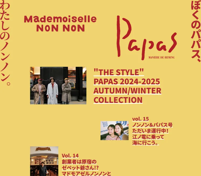
黄色の背景と深い赤の極太文字、白い下線が印象的なファッション誌。デスクトップでは記事を左右にずらし、モバイルでは写真と見出しを交互に配置する。
オリジナルサイトを見るPapas / Mademoiselle NON NON — Style Reference
A fashion magazine printed in red on sun-yellow paper, with photographs and underlined headlines stepping down the page.
Website: Papas / Mademoiselle NON NON magazine
Original URL: https://papas.jpn.com/ja/papas-nonnon
Final URL: https://papas.jpn.com/ja/papas-nonnon
Theme: a light yellow canvas with deep red typography and white accents; no theme selector was evidenced.
Inspected: September 17, 2026, 04:29 JST. The supplied capture record is 2026-09-16T19:29:46.469Z.
Viewports: desktop 1440 × 1000 and mobile 390 × 844 CSS pixels.
Scope: the current magazine index, including its masthead, article archive beginning with Vol.33, editorial introduction, catalog links, webshop banner, footer, and closed menu affordance. Evidence consists of supplied desktop opening/middle/footer captures, mobile opening/footer captures, and rendered DOM/computed styles for both widths. Article destinations and open navigation states were not inspected.
The page combines the confidence of a fashion masthead with the informality of a personal magazine. A continuous yellow background carries oversized red brand graphics, extremely heavy Japanese headlines, white underlines, and unframed photography. The photographs show people, clothing, shops, and everyday settings; they introduce texture and human detail into an otherwise flat graphic system.
Its defining structure is a long editorial archive. A large lead story spans the desktop content area, followed by smaller entries that alternate between the right and left halves at staggered heights. Large empty areas are part of the composition. On mobile, the lead becomes a full-width photograph above its headline, while subsequent entries form compact rows with alternating image/text orientation. Catalog and shopping links appear after the editorial material.
How to Read This Reference
- Measured means a value supplied by the rendered DOM or computed styles. Measurements apply to the two recorded viewports.
- Calculated means arithmetic based on those measurements, such as the desktop main width being 70% of the viewport.
- Estimated means a visual reading of a supplied screenshot, principally for image bounds, graphic heights, and underline thickness.
- Recommended means guidance for a new implementation. Breakpoints, missing interaction states, and the Quick Start's implementation choices are not recovered source code.
- Token names introduced here are descriptive aliases. Original custom properties are explicitly identified.
- Inline image-link rectangles sometimes report only a
17pxor19pxtext line box. Those heights do not describe the visible logo, photograph, or banner. - Some later image heights differ between the screenshot and DOM evidence. Preserve the observed composition without treating every recorded document coordinate as a permanent layout constant.
Tokens — Colors
Default Palette
| Name | Value | Reusable token / source property | Role and evidence |
|---|---|---|---|
| Sun Yellow | #f0d26e |
--color-paper / source --color_a_bg |
Measured body background at both viewports; continuous behind articles, masthead, commerce panel, and footer |
| Editorial Red | #b1292f |
--color-ink / source --color_a |
Measured body and heading color; visually repeated in brand lettering, rules, and the menu square |
| Underline White | #ffffff |
--color-accent / source --color_w |
Measured anchor color; visibly used for headline underlines and social glyphs |
| Banner Burgundy | No verified CSS value | Retain within the supplied banner artwork | The webshop graphic contains a darker red field and a subtle fish illustration; do not replace it with an invented source token |
The red/yellow pair supplies nearly all interface color. White is a sharp secondary accent, particularly beneath each line of a headline. Photography retains its natural colors and is not globally recolored.
Article anchors compute to white while their h3 descendants compute to red. This agrees with the visible separation between red text and white underlining. A new implementation can express that relationship directly with text-decoration-color; reproducing the original inheritance mechanism is unnecessary.
Theme Presets
The exported custom properties also contain blue, green, neutral, collection, and general CMS preset colors. Their presence does not establish visible themes or alternate states on this page. Only the yellow/red treatment is supported by the supplied captures. No gradient or shadow preset should be imported into this reference merely because it exists in the page's global variables.
Tokens — Typography
Japanese Editorial Text
Measured family stack: YakuHanJP, "Noto Sans JP", YuGothic, "Yu Gothic", 游ゴシック, 游ゴシック体, "ヒラギノ角ゴ Pro W3", "Hiragino Kaku Gothic Pro", メイリオ, Meiryo, Osaka, "MS Pゴシック", "MS PGothic", sans-serif.
This is the computed family declaration, not proof of which font supplied every rendered glyph. Use the declared stack when the corresponding fonts are available, and verify Japanese punctuation and line lengths after loading them.
- Article headings, section labels, and the editorial introduction use weight
900. - The body's inherited weight is
500. - Article headings use line height
1.2and normal letter spacing. - The introduction uses line height
1.45. - Dense, phrase-based line composition creates the editorial rhythm. Volume numbers belong to the headline block rather than a separate badge.
Brand and Side Lettering
The Papas mark has irregular brush strokes and a small serif subtitle. Mademoiselle NON NON uses a heavy, rounded display wordmark. The left vertical phrase, わたしのノンノン。, has a calligraphic character; the right phrase, ぼくのパパス、, is much heavier and more geometric.
Treat these as supplied brand graphics. Their font families and construction were not established by the DOM excerpt. The body font stack should not be used to approximate the wordmarks. The footer's PAPAS COMPANY mark is likewise visually distinct from ordinary interface text.
Type Scale
| Role | Desktop measured | Mobile measured | Weight / line height | Suggested alias |
|---|---|---|---|---|
| Body inheritance | 13.26px |
12px |
500 / 1.5 |
--text-base |
| Lead story heading | 53.04px |
26.4px |
900 / 1.2 |
--text-feature |
| Standard story heading | 34.476px |
18px |
900 / 1.2 |
--text-story |
| Editorial introduction | 18.564px |
18px |
900 / 1.45 |
--text-intro |
| CATALOG / WEBSHOP heading | 26.52px |
24px |
900 / 1 |
--text-section |
| Social anchor font size | 39.78px |
36px |
Measured line height 40px |
--social-size |
The social measurements describe the anchor's computed typography, not a verified icon font or exact SVG size. The visible glyphs are Facebook and Instagram marks; their implementation library is unknown.
The HTML element retains a measured 16px font size. The 13.26px desktop body size is therefore not a custom root rem. Do not multiply ordinary rem units as though the root had been reduced.
Tokens — Spacing & Shapes
Density: broad desktop breathing room around compact, very bold text; considerably tighter archive rows on mobile.
Geometry: square photographs, rectangular graphic banners, fine red panel rules, and an unrounded menu square.
Responsive Unit
Several desktop dimensions are multiples of the measured body size: the lead heading is 4 × 13.26px, the standard heading is 2.6 × 13.26px, and the section label is 2 × 13.26px. On mobile, the corresponding heading multiples change to 2.2, 1.5, and 2 against a 12px body size.
These relationships are calculated from the snapshots. The original formula that produces the desktop body size, its minimum/maximum values, and the original media-query threshold were not supplied. The Quick Start uses an explicitly recommended scaling rule that matches the inspected desktop width.
Spacing Scale
| Use | Desktop | Mobile | Status |
|---|---|---|---|
| Main outside margin | 216px each side |
0px |
Measured; desktop equals 15vw |
| Lead image-to-heading gap | About 50.4px |
About 20px vertically |
Desktop calculated from geometry; mobile screenshot and heading position |
| Standard desktop image-to-heading gap | About 25.2px |
Replaced by heading padding | Calculated; approximately 5% of a standard desktop entry |
| Standard heading padding | 0px |
18px on all sides |
Measured |
| Lead mobile heading outside inset | — | 31.2px each side |
Measured; 8% of viewport width |
| Commerce inner inset | About 53px beyond the border |
About 31.2px |
Calculated from link widths/positions |
| Section-label vertical padding | 13.26px |
12px |
Measured |
| Archive-to-introduction gap | About 132.6px |
60px |
Calculated from section bounds |
| Introduction-to-commerce gap | About 132.6px |
60px |
Calculated from section bounds |
| Commerce-to-footer gap | About 66.3px |
60px |
Calculated from section bounds |
| Commerce rules | About 2px |
About 2px |
Supported by screenshots and element offsets |
Desktop archive spacing is staggered, not a universal row gap. For example, the first secondary article begins around 79.53px below the lead's measured end; the next left entry begins about 251.95px below that right entry's start. Adjacent entries can overlap vertically while remaining in different horizontal lanes.
Border Radius
| Element | Treatment |
|---|---|
| Article links and headings | Measured 0px radius |
| Photographs and catalog covers | Visually square corners |
| Commerce panel | Square red border |
| Menu affordance | Approximately 60 × 60px, square |
| Social marks | Their native circular or rounded logo geometry; not a general UI radius system |
Layout Measurements
| Element | Desktop 1440 × 1000 |
Mobile 390 × 844 |
|---|---|---|
| Header | 1440 × 464.09px |
390 × 384px |
| Main | x=216, width 1008px |
x=0, width 390px |
| Lead link | 1008 × 381.84px |
390 × 509.72px |
| Lead heading box | x=669.61, width 554.39px |
x=31.20, width 327.59px |
| Lead photograph | Estimated 403 × 270px |
Visually 390 × 260px |
| Standard article link | Width 504px |
Width 390px |
| Standard heading box | Width 277.19px |
Width 234px, including 18px padding |
| Standard image column | Estimated 201.6px |
Remaining 156px, calculated from the row partition |
| Catalog cover link width | 426.52px each |
155.61px each |
| Webshop banner link width | 897.94px |
327.63px |
| Footer company-link width | 432px |
327.59px |
| Document height | Approximately 12032px |
Approximately 9036px |
A notable evidence difference occurs around Vol.14: the desktop middle capture shows a portrait roughly 202 × 302px, while the supplied DOM records its article anchor at approximately 504 × 222.61px. The reason for this difference is not established. Use final image dimensions and natural content flow; do not hardcode later article positions from the DOM snapshot.
Components
Brand Masthead
Role: identify the two brands and establish the editorial tone before the article archive.
On desktop, Mademoiselle NON NON occupies the upper-left interior at approximately x=172.8px, with a measured link width of 518.39px. The Papas graphic occupies the upper-right interior at approximately x=835.2px, with a width of 432px. Their visual tops are near 106px, but the taller Papas artwork extends substantially farther down.
On mobile, the hierarchy changes: Papas sits above Mademoiselle NON NON in the center. Their measured link widths are approximately 210.2px and 214.5px. The Papas artwork visually starts around 84px; the NON NON wordmark starts around 289px. The archive begins at y=384px.
Four graphic anchors in the header have javascript:void(0) destinations. Their click results are not evidenced. Do not assume that either wordmark navigates to a homepage or opens a particular overlay.
Vertical Edge Lettering
Role: frame the desktop page with recognizable brand phrases.
The red vertical graphics sit flush against the left and right viewport edges. Desktop link widths measure 72px, equal to 5% of the viewport. Their visible heights differ: the left phrase extends to roughly 610px, while the right finishes around 444px.
The graphics remain in the same viewport positions across the supplied desktop opening, middle, and footer captures, supporting a persistent edge treatment. On mobile they narrow to about 42.9px, or 11vw, and appear in the opening masthead. They are absent from the supplied mobile footer capture. The evidence does not distinguish scrolling out of view from a scroll-dependent hiding rule; a header-bound mobile treatment is a reasonable implementation recommendation.
These graphics are separate from the article grid. Do not reserve their full visible height as extra space inside every content row.
Lead Story
Role: give the latest article a markedly larger visual presence.
The complete image-and-heading composition is one anchor to /ja/papas-nonnon/vol-33. On desktop it spans the full 1008px main width. Its apparent proportions are approximately 40% image, 5% gap, and 55% heading. The landscape portrait is vertically centered beside the six-line headline.
The headline begins with Vol.33, followed by the article title, including シワが絵になる一着を。. Each line has a conspicuous white underline. The type is red, weight 900, with a 53.04px size and 63.648px line height.
On mobile, the photograph becomes full bleed, occupying approximately 390 × 260px from y=384px. The headline starts at y=664px, giving a 20px gap beneath the image. It occupies 84% of the viewport width and uses 26.4px / 31.68px type. Retain this distinct lead treatment rather than applying the smaller archive-row layout to it.
Staggered Archive Entry
Role: link to an individual interview, brand story, or collection feature.
The source uses flex containers for the archive and article anchors. Standard desktop anchors measure 504px, half the main width. Their photographs sit on the left and their headline blocks on the right, even when the entire entry occupies the right lane.
After the lead, entries proceed right, left, right, left. Their vertical positions form a descending zigzag. The middle capture makes this especially clear: Vol.15 is left, Vol.14 is lower and right, and Vol.13 is lower and left. Avoid arranging these entries into level, evenly spaced pairs.
Each entry contains a photograph and an h3; the title itself supplies the descriptive content. The supplied index does not show separate category chips, excerpt paragraphs, reading-time labels, or individual CTA buttons.
At mobile width, every standard entry spans the page. Its heading occupies a 234px box and the image column accounts for 156px, a 60/40 split. The text box alternates between x=156px and x=0, producing alternating image/text orientation. Titles use 18px / 21.6px, with 18px internal padding. This is supported by the mobile DOM; no middle-of-archive mobile screenshot was supplied.
Underlined Headline
Role: make article titles function as both editorial typography and obvious links.
Red, very heavy letters sit immediately above straight white rules. The rule follows the length of each line rather than creating a single full-width divider beneath the component. Visual thickness is approximately 4–5px for the desktop lead and 2–4px for smaller headings; exact decoration properties were not exported.
Use intentional phrase breaks and preserve the volume label's relationship to the title. Some visible desktop text extends beyond its nominal heading box, so the measured width must not automatically become an overflow clipping boundary. In a new implementation, test long titles and allow safe wrapping at small widths.
Editorial Introduction
Role: explain the magazine's interest in clothing, its makers, its background, and the people who wear it.
This appears after the archive, before the commerce panel. On desktop, the measured paragraph occupies the rightmost 30% of the main area: about 302.39px at x=921.61px. It uses 18.564px, weight 900, and 26.9178px line height.
On mobile, the section is inset by approximately 7vw and the paragraph spans 335.39px. Its type remains comparatively large at 18px / 26.1px. The paragraph begins below an earlier region within the section, but the supplied screenshots do not establish the appearance of that region. Do not invent an illustration to fill it.
Catalog Panel
Role: connect the magazine to the two brand catalogs.
A thin red frame contains a centered uppercase CATALOG label, a horizontal rule, and two portrait covers. The desktop panel spans the main width; mobile horizontal rules extend across the viewport. Both covers remain side by side on mobile.
At mobile width, the covers are approximately 155.6px wide, separated by about 16.4px, with approximately 31.2px outer insets. The screenshot shows related storefront-and-car artwork on both covers, with distinct brand labeling. Do not collapse them into one shared destination.
The original page exposes separate links to /ja/catalog/papas-catalog71 and /ja/catalog/nonnon-catalog71. Their destination layouts were not inspected.
Webshop Banner
Role: provide a visually substantial shopping exit after the editorial archive.
The WEBSHOP heading repeats the catalog label's centered red uppercase treatment and ruled boundaries. Beneath it sits a wide graphic with a dark red field, large yellow lettering, small brand names, and a faint fish illustration.
The banner is approximately 898 × 478px in the desktop footer capture and 328 × 175px on mobile, giving an estimated aspect ratio near 1.88:1. Keep the full composition visible. Its typography and illustration are part of the graphic, not evidence of additional interface fonts.
The banner links to https://papas.jpn.com/webshop/. No product listing, cart, or checkout interaction was inspected.
Company Footer
Role: close the magazine with company identity and social links.
Center the red PAPAS COMPANY graphic above a small copyright line, then a pair of white Facebook and Instagram glyphs. The footer shares the yellow page background and has no independent dark surface.
The company graphic's link width changes from 432px on desktop to approximately 327.6px on mobile. Its destination is /ja. The copyright reads copyright © Papas all rights reserved.
The social destinations are the Facebook papas.jpn account and Instagram papas_jpn_official account. Their links are evidenced; hover appearance, accessible names, and destination-page behavior were not inspected.
Fixed Menu Affordance
Role: provide persistent access to navigation.
A red square sits flush against the lower-right viewport corner in every supplied current capture. Its visual size is approximately 60 × 60px, at x=1380, y=940 on desktop and x=330, y=784 on mobile. Three yellow horizontal strokes form the icon, approximately 26px wide and 3px thick.
The open menu, animation, destination list, DOM semantics, and focus behavior are unknown. The visible closed state can be reproduced; any functional navigation panel must be specified separately.
Tokens — Motion & Interaction
| Treatment | Evidence | What can be concluded |
|---|---|---|
| Opening animation | Body computes to 1s openPage at both viewports |
A one-second named animation is declared; its keyframes and visible effect were not supplied |
| Link transitions | Article and graphic anchors compute to 0.2s linear |
A 200ms linear transition is declared; changed properties and hover end states are unverified |
| Other transition exports | Many elements report all |
This alone does not establish visible animation or a nonzero transition duration |
| Desktop edge graphics | Same positions in opening, middle, and footer captures | Persistent visual framing during the sampled desktop scroll positions |
| Menu affordance | Same lower-right position across captures | Persistent closed control; opening behavior remains unknown |
| Article navigation | Explicit article URLs in rendered anchors | Destinations are known, but navigation transitions and article layouts were not tested |
| Scrolling | Opening and lower-page captures plus the supplied traversal record | The index is a long document; no scroll snapping, parallax, or scroll-triggered reveal effect was established |
The capture process waited for load, sampled stability, finite animations, and visible image decoding within stated time limits. This makes the settled screenshots useful, but does not prove that delayed behavior or unexercised states were captured.
For adaptation, let typography, image placement, and scrolling carry the experience. A short link-feedback transition is sufficient. Do not infer an opacity fade from the openPage name or prescribe animated menus as though their behavior had been observed.
Surfaces
| Layer | Appearance | Purpose |
|---|---|---|
| Page canvas | Solid yellow | Unifies the entire long document |
| Masthead and archive | Same canvas, no separate panels | Lets logos, text, and photography establish hierarchy |
| Story link | Unboxed image and underlined red heading | Editorial navigation without card chrome |
| Commerce frame | Yellow interior with thin red boundaries | Groups catalog and webshop exits |
| Webshop artwork | Dark red image with yellow lettering | Concentrated promotional graphic |
| Footer | Same yellow canvas | Continues the page identity through its end |
| Menu affordance | Solid red square with yellow strokes | Persistent navigation access |
No general elevation, blur, rounded-card, or gradient system is visible. Distinction comes from scale, blank space, rules, and the boundaries of photographs.
Imagery
Use editorial photography with people and places at its center. The lead portrait shows a seated man in a textured jacket against a dark banquette. Other visible entries include two women on a train, a standing portrait inside a restaurant, and a seated interview subject beside tall windows. Clothing is shown in lived environments rather than isolated product cutouts.
Photographic color remains natural. Dark interiors, skin tones, neutral tailoring, striped garments, and greenery provide contrast against the yellow/red shell. Keep square corners and avoid adding a uniform color wash, gradient overlay, or shadow.
Image proportions vary. Landscape interview photographs sit alongside tall environmental portraits; the webshop banner is panoramic and catalog covers are portrait-oriented. A single compulsory thumbnail aspect ratio would erase an important part of the archive's rhythm.
Observed Asset References
No image src URLs, downloadable logo paths, or intrinsic image dimensions were included in the supplied evidence. The references below identify visible assets and evidenced link destinations; they are not asset download paths.
| Visible asset | Evidenced destination | Implementation guidance |
|---|---|---|
| Papas and Mademoiselle NON NON masthead graphics | Header anchors use javascript:void(0) |
Obtain authorized graphics; click outcomes remain unspecified |
| Vertical brand phrases | Header anchors use javascript:void(0) |
Preserve their differing lettering styles and proportions |
| Vol.33 portrait | /ja/papas-nonnon/vol-33 |
Landscape lead image, full width on mobile |
| Archive photographs | Corresponding article anchors in the rendered page | Retain image-specific proportions |
| Papas catalog cover | /ja/catalog/papas-catalog71 |
Separate cover link |
| NON NON catalog cover | /ja/catalog/nonnon-catalog71 |
Separate cover link |
| Webshop graphic | /webshop/ |
Preserve the complete banner artwork |
| PAPAS COMPANY footer mark | /ja |
Use the supplied wordmark rather than approximating its font |
Use original assets when authorized and available. The CSS shell can reproduce the layout, but the brush lettering, wordmarks, photographs, and banner illustration carry much of the identity.
Layout & Responsive Behavior
Desktop Composition
The main area is 1008px wide at a 1440px viewport, exactly 70% by calculation. Its 216px margins leave room between the archive and the persistent edge lettering. The masthead extends outside this central column: its left wordmark begins at 12vw and its right graphic begins at 58vw.
The lead spans the complete main width. Standard entries occupy half-width lanes and descend in alternating positions. Images stay left of their headlines within both lanes. Generous empty yellow space separates the compositions without adding borders between articles.
The desktop archive's measured height is approximately 9370px. This is followed by the introduction, framed commerce section, and footer. These content heights describe the captured article set, not reusable fixed dimensions.
Mobile Composition
At 390px, the main area becomes full width. The masthead stacks its central logos while keeping vertical lettering at the outer edges. The lead photograph spans the entire viewport, and its heading receives an 8vw inset.
Subsequent archive entries remain image-and-text rows. They do not all become image-above-title cards. Their orientation alternates, with a 40% image region and a 60% padded heading region. Entry heights vary with the image and title rather than following a uniform tile height.
The introduction gains approximately 7vw horizontal margins. The catalog keeps two covers side by side, and the webshop image uses about 84% of the viewport width. The menu square retains its approximate 60px dimensions.
Limits of the Responsive Evidence
Only the two recorded viewport sizes were inspected. Intermediate breakpoints, tablet behavior, landscape phones, maximum content widths, and browser zoom behavior are unknown. The mobile middle-archive arrangement is supported by DOM geometry rather than a supplied visual capture.
For a new implementation, choose a breakpoint based on title fit and image legibility, preserve chronological DOM order, and verify at intermediate widths. The Quick Start uses 900px as a recommended starting threshold, not an observed source breakpoint.
Do’s and Don’ts
Do
- Preserve the measured yellow
#f0d26e, red#b1292f, and white accent relationship. - Make weight
900headings a central part of the composition. - Underline individual headline lines in white.
- Keep brand graphics distinct from the Japanese text font.
- Give the latest story a substantially larger desktop treatment and a stacked mobile treatment.
- Maintain the desktop archive's descending right/left rhythm.
- Alternate image/text orientation in standard mobile rows.
- Retain natural photographic color and varied image proportions.
- Use square corners and thin red commerce rules.
- Keep the catalog's two brand links separate at every width.
Don't
- Do not replace the archive with an evenly aligned grid of rounded cards.
- Do not turn the magazine into a sequence of generic feature, testimonial, and conversion sections.
- Do not add category badges, metadata rows, or CTA buttons to every article without a content need.
- Do not crop all photographs to a shared landscape ratio.
- Do not replace the brand artwork with guessed display fonts.
- Do not treat global CMS color and shadow presets as visible page styling.
- Do not assume a white computed anchor color means the headline letters are white.
- Do not carry desktop edge graphics over mobile article content without checking the intended behavior.
- Do not copy image-link line-box heights as actual image heights.
- Do not claim a menu interaction, hover effect, or opening fade that the evidence does not establish.
Recommended Implementation Additions
These are recommendations for a new implementation, not verified features of the original page:
- Use one meaningful link per story, with descriptive image alternatives where the photograph adds information beyond the title.
- Preserve chronological keyboard and reading order even when desktop entries are visually staggered.
- Add a page-level accessible heading if the visible identity is entirely graphical. Choose a heading hierarchy appropriate to the surrounding site.
- Implement the menu as a named button with
aria-expandedandaria-controls; specify focus handling and Escape behavior when its panel is designed. - Give catalog, company, and social image links useful accessible names. Empty extracted text does not by itself prove that accessible names are missing.
- Test small red text and white social glyphs against accessibility contrast targets. If needed, use a darker red for small copy or place white glyphs on a red surface in the adapted design.
- Reserve image space with known intrinsic dimensions or per-image aspect ratios to reduce layout movement.
- Keep the lead image eager-loading and load distant archive images progressively without changing their intended proportions.
- Provide visible focus indicators, safe-area handling, and sufficient bottom clearance for the fixed menu.
- Allow long translated or enlarged headlines to wrap. Do not preserve visual phrase breaks at the expense of horizontal overflow.
- Respect reduced-motion preferences for any implemented opening or navigation effects.
Agent Prompt Guide
Quick Color Reference
- Continuous page background:
#f0d26e. - Headlines, brand color, rules, and menu fill:
#b1292f. - Headline underlines and social glyphs:
#ffffff. - Photographs: natural color, no global tint.
- Webshop artwork: retain its own dark red/yellow composition.
- Surface treatment: flat and square, with no general shadow system.
Overall Prompt
“Create a Japanese fashion web-magazine index inspired by the current Papas / Mademoiselle NON NON page. Use a continuous yellow canvas #f0d26e, deep red text #b1292f, 900-weight Japanese sans-serif article headings, and white underlines beneath each headline line. Use authorized brush-lettered and heavy display brand graphics, with vertical phrases framing the desktop edges. Center the archive in a 70%-width desktop column. Make the newest article a full-width image-and-heading composition, then place smaller entries in a descending right/left zigzag with abundant yellow space. On mobile, stack the lead photograph above its headline and turn the remaining entries into full-width rows with alternating image/text orientation. Finish with a thin red catalog frame, two portrait covers, a wide webshop graphic, a centered company mark, and social links. Keep photographs unframed and naturally colored.”
Example Component Prompts
- Lead story: “Build one large article link on yellow: a landscape interview portrait on the left and a six-line, deep red, 900-weight heading on the right. At a 1440px viewport use a 1008px composition, approximately 40/5/55 image-gap-text proportions, and 53.04px heading type. On a 390px phone place the full-width image above a 26.4px heading inset by 8vw. Apply white underlines to the headline lines.”
- Archive: “Create a chronological fashion-magazine archive with half-width desktop entries that step down from right to left. Each desktop entry has a naturally proportioned photograph left of a heavy red headline. On mobile use 40% image and 60% padded title columns, alternating their orientation. Avoid card backgrounds, badges, and shadows.”
- Catalog and webshop: “Create a square red-outlined section on the same yellow canvas. Center uppercase CATALOG and WEBSHOP labels between fine red rules. Keep two portrait catalog covers side by side, including on mobile, and place one complete wide webshop artwork below. Use spacious inner insets rather than raised panels.”
- Masthead: “Position the authorized NON NON wordmark upper left and Papas brush mark upper right on desktop, with different vertical brand phrases flush to the outer edges. On mobile center Papas above NON NON within a roughly 384px-tall opening. Preserve the supplied graphics rather than approximating their lettering with fonts.”
- Navigation affordance: “Render the evidenced closed state as a 60px red square fixed to the bottom-right corner, containing three yellow horizontal strokes. Give it an accessible name. Treat the open panel and its transition as a separate interaction specification.”
Quick Start
CSS Custom Properties
This is an adaptation, not the original stylesheet. It matches the principal measured dimensions at the two inspected widths. The desktop fluid unit, 900px breakpoint, pair wrappers, focus styling, and opacity hover are recommended implementation choices. The source only establishes the link transition's 200ms linear timing, not its opacity behavior.
Keep a conventional root font size. Use authorized images for all brand graphics and artwork. The CSS does not reproduce an unobserved opening animation or menu panel.
Expected markup:
.brand-mastheadcontains.brand-papasand.brand-nonnonimage elements;.edge-mark--leftand.edge-mark--rightidentify the vertical graphics..magazine-maincontains a lead anchor with.story.story--lead, followed by.story-pairwrappers.- Each pair contains two standard story anchors in chronological order. The first is placed right on desktop; the second is placed lower and left. The source uses flex; this adaptation uses a grid inside each pair.
- Every story contains an image with
.story-imageand a heading with.story-title. Wrap intended headline segments in.story-linespans separated by explicit line breaks where appropriate. .catalog-gridcontains two linked cover images;.shop-artis the linked webshop image wrapper..menu-buttoncontains three decorative spans.
:root {
  /* Measured source palette */
  --color-paper: #f0d26e;
  --color-ink: #b1292f;
  --color-accent: #ffffff;

  /* Shortened stack using names present in the evidence */
  --font-editorial: YakuHanJP, 'Noto Sans JP', YuGothic,
    'Yu Gothic', 'Hiragino Kaku Gothic Pro', Meiryo,
    Osaka, 'MS PGothic', sans-serif;
  --weight-body: 500;
  --weight-heading: 900;

  /* Recommended fluid rule: 13.26px at a 1440px viewport */
  --u: clamp(8px, 0.920833vw, 16px);
  --content-width: 70vw;
  --text-feature: calc(4 * var(--u));
  --text-story: calc(2.6 * var(--u));
  --text-intro: calc(1.4 * var(--u));
  --text-section: calc(2 * var(--u));
  --leading-title: 1.2;
  --leading-intro: 1.45;

  --frame-inset: calc(4 * var(--u));
  --section-space: calc(10 * var(--u));
  --pair-space: calc(6 * var(--u));
  --pair-stagger: calc(var(--content-width) / 4);
  --rule-width: 2px;
  --menu-size: 60px;
  --link-duration: 200ms;
  --link-easing: linear;
}

* {
  box-sizing: border-box;
}

body.papas-reference {
  margin: 0;
  color: var(--color-ink);
  background: var(--color-paper);
  font-family: var(--font-editorial);
  font-size: max(12px, var(--u));
  font-weight: var(--weight-body);
  line-height: 1.5;
}

.papas-reference img {
  display: block;
  max-width: 100%;
  height: auto;
}

.brand-masthead {
  position: relative;
  height: 32.2287vw;
}

.brand-papas,
.brand-nonnon {
  position: absolute;
  top: 7.4vw;
}

.brand-papas {
  left: 58%;
  width: 30%;
}

.brand-nonnon {
  left: 12%;
  width: 36%;
}

.edge-mark {
  position: fixed;
  top: 0;
  z-index: 10;
  width: 5vw;
}

.edge-mark--left { left: 0; }
.edge-mark--right { right: 0; }

.magazine-main {
  width: var(--content-width);
  margin-inline: auto;
}

.story {
  display: flex;
  align-items: center;
  justify-content: space-between;
  min-width: 0;
  color: var(--color-ink);
  text-decoration: none;
  transition: opacity var(--link-duration) var(--link-easing);
}

.story-image {
  flex: 0 0 40%;
  width: 40%;
  border-radius: 0;
}

.story-title {
  flex: 0 0 55%;
  width: 55%;
  margin: 0;
  color: var(--color-ink);
  font-size: var(--text-story);
  font-weight: var(--weight-heading);
  line-height: var(--leading-title);
  letter-spacing: normal;
  overflow-wrap: anywhere;
}

.story-line {
  text-decoration-line: underline;
  text-decoration-color: var(--color-accent);
  text-decoration-thickness: 0.09em;
  text-underline-offset: 0.07em;
  text-decoration-skip-ink: none;
}

.story--lead .story-title {
  font-size: var(--text-feature);
}

/* Pair wrappers preserve chronological DOM order. */
.story-pair {
  display: grid;
  grid-template-columns: repeat(2, minmax(0, 1fr));
  align-items: start;
  margin-top: var(--pair-space);
}

.story-pair > .story:first-child {
  grid-column: 2;
  grid-row: 1;
}

.story-pair > .story:nth-child(2) {
  grid-column: 1;
  grid-row: 1;
  margin-top: var(--pair-stagger);
}

.editorial-intro {
  margin-block: var(--section-space);
}

.intro-copy {
  width: 30%;
  margin: 0 0 0 auto;
  font-size: var(--text-intro);
  font-weight: var(--weight-heading);
  line-height: var(--leading-intro);
}

.commerce-frame {
  border: var(--rule-width) solid var(--color-ink);
}

.commerce-title {
  margin: 0;
  padding-block: var(--u);
  border-bottom: var(--rule-width) solid var(--color-ink);
  font-size: var(--text-section);
  font-weight: var(--weight-heading);
  line-height: 1;
  text-align: center;
}

.commerce-title--shop {
  border-top: var(--rule-width) solid var(--color-ink);
}

.catalog-grid {
  display: grid;
  grid-template-columns: repeat(2, minmax(0, 1fr));
  gap: 5%;
  padding: var(--frame-inset);
}

.catalog-grid a,
.shop-art {
  display: block;
}

.catalog-grid img,
.shop-art img {
  width: 100%;
}

.shop-art {
  margin: var(--frame-inset);
}

.company-footer {
  margin-top: calc(5 * var(--u));
  padding-bottom: calc(60px + env(safe-area-inset-bottom, 0px));
  text-align: center;
}

.company-mark {
  display: block;
  width: 30vw;
  margin-inline: auto;
}

.company-mark img {
  width: 100%;
}

.company-footer small {
  display: block;
  margin-top: calc(2 * var(--u));
  font-size: max(12px, var(--u));
}

.social-links {
  display: flex;
  justify-content: center;
  align-items: center;
  gap: calc(1.5 * var(--u));
  margin-top: calc(2.5 * var(--u));
}

.social-links a {
  display: grid;
  min-width: 44px;
  min-height: 44px;
  place-items: center;
  color: var(--color-accent);
}

.social-links svg {
  width: calc(3 * var(--u));
  height: calc(3 * var(--u));
}

.menu-button {
  position: fixed;
  right: env(safe-area-inset-right, 0px);
  bottom: env(safe-area-inset-bottom, 0px);
  z-index: 30;
  display: grid;
  place-content: center;
  gap: 6px;
  width: var(--menu-size);
  height: var(--menu-size);
  padding: 0;
  border: 0;
  border-radius: 0;
  color: var(--color-paper);
  background: var(--color-ink);
  cursor: pointer;
}

.menu-button span {
  display: block;
  width: 26px;
  height: 3px;
  background: currentColor;
}

/* Recommended feedback; source hover endpoints are unknown. */
@media (hover: hover) {
  .story:hover {
    opacity: 0.85;
  }
}

.papas-reference :focus-visible {
  outline: 3px solid var(--color-ink);
  outline-offset: 4px;
}

.menu-button:focus-visible {
  outline-color: var(--color-paper);
  outline-offset: -6px;
}

/* Recommended breakpoint, not a recovered source query. */
@media (max-width: 900px) {
  :root {
    --u: 12px;
    --content-width: 100%;
    --text-feature: 26.4px;
    --text-story: 18px;
    --text-intro: 18px;
    --text-section: 24px;
    --frame-inset: 8vw;
    --section-space: 60px;
  }

  .brand-masthead {
    height: 384px;
  }

  .brand-papas {
    top: 84px;
    left: 23.6%;
    width: 53.9%;
  }

  .brand-nonnon {
    top: 288px;
    left: 22.5%;
    width: 55%;
  }

  /* Header-bound mobile rails are an adaptation choice. */
  .edge-mark {
    position: absolute;
    width: 11vw;
  }

  .story--lead {
    display: block;
    padding-bottom: 39.6px;
  }

  .story--lead .story-image {
    width: 100%;
  }

  .story--lead .story-title {
    width: 84%;
    margin: 20px auto 0;
    padding: 0;
  }

  .story-pair {
    display: block;
    margin-top: 0;
  }

  .story-pair > .story:nth-child(2) {
    flex-direction: row-reverse;
    margin-top: 0;
  }

  .story-pair .story-title {
    flex-basis: 60%;
    width: 60%;
    padding: 18px;
  }

  .editorial-intro {
    width: 86%;
    margin-inline: auto;
  }

  .intro-copy {
    width: 100%;
  }

  .commerce-frame {
    border-inline: 0;
  }

  .company-mark {
    width: 84%;
  }
}

@media (prefers-reduced-motion: reduce) {
  .papas-reference *,
  .papas-reference *::before,
  .papas-reference *::after {
    animation: none !important;
    transition: none !important;
  }
}
The snippet leaves image aspect ratios intrinsic, omits the introduction's unidentified preceding visual region, and does not impose the captured document height. Match final spacing after inserting the actual photographs and font files. Test the mobile masthead at widths other than 390px before shipping.
Tailwind v4 Token Mapping
Optional aliases for a project already using Tailwind v4. These do not imply that the original page uses Tailwind. Define the preceding custom properties first; preserve the component CSS for the staggered archive.
@theme inline {
  --color-paper: #f0d26e;
  --color-ink: #b1292f;
  --color-underline: #ffffff;

  --font-editorial: YakuHanJP, 'Noto Sans JP', YuGothic,
    'Yu Gothic', 'Hiragino Kaku Gothic Pro', Meiryo,
    Osaka, 'MS PGothic', sans-serif;

  --text-feature: calc(4 * var(--u));
  --text-archive: var(--text-story);
  --text-section-label: var(--text-section);
  --text-introduction: var(--text-intro);

  --spacing-editorial-unit: var(--u);
  --spacing-frame-inset: var(--frame-inset);
  --spacing-section-gap: var(--section-space);
  --spacing-menu: 60px;

  --radius-editorial: 0px;
}

/* Keep utility sizing aligned with the recommended mobile scale. */
@media (max-width: 900px) {
  :root {
    --text-feature: 26.4px;
  }
}
Sources & Evidence
- Original and final magazine URL: supplied HTTP status
200, rendered title, archive text, link destinations, element bounds, computed typography, colors, and animation/transition declarations. - Capture record:
2026-09-16T19:29:46.469Z, equivalent to September 17, 2026, 04:29:46 JST. Viewports were1440 × 1000and390 × 844CSS pixels. - Current desktop captures show the opening masthead and Vol.33 lead, middle archive entries including Vol.15–13, and the webshop/footer area. Current mobile captures show the opening masthead/lead and the catalog/webshop/footer area.
- Rendered DOM evidence covers the longer archive at both widths, including the mobile alternating title positions and the introduction's typography and bounds. Image nodes, image-source URLs, complete stylesheets, breakpoint rules, animation keyframes, and menu markup were not supplied.
- The inspection record describes waiting for document load, finite animation completion within limits, sampled stability, and visible image decoding, followed by scrolling through intermediate positions. It does not establish all delayed behavior or semantic completeness.
- No open menu, hover, keyboard focus, article destination, catalog destination, shopping flow, or social destination was exercised in the supplied evidence. The differing later-image heights prevent treating all DOM and screenshot geometry as one synchronized measurement.
This reference describes the current index represented by those captures. Source measurements, screenshot estimates, derived proportions, and recommended implementation choices are distinguished throughout.
# Papas / Mademoiselle NON NON — Style Reference

> A fashion magazine printed in red on sun-yellow paper, with photographs and underlined headlines stepping down the page.

**Website:** [Papas / Mademoiselle NON NON magazine](https://papas.jpn.com/ja/papas-nonnon)
**Original URL:** https://papas.jpn.com/ja/papas-nonnon
**Final URL:** https://papas.jpn.com/ja/papas-nonnon
**Theme:** a light yellow canvas with deep red typography and white accents; no theme selector was evidenced.
**Inspected:** September 17, 2026, 04:29 JST. The supplied capture record is `2026-09-16T19:29:46.469Z`.
**Viewports:** desktop `1440 × 1000` and mobile `390 × 844` CSS pixels.
**Scope:** the current magazine index, including its masthead, article archive beginning with Vol.33, editorial introduction, catalog links, webshop banner, footer, and closed menu affordance. Evidence consists of supplied desktop opening/middle/footer captures, mobile opening/footer captures, and rendered DOM/computed styles for both widths. Article destinations and open navigation states were not inspected.

The page combines the confidence of a fashion masthead with the informality of a personal magazine. A continuous yellow background carries oversized red brand graphics, extremely heavy Japanese headlines, white underlines, and unframed photography. The photographs show people, clothing, shops, and everyday settings; they introduce texture and human detail into an otherwise flat graphic system.

Its defining structure is a long editorial archive. A large lead story spans the desktop content area, followed by smaller entries that alternate between the right and left halves at staggered heights. Large empty areas are part of the composition. On mobile, the lead becomes a full-width photograph above its headline, while subsequent entries form compact rows with alternating image/text orientation. Catalog and shopping links appear after the editorial material.

## How to Read This Reference

- **Measured** means a value supplied by the rendered DOM or computed styles. Measurements apply to the two recorded viewports.
- **Calculated** means arithmetic based on those measurements, such as the desktop main width being 70% of the viewport.
- **Estimated** means a visual reading of a supplied screenshot, principally for image bounds, graphic heights, and underline thickness.
- **Recommended** means guidance for a new implementation. Breakpoints, missing interaction states, and the Quick Start's implementation choices are not recovered source code.
- Token names introduced here are descriptive aliases. Original custom properties are explicitly identified.
- Inline image-link rectangles sometimes report only a `17px` or `19px` text line box. Those heights do not describe the visible logo, photograph, or banner.
- Some later image heights differ between the screenshot and DOM evidence. Preserve the observed composition without treating every recorded document coordinate as a permanent layout constant.

## Tokens — Colors

### Default Palette

| Name | Value | Reusable token / source property | Role and evidence |
| --- | --- | --- | --- |
| Sun Yellow | `#f0d26e` | `--color-paper` / source `--color_a_bg` | Measured body background at both viewports; continuous behind articles, masthead, commerce panel, and footer |
| Editorial Red | `#b1292f` | `--color-ink` / source `--color_a` | Measured body and heading color; visually repeated in brand lettering, rules, and the menu square |
| Underline White | `#ffffff` | `--color-accent` / source `--color_w` | Measured anchor color; visibly used for headline underlines and social glyphs |
| Banner Burgundy | No verified CSS value | Retain within the supplied banner artwork | The webshop graphic contains a darker red field and a subtle fish illustration; do not replace it with an invented source token |

The red/yellow pair supplies nearly all interface color. White is a sharp secondary accent, particularly beneath each line of a headline. Photography retains its natural colors and is not globally recolored.

Article anchors compute to white while their `h3` descendants compute to red. This agrees with the visible separation between red text and white underlining. A new implementation can express that relationship directly with `text-decoration-color`; reproducing the original inheritance mechanism is unnecessary.

### Theme Presets

The exported custom properties also contain blue, green, neutral, collection, and general CMS preset colors. Their presence does not establish visible themes or alternate states on this page. Only the yellow/red treatment is supported by the supplied captures. No gradient or shadow preset should be imported into this reference merely because it exists in the page's global variables.

## Tokens — Typography

### Japanese Editorial Text

**Measured family stack:** `YakuHanJP, "Noto Sans JP", YuGothic, "Yu Gothic", 游ゴシック, 游ゴシック体, "ヒラギノ角ゴ Pro W3", "Hiragino Kaku Gothic Pro", メイリオ, Meiryo, Osaka, "MS Pゴシック", "MS PGothic", sans-serif`.

This is the computed family declaration, not proof of which font supplied every rendered glyph. Use the declared stack when the corresponding fonts are available, and verify Japanese punctuation and line lengths after loading them.

- Article headings, section labels, and the editorial introduction use weight `900`.
- The body's inherited weight is `500`.
- Article headings use line height `1.2` and normal letter spacing.
- The introduction uses line height `1.45`.
- Dense, phrase-based line composition creates the editorial rhythm. Volume numbers belong to the headline block rather than a separate badge.

### Brand and Side Lettering

The Papas mark has irregular brush strokes and a small serif subtitle. Mademoiselle NON NON uses a heavy, rounded display wordmark. The left vertical phrase, `わたしのノンノン。`, has a calligraphic character; the right phrase, `ぼくのパパス、`, is much heavier and more geometric.

Treat these as supplied brand graphics. Their font families and construction were not established by the DOM excerpt. The body font stack should not be used to approximate the wordmarks. The footer's PAPAS COMPANY mark is likewise visually distinct from ordinary interface text.

### Type Scale

| Role | Desktop measured | Mobile measured | Weight / line height | Suggested alias |
| --- | --- | --- | --- | --- |
| Body inheritance | `13.26px` | `12px` | `500 / 1.5` | `--text-base` |
| Lead story heading | `53.04px` | `26.4px` | `900 / 1.2` | `--text-feature` |
| Standard story heading | `34.476px` | `18px` | `900 / 1.2` | `--text-story` |
| Editorial introduction | `18.564px` | `18px` | `900 / 1.45` | `--text-intro` |
| CATALOG / WEBSHOP heading | `26.52px` | `24px` | `900 / 1` | `--text-section` |
| Social anchor font size | `39.78px` | `36px` | Measured line height `40px` | `--social-size` |

The social measurements describe the anchor's computed typography, not a verified icon font or exact SVG size. The visible glyphs are Facebook and Instagram marks; their implementation library is unknown.

The HTML element retains a measured `16px` font size. The `13.26px` desktop body size is therefore not a custom root `rem`. Do not multiply ordinary rem units as though the root had been reduced.

## Tokens — Spacing & Shapes

**Density:** broad desktop breathing room around compact, very bold text; considerably tighter archive rows on mobile.
**Geometry:** square photographs, rectangular graphic banners, fine red panel rules, and an unrounded menu square.

### Responsive Unit

Several desktop dimensions are multiples of the measured body size: the lead heading is `4 × 13.26px`, the standard heading is `2.6 × 13.26px`, and the section label is `2 × 13.26px`. On mobile, the corresponding heading multiples change to `2.2`, `1.5`, and `2` against a `12px` body size.

These relationships are calculated from the snapshots. The original formula that produces the desktop body size, its minimum/maximum values, and the original media-query threshold were not supplied. The Quick Start uses an explicitly recommended scaling rule that matches the inspected desktop width.

### Spacing Scale

| Use | Desktop | Mobile | Status |
| --- | --- | --- | --- |
| Main outside margin | `216px` each side | `0px` | Measured; desktop equals 15vw |
| Lead image-to-heading gap | About `50.4px` | About `20px` vertically | Desktop calculated from geometry; mobile screenshot and heading position |
| Standard desktop image-to-heading gap | About `25.2px` | Replaced by heading padding | Calculated; approximately 5% of a standard desktop entry |
| Standard heading padding | `0px` | `18px` on all sides | Measured |
| Lead mobile heading outside inset | — | `31.2px` each side | Measured; 8% of viewport width |
| Commerce inner inset | About `53px` beyond the border | About `31.2px` | Calculated from link widths/positions |
| Section-label vertical padding | `13.26px` | `12px` | Measured |
| Archive-to-introduction gap | About `132.6px` | `60px` | Calculated from section bounds |
| Introduction-to-commerce gap | About `132.6px` | `60px` | Calculated from section bounds |
| Commerce-to-footer gap | About `66.3px` | `60px` | Calculated from section bounds |
| Commerce rules | About `2px` | About `2px` | Supported by screenshots and element offsets |

Desktop archive spacing is staggered, not a universal row gap. For example, the first secondary article begins around `79.53px` below the lead's measured end; the next left entry begins about `251.95px` below that right entry's start. Adjacent entries can overlap vertically while remaining in different horizontal lanes.

### Border Radius

| Element | Treatment |
| --- | --- |
| Article links and headings | Measured `0px` radius |
| Photographs and catalog covers | Visually square corners |
| Commerce panel | Square red border |
| Menu affordance | Approximately `60 × 60px`, square |
| Social marks | Their native circular or rounded logo geometry; not a general UI radius system |

### Layout Measurements

| Element | Desktop `1440 × 1000` | Mobile `390 × 844` |
| --- | --- | --- |
| Header | `1440 × 464.09px` | `390 × 384px` |
| Main | `x=216`, width `1008px` | `x=0`, width `390px` |
| Lead link | `1008 × 381.84px` | `390 × 509.72px` |
| Lead heading box | `x=669.61`, width `554.39px` | `x=31.20`, width `327.59px` |
| Lead photograph | Estimated `403 × 270px` | Visually `390 × 260px` |
| Standard article link | Width `504px` | Width `390px` |
| Standard heading box | Width `277.19px` | Width `234px`, including `18px` padding |
| Standard image column | Estimated `201.6px` | Remaining `156px`, calculated from the row partition |
| Catalog cover link width | `426.52px` each | `155.61px` each |
| Webshop banner link width | `897.94px` | `327.63px` |
| Footer company-link width | `432px` | `327.59px` |
| Document height | Approximately `12032px` | Approximately `9036px` |

A notable evidence difference occurs around Vol.14: the desktop middle capture shows a portrait roughly `202 × 302px`, while the supplied DOM records its article anchor at approximately `504 × 222.61px`. The reason for this difference is not established. Use final image dimensions and natural content flow; do not hardcode later article positions from the DOM snapshot.

## Components

### Brand Masthead

**Role:** identify the two brands and establish the editorial tone before the article archive.

On desktop, Mademoiselle NON NON occupies the upper-left interior at approximately `x=172.8px`, with a measured link width of `518.39px`. The Papas graphic occupies the upper-right interior at approximately `x=835.2px`, with a width of `432px`. Their visual tops are near `106px`, but the taller Papas artwork extends substantially farther down.

On mobile, the hierarchy changes: Papas sits above Mademoiselle NON NON in the center. Their measured link widths are approximately `210.2px` and `214.5px`. The Papas artwork visually starts around `84px`; the NON NON wordmark starts around `289px`. The archive begins at `y=384px`.

Four graphic anchors in the header have `javascript:void(0)` destinations. Their click results are not evidenced. Do not assume that either wordmark navigates to a homepage or opens a particular overlay.

### Vertical Edge Lettering

**Role:** frame the desktop page with recognizable brand phrases.

The red vertical graphics sit flush against the left and right viewport edges. Desktop link widths measure `72px`, equal to 5% of the viewport. Their visible heights differ: the left phrase extends to roughly `610px`, while the right finishes around `444px`.

The graphics remain in the same viewport positions across the supplied desktop opening, middle, and footer captures, supporting a persistent edge treatment. On mobile they narrow to about `42.9px`, or 11vw, and appear in the opening masthead. They are absent from the supplied mobile footer capture. The evidence does not distinguish scrolling out of view from a scroll-dependent hiding rule; a header-bound mobile treatment is a reasonable implementation recommendation.

These graphics are separate from the article grid. Do not reserve their full visible height as extra space inside every content row.

### Lead Story

**Role:** give the latest article a markedly larger visual presence.

The complete image-and-heading composition is one anchor to `/ja/papas-nonnon/vol-33`. On desktop it spans the full `1008px` main width. Its apparent proportions are approximately 40% image, 5% gap, and 55% heading. The landscape portrait is vertically centered beside the six-line headline.

The headline begins with `Vol.33`, followed by the article title, including `シワが絵になる一着を。`. Each line has a conspicuous white underline. The type is red, weight `900`, with a `53.04px` size and `63.648px` line height.

On mobile, the photograph becomes full bleed, occupying approximately `390 × 260px` from `y=384px`. The headline starts at `y=664px`, giving a `20px` gap beneath the image. It occupies 84% of the viewport width and uses `26.4px / 31.68px` type. Retain this distinct lead treatment rather than applying the smaller archive-row layout to it.

### Staggered Archive Entry

**Role:** link to an individual interview, brand story, or collection feature.

The source uses flex containers for the archive and article anchors. Standard desktop anchors measure `504px`, half the main width. Their photographs sit on the left and their headline blocks on the right, even when the entire entry occupies the right lane.

After the lead, entries proceed right, left, right, left. Their vertical positions form a descending zigzag. The middle capture makes this especially clear: Vol.15 is left, Vol.14 is lower and right, and Vol.13 is lower and left. Avoid arranging these entries into level, evenly spaced pairs.

Each entry contains a photograph and an `h3`; the title itself supplies the descriptive content. The supplied index does not show separate category chips, excerpt paragraphs, reading-time labels, or individual CTA buttons.

At mobile width, every standard entry spans the page. Its heading occupies a `234px` box and the image column accounts for `156px`, a 60/40 split. The text box alternates between `x=156px` and `x=0`, producing alternating image/text orientation. Titles use `18px / 21.6px`, with `18px` internal padding. This is supported by the mobile DOM; no middle-of-archive mobile screenshot was supplied.

### Underlined Headline

**Role:** make article titles function as both editorial typography and obvious links.

Red, very heavy letters sit immediately above straight white rules. The rule follows the length of each line rather than creating a single full-width divider beneath the component. Visual thickness is approximately `4–5px` for the desktop lead and `2–4px` for smaller headings; exact decoration properties were not exported.

Use intentional phrase breaks and preserve the volume label's relationship to the title. Some visible desktop text extends beyond its nominal heading box, so the measured width must not automatically become an overflow clipping boundary. In a new implementation, test long titles and allow safe wrapping at small widths.

### Editorial Introduction

**Role:** explain the magazine's interest in clothing, its makers, its background, and the people who wear it.

This appears after the archive, before the commerce panel. On desktop, the measured paragraph occupies the rightmost 30% of the main area: about `302.39px` at `x=921.61px`. It uses `18.564px`, weight `900`, and `26.9178px` line height.

On mobile, the section is inset by approximately 7vw and the paragraph spans `335.39px`. Its type remains comparatively large at `18px / 26.1px`. The paragraph begins below an earlier region within the section, but the supplied screenshots do not establish the appearance of that region. Do not invent an illustration to fill it.

### Catalog Panel

**Role:** connect the magazine to the two brand catalogs.

A thin red frame contains a centered uppercase CATALOG label, a horizontal rule, and two portrait covers. The desktop panel spans the main width; mobile horizontal rules extend across the viewport. Both covers remain side by side on mobile.

At mobile width, the covers are approximately `155.6px` wide, separated by about `16.4px`, with approximately `31.2px` outer insets. The screenshot shows related storefront-and-car artwork on both covers, with distinct brand labeling. Do not collapse them into one shared destination.

The original page exposes separate links to `/ja/catalog/papas-catalog71` and `/ja/catalog/nonnon-catalog71`. Their destination layouts were not inspected.

### Webshop Banner

**Role:** provide a visually substantial shopping exit after the editorial archive.

The WEBSHOP heading repeats the catalog label's centered red uppercase treatment and ruled boundaries. Beneath it sits a wide graphic with a dark red field, large yellow lettering, small brand names, and a faint fish illustration.

The banner is approximately `898 × 478px` in the desktop footer capture and `328 × 175px` on mobile, giving an estimated aspect ratio near `1.88:1`. Keep the full composition visible. Its typography and illustration are part of the graphic, not evidence of additional interface fonts.

The banner links to `https://papas.jpn.com/webshop/`. No product listing, cart, or checkout interaction was inspected.

### Company Footer

**Role:** close the magazine with company identity and social links.

Center the red PAPAS COMPANY graphic above a small copyright line, then a pair of white Facebook and Instagram glyphs. The footer shares the yellow page background and has no independent dark surface.

The company graphic's link width changes from `432px` on desktop to approximately `327.6px` on mobile. Its destination is `/ja`. The copyright reads `copyright © Papas all rights reserved`.

The social destinations are the Facebook `papas.jpn` account and Instagram `papas_jpn_official` account. Their links are evidenced; hover appearance, accessible names, and destination-page behavior were not inspected.

### Fixed Menu Affordance

**Role:** provide persistent access to navigation.

A red square sits flush against the lower-right viewport corner in every supplied current capture. Its visual size is approximately `60 × 60px`, at `x=1380, y=940` on desktop and `x=330, y=784` on mobile. Three yellow horizontal strokes form the icon, approximately `26px` wide and `3px` thick.

The open menu, animation, destination list, DOM semantics, and focus behavior are unknown. The visible closed state can be reproduced; any functional navigation panel must be specified separately.

## Tokens — Motion & Interaction

| Treatment | Evidence | What can be concluded |
| --- | --- | --- |
| Opening animation | Body computes to `1s openPage` at both viewports | A one-second named animation is declared; its keyframes and visible effect were not supplied |
| Link transitions | Article and graphic anchors compute to `0.2s linear` | A 200ms linear transition is declared; changed properties and hover end states are unverified |
| Other transition exports | Many elements report `all` | This alone does not establish visible animation or a nonzero transition duration |
| Desktop edge graphics | Same positions in opening, middle, and footer captures | Persistent visual framing during the sampled desktop scroll positions |
| Menu affordance | Same lower-right position across captures | Persistent closed control; opening behavior remains unknown |
| Article navigation | Explicit article URLs in rendered anchors | Destinations are known, but navigation transitions and article layouts were not tested |
| Scrolling | Opening and lower-page captures plus the supplied traversal record | The index is a long document; no scroll snapping, parallax, or scroll-triggered reveal effect was established |

The capture process waited for load, sampled stability, finite animations, and visible image decoding within stated time limits. This makes the settled screenshots useful, but does not prove that delayed behavior or unexercised states were captured.

For adaptation, let typography, image placement, and scrolling carry the experience. A short link-feedback transition is sufficient. Do not infer an opacity fade from the `openPage` name or prescribe animated menus as though their behavior had been observed.

## Surfaces

| Layer | Appearance | Purpose |
| --- | --- | --- |
| Page canvas | Solid yellow | Unifies the entire long document |
| Masthead and archive | Same canvas, no separate panels | Lets logos, text, and photography establish hierarchy |
| Story link | Unboxed image and underlined red heading | Editorial navigation without card chrome |
| Commerce frame | Yellow interior with thin red boundaries | Groups catalog and webshop exits |
| Webshop artwork | Dark red image with yellow lettering | Concentrated promotional graphic |
| Footer | Same yellow canvas | Continues the page identity through its end |
| Menu affordance | Solid red square with yellow strokes | Persistent navigation access |

No general elevation, blur, rounded-card, or gradient system is visible. Distinction comes from scale, blank space, rules, and the boundaries of photographs.

## Imagery

Use editorial photography with people and places at its center. The lead portrait shows a seated man in a textured jacket against a dark banquette. Other visible entries include two women on a train, a standing portrait inside a restaurant, and a seated interview subject beside tall windows. Clothing is shown in lived environments rather than isolated product cutouts.

Photographic color remains natural. Dark interiors, skin tones, neutral tailoring, striped garments, and greenery provide contrast against the yellow/red shell. Keep square corners and avoid adding a uniform color wash, gradient overlay, or shadow.

Image proportions vary. Landscape interview photographs sit alongside tall environmental portraits; the webshop banner is panoramic and catalog covers are portrait-oriented. A single compulsory thumbnail aspect ratio would erase an important part of the archive's rhythm.

### Observed Asset References

No image `src` URLs, downloadable logo paths, or intrinsic image dimensions were included in the supplied evidence. The references below identify visible assets and evidenced link destinations; they are not asset download paths.

| Visible asset | Evidenced destination | Implementation guidance |
| --- | --- | --- |
| Papas and Mademoiselle NON NON masthead graphics | Header anchors use `javascript:void(0)` | Obtain authorized graphics; click outcomes remain unspecified |
| Vertical brand phrases | Header anchors use `javascript:void(0)` | Preserve their differing lettering styles and proportions |
| Vol.33 portrait | `/ja/papas-nonnon/vol-33` | Landscape lead image, full width on mobile |
| Archive photographs | Corresponding article anchors in the rendered page | Retain image-specific proportions |
| Papas catalog cover | `/ja/catalog/papas-catalog71` | Separate cover link |
| NON NON catalog cover | `/ja/catalog/nonnon-catalog71` | Separate cover link |
| Webshop graphic | `/webshop/` | Preserve the complete banner artwork |
| PAPAS COMPANY footer mark | `/ja` | Use the supplied wordmark rather than approximating its font |

Use original assets when authorized and available. The CSS shell can reproduce the layout, but the brush lettering, wordmarks, photographs, and banner illustration carry much of the identity.

## Layout & Responsive Behavior

### Desktop Composition

The main area is `1008px` wide at a `1440px` viewport, exactly 70% by calculation. Its `216px` margins leave room between the archive and the persistent edge lettering. The masthead extends outside this central column: its left wordmark begins at 12vw and its right graphic begins at 58vw.

The lead spans the complete main width. Standard entries occupy half-width lanes and descend in alternating positions. Images stay left of their headlines within both lanes. Generous empty yellow space separates the compositions without adding borders between articles.

The desktop archive's measured height is approximately `9370px`. This is followed by the introduction, framed commerce section, and footer. These content heights describe the captured article set, not reusable fixed dimensions.

### Mobile Composition

At `390px`, the main area becomes full width. The masthead stacks its central logos while keeping vertical lettering at the outer edges. The lead photograph spans the entire viewport, and its heading receives an 8vw inset.

Subsequent archive entries remain image-and-text rows. They do not all become image-above-title cards. Their orientation alternates, with a 40% image region and a 60% padded heading region. Entry heights vary with the image and title rather than following a uniform tile height.

The introduction gains approximately 7vw horizontal margins. The catalog keeps two covers side by side, and the webshop image uses about 84% of the viewport width. The menu square retains its approximate `60px` dimensions.

### Limits of the Responsive Evidence

Only the two recorded viewport sizes were inspected. Intermediate breakpoints, tablet behavior, landscape phones, maximum content widths, and browser zoom behavior are unknown. The mobile middle-archive arrangement is supported by DOM geometry rather than a supplied visual capture.

For a new implementation, choose a breakpoint based on title fit and image legibility, preserve chronological DOM order, and verify at intermediate widths. The Quick Start uses `900px` as a recommended starting threshold, not an observed source breakpoint.

## Do’s and Don’ts

### Do

- Preserve the measured yellow `#f0d26e`, red `#b1292f`, and white accent relationship.
- Make weight `900` headings a central part of the composition.
- Underline individual headline lines in white.
- Keep brand graphics distinct from the Japanese text font.
- Give the latest story a substantially larger desktop treatment and a stacked mobile treatment.
- Maintain the desktop archive's descending right/left rhythm.
- Alternate image/text orientation in standard mobile rows.
- Retain natural photographic color and varied image proportions.
- Use square corners and thin red commerce rules.
- Keep the catalog's two brand links separate at every width.

### Don't

- Do not replace the archive with an evenly aligned grid of rounded cards.
- Do not turn the magazine into a sequence of generic feature, testimonial, and conversion sections.
- Do not add category badges, metadata rows, or CTA buttons to every article without a content need.
- Do not crop all photographs to a shared landscape ratio.
- Do not replace the brand artwork with guessed display fonts.
- Do not treat global CMS color and shadow presets as visible page styling.
- Do not assume a white computed anchor color means the headline letters are white.
- Do not carry desktop edge graphics over mobile article content without checking the intended behavior.
- Do not copy image-link line-box heights as actual image heights.
- Do not claim a menu interaction, hover effect, or opening fade that the evidence does not establish.

## Recommended Implementation Additions

These are recommendations for a new implementation, not verified features of the original page:

- Use one meaningful link per story, with descriptive image alternatives where the photograph adds information beyond the title.
- Preserve chronological keyboard and reading order even when desktop entries are visually staggered.
- Add a page-level accessible heading if the visible identity is entirely graphical. Choose a heading hierarchy appropriate to the surrounding site.
- Implement the menu as a named button with `aria-expanded` and `aria-controls`; specify focus handling and Escape behavior when its panel is designed.
- Give catalog, company, and social image links useful accessible names. Empty extracted text does not by itself prove that accessible names are missing.
- Test small red text and white social glyphs against accessibility contrast targets. If needed, use a darker red for small copy or place white glyphs on a red surface in the adapted design.
- Reserve image space with known intrinsic dimensions or per-image aspect ratios to reduce layout movement.
- Keep the lead image eager-loading and load distant archive images progressively without changing their intended proportions.
- Provide visible focus indicators, safe-area handling, and sufficient bottom clearance for the fixed menu.
- Allow long translated or enlarged headlines to wrap. Do not preserve visual phrase breaks at the expense of horizontal overflow.
- Respect reduced-motion preferences for any implemented opening or navigation effects.

## Agent Prompt Guide

### Quick Color Reference

- Continuous page background: `#f0d26e`.
- Headlines, brand color, rules, and menu fill: `#b1292f`.
- Headline underlines and social glyphs: `#ffffff`.
- Photographs: natural color, no global tint.
- Webshop artwork: retain its own dark red/yellow composition.
- Surface treatment: flat and square, with no general shadow system.

### Overall Prompt

“Create a Japanese fashion web-magazine index inspired by the current Papas / Mademoiselle NON NON page. Use a continuous yellow canvas `#f0d26e`, deep red text `#b1292f`, 900-weight Japanese sans-serif article headings, and white underlines beneath each headline line. Use authorized brush-lettered and heavy display brand graphics, with vertical phrases framing the desktop edges. Center the archive in a 70%-width desktop column. Make the newest article a full-width image-and-heading composition, then place smaller entries in a descending right/left zigzag with abundant yellow space. On mobile, stack the lead photograph above its headline and turn the remaining entries into full-width rows with alternating image/text orientation. Finish with a thin red catalog frame, two portrait covers, a wide webshop graphic, a centered company mark, and social links. Keep photographs unframed and naturally colored.”

### Example Component Prompts

1. **Lead story:** “Build one large article link on yellow: a landscape interview portrait on the left and a six-line, deep red, 900-weight heading on the right. At a 1440px viewport use a 1008px composition, approximately 40/5/55 image-gap-text proportions, and 53.04px heading type. On a 390px phone place the full-width image above a 26.4px heading inset by 8vw. Apply white underlines to the headline lines.”
2. **Archive:** “Create a chronological fashion-magazine archive with half-width desktop entries that step down from right to left. Each desktop entry has a naturally proportioned photograph left of a heavy red headline. On mobile use 40% image and 60% padded title columns, alternating their orientation. Avoid card backgrounds, badges, and shadows.”
3. **Catalog and webshop:** “Create a square red-outlined section on the same yellow canvas. Center uppercase CATALOG and WEBSHOP labels between fine red rules. Keep two portrait catalog covers side by side, including on mobile, and place one complete wide webshop artwork below. Use spacious inner insets rather than raised panels.”
4. **Masthead:** “Position the authorized NON NON wordmark upper left and Papas brush mark upper right on desktop, with different vertical brand phrases flush to the outer edges. On mobile center Papas above NON NON within a roughly 384px-tall opening. Preserve the supplied graphics rather than approximating their lettering with fonts.”
5. **Navigation affordance:** “Render the evidenced closed state as a 60px red square fixed to the bottom-right corner, containing three yellow horizontal strokes. Give it an accessible name. Treat the open panel and its transition as a separate interaction specification.”

## Quick Start

### CSS Custom Properties

This is an adaptation, not the original stylesheet. It matches the principal measured dimensions at the two inspected widths. The desktop fluid unit, `900px` breakpoint, pair wrappers, focus styling, and opacity hover are recommended implementation choices. The source only establishes the link transition's 200ms linear timing, not its opacity behavior.

Keep a conventional root font size. Use authorized images for all brand graphics and artwork. The CSS does not reproduce an unobserved opening animation or menu panel.

Expected markup:

- `.brand-masthead` contains `.brand-papas` and `.brand-nonnon` image elements; `.edge-mark--left` and `.edge-mark--right` identify the vertical graphics.
- `.magazine-main` contains a lead anchor with `.story.story--lead`, followed by `.story-pair` wrappers.
- Each pair contains two standard story anchors in chronological order. The first is placed right on desktop; the second is placed lower and left. The source uses flex; this adaptation uses a grid inside each pair.
- Every story contains an image with `.story-image` and a heading with `.story-title`. Wrap intended headline segments in `.story-line` spans separated by explicit line breaks where appropriate.
- `.catalog-grid` contains two linked cover images; `.shop-art` is the linked webshop image wrapper. `.menu-button` contains three decorative spans.

```css
:root {
  /* Measured source palette */
  --color-paper: #f0d26e;
  --color-ink: #b1292f;
  --color-accent: #ffffff;

  /* Shortened stack using names present in the evidence */
  --font-editorial: YakuHanJP, 'Noto Sans JP', YuGothic,
    'Yu Gothic', 'Hiragino Kaku Gothic Pro', Meiryo,
    Osaka, 'MS PGothic', sans-serif;
  --weight-body: 500;
  --weight-heading: 900;

  /* Recommended fluid rule: 13.26px at a 1440px viewport */
  --u: clamp(8px, 0.920833vw, 16px);
  --content-width: 70vw;
  --text-feature: calc(4 * var(--u));
  --text-story: calc(2.6 * var(--u));
  --text-intro: calc(1.4 * var(--u));
  --text-section: calc(2 * var(--u));
  --leading-title: 1.2;
  --leading-intro: 1.45;

  --frame-inset: calc(4 * var(--u));
  --section-space: calc(10 * var(--u));
  --pair-space: calc(6 * var(--u));
  --pair-stagger: calc(var(--content-width) / 4);
  --rule-width: 2px;
  --menu-size: 60px;
  --link-duration: 200ms;
  --link-easing: linear;
}

* {
  box-sizing: border-box;
}

body.papas-reference {
  margin: 0;
  color: var(--color-ink);
  background: var(--color-paper);
  font-family: var(--font-editorial);
  font-size: max(12px, var(--u));
  font-weight: var(--weight-body);
  line-height: 1.5;
}

.papas-reference img {
  display: block;
  max-width: 100%;
  height: auto;
}

.brand-masthead {
  position: relative;
  height: 32.2287vw;
}

.brand-papas,
.brand-nonnon {
  position: absolute;
  top: 7.4vw;
}

.brand-papas {
  left: 58%;
  width: 30%;
}

.brand-nonnon {
  left: 12%;
  width: 36%;
}

.edge-mark {
  position: fixed;
  top: 0;
  z-index: 10;
  width: 5vw;
}

.edge-mark--left { left: 0; }
.edge-mark--right { right: 0; }

.magazine-main {
  width: var(--content-width);
  margin-inline: auto;
}

.story {
  display: flex;
  align-items: center;
  justify-content: space-between;
  min-width: 0;
  color: var(--color-ink);
  text-decoration: none;
  transition: opacity var(--link-duration) var(--link-easing);
}

.story-image {
  flex: 0 0 40%;
  width: 40%;
  border-radius: 0;
}

.story-title {
  flex: 0 0 55%;
  width: 55%;
  margin: 0;
  color: var(--color-ink);
  font-size: var(--text-story);
  font-weight: var(--weight-heading);
  line-height: var(--leading-title);
  letter-spacing: normal;
  overflow-wrap: anywhere;
}

.story-line {
  text-decoration-line: underline;
  text-decoration-color: var(--color-accent);
  text-decoration-thickness: 0.09em;
  text-underline-offset: 0.07em;
  text-decoration-skip-ink: none;
}

.story--lead .story-title {
  font-size: var(--text-feature);
}

/* Pair wrappers preserve chronological DOM order. */
.story-pair {
  display: grid;
  grid-template-columns: repeat(2, minmax(0, 1fr));
  align-items: start;
  margin-top: var(--pair-space);
}

.story-pair > .story:first-child {
  grid-column: 2;
  grid-row: 1;
}

.story-pair > .story:nth-child(2) {
  grid-column: 1;
  grid-row: 1;
  margin-top: var(--pair-stagger);
}

.editorial-intro {
  margin-block: var(--section-space);
}

.intro-copy {
  width: 30%;
  margin: 0 0 0 auto;
  font-size: var(--text-intro);
  font-weight: var(--weight-heading);
  line-height: var(--leading-intro);
}

.commerce-frame {
  border: var(--rule-width) solid var(--color-ink);
}

.commerce-title {
  margin: 0;
  padding-block: var(--u);
  border-bottom: var(--rule-width) solid var(--color-ink);
  font-size: var(--text-section);
  font-weight: var(--weight-heading);
  line-height: 1;
  text-align: center;
}

.commerce-title--shop {
  border-top: var(--rule-width) solid var(--color-ink);
}

.catalog-grid {
  display: grid;
  grid-template-columns: repeat(2, minmax(0, 1fr));
  gap: 5%;
  padding: var(--frame-inset);
}

.catalog-grid a,
.shop-art {
  display: block;
}

.catalog-grid img,
.shop-art img {
  width: 100%;
}

.shop-art {
  margin: var(--frame-inset);
}

.company-footer {
  margin-top: calc(5 * var(--u));
  padding-bottom: calc(60px + env(safe-area-inset-bottom, 0px));
  text-align: center;
}

.company-mark {
  display: block;
  width: 30vw;
  margin-inline: auto;
}

.company-mark img {
  width: 100%;
}

.company-footer small {
  display: block;
  margin-top: calc(2 * var(--u));
  font-size: max(12px, var(--u));
}

.social-links {
  display: flex;
  justify-content: center;
  align-items: center;
  gap: calc(1.5 * var(--u));
  margin-top: calc(2.5 * var(--u));
}

.social-links a {
  display: grid;
  min-width: 44px;
  min-height: 44px;
  place-items: center;
  color: var(--color-accent);
}

.social-links svg {
  width: calc(3 * var(--u));
  height: calc(3 * var(--u));
}

.menu-button {
  position: fixed;
  right: env(safe-area-inset-right, 0px);
  bottom: env(safe-area-inset-bottom, 0px);
  z-index: 30;
  display: grid;
  place-content: center;
  gap: 6px;
  width: var(--menu-size);
  height: var(--menu-size);
  padding: 0;
  border: 0;
  border-radius: 0;
  color: var(--color-paper);
  background: var(--color-ink);
  cursor: pointer;
}

.menu-button span {
  display: block;
  width: 26px;
  height: 3px;
  background: currentColor;
}

/* Recommended feedback; source hover endpoints are unknown. */
@media (hover: hover) {
  .story:hover {
    opacity: 0.85;
  }
}

.papas-reference :focus-visible {
  outline: 3px solid var(--color-ink);
  outline-offset: 4px;
}

.menu-button:focus-visible {
  outline-color: var(--color-paper);
  outline-offset: -6px;
}

/* Recommended breakpoint, not a recovered source query. */
@media (max-width: 900px) {
  :root {
    --u: 12px;
    --content-width: 100%;
    --text-feature: 26.4px;
    --text-story: 18px;
    --text-intro: 18px;
    --text-section: 24px;
    --frame-inset: 8vw;
    --section-space: 60px;
  }

  .brand-masthead {
    height: 384px;
  }

  .brand-papas {
    top: 84px;
    left: 23.6%;
    width: 53.9%;
  }

  .brand-nonnon {
    top: 288px;
    left: 22.5%;
    width: 55%;
  }

  /* Header-bound mobile rails are an adaptation choice. */
  .edge-mark {
    position: absolute;
    width: 11vw;
  }

  .story--lead {
    display: block;
    padding-bottom: 39.6px;
  }

  .story--lead .story-image {
    width: 100%;
  }

  .story--lead .story-title {
    width: 84%;
    margin: 20px auto 0;
    padding: 0;
  }

  .story-pair {
    display: block;
    margin-top: 0;
  }

  .story-pair > .story:nth-child(2) {
    flex-direction: row-reverse;
    margin-top: 0;
  }

  .story-pair .story-title {
    flex-basis: 60%;
    width: 60%;
    padding: 18px;
  }

  .editorial-intro {
    width: 86%;
    margin-inline: auto;
  }

  .intro-copy {
    width: 100%;
  }

  .commerce-frame {
    border-inline: 0;
  }

  .company-mark {
    width: 84%;
  }
}

@media (prefers-reduced-motion: reduce) {
  .papas-reference *,
  .papas-reference *::before,
  .papas-reference *::after {
    animation: none !important;
    transition: none !important;
  }
}
```

The snippet leaves image aspect ratios intrinsic, omits the introduction's unidentified preceding visual region, and does not impose the captured document height. Match final spacing after inserting the actual photographs and font files. Test the mobile masthead at widths other than 390px before shipping.

### Tailwind v4 Token Mapping

Optional aliases for a project already using Tailwind v4. These do not imply that the original page uses Tailwind. Define the preceding custom properties first; preserve the component CSS for the staggered archive.

```css
@theme inline {
  --color-paper: #f0d26e;
  --color-ink: #b1292f;
  --color-underline: #ffffff;

  --font-editorial: YakuHanJP, 'Noto Sans JP', YuGothic,
    'Yu Gothic', 'Hiragino Kaku Gothic Pro', Meiryo,
    Osaka, 'MS PGothic', sans-serif;

  --text-feature: calc(4 * var(--u));
  --text-archive: var(--text-story);
  --text-section-label: var(--text-section);
  --text-introduction: var(--text-intro);

  --spacing-editorial-unit: var(--u);
  --spacing-frame-inset: var(--frame-inset);
  --spacing-section-gap: var(--section-space);
  --spacing-menu: 60px;

  --radius-editorial: 0px;
}

/* Keep utility sizing aligned with the recommended mobile scale. */
@media (max-width: 900px) {
  :root {
    --text-feature: 26.4px;
  }
}
```

## Sources & Evidence

- [Original and final magazine URL](https://papas.jpn.com/ja/papas-nonnon): supplied HTTP status `200`, rendered title, archive text, link destinations, element bounds, computed typography, colors, and animation/transition declarations.
- Capture record: `2026-09-16T19:29:46.469Z`, equivalent to September 17, 2026, 04:29:46 JST. Viewports were `1440 × 1000` and `390 × 844` CSS pixels.
- Current desktop captures show the opening masthead and Vol.33 lead, middle archive entries including Vol.15–13, and the webshop/footer area. Current mobile captures show the opening masthead/lead and the catalog/webshop/footer area.
- Rendered DOM evidence covers the longer archive at both widths, including the mobile alternating title positions and the introduction's typography and bounds. Image nodes, image-source URLs, complete stylesheets, breakpoint rules, animation keyframes, and menu markup were not supplied.
- The inspection record describes waiting for document load, finite animation completion within limits, sampled stability, and visible image decoding, followed by scrolling through intermediate positions. It does not establish all delayed behavior or semantic completeness.
- No open menu, hover, keyboard focus, article destination, catalog destination, shopping flow, or social destination was exercised in the supplied evidence. The differing later-image heights prevent treating all DOM and screenshot geometry as one synchronized measurement.

This reference describes the current index represented by those captures. Source measurements, screenshot estimates, derived proportions, and recommended implementation choices are distinguished throughout.