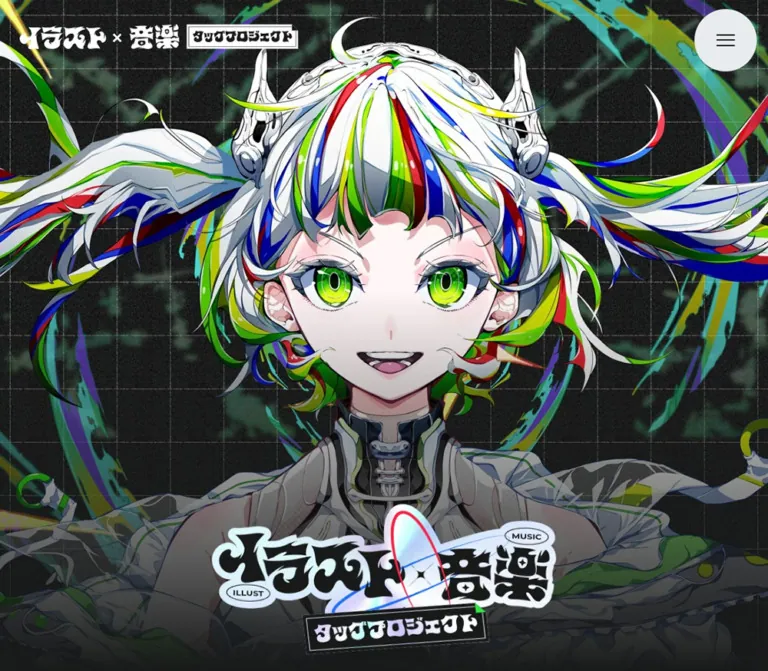
DESIGN REFERENCE
イラスト×音楽 タッグプロジェクト|神戸テック・KOYO
黒い方眼と粒状テクスチャに、大きなキャラクター、赤と青の対比、ホログラム調の帯を重ねた専門学校の共同プロジェクト特設サイト。長いビジュアル展開から、明るい学校案内フッターへつなぐ構成。
オリジナルサイトを見るKobe Tech × KOYO — Illustration & Music Style Reference
A creative-school collaboration staged as a grainy anime poster, with red illustration and blue music sharing the screen.
Original URL: https://www.kobe-tech.ac.jp/illust/
Final URL: https://www.kobe-tech.ac.jp/illust/ — unchanged; supplied response status: HTTP 200.
Theme: dark illustrated scenes, saturated discipline colors, holographic highlights, and a pale gridded footer.
Inspected: September 13, 2026, at 03:13:38 JST, corresponding to the supplied retrieval timestamp of September 12, 2026, at 18:13:38 UTC.
Viewports: desktop 1440 × 1000 CSS px; mobile 390 × 844 CSS px.
Scope: analysis of the supplied current-page captures and rendered DOM/computed styles. Visual coverage includes a desktop startup state, a desktop artist scene, desktop closing artwork and footer, a mobile split-portrait opening, and a mobile closing/footer state. The DOM additionally documents school introductions, a project availability notice, creative-process captions, and event/material-request links. The menu, destination pages, and complete animation sequences were not exercised in the supplied evidence.
The page presents the joint project “イラスト×音楽 タッグプロジェクト” through oversized character artwork and a persistent red/blue distinction. Illustration is associated with red; music is associated with blue. Black graph-paper surfaces, grain, sharp lettering strips, cropped outline type, and iridescent panels connect the scenes. Green and multicolored highlights appear within the collaborative artwork without replacing the two discipline colors.
This is a long editorial and promotional project page with institutional links. Its defining structure is a sequence of large visual scenes, followed by practical school information and a much quieter footer. Preserve the relationship between dramatic artwork and restrained navigation: the characters occupy the visual foreground, while the interface relies on a small wordmark, a circular menu control, and black pill links.
How to Read This Reference
- Measured means a value is present in the supplied rendered DOM or computed styles. Tables round some fractional values to two decimal places.
- Declared means a custom property exists in the supplied page data. Its presence does not establish that every visible component uses it.
- Estimated means a dimension or appearance was judged from the supplied screenshots without pixel-sampling tools.
- Calculated means a relationship was derived from measured values, such as a section being five viewport heights tall.
- Recommended means implementation guidance for a new version. The CSS and Tailwind examples are adaptations, not recovered source code.
- Rectangles can include transforms and intermediate animation positions. Negative heading coordinates and very wide decorative text strips should not be copied as ordinary content alignment.
- The captures establish selected visual states. They do not establish every transition, the entire order of animated artwork, or the exact scroll position associated with each screenshot.
Tokens — Colors
Default Palette
| Name | Value | Source token | Role and evidence |
|---|---|---|---|
| Ink black | #181919 |
--color-black-100 |
Measured body background, black CTA fills, dark footer icons, and text on colored labels |
| Scene charcoal | #1e1f1f |
--color-bg |
Declared scene color; introduction and action sections have a measured 85%-opaque version of this color |
| Illustration red | #f72243 |
--color-red |
Measured illustration-school headings and event labels; visible in the mobile illustration banner and footer arrow circle |
| Music blue | #2170f7 |
--color-blue |
Measured music-school headings and event labels; visible in the artist scene and music footer arrow circle |
| Creative green | #2cea3f |
--color-green |
Declared accent, consistent with the green highlights visible in collaborative artwork; individual illustration pixels are not measured CSS fills |
| White | #ffffff |
--color-white |
Measured body and button text; visible in the project wordmark, outline letters, and startup arc |
| Pale gray | #e9ecee |
--color-gray-20 |
Declared neutral and a useful reference for the pale menu/footer appearance; assignment to their actual painted layers is unverified |
The red/blue pairing communicates subject and institution. Keep it consistent across headings, vertical strips, event labels, and arrow discs. The main CTA remains black with white text; its small colored disc carries the institutional distinction.
The footer element itself computes as transparent even though the screenshot shows a pale textured grid. Its final painted background therefore cannot be identified from that element's background value alone. Treat the pale-gray footer fill in the Quick Start as an approximation of the visible surface.
Supporting Palette
| Name | Value | Evidence and use |
|---|---|---|
| Near white | #f9fbfc |
Declared --color-gray-10; no distinct component assignment established |
| Light gray | #d8dadc |
Declared --color-gray-30; secondary neutral reference |
| Mid grays | #8e9191, #7a7f7f, #676b6c |
Declared black-40, black-50, and black-60 tokens; avoid inventing a complete disabled-state system from these declarations |
| Startup plum | Approximately #95469a |
Visual estimate for the small four-point star in the startup capture; no corresponding source token identified |
| Holographic spectrum | Image-based | Visible pale cyan, pink, green, and lavender shifts; two hologram image URLs are declared in the page |
The holographic treatment is not a single brand color. Preserve its soft, irregular color variation within otherwise hard-edged compositions. No selectable theme system was established.
Tokens — Typography
Japanese Body and Utility Text
- Measured stack:
LINESeedJP, sans-serif. - Source alias:
--font-ja. - Body:
14px, weight400,30.002pxline height, and0.7pxtracking at both inspected widths. - Character: compact Japanese sans-serif text with unusually generous line spacing.
- Roles: descriptions, CTA labels, and supporting event copy.
At 14px, the measured tracking equals 0.05em, and the body line height is approximately 2.143. Mobile retains the same body size instead of shrinking it to match the artwork.
Japanese Display Labels
- Measured stack:
"Shippori Antique B1", serif. - Source alias:
--font-shippori. - Measured weight:
400on school headings, event titles, and the closing text strip. - Roles: school names, “オープンキャンパス,” “資料請求,” and “クリエーティブが交差する.”
Preserve the declared fallback as documented. Do not replace these headings with a heavy generic sans-serif simply because other parts of the page use bold illustrated lettering.
English and Copyright
- Measured stack:
Montserrat, serif. - Source alias:
--font-en. - Availability notice: weight
500, with a one-em line height. - Copyright: weight
400, approximately1.7line height.
The source explicitly uses a serif fallback after Montserrat. Computed family names establish the requested stacks; the evidence does not independently identify font file URLs or confirm which font supplied every glyph.
Artwork Lettering
The project wordmark is graphical. Its irregular Japanese forms, small English ovals, and boxed subtitle should be retained as artwork. The H1 has no extracted text, so its inherited 14px font size is not a measurement of the visible logo lettering.
The large blue “アーティスト” strip and enormous outline letters in the desktop scene are visible in a screenshot but are not separately mapped to a computed font sample. Their dimensions below are estimates, and no font-family attribution is made for them.
Type Scale
| Role | Desktop size / line height | Mobile size / line height | Weight | Tracking |
|---|---|---|---|---|
| Body descriptions | 14 / 30.002px |
14 / 30.002px |
400 | 0.7px |
| School H2 | 31.22 / 39.02px |
26.07 / 32.59px |
400 | 0.7px |
| Availability notice | 64.78 / 64.78px |
30.49 / 30.49px |
500 | 0.7px |
| Event supporting text | 15.48 / 15.48px |
14.02 / 18.23px |
700 | 0.7px |
| Event H3 label | 28.96 / 28.96px |
22.10 / 22.10px |
400 | 0.7px |
| CTA text | 14 / 30.002px |
14 / 30.002px |
400 | 0.7px |
| Closing statement | 29.22 / 29.22px |
24.07 / 24.07px |
400 | Approximately -0.07em |
| Copyright | 15.48 / 26.31px |
12.05 / 20.48px |
400 | 0.7px |
| Social-link inherited icon size | 20 / 20px |
20 / 20px |
400 | Inherited 0.7px |
The closing statement's negative tracking is specific to that compact strip. Do not apply it to body paragraphs or institutional names.
Tokens — Spacing & Shapes
Density: expansive illustrated scenes, compact labels, and generous separation between practical actions.
Scaling: several measured values vary fractionally between desktop and mobile. The evidence does not include their generating CSS formulas. Use the measured endpoints as reference points; any interpolating clamp() in an adaptation is a recommendation.
Spacing Scale
| Use | Desktop | Mobile | Evidence |
|---|---|---|---|
| Header padding, top/right/bottom/left | 14.35 / 18.69 / 14.35 / 36.08px |
10.06 / 10.12 / 10.06 / 10.37px |
Computed |
| CTA horizontal padding | 30px left, 10px right |
Same | Computed |
| CTA internal gap | 14px |
14px |
Computed |
| Footer CTA vertical padding | 5px |
5px |
Computed |
| Event CTA vertical padding | 14.35px |
10.06px |
Computed |
| Social-link padding | 10px |
10px |
Computed |
| Introduction top/bottom padding | 373.88 / 190.86px |
202.45 / 130.86px |
Computed |
| Process-section vertical padding | 114.78px |
80.49px |
Computed |
| Footer top/bottom padding | 96.73 / 33.04px |
75.31 / 75px |
Computed |
| Background grid interval | About 80px |
About 69–70px in the footer |
Screenshot estimate |
Border Radius
| Element | Observed value | Interpretation |
|---|---|---|
| Introduction upper corners | 56.08px desktop; 30.37px mobile |
Rounded entrance to a large dark content surface |
| Introduction lower corners | 0 |
The surface continues into the page |
| CTA links | 1440px desktop; 844px mobile |
Effectively a full pill; reuse with a large radius such as 9999px |
| Menu and arrow discs | Circular in captures | Their roundness is a defining interface motif |
| Event labels and closing text strip | 0 |
Hard rectangular strips |
| Footer | 0 |
Full-width surface with no card enclosure |
Layout Measurements
| Element | Desktop | Mobile | Status |
|---|---|---|---|
| Document height | 26662.44px |
23539.50px |
Measured |
| Header bounding box height | 125.02px |
92.42px |
Measured; sampled positions include translation |
| Logo H1 box | 456.39 × 51.48px |
268.67 × 34.42px |
Measured wrapper, not intrinsic artwork size |
| Circular menu | About 96px diameter |
About 72px diameter |
Screenshot estimate |
| School-description width | About 437.04px per sampled desktop block |
329.44px |
Measured; desktop blocks are sampled near viewport edges |
| Event module content width | About 387.27px |
309.53px |
Measured supporting-text boxes |
| CTA width | 255px |
255px |
Measured |
| Event CTA height | 68.03px |
70.09px |
Measured |
| Footer CTA height | 49.34px |
60px |
Measured |
| CTA arrow grid track | 39.34px |
50px |
Measured track; captures show a circular disc within this position |
| Social-link box | 40 × 43px |
40 × 43px |
Measured |
| Footer height | 433.98px |
674.83px |
Measured |
The source declares --header-height: 100px, but the measured header box is not 100px at either viewport. Preserve the distinction between a declared layout token and the rendered box. Do not hardcode the sampled negative header Y coordinates as permanent top offsets.
Components
Project Header
Role: retain project identity and provide a compact navigation entry point over changing artwork.
The desktop artist and ending captures show a white graphical project wordmark at the upper left and a pale circular menu at the upper right. The header has no opaque full-width bar. This allows artwork, graph-paper texture, and bright backgrounds to continue behind it.
The desktop wordmark occupies an approximately 456px-wide wrapper. On mobile, the measured wrapper is about 269px wide, while the menu is approximately 72px in diameter. The three-line menu glyph is black and visually centered.
The logo links to /illust/#page. Header visibility varies between supplied states: the mobile split-portrait capture contains no visible header, while the mobile footer capture does. A translation/opacity transition is declared, but its exact trigger was not established. A fixed overlay header is a reasonable adaptation, not a directly supplied position measurement.
Startup State
Role: provide a visual holding state before the illustrated content appears.
The desktop startup capture is almost entirely dark graph paper with fine grain. A thick white open arc surrounds a small plum four-point star near the viewport center. The implied arc diameter is approximately 240–250px, with a stroke around 17px; these are visual estimates.
The state contains no readable percentage or status label. A still image does not establish rotation, timing, progress semantics, or the exit transition. Later captures show the page content, so this opening state is not evidence of a discontinued or permanently blocked page.
Split-Portrait Opening
Role: introduce illustration and music as equal halves of one collaboration.
The mobile opening fills the 390 × 844 capture. Two character portraits meet at a sharp vertical seam around the center of the viewport. The left portrait uses black hair, red accents, a red eye, and glasses; the right uses pale hair, blue accents, and a blue eye. The faces align closely enough to read as one divided composition.
Two narrow vertical copy strips sit near the upper left and upper right. The illustration strip is red and reads “イラストで魅了したい”; the music strip is blue and reads “音楽で感動を与えたい.” Their widths are roughly 40px, estimated from the capture. Color splashes and angular fragments decorate the upper background.
Use separately art-directed crops for each half. The seam is a visual construction; there is no evidence that it is a draggable comparison slider.
Artist Scene
Role: make a creative career tangible through an oversized character and recognizable production equipment.
The desktop capture layers a blue rectangular field over the dark grid. At this captured state, the blue band runs approximately from Y=140px to Y=860px. A headphone-wearing character, microphone, pop filter, keyboard controller, and monitor extend beyond the band's bounds.
The scene anatomy is:
- Dark gridded canvas.
- Wide blue field with subdued equipment imagery.
- Huge cropped white outline letters behind the character.
- Character and equipment cutout crossing the field's edges.
- Blue starbursts, some cropped by the viewport.
- A pale holographic strip carrying “アーティスト” across the foreground.
- The small project header above the composition.
The title strip is approximately 500 × 110px in this capture. Its typography is much larger than ordinary DOM headings, but its font and exact size were not separately measured. Preserve the layered silhouette and deliberate cropping rather than forcing everything into a centered rectangular hero image.
School Introduction Surface
Role: connect the spectacle to the two participating schools.
The DOM documents a large charcoal section with 85% opacity and rounded upper corners. It contains a red heading for “神戸・甲陽デザイン&テクノロジー専門学校” and a blue heading for “神戸・甲陽音楽&ダンス専門学校,” each followed by a white description.
At mobile width, both text blocks are stacked and share a measured width of 329.44px, beginning around X=30.28px. Paragraphs occupy three 30px lines in the sample. Desktop blocks are sampled near opposite outer edges; their positions may reflect the page's animation state. Do not infer a conventional centered two-column grid solely from those transformed coordinates.
Project Availability Notice
Role: communicate the current limits of the published project information.
The page includes “COMING SOON” and the sentence “カリキュラムやプロジェクトの詳細については、今後掲載予定です。” The notice uses Montserrat at approximately 64.78px on desktop and 30.49px on mobile, with Japanese explanatory text remaining 14px.
Mobile DOM samples also show small red and blue decorative elements flanking this area, with scale transitions. Their exact artwork is not established by the supplied captures.
This is a notice within a functioning page containing substantial imagery and school links. Preserve the limitation in the copy; do not invent a curriculum, release date, or working detail page.
Creative-Process Content
Role: ground the character-led presentation in activities associated with illustration, music, and collaborative production.
Extracted captions mention Live2D, character design, songwriting, recording music for an MV, After Effects, group discussion, professional instruction, and vocal training. Examples include “Live2dに挑戦,” “MVで使う楽曲を収録♪,” and “みんなで意見を出して制作する.”
This section is documented by DOM text and section bounds, rather than a dedicated visual capture. Its exact image arrangement, caption styling, and any carousel behavior remain unverified. The smaller mobile visible-text extract does not establish that other captions were removed; visibility may depend on clipping or animation state.
Event and Materials Module
Role: provide distinct next steps for each school.
Each discipline has two action modules: open-campus events and a materials request. The desktop samples place the two actions alongside one another; the mobile samples stack them. Illustration modules use red supporting text and labels, while music modules use blue.
Each module contains:
- A short, bold, discipline-colored introductory sentence.
- A square-cornered colored H3 strip, such as “オープンキャンパス” or “資料請求,” with dark text.
- Decorative oversized content represented by wide DOM boxes, whose complete appearance is not visually verified.
- A black pill link with white text and a colored arrow disc.
Keep decorative overflow separate from the usable action area. Some sampled decorative boxes are far wider than the viewport; this is not a suitable width for the interactive content container.
Pill Link with Arrow Disc
Role: provide the page's repeatable action language.
The measured link is 255px wide at both inspected widths. Its inner layout is a two-column grid with a 14px gap, 30px left padding, and 10px right padding. The right track is approximately 39.34px on desktop and 50px on mobile.
The footer version uses 5px vertical padding, producing a 49.34px desktop height and 60px mobile height. Event links add more vertical padding and measure approximately 68px and 70px high.
The arrow disc is red for illustration and blue for music. The black northeast arrow sits within that disc; the text remains in the larger black part of the pill. Do not round the rectangular section labels to match the CTA.
Measured transitions cover background color and text color over 0.3s. The supplied evidence does not establish their hover destination colors.
Closing Collaboration Scene
Role: reunite the two creative disciplines before the institutional footer.
The desktop ending capture shows a large illustrated figure, microphone, white costume, sweeping ribbons, green highlights, and a pale multicolored background. An oversized project wordmark overlaps the illustration, with small English category ovals and a boxed project subtitle.
The DOM also records “クリエーティブが交差する” as a black-on-white rectangular strip. It uses approximately 29.22px type on desktop and 24.07px on mobile, one-em leading, and tight negative tracking. Its appearance is part of the closing sequence, but its exact relationship to the pictured ending frame is not established.
Institutional Footer
Role: provide clear destinations after the dense visual narrative.
The footer changes to a pale, subtly textured grid. On desktop, two school identity groups sit side by side, separated by a dark vertical rule. Each group contains a school logo/name, an official-site pill link, and a row of X, LINE, and Instagram icons.
On mobile, the groups stack vertically and the center divider disappears. The official-site buttons retain their 255px width and center at X=67.5px. Their arrows become larger, while the social glyphs remain approximately 20px within measured 40 × 43px link boxes.
The copyright uses Montserrat and dark text. It fits on one line in the desktop capture and wraps into two centered lines on mobile. The displayed year is 2025; it is content on the page, not the inspection date.
Tokens — Motion & Interaction
Measured Transition Signatures
| Element | Supplied computed transition | What is established |
|---|---|---|
| Header | opacity 0.3s, translate 0.6s cubic-bezier(1,0,0,1) |
Header supports opacity and positional changes; triggering behavior is unverified |
| School H2 | opacity 0.3s 1.575s, translate 0.75s 1.575s |
Delayed heading reveal treatment |
| School description | opacity 0.3s 1.725s, translate 0.75s 1.725s |
Description delay follows the heading by 150ms |
| Availability heading | opacity 0.3s 0.45s, translate 0.6s 0.45s |
Short delayed reveal |
| Availability explanation | opacity 0.3s 0.48s, translate 0.6s 0.48s |
Explanation starts 30ms after the heading's declared delay |
| Mobile notice ornaments | scale 0.6s cubic-bezier(0.19,1,0.22,1) 0.45s |
Scale transition with ease-out-expo curve |
| CTA links | background-color 0.3s, color 0.3s |
Color-transition capability; endpoints unverified |
| Social links | opacity 0.3s, scale 0.3s |
Opacity and scale feedback capability; endpoints unverified |
| Closing statement | opacity 0.3s |
Fade capability |
The source declares --dur: 0.3s and a broader family of easing curves. Only curves attached to sampled elements should be treated as established component behavior.
Scene-Length Evidence
The opening section measures 5000px at a 1000px-high viewport and 4220px at an 844px-high viewport: exactly five viewport heights in both samples. The closing section measures 6000px and 5064px: exactly six viewport heights.
These relationships support an extended scene-based scroll structure. They do not independently prove the pinning implementation, animation library, scrub speed, layer directions, or whether every part of those ranges is animated.
Interaction Limits
- Scrolling was used by the supplied capture process, but no frame-by-frame timeline or exact screenshot scroll offsets were supplied.
- Perpetual animations were temporarily paused for readiness checks and resumed afterward. A reported paused state should not be interpreted as a permanent visitor-facing state.
- The loader's rotation and dismissal timing were not measured.
- The circular menu is visible, but its open state, focus behavior, and navigation contents were not exercised.
- Links and their destinations are present in the DOM; successful navigation or form completion was not tested.
- A Swiper color token and a Live2D caption do not establish a visible carousel or interactive Live2D character.
- No audio playback behavior was established.
Surfaces
| Layer | Appearance | Structural purpose |
|---|---|---|
| Main canvas | Near-black grid with fine grain | Connects otherwise different illustrated scenes |
| Discipline field | Saturated blue in the captured artist scene; red/blue elsewhere in labels | Identifies creative subject and creates large contrast blocks |
| Intro/action surface | 85%-opaque charcoal | Supports readable institutional and action content |
| Holographic strip | Pale irregular color shifts with hard rectangular edges | Separates large display copy from busy illustration |
| Character layer | Detailed cutout artwork crossing section boundaries | Supplies depth and narrative focus without card containers |
| Utility circle | Pale disc with dark menu glyph | Gives navigation a stable silhouette over changing backgrounds |
| CTA | Black pill, white label, colored arrow disc | Repeats a compact and recognizable action pattern |
| Footer | Pale gridded surface with dark content | Establishes a calm, legible endpoint |
There is no general soft-shadow card system in the inspected views. Depth comes from overlapping artwork, occlusion, strong color fields, grain, and contrasting strips. The holographic appearance should not be described as a verified backdrop-blur effect.
Imagery
The artwork is detailed anime illustration with sharp facial features, complex hair shapes, saturated streaks, metallic costume details, microphones, headphones, and music-production equipment. Fine grain appears across both the artwork and the canvas, connecting the characters to the poster-like environment.
In the mobile opening, the matching face scale and central seam carry the concept. In the desktop artist scene, the character and equipment project beyond a blue band. In the closing scene, white costume forms and bright green ribbons expand over an iridescent background.
Use responsive art direction rather than one universal crop. Preserve eyes, facial alignment, important equipment, and readable foreground labels. Broad hair and ribbon shapes can extend beyond the viewport as deliberate framing devices.
The illustrations are not pixel art. Preserve clean source detail and native grain; do not apply image-rendering: pixelated.
Observed Asset References
Paths below were explicitly present in supplied custom properties. They are references on the original website, not bundled files.
| Asset | Observed path | Evidence |
|---|---|---|
| Hologram texture | /illust/img/common/bg_hologram.webp |
Declared by --hologram |
| Additional hologram texture | /illust/img/common/bg_hologram@2x.webp |
Declared by --hologram02 |
The evidence does not include exact URLs for the character cutouts, project logo, school logos, grid/grain textures, or social SVGs. Do not invent an asset manifest or assume which hologram declaration paints a particular screenshot layer.
The process captions indicate creative activities, but they do not establish the appearance or order of unseen classroom photographs. Keep those visual details unspecified until actual assets or captures are available.
Layout & Responsive Behavior
Document Structure
The labels in this table are descriptive names for the sampled sections, not recovered source component names.
| Section | Desktop height | Mobile height | Evidence scope |
|---|---|---|---|
| Opening scene | 5000px |
4220px |
Bounds measured; mobile split portrait captured |
| School introduction and availability | 1934.83px |
1848.06px |
Text, styles, and bounds supplied |
| Extended creative scene sequence | 8260.81px |
8443.67px |
Bounds and repeated decorative text supplied; artist scene visually captured without an exact offset |
| Creative-process section | 3503.91px |
1429.63px |
Captions, padding, and bounds supplied |
| Event/materials section | 1528.91px |
1859.31px |
Text, links, styles, and bounds supplied |
| Closing scene | 6000px |
5064px |
Bounds, statement styles, and ending artwork captured |
| Footer | 433.98px |
674.83px |
Visually captured and measured |
The mobile document is shorter overall, but individual sections do not scale uniformly. The extended creative sequence is slightly taller on mobile, the process section is much shorter, and the action area grows because its modules stack.
Desktop Composition
The 1440px-wide artist capture gives the artwork almost the entire viewport. A central title strip crosses the character, and oversized outline type and starbursts extend beyond the frame. The navigation remains small relative to the image.
Action modules use paired desktop positions, while the footer uses two institutional groups around a central vertical divider. Decorative regions are full width; readable utility content uses narrower internal groupings.
Mobile Composition
The opening is recomposed around a tall split face. It is not a uniformly reduced desktop artist scene. The 390px width remains filled by artwork, with vertical labels near the edges.
The school descriptions and action modules stack. Body text stays at 14px, while display headings reduce moderately. The availability heading reduces more strongly, from about 65px to 30px.
Buttons remain 255px wide. Their arrow track grows from approximately 39px to 50px, so the footer button becomes taller on mobile. This is a useful example of keeping practical controls generous while scaling decorative elements independently.
The footer changes from two columns to one, removes the vertical divider, and gives each school a distinct vertical group. Copyright text reduces to about 12px and wraps.
Implementation Boundary
Only the 1440px and 390px layouts were supplied. The exact breakpoint, intermediate fluid formulas, orientation behavior, and safe-area handling are unknown. A breakpoint such as 48rem is a reasonable starting recommendation, not an observed source value.
For a static adaptation, give each illustrated scene a meaningful viewport-sized composition. Add five- and six-viewport scroll ranges only after actual scene progression exists; otherwise those measured source heights would become long empty stretches.
Do’s and Don’ts
Do
- Keep illustration red
#f72243and music blue#2170f7consistent across school identities, labels, and arrow discs. - Preserve the dark grid and grain as a continuous background language.
- Let detailed artwork cross colored fields and extend beyond the viewport.
- Art-direct the mobile split portraits around face alignment and the central seam.
- Keep graphical wordmarks as assets rather than approximating them with a normal font.
- Pair square display strips with circular utility controls and pill links.
- Retain 14px body text and generous line spacing on mobile.
- Preserve the fixed 255px CTA width and the larger mobile arrow disc.
- Give the ending a strong light/dark transition into the pale footer.
- Keep both schools' official links and social groups distinct.
- Treat the current availability notice as real content rather than filling it with invented program details.
Don’t
- Don't replace the illustrated narrative with a generic feature-card grid.
- Don't make all actions red or all actions blue; that would erase the subject mapping.
- Don't use a single flattened image crop for both desktop and mobile.
- Don't convert the portrait seam into a draggable control without evidence or a new product requirement.
- Don't apply pixelated scaling to detailed anime artwork.
- Don't replace the holographic texture with an unrelated glass-blur system.
- Don't copy transformed offscreen DOM coordinates into normal content layout.
- Don't treat graphical logo lettering as the H1's inherited 14px body font.
- Don't claim a tested drawer, audio player, carousel, or Live2D interaction from labels and variables alone.
- Don't reproduce the source's long scroll containers as empty spacer blocks.
Recommended Implementation Additions
These are recommendations for a new implementation, not verified original-page features:
- Give the graphical project logo a useful accessible name. The empty extracted H1 text alone does not establish its accessibility semantics.
- Implement the menu as a real button with
aria-expanded, an associated navigation region, keyboard operation, and a visible focus state. Add focus management if its open state is modal. - Keep essential copy in accessible text even when the visible treatment uses lettering assets.
- Label decorative starbursts, texture layers, and duplicate background lettering as decorative.
- Increase social-link hit areas from the measured 40 × 43px to at least 44 × 44px while retaining the approximately 20px glyphs.
- Respect reduced-motion preferences. If scroll pinning is added, remove unnecessary scroll spacers and expose a coherent static sequence in the reduced-motion version.
- Ensure startup graphics cannot indefinitely hide content after an asset failure.
- Supply responsive images with intrinsic dimensions. Prioritize the opening artwork and defer below-the-fold imagery where appropriate.
- Maintain contrast for white navigation artwork over the bright closing scene, using a deliberate alternate mark or local backing when needed.
- Keep the two schools distinguishable by names and labels as well as color.
Agent Prompt Guide
Quick Color Reference
- Main ink and black CTA fill:
#181919. - Dark content surface:
#1e1f1f, observed at 85% opacity in selected sections. - Illustration identity:
#f72243. - Music identity:
#2170f7. - Additional creative accent: declared
#2cea3f. - White text and outline details:
#ffffff. - Pale footer/menu approximation:
#e9ecee. - Holographic effects: softly varying image texture inside hard-edged compositions.
Overall Prompt
“Create a Japanese creative-education collaboration page with the visual intensity of an illustrated music poster. Use a near-black gridded canvas with fine grain, red for illustration, blue for music, and occasional green highlights within the artwork. Build large scenes from detailed character cutouts, cropped outline lettering, starbursts, production equipment, and pale holographic title strips. Keep a small graphical project wordmark at the upper left and a pale circular menu at the upper right when navigation is visible. Use LINESeedJP for body copy, Shippori Antique B1 for measured Japanese heading roles, and Montserrat for English utility text. Follow the artwork with distinct school actions and a pale gridded footer. Buttons are black 255px-wide pills with white labels and separate red or blue arrow circles. Recompose mobile artwork rather than shrinking a desktop poster.”
Example Component Prompts
- Mobile opening: “Create a full-height split portrait at 390 × 844. Align two illustrated faces at the vertical center seam: black/red styling on the left and pale/blue styling on the right. Add narrow red and blue vertical Japanese copy strips near the outer edges. Keep the eyes and face alignment dominant. Treat the seam as composition, not an interactive slider.”
- Artist scene: “Layer a wide blue band over dark graph paper. Place a detailed headphone-wearing character, studio microphone, pop filter, and keyboard controller across its edges. Add very large cropped outline letters behind the figure and a pale iridescent foreground strip reading ‘アーティスト’. Preserve sharp cutout silhouettes and visible grain.”
- Action module: “Use a short red or blue supporting sentence, a square colored label reading ‘オープンキャンパス’, and a black 255px-wide pill reading ‘イベントはこちら’. Place a matching colored circle with a northeast arrow at the right. Use a 14px internal gap and retain a generous mobile target.”
- Footer: “Create a pale textured graph-paper footer containing two school identity groups. Each has its logo, a black official-site pill with a discipline-colored arrow disc, and X, LINE, and Instagram links. Separate desktop groups with a dark vertical rule. Stack them on mobile and wrap the small centered copyright into two lines.”
- Static motion fallback: “Present every illustrated scene and action in readable document order. Preserve the red/blue distinction and artwork scale, but replace extended scroll choreography with coherent static compositions. Keep content visible without relying on delayed reveal triggers.”
Quick Start
CSS Custom Properties
This is a static adaptation using the measured palette, font stacks, body typography, CTA anatomy, and responsive endpoints. Grid rendering, scene placement, intermediate clamps, a 48rem breakpoint, and a solid pale footer are recommendations. The gradient is a hologram placeholder; supply the actual artwork, logos, texture, and font files separately.
The classes assume that portrait wrappers contain images, the artist scene contains a .scene-art image and title, and each school group sets .discipline--illustration or .discipline--music. Menu behavior and scroll choreography require separate implementation.
:root {
  /* Measured or declared source colors */
  --ink: #181919;
  --scene: #1e1f1f;
  --paper: #e9ecee;
  --white: #fff;
  --red: #f72243;
  --blue: #2170f7;
  --green: #2cea3f;

  /* Source font stacks; font files are not included */
  --font-ja: 'LINESeedJP', sans-serif;
  --font-display: 'Shippori Antique B1', serif;
  --font-en: 'Montserrat', serif;
  --text-body: 14px;
  --leading-body: 2.143;
  --tracking-body: 0.7px;

  /* Recommended interpolation between inspected sizes */
  --text-school: clamp(26.07px, 2.17vw, 31.22px);
  --text-notice: clamp(30.49px, 4.5vw, 64.78px);
  --text-action: clamp(22.1px, 2.01vw, 28.96px);
  --text-copyright: clamp(12.05px, 1.075vw, 15.48px);
  --panel-radius: clamp(30.37px, 3.895vw, 56.08px);
  --grid-step: clamp(70px, 5.556vw, 80px);
  --grid-rule: rgb(255 255 255 / 0.22);

  /* Measured CTA width; arrow track changes on mobile */
  --cta-width: 255px;
  --arrow-size: 39.34px;
  --menu-size: 96px;
  --duration: 0.3s;
  --ease-header: cubic-bezier(1, 0, 0, 1);

  /* Declared source stacking levels */
  --z-base: 100;
  --z-drawer: 5000;
  --z-header: 6000;
  --z-loading: 9000;

  /* Assign local image assets when available */
  --grain-image: none;
  --hologram-image: none;
}

* {
  box-sizing: border-box;
}

body.project-page {
  margin: 0;
  color: var(--white);
  background-color: var(--ink);
  font-family: var(--font-ja);
  font-size: var(--text-body);
  font-weight: 400;
  line-height: var(--leading-body);
  letter-spacing: var(--tracking-body);
}

.grid-surface {
  background-image:
    var(--grain-image),
    linear-gradient(var(--grid-rule) 1px, transparent 1px),
    linear-gradient(90deg, var(--grid-rule) 1px, transparent 1px);
  background-size:
    auto,
    var(--grid-step) var(--grid-step),
    var(--grid-step) var(--grid-step);
}

.discipline--illustration {
  --accent: var(--red);
}

.discipline--music {
  --accent: var(--blue);
}

/* Fixed positioning is an adaptation of the overlay appearance. */
.project-header {
  position: fixed;
  inset: 0 0 auto;
  z-index: var(--z-header);
  display: flex;
  align-items: center;
  justify-content: space-between;
  gap: 20px;
  padding: 14.35px 18.69px 14.35px 36.08px;
  transition:
    opacity var(--duration),
    translate 0.6s var(--ease-header);
}

.project-brand {
  display: block;
  width: min(456.39px, 32vw);
  margin: 0;
}

.project-brand img {
  display: block;
  width: 100%;
  height: auto;
}

.menu-button {
  display: grid;
  place-content: center;
  gap: 6px;
  flex: 0 0 var(--menu-size);
  width: var(--menu-size);
  height: var(--menu-size);
  padding: 0;
  border: 0;
  border-radius: 50%;
  color: var(--ink);
  background: var(--paper);
  cursor: pointer;
}

.menu-button span {
  display: block;
  width: 29px;
  height: 2px;
  background: currentColor;
}

/* Static scenes do not reproduce the original scroll spacers. */
.split-hero {
  display: grid;
  grid-template-columns: repeat(2, minmax(0, 1fr));
  min-height: 100svh;
}

.portrait {
  position: relative;
  min-width: 0;
  margin: 0;
  overflow: hidden;
}

.portrait img {
  display: block;
  width: 100%;
  height: 100svh;
  object-fit: cover;
  object-position: var(--portrait-focus, 50% 50%);
}

.vertical-banner {
  position: absolute;
  top: 10%;
  left: 20px;
  padding: 2px 3px;
  color: var(--ink);
  background: var(--accent);
  font-family: var(--font-display);
  font-size: clamp(26px, 8.2vw, 34px);
  line-height: 1.15;
  letter-spacing: 0;
  writing-mode: vertical-rl;
}

.portrait.discipline--music .vertical-banner {
  right: 20px;
  left: auto;
}

.artist-scene {
  position: relative;
  isolation: isolate;
  display: grid;
  place-items: center;
  min-height: 100svh;
  overflow: hidden;
}

.artist-scene::before {
  position: absolute;
  z-index: -1;
  inset: 14% 0;
  background: var(--blue);
  content: '';
}

.scene-art {
  position: absolute;
  inset: 6% 0 6% 21%;
  width: 79%;
  height: 88%;
  object-fit: contain;
  object-position: right center;
}

.artist-title {
  position: relative;
  margin: 0;
  padding: 0.05em 0.15em;
  color: var(--blue);
  background-color: var(--paper);
  background-image:
    var(--hologram-image),
    linear-gradient(120deg, #dcf4f4, #e9ddf6, #e5f4ee);
  background-size: cover;
  font-family: var(--font-display);
  font-size: clamp(44px, 7vw, 100px);
  font-weight: 400;
  line-height: 1.05;
}

.school-intro {
  padding-block:
    clamp(202px, 25.96vw, 374px)
    clamp(131px, 13.26vw, 191px);
  border-radius: var(--panel-radius) var(--panel-radius) 0 0;
  background: rgb(30 31 31 / 0.85);
}

.school-intro__inner {
  display: grid;
  grid-template-columns: repeat(2, minmax(0, 1fr));
  gap: 60px;
  width: min(calc(100% - 60px), 1094px);
  margin-inline: auto;
}

.school-title {
  margin: 0 0 14px;
  color: var(--accent);
  font-family: var(--font-display);
  font-size: var(--text-school);
  font-weight: 400;
  line-height: 1.25;
}

.availability-title {
  margin: 0;
  font-family: var(--font-en);
  font-size: var(--text-notice);
  font-weight: 500;
  line-height: 1;
  text-align: center;
}

.action-grid {
  display: grid;
  grid-template-columns: repeat(2, minmax(0, 1fr));
  gap: 18px;
  width: min(calc(100% - 60px), 792px);
  margin-inline: auto;
}

.action-module {
  min-width: 0;
  text-align: center;
}

.action-eyebrow {
  color: var(--accent);
  font-weight: 700;
  line-height: 1.3;
}

.action-title {
  width: fit-content;
  margin: 20px auto 32px;
  padding: 0.33em 0.2em;
  color: var(--ink);
  background: var(--accent);
  font-family: var(--font-display);
  font-size: var(--text-action);
  font-weight: 400;
  line-height: 1;
}

.cta {
  display: grid;
  grid-template-columns: minmax(0, 1fr) var(--arrow-size);
  align-items: center;
  gap: 14px;
  width: var(--cta-width);
  max-width: 100%;
  margin-inline: auto;
  padding: 5px 10px 5px 30px;
  border-radius: 9999px;
  color: var(--white);
  background: var(--ink);
  font-family: var(--font-ja);
  font-size: 14px;
  line-height: 30.002px;
  text-align: center;
  text-decoration: none;
  transition:
    background-color var(--duration),
    color var(--duration);
}

.cta--event {
  padding-block: 14.35px;
}

.cta__arrow {
  display: grid;
  place-items: center;
  width: var(--arrow-size);
  height: var(--arrow-size);
  border-radius: 50%;
  color: var(--ink);
  background: var(--accent, var(--blue));
  font-size: 20px;
  line-height: 1;
}

.project-footer {
  --grid-rule: rgb(24 25 25 / 0.12);
  padding: 96.73px 0 33.04px;
  color: var(--ink);
  background-color: var(--paper);
}

.footer-schools {
  display: grid;
  grid-template-columns: repeat(2, minmax(0, 1fr));
  width: min(100%, 1060px);
  margin-inline: auto;
}

.school-footer {
  min-width: 0;
  padding-inline: 40px;
  text-align: center;
}

.school-footer + .school-footer {
  border-left: 3px solid var(--ink);
}

.school-logo {
  display: block;
  width: min(100%, 400px);
  height: auto;
  margin: 0 auto 28px;
}

/* Recommended 44px targets around approximately 20px glyphs. */
.socials {
  display: flex;
  justify-content: center;
  gap: 24px;
  margin-top: 28px;
}

.socials a {
  display: grid;
  place-items: center;
  width: 44px;
  height: 44px;
  color: inherit;
  font-size: 20px;
  line-height: 1;
  text-decoration: none;
  transition: opacity var(--duration), scale var(--duration);
}

.copyright {
  max-width: 1120px;
  margin: 80px auto 0;
  padding-inline: 10px;
  font-family: var(--font-en);
  font-size: var(--text-copyright);
  line-height: 1.7;
  text-align: center;
  overflow-wrap: anywhere;
}

/* Recommended focus treatment, not an observed source state. */
.project-page :focus-visible {
  outline: 2px solid var(--white);
  outline-offset: 2px;
  box-shadow: 0 0 0 4px var(--ink);
}

@media (max-width: 48rem) {
  :root {
    --menu-size: 72px;
    --arrow-size: 50px;
  }

  .project-header {
    gap: 18px;
    padding: 10px;
  }

  .project-brand {
    width: min(268.67px, calc(100vw - 111px));
  }

  .menu-button span {
    width: 23px;
  }

  .school-intro__inner {
    grid-template-columns: minmax(0, 1fr);
    gap: 60px;
  }

  .action-grid {
    grid-template-columns: minmax(0, 1fr);
    gap: 60px;
    width: calc(100% - 80px);
  }

  .cta--event {
    padding-block: 10.06px;
  }

  .project-footer {
    padding-block: 75.31px 75px;
  }

  .footer-schools {
    grid-template-columns: minmax(0, 1fr);
    gap: 75px;
  }

  .school-footer {
    padding-inline: 10.23px;
  }

  .school-footer + .school-footer {
    border-left: 0;
  }

  .socials {
    gap: 16px;
    margin-top: 20px;
  }

  .copyright {
    margin-top: 48px;
  }
}

@media (prefers-reduced-motion: reduce) {
  .project-page *,
  .project-page *::before,
  .project-page *::after {
    animation: none !important;
    transition: none !important;
  }

  .project-page [data-reveal] {
    opacity: 1 !important;
    translate: none !important;
  }
}
Example link markup uses an observed destination and UI label. The text arrow is a simple implementation substitute for the exact icon artwork.
<div class="discipline--illustration">
  <a class="cta" href="https://www.kobe-tech.ac.jp/">
    <span>公式サイトはこちら</span>
    <span class="cta__arrow" aria-hidden="true">↗</span>
  </a>
</div>
If JavaScript scroll animation is added, its reduced-motion path must also remove pinning and unnecessary section spacers. CSS transition suppression alone cannot provide that behavior.
Tailwind v4 Token Mapping
Optional aliases for a project already using Tailwind v4. These mappings do not imply that the original page uses Tailwind. Define the custom properties above first.
@theme inline {
  --color-project-ink: var(--ink);
  --color-project-scene: var(--scene);
  --color-project-paper: var(--paper);
  --color-illustration: var(--red);
  --color-music: var(--blue);
  --color-creative: var(--green);

  --font-japanese: var(--font-ja);
  --font-display: 'Shippori Antique B1', serif;
  --font-english: var(--font-en);

  --text-project-body: var(--text-body);
  --text-school: clamp(26.07px, 2.17vw, 31.22px);
  --text-notice: clamp(30.49px, 4.5vw, 64.78px);
  --text-action: clamp(22.1px, 2.01vw, 28.96px);

  --spacing-cta: var(--cta-width);
  --spacing-arrow: var(--arrow-size);
  --spacing-menu: var(--menu-size);
  --radius-project-panel: var(--panel-radius);
}
Sources & Evidence
- Current original and final page: supplied HTTP 200 result, page title, rendered text, links, custom properties, element rectangles, computed typography, colors, padding, radii, and transition signatures.
- Capture timestamp: September 12, 2026, 18:13:38 UTC / September 13, 2026, 03:13:38 JST.
- Desktop: 1440 × 1000 CSS px. Supplied captures show startup, an artist composition, and closing artwork/footer. Measured document height: 26662.44px.
- Mobile: 390 × 844 CSS px. Supplied captures show the split-portrait opening and closing/footer. Measured document height: 23539.50px.
- Institutional identity: the inspected page names both schools and links to Kobe Tech and KOYO. These destinations were present in the page; their separate pages were not inspected for this reference.
- Asset declarations: the original page supplies the two hologram paths documented under Imagery. Other artwork and font file URLs were not included in the supplied evidence.
- Capture procedure: the supplied browser process waited for document load, sampled layout/text stability, image decoding, and applicable finite motion within bounded time limits. It traversed intermediate scroll positions and temporarily paused perpetual animation during readiness checks. These checks do not prove semantic completeness or expose every delayed state.
- Limitations: no additional browsing or commands were performed for this reference. No menu opening, hover endpoint, keyboard flow, destination navigation, form completion, audio behavior, or complete motion timeline was independently verified. SharedWorkers and service workers were disabled during the supplied inspection.
This reference describes the current supplied page evidence. Visual estimates, calculated relationships, and implementation recommendations are labeled separately from measured source values.
# Kobe Tech × KOYO — Illustration & Music Style Reference

> A creative-school collaboration staged as a grainy anime poster, with red illustration and blue music sharing the screen.

**Original URL:** [https://www.kobe-tech.ac.jp/illust/](https://www.kobe-tech.ac.jp/illust/)

**Final URL:** [https://www.kobe-tech.ac.jp/illust/](https://www.kobe-tech.ac.jp/illust/) — unchanged; supplied response status: HTTP 200.

**Theme:** dark illustrated scenes, saturated discipline colors, holographic highlights, and a pale gridded footer.

**Inspected:** September 13, 2026, at 03:13:38 JST, corresponding to the supplied retrieval timestamp of September 12, 2026, at 18:13:38 UTC.

**Viewports:** desktop 1440 × 1000 CSS px; mobile 390 × 844 CSS px.

**Scope:** analysis of the supplied current-page captures and rendered DOM/computed styles. Visual coverage includes a desktop startup state, a desktop artist scene, desktop closing artwork and footer, a mobile split-portrait opening, and a mobile closing/footer state. The DOM additionally documents school introductions, a project availability notice, creative-process captions, and event/material-request links. The menu, destination pages, and complete animation sequences were not exercised in the supplied evidence.

The page presents the joint project “イラスト×音楽 タッグプロジェクト” through oversized character artwork and a persistent red/blue distinction. Illustration is associated with red; music is associated with blue. Black graph-paper surfaces, grain, sharp lettering strips, cropped outline type, and iridescent panels connect the scenes. Green and multicolored highlights appear within the collaborative artwork without replacing the two discipline colors.

This is a long editorial and promotional project page with institutional links. Its defining structure is a sequence of large visual scenes, followed by practical school information and a much quieter footer. Preserve the relationship between dramatic artwork and restrained navigation: the characters occupy the visual foreground, while the interface relies on a small wordmark, a circular menu control, and black pill links.

## How to Read This Reference

- **Measured** means a value is present in the supplied rendered DOM or computed styles. Tables round some fractional values to two decimal places.
- **Declared** means a custom property exists in the supplied page data. Its presence does not establish that every visible component uses it.
- **Estimated** means a dimension or appearance was judged from the supplied screenshots without pixel-sampling tools.
- **Calculated** means a relationship was derived from measured values, such as a section being five viewport heights tall.
- **Recommended** means implementation guidance for a new version. The CSS and Tailwind examples are adaptations, not recovered source code.
- Rectangles can include transforms and intermediate animation positions. Negative heading coordinates and very wide decorative text strips should not be copied as ordinary content alignment.
- The captures establish selected visual states. They do not establish every transition, the entire order of animated artwork, or the exact scroll position associated with each screenshot.

## Tokens — Colors

### Default Palette

| Name | Value | Source token | Role and evidence |
| --- | --- | --- | --- |
| Ink black | `#181919` | `--color-black-100` | Measured body background, black CTA fills, dark footer icons, and text on colored labels |
| Scene charcoal | `#1e1f1f` | `--color-bg` | Declared scene color; introduction and action sections have a measured 85%-opaque version of this color |
| Illustration red | `#f72243` | `--color-red` | Measured illustration-school headings and event labels; visible in the mobile illustration banner and footer arrow circle |
| Music blue | `#2170f7` | `--color-blue` | Measured music-school headings and event labels; visible in the artist scene and music footer arrow circle |
| Creative green | `#2cea3f` | `--color-green` | Declared accent, consistent with the green highlights visible in collaborative artwork; individual illustration pixels are not measured CSS fills |
| White | `#ffffff` | `--color-white` | Measured body and button text; visible in the project wordmark, outline letters, and startup arc |
| Pale gray | `#e9ecee` | `--color-gray-20` | Declared neutral and a useful reference for the pale menu/footer appearance; assignment to their actual painted layers is unverified |

The red/blue pairing communicates subject and institution. Keep it consistent across headings, vertical strips, event labels, and arrow discs. The main CTA remains black with white text; its small colored disc carries the institutional distinction.

The footer element itself computes as transparent even though the screenshot shows a pale textured grid. Its final painted background therefore cannot be identified from that element's background value alone. Treat the pale-gray footer fill in the Quick Start as an approximation of the visible surface.

### Supporting Palette

| Name | Value | Evidence and use |
| --- | --- | --- |
| Near white | `#f9fbfc` | Declared `--color-gray-10`; no distinct component assignment established |
| Light gray | `#d8dadc` | Declared `--color-gray-30`; secondary neutral reference |
| Mid grays | `#8e9191`, `#7a7f7f`, `#676b6c` | Declared black-40, black-50, and black-60 tokens; avoid inventing a complete disabled-state system from these declarations |
| Startup plum | Approximately `#95469a` | Visual estimate for the small four-point star in the startup capture; no corresponding source token identified |
| Holographic spectrum | Image-based | Visible pale cyan, pink, green, and lavender shifts; two hologram image URLs are declared in the page |

The holographic treatment is not a single brand color. Preserve its soft, irregular color variation within otherwise hard-edged compositions. No selectable theme system was established.

## Tokens — Typography

### Japanese Body and Utility Text

- **Measured stack:** `LINESeedJP, sans-serif`.
- **Source alias:** `--font-ja`.
- **Body:** `14px`, weight `400`, `30.002px` line height, and `0.7px` tracking at both inspected widths.
- **Character:** compact Japanese sans-serif text with unusually generous line spacing.
- **Roles:** descriptions, CTA labels, and supporting event copy.

At 14px, the measured tracking equals `0.05em`, and the body line height is approximately `2.143`. Mobile retains the same body size instead of shrinking it to match the artwork.

### Japanese Display Labels

- **Measured stack:** `"Shippori Antique B1", serif`.
- **Source alias:** `--font-shippori`.
- **Measured weight:** `400` on school headings, event titles, and the closing text strip.
- **Roles:** school names, “オープンキャンパス,” “資料請求,” and “クリエーティブが交差する.”

Preserve the declared fallback as documented. Do not replace these headings with a heavy generic sans-serif simply because other parts of the page use bold illustrated lettering.

### English and Copyright

- **Measured stack:** `Montserrat, serif`.
- **Source alias:** `--font-en`.
- **Availability notice:** weight `500`, with a one-em line height.
- **Copyright:** weight `400`, approximately `1.7` line height.

The source explicitly uses a serif fallback after Montserrat. Computed family names establish the requested stacks; the evidence does not independently identify font file URLs or confirm which font supplied every glyph.

### Artwork Lettering

The project wordmark is graphical. Its irregular Japanese forms, small English ovals, and boxed subtitle should be retained as artwork. The H1 has no extracted text, so its inherited `14px` font size is not a measurement of the visible logo lettering.

The large blue “アーティスト” strip and enormous outline letters in the desktop scene are visible in a screenshot but are not separately mapped to a computed font sample. Their dimensions below are estimates, and no font-family attribution is made for them.

### Type Scale

| Role | Desktop size / line height | Mobile size / line height | Weight | Tracking |
| --- | --- | --- | --- | --- |
| Body descriptions | `14 / 30.002px` | `14 / 30.002px` | 400 | `0.7px` |
| School H2 | `31.22 / 39.02px` | `26.07 / 32.59px` | 400 | `0.7px` |
| Availability notice | `64.78 / 64.78px` | `30.49 / 30.49px` | 500 | `0.7px` |
| Event supporting text | `15.48 / 15.48px` | `14.02 / 18.23px` | 700 | `0.7px` |
| Event H3 label | `28.96 / 28.96px` | `22.10 / 22.10px` | 400 | `0.7px` |
| CTA text | `14 / 30.002px` | `14 / 30.002px` | 400 | `0.7px` |
| Closing statement | `29.22 / 29.22px` | `24.07 / 24.07px` | 400 | Approximately `-0.07em` |
| Copyright | `15.48 / 26.31px` | `12.05 / 20.48px` | 400 | `0.7px` |
| Social-link inherited icon size | `20 / 20px` | `20 / 20px` | 400 | Inherited `0.7px` |

The closing statement's negative tracking is specific to that compact strip. Do not apply it to body paragraphs or institutional names.

## Tokens — Spacing & Shapes

**Density:** expansive illustrated scenes, compact labels, and generous separation between practical actions.

**Scaling:** several measured values vary fractionally between desktop and mobile. The evidence does not include their generating CSS formulas. Use the measured endpoints as reference points; any interpolating `clamp()` in an adaptation is a recommendation.

### Spacing Scale

| Use | Desktop | Mobile | Evidence |
| --- | --- | --- | --- |
| Header padding, top/right/bottom/left | `14.35 / 18.69 / 14.35 / 36.08px` | `10.06 / 10.12 / 10.06 / 10.37px` | Computed |
| CTA horizontal padding | `30px` left, `10px` right | Same | Computed |
| CTA internal gap | `14px` | `14px` | Computed |
| Footer CTA vertical padding | `5px` | `5px` | Computed |
| Event CTA vertical padding | `14.35px` | `10.06px` | Computed |
| Social-link padding | `10px` | `10px` | Computed |
| Introduction top/bottom padding | `373.88 / 190.86px` | `202.45 / 130.86px` | Computed |
| Process-section vertical padding | `114.78px` | `80.49px` | Computed |
| Footer top/bottom padding | `96.73 / 33.04px` | `75.31 / 75px` | Computed |
| Background grid interval | About `80px` | About `69–70px` in the footer | Screenshot estimate |

### Border Radius

| Element | Observed value | Interpretation |
| --- | --- | --- |
| Introduction upper corners | `56.08px` desktop; `30.37px` mobile | Rounded entrance to a large dark content surface |
| Introduction lower corners | `0` | The surface continues into the page |
| CTA links | `1440px` desktop; `844px` mobile | Effectively a full pill; reuse with a large radius such as `9999px` |
| Menu and arrow discs | Circular in captures | Their roundness is a defining interface motif |
| Event labels and closing text strip | `0` | Hard rectangular strips |
| Footer | `0` | Full-width surface with no card enclosure |

### Layout Measurements

| Element | Desktop | Mobile | Status |
| --- | --- | --- | --- |
| Document height | `26662.44px` | `23539.50px` | Measured |
| Header bounding box height | `125.02px` | `92.42px` | Measured; sampled positions include translation |
| Logo H1 box | `456.39 × 51.48px` | `268.67 × 34.42px` | Measured wrapper, not intrinsic artwork size |
| Circular menu | About `96px` diameter | About `72px` diameter | Screenshot estimate |
| School-description width | About `437.04px` per sampled desktop block | `329.44px` | Measured; desktop blocks are sampled near viewport edges |
| Event module content width | About `387.27px` | `309.53px` | Measured supporting-text boxes |
| CTA width | `255px` | `255px` | Measured |
| Event CTA height | `68.03px` | `70.09px` | Measured |
| Footer CTA height | `49.34px` | `60px` | Measured |
| CTA arrow grid track | `39.34px` | `50px` | Measured track; captures show a circular disc within this position |
| Social-link box | `40 × 43px` | `40 × 43px` | Measured |
| Footer height | `433.98px` | `674.83px` | Measured |

The source declares `--header-height: 100px`, but the measured header box is not 100px at either viewport. Preserve the distinction between a declared layout token and the rendered box. Do not hardcode the sampled negative header Y coordinates as permanent top offsets.

## Components

### Project Header

**Role:** retain project identity and provide a compact navigation entry point over changing artwork.

The desktop artist and ending captures show a white graphical project wordmark at the upper left and a pale circular menu at the upper right. The header has no opaque full-width bar. This allows artwork, graph-paper texture, and bright backgrounds to continue behind it.

The desktop wordmark occupies an approximately 456px-wide wrapper. On mobile, the measured wrapper is about 269px wide, while the menu is approximately 72px in diameter. The three-line menu glyph is black and visually centered.

The logo links to `/illust/#page`. Header visibility varies between supplied states: the mobile split-portrait capture contains no visible header, while the mobile footer capture does. A translation/opacity transition is declared, but its exact trigger was not established. A fixed overlay header is a reasonable adaptation, not a directly supplied `position` measurement.

### Startup State

**Role:** provide a visual holding state before the illustrated content appears.

The desktop startup capture is almost entirely dark graph paper with fine grain. A thick white open arc surrounds a small plum four-point star near the viewport center. The implied arc diameter is approximately 240–250px, with a stroke around 17px; these are visual estimates.

The state contains no readable percentage or status label. A still image does not establish rotation, timing, progress semantics, or the exit transition. Later captures show the page content, so this opening state is not evidence of a discontinued or permanently blocked page.

### Split-Portrait Opening

**Role:** introduce illustration and music as equal halves of one collaboration.

The mobile opening fills the 390 × 844 capture. Two character portraits meet at a sharp vertical seam around the center of the viewport. The left portrait uses black hair, red accents, a red eye, and glasses; the right uses pale hair, blue accents, and a blue eye. The faces align closely enough to read as one divided composition.

Two narrow vertical copy strips sit near the upper left and upper right. The illustration strip is red and reads “イラストで魅了したい”; the music strip is blue and reads “音楽で感動を与えたい.” Their widths are roughly 40px, estimated from the capture. Color splashes and angular fragments decorate the upper background.

Use separately art-directed crops for each half. The seam is a visual construction; there is no evidence that it is a draggable comparison slider.

### Artist Scene

**Role:** make a creative career tangible through an oversized character and recognizable production equipment.

The desktop capture layers a blue rectangular field over the dark grid. At this captured state, the blue band runs approximately from Y=140px to Y=860px. A headphone-wearing character, microphone, pop filter, keyboard controller, and monitor extend beyond the band's bounds.

The scene anatomy is:

1. Dark gridded canvas.
2. Wide blue field with subdued equipment imagery.
3. Huge cropped white outline letters behind the character.
4. Character and equipment cutout crossing the field's edges.
5. Blue starbursts, some cropped by the viewport.
6. A pale holographic strip carrying “アーティスト” across the foreground.
7. The small project header above the composition.

The title strip is approximately 500 × 110px in this capture. Its typography is much larger than ordinary DOM headings, but its font and exact size were not separately measured. Preserve the layered silhouette and deliberate cropping rather than forcing everything into a centered rectangular hero image.

### School Introduction Surface

**Role:** connect the spectacle to the two participating schools.

The DOM documents a large charcoal section with 85% opacity and rounded upper corners. It contains a red heading for “神戸・甲陽デザイン&テクノロジー専門学校” and a blue heading for “神戸・甲陽音楽&ダンス専門学校,” each followed by a white description.

At mobile width, both text blocks are stacked and share a measured width of 329.44px, beginning around X=30.28px. Paragraphs occupy three 30px lines in the sample. Desktop blocks are sampled near opposite outer edges; their positions may reflect the page's animation state. Do not infer a conventional centered two-column grid solely from those transformed coordinates.

### Project Availability Notice

**Role:** communicate the current limits of the published project information.

The page includes “COMING SOON” and the sentence “カリキュラムやプロジェクトの詳細については、今後掲載予定です。” The notice uses Montserrat at approximately 64.78px on desktop and 30.49px on mobile, with Japanese explanatory text remaining 14px.

Mobile DOM samples also show small red and blue decorative elements flanking this area, with scale transitions. Their exact artwork is not established by the supplied captures.

This is a notice within a functioning page containing substantial imagery and school links. Preserve the limitation in the copy; do not invent a curriculum, release date, or working detail page.

### Creative-Process Content

**Role:** ground the character-led presentation in activities associated with illustration, music, and collaborative production.

Extracted captions mention Live2D, character design, songwriting, recording music for an MV, After Effects, group discussion, professional instruction, and vocal training. Examples include “Live2dに挑戦,” “MVで使う楽曲を収録♪,” and “みんなで意見を出して制作する.”

This section is documented by DOM text and section bounds, rather than a dedicated visual capture. Its exact image arrangement, caption styling, and any carousel behavior remain unverified. The smaller mobile visible-text extract does not establish that other captions were removed; visibility may depend on clipping or animation state.

### Event and Materials Module

**Role:** provide distinct next steps for each school.

Each discipline has two action modules: open-campus events and a materials request. The desktop samples place the two actions alongside one another; the mobile samples stack them. Illustration modules use red supporting text and labels, while music modules use blue.

Each module contains:

1. A short, bold, discipline-colored introductory sentence.
2. A square-cornered colored H3 strip, such as “オープンキャンパス” or “資料請求,” with dark text.
3. Decorative oversized content represented by wide DOM boxes, whose complete appearance is not visually verified.
4. A black pill link with white text and a colored arrow disc.

Keep decorative overflow separate from the usable action area. Some sampled decorative boxes are far wider than the viewport; this is not a suitable width for the interactive content container.

### Pill Link with Arrow Disc

**Role:** provide the page's repeatable action language.

The measured link is 255px wide at both inspected widths. Its inner layout is a two-column grid with a 14px gap, 30px left padding, and 10px right padding. The right track is approximately 39.34px on desktop and 50px on mobile.

The footer version uses 5px vertical padding, producing a 49.34px desktop height and 60px mobile height. Event links add more vertical padding and measure approximately 68px and 70px high.

The arrow disc is red for illustration and blue for music. The black northeast arrow sits within that disc; the text remains in the larger black part of the pill. Do not round the rectangular section labels to match the CTA.

Measured transitions cover background color and text color over 0.3s. The supplied evidence does not establish their hover destination colors.

### Closing Collaboration Scene

**Role:** reunite the two creative disciplines before the institutional footer.

The desktop ending capture shows a large illustrated figure, microphone, white costume, sweeping ribbons, green highlights, and a pale multicolored background. An oversized project wordmark overlaps the illustration, with small English category ovals and a boxed project subtitle.

The DOM also records “クリエーティブが交差する” as a black-on-white rectangular strip. It uses approximately 29.22px type on desktop and 24.07px on mobile, one-em leading, and tight negative tracking. Its appearance is part of the closing sequence, but its exact relationship to the pictured ending frame is not established.

### Institutional Footer

**Role:** provide clear destinations after the dense visual narrative.

The footer changes to a pale, subtly textured grid. On desktop, two school identity groups sit side by side, separated by a dark vertical rule. Each group contains a school logo/name, an official-site pill link, and a row of X, LINE, and Instagram icons.

On mobile, the groups stack vertically and the center divider disappears. The official-site buttons retain their 255px width and center at X=67.5px. Their arrows become larger, while the social glyphs remain approximately 20px within measured 40 × 43px link boxes.

The copyright uses Montserrat and dark text. It fits on one line in the desktop capture and wraps into two centered lines on mobile. The displayed year is 2025; it is content on the page, not the inspection date.

## Tokens — Motion & Interaction

### Measured Transition Signatures

| Element | Supplied computed transition | What is established |
| --- | --- | --- |
| Header | `opacity 0.3s`, `translate 0.6s cubic-bezier(1,0,0,1)` | Header supports opacity and positional changes; triggering behavior is unverified |
| School H2 | `opacity 0.3s 1.575s`, `translate 0.75s 1.575s` | Delayed heading reveal treatment |
| School description | `opacity 0.3s 1.725s`, `translate 0.75s 1.725s` | Description delay follows the heading by 150ms |
| Availability heading | `opacity 0.3s 0.45s`, `translate 0.6s 0.45s` | Short delayed reveal |
| Availability explanation | `opacity 0.3s 0.48s`, `translate 0.6s 0.48s` | Explanation starts 30ms after the heading's declared delay |
| Mobile notice ornaments | `scale 0.6s cubic-bezier(0.19,1,0.22,1) 0.45s` | Scale transition with ease-out-expo curve |
| CTA links | `background-color 0.3s`, `color 0.3s` | Color-transition capability; endpoints unverified |
| Social links | `opacity 0.3s`, `scale 0.3s` | Opacity and scale feedback capability; endpoints unverified |
| Closing statement | `opacity 0.3s` | Fade capability |

The source declares `--dur: 0.3s` and a broader family of easing curves. Only curves attached to sampled elements should be treated as established component behavior.

### Scene-Length Evidence

The opening section measures 5000px at a 1000px-high viewport and 4220px at an 844px-high viewport: exactly five viewport heights in both samples. The closing section measures 6000px and 5064px: exactly six viewport heights.

These relationships support an extended scene-based scroll structure. They do not independently prove the pinning implementation, animation library, scrub speed, layer directions, or whether every part of those ranges is animated.

### Interaction Limits

- Scrolling was used by the supplied capture process, but no frame-by-frame timeline or exact screenshot scroll offsets were supplied.
- Perpetual animations were temporarily paused for readiness checks and resumed afterward. A reported paused state should not be interpreted as a permanent visitor-facing state.
- The loader's rotation and dismissal timing were not measured.
- The circular menu is visible, but its open state, focus behavior, and navigation contents were not exercised.
- Links and their destinations are present in the DOM; successful navigation or form completion was not tested.
- A Swiper color token and a Live2D caption do not establish a visible carousel or interactive Live2D character.
- No audio playback behavior was established.

## Surfaces

| Layer | Appearance | Structural purpose |
| --- | --- | --- |
| Main canvas | Near-black grid with fine grain | Connects otherwise different illustrated scenes |
| Discipline field | Saturated blue in the captured artist scene; red/blue elsewhere in labels | Identifies creative subject and creates large contrast blocks |
| Intro/action surface | 85%-opaque charcoal | Supports readable institutional and action content |
| Holographic strip | Pale irregular color shifts with hard rectangular edges | Separates large display copy from busy illustration |
| Character layer | Detailed cutout artwork crossing section boundaries | Supplies depth and narrative focus without card containers |
| Utility circle | Pale disc with dark menu glyph | Gives navigation a stable silhouette over changing backgrounds |
| CTA | Black pill, white label, colored arrow disc | Repeats a compact and recognizable action pattern |
| Footer | Pale gridded surface with dark content | Establishes a calm, legible endpoint |

There is no general soft-shadow card system in the inspected views. Depth comes from overlapping artwork, occlusion, strong color fields, grain, and contrasting strips. The holographic appearance should not be described as a verified backdrop-blur effect.

## Imagery

The artwork is detailed anime illustration with sharp facial features, complex hair shapes, saturated streaks, metallic costume details, microphones, headphones, and music-production equipment. Fine grain appears across both the artwork and the canvas, connecting the characters to the poster-like environment.

In the mobile opening, the matching face scale and central seam carry the concept. In the desktop artist scene, the character and equipment project beyond a blue band. In the closing scene, white costume forms and bright green ribbons expand over an iridescent background.

Use responsive art direction rather than one universal crop. Preserve eyes, facial alignment, important equipment, and readable foreground labels. Broad hair and ribbon shapes can extend beyond the viewport as deliberate framing devices.

The illustrations are not pixel art. Preserve clean source detail and native grain; do not apply `image-rendering: pixelated`.

### Observed Asset References

Paths below were explicitly present in supplied custom properties. They are references on the original website, not bundled files.

| Asset | Observed path | Evidence |
| --- | --- | --- |
| Hologram texture | `/illust/img/common/bg_hologram.webp` | Declared by `--hologram` |
| Additional hologram texture | `/illust/img/common/bg_hologram@2x.webp` | Declared by `--hologram02` |

The evidence does not include exact URLs for the character cutouts, project logo, school logos, grid/grain textures, or social SVGs. Do not invent an asset manifest or assume which hologram declaration paints a particular screenshot layer.

The process captions indicate creative activities, but they do not establish the appearance or order of unseen classroom photographs. Keep those visual details unspecified until actual assets or captures are available.

## Layout & Responsive Behavior

### Document Structure

The labels in this table are descriptive names for the sampled sections, not recovered source component names.

| Section | Desktop height | Mobile height | Evidence scope |
| --- | --- | --- | --- |
| Opening scene | `5000px` | `4220px` | Bounds measured; mobile split portrait captured |
| School introduction and availability | `1934.83px` | `1848.06px` | Text, styles, and bounds supplied |
| Extended creative scene sequence | `8260.81px` | `8443.67px` | Bounds and repeated decorative text supplied; artist scene visually captured without an exact offset |
| Creative-process section | `3503.91px` | `1429.63px` | Captions, padding, and bounds supplied |
| Event/materials section | `1528.91px` | `1859.31px` | Text, links, styles, and bounds supplied |
| Closing scene | `6000px` | `5064px` | Bounds, statement styles, and ending artwork captured |
| Footer | `433.98px` | `674.83px` | Visually captured and measured |

The mobile document is shorter overall, but individual sections do not scale uniformly. The extended creative sequence is slightly taller on mobile, the process section is much shorter, and the action area grows because its modules stack.

### Desktop Composition

The 1440px-wide artist capture gives the artwork almost the entire viewport. A central title strip crosses the character, and oversized outline type and starbursts extend beyond the frame. The navigation remains small relative to the image.

Action modules use paired desktop positions, while the footer uses two institutional groups around a central vertical divider. Decorative regions are full width; readable utility content uses narrower internal groupings.

### Mobile Composition

The opening is recomposed around a tall split face. It is not a uniformly reduced desktop artist scene. The 390px width remains filled by artwork, with vertical labels near the edges.

The school descriptions and action modules stack. Body text stays at 14px, while display headings reduce moderately. The availability heading reduces more strongly, from about 65px to 30px.

Buttons remain 255px wide. Their arrow track grows from approximately 39px to 50px, so the footer button becomes taller on mobile. This is a useful example of keeping practical controls generous while scaling decorative elements independently.

The footer changes from two columns to one, removes the vertical divider, and gives each school a distinct vertical group. Copyright text reduces to about 12px and wraps.

### Implementation Boundary

Only the 1440px and 390px layouts were supplied. The exact breakpoint, intermediate fluid formulas, orientation behavior, and safe-area handling are unknown. A breakpoint such as `48rem` is a reasonable starting recommendation, not an observed source value.

For a static adaptation, give each illustrated scene a meaningful viewport-sized composition. Add five- and six-viewport scroll ranges only after actual scene progression exists; otherwise those measured source heights would become long empty stretches.

## Do’s and Don’ts

### Do

- Keep illustration red `#f72243` and music blue `#2170f7` consistent across school identities, labels, and arrow discs.
- Preserve the dark grid and grain as a continuous background language.
- Let detailed artwork cross colored fields and extend beyond the viewport.
- Art-direct the mobile split portraits around face alignment and the central seam.
- Keep graphical wordmarks as assets rather than approximating them with a normal font.
- Pair square display strips with circular utility controls and pill links.
- Retain 14px body text and generous line spacing on mobile.
- Preserve the fixed 255px CTA width and the larger mobile arrow disc.
- Give the ending a strong light/dark transition into the pale footer.
- Keep both schools' official links and social groups distinct.
- Treat the current availability notice as real content rather than filling it with invented program details.

### Don’t

- Don't replace the illustrated narrative with a generic feature-card grid.
- Don't make all actions red or all actions blue; that would erase the subject mapping.
- Don't use a single flattened image crop for both desktop and mobile.
- Don't convert the portrait seam into a draggable control without evidence or a new product requirement.
- Don't apply pixelated scaling to detailed anime artwork.
- Don't replace the holographic texture with an unrelated glass-blur system.
- Don't copy transformed offscreen DOM coordinates into normal content layout.
- Don't treat graphical logo lettering as the H1's inherited 14px body font.
- Don't claim a tested drawer, audio player, carousel, or Live2D interaction from labels and variables alone.
- Don't reproduce the source's long scroll containers as empty spacer blocks.

## Recommended Implementation Additions

These are recommendations for a new implementation, not verified original-page features:

- Give the graphical project logo a useful accessible name. The empty extracted H1 text alone does not establish its accessibility semantics.
- Implement the menu as a real button with `aria-expanded`, an associated navigation region, keyboard operation, and a visible focus state. Add focus management if its open state is modal.
- Keep essential copy in accessible text even when the visible treatment uses lettering assets.
- Label decorative starbursts, texture layers, and duplicate background lettering as decorative.
- Increase social-link hit areas from the measured 40 × 43px to at least 44 × 44px while retaining the approximately 20px glyphs.
- Respect reduced-motion preferences. If scroll pinning is added, remove unnecessary scroll spacers and expose a coherent static sequence in the reduced-motion version.
- Ensure startup graphics cannot indefinitely hide content after an asset failure.
- Supply responsive images with intrinsic dimensions. Prioritize the opening artwork and defer below-the-fold imagery where appropriate.
- Maintain contrast for white navigation artwork over the bright closing scene, using a deliberate alternate mark or local backing when needed.
- Keep the two schools distinguishable by names and labels as well as color.

## Agent Prompt Guide

### Quick Color Reference

- Main ink and black CTA fill: `#181919`.
- Dark content surface: `#1e1f1f`, observed at 85% opacity in selected sections.
- Illustration identity: `#f72243`.
- Music identity: `#2170f7`.
- Additional creative accent: declared `#2cea3f`.
- White text and outline details: `#ffffff`.
- Pale footer/menu approximation: `#e9ecee`.
- Holographic effects: softly varying image texture inside hard-edged compositions.

### Overall Prompt

“Create a Japanese creative-education collaboration page with the visual intensity of an illustrated music poster. Use a near-black gridded canvas with fine grain, red for illustration, blue for music, and occasional green highlights within the artwork. Build large scenes from detailed character cutouts, cropped outline lettering, starbursts, production equipment, and pale holographic title strips. Keep a small graphical project wordmark at the upper left and a pale circular menu at the upper right when navigation is visible. Use LINESeedJP for body copy, Shippori Antique B1 for measured Japanese heading roles, and Montserrat for English utility text. Follow the artwork with distinct school actions and a pale gridded footer. Buttons are black 255px-wide pills with white labels and separate red or blue arrow circles. Recompose mobile artwork rather than shrinking a desktop poster.”

### Example Component Prompts

1. **Mobile opening:** “Create a full-height split portrait at 390 × 844. Align two illustrated faces at the vertical center seam: black/red styling on the left and pale/blue styling on the right. Add narrow red and blue vertical Japanese copy strips near the outer edges. Keep the eyes and face alignment dominant. Treat the seam as composition, not an interactive slider.”
2. **Artist scene:** “Layer a wide blue band over dark graph paper. Place a detailed headphone-wearing character, studio microphone, pop filter, and keyboard controller across its edges. Add very large cropped outline letters behind the figure and a pale iridescent foreground strip reading ‘アーティスト’. Preserve sharp cutout silhouettes and visible grain.”
3. **Action module:** “Use a short red or blue supporting sentence, a square colored label reading ‘オープンキャンパス’, and a black 255px-wide pill reading ‘イベントはこちら’. Place a matching colored circle with a northeast arrow at the right. Use a 14px internal gap and retain a generous mobile target.”
4. **Footer:** “Create a pale textured graph-paper footer containing two school identity groups. Each has its logo, a black official-site pill with a discipline-colored arrow disc, and X, LINE, and Instagram links. Separate desktop groups with a dark vertical rule. Stack them on mobile and wrap the small centered copyright into two lines.”
5. **Static motion fallback:** “Present every illustrated scene and action in readable document order. Preserve the red/blue distinction and artwork scale, but replace extended scroll choreography with coherent static compositions. Keep content visible without relying on delayed reveal triggers.”

## Quick Start

### CSS Custom Properties

This is a static adaptation using the measured palette, font stacks, body typography, CTA anatomy, and responsive endpoints. Grid rendering, scene placement, intermediate clamps, a 48rem breakpoint, and a solid pale footer are recommendations. The gradient is a hologram placeholder; supply the actual artwork, logos, texture, and font files separately.

The classes assume that portrait wrappers contain images, the artist scene contains a `.scene-art` image and title, and each school group sets `.discipline--illustration` or `.discipline--music`. Menu behavior and scroll choreography require separate implementation.

```css
:root {
  /* Measured or declared source colors */
  --ink: #181919;
  --scene: #1e1f1f;
  --paper: #e9ecee;
  --white: #fff;
  --red: #f72243;
  --blue: #2170f7;
  --green: #2cea3f;

  /* Source font stacks; font files are not included */
  --font-ja: 'LINESeedJP', sans-serif;
  --font-display: 'Shippori Antique B1', serif;
  --font-en: 'Montserrat', serif;
  --text-body: 14px;
  --leading-body: 2.143;
  --tracking-body: 0.7px;

  /* Recommended interpolation between inspected sizes */
  --text-school: clamp(26.07px, 2.17vw, 31.22px);
  --text-notice: clamp(30.49px, 4.5vw, 64.78px);
  --text-action: clamp(22.1px, 2.01vw, 28.96px);
  --text-copyright: clamp(12.05px, 1.075vw, 15.48px);
  --panel-radius: clamp(30.37px, 3.895vw, 56.08px);
  --grid-step: clamp(70px, 5.556vw, 80px);
  --grid-rule: rgb(255 255 255 / 0.22);

  /* Measured CTA width; arrow track changes on mobile */
  --cta-width: 255px;
  --arrow-size: 39.34px;
  --menu-size: 96px;
  --duration: 0.3s;
  --ease-header: cubic-bezier(1, 0, 0, 1);

  /* Declared source stacking levels */
  --z-base: 100;
  --z-drawer: 5000;
  --z-header: 6000;
  --z-loading: 9000;

  /* Assign local image assets when available */
  --grain-image: none;
  --hologram-image: none;
}

* {
  box-sizing: border-box;
}

body.project-page {
  margin: 0;
  color: var(--white);
  background-color: var(--ink);
  font-family: var(--font-ja);
  font-size: var(--text-body);
  font-weight: 400;
  line-height: var(--leading-body);
  letter-spacing: var(--tracking-body);
}

.grid-surface {
  background-image:
    var(--grain-image),
    linear-gradient(var(--grid-rule) 1px, transparent 1px),
    linear-gradient(90deg, var(--grid-rule) 1px, transparent 1px);
  background-size:
    auto,
    var(--grid-step) var(--grid-step),
    var(--grid-step) var(--grid-step);
}

.discipline--illustration {
  --accent: var(--red);
}

.discipline--music {
  --accent: var(--blue);
}

/* Fixed positioning is an adaptation of the overlay appearance. */
.project-header {
  position: fixed;
  inset: 0 0 auto;
  z-index: var(--z-header);
  display: flex;
  align-items: center;
  justify-content: space-between;
  gap: 20px;
  padding: 14.35px 18.69px 14.35px 36.08px;
  transition:
    opacity var(--duration),
    translate 0.6s var(--ease-header);
}

.project-brand {
  display: block;
  width: min(456.39px, 32vw);
  margin: 0;
}

.project-brand img {
  display: block;
  width: 100%;
  height: auto;
}

.menu-button {
  display: grid;
  place-content: center;
  gap: 6px;
  flex: 0 0 var(--menu-size);
  width: var(--menu-size);
  height: var(--menu-size);
  padding: 0;
  border: 0;
  border-radius: 50%;
  color: var(--ink);
  background: var(--paper);
  cursor: pointer;
}

.menu-button span {
  display: block;
  width: 29px;
  height: 2px;
  background: currentColor;
}

/* Static scenes do not reproduce the original scroll spacers. */
.split-hero {
  display: grid;
  grid-template-columns: repeat(2, minmax(0, 1fr));
  min-height: 100svh;
}

.portrait {
  position: relative;
  min-width: 0;
  margin: 0;
  overflow: hidden;
}

.portrait img {
  display: block;
  width: 100%;
  height: 100svh;
  object-fit: cover;
  object-position: var(--portrait-focus, 50% 50%);
}

.vertical-banner {
  position: absolute;
  top: 10%;
  left: 20px;
  padding: 2px 3px;
  color: var(--ink);
  background: var(--accent);
  font-family: var(--font-display);
  font-size: clamp(26px, 8.2vw, 34px);
  line-height: 1.15;
  letter-spacing: 0;
  writing-mode: vertical-rl;
}

.portrait.discipline--music .vertical-banner {
  right: 20px;
  left: auto;
}

.artist-scene {
  position: relative;
  isolation: isolate;
  display: grid;
  place-items: center;
  min-height: 100svh;
  overflow: hidden;
}

.artist-scene::before {
  position: absolute;
  z-index: -1;
  inset: 14% 0;
  background: var(--blue);
  content: '';
}

.scene-art {
  position: absolute;
  inset: 6% 0 6% 21%;
  width: 79%;
  height: 88%;
  object-fit: contain;
  object-position: right center;
}

.artist-title {
  position: relative;
  margin: 0;
  padding: 0.05em 0.15em;
  color: var(--blue);
  background-color: var(--paper);
  background-image:
    var(--hologram-image),
    linear-gradient(120deg, #dcf4f4, #e9ddf6, #e5f4ee);
  background-size: cover;
  font-family: var(--font-display);
  font-size: clamp(44px, 7vw, 100px);
  font-weight: 400;
  line-height: 1.05;
}

.school-intro {
  padding-block:
    clamp(202px, 25.96vw, 374px)
    clamp(131px, 13.26vw, 191px);
  border-radius: var(--panel-radius) var(--panel-radius) 0 0;
  background: rgb(30 31 31 / 0.85);
}

.school-intro__inner {
  display: grid;
  grid-template-columns: repeat(2, minmax(0, 1fr));
  gap: 60px;
  width: min(calc(100% - 60px), 1094px);
  margin-inline: auto;
}

.school-title {
  margin: 0 0 14px;
  color: var(--accent);
  font-family: var(--font-display);
  font-size: var(--text-school);
  font-weight: 400;
  line-height: 1.25;
}

.availability-title {
  margin: 0;
  font-family: var(--font-en);
  font-size: var(--text-notice);
  font-weight: 500;
  line-height: 1;
  text-align: center;
}

.action-grid {
  display: grid;
  grid-template-columns: repeat(2, minmax(0, 1fr));
  gap: 18px;
  width: min(calc(100% - 60px), 792px);
  margin-inline: auto;
}

.action-module {
  min-width: 0;
  text-align: center;
}

.action-eyebrow {
  color: var(--accent);
  font-weight: 700;
  line-height: 1.3;
}

.action-title {
  width: fit-content;
  margin: 20px auto 32px;
  padding: 0.33em 0.2em;
  color: var(--ink);
  background: var(--accent);
  font-family: var(--font-display);
  font-size: var(--text-action);
  font-weight: 400;
  line-height: 1;
}

.cta {
  display: grid;
  grid-template-columns: minmax(0, 1fr) var(--arrow-size);
  align-items: center;
  gap: 14px;
  width: var(--cta-width);
  max-width: 100%;
  margin-inline: auto;
  padding: 5px 10px 5px 30px;
  border-radius: 9999px;
  color: var(--white);
  background: var(--ink);
  font-family: var(--font-ja);
  font-size: 14px;
  line-height: 30.002px;
  text-align: center;
  text-decoration: none;
  transition:
    background-color var(--duration),
    color var(--duration);
}

.cta--event {
  padding-block: 14.35px;
}

.cta__arrow {
  display: grid;
  place-items: center;
  width: var(--arrow-size);
  height: var(--arrow-size);
  border-radius: 50%;
  color: var(--ink);
  background: var(--accent, var(--blue));
  font-size: 20px;
  line-height: 1;
}

.project-footer {
  --grid-rule: rgb(24 25 25 / 0.12);
  padding: 96.73px 0 33.04px;
  color: var(--ink);
  background-color: var(--paper);
}

.footer-schools {
  display: grid;
  grid-template-columns: repeat(2, minmax(0, 1fr));
  width: min(100%, 1060px);
  margin-inline: auto;
}

.school-footer {
  min-width: 0;
  padding-inline: 40px;
  text-align: center;
}

.school-footer + .school-footer {
  border-left: 3px solid var(--ink);
}

.school-logo {
  display: block;
  width: min(100%, 400px);
  height: auto;
  margin: 0 auto 28px;
}

/* Recommended 44px targets around approximately 20px glyphs. */
.socials {
  display: flex;
  justify-content: center;
  gap: 24px;
  margin-top: 28px;
}

.socials a {
  display: grid;
  place-items: center;
  width: 44px;
  height: 44px;
  color: inherit;
  font-size: 20px;
  line-height: 1;
  text-decoration: none;
  transition: opacity var(--duration), scale var(--duration);
}

.copyright {
  max-width: 1120px;
  margin: 80px auto 0;
  padding-inline: 10px;
  font-family: var(--font-en);
  font-size: var(--text-copyright);
  line-height: 1.7;
  text-align: center;
  overflow-wrap: anywhere;
}

/* Recommended focus treatment, not an observed source state. */
.project-page :focus-visible {
  outline: 2px solid var(--white);
  outline-offset: 2px;
  box-shadow: 0 0 0 4px var(--ink);
}

@media (max-width: 48rem) {
  :root {
    --menu-size: 72px;
    --arrow-size: 50px;
  }

  .project-header {
    gap: 18px;
    padding: 10px;
  }

  .project-brand {
    width: min(268.67px, calc(100vw - 111px));
  }

  .menu-button span {
    width: 23px;
  }

  .school-intro__inner {
    grid-template-columns: minmax(0, 1fr);
    gap: 60px;
  }

  .action-grid {
    grid-template-columns: minmax(0, 1fr);
    gap: 60px;
    width: calc(100% - 80px);
  }

  .cta--event {
    padding-block: 10.06px;
  }

  .project-footer {
    padding-block: 75.31px 75px;
  }

  .footer-schools {
    grid-template-columns: minmax(0, 1fr);
    gap: 75px;
  }

  .school-footer {
    padding-inline: 10.23px;
  }

  .school-footer + .school-footer {
    border-left: 0;
  }

  .socials {
    gap: 16px;
    margin-top: 20px;
  }

  .copyright {
    margin-top: 48px;
  }
}

@media (prefers-reduced-motion: reduce) {
  .project-page *,
  .project-page *::before,
  .project-page *::after {
    animation: none !important;
    transition: none !important;
  }

  .project-page [data-reveal] {
    opacity: 1 !important;
    translate: none !important;
  }
}
```

Example link markup uses an observed destination and UI label. The text arrow is a simple implementation substitute for the exact icon artwork.

```html
<div class="discipline--illustration">
  <a class="cta" href="https://www.kobe-tech.ac.jp/">
    <span>公式サイトはこちら</span>
    <span class="cta__arrow" aria-hidden="true">↗</span>
  </a>
</div>
```

If JavaScript scroll animation is added, its reduced-motion path must also remove pinning and unnecessary section spacers. CSS transition suppression alone cannot provide that behavior.

### Tailwind v4 Token Mapping

Optional aliases for a project already using Tailwind v4. These mappings do not imply that the original page uses Tailwind. Define the custom properties above first.

```css
@theme inline {
  --color-project-ink: var(--ink);
  --color-project-scene: var(--scene);
  --color-project-paper: var(--paper);
  --color-illustration: var(--red);
  --color-music: var(--blue);
  --color-creative: var(--green);

  --font-japanese: var(--font-ja);
  --font-display: 'Shippori Antique B1', serif;
  --font-english: var(--font-en);

  --text-project-body: var(--text-body);
  --text-school: clamp(26.07px, 2.17vw, 31.22px);
  --text-notice: clamp(30.49px, 4.5vw, 64.78px);
  --text-action: clamp(22.1px, 2.01vw, 28.96px);

  --spacing-cta: var(--cta-width);
  --spacing-arrow: var(--arrow-size);
  --spacing-menu: var(--menu-size);
  --radius-project-panel: var(--panel-radius);
}
```

## Sources & Evidence

- [Current original and final page](https://www.kobe-tech.ac.jp/illust/): supplied HTTP 200 result, page title, rendered text, links, custom properties, element rectangles, computed typography, colors, padding, radii, and transition signatures.
- **Capture timestamp:** September 12, 2026, 18:13:38 UTC / September 13, 2026, 03:13:38 JST.
- **Desktop:** 1440 × 1000 CSS px. Supplied captures show startup, an artist composition, and closing artwork/footer. Measured document height: 26662.44px.
- **Mobile:** 390 × 844 CSS px. Supplied captures show the split-portrait opening and closing/footer. Measured document height: 23539.50px.
- **Institutional identity:** the inspected page names both schools and links to [Kobe Tech](https://www.kobe-tech.ac.jp/) and [KOYO](https://www.music.ac.jp/). These destinations were present in the page; their separate pages were not inspected for this reference.
- **Asset declarations:** the original page supplies the two hologram paths documented under Imagery. Other artwork and font file URLs were not included in the supplied evidence.
- **Capture procedure:** the supplied browser process waited for document load, sampled layout/text stability, image decoding, and applicable finite motion within bounded time limits. It traversed intermediate scroll positions and temporarily paused perpetual animation during readiness checks. These checks do not prove semantic completeness or expose every delayed state.
- **Limitations:** no additional browsing or commands were performed for this reference. No menu opening, hover endpoint, keyboard flow, destination navigation, form completion, audio behavior, or complete motion timeline was independently verified. SharedWorkers and service workers were disabled during the supplied inspection.

This reference describes the current supplied page evidence. Visual estimates, calculated relationships, and implementation recommendations are labeled separately from measured source values.