DESIGN REFERENCE
コスミックビジネス株式会社|コーポレートサイト
白い余白に青紫と黄緑のロゴモチーフを配し、細身の欧文、ゆったりした和文、線画と採用イラストで構成したIT企業のコーポレートサイト。
オリジナルサイトを見るCosmic Business — Style Reference
A spacious white corporate canvas, animated in character by paired organic emblems and quietly ordered typography.
Website: Cosmic Business
Original URL: https://www.cosmicb.co.jp/
Final URL: https://www.cosmicb.co.jp/
Theme: light; white content canvas, violet and yellow-green identity colors, pale gray footer, blue recruitment panel.
Inspected: supplied capture record retrieved September 13, 2026 at 02:17 JST; timestamp 2026-09-12T17:17:12.139Z.
Viewports: desktop 1440 × 1000 and mobile 390 × 844 CSS pixels.
Scope: the current corporate homepage: opening brand composition, About introduction, three service summaries, news links, recruitment invitation, persistent brand/menu controls, and footer. Visual captures cover the desktop opening, services, and recruitment/footer, plus the mobile opening and lower footer. About, News, and mobile service/recruitment measurements additionally come from the supplied rendered DOM. Linked destination pages and the expanded menu were not inspected.
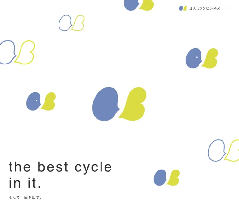
Cosmic Business presents an IT services company through approachable identity graphics and unusually generous space. Two soft, asymmetric shapes—violet on the left and yellow-green on the right—repeat across the opening canvas. Some are filled, some are outlined, and several extend beyond the viewport. The lowercase statement “the best cycle / in it.” sits near the bottom left, leaving the central emblem and surrounding white space to establish the first impression.
Below the opening, the site becomes an understated corporate index. Regular-weight English headings organize Japanese explanations, service entries have small numbers and large vertical intervals, and news uses text rows. Recruitment introduces a stronger blue field and a colorful illustration collage. A substantial pale gray footer exposes the site's information architecture and office details. Preserve this progression from expressive identity to practical company information.
How to Read This Reference
- Measured means a value appears in the supplied computed styles, custom properties, or element rectangles. Measurements are CSS pixels unless stated otherwise.
- Estimated means a visual approximation from the current-page screenshots. These values are not extracted CSS declarations.
- Derived means arithmetic using measured values, such as the gap between two element rectangles.
- Recommended means an implementation choice for a new project. Breakpoints, hover endpoints, accessibility additions, and the Quick Start's layout formulas belong to this category unless identified otherwise.
- Computed font-family stacks identify declared families; they do not independently verify which font supplied every rendered glyph.
- Child artwork and styled text spans were not comprehensively extracted. A parent element's
16pxfont size does not establish the size of the large lettering inside it. - Document coordinates describe the supplied geometry. They are not evidence of a particular sticky-positioning or scroll-animation algorithm.
Tokens — Colors
Default Palette
| Name | Value | Source / implementation token | Role and evidence |
|---|---|---|---|
| White Canvas | #ffffff |
Source --color-white; alias --color-canvas |
Measured body background; dominant opening and content surface |
| Charcoal | #313131 |
Source --color-black; alias --color-ink |
Measured main text, English headings, service descriptions, and footer navigation |
| Secondary Text | #707070 |
Source --color-text; alias --color-muted |
Measured About paragraph, news titles, map links, and policy text |
| Brand Violet | #7188bd |
Source --color-violet; alias --color-brand-violet |
Declared identity color, visually corresponding to the left emblem and fine navigation accents |
| Brand Yellow-Green | #dadb43 |
Source --color-green; alias --color-brand-lime |
Declared identity color, visually corresponding to the right emblem |
| Recruitment Blue | #4f9ff9 |
Source --color-recruit |
Measured recruitment-panel background |
| Footer Gray | #f5f5f5 |
Alias --color-footer |
Measured footer background, rgb(245, 245, 245) |
| Light Neutral | #c8cccc |
Source --color-gray2; alias --color-rule |
Available source neutral; suitable for the pale dash/rule treatment, though individual rule bindings were not extracted |
The opening depends on white occupying most of the frame. Violet and yellow-green belong primarily to the emblem system, rather than to alternating section backgrounds or prominent text fills. Recruitment Blue is a separate, concentrated section accent.
Other Declared Colors
The supplied properties also contain #9a9a9b, #d6dbde, #ebeff2, #fafafa, #c69534, #f86d5a, and #04b96b. Their names suggest neutral, recruitment, and status-related uses, but the evidence does not establish all their component bindings. Do not turn every declared color into an active homepage token.
In particular, source --color-recruit_base: #fafafa is not the measured footer color. Generic CMS gradients and shadow presets are also present in the properties; their presence does not establish a visible gradient or elevation system.
Tokens — Typography
Japanese Text — Tsukushi Gothic Stack
Measured primary family stack:
TsukuGoPr5N-R, 'FOT-筑紫ゴシック Pr5N R', 'Helvetica Neue', Arial,
'Hiragino Kaku Gothic ProN', 'Hiragino Sans', Meiryo, sans-serif
Japanese paragraphs and navigation use a light, open Gothic character. Most sampled elements have computed weight 400. Tracking is frequently 0.1em, with unusually spacious paragraph leading: 2.3 for About and 2.2 for desktop service descriptions.
This combination makes the text feel calm without relying on very pale foreground colors. Preserve the tracking and line spacing together; adding only letter spacing to a tightly set paragraph misses the effect.
English Headings — Helvetica Stack
Measured heading family stack:
HelveticaLTPro-Roman, 'Helvetica Neue', Arial,
'Hiragino Kaku Gothic ProN', 'Hiragino Sans', Meiryo, sans-serif
Section headings such as ABOUT, SERVICE, and NEWS use regular weight, uppercase letters, and 0.08em tracking. Footer group headings repeat the same language at 16px. The recruitment heading increases the tracking to 0.1em.
The large service lettering is visibly sans serif and regular weight. Its child-level family and size were not extracted, so the exact measured section-heading declaration should not automatically be assigned to it.
Office Labels and Brand Artwork
Desktop office labels declare TsukuGoPr5-M / FOT-筑紫ゴシック Pr5 M; mobile labels declare TsukuGoPr5-D / FOT-筑紫ゴシック Pr5 D. Both sampled computed weights remain 400. These family names are not evidence that CSS weights of 500 or 700 were used.
Header and footer wordmarks are visually supplied brand artwork. Their empty anchor text in the extraction does not establish their accessible names or internal image format. Preserve the wordmark proportions instead of rebuilding it with an assumed font.
The root and some structural elements report Times, but the visible content uses more specific descendant styles and artwork. Times is not the site's visual heading system.
Type Scale
| Role | Desktop | Mobile | Leading / tracking | Status |
|---|---|---|---|---|
| Opening English statement | Approximately 80px |
Approximately 40px |
Approximately 1.2; visibly tracked |
Screenshot estimate; rendering method and font not extracted |
| Opening Japanese tagline | Approximately 20–22px |
Approximately 14–16px |
Open tracking | Screenshot estimate; parent reports 16px |
| Standard section heading | 28px |
24px |
1.4; 0.08em |
Measured |
| About paragraph | 17px |
15px |
2.3; 0.1em |
Measured |
| Service English title | Approximately 36px / 52px |
Child size not extracted | Regular weight; uppercase | Desktop screenshot estimate |
| Service Japanese subtitle | Approximately 13px |
Child size not extracted | Muted gray | Desktop screenshot estimate |
| Service paragraph | 16px |
13px |
Desktop 2.2; mobile 1.9; 0.1em |
Measured |
| About / Service overview link | 14px |
13px |
1.9; 0.1em |
Measured |
| News title | 14px |
13px |
1.9; 0.1em |
Measured |
| Recruitment heading | 32px |
22px |
Declared 1.6; 0.1em |
Measured |
| Recruitment message | 20px |
18px |
1.8; 0.1em |
Measured |
| Footer group heading | 16px |
16px |
1.4; 0.08em |
Measured |
| Footer subsection link | 12px |
12px |
1.7; 0.1em |
Measured |
| Office label | 11px |
12px |
Desktop 2.1; mobile 1.9; 0.1em |
Measured |
| Policy link | 11px |
11px |
2.1; 0.1em |
Measured |
The mobile version does not shrink every text style. Footer navigation remains the same size, and office labels become slightly larger.
Tokens — Spacing & Shapes
Base: the measured root font size is 16px. No special rem conversion is established.
Density: very sparse opening and service layout; moderately dense footer navigation.
Geometry: square section surfaces, fine lines, organically curved identity artwork, and a white pill inside the recruitment panel.
Spacing Scale
These are recurring measured values and useful aliases, not evidence of a single source spacing scale.
| Use | Desktop | Mobile | Evidence |
|---|---|---|---|
| Menu control | 44 × 44px |
44 × 44px |
Measured button box |
| Menu line gap | 8px |
8px |
Measured flex gap |
| Main section top padding | 75px |
110px |
Source --pt-sec and --pt-sec-sp; applied to sampled sections |
| Opening copy left inset | 40px |
17.55px |
Measured paragraph padding / position |
| Main mobile paragraph inset | — | 31.19px |
About and News rectangles |
| Mobile section-label inset | — | 15.59px |
About, Service, and News heading rectangles |
| Overview-link padding | 17px 64px 16px 45px |
10px 48px 10px 27px |
Measured |
| News-row vertical padding | 30px top and bottom |
20px top, 23px bottom |
Measured |
| Footer top / bottom padding | 50px / 40px |
40px / 30px |
Measured |
| Footer subsection text indent | 17px |
17px |
Measured; reserves space for a short dash |
| Footer subsection row gap | Approximately 12px |
Approximately 13px |
Derived from adjacent link rectangles |
| News end to recruitment panel | 184px |
100px |
Derived |
| Recruitment panel end to footer | 184px |
120px |
Derived |
Border Radius
| Element | Treatment | Evidence |
|---|---|---|
| Recruitment panel | 0 |
Measured parent radius |
| Footer product banner | Square white rectangle | Screenshot observation |
| About / Service overview links | 0 on measured anchor |
Child or pseudo-element treatment not fully extracted |
| Recruitment inner CTA | Pill, approximately 27px radius at desktop |
Screenshot estimate; about 53px tall |
| Identity emblem | Custom asymmetric curves | Artwork, not a standard border-radius shape |
| Menu and footer rules | Approximately 1px |
Screenshot estimate |
Layout Measurements
| Element | Desktop 1440 × 1000 |
Mobile 390 × 844 |
|---|---|---|
| Document height | 5403.45px |
5271.55px |
| Opening artwork section | 1440 × 1000px |
390 × 780px |
| Opening copy container | y: 717.77px, height 236.72px |
x: 17.55px, y: 702.56px, 304 × 124.67px |
| Header brand link | x: 1165px, y: 21px, 189 × 33px |
x: 15px, y: 18.42px, 186 × 23.14px |
| Menu button | x: 1373px, y: 15.5px |
x: 328px, y: 8px |
| About paragraph | x: 811.69px, width 465.31px |
x: 31.19px, width 327.63px |
| Service title column | x: 707.19px, width 537.81px |
x: 72.19px, width 286.63px |
| Service paragraph box | Same horizontal bounds as title | x: 134.19px, width 224.63px, including 32px left padding |
| News list | x: 345px, width 900px |
x: 31.19px, width 327.63px |
| Recruitment panel | x: 270px, 900 × 208.98px |
x: 15.59px, 358.81 × 425.20px |
| Footer | 560.31px high |
1196.30px high |
| Footer CONTACT link | 180 × 35.39px |
327.63 × 35.39px |
| Footer brand link | 222 × 38px |
226 × 38px |
| Product-banner link | 260 × 67px |
327.63 × 81.17px |
The desktop content is not organized around one universal centered container. The measured Service/News rail extends from x: 135px to 1245px, while the recruitment panel is centered from 270px to 1170px. About uses a further-right text block, and the footer uses 40px outside insets.
The properties --desktop-vw: 1600, --desktop-max-vw: 2000, and --mobile-vw: 375 are present. Their consuming formulas were not supplied; they should not be treated as verified breakpoints or scaling equations.
Components
Persistent Brand and Menu Controls
Role: retain identity and navigation access while leaving the canvas open.
On desktop, the brand link and menu button form a compact cluster at the upper right. The Japanese wordmark follows the small two-color emblem. The menu consists of two thin violet horizontal lines, visually about 30px wide, centered inside a measured 44px square button.
On mobile, the brand link moves to the upper left while the menu stays at the upper right. Its width remains close to the desktop width rather than scaling down with the viewport. The controls remain visible in the supplied scrolled captures.
The header element itself has a measured height of 0px, consistent with controls that do not reserve a conventional header strip. Do not interpret this as an absent header. The captures show transparent surroundings rather than a separate solid navigation bar; mobile footer text can appear beneath the persistent brand area.
The button has a measured gap transition, but menu opening, panel geometry, focus behavior, and the final icon state were not exercised.
Opening Brand Composition
Role: introduce the company's identity before the informational sections.
Use a full-width white art field containing several instances of the same paired emblem. The largest central pair is approximately 326 × 205px at desktop and 174 × 110px on mobile. Secondary pairs vary in size and mix solid fills with outlines. Some are deliberately cropped by the top and side edges.
The silhouette has a soft profile-like character: a violet left shape and a yellow-green right shape separated by an expressive white gap. Small white eye-like dots are visible on some filled variants. The still captures do not establish blinking, morphing, rotation, or a loop sequence.
Place the English statement near the lower left, with an intentional break after “cycle.” The Japanese line そして、回り出す。 sits below it. This is a brand statement without an adjacent hero CTA in the captured view.
The English lettering is visible in the screenshot but absent from the extracted paragraph text. Its rendering method—image, SVG, or another descendant—is unverified. For a new implementation, retain an accessible text equivalent even if visual lettering is supplied as artwork.
Important mobile geometry: the artwork section ends at 780px, while the copy container extends to about 827.23px. The About heading starts at 849px. Clip the decorative layer independently; clipping all opening content at the art boundary would cut off the copy.
About Introduction
Role: explain the company and link to its broader introduction.
The desktop text block sits well to the right: approximately 465px wide at x: 812px. Stack an uppercase ABOUT heading, a gray Japanese paragraph, and the overview link 私たちについて aligned toward the right.
The paragraph uses 17px / 39.1px with 1.7px tracking. Its content describes tailored systems and ongoing business support. The supplied text wraps into six desktop lines and eight mobile lines. Mobile uses 15px / 34.5px inside a 327.63px block.
The mobile section heading begins around 4vw, while the paragraph begins around 8vw. This slight difference in indentation is part of the hierarchy. The visual contents of the unused desktop space beside the paragraph are not established by the supplied screenshots.
Service Section and Numbered Entry
Role: present three distinct service areas without surrounding cards.
The desktop composition has a left-side SERVICE label and illustration area, with the service descriptions in a right-side column. One supplied view shows a delicate gray drawing of overlapping speech bubbles, one with a check mark and one with a question mark. Other service illustration designs were not independently captured.
Each entry consists of:
- A small two-digit number,
01,02, or03, positioned to the left of the title. - A large regular-weight uppercase English title.
- A smaller muted Japanese subtitle.
- A short Japanese explanation with generous leading.
The observed service names are SYSTEM INTEGRATION, ENGINEERING SERVICES, and SOFTWARE MANAGED SERVICES. Desktop titles use deliberate two-line arrangements. Their Japanese subtitles stay subordinate, rather than becoming separate badges.
Title starts are approximately 364.86px and 400.05px apart on desktop. The difference corresponds to varying content height; do not force every entry into an identical fixed-height tile.
Mobile uses a more compact, indented arrangement. Titles begin at x: 72.19px. Description boxes begin at 134.19px and include another 32px of left padding. The third title container is taller than the first two, consistent with additional wrapping. Actual mobile icon placement was not visually captured.
The screenshot establishes the spacious left/right composition, but not whether the left illustration or label is sticky or scroll-switched.
Overview Link
Role: carry the visitor from a homepage summary to a full section.
The two measured links are 私たちについて and 業務案内を詳しくみる, targeting /about/ and /service/. They use tracked Japanese text and generous asymmetric padding, leaving more space at the trailing edge.
Desktop boxes are approximately 216 × 60px and 263 × 60px; mobile boxes are approximately 175 × 45px and 218 × 45px. Their measured anchors are transparent and square-cornered. Decorative descendants and pseudo-elements were not fully supplied, so a particular border or animated arrow treatment cannot be asserted from these measurements alone.
News Row
Role: present recent company updates as a concise text index.
The desktop list is 900px wide and aligned to the right side of its section rail. Each anchor contains a date, a title, and trailing content space. The measured layout uses CSS Grid with a 137px first column. Later column widths vary by row; the evidence does not establish three fixed equal columns.
Rows are about 86.59px tall with 30px vertical padding. Titles use muted 14px / 26.6px text and 0.1em tracking. The supplied entries include dates 2026.2.19, 2025.8.7, and 2025.1.22.
On mobile, the active layout changes to flex, with the date above the title, a 7px gap, and 20px 0 23px padding. The longest title produces a 117.56px row; shorter entries are about 92.88px. Preserve content-driven height and readable wrapping.
A grid-template-columns value remains in the mobile computed record, but it is inactive while display: flex applies. Do not copy inactive grid values as mobile layout behavior. No supplied screenshot independently verifies the News section's decorative details or hover state.
Recruitment Panel
Role: provide a distinct invitation to explore employment information.
A centered blue rectangle interrupts the white page. At desktop it measures 900 × 208.98px, with square corners and padding 14px 24px 27px. The white RECRUIT heading has a thin underline. Below it, the two-line message やりがいも、働きやすさも、大切に sits beside a white pill labeled 採用情報をみる and a small blue arrow.
A colorful illustration collage occupies the right side and extends beyond the blue panel. It combines colleagues around a laptop, a person working, a walking figure with a dog, and a conversational pair. The overlap is intentional: the blue rectangle is a backdrop, not an image-cropping frame.
The whole panel is one measured anchor targeting /recruit/. In a new implementation, make the pill-shaped affordance a noninteractive child of that anchor; do not nest a button or another link inside it.
The mobile panel becomes approximately 359 × 425px. Its heading reduces to 22px, and the message becomes a centered 198px block at 18px / 32.4px. The taller structure is measured, but the mobile artwork arrangement is not shown in the supplied captures. Any proposed vertical illustration arrangement should be identified as an adaptation.
Footer Sitemap
Role: expose the corporate site's main sections and their subsections.
The full-width footer uses #f5f5f5 and ample top padding. Desktop presents four groups—ABOUT, SERVICE, COMPANY, and RECRUIT—with CONTACT separated at the far right.
Each group has a regular 16px English heading and a list of tracked 12px Japanese links. Small pale horizontal dashes sit to the left of the subsection text. There are no enclosing cards or vertical column dividers.
On mobile, the four groups become a two-column, two-row arrangement. The column starts are approximately 31.19px and 213px. CONTACT spans the content width below them, with a thin violet underline and a right-pointing arrow. The footer remains expanded in the evidence; no accordion interaction is established.
Subsection links use URLs such as /about/?secid=section1 and /recruit/?secid=section7. Their presence confirms deep-link targets in the navigation, but the destination scrolling behavior was not tested.
Office Information and Legal Row
Role: make company identity and physical locations accessible at the end of the page.
The footer repeats the paired emblem with the Japanese name and a small English wordmark. On desktop, office labels and address/contact lines sit horizontally beneath it. Two locations are identified in the original page: the Fukuoka head office and Hiroshima office, each with an underlined map link.
On mobile, each office becomes a stacked block: label first, then telephone/address text wrapping across the available width. The map link follows inline. The brand link is slightly wider on mobile, 226px versus 222px, while retaining a 38px height.
The policy link and © Cosmic Business form the final legal row. Desktop places these near the right-side product banner; mobile distributes copyright left and policy right. Do not mistake the intentionally small legal text for the main body scale.
External Product Banner
Role: link to the company's related matching-site offering.
A white, square-cornered banner contains the Connect Place mark and a small gold diagonal arrow. It sits at the lower right on desktop and below the office blocks on mobile. The link target in the original-page DOM is https://connect-place.com/; that destination was not inspected.
The measured anchor is 260 × 67px on desktop and 327.63 × 81.17px on mobile. Anchor bounds and painted image bounds need not be identical. Treat the product mark as supplied artwork rather than approximating its lettering with the site's body font.
Tokens — Motion & Interaction
Measured Transition Declarations
| Element | Computed transition | What is established | What remains unverified |
|---|---|---|---|
| Menu button | gap 0.4s cubic-bezier(0.16, 1, 0.3, 1) |
Gap changes have a declared 400ms easing |
Trigger, target gap, and open-menu appearance |
| Recruitment anchor | transform 0.32s cubic-bezier(0.16, 1, 0.3, 1) |
Transform changes have a declared 320ms easing |
Hover scale, translation, and any other endpoint |
| Footer group links | color 0.24s cubic-bezier(0.16, 1, 0.3, 1) |
Color changes have a declared 240ms easing |
Final interactive color |
| Footer subsection links | transform 0.32s cubic-bezier(0.16, 1, 0.3, 1) |
Transform changes have a declared 320ms easing |
Direction and distance of movement |
| Footer CONTACT link | color 0.24s cubic-bezier(0.16, 1, 0.3, 1) |
Same short color-transition family | Arrow animation and final color |
These declarations support a restrained interaction vocabulary with a rapid start and eased finish. They do not prove that a particular hover or click interaction was performed.
The sampled elements report animation: none. This does not rule out animated descendants, SVG internals, canvas, JavaScript-driven transforms, or media. Conversely, the capture system's ability to pause perpetual animations is a collection procedure, not evidence that this homepage contains a particular perpetual animation.
Unverified: hero movement, eye changes over time, scroll-linked illustration changes, menu reveal choreography, page transitions, and reduced-motion behavior. Do not invent durations or parallax trajectories for them.
Recommended adaptation: keep optional hover movement small, reuse the measured easing, and begin with static emblem compositions. Introduce hero motion only with additional direct observation or an explicitly new art-direction decision.
Surfaces
| Layer | Appearance | Purpose |
|---|---|---|
| Main canvas | Solid white | Gives identity artwork and typography room |
| Header surroundings | Visually transparent | Keeps navigation present without a heavy top band |
| About / Service / News | White with unboxed text | Separates content through position and spacing |
| Recruitment panel | Flat blue, square corners | Concentrates color around recruitment |
| Recruitment CTA | White pill | Adds a clear local affordance inside the panel |
| Footer | Flat pale gray | Distinguishes the site's practical information base |
| Product banner | White rectangle on gray | Separates external brand artwork from office details |
No general shadow, glass, gradient, or rounded-card system is visible in the supplied current-page screenshots. Organic curves belong to the emblem and illustrations; most layout surfaces remain rectangular.
Imagery
Identity Artwork
The paired emblem is the strongest reusable visual principle. Preserve its uneven curves, the white gap between its halves, and its violet/yellow-green relationship. Repetition uses changes in scale, fill, outline, and placement rather than different symbols for every instance.
The opening resembles a composed field of emblems, not a regular wallpaper tile. Keep a dominant center pair and allow selected satellites to leave the frame. On mobile, rearrange them to retain the central focus and clear the copy area.
Outlined variants have smooth contours. Their apparent stroke thickness varies with size; approximately 3–5px is visible in larger desktop examples and 1–2px in smaller mobile examples. These are screenshot estimates, not a recovered stroke-scaling rule.
Supporting Illustrations
The service illustration uses restrained gray outline work and ample interior white space. The recruitment collage uses filled, colorful human scenes. Maintain this distinction: technical explanation stays quiet, while recruitment introduces activity and personality.
Artwork appears smooth and vector-like, but file formats were not supplied. Do not apply pixelated rendering or assume every image is an SVG. No photography is visible in the supplied current-page screenshots; uncaptured visual sections cannot be classified from empty DOM text alone.
Observed Asset References
No image src, SVG path inventory, or font-file URLs were included in the evidence. The following identifies visible artwork without inventing filenames.
| Artwork | Evidence | Implementation requirement |
|---|---|---|
| Header wordmark | Desktop and mobile opening/footer captures | Preserve the horizontal lockup and viewport-specific placement |
| Filled paired emblem | Desktop and mobile opening captures | Use authorized artwork; retain the central negative space |
| Outline emblem variants | Desktop and mobile opening captures | Preserve contour character and intentional clipping |
| English opening statement | Opening captures | Preserve its two-line composition and provide accessible text |
| Speech-bubble drawing | Desktop service capture | Fine gray strokes; no enclosing icon card |
| Recruitment collage | Desktop recruitment capture | Allow artwork to exceed the blue panel's bounds |
| Footer wordmark | Desktop and mobile footer captures | Include the small English line as part of the lockup |
| Connect Place banner | Desktop and mobile footer captures | Use the product artwork and its separate external-link treatment |
The DOM also records a textless section of 384px height on desktop and approximately 207.92px on mobile, plus other uncaptured intervals. Their contents are not established. Do not fill these areas with guessed photography, video, or decorative assets and describe the result as observed.
Layout & Responsive Behavior
The homepage retains the same broad sequence at both viewports: opening, About, Service, News, recruitment, and footer. Its approximately 5.4k desktop and 5.3k mobile document heights conceal substantial internal rearrangement: the main content becomes shorter on mobile, while the footer more than doubles in height.
Observed Changes
| Area | Desktop behavior | Mobile behavior |
|---|---|---|
| Brand controls | Brand and menu clustered right | Brand moves left; menu remains right |
| Opening | Broad emblem field; large statement lower left | Repositioned and cropped emblems; roughly half-size statement |
| Opening art height | Matches the 1000px viewport height |
780px inside an 844px viewport |
| About | Narrow paragraph toward the right | Nearly full-width paragraph with inset section label |
| Service | Wide split composition with a distant text column | Narrow indented title/body arrangement |
| Section padding | 75px |
110px, despite the narrower viewport |
| News | Horizontal date/title grid | Stacked date and title using flex |
| Recruitment | Wide, shallow 900px panel |
Narrow, tall panel approximately 359px wide |
| Footer sitemap | Four groups across, CONTACT far right | Two columns, CONTACT below across both |
| Office information | Compact horizontal rows | Labels and wrapped address text stack |
| Product banner | Right of company details | Below company details |
The mobile heading inset of approximately 4vw and body inset of approximately 8vw are derived from this one mobile viewport. Their underlying source formulas and breakpoint are not supplied.
The opening and About rectangles overlap in the record: About begins at 946.48px on desktop and 739px on mobile. Its internal padding places the actual heading below the opening copy. This is evidence of overlapping section geometry, not a recommendation to copy negative offsets without understanding the original positioning system.
For a new implementation, use a clear document flow and independently clipped art layer. Preserve the visible spacing relationships while ensuring text remains reachable at short heights, narrow widths, and increased text size. Tablet behavior, landscape phones, safe-area handling, and browser-toolbar changes were not tested.
Do’s and Don’ts
Do
- Keep white as the dominant surface and preserve the exact violet/yellow-green identity pair.
- Use one recognizable paired emblem in several scales and outline/fill variants.
- Leave large quiet areas around the central emblem and lower-left statement.
- Pair regular English headings with tracked Japanese text and generous leading.
- Preserve the distinct alignment of About, Service, News, recruitment, and footer.
- Build service entries as unboxed numbered information blocks.
- Let recruitment artwork extend beyond its blue backdrop.
- Keep the footer sitemap expanded and readable in two mobile columns.
- Preserve the
44pxmenu control even though its visible lines are small. - Separate measured transition timing from unverified movement endpoints.
Don’t
- Don't turn the corporate homepage into a single-purpose conversion page with repeated hero CTAs.
- Don't replace the organic brand emblem with generic circles, blobs, or emoji.
- Don't center every heading and paragraph or force all sections into one identical container.
- Don't introduce feature-card shadows, glass panels, or rounded boxes around each service.
- Don't use yellow-green as small body text on white.
- Don't make all English headings bold; regular weight is fundamental here.
- Don't confuse the blue recruitment panel with the site's primary brand-violet token.
- Don't clip the mobile tagline to the artwork section's
780pxboundary. - Don't interpret parent
16pxstyles as the measured size of the large service or opening lettering. - Don't invent a hero animation loop, menu overlay, asset filename, or uncaptured image section.
Recommended Implementation Additions
These are recommendations for a new implementation, not verified features of the original website:
- Give the icon-only menu button an accessible name and maintain
aria-expandedandaria-controls. If it opens a modal navigation panel, implement appropriate focus movement and dismissal. - Provide an accessible brand-link name and an actual text equivalent for the English opening statement. Empty extracted text alone does not prove those are missing on the original.
- Keep decorative emblem instances outside the accessibility tree and give meaningful illustrations contextual alternatives only when they convey information.
- Use visible keyboard focus that remains clear on white, gray, and blue surfaces.
- Preserve the observed single recruitment link; make the internal pill decorative rather than nesting interactive elements.
- Review recruitment text contrast. White on the measured
#4f9ff9is approximately2.74:1, calculated from the supplied sRGB colors. Use darker text or an adjusted local background when implementing accessible production text. - Keep decorative cropping local to the hero artwork. Avoid hiding page-wide horizontal overflow as a substitute for correcting layout.
- At very narrow widths, relax the service description's deep indentation before making its text smaller.
- Offer reduced-motion behavior and keep all content visible without animation. No source reveal sequence has been established.
- Supply licensed font files when available, with suitable fallbacks and stable image dimensions. No font delivery URLs were inspected.
Agent Prompt Guide
Quick Color Reference
- Main canvas:
#ffffff. - Main text:
#313131. - Secondary paragraphs and news:
#707070. - Paired emblem: violet
#7188bdand yellow-green#dadb43. - Recruitment backdrop:
#4f9ff9. - Footer:
#f5f5f5. - Fine neutral accents: source neutral
#c8cccc, with exact component binding to be verified. - Principal shapes: custom organic emblems, square content surfaces, one white recruitment pill.
Overall Prompt
“Create a Japanese IT company homepage inspired by Cosmic Business. Use a predominantly white canvas with repeated paired organic emblems in violet #7188bd and yellow-green #dadb43. Mix filled and outlined instances, emphasize one central pair, and crop selected smaller pairs at the edges. Place a large regular-weight lowercase English statement at the lower left with a short tracked Japanese tagline beneath it. Continue into a right-aligned About paragraph, spacious numbered service summaries, text-based news rows, a square blue recruitment panel with overlapping colorful people illustrations, and an expanded pale gray footer sitemap. Use regular Helvetica-style English headings and an open Japanese Gothic stack, with generous leading and tracking. Recompose the layout for mobile: logo left, menu right, stacked news dates, a taller recruitment panel, and a two-column footer. Treat hero movement and menu choreography as unspecified.”
Example Component Prompts
- Opening composition: “A white desktop opening with one large paired violet/yellow-green emblem near the center, smaller filled and outline versions scattered asymmetrically, and deliberate edge cropping. Put ‘the best cycle’ above ‘in it.’ near the lower left, with
そして、回り出す。beneath. Keep the upper-right brand/menu cluster small. Avoid adding a hero action button.” - Service entry: “An unboxed service summary on white: small number at left, a two-line regular uppercase English title, a muted Japanese subtitle, and a short Japanese explanation at
16px / 35.2pxwith0.1emtracking. Leave enough vertical space that each entry reads separately. Use a fine gray line illustration in the adjacent left area.” - News list: “A restrained desktop list with a
137pxdate column and muted tracked Japanese titles, each row padded30pxvertically. On mobile, place the date above its title with a7pxgap. Keep row heights content-driven and use a proposed fine neutral divider.” - Recruitment panel: “A square-cornered blue
#4f9ff9recruitment banner, about900 × 209pxon desktop, with an underlined English heading, two-line Japanese message, and a white pill-shaped link affordance. Let colorful workplace and everyday-life illustrations overlap the right and upper edges. The whole banner is one link. Review white-text contrast before production.” - Footer: “A pale gray footer with four regular uppercase navigation headings, small Japanese links prefixed by short pale dashes, and a separate CONTACT underline link. Place company artwork and two office blocks below, with a white Connect Place banner at right. On mobile, use two navigation columns and stack the office information and banner.”
- Interaction adaptation: “Reuse
cubic-bezier(0.16, 1, 0.3, 1)for subtle240–400msinterface transitions. Mark proposed hover distances as new design decisions. Keep the hero static unless direct motion evidence is supplied, and provide reduced-motion behavior.”
Quick Start
CSS Custom Properties
This is a usable adaptation, not recovered source CSS. Colors, font stacks, several text styles, and transition timings come from the supplied evidence. The 768px breakpoint, static hero positioning, hover endpoints, and layout formulas are recommendations.
The desktop editorial wrapper uses 1170px with 60px trailing padding to reproduce the measured x: 135px to 1245px content rail at 1440px. That is a derived implementation method, not a verified source formula. The hero uses a stable viewport-height wrapper rather than reproducing the original overlapping section boxes. Its mobile art inset approximates the observed 780px art field inside the 844px capture.
Use authorized artwork inside .hero-mark, .brand-link, and .recruit-art; no asset paths or font downloads are implied. Apply .cosmic-page to the page root. A service entry expects separate number, English title, Japanese label, and paragraph elements. The recruitment CTA should be a span inside the panel anchor.
:root {
  /* Observed colors; semantic aliases for this adaptation. */
  --color-canvas: #ffffff;
  --color-ink: #313131;
  --color-muted: #707070;
  --color-brand-violet: #7188bd;
  --color-brand-lime: #dadb43;
  --color-recruit: #4f9ff9;
  --color-footer: #f5f5f5;
  --color-rule: #c8cccc;

  /* Declared source families; provide licensed fonts separately. */
  --font-jp: TsukuGoPr5N-R, 'FOT-筑紫ゴシック Pr5N R',
    'Helvetica Neue', Arial, 'Hiragino Kaku Gothic ProN',
    'Hiragino Sans', Meiryo, sans-serif;
  --font-en: HelveticaLTPro-Roman, 'Helvetica Neue', Arial,
    'Hiragino Kaku Gothic ProN', 'Hiragino Sans', Meiryo, sans-serif;

  --text-section: 28px;
  --text-about: 17px;
  --text-body: 16px;
  --text-link: 14px;
  --text-footer: 12px;
  --tracking-en: 0.08em;
  --tracking-jp: 0.1em;
  --section-top: 75px;
  --control-size: 44px;
  --radius-pill: 999px;

  --ease-out: cubic-bezier(0.16, 1, 0.3, 1);
  --motion-color: 240ms var(--ease-out);
  --motion-transform: 320ms var(--ease-out);
  --motion-menu: 400ms var(--ease-out);
}

.cosmic-page,
.cosmic-page *,
.cosmic-page *::before,
.cosmic-page *::after {
  box-sizing: border-box;
}

.cosmic-page {
  margin: 0;
  color: var(--color-ink);
  background: var(--color-canvas);
  font-family: var(--font-jp);
  font-size: 16px;
  font-weight: 400;
}

.cosmic-page a {
  color: inherit;
}

.cosmic-page img {
  display: block;
  max-width: 100%;
  height: auto;
}

.brand-link {
  position: fixed;
  z-index: 10000;
  top: 21px;
  right: 86px;
  width: 189px;
  height: 33px;
}

.brand-link img {
  width: 100%;
  height: 100%;
  object-fit: contain;
}

.menu-toggle {
  position: fixed;
  z-index: 10000;
  top: 15.5px;
  right: 23px;
  display: flex;
  flex-direction: column;
  align-items: center;
  justify-content: center;
  gap: 8px;
  width: var(--control-size);
  height: var(--control-size);
  padding: 7px;
  border: 0;
  color: var(--color-brand-violet);
  background: transparent;
  cursor: pointer;
  transition: gap var(--motion-menu);
}

.menu-toggle span {
  width: 30px;
  height: 1px;
  background: currentColor;
}

.hero {
  position: relative;
  min-height: 100vh;
  min-height: 100svh;
}

.hero-art {
  position: absolute;
  inset: 0;
  overflow: hidden;
  pointer-events: none;
}

.hero-mark {
  position: absolute;
  height: auto;
}

.hero-mark--main {
  top: 50%;
  left: 50%;
  width: 326px;
  transform: translate(-50%, -50%);
}

/* Place additional emblem variants deliberately for each viewport. */
.hero-copy {
  position: absolute;
  right: 40px;
  bottom: 45px;
  left: 40px;
}

.hero-title {
  margin: 0;
  font-family: var(--font-en);
  font-size: 80px;
  font-weight: 400;
  line-height: 1.2;
  letter-spacing: 0.08em;
}

.hero-tagline {
  margin: 16px 0 0;
  font-size: 20px;
  line-height: 1.4;
  letter-spacing: var(--tracking-jp);
}

/* Derived wrapper, not a recovered source container declaration. */
.editorial-rail {
  width: min(1170px, calc(100% - 80px));
  margin-inline: auto;
  padding-inline-end: 60px;
}

.content-section {
  padding-block-start: var(--section-top);
}

.section-heading {
  margin: 0;
  font-family: var(--font-en);
  font-size: var(--text-section);
  font-weight: 400;
  line-height: 1.4;
  letter-spacing: var(--tracking-en);
}

.about-copy {
  max-width: 465px;
  margin-inline-start: auto;
}

.about-copy p {
  margin: 42px 0 0;
  color: var(--color-muted);
  font-size: var(--text-about);
  line-height: 2.3;
  letter-spacing: var(--tracking-jp);
}

.overview-link {
  display: flex;
  align-items: center;
  width: fit-content;
  min-height: 44px;
  margin: 70px 0 0 auto;
  padding: 17px 64px 16px 45px;
  font-size: var(--text-link);
  line-height: 1.9;
  letter-spacing: var(--tracking-jp);
  text-decoration: none;
}

.service-layout {
  display: grid;
  grid-template-columns: minmax(0, 1fr) minmax(0, 537.8125px);
  gap: 40px;
}

.service-items {
  min-width: 0;
  padding-block-start: 145px;
}

.service-item {
  position: relative;
}

.service-item + .service-item {
  margin-block-start: 157px;
}

.service-number {
  position: absolute;
  top: 5px;
  left: -59px;
  font-family: var(--font-en);
  font-size: 14px;
  letter-spacing: 0.08em;
}

/* English service sizes approximate the desktop screenshot. */
.service-title {
  margin: 0;
  font-family: var(--font-en);
  font-size: 36px;
  font-weight: 400;
  line-height: 1.45;
  letter-spacing: 0.03em;
}

.service-label {
  display: block;
  margin-block-start: 12px;
  color: var(--color-muted);
  font-family: var(--font-jp);
  font-size: 13px;
  line-height: 1.9;
  letter-spacing: 0.08em;
}

.service-body {
  margin: 31px 0 0;
  font-size: var(--text-body);
  line-height: 2.2;
  letter-spacing: var(--tracking-jp);
}

.news-list {
  width: min(900px, 100%);
  margin-inline-start: auto;
}

.news-row {
  display: grid;
  grid-template-columns: 137px minmax(0, 1fr) auto;
  align-items: start;
  padding: 30px 0;
  border-bottom: 1px solid var(--color-rule);
  text-decoration: none;
}

.news-title {
  margin: 0;
  padding-inline-end: 24px;
  color: var(--color-muted);
  font-size: var(--text-link);
  font-weight: 400;
  line-height: 1.9;
  letter-spacing: var(--tracking-jp);
}

.recruit-panel {
  position: relative;
  display: block;
  width: min(900px, calc(100% - 80px));
  min-height: 209px;
  margin: 184px auto;
  padding: 14px 24px 27px;
  color: white;
  background: var(--color-recruit);
  text-decoration: none;
  transition: transform var(--motion-transform);
}

.cosmic-page .recruit-panel {
  color: white;
}

.recruit-heading {
  display: inline-block;
  margin: 0;
  border-bottom: 1px solid currentColor;
  font-family: var(--font-en);
  font-size: 32px;
  font-weight: 400;
  line-height: 1.6;
  letter-spacing: 0.1em;
}

.recruit-content {
  display: flex;
  align-items: center;
  gap: 24px;
  margin: 23px 0 0 23px;
}

.recruit-message {
  width: 220px;
  margin: 0;
  font-size: 20px;
  line-height: 1.8;
  letter-spacing: var(--tracking-jp);
}

.recruit-cta {
  display: inline-flex;
  align-items: center;
  justify-content: center;
  gap: 20px;
  min-height: 53px;
  padding: 14px 34px;
  border-radius: var(--radius-pill);
  color: var(--color-ink);
  background: white;
  font-size: 14px;
  line-height: 1.7;
  white-space: nowrap;
}

/* Artwork positioning is an approximation of the desktop collage. */
.recruit-art {
  position: absolute;
  top: -47px;
  right: -38px;
  width: 430px;
  pointer-events: none;
}

/* Optional accessible contrast variant for a new implementation. */
.cosmic-page .recruit-panel--readable {
  color: var(--color-ink);
}

.site-footer {
  padding: 50px 40px 40px;
  background: var(--color-footer);
}

.footer-nav {
  display: grid;
  grid-template-columns: repeat(4, max-content) minmax(180px, 1fr);
  gap: 60px;
}

.footer-heading {
  display: inline-block;
  margin-block-end: 27px;
  font-family: var(--font-en);
  font-size: 16px;
  line-height: 1.4;
  letter-spacing: 0.08em;
  text-decoration: none;
  transition: color var(--motion-color);
}

.footer-links {
  display: grid;
  gap: 12px;
  margin: 0;
  padding: 0;
  list-style: none;
}

.footer-sub {
  position: relative;
  display: block;
  padding-inline-start: 17px;
  font-size: var(--text-footer);
  line-height: 1.7;
  letter-spacing: var(--tracking-jp);
  text-decoration: none;
  transition: transform var(--motion-transform);
}

.footer-sub::before {
  position: absolute;
  top: 0.8em;
  left: 0;
  width: 7px;
  height: 1px;
  background: var(--color-rule);
  content: '';
}

.footer-contact {
  display: flex;
  align-items: flex-start;
  justify-content: space-between;
  justify-self: end;
  align-self: start;
  width: 180px;
  padding-block-end: 13px;
  border-bottom: 1px solid var(--color-brand-violet);
  font-family: var(--font-en);
  font-size: 16px;
  line-height: 1.4;
  letter-spacing: 0.1em;
  text-decoration: none;
}

.footer-details {
  display: grid;
  grid-template-columns: minmax(0, 1fr) 260px;
  gap: 40px;
  margin-block-start: 77px;
}

.footer-brand {
  display: block;
  width: 222px;
}

.office-list {
  margin-block-start: 36px;
  color: var(--color-muted);
  font-size: 11px;
  line-height: 2.1;
  letter-spacing: 0.1em;
}

.office-row {
  display: grid;
  grid-template-columns: 100px minmax(0, 1fr);
  margin-block-start: 9px;
}

.office-row p {
  margin: 0;
}

.office-label {
  color: var(--color-ink);
}

.product-banner {
  display: block;
  background: white;
}

.footer-legal {
  display: flex;
  justify-content: space-between;
  gap: 24px;
  margin-block-start: 30px;
  color: var(--color-muted);
  font-size: 11px;
  line-height: 2.1;
  letter-spacing: 0.1em;
}

/* Proposed endpoints; only the timing family is source-measured. */
@media (hover: hover) {
  .menu-toggle:hover { gap: 6px; }
  .footer-sub:hover { transform: translateX(2px); }
  .footer-heading:hover { color: var(--color-brand-violet); }
}

.cosmic-page :focus-visible {
  outline: 2px solid var(--color-ink);
  outline-offset: 4px;
}

/* Recommended breakpoint; the source breakpoint was not supplied. */
@media (max-width: 768px) {
  :root {
    --text-section: 24px;
    --text-about: 15px;
    --text-body: 13px;
    --text-link: 13px;
    --section-top: 110px;
  }

  .brand-link {
    top: 18.42px;
    right: auto;
    left: 15px;
    width: 186px;
    height: 23.14px;
  }

  .menu-toggle { top: 8px; right: 18px; }

  /* Capture-matching art clearance, not a verified source formula. */
  .hero-art { bottom: 64px; }
  .hero-mark--main { width: clamp(140px, 44.6vw, 220px); }
  .hero-copy { right: 4.5vw; bottom: 17px; left: 4.5vw; }
  .hero-title { font-size: 40px; }
  .hero-tagline { margin-block-start: 8px; font-size: 15px; }

  .editorial-rail {
    width: 92%;
    padding-inline-end: 4vw;
  }

  .about-copy { max-width: none; }
  .about-copy p { margin: 47px 0 0 4vw; }
  .overview-link { margin-block-start: 46px; padding: 10px 48px 10px 27px; }

  .service-layout { display: block; }
  .service-items { padding: 50px 0 0 calc(4vw + 41px); }
  .service-item + .service-item { margin-block-start: 71px; }
  .service-number { left: -41px; }
  .service-title { font-size: 22px; line-height: 1.34; }
  .service-label { margin-block-start: 8px; line-height: 1.5; }
  .desktop-break { display: none; }

  .service-body {
    min-height: 62px;
    margin: 25px 0 0 62px;
    padding-inline-start: 32px;
    line-height: 1.9;
  }

  .news-list { width: auto; margin: 24px 0 0 4vw; }
  .news-row {
    display: flex;
    flex-direction: column;
    gap: 7px;
    padding: 20px 0 23px;
  }

  .recruit-panel {
    width: 92%;
    min-height: 425px;
    margin: 100px auto 120px;
    padding: 15px 22px 27px;
  }

  .recruit-heading { font-size: 22px; }
  .recruit-content {
    flex-direction: column;
    gap: 20px;
    margin: 22px 0 0;
  }
  .recruit-message { width: 198px; font-size: 18px; }

  /* Proposed stack: mobile artwork placement was not captured. */
  .recruit-art {
    position: static;
    width: min(300px, 100%);
    margin: 24px auto 0;
  }

  .site-footer { padding: 40px 8vw 30px; }
  .footer-nav { grid-template-columns: repeat(2, minmax(0, 1fr)); gap: 50px 36px; }
  .footer-heading { margin-block-end: 20px; }
  .footer-links { gap: 13px; }
  .footer-contact { grid-column: 1 / -1; width: 100%; }
  .footer-details { display: block; margin-block-start: 85px; }
  .footer-brand { width: 226px; }
  .office-list { margin-block-start: 34px; font-size: 12px; line-height: 1.9; }
  .office-row { display: block; margin-block-start: 18px; }
  .office-label { margin-block-end: 5px !important; }
  .product-banner { margin-block-start: 50px; }
  .footer-legal { margin-block-start: 35px; }
}

/* Recommended narrow-screen relaxation of the deep service indent. */
@media (max-width: 360px) {
  .service-body { margin-inline-start: 0; padding-inline-start: 0; }
  .footer-nav { column-gap: 20px; }
}

@media (prefers-reduced-motion: reduce) {
  .cosmic-page *,
  .cosmic-page *::before,
  .cosmic-page *::after {
    animation: none !important;
    transition: none !important;
    scroll-behavior: auto !important;
  }
}
The CSS supplies a static visual shell. Menu functionality, asset composition, destination pages, and any newly specified animation need separate implementation. At intermediate widths, verify the recruitment collage and footer groups with actual content rather than assuming the two inspected viewports establish every layout state.
Tailwind v4 Token Mapping
Optional aliases for a project already using Tailwind v4. This is not evidence that the original website uses Tailwind. Define the custom properties above first.
@theme inline {
  --color-canvas: #ffffff;
  --color-ink: #313131;
  --color-muted: #707070;
  --color-brand-violet: #7188bd;
  --color-brand-lime: #dadb43;
  --color-recruit: #4f9ff9;
  --color-footer: #f5f5f5;
  --color-rule: #c8cccc;

  --font-body: var(--font-jp);
  --font-heading: var(--font-en);

  --text-section: var(--text-section-size, 28px);
  --text-footer: 12px;
  --spacing-control: 44px;
  --spacing-section-top: var(--section-top);
  --radius-pill: 999px;
}
If using this mapping, set --text-section-size: 24px inside the mobile media query and use that variable for the section-heading utility. Avoid defining a theme token in terms of itself.
Sources & Evidence
- Cosmic Business homepage: original and final URL are identical; supplied response status is
200. The original page title identifies コスミックビジネス株式会社, and its visible content and footer support that company identity. - Capture record timestamp:
2026-09-12T17:17:12.139Z, equivalent to September 13, 2026 at 02:17 JST. Individual screenshot timestamps were not separately supplied. - Desktop evidence: three current-page captures at
1440 × 1000, covering the opening, service composition, and recruitment/footer; rendered DOM, computed styles, custom properties, link destinations, and document geometry. - Mobile evidence: two current-page captures at
390 × 844, covering the opening and lower footer; rendered DOM measurements for the remaining homepage sections. - Collection conditions: the browser waited for loading, sampled layout/text stability, visible image decoding, and qualifying finite animations within stated time limits. Initial observation lasted at least five seconds. Scroll collection traversed intermediate positions. SharedWorkers and service workers were disabled.
- Interaction evidence is limited to the supplied scrolled captures, link targets, and computed transition declarations. No menu-open, hover, focus, form, or destination-page test was supplied.
- Missing evidence includes image-source paths, complete descendant styles, font-file delivery, uncaptured visual intervals, tablet layouts, and a recorded motion sequence. Readiness checks do not guarantee delayed-content completeness.
This reference describes the current homepage represented by those captures. Measured values, visual estimates, derived geometry, and implementation recommendations are identified separately throughout.
# Cosmic Business — Style Reference

> A spacious white corporate canvas, animated in character by paired organic emblems and quietly ordered typography.

**Website:** [Cosmic Business](https://www.cosmicb.co.jp/)
**Original URL:** https://www.cosmicb.co.jp/
**Final URL:** https://www.cosmicb.co.jp/
**Theme:** light; white content canvas, violet and yellow-green identity colors, pale gray footer, blue recruitment panel.
**Inspected:** supplied capture record retrieved September 13, 2026 at 02:17 JST; timestamp `2026-09-12T17:17:12.139Z`.
**Viewports:** desktop `1440 × 1000` and mobile `390 × 844` CSS pixels.
**Scope:** the current corporate homepage: opening brand composition, About introduction, three service summaries, news links, recruitment invitation, persistent brand/menu controls, and footer. Visual captures cover the desktop opening, services, and recruitment/footer, plus the mobile opening and lower footer. About, News, and mobile service/recruitment measurements additionally come from the supplied rendered DOM. Linked destination pages and the expanded menu were not inspected.

Cosmic Business presents an IT services company through approachable identity graphics and unusually generous space. Two soft, asymmetric shapes—violet on the left and yellow-green on the right—repeat across the opening canvas. Some are filled, some are outlined, and several extend beyond the viewport. The lowercase statement “the best cycle / in it.” sits near the bottom left, leaving the central emblem and surrounding white space to establish the first impression.

Below the opening, the site becomes an understated corporate index. Regular-weight English headings organize Japanese explanations, service entries have small numbers and large vertical intervals, and news uses text rows. Recruitment introduces a stronger blue field and a colorful illustration collage. A substantial pale gray footer exposes the site's information architecture and office details. Preserve this progression from expressive identity to practical company information.

## How to Read This Reference

- **Measured** means a value appears in the supplied computed styles, custom properties, or element rectangles. Measurements are CSS pixels unless stated otherwise.
- **Estimated** means a visual approximation from the current-page screenshots. These values are not extracted CSS declarations.
- **Derived** means arithmetic using measured values, such as the gap between two element rectangles.
- **Recommended** means an implementation choice for a new project. Breakpoints, hover endpoints, accessibility additions, and the Quick Start's layout formulas belong to this category unless identified otherwise.
- Computed font-family stacks identify declared families; they do not independently verify which font supplied every rendered glyph.
- Child artwork and styled text spans were not comprehensively extracted. A parent element's `16px` font size does not establish the size of the large lettering inside it.
- Document coordinates describe the supplied geometry. They are not evidence of a particular sticky-positioning or scroll-animation algorithm.

## Tokens — Colors

### Default Palette

| Name | Value | Source / implementation token | Role and evidence |
| --- | --- | --- | --- |
| White Canvas | `#ffffff` | Source `--color-white`; alias `--color-canvas` | Measured body background; dominant opening and content surface |
| Charcoal | `#313131` | Source `--color-black`; alias `--color-ink` | Measured main text, English headings, service descriptions, and footer navigation |
| Secondary Text | `#707070` | Source `--color-text`; alias `--color-muted` | Measured About paragraph, news titles, map links, and policy text |
| Brand Violet | `#7188bd` | Source `--color-violet`; alias `--color-brand-violet` | Declared identity color, visually corresponding to the left emblem and fine navigation accents |
| Brand Yellow-Green | `#dadb43` | Source `--color-green`; alias `--color-brand-lime` | Declared identity color, visually corresponding to the right emblem |
| Recruitment Blue | `#4f9ff9` | Source `--color-recruit` | Measured recruitment-panel background |
| Footer Gray | `#f5f5f5` | Alias `--color-footer` | Measured footer background, `rgb(245, 245, 245)` |
| Light Neutral | `#c8cccc` | Source `--color-gray2`; alias `--color-rule` | Available source neutral; suitable for the pale dash/rule treatment, though individual rule bindings were not extracted |

The opening depends on white occupying most of the frame. Violet and yellow-green belong primarily to the emblem system, rather than to alternating section backgrounds or prominent text fills. Recruitment Blue is a separate, concentrated section accent.

### Other Declared Colors

The supplied properties also contain `#9a9a9b`, `#d6dbde`, `#ebeff2`, `#fafafa`, `#c69534`, `#f86d5a`, and `#04b96b`. Their names suggest neutral, recruitment, and status-related uses, but the evidence does not establish all their component bindings. Do not turn every declared color into an active homepage token.

In particular, source `--color-recruit_base: #fafafa` is not the measured footer color. Generic CMS gradients and shadow presets are also present in the properties; their presence does not establish a visible gradient or elevation system.

## Tokens — Typography

### Japanese Text — Tsukushi Gothic Stack

**Measured primary family stack:**

```css
TsukuGoPr5N-R, 'FOT-筑紫ゴシック Pr5N R', 'Helvetica Neue', Arial,
'Hiragino Kaku Gothic ProN', 'Hiragino Sans', Meiryo, sans-serif
```

Japanese paragraphs and navigation use a light, open Gothic character. Most sampled elements have computed weight `400`. Tracking is frequently `0.1em`, with unusually spacious paragraph leading: `2.3` for About and `2.2` for desktop service descriptions.

This combination makes the text feel calm without relying on very pale foreground colors. Preserve the tracking and line spacing together; adding only letter spacing to a tightly set paragraph misses the effect.

### English Headings — Helvetica Stack

**Measured heading family stack:**

```css
HelveticaLTPro-Roman, 'Helvetica Neue', Arial,
'Hiragino Kaku Gothic ProN', 'Hiragino Sans', Meiryo, sans-serif
```

Section headings such as `ABOUT`, `SERVICE`, and `NEWS` use regular weight, uppercase letters, and `0.08em` tracking. Footer group headings repeat the same language at `16px`. The recruitment heading increases the tracking to `0.1em`.

The large service lettering is visibly sans serif and regular weight. Its child-level family and size were not extracted, so the exact measured section-heading declaration should not automatically be assigned to it.

### Office Labels and Brand Artwork

Desktop office labels declare `TsukuGoPr5-M` / `FOT-筑紫ゴシック Pr5 M`; mobile labels declare `TsukuGoPr5-D` / `FOT-筑紫ゴシック Pr5 D`. Both sampled computed weights remain `400`. These family names are not evidence that CSS weights of `500` or `700` were used.

Header and footer wordmarks are visually supplied brand artwork. Their empty anchor text in the extraction does not establish their accessible names or internal image format. Preserve the wordmark proportions instead of rebuilding it with an assumed font.

The root and some structural elements report `Times`, but the visible content uses more specific descendant styles and artwork. Times is not the site's visual heading system.

### Type Scale

| Role | Desktop | Mobile | Leading / tracking | Status |
| --- | --- | --- | --- | --- |
| Opening English statement | Approximately `80px` | Approximately `40px` | Approximately `1.2`; visibly tracked | Screenshot estimate; rendering method and font not extracted |
| Opening Japanese tagline | Approximately `20–22px` | Approximately `14–16px` | Open tracking | Screenshot estimate; parent reports `16px` |
| Standard section heading | `28px` | `24px` | `1.4`; `0.08em` | Measured |
| About paragraph | `17px` | `15px` | `2.3`; `0.1em` | Measured |
| Service English title | Approximately `36px / 52px` | Child size not extracted | Regular weight; uppercase | Desktop screenshot estimate |
| Service Japanese subtitle | Approximately `13px` | Child size not extracted | Muted gray | Desktop screenshot estimate |
| Service paragraph | `16px` | `13px` | Desktop `2.2`; mobile `1.9`; `0.1em` | Measured |
| About / Service overview link | `14px` | `13px` | `1.9`; `0.1em` | Measured |
| News title | `14px` | `13px` | `1.9`; `0.1em` | Measured |
| Recruitment heading | `32px` | `22px` | Declared `1.6`; `0.1em` | Measured |
| Recruitment message | `20px` | `18px` | `1.8`; `0.1em` | Measured |
| Footer group heading | `16px` | `16px` | `1.4`; `0.08em` | Measured |
| Footer subsection link | `12px` | `12px` | `1.7`; `0.1em` | Measured |
| Office label | `11px` | `12px` | Desktop `2.1`; mobile `1.9`; `0.1em` | Measured |
| Policy link | `11px` | `11px` | `2.1`; `0.1em` | Measured |

The mobile version does not shrink every text style. Footer navigation remains the same size, and office labels become slightly larger.

## Tokens — Spacing & Shapes

**Base:** the measured root font size is `16px`. No special rem conversion is established.
**Density:** very sparse opening and service layout; moderately dense footer navigation.
**Geometry:** square section surfaces, fine lines, organically curved identity artwork, and a white pill inside the recruitment panel.

### Spacing Scale

These are recurring measured values and useful aliases, not evidence of a single source spacing scale.

| Use | Desktop | Mobile | Evidence |
| --- | --- | --- | --- |
| Menu control | `44 × 44px` | `44 × 44px` | Measured button box |
| Menu line gap | `8px` | `8px` | Measured flex gap |
| Main section top padding | `75px` | `110px` | Source `--pt-sec` and `--pt-sec-sp`; applied to sampled sections |
| Opening copy left inset | `40px` | `17.55px` | Measured paragraph padding / position |
| Main mobile paragraph inset | — | `31.19px` | About and News rectangles |
| Mobile section-label inset | — | `15.59px` | About, Service, and News heading rectangles |
| Overview-link padding | `17px 64px 16px 45px` | `10px 48px 10px 27px` | Measured |
| News-row vertical padding | `30px` top and bottom | `20px` top, `23px` bottom | Measured |
| Footer top / bottom padding | `50px / 40px` | `40px / 30px` | Measured |
| Footer subsection text indent | `17px` | `17px` | Measured; reserves space for a short dash |
| Footer subsection row gap | Approximately `12px` | Approximately `13px` | Derived from adjacent link rectangles |
| News end to recruitment panel | `184px` | `100px` | Derived |
| Recruitment panel end to footer | `184px` | `120px` | Derived |

### Border Radius

| Element | Treatment | Evidence |
| --- | --- | --- |
| Recruitment panel | `0` | Measured parent radius |
| Footer product banner | Square white rectangle | Screenshot observation |
| About / Service overview links | `0` on measured anchor | Child or pseudo-element treatment not fully extracted |
| Recruitment inner CTA | Pill, approximately `27px` radius at desktop | Screenshot estimate; about `53px` tall |
| Identity emblem | Custom asymmetric curves | Artwork, not a standard border-radius shape |
| Menu and footer rules | Approximately `1px` | Screenshot estimate |

### Layout Measurements

| Element | Desktop `1440 × 1000` | Mobile `390 × 844` |
| --- | --- | --- |
| Document height | `5403.45px` | `5271.55px` |
| Opening artwork section | `1440 × 1000px` | `390 × 780px` |
| Opening copy container | `y: 717.77px`, height `236.72px` | `x: 17.55px`, `y: 702.56px`, `304 × 124.67px` |
| Header brand link | `x: 1165px`, `y: 21px`, `189 × 33px` | `x: 15px`, `y: 18.42px`, `186 × 23.14px` |
| Menu button | `x: 1373px`, `y: 15.5px` | `x: 328px`, `y: 8px` |
| About paragraph | `x: 811.69px`, width `465.31px` | `x: 31.19px`, width `327.63px` |
| Service title column | `x: 707.19px`, width `537.81px` | `x: 72.19px`, width `286.63px` |
| Service paragraph box | Same horizontal bounds as title | `x: 134.19px`, width `224.63px`, including `32px` left padding |
| News list | `x: 345px`, width `900px` | `x: 31.19px`, width `327.63px` |
| Recruitment panel | `x: 270px`, `900 × 208.98px` | `x: 15.59px`, `358.81 × 425.20px` |
| Footer | `560.31px` high | `1196.30px` high |
| Footer CONTACT link | `180 × 35.39px` | `327.63 × 35.39px` |
| Footer brand link | `222 × 38px` | `226 × 38px` |
| Product-banner link | `260 × 67px` | `327.63 × 81.17px` |

The desktop content is not organized around one universal centered container. The measured Service/News rail extends from `x: 135px` to `1245px`, while the recruitment panel is centered from `270px` to `1170px`. About uses a further-right text block, and the footer uses `40px` outside insets.

The properties `--desktop-vw: 1600`, `--desktop-max-vw: 2000`, and `--mobile-vw: 375` are present. Their consuming formulas were not supplied; they should not be treated as verified breakpoints or scaling equations.

## Components

### Persistent Brand and Menu Controls

**Role:** retain identity and navigation access while leaving the canvas open.

On desktop, the brand link and menu button form a compact cluster at the upper right. The Japanese wordmark follows the small two-color emblem. The menu consists of two thin violet horizontal lines, visually about `30px` wide, centered inside a measured `44px` square button.

On mobile, the brand link moves to the upper left while the menu stays at the upper right. Its width remains close to the desktop width rather than scaling down with the viewport. The controls remain visible in the supplied scrolled captures.

The header element itself has a measured height of `0px`, consistent with controls that do not reserve a conventional header strip. Do not interpret this as an absent header. The captures show transparent surroundings rather than a separate solid navigation bar; mobile footer text can appear beneath the persistent brand area.

The button has a measured gap transition, but menu opening, panel geometry, focus behavior, and the final icon state were not exercised.

### Opening Brand Composition

**Role:** introduce the company's identity before the informational sections.

Use a full-width white art field containing several instances of the same paired emblem. The largest central pair is approximately `326 × 205px` at desktop and `174 × 110px` on mobile. Secondary pairs vary in size and mix solid fills with outlines. Some are deliberately cropped by the top and side edges.

The silhouette has a soft profile-like character: a violet left shape and a yellow-green right shape separated by an expressive white gap. Small white eye-like dots are visible on some filled variants. The still captures do not establish blinking, morphing, rotation, or a loop sequence.

Place the English statement near the lower left, with an intentional break after “cycle.” The Japanese line `そして、回り出す。` sits below it. This is a brand statement without an adjacent hero CTA in the captured view.

The English lettering is visible in the screenshot but absent from the extracted paragraph text. Its rendering method—image, SVG, or another descendant—is unverified. For a new implementation, retain an accessible text equivalent even if visual lettering is supplied as artwork.

**Important mobile geometry:** the artwork section ends at `780px`, while the copy container extends to about `827.23px`. The About heading starts at `849px`. Clip the decorative layer independently; clipping all opening content at the art boundary would cut off the copy.

### About Introduction

**Role:** explain the company and link to its broader introduction.

The desktop text block sits well to the right: approximately `465px` wide at `x: 812px`. Stack an uppercase `ABOUT` heading, a gray Japanese paragraph, and the overview link `私たちについて` aligned toward the right.

The paragraph uses `17px / 39.1px` with `1.7px` tracking. Its content describes tailored systems and ongoing business support. The supplied text wraps into six desktop lines and eight mobile lines. Mobile uses `15px / 34.5px` inside a `327.63px` block.

The mobile section heading begins around `4vw`, while the paragraph begins around `8vw`. This slight difference in indentation is part of the hierarchy. The visual contents of the unused desktop space beside the paragraph are not established by the supplied screenshots.

### Service Section and Numbered Entry

**Role:** present three distinct service areas without surrounding cards.

The desktop composition has a left-side `SERVICE` label and illustration area, with the service descriptions in a right-side column. One supplied view shows a delicate gray drawing of overlapping speech bubbles, one with a check mark and one with a question mark. Other service illustration designs were not independently captured.

Each entry consists of:

1. A small two-digit number, `01`, `02`, or `03`, positioned to the left of the title.
2. A large regular-weight uppercase English title.
3. A smaller muted Japanese subtitle.
4. A short Japanese explanation with generous leading.

The observed service names are `SYSTEM INTEGRATION`, `ENGINEERING SERVICES`, and `SOFTWARE MANAGED SERVICES`. Desktop titles use deliberate two-line arrangements. Their Japanese subtitles stay subordinate, rather than becoming separate badges.

Title starts are approximately `364.86px` and `400.05px` apart on desktop. The difference corresponds to varying content height; do not force every entry into an identical fixed-height tile.

Mobile uses a more compact, indented arrangement. Titles begin at `x: 72.19px`. Description boxes begin at `134.19px` and include another `32px` of left padding. The third title container is taller than the first two, consistent with additional wrapping. Actual mobile icon placement was not visually captured.

The screenshot establishes the spacious left/right composition, but not whether the left illustration or label is sticky or scroll-switched.

### Overview Link

**Role:** carry the visitor from a homepage summary to a full section.

The two measured links are `私たちについて` and `業務案内を詳しくみる`, targeting `/about/` and `/service/`. They use tracked Japanese text and generous asymmetric padding, leaving more space at the trailing edge.

Desktop boxes are approximately `216 × 60px` and `263 × 60px`; mobile boxes are approximately `175 × 45px` and `218 × 45px`. Their measured anchors are transparent and square-cornered. Decorative descendants and pseudo-elements were not fully supplied, so a particular border or animated arrow treatment cannot be asserted from these measurements alone.

### News Row

**Role:** present recent company updates as a concise text index.

The desktop list is `900px` wide and aligned to the right side of its section rail. Each anchor contains a date, a title, and trailing content space. The measured layout uses CSS Grid with a `137px` first column. Later column widths vary by row; the evidence does not establish three fixed equal columns.

Rows are about `86.59px` tall with `30px` vertical padding. Titles use muted `14px / 26.6px` text and `0.1em` tracking. The supplied entries include dates `2026.2.19`, `2025.8.7`, and `2025.1.22`.

On mobile, the active layout changes to flex, with the date above the title, a `7px` gap, and `20px 0 23px` padding. The longest title produces a `117.56px` row; shorter entries are about `92.88px`. Preserve content-driven height and readable wrapping.

A `grid-template-columns` value remains in the mobile computed record, but it is inactive while `display: flex` applies. Do not copy inactive grid values as mobile layout behavior. No supplied screenshot independently verifies the News section's decorative details or hover state.

### Recruitment Panel

**Role:** provide a distinct invitation to explore employment information.

A centered blue rectangle interrupts the white page. At desktop it measures `900 × 208.98px`, with square corners and padding `14px 24px 27px`. The white `RECRUIT` heading has a thin underline. Below it, the two-line message `やりがいも、働きやすさも、大切に` sits beside a white pill labeled `採用情報をみる` and a small blue arrow.

A colorful illustration collage occupies the right side and extends beyond the blue panel. It combines colleagues around a laptop, a person working, a walking figure with a dog, and a conversational pair. The overlap is intentional: the blue rectangle is a backdrop, not an image-cropping frame.

The whole panel is one measured anchor targeting `/recruit/`. In a new implementation, make the pill-shaped affordance a noninteractive child of that anchor; do not nest a button or another link inside it.

The mobile panel becomes approximately `359 × 425px`. Its heading reduces to `22px`, and the message becomes a centered `198px` block at `18px / 32.4px`. The taller structure is measured, but the mobile artwork arrangement is not shown in the supplied captures. Any proposed vertical illustration arrangement should be identified as an adaptation.

### Footer Sitemap

**Role:** expose the corporate site's main sections and their subsections.

The full-width footer uses `#f5f5f5` and ample top padding. Desktop presents four groups—`ABOUT`, `SERVICE`, `COMPANY`, and `RECRUIT`—with `CONTACT` separated at the far right.

Each group has a regular `16px` English heading and a list of tracked `12px` Japanese links. Small pale horizontal dashes sit to the left of the subsection text. There are no enclosing cards or vertical column dividers.

On mobile, the four groups become a two-column, two-row arrangement. The column starts are approximately `31.19px` and `213px`. `CONTACT` spans the content width below them, with a thin violet underline and a right-pointing arrow. The footer remains expanded in the evidence; no accordion interaction is established.

Subsection links use URLs such as `/about/?secid=section1` and `/recruit/?secid=section7`. Their presence confirms deep-link targets in the navigation, but the destination scrolling behavior was not tested.

### Office Information and Legal Row

**Role:** make company identity and physical locations accessible at the end of the page.

The footer repeats the paired emblem with the Japanese name and a small English wordmark. On desktop, office labels and address/contact lines sit horizontally beneath it. Two locations are identified in the original page: the Fukuoka head office and Hiroshima office, each with an underlined `map` link.

On mobile, each office becomes a stacked block: label first, then telephone/address text wrapping across the available width. The map link follows inline. The brand link is slightly wider on mobile, `226px` versus `222px`, while retaining a `38px` height.

The policy link and `© Cosmic Business` form the final legal row. Desktop places these near the right-side product banner; mobile distributes copyright left and policy right. Do not mistake the intentionally small legal text for the main body scale.

### External Product Banner

**Role:** link to the company's related matching-site offering.

A white, square-cornered banner contains the Connect Place mark and a small gold diagonal arrow. It sits at the lower right on desktop and below the office blocks on mobile. The link target in the original-page DOM is `https://connect-place.com/`; that destination was not inspected.

The measured anchor is `260 × 67px` on desktop and `327.63 × 81.17px` on mobile. Anchor bounds and painted image bounds need not be identical. Treat the product mark as supplied artwork rather than approximating its lettering with the site's body font.

## Tokens — Motion & Interaction

### Measured Transition Declarations

| Element | Computed transition | What is established | What remains unverified |
| --- | --- | --- | --- |
| Menu button | `gap 0.4s cubic-bezier(0.16, 1, 0.3, 1)` | Gap changes have a declared `400ms` easing | Trigger, target gap, and open-menu appearance |
| Recruitment anchor | `transform 0.32s cubic-bezier(0.16, 1, 0.3, 1)` | Transform changes have a declared `320ms` easing | Hover scale, translation, and any other endpoint |
| Footer group links | `color 0.24s cubic-bezier(0.16, 1, 0.3, 1)` | Color changes have a declared `240ms` easing | Final interactive color |
| Footer subsection links | `transform 0.32s cubic-bezier(0.16, 1, 0.3, 1)` | Transform changes have a declared `320ms` easing | Direction and distance of movement |
| Footer CONTACT link | `color 0.24s cubic-bezier(0.16, 1, 0.3, 1)` | Same short color-transition family | Arrow animation and final color |

These declarations support a restrained interaction vocabulary with a rapid start and eased finish. They do not prove that a particular hover or click interaction was performed.

The sampled elements report `animation: none`. This does not rule out animated descendants, SVG internals, canvas, JavaScript-driven transforms, or media. Conversely, the capture system's ability to pause perpetual animations is a collection procedure, not evidence that this homepage contains a particular perpetual animation.

**Unverified:** hero movement, eye changes over time, scroll-linked illustration changes, menu reveal choreography, page transitions, and reduced-motion behavior. Do not invent durations or parallax trajectories for them.

**Recommended adaptation:** keep optional hover movement small, reuse the measured easing, and begin with static emblem compositions. Introduce hero motion only with additional direct observation or an explicitly new art-direction decision.

## Surfaces

| Layer | Appearance | Purpose |
| --- | --- | --- |
| Main canvas | Solid white | Gives identity artwork and typography room |
| Header surroundings | Visually transparent | Keeps navigation present without a heavy top band |
| About / Service / News | White with unboxed text | Separates content through position and spacing |
| Recruitment panel | Flat blue, square corners | Concentrates color around recruitment |
| Recruitment CTA | White pill | Adds a clear local affordance inside the panel |
| Footer | Flat pale gray | Distinguishes the site's practical information base |
| Product banner | White rectangle on gray | Separates external brand artwork from office details |

No general shadow, glass, gradient, or rounded-card system is visible in the supplied current-page screenshots. Organic curves belong to the emblem and illustrations; most layout surfaces remain rectangular.

## Imagery

### Identity Artwork

The paired emblem is the strongest reusable visual principle. Preserve its uneven curves, the white gap between its halves, and its violet/yellow-green relationship. Repetition uses changes in scale, fill, outline, and placement rather than different symbols for every instance.

The opening resembles a composed field of emblems, not a regular wallpaper tile. Keep a dominant center pair and allow selected satellites to leave the frame. On mobile, rearrange them to retain the central focus and clear the copy area.

Outlined variants have smooth contours. Their apparent stroke thickness varies with size; approximately `3–5px` is visible in larger desktop examples and `1–2px` in smaller mobile examples. These are screenshot estimates, not a recovered stroke-scaling rule.

### Supporting Illustrations

The service illustration uses restrained gray outline work and ample interior white space. The recruitment collage uses filled, colorful human scenes. Maintain this distinction: technical explanation stays quiet, while recruitment introduces activity and personality.

Artwork appears smooth and vector-like, but file formats were not supplied. Do not apply pixelated rendering or assume every image is an SVG. No photography is visible in the supplied current-page screenshots; uncaptured visual sections cannot be classified from empty DOM text alone.

### Observed Asset References

No image `src`, SVG path inventory, or font-file URLs were included in the evidence. The following identifies visible artwork without inventing filenames.

| Artwork | Evidence | Implementation requirement |
| --- | --- | --- |
| Header wordmark | Desktop and mobile opening/footer captures | Preserve the horizontal lockup and viewport-specific placement |
| Filled paired emblem | Desktop and mobile opening captures | Use authorized artwork; retain the central negative space |
| Outline emblem variants | Desktop and mobile opening captures | Preserve contour character and intentional clipping |
| English opening statement | Opening captures | Preserve its two-line composition and provide accessible text |
| Speech-bubble drawing | Desktop service capture | Fine gray strokes; no enclosing icon card |
| Recruitment collage | Desktop recruitment capture | Allow artwork to exceed the blue panel's bounds |
| Footer wordmark | Desktop and mobile footer captures | Include the small English line as part of the lockup |
| Connect Place banner | Desktop and mobile footer captures | Use the product artwork and its separate external-link treatment |

The DOM also records a textless section of `384px` height on desktop and approximately `207.92px` on mobile, plus other uncaptured intervals. Their contents are not established. Do not fill these areas with guessed photography, video, or decorative assets and describe the result as observed.

## Layout & Responsive Behavior

The homepage retains the same broad sequence at both viewports: opening, About, Service, News, recruitment, and footer. Its approximately `5.4k` desktop and `5.3k` mobile document heights conceal substantial internal rearrangement: the main content becomes shorter on mobile, while the footer more than doubles in height.

### Observed Changes

| Area | Desktop behavior | Mobile behavior |
| --- | --- | --- |
| Brand controls | Brand and menu clustered right | Brand moves left; menu remains right |
| Opening | Broad emblem field; large statement lower left | Repositioned and cropped emblems; roughly half-size statement |
| Opening art height | Matches the `1000px` viewport height | `780px` inside an `844px` viewport |
| About | Narrow paragraph toward the right | Nearly full-width paragraph with inset section label |
| Service | Wide split composition with a distant text column | Narrow indented title/body arrangement |
| Section padding | `75px` | `110px`, despite the narrower viewport |
| News | Horizontal date/title grid | Stacked date and title using flex |
| Recruitment | Wide, shallow `900px` panel | Narrow, tall panel approximately `359px` wide |
| Footer sitemap | Four groups across, CONTACT far right | Two columns, CONTACT below across both |
| Office information | Compact horizontal rows | Labels and wrapped address text stack |
| Product banner | Right of company details | Below company details |

The mobile heading inset of approximately `4vw` and body inset of approximately `8vw` are derived from this one mobile viewport. Their underlying source formulas and breakpoint are not supplied.

The opening and About rectangles overlap in the record: About begins at `946.48px` on desktop and `739px` on mobile. Its internal padding places the actual heading below the opening copy. This is evidence of overlapping section geometry, not a recommendation to copy negative offsets without understanding the original positioning system.

For a new implementation, use a clear document flow and independently clipped art layer. Preserve the visible spacing relationships while ensuring text remains reachable at short heights, narrow widths, and increased text size. Tablet behavior, landscape phones, safe-area handling, and browser-toolbar changes were not tested.

## Do’s and Don’ts

### Do

- Keep white as the dominant surface and preserve the exact violet/yellow-green identity pair.
- Use one recognizable paired emblem in several scales and outline/fill variants.
- Leave large quiet areas around the central emblem and lower-left statement.
- Pair regular English headings with tracked Japanese text and generous leading.
- Preserve the distinct alignment of About, Service, News, recruitment, and footer.
- Build service entries as unboxed numbered information blocks.
- Let recruitment artwork extend beyond its blue backdrop.
- Keep the footer sitemap expanded and readable in two mobile columns.
- Preserve the `44px` menu control even though its visible lines are small.
- Separate measured transition timing from unverified movement endpoints.

### Don’t

- Don't turn the corporate homepage into a single-purpose conversion page with repeated hero CTAs.
- Don't replace the organic brand emblem with generic circles, blobs, or emoji.
- Don't center every heading and paragraph or force all sections into one identical container.
- Don't introduce feature-card shadows, glass panels, or rounded boxes around each service.
- Don't use yellow-green as small body text on white.
- Don't make all English headings bold; regular weight is fundamental here.
- Don't confuse the blue recruitment panel with the site's primary brand-violet token.
- Don't clip the mobile tagline to the artwork section's `780px` boundary.
- Don't interpret parent `16px` styles as the measured size of the large service or opening lettering.
- Don't invent a hero animation loop, menu overlay, asset filename, or uncaptured image section.

## Recommended Implementation Additions

These are recommendations for a new implementation, not verified features of the original website:

- Give the icon-only menu button an accessible name and maintain `aria-expanded` and `aria-controls`. If it opens a modal navigation panel, implement appropriate focus movement and dismissal.
- Provide an accessible brand-link name and an actual text equivalent for the English opening statement. Empty extracted text alone does not prove those are missing on the original.
- Keep decorative emblem instances outside the accessibility tree and give meaningful illustrations contextual alternatives only when they convey information.
- Use visible keyboard focus that remains clear on white, gray, and blue surfaces.
- Preserve the observed single recruitment link; make the internal pill decorative rather than nesting interactive elements.
- Review recruitment text contrast. White on the measured `#4f9ff9` is approximately `2.74:1`, calculated from the supplied sRGB colors. Use darker text or an adjusted local background when implementing accessible production text.
- Keep decorative cropping local to the hero artwork. Avoid hiding page-wide horizontal overflow as a substitute for correcting layout.
- At very narrow widths, relax the service description's deep indentation before making its text smaller.
- Offer reduced-motion behavior and keep all content visible without animation. No source reveal sequence has been established.
- Supply licensed font files when available, with suitable fallbacks and stable image dimensions. No font delivery URLs were inspected.

## Agent Prompt Guide

### Quick Color Reference

- Main canvas: `#ffffff`.
- Main text: `#313131`.
- Secondary paragraphs and news: `#707070`.
- Paired emblem: violet `#7188bd` and yellow-green `#dadb43`.
- Recruitment backdrop: `#4f9ff9`.
- Footer: `#f5f5f5`.
- Fine neutral accents: source neutral `#c8cccc`, with exact component binding to be verified.
- Principal shapes: custom organic emblems, square content surfaces, one white recruitment pill.

### Overall Prompt

“Create a Japanese IT company homepage inspired by Cosmic Business. Use a predominantly white canvas with repeated paired organic emblems in violet `#7188bd` and yellow-green `#dadb43`. Mix filled and outlined instances, emphasize one central pair, and crop selected smaller pairs at the edges. Place a large regular-weight lowercase English statement at the lower left with a short tracked Japanese tagline beneath it. Continue into a right-aligned About paragraph, spacious numbered service summaries, text-based news rows, a square blue recruitment panel with overlapping colorful people illustrations, and an expanded pale gray footer sitemap. Use regular Helvetica-style English headings and an open Japanese Gothic stack, with generous leading and tracking. Recompose the layout for mobile: logo left, menu right, stacked news dates, a taller recruitment panel, and a two-column footer. Treat hero movement and menu choreography as unspecified.”

### Example Component Prompts

1. **Opening composition:** “A white desktop opening with one large paired violet/yellow-green emblem near the center, smaller filled and outline versions scattered asymmetrically, and deliberate edge cropping. Put ‘the best cycle’ above ‘in it.’ near the lower left, with `そして、回り出す。` beneath. Keep the upper-right brand/menu cluster small. Avoid adding a hero action button.”
2. **Service entry:** “An unboxed service summary on white: small number at left, a two-line regular uppercase English title, a muted Japanese subtitle, and a short Japanese explanation at `16px / 35.2px` with `0.1em` tracking. Leave enough vertical space that each entry reads separately. Use a fine gray line illustration in the adjacent left area.”
3. **News list:** “A restrained desktop list with a `137px` date column and muted tracked Japanese titles, each row padded `30px` vertically. On mobile, place the date above its title with a `7px` gap. Keep row heights content-driven and use a proposed fine neutral divider.”
4. **Recruitment panel:** “A square-cornered blue `#4f9ff9` recruitment banner, about `900 × 209px` on desktop, with an underlined English heading, two-line Japanese message, and a white pill-shaped link affordance. Let colorful workplace and everyday-life illustrations overlap the right and upper edges. The whole banner is one link. Review white-text contrast before production.”
5. **Footer:** “A pale gray footer with four regular uppercase navigation headings, small Japanese links prefixed by short pale dashes, and a separate CONTACT underline link. Place company artwork and two office blocks below, with a white Connect Place banner at right. On mobile, use two navigation columns and stack the office information and banner.”
6. **Interaction adaptation:** “Reuse `cubic-bezier(0.16, 1, 0.3, 1)` for subtle `240–400ms` interface transitions. Mark proposed hover distances as new design decisions. Keep the hero static unless direct motion evidence is supplied, and provide reduced-motion behavior.”

## Quick Start

### CSS Custom Properties

This is a usable adaptation, not recovered source CSS. Colors, font stacks, several text styles, and transition timings come from the supplied evidence. The `768px` breakpoint, static hero positioning, hover endpoints, and layout formulas are recommendations.

The desktop editorial wrapper uses `1170px` with `60px` trailing padding to reproduce the measured `x: 135px` to `1245px` content rail at `1440px`. That is a derived implementation method, not a verified source formula. The hero uses a stable viewport-height wrapper rather than reproducing the original overlapping section boxes. Its mobile art inset approximates the observed `780px` art field inside the `844px` capture.

Use authorized artwork inside `.hero-mark`, `.brand-link`, and `.recruit-art`; no asset paths or font downloads are implied. Apply `.cosmic-page` to the page root. A service entry expects separate number, English title, Japanese label, and paragraph elements. The recruitment CTA should be a span inside the panel anchor.

```css
:root {
  /* Observed colors; semantic aliases for this adaptation. */
  --color-canvas: #ffffff;
  --color-ink: #313131;
  --color-muted: #707070;
  --color-brand-violet: #7188bd;
  --color-brand-lime: #dadb43;
  --color-recruit: #4f9ff9;
  --color-footer: #f5f5f5;
  --color-rule: #c8cccc;

  /* Declared source families; provide licensed fonts separately. */
  --font-jp: TsukuGoPr5N-R, 'FOT-筑紫ゴシック Pr5N R',
    'Helvetica Neue', Arial, 'Hiragino Kaku Gothic ProN',
    'Hiragino Sans', Meiryo, sans-serif;
  --font-en: HelveticaLTPro-Roman, 'Helvetica Neue', Arial,
    'Hiragino Kaku Gothic ProN', 'Hiragino Sans', Meiryo, sans-serif;

  --text-section: 28px;
  --text-about: 17px;
  --text-body: 16px;
  --text-link: 14px;
  --text-footer: 12px;
  --tracking-en: 0.08em;
  --tracking-jp: 0.1em;
  --section-top: 75px;
  --control-size: 44px;
  --radius-pill: 999px;

  --ease-out: cubic-bezier(0.16, 1, 0.3, 1);
  --motion-color: 240ms var(--ease-out);
  --motion-transform: 320ms var(--ease-out);
  --motion-menu: 400ms var(--ease-out);
}

.cosmic-page,
.cosmic-page *,
.cosmic-page *::before,
.cosmic-page *::after {
  box-sizing: border-box;
}

.cosmic-page {
  margin: 0;
  color: var(--color-ink);
  background: var(--color-canvas);
  font-family: var(--font-jp);
  font-size: 16px;
  font-weight: 400;
}

.cosmic-page a {
  color: inherit;
}

.cosmic-page img {
  display: block;
  max-width: 100%;
  height: auto;
}

.brand-link {
  position: fixed;
  z-index: 10000;
  top: 21px;
  right: 86px;
  width: 189px;
  height: 33px;
}

.brand-link img {
  width: 100%;
  height: 100%;
  object-fit: contain;
}

.menu-toggle {
  position: fixed;
  z-index: 10000;
  top: 15.5px;
  right: 23px;
  display: flex;
  flex-direction: column;
  align-items: center;
  justify-content: center;
  gap: 8px;
  width: var(--control-size);
  height: var(--control-size);
  padding: 7px;
  border: 0;
  color: var(--color-brand-violet);
  background: transparent;
  cursor: pointer;
  transition: gap var(--motion-menu);
}

.menu-toggle span {
  width: 30px;
  height: 1px;
  background: currentColor;
}

.hero {
  position: relative;
  min-height: 100vh;
  min-height: 100svh;
}

.hero-art {
  position: absolute;
  inset: 0;
  overflow: hidden;
  pointer-events: none;
}

.hero-mark {
  position: absolute;
  height: auto;
}

.hero-mark--main {
  top: 50%;
  left: 50%;
  width: 326px;
  transform: translate(-50%, -50%);
}

/* Place additional emblem variants deliberately for each viewport. */
.hero-copy {
  position: absolute;
  right: 40px;
  bottom: 45px;
  left: 40px;
}

.hero-title {
  margin: 0;
  font-family: var(--font-en);
  font-size: 80px;
  font-weight: 400;
  line-height: 1.2;
  letter-spacing: 0.08em;
}

.hero-tagline {
  margin: 16px 0 0;
  font-size: 20px;
  line-height: 1.4;
  letter-spacing: var(--tracking-jp);
}

/* Derived wrapper, not a recovered source container declaration. */
.editorial-rail {
  width: min(1170px, calc(100% - 80px));
  margin-inline: auto;
  padding-inline-end: 60px;
}

.content-section {
  padding-block-start: var(--section-top);
}

.section-heading {
  margin: 0;
  font-family: var(--font-en);
  font-size: var(--text-section);
  font-weight: 400;
  line-height: 1.4;
  letter-spacing: var(--tracking-en);
}

.about-copy {
  max-width: 465px;
  margin-inline-start: auto;
}

.about-copy p {
  margin: 42px 0 0;
  color: var(--color-muted);
  font-size: var(--text-about);
  line-height: 2.3;
  letter-spacing: var(--tracking-jp);
}

.overview-link {
  display: flex;
  align-items: center;
  width: fit-content;
  min-height: 44px;
  margin: 70px 0 0 auto;
  padding: 17px 64px 16px 45px;
  font-size: var(--text-link);
  line-height: 1.9;
  letter-spacing: var(--tracking-jp);
  text-decoration: none;
}

.service-layout {
  display: grid;
  grid-template-columns: minmax(0, 1fr) minmax(0, 537.8125px);
  gap: 40px;
}

.service-items {
  min-width: 0;
  padding-block-start: 145px;
}

.service-item {
  position: relative;
}

.service-item + .service-item {
  margin-block-start: 157px;
}

.service-number {
  position: absolute;
  top: 5px;
  left: -59px;
  font-family: var(--font-en);
  font-size: 14px;
  letter-spacing: 0.08em;
}

/* English service sizes approximate the desktop screenshot. */
.service-title {
  margin: 0;
  font-family: var(--font-en);
  font-size: 36px;
  font-weight: 400;
  line-height: 1.45;
  letter-spacing: 0.03em;
}

.service-label {
  display: block;
  margin-block-start: 12px;
  color: var(--color-muted);
  font-family: var(--font-jp);
  font-size: 13px;
  line-height: 1.9;
  letter-spacing: 0.08em;
}

.service-body {
  margin: 31px 0 0;
  font-size: var(--text-body);
  line-height: 2.2;
  letter-spacing: var(--tracking-jp);
}

.news-list {
  width: min(900px, 100%);
  margin-inline-start: auto;
}

.news-row {
  display: grid;
  grid-template-columns: 137px minmax(0, 1fr) auto;
  align-items: start;
  padding: 30px 0;
  border-bottom: 1px solid var(--color-rule);
  text-decoration: none;
}

.news-title {
  margin: 0;
  padding-inline-end: 24px;
  color: var(--color-muted);
  font-size: var(--text-link);
  font-weight: 400;
  line-height: 1.9;
  letter-spacing: var(--tracking-jp);
}

.recruit-panel {
  position: relative;
  display: block;
  width: min(900px, calc(100% - 80px));
  min-height: 209px;
  margin: 184px auto;
  padding: 14px 24px 27px;
  color: white;
  background: var(--color-recruit);
  text-decoration: none;
  transition: transform var(--motion-transform);
}

.cosmic-page .recruit-panel {
  color: white;
}

.recruit-heading {
  display: inline-block;
  margin: 0;
  border-bottom: 1px solid currentColor;
  font-family: var(--font-en);
  font-size: 32px;
  font-weight: 400;
  line-height: 1.6;
  letter-spacing: 0.1em;
}

.recruit-content {
  display: flex;
  align-items: center;
  gap: 24px;
  margin: 23px 0 0 23px;
}

.recruit-message {
  width: 220px;
  margin: 0;
  font-size: 20px;
  line-height: 1.8;
  letter-spacing: var(--tracking-jp);
}

.recruit-cta {
  display: inline-flex;
  align-items: center;
  justify-content: center;
  gap: 20px;
  min-height: 53px;
  padding: 14px 34px;
  border-radius: var(--radius-pill);
  color: var(--color-ink);
  background: white;
  font-size: 14px;
  line-height: 1.7;
  white-space: nowrap;
}

/* Artwork positioning is an approximation of the desktop collage. */
.recruit-art {
  position: absolute;
  top: -47px;
  right: -38px;
  width: 430px;
  pointer-events: none;
}

/* Optional accessible contrast variant for a new implementation. */
.cosmic-page .recruit-panel--readable {
  color: var(--color-ink);
}

.site-footer {
  padding: 50px 40px 40px;
  background: var(--color-footer);
}

.footer-nav {
  display: grid;
  grid-template-columns: repeat(4, max-content) minmax(180px, 1fr);
  gap: 60px;
}

.footer-heading {
  display: inline-block;
  margin-block-end: 27px;
  font-family: var(--font-en);
  font-size: 16px;
  line-height: 1.4;
  letter-spacing: 0.08em;
  text-decoration: none;
  transition: color var(--motion-color);
}

.footer-links {
  display: grid;
  gap: 12px;
  margin: 0;
  padding: 0;
  list-style: none;
}

.footer-sub {
  position: relative;
  display: block;
  padding-inline-start: 17px;
  font-size: var(--text-footer);
  line-height: 1.7;
  letter-spacing: var(--tracking-jp);
  text-decoration: none;
  transition: transform var(--motion-transform);
}

.footer-sub::before {
  position: absolute;
  top: 0.8em;
  left: 0;
  width: 7px;
  height: 1px;
  background: var(--color-rule);
  content: '';
}

.footer-contact {
  display: flex;
  align-items: flex-start;
  justify-content: space-between;
  justify-self: end;
  align-self: start;
  width: 180px;
  padding-block-end: 13px;
  border-bottom: 1px solid var(--color-brand-violet);
  font-family: var(--font-en);
  font-size: 16px;
  line-height: 1.4;
  letter-spacing: 0.1em;
  text-decoration: none;
}

.footer-details {
  display: grid;
  grid-template-columns: minmax(0, 1fr) 260px;
  gap: 40px;
  margin-block-start: 77px;
}

.footer-brand {
  display: block;
  width: 222px;
}

.office-list {
  margin-block-start: 36px;
  color: var(--color-muted);
  font-size: 11px;
  line-height: 2.1;
  letter-spacing: 0.1em;
}

.office-row {
  display: grid;
  grid-template-columns: 100px minmax(0, 1fr);
  margin-block-start: 9px;
}

.office-row p {
  margin: 0;
}

.office-label {
  color: var(--color-ink);
}

.product-banner {
  display: block;
  background: white;
}

.footer-legal {
  display: flex;
  justify-content: space-between;
  gap: 24px;
  margin-block-start: 30px;
  color: var(--color-muted);
  font-size: 11px;
  line-height: 2.1;
  letter-spacing: 0.1em;
}

/* Proposed endpoints; only the timing family is source-measured. */
@media (hover: hover) {
  .menu-toggle:hover { gap: 6px; }
  .footer-sub:hover { transform: translateX(2px); }
  .footer-heading:hover { color: var(--color-brand-violet); }
}

.cosmic-page :focus-visible {
  outline: 2px solid var(--color-ink);
  outline-offset: 4px;
}

/* Recommended breakpoint; the source breakpoint was not supplied. */
@media (max-width: 768px) {
  :root {
    --text-section: 24px;
    --text-about: 15px;
    --text-body: 13px;
    --text-link: 13px;
    --section-top: 110px;
  }

  .brand-link {
    top: 18.42px;
    right: auto;
    left: 15px;
    width: 186px;
    height: 23.14px;
  }

  .menu-toggle { top: 8px; right: 18px; }

  /* Capture-matching art clearance, not a verified source formula. */
  .hero-art { bottom: 64px; }
  .hero-mark--main { width: clamp(140px, 44.6vw, 220px); }
  .hero-copy { right: 4.5vw; bottom: 17px; left: 4.5vw; }
  .hero-title { font-size: 40px; }
  .hero-tagline { margin-block-start: 8px; font-size: 15px; }

  .editorial-rail {
    width: 92%;
    padding-inline-end: 4vw;
  }

  .about-copy { max-width: none; }
  .about-copy p { margin: 47px 0 0 4vw; }
  .overview-link { margin-block-start: 46px; padding: 10px 48px 10px 27px; }

  .service-layout { display: block; }
  .service-items { padding: 50px 0 0 calc(4vw + 41px); }
  .service-item + .service-item { margin-block-start: 71px; }
  .service-number { left: -41px; }
  .service-title { font-size: 22px; line-height: 1.34; }
  .service-label { margin-block-start: 8px; line-height: 1.5; }
  .desktop-break { display: none; }

  .service-body {
    min-height: 62px;
    margin: 25px 0 0 62px;
    padding-inline-start: 32px;
    line-height: 1.9;
  }

  .news-list { width: auto; margin: 24px 0 0 4vw; }
  .news-row {
    display: flex;
    flex-direction: column;
    gap: 7px;
    padding: 20px 0 23px;
  }

  .recruit-panel {
    width: 92%;
    min-height: 425px;
    margin: 100px auto 120px;
    padding: 15px 22px 27px;
  }

  .recruit-heading { font-size: 22px; }
  .recruit-content {
    flex-direction: column;
    gap: 20px;
    margin: 22px 0 0;
  }
  .recruit-message { width: 198px; font-size: 18px; }

  /* Proposed stack: mobile artwork placement was not captured. */
  .recruit-art {
    position: static;
    width: min(300px, 100%);
    margin: 24px auto 0;
  }

  .site-footer { padding: 40px 8vw 30px; }
  .footer-nav { grid-template-columns: repeat(2, minmax(0, 1fr)); gap: 50px 36px; }
  .footer-heading { margin-block-end: 20px; }
  .footer-links { gap: 13px; }
  .footer-contact { grid-column: 1 / -1; width: 100%; }
  .footer-details { display: block; margin-block-start: 85px; }
  .footer-brand { width: 226px; }
  .office-list { margin-block-start: 34px; font-size: 12px; line-height: 1.9; }
  .office-row { display: block; margin-block-start: 18px; }
  .office-label { margin-block-end: 5px !important; }
  .product-banner { margin-block-start: 50px; }
  .footer-legal { margin-block-start: 35px; }
}

/* Recommended narrow-screen relaxation of the deep service indent. */
@media (max-width: 360px) {
  .service-body { margin-inline-start: 0; padding-inline-start: 0; }
  .footer-nav { column-gap: 20px; }
}

@media (prefers-reduced-motion: reduce) {
  .cosmic-page *,
  .cosmic-page *::before,
  .cosmic-page *::after {
    animation: none !important;
    transition: none !important;
    scroll-behavior: auto !important;
  }
}
```

The CSS supplies a static visual shell. Menu functionality, asset composition, destination pages, and any newly specified animation need separate implementation. At intermediate widths, verify the recruitment collage and footer groups with actual content rather than assuming the two inspected viewports establish every layout state.

### Tailwind v4 Token Mapping

Optional aliases for a project already using Tailwind v4. This is not evidence that the original website uses Tailwind. Define the custom properties above first.

```css
@theme inline {
  --color-canvas: #ffffff;
  --color-ink: #313131;
  --color-muted: #707070;
  --color-brand-violet: #7188bd;
  --color-brand-lime: #dadb43;
  --color-recruit: #4f9ff9;
  --color-footer: #f5f5f5;
  --color-rule: #c8cccc;

  --font-body: var(--font-jp);
  --font-heading: var(--font-en);

  --text-section: var(--text-section-size, 28px);
  --text-footer: 12px;
  --spacing-control: 44px;
  --spacing-section-top: var(--section-top);
  --radius-pill: 999px;
}
```

If using this mapping, set `--text-section-size: 24px` inside the mobile media query and use that variable for the section-heading utility. Avoid defining a theme token in terms of itself.

## Sources & Evidence

- [Cosmic Business homepage](https://www.cosmicb.co.jp/): original and final URL are identical; supplied response status is `200`. The original page title identifies コスミックビジネス株式会社, and its visible content and footer support that company identity.
- Capture record timestamp: `2026-09-12T17:17:12.139Z`, equivalent to September 13, 2026 at 02:17 JST. Individual screenshot timestamps were not separately supplied.
- Desktop evidence: three current-page captures at `1440 × 1000`, covering the opening, service composition, and recruitment/footer; rendered DOM, computed styles, custom properties, link destinations, and document geometry.
- Mobile evidence: two current-page captures at `390 × 844`, covering the opening and lower footer; rendered DOM measurements for the remaining homepage sections.
- Collection conditions: the browser waited for loading, sampled layout/text stability, visible image decoding, and qualifying finite animations within stated time limits. Initial observation lasted at least five seconds. Scroll collection traversed intermediate positions. SharedWorkers and service workers were disabled.
- Interaction evidence is limited to the supplied scrolled captures, link targets, and computed transition declarations. No menu-open, hover, focus, form, or destination-page test was supplied.
- Missing evidence includes image-source paths, complete descendant styles, font-file delivery, uncaptured visual intervals, tablet layouts, and a recorded motion sequence. Readiness checks do not guarantee delayed-content completeness.

This reference describes the current homepage represented by those captures. Measured values, visual estimates, derived geometry, and implementation recommendations are identified separately throughout.