DESIGN REFERENCE
Satoshi Watanabe|映像・写真のポートフォリオ
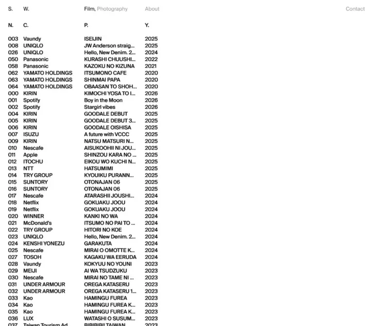
白地に小さな欧文文字を並べ、クライアント・作品名・制作年を一覧化したポートフォリオ。ヘッダーと作品リストの列を揃え、広い余白と緻密な整列で構成。モバイルでは作品番号を省き、3列の一覧を維持しています。
オリジナルサイトを見るSatoshi Watanabe — Style Reference
A film portfolio presented as a compact typographic index on an expansive white canvas.
Website: satoshiwatanabe.org Original URL: https://satoshiwatanabe.org/ Final URL: https://satoshiwatanabe.org/ Theme: white background, black primary text, visually gray secondary navigation; no alternative theme was inspected. Inspected: September 12, 2026, at 07:57:15.556 UTC / 16:57:15.556 JST. Viewports: 1440 × 1000 and 390 × 844 CSS pixels. Scope: the current Film index, its header, visible work rows, responsive presentation, and supplied rendered DOM/computed-style evidence. Three desktop captures and two mobile captures show the same respective index composition. Photography, About, Contact, identity-button behavior, and individual work views were not exercised.
The page gives almost all visual responsibility to alignment. A small split-initial identity sits at the upper left. Film and Photography occupy the same horizontal position as project titles; About aligns with the year column. Below them, tightly spaced rows enumerate clients or artists, project names, and years. The desktop index also includes three-digit work numbers.
At 1440px wide, the visible work information occupies approximately the left two-fifths of the canvas. The remaining white field is a defining part of the composition. There is no visible hero image, large heading, card system, or decorative background. On mobile, the page preserves a tabular index: it removes the number column, shortens Photography to Photo, and keeps client, project, and year side by side.
How to Read This Reference
- Measured means a value appears directly in the supplied computed styles, element rectangles, custom properties, or viewport metadata.
- Observed means a feature is visible in the screenshots or rendered text. Screenshot coordinates and apparent colors are approximate unless corroborated by a measured rectangle.
- Calculated means arithmetic based on supplied measurements. The proposed 24-column desktop and 12-column mobile grids fit the evidence, but their original CSS declarations were not supplied.
- Recommended means an implementation choice for reuse. The breakpoint, overflow implementation, focus treatment, contrast alternative, and comfortable touch density below are recommendations.
- Named tokens are implementation aliases unless explicitly identified as source custom properties.
- The evidence contains selected element styles, not the complete stylesheet, font resources, event handlers, or media assets. Do not extend measured header styles into unverified claims about every work row or interaction.
Tokens — Colors
Default Palette
| Name | Value | Evidence | Role |
|---|---|---|---|
| White Canvas | #ffffff |
Measured body background; source --c-white: #fff |
Entire visible page background |
| Black Ink | #000000 |
Measured text color; source --c-black: #000 |
Identity, active Film link, column labels, and visible work information |
| Muted Navigation | Approximately #999999 |
Visual estimate, not an extracted foreground declaration | Photography / Photo, About, and desktop Contact |
The page uses one continuous white surface. There are no visible alternating row fills, divider colors, shadows, or background panels. Color hierarchy is concentrated in the header: Film appears black while the other navigation labels appear gray.
Computed color versus visible appearance: the sampled Photography and About links and Contact button report black text even though their screenshot appearance is gray. The supplied subset does not establish whether opacity, descendants, or another rendering rule produces that result. Use #999999 only as a visual approximation, not as a recovered source declaration.
Declared but Unobserved Accent
The source exposes --c-orange: #ff6f00. No visible orange area appears in the supplied captures, and no inspected interaction establishes its purpose. Keep this token separate from the visible palette; do not turn it into a primary button fill or assumed work-selection color.
The source also exposes black and white RGB parameter strings and --ui-opacity: 1. These declarations do not establish a separate visible theme or explain the muted navigation by themselves.
Tokens — Typography
Interface Typeface
- Measured computed family:
"Suisse Intl", sans-serifon the body, header, identity, navigation, and sampled main element. - Measured weight:
400throughout those samples, including theh1. - Measured tracking:
normal. - Measured body line-height ratio:
1.35at both inspected widths. - Character: compact, neutral sans-serif typography with almost no scale-based hierarchy.
- Implementation alias:
--font-ui: 'Suisse Intl', sans-serif.
The family declaration is directly supported. A font-file URL, font-face definition, and resolved font-load result were not supplied, so do not claim a particular font file or distribution. Reuse Suisse Intl only when appropriately available; otherwise use a neutral sans-serif fallback and recheck truncation widths.
The root HTML element reports Times at 16px, but the body overrides it. That root sample is not evidence for a visible serif style.
Type Scale
| Role | Desktop | Mobile | Evidence and treatment |
|---|---|---|---|
| Body and sampled main container | 15px / 20.25px |
13px / 17.55px |
Measured; weight 400 |
Identity h1 and button |
15px / 20.25px |
13px / 17.55px |
Measured; no enlarged or bold wordmark |
| Film, Photography / Photo, About | 15px / 20.25px |
13px / 17.55px |
Measured; hierarchy comes from position and visible tone |
| Contact | 15px / 20.25px |
Not visibly rendered | Desktop button measurement |
| Column labels and work text | Visually consistent with 15px | Visually consistent with 13px | Per-cell computed styles were not supplied |
| Work-row pitch | Approximately 20px |
Approximately 18px |
Screenshot estimate; separate from measured body line height |
Avoid creating a conventional heading ladder. The identity, navigation, legend, and archive information share essentially one typographic voice.
Content and Numeric Treatment
The visible identity is S. and W., not the full document title. Desktop work numbers use three digits, starting at 000. Years remain four digits and are left aligned within their column.
Client and artist capitalization varies: FUKOKU LIFE, KIRIN, Spotify, Vaundy, and McDonald’s all occur. Project titles likewise mix uppercase romanized text and sentence case. Preserve those content distinctions rather than applying global uppercase styling.
Long names and titles visibly end in ellipses while the DOM retains their full text. For example, the complete project title KIMOCHI YOSA TO IKITEIKU FUTARI exists in the rendered text even when the screenshot shows an abbreviated line. Preserve full strings in the implementation and truncate visually.
No tabular-numeral font feature was supplied. It may be tested as an optional enhancement, but it is not an observed source setting.
Tokens — Spacing & Shapes
Measured Source Variables
| Source property | Desktop | Mobile | Supported interpretation |
|---|---|---|---|
--margin |
24px |
12px |
Matches header horizontal padding and the outer grid inset |
--gutter |
24px |
12px |
Grid-spacing input; consistent with the reconstructed column geometry |
--column |
35px |
19.5px |
Base column-width value exposed by the source |
--vMargin |
16px |
10px |
Matches the measured header top padding |
--fs |
15px |
13px |
Matches the measured interface font size |
--rect-height |
36px |
34px |
Declaration only; target component is unknown |
--rect-left |
12px |
4px |
Declaration only; target component is unknown |
Do not use --rect-height as the archive row height. It does not match the approximately 20px / 18px row pitch visible in the screenshots.
Layout Measurements
| Element or relationship | Desktop | Mobile | Evidence |
|---|---|---|---|
| Header rectangle | 1440 × 56.25px |
390 × 37.546875px |
Measured |
| Header padding | 16px 24px 20px |
10px 12px |
Measured |
| Identity allocation | x: 24px, width 271px |
x: 12px, width 145.5px |
Measured h1 rectangle |
| Identity button width | 75.703125px |
63.484375px |
Measured |
| Film start | x: 319px |
x: 169.5px |
Measured |
| About start | x: 555px |
x: 327px |
Measured |
| Gap between Film and the photography link | 4px |
4px |
Calculated from adjacent link rectangles |
| Contact right clearance | 24px |
Not visible | Calculated from button bounds |
| Column-label visible text top | Approximately 68px |
Approximately 68px |
Screenshot estimate |
| First work's visible text top | Approximately 108px |
Approximately 104px |
Screenshot estimate |
| Subsequent work-row pitch | Approximately 20px |
Approximately 18px |
Screenshot estimate |
The mobile header becomes shorter, but the column labels remain at approximately the same vertical position. Consequently, the white gap between the navigation and column labels becomes larger on mobile. A uniform scaling-down of desktop spacing would miss this relationship.
Grid Reconstruction
A regular base grid explains the supplied custom properties and alignment points:
Desktop inner width = 1440 - 2 × 24 = 1392px
24 columns × 35px + 23 gutters × 24px = 1392px
Desktop column-start interval = 35 + 24 = 59px

Mobile inner width = 390 - 2 × 12 = 366px
12 columns × 19.5px + 11 gutters × 12px = 366px
Mobile column-start interval = 19.5 + 12 = 31.5px
These are calculated models, not recovered grid declarations. They reproduce the following positions:
| Content | Desktop model | Mobile model |
|---|---|---|
| Number | Column 1, x: 24px |
Hidden |
| Client / artist | Column 2, x: 83px |
Column 1, x: 12px |
| Project | Column 6, x: 319px |
Column 6, x: 169.5px |
| Year | Column 10, x: 555px |
Column 11, x: 327px |
| Film / photography navigation | Column 6 | Column 6 |
| About | Column 10 | Column 11 |
In this model, desktop client and project fields each span four base columns: 212px of content width, followed by a 24px gutter. Their mobile counterparts each span five base columns: 145.5px of content width, followed by a 12px gutter. These calculated widths agree with the visible truncation pattern.
Shapes and Boundaries
Sampled elements report zero border radius. The visible page has no rounded containers, row outlines, background pills, divider rules, or elevated surfaces. Define reusable structure through shared column starts and consistent line rhythm rather than decorative boundaries.
Components
Split-Initial Identity
Role: compact site identity at the first header position.
The DOM contains an h1 with a button displaying S. and W.. Both remain regular weight and body size. On desktop the visible W. aligns approximately with the client column at x: 83px; on mobile it sits around x: 61px, independently of the main client/project grid.
The button occupies only part of the larger identity allocation: approximately 75.7px within 271px on desktop, and 63.5px within 145.5px on mobile. Preserve the deliberate separation between the initials rather than replacing them with a large logo or a tightly set monogram.
Interaction limit: the button's action was not captured. Do not describe it as a home action, menu trigger, or view switch without additional evidence.
Header Navigation
Role: medium selection and access to supporting information.
The Film link points to the inspected root URL and visibly includes a trailing comma: Film,. The adjacent photography link points to /photography/. Its visible label is Photography on desktop and Photo on mobile. The rendered link text contains both alternatives, but the screenshots show only the appropriate label.
Keep these two links together with the measured 4px gap. Their group starts on the project axis. About occupies the year axis and links to /about/. Contact is a separate, unboxed button aligned to the desktop right inset.
Film appears black; the other labels appear muted gray. None has a visible filled button container or persistent underline in the supplied state. Contact is absent from the mobile visible text and captures, although the aggregate header DOM text still contains it.
Interaction limit: the anchor destinations are known, but their resulting pages were not inspected. Contact's action is unknown. There is no supplied evidence of a mobile replacement for Contact.
Column Legend
Role: compact labels for the work index.
Desktop shows N., C., P., and Y.. Mobile shows C., P., and Y.. Their aligned values support interpreting these as number, client or artist, project, and year; those expansions are descriptive interpretations, not additional source UI text.
The labels use the same restrained visual weight as the rows. They sit above a modest blank interval before the first work. There are no visible sorting arrows, filter inputs, or rules around the legend. Sorting functionality was not established.
For reuse, keep the visible abbreviations and provide understandable full labels through semantic table headers or accessible text.
Work Index Row
Role: present a work as a concise record.
Desktop anatomy:
000    FUKOKU LIFE    YASASHII KYORIKAN    2026
N.     C.            P.                  Y.
Mobile anatomy:
FUKOKU LIFE    YASASHII KYORIKAN    2026
C.            P.                  Y.
Each visible row contains one client or artist, one project, and one year. Numbers are an additional desktop field. The source text includes 79 entries, numbered 000 through 078 on desktop, spanning 2026 through 2020 in descending year order. Only the upper portion appears in the captures.
Keep all fields on one line. The client and project fields may truncate, but the year remains fully visible. Projects are not stacked below clients on mobile. There are no visible thumbnails, category badges, duration chips, or separators.
Duration variants such as YASASHII KYORIKAN 30sec and YASASHII KYORIKAN 15sec are distinct rows. Repeated client names and repeated project titles also occur. Do not deduplicate them merely to make the archive look cleaner.
Interaction limit: row-specific elements and handlers were not supplied. Clickability, hover previews, selected rows, and work-opening behavior remain unverified.
Archive Viewport
Role: contain a dense archive below the navigation.
The recorded document height equals the viewport height at both sizes, while the rendered text contains considerably more rows than fit on screen. This is consistent with a viewport-bound layout containing overflow, but it does not identify the actual scrolling element or positioning rules.
The supplied images do not establish a different scroll position, sticky column labels, or the appearance of the oldest entries. The Quick Start uses an internal vertical scroller as a practical recommendation. Treat that as an implementation decision rather than recovered behavior.
The open desktop region to the right remains white in every supplied capture. Whether it hosts content after an interaction is unknown; no permanent preview panel is evidenced.
Tokens — Motion & Interaction
| Area | Supplied evidence | What can be concluded |
|---|---|---|
| Sampled element animation | animation: none |
No CSS animation is reported on those sampled elements in the inspected state |
| Sampled transition field | all |
No positive duration or easing is supplied; this is insufficient to establish animated transitions |
| Initial display | Repeated settled captures show the same composition | The supplied resting state is consistent; entrance choreography is not documented |
| Film, photography, About | Anchor URLs are present | Destinations are known; navigation outcomes were not exercised |
| Identity and Contact | Button elements are present | Actions, overlays, and resulting states are unknown |
| Work rows | Text and visual layout only | Hover, focus, selection, and activation behavior are unverified |
| Scrolling | Long rendered text within viewport-height documents | Overflow is likely involved; the actual scroll target and sticky behavior are unverified |
| Media | No visible image or player in the captures | Playback, poster loading, previews, and autoplay cannot be characterized |
The capture process included a minimum initial observation and readiness checks, but those checks do not prove the absence of delayed content or unexercised motion. No defensible source duration or easing token can be extracted from this evidence.
Recommended adaptation: render the index immediately without staggered text reveals, animated row rearrangement, or decorative parallax. Use immediate focus and hover feedback unless additional interaction evidence justifies motion. The CSS below introduces no animation.
Surfaces
| Layer | Observed appearance | Implementation implication |
|---|---|---|
| Page canvas | Solid white | One continuous background |
| Header | Transparent sampled background over white | No contrasting masthead band or bottom rule |
| Identity and Contact buttons | Transparent, unpadded text controls in sampled styles | Reset native button decoration while retaining semantics |
| Work index | Black text directly on white | No cards, striping, or elevation |
| Secondary navigation | Visually gray text | A tonal hierarchy, not a separate surface |
| Right desktop field | Unoccupied white space | Preserve the visible emptiness in the resting composition |
No modal, menu surface, player chrome, loading skeleton, or footer treatment was visible. Their design cannot be inferred from the archive's restrained appearance.
Imagery
No photograph, film still, thumbnail, illustration, icon asset, or video frame is visible in the supplied index captures. The page concerns film and photography, but its inspected resting composition is entirely typographic.
Do not derive an image style from the listed clients or project names. They provide archive content, not evidence of color grading, aspect ratios, cropping, or media placement. Likewise, the empty desktop area is not sufficient evidence for an unseen hover-video component.
Observed Asset References
No image, video, poster, icon, or font-file URLs were supplied. The /photography/ link establishes a navigation destination only; its imagery was not inspected. Reproducing the visible shell requires no decorative bitmap assets.
Layout & Responsive Behavior
Desktop — 1440 × 1000
The header spans the viewport with 24px side insets. The identity begins at x: 24px, the medium links at x: 319px, About at x: 555px, and Contact ends at x: 1416px.
The archive starts at the same left inset. Its number, client, project, and year axes are approximately 24, 83, 319, and 555px. Visible year text ends around 592px, leaving roughly the right three-fifths of the screenshot unoccupied.
This is a left-oriented composition on a full-width grid. Centering a narrow table within the viewport would materially change it. Expanding all four data columns equally across the full width would also lose the compact grouping.
Mobile — 390 × 844
The side inset becomes 12px, the body size becomes 13px, and the source gutter becomes 12px. The number column disappears. Client, project, and year start at approximately 12, 169.5, and 327px.
The header follows the same revised axes: medium links start at the project column and About starts at the year column. Photography shortens to Photo. Contact is not visible, and no hamburger or replacement menu is shown.
The list remains compact and tabular. Project text truncates more frequently, while years stay on the same row. Column labels remain near the same vertical position as on desktop despite the shorter header.
Responsive Comparison
| Feature | Desktop | Mobile |
|---|---|---|
| Interface size | 15px | 13px |
| Measured body line height | 20.25px | 17.55px |
| Horizontal inset | 24px | 12px |
| Source gutter | 24px | 12px |
| Calculated base-grid model | 24 columns | 12 columns |
| Visible record fields | Number, client, project, year | Client, project, year |
| Photography label | Photography | Photo |
| Contact | Visible at far right | Not visible |
| Row presentation | Single-line fields | Single-line fields with more truncation |
| Approximate row pitch | 20px | 18px |
Limits and Recommended Breakpoint
Only the two listed viewport sizes were inspected. The exact breakpoint, intermediate-width behavior, landscape layout, browser zoom response, and safe-area handling are unknown.
The Quick Start chooses a 64rem breakpoint, conventionally 1024px, to give the longer desktop navigation enough room before changing grid modes. This is a recommendation, not the site's recovered breakpoint. Validate additional widths and actual font metrics before adopting it.
Do’s and Don’ts
Do
- Keep the visible palette white, black, and restrained navigation gray.
- Align medium navigation with project titles and About with years.
- Preserve the large unoccupied desktop field and the compact grouping at the left.
- Use regular-weight interface typography at the measured 15px / 13px sizes for a close visual reference.
- Keep numbers, clients, projects, and years on stable shared axes.
- Preserve mixed capitalization, punctuation, duplicate titles, and duration variants from the work data.
- Truncate client and project text visually while retaining complete strings.
- Hide the number column on mobile while maintaining client, project, and year columns.
- Shorten Photography to Photo in the compact header.
- Distinguish measured body line heights from estimated row spacing.
Don’t
- Don’t turn this index into a hero-led page or a grid of portfolio cards.
- Don’t fill the visible right-hand white area with an invented featured image or biography.
- Don’t enlarge or bold the identity into a display heading.
- Don’t add row dividers, colored year badges, rounded containers, gradients, or shadows.
- Don’t convert mobile records into stacked cards or remove the year field.
- Don’t interpret the declared orange token as a visible action color.
- Don’t mistake
--rect-heightfor the work-row pitch. - Don’t replace full data strings with manually shortened text containing literal ellipses.
- Don’t assume work-row clicks, hover videos, sorting, sticky headers, or button actions.
- Don’t copy an assumed historical interaction or media layout into this current-state reference.
Recommended Implementation Additions
These are recommendations for a new implementation, not verified features of the inspected page:
- Improve muted-text contrast where needed. The approximate
#999999against white has about 2.85:1 contrast. An optional#666666navigation treatment gives about 5.74:1 while retaining the neutral palette. These ratios are calculated from the proposed hex values, not measured from the original rendering. - Provide full accessible labels. Preserve the visible initials and abbreviated column labels, but expose Satoshi Watanabe, client or artist, project, and year meaningfully to assistive technology.
- Use appropriate native semantics. Represent the archive as a semantic table or structured list. Use links for work navigation only when real destination URLs exist, and buttons only for implemented actions.
- Keep full titles available. CSS truncation should not remove the underlying content. If a detail view is implemented, make complete titles accessible through keyboard and touch as well as pointer input.
- Offer comfortable touch density. The observed approximately 18px mobile row pitch is very compact. An optional 44px row mode can improve operation without overlapping invisible hit areas or changing the column structure.
- Make overflow reachable. If using an internal scroller, label it, support keyboard scrolling, and verify that all 79 records can be reached without trapping focus.
- Add visible focus. A thin black outline or clear underline fits the existing palette. Do not rely solely on a subtle gray change.
- Define future media behavior explicitly. If previews or players are later introduced, design keyboard access, dismissal, and reduced-motion behavior from their actual requirements; they are not established by these captures.
Agent Prompt Guide
Quick Color Reference
- Canvas and all visible surfaces:
#ffffff. - Primary text and active Film navigation:
#000000. - Secondary navigation: approximately
#999999, an estimated visual match. - Recommended higher-contrast secondary navigation:
#666666. - No visible action fill, border palette, or decorative accent.
- The source's
#ff6f00declaration has no verified visible role.
Overall Prompt
“Create a film portfolio index inspired by the inspected Satoshi Watanabe page. Use a white full-viewport canvas, small regular-weight sans-serif typography, and black text with muted gray secondary navigation. Use Suisse Intl when appropriately available, with a neutral sans-serif fallback. At 1440px wide, use 24px outer insets and align number, client, project, and year fields near x=24, 83, 319, and 555px. Place split S. and W. initials at the upper left, Film and Photography above the project axis, About above the year axis, and an unboxed Contact control at the far right. Keep the visible right side largely empty. Use a dense single-line archive with three-digit numbers, repeated clients, full years, and ellipsized long text. At 390px, use 12px insets and 13px text, hide numbers and Contact, shorten Photography to Photo, and retain client/project/year starts near 12, 169.5, and 327px. Do not invent media previews or button behaviors.”
Example Component Prompts
- Header: “Build a plain white portfolio header with regular 15px text, 16px top padding, and 24px side padding. Separate S. and W. at the left. Place Film, followed by a gray Photography link with a 4px gap, on the project-column axis. Align About with years and Contact to the right inset. No oversized logo, pills, icons, or bottom border.”
- Archive row: “Create a compact borderless film-record row with a three-digit number, client or artist, project title, and four-digit year. Use black regular sans-serif text and approximately 20px row pitch. Keep client and project on one line with CSS ellipsis, retain their full accessible text, and left-align the year.”
- Mobile index: “At 390px, preserve a three-column text index with 12px outer insets. Allocate approximately 145.5px each to client and project, separated by 12px gutters, with years starting at x=327px. Use 13px text and approximately 18px row pitch. Remove the desktop number field and show Photo instead of Photography.”
- Accessible variant: “Retain the white-and-black typographic index and its shared alignment axes. Darken secondary links to #666666, add a clear keyboard focus outline, preserve complete project strings beneath visual truncation, and offer a comfortable 44px touch-row mode without converting records into cards.”
Quick Start
CSS Custom Properties
This is a reusable approximation of the supplied resting layouts. Measured palette, typography, margins, and header padding are combined with the calculated grid model. The 64rem breakpoint, approximately 64px archive start, 20px / 18px row heights, internal scroller, hover treatment, and accessibility modifiers are implementation recommendations.
Expected structure: .site-header contains .site-identity, .site-categories, .site-about, and .site-contact. The identity contains an .identity-mark control with two spans. The photography link contains .label-long and .label-short alternatives. .archive-scroll contains .index-head and .work-list; each .work-row contains number, client, project, and year fields using the classes below. Use semantic list or table markup and wire controls only to implemented actions.
:root {
  /* Measured palette; muted navigation is a visual estimate. */
  --color-paper: #ffffff;
  --color-ink: #000000;
  --color-muted: #999999;

  /* The family declaration is observed; no font file is bundled. */
  --font-ui: 'Suisse Intl', sans-serif;
  --text-ui: 15px;
  --leading-ui: 1.35;
  --weight-ui: 400;

  /* Measured spacing and calculated desktop grid model. */
  --page-margin: 24px;
  --gutter: 24px;
  --columns: 24;
  --header-top: 16px;
  --header-bottom: 20px;
  --category-gap: 4px;

  /* Screenshot-based reconstruction values. */
  --identity-step: 59px;
  --archive-top: 64px;
  --row-height: 20px;
  --legend-gap: 20px;
}

* {
  box-sizing: border-box;
}

body {
  margin: 0;
  height: 100vh;
  height: 100dvh;
  overflow: hidden;
  color: var(--color-ink);
  background: var(--color-paper);
  font-family: var(--font-ui);
  font-size: var(--text-ui);
  font-weight: var(--weight-ui);
  line-height: var(--leading-ui);
  letter-spacing: normal;
}

.site-header,
.index-head,
.work-row {
  display: grid;
  grid-template-columns: repeat(var(--columns), minmax(0, 1fr));
  column-gap: var(--gutter);
  row-gap: 0;
}

.site-header {
  position: relative;
  z-index: 1;
  align-items: start;
  padding: var(--header-top) var(--page-margin) var(--header-bottom);
  background: var(--color-paper);
}

.site-header a {
  color: inherit;
  text-decoration: none;
}

.site-header button {
  appearance: none;
  margin: 0;
  padding: 0;
  border: 0;
  border-radius: 0;
  color: inherit;
  background: transparent;
  font: inherit;
  cursor: pointer;
}

.site-identity {
  grid-column: 1 / span 5;
  margin: 0;
  font: inherit;
}

.identity-mark {
  display: grid;
  grid-template-columns: var(--identity-step) auto;
  width: max-content;
  text-align: left;
}

.site-categories {
  grid-column: 6 / span 4;
  display: flex;
  align-items: baseline;
  gap: var(--category-gap);
  white-space: nowrap;
}

.site-categories a:not([aria-current=page]),
.site-header .site-about,
.site-header .site-contact {
  color: var(--color-muted);
}

.site-about {
  grid-column: 10 / span 2;
  justify-self: start;
}

.site-contact {
  grid-column: 23 / -1;
  justify-self: end;
}

.label-short {
  display: none;
}

/* Recommended overflow model, not a recovered source rule. */
.archive-scroll {
  position: fixed;
  inset: var(--archive-top) 0 0;
  min-height: 0;
  overflow-x: hidden;
  overflow-y: auto;
  padding-inline: var(--page-margin);
  background: var(--color-paper);
}

.index-head,
.work-row {
  min-height: var(--row-height);
  line-height: var(--row-height);
}

.index-head {
  margin-bottom: var(--legend-gap);
}

.work-list {
  margin: 0;
  padding: 0;
  list-style: none;
}

.work-row {
  margin: 0;
  padding: 0;
  border: 0;
  border-radius: 0;
  background: transparent;
}

.work-number {
  grid-column: 1;
  white-space: nowrap;
}

.work-client {
  grid-column: 2 / span 4;
}

.work-project {
  grid-column: 6 / span 4;
}

.work-client,
.work-project {
  min-width: 0;
  overflow: hidden;
  white-space: nowrap;
  text-overflow: ellipsis;
}

.work-year {
  grid-column: 10 / span 2;
  white-space: nowrap;
  text-align: left;
}

/* Recommended feedback; original hover and focus were not captured. */
.site-header a:hover {
  text-decoration: underline;
  text-underline-offset: 2px;
}

:focus-visible {
  outline: 2px solid var(--color-ink);
  outline-offset: 3px;
}

.archive-scroll:focus-visible {
  outline-offset: -3px;
}

.sr-only {
  position: absolute;
  width: 1px;
  height: 1px;
  margin: -1px;
  padding: 0;
  overflow: hidden;
  clip-path: inset(50%);
  white-space: nowrap;
  border: 0;
}

/* Recommended breakpoint; only the endpoint layouts were inspected. */
@media (max-width: 64rem) {
  :root {
    --text-ui: 13px;
    --page-margin: 12px;
    --gutter: 12px;
    --columns: 12;
    --header-top: 10px;
    --header-bottom: 10px;
    --identity-step: 49px;
    --row-height: 18px;
    --legend-gap: 18px;
  }

  .site-categories {
    grid-column: 6 / span 5;
  }

  .site-about {
    grid-column: 11 / -1;
  }

  .site-contact,
  .work-number,
  .label-long {
    display: none;
  }

  .label-short {
    display: inline;
  }

  .work-client {
    grid-column: 1 / span 5;
  }

  .work-project {
    grid-column: 6 / span 5;
  }

  .work-year {
    grid-column: 11 / -1;
  }
}

/* Optional accessibility variants; these change the reference appearance. */
.accessible-contrast {
  --color-muted: #666666;
}

.archive-scroll.is-comfortable {
  --row-height: 44px;
}
The index and header must share the same available width and grid variables. Do not give individual rows independent percentage columns. Preserve full client/project strings in their elements; min-width: 0, white-space: nowrap, and text-overflow: ellipsis handle visual shortening.
The code deliberately leaves native scrolling available and does not define media previews or button outcomes. If the scroller is focusable, give it an accessible name. If list styling is removed, verify that list semantics remain exposed in the target browser and assistive-technology combination.
Tailwind v4 Token Mapping
Optional aliases for a project already using Tailwind v4. This is not evidence that the original site uses Tailwind. Define the custom properties above first; retain the shared grid rules for precise alignment.
@theme inline {
  --color-canvas: var(--color-paper);
  --color-primary-text: var(--color-ink);
  --color-muted-nav: var(--color-muted);

  --font-interface: var(--font-ui);
  --text-interface: var(--text-ui);
  --text-interface--line-height: var(--leading-ui);

  --spacing-page: var(--page-margin);
  --spacing-column-gap: var(--gutter);
  --spacing-work-row: var(--row-height);
}
Sources & Evidence
- Inspected original and final page: https://satoshiwatanabe.org/. The supplied retrieval reports HTTP 200 and an unchanged final URL. The document title is
Satoshi Watanabe. - Capture timestamp: September 12, 2026,
07:57:15.556 UTC, equivalent to16:57:15.556 JST. - Desktop evidence: three supplied 1440 × 1000 captures and the corresponding rendered text, link destinations, selected element rectangles, computed styles, and custom properties.
- Mobile evidence: two supplied 390 × 844 captures and equivalent rendered DOM evidence. Both inspected document heights equal their viewport heights.
- Navigation evidence only: Photography and About appear as anchor destinations on the inspected page. Their destination contents were not inspected.
- Style evidence: the supplied samples establish the body background, declared Suisse Intl stack, regular weight, interface sizes, body line heights, header padding, navigation rectangles, and exposed spacing/color variables. They do not include a complete stylesheet or work-row-specific computed styles.
- Inspection limitations: readiness checks and repeated captures do not establish semantic completeness, successful archive scrolling, delayed media, hover states, button outcomes, or motion outside the sampled elements. No independent browsing, resource retrieval, or interaction testing was performed for this reference.
This document describes the supplied current Film index. The reconstructed grid, chosen breakpoint, CSS overflow model, estimated navigation gray, and accessibility variants are explicitly separated from measured original-page values.
# Satoshi Watanabe — Style Reference

> A film portfolio presented as a compact typographic index on an expansive white canvas.

**Website:** [satoshiwatanabe.org](https://satoshiwatanabe.org/)
**Original URL:** https://satoshiwatanabe.org/
**Final URL:** https://satoshiwatanabe.org/
**Theme:** white background, black primary text, visually gray secondary navigation; no alternative theme was inspected.
**Inspected:** September 12, 2026, at 07:57:15.556 UTC / 16:57:15.556 JST.
**Viewports:** 1440 × 1000 and 390 × 844 CSS pixels.
**Scope:** the current Film index, its header, visible work rows, responsive presentation, and supplied rendered DOM/computed-style evidence. Three desktop captures and two mobile captures show the same respective index composition. Photography, About, Contact, identity-button behavior, and individual work views were not exercised.

The page gives almost all visual responsibility to alignment. A small split-initial identity sits at the upper left. Film and Photography occupy the same horizontal position as project titles; About aligns with the year column. Below them, tightly spaced rows enumerate clients or artists, project names, and years. The desktop index also includes three-digit work numbers.

At 1440px wide, the visible work information occupies approximately the left two-fifths of the canvas. The remaining white field is a defining part of the composition. There is no visible hero image, large heading, card system, or decorative background. On mobile, the page preserves a tabular index: it removes the number column, shortens Photography to Photo, and keeps client, project, and year side by side.

## How to Read This Reference

- **Measured** means a value appears directly in the supplied computed styles, element rectangles, custom properties, or viewport metadata.
- **Observed** means a feature is visible in the screenshots or rendered text. Screenshot coordinates and apparent colors are approximate unless corroborated by a measured rectangle.
- **Calculated** means arithmetic based on supplied measurements. The proposed 24-column desktop and 12-column mobile grids fit the evidence, but their original CSS declarations were not supplied.
- **Recommended** means an implementation choice for reuse. The breakpoint, overflow implementation, focus treatment, contrast alternative, and comfortable touch density below are recommendations.
- **Named tokens** are implementation aliases unless explicitly identified as source custom properties.
- The evidence contains selected element styles, not the complete stylesheet, font resources, event handlers, or media assets. Do not extend measured header styles into unverified claims about every work row or interaction.

## Tokens — Colors

### Default Palette

| Name | Value | Evidence | Role |
| --- | --- | --- | --- |
| White Canvas | `#ffffff` | Measured body background; source `--c-white: #fff` | Entire visible page background |
| Black Ink | `#000000` | Measured text color; source `--c-black: #000` | Identity, active Film link, column labels, and visible work information |
| Muted Navigation | Approximately `#999999` | Visual estimate, not an extracted foreground declaration | Photography / Photo, About, and desktop Contact |

The page uses one continuous white surface. There are no visible alternating row fills, divider colors, shadows, or background panels. Color hierarchy is concentrated in the header: Film appears black while the other navigation labels appear gray.

**Computed color versus visible appearance:** the sampled Photography and About links and Contact button report black text even though their screenshot appearance is gray. The supplied subset does not establish whether opacity, descendants, or another rendering rule produces that result. Use `#999999` only as a visual approximation, not as a recovered source declaration.

### Declared but Unobserved Accent

The source exposes `--c-orange: #ff6f00`. No visible orange area appears in the supplied captures, and no inspected interaction establishes its purpose. Keep this token separate from the visible palette; do not turn it into a primary button fill or assumed work-selection color.

The source also exposes black and white RGB parameter strings and `--ui-opacity: 1`. These declarations do not establish a separate visible theme or explain the muted navigation by themselves.

## Tokens — Typography

### Interface Typeface

- **Measured computed family:** `"Suisse Intl", sans-serif` on the body, header, identity, navigation, and sampled main element.
- **Measured weight:** `400` throughout those samples, including the `h1`.
- **Measured tracking:** `normal`.
- **Measured body line-height ratio:** `1.35` at both inspected widths.
- **Character:** compact, neutral sans-serif typography with almost no scale-based hierarchy.
- **Implementation alias:** `--font-ui: 'Suisse Intl', sans-serif`.

The family declaration is directly supported. A font-file URL, font-face definition, and resolved font-load result were not supplied, so do not claim a particular font file or distribution. Reuse Suisse Intl only when appropriately available; otherwise use a neutral sans-serif fallback and recheck truncation widths.

The root HTML element reports Times at 16px, but the body overrides it. That root sample is not evidence for a visible serif style.

### Type Scale

| Role | Desktop | Mobile | Evidence and treatment |
| --- | --- | --- | --- |
| Body and sampled main container | `15px / 20.25px` | `13px / 17.55px` | Measured; weight 400 |
| Identity `h1` and button | `15px / 20.25px` | `13px / 17.55px` | Measured; no enlarged or bold wordmark |
| Film, Photography / Photo, About | `15px / 20.25px` | `13px / 17.55px` | Measured; hierarchy comes from position and visible tone |
| Contact | `15px / 20.25px` | Not visibly rendered | Desktop button measurement |
| Column labels and work text | Visually consistent with 15px | Visually consistent with 13px | Per-cell computed styles were not supplied |
| Work-row pitch | Approximately `20px` | Approximately `18px` | Screenshot estimate; separate from measured body line height |

Avoid creating a conventional heading ladder. The identity, navigation, legend, and archive information share essentially one typographic voice.

### Content and Numeric Treatment

The visible identity is `S.` and `W.`, not the full document title. Desktop work numbers use three digits, starting at `000`. Years remain four digits and are left aligned within their column.

Client and artist capitalization varies: `FUKOKU LIFE`, `KIRIN`, `Spotify`, `Vaundy`, and `McDonald’s` all occur. Project titles likewise mix uppercase romanized text and sentence case. Preserve those content distinctions rather than applying global uppercase styling.

Long names and titles visibly end in ellipses while the DOM retains their full text. For example, the complete project title `KIMOCHI YOSA TO IKITEIKU FUTARI` exists in the rendered text even when the screenshot shows an abbreviated line. Preserve full strings in the implementation and truncate visually.

No tabular-numeral font feature was supplied. It may be tested as an optional enhancement, but it is not an observed source setting.

## Tokens — Spacing & Shapes

### Measured Source Variables

| Source property | Desktop | Mobile | Supported interpretation |
| --- | --- | --- | --- |
| `--margin` | `24px` | `12px` | Matches header horizontal padding and the outer grid inset |
| `--gutter` | `24px` | `12px` | Grid-spacing input; consistent with the reconstructed column geometry |
| `--column` | `35px` | `19.5px` | Base column-width value exposed by the source |
| `--vMargin` | `16px` | `10px` | Matches the measured header top padding |
| `--fs` | `15px` | `13px` | Matches the measured interface font size |
| `--rect-height` | `36px` | `34px` | Declaration only; target component is unknown |
| `--rect-left` | `12px` | `4px` | Declaration only; target component is unknown |

Do not use `--rect-height` as the archive row height. It does not match the approximately 20px / 18px row pitch visible in the screenshots.

### Layout Measurements

| Element or relationship | Desktop | Mobile | Evidence |
| --- | --- | --- | --- |
| Header rectangle | `1440 × 56.25px` | `390 × 37.546875px` | Measured |
| Header padding | `16px 24px 20px` | `10px 12px` | Measured |
| Identity allocation | `x: 24px`, width `271px` | `x: 12px`, width `145.5px` | Measured `h1` rectangle |
| Identity button width | `75.703125px` | `63.484375px` | Measured |
| Film start | `x: 319px` | `x: 169.5px` | Measured |
| About start | `x: 555px` | `x: 327px` | Measured |
| Gap between Film and the photography link | `4px` | `4px` | Calculated from adjacent link rectangles |
| Contact right clearance | `24px` | Not visible | Calculated from button bounds |
| Column-label visible text top | Approximately `68px` | Approximately `68px` | Screenshot estimate |
| First work's visible text top | Approximately `108px` | Approximately `104px` | Screenshot estimate |
| Subsequent work-row pitch | Approximately `20px` | Approximately `18px` | Screenshot estimate |

The mobile header becomes shorter, but the column labels remain at approximately the same vertical position. Consequently, the white gap between the navigation and column labels becomes larger on mobile. A uniform scaling-down of desktop spacing would miss this relationship.

### Grid Reconstruction

A regular base grid explains the supplied custom properties and alignment points:

```text
Desktop inner width = 1440 - 2 × 24 = 1392px
24 columns × 35px + 23 gutters × 24px = 1392px
Desktop column-start interval = 35 + 24 = 59px

Mobile inner width = 390 - 2 × 12 = 366px
12 columns × 19.5px + 11 gutters × 12px = 366px
Mobile column-start interval = 19.5 + 12 = 31.5px
```

These are calculated models, not recovered grid declarations. They reproduce the following positions:

| Content | Desktop model | Mobile model |
| --- | --- | --- |
| Number | Column 1, `x: 24px` | Hidden |
| Client / artist | Column 2, `x: 83px` | Column 1, `x: 12px` |
| Project | Column 6, `x: 319px` | Column 6, `x: 169.5px` |
| Year | Column 10, `x: 555px` | Column 11, `x: 327px` |
| Film / photography navigation | Column 6 | Column 6 |
| About | Column 10 | Column 11 |

In this model, desktop client and project fields each span four base columns: `212px` of content width, followed by a `24px` gutter. Their mobile counterparts each span five base columns: `145.5px` of content width, followed by a `12px` gutter. These calculated widths agree with the visible truncation pattern.

### Shapes and Boundaries

Sampled elements report zero border radius. The visible page has no rounded containers, row outlines, background pills, divider rules, or elevated surfaces. Define reusable structure through shared column starts and consistent line rhythm rather than decorative boundaries.

## Components

### Split-Initial Identity

**Role:** compact site identity at the first header position.

The DOM contains an `h1` with a button displaying `S.` and `W.`. Both remain regular weight and body size. On desktop the visible `W.` aligns approximately with the client column at `x: 83px`; on mobile it sits around `x: 61px`, independently of the main client/project grid.

The button occupies only part of the larger identity allocation: approximately 75.7px within 271px on desktop, and 63.5px within 145.5px on mobile. Preserve the deliberate separation between the initials rather than replacing them with a large logo or a tightly set monogram.

**Interaction limit:** the button's action was not captured. Do not describe it as a home action, menu trigger, or view switch without additional evidence.

### Header Navigation

**Role:** medium selection and access to supporting information.

The Film link points to the inspected root URL and visibly includes a trailing comma: `Film,`. The adjacent photography link points to `/photography/`. Its visible label is `Photography` on desktop and `Photo` on mobile. The rendered link text contains both alternatives, but the screenshots show only the appropriate label.

Keep these two links together with the measured 4px gap. Their group starts on the project axis. About occupies the year axis and links to `/about/`. Contact is a separate, unboxed button aligned to the desktop right inset.

Film appears black; the other labels appear muted gray. None has a visible filled button container or persistent underline in the supplied state. Contact is absent from the mobile visible text and captures, although the aggregate header DOM text still contains it.

**Interaction limit:** the anchor destinations are known, but their resulting pages were not inspected. Contact's action is unknown. There is no supplied evidence of a mobile replacement for Contact.

### Column Legend

**Role:** compact labels for the work index.

Desktop shows `N.`, `C.`, `P.`, and `Y.`. Mobile shows `C.`, `P.`, and `Y.`. Their aligned values support interpreting these as number, client or artist, project, and year; those expansions are descriptive interpretations, not additional source UI text.

The labels use the same restrained visual weight as the rows. They sit above a modest blank interval before the first work. There are no visible sorting arrows, filter inputs, or rules around the legend. Sorting functionality was not established.

For reuse, keep the visible abbreviations and provide understandable full labels through semantic table headers or accessible text.

### Work Index Row

**Role:** present a work as a concise record.

Desktop anatomy:

```text
000    FUKOKU LIFE    YASASHII KYORIKAN    2026
N.     C.            P.                  Y.
```

Mobile anatomy:

```text
FUKOKU LIFE    YASASHII KYORIKAN    2026
C.            P.                  Y.
```

Each visible row contains one client or artist, one project, and one year. Numbers are an additional desktop field. The source text includes 79 entries, numbered `000` through `078` on desktop, spanning 2026 through 2020 in descending year order. Only the upper portion appears in the captures.

Keep all fields on one line. The client and project fields may truncate, but the year remains fully visible. Projects are not stacked below clients on mobile. There are no visible thumbnails, category badges, duration chips, or separators.

Duration variants such as `YASASHII KYORIKAN 30sec` and `YASASHII KYORIKAN 15sec` are distinct rows. Repeated client names and repeated project titles also occur. Do not deduplicate them merely to make the archive look cleaner.

**Interaction limit:** row-specific elements and handlers were not supplied. Clickability, hover previews, selected rows, and work-opening behavior remain unverified.

### Archive Viewport

**Role:** contain a dense archive below the navigation.

The recorded document height equals the viewport height at both sizes, while the rendered text contains considerably more rows than fit on screen. This is consistent with a viewport-bound layout containing overflow, but it does not identify the actual scrolling element or positioning rules.

The supplied images do not establish a different scroll position, sticky column labels, or the appearance of the oldest entries. The Quick Start uses an internal vertical scroller as a practical recommendation. Treat that as an implementation decision rather than recovered behavior.

The open desktop region to the right remains white in every supplied capture. Whether it hosts content after an interaction is unknown; no permanent preview panel is evidenced.

## Tokens — Motion & Interaction

| Area | Supplied evidence | What can be concluded |
| --- | --- | --- |
| Sampled element animation | `animation: none` | No CSS animation is reported on those sampled elements in the inspected state |
| Sampled transition field | `all` | No positive duration or easing is supplied; this is insufficient to establish animated transitions |
| Initial display | Repeated settled captures show the same composition | The supplied resting state is consistent; entrance choreography is not documented |
| Film, photography, About | Anchor URLs are present | Destinations are known; navigation outcomes were not exercised |
| Identity and Contact | Button elements are present | Actions, overlays, and resulting states are unknown |
| Work rows | Text and visual layout only | Hover, focus, selection, and activation behavior are unverified |
| Scrolling | Long rendered text within viewport-height documents | Overflow is likely involved; the actual scroll target and sticky behavior are unverified |
| Media | No visible image or player in the captures | Playback, poster loading, previews, and autoplay cannot be characterized |

The capture process included a minimum initial observation and readiness checks, but those checks do not prove the absence of delayed content or unexercised motion. No defensible source duration or easing token can be extracted from this evidence.

**Recommended adaptation:** render the index immediately without staggered text reveals, animated row rearrangement, or decorative parallax. Use immediate focus and hover feedback unless additional interaction evidence justifies motion. The CSS below introduces no animation.

## Surfaces

| Layer | Observed appearance | Implementation implication |
| --- | --- | --- |
| Page canvas | Solid white | One continuous background |
| Header | Transparent sampled background over white | No contrasting masthead band or bottom rule |
| Identity and Contact buttons | Transparent, unpadded text controls in sampled styles | Reset native button decoration while retaining semantics |
| Work index | Black text directly on white | No cards, striping, or elevation |
| Secondary navigation | Visually gray text | A tonal hierarchy, not a separate surface |
| Right desktop field | Unoccupied white space | Preserve the visible emptiness in the resting composition |

No modal, menu surface, player chrome, loading skeleton, or footer treatment was visible. Their design cannot be inferred from the archive's restrained appearance.

## Imagery

No photograph, film still, thumbnail, illustration, icon asset, or video frame is visible in the supplied index captures. The page concerns film and photography, but its inspected resting composition is entirely typographic.

Do not derive an image style from the listed clients or project names. They provide archive content, not evidence of color grading, aspect ratios, cropping, or media placement. Likewise, the empty desktop area is not sufficient evidence for an unseen hover-video component.

### Observed Asset References

No image, video, poster, icon, or font-file URLs were supplied. The `/photography/` link establishes a navigation destination only; its imagery was not inspected. Reproducing the visible shell requires no decorative bitmap assets.

## Layout & Responsive Behavior

### Desktop — 1440 × 1000

The header spans the viewport with 24px side insets. The identity begins at `x: 24px`, the medium links at `x: 319px`, About at `x: 555px`, and Contact ends at `x: 1416px`.

The archive starts at the same left inset. Its number, client, project, and year axes are approximately `24`, `83`, `319`, and `555px`. Visible year text ends around `592px`, leaving roughly the right three-fifths of the screenshot unoccupied.

This is a left-oriented composition on a full-width grid. Centering a narrow table within the viewport would materially change it. Expanding all four data columns equally across the full width would also lose the compact grouping.

### Mobile — 390 × 844

The side inset becomes 12px, the body size becomes 13px, and the source gutter becomes 12px. The number column disappears. Client, project, and year start at approximately `12`, `169.5`, and `327px`.

The header follows the same revised axes: medium links start at the project column and About starts at the year column. Photography shortens to Photo. Contact is not visible, and no hamburger or replacement menu is shown.

The list remains compact and tabular. Project text truncates more frequently, while years stay on the same row. Column labels remain near the same vertical position as on desktop despite the shorter header.

### Responsive Comparison

| Feature | Desktop | Mobile |
| --- | --- | --- |
| Interface size | 15px | 13px |
| Measured body line height | 20.25px | 17.55px |
| Horizontal inset | 24px | 12px |
| Source gutter | 24px | 12px |
| Calculated base-grid model | 24 columns | 12 columns |
| Visible record fields | Number, client, project, year | Client, project, year |
| Photography label | Photography | Photo |
| Contact | Visible at far right | Not visible |
| Row presentation | Single-line fields | Single-line fields with more truncation |
| Approximate row pitch | 20px | 18px |

### Limits and Recommended Breakpoint

Only the two listed viewport sizes were inspected. The exact breakpoint, intermediate-width behavior, landscape layout, browser zoom response, and safe-area handling are unknown.

The Quick Start chooses a `64rem` breakpoint, conventionally 1024px, to give the longer desktop navigation enough room before changing grid modes. This is a recommendation, not the site's recovered breakpoint. Validate additional widths and actual font metrics before adopting it.

## Do’s and Don’ts

### Do

- Keep the visible palette white, black, and restrained navigation gray.
- Align medium navigation with project titles and About with years.
- Preserve the large unoccupied desktop field and the compact grouping at the left.
- Use regular-weight interface typography at the measured 15px / 13px sizes for a close visual reference.
- Keep numbers, clients, projects, and years on stable shared axes.
- Preserve mixed capitalization, punctuation, duplicate titles, and duration variants from the work data.
- Truncate client and project text visually while retaining complete strings.
- Hide the number column on mobile while maintaining client, project, and year columns.
- Shorten Photography to Photo in the compact header.
- Distinguish measured body line heights from estimated row spacing.

### Don’t

- Don’t turn this index into a hero-led page or a grid of portfolio cards.
- Don’t fill the visible right-hand white area with an invented featured image or biography.
- Don’t enlarge or bold the identity into a display heading.
- Don’t add row dividers, colored year badges, rounded containers, gradients, or shadows.
- Don’t convert mobile records into stacked cards or remove the year field.
- Don’t interpret the declared orange token as a visible action color.
- Don’t mistake `--rect-height` for the work-row pitch.
- Don’t replace full data strings with manually shortened text containing literal ellipses.
- Don’t assume work-row clicks, hover videos, sorting, sticky headers, or button actions.
- Don’t copy an assumed historical interaction or media layout into this current-state reference.

## Recommended Implementation Additions

These are recommendations for a new implementation, not verified features of the inspected page:

- **Improve muted-text contrast where needed.** The approximate `#999999` against white has about 2.85:1 contrast. An optional `#666666` navigation treatment gives about 5.74:1 while retaining the neutral palette. These ratios are calculated from the proposed hex values, not measured from the original rendering.
- **Provide full accessible labels.** Preserve the visible initials and abbreviated column labels, but expose Satoshi Watanabe, client or artist, project, and year meaningfully to assistive technology.
- **Use appropriate native semantics.** Represent the archive as a semantic table or structured list. Use links for work navigation only when real destination URLs exist, and buttons only for implemented actions.
- **Keep full titles available.** CSS truncation should not remove the underlying content. If a detail view is implemented, make complete titles accessible through keyboard and touch as well as pointer input.
- **Offer comfortable touch density.** The observed approximately 18px mobile row pitch is very compact. An optional 44px row mode can improve operation without overlapping invisible hit areas or changing the column structure.
- **Make overflow reachable.** If using an internal scroller, label it, support keyboard scrolling, and verify that all 79 records can be reached without trapping focus.
- **Add visible focus.** A thin black outline or clear underline fits the existing palette. Do not rely solely on a subtle gray change.
- **Define future media behavior explicitly.** If previews or players are later introduced, design keyboard access, dismissal, and reduced-motion behavior from their actual requirements; they are not established by these captures.

## Agent Prompt Guide

### Quick Color Reference

- Canvas and all visible surfaces: `#ffffff`.
- Primary text and active Film navigation: `#000000`.
- Secondary navigation: approximately `#999999`, an estimated visual match.
- Recommended higher-contrast secondary navigation: `#666666`.
- No visible action fill, border palette, or decorative accent.
- The source's `#ff6f00` declaration has no verified visible role.

### Overall Prompt

“Create a film portfolio index inspired by the inspected Satoshi Watanabe page. Use a white full-viewport canvas, small regular-weight sans-serif typography, and black text with muted gray secondary navigation. Use Suisse Intl when appropriately available, with a neutral sans-serif fallback. At 1440px wide, use 24px outer insets and align number, client, project, and year fields near x=24, 83, 319, and 555px. Place split S. and W. initials at the upper left, Film and Photography above the project axis, About above the year axis, and an unboxed Contact control at the far right. Keep the visible right side largely empty. Use a dense single-line archive with three-digit numbers, repeated clients, full years, and ellipsized long text. At 390px, use 12px insets and 13px text, hide numbers and Contact, shorten Photography to Photo, and retain client/project/year starts near 12, 169.5, and 327px. Do not invent media previews or button behaviors.”

### Example Component Prompts

1. **Header:** “Build a plain white portfolio header with regular 15px text, 16px top padding, and 24px side padding. Separate S. and W. at the left. Place Film, followed by a gray Photography link with a 4px gap, on the project-column axis. Align About with years and Contact to the right inset. No oversized logo, pills, icons, or bottom border.”
2. **Archive row:** “Create a compact borderless film-record row with a three-digit number, client or artist, project title, and four-digit year. Use black regular sans-serif text and approximately 20px row pitch. Keep client and project on one line with CSS ellipsis, retain their full accessible text, and left-align the year.”
3. **Mobile index:** “At 390px, preserve a three-column text index with 12px outer insets. Allocate approximately 145.5px each to client and project, separated by 12px gutters, with years starting at x=327px. Use 13px text and approximately 18px row pitch. Remove the desktop number field and show Photo instead of Photography.”
4. **Accessible variant:** “Retain the white-and-black typographic index and its shared alignment axes. Darken secondary links to #666666, add a clear keyboard focus outline, preserve complete project strings beneath visual truncation, and offer a comfortable 44px touch-row mode without converting records into cards.”

## Quick Start

### CSS Custom Properties

This is a reusable approximation of the supplied resting layouts. Measured palette, typography, margins, and header padding are combined with the calculated grid model. The 64rem breakpoint, approximately 64px archive start, 20px / 18px row heights, internal scroller, hover treatment, and accessibility modifiers are implementation recommendations.

Expected structure: `.site-header` contains `.site-identity`, `.site-categories`, `.site-about`, and `.site-contact`. The identity contains an `.identity-mark` control with two spans. The photography link contains `.label-long` and `.label-short` alternatives. `.archive-scroll` contains `.index-head` and `.work-list`; each `.work-row` contains number, client, project, and year fields using the classes below. Use semantic list or table markup and wire controls only to implemented actions.

```css
:root {
  /* Measured palette; muted navigation is a visual estimate. */
  --color-paper: #ffffff;
  --color-ink: #000000;
  --color-muted: #999999;

  /* The family declaration is observed; no font file is bundled. */
  --font-ui: 'Suisse Intl', sans-serif;
  --text-ui: 15px;
  --leading-ui: 1.35;
  --weight-ui: 400;

  /* Measured spacing and calculated desktop grid model. */
  --page-margin: 24px;
  --gutter: 24px;
  --columns: 24;
  --header-top: 16px;
  --header-bottom: 20px;
  --category-gap: 4px;

  /* Screenshot-based reconstruction values. */
  --identity-step: 59px;
  --archive-top: 64px;
  --row-height: 20px;
  --legend-gap: 20px;
}

* {
  box-sizing: border-box;
}

body {
  margin: 0;
  height: 100vh;
  height: 100dvh;
  overflow: hidden;
  color: var(--color-ink);
  background: var(--color-paper);
  font-family: var(--font-ui);
  font-size: var(--text-ui);
  font-weight: var(--weight-ui);
  line-height: var(--leading-ui);
  letter-spacing: normal;
}

.site-header,
.index-head,
.work-row {
  display: grid;
  grid-template-columns: repeat(var(--columns), minmax(0, 1fr));
  column-gap: var(--gutter);
  row-gap: 0;
}

.site-header {
  position: relative;
  z-index: 1;
  align-items: start;
  padding: var(--header-top) var(--page-margin) var(--header-bottom);
  background: var(--color-paper);
}

.site-header a {
  color: inherit;
  text-decoration: none;
}

.site-header button {
  appearance: none;
  margin: 0;
  padding: 0;
  border: 0;
  border-radius: 0;
  color: inherit;
  background: transparent;
  font: inherit;
  cursor: pointer;
}

.site-identity {
  grid-column: 1 / span 5;
  margin: 0;
  font: inherit;
}

.identity-mark {
  display: grid;
  grid-template-columns: var(--identity-step) auto;
  width: max-content;
  text-align: left;
}

.site-categories {
  grid-column: 6 / span 4;
  display: flex;
  align-items: baseline;
  gap: var(--category-gap);
  white-space: nowrap;
}

.site-categories a:not([aria-current=page]),
.site-header .site-about,
.site-header .site-contact {
  color: var(--color-muted);
}

.site-about {
  grid-column: 10 / span 2;
  justify-self: start;
}

.site-contact {
  grid-column: 23 / -1;
  justify-self: end;
}

.label-short {
  display: none;
}

/* Recommended overflow model, not a recovered source rule. */
.archive-scroll {
  position: fixed;
  inset: var(--archive-top) 0 0;
  min-height: 0;
  overflow-x: hidden;
  overflow-y: auto;
  padding-inline: var(--page-margin);
  background: var(--color-paper);
}

.index-head,
.work-row {
  min-height: var(--row-height);
  line-height: var(--row-height);
}

.index-head {
  margin-bottom: var(--legend-gap);
}

.work-list {
  margin: 0;
  padding: 0;
  list-style: none;
}

.work-row {
  margin: 0;
  padding: 0;
  border: 0;
  border-radius: 0;
  background: transparent;
}

.work-number {
  grid-column: 1;
  white-space: nowrap;
}

.work-client {
  grid-column: 2 / span 4;
}

.work-project {
  grid-column: 6 / span 4;
}

.work-client,
.work-project {
  min-width: 0;
  overflow: hidden;
  white-space: nowrap;
  text-overflow: ellipsis;
}

.work-year {
  grid-column: 10 / span 2;
  white-space: nowrap;
  text-align: left;
}

/* Recommended feedback; original hover and focus were not captured. */
.site-header a:hover {
  text-decoration: underline;
  text-underline-offset: 2px;
}

:focus-visible {
  outline: 2px solid var(--color-ink);
  outline-offset: 3px;
}

.archive-scroll:focus-visible {
  outline-offset: -3px;
}

.sr-only {
  position: absolute;
  width: 1px;
  height: 1px;
  margin: -1px;
  padding: 0;
  overflow: hidden;
  clip-path: inset(50%);
  white-space: nowrap;
  border: 0;
}

/* Recommended breakpoint; only the endpoint layouts were inspected. */
@media (max-width: 64rem) {
  :root {
    --text-ui: 13px;
    --page-margin: 12px;
    --gutter: 12px;
    --columns: 12;
    --header-top: 10px;
    --header-bottom: 10px;
    --identity-step: 49px;
    --row-height: 18px;
    --legend-gap: 18px;
  }

  .site-categories {
    grid-column: 6 / span 5;
  }

  .site-about {
    grid-column: 11 / -1;
  }

  .site-contact,
  .work-number,
  .label-long {
    display: none;
  }

  .label-short {
    display: inline;
  }

  .work-client {
    grid-column: 1 / span 5;
  }

  .work-project {
    grid-column: 6 / span 5;
  }

  .work-year {
    grid-column: 11 / -1;
  }
}

/* Optional accessibility variants; these change the reference appearance. */
.accessible-contrast {
  --color-muted: #666666;
}

.archive-scroll.is-comfortable {
  --row-height: 44px;
}
```

The index and header must share the same available width and grid variables. Do not give individual rows independent percentage columns. Preserve full client/project strings in their elements; `min-width: 0`, `white-space: nowrap`, and `text-overflow: ellipsis` handle visual shortening.

The code deliberately leaves native scrolling available and does not define media previews or button outcomes. If the scroller is focusable, give it an accessible name. If list styling is removed, verify that list semantics remain exposed in the target browser and assistive-technology combination.

### Tailwind v4 Token Mapping

Optional aliases for a project already using Tailwind v4. This is not evidence that the original site uses Tailwind. Define the custom properties above first; retain the shared grid rules for precise alignment.

```css
@theme inline {
  --color-canvas: var(--color-paper);
  --color-primary-text: var(--color-ink);
  --color-muted-nav: var(--color-muted);

  --font-interface: var(--font-ui);
  --text-interface: var(--text-ui);
  --text-interface--line-height: var(--leading-ui);

  --spacing-page: var(--page-margin);
  --spacing-column-gap: var(--gutter);
  --spacing-work-row: var(--row-height);
}
```

## Sources & Evidence

- **Inspected original and final page:** [https://satoshiwatanabe.org/](https://satoshiwatanabe.org/). The supplied retrieval reports HTTP 200 and an unchanged final URL. The document title is `Satoshi Watanabe`.
- **Capture timestamp:** September 12, 2026, `07:57:15.556 UTC`, equivalent to `16:57:15.556 JST`.
- **Desktop evidence:** three supplied 1440 × 1000 captures and the corresponding rendered text, link destinations, selected element rectangles, computed styles, and custom properties.
- **Mobile evidence:** two supplied 390 × 844 captures and equivalent rendered DOM evidence. Both inspected document heights equal their viewport heights.
- **Navigation evidence only:** [Photography](https://satoshiwatanabe.org/photography/) and [About](https://satoshiwatanabe.org/about/) appear as anchor destinations on the inspected page. Their destination contents were not inspected.
- **Style evidence:** the supplied samples establish the body background, declared Suisse Intl stack, regular weight, interface sizes, body line heights, header padding, navigation rectangles, and exposed spacing/color variables. They do not include a complete stylesheet or work-row-specific computed styles.
- **Inspection limitations:** readiness checks and repeated captures do not establish semantic completeness, successful archive scrolling, delayed media, hover states, button outcomes, or motion outside the sampled elements. No independent browsing, resource retrieval, or interaction testing was performed for this reference.

This document describes the supplied current Film index. The reconstructed grid, chosen breakpoint, CSS overflow model, estimated navigation gray, and accessibility variants are explicitly separated from measured original-page values.