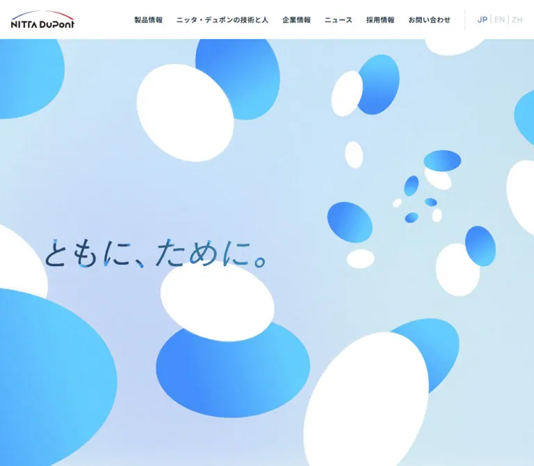
DESIGN REFERENCE
ニッタ・デュポン株式会社|コーポレートサイト
青と白の楕円モチーフと淡いグラデーションが印象的な企業サイト。広い余白、日英の見出し、繊細な矢印、白い角丸パネルで製品・企業情報への導線を整理しています。
オリジナルサイトを見るNITTA DuPont — Style Reference
Precision expressed through weightless blue discs, pale atmospheric color, and quiet corporate navigation.
Website: www.nittadupont.co.jp
Original URL: https://www.nittadupont.co.jp/
Final URL: https://www.nittadupont.co.jp/
Theme: a light corporate interface with a dark photographic feature
Inspected: September 12, 2026, at 13:43 UTC / 22:43 JST; supplied retrieval timestamp 2026-09-12T13:43:20.376Z
Viewports: desktop 1440 × 1000 and mobile 390 × 844 CSS pixels
Scope: the current Japanese corporate homepage, using three desktop captures, two mobile captures, and supplied rendered DOM measurements throughout the document. Visual coverage includes the opening hero, a partial middle-page transition, and the footer. Interior pages and opened navigation states were not inspected.
NITTA DuPont presents its polishing materials and technology through an unusually airy visual system. White and cyan-to-blue ovals float across a pale blue field with subtle lavender variation and fine grain. Their changing size, rotation, overlap, and cropping create depth without conventional object shadows. The Japanese slogan, 「ともに、ために。」, is the visual anchor. Its loose, expressive lettering contrasts with the disciplined navigation and information typography.
This is a corporate homepage with several parallel entry points: products, technology and people, company information, news, recruitment, and contact. Large introductory spaces lead into more practical navigation. The footer is especially distinctive: tightly separated white panels organize a sitemap, an oversized Contact link, the company logo, office addresses, and a substantial UP control. The original footer identifies the operator as ニッタ・デュポン株式会社.
How to Read This Reference
- Measured means a supplied computed style or rendered bounding box. Calculations from those measurements are identified separately.
- Visual estimate means an approximate value inferred from an original-page screenshot. Estimated hexadecimal colors are reconstruction targets, not sampled source declarations.
- Recommended means an implementation choice for a new build. Breakpoints, fallback artwork, focus styling, and illustrative CSS selectors belong to this category.
- Named tokens are descriptive aliases. The supplied custom-property collections were empty; this does not establish that the complete website has no CSS variables.
- DOM presence does not prove visibility. Menu entries, introductory paragraphs, Scroll, and Replay have recorded boxes but are not all visible in the opening captures. Some boxes overlap despite the clean screenshot. Treat them as evidence of structure or possible states, not a complete visible composition.
- Coverage varies by component. Header, hero, and footer appearance are directly visible. Most product, company, news, and recruitment details are supported by text and geometry rather than complete screenshots.
Tokens — Colors
Default Palette
| Name | Value | Suggested token | Role and evidence |
|---|---|---|---|
| Deep Navy | #13253b |
--color-ink |
Measured body and sampled text color: rgb(19, 37, 59) |
| White | #ffffff |
--color-surface |
Measured header background and feature paragraph color; also visibly used for discs and footer panels |
| Corporate Blue | #2e5dbc |
--color-accent |
Measured on Scroll; visually consistent with arrows and small blue labels, whose exact colors were not separately supplied |
| Frost Canvas | approximately #f0f5f7 |
--color-canvas |
Visual estimate of the lightly textured background around content and footer panels |
| Pale Sky | approximately #c8e8f4 |
--color-hero-sky |
Visual estimate of the hero's broad light-blue field |
| Lavender Haze | approximately #cdd8f4 |
--color-hero-lavender |
Visual estimate of the cooler lower-left hero variation |
| Disc Cyan | approximately #52cbf2 |
--color-disc-cyan |
Visual estimate of the bright ends of blue oval gradients |
| Disc Blue | approximately #3984ff |
--color-disc-blue |
Visual estimate of the stronger blue ends of oval gradients |
| Muted Slate | approximately #758294 |
--color-muted-visual |
Visual estimate of subordinate footer links and address text |
| Fine Divider | approximately #bfd0e4 |
--color-rule |
Visual estimate of pale dotted separators |
The measured body background is transparent. It does not identify the visible canvas color or the element responsible for the hero gradient. Likewise, a navy computed color on an anchor does not necessarily describe a differently styled child label or arrow.
Color Behavior
The page uses three related treatments: atmospheric pale color in the hero, near-white surroundings for information, and deep blue photographic contrast in the technology-and-people feature. Blue remains the connective accent across all three.
The hero ovals contain directional cyan-to-blue gradients. Their white companions remain visually flat and crisp. Avoid treating the blue forms as glossy spheres: the captured shapes read as tilted discs or elliptical surfaces, without a consistent spherical highlight model.
The logo retains its own blue and red arcs. Red is not established as a general interface accent. No alternate theme selector or user-selectable palette is evidenced.
Tokens — Typography
Japanese Interface and Body Copy
- Computed family:
"Noto Sans JP", sans-serifon the body and sampled Japanese elements. - Body baseline:
13px, weight400, line height13px. This is an inherited baseline, not the reading style of every paragraph. - Content weights: product headings use
600; major introductory paragraphs use600or700; descriptive paragraphs use400. - Character: compact, orderly Japanese sans-serif typography, with unusually generous paragraph leading in the main content.
- Important distinction: desktop navigation anchors report
13px / 400, while their visible labels appear heavier. The leaf styles that create that appearance were not included.
English Utility Typography
The Scroll label explicitly reports Satoshi-Medium, serif, 14px, weight 500, 28px line height, and -0.28px tracking. The fallback is serif. This declaration is evidence for that label only; it does not prove that Contact or every English section title uses the same family.
The page contains English section names such as Products, Company, News, and Recruit. Their individual child-element styles were not supplied. Keep their exact font family unassigned until it can be independently verified.
Slogan and Brand Artwork
The visible slogan uses expressive Japanese forms with varied blue coloring. Its lettering is visually distinct from the ordinary interface text. No family, font file, SVG path, or raster asset URL was supplied for it. Treat the lettering as artwork to preserve when available; a standard-font text version is a functional fallback.
The logo is also artwork. A sampled H1 containing the company name occupies a 1 × 1px box near the logo. Its computed 26px font size is not a visible hero or wordmark measurement.
Type Scale
| Role | Desktop measurement | Mobile measurement | Weight | Tracking and notes |
|---|---|---|---|---|
| Introductory statement | 24px / 55.2px |
17.68px / 40.664px |
400 |
Desktop normal; mobile -0.7072px, equivalent to -0.04em; this statement is not visible in the supplied opening frame |
| Product section summary | 18px / 39.6px |
16px / 35.2px |
600 |
0.08em at both widths |
| Company and recruitment summaries | 18px / 39.6px |
16px / 35.2px |
700 |
0.08em at both widths |
| Product heading | 28px / 35.84px |
24px / 30.72px |
600 |
Normal tracking; 1.28 line-height ratio |
| Product description | 14px / 28px |
14px / 28px |
400 |
0.56px, equivalent to 0.04em |
| Technology-and-people paragraph | 16px / 35.2px |
13px / 28.6px |
400 |
0.04em; white text |
| Scroll label | 14px / 28px |
14px / 28px |
500 |
-0.02em; Satoshi-Medium declaration |
| Address link | 12px / 19.2px |
12px / 19.2px |
400 |
Headquarters link uses 0.48px; other sampled address links use normal tracking |
| Sampled navigation and CTA anchor baseline | 13px / 13px |
13px / 13px |
400 |
Child label styles may differ |
| Menu child link, DOM only | 15px / 15px |
15px / 15px |
400 |
0.6px tracking; opened appearance unverified |
Visual estimates: the slogan occupies roughly an 80–90px-high lettering region on desktop and a 45–50px-high region on mobile. The desktop Contact title appears approximately 48px. These are visible scale estimates, not measured font sizes.
Composite headings: Products and Company heading boxes measure 177px high on desktop and 118px on mobile. News and Recruit heading boxes measure 121px and 105px. Their parent H2 reports 19.5px, but that inherited value does not explain the whole bilingual heading. Do not use 19.5px as a verified size for the prominent English word.
The HTML root reports 10px. The Quick Start uses explicit pixel values and a conventional surrounding document; it does not infer missing source rem formulas.
Tokens — Spacing & Shapes
Density: spacious content composition with compact utility typography. Shape vocabulary: rotated ovals, modestly rounded panels, pill outlines, circles, fine arrows, and dotted rules.
Layout Measurements
| Element | Desktop, 1440px wide | Mobile, 390px wide | Evidence |
|---|---|---|---|
| Header | 80px high; 30px side padding |
56px high; 24.953px side padding |
Measured |
| Header logo link | 132 × 36px, at 30, 22 |
100 × 30px, at 24.953, 14 |
Measured |
| Main content span used by News | 1200px, starting at x=120 |
341.109px, starting at x=24.438 |
Measured |
| Product summary width | 420px, starting at x=900 |
341.109px, starting at x=24.438 |
Measured |
| Product detail copy width | approximately 510px, starting at x=900.016 |
341.109px, starting at x=24.438 |
Measured |
| Company copy width | 420px, starting at x=122.156 |
317.219px, starting at x=36.391 |
Measured |
| Feature paragraph width | 420px, starting at x=515.516 |
228.141px, starting at x=19.5 |
Measured |
| Footer width | 1380px, starting at x=30 |
340.078px, starting at x=24.953 |
Measured |
| Contact tile | 505.984 × 385.625px |
340.078 × 291px |
Measured |
| UP tile | 172 × 308.813px |
340.078 × 125px |
Measured |
| Mobile menu button | Not visible in desktop capture | 32 × 32px, at 333.047, 12 |
Measured |
The source uses more than one inset system. Header and footer have approximately 25px mobile margins, normal content starts around 24.44px, and nested company/recruitment copy starts around 36.3px. Preserve these nested levels instead of forcing every element onto one left edge.
Spacing Scale
| Use | Value | Status |
|---|---|---|
| Separation between adjacent footer panels | 4px |
Calculated from recorded positions and corroborated visually |
| CTA right inset | 10px |
Measured |
| CTA left inset | 32px |
Measured |
| Product heading-to-paragraph gap | 32px desktop; 20px mobile |
Calculated from element boxes |
| Product paragraph-to-detail-link gap | 75px desktop; 40px mobile |
Calculated from element boxes |
| Introductory paragraph top padding | 45px |
Measured |
| Company directory row padding | 16px top/bottom desktop; 20px top and 17px bottom mobile |
Measured |
| News row padding | 25px top/bottom |
Measured at both widths |
| Products section padding | 100px top/bottom |
Measured at both widths |
| Feature-to-company section gap | 450px desktop; 315px mobile |
Calculated from section boxes |
| Company-to-news section gap | 200px |
Calculated at both widths |
Large gaps exist in the sampled layout. The partial middle screenshot shows about 450px of pale canvas between the bottom of the dark feature and the following white panel. This supports a spacious section rhythm, but does not establish the intended visibility of every nearby animated child.
Border Radius and Controls
| Element | Value or treatment | Evidence |
|---|---|---|
| Footer panels | Approximately 10–12px corners |
Visual estimate |
| Large white middle-page panel | Approximately 16px corners |
Visual estimate |
| Feature photo container | Small rounded corners | Visible at the lower edge; exact radius unavailable |
| Outline CTA | Visually pill-shaped; 58px measured height |
Shape observed in the partial feature capture |
| CTA arrow disc | Approximately 34px diameter |
Visual estimate |
| Detail link | 240 × 39px, including 10px bottom padding |
Measured; full decoration not visible |
| Main CTA width | 232px for desktop Products, usually 252px elsewhere; 240px on mobile |
Measured |
Some sampled anchors report border-radius: 0 even where a rounded visual treatment is evident. The rounded boundary may belong to a descendant, pseudo-element, or wrapper. Reproduce the visible anatomy without presenting an uninspected implementation layer as fact.
Components
Persistent Header
Role: company identity, primary destinations, and language navigation.
The desktop header is a clean white strip, 80px high. The logo occupies the left edge with 30px clearance. Six Japanese navigation entries are grouped toward the right, beginning near x=614. Adjacent sampled navigation boxes are separated by approximately 28px.
A language group follows the contact link. JP is visibly emphasized in blue, while EN and ZH appear pale. Fine separators distinguish the group and its entries. The links target the homepage, /en/, and /zh/; translation pages were not opened.
On mobile, the header becomes 56px high and the logo becomes 100px wide. The horizontal navigation and visible language group are replaced by a two-line menu icon in a measured 32px button box. The header remains visible in the lower-page captures at both sizes, supporting persistent positioning; the supplied style fields do not identify whether the source uses fixed or sticky positioning.
The DOM also contains a secondary navigation structure with language links, category buttons, and nested destinations. Its opened appearance, focus behavior, and accordion transitions are unverified.
Opening Hero and Introductory State
Role: establish the brand idea before detailed product navigation.
The hero fills the visible space below the header. A pale blue-to-lavender field carries white and gradient-blue ellipses. Large forms extend beyond the image edges; medium pairs overlap; a tight cluster of small forms creates a distant focal area toward the right side of the desktop composition.
The desktop slogan begins around x=180, near the middle of the viewport vertically. It has generous separation from the navigation and does not sit inside a card. The first capture shows the artwork and slogan without a large visible conversion button.
The mobile scene is recomposed. Most oval activity occupies the upper part of the hero, while the slogan sits near the bottom, around y=747–791, with approximately 25px side clearance. This is not a simple proportional reduction of the desktop arrangement.
The DOM contains a longer company statement, a Scroll label, and a Replay button. Replay measures 91 × 92px on desktop and 72 × 72px on mobile. These controls and the long statement are not visibly established in the supplied opening frame. Their presence suggests additional presentation states, but the sequence, trigger, duration, and rendering technology are unknown.
Bilingual Section Heading
Role: pair clear Japanese identification with a larger English section name.
Products, Company, News, and Recruit each appear in a heading group with a Japanese label. Their recorded boxes indicate a spacious composite component. Products places its heading on the left and an introductory paragraph on the right at desktop width. On mobile, the paragraph follows the heading in one column, separated by 40px in the Products section.
Keep the Japanese label and English name as separate styleable children. Their sizes should not be inferred from the parent H2 baseline. A recommended starting point for an adaptation is a small 13–16px Japanese label and a substantially larger English display line, tuned against actual artwork and available width.
Product Sequence
Role: expose the three principal product families.
Each entry contains an English numbered label, a Japanese heading, a descriptive paragraph, and a 「もっと見る」 link. The recorded labels are (01) Polishing Pad, (02) Polishing Slurry, and (03) Conditioner / Fixturing.
On desktop, all three sampled Japanese headings and descriptions align near x=900 in a roughly 510px text column. The heading-to-heading interval is 536.25px, calculated from their positions. This establishes a repeated large-scale rhythm. It does not establish the dimensions or subject matter of any accompanying media, which were not supplied.
On mobile, the copy occupies the normal 341px content width. Headings reduce from 28px to 24px; body copy remains 14px / 28px. The longest Japanese product heading wraps onto two lines, while the shorter headings remain one line. Let this wrapping increase the entry's height naturally.
The content is a sequence of product introductions. No prices, cart controls, or purchase interactions appear in the supplied evidence.
Outline CTA and Detail Link
Role: provide a recognizable hierarchy between section-level navigation and individual detail links.
Section-level links use measured 58px-high boxes, generally 252px wide on desktop and 240px on mobile. In the visible dark feature, the link has a fine rounded outline, white Japanese text, and a white circular arrow container at the right. The arrow itself is blue and lightweight.
The sampled CTA layout uses 32px left padding and 10px right padding. Reuse the balance of text, open middle space, and circular arrow rather than centering all contents as one tight group.
Product detail links measure 240 × 39px and include 10px bottom padding. They form a lighter secondary action. Their complete line and arrow decoration is not visible in the captures, so any reconstruction of that decoration should be labeled an adaptation.
Technology-and-People Feature
Role: connect technical capability to employees and teamwork.
The desktop middle capture shows the lower portion of a wide workplace photograph, heavily darkened toward navy and black. A person and industrial surroundings are partially discernible. The image container sits approximately 30px inside the viewport and has rounded lower corners.
DOM evidence identifies a headline about colleagues and customers, two white paragraphs, and the article-index link. The paragraphs use 16px / 35.2px on desktop in a 420px column near the horizontal center. On mobile they use 13px / 28.6px in a much narrower 228px column starting at x=19.5.
That narrow mobile paragraph column is a specific composition choice. Do not automatically expand it to the standard content width when seeking close correspondence. The mobile feature's actual image crop is not visible in the supplied captures.
Company Directory
Role: introduce the organization and provide direct routes into eight company topics.
The structure contains a bilingual heading, a bold introduction, a company-index CTA, and eight links pairing English and Japanese names. Topics include Message, Philosophy, Feature, Technical Center, About NITTA DuPont, History, Sustainability, and NITTA DuPont - The Numbers.
Desktop link boxes are 420px wide and about 76.41px high. Their successive top positions differ by approximately 77.41px, leaving a one-pixel interval. Mobile boxes are approximately 317.22 × 77.80px, with a similar one-pixel interval. A rule is a reasonable implementation interpretation, but the supplied fields do not expose its border declaration.
On desktop, the first directory row follows the CTA by 60px. On mobile, approximately 470px separates the CTA's bottom from the first directory row. The supplied middle capture includes a partial blue-sky-and-cloud image at the right edge of a white panel. It does not establish the complete media arrangement or prove what fills that mobile interval.
News List
Role: show three recent updates with a route to the complete archive.
The supplied text identifies three date-and-title links. Their desktop boxes span 1200px and measure 84px high with 25px vertical padding. On mobile, each spans approximately 341px and grows to 121px high. Keep dates and titles grouped in one link and allow the extra mobile height needed by wrapped text.
The archive CTA is aligned to the right edge of the content span at both sizes. It measures 252 × 58px on desktop and 240 × 58px on mobile. The supplied screenshots do not establish the precise date typography, row ornament, or hover appearance.
Recruitment Introduction
Role: connect the company's precision-polishing work to prospective employees.
The section contains a bilingual Recruit heading, a bold Japanese paragraph, and a recruitment link. Desktop copy occupies 400px beginning at x=108; mobile copy occupies about 317px beginning at x=36.28. The paragraph changes from 18px / 39.6px to 16px / 35.2px, retaining 700 weight and 0.08em tracking.
Its recorded section height increases from approximately 700px to 946px on mobile. The supplied captures do not show enough of this section to specify its imagery or complete arrangement.
Footer Sitemap and Contact Tile
Role: provide a complete navigation map and a prominent final contact route.
The desktop footer begins with two adjacent white panels separated by 4px. The left panel is approximately 870px wide and contains three sitemap columns. The right panel is a measured 506px-wide Contact link. Both are approximately 386px high.
Sitemap category links appear dark and comparatively bold, with a small blue dot at the left and a fine right arrow. Child links are smaller and muted, indented beneath their category. Product and company branches contain the most detail; News, Recruit, and the privacy policy occupy the final column.
The Contact tile combines a small Japanese label over a pale organic spot, a large dark Contact title, and an oversized blue right arrow toward the lower-right corner. Its scale comes from empty space and the arrow, rather than a filled accent background. The entire recorded panel is an anchor to /contact/.
On mobile, the sitemap and Contact tile appear sequentially in the recorded layout. The Contact tile retains the footer's approximately 340px width and becomes 291px high. Its complete mobile appearance is not included in the attached bottom capture.
Footer Identity, Locations, and UP
Role: close the page with concrete corporate information and an obvious return control.
The desktop lower row contains three panels: a logo panel of approximately 298px, a locations panel of approximately 902px, and a measured 172px UP panel. They share an approximately 309px height and 4px gutters.
The locations panel divides headquarters information from domestic locations with a fine vertical dotted rule. The headquarters column contains a blue small label, a dark company name, postal information, and an underlined map link. Domestic locations form a two-column arrangement with Tokyo and Kyoto above Mie and Kumamoto.
The mobile capture verifies a single-column address layout. Headquarters appears first, followed by a horizontal dotted rule and the four domestic locations in reading order. Text starts around x=50, approximately 25px inside the white panel. Address links remain 12px / 19.2px; office names appear larger and heavier.
The footer logo link grows from 182 × 50px on desktop to 207 × 56px in the mobile DOM, even though the header logo becomes smaller. These are separate brand placements.
UP is a large white tile with an upward chevron over its label. On mobile it spans the footer width and measures 125px high. The recorded anchor has an empty href; the actual scroll handler was not tested. The copyright line sits outside the white panels, right-aligned on desktop and visually centered on mobile. Its displayed year is 2025, which is content, not the inspection date.
Tokens — Motion & Interaction
| Treatment | Supplied value or evidence | What can be concluded |
|---|---|---|
| Header animation | 1.2s cubic-bezier(0.075, 0.82, 0.165, 1) 0.5s forwards downHeader |
A named animation with a 500ms delay is declared at both widths; keyframes and exact travel are unavailable |
| Desktop primary navigation transition | 0.8s cubic-bezier(0.165, 0.84, 0.44, 1) |
Timing is measured; affected properties and hover endpoints were not supplied |
| Replay transition | 0.8s cubic-bezier(0.165, 0.84, 0.44, 1) 1s |
A delayed transition is declared; appearance and replay behavior were not exercised |
| UP transition | 0.8s cubic-bezier(0.165, 0.84, 0.44, 1) |
Transition timing is measured; scrolling behavior is unverified |
| Header persistence | Header remains visible in top and lower-page captures | Persistent visual behavior is supported; positioning implementation is not supplied |
| Hero oval movement | A single captured composition per viewport | No reliable speed, path, loop, parallax, or rendering-engine claim can be made |
| Mobile menu and category buttons | Button and link structure exists in the DOM | Opening, closing, expansion, focus management, and visual transitions are unverified |
Many elements report only transition: all. Without a nonzero duration, this is not evidence that they visibly animate.
The capture process waited for load, finite animations, sampled layout and text stability, and image decoding within bounded timeouts. Perpetual animations were temporarily paused during readiness checks and then resumed. These safeguards improve capture stability; they do not supply a temporal recording or prove that every presentation state was reached.
For an adaptation, retain the measured easing curve where it suits navigation decoration. Any added arrow translation or oval drift should be documented as new behavior. Essential text should remain available without waiting for an introductory sequence.
Surfaces
| Layer | Appearance | Purpose |
|---|---|---|
| Header | Solid white, straight main edge, no visible elevation shadow | Stable identity and navigation |
| Hero | Pale blue/lavender field with fine grain | Atmospheric opening composition |
| Hero forms | Flat white and cyan-to-blue ellipses | Depth and identity through overlap and scale |
| General canvas | Very pale cool background with subtle texture | Separates white panels without strong borders |
| Photographic feature | Deep blue/black image treatment with white text | Strong contrast for the people-and-technology narrative |
| Footer panels | White, modestly rounded, nearly touching | Dense organization within the otherwise spacious page |
| Fine navigation details | Blue arrows and dots; pale dotted rules | Direction, grouping, and hierarchy |
There is no visible general-purpose shadow elevation system in the supplied captures. Panel separation comes from the surrounding pale canvas, narrow gutters, and rounded boundaries. The hero's depth comes from composition rather than card elevation.
Imagery
The opening artwork is the strongest identity carrier. Its ovals vary substantially in size and aspect ratio. Large cropped forms establish a foreground, overlapping pairs create intermediate depth, and smaller forms gather into a distant cluster. Keep some shapes fully white and others gradient-filled. Uniformly spaced circles would lose this spatial character.
The background has visible fine grain and gentle chromatic variation. The source technique is unknown: no asset URLs, canvas details, shader information, or background-image declarations were supplied. A restrained texture layer is a reasonable adaptation, but its density should remain low enough to preserve the clean white forms.
The slogan's irregular lettering belongs to the same composition. Preserve its proportions and varied coloring if authorized artwork becomes available. Do not invent a named display font to explain it.
Photography appears in the dark workplace feature and in a small visible sky-and-cloud crop at the following white panel. The evidence does not establish a broader photographic art direction for product or recruitment sections.
Observed Asset References
| Asset or visual | Observed location | What is known | Reference limitation |
|---|---|---|---|
| NITTA DuPont logo | Header and footer | Dark wordmark with blue/red arcs; multiple measured link sizes | Asset URL and format not supplied |
| Oval hero scene | Desktop and mobile opening captures | White and blue gradient ellipses, pale textured backdrop, viewport-specific composition | Rendering method and asset paths not supplied |
| Slogan lettering | Opening captures | Actual copy is 「ともに、ために。」; distinctive blue lettering | Font or artwork source not supplied |
| Dark workplace photograph | Partial desktop middle capture | Wide, darkened blue image with a person and industrial surroundings | Full crop, filename, and photographer not established by this page evidence |
| Sky-and-cloud image | Lower-right portion of the desktop middle capture | Bright blue sky and white clouds inside the next composition | Full subject and asset path not supplied |
No asset filenames should be synthesized from these observations. The CSS Quick Start supplies a simplified static scene for layout work, not a substitute for the original artwork.
Layout & Responsive Behavior
The desktop composition alternates between broad media areas and constrained information columns. A 1200px content span is visible in the News measurements, while outer panels use almost the full viewport with 30px margins. Product copy aligns unusually far right, around 62.5% of the viewport width. The hero slogan begins around 12.5% from the left.
Mobile changes the relationships between components. The header collapses to logo and menu control; product summaries and details become a single column; longer headings wrap; the hero slogan moves to the bottom of the opening frame; and the footer changes from two compact panel rows into a long vertical sequence. Main descriptive text retains generous leading rather than becoming tightly packed.
Recorded Section Geometry
These are document coordinates in the supplied DOM snapshots, rounded to two decimals. They are evidence of the sampled layout, not absolute-positioning instructions.
| Section | Desktop top / height | Mobile top / height |
|---|---|---|
| Products | 1150 / 2276.13px |
1254.80 / 2617.05px |
| Technology and people | 3863.13 / 1001.44px |
4043.84 / 983.13px |
| Company | 5314.56 / 1486.03px |
5341.97 / 1692.66px |
| News | 7000.59 / 520px |
7234.63 / 615px |
| Recruit | 8365.75 / 700.33px |
8372.19 / 946.09px |
| Footer | 9309.08 / 766.44px |
9433.28 / 1977.47px |
The document heights are approximately 10076px on desktop and 11411px on mobile. The footer alone grows by approximately 1211px as its navigation and address groups stack.
No tablet, landscape phone, zoomed layout, or breakpoint declaration was provided. A breakpoint chosen for a new implementation must therefore be labeled a recommendation. The Quick Start uses 1000px as a practical starting threshold and keeps content in normal flow.
Do’s and Don’ts
Do
- Preserve the relationship between pale atmosphere, white forms, strong blue gradients, and dark navy text.
- Compose ovals with varied scales, rotations, overlaps, and edge crops.
- Give the mobile hero its own arrangement and keep the slogan near the lower portion of the opening frame.
- Retain multiple corporate entry points and the full product/company information hierarchy.
- Use generous paragraph leading: measured ratios are commonly
2or2.2. - Keep footer panels close together with approximately
4pxgutters and modest corner rounding. - Preserve blue dots, thin arrows, dotted separators, and underlined address links.
- Distinguish the compact header logo from the larger closing brand placement.
- Let Japanese headings and news titles wrap naturally on narrow screens.
- Label inferred artwork, breakpoints, and interactions as adaptations.
Don’t
- Don't turn the homepage into a single-purpose conversion funnel that removes its product and company navigation.
- Don't replace the spatial oval arrangement with an evenly distributed bubble pattern.
- Don't add strong shadows, glass blur, or glossy highlights to every surface.
- Don't assign the Scroll label's font family to all English headings without evidence.
- Don't interpret the hidden
1 × 1pxcompany heading as visible typography. - Don't reduce all content to the body's inherited
13px / 13pxbaseline. - Don't recreate concealed menu boxes as though they were visible over the hero.
- Don't assume Replay proves a particular video, canvas, or 3D implementation.
- Don't fill all measured large gaps with invented cards or photographs.
- Don't hardcode the recorded document coordinates or total heights into a responsive page.
Recommended Implementation Additions
These are recommendations for a new implementation, not verified original-site features:
- Provide a named menu button with
aria-expandedandaria-controls; manage keyboard focus and Escape behavior when its navigation is open. - Preserve the thin
32pxmenu artwork inside a larger touch target of at least44px. - Give the current language a semantic current state. Check the contrast of pale inactive-language text before reusing it.
- Keep an accessible text equivalent of the slogan even when its visible form is supplied artwork. Mark purely decorative ovals as hidden from assistive technology.
- Keep introductory content readable when animation is unavailable, delayed, or reduced. Add a stable static hero state.
- Use a real fragment destination or tested handler for UP. Account for the persistent header when moving to in-page targets.
- Check small muted address text against its white panel. The Quick Start uses a darker recommended slate than the visual estimate.
- Use semantic headings, navigation lists, dates, and links. Avoid making oversized visual arrows the only accessible label of a destination.
- Preserve aspect ratios and reserve space for supplied media so image loading does not move navigation or text unexpectedly.
Agent Prompt Guide
Quick Color Reference
- Main text: measured
#13253b. - Header and panels: measured/visible white
#ffffff. - Blue accent reference: measured
#2e5dbcon Scroll. - General canvas: estimated
#f0f5f7. - Hero atmosphere: estimated
#c8e8f4with#cdd8f4variation. - Oval gradient: estimated
#52cbf2to#3984ff. - Dark feature: deep navy photographic treatment with white copy.
- Surface separation: pale background and narrow gaps, with restrained rounded corners.
Overall Prompt
“Create a Japanese corporate homepage for a precision-polishing materials company using the observed NITTA DuPont visual language. Build a persistent white header, dark navy Japanese navigation, a pale blue and lavender hero filled with overlapping white and cyan-to-blue elliptical discs, and the supplied slogan artwork for 「ともに、ために。」. Use large spaces between major sections, bilingual section headings, generous Japanese paragraph leading, product introductions, a dark workplace feature, company-topic links, dated news, and recruitment information. Finish with closely grouped white footer panels containing a sitemap, a large Contact link, company identity, office addresses, and UP. On mobile, recompose the hero and stack the information panels. Treat unprovided assets and interaction details as explicit implementation choices.”
Example Component Prompts
- Header: “Create an 80px white desktop header with a 132px-wide brand link at a 30px left inset, six compact Japanese navigation entries, and a separated JP/EN/ZH group. At a recommended mobile threshold, use a 56px header, a 100px brand link, and a two-line menu control. Provide accessible menu state and focus behavior.”
- Hero: “Compose a pale blue field with subtle lavender variation and fine grain. Place large cropped ellipses near the edges, overlapping white and blue gradient pairs in the middle distance, and a smaller cluster toward the right. Place the supplied Japanese slogan left of center on desktop and near the bottom on mobile. Use a static layout unless motion requirements are separately specified.”
- Product entry: “Use a numbered English category label, a Japanese semibold heading, a 14px paragraph with 28px leading, and a restrained detail link. Align the desktop copy in an approximately 510px right column. On a 390px phone, use an approximately 341px content column and 24px headings with natural wrapping.”
- Feature CTA: “Create a 58px-high outline pill over a dark blue photograph. Place white Japanese text with a 32px left inset and a white circular arrow container near the right edge. Use a thin blue arrow and preserve ample space between label and icon.”
- Footer: “Build a white-panel footer on a pale cool canvas. On desktop, place a three-column sitemap beside a large Contact tile, then a logo panel beside office information and a narrow UP panel. Use 4px gaps, roughly 10px corners, blue dots and arrows, and dotted address separators. Stack the groups on mobile and make UP a 125px-high full-width tile.”
Quick Start
CSS Custom Properties
This is an implementation scaffold, not extracted source CSS. Measured colors and dimensions are retained where available. The 1000px breakpoint, heading fallback sizes, static disc scene, hover displacement, and darker muted-text color are recommendations. The smooth gradient fallback omits the original fine grain and distinctive slogan lettering.
The selectors assume semantic HTML using the component class names below. Load font files only when available and appropriately licensed; a CSS family declaration alone does not provide them.
:root {
  /* Measured colors */
  --color-ink: #13253b;
  --color-surface: #ffffff;
  --color-accent: #2e5dbc;

  /* Visual approximations */
  --color-canvas: #f0f5f7;
  --color-hero-sky: #c8e8f4;
  --color-hero-lavender: #cdd8f4;
  --color-disc-cyan: #52cbf2;
  --color-disc-blue: #3984ff;
  --color-rule: #bfd0e4;
  --color-feature: #071b36;

  /* Recommended darker color for small secondary text */
  --color-muted: #5d6d80;

  --font-body: 'Noto Sans JP', sans-serif;
  --font-scroll: Satoshi-Medium, serif;
  --text-body: 14px;
  --text-summary: 18px;
  --text-product: 28px;
  --text-address: 12px;
  --leading-body: 2;
  --leading-summary: 2.2;
  --tracking-body: 0.04em;
  --tracking-summary: 0.08em;

  --header-height: 80px;
  --outer-inset: 30px;
  --content-inset: 30px;
  --content-max: 1200px;
  --panel-gap: 4px;
  --radius-panel: 10px;
  --radius-feature: 12px;
  --cta-height: 58px;
  --cta-width: 252px;
  --section-space: 100px;

  /* Measured timing; hover endpoints below are recommendations */
  --ease-navigation: cubic-bezier(0.165, 0.84, 0.44, 1);
  --motion-navigation: 800ms var(--ease-navigation);
}

* { box-sizing: border-box; }
html { scroll-padding-top: calc(var(--header-height) + 16px); }
body {
  margin: 0;
  color: var(--color-ink);
  background: var(--color-canvas);
  font-family: var(--font-body);
  font-size: var(--text-body);
  line-height: var(--leading-body);
}
a { color: inherit; }
button { font: inherit; }
img { display: block; max-width: 100%; }
main { padding-top: var(--header-height); }

.content {
  width: min(var(--content-max), calc(100% - 2 * var(--content-inset)));
  margin-inline: auto;
}
.edge-frame {
  width: calc(100% - 2 * var(--outer-inset));
  margin-inline: auto;
}
.panel {
  background: var(--color-surface);
  border-radius: var(--radius-panel);
}

/* Fixed positioning reproduces the observed persistent appearance. */
.site-header {
  position: fixed;
  inset: 0 0 auto;
  z-index: 50;
  display: flex;
  align-items: center;
  gap: 28px;
  height: var(--header-height);
  padding-inline: var(--outer-inset);
  background: var(--color-surface);
}
.brand { display: block; width: 132px; height: 36px; flex: none; }
.brand img { width: 100%; height: 100%; object-fit: contain; }
.primary-nav { display: flex; align-items: center; gap: 28px; margin-left: auto; }
.primary-nav a { font-size: 13px; text-decoration: none; }
.languages {
  display: flex;
  align-items: center;
  padding-left: 18px;
  border-left: 1px dotted var(--color-rule);
  font-size: 13px;
}
.languages a { padding-inline: 7px; text-decoration: none; }
.languages a + a { border-left: 1px solid var(--color-rule); }
.languages [aria-current] { color: var(--color-accent); }
.menu-toggle {
  display: none;
  width: 44px;
  height: 44px;
  padding: 6px;
  border: 0;
  background: transparent;
  color: var(--color-ink);
}
.menu-toggle span { display: block; width: 32px; height: 1px; background: currentColor; }
.menu-toggle span + span { margin-top: 8px; }

/* Simplified static artwork: positions are recommended approximations. */
.hero {
  position: relative;
  min-height: calc(100svh - var(--header-height));
  overflow: hidden;
  isolation: isolate;
  background:
    radial-gradient(ellipse at 24% 86%, var(--color-hero-lavender), transparent 68%),
    linear-gradient(120deg, #d4edf7, var(--color-hero-sky));
}
.hero-art { position: absolute; inset: 0; pointer-events: none; }
.disc {
  position: absolute;
  left: var(--x);
  top: var(--y);
  width: var(--w);
  height: var(--h);
  border-radius: 50%;
  transform: rotate(var(--turn, 0deg));
  background: linear-gradient(135deg, var(--color-disc-blue), var(--color-disc-cyan));
}
.disc.is-white { background: var(--color-surface); }
.disc:nth-child(1) { --x: -12%; --y: 70%; --w: 35%; --h: 44%; --turn: 25deg; }
.disc:nth-child(2) { --x: 37%; --y: -14%; --w: 16%; --h: 38%; --turn: -25deg; }
.disc:nth-child(3) { --x: 26%; --y: 8%; --w: 18%; --h: 30%; --turn: -35deg; }
.disc:nth-child(4) { --x: 66%; --y: 6%; --w: 8%; --h: 18%; --turn: 20deg; }
.disc:nth-child(5) { --x: 62%; --y: 11%; --w: 6%; --h: 14%; --turn: 20deg; }
.disc:nth-child(6) { --x: 61%; --y: 49%; --w: 9%; --h: 12%; --turn: -38deg; }
.disc:nth-child(7) { --x: 30%; --y: 66%; --w: 22%; --h: 23%; --turn: 24deg; }
.disc:nth-child(8) { --x: 29%; --y: 80%; --w: 30%; --h: 29%; --turn: -12deg; z-index: -1; }
.hero-slogan {
  position: absolute;
  top: 45%;
  left: 12.5%;
  width: min(640px, 80%);
  margin: 0;
  color: #315b7e;
  font-size: 84px;
  font-weight: 400;
  line-height: 1.2;
}
.hero-slogan img { width: 100%; height: auto; }

.section { padding-block: var(--section-space); }
.section-lead {
  display: grid;
  grid-template-columns: minmax(0, 600px) minmax(0, 420px);
  justify-content: space-between;
  gap: 40px;
}
.section-title { margin: 0; font-weight: 400; }
.section-title small { display: block; font-size: 14px; color: var(--color-accent); }
/* English display size is a recommendation; its source leaf style was unavailable. */
.section-title .english { display: block; font-size: clamp(56px, 6vw, 88px); line-height: 1.15; }
.summary {
  margin: 0;
  font-size: var(--text-summary);
  font-weight: 600;
  line-height: var(--leading-summary);
  letter-spacing: var(--tracking-summary);
}
.product-copy { width: min(510px, 100%); margin-left: auto; }
.product-copy h3 { margin: 0 0 32px; font-size: var(--text-product); font-weight: 600; line-height: 1.28; }
.product-copy p { margin: 0; line-height: 2; letter-spacing: var(--tracking-body); }

.cta {
  display: flex;
  align-items: center;
  justify-content: space-between;
  width: min(var(--cta-width), 100%);
  min-height: var(--cta-height);
  padding: 8px 10px 8px 32px;
  border: 1px solid var(--color-rule);
  border-radius: 999px;
  text-decoration: none;
}
.cta-icon {
  display: grid;
  place-items: center;
  width: 34px;
  height: 34px;
  flex: none;
  border-radius: 50%;
  background: white;
  color: var(--color-accent);
}
.arrow { display: inline-block; transition: transform var(--motion-navigation); }
.detail-link {
  display: flex;
  justify-content: space-between;
  width: min(240px, 100%);
  min-height: 39px;
  margin-top: 75px;
  padding-bottom: 10px;
  border-bottom: 1px solid var(--color-rule);
  text-decoration: none;
}
.people-feature {
  padding-block: 120px;
  border-radius: var(--radius-feature);
  background: var(--color-feature);
  color: white;
}
.people-copy { width: min(420px, 90%); margin-inline: auto; }
.people-copy p { font-size: 16px; line-height: 2.2; letter-spacing: 0.04em; }
.people-feature .cta { color: white; border-color: rgb(255 255 255 / 35%); }
.company-link {
  display: flex;
  justify-content: space-between;
  align-items: center;
  min-height: 77px;
  padding-block: 16px;
  border-bottom: 1px solid var(--color-rule);
  text-decoration: none;
}
.news-row {
  display: grid;
  grid-template-columns: 120px minmax(0, 1fr);
  gap: 24px;
  min-height: 84px;
  padding-block: 25px;
  border-bottom: 1px solid var(--color-rule);
  text-decoration: none;
}
.news-more { margin: 60px 0 0 auto; }

.site-footer { margin-top: 120px; }
.footer-top { display: grid; grid-template-columns: minmax(0, 1fr) 506px; gap: var(--panel-gap); }
.footer-nav {
  display: grid;
  grid-template-columns: repeat(3, minmax(0, 1fr));
  gap: 56px;
  padding: 60px 64px;
}
.footer-nav ul { margin: 0; padding: 0; list-style: none; }
.footer-nav a { text-decoration: none; }
.footer-nav .group-title { display: block; margin-bottom: 16px; font-weight: 700; }
.footer-nav .child-link { display: block; color: var(--color-muted); font-size: 12px; line-height: 28px; }
.contact-tile {
  position: relative;
  display: block;
  min-height: 386px;
  padding: 80px 76px;
  text-decoration: none;
}
.contact-tile small { color: var(--color-accent); }
.contact-title { display: block; margin-top: 12px; font-size: 48px; line-height: 1.2; }
.contact-tile .arrow { position: absolute; right: 60px; bottom: 60px; color: var(--color-accent); font-size: 72px; line-height: 1; }
.footer-bottom {
  display: grid;
  grid-template-columns: 298px minmax(0, 1fr) 172px;
  gap: var(--panel-gap);
  margin-top: var(--panel-gap);
}
.footer-brand { display: grid; place-items: center; min-height: 309px; }
.footer-brand img { width: 182px; height: auto; }
.locations { display: grid; grid-template-columns: 260px minmax(0, 1fr); gap: 64px; padding: 60px; }
.headquarters { padding-right: 24px; border-right: 1px dotted var(--color-rule); }
.location-label { margin: 0 0 12px; color: var(--color-accent); font-size: 12px; font-weight: 700; }
.location-name { margin: 0 0 8px; font-size: 14px; font-weight: 700; }
.branches { display: grid; grid-template-columns: repeat(2, minmax(0, 1fr)); gap: 20px 32px; }
.locations address { font-style: normal; font-size: 12px; line-height: 1.6; color: var(--color-muted); }
.locations address a { text-decoration: underline; text-underline-offset: 2px; }
.up-tile { display: flex; flex-direction: column; align-items: center; justify-content: center; gap: 12px; min-height: 309px; text-decoration: none; font-size: 28px; font-weight: 700; }
.up-chevron { width: 20px; height: 20px; border-top: 1px solid; border-right: 1px solid; transform: rotate(-45deg); }
.copyright { margin: 26px 0 30px; text-align: right; font-size: 12px; }

/* Recommended interaction feedback. */
@media (hover: hover) {
  .cta:hover .arrow, .contact-tile:hover .arrow { transform: translateX(6px); }
}
:where(a, button):focus-visible { outline: 3px solid var(--color-accent); outline-offset: 4px; }

/* Recommended breakpoint; only 1440px and 390px were inspected. */
@media (max-width: 1000px) {
  :root {
    --header-height: 56px;
    --outer-inset: 6.4vw;
    --content-inset: 6.266vw;
    --text-summary: 16px;
    --text-product: 24px;
    --cta-width: 240px;
  }
  .brand { width: 100px; height: 30px; }
  .primary-nav, .languages { display: none; }
  .menu-toggle { display: block; margin-left: auto; }
  .hero-art { bottom: 30%; }
  .hero-slogan { top: auto; bottom: 48px; left: var(--outer-inset); width: calc(100% - 2 * var(--outer-inset)); font-size: clamp(32px, 11.8vw, 46px); }
  .disc:nth-child(1) { --x: -30%; --y: 56%; --w: 52%; --h: 30%; }
  .disc:nth-child(2) { --x: 5%; --y: -13%; --w: 28%; --h: 36%; }
  .disc:nth-child(3) { --x: -12%; --y: 9%; --w: 28%; --h: 25%; }
  .disc:nth-child(4) { --x: 63%; --y: 10%; --w: 17%; --h: 17%; }
  .disc:nth-child(5) { --x: 54%; --y: 13%; --w: 11%; --h: 14%; }
  .disc:nth-child(6) { --x: 28%; --y: 46%; --w: 20%; --h: 17%; }
  .disc:nth-child(7) { --x: 30%; --y: 82%; --w: 27%; --h: 20%; }
  .disc:nth-child(8) { --x: 55%; --y: 89%; --w: 17%; --h: 15%; }
  .section-lead { grid-template-columns: minmax(0, 1fr); }
  .product-copy h3 { margin-bottom: 20px; }
  .detail-link { margin-top: 40px; }
  .people-copy { width: 58.5%; margin-left: 5%; margin-right: 0; }
  .people-copy p { font-size: 13px; }
  .company-link { padding: 20px 0 17px; }
  .news-row { grid-template-columns: minmax(0, 1fr); gap: 8px; min-height: 121px; }
  .footer-top, .footer-bottom { grid-template-columns: minmax(0, 1fr); }
  .footer-nav { grid-template-columns: minmax(0, 1fr); gap: 32px; padding: 40px 28px; }
  .contact-tile { min-height: 291px; padding: 68px 20px; }
  .contact-tile .arrow { right: 30px; bottom: 34px; }
  .footer-brand { min-height: 140px; }
  .footer-brand img { width: 207px; }
  .locations { display: block; padding: 40px 25px; }
  .headquarters { padding: 0 0 30px; margin-bottom: 40px; border-right: 0; border-bottom: 1px dotted var(--color-rule); }
  .branches { grid-template-columns: minmax(0, 1fr); }
  .up-tile { min-height: 125px; font-size: 22px; }
  .copyright { margin: 38px 0 40px; text-align: center; }
}

@media (prefers-reduced-motion: reduce) {
  html { scroll-behavior: auto; }
  .arrow, .disc, .site-header { animation: none; transition: none; }
}
A minimal hero example follows. The eight-disc composition is deliberately simplified; the captured artwork contains additional forms. Replace the fallback slogan text with approved artwork when available, retaining an accessible equivalent.
<section class='hero' aria-label='Brand introduction'>
  <div class='hero-art' aria-hidden='true'>
    <span class='disc'></span>
    <span class='disc'></span>
    <span class='disc is-white'></span>
    <span class='disc'></span>
    <span class='disc is-white'></span>
    <span class='disc'></span>
    <span class='disc is-white'></span>
    <span class='disc'></span>
  </div>
  <p class='hero-slogan' lang='ja'>ともに、ために。</p>
</section>

<a class='cta' href='/products/'>
  <span lang='ja'>製品情報一覧</span>
  <span class='cta-icon' aria-hidden='true'><span class='arrow'>→</span></span>
</a>

<!-- Place id='top' on an appropriate destination near the document start. -->
<a class='up-tile panel' href='#top' aria-label='Back to top'>
  <span class='up-chevron' aria-hidden='true'></span>
  <span>UP</span>
</a>
A production build still needs actual logo/media assets, the complete navigation markup, and separately tested menu behavior. The scaffold does not introduce a hidden intro state or invent Replay functionality.
Tailwind v4 Token Mapping
Optional aliases for a project that already uses Tailwind v4. This is not evidence that the inspected website uses Tailwind. Define the custom properties above first.
@theme inline {
  --color-ink: #13253b;
  --color-surface: #ffffff;
  --color-accent: #2e5dbc;
  --color-canvas: #f0f5f7;
  --color-disc-cyan: #52cbf2;
  --color-disc-blue: #3984ff;
  --font-japanese: 'Noto Sans JP', sans-serif;
  --font-scroll: Satoshi-Medium, serif;
  --text-copy: 14px;
  --text-introduction: var(--text-summary);
  --text-product-title: var(--text-product);
  --text-address: 12px;
  --spacing-panel-gap: 4px;
  --spacing-page-inset: var(--outer-inset);
  --spacing-header: var(--header-height);
  --spacing-cta: 58px;
  --radius-panel: 10px;
  --radius-feature: 12px;
  --ease-navigation: cubic-bezier(0.165, 0.84, 0.44, 1);
}
Sources & Evidence
- NITTA DuPont — current Japanese homepage: original and final URL are identical; supplied HTTP status is
200. The page title, company identity, navigation destinations, content hierarchy, and footer information come from this original-page evidence. - Capture session: September 12, 2026; retrieval timestamp
2026-09-12T13:43:20.376Z. Original-page visual evidence consists of three1440 × 1000desktop captures and two390 × 844mobile captures. - Rendered DOM and styles: supplied body, header, text, link, button, section, and footer bounding boxes; selected computed font, color, spacing, transition, and animation values. These measurements are the authority for entries marked measured.
- Observed page states: opening desktop/mobile compositions, a partial desktop middle-page view, and desktop/mobile footer views after scrolling. The persistent header is visible across these captures.
- Inspection limits: no additional browsing or file access was performed. Link destinations were recorded but not opened. Hover, keyboard focus, mobile-menu expansion, language switching, Replay, and UP activation were not tested. Full asset paths, font resources, animation keyframes, media rendering technology, and source breakpoints were not supplied.
- Readiness limits: the supplied collection process used bounded waits for document load, animation settling, geometry/text stability, and image decoding. SharedWorkers and service workers were disabled. Delayed or concealed content may remain unrepresented, and static captures cannot establish a complete motion sequence.
This reference describes the current homepage represented by the supplied September 12, 2026 evidence. Estimated colors, incomplete component visuals, and recommended implementation behavior are explicitly distinguished from measured findings.
# NITTA DuPont — Style Reference

> Precision expressed through weightless blue discs, pale atmospheric color, and quiet corporate navigation.

**Website:** [www.nittadupont.co.jp](https://www.nittadupont.co.jp/)
**Original URL:** https://www.nittadupont.co.jp/
**Final URL:** https://www.nittadupont.co.jp/
**Theme:** a light corporate interface with a dark photographic feature
**Inspected:** September 12, 2026, at 13:43 UTC / 22:43 JST; supplied retrieval timestamp `2026-09-12T13:43:20.376Z`
**Viewports:** desktop `1440 × 1000` and mobile `390 × 844` CSS pixels
**Scope:** the current Japanese corporate homepage, using three desktop captures, two mobile captures, and supplied rendered DOM measurements throughout the document. Visual coverage includes the opening hero, a partial middle-page transition, and the footer. Interior pages and opened navigation states were not inspected.

NITTA DuPont presents its polishing materials and technology through an unusually airy visual system. White and cyan-to-blue ovals float across a pale blue field with subtle lavender variation and fine grain. Their changing size, rotation, overlap, and cropping create depth without conventional object shadows. The Japanese slogan, 「ともに、ために。」, is the visual anchor. Its loose, expressive lettering contrasts with the disciplined navigation and information typography.

This is a corporate homepage with several parallel entry points: products, technology and people, company information, news, recruitment, and contact. Large introductory spaces lead into more practical navigation. The footer is especially distinctive: tightly separated white panels organize a sitemap, an oversized Contact link, the company logo, office addresses, and a substantial UP control. The original footer identifies the operator as ニッタ・デュポン株式会社.

## How to Read This Reference

- **Measured** means a supplied computed style or rendered bounding box. Calculations from those measurements are identified separately.
- **Visual estimate** means an approximate value inferred from an original-page screenshot. Estimated hexadecimal colors are reconstruction targets, not sampled source declarations.
- **Recommended** means an implementation choice for a new build. Breakpoints, fallback artwork, focus styling, and illustrative CSS selectors belong to this category.
- **Named tokens** are descriptive aliases. The supplied custom-property collections were empty; this does not establish that the complete website has no CSS variables.
- **DOM presence does not prove visibility.** Menu entries, introductory paragraphs, Scroll, and Replay have recorded boxes but are not all visible in the opening captures. Some boxes overlap despite the clean screenshot. Treat them as evidence of structure or possible states, not a complete visible composition.
- **Coverage varies by component.** Header, hero, and footer appearance are directly visible. Most product, company, news, and recruitment details are supported by text and geometry rather than complete screenshots.

## Tokens — Colors

### Default Palette

| Name | Value | Suggested token | Role and evidence |
| --- | --- | --- | --- |
| Deep Navy | `#13253b` | `--color-ink` | Measured body and sampled text color: `rgb(19, 37, 59)` |
| White | `#ffffff` | `--color-surface` | Measured header background and feature paragraph color; also visibly used for discs and footer panels |
| Corporate Blue | `#2e5dbc` | `--color-accent` | Measured on Scroll; visually consistent with arrows and small blue labels, whose exact colors were not separately supplied |
| Frost Canvas | approximately `#f0f5f7` | `--color-canvas` | Visual estimate of the lightly textured background around content and footer panels |
| Pale Sky | approximately `#c8e8f4` | `--color-hero-sky` | Visual estimate of the hero's broad light-blue field |
| Lavender Haze | approximately `#cdd8f4` | `--color-hero-lavender` | Visual estimate of the cooler lower-left hero variation |
| Disc Cyan | approximately `#52cbf2` | `--color-disc-cyan` | Visual estimate of the bright ends of blue oval gradients |
| Disc Blue | approximately `#3984ff` | `--color-disc-blue` | Visual estimate of the stronger blue ends of oval gradients |
| Muted Slate | approximately `#758294` | `--color-muted-visual` | Visual estimate of subordinate footer links and address text |
| Fine Divider | approximately `#bfd0e4` | `--color-rule` | Visual estimate of pale dotted separators |

The measured body background is transparent. It does not identify the visible canvas color or the element responsible for the hero gradient. Likewise, a navy computed color on an anchor does not necessarily describe a differently styled child label or arrow.

### Color Behavior

The page uses three related treatments: atmospheric pale color in the hero, near-white surroundings for information, and deep blue photographic contrast in the technology-and-people feature. Blue remains the connective accent across all three.

The hero ovals contain directional cyan-to-blue gradients. Their white companions remain visually flat and crisp. Avoid treating the blue forms as glossy spheres: the captured shapes read as tilted discs or elliptical surfaces, without a consistent spherical highlight model.

The logo retains its own blue and red arcs. Red is not established as a general interface accent. No alternate theme selector or user-selectable palette is evidenced.

## Tokens — Typography

### Japanese Interface and Body Copy

- **Computed family:** `"Noto Sans JP", sans-serif` on the body and sampled Japanese elements.
- **Body baseline:** `13px`, weight `400`, line height `13px`. This is an inherited baseline, not the reading style of every paragraph.
- **Content weights:** product headings use `600`; major introductory paragraphs use `600` or `700`; descriptive paragraphs use `400`.
- **Character:** compact, orderly Japanese sans-serif typography, with unusually generous paragraph leading in the main content.
- **Important distinction:** desktop navigation anchors report `13px / 400`, while their visible labels appear heavier. The leaf styles that create that appearance were not included.

### English Utility Typography

The Scroll label explicitly reports `Satoshi-Medium, serif`, `14px`, weight `500`, `28px` line height, and `-0.28px` tracking. The fallback is serif. This declaration is evidence for that label only; it does not prove that Contact or every English section title uses the same family.

The page contains English section names such as Products, Company, News, and Recruit. Their individual child-element styles were not supplied. Keep their exact font family unassigned until it can be independently verified.

### Slogan and Brand Artwork

The visible slogan uses expressive Japanese forms with varied blue coloring. Its lettering is visually distinct from the ordinary interface text. No family, font file, SVG path, or raster asset URL was supplied for it. Treat the lettering as artwork to preserve when available; a standard-font text version is a functional fallback.

The logo is also artwork. A sampled `H1` containing the company name occupies a `1 × 1px` box near the logo. Its computed `26px` font size is not a visible hero or wordmark measurement.

### Type Scale

| Role | Desktop measurement | Mobile measurement | Weight | Tracking and notes |
| --- | --- | --- | --- | --- |
| Introductory statement | `24px / 55.2px` | `17.68px / 40.664px` | `400` | Desktop normal; mobile `-0.7072px`, equivalent to `-0.04em`; this statement is not visible in the supplied opening frame |
| Product section summary | `18px / 39.6px` | `16px / 35.2px` | `600` | `0.08em` at both widths |
| Company and recruitment summaries | `18px / 39.6px` | `16px / 35.2px` | `700` | `0.08em` at both widths |
| Product heading | `28px / 35.84px` | `24px / 30.72px` | `600` | Normal tracking; `1.28` line-height ratio |
| Product description | `14px / 28px` | `14px / 28px` | `400` | `0.56px`, equivalent to `0.04em` |
| Technology-and-people paragraph | `16px / 35.2px` | `13px / 28.6px` | `400` | `0.04em`; white text |
| Scroll label | `14px / 28px` | `14px / 28px` | `500` | `-0.02em`; Satoshi-Medium declaration |
| Address link | `12px / 19.2px` | `12px / 19.2px` | `400` | Headquarters link uses `0.48px`; other sampled address links use normal tracking |
| Sampled navigation and CTA anchor baseline | `13px / 13px` | `13px / 13px` | `400` | Child label styles may differ |
| Menu child link, DOM only | `15px / 15px` | `15px / 15px` | `400` | `0.6px` tracking; opened appearance unverified |

**Visual estimates:** the slogan occupies roughly an `80–90px`-high lettering region on desktop and a `45–50px`-high region on mobile. The desktop Contact title appears approximately `48px`. These are visible scale estimates, not measured font sizes.

**Composite headings:** Products and Company heading boxes measure `177px` high on desktop and `118px` on mobile. News and Recruit heading boxes measure `121px` and `105px`. Their parent `H2` reports `19.5px`, but that inherited value does not explain the whole bilingual heading. Do not use `19.5px` as a verified size for the prominent English word.

The HTML root reports `10px`. The Quick Start uses explicit pixel values and a conventional surrounding document; it does not infer missing source `rem` formulas.

## Tokens — Spacing & Shapes

**Density:** spacious content composition with compact utility typography.
**Shape vocabulary:** rotated ovals, modestly rounded panels, pill outlines, circles, fine arrows, and dotted rules.

### Layout Measurements

| Element | Desktop, 1440px wide | Mobile, 390px wide | Evidence |
| --- | --- | --- | --- |
| Header | `80px` high; `30px` side padding | `56px` high; `24.953px` side padding | Measured |
| Header logo link | `132 × 36px`, at `30, 22` | `100 × 30px`, at `24.953, 14` | Measured |
| Main content span used by News | `1200px`, starting at `x=120` | `341.109px`, starting at `x=24.438` | Measured |
| Product summary width | `420px`, starting at `x=900` | `341.109px`, starting at `x=24.438` | Measured |
| Product detail copy width | approximately `510px`, starting at `x=900.016` | `341.109px`, starting at `x=24.438` | Measured |
| Company copy width | `420px`, starting at `x=122.156` | `317.219px`, starting at `x=36.391` | Measured |
| Feature paragraph width | `420px`, starting at `x=515.516` | `228.141px`, starting at `x=19.5` | Measured |
| Footer width | `1380px`, starting at `x=30` | `340.078px`, starting at `x=24.953` | Measured |
| Contact tile | `505.984 × 385.625px` | `340.078 × 291px` | Measured |
| UP tile | `172 × 308.813px` | `340.078 × 125px` | Measured |
| Mobile menu button | Not visible in desktop capture | `32 × 32px`, at `333.047, 12` | Measured |

The source uses more than one inset system. Header and footer have approximately `25px` mobile margins, normal content starts around `24.44px`, and nested company/recruitment copy starts around `36.3px`. Preserve these nested levels instead of forcing every element onto one left edge.

### Spacing Scale

| Use | Value | Status |
| --- | --- | --- |
| Separation between adjacent footer panels | `4px` | Calculated from recorded positions and corroborated visually |
| CTA right inset | `10px` | Measured |
| CTA left inset | `32px` | Measured |
| Product heading-to-paragraph gap | `32px` desktop; `20px` mobile | Calculated from element boxes |
| Product paragraph-to-detail-link gap | `75px` desktop; `40px` mobile | Calculated from element boxes |
| Introductory paragraph top padding | `45px` | Measured |
| Company directory row padding | `16px` top/bottom desktop; `20px` top and `17px` bottom mobile | Measured |
| News row padding | `25px` top/bottom | Measured at both widths |
| Products section padding | `100px` top/bottom | Measured at both widths |
| Feature-to-company section gap | `450px` desktop; `315px` mobile | Calculated from section boxes |
| Company-to-news section gap | `200px` | Calculated at both widths |

Large gaps exist in the sampled layout. The partial middle screenshot shows about `450px` of pale canvas between the bottom of the dark feature and the following white panel. This supports a spacious section rhythm, but does not establish the intended visibility of every nearby animated child.

### Border Radius and Controls

| Element | Value or treatment | Evidence |
| --- | --- | --- |
| Footer panels | Approximately `10–12px` corners | Visual estimate |
| Large white middle-page panel | Approximately `16px` corners | Visual estimate |
| Feature photo container | Small rounded corners | Visible at the lower edge; exact radius unavailable |
| Outline CTA | Visually pill-shaped; `58px` measured height | Shape observed in the partial feature capture |
| CTA arrow disc | Approximately `34px` diameter | Visual estimate |
| Detail link | `240 × 39px`, including `10px` bottom padding | Measured; full decoration not visible |
| Main CTA width | `232px` for desktop Products, usually `252px` elsewhere; `240px` on mobile | Measured |

Some sampled anchors report `border-radius: 0` even where a rounded visual treatment is evident. The rounded boundary may belong to a descendant, pseudo-element, or wrapper. Reproduce the visible anatomy without presenting an uninspected implementation layer as fact.

## Components

### Persistent Header

**Role:** company identity, primary destinations, and language navigation.

The desktop header is a clean white strip, `80px` high. The logo occupies the left edge with `30px` clearance. Six Japanese navigation entries are grouped toward the right, beginning near `x=614`. Adjacent sampled navigation boxes are separated by approximately `28px`.

A language group follows the contact link. JP is visibly emphasized in blue, while EN and ZH appear pale. Fine separators distinguish the group and its entries. The links target the homepage, `/en/`, and `/zh/`; translation pages were not opened.

On mobile, the header becomes `56px` high and the logo becomes `100px` wide. The horizontal navigation and visible language group are replaced by a two-line menu icon in a measured `32px` button box. The header remains visible in the lower-page captures at both sizes, supporting persistent positioning; the supplied style fields do not identify whether the source uses fixed or sticky positioning.

The DOM also contains a secondary navigation structure with language links, category buttons, and nested destinations. Its opened appearance, focus behavior, and accordion transitions are unverified.

### Opening Hero and Introductory State

**Role:** establish the brand idea before detailed product navigation.

The hero fills the visible space below the header. A pale blue-to-lavender field carries white and gradient-blue ellipses. Large forms extend beyond the image edges; medium pairs overlap; a tight cluster of small forms creates a distant focal area toward the right side of the desktop composition.

The desktop slogan begins around `x=180`, near the middle of the viewport vertically. It has generous separation from the navigation and does not sit inside a card. The first capture shows the artwork and slogan without a large visible conversion button.

The mobile scene is recomposed. Most oval activity occupies the upper part of the hero, while the slogan sits near the bottom, around `y=747–791`, with approximately `25px` side clearance. This is not a simple proportional reduction of the desktop arrangement.

The DOM contains a longer company statement, a Scroll label, and a Replay button. Replay measures `91 × 92px` on desktop and `72 × 72px` on mobile. These controls and the long statement are not visibly established in the supplied opening frame. Their presence suggests additional presentation states, but the sequence, trigger, duration, and rendering technology are unknown.

### Bilingual Section Heading

**Role:** pair clear Japanese identification with a larger English section name.

Products, Company, News, and Recruit each appear in a heading group with a Japanese label. Their recorded boxes indicate a spacious composite component. Products places its heading on the left and an introductory paragraph on the right at desktop width. On mobile, the paragraph follows the heading in one column, separated by `40px` in the Products section.

Keep the Japanese label and English name as separate styleable children. Their sizes should not be inferred from the parent `H2` baseline. A recommended starting point for an adaptation is a small `13–16px` Japanese label and a substantially larger English display line, tuned against actual artwork and available width.

### Product Sequence

**Role:** expose the three principal product families.

Each entry contains an English numbered label, a Japanese heading, a descriptive paragraph, and a 「もっと見る」 link. The recorded labels are `(01) Polishing Pad`, `(02) Polishing Slurry`, and `(03) Conditioner / Fixturing`.

On desktop, all three sampled Japanese headings and descriptions align near `x=900` in a roughly `510px` text column. The heading-to-heading interval is `536.25px`, calculated from their positions. This establishes a repeated large-scale rhythm. It does not establish the dimensions or subject matter of any accompanying media, which were not supplied.

On mobile, the copy occupies the normal `341px` content width. Headings reduce from `28px` to `24px`; body copy remains `14px / 28px`. The longest Japanese product heading wraps onto two lines, while the shorter headings remain one line. Let this wrapping increase the entry's height naturally.

The content is a sequence of product introductions. No prices, cart controls, or purchase interactions appear in the supplied evidence.

### Outline CTA and Detail Link

**Role:** provide a recognizable hierarchy between section-level navigation and individual detail links.

Section-level links use measured `58px`-high boxes, generally `252px` wide on desktop and `240px` on mobile. In the visible dark feature, the link has a fine rounded outline, white Japanese text, and a white circular arrow container at the right. The arrow itself is blue and lightweight.

The sampled CTA layout uses `32px` left padding and `10px` right padding. Reuse the balance of text, open middle space, and circular arrow rather than centering all contents as one tight group.

Product detail links measure `240 × 39px` and include `10px` bottom padding. They form a lighter secondary action. Their complete line and arrow decoration is not visible in the captures, so any reconstruction of that decoration should be labeled an adaptation.

### Technology-and-People Feature

**Role:** connect technical capability to employees and teamwork.

The desktop middle capture shows the lower portion of a wide workplace photograph, heavily darkened toward navy and black. A person and industrial surroundings are partially discernible. The image container sits approximately `30px` inside the viewport and has rounded lower corners.

DOM evidence identifies a headline about colleagues and customers, two white paragraphs, and the article-index link. The paragraphs use `16px / 35.2px` on desktop in a `420px` column near the horizontal center. On mobile they use `13px / 28.6px` in a much narrower `228px` column starting at `x=19.5`.

That narrow mobile paragraph column is a specific composition choice. Do not automatically expand it to the standard content width when seeking close correspondence. The mobile feature's actual image crop is not visible in the supplied captures.

### Company Directory

**Role:** introduce the organization and provide direct routes into eight company topics.

The structure contains a bilingual heading, a bold introduction, a company-index CTA, and eight links pairing English and Japanese names. Topics include Message, Philosophy, Feature, Technical Center, About NITTA DuPont, History, Sustainability, and NITTA DuPont - The Numbers.

Desktop link boxes are `420px` wide and about `76.41px` high. Their successive top positions differ by approximately `77.41px`, leaving a one-pixel interval. Mobile boxes are approximately `317.22 × 77.80px`, with a similar one-pixel interval. A rule is a reasonable implementation interpretation, but the supplied fields do not expose its border declaration.

On desktop, the first directory row follows the CTA by `60px`. On mobile, approximately `470px` separates the CTA's bottom from the first directory row. The supplied middle capture includes a partial blue-sky-and-cloud image at the right edge of a white panel. It does not establish the complete media arrangement or prove what fills that mobile interval.

### News List

**Role:** show three recent updates with a route to the complete archive.

The supplied text identifies three date-and-title links. Their desktop boxes span `1200px` and measure `84px` high with `25px` vertical padding. On mobile, each spans approximately `341px` and grows to `121px` high. Keep dates and titles grouped in one link and allow the extra mobile height needed by wrapped text.

The archive CTA is aligned to the right edge of the content span at both sizes. It measures `252 × 58px` on desktop and `240 × 58px` on mobile. The supplied screenshots do not establish the precise date typography, row ornament, or hover appearance.

### Recruitment Introduction

**Role:** connect the company's precision-polishing work to prospective employees.

The section contains a bilingual Recruit heading, a bold Japanese paragraph, and a recruitment link. Desktop copy occupies `400px` beginning at `x=108`; mobile copy occupies about `317px` beginning at `x=36.28`. The paragraph changes from `18px / 39.6px` to `16px / 35.2px`, retaining `700` weight and `0.08em` tracking.

Its recorded section height increases from approximately `700px` to `946px` on mobile. The supplied captures do not show enough of this section to specify its imagery or complete arrangement.

### Footer Sitemap and Contact Tile

**Role:** provide a complete navigation map and a prominent final contact route.

The desktop footer begins with two adjacent white panels separated by `4px`. The left panel is approximately `870px` wide and contains three sitemap columns. The right panel is a measured `506px`-wide Contact link. Both are approximately `386px` high.

Sitemap category links appear dark and comparatively bold, with a small blue dot at the left and a fine right arrow. Child links are smaller and muted, indented beneath their category. Product and company branches contain the most detail; News, Recruit, and the privacy policy occupy the final column.

The Contact tile combines a small Japanese label over a pale organic spot, a large dark Contact title, and an oversized blue right arrow toward the lower-right corner. Its scale comes from empty space and the arrow, rather than a filled accent background. The entire recorded panel is an anchor to `/contact/`.

On mobile, the sitemap and Contact tile appear sequentially in the recorded layout. The Contact tile retains the footer's approximately `340px` width and becomes `291px` high. Its complete mobile appearance is not included in the attached bottom capture.

### Footer Identity, Locations, and UP

**Role:** close the page with concrete corporate information and an obvious return control.

The desktop lower row contains three panels: a logo panel of approximately `298px`, a locations panel of approximately `902px`, and a measured `172px` UP panel. They share an approximately `309px` height and `4px` gutters.

The locations panel divides headquarters information from domestic locations with a fine vertical dotted rule. The headquarters column contains a blue small label, a dark company name, postal information, and an underlined map link. Domestic locations form a two-column arrangement with Tokyo and Kyoto above Mie and Kumamoto.

The mobile capture verifies a single-column address layout. Headquarters appears first, followed by a horizontal dotted rule and the four domestic locations in reading order. Text starts around `x=50`, approximately `25px` inside the white panel. Address links remain `12px / 19.2px`; office names appear larger and heavier.

The footer logo link grows from `182 × 50px` on desktop to `207 × 56px` in the mobile DOM, even though the header logo becomes smaller. These are separate brand placements.

UP is a large white tile with an upward chevron over its label. On mobile it spans the footer width and measures `125px` high. The recorded anchor has an empty href; the actual scroll handler was not tested. The copyright line sits outside the white panels, right-aligned on desktop and visually centered on mobile. Its displayed year is 2025, which is content, not the inspection date.

## Tokens — Motion & Interaction

| Treatment | Supplied value or evidence | What can be concluded |
| --- | --- | --- |
| Header animation | `1.2s cubic-bezier(0.075, 0.82, 0.165, 1) 0.5s forwards downHeader` | A named animation with a 500ms delay is declared at both widths; keyframes and exact travel are unavailable |
| Desktop primary navigation transition | `0.8s cubic-bezier(0.165, 0.84, 0.44, 1)` | Timing is measured; affected properties and hover endpoints were not supplied |
| Replay transition | `0.8s cubic-bezier(0.165, 0.84, 0.44, 1) 1s` | A delayed transition is declared; appearance and replay behavior were not exercised |
| UP transition | `0.8s cubic-bezier(0.165, 0.84, 0.44, 1)` | Transition timing is measured; scrolling behavior is unverified |
| Header persistence | Header remains visible in top and lower-page captures | Persistent visual behavior is supported; positioning implementation is not supplied |
| Hero oval movement | A single captured composition per viewport | No reliable speed, path, loop, parallax, or rendering-engine claim can be made |
| Mobile menu and category buttons | Button and link structure exists in the DOM | Opening, closing, expansion, focus management, and visual transitions are unverified |

Many elements report only `transition: all`. Without a nonzero duration, this is not evidence that they visibly animate.

The capture process waited for load, finite animations, sampled layout and text stability, and image decoding within bounded timeouts. Perpetual animations were temporarily paused during readiness checks and then resumed. These safeguards improve capture stability; they do not supply a temporal recording or prove that every presentation state was reached.

For an adaptation, retain the measured easing curve where it suits navigation decoration. Any added arrow translation or oval drift should be documented as new behavior. Essential text should remain available without waiting for an introductory sequence.

## Surfaces

| Layer | Appearance | Purpose |
| --- | --- | --- |
| Header | Solid white, straight main edge, no visible elevation shadow | Stable identity and navigation |
| Hero | Pale blue/lavender field with fine grain | Atmospheric opening composition |
| Hero forms | Flat white and cyan-to-blue ellipses | Depth and identity through overlap and scale |
| General canvas | Very pale cool background with subtle texture | Separates white panels without strong borders |
| Photographic feature | Deep blue/black image treatment with white text | Strong contrast for the people-and-technology narrative |
| Footer panels | White, modestly rounded, nearly touching | Dense organization within the otherwise spacious page |
| Fine navigation details | Blue arrows and dots; pale dotted rules | Direction, grouping, and hierarchy |

There is no visible general-purpose shadow elevation system in the supplied captures. Panel separation comes from the surrounding pale canvas, narrow gutters, and rounded boundaries. The hero's depth comes from composition rather than card elevation.

## Imagery

The opening artwork is the strongest identity carrier. Its ovals vary substantially in size and aspect ratio. Large cropped forms establish a foreground, overlapping pairs create intermediate depth, and smaller forms gather into a distant cluster. Keep some shapes fully white and others gradient-filled. Uniformly spaced circles would lose this spatial character.

The background has visible fine grain and gentle chromatic variation. The source technique is unknown: no asset URLs, canvas details, shader information, or background-image declarations were supplied. A restrained texture layer is a reasonable adaptation, but its density should remain low enough to preserve the clean white forms.

The slogan's irregular lettering belongs to the same composition. Preserve its proportions and varied coloring if authorized artwork becomes available. Do not invent a named display font to explain it.

Photography appears in the dark workplace feature and in a small visible sky-and-cloud crop at the following white panel. The evidence does not establish a broader photographic art direction for product or recruitment sections.

### Observed Asset References

| Asset or visual | Observed location | What is known | Reference limitation |
| --- | --- | --- | --- |
| NITTA DuPont logo | Header and footer | Dark wordmark with blue/red arcs; multiple measured link sizes | Asset URL and format not supplied |
| Oval hero scene | Desktop and mobile opening captures | White and blue gradient ellipses, pale textured backdrop, viewport-specific composition | Rendering method and asset paths not supplied |
| Slogan lettering | Opening captures | Actual copy is 「ともに、ために。」; distinctive blue lettering | Font or artwork source not supplied |
| Dark workplace photograph | Partial desktop middle capture | Wide, darkened blue image with a person and industrial surroundings | Full crop, filename, and photographer not established by this page evidence |
| Sky-and-cloud image | Lower-right portion of the desktop middle capture | Bright blue sky and white clouds inside the next composition | Full subject and asset path not supplied |

No asset filenames should be synthesized from these observations. The CSS Quick Start supplies a simplified static scene for layout work, not a substitute for the original artwork.

## Layout & Responsive Behavior

The desktop composition alternates between broad media areas and constrained information columns. A `1200px` content span is visible in the News measurements, while outer panels use almost the full viewport with `30px` margins. Product copy aligns unusually far right, around `62.5%` of the viewport width. The hero slogan begins around `12.5%` from the left.

Mobile changes the relationships between components. The header collapses to logo and menu control; product summaries and details become a single column; longer headings wrap; the hero slogan moves to the bottom of the opening frame; and the footer changes from two compact panel rows into a long vertical sequence. Main descriptive text retains generous leading rather than becoming tightly packed.

### Recorded Section Geometry

These are document coordinates in the supplied DOM snapshots, rounded to two decimals. They are evidence of the sampled layout, not absolute-positioning instructions.

| Section | Desktop top / height | Mobile top / height |
| --- | --- | --- |
| Products | `1150 / 2276.13px` | `1254.80 / 2617.05px` |
| Technology and people | `3863.13 / 1001.44px` | `4043.84 / 983.13px` |
| Company | `5314.56 / 1486.03px` | `5341.97 / 1692.66px` |
| News | `7000.59 / 520px` | `7234.63 / 615px` |
| Recruit | `8365.75 / 700.33px` | `8372.19 / 946.09px` |
| Footer | `9309.08 / 766.44px` | `9433.28 / 1977.47px` |

The document heights are approximately `10076px` on desktop and `11411px` on mobile. The footer alone grows by approximately `1211px` as its navigation and address groups stack.

No tablet, landscape phone, zoomed layout, or breakpoint declaration was provided. A breakpoint chosen for a new implementation must therefore be labeled a recommendation. The Quick Start uses `1000px` as a practical starting threshold and keeps content in normal flow.

## Do’s and Don’ts

### Do

- Preserve the relationship between pale atmosphere, white forms, strong blue gradients, and dark navy text.
- Compose ovals with varied scales, rotations, overlaps, and edge crops.
- Give the mobile hero its own arrangement and keep the slogan near the lower portion of the opening frame.
- Retain multiple corporate entry points and the full product/company information hierarchy.
- Use generous paragraph leading: measured ratios are commonly `2` or `2.2`.
- Keep footer panels close together with approximately `4px` gutters and modest corner rounding.
- Preserve blue dots, thin arrows, dotted separators, and underlined address links.
- Distinguish the compact header logo from the larger closing brand placement.
- Let Japanese headings and news titles wrap naturally on narrow screens.
- Label inferred artwork, breakpoints, and interactions as adaptations.

### Don’t

- Don't turn the homepage into a single-purpose conversion funnel that removes its product and company navigation.
- Don't replace the spatial oval arrangement with an evenly distributed bubble pattern.
- Don't add strong shadows, glass blur, or glossy highlights to every surface.
- Don't assign the Scroll label's font family to all English headings without evidence.
- Don't interpret the hidden `1 × 1px` company heading as visible typography.
- Don't reduce all content to the body's inherited `13px / 13px` baseline.
- Don't recreate concealed menu boxes as though they were visible over the hero.
- Don't assume Replay proves a particular video, canvas, or 3D implementation.
- Don't fill all measured large gaps with invented cards or photographs.
- Don't hardcode the recorded document coordinates or total heights into a responsive page.

## Recommended Implementation Additions

These are recommendations for a new implementation, not verified original-site features:

- Provide a named menu button with `aria-expanded` and `aria-controls`; manage keyboard focus and Escape behavior when its navigation is open.
- Preserve the thin `32px` menu artwork inside a larger touch target of at least `44px`.
- Give the current language a semantic current state. Check the contrast of pale inactive-language text before reusing it.
- Keep an accessible text equivalent of the slogan even when its visible form is supplied artwork. Mark purely decorative ovals as hidden from assistive technology.
- Keep introductory content readable when animation is unavailable, delayed, or reduced. Add a stable static hero state.
- Use a real fragment destination or tested handler for UP. Account for the persistent header when moving to in-page targets.
- Check small muted address text against its white panel. The Quick Start uses a darker recommended slate than the visual estimate.
- Use semantic headings, navigation lists, dates, and links. Avoid making oversized visual arrows the only accessible label of a destination.
- Preserve aspect ratios and reserve space for supplied media so image loading does not move navigation or text unexpectedly.

## Agent Prompt Guide

### Quick Color Reference

- Main text: measured `#13253b`.
- Header and panels: measured/visible white `#ffffff`.
- Blue accent reference: measured `#2e5dbc` on Scroll.
- General canvas: estimated `#f0f5f7`.
- Hero atmosphere: estimated `#c8e8f4` with `#cdd8f4` variation.
- Oval gradient: estimated `#52cbf2` to `#3984ff`.
- Dark feature: deep navy photographic treatment with white copy.
- Surface separation: pale background and narrow gaps, with restrained rounded corners.

### Overall Prompt

“Create a Japanese corporate homepage for a precision-polishing materials company using the observed NITTA DuPont visual language. Build a persistent white header, dark navy Japanese navigation, a pale blue and lavender hero filled with overlapping white and cyan-to-blue elliptical discs, and the supplied slogan artwork for 「ともに、ために。」. Use large spaces between major sections, bilingual section headings, generous Japanese paragraph leading, product introductions, a dark workplace feature, company-topic links, dated news, and recruitment information. Finish with closely grouped white footer panels containing a sitemap, a large Contact link, company identity, office addresses, and UP. On mobile, recompose the hero and stack the information panels. Treat unprovided assets and interaction details as explicit implementation choices.”

### Example Component Prompts

1. **Header:** “Create an 80px white desktop header with a 132px-wide brand link at a 30px left inset, six compact Japanese navigation entries, and a separated JP/EN/ZH group. At a recommended mobile threshold, use a 56px header, a 100px brand link, and a two-line menu control. Provide accessible menu state and focus behavior.”
2. **Hero:** “Compose a pale blue field with subtle lavender variation and fine grain. Place large cropped ellipses near the edges, overlapping white and blue gradient pairs in the middle distance, and a smaller cluster toward the right. Place the supplied Japanese slogan left of center on desktop and near the bottom on mobile. Use a static layout unless motion requirements are separately specified.”
3. **Product entry:** “Use a numbered English category label, a Japanese semibold heading, a 14px paragraph with 28px leading, and a restrained detail link. Align the desktop copy in an approximately 510px right column. On a 390px phone, use an approximately 341px content column and 24px headings with natural wrapping.”
4. **Feature CTA:** “Create a 58px-high outline pill over a dark blue photograph. Place white Japanese text with a 32px left inset and a white circular arrow container near the right edge. Use a thin blue arrow and preserve ample space between label and icon.”
5. **Footer:** “Build a white-panel footer on a pale cool canvas. On desktop, place a three-column sitemap beside a large Contact tile, then a logo panel beside office information and a narrow UP panel. Use 4px gaps, roughly 10px corners, blue dots and arrows, and dotted address separators. Stack the groups on mobile and make UP a 125px-high full-width tile.”

## Quick Start

### CSS Custom Properties

This is an implementation scaffold, not extracted source CSS. Measured colors and dimensions are retained where available. The `1000px` breakpoint, heading fallback sizes, static disc scene, hover displacement, and darker muted-text color are recommendations. The smooth gradient fallback omits the original fine grain and distinctive slogan lettering.

The selectors assume semantic HTML using the component class names below. Load font files only when available and appropriately licensed; a CSS family declaration alone does not provide them.

```css
:root {
  /* Measured colors */
  --color-ink: #13253b;
  --color-surface: #ffffff;
  --color-accent: #2e5dbc;

  /* Visual approximations */
  --color-canvas: #f0f5f7;
  --color-hero-sky: #c8e8f4;
  --color-hero-lavender: #cdd8f4;
  --color-disc-cyan: #52cbf2;
  --color-disc-blue: #3984ff;
  --color-rule: #bfd0e4;
  --color-feature: #071b36;

  /* Recommended darker color for small secondary text */
  --color-muted: #5d6d80;

  --font-body: 'Noto Sans JP', sans-serif;
  --font-scroll: Satoshi-Medium, serif;
  --text-body: 14px;
  --text-summary: 18px;
  --text-product: 28px;
  --text-address: 12px;
  --leading-body: 2;
  --leading-summary: 2.2;
  --tracking-body: 0.04em;
  --tracking-summary: 0.08em;

  --header-height: 80px;
  --outer-inset: 30px;
  --content-inset: 30px;
  --content-max: 1200px;
  --panel-gap: 4px;
  --radius-panel: 10px;
  --radius-feature: 12px;
  --cta-height: 58px;
  --cta-width: 252px;
  --section-space: 100px;

  /* Measured timing; hover endpoints below are recommendations */
  --ease-navigation: cubic-bezier(0.165, 0.84, 0.44, 1);
  --motion-navigation: 800ms var(--ease-navigation);
}

* { box-sizing: border-box; }
html { scroll-padding-top: calc(var(--header-height) + 16px); }
body {
  margin: 0;
  color: var(--color-ink);
  background: var(--color-canvas);
  font-family: var(--font-body);
  font-size: var(--text-body);
  line-height: var(--leading-body);
}
a { color: inherit; }
button { font: inherit; }
img { display: block; max-width: 100%; }
main { padding-top: var(--header-height); }

.content {
  width: min(var(--content-max), calc(100% - 2 * var(--content-inset)));
  margin-inline: auto;
}
.edge-frame {
  width: calc(100% - 2 * var(--outer-inset));
  margin-inline: auto;
}
.panel {
  background: var(--color-surface);
  border-radius: var(--radius-panel);
}

/* Fixed positioning reproduces the observed persistent appearance. */
.site-header {
  position: fixed;
  inset: 0 0 auto;
  z-index: 50;
  display: flex;
  align-items: center;
  gap: 28px;
  height: var(--header-height);
  padding-inline: var(--outer-inset);
  background: var(--color-surface);
}
.brand { display: block; width: 132px; height: 36px; flex: none; }
.brand img { width: 100%; height: 100%; object-fit: contain; }
.primary-nav { display: flex; align-items: center; gap: 28px; margin-left: auto; }
.primary-nav a { font-size: 13px; text-decoration: none; }
.languages {
  display: flex;
  align-items: center;
  padding-left: 18px;
  border-left: 1px dotted var(--color-rule);
  font-size: 13px;
}
.languages a { padding-inline: 7px; text-decoration: none; }
.languages a + a { border-left: 1px solid var(--color-rule); }
.languages [aria-current] { color: var(--color-accent); }
.menu-toggle {
  display: none;
  width: 44px;
  height: 44px;
  padding: 6px;
  border: 0;
  background: transparent;
  color: var(--color-ink);
}
.menu-toggle span { display: block; width: 32px; height: 1px; background: currentColor; }
.menu-toggle span + span { margin-top: 8px; }

/* Simplified static artwork: positions are recommended approximations. */
.hero {
  position: relative;
  min-height: calc(100svh - var(--header-height));
  overflow: hidden;
  isolation: isolate;
  background:
    radial-gradient(ellipse at 24% 86%, var(--color-hero-lavender), transparent 68%),
    linear-gradient(120deg, #d4edf7, var(--color-hero-sky));
}
.hero-art { position: absolute; inset: 0; pointer-events: none; }
.disc {
  position: absolute;
  left: var(--x);
  top: var(--y);
  width: var(--w);
  height: var(--h);
  border-radius: 50%;
  transform: rotate(var(--turn, 0deg));
  background: linear-gradient(135deg, var(--color-disc-blue), var(--color-disc-cyan));
}
.disc.is-white { background: var(--color-surface); }
.disc:nth-child(1) { --x: -12%; --y: 70%; --w: 35%; --h: 44%; --turn: 25deg; }
.disc:nth-child(2) { --x: 37%; --y: -14%; --w: 16%; --h: 38%; --turn: -25deg; }
.disc:nth-child(3) { --x: 26%; --y: 8%; --w: 18%; --h: 30%; --turn: -35deg; }
.disc:nth-child(4) { --x: 66%; --y: 6%; --w: 8%; --h: 18%; --turn: 20deg; }
.disc:nth-child(5) { --x: 62%; --y: 11%; --w: 6%; --h: 14%; --turn: 20deg; }
.disc:nth-child(6) { --x: 61%; --y: 49%; --w: 9%; --h: 12%; --turn: -38deg; }
.disc:nth-child(7) { --x: 30%; --y: 66%; --w: 22%; --h: 23%; --turn: 24deg; }
.disc:nth-child(8) { --x: 29%; --y: 80%; --w: 30%; --h: 29%; --turn: -12deg; z-index: -1; }
.hero-slogan {
  position: absolute;
  top: 45%;
  left: 12.5%;
  width: min(640px, 80%);
  margin: 0;
  color: #315b7e;
  font-size: 84px;
  font-weight: 400;
  line-height: 1.2;
}
.hero-slogan img { width: 100%; height: auto; }

.section { padding-block: var(--section-space); }
.section-lead {
  display: grid;
  grid-template-columns: minmax(0, 600px) minmax(0, 420px);
  justify-content: space-between;
  gap: 40px;
}
.section-title { margin: 0; font-weight: 400; }
.section-title small { display: block; font-size: 14px; color: var(--color-accent); }
/* English display size is a recommendation; its source leaf style was unavailable. */
.section-title .english { display: block; font-size: clamp(56px, 6vw, 88px); line-height: 1.15; }
.summary {
  margin: 0;
  font-size: var(--text-summary);
  font-weight: 600;
  line-height: var(--leading-summary);
  letter-spacing: var(--tracking-summary);
}
.product-copy { width: min(510px, 100%); margin-left: auto; }
.product-copy h3 { margin: 0 0 32px; font-size: var(--text-product); font-weight: 600; line-height: 1.28; }
.product-copy p { margin: 0; line-height: 2; letter-spacing: var(--tracking-body); }

.cta {
  display: flex;
  align-items: center;
  justify-content: space-between;
  width: min(var(--cta-width), 100%);
  min-height: var(--cta-height);
  padding: 8px 10px 8px 32px;
  border: 1px solid var(--color-rule);
  border-radius: 999px;
  text-decoration: none;
}
.cta-icon {
  display: grid;
  place-items: center;
  width: 34px;
  height: 34px;
  flex: none;
  border-radius: 50%;
  background: white;
  color: var(--color-accent);
}
.arrow { display: inline-block; transition: transform var(--motion-navigation); }
.detail-link {
  display: flex;
  justify-content: space-between;
  width: min(240px, 100%);
  min-height: 39px;
  margin-top: 75px;
  padding-bottom: 10px;
  border-bottom: 1px solid var(--color-rule);
  text-decoration: none;
}
.people-feature {
  padding-block: 120px;
  border-radius: var(--radius-feature);
  background: var(--color-feature);
  color: white;
}
.people-copy { width: min(420px, 90%); margin-inline: auto; }
.people-copy p { font-size: 16px; line-height: 2.2; letter-spacing: 0.04em; }
.people-feature .cta { color: white; border-color: rgb(255 255 255 / 35%); }
.company-link {
  display: flex;
  justify-content: space-between;
  align-items: center;
  min-height: 77px;
  padding-block: 16px;
  border-bottom: 1px solid var(--color-rule);
  text-decoration: none;
}
.news-row {
  display: grid;
  grid-template-columns: 120px minmax(0, 1fr);
  gap: 24px;
  min-height: 84px;
  padding-block: 25px;
  border-bottom: 1px solid var(--color-rule);
  text-decoration: none;
}
.news-more { margin: 60px 0 0 auto; }

.site-footer { margin-top: 120px; }
.footer-top { display: grid; grid-template-columns: minmax(0, 1fr) 506px; gap: var(--panel-gap); }
.footer-nav {
  display: grid;
  grid-template-columns: repeat(3, minmax(0, 1fr));
  gap: 56px;
  padding: 60px 64px;
}
.footer-nav ul { margin: 0; padding: 0; list-style: none; }
.footer-nav a { text-decoration: none; }
.footer-nav .group-title { display: block; margin-bottom: 16px; font-weight: 700; }
.footer-nav .child-link { display: block; color: var(--color-muted); font-size: 12px; line-height: 28px; }
.contact-tile {
  position: relative;
  display: block;
  min-height: 386px;
  padding: 80px 76px;
  text-decoration: none;
}
.contact-tile small { color: var(--color-accent); }
.contact-title { display: block; margin-top: 12px; font-size: 48px; line-height: 1.2; }
.contact-tile .arrow { position: absolute; right: 60px; bottom: 60px; color: var(--color-accent); font-size: 72px; line-height: 1; }
.footer-bottom {
  display: grid;
  grid-template-columns: 298px minmax(0, 1fr) 172px;
  gap: var(--panel-gap);
  margin-top: var(--panel-gap);
}
.footer-brand { display: grid; place-items: center; min-height: 309px; }
.footer-brand img { width: 182px; height: auto; }
.locations { display: grid; grid-template-columns: 260px minmax(0, 1fr); gap: 64px; padding: 60px; }
.headquarters { padding-right: 24px; border-right: 1px dotted var(--color-rule); }
.location-label { margin: 0 0 12px; color: var(--color-accent); font-size: 12px; font-weight: 700; }
.location-name { margin: 0 0 8px; font-size: 14px; font-weight: 700; }
.branches { display: grid; grid-template-columns: repeat(2, minmax(0, 1fr)); gap: 20px 32px; }
.locations address { font-style: normal; font-size: 12px; line-height: 1.6; color: var(--color-muted); }
.locations address a { text-decoration: underline; text-underline-offset: 2px; }
.up-tile { display: flex; flex-direction: column; align-items: center; justify-content: center; gap: 12px; min-height: 309px; text-decoration: none; font-size: 28px; font-weight: 700; }
.up-chevron { width: 20px; height: 20px; border-top: 1px solid; border-right: 1px solid; transform: rotate(-45deg); }
.copyright { margin: 26px 0 30px; text-align: right; font-size: 12px; }

/* Recommended interaction feedback. */
@media (hover: hover) {
  .cta:hover .arrow, .contact-tile:hover .arrow { transform: translateX(6px); }
}
:where(a, button):focus-visible { outline: 3px solid var(--color-accent); outline-offset: 4px; }

/* Recommended breakpoint; only 1440px and 390px were inspected. */
@media (max-width: 1000px) {
  :root {
    --header-height: 56px;
    --outer-inset: 6.4vw;
    --content-inset: 6.266vw;
    --text-summary: 16px;
    --text-product: 24px;
    --cta-width: 240px;
  }
  .brand { width: 100px; height: 30px; }
  .primary-nav, .languages { display: none; }
  .menu-toggle { display: block; margin-left: auto; }
  .hero-art { bottom: 30%; }
  .hero-slogan { top: auto; bottom: 48px; left: var(--outer-inset); width: calc(100% - 2 * var(--outer-inset)); font-size: clamp(32px, 11.8vw, 46px); }
  .disc:nth-child(1) { --x: -30%; --y: 56%; --w: 52%; --h: 30%; }
  .disc:nth-child(2) { --x: 5%; --y: -13%; --w: 28%; --h: 36%; }
  .disc:nth-child(3) { --x: -12%; --y: 9%; --w: 28%; --h: 25%; }
  .disc:nth-child(4) { --x: 63%; --y: 10%; --w: 17%; --h: 17%; }
  .disc:nth-child(5) { --x: 54%; --y: 13%; --w: 11%; --h: 14%; }
  .disc:nth-child(6) { --x: 28%; --y: 46%; --w: 20%; --h: 17%; }
  .disc:nth-child(7) { --x: 30%; --y: 82%; --w: 27%; --h: 20%; }
  .disc:nth-child(8) { --x: 55%; --y: 89%; --w: 17%; --h: 15%; }
  .section-lead { grid-template-columns: minmax(0, 1fr); }
  .product-copy h3 { margin-bottom: 20px; }
  .detail-link { margin-top: 40px; }
  .people-copy { width: 58.5%; margin-left: 5%; margin-right: 0; }
  .people-copy p { font-size: 13px; }
  .company-link { padding: 20px 0 17px; }
  .news-row { grid-template-columns: minmax(0, 1fr); gap: 8px; min-height: 121px; }
  .footer-top, .footer-bottom { grid-template-columns: minmax(0, 1fr); }
  .footer-nav { grid-template-columns: minmax(0, 1fr); gap: 32px; padding: 40px 28px; }
  .contact-tile { min-height: 291px; padding: 68px 20px; }
  .contact-tile .arrow { right: 30px; bottom: 34px; }
  .footer-brand { min-height: 140px; }
  .footer-brand img { width: 207px; }
  .locations { display: block; padding: 40px 25px; }
  .headquarters { padding: 0 0 30px; margin-bottom: 40px; border-right: 0; border-bottom: 1px dotted var(--color-rule); }
  .branches { grid-template-columns: minmax(0, 1fr); }
  .up-tile { min-height: 125px; font-size: 22px; }
  .copyright { margin: 38px 0 40px; text-align: center; }
}

@media (prefers-reduced-motion: reduce) {
  html { scroll-behavior: auto; }
  .arrow, .disc, .site-header { animation: none; transition: none; }
}
```

A minimal hero example follows. The eight-disc composition is deliberately simplified; the captured artwork contains additional forms. Replace the fallback slogan text with approved artwork when available, retaining an accessible equivalent.

```html
<section class='hero' aria-label='Brand introduction'>
  <div class='hero-art' aria-hidden='true'>
    <span class='disc'></span>
    <span class='disc'></span>
    <span class='disc is-white'></span>
    <span class='disc'></span>
    <span class='disc is-white'></span>
    <span class='disc'></span>
    <span class='disc is-white'></span>
    <span class='disc'></span>
  </div>
  <p class='hero-slogan' lang='ja'>ともに、ために。</p>
</section>

<a class='cta' href='/products/'>
  <span lang='ja'>製品情報一覧</span>
  <span class='cta-icon' aria-hidden='true'><span class='arrow'>→</span></span>
</a>

<!-- Place id='top' on an appropriate destination near the document start. -->
<a class='up-tile panel' href='#top' aria-label='Back to top'>
  <span class='up-chevron' aria-hidden='true'></span>
  <span>UP</span>
</a>
```

A production build still needs actual logo/media assets, the complete navigation markup, and separately tested menu behavior. The scaffold does not introduce a hidden intro state or invent Replay functionality.

### Tailwind v4 Token Mapping

Optional aliases for a project that already uses Tailwind v4. This is not evidence that the inspected website uses Tailwind. Define the custom properties above first.

```css
@theme inline {
  --color-ink: #13253b;
  --color-surface: #ffffff;
  --color-accent: #2e5dbc;
  --color-canvas: #f0f5f7;
  --color-disc-cyan: #52cbf2;
  --color-disc-blue: #3984ff;
  --font-japanese: 'Noto Sans JP', sans-serif;
  --font-scroll: Satoshi-Medium, serif;
  --text-copy: 14px;
  --text-introduction: var(--text-summary);
  --text-product-title: var(--text-product);
  --text-address: 12px;
  --spacing-panel-gap: 4px;
  --spacing-page-inset: var(--outer-inset);
  --spacing-header: var(--header-height);
  --spacing-cta: 58px;
  --radius-panel: 10px;
  --radius-feature: 12px;
  --ease-navigation: cubic-bezier(0.165, 0.84, 0.44, 1);
}
```

## Sources & Evidence

- [NITTA DuPont — current Japanese homepage](https://www.nittadupont.co.jp/): original and final URL are identical; supplied HTTP status is `200`. The page title, company identity, navigation destinations, content hierarchy, and footer information come from this original-page evidence.
- **Capture session:** September 12, 2026; retrieval timestamp `2026-09-12T13:43:20.376Z`. Original-page visual evidence consists of three `1440 × 1000` desktop captures and two `390 × 844` mobile captures.
- **Rendered DOM and styles:** supplied body, header, text, link, button, section, and footer bounding boxes; selected computed font, color, spacing, transition, and animation values. These measurements are the authority for entries marked measured.
- **Observed page states:** opening desktop/mobile compositions, a partial desktop middle-page view, and desktop/mobile footer views after scrolling. The persistent header is visible across these captures.
- **Inspection limits:** no additional browsing or file access was performed. Link destinations were recorded but not opened. Hover, keyboard focus, mobile-menu expansion, language switching, Replay, and UP activation were not tested. Full asset paths, font resources, animation keyframes, media rendering technology, and source breakpoints were not supplied.
- **Readiness limits:** the supplied collection process used bounded waits for document load, animation settling, geometry/text stability, and image decoding. SharedWorkers and service workers were disabled. Delayed or concealed content may remain unrepresented, and static captures cannot establish a complete motion sequence.

This reference describes the current homepage represented by the supplied September 12, 2026 evidence. Estimated colors, incomplete component visuals, and recommended implementation behavior are explicitly distinguished from measured findings.