DESIGN REFERENCE
ピッカス インターナショナル プリスクール|教室写真と遊び心のあるタイポグラフィ
教室の大きな写真に、白い英字見出しと小さな写真を組み合わせたプリスクールの公式サイト。緑の操作ボタン、端正なナビゲーション、スマートフォンでの構成変化を整理。
オリジナルサイトを見るPikkas International Preschool — Style Reference
A sunlit classroom becomes the canvas for a precise, playful photographic headline.
Original URL: pikkasinternational.com Final URL: pikkasinternational.com/en/ Theme: light interface, natural photography, black typography, and a bright green accent. Inspected capture: September 13, 2026, 01:49:35 JST — September 12, 2026, 16:49:35.737 UTC. Viewports: 1440 × 1000 desktop and 390 × 844 mobile, in reported CSS pixels. Scope: the current English homepage reached from the original Japanese-domain URL. Visual evidence covers the opening viewport in three desktop and two mobile captures. Supplied rendered DOM and computed styles additionally cover About Us, School Life, Admission, Careers, navigation content, and the footer. Those lower sections and the expanded menu were not visually captured in the supplied images.
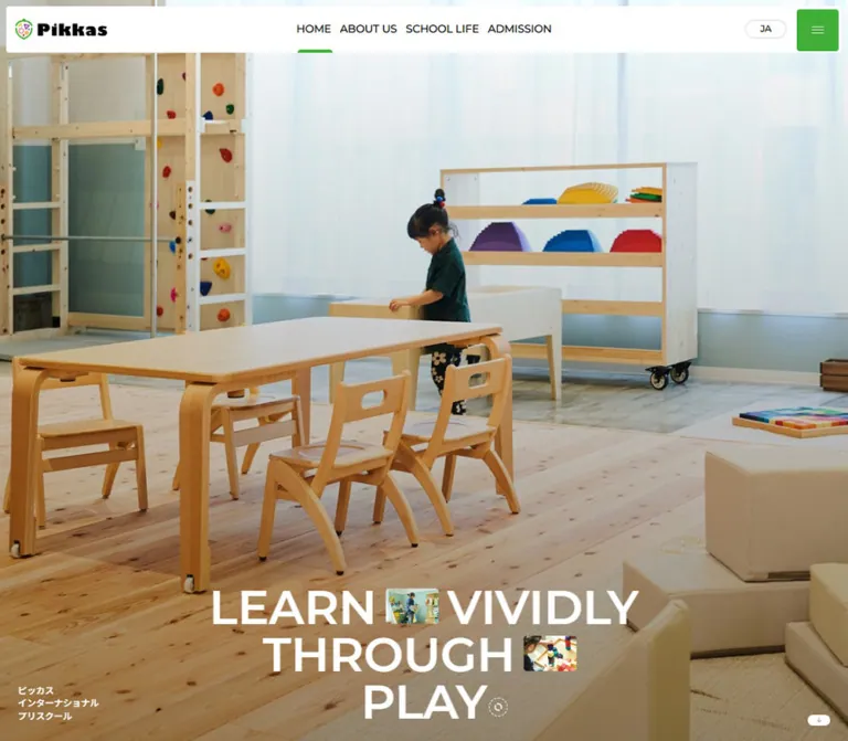
Pikkas presents an international preschool through the physical environment children inhabit: pale timber furniture, translucent curtains, soft upholstery, colorful learning materials, and a child absorbed in an activity. A full-bleed classroom photograph carries most of the opening screen. The interface adds a narrow white navigation surface, a compact black wordmark, and one strongly colored menu button.
The main typographic device is a large white sentence arranged across three lines: LEARN VIVIDLY / THROUGH / PLAY. Small rectangular photographs interrupt its word groups. Their contents and positions differ between desktop captures, giving the composition a playful quality while the surrounding typography stays disciplined. On mobile, the same scene is cropped vertically, the headline becomes nearly screen-wide, and the Japanese school name moves beneath it.
This is a school homepage with routes to educational information, admissions, employment, and company information. Its reference should preserve that information architecture alongside the memorable opening image.
How to Read This Reference
- Measured values come from the supplied computed styles, custom properties, and element rectangles. They describe the sampled state.
- Visual estimates describe details visible in the original-page screenshots whose individual styles were not supplied, including the white header surface and inline photo sizes.
- DOM-only findings establish text, destinations, hierarchy, and sampled geometry. They do not establish a complete painted appearance or an exercised interaction.
- Recommendations and the Quick Start are implementation guidance. Their breakpoints, crop settings, accessibility treatments, and unspecified component fills are not recovered source rules.
- Token names are descriptive aliases unless explicitly identified as source custom properties.
- Some lower-page bounds are smaller than their computed text line boxes. Transformed ancestors could explain this, but transform rules were not supplied. Do not treat every fractional rectangle as an authored width or a final animation position.
Tokens — Colors
Core Palette
| Name | Value | Suggested token | Evidence and role |
|---|---|---|---|
| School Green | #3faf37 |
--color-green |
Measured menu-button background, active Home item in the menu DOM, and footer return-link background |
| Pale Canvas | #f5f7f5 |
--color-canvas |
Measured root background; a subtly green-tinted neutral |
| Black Ink | #000000 |
--color-ink |
Measured navigation, section headings, body text, and footer text |
| White | #ffffff |
--color-white |
Measured hero lettering and menu-button foreground; the header surface also appears white |
| Language Outline | Approximately #e8e8e8 |
--color-outline |
Visual estimate of the thin language-capsule border |
| Warm Arrow | Approximately #b79b6d |
--color-arrow |
Visual estimate of the small downward arrow against its white pill |
School Green is concentrated in interface landmarks: the menu square, the active navigation indicator, and the footer return control. The classroom contributes most of the remaining color. Timber browns, pale blue-gray walls, and saturated toy colors belong to the photography rather than a measured UI palette.
The white header is an observed painted surface. Its inner element was not separately included in the style sample; the outer HEADER itself reports a transparent background.
Recommended Contrast Variant
For a new implementation, #176d22 is a possible darker green for small white action labels. This is a recommendation, not an observed site color. White against the measured bright green is approximately 2.8:1, so the original green should not automatically become the background for every small white-text button.
No alternate color theme or theme selector is established by the supplied evidence.
Tokens — Typography
Declared Typeface Stack
Measured body stack: Montserrat, 'Noto Sans JP', sans-serif.
Montserrat supplies the declared Latin typography; Noto Sans JP provides the declared Japanese fallback. The supplied evidence establishes the computed stack, not font-file versions, loading behavior, or the exact face used for every glyph.
The headline uses weight 600, producing a substantial geometric shape without the density of an extra-bold display face. Navigation uses 500; section labels and secondary headings generally use 600; paragraphs use 400.
The Pikkas wordmark is visually distinct from the surrounding text. Its exact lettering face and asset format were not supplied. Preserve it as authorized brand artwork rather than trying to reproduce it with Montserrat.
Type Scale
All values below are measured computed styles. Menu entries are DOM-only observations.
| Role | Desktop size / line height | Mobile size / line height | Weight | Tracking |
|---|---|---|---|---|
| Hero sentence | 80px / 80px |
39px / 39px |
600 |
Normal |
| Japanese hero caption | 12.16px / 16.416px |
14px / 18.9px |
600 |
0.3px |
| Header navigation | 14.16px / 21.24px |
14px / 21px in DOM; not visibly displayed |
500 |
0.3px |
| Current language label | 12.16px / 16.416px |
11px / 14.85px |
500 |
0.3px |
| Main menu entries | 50px / 50px |
46.8px / 51.48px |
600 |
Desktop 0.5px; mobile -2px |
| Section labels | 14.16px / 21.24px |
14px / 21px |
600 |
0.3px |
| About statement | 50px / 55px |
21.45px / 23.595px |
600 |
Desktop 0.5px; mobile 0.2145px |
| About paragraph | 18px / 25.2px |
14px / 19.6px |
400 |
0.2px |
| School Life / Admission heading | 32px / 32px |
20px / 20px |
600 |
Normal |
| Other body paragraphs | 14.16px / 21.24px |
14px / 21px |
400 |
0.3px |
| SEE DETAILS label | 14.16px / 21.24px |
14px / 21px |
500 |
0.3px |
| Footer certification note | 9.44px / 12.744px |
8.39px / 11.3265px |
500 |
Normal |
The hero uses a line-height of exactly one font size. Larger lower-page headings also use tight leading, while paragraphs receive approximately 1.4 or 1.5 line-height.
Lettering and Semantic Hierarchy
The source associates its H1 with the brand identity. The large hero sentence is composed of three flex-displayed P elements, and the Japanese school name is an H2. Lower sections use small H2 labels followed by larger H3 statements where present.
Visible header and section labels use uppercase lettering even where extracted link text uses title case. Preserve the intended visual casing without assuming the exact capitalization mechanism.
The source root font size is 10px. The root also reports Times, but the body overrides that family with the declared sans-serif stack. Times is not evidence of an editorial serif treatment. The Quick Start uses explicit sizes and a conventional root rather than copying source rem numbers.
Tokens — Spacing & Shapes
Source Units
| Source property | Desktop | Mobile | Interpretation |
|---|---|---|---|
--grid |
2.08333vw, approximately 30px |
20px |
Viewport-derived desktop spacing changes to a fixed mobile unit |
--vh |
10px |
8.44px |
Equals one percent of the reported viewport height in each sample |
| Root font size | 10px |
10px |
Source rem conversion only |
The desktop grid value is approximately one forty-eighth of the viewport width. This establishes a useful spacing relationship; it does not prove a literal 48-column CSS grid.
Spacing Scale
| Use | Desktop | Mobile | Status |
|---|---|---|---|
| Outer header inset | Approximately 10px |
10px |
Computed padding and visible placement |
| Standard content gutter | Approximately 30px |
20px |
Repeated measured left edges |
| Header navigation gap | Approximately 15px |
Navigation not painted | Calculated from adjacent link bounds |
| Hero lines | 80px pitch |
39px pitch |
Measured; no extra inter-line gap |
| Caption below mobile headline | Separate desktop corner placement | 20px |
Calculated from measured line and caption bounds |
| Hero-to-next-section extension | 180px |
120px |
Measured section bottom padding; six grid units |
| About heading left inset | Approximately 120px |
20px |
Measured |
| About label offset within section | Approximately 138px |
93px |
Calculated from section and label positions |
| School Life / Admission label offset | Approximately 270px |
180px |
Calculated; approximately nine grid units |
Border Radius
| Element | Desktop | Mobile | Evidence |
|---|---|---|---|
| Green menu button | 5px |
3.33334px |
Computed |
| Detail-link wrapper | 5px |
3.33334px |
Computed; fill not established |
| White header surface | Approximately 5px |
Approximately 3px |
Screenshot estimate |
| Inline photographic inserts | Approximately 4–5px |
Approximately 3px |
Screenshot estimate |
| Language capsule | Pill | Pill | Visible shape; exact radius unavailable |
| Footer return control | Fully rounded | Fully rounded | Computed radius 1440px / 390px |
The geometry combines lightly rounded rectangles with small pills. Large rounded cards and a general shadow system are not established by the visible opening screen.
Layout Measurements
| Element | Desktop | Mobile | Notes |
|---|---|---|---|
| Painted header surface | Approximately 1420 × 60px, at (10, 10) |
Approximately 370 × 60px, at (10, 10) |
Visual estimate |
| Outer header rectangle | 1440 × 60px |
390 × 80px |
Measured wrapper, distinct from painted surface |
| Brand bounds | 120 × 27.20px, near (25, 26.38) |
100 × 22.66px, at (20, 28.67) |
Measured H1 bounds |
| Menu button | 54 × 54px, near (1372, 14) |
50 × 50px, at (325, 15) |
Measured |
| Hero sentence block | Approximately 729.70 × 240px, at (355.15, 730.02) |
367.25 × 117px, at (11.38, 568.11) |
Calculated from measured line rectangles |
| Japanese caption | Near (29.98, 920.33), three lines |
Near (54.97, 705.11), one line |
Measured |
| Inline photographs | Approximately 90 × 60px |
Approximately 40 × 27px |
Visual estimate, not native asset size |
| Hero down-link bounds | 38 × 18px, near (1372, 952) |
175 × 23.67px, at (107.5, 780.33) |
Mobile anchor is wider than its painted pill |
| Painted mobile down pill | — | Approximately 50 × 24px, centered |
Screenshot estimate |
| Opening section height | 1179.98px |
964px |
Includes bottom extension beyond the photographed viewport |
Components
Floating White Header
Role: identity, primary destinations, language access, and menu access.
The visible header sits approximately 10px inside the top and sides of the viewport. It is a flat white horizontal surface with small corner radii. The photograph remains visible around its outer edge.
Its anatomy is a brand at left, four desktop navigation items centered across the page, and a language capsule plus green menu button at right. The brand width reduces from 120px to 100px on mobile. The painted bar stays approximately 60px tall in both supplied viewport sizes.
The outer header rectangle has different dimensions from the visible white surface. Use the screenshot for painted geometry and the element table for sampled wrapper geometry. Persistence during scrolling was not demonstrated; fixed or sticky positioning cannot be confirmed from the supplied opening captures.
Desktop Primary Navigation
Role: direct access to Home, About Us, School Life, and Admission.
The four links occupy approximately x=540–900 at desktop, centered around the viewport midpoint. Their measured gaps are about 15px. Labels are black, uppercase in the screenshots, and modestly tracked.
HOME has a short green indicator along the bottom edge of the white bar. Its visible height is approximately 3px, with a rounded upper edge. This active state is visually established; hover and focus treatments were not exercised.
The navigation is absent from the painted mobile header even though corresponding links still have entries in the supplied DOM sample. Their DOM rectangles should not be interpreted as overlapping visible links on the phone.
Language Capsule
Role: expose the current language and access to language destinations.
The visible EN label sits inside a thin gray-outlined white pill. Its painted size is approximately 58 × 28px on desktop and 50 × 24px on mobile. The measured anchor includes a larger padded area.
The DOM includes JA linking to the original root and EN linking to /en/. Only EN is visible in the supplied captures. An expanded selector, dropdown animation, hover trigger, or successful language-switch result was not supplied.
Menu Button and Menu Content
Role: compact access to the wider site navigation.
The menu button is the strongest solid-color interface element: School Green, a white thin-line hamburger, a 54px desktop square, and a 50px mobile square. Its radius changes from 5px to approximately 3.33px.
The DOM contains a second navigation set with four large entries, followed by Company, Careers, Privacy Policy, and social destinations for LINE, Instagram, and Note. Large entries measure 50px on desktop and 46.8px on mobile. The Home entry is green in this set.
These menu links are not painted in the supplied screenshots. Their background, layering, opening direction, focus handling, and scrolling behavior remain unverified. The available data supports the menu's content hierarchy and typography, rather than a finished overlay design.
Classroom Hero
Role: communicate the school environment before introducing detailed content.
A bright classroom scene fills the opening viewport behind all hero content. The composition includes a timber climbing structure at left, a large table and child-sized chairs across the foreground, a child around the middle, wheeled shelves with colorful materials, pale curtains, and cream upholstered blocks at right.
Desktop preserves the breadth of the room. Mobile uses a much narrower crop, keeping the child toward the right of center and allowing the table and chairs to dominate the foreground. The image reaches the viewport edges.
Lower image areas appear subdued enough to support white lettering. The exact overlay, exposure adjustment, or underlying media processing is not recorded. Any gradient in a reproduction is an approximation.
The evidence shows photographic imagery. It does not identify whether the background originates from an image element, a video poster, or another media implementation.
Headline with Inline Photographs
Role: express learning through play through both language and image arrangement.
Three centered rows form the statement. Each measured source row is a flex container using Montserrat at weight 600, white, with a line-height of one.
One desktop capture places a photograph between LEARN and VIVIDLY, and another after THROUGH. Later desktop captures place a photograph after LEARN VIVIDLY and another before THROUGH. The mobile captures use the latter arrangement.
The inserts are small landscape crops, approximately 3:2, with lightly rounded corners. They sit within the typographic rows rather than forming a separate gallery. Their height is approximately three quarters of the desktop letter line and somewhat smaller relative to the mobile line.
A small white circular motif follows PLAY. Its appearance is visible, but no control semantics or playback behavior are established. Do not assign a media action based solely on its shape.
Japanese School Caption and Downward Cue
Role: retain the school's Japanese identity and indicate continuation below the hero.
Desktop places the school name near the bottom-left corner in three compact lines: ピッカス, インターナショナル, and プリスクール. Its 12.16px lettering is visually subordinate to the central English sentence.
Mobile increases this caption to 14px and combines it into one centered line, ピッカス インターナショナル プリスクール, approximately 20px below the headline block.
The down cue is a tiny white pill with a warm-colored arrow. It sits near the bottom-right on desktop and at the horizontal center on mobile. Its anchor points to /en/#a-body; anchor activation and scroll timing were not tested.
About Us Introduction
Role: introduce the school's opening and educational approach.
This section is established by DOM measurements rather than a supplied lower-page screenshot. Its desktop structure is deliberately asymmetric: a small label begins near the 30px page gutter; a large statement begins at x≈120 and spans approximately 1200px; the following paragraph begins around x=600 and occupies approximately 720px.
The statement uses 50px / 55px semibold text. The paragraph uses 18px / 25.2px, making this introduction more prominent than later body copy. The content mentions opening in spring 2025 in Minato City, Tokyo, and an environment for children, families, and caregivers to learn together.
On mobile, the label, statement, and paragraph align to a 20px gutter within a 350px width. The statement reduces to 21.45px and the paragraph to 14px. A detail link follows later in the section. The intervening media arrangement is not established by the supplied element sample.
School Life and Admission Sections
Role: provide focused summaries that lead to dedicated information pages.
Both sections use a small uppercase label, a semibold statement, supporting prose, and a SEE DETAILS link. At desktop, their label and heading containers are approximately 720px wide and centered at x≈360. Their paragraphs have sampled rendered widths of approximately 349.18px, centered within that larger region.
On mobile, heading containers expand to approximately 370px with 10px outside margins. Paragraph bounds are narrower, approximately 300.70px, centered near x=44.65. This creates a clear distinction between broad heading space and a controlled reading measure.
School Life discusses an English environment and learning through experience. Admission invites prospective families to an orientation. The DOM shows substantial vertical separation between headings, paragraphs, and links. Without lower-page visual captures, those intervals cannot be described as empty space or assigned invented imagery.
SEE DETAILS Link
Role: move from a homepage summary to its dedicated page.
The sampled link wrappers have small corner radii and white uppercase labels. Desktop rendered bounds are approximately 231 × 58.15px; most mobile bounds are approximately 203.38 × 58.2px. The mobile Careers link is approximately 209.67 × 60px.
Two copies of the same label appear inside each anchor. This could support a rolling or replacement-label effect, but the transition was not observed. Treat each pair as one link with one accessible name.
The anchor's measured background is transparent. A child or pseudo-element may provide a fill, but that surface was not included in the evidence. Do not classify these links as measured green buttons. The Quick Start supplies an explicitly recommended fill.
Careers Section
Role: introduce employment opportunities without interrupting the school's primary information sequence.
Desktop places the label in a right-side region beginning near x=840, with a 480px label container. The paragraph has sampled bounds near x=847 and width 378.32px; the detail link follows in the same region.
Mobile returns the section label to the standard 20px gutter, with paragraph bounds approximately 339.5px wide. The detail link is centered near the end of the section. The supplied data does not reveal what occupies the remaining desktop area or the large mobile interval before the link.
An opacity 0.7s transition is recorded on the section, but its reveal trigger was not exercised.
Information Footer
Role: provide contact information, a sitemap, social links, institutional information, and a return route.
The footer DOM contains Information, Sitemap, and FOLLOW US groups, followed by a certification/subsidy note and copyright text. Contact content includes the school name, its Shibaura address, a map destination, and an email link.
Desktop places the main groups across the page, with starts near x=30, 360, and 690. The compact certification note sits farther right near x=1230. Mobile stacks the groups within 20px gutters while keeping the sitemap itself in two columns, beginning at x=20 and x=195.
The return-to-top anchor points to /en/#top-body. Its measured background is green and its shape is a pill: 38 × 18px on desktop and 50 × 23.67px on mobile. The complete footer surface and any decorative imagery were not visually supplied.
Tokens — Motion & Interaction
| Element or treatment | Supplied evidence | Supported interpretation | Limitation |
|---|---|---|---|
| Header | transition: 0.3s |
A 300ms transition is declared | Trigger and changed property are not established |
| Menu button | transition: 0.4s |
A 400ms transition is declared | No opened state or icon morph was captured |
| Secondary menu, social, and some footer links | transition: 0.2s |
Short utility-link transitions are declared | No hover or focus outcome was supplied |
| Japanese hero caption | transition: opacity 0.7s |
A 700ms opacity transition is declared | Initial state and trigger unknown |
| Careers section | transition: opacity 0.7s |
A 700ms opacity transition is declared | Reveal behavior unverified |
| Inline hero photographs | Contents and positions differ between desktop frames | The supplied states demonstrate visual variation | Timing, sequence, easing, trigger, and implementation unknown |
| Duplicate detail labels | Two text copies inside one link | A layered label structure exists | Rolling-label behavior remains a hypothesis |
| Hero and footer anchors | #a-body and #top-body destinations |
In-page navigation is present | Smooth scrolling and arrival positions not tested |
Many sampled elements report animation: none. That does not establish that the page has no animation: motion could occur on descendants, pseudo-elements, or through scripts. Likewise, a bare transition: all entry without a useful duration is not a measured animation token.
For an adaptation, keep photographic movement gentle and retain stable text baselines. A static inline-photo arrangement is an evidence-compatible fallback. Any chosen looping interval or easing curve should be documented as a new implementation decision.
Surfaces
| Layer | Appearance | Evidence boundary |
|---|---|---|
| Root canvas | Solid pale green-white #f5f7f5 |
Measured |
| Opening media | Full-bleed classroom photography | Visually confirmed; media implementation unknown |
| Header | Flat white strip with small rounded corners | Visually confirmed; inner fill not separately sampled |
| Primary utility control | Solid green square with white line icon | Measured and visually confirmed |
| Language control | White pill with a pale outline | Visually confirmed; outline color estimated |
| Hero continuation cue | Small white pill with warm arrow | Visually confirmed |
| Lower section wrappers | Transparent sampled backgrounds over the page base | Does not rule out unsampled child surfaces |
| Detail links | White labels and rounded wrapper geometry | Painted fill unverified |
The opening screen achieves separation through image-to-white contrast, a solid green control, and restrained outlines. It does not show a general elevation or card-shadow system.
Imagery
The photographic direction is bright, observational, and grounded in real preschool activity. Natural wood, diffuse daylight, and quiet concentration carry the mood. Colorful learning objects provide small saturated accents without turning the interface itself into a multicolor system.
Preserve room context in the large image: furniture scale, open floor area, curtains, and teaching materials communicate the environment. For narrow screens, prioritize the child and recognizable classroom objects when choosing the crop.
The inline photographs should remain legible as small activity glimpses. Favor clear subjects and simple compositions. They function as punctuation inside the sentence, so their size and placement need to respond to the text rather than a separate gallery grid.
Observed Asset References
No original image URLs, filenames, intrinsic dimensions, or file formats were included in the supplied evidence.
| Asset role | What is established | Reuse guidance |
|---|---|---|
| Brand artwork | Pikkas lettering and a small multicolor emblem; approximately 4.41:1 displayed bounds | Obtain the authorized logo asset; do not infer its font |
| Main classroom media | Same classroom composition across the supplied original-page frames | Use an authorized high-resolution source and tune the mobile crop |
| Inline activity photographs | Two small landscape inserts with differing contents and positions | Preserve approximately 3:2 crops and modest corner rounding |
| Circular headline motif | Small white circular decoration after PLAY | Keep decorative unless actual control semantics are established |
| Lower-page media | Not established by the supplied images or asset records | Do not invent an asset inventory from section spacing |
Layout & Responsive Behavior
Opening Viewport
The desktop image occupies the full 1440 × 1000 opening view. The headline begins around y=730 and ends around y=970, placing its three 80px lines near the bottom center. The Japanese caption and down cue independently occupy the lower corners.
At 390 × 844, the headline begins around y=568 and ends around y=685. Its three 39px lines occupy nearly the available width. The caption follows at y≈705, and the down pill appears at y≈780. This is a coordinated repositioning of the supporting elements, not uniform scaling of the desktop composition.
The mobile header retains its approximately 60px white surface while removing the painted primary navigation. The logo and menu button become slightly smaller; the language control remains visible.
Lower-Page Geometry
These values are sampled DOM rectangles, not visually verified section designs.
| Region | Desktop | Mobile |
|---|---|---|
| About section | Starts y≈1180; height≈1239px | Starts y=964; height≈1056px |
| About statement | x≈120, width≈1200px | x=20, width=350px |
| About paragraph | x≈600, width≈720px | x=20, width=350px |
| School Life section | Starts y≈2445; height≈1530px | Starts y≈2030; height≈1301px |
| Admission section | Starts y≈3984; height≈1298px | Starts y≈3338; height≈1090px |
| Careers section | Starts y≈5283; height≈930px | Starts y≈4428; height≈823px |
| Footer | Starts y≈6213; height=1000px | Starts y≈5252; height≈1162px |
The main element measures approximately 6212.77px high on desktop and 5251.81px on mobile. However, the reported document height equals the viewport height in both samples. This mismatch prevents a reliable conclusion about the scrolling container or transformed page shell. Do not reproduce it by clipping the body to one screen.
Responsive Rules to Preserve
- Keep the opening media edge-to-edge and preserve a useful subject crop at each width.
- Maintain three deliberate headline rows with inline photo inserts.
- Move the Japanese school caption from a desktop corner into the mobile reading sequence.
- Center the mobile down cue independently from the headline.
- Change the About introduction from an offset desktop arrangement to a single mobile column.
- Retain a narrower paragraph measure inside the broader School Life and Admission heading regions.
- Stack footer groups on mobile while retaining the two-column sitemap.
Only two viewport sizes were supplied. The exact source breakpoint, intermediate tablet behavior, browser-toolbar response, safe-area handling, and short-landscape layout are unknown. The Quick Start uses 48rem as a recommended breakpoint, not a measured one.
Do’s and Don’ts
Do
- Lead with the actual classroom environment and the scale of child-sized furniture.
- Use the measured green
#3faf37for recognizable interface accents. - Keep the header white, shallow, and inset approximately 10px from the viewport edges.
- Use the declared Montserrat/Noto Sans JP stack, with a semibold hero and regular paragraphs.
- Preserve the three-line headline and its small photographic inserts.
- Retain the Japanese school name and its different desktop/mobile placement.
- Keep the mobile child and classroom activity legible within the crop.
- Preserve the homepage's routes to About Us, School Life, Admission, Careers, and company information.
- Use the DOM evidence to guide lower-page hierarchy while marking missing visual treatments as unverified.
Don’t
- Don’t replace the authorized wordmark with ordinary typed text and call it an exact match.
- Don’t treat toy colors inside the photograph as a measured collection of UI accent tokens.
- Don’t scale the entire desktop screen down to create the phone layout.
- Don’t expose the sampled hidden navigation links across the mobile header.
- Don’t assign a playback action to the circular headline motif without supporting evidence.
- Don’t present an invented slideshow interval, parallax effect, or menu animation as observed behavior.
- Don’t assume transparent detail-link wrappers prove either a transparent or green painted button.
- Don’t interpret large lower-section intervals as confirmed empty whitespace.
- Don’t copy the viewport-height document measurement into a body rule that prevents access to the remaining content.
Recommended Implementation Additions
These are recommendations for a new implementation, not verified features of the original page.
- Give the menu button an accessible name, connect its expanded state to the controlled navigation, and provide keyboard closing and focus return.
- Hide inactive navigation from both focus and assistive technology. DOM presence alone should not make a closed menu interactive.
- Preserve a single accessible name for each detail link; hide any duplicate animation label from assistive technology.
- Provide at least a 44px effective target for the small language and directional controls while retaining their compact painted shapes.
- Use a contrast-tested fill for small white action labels. The recommended darker green is separate from the measured brand green.
- Increase the very small certification text for practical reading, especially the measured 8.39px mobile version.
- Give the main photograph meaningful alternative text when it conveys content; use empty alternatives for purely decorative inline inserts.
- Offer a reduced-motion state that keeps the sentence stable and uses a single photographic arrangement.
- Keep lower content reachable without motion scripts. Use a normal document-flow fallback rather than relying on unexplained viewport-height measurements.
- Load authorized font files and imagery, reserve their dimensions, and recheck line wrapping after fonts become available.
Agent Prompt Guide
Quick Color Reference
- Canvas:
#f5f7f5. - Text:
#000000. - Hero lettering and header surface: white.
- Menu square, active marker, and footer return control:
#3faf37. - Language outline: approximately
#e8e8e8, visually estimated. - Small white-text action fill:
#176d22only as a recommended contrast adaptation. - Timber, curtain, and toy colors should come from photography.
Overall Prompt
“Create a preschool homepage inspired by the observed Pikkas International Preschool interface. Use an edge-to-edge sunlit classroom photograph, an inset white header, authorized brand artwork, centered desktop navigation, an outlined language capsule, and a compact green menu square in #3faf37. Set LEARN VIVIDLY / THROUGH / PLAY across three centered white Montserrat semibold rows, with two small rounded landscape photographs embedded in the lettering. At 1440px, use approximately 80px headline type near the bottom of the first viewport. At 390px, use approximately 39px type, remove the painted desktop navigation, place the Japanese school name below the headline, and center the down cue. Continue with a pale #f5f7f5 canvas, small uppercase section labels, black statements, controlled paragraph widths, and links to the school's information pages. Treat unspecified lower-page surfaces and motion as new implementation decisions.”
Example Component Prompts
- Header: “Build a white header inset 10px from the viewport, approximately 60px tall, with a 120px-wide brand asset at left. Center HOME, ABOUT US, SCHOOL LIFE, and ADMISSION in 14.16px Montserrat medium. Put a thin green active marker beneath HOME. At right, add a pale outlined EN capsule and a 54px green menu square with a thin white hamburger.”
- Hero sentence: “Arrange a white 600-weight sentence into three tightly spaced rows: LEARN VIVIDLY, THROUGH, PLAY. Place an approximately 90 × 60px activity photograph after the first row's words and another before THROUGH. Keep each insert aligned within its row, lightly rounded, and visually smaller than the sentence.”
- Mobile opening: “At 390 × 844, retain the classroom scene with the child toward the right of center. Use a 100px brand, a 50px green menu button, and no visible desktop link row. Place three 39px headline rows around the lower third, followed by the single-line Japanese school name and a centered white down pill.”
- About introduction: “Use the recorded desktop hierarchy: a small label at the page gutter, a 50px semibold statement in a broad inset region, and an 18px paragraph occupying the right portion below. On mobile, align the content to 20px gutters and reduce the statement to about 21.45px. Leave unspecified media placement open for verified assets.”
- Detail link adaptation: “Create one rounded 60px-high information link with a white uppercase SEE DETAILS label. Use a darker contrast-tested green as an explicitly recommended fill. If animating duplicate labels, expose only one accessible name and retain a static reduced-motion state.”
Quick Start
CSS Custom Properties
This is an implementation adaptation, not extracted source CSS. It preserves the measured desktop/mobile endpoints and visible hero anatomy. The 48rem breakpoint, gradient, initial image crop, static positioning, and darker detail-link fill are recommendations. Load authorized Montserrat and Noto Sans JP files separately; this snippet only declares their family names.
:root {
  /* Measured source colors */
  --color-green: #3faf37;
  --color-canvas: #f5f7f5;
  --color-ink: #000000;
  --color-white: #ffffff;

  /* Visual estimates and recommended action color */
  --color-outline: #e8e8e8;
  --color-arrow: #b79b6d;
  --color-action: #176d22;

  --font-site: 'Montserrat', 'Noto Sans JP', sans-serif;
  --layout-grid: 2.08333vw;
  --header-inset: 10px;
  --header-height: 60px;
  --logo-width: 120px;
  --menu-size: 54px;
  --radius-control: 5px;
  --text-ui: 14.16px;
  --text-hero: min(5.55556vw, 80px);
  --text-about: 50px;
  --text-section: 32px;
  --photo-width: 90px;
  --photo-gap: 14px;
  --hero-copy-bottom: 30px;
  --caption-bottom: 30px;
  --caption-size: 12.16px;
  --hero-position: 50% 50%;

  /* Durations observed; application and easing are recommendations */
  --duration-link: 200ms;
  --duration-header: 300ms;
  --duration-control: 400ms;
  --duration-reveal: 700ms;
}

* { box-sizing: border-box; }
html { background: var(--color-canvas); }
body {
  margin: 0;
  color: var(--color-ink);
  font-family: var(--font-site);
  font-size: 16px;
}
button, a { -webkit-tap-highlight-color: transparent; }
button { font: inherit; }
img { display: block; max-width: 100%; }
a { color: inherit; }

.site-header {
  position: absolute;
  z-index: 10;
  inset: var(--header-inset) var(--header-inset) auto;
  display: flex;
  align-items: center;
  justify-content: space-between;
  height: var(--header-height);
  padding: 4px 4px 4px 15px;
  border-radius: 5px;
  background: var(--color-white);
}
.brand { margin: 0; line-height: 1; }
.brand img { width: var(--logo-width); height: auto; }
.primary-nav {
  position: absolute;
  top: 50%;
  left: 50%;
  display: flex;
  gap: 15px;
  transform: translate(-50%, -50%);
}
.primary-nav a {
  position: relative;
  white-space: nowrap;
  text-decoration: none;
  text-transform: uppercase;
  font-size: var(--text-ui);
  font-weight: 500;
  line-height: 1.5;
  letter-spacing: 0.3px;
}
.primary-nav [aria-current='page']::after {
  content: '';
  position: absolute;
  right: 0;
  bottom: -19px;
  left: 0;
  height: 3px;
  border-radius: 3px 3px 0 0;
  background: var(--color-green);
}
.header-tools { display: flex; align-items: center; gap: 18px; }
.language-link {
  position: relative;
  display: grid;
  place-items: center;
  width: 58px;
  min-height: 44px;
  font-size: 12.16px;
  font-weight: 500;
  text-decoration: none;
}
.language-link::before {
  content: '';
  position: absolute;
  inset: 8px 0;
  border: 2px solid var(--color-outline);
  border-radius: 999px;
  pointer-events: none;
}
.menu-button {
  display: grid;
  place-content: center;
  gap: 3px;
  width: var(--menu-size);
  height: var(--menu-size);
  padding: 0;
  border: 0;
  border-radius: var(--radius-control);
  color: var(--color-white);
  background: var(--color-green);
  cursor: pointer;
}
.menu-button span { width: 17px; height: 1px; background: currentColor; }

.opening { padding-bottom: calc(6 * var(--layout-grid)); }
.hero-stage {
  position: relative;
  isolation: isolate;
  min-height: 100vh;
  min-height: 100svh;
  color: var(--color-white);
}
.hero-background {
  position: absolute;
  z-index: -2;
  inset: 0;
  width: 100%;
  height: 100%;
  object-fit: cover;
  object-position: var(--hero-position);
}
.hero-stage::before {
  /* Recommended approximation; source overlay was not measured. */
  content: '';
  position: absolute;
  z-index: -1;
  inset: 0;
  background: linear-gradient(transparent 45%, rgb(0 0 0 / 26%));
}
.hero-copy {
  position: absolute;
  bottom: var(--hero-copy-bottom);
  left: 50%;
  width: max-content;
  max-width: calc(100% - 20px);
  transform: translateX(-50%);
  font-size: var(--text-hero);
  font-weight: 600;
  line-height: 1;
}
.hero-line {
  display: flex;
  justify-content: center;
  align-items: center;
  gap: var(--photo-gap);
  margin: 0;
  font: inherit;
  white-space: nowrap;
}
.hero-photo {
  flex: 0 0 var(--photo-width);
  width: var(--photo-width);
  aspect-ratio: 3 / 2;
  object-fit: cover;
  border-radius: 4px;
}
.hero-mark {
  align-self: flex-end;
  margin-bottom: 0.4em;
  font-size: 24px;
  line-height: 1;
}
.school-caption {
  position: absolute;
  bottom: var(--caption-bottom);
  left: var(--layout-grid);
  margin: 0;
  font-size: var(--caption-size);
  font-weight: 600;
  line-height: 1.35;
  letter-spacing: 0.3px;
}
.school-caption span { display: block; }
.scroll-cue {
  position: absolute;
  right: var(--layout-grid);
  bottom: 30px;
  display: grid;
  place-items: center;
  width: 38px;
  height: 18px;
  border-radius: 999px;
  color: var(--color-arrow);
  background: var(--color-white);
  font-size: 12px;
  text-decoration: none;
}
.scroll-cue::before {
  /* Expand the effective target without enlarging the painted pill. */
  content: '';
  position: absolute;
  top: 50%;
  left: 50%;
  width: max(100%, 44px);
  height: 44px;
  transform: translate(-50%, -50%);
}

/* Lower-page layouts approximate the measured content relationships. */
.editorial-section { padding: 90px var(--layout-grid); }
.section-kicker {
  margin: 0;
  font-size: var(--text-ui);
  font-weight: 600;
  line-height: 1.5;
  letter-spacing: 0.3px;
  text-transform: uppercase;
}
.about-heading {
  margin: 90px calc(3 * var(--layout-grid));
  font-size: var(--text-about);
  font-weight: 600;
  line-height: 1.1;
  letter-spacing: 0.01em;
}
.about-copy {
  width: calc(24 * var(--layout-grid));
  margin-left: auto;
  margin-right: calc(3 * var(--layout-grid));
  font-size: 18px;
  line-height: 1.4;
  letter-spacing: 0.2px;
}
.centered-heading {
  max-width: 720px;
  margin-inline: auto;
  font-size: var(--text-section);
  font-weight: 600;
  line-height: 1;
}
.centered-copy {
  max-width: 360px;
  margin-inline: auto;
  font-size: var(--text-ui);
  line-height: 1.5;
  letter-spacing: 0.3px;
}
.detail-link {
  display: inline-flex;
  align-items: center;
  justify-content: space-between;
  gap: 24px;
  width: 238px;
  min-height: 60px;
  padding: 16px 30px;
  border-radius: var(--radius-control);
  color: var(--color-white);
  background: var(--color-action);
  font-size: var(--text-ui);
  font-weight: 500;
  line-height: 1.5;
  letter-spacing: 0.3px;
  text-transform: uppercase;
  text-decoration: none;
}
:where(a, button):focus-visible {
  outline: 3px solid var(--color-action);
  outline-offset: 4px;
}
.hero-stage .scroll-cue:focus-visible {
  outline-color: white;
  box-shadow: 0 0 0 7px var(--color-action);
}

/* Recommended breakpoint; only the two endpoints were inspected. */
@media (max-width: 48rem) {
  :root {
    --layout-grid: 20px;
    --logo-width: 100px;
    --menu-size: 50px;
    --radius-control: 3.33334px;
    --text-ui: 14px;
    --text-hero: 10vw;
    --text-about: 5.5vw;
    --text-section: 20px;
    --photo-width: 40px;
    --photo-gap: 10px;
    --hero-copy-bottom: 158.9px;
    --caption-bottom: 120px;
    --caption-size: 14px;
  }
  .site-header { padding: 5px 5px 5px 10px; border-radius: 3px; }
  .primary-nav { display: none; }
  .header-tools { gap: 15px; }
  .language-link { width: 50px; font-size: 11px; }
  .language-link::before { inset-block: 10px; }
  .hero-photo { border-radius: 3px; }
  .hero-mark { font-size: 16px; }
  .school-caption {
    left: 50%;
    transform: translateX(-50%);
    white-space: nowrap;
  }
  .school-caption span { display: inline; }
  .scroll-cue {
    right: auto;
    bottom: 40px;
    left: 50%;
    width: 50px;
    height: 24px;
    transform: translateX(-50%);
  }
  .about-heading { margin: 80px 0 40px; }
  .about-copy { width: auto; margin-inline: 0; font-size: 14px; }
  .centered-copy { max-width: 310px; }
  .detail-link { width: 210px; padding-inline: 20px; }
}

/* Recommended fallback for short screens; not observed source behavior. */
@media (max-height: 650px) {
  .hero-stage { min-height: 700px; }
}
@media (prefers-reduced-motion: reduce) {
  .site-header, .menu-button, .detail-link { transition: none; }
  .hero-photo { animation: none; }
}
Minimal Hero Markup
Every /media/ path below is a placeholder for an authorized local asset, not an observed source path. The circular character is a decorative approximation. Tune --hero-position using the actual image so the phone crop preserves the child. Connect the menu button to an accessible navigation implementation before use; no menu controller is implied by this static example.
<header class='site-header'>
  <h1 class='brand'>
    <a href='/en/'>
      <img src='/media/pikkas-logo.png' alt='Pikkas International Preschool'>
    </a>
  </h1>
  <nav class='primary-nav' aria-label='Primary navigation'>
    <a href='/en/' aria-current='page'>Home</a>
    <a href='/en/about/'>About us</a>
    <a href='/en/school-life/'>School life</a>
    <a href='/en/admission/'>Admission</a>
  </nav>
  <div class='header-tools'>
    <a class='language-link' href='/en/' hreflang='en' aria-label='English version'>EN</a>
    <button class='menu-button' type='button' aria-label='Open navigation'>
      <span aria-hidden='true'></span>
      <span aria-hidden='true'></span>
      <span aria-hidden='true'></span>
    </button>
  </div>
</header>
<main id='top-body'>
  <section class='opening'>
    <div class='hero-stage'>
      <img class='hero-background' src='/media/classroom.jpg'
        alt='A child exploring a sunlit preschool classroom with wooden furniture.'>
      <div class='hero-copy'>
        <p class='hero-line'>
          <span>LEARN VIVIDLY</span>
          <img class='hero-photo' src='/media/activity-one.jpg' alt=''>
        </p>
        <p class='hero-line'>
          <img class='hero-photo' src='/media/activity-two.jpg' alt=''>
          <span>THROUGH</span>
        </p>
        <p class='hero-line'>
          <span>PLAY</span><span class='hero-mark' aria-hidden='true'>◌</span>
        </p>
      </div>
      <h2 class='school-caption' lang='ja'>
        <span>ピッカス</span>
        <span>インターナショナル</span>
        <span>プリスクール</span>
      </h2>
      <a class='scroll-cue' href='#a-body' aria-label='Continue to About us'>↓</a>
    </div>
  </section>
  <section id='a-body' class='editorial-section'>
    <h2 class='section-kicker'>About us</h2>
    <!-- Insert the verified introduction, media, and detail link here. -->
  </section>
</main>
The example reproduces one observed arrangement of the inline photographs. It intentionally does not invent a cycling sequence. Recommended paragraph widths of 360px and 310px approximate the measured narrower rendered bounds without assuming that their fractional scaling is the intended resting layout.
Tailwind v4 Token Mapping
Optional aliases for a project already using Tailwind v4. This does not identify the original site's framework. Define the custom properties above first.
@theme inline {
  --color-school: var(--color-green);
  --color-canvas: #f5f7f5;
  --color-ink: #000000;
  --color-action: #176d22;
  --font-site: 'Montserrat', 'Noto Sans JP', sans-serif;
  --text-hero: var(--text-hero);
  --spacing-school-grid: var(--layout-grid);
  --radius-school: var(--radius-control);
}
Sources & Evidence
- Original website: https://pikkasinternational.com/.
- Final inspected page: https://pikkasinternational.com/en/, reported HTTP 200, with the document title Pikkas International Preschool. The final page retains the school's identity and serves English content.
- Capture time: September 12, 2026, 16:49:35.737 UTC; September 13, 2026, 01:49:35.737 JST.
- Visual evidence: three supplied original-page desktop captures at 1440 × 1000 and two mobile captures at 390 × 844. All show the opening viewport. Inline photographic contents and placement vary between desktop frames.
- Rendered evidence: supplied text, links, element rectangles, computed typography, colors, backgrounds, border radii, transition entries, and the
--gridand--vhcustom properties at both viewports. - Capture procedure: the supplied record describes load, image-decoding, and layout-stability checks with bounded waits, including temporary handling of perpetual animations. It also reports that service workers and SharedWorkers were disabled. These checks do not establish complete delayed content or all interaction states.
- Inspection limitations: no separate menu-open, hover, focus, language-switch, or anchor-activation result was supplied. Lower sections have DOM measurements but no supplied visual captures. Asset URLs, full stylesheet rules, font files, script behavior, source breakpoints, and transform rules were unavailable. The reported document-height discrepancy prevents confirmation of the scrolling architecture.
This reference describes the current supplied page state. CSS, markup, and accessibility additions are reusable recommendations and were not executed or tested against the original website.
# Pikkas International Preschool — Style Reference

> A sunlit classroom becomes the canvas for a precise, playful photographic headline.

**Original URL:** [pikkasinternational.com](https://pikkasinternational.com/)
**Final URL:** [pikkasinternational.com/en/](https://pikkasinternational.com/en/)
**Theme:** light interface, natural photography, black typography, and a bright green accent.
**Inspected capture:** September 13, 2026, 01:49:35 JST — September 12, 2026, 16:49:35.737 UTC.
**Viewports:** 1440 × 1000 desktop and 390 × 844 mobile, in reported CSS pixels.
**Scope:** the current English homepage reached from the original Japanese-domain URL. Visual evidence covers the opening viewport in three desktop and two mobile captures. Supplied rendered DOM and computed styles additionally cover About Us, School Life, Admission, Careers, navigation content, and the footer. Those lower sections and the expanded menu were not visually captured in the supplied images.

Pikkas presents an international preschool through the physical environment children inhabit: pale timber furniture, translucent curtains, soft upholstery, colorful learning materials, and a child absorbed in an activity. A full-bleed classroom photograph carries most of the opening screen. The interface adds a narrow white navigation surface, a compact black wordmark, and one strongly colored menu button.

The main typographic device is a large white sentence arranged across three lines: LEARN VIVIDLY / THROUGH / PLAY. Small rectangular photographs interrupt its word groups. Their contents and positions differ between desktop captures, giving the composition a playful quality while the surrounding typography stays disciplined. On mobile, the same scene is cropped vertically, the headline becomes nearly screen-wide, and the Japanese school name moves beneath it.

This is a school homepage with routes to educational information, admissions, employment, and company information. Its reference should preserve that information architecture alongside the memorable opening image.

## How to Read This Reference

- **Measured** values come from the supplied computed styles, custom properties, and element rectangles. They describe the sampled state.
- **Visual estimates** describe details visible in the original-page screenshots whose individual styles were not supplied, including the white header surface and inline photo sizes.
- **DOM-only findings** establish text, destinations, hierarchy, and sampled geometry. They do not establish a complete painted appearance or an exercised interaction.
- **Recommendations** and the Quick Start are implementation guidance. Their breakpoints, crop settings, accessibility treatments, and unspecified component fills are not recovered source rules.
- **Token names** are descriptive aliases unless explicitly identified as source custom properties.
- Some lower-page bounds are smaller than their computed text line boxes. Transformed ancestors could explain this, but transform rules were not supplied. Do not treat every fractional rectangle as an authored width or a final animation position.

## Tokens — Colors

### Core Palette

| Name | Value | Suggested token | Evidence and role |
| --- | --- | --- | --- |
| School Green | `#3faf37` | `--color-green` | Measured menu-button background, active Home item in the menu DOM, and footer return-link background |
| Pale Canvas | `#f5f7f5` | `--color-canvas` | Measured root background; a subtly green-tinted neutral |
| Black Ink | `#000000` | `--color-ink` | Measured navigation, section headings, body text, and footer text |
| White | `#ffffff` | `--color-white` | Measured hero lettering and menu-button foreground; the header surface also appears white |
| Language Outline | Approximately `#e8e8e8` | `--color-outline` | Visual estimate of the thin language-capsule border |
| Warm Arrow | Approximately `#b79b6d` | `--color-arrow` | Visual estimate of the small downward arrow against its white pill |

School Green is concentrated in interface landmarks: the menu square, the active navigation indicator, and the footer return control. The classroom contributes most of the remaining color. Timber browns, pale blue-gray walls, and saturated toy colors belong to the photography rather than a measured UI palette.

The white header is an observed painted surface. Its inner element was not separately included in the style sample; the outer `HEADER` itself reports a transparent background.

### Recommended Contrast Variant

For a new implementation, `#176d22` is a possible darker green for small white action labels. This is a recommendation, not an observed site color. White against the measured bright green is approximately 2.8:1, so the original green should not automatically become the background for every small white-text button.

No alternate color theme or theme selector is established by the supplied evidence.

## Tokens — Typography

### Declared Typeface Stack

**Measured body stack:** `Montserrat, 'Noto Sans JP', sans-serif`.

Montserrat supplies the declared Latin typography; Noto Sans JP provides the declared Japanese fallback. The supplied evidence establishes the computed stack, not font-file versions, loading behavior, or the exact face used for every glyph.

The headline uses weight `600`, producing a substantial geometric shape without the density of an extra-bold display face. Navigation uses `500`; section labels and secondary headings generally use `600`; paragraphs use `400`.

The Pikkas wordmark is visually distinct from the surrounding text. Its exact lettering face and asset format were not supplied. Preserve it as authorized brand artwork rather than trying to reproduce it with Montserrat.

### Type Scale

All values below are measured computed styles. Menu entries are DOM-only observations.

| Role | Desktop size / line height | Mobile size / line height | Weight | Tracking |
| --- | --- | --- | --- | --- |
| Hero sentence | `80px / 80px` | `39px / 39px` | `600` | Normal |
| Japanese hero caption | `12.16px / 16.416px` | `14px / 18.9px` | `600` | `0.3px` |
| Header navigation | `14.16px / 21.24px` | `14px / 21px` in DOM; not visibly displayed | `500` | `0.3px` |
| Current language label | `12.16px / 16.416px` | `11px / 14.85px` | `500` | `0.3px` |
| Main menu entries | `50px / 50px` | `46.8px / 51.48px` | `600` | Desktop `0.5px`; mobile `-2px` |
| Section labels | `14.16px / 21.24px` | `14px / 21px` | `600` | `0.3px` |
| About statement | `50px / 55px` | `21.45px / 23.595px` | `600` | Desktop `0.5px`; mobile `0.2145px` |
| About paragraph | `18px / 25.2px` | `14px / 19.6px` | `400` | `0.2px` |
| School Life / Admission heading | `32px / 32px` | `20px / 20px` | `600` | Normal |
| Other body paragraphs | `14.16px / 21.24px` | `14px / 21px` | `400` | `0.3px` |
| SEE DETAILS label | `14.16px / 21.24px` | `14px / 21px` | `500` | `0.3px` |
| Footer certification note | `9.44px / 12.744px` | `8.39px / 11.3265px` | `500` | Normal |

The hero uses a line-height of exactly one font size. Larger lower-page headings also use tight leading, while paragraphs receive approximately `1.4` or `1.5` line-height.

### Lettering and Semantic Hierarchy

The source associates its `H1` with the brand identity. The large hero sentence is composed of three flex-displayed `P` elements, and the Japanese school name is an `H2`. Lower sections use small `H2` labels followed by larger `H3` statements where present.

Visible header and section labels use uppercase lettering even where extracted link text uses title case. Preserve the intended visual casing without assuming the exact capitalization mechanism.

The source root font size is `10px`. The root also reports Times, but the body overrides that family with the declared sans-serif stack. Times is not evidence of an editorial serif treatment. The Quick Start uses explicit sizes and a conventional root rather than copying source rem numbers.

## Tokens — Spacing & Shapes

### Source Units

| Source property | Desktop | Mobile | Interpretation |
| --- | --- | --- | --- |
| `--grid` | `2.08333vw`, approximately `30px` | `20px` | Viewport-derived desktop spacing changes to a fixed mobile unit |
| `--vh` | `10px` | `8.44px` | Equals one percent of the reported viewport height in each sample |
| Root font size | `10px` | `10px` | Source rem conversion only |

The desktop grid value is approximately one forty-eighth of the viewport width. This establishes a useful spacing relationship; it does not prove a literal 48-column CSS grid.

### Spacing Scale

| Use | Desktop | Mobile | Status |
| --- | --- | --- | --- |
| Outer header inset | Approximately `10px` | `10px` | Computed padding and visible placement |
| Standard content gutter | Approximately `30px` | `20px` | Repeated measured left edges |
| Header navigation gap | Approximately `15px` | Navigation not painted | Calculated from adjacent link bounds |
| Hero lines | `80px` pitch | `39px` pitch | Measured; no extra inter-line gap |
| Caption below mobile headline | Separate desktop corner placement | `20px` | Calculated from measured line and caption bounds |
| Hero-to-next-section extension | `180px` | `120px` | Measured section bottom padding; six grid units |
| About heading left inset | Approximately `120px` | `20px` | Measured |
| About label offset within section | Approximately `138px` | `93px` | Calculated from section and label positions |
| School Life / Admission label offset | Approximately `270px` | `180px` | Calculated; approximately nine grid units |

### Border Radius

| Element | Desktop | Mobile | Evidence |
| --- | --- | --- | --- |
| Green menu button | `5px` | `3.33334px` | Computed |
| Detail-link wrapper | `5px` | `3.33334px` | Computed; fill not established |
| White header surface | Approximately `5px` | Approximately `3px` | Screenshot estimate |
| Inline photographic inserts | Approximately `4–5px` | Approximately `3px` | Screenshot estimate |
| Language capsule | Pill | Pill | Visible shape; exact radius unavailable |
| Footer return control | Fully rounded | Fully rounded | Computed radius `1440px` / `390px` |

The geometry combines lightly rounded rectangles with small pills. Large rounded cards and a general shadow system are not established by the visible opening screen.

### Layout Measurements

| Element | Desktop | Mobile | Notes |
| --- | --- | --- | --- |
| Painted header surface | Approximately `1420 × 60px`, at `(10, 10)` | Approximately `370 × 60px`, at `(10, 10)` | Visual estimate |
| Outer header rectangle | `1440 × 60px` | `390 × 80px` | Measured wrapper, distinct from painted surface |
| Brand bounds | `120 × 27.20px`, near `(25, 26.38)` | `100 × 22.66px`, at `(20, 28.67)` | Measured H1 bounds |
| Menu button | `54 × 54px`, near `(1372, 14)` | `50 × 50px`, at `(325, 15)` | Measured |
| Hero sentence block | Approximately `729.70 × 240px`, at `(355.15, 730.02)` | `367.25 × 117px`, at `(11.38, 568.11)` | Calculated from measured line rectangles |
| Japanese caption | Near `(29.98, 920.33)`, three lines | Near `(54.97, 705.11)`, one line | Measured |
| Inline photographs | Approximately `90 × 60px` | Approximately `40 × 27px` | Visual estimate, not native asset size |
| Hero down-link bounds | `38 × 18px`, near `(1372, 952)` | `175 × 23.67px`, at `(107.5, 780.33)` | Mobile anchor is wider than its painted pill |
| Painted mobile down pill | — | Approximately `50 × 24px`, centered | Screenshot estimate |
| Opening section height | `1179.98px` | `964px` | Includes bottom extension beyond the photographed viewport |

## Components

### Floating White Header

**Role:** identity, primary destinations, language access, and menu access.

The visible header sits approximately 10px inside the top and sides of the viewport. It is a flat white horizontal surface with small corner radii. The photograph remains visible around its outer edge.

Its anatomy is a brand at left, four desktop navigation items centered across the page, and a language capsule plus green menu button at right. The brand width reduces from 120px to 100px on mobile. The painted bar stays approximately 60px tall in both supplied viewport sizes.

The outer header rectangle has different dimensions from the visible white surface. Use the screenshot for painted geometry and the element table for sampled wrapper geometry. Persistence during scrolling was not demonstrated; fixed or sticky positioning cannot be confirmed from the supplied opening captures.

### Desktop Primary Navigation

**Role:** direct access to Home, About Us, School Life, and Admission.

The four links occupy approximately `x=540–900` at desktop, centered around the viewport midpoint. Their measured gaps are about 15px. Labels are black, uppercase in the screenshots, and modestly tracked.

HOME has a short green indicator along the bottom edge of the white bar. Its visible height is approximately 3px, with a rounded upper edge. This active state is visually established; hover and focus treatments were not exercised.

The navigation is absent from the painted mobile header even though corresponding links still have entries in the supplied DOM sample. Their DOM rectangles should not be interpreted as overlapping visible links on the phone.

### Language Capsule

**Role:** expose the current language and access to language destinations.

The visible EN label sits inside a thin gray-outlined white pill. Its painted size is approximately `58 × 28px` on desktop and `50 × 24px` on mobile. The measured anchor includes a larger padded area.

The DOM includes JA linking to the original root and EN linking to `/en/`. Only EN is visible in the supplied captures. An expanded selector, dropdown animation, hover trigger, or successful language-switch result was not supplied.

### Menu Button and Menu Content

**Role:** compact access to the wider site navigation.

The menu button is the strongest solid-color interface element: School Green, a white thin-line hamburger, a 54px desktop square, and a 50px mobile square. Its radius changes from 5px to approximately 3.33px.

The DOM contains a second navigation set with four large entries, followed by Company, Careers, Privacy Policy, and social destinations for LINE, Instagram, and Note. Large entries measure 50px on desktop and 46.8px on mobile. The Home entry is green in this set.

These menu links are not painted in the supplied screenshots. Their background, layering, opening direction, focus handling, and scrolling behavior remain unverified. The available data supports the menu's content hierarchy and typography, rather than a finished overlay design.

### Classroom Hero

**Role:** communicate the school environment before introducing detailed content.

A bright classroom scene fills the opening viewport behind all hero content. The composition includes a timber climbing structure at left, a large table and child-sized chairs across the foreground, a child around the middle, wheeled shelves with colorful materials, pale curtains, and cream upholstered blocks at right.

Desktop preserves the breadth of the room. Mobile uses a much narrower crop, keeping the child toward the right of center and allowing the table and chairs to dominate the foreground. The image reaches the viewport edges.

Lower image areas appear subdued enough to support white lettering. The exact overlay, exposure adjustment, or underlying media processing is not recorded. Any gradient in a reproduction is an approximation.

The evidence shows photographic imagery. It does not identify whether the background originates from an image element, a video poster, or another media implementation.

### Headline with Inline Photographs

**Role:** express learning through play through both language and image arrangement.

Three centered rows form the statement. Each measured source row is a flex container using Montserrat at weight 600, white, with a line-height of one.

One desktop capture places a photograph between LEARN and VIVIDLY, and another after THROUGH. Later desktop captures place a photograph after LEARN VIVIDLY and another before THROUGH. The mobile captures use the latter arrangement.

The inserts are small landscape crops, approximately 3:2, with lightly rounded corners. They sit within the typographic rows rather than forming a separate gallery. Their height is approximately three quarters of the desktop letter line and somewhat smaller relative to the mobile line.

A small white circular motif follows PLAY. Its appearance is visible, but no control semantics or playback behavior are established. Do not assign a media action based solely on its shape.

### Japanese School Caption and Downward Cue

**Role:** retain the school's Japanese identity and indicate continuation below the hero.

Desktop places the school name near the bottom-left corner in three compact lines: `ピッカス`, `インターナショナル`, and `プリスクール`. Its 12.16px lettering is visually subordinate to the central English sentence.

Mobile increases this caption to 14px and combines it into one centered line, `ピッカス インターナショナル プリスクール`, approximately 20px below the headline block.

The down cue is a tiny white pill with a warm-colored arrow. It sits near the bottom-right on desktop and at the horizontal center on mobile. Its anchor points to `/en/#a-body`; anchor activation and scroll timing were not tested.

### About Us Introduction

**Role:** introduce the school's opening and educational approach.

This section is established by DOM measurements rather than a supplied lower-page screenshot. Its desktop structure is deliberately asymmetric: a small label begins near the 30px page gutter; a large statement begins at x≈120 and spans approximately 1200px; the following paragraph begins around x=600 and occupies approximately 720px.

The statement uses `50px / 55px` semibold text. The paragraph uses `18px / 25.2px`, making this introduction more prominent than later body copy. The content mentions opening in spring 2025 in Minato City, Tokyo, and an environment for children, families, and caregivers to learn together.

On mobile, the label, statement, and paragraph align to a 20px gutter within a 350px width. The statement reduces to 21.45px and the paragraph to 14px. A detail link follows later in the section. The intervening media arrangement is not established by the supplied element sample.

### School Life and Admission Sections

**Role:** provide focused summaries that lead to dedicated information pages.

Both sections use a small uppercase label, a semibold statement, supporting prose, and a SEE DETAILS link. At desktop, their label and heading containers are approximately 720px wide and centered at x≈360. Their paragraphs have sampled rendered widths of approximately 349.18px, centered within that larger region.

On mobile, heading containers expand to approximately 370px with 10px outside margins. Paragraph bounds are narrower, approximately 300.70px, centered near x=44.65. This creates a clear distinction between broad heading space and a controlled reading measure.

School Life discusses an English environment and learning through experience. Admission invites prospective families to an orientation. The DOM shows substantial vertical separation between headings, paragraphs, and links. Without lower-page visual captures, those intervals cannot be described as empty space or assigned invented imagery.

### SEE DETAILS Link

**Role:** move from a homepage summary to its dedicated page.

The sampled link wrappers have small corner radii and white uppercase labels. Desktop rendered bounds are approximately `231 × 58.15px`; most mobile bounds are approximately `203.38 × 58.2px`. The mobile Careers link is approximately `209.67 × 60px`.

Two copies of the same label appear inside each anchor. This could support a rolling or replacement-label effect, but the transition was not observed. Treat each pair as one link with one accessible name.

The anchor's measured background is transparent. A child or pseudo-element may provide a fill, but that surface was not included in the evidence. Do not classify these links as measured green buttons. The Quick Start supplies an explicitly recommended fill.

### Careers Section

**Role:** introduce employment opportunities without interrupting the school's primary information sequence.

Desktop places the label in a right-side region beginning near x=840, with a 480px label container. The paragraph has sampled bounds near x=847 and width 378.32px; the detail link follows in the same region.

Mobile returns the section label to the standard 20px gutter, with paragraph bounds approximately 339.5px wide. The detail link is centered near the end of the section. The supplied data does not reveal what occupies the remaining desktop area or the large mobile interval before the link.

An `opacity 0.7s` transition is recorded on the section, but its reveal trigger was not exercised.

### Information Footer

**Role:** provide contact information, a sitemap, social links, institutional information, and a return route.

The footer DOM contains Information, Sitemap, and FOLLOW US groups, followed by a certification/subsidy note and copyright text. Contact content includes the school name, its Shibaura address, a map destination, and an email link.

Desktop places the main groups across the page, with starts near x=30, 360, and 690. The compact certification note sits farther right near x=1230. Mobile stacks the groups within 20px gutters while keeping the sitemap itself in two columns, beginning at x=20 and x=195.

The return-to-top anchor points to `/en/#top-body`. Its measured background is green and its shape is a pill: `38 × 18px` on desktop and `50 × 23.67px` on mobile. The complete footer surface and any decorative imagery were not visually supplied.

## Tokens — Motion & Interaction

| Element or treatment | Supplied evidence | Supported interpretation | Limitation |
| --- | --- | --- | --- |
| Header | `transition: 0.3s` | A 300ms transition is declared | Trigger and changed property are not established |
| Menu button | `transition: 0.4s` | A 400ms transition is declared | No opened state or icon morph was captured |
| Secondary menu, social, and some footer links | `transition: 0.2s` | Short utility-link transitions are declared | No hover or focus outcome was supplied |
| Japanese hero caption | `transition: opacity 0.7s` | A 700ms opacity transition is declared | Initial state and trigger unknown |
| Careers section | `transition: opacity 0.7s` | A 700ms opacity transition is declared | Reveal behavior unverified |
| Inline hero photographs | Contents and positions differ between desktop frames | The supplied states demonstrate visual variation | Timing, sequence, easing, trigger, and implementation unknown |
| Duplicate detail labels | Two text copies inside one link | A layered label structure exists | Rolling-label behavior remains a hypothesis |
| Hero and footer anchors | `#a-body` and `#top-body` destinations | In-page navigation is present | Smooth scrolling and arrival positions not tested |

Many sampled elements report `animation: none`. That does not establish that the page has no animation: motion could occur on descendants, pseudo-elements, or through scripts. Likewise, a bare `transition: all` entry without a useful duration is not a measured animation token.

For an adaptation, keep photographic movement gentle and retain stable text baselines. A static inline-photo arrangement is an evidence-compatible fallback. Any chosen looping interval or easing curve should be documented as a new implementation decision.

## Surfaces

| Layer | Appearance | Evidence boundary |
| --- | --- | --- |
| Root canvas | Solid pale green-white `#f5f7f5` | Measured |
| Opening media | Full-bleed classroom photography | Visually confirmed; media implementation unknown |
| Header | Flat white strip with small rounded corners | Visually confirmed; inner fill not separately sampled |
| Primary utility control | Solid green square with white line icon | Measured and visually confirmed |
| Language control | White pill with a pale outline | Visually confirmed; outline color estimated |
| Hero continuation cue | Small white pill with warm arrow | Visually confirmed |
| Lower section wrappers | Transparent sampled backgrounds over the page base | Does not rule out unsampled child surfaces |
| Detail links | White labels and rounded wrapper geometry | Painted fill unverified |

The opening screen achieves separation through image-to-white contrast, a solid green control, and restrained outlines. It does not show a general elevation or card-shadow system.

## Imagery

The photographic direction is bright, observational, and grounded in real preschool activity. Natural wood, diffuse daylight, and quiet concentration carry the mood. Colorful learning objects provide small saturated accents without turning the interface itself into a multicolor system.

Preserve room context in the large image: furniture scale, open floor area, curtains, and teaching materials communicate the environment. For narrow screens, prioritize the child and recognizable classroom objects when choosing the crop.

The inline photographs should remain legible as small activity glimpses. Favor clear subjects and simple compositions. They function as punctuation inside the sentence, so their size and placement need to respond to the text rather than a separate gallery grid.

### Observed Asset References

No original image URLs, filenames, intrinsic dimensions, or file formats were included in the supplied evidence.

| Asset role | What is established | Reuse guidance |
| --- | --- | --- |
| Brand artwork | Pikkas lettering and a small multicolor emblem; approximately 4.41:1 displayed bounds | Obtain the authorized logo asset; do not infer its font |
| Main classroom media | Same classroom composition across the supplied original-page frames | Use an authorized high-resolution source and tune the mobile crop |
| Inline activity photographs | Two small landscape inserts with differing contents and positions | Preserve approximately 3:2 crops and modest corner rounding |
| Circular headline motif | Small white circular decoration after PLAY | Keep decorative unless actual control semantics are established |
| Lower-page media | Not established by the supplied images or asset records | Do not invent an asset inventory from section spacing |

## Layout & Responsive Behavior

### Opening Viewport

The desktop image occupies the full 1440 × 1000 opening view. The headline begins around y=730 and ends around y=970, placing its three 80px lines near the bottom center. The Japanese caption and down cue independently occupy the lower corners.

At 390 × 844, the headline begins around y=568 and ends around y=685. Its three 39px lines occupy nearly the available width. The caption follows at y≈705, and the down pill appears at y≈780. This is a coordinated repositioning of the supporting elements, not uniform scaling of the desktop composition.

The mobile header retains its approximately 60px white surface while removing the painted primary navigation. The logo and menu button become slightly smaller; the language control remains visible.

### Lower-Page Geometry

These values are sampled DOM rectangles, not visually verified section designs.

| Region | Desktop | Mobile |
| --- | --- | --- |
| About section | Starts y≈1180; height≈1239px | Starts y=964; height≈1056px |
| About statement | x≈120, width≈1200px | x=20, width=350px |
| About paragraph | x≈600, width≈720px | x=20, width=350px |
| School Life section | Starts y≈2445; height≈1530px | Starts y≈2030; height≈1301px |
| Admission section | Starts y≈3984; height≈1298px | Starts y≈3338; height≈1090px |
| Careers section | Starts y≈5283; height≈930px | Starts y≈4428; height≈823px |
| Footer | Starts y≈6213; height=1000px | Starts y≈5252; height≈1162px |

The main element measures approximately 6212.77px high on desktop and 5251.81px on mobile. However, the reported document height equals the viewport height in both samples. This mismatch prevents a reliable conclusion about the scrolling container or transformed page shell. Do not reproduce it by clipping the body to one screen.

### Responsive Rules to Preserve

- Keep the opening media edge-to-edge and preserve a useful subject crop at each width.
- Maintain three deliberate headline rows with inline photo inserts.
- Move the Japanese school caption from a desktop corner into the mobile reading sequence.
- Center the mobile down cue independently from the headline.
- Change the About introduction from an offset desktop arrangement to a single mobile column.
- Retain a narrower paragraph measure inside the broader School Life and Admission heading regions.
- Stack footer groups on mobile while retaining the two-column sitemap.

Only two viewport sizes were supplied. The exact source breakpoint, intermediate tablet behavior, browser-toolbar response, safe-area handling, and short-landscape layout are unknown. The Quick Start uses 48rem as a recommended breakpoint, not a measured one.

## Do’s and Don’ts

### Do

- Lead with the actual classroom environment and the scale of child-sized furniture.
- Use the measured green `#3faf37` for recognizable interface accents.
- Keep the header white, shallow, and inset approximately 10px from the viewport edges.
- Use the declared Montserrat/Noto Sans JP stack, with a semibold hero and regular paragraphs.
- Preserve the three-line headline and its small photographic inserts.
- Retain the Japanese school name and its different desktop/mobile placement.
- Keep the mobile child and classroom activity legible within the crop.
- Preserve the homepage's routes to About Us, School Life, Admission, Careers, and company information.
- Use the DOM evidence to guide lower-page hierarchy while marking missing visual treatments as unverified.

### Don’t

- Don’t replace the authorized wordmark with ordinary typed text and call it an exact match.
- Don’t treat toy colors inside the photograph as a measured collection of UI accent tokens.
- Don’t scale the entire desktop screen down to create the phone layout.
- Don’t expose the sampled hidden navigation links across the mobile header.
- Don’t assign a playback action to the circular headline motif without supporting evidence.
- Don’t present an invented slideshow interval, parallax effect, or menu animation as observed behavior.
- Don’t assume transparent detail-link wrappers prove either a transparent or green painted button.
- Don’t interpret large lower-section intervals as confirmed empty whitespace.
- Don’t copy the viewport-height document measurement into a body rule that prevents access to the remaining content.

## Recommended Implementation Additions

These are recommendations for a new implementation, not verified features of the original page.

- Give the menu button an accessible name, connect its expanded state to the controlled navigation, and provide keyboard closing and focus return.
- Hide inactive navigation from both focus and assistive technology. DOM presence alone should not make a closed menu interactive.
- Preserve a single accessible name for each detail link; hide any duplicate animation label from assistive technology.
- Provide at least a 44px effective target for the small language and directional controls while retaining their compact painted shapes.
- Use a contrast-tested fill for small white action labels. The recommended darker green is separate from the measured brand green.
- Increase the very small certification text for practical reading, especially the measured 8.39px mobile version.
- Give the main photograph meaningful alternative text when it conveys content; use empty alternatives for purely decorative inline inserts.
- Offer a reduced-motion state that keeps the sentence stable and uses a single photographic arrangement.
- Keep lower content reachable without motion scripts. Use a normal document-flow fallback rather than relying on unexplained viewport-height measurements.
- Load authorized font files and imagery, reserve their dimensions, and recheck line wrapping after fonts become available.

## Agent Prompt Guide

### Quick Color Reference

- Canvas: `#f5f7f5`.
- Text: `#000000`.
- Hero lettering and header surface: white.
- Menu square, active marker, and footer return control: `#3faf37`.
- Language outline: approximately `#e8e8e8`, visually estimated.
- Small white-text action fill: `#176d22` only as a recommended contrast adaptation.
- Timber, curtain, and toy colors should come from photography.

### Overall Prompt

“Create a preschool homepage inspired by the observed Pikkas International Preschool interface. Use an edge-to-edge sunlit classroom photograph, an inset white header, authorized brand artwork, centered desktop navigation, an outlined language capsule, and a compact green menu square in `#3faf37`. Set LEARN VIVIDLY / THROUGH / PLAY across three centered white Montserrat semibold rows, with two small rounded landscape photographs embedded in the lettering. At 1440px, use approximately 80px headline type near the bottom of the first viewport. At 390px, use approximately 39px type, remove the painted desktop navigation, place the Japanese school name below the headline, and center the down cue. Continue with a pale `#f5f7f5` canvas, small uppercase section labels, black statements, controlled paragraph widths, and links to the school's information pages. Treat unspecified lower-page surfaces and motion as new implementation decisions.”

### Example Component Prompts

1. **Header:** “Build a white header inset 10px from the viewport, approximately 60px tall, with a 120px-wide brand asset at left. Center HOME, ABOUT US, SCHOOL LIFE, and ADMISSION in 14.16px Montserrat medium. Put a thin green active marker beneath HOME. At right, add a pale outlined EN capsule and a 54px green menu square with a thin white hamburger.”
2. **Hero sentence:** “Arrange a white 600-weight sentence into three tightly spaced rows: LEARN VIVIDLY, THROUGH, PLAY. Place an approximately 90 × 60px activity photograph after the first row's words and another before THROUGH. Keep each insert aligned within its row, lightly rounded, and visually smaller than the sentence.”
3. **Mobile opening:** “At 390 × 844, retain the classroom scene with the child toward the right of center. Use a 100px brand, a 50px green menu button, and no visible desktop link row. Place three 39px headline rows around the lower third, followed by the single-line Japanese school name and a centered white down pill.”
4. **About introduction:** “Use the recorded desktop hierarchy: a small label at the page gutter, a 50px semibold statement in a broad inset region, and an 18px paragraph occupying the right portion below. On mobile, align the content to 20px gutters and reduce the statement to about 21.45px. Leave unspecified media placement open for verified assets.”
5. **Detail link adaptation:** “Create one rounded 60px-high information link with a white uppercase SEE DETAILS label. Use a darker contrast-tested green as an explicitly recommended fill. If animating duplicate labels, expose only one accessible name and retain a static reduced-motion state.”

## Quick Start

### CSS Custom Properties

This is an implementation adaptation, not extracted source CSS. It preserves the measured desktop/mobile endpoints and visible hero anatomy. The 48rem breakpoint, gradient, initial image crop, static positioning, and darker detail-link fill are recommendations. Load authorized Montserrat and Noto Sans JP files separately; this snippet only declares their family names.

```css
:root {
  /* Measured source colors */
  --color-green: #3faf37;
  --color-canvas: #f5f7f5;
  --color-ink: #000000;
  --color-white: #ffffff;

  /* Visual estimates and recommended action color */
  --color-outline: #e8e8e8;
  --color-arrow: #b79b6d;
  --color-action: #176d22;

  --font-site: 'Montserrat', 'Noto Sans JP', sans-serif;
  --layout-grid: 2.08333vw;
  --header-inset: 10px;
  --header-height: 60px;
  --logo-width: 120px;
  --menu-size: 54px;
  --radius-control: 5px;
  --text-ui: 14.16px;
  --text-hero: min(5.55556vw, 80px);
  --text-about: 50px;
  --text-section: 32px;
  --photo-width: 90px;
  --photo-gap: 14px;
  --hero-copy-bottom: 30px;
  --caption-bottom: 30px;
  --caption-size: 12.16px;
  --hero-position: 50% 50%;

  /* Durations observed; application and easing are recommendations */
  --duration-link: 200ms;
  --duration-header: 300ms;
  --duration-control: 400ms;
  --duration-reveal: 700ms;
}

* { box-sizing: border-box; }
html { background: var(--color-canvas); }
body {
  margin: 0;
  color: var(--color-ink);
  font-family: var(--font-site);
  font-size: 16px;
}
button, a { -webkit-tap-highlight-color: transparent; }
button { font: inherit; }
img { display: block; max-width: 100%; }
a { color: inherit; }

.site-header {
  position: absolute;
  z-index: 10;
  inset: var(--header-inset) var(--header-inset) auto;
  display: flex;
  align-items: center;
  justify-content: space-between;
  height: var(--header-height);
  padding: 4px 4px 4px 15px;
  border-radius: 5px;
  background: var(--color-white);
}
.brand { margin: 0; line-height: 1; }
.brand img { width: var(--logo-width); height: auto; }
.primary-nav {
  position: absolute;
  top: 50%;
  left: 50%;
  display: flex;
  gap: 15px;
  transform: translate(-50%, -50%);
}
.primary-nav a {
  position: relative;
  white-space: nowrap;
  text-decoration: none;
  text-transform: uppercase;
  font-size: var(--text-ui);
  font-weight: 500;
  line-height: 1.5;
  letter-spacing: 0.3px;
}
.primary-nav [aria-current='page']::after {
  content: '';
  position: absolute;
  right: 0;
  bottom: -19px;
  left: 0;
  height: 3px;
  border-radius: 3px 3px 0 0;
  background: var(--color-green);
}
.header-tools { display: flex; align-items: center; gap: 18px; }
.language-link {
  position: relative;
  display: grid;
  place-items: center;
  width: 58px;
  min-height: 44px;
  font-size: 12.16px;
  font-weight: 500;
  text-decoration: none;
}
.language-link::before {
  content: '';
  position: absolute;
  inset: 8px 0;
  border: 2px solid var(--color-outline);
  border-radius: 999px;
  pointer-events: none;
}
.menu-button {
  display: grid;
  place-content: center;
  gap: 3px;
  width: var(--menu-size);
  height: var(--menu-size);
  padding: 0;
  border: 0;
  border-radius: var(--radius-control);
  color: var(--color-white);
  background: var(--color-green);
  cursor: pointer;
}
.menu-button span { width: 17px; height: 1px; background: currentColor; }

.opening { padding-bottom: calc(6 * var(--layout-grid)); }
.hero-stage {
  position: relative;
  isolation: isolate;
  min-height: 100vh;
  min-height: 100svh;
  color: var(--color-white);
}
.hero-background {
  position: absolute;
  z-index: -2;
  inset: 0;
  width: 100%;
  height: 100%;
  object-fit: cover;
  object-position: var(--hero-position);
}
.hero-stage::before {
  /* Recommended approximation; source overlay was not measured. */
  content: '';
  position: absolute;
  z-index: -1;
  inset: 0;
  background: linear-gradient(transparent 45%, rgb(0 0 0 / 26%));
}
.hero-copy {
  position: absolute;
  bottom: var(--hero-copy-bottom);
  left: 50%;
  width: max-content;
  max-width: calc(100% - 20px);
  transform: translateX(-50%);
  font-size: var(--text-hero);
  font-weight: 600;
  line-height: 1;
}
.hero-line {
  display: flex;
  justify-content: center;
  align-items: center;
  gap: var(--photo-gap);
  margin: 0;
  font: inherit;
  white-space: nowrap;
}
.hero-photo {
  flex: 0 0 var(--photo-width);
  width: var(--photo-width);
  aspect-ratio: 3 / 2;
  object-fit: cover;
  border-radius: 4px;
}
.hero-mark {
  align-self: flex-end;
  margin-bottom: 0.4em;
  font-size: 24px;
  line-height: 1;
}
.school-caption {
  position: absolute;
  bottom: var(--caption-bottom);
  left: var(--layout-grid);
  margin: 0;
  font-size: var(--caption-size);
  font-weight: 600;
  line-height: 1.35;
  letter-spacing: 0.3px;
}
.school-caption span { display: block; }
.scroll-cue {
  position: absolute;
  right: var(--layout-grid);
  bottom: 30px;
  display: grid;
  place-items: center;
  width: 38px;
  height: 18px;
  border-radius: 999px;
  color: var(--color-arrow);
  background: var(--color-white);
  font-size: 12px;
  text-decoration: none;
}
.scroll-cue::before {
  /* Expand the effective target without enlarging the painted pill. */
  content: '';
  position: absolute;
  top: 50%;
  left: 50%;
  width: max(100%, 44px);
  height: 44px;
  transform: translate(-50%, -50%);
}

/* Lower-page layouts approximate the measured content relationships. */
.editorial-section { padding: 90px var(--layout-grid); }
.section-kicker {
  margin: 0;
  font-size: var(--text-ui);
  font-weight: 600;
  line-height: 1.5;
  letter-spacing: 0.3px;
  text-transform: uppercase;
}
.about-heading {
  margin: 90px calc(3 * var(--layout-grid));
  font-size: var(--text-about);
  font-weight: 600;
  line-height: 1.1;
  letter-spacing: 0.01em;
}
.about-copy {
  width: calc(24 * var(--layout-grid));
  margin-left: auto;
  margin-right: calc(3 * var(--layout-grid));
  font-size: 18px;
  line-height: 1.4;
  letter-spacing: 0.2px;
}
.centered-heading {
  max-width: 720px;
  margin-inline: auto;
  font-size: var(--text-section);
  font-weight: 600;
  line-height: 1;
}
.centered-copy {
  max-width: 360px;
  margin-inline: auto;
  font-size: var(--text-ui);
  line-height: 1.5;
  letter-spacing: 0.3px;
}
.detail-link {
  display: inline-flex;
  align-items: center;
  justify-content: space-between;
  gap: 24px;
  width: 238px;
  min-height: 60px;
  padding: 16px 30px;
  border-radius: var(--radius-control);
  color: var(--color-white);
  background: var(--color-action);
  font-size: var(--text-ui);
  font-weight: 500;
  line-height: 1.5;
  letter-spacing: 0.3px;
  text-transform: uppercase;
  text-decoration: none;
}
:where(a, button):focus-visible {
  outline: 3px solid var(--color-action);
  outline-offset: 4px;
}
.hero-stage .scroll-cue:focus-visible {
  outline-color: white;
  box-shadow: 0 0 0 7px var(--color-action);
}

/* Recommended breakpoint; only the two endpoints were inspected. */
@media (max-width: 48rem) {
  :root {
    --layout-grid: 20px;
    --logo-width: 100px;
    --menu-size: 50px;
    --radius-control: 3.33334px;
    --text-ui: 14px;
    --text-hero: 10vw;
    --text-about: 5.5vw;
    --text-section: 20px;
    --photo-width: 40px;
    --photo-gap: 10px;
    --hero-copy-bottom: 158.9px;
    --caption-bottom: 120px;
    --caption-size: 14px;
  }
  .site-header { padding: 5px 5px 5px 10px; border-radius: 3px; }
  .primary-nav { display: none; }
  .header-tools { gap: 15px; }
  .language-link { width: 50px; font-size: 11px; }
  .language-link::before { inset-block: 10px; }
  .hero-photo { border-radius: 3px; }
  .hero-mark { font-size: 16px; }
  .school-caption {
    left: 50%;
    transform: translateX(-50%);
    white-space: nowrap;
  }
  .school-caption span { display: inline; }
  .scroll-cue {
    right: auto;
    bottom: 40px;
    left: 50%;
    width: 50px;
    height: 24px;
    transform: translateX(-50%);
  }
  .about-heading { margin: 80px 0 40px; }
  .about-copy { width: auto; margin-inline: 0; font-size: 14px; }
  .centered-copy { max-width: 310px; }
  .detail-link { width: 210px; padding-inline: 20px; }
}

/* Recommended fallback for short screens; not observed source behavior. */
@media (max-height: 650px) {
  .hero-stage { min-height: 700px; }
}
@media (prefers-reduced-motion: reduce) {
  .site-header, .menu-button, .detail-link { transition: none; }
  .hero-photo { animation: none; }
}
```

### Minimal Hero Markup

Every `/media/` path below is a placeholder for an authorized local asset, not an observed source path. The circular character is a decorative approximation. Tune `--hero-position` using the actual image so the phone crop preserves the child. Connect the menu button to an accessible navigation implementation before use; no menu controller is implied by this static example.

```html
<header class='site-header'>
  <h1 class='brand'>
    <a href='/en/'>
      <img src='/media/pikkas-logo.png' alt='Pikkas International Preschool'>
    </a>
  </h1>
  <nav class='primary-nav' aria-label='Primary navigation'>
    <a href='/en/' aria-current='page'>Home</a>
    <a href='/en/about/'>About us</a>
    <a href='/en/school-life/'>School life</a>
    <a href='/en/admission/'>Admission</a>
  </nav>
  <div class='header-tools'>
    <a class='language-link' href='/en/' hreflang='en' aria-label='English version'>EN</a>
    <button class='menu-button' type='button' aria-label='Open navigation'>
      <span aria-hidden='true'></span>
      <span aria-hidden='true'></span>
      <span aria-hidden='true'></span>
    </button>
  </div>
</header>
<main id='top-body'>
  <section class='opening'>
    <div class='hero-stage'>
      <img class='hero-background' src='/media/classroom.jpg'
        alt='A child exploring a sunlit preschool classroom with wooden furniture.'>
      <div class='hero-copy'>
        <p class='hero-line'>
          <span>LEARN VIVIDLY</span>
          <img class='hero-photo' src='/media/activity-one.jpg' alt=''>
        </p>
        <p class='hero-line'>
          <img class='hero-photo' src='/media/activity-two.jpg' alt=''>
          <span>THROUGH</span>
        </p>
        <p class='hero-line'>
          <span>PLAY</span><span class='hero-mark' aria-hidden='true'>◌</span>
        </p>
      </div>
      <h2 class='school-caption' lang='ja'>
        <span>ピッカス</span>
        <span>インターナショナル</span>
        <span>プリスクール</span>
      </h2>
      <a class='scroll-cue' href='#a-body' aria-label='Continue to About us'>↓</a>
    </div>
  </section>
  <section id='a-body' class='editorial-section'>
    <h2 class='section-kicker'>About us</h2>
    <!-- Insert the verified introduction, media, and detail link here. -->
  </section>
</main>
```

The example reproduces one observed arrangement of the inline photographs. It intentionally does not invent a cycling sequence. Recommended paragraph widths of 360px and 310px approximate the measured narrower rendered bounds without assuming that their fractional scaling is the intended resting layout.

### Tailwind v4 Token Mapping

Optional aliases for a project already using Tailwind v4. This does not identify the original site's framework. Define the custom properties above first.

```css
@theme inline {
  --color-school: var(--color-green);
  --color-canvas: #f5f7f5;
  --color-ink: #000000;
  --color-action: #176d22;
  --font-site: 'Montserrat', 'Noto Sans JP', sans-serif;
  --text-hero: var(--text-hero);
  --spacing-school-grid: var(--layout-grid);
  --radius-school: var(--radius-control);
}
```

## Sources & Evidence

- **Original website:** [https://pikkasinternational.com/](https://pikkasinternational.com/).
- **Final inspected page:** [https://pikkasinternational.com/en/](https://pikkasinternational.com/en/), reported HTTP 200, with the document title Pikkas International Preschool. The final page retains the school's identity and serves English content.
- **Capture time:** September 12, 2026, 16:49:35.737 UTC; September 13, 2026, 01:49:35.737 JST.
- **Visual evidence:** three supplied original-page desktop captures at 1440 × 1000 and two mobile captures at 390 × 844. All show the opening viewport. Inline photographic contents and placement vary between desktop frames.
- **Rendered evidence:** supplied text, links, element rectangles, computed typography, colors, backgrounds, border radii, transition entries, and the `--grid` and `--vh` custom properties at both viewports.
- **Capture procedure:** the supplied record describes load, image-decoding, and layout-stability checks with bounded waits, including temporary handling of perpetual animations. It also reports that service workers and SharedWorkers were disabled. These checks do not establish complete delayed content or all interaction states.
- **Inspection limitations:** no separate menu-open, hover, focus, language-switch, or anchor-activation result was supplied. Lower sections have DOM measurements but no supplied visual captures. Asset URLs, full stylesheet rules, font files, script behavior, source breakpoints, and transform rules were unavailable. The reported document-height discrepancy prevents confirmation of the scrolling architecture.

This reference describes the current supplied page state. CSS, markup, and accessibility additions are reusable recommendations and were not executed or tested against the original website.