
DESIGN REFERENCE
NEWTOWNデザイナー募集2026
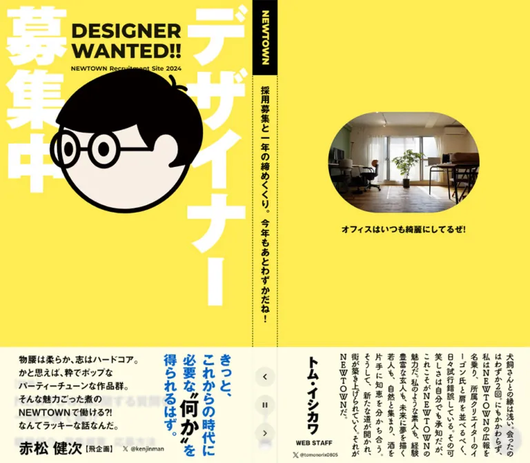
鮮やかな黄色に巨大な白い縦書き文字と人物イラストを重ねた採用ページ。固定ポスターと本文の左右分割、推薦コメントのカルーセル、会話形式のFAQが特徴。
オリジナルサイトを見るNEWTOWN Designer Recruitment 2026 — Style Reference
A bright yellow recruitment poster beside a practical hiring handbook.
Original URL: https://newtown.tokyo/recruit2026
Final URL: https://newtown.tokyo/recruit2026
Theme: a single observed yellow, black, and white presentation
Inspected: September 17, 2026, Japan Standard Time; supplied retrieval timestamp September 16, 2026, at 19:57:30.763 UTC, equivalent to September 17 at 04:57:30.763 JST
Viewports: 1440 × 1000 and 390 × 844 CSS pixels
Scope: the current 2026 recruitment page, including its opening composition, testimonial strip, contents navigation, seven-question FAQ, role descriptions, recruitment particulars, application instructions, and desktop application form. Five current-page screenshots and rendered DOM measurements support this reference. No additional pages were inspected.
NEWTOWN presents recruitment through a graphic poster and an extended editorial document. A saturated yellow canvas connects both. Enormous white Japanese lettering, a black-haired character with round glasses, and a compact English headline make the opening immediately recognizable. Natural office photography and personal testimonial graphics add a small-studio atmosphere.
At desktop size, the poster remains visible on the left while the document advances on the right. A narrow vertical brand strip separates them. The practical content keeps the same yellow background but changes register: generous section spacing, vertical Japanese headings, dotted dividers, conversational FAQ bubbles, and straightforward form controls. On mobile, the poster becomes the opening of a single scrolling column. Preserve this relationship between expressive identity and readable information.
How to Read This Reference
- Measured values come from the supplied rendered DOM and computed styles. Dimensions use CSS pixels unless stated otherwise.
- Calculated values are arithmetic derived from those measurements. They do not establish the original CSS formula.
- Estimated values describe screenshot geometry or appearance where an element measurement was not supplied.
- Recommended values and implementation choices are adaptations for a new build, not verified original behavior.
- Token names in this document are descriptive aliases. Source custom-property names are identified explicitly where useful.
- The supplied DOM samples include offscreen carousel items and repeated announcement phrases. Their presence does not mean that all were visible simultaneously.
- Screenshots show selected settled states. Link destinations and transition declarations are available; click results, autoplay timing, form validation, and submission behavior were not exercised in the supplied evidence.
Tokens — Colors
Default Palette
| Name | Value | Suggested token | Role and evidence |
|---|---|---|---|
| Recruitment Yellow | #ffeb52 |
--color-yellow |
Measured body background at both viewports; also the brand lettering on the black strip |
| Black Ink | #000000 |
--color-ink |
Measured headings, most body text, question bubbles, brand-strip fill, and submit-button fill |
| White | #ffffff |
--color-white |
Measured answer-bubble fill and reversed question text; visually also the enormous poster lettering and form fields |
| Secondary Ink | #333333 |
--color-secondary |
Measured utility text and several containers; source variable --s-color-32884faa is #333333ff |
| Warm Button Text | #f5efe5 |
--color-on-ink |
Measured text inside the desktop submit button |
| Desktop Testimonial Veil | rgba(255,255,255,.85) |
--surface-testimonial |
Measured background of desktop testimonial links |
| Mobile Testimonial Veil | rgba(255,255,255,.9) |
--surface-testimonial-mobile |
Measured mobile testimonial-link background |
| Desktop Menu Fill | rgba(0,0,0,.7) |
--surface-menu |
Measured circular contents-link background |
| Mobile Menu Fill | rgba(0,0,0,.3) |
--surface-menu-mobile |
Measured lighter mobile contents-link background |
| Desktop Carousel Control | rgba(0,0,0,.05) |
--surface-control |
Measured background of the three circular controls |
| Mobile Carousel Control | rgba(142,142,142,.51) |
--surface-control-mobile |
Measured background of the three short pill controls |
The pale testimonial area is translucent white over the page. It is not evidence of an independent cream page theme. Over uninterrupted yellow, the desktop veil calculates to approximately #fffce5; the mobile veil calculates to approximately #fffdee. Artwork or other content underneath changes the result.
The portrait has a warm, pale face fill, visually near #f8eee3. This is a screenshot estimate. A source variable with that value exists, but its connection to the illustration was not established. Keep the illustration's own colors when using an authorized asset.
Additional cream variables appear in the source-property inventory. Their existence alone does not establish a visible role on this page. Likewise, the many transparent gradient variables do not demonstrate a visible gradient treatment.
Color Use
Yellow is the continuous environment, rather than an accent confined to buttons. Black carries information and the strongest action. White has three distinct jobs: decorative poster lettering, conversational answer surfaces, and input surfaces. The office photograph supplies most of the natural color variation.
The menu can appear olive against yellow because its black fill is translucent. Do not introduce a separate olive brand color to reproduce that composite.
Tokens — Typography
Montserrat — English Identity and Navigation Index
Measured family: Montserrat. Source custom property: --s-font-3eaee7a1.
The two-line DESIGNER / WANTED!! headline uses weight 800, a 40px size, and a 40px line height at both inspected widths. Its compact, heavy geometry stays assertive on mobile instead of shrinking proportionally with the illustration.
Montserrat also appears in the small recruitment-year line, the strip's NEWTOWN wordmark, the Contents heading, and the numbered contents entries.
Japanese Display Face
Measured family: 'ゴシックMB101 B JIS2004'. Source custom property: --s-font-b5858a21.
This face appears in the poster's feature link, short navigation links, office caption, announcement text, and vertical section titles. Most of these elements report CSS weight 400 despite their visibly heavy appearance. The weight is partly encoded in the named font face. Do not automatically change all of them to 900.
The announcement phrases are an exception: their sampled computed weight is 900.
The exact typeface or asset construction of the enormous white poster lettering is not supplied. Its resemblance to other heavy lettering is insufficient to assign it a font name.
Japanese Reading Faces
| Measured family | Source property | Observed use |
|---|---|---|
'ヒラギノUD角ゴ W6 JIS2004' |
--s-font-b4bf53b9 |
Section introductions, FAQ questions, role headings, form labels, and application checklist emphasis |
'ヒラギノUD角ゴ W4 JIS2004' |
--s-font-c093eb4d |
Desktop prose, FAQ answers at both widths, contents descriptions, and application instructions |
'ヒラギノUD角ゴ W3 JIS2004' |
--s-font-108d84f4 |
Mobile role descriptions and recruitment particulars; smaller attachment guidance |
Many W6 elements also report CSS weight 400. Preserve the distinction between the selected face and the CSS weight property.
The HTML and body report Times as a default, but the visible content elements override it. Times is not the page's observed reading face. Syne and Creepster occur in the custom-property inventory without a demonstrated role in the sampled interface.
Type Scale
Values below are measured. A slash separates font size from line height.
| Role | Desktop | Mobile | Weight / tracking |
|---|---|---|---|
| English poster headline | 40 / 40px |
40 / 40px |
Montserrat 800; normal tracking |
| Recruitment-year caption | 12 / 13.2px |
9 / 9.9px |
Montserrat 700 |
| NEWTOWN strip wordmark | 18 / 25.2px |
11 / 15.4px |
Montserrat 800 |
| Announcement phrase | 18 / 18px |
12 / 15.6px |
Display face 900; 0.05em tracking |
| Feature eyebrow | 18 / 25.2px |
18 / 25.2px |
Display face 400 |
| Feature-link headline | 24 / 31.2px |
22 / 28.6px |
Display face 400 |
| Poster section links | 20 / 28px |
18 / 25.2px |
Display face 400; 0.05em tracking |
| Contents heading | 72 / 79.2px |
56 / 61.6px |
Montserrat 800; -0.02em tracking |
| Contents index number | 13 / 18.2px |
13 / 18.2px |
Montserrat 800 |
| Contents entry title | 28 / 39.2px |
24 / 33.6px |
Display face 400 |
| Contents description | 14 / 22.4px |
12 / 19.2px |
W4; 0.05em tracking |
| Vertical section title | 40 / 56px |
40 / 56px |
Display face 400; 2px tracking |
| Section introduction | 14 / 22.4px |
14 / 22.4px |
W6; 0.05em tracking |
| FAQ number | 18 / 25.2px |
13 / 18.2px |
W6 |
| FAQ question | 16 / 24px |
14 / 21px |
W6; 0.03em tracking |
| FAQ answer | 16 / 25.6px |
14 / 22.4px |
W4; 0.03em tracking |
| Role heading | 20 / 32px |
20 / 32px |
W6; usually 2px tracking; the assistant heading reports normal tracking |
| Role description | 15 / 27px |
14 / 25.2px |
W4 desktop, W3 mobile; 0.05em tracking |
| Recruitment particulars | Usually 16 / 32px |
Usually 16 / 25.6px |
W4 desktop, W3 mobile; tracking varies between 0.05em and 0.1em |
| Main application instructions | 16 / 28.8px |
15 / 27px |
W4; 0.05em tracking |
| Reply-troubleshooting paragraph | 13 / 20.8px |
15 / 27px |
W4; mobile deliberately uses a larger size |
| Desktop form labels | 14 / 19.6px |
Not observed | W6; sampled weights 500 and 700 |
| Submit label | 16 / 16px |
Not observed | W6 500 |
The testimonial graphics mix large display lettering, vertical Japanese text, signatures, and small social handles. Their exact fonts were not established. Treat them as individually composed graphics rather than applying the interface type scale to every inscription.
Tokens — Spacing & Shapes
There is no demonstrated universal spacing unit. Repeated values include 8, 12, 16, 24, 28, 60, and 80px. Large spaces organize sections; compact spaces organize controls and text groups.
Spacing Scale
| Use | Value | Evidence |
|---|---|---|
| Poster headline to year line | 8px |
Calculated from text rectangles at both widths |
| Feature eyebrow to feature title | 6px |
Measured link-container gap |
| Desktop poster-link spacing | 15px |
Calculated from adjacent link rectangles |
| Mobile poster-link spacing | 24px |
Calculated from adjacent link rectangles |
| Desktop poster navigation inset | 28px |
Measured left position and bottom clearance |
| Mobile poster navigation inset | 20px horizontally |
Measured left position |
| Mobile reading gutter | 24px |
Measured section padding |
| Main section vertical padding | 80px top and bottom |
Measured at both widths |
| Main section internal gap | 60px |
Measured section-container gap |
| Contents heading to entries | 25px |
Measured section gap |
| Contents entry padding | 12px desktop; 8px mobile |
Measured |
| FAQ bubble padding | 16px 24px desktop; 12px 18px mobile |
Measured |
| First FAQ question-to-answer gap | 20px desktop; 25px mobile |
Calculated from bubble rectangles |
| Role heading-to-body gap | 16px desktop; 12px mobile |
Calculated from text rectangles |
| Desktop carousel-control gap | 16px |
Calculated from 40px controls on 56px centers |
| Mobile carousel-control gap | 16px |
Calculated from 48px controls on 64px centers |
Border Radius
| Element | Value | Status |
|---|---|---|
| Main document sections | 0 |
Measured |
| Contents links | 4px |
Measured; their default background is transparent |
| Question bubble | 0 24px 24px 24px |
Measured; square upper-left corner |
| Answer bubble | 24px 0 24px 24px |
Measured; square upper-right corner |
| Submit helper bubble | 0 24px 24px 24px |
Measured |
| Submit button | 40px |
Measured |
| Desktop carousel controls | 50% |
Measured on 40 × 40px boxes |
| Mobile carousel controls | 48px |
Measured on 48 × 24px boxes |
| Floating contents link | 50% |
Measured |
| Form fields and upload buttons | Approximately 4px |
Screenshot estimate; input styles were not included in the element sample |
| Office image | Capsule, radius approximately half its height | Screenshot estimate |
Layout Measurements
| Element | Desktop at 1440 × 1000 | Mobile at 390 × 844 | Evidence |
|---|---|---|---|
| Poster region | Approximately 695px wide |
Full viewport width | Desktop boundary visible at x=695; mobile screenshot |
| Central strip | 50px wide, x=695–745 |
Replaced by a 50px-high horizontal strip after the poster |
Desktop wordmark and mobile strip measurements |
| Right document | 695px wide, starts x=745 |
Full width; measured MAIN starts around y=759.6 | Measured |
| Standard reading width | 556px, starts x=814.5 |
342px, starts x=24 |
Measured |
| Contents width | 500px, starts x=842.5 |
342px, starts x=24 |
Measured |
| Vertical section-title box | 56 × 168px |
56 × 168px |
Measured |
| Main portrait | Approximately 418 × 394px |
Approximately 234 × 220px |
Screenshot estimate |
| Office-photo frame | Approximately 417 × 278px, near x=884, y=175 |
No displayed mobile counterpart established | Screenshot estimate and mobile evidence limitation |
| Testimonial item | 745 × 327.5px, y=672.5 |
390 × 223px, y=621 |
Measured |
| Carousel controls | Three 40 × 40px circles in a vertical stack |
Three 48 × 24px pills in a horizontal row |
Measured |
| Floating contents link | 60 × 60px; right/bottom 16px |
44 × 44px; right/top 10px |
Measured |
| Submit button | 162 × 74px |
Not observed | Measured |
| Document height | Approximately 8509.17px |
Approximately 7857.78px |
Measured; these are capture-state heights, not reusable constants |
The desktop composition can be reproduced by dividing the width remaining after a 50px strip into two equal panels. At 1440px, (1440 − 50) / 2 = 695px. The standard reading width is exactly 80% of that panel in the sample: 695 × .8 = 556px. These are useful calculated relationships, not recovered source formulas.
Components
Persistent Recruitment Poster
Role: maintains identity and provides immediate navigation into the recruitment document.
The desktop poster occupies the left 695px and remains in the same position in the opening, role-description, and form screenshots. Its key layers are:
- A yellow field extending to the panel edges.
- Giant white vertical lettering:
募集中at the left andデザイナーat the right. - A centered, two-line black English headline near the top.
- A small recruitment-year line beneath the headline.
- A large glasses-wearing character in front of the white lettering.
- A feature link and a row of three section links near the bottom-left.
The headline's desktop rectangle begins around x=238, y=49.4 and measures approximately 219 × 80px. On mobile, it begins around x=85.5, y=46 with the same dimensions. This is a deliberately retained headline size.
The character occupies roughly 60% of the poster width at both sizes. Its silhouette uses thick black contours, solid black hair, round glasses, and a pale face with minimal detail. The white lettering is partly obscured by the character and English headline. This overlap gives the composition its poster character.
Use separately positioned artwork and live identity text when suitable assets are available. Do not flatten the feature links or the entire poster into one inaccessible image.
Feature Link and Poster Navigation
Role: offers a compact route from the poster to substantive information.
The feature link combines the eyebrow 【特集】 with a two-line Japanese headline. The whole group targets #faq. Below it, 職種紹介, 募集概要, and 応募方法 target #introduction, #recruitment, and #apply respectively.
These are heavy text links directly on yellow. They have no default pill surface or enclosing card. At desktop, the navigation row sits at y=944 with a 28px line box and 28px bottom clearance. On mobile, the row is around y=690.4, beneath the feature group.
The initial testimonial strip overlaps this lower poster content in both opening screenshots. Later screenshots show the document without that strip. The exact visibility trigger is not supplied.
Brand and Announcement Strip
Role: separates the desktop panels and adds a compact stream of recruitment messages.
On desktop, the strip is 50px wide. A black top block, approximately 149px tall, contains yellow NEWTOWN lettering running vertically. Beneath it, a narrow Japanese phrase appears between fine dotted vertical boundaries. A smaller brand signature and portrait are visible near the strip's bottom in later screenshots.
The DOM contains repeated announcement phrases in a track, while the screenshots show different active phrases. This supports describing a message rotator, but does not establish its timing or animation direction.
On mobile, the divider is reorganized into a horizontal strip after the poster. Its NEWTOWN block measures approximately 90.6 × 50px; the adjoining phrases use 12px type. It is no longer a vertical separator through the whole screen.
Office Photograph
Role: gives a concrete sense of the workplace while balancing the illustration-heavy poster.
A natural interior photograph sits alone in the upper portion of the right desktop panel. The approximate frame is 417 × 278px. Its rounded ends form a horizontal capsule with short straight top and bottom segments, rather than a conventional rectangular photo card.
The photograph shows an ordinary office with desks, chairs, wood flooring, a central plant, and daylight through curtains. It retains natural color and lighting. Beneath it, the bold caption オフィスはいつも綺麗にしてるぜ! uses the Japanese display face at 16px, 22.4px line height, and 0.8px tracking.
The caption begins around y=474.7, leaving approximately 22px after the visible photo frame. Broad yellow space surrounds the entire group. No equivalent displayed photo block is established by the supplied mobile evidence.
Testimonial Carousel
Role: introduces personal voices through individually designed quotation graphics.
The opening desktop screenshot contains a translucent strip across the bottom of the viewport. One testimonial item starts at x=0, and the next at x=745, so the second item is partially clipped by the 1440px viewport. Each sampled item is an external social-profile link with a 745 × 327.5px box and 0 70px 0 20px padding.
The visible graphics combine large Japanese statements, vertical commentary, names, and small social handles. They are not uniform review cards. Preserve their varied typography and graphic arrangements without inventing font attributions.
On mobile, one 390 × 223px item occupies the bottom portion of the opening capture, from y=621 to the viewport bottom. Its padding changes to 4px 8px 32px. The resulting inner dimensions are consistent with a 2:1 graphic: 655 × 327.5px on desktop and 374 × 187px on mobile. That ratio is calculated from the wrapper and padding, assuming the graphic fills the inner area.
Previous, pause, and next controls sit vertically over the central desktop strip. On mobile they move to a centered row near the bottom, with 48 × 24px gray pills and 16px gaps.
The link text is empty in the supplied extraction, although lettering is visible in the screenshots. Asset URLs, alternative text, and the exact construction of these graphics were not supplied. Social-profile links identify testimonial destinations; they do not establish production credits.
Contents Index
Role: serves as the page's explicit navigation hub.
A large Montserrat Contents heading introduces four linked entries numbered 01–04. Their targets are the FAQ, role introduction, recruitment particulars, and application section.
On desktop, each entry places a small index number, a heavy Japanese title, and a short description across the row. The container is 500px wide. Entry heights range from approximately 63 to 69px according to description wrapping. The measured default surface is transparent, with a small 4px corner radius.
On mobile, the number retains a left column while the title and description stack beside it. Number boxes narrow from 60px to 40px. Row padding reduces from 12px to 8px. The heading drops from 72px to 56px, while entry titles drop from 28px to 24px.
Do not reinterpret this index as four feature cards. It is a compact list of document destinations.
Vertical Section Header
Role: marks the transition into each major chapter.
The FAQ, role descriptions, recruitment particulars, and application instructions use a heavy vertical Japanese title at the upper-right of their content area. Each sampled title occupies a 56 × 168px box, with 40px type and 2px tracking. This treatment remains the same size on mobile.
An introductory paragraph, where present, sits to the lower-left of the title. The FAQ introduction occupies 60% of the content width at both inspected sizes. The role introduction uses approximately 60% on desktop and 70% on mobile.
Leave the surrounding space intact. The title is a chapter marker, not a full-width horizontal banner. Its right alignment connects the text document to the vertical lettering of the poster.
Conversational FAQ
Role: explains the studio and the hiring expectations through seven visible question-and-answer pairs.
The FAQ is rendered as a conversation. A numbered marker sits beside a black question bubble with white text. A white answer bubble with black text follows underneath. All answers are present in the rendered document; there is no evidence of an accordion interaction.
Question bubbles retain a square upper-left corner and 24px rounding elsewhere. Answers reverse the square corner to the upper-right. This small asymmetry establishes the conversational direction without speech-tail triangles.
At desktop, the first question begins 72px inside the section's left edge. Its answer begins 80px inside and is 404px wide. Question width varies with content. On mobile, the first question begins 48px inside the reading area and is 270px wide; answers begin 24px inside and are 262px wide.
Bubble padding reduces from 16px 24px to 12px 18px, and body type reduces from 16px to 14px. The source preserves comfortable answer leading at 1.6. The full container shape of the numbered marker was not included in the element sample, so its exact geometry should not be treated as measured.
Role Description List
Role: explains the studio's internal levels and responsibilities.
Four entries describe designer, assistant designer, senior designer, and lead designer positions. Each begins with a small black square and a 20px W6 heading. The description follows on the same yellow surface. Fine dotted horizontal rules divide the entries.
Desktop descriptions use 15px W4 with a 27px line height; mobile descriptions use 14px W3 with a 25.2px line height. The measured heading-to-description space changes from 16px to 12px.
The desktop screenshot and text positions are consistent with approximately 28px of vertical padding at each row boundary. Treat that row-padding reconstruction as an estimate. Use content-driven heights: the entries have materially different amounts of text.
The role catalog describes an internal hierarchy. It should not automatically be interpreted as proof that every described level is currently being recruited.
Recruitment Particulars
Role: supplies practical employment information in a structured document format.
The section includes a small update date and label/value entries covering the recruited role, work, employment types, location, compensation, hours, company website, leave, benefits, and other conditions.
Desktop value rectangles begin approximately 111.2px inside the 556px content area and occupy 444.8px. This corresponds to a 20% label region and 80% value region. On mobile, values begin at the normal 24px reading gutter, supporting a stacked presentation rather than retaining a narrow side-by-side table.
Body type remains 16px on mobile, but leading generally tightens from 32px to 25.6px. Several values use 0.1em tracking. Preserve the distinction between these practical details and the slightly smaller role-description prose.
Application Instructions and Checklist
Role: explains the application process and required materials before the form.
The section begins with the same vertical title, followed by open paragraphs on yellow. A supporting checklist uses black square bullets and a fine vertical rule at the left. The checklist requests a résumé, work history, a selected role, and a portfolio supplied by URL or attachment.
The mobile capture shows the instructions with 24px side gutters and substantial line spacing. The troubleshooting paragraph uses the same 15px/27px treatment as the main instructions on mobile, rather than the smaller desktop note style.
The captured announcement strip and the application body contain different deadlines. These are content discrepancies, not visual tokens. The evidence does not establish current application availability; a new implementation should manage repeated dates from one content source.
Desktop Application Form
Role: gathers applicant details and supporting files.
The observed order is:
- Name field, labeled
氏名. - Email field, labeled
メールアドレス. - Role selector, labeled
希望職種. - Multiline application information, labeled
応募情報. - Three upload rows for résumé, work history, and portfolio.
- A centered
応募するsubmit button. - A small character and a white helper bubble.
The form is placed directly on yellow. There is no enclosing white card. The name and email fields visually span approximately 556px and are about 44px high. The role selector is approximately 180 × 53px. The textarea is approximately 556 × 100px. These field dimensions are screenshot estimates because input-element measurements were not supplied.
Labels are measured at 14px/19.6px. Fields use white fills, subtle rounding, and gray placeholder text. Upload rows place a compact label to the left of a yellow button with a thin black outline. The three row labels are spaced 69px apart in the measured desktop DOM.
The submit button is measured at 162 × 74px, with a 40px radius, a black fill, and warm off-white text. Its source padding is 28px 48px. The helper bubble beneath it measures 281 × 56px with 16px 24px padding. The helper sentence is present before submission; it is not evidence of a successful application state.
No visible form labels, fields, or submit button occur in the supplied mobile rendered text or bottom capture. Mobile evidence ends after the checklist. Whether this results from responsive visibility, deferred rendering, or another condition is unverified. Do not claim that mobile form parity was demonstrated.
Floating Contents Link
Role: provides persistent access to the contents index.
The circular control carries a three-line menu glyph, but its measured destination is #contents. There is no evidence that it opens a drawer or modal.
At desktop it is a 60px circle, positioned 16px from the bottom-right corner, with 70% black fill. On mobile it becomes a 44px circle at the top-right with 10px offsets and 30% black fill. It remains visible in the mobile application-instructions screenshot.
Reproduce the actual anchor behavior before adding any richer menu interaction. Icon-only accessible naming is a recommended addition.
Tokens — Motion & Interaction
| Treatment | Supplied evidence | What can be concluded |
|---|---|---|
| General element transitions | 0.3s cubic-bezier(0.4, 0.4, 0, 1) on many elements |
A common declared transition curve and duration; no specific hover transformation is established |
| Buttons | 0.4s cubic-bezier(0.4, 0.4, 0, 1) |
Measured transition declaration on carousel and submit buttons |
| Body background | background 0.5s cubic-bezier(0.4, 0.4, 0, 1) |
Background changes would use this transition; a theme change was not observed |
| Announcement messages | Repeated track items and different visible phrases across captures | Consistent with a rotator; interval, movement direction, and easing remain unverified |
| Testimonials | Offscreen linked items, different visible compositions, previous/pause/next controls | Carousel structure is supported; control results and autoplay timing were not tested |
| Opening testimonial visibility | Present in opening captures, absent in later captures | Visibility changes between states; the exact scroll or time trigger is unknown |
| Poster persistence | Same desktop composition across opening, roles, and form views | Persistent desktop positioning is visually supported; exact fixed-versus-sticky implementation was not sampled |
| Section navigation | Fragment destinations in rendered links | In-page navigation intent is confirmed; smooth scrolling and focus behavior are not |
| Form action | A submit button and fields in desktop evidence | Input and submission outcomes are unverified |
Sampled elements report animation: none. This does not rule out JavaScript-driven movement, animation on unsampled wrappers, or media animation. The inspection process temporarily paused perpetual animation during readiness checks and then resumed it; still captures cannot establish a complete motion sequence.
For an adaptation, retain the measured easing as a restrained utility transition. Do not invent spring motion, parallax, portrait wobble, scroll snapping, or a precise autoplay interval and describe it as original behavior.
Surfaces
| Layer | Appearance | Purpose |
|---|---|---|
| Page canvas | Solid yellow | Connects identity, information, and application content |
| Poster artwork | White lettering behind black and pale illustration | Creates the strongest visual hierarchy |
| Brand strip | Black wordmark block; yellow message region with dotted edges | Separates the desktop panels and carries announcements |
| Reading sections | Transparent on yellow | Keeps long information visually continuous |
| Question bubble | Black with white text | Marks the questioner's voice |
| Answer bubble | White with black text | Separates the response from the yellow document |
| Testimonial strip | Translucent white with independent graphic compositions | Overlays personal voices on the opening view |
| Form field | White with small-radius corners | Establishes an editable area |
| Upload action | Yellow with a thin black outline | Secondary action within the form |
| Submit action | Black rounded capsule | Strongest form action |
| Contents control | Translucent black circle | Persistent navigation utility |
The observed design has no general card-elevation system. Hierarchy comes from typography, spacing, contrasting fills, illustration, and fine rules. Some underlying content looks softened through the testimonial strip, but no filter measurement was supplied; do not assign a measured blur radius.
Imagery
The dominant illustration is a simplified character head: a rounded face, heavy black hair, thick circular glasses, and minimal facial detail. Its large scale and uncomplicated colors let it overlap giant lettering without becoming visually noisy. Smaller versions of the character reinforce continuity in the strip and submit helper.
Photography is limited and natural. The office photograph is not recolored to match the poster; the yellow surround and capsule crop integrate it into the composition. Preserve its environmental detail and empty room atmosphere.
The testimonial compositions behave like small editorial posters. They use varied scales, writing directions, and signatures. Their individuality is part of the page's character. Avoid replacing them with a uniform avatar, five-star rating, and paragraph template.
Observed Asset References
No image source URLs or asset filenames were supplied. The following inventory identifies visual roles without inventing paths.
| Visual asset | Observed treatment | Reuse guidance |
|---|---|---|
| Main character portrait | Large, isolated head; approximately 418px wide desktop and 234px mobile | Use an authorized transparent asset; retain contour thickness and proportions |
| White Japanese poster lettering | Extremely heavy vertical composition, partly covered by foreground content | Preserve as supplied artwork if available; exact font is unknown |
| Office photograph | Approximately 3:2 image in a capsule frame | Use natural photography and preserve the demonstrated crop relationship |
| Testimonial graphics | Wide compositions consistent with an approximately 2:1 inner box | Preserve embedded typography; use containment rather than cropping away names or text |
| Small character variants | Strip signature and application helper | Keep them visually consistent with the main portrait |
| Utility glyphs | Previous, pause, next, and three-line menu symbols | Use clear equivalents; the actual icon font was not identified |
The source text contains icon ligature names, but the captures show icons. A replacement implementation should render actual glyphs or SVGs, not those literal ligature strings.
Layout & Responsive Behavior
Desktop Structure
The 1440px viewport consists of a 695px poster, a 50px central strip, and a 695px document region. The poster stays visually stable as later document sections appear. Standard document sections are inset by approximately 69.5px on each side of the right panel, producing a 556px reading width.
The opening right panel is spacious: a relatively small photograph sits high in a broad yellow field. The contents index begins around document y=1080. Major sections then follow with 80px vertical padding and 60px internal gaps.
The testimonial strip occupies the bottom 327.5px of the opening capture. It spans both panels and overlaps poster navigation. Its controls align with the center divider, making the overlay feel connected to the page's structural spine.
Mobile Structure
At 390px, the desktop columns become a single document sequence. The poster precedes the main information, and the horizontal brand strip begins around document y=759.6. The contents section follows the 50px strip.
The portrait becomes smaller, but the English headline stays at 40px. The recruitment-year caption reduces to 9px. Large white vertical lettering continues to frame the portrait, retaining the poster's distinctive composition.
Reading sections use 24px gutters and a 342px inner width. Vertical chapter titles remain 40px, rather than shrinking with the prose. Contents descriptions move beneath titles, recruitment values return to the normal left gutter, and FAQ bubbles use smaller padding and text.
The testimonial strip shows one composition at a time in the opening capture. Its controls move below the artwork into a horizontal row. The floating contents link moves from bottom-right to top-right.
Responsive Limits
Only the two stated viewports were inspected. The source excerpt contains an 1140px media query for conditional line breaks, but does not establish that the main layout switches at that width. Tablet layouts, landscape phones, browser zoom, and intermediate breakpoints were not captured.
The shorter mobile document does not imply that every desktop element has simply compressed. The office opening block is not established as displayed in the mobile evidence, and the desktop form is absent from the mobile rendered snapshot. Treat these as specific coverage limitations.
For a new implementation, keep the application path reachable at all widths. Reserve adequate space for any testimonial overlay and prevent fixed controls from covering focused fields or chapter headings. These are recommendations, not verified properties of the original.
Do’s and Don’ts
Do
- Use the measured yellow
#ffeb52as the continuous canvas. - Preserve the desktop relationship of poster, narrow strip, and reading column.
- Keep the English headline at a forceful 40px at the inspected phone width.
- Distinguish heavy Japanese display lettering from the quieter reading faces.
- Retain vertical chapter titles on mobile.
- Let the character overlap decorative white lettering.
- Keep role descriptions and employment details directly on yellow.
- Use asymmetric black and white bubbles for the FAQ.
- Preserve dotted rules, square bullet marks, and open section spacing.
- Treat each testimonial as a composed graphic with its own lettering hierarchy.
- Use the menu-shaped control as a link to the contents index.
- Keep the submit action black and visually distinct from outlined upload controls.
Don’t
- Don't convert the desktop composition into a generic centered headline followed by a card grid.
- Don't replace the yellow with a neutral page background and use yellow only for CTAs.
- Don't shrink every mobile element by the same scale factor.
- Don't assign a font to the white poster lettering or testimonial artwork without asset evidence.
- Don't mistake an intrinsic bold font face for a measured CSS weight of 700 or 900.
- Don't turn the rendered FAQ into an accordion and call that observed behavior.
- Don't infer a drawer from the menu glyph when its destination is
#contents. - Don't describe the pre-submit helper bubble as a success confirmation.
- Don't treat translucent composites as additional brand palette colors.
- Don't add shadows or rounded containers to every document section.
- Don't reproduce missing mobile form access as a design requirement.
- Don't infer production authorship from testimonial names or social links.
Recommended Implementation Additions
These are recommendations for a new implementation, not verified original features:
- Give the contents link and carousel controls accessible names. Expose the actual carousel pause state and make previous/next actions keyboard-operable.
- Increase the effective mobile carousel hit area beyond the observed 24px visual height, ideally to at least 44px, without requiring a larger pill graphic.
- Keep testimonial copy available as accessible text when the visible composition is an image. Provide meaningful link names for its social destination.
- Exclude duplicate carousel slides and repeated announcement clones from keyboard and screen-reader navigation.
- Use a semantic main heading and a logical section-heading hierarchy. The sampled original headline is a paragraph, and major and subordinate headings both use H3 elements.
- Associate every form control with a real label. Provide visible upload filenames, accepted-format guidance, validation messages, and distinct sending, success, and failure states.
- Maintain an accessible application form or equivalent application route on mobile. Do not hide it merely to imitate the supplied mobile capture.
- Stop automatic rotation when reduced motion is requested, and ensure a static testimonial remains readable.
- Keep deadlines and available-role options synchronized with recruitment content. The captured page contains inconsistent deadline text and a broader selector than the single role listed in its recruitment summary.
- Preserve black live text for essential identity information; the low-contrast white-on-yellow lettering should remain decorative.
- Test the poster and fixed utilities at short viewport heights and increased text size. Allow navigation to remain reachable if the poster no longer fits comfortably.
Agent Prompt Guide
Quick Color Reference
- Canvas:
#ffeb52. - Main text, illustration contours, question surfaces, and submit action:
#000000. - Decorative lettering, answer surfaces, and input fields:
#ffffff. - Secondary utility ink:
#333333. - Submit text:
#f5efe5. - Testimonial surface: white at 85% opacity desktop and 90% mobile.
- Menu circle: black at 70% opacity desktop and 30% mobile.
Overall Prompt
“Create a Japanese design-studio recruitment page with a continuous bright yellow #ffeb52 canvas. At desktop, arrange a persistent illustrated poster on the left, a 50px vertical announcement strip in the center, and a scrolling information document on the right. Use a compact black Montserrat 800 headline at 40px over two lines, enormous white vertical Japanese lettering behind a simple glasses-wearing character, and heavy Japanese text links near the poster's lower-left. Give the document vertical chapter titles, generous 80px section padding, dotted role dividers, alternating black question and white answer bubbles, and a direct-on-yellow application form. On mobile, stack the poster and document, retain the 40px English headline and vertical chapter titles, use 24px reading gutters, and move the circular contents link to the top-right. Keep unverified carousel timing and form behavior explicit implementation choices.”
Example Component Prompts
- Poster: “Compose a yellow recruitment poster with a two-line black 40px English heading, a small year caption, giant white vertical Japanese lettering near both edges, and a large transparent character illustration overlapping the lettering. Add a bold feature link and three unboxed section links at the lower-left.”
- Section header: “Create a chapter header on yellow with a 40px heavy Japanese title written vertically at the far right. Place a compact 14px introductory paragraph toward the lower-left, leaving generous open space between the two.”
- FAQ: “Build a permanently expanded conversation: numbered questions in black bubbles with white text and a square upper-left corner; answers in white bubbles with black text and a square upper-right corner. Use 24px rounding on the other corners, 16px/24px desktop padding, and 12px/18px mobile padding.”
- Role list: “Create a plain yellow list of four design roles. Use a small black square before each 20px heading, fine dotted horizontal separators, and 15px Japanese prose with 27px leading. Let each row's height follow its text.”
- Form: “Place labeled white inputs directly on yellow, followed by a compact role selector, a multiline information field, and three outlined upload actions. Center a black 162 × 74px submit capsule below them and add a small character with a white helper bubble. Keep the form available on mobile and implement real accessible labels and status messages.”
- Testimonials: “Present individually designed wide quotation graphics on a translucent white strip. Show an adjacent preview on desktop and one full composition on mobile. Use vertical circular controls on desktop and a centered horizontal control row on mobile. Keep artwork text uncropped and provide a static reduced-motion mode.”
Quick Start
CSS Custom Properties
This is a recommended implementation scaffold, not extracted source CSS. It preserves the measured palette, type sizes, section spacing, bubble geometry, and the desktop panel relationship. Poster-art positioning and field dimensions use screenshot estimates. The 960px breakpoint is an integration recommendation; the original layout breakpoint was not established.
Load the named fonts only when properly licensed and available. No font-file or image URLs were supplied. The fallback sans-serif declarations below are implementation additions.
Expected structure: a .recruit-page containing .poster, .brand-rail, .recruit-main, an optional .testimonial-band, and a .contents-fab anchor targeting #contents. Place the contents, FAQ, roles, particulars, instructions, and form within the main document. Use authorized image assets for portrait, lettering, office photo, and testimonial graphics.
:root {
  /* Measured colors */
  --color-yellow: #ffeb52;
  --color-ink: #000;
  --color-white: #fff;
  --color-secondary: #333;
  --color-on-ink: #f5efe5;
  --surface-testimonial: rgb(255 255 255 / 85%);
  --surface-testimonial-mobile: rgb(255 255 255 / 90%);
  --surface-menu: rgb(0 0 0 / 70%);
  --surface-menu-mobile: rgb(0 0 0 / 30%);
  --surface-control: rgb(0 0 0 / 5%);
  --surface-control-mobile: rgb(142 142 142 / 51%);

  /* Measured family names; fallbacks are recommendations */
  --font-latin: 'Montserrat', sans-serif;
  --font-display: 'ゴシックMB101 B JIS2004', sans-serif;
  --font-ja-strong: 'ヒラギノUD角ゴ W6 JIS2004', sans-serif;
  --font-ja-body: 'ヒラギノUD角ゴ W4 JIS2004', sans-serif;
  --font-ja-light: 'ヒラギノUD角ゴ W3 JIS2004', sans-serif;

  --rail-width: 50px;
  --panel-width: calc((100% - var(--rail-width)) / 2);
  --section-space: 80px;
  --section-gap: 60px;
  --mobile-gutter: 24px;
  --radius-small: 4px;
  --radius-bubble: 24px;
  --radius-submit: 40px;

  /* Rule opacity is an adaptation, not a measured value */
  --color-rule: rgb(0 0 0 / 25%);
  --ease-ui: cubic-bezier(0.4, 0.4, 0, 1);
  --motion-ui: 300ms var(--ease-ui);
  --motion-control: 400ms var(--ease-ui);
}

* { box-sizing: border-box; }

html { scroll-behavior: auto; }

body {
  margin: 0;
  background: var(--color-yellow);
  color: var(--color-ink);
  font-family: var(--font-ja-body);
}

button, input, select, textarea { font: inherit; }
button, a, input, select, textarea { -webkit-tap-highlight-color: transparent; }
img { display: block; max-width: 100%; }
a { color: inherit; }

.recruit-page {
  background: var(--color-yellow);
  min-height: 100vh;
}

.poster {
  position: fixed;
  inset: 0 auto 0 0;
  width: var(--panel-width);
  height: 100dvh;
  overflow-y: auto;
  isolation: isolate;
}

.poster-heading {
  position: absolute;
  top: 49px;
  left: 50%;
  transform: translateX(-50%);
  z-index: 2;
  width: max-content;
}

.poster-heading h1 {
  margin: 0;
  font: 800 40px/1 var(--font-latin);
}

.poster-year {
  margin: 8px 0 0;
  text-align: center;
  font: 700 12px/1.1 var(--font-latin);
}

/* Approximate placement; use supplied artwork proportions. */
.poster-portrait {
  position: absolute;
  top: 17.2vh;
  left: 20%;
  width: 60%;
  height: auto;
  z-index: 1;
}

.poster-lettering {
  position: absolute;
  top: 8px;
  width: 25%;
  height: auto;
  pointer-events: none;
}

.poster-lettering--left { left: 8px; }
.poster-lettering--right { right: 8px; }

.poster-nav {
  position: absolute;
  left: 28px;
  right: 28px;
  bottom: 28px;
  font-family: var(--font-display);
}

.poster-feature {
  display: grid;
  gap: 6px;
  width: fit-content;
  margin-bottom: 20px;
  text-decoration: none;
}

.poster-feature small { font-size: 18px; line-height: 1.4; }
.poster-feature strong { font-size: 24px; line-height: 1.3; font-weight: 400; }

.poster-links {
  display: flex;
  flex-wrap: wrap;
  gap: 15px;
}

.poster-links a {
  font-size: 20px;
  line-height: 1.4;
  letter-spacing: .05em;
  text-decoration: none;
}

.brand-rail {
  position: fixed;
  top: 0;
  bottom: 0;
  left: var(--panel-width);
  width: var(--rail-width);
  border-inline: 1px dotted var(--color-ink);
  display: flex;
  flex-direction: column;
  align-items: center;
  overflow: hidden;
}

.rail-brand {
  display: grid;
  place-items: center;
  width: 100%;
  min-height: 149px;
  margin: 0;
  padding: 20px 0;
  writing-mode: vertical-rl;
  background: var(--color-ink);
  color: var(--color-yellow);
  font: 800 18px/1.4 var(--font-latin);
}

.rail-message {
  margin: 20px 0 0;
  writing-mode: vertical-rl;
  font: 900 18px/1 var(--font-display);
  letter-spacing: .05em;
}

.recruit-main {
  margin-left: calc(50% + 25px);
  width: var(--panel-width);
}

.office-intro {
  min-height: 100vh;
  padding-top: 17.5vh;
  text-align: center;
}

.office-intro figure { margin: 0; }

.office-photo {
  width: 60%;
  aspect-ratio: 3 / 2;
  margin-inline: auto;
  object-fit: cover;
  border-radius: 999px;
}

.office-caption {
  margin-top: 22px;
  font: 400 16px/1.4 var(--font-display);
  letter-spacing: .05em;
}

.contents {
  width: min(500px, 80%);
  margin: 80px auto;
}

.contents-heading {
  margin: 0 0 25px;
  font: 800 72px/1.1 var(--font-latin);
  letter-spacing: -.02em;
}

.contents-row {
  display: grid;
  grid-template-columns: 60px minmax(0, 1fr);
  align-items: center;
  padding: 12px;
  border-radius: var(--radius-small);
  text-decoration: none;
}

.contents-number { font: 800 13px/1.4 var(--font-latin); }

.contents-row-body {
  display: grid;
  grid-template-columns: 112px minmax(0, 1fr);
  align-items: center;
  gap: 12px;
}

.contents-row-title { font: 400 28px/1.4 var(--font-display); }
.contents-row-description { font-size: 14px; line-height: 1.6; letter-spacing: .05em; }

.content-section {
  width: 80%;
  margin-inline: auto;
  padding-block: var(--section-space);
  display: flex;
  flex-direction: column;
  gap: var(--section-gap);
  scroll-margin-top: 24px;
}

.section-head {
  min-height: 168px;
  display: flex;
  justify-content: space-between;
  align-items: flex-end;
}

.section-intro {
  width: 60%;
  margin: 0;
  font: 400 14px/1.6 var(--font-ja-strong);
  letter-spacing: .05em;
}

.section-title {
  margin: 0 0 0 auto;
  writing-mode: vertical-rl;
  text-orientation: upright;
  font: 400 40px/1.4 var(--font-display);
  letter-spacing: 2px;
}

.faq-pair + .faq-pair { margin-top: 40px; }

.faq-question {
  width: fit-content;
  max-width: calc(100% - 72px);
  margin: 0 0 20px 72px;
  padding: 16px 24px;
  color: var(--color-white);
  background: var(--color-ink);
  border-radius: 0 24px 24px 24px;
  font: 400 16px/1.5 var(--font-ja-strong);
  letter-spacing: .03em;
}

.faq-answer {
  margin: 0 72px 0 80px;
  padding: 16px 24px;
  color: var(--color-ink);
  background: var(--color-white);
  border-radius: 24px 0 24px 24px;
  font-size: 16px;
  line-height: 1.6;
  letter-spacing: .03em;
}

.role-row {
  padding-block: 28px;
  border-top: 1px dotted var(--color-rule);
}

.role-title {
  display: flex;
  align-items: center;
  gap: 4px;
  margin: 0 0 16px;
  font: 400 20px/1.6 var(--font-ja-strong);
  letter-spacing: .1em;
}

.role-title::before {
  content: '';
  flex: 0 0 8px;
  height: 8px;
  background: currentColor;
}

.role-description {
  margin: 0;
  font-size: 15px;
  line-height: 1.8;
  letter-spacing: .05em;
}

.spec-row {
  display: grid;
  grid-template-columns: 20% minmax(0, 1fr);
  padding-block: 28px;
}

.spec-row dt { font-family: var(--font-ja-strong); }
.spec-row dd { margin: 0; font-size: 16px; line-height: 2; letter-spacing: .05em; }

.application-copy { font-size: 16px; line-height: 1.8; letter-spacing: .05em; }
.application-copy p { margin: 0 0 12px; }

.application-checklist {
  border-left: 2px solid var(--color-ink);
  padding-left: 24px;
  list-style: square;
  font: 400 15px/1.6 var(--font-ja-strong);
  letter-spacing: .05em;
}

.application-checklist li + li { margin-top: 12px; }

.application-form { width: 100%; }
.form-field { display: grid; gap: 8px; margin-bottom: 32px; }
.form-field label, .file-row label { font: 500 14px/1.4 var(--font-ja-strong); }

.form-field input,
.form-field select,
.form-field textarea {
  min-width: 0;
  width: 100%;
  min-height: 44px;
  border: 0;
  border-radius: 4px;
  padding: 10px 12px;
  background: var(--color-white);
  color: var(--color-ink);
  font-size: 16px;
  line-height: 1.5;
}

.form-field select { width: min(180px, 100%); min-height: 53px; }
.form-field textarea { min-height: 100px; resize: vertical; }

.file-row {
  display: grid;
  grid-template-columns: 100px minmax(0, 1fr);
  align-items: center;
  gap: 16px;
  margin-bottom: 32px;
}

.file-row input { min-width: 0; max-width: 100%; }

.file-row input::file-selector-button {
  margin-right: 12px;
  border: 1px solid var(--color-ink);
  border-radius: 4px;
  padding: 8px 12px;
  background: transparent;
  color: var(--color-ink);
  font-family: var(--font-ja-strong);
  cursor: pointer;
}

.submit-button {
  display: block;
  margin: 52px auto 0;
  border: 1px solid var(--color-ink);
  border-radius: var(--radius-submit);
  padding: 28px 48px;
  background: var(--color-ink);
  color: var(--color-on-ink);
  font: 500 16px/1 var(--font-ja-strong);
  cursor: pointer;
  transition: opacity var(--motion-control);
}

.submit-helper {
  width: fit-content;
  max-width: 100%;
  margin: 72px auto 0;
  padding: 16px 24px;
  border-radius: 0 24px 24px 24px;
  background: var(--color-white);
  font-size: 16px;
  line-height: 1.5;
  letter-spacing: .03em;
}

.contents-fab {
  position: fixed;
  right: 16px;
  bottom: 16px;
  z-index: 40;
  display: grid;
  place-items: center;
  width: 60px;
  height: 60px;
  border-radius: 50%;
  background: var(--surface-menu);
  color: var(--color-white);
  text-decoration: none;
}

/* Optional opening state. A controller must manage its visibility. */
.testimonial-band {
  display: none;
  position: fixed;
  inset: auto 0 0;
  z-index: 30;
  overflow: hidden;
}

.recruit-page[data-show-testimonials='true'] .testimonial-band { display: flex; }

.testimonial-slide {
  flex: 0 0 calc(50% + 25px);
  padding: 0 70px 0 20px;
  background: var(--surface-testimonial);
}

.testimonial-art { width: 100%; aspect-ratio: 2 / 1; object-fit: contain; }

.testimonial-controls {
  position: absolute;
  top: 50%;
  left: 50%;
  transform: translate(-50%, -50%);
  display: flex;
  flex-direction: column;
  gap: 16px;
}

.testimonial-controls button {
  display: grid;
  place-items: center;
  width: 40px;
  height: 40px;
  padding: 0;
  border: 0;
  border-radius: 50%;
  background: var(--surface-control);
  color: var(--color-secondary);
  cursor: pointer;
}

/* Recommended accessibility treatment. */
.recruit-page :focus-visible {
  outline: 2px solid var(--color-ink);
  outline-offset: 4px;
}

@media (max-width: 960px) {
  .poster {
    position: relative;
    width: 100%;
    height: 760px;
    overflow: visible;
  }

  .poster-heading { top: 46px; }
  .poster-year { font-size: 9px; }
  .poster-portrait { top: 161px; }
  .poster-nav { left: 20px; right: 20px; bottom: 44px; }
  .poster-feature { margin-bottom: 24px; }
  .poster-feature strong { font-size: 22px; }
  .poster-links { gap: 24px; }
  .poster-links a { font-size: 18px; }

  .brand-rail {
    position: relative;
    inset: auto;
    width: 100%;
    height: 50px;
    flex-direction: row;
    border-inline: 0;
    border-block: 1px dotted var(--color-ink);
  }

  .rail-brand {
    width: auto;
    min-height: 50px;
    flex: 0 0 auto;
    padding: 0 12px;
    writing-mode: horizontal-tb;
    font-size: 11px;
  }

  .rail-message {
    margin: 0 12px;
    writing-mode: horizontal-tb;
    white-space: nowrap;
    font-size: 12px;
    line-height: 1.3;
  }

  .recruit-main { width: 100%; margin-left: 0; }

  /* Matches the supplied mobile evidence; not a verified source rule. */
  .office-intro { display: none; }

  .contents {
    width: calc(100% - 48px);
    margin: 0 auto;
    padding-block: 80px;
  }

  .contents-heading { font-size: 56px; }
  .contents-row { grid-template-columns: 40px minmax(0, 1fr); gap: 8px; padding: 8px; }
  .contents-row-body { display: block; }
  .contents-row-title { display: block; font-size: 24px; }
  .contents-row-description { display: block; font-size: 12px; }

  .content-section { width: auto; margin: 0; padding: 80px 24px; }
  .section-head--roles .section-intro { width: 70%; }

  .faq-question {
    max-width: calc(100% - 72px);
    margin: 0 0 25px 48px;
    padding: 12px 18px;
    font-size: 14px;
  }

  .faq-answer {
    margin: 0 56px 0 24px;
    padding: 12px 18px;
    font-size: 14px;
  }

  .role-title { margin-bottom: 12px; }
  .role-description { font-family: var(--font-ja-light); font-size: 14px; }
  .spec-row { grid-template-columns: 1fr; gap: 12px; }
  .spec-row dd { font-family: var(--font-ja-light); line-height: 1.6; }
  .application-copy { font-size: 15px; }

  /* Recommended mobile form access is intentionally retained. */
  .application-form { display: block; }
  .file-row { grid-template-columns: 1fr; gap: 8px; }

  .contents-fab {
    top: 10px;
    right: 10px;
    bottom: auto;
    width: 44px;
    height: 44px;
    background: var(--surface-menu-mobile);
  }

  .testimonial-slide {
    flex-basis: 100%;
    padding: 4px 8px 32px;
    background: var(--surface-testimonial-mobile);
  }

  .testimonial-controls {
    top: auto;
    bottom: 8px;
    transform: translateX(-50%);
    flex-direction: row;
  }

  .testimonial-controls button {
    width: 48px;
    height: 24px;
    border-radius: 48px;
    background: var(--surface-control-mobile);
    color: var(--color-white);
  }
}

@media (prefers-reduced-motion: reduce) {
  .recruit-page *,
  .recruit-page *::before,
  .recruit-page *::after {
    animation: none !important;
    transition: none !important;
    scroll-behavior: auto !important;
  }
}
The scaffold does not implement carousel rotation, announcement scheduling, upload handling, or form submission. Add those behaviors separately, including reduced-motion handling for JavaScript timers. The optional testimonial state must not remain over the reading document indefinitely. Its original visibility trigger is unknown.
The code has not been executed or rendered as part of this evidence-only analysis. Validate asset placement, font metrics, intermediate widths, short screens, and form reachability in the implementation.
Tailwind v4 Token Mapping
Optional aliases for a project already using Tailwind v4. This does not imply that the original page uses Tailwind. Define the custom properties above first.
@theme inline {
  --color-recruit-yellow: var(--color-yellow);
  --color-recruit-ink: var(--color-ink);
  --color-recruit-white: var(--color-white);
  --color-recruit-secondary: var(--color-secondary);
  --color-recruit-on-ink: var(--color-on-ink);

  --font-recruit-latin: var(--font-latin);
  --font-recruit-display: var(--font-display);
  --font-recruit-body: var(--font-ja-body);
  --font-recruit-strong: var(--font-ja-strong);

  --spacing-recruit-rail: 50px;
  --spacing-recruit-gutter: 24px;
  --spacing-recruit-section: 80px;
  --spacing-recruit-section-gap: 60px;

  --radius-recruit-field: 4px;
  --radius-recruit-bubble: 24px;
  --radius-recruit-submit: 40px;
}
Sources & Evidence
- Inspected original and final page: NEWTOWN Designer Recruitment 2026. Both URLs are identical; the supplied response status is HTTP 200.
- Capture-session timestamp:
2026-09-16T19:57:30.763Z, equivalent to September 17, 2026, 04:57:30.763 JST. Individual screenshot timestamps were not supplied separately. - Desktop evidence: three 1440 × 1000 captures showing the opening poster, office photograph, and testimonials; the role-description section; and the application form. Rendered DOM and computed styles cover the contents index, FAQ, role descriptions, particulars, and application section.
- Mobile evidence: two 390 × 844 captures showing the opening poster with a testimonial and the application instructions near the document bottom. Rendered DOM records mobile dimensions and typography throughout the document, but does not show the desktop application form as rendered content.
- Navigation evidence: fragment links to
#contents,#faq,#introduction,#recruitment, and#apply; a company-homepage link; and testimonial social-profile links. Destinations were recorded, not followed during this analysis. - Inspection method supplied with the evidence: initial observation of at least five seconds; bounded load, layout, animation, and image-readiness checks; scrolling through intermediate positions. Perpetual animations were paused during readiness checks and resumed afterward. SharedWorkers and service workers were disabled.
- Limits: no independent browsing, command execution, or file inspection was performed for this reference. Full stylesheets, asset URLs, font files, intermediate-width captures, interaction recordings, hover results, validation states, and successful submissions were not supplied. Delayed content and unexercised behaviors remain unverified.
This reference describes the current page evidenced in that capture session. Measured values, screenshot estimates, calculated relationships, and recommended implementation choices are distinguished throughout.
# NEWTOWN Designer Recruitment 2026 — Style Reference

> A bright yellow recruitment poster beside a practical hiring handbook.

**Original URL:** [https://newtown.tokyo/recruit2026](https://newtown.tokyo/recruit2026)
**Final URL:** [https://newtown.tokyo/recruit2026](https://newtown.tokyo/recruit2026)
**Theme:** a single observed yellow, black, and white presentation
**Inspected:** September 17, 2026, Japan Standard Time; supplied retrieval timestamp September 16, 2026, at 19:57:30.763 UTC, equivalent to September 17 at 04:57:30.763 JST
**Viewports:** 1440 × 1000 and 390 × 844 CSS pixels
**Scope:** the current 2026 recruitment page, including its opening composition, testimonial strip, contents navigation, seven-question FAQ, role descriptions, recruitment particulars, application instructions, and desktop application form. Five current-page screenshots and rendered DOM measurements support this reference. No additional pages were inspected.

NEWTOWN presents recruitment through a graphic poster and an extended editorial document. A saturated yellow canvas connects both. Enormous white Japanese lettering, a black-haired character with round glasses, and a compact English headline make the opening immediately recognizable. Natural office photography and personal testimonial graphics add a small-studio atmosphere.

At desktop size, the poster remains visible on the left while the document advances on the right. A narrow vertical brand strip separates them. The practical content keeps the same yellow background but changes register: generous section spacing, vertical Japanese headings, dotted dividers, conversational FAQ bubbles, and straightforward form controls. On mobile, the poster becomes the opening of a single scrolling column. Preserve this relationship between expressive identity and readable information.

## How to Read This Reference

- **Measured** values come from the supplied rendered DOM and computed styles. Dimensions use CSS pixels unless stated otherwise.
- **Calculated** values are arithmetic derived from those measurements. They do not establish the original CSS formula.
- **Estimated** values describe screenshot geometry or appearance where an element measurement was not supplied.
- **Recommended** values and implementation choices are adaptations for a new build, not verified original behavior.
- Token names in this document are descriptive aliases. Source custom-property names are identified explicitly where useful.
- The supplied DOM samples include offscreen carousel items and repeated announcement phrases. Their presence does not mean that all were visible simultaneously.
- Screenshots show selected settled states. Link destinations and transition declarations are available; click results, autoplay timing, form validation, and submission behavior were not exercised in the supplied evidence.

## Tokens — Colors

### Default Palette

| Name | Value | Suggested token | Role and evidence |
| --- | --- | --- | --- |
| Recruitment Yellow | `#ffeb52` | `--color-yellow` | Measured body background at both viewports; also the brand lettering on the black strip |
| Black Ink | `#000000` | `--color-ink` | Measured headings, most body text, question bubbles, brand-strip fill, and submit-button fill |
| White | `#ffffff` | `--color-white` | Measured answer-bubble fill and reversed question text; visually also the enormous poster lettering and form fields |
| Secondary Ink | `#333333` | `--color-secondary` | Measured utility text and several containers; source variable `--s-color-32884faa` is `#333333ff` |
| Warm Button Text | `#f5efe5` | `--color-on-ink` | Measured text inside the desktop submit button |
| Desktop Testimonial Veil | `rgba(255,255,255,.85)` | `--surface-testimonial` | Measured background of desktop testimonial links |
| Mobile Testimonial Veil | `rgba(255,255,255,.9)` | `--surface-testimonial-mobile` | Measured mobile testimonial-link background |
| Desktop Menu Fill | `rgba(0,0,0,.7)` | `--surface-menu` | Measured circular contents-link background |
| Mobile Menu Fill | `rgba(0,0,0,.3)` | `--surface-menu-mobile` | Measured lighter mobile contents-link background |
| Desktop Carousel Control | `rgba(0,0,0,.05)` | `--surface-control` | Measured background of the three circular controls |
| Mobile Carousel Control | `rgba(142,142,142,.51)` | `--surface-control-mobile` | Measured background of the three short pill controls |

The pale testimonial area is translucent white over the page. It is not evidence of an independent cream page theme. Over uninterrupted yellow, the desktop veil calculates to approximately `#fffce5`; the mobile veil calculates to approximately `#fffdee`. Artwork or other content underneath changes the result.

The portrait has a warm, pale face fill, visually near `#f8eee3`. This is a screenshot estimate. A source variable with that value exists, but its connection to the illustration was not established. Keep the illustration's own colors when using an authorized asset.

Additional cream variables appear in the source-property inventory. Their existence alone does not establish a visible role on this page. Likewise, the many transparent gradient variables do not demonstrate a visible gradient treatment.

### Color Use

Yellow is the continuous environment, rather than an accent confined to buttons. Black carries information and the strongest action. White has three distinct jobs: decorative poster lettering, conversational answer surfaces, and input surfaces. The office photograph supplies most of the natural color variation.

The menu can appear olive against yellow because its black fill is translucent. Do not introduce a separate olive brand color to reproduce that composite.

## Tokens — Typography

### Montserrat — English Identity and Navigation Index

**Measured family:** `Montserrat`. Source custom property: `--s-font-3eaee7a1`.

The two-line `DESIGNER / WANTED!!` headline uses weight `800`, a 40px size, and a 40px line height at both inspected widths. Its compact, heavy geometry stays assertive on mobile instead of shrinking proportionally with the illustration.

Montserrat also appears in the small recruitment-year line, the strip's NEWTOWN wordmark, the `Contents` heading, and the numbered contents entries.

### Japanese Display Face

**Measured family:** `'ゴシックMB101 B JIS2004'`. Source custom property: `--s-font-b5858a21`.

This face appears in the poster's feature link, short navigation links, office caption, announcement text, and vertical section titles. Most of these elements report CSS weight `400` despite their visibly heavy appearance. The weight is partly encoded in the named font face. Do not automatically change all of them to `900`.

The announcement phrases are an exception: their sampled computed weight is `900`.

The exact typeface or asset construction of the enormous white poster lettering is not supplied. Its resemblance to other heavy lettering is insufficient to assign it a font name.

### Japanese Reading Faces

| Measured family | Source property | Observed use |
| --- | --- | --- |
| `'ヒラギノUD角ゴ W6 JIS2004'` | `--s-font-b4bf53b9` | Section introductions, FAQ questions, role headings, form labels, and application checklist emphasis |
| `'ヒラギノUD角ゴ W4 JIS2004'` | `--s-font-c093eb4d` | Desktop prose, FAQ answers at both widths, contents descriptions, and application instructions |
| `'ヒラギノUD角ゴ W3 JIS2004'` | `--s-font-108d84f4` | Mobile role descriptions and recruitment particulars; smaller attachment guidance |

Many W6 elements also report CSS weight `400`. Preserve the distinction between the selected face and the CSS weight property.

The HTML and body report Times as a default, but the visible content elements override it. Times is not the page's observed reading face. Syne and Creepster occur in the custom-property inventory without a demonstrated role in the sampled interface.

### Type Scale

Values below are measured. A slash separates font size from line height.

| Role | Desktop | Mobile | Weight / tracking |
| --- | --- | --- | --- |
| English poster headline | `40 / 40px` | `40 / 40px` | Montserrat `800`; normal tracking |
| Recruitment-year caption | `12 / 13.2px` | `9 / 9.9px` | Montserrat `700` |
| NEWTOWN strip wordmark | `18 / 25.2px` | `11 / 15.4px` | Montserrat `800` |
| Announcement phrase | `18 / 18px` | `12 / 15.6px` | Display face `900`; `0.05em` tracking |
| Feature eyebrow | `18 / 25.2px` | `18 / 25.2px` | Display face `400` |
| Feature-link headline | `24 / 31.2px` | `22 / 28.6px` | Display face `400` |
| Poster section links | `20 / 28px` | `18 / 25.2px` | Display face `400`; `0.05em` tracking |
| Contents heading | `72 / 79.2px` | `56 / 61.6px` | Montserrat `800`; `-0.02em` tracking |
| Contents index number | `13 / 18.2px` | `13 / 18.2px` | Montserrat `800` |
| Contents entry title | `28 / 39.2px` | `24 / 33.6px` | Display face `400` |
| Contents description | `14 / 22.4px` | `12 / 19.2px` | W4; `0.05em` tracking |
| Vertical section title | `40 / 56px` | `40 / 56px` | Display face `400`; `2px` tracking |
| Section introduction | `14 / 22.4px` | `14 / 22.4px` | W6; `0.05em` tracking |
| FAQ number | `18 / 25.2px` | `13 / 18.2px` | W6 |
| FAQ question | `16 / 24px` | `14 / 21px` | W6; `0.03em` tracking |
| FAQ answer | `16 / 25.6px` | `14 / 22.4px` | W4; `0.03em` tracking |
| Role heading | `20 / 32px` | `20 / 32px` | W6; usually `2px` tracking; the assistant heading reports normal tracking |
| Role description | `15 / 27px` | `14 / 25.2px` | W4 desktop, W3 mobile; `0.05em` tracking |
| Recruitment particulars | Usually `16 / 32px` | Usually `16 / 25.6px` | W4 desktop, W3 mobile; tracking varies between `0.05em` and `0.1em` |
| Main application instructions | `16 / 28.8px` | `15 / 27px` | W4; `0.05em` tracking |
| Reply-troubleshooting paragraph | `13 / 20.8px` | `15 / 27px` | W4; mobile deliberately uses a larger size |
| Desktop form labels | `14 / 19.6px` | Not observed | W6; sampled weights `500` and `700` |
| Submit label | `16 / 16px` | Not observed | W6 `500` |

The testimonial graphics mix large display lettering, vertical Japanese text, signatures, and small social handles. Their exact fonts were not established. Treat them as individually composed graphics rather than applying the interface type scale to every inscription.

## Tokens — Spacing & Shapes

There is no demonstrated universal spacing unit. Repeated values include 8, 12, 16, 24, 28, 60, and 80px. Large spaces organize sections; compact spaces organize controls and text groups.

### Spacing Scale

| Use | Value | Evidence |
| --- | --- | --- |
| Poster headline to year line | `8px` | Calculated from text rectangles at both widths |
| Feature eyebrow to feature title | `6px` | Measured link-container gap |
| Desktop poster-link spacing | `15px` | Calculated from adjacent link rectangles |
| Mobile poster-link spacing | `24px` | Calculated from adjacent link rectangles |
| Desktop poster navigation inset | `28px` | Measured left position and bottom clearance |
| Mobile poster navigation inset | `20px` horizontally | Measured left position |
| Mobile reading gutter | `24px` | Measured section padding |
| Main section vertical padding | `80px` top and bottom | Measured at both widths |
| Main section internal gap | `60px` | Measured section-container gap |
| Contents heading to entries | `25px` | Measured section gap |
| Contents entry padding | `12px` desktop; `8px` mobile | Measured |
| FAQ bubble padding | `16px 24px` desktop; `12px 18px` mobile | Measured |
| First FAQ question-to-answer gap | `20px` desktop; `25px` mobile | Calculated from bubble rectangles |
| Role heading-to-body gap | `16px` desktop; `12px` mobile | Calculated from text rectangles |
| Desktop carousel-control gap | `16px` | Calculated from 40px controls on 56px centers |
| Mobile carousel-control gap | `16px` | Calculated from 48px controls on 64px centers |

### Border Radius

| Element | Value | Status |
| --- | --- | --- |
| Main document sections | `0` | Measured |
| Contents links | `4px` | Measured; their default background is transparent |
| Question bubble | `0 24px 24px 24px` | Measured; square upper-left corner |
| Answer bubble | `24px 0 24px 24px` | Measured; square upper-right corner |
| Submit helper bubble | `0 24px 24px 24px` | Measured |
| Submit button | `40px` | Measured |
| Desktop carousel controls | `50%` | Measured on 40 × 40px boxes |
| Mobile carousel controls | `48px` | Measured on 48 × 24px boxes |
| Floating contents link | `50%` | Measured |
| Form fields and upload buttons | Approximately `4px` | Screenshot estimate; input styles were not included in the element sample |
| Office image | Capsule, radius approximately half its height | Screenshot estimate |

### Layout Measurements

| Element | Desktop at 1440 × 1000 | Mobile at 390 × 844 | Evidence |
| --- | --- | --- | --- |
| Poster region | Approximately `695px` wide | Full viewport width | Desktop boundary visible at x=695; mobile screenshot |
| Central strip | `50px` wide, x=695–745 | Replaced by a `50px`-high horizontal strip after the poster | Desktop wordmark and mobile strip measurements |
| Right document | `695px` wide, starts x=745 | Full width; measured MAIN starts around y=759.6 | Measured |
| Standard reading width | `556px`, starts x=814.5 | `342px`, starts x=24 | Measured |
| Contents width | `500px`, starts x=842.5 | `342px`, starts x=24 | Measured |
| Vertical section-title box | `56 × 168px` | `56 × 168px` | Measured |
| Main portrait | Approximately `418 × 394px` | Approximately `234 × 220px` | Screenshot estimate |
| Office-photo frame | Approximately `417 × 278px`, near x=884, y=175 | No displayed mobile counterpart established | Screenshot estimate and mobile evidence limitation |
| Testimonial item | `745 × 327.5px`, y=672.5 | `390 × 223px`, y=621 | Measured |
| Carousel controls | Three `40 × 40px` circles in a vertical stack | Three `48 × 24px` pills in a horizontal row | Measured |
| Floating contents link | `60 × 60px`; right/bottom `16px` | `44 × 44px`; right/top `10px` | Measured |
| Submit button | `162 × 74px` | Not observed | Measured |
| Document height | Approximately `8509.17px` | Approximately `7857.78px` | Measured; these are capture-state heights, not reusable constants |

The desktop composition can be reproduced by dividing the width remaining after a 50px strip into two equal panels. At 1440px, `(1440 − 50) / 2 = 695px`. The standard reading width is exactly 80% of that panel in the sample: `695 × .8 = 556px`. These are useful calculated relationships, not recovered source formulas.

## Components

### Persistent Recruitment Poster

**Role:** maintains identity and provides immediate navigation into the recruitment document.

The desktop poster occupies the left 695px and remains in the same position in the opening, role-description, and form screenshots. Its key layers are:

1. A yellow field extending to the panel edges.
2. Giant white vertical lettering: `募集中` at the left and `デザイナー` at the right.
3. A centered, two-line black English headline near the top.
4. A small recruitment-year line beneath the headline.
5. A large glasses-wearing character in front of the white lettering.
6. A feature link and a row of three section links near the bottom-left.

The headline's desktop rectangle begins around x=238, y=49.4 and measures approximately 219 × 80px. On mobile, it begins around x=85.5, y=46 with the same dimensions. This is a deliberately retained headline size.

The character occupies roughly 60% of the poster width at both sizes. Its silhouette uses thick black contours, solid black hair, round glasses, and a pale face with minimal detail. The white lettering is partly obscured by the character and English headline. This overlap gives the composition its poster character.

Use separately positioned artwork and live identity text when suitable assets are available. Do not flatten the feature links or the entire poster into one inaccessible image.

### Feature Link and Poster Navigation

**Role:** offers a compact route from the poster to substantive information.

The feature link combines the eyebrow `【特集】` with a two-line Japanese headline. The whole group targets `#faq`. Below it, `職種紹介`, `募集概要`, and `応募方法` target `#introduction`, `#recruitment`, and `#apply` respectively.

These are heavy text links directly on yellow. They have no default pill surface or enclosing card. At desktop, the navigation row sits at y=944 with a 28px line box and 28px bottom clearance. On mobile, the row is around y=690.4, beneath the feature group.

The initial testimonial strip overlaps this lower poster content in both opening screenshots. Later screenshots show the document without that strip. The exact visibility trigger is not supplied.

### Brand and Announcement Strip

**Role:** separates the desktop panels and adds a compact stream of recruitment messages.

On desktop, the strip is 50px wide. A black top block, approximately 149px tall, contains yellow NEWTOWN lettering running vertically. Beneath it, a narrow Japanese phrase appears between fine dotted vertical boundaries. A smaller brand signature and portrait are visible near the strip's bottom in later screenshots.

The DOM contains repeated announcement phrases in a track, while the screenshots show different active phrases. This supports describing a message rotator, but does not establish its timing or animation direction.

On mobile, the divider is reorganized into a horizontal strip after the poster. Its NEWTOWN block measures approximately 90.6 × 50px; the adjoining phrases use 12px type. It is no longer a vertical separator through the whole screen.

### Office Photograph

**Role:** gives a concrete sense of the workplace while balancing the illustration-heavy poster.

A natural interior photograph sits alone in the upper portion of the right desktop panel. The approximate frame is 417 × 278px. Its rounded ends form a horizontal capsule with short straight top and bottom segments, rather than a conventional rectangular photo card.

The photograph shows an ordinary office with desks, chairs, wood flooring, a central plant, and daylight through curtains. It retains natural color and lighting. Beneath it, the bold caption `オフィスはいつも綺麗にしてるぜ!` uses the Japanese display face at 16px, 22.4px line height, and 0.8px tracking.

The caption begins around y=474.7, leaving approximately 22px after the visible photo frame. Broad yellow space surrounds the entire group. No equivalent displayed photo block is established by the supplied mobile evidence.

### Testimonial Carousel

**Role:** introduces personal voices through individually designed quotation graphics.

The opening desktop screenshot contains a translucent strip across the bottom of the viewport. One testimonial item starts at x=0, and the next at x=745, so the second item is partially clipped by the 1440px viewport. Each sampled item is an external social-profile link with a 745 × 327.5px box and `0 70px 0 20px` padding.

The visible graphics combine large Japanese statements, vertical commentary, names, and small social handles. They are not uniform review cards. Preserve their varied typography and graphic arrangements without inventing font attributions.

On mobile, one 390 × 223px item occupies the bottom portion of the opening capture, from y=621 to the viewport bottom. Its padding changes to `4px 8px 32px`. The resulting inner dimensions are consistent with a 2:1 graphic: 655 × 327.5px on desktop and 374 × 187px on mobile. That ratio is calculated from the wrapper and padding, assuming the graphic fills the inner area.

Previous, pause, and next controls sit vertically over the central desktop strip. On mobile they move to a centered row near the bottom, with 48 × 24px gray pills and 16px gaps.

The link text is empty in the supplied extraction, although lettering is visible in the screenshots. Asset URLs, alternative text, and the exact construction of these graphics were not supplied. Social-profile links identify testimonial destinations; they do not establish production credits.

### Contents Index

**Role:** serves as the page's explicit navigation hub.

A large Montserrat `Contents` heading introduces four linked entries numbered 01–04. Their targets are the FAQ, role introduction, recruitment particulars, and application section.

On desktop, each entry places a small index number, a heavy Japanese title, and a short description across the row. The container is 500px wide. Entry heights range from approximately 63 to 69px according to description wrapping. The measured default surface is transparent, with a small 4px corner radius.

On mobile, the number retains a left column while the title and description stack beside it. Number boxes narrow from 60px to 40px. Row padding reduces from 12px to 8px. The heading drops from 72px to 56px, while entry titles drop from 28px to 24px.

Do not reinterpret this index as four feature cards. It is a compact list of document destinations.

### Vertical Section Header

**Role:** marks the transition into each major chapter.

The FAQ, role descriptions, recruitment particulars, and application instructions use a heavy vertical Japanese title at the upper-right of their content area. Each sampled title occupies a 56 × 168px box, with 40px type and 2px tracking. This treatment remains the same size on mobile.

An introductory paragraph, where present, sits to the lower-left of the title. The FAQ introduction occupies 60% of the content width at both inspected sizes. The role introduction uses approximately 60% on desktop and 70% on mobile.

Leave the surrounding space intact. The title is a chapter marker, not a full-width horizontal banner. Its right alignment connects the text document to the vertical lettering of the poster.

### Conversational FAQ

**Role:** explains the studio and the hiring expectations through seven visible question-and-answer pairs.

The FAQ is rendered as a conversation. A numbered marker sits beside a black question bubble with white text. A white answer bubble with black text follows underneath. All answers are present in the rendered document; there is no evidence of an accordion interaction.

Question bubbles retain a square upper-left corner and 24px rounding elsewhere. Answers reverse the square corner to the upper-right. This small asymmetry establishes the conversational direction without speech-tail triangles.

At desktop, the first question begins 72px inside the section's left edge. Its answer begins 80px inside and is 404px wide. Question width varies with content. On mobile, the first question begins 48px inside the reading area and is 270px wide; answers begin 24px inside and are 262px wide.

Bubble padding reduces from `16px 24px` to `12px 18px`, and body type reduces from 16px to 14px. The source preserves comfortable answer leading at 1.6. The full container shape of the numbered marker was not included in the element sample, so its exact geometry should not be treated as measured.

### Role Description List

**Role:** explains the studio's internal levels and responsibilities.

Four entries describe designer, assistant designer, senior designer, and lead designer positions. Each begins with a small black square and a 20px W6 heading. The description follows on the same yellow surface. Fine dotted horizontal rules divide the entries.

Desktop descriptions use 15px W4 with a 27px line height; mobile descriptions use 14px W3 with a 25.2px line height. The measured heading-to-description space changes from 16px to 12px.

The desktop screenshot and text positions are consistent with approximately 28px of vertical padding at each row boundary. Treat that row-padding reconstruction as an estimate. Use content-driven heights: the entries have materially different amounts of text.

The role catalog describes an internal hierarchy. It should not automatically be interpreted as proof that every described level is currently being recruited.

### Recruitment Particulars

**Role:** supplies practical employment information in a structured document format.

The section includes a small update date and label/value entries covering the recruited role, work, employment types, location, compensation, hours, company website, leave, benefits, and other conditions.

Desktop value rectangles begin approximately 111.2px inside the 556px content area and occupy 444.8px. This corresponds to a 20% label region and 80% value region. On mobile, values begin at the normal 24px reading gutter, supporting a stacked presentation rather than retaining a narrow side-by-side table.

Body type remains 16px on mobile, but leading generally tightens from 32px to 25.6px. Several values use 0.1em tracking. Preserve the distinction between these practical details and the slightly smaller role-description prose.

### Application Instructions and Checklist

**Role:** explains the application process and required materials before the form.

The section begins with the same vertical title, followed by open paragraphs on yellow. A supporting checklist uses black square bullets and a fine vertical rule at the left. The checklist requests a résumé, work history, a selected role, and a portfolio supplied by URL or attachment.

The mobile capture shows the instructions with 24px side gutters and substantial line spacing. The troubleshooting paragraph uses the same 15px/27px treatment as the main instructions on mobile, rather than the smaller desktop note style.

The captured announcement strip and the application body contain different deadlines. These are content discrepancies, not visual tokens. The evidence does not establish current application availability; a new implementation should manage repeated dates from one content source.

### Desktop Application Form

**Role:** gathers applicant details and supporting files.

The observed order is:

1. Name field, labeled `氏名`.
2. Email field, labeled `メールアドレス`.
3. Role selector, labeled `希望職種`.
4. Multiline application information, labeled `応募情報`.
5. Three upload rows for résumé, work history, and portfolio.
6. A centered `応募する` submit button.
7. A small character and a white helper bubble.

The form is placed directly on yellow. There is no enclosing white card. The name and email fields visually span approximately 556px and are about 44px high. The role selector is approximately 180 × 53px. The textarea is approximately 556 × 100px. These field dimensions are screenshot estimates because input-element measurements were not supplied.

Labels are measured at 14px/19.6px. Fields use white fills, subtle rounding, and gray placeholder text. Upload rows place a compact label to the left of a yellow button with a thin black outline. The three row labels are spaced 69px apart in the measured desktop DOM.

The submit button is measured at 162 × 74px, with a 40px radius, a black fill, and warm off-white text. Its source padding is `28px 48px`. The helper bubble beneath it measures 281 × 56px with `16px 24px` padding. The helper sentence is present before submission; it is not evidence of a successful application state.

No visible form labels, fields, or submit button occur in the supplied mobile rendered text or bottom capture. Mobile evidence ends after the checklist. Whether this results from responsive visibility, deferred rendering, or another condition is unverified. Do not claim that mobile form parity was demonstrated.

### Floating Contents Link

**Role:** provides persistent access to the contents index.

The circular control carries a three-line menu glyph, but its measured destination is `#contents`. There is no evidence that it opens a drawer or modal.

At desktop it is a 60px circle, positioned 16px from the bottom-right corner, with 70% black fill. On mobile it becomes a 44px circle at the top-right with 10px offsets and 30% black fill. It remains visible in the mobile application-instructions screenshot.

Reproduce the actual anchor behavior before adding any richer menu interaction. Icon-only accessible naming is a recommended addition.

## Tokens — Motion & Interaction

| Treatment | Supplied evidence | What can be concluded |
| --- | --- | --- |
| General element transitions | `0.3s cubic-bezier(0.4, 0.4, 0, 1)` on many elements | A common declared transition curve and duration; no specific hover transformation is established |
| Buttons | `0.4s cubic-bezier(0.4, 0.4, 0, 1)` | Measured transition declaration on carousel and submit buttons |
| Body background | `background 0.5s cubic-bezier(0.4, 0.4, 0, 1)` | Background changes would use this transition; a theme change was not observed |
| Announcement messages | Repeated track items and different visible phrases across captures | Consistent with a rotator; interval, movement direction, and easing remain unverified |
| Testimonials | Offscreen linked items, different visible compositions, previous/pause/next controls | Carousel structure is supported; control results and autoplay timing were not tested |
| Opening testimonial visibility | Present in opening captures, absent in later captures | Visibility changes between states; the exact scroll or time trigger is unknown |
| Poster persistence | Same desktop composition across opening, roles, and form views | Persistent desktop positioning is visually supported; exact fixed-versus-sticky implementation was not sampled |
| Section navigation | Fragment destinations in rendered links | In-page navigation intent is confirmed; smooth scrolling and focus behavior are not |
| Form action | A submit button and fields in desktop evidence | Input and submission outcomes are unverified |

Sampled elements report `animation: none`. This does not rule out JavaScript-driven movement, animation on unsampled wrappers, or media animation. The inspection process temporarily paused perpetual animation during readiness checks and then resumed it; still captures cannot establish a complete motion sequence.

For an adaptation, retain the measured easing as a restrained utility transition. Do not invent spring motion, parallax, portrait wobble, scroll snapping, or a precise autoplay interval and describe it as original behavior.

## Surfaces

| Layer | Appearance | Purpose |
| --- | --- | --- |
| Page canvas | Solid yellow | Connects identity, information, and application content |
| Poster artwork | White lettering behind black and pale illustration | Creates the strongest visual hierarchy |
| Brand strip | Black wordmark block; yellow message region with dotted edges | Separates the desktop panels and carries announcements |
| Reading sections | Transparent on yellow | Keeps long information visually continuous |
| Question bubble | Black with white text | Marks the questioner's voice |
| Answer bubble | White with black text | Separates the response from the yellow document |
| Testimonial strip | Translucent white with independent graphic compositions | Overlays personal voices on the opening view |
| Form field | White with small-radius corners | Establishes an editable area |
| Upload action | Yellow with a thin black outline | Secondary action within the form |
| Submit action | Black rounded capsule | Strongest form action |
| Contents control | Translucent black circle | Persistent navigation utility |

The observed design has no general card-elevation system. Hierarchy comes from typography, spacing, contrasting fills, illustration, and fine rules. Some underlying content looks softened through the testimonial strip, but no filter measurement was supplied; do not assign a measured blur radius.

## Imagery

The dominant illustration is a simplified character head: a rounded face, heavy black hair, thick circular glasses, and minimal facial detail. Its large scale and uncomplicated colors let it overlap giant lettering without becoming visually noisy. Smaller versions of the character reinforce continuity in the strip and submit helper.

Photography is limited and natural. The office photograph is not recolored to match the poster; the yellow surround and capsule crop integrate it into the composition. Preserve its environmental detail and empty room atmosphere.

The testimonial compositions behave like small editorial posters. They use varied scales, writing directions, and signatures. Their individuality is part of the page's character. Avoid replacing them with a uniform avatar, five-star rating, and paragraph template.

### Observed Asset References

No image source URLs or asset filenames were supplied. The following inventory identifies visual roles without inventing paths.

| Visual asset | Observed treatment | Reuse guidance |
| --- | --- | --- |
| Main character portrait | Large, isolated head; approximately 418px wide desktop and 234px mobile | Use an authorized transparent asset; retain contour thickness and proportions |
| White Japanese poster lettering | Extremely heavy vertical composition, partly covered by foreground content | Preserve as supplied artwork if available; exact font is unknown |
| Office photograph | Approximately 3:2 image in a capsule frame | Use natural photography and preserve the demonstrated crop relationship |
| Testimonial graphics | Wide compositions consistent with an approximately 2:1 inner box | Preserve embedded typography; use containment rather than cropping away names or text |
| Small character variants | Strip signature and application helper | Keep them visually consistent with the main portrait |
| Utility glyphs | Previous, pause, next, and three-line menu symbols | Use clear equivalents; the actual icon font was not identified |

The source text contains icon ligature names, but the captures show icons. A replacement implementation should render actual glyphs or SVGs, not those literal ligature strings.

## Layout & Responsive Behavior

### Desktop Structure

The 1440px viewport consists of a 695px poster, a 50px central strip, and a 695px document region. The poster stays visually stable as later document sections appear. Standard document sections are inset by approximately 69.5px on each side of the right panel, producing a 556px reading width.

The opening right panel is spacious: a relatively small photograph sits high in a broad yellow field. The contents index begins around document y=1080. Major sections then follow with 80px vertical padding and 60px internal gaps.

The testimonial strip occupies the bottom 327.5px of the opening capture. It spans both panels and overlaps poster navigation. Its controls align with the center divider, making the overlay feel connected to the page's structural spine.

### Mobile Structure

At 390px, the desktop columns become a single document sequence. The poster precedes the main information, and the horizontal brand strip begins around document y=759.6. The contents section follows the 50px strip.

The portrait becomes smaller, but the English headline stays at 40px. The recruitment-year caption reduces to 9px. Large white vertical lettering continues to frame the portrait, retaining the poster's distinctive composition.

Reading sections use 24px gutters and a 342px inner width. Vertical chapter titles remain 40px, rather than shrinking with the prose. Contents descriptions move beneath titles, recruitment values return to the normal left gutter, and FAQ bubbles use smaller padding and text.

The testimonial strip shows one composition at a time in the opening capture. Its controls move below the artwork into a horizontal row. The floating contents link moves from bottom-right to top-right.

### Responsive Limits

Only the two stated viewports were inspected. The source excerpt contains an 1140px media query for conditional line breaks, but does not establish that the main layout switches at that width. Tablet layouts, landscape phones, browser zoom, and intermediate breakpoints were not captured.

The shorter mobile document does not imply that every desktop element has simply compressed. The office opening block is not established as displayed in the mobile evidence, and the desktop form is absent from the mobile rendered snapshot. Treat these as specific coverage limitations.

For a new implementation, keep the application path reachable at all widths. Reserve adequate space for any testimonial overlay and prevent fixed controls from covering focused fields or chapter headings. These are recommendations, not verified properties of the original.

## Do’s and Don’ts

### Do

- Use the measured yellow `#ffeb52` as the continuous canvas.
- Preserve the desktop relationship of poster, narrow strip, and reading column.
- Keep the English headline at a forceful 40px at the inspected phone width.
- Distinguish heavy Japanese display lettering from the quieter reading faces.
- Retain vertical chapter titles on mobile.
- Let the character overlap decorative white lettering.
- Keep role descriptions and employment details directly on yellow.
- Use asymmetric black and white bubbles for the FAQ.
- Preserve dotted rules, square bullet marks, and open section spacing.
- Treat each testimonial as a composed graphic with its own lettering hierarchy.
- Use the menu-shaped control as a link to the contents index.
- Keep the submit action black and visually distinct from outlined upload controls.

### Don’t

- Don't convert the desktop composition into a generic centered headline followed by a card grid.
- Don't replace the yellow with a neutral page background and use yellow only for CTAs.
- Don't shrink every mobile element by the same scale factor.
- Don't assign a font to the white poster lettering or testimonial artwork without asset evidence.
- Don't mistake an intrinsic bold font face for a measured CSS weight of 700 or 900.
- Don't turn the rendered FAQ into an accordion and call that observed behavior.
- Don't infer a drawer from the menu glyph when its destination is `#contents`.
- Don't describe the pre-submit helper bubble as a success confirmation.
- Don't treat translucent composites as additional brand palette colors.
- Don't add shadows or rounded containers to every document section.
- Don't reproduce missing mobile form access as a design requirement.
- Don't infer production authorship from testimonial names or social links.

## Recommended Implementation Additions

These are recommendations for a new implementation, not verified original features:

- Give the contents link and carousel controls accessible names. Expose the actual carousel pause state and make previous/next actions keyboard-operable.
- Increase the effective mobile carousel hit area beyond the observed 24px visual height, ideally to at least 44px, without requiring a larger pill graphic.
- Keep testimonial copy available as accessible text when the visible composition is an image. Provide meaningful link names for its social destination.
- Exclude duplicate carousel slides and repeated announcement clones from keyboard and screen-reader navigation.
- Use a semantic main heading and a logical section-heading hierarchy. The sampled original headline is a paragraph, and major and subordinate headings both use H3 elements.
- Associate every form control with a real label. Provide visible upload filenames, accepted-format guidance, validation messages, and distinct sending, success, and failure states.
- Maintain an accessible application form or equivalent application route on mobile. Do not hide it merely to imitate the supplied mobile capture.
- Stop automatic rotation when reduced motion is requested, and ensure a static testimonial remains readable.
- Keep deadlines and available-role options synchronized with recruitment content. The captured page contains inconsistent deadline text and a broader selector than the single role listed in its recruitment summary.
- Preserve black live text for essential identity information; the low-contrast white-on-yellow lettering should remain decorative.
- Test the poster and fixed utilities at short viewport heights and increased text size. Allow navigation to remain reachable if the poster no longer fits comfortably.

## Agent Prompt Guide

### Quick Color Reference

- Canvas: `#ffeb52`.
- Main text, illustration contours, question surfaces, and submit action: `#000000`.
- Decorative lettering, answer surfaces, and input fields: `#ffffff`.
- Secondary utility ink: `#333333`.
- Submit text: `#f5efe5`.
- Testimonial surface: white at 85% opacity desktop and 90% mobile.
- Menu circle: black at 70% opacity desktop and 30% mobile.

### Overall Prompt

“Create a Japanese design-studio recruitment page with a continuous bright yellow `#ffeb52` canvas. At desktop, arrange a persistent illustrated poster on the left, a 50px vertical announcement strip in the center, and a scrolling information document on the right. Use a compact black Montserrat 800 headline at 40px over two lines, enormous white vertical Japanese lettering behind a simple glasses-wearing character, and heavy Japanese text links near the poster's lower-left. Give the document vertical chapter titles, generous 80px section padding, dotted role dividers, alternating black question and white answer bubbles, and a direct-on-yellow application form. On mobile, stack the poster and document, retain the 40px English headline and vertical chapter titles, use 24px reading gutters, and move the circular contents link to the top-right. Keep unverified carousel timing and form behavior explicit implementation choices.”

### Example Component Prompts

1. **Poster:** “Compose a yellow recruitment poster with a two-line black 40px English heading, a small year caption, giant white vertical Japanese lettering near both edges, and a large transparent character illustration overlapping the lettering. Add a bold feature link and three unboxed section links at the lower-left.”
2. **Section header:** “Create a chapter header on yellow with a 40px heavy Japanese title written vertically at the far right. Place a compact 14px introductory paragraph toward the lower-left, leaving generous open space between the two.”
3. **FAQ:** “Build a permanently expanded conversation: numbered questions in black bubbles with white text and a square upper-left corner; answers in white bubbles with black text and a square upper-right corner. Use 24px rounding on the other corners, 16px/24px desktop padding, and 12px/18px mobile padding.”
4. **Role list:** “Create a plain yellow list of four design roles. Use a small black square before each 20px heading, fine dotted horizontal separators, and 15px Japanese prose with 27px leading. Let each row's height follow its text.”
5. **Form:** “Place labeled white inputs directly on yellow, followed by a compact role selector, a multiline information field, and three outlined upload actions. Center a black 162 × 74px submit capsule below them and add a small character with a white helper bubble. Keep the form available on mobile and implement real accessible labels and status messages.”
6. **Testimonials:** “Present individually designed wide quotation graphics on a translucent white strip. Show an adjacent preview on desktop and one full composition on mobile. Use vertical circular controls on desktop and a centered horizontal control row on mobile. Keep artwork text uncropped and provide a static reduced-motion mode.”

## Quick Start

### CSS Custom Properties

This is a recommended implementation scaffold, not extracted source CSS. It preserves the measured palette, type sizes, section spacing, bubble geometry, and the desktop panel relationship. Poster-art positioning and field dimensions use screenshot estimates. The 960px breakpoint is an integration recommendation; the original layout breakpoint was not established.

Load the named fonts only when properly licensed and available. No font-file or image URLs were supplied. The fallback `sans-serif` declarations below are implementation additions.

Expected structure: a `.recruit-page` containing `.poster`, `.brand-rail`, `.recruit-main`, an optional `.testimonial-band`, and a `.contents-fab` anchor targeting `#contents`. Place the contents, FAQ, roles, particulars, instructions, and form within the main document. Use authorized image assets for portrait, lettering, office photo, and testimonial graphics.

```css
:root {
  /* Measured colors */
  --color-yellow: #ffeb52;
  --color-ink: #000;
  --color-white: #fff;
  --color-secondary: #333;
  --color-on-ink: #f5efe5;
  --surface-testimonial: rgb(255 255 255 / 85%);
  --surface-testimonial-mobile: rgb(255 255 255 / 90%);
  --surface-menu: rgb(0 0 0 / 70%);
  --surface-menu-mobile: rgb(0 0 0 / 30%);
  --surface-control: rgb(0 0 0 / 5%);
  --surface-control-mobile: rgb(142 142 142 / 51%);

  /* Measured family names; fallbacks are recommendations */
  --font-latin: 'Montserrat', sans-serif;
  --font-display: 'ゴシックMB101 B JIS2004', sans-serif;
  --font-ja-strong: 'ヒラギノUD角ゴ W6 JIS2004', sans-serif;
  --font-ja-body: 'ヒラギノUD角ゴ W4 JIS2004', sans-serif;
  --font-ja-light: 'ヒラギノUD角ゴ W3 JIS2004', sans-serif;

  --rail-width: 50px;
  --panel-width: calc((100% - var(--rail-width)) / 2);
  --section-space: 80px;
  --section-gap: 60px;
  --mobile-gutter: 24px;
  --radius-small: 4px;
  --radius-bubble: 24px;
  --radius-submit: 40px;

  /* Rule opacity is an adaptation, not a measured value */
  --color-rule: rgb(0 0 0 / 25%);
  --ease-ui: cubic-bezier(0.4, 0.4, 0, 1);
  --motion-ui: 300ms var(--ease-ui);
  --motion-control: 400ms var(--ease-ui);
}

* { box-sizing: border-box; }

html { scroll-behavior: auto; }

body {
  margin: 0;
  background: var(--color-yellow);
  color: var(--color-ink);
  font-family: var(--font-ja-body);
}

button, input, select, textarea { font: inherit; }
button, a, input, select, textarea { -webkit-tap-highlight-color: transparent; }
img { display: block; max-width: 100%; }
a { color: inherit; }

.recruit-page {
  background: var(--color-yellow);
  min-height: 100vh;
}

.poster {
  position: fixed;
  inset: 0 auto 0 0;
  width: var(--panel-width);
  height: 100dvh;
  overflow-y: auto;
  isolation: isolate;
}

.poster-heading {
  position: absolute;
  top: 49px;
  left: 50%;
  transform: translateX(-50%);
  z-index: 2;
  width: max-content;
}

.poster-heading h1 {
  margin: 0;
  font: 800 40px/1 var(--font-latin);
}

.poster-year {
  margin: 8px 0 0;
  text-align: center;
  font: 700 12px/1.1 var(--font-latin);
}

/* Approximate placement; use supplied artwork proportions. */
.poster-portrait {
  position: absolute;
  top: 17.2vh;
  left: 20%;
  width: 60%;
  height: auto;
  z-index: 1;
}

.poster-lettering {
  position: absolute;
  top: 8px;
  width: 25%;
  height: auto;
  pointer-events: none;
}

.poster-lettering--left { left: 8px; }
.poster-lettering--right { right: 8px; }

.poster-nav {
  position: absolute;
  left: 28px;
  right: 28px;
  bottom: 28px;
  font-family: var(--font-display);
}

.poster-feature {
  display: grid;
  gap: 6px;
  width: fit-content;
  margin-bottom: 20px;
  text-decoration: none;
}

.poster-feature small { font-size: 18px; line-height: 1.4; }
.poster-feature strong { font-size: 24px; line-height: 1.3; font-weight: 400; }

.poster-links {
  display: flex;
  flex-wrap: wrap;
  gap: 15px;
}

.poster-links a {
  font-size: 20px;
  line-height: 1.4;
  letter-spacing: .05em;
  text-decoration: none;
}

.brand-rail {
  position: fixed;
  top: 0;
  bottom: 0;
  left: var(--panel-width);
  width: var(--rail-width);
  border-inline: 1px dotted var(--color-ink);
  display: flex;
  flex-direction: column;
  align-items: center;
  overflow: hidden;
}

.rail-brand {
  display: grid;
  place-items: center;
  width: 100%;
  min-height: 149px;
  margin: 0;
  padding: 20px 0;
  writing-mode: vertical-rl;
  background: var(--color-ink);
  color: var(--color-yellow);
  font: 800 18px/1.4 var(--font-latin);
}

.rail-message {
  margin: 20px 0 0;
  writing-mode: vertical-rl;
  font: 900 18px/1 var(--font-display);
  letter-spacing: .05em;
}

.recruit-main {
  margin-left: calc(50% + 25px);
  width: var(--panel-width);
}

.office-intro {
  min-height: 100vh;
  padding-top: 17.5vh;
  text-align: center;
}

.office-intro figure { margin: 0; }

.office-photo {
  width: 60%;
  aspect-ratio: 3 / 2;
  margin-inline: auto;
  object-fit: cover;
  border-radius: 999px;
}

.office-caption {
  margin-top: 22px;
  font: 400 16px/1.4 var(--font-display);
  letter-spacing: .05em;
}

.contents {
  width: min(500px, 80%);
  margin: 80px auto;
}

.contents-heading {
  margin: 0 0 25px;
  font: 800 72px/1.1 var(--font-latin);
  letter-spacing: -.02em;
}

.contents-row {
  display: grid;
  grid-template-columns: 60px minmax(0, 1fr);
  align-items: center;
  padding: 12px;
  border-radius: var(--radius-small);
  text-decoration: none;
}

.contents-number { font: 800 13px/1.4 var(--font-latin); }

.contents-row-body {
  display: grid;
  grid-template-columns: 112px minmax(0, 1fr);
  align-items: center;
  gap: 12px;
}

.contents-row-title { font: 400 28px/1.4 var(--font-display); }
.contents-row-description { font-size: 14px; line-height: 1.6; letter-spacing: .05em; }

.content-section {
  width: 80%;
  margin-inline: auto;
  padding-block: var(--section-space);
  display: flex;
  flex-direction: column;
  gap: var(--section-gap);
  scroll-margin-top: 24px;
}

.section-head {
  min-height: 168px;
  display: flex;
  justify-content: space-between;
  align-items: flex-end;
}

.section-intro {
  width: 60%;
  margin: 0;
  font: 400 14px/1.6 var(--font-ja-strong);
  letter-spacing: .05em;
}

.section-title {
  margin: 0 0 0 auto;
  writing-mode: vertical-rl;
  text-orientation: upright;
  font: 400 40px/1.4 var(--font-display);
  letter-spacing: 2px;
}

.faq-pair + .faq-pair { margin-top: 40px; }

.faq-question {
  width: fit-content;
  max-width: calc(100% - 72px);
  margin: 0 0 20px 72px;
  padding: 16px 24px;
  color: var(--color-white);
  background: var(--color-ink);
  border-radius: 0 24px 24px 24px;
  font: 400 16px/1.5 var(--font-ja-strong);
  letter-spacing: .03em;
}

.faq-answer {
  margin: 0 72px 0 80px;
  padding: 16px 24px;
  color: var(--color-ink);
  background: var(--color-white);
  border-radius: 24px 0 24px 24px;
  font-size: 16px;
  line-height: 1.6;
  letter-spacing: .03em;
}

.role-row {
  padding-block: 28px;
  border-top: 1px dotted var(--color-rule);
}

.role-title {
  display: flex;
  align-items: center;
  gap: 4px;
  margin: 0 0 16px;
  font: 400 20px/1.6 var(--font-ja-strong);
  letter-spacing: .1em;
}

.role-title::before {
  content: '';
  flex: 0 0 8px;
  height: 8px;
  background: currentColor;
}

.role-description {
  margin: 0;
  font-size: 15px;
  line-height: 1.8;
  letter-spacing: .05em;
}

.spec-row {
  display: grid;
  grid-template-columns: 20% minmax(0, 1fr);
  padding-block: 28px;
}

.spec-row dt { font-family: var(--font-ja-strong); }
.spec-row dd { margin: 0; font-size: 16px; line-height: 2; letter-spacing: .05em; }

.application-copy { font-size: 16px; line-height: 1.8; letter-spacing: .05em; }
.application-copy p { margin: 0 0 12px; }

.application-checklist {
  border-left: 2px solid var(--color-ink);
  padding-left: 24px;
  list-style: square;
  font: 400 15px/1.6 var(--font-ja-strong);
  letter-spacing: .05em;
}

.application-checklist li + li { margin-top: 12px; }

.application-form { width: 100%; }
.form-field { display: grid; gap: 8px; margin-bottom: 32px; }
.form-field label, .file-row label { font: 500 14px/1.4 var(--font-ja-strong); }

.form-field input,
.form-field select,
.form-field textarea {
  min-width: 0;
  width: 100%;
  min-height: 44px;
  border: 0;
  border-radius: 4px;
  padding: 10px 12px;
  background: var(--color-white);
  color: var(--color-ink);
  font-size: 16px;
  line-height: 1.5;
}

.form-field select { width: min(180px, 100%); min-height: 53px; }
.form-field textarea { min-height: 100px; resize: vertical; }

.file-row {
  display: grid;
  grid-template-columns: 100px minmax(0, 1fr);
  align-items: center;
  gap: 16px;
  margin-bottom: 32px;
}

.file-row input { min-width: 0; max-width: 100%; }

.file-row input::file-selector-button {
  margin-right: 12px;
  border: 1px solid var(--color-ink);
  border-radius: 4px;
  padding: 8px 12px;
  background: transparent;
  color: var(--color-ink);
  font-family: var(--font-ja-strong);
  cursor: pointer;
}

.submit-button {
  display: block;
  margin: 52px auto 0;
  border: 1px solid var(--color-ink);
  border-radius: var(--radius-submit);
  padding: 28px 48px;
  background: var(--color-ink);
  color: var(--color-on-ink);
  font: 500 16px/1 var(--font-ja-strong);
  cursor: pointer;
  transition: opacity var(--motion-control);
}

.submit-helper {
  width: fit-content;
  max-width: 100%;
  margin: 72px auto 0;
  padding: 16px 24px;
  border-radius: 0 24px 24px 24px;
  background: var(--color-white);
  font-size: 16px;
  line-height: 1.5;
  letter-spacing: .03em;
}

.contents-fab {
  position: fixed;
  right: 16px;
  bottom: 16px;
  z-index: 40;
  display: grid;
  place-items: center;
  width: 60px;
  height: 60px;
  border-radius: 50%;
  background: var(--surface-menu);
  color: var(--color-white);
  text-decoration: none;
}

/* Optional opening state. A controller must manage its visibility. */
.testimonial-band {
  display: none;
  position: fixed;
  inset: auto 0 0;
  z-index: 30;
  overflow: hidden;
}

.recruit-page[data-show-testimonials='true'] .testimonial-band { display: flex; }

.testimonial-slide {
  flex: 0 0 calc(50% + 25px);
  padding: 0 70px 0 20px;
  background: var(--surface-testimonial);
}

.testimonial-art { width: 100%; aspect-ratio: 2 / 1; object-fit: contain; }

.testimonial-controls {
  position: absolute;
  top: 50%;
  left: 50%;
  transform: translate(-50%, -50%);
  display: flex;
  flex-direction: column;
  gap: 16px;
}

.testimonial-controls button {
  display: grid;
  place-items: center;
  width: 40px;
  height: 40px;
  padding: 0;
  border: 0;
  border-radius: 50%;
  background: var(--surface-control);
  color: var(--color-secondary);
  cursor: pointer;
}

/* Recommended accessibility treatment. */
.recruit-page :focus-visible {
  outline: 2px solid var(--color-ink);
  outline-offset: 4px;
}

@media (max-width: 960px) {
  .poster {
    position: relative;
    width: 100%;
    height: 760px;
    overflow: visible;
  }

  .poster-heading { top: 46px; }
  .poster-year { font-size: 9px; }
  .poster-portrait { top: 161px; }
  .poster-nav { left: 20px; right: 20px; bottom: 44px; }
  .poster-feature { margin-bottom: 24px; }
  .poster-feature strong { font-size: 22px; }
  .poster-links { gap: 24px; }
  .poster-links a { font-size: 18px; }

  .brand-rail {
    position: relative;
    inset: auto;
    width: 100%;
    height: 50px;
    flex-direction: row;
    border-inline: 0;
    border-block: 1px dotted var(--color-ink);
  }

  .rail-brand {
    width: auto;
    min-height: 50px;
    flex: 0 0 auto;
    padding: 0 12px;
    writing-mode: horizontal-tb;
    font-size: 11px;
  }

  .rail-message {
    margin: 0 12px;
    writing-mode: horizontal-tb;
    white-space: nowrap;
    font-size: 12px;
    line-height: 1.3;
  }

  .recruit-main { width: 100%; margin-left: 0; }

  /* Matches the supplied mobile evidence; not a verified source rule. */
  .office-intro { display: none; }

  .contents {
    width: calc(100% - 48px);
    margin: 0 auto;
    padding-block: 80px;
  }

  .contents-heading { font-size: 56px; }
  .contents-row { grid-template-columns: 40px minmax(0, 1fr); gap: 8px; padding: 8px; }
  .contents-row-body { display: block; }
  .contents-row-title { display: block; font-size: 24px; }
  .contents-row-description { display: block; font-size: 12px; }

  .content-section { width: auto; margin: 0; padding: 80px 24px; }
  .section-head--roles .section-intro { width: 70%; }

  .faq-question {
    max-width: calc(100% - 72px);
    margin: 0 0 25px 48px;
    padding: 12px 18px;
    font-size: 14px;
  }

  .faq-answer {
    margin: 0 56px 0 24px;
    padding: 12px 18px;
    font-size: 14px;
  }

  .role-title { margin-bottom: 12px; }
  .role-description { font-family: var(--font-ja-light); font-size: 14px; }
  .spec-row { grid-template-columns: 1fr; gap: 12px; }
  .spec-row dd { font-family: var(--font-ja-light); line-height: 1.6; }
  .application-copy { font-size: 15px; }

  /* Recommended mobile form access is intentionally retained. */
  .application-form { display: block; }
  .file-row { grid-template-columns: 1fr; gap: 8px; }

  .contents-fab {
    top: 10px;
    right: 10px;
    bottom: auto;
    width: 44px;
    height: 44px;
    background: var(--surface-menu-mobile);
  }

  .testimonial-slide {
    flex-basis: 100%;
    padding: 4px 8px 32px;
    background: var(--surface-testimonial-mobile);
  }

  .testimonial-controls {
    top: auto;
    bottom: 8px;
    transform: translateX(-50%);
    flex-direction: row;
  }

  .testimonial-controls button {
    width: 48px;
    height: 24px;
    border-radius: 48px;
    background: var(--surface-control-mobile);
    color: var(--color-white);
  }
}

@media (prefers-reduced-motion: reduce) {
  .recruit-page *,
  .recruit-page *::before,
  .recruit-page *::after {
    animation: none !important;
    transition: none !important;
    scroll-behavior: auto !important;
  }
}
```

The scaffold does not implement carousel rotation, announcement scheduling, upload handling, or form submission. Add those behaviors separately, including reduced-motion handling for JavaScript timers. The optional testimonial state must not remain over the reading document indefinitely. Its original visibility trigger is unknown.

The code has not been executed or rendered as part of this evidence-only analysis. Validate asset placement, font metrics, intermediate widths, short screens, and form reachability in the implementation.

### Tailwind v4 Token Mapping

Optional aliases for a project already using Tailwind v4. This does not imply that the original page uses Tailwind. Define the custom properties above first.

```css
@theme inline {
  --color-recruit-yellow: var(--color-yellow);
  --color-recruit-ink: var(--color-ink);
  --color-recruit-white: var(--color-white);
  --color-recruit-secondary: var(--color-secondary);
  --color-recruit-on-ink: var(--color-on-ink);

  --font-recruit-latin: var(--font-latin);
  --font-recruit-display: var(--font-display);
  --font-recruit-body: var(--font-ja-body);
  --font-recruit-strong: var(--font-ja-strong);

  --spacing-recruit-rail: 50px;
  --spacing-recruit-gutter: 24px;
  --spacing-recruit-section: 80px;
  --spacing-recruit-section-gap: 60px;

  --radius-recruit-field: 4px;
  --radius-recruit-bubble: 24px;
  --radius-recruit-submit: 40px;
}
```

## Sources & Evidence

- **Inspected original and final page:** [NEWTOWN Designer Recruitment 2026](https://newtown.tokyo/recruit2026). Both URLs are identical; the supplied response status is HTTP 200.
- **Capture-session timestamp:** `2026-09-16T19:57:30.763Z`, equivalent to September 17, 2026, 04:57:30.763 JST. Individual screenshot timestamps were not supplied separately.
- **Desktop evidence:** three 1440 × 1000 captures showing the opening poster, office photograph, and testimonials; the role-description section; and the application form. Rendered DOM and computed styles cover the contents index, FAQ, role descriptions, particulars, and application section.
- **Mobile evidence:** two 390 × 844 captures showing the opening poster with a testimonial and the application instructions near the document bottom. Rendered DOM records mobile dimensions and typography throughout the document, but does not show the desktop application form as rendered content.
- **Navigation evidence:** fragment links to `#contents`, `#faq`, `#introduction`, `#recruitment`, and `#apply`; a company-homepage link; and testimonial social-profile links. Destinations were recorded, not followed during this analysis.
- **Inspection method supplied with the evidence:** initial observation of at least five seconds; bounded load, layout, animation, and image-readiness checks; scrolling through intermediate positions. Perpetual animations were paused during readiness checks and resumed afterward. SharedWorkers and service workers were disabled.
- **Limits:** no independent browsing, command execution, or file inspection was performed for this reference. Full stylesheets, asset URLs, font files, intermediate-width captures, interaction recordings, hover results, validation states, and successful submissions were not supplied. Delayed content and unexercised behaviors remain unverified.

This reference describes the current page evidenced in that capture session. Measured values, screenshot estimates, calculated relationships, and recommended implementation choices are distinguished throughout.