
DESIGN REFERENCE
アニヴェルセルの魅力|ロイヤルブルーと余白で魅せるウェディングサイト
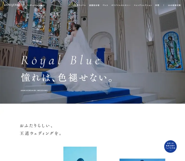
ロイヤルブルーと白を基調に、明朝体と大きな婚礼写真でブランドの魅力を伝える紹介ページ。左右交互の写真・文章構成、6つの魅力への導線、追従する円形予約ボタンが特徴。
オリジナルサイトを見るANNIVERSAIRE / Charm — Style Reference
A royal-blue wedding aisle becomes the organizing color for spacious photography, delicate typography, and a quiet reservation invitation.
Website: ANNIVERSAIRE — Charm Original URL: https://www.anniversaire.co.jp/charm/ Final URL: https://www.anniversaire.co.jp/charm/ HTTP status: 200 Theme: white editorial canvas, royal-blue identity and footer, restrained gold accents. Inspected: September 12, 2026, 04:54 JST; supplied retrieval timestamp: September 11, 2026, 19:54:22.017 UTC. Viewports: desktop 1440 × 1000 CSS pixels; mobile 390 × 844 CSS pixels. Scope: the current brand feature page, including its opening composition, introductory story, six recommendations, galleries, staff and customer voices, reservation links, ten-venue directory, and footer. Visual evidence comprises three desktop captures and two mobile captures; rendered text and selected computed styles cover additional sections. No additional browsing or interaction testing was performed for this reference.
ANNIVERSAIRE presents its wedding offering as a long photographic narrative within its larger website. The page moves from aspiration to six specific reasons to choose the brand, then to venues and reservation destinations. Its extended navigation, directory, and substantial corporate/service footer are integral to this structure.
The visual identity rests on a precise relationship: blue carpeting against white dresses and pale architecture, echoed by blue headings and interface surfaces against white space. Large photographs alternate with unusually narrow text columns. Japanese Mincho typography supplies the expressive voice; small sans-serif labels handle navigation, captions, and supporting information. Gold appears as a restrained recommendation marker.
Desktop and mobile use different compositions. Desktop places white introductory copy over a panoramic chapel scene. Mobile gives a square photograph its own area, then sets blue introductory copy on white below it. That rearrangement is more important than simply reducing font sizes.
How to Read This Reference
- Measured means supplied computed styles, custom properties, or element rectangles. Values are CSS pixels unless stated otherwise.
- Calculated means arithmetic derived from those measurements, such as grid equivalents, margins, or distances between elements.
- Estimated means visual interpretation of the supplied captures. Image geometry, footer details, and headline child styles have less complete DOM coverage.
- Recommended means a practical implementation choice for a new page. Recommendations are not assertions about the original source.
- Named aliases are reference tokens unless explicitly identified as source custom properties.
- A computed font-family declaration does not prove which font file supplied every rendered glyph. The evidence contains declarations, not a font-loading audit.
- Text and element rectangles can include offscreen, clipped, or otherwise concealed content. They do not independently establish visibility. For example, the desktop opening capture shows white space below the hero even though the introductory heading has a measured position within that area.
- Only two viewport widths were inspected. The original media-query breakpoints, intermediate layouts, and wider-screen limits were not supplied.
Tokens — Colors
Core Palette
| Name | Value | Source token | Role and evidence |
|---|---|---|---|
| Royal Blue | #173E9A |
--blue |
Measured heading color, floating reservation fill, active gallery dots, and mobile header background; visually consistent with the large blue footer |
| White | #FFFFFF |
--white |
Measured body background and reversed navigation/CTA text; the dominant editorial surface |
| Charcoal | #333333 |
--black |
Measured paragraph and supporting text color; the source name does not mean pure black |
| Muted Gold | #A58B48 |
--gold |
Measured color of recommendation-marker containers; a small organizational accent |
| Warm Neutral | #F3F1EF |
--lightgold |
Measured circular gallery-control backgrounds and inactive pagination dots |
| Medium Gray | #969696 |
--gray |
Measured customer-voice labels; also part of the supporting neutral palette |
| Rule Gray | #D8D8D8 |
--lightgray |
Declared source token; visually consistent with the thin quotation frame, whose own border color was not captured |
| Pale Blue | #E8F0FC |
--lightblue |
Declared source token; no specific large visible surface can be assigned to it from the supplied captures |
Blue is both a brand color and a photographic subject. Preserve that connection. It is not an interchangeable accent applied only to buttons.
The desktop hero photograph is visibly subdued beneath white text. Its overlay color, opacity, and implementation were not supplied. A black overlay around 25–35% is a recommended starting point, to be adjusted against the actual image. Do not treat that range as a measured source value.
Footer links appear lighter and less prominent than the white group headings. Their exact color or opacity was not measured; do not automatically reuse --gray on blue and assume it matches the capture.
Color Distribution
Use white across most reading areas. Reserve substantial blue fields for identity moments, especially the mobile opening header and footer. Apply blue to expressive headings and the persistent booking circle. Keep gold confined to small section markers. Floral colors, skin tones, stained glass, and warm interiors belong primarily to photography.
Tokens — Typography
Japanese Editorial Serif
Measured source stack:
YakuHanMP, 'FOT-筑紫Aオールド明朝 Pr6 M',
'ヒラギノ明朝 ProN', 'Hiragino Mincho ProN',
'ヒラギノ明朝 Pro', 'Hiragino Mincho Pro',
游明朝体, YuMincho, 游明朝, 'Yu Mincho', serif
This stack is declared on the body, introductory prose, recommendation headings, and several brand labels. Regular weight 400, generous tracking, and tall line boxes establish a ceremonial, measured reading pace.
Use the exact named commercial face only when available under an appropriate license. Its presence in the declaration does not establish redistribution rights or guarantee identical rendering on another system.
Navigation and Supporting Sans Serif
Measured source stack:
YakuHanJP, lato, 游ゴシック体, YuGothic,
'游ゴシック Medium', 'Yu Gothic Medium',
游ゴシック, 'Yu Gothic',
'ヒラギノ角ゴ Pro W3', 'Hiragino Kaku Gothic Pro',
Osaka, メイリオ, Meiryo, 'MS Pゴシック', sans-serif
Use this role for navigation, supporting descriptions, staff quotations, customer reviews, and action labels. Most samples use weight 400; the three ceremony-detail headings use 700.
The uppercase hero caption explicitly declares Lato, sans-serif. Its narrow, tracked presentation separates the small identifier from the expressive headline above.
Latin Display Type and Brand Artwork
The heading TREND COLLECTIONS 2024 STYLIST explicitly declares 'Cormorant Infant', serif. It measures 16px on desktop and 14.04px on mobile, both at weight 400.
The visible Royal Blue headline is a fine, high-contrast italic serif. Its child-level font declaration was not included. Do not present Cormorant Infant as its verified original font solely because that family appears elsewhere on the page. Reusing Cormorant Infant italic is a reasonable recommended approximation.
The ANNIVERSAIRE wordmark has distinctive narrow letterforms. Treat it as supplied brand artwork, not as ordinary text recreated with Lato. Its file format and asset URL were not provided.
Type Scale
All entries are measured unless explicitly marked as estimates. Tracking is expressed in em where it can be calculated from the supplied pixel values.
| Role | Desktop size / line height | Mobile size / line height | Tracking | Weight |
|---|---|---|---|---|
| Header page-label link | 12 / 12px |
10.92 / 10.92px |
0.16em |
400 |
| Main navigation links | 12 / 12px |
11.7 / 11.7px, offscreen in closed state |
0.16em |
400 |
| Hero English headline | Approximately 80–88px |
Approximately 40–44px |
Visibly wide; exact value unavailable | Visually light italic |
| Hero Japanese headline | Approximately 56–64px |
Approximately 26–28px |
Visibly open; exact value unavailable | Visually regular |
| Hero uppercase caption | 11.2 / 11.2px |
9.75 / 9.75px |
0.20em |
400 |
| Introductory statement | 28 / 51.52px |
17.94 / 33.01px |
0.24em |
400 |
| Introductory prose | 14.4 / 46.08px |
12.48 / 29.952px |
0.16em |
400 |
| Recommendation heading | 24 / 48px |
19.5 / 39px |
0.20em |
400 |
| Recommendation description | 13.6 / 27.2px |
12.48 / 24.96px |
Desktop 0.16em; mobile 0.14em |
400 |
| Staff quotation | 11.2 / 18.816px |
10.92 / 18.346px |
0.16em |
400 |
| Customer-voice label | 10.4 / 10.4px |
10.14 / 10.14px |
0.16em |
400 |
| Customer-review paragraph | 12 / 22.08px |
11.7 / 21.528px |
0.16em |
400 |
| Ceremony-detail heading | 13.6 / 21.76px |
13.26 / 21.216px |
0.16em |
700 |
| Ceremony-detail paragraph | 12 / 22.08px |
11.7 / 19.656px |
0.16em |
400 |
| Rectangular action label | 12 / 12px |
11.7 / 11.7px |
0.12em |
400 |
Two measurement traps matter here. The hero H2 container reports the inherited 10px desktop body size, while its visible child text is much larger. Similarly, recommendation-marker containers report 6.4px on desktop and 4.68px on mobile, despite containing a much taller number-and-label composition. Those container values are not reliable visual sizes for all their children.
The semantic H1 is the small page identifier in the header; the opening campaign line is an H2. Visual prominence and heading level are therefore separate in the inspected page.
Tokens — Spacing & Shapes
Source Units
The original uses a small root size and a separate grid token:
/* Observed desktop values */
--fontsize: 10px;
--grid: 1.6rem;

/* Observed mobile values */
--fontsize: calc(100vw / 40);
--grid: 0.8rem;
At desktop, one source rem is 10px and one grid unit is 16px. At 390px mobile width, one source rem is 9.75px and one grid unit is 7.8px.
The root size changes only slightly between these captures, while the grid nearly halves. Type and spatial composition therefore do not follow one uniform reduction factor.
Grid Equivalents
| Source expression | Desktop | At 390px mobile | Typical relationship |
|---|---|---|---|
--grid |
16px | 7.8px | Base spatial unit |
--grid-2 |
32px | 15.6px | Desktop header inset; mobile content inset |
--grid-4 |
64px | 31.2px | Desktop outer utility inset; mobile spacing/radius relationships |
--grid-6 |
96px | 46.8px | Desktop floating CTA diameter; mobile gallery-control diameter |
--grid-8 |
128px | 62.4px | Mobile header and floating CTA size correspond to eight mobile units |
--grid-10 |
160px | 78px | Desktop editorial left margin |
--grid-16 |
256px | 124.8px | Desktop ceremony-detail column width |
--grid-18 |
288px | 140.4px | Desktop recommendation text width |
--grid-28 |
448px | 218.4px | Desktop prose width; mobile rectangular action width |
--grid-46 |
736px | 358.8px | Mobile content width |
--grid-70 |
1120px | 546px | Desktop editorial content width |
These are calculated token equivalents, not instructions to assign the same token to the same component at every width. Components switch relationships responsively.
Layout Measurements
| Element | Desktop | Mobile | Evidence |
|---|---|---|---|
| Document height | 22365.42px |
18189.48px |
Measured; capture-specific, not a layout target |
| Initial header | 1440 × 80px |
390 × 62.39px |
Measured |
| Header home-link box | 156 × 25.55px, x = 32 |
152.09 × 25.67px, centered |
Measured |
| Editorial content column | 1120px, x = 160 |
358.80px, x = 15.59 |
Measured |
| Introductory prose column | 448px, alternating x = 160 and 832 |
358.80px, x = 15.59 |
Measured |
| Recommendation text column | 288px, x = 64 or 1088 |
358.80px, x = 15.59 |
Measured |
| Hero media | Approximately 1440 × 810px |
Approximately 390 × 390px below header |
Screenshot estimate |
| Ceremony lead photograph | Approximately 1016px wide, flush left |
Full-width lead allocation is consistent with a square image | Desktop visual estimate; mobile geometry inference |
| Ceremony-detail columns | Three 256px columns at x = 160, 592, 1024 |
Text columns 171.59px wide at x = 202.78, in successive rows |
Measured text geometry |
| Floating reservation link | 96 × 96px; right/bottom 64px |
62.39 × 62.39px; right/bottom about 15.59px |
Measured; offsets calculated |
| Rectangular action link | 224 × 48px |
218.39 × 39px |
Measured |
Keep three desktop alignment systems distinct: the header begins at 32px, utility and recommendation text can begin at 64px, and the editorial story begins at 160px. Aligning everything to one centered container would flatten the composition.
Shapes and Borders
| Element | Treatment |
|---|---|
| Main photography | Square corners; no visible decorative frame or shadow |
| Six-topic index links | Measured radius 8px desktop, 7.8px mobile |
| Staff quotation frame | Thin outline, approximately 16px corner radius in the desktop capture |
| Staff portrait | Circular crop, approximately 64px in the desktop capture |
| Gallery direction controls | Measured 64px circles desktop; 46.8px circles mobile |
| Gallery dots | Measured 6px desktop; approximately 5.85px mobile |
| Floating reservation link | Circle; measured radius 48px desktop and 31.2px mobile |
| Repeated rectangular action links | Measured radius 0 |
| Social links | White circular containers, approximately 32px in both footer captures |
Roundness is selective. It identifies compact controls and human quotations; it does not turn the whole page into rounded cards.
Components
Site Header
Role: brand identity, page identification, and direct access to the six topics and venue directory.
The desktop opening header overlays the hero. The home-linked wordmark sits at x = 32px, followed by the small page label アニヴェルセルの魅力. Navigation starts around x = 659px. Adjacent topic links have approximately 24px gaps; a thin vertical separator distinguishes 10の結婚式場 from the six feature links.
The opening header is measured at 80px high with 32px padding. White navigation contrasts with the subdued photograph. In the middle and footer desktop captures, the header remains at the top with a blue wordmark, dark navigation, and a pale translucent-looking surface. Its visible height is approximately 64px. The precise scroll threshold, background opacity, and use of blur are unverified.
Mobile opens with a solid blue 62.39px bar. The wordmark is centered above the page label. A compact white line symbol and MENU caption occupy the upper right. The desktop links remain in the supplied DOM but have negative horizontal coordinates in this state; they are not visibly squeezed into the bar.
The mobile footer capture retains the upper-right menu control without the full opening wordmark bar. Preserve this distinction when documenting states: the evidence supports persistent menu access, not an unchanged full mobile header at every scroll position. No open-menu capture was supplied.
Hero Composition
Role: introduce the blue-aisle identity through architecture, the couple, and a concise promise.
Desktop anatomy:
- An edge-to-edge chapel photograph, approximately 16:9.
- Subdued image exposure beneath white foreground text.
- An H2 group beginning at x = 160px and y = 439.44px, measured at approximately
643.78 × 201.59px. - A widely tracked italic
Royal Blueline above憧れは、色褪せない。. - A separate
ANNIVERSAIRE WEDDINGcaption at y = 702.80px.
The H2 uses a measured 32px gap between its children. Its bottom sits approximately 62px above the caption. The copy occupies the lower-left portion of the media without a bounding card.
Mobile anatomy changes: the blue header ends at y ≈ 62.4px; the square image ends at y ≈ 452px; the H2 starts at y = 483.58px on white. The H2 child gap becomes 15.6px, and the caption starts at y = 611.88px. The text changes to blue.
The desktop photograph shows a broad architectural view; mobile shows a close view of the couple. Different source assets, responsive cropping, and different moving-media frames cannot be distinguished from this evidence. A new implementation should select imagery or crops that reproduce the compositional result without assuming a verified video system.
Introductory Story
Role: establish the experience before presenting the six recommendations.
The opening statement おふたりらしい、王道ウェディングを。 uses deliberate line breaks, regular Mincho type, and 0.24em tracking. Desktop gives it a 1120px-wide alignment area, although the text itself remains short.
Later prose alternates between 448px columns on the left and right. Measured desktop paragraph positions around y = 1590, 2223, and 2904 demonstrate the unusually spacious pacing. Photography and empty space separate the narrative beats rather than a dense sequence of bordered panels.
On mobile, these paragraphs share the 358.8px content width and approximately 15.6px side margins. Their line height drops from 46.08px to 29.952px. Maintain intentional pauses, but do not copy the desktop vertical distances as fixed mobile spacers.
Six-Recommendation Index
Role: provide a compact table of contents inside the photographic narrative.
The index follows the introductory story and includes a bilingual heading, a short expressive statement, and six links for chapel, banquet, dresses, ceremony, trend collections, and cuisine.
Desktop link boxes measure 120 × 176.25px, arranged in a single row. Their left positions advance by 200px, producing 80px gaps. Each link uses white Mincho text, a 16px internal gap, 16px bottom padding, and an 8px radius. Graphic content above the labels is not individually documented in the supplied element records.
Mobile becomes a three-column, two-row arrangement. Each link measures approximately 109.19 × 107.5px, with 15.6px horizontal and vertical gaps. Internal spacing drops to 7.8px and the label becomes 13.26 / 18.03px.
The anchors point to existing section IDs such as #charm-chapel and #charm-ceremony. Their destinations are verified by the supplied hrefs; smooth scrolling and active-section highlighting were not exercised.
Alternating Recommendation Lead
Role: pair a specific brand benefit with immersive photography and a short human endorsement.
Each numbered section contains a recommendation marker, blue three-line heading, description, staff quotation, and major photograph. The text sits left for chapel, dresses, and trend collections; it sits right for banquet, ceremony, and cuisine.
The ceremony capture makes the proportion particularly clear: photography occupies roughly 1016px of the 1440px width, while a 288px text column starts at x = 1088px. The 72px gap between image edge and text, plus 64px outside clearance, creates a spacious 424px text-side allocation.
A square lead image is a useful reconstruction starting point: desktop section geometry and mobile section-to-marker distances are consistent with that relationship. Image element rectangles were not supplied, so the precise original aspect-ratio rule remains an inference.
Mobile places the major media allocation before the copy. All six headings begin at the standard left inset. Their type remains substantial at 19.5 / 39px; this is a recomposed editorial sequence rather than a miniature side-by-side layout.
Staff Quotation
Role: add a small, specific staff observation to each feature.
The desktop ceremony example contains an approximately 224px-wide outlined quotation box. Large gray quotation marks interrupt its upper-left and lower-right edges. A short sans-serif quote sits above a circular staff portrait and muted venue/job information. The box stays flat, with no visible drop shadow.
The measured quotation paragraph is 192px wide on desktop, including its recorded padding, and uses 11.2 / 18.816px text. Mobile quotation copy starts at x = 93.58px and measures 249.61px wide, indicating a changed horizontal arrangement rather than preservation of the narrow desktop stack. Exact mobile portrait dimensions were not supplied.
The staff job label is contextual content. It does not identify the people who designed or built the website.
Supporting Galleries
Role: expand a feature through multiple photographs and short captions.
The DOM contains repeated offscreen entries and compact pagination/control buttons. The chapel gallery has five pagination dots, banquet six, dresses ten, and trend collections six. Repeated captions are consistent with carousel clones; they should not be counted as additional editorial topics.
Desktop direction buttons are 64px circles with warm-neutral fills. In the chapel and banquet records, they form a vertical pair with an 8px gap. Mobile places the pair side by side near the center, using 46.8px circles and approximately 7.8px between them.
Pagination dots are 6px on desktop with 22px center-to-center spacing. At mobile they are approximately 5.85px with 21.44px spacing. Blue marks the sampled active dot; warm neutral marks the others.
Mobile dress caption boxes measure about 265.19px wide with a 280.78px horizontal pitch. Trend caption boxes measure 312px with about 335.39px pitch. These measurements describe their caption containers, not proven image dimensions.
The controls establish a gallery interface, but do not establish autoplay, swipe support, looping behavior, transition duration, or successful button activation. Those require separate implementation and testing.
Ceremony Detail Group
Role: explain three distinct ceremony experiences beneath the main photograph.
The desktop capture shows three unboxed items: 家族の時間, 確認の儀, and チャペルムービー. Each has a rectangular photograph, bold sans-serif heading, and supporting paragraph. Image boxes appear approximately 256 × 160px, an 8:5 ratio. The items begin at x = 160, 592, and 1024px, leaving 176px between their 256px columns.
This large inter-column space is a defining detail. Do not replace it with three large cards that fill the available width.
Mobile changes to successive horizontal items. Measured text columns begin at x = 202.78px and are 171.59px wide. This supports an image-left/text-right composition within the 358.8px content area. Exact mobile image crops were not visually captured.
Cuisine uses related image-and-text supporting items, but its desktop text positions show a vertical group rather than the ceremony section's three-column arrangement. Reuse typography and image treatment without forcing every supporting group into one layout.
Customer Voice
Role: provide longer customer testimony after selected recommendations.
Desktop reviews use a small gray お客様の声 label, a short summary heading, and a 448px-wide sans-serif paragraph. The body measures 12 / 22.08px, with 0.16em tracking.
Mobile rendered text retains the labels and summary headings but omits the long review paragraphs, even though paragraph element records still exist. This suggests visibility or clipping behavior; it does not prove an accordion or a particular disclosure mechanism. Do not reconstruct a mobile expand/collapse interaction without further evidence. In a new implementation, keep the content visible or provide an explicitly designed accessible disclosure.
Repeated Venue and Fair Actions
Role: let readers move from inspiration to either venue exploration or a fair reservation.
Paired invitation rows recur after recommendations two, four, and six. One explains the venue directory and links to #charm-halls; the other explains the fair experience and links to the supplied reservation URL.
Desktop explanatory text sits around x = 376px, with 224 × 48px action links at x = 848px. Mobile stacks each explanation above a centered 218.39 × 39px link.
The link rectangles have square corners and white label text. Their own computed backgrounds are transparent, so the visible fill may belong to another layer that was not supplied. A blue-filled rectangular action is a recommended adaptation, not a verified element-level background measurement.
Floating Reservation Circle
Role: maintain a compact route to booking during the long read.
A blue circle occupies the lower-right corner across the supplied captures. Its three-line Japanese invitation is followed by a fine rightward arrow. Desktop geometry is exact: 96 × 96px, x = 1280px, y = 840px, leaving 64px on both sides of the viewport corner.
Mobile reduces the circle to approximately 62.4px and the offsets to 15.6px. Child-level text sizing was not provided; the visibly tiny mobile label should not be inferred from the wrapper's 9.75px font size.
The anchor points to https://www.anniversaire.co.jp/special/gl-royalbluechapelfair/. That destination was not visited. Over the blue footer, the circle's fill visually merges with the background while the white invitation remains visible. This is not evidence that the control disappears.
Wedding-Hall Directory
Role: connect the six benefits to ten concrete venues.
The supplied rendered text establishes a WEDDING HALLS introduction, seven regional anchors, and ten venue entries. The regions are Tokyo, Kanagawa, Saitama, Chiba, Nagano, Aichi, and Osaka.
Each entry includes a Japanese venue name, a short positioning sentence, access information, and separate venue-detail and fair-reservation links. Desktop text also includes English venue-name treatments that are absent from the mobile rendered-text extraction.
The full directory is not shown in the supplied screenshots, and its detailed component rectangles were not included. Preserve its information hierarchy; do not claim a verified card grid, filter system, map, or tab interaction. The regional links are fragment anchors, not evidence of filtering.
Footer
Role: reconnect this feature page to the brand's broader services and institutional information.
The desktop footer is a large blue field with generous top spacing. Its visible groups begin around x = 64, 352, 640, and 1120px. They cover page topics, brand/preparation content, total services, and social/company links. Headings are white and more prominent than the pale supporting links.
Five white circular social controls represent Instagram, Facebook, X, YouTube, and Pinterest. A thin low-contrast rule separates the lower signature row. The white wordmark and small brand sentence sit on the left; the copyright sits toward the right.
Mobile reorganizes the links into narrower columns. In the supplied lower-footer crop, brand/preparation links occupy the left column and services the right. Social circles form a centered row. Company and policy links form two columns below, followed by a divider, centered wordmark, short brand sentence, and copyright.
The visible copyright reads © 2025 ANNIVERSAIRE. This is page content, not the inspection year or verified redesign date. Likewise, the stylist section's 2024 label does not date the current website implementation.
Tokens — Motion & Interaction
| Treatment | Supplied evidence | What can safely be concluded |
|---|---|---|
| Floating reservation background | background 0.24s cubic-bezier(0.22, 1, 0.36, 1) |
A short background transition is defined; its changed color and trigger were not captured |
| Gallery direction-button background | Same 0.24s transition and easing |
Controls share a restrained transition token; no slide timing is established |
| Six-topic link border | border 0.24s cubic-bezier(0.22, 1, 0.36, 1) |
Border feedback is defined; exact alternate border state is unverified |
| Mobile recommendation sections | 0.8s cubic-bezier(0.65, 0, 0.35, 1) both fade_in |
A named reveal animation is assigned; its keyframes, trigger, and replay rules were not provided |
| Desktop header across captures | Over-image white state and pale-surface dark/blue state | A scroll-associated visual change is supported; exact implementation is unknown |
| Mobile menu | Visible trigger; navigation links positioned offscreen | Closed presentation is supported; opening behavior and focus handling are untested |
| Galleries | Pagination, directional buttons, repeated offscreen content | A carousel-like structure exists; autoplay, dragging, looping, and transitions are unverified |
| Hero media | Different desktop/mobile compositions | No reliable conclusion about video playback or automatic image changes |
Several elements report only transition: all. Without a duration and changed state, this is not useful evidence of a particular animation.
The capture process waited for finite motion and layout stability, and temporarily paused perpetual animations during readiness checks. Static captures therefore cannot establish the absence of continuous motion. The name fade_in also does not establish translation distance, scale, or parallax.
For a new implementation, use restrained opacity reveals and brief color feedback. Keep content readable before enhancement, and offer reduced-motion behavior. These are recommendations rather than verified original features.
Surfaces
| Surface | Appearance | Structural purpose |
|---|---|---|
| Main canvas | Solid white | Provides long visual pauses around photography and text |
| Desktop opening media | Subdued photograph with white type | Establishes atmosphere and blue-aisle identity |
| Mobile opening header | Solid royal blue | Keeps the brand visible above a separate image block |
| Scrolled desktop header | Pale, translucent-looking band | Separates navigation from changing content beneath |
| Recommendation copy | White, generally unboxed | Lets typography and image boundaries define sections |
| Staff quotation | White with a thin gray frame | Distinguishes a small human endorsement |
| Gallery controls | Warm-neutral circles | Provides a quiet control surface beside imagery |
| Floating reservation | Solid blue circle | Repeats the brand color as an action |
| Footer | Full-width blue with reversed details | Creates a strong final identity field and dense navigation area |
There is no visible general-purpose shadow elevation system. Most separation comes from whitespace, image edges, typography, and changes between white and blue fields.
Imagery
Photography carries the emotional and spatial scale. The supplied captures show pale cathedral architecture, stained glass, chandeliers, a saturated blue aisle, white wedding clothing, guests applauding, family moments, and atmospheric chapel lighting.
Alternate architectural distance with human closeness. The opening desktop view emphasizes the height and volume of the chapel; mobile emphasizes the couple's faces and connection. The ceremony section uses guests, foreground blur, floral greenery, and a blue aisle to draw the eye through the image.
Keep large photographs edge-to-edge within their allocated area and preserve square corners. Use natural photographic color rather than applying the interface's blue as a universal duotone. Blue is already present in the scene, while warm skin tones and green foliage keep it human.
Observed Asset References
No image URLs, media source URLs, or asset filenames were included. The following is a visual inventory, not a downloadable asset manifest.
| Asset | Evidence | Reuse guidance |
|---|---|---|
| Desktop chapel hero | Desktop opening capture; approximately 16:9 | Select a wide architectural composition with a clear blue aisle and room for lower-left text |
| Mobile couple hero | Mobile opening capture; approximately square | Preserve both faces and the link between white dress, dark suit, and blue background |
| Ceremony lead photograph | Desktop middle capture; approximately 1016px wide | Keep the aisle and couple central to the reading direction; allow foreground guests to frame the scene |
| Three ceremony-detail photographs | Desktop middle capture; approximately 256 × 160px each | Use a consistent rectangular presentation with different human or ceremonial subjects |
| Staff portrait | Desktop quotation panel; circular | Use a small, unobtrusive crop associated with the actual quoted staff member |
| Brand wordmark | Header and footer captures | Use authorized brand artwork with appropriate blue/white variants |
| Social symbols | Desktop and mobile footer captures | Keep the small symbols inside white circular controls |
Photographs are visible evidence of the design; their legal availability for reuse is not established by these captures. Supply authorized imagery for an implementation. Avoid inventing original asset paths.
Layout & Responsive Behavior
| Relationship | Desktop observation | Mobile observation |
|---|---|---|
| Opening header | Overlay across hero, wordmark left, horizontal navigation | Blue opening bar, centered wordmark/page label, menu at right |
| Hero copy | White and layered over media | Blue and placed below square media |
| Main editorial inset | 160px | Approximately 15.6px |
| Introductory prose | Alternating 448px columns | One 358.8px column |
| Six-topic index | Six links in one row | Three columns and two rows |
| Recommendation leads | Alternating narrow text and dominant media | Media allocation before full-width copy |
| Gallery direction controls | Vertical pairs in sampled desktop galleries | Horizontal centered pairs |
| Ceremony supporting content | Three widely spaced image-over-text columns | Successive image-left/text-right rows, supported by text geometry |
| Repeated invitations | Explanation left, action right | Explanation above centered action |
| Booking circle | 96px with 64px corner offsets | Approximately 62.4px with 15.6px offsets |
| Footer | Broad multi-column field and horizontal signature row | Narrow link columns and centered lower identity |
The mobile document is shorter than the desktop document in these captures despite its narrower text measure. The changed media allocation, grid, and content visibility prevent document height from being understood as a simple scaling ratio. Do not reproduce the recorded heights with fixed spacers.
No tablet capture was supplied. For a new implementation, collapse the full navigation before it becomes crowded, then test content transitions independently. Any chosen breakpoint is a recommendation, not a recovered original value.
The persistent booking invitation can overlap imagery and footer content. Reserve sufficient clearance for essential actions and text, particularly when enlarging labels for readability or accommodating device safe areas.
Do’s and Don’ts
Do
- Keep the exact royal blue
#173E9Aconnected to both interface elements and blue-aisle photography. - Preserve a white-dominant page with a substantial blue footer.
- Use regular Japanese Mincho type for expressive headings and narrative prose.
- Keep utility information small, tracked, and predominantly sans-serif.
- Retain distinct desktop alignments at approximately 32px, 64px, and 160px.
- Pair dominant photographs with narrow 288px desktop feature-copy columns.
- Alternate the text side across the six recommendations.
- Move hero copy below the photograph on mobile.
- Preserve the three-by-two mobile topic index and horizontal mobile gallery controls.
- Keep staff quotations intimate, lightly outlined, and associated with a portrait.
- Maintain direct routes to both venue information and fair reservations.
- Distinguish measured source behavior from implementation choices.
Don’t
- Don’t replace the long brand narrative with a generic feature-card page.
- Don’t give every image or content block a large radius and shadow.
- Don’t spread gold across major backgrounds or introduce unrelated action colors.
- Don’t force desktop text overlays onto the mobile hero.
- Don’t use a single centered container for every desktop component.
- Don’t enlarge the ceremony-detail columns until all their characteristic whitespace disappears.
- Don’t interpret offscreen gallery clones as extra content sections.
- Don’t infer autoplay, video, parallax, or accordion behavior from static evidence.
- Don’t identify the hero font from another element's declaration.
- Don’t copy source
remnumbers into a conventional 16px-root project without conversion. - Don’t reproduce tiny mobile control labels without checking readability and touch access.
- Don’t treat the page's 2024 or 2025 content labels as verified design-release dates.
Recommended Implementation Additions
These are improvements for a new implementation, not verified features of the inspected page:
- Give the menu button an accessible name,
aria-expanded, and a controlled navigation region. Ensure hidden navigation is not keyboard-focusable. - Give gallery buttons explicit previous/next labels, expose the current slide, and enlarge dot hit areas while keeping the visible dots small.
- Use at least 44px touch targets for primary mobile actions. The sampled rectangular links are only 39px high.
- Raise small explanatory text toward 14–16px where reading conditions require it; reflow the narrow columns rather than clipping the content.
- Verify contrast for pale footer links, muted labels, and white hero text against the actual image. The exact footer link color is unknown.
- Add visible focus indicators and anchor offsets for persistent navigation.
- Keep long customer reviews readable or offer explicit keyboard-operable disclosure controls.
- Respect reduced-motion preferences. If moving hero media is introduced, provide an appropriate static alternative and controls where needed.
- Reserve dimensions for images and use responsive sources. Load the opening media promptly and defer distant gallery assets.
- Add safe-area offsets and check that the booking circle does not cover venue actions or footer links.
Agent Prompt Guide
Quick Color Reference
- Main canvas: white
#FFFFFF. - Identity, feature headings, and booking circle: royal blue
#173E9A. - Main text: charcoal
#333333. - Recommendation accent: muted gold
#A58B48. - Gallery-control background: warm neutral
#F3F1EF. - Supporting labels: medium gray
#969696. - Fine neutral rules: declared token
#D8D8D8. - Footer: blue field with white headings and suitably contrasted pale links.
Overall Prompt
“Create a long Japanese wedding-brand feature page inspired by ANNIVERSAIRE's Charm page. Use royal blue #173E9A, white, restrained gold markers, regular Mincho headings, and small tracked sans-serif supporting text. Open desktop with a panoramic pale cathedral photograph featuring a vivid blue aisle and white lower-left copy: an italic ‘Royal Blue’ line, a Japanese promise, and a small uppercase caption. Follow with spacious alternating photographic storytelling, a six-topic index, and six numbered benefits. Pair dominant photographs with narrow desktop text columns, short staff quotations, and selected galleries or supporting detail groups. End with a regional venue directory and a substantial blue multi-column footer. Keep a small circular reservation invitation at the lower right. On mobile, use a blue opening header, square hero photograph, blue copy below the image, a three-by-two topic index, and vertically reordered feature sections.”
Example Component Prompts
- Recommendation lead: “At 1440px, create a full-width wedding feature with a dominant photograph and a 424px text-side allocation. Inside that allocation, use a 288px column, a small gold recommendation marker, a blue three-line Mincho heading at 24px with 48px leading, a short paragraph, and an outlined staff quotation. Alternate the text side between sections.”
- Mobile hero: “At 390px, place a centered white wordmark and small page label in a blue bar approximately 62px high. Follow with a square photograph of the couple. Put the italic blue English headline and blue Japanese promise on white below, with approximately 16px side margins. Keep the small uppercase caption separate.”
- Ceremony details: “Create three unboxed desktop items inside a 1120px area. Each uses a 256-by-160 photographic crop, a bold 13.6px sans-serif heading, and a compact paragraph. Leave broad gaps between items. On mobile, arrange successive image-left/text-right rows.”
- Booking circle: “Create a flat royal-blue reservation circle with a centered three-line Japanese label and a fine right arrow. Use 96px diameter and 64px corner offsets on desktop; approximately 62px diameter and 16px offsets at 390px. Add accessible labeling, focus visibility, and safe-area clearance.”
- Footer: “Create a full-width royal-blue footer with white group headings, lighter service links, five small white social circles, and a quiet divider above the brand signature. Use broad desktop columns and narrow mobile columns, with the mobile wordmark and copyright centered below.”
Quick Start
CSS Custom Properties
This is a recommended implementation scaffold, not recovered source code. It preserves measured colors, sampled dimensions, and responsive relationships while keeping the document's normal root font size. --source-rem is a conversion unit for this reference; it does not change the browser root.
The 1100px breakpoint is recommended and unverified. The mobile unit is capped and floored for stability outside the inspected 390px width; the original supplied mobile expression was uncapped. Hero font sizes, its overlay, quotation geometry, and the square recommendation-image rule are reconstruction choices. The opacity keyframes below are an approximation because the original fade_in keyframes were not supplied.
:root {
  /* Measured source palette */
  --royal: #173e9a;
  --paper: #fff;
  --ink: #333;
  --gold: #a58b48;
  --warm: #f3f1ef;
  --muted: #969696;
  --rule: #d8d8d8;
  --pale-blue: #e8f0fc;

  /* Observed family names with shortened fallback stacks */
  --font-mincho: YakuHanMP, 'FOT-筑紫Aオールド明朝 Pr6 M',
    'Hiragino Mincho ProN', 'Yu Mincho', serif;
  --font-sans: YakuHanJP, Lato, 'Yu Gothic', Meiryo, sans-serif;
  /* Recommended hero approximation; verified elsewhere on the page */
  --font-display: 'Cormorant Infant', serif;

  --source-rem: 10px;
  --g: calc(1.6 * var(--source-rem));
  --content: 1120px;
  --content-inset: max(32px, calc((100% - var(--content)) / 2));
  --header-height: 80px;
  --body-size: 13.6px;
  --heading-size: 24px;
  --control-size: 64px;
  --booking-size: 96px;
  --booking-offset: 64px;
  --ease-control: cubic-bezier(0.22, 1, 0.36, 1);
  --ease-reveal: cubic-bezier(0.65, 0, 0.35, 1);
}

* { box-sizing: border-box; }
body {
  margin: 0;
  color: var(--ink);
  background: var(--paper);
  font-family: var(--font-mincho);
  font-size: var(--body-size);
  line-height: 2;
  letter-spacing: 0.16em;
}
img { display: block; max-width: 100%; height: auto; }
a { color: inherit; }
button { font: inherit; }
[hidden] { display: none !important; }
section[id] { scroll-margin-top: calc(var(--header-height) + 16px); }
.content {
  width: min(var(--content), calc(100% - 64px));
  margin-inline: auto;
}

/* Header state changes require application logic. */
.site-header {
  position: fixed;
  inset: 0 0 auto;
  z-index: 30;
  height: var(--header-height);
  padding-inline: 32px;
  display: flex;
  align-items: center;
  justify-content: space-between;
  gap: 24px;
  color: var(--paper);
}
.brand-group { display: flex; align-items: center; gap: 16px; }
.brand-mark { width: 156px; }
.page-label { margin: 0; font-size: 12px; font-weight: 400; }
.desktop-nav { display: flex; align-items: center; gap: 24px; }
.desktop-nav a {
  font: 400 12px/1 var(--font-sans);
  letter-spacing: 0.16em;
  text-decoration: none;
  white-space: nowrap;
}
.site-header.is-scrolled {
  height: 64px;
  color: var(--royal);
  background: rgb(255 255 255 / 94%);
}
.site-header.is-scrolled .desktop-nav { color: var(--ink); }
.menu-trigger { display: none; }

/* Supply authorized media and wordmark variants in the markup. */
.hero { position: relative; }
.hero-media { position: relative; aspect-ratio: 16 / 9; }
.hero-media > picture,
.hero-media img { width: 100%; height: 100%; display: block; }
.hero-media img { object-fit: cover; }
.hero-media::after {
  content: '';
  position: absolute;
  inset: 0;
  background: rgb(0 0 0 / 28%);
  pointer-events: none;
}
.hero-copy {
  position: absolute;
  left: var(--content-inset);
  bottom: 96px;
  color: var(--paper);
}
.hero-heading { display: grid; gap: 32px; margin: 0; font-weight: 400; }
.hero-english {
  font: italic 400 88px/1.1 var(--font-display);
  letter-spacing: 0.2em;
}
.hero-japanese { font-size: 56px; line-height: 1.3; letter-spacing: 0.16em; }
.hero-caption {
  margin: 64px 0 0;
  font: 400 11.2px/1 Lato, sans-serif;
  letter-spacing: 0.2em;
}
.intro { padding-block: 128px; }
.intro-heading {
  margin: 0;
  font-size: 28px;
  font-weight: 400;
  line-height: 1.84;
  letter-spacing: 0.24em;
}
.intro-copy { max-width: 448px; font-size: 14.4px; line-height: 3.2; }
.intro-copy.is-right { margin-left: auto; }

/* Six-topic index: its enclosing photographic treatment is separate. */
.topic-index {
  display: grid;
  grid-template-columns: repeat(6, 120px);
  justify-content: space-between;
  gap: 16px;
}
.topic-link {
  min-height: 176.25px;
  display: flex;
  flex-direction: column;
  align-items: center;
  justify-content: center;
  gap: 16px;
  padding-bottom: 16px;
  border: 1px solid transparent;
  border-radius: 8px;
  color: var(--paper);
  font-size: 16px;
  line-height: 1.44;
  text-align: center;
  text-decoration: none;
  transition: border-color 240ms var(--ease-control);
}

/* Recommended square image allocation based on supplied geometry. */
.feature-lead {
  display: grid;
  grid-template-columns: 424px minmax(0, 1fr);
  grid-template-areas: 'copy media';
  align-items: center;
}
.feature-lead.is-reversed {
  grid-template-columns: minmax(0, 1fr) 424px;
  grid-template-areas: 'media copy';
}
.feature-media { grid-area: media; margin: 0; aspect-ratio: 1; }
.feature-media img { width: 100%; height: 100%; object-fit: cover; }
.feature-copy { grid-area: copy; padding: 64px 72px 64px 64px; }
.is-reversed .feature-copy { padding-inline: 72px 64px; }
.recommend-marker { color: var(--gold); font-family: var(--font-sans); }
.feature-title {
  margin: 24px 0 38.4px;
  color: var(--royal);
  font-size: var(--heading-size);
  font-weight: 400;
  line-height: 2;
  letter-spacing: 0.2em;
}
.feature-description { margin: 0; }
.staff-quote {
  position: relative;
  width: 224px;
  margin: 48px 0 0;
  padding: 24px 16px 16px;
  border: 1px solid var(--rule);
  border-radius: 16px;
  font: 400 11.2px/1.68 var(--font-sans);
  letter-spacing: 0.16em;
}
.staff-person { display: flex; align-items: center; gap: 16px; margin-top: 16px; }
.staff-person img { width: 64px; aspect-ratio: 1; border-radius: 50%; object-fit: cover; }
.staff-person small { color: var(--muted); }

.detail-grid {
  display: grid;
  grid-template-columns: repeat(3, 256px);
  justify-content: space-between;
  gap: 32px;
  margin-block: 64px;
}
.detail-item img { width: 100%; aspect-ratio: 8 / 5; object-fit: cover; }
.detail-item h3 {
  margin: 32px 0 11.2px;
  font: 700 13.6px/1.6 var(--font-sans);
  letter-spacing: 0.16em;
}
.detail-item p { margin: 0; font: 400 12px/1.84 var(--font-sans); letter-spacing: 0.16em; }
.gallery-controls { display: flex; flex-direction: column; gap: 8px; }
.gallery-arrow {
  width: var(--control-size);
  height: var(--control-size);
  display: grid;
  place-items: center;
  border: 0;
  border-radius: 50%;
  color: var(--royal);
  background: var(--warm);
  cursor: pointer;
  transition: background-color 240ms var(--ease-control);
}

.action-row {
  display: grid;
  grid-template-columns: minmax(0, 1fr) 224px;
  align-items: center;
  gap: 48px;
  max-width: 696px;
  margin: 40px auto;
  font-family: var(--font-sans);
}
.action-link {
  min-height: 48px;
  display: flex;
  align-items: center;
  justify-content: center;
  padding: 12px 24px;
  color: var(--paper);
  background: var(--royal);
  font-size: 12px;
  line-height: 1.4;
  letter-spacing: 0.12em;
  text-decoration: none;
}
.booking-fab {
  position: fixed;
  z-index: 40;
  right: max(var(--booking-offset), env(safe-area-inset-right, 0px));
  bottom: max(var(--booking-offset), env(safe-area-inset-bottom, 0px));
  width: var(--booking-size);
  height: var(--booking-size);
  display: flex;
  flex-direction: column;
  justify-content: center;
  align-items: center;
  gap: 4.8px;
  border-radius: 50%;
  color: var(--paper);
  background: var(--royal);
  font-size: 10px;
  line-height: 1.5;
  text-align: center;
  text-decoration: none;
  transition: background-color 240ms var(--ease-control);
}

.site-footer { padding: 96px 64px 64px; color: var(--paper); background: var(--royal); }
.footer-links {
  display: grid;
  grid-template-columns: 224px 224px minmax(0, 1fr) 256px;
  gap: 64px;
}
.footer-links h2 { font-size: 14px; font-weight: 400; }
.footer-links ul { margin: 32px 0 0; padding: 0; list-style: none; }
.footer-links li { margin-block: 16px; }
.footer-links a { font: 400 12px/1.8 var(--font-sans); text-decoration: none; }
.footer-bottom {
  display: flex;
  align-items: center;
  justify-content: space-between;
  gap: 32px;
  margin-top: 64px;
  padding-top: 32px;
  border-top: 1px solid rgb(255 255 255 / 20%);
}

@media (max-width: 1100px) {
  :root {
    /* Recommended limits; matches the supplied 390px measurements. */
    --source-rem: clamp(9.75px, 2.5vw, 10px);
    --g: calc(0.8 * var(--source-rem));
    --header-height: calc(8 * var(--g));
    --body-size: calc(1.28 * var(--source-rem));
    --heading-size: calc(2 * var(--source-rem));
    --control-size: calc(6 * var(--g));
    --booking-size: calc(8 * var(--g));
    --booking-offset: calc(2 * var(--g));
  }
  .content { width: calc(100% - 4 * var(--g)); }
  .site-header,
  .site-header.is-scrolled {
    position: relative;
    height: var(--header-height);
    justify-content: center;
    padding: 0;
    color: var(--paper);
    background: var(--royal);
  }
  .brand-group { flex-direction: column; gap: 4px; }
  .brand-mark { width: calc(15.6 * var(--source-rem)); }
  .page-label { font-size: calc(1.12 * var(--source-rem)); }
  .desktop-nav { display: none; }
  .menu-trigger {
    position: fixed;
    z-index: 45;
    top: 8px;
    right: calc(2 * var(--g));
    display: grid;
    place-items: center;
    width: 44px;
    height: 44px;
    border: 0;
    color: var(--paper);
    background: var(--royal);
  }
  .hero-media { aspect-ratio: 1; }
  .hero-media::after { display: none; }
  .hero-copy {
    position: static;
    padding: calc(4 * var(--g)) calc(2 * var(--g)) 0;
    color: var(--royal);
  }
  .hero-heading { gap: calc(2 * var(--g)); }
  .hero-english { font-size: calc(4.4 * var(--source-rem)); line-height: 1.12; }
  .hero-japanese { font-size: calc(2.8 * var(--source-rem)); }
  .hero-caption { margin-top: calc(3.75 * var(--g)); font-size: var(--source-rem); }
  .intro { padding-block: calc(10 * var(--g)); }
  .intro-heading { font-size: calc(1.84 * var(--source-rem)); }
  .intro-copy { max-width: none; font-size: var(--body-size); line-height: 2.4; }
  .topic-index { grid-template-columns: repeat(3, minmax(0, 1fr)); gap: calc(2 * var(--g)); }
  .topic-link {
    min-height: 107.5px;
    padding-block: calc(1.5 * var(--g));
    gap: var(--g);
    font-size: calc(1.36 * var(--source-rem));
    line-height: 1.36;
  }
  .feature-lead,
  .feature-lead.is-reversed { grid-template-columns: 1fr; grid-template-areas: 'media' 'copy'; }
  .feature-copy,
  .is-reversed .feature-copy { padding: calc(2 * var(--g)); }
  .feature-title { margin-block: 16px; }
  .feature-description { letter-spacing: 0.14em; }
  .staff-quote { width: 100%; margin-top: 32px; font-size: calc(1.12 * var(--source-rem)); }
  .detail-grid { grid-template-columns: 1fr; gap: 32px; }
  .detail-item { display: grid; grid-template-columns: 1fr 1fr; gap: calc(2 * var(--g)); }
  .detail-item h3 { margin: 0 0 5px; font-size: calc(1.36 * var(--source-rem)); }
  .detail-item p { font-size: calc(1.2 * var(--source-rem)); line-height: 1.68; }
  .gallery-controls { flex-direction: row; justify-content: center; gap: var(--g); }
  .action-row { grid-template-columns: 1fr; justify-items: center; gap: var(--g); text-align: center; }
  .action-link { width: calc(28 * var(--g)); min-height: 44px; }
  .booking-fab { gap: 3px; font-size: 8px; line-height: 1.3; }
  .site-footer { padding: 64px calc(2 * var(--g)) 96px; }
  .footer-links { grid-template-columns: 1fr 1fr; gap: 32px 16px; }
  .footer-company { grid-column: 1 / -1; }
  .footer-bottom { flex-direction: column; text-align: center; }
}

/* Recommended feedback and progressive motion enhancement. */
:focus-visible { outline: 2px solid currentColor; outline-offset: 4px; }
@media (hover: hover) {
  .topic-link:hover { border-color: currentColor; }
  .gallery-arrow:hover { background: var(--pale-blue); }
  .booking-fab:hover { background: #102e76; }
}
.is-revealed { animation: reference-fade-in 800ms var(--ease-reveal) both; }
@keyframes reference-fade-in { from { opacity: 0; } to { opacity: 1; } }
@media (prefers-reduced-motion: reduce) {
  .is-revealed { animation: none; }
  .topic-link, .gallery-arrow, .booking-fab { transition: none; }
}
The component structure assumes .feature-lead contains .feature-copy and .feature-media; add .is-reversed for the opposite desktop arrangement. Each .detail-item contains an image and a text wrapper. The floating invitation is a real anchor, and gallery/menu controls are buttons with accessible names.
The scaffold does not implement menu opening, gallery state, media playback, or header scroll detection. Those require explicit behavior. The mobile staff quotation is a readable full-width approximation; its exact original internal reflow was not captured. No content is hidden by default for reveal animation.
Tailwind v4 Token Mapping
Optional aliases for a project already using Tailwind v4. This does not identify the original site's framework. Define the preceding properties first.
@theme inline {
  --color-royal: var(--royal);
  --color-paper: var(--paper);
  --color-ink: var(--ink);
  --color-accent-gold: var(--gold);
  --color-warm-neutral: var(--warm);
  --color-rule-gray: var(--rule);
  --font-editorial: var(--font-mincho);
  --font-utility: var(--font-sans);
  --font-latin-display: var(--font-display);
  --text-feature: var(--heading-size);
  --text-editorial-body: var(--body-size);
  --spacing-grid: var(--g);
  --spacing-gallery-control: var(--control-size);
  --spacing-booking-circle: var(--booking-size);
}
Sources & Evidence
- Inspected original and final page: https://www.anniversaire.co.jp/charm/. The supplied browser evidence reports HTTP 200 with no URL change.
- Capture time: September 11, 2026, 19:54:22.017 UTC, corresponding to September 12, 2026, 04:54:22.017 JST.
- Desktop visual evidence: three 1440 × 1000 captures showing the opening hero, the ceremony recommendation and supporting photographs, and the footer.
- Mobile visual evidence: two 390 × 844 captures showing the opening composition and lower footer.
- Rendered DOM evidence: page text, observed hrefs, root custom properties, selected element rectangles, font declarations, colors, spacing, radii, transitions, and animation declarations at both viewports.
- Observed destinations: topic and regional fragment links, venue-detail/fair links, and the floating reservation href were supplied as rendered link data. Their destinations and resulting interactions were not independently visited or exercised.
- Inspection limitations: screenshots cover selected scroll positions; image source paths, hero child typography, animation keyframes, open-menu states, gallery activation, review disclosure behavior, and detailed directory styling were not supplied. Computed rectangles can include offscreen or concealed elements.
- Capture preparation: the supplied process waited for document load, finite visible motion, sampled layout/text stability, and visible image decoding within bounded time limits. Perpetual animations were temporarily paused for readiness checks and then resumed. These checks do not prove that all delayed content or interactions were observed.
This reference describes the current page in the supplied evidence. Its CSS, accessibility additions, intermediate-width behavior, and reusable prompts are explicitly implementation guidance rather than claims of complete source recovery.
# ANNIVERSAIRE / Charm — Style Reference

> A royal-blue wedding aisle becomes the organizing color for spacious photography, delicate typography, and a quiet reservation invitation.

**Website:** [ANNIVERSAIRE — Charm](https://www.anniversaire.co.jp/charm/)
**Original URL:** https://www.anniversaire.co.jp/charm/
**Final URL:** https://www.anniversaire.co.jp/charm/
**HTTP status:** 200
**Theme:** white editorial canvas, royal-blue identity and footer, restrained gold accents.
**Inspected:** September 12, 2026, 04:54 JST; supplied retrieval timestamp: September 11, 2026, 19:54:22.017 UTC.
**Viewports:** desktop 1440 × 1000 CSS pixels; mobile 390 × 844 CSS pixels.
**Scope:** the current brand feature page, including its opening composition, introductory story, six recommendations, galleries, staff and customer voices, reservation links, ten-venue directory, and footer. Visual evidence comprises three desktop captures and two mobile captures; rendered text and selected computed styles cover additional sections. No additional browsing or interaction testing was performed for this reference.

ANNIVERSAIRE presents its wedding offering as a long photographic narrative within its larger website. The page moves from aspiration to six specific reasons to choose the brand, then to venues and reservation destinations. Its extended navigation, directory, and substantial corporate/service footer are integral to this structure.

The visual identity rests on a precise relationship: blue carpeting against white dresses and pale architecture, echoed by blue headings and interface surfaces against white space. Large photographs alternate with unusually narrow text columns. Japanese Mincho typography supplies the expressive voice; small sans-serif labels handle navigation, captions, and supporting information. Gold appears as a restrained recommendation marker.

Desktop and mobile use different compositions. Desktop places white introductory copy over a panoramic chapel scene. Mobile gives a square photograph its own area, then sets blue introductory copy on white below it. That rearrangement is more important than simply reducing font sizes.

## How to Read This Reference

- **Measured** means supplied computed styles, custom properties, or element rectangles. Values are CSS pixels unless stated otherwise.
- **Calculated** means arithmetic derived from those measurements, such as grid equivalents, margins, or distances between elements.
- **Estimated** means visual interpretation of the supplied captures. Image geometry, footer details, and headline child styles have less complete DOM coverage.
- **Recommended** means a practical implementation choice for a new page. Recommendations are not assertions about the original source.
- **Named aliases** are reference tokens unless explicitly identified as source custom properties.
- A computed font-family declaration does not prove which font file supplied every rendered glyph. The evidence contains declarations, not a font-loading audit.
- Text and element rectangles can include offscreen, clipped, or otherwise concealed content. They do not independently establish visibility. For example, the desktop opening capture shows white space below the hero even though the introductory heading has a measured position within that area.
- Only two viewport widths were inspected. The original media-query breakpoints, intermediate layouts, and wider-screen limits were not supplied.

## Tokens — Colors

### Core Palette

| Name | Value | Source token | Role and evidence |
| --- | --- | --- | --- |
| Royal Blue | `#173E9A` | `--blue` | Measured heading color, floating reservation fill, active gallery dots, and mobile header background; visually consistent with the large blue footer |
| White | `#FFFFFF` | `--white` | Measured body background and reversed navigation/CTA text; the dominant editorial surface |
| Charcoal | `#333333` | `--black` | Measured paragraph and supporting text color; the source name does not mean pure black |
| Muted Gold | `#A58B48` | `--gold` | Measured color of recommendation-marker containers; a small organizational accent |
| Warm Neutral | `#F3F1EF` | `--lightgold` | Measured circular gallery-control backgrounds and inactive pagination dots |
| Medium Gray | `#969696` | `--gray` | Measured customer-voice labels; also part of the supporting neutral palette |
| Rule Gray | `#D8D8D8` | `--lightgray` | Declared source token; visually consistent with the thin quotation frame, whose own border color was not captured |
| Pale Blue | `#E8F0FC` | `--lightblue` | Declared source token; no specific large visible surface can be assigned to it from the supplied captures |

Blue is both a brand color and a photographic subject. Preserve that connection. It is not an interchangeable accent applied only to buttons.

The desktop hero photograph is visibly subdued beneath white text. Its overlay color, opacity, and implementation were not supplied. A black overlay around 25–35% is a **recommended starting point**, to be adjusted against the actual image. Do not treat that range as a measured source value.

Footer links appear lighter and less prominent than the white group headings. Their exact color or opacity was not measured; do not automatically reuse `--gray` on blue and assume it matches the capture.

### Color Distribution

Use white across most reading areas. Reserve substantial blue fields for identity moments, especially the mobile opening header and footer. Apply blue to expressive headings and the persistent booking circle. Keep gold confined to small section markers. Floral colors, skin tones, stained glass, and warm interiors belong primarily to photography.

## Tokens — Typography

### Japanese Editorial Serif

**Measured source stack:**

```css
YakuHanMP, 'FOT-筑紫Aオールド明朝 Pr6 M',
'ヒラギノ明朝 ProN', 'Hiragino Mincho ProN',
'ヒラギノ明朝 Pro', 'Hiragino Mincho Pro',
游明朝体, YuMincho, 游明朝, 'Yu Mincho', serif
```

This stack is declared on the body, introductory prose, recommendation headings, and several brand labels. Regular weight `400`, generous tracking, and tall line boxes establish a ceremonial, measured reading pace.

Use the exact named commercial face only when available under an appropriate license. Its presence in the declaration does not establish redistribution rights or guarantee identical rendering on another system.

### Navigation and Supporting Sans Serif

**Measured source stack:**

```css
YakuHanJP, lato, 游ゴシック体, YuGothic,
'游ゴシック Medium', 'Yu Gothic Medium',
游ゴシック, 'Yu Gothic',
'ヒラギノ角ゴ Pro W3', 'Hiragino Kaku Gothic Pro',
Osaka, メイリオ, Meiryo, 'MS Pゴシック', sans-serif
```

Use this role for navigation, supporting descriptions, staff quotations, customer reviews, and action labels. Most samples use weight `400`; the three ceremony-detail headings use `700`.

The uppercase hero caption explicitly declares `Lato, sans-serif`. Its narrow, tracked presentation separates the small identifier from the expressive headline above.

### Latin Display Type and Brand Artwork

The heading `TREND COLLECTIONS 2024 STYLIST` explicitly declares `'Cormorant Infant', serif`. It measures 16px on desktop and 14.04px on mobile, both at weight `400`.

The visible `Royal Blue` headline is a fine, high-contrast italic serif. Its child-level font declaration was not included. Do not present Cormorant Infant as its verified original font solely because that family appears elsewhere on the page. Reusing Cormorant Infant italic is a reasonable **recommended approximation**.

The ANNIVERSAIRE wordmark has distinctive narrow letterforms. Treat it as supplied brand artwork, not as ordinary text recreated with Lato. Its file format and asset URL were not provided.

### Type Scale

All entries are measured unless explicitly marked as estimates. Tracking is expressed in `em` where it can be calculated from the supplied pixel values.

| Role | Desktop size / line height | Mobile size / line height | Tracking | Weight |
| --- | --- | --- | --- | --- |
| Header page-label link | `12 / 12px` | `10.92 / 10.92px` | `0.16em` | 400 |
| Main navigation links | `12 / 12px` | `11.7 / 11.7px`, offscreen in closed state | `0.16em` | 400 |
| Hero English headline | Approximately `80–88px` | Approximately `40–44px` | Visibly wide; exact value unavailable | Visually light italic |
| Hero Japanese headline | Approximately `56–64px` | Approximately `26–28px` | Visibly open; exact value unavailable | Visually regular |
| Hero uppercase caption | `11.2 / 11.2px` | `9.75 / 9.75px` | `0.20em` | 400 |
| Introductory statement | `28 / 51.52px` | `17.94 / 33.01px` | `0.24em` | 400 |
| Introductory prose | `14.4 / 46.08px` | `12.48 / 29.952px` | `0.16em` | 400 |
| Recommendation heading | `24 / 48px` | `19.5 / 39px` | `0.20em` | 400 |
| Recommendation description | `13.6 / 27.2px` | `12.48 / 24.96px` | Desktop `0.16em`; mobile `0.14em` | 400 |
| Staff quotation | `11.2 / 18.816px` | `10.92 / 18.346px` | `0.16em` | 400 |
| Customer-voice label | `10.4 / 10.4px` | `10.14 / 10.14px` | `0.16em` | 400 |
| Customer-review paragraph | `12 / 22.08px` | `11.7 / 21.528px` | `0.16em` | 400 |
| Ceremony-detail heading | `13.6 / 21.76px` | `13.26 / 21.216px` | `0.16em` | 700 |
| Ceremony-detail paragraph | `12 / 22.08px` | `11.7 / 19.656px` | `0.16em` | 400 |
| Rectangular action label | `12 / 12px` | `11.7 / 11.7px` | `0.12em` | 400 |

Two measurement traps matter here. The hero H2 container reports the inherited 10px desktop body size, while its visible child text is much larger. Similarly, recommendation-marker containers report 6.4px on desktop and 4.68px on mobile, despite containing a much taller number-and-label composition. Those container values are not reliable visual sizes for all their children.

The semantic H1 is the small page identifier in the header; the opening campaign line is an H2. Visual prominence and heading level are therefore separate in the inspected page.

## Tokens — Spacing & Shapes

### Source Units

The original uses a small root size and a separate grid token:

```css
/* Observed desktop values */
--fontsize: 10px;
--grid: 1.6rem;

/* Observed mobile values */
--fontsize: calc(100vw / 40);
--grid: 0.8rem;
```

At desktop, one source `rem` is 10px and one grid unit is 16px. At 390px mobile width, one source `rem` is 9.75px and one grid unit is 7.8px.

The root size changes only slightly between these captures, while the grid nearly halves. Type and spatial composition therefore do not follow one uniform reduction factor.

### Grid Equivalents

| Source expression | Desktop | At 390px mobile | Typical relationship |
| --- | --- | --- | --- |
| `--grid` | 16px | 7.8px | Base spatial unit |
| `--grid-2` | 32px | 15.6px | Desktop header inset; mobile content inset |
| `--grid-4` | 64px | 31.2px | Desktop outer utility inset; mobile spacing/radius relationships |
| `--grid-6` | 96px | 46.8px | Desktop floating CTA diameter; mobile gallery-control diameter |
| `--grid-8` | 128px | 62.4px | Mobile header and floating CTA size correspond to eight mobile units |
| `--grid-10` | 160px | 78px | Desktop editorial left margin |
| `--grid-16` | 256px | 124.8px | Desktop ceremony-detail column width |
| `--grid-18` | 288px | 140.4px | Desktop recommendation text width |
| `--grid-28` | 448px | 218.4px | Desktop prose width; mobile rectangular action width |
| `--grid-46` | 736px | 358.8px | Mobile content width |
| `--grid-70` | 1120px | 546px | Desktop editorial content width |

These are calculated token equivalents, not instructions to assign the same token to the same component at every width. Components switch relationships responsively.

### Layout Measurements

| Element | Desktop | Mobile | Evidence |
| --- | --- | --- | --- |
| Document height | `22365.42px` | `18189.48px` | Measured; capture-specific, not a layout target |
| Initial header | `1440 × 80px` | `390 × 62.39px` | Measured |
| Header home-link box | `156 × 25.55px`, x = 32 | `152.09 × 25.67px`, centered | Measured |
| Editorial content column | `1120px`, x = 160 | `358.80px`, x = 15.59 | Measured |
| Introductory prose column | `448px`, alternating x = 160 and 832 | `358.80px`, x = 15.59 | Measured |
| Recommendation text column | `288px`, x = 64 or 1088 | `358.80px`, x = 15.59 | Measured |
| Hero media | Approximately `1440 × 810px` | Approximately `390 × 390px` below header | Screenshot estimate |
| Ceremony lead photograph | Approximately `1016px` wide, flush left | Full-width lead allocation is consistent with a square image | Desktop visual estimate; mobile geometry inference |
| Ceremony-detail columns | Three `256px` columns at x = 160, 592, 1024 | Text columns `171.59px` wide at x = 202.78, in successive rows | Measured text geometry |
| Floating reservation link | `96 × 96px`; right/bottom 64px | `62.39 × 62.39px`; right/bottom about 15.59px | Measured; offsets calculated |
| Rectangular action link | `224 × 48px` | `218.39 × 39px` | Measured |

Keep three desktop alignment systems distinct: the header begins at 32px, utility and recommendation text can begin at 64px, and the editorial story begins at 160px. Aligning everything to one centered container would flatten the composition.

### Shapes and Borders

| Element | Treatment |
| --- | --- |
| Main photography | Square corners; no visible decorative frame or shadow |
| Six-topic index links | Measured radius `8px` desktop, `7.8px` mobile |
| Staff quotation frame | Thin outline, approximately 16px corner radius in the desktop capture |
| Staff portrait | Circular crop, approximately 64px in the desktop capture |
| Gallery direction controls | Measured `64px` circles desktop; `46.8px` circles mobile |
| Gallery dots | Measured `6px` desktop; approximately `5.85px` mobile |
| Floating reservation link | Circle; measured radius `48px` desktop and `31.2px` mobile |
| Repeated rectangular action links | Measured radius `0` |
| Social links | White circular containers, approximately 32px in both footer captures |

Roundness is selective. It identifies compact controls and human quotations; it does not turn the whole page into rounded cards.

## Components

### Site Header

**Role:** brand identity, page identification, and direct access to the six topics and venue directory.

The desktop opening header overlays the hero. The home-linked wordmark sits at x = 32px, followed by the small page label `アニヴェルセルの魅力`. Navigation starts around x = 659px. Adjacent topic links have approximately 24px gaps; a thin vertical separator distinguishes `10の結婚式場` from the six feature links.

The opening header is measured at 80px high with 32px padding. White navigation contrasts with the subdued photograph. In the middle and footer desktop captures, the header remains at the top with a blue wordmark, dark navigation, and a pale translucent-looking surface. Its visible height is approximately 64px. The precise scroll threshold, background opacity, and use of blur are unverified.

Mobile opens with a solid blue 62.39px bar. The wordmark is centered above the page label. A compact white line symbol and `MENU` caption occupy the upper right. The desktop links remain in the supplied DOM but have negative horizontal coordinates in this state; they are not visibly squeezed into the bar.

The mobile footer capture retains the upper-right menu control without the full opening wordmark bar. Preserve this distinction when documenting states: the evidence supports persistent menu access, not an unchanged full mobile header at every scroll position. No open-menu capture was supplied.

### Hero Composition

**Role:** introduce the blue-aisle identity through architecture, the couple, and a concise promise.

Desktop anatomy:

1. An edge-to-edge chapel photograph, approximately 16:9.
2. Subdued image exposure beneath white foreground text.
3. An H2 group beginning at x = 160px and y = 439.44px, measured at approximately `643.78 × 201.59px`.
4. A widely tracked italic `Royal Blue` line above `憧れは、色褪せない。`.
5. A separate `ANNIVERSAIRE WEDDING` caption at y = 702.80px.

The H2 uses a measured 32px gap between its children. Its bottom sits approximately 62px above the caption. The copy occupies the lower-left portion of the media without a bounding card.

Mobile anatomy changes: the blue header ends at y ≈ 62.4px; the square image ends at y ≈ 452px; the H2 starts at y = 483.58px on white. The H2 child gap becomes 15.6px, and the caption starts at y = 611.88px. The text changes to blue.

The desktop photograph shows a broad architectural view; mobile shows a close view of the couple. Different source assets, responsive cropping, and different moving-media frames cannot be distinguished from this evidence. A new implementation should select imagery or crops that reproduce the compositional result without assuming a verified video system.

### Introductory Story

**Role:** establish the experience before presenting the six recommendations.

The opening statement `おふたりらしい、王道ウェディングを。` uses deliberate line breaks, regular Mincho type, and `0.24em` tracking. Desktop gives it a 1120px-wide alignment area, although the text itself remains short.

Later prose alternates between 448px columns on the left and right. Measured desktop paragraph positions around y = 1590, 2223, and 2904 demonstrate the unusually spacious pacing. Photography and empty space separate the narrative beats rather than a dense sequence of bordered panels.

On mobile, these paragraphs share the 358.8px content width and approximately 15.6px side margins. Their line height drops from 46.08px to 29.952px. Maintain intentional pauses, but do not copy the desktop vertical distances as fixed mobile spacers.

### Six-Recommendation Index

**Role:** provide a compact table of contents inside the photographic narrative.

The index follows the introductory story and includes a bilingual heading, a short expressive statement, and six links for chapel, banquet, dresses, ceremony, trend collections, and cuisine.

Desktop link boxes measure `120 × 176.25px`, arranged in a single row. Their left positions advance by 200px, producing 80px gaps. Each link uses white Mincho text, a 16px internal gap, 16px bottom padding, and an 8px radius. Graphic content above the labels is not individually documented in the supplied element records.

Mobile becomes a three-column, two-row arrangement. Each link measures approximately `109.19 × 107.5px`, with 15.6px horizontal and vertical gaps. Internal spacing drops to 7.8px and the label becomes `13.26 / 18.03px`.

The anchors point to existing section IDs such as `#charm-chapel` and `#charm-ceremony`. Their destinations are verified by the supplied hrefs; smooth scrolling and active-section highlighting were not exercised.

### Alternating Recommendation Lead

**Role:** pair a specific brand benefit with immersive photography and a short human endorsement.

Each numbered section contains a recommendation marker, blue three-line heading, description, staff quotation, and major photograph. The text sits left for chapel, dresses, and trend collections; it sits right for banquet, ceremony, and cuisine.

The ceremony capture makes the proportion particularly clear: photography occupies roughly 1016px of the 1440px width, while a 288px text column starts at x = 1088px. The 72px gap between image edge and text, plus 64px outside clearance, creates a spacious 424px text-side allocation.

A square lead image is a useful reconstruction starting point: desktop section geometry and mobile section-to-marker distances are consistent with that relationship. Image element rectangles were not supplied, so the precise original aspect-ratio rule remains an inference.

Mobile places the major media allocation before the copy. All six headings begin at the standard left inset. Their type remains substantial at `19.5 / 39px`; this is a recomposed editorial sequence rather than a miniature side-by-side layout.

### Staff Quotation

**Role:** add a small, specific staff observation to each feature.

The desktop ceremony example contains an approximately 224px-wide outlined quotation box. Large gray quotation marks interrupt its upper-left and lower-right edges. A short sans-serif quote sits above a circular staff portrait and muted venue/job information. The box stays flat, with no visible drop shadow.

The measured quotation paragraph is 192px wide on desktop, including its recorded padding, and uses `11.2 / 18.816px` text. Mobile quotation copy starts at x = 93.58px and measures 249.61px wide, indicating a changed horizontal arrangement rather than preservation of the narrow desktop stack. Exact mobile portrait dimensions were not supplied.

The staff job label is contextual content. It does not identify the people who designed or built the website.

### Supporting Galleries

**Role:** expand a feature through multiple photographs and short captions.

The DOM contains repeated offscreen entries and compact pagination/control buttons. The chapel gallery has five pagination dots, banquet six, dresses ten, and trend collections six. Repeated captions are consistent with carousel clones; they should not be counted as additional editorial topics.

Desktop direction buttons are 64px circles with warm-neutral fills. In the chapel and banquet records, they form a vertical pair with an 8px gap. Mobile places the pair side by side near the center, using 46.8px circles and approximately 7.8px between them.

Pagination dots are 6px on desktop with 22px center-to-center spacing. At mobile they are approximately 5.85px with 21.44px spacing. Blue marks the sampled active dot; warm neutral marks the others.

Mobile dress caption boxes measure about 265.19px wide with a 280.78px horizontal pitch. Trend caption boxes measure 312px with about 335.39px pitch. These measurements describe their caption containers, not proven image dimensions.

The controls establish a gallery interface, but do not establish autoplay, swipe support, looping behavior, transition duration, or successful button activation. Those require separate implementation and testing.

### Ceremony Detail Group

**Role:** explain three distinct ceremony experiences beneath the main photograph.

The desktop capture shows three unboxed items: `家族の時間`, `確認の儀`, and `チャペルムービー`. Each has a rectangular photograph, bold sans-serif heading, and supporting paragraph. Image boxes appear approximately `256 × 160px`, an 8:5 ratio. The items begin at x = 160, 592, and 1024px, leaving 176px between their 256px columns.

This large inter-column space is a defining detail. Do not replace it with three large cards that fill the available width.

Mobile changes to successive horizontal items. Measured text columns begin at x = 202.78px and are 171.59px wide. This supports an image-left/text-right composition within the 358.8px content area. Exact mobile image crops were not visually captured.

Cuisine uses related image-and-text supporting items, but its desktop text positions show a vertical group rather than the ceremony section's three-column arrangement. Reuse typography and image treatment without forcing every supporting group into one layout.

### Customer Voice

**Role:** provide longer customer testimony after selected recommendations.

Desktop reviews use a small gray `お客様の声` label, a short summary heading, and a 448px-wide sans-serif paragraph. The body measures `12 / 22.08px`, with `0.16em` tracking.

Mobile rendered text retains the labels and summary headings but omits the long review paragraphs, even though paragraph element records still exist. This suggests visibility or clipping behavior; it does not prove an accordion or a particular disclosure mechanism. Do not reconstruct a mobile expand/collapse interaction without further evidence. In a new implementation, keep the content visible or provide an explicitly designed accessible disclosure.

### Repeated Venue and Fair Actions

**Role:** let readers move from inspiration to either venue exploration or a fair reservation.

Paired invitation rows recur after recommendations two, four, and six. One explains the venue directory and links to `#charm-halls`; the other explains the fair experience and links to the supplied reservation URL.

Desktop explanatory text sits around x = 376px, with `224 × 48px` action links at x = 848px. Mobile stacks each explanation above a centered `218.39 × 39px` link.

The link rectangles have square corners and white label text. Their own computed backgrounds are transparent, so the visible fill may belong to another layer that was not supplied. A blue-filled rectangular action is a recommended adaptation, not a verified element-level background measurement.

### Floating Reservation Circle

**Role:** maintain a compact route to booking during the long read.

A blue circle occupies the lower-right corner across the supplied captures. Its three-line Japanese invitation is followed by a fine rightward arrow. Desktop geometry is exact: `96 × 96px`, x = 1280px, y = 840px, leaving 64px on both sides of the viewport corner.

Mobile reduces the circle to approximately 62.4px and the offsets to 15.6px. Child-level text sizing was not provided; the visibly tiny mobile label should not be inferred from the wrapper's 9.75px font size.

The anchor points to `https://www.anniversaire.co.jp/special/gl-royalbluechapelfair/`. That destination was not visited. Over the blue footer, the circle's fill visually merges with the background while the white invitation remains visible. This is not evidence that the control disappears.

### Wedding-Hall Directory

**Role:** connect the six benefits to ten concrete venues.

The supplied rendered text establishes a `WEDDING HALLS` introduction, seven regional anchors, and ten venue entries. The regions are Tokyo, Kanagawa, Saitama, Chiba, Nagano, Aichi, and Osaka.

Each entry includes a Japanese venue name, a short positioning sentence, access information, and separate venue-detail and fair-reservation links. Desktop text also includes English venue-name treatments that are absent from the mobile rendered-text extraction.

The full directory is not shown in the supplied screenshots, and its detailed component rectangles were not included. Preserve its information hierarchy; do not claim a verified card grid, filter system, map, or tab interaction. The regional links are fragment anchors, not evidence of filtering.

### Footer

**Role:** reconnect this feature page to the brand's broader services and institutional information.

The desktop footer is a large blue field with generous top spacing. Its visible groups begin around x = 64, 352, 640, and 1120px. They cover page topics, brand/preparation content, total services, and social/company links. Headings are white and more prominent than the pale supporting links.

Five white circular social controls represent Instagram, Facebook, X, YouTube, and Pinterest. A thin low-contrast rule separates the lower signature row. The white wordmark and small brand sentence sit on the left; the copyright sits toward the right.

Mobile reorganizes the links into narrower columns. In the supplied lower-footer crop, brand/preparation links occupy the left column and services the right. Social circles form a centered row. Company and policy links form two columns below, followed by a divider, centered wordmark, short brand sentence, and copyright.

The visible copyright reads `© 2025 ANNIVERSAIRE`. This is page content, not the inspection year or verified redesign date. Likewise, the stylist section's 2024 label does not date the current website implementation.

## Tokens — Motion & Interaction

| Treatment | Supplied evidence | What can safely be concluded |
| --- | --- | --- |
| Floating reservation background | `background 0.24s cubic-bezier(0.22, 1, 0.36, 1)` | A short background transition is defined; its changed color and trigger were not captured |
| Gallery direction-button background | Same `0.24s` transition and easing | Controls share a restrained transition token; no slide timing is established |
| Six-topic link border | `border 0.24s cubic-bezier(0.22, 1, 0.36, 1)` | Border feedback is defined; exact alternate border state is unverified |
| Mobile recommendation sections | `0.8s cubic-bezier(0.65, 0, 0.35, 1) both fade_in` | A named reveal animation is assigned; its keyframes, trigger, and replay rules were not provided |
| Desktop header across captures | Over-image white state and pale-surface dark/blue state | A scroll-associated visual change is supported; exact implementation is unknown |
| Mobile menu | Visible trigger; navigation links positioned offscreen | Closed presentation is supported; opening behavior and focus handling are untested |
| Galleries | Pagination, directional buttons, repeated offscreen content | A carousel-like structure exists; autoplay, dragging, looping, and transitions are unverified |
| Hero media | Different desktop/mobile compositions | No reliable conclusion about video playback or automatic image changes |

Several elements report only `transition: all`. Without a duration and changed state, this is not useful evidence of a particular animation.

The capture process waited for finite motion and layout stability, and temporarily paused perpetual animations during readiness checks. Static captures therefore cannot establish the absence of continuous motion. The name `fade_in` also does not establish translation distance, scale, or parallax.

For a new implementation, use restrained opacity reveals and brief color feedback. Keep content readable before enhancement, and offer reduced-motion behavior. These are recommendations rather than verified original features.

## Surfaces

| Surface | Appearance | Structural purpose |
| --- | --- | --- |
| Main canvas | Solid white | Provides long visual pauses around photography and text |
| Desktop opening media | Subdued photograph with white type | Establishes atmosphere and blue-aisle identity |
| Mobile opening header | Solid royal blue | Keeps the brand visible above a separate image block |
| Scrolled desktop header | Pale, translucent-looking band | Separates navigation from changing content beneath |
| Recommendation copy | White, generally unboxed | Lets typography and image boundaries define sections |
| Staff quotation | White with a thin gray frame | Distinguishes a small human endorsement |
| Gallery controls | Warm-neutral circles | Provides a quiet control surface beside imagery |
| Floating reservation | Solid blue circle | Repeats the brand color as an action |
| Footer | Full-width blue with reversed details | Creates a strong final identity field and dense navigation area |

There is no visible general-purpose shadow elevation system. Most separation comes from whitespace, image edges, typography, and changes between white and blue fields.

## Imagery

Photography carries the emotional and spatial scale. The supplied captures show pale cathedral architecture, stained glass, chandeliers, a saturated blue aisle, white wedding clothing, guests applauding, family moments, and atmospheric chapel lighting.

Alternate architectural distance with human closeness. The opening desktop view emphasizes the height and volume of the chapel; mobile emphasizes the couple's faces and connection. The ceremony section uses guests, foreground blur, floral greenery, and a blue aisle to draw the eye through the image.

Keep large photographs edge-to-edge within their allocated area and preserve square corners. Use natural photographic color rather than applying the interface's blue as a universal duotone. Blue is already present in the scene, while warm skin tones and green foliage keep it human.

### Observed Asset References

No image URLs, media source URLs, or asset filenames were included. The following is a visual inventory, not a downloadable asset manifest.

| Asset | Evidence | Reuse guidance |
| --- | --- | --- |
| Desktop chapel hero | Desktop opening capture; approximately 16:9 | Select a wide architectural composition with a clear blue aisle and room for lower-left text |
| Mobile couple hero | Mobile opening capture; approximately square | Preserve both faces and the link between white dress, dark suit, and blue background |
| Ceremony lead photograph | Desktop middle capture; approximately 1016px wide | Keep the aisle and couple central to the reading direction; allow foreground guests to frame the scene |
| Three ceremony-detail photographs | Desktop middle capture; approximately 256 × 160px each | Use a consistent rectangular presentation with different human or ceremonial subjects |
| Staff portrait | Desktop quotation panel; circular | Use a small, unobtrusive crop associated with the actual quoted staff member |
| Brand wordmark | Header and footer captures | Use authorized brand artwork with appropriate blue/white variants |
| Social symbols | Desktop and mobile footer captures | Keep the small symbols inside white circular controls |

Photographs are visible evidence of the design; their legal availability for reuse is not established by these captures. Supply authorized imagery for an implementation. Avoid inventing original asset paths.

## Layout & Responsive Behavior

| Relationship | Desktop observation | Mobile observation |
| --- | --- | --- |
| Opening header | Overlay across hero, wordmark left, horizontal navigation | Blue opening bar, centered wordmark/page label, menu at right |
| Hero copy | White and layered over media | Blue and placed below square media |
| Main editorial inset | 160px | Approximately 15.6px |
| Introductory prose | Alternating 448px columns | One 358.8px column |
| Six-topic index | Six links in one row | Three columns and two rows |
| Recommendation leads | Alternating narrow text and dominant media | Media allocation before full-width copy |
| Gallery direction controls | Vertical pairs in sampled desktop galleries | Horizontal centered pairs |
| Ceremony supporting content | Three widely spaced image-over-text columns | Successive image-left/text-right rows, supported by text geometry |
| Repeated invitations | Explanation left, action right | Explanation above centered action |
| Booking circle | 96px with 64px corner offsets | Approximately 62.4px with 15.6px offsets |
| Footer | Broad multi-column field and horizontal signature row | Narrow link columns and centered lower identity |

The mobile document is shorter than the desktop document in these captures despite its narrower text measure. The changed media allocation, grid, and content visibility prevent document height from being understood as a simple scaling ratio. Do not reproduce the recorded heights with fixed spacers.

No tablet capture was supplied. For a new implementation, collapse the full navigation before it becomes crowded, then test content transitions independently. Any chosen breakpoint is a recommendation, not a recovered original value.

The persistent booking invitation can overlap imagery and footer content. Reserve sufficient clearance for essential actions and text, particularly when enlarging labels for readability or accommodating device safe areas.

## Do’s and Don’ts

### Do

- Keep the exact royal blue `#173E9A` connected to both interface elements and blue-aisle photography.
- Preserve a white-dominant page with a substantial blue footer.
- Use regular Japanese Mincho type for expressive headings and narrative prose.
- Keep utility information small, tracked, and predominantly sans-serif.
- Retain distinct desktop alignments at approximately 32px, 64px, and 160px.
- Pair dominant photographs with narrow 288px desktop feature-copy columns.
- Alternate the text side across the six recommendations.
- Move hero copy below the photograph on mobile.
- Preserve the three-by-two mobile topic index and horizontal mobile gallery controls.
- Keep staff quotations intimate, lightly outlined, and associated with a portrait.
- Maintain direct routes to both venue information and fair reservations.
- Distinguish measured source behavior from implementation choices.

### Don’t

- Don’t replace the long brand narrative with a generic feature-card page.
- Don’t give every image or content block a large radius and shadow.
- Don’t spread gold across major backgrounds or introduce unrelated action colors.
- Don’t force desktop text overlays onto the mobile hero.
- Don’t use a single centered container for every desktop component.
- Don’t enlarge the ceremony-detail columns until all their characteristic whitespace disappears.
- Don’t interpret offscreen gallery clones as extra content sections.
- Don’t infer autoplay, video, parallax, or accordion behavior from static evidence.
- Don’t identify the hero font from another element's declaration.
- Don’t copy source `rem` numbers into a conventional 16px-root project without conversion.
- Don’t reproduce tiny mobile control labels without checking readability and touch access.
- Don’t treat the page's 2024 or 2025 content labels as verified design-release dates.

## Recommended Implementation Additions

These are improvements for a new implementation, not verified features of the inspected page:

- Give the menu button an accessible name, `aria-expanded`, and a controlled navigation region. Ensure hidden navigation is not keyboard-focusable.
- Give gallery buttons explicit previous/next labels, expose the current slide, and enlarge dot hit areas while keeping the visible dots small.
- Use at least 44px touch targets for primary mobile actions. The sampled rectangular links are only 39px high.
- Raise small explanatory text toward 14–16px where reading conditions require it; reflow the narrow columns rather than clipping the content.
- Verify contrast for pale footer links, muted labels, and white hero text against the actual image. The exact footer link color is unknown.
- Add visible focus indicators and anchor offsets for persistent navigation.
- Keep long customer reviews readable or offer explicit keyboard-operable disclosure controls.
- Respect reduced-motion preferences. If moving hero media is introduced, provide an appropriate static alternative and controls where needed.
- Reserve dimensions for images and use responsive sources. Load the opening media promptly and defer distant gallery assets.
- Add safe-area offsets and check that the booking circle does not cover venue actions or footer links.

## Agent Prompt Guide

### Quick Color Reference

- Main canvas: white `#FFFFFF`.
- Identity, feature headings, and booking circle: royal blue `#173E9A`.
- Main text: charcoal `#333333`.
- Recommendation accent: muted gold `#A58B48`.
- Gallery-control background: warm neutral `#F3F1EF`.
- Supporting labels: medium gray `#969696`.
- Fine neutral rules: declared token `#D8D8D8`.
- Footer: blue field with white headings and suitably contrasted pale links.

### Overall Prompt

“Create a long Japanese wedding-brand feature page inspired by ANNIVERSAIRE's Charm page. Use royal blue #173E9A, white, restrained gold markers, regular Mincho headings, and small tracked sans-serif supporting text. Open desktop with a panoramic pale cathedral photograph featuring a vivid blue aisle and white lower-left copy: an italic ‘Royal Blue’ line, a Japanese promise, and a small uppercase caption. Follow with spacious alternating photographic storytelling, a six-topic index, and six numbered benefits. Pair dominant photographs with narrow desktop text columns, short staff quotations, and selected galleries or supporting detail groups. End with a regional venue directory and a substantial blue multi-column footer. Keep a small circular reservation invitation at the lower right. On mobile, use a blue opening header, square hero photograph, blue copy below the image, a three-by-two topic index, and vertically reordered feature sections.”

### Example Component Prompts

1. **Recommendation lead:** “At 1440px, create a full-width wedding feature with a dominant photograph and a 424px text-side allocation. Inside that allocation, use a 288px column, a small gold recommendation marker, a blue three-line Mincho heading at 24px with 48px leading, a short paragraph, and an outlined staff quotation. Alternate the text side between sections.”
2. **Mobile hero:** “At 390px, place a centered white wordmark and small page label in a blue bar approximately 62px high. Follow with a square photograph of the couple. Put the italic blue English headline and blue Japanese promise on white below, with approximately 16px side margins. Keep the small uppercase caption separate.”
3. **Ceremony details:** “Create three unboxed desktop items inside a 1120px area. Each uses a 256-by-160 photographic crop, a bold 13.6px sans-serif heading, and a compact paragraph. Leave broad gaps between items. On mobile, arrange successive image-left/text-right rows.”
4. **Booking circle:** “Create a flat royal-blue reservation circle with a centered three-line Japanese label and a fine right arrow. Use 96px diameter and 64px corner offsets on desktop; approximately 62px diameter and 16px offsets at 390px. Add accessible labeling, focus visibility, and safe-area clearance.”
5. **Footer:** “Create a full-width royal-blue footer with white group headings, lighter service links, five small white social circles, and a quiet divider above the brand signature. Use broad desktop columns and narrow mobile columns, with the mobile wordmark and copyright centered below.”

## Quick Start

### CSS Custom Properties

This is a recommended implementation scaffold, not recovered source code. It preserves measured colors, sampled dimensions, and responsive relationships while keeping the document's normal root font size. `--source-rem` is a conversion unit for this reference; it does not change the browser root.

The 1100px breakpoint is recommended and unverified. The mobile unit is capped and floored for stability outside the inspected 390px width; the original supplied mobile expression was uncapped. Hero font sizes, its overlay, quotation geometry, and the square recommendation-image rule are reconstruction choices. The opacity keyframes below are an approximation because the original `fade_in` keyframes were not supplied.

```css
:root {
  /* Measured source palette */
  --royal: #173e9a;
  --paper: #fff;
  --ink: #333;
  --gold: #a58b48;
  --warm: #f3f1ef;
  --muted: #969696;
  --rule: #d8d8d8;
  --pale-blue: #e8f0fc;

  /* Observed family names with shortened fallback stacks */
  --font-mincho: YakuHanMP, 'FOT-筑紫Aオールド明朝 Pr6 M',
    'Hiragino Mincho ProN', 'Yu Mincho', serif;
  --font-sans: YakuHanJP, Lato, 'Yu Gothic', Meiryo, sans-serif;
  /* Recommended hero approximation; verified elsewhere on the page */
  --font-display: 'Cormorant Infant', serif;

  --source-rem: 10px;
  --g: calc(1.6 * var(--source-rem));
  --content: 1120px;
  --content-inset: max(32px, calc((100% - var(--content)) / 2));
  --header-height: 80px;
  --body-size: 13.6px;
  --heading-size: 24px;
  --control-size: 64px;
  --booking-size: 96px;
  --booking-offset: 64px;
  --ease-control: cubic-bezier(0.22, 1, 0.36, 1);
  --ease-reveal: cubic-bezier(0.65, 0, 0.35, 1);
}

* { box-sizing: border-box; }
body {
  margin: 0;
  color: var(--ink);
  background: var(--paper);
  font-family: var(--font-mincho);
  font-size: var(--body-size);
  line-height: 2;
  letter-spacing: 0.16em;
}
img { display: block; max-width: 100%; height: auto; }
a { color: inherit; }
button { font: inherit; }
[hidden] { display: none !important; }
section[id] { scroll-margin-top: calc(var(--header-height) + 16px); }
.content {
  width: min(var(--content), calc(100% - 64px));
  margin-inline: auto;
}

/* Header state changes require application logic. */
.site-header {
  position: fixed;
  inset: 0 0 auto;
  z-index: 30;
  height: var(--header-height);
  padding-inline: 32px;
  display: flex;
  align-items: center;
  justify-content: space-between;
  gap: 24px;
  color: var(--paper);
}
.brand-group { display: flex; align-items: center; gap: 16px; }
.brand-mark { width: 156px; }
.page-label { margin: 0; font-size: 12px; font-weight: 400; }
.desktop-nav { display: flex; align-items: center; gap: 24px; }
.desktop-nav a {
  font: 400 12px/1 var(--font-sans);
  letter-spacing: 0.16em;
  text-decoration: none;
  white-space: nowrap;
}
.site-header.is-scrolled {
  height: 64px;
  color: var(--royal);
  background: rgb(255 255 255 / 94%);
}
.site-header.is-scrolled .desktop-nav { color: var(--ink); }
.menu-trigger { display: none; }

/* Supply authorized media and wordmark variants in the markup. */
.hero { position: relative; }
.hero-media { position: relative; aspect-ratio: 16 / 9; }
.hero-media > picture,
.hero-media img { width: 100%; height: 100%; display: block; }
.hero-media img { object-fit: cover; }
.hero-media::after {
  content: '';
  position: absolute;
  inset: 0;
  background: rgb(0 0 0 / 28%);
  pointer-events: none;
}
.hero-copy {
  position: absolute;
  left: var(--content-inset);
  bottom: 96px;
  color: var(--paper);
}
.hero-heading { display: grid; gap: 32px; margin: 0; font-weight: 400; }
.hero-english {
  font: italic 400 88px/1.1 var(--font-display);
  letter-spacing: 0.2em;
}
.hero-japanese { font-size: 56px; line-height: 1.3; letter-spacing: 0.16em; }
.hero-caption {
  margin: 64px 0 0;
  font: 400 11.2px/1 Lato, sans-serif;
  letter-spacing: 0.2em;
}
.intro { padding-block: 128px; }
.intro-heading {
  margin: 0;
  font-size: 28px;
  font-weight: 400;
  line-height: 1.84;
  letter-spacing: 0.24em;
}
.intro-copy { max-width: 448px; font-size: 14.4px; line-height: 3.2; }
.intro-copy.is-right { margin-left: auto; }

/* Six-topic index: its enclosing photographic treatment is separate. */
.topic-index {
  display: grid;
  grid-template-columns: repeat(6, 120px);
  justify-content: space-between;
  gap: 16px;
}
.topic-link {
  min-height: 176.25px;
  display: flex;
  flex-direction: column;
  align-items: center;
  justify-content: center;
  gap: 16px;
  padding-bottom: 16px;
  border: 1px solid transparent;
  border-radius: 8px;
  color: var(--paper);
  font-size: 16px;
  line-height: 1.44;
  text-align: center;
  text-decoration: none;
  transition: border-color 240ms var(--ease-control);
}

/* Recommended square image allocation based on supplied geometry. */
.feature-lead {
  display: grid;
  grid-template-columns: 424px minmax(0, 1fr);
  grid-template-areas: 'copy media';
  align-items: center;
}
.feature-lead.is-reversed {
  grid-template-columns: minmax(0, 1fr) 424px;
  grid-template-areas: 'media copy';
}
.feature-media { grid-area: media; margin: 0; aspect-ratio: 1; }
.feature-media img { width: 100%; height: 100%; object-fit: cover; }
.feature-copy { grid-area: copy; padding: 64px 72px 64px 64px; }
.is-reversed .feature-copy { padding-inline: 72px 64px; }
.recommend-marker { color: var(--gold); font-family: var(--font-sans); }
.feature-title {
  margin: 24px 0 38.4px;
  color: var(--royal);
  font-size: var(--heading-size);
  font-weight: 400;
  line-height: 2;
  letter-spacing: 0.2em;
}
.feature-description { margin: 0; }
.staff-quote {
  position: relative;
  width: 224px;
  margin: 48px 0 0;
  padding: 24px 16px 16px;
  border: 1px solid var(--rule);
  border-radius: 16px;
  font: 400 11.2px/1.68 var(--font-sans);
  letter-spacing: 0.16em;
}
.staff-person { display: flex; align-items: center; gap: 16px; margin-top: 16px; }
.staff-person img { width: 64px; aspect-ratio: 1; border-radius: 50%; object-fit: cover; }
.staff-person small { color: var(--muted); }

.detail-grid {
  display: grid;
  grid-template-columns: repeat(3, 256px);
  justify-content: space-between;
  gap: 32px;
  margin-block: 64px;
}
.detail-item img { width: 100%; aspect-ratio: 8 / 5; object-fit: cover; }
.detail-item h3 {
  margin: 32px 0 11.2px;
  font: 700 13.6px/1.6 var(--font-sans);
  letter-spacing: 0.16em;
}
.detail-item p { margin: 0; font: 400 12px/1.84 var(--font-sans); letter-spacing: 0.16em; }
.gallery-controls { display: flex; flex-direction: column; gap: 8px; }
.gallery-arrow {
  width: var(--control-size);
  height: var(--control-size);
  display: grid;
  place-items: center;
  border: 0;
  border-radius: 50%;
  color: var(--royal);
  background: var(--warm);
  cursor: pointer;
  transition: background-color 240ms var(--ease-control);
}

.action-row {
  display: grid;
  grid-template-columns: minmax(0, 1fr) 224px;
  align-items: center;
  gap: 48px;
  max-width: 696px;
  margin: 40px auto;
  font-family: var(--font-sans);
}
.action-link {
  min-height: 48px;
  display: flex;
  align-items: center;
  justify-content: center;
  padding: 12px 24px;
  color: var(--paper);
  background: var(--royal);
  font-size: 12px;
  line-height: 1.4;
  letter-spacing: 0.12em;
  text-decoration: none;
}
.booking-fab {
  position: fixed;
  z-index: 40;
  right: max(var(--booking-offset), env(safe-area-inset-right, 0px));
  bottom: max(var(--booking-offset), env(safe-area-inset-bottom, 0px));
  width: var(--booking-size);
  height: var(--booking-size);
  display: flex;
  flex-direction: column;
  justify-content: center;
  align-items: center;
  gap: 4.8px;
  border-radius: 50%;
  color: var(--paper);
  background: var(--royal);
  font-size: 10px;
  line-height: 1.5;
  text-align: center;
  text-decoration: none;
  transition: background-color 240ms var(--ease-control);
}

.site-footer { padding: 96px 64px 64px; color: var(--paper); background: var(--royal); }
.footer-links {
  display: grid;
  grid-template-columns: 224px 224px minmax(0, 1fr) 256px;
  gap: 64px;
}
.footer-links h2 { font-size: 14px; font-weight: 400; }
.footer-links ul { margin: 32px 0 0; padding: 0; list-style: none; }
.footer-links li { margin-block: 16px; }
.footer-links a { font: 400 12px/1.8 var(--font-sans); text-decoration: none; }
.footer-bottom {
  display: flex;
  align-items: center;
  justify-content: space-between;
  gap: 32px;
  margin-top: 64px;
  padding-top: 32px;
  border-top: 1px solid rgb(255 255 255 / 20%);
}

@media (max-width: 1100px) {
  :root {
    /* Recommended limits; matches the supplied 390px measurements. */
    --source-rem: clamp(9.75px, 2.5vw, 10px);
    --g: calc(0.8 * var(--source-rem));
    --header-height: calc(8 * var(--g));
    --body-size: calc(1.28 * var(--source-rem));
    --heading-size: calc(2 * var(--source-rem));
    --control-size: calc(6 * var(--g));
    --booking-size: calc(8 * var(--g));
    --booking-offset: calc(2 * var(--g));
  }
  .content { width: calc(100% - 4 * var(--g)); }
  .site-header,
  .site-header.is-scrolled {
    position: relative;
    height: var(--header-height);
    justify-content: center;
    padding: 0;
    color: var(--paper);
    background: var(--royal);
  }
  .brand-group { flex-direction: column; gap: 4px; }
  .brand-mark { width: calc(15.6 * var(--source-rem)); }
  .page-label { font-size: calc(1.12 * var(--source-rem)); }
  .desktop-nav { display: none; }
  .menu-trigger {
    position: fixed;
    z-index: 45;
    top: 8px;
    right: calc(2 * var(--g));
    display: grid;
    place-items: center;
    width: 44px;
    height: 44px;
    border: 0;
    color: var(--paper);
    background: var(--royal);
  }
  .hero-media { aspect-ratio: 1; }
  .hero-media::after { display: none; }
  .hero-copy {
    position: static;
    padding: calc(4 * var(--g)) calc(2 * var(--g)) 0;
    color: var(--royal);
  }
  .hero-heading { gap: calc(2 * var(--g)); }
  .hero-english { font-size: calc(4.4 * var(--source-rem)); line-height: 1.12; }
  .hero-japanese { font-size: calc(2.8 * var(--source-rem)); }
  .hero-caption { margin-top: calc(3.75 * var(--g)); font-size: var(--source-rem); }
  .intro { padding-block: calc(10 * var(--g)); }
  .intro-heading { font-size: calc(1.84 * var(--source-rem)); }
  .intro-copy { max-width: none; font-size: var(--body-size); line-height: 2.4; }
  .topic-index { grid-template-columns: repeat(3, minmax(0, 1fr)); gap: calc(2 * var(--g)); }
  .topic-link {
    min-height: 107.5px;
    padding-block: calc(1.5 * var(--g));
    gap: var(--g);
    font-size: calc(1.36 * var(--source-rem));
    line-height: 1.36;
  }
  .feature-lead,
  .feature-lead.is-reversed { grid-template-columns: 1fr; grid-template-areas: 'media' 'copy'; }
  .feature-copy,
  .is-reversed .feature-copy { padding: calc(2 * var(--g)); }
  .feature-title { margin-block: 16px; }
  .feature-description { letter-spacing: 0.14em; }
  .staff-quote { width: 100%; margin-top: 32px; font-size: calc(1.12 * var(--source-rem)); }
  .detail-grid { grid-template-columns: 1fr; gap: 32px; }
  .detail-item { display: grid; grid-template-columns: 1fr 1fr; gap: calc(2 * var(--g)); }
  .detail-item h3 { margin: 0 0 5px; font-size: calc(1.36 * var(--source-rem)); }
  .detail-item p { font-size: calc(1.2 * var(--source-rem)); line-height: 1.68; }
  .gallery-controls { flex-direction: row; justify-content: center; gap: var(--g); }
  .action-row { grid-template-columns: 1fr; justify-items: center; gap: var(--g); text-align: center; }
  .action-link { width: calc(28 * var(--g)); min-height: 44px; }
  .booking-fab { gap: 3px; font-size: 8px; line-height: 1.3; }
  .site-footer { padding: 64px calc(2 * var(--g)) 96px; }
  .footer-links { grid-template-columns: 1fr 1fr; gap: 32px 16px; }
  .footer-company { grid-column: 1 / -1; }
  .footer-bottom { flex-direction: column; text-align: center; }
}

/* Recommended feedback and progressive motion enhancement. */
:focus-visible { outline: 2px solid currentColor; outline-offset: 4px; }
@media (hover: hover) {
  .topic-link:hover { border-color: currentColor; }
  .gallery-arrow:hover { background: var(--pale-blue); }
  .booking-fab:hover { background: #102e76; }
}
.is-revealed { animation: reference-fade-in 800ms var(--ease-reveal) both; }
@keyframes reference-fade-in { from { opacity: 0; } to { opacity: 1; } }
@media (prefers-reduced-motion: reduce) {
  .is-revealed { animation: none; }
  .topic-link, .gallery-arrow, .booking-fab { transition: none; }
}
```

The component structure assumes `.feature-lead` contains `.feature-copy` and `.feature-media`; add `.is-reversed` for the opposite desktop arrangement. Each `.detail-item` contains an image and a text wrapper. The floating invitation is a real anchor, and gallery/menu controls are buttons with accessible names.

The scaffold does not implement menu opening, gallery state, media playback, or header scroll detection. Those require explicit behavior. The mobile staff quotation is a readable full-width approximation; its exact original internal reflow was not captured. No content is hidden by default for reveal animation.

### Tailwind v4 Token Mapping

Optional aliases for a project already using Tailwind v4. This does not identify the original site's framework. Define the preceding properties first.

```css
@theme inline {
  --color-royal: var(--royal);
  --color-paper: var(--paper);
  --color-ink: var(--ink);
  --color-accent-gold: var(--gold);
  --color-warm-neutral: var(--warm);
  --color-rule-gray: var(--rule);
  --font-editorial: var(--font-mincho);
  --font-utility: var(--font-sans);
  --font-latin-display: var(--font-display);
  --text-feature: var(--heading-size);
  --text-editorial-body: var(--body-size);
  --spacing-grid: var(--g);
  --spacing-gallery-control: var(--control-size);
  --spacing-booking-circle: var(--booking-size);
}
```

## Sources & Evidence

- **Inspected original and final page:** [https://www.anniversaire.co.jp/charm/](https://www.anniversaire.co.jp/charm/). The supplied browser evidence reports HTTP 200 with no URL change.
- **Capture time:** September 11, 2026, 19:54:22.017 UTC, corresponding to September 12, 2026, 04:54:22.017 JST.
- **Desktop visual evidence:** three 1440 × 1000 captures showing the opening hero, the ceremony recommendation and supporting photographs, and the footer.
- **Mobile visual evidence:** two 390 × 844 captures showing the opening composition and lower footer.
- **Rendered DOM evidence:** page text, observed hrefs, root custom properties, selected element rectangles, font declarations, colors, spacing, radii, transitions, and animation declarations at both viewports.
- **Observed destinations:** topic and regional fragment links, venue-detail/fair links, and the floating reservation href were supplied as rendered link data. Their destinations and resulting interactions were not independently visited or exercised.
- **Inspection limitations:** screenshots cover selected scroll positions; image source paths, hero child typography, animation keyframes, open-menu states, gallery activation, review disclosure behavior, and detailed directory styling were not supplied. Computed rectangles can include offscreen or concealed elements.
- **Capture preparation:** the supplied process waited for document load, finite visible motion, sampled layout/text stability, and visible image decoding within bounded time limits. Perpetual animations were temporarily paused for readiness checks and then resumed. These checks do not prove that all delayed content or interactions were observed.

This reference describes the current page in the supplied evidence. Its CSS, accessibility additions, intermediate-width behavior, and reusable prompts are explicitly implementation guidance rather than claims of complete source recovery.