DESIGN REFERENCE
mizuya|京都府北部・宮津のブティックホテル
生成りの背景と繊細な明朝体に、海辺の写真や木の質感を重ねたホテルサイト。縦書き見出し、左右交互の構成、波形の予約枠が静かな世界観をつくります。
オリジナルサイトを見るmizuya — Style Reference
Warm ivory, delicate serif text, and coastal photographs arranged with the quiet rhythm of a hotel journal.
Website: mizuya-kyoto.com/main
Original URL: https://mizuya-kyoto.com/main
Final URL: https://mizuya-kyoto.com/main
Theme: light, with a warm ivory canvas and brown-charcoal text
Inspected: September 12, 2026; supplied retrieval timestamp: 11:20:54.747 UTC / 20:20:54.747 JST
Viewports: desktop 1440 × 1000 CSS px; mobile 390 × 844 CSS px
Scope: the current hotel main page, including its opening composition, introduction, news, accommodation and sauna gateways, town and café content, persistent header, and contact footer. Five current-page captures and page-wide rendered DOM/computed-style records support this reference. Linked pages, the reservation flow, and the opened menu were not inspected.
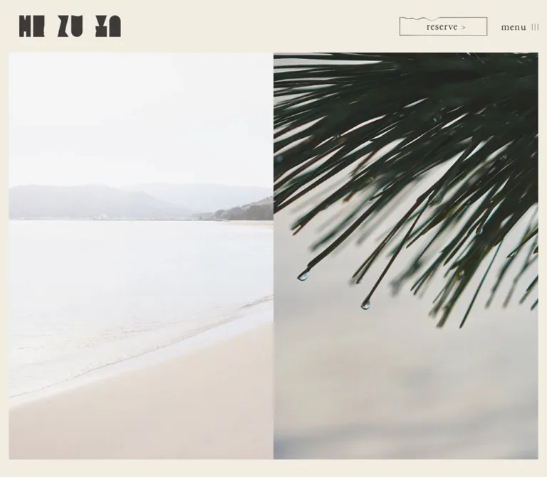
mizuya presents a boutique hotel in Miyazu through landscape, material, and carefully spaced language. The opening desktop composition pairs a pale shoreline with a close view of wet pine needles. The photographs meet at the exact center of the page, framed by a narrow ivory margin. A heavy, sculptural wordmark anchors the upper left, while a fine reservation outline and small menu graphic occupy the upper right.
Below the opening, the page becomes an editorial sequence. Large photographs alternate sides with narrow text panels. Vertical Japanese headings sit opposite lowercase English labels, with a long, fine arrow lower in the panel. The same ivory surface continues through the footer, where a misty landscape balances practical contact information. Hierarchy comes from placement, image scale, and whitespace; most sampled text remains regular weight.
The mobile evidence has an important limit: its opening capture shows the header above an otherwise blank ivory viewport. The footer photograph and contact content are visibly rendered. The blank opening is an observed state with an unresolved cause, not a verified intentional introduction.
How to Read This Reference
- Measured values come from the supplied rendered element rectangles, computed styles, and custom properties. Coordinates are document coordinates unless explicitly described as screenshot positions.
- Calculated values use those measurements, such as subtracting padding from the opening container or comparing paragraph boundaries.
- Visual estimates describe image crops, fine strokes, and details without an exported element measurement.
- Implementation aliases are readable names introduced here. Original custom-property names are identified separately.
- Recommendations cover new implementation choices, accessibility, unobserved responsive arrangements, and the Quick Start. They are not claims about the original source.
- The supplied evidence was analyzed directly. No additional browsing, file inspection, or interaction testing was performed.
Tokens — Colors
Default Palette
| Name | Value | Implementation alias / source token | Evidence and role |
|---|---|---|---|
| Warm Ivory | #f1ede1 |
--color-paper / --s-color-ddbdc340 |
Measured body, main-section, header, and footer background at both viewports |
| Brown Charcoal | #3e3a39 |
--color-ink / --s-color-57bb2946 |
Measured narrative text, Japanese headings, English section labels, and primary footer links |
| Soft Stone | #787574 |
--color-muted / --s-color-958481a3 |
Measured news date and secondary footer links |
| Structural Gray | #333333 |
--color-structural |
Measured on many structural wrappers and the copyright line; wrapper inheritance does not establish the color of embedded artwork |
| Pale Ivory | #f8f6ef |
--color-paper-pale / --s-color-d482dff5 |
Declared source token; no distinct visible surface using it is established by the supplied samples |
| White | #ffffff |
source --s-color-60b326ef |
Declared token and background of a zero-height terminal section; not evidence of a substantial white panel |
The source color variables use eight-digit hex values with full opacity. Their six-digit equivalents above preserve the same colors.
The interface palette is restrained. Blue-gray mist, deep pine green, sand, concrete, and warm timber belong to the photographs. They should not automatically become button colors or alternating section backgrounds.
Numerous transparent gradient variables appear in the export. They do not establish a visible gradient treatment. The large page surfaces in the captures are flat ivory.
Theme Presets
Only the light appearance is evidenced. No theme picker or alternate color mode was inspected. A background transition declaration alone does not establish theme switching.
Tokens — Typography
Japanese Body and Vertical Headings
Measured family: "霞青藍 R", also declared through --s-font-c083be74.
This family appears on narrative paragraphs, Japanese section labels, café navigation, news text, and footer information. Its fine strokes and distinctive kana give the page a literary character. Long paragraphs retain normal tracking and generous line height. Additional tracking is reserved for the short vertical labels.
The measured weight is 400. The large wordmark provides the visual mass that a conventional site might obtain from bold headings.
English Section Labels
Measured family: "文游明朝体S 朝靄かな R", declared through --s-font-c19de938.
The labels news, stay, sauna, town culture, and & hotel use this family at regular weight. They are larger than the body copy, but remain relatively modest beside the photography. The town label occupies two right-aligned lines.
Graphic Header Labels
The wordmark is artwork, not a sampled typographic heading. The reservation link contains a background-image declaration, and the visible menu label has no ordinary text in the exported button record.
Consequently, the wrappers' computed sans-serif / 16px values are not reliable measurements of the lettering visible inside these graphics. Preserve authorized artwork when available. Text-based substitutes in the Quick Start are explicitly approximations.
Other Declared Families
"霞青藍 M" and Lato are present as custom properties, but their use is not confirmed in the sampled visible text. The root's Times value is also not the main editorial typeface.
The computed family strings are direct evidence. Font-file URLs, licensing arrangements, and independent font-loading verification were not supplied. A generic serif fallback is a recommendation for adaptation.
Type Scale
| Role | Desktop | Mobile | Line height | Tracking | Weight |
|---|---|---|---|---|---|
| Narrative and feature copy | 18px |
16px |
32.4px / 28.8px, both 1.8 |
Normal | 400 |
| English section labels | 40px |
28px |
40px / 28px |
Normal | 400 |
| Vertical Japanese feature labels | 36px |
28px |
36px / 28px |
3.6px / 2.8px, both 0.1em |
400 |
| Café navigation | 24px |
20px |
33.6px / 28px, both 1.4 |
2.4px / 2px, both 0.1em |
400 |
| News date and announcement | 16px |
15px |
16px / 15px |
Normal | 400 |
| Footer information and links | 16px |
15px |
Usually 16px / 15px |
Normal | 400 |
| Copyright | 16px |
15px |
16px / 15px |
Normal | 400 |
Some English labels have 1px padding, making their measured rectangles 2px taller than the line box. Japanese feature labels have 12px top padding on desktop and 8px on mobile.
Vertical Japanese presentation is visible in the desktop sauna capture and supported by narrow, tall rectangles in the DOM. The export does not include the actual writing-mode declaration. Using writing-mode: vertical-rl with upright glyphs is a recommended implementation method.
Footer line height needs interpretation: its apparent breathing room largely comes from spacing between separate rows. Do not apply line-height: 1 to a wrapping contact paragraph without checking readability.
Tokens — Spacing & Shapes
The layout combines very small interface marks with broad photographic fields and large empty intervals. There is no evidence of a single global spacing formula. Reusable values include 12, 16, 24, 32, 40, 48, 120, and 160px, with different responsive adjustments by component.
Spacing Scale
| Use | Desktop | Mobile | Evidence |
|---|---|---|---|
| Header height | 120px |
72px |
Measured |
| Header left / right padding | 40px / 20px |
24px / 12px |
Measured |
| Opening top / side / bottom padding | 120px / 20px / 40px |
72px / 12px / 24px |
Measured |
| Other sampled main-section side / bottom padding | 20px / 40px |
12px / 24px |
Measured |
| Footer top / side / bottom padding | 120px / 16px / 40px |
72px / 12px / 24px |
Measured |
| Reservation-to-menu gap | 32px |
16px |
Calculated from control rectangles |
| Introduction paragraph gap | 24px |
16px |
Calculated from paragraph boundaries |
| Feature paragraph gap | 24px |
24px |
Calculated for stay, sauna, and town copy |
| Arrow bottom to feature copy | 40px |
40px |
Calculated for all three feature gateways |
| Social-row and address-row clearances | About 16px |
About 16px |
Calculated between separate line boxes |
| Major footer information gaps | About 48px |
About 32px |
Calculated between groups |
| FAQ bottom to legal-link row | 88px |
56px |
Calculated |
| Feature copy bottom to next feature heading | 160px |
Not an equivalent gap | Calculated on desktop; mobile includes intervening content |
Border Radius
The sampled elements report 0px radius. Photographs and the reservation outline also appear square at their corners. No card rounding system is visible.
Fine arrows and the reservation outline appear approximately 1px thick at desktop size. Their exact stroke declarations are unavailable. A 1px stroke is a practical starting recommendation.
The distinctive reservation shape is a thin rectangular outline whose upper-left edge briefly ripples. It is a local drawing detail, not a general rule for all section boundaries.
Layout Measurements
| Element | Desktop 1440 × 1000 | Mobile 390 × 844 | Status |
|---|---|---|---|
| Full document height | 6287.22px |
5315.22px |
Measured |
| Opening container | 1440 × 1000px |
390 × 844px |
Measured |
| Opening inner box | 1400 × 840px |
366 × 748px |
Calculated; mobile box is visually blank |
| Each desktop opening photograph | Approximately 700 × 840px |
Unverified | Calculated with visually confirmed equal split |
| Logo link box | 240 × 57.39px |
136 × 32.52px |
Measured; visible artwork has internal clearance |
| Reservation link box | 200 × 41.14px |
120 × 24.69px |
Measured |
| Menu button box | 84 × 18.39px |
50 × 10.94px |
Measured |
| Feature text width | 460px |
342px |
Measured |
| Introduction and café prose width | 384px |
280px |
Measured |
| Feature arrow link | 139 × 18px |
75 × 10px |
Measured |
| Footer photograph | Approximately 704 × 840px |
Approximately 366 × 244px |
Visual bounds supported by container geometry |
| Footer container height | 1000px |
807px |
Measured |
Desktop feature text begins at x=840px on the right or x=140px on the left. Combined with the visible half-page image structure, this implies 120px of inset on each side of a 700px text half. On mobile, feature text begins at x=24px, while the main image gutter is 12px.
The narrower introduction measure is centered within its available text area: x=878px, width 384px on desktop; x=55px, width 280px on mobile. This deliberate change of text measure differentiates atmospheric narrative from practical feature descriptions.
Components
Persistent Header
Role: maintain identity and access to reservation and navigation throughout the page.
The header is an opaque ivory band. Its identity link sits left; the reservation and menu controls form a right-hand group. There is no visible dividing rule, shadow, or contrasting header fill.
At desktop size, the logo link begins at x=40px, the reservation link at x=1104px, and the menu at x=1336px. At mobile size, their respective x positions are 24, 192, and 328px. The mobile header retains all three elements on one row.
The header remains at the top in the supplied scrolled captures. This confirms persistent visual placement, but its exact fixed-versus-sticky implementation was not exported. The Quick Start uses a fixed header as a recommendation.
Reservation Link
Role: the principal booking action.
The visible anatomy is a narrow outlined frame, a short wavy segment along its upper-left edge, centered reserve lettering, and a small right-facing mark. The interior uses the page background. Its emphasis comes from the enclosing line and persistent position.
The measured aspect ratio stays near 4.86:1 across both viewports. Width reduces from 200px to 120px. The supplied link destination is https://www.chillnn.com/193ddce366e31f.
This establishes the destination of the link, not the behavior or appearance of the booking flow. No clicked, hovered, focused, or loading state was supplied.
Menu Control
Role: access to the site's broader navigation.
The closed control visually combines the word menu with three short vertical strokes. It is unboxed and substantially smaller than the reservation frame. A button element is present in the DOM.
Only its closed appearance is known. Panel placement, navigation contents, opening animation, dismissal, and keyboard behavior remain unverified. Do not infer a full-screen menu from the sparse closed control alone.
Opening Image Diptych
Role: establish the hotel's relationship to landscape before introducing explanatory text.
The desktop opening occupies one viewport. Beneath the 120px header, two photographs touch at x=720px. The left panel shows a bright shore with a low distant ridge and gently curving waterline. The right panel moves close to dark pine needles and suspended droplets. The pale distance and dark foreground create the central contrast.
Both images end at approximately y=960px, leaving a 40px ivory margin. There is no visible headline overlay, caption, pagination, or separate booking panel within this composition.
Treat the two photographs as an intentional pair. The shoreline supplies open space and distance; the pine image supplies texture and proximity. The viewport crop is part of their relationship.
Mobile limitation: the corresponding 390 × 844 opening capture contains the header and blank ivory space. The DOM retains a full-height opening container, but does not establish a visible mobile image arrangement. A stacked image fallback is recommended later, not observed here.
Place Introduction
Role: connect the hotel to Miyazu's geography and cultural history.
The source contains two paragraphs, rendered in the narrower narrative measure. On desktop, their shared left edge is x=878px; their widths are 384px. The first starts at document y=1370.83px, within the second 1000px-high main region. Body size is 18px with 32.4px line height.
Mobile uses a centered 280px measure and 16px type with 28.8px line height. This is narrower than the later 342px feature copy. Preserve that distinction when extending the page.
Paragraphs begin with a full-width Japanese space in the extracted text. If recreating the indentation with CSS, remove the literal space first to avoid doubling it.
The supplied images do not independently show this whole section. Its typography and placement are DOM-supported; the precise associated image crop is unverified.
News Row
Role: provide a small current-information interruption between the introductory atmosphere and feature gateways.
Desktop places news at x=120px and the entry at x=720px. The entry contains a muted date above an ink-colored announcement, with a small graphical link toward the far right. The rendered item is dated 2025年5月1日 and announces the opening of mizuya and 菓寮 浮雲.
Mobile stacks the heading above the entry at x=24px. The heading drops from 40px to 28px; entry text drops from 16px to 15px. The graphical link measures approximately 38 × 7.89px on mobile, compared with 75 × 10px on desktop, and points to the hotel's Instagram account.
The evidence contains one entry. Additional news-list states and pagination are not established.
Alternating Feature Section
Role: introduce accommodation, sauna, and the town relationship while providing gateways to dedicated pages.
Each desktop feature pairs a broad photograph with a text half. Stay uses text on the right; sauna uses text on the left; town returns text to the right. The sauna screenshot directly shows this composition, with a roughly 700 × 467px interior photograph on the right.
The text-panel anatomy is consistent:
- A vertical Japanese label at the upper left of the text measure.
- A horizontal English label at the upper right.
- A long, fine arrow aligned to the right below the labels.
- A 40px clearance after the arrow.
- Two body paragraphs separated by 24px.
The Japanese label is intentionally separated from its English counterpart by a large empty region. Preserve the shared top alignment and opposite edges; placing the translation immediately below the Japanese label would change the composition.
Desktop feature starts occur at approximately y=2452px, 3090.41px, and 3728.81px. Stay and sauna text panels each span about 478.4px from their title origin to their final paragraph bottom. A flexible upper heading area can reproduce the differing arrow positions while keeping body copy aligned near the lower portion.
| Japanese label | English label | Rendered destination |
|---|---|---|
宿泊 |
stay |
/stay |
サウナ |
sauna |
/sauna |
街と宿 |
town culture / & hotel |
/town |
Mobile places all three text measures at x=24px, width 342px. Japanese labels remain narrow and tall; English labels remain right-aligned. The arrow ends at x=366px and aligns with the lower edge of the Japanese label's rectangle. Middle-section mobile photographs were not supplied as visible captures, so their ordering and crops remain unverified.
The original sampled section labels are paragraph elements. Semantic headings are a recommended addition for a new implementation.
Directional Arrow Link
Role: a discreet route from editorial description to a detail page.
The visible arrow is a long horizontal hairline ending in one angled upper stroke. It has no circle, fill, enclosing pill, or accompanying Learn more label. Desktop feature links measure 139 × 18px; mobile links measure 75 × 10px.
The arrow is a separate anchor in the supplied DOM. The evidence does not establish that the whole photograph or feature section is clickable.
Use an accessible name that identifies the destination, such as Explore the sauna. A larger transparent activation area can preserve the thin visual mark while improving keyboard and touch use.
Café Introduction and Vertical Navigation
Role: introduce 菓寮 浮雲 and its breakfast, tea, sweets, and evening offerings.
This section is supported primarily by the DOM. It uses the narrow prose measure: 384px on desktop and 280px on mobile. The text connects the café to mist, water, and the idea of a flowing-water banquet.
Four narrow, tall links follow the paragraph. Their measured arrangement reads from the café link at the right toward the offering links at the left. The category links have approximately 16px of horizontal clearance; the café link is separated from them by 48px at both sizes.
| Label | Destination |
|---|---|
菓寮 浮雲 |
/cafe |
朝餉 |
/cafe#breakfast |
茶と菓子 |
/cafe#wagashi |
酒と肴 |
/cafe#bar |
Type reduces from 24px to 20px while retaining 0.1em tracking. The measured rectangles support vertical presentation; its precise rendering mechanism and hover behavior were not exported. Repeated label text in the extraction is not evidence of a marquee or animated duplication.
Contact Footer
Role: close the visual narrative while making location, contact, social, and policy information easy to find.
Desktop uses a 1000px-high footer with 120px top padding and 40px bottom padding. A misty landscape fills the left half, approximately 704 × 840px. The right half holds a compact information group centered within extensive ivory space. Its legal-link row spans about 378px.
The information sequence is:
- Two social rows, pairing the hotel and café names with their Instagram destinations.
- Address, station access, and travel-time information.
- Telephone and eFAX.
- Email contact.
よくあるご質問.- A subdued row containing
recruit,privacy policy,運営会社, and宿泊約款. - A copyright line toward the lower right.
Social labels and link text start 120px apart on desktop and 80px apart on mobile. Email, FAQ, and the secondary links are visibly underlined. The footer contains no map embed in the supplied capture.
Mobile stacks a 366 × 244px landscape above the information. The photo keeps a 12px outer gutter; text begins at 24px. The same information remains present, with 15px type and smaller group gaps. The legal links fit on one row at 390px, and copyright remains right-aligned.
The footer photograph starts around screenshot y=109px in the bottom mobile capture. This is not a 109px internal padding token: the footer starts about 37px below the viewport top at maximum scroll, then applies its measured 72px top padding.
Tokens — Motion & Interaction
| Treatment | Supplied evidence | Interpretation |
|---|---|---|
| General element transitions | Repeated 0.3s cubic-bezier(0.4, 0.4, 0, 1) declarations |
A source timing value; no specific hover or entrance effect is demonstrated |
| Body background | background 0.5s cubic-bezier(0.4, 0.4, 0, 1) |
A background-change transition is defined; a color-mode change was not observed |
| Desktop footer transition | 1s cubic-bezier(0.4, 0.4, 0, 1) |
Defined on the footer; its trigger and visual progression are unknown |
| Mobile footer transition | 0.3s cubic-bezier(0.4, 0.4, 0, 1) |
Responsive difference in the exported declaration |
| Sampled element animations | animation: none |
Applies to sampled elements; does not rule out JavaScript or pseudo-element behavior |
| Header during scrolling | Same top placement in supplied scrolled captures | Supports persistent visual placement |
| Reservation, feature, café, and footer links | Rendered anchor destinations | Navigation targets are known; resulting pages were not inspected |
| Menu | Closed button only | Opening, closing, focus management, and motion remain unverified |
The readiness process waited for document load, finite animation completion, sampled layout/text stability, and visible image decoding within its stated limits. This improves the reliability of the captured states, but does not establish semantic completeness. Its handling of perpetual animations is a collection procedure, not proof that this page contains one.
No supplied sequence demonstrates parallax, image crossfades, a carousel, moving water, or a timed logo reveal. Asset-name fragments containing v-frms also do not prove runtime video playback. Describe the supplied photographs as still captured imagery unless further evidence becomes available.
For adaptation, the measured cubic-bezier curve is a reasonable timing reference for subtle feedback. Do not introduce animation-dependent content visibility to reproduce the unresolved mobile blank state.
Surfaces
| Layer | Appearance | Purpose |
|---|---|---|
| Page canvas | Flat #f1ede1 |
Continuous atmosphere across sections |
| Header | Same opaque ivory | Keeps navigation readable over scrolling content |
| Text panels | Open space on the canvas | Creates editorial hierarchy without containers |
| Photographs | Square edges, direct crops | Supplies material, depth, and tonal contrast |
| Reservation link | Fine irregular outline with ivory interior | Gives booking a persistent but restrained emphasis |
| Footer | Same canvas, underlined text links | Integrates practical information into the visual system |
No elevation shadows are apparent in the supplied captures. The export did not include a complete shadow-property inventory, so this is a visual observation rather than a source-wide CSS claim.
Imagery
The opening's strongest device is a change in viewing distance. A pale coastal panorama occupies one half; a close botanical detail occupies the other. The pine needles introduce diagonals and tiny highlights from droplets, while the shoreline curves gently through a much quieter field.
The visible interior photograph continues the material palette through timber, concrete, pale upholstery, and warm light. It shows the sauna's adjacent relaxation space with a tub and chairs. Retain the depth of the corridor-like composition and the contrast between rough walls and soft seating. The partial accommodation photograph shows timber furniture, a textured rug, and light fabric.
The footer returns to the landscape in cool misty blue-gray. Desktop crops it into a tall field; mobile reveals a much wider scene at roughly 3:2. These are different compositional uses of a landscape, so a single universal crop setting will not reproduce both appearances reliably.
For new imagery, choose diffuse light, restrained saturation, quiet architecture, natural surfaces, and clear changes between wide views and intimate details. Keep image texture photographic. Artificial paper overlays, strong sepia filters, heavy contrast effects, and text baked into the photographs are not evidenced here.
Observed Asset References
Background-image declarations use the following supplied project prefix:
https://storage.googleapis.com/studio-design-asset-files/projects/BRO3vbB0WD/
Full filenames were truncated in the evidence. These fragments are identifiers, not complete downloadable asset paths.
| Context | Observed filename fragment | Limitation |
|---|---|---|
| Opening and introduction containers | s-2040x2040_v-frms_… |
Complete paths and individual panel mapping unavailable |
| Reservation graphic | s-452x93_webp_113d… |
Full file URL unavailable; its 452:93 ratio agrees with the measured link box |
| Mobile café container | s-2040x1600_v-frms_… |
Full path and visible crop unavailable |
| Mobile footer image | s-3060x2040_v-frms… |
Full path unavailable; the filename dimensions are consistent with the visible 3:2 mobile image |
| Wordmark and directional marks | No complete path supplied | Preserve authorized assets or clearly label replacement drawings |
Layout & Responsive Behavior
Desktop relies on a strong center seam and alternating visual weight. The opening is split evenly; the feature sequence alternates image and text halves; the footer returns to image-left and information-right. Text widths remain substantially narrower than their halves, producing large internal margins rather than merely adding space between columns.
Mobile changes the composition while retaining the typography's roles. Feature text expands to a 342px measure with 24px page margins. Atmospheric introduction and café copy remain narrower at 280px. Japanese headings retain vertical presentation, and English labels remain on the opposite edge. News moves from a horizontally separated heading and entry into a vertical sequence. The footer is visibly stacked.
Scaling is component-specific. The header height and reservation width reduce to 60% of desktop size; the logo width reduces to about 57%; English headings reduce to 70%; narrative type reduces from 18px to 16px. A uniform page-scale transform would not reproduce these relationships.
The measured opening height equals the viewport height at both tested sizes. Several desktop main regions and the footer are also 1000px high, while the mobile introduction and café regions measure approximately 759.59px. These observations support viewport-related composition, but the exact source height formulas were not exported.
A max-width: 1140px rule appears in the supplied breakpoint-dependent line-break CSS. It does not establish the breakpoint for every layout change. Tablet, landscape-phone, intermediate-width, safe-area, and zoom behavior remain unverified. The Quick Start's 64rem layout breakpoint is a recommendation.
Mobile opening limitation: retain the blank captured state in the evidence record, but keep it separate from the recommended design behavior. A new implementation should display meaningful opening media or text without depending on an unverified reveal.
Do’s and Don’ts
Do
- Keep the measured ivory and ink pair:
#f1ede1and#3e3a39. - Let photography supply blue-gray, green, and timber tones.
- Preserve the relationship between the heavy graphic wordmark and fine regular-weight text.
- Pair a distant landscape with a close natural detail in the desktop opening.
- Retain vertical Japanese labels opposite horizontal English labels.
- Use narrow narrative measures and broader feature-copy measures.
- Preserve the long single-barbed arrow and its generous clearance before copy.
- Alternate the desktop feature halves and use square image edges.
- Keep the reservation action visible in the header at both tested sizes.
- Maintain the footer's contact order, underlines, and responsive image crop.
Don't
- Don't overlay a large promotional headline on the observed desktop image pair.
- Don't turn the editorial feature sequence into a rounded-card grid.
- Don't add gold fills, glossy shadows, or colorful booking buttons without a separate design reason.
- Don't replace the graphic wordmark with an assumed font.
- Don't treat wrapper
sans-serifstyles as the visible header lettering. - Don't assign the photograph's blue or green tones to every interface control.
- Don't infer video, parallax, hover effects, or menu animation from generic transition declarations.
- Don't make the entire feature clickable when only the arrow link is evidenced.
- Don't recreate the blank mobile opening as a deliberate loading screen.
- Don't force every footer photograph into the same aspect ratio across desktop and mobile.
Recommended Implementation Additions
These are recommendations for a new implementation, not verified features of the inspected page:
- Give the logo, graphic reservation link, menu, and arrow links explicit accessible names. Empty extracted text alone does not establish whether the original already has suitable ARIA labels.
- Enlarge the small graphic controls to approximately 44px activation height through transparent padding or an extended hit area. Preserve their visible proportions.
- Use semantic headings for major sections, with a logical reading order when desktop columns alternate.
- Keep images and essential copy visible by default. Provide a static fallback if optional media or reveal scripts fail.
- Verify text contrast, particularly the small muted legal links. Use the main ink color where additional contrast is needed.
- Allow contact lines and legal navigation to wrap at narrow widths or enlarged text settings. Increase line height for wrapped content.
- If implementing a menu overlay, add keyboard operation, an accurate expanded state, Escape dismissal, and focus restoration. Its visual design needs separate specification.
- Supply responsive image sources and intentional crop positions. Reserve image dimensions and avoid lazy-loading the primary opening image unnecessarily.
- Respect reduced-motion preferences for any added transitions or media effects.
Agent Prompt Guide
Quick Color Reference
- Canvas and header:
#f1ede1. - Editorial text and principal linework:
#3e3a39. - Dates and secondary links:
#787574. - Booking emphasis: thin outline on ivory.
- Photography: pale coast, deep pine, warm wood, rough concrete, and blue-gray mist.
- Geometry: square photographs, fine arrows, and a small wave along the reservation frame.
Overall Prompt
“Create an editorial boutique-hotel main page inspired by mizuya's observed visual system. Use a continuous warm ivory canvas #f1ede1, brown-charcoal text #3e3a39, regular Japanese serif copy, and delicate English serif section labels. Keep a sculptural graphic wordmark at the upper left and a narrow outlined reservation link plus small menu control at the upper right. Open desktop with two touching photographs: a pale coastal panorama and a close view of wet pine needles. Alternate broad interior photographs with deeply inset text panels. Place vertical Japanese headings opposite lowercase English labels, followed by a long fine arrow and two generously led paragraphs. Finish with a misty landscape and carefully grouped contact information. On mobile, retain the compact header, 24px text margins, vertical heading relationships, and a stacked photo/contact footer. Treat the mobile opening image arrangement as a proposed visible fallback because the supplied original opening capture is blank.”
Example Component Prompts
- Header: “An opaque ivory header, 120px high on desktop and 72px on mobile. Use an authorized dark graphic logo at left, a fine rectangular reservation frame with a small upper-left ripple, and a discreet
menulabel with three vertical strokes. Keep both controls visible on mobile.” - Sauna feature: “A desktop two-column editorial section with a 700px-wide warm timber-and-concrete interior photograph on the right. On the left, inset a 460px text panel: vertical
サウナat its upper left, 40px lowercasesaunaat its upper right, a thin 139px arrow below, then 18px Japanese serif paragraphs at 1.8 line height.” - Café navigation: “Four narrow vertical Japanese links on ivory:
菓寮 浮雲,朝餉,茶と菓子, and酒と肴. Keep the café link at the right with 48px separation from the category group; use 16px gaps within the category group. Use regular serif type and 0.1em tracking.” - Footer: “A tall misty landscape on the left and a compact, centered contact block on the right. Use small regular serif text, aligned social rows, underlined contact links, larger gaps between information groups, and a subdued legal row. On mobile, show the landscape at 3:2 above the information with 12px photo gutters and 24px text margins.”
- Responsive adaptation: “Preserve the Japanese/English heading opposition while moving feature content into one column. Use 28px labels, 16px body text at 1.8 line height, and a 75px arrow. Make photo ordering an explicit implementation decision, since the supplied middle mobile photographs are not visually verified.”
Quick Start
CSS Custom Properties
This is an implementation scaffold, not the original stylesheet. It uses a conventional root size and readable aliases. Colors and endpoint type sizes are measured. The 64rem breakpoint, fixed-header implementation, mobile image stacking, text-based header labels, focus styling, and enlarged activation areas are recommendations.
The original named fonts require appropriate licensed font loading. The serif fallbacks below keep the CSS usable without pretending to supply those font files. No hidden entrance state is included.
:root {
  /* Measured palette */
  --color-paper: #f1ede1;
  --color-ink: #3e3a39;
  --color-muted: #787574;
  --color-structural: #333333;
  --color-paper-pale: #f8f6ef;

  /* Observed family strings; fallback is recommended */
  --font-body: '霞青藍 R', serif;
  --font-editorial: '文游明朝体S 朝靄かな R', serif;
  --weight-regular: 400;
  --text-copy: 18px;
  --text-section: 40px;
  --text-vertical: 36px;
  --text-cafe: 24px;
  --text-small: 16px;
  --leading-copy: 1.8;
  --tracking-vertical: 0.1em;

  /* Measured desktop endpoints */
  --header-height: 120px;
  --header-start: 40px;
  --page-edge: 20px;
  --logo-width: 240px;
  --reserve-width: 200px;
  --menu-width: 84px;
  --header-control-gap: 32px;
  --arrow-width: 139px;
  --arrow-height: 18px;
  --paragraph-gap: 24px;
  --arrow-copy-gap: 40px;
  --section-space: 160px;
  --feature-copy-height: 478.4px;
  --narrative-width: 384px;

  /* Interpolation and stroke thickness are recommendations */
  --feature-inset: clamp(24px, 8.333333vw, 120px);
  --rule-width: 1px;
  --radius: 0;
  --ease-source: cubic-bezier(0.4, 0.4, 0, 1);
  --duration-ui: 300ms;
}

* {
  box-sizing: border-box;
}

.mizuya-page {
  margin: 0;
  color: var(--color-ink);
  background: var(--color-paper);
  font-family: var(--font-body);
  font-size: var(--text-copy);
  font-weight: var(--weight-regular);
  line-height: var(--leading-copy);
}

.mizuya-page a {
  color: inherit;
}

.mizuya-page img {
  display: block;
  max-inline-size: 100%;
  border-radius: 0;
}

.mizuya-page :focus-visible {
  outline: 2px solid var(--color-ink);
  outline-offset: 5px;
}

.mizuya-page [id] {
  scroll-margin-top: calc(var(--header-height) + 24px);
}

.site-header {
  position: fixed;
  inset: 0 0 auto;
  z-index: 20;
  display: flex;
  align-items: center;
  block-size: var(--header-height);
  padding-inline: var(--header-start) var(--page-edge);
  background: var(--color-paper);
}

.site-brand {
  flex: 0 0 var(--logo-width);
  inline-size: var(--logo-width);
}

.site-brand img {
  inline-size: 100%;
  aspect-ratio: 240 / 57.39;
  object-fit: contain;
}

.header-actions {
  display: flex;
  align-items: center;
  gap: var(--header-control-gap);
  margin-inline-start: auto;
}

/* Text and SVG approximate the observed reservation artwork. */
.reserve-link {
  position: relative;
  display: grid;
  place-items: center;
  inline-size: var(--reserve-width);
  min-block-size: 44px;
  text-decoration: none;
}

.reserve-frame {
  position: absolute;
  inset-inline-start: 0;
  inset-block-start: 50%;
  inline-size: 100%;
  block-size: auto;
  transform: translateY(-50%);
  fill: none;
  stroke: currentColor;
  stroke-width: var(--rule-width);
}

.reserve-label {
  position: relative;
  font-family: var(--font-editorial);
  font-size: 22px;
  line-height: 1;
}

.menu-button {
  display: flex;
  align-items: center;
  justify-content: space-between;
  inline-size: var(--menu-width);
  min-block-size: 44px;
  padding: 0;
  border: 0;
  color: inherit;
  background: transparent;
  font-family: var(--font-editorial);
  font-size: 22px;
  line-height: 1;
  cursor: pointer;
}

.menu-ticks {
  display: flex;
  gap: 5px;
}

.menu-ticks i {
  display: block;
  inline-size: 1px;
  block-size: 14px;
  background: currentColor;
}

.opening {
  block-size: 100svh;
  padding: var(--header-height) var(--page-edge) 40px;
}

.opening-diptych {
  display: grid;
  grid-template-columns: repeat(2, minmax(0, 1fr));
  block-size: 100%;
}

.opening-diptych img {
  inline-size: 100%;
  block-size: 100%;
  min-block-size: 0;
  object-fit: cover;
}

.narrative-copy {
  inline-size: min(100%, var(--narrative-width));
  margin-inline: auto;
}

.narrative-copy p,
.feature-prose p {
  margin: 0;
}

.narrative-copy p + p,
.feature-prose p + p {
  margin-block-start: var(--paragraph-gap);
}

.feature-list {
  display: grid;
  gap: var(--section-space);
  padding-inline: var(--page-edge);
}

.feature {
  display: grid;
  grid-template-columns: repeat(2, minmax(0, 1fr));
  grid-template-areas: 'media copy';
  align-items: start;
}

.feature--reverse {
  grid-template-areas: 'copy media';
}

.feature-media {
  grid-area: media;
  margin: 0;
}

.feature-media img {
  inline-size: 100%;
  aspect-ratio: 3 / 2;
  object-fit: cover;
}

.feature-copy {
  grid-area: copy;
  display: flex;
  flex-direction: column;
  min-inline-size: 0;
  min-block-size: var(--feature-copy-height);
  padding-inline: var(--feature-inset);
}

.feature-heading {
  flex: 1;
  display: grid;
  grid-template-columns: auto minmax(0, 1fr);
  grid-template-rows: auto 1fr;
  grid-template-areas: 'jp en' 'jp arrow';
}

.feature-jp {
  grid-area: jp;
  align-self: start;
  margin: 0;
  padding-top: 12px;
  writing-mode: vertical-rl;
  text-orientation: upright;
  font-size: var(--text-vertical);
  font-weight: 400;
  line-height: 1;
  letter-spacing: var(--tracking-vertical);
}

.feature-en {
  grid-area: en;
  justify-self: end;
  align-self: start;
  margin: 0;
  font-family: var(--font-editorial);
  font-size: var(--text-section);
  line-height: 1;
  text-align: right;
}

.arrow-link {
  grid-area: arrow;
  position: relative;
  justify-self: end;
  align-self: end;
  display: block;
  inline-size: var(--arrow-width);
  block-size: var(--arrow-height);
}

/* Extend the activation area without enlarging the drawing. */
.arrow-link::before {
  content: '';
  position: absolute;
  inset-inline: 0;
  inset-block-start: 50%;
  block-size: max(44px, 100%);
  transform: translateY(-50%);
}

.arrow-link svg {
  display: block;
  inline-size: 100%;
  block-size: 100%;
  fill: none;
  stroke: currentColor;
  stroke-width: var(--rule-width);
}

.feature-prose {
  margin-block-start: var(--arrow-copy-gap);
}

.cafe-links {
  display: flex;
  flex-direction: row-reverse;
  align-items: flex-start;
  gap: 16px;
}

.cafe-links a {
  writing-mode: vertical-rl;
  text-orientation: upright;
  font-size: var(--text-cafe);
  line-height: 1.4;
  letter-spacing: 0.1em;
  text-underline-offset: 5px;
}

.cafe-links a:first-child {
  margin-inline-start: 32px;
}

.contact-footer {
  display: grid;
  grid-template-columns: repeat(2, minmax(0, 1fr));
  min-block-size: 100svh;
  padding: var(--header-height) 16px 40px;
}

.contact-photo {
  margin: 0;
}

.contact-photo img {
  inline-size: 100%;
  block-size: max(32rem, calc(100svh - 160px));
  object-fit: cover;
}

.contact-panel {
  position: relative;
  display: grid;
  place-items: center;
  min-inline-size: 0;
  padding-inline: 24px;
  font-size: var(--text-small);
}

.contact-info {
  inline-size: min(100%, 378px);
}

/* Increased line height is recommended for wrapping contact text. */
.contact-info p {
  margin: 0;
  line-height: 1.6;
}

.contact-info a {
  overflow-wrap: anywhere;
  text-decoration: underline;
  text-underline-offset: 3px;
}

.contact-social {
  display: grid;
  grid-template-columns: 120px minmax(0, 1fr);
  gap: 16px 0;
}

.contact-info > * + * {
  margin-block-start: 48px;
}

.contact-group p + p {
  margin-block-start: 16px;
}

.contact-info > .contact-legal {
  display: flex;
  flex-wrap: wrap;
  gap: 16px 40px;
  margin-block-start: 88px;
  color: var(--color-muted);
}

.contact-copyright {
  position: absolute;
  inset-inline-end: 0;
  inset-block-end: 0;
  margin: 0;
  color: var(--color-structural);
  font-size: var(--text-small);
  line-height: 1.6;
  text-align: right;
}

/* Recommended breakpoint; original layout threshold is unverified. */
@media (max-width: 64rem) {
  :root {
    --text-copy: 16px;
    --text-section: 28px;
    --text-vertical: 28px;
    --text-cafe: 20px;
    --text-small: 15px;
    --header-height: 72px;
    --header-start: 24px;
    --page-edge: 12px;
    --logo-width: 136px;
    --reserve-width: 120px;
    --menu-width: 50px;
    --header-control-gap: 16px;
    --arrow-width: 75px;
    --arrow-height: 10px;
    --feature-inset: 12px;
    --feature-copy-height: 0px;
    --narrative-width: 280px;
    --section-space: 64px;
  }

  .reserve-label {
    font-size: 14px;
  }

  .menu-button {
    font-size: 13px;
  }

  .menu-ticks {
    gap: 3px;
  }

  .menu-ticks i {
    block-size: 9px;
  }

  /* Proposed visible fallback, not the blank captured opening state. */
  .opening {
    block-size: auto;
    padding: calc(var(--header-height) + 12px) 12px 24px;
  }

  .opening-diptych {
    grid-template-columns: minmax(0, 1fr);
    gap: 12px;
  }

  .opening-diptych img {
    block-size: auto;
    aspect-ratio: 3 / 2;
  }

  .narrative-copy p + p {
    margin-block-start: 16px;
  }

  /* Copy-before-image is an explicit adaptation choice. */
  .feature,
  .feature--reverse {
    grid-template-columns: minmax(0, 1fr);
    grid-template-areas: 'copy' 'media';
    gap: 24px;
  }

  .feature-jp {
    padding-top: 8px;
  }

  .contact-footer {
    grid-template-columns: minmax(0, 1fr);
    min-block-size: 0;
    padding: 72px 12px 24px;
  }

  .contact-photo img {
    block-size: auto;
    aspect-ratio: 3 / 2;
  }

  .contact-panel {
    display: block;
    margin-block-start: 40px;
    padding-inline: 12px;
  }

  .contact-info {
    inline-size: 100%;
  }

  .contact-social {
    grid-template-columns: 80px minmax(0, 1fr);
  }

  .contact-info > * + * {
    margin-block-start: 32px;
  }

  .contact-info > .contact-legal {
    gap: 16px;
    margin-block-start: 56px;
  }

  .contact-copyright {
    position: static;
    margin-block-start: 40px;
  }
}

/* Additional narrow-screen recommendation; not an inspected viewport. */
@media (max-width: 360px) {
  :root {
    --header-start: 16px;
    --logo-width: 104px;
    --reserve-width: 104px;
    --menu-width: 46px;
    --header-control-gap: 10px;
  }
}

@media (prefers-reduced-motion: reduce) {
  .mizuya-page *,
  .mizuya-page *::before,
  .mizuya-page *::after {
    animation: none !important;
    transition: none !important;
    scroll-behavior: auto !important;
  }
}
Example Component Markup
Local asset names below are replacement placeholders, not observed source paths. Supply authorized images and the brand artwork. The reservation frame and arrow are approximate drawings. Wire the menu button to real navigation before use; an opened-menu design is outside this reference.
<header class="site-header">
<a class="site-brand" href="/main" aria-label="mizuya home">
<img src="assets/brand-mark.svg" alt="mizuya">
</a>
<div class="header-actions">
<a class="reserve-link"
href="https://www.chillnn.com/193ddce366e31f"
aria-label="Reserve a stay">
<svg class="reserve-frame" viewBox="0 0 200 42"
aria-hidden="true">
<path d="M.5 1 C8 1 10 5 18 4 S27 1 34 4
S46 0 56 4 S69 8 81 1 H199.5 V41.5 H.5 Z" />
</svg>
<span class="reserve-label">reserve ></span>
</a>
<button class="menu-button" type="button" aria-label="Open menu">
<span>menu</span>
<span class="menu-ticks" aria-hidden="true">
<i></i><i></i><i></i>
</span>
</button>
</div>
</header>
<section class="feature" aria-labelledby="stay-title">
<div class="feature-copy">
<div class="feature-heading">
<h2 class="feature-jp" id="stay-title" lang="ja">宿泊</h2>
<p class="feature-en" lang="en">stay</p>
<a class="arrow-link" href="/stay" aria-label="Explore guest rooms">
<svg viewBox="0 0 139 18" aria-hidden="true">
<path d="M0 17.5 H137 L101 1" />
</svg>
</a>
</div>
<div class="feature-prose" lang="ja">
<p>宿の名の由来ともなった“水屋”をすべての客室に設え、お部屋ごとに異なる茶の趣をお愉しみいただけます。</p>
<p>全9室・3つの趣をもつ客室は、2名から4名様までのご滞在に寄り添います。</p>
</div>
</div>
<figure class="feature-media">
<img src="assets/guest-room.webp"
alt="Guest-room furniture beside softly lit curtains"
loading="lazy">
</figure>
</section>
Wrap repeated features in .feature-list; use .feature--reverse for the desktop sauna orientation. The footer CSS expects .contact-photo and .contact-panel as siblings. Place .contact-info and .contact-copyright inside the panel, and use .contact-social, .contact-group, and .contact-legal for its internal groups.
The snippets have not been executed or browser-tested in this analysis. Font metrics, replacement imagery, and wrapping content will affect final geometry.
Tailwind v4 Token Mapping
Optional aliases for a project already using Tailwind v4. This does not establish that the original site uses Tailwind. Define the properties above first.
@theme inline {
  --color-paper: #f1ede1;
  --color-ink: #3e3a39;
  --color-muted: #787574;
  --color-paper-pale: #f8f6ef;

  --font-japanese: '霞青藍 R', serif;
  --font-editorial: '文游明朝体S 朝靄かな R', serif;

  --text-body: var(--text-copy);
  --text-heading: var(--text-section);
  --text-japanese-heading: var(--text-vertical);
  --text-caption: var(--text-small);
  --text-cafe-link: var(--text-cafe);

  --spacing-page: var(--page-edge);
  --spacing-header: var(--header-height);
  --spacing-feature-inset: var(--feature-inset);
  --spacing-section: var(--section-space);
  --spacing-arrow-copy: var(--arrow-copy-gap);

  --radius-photo: 0px;
  --ease-editorial: cubic-bezier(0.4, 0.4, 0, 1);
}
Sources & Evidence
- Inspected original and final page: mizuya — main page. Both supplied URLs are identical; reported HTTP status is 200.
- Capture date: September 12, 2026. The supplied page retrieval timestamp is
2026-09-12T11:20:54.747Z. - Desktop evidence: 1440 × 1000 CSS px; supplied opening, stay/sauna scroll-position, and footer captures. Rendered document height is approximately 6287.22px.
- Mobile evidence: 390 × 844 CSS px; supplied opening and footer captures. Rendered document height is approximately 5315.22px. The opening capture is blank below the header; the footer image and information are visible.
- DOM and computed styles: supplied page text, link destinations, element rectangles, colors, font-family strings, sizes, line heights, tracking, padding, transition declarations, and custom properties at both viewports. These establish measurements for sections not fully pictured in the five captures.
- Observed state coverage: initial and scrolled page states. The header remains visually persistent. No supplied evidence demonstrates menu opening, hover, focus, booking completion, image playback, or detail-page behavior.
- Collection limits: readiness checks used a 15-second overall limit and a five-second pending-image limit; scrolling used up to ten seconds per position. SharedWorkers and service workers were disabled. Delayed content, pseudo-element behavior, and unexercised interactions may remain outside the captures.
This reference documents the supplied current-page evidence. Exact font files, complete image URLs, the full responsive stylesheet, and interaction timelines were unavailable. Recommendations and reusable code are distinguished from measured source behavior throughout.
# mizuya — Style Reference
> Warm ivory, delicate serif text, and coastal photographs arranged with the quiet rhythm of a hotel journal.
**Website:** [mizuya-kyoto.com/main](https://mizuya-kyoto.com/main)
**Original URL:** https://mizuya-kyoto.com/main
**Final URL:** https://mizuya-kyoto.com/main
**Theme:** light, with a warm ivory canvas and brown-charcoal text
**Inspected:** September 12, 2026; supplied retrieval timestamp: 11:20:54.747 UTC / 20:20:54.747 JST
**Viewports:** desktop 1440 × 1000 CSS px; mobile 390 × 844 CSS px
**Scope:** the current hotel main page, including its opening composition, introduction, news, accommodation and sauna gateways, town and café content, persistent header, and contact footer. Five current-page captures and page-wide rendered DOM/computed-style records support this reference. Linked pages, the reservation flow, and the opened menu were not inspected.
mizuya presents a boutique hotel in Miyazu through landscape, material, and carefully spaced language. The opening desktop composition pairs a pale shoreline with a close view of wet pine needles. The photographs meet at the exact center of the page, framed by a narrow ivory margin. A heavy, sculptural wordmark anchors the upper left, while a fine reservation outline and small menu graphic occupy the upper right.
Below the opening, the page becomes an editorial sequence. Large photographs alternate sides with narrow text panels. Vertical Japanese headings sit opposite lowercase English labels, with a long, fine arrow lower in the panel. The same ivory surface continues through the footer, where a misty landscape balances practical contact information. Hierarchy comes from placement, image scale, and whitespace; most sampled text remains regular weight.
The mobile evidence has an important limit: its opening capture shows the header above an otherwise blank ivory viewport. The footer photograph and contact content are visibly rendered. The blank opening is an observed state with an unresolved cause, not a verified intentional introduction.
## How to Read This Reference
- **Measured** values come from the supplied rendered element rectangles, computed styles, and custom properties. Coordinates are document coordinates unless explicitly described as screenshot positions.
- **Calculated** values use those measurements, such as subtracting padding from the opening container or comparing paragraph boundaries.
- **Visual estimates** describe image crops, fine strokes, and details without an exported element measurement.
- **Implementation aliases** are readable names introduced here. Original custom-property names are identified separately.
- **Recommendations** cover new implementation choices, accessibility, unobserved responsive arrangements, and the Quick Start. They are not claims about the original source.
- The supplied evidence was analyzed directly. No additional browsing, file inspection, or interaction testing was performed.
## Tokens — Colors
### Default Palette
| Name | Value | Implementation alias / source token | Evidence and role |
| --- | --- | --- | --- |
| Warm Ivory | `#f1ede1` | `--color-paper` / `--s-color-ddbdc340` | Measured body, main-section, header, and footer background at both viewports |
| Brown Charcoal | `#3e3a39` | `--color-ink` / `--s-color-57bb2946` | Measured narrative text, Japanese headings, English section labels, and primary footer links |
| Soft Stone | `#787574` | `--color-muted` / `--s-color-958481a3` | Measured news date and secondary footer links |
| Structural Gray | `#333333` | `--color-structural` | Measured on many structural wrappers and the copyright line; wrapper inheritance does not establish the color of embedded artwork |
| Pale Ivory | `#f8f6ef` | `--color-paper-pale` / `--s-color-d482dff5` | Declared source token; no distinct visible surface using it is established by the supplied samples |
| White | `#ffffff` | source `--s-color-60b326ef` | Declared token and background of a zero-height terminal section; not evidence of a substantial white panel |
The source color variables use eight-digit hex values with full opacity. Their six-digit equivalents above preserve the same colors.
The interface palette is restrained. Blue-gray mist, deep pine green, sand, concrete, and warm timber belong to the photographs. They should not automatically become button colors or alternating section backgrounds.
Numerous transparent gradient variables appear in the export. They do not establish a visible gradient treatment. The large page surfaces in the captures are flat ivory.
### Theme Presets
Only the light appearance is evidenced. No theme picker or alternate color mode was inspected. A background transition declaration alone does not establish theme switching.
## Tokens — Typography
### Japanese Body and Vertical Headings
**Measured family:** `"霞青藍 R"`, also declared through `--s-font-c083be74`.
This family appears on narrative paragraphs, Japanese section labels, café navigation, news text, and footer information. Its fine strokes and distinctive kana give the page a literary character. Long paragraphs retain normal tracking and generous line height. Additional tracking is reserved for the short vertical labels.
The measured weight is `400`. The large wordmark provides the visual mass that a conventional site might obtain from bold headings.
### English Section Labels
**Measured family:** `"文游明朝体S 朝靄かな R"`, declared through `--s-font-c19de938`.
The labels `news`, `stay`, `sauna`, `town culture`, and `& hotel` use this family at regular weight. They are larger than the body copy, but remain relatively modest beside the photography. The town label occupies two right-aligned lines.
### Graphic Header Labels
The wordmark is artwork, not a sampled typographic heading. The reservation link contains a background-image declaration, and the visible menu label has no ordinary text in the exported button record.
Consequently, the wrappers' computed `sans-serif / 16px` values are not reliable measurements of the lettering visible inside these graphics. Preserve authorized artwork when available. Text-based substitutes in the Quick Start are explicitly approximations.
### Other Declared Families
`"霞青藍 M"` and `Lato` are present as custom properties, but their use is not confirmed in the sampled visible text. The root's `Times` value is also not the main editorial typeface.
The computed family strings are direct evidence. Font-file URLs, licensing arrangements, and independent font-loading verification were not supplied. A generic `serif` fallback is a recommendation for adaptation.
### Type Scale
| Role | Desktop | Mobile | Line height | Tracking | Weight |
| --- | --- | --- | --- | --- | --- |
| Narrative and feature copy | `18px` | `16px` | `32.4px` / `28.8px`, both `1.8` | Normal | `400` |
| English section labels | `40px` | `28px` | `40px` / `28px` | Normal | `400` |
| Vertical Japanese feature labels | `36px` | `28px` | `36px` / `28px` | `3.6px` / `2.8px`, both `0.1em` | `400` |
| Café navigation | `24px` | `20px` | `33.6px` / `28px`, both `1.4` | `2.4px` / `2px`, both `0.1em` | `400` |
| News date and announcement | `16px` | `15px` | `16px` / `15px` | Normal | `400` |
| Footer information and links | `16px` | `15px` | Usually `16px` / `15px` | Normal | `400` |
| Copyright | `16px` | `15px` | `16px` / `15px` | Normal | `400` |
Some English labels have `1px` padding, making their measured rectangles 2px taller than the line box. Japanese feature labels have `12px` top padding on desktop and `8px` on mobile.
Vertical Japanese presentation is visible in the desktop sauna capture and supported by narrow, tall rectangles in the DOM. The export does not include the actual `writing-mode` declaration. Using `writing-mode: vertical-rl` with upright glyphs is a recommended implementation method.
Footer line height needs interpretation: its apparent breathing room largely comes from spacing between separate rows. Do not apply `line-height: 1` to a wrapping contact paragraph without checking readability.
## Tokens — Spacing & Shapes
The layout combines very small interface marks with broad photographic fields and large empty intervals. There is no evidence of a single global spacing formula. Reusable values include 12, 16, 24, 32, 40, 48, 120, and 160px, with different responsive adjustments by component.
### Spacing Scale
| Use | Desktop | Mobile | Evidence |
| --- | --- | --- | --- |
| Header height | `120px` | `72px` | Measured |
| Header left / right padding | `40px / 20px` | `24px / 12px` | Measured |
| Opening top / side / bottom padding | `120px / 20px / 40px` | `72px / 12px / 24px` | Measured |
| Other sampled main-section side / bottom padding | `20px / 40px` | `12px / 24px` | Measured |
| Footer top / side / bottom padding | `120px / 16px / 40px` | `72px / 12px / 24px` | Measured |
| Reservation-to-menu gap | `32px` | `16px` | Calculated from control rectangles |
| Introduction paragraph gap | `24px` | `16px` | Calculated from paragraph boundaries |
| Feature paragraph gap | `24px` | `24px` | Calculated for stay, sauna, and town copy |
| Arrow bottom to feature copy | `40px` | `40px` | Calculated for all three feature gateways |
| Social-row and address-row clearances | About `16px` | About `16px` | Calculated between separate line boxes |
| Major footer information gaps | About `48px` | About `32px` | Calculated between groups |
| FAQ bottom to legal-link row | `88px` | `56px` | Calculated |
| Feature copy bottom to next feature heading | `160px` | Not an equivalent gap | Calculated on desktop; mobile includes intervening content |
### Border Radius
The sampled elements report `0px` radius. Photographs and the reservation outline also appear square at their corners. No card rounding system is visible.
Fine arrows and the reservation outline appear approximately 1px thick at desktop size. Their exact stroke declarations are unavailable. A `1px` stroke is a practical starting recommendation.
The distinctive reservation shape is a thin rectangular outline whose upper-left edge briefly ripples. It is a local drawing detail, not a general rule for all section boundaries.
### Layout Measurements
| Element | Desktop 1440 × 1000 | Mobile 390 × 844 | Status |
| --- | --- | --- | --- |
| Full document height | `6287.22px` | `5315.22px` | Measured |
| Opening container | `1440 × 1000px` | `390 × 844px` | Measured |
| Opening inner box | `1400 × 840px` | `366 × 748px` | Calculated; mobile box is visually blank |
| Each desktop opening photograph | Approximately `700 × 840px` | Unverified | Calculated with visually confirmed equal split |
| Logo link box | `240 × 57.39px` | `136 × 32.52px` | Measured; visible artwork has internal clearance |
| Reservation link box | `200 × 41.14px` | `120 × 24.69px` | Measured |
| Menu button box | `84 × 18.39px` | `50 × 10.94px` | Measured |
| Feature text width | `460px` | `342px` | Measured |
| Introduction and café prose width | `384px` | `280px` | Measured |
| Feature arrow link | `139 × 18px` | `75 × 10px` | Measured |
| Footer photograph | Approximately `704 × 840px` | Approximately `366 × 244px` | Visual bounds supported by container geometry |
| Footer container height | `1000px` | `807px` | Measured |
Desktop feature text begins at `x=840px` on the right or `x=140px` on the left. Combined with the visible half-page image structure, this implies 120px of inset on each side of a 700px text half. On mobile, feature text begins at `x=24px`, while the main image gutter is 12px.
The narrower introduction measure is centered within its available text area: `x=878px`, width 384px on desktop; `x=55px`, width 280px on mobile. This deliberate change of text measure differentiates atmospheric narrative from practical feature descriptions.
## Components
### Persistent Header
**Role:** maintain identity and access to reservation and navigation throughout the page.
The header is an opaque ivory band. Its identity link sits left; the reservation and menu controls form a right-hand group. There is no visible dividing rule, shadow, or contrasting header fill.
At desktop size, the logo link begins at `x=40px`, the reservation link at `x=1104px`, and the menu at `x=1336px`. At mobile size, their respective x positions are 24, 192, and 328px. The mobile header retains all three elements on one row.
The header remains at the top in the supplied scrolled captures. This confirms persistent visual placement, but its exact fixed-versus-sticky implementation was not exported. The Quick Start uses a fixed header as a recommendation.
### Reservation Link
**Role:** the principal booking action.
The visible anatomy is a narrow outlined frame, a short wavy segment along its upper-left edge, centered `reserve` lettering, and a small right-facing mark. The interior uses the page background. Its emphasis comes from the enclosing line and persistent position.
The measured aspect ratio stays near `4.86:1` across both viewports. Width reduces from 200px to 120px. The supplied link destination is `https://www.chillnn.com/193ddce366e31f`.
This establishes the destination of the link, not the behavior or appearance of the booking flow. No clicked, hovered, focused, or loading state was supplied.
### Menu Control
**Role:** access to the site's broader navigation.
The closed control visually combines the word `menu` with three short vertical strokes. It is unboxed and substantially smaller than the reservation frame. A button element is present in the DOM.
Only its closed appearance is known. Panel placement, navigation contents, opening animation, dismissal, and keyboard behavior remain unverified. Do not infer a full-screen menu from the sparse closed control alone.
### Opening Image Diptych
**Role:** establish the hotel's relationship to landscape before introducing explanatory text.
The desktop opening occupies one viewport. Beneath the 120px header, two photographs touch at `x=720px`. The left panel shows a bright shore with a low distant ridge and gently curving waterline. The right panel moves close to dark pine needles and suspended droplets. The pale distance and dark foreground create the central contrast.
Both images end at approximately `y=960px`, leaving a 40px ivory margin. There is no visible headline overlay, caption, pagination, or separate booking panel within this composition.
Treat the two photographs as an intentional pair. The shoreline supplies open space and distance; the pine image supplies texture and proximity. The viewport crop is part of their relationship.
**Mobile limitation:** the corresponding 390 × 844 opening capture contains the header and blank ivory space. The DOM retains a full-height opening container, but does not establish a visible mobile image arrangement. A stacked image fallback is recommended later, not observed here.
### Place Introduction
**Role:** connect the hotel to Miyazu's geography and cultural history.
The source contains two paragraphs, rendered in the narrower narrative measure. On desktop, their shared left edge is `x=878px`; their widths are 384px. The first starts at document `y=1370.83px`, within the second 1000px-high main region. Body size is 18px with 32.4px line height.
Mobile uses a centered 280px measure and 16px type with 28.8px line height. This is narrower than the later 342px feature copy. Preserve that distinction when extending the page.
Paragraphs begin with a full-width Japanese space in the extracted text. If recreating the indentation with CSS, remove the literal space first to avoid doubling it.
The supplied images do not independently show this whole section. Its typography and placement are DOM-supported; the precise associated image crop is unverified.
### News Row
**Role:** provide a small current-information interruption between the introductory atmosphere and feature gateways.
Desktop places `news` at `x=120px` and the entry at `x=720px`. The entry contains a muted date above an ink-colored announcement, with a small graphical link toward the far right. The rendered item is dated `2025年5月1日` and announces the opening of mizuya and `菓寮 浮雲`.
Mobile stacks the heading above the entry at `x=24px`. The heading drops from 40px to 28px; entry text drops from 16px to 15px. The graphical link measures approximately `38 × 7.89px` on mobile, compared with `75 × 10px` on desktop, and points to the hotel's Instagram account.
The evidence contains one entry. Additional news-list states and pagination are not established.
### Alternating Feature Section
**Role:** introduce accommodation, sauna, and the town relationship while providing gateways to dedicated pages.
Each desktop feature pairs a broad photograph with a text half. Stay uses text on the right; sauna uses text on the left; town returns text to the right. The sauna screenshot directly shows this composition, with a roughly 700 × 467px interior photograph on the right.
The text-panel anatomy is consistent:
1. A vertical Japanese label at the upper left of the text measure.
2. A horizontal English label at the upper right.
3. A long, fine arrow aligned to the right below the labels.
4. A 40px clearance after the arrow.
5. Two body paragraphs separated by 24px.
The Japanese label is intentionally separated from its English counterpart by a large empty region. Preserve the shared top alignment and opposite edges; placing the translation immediately below the Japanese label would change the composition.
Desktop feature starts occur at approximately `y=2452px`, `3090.41px`, and `3728.81px`. Stay and sauna text panels each span about 478.4px from their title origin to their final paragraph bottom. A flexible upper heading area can reproduce the differing arrow positions while keeping body copy aligned near the lower portion.
| Japanese label | English label | Rendered destination |
| --- | --- | --- |
| `宿泊` | `stay` | `/stay` |
| `サウナ` | `sauna` | `/sauna` |
| `街と宿` | `town culture` / `& hotel` | `/town` |
Mobile places all three text measures at `x=24px`, width 342px. Japanese labels remain narrow and tall; English labels remain right-aligned. The arrow ends at `x=366px` and aligns with the lower edge of the Japanese label's rectangle. Middle-section mobile photographs were not supplied as visible captures, so their ordering and crops remain unverified.
The original sampled section labels are paragraph elements. Semantic headings are a recommended addition for a new implementation.
### Directional Arrow Link
**Role:** a discreet route from editorial description to a detail page.
The visible arrow is a long horizontal hairline ending in one angled upper stroke. It has no circle, fill, enclosing pill, or accompanying `Learn more` label. Desktop feature links measure 139 × 18px; mobile links measure 75 × 10px.
The arrow is a separate anchor in the supplied DOM. The evidence does not establish that the whole photograph or feature section is clickable.
Use an accessible name that identifies the destination, such as `Explore the sauna`. A larger transparent activation area can preserve the thin visual mark while improving keyboard and touch use.
### Café Introduction and Vertical Navigation
**Role:** introduce `菓寮 浮雲` and its breakfast, tea, sweets, and evening offerings.
This section is supported primarily by the DOM. It uses the narrow prose measure: 384px on desktop and 280px on mobile. The text connects the café to mist, water, and the idea of a flowing-water banquet.
Four narrow, tall links follow the paragraph. Their measured arrangement reads from the café link at the right toward the offering links at the left. The category links have approximately 16px of horizontal clearance; the café link is separated from them by 48px at both sizes.
| Label | Destination |
| --- | --- |
| `菓寮 浮雲` | `/cafe` |
| `朝餉` | `/cafe#breakfast` |
| `茶と菓子` | `/cafe#wagashi` |
| `酒と肴` | `/cafe#bar` |
Type reduces from 24px to 20px while retaining `0.1em` tracking. The measured rectangles support vertical presentation; its precise rendering mechanism and hover behavior were not exported. Repeated label text in the extraction is not evidence of a marquee or animated duplication.
### Contact Footer
**Role:** close the visual narrative while making location, contact, social, and policy information easy to find.
Desktop uses a 1000px-high footer with 120px top padding and 40px bottom padding. A misty landscape fills the left half, approximately 704 × 840px. The right half holds a compact information group centered within extensive ivory space. Its legal-link row spans about 378px.
The information sequence is:
- Two social rows, pairing the hotel and café names with their Instagram destinations.
- Address, station access, and travel-time information.
- Telephone and eFAX.
- Email contact.
- `よくあるご質問`.
- A subdued row containing `recruit`, `privacy policy`, `運営会社`, and `宿泊約款`.
- A copyright line toward the lower right.
Social labels and link text start 120px apart on desktop and 80px apart on mobile. Email, FAQ, and the secondary links are visibly underlined. The footer contains no map embed in the supplied capture.
Mobile stacks a 366 × 244px landscape above the information. The photo keeps a 12px outer gutter; text begins at 24px. The same information remains present, with 15px type and smaller group gaps. The legal links fit on one row at 390px, and copyright remains right-aligned.
The footer photograph starts around screenshot `y=109px` in the bottom mobile capture. This is not a 109px internal padding token: the footer starts about 37px below the viewport top at maximum scroll, then applies its measured 72px top padding.
## Tokens — Motion & Interaction
| Treatment | Supplied evidence | Interpretation |
| --- | --- | --- |
| General element transitions | Repeated `0.3s cubic-bezier(0.4, 0.4, 0, 1)` declarations | A source timing value; no specific hover or entrance effect is demonstrated |
| Body background | `background 0.5s cubic-bezier(0.4, 0.4, 0, 1)` | A background-change transition is defined; a color-mode change was not observed |
| Desktop footer transition | `1s cubic-bezier(0.4, 0.4, 0, 1)` | Defined on the footer; its trigger and visual progression are unknown |
| Mobile footer transition | `0.3s cubic-bezier(0.4, 0.4, 0, 1)` | Responsive difference in the exported declaration |
| Sampled element animations | `animation: none` | Applies to sampled elements; does not rule out JavaScript or pseudo-element behavior |
| Header during scrolling | Same top placement in supplied scrolled captures | Supports persistent visual placement |
| Reservation, feature, café, and footer links | Rendered anchor destinations | Navigation targets are known; resulting pages were not inspected |
| Menu | Closed button only | Opening, closing, focus management, and motion remain unverified |
The readiness process waited for document load, finite animation completion, sampled layout/text stability, and visible image decoding within its stated limits. This improves the reliability of the captured states, but does not establish semantic completeness. Its handling of perpetual animations is a collection procedure, not proof that this page contains one.
No supplied sequence demonstrates parallax, image crossfades, a carousel, moving water, or a timed logo reveal. Asset-name fragments containing `v-frms` also do not prove runtime video playback. Describe the supplied photographs as still captured imagery unless further evidence becomes available.
For adaptation, the measured cubic-bezier curve is a reasonable timing reference for subtle feedback. Do not introduce animation-dependent content visibility to reproduce the unresolved mobile blank state.
## Surfaces
| Layer | Appearance | Purpose |
| --- | --- | --- |
| Page canvas | Flat `#f1ede1` | Continuous atmosphere across sections |
| Header | Same opaque ivory | Keeps navigation readable over scrolling content |
| Text panels | Open space on the canvas | Creates editorial hierarchy without containers |
| Photographs | Square edges, direct crops | Supplies material, depth, and tonal contrast |
| Reservation link | Fine irregular outline with ivory interior | Gives booking a persistent but restrained emphasis |
| Footer | Same canvas, underlined text links | Integrates practical information into the visual system |
No elevation shadows are apparent in the supplied captures. The export did not include a complete shadow-property inventory, so this is a visual observation rather than a source-wide CSS claim.
## Imagery
The opening's strongest device is a change in viewing distance. A pale coastal panorama occupies one half; a close botanical detail occupies the other. The pine needles introduce diagonals and tiny highlights from droplets, while the shoreline curves gently through a much quieter field.
The visible interior photograph continues the material palette through timber, concrete, pale upholstery, and warm light. It shows the sauna's adjacent relaxation space with a tub and chairs. Retain the depth of the corridor-like composition and the contrast between rough walls and soft seating. The partial accommodation photograph shows timber furniture, a textured rug, and light fabric.
The footer returns to the landscape in cool misty blue-gray. Desktop crops it into a tall field; mobile reveals a much wider scene at roughly 3:2. These are different compositional uses of a landscape, so a single universal crop setting will not reproduce both appearances reliably.
For new imagery, choose diffuse light, restrained saturation, quiet architecture, natural surfaces, and clear changes between wide views and intimate details. Keep image texture photographic. Artificial paper overlays, strong sepia filters, heavy contrast effects, and text baked into the photographs are not evidenced here.
### Observed Asset References
Background-image declarations use the following supplied project prefix:
`https://storage.googleapis.com/studio-design-asset-files/projects/BRO3vbB0WD/`
Full filenames were truncated in the evidence. These fragments are identifiers, not complete downloadable asset paths.
| Context | Observed filename fragment | Limitation |
| --- | --- | --- |
| Opening and introduction containers | `s-2040x2040_v-frms_…` | Complete paths and individual panel mapping unavailable |
| Reservation graphic | `s-452x93_webp_113d…` | Full file URL unavailable; its 452:93 ratio agrees with the measured link box |
| Mobile café container | `s-2040x1600_v-frms_…` | Full path and visible crop unavailable |
| Mobile footer image | `s-3060x2040_v-frms…` | Full path unavailable; the filename dimensions are consistent with the visible 3:2 mobile image |
| Wordmark and directional marks | No complete path supplied | Preserve authorized assets or clearly label replacement drawings |
## Layout & Responsive Behavior
Desktop relies on a strong center seam and alternating visual weight. The opening is split evenly; the feature sequence alternates image and text halves; the footer returns to image-left and information-right. Text widths remain substantially narrower than their halves, producing large internal margins rather than merely adding space between columns.
Mobile changes the composition while retaining the typography's roles. Feature text expands to a 342px measure with 24px page margins. Atmospheric introduction and café copy remain narrower at 280px. Japanese headings retain vertical presentation, and English labels remain on the opposite edge. News moves from a horizontally separated heading and entry into a vertical sequence. The footer is visibly stacked.
Scaling is component-specific. The header height and reservation width reduce to 60% of desktop size; the logo width reduces to about 57%; English headings reduce to 70%; narrative type reduces from 18px to 16px. A uniform page-scale transform would not reproduce these relationships.
The measured opening height equals the viewport height at both tested sizes. Several desktop main regions and the footer are also 1000px high, while the mobile introduction and café regions measure approximately 759.59px. These observations support viewport-related composition, but the exact source height formulas were not exported.
A `max-width: 1140px` rule appears in the supplied breakpoint-dependent line-break CSS. It does not establish the breakpoint for every layout change. Tablet, landscape-phone, intermediate-width, safe-area, and zoom behavior remain unverified. The Quick Start's 64rem layout breakpoint is a recommendation.
**Mobile opening limitation:** retain the blank captured state in the evidence record, but keep it separate from the recommended design behavior. A new implementation should display meaningful opening media or text without depending on an unverified reveal.
## Do’s and Don’ts
### Do
- Keep the measured ivory and ink pair: `#f1ede1` and `#3e3a39`.
- Let photography supply blue-gray, green, and timber tones.
- Preserve the relationship between the heavy graphic wordmark and fine regular-weight text.
- Pair a distant landscape with a close natural detail in the desktop opening.
- Retain vertical Japanese labels opposite horizontal English labels.
- Use narrow narrative measures and broader feature-copy measures.
- Preserve the long single-barbed arrow and its generous clearance before copy.
- Alternate the desktop feature halves and use square image edges.
- Keep the reservation action visible in the header at both tested sizes.
- Maintain the footer's contact order, underlines, and responsive image crop.
### Don't
- Don't overlay a large promotional headline on the observed desktop image pair.
- Don't turn the editorial feature sequence into a rounded-card grid.
- Don't add gold fills, glossy shadows, or colorful booking buttons without a separate design reason.
- Don't replace the graphic wordmark with an assumed font.
- Don't treat wrapper `sans-serif` styles as the visible header lettering.
- Don't assign the photograph's blue or green tones to every interface control.
- Don't infer video, parallax, hover effects, or menu animation from generic transition declarations.
- Don't make the entire feature clickable when only the arrow link is evidenced.
- Don't recreate the blank mobile opening as a deliberate loading screen.
- Don't force every footer photograph into the same aspect ratio across desktop and mobile.
## Recommended Implementation Additions
These are recommendations for a new implementation, not verified features of the inspected page:
- Give the logo, graphic reservation link, menu, and arrow links explicit accessible names. Empty extracted text alone does not establish whether the original already has suitable ARIA labels.
- Enlarge the small graphic controls to approximately 44px activation height through transparent padding or an extended hit area. Preserve their visible proportions.
- Use semantic headings for major sections, with a logical reading order when desktop columns alternate.
- Keep images and essential copy visible by default. Provide a static fallback if optional media or reveal scripts fail.
- Verify text contrast, particularly the small muted legal links. Use the main ink color where additional contrast is needed.
- Allow contact lines and legal navigation to wrap at narrow widths or enlarged text settings. Increase line height for wrapped content.
- If implementing a menu overlay, add keyboard operation, an accurate expanded state, Escape dismissal, and focus restoration. Its visual design needs separate specification.
- Supply responsive image sources and intentional crop positions. Reserve image dimensions and avoid lazy-loading the primary opening image unnecessarily.
- Respect reduced-motion preferences for any added transitions or media effects.
## Agent Prompt Guide
### Quick Color Reference
- Canvas and header: `#f1ede1`.
- Editorial text and principal linework: `#3e3a39`.
- Dates and secondary links: `#787574`.
- Booking emphasis: thin outline on ivory.
- Photography: pale coast, deep pine, warm wood, rough concrete, and blue-gray mist.
- Geometry: square photographs, fine arrows, and a small wave along the reservation frame.
### Overall Prompt
“Create an editorial boutique-hotel main page inspired by mizuya's observed visual system. Use a continuous warm ivory canvas `#f1ede1`, brown-charcoal text `#3e3a39`, regular Japanese serif copy, and delicate English serif section labels. Keep a sculptural graphic wordmark at the upper left and a narrow outlined reservation link plus small menu control at the upper right. Open desktop with two touching photographs: a pale coastal panorama and a close view of wet pine needles. Alternate broad interior photographs with deeply inset text panels. Place vertical Japanese headings opposite lowercase English labels, followed by a long fine arrow and two generously led paragraphs. Finish with a misty landscape and carefully grouped contact information. On mobile, retain the compact header, 24px text margins, vertical heading relationships, and a stacked photo/contact footer. Treat the mobile opening image arrangement as a proposed visible fallback because the supplied original opening capture is blank.”
### Example Component Prompts
1. **Header:** “An opaque ivory header, 120px high on desktop and 72px on mobile. Use an authorized dark graphic logo at left, a fine rectangular reservation frame with a small upper-left ripple, and a discreet `menu` label with three vertical strokes. Keep both controls visible on mobile.”
2. **Sauna feature:** “A desktop two-column editorial section with a 700px-wide warm timber-and-concrete interior photograph on the right. On the left, inset a 460px text panel: vertical `サウナ` at its upper left, 40px lowercase `sauna` at its upper right, a thin 139px arrow below, then 18px Japanese serif paragraphs at 1.8 line height.”
3. **Café navigation:** “Four narrow vertical Japanese links on ivory: `菓寮 浮雲`, `朝餉`, `茶と菓子`, and `酒と肴`. Keep the café link at the right with 48px separation from the category group; use 16px gaps within the category group. Use regular serif type and 0.1em tracking.”
4. **Footer:** “A tall misty landscape on the left and a compact, centered contact block on the right. Use small regular serif text, aligned social rows, underlined contact links, larger gaps between information groups, and a subdued legal row. On mobile, show the landscape at 3:2 above the information with 12px photo gutters and 24px text margins.”
5. **Responsive adaptation:** “Preserve the Japanese/English heading opposition while moving feature content into one column. Use 28px labels, 16px body text at 1.8 line height, and a 75px arrow. Make photo ordering an explicit implementation decision, since the supplied middle mobile photographs are not visually verified.”
## Quick Start
### CSS Custom Properties
This is an implementation scaffold, not the original stylesheet. It uses a conventional root size and readable aliases. Colors and endpoint type sizes are measured. The 64rem breakpoint, fixed-header implementation, mobile image stacking, text-based header labels, focus styling, and enlarged activation areas are recommendations.
The original named fonts require appropriate licensed font loading. The `serif` fallbacks below keep the CSS usable without pretending to supply those font files. No hidden entrance state is included.
```css
:root {
/* Measured palette */
--color-paper: #f1ede1;
--color-ink: #3e3a39;
--color-muted: #787574;
--color-structural: #333333;
--color-paper-pale: #f8f6ef;
/* Observed family strings; fallback is recommended */
--font-body: '霞青藍 R', serif;
--font-editorial: '文游明朝体S 朝靄かな R', serif;
--weight-regular: 400;
--text-copy: 18px;
--text-section: 40px;
--text-vertical: 36px;
--text-cafe: 24px;
--text-small: 16px;
--leading-copy: 1.8;
--tracking-vertical: 0.1em;
/* Measured desktop endpoints */
--header-height: 120px;
--header-start: 40px;
--page-edge: 20px;
--logo-width: 240px;
--reserve-width: 200px;
--menu-width: 84px;
--header-control-gap: 32px;
--arrow-width: 139px;
--arrow-height: 18px;
--paragraph-gap: 24px;
--arrow-copy-gap: 40px;
--section-space: 160px;
--feature-copy-height: 478.4px;
--narrative-width: 384px;
/* Interpolation and stroke thickness are recommendations */
--feature-inset: clamp(24px, 8.333333vw, 120px);
--rule-width: 1px;
--radius: 0;
--ease-source: cubic-bezier(0.4, 0.4, 0, 1);
--duration-ui: 300ms;
}
* {
box-sizing: border-box;
}
.mizuya-page {
margin: 0;
color: var(--color-ink);
background: var(--color-paper);
font-family: var(--font-body);
font-size: var(--text-copy);
font-weight: var(--weight-regular);
line-height: var(--leading-copy);
}
.mizuya-page a {
color: inherit;
}
.mizuya-page img {
display: block;
max-inline-size: 100%;
border-radius: 0;
}
.mizuya-page :focus-visible {
outline: 2px solid var(--color-ink);
outline-offset: 5px;
}
.mizuya-page [id] {
scroll-margin-top: calc(var(--header-height) + 24px);
}
.site-header {
position: fixed;
inset: 0 0 auto;
z-index: 20;
display: flex;
align-items: center;
block-size: var(--header-height);
padding-inline: var(--header-start) var(--page-edge);
background: var(--color-paper);
}
.site-brand {
flex: 0 0 var(--logo-width);
inline-size: var(--logo-width);
}
.site-brand img {
inline-size: 100%;
aspect-ratio: 240 / 57.39;
object-fit: contain;
}
.header-actions {
display: flex;
align-items: center;
gap: var(--header-control-gap);
margin-inline-start: auto;
}
/* Text and SVG approximate the observed reservation artwork. */
.reserve-link {
position: relative;
display: grid;
place-items: center;
inline-size: var(--reserve-width);
min-block-size: 44px;
text-decoration: none;
}
.reserve-frame {
position: absolute;
inset-inline-start: 0;
inset-block-start: 50%;
inline-size: 100%;
block-size: auto;
transform: translateY(-50%);
fill: none;
stroke: currentColor;
stroke-width: var(--rule-width);
}
.reserve-label {
position: relative;
font-family: var(--font-editorial);
font-size: 22px;
line-height: 1;
}
.menu-button {
display: flex;
align-items: center;
justify-content: space-between;
inline-size: var(--menu-width);
min-block-size: 44px;
padding: 0;
border: 0;
color: inherit;
background: transparent;
font-family: var(--font-editorial);
font-size: 22px;
line-height: 1;
cursor: pointer;
}
.menu-ticks {
display: flex;
gap: 5px;
}
.menu-ticks i {
display: block;
inline-size: 1px;
block-size: 14px;
background: currentColor;
}
.opening {
block-size: 100svh;
padding: var(--header-height) var(--page-edge) 40px;
}
.opening-diptych {
display: grid;
grid-template-columns: repeat(2, minmax(0, 1fr));
block-size: 100%;
}
.opening-diptych img {
inline-size: 100%;
block-size: 100%;
min-block-size: 0;
object-fit: cover;
}
.narrative-copy {
inline-size: min(100%, var(--narrative-width));
margin-inline: auto;
}
.narrative-copy p,
.feature-prose p {
margin: 0;
}
.narrative-copy p + p,
.feature-prose p + p {
margin-block-start: var(--paragraph-gap);
}
.feature-list {
display: grid;
gap: var(--section-space);
padding-inline: var(--page-edge);
}
.feature {
display: grid;
grid-template-columns: repeat(2, minmax(0, 1fr));
grid-template-areas: 'media copy';
align-items: start;
}
.feature--reverse {
grid-template-areas: 'copy media';
}
.feature-media {
grid-area: media;
margin: 0;
}
.feature-media img {
inline-size: 100%;
aspect-ratio: 3 / 2;
object-fit: cover;
}
.feature-copy {
grid-area: copy;
display: flex;
flex-direction: column;
min-inline-size: 0;
min-block-size: var(--feature-copy-height);
padding-inline: var(--feature-inset);
}
.feature-heading {
flex: 1;
display: grid;
grid-template-columns: auto minmax(0, 1fr);
grid-template-rows: auto 1fr;
grid-template-areas: 'jp en' 'jp arrow';
}
.feature-jp {
grid-area: jp;
align-self: start;
margin: 0;
padding-top: 12px;
writing-mode: vertical-rl;
text-orientation: upright;
font-size: var(--text-vertical);
font-weight: 400;
line-height: 1;
letter-spacing: var(--tracking-vertical);
}
.feature-en {
grid-area: en;
justify-self: end;
align-self: start;
margin: 0;
font-family: var(--font-editorial);
font-size: var(--text-section);
line-height: 1;
text-align: right;
}
.arrow-link {
grid-area: arrow;
position: relative;
justify-self: end;
align-self: end;
display: block;
inline-size: var(--arrow-width);
block-size: var(--arrow-height);
}
/* Extend the activation area without enlarging the drawing. */
.arrow-link::before {
content: '';
position: absolute;
inset-inline: 0;
inset-block-start: 50%;
block-size: max(44px, 100%);
transform: translateY(-50%);
}
.arrow-link svg {
display: block;
inline-size: 100%;
block-size: 100%;
fill: none;
stroke: currentColor;
stroke-width: var(--rule-width);
}
.feature-prose {
margin-block-start: var(--arrow-copy-gap);
}
.cafe-links {
display: flex;
flex-direction: row-reverse;
align-items: flex-start;
gap: 16px;
}
.cafe-links a {
writing-mode: vertical-rl;
text-orientation: upright;
font-size: var(--text-cafe);
line-height: 1.4;
letter-spacing: 0.1em;
text-underline-offset: 5px;
}
.cafe-links a:first-child {
margin-inline-start: 32px;
}
.contact-footer {
display: grid;
grid-template-columns: repeat(2, minmax(0, 1fr));
min-block-size: 100svh;
padding: var(--header-height) 16px 40px;
}
.contact-photo {
margin: 0;
}
.contact-photo img {
inline-size: 100%;
block-size: max(32rem, calc(100svh - 160px));
object-fit: cover;
}
.contact-panel {
position: relative;
display: grid;
place-items: center;
min-inline-size: 0;
padding-inline: 24px;
font-size: var(--text-small);
}
.contact-info {
inline-size: min(100%, 378px);
}
/* Increased line height is recommended for wrapping contact text. */
.contact-info p {
margin: 0;
line-height: 1.6;
}
.contact-info a {
overflow-wrap: anywhere;
text-decoration: underline;
text-underline-offset: 3px;
}
.contact-social {
display: grid;
grid-template-columns: 120px minmax(0, 1fr);
gap: 16px 0;
}
.contact-info > * + * {
margin-block-start: 48px;
}
.contact-group p + p {
margin-block-start: 16px;
}
.contact-info > .contact-legal {
display: flex;
flex-wrap: wrap;
gap: 16px 40px;
margin-block-start: 88px;
color: var(--color-muted);
}
.contact-copyright {
position: absolute;
inset-inline-end: 0;
inset-block-end: 0;
margin: 0;
color: var(--color-structural);
font-size: var(--text-small);
line-height: 1.6;
text-align: right;
}
/* Recommended breakpoint; original layout threshold is unverified. */
@media (max-width: 64rem) {
:root {
--text-copy: 16px;
--text-section: 28px;
--text-vertical: 28px;
--text-cafe: 20px;
--text-small: 15px;
--header-height: 72px;
--header-start: 24px;
--page-edge: 12px;
--logo-width: 136px;
--reserve-width: 120px;
--menu-width: 50px;
--header-control-gap: 16px;
--arrow-width: 75px;
--arrow-height: 10px;
--feature-inset: 12px;
--feature-copy-height: 0px;
--narrative-width: 280px;
--section-space: 64px;
}
.reserve-label {
font-size: 14px;
}
.menu-button {
font-size: 13px;
}
.menu-ticks {
gap: 3px;
}
.menu-ticks i {
block-size: 9px;
}
/* Proposed visible fallback, not the blank captured opening state. */
.opening {
block-size: auto;
padding: calc(var(--header-height) + 12px) 12px 24px;
}
.opening-diptych {
grid-template-columns: minmax(0, 1fr);
gap: 12px;
}
.opening-diptych img {
block-size: auto;
aspect-ratio: 3 / 2;
}
.narrative-copy p + p {
margin-block-start: 16px;
}
/* Copy-before-image is an explicit adaptation choice. */
.feature,
.feature--reverse {
grid-template-columns: minmax(0, 1fr);
grid-template-areas: 'copy' 'media';
gap: 24px;
}
.feature-jp {
padding-top: 8px;
}
.contact-footer {
grid-template-columns: minmax(0, 1fr);
min-block-size: 0;
padding: 72px 12px 24px;
}
.contact-photo img {
block-size: auto;
aspect-ratio: 3 / 2;
}
.contact-panel {
display: block;
margin-block-start: 40px;
padding-inline: 12px;
}
.contact-info {
inline-size: 100%;
}
.contact-social {
grid-template-columns: 80px minmax(0, 1fr);
}
.contact-info > * + * {
margin-block-start: 32px;
}
.contact-info > .contact-legal {
gap: 16px;
margin-block-start: 56px;
}
.contact-copyright {
position: static;
margin-block-start: 40px;
}
}
/* Additional narrow-screen recommendation; not an inspected viewport. */
@media (max-width: 360px) {
:root {
--header-start: 16px;
--logo-width: 104px;
--reserve-width: 104px;
--menu-width: 46px;
--header-control-gap: 10px;
}
}
@media (prefers-reduced-motion: reduce) {
.mizuya-page *,
.mizuya-page *::before,
.mizuya-page *::after {
animation: none !important;
transition: none !important;
scroll-behavior: auto !important;
}
}
```
### Example Component Markup
Local asset names below are replacement placeholders, not observed source paths. Supply authorized images and the brand artwork. The reservation frame and arrow are approximate drawings. Wire the menu button to real navigation before use; an opened-menu design is outside this reference.
```html
<header class="site-header">
<a class="site-brand" href="/main" aria-label="mizuya home">
<img src="assets/brand-mark.svg" alt="mizuya">
</a>
<div class="header-actions">
<a class="reserve-link"
href="https://www.chillnn.com/193ddce366e31f"
aria-label="Reserve a stay">
<svg class="reserve-frame" viewBox="0 0 200 42"
aria-hidden="true">
<path d="M.5 1 C8 1 10 5 18 4 S27 1 34 4
S46 0 56 4 S69 8 81 1 H199.5 V41.5 H.5 Z" />
</svg>
<span class="reserve-label">reserve ></span>
</a>
<button class="menu-button" type="button" aria-label="Open menu">
<span>menu</span>
<span class="menu-ticks" aria-hidden="true">
<i></i><i></i><i></i>
</span>
</button>
</div>
</header>
<section class="feature" aria-labelledby="stay-title">
<div class="feature-copy">
<div class="feature-heading">
<h2 class="feature-jp" id="stay-title" lang="ja">宿泊</h2>
<p class="feature-en" lang="en">stay</p>
<a class="arrow-link" href="/stay" aria-label="Explore guest rooms">
<svg viewBox="0 0 139 18" aria-hidden="true">
<path d="M0 17.5 H137 L101 1" />
</svg>
</a>
</div>
<div class="feature-prose" lang="ja">
<p>宿の名の由来ともなった“水屋”をすべての客室に設え、お部屋ごとに異なる茶の趣をお愉しみいただけます。</p>
<p>全9室・3つの趣をもつ客室は、2名から4名様までのご滞在に寄り添います。</p>
</div>
</div>
<figure class="feature-media">
<img src="assets/guest-room.webp"
alt="Guest-room furniture beside softly lit curtains"
loading="lazy">
</figure>
</section>
```
Wrap repeated features in `.feature-list`; use `.feature--reverse` for the desktop sauna orientation. The footer CSS expects `.contact-photo` and `.contact-panel` as siblings. Place `.contact-info` and `.contact-copyright` inside the panel, and use `.contact-social`, `.contact-group`, and `.contact-legal` for its internal groups.
The snippets have not been executed or browser-tested in this analysis. Font metrics, replacement imagery, and wrapping content will affect final geometry.
### Tailwind v4 Token Mapping
Optional aliases for a project already using Tailwind v4. This does not establish that the original site uses Tailwind. Define the properties above first.
```css
@theme inline {
--color-paper: #f1ede1;
--color-ink: #3e3a39;
--color-muted: #787574;
--color-paper-pale: #f8f6ef;
--font-japanese: '霞青藍 R', serif;
--font-editorial: '文游明朝体S 朝靄かな R', serif;
--text-body: var(--text-copy);
--text-heading: var(--text-section);
--text-japanese-heading: var(--text-vertical);
--text-caption: var(--text-small);
--text-cafe-link: var(--text-cafe);
--spacing-page: var(--page-edge);
--spacing-header: var(--header-height);
--spacing-feature-inset: var(--feature-inset);
--spacing-section: var(--section-space);
--spacing-arrow-copy: var(--arrow-copy-gap);
--radius-photo: 0px;
--ease-editorial: cubic-bezier(0.4, 0.4, 0, 1);
}
```
## Sources & Evidence
- **Inspected original and final page:** [mizuya — main page](https://mizuya-kyoto.com/main). Both supplied URLs are identical; reported HTTP status is 200.
- **Capture date:** September 12, 2026. The supplied page retrieval timestamp is `2026-09-12T11:20:54.747Z`.
- **Desktop evidence:** 1440 × 1000 CSS px; supplied opening, stay/sauna scroll-position, and footer captures. Rendered document height is approximately 6287.22px.
- **Mobile evidence:** 390 × 844 CSS px; supplied opening and footer captures. Rendered document height is approximately 5315.22px. The opening capture is blank below the header; the footer image and information are visible.
- **DOM and computed styles:** supplied page text, link destinations, element rectangles, colors, font-family strings, sizes, line heights, tracking, padding, transition declarations, and custom properties at both viewports. These establish measurements for sections not fully pictured in the five captures.
- **Observed state coverage:** initial and scrolled page states. The header remains visually persistent. No supplied evidence demonstrates menu opening, hover, focus, booking completion, image playback, or detail-page behavior.
- **Collection limits:** readiness checks used a 15-second overall limit and a five-second pending-image limit; scrolling used up to ten seconds per position. SharedWorkers and service workers were disabled. Delayed content, pseudo-element behavior, and unexercised interactions may remain outside the captures.
This reference documents the supplied current-page evidence. Exact font files, complete image URLs, the full responsive stylesheet, and interaction timelines were unavailable. Recommendations and reusable code are distinguished from measured source behavior throughout.