DESIGN REFERENCE
Flags Niigata|新潟と東京をつなぐクリエイティブカンパニー
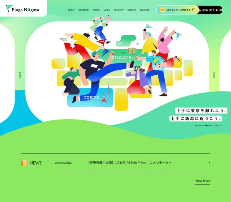
鮮やかなグリーンと波形の背景、躍動感のある人物イラストが特徴の企業サイト。大きなセリフ体見出し、重なり合う事業紹介の円、画面に常駐するコミュニティ参加導線を組み合わせています。
オリジナルサイトを見るFlags Niigata — Style Reference
A bright green landscape of people, flags, and overlapping circles, anchored by stately serif headings.
Website: flags-niigata.com
Original URL: https://flags-niigata.com/
Final URL: https://flags-niigata.com/
Theme: light, with white surfaces, vivid green fields, mint gradients, and black typography.
Inspected: September 13, 2026, Japan time. The supplied inspection record is timestamped 2026-09-12T18:52:54.575Z, equivalent to September 13 at 03:52:54.575 JST. Individual capture timestamps were not supplied.
Viewports: 1440 × 1000 and 390 × 844 CSS pixels.
Scope: the current corporate and community homepage: opening carousel, news, About, Solution, Works, Media, Company, and contact footer. Screenshots directly show the desktop opening, Solution, and footer, plus the mobile opening and footer. Other sections are documented through rendered text, link destinations, and computed element measurements.
Flags Niigata presents a creative company that grew from a community connecting Niigata and Tokyo. Its visual identity combines exuberant illustration with a composed editorial framework. People leap across the opening scene, carry small flags, and reappear together near the contact area. Large green waves connect the page sections. White panels and circular business diagrams make the colorful artwork readable.
The typography provides an essential counterweight. Large, regular-weight Marcellus capitals label the sections, while Inter handles English navigation and dates. Noto Sans JP carries Japanese explanations and project titles. A persistent community invitation remains prominent: it occupies the desktop header and becomes a black bottom strip with a bright gradient capsule on mobile.
How to Read This Reference
- Measured means a value appears in the supplied computed styles or element bounds. Derived gaps and proportions are identified as calculations.
- Visual estimate means an approximation from the original-page screenshots. Most vivid colors, gradient stops, wave geometry, and footer dimensions fall into this category; no pixel sampling was performed.
- DOM-supported means structure or content is evidenced, but the corresponding section is not fully shown in the supplied screenshots.
- Recommended means guidance for a new implementation. Breakpoints, accessibility improvements, and Quick Start selectors are recommendations unless explicitly marked otherwise.
- Token names are implementation aliases. The only supplied source custom properties are
--swiper-theme-color,--swiper-navigation-size, and--vh. - Element bounds can include transformed content or offscreen carousel slides. They do not establish that every recorded element was simultaneously visible.
Tokens — Colors
Measured Neutral Palette
| Name | Value | Suggested token | Evidence and role |
|---|---|---|---|
| Black | #000000 |
--color-ink |
Computed text color throughout; mobile invitation strip background; visible rules and icons |
| White | #ffffff |
--color-surface |
Computed community READ MORE background and category-label text; visible large panels |
| Metadata Gray | #aaaaaa |
--color-muted-source |
Computed project descriptors and media dates |
| Renovation Tint | #faf5f5 |
--color-renovation-tint |
Computed renovation READ MORE surface |
| Creative Tint | #eff5f5 |
--color-creative-tint |
Computed creative READ MORE surface |
| Think Tank Tint | #faf7f0 |
--color-thinktank-tint |
Computed think tank READ MORE surface |
Estimated Identity Palette
These hexadecimal values are practical visual approximations, not recovered stylesheet declarations.
| Name | Approximate value | Suggested token | Visible role |
|---|---|---|---|
| Lawn Green | #86e45b |
--color-lawn |
Large foreground wave, news field, contact footer |
| Mint | #54d9a5 |
--color-mint |
Rear landscape wave and broad gradient fields |
| Action Teal | #16cbb0 |
--color-teal |
Menu discs, community counter, outlined actions, return-to-top control |
| Bright Cyan | #06bdd9 |
--color-cyan |
Lower-left opening landscape and illustration accents |
| Pale Lime | #d4ff97 |
--color-lime |
Light green background glow |
| Invitation Gradient | #61dddd → #d9ff88 |
--gradient-invitation |
Community participation capsule |
| Creative Blue | #0750ff |
--color-blue |
Creative business circle and associated lettering |
| Renovation Pink | #ff4f94 |
--color-pink |
Renovation circle, heading accents, and decorative motifs |
| Think Tank Yellow | #ffdd00 |
--color-yellow |
Think tank circle and business label |
| Warm Orange | #ffaa00 |
--color-orange |
Yellow-to-orange category accents |
| Seal Yellow | #ffe15b |
--color-seal |
Small FREE seal inside the participation capsule |
The large green fields establish identity; blue, pink, and yellow organize the service diagram and animate the illustrations. Black remains the main reading color. Keep the saturated secondary colors concentrated around those roles.
Palette Behavior
The opening and Solution backgrounds contain broad, soft gradients. Solution includes pale concentric circular fields behind the sharper outlined circles. The participation capsule uses a more directional cyan-to-lime gradient, enclosed by a white edge.
Several sampled wrappers report transparent backgrounds or black text even where the screenshot shows colored lettering or gradients. Their descendant paint, background images, and pseudo-elements were not included in the measurements. Treat wrapper styles and visible appearance as separate evidence; do not infer a global recoloring technique.
The source exposes --swiper-theme-color: #007aff. This is evidence of slider-related styling, not proof that this exact blue is the creative business color. Likewise, --swiper-navigation-size: 44px does not describe the measured mobile carousel controls, which are 26px high.
Tokens — Typography
Marcellus — Section Headings
- Measured family:
Marcellus, serif. - Measured weight:
400. - Roles: ABOUT, SOLUTION, WORKS, MEDIA, COMPANY, NEWS, and smaller editorial labels such as WHO WE ARE.
- Character: broad capitals, fine serifs, and an unhurried rhythm that balances the energetic artwork.
- Alias:
--font-display: 'Marcellus', serif.
The contact heading visibly belongs to the same serif language, but its own computed font declaration was not supplied. Using Marcellus there is a reconstruction recommendation, not a separately verified measurement.
Noto Sans JP — Japanese Content
- Measured family:
'Noto Sans JP', sans-serif. - Weights:
400for explanations and news;700for project titles, category labels, and carousel headlines. - Tracking: many Japanese headings and paragraphs use
0.08em, calculated from their supplied pixel values. - Role: a clear, contemporary reading layer across the expressive landscape.
Long About paragraphs have unusually generous leading: approximately 38px on desktop and 31.10px on mobile. Preserve this breathing room even when the surrounding content is visually dense.
Inter — Navigation and Utilities
- Measured family:
Inter, sans-serif. - Roles: desktop navigation, dates, English explanatory notes, READ MORE, and View More.
- Weight:
400in the sampled elements. - Character: quiet, compact, and functional.
Barlow Semi Condensed — Community Count
- Measured family:
'Barlow Semi Condensed', sans-serif. - Weight:
600. - Desktop declaration:
120px / 120px, measured on an offscreen community slide. - Mobile declaration:
49.92px / 49.92px, visible in the supplied opening capture.
The visible mobile count is 1634, accompanied by a small person suffix and a July 2026 date note. These are captured content values; count-up animation and live updating were not established.
Wordmarks and Graphic Lettering
Use the actual flag-and-wordmark artwork where authorized. The horizontal, stacked, and large hero lockups should not be recreated by typing the name in an assumed font.
Some slogan wrappers report a 10px desktop font even though their visible lettering is much larger. For example, the community slogan occupies a measured 227.02 × 51px box. The wrapper declaration does not establish the font or size of the painted lettering. Its visual treatment should be matched from the original artwork or separately inspected descendants.
Type Scale
Values below are measured unless marked as estimates. A dash indicates that the matching measurement was not supplied.
| Role | Desktop | Mobile | Weight / tracking |
|---|---|---|---|
| Main section heading | 60px / 75px |
41.6px / 52px |
Marcellus 400 |
| NEWS and small editorial headings | 21px / 26.25px |
18.72px / 23.4px |
Marcellus 400 |
| Header navigation | 12px, normal leading |
Replaced visually by menu control | Inter 400 |
| English section note | 10px, 12–14px leading |
9.36px, 11.44–13.10px leading |
Inter 400 |
| About introduction | 15px / 38px |
13.52px / 31.096px |
Noto Sans JP 400; 0.08em |
| Vision, Mission, Value prose | 14px / 38px |
13.52px / 31.096px |
Noto Sans JP 400; 0.08em |
| Carousel project title | 22px / 35.9925px |
18.72px / 24.9594px |
Noto Sans JP 700; 0.08em |
| Project title | 16px / 22px |
13.52px / 21.2264px |
Noto Sans JP 700; 0.08em |
| Media title | 16px / 22px |
13.52px / 18.59px |
Noto Sans JP 700; 0.08em |
| News title | 15px / 25.5px |
13.52px / 22.984px |
Noto Sans JP 400 |
| News date | 14px / 27.3px |
12.48px / 24.336px |
Inter 400 |
| Solution description | 13px / 21.97px |
11.44px / 16.588px before overview scaling |
Noto Sans JP 400 |
| Solution business label | 14px |
11.44px before overview scaling |
Noto Sans JP 700 |
| READ MORE | 10px |
10.4px before overview scaling |
Inter 400 |
| View More | 14px |
12.48px |
Inter 400 |
| Community count | 120px / 120px |
49.92px / 49.92px |
Barlow Semi Condensed 600 |
| Contact heading | Approximately 92–96px |
Approximately 50–52px |
Visual estimate; serif |
The root is measured at 10px on desktop and 10.4px on mobile. The responsive formula was not supplied. Do not assume the mobile interface is a uniformly reduced desktop layout or copy numeric source rem values into a conventional 16px root.
Tokens — Spacing & Shapes
Density: generous spacing between major ideas, compact labels and buttons within them. Geometry: oversized rounded rectangles, true circles, slim capsules, thin rules, and broad organic waves.
Measured Spacing
| Use | Desktop | Mobile |
|---|---|---|
| Standard section content width | Approximately 1180px |
348.39px |
| Standard horizontal margin | Approximately 130px |
20.80px |
| Common section top padding | 140px |
83.2px |
| Solution top padding | 90px |
104px |
| Hero top padding | 132.984px |
91.52px |
| Desktop navigation gap | 24px, calculated from link bounds |
Not applicable |
| News row vertical padding | 30px |
20.8px |
| Project column gap | Approximately 39.92px, calculated |
Approximately 11.47px, calculated |
| Project row gap | 70px, calculated |
Approximately 33.27px, calculated |
| Media row gap within a group | Approximately 26px, calculated |
Approximately 15.59px, calculated |
There are deliberate exceptions to the main container. The desktop project grid is inset further from the left; mobile project cards extend to about 15.58px from either viewport edge.
Shapes and Radii
| Element | Value or geometry | Evidence |
|---|---|---|
| Opening white panel | Approximately 1140 × 598px, with roughly 150–160px corners |
Desktop visual estimate |
| Initial desktop logo tab | Approximately 290 × 103px; rounded lower-right corner |
Visual estimate |
| Mobile header capsule | 352.55 × 55.11px; 52px radius |
Measured |
| Mobile menu disc | 46.80 × 46.80px; 50% radius |
Measured |
| Standard desktop carousel detail button | 167 × 60px; 30px radius; 4px padding |
Measured |
| Desktop community detail button | 315 × 60px; 30px radius |
Measured, offscreen slide |
| Mobile carousel detail button | 163.27 × 49.91px; 31.2px radius; 3.12px padding |
Measured |
| Desktop Solution READ MORE | 135 × 33px; 30px radius |
Measured |
| Mobile community READ MORE | 113.36 × 28.08px; 31.2px radius |
Measured |
| Solution business label | 21px high; 20px radius |
Measured desktop |
| Project category label | Approximately 17px high; 10px radius |
Measured desktop |
| Works / Media index link | Approximately 31px high; 24px radius |
Measured desktop |
| Supporting service circles | Approximately 340px diameter; roughly 3px outlines |
Desktop visual estimate |
| Main community circle | Approximately 640px diameter |
Desktop visual estimate |
| Return-to-top control | Approximately 100px square on desktop and 70px on mobile |
Visual estimate |
The waves need drawn curves. A rounded section corner does not reproduce their alternating crests and troughs. Use layered SVG paths or equivalent authored shapes, with text kept outside the decorative geometry.
Components
Persistent Header
Role: identity, section navigation, and community participation.
At the desktop opening, a white logo tab occupies the upper-left corner. Seven small Inter links sit across the top: ABOUT, SOLUTION, WORKS, MEDIA, COMPANY, RECRUIT, and CONTACT. The section links target named anchors on the homepage; recruitment and contact point to external destinations.
The navigation begins near x = 436.48px. The community invitation begins at x = 980.02px and y = 33px, with a measured overall footprint of 423 × 56px. This compact top band leaves most of the viewport for the illustration.
In the scrolled desktop captures, the logo becomes a compact stacked lockup, and a white-outlined teal menu disc appears beside the participation control. These captures establish a changed header presentation; the exact scroll threshold and transition are unverified.
On mobile, the header is a floating white capsule at approximately x = 18.72px and y = 17.67px. The opening capture centers the wordmark. The footer capture shows the wordmark toward the left with a small two-line slogan beside it. A teal menu circle remains at the right. Although social-link rectangles appear in the mobile DOM sample, those icons are not visibly present in the supplied closed-header screenshots.
Community Participation Rail
Role: the most persistent call to action.
The component has three visual layers:
- A black rounded rail carrying repeated white JOIN US text and hand emoji.
- A foreground capsule with a cyan-to-lime gradient and a white outline.
- A small yellow FREE seal, bold Japanese participation label, and flag accent inside the capsule.
On desktop, the visible foreground capsule is approximately 260 × 56px within the 423px rail. On mobile, the rail becomes a full-width black strip at the viewport bottom. Its measured box is 390 × 90.47px, starting at y = 753.53px in the DOM record. The foreground capsule is visually about 298 × 52px.
The mobile rail has measured padding of 12.48px 0 26px. It stays present in both opening and footer captures. Some lower content and the return-to-top control appear partially covered in the supplied views, so a new implementation should explicitly reserve clearance.
The participation link resolves to # in the supplied DOM. Its activation result was not tested. Do not assume it opens a particular form, modal, or external service.
Opening Carousel
Role: a changing introduction spanning brand identity, community information, projects, and media activity.
The desktop opening shows a large white rounded frame with partial neighboring panels visible at the sides. The central illustration features people moving diagonally across rounded blocks marked NIIGATA and TOKYO. A mint wave rises across the lower-right region, carrying two white-backed Japanese slogan lines. A brighter green wave passes in front and continues into the news area.
The slogan reads “上手に東京を離れよう。上手に新潟に近づこう。” Small Inter NIIGATA and TOKYO labels are joined by a 33 × 1px black line beneath it.
Desktop BACK and NEXT labels are rotated along the sides of the active panel. Their measured positions are approximately x = 118.27px and x = 1309.73px, both at y = 424.63px.
The mobile capture shows the community slide: audience copy, a large wordmark, a compact group illustration, then a participant count beside an outlined community-information button. BACK and NEXT become adjacent outlined controls near the lower-right corner. Their measured sizes are 33.27 × 26px and 58.23 × 26px.
The different active slides are capture states. They do not prove that desktop and mobile intentionally select different content. The offscreen DOM includes additional project and media slides, so the opening should be modeled as a carousel rather than a single immutable hero.
News Strip
Role: a concise current update beneath the opening scene.
Use a green surface, a small serif NEWS heading, thin black rules, and one horizontal linked row. The mobile screenshot includes a small notebook illustration beside NEWS.
On desktop, the news link begins at x = 292px, with a 150px date allocation, flexible title region, and right-edge arrow. The linked row is approximately 1017.98 × 87.30px. The NEWS heading exists in the DOM to its left, although it is not clearly visible in the supplied desktop opening image.
On mobile, the heading moves above the row. The row spans 348.39px; the date receives about 91.52px and the title wraps within the remaining width, reserving 40.56px on its right for the arrow. View More sits below, aligned right with a short underline.
Section Heading Pair
Role: a repeatable editorial anchor for the long page.
A 60px Marcellus heading sits left on desktop. ABOUT and SOLUTION pair it with a very small English explanatory sentence aligned toward the right. WORKS and MEDIA pair the heading with View More instead.
On mobile, the heading becomes 41.6px. Explanatory notes occupy the line below and wrap into two lines. View More remains beside the heading where measured. Preserve the difference between explanatory text and navigational action; they are not interchangeable subtitles.
About Narrative
Role: explains the community origin, vision, mission, and values.
The DOM establishes a long sequence of WHO WE ARE, VISION, MISSION, and VALUE. On desktop, the introductory paragraph is offset into an 880px-wide region beginning around x = 430px. Vision and Mission occupy separate left and right regions, each approximately 502px wide. Value pairs a left label with a narrower paragraph on the right.
On mobile, these ideas follow one another vertically within the 348.39px content width. The prose uses 13.52px type with approximately 31.10px leading. The supplied evidence does not show the complete artwork in this section, so preserve the verified hierarchy and spacing without inventing specific illustrations for unseen gaps.
Solution Constellation
Role: shows the community as the origin of three related business activities.
The desktop screenshot centers a large pale community circle behind three smaller white circles. Renovation sits lower left, creative sits lower center, and think tank sits lower right. The creative circle descends farther and overlaps the other circles in the foreground. This arrangement communicates a relationship, not just four equal categories.
Each supporting circle contains:
- A narrow rounded category strip with white Japanese text and a vivid gradient.
- A centered colored value statement, visually around 18px, with deliberate line breaks.
- A short black description at a measured 13px / 21.97px.
- A subdued pill-shaped READ MORE link, 135 × 33px.
The community circle adds the stacked wordmark above its category strip. Its central statement uses the main brand slogan. Two large illustrated people overlap the upper sides of the composition, while smaller flowers, mountains, dots, and abstract local motifs surround it.
Use pink for “リノベーション事業”, blue for “クリエイティブ事業”, and yellow/orange for “シンクタンク事業”. Their READ MORE surfaces use the measured pale tints listed above.
Mobile evidence requires caution. The DOM contains the community information, a reduced overview of the supporting circles, and additional service-name labels. Supporting READ MORE bounds are approximately 53.17 × 13.17px, compared with 113.36 × 28.08px for the community link. The ratio is approximately 0.469, consistent with substantial visual scaling; it is not a recovered CSS transform declaration. The mobile section is much taller than desktop, but its complete presentation and any expansion behavior are not captured.
Project Card Grid
Role: provides evidence of the company's work.
Six linked entries are present. Each card groups an upper media area, bold Japanese project title, colored business-category capsule, and muted service descriptors. The provided screenshots do not show the project images, so their actual content, crops, and corner treatment remain unverified.
Desktop measurements establish three columns. Card widths are approximately 313.43px, separated by 39.92px. The grid begins around x = 249.92px, noticeably inset from the main heading at x = 130px. A 70px gap separates the two rows.
At 390px, the grid retains two columns, each 173.67px wide, with an 11.47px gap. Titles use 13.52px bold type and approximately 21.23px leading. Longer titles occupy measured two-line boxes; do not assume the complete text is visually displayed simply because it appears in the DOM.
The category capsule follows the title by approximately 9px on desktop. Descriptor text follows by about 6px and uses measured #aaaaaa. A separate outlined WORKS index link finishes the section at the right.
Media List
Role: organizes appearances and speaking engagements.
Desktop uses two parallel groups of three horizontal entries. Each entry is approximately 543 × 120px and uses a left media region with text to the right. The right-hand text stack contains a narrow category capsule, a bold title, and a small gray Inter date.
On mobile, the two groups become one vertical sequence. Each row spans 348.39px and is about 83.44px high. Text begins approximately 149.75px inside the row, leaving a substantial left allocation for media and spacing. The title region is approximately 198.64px wide.
This is a list of horizontal entries on mobile, while Works remains a two-column card grid. Preserve the distinction.
Company Facts and Profile
Role: connects the expressive brand presentation to concrete organizational information.
The DOM contains company name, establishment date, address, employee information, a representative biography, and related links. Desktop fact values begin at x = 240.02px beneath a COMPANY heading at x = 130.02px. Their measured type is 15px / 21px.
Mobile values begin at x = 98.80px, with a 270.39px-wide value column and 13.52px / 21.63px type. The founders link changes from an inline desktop arrangement to a separate block in the mobile fact row. Address lines also wrap explicitly.
Use semantic term/value structure for these facts and normal paragraphs for the biography. The screenshot set does not establish the complete profile image, its crop, or the surrounding visual layout.
Contact Footer
Role: closes the page with contact access, repeated identity, navigation, and community energy.
A broad green wave introduces a large green field. On desktop, CONTACT US appears in oversized black serif type near the left-center, with a slender outlined Japanese contact link below. Two vertical slogan columns sit along the left edge. A compact horizontal navigation row and a white logo/social capsule sit lower left. The recurring group of people fills the lower-right region. Copyright runs vertically near the far-right edge.
The social capsule visibly includes the wordmark, X, and Instagram. A large teal rounded-square return-to-top control has a white outline and a simple black upward arrow.
On mobile, CONTACT US fits across the content width. The contact link sits below, followed by a split composition: white logo/social panel and vertical navigation on the left; two vertical slogan columns on the right, separated by a thin vertical rule. The group illustration then spans nearly the full width below them.
The contact link points to an external form URL in the supplied DOM. Form contents, submission behavior, and new-tab behavior were not inspected. The upward-arrow control is visibly present, but its scroll behavior was not exercised.
Tokens — Motion & Interaction
| Treatment | Evidence | What can be concluded |
|---|---|---|
| Selected utility-link transitions | 0.4s cubic-bezier(0.25, 0.46, 0.45, 0.94) on Works/Media index links and some social/founder links |
A shared 400ms eased transition is declared; changed properties and hover results were not captured |
| Rotation keyframes | Supplied text includes rotation from 0 to 360 degrees and rotation-reverse from 0 to −360 degrees |
Rotation definitions exist; targets, duration, and active use are unverified |
| Other keyframe text | An oyayubi definition begins in the supplied excerpt but is truncated |
Its full behavior cannot be reconstructed |
| Opening carousel | Multiple offscreen slides, BACK/NEXT controls, and slider-related custom properties | Carousel structure is supported; autoplay timing, swipe response, and easing are unverified |
| Participation rail | Repeated JOIN US text and hand emoji | A repeating visual track is present; continuous motion and speed were not directly documented |
| Decorative lettering | Repeated phrases and individually represented characters; curved, cropped lettering visible near the footer | Decorative text follows a large curved composition; animation path and timing are unknown |
| Header change | Different opening and scrolled desktop presentations | Multiple header states are visible; the switching mechanism is unknown |
| Community count | One captured numerical value | No evidence of a count-up animation |
Many sampled elements report transition: all without a useful duration and animation: none. These entries do not establish either an animated effect or the absence of motion in descendants, SVG, pseudo-elements, or scripts.
The capture process observed the initial page for at least five seconds, waited for finite motion and layout stability within limits, and temporarily paused perpetual animations during readiness checks. This is not equivalent to recording complete motion sequences or testing controls.
Recommended adaptation: use the measured 400ms easing for modest color and opacity feedback. Any scrolling marquee, carousel autoplay, wave movement, or rotating ornament should be implemented only as an explicit addition, with pause controls and reduced-motion behavior where appropriate. Keep essential content available in the static state.
Surfaces
| Layer | Appearance | Purpose |
|---|---|---|
| Broad page atmosphere | Pale green, mint, and white gradients | Connects distant sections without a rigid boxed page |
| Landscape foreground | Saturated solid green with authored wave edge | Carries news and the contact destination |
| Hero stage | Large white rounded frame | Separates detailed illustration from the changing background |
| Service diagram | Pale large circle and smaller white circles with colored outlines | Shows relationships between business areas |
| Primary participation action | Bright gradient capsule, white edge, black surrounding rail | Keeps the community invitation recognizable across layouts |
| Secondary action | Fine outline or very pale tinted capsule | Provides a quieter route into detail |
| Informational content | Open layout, typography, small capsules, thin rules | Supports browsing without adding heavy panel chrome |
The supplied screenshots show no prominent card-shadow elevation system. Depth comes from illustration overlap, nested circles, and landscape layers. Avoid introducing generic floating cards where the existing structure is open and editorial.
Imagery
The visible artwork uses energetic human figures with long limbs, strong diagonal poses, simplified faces, and contemporary clothing. Solid cyan, blue, pink, yellow, green, red, and dark navy areas combine with selective gradients and grain. The figures are expressive without realistic shading or dimensional rendering.
Flags recur in the wordmark and in people's hands. They connect the company name to participation and collective movement. The opening illustration also contains rounded blocks, regional labels, landmark silhouettes, and small objects. The Solution illustration surrounds people with decorative flowers, mountain-like shapes, dots, and abstract symbols.
The desktop opening arrangement and the grouped footer illustration are different compositions from the same visual family. Preserve both roles: a broad introductory scene and a compact collective signature. Keep important limbs and flags visible instead of applying arbitrary cover crops.
Observed Asset References
Asset URLs were not supplied. The references below identify visible subjects and their capture locations, not filenames to fetch.
| Asset family | Original-page evidence | Implementation guidance |
|---|---|---|
| Horizontal flag wordmark | Desktop opening; mobile header | Use authorized artwork; retain flag geometry and letter placement |
| Stacked wordmark | Scrolled desktop header, Solution, footer social panel | Preserve as a distinct lockup |
| Niigata–Tokyo introductory scene | Desktop opening | Keep the large composition and its regional lettering together |
| Group of moving people | Mobile community slide; desktop and mobile footer | Use transparent artwork with its full group silhouette |
| Solution people and ornaments | Desktop Solution capture | Layer over and around the circles without obscuring text |
| FREE seal and small flag | Participation capsule | Preserve their small size relative to the main label |
| Notebook symbol | Mobile NEWS heading | Treat as a small editorial illustration |
| X and Instagram marks | Footer social panels | Use recognizable official marks with accessible link names |
Photography and project thumbnails may occupy media regions evidenced by the DOM, but their visual contents are not shown in the supplied screenshots. Do not infer their color grading, subject matter, or composition.
Layout & Responsive Behavior
The page remains a long scrolling homepage. It combines company narrative, services, project browsing, media records, organizational facts, and contact access. The measured document heights are approximately 9350.08px on desktop and 10863.55px on mobile.
Measured Section Extents
These values describe the captured layouts, not recommended fixed heights.
| Section | Desktop height | Mobile height |
|---|---|---|
| Opening | 943.64px |
599.83px |
| News and associated decorative region | 528.28px |
171.81px |
| About | 2639.31px |
2738.08px |
| Solution | 1062px |
2344.13px |
| Works | 1131.27px |
1072.95px |
| Media | 871.95px |
906.23px |
| Company and associated ending region | 1416.64px |
2033.45px |
Desktop section boxes overlap in places: News begins 40px before the opening section ends, and Works begins 45px before Solution ends. Consequently, these heights should not be added as independent stacked blocks. The overlap supports continuous decorative transitions.
Confirmed Responsive Changes
| Component | Desktop | Mobile |
|---|---|---|
| Header | Logo tab and full navigation at opening; compact presentation in scrolled captures | Floating white capsule and menu circle |
| Community invitation | Upper-right rail | Full-width bottom rail |
| Carousel controls | Vertical labels at opposite sides | Adjacent small controls at lower right |
| News | Heading beside date/title row | Heading above wrapped row |
| Section explanations | Small text aligned toward the right | Text below the large heading |
| Vision and Mission | Separate left and right regions | Sequential full-width content |
| Works | Three columns | Two columns |
| Media | Two groups side by side | One vertical sequence |
| Company facts | Wider value column and some inline links | Narrower value column; selected links break below |
| Footer | Horizontal navigation, left slogan, right illustration | Vertical navigation, right slogan, illustration below |
The mobile Solution layout includes transformed overview content and extra labels, so its full arrangement should remain an inspection task rather than an assumed simple stack.
No intermediate viewport was supplied. The breakpoint used in Quick Start is a recommendation. The source root changes between the two captured sizes, but its governing media queries and formulas are unknown. --vh equals 10px on desktop and 8.44px on mobile, matching one percent of each viewport height; its downstream uses were not supplied.
For a new implementation, keep the project grid at two columns around 390px, allow a one-column fallback at very narrow widths or high zoom, and reserve space below content for the mobile participation rail. Use scroll offsets so section headings can clear the persistent header.
Do’s and Don’ts
Do
- Make the green landscape, people, and flags the primary identity carriers.
- Pair large regular-weight serif capitals with compact sans-serif utilities.
- Preserve Noto Sans JP's generous paragraph leading and recurring
0.08emtracking. - Keep the community circle visually central to the three business circles.
- Use blue, pink, and yellow consistently for their service roles.
- Repeat the group illustration near contact to close the visual narrative.
- Preserve the different mobile patterns for Works and Media.
- Keep the community invitation prominent in both header and bottom-dock layouts.
- Use thin rules and slim pills for secondary navigation.
- Separate decorative lettering from readable content and accessible navigation.
Don't
- Don't compress the corporate narrative, work, media, and company sections into a single conversion screen.
- Don't replace the illustration system with stock photos, generic avatars, or unrelated 3D characters.
- Don't replace the service constellation with four identical desktop cards.
- Don't use bold geometric sans-serif type for every large heading.
- Don't make every background a saturated rainbow gradient.
- Don't add a general drop-shadow or glass-panel system.
- Don't interpret offscreen carousel entries as simultaneous visible content.
- Don't infer autoplay, hover transformations, or count animation from a static capture.
- Don't use transformed miniature links as the only mobile route to service details.
- Don't let the participation rail cover the final links or return-to-top control.
Recommended Implementation Additions
These are recommendations for a new implementation, not verified features of the original:
- Give menu, carousel, social, and return-to-top controls explicit accessible names. Use buttons for local state changes and links for navigation.
- Supply visible keyboard focus styles, and ensure inactive carousel slides cannot trap keyboard focus.
- Expand small visual controls to practical hit areas. The measured 26px carousel controls and 33px service buttons need particular attention.
- Keep readable service descriptions and full-size links available alongside any miniature mobile diagram.
- Check contrast for white text on bright category gradients and for
#aaaaaametadata. Darker text can preserve the palette while improving readability. - Reserve the mobile rail height plus safe-area clearance, and position footer controls above it.
- Hide repeated decorative JOIN US copies and curved lettering from assistive technology while keeping one meaningful action label.
- Support reduced motion and a static carousel presentation. Do not add automatic numerical animation merely because the participant count is large.
- Load only needed font weights, preserve illustration aspect ratios, and use appropriately sized image variants when available.
Agent Prompt Guide
Quick Color Reference
- Measured text and rules: black
#000000. - Measured white surface:
#ffffff. - Estimated dominant green:
#86e45b. - Estimated landscape mint:
#54d9a5. - Estimated action teal:
#16cbb0. - Estimated participation gradient:
#61ddddto#d9ff88, enclosed by white. - Estimated service accents: pink
#ff4f94, blue#0750ff, yellow#ffdd00with orange. - Measured secondary service surfaces:
#faf5f5,#eff5f5,#faf7f0.
Overall Prompt
“Create a corporate and community homepage inspired by the observed Flags Niigata design. Build a bright green landscape with mint gradients, large white rounded stages, and expressive illustrations of people carrying flags. Use regular Marcellus capitals for major section headings, Inter for English utilities, and Noto Sans JP for Japanese content. Include an introductory carousel, a thin-rule news strip, an expansive About narrative, a central community circle overlapping three colored business circles, a project grid, a media list, company facts, and an illustrated contact footer. Keep the community participation capsule in the desktop header and in a black bottom rail on mobile. Preserve broad spacing, slim secondary buttons, and the contrast between energetic artwork and restrained typography.”
Example Component Prompts
- Header: “A transparent desktop header with a white logo tab at upper left, small 12px Inter anchor links, and a black participation rail at upper right. Overlay the rail with a white-outlined cyan-to-lime capsule containing a yellow FREE seal, the label ‘コミュニティに参加する’, and a small flag. On mobile, use a floating white header capsule and move the participation rail to the viewport bottom.”
- Solution diagram: “A large pale community circle centered behind three white service circles. Place renovation left in pink, creative lower center in blue, and think tank right in yellow/orange. Each supporting circle contains a gradient business label, centered value statement, two lines of black description, and a pale READ MORE pill. Place energetic people and small local motifs around the circles.”
- Project grid: “A quiet editorial project grid with three desktop columns and two columns at 390px. Each linked item has an upper media region, a bold tracked Japanese title, a small business-category pill, and muted service descriptors. Use open spacing and avoid elevated card containers. Image content must come from supplied project assets.”
- News: “A bright green news area with a small serif NEWS label and notebook motif. Use thin black rules, an Inter date, a Japanese title, and a small arrow. On mobile, put the heading above the row and allow the title to wrap beside the date.”
- Footer: “A green contact landscape introduced by a broad wave. Use a very large black serif CONTACT US heading, a thin outlined Japanese contact link, vertical Japanese slogan columns, a white wordmark-and-social panel, and a group illustration. On mobile, stack navigation vertically and place the full illustration below it, above the persistent participation rail.”
Quick Start
CSS Custom Properties
This is an implementation adaptation, not recovered source CSS. It uses a conventional root font size, the measured font families, representative measured dimensions, and explicitly estimated identity colors. Load the fonts and authorized artwork separately; their resource URLs were not supplied.
The mobile breakpoint is recommended. The example uses readable stacked service circles on mobile; the original mobile overview requires further visual inspection. Project and media image ratios of 16 / 9 are recommended placeholders, not measured source ratios. The example also uses darker metadata and black business-label text as readability additions; the inspected values were #aaaaaa and white respectively.
:root {
  /* Measured neutral colors */
  --color-ink: #000000;
  --color-surface: #ffffff;
  --color-muted-source: #aaaaaa;
  --color-renovation-tint: #faf5f5;
  --color-creative-tint: #eff5f5;
  --color-thinktank-tint: #faf7f0;

  /* Visual estimates */
  --color-lawn: #86e45b;
  --color-mint: #54d9a5;
  --color-teal: #16cbb0;
  --color-cyan: #06bdd9;
  --color-lime: #d4ff97;
  --color-blue: #0750ff;
  --color-pink: #ff4f94;
  --color-yellow: #ffdd00;
  --color-orange: #ffaa00;
  --color-seal: #ffe15b;
  --gradient-invitation: linear-gradient(100deg, #61dddd, #d9ff88);

  /* Recommended readable metadata color */
  --color-muted: #626262;

  /* Measured families; font files must be loaded separately */
  --font-display: 'Marcellus', serif;
  --font-body: 'Noto Sans JP', sans-serif;
  --font-utility: 'Inter', sans-serif;
  --font-count: 'Barlow Semi Condensed', sans-serif;

  --content-width: 1180px;
  --gutter: 32px;
  --section-space: 140px;
  --text-section: 60px;
  --tracking-japanese: 0.08em;
  --radius-pill: 999px;
  --dock-height: 0px;
  --safe-bottom: env(safe-area-inset-bottom, 0px);
  --motion-link: 400ms cubic-bezier(0.25, 0.46, 0.45, 0.94);
}

* { box-sizing: border-box; }
body { margin: 0; }
button, input, textarea { font: inherit; }
img { display: block; max-width: 100%; height: auto; }

.flags-site {
  color: var(--color-ink);
  background: var(--color-surface);
  font-family: var(--font-body);
  padding-bottom: calc(var(--dock-height) + var(--safe-bottom));
}

.container {
  width: min(var(--content-width), calc(100% - 2 * var(--gutter)));
  margin-inline: auto;
}

.section {
  padding-block: var(--section-space) 80px;
  scroll-margin-top: 110px;
}

.section-heading {
  display: grid;
  grid-template-columns: minmax(0, 1fr) auto;
  align-items: center;
  gap: 16px;
  margin-bottom: 60px;
}

.section-title {
  margin: 0;
  font: 400 var(--text-section) / 1.25 var(--font-display);
}

.section-note {
  max-width: 514px;
  margin: 0;
  font: 400 10px / 1.4 var(--font-utility);
}

.view-more {
  color: inherit;
  padding-bottom: 10px;
  border-bottom: 1px solid currentColor;
  font: 400 14px / 1.2 var(--font-utility);
  text-decoration: none;
}

.about-copy {
  max-width: 880px;
  margin-left: auto;
  font-size: 15px;
  line-height: 38px;
  letter-spacing: var(--tracking-japanese);
}

.site-header {
  position: fixed;
  inset: 0 0 auto;
  z-index: 50;
  display: flex;
  align-items: center;
  justify-content: flex-end;
  gap: 43px;
  min-height: 89px;
  padding: 33px 37px 0 330px;
  pointer-events: none;
}

.site-header a,
.site-header button { pointer-events: auto; }

.site-brand {
  position: absolute;
  inset: 0 auto auto 0;
  display: grid;
  place-items: center;
  width: 290px;
  height: 103px;
  border-radius: 0 0 30px 0;
  background: var(--color-surface);
}

.site-brand img { width: 205px; }

.header-nav {
  display: flex;
  gap: 24px;
  white-space: nowrap;
}

.header-nav a {
  color: inherit;
  font: 400 12px / 1.25 var(--font-utility);
  text-decoration: none;
}

.join-rail {
  position: relative;
  display: flex;
  flex: 0 0 423px;
  align-items: center;
  height: 56px;
  overflow: hidden;
  border-radius: var(--radius-pill);
  background: var(--color-ink);
  color: var(--color-ink);
  text-decoration: none;
}

.join-track {
  position: absolute;
  inset-inline-start: 0;
  width: max-content;
  color: white;
  white-space: nowrap;
  font: 400 12px / 1 var(--font-utility);
}

.join-label {
  position: relative;
  z-index: 1;
  display: flex;
  align-items: center;
  justify-content: center;
  gap: 10px;
  width: 260px;
  height: 56px;
  border: 2px solid white;
  border-radius: var(--radius-pill);
  background: var(--gradient-invitation);
  font-size: 13px;
  font-weight: 700;
}

.free-seal { width: 36px; height: 36px; flex: none; }

.menu-toggle {
  display: none;
  place-items: center;
  width: 56px;
  height: 56px;
  padding: 0;
  border: 2px solid white;
  border-radius: 50%;
  background: var(--color-teal);
  color: white;
  cursor: pointer;
}

/* An application may apply this state after its chosen scroll threshold. */
.site-header.is-compact .header-nav { display: none; }
.site-header.is-compact .menu-toggle { display: grid; }
.site-header.is-compact .site-brand {
  width: 150px;
  height: 110px;
  background: transparent;
}
.site-header.is-compact .site-brand img { width: 110px; }

.hero {
  position: relative;
  isolation: isolate;
  padding-block: 133px 173px;
  background:
    radial-gradient(ellipse at 28% 14%, var(--color-lime), transparent 65%),
    linear-gradient(125deg, #91e9ae, #d8ffac 65%, white);
}

.hero-window {
  position: relative;
  width: min(1140px, calc(100% - 48px));
  min-height: 598px;
  margin-inline: auto;
  border-radius: 155px;
  background: white;
}

.hero-art {
  width: min(880px, 100%);
  margin-inline: auto;
  transform: translateY(-38px);
}

.landscape-wave {
  position: absolute;
  inset: auto 0 0;
  z-index: 2;
  width: 100%;
  height: 180px;
  color: var(--color-lawn);
  pointer-events: none;
}

.landscape-wave--rear {
  bottom: 65px;
  z-index: 1;
  height: 230px;
  color: var(--color-mint);
}

.community-count {
  color: var(--color-teal);
  font: 600 120px / 1 var(--font-count);
}

.news { background: var(--color-lawn); }

.news-layout {
  display: grid;
  grid-template-columns: 162px minmax(0, 1fr);
  align-items: start;
  border-top: 1px solid currentColor;
}

.news-heading {
  margin: 30px 0 0;
  font: 400 21px / 1.25 var(--font-display);
}

.news-row {
  display: grid;
  grid-template-columns: 150px minmax(0, 1fr) 15px;
  align-items: start;
  padding-block: 30px;
  border-bottom: 1px solid currentColor;
  color: inherit;
  text-decoration: none;
}

.news-date { font: 400 14px / 27.3px var(--font-utility); }
.news-title { margin: 0; padding-right: 24px; font: 400 15px / 25.5px var(--font-body); }

.solution {
  background:
    radial-gradient(circle at 50% 45%, #f8ffe9, transparent 64%),
    linear-gradient(125deg, #d8ffa6, #7be8ba 80%, white);
}

.solution-map {
  position: relative;
  max-width: 964px;
  min-height: 780px;
  margin-inline: auto;
}

.solution-node {
  --accent: var(--color-teal);
  --accent-end: var(--color-mint);
  position: absolute;
  display: flex;
  flex-direction: column;
  align-items: center;
  justify-content: center;
  gap: 16px;
  width: 340px;
  min-height: 340px;
  padding: 42px 30px;
  border: 3px solid var(--accent);
  border-radius: 50%;
  background: white;
  text-align: center;
}

.solution-node--community {
  top: 20px;
  left: 50%;
  width: 640px;
  min-height: 640px;
  justify-content: flex-start;
  padding-top: 150px;
  transform: translateX(-50%);
  background: rgb(255 255 255 / 40%);
}

.solution-node--renovation {
  --accent: var(--color-pink);
  --accent-end: #ff4564;
  top: 304px;
  left: 0;
}

.solution-node--creative {
  --accent: var(--color-blue);
  --accent-end: #3086ff;
  top: 402px;
  left: 50%;
  z-index: 2;
  transform: translateX(-50%);
}

.solution-node--thinktank {
  --accent: var(--color-yellow);
  --accent-end: var(--color-orange);
  top: 304px;
  right: 0;
}

.service-label {
  display: inline-block;
  margin: 0;
  padding: 1px 18px;
  border-radius: var(--radius-pill);
  background: linear-gradient(90deg, var(--accent), var(--accent-end));
  color: var(--color-ink);
  font-size: 14px;
  font-weight: 700;
  letter-spacing: 0.08em;
}

.service-title {
  margin: 0;
  color: var(--accent);
  font-size: 18px;
  line-height: 1.4;
  letter-spacing: 0.06em;
}

.service-copy { margin: 0; font-size: 13px; line-height: 21.97px; }

.read-more {
  display: inline-flex;
  align-items: center;
  justify-content: center;
  min-width: 135px;
  min-height: 44px;
  padding-inline: 20px;
  border-radius: var(--radius-pill);
  background: var(--color-creative-tint);
  color: var(--color-ink);
  font: 400 10px / 1 var(--font-utility);
  text-decoration: none;
}

.solution-node--community .read-more { background: white; }
.solution-node--renovation .read-more { background: var(--color-renovation-tint); }
.solution-node--thinktank .read-more { background: var(--color-thinktank-tint); }

.works-grid {
  display: grid;
  grid-template-columns: repeat(3, minmax(0, 1fr));
  gap: 70px 40px;
  width: min(100%, 1020px);
  margin-inline: auto 40px;
}

.project-card { min-width: 0; color: inherit; text-decoration: none; }
.project-image { width: 100%; aspect-ratio: 16 / 9; object-fit: cover; }
.project-title {
  margin: 27px 0 9px;
  font-size: 16px;
  line-height: 22px;
  font-weight: 700;
  letter-spacing: 0.08em;
}
.project-meta { margin: 6px 0 0; color: var(--color-muted); font-size: 11px; line-height: 20.02px; }

.media-columns {
  display: grid;
  grid-template-columns: repeat(2, minmax(0, 1fr));
  gap: 70px;
  padding-inline: 13px;
}
.media-list { display: grid; gap: 26px; }
.media-item {
  display: grid;
  grid-template-columns: 40% minmax(0, 1fr);
  gap: 20px;
  min-height: 120px;
  color: inherit;
  text-decoration: none;
}
.media-image { width: 100%; aspect-ratio: 16 / 9; object-fit: cover; }
.media-title { margin: 14px 0 12px; font-size: 16px; line-height: 22px; letter-spacing: 0.08em; }
.media-date { color: var(--color-muted); font: 400 11px / 1.3 var(--font-utility); }

.contact-footer {
  position: relative;
  padding: 180px 65px 80px;
  background: var(--color-lawn);
}
.contact-title {
  margin: 0 0 12px;
  font: 400 clamp(52px, 6.67vw, 96px) / 1.1 var(--font-display);
}
.contact-link {
  display: inline-flex;
  align-items: center;
  justify-content: space-between;
  gap: 36px;
  min-height: 44px;
  padding: 8px 18px;
  border: 1px solid currentColor;
  border-radius: var(--radius-pill);
  color: inherit;
  text-decoration: none;
}
.vertical-slogan { writing-mode: vertical-rl; text-orientation: upright; letter-spacing: 0.15em; }
.footer-art { width: min(600px, 100%); margin: 48px 8% 0 auto; }

.flags-site :focus-visible { outline: 3px solid var(--color-ink); outline-offset: 4px; }
.view-more, .contact-link { transition: opacity var(--motion-link); }
@media (hover: hover) {
  .view-more:hover, .contact-link:hover { opacity: 0.65; }
}

/* Recommended breakpoint; not recovered from the original stylesheet. */
@media (max-width: 1199px) {
  :root {
    --gutter: 20.8px;
    --section-space: 83.2px;
    --text-section: 41.6px;
    --dock-height: 90.47px;
  }

  .section-heading { gap: 2px 16px; margin-bottom: 42px; }
  .section-note { grid-column: 1 / -1; font-size: 9.36px; }
  .view-more { font-size: 12.48px; padding-bottom: 6.24px; }
  .about-copy { font-size: 13.52px; line-height: 31.096px; }

  .site-header {
    inset: 17.68px 18.72px auto;
    min-height: 55.12px;
    padding: 2.08px 52px 2.08px 12px;
    justify-content: center;
    border: 2.08px solid transparent;
    border-radius: var(--radius-pill);
    background: linear-gradient(white, white) padding-box,
      var(--gradient-invitation) border-box;
  }
  .site-brand, .site-header.is-compact .site-brand {
    position: static;
    width: auto;
    height: auto;
    background: transparent;
  }
  .site-brand img, .site-header.is-compact .site-brand img { width: 170px; }
  .header-nav { display: none; }
  .menu-toggle {
    position: absolute;
    inset: 2.08px 2.08px auto auto;
    display: grid;
    width: 46.8px;
    height: 46.8px;
  }
  .join-rail {
    position: fixed;
    inset: auto 0 0;
    display: grid;
    justify-items: center;
    align-content: start;
    width: 100%;
    height: calc(var(--dock-height) + var(--safe-bottom));
    padding: 12.48px 0 calc(26px + var(--safe-bottom));
    border-radius: 0;
  }
  .join-label { width: min(298px, calc(100vw - 40px)); height: 52px; }
  .join-track { top: 35px; }

  .hero { padding-block: 91.52px 68px; }
  .hero-window { width: calc(100% - 42px); min-height: 440px; border-radius: 52px; }
  .hero-art { width: calc(100% - 32px); transform: none; }
  .community-count { font-size: 49.92px; }
  .landscape-wave { height: 95px; }
  .landscape-wave--rear { bottom: 24px; height: 120px; }

  .news-layout { display: block; border-top: 0; }
  .news-heading { margin: 0 0 12px; font-size: 18.72px; }
  .news-row {
    grid-template-columns: 91.52px minmax(0, 1fr) 14px;
    padding-block: 20.8px;
    border-top: 1px solid currentColor;
  }
  .news-date { font-size: 12.48px; line-height: 24.336px; }
  .news-title { padding-right: 12px; font-size: 13.52px; line-height: 22.984px; }

  /* Readable mobile service presentation recommended for this adaptation. */
  .solution-map { display: grid; gap: 24px; min-height: 0; }
  .solution-node {
    position: relative;
    inset: auto;
    width: min(100%, 360px);
    min-height: 360px;
    margin-inline: auto;
    padding: 36px 28px;
    justify-content: center;
    transform: none;
  }

  .works-grid {
    width: calc(100% + 10.4px);
    margin-inline: -5.2px;
    grid-template-columns: repeat(2, minmax(0, 1fr));
    gap: 33.27px 11.47px;
  }
  .project-title { margin-top: 22px; font-size: 13.52px; line-height: 21.2264px; }
  .project-meta { font-size: 10.4px; line-height: 1.5; }
  .media-columns { grid-template-columns: 1fr; gap: 46px; padding-inline: 0; }
  .media-list { gap: 15.6px; }
  .media-item { min-height: 83.44px; gap: 10.4px; }
  .media-title { margin: 6.24px 0; font-size: 13.52px; line-height: 18.59px; }
  .media-date { font-size: 11.44px; }

  .contact-footer { padding: 100px 20.8px 48px; }
  .contact-title { font-size: clamp(40px, 13.33vw, 52px); }
  .footer-art { width: calc(100% + 20px); max-width: none; margin: 40px -10px 0; }
}

@media (max-width: 340px) {
  .works-grid { grid-template-columns: 1fr; }
  .solution-node { border-radius: 32px; }
}

@media (prefers-reduced-motion: reduce) {
  .flags-site *, .flags-site *::before, .flags-site *::after {
    animation: none !important;
    transition: none !important;
    scroll-behavior: auto !important;
  }
}
Use an authored wave SVG inside a positioned landscape section. This example path is a recommended approximation, not an extracted asset. A second instance with the rear-wave class can provide the mint layer.
<svg class="landscape-wave" viewBox="0 0 1440 180"
     preserveAspectRatio="none" aria-hidden="true" focusable="false">
  <path fill="currentColor"
        d="M0 115 C260 0 420 -20 650 60 C850 135 1000 170 1190 130 C1310 104 1390 90 1440 108 L1440 180 L0 180 Z" />
</svg>
Keep one participation anchor around the decorative rail and foreground label. Mark repeated track text as decorative, and give the anchor one accessible name. Supply real menu state management, carousel behavior, appropriate destinations, and artwork separately; CSS alone does not implement those interactions.
Tailwind v4 Token Mapping
Optional aliases for a project already using Tailwind v4. This does not imply that the original website uses Tailwind. Define the custom properties above first.
@theme inline {
  --color-ink: #000000;
  --color-surface: #ffffff;
  --color-lawn: #86e45b;
  --color-mint: #54d9a5;
  --color-teal: #16cbb0;
  --color-creative: #0750ff;
  --color-renovation: #ff4f94;
  --color-thinktank: #ffdd00;

  --font-display: 'Marcellus', serif;
  --font-body: 'Noto Sans JP', sans-serif;
  --font-utility: 'Inter', sans-serif;
  --font-count: 'Barlow Semi Condensed', sans-serif;

  --text-section: var(--text-section);
  --spacing-section: var(--section-space);
  --spacing-gutter: var(--gutter);
  --radius-capsule: 999px;
}
Sources & Evidence
- Flags Niigata — original and final homepage: supplied HTTP 200 record, current rendered text, link targets, and computed styles. Original and final URLs are identical.
- Inspection record timestamp:
2026-09-12T18:52:54.575Z, or September 13, 2026 at 03:52:54.575 JST. Per-capture timestamps were not supplied. - Desktop evidence: three original-page captures at 1440 × 1000 showing the opening, Solution composition, and contact footer; rendered DOM measurements cover the broader homepage.
- Mobile evidence: two original-page captures at 390 × 844 showing the community opening slide and contact footer; rendered DOM measurements document responsive section, grid, and list changes.
- The capture process waited for document load, visible image decoding, finite motion, and sampled layout/text stability within stated time limits. Scrolling traversed intermediate positions. These checks do not establish complete delayed content or interaction behavior.
- No additional browsing or file inspection was performed for this reference. Menu activation, participation-link results, carousel navigation, hover outcomes, form contents, and external pages remain untested. Asset URLs, complete stylesheets, and most animation details were not supplied.
This reference describes the current page represented by the supplied evidence. Exact computed values, calculated dimensions, visual approximations, and recommended implementation choices are identified separately throughout.
# Flags Niigata — Style Reference

> A bright green landscape of people, flags, and overlapping circles, anchored by stately serif headings.

**Website:** [flags-niigata.com](https://flags-niigata.com/)
**Original URL:** https://flags-niigata.com/
**Final URL:** https://flags-niigata.com/
**Theme:** light, with white surfaces, vivid green fields, mint gradients, and black typography.
**Inspected:** September 13, 2026, Japan time. The supplied inspection record is timestamped `2026-09-12T18:52:54.575Z`, equivalent to September 13 at 03:52:54.575 JST. Individual capture timestamps were not supplied.
**Viewports:** 1440 × 1000 and 390 × 844 CSS pixels.
**Scope:** the current corporate and community homepage: opening carousel, news, About, Solution, Works, Media, Company, and contact footer. Screenshots directly show the desktop opening, Solution, and footer, plus the mobile opening and footer. Other sections are documented through rendered text, link destinations, and computed element measurements.

Flags Niigata presents a creative company that grew from a community connecting Niigata and Tokyo. Its visual identity combines exuberant illustration with a composed editorial framework. People leap across the opening scene, carry small flags, and reappear together near the contact area. Large green waves connect the page sections. White panels and circular business diagrams make the colorful artwork readable.

The typography provides an essential counterweight. Large, regular-weight Marcellus capitals label the sections, while Inter handles English navigation and dates. Noto Sans JP carries Japanese explanations and project titles. A persistent community invitation remains prominent: it occupies the desktop header and becomes a black bottom strip with a bright gradient capsule on mobile.

## How to Read This Reference

- **Measured** means a value appears in the supplied computed styles or element bounds. Derived gaps and proportions are identified as calculations.
- **Visual estimate** means an approximation from the original-page screenshots. Most vivid colors, gradient stops, wave geometry, and footer dimensions fall into this category; no pixel sampling was performed.
- **DOM-supported** means structure or content is evidenced, but the corresponding section is not fully shown in the supplied screenshots.
- **Recommended** means guidance for a new implementation. Breakpoints, accessibility improvements, and Quick Start selectors are recommendations unless explicitly marked otherwise.
- **Token names** are implementation aliases. The only supplied source custom properties are `--swiper-theme-color`, `--swiper-navigation-size`, and `--vh`.
- Element bounds can include transformed content or offscreen carousel slides. They do not establish that every recorded element was simultaneously visible.

## Tokens — Colors

### Measured Neutral Palette

| Name | Value | Suggested token | Evidence and role |
| --- | --- | --- | --- |
| Black | `#000000` | `--color-ink` | Computed text color throughout; mobile invitation strip background; visible rules and icons |
| White | `#ffffff` | `--color-surface` | Computed community READ MORE background and category-label text; visible large panels |
| Metadata Gray | `#aaaaaa` | `--color-muted-source` | Computed project descriptors and media dates |
| Renovation Tint | `#faf5f5` | `--color-renovation-tint` | Computed renovation READ MORE surface |
| Creative Tint | `#eff5f5` | `--color-creative-tint` | Computed creative READ MORE surface |
| Think Tank Tint | `#faf7f0` | `--color-thinktank-tint` | Computed think tank READ MORE surface |

### Estimated Identity Palette

These hexadecimal values are practical visual approximations, not recovered stylesheet declarations.

| Name | Approximate value | Suggested token | Visible role |
| --- | --- | --- | --- |
| Lawn Green | `#86e45b` | `--color-lawn` | Large foreground wave, news field, contact footer |
| Mint | `#54d9a5` | `--color-mint` | Rear landscape wave and broad gradient fields |
| Action Teal | `#16cbb0` | `--color-teal` | Menu discs, community counter, outlined actions, return-to-top control |
| Bright Cyan | `#06bdd9` | `--color-cyan` | Lower-left opening landscape and illustration accents |
| Pale Lime | `#d4ff97` | `--color-lime` | Light green background glow |
| Invitation Gradient | `#61dddd` → `#d9ff88` | `--gradient-invitation` | Community participation capsule |
| Creative Blue | `#0750ff` | `--color-blue` | Creative business circle and associated lettering |
| Renovation Pink | `#ff4f94` | `--color-pink` | Renovation circle, heading accents, and decorative motifs |
| Think Tank Yellow | `#ffdd00` | `--color-yellow` | Think tank circle and business label |
| Warm Orange | `#ffaa00` | `--color-orange` | Yellow-to-orange category accents |
| Seal Yellow | `#ffe15b` | `--color-seal` | Small FREE seal inside the participation capsule |

The large green fields establish identity; blue, pink, and yellow organize the service diagram and animate the illustrations. Black remains the main reading color. Keep the saturated secondary colors concentrated around those roles.

### Palette Behavior

The opening and Solution backgrounds contain broad, soft gradients. Solution includes pale concentric circular fields behind the sharper outlined circles. The participation capsule uses a more directional cyan-to-lime gradient, enclosed by a white edge.

Several sampled wrappers report transparent backgrounds or black text even where the screenshot shows colored lettering or gradients. Their descendant paint, background images, and pseudo-elements were not included in the measurements. Treat wrapper styles and visible appearance as separate evidence; do not infer a global recoloring technique.

The source exposes `--swiper-theme-color: #007aff`. This is evidence of slider-related styling, not proof that this exact blue is the creative business color. Likewise, `--swiper-navigation-size: 44px` does not describe the measured mobile carousel controls, which are 26px high.

## Tokens — Typography

### Marcellus — Section Headings

- **Measured family:** `Marcellus, serif`.
- **Measured weight:** `400`.
- **Roles:** ABOUT, SOLUTION, WORKS, MEDIA, COMPANY, NEWS, and smaller editorial labels such as WHO WE ARE.
- **Character:** broad capitals, fine serifs, and an unhurried rhythm that balances the energetic artwork.
- **Alias:** `--font-display: 'Marcellus', serif`.

The contact heading visibly belongs to the same serif language, but its own computed font declaration was not supplied. Using Marcellus there is a reconstruction recommendation, not a separately verified measurement.

### Noto Sans JP — Japanese Content

- **Measured family:** `'Noto Sans JP', sans-serif`.
- **Weights:** `400` for explanations and news; `700` for project titles, category labels, and carousel headlines.
- **Tracking:** many Japanese headings and paragraphs use `0.08em`, calculated from their supplied pixel values.
- **Role:** a clear, contemporary reading layer across the expressive landscape.

Long About paragraphs have unusually generous leading: approximately 38px on desktop and 31.10px on mobile. Preserve this breathing room even when the surrounding content is visually dense.

### Inter — Navigation and Utilities

- **Measured family:** `Inter, sans-serif`.
- **Roles:** desktop navigation, dates, English explanatory notes, READ MORE, and View More.
- **Weight:** `400` in the sampled elements.
- **Character:** quiet, compact, and functional.

### Barlow Semi Condensed — Community Count

- **Measured family:** `'Barlow Semi Condensed', sans-serif`.
- **Weight:** `600`.
- **Desktop declaration:** `120px / 120px`, measured on an offscreen community slide.
- **Mobile declaration:** `49.92px / 49.92px`, visible in the supplied opening capture.

The visible mobile count is `1634`, accompanied by a small person suffix and a July 2026 date note. These are captured content values; count-up animation and live updating were not established.

### Wordmarks and Graphic Lettering

Use the actual flag-and-wordmark artwork where authorized. The horizontal, stacked, and large hero lockups should not be recreated by typing the name in an assumed font.

Some slogan wrappers report a 10px desktop font even though their visible lettering is much larger. For example, the community slogan occupies a measured 227.02 × 51px box. The wrapper declaration does not establish the font or size of the painted lettering. Its visual treatment should be matched from the original artwork or separately inspected descendants.

### Type Scale

Values below are measured unless marked as estimates. A dash indicates that the matching measurement was not supplied.

| Role | Desktop | Mobile | Weight / tracking |
| --- | --- | --- | --- |
| Main section heading | `60px / 75px` | `41.6px / 52px` | Marcellus 400 |
| NEWS and small editorial headings | `21px / 26.25px` | `18.72px / 23.4px` | Marcellus 400 |
| Header navigation | `12px`, normal leading | Replaced visually by menu control | Inter 400 |
| English section note | `10px`, 12–14px leading | `9.36px`, 11.44–13.10px leading | Inter 400 |
| About introduction | `15px / 38px` | `13.52px / 31.096px` | Noto Sans JP 400; `0.08em` |
| Vision, Mission, Value prose | `14px / 38px` | `13.52px / 31.096px` | Noto Sans JP 400; `0.08em` |
| Carousel project title | `22px / 35.9925px` | `18.72px / 24.9594px` | Noto Sans JP 700; `0.08em` |
| Project title | `16px / 22px` | `13.52px / 21.2264px` | Noto Sans JP 700; `0.08em` |
| Media title | `16px / 22px` | `13.52px / 18.59px` | Noto Sans JP 700; `0.08em` |
| News title | `15px / 25.5px` | `13.52px / 22.984px` | Noto Sans JP 400 |
| News date | `14px / 27.3px` | `12.48px / 24.336px` | Inter 400 |
| Solution description | `13px / 21.97px` | `11.44px / 16.588px` before overview scaling | Noto Sans JP 400 |
| Solution business label | `14px` | `11.44px` before overview scaling | Noto Sans JP 700 |
| READ MORE | `10px` | `10.4px` before overview scaling | Inter 400 |
| View More | `14px` | `12.48px` | Inter 400 |
| Community count | `120px / 120px` | `49.92px / 49.92px` | Barlow Semi Condensed 600 |
| Contact heading | Approximately `92–96px` | Approximately `50–52px` | Visual estimate; serif |

The root is measured at 10px on desktop and 10.4px on mobile. The responsive formula was not supplied. Do not assume the mobile interface is a uniformly reduced desktop layout or copy numeric source rem values into a conventional 16px root.

## Tokens — Spacing & Shapes

**Density:** generous spacing between major ideas, compact labels and buttons within them.
**Geometry:** oversized rounded rectangles, true circles, slim capsules, thin rules, and broad organic waves.

### Measured Spacing

| Use | Desktop | Mobile |
| --- | --- | --- |
| Standard section content width | Approximately `1180px` | `348.39px` |
| Standard horizontal margin | Approximately `130px` | `20.80px` |
| Common section top padding | `140px` | `83.2px` |
| Solution top padding | `90px` | `104px` |
| Hero top padding | `132.984px` | `91.52px` |
| Desktop navigation gap | `24px`, calculated from link bounds | Not applicable |
| News row vertical padding | `30px` | `20.8px` |
| Project column gap | Approximately `39.92px`, calculated | Approximately `11.47px`, calculated |
| Project row gap | `70px`, calculated | Approximately `33.27px`, calculated |
| Media row gap within a group | Approximately `26px`, calculated | Approximately `15.59px`, calculated |

There are deliberate exceptions to the main container. The desktop project grid is inset further from the left; mobile project cards extend to about 15.58px from either viewport edge.

### Shapes and Radii

| Element | Value or geometry | Evidence |
| --- | --- | --- |
| Opening white panel | Approximately `1140 × 598px`, with roughly `150–160px` corners | Desktop visual estimate |
| Initial desktop logo tab | Approximately `290 × 103px`; rounded lower-right corner | Visual estimate |
| Mobile header capsule | `352.55 × 55.11px`; `52px` radius | Measured |
| Mobile menu disc | `46.80 × 46.80px`; `50%` radius | Measured |
| Standard desktop carousel detail button | `167 × 60px`; `30px` radius; `4px` padding | Measured |
| Desktop community detail button | `315 × 60px`; `30px` radius | Measured, offscreen slide |
| Mobile carousel detail button | `163.27 × 49.91px`; `31.2px` radius; `3.12px` padding | Measured |
| Desktop Solution READ MORE | `135 × 33px`; `30px` radius | Measured |
| Mobile community READ MORE | `113.36 × 28.08px`; `31.2px` radius | Measured |
| Solution business label | `21px` high; `20px` radius | Measured desktop |
| Project category label | Approximately `17px` high; `10px` radius | Measured desktop |
| Works / Media index link | Approximately `31px` high; `24px` radius | Measured desktop |
| Supporting service circles | Approximately `340px` diameter; roughly `3px` outlines | Desktop visual estimate |
| Main community circle | Approximately `640px` diameter | Desktop visual estimate |
| Return-to-top control | Approximately `100px` square on desktop and `70px` on mobile | Visual estimate |

The waves need drawn curves. A rounded section corner does not reproduce their alternating crests and troughs. Use layered SVG paths or equivalent authored shapes, with text kept outside the decorative geometry.

## Components

### Persistent Header

**Role:** identity, section navigation, and community participation.

At the desktop opening, a white logo tab occupies the upper-left corner. Seven small Inter links sit across the top: ABOUT, SOLUTION, WORKS, MEDIA, COMPANY, RECRUIT, and CONTACT. The section links target named anchors on the homepage; recruitment and contact point to external destinations.

The navigation begins near x = 436.48px. The community invitation begins at x = 980.02px and y = 33px, with a measured overall footprint of 423 × 56px. This compact top band leaves most of the viewport for the illustration.

In the scrolled desktop captures, the logo becomes a compact stacked lockup, and a white-outlined teal menu disc appears beside the participation control. These captures establish a changed header presentation; the exact scroll threshold and transition are unverified.

On mobile, the header is a floating white capsule at approximately x = 18.72px and y = 17.67px. The opening capture centers the wordmark. The footer capture shows the wordmark toward the left with a small two-line slogan beside it. A teal menu circle remains at the right. Although social-link rectangles appear in the mobile DOM sample, those icons are not visibly present in the supplied closed-header screenshots.

### Community Participation Rail

**Role:** the most persistent call to action.

The component has three visual layers:

1. A black rounded rail carrying repeated white JOIN US text and hand emoji.
2. A foreground capsule with a cyan-to-lime gradient and a white outline.
3. A small yellow FREE seal, bold Japanese participation label, and flag accent inside the capsule.

On desktop, the visible foreground capsule is approximately 260 × 56px within the 423px rail. On mobile, the rail becomes a full-width black strip at the viewport bottom. Its measured box is 390 × 90.47px, starting at y = 753.53px in the DOM record. The foreground capsule is visually about 298 × 52px.

The mobile rail has measured padding of `12.48px 0 26px`. It stays present in both opening and footer captures. Some lower content and the return-to-top control appear partially covered in the supplied views, so a new implementation should explicitly reserve clearance.

The participation link resolves to `#` in the supplied DOM. Its activation result was not tested. Do not assume it opens a particular form, modal, or external service.

### Opening Carousel

**Role:** a changing introduction spanning brand identity, community information, projects, and media activity.

The desktop opening shows a large white rounded frame with partial neighboring panels visible at the sides. The central illustration features people moving diagonally across rounded blocks marked NIIGATA and TOKYO. A mint wave rises across the lower-right region, carrying two white-backed Japanese slogan lines. A brighter green wave passes in front and continues into the news area.

The slogan reads “上手に東京を離れよう。上手に新潟に近づこう。” Small Inter NIIGATA and TOKYO labels are joined by a 33 × 1px black line beneath it.

Desktop BACK and NEXT labels are rotated along the sides of the active panel. Their measured positions are approximately x = 118.27px and x = 1309.73px, both at y = 424.63px.

The mobile capture shows the community slide: audience copy, a large wordmark, a compact group illustration, then a participant count beside an outlined community-information button. BACK and NEXT become adjacent outlined controls near the lower-right corner. Their measured sizes are 33.27 × 26px and 58.23 × 26px.

The different active slides are capture states. They do not prove that desktop and mobile intentionally select different content. The offscreen DOM includes additional project and media slides, so the opening should be modeled as a carousel rather than a single immutable hero.

### News Strip

**Role:** a concise current update beneath the opening scene.

Use a green surface, a small serif NEWS heading, thin black rules, and one horizontal linked row. The mobile screenshot includes a small notebook illustration beside NEWS.

On desktop, the news link begins at x = 292px, with a 150px date allocation, flexible title region, and right-edge arrow. The linked row is approximately 1017.98 × 87.30px. The NEWS heading exists in the DOM to its left, although it is not clearly visible in the supplied desktop opening image.

On mobile, the heading moves above the row. The row spans 348.39px; the date receives about 91.52px and the title wraps within the remaining width, reserving 40.56px on its right for the arrow. View More sits below, aligned right with a short underline.

### Section Heading Pair

**Role:** a repeatable editorial anchor for the long page.

A 60px Marcellus heading sits left on desktop. ABOUT and SOLUTION pair it with a very small English explanatory sentence aligned toward the right. WORKS and MEDIA pair the heading with View More instead.

On mobile, the heading becomes 41.6px. Explanatory notes occupy the line below and wrap into two lines. View More remains beside the heading where measured. Preserve the difference between explanatory text and navigational action; they are not interchangeable subtitles.

### About Narrative

**Role:** explains the community origin, vision, mission, and values.

The DOM establishes a long sequence of WHO WE ARE, VISION, MISSION, and VALUE. On desktop, the introductory paragraph is offset into an 880px-wide region beginning around x = 430px. Vision and Mission occupy separate left and right regions, each approximately 502px wide. Value pairs a left label with a narrower paragraph on the right.

On mobile, these ideas follow one another vertically within the 348.39px content width. The prose uses 13.52px type with approximately 31.10px leading. The supplied evidence does not show the complete artwork in this section, so preserve the verified hierarchy and spacing without inventing specific illustrations for unseen gaps.

### Solution Constellation

**Role:** shows the community as the origin of three related business activities.

The desktop screenshot centers a large pale community circle behind three smaller white circles. Renovation sits lower left, creative sits lower center, and think tank sits lower right. The creative circle descends farther and overlaps the other circles in the foreground. This arrangement communicates a relationship, not just four equal categories.

Each supporting circle contains:

1. A narrow rounded category strip with white Japanese text and a vivid gradient.
2. A centered colored value statement, visually around 18px, with deliberate line breaks.
3. A short black description at a measured 13px / 21.97px.
4. A subdued pill-shaped READ MORE link, 135 × 33px.

The community circle adds the stacked wordmark above its category strip. Its central statement uses the main brand slogan. Two large illustrated people overlap the upper sides of the composition, while smaller flowers, mountains, dots, and abstract local motifs surround it.

Use pink for “リノベーション事業”, blue for “クリエイティブ事業”, and yellow/orange for “シンクタンク事業”. Their READ MORE surfaces use the measured pale tints listed above.

Mobile evidence requires caution. The DOM contains the community information, a reduced overview of the supporting circles, and additional service-name labels. Supporting READ MORE bounds are approximately 53.17 × 13.17px, compared with 113.36 × 28.08px for the community link. The ratio is approximately 0.469, consistent with substantial visual scaling; it is not a recovered CSS transform declaration. The mobile section is much taller than desktop, but its complete presentation and any expansion behavior are not captured.

### Project Card Grid

**Role:** provides evidence of the company's work.

Six linked entries are present. Each card groups an upper media area, bold Japanese project title, colored business-category capsule, and muted service descriptors. The provided screenshots do not show the project images, so their actual content, crops, and corner treatment remain unverified.

Desktop measurements establish three columns. Card widths are approximately 313.43px, separated by 39.92px. The grid begins around x = 249.92px, noticeably inset from the main heading at x = 130px. A 70px gap separates the two rows.

At 390px, the grid retains two columns, each 173.67px wide, with an 11.47px gap. Titles use 13.52px bold type and approximately 21.23px leading. Longer titles occupy measured two-line boxes; do not assume the complete text is visually displayed simply because it appears in the DOM.

The category capsule follows the title by approximately 9px on desktop. Descriptor text follows by about 6px and uses measured `#aaaaaa`. A separate outlined WORKS index link finishes the section at the right.

### Media List

**Role:** organizes appearances and speaking engagements.

Desktop uses two parallel groups of three horizontal entries. Each entry is approximately 543 × 120px and uses a left media region with text to the right. The right-hand text stack contains a narrow category capsule, a bold title, and a small gray Inter date.

On mobile, the two groups become one vertical sequence. Each row spans 348.39px and is about 83.44px high. Text begins approximately 149.75px inside the row, leaving a substantial left allocation for media and spacing. The title region is approximately 198.64px wide.

This is a list of horizontal entries on mobile, while Works remains a two-column card grid. Preserve the distinction.

### Company Facts and Profile

**Role:** connects the expressive brand presentation to concrete organizational information.

The DOM contains company name, establishment date, address, employee information, a representative biography, and related links. Desktop fact values begin at x = 240.02px beneath a COMPANY heading at x = 130.02px. Their measured type is 15px / 21px.

Mobile values begin at x = 98.80px, with a 270.39px-wide value column and 13.52px / 21.63px type. The founders link changes from an inline desktop arrangement to a separate block in the mobile fact row. Address lines also wrap explicitly.

Use semantic term/value structure for these facts and normal paragraphs for the biography. The screenshot set does not establish the complete profile image, its crop, or the surrounding visual layout.

### Contact Footer

**Role:** closes the page with contact access, repeated identity, navigation, and community energy.

A broad green wave introduces a large green field. On desktop, CONTACT US appears in oversized black serif type near the left-center, with a slender outlined Japanese contact link below. Two vertical slogan columns sit along the left edge. A compact horizontal navigation row and a white logo/social capsule sit lower left. The recurring group of people fills the lower-right region. Copyright runs vertically near the far-right edge.

The social capsule visibly includes the wordmark, X, and Instagram. A large teal rounded-square return-to-top control has a white outline and a simple black upward arrow.

On mobile, CONTACT US fits across the content width. The contact link sits below, followed by a split composition: white logo/social panel and vertical navigation on the left; two vertical slogan columns on the right, separated by a thin vertical rule. The group illustration then spans nearly the full width below them.

The contact link points to an external form URL in the supplied DOM. Form contents, submission behavior, and new-tab behavior were not inspected. The upward-arrow control is visibly present, but its scroll behavior was not exercised.

## Tokens — Motion & Interaction

| Treatment | Evidence | What can be concluded |
| --- | --- | --- |
| Selected utility-link transitions | `0.4s cubic-bezier(0.25, 0.46, 0.45, 0.94)` on Works/Media index links and some social/founder links | A shared 400ms eased transition is declared; changed properties and hover results were not captured |
| Rotation keyframes | Supplied text includes `rotation` from 0 to 360 degrees and `rotation-reverse` from 0 to −360 degrees | Rotation definitions exist; targets, duration, and active use are unverified |
| Other keyframe text | An `oyayubi` definition begins in the supplied excerpt but is truncated | Its full behavior cannot be reconstructed |
| Opening carousel | Multiple offscreen slides, BACK/NEXT controls, and slider-related custom properties | Carousel structure is supported; autoplay timing, swipe response, and easing are unverified |
| Participation rail | Repeated JOIN US text and hand emoji | A repeating visual track is present; continuous motion and speed were not directly documented |
| Decorative lettering | Repeated phrases and individually represented characters; curved, cropped lettering visible near the footer | Decorative text follows a large curved composition; animation path and timing are unknown |
| Header change | Different opening and scrolled desktop presentations | Multiple header states are visible; the switching mechanism is unknown |
| Community count | One captured numerical value | No evidence of a count-up animation |

Many sampled elements report `transition: all` without a useful duration and `animation: none`. These entries do not establish either an animated effect or the absence of motion in descendants, SVG, pseudo-elements, or scripts.

The capture process observed the initial page for at least five seconds, waited for finite motion and layout stability within limits, and temporarily paused perpetual animations during readiness checks. This is not equivalent to recording complete motion sequences or testing controls.

**Recommended adaptation:** use the measured 400ms easing for modest color and opacity feedback. Any scrolling marquee, carousel autoplay, wave movement, or rotating ornament should be implemented only as an explicit addition, with pause controls and reduced-motion behavior where appropriate. Keep essential content available in the static state.

## Surfaces

| Layer | Appearance | Purpose |
| --- | --- | --- |
| Broad page atmosphere | Pale green, mint, and white gradients | Connects distant sections without a rigid boxed page |
| Landscape foreground | Saturated solid green with authored wave edge | Carries news and the contact destination |
| Hero stage | Large white rounded frame | Separates detailed illustration from the changing background |
| Service diagram | Pale large circle and smaller white circles with colored outlines | Shows relationships between business areas |
| Primary participation action | Bright gradient capsule, white edge, black surrounding rail | Keeps the community invitation recognizable across layouts |
| Secondary action | Fine outline or very pale tinted capsule | Provides a quieter route into detail |
| Informational content | Open layout, typography, small capsules, thin rules | Supports browsing without adding heavy panel chrome |

The supplied screenshots show no prominent card-shadow elevation system. Depth comes from illustration overlap, nested circles, and landscape layers. Avoid introducing generic floating cards where the existing structure is open and editorial.

## Imagery

The visible artwork uses energetic human figures with long limbs, strong diagonal poses, simplified faces, and contemporary clothing. Solid cyan, blue, pink, yellow, green, red, and dark navy areas combine with selective gradients and grain. The figures are expressive without realistic shading or dimensional rendering.

Flags recur in the wordmark and in people's hands. They connect the company name to participation and collective movement. The opening illustration also contains rounded blocks, regional labels, landmark silhouettes, and small objects. The Solution illustration surrounds people with decorative flowers, mountain-like shapes, dots, and abstract symbols.

The desktop opening arrangement and the grouped footer illustration are different compositions from the same visual family. Preserve both roles: a broad introductory scene and a compact collective signature. Keep important limbs and flags visible instead of applying arbitrary cover crops.

### Observed Asset References

Asset URLs were not supplied. The references below identify visible subjects and their capture locations, not filenames to fetch.

| Asset family | Original-page evidence | Implementation guidance |
| --- | --- | --- |
| Horizontal flag wordmark | Desktop opening; mobile header | Use authorized artwork; retain flag geometry and letter placement |
| Stacked wordmark | Scrolled desktop header, Solution, footer social panel | Preserve as a distinct lockup |
| Niigata–Tokyo introductory scene | Desktop opening | Keep the large composition and its regional lettering together |
| Group of moving people | Mobile community slide; desktop and mobile footer | Use transparent artwork with its full group silhouette |
| Solution people and ornaments | Desktop Solution capture | Layer over and around the circles without obscuring text |
| FREE seal and small flag | Participation capsule | Preserve their small size relative to the main label |
| Notebook symbol | Mobile NEWS heading | Treat as a small editorial illustration |
| X and Instagram marks | Footer social panels | Use recognizable official marks with accessible link names |

Photography and project thumbnails may occupy media regions evidenced by the DOM, but their visual contents are not shown in the supplied screenshots. Do not infer their color grading, subject matter, or composition.

## Layout & Responsive Behavior

The page remains a long scrolling homepage. It combines company narrative, services, project browsing, media records, organizational facts, and contact access. The measured document heights are approximately 9350.08px on desktop and 10863.55px on mobile.

### Measured Section Extents

These values describe the captured layouts, not recommended fixed heights.

| Section | Desktop height | Mobile height |
| --- | --- | --- |
| Opening | `943.64px` | `599.83px` |
| News and associated decorative region | `528.28px` | `171.81px` |
| About | `2639.31px` | `2738.08px` |
| Solution | `1062px` | `2344.13px` |
| Works | `1131.27px` | `1072.95px` |
| Media | `871.95px` | `906.23px` |
| Company and associated ending region | `1416.64px` | `2033.45px` |

Desktop section boxes overlap in places: News begins 40px before the opening section ends, and Works begins 45px before Solution ends. Consequently, these heights should not be added as independent stacked blocks. The overlap supports continuous decorative transitions.

### Confirmed Responsive Changes

| Component | Desktop | Mobile |
| --- | --- | --- |
| Header | Logo tab and full navigation at opening; compact presentation in scrolled captures | Floating white capsule and menu circle |
| Community invitation | Upper-right rail | Full-width bottom rail |
| Carousel controls | Vertical labels at opposite sides | Adjacent small controls at lower right |
| News | Heading beside date/title row | Heading above wrapped row |
| Section explanations | Small text aligned toward the right | Text below the large heading |
| Vision and Mission | Separate left and right regions | Sequential full-width content |
| Works | Three columns | Two columns |
| Media | Two groups side by side | One vertical sequence |
| Company facts | Wider value column and some inline links | Narrower value column; selected links break below |
| Footer | Horizontal navigation, left slogan, right illustration | Vertical navigation, right slogan, illustration below |

The mobile Solution layout includes transformed overview content and extra labels, so its full arrangement should remain an inspection task rather than an assumed simple stack.

No intermediate viewport was supplied. The breakpoint used in Quick Start is a recommendation. The source root changes between the two captured sizes, but its governing media queries and formulas are unknown. `--vh` equals 10px on desktop and 8.44px on mobile, matching one percent of each viewport height; its downstream uses were not supplied.

For a new implementation, keep the project grid at two columns around 390px, allow a one-column fallback at very narrow widths or high zoom, and reserve space below content for the mobile participation rail. Use scroll offsets so section headings can clear the persistent header.

## Do’s and Don’ts

### Do

- Make the green landscape, people, and flags the primary identity carriers.
- Pair large regular-weight serif capitals with compact sans-serif utilities.
- Preserve Noto Sans JP's generous paragraph leading and recurring `0.08em` tracking.
- Keep the community circle visually central to the three business circles.
- Use blue, pink, and yellow consistently for their service roles.
- Repeat the group illustration near contact to close the visual narrative.
- Preserve the different mobile patterns for Works and Media.
- Keep the community invitation prominent in both header and bottom-dock layouts.
- Use thin rules and slim pills for secondary navigation.
- Separate decorative lettering from readable content and accessible navigation.

### Don't

- Don't compress the corporate narrative, work, media, and company sections into a single conversion screen.
- Don't replace the illustration system with stock photos, generic avatars, or unrelated 3D characters.
- Don't replace the service constellation with four identical desktop cards.
- Don't use bold geometric sans-serif type for every large heading.
- Don't make every background a saturated rainbow gradient.
- Don't add a general drop-shadow or glass-panel system.
- Don't interpret offscreen carousel entries as simultaneous visible content.
- Don't infer autoplay, hover transformations, or count animation from a static capture.
- Don't use transformed miniature links as the only mobile route to service details.
- Don't let the participation rail cover the final links or return-to-top control.

## Recommended Implementation Additions

These are recommendations for a new implementation, not verified features of the original:

- Give menu, carousel, social, and return-to-top controls explicit accessible names. Use buttons for local state changes and links for navigation.
- Supply visible keyboard focus styles, and ensure inactive carousel slides cannot trap keyboard focus.
- Expand small visual controls to practical hit areas. The measured 26px carousel controls and 33px service buttons need particular attention.
- Keep readable service descriptions and full-size links available alongside any miniature mobile diagram.
- Check contrast for white text on bright category gradients and for `#aaaaaa` metadata. Darker text can preserve the palette while improving readability.
- Reserve the mobile rail height plus safe-area clearance, and position footer controls above it.
- Hide repeated decorative JOIN US copies and curved lettering from assistive technology while keeping one meaningful action label.
- Support reduced motion and a static carousel presentation. Do not add automatic numerical animation merely because the participant count is large.
- Load only needed font weights, preserve illustration aspect ratios, and use appropriately sized image variants when available.

## Agent Prompt Guide

### Quick Color Reference

- Measured text and rules: black `#000000`.
- Measured white surface: `#ffffff`.
- Estimated dominant green: `#86e45b`.
- Estimated landscape mint: `#54d9a5`.
- Estimated action teal: `#16cbb0`.
- Estimated participation gradient: `#61dddd` to `#d9ff88`, enclosed by white.
- Estimated service accents: pink `#ff4f94`, blue `#0750ff`, yellow `#ffdd00` with orange.
- Measured secondary service surfaces: `#faf5f5`, `#eff5f5`, `#faf7f0`.

### Overall Prompt

“Create a corporate and community homepage inspired by the observed Flags Niigata design. Build a bright green landscape with mint gradients, large white rounded stages, and expressive illustrations of people carrying flags. Use regular Marcellus capitals for major section headings, Inter for English utilities, and Noto Sans JP for Japanese content. Include an introductory carousel, a thin-rule news strip, an expansive About narrative, a central community circle overlapping three colored business circles, a project grid, a media list, company facts, and an illustrated contact footer. Keep the community participation capsule in the desktop header and in a black bottom rail on mobile. Preserve broad spacing, slim secondary buttons, and the contrast between energetic artwork and restrained typography.”

### Example Component Prompts

1. **Header:** “A transparent desktop header with a white logo tab at upper left, small 12px Inter anchor links, and a black participation rail at upper right. Overlay the rail with a white-outlined cyan-to-lime capsule containing a yellow FREE seal, the label ‘コミュニティに参加する’, and a small flag. On mobile, use a floating white header capsule and move the participation rail to the viewport bottom.”
2. **Solution diagram:** “A large pale community circle centered behind three white service circles. Place renovation left in pink, creative lower center in blue, and think tank right in yellow/orange. Each supporting circle contains a gradient business label, centered value statement, two lines of black description, and a pale READ MORE pill. Place energetic people and small local motifs around the circles.”
3. **Project grid:** “A quiet editorial project grid with three desktop columns and two columns at 390px. Each linked item has an upper media region, a bold tracked Japanese title, a small business-category pill, and muted service descriptors. Use open spacing and avoid elevated card containers. Image content must come from supplied project assets.”
4. **News:** “A bright green news area with a small serif NEWS label and notebook motif. Use thin black rules, an Inter date, a Japanese title, and a small arrow. On mobile, put the heading above the row and allow the title to wrap beside the date.”
5. **Footer:** “A green contact landscape introduced by a broad wave. Use a very large black serif CONTACT US heading, a thin outlined Japanese contact link, vertical Japanese slogan columns, a white wordmark-and-social panel, and a group illustration. On mobile, stack navigation vertically and place the full illustration below it, above the persistent participation rail.”

## Quick Start

### CSS Custom Properties

This is an implementation adaptation, not recovered source CSS. It uses a conventional root font size, the measured font families, representative measured dimensions, and explicitly estimated identity colors. Load the fonts and authorized artwork separately; their resource URLs were not supplied.

The mobile breakpoint is recommended. The example uses readable stacked service circles on mobile; the original mobile overview requires further visual inspection. Project and media image ratios of `16 / 9` are recommended placeholders, not measured source ratios. The example also uses darker metadata and black business-label text as readability additions; the inspected values were `#aaaaaa` and white respectively.

```css
:root {
  /* Measured neutral colors */
  --color-ink: #000000;
  --color-surface: #ffffff;
  --color-muted-source: #aaaaaa;
  --color-renovation-tint: #faf5f5;
  --color-creative-tint: #eff5f5;
  --color-thinktank-tint: #faf7f0;

  /* Visual estimates */
  --color-lawn: #86e45b;
  --color-mint: #54d9a5;
  --color-teal: #16cbb0;
  --color-cyan: #06bdd9;
  --color-lime: #d4ff97;
  --color-blue: #0750ff;
  --color-pink: #ff4f94;
  --color-yellow: #ffdd00;
  --color-orange: #ffaa00;
  --color-seal: #ffe15b;
  --gradient-invitation: linear-gradient(100deg, #61dddd, #d9ff88);

  /* Recommended readable metadata color */
  --color-muted: #626262;

  /* Measured families; font files must be loaded separately */
  --font-display: 'Marcellus', serif;
  --font-body: 'Noto Sans JP', sans-serif;
  --font-utility: 'Inter', sans-serif;
  --font-count: 'Barlow Semi Condensed', sans-serif;

  --content-width: 1180px;
  --gutter: 32px;
  --section-space: 140px;
  --text-section: 60px;
  --tracking-japanese: 0.08em;
  --radius-pill: 999px;
  --dock-height: 0px;
  --safe-bottom: env(safe-area-inset-bottom, 0px);
  --motion-link: 400ms cubic-bezier(0.25, 0.46, 0.45, 0.94);
}

* { box-sizing: border-box; }
body { margin: 0; }
button, input, textarea { font: inherit; }
img { display: block; max-width: 100%; height: auto; }

.flags-site {
  color: var(--color-ink);
  background: var(--color-surface);
  font-family: var(--font-body);
  padding-bottom: calc(var(--dock-height) + var(--safe-bottom));
}

.container {
  width: min(var(--content-width), calc(100% - 2 * var(--gutter)));
  margin-inline: auto;
}

.section {
  padding-block: var(--section-space) 80px;
  scroll-margin-top: 110px;
}

.section-heading {
  display: grid;
  grid-template-columns: minmax(0, 1fr) auto;
  align-items: center;
  gap: 16px;
  margin-bottom: 60px;
}

.section-title {
  margin: 0;
  font: 400 var(--text-section) / 1.25 var(--font-display);
}

.section-note {
  max-width: 514px;
  margin: 0;
  font: 400 10px / 1.4 var(--font-utility);
}

.view-more {
  color: inherit;
  padding-bottom: 10px;
  border-bottom: 1px solid currentColor;
  font: 400 14px / 1.2 var(--font-utility);
  text-decoration: none;
}

.about-copy {
  max-width: 880px;
  margin-left: auto;
  font-size: 15px;
  line-height: 38px;
  letter-spacing: var(--tracking-japanese);
}

.site-header {
  position: fixed;
  inset: 0 0 auto;
  z-index: 50;
  display: flex;
  align-items: center;
  justify-content: flex-end;
  gap: 43px;
  min-height: 89px;
  padding: 33px 37px 0 330px;
  pointer-events: none;
}

.site-header a,
.site-header button { pointer-events: auto; }

.site-brand {
  position: absolute;
  inset: 0 auto auto 0;
  display: grid;
  place-items: center;
  width: 290px;
  height: 103px;
  border-radius: 0 0 30px 0;
  background: var(--color-surface);
}

.site-brand img { width: 205px; }

.header-nav {
  display: flex;
  gap: 24px;
  white-space: nowrap;
}

.header-nav a {
  color: inherit;
  font: 400 12px / 1.25 var(--font-utility);
  text-decoration: none;
}

.join-rail {
  position: relative;
  display: flex;
  flex: 0 0 423px;
  align-items: center;
  height: 56px;
  overflow: hidden;
  border-radius: var(--radius-pill);
  background: var(--color-ink);
  color: var(--color-ink);
  text-decoration: none;
}

.join-track {
  position: absolute;
  inset-inline-start: 0;
  width: max-content;
  color: white;
  white-space: nowrap;
  font: 400 12px / 1 var(--font-utility);
}

.join-label {
  position: relative;
  z-index: 1;
  display: flex;
  align-items: center;
  justify-content: center;
  gap: 10px;
  width: 260px;
  height: 56px;
  border: 2px solid white;
  border-radius: var(--radius-pill);
  background: var(--gradient-invitation);
  font-size: 13px;
  font-weight: 700;
}

.free-seal { width: 36px; height: 36px; flex: none; }

.menu-toggle {
  display: none;
  place-items: center;
  width: 56px;
  height: 56px;
  padding: 0;
  border: 2px solid white;
  border-radius: 50%;
  background: var(--color-teal);
  color: white;
  cursor: pointer;
}

/* An application may apply this state after its chosen scroll threshold. */
.site-header.is-compact .header-nav { display: none; }
.site-header.is-compact .menu-toggle { display: grid; }
.site-header.is-compact .site-brand {
  width: 150px;
  height: 110px;
  background: transparent;
}
.site-header.is-compact .site-brand img { width: 110px; }

.hero {
  position: relative;
  isolation: isolate;
  padding-block: 133px 173px;
  background:
    radial-gradient(ellipse at 28% 14%, var(--color-lime), transparent 65%),
    linear-gradient(125deg, #91e9ae, #d8ffac 65%, white);
}

.hero-window {
  position: relative;
  width: min(1140px, calc(100% - 48px));
  min-height: 598px;
  margin-inline: auto;
  border-radius: 155px;
  background: white;
}

.hero-art {
  width: min(880px, 100%);
  margin-inline: auto;
  transform: translateY(-38px);
}

.landscape-wave {
  position: absolute;
  inset: auto 0 0;
  z-index: 2;
  width: 100%;
  height: 180px;
  color: var(--color-lawn);
  pointer-events: none;
}

.landscape-wave--rear {
  bottom: 65px;
  z-index: 1;
  height: 230px;
  color: var(--color-mint);
}

.community-count {
  color: var(--color-teal);
  font: 600 120px / 1 var(--font-count);
}

.news { background: var(--color-lawn); }

.news-layout {
  display: grid;
  grid-template-columns: 162px minmax(0, 1fr);
  align-items: start;
  border-top: 1px solid currentColor;
}

.news-heading {
  margin: 30px 0 0;
  font: 400 21px / 1.25 var(--font-display);
}

.news-row {
  display: grid;
  grid-template-columns: 150px minmax(0, 1fr) 15px;
  align-items: start;
  padding-block: 30px;
  border-bottom: 1px solid currentColor;
  color: inherit;
  text-decoration: none;
}

.news-date { font: 400 14px / 27.3px var(--font-utility); }
.news-title { margin: 0; padding-right: 24px; font: 400 15px / 25.5px var(--font-body); }

.solution {
  background:
    radial-gradient(circle at 50% 45%, #f8ffe9, transparent 64%),
    linear-gradient(125deg, #d8ffa6, #7be8ba 80%, white);
}

.solution-map {
  position: relative;
  max-width: 964px;
  min-height: 780px;
  margin-inline: auto;
}

.solution-node {
  --accent: var(--color-teal);
  --accent-end: var(--color-mint);
  position: absolute;
  display: flex;
  flex-direction: column;
  align-items: center;
  justify-content: center;
  gap: 16px;
  width: 340px;
  min-height: 340px;
  padding: 42px 30px;
  border: 3px solid var(--accent);
  border-radius: 50%;
  background: white;
  text-align: center;
}

.solution-node--community {
  top: 20px;
  left: 50%;
  width: 640px;
  min-height: 640px;
  justify-content: flex-start;
  padding-top: 150px;
  transform: translateX(-50%);
  background: rgb(255 255 255 / 40%);
}

.solution-node--renovation {
  --accent: var(--color-pink);
  --accent-end: #ff4564;
  top: 304px;
  left: 0;
}

.solution-node--creative {
  --accent: var(--color-blue);
  --accent-end: #3086ff;
  top: 402px;
  left: 50%;
  z-index: 2;
  transform: translateX(-50%);
}

.solution-node--thinktank {
  --accent: var(--color-yellow);
  --accent-end: var(--color-orange);
  top: 304px;
  right: 0;
}

.service-label {
  display: inline-block;
  margin: 0;
  padding: 1px 18px;
  border-radius: var(--radius-pill);
  background: linear-gradient(90deg, var(--accent), var(--accent-end));
  color: var(--color-ink);
  font-size: 14px;
  font-weight: 700;
  letter-spacing: 0.08em;
}

.service-title {
  margin: 0;
  color: var(--accent);
  font-size: 18px;
  line-height: 1.4;
  letter-spacing: 0.06em;
}

.service-copy { margin: 0; font-size: 13px; line-height: 21.97px; }

.read-more {
  display: inline-flex;
  align-items: center;
  justify-content: center;
  min-width: 135px;
  min-height: 44px;
  padding-inline: 20px;
  border-radius: var(--radius-pill);
  background: var(--color-creative-tint);
  color: var(--color-ink);
  font: 400 10px / 1 var(--font-utility);
  text-decoration: none;
}

.solution-node--community .read-more { background: white; }
.solution-node--renovation .read-more { background: var(--color-renovation-tint); }
.solution-node--thinktank .read-more { background: var(--color-thinktank-tint); }

.works-grid {
  display: grid;
  grid-template-columns: repeat(3, minmax(0, 1fr));
  gap: 70px 40px;
  width: min(100%, 1020px);
  margin-inline: auto 40px;
}

.project-card { min-width: 0; color: inherit; text-decoration: none; }
.project-image { width: 100%; aspect-ratio: 16 / 9; object-fit: cover; }
.project-title {
  margin: 27px 0 9px;
  font-size: 16px;
  line-height: 22px;
  font-weight: 700;
  letter-spacing: 0.08em;
}
.project-meta { margin: 6px 0 0; color: var(--color-muted); font-size: 11px; line-height: 20.02px; }

.media-columns {
  display: grid;
  grid-template-columns: repeat(2, minmax(0, 1fr));
  gap: 70px;
  padding-inline: 13px;
}
.media-list { display: grid; gap: 26px; }
.media-item {
  display: grid;
  grid-template-columns: 40% minmax(0, 1fr);
  gap: 20px;
  min-height: 120px;
  color: inherit;
  text-decoration: none;
}
.media-image { width: 100%; aspect-ratio: 16 / 9; object-fit: cover; }
.media-title { margin: 14px 0 12px; font-size: 16px; line-height: 22px; letter-spacing: 0.08em; }
.media-date { color: var(--color-muted); font: 400 11px / 1.3 var(--font-utility); }

.contact-footer {
  position: relative;
  padding: 180px 65px 80px;
  background: var(--color-lawn);
}
.contact-title {
  margin: 0 0 12px;
  font: 400 clamp(52px, 6.67vw, 96px) / 1.1 var(--font-display);
}
.contact-link {
  display: inline-flex;
  align-items: center;
  justify-content: space-between;
  gap: 36px;
  min-height: 44px;
  padding: 8px 18px;
  border: 1px solid currentColor;
  border-radius: var(--radius-pill);
  color: inherit;
  text-decoration: none;
}
.vertical-slogan { writing-mode: vertical-rl; text-orientation: upright; letter-spacing: 0.15em; }
.footer-art { width: min(600px, 100%); margin: 48px 8% 0 auto; }

.flags-site :focus-visible { outline: 3px solid var(--color-ink); outline-offset: 4px; }
.view-more, .contact-link { transition: opacity var(--motion-link); }
@media (hover: hover) {
  .view-more:hover, .contact-link:hover { opacity: 0.65; }
}

/* Recommended breakpoint; not recovered from the original stylesheet. */
@media (max-width: 1199px) {
  :root {
    --gutter: 20.8px;
    --section-space: 83.2px;
    --text-section: 41.6px;
    --dock-height: 90.47px;
  }

  .section-heading { gap: 2px 16px; margin-bottom: 42px; }
  .section-note { grid-column: 1 / -1; font-size: 9.36px; }
  .view-more { font-size: 12.48px; padding-bottom: 6.24px; }
  .about-copy { font-size: 13.52px; line-height: 31.096px; }

  .site-header {
    inset: 17.68px 18.72px auto;
    min-height: 55.12px;
    padding: 2.08px 52px 2.08px 12px;
    justify-content: center;
    border: 2.08px solid transparent;
    border-radius: var(--radius-pill);
    background: linear-gradient(white, white) padding-box,
      var(--gradient-invitation) border-box;
  }
  .site-brand, .site-header.is-compact .site-brand {
    position: static;
    width: auto;
    height: auto;
    background: transparent;
  }
  .site-brand img, .site-header.is-compact .site-brand img { width: 170px; }
  .header-nav { display: none; }
  .menu-toggle {
    position: absolute;
    inset: 2.08px 2.08px auto auto;
    display: grid;
    width: 46.8px;
    height: 46.8px;
  }
  .join-rail {
    position: fixed;
    inset: auto 0 0;
    display: grid;
    justify-items: center;
    align-content: start;
    width: 100%;
    height: calc(var(--dock-height) + var(--safe-bottom));
    padding: 12.48px 0 calc(26px + var(--safe-bottom));
    border-radius: 0;
  }
  .join-label { width: min(298px, calc(100vw - 40px)); height: 52px; }
  .join-track { top: 35px; }

  .hero { padding-block: 91.52px 68px; }
  .hero-window { width: calc(100% - 42px); min-height: 440px; border-radius: 52px; }
  .hero-art { width: calc(100% - 32px); transform: none; }
  .community-count { font-size: 49.92px; }
  .landscape-wave { height: 95px; }
  .landscape-wave--rear { bottom: 24px; height: 120px; }

  .news-layout { display: block; border-top: 0; }
  .news-heading { margin: 0 0 12px; font-size: 18.72px; }
  .news-row {
    grid-template-columns: 91.52px minmax(0, 1fr) 14px;
    padding-block: 20.8px;
    border-top: 1px solid currentColor;
  }
  .news-date { font-size: 12.48px; line-height: 24.336px; }
  .news-title { padding-right: 12px; font-size: 13.52px; line-height: 22.984px; }

  /* Readable mobile service presentation recommended for this adaptation. */
  .solution-map { display: grid; gap: 24px; min-height: 0; }
  .solution-node {
    position: relative;
    inset: auto;
    width: min(100%, 360px);
    min-height: 360px;
    margin-inline: auto;
    padding: 36px 28px;
    justify-content: center;
    transform: none;
  }

  .works-grid {
    width: calc(100% + 10.4px);
    margin-inline: -5.2px;
    grid-template-columns: repeat(2, minmax(0, 1fr));
    gap: 33.27px 11.47px;
  }
  .project-title { margin-top: 22px; font-size: 13.52px; line-height: 21.2264px; }
  .project-meta { font-size: 10.4px; line-height: 1.5; }
  .media-columns { grid-template-columns: 1fr; gap: 46px; padding-inline: 0; }
  .media-list { gap: 15.6px; }
  .media-item { min-height: 83.44px; gap: 10.4px; }
  .media-title { margin: 6.24px 0; font-size: 13.52px; line-height: 18.59px; }
  .media-date { font-size: 11.44px; }

  .contact-footer { padding: 100px 20.8px 48px; }
  .contact-title { font-size: clamp(40px, 13.33vw, 52px); }
  .footer-art { width: calc(100% + 20px); max-width: none; margin: 40px -10px 0; }
}

@media (max-width: 340px) {
  .works-grid { grid-template-columns: 1fr; }
  .solution-node { border-radius: 32px; }
}

@media (prefers-reduced-motion: reduce) {
  .flags-site *, .flags-site *::before, .flags-site *::after {
    animation: none !important;
    transition: none !important;
    scroll-behavior: auto !important;
  }
}
```

Use an authored wave SVG inside a positioned landscape section. This example path is a recommended approximation, not an extracted asset. A second instance with the rear-wave class can provide the mint layer.

```html
<svg class="landscape-wave" viewBox="0 0 1440 180"
     preserveAspectRatio="none" aria-hidden="true" focusable="false">
  <path fill="currentColor"
        d="M0 115 C260 0 420 -20 650 60 C850 135 1000 170 1190 130 C1310 104 1390 90 1440 108 L1440 180 L0 180 Z" />
</svg>
```

Keep one participation anchor around the decorative rail and foreground label. Mark repeated track text as decorative, and give the anchor one accessible name. Supply real menu state management, carousel behavior, appropriate destinations, and artwork separately; CSS alone does not implement those interactions.

### Tailwind v4 Token Mapping

Optional aliases for a project already using Tailwind v4. This does not imply that the original website uses Tailwind. Define the custom properties above first.

```css
@theme inline {
  --color-ink: #000000;
  --color-surface: #ffffff;
  --color-lawn: #86e45b;
  --color-mint: #54d9a5;
  --color-teal: #16cbb0;
  --color-creative: #0750ff;
  --color-renovation: #ff4f94;
  --color-thinktank: #ffdd00;

  --font-display: 'Marcellus', serif;
  --font-body: 'Noto Sans JP', sans-serif;
  --font-utility: 'Inter', sans-serif;
  --font-count: 'Barlow Semi Condensed', sans-serif;

  --text-section: var(--text-section);
  --spacing-section: var(--section-space);
  --spacing-gutter: var(--gutter);
  --radius-capsule: 999px;
}
```

## Sources & Evidence

- [Flags Niigata — original and final homepage](https://flags-niigata.com/): supplied HTTP 200 record, current rendered text, link targets, and computed styles. Original and final URLs are identical.
- Inspection record timestamp: `2026-09-12T18:52:54.575Z`, or September 13, 2026 at 03:52:54.575 JST. Per-capture timestamps were not supplied.
- Desktop evidence: three original-page captures at 1440 × 1000 showing the opening, Solution composition, and contact footer; rendered DOM measurements cover the broader homepage.
- Mobile evidence: two original-page captures at 390 × 844 showing the community opening slide and contact footer; rendered DOM measurements document responsive section, grid, and list changes.
- The capture process waited for document load, visible image decoding, finite motion, and sampled layout/text stability within stated time limits. Scrolling traversed intermediate positions. These checks do not establish complete delayed content or interaction behavior.
- No additional browsing or file inspection was performed for this reference. Menu activation, participation-link results, carousel navigation, hover outcomes, form contents, and external pages remain untested. Asset URLs, complete stylesheets, and most animation details were not supplied.

This reference describes the current page represented by the supplied evidence. Exact computed values, calculated dimensions, visual approximations, and recommended implementation choices are identified separately throughout.