
DESIGN REFERENCE
ウマジョブ −馬のお仕事紹介サイト−
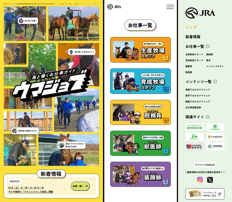
馬に関わる7職種を紹介するJRAの情報サイト。鮮やかな黄色、写真コラージュ、キャラクター、職種別の配色を組み合わせ、PCでは三分割、スマートフォンでは縦一列に展開します。
オリジナルサイトを見るUmajob / JRA — Style Reference
A bright equine career guide built from documentary photographs, comic characters, and bold outlined labels.
Website: Umajob Original URL: https://jra-fun.jp/umajob/ Final URL: https://jra-fun.jp/umajob/ Theme: a light interface with a vivid yellow identity field, white reading surfaces, and a pale green desktop navigation rail. Inspected: supplied browser session retrieved September 12, 2026, at 05:23:53.790 JST / September 11, 2026, at 20:23:53.790 UTC. Viewports: 1440 × 1000 desktop and 390 × 844 mobile. The corresponding document widths were 1425px and 375px. Scope: the current homepage, represented by three desktop captures, two mobile captures, and rendered DOM/computed-style evidence at both viewports. Coverage includes the photo collage, news, seven career links, relationship-chart entry, video and interview sections, additional content links, brochure promotion, social links, and footer. Linked pages, video playback, menu opening, and chart activation were not inspected.
Umajob is a career information hub. It introduces seven horse-related occupations through job profiles, videos, interviews, manga, numerical information, and a matching quiz. Its visual identity combines real working environments with illustrated characters: feeding, grooming, training, riding, and handling horses become approachable subjects through bright colors and playful graphic lettering.
The defining desktop composition has three unequal regions. A large yellow photo collage fills the left, a phone-width reading column runs through the middle, and a pale green navigation rail occupies the right. Heavy black vertical separators make this division explicit. Across the supplied scrolled captures, the collage, its lower information dock, and the navigation remain in place while the middle content changes. On mobile, the collage and news join the vertical reading sequence beneath a compact JRA header.
How to Read This Reference
- Measured values come from supplied element rectangles or computed styles. Values are in CSS pixels unless stated otherwise.
- Calculated values are arithmetic derived from those measurements, such as the gap between adjacent carousel slides.
- Visual estimates describe screenshot appearance. Their hexadecimal colors and dimensions are approximations, not sampled pixels or recovered CSS declarations.
- Recommendations and the Quick Start are implementation guidance for a new project. They are not claims about the original source code.
- Token names beginning with
--uj-are descriptive aliases introduced here. The supplied custom-property sample exposed--swiper-theme-color: #007aff, but did not establish that blue as a visible brand color. - A computed rectangle does not prove that an element was visible. The evidence includes navigation content and a mobile quiz strip that do not appear in the supplied screenshots. Bounding rectangles may also include reveal transforms.
- The 15px difference between viewport width and document width is consistent with the capture environment reserving scrollbar space. Do not reproduce it as intentional right padding.
Tokens — Colors
Default Palette
| Name | Value | Suggested token | Role and evidence |
|---|---|---|---|
| Identity Yellow | Approximately #FFE53B |
--uj-yellow |
Large collage field and lower promotional/video backgrounds. Visual estimate; exact declaration was not supplied. |
| Reading White | #FFFFFF |
--uj-white |
Root surface, footer, social tiles, and brochure button container surfaces. Computed value. |
| Outline Black | #000000 |
--uj-ink |
Text, graphic outlines, separators, navigation, and content tabs. Computed text and tab color; line appearance also visible. |
| Navigation Mint | Approximately #E7F3E2 |
--uj-mint |
Quiet background of the desktop right rail. Visual estimate; exact declaration was not supplied. |
| Action Orange | #FE6213 |
--uj-action |
Brochure CTA, more-videos CTA, and breeding-career detail CTA. Computed value. |
| News Lime | #D9E471 |
--uj-news |
News-list button. Computed value. |
| Quiz Pink | #F7C7C6 |
--uj-quiz |
Desktop matching-quiz panel and a mobile quiz strip represented in the DOM. Computed value. |
| Warm Cream | #FFF3CD |
--uj-cream |
Breeding and stable-staff description capsules. Computed value; visually similar to the news inset. |
| Cool Pale Blue | #DFF2FC |
--uj-pale-blue |
Training and veterinary description capsules. Computed value. |
The metadata palette uses the same approximate Identity Yellow and Navigation Mint as this table. These two values require verification before a pixel-exact implementation.
Yellow gives the site its immediate identity, while white provides pauses for reading. Black is unusually assertive: it outlines the wordmark, separates the desktop regions, frames buttons, and anchors small labels. Orange is an action color with a different value from the amber breeding-career card.
Career Category Palette
The seven categories have stable color assignments in the supplied DOM. These colors recur on career cards and corresponding detail links in the video sections.
| Career | Card fill | Description-capsule fill | Detail CTA fill |
|---|---|---|---|
Breeding-farm staff — 生産牧場スタッフ |
#F49B17 |
#FFF3CD |
#FE6213 |
Training-farm staff — 育成牧場スタッフ |
#23B3D3 |
#DFF2FC |
#23B3D3 |
Stable staff — 厩務員 |
#FCC92C |
#FFF3CD |
#FCC92C |
Veterinarian — 獣医師 |
#2FA438 |
#DFF2FC |
#2FA438 |
Farrier — 装蹄師 |
#845BA3 |
#EEDEED |
#845BA3 |
Jockey — 騎手 |
#E9473B |
#FEFCE2 |
#E9473B |
Instructor — インストラクター |
#E84994 |
#FEEFE2 |
#E84994 |
The active desktop トップ link uses the breeding-card amber, #F49B17. No theme selector or alternate color mode appears in the supplied captures.
Tokens — Typography
Declared Japanese Sans-Serif Stack
Computed family: "Noto Sans JP", "Zen Kaku Gothic New", sans-serif.
This stack appears throughout the sampled DOM. The evidence establishes the declared family order, but does not identify the actual font file used for every glyph. Do not describe both named fonts as independently verified rendered faces.
Most interface text is bold, with measured weights of 700. Secondary mobile text and the footer use 500. A mobile quiz title represented in the DOM uses 800.
The root has a measured 10px font size and 11.5px line height. This is not the visual size of the large headings: many heading containers carry graphic lettering or styled descendants that were not separately sampled.
Graphic Lettering
The large ウマジョブ wordmark is artwork with white faces, thick black contours, a strong diagonal silhouette, and an irregular right edge. Its smaller supporting line, 馬と働くお仕事ガイド, belongs to the same composition. Preserve this as an authorized graphic rather than trying to reproduce it by italicizing a normal heading.
Career names similarly use expressive white lettering with black outlines. Their visible scale is much larger than the enclosing paragraph's computed 10px. The exact lettering fonts and asset formats were not supplied.
Section headings such as お仕事一覧 sit inside white capsules. Their visible lettering is approximately 26–29px high in the captures, with a heavy Gothic appearance. This is a visual estimate, not a recovered font-size declaration.
Type Scale
| Role | Size / line height | Weight | Evidence and use |
|---|---|---|---|
| Root and many graphic wrappers | 10px / 11.5px |
700 |
Measured; do not apply this to the visible artwork inside them. |
| Career-description capsule | 9.75px / 16.25px |
700 |
Measured on all seven cards. |
| Desktop rail sublink | 12px / 18px |
700 |
Measured on career and content links. |
| Desktop news date and event link | 12px / 22px |
700 |
Measured in the left information dock. |
| PDF CTA | 13px / 16.25px |
700 |
Measured, including the visible PDFを見る label. |
| Mobile news date | 13px / 16.25px |
700 |
Measured in the inline news section. |
| Mobile event link | 14.625px / 19.5px |
500 |
Measured; more relaxed than desktop news text. |
| Footer | 14.625px / 19.5px |
500 |
Measured at both viewports. |
| Brochure supporting sentence | 16.25px / 22.75px |
700 |
Measured. |
| Relationship-chart introduction | 19.5px / 32.5px |
700 |
Measured; three centered lines. |
| Additional-content black tab | 19.5px / 26px |
700 |
Measured. |
| Desktop rail primary link | 20px / 20px |
700 |
Measured on トップ and 新着情報. |
| Section capsule lettering | Approximately 26–29px |
Visually heavy | Screenshot estimate; wrapper measurements are not glyph sizes. |
The navigation variant inside the header has measured primary links at 22.75px / 32.5px and sublinks at 14.625px / 19.5px, weight 500 for the sublinks. That variant is represented in the DOM, but its opened appearance was not captured.
Tracking is normal in the sampled text. Avoid introducing broad letter spacing across Japanese headings. The energy comes from weight, outlined graphics, and spatial composition.
Tokens — Spacing & Shapes
Fractional values such as 3.25, 6.5, 13, 16.25, and 32.5px repeat throughout the measured central/mobile interface. They form a useful reconstruction scale, but the evidence does not expose the original formula that produced them. The left desktop dock and right rail also use whole-pixel dimensions such as 20, 40, 48, and 160px.
Spacing Scale
| Use | Value | Status |
|---|---|---|
| Fine component outlines | Approximately 1px |
Visible estimate; also consistent with social-tile inner geometry. |
| Capsule vertical padding | 3.25px |
Measured. |
| Capsule horizontal padding | 6.5px |
Measured. |
| Header horizontal inset | 16.25px |
Calculated from measured logo and header positions. |
| Career-card horizontal padding | 13px |
Measured. |
| Career-card vertical padding | 19.5px |
Measured. |
| Adjacent video-slide gap | 16.25px |
Calculated from a 341.25px stride and 325px slide width. |
| Standard central content inset | 32.5px |
Measured through card positions. |
| Gap between the first four visible career cards | 32.5px |
Calculated from their rectangles. |
| Footer vertical padding | 32.5px |
Measured. |
| Desktop collage outer inset | Approximately 20px |
Visible in the captures; lower quiz link also begins at x = 20px. |
| Desktop rail left inset | Approximately 40px |
Derived from the visible rail boundary and measured link positions. |
Border Radius
| Element | Value | Evidence |
|---|---|---|
| Career card | 13px |
Computed. |
| Career-description capsule | 32.5px |
Computed; effectively pill-shaped at its height. |
| Main action links | 9999px |
Computed. |
| Desktop quiz panel | 16px |
Computed. |
| Social tile | 8.125px |
Computed. |
| Additional-content tab | 13px 13px 13px 0 |
Computed; square lower-left attachment corner. |
| Section heading capsule | Fully rounded | Visible appearance; exact radius was not supplied. |
| Hero photograph corners | Square | Visible appearance. |
Layout Measurements
| Element | Desktop | Mobile | Evidence |
|---|---|---|---|
| Document width | 1425px |
375px |
Measured within the reported viewports. |
| Central reading region | 390px, starting at x = 738.5px |
375px, starting at x = 0 |
Measured header/main rectangles. |
| Left yellow region | Approximately 732px wide |
Becomes inline content | Calculated from the supplied desktop composition. |
| Black vertical separators | Approximately 6.5px each |
Not present | Geometry and screenshot correspondence. |
| Right navigation region | Approximately 290px wide |
Not visible | Screenshot geometry. |
| Header | 390 × 73.125px |
375 × 73.125px |
Measured. |
| Header JRA mark | 75.5625 × 28.328px |
Same | Measured. |
| Hamburger glyph/button rectangle | 39 × 23.5625px |
Same | Measured; an enlarged touch target was not established. |
| Hero H1 graphic box | 506.734 × 219.766px |
357.5 × 155.188px |
Measured. |
| First two career cards | 325 × 136.641px |
310 × 136.641px |
Measured. |
| Remaining career-card heights | Approximately 134.438px |
Approximately 134.438px |
Measured. |
| Portrait video button | 325 × 577.766px |
Same | Measured; approximately 9:16. |
| Career detail CTA | 282.75 × 57.25px |
Same | Measured. |
| PDF CTA | 143.313 × 57.25px |
Same | Measured. |
| Social tile | 95.875 × 95.875px |
Same | Measured. |
| Footer | 390 × 103.969px |
375 × 103.969px |
Measured. |
| Document height | 5591.547px |
6494.406px |
Measured; not a fixed-height design requirement. |
Some below-fold desktop heading rectangles are 273 × 41.212px, while the initial heading is 58.875px high and later screenshots show full-size capsules. The smaller dimensions numerically match a 0.7-scaled 390 × 58.875px box. Because the active transform was not supplied, treat these as potentially reveal-state measurements rather than a separate permanent heading size.
Components
Desktop Three-Region Frame
Role: retain the project's identity and navigation while visitors explore a long content sequence.
The left region is almost twice the width of the middle reading column. Its photo mosaic occupies most of the height, with a quiz panel and a news panel arranged below. A thick black strip separates it from the white central column. Another black strip separates that column from the pale green rail.
The outer regions stay at consistent viewport positions across the three desktop captures. This establishes the persistent visual behavior. The provided style sample does not identify whether each region uses fixed, sticky, or another positioning implementation. It also does not prove that the middle has its own independent scroll container.
For reuse, preserve a normal document scroll with persistent desktop side regions unless further inspection establishes another requirement. The key relationship is a narrow continuous story between stable visual anchors.
Compact JRA Header
Role: maintain official identity and access to navigation.
A white strip approximately 73px high contains the black JRA mark at the left and a three-line hamburger at the right. The logo has a measured 16.25px left inset. Both elements are vertically centered, with generous empty space between them.
This header appears at the top of the central desktop column and across the mobile document width. It remains at the top in the supplied lower-page captures. It does not span the desktop collage or the right rail.
The hamburger is a real button in the DOM. Its opened state, animation, focus behavior, and dismiss behavior were not exercised.
Photo-Mosaic Hero
Role: communicate the range and physical reality of working with horses.
Use a dense arrangement of rectangular photographs with yellow gutters. Mix large and small tiles, landscape and portrait crops, and different working environments. The images show people leading horses, feeding, washing, grooming, riding, and working in fields or stables. Seasonal contrast, including snow and green pasture, adds variety.
The oversized wordmark overlaps multiple photographs near the center. Its strong black-and-white silhouette remains legible despite the busy background. It is not placed inside a separate neutral text box.
Small white quote capsules float over selected photographs. Each combines a circular person thumbnail with a short black statement, such as 命に近い仕事! or 大変なはずなのに、大変じゃない!. Rounded corners and thin dark outlines make them feel like compact testimonials or speech labels.
The desktop captures show a broad, landscape-oriented mosaic area. The phone capture reorganizes it into a tall composition of roughly 343 × 577px, estimated from the image. The mobile logo extends slightly beyond the photograph grid's horizontal edges. Preserve independent mobile art direction instead of shrinking the entire desktop mosaic into a tiny strip.
Photo positions and visible quotes differ between captures. These differences do not establish the timing, direction, or trigger of any ongoing animation.
News and Matching-Quiz Dock
Role: keep a current update and a playful exploration entry point prominent.
On desktop, two panels sit near the bottom of the yellow left region:
- The quiz panel is a measured
280 × 150pxpink link with a16pxradius. A black title tab overlaps its top. Character artwork, large question graphics, a small speech bubble, and a yellow horseshoe-shaped arrow make the compact panel visually dense. - The news panel is approximately 402px wide in the screenshot. A white outlined outer box contains a pale cream inset, a white date stamp, an underlined event link, and a lime rounded
新着一覧へlink. A dotted vertical accent separates the text from the action.
The captured news item is dated 2026.05.01. Treat it as current content in this inspection, not permanent design copy.
On mobile, the news becomes a full-width section after the collage, before the career list. Its title capsule overlaps the top of the inner news panel. The event link increases from desktop 12px / 22px bold text to mobile 14.625px / 19.5px medium text, and the archive link sits below it.
The mobile DOM also represents a separate pink matching strip with a close button. That strip is absent from the supplied visible mobile frames. Its trigger, persistence, and dismissal behavior are unverified; do not include it in a screenshot reconstruction by default.
Section Heading Capsule
Role: mark transitions in a long, narrow content stream.
A centered white pill holds a short, heavy black Japanese heading. Its edge is a thin black line. Small pastel-colored backing edges are visible along the lower and right sides, creating a shallow printed-sticker effect. The offset is approximately 2–4px by visual estimate.
Widths follow the copy. The compact お仕事一覧 pill is narrower than the long パンフレットはコチラ! pill. The social heading adds a small overline above SNSもチェック! and becomes taller.
Keep this backing crisp. The effect comes from a slight misregistration of flat layers, with no diffuse elevation shadow.
Career Card
Role: offer an immediately recognizable route into one of seven occupations.
Each card is a complete anchor with this anatomy:
- A category-colored rounded rectangle with a fine black outline and a subtle square grid texture.
- A rectangular documentary photograph on the left.
- A small illustrated worker-and-horse composition overlapping the photo and its lower/right area.
- A pale description capsule above the job name.
- Large white job lettering with a strong black outline.
- A small horseshoe-shaped arrow near the lower-right corner.
The measured grid tracks are 115.375px and 164.125px, with 19.5px 13px padding. Card width changes from 325px in the desktop column to 310px on mobile while those reported track sizes stay the same. The source therefore preserves compact internal artwork dimensions rather than scaling every part proportionally.
The first description reads 命の誕生を支え、育む; others connect each occupation to a concrete task. Maintain the relationship between photograph, character, color, and job title. Use a single meaningful link for the full card rather than independent competing targets on every visual part.
The farrier description includes a reading for 蹄 as ひづめ. Preserve that reading through appropriate ruby markup or equivalent accessible text.
Career Relationship-Chart Entry
Role: explain how the occupations relate to stages of a horse's development.
The DOM supplies a section heading, a three-line centered introduction at 19.5px / 32.5px, and a large button measuring 390 × 425.75px on desktop and 375 × 409.375px on mobile.
The actual chart artwork and activated state are not visible in the supplied captures. Its diagram structure, zoom behavior, and possible overlay cannot be specified from the button's presence alone. Preserve the large diagram-entry area without inventing chart contents or a modal interaction.
Portrait Video Carousel
Role: make each occupation understandable through a person and a practical example.
The visible middle-page desktop capture shows a portrait media poster with a worker and a horse, a large white triangular play symbol outlined in black, category-colored framing, and prominent Japanese lettering near the lower portion of the image.
The measured video button is 325 × 577.766px, approximately 9:16. Adjacent slide origins differ by 341.25px, giving a calculated 16.25px gap. The next slide peeks into the available side space. Yellow horseshoe-shaped previous/next controls appear near the media edges.
A rounded category-colored detail link sits below each poster. The first uses 生産牧場スタッフの仕事を詳しく見る and measures 282.75 × 57.25px.
The DOM contains seven job entries. This supports the carousel's content set and horizontal arrangement, but not successful playback, swiping, looping, or autoplay. The screenshot's play triangle is an affordance, not evidence that a video was started.
Interview Carousel
Role: add personal experience to the practical job introduction.
The 先輩に聞いてみた! section repeats the portrait-media and career-detail-link structure. In the visible poster, a worker's face is prominent and a top caption identifies the person and occupation.
Keep the interview module visually related to the preceding practical-video module. Both use tall media, the same narrow column, category colors, and large capsule headings. A dotted horizontal separator creates a light division within the yellow field.
The section ends with a larger orange もっと他の動画も見てみる link, measured at 299.375 × 73.5px. Its destination is the site's movie index; that destination was not inspected.
Additional-Content Banner
Role: offer alternate ways to explore the subject.
Three linked banners lead to manga, job matching, and numerical information. The measured banner boxes are approximately 325 × 182.672px on desktop and 310 × 174.3–174.7px on mobile, close to a 16:9 proportion.
A black label tab overlaps the banner at the upper left. It uses white 19.5px / 26px bold text, 6.5px 13px padding, and a 13px 13px 13px 0 radius. The square lower-left corner makes the tab appear attached to the image.
The supplied screenshots do not show every banner completely. Their link destinations, dimensions, and tab styling are supported by the DOM; detailed unseen illustration compositions are not specified here.
Brochure Promotion
Role: offer a portable overview of the careers and interviews.
A large section capsule introduces a white rounded card on yellow. The card contains a centered supporting sentence, a graphic showing the brochure cover and an open spread, and the orange PDFを見る link with a small overlapping-squares symbol.
The card is approximately 321px wide in the screenshots. Its thin black border and moderate rounded corners match the restrained container treatment elsewhere. The brochure graphic is centered and displayed as a complete object, with white space around it.
The CTA is measured at 143.313 × 57.25px, with 19.5px 26px padding, a 13px icon gap, and a fully rounded radius. The DOM links directly to /umajob/assets/documents/pamphlet.pdf. The document itself was not opened, and new-tab or download behavior was not established.
Social Links and Footer
Role: finish the content sequence with clear follow-up destinations.
The social heading combines a small ウマジョブ公式 line with the larger SNSもチェック! inside a white capsule. Two white outlined tiles below contain the Instagram and X marks.
Each tile measures 95.875px square with an 8.125px radius. Their calculated horizontal gap is approximately 20.3125px. The icons retain their familiar brand appearances: the Instagram gradient is confined to its logo, and X appears in black and white.
A simple white footer follows. It uses two centered lines, 14.625px / 19.5px, weight 500, with 32.5px vertical padding. Its text credits Japan Racing Association. This provides direct on-page JRA identity evidence; the inspected page does not provide a named production credit.
Desktop Navigation Rail
Role: provide a persistent directory of the site's topics and related organizations.
The pale green rail starts with a larger JRA mark, measured at 160 × 60px. Below it, bold primary entries and section labels are separated by substantial vertical gaps. The current トップ link is amber.
The jobs group uses two compact columns. Additional content links stack vertically. Section labels have small outlined circular minus symbols in the visible state. These look expandable, but collapse behavior was not tested.
Six related-site logos appear in a two-column, three-row arrangement of white rectangular tiles. A dotted white divider separates them from a social area with a white label capsule, a short supporting line, and smaller Instagram/X marks.
The rail is a directory, not a list of production partners. The organization logos should not be interpreted as site-creation credits.
Tokens — Motion & Interaction
The following values are present in the supplied computed styles. They define available transitions; their presence does not prove that every corresponding transition was observed from start to finish.
| Element or treatment | Recorded transition | What is supported |
|---|---|---|
| Hero H1 | Opacity 0.4s, delay 0.2s; transform 1.8s, delay 0.2s, custom linear(...) easing |
A long transform reveal with an oscillating easing definition. Initial/final transform values were not supplied. |
| Section headings | Opacity 0.3s, delay 0.3s; transform 1.3s, delay 0.3s, custom linear(...) easing |
A recurring spring-like heading reveal definition. |
| Career-description capsules | Opacity 0.4s cubic-bezier(0.215, 0.61, 0.355, 1), delay 0.7s |
Delayed description fade definition. |
| Career title graphics | Clip path 0.4s and opacity 0.35s, same easing, delay 0.7s |
A reveal combining clipping and fading; clipping endpoints were not supplied. |
| Relationship introduction and chart button | Transform and opacity 0.65s cubic-bezier(0.25, 0.46, 0.45, 0.94), delay 0.3s |
Coordinated content-reveal definition. |
| Mobile news section | Transform and opacity 0.65s, delay 0.1s |
A separate news reveal definition. |
| Navigation and some utility links | Opacity 0.3s cubic-bezier(0.25, 0.46, 0.45, 0.94) |
Opacity feedback is defined; its target opacity was not supplied. |
| PDF, more-videos, and news-list links | Box shadow 0.2s cubic-bezier(0, 0, 0.58, 1) |
Shadow feedback is defined; exact interaction-state shadows were not supplied. |
| News event link | Text-decoration color 0.2s with the same ease-out curve |
Underline-color feedback is defined. |
| Additional-content tabs | Transform 0.3s cubic-bezier(0.25, 0.46, 0.45, 0.94) |
A short tab transformation is defined; its displacement was not supplied. |
The custom heading/H1 easing rises beyond 1 to approximately 1.4418, falls below 1, and settles through diminishing oscillations. This is easing progress, not evidence that an element becomes exactly 144.18% of its normal scale. The affected transform endpoints remain unknown.
Many sampled elements report animation: none or a bare transition: all. Neither justifies inventing a continuous animation. The capture process also temporarily paused perpetual animations during readiness checks and resumed them afterward.
Interaction limits: navigation destinations and button elements are present; playback, menu opening, slider advancement, chart activation, quiz dismissal, keyboard focus behavior, and hover results were not exercised. Different collage frames suggest changing presentation, but do not establish autoplay cadence or scroll-linked movement.
Surfaces
| Surface | Appearance | Function |
|---|---|---|
| Identity field | Saturated yellow | Holds the collage and energetic promotional sections. |
| Reading field | White | Separates the career list and content banners from the photo density. |
| Navigation field | Pale green | Provides a quieter persistent directory. |
| Career card | Category color, fine square grid, black outline | Encodes occupation and supports layered image/character content. |
| Heading sticker | White pill, black edge, small pastel backing offsets | Creates a recurring section marker. |
| News inset | Pale cream with a white date stamp | Groups a compact update within the white panel. |
| Action capsule | Orange or category color, outlined edge | Provides a clear route to a detail page or resource. |
| Content tab | Solid black with white type | Attaches a title to a promotional banner. |
| Footer | Plain white with centered text | Ends the sequence quietly. |
There is no general soft-shadow elevation system in the supplied appearance. Structure comes from flat color, crisp outlines, small offset layers, and artwork overlap.
Imagery
The photography is documentary and varied. People wear practical clothing and appear beside animals, tools, stable equipment, and training spaces. Preserve the close relationship between person and horse. A feed bucket, hand on a horse's face, or lead rope can communicate the work as strongly as a riding photograph.
The illustrations provide a second visual register: compact characters with large heads, readable uniforms, expressive horses, and heavy dark contours. Their category colors coordinate with the surrounding cards. The contrast between realistic photographs and simplified figures is central to the design.
Use square crops for collage tiles and leave the composite wordmark uncropped. Use portrait crops for video posters, keeping the worker and animal readable behind the play control and large lettering. Display the brochure as an intact publication graphic. Related-organization marks belong in clean white rectangles.
Do not apply pixelated rendering, duotone processing, or a uniform cinematic color grade. The photographs retain full-color environments; the graphic artwork supplies the stronger stylization.
Observed Asset References
The evidence does not expose image src values or an image-asset manifest. No image filenames should be inferred.
| Asset or resource | Observed evidence | Reuse guidance |
|---|---|---|
| JRA marks | Visible in the compact header and desktop rail | Preserve the supplied proportions; use authorized mark assets. |
| Umajob wordmark | Visible over both desktop and mobile mosaics | Treat as authored artwork; no font or format was established. |
| Career photos and illustrated figures | Visible together on the first four career cards | Keep job-specific pairings and category colors. |
| Hero photographs and quote graphics | Visible in all hero captures | Prepare separate desktop/mobile placement rules. |
| Video/interview posters | Visible in the middle desktop capture; dimensions supplied in DOM | Keep portrait proportions and legible overlay content. |
| Brochure preview | Visible in desktop and mobile lower-page captures | Keep the entire cover/spread graphic visible. |
| Brochure destination | pamphlet.pdf | Link observed in DOM; document content was not inspected. |
| Social destinations | Instagram and X | Links observed in DOM; destination pages were not inspected. |
Layout & Responsive Behavior
Desktop
At the measured 1425px document width, the composition is approximately:
732px identity panel + 6.5px separator + 390px reading column + 6.5px separator + 290px navigation rail.
The central column begins at x = 738.5px. Regular career cards have 32.5px side insets, giving a 325px width. The column remains narrow even though the overall browser is wide. The first desktop capture begins directly with the career list beneath the header because the hero and news are already visible in the left region.
The desktop document is approximately 5592px high. The side regions remain visible while different middle sections appear, including the video content and the final brochure/social area. Do not convert the career list into a multi-column desktop card grid.
Mobile
At the reported 390px viewport, the document itself is 375px wide. The persistent header is followed by:
- The tall photo mosaic and overlapping wordmark.
- The inline news panel.
- The seven career cards.
- The career relationship-chart entry.
- Practical videos and interviews.
- Additional content banners.
- Brochure, social links, and footer.
The right navigation rail disappears from the visible layout. The hamburger remains available, but its opened presentation is unverified.
Regular cards use the same 32.5px side inset, so their width becomes 310px. Portrait video posters remain 325px wide, centered with 25px margins. Do not assume every central component shares one identical inner width.
The hero H1 graphic is 357.5px wide on mobile. The supplied image shows it nearly spanning the document, with substantially larger relative presence than a simple proportional reduction of the desktop layout would produce.
The footer and social tiles retain their desktop measurements. The mobile document is roughly 903px taller than the desktop document, consistent with the hero and news entering the content flow, alongside other responsive differences.
Unverified Breakpoints and States
Only the two stated viewports were supplied. Tablet layouts, landscape phones, very short desktop windows, larger text settings, and the exact media-query thresholds were not inspected. The Quick Start uses a recommended breakpoint rather than claiming to recover the original one.
The mobile bottom capture shows the fixed header covering part of the heading above the brochure card at that scroll position. For a new implementation, give anchor targets suitable scroll margins so navigation does not leave headings hidden beneath the header.
Do’s and Don’ts
Do
- Preserve the broad collage, narrow story, and quiet navigation relationship on desktop.
- Move the hero and news into the mobile reading sequence.
- Keep the seven career colors and their photo/character pairings consistent.
- Distinguish breeding-card amber
#F49B17from action orange#FE6213. - Use documentary photographs of actual work, alongside expressive illustrated figures.
- Keep the large black-and-white wordmark as authored artwork.
- Use compact white heading capsules with thin black borders and slight colored backing offsets.
- Keep career cards as complete links with a photo, character, description, title, and directional cue.
- Preserve portrait media and the small preview of adjacent carousel content.
- Retain the simple white footer after the saturated lower-page sections.
Don't
- Don't stretch the middle column across the desktop or turn its career list into a broad grid.
- Don't replace the mosaic with a single generic horse photograph.
- Don't use yellow, orange, or category colors interchangeably.
- Don't interpret a graphic wrapper's
10pxcomputed font size as the visible title size. - Don't give every panel a large soft shadow, glass effect, or glossy gradient.
- Don't crop the wordmark, brochure preview, or organization logos as ordinary cover images.
- Don't infer autoplay, parallax, menu animation, or video playback from still captures.
- Don't reproduce hidden DOM navigation as an always-visible mobile menu.
- Don't hardcode the capture environment's 15px scrollbar reservation as a page margin.
- Don't treat related-site logos as production credits.
Recommended Implementation Additions
These are recommendations for a new implementation, not verified features of the inspected site:
- Give image-based career names accessible text and give icon-only menu, carousel, social, and close controls explicit names. The supplied text extraction does not include enough attributes for an accessibility verdict.
- Keep a single semantic H1 and a coherent reading order when the hero and news change position between layouts. Avoid duplicate focusable news links solely to satisfy desktop placement.
- Increase the menu hit area to at least 44 × 44px while preserving the measured 39px-wide glyph.
- Review the small
9.75pxcareer descriptions. For new or longer copy, use 12–14px text and permit wrapping instead of shrinking it further. - Check contrast for small white text on orange, yellow, cyan, and other category fills. Use darker text or an adjusted action surface where necessary while retaining the category color elsewhere.
- Provide keyboard-operable carousel controls, an understandable current-slide state, and captions/transcripts for videos. Keep playback intentional.
- Support reduced motion and show content by default if reveal scripting fails. Any verified continuous collage motion should have a static alternative.
- Use
scroll-margin-topfor destinations beneath the persistent header. If implementing a dismissible mobile quiz strip, ensure it does not cover links or the footer. - Test 320–375px widths and text enlargement: the reported fixed card tracks leave little spare room in a 310px card.
Agent Prompt Guide
Quick Color Reference
- Identity background: approximately
#FFE53B; verify before exact matching. - Reading surfaces:
#FFFFFF. - Text, outlines, and separators:
#000000. - Desktop navigation background: approximately
#E7F3E2; verify before exact matching. - Main action:
#FE6213. - News action:
#D9E471. - Quiz panel:
#F7C7C6. - Career fills: amber
#F49B17, cyan#23B3D3, yellow#FCC92C, green#2FA438, purple#845BA3, red#E9473B, and pink#E84994.
Overall Prompt
“Create a Japanese equine career information hub inspired by Umajob. On desktop, place a large yellow photo mosaic at the left, a 390px reading column between strong black vertical separators, and a pale green navigation rail at the right. Overlay the collage with an authorized bold black-and-white wordmark and small white testimonial capsules with circular portraits. Use the declared Noto Sans JP / Zen Kaku Gothic New sans-serif stack for interface text. Build seven single-column career cards from documentary photography, overlapping illustrated workers and horses, category-colored grid backgrounds, pale description pills, outlined title artwork, and horseshoe-shaped arrows. Continue with portrait videos, interviews, content banners, a brochure card, and social tiles. On mobile, place the header, tall collage, news, and content into one vertical sequence. Keep outlines crisp and heading backing offsets small.”
Example Component Prompts
- Career card: “A 325px-wide amber career link with a 13px radius, fine black outline, and faint square grid. Put a working-with-horses photograph on the left and overlap a small illustrated worker/horse pair near its lower edge. Place a cream task-description capsule above large outlined white job lettering on the right. Finish with a small horseshoe-shaped arrow. Preserve the complete card as one accessible link.”
- Photo hero: “Create an art-directed collage of horse-care and training photographs with square corners and vivid yellow gutters. Use varied tile sizes, practical working scenes, and both green pasture and winter settings. Center a large authorized diagonal wordmark over the mosaic and add several compact white quote labels with circular worker portraits. Prepare a separate tall mobile arrangement.”
- Section heading: “A content-width white pill with heavy black Japanese lettering, a fine black outline, and a 2–4px pastel backing edge along the bottom and right. Keep the effect flat and crisp. Let longer labels widen the pill instead of reducing their font size.”
- Video module: “A centered 325px-wide 9:16 documentary poster on yellow, with a large outlined white play triangle, category-colored framing, and bold artwork lettering near the bottom. Show a narrow slice of the next poster and horseshoe-shaped arrow controls. Add a rounded career detail link below. Implement real controls only when playback and carousel behavior are defined.”
- Brochure and social ending: “On a yellow field, place a white outlined card with a centered supporting sentence, an intact brochure cover/spread graphic, and an orange pill labeled
PDFを見る. Follow with a white capsule heading and two approximately 96px square outlined social tiles. End with a plain white footer and two centered lines of small text.”
Quick Start
CSS Custom Properties
This is a reusable adaptation, not recovered source CSS. It keeps a conventional root font size and expresses measured component dimensions directly in pixels. The yellow and mint colors, texture pitch, heading backing, and desktop breakpoint are approximations or recommendations.
The suggested shell contains .brand-panel with .hero-mosaic and .hero-dock; .reading-column with .site-header, .story-content, and .site-footer; and .nav-rail. On mobile, display: contents lets these components form the visible header → hero → news → content → footer sequence. Compose the HTML with one accessible hero and one news item, and verify its reading order.
Populate the mosaic with art-directed image placements and supply authorized logo, title, character, and arrow assets. CSS alone does not reproduce those assets. This starter does not implement menu, video, carousel, or reveal-state logic.
:root {
  /* Visual estimates: verify these two colors against original assets. */
  --uj-yellow: #ffe53b;
  --uj-mint: #e7f3e2;

  /* Computed colors from the supplied page evidence. */
  --uj-white: #ffffff;
  --uj-ink: #000000;
  --uj-action: #fe6213;
  --uj-news: #d9e471;
  --uj-quiz: #f7c7c6;
  --uj-cream: #fff3cd;
  --uj-pale-blue: #dff2fc;
  --uj-breeding: #f49b17;
  --uj-training: #23b3d3;
  --uj-stable: #fcc92c;
  --uj-vet: #2fa438;
  --uj-farrier: #845ba3;
  --uj-jockey: #e9473b;
  --uj-instructor: #e84994;

  --uj-font: 'Noto Sans JP', 'Zen Kaku Gothic New', sans-serif;
  --uj-text-tag: 9.75px;
  --uj-text-small: 13px;
  --uj-text-body: 14.625px;
  --uj-text-heading: 28px; /* Visual approximation. */

  --uj-space-1: 3.25px;
  --uj-space-2: 6.5px;
  --uj-space-4: 13px;
  --uj-space-5: 16.25px;
  --uj-space-6: 19.5px;
  --uj-space-10: 32.5px;

  --uj-header-height: 73.125px;
  --uj-column-width: 390px;
  --uj-rail-width: 290px;
  --uj-separator: 6.5px;
  --uj-radius-card: 13px;
  --uj-radius-tile: 8.125px;
  --uj-link-motion: 300ms cubic-bezier(.25, .46, .45, .94);
  --uj-button-motion: 200ms cubic-bezier(0, 0, .58, 1);
}

* {
  box-sizing: border-box;
}

body {
  margin: 0;
}

.umajob-shell {
  display: flex;
  flex-direction: column;
  min-height: 100dvh;
  color: var(--uj-ink);
  background: var(--uj-yellow);
  font-family: var(--uj-font);
  font-weight: 700;
}

.brand-panel,
.reading-column {
  display: contents;
}

.site-header {
  order: 0;
  position: sticky;
  top: 0;
  z-index: 20;
  display: flex;
  align-items: center;
  justify-content: space-between;
  flex: 0 0 var(--uj-header-height);
  height: var(--uj-header-height);
  padding-inline: var(--uj-space-5);
  background: var(--uj-white);
}

.header-logo {
  display: block;
  width: 75.5625px;
  height: auto;
}

.menu-button {
  display: grid;
  place-items: center;
  min-width: 44px; /* Recommended hit area, larger than the observed glyph. */
  min-height: 44px;
  padding: 0;
  border: 0;
  color: inherit;
  background: transparent;
  cursor: pointer;
}

.menu-glyph {
  position: relative;
  display: block;
  width: 39px;
  height: 23.5625px;
  border-block: 2px solid currentColor;
}

.menu-glyph::after {
  content: '';
  position: absolute;
  inset-inline: 0;
  top: 50%;
  height: 2px;
  background: currentColor;
  transform: translateY(-50%);
}

.hero-mosaic {
  order: 1;
  position: relative;
  isolation: isolate;
  aspect-ratio: 343 / 577; /* Mobile screenshot approximation. */
  margin: var(--uj-space-5) var(--uj-space-5) 0;
  background: var(--uj-yellow);
}

.mosaic-grid {
  position: absolute;
  inset: 0;
  display: grid;
  grid-template-columns: repeat(6, minmax(0, 1fr));
  grid-template-rows: repeat(10, minmax(0, 1fr));
  gap: 8px; /* Adaptation: author individual tile spans in the template. */
  overflow: hidden;
}

.mosaic-grid img {
  display: block;
  width: 100%;
  height: 100%;
  min-width: 0;
  min-height: 0;
  object-fit: cover;
}

.hero-logo {
  position: absolute;
  z-index: 2;
  top: 48%;
  left: 50%;
  width: calc(100% + 15px);
  margin: 0;
  transform: translate(-50%, -50%);
}

.hero-logo img {
  display: block;
  width: 100%;
  height: auto;
}

.hero-dock {
  order: 2;
  padding: 60px var(--uj-space-10) 48.75px;
}

.quiz-card {
  display: none;
}

.news-card {
  position: relative;
  min-width: 0;
  padding: var(--uj-space-5);
  border: 1px solid var(--uj-ink);
  border-radius: 16px;
  background: var(--uj-white);
}

.news-inner {
  padding: var(--uj-space-4);
  border-radius: 9px;
  background: var(--uj-cream);
}

.news-date {
  display: inline-block;
  margin: 0 0 var(--uj-space-2);
  padding: var(--uj-space-1) var(--uj-space-2);
  background: var(--uj-white);
  font-size: 13px;
  line-height: 16.25px;
}

.news-link {
  display: block;
  color: inherit;
  font-size: 14.625px;
  font-weight: 500;
  line-height: 19.5px;
  text-underline-offset: 3px;
}

.story-content {
  order: 3;
  min-width: 0;
  background: var(--uj-white);
}

.section {
  padding-block: var(--uj-space-10);
  scroll-margin-top: calc(var(--uj-header-height) + 16px);
}

.section--yellow {
  background: var(--uj-yellow);
}

.section-inner {
  margin-inline: var(--uj-space-10);
}

.section-title {
  position: relative;
  width: fit-content;
  max-width: calc(100% - 24px);
  margin: 0 auto var(--uj-space-10);
  padding: 12px 19.5px;
  border: 1px solid var(--uj-ink);
  border-radius: 9999px;
  background: var(--uj-white);
  font-size: var(--uj-text-heading);
  font-weight: 800;
  line-height: 32.5px;
  text-align: center;
  /* Approximation of the small, crisp colored backing. */
  box-shadow: 2px 2px 0 var(--uj-quiz), 3px 3px 0 var(--uj-ink);
}

.news-card > .section-title {
  position: absolute;
  top: 0;
  left: 50%;
  margin: 0;
  white-space: nowrap;
  transform: translate(-50%, -50%);
}

.job-list {
  display: grid;
  gap: var(--uj-space-10);
  margin: 0;
  padding: 0;
  list-style: none;
}

.job-card {
  --job-color: var(--uj-breeding);
  --job-pale: var(--uj-cream);
  position: relative;
  display: grid;
  grid-template-columns: 115.375px 164.125px;
  justify-content: space-between;
  align-items: center;
  min-height: 134.4375px;
  padding: 19.5px 13px;
  border: 1px solid var(--uj-ink);
  border-radius: var(--uj-radius-card);
  color: var(--uj-ink);
  background-color: var(--job-color);
  background-image:
    linear-gradient(rgb(255 255 255 / 12%) 1px, transparent 1px),
    linear-gradient(90deg, rgb(255 255 255 / 12%) 1px, transparent 1px);
  background-size: 11px 11px; /* Estimated grid pitch. */
  text-decoration: none;
}

.job-card[data-job='training'] {
  --job-color: var(--uj-training);
  --job-pale: var(--uj-pale-blue);
}

.job-card[data-job='stable'] {
  --job-color: var(--uj-stable);
}

.job-card[data-job='vet'] {
  --job-color: var(--uj-vet);
  --job-pale: var(--uj-pale-blue);
}

.job-card[data-job='farrier'] {
  --job-color: var(--uj-farrier);
  --job-pale: #eedeed;
}

.job-card[data-job='jockey'] {
  --job-color: var(--uj-jockey);
  --job-pale: #fefce2;
}

.job-card[data-job='instructor'] {
  --job-color: var(--uj-instructor);
  --job-pale: #feefe2;
}

.job-visual {
  position: relative;
  min-width: 0;
}

.job-photo {
  display: block;
  width: 100%;
  aspect-ratio: 1.22; /* Approximation of the visible card photograph. */
  object-fit: cover;
}

.job-character {
  position: absolute;
  right: -26px;
  bottom: -13px;
  width: 80px; /* Adjust for each authorized character composition. */
  height: auto;
}

.job-info {
  min-width: 0;
  text-align: center;
}

.job-tag {
  display: inline-block;
  max-width: 100%;
  margin: 0 0 6.5px;
  padding: 3.25px 6.5px;
  border: 1px solid var(--uj-ink);
  border-radius: 32.5px;
  background: var(--job-pale);
  font-size: var(--uj-text-tag);
  line-height: 16.25px;
}

.job-title-art {
  display: block;
  width: min(100%, 131.625px);
  height: auto;
  margin-inline: auto;
}

.job-arrow {
  position: absolute;
  right: 9.75px;
  bottom: 8.125px;
  width: 32.5px;
  height: 32.5px;
}

.pill-link {
  display: flex;
  align-items: center;
  justify-content: center;
  gap: 13px;
  width: fit-content;
  max-width: 100%;
  min-height: 57.25px;
  margin-inline: auto;
  padding: 19.5px 26px;
  border: 1px solid var(--uj-ink);
  border-radius: 9999px;
  color: var(--uj-white);
  background: var(--uj-action);
  font-size: 13px;
  line-height: 16.25px;
  text-decoration: none;
  transition: box-shadow var(--uj-button-motion);
}

.pill-link--news {
  min-height: 44px; /* Recommended touch-target adjustment. */
  margin-top: 24px;
  padding: 9.75px 8px;
  color: var(--uj-ink);
  background: var(--uj-news);
}

.movie-poster {
  position: relative;
  display: block;
  width: min(325px, calc(100% - 32px));
  aspect-ratio: 9 / 16;
  margin-inline: auto;
  padding: 0;
  border: 0;
  background: var(--uj-yellow);
  cursor: pointer;
}

.movie-poster img {
  display: block;
  width: 100%;
  height: 100%;
  object-fit: cover;
}

.movie-detail {
  width: min(282.75px, calc(100% - 48px));
  margin-top: 32.5px;
  padding-inline: 16.25px;
}

.content-tab {
  display: inline-block;
  margin: 0;
  padding: 6.5px 13px;
  border-radius: 13px 13px 13px 0;
  color: var(--uj-white);
  background: var(--uj-ink);
  font-size: 19.5px;
  line-height: 26px;
}

.pamphlet-card {
  display: grid;
  justify-items: center;
  gap: 20px;
  width: min(321px, calc(100% - 48px));
  margin-inline: auto;
  padding: 32.5px 24px;
  border: 1px solid var(--uj-ink);
  border-radius: 13px;
  background: var(--uj-white);
  text-align: center;
}

.pamphlet-card p {
  margin: 0;
  font-size: 16.25px;
  line-height: 22.75px;
}

.pamphlet-preview {
  display: block;
  width: 100%;
  height: auto;
  object-fit: contain;
}

.social-links {
  display: flex;
  justify-content: center;
  gap: 20.3125px;
}

.social-tile {
  display: grid;
  place-items: center;
  width: 95.875px;
  height: 95.875px;
  border: 1px solid var(--uj-ink);
  border-radius: var(--uj-radius-tile);
  background: var(--uj-white);
}

.social-tile img {
  width: 43px; /* Screenshot approximation. */
  height: 43px;
  object-fit: contain;
}

.site-footer {
  order: 4;
  padding-block: 32.5px;
  background: var(--uj-white);
  font-size: 14.625px;
  font-weight: 500;
  line-height: 19.5px;
  text-align: center;
}

.site-footer p {
  margin: 0;
}

.nav-rail {
  display: none;
}

/* Recommended narrow-screen fallback; not a recovered source breakpoint. */
@media (max-width: 389px) {
  .section-inner {
    margin-inline: 16px;
  }

  .job-card {
    grid-template-columns: 38% minmax(0, 1fr);
    column-gap: 8px;
  }

  .job-tag {
    overflow-wrap: anywhere;
  }
}

/* Recommended desktop threshold; only 1440px and 390px were inspected. */
@media (min-width: 1280px) {
  .umajob-shell {
    display: grid;
    grid-template-columns:
      minmax(0, 1fr)
      calc(var(--uj-column-width) + 2 * var(--uj-separator))
      var(--uj-rail-width);
    align-items: start;
  }

  .brand-panel {
    position: sticky;
    top: 0;
    display: grid;
    grid-template-rows: minmax(0, 1fr) auto;
    gap: 20px;
    height: 100dvh;
    min-width: 0;
    padding: 20px;
  }

  .hero-mosaic {
    order: initial;
    min-height: 0;
    margin: 0;
    aspect-ratio: auto;
  }

  .hero-logo {
    top: 50%;
    width: 73.2%;
  }

  .hero-dock {
    order: initial;
    display: grid;
    grid-template-columns: minmax(0, 280px) minmax(0, 1fr);
    align-items: end;
    gap: 10px;
    padding: 24px 0 0;
  }

  .quiz-card {
    display: block;
    min-height: 150px;
    border: 1px solid var(--uj-ink);
    border-radius: 16px;
    background: var(--uj-quiz);
  }

  .news-link {
    font-size: 12px;
    font-weight: 700;
    line-height: 22px;
  }

  .reading-column {
    display: block;
    min-width: 0;
    border-inline: var(--uj-separator) solid var(--uj-ink);
    background: var(--uj-white);
  }

  .nav-rail {
    position: sticky;
    top: 0;
    display: block;
    height: 100dvh;
    padding: 40px;
    overflow-y: auto;
    background: var(--uj-mint);
    font-size: 12px;
    line-height: 18px;
  }

  .rail-logo {
    display: block;
    width: 160px;
    height: auto;
    margin-bottom: 32px;
  }

  .rail-heading {
    margin: 28px 0 20px;
    font-size: 20px;
    line-height: 1;
  }

  .rail-jobs {
    display: grid;
    grid-template-columns: repeat(2, minmax(0, 1fr));
    gap: 14px 15.5px;
  }

  .nav-rail a {
    color: inherit;
    text-decoration: none;
    transition: opacity var(--uj-link-motion);
  }

  .nav-rail a[aria-current='page'] {
    color: var(--uj-breeding);
  }
}

/* Recommended feedback; original hover endpoints were not supplied. */
@media (hover: hover) {
  .pill-link:hover {
    box-shadow: 2px 2px 0 var(--uj-ink);
  }

  .nav-rail a:hover {
    opacity: .7;
  }
}

.umajob-shell :focus-visible {
  outline: 3px solid var(--uj-ink);
  outline-offset: 4px;
}

@media (prefers-reduced-motion: reduce) {
  .umajob-shell *,
  .umajob-shell *::before,
  .umajob-shell *::after {
    animation: none !important;
    transition: none !important;
    scroll-behavior: auto !important;
  }
}
The desktop grid totals a flexible left region plus 403px for the bordered middle and 290px for the rail. At a 1425px document width, this yields the observed approximately 732px left region and 390px inner reading width. The starter simplifies the news dock's internal arrangement and does not reproduce the complete quote or illustration layering.
Tailwind v4 Token Mapping
Optional aliases for a project already using Tailwind v4. Define the custom properties above first. This mapping does not imply that the original site uses Tailwind.
@theme inline {
  --color-umajob-yellow: var(--uj-yellow);
  --color-umajob-mint: var(--uj-mint);
  --color-umajob-ink: var(--uj-ink);
  --color-umajob-white: var(--uj-white);
  --color-umajob-action: var(--uj-action);
  --color-umajob-news: var(--uj-news);
  --color-umajob-quiz: var(--uj-quiz);
  --color-umajob-breeding: var(--uj-breeding);
  --color-umajob-training: var(--uj-training);
  --color-umajob-stable: var(--uj-stable);
  --color-umajob-vet: var(--uj-vet);
  --color-umajob-farrier: var(--uj-farrier);
  --color-umajob-jockey: var(--uj-jockey);
  --color-umajob-instructor: var(--uj-instructor);

  --font-umajob: var(--uj-font);
  --text-umajob-tag: var(--uj-text-tag);
  --text-umajob-small: var(--uj-text-small);
  --text-umajob-body: var(--uj-text-body);
  --text-umajob-heading: var(--uj-text-heading);

  --spacing-umajob-inset: var(--uj-space-10);
  --spacing-umajob-header: var(--uj-header-height);
  --spacing-umajob-column: var(--uj-column-width);
  --radius-umajob-card: var(--uj-radius-card);
  --radius-umajob-tile: var(--uj-radius-tile);
}
Sources & Evidence
- Inspected original and final page: Umajob. Both supplied URLs are identical, and the reported HTTP status is 200. The rendered title is
ウマジョブ −馬のお仕事紹介サイト−. - Inspection timestamp: the supplied session was retrieved at
2026-09-11T20:23:53.790Z, equivalent to September 12, 2026, at 05:23:53.790 JST. Separate timestamps for individual screenshots were not supplied. - Desktop evidence: three 1440 × 1000 captures showing the initial career list, a middle video/interview position, and the brochure/social/footer area. Supplied DOM width: 1425px; document height: approximately 5591.547px.
- Mobile evidence: two 390 × 844 captures showing the initial collage/news area and the brochure/social/footer area. Supplied DOM width: 375px; document height: approximately 6494.406px.
- Measurements: supplied rendered element rectangles, computed font stacks, font sizes, weights, line heights, padding, grid tracks, radii, colors, and transition definitions. Image filenames, full stylesheets, pseudo-element styles, and complete accessibility attributes were not supplied.
- Observed page progression: the provided captures show different vertical content positions while the desktop outer regions and compact header remain at consistent viewport positions. No direct click, hover, menu-opening, or playback result was supplied.
- Capture limitations: the browser process waited for document load, relevant finite animation/layout stability, and image decoding within stated limits. Perpetual animations were paused for readiness checks and resumed. SharedWorkers and service workers were disabled. These conditions do not establish complete loading of delayed content or behavior of unexercised controls.
- Linked resources: brochure and social URLs are recorded as original-page link evidence only. Their contents and destination behavior were not inspected.
This reference describes the current page shown in the supplied evidence. Visual color estimates, responsive fallback rules, accessibility additions, and reusable CSS are explicitly distinguished from measured original-page values.
# Umajob / JRA — Style Reference

> A bright equine career guide built from documentary photographs, comic characters, and bold outlined labels.

**Website:** [Umajob](https://jra-fun.jp/umajob/)
**Original URL:** https://jra-fun.jp/umajob/
**Final URL:** https://jra-fun.jp/umajob/
**Theme:** a light interface with a vivid yellow identity field, white reading surfaces, and a pale green desktop navigation rail.
**Inspected:** supplied browser session retrieved September 12, 2026, at 05:23:53.790 JST / September 11, 2026, at 20:23:53.790 UTC.
**Viewports:** 1440 × 1000 desktop and 390 × 844 mobile. The corresponding document widths were 1425px and 375px.
**Scope:** the current homepage, represented by three desktop captures, two mobile captures, and rendered DOM/computed-style evidence at both viewports. Coverage includes the photo collage, news, seven career links, relationship-chart entry, video and interview sections, additional content links, brochure promotion, social links, and footer. Linked pages, video playback, menu opening, and chart activation were not inspected.

Umajob is a career information hub. It introduces seven horse-related occupations through job profiles, videos, interviews, manga, numerical information, and a matching quiz. Its visual identity combines real working environments with illustrated characters: feeding, grooming, training, riding, and handling horses become approachable subjects through bright colors and playful graphic lettering.

The defining desktop composition has three unequal regions. A large yellow photo collage fills the left, a phone-width reading column runs through the middle, and a pale green navigation rail occupies the right. Heavy black vertical separators make this division explicit. Across the supplied scrolled captures, the collage, its lower information dock, and the navigation remain in place while the middle content changes. On mobile, the collage and news join the vertical reading sequence beneath a compact JRA header.

## How to Read This Reference

- **Measured** values come from supplied element rectangles or computed styles. Values are in CSS pixels unless stated otherwise.
- **Calculated** values are arithmetic derived from those measurements, such as the gap between adjacent carousel slides.
- **Visual estimates** describe screenshot appearance. Their hexadecimal colors and dimensions are approximations, not sampled pixels or recovered CSS declarations.
- **Recommendations** and the Quick Start are implementation guidance for a new project. They are not claims about the original source code.
- Token names beginning with `--uj-` are descriptive aliases introduced here. The supplied custom-property sample exposed `--swiper-theme-color: #007aff`, but did not establish that blue as a visible brand color.
- A computed rectangle does not prove that an element was visible. The evidence includes navigation content and a mobile quiz strip that do not appear in the supplied screenshots. Bounding rectangles may also include reveal transforms.
- The 15px difference between viewport width and document width is consistent with the capture environment reserving scrollbar space. Do not reproduce it as intentional right padding.

## Tokens — Colors

### Default Palette

| Name | Value | Suggested token | Role and evidence |
| --- | --- | --- | --- |
| Identity Yellow | Approximately `#FFE53B` | `--uj-yellow` | Large collage field and lower promotional/video backgrounds. Visual estimate; exact declaration was not supplied. |
| Reading White | `#FFFFFF` | `--uj-white` | Root surface, footer, social tiles, and brochure button container surfaces. Computed value. |
| Outline Black | `#000000` | `--uj-ink` | Text, graphic outlines, separators, navigation, and content tabs. Computed text and tab color; line appearance also visible. |
| Navigation Mint | Approximately `#E7F3E2` | `--uj-mint` | Quiet background of the desktop right rail. Visual estimate; exact declaration was not supplied. |
| Action Orange | `#FE6213` | `--uj-action` | Brochure CTA, more-videos CTA, and breeding-career detail CTA. Computed value. |
| News Lime | `#D9E471` | `--uj-news` | News-list button. Computed value. |
| Quiz Pink | `#F7C7C6` | `--uj-quiz` | Desktop matching-quiz panel and a mobile quiz strip represented in the DOM. Computed value. |
| Warm Cream | `#FFF3CD` | `--uj-cream` | Breeding and stable-staff description capsules. Computed value; visually similar to the news inset. |
| Cool Pale Blue | `#DFF2FC` | `--uj-pale-blue` | Training and veterinary description capsules. Computed value. |

The metadata palette uses the same approximate Identity Yellow and Navigation Mint as this table. These two values require verification before a pixel-exact implementation.

Yellow gives the site its immediate identity, while white provides pauses for reading. Black is unusually assertive: it outlines the wordmark, separates the desktop regions, frames buttons, and anchors small labels. Orange is an action color with a different value from the amber breeding-career card.

### Career Category Palette

The seven categories have stable color assignments in the supplied DOM. These colors recur on career cards and corresponding detail links in the video sections.

| Career | Card fill | Description-capsule fill | Detail CTA fill |
| --- | --- | --- | --- |
| Breeding-farm staff — `生産牧場スタッフ` | `#F49B17` | `#FFF3CD` | `#FE6213` |
| Training-farm staff — `育成牧場スタッフ` | `#23B3D3` | `#DFF2FC` | `#23B3D3` |
| Stable staff — `厩務員` | `#FCC92C` | `#FFF3CD` | `#FCC92C` |
| Veterinarian — `獣医師` | `#2FA438` | `#DFF2FC` | `#2FA438` |
| Farrier — `装蹄師` | `#845BA3` | `#EEDEED` | `#845BA3` |
| Jockey — `騎手` | `#E9473B` | `#FEFCE2` | `#E9473B` |
| Instructor — `インストラクター` | `#E84994` | `#FEEFE2` | `#E84994` |

The active desktop `トップ` link uses the breeding-card amber, `#F49B17`. No theme selector or alternate color mode appears in the supplied captures.

## Tokens — Typography

### Declared Japanese Sans-Serif Stack

**Computed family:** `"Noto Sans JP", "Zen Kaku Gothic New", sans-serif`.

This stack appears throughout the sampled DOM. The evidence establishes the declared family order, but does not identify the actual font file used for every glyph. Do not describe both named fonts as independently verified rendered faces.

Most interface text is bold, with measured weights of `700`. Secondary mobile text and the footer use `500`. A mobile quiz title represented in the DOM uses `800`.

The root has a measured `10px` font size and `11.5px` line height. This is not the visual size of the large headings: many heading containers carry graphic lettering or styled descendants that were not separately sampled.

### Graphic Lettering

The large `ウマジョブ` wordmark is artwork with white faces, thick black contours, a strong diagonal silhouette, and an irregular right edge. Its smaller supporting line, `馬と働くお仕事ガイド`, belongs to the same composition. Preserve this as an authorized graphic rather than trying to reproduce it by italicizing a normal heading.

Career names similarly use expressive white lettering with black outlines. Their visible scale is much larger than the enclosing paragraph's computed `10px`. The exact lettering fonts and asset formats were not supplied.

Section headings such as `お仕事一覧` sit inside white capsules. Their visible lettering is approximately 26–29px high in the captures, with a heavy Gothic appearance. This is a visual estimate, not a recovered font-size declaration.

### Type Scale

| Role | Size / line height | Weight | Evidence and use |
| --- | --- | --- | --- |
| Root and many graphic wrappers | `10px / 11.5px` | `700` | Measured; do not apply this to the visible artwork inside them. |
| Career-description capsule | `9.75px / 16.25px` | `700` | Measured on all seven cards. |
| Desktop rail sublink | `12px / 18px` | `700` | Measured on career and content links. |
| Desktop news date and event link | `12px / 22px` | `700` | Measured in the left information dock. |
| PDF CTA | `13px / 16.25px` | `700` | Measured, including the visible `PDFを見る` label. |
| Mobile news date | `13px / 16.25px` | `700` | Measured in the inline news section. |
| Mobile event link | `14.625px / 19.5px` | `500` | Measured; more relaxed than desktop news text. |
| Footer | `14.625px / 19.5px` | `500` | Measured at both viewports. |
| Brochure supporting sentence | `16.25px / 22.75px` | `700` | Measured. |
| Relationship-chart introduction | `19.5px / 32.5px` | `700` | Measured; three centered lines. |
| Additional-content black tab | `19.5px / 26px` | `700` | Measured. |
| Desktop rail primary link | `20px / 20px` | `700` | Measured on `トップ` and `新着情報`. |
| Section capsule lettering | Approximately `26–29px` | Visually heavy | Screenshot estimate; wrapper measurements are not glyph sizes. |

The navigation variant inside the header has measured primary links at `22.75px / 32.5px` and sublinks at `14.625px / 19.5px`, weight `500` for the sublinks. That variant is represented in the DOM, but its opened appearance was not captured.

Tracking is `normal` in the sampled text. Avoid introducing broad letter spacing across Japanese headings. The energy comes from weight, outlined graphics, and spatial composition.

## Tokens — Spacing & Shapes

Fractional values such as 3.25, 6.5, 13, 16.25, and 32.5px repeat throughout the measured central/mobile interface. They form a useful reconstruction scale, but the evidence does not expose the original formula that produced them. The left desktop dock and right rail also use whole-pixel dimensions such as 20, 40, 48, and 160px.

### Spacing Scale

| Use | Value | Status |
| --- | --- | --- |
| Fine component outlines | Approximately `1px` | Visible estimate; also consistent with social-tile inner geometry. |
| Capsule vertical padding | `3.25px` | Measured. |
| Capsule horizontal padding | `6.5px` | Measured. |
| Header horizontal inset | `16.25px` | Calculated from measured logo and header positions. |
| Career-card horizontal padding | `13px` | Measured. |
| Career-card vertical padding | `19.5px` | Measured. |
| Adjacent video-slide gap | `16.25px` | Calculated from a `341.25px` stride and `325px` slide width. |
| Standard central content inset | `32.5px` | Measured through card positions. |
| Gap between the first four visible career cards | `32.5px` | Calculated from their rectangles. |
| Footer vertical padding | `32.5px` | Measured. |
| Desktop collage outer inset | Approximately `20px` | Visible in the captures; lower quiz link also begins at `x = 20px`. |
| Desktop rail left inset | Approximately `40px` | Derived from the visible rail boundary and measured link positions. |

### Border Radius

| Element | Value | Evidence |
| --- | --- | --- |
| Career card | `13px` | Computed. |
| Career-description capsule | `32.5px` | Computed; effectively pill-shaped at its height. |
| Main action links | `9999px` | Computed. |
| Desktop quiz panel | `16px` | Computed. |
| Social tile | `8.125px` | Computed. |
| Additional-content tab | `13px 13px 13px 0` | Computed; square lower-left attachment corner. |
| Section heading capsule | Fully rounded | Visible appearance; exact radius was not supplied. |
| Hero photograph corners | Square | Visible appearance. |

### Layout Measurements

| Element | Desktop | Mobile | Evidence |
| --- | --- | --- | --- |
| Document width | `1425px` | `375px` | Measured within the reported viewports. |
| Central reading region | `390px`, starting at `x = 738.5px` | `375px`, starting at `x = 0` | Measured header/main rectangles. |
| Left yellow region | Approximately `732px` wide | Becomes inline content | Calculated from the supplied desktop composition. |
| Black vertical separators | Approximately `6.5px` each | Not present | Geometry and screenshot correspondence. |
| Right navigation region | Approximately `290px` wide | Not visible | Screenshot geometry. |
| Header | `390 × 73.125px` | `375 × 73.125px` | Measured. |
| Header JRA mark | `75.5625 × 28.328px` | Same | Measured. |
| Hamburger glyph/button rectangle | `39 × 23.5625px` | Same | Measured; an enlarged touch target was not established. |
| Hero H1 graphic box | `506.734 × 219.766px` | `357.5 × 155.188px` | Measured. |
| First two career cards | `325 × 136.641px` | `310 × 136.641px` | Measured. |
| Remaining career-card heights | Approximately `134.438px` | Approximately `134.438px` | Measured. |
| Portrait video button | `325 × 577.766px` | Same | Measured; approximately 9:16. |
| Career detail CTA | `282.75 × 57.25px` | Same | Measured. |
| PDF CTA | `143.313 × 57.25px` | Same | Measured. |
| Social tile | `95.875 × 95.875px` | Same | Measured. |
| Footer | `390 × 103.969px` | `375 × 103.969px` | Measured. |
| Document height | `5591.547px` | `6494.406px` | Measured; not a fixed-height design requirement. |

Some below-fold desktop heading rectangles are `273 × 41.212px`, while the initial heading is `58.875px` high and later screenshots show full-size capsules. The smaller dimensions numerically match a 0.7-scaled `390 × 58.875px` box. Because the active transform was not supplied, treat these as potentially reveal-state measurements rather than a separate permanent heading size.

## Components

### Desktop Three-Region Frame

**Role:** retain the project's identity and navigation while visitors explore a long content sequence.

The left region is almost twice the width of the middle reading column. Its photo mosaic occupies most of the height, with a quiz panel and a news panel arranged below. A thick black strip separates it from the white central column. Another black strip separates that column from the pale green rail.

The outer regions stay at consistent viewport positions across the three desktop captures. This establishes the persistent visual behavior. The provided style sample does not identify whether each region uses `fixed`, `sticky`, or another positioning implementation. It also does not prove that the middle has its own independent scroll container.

For reuse, preserve a normal document scroll with persistent desktop side regions unless further inspection establishes another requirement. The key relationship is a narrow continuous story between stable visual anchors.

### Compact JRA Header

**Role:** maintain official identity and access to navigation.

A white strip approximately 73px high contains the black JRA mark at the left and a three-line hamburger at the right. The logo has a measured 16.25px left inset. Both elements are vertically centered, with generous empty space between them.

This header appears at the top of the central desktop column and across the mobile document width. It remains at the top in the supplied lower-page captures. It does not span the desktop collage or the right rail.

The hamburger is a real button in the DOM. Its opened state, animation, focus behavior, and dismiss behavior were not exercised.

### Photo-Mosaic Hero

**Role:** communicate the range and physical reality of working with horses.

Use a dense arrangement of rectangular photographs with yellow gutters. Mix large and small tiles, landscape and portrait crops, and different working environments. The images show people leading horses, feeding, washing, grooming, riding, and working in fields or stables. Seasonal contrast, including snow and green pasture, adds variety.

The oversized wordmark overlaps multiple photographs near the center. Its strong black-and-white silhouette remains legible despite the busy background. It is not placed inside a separate neutral text box.

Small white quote capsules float over selected photographs. Each combines a circular person thumbnail with a short black statement, such as `命に近い仕事!` or `大変なはずなのに、大変じゃない!`. Rounded corners and thin dark outlines make them feel like compact testimonials or speech labels.

The desktop captures show a broad, landscape-oriented mosaic area. The phone capture reorganizes it into a tall composition of roughly 343 × 577px, estimated from the image. The mobile logo extends slightly beyond the photograph grid's horizontal edges. Preserve independent mobile art direction instead of shrinking the entire desktop mosaic into a tiny strip.

Photo positions and visible quotes differ between captures. These differences do not establish the timing, direction, or trigger of any ongoing animation.

### News and Matching-Quiz Dock

**Role:** keep a current update and a playful exploration entry point prominent.

On desktop, two panels sit near the bottom of the yellow left region:

- The quiz panel is a measured `280 × 150px` pink link with a `16px` radius. A black title tab overlaps its top. Character artwork, large question graphics, a small speech bubble, and a yellow horseshoe-shaped arrow make the compact panel visually dense.
- The news panel is approximately 402px wide in the screenshot. A white outlined outer box contains a pale cream inset, a white date stamp, an underlined event link, and a lime rounded `新着一覧へ` link. A dotted vertical accent separates the text from the action.

The captured news item is dated `2026.05.01`. Treat it as current content in this inspection, not permanent design copy.

On mobile, the news becomes a full-width section after the collage, before the career list. Its title capsule overlaps the top of the inner news panel. The event link increases from desktop `12px / 22px` bold text to mobile `14.625px / 19.5px` medium text, and the archive link sits below it.

The mobile DOM also represents a separate pink matching strip with a close button. That strip is absent from the supplied visible mobile frames. Its trigger, persistence, and dismissal behavior are unverified; do not include it in a screenshot reconstruction by default.

### Section Heading Capsule

**Role:** mark transitions in a long, narrow content stream.

A centered white pill holds a short, heavy black Japanese heading. Its edge is a thin black line. Small pastel-colored backing edges are visible along the lower and right sides, creating a shallow printed-sticker effect. The offset is approximately 2–4px by visual estimate.

Widths follow the copy. The compact `お仕事一覧` pill is narrower than the long `パンフレットはコチラ!` pill. The social heading adds a small overline above `SNSもチェック!` and becomes taller.

Keep this backing crisp. The effect comes from a slight misregistration of flat layers, with no diffuse elevation shadow.

### Career Card

**Role:** offer an immediately recognizable route into one of seven occupations.

Each card is a complete anchor with this anatomy:

1. A category-colored rounded rectangle with a fine black outline and a subtle square grid texture.
2. A rectangular documentary photograph on the left.
3. A small illustrated worker-and-horse composition overlapping the photo and its lower/right area.
4. A pale description capsule above the job name.
5. Large white job lettering with a strong black outline.
6. A small horseshoe-shaped arrow near the lower-right corner.

The measured grid tracks are `115.375px` and `164.125px`, with `19.5px 13px` padding. Card width changes from 325px in the desktop column to 310px on mobile while those reported track sizes stay the same. The source therefore preserves compact internal artwork dimensions rather than scaling every part proportionally.

The first description reads `命の誕生を支え、育む`; others connect each occupation to a concrete task. Maintain the relationship between photograph, character, color, and job title. Use a single meaningful link for the full card rather than independent competing targets on every visual part.

The farrier description includes a reading for `蹄` as `ひづめ`. Preserve that reading through appropriate ruby markup or equivalent accessible text.

### Career Relationship-Chart Entry

**Role:** explain how the occupations relate to stages of a horse's development.

The DOM supplies a section heading, a three-line centered introduction at `19.5px / 32.5px`, and a large button measuring `390 × 425.75px` on desktop and `375 × 409.375px` on mobile.

The actual chart artwork and activated state are not visible in the supplied captures. Its diagram structure, zoom behavior, and possible overlay cannot be specified from the button's presence alone. Preserve the large diagram-entry area without inventing chart contents or a modal interaction.

### Portrait Video Carousel

**Role:** make each occupation understandable through a person and a practical example.

The visible middle-page desktop capture shows a portrait media poster with a worker and a horse, a large white triangular play symbol outlined in black, category-colored framing, and prominent Japanese lettering near the lower portion of the image.

The measured video button is `325 × 577.766px`, approximately 9:16. Adjacent slide origins differ by 341.25px, giving a calculated 16.25px gap. The next slide peeks into the available side space. Yellow horseshoe-shaped previous/next controls appear near the media edges.

A rounded category-colored detail link sits below each poster. The first uses `生産牧場スタッフの仕事を詳しく見る` and measures `282.75 × 57.25px`.

The DOM contains seven job entries. This supports the carousel's content set and horizontal arrangement, but not successful playback, swiping, looping, or autoplay. The screenshot's play triangle is an affordance, not evidence that a video was started.

### Interview Carousel

**Role:** add personal experience to the practical job introduction.

The `先輩に聞いてみた!` section repeats the portrait-media and career-detail-link structure. In the visible poster, a worker's face is prominent and a top caption identifies the person and occupation.

Keep the interview module visually related to the preceding practical-video module. Both use tall media, the same narrow column, category colors, and large capsule headings. A dotted horizontal separator creates a light division within the yellow field.

The section ends with a larger orange `もっと他の動画も見てみる` link, measured at `299.375 × 73.5px`. Its destination is the site's movie index; that destination was not inspected.

### Additional-Content Banner

**Role:** offer alternate ways to explore the subject.

Three linked banners lead to manga, job matching, and numerical information. The measured banner boxes are approximately `325 × 182.672px` on desktop and `310 × 174.3–174.7px` on mobile, close to a 16:9 proportion.

A black label tab overlaps the banner at the upper left. It uses white `19.5px / 26px` bold text, `6.5px 13px` padding, and a `13px 13px 13px 0` radius. The square lower-left corner makes the tab appear attached to the image.

The supplied screenshots do not show every banner completely. Their link destinations, dimensions, and tab styling are supported by the DOM; detailed unseen illustration compositions are not specified here.

### Brochure Promotion

**Role:** offer a portable overview of the careers and interviews.

A large section capsule introduces a white rounded card on yellow. The card contains a centered supporting sentence, a graphic showing the brochure cover and an open spread, and the orange `PDFを見る` link with a small overlapping-squares symbol.

The card is approximately 321px wide in the screenshots. Its thin black border and moderate rounded corners match the restrained container treatment elsewhere. The brochure graphic is centered and displayed as a complete object, with white space around it.

The CTA is measured at `143.313 × 57.25px`, with `19.5px 26px` padding, a `13px` icon gap, and a fully rounded radius. The DOM links directly to `/umajob/assets/documents/pamphlet.pdf`. The document itself was not opened, and new-tab or download behavior was not established.

### Social Links and Footer

**Role:** finish the content sequence with clear follow-up destinations.

The social heading combines a small `ウマジョブ公式` line with the larger `SNSもチェック!` inside a white capsule. Two white outlined tiles below contain the Instagram and X marks.

Each tile measures `95.875px` square with an `8.125px` radius. Their calculated horizontal gap is approximately `20.3125px`. The icons retain their familiar brand appearances: the Instagram gradient is confined to its logo, and X appears in black and white.

A simple white footer follows. It uses two centered lines, `14.625px / 19.5px`, weight `500`, with `32.5px` vertical padding. Its text credits Japan Racing Association. This provides direct on-page JRA identity evidence; the inspected page does not provide a named production credit.

### Desktop Navigation Rail

**Role:** provide a persistent directory of the site's topics and related organizations.

The pale green rail starts with a larger JRA mark, measured at `160 × 60px`. Below it, bold primary entries and section labels are separated by substantial vertical gaps. The current `トップ` link is amber.

The jobs group uses two compact columns. Additional content links stack vertically. Section labels have small outlined circular minus symbols in the visible state. These look expandable, but collapse behavior was not tested.

Six related-site logos appear in a two-column, three-row arrangement of white rectangular tiles. A dotted white divider separates them from a social area with a white label capsule, a short supporting line, and smaller Instagram/X marks.

The rail is a directory, not a list of production partners. The organization logos should not be interpreted as site-creation credits.

## Tokens — Motion & Interaction

The following values are present in the supplied computed styles. They define available transitions; their presence does not prove that every corresponding transition was observed from start to finish.

| Element or treatment | Recorded transition | What is supported |
| --- | --- | --- |
| Hero H1 | Opacity `0.4s`, delay `0.2s`; transform `1.8s`, delay `0.2s`, custom `linear(...)` easing | A long transform reveal with an oscillating easing definition. Initial/final transform values were not supplied. |
| Section headings | Opacity `0.3s`, delay `0.3s`; transform `1.3s`, delay `0.3s`, custom `linear(...)` easing | A recurring spring-like heading reveal definition. |
| Career-description capsules | Opacity `0.4s cubic-bezier(0.215, 0.61, 0.355, 1)`, delay `0.7s` | Delayed description fade definition. |
| Career title graphics | Clip path `0.4s` and opacity `0.35s`, same easing, delay `0.7s` | A reveal combining clipping and fading; clipping endpoints were not supplied. |
| Relationship introduction and chart button | Transform and opacity `0.65s cubic-bezier(0.25, 0.46, 0.45, 0.94)`, delay `0.3s` | Coordinated content-reveal definition. |
| Mobile news section | Transform and opacity `0.65s`, delay `0.1s` | A separate news reveal definition. |
| Navigation and some utility links | Opacity `0.3s cubic-bezier(0.25, 0.46, 0.45, 0.94)` | Opacity feedback is defined; its target opacity was not supplied. |
| PDF, more-videos, and news-list links | Box shadow `0.2s cubic-bezier(0, 0, 0.58, 1)` | Shadow feedback is defined; exact interaction-state shadows were not supplied. |
| News event link | Text-decoration color `0.2s` with the same ease-out curve | Underline-color feedback is defined. |
| Additional-content tabs | Transform `0.3s cubic-bezier(0.25, 0.46, 0.45, 0.94)` | A short tab transformation is defined; its displacement was not supplied. |

The custom heading/H1 easing rises beyond 1 to approximately `1.4418`, falls below 1, and settles through diminishing oscillations. This is easing progress, not evidence that an element becomes exactly 144.18% of its normal scale. The affected transform endpoints remain unknown.

Many sampled elements report `animation: none` or a bare `transition: all`. Neither justifies inventing a continuous animation. The capture process also temporarily paused perpetual animations during readiness checks and resumed them afterward.

**Interaction limits:** navigation destinations and button elements are present; playback, menu opening, slider advancement, chart activation, quiz dismissal, keyboard focus behavior, and hover results were not exercised. Different collage frames suggest changing presentation, but do not establish autoplay cadence or scroll-linked movement.

## Surfaces

| Surface | Appearance | Function |
| --- | --- | --- |
| Identity field | Saturated yellow | Holds the collage and energetic promotional sections. |
| Reading field | White | Separates the career list and content banners from the photo density. |
| Navigation field | Pale green | Provides a quieter persistent directory. |
| Career card | Category color, fine square grid, black outline | Encodes occupation and supports layered image/character content. |
| Heading sticker | White pill, black edge, small pastel backing offsets | Creates a recurring section marker. |
| News inset | Pale cream with a white date stamp | Groups a compact update within the white panel. |
| Action capsule | Orange or category color, outlined edge | Provides a clear route to a detail page or resource. |
| Content tab | Solid black with white type | Attaches a title to a promotional banner. |
| Footer | Plain white with centered text | Ends the sequence quietly. |

There is no general soft-shadow elevation system in the supplied appearance. Structure comes from flat color, crisp outlines, small offset layers, and artwork overlap.

## Imagery

The photography is documentary and varied. People wear practical clothing and appear beside animals, tools, stable equipment, and training spaces. Preserve the close relationship between person and horse. A feed bucket, hand on a horse's face, or lead rope can communicate the work as strongly as a riding photograph.

The illustrations provide a second visual register: compact characters with large heads, readable uniforms, expressive horses, and heavy dark contours. Their category colors coordinate with the surrounding cards. The contrast between realistic photographs and simplified figures is central to the design.

Use square crops for collage tiles and leave the composite wordmark uncropped. Use portrait crops for video posters, keeping the worker and animal readable behind the play control and large lettering. Display the brochure as an intact publication graphic. Related-organization marks belong in clean white rectangles.

Do not apply pixelated rendering, duotone processing, or a uniform cinematic color grade. The photographs retain full-color environments; the graphic artwork supplies the stronger stylization.

### Observed Asset References

The evidence does not expose image `src` values or an image-asset manifest. No image filenames should be inferred.

| Asset or resource | Observed evidence | Reuse guidance |
| --- | --- | --- |
| JRA marks | Visible in the compact header and desktop rail | Preserve the supplied proportions; use authorized mark assets. |
| Umajob wordmark | Visible over both desktop and mobile mosaics | Treat as authored artwork; no font or format was established. |
| Career photos and illustrated figures | Visible together on the first four career cards | Keep job-specific pairings and category colors. |
| Hero photographs and quote graphics | Visible in all hero captures | Prepare separate desktop/mobile placement rules. |
| Video/interview posters | Visible in the middle desktop capture; dimensions supplied in DOM | Keep portrait proportions and legible overlay content. |
| Brochure preview | Visible in desktop and mobile lower-page captures | Keep the entire cover/spread graphic visible. |
| Brochure destination | [pamphlet.pdf](https://jra-fun.jp/umajob/assets/documents/pamphlet.pdf) | Link observed in DOM; document content was not inspected. |
| Social destinations | [Instagram](https://www.instagram.com/umajob_jra/) and [X](https://x.com/umajob_jra) | Links observed in DOM; destination pages were not inspected. |

## Layout & Responsive Behavior

### Desktop

At the measured 1425px document width, the composition is approximately:

`732px identity panel + 6.5px separator + 390px reading column + 6.5px separator + 290px navigation rail`.

The central column begins at `x = 738.5px`. Regular career cards have 32.5px side insets, giving a 325px width. The column remains narrow even though the overall browser is wide. The first desktop capture begins directly with the career list beneath the header because the hero and news are already visible in the left region.

The desktop document is approximately 5592px high. The side regions remain visible while different middle sections appear, including the video content and the final brochure/social area. Do not convert the career list into a multi-column desktop card grid.

### Mobile

At the reported 390px viewport, the document itself is 375px wide. The persistent header is followed by:

1. The tall photo mosaic and overlapping wordmark.
2. The inline news panel.
3. The seven career cards.
4. The career relationship-chart entry.
5. Practical videos and interviews.
6. Additional content banners.
7. Brochure, social links, and footer.

The right navigation rail disappears from the visible layout. The hamburger remains available, but its opened presentation is unverified.

Regular cards use the same 32.5px side inset, so their width becomes 310px. Portrait video posters remain 325px wide, centered with 25px margins. Do not assume every central component shares one identical inner width.

The hero H1 graphic is 357.5px wide on mobile. The supplied image shows it nearly spanning the document, with substantially larger relative presence than a simple proportional reduction of the desktop layout would produce.

The footer and social tiles retain their desktop measurements. The mobile document is roughly 903px taller than the desktop document, consistent with the hero and news entering the content flow, alongside other responsive differences.

### Unverified Breakpoints and States

Only the two stated viewports were supplied. Tablet layouts, landscape phones, very short desktop windows, larger text settings, and the exact media-query thresholds were not inspected. The Quick Start uses a recommended breakpoint rather than claiming to recover the original one.

The mobile bottom capture shows the fixed header covering part of the heading above the brochure card at that scroll position. For a new implementation, give anchor targets suitable scroll margins so navigation does not leave headings hidden beneath the header.

## Do’s and Don’ts

### Do

- Preserve the broad collage, narrow story, and quiet navigation relationship on desktop.
- Move the hero and news into the mobile reading sequence.
- Keep the seven career colors and their photo/character pairings consistent.
- Distinguish breeding-card amber `#F49B17` from action orange `#FE6213`.
- Use documentary photographs of actual work, alongside expressive illustrated figures.
- Keep the large black-and-white wordmark as authored artwork.
- Use compact white heading capsules with thin black borders and slight colored backing offsets.
- Keep career cards as complete links with a photo, character, description, title, and directional cue.
- Preserve portrait media and the small preview of adjacent carousel content.
- Retain the simple white footer after the saturated lower-page sections.

### Don't

- Don't stretch the middle column across the desktop or turn its career list into a broad grid.
- Don't replace the mosaic with a single generic horse photograph.
- Don't use yellow, orange, or category colors interchangeably.
- Don't interpret a graphic wrapper's `10px` computed font size as the visible title size.
- Don't give every panel a large soft shadow, glass effect, or glossy gradient.
- Don't crop the wordmark, brochure preview, or organization logos as ordinary cover images.
- Don't infer autoplay, parallax, menu animation, or video playback from still captures.
- Don't reproduce hidden DOM navigation as an always-visible mobile menu.
- Don't hardcode the capture environment's 15px scrollbar reservation as a page margin.
- Don't treat related-site logos as production credits.

## Recommended Implementation Additions

These are recommendations for a new implementation, not verified features of the inspected site:

- Give image-based career names accessible text and give icon-only menu, carousel, social, and close controls explicit names. The supplied text extraction does not include enough attributes for an accessibility verdict.
- Keep a single semantic H1 and a coherent reading order when the hero and news change position between layouts. Avoid duplicate focusable news links solely to satisfy desktop placement.
- Increase the menu hit area to at least 44 × 44px while preserving the measured 39px-wide glyph.
- Review the small `9.75px` career descriptions. For new or longer copy, use 12–14px text and permit wrapping instead of shrinking it further.
- Check contrast for small white text on orange, yellow, cyan, and other category fills. Use darker text or an adjusted action surface where necessary while retaining the category color elsewhere.
- Provide keyboard-operable carousel controls, an understandable current-slide state, and captions/transcripts for videos. Keep playback intentional.
- Support reduced motion and show content by default if reveal scripting fails. Any verified continuous collage motion should have a static alternative.
- Use `scroll-margin-top` for destinations beneath the persistent header. If implementing a dismissible mobile quiz strip, ensure it does not cover links or the footer.
- Test 320–375px widths and text enlargement: the reported fixed card tracks leave little spare room in a 310px card.

## Agent Prompt Guide

### Quick Color Reference

- Identity background: approximately `#FFE53B`; verify before exact matching.
- Reading surfaces: `#FFFFFF`.
- Text, outlines, and separators: `#000000`.
- Desktop navigation background: approximately `#E7F3E2`; verify before exact matching.
- Main action: `#FE6213`.
- News action: `#D9E471`.
- Quiz panel: `#F7C7C6`.
- Career fills: amber `#F49B17`, cyan `#23B3D3`, yellow `#FCC92C`, green `#2FA438`, purple `#845BA3`, red `#E9473B`, and pink `#E84994`.

### Overall Prompt

“Create a Japanese equine career information hub inspired by Umajob. On desktop, place a large yellow photo mosaic at the left, a 390px reading column between strong black vertical separators, and a pale green navigation rail at the right. Overlay the collage with an authorized bold black-and-white wordmark and small white testimonial capsules with circular portraits. Use the declared Noto Sans JP / Zen Kaku Gothic New sans-serif stack for interface text. Build seven single-column career cards from documentary photography, overlapping illustrated workers and horses, category-colored grid backgrounds, pale description pills, outlined title artwork, and horseshoe-shaped arrows. Continue with portrait videos, interviews, content banners, a brochure card, and social tiles. On mobile, place the header, tall collage, news, and content into one vertical sequence. Keep outlines crisp and heading backing offsets small.”

### Example Component Prompts

1. **Career card:** “A 325px-wide amber career link with a 13px radius, fine black outline, and faint square grid. Put a working-with-horses photograph on the left and overlap a small illustrated worker/horse pair near its lower edge. Place a cream task-description capsule above large outlined white job lettering on the right. Finish with a small horseshoe-shaped arrow. Preserve the complete card as one accessible link.”
2. **Photo hero:** “Create an art-directed collage of horse-care and training photographs with square corners and vivid yellow gutters. Use varied tile sizes, practical working scenes, and both green pasture and winter settings. Center a large authorized diagonal wordmark over the mosaic and add several compact white quote labels with circular worker portraits. Prepare a separate tall mobile arrangement.”
3. **Section heading:** “A content-width white pill with heavy black Japanese lettering, a fine black outline, and a 2–4px pastel backing edge along the bottom and right. Keep the effect flat and crisp. Let longer labels widen the pill instead of reducing their font size.”
4. **Video module:** “A centered 325px-wide 9:16 documentary poster on yellow, with a large outlined white play triangle, category-colored framing, and bold artwork lettering near the bottom. Show a narrow slice of the next poster and horseshoe-shaped arrow controls. Add a rounded career detail link below. Implement real controls only when playback and carousel behavior are defined.”
5. **Brochure and social ending:** “On a yellow field, place a white outlined card with a centered supporting sentence, an intact brochure cover/spread graphic, and an orange pill labeled `PDFを見る`. Follow with a white capsule heading and two approximately 96px square outlined social tiles. End with a plain white footer and two centered lines of small text.”

## Quick Start

### CSS Custom Properties

This is a reusable adaptation, not recovered source CSS. It keeps a conventional root font size and expresses measured component dimensions directly in pixels. The yellow and mint colors, texture pitch, heading backing, and desktop breakpoint are approximations or recommendations.

The suggested shell contains `.brand-panel` with `.hero-mosaic` and `.hero-dock`; `.reading-column` with `.site-header`, `.story-content`, and `.site-footer`; and `.nav-rail`. On mobile, `display: contents` lets these components form the visible header → hero → news → content → footer sequence. Compose the HTML with one accessible hero and one news item, and verify its reading order.

Populate the mosaic with art-directed image placements and supply authorized logo, title, character, and arrow assets. CSS alone does not reproduce those assets. This starter does not implement menu, video, carousel, or reveal-state logic.

```css
:root {
  /* Visual estimates: verify these two colors against original assets. */
  --uj-yellow: #ffe53b;
  --uj-mint: #e7f3e2;

  /* Computed colors from the supplied page evidence. */
  --uj-white: #ffffff;
  --uj-ink: #000000;
  --uj-action: #fe6213;
  --uj-news: #d9e471;
  --uj-quiz: #f7c7c6;
  --uj-cream: #fff3cd;
  --uj-pale-blue: #dff2fc;
  --uj-breeding: #f49b17;
  --uj-training: #23b3d3;
  --uj-stable: #fcc92c;
  --uj-vet: #2fa438;
  --uj-farrier: #845ba3;
  --uj-jockey: #e9473b;
  --uj-instructor: #e84994;

  --uj-font: 'Noto Sans JP', 'Zen Kaku Gothic New', sans-serif;
  --uj-text-tag: 9.75px;
  --uj-text-small: 13px;
  --uj-text-body: 14.625px;
  --uj-text-heading: 28px; /* Visual approximation. */

  --uj-space-1: 3.25px;
  --uj-space-2: 6.5px;
  --uj-space-4: 13px;
  --uj-space-5: 16.25px;
  --uj-space-6: 19.5px;
  --uj-space-10: 32.5px;

  --uj-header-height: 73.125px;
  --uj-column-width: 390px;
  --uj-rail-width: 290px;
  --uj-separator: 6.5px;
  --uj-radius-card: 13px;
  --uj-radius-tile: 8.125px;
  --uj-link-motion: 300ms cubic-bezier(.25, .46, .45, .94);
  --uj-button-motion: 200ms cubic-bezier(0, 0, .58, 1);
}

* {
  box-sizing: border-box;
}

body {
  margin: 0;
}

.umajob-shell {
  display: flex;
  flex-direction: column;
  min-height: 100dvh;
  color: var(--uj-ink);
  background: var(--uj-yellow);
  font-family: var(--uj-font);
  font-weight: 700;
}

.brand-panel,
.reading-column {
  display: contents;
}

.site-header {
  order: 0;
  position: sticky;
  top: 0;
  z-index: 20;
  display: flex;
  align-items: center;
  justify-content: space-between;
  flex: 0 0 var(--uj-header-height);
  height: var(--uj-header-height);
  padding-inline: var(--uj-space-5);
  background: var(--uj-white);
}

.header-logo {
  display: block;
  width: 75.5625px;
  height: auto;
}

.menu-button {
  display: grid;
  place-items: center;
  min-width: 44px; /* Recommended hit area, larger than the observed glyph. */
  min-height: 44px;
  padding: 0;
  border: 0;
  color: inherit;
  background: transparent;
  cursor: pointer;
}

.menu-glyph {
  position: relative;
  display: block;
  width: 39px;
  height: 23.5625px;
  border-block: 2px solid currentColor;
}

.menu-glyph::after {
  content: '';
  position: absolute;
  inset-inline: 0;
  top: 50%;
  height: 2px;
  background: currentColor;
  transform: translateY(-50%);
}

.hero-mosaic {
  order: 1;
  position: relative;
  isolation: isolate;
  aspect-ratio: 343 / 577; /* Mobile screenshot approximation. */
  margin: var(--uj-space-5) var(--uj-space-5) 0;
  background: var(--uj-yellow);
}

.mosaic-grid {
  position: absolute;
  inset: 0;
  display: grid;
  grid-template-columns: repeat(6, minmax(0, 1fr));
  grid-template-rows: repeat(10, minmax(0, 1fr));
  gap: 8px; /* Adaptation: author individual tile spans in the template. */
  overflow: hidden;
}

.mosaic-grid img {
  display: block;
  width: 100%;
  height: 100%;
  min-width: 0;
  min-height: 0;
  object-fit: cover;
}

.hero-logo {
  position: absolute;
  z-index: 2;
  top: 48%;
  left: 50%;
  width: calc(100% + 15px);
  margin: 0;
  transform: translate(-50%, -50%);
}

.hero-logo img {
  display: block;
  width: 100%;
  height: auto;
}

.hero-dock {
  order: 2;
  padding: 60px var(--uj-space-10) 48.75px;
}

.quiz-card {
  display: none;
}

.news-card {
  position: relative;
  min-width: 0;
  padding: var(--uj-space-5);
  border: 1px solid var(--uj-ink);
  border-radius: 16px;
  background: var(--uj-white);
}

.news-inner {
  padding: var(--uj-space-4);
  border-radius: 9px;
  background: var(--uj-cream);
}

.news-date {
  display: inline-block;
  margin: 0 0 var(--uj-space-2);
  padding: var(--uj-space-1) var(--uj-space-2);
  background: var(--uj-white);
  font-size: 13px;
  line-height: 16.25px;
}

.news-link {
  display: block;
  color: inherit;
  font-size: 14.625px;
  font-weight: 500;
  line-height: 19.5px;
  text-underline-offset: 3px;
}

.story-content {
  order: 3;
  min-width: 0;
  background: var(--uj-white);
}

.section {
  padding-block: var(--uj-space-10);
  scroll-margin-top: calc(var(--uj-header-height) + 16px);
}

.section--yellow {
  background: var(--uj-yellow);
}

.section-inner {
  margin-inline: var(--uj-space-10);
}

.section-title {
  position: relative;
  width: fit-content;
  max-width: calc(100% - 24px);
  margin: 0 auto var(--uj-space-10);
  padding: 12px 19.5px;
  border: 1px solid var(--uj-ink);
  border-radius: 9999px;
  background: var(--uj-white);
  font-size: var(--uj-text-heading);
  font-weight: 800;
  line-height: 32.5px;
  text-align: center;
  /* Approximation of the small, crisp colored backing. */
  box-shadow: 2px 2px 0 var(--uj-quiz), 3px 3px 0 var(--uj-ink);
}

.news-card > .section-title {
  position: absolute;
  top: 0;
  left: 50%;
  margin: 0;
  white-space: nowrap;
  transform: translate(-50%, -50%);
}

.job-list {
  display: grid;
  gap: var(--uj-space-10);
  margin: 0;
  padding: 0;
  list-style: none;
}

.job-card {
  --job-color: var(--uj-breeding);
  --job-pale: var(--uj-cream);
  position: relative;
  display: grid;
  grid-template-columns: 115.375px 164.125px;
  justify-content: space-between;
  align-items: center;
  min-height: 134.4375px;
  padding: 19.5px 13px;
  border: 1px solid var(--uj-ink);
  border-radius: var(--uj-radius-card);
  color: var(--uj-ink);
  background-color: var(--job-color);
  background-image:
    linear-gradient(rgb(255 255 255 / 12%) 1px, transparent 1px),
    linear-gradient(90deg, rgb(255 255 255 / 12%) 1px, transparent 1px);
  background-size: 11px 11px; /* Estimated grid pitch. */
  text-decoration: none;
}

.job-card[data-job='training'] {
  --job-color: var(--uj-training);
  --job-pale: var(--uj-pale-blue);
}

.job-card[data-job='stable'] {
  --job-color: var(--uj-stable);
}

.job-card[data-job='vet'] {
  --job-color: var(--uj-vet);
  --job-pale: var(--uj-pale-blue);
}

.job-card[data-job='farrier'] {
  --job-color: var(--uj-farrier);
  --job-pale: #eedeed;
}

.job-card[data-job='jockey'] {
  --job-color: var(--uj-jockey);
  --job-pale: #fefce2;
}

.job-card[data-job='instructor'] {
  --job-color: var(--uj-instructor);
  --job-pale: #feefe2;
}

.job-visual {
  position: relative;
  min-width: 0;
}

.job-photo {
  display: block;
  width: 100%;
  aspect-ratio: 1.22; /* Approximation of the visible card photograph. */
  object-fit: cover;
}

.job-character {
  position: absolute;
  right: -26px;
  bottom: -13px;
  width: 80px; /* Adjust for each authorized character composition. */
  height: auto;
}

.job-info {
  min-width: 0;
  text-align: center;
}

.job-tag {
  display: inline-block;
  max-width: 100%;
  margin: 0 0 6.5px;
  padding: 3.25px 6.5px;
  border: 1px solid var(--uj-ink);
  border-radius: 32.5px;
  background: var(--job-pale);
  font-size: var(--uj-text-tag);
  line-height: 16.25px;
}

.job-title-art {
  display: block;
  width: min(100%, 131.625px);
  height: auto;
  margin-inline: auto;
}

.job-arrow {
  position: absolute;
  right: 9.75px;
  bottom: 8.125px;
  width: 32.5px;
  height: 32.5px;
}

.pill-link {
  display: flex;
  align-items: center;
  justify-content: center;
  gap: 13px;
  width: fit-content;
  max-width: 100%;
  min-height: 57.25px;
  margin-inline: auto;
  padding: 19.5px 26px;
  border: 1px solid var(--uj-ink);
  border-radius: 9999px;
  color: var(--uj-white);
  background: var(--uj-action);
  font-size: 13px;
  line-height: 16.25px;
  text-decoration: none;
  transition: box-shadow var(--uj-button-motion);
}

.pill-link--news {
  min-height: 44px; /* Recommended touch-target adjustment. */
  margin-top: 24px;
  padding: 9.75px 8px;
  color: var(--uj-ink);
  background: var(--uj-news);
}

.movie-poster {
  position: relative;
  display: block;
  width: min(325px, calc(100% - 32px));
  aspect-ratio: 9 / 16;
  margin-inline: auto;
  padding: 0;
  border: 0;
  background: var(--uj-yellow);
  cursor: pointer;
}

.movie-poster img {
  display: block;
  width: 100%;
  height: 100%;
  object-fit: cover;
}

.movie-detail {
  width: min(282.75px, calc(100% - 48px));
  margin-top: 32.5px;
  padding-inline: 16.25px;
}

.content-tab {
  display: inline-block;
  margin: 0;
  padding: 6.5px 13px;
  border-radius: 13px 13px 13px 0;
  color: var(--uj-white);
  background: var(--uj-ink);
  font-size: 19.5px;
  line-height: 26px;
}

.pamphlet-card {
  display: grid;
  justify-items: center;
  gap: 20px;
  width: min(321px, calc(100% - 48px));
  margin-inline: auto;
  padding: 32.5px 24px;
  border: 1px solid var(--uj-ink);
  border-radius: 13px;
  background: var(--uj-white);
  text-align: center;
}

.pamphlet-card p {
  margin: 0;
  font-size: 16.25px;
  line-height: 22.75px;
}

.pamphlet-preview {
  display: block;
  width: 100%;
  height: auto;
  object-fit: contain;
}

.social-links {
  display: flex;
  justify-content: center;
  gap: 20.3125px;
}

.social-tile {
  display: grid;
  place-items: center;
  width: 95.875px;
  height: 95.875px;
  border: 1px solid var(--uj-ink);
  border-radius: var(--uj-radius-tile);
  background: var(--uj-white);
}

.social-tile img {
  width: 43px; /* Screenshot approximation. */
  height: 43px;
  object-fit: contain;
}

.site-footer {
  order: 4;
  padding-block: 32.5px;
  background: var(--uj-white);
  font-size: 14.625px;
  font-weight: 500;
  line-height: 19.5px;
  text-align: center;
}

.site-footer p {
  margin: 0;
}

.nav-rail {
  display: none;
}

/* Recommended narrow-screen fallback; not a recovered source breakpoint. */
@media (max-width: 389px) {
  .section-inner {
    margin-inline: 16px;
  }

  .job-card {
    grid-template-columns: 38% minmax(0, 1fr);
    column-gap: 8px;
  }

  .job-tag {
    overflow-wrap: anywhere;
  }
}

/* Recommended desktop threshold; only 1440px and 390px were inspected. */
@media (min-width: 1280px) {
  .umajob-shell {
    display: grid;
    grid-template-columns:
      minmax(0, 1fr)
      calc(var(--uj-column-width) + 2 * var(--uj-separator))
      var(--uj-rail-width);
    align-items: start;
  }

  .brand-panel {
    position: sticky;
    top: 0;
    display: grid;
    grid-template-rows: minmax(0, 1fr) auto;
    gap: 20px;
    height: 100dvh;
    min-width: 0;
    padding: 20px;
  }

  .hero-mosaic {
    order: initial;
    min-height: 0;
    margin: 0;
    aspect-ratio: auto;
  }

  .hero-logo {
    top: 50%;
    width: 73.2%;
  }

  .hero-dock {
    order: initial;
    display: grid;
    grid-template-columns: minmax(0, 280px) minmax(0, 1fr);
    align-items: end;
    gap: 10px;
    padding: 24px 0 0;
  }

  .quiz-card {
    display: block;
    min-height: 150px;
    border: 1px solid var(--uj-ink);
    border-radius: 16px;
    background: var(--uj-quiz);
  }

  .news-link {
    font-size: 12px;
    font-weight: 700;
    line-height: 22px;
  }

  .reading-column {
    display: block;
    min-width: 0;
    border-inline: var(--uj-separator) solid var(--uj-ink);
    background: var(--uj-white);
  }

  .nav-rail {
    position: sticky;
    top: 0;
    display: block;
    height: 100dvh;
    padding: 40px;
    overflow-y: auto;
    background: var(--uj-mint);
    font-size: 12px;
    line-height: 18px;
  }

  .rail-logo {
    display: block;
    width: 160px;
    height: auto;
    margin-bottom: 32px;
  }

  .rail-heading {
    margin: 28px 0 20px;
    font-size: 20px;
    line-height: 1;
  }

  .rail-jobs {
    display: grid;
    grid-template-columns: repeat(2, minmax(0, 1fr));
    gap: 14px 15.5px;
  }

  .nav-rail a {
    color: inherit;
    text-decoration: none;
    transition: opacity var(--uj-link-motion);
  }

  .nav-rail a[aria-current='page'] {
    color: var(--uj-breeding);
  }
}

/* Recommended feedback; original hover endpoints were not supplied. */
@media (hover: hover) {
  .pill-link:hover {
    box-shadow: 2px 2px 0 var(--uj-ink);
  }

  .nav-rail a:hover {
    opacity: .7;
  }
}

.umajob-shell :focus-visible {
  outline: 3px solid var(--uj-ink);
  outline-offset: 4px;
}

@media (prefers-reduced-motion: reduce) {
  .umajob-shell *,
  .umajob-shell *::before,
  .umajob-shell *::after {
    animation: none !important;
    transition: none !important;
    scroll-behavior: auto !important;
  }
}
```

The desktop grid totals a flexible left region plus 403px for the bordered middle and 290px for the rail. At a 1425px document width, this yields the observed approximately 732px left region and 390px inner reading width. The starter simplifies the news dock's internal arrangement and does not reproduce the complete quote or illustration layering.

### Tailwind v4 Token Mapping

Optional aliases for a project already using Tailwind v4. Define the custom properties above first. This mapping does not imply that the original site uses Tailwind.

```css
@theme inline {
  --color-umajob-yellow: var(--uj-yellow);
  --color-umajob-mint: var(--uj-mint);
  --color-umajob-ink: var(--uj-ink);
  --color-umajob-white: var(--uj-white);
  --color-umajob-action: var(--uj-action);
  --color-umajob-news: var(--uj-news);
  --color-umajob-quiz: var(--uj-quiz);
  --color-umajob-breeding: var(--uj-breeding);
  --color-umajob-training: var(--uj-training);
  --color-umajob-stable: var(--uj-stable);
  --color-umajob-vet: var(--uj-vet);
  --color-umajob-farrier: var(--uj-farrier);
  --color-umajob-jockey: var(--uj-jockey);
  --color-umajob-instructor: var(--uj-instructor);

  --font-umajob: var(--uj-font);
  --text-umajob-tag: var(--uj-text-tag);
  --text-umajob-small: var(--uj-text-small);
  --text-umajob-body: var(--uj-text-body);
  --text-umajob-heading: var(--uj-text-heading);

  --spacing-umajob-inset: var(--uj-space-10);
  --spacing-umajob-header: var(--uj-header-height);
  --spacing-umajob-column: var(--uj-column-width);
  --radius-umajob-card: var(--uj-radius-card);
  --radius-umajob-tile: var(--uj-radius-tile);
}
```

## Sources & Evidence

- **Inspected original and final page:** [Umajob](https://jra-fun.jp/umajob/). Both supplied URLs are identical, and the reported HTTP status is 200. The rendered title is `ウマジョブ −馬のお仕事紹介サイト−`.
- **Inspection timestamp:** the supplied session was retrieved at `2026-09-11T20:23:53.790Z`, equivalent to September 12, 2026, at 05:23:53.790 JST. Separate timestamps for individual screenshots were not supplied.
- **Desktop evidence:** three 1440 × 1000 captures showing the initial career list, a middle video/interview position, and the brochure/social/footer area. Supplied DOM width: 1425px; document height: approximately 5591.547px.
- **Mobile evidence:** two 390 × 844 captures showing the initial collage/news area and the brochure/social/footer area. Supplied DOM width: 375px; document height: approximately 6494.406px.
- **Measurements:** supplied rendered element rectangles, computed font stacks, font sizes, weights, line heights, padding, grid tracks, radii, colors, and transition definitions. Image filenames, full stylesheets, pseudo-element styles, and complete accessibility attributes were not supplied.
- **Observed page progression:** the provided captures show different vertical content positions while the desktop outer regions and compact header remain at consistent viewport positions. No direct click, hover, menu-opening, or playback result was supplied.
- **Capture limitations:** the browser process waited for document load, relevant finite animation/layout stability, and image decoding within stated limits. Perpetual animations were paused for readiness checks and resumed. SharedWorkers and service workers were disabled. These conditions do not establish complete loading of delayed content or behavior of unexercised controls.
- **Linked resources:** brochure and social URLs are recorded as original-page link evidence only. Their contents and destination behavior were not inspected.

This reference describes the current page shown in the supplied evidence. Visual color estimates, responsive fallback rules, accessibility additions, and reusable CSS are explicitly distinguished from measured original-page values.