
DESIGN REFERENCE
大阪梅田・中津のパーソナルマシンピラティス|neuler pilates
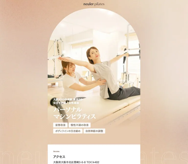
淡いピーチの粒状背景に、アーチ形の写真と細い中央カラムを組み合わせたピラティススタジオの公式サイト。PCの固定サイドナビと、スマートフォンの追従予約バナーが特徴。
オリジナルサイトを見るneuler pilates — Style Reference
A sunlit studio portrait inside a narrow column, surrounded by warm grain and persistent booking controls.
Website / original URL: neuler.jp
Final URL: https://neuler.jp/
Theme: light, with white reading surfaces, peach surroundings, orange accents, and a textured taupe footer.
Inspected: September 12, 2026. Supplied observation timestamp: 2026-09-12T14:12:10.699Z, equivalent to 23:12:10.699 JST.
Viewports: desktop 1440 × 1000 and mobile 390 × 844 CSS pixels.
Scope: the current studio homepage. Visual captures cover the desktop opening, instructor profiles, and footer, plus the mobile opening and footer. Rendered text and element measurements also document the intervening sections. Linked pages, booking completion, menu expansion, and FAQ interactions were not inspected.
neuler pilates presents a private Pilates studio through bright photography, compact Japanese typography, and unusually narrow desktop content. A 540px central strip retains the intimacy of a phone layout while the surrounding desktop space carries navigation and booking. The page is a substantial studio website: facilities, instructors, academic supervision, pricing, trial preparation, questions, news, and access information all support the primary reservation route.
Its strongest visual relationship is between soft photographic light and precise interface geometry. The desktop hero has a tall semicircular crown; the footer returns to a much shallower curve. White trust pills, restrained serif accents, fine separators, and a small orange reservation band supply structure without turning the whole page into a card grid. On mobile, the photograph fills the width and booking becomes a compact banner near the bottom edge.
How to Read This Reference
- Measured values come from supplied rendered element rectangles and computed styles. Source variables are custom properties included in that evidence.
- Derived values are arithmetic relationships between measured rectangles, such as an inset or repeated gap.
- Estimated values describe screenshot appearance where the relevant paint or geometry was not supplied. Estimated colors are not sampled or authoritative brand values.
- Recommended values and behaviors belong to the reusable implementation, not necessarily the original website.
- Font stacks are recorded declarations. The evidence does not establish which font rendered every individual glyph.
- The supplied screenshots show settled states. Recorded transitions support specific motion declarations, but do not establish complete animation sequences or interaction outcomes.
Tokens — Colors
Default Palette
| Name | Value | Source or suggested token | Evidence and role |
|---|---|---|---|
| White | #ffffff |
Source --color-white |
Source variable and computed background of About, Instructor, FAQ, News, and reservation cards |
| Main Text | #323232 |
Source --color-text |
Body and desktop navigation text |
| Section Text | #333333 |
Suggested --color-section-text |
Computed section headings and many paragraphs |
| Strong Text | #242424 |
Source --color-text-strong |
Small action text inside the hero reservation band |
| Warm Heading | #886556 |
Suggested --color-heading |
Computed English section labels and feature headings |
| Muted Brown | #ac8c7e |
Suggested --color-muted-brown |
Computed academic name detail and news metadata |
| Beige Base | #ede4db |
Source --color-beige-bg |
Available source background token; not a measurement of the textured desktop canvas |
| Beige Line | #d7bfb4 |
Source --color-beige-line |
Available source line token; exact assignment to every visible divider is unverified |
| Gold | #b27d12 |
Source --color-gold |
Source accent and gradient endpoint |
| Bronze | #b26112 |
Source --color-bronze |
Source warm accent and orange-gradient endpoint |
| Secondary Gray | #838383 |
Suggested --color-secondary |
Computed explanatory notes in About |
| Reversed Soft White | #f2eeec |
Suggested --color-on-dark-soft |
Computed Plan and Flow labels and the small Flow reservation pill |
| Reversed Detail | #efe8e6 |
Suggested --color-on-dark-muted |
Computed pricing qualifications and validity details |
Source Gradients
| Source property | Recorded value | Interpretation |
|---|---|---|
--grad-cta-orange |
linear-gradient(135deg, #f2a43f, #b26112) |
Consistent with the warm orange reservation treatment visible in the captures |
--grad-cta-gold |
linear-gradient(135deg, #ebb659, #b27d12) |
Available gold treatment; exact component assignment is not established |
--grad-cta-gold-light |
linear-gradient(135deg, #ffd182, #b27d12) |
Available lighter gold treatment; exact component assignment is not established |
Several badge text elements report transparent computed text color while appearing orange or gold in the screenshots. This indicates that the ordinary color property does not describe their final paint. Background clipping or another paint layer may be involved, but the necessary declarations were not supplied. A solid bronze text color is a dependable approximation for a new implementation.
Screenshot-Based Surface Estimates
| Surface | Approximation | Evidence limitation |
|---|---|---|
| Peach outer canvas | Around #fae6d5 |
The visible grain produces many local colors; the background layer was not measured |
| Taupe footer | Around #8a7e73 |
Visible in desktop and mobile captures; exact fill and texture composition unavailable |
| Mobile booking banner | Around #e2c4af |
Visible peach-beige fill; no computed banner background included |
| Profile separators | A fine pale warm gray | Visually apparent; exact stroke color and width were not included |
Keep the distinction between a flat beige token and the finished canvas. A uniform #ede4db background alone will not reproduce the warm, finely speckled desktop surroundings.
Tokens — Typography
Japanese Interface and Body
Recorded stack: "Gen Interface JP", "GenJP Fallback", "Hiragino Sans", sans-serif.
This is the principal family for navigation, Japanese section headings, explanatory paragraphs, qualifications, prices, and reservation text. Body copy often uses weight 500, rather than a very light treatment. Feature paragraphs combine a 15px size with generous line height and positive tracking; instructor biographies use a smaller size with even more vertical breathing room.
Japanese Hero Display
Recorded stack: "Noto Serif JP", "Noto Serif JP Fallback", "Hiragino Mincho ProN", serif.
The large three-line statement uses weight 700, tight tracking, and line height equal to its font size. Its observed text is 身体が整う / パーソナル / マシンピラティス. The screenshot’s line breaks are central to the composition.
The smaller service-and-location line is the semantic h1 in the inspected DOM, while the large display statement is an h2. This is an observed distinction between visual hierarchy and heading markup, not a recommendation to duplicate that hierarchy in every adaptation.
English Editorial Accents
Recorded stack: "Libre Baskerville", "Libre Baskerville Fallback", Georgia, serif.
This family appears in section eyebrows such as About and Instructor, instructor names, news dates, and selected small English details. It adds a quiet editorial character without replacing the Japanese sans-serif reading system.
The visible brand wordmark has a serif appearance, but its production font and asset format are not established by the supplied element records. Use an authorized wordmark asset when reproducing the identity.
Type Scale
Values apply to both inspected viewports unless a difference is stated.
| Role | Size / line height | Weight | Tracking | Evidence |
|---|---|---|---|---|
| Desktop navigation | 16px / normal; measured line box about 23.39px |
400 |
Normal | Computed |
Hero location h1 |
13px / 19.5px |
500 |
-0.26px, or -0.02em |
Computed |
| Hero private-studio line | 15px / 21px |
500 |
Normal | Computed |
| Hero display, desktop | 40px / 40px |
700 |
-2px, or -0.05em |
Computed |
| Hero display, mobile | 39px / 39px |
700 |
-1.95px, or -0.05em |
Computed |
| Trust badge text | 15px / 21px |
600 |
Normal | Computed |
| Trial duration and price in hero band | 16px / 16px |
600 |
Normal | Computed |
| Hero band’s small action label | 10px / 11px |
500 |
Normal | Computed; a small visual label inside a larger linked band |
| English section eyebrow | 12px / 16.8px |
600 |
Normal | Computed |
| Standard Japanese section heading | 20px / 28px |
Usually 500; Flow, FAQ, and News use 700 |
Normal | Computed |
| Feature heading | 17px / 23.8px |
600 |
Normal | Computed |
| Feature paragraph | 15px / 25.5px |
500 |
1.5px, or 0.1em |
Computed |
| Instructor name | 16px / 22.4px |
600 |
Normal | Computed, English serif |
| Instructor qualification | 15px / 21px |
500 |
Normal | Computed |
| Instructor biography | 13px / 24.7px |
500 |
0.65px, or 0.05em |
Computed |
| About fine print | 12px / 16.8px |
500 |
1.2px, or 0.1em |
Computed |
| FAQ answer paragraph | 15px / 27.75px |
400 |
Normal | Computed; visibility of answer wrappers is unverified |
| News category / date | 13px / 15.6px; 14px / 19.6px |
500 |
Normal | Computed mobile records |
The FAQ button element itself reports Arial, 13.3333px, and weight 400. Its internal text styling is not fully documented. Do not mistake this isolated browser-button measurement, or the root element’s Times declaration, for the site-wide font system.
Tokens — Spacing & Shapes
Observed unit system: ordinary CSS pixels with a 16px root. The evidence does not expose a comprehensive spacing scale or the original responsive formulas.
Spacing Relationships
| Use | Value | Evidence |
|---|---|---|
| Header top padding | 14px |
Measured |
| Main content horizontal inset | Desktop 32px; mobile 24px |
Measured |
| Eyebrow-to-section-heading gap | 8px |
Derived from rectangles |
| Feature heading-to-paragraph gap | 8px |
Derived |
| Feature text indentation beyond the normal inset | 66px at both sizes |
Derived |
| Gap between successive feature groups | 54px after preceding text in sampled groups |
Derived |
| Desktop navigation gap | 18px between approximately 23.39px line boxes |
Derived |
| Instructor name-to-qualification gap | 24px |
Derived |
| Qualification list-to-biography gap | 12px |
Derived |
| Flow item gap | 16px |
Derived from repeated x positions |
| Common section vertical padding | 24px, 32px, or 40px, depending on section |
Measured |
| Trust pill padding | Approximately 6px 14px |
Estimated from visible pill boundaries and measured text |
| Mobile fixed banner outside inset | Approximately 10px horizontally and 6px below |
Capture estimate |
Shapes
| Element | Geometry | Evidence |
|---|---|---|
| Desktop hero | A 540px-wide image with a semicircular crown; approximately 270px top corner radii | Capture geometry and measured width; exact radius declaration unavailable |
| Mobile hero | Full-width rectangular crop with no visible arch | Capture |
| Desktop and inline booking cards | 8px radius |
Computed |
| Interview link card | 8px radius |
Computed |
| Before / After section | 32px border radius |
Computed; its transparent recorded background does not establish the painted surface |
| Flow reservation pill | 128px radius |
Computed |
| Trust badges | Fully rounded white pills | Capture |
| Footer crown | Broad shallow arch rising approximately 22–24px above its sides |
Capture estimate |
| Instructor rows | Unboxed white sections separated by fine rules | Capture |
Layout Measurements
| Element | Desktop 1440 × 1000 |
Mobile 390 × 844 |
|---|---|---|
| Central main column | 540px, x = 450 |
390px, x = 0 |
| Standard inner content width | 476px |
342px |
| Indented feature text width | 410px |
276px |
| Header home-link box | 120 × 21.69px, x = 660, y = 14 |
Same size, x = 135, y = 14 |
| Mobile menu button | Not present in supplied desktop records | 24 × 27px, x = 350, y = 14 |
| Hero section | 540 × 818px, including 48px top padding |
390 × 709px, no top padding |
| Hero photograph area | Approximately 540 × 770px after top padding |
Occupies the 390 × 709px hero |
| Hero reservation band | 540 × 74px, y = 818 |
390 × 74px, y = 709 |
| About section start | y = 892 |
y = 783 |
| Desktop booking card | 210 × 163.97px, x = 1060, y = 415.02 |
Replaced visually by the bottom banner |
| Inline booking card | 492 × 147.97px |
342 × 149.67px |
| Interview card | 476 × 134px |
342 × 117.38px |
| Flow item text width | 255px |
255px |
| Document height | 11455.56px, reported rounded as 11456px |
11575.70px, reported rounded as 11576px |
These document heights describe the captured state. They are not fixed layout targets, particularly when disclosure content, fonts, or availability information changes.
Components
Persistent Identity Header
Role: keep the studio identity available throughout the long page.
The wordmark sits at the horizontal center of the viewport, 14px from the top. It remains in that position in the supplied instructor and footer captures. The header has no visible opaque backing strip; underlying biography text and map content can pass behind it.
On mobile, a small three-line menu icon occupies the right side, with its measured button box ending 16px from the viewport edge. The menu’s expanded state, focus behavior, and animation are unverified.
For an adaptation, preserve the centered identity but enlarge the menu’s actual hit area. A subtle backing surface may be appropriate when the logo overlaps busy content; that would be an improvement, not an observed header state.
Desktop Navigation Rail
Role: make the major sections and supporting routes reachable without widening the content column.
Nine links form a left-aligned vertical list. The first begins at x = 189.17, y = 322.73; the last ends near y = 677.25. Together they are vertically centered around the viewport midpoint. The list’s right edge is approximately 100px before the central column’s left edge.
Use plain charcoal text with no enclosing panel. The links mix homepage anchors with separate routes: About, Instructor, Plan, and Information use anchors, while Trial, FAQ, Reservation, News, and Contact lead to dedicated URLs. Their href values are documented, but click outcomes and scrolling behavior were not tested.
The rail remains visible in all three desktop captures. It is absent from the mobile captures.
Photographic Hero
Role: show the atmosphere and assisted nature of the studio’s service immediately.
The desktop image starts below a 48px top allowance and occupies the full 540px column. Its rounded crown frames bright ceiling space above a client stretching on a reformer while an instructor supports her movement. The image remains visually open at the top; the text occupies the lower portion.
The overlay has four levels:
- A small service-and-location line in nearly opaque white.
- A short private-studio and audience statement.
- The three-line bold Japanese serif display statement.
- Three white trust pills, with two on the first row and one on the second.
On desktop, the display heading begins at x = 482, y = 546. On mobile, it begins at x = 22, y = 432, slightly outside the standard 24px text inset. Its size changes only from 40px to 39px; the mobile composition is not a uniformly scaled desktop screenshot.
The mobile image starts at the top edge and loses the arch. The tighter crop allows the extended arms and equipment to continue beyond the frame. Preserve the subject’s face and the visible assistance when selecting an image focal point.
Trust Pills
Role: provide compact reassurance immediately below the display statement.
The observed labels are 全員が有資格者, お子様連れ歓迎, and スポーツ健康科学修士 監修. They use 15px semibold text inside white capsules, with orange-gold lettering and small gaps.
These are short informational claims, not independently documented buttons. Keep their text compact enough to retain the observed two-plus-one arrangement at 390px. Allow natural wrapping on narrower screens rather than shrinking the text until it becomes unreadable.
Inline Hero Reservation Band
Role: connect the hero directly to the trial route.
A 74px-high orange band follows the photograph. Its entire measured anchor links to /trial. On the left, duration and price form a compact two-line group. On the right, a small white pill contains the action label. A white promotional tab overlaps the band’s upper edge.
The band uses 20px 32px padding on desktop and 20px 24px on mobile. The main price and duration text are 16px; the tax detail is 13px; the small action label is 10px. The tiny visible label is nested within a much larger clickable band.
The captured price is 5,500 yen for 50 minutes. Treat it as captured content, not a permanent token.
Persistent and Repeated Booking Cards
Role: retain access to the same trial destination during a long information-heavy visit.
| Variant | Anatomy | Evidence |
|---|---|---|
| Desktop rail card | White 210px panel, 8px radius, orange reservation eyebrow, bold action, duration/price, and an availability line | Rectangle and padding measured; visual content captured |
| In-content card | Wider white panel with the same booking hierarchy; 24px outer horizontal inset within the main column | Computed at both viewports |
| Mobile bottom banner | Approximately 370 × 89px, peach-beige fill, lesson thumbnail at left, compact text in the middle, thin right arrow |
Screenshot estimate; stays at the same bottom position in opening and footer captures |
The desktop card uses 32px 24px 32px 26px padding and sits 70px beyond the main column’s right edge. Its center is close to the viewport’s vertical center. The in-content card uses 24px 24px 24px 26px padding.
The mobile thumbnail occupies roughly the first 95px, with a soft visual transition into the text area. The banner overlays part of the hero band in the opening capture and remains over the footer in the final capture.
Availability text appears partly clipped and at different horizontal offsets across captures, consistent with a ticker. Its timing, data source, update frequency, and freshness were not supplied. Do not invent a live schedule or hardcode a captured date as ongoing availability.
Section Heading and Feature Group
Role: maintain a repeatable reading rhythm within the narrow column.
The standard heading pairs a small brown English serif eyebrow with a larger Japanese sans-serif heading, separated by 8px. Both align to the 32px desktop or 24px mobile content inset.
The About section then introduces a substantial image area and a series of feature explanations. Sampled feature text is indented another 66px on both viewport sizes. This leaves a distinct leading gutter; the evidence does not identify every decorative element within it.
Feature headings use warm brown at 17px / 23.8px. Paragraphs use 15px / 25.5px and 0.1em tracking. Successive sampled groups have a generous 54px separation after the preceding text. Retain this asymmetry and rhythm rather than replacing the list with equally sized feature cards.
Before / After and Customer Interview
Role: group outcome-oriented content and a customer story before the instructor profiles.
The Before / After wrapper has a measured 32px radius and the normal horizontal section inset. It contains a bilingual heading, a one-trial qualifier, a substantial comparison area, explanatory points, and an individual-results note. The actual comparison image was not included in the visible captures, so its subjects, crop, and internal layout cannot be specified here.
The interview link is a white horizontal flex card with an 8px radius. Desktop padding is 14px 18px 14px 14px with a 16px gap; mobile padding is 12px 14px 12px 12px with a 12px gap. It links to /interview/mai and contains a story headline and customer name.
The card declares 250ms background-color and border-color transitions. Hover colors and the destination page were not observed.
Instructor Profile
Role: build trust through people, qualifications, and readable biographies.
The visible profile arrangement is deliberately unboxed. A bright rectangular portrait occupies the right portion of the upper area, while the instructor’s English serif name sits low on the left. In the desktop capture, the portrait is approximately 333px wide within the 476px inner column, or about 70%. Its left edge visually fades into white; whether that treatment belongs to the image or a CSS layer is unverified.
Below the image/name area, qualifications form a compact list with muted brown bullets. A biography follows after 12px. Names use 16px English serif, qualifications use 15px sans-serif, and biographies use 13px / 24.7px with 0.05em tracking. Fine horizontal rules separate the profiles.
The rendered page includes Kaede, maria, megumi, and Marisa. Preserve content-dependent biography heights. The profiles remain stacked on desktop.
Academic Supervision Block
Role: explain the studio’s stated academic supervision separately from instructor biographies.
The current page names Kentaro Nakashima in this service-content role. The top identity text is positioned toward the right, while the explanatory body uses an additional 24px inset: its measured width is 428px on desktop and 294px on mobile. Warm brown labels distinguish the field of expertise from qualifications.
This is evidence about the studio’s service presentation. It does not establish website production authorship.
Pricing Section
Role: present trial, enrollment, single-session, and package prices within the same reading column.
The section uses reversed white headings and labels. The English eyebrow is #f2eeec, and pricing qualifications use #efe8e6. The background’s exact paint was not included in the supplied computed records or visible screenshots; a specific dark fill should therefore remain an implementation choice.
Labels sit to the left of price information. Sampled label widths reduce from 200px on desktop to 133px on mobile. Supporting information includes tax inclusion, a trial-day enrollment condition, per-session equivalents, and package validity periods.
Keep this as a structured price list with clearly associated details. The price numerals’ specific font measurements were not included, so do not invent a display-number treatment.
Trial Flow Strip
Role: explain four stages: reservation, arrival/changing, consultation, and the trial lesson.
The DOM establishes a horizontal arrangement. Item text blocks are 255px wide on both viewports, and successive x positions advance by 271px, giving a 16px gap. A small English scroll cue appears beside the section heading. Number labels run from 01 to 04, with substantial space above each item’s heading for its upper content.
This supports an intended horizontally navigable strip. It does not prove drag handling, snap behavior, autoplay, or keyboard controls. Offscreen child rectangles are not themselves proof that the entire document has horizontal overflow.
The first item contains a small rounded reservation link. A separate trailing link leads to /trial for lesson contents and preparation details.
FAQ Rows
Role: answer common concerns without immediately sending the visitor elsewhere.
Six question headings contain actual button elements. Most measured buttons are 48px high with 12px padding; the first mobile question wraps and becomes 66px high. Answer paragraphs use 15px type and 1.85 line height with 4px 12px 14px padding.
Answers appear in the extracted DOM, but their rectangles overlap the following question positions. Their presence is not evidence that all answers are visually expanded. The surrounding clipping or disclosure state was not supplied, and no question was exercised.
A new implementation can use accessible disclosures, while retaining the original’s white surfaces, full-row controls, and compact spacing.
News and Contact
Role: show current studio activity and provide a general inquiry route.
News follows the same English-eyebrow/Japanese-heading pattern, with a small list link beside the heading. Three articles are present in the rendered text. Mobile measurements show muted brown serif metadata above a 15px semibold Japanese title. In the first row, the title begins 94px after the link’s left edge, leaving a leading area whose media asset was not supplied.
The Contact section links to /contact. Its existence and label are documented, but its detailed visual anatomy is not visible in the supplied captures. Preserve the route and section hierarchy without inventing a form embedded on this homepage.
Store Information and Map
Role: make the physical studio easy to locate.
The captured information includes an address, station walking times, operating hours, and an embedded map. Warm brown labels distinguish fields such as address and opening hours. Small train symbols precede transport lines.
The desktop map aligns to the 476px inner column; the mobile map aligns to the 342px inner column. The desktop capture shows a largely gray map area with only a narrow strip of tiles, while the mobile capture shows a rendered map and marker. This is a capture-dependent loading limitation, not a deliberate gray-map design.
The visible map provider’s controls belong to the embedded map. Their behavior was not tested.
Curved Footer
Role: close the page with a softer, darker surface and a comprehensive route directory.
A shallow curved crown introduces a warm taupe field with fine grain. In both captures, the crown begins approximately 68px below the map’s lower edge. The curve rises only around 22–24px; it is much flatter than the hero arch.
The footer contains a white wordmark, wrapping primary links, a compact white 公式LINE button with a green brand icon, a fine divider, legal/member/company links, and a copyright line. Desktop content retains the 32px inset; mobile uses 24px. Link groups wrap naturally across the narrow width.
Use the curve and texture to distinguish the footer. It does not need a dense set of separately boxed navigation cards.
Tokens — Motion & Interaction
| Treatment | Supplied evidence | Limit |
|---|---|---|
| Hero location and audience copy | transition: opacity 1.6s 0.3s |
Duration and delay recorded; trigger and full playback sequence unverified |
| Hero display heading | transition: opacity 1.6s 0.55s |
Its transition starts 250ms later than the preceding copy if triggered together |
| Interview card | background-color 0.25s, border-color 0.25s |
Destination colors and pointer state not observed |
| Header, desktop navigation, booking controls | Remain at consistent viewport positions across scroll captures | Persistent placement is observed; exact positioning declarations were not supplied |
| Availability line | Clipped text at differing horizontal offsets | Consistent with a ticker, but duration, easing, and update behavior unknown |
| Flow strip | Horizontal item geometry and a scroll cue |
Navigation method and snapping unverified |
| FAQ and mobile menu | Button elements present | Open states and transitions unverified |
| Other sampled elements | Often animation: none and transition: all |
These records do not establish a general animation system or meaningful transition duration |
The supplied custom properties also include --soft: 22% and --reveal: 0.001%. Their consumers were not supplied. Do not convert those names into claims about a particular reveal mask or scroll animation.
The supported motion character is restrained: staggered opacity and a brief color transition. Additional parallax, image zoom, animated counters, or automatic carousels would be new design decisions.
Surfaces
| Layer | Appearance | Function |
|---|---|---|
| Desktop surroundings | Pale peach with fine grain | Holds the side navigation and booking card around the narrow page |
| Main reading areas | Flat white | Keeps long Japanese text, qualifications, and news readable |
| Hero | Bright studio photography with white overlay text | Communicates the people, equipment, and atmosphere |
| Trust labels | White capsules with warm lettering | Small reassurance markers within the photograph |
| Hero reservation band | Orange-gold appearance with visible texture | Marks the immediate booking route |
| Booking and interview cards | White, 8px corners | Separates a limited number of actionable components |
| Plan and Flow | Reversed light text | Distinguishes practical enrollment content; exact background unverified |
| Footer | Textured taupe with a shallow curved top | Creates a calm closing surface |
| Mobile fixed booking control | Peach-beige banner with photo and arrow | Keeps the trial route close during scrolling |
There is no evidence of a broad elevation scale. The booking controls show subtle visual separation, but exact shadows were not recorded. Most hierarchy comes from white space, changes in surface color, photographic boundaries, and fine rules.
Imagery
The visible photography is bright, warm, and spatially believable. White walls, window light, pale timber, neutral exercise clothing, and actual Pilates equipment establish the studio atmosphere. The hero shows assisted movement rather than an isolated model posing at the camera. Instructor portraits maintain similar exposure and color temperature.
Preserve these relationships when commissioning or selecting replacement imagery:
- Keep the client’s face, upper-body movement, and the instructor’s supporting gesture legible in both crops.
- Leave calm upper image space for the desktop arch and centered wordmark.
- Favor warm whites and natural skin tones over a heavy sepia filter.
- Keep the grain primarily in decorative surfaces; do not obscure faces or instructional detail with added noise.
- Use responsive crops rather than stretching the photograph.
- Keep portraits rectangular and bright, with generous white space around names and biographies.
Observed Asset References
| Asset or resource | Evidence | Reuse guidance |
|---|---|---|
| Assisted reformer hero photograph | Visible in desktop and mobile opening captures | Use a full-height cover crop with a verified focal point |
| Instructor portraits | Visible in the desktop profile capture | Preserve bright exposure and the right-weighted composition |
| Booking thumbnail | Visible in both mobile captures | Use a compact crop that remains understandable at roughly 95px wide |
| Header and footer wordmarks | Visible in light and dark contexts | Use the supplied identity artwork; exact asset URLs were not provided |
| Peach and taupe grain | Visible in the outer canvas and footer | Reproduce with an authorized texture layer; exact resource and blend mode unknown |
| Font stylesheet reference | /fonts/gen-interface-jp/fonts.css appears in the supplied DOM |
Reference observed only; stylesheet contents were not separately opened |
Image filenames and original image URLs were not included in the evidence. No asset path should be invented as though it came from the site. The comparison imagery and most intermediate section media are not visually specified by these captures.
Layout & Responsive Behavior
The page keeps a single narrow content column on desktop. At 1440px, the 540px main column leaves 450px on each side. The navigation and reservation panel occupy these surroundings without changing the width of the reading content.
At 390px, the main column fills the viewport. Side navigation disappears, a menu control appears at the upper right, and the booking route moves into a bottom banner. The header wordmark remains 120px wide. Standard horizontal padding decreases from 32px to 24px, producing inner widths of 476px and 342px respectively.
Typography changes very little. The hero display decreases by only 1px; section headings, body copy, and instructor text retain their measured sizes. Consequently, mobile adaptation relies on wrapping, crop changes, and vertical content growth. For example, About grows from approximately 2644px to 2808px high, while the media-heavy Before / After group becomes shorter. Do not derive all mobile section heights from a single scale factor.
The 66px feature-text indentation survives on mobile, leaving a 276px text width. The Flow strip also retains 255px items and a 16px gap. These are important exceptions to the otherwise full-width mobile column.
The exact breakpoint and hero height formula were not supplied. width: min(100%, 540px) reproduces the two observed main widths, but is an adaptation rather than a recovered source rule. The Quick Start uses a recommended 1200px rail breakpoint and a mobile hero height that reproduces the supplied 390 × 844 capture.
Only one desktop and one mobile viewport were inspected. Tablet layouts, short landscape screens, zoom, enlarged text, and intermediate breakpoint behavior remain unverified.
Do’s and Don’ts
Do
- Preserve the 540px desktop reading column and generous surrounding space.
- Treat the desktop side navigation and booking panel as part of the overall composition.
- Use the tall hero arch on desktop and the rectangular full-width crop on mobile.
- Keep the hero’s Japanese serif statement compact, bold, and tightly tracked.
- Pair small English serif eyebrows with readable Japanese sans-serif headings.
- Maintain the 32px desktop and 24px mobile content insets.
- Keep biographies unboxed, with qualifications, fine rules, and generous line height.
- Use white capsules and restrained orange accents to distinguish reassurance and booking.
- Preserve the footer’s shallow crown and muted texture.
- Separate documented source values from screenshot estimates and new implementation choices.
Don’t
- Don’t widen the desktop hero into a conventional edge-to-edge banner.
- Don’t turn the instructor list or studio features into a desktop card grid.
- Don’t keep the desktop arch on mobile when matching the supplied current layout.
- Don’t replace all three typography roles with one generic family.
- Don’t use source transparent text colors as an instruction to hide badge lettering.
- Don’t assume every available gold gradient is visibly applied to a specific component.
- Don’t reproduce the partly loaded desktop map as a permanent gray panel.
- Don’t infer expanded FAQs from answer text found in the DOM.
- Don’t invent menu transitions, carousel autoplay, or booking availability updates.
- Don’t treat a captured price or date as a timeless design token.
Recommended Implementation Additions
These recommendations extend the observed design; they are not verified original features.
- Increase the mobile menu’s hit area to at least 44px while retaining its compact visible icon.
- Add visible keyboard focus styles to navigation, booking links, interview cards, and footer links.
- Implement menu and FAQ states with accessible names, expanded-state information, and dependable keyboard operation.
- Reserve enough final-page space for the fixed booking banner and device safe area. Keep focused controls from disappearing behind it.
- Make availability understandable without ticker motion. Show a static fallback when current scheduling data is unavailable.
- Preserve sufficient contrast behind white hero copy across responsive crops; apply a localized image tint if necessary.
- Keep important price conditions readable instead of preserving 10–11px text at all costs.
- Provide a text address and direct map link even while map tiles are loading.
- Support reduced motion, and keep hero text visible when animation initialization fails.
- Give the Flow strip keyboard access and a visible way to move through its four steps without depending exclusively on touch gestures.
Agent Prompt Guide
Quick Color Reference
- Reading surfaces: exact white
#ffffff. - Main text: source
#323232; section text commonly computes to#333333. - Editorial brown: measured
#886556. - Secondary brown: measured
#ac8c7e. - Orange gradient: source
135deg,#f2a43fto#b26112. - Beige source token:
#ede4db; do not equate it with the finished textured canvas. - Canvas approximation:
#fae6d5plus fine grain. - Footer approximation:
#8a7e73plus fine grain. - Mobile booking approximation:
#e2c4af.
Overall Prompt
“Create a Japanese private Pilates studio homepage inspired by the current neuler pilates composition. Center a 540px reading column on desktop within a pale peach, finely textured canvas. Place a plain vertical navigation rail at left and a compact white booking card at right. Use a bright photograph of assisted reformer movement inside a tall semicircular hero, a small centered wordmark, a three-line white Japanese serif statement, and white trust capsules with warm orange lettering. Continue into white sections with small Libre Baskerville English eyebrows, Gen Interface JP Japanese text, unboxed instructor profiles, a price list, trial flow, FAQs, news, and access information. Finish with a shallow curved taupe footer. At phone width, remove the hero arch and side rails, keep 24px content insets, show a menu control, and place booking in a compact bottom banner with a photo and arrow. Treat estimated colors and unverified interactions as implementation choices.”
Example Component Prompts
- Hero: “Build a 540px desktop photo column with a 270px-radius crown and 48px top allowance. Position a compact white location line above a 40px bold Noto Serif JP statement with 1.0 line height and −0.05em tracking. Add three white trust capsules below. At 390px, use a rectangular photo crop and 39px display type. Keep the face and assisting gesture visible.”
- Instructor profile: “Create an unboxed white profile with a bright portrait toward the right, a 16px Libre Baskerville name at the lower left of the portrait area, 15px qualification bullets, and a 13px biography with 24.7px line height. Separate profiles with fine warm-gray rules.”
- Booking controls: “Create a 210px white desktop booking panel with 8px corners, a small bronze reservation label, a bold action, price/duration, and a static availability line. On mobile, use a peach-beige banner inset 10px from the sides, with a small lesson photograph and a thin right arrow. Keep real availability separate from decorative motion.”
- Feature group: “Use a 12px English serif eyebrow above a 20px Japanese sans-serif section title. Indent feature text 66px beyond the normal content inset. Set feature headings in warm brown at 17px and paragraphs at 15px with 1.7 line height and 0.1em tracking. Preserve generous vertical gaps.”
- Footer: “Build a narrow taupe footer with fine grain and a shallow curved crown rising about 24px. Place a white wordmark above wrapping text navigation, a small white LINE button, a fine divider, and secondary links. Use 32px desktop and 24px mobile horizontal padding.”
Quick Start
CSS Custom Properties
This is a reusable approximation, not a copy of the original stylesheet. Exact source colors and measured type values are retained where available. Estimated surfaces are named explicitly. The 1200px breakpoint, safe-area handling, focus styles, disclosure markup, and footer curve implementation are recommendations.
Use an authorized hero image and wordmark in the corresponding image elements. Load the recorded font families separately; declaring their names does not load font files. Set --grain-image to a project texture if available. Its default produces a flat fallback.
:root {
  /* Recorded source colors */
  --color-white: #fff;
  --color-text: #323232;
  --color-text-strong: #242424;
  --color-beige-bg: #ede4db;
  --color-beige-line: #d7bfb4;
  --color-gold: #b27d12;
  --color-bronze: #b26112;
  --grad-cta-orange: linear-gradient(135deg, #f2a43f, #b26112);
  --grad-cta-gold: linear-gradient(135deg, #ebb659, #b27d12);
  --grad-cta-gold-light: linear-gradient(135deg, #ffd182, #b27d12);

  /* Measured colors exposed as reusable aliases */
  --color-heading: #886556;
  --color-muted-brown: #ac8c7e;
  --color-section-text: #333;
  --color-secondary: #838383;
  --color-on-dark-soft: #f2eeec;

  /* Screenshot estimates, not measured source fills */
  --canvas-estimate: #fae6d5;
  --footer-estimate: #8a7e73;
  --booking-mobile-estimate: #e2c4af;
  --grain-image: none;

  /* Recorded family stacks */
  --font-sans: 'Gen Interface JP', 'GenJP Fallback',
    'Hiragino Sans', sans-serif;
  --font-serif: 'Noto Serif JP', 'Noto Serif JP Fallback',
    'Hiragino Mincho ProN', serif;
  --font-en-serif: 'Libre Baskerville',
    'Libre Baskerville Fallback', Georgia, serif;

  /* Measured proportions and implementation aliases */
  --column-width: 540px;
  --content-inset: 24px;
  --feature-indent: 66px;
  --text-hero: 39px;
  --text-section: 20px;
  --text-feature: 17px;
  --text-body: 15px;
  --text-bio: 13px;
  --text-eyebrow: 12px;
  --radius-card: 8px;
  --radius-section: 32px;
  --safe-bottom: env(safe-area-inset-bottom, 0px);
}

* { box-sizing: border-box; }

html {
  scroll-padding-block: 56px calc(110px + var(--safe-bottom));
}

body {
  margin: 0;
  color: var(--color-text);
  background-color: var(--canvas-estimate);
  background-image: var(--grain-image);
  font-family: var(--font-sans);
  font-size: 16px;
}

button { font: inherit; }
img { display: block; max-width: 100%; }
a { color: inherit; }

.site-main,
.site-footer {
  width: min(100%, var(--column-width));
  margin-inline: auto;
}

.site-header {
  position: fixed;
  inset: 0 0 auto;
  z-index: 30;
  display: flex;
  justify-content: center;
  padding-top: 14px;
  pointer-events: none;
}

.site-header a,
.site-header button { pointer-events: auto; }

.site-logo { display: block; width: 120px; }
.site-logo img { width: 100%; height: auto; }

/* Recommended hit area around the small visible icon */
.menu-toggle {
  position: absolute;
  top: 5px;
  right: 6px;
  display: grid;
  place-items: center;
  width: 44px;
  height: 44px;
  padding: 0;
  border: 0;
  background: transparent;
  color: var(--color-section-text);
}

.side-nav,
.booking-card--desktop { display: none; }

.hero-stage {
  position: relative;
  min-height: 709px;
  height: 84svh;
  overflow: hidden;
}

.hero-photo {
  position: absolute;
  inset: 0;
  width: 100%;
  height: 100%;
  object-fit: cover;
  object-position: 50% 50%;
}

.hero-copy {
  position: absolute;
  inset-inline: var(--content-inset);
  bottom: 72px;
  color: #fff;
}

.hero-location {
  margin: 0;
  color: rgb(255 255 255 / 92%);
  font-size: 13px;
  font-weight: 500;
  line-height: 1.5;
  letter-spacing: -0.02em;
  transition: opacity 1.6s 0.3s;
}

.hero-context {
  margin: 4px 0 0;
  font-size: 15px;
  font-weight: 500;
  line-height: 1.4;
  transition: opacity 1.6s 0.3s;
}

.hero-title {
  margin: 24px 0 16px -2px;
  font-family: var(--font-serif);
  font-size: var(--text-hero);
  font-weight: 700;
  line-height: 1;
  letter-spacing: -0.05em;
  transition: opacity 1.6s 0.55s;
}

.hero-title span { display: block; }

.trust-list {
  display: flex;
  flex-wrap: wrap;
  gap: 6px;
  max-width: 320px;
  margin: 0;
  padding: 0;
  list-style: none;
}

.trust-list li {
  padding: 6px 14px;
  border-radius: 999px;
  background: #fff;
  color: var(--color-bronze);
  font-size: 15px;
  font-weight: 600;
  line-height: 1.4;
}

.trial-band {
  position: relative;
  display: flex;
  align-items: center;
  justify-content: space-between;
  gap: 12px;
  min-height: 74px;
  padding: 20px var(--content-inset);
  color: #fff;
  background: var(--grad-cta-orange);
  text-decoration: none;
}

.trial-band__price {
  font-size: 16px;
  font-weight: 600;
  line-height: 1;
}

.trial-band__note {
  position: absolute;
  top: -16px;
  left: var(--content-inset);
  max-width: calc(100% - 48px);
  padding: 4px 10px;
  border-radius: 3px;
  background: #fff;
  color: var(--color-bronze);
  font-size: 13px;
  font-weight: 700;
  line-height: 1.4;
}

.trial-band__action {
  flex: 0 0 auto;
  padding: 8px 16px;
  border-radius: 999px;
  background: #fff;
  color: var(--color-text-strong);
  font-size: 10px;
  font-weight: 500;
  line-height: 1.1;
}

.content-section {
  padding: 32px var(--content-inset);
  background: #fff;
}

.section-eyebrow {
  margin: 0 0 8px;
  color: var(--color-heading);
  font-family: var(--font-en-serif);
  font-size: var(--text-eyebrow);
  font-weight: 600;
  line-height: 1.4;
}

.section-title {
  margin: 0;
  color: var(--color-section-text);
  font-size: var(--text-section);
  font-weight: 500;
  line-height: 1.4;
}

.feature {
  margin-left: var(--feature-indent);
  margin-top: 54px;
}

.feature h3 {
  margin: 0 0 8px;
  color: var(--color-heading);
  font-size: var(--text-feature);
  font-weight: 600;
  line-height: 1.4;
}

.feature p {
  margin: 0;
  font-size: var(--text-body);
  font-weight: 500;
  line-height: 1.7;
  letter-spacing: 0.1em;
}

.instructor-profile {
  padding-block: 24px 32px;
  border-bottom: 1px solid var(--color-beige-line);
}

/* Portrait geometry is a screenshot-based approximation */
.instructor-profile__top {
  display: grid;
  grid-template-columns: 30% 70%;
  align-items: end;
}

.instructor-profile__photo {
  width: 100%;
  aspect-ratio: 3 / 2;
  object-fit: cover;
}

.instructor-profile__name {
  margin: 0;
  font-family: var(--font-en-serif);
  font-size: 16px;
  font-weight: 600;
  line-height: 1.4;
}

.instructor-profile__qualifications {
  margin: 24px 0 12px;
  padding-left: 14px;
  font-size: 15px;
  font-weight: 500;
  line-height: 1.4;
}

.instructor-profile__qualifications li::marker {
  color: var(--color-muted-brown);
}

.instructor-profile__bio {
  margin: 0;
  font-size: var(--text-bio);
  font-weight: 500;
  line-height: 1.9;
  letter-spacing: 0.05em;
}

.interview-card {
  display: flex;
  align-items: center;
  gap: 12px;
  padding: 12px 14px 12px 12px;
  border: 1px solid var(--color-beige-line);
  border-radius: var(--radius-card);
  background: #fff;
  text-decoration: none;
  transition: background-color 0.25s, border-color 0.25s;
}

/* Recommended overflow implementation; source snapping is unknown */
.flow-track {
  display: flex;
  gap: 16px;
  overflow-x: auto;
  padding-block: 24px 12px;
}

.flow-step { flex: 0 0 255px; }

/* Use these rules with native details/summary disclosures */
.faq-item + .faq-item { margin-top: 6px; }

.faq-item summary {
  min-height: 48px;
  padding: 12px;
  cursor: pointer;
  font-size: 15px;
  line-height: 1.4;
}

.faq-answer {
  margin: 0;
  padding: 4px 12px 14px;
  font-size: 15px;
  line-height: 1.85;
}

.booking-card {
  border-radius: var(--radius-card);
  background: #fff;
  color: var(--color-text);
  text-decoration: none;
}

.booking-label {
  display: inline-block;
  padding: 2px 8px;
  border-radius: 999px;
  background: var(--color-bronze);
  color: #fff;
  font-size: 12px;
  font-weight: 600;
  line-height: 1.4;
}

.booking-title {
  display: block;
  margin-top: 6px;
  font-size: 15px;
  font-weight: 700;
  line-height: 1.4;
}

.booking-detail,
.booking-availability {
  display: block;
  font-size: 13px;
  line-height: 1.4;
}

.booking-availability {
  margin-top: 10px;
  color: var(--color-secondary);
}

.booking-card--inline {
  display: block;
  min-height: 148px;
  margin: 56px 24px 54px;
  padding: 24px 24px 24px 26px;
}

.booking-card--mobile {
  position: fixed;
  z-index: 40;
  bottom: max(6px, var(--safe-bottom));
  left: 50%;
  transform: translateX(-50%);
  display: flex;
  align-items: center;
  width: min(calc(100% - 20px), 520px);
  min-height: 89px;
  overflow: hidden;
  background: var(--booking-mobile-estimate);
  box-shadow: 0 6px 20px rgb(70 45 25 / 12%);
}

.booking-card--mobile .booking-photo {
  align-self: stretch;
  width: 95px;
  flex: 0 0 95px;
  object-fit: cover;
}

.booking-card--mobile .booking-copy {
  flex: 1;
  min-width: 0;
  padding-block: 10px;
}

.booking-card--mobile .booking-title { margin-top: 2px; }

.booking-card--mobile .booking-arrow {
  flex: 0 0 auto;
  padding-inline: 12px 24px;
  font-size: 24px;
}

.site-footer {
  position: relative;
  margin-top: 92px;
  padding: 40px var(--content-inset)
    calc(112px + var(--safe-bottom));
  color: var(--color-on-dark-soft);
  background-color: var(--footer-estimate);
  background-image: var(--grain-image);
}

/* Recommended approximation of the shallow captured crown */
.site-footer::before {
  content: '';
  position: absolute;
  inset: -24px 0 auto;
  height: 24px;
  border-radius: 50% 50% 0 0 / 100% 100% 0 0;
  background: inherit;
}

.footer-links {
  display: flex;
  flex-wrap: wrap;
  gap: 18px 16px;
  margin-block: 48px 28px;
  font-size: 13px;
  line-height: 1.4;
}

.footer-links a { text-decoration: none; }

.footer-secondary {
  padding-top: 24px;
  border-top: 1px solid rgb(255 255 255 / 25%);
}

/* Recommended breakpoint, not a recovered source media query */
@media (min-width: 1200px) {
  :root {
    --content-inset: 32px;
    --text-hero: 40px;
  }

  .menu-toggle,
  .booking-card--mobile { display: none; }

  .side-nav {
    position: fixed;
    z-index: 20;
    top: 50%;
    right: calc(50% + 370px);
    transform: translateY(-50%);
    display: flex;
    flex-direction: column;
    align-items: flex-start;
    gap: 18px;
    font-size: 16px;
    line-height: 1.462;
  }

  .side-nav a { text-decoration: none; }

  .booking-card--desktop {
    position: fixed;
    z-index: 20;
    top: 50%;
    left: calc(50% + 340px);
    transform: translateY(-50%);
    display: block;
    width: 210px;
    min-height: 164px;
    padding: 32px 24px 32px 26px;
    box-shadow: 0 6px 20px rgb(70 45 25 / 8%);
  }

  .hero { padding-top: 48px; }

  .hero-stage {
    height: 770px;
    min-height: 770px;
    border-radius: 270px 270px 0 0;
  }

  .hero-copy { bottom: 64px; }
  .hero-title { margin-top: 8px; margin-left: 0; }

  .interview-card {
    gap: 16px;
    padding: 14px 18px 14px 14px;
  }

  .site-footer { padding-bottom: 48px; }
}

/* Recommended accessibility additions */
a:focus-visible,
button:focus-visible,
summary:focus-visible,
.flow-track:focus-visible {
  outline: 3px solid var(--color-bronze);
  outline-offset: 4px;
}

.site-footer a:focus-visible { outline-color: #fff; }

@media (prefers-reduced-motion: reduce) {
  .hero-location,
  .hero-context,
  .hero-title,
  .interview-card {
    transition: none;
  }
}
The hero text remains visible by default. A separate enhancement may trigger the recorded opacity transitions after initialization. The CSS does not implement the uninspected mobile menu or scheduling feed. For the suggested native FAQ implementation, use details with a summary and an answer element; menu state requires its own implementation.
Tailwind v4 Token Mapping
Optional aliases for a project that already uses Tailwind v4. This does not identify the original site’s styling framework. Define the custom properties above first.
@theme inline {
  --color-studio-ink: var(--color-text);
  --color-studio-heading: var(--color-heading);
  --color-studio-bronze: var(--color-bronze);
  --color-studio-beige: var(--color-beige-bg);
  --color-studio-line: var(--color-beige-line);
  --color-studio-canvas: var(--canvas-estimate);
  --color-studio-footer: var(--footer-estimate);

  --font-studio-sans: var(--font-sans);
  --font-studio-display: var(--font-serif);
  --font-studio-editorial: var(--font-en-serif);

  --text-studio-hero: var(--text-hero);
  --text-studio-section: 20px;
  --text-studio-body: 15px;
  --text-studio-bio: 13px;
  --text-studio-eyebrow: 12px;

  --spacing-studio-column: 540px;
  --spacing-studio-inset: var(--content-inset);
  --spacing-studio-feature-indent: 66px;
  --radius-studio-card: 8px;
  --radius-studio-section: 32px;
}
Sources & Evidence
- Inspected original and final website: https://neuler.jp/. The supplied record reports HTTP
200with no URL change. - Capture date: September 12, 2026, recorded at
2026-09-12T14:12:10.699Z/ 23:12:10.699 JST. - Desktop evidence:
1440 × 1000CSS-pixel viewport; opening, instructor, and footer captures; rendered text, link destinations, custom properties, and sampled element rectangles/computed styles. - Mobile evidence:
390 × 844CSS-pixel viewport; opening and footer captures; rendered text, link destinations, custom properties, and sampled element rectangles/computed styles. - Navigation evidence: homepage anchors and linked routes such as
/trial,/faq,/reservation,/post,/contact, and/accesswere present in the inspected homepage. These destination pages were not separately inspected. - Readiness limits: the supplied procedure observed the initial page for at least five seconds and waited for document load, relevant finite motion, sampled layout/text stability, and image decoding within bounded timeouts. Perpetual animations were paused during readiness checks and resumed afterward. These checks do not establish complete delayed content or exercised interaction behavior.
- Specific limitations: desktop map tiles were partly unavailable in the capture; expanded menu and FAQ states were not tested; intermediate section imagery, full paint layers, exact breakpoints, ticker timing, and booking behavior were not supplied. SharedWorkers and service workers were disabled during inspection.
This reference uses the supplied current homepage evidence. No additional pages or resources were opened. Source values, arithmetic derivations, screenshot estimates, and recommended implementation choices are distinguished throughout.
# neuler pilates — Style Reference

> A sunlit studio portrait inside a narrow column, surrounded by warm grain and persistent booking controls.

**Website / original URL:** [neuler.jp](https://neuler.jp/)
**Final URL:** [https://neuler.jp/](https://neuler.jp/)
**Theme:** light, with white reading surfaces, peach surroundings, orange accents, and a textured taupe footer.
**Inspected:** September 12, 2026. Supplied observation timestamp: `2026-09-12T14:12:10.699Z`, equivalent to 23:12:10.699 JST.
**Viewports:** desktop `1440 × 1000` and mobile `390 × 844` CSS pixels.
**Scope:** the current studio homepage. Visual captures cover the desktop opening, instructor profiles, and footer, plus the mobile opening and footer. Rendered text and element measurements also document the intervening sections. Linked pages, booking completion, menu expansion, and FAQ interactions were not inspected.

neuler pilates presents a private Pilates studio through bright photography, compact Japanese typography, and unusually narrow desktop content. A 540px central strip retains the intimacy of a phone layout while the surrounding desktop space carries navigation and booking. The page is a substantial studio website: facilities, instructors, academic supervision, pricing, trial preparation, questions, news, and access information all support the primary reservation route.

Its strongest visual relationship is between soft photographic light and precise interface geometry. The desktop hero has a tall semicircular crown; the footer returns to a much shallower curve. White trust pills, restrained serif accents, fine separators, and a small orange reservation band supply structure without turning the whole page into a card grid. On mobile, the photograph fills the width and booking becomes a compact banner near the bottom edge.

## How to Read This Reference

- **Measured** values come from supplied rendered element rectangles and computed styles. **Source variables** are custom properties included in that evidence.
- **Derived** values are arithmetic relationships between measured rectangles, such as an inset or repeated gap.
- **Estimated** values describe screenshot appearance where the relevant paint or geometry was not supplied. Estimated colors are not sampled or authoritative brand values.
- **Recommended** values and behaviors belong to the reusable implementation, not necessarily the original website.
- Font stacks are recorded declarations. The evidence does not establish which font rendered every individual glyph.
- The supplied screenshots show settled states. Recorded transitions support specific motion declarations, but do not establish complete animation sequences or interaction outcomes.

## Tokens — Colors

### Default Palette

| Name | Value | Source or suggested token | Evidence and role |
| --- | --- | --- | --- |
| White | `#ffffff` | Source `--color-white` | Source variable and computed background of About, Instructor, FAQ, News, and reservation cards |
| Main Text | `#323232` | Source `--color-text` | Body and desktop navigation text |
| Section Text | `#333333` | Suggested `--color-section-text` | Computed section headings and many paragraphs |
| Strong Text | `#242424` | Source `--color-text-strong` | Small action text inside the hero reservation band |
| Warm Heading | `#886556` | Suggested `--color-heading` | Computed English section labels and feature headings |
| Muted Brown | `#ac8c7e` | Suggested `--color-muted-brown` | Computed academic name detail and news metadata |
| Beige Base | `#ede4db` | Source `--color-beige-bg` | Available source background token; not a measurement of the textured desktop canvas |
| Beige Line | `#d7bfb4` | Source `--color-beige-line` | Available source line token; exact assignment to every visible divider is unverified |
| Gold | `#b27d12` | Source `--color-gold` | Source accent and gradient endpoint |
| Bronze | `#b26112` | Source `--color-bronze` | Source warm accent and orange-gradient endpoint |
| Secondary Gray | `#838383` | Suggested `--color-secondary` | Computed explanatory notes in About |
| Reversed Soft White | `#f2eeec` | Suggested `--color-on-dark-soft` | Computed Plan and Flow labels and the small Flow reservation pill |
| Reversed Detail | `#efe8e6` | Suggested `--color-on-dark-muted` | Computed pricing qualifications and validity details |

### Source Gradients

| Source property | Recorded value | Interpretation |
| --- | --- | --- |
| `--grad-cta-orange` | `linear-gradient(135deg, #f2a43f, #b26112)` | Consistent with the warm orange reservation treatment visible in the captures |
| `--grad-cta-gold` | `linear-gradient(135deg, #ebb659, #b27d12)` | Available gold treatment; exact component assignment is not established |
| `--grad-cta-gold-light` | `linear-gradient(135deg, #ffd182, #b27d12)` | Available lighter gold treatment; exact component assignment is not established |

Several badge text elements report transparent computed text color while appearing orange or gold in the screenshots. This indicates that the ordinary `color` property does not describe their final paint. Background clipping or another paint layer may be involved, but the necessary declarations were not supplied. A solid bronze text color is a dependable approximation for a new implementation.

### Screenshot-Based Surface Estimates

| Surface | Approximation | Evidence limitation |
| --- | --- | --- |
| Peach outer canvas | Around `#fae6d5` | The visible grain produces many local colors; the background layer was not measured |
| Taupe footer | Around `#8a7e73` | Visible in desktop and mobile captures; exact fill and texture composition unavailable |
| Mobile booking banner | Around `#e2c4af` | Visible peach-beige fill; no computed banner background included |
| Profile separators | A fine pale warm gray | Visually apparent; exact stroke color and width were not included |

Keep the distinction between a flat beige token and the finished canvas. A uniform `#ede4db` background alone will not reproduce the warm, finely speckled desktop surroundings.

## Tokens — Typography

### Japanese Interface and Body

**Recorded stack:** `"Gen Interface JP", "GenJP Fallback", "Hiragino Sans", sans-serif`.

This is the principal family for navigation, Japanese section headings, explanatory paragraphs, qualifications, prices, and reservation text. Body copy often uses weight `500`, rather than a very light treatment. Feature paragraphs combine a 15px size with generous line height and positive tracking; instructor biographies use a smaller size with even more vertical breathing room.

### Japanese Hero Display

**Recorded stack:** `"Noto Serif JP", "Noto Serif JP Fallback", "Hiragino Mincho ProN", serif`.

The large three-line statement uses weight `700`, tight tracking, and line height equal to its font size. Its observed text is `身体が整う / パーソナル / マシンピラティス`. The screenshot’s line breaks are central to the composition.

The smaller service-and-location line is the semantic `h1` in the inspected DOM, while the large display statement is an `h2`. This is an observed distinction between visual hierarchy and heading markup, not a recommendation to duplicate that hierarchy in every adaptation.

### English Editorial Accents

**Recorded stack:** `"Libre Baskerville", "Libre Baskerville Fallback", Georgia, serif`.

This family appears in section eyebrows such as About and Instructor, instructor names, news dates, and selected small English details. It adds a quiet editorial character without replacing the Japanese sans-serif reading system.

The visible brand wordmark has a serif appearance, but its production font and asset format are not established by the supplied element records. Use an authorized wordmark asset when reproducing the identity.

### Type Scale

Values apply to both inspected viewports unless a difference is stated.

| Role | Size / line height | Weight | Tracking | Evidence |
| --- | --- | --- | --- | --- |
| Desktop navigation | `16px / normal`; measured line box about `23.39px` | `400` | Normal | Computed |
| Hero location `h1` | `13px / 19.5px` | `500` | `-0.26px`, or `-0.02em` | Computed |
| Hero private-studio line | `15px / 21px` | `500` | Normal | Computed |
| Hero display, desktop | `40px / 40px` | `700` | `-2px`, or `-0.05em` | Computed |
| Hero display, mobile | `39px / 39px` | `700` | `-1.95px`, or `-0.05em` | Computed |
| Trust badge text | `15px / 21px` | `600` | Normal | Computed |
| Trial duration and price in hero band | `16px / 16px` | `600` | Normal | Computed |
| Hero band’s small action label | `10px / 11px` | `500` | Normal | Computed; a small visual label inside a larger linked band |
| English section eyebrow | `12px / 16.8px` | `600` | Normal | Computed |
| Standard Japanese section heading | `20px / 28px` | Usually `500`; Flow, FAQ, and News use `700` | Normal | Computed |
| Feature heading | `17px / 23.8px` | `600` | Normal | Computed |
| Feature paragraph | `15px / 25.5px` | `500` | `1.5px`, or `0.1em` | Computed |
| Instructor name | `16px / 22.4px` | `600` | Normal | Computed, English serif |
| Instructor qualification | `15px / 21px` | `500` | Normal | Computed |
| Instructor biography | `13px / 24.7px` | `500` | `0.65px`, or `0.05em` | Computed |
| About fine print | `12px / 16.8px` | `500` | `1.2px`, or `0.1em` | Computed |
| FAQ answer paragraph | `15px / 27.75px` | `400` | Normal | Computed; visibility of answer wrappers is unverified |
| News category / date | `13px / 15.6px`; `14px / 19.6px` | `500` | Normal | Computed mobile records |

The FAQ button element itself reports `Arial`, `13.3333px`, and weight `400`. Its internal text styling is not fully documented. Do not mistake this isolated browser-button measurement, or the root element’s Times declaration, for the site-wide font system.

## Tokens — Spacing & Shapes

**Observed unit system:** ordinary CSS pixels with a 16px root. The evidence does not expose a comprehensive spacing scale or the original responsive formulas.

### Spacing Relationships

| Use | Value | Evidence |
| --- | --- | --- |
| Header top padding | `14px` | Measured |
| Main content horizontal inset | Desktop `32px`; mobile `24px` | Measured |
| Eyebrow-to-section-heading gap | `8px` | Derived from rectangles |
| Feature heading-to-paragraph gap | `8px` | Derived |
| Feature text indentation beyond the normal inset | `66px` at both sizes | Derived |
| Gap between successive feature groups | `54px` after preceding text in sampled groups | Derived |
| Desktop navigation gap | `18px` between approximately `23.39px` line boxes | Derived |
| Instructor name-to-qualification gap | `24px` | Derived |
| Qualification list-to-biography gap | `12px` | Derived |
| Flow item gap | `16px` | Derived from repeated x positions |
| Common section vertical padding | `24px`, `32px`, or `40px`, depending on section | Measured |
| Trust pill padding | Approximately `6px 14px` | Estimated from visible pill boundaries and measured text |
| Mobile fixed banner outside inset | Approximately `10px` horizontally and `6px` below | Capture estimate |

### Shapes

| Element | Geometry | Evidence |
| --- | --- | --- |
| Desktop hero | A 540px-wide image with a semicircular crown; approximately 270px top corner radii | Capture geometry and measured width; exact radius declaration unavailable |
| Mobile hero | Full-width rectangular crop with no visible arch | Capture |
| Desktop and inline booking cards | `8px` radius | Computed |
| Interview link card | `8px` radius | Computed |
| Before / After section | `32px` border radius | Computed; its transparent recorded background does not establish the painted surface |
| Flow reservation pill | `128px` radius | Computed |
| Trust badges | Fully rounded white pills | Capture |
| Footer crown | Broad shallow arch rising approximately `22–24px` above its sides | Capture estimate |
| Instructor rows | Unboxed white sections separated by fine rules | Capture |

### Layout Measurements

| Element | Desktop `1440 × 1000` | Mobile `390 × 844` |
| --- | --- | --- |
| Central main column | `540px`, x = `450` | `390px`, x = `0` |
| Standard inner content width | `476px` | `342px` |
| Indented feature text width | `410px` | `276px` |
| Header home-link box | `120 × 21.69px`, x = `660`, y = `14` | Same size, x = `135`, y = `14` |
| Mobile menu button | Not present in supplied desktop records | `24 × 27px`, x = `350`, y = `14` |
| Hero section | `540 × 818px`, including `48px` top padding | `390 × 709px`, no top padding |
| Hero photograph area | Approximately `540 × 770px` after top padding | Occupies the `390 × 709px` hero |
| Hero reservation band | `540 × 74px`, y = `818` | `390 × 74px`, y = `709` |
| About section start | y = `892` | y = `783` |
| Desktop booking card | `210 × 163.97px`, x = `1060`, y = `415.02` | Replaced visually by the bottom banner |
| Inline booking card | `492 × 147.97px` | `342 × 149.67px` |
| Interview card | `476 × 134px` | `342 × 117.38px` |
| Flow item text width | `255px` | `255px` |
| Document height | `11455.56px`, reported rounded as `11456px` | `11575.70px`, reported rounded as `11576px` |

These document heights describe the captured state. They are not fixed layout targets, particularly when disclosure content, fonts, or availability information changes.

## Components

### Persistent Identity Header

**Role:** keep the studio identity available throughout the long page.

The wordmark sits at the horizontal center of the viewport, 14px from the top. It remains in that position in the supplied instructor and footer captures. The header has no visible opaque backing strip; underlying biography text and map content can pass behind it.

On mobile, a small three-line menu icon occupies the right side, with its measured button box ending 16px from the viewport edge. The menu’s expanded state, focus behavior, and animation are unverified.

For an adaptation, preserve the centered identity but enlarge the menu’s actual hit area. A subtle backing surface may be appropriate when the logo overlaps busy content; that would be an improvement, not an observed header state.

### Desktop Navigation Rail

**Role:** make the major sections and supporting routes reachable without widening the content column.

Nine links form a left-aligned vertical list. The first begins at x = `189.17`, y = `322.73`; the last ends near y = `677.25`. Together they are vertically centered around the viewport midpoint. The list’s right edge is approximately 100px before the central column’s left edge.

Use plain charcoal text with no enclosing panel. The links mix homepage anchors with separate routes: About, Instructor, Plan, and Information use anchors, while Trial, FAQ, Reservation, News, and Contact lead to dedicated URLs. Their href values are documented, but click outcomes and scrolling behavior were not tested.

The rail remains visible in all three desktop captures. It is absent from the mobile captures.

### Photographic Hero

**Role:** show the atmosphere and assisted nature of the studio’s service immediately.

The desktop image starts below a 48px top allowance and occupies the full 540px column. Its rounded crown frames bright ceiling space above a client stretching on a reformer while an instructor supports her movement. The image remains visually open at the top; the text occupies the lower portion.

The overlay has four levels:

1. A small service-and-location line in nearly opaque white.
2. A short private-studio and audience statement.
3. The three-line bold Japanese serif display statement.
4. Three white trust pills, with two on the first row and one on the second.

On desktop, the display heading begins at x = `482`, y = `546`. On mobile, it begins at x = `22`, y = `432`, slightly outside the standard 24px text inset. Its size changes only from 40px to 39px; the mobile composition is not a uniformly scaled desktop screenshot.

The mobile image starts at the top edge and loses the arch. The tighter crop allows the extended arms and equipment to continue beyond the frame. Preserve the subject’s face and the visible assistance when selecting an image focal point.

### Trust Pills

**Role:** provide compact reassurance immediately below the display statement.

The observed labels are `全員が有資格者`, `お子様連れ歓迎`, and `スポーツ健康科学修士 監修`. They use 15px semibold text inside white capsules, with orange-gold lettering and small gaps.

These are short informational claims, not independently documented buttons. Keep their text compact enough to retain the observed two-plus-one arrangement at 390px. Allow natural wrapping on narrower screens rather than shrinking the text until it becomes unreadable.

### Inline Hero Reservation Band

**Role:** connect the hero directly to the trial route.

A 74px-high orange band follows the photograph. Its entire measured anchor links to `/trial`. On the left, duration and price form a compact two-line group. On the right, a small white pill contains the action label. A white promotional tab overlaps the band’s upper edge.

The band uses `20px 32px` padding on desktop and `20px 24px` on mobile. The main price and duration text are 16px; the tax detail is 13px; the small action label is 10px. The tiny visible label is nested within a much larger clickable band.

The captured price is 5,500 yen for 50 minutes. Treat it as captured content, not a permanent token.

### Persistent and Repeated Booking Cards

**Role:** retain access to the same trial destination during a long information-heavy visit.

| Variant | Anatomy | Evidence |
| --- | --- | --- |
| Desktop rail card | White 210px panel, 8px radius, orange reservation eyebrow, bold action, duration/price, and an availability line | Rectangle and padding measured; visual content captured |
| In-content card | Wider white panel with the same booking hierarchy; 24px outer horizontal inset within the main column | Computed at both viewports |
| Mobile bottom banner | Approximately `370 × 89px`, peach-beige fill, lesson thumbnail at left, compact text in the middle, thin right arrow | Screenshot estimate; stays at the same bottom position in opening and footer captures |

The desktop card uses `32px 24px 32px 26px` padding and sits 70px beyond the main column’s right edge. Its center is close to the viewport’s vertical center. The in-content card uses `24px 24px 24px 26px` padding.

The mobile thumbnail occupies roughly the first 95px, with a soft visual transition into the text area. The banner overlays part of the hero band in the opening capture and remains over the footer in the final capture.

Availability text appears partly clipped and at different horizontal offsets across captures, consistent with a ticker. Its timing, data source, update frequency, and freshness were not supplied. Do not invent a live schedule or hardcode a captured date as ongoing availability.

### Section Heading and Feature Group

**Role:** maintain a repeatable reading rhythm within the narrow column.

The standard heading pairs a small brown English serif eyebrow with a larger Japanese sans-serif heading, separated by 8px. Both align to the 32px desktop or 24px mobile content inset.

The About section then introduces a substantial image area and a series of feature explanations. Sampled feature text is indented another 66px on both viewport sizes. This leaves a distinct leading gutter; the evidence does not identify every decorative element within it.

Feature headings use warm brown at `17px / 23.8px`. Paragraphs use `15px / 25.5px` and `0.1em` tracking. Successive sampled groups have a generous 54px separation after the preceding text. Retain this asymmetry and rhythm rather than replacing the list with equally sized feature cards.

### Before / After and Customer Interview

**Role:** group outcome-oriented content and a customer story before the instructor profiles.

The Before / After wrapper has a measured 32px radius and the normal horizontal section inset. It contains a bilingual heading, a one-trial qualifier, a substantial comparison area, explanatory points, and an individual-results note. The actual comparison image was not included in the visible captures, so its subjects, crop, and internal layout cannot be specified here.

The interview link is a white horizontal flex card with an 8px radius. Desktop padding is `14px 18px 14px 14px` with a 16px gap; mobile padding is `12px 14px 12px 12px` with a 12px gap. It links to `/interview/mai` and contains a story headline and customer name.

The card declares 250ms background-color and border-color transitions. Hover colors and the destination page were not observed.

### Instructor Profile

**Role:** build trust through people, qualifications, and readable biographies.

The visible profile arrangement is deliberately unboxed. A bright rectangular portrait occupies the right portion of the upper area, while the instructor’s English serif name sits low on the left. In the desktop capture, the portrait is approximately 333px wide within the 476px inner column, or about 70%. Its left edge visually fades into white; whether that treatment belongs to the image or a CSS layer is unverified.

Below the image/name area, qualifications form a compact list with muted brown bullets. A biography follows after 12px. Names use 16px English serif, qualifications use 15px sans-serif, and biographies use `13px / 24.7px` with `0.05em` tracking. Fine horizontal rules separate the profiles.

The rendered page includes Kaede, maria, megumi, and Marisa. Preserve content-dependent biography heights. The profiles remain stacked on desktop.

### Academic Supervision Block

**Role:** explain the studio’s stated academic supervision separately from instructor biographies.

The current page names Kentaro Nakashima in this service-content role. The top identity text is positioned toward the right, while the explanatory body uses an additional 24px inset: its measured width is 428px on desktop and 294px on mobile. Warm brown labels distinguish the field of expertise from qualifications.

This is evidence about the studio’s service presentation. It does not establish website production authorship.

### Pricing Section

**Role:** present trial, enrollment, single-session, and package prices within the same reading column.

The section uses reversed white headings and labels. The English eyebrow is `#f2eeec`, and pricing qualifications use `#efe8e6`. The background’s exact paint was not included in the supplied computed records or visible screenshots; a specific dark fill should therefore remain an implementation choice.

Labels sit to the left of price information. Sampled label widths reduce from 200px on desktop to 133px on mobile. Supporting information includes tax inclusion, a trial-day enrollment condition, per-session equivalents, and package validity periods.

Keep this as a structured price list with clearly associated details. The price numerals’ specific font measurements were not included, so do not invent a display-number treatment.

### Trial Flow Strip

**Role:** explain four stages: reservation, arrival/changing, consultation, and the trial lesson.

The DOM establishes a horizontal arrangement. Item text blocks are 255px wide on both viewports, and successive x positions advance by 271px, giving a 16px gap. A small English `scroll` cue appears beside the section heading. Number labels run from 01 to 04, with substantial space above each item’s heading for its upper content.

This supports an intended horizontally navigable strip. It does not prove drag handling, snap behavior, autoplay, or keyboard controls. Offscreen child rectangles are not themselves proof that the entire document has horizontal overflow.

The first item contains a small rounded reservation link. A separate trailing link leads to `/trial` for lesson contents and preparation details.

### FAQ Rows

**Role:** answer common concerns without immediately sending the visitor elsewhere.

Six question headings contain actual button elements. Most measured buttons are 48px high with 12px padding; the first mobile question wraps and becomes 66px high. Answer paragraphs use 15px type and `1.85` line height with `4px 12px 14px` padding.

Answers appear in the extracted DOM, but their rectangles overlap the following question positions. Their presence is not evidence that all answers are visually expanded. The surrounding clipping or disclosure state was not supplied, and no question was exercised.

A new implementation can use accessible disclosures, while retaining the original’s white surfaces, full-row controls, and compact spacing.

### News and Contact

**Role:** show current studio activity and provide a general inquiry route.

News follows the same English-eyebrow/Japanese-heading pattern, with a small list link beside the heading. Three articles are present in the rendered text. Mobile measurements show muted brown serif metadata above a 15px semibold Japanese title. In the first row, the title begins 94px after the link’s left edge, leaving a leading area whose media asset was not supplied.

The Contact section links to `/contact`. Its existence and label are documented, but its detailed visual anatomy is not visible in the supplied captures. Preserve the route and section hierarchy without inventing a form embedded on this homepage.

### Store Information and Map

**Role:** make the physical studio easy to locate.

The captured information includes an address, station walking times, operating hours, and an embedded map. Warm brown labels distinguish fields such as address and opening hours. Small train symbols precede transport lines.

The desktop map aligns to the 476px inner column; the mobile map aligns to the 342px inner column. The desktop capture shows a largely gray map area with only a narrow strip of tiles, while the mobile capture shows a rendered map and marker. This is a capture-dependent loading limitation, not a deliberate gray-map design.

The visible map provider’s controls belong to the embedded map. Their behavior was not tested.

### Curved Footer

**Role:** close the page with a softer, darker surface and a comprehensive route directory.

A shallow curved crown introduces a warm taupe field with fine grain. In both captures, the crown begins approximately 68px below the map’s lower edge. The curve rises only around 22–24px; it is much flatter than the hero arch.

The footer contains a white wordmark, wrapping primary links, a compact white `公式LINE` button with a green brand icon, a fine divider, legal/member/company links, and a copyright line. Desktop content retains the 32px inset; mobile uses 24px. Link groups wrap naturally across the narrow width.

Use the curve and texture to distinguish the footer. It does not need a dense set of separately boxed navigation cards.

## Tokens — Motion & Interaction

| Treatment | Supplied evidence | Limit |
| --- | --- | --- |
| Hero location and audience copy | `transition: opacity 1.6s 0.3s` | Duration and delay recorded; trigger and full playback sequence unverified |
| Hero display heading | `transition: opacity 1.6s 0.55s` | Its transition starts 250ms later than the preceding copy if triggered together |
| Interview card | `background-color 0.25s, border-color 0.25s` | Destination colors and pointer state not observed |
| Header, desktop navigation, booking controls | Remain at consistent viewport positions across scroll captures | Persistent placement is observed; exact positioning declarations were not supplied |
| Availability line | Clipped text at differing horizontal offsets | Consistent with a ticker, but duration, easing, and update behavior unknown |
| Flow strip | Horizontal item geometry and a `scroll` cue | Navigation method and snapping unverified |
| FAQ and mobile menu | Button elements present | Open states and transitions unverified |
| Other sampled elements | Often `animation: none` and `transition: all` | These records do not establish a general animation system or meaningful transition duration |

The supplied custom properties also include `--soft: 22%` and `--reveal: 0.001%`. Their consumers were not supplied. Do not convert those names into claims about a particular reveal mask or scroll animation.

The supported motion character is restrained: staggered opacity and a brief color transition. Additional parallax, image zoom, animated counters, or automatic carousels would be new design decisions.

## Surfaces

| Layer | Appearance | Function |
| --- | --- | --- |
| Desktop surroundings | Pale peach with fine grain | Holds the side navigation and booking card around the narrow page |
| Main reading areas | Flat white | Keeps long Japanese text, qualifications, and news readable |
| Hero | Bright studio photography with white overlay text | Communicates the people, equipment, and atmosphere |
| Trust labels | White capsules with warm lettering | Small reassurance markers within the photograph |
| Hero reservation band | Orange-gold appearance with visible texture | Marks the immediate booking route |
| Booking and interview cards | White, 8px corners | Separates a limited number of actionable components |
| Plan and Flow | Reversed light text | Distinguishes practical enrollment content; exact background unverified |
| Footer | Textured taupe with a shallow curved top | Creates a calm closing surface |
| Mobile fixed booking control | Peach-beige banner with photo and arrow | Keeps the trial route close during scrolling |

There is no evidence of a broad elevation scale. The booking controls show subtle visual separation, but exact shadows were not recorded. Most hierarchy comes from white space, changes in surface color, photographic boundaries, and fine rules.

## Imagery

The visible photography is bright, warm, and spatially believable. White walls, window light, pale timber, neutral exercise clothing, and actual Pilates equipment establish the studio atmosphere. The hero shows assisted movement rather than an isolated model posing at the camera. Instructor portraits maintain similar exposure and color temperature.

Preserve these relationships when commissioning or selecting replacement imagery:

- Keep the client’s face, upper-body movement, and the instructor’s supporting gesture legible in both crops.
- Leave calm upper image space for the desktop arch and centered wordmark.
- Favor warm whites and natural skin tones over a heavy sepia filter.
- Keep the grain primarily in decorative surfaces; do not obscure faces or instructional detail with added noise.
- Use responsive crops rather than stretching the photograph.
- Keep portraits rectangular and bright, with generous white space around names and biographies.

### Observed Asset References

| Asset or resource | Evidence | Reuse guidance |
| --- | --- | --- |
| Assisted reformer hero photograph | Visible in desktop and mobile opening captures | Use a full-height cover crop with a verified focal point |
| Instructor portraits | Visible in the desktop profile capture | Preserve bright exposure and the right-weighted composition |
| Booking thumbnail | Visible in both mobile captures | Use a compact crop that remains understandable at roughly 95px wide |
| Header and footer wordmarks | Visible in light and dark contexts | Use the supplied identity artwork; exact asset URLs were not provided |
| Peach and taupe grain | Visible in the outer canvas and footer | Reproduce with an authorized texture layer; exact resource and blend mode unknown |
| Font stylesheet reference | `/fonts/gen-interface-jp/fonts.css` appears in the supplied DOM | Reference observed only; stylesheet contents were not separately opened |

Image filenames and original image URLs were not included in the evidence. No asset path should be invented as though it came from the site. The comparison imagery and most intermediate section media are not visually specified by these captures.

## Layout & Responsive Behavior

The page keeps a single narrow content column on desktop. At 1440px, the 540px main column leaves 450px on each side. The navigation and reservation panel occupy these surroundings without changing the width of the reading content.

At 390px, the main column fills the viewport. Side navigation disappears, a menu control appears at the upper right, and the booking route moves into a bottom banner. The header wordmark remains 120px wide. Standard horizontal padding decreases from 32px to 24px, producing inner widths of 476px and 342px respectively.

Typography changes very little. The hero display decreases by only 1px; section headings, body copy, and instructor text retain their measured sizes. Consequently, mobile adaptation relies on wrapping, crop changes, and vertical content growth. For example, About grows from approximately 2644px to 2808px high, while the media-heavy Before / After group becomes shorter. Do not derive all mobile section heights from a single scale factor.

The 66px feature-text indentation survives on mobile, leaving a 276px text width. The Flow strip also retains 255px items and a 16px gap. These are important exceptions to the otherwise full-width mobile column.

The exact breakpoint and hero height formula were not supplied. `width: min(100%, 540px)` reproduces the two observed main widths, but is an adaptation rather than a recovered source rule. The Quick Start uses a recommended 1200px rail breakpoint and a mobile hero height that reproduces the supplied 390 × 844 capture.

Only one desktop and one mobile viewport were inspected. Tablet layouts, short landscape screens, zoom, enlarged text, and intermediate breakpoint behavior remain unverified.

## Do’s and Don’ts

### Do

- Preserve the 540px desktop reading column and generous surrounding space.
- Treat the desktop side navigation and booking panel as part of the overall composition.
- Use the tall hero arch on desktop and the rectangular full-width crop on mobile.
- Keep the hero’s Japanese serif statement compact, bold, and tightly tracked.
- Pair small English serif eyebrows with readable Japanese sans-serif headings.
- Maintain the 32px desktop and 24px mobile content insets.
- Keep biographies unboxed, with qualifications, fine rules, and generous line height.
- Use white capsules and restrained orange accents to distinguish reassurance and booking.
- Preserve the footer’s shallow crown and muted texture.
- Separate documented source values from screenshot estimates and new implementation choices.

### Don’t

- Don’t widen the desktop hero into a conventional edge-to-edge banner.
- Don’t turn the instructor list or studio features into a desktop card grid.
- Don’t keep the desktop arch on mobile when matching the supplied current layout.
- Don’t replace all three typography roles with one generic family.
- Don’t use source transparent text colors as an instruction to hide badge lettering.
- Don’t assume every available gold gradient is visibly applied to a specific component.
- Don’t reproduce the partly loaded desktop map as a permanent gray panel.
- Don’t infer expanded FAQs from answer text found in the DOM.
- Don’t invent menu transitions, carousel autoplay, or booking availability updates.
- Don’t treat a captured price or date as a timeless design token.

## Recommended Implementation Additions

These recommendations extend the observed design; they are not verified original features.

- Increase the mobile menu’s hit area to at least 44px while retaining its compact visible icon.
- Add visible keyboard focus styles to navigation, booking links, interview cards, and footer links.
- Implement menu and FAQ states with accessible names, expanded-state information, and dependable keyboard operation.
- Reserve enough final-page space for the fixed booking banner and device safe area. Keep focused controls from disappearing behind it.
- Make availability understandable without ticker motion. Show a static fallback when current scheduling data is unavailable.
- Preserve sufficient contrast behind white hero copy across responsive crops; apply a localized image tint if necessary.
- Keep important price conditions readable instead of preserving 10–11px text at all costs.
- Provide a text address and direct map link even while map tiles are loading.
- Support reduced motion, and keep hero text visible when animation initialization fails.
- Give the Flow strip keyboard access and a visible way to move through its four steps without depending exclusively on touch gestures.

## Agent Prompt Guide

### Quick Color Reference

- Reading surfaces: exact white `#ffffff`.
- Main text: source `#323232`; section text commonly computes to `#333333`.
- Editorial brown: measured `#886556`.
- Secondary brown: measured `#ac8c7e`.
- Orange gradient: source `135deg`, `#f2a43f` to `#b26112`.
- Beige source token: `#ede4db`; do not equate it with the finished textured canvas.
- Canvas approximation: `#fae6d5` plus fine grain.
- Footer approximation: `#8a7e73` plus fine grain.
- Mobile booking approximation: `#e2c4af`.

### Overall Prompt

“Create a Japanese private Pilates studio homepage inspired by the current neuler pilates composition. Center a 540px reading column on desktop within a pale peach, finely textured canvas. Place a plain vertical navigation rail at left and a compact white booking card at right. Use a bright photograph of assisted reformer movement inside a tall semicircular hero, a small centered wordmark, a three-line white Japanese serif statement, and white trust capsules with warm orange lettering. Continue into white sections with small Libre Baskerville English eyebrows, Gen Interface JP Japanese text, unboxed instructor profiles, a price list, trial flow, FAQs, news, and access information. Finish with a shallow curved taupe footer. At phone width, remove the hero arch and side rails, keep 24px content insets, show a menu control, and place booking in a compact bottom banner with a photo and arrow. Treat estimated colors and unverified interactions as implementation choices.”

### Example Component Prompts

1. **Hero:** “Build a 540px desktop photo column with a 270px-radius crown and 48px top allowance. Position a compact white location line above a 40px bold Noto Serif JP statement with 1.0 line height and −0.05em tracking. Add three white trust capsules below. At 390px, use a rectangular photo crop and 39px display type. Keep the face and assisting gesture visible.”
2. **Instructor profile:** “Create an unboxed white profile with a bright portrait toward the right, a 16px Libre Baskerville name at the lower left of the portrait area, 15px qualification bullets, and a 13px biography with 24.7px line height. Separate profiles with fine warm-gray rules.”
3. **Booking controls:** “Create a 210px white desktop booking panel with 8px corners, a small bronze reservation label, a bold action, price/duration, and a static availability line. On mobile, use a peach-beige banner inset 10px from the sides, with a small lesson photograph and a thin right arrow. Keep real availability separate from decorative motion.”
4. **Feature group:** “Use a 12px English serif eyebrow above a 20px Japanese sans-serif section title. Indent feature text 66px beyond the normal content inset. Set feature headings in warm brown at 17px and paragraphs at 15px with 1.7 line height and 0.1em tracking. Preserve generous vertical gaps.”
5. **Footer:** “Build a narrow taupe footer with fine grain and a shallow curved crown rising about 24px. Place a white wordmark above wrapping text navigation, a small white LINE button, a fine divider, and secondary links. Use 32px desktop and 24px mobile horizontal padding.”

## Quick Start

### CSS Custom Properties

This is a reusable approximation, not a copy of the original stylesheet. Exact source colors and measured type values are retained where available. Estimated surfaces are named explicitly. The 1200px breakpoint, safe-area handling, focus styles, disclosure markup, and footer curve implementation are recommendations.

Use an authorized hero image and wordmark in the corresponding image elements. Load the recorded font families separately; declaring their names does not load font files. Set `--grain-image` to a project texture if available. Its default produces a flat fallback.

```css
:root {
  /* Recorded source colors */
  --color-white: #fff;
  --color-text: #323232;
  --color-text-strong: #242424;
  --color-beige-bg: #ede4db;
  --color-beige-line: #d7bfb4;
  --color-gold: #b27d12;
  --color-bronze: #b26112;
  --grad-cta-orange: linear-gradient(135deg, #f2a43f, #b26112);
  --grad-cta-gold: linear-gradient(135deg, #ebb659, #b27d12);
  --grad-cta-gold-light: linear-gradient(135deg, #ffd182, #b27d12);

  /* Measured colors exposed as reusable aliases */
  --color-heading: #886556;
  --color-muted-brown: #ac8c7e;
  --color-section-text: #333;
  --color-secondary: #838383;
  --color-on-dark-soft: #f2eeec;

  /* Screenshot estimates, not measured source fills */
  --canvas-estimate: #fae6d5;
  --footer-estimate: #8a7e73;
  --booking-mobile-estimate: #e2c4af;
  --grain-image: none;

  /* Recorded family stacks */
  --font-sans: 'Gen Interface JP', 'GenJP Fallback',
    'Hiragino Sans', sans-serif;
  --font-serif: 'Noto Serif JP', 'Noto Serif JP Fallback',
    'Hiragino Mincho ProN', serif;
  --font-en-serif: 'Libre Baskerville',
    'Libre Baskerville Fallback', Georgia, serif;

  /* Measured proportions and implementation aliases */
  --column-width: 540px;
  --content-inset: 24px;
  --feature-indent: 66px;
  --text-hero: 39px;
  --text-section: 20px;
  --text-feature: 17px;
  --text-body: 15px;
  --text-bio: 13px;
  --text-eyebrow: 12px;
  --radius-card: 8px;
  --radius-section: 32px;
  --safe-bottom: env(safe-area-inset-bottom, 0px);
}

* { box-sizing: border-box; }

html {
  scroll-padding-block: 56px calc(110px + var(--safe-bottom));
}

body {
  margin: 0;
  color: var(--color-text);
  background-color: var(--canvas-estimate);
  background-image: var(--grain-image);
  font-family: var(--font-sans);
  font-size: 16px;
}

button { font: inherit; }
img { display: block; max-width: 100%; }
a { color: inherit; }

.site-main,
.site-footer {
  width: min(100%, var(--column-width));
  margin-inline: auto;
}

.site-header {
  position: fixed;
  inset: 0 0 auto;
  z-index: 30;
  display: flex;
  justify-content: center;
  padding-top: 14px;
  pointer-events: none;
}

.site-header a,
.site-header button { pointer-events: auto; }

.site-logo { display: block; width: 120px; }
.site-logo img { width: 100%; height: auto; }

/* Recommended hit area around the small visible icon */
.menu-toggle {
  position: absolute;
  top: 5px;
  right: 6px;
  display: grid;
  place-items: center;
  width: 44px;
  height: 44px;
  padding: 0;
  border: 0;
  background: transparent;
  color: var(--color-section-text);
}

.side-nav,
.booking-card--desktop { display: none; }

.hero-stage {
  position: relative;
  min-height: 709px;
  height: 84svh;
  overflow: hidden;
}

.hero-photo {
  position: absolute;
  inset: 0;
  width: 100%;
  height: 100%;
  object-fit: cover;
  object-position: 50% 50%;
}

.hero-copy {
  position: absolute;
  inset-inline: var(--content-inset);
  bottom: 72px;
  color: #fff;
}

.hero-location {
  margin: 0;
  color: rgb(255 255 255 / 92%);
  font-size: 13px;
  font-weight: 500;
  line-height: 1.5;
  letter-spacing: -0.02em;
  transition: opacity 1.6s 0.3s;
}

.hero-context {
  margin: 4px 0 0;
  font-size: 15px;
  font-weight: 500;
  line-height: 1.4;
  transition: opacity 1.6s 0.3s;
}

.hero-title {
  margin: 24px 0 16px -2px;
  font-family: var(--font-serif);
  font-size: var(--text-hero);
  font-weight: 700;
  line-height: 1;
  letter-spacing: -0.05em;
  transition: opacity 1.6s 0.55s;
}

.hero-title span { display: block; }

.trust-list {
  display: flex;
  flex-wrap: wrap;
  gap: 6px;
  max-width: 320px;
  margin: 0;
  padding: 0;
  list-style: none;
}

.trust-list li {
  padding: 6px 14px;
  border-radius: 999px;
  background: #fff;
  color: var(--color-bronze);
  font-size: 15px;
  font-weight: 600;
  line-height: 1.4;
}

.trial-band {
  position: relative;
  display: flex;
  align-items: center;
  justify-content: space-between;
  gap: 12px;
  min-height: 74px;
  padding: 20px var(--content-inset);
  color: #fff;
  background: var(--grad-cta-orange);
  text-decoration: none;
}

.trial-band__price {
  font-size: 16px;
  font-weight: 600;
  line-height: 1;
}

.trial-band__note {
  position: absolute;
  top: -16px;
  left: var(--content-inset);
  max-width: calc(100% - 48px);
  padding: 4px 10px;
  border-radius: 3px;
  background: #fff;
  color: var(--color-bronze);
  font-size: 13px;
  font-weight: 700;
  line-height: 1.4;
}

.trial-band__action {
  flex: 0 0 auto;
  padding: 8px 16px;
  border-radius: 999px;
  background: #fff;
  color: var(--color-text-strong);
  font-size: 10px;
  font-weight: 500;
  line-height: 1.1;
}

.content-section {
  padding: 32px var(--content-inset);
  background: #fff;
}

.section-eyebrow {
  margin: 0 0 8px;
  color: var(--color-heading);
  font-family: var(--font-en-serif);
  font-size: var(--text-eyebrow);
  font-weight: 600;
  line-height: 1.4;
}

.section-title {
  margin: 0;
  color: var(--color-section-text);
  font-size: var(--text-section);
  font-weight: 500;
  line-height: 1.4;
}

.feature {
  margin-left: var(--feature-indent);
  margin-top: 54px;
}

.feature h3 {
  margin: 0 0 8px;
  color: var(--color-heading);
  font-size: var(--text-feature);
  font-weight: 600;
  line-height: 1.4;
}

.feature p {
  margin: 0;
  font-size: var(--text-body);
  font-weight: 500;
  line-height: 1.7;
  letter-spacing: 0.1em;
}

.instructor-profile {
  padding-block: 24px 32px;
  border-bottom: 1px solid var(--color-beige-line);
}

/* Portrait geometry is a screenshot-based approximation */
.instructor-profile__top {
  display: grid;
  grid-template-columns: 30% 70%;
  align-items: end;
}

.instructor-profile__photo {
  width: 100%;
  aspect-ratio: 3 / 2;
  object-fit: cover;
}

.instructor-profile__name {
  margin: 0;
  font-family: var(--font-en-serif);
  font-size: 16px;
  font-weight: 600;
  line-height: 1.4;
}

.instructor-profile__qualifications {
  margin: 24px 0 12px;
  padding-left: 14px;
  font-size: 15px;
  font-weight: 500;
  line-height: 1.4;
}

.instructor-profile__qualifications li::marker {
  color: var(--color-muted-brown);
}

.instructor-profile__bio {
  margin: 0;
  font-size: var(--text-bio);
  font-weight: 500;
  line-height: 1.9;
  letter-spacing: 0.05em;
}

.interview-card {
  display: flex;
  align-items: center;
  gap: 12px;
  padding: 12px 14px 12px 12px;
  border: 1px solid var(--color-beige-line);
  border-radius: var(--radius-card);
  background: #fff;
  text-decoration: none;
  transition: background-color 0.25s, border-color 0.25s;
}

/* Recommended overflow implementation; source snapping is unknown */
.flow-track {
  display: flex;
  gap: 16px;
  overflow-x: auto;
  padding-block: 24px 12px;
}

.flow-step { flex: 0 0 255px; }

/* Use these rules with native details/summary disclosures */
.faq-item + .faq-item { margin-top: 6px; }

.faq-item summary {
  min-height: 48px;
  padding: 12px;
  cursor: pointer;
  font-size: 15px;
  line-height: 1.4;
}

.faq-answer {
  margin: 0;
  padding: 4px 12px 14px;
  font-size: 15px;
  line-height: 1.85;
}

.booking-card {
  border-radius: var(--radius-card);
  background: #fff;
  color: var(--color-text);
  text-decoration: none;
}

.booking-label {
  display: inline-block;
  padding: 2px 8px;
  border-radius: 999px;
  background: var(--color-bronze);
  color: #fff;
  font-size: 12px;
  font-weight: 600;
  line-height: 1.4;
}

.booking-title {
  display: block;
  margin-top: 6px;
  font-size: 15px;
  font-weight: 700;
  line-height: 1.4;
}

.booking-detail,
.booking-availability {
  display: block;
  font-size: 13px;
  line-height: 1.4;
}

.booking-availability {
  margin-top: 10px;
  color: var(--color-secondary);
}

.booking-card--inline {
  display: block;
  min-height: 148px;
  margin: 56px 24px 54px;
  padding: 24px 24px 24px 26px;
}

.booking-card--mobile {
  position: fixed;
  z-index: 40;
  bottom: max(6px, var(--safe-bottom));
  left: 50%;
  transform: translateX(-50%);
  display: flex;
  align-items: center;
  width: min(calc(100% - 20px), 520px);
  min-height: 89px;
  overflow: hidden;
  background: var(--booking-mobile-estimate);
  box-shadow: 0 6px 20px rgb(70 45 25 / 12%);
}

.booking-card--mobile .booking-photo {
  align-self: stretch;
  width: 95px;
  flex: 0 0 95px;
  object-fit: cover;
}

.booking-card--mobile .booking-copy {
  flex: 1;
  min-width: 0;
  padding-block: 10px;
}

.booking-card--mobile .booking-title { margin-top: 2px; }

.booking-card--mobile .booking-arrow {
  flex: 0 0 auto;
  padding-inline: 12px 24px;
  font-size: 24px;
}

.site-footer {
  position: relative;
  margin-top: 92px;
  padding: 40px var(--content-inset)
    calc(112px + var(--safe-bottom));
  color: var(--color-on-dark-soft);
  background-color: var(--footer-estimate);
  background-image: var(--grain-image);
}

/* Recommended approximation of the shallow captured crown */
.site-footer::before {
  content: '';
  position: absolute;
  inset: -24px 0 auto;
  height: 24px;
  border-radius: 50% 50% 0 0 / 100% 100% 0 0;
  background: inherit;
}

.footer-links {
  display: flex;
  flex-wrap: wrap;
  gap: 18px 16px;
  margin-block: 48px 28px;
  font-size: 13px;
  line-height: 1.4;
}

.footer-links a { text-decoration: none; }

.footer-secondary {
  padding-top: 24px;
  border-top: 1px solid rgb(255 255 255 / 25%);
}

/* Recommended breakpoint, not a recovered source media query */
@media (min-width: 1200px) {
  :root {
    --content-inset: 32px;
    --text-hero: 40px;
  }

  .menu-toggle,
  .booking-card--mobile { display: none; }

  .side-nav {
    position: fixed;
    z-index: 20;
    top: 50%;
    right: calc(50% + 370px);
    transform: translateY(-50%);
    display: flex;
    flex-direction: column;
    align-items: flex-start;
    gap: 18px;
    font-size: 16px;
    line-height: 1.462;
  }

  .side-nav a { text-decoration: none; }

  .booking-card--desktop {
    position: fixed;
    z-index: 20;
    top: 50%;
    left: calc(50% + 340px);
    transform: translateY(-50%);
    display: block;
    width: 210px;
    min-height: 164px;
    padding: 32px 24px 32px 26px;
    box-shadow: 0 6px 20px rgb(70 45 25 / 8%);
  }

  .hero { padding-top: 48px; }

  .hero-stage {
    height: 770px;
    min-height: 770px;
    border-radius: 270px 270px 0 0;
  }

  .hero-copy { bottom: 64px; }
  .hero-title { margin-top: 8px; margin-left: 0; }

  .interview-card {
    gap: 16px;
    padding: 14px 18px 14px 14px;
  }

  .site-footer { padding-bottom: 48px; }
}

/* Recommended accessibility additions */
a:focus-visible,
button:focus-visible,
summary:focus-visible,
.flow-track:focus-visible {
  outline: 3px solid var(--color-bronze);
  outline-offset: 4px;
}

.site-footer a:focus-visible { outline-color: #fff; }

@media (prefers-reduced-motion: reduce) {
  .hero-location,
  .hero-context,
  .hero-title,
  .interview-card {
    transition: none;
  }
}
```

The hero text remains visible by default. A separate enhancement may trigger the recorded opacity transitions after initialization. The CSS does not implement the uninspected mobile menu or scheduling feed. For the suggested native FAQ implementation, use `details` with a `summary` and an answer element; menu state requires its own implementation.

### Tailwind v4 Token Mapping

Optional aliases for a project that already uses Tailwind v4. This does not identify the original site’s styling framework. Define the custom properties above first.

```css
@theme inline {
  --color-studio-ink: var(--color-text);
  --color-studio-heading: var(--color-heading);
  --color-studio-bronze: var(--color-bronze);
  --color-studio-beige: var(--color-beige-bg);
  --color-studio-line: var(--color-beige-line);
  --color-studio-canvas: var(--canvas-estimate);
  --color-studio-footer: var(--footer-estimate);

  --font-studio-sans: var(--font-sans);
  --font-studio-display: var(--font-serif);
  --font-studio-editorial: var(--font-en-serif);

  --text-studio-hero: var(--text-hero);
  --text-studio-section: 20px;
  --text-studio-body: 15px;
  --text-studio-bio: 13px;
  --text-studio-eyebrow: 12px;

  --spacing-studio-column: 540px;
  --spacing-studio-inset: var(--content-inset);
  --spacing-studio-feature-indent: 66px;
  --radius-studio-card: 8px;
  --radius-studio-section: 32px;
}
```

## Sources & Evidence

- **Inspected original and final website:** [https://neuler.jp/](https://neuler.jp/). The supplied record reports HTTP `200` with no URL change.
- **Capture date:** September 12, 2026, recorded at `2026-09-12T14:12:10.699Z` / 23:12:10.699 JST.
- **Desktop evidence:** `1440 × 1000` CSS-pixel viewport; opening, instructor, and footer captures; rendered text, link destinations, custom properties, and sampled element rectangles/computed styles.
- **Mobile evidence:** `390 × 844` CSS-pixel viewport; opening and footer captures; rendered text, link destinations, custom properties, and sampled element rectangles/computed styles.
- **Navigation evidence:** homepage anchors and linked routes such as `/trial`, `/faq`, `/reservation`, `/post`, `/contact`, and `/access` were present in the inspected homepage. These destination pages were not separately inspected.
- **Readiness limits:** the supplied procedure observed the initial page for at least five seconds and waited for document load, relevant finite motion, sampled layout/text stability, and image decoding within bounded timeouts. Perpetual animations were paused during readiness checks and resumed afterward. These checks do not establish complete delayed content or exercised interaction behavior.
- **Specific limitations:** desktop map tiles were partly unavailable in the capture; expanded menu and FAQ states were not tested; intermediate section imagery, full paint layers, exact breakpoints, ticker timing, and booking behavior were not supplied. SharedWorkers and service workers were disabled during inspection.

This reference uses the supplied current homepage evidence. No additional pages or resources were opened. Source values, arithmetic derivations, screenshot estimates, and recommended implementation choices are distinguished throughout.