
DESIGN REFERENCE
袴田巌さん 58年後の無罪 なぜ死刑囚にされたのか|朝日新聞
全面写真と重厚なゴシック見出し、数字を軸とした解説で構成する報道特集。デスクトップの左右分割、モバイルでも一部維持される2列の数値記事、影の写真を使ったクレジットが特徴。
オリジナルサイトを見るAsahi Shimbun / Hakamada: Innocent After 58 Years — Style Reference
Documentary photography, monumental numbers, and quiet reading columns give a long judicial history a human scale.
Website: asahi.com/special/hakamadainnocence58 Original URL: https://www.asahi.com/special/hakamadainnocence58/ Final URL: https://www.asahi.com/special/hakamadainnocence58/ Theme: white editorial reading surfaces, dark photographic stages, and restrained semantic colors in judicial timelines. Inspected: September 17, 2026, 04:44 JST; supplied retrieval timestamp: September 16, 2026, 19:44:11.889 UTC. Viewports: 1440 × 1000 and 390 × 844 CSS pixels. Scope: supplied current-page desktop opening, middle, and footer captures; mobile opening and footer captures; rendered text, links, element geometry, and computed-style samples across both document layouts. No additional browsing or interaction testing was performed for this reference.
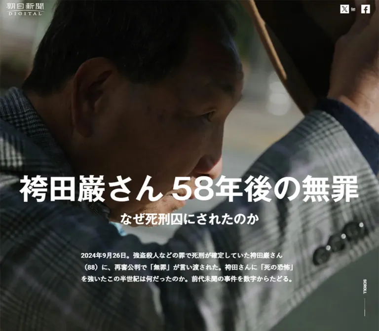
This is a long-form newspaper special about 袴田巌さん, structured around the numbers and stages of his case. Its opening photograph fills the screen: a close view of his face, raised hat, and checked jacket, with a large white headline placed across the lower portion. The interface stays small around this image. The publisher mark occupies the upper left, while subscription, login, and menu controls sit at the upper right.
The central design alternates immersive photography with explanatory reading. On desktop, a photograph occupies the left half while numbers, paragraphs, archival images, and captions occupy the right. Centered 600px reading columns provide pauses between those chapters. The ending moves through further narrative passages, an article series, related reading, and credits laid over a pale photograph of a human shadow on paving.
The visual hierarchy comes from scale, contrast, and space. Large numerals make elapsed time and procedural facts prominent; documentary photographs carry emotional weight; ordinary paragraphs remain measured and readable. Preserve this editorial sequence when adapting the design.
How to Read This Reference
- Measured means a value appears in the supplied rendered DOM or computed-style evidence. Measurements are CSS pixels unless otherwise stated.
- Derived means arithmetic from those measurements, such as a gap between two element rectangles.
- Estimated means a visual approximation from the supplied current-page captures. These values are useful starting points, not recovered stylesheet declarations.
- Recommended means a proposed implementation choice. Breakpoints, replacement asset handling, accessibility additions, and the Quick Start belong to this category unless explicitly tied to a measurement.
- Token names are descriptive implementation aliases. The supplied custom-property inventory was empty; these are not original source variables.
- Computed font stacks identify declared families, not proof that every fallback font loaded. Static captures do not establish video playback, scroll animation, or hover behavior.
The page displays a publication date of September 26, 2024, and an update date of October 8, 2024. These are editorial dates, distinct from the September 2026 inspection date.
Tokens — Colors
Editorial Palette
| Name | Value | Suggested token | Evidence and role |
|---|---|---|---|
| Reading White | #ffffff |
--paper |
White is visually present on reading surfaces; white foreground text is directly measured. The sampled body background itself is transparent. |
| Body Ink | #0a0a0a |
--ink |
Measured body and fact-paragraph foreground. |
| Related-reading Ink | #111111 |
--related-ink |
Measured series links, related links, and footer title. |
| Breadcrumb Gray | #404040 |
--breadcrumb-ink |
Measured breadcrumb-link foreground. |
| Court Black | #000000 |
--court |
Measured court labels in the procedural diagrams. |
| Hakamada-side Blue | #004881 |
--defense |
Measured labels for the Hakamada side in the diagrams. |
| Prosecution Purple | #9e348f |
--prosecution |
Measured prosecution labels in the diagrams. |
| Caption Gray | approximately #909090 |
--caption |
Estimated from the release photograph caption in the desktop middle capture. |
| Divider Gray | approximately #888888 |
--rule |
Estimated thin horizontal rule on the white fact surface. |
| Footer Paper | approximately #f5f5ef |
--footer-paper |
Estimated pale copyright strip. |
| Mobile Series Slate | approximately #8087a2 |
--series-slate |
Estimated fill of the mobile bottom series link. |
The photo sections contain muted greens, charcoal, brown, and warm stone colors. These belong to the imagery; they should not become a broad interface palette. Most controls and reading content remain black and white.
Photographic Contrast Treatments
The opening and chapter photographs are dark enough to support white titles. The credits photograph is strongly lightened to support black text. The supplied evidence does not identify the source overlay opacity or whether all tonal treatment happens in CSS.
Recommended starting points: a restrained black veil over title photography and a roughly 65–80% white veil over the credits photograph. Adjust against the actual licensed images. These percentages are adaptation values, not measurements.
The blue and purple colors identify participants in the legal process. Preserve those meanings rather than reusing them indiscriminately for buttons or decorative highlights.
Tokens — Typography
Display Gothic — Headlines and Explanatory Headings
Measured stack: MFW-GothicMB101Pr6-DeBold, 'Gothic MB101 DemiBold', sans-serif.
The H1, chapter H2s, and explanatory H3s use this stack. Computed weight is 400, despite the visibly heavy letterforms: the named face supplies the weight. Applying another bold weight to the same face may alter the result.
The headline has a dense, serious Japanese Gothic character. There is no decorative serif headline system. Letter spacing is recorded as normal on these sampled headings.
Implementation guidance: use the named font only when properly available. Otherwise choose a heavy Japanese sans-serif fallback and use an appropriate bold weight. Do not assume that naming the original family in CSS supplies its font files.
Body and Utility Text
Measured stack: -apple-system, 'system-ui', 'Segoe UI', Roboto, 'Hiragino Kaku Gothic ProN', 'Noto Sans JP', Meiryo, sans-serif.
Regular body text uses weight 400. The opening introduction uses 700. The source root remains a conventional 16px; the base body line height is 25.6px.
Two paragraph rhythms coexist:
- Narrative and explanatory text: line height
1.7. - Fact descriptions and the opening introduction: line height
1.8.
That distinction helps separate flowing explanation from discrete numerical evidence.
Diagram Typography
Measured stack: -apple-system, 'system-ui', Roboto, 'Helvetica Neue', HelveticaNeue, 'Hiragino Kaku Gothic ProN', YuGothic, 'Yu Gothic Medium', 'Yu Gothic', Meiryo, sans-serif.
Diagram labels use weight 700, with participant colors applied to the text. Desktop labels are 18px; mobile labels are 14px. Several mobile event captions use a tight 17px line height, while participant labels and numbered markers retain 20px.
Two-digit step markers have measured tracking of -1.44px on desktop and -1.12px on mobile, equivalent to -0.08em in both cases. This is a local fitting treatment, not a global tracking rule.
Type Scale
| Role | Desktop | Mobile | Weight / evidence |
|---|---|---|---|
| Main H1 base | 80px / 104px |
43.3333px / 56.3333px |
Measured; display face, computed 400 |
| H1 subtitle | approximately 32–36px |
approximately 22–24px |
Visual estimate; descendant style not supplied |
| Chapter H2 | 44px / 61.6px |
30px / 42px |
Measured; display face, computed 400 |
| Explanatory H3 | 27px / 35.1px |
21px / 27.3px |
Measured; display face, computed 400 |
| Opening introduction | 18px / 32.4px |
16px / 28.8px |
Measured; weight 700 |
| Narrative paragraph | 18px / 30.6px |
16px / 27.2px |
Measured; weight 400 |
| Fact paragraph | 18px / 32.4px |
15px / 27px |
Measured; weight 400 |
| Diagram labels | 18px / 20px |
14px / 17–20px |
Measured; weight 700 |
| Series-row title | 16px / 22.4px |
14.4px / 20.16px |
Measured; weight 400 |
| Breadcrumb | 12.8px / 23.04px |
12px / 21.6px |
Measured; weight 400 |
| Footer page title | 15.2px / 22.8px |
15.2px / 22.8px |
Measured |
| Figure caption | approximately 12px / 18px |
Not separately measured | Desktop visual estimate |
| Credits | approximately 13–14px |
approximately 13–14px |
Visual estimate; bold role labels |
Large fact numerals are visibly much larger than their accompanying units. Their exact font family, size, and weight were not included in the sampled elements. An initial 96–120px desktop numeral scale is a recommendation, not a recovered token.
The H1 rectangle includes its subtitle and, on mobile, 126.6px of bottom padding. Its measured total height is therefore not the height of a single title line.
Tokens — Spacing & Shapes
Spacing Scale
The page uses several content-specific gutters instead of one universal inset.
| Use | Value | Status |
|---|---|---|
| Related-link internal gap | 8px |
Measured |
| Series-row separation | 16px |
Derived from 84px row-start intervals and 68px row heights |
| Mobile ordinary reading gutter | 19.5px |
Measured at 390px; exactly 5% of the viewport |
| Chapter-title left inset | 32px |
Measured at both viewports |
| Explanatory heading bottom padding | 32px |
Measured |
| Heading-to-introduction gap | 48px |
Derived from H1 and introduction rectangles at both viewports |
| Mobile wide-fact gutter | 48px |
Measured |
| Mobile first explanatory heading top padding | 48px |
Measured |
| Subsequent explanatory heading top padding | 64px |
Measured |
| Desktop right-panel outer gutter | approximately 55px |
Derived relative to the visible half-page split |
| Mobile gap between paired fact bodies | 32px |
Derived |
| Desktop gap between paired fact bodies | 100px |
Derived |
Shapes and Edges
The dominant geometry is square and flat. Sampled headings, paragraphs, and article links have 0px border radius. Photographs sit directly in the composition without rounded frames or shadows.
Small exceptions are visible in utility controls:
- The subscription outline has slightly rounded corners, approximately
3px. - The back-to-top control is a pale square with approximately
5–6pxcorner rounding. - Social marks occupy circles of approximately
32pxdiameter. - Dividers and outlined controls use visually thin, approximately
1pxstrokes.
These exception values are screenshot estimates. There is no evidence of a general card-elevation system.
Layout Measurements
| Element | Desktop: 1440 × 1000 | Mobile: 390 × 844 | Evidence |
|---|---|---|---|
| Document height | 20673.20px |
22096.14px |
Measured |
| Main H1 rectangle | x 249.27, y 537.33, width 941.45px |
x 53.78, y 516.61, width 282.44px |
Measured |
| H1 total rectangle height | 177.5px |
295.39px, including bottom padding |
Measured |
| Introduction | x 420, y 762.83, width 600px |
x 19.5, y 860, width 351px |
Measured |
| Ordinary explanatory column | 600px, centered |
351px, centered |
Measured |
| Desktop photographic split | approximately 720px + 720px |
Outer split becomes sequential content | Screenshot plus mobile DOM geometry |
| Wide fact body | 486px, x 837 |
294px, x 48 |
Measured |
| Paired fact bodies | 255px each, x 775 and 1130 |
163px each, x 16 and 211 |
Measured |
| Release photograph | approximately 380 × 285px |
Not visually supplied | Desktop screenshot estimate |
| Series link row | 560 × 68px |
351 × 68px |
Measured |
| Series text left offset within row | 118px |
118px |
Derived |
| Related-link width | approximately 289.80px each |
approximately 166.72px each |
Measured |
| Credits divider | approximately 720px |
approximately 350px |
Screenshot estimate |
Do not replace all of these widths with a single container token. The hierarchy depends on a broad photo field, a medium explanatory column, narrower fact copy, and compact paired comparisons.
Components
Publisher Header
Role: publisher identity and account utilities above the opening photograph.
The white publisher mark sits about 24px from the desktop left edge and about 14px from the mobile left edge. Its visible width is approximately 100px. At the right, an outlined お申し込み control precedes ログイン and a three-line menu icon.
The header has no opaque background in the opening capture. Its compact controls leave the photograph dominant. The subscription outline is approximately 78 × 30px; the menu glyph is approximately 20px wide. These dimensions are visual estimates.
The header is not visible in the supplied middle or footer captures. Persistent positioning, menu contents, open states, and account-link behavior were not established.
Opening Photographic Stage
Role: introduce the subject and establish the seriousness of the story.
An edge-to-edge photograph forms the first screen. The face occupies the left and center of the desktop image, while the raised hat and arm fill the right. On mobile, the much narrower crop retains the face along the left edge and the hat above the title.
The main title reads 袴田巌さん 58年後の無罪, followed by なぜ死刑囚にされたのか. Desktop keeps the main title on one broad line; mobile separates the name and the 58-year phrase into two centered lines. The subtitle remains smaller and close enough to read as part of the same heading.
Desktop places the introduction below the heading in a centered 600px column. Mobile moves that paragraph beyond the first screen: its top is y 860px, 16px below the 844px viewport. It has not been removed from the page.
The vertical SCROLL label and fine line sit near the lower-right corner. The indicator communicates continuation; clicking or animation behavior was not demonstrated.
Photographic Chapter Panel
Role: give each stage of the investigation and retrial a sustained visual setting.
The desktop middle capture has a full-height photograph on the left and a white evidence area on the right. The photograph shows the subject ascending stairs from behind. A white chapter heading sits near the upper-left corner, inset 32px horizontally.
The chapter title remains prominent while the right-hand capture begins partway through a large duration statistic. This composition is consistent with a held photographic panel, but the supplied CSS does not prove its positioning mechanism. A desktop position: sticky implementation is a reasonable recommendation, not a verified source declaration.
Three principal chapter headings are present in the rendered document: the original crime and investigation; the contested trial and death sentence; and the long route to retrial and acquittal.
Numerical Fact Block
Role: make quantities, durations, and procedural contrasts easy to scan.
The content sequence is a short fact label, a large number or duration with smaller units, an explanatory paragraph, and sometimes a figure with a caption. Examples include four victims, approximately 430 hours of questioning, 49 days before arrest, and the 58-year interval before acquittal.
Some blocks occupy the full right reading panel. Others are paired, creating narrow parallel columns. That pairing survives on mobile: body widths become 163px with a 32px gap.
The desktop release block combines an oversized duration, a 486px paragraph, a centered photograph approximately 380px wide, a small gray caption, and a long divider below. Whitespace separates facts; there is no enclosing rounded card.
Several numeral strings are absent from the mobile text extraction, while the associated labels and prose remain. The visual rendering method and possible reveal behavior are unverified. Do not reproduce missing values or infer a count-up animation from this extraction alone.
Documentary Figure and Caption
Role: provide documentary context immediately beside the numerical explanation.
The visible release photograph is a plain rectangular image with its caption directly below. The image is narrower than the paragraph above it and centered in the fact area. The caption aligns with the image edges, uses subdued gray text, and wraps naturally.
The rendered document also identifies photographs of the crime scene, an interrogation recording tape, a knife, the miso tank, a statement, and supporters. Those subjects are supported by the captions; their exact current framing and visual treatment are not all shown in the supplied screenshots.
Use semantic figure and figcaption elements in an adaptation. Preserve provenance captions as reading content.
Centered Explanatory Passage
Role: pause the numerical sequence and explain its implications.
Explanatory H3s are centered above left-aligned prose in a 600px desktop column. The H3 uses 27px / 1.3; the paragraph uses 18px / 1.7. Mobile changes these to 21px / 1.3 and 16px / 1.7, with a 351px paragraph width.
Padding is deliberately generous: 32px below the heading, 48px above some mobile headings, and 64px above a subsequent question. The original H3 text is ordinary document content; there is no evidence that these question headings are accordion controls.
Judicial Process Diagram
Role: explain the sequence of actions among the Hakamada side, courts, and prosecution.
The rendered evidence contains a seven-step trial sequence and a fourteen-step retrial sequence. Participant labels repeat at the top and bottom. Numbered events occupy participant-specific horizontal positions; blue identifies the Hakamada side, black the courts, and purple the prosecution.
Mobile retains the participant structure with smaller text and additional line breaks. For example, a court event that fits one desktop line is split into two mobile lines.
The supplied data supports the label positions, participant colors, numbering, and typography. Connector geometry, arrow styling, background tracks, and animation are not visible in the provided captures and should not be reconstructed as confirmed facts.
Closing Narrative Stages
Role: return from procedure and statistics to the human consequences.
Three later narrative passages have white text in centered columns. Their vertical positions are separated by approximately one viewport: around 1000px on desktop and 844px on mobile, with differences caused by paragraph height.
This supports a sequence of spacious narrative stages. The background assets and any transitions between them are not visually documented here. Do not assume a slideshow, video, parallax effect, or specific image sequence.
A subsequent section discusses the retrial approval rate. Its H2 has a much taller rectangle than its font size alone would explain, indicating additional internal layout or content. The actual visualization type is not established by the supplied evidence.
Article Series List
Role: connect the special to fourteen related reports and a separate editorial apology.
Each measured link is a horizontal flex row, 68px high, with a consistent 118px offset before the title text. Desktop rows are 560px wide; mobile rows are 351px wide. Successive rows start 84px apart, leaving 16px of separation.
The leading area appears reserved for media or another visual element, but its exact child dimensions were not supplied. A 102 × 68px thumbnail plus a 16px gap is a useful recommended fit for the measured footprint, not a confirmed source asset size.
Text uses 16px / 22.4px on desktop and 14.4px / 20.16px on mobile. The title region has 32px of right padding on desktop and 28.8px on mobile. Keep titles readable across multiple lines rather than introducing a fixed one-line truncation.
Related Reading Pair
Role: offer two routes into the related prison-letters coverage.
Two related links sit side by side at both sampled widths. Each combines a visual region and a title with a measured 8px internal gap. Mobile does not convert this pair to a vertical list: each link is approximately 166.72px wide within the 351px content width.
The links lead to a related special and a series index. Destination-page design and access behavior were not inspected.
Series Shortcut and Back-to-Top Control
Role: offer shortcuts through a document exceeding 20,000px in height.
In the desktop middle capture, the series shortcut is a narrow outlined tab along the right edge. Its Japanese label is vertical, with a downward arrow. The visible tab is approximately 48px wide.
In the mobile footer capture, the same series label appears in a centered slate rectangle at the bottom, approximately 280 × 50px. The opening mobile capture does not show it. Its appearance threshold, dismissal behavior, and exact destination were not tested.
A pale back-to-top square with a gray chevron appears at the lower right in later captures. It is approximately 50px square on desktop. The icon suggests returning to the beginning, but click behavior and scroll duration remain unverified.
Credits, Sharing, and Copyright
Role: close the report with authorship, dates, and sharing utilities.
A full-width photograph of a person's shadow on paving is heavily lightened behind centered text. Desktop includes breadcrumbs, a repeated page title, publication and update dates, stacked role/name groups, a thin horizontal divider, and sharing controls. On mobile, names and role groups wrap within the narrow canvas while substantial photographic space remains below sharing.
The original page explicitly credits web direction to 澤田紫門, 藤井宏太, and 森本浩一郎; design and production to 岩見梨絵, 佐久間盛大, and 原有希; and photography to 時津剛. It separately lists reporting staff and photograph provision. These are original-page footer findings.
The share group has a small bold label and three circular marks for X, Facebook, and LINE, approximately 32px across with 12px gaps. A small underlined list label is visible below X in both footer captures; its purpose is unverified and it should not be treated as a required design motif.
A separate pale copyright strip closes the page. The desktop strip is approximately 70px high. Mobile wraps the legal text, and the bottom series shortcut overlaps part of this region in the capture.
Tokens — Motion & Interaction
| Treatment | Evidence | What can safely be reused |
|---|---|---|
| Series and related-link transitions | Computed transition: 0.2s |
A short 200ms transition duration; changed property and hover appearance are unverified |
| Breadcrumb transitions | Computed transition: 0.3s |
A 300ms duration; visual endpoint is unverified |
| Other sampled elements | Often transition: all, animation: none |
No positive evidence of a running animation or meaningful duration |
| Desktop held-photo composition | Suggested by the middle screenshot | Sticky positioning is a proposed implementation, not a confirmed mechanism |
| Large numerals | Some values missing from extracted text | No verified counter animation, trigger, easing, or duration |
| Opening photographic media | Static frames supplied | No verified video playback, audio, pan, or zoom |
| Scroll indicator | Label and line visible | Appearance established; movement and click behavior unknown |
| Menu, share, and shortcut controls | Visible affordances | Open states and activated behavior were not exercised |
The capture process waited for document readiness, sampled visual stability, and visible image decoding. It also handled animations during readiness checks. That process does not prove the absence of delayed JavaScript effects or establish their timing.
Recommended interaction style: keep ordinary links responsive with subtle, short feedback. Make all content readable before enhancements initialize. Use native scrolling, avoid compulsory scroll snapping, and provide a reduced-motion path for any added counters or photographic transitions. These are recommendations for an adaptation.
Surfaces
| Surface | Appearance | Function |
|---|---|---|
| Opening stage | Dark documentary photograph with white text | Establish subject and title |
| Chapter image panel | Full-bleed photograph with white chapter heading | Maintain narrative context |
| Fact panel | White, black typography, thin gray separators | Present evidence clearly |
| Explanatory column | White with broad outer whitespace | Support sustained reading |
| Judicial diagram | White with blue, black, and purple labels | Distinguish participant roles |
| Closing narrative stages | White text; background details not supplied | Give the concluding passages space |
| Credits field | Pale photograph of shadow and paving | Quiet visual closure |
| Copyright strip | Nearly white, small gray text | Publisher notice |
| Floating utilities | White outline tab, slate mobile link, pale chevron square | Navigation without a large toolbar |
Depth is mostly photographic. The interface itself relies on alignment, tonal contrast, thin rules, and whitespace rather than drop shadows or layered cards.
Imagery
The main imagery is documentary and specific to the subject. Visible photographs show a person lifting his hat, climbing stairs, leaving detention with others, and casting a long shadow on paving. Clothing texture, stair geometry, natural light, and the human silhouette provide much of the page's visual character.
The opening crop prioritizes recognition and gesture. On desktop, the face, hat, and raised arm form a broad diagonal composition. On mobile, the photograph is cropped tightly while preserving those same focal elements. Text occupies the lower region and must remain legible without covering the most important facial detail.
The footer changes the tonal register. A warm pavement photograph and diffuse shadow remain visible through a pale treatment. Keep the paving and shadow recognizable rather than replacing the entire field with a flat beige fill.
Observed Asset References
No original image URLs, file names, media-element inventory, or native dimensions were supplied. The following identifies assets by visible role, not by invented paths.
| Asset role | Evidence | Adaptation guidance |
|---|---|---|
| Hat-lifting opening image | Desktop and mobile opening captures | Use responsive cropping with an explicit focal point |
| Stair-climbing chapter image | Desktop middle capture | Preserve a tall composition and clear heading area |
| Release photograph | Desktop middle capture and caption | Keep a plain rectangular figure with its factual caption |
| Archival evidence photographs | Rendered captions | Obtain the actual authorized images before matching their treatment |
| Shadow-on-paving footer image | Desktop and mobile footer captures | Use a light wash with black text above |
| Series leading media | Inferred from repeated text offsets | Exact asset dimensions and cropping remain unverified |
Use authentic, authorized documentary imagery for factual reporting. Generated substitutes should not be presented as archival evidence. Background photographs and informational figures also need different text-alternative strategies: a decorative backdrop can be redundant with nearby text, while an evidence photograph needs meaningful identification.
Layout & Responsive Behavior
Desktop Structure
The opening image fills the 1440 × 1000 capture. Its main heading starts around 54% of the viewport height, while the introduction begins around 76%. Small publisher utilities remain near the top edge.
The chapter composition divides the desktop canvas approximately in half. Within the right half, wide fact descriptions are 486px across and paired descriptions are 255px each. Separate explanatory sections return to a centered 600px column across the overall page.
The article-series list narrows further to 560px. Credits expand visually back to a full-width photograph while keeping names and sharing centered.
Mobile Structure
At 390 × 844, the initial photograph still fills the first screen. The H1 is approximately 43.33px, and its main copy forms two lines. The introductory paragraph starts below the fold at y 860px.
The desktop outer photo/content split becomes sequential content. Internal fact pairs remain two columns, each 163px wide. This is a significant feature of the observed layout: mobile does not simply stack every component.
Three mobile reading widths remain distinct:
- 351px for ordinary narrative and the introduction, with 19.5px outer margins.
- 294px for wide fact paragraphs, with 48px outer margins.
- 163px per column for paired facts, with 16px outside margins and a 32px central gap.
Chapter headings retain a 32px left inset. Their size falls from 44px to 30px, while explanatory headings fall from 27px to 21px. Diagram labels shrink to 14px and gain manual or responsive line breaks.
Series rows retain their 68px measured height and 118px leading offset. Related-reading links remain side by side. The series shortcut changes from a vertical edge tab to a horizontal bottom control in the supplied later state.
Limits of the Responsive Evidence
Only two viewport widths were supplied. The exact media-query breakpoints, landscape layout, tablet behavior, browser chrome handling, and safe-area rules were not recorded.
The Quick Start uses a 900px breakpoint as a recommended starting point. Its viewport units, sticky panel, and interpolated mobile heading size are implementation choices. They reproduce the general observed relationships without claiming to recover the original responsive formulas.
Do’s and Don’ts
Do
- Lead with authentic documentary photography and a strongly weighted Japanese Gothic title.
- Preserve the desktop single-line main headline and deliberate mobile two-line composition.
- Keep the mobile introduction below the opening image rather than removing it.
- Maintain separate widths for narrative passages, wide facts, and paired facts.
- Preserve selected two-column fact comparisons on the sampled phone layout.
- Give large numbers smaller units and enough nearby explanation to retain their meaning.
- Keep images square-cornered and captions attached to their figures.
- Use blue and purple consistently for participant roles in procedural diagrams.
- Let thin dividers and whitespace organize the reading surfaces.
- Finish with the pale photographic credits field and compact authorship information.
Don’t
- Don't turn the editorial sequence into a feature-card or conversion-funnel layout.
- Don't replace the documentary photographs with generic legal stock imagery.
- Don't apply the display face's computed
400weight to an unrelated light fallback and expect the same result. - Don't treat the H1's full padded rectangle as a single text-line measurement.
- Don't assume every mobile component stacks into one column.
- Don't use timeline participant colors as arbitrary CTA accents.
- Don't add shadows, pill-shaped fact cards, or decorative gradients to the white reading sections.
- Don't claim autoplay video, parallax, number counting, or a menu interaction without additional evidence.
- Don't copy missing extracted numerals or the unexplained
listlabel as intentional design requirements. - Don't let fixed mobile utilities cover the final lines of content in a new implementation.
Recommended Implementation Additions
These are proposed improvements, not verified features of the original page:
- Give the menu, back-to-top control, and social links explicit accessible names and visible keyboard focus.
- Keep the complete title, numerical values, units, and diagram events available as semantic text.
- Provide a linear text equivalent for procedural diagrams; color should supplement participant names.
- Use complete static values as the default if counters are added. Motion must not be required to reveal facts.
- Reserve media dimensions to limit layout shifts. Prioritize the opening image and defer lower-page images appropriately.
- Preserve image focal points with responsive sources or per-breakpoint positioning.
- Test the narrow paired fact columns at text zoom. Stack them when readability requires it, even though the sampled original retains two columns.
- Reserve bottom clearance for the mobile series shortcut and account for safe-area insets.
- Increase the contrast of small captions and copyright text where necessary, particularly over photography.
- Ensure the hero title can enter normal document flow on short screens or at large text sizes.
Agent Prompt Guide
Quick Color Reference
- Main reading surface: white,
#ffffff. - Main text:
#0a0a0a. - Related-reading text:
#111111. - Breadcrumbs:
#404040. - Hakamada-side diagram labels:
#004881. - Court labels:
#000000. - Prosecution labels:
#9e348f. - Captions and dividers: subdued gray; exact values were not recovered.
- Photographic stages: white type over dark imagery; footer: black type over a pale image.
Overall Prompt
“Create a long-form Japanese newspaper special about a documented human story. Open with an edge-to-edge documentary photograph and a large, heavy Japanese Gothic headline across its lower portion. Keep publisher and account controls small at the top. Use a one-line main headline on desktop and two centered lines on mobile, with the mobile introduction following below the first photographic screen. Build desktop chapters from equal photo and white-content halves, using large numerical facts, smaller units, explanatory copy, and captioned archival figures. Alternate those chapters with centered 600px reading passages. Preserve selected paired facts on mobile. Finish with a compact article series and centered credits over a pale photograph of a shadow on paving. Use flat surfaces, thin rules, and restrained participant colors in procedural diagrams.”
Example Component Prompts
- Opening stage: “Compose a full-screen documentary photograph around a face and raised hat. Place a white Gothic headline low in the frame, a smaller subtitle beneath it, and a narrow introductory paragraph below. Keep the face readable and put a small vertical SCROLL cue near the lower-right edge. On a 390px phone, wrap the main headline into two lines and move the paragraph below the first screen.”
- Fact section: “Create a white editorial fact block with a short centered label, an oversized black number, smaller Japanese units, and a left-aligned paragraph. Use an optional square-cornered documentary photograph with a gray caption. Separate the next block with a fine gray rule and generous space; do not add a surrounding card.”
- Paired facts: “Arrange two fact descriptions in parallel. At 1440px desktop, use 255px text columns with a 100px gap inside the right half of the page. At 390px mobile, use 163px columns, a 32px gap, and 16px outer margins. Let titles wrap and retain complete values as text.”
- Explanatory passage: “Use a centered 600px column, a 27px heavy Japanese Gothic question heading, and 18px body text with 1.7 line height. On mobile, use 90% width, a 21px heading, and 16px body text. Keep the heading centered and paragraphs left aligned.”
- Credits footer: “Place centered dates and compact role/name groups over a strongly lightened photograph of a long human shadow on stone paving. Add a thin divider, three small circular sharing marks, and a pale copyright strip. Preserve broad photographic whitespace below the credits.”
Evidence-Safe Motion Prompt
“Implement static, readable content first. Use brief link feedback and optional desktop sticky photography as enhancement choices. Do not invent original animation timing, autoplay media, or number-counting behavior. Provide reduced-motion styles and keep every numerical fact visible without animation.”
Quick Start
CSS Custom Properties
This is a reusable adaptation, not extracted source CSS. It preserves measured type and reading widths where possible. The 900px breakpoint, photographic overlays, number sizes, sticky positioning, and hover opacity are recommendations. Estimated colors are marked in comments.
The markup should provide a .h58 wrapper; a .feature-hero containing .hero-stage and .hero-intro; a .hero-title with .hero-main and .hero-subtitle; .chapter sections containing .chapter-visual and .fact-stream; and semantic figures, lists, and links. Put the two main title phrases in separate spans. Supply actual authorized images through image elements; no original asset paths are assumed.
:root {
  /* Measured foreground colors and visually observed white surface */
  --paper: #fff;
  --ink: #0a0a0a;
  --related-ink: #111;
  --breadcrumb-ink: #404040;
  --defense: #004881;
  --court: #000;
  --prosecution: #9e348f;

  /* Estimated or recommended adaptation colors */
  --caption: #909090;
  --rule: #888;
  --footer-paper: #f5f5ef;
  --series-slate: #8087a2;
  --photo-fallback: #3b4940;

  --font-body: -apple-system, system-ui, 'Segoe UI', Roboto,
    'Hiragino Kaku Gothic ProN', 'Noto Sans JP', Meiryo, sans-serif;
  --font-display: var(--font-body);
  --display-weight: 700;

  --text-hero: 80px;
  --text-chapter: 44px;
  --text-explainer: 27px;
  --text-body: 18px;
  --text-fact: 18px;
  --text-series: 16px;
  --text-diagram: 18px;
  --text-number: 112px; /* Recommended; not measured */

  --reading-width: 600px;
  --fact-width: 486px;
  --series-width: 560px;
  --space-8: 8px;
  --space-16: 16px;
  --space-32: 32px;
  --space-48: 48px;
  --space-64: 64px;
  --link-duration: 200ms;
}

/* Enable only when the original display face is actually available. */
.h58.has-source-display {
  --font-display: MFW-GothicMB101Pr6-DeBold,
    'Gothic MB101 DemiBold', sans-serif;
  --display-weight: 400;
}

.h58,
.h58 * {
  box-sizing: border-box;
}

.h58 {
  margin: 0;
  color: var(--ink);
  background: var(--paper);
  font-family: var(--font-body);
  font-size: 16px;
  line-height: 1.6;
}

.h58 img {
  display: block;
  max-width: 100%;
}

.h58 a {
  color: inherit;
}

.h58 :focus-visible {
  outline: 2px solid currentColor;
  outline-offset: 4px;
}

.feature-hero {
  position: relative;
  color: #fff;
  background: var(--photo-fallback);
}

.hero-stage {
  position: relative;
  min-height: 100vh;
  min-height: 100svh;
  isolation: isolate;
}

.hero-media,
.chapter-media,
.credits-media {
  position: absolute;
  inset: 0;
  width: 100%;
  height: 100%;
  object-fit: cover;
}

.hero-media {
  z-index: -2;
  object-position: var(--hero-focus, 50% 50%);
}

/* Recommended tonal treatment; tune against the actual image. */
.hero-stage::before {
  position: absolute;
  inset: 0;
  z-index: -1;
  content: '';
  background: linear-gradient(
    to bottom,
    rgb(0 0 0 / 24%),
    rgb(0 0 0 / 20%) 45%,
    rgb(0 0 0 / 45%)
  );
}

.special-header {
  position: absolute;
  z-index: 3;
  inset: 0 0 auto;
  display: flex;
  align-items: center;
  justify-content: space-between;
  min-height: 50px;
  padding: 10px 24px;
  color: #fff;
}

.publisher-mark {
  width: 100px;
  height: auto;
}

.header-actions {
  display: flex;
  align-items: center;
  gap: 12px;
  font-size: 13px;
  font-weight: 700;
}

.subscription-link {
  padding: 4px 8px;
  border: 1px solid currentColor;
  border-radius: 3px;
  text-decoration: none;
}

.hero-title {
  position: absolute;
  top: 53.733svh;
  left: 50%;
  width: max-content;
  max-width: 95%;
  margin: 0;
  transform: translateX(-50%);
  font-family: var(--font-display);
  font-size: var(--text-hero);
  font-weight: var(--display-weight);
  line-height: 1.3;
  text-align: center;
}

.hero-main {
  display: flex;
  justify-content: center;
  gap: 0.16em;
}

.hero-subtitle {
  display: block;
  margin-top: 26px;
  font-size: 34px; /* Estimated subtitle scale */
  line-height: 1.4;
}

.hero-intro {
  position: absolute;
  bottom: 14svh;
  left: 50%;
  width: min(var(--reading-width), 90%);
  margin: 0;
  transform: translateX(-50%);
  font-size: var(--text-body);
  font-weight: 700;
  line-height: 1.8;
}

.scroll-cue {
  position: absolute;
  right: 32px;
  bottom: 42px;
  display: flex;
  flex-direction: column;
  align-items: center;
  gap: 8px;
  font-size: 10px;
  font-weight: 700;
}

.scroll-cue span {
  writing-mode: vertical-rl;
}

.scroll-cue::after {
  width: 1px;
  height: 50px;
  content: '';
  background: rgb(255 255 255 / 55%);
}

.chapter {
  display: grid;
  grid-template-columns: minmax(0, 1fr) minmax(0, 1fr);
  align-items: start;
}

/* Sticky behavior is an adaptation choice. */
.chapter-visual {
  position: sticky;
  top: 0;
  min-height: 100svh;
  padding: 60px 32px;
  isolation: isolate;
  color: #fff;
  background: var(--photo-fallback);
}

.chapter-media {
  z-index: -2;
}

.chapter-visual::before {
  position: absolute;
  inset: 0;
  z-index: -1;
  content: '';
  background: rgb(0 0 0 / 32%);
}

.chapter-title {
  margin: 0;
  font-family: var(--font-display);
  font-size: var(--text-chapter);
  font-weight: var(--display-weight);
  line-height: 1.4;
}

.chapter-intro {
  margin: 32px 0 0;
  font-size: var(--text-body);
  line-height: 1.7;
}

.fact-stream {
  min-width: 0;
  padding: 64px 55px;
}

.fact-card {
  min-width: 0;
  margin-bottom: 64px;
  padding-bottom: 64px;
  border-bottom: 1px solid var(--rule);
}

.fact-card--wide {
  width: min(100%, var(--fact-width));
  margin-inline: auto;
}

.fact-pair {
  display: grid;
  grid-template-columns: repeat(2, minmax(0, 1fr));
  gap: 100px;
}

.fact-label,
.fact-value {
  text-align: center;
}

.fact-value {
  margin: 16px 0 32px;
  font-family: var(--font-display);
  font-size: var(--text-number);
  font-weight: var(--display-weight);
  line-height: 1.05;
}

.fact-unit {
  font-size: 0.42em;
}

.fact-body {
  margin: 0;
  font-size: var(--text-fact);
  line-height: 1.8;
}

.fact-body a {
  text-underline-offset: 0.18em;
}

.fact-figure {
  width: min(380px, 100%);
  margin: 32px auto 0;
}

.fact-figure img {
  width: 100%;
  height: auto;
}

.fact-figure figcaption {
  margin-top: 8px;
  color: var(--caption);
  font-size: 12px;
  line-height: 1.5;
}

.explainer {
  width: min(var(--reading-width), 90%);
  margin-inline: auto;
  padding-block: 32px;
}

.explainer h3 {
  margin: 0;
  padding: 32px 0;
  font-family: var(--font-display);
  font-size: var(--text-explainer);
  font-weight: var(--display-weight);
  line-height: 1.3;
  text-align: center;
}

.explainer h3:not(:first-child) {
  padding-top: 64px;
}

.explainer p {
  margin: 0;
  font-size: var(--text-body);
  line-height: 1.7;
}

.timeline {
  font-size: var(--text-diagram);
  font-weight: 700;
  line-height: 20px;
}

.party--defense { color: var(--defense); }
.party--court { color: var(--court); }
.party--prosecution { color: var(--prosecution); }

.timeline-step--double {
  letter-spacing: -0.08em;
}

.series-list {
  display: grid;
  gap: 16px;
  width: min(var(--series-width), 90%);
  margin-inline: auto;
  padding: 0;
  list-style: none;
}

/* The 102px media slot is a recommended fit for the 118px offset. */
.series-row {
  display: grid;
  grid-template-columns: 102px minmax(0, 1fr);
  align-items: center;
  gap: 16px;
  min-height: 68px;
  color: var(--related-ink);
  text-decoration: none;
  transition: opacity var(--link-duration);
}

.series-row img {
  width: 102px;
  height: 68px;
  object-fit: cover;
}

.series-row p {
  margin: 0;
  padding-right: 32px;
  font-size: var(--text-series);
  line-height: 1.4;
}

.related-links {
  display: grid;
  grid-template-columns: repeat(2, minmax(0, 1fr));
  gap: 5%;
  width: min(var(--reading-width), 90%);
  margin: 96px auto;
}

.related-link {
  display: flex;
  flex-direction: column;
  gap: 8px;
  color: var(--related-ink);
  font-size: var(--text-series);
  line-height: 1.4;
}

.credits-panel {
  position: relative;
  min-height: 93svh;
  padding: 32px 5% 240px;
  isolation: isolate;
  color: var(--related-ink);
  text-align: center;
}

.credits-media {
  z-index: -2;
}

.credits-panel::before {
  position: absolute;
  inset: 0;
  z-index: -1;
  content: '';
  background: rgb(255 255 255 / 72%);
}

.credits-content {
  width: min(720px, 100%);
  margin-inline: auto;
  font-size: 13px;
}

.credits-content dt {
  margin-top: 20px;
  font-weight: 700;
}

.credits-content dd {
  margin: 4px 0 0;
}

.credits-divider {
  margin-block: 32px;
  border: 0;
  border-top: 1px solid rgb(255 255 255 / 90%);
}

.share-actions {
  display: flex;
  justify-content: center;
  gap: 12px;
  margin-top: 16px;
}

.share-action {
  display: grid;
  width: 32px;
  height: 32px;
  place-items: center;
  border-radius: 50%;
}

.copyright {
  padding: 16px 5%;
  color: #777; /* Recommended stronger contrast */
  background: var(--footer-paper);
  font-size: 11px;
  text-align: center;
}

/* Apply is-reading only when the application should expose shortcuts. */
.series-jump {
  position: fixed;
  z-index: 5;
  top: 96px;
  right: 0;
  display: none;
  padding: 16px;
  border: 1px solid var(--rule);
  color: var(--ink);
  background: var(--paper);
  font-weight: 700;
  text-decoration: none;
  writing-mode: vertical-rl;
}

.h58.is-reading .series-jump {
  display: flex;
}

.back-to-top {
  position: fixed;
  z-index: 5;
  right: 30px;
  bottom: 10px;
  display: grid;
  width: 50px;
  height: 50px;
  place-items: center;
  border: 0;
  border-radius: 6px;
  color: #888;
  background: #f4f4f4;
}

@media (hover: hover) {
  .series-row:hover {
    opacity: 0.72; /* Recommended endpoint, not observed */
  }
}

/* Recommended breakpoint; the original breakpoint is unknown. */
@media (max-width: 900px) {
  .h58 {
    --text-hero: clamp(32px, 11.1111vw, 48px);
    --text-chapter: 30px;
    --text-explainer: 21px;
    --text-body: 16px;
    --text-fact: 15px;
    --text-series: 14.4px;
    --text-diagram: 14px;
    --text-number: clamp(64px, 22vw, 96px);
  }

  .special-header {
    padding-inline: 14px 24px;
  }

  .hero-title {
    top: 61.21svh;
  }

  .hero-main {
    flex-direction: column;
    gap: 0;
  }

  .hero-subtitle {
    margin-top: 24px;
    font-size: 22px;
  }

  .hero-intro {
    position: static;
    width: 90%;
    margin: 16px auto 0;
    padding-bottom: 64px;
    transform: none;
  }

  .scroll-cue::after {
    height: 80px;
  }

  .chapter {
    display: block;
  }

  /* Mobile photo-stage height and alignment are adaptation choices. */
  .chapter-visual {
    position: relative;
    display: flex;
    flex-direction: column;
    justify-content: flex-end;
    min-height: 100svh;
    padding: 64px 32px;
  }

  .fact-stream {
    padding: 48px 0;
  }

  .fact-card--wide {
    width: calc(100% - 96px);
    max-width: var(--fact-width);
  }

  .fact-pair {
    gap: 32px;
    padding-inline: 16px;
  }

  .explainer h3 {
    padding-top: 48px;
  }

  .series-row p {
    padding-right: 28.8px;
  }

  .credits-panel {
    min-height: 100svh;
  }

  .series-jump {
    top: auto;
    right: auto;
    bottom: env(safe-area-inset-bottom, 0px);
    left: 50%;
    align-items: center;
    justify-content: center;
    width: min(280px, calc(100% - 80px));
    min-height: 50px;
    padding: 12px;
    transform: translateX(-50%);
    border: 0;
    color: #fff;
    background: var(--series-slate);
    writing-mode: horizontal-tb;
  }

  .back-to-top {
    right: 10px;
    bottom: calc(64px + env(safe-area-inset-bottom, 0px));
  }

  .h58.is-reading .copyright {
    padding-bottom: calc(80px + env(safe-area-inset-bottom, 0px));
  }
}

/* Recommended fallback for short viewports and enlarged text. */
@media (max-height: 600px) {
  .hero-stage {
    display: flex;
    align-items: flex-end;
    min-height: 100svh;
    padding: 100px 5% 140px;
  }

  .hero-title {
    position: static;
    width: 100%;
    max-width: none;
    transform: none;
  }

  .hero-main {
    flex-wrap: wrap;
  }

  .hero-intro {
    position: static;
    width: min(var(--reading-width), 90%);
    margin: 16px auto 0;
    padding-bottom: 48px;
    transform: none;
  }
}

@media (prefers-reduced-motion: reduce) {
  .h58 *,
  .h58 *::before,
  .h58 *::after {
    animation: none !important;
    transition: none !important;
    scroll-behavior: auto !important;
  }
}
The snippet provides visual structure. Menu operation, actual share destinations, shortcut activation, accessible diagram markup, and image licensing require separate implementation. No motion is required for the text to appear.
Tailwind v4 Token Mapping
Optional mapping for a project already using Tailwind v4. This does not imply that the original site uses Tailwind. Define the properties above first.
@theme inline {
  --color-editorial-paper: var(--paper);
  --color-editorial-ink: var(--ink);
  --color-editorial-muted: var(--caption);
  --color-party-defense: var(--defense);
  --color-party-court: var(--court);
  --color-party-prosecution: var(--prosecution);

  --font-editorial: var(--font-body);
  --font-headline: var(--font-display);

  --text-feature: var(--text-hero);
  --text-chapter: var(--text-chapter);
  --text-explanation: var(--text-explainer);
  --text-narrative: var(--text-body);
  --text-fact-copy: var(--text-fact);
  --text-related: var(--text-series);

  --spacing-reading: var(--reading-width);
  --spacing-wide-fact: var(--fact-width);
  --spacing-series: var(--series-width);
}
Sources & Evidence
- Original and final page: Asahi Shimbun — Hakamada special. The supplied browser record reports HTTP
200and identical original/final URLs. - Capture time:
2026-09-16T19:44:11.889Z, equivalent to September 17, 2026, 04:44:11.889 JST. Analysis uses the supplied observation package rather than a new browser session. - Desktop visual evidence: 1440 × 1000 opening, middle chapter, and footer captures. These establish photography, visible composition, header utilities, the split chapter, floating shortcuts, and footer treatment.
- Mobile visual evidence: 390 × 844 opening and footer captures. These establish title wrapping, image cropping, compact header controls, the mobile footer, and the later bottom series shortcut.
- Rendered DOM and computed styles: samples at both widths establish declared font stacks, typography, foreground colors, paragraph widths, heading padding, article-link geometry, related-link gaps, and transition-duration strings. Document heights are approximately 20,673px and 22,096px.
- Original-page text: supports the editorial sequence, fourteen linked reports, procedural-event labels, dates, figure captions, and named footer credits. Linked destination pages were not independently inspected.
- Inspection limits: no opened menu, activated share control, hover-state capture, keyboard test, video playback record, counter timing, original media URLs, or complete stylesheet was supplied. SharedWorkers and service workers were disabled during the browser inspection. Readiness checks reduce transient capture artifacts but do not establish semantic completeness or all delayed behavior.
This reference documents the current rendered page evidenced by those captures. Values labeled as estimates or recommendations should be validated against the actual assets and implementation before being treated as exact specifications.
# Asahi Shimbun / Hakamada: Innocent After 58 Years — Style Reference

> Documentary photography, monumental numbers, and quiet reading columns give a long judicial history a human scale.

**Website:** [asahi.com/special/hakamadainnocence58](https://www.asahi.com/special/hakamadainnocence58/)
**Original URL:** https://www.asahi.com/special/hakamadainnocence58/
**Final URL:** https://www.asahi.com/special/hakamadainnocence58/
**Theme:** white editorial reading surfaces, dark photographic stages, and restrained semantic colors in judicial timelines.
**Inspected:** September 17, 2026, 04:44 JST; supplied retrieval timestamp: September 16, 2026, 19:44:11.889 UTC.
**Viewports:** 1440 × 1000 and 390 × 844 CSS pixels.
**Scope:** supplied current-page desktop opening, middle, and footer captures; mobile opening and footer captures; rendered text, links, element geometry, and computed-style samples across both document layouts. No additional browsing or interaction testing was performed for this reference.

This is a long-form newspaper special about 袴田巌さん, structured around the numbers and stages of his case. Its opening photograph fills the screen: a close view of his face, raised hat, and checked jacket, with a large white headline placed across the lower portion. The interface stays small around this image. The publisher mark occupies the upper left, while subscription, login, and menu controls sit at the upper right.

The central design alternates immersive photography with explanatory reading. On desktop, a photograph occupies the left half while numbers, paragraphs, archival images, and captions occupy the right. Centered 600px reading columns provide pauses between those chapters. The ending moves through further narrative passages, an article series, related reading, and credits laid over a pale photograph of a human shadow on paving.

The visual hierarchy comes from scale, contrast, and space. Large numerals make elapsed time and procedural facts prominent; documentary photographs carry emotional weight; ordinary paragraphs remain measured and readable. Preserve this editorial sequence when adapting the design.

## How to Read This Reference

- **Measured** means a value appears in the supplied rendered DOM or computed-style evidence. Measurements are CSS pixels unless otherwise stated.
- **Derived** means arithmetic from those measurements, such as a gap between two element rectangles.
- **Estimated** means a visual approximation from the supplied current-page captures. These values are useful starting points, not recovered stylesheet declarations.
- **Recommended** means a proposed implementation choice. Breakpoints, replacement asset handling, accessibility additions, and the Quick Start belong to this category unless explicitly tied to a measurement.
- Token names are descriptive implementation aliases. The supplied custom-property inventory was empty; these are not original source variables.
- Computed font stacks identify declared families, not proof that every fallback font loaded. Static captures do not establish video playback, scroll animation, or hover behavior.

The page displays a publication date of September 26, 2024, and an update date of October 8, 2024. These are editorial dates, distinct from the September 2026 inspection date.

## Tokens — Colors

### Editorial Palette

| Name | Value | Suggested token | Evidence and role |
| --- | --- | --- | --- |
| Reading White | `#ffffff` | `--paper` | White is visually present on reading surfaces; white foreground text is directly measured. The sampled body background itself is transparent. |
| Body Ink | `#0a0a0a` | `--ink` | Measured body and fact-paragraph foreground. |
| Related-reading Ink | `#111111` | `--related-ink` | Measured series links, related links, and footer title. |
| Breadcrumb Gray | `#404040` | `--breadcrumb-ink` | Measured breadcrumb-link foreground. |
| Court Black | `#000000` | `--court` | Measured court labels in the procedural diagrams. |
| Hakamada-side Blue | `#004881` | `--defense` | Measured labels for the Hakamada side in the diagrams. |
| Prosecution Purple | `#9e348f` | `--prosecution` | Measured prosecution labels in the diagrams. |
| Caption Gray | approximately `#909090` | `--caption` | Estimated from the release photograph caption in the desktop middle capture. |
| Divider Gray | approximately `#888888` | `--rule` | Estimated thin horizontal rule on the white fact surface. |
| Footer Paper | approximately `#f5f5ef` | `--footer-paper` | Estimated pale copyright strip. |
| Mobile Series Slate | approximately `#8087a2` | `--series-slate` | Estimated fill of the mobile bottom series link. |

The photo sections contain muted greens, charcoal, brown, and warm stone colors. These belong to the imagery; they should not become a broad interface palette. Most controls and reading content remain black and white.

### Photographic Contrast Treatments

The opening and chapter photographs are dark enough to support white titles. The credits photograph is strongly lightened to support black text. The supplied evidence does not identify the source overlay opacity or whether all tonal treatment happens in CSS.

**Recommended starting points:** a restrained black veil over title photography and a roughly 65–80% white veil over the credits photograph. Adjust against the actual licensed images. These percentages are adaptation values, not measurements.

The blue and purple colors identify participants in the legal process. Preserve those meanings rather than reusing them indiscriminately for buttons or decorative highlights.

## Tokens — Typography

### Display Gothic — Headlines and Explanatory Headings

**Measured stack:** `MFW-GothicMB101Pr6-DeBold, 'Gothic MB101 DemiBold', sans-serif`.

The H1, chapter H2s, and explanatory H3s use this stack. Computed weight is `400`, despite the visibly heavy letterforms: the named face supplies the weight. Applying another bold weight to the same face may alter the result.

The headline has a dense, serious Japanese Gothic character. There is no decorative serif headline system. Letter spacing is recorded as `normal` on these sampled headings.

**Implementation guidance:** use the named font only when properly available. Otherwise choose a heavy Japanese sans-serif fallback and use an appropriate bold weight. Do not assume that naming the original family in CSS supplies its font files.

### Body and Utility Text

**Measured stack:** `-apple-system, 'system-ui', 'Segoe UI', Roboto, 'Hiragino Kaku Gothic ProN', 'Noto Sans JP', Meiryo, sans-serif`.

Regular body text uses weight `400`. The opening introduction uses `700`. The source root remains a conventional `16px`; the base body line height is `25.6px`.

Two paragraph rhythms coexist:

- Narrative and explanatory text: line height `1.7`.
- Fact descriptions and the opening introduction: line height `1.8`.

That distinction helps separate flowing explanation from discrete numerical evidence.

### Diagram Typography

**Measured stack:** `-apple-system, 'system-ui', Roboto, 'Helvetica Neue', HelveticaNeue, 'Hiragino Kaku Gothic ProN', YuGothic, 'Yu Gothic Medium', 'Yu Gothic', Meiryo, sans-serif`.

Diagram labels use weight `700`, with participant colors applied to the text. Desktop labels are `18px`; mobile labels are `14px`. Several mobile event captions use a tight `17px` line height, while participant labels and numbered markers retain `20px`.

Two-digit step markers have measured tracking of `-1.44px` on desktop and `-1.12px` on mobile, equivalent to `-0.08em` in both cases. This is a local fitting treatment, not a global tracking rule.

### Type Scale

| Role | Desktop | Mobile | Weight / evidence |
| --- | --- | --- | --- |
| Main H1 base | `80px / 104px` | `43.3333px / 56.3333px` | Measured; display face, computed `400` |
| H1 subtitle | approximately `32–36px` | approximately `22–24px` | Visual estimate; descendant style not supplied |
| Chapter H2 | `44px / 61.6px` | `30px / 42px` | Measured; display face, computed `400` |
| Explanatory H3 | `27px / 35.1px` | `21px / 27.3px` | Measured; display face, computed `400` |
| Opening introduction | `18px / 32.4px` | `16px / 28.8px` | Measured; weight `700` |
| Narrative paragraph | `18px / 30.6px` | `16px / 27.2px` | Measured; weight `400` |
| Fact paragraph | `18px / 32.4px` | `15px / 27px` | Measured; weight `400` |
| Diagram labels | `18px / 20px` | `14px / 17–20px` | Measured; weight `700` |
| Series-row title | `16px / 22.4px` | `14.4px / 20.16px` | Measured; weight `400` |
| Breadcrumb | `12.8px / 23.04px` | `12px / 21.6px` | Measured; weight `400` |
| Footer page title | `15.2px / 22.8px` | `15.2px / 22.8px` | Measured |
| Figure caption | approximately `12px / 18px` | Not separately measured | Desktop visual estimate |
| Credits | approximately `13–14px` | approximately `13–14px` | Visual estimate; bold role labels |

Large fact numerals are visibly much larger than their accompanying units. Their exact font family, size, and weight were not included in the sampled elements. An initial `96–120px` desktop numeral scale is a **recommendation**, not a recovered token.

The H1 rectangle includes its subtitle and, on mobile, `126.6px` of bottom padding. Its measured total height is therefore not the height of a single title line.

## Tokens — Spacing & Shapes

### Spacing Scale

The page uses several content-specific gutters instead of one universal inset.

| Use | Value | Status |
| --- | --- | --- |
| Related-link internal gap | `8px` | Measured |
| Series-row separation | `16px` | Derived from `84px` row-start intervals and `68px` row heights |
| Mobile ordinary reading gutter | `19.5px` | Measured at 390px; exactly 5% of the viewport |
| Chapter-title left inset | `32px` | Measured at both viewports |
| Explanatory heading bottom padding | `32px` | Measured |
| Heading-to-introduction gap | `48px` | Derived from H1 and introduction rectangles at both viewports |
| Mobile wide-fact gutter | `48px` | Measured |
| Mobile first explanatory heading top padding | `48px` | Measured |
| Subsequent explanatory heading top padding | `64px` | Measured |
| Desktop right-panel outer gutter | approximately `55px` | Derived relative to the visible half-page split |
| Mobile gap between paired fact bodies | `32px` | Derived |
| Desktop gap between paired fact bodies | `100px` | Derived |

### Shapes and Edges

The dominant geometry is square and flat. Sampled headings, paragraphs, and article links have `0px` border radius. Photographs sit directly in the composition without rounded frames or shadows.

Small exceptions are visible in utility controls:

- The subscription outline has slightly rounded corners, approximately `3px`.
- The back-to-top control is a pale square with approximately `5–6px` corner rounding.
- Social marks occupy circles of approximately `32px` diameter.
- Dividers and outlined controls use visually thin, approximately `1px` strokes.

These exception values are screenshot estimates. There is no evidence of a general card-elevation system.

### Layout Measurements

| Element | Desktop: 1440 × 1000 | Mobile: 390 × 844 | Evidence |
| --- | --- | --- | --- |
| Document height | `20673.20px` | `22096.14px` | Measured |
| Main H1 rectangle | x `249.27`, y `537.33`, width `941.45px` | x `53.78`, y `516.61`, width `282.44px` | Measured |
| H1 total rectangle height | `177.5px` | `295.39px`, including bottom padding | Measured |
| Introduction | x `420`, y `762.83`, width `600px` | x `19.5`, y `860`, width `351px` | Measured |
| Ordinary explanatory column | `600px`, centered | `351px`, centered | Measured |
| Desktop photographic split | approximately `720px + 720px` | Outer split becomes sequential content | Screenshot plus mobile DOM geometry |
| Wide fact body | `486px`, x `837` | `294px`, x `48` | Measured |
| Paired fact bodies | `255px` each, x `775` and `1130` | `163px` each, x `16` and `211` | Measured |
| Release photograph | approximately `380 × 285px` | Not visually supplied | Desktop screenshot estimate |
| Series link row | `560 × 68px` | `351 × 68px` | Measured |
| Series text left offset within row | `118px` | `118px` | Derived |
| Related-link width | approximately `289.80px` each | approximately `166.72px` each | Measured |
| Credits divider | approximately `720px` | approximately `350px` | Screenshot estimate |

Do not replace all of these widths with a single container token. The hierarchy depends on a broad photo field, a medium explanatory column, narrower fact copy, and compact paired comparisons.

## Components

### Publisher Header

**Role:** publisher identity and account utilities above the opening photograph.

The white publisher mark sits about 24px from the desktop left edge and about 14px from the mobile left edge. Its visible width is approximately 100px. At the right, an outlined `お申し込み` control precedes `ログイン` and a three-line menu icon.

The header has no opaque background in the opening capture. Its compact controls leave the photograph dominant. The subscription outline is approximately `78 × 30px`; the menu glyph is approximately 20px wide. These dimensions are visual estimates.

The header is not visible in the supplied middle or footer captures. Persistent positioning, menu contents, open states, and account-link behavior were not established.

### Opening Photographic Stage

**Role:** introduce the subject and establish the seriousness of the story.

An edge-to-edge photograph forms the first screen. The face occupies the left and center of the desktop image, while the raised hat and arm fill the right. On mobile, the much narrower crop retains the face along the left edge and the hat above the title.

The main title reads `袴田巌さん 58年後の無罪`, followed by `なぜ死刑囚にされたのか`. Desktop keeps the main title on one broad line; mobile separates the name and the 58-year phrase into two centered lines. The subtitle remains smaller and close enough to read as part of the same heading.

Desktop places the introduction below the heading in a centered 600px column. Mobile moves that paragraph beyond the first screen: its top is y `860px`, 16px below the 844px viewport. It has not been removed from the page.

The vertical `SCROLL` label and fine line sit near the lower-right corner. The indicator communicates continuation; clicking or animation behavior was not demonstrated.

### Photographic Chapter Panel

**Role:** give each stage of the investigation and retrial a sustained visual setting.

The desktop middle capture has a full-height photograph on the left and a white evidence area on the right. The photograph shows the subject ascending stairs from behind. A white chapter heading sits near the upper-left corner, inset 32px horizontally.

The chapter title remains prominent while the right-hand capture begins partway through a large duration statistic. This composition is consistent with a held photographic panel, but the supplied CSS does not prove its positioning mechanism. A desktop `position: sticky` implementation is a reasonable **recommendation**, not a verified source declaration.

Three principal chapter headings are present in the rendered document: the original crime and investigation; the contested trial and death sentence; and the long route to retrial and acquittal.

### Numerical Fact Block

**Role:** make quantities, durations, and procedural contrasts easy to scan.

The content sequence is a short fact label, a large number or duration with smaller units, an explanatory paragraph, and sometimes a figure with a caption. Examples include four victims, approximately 430 hours of questioning, 49 days before arrest, and the 58-year interval before acquittal.

Some blocks occupy the full right reading panel. Others are paired, creating narrow parallel columns. That pairing survives on mobile: body widths become 163px with a 32px gap.

The desktop release block combines an oversized duration, a 486px paragraph, a centered photograph approximately 380px wide, a small gray caption, and a long divider below. Whitespace separates facts; there is no enclosing rounded card.

Several numeral strings are absent from the mobile text extraction, while the associated labels and prose remain. The visual rendering method and possible reveal behavior are unverified. Do not reproduce missing values or infer a count-up animation from this extraction alone.

### Documentary Figure and Caption

**Role:** provide documentary context immediately beside the numerical explanation.

The visible release photograph is a plain rectangular image with its caption directly below. The image is narrower than the paragraph above it and centered in the fact area. The caption aligns with the image edges, uses subdued gray text, and wraps naturally.

The rendered document also identifies photographs of the crime scene, an interrogation recording tape, a knife, the miso tank, a statement, and supporters. Those subjects are supported by the captions; their exact current framing and visual treatment are not all shown in the supplied screenshots.

Use semantic `figure` and `figcaption` elements in an adaptation. Preserve provenance captions as reading content.

### Centered Explanatory Passage

**Role:** pause the numerical sequence and explain its implications.

Explanatory H3s are centered above left-aligned prose in a 600px desktop column. The H3 uses `27px / 1.3`; the paragraph uses `18px / 1.7`. Mobile changes these to `21px / 1.3` and `16px / 1.7`, with a 351px paragraph width.

Padding is deliberately generous: 32px below the heading, 48px above some mobile headings, and 64px above a subsequent question. The original H3 text is ordinary document content; there is no evidence that these question headings are accordion controls.

### Judicial Process Diagram

**Role:** explain the sequence of actions among the Hakamada side, courts, and prosecution.

The rendered evidence contains a seven-step trial sequence and a fourteen-step retrial sequence. Participant labels repeat at the top and bottom. Numbered events occupy participant-specific horizontal positions; blue identifies the Hakamada side, black the courts, and purple the prosecution.

Mobile retains the participant structure with smaller text and additional line breaks. For example, a court event that fits one desktop line is split into two mobile lines.

The supplied data supports the label positions, participant colors, numbering, and typography. Connector geometry, arrow styling, background tracks, and animation are not visible in the provided captures and should not be reconstructed as confirmed facts.

### Closing Narrative Stages

**Role:** return from procedure and statistics to the human consequences.

Three later narrative passages have white text in centered columns. Their vertical positions are separated by approximately one viewport: around 1000px on desktop and 844px on mobile, with differences caused by paragraph height.

This supports a sequence of spacious narrative stages. The background assets and any transitions between them are not visually documented here. Do not assume a slideshow, video, parallax effect, or specific image sequence.

A subsequent section discusses the retrial approval rate. Its H2 has a much taller rectangle than its font size alone would explain, indicating additional internal layout or content. The actual visualization type is not established by the supplied evidence.

### Article Series List

**Role:** connect the special to fourteen related reports and a separate editorial apology.

Each measured link is a horizontal flex row, 68px high, with a consistent 118px offset before the title text. Desktop rows are 560px wide; mobile rows are 351px wide. Successive rows start 84px apart, leaving 16px of separation.

The leading area appears reserved for media or another visual element, but its exact child dimensions were not supplied. A `102 × 68px` thumbnail plus a 16px gap is a useful **recommended fit** for the measured footprint, not a confirmed source asset size.

Text uses `16px / 22.4px` on desktop and `14.4px / 20.16px` on mobile. The title region has 32px of right padding on desktop and 28.8px on mobile. Keep titles readable across multiple lines rather than introducing a fixed one-line truncation.

### Related Reading Pair

**Role:** offer two routes into the related prison-letters coverage.

Two related links sit side by side at both sampled widths. Each combines a visual region and a title with a measured 8px internal gap. Mobile does not convert this pair to a vertical list: each link is approximately 166.72px wide within the 351px content width.

The links lead to a related special and a series index. Destination-page design and access behavior were not inspected.

### Series Shortcut and Back-to-Top Control

**Role:** offer shortcuts through a document exceeding 20,000px in height.

In the desktop middle capture, the series shortcut is a narrow outlined tab along the right edge. Its Japanese label is vertical, with a downward arrow. The visible tab is approximately 48px wide.

In the mobile footer capture, the same series label appears in a centered slate rectangle at the bottom, approximately `280 × 50px`. The opening mobile capture does not show it. Its appearance threshold, dismissal behavior, and exact destination were not tested.

A pale back-to-top square with a gray chevron appears at the lower right in later captures. It is approximately 50px square on desktop. The icon suggests returning to the beginning, but click behavior and scroll duration remain unverified.

### Credits, Sharing, and Copyright

**Role:** close the report with authorship, dates, and sharing utilities.

A full-width photograph of a person's shadow on paving is heavily lightened behind centered text. Desktop includes breadcrumbs, a repeated page title, publication and update dates, stacked role/name groups, a thin horizontal divider, and sharing controls. On mobile, names and role groups wrap within the narrow canvas while substantial photographic space remains below sharing.

The original page explicitly credits web direction to 澤田紫門, 藤井宏太, and 森本浩一郎; design and production to 岩見梨絵, 佐久間盛大, and 原有希; and photography to 時津剛. It separately lists reporting staff and photograph provision. These are original-page footer findings.

The share group has a small bold label and three circular marks for X, Facebook, and LINE, approximately 32px across with 12px gaps. A small underlined `list` label is visible below X in both footer captures; its purpose is unverified and it should not be treated as a required design motif.

A separate pale copyright strip closes the page. The desktop strip is approximately 70px high. Mobile wraps the legal text, and the bottom series shortcut overlaps part of this region in the capture.

## Tokens — Motion & Interaction

| Treatment | Evidence | What can safely be reused |
| --- | --- | --- |
| Series and related-link transitions | Computed `transition: 0.2s` | A short 200ms transition duration; changed property and hover appearance are unverified |
| Breadcrumb transitions | Computed `transition: 0.3s` | A 300ms duration; visual endpoint is unverified |
| Other sampled elements | Often `transition: all`, `animation: none` | No positive evidence of a running animation or meaningful duration |
| Desktop held-photo composition | Suggested by the middle screenshot | Sticky positioning is a proposed implementation, not a confirmed mechanism |
| Large numerals | Some values missing from extracted text | No verified counter animation, trigger, easing, or duration |
| Opening photographic media | Static frames supplied | No verified video playback, audio, pan, or zoom |
| Scroll indicator | Label and line visible | Appearance established; movement and click behavior unknown |
| Menu, share, and shortcut controls | Visible affordances | Open states and activated behavior were not exercised |

The capture process waited for document readiness, sampled visual stability, and visible image decoding. It also handled animations during readiness checks. That process does not prove the absence of delayed JavaScript effects or establish their timing.

**Recommended interaction style:** keep ordinary links responsive with subtle, short feedback. Make all content readable before enhancements initialize. Use native scrolling, avoid compulsory scroll snapping, and provide a reduced-motion path for any added counters or photographic transitions. These are recommendations for an adaptation.

## Surfaces

| Surface | Appearance | Function |
| --- | --- | --- |
| Opening stage | Dark documentary photograph with white text | Establish subject and title |
| Chapter image panel | Full-bleed photograph with white chapter heading | Maintain narrative context |
| Fact panel | White, black typography, thin gray separators | Present evidence clearly |
| Explanatory column | White with broad outer whitespace | Support sustained reading |
| Judicial diagram | White with blue, black, and purple labels | Distinguish participant roles |
| Closing narrative stages | White text; background details not supplied | Give the concluding passages space |
| Credits field | Pale photograph of shadow and paving | Quiet visual closure |
| Copyright strip | Nearly white, small gray text | Publisher notice |
| Floating utilities | White outline tab, slate mobile link, pale chevron square | Navigation without a large toolbar |

Depth is mostly photographic. The interface itself relies on alignment, tonal contrast, thin rules, and whitespace rather than drop shadows or layered cards.

## Imagery

The main imagery is documentary and specific to the subject. Visible photographs show a person lifting his hat, climbing stairs, leaving detention with others, and casting a long shadow on paving. Clothing texture, stair geometry, natural light, and the human silhouette provide much of the page's visual character.

The opening crop prioritizes recognition and gesture. On desktop, the face, hat, and raised arm form a broad diagonal composition. On mobile, the photograph is cropped tightly while preserving those same focal elements. Text occupies the lower region and must remain legible without covering the most important facial detail.

The footer changes the tonal register. A warm pavement photograph and diffuse shadow remain visible through a pale treatment. Keep the paving and shadow recognizable rather than replacing the entire field with a flat beige fill.

### Observed Asset References

No original image URLs, file names, media-element inventory, or native dimensions were supplied. The following identifies assets by visible role, not by invented paths.

| Asset role | Evidence | Adaptation guidance |
| --- | --- | --- |
| Hat-lifting opening image | Desktop and mobile opening captures | Use responsive cropping with an explicit focal point |
| Stair-climbing chapter image | Desktop middle capture | Preserve a tall composition and clear heading area |
| Release photograph | Desktop middle capture and caption | Keep a plain rectangular figure with its factual caption |
| Archival evidence photographs | Rendered captions | Obtain the actual authorized images before matching their treatment |
| Shadow-on-paving footer image | Desktop and mobile footer captures | Use a light wash with black text above |
| Series leading media | Inferred from repeated text offsets | Exact asset dimensions and cropping remain unverified |

Use authentic, authorized documentary imagery for factual reporting. Generated substitutes should not be presented as archival evidence. Background photographs and informational figures also need different text-alternative strategies: a decorative backdrop can be redundant with nearby text, while an evidence photograph needs meaningful identification.

## Layout & Responsive Behavior

### Desktop Structure

The opening image fills the 1440 × 1000 capture. Its main heading starts around 54% of the viewport height, while the introduction begins around 76%. Small publisher utilities remain near the top edge.

The chapter composition divides the desktop canvas approximately in half. Within the right half, wide fact descriptions are 486px across and paired descriptions are 255px each. Separate explanatory sections return to a centered 600px column across the overall page.

The article-series list narrows further to 560px. Credits expand visually back to a full-width photograph while keeping names and sharing centered.

### Mobile Structure

At 390 × 844, the initial photograph still fills the first screen. The H1 is approximately 43.33px, and its main copy forms two lines. The introductory paragraph starts below the fold at y `860px`.

The desktop outer photo/content split becomes sequential content. Internal fact pairs remain two columns, each 163px wide. This is a significant feature of the observed layout: mobile does not simply stack every component.

Three mobile reading widths remain distinct:

- 351px for ordinary narrative and the introduction, with 19.5px outer margins.
- 294px for wide fact paragraphs, with 48px outer margins.
- 163px per column for paired facts, with 16px outside margins and a 32px central gap.

Chapter headings retain a 32px left inset. Their size falls from 44px to 30px, while explanatory headings fall from 27px to 21px. Diagram labels shrink to 14px and gain manual or responsive line breaks.

Series rows retain their 68px measured height and 118px leading offset. Related-reading links remain side by side. The series shortcut changes from a vertical edge tab to a horizontal bottom control in the supplied later state.

### Limits of the Responsive Evidence

Only two viewport widths were supplied. The exact media-query breakpoints, landscape layout, tablet behavior, browser chrome handling, and safe-area rules were not recorded.

The Quick Start uses a 900px breakpoint as a **recommended starting point**. Its viewport units, sticky panel, and interpolated mobile heading size are implementation choices. They reproduce the general observed relationships without claiming to recover the original responsive formulas.

## Do’s and Don’ts

### Do

- Lead with authentic documentary photography and a strongly weighted Japanese Gothic title.
- Preserve the desktop single-line main headline and deliberate mobile two-line composition.
- Keep the mobile introduction below the opening image rather than removing it.
- Maintain separate widths for narrative passages, wide facts, and paired facts.
- Preserve selected two-column fact comparisons on the sampled phone layout.
- Give large numbers smaller units and enough nearby explanation to retain their meaning.
- Keep images square-cornered and captions attached to their figures.
- Use blue and purple consistently for participant roles in procedural diagrams.
- Let thin dividers and whitespace organize the reading surfaces.
- Finish with the pale photographic credits field and compact authorship information.

### Don’t

- Don't turn the editorial sequence into a feature-card or conversion-funnel layout.
- Don't replace the documentary photographs with generic legal stock imagery.
- Don't apply the display face's computed `400` weight to an unrelated light fallback and expect the same result.
- Don't treat the H1's full padded rectangle as a single text-line measurement.
- Don't assume every mobile component stacks into one column.
- Don't use timeline participant colors as arbitrary CTA accents.
- Don't add shadows, pill-shaped fact cards, or decorative gradients to the white reading sections.
- Don't claim autoplay video, parallax, number counting, or a menu interaction without additional evidence.
- Don't copy missing extracted numerals or the unexplained `list` label as intentional design requirements.
- Don't let fixed mobile utilities cover the final lines of content in a new implementation.

## Recommended Implementation Additions

These are proposed improvements, not verified features of the original page:

- Give the menu, back-to-top control, and social links explicit accessible names and visible keyboard focus.
- Keep the complete title, numerical values, units, and diagram events available as semantic text.
- Provide a linear text equivalent for procedural diagrams; color should supplement participant names.
- Use complete static values as the default if counters are added. Motion must not be required to reveal facts.
- Reserve media dimensions to limit layout shifts. Prioritize the opening image and defer lower-page images appropriately.
- Preserve image focal points with responsive sources or per-breakpoint positioning.
- Test the narrow paired fact columns at text zoom. Stack them when readability requires it, even though the sampled original retains two columns.
- Reserve bottom clearance for the mobile series shortcut and account for safe-area insets.
- Increase the contrast of small captions and copyright text where necessary, particularly over photography.
- Ensure the hero title can enter normal document flow on short screens or at large text sizes.

## Agent Prompt Guide

### Quick Color Reference

- Main reading surface: white, `#ffffff`.
- Main text: `#0a0a0a`.
- Related-reading text: `#111111`.
- Breadcrumbs: `#404040`.
- Hakamada-side diagram labels: `#004881`.
- Court labels: `#000000`.
- Prosecution labels: `#9e348f`.
- Captions and dividers: subdued gray; exact values were not recovered.
- Photographic stages: white type over dark imagery; footer: black type over a pale image.

### Overall Prompt

“Create a long-form Japanese newspaper special about a documented human story. Open with an edge-to-edge documentary photograph and a large, heavy Japanese Gothic headline across its lower portion. Keep publisher and account controls small at the top. Use a one-line main headline on desktop and two centered lines on mobile, with the mobile introduction following below the first photographic screen. Build desktop chapters from equal photo and white-content halves, using large numerical facts, smaller units, explanatory copy, and captioned archival figures. Alternate those chapters with centered 600px reading passages. Preserve selected paired facts on mobile. Finish with a compact article series and centered credits over a pale photograph of a shadow on paving. Use flat surfaces, thin rules, and restrained participant colors in procedural diagrams.”

### Example Component Prompts

1. **Opening stage:** “Compose a full-screen documentary photograph around a face and raised hat. Place a white Gothic headline low in the frame, a smaller subtitle beneath it, and a narrow introductory paragraph below. Keep the face readable and put a small vertical SCROLL cue near the lower-right edge. On a 390px phone, wrap the main headline into two lines and move the paragraph below the first screen.”
2. **Fact section:** “Create a white editorial fact block with a short centered label, an oversized black number, smaller Japanese units, and a left-aligned paragraph. Use an optional square-cornered documentary photograph with a gray caption. Separate the next block with a fine gray rule and generous space; do not add a surrounding card.”
3. **Paired facts:** “Arrange two fact descriptions in parallel. At 1440px desktop, use 255px text columns with a 100px gap inside the right half of the page. At 390px mobile, use 163px columns, a 32px gap, and 16px outer margins. Let titles wrap and retain complete values as text.”
4. **Explanatory passage:** “Use a centered 600px column, a 27px heavy Japanese Gothic question heading, and 18px body text with 1.7 line height. On mobile, use 90% width, a 21px heading, and 16px body text. Keep the heading centered and paragraphs left aligned.”
5. **Credits footer:** “Place centered dates and compact role/name groups over a strongly lightened photograph of a long human shadow on stone paving. Add a thin divider, three small circular sharing marks, and a pale copyright strip. Preserve broad photographic whitespace below the credits.”

### Evidence-Safe Motion Prompt

“Implement static, readable content first. Use brief link feedback and optional desktop sticky photography as enhancement choices. Do not invent original animation timing, autoplay media, or number-counting behavior. Provide reduced-motion styles and keep every numerical fact visible without animation.”

## Quick Start

### CSS Custom Properties

This is a reusable adaptation, not extracted source CSS. It preserves measured type and reading widths where possible. The 900px breakpoint, photographic overlays, number sizes, sticky positioning, and hover opacity are recommendations. Estimated colors are marked in comments.

The markup should provide a `.h58` wrapper; a `.feature-hero` containing `.hero-stage` and `.hero-intro`; a `.hero-title` with `.hero-main` and `.hero-subtitle`; `.chapter` sections containing `.chapter-visual` and `.fact-stream`; and semantic figures, lists, and links. Put the two main title phrases in separate spans. Supply actual authorized images through image elements; no original asset paths are assumed.

```css
:root {
  /* Measured foreground colors and visually observed white surface */
  --paper: #fff;
  --ink: #0a0a0a;
  --related-ink: #111;
  --breadcrumb-ink: #404040;
  --defense: #004881;
  --court: #000;
  --prosecution: #9e348f;

  /* Estimated or recommended adaptation colors */
  --caption: #909090;
  --rule: #888;
  --footer-paper: #f5f5ef;
  --series-slate: #8087a2;
  --photo-fallback: #3b4940;

  --font-body: -apple-system, system-ui, 'Segoe UI', Roboto,
    'Hiragino Kaku Gothic ProN', 'Noto Sans JP', Meiryo, sans-serif;
  --font-display: var(--font-body);
  --display-weight: 700;

  --text-hero: 80px;
  --text-chapter: 44px;
  --text-explainer: 27px;
  --text-body: 18px;
  --text-fact: 18px;
  --text-series: 16px;
  --text-diagram: 18px;
  --text-number: 112px; /* Recommended; not measured */

  --reading-width: 600px;
  --fact-width: 486px;
  --series-width: 560px;
  --space-8: 8px;
  --space-16: 16px;
  --space-32: 32px;
  --space-48: 48px;
  --space-64: 64px;
  --link-duration: 200ms;
}

/* Enable only when the original display face is actually available. */
.h58.has-source-display {
  --font-display: MFW-GothicMB101Pr6-DeBold,
    'Gothic MB101 DemiBold', sans-serif;
  --display-weight: 400;
}

.h58,
.h58 * {
  box-sizing: border-box;
}

.h58 {
  margin: 0;
  color: var(--ink);
  background: var(--paper);
  font-family: var(--font-body);
  font-size: 16px;
  line-height: 1.6;
}

.h58 img {
  display: block;
  max-width: 100%;
}

.h58 a {
  color: inherit;
}

.h58 :focus-visible {
  outline: 2px solid currentColor;
  outline-offset: 4px;
}

.feature-hero {
  position: relative;
  color: #fff;
  background: var(--photo-fallback);
}

.hero-stage {
  position: relative;
  min-height: 100vh;
  min-height: 100svh;
  isolation: isolate;
}

.hero-media,
.chapter-media,
.credits-media {
  position: absolute;
  inset: 0;
  width: 100%;
  height: 100%;
  object-fit: cover;
}

.hero-media {
  z-index: -2;
  object-position: var(--hero-focus, 50% 50%);
}

/* Recommended tonal treatment; tune against the actual image. */
.hero-stage::before {
  position: absolute;
  inset: 0;
  z-index: -1;
  content: '';
  background: linear-gradient(
    to bottom,
    rgb(0 0 0 / 24%),
    rgb(0 0 0 / 20%) 45%,
    rgb(0 0 0 / 45%)
  );
}

.special-header {
  position: absolute;
  z-index: 3;
  inset: 0 0 auto;
  display: flex;
  align-items: center;
  justify-content: space-between;
  min-height: 50px;
  padding: 10px 24px;
  color: #fff;
}

.publisher-mark {
  width: 100px;
  height: auto;
}

.header-actions {
  display: flex;
  align-items: center;
  gap: 12px;
  font-size: 13px;
  font-weight: 700;
}

.subscription-link {
  padding: 4px 8px;
  border: 1px solid currentColor;
  border-radius: 3px;
  text-decoration: none;
}

.hero-title {
  position: absolute;
  top: 53.733svh;
  left: 50%;
  width: max-content;
  max-width: 95%;
  margin: 0;
  transform: translateX(-50%);
  font-family: var(--font-display);
  font-size: var(--text-hero);
  font-weight: var(--display-weight);
  line-height: 1.3;
  text-align: center;
}

.hero-main {
  display: flex;
  justify-content: center;
  gap: 0.16em;
}

.hero-subtitle {
  display: block;
  margin-top: 26px;
  font-size: 34px; /* Estimated subtitle scale */
  line-height: 1.4;
}

.hero-intro {
  position: absolute;
  bottom: 14svh;
  left: 50%;
  width: min(var(--reading-width), 90%);
  margin: 0;
  transform: translateX(-50%);
  font-size: var(--text-body);
  font-weight: 700;
  line-height: 1.8;
}

.scroll-cue {
  position: absolute;
  right: 32px;
  bottom: 42px;
  display: flex;
  flex-direction: column;
  align-items: center;
  gap: 8px;
  font-size: 10px;
  font-weight: 700;
}

.scroll-cue span {
  writing-mode: vertical-rl;
}

.scroll-cue::after {
  width: 1px;
  height: 50px;
  content: '';
  background: rgb(255 255 255 / 55%);
}

.chapter {
  display: grid;
  grid-template-columns: minmax(0, 1fr) minmax(0, 1fr);
  align-items: start;
}

/* Sticky behavior is an adaptation choice. */
.chapter-visual {
  position: sticky;
  top: 0;
  min-height: 100svh;
  padding: 60px 32px;
  isolation: isolate;
  color: #fff;
  background: var(--photo-fallback);
}

.chapter-media {
  z-index: -2;
}

.chapter-visual::before {
  position: absolute;
  inset: 0;
  z-index: -1;
  content: '';
  background: rgb(0 0 0 / 32%);
}

.chapter-title {
  margin: 0;
  font-family: var(--font-display);
  font-size: var(--text-chapter);
  font-weight: var(--display-weight);
  line-height: 1.4;
}

.chapter-intro {
  margin: 32px 0 0;
  font-size: var(--text-body);
  line-height: 1.7;
}

.fact-stream {
  min-width: 0;
  padding: 64px 55px;
}

.fact-card {
  min-width: 0;
  margin-bottom: 64px;
  padding-bottom: 64px;
  border-bottom: 1px solid var(--rule);
}

.fact-card--wide {
  width: min(100%, var(--fact-width));
  margin-inline: auto;
}

.fact-pair {
  display: grid;
  grid-template-columns: repeat(2, minmax(0, 1fr));
  gap: 100px;
}

.fact-label,
.fact-value {
  text-align: center;
}

.fact-value {
  margin: 16px 0 32px;
  font-family: var(--font-display);
  font-size: var(--text-number);
  font-weight: var(--display-weight);
  line-height: 1.05;
}

.fact-unit {
  font-size: 0.42em;
}

.fact-body {
  margin: 0;
  font-size: var(--text-fact);
  line-height: 1.8;
}

.fact-body a {
  text-underline-offset: 0.18em;
}

.fact-figure {
  width: min(380px, 100%);
  margin: 32px auto 0;
}

.fact-figure img {
  width: 100%;
  height: auto;
}

.fact-figure figcaption {
  margin-top: 8px;
  color: var(--caption);
  font-size: 12px;
  line-height: 1.5;
}

.explainer {
  width: min(var(--reading-width), 90%);
  margin-inline: auto;
  padding-block: 32px;
}

.explainer h3 {
  margin: 0;
  padding: 32px 0;
  font-family: var(--font-display);
  font-size: var(--text-explainer);
  font-weight: var(--display-weight);
  line-height: 1.3;
  text-align: center;
}

.explainer h3:not(:first-child) {
  padding-top: 64px;
}

.explainer p {
  margin: 0;
  font-size: var(--text-body);
  line-height: 1.7;
}

.timeline {
  font-size: var(--text-diagram);
  font-weight: 700;
  line-height: 20px;
}

.party--defense { color: var(--defense); }
.party--court { color: var(--court); }
.party--prosecution { color: var(--prosecution); }

.timeline-step--double {
  letter-spacing: -0.08em;
}

.series-list {
  display: grid;
  gap: 16px;
  width: min(var(--series-width), 90%);
  margin-inline: auto;
  padding: 0;
  list-style: none;
}

/* The 102px media slot is a recommended fit for the 118px offset. */
.series-row {
  display: grid;
  grid-template-columns: 102px minmax(0, 1fr);
  align-items: center;
  gap: 16px;
  min-height: 68px;
  color: var(--related-ink);
  text-decoration: none;
  transition: opacity var(--link-duration);
}

.series-row img {
  width: 102px;
  height: 68px;
  object-fit: cover;
}

.series-row p {
  margin: 0;
  padding-right: 32px;
  font-size: var(--text-series);
  line-height: 1.4;
}

.related-links {
  display: grid;
  grid-template-columns: repeat(2, minmax(0, 1fr));
  gap: 5%;
  width: min(var(--reading-width), 90%);
  margin: 96px auto;
}

.related-link {
  display: flex;
  flex-direction: column;
  gap: 8px;
  color: var(--related-ink);
  font-size: var(--text-series);
  line-height: 1.4;
}

.credits-panel {
  position: relative;
  min-height: 93svh;
  padding: 32px 5% 240px;
  isolation: isolate;
  color: var(--related-ink);
  text-align: center;
}

.credits-media {
  z-index: -2;
}

.credits-panel::before {
  position: absolute;
  inset: 0;
  z-index: -1;
  content: '';
  background: rgb(255 255 255 / 72%);
}

.credits-content {
  width: min(720px, 100%);
  margin-inline: auto;
  font-size: 13px;
}

.credits-content dt {
  margin-top: 20px;
  font-weight: 700;
}

.credits-content dd {
  margin: 4px 0 0;
}

.credits-divider {
  margin-block: 32px;
  border: 0;
  border-top: 1px solid rgb(255 255 255 / 90%);
}

.share-actions {
  display: flex;
  justify-content: center;
  gap: 12px;
  margin-top: 16px;
}

.share-action {
  display: grid;
  width: 32px;
  height: 32px;
  place-items: center;
  border-radius: 50%;
}

.copyright {
  padding: 16px 5%;
  color: #777; /* Recommended stronger contrast */
  background: var(--footer-paper);
  font-size: 11px;
  text-align: center;
}

/* Apply is-reading only when the application should expose shortcuts. */
.series-jump {
  position: fixed;
  z-index: 5;
  top: 96px;
  right: 0;
  display: none;
  padding: 16px;
  border: 1px solid var(--rule);
  color: var(--ink);
  background: var(--paper);
  font-weight: 700;
  text-decoration: none;
  writing-mode: vertical-rl;
}

.h58.is-reading .series-jump {
  display: flex;
}

.back-to-top {
  position: fixed;
  z-index: 5;
  right: 30px;
  bottom: 10px;
  display: grid;
  width: 50px;
  height: 50px;
  place-items: center;
  border: 0;
  border-radius: 6px;
  color: #888;
  background: #f4f4f4;
}

@media (hover: hover) {
  .series-row:hover {
    opacity: 0.72; /* Recommended endpoint, not observed */
  }
}

/* Recommended breakpoint; the original breakpoint is unknown. */
@media (max-width: 900px) {
  .h58 {
    --text-hero: clamp(32px, 11.1111vw, 48px);
    --text-chapter: 30px;
    --text-explainer: 21px;
    --text-body: 16px;
    --text-fact: 15px;
    --text-series: 14.4px;
    --text-diagram: 14px;
    --text-number: clamp(64px, 22vw, 96px);
  }

  .special-header {
    padding-inline: 14px 24px;
  }

  .hero-title {
    top: 61.21svh;
  }

  .hero-main {
    flex-direction: column;
    gap: 0;
  }

  .hero-subtitle {
    margin-top: 24px;
    font-size: 22px;
  }

  .hero-intro {
    position: static;
    width: 90%;
    margin: 16px auto 0;
    padding-bottom: 64px;
    transform: none;
  }

  .scroll-cue::after {
    height: 80px;
  }

  .chapter {
    display: block;
  }

  /* Mobile photo-stage height and alignment are adaptation choices. */
  .chapter-visual {
    position: relative;
    display: flex;
    flex-direction: column;
    justify-content: flex-end;
    min-height: 100svh;
    padding: 64px 32px;
  }

  .fact-stream {
    padding: 48px 0;
  }

  .fact-card--wide {
    width: calc(100% - 96px);
    max-width: var(--fact-width);
  }

  .fact-pair {
    gap: 32px;
    padding-inline: 16px;
  }

  .explainer h3 {
    padding-top: 48px;
  }

  .series-row p {
    padding-right: 28.8px;
  }

  .credits-panel {
    min-height: 100svh;
  }

  .series-jump {
    top: auto;
    right: auto;
    bottom: env(safe-area-inset-bottom, 0px);
    left: 50%;
    align-items: center;
    justify-content: center;
    width: min(280px, calc(100% - 80px));
    min-height: 50px;
    padding: 12px;
    transform: translateX(-50%);
    border: 0;
    color: #fff;
    background: var(--series-slate);
    writing-mode: horizontal-tb;
  }

  .back-to-top {
    right: 10px;
    bottom: calc(64px + env(safe-area-inset-bottom, 0px));
  }

  .h58.is-reading .copyright {
    padding-bottom: calc(80px + env(safe-area-inset-bottom, 0px));
  }
}

/* Recommended fallback for short viewports and enlarged text. */
@media (max-height: 600px) {
  .hero-stage {
    display: flex;
    align-items: flex-end;
    min-height: 100svh;
    padding: 100px 5% 140px;
  }

  .hero-title {
    position: static;
    width: 100%;
    max-width: none;
    transform: none;
  }

  .hero-main {
    flex-wrap: wrap;
  }

  .hero-intro {
    position: static;
    width: min(var(--reading-width), 90%);
    margin: 16px auto 0;
    padding-bottom: 48px;
    transform: none;
  }
}

@media (prefers-reduced-motion: reduce) {
  .h58 *,
  .h58 *::before,
  .h58 *::after {
    animation: none !important;
    transition: none !important;
    scroll-behavior: auto !important;
  }
}
```

The snippet provides visual structure. Menu operation, actual share destinations, shortcut activation, accessible diagram markup, and image licensing require separate implementation. No motion is required for the text to appear.

### Tailwind v4 Token Mapping

Optional mapping for a project already using Tailwind v4. This does not imply that the original site uses Tailwind. Define the properties above first.

```css
@theme inline {
  --color-editorial-paper: var(--paper);
  --color-editorial-ink: var(--ink);
  --color-editorial-muted: var(--caption);
  --color-party-defense: var(--defense);
  --color-party-court: var(--court);
  --color-party-prosecution: var(--prosecution);

  --font-editorial: var(--font-body);
  --font-headline: var(--font-display);

  --text-feature: var(--text-hero);
  --text-chapter: var(--text-chapter);
  --text-explanation: var(--text-explainer);
  --text-narrative: var(--text-body);
  --text-fact-copy: var(--text-fact);
  --text-related: var(--text-series);

  --spacing-reading: var(--reading-width);
  --spacing-wide-fact: var(--fact-width);
  --spacing-series: var(--series-width);
}
```

## Sources & Evidence

- **Original and final page:** [Asahi Shimbun — Hakamada special](https://www.asahi.com/special/hakamadainnocence58/). The supplied browser record reports HTTP `200` and identical original/final URLs.
- **Capture time:** `2026-09-16T19:44:11.889Z`, equivalent to September 17, 2026, 04:44:11.889 JST. Analysis uses the supplied observation package rather than a new browser session.
- **Desktop visual evidence:** 1440 × 1000 opening, middle chapter, and footer captures. These establish photography, visible composition, header utilities, the split chapter, floating shortcuts, and footer treatment.
- **Mobile visual evidence:** 390 × 844 opening and footer captures. These establish title wrapping, image cropping, compact header controls, the mobile footer, and the later bottom series shortcut.
- **Rendered DOM and computed styles:** samples at both widths establish declared font stacks, typography, foreground colors, paragraph widths, heading padding, article-link geometry, related-link gaps, and transition-duration strings. Document heights are approximately 20,673px and 22,096px.
- **Original-page text:** supports the editorial sequence, fourteen linked reports, procedural-event labels, dates, figure captions, and named footer credits. Linked destination pages were not independently inspected.
- **Inspection limits:** no opened menu, activated share control, hover-state capture, keyboard test, video playback record, counter timing, original media URLs, or complete stylesheet was supplied. SharedWorkers and service workers were disabled during the browser inspection. Readiness checks reduce transient capture artifacts but do not establish semantic completeness or all delayed behavior.

This reference documents the current rendered page evidenced by those captures. Values labeled as estimates or recommendations should be validated against the actual assets and implementation before being treated as exact specifications.