DESIGN REFERENCE
純国産てづくりランドセル工房 ごとうじゅうランドセル
温かなベージュとブラウンにオレンジを効かせ、子どもや職人、色豊かなランドセルの写真を大きく配置。商品探しから展示会予約、修理サポートまでをつなぐブランド・ECサイト。
オリジナルサイトを見るGotoju Randoseru — Style Reference
A warm workshop storefront, organized around colorful school bags and the families choosing them.
Website: gotoju.co.jp Original URL: https://www.gotoju.co.jp/ Final URL: https://www.gotoju.co.jp/ Theme: light; white and warm beige surfaces, brown navigation, orange announcements, and colorful product photography. Inspected: September 13, 2026, at 03:52:51.986 JST; supplied retrieval timestamp: September 12, 2026, at 18:52:51.986 UTC. Viewports: 1440 × 1000 and 390 × 844 CSS pixels. Scope: the current homepage, including desktop opening, middle-page and footer captures; mobile opening and footer captures; full-page rendered text and links; and sampled computed styles. Product pages, forms, checkout, and opened navigation states were not inspected.
Gotoju combines a manufacturer’s brand story with a substantial shopping and support directory. Visitors can request a catalog, explore school bags by color, material or series, arrange a showroom visit, and find repair information. Product browsing sits alongside workshop photography, practical buying guidance, news, and company information.
The visual identity comes from warm brown lettering, cream backgrounds, large photographic compositions, and softly rounded entry points. The small orange, cyan and yellow bag symbols make the identity cheerful without turning every interface surface into a bright color block. Photography supplies most of the variation: pastel and dark school bags, children wearing them, showroom displays, stitching, and leather details.
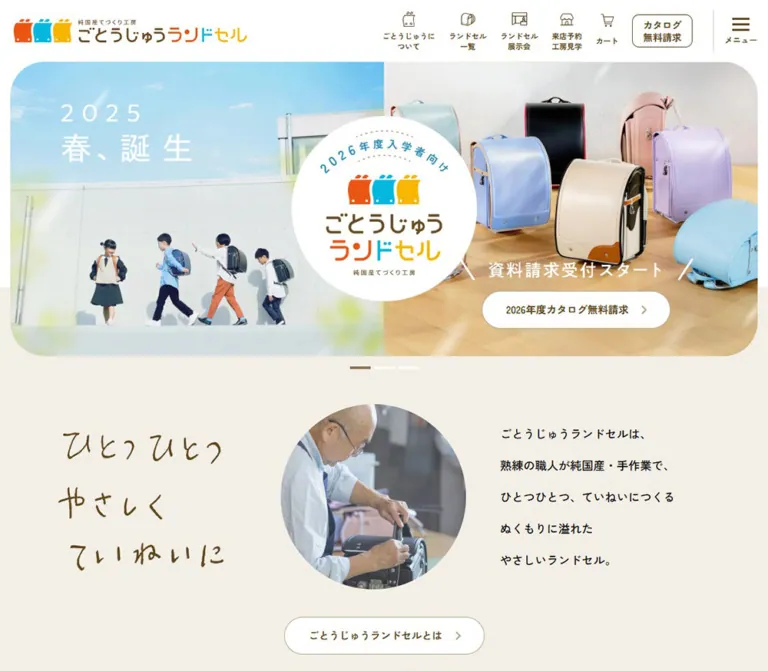
The opening is especially distinctive. A broad rounded photograph area carries a large white circular brand mark across its center. A white catalog-request pill sits over the imagery, while an orange availability announcement occupies the cream area below. Farther down, compact navigation and dense footer links balance generous spaces around photographs.
How to Read This Reference
- Measured means a value appears in the supplied computed styles or element rectangles. Measurements refer to the stated viewport and captured state.
- Calculated means arithmetic based on those measurements, such as dividing a font size by the measured root size.
- Estimated means a visual approximation from the current page captures. Estimated colors were not sampled with a pixel tool.
- Recommended means guidance for a new implementation. Breakpoints, accessible target sizes and missing interaction behavior are not presented as original source facts.
- Implementation tokens such as
--g-inkare aliases created for this reference. Original custom properties are identified separately.
The DOM includes duplicate navigation and menu content that is outside the desktop viewport or absent from the visible mobile screenshot. Nonzero rectangles do not establish visibility. Menu measurements are therefore separated from the visible homepage anatomy.
The evidence supports the current page’s visual system and information architecture. It does not support a complete reconstruction of unseen sections or untested interaction states.
Tokens — Colors
Default Palette
| Name | Value | Implementation token | Evidence and role |
|---|---|---|---|
| Warm Beige | #F3EEE6 |
--g-paper |
Exact source preset --wp--preset--color--c-beige; also computed on navigation section labels. Corresponds to the large cream page and footer surfaces. |
| Workshop Brown | #60451B |
--g-ink |
Exact source preset --wp--preset--color--c-brown; computed on navigation and catalog links. Also the computed active carousel marker color. |
| Announcement Orange | #EA5514 |
--g-orange |
Exact source preset --wp--preset--color--c-red; computed on the availability heading and filled explanatory capsule. Despite the source name, it reads as orange. |
| White | #FFFFFF |
--g-white |
Computed on catalog pills and the notification close button; visible in the header and central brand disc. |
| Brand Cyan | #03B8DF |
--g-cyan |
Exact source preset --wp--preset--color--c-light-blue; visually consistent with the cyan identity accent. The logo image’s individual pixels were not sampled. |
| Brand Yellow | #F8B500 |
--g-yellow |
Exact source preset --wp--preset--color--c-yellow; visually consistent with the yellow identity accent. |
| Footer Taupe | Approximately #B5A58A |
--g-taupe |
Screenshot estimate for the legal strip and muted details; no corresponding computed footer color was supplied. |
| Soft Divider | Approximately #DCD3C8 |
--g-line |
Screenshot estimate for thin mobile footer and header dividers. Desktop footer sections also use visibly white rules. |
Brown carries identity, navigation and much of the visible informational text. Orange emphasizes current availability. The primary photographic catalog CTA remains white with brown text; it is not an orange button.
The root and body report black inherited text and a white background. Those defaults should not be mistaken for the complete rendered palette: individual components override them.
Product Color Swatches
These values were computed on color-category links in the menu subtree. They provide reliable component-level color evidence, but the menu was not visibly opened in the supplied captures. Their appearance in the separate main-page finder was not individually measured.
| Category | Computed fill | Computed text | Evidence note |
|---|---|---|---|
| Black | #000000 |
White | Measured in the mobile menu subtree. |
| Red | #E2616F |
White | Different from the announcement orange. |
| Purple | #C1A5D5 |
White | Also present as a named source preset. |
| Pink | #EAABC4 |
White | Soft product-category pink. |
| Blue | #74AED8 |
White | Softer than the brand cyan. |
| Green | #76C5B1 |
White | Different from the source green preset #4AB69B. |
| Brown | #C29663 |
White | Camel-like product color, distinct from navigation brown. |
| White / Beige | #F2EEE5 |
Brown | Slightly different from the main warm beige. |
| Yellow / Orange | #F6C012 |
White | Different from the brand yellow preset. |
| Metallic | Not established | White | Transparent computed background alone does not reveal its complete visual treatment. |
Retain the distinction between brand colors and product attributes. A blue school-bag category does not imply a blue primary action system.
The supplied custom properties also contain generic publishing-system gradients, shadows and additional colors. Their existence does not establish use in the visible design. No theme-switching interface was observed.
Tokens — Typography
Primary Interface Family
- Computed stack:
"Zen Kaku Gothic New", serif. - Measured weights:
500for body and descriptive copy;700for navigation labels, catalog actions and availability messages. - Character: friendly Japanese Gothic lettering with clear shapes and a comfortable rhythm. Bold labels create hierarchy without a separate display typeface.
- Fallback limitation: the computed family declaration was supplied; individual font-file loading and glyph fallback were not separately verified.
- Implementation alias:
--g-font: 'Zen Kaku Gothic New', serif.
The central wordmark is graphic identity. Its H1 rectangle contains no extracted text, and the nearby catalog caption has a measured font size of 0px. Do not derive their lettering from the inherited H1 or paragraph font size.
Type Scale
All sizes and line heights below are measured computed values. Decimal precision describes the capture, not a requirement to hand-tune every production value.
| Role | Desktop size / line height | Mobile size / line height | Weight | Implementation alias |
|---|---|---|---|---|
| Root sizing unit | 11.076 / 22.152px |
10.4 / 20.8px |
500 | --g-u uses the font-size value only |
| Body default | 17.7216 / 35.4432px |
14.56 / 29.12px |
500 | --g-text-body |
| Notification link | 16.614 / 18.2754px |
13.52 / 16.224px |
700 | --g-text-notice |
| Icon navigation caption | 12.1836 / 15.8387px |
10.4 / 15.6px |
700 | --g-text-nav |
| Header catalog action | 15.5064 / 20.1583px |
10.4 / 13.52px in the secondary row |
700 | Context-specific |
| Hero catalog action | 16.614 / 18.2754px |
13.52 / 16.224px |
700 | --g-text-action |
| Availability headline | 33.228 / 53.1648px |
20.8 / 35.36px |
700 | --g-text-announcement |
| Orange explanatory capsule | 22.152 / 35.4432px |
16.64 / 26.624px |
700 | --g-text-status |
| Brand introduction paragraph | 18.8292 / 50.8388px |
13.52 / 31.096px |
500 | --g-text-story |
Most sampled visible labels use normal letter spacing. The white titles over the three photographic feature panels appear more widely spaced, but their exact tracking was not supplied. For a new implementation, approximately 0.1em is a reasonable starting point for those titles only.
The body line height is twice its font size at both viewports. The brand introduction is even more open: 2.7 on desktop and 2.3 on mobile, calculated from the measured values. Navigation uses much tighter line boxes so two Japanese lines fit beneath small icons.
Responsive Type Relationships
At the desktop capture, the availability headline is exactly 3 × 11.076px; on mobile it is 2 × 10.4px. Body text changes from 1.6 to 1.4 root units. Responsive typography therefore changes component ratios as well as the root size.
The source exposes --fz, --min-width: 1300 and --max-width: 1600. Only the resulting --fz values were supplied. The interpolation formula and breakpoints are unknown; the numeric minimum-width variable is not proof that the page applies a 1300px minimum layout width.
Tokens — Spacing & Shapes
Density: compact header and directory controls surrounding expansive photography and comfortable section spacing.
Unit convention: in this document, u means the measured root font size: 11.076px at desktop and 10.4px at mobile. Ratios below are calculated unless an original declaration is explicitly quoted.
Spacing Scale
| Use | Desktop evidence | Mobile evidence | Interpretation |
|---|---|---|---|
| Small control inset | 5.538px in header catalog padding |
5.2px in secondary navigation |
0.5u |
| Catalog icon/text gap | 11.076px |
5.2px |
Changes from 1u to 0.5u |
| Hero side gutter | Approximately 16.6px |
Approximately 15.6px |
Screenshot estimate consistent with 1.5u |
| Mobile promotion gutter | — | 26px |
Measured; 2.5u |
| Hero action horizontal padding | 33.228px |
19.76px |
Measured; 3u and 1.9u |
| Desktop promotional column gap | Approximately 33.25px |
Banners stack | Calculated from anchor rectangles |
| Desktop service-image gap | Approximately 44px |
Not pictured | Screenshot estimate |
| Space above service images in the cream section | Approximately 111px |
Not pictured | Screenshot estimate |
Border Radius
| Element | Desktop | Mobile | Evidence |
|---|---|---|---|
| Main hero outer corners | Approximately 55px |
Approximately 25px |
Screenshot estimates |
| Central identity disc | Circle | Circle | Visible in both captures |
| Header catalog link | 11.076px |
Square secondary-navigation cell | Computed styles |
| Catalog pill | Fully rounded | Fully rounded | Computed radius is an extremely large value; 9999px is a practical equivalent |
| Orange explanatory capsule | Fully rounded | Fully rounded, with two text lines | Computed styles and screenshots |
| Notification close button | 50% |
50% |
Computed styles |
| Three-photo feature group | Approximately 55px at visible outer bottom corners |
Not pictured | Screenshot estimate; inner seams are square |
| Service photographs | Square | Not pictured | Desktop screenshot |
| Menu color-category links | 5.538px |
10.4px |
Computed styles in the unexercised menu subtree |
Rounding is selective. Large hero boundaries, a shared feature-group perimeter, circles and action pills carry softness. Service photography and directory rules remain crisp.
Layout Measurements
| Element | At 1440 × 1000 | At 390 × 844 | Evidence |
|---|---|---|---|
| Header total height | 153.94px |
121.14px |
Measured |
| Notification strip | Approximately 54.27px |
Approximately 34.94px |
Calculated from visible row geometry |
| Identity/navigation row | Approximately 99.67px |
Approximately 46.80px |
Calculated |
| Additional mobile navigation row | Absent | Approximately 39.41px, including separators |
Calculated |
| Homepage logo anchor | 376.58 × 37px |
124.80 × 29.13px |
Measured inline-anchor bounds, not necessarily painted artwork bounds |
| Hero photographic area | Approximately 1406 × 554px |
Approximately 358 × 499px |
Screenshot estimates |
| Hero brand H1 box | 299.05 × 299.05px |
124.80 × 124.80px |
Measured |
| Hero catalog link | 303.44 × 60.91px |
240.75 × 47.91px |
Measured |
| Carousel marker | 33.22 × 4.42px |
15.59 × 3.11px |
Measured button bounds |
| Orange capsule | 631.30 × 39.84px |
334.89 × 74.03px |
Measured |
| Large promotional link | 498.41 × 166.13px |
338 × 112.66px |
Measured; approximately 3:1 |
| Three-photo feature group width | Approximately 1262px |
Not pictured | Screenshot estimate |
| Standard service/footer content width | Approximately 1108px |
Approximately 358px for footer groups |
Screenshot estimates |
| Legal strip height | Approximately 64px |
Approximately 129px |
Screenshot estimates |
| Document height | 13961.81px |
16736.22px |
Measured |
The middle desktop capture cuts off the upper portion of the three-photo feature group behind the persistent header. Its visible height must not be treated as the full component height.
Components
Notification Strip
Role: immediate access to showroom visits and workshop tours.
A full-width brown strip precedes the white header. Center the white bold message and place a circular white close control to its right. The visible message is “ショールーム来店/工房見学 まだまだ受付中!” and links to /shop/.
The close button measures 38.77px square on desktop but only 15.59px square on mobile. Its circular face contains a brown cross. A background transition is declared, but dismissal behavior and persistence were not exercised.
Recommended: increase the mobile close target while retaining a small visual circle. Let the header recompute its height after dismissal rather than leaving a fixed blank offset.
Desktop Header
Role: persistent brand identity and direct access to the main shopping and service destinations.
The white row contains a horizontal brand mark on the left and a compact cluster of controls on the right. Five destinations use thin brown pictograms above captions: brand information, product listing, exhibitions, showroom/workshop reservations, and cart. Most captions occupy two short lines.
A separate outlined catalog link follows the icon controls. It measures approximately 97.22 × 53.34px, with an 11.076px radius and two lines of bold brown text. The menu control occupies the far-right area, separated by a fine vertical rule, with three brown horizontal strokes above “メニュー”.
Preserve the broad gap between the brand mark and the navigation cluster. Equal-width navigation distributed across the entire header would lose the observed balance.
The header remains visible at the top in the middle and footer captures. The exact implementation—fixed or sticky—was not included in the computed sample.
Mobile Header
Role: retain frequently used destinations without placing everything behind the menu.
Below the notification strip, a compact white row places the small brand mark at left and product listing, cart, and menu at right. A second white row contains four equal cells: brand information, exhibitions, showroom/workshop reservations, and catalog request.
Each lower cell measures 96.75 × 37.41px, with fine separators between cells. Labels use 10.4px bold text and deliberate two-line wrapping. The desktop rounded catalog box becomes one of these square-edged cells.
This is a navigation reorganization, not merely a smaller desktop header. Both rows remain visible in the mobile footer capture.
Photographic Hero
Role: establish the product world and make the current catalog easy to request.
The desktop hero starts immediately below the header, with about 17px of side clearance. The captured slide combines a showroom wall of bags on the left with children wearing bags on the right. Rounded outer corners contain both photographs. A white circular brand mark overlays the center seam.
On mobile, the photographed area starts about 16px below the header and becomes a tall rounded montage. Four photographs use unequal widths and offset seams. The white identity circle overlaps the upper-middle area; it is not a separate section between images.
The desktop capture has the fourth carousel marker active; mobile has the second active. These are different captured slides. The evidence establishes different visible compositions, but it does not prove the exact desktop/mobile asset pairing for any single slide.
Recommended implementation: provide art-directed image compositions for each viewport and keep the brand mark and catalog link as independent layers. Preserve bag silhouettes, shoulder straps and children’s faces when choosing crops.
Catalog Request Pill
Role: the main action within the hero.
The white pill uses brown bold text, a muted right chevron, and no prominent shadow. The current label is “2027年度カタログ無料請求”. Desktop places the action over the lower part of the right-hand photograph; mobile centers it close to the bottom of the montage.
The desktop link is approximately 303 × 61px; mobile is approximately 241 × 48px. A white catalog-availability graphic sits above it. The graphic’s lettering is not represented by ordinary measured text.
Related white pills recur in the page, including the link to the brand introduction. Preserve a consistent combination of comfortable height, generous horizontal padding and a restrained directional arrow.
Carousel Indicators
Role: indicate the current hero item and provide slide controls.
Four short horizontal bars sit centered below the hero. Inactive bars are white; the active bar computes to brown. Desktop bars are roughly twice as wide as the mobile bars.
The controls are actual button elements in the supplied DOM. Their small measured bounds are not evidence of an expanded invisible hit area. Autoplay, pointer interaction, swipe support, keyboard behavior and slide-change timing remain unverified.
Availability Announcement
Role: communicate that orders for the current school-entry year remain available.
A large orange headline appears on cream below the carousel. Desktop keeps the message on one line; mobile wraps it into two centered lines. A second message sits in an orange capsule immediately beneath it.
The capsule is a paragraph, not a link or button. On desktop it is a low, wide shape with one text line. On mobile it becomes taller, with two lines and approximately 26px horizontal padding.
Use orange to make this message prominent, but preserve its informational semantics. Adding a pointer cursor or hover effect would falsely suggest an action.
Promotional Links Below the Opening
Role: surface catalog, exhibition, showroom and related entry points.
Measured rectangles show four approximately 3:1 promotional anchors arranged in two desktop columns. On mobile, the same large anchors become a single column with 26px side margins and about 15.6px between rows. Smaller related anchors remain paired below them.
The destinations are present in the DOM, but these banner artworks are outside the supplied opening screenshots. Their internal typography, illustrations and colors are not specified here.
Brand Introduction
Role: explain the connection between children, parents and the workshop.
The rendered text describes domestic hand production by experienced craftspeople, followed by a white pill linking to /about/. The paragraph is measured in white at both viewports, with unusually generous line spacing.
Desktop positions its text block toward the right, at approximately x = 773px with a 452px width. Mobile spans a 390px text region and uses smaller type. The surrounding visual composition is not fully pictured in the current captures; its background and image arrangement should not be invented.
Product Finder and Series Modules
Role: support browsing from several different starting points.
The rendered page includes two popularity destinations, ten color categories, four material categories, a cover accessory destination, and ten product series. These are navigation links to product collections, not evidence of an in-place filtering interface.
The repeated series anatomy is established by the text and links: a series destination, a short descriptive sentence, named colorway links to individual products, and a “シリーズを見る” action. Most series expose three named examples; the cordovan series exposes one and the luxury series two. Do not force every module to contain exactly three products.
The exact visible main-page series grid and its image treatment are not included in the supplied screenshots. Dense three- or four-column rectangles in the menu subtree must not be used as proof of the main catalog layout.
Three-Photo Feature Group
Role: connect product browsing with craftsmanship, construction and customization.
The middle desktop capture shows three edge-to-edge photographic links in a shared wide group. Their subjects are a close-up of hand stitching, the open interior of a caramel-colored bag, and a child wearing a glossy dark bag.
Each panel has centered white bold text over a visibly darkened photograph and a small white circular arrow toward the lower portion. The visible labels describe a century of manufacturing, basic functions and materials, and customization options.
The group is approximately 1262px wide, with three approximately 421px panels. Internal seams have no gaps or rounded corners. Only the outer perimeter receives the large corner treatment. The photograph darkening provides separation for the lettering; its exact overlay opacity was not supplied.
Service Information Cards
Role: help visitors move from online exploration to trying or understanding the product.
Below the three-photo group, a cream section presents a desktop pair of wide image-led links. The first photograph shows a group of school bags on a light wooden surface. The second combines children in a showroom with a person inspecting a bag.
Each visible image measures approximately 532 × 221px. The pair occupies an approximately 1108px container with a 44px gap. Brown titles beneath the images begin with a small circular arrow. Descriptive paragraphs are confirmed by the DOM.
Use square image corners and let the card sit directly on the cream section. The visible cards do not use separate white boxes, thick borders or elevation shadows. Related function and customization links are also present in the rendered content, although their complete card layouts are not pictured.
Support and Editorial Content
Role: continue the relationship beyond initial product discovery.
The DOM establishes a six-year repair section with three service points, four buying-guide topics, four dated news entries, Instagram links, four article previews with dates and categories, and a movie section heading.
These modules make the page a long-lived shopping and information hub. Preserve repair, scheduling, FAQ and contact access when adapting the site. The detailed layouts, movie controls and social-feed behavior are outside the visual evidence.
Footer Directory
Role: provide comprehensive navigation at the end of a long page.
Desktop uses a wide cream directory with muted category headings, brown bold links, small leading chevrons, wrapping link rows and fine horizontal separators. Product colors, materials, series and support items are expanded in the supplied desktop footer view.
Two association graphics occupy white rectangular boxes with thin taupe outlines. Below them, a separate wrapping group contains news, company, recruitment, manufacturing services, social accounts, articles and usage guidance.
Mobile replaces the expanded directory groups with nine compact rows. Each row has a bold brown label, a muted plus on the right and a thin bottom divider. The screenshot shows all nine groups collapsed. The headings include product features, showroom information, product discovery, colors, materials, series, accessories, support and associations.
The secondary company links remain visible below these rows and wrap over several lines. Expansion behavior was not tested; the plus symbols establish an accordion affordance, not its keyboard or animation behavior.
Legal Strip
Role: separate legal links and copyright from the main directory.
A full-width taupe strip closes the page. Desktop places small white legal links on the left and copyright at the far right. Mobile wraps the legal links into centered rows and places copyright below, increasing the strip from about 64px to about 129px high.
Tokens — Motion & Interaction
| Element | Supplied evidence | What can be concluded |
|---|---|---|
| Desktop logo link | opacity 0.15s |
A short opacity transition is declared; the target opacity was not supplied. |
| Navigation links | color 0.25s |
Color changes can transition over 250ms; the actual hover color was not observed. |
| Header and hero catalog actions | color 0.25s, background 0.25s |
Both foreground and surface changes are prepared. |
| Notification close and menu buttons | background 0.25s |
Background feedback is declared; action results were not tested. |
| Carousel bars | background 0.25s |
Selected-state color can transition. This is not the slide transition duration. |
| Hero caption graphic | opacity 0.25s 0.15s and transform 0.25s cubic-bezier(0.66, 0, 0.51, 1.33) 0.15s |
A delayed, overshooting transform transition is declared. Trigger and travel distance are unknown. |
| Product-image anchors | transform 0.25s |
Transform feedback is prepared; rotation, scale or translation endpoints were not supplied. |
| Menu close control | Color and opacity over 0.25s, delayed visibility change |
Style evidence for a concealed/revealed control; no opened state was inspected. |
| Persistent header | Same top placement in opening, middle and footer captures | Persistence across scrolling is visually supported; exact positioning code is unknown. |
| Mobile footer | Collapsed rows with plus symbols | Accordion affordance is visible; opening behavior is unverified. |
Many sampled elements report transition: all without a duration. This does not establish a visible animation. Likewise, sampled animation: none values do not exclude JavaScript motion or animation on ancestors and pseudo-elements.
The capture process observed the initial page for at least five seconds and waited for defined readiness conditions. It also temporarily paused perpetual animations during checks. This is not a motion recording and does not establish carousel autoplay, continuous product movement, scroll reveals or video behavior.
Recommended motion direction: retain quick 150–250ms color and opacity feedback. Use the recorded overshoot easing only for an intentionally animated caption. Provide a static reduced-motion experience and explicit pause controls if autoplay is implemented.
Surfaces
| Layer | Appearance | Purpose |
|---|---|---|
| Header | White with brown controls | Clear identity and persistent navigation |
| Notification | Solid dark brown, white message | Current showroom/workshop availability |
| Main cream fields | Warm beige | Comfortable space around products and information |
| Photographic hero | Large imagery with rounded outer boundary | Emotional and product introduction |
| Identity disc | Solid white circle | Legible brand mark across photographic seams |
| Catalog action | White pill, brown type, muted chevron | Consistent action over imagery |
| Availability capsule | Orange fill, white bold text | Informational emphasis |
| Feature panels | Darkened photographs with white labels | Direct thematic navigation |
| Service cards | Images and text directly on cream | Editorial presentation without elevation |
| Footer | Cream directory above taupe legal strip | Hierarchical navigation and closure |
The visible design has no general-purpose shadow elevation system. Hierarchy comes from photography, surface changes, spacing, borders and a limited set of rounded forms.
Imagery
Use natural photographs that show both the product and its relationship to people. The current captures include bags displayed in a workshop-like retail space, children seen from behind while wearing them, a hand stitching leather, an open bag interior, and a showroom visit.
Product colors range from lavender, pale blue and mint to cream, camel, red and glossy black. Keep those differences in the photographs; avoid a global brown tint that makes product colors unreliable.
The hero favors large contextual photographs. Feature links move closer to construction details. Service images use wider group compositions. This progression lets the page move from emotional recognition to practical evaluation without changing its visual language.
Icons are small brown outline pictograms depicting bags, a display/exhibition setting, a storefront and a cart. Their visual character is observed, but no icon library was identified. The multicolored brand mark should remain an authorized identity asset rather than being re-created as ordinary text or emoji.
Observed Asset References
No image source URLs, filenames, native dimensions or font-file paths were supplied. The table identifies visible asset roles; linked paths are destination pages, not image files.
| Asset role | Current visual evidence | Associated destination where established |
|---|---|---|
| Horizontal brand mark | Multicolored bag symbols and Japanese wordmark in the header | / |
| Circular hero identity | White disc with centered brand artwork | No separate destination established |
| Desktop hero photograph | Showroom display beside children wearing bags | Catalog action links to /catalog/ |
| Mobile hero montage | Four photographs of children wearing bags | Catalog action links to /catalog/ |
| Craft feature | Hands stitching material | /about/ |
| Construction feature | Open caramel-colored bag | /function/ |
| Customization feature | Child wearing a glossy dark bag | /customize/ |
| Exhibition image | Multiple bags on a wooden surface | /exhibition/ |
| Showroom image | Children and a bag inspection scene | /shop/ |
For a new build, use authorized photographs, explicit image dimensions and suitable mobile crops. Photography should remain smoothly rendered; pixelation and artificial halftone effects are not part of the observed treatment.
Layout & Responsive Behavior
The page uses several widths rather than a single universal container. The hero nearly spans the viewport. The three-photo feature group is narrower, and service information and footer content narrow further to approximately 1108px at the desktop capture. Promotional banners use another measured width of approximately 1030px.
| Relationship | Desktop observation | Mobile observation |
|---|---|---|
| Main navigation | One spacious identity/navigation row | Identity and utility row plus four-cell secondary row |
| Hero proportions | Broad landscape, approximately 2.54:1 |
Tall portrait, approximately 0.72:1 |
| Hero mark | Approximately 299px circle at the central seam |
Approximately 125px circle in the upper-middle area |
| Hero action | Over the lower-right photograph | Centered near the bottom |
| Availability title | One line | Two centered lines |
| Orange capsule | One line, about 40px high |
Two lines, about 74px high |
| Large promotional banners | Two columns | One column |
| Footer directory | Expanded wrapping link groups | Nine collapsed rows |
| Legal strip | Horizontal links and right-aligned copyright | Centered wrapping links and separate copyright row |
At 390px, the page is not simply a scaled version of the desktop layout. Header grouping, image proportions, type ratios, banner columns and footer presentation change independently.
The exact breakpoint locations and intermediate tablet layouts were not supplied. The Quick Start uses an explicitly recommended breakpoint and approximated containers. It should be checked with actual content at widths between the two inspected viewports.
The source --vh remains 10px in both snapshots, including the 844px-high mobile viewport. Do not treat that variable as reliable evidence of the current mobile viewport height or reproduce it as a full-screen height formula.
Do’s and Don’ts
Do
- Build the core interface from exact warm beige
#F3EEE6, brown#60451B, white and announcement orange#EA5514. - Keep the primary catalog action white with brown text when it sits over photography.
- Use the measured Zen Kaku Gothic New stack and the observed distinction between medium body text and bold labels.
- Preserve the large central white brand disc and generous rounded hero perimeter.
- Give mobile its own portrait composition and two-row navigation organization.
- Keep product colors accurate and photograph bags both in use and in detail.
- Round the outside of the three-photo group while keeping its internal seams flush.
- Preserve direct access to product categories, showroom information, repair services and practical guidance.
- Treat the orange capsule as informational text.
- Distinguish the main product modules from hidden menu content when translating DOM evidence into layouts.
Don’t
- Don’t reduce the homepage to a single promotional conversion sequence; its shopping and support directory is central to its function.
- Don’t replace all photographs with detached product cutouts or generic family illustrations.
- Don’t infer main-page card layouts from offscreen menu rectangles.
- Don’t make every surface a rounded white card with a drop shadow.
- Don’t use brand cyan or yellow as broad page backgrounds merely because they appear in the logo and source presets.
- Don’t assign generic publishing-system gradients or shadow presets to the visible design without element-level evidence.
- Don’t flatten the mobile hero into a cropped desktop panorama.
- Don’t invent autoplay intervals, menu gestures, accordion timing or video controls.
- Don’t copy the original rem numbers into a conventional 16px-root project without translating their scale.
Recommended Implementation Additions
These recommendations are for a new implementation, not verified features of the original page:
- Give the graphic H1 and linked brand artwork meaningful accessible names. An empty extracted text field alone does not prove that the original lacks alternative text; inspect the actual accessibility tree before making that claim.
- Increase small mobile utility targets, especially the notification close button and carousel markers. Keep their visible artwork compact while allocating adequate space for interaction.
- Provide visible brown focus outlines and keyboard-operable menu, carousel and footer controls.
- Implement footer rows with buttons and explicit expanded states. Keep desktop directory content available and avoid separate copies with inconsistent destinations.
- If the menu is modal, manage focus, Escape dismissal and background interaction appropriately. Its original behavior remains unverified.
- Check white-on-orange text at mobile sizes. Calculated contrast between white and
#EA5514is approximately3.6:1; the measured16.64pxbold mobile capsule text is below the large-text threshold. A darker orange or another accessible treatment is advisable for a new version. - Check white labels on pastel product swatches and small legal text on the estimated taupe surface. Color names should remain available independently of the swatch color.
- Allow text enlargement and longer translations to increase row heights. Preserve intentional Japanese wrapping without imposing clipping heights.
- Keep essential navigation and product links usable without animation. Pause autoplay for reduced motion if an autoplay carousel is added.
- Reserve image space using dimensions or aspect ratios, prioritize the initial hero, and load lower-page photography progressively.
Agent Prompt Guide
Quick Color Reference
- Main cream field:
#F3EEE6. - Navigation, outline icons and action text:
#60451B. - Availability emphasis:
#EA5514. - Header, central logo disc and photographic CTA:
#FFFFFF. - Small brand accents: source cyan
#03B8DFand yellow#F8B500. - Legal surface: approximately
#B5A58A, an estimate requiring verification. - Product swatches form a separate attribute palette; do not substitute them for the brand colors.
Overall Prompt
“Create a Japanese school-bag manufacturer’s brand and shopping homepage inspired by the current Gotoju visual system. Use warm beige #F3EEE6, dark brown #60451B, white surfaces and orange #EA5514 for availability messages. Use Zen Kaku Gothic New with medium body copy, bold compact navigation and generous paragraph spacing. Place a brown notification strip above a white persistent header with a multicolored brand asset, small brown outline pictograms, a catalog link and menu control. Build a nearly full-width rounded photographic hero with a large white circular identity mark overlapping the image composition and a white catalog-request pill. Continue into product discovery, craftsmanship, showroom information, repair support and editorial content. Use a shared three-photo feature group with flush seams, square service photographs on cream, and a comprehensive footer. On mobile, reorganize navigation into two rows, use a portrait hero composition, stack large promotional banners and collapse footer groups. Treat unknown interactions as implementation decisions requiring validation.”
Example Component Prompts
- Desktop header: “Build a white header below a brown notice strip. Keep the horizontal brand mark left and a compact cluster of thin brown icon-over-caption links right. Add a small outlined two-line catalog link and a separated menu control. Use approximately 12.2px bold captions and retain a broad empty gap between identity and navigation.”
- Hero: “Compose a wide rounded school-bag photo area with an approximately 299px white identity circle over its center seam. Put a white pill labeled ‘2027年度カタログ無料請求’ near the lower-right area. At 390px, use a tall art-directed montage, an approximately 125px identity circle and a centered 241 × 48px catalog pill near the bottom.”
- Availability block: “On warm beige, center a bold orange availability message at about 33px desktop and 21px mobile. Follow it with a rounded orange paragraph containing white bold text. Keep the capsule informational; use one desktop line and two mobile lines. Review the smaller text’s contrast.”
- Feature group: “Create three flush photographic links showing hand stitching, an open caramel school bag and a child wearing a dark bag. Apply enough darkening for centered white labels, add small white circular arrows, and round only the group’s outer boundary. Use approximately 1262px total width at a 1440px viewport.”
- Service cards: “Use a centered cream section with two approximately 532 × 221px square-cornered photographs separated by about 44px. Place brown titles and descriptive text below, with a small circular arrow before each title. Keep the cards directly on the section background.”
- Responsive footer: “Build a cream directory with muted headings, brown chevron links and fine separators. Show expanded wrapping groups on desktop. On mobile, use nine full-width collapsed rows with plus symbols, followed by visible company links. Close with a taupe legal strip whose small white links and copyright center and wrap on mobile. Implement accessible expansion behavior as a new-build requirement.”
Quick Start
CSS Custom Properties
This is an implementation scaffold, not recovered source CSS. It preserves measured type relationships and approximate geometry while leaving the document root at its normal size. The 70rem breakpoint is recommended, not observed. Container widths, hero ratios, overlays and estimated footer colors require visual validation with actual assets.
The class anatomy assumes a .gotoju-site wrapper; a .site-header containing .notice-bar, .header-main and .mobile-nav; a .hero containing .hero-media, .hero-brand and .hero-action; and separate announcement, feature, service and footer sections. Supply authorized brand and photo assets. Load the measured font family through your project’s approved font setup.
:root {
  /* Exact observed palette, with explicitly estimated supporting colors. */
  --g-paper: #f3eee6;
  --g-ink: #60451b;
  --g-orange: #ea5514;
  --g-white: #ffffff;
  --g-cyan: #03b8df;
  --g-yellow: #f8b500;
  --g-taupe: #b5a58a; /* Screenshot estimate. */
  --g-line: #dcd3c8; /* Screenshot estimate. */

  --g-font: 'Zen Kaku Gothic New', serif;
  --g-medium: 500;
  --g-bold: 700;

  /* Captured desktop scale, without changing the root font size. */
  --g-u: 11.076px;
  --g-text-body: calc(1.6 * var(--g-u));
  --g-text-nav: calc(1.1 * var(--g-u));
  --g-text-action: calc(1.5 * var(--g-u));
  --g-text-announcement: calc(3 * var(--g-u));
  --g-text-status: calc(2 * var(--g-u));

  --g-gutter: calc(1.5 * var(--g-u));
  --g-space-small: calc(0.5 * var(--g-u));
  --g-space-base: var(--g-u);
  --g-space-large: calc(3 * var(--g-u));
  --g-section-space: calc(10 * var(--g-u));

  /* Container approximations from current screenshots. */
  --g-content: calc(100 * var(--g-u));
  --g-wide: calc(114 * var(--g-u));
  --g-promotions: calc(93 * var(--g-u));
  --g-radius-hero: calc(5 * var(--g-u));
  --g-radius-control: var(--g-u);
  --g-radius-pill: 9999px;

  --g-fast: 150ms;
  --g-feedback: 250ms;
  --g-caption-ease: cubic-bezier(0.66, 0, 0.51, 1.33);
}

.gotoju-site,
.gotoju-site *,
.gotoju-site *::before,
.gotoju-site *::after {
  box-sizing: border-box;
}

.gotoju-site {
  margin: 0;
  color: var(--g-ink);
  background: var(--g-white);
  font-family: var(--g-font);
  font-size: var(--g-text-body);
  font-weight: var(--g-medium);
  line-height: 2;
}

.gotoju-site img {
  display: block;
  max-inline-size: 100%;
}

.gotoju-site button {
  font: inherit;
}

.gotoju-site a {
  color: inherit;
}

.gotoju-site :focus-visible {
  outline: 3px solid var(--g-ink);
  outline-offset: 4px;
}

.g-container {
  inline-size: min(
    calc(100% - 2 * var(--g-gutter)),
    var(--g-content)
  );
  margin-inline: auto;
}

/* Sticky positioning is a recommended implementation of observed persistence. */
.site-header {
  position: sticky;
  inset-block-start: 0;
  z-index: 100;
  background: var(--g-white);
}

.notice-bar {
  position: relative;
  display: flex;
  align-items: center;
  justify-content: center;
  gap: calc(5 * var(--g-u));
  padding: 18px var(--g-gutter);
  color: var(--g-white);
  background: var(--g-ink);
  font-size: calc(1.5 * var(--g-u));
  font-weight: var(--g-bold);
  line-height: 1.1;
}

.notice-bar > a {
  text-decoration: none;
}

.notice-close {
  display: grid;
  flex: 0 0 auto;
  place-items: center;
  inline-size: calc(3.5 * var(--g-u));
  block-size: calc(3.5 * var(--g-u));
  padding: 0;
  border: 0;
  border-radius: 50%;
  color: var(--g-ink);
  background: var(--g-white);
  cursor: pointer;
}

.header-main {
  display: flex;
  align-items: center;
  justify-content: space-between;
  gap: calc(2 * var(--g-u));
  min-block-size: calc(9 * var(--g-u));
  padding-inline-start: calc(2 * var(--g-u));
}

.site-brand {
  flex: 0 1 calc(34 * var(--g-u));
  min-inline-size: 0;
}

.primary-nav,
.mobile-utilities {
  display: flex;
  align-items: center;
  gap: calc(2 * var(--g-u));
}

.nav-link {
  display: grid;
  justify-items: center;
  gap: calc(0.5 * var(--g-u));
  text-align: center;
  text-decoration: none;
  transition: color var(--g-feedback);
}

.nav-link .icon {
  inline-size: calc(2.2 * var(--g-u));
  block-size: calc(2.2 * var(--g-u));
}

.nav-label {
  font-size: var(--g-text-nav);
  font-weight: var(--g-bold);
  line-height: 1.3;
}

.header-catalog {
  padding: calc(0.5 * var(--g-u)) calc(1.5 * var(--g-u));
  border: 1px solid currentColor;
  border-radius: var(--g-radius-control);
  font-size: calc(1.4 * var(--g-u));
  font-weight: var(--g-bold);
  line-height: 1.3;
  text-align: center;
  text-decoration: none;
  transition:
    color var(--g-feedback),
    background-color var(--g-feedback);
}

.menu-button {
  align-self: stretch;
  min-inline-size: calc(8 * var(--g-u));
  padding: var(--g-u);
  border: 0;
  border-inline-start: 1px solid var(--g-line);
  color: var(--g-ink);
  background: transparent;
  cursor: pointer;
}

.mobile-nav,
.mobile-utilities {
  display: none;
}

.hero-section {
  background: var(--g-paper);
}

.hero {
  position: relative;
  isolation: isolate;
  margin-inline: var(--g-gutter);
  aspect-ratio: 2.54;
  overflow: hidden;
  border-radius: var(--g-radius-hero);
  background: var(--g-paper);
}

.hero-media,
.hero-media img {
  inline-size: 100%;
  block-size: 100%;
}

.hero-media {
  position: absolute;
  inset: 0;
  z-index: -1;
}

.hero-media img {
  object-fit: cover;
}

.hero-brand {
  position: absolute;
  inset-block-start: 50%;
  inset-inline-start: 50%;
  display: grid;
  place-items: center;
  inline-size: calc(27 * var(--g-u));
  aspect-ratio: 1;
  margin: 0;
  padding: calc(4 * var(--g-u));
  border-radius: 50%;
  background: var(--g-white);
  transform: translate(-50%, -50%);
}

.hero-action {
  position: absolute;
  inset-inline-start: 75.6%;
  inset-block-end: calc(4 * var(--g-u));
  display: grid;
  justify-items: center;
  gap: calc(1.5 * var(--g-u));
  max-inline-size: calc(100% - 2 * var(--g-u));
  transform: translateX(-50%);
}

/* Use the authorized caption graphic or an accessible live-text replacement. */
.hero-caption {
  margin: 0;
  color: var(--g-white);
  font-size: calc(2.4 * var(--g-u));
  font-weight: var(--g-bold);
  line-height: 1.3;
  letter-spacing: 0.1em;
  text-align: center;
}

.g-pill {
  display: inline-flex;
  align-items: center;
  justify-content: center;
  gap: var(--g-u);
  min-block-size: calc(5.5 * var(--g-u));
  padding: calc(0.45 * var(--g-u)) calc(3 * var(--g-u));
  border: 1px solid var(--g-line);
  border-radius: var(--g-radius-pill);
  color: var(--g-ink);
  background: var(--g-white);
  font-size: var(--g-text-action);
  font-weight: var(--g-bold);
  line-height: 1.1;
  text-align: center;
  text-decoration: none;
  transition:
    color var(--g-feedback),
    background-color var(--g-feedback);
}

.hero-action .g-pill {
  inline-size: calc(27.4 * var(--g-u));
  max-inline-size: 100%;
}

.g-chevron {
  flex: 0 0 auto;
  inline-size: 0.5em;
  block-size: 0.5em;
  border-block-start: 2px solid var(--g-taupe);
  border-inline-end: 2px solid var(--g-taupe);
  transform: rotate(45deg);
}

/* Recommended larger targets; marker spacing intentionally differs from source. */
.carousel-controls {
  display: flex;
  justify-content: center;
  gap: var(--g-space-small);
  padding-block: var(--g-space-small);
}

.slide-control {
  display: grid;
  place-items: center;
  inline-size: 44px;
  block-size: 44px;
  padding: 0;
  border: 0;
  background: transparent;
  cursor: pointer;
}

.slide-control::before {
  content: '';
  inline-size: calc(3 * var(--g-u));
  block-size: calc(0.4 * var(--g-u));
  background: var(--g-white);
  transition: background-color var(--g-feedback);
}

.slide-control[aria-current='true']::before {
  background: var(--g-ink);
}

.availability {
  padding: calc(2 * var(--g-u)) var(--g-gutter) var(--g-section-space);
  color: var(--g-orange);
  background: var(--g-paper);
  text-align: center;
}

.availability-title {
  margin: 0;
  font-size: var(--g-text-announcement);
  font-weight: var(--g-bold);
  line-height: 1.6;
}

.availability-note {
  display: table;
  max-inline-size: 100%;
  margin: var(--g-u) auto 0;
  padding: calc(0.2 * var(--g-u)) calc(3.5 * var(--g-u));
  border-radius: var(--g-radius-pill);
  color: var(--g-white);
  background: var(--g-orange);
  font-size: var(--g-text-status);
  font-weight: var(--g-bold);
  line-height: 1.6;
}

.promotion-grid {
  display: grid;
  grid-template-columns: repeat(2, minmax(0, 1fr));
  gap: calc(3 * var(--g-u));
  inline-size: min(calc(100% - 52px), var(--g-promotions));
  margin-inline: auto;
}

.promotion-grid img {
  inline-size: 100%;
  aspect-ratio: 3 / 1;
  object-fit: cover;
}

.feature-group {
  display: grid;
  grid-template-columns: repeat(3, minmax(0, 1fr));
  inline-size: min(calc(100% - 2 * var(--g-gutter)), var(--g-wide));
  margin: var(--g-section-space) auto;
  overflow: hidden;
  border-radius: var(--g-radius-hero);
}

.feature-link {
  position: relative;
  isolation: isolate;
  display: flex;
  flex-direction: column;
  align-items: center;
  justify-content: space-between;
  min-block-size: 24rem; /* Recommended; full source height was not visible. */
  padding: 3rem 1.25rem 2rem;
  color: var(--g-white);
  text-align: center;
  text-decoration: none;
}

.feature-link > img {
  position: absolute;
  inset: 0;
  z-index: -2;
  inline-size: 100%;
  block-size: 100%;
  object-fit: cover;
}

.feature-link::before {
  position: absolute;
  inset: 0;
  z-index: -1;
  content: '';
  background: rgb(0 0 0 / 30%); /* Recommended approximation. */
}

.feature-title {
  margin: 0;
  font-size: 1.625rem; /* Screenshot-based starting point. */
  font-weight: var(--g-bold);
  line-height: 1.9;
  letter-spacing: 0.1em;
}

.circle-arrow {
  display: grid;
  place-items: center;
  inline-size: 32px;
  aspect-ratio: 1;
  border: 1px solid var(--g-line);
  border-radius: 50%;
  background: var(--g-white);
}

.service-section {
  padding-block: var(--g-section-space);
  background: var(--g-paper);
}

.service-grid {
  display: grid;
  grid-template-columns: repeat(2, minmax(0, 1fr));
  gap: calc(4 * var(--g-u));
}

.service-card {
  text-decoration: none;
}

.service-card > img {
  inline-size: 100%;
  aspect-ratio: 532 / 221;
  object-fit: cover;
  border-radius: 0;
}

.service-title {
  display: flex;
  align-items: center;
  gap: var(--g-u);
  margin-block: calc(2 * var(--g-u)) var(--g-u);
  font-size: calc(2 * var(--g-u));
  font-weight: var(--g-bold);
  line-height: 1.5;
}

.site-footer {
  background: var(--g-paper);
}

.footer-group {
  padding-block: calc(1.5 * var(--g-u));
  border-block-end: 1px solid var(--g-white);
}

.footer-group-title {
  margin: 0 0 var(--g-u);
  color: var(--g-taupe);
  font: inherit;
  font-weight: var(--g-bold);
}

.footer-links {
  display: flex;
  flex-wrap: wrap;
  gap: calc(0.5 * var(--g-u)) calc(2 * var(--g-u));
  margin: 0;
  padding: 0;
  list-style: none;
}

.footer-links a {
  display: inline-flex;
  align-items: center;
  gap: var(--g-u);
  font-weight: var(--g-bold);
  text-decoration: none;
}

.footer-toggle {
  display: none;
}

.footer-legal {
  display: flex;
  align-items: center;
  justify-content: space-between;
  flex-wrap: wrap;
  gap: 1rem;
  margin-block-start: 4rem;
  padding: 1.25rem clamp(1rem, 4vw, 3.5rem);
  color: var(--g-white);
  background: var(--g-taupe);
  font-size: 0.8125rem;
  line-height: 1.6;
}

.footer-legal-links {
  display: flex;
  flex-wrap: wrap;
  gap: 1rem 1.75rem;
}

.footer-legal a {
  text-decoration: none;
}

/* Recommended feedback endpoints; original hover colors were not supplied. */
@media (hover: hover) {
  .nav-link:hover,
  .footer-links a:hover {
    color: var(--g-orange);
  }

  .g-pill:hover,
  .header-catalog:hover {
    color: var(--g-white);
    background: var(--g-ink);
  }
}

/* Recommended breakpoint; only 1440px and 390px were inspected. */
@media (max-width: 70rem) {
  .gotoju-site {
    --g-u: 10.4px;
    --g-text-body: calc(1.4 * var(--g-u));
    --g-text-nav: var(--g-u);
    --g-text-action: calc(1.3 * var(--g-u));
    --g-text-announcement: calc(2 * var(--g-u));
    --g-text-status: calc(1.6 * var(--g-u));
    --g-radius-hero: calc(2.5 * var(--g-u));
    --g-section-space: calc(5 * var(--g-u));
  }

  .notice-bar {
    gap: var(--g-u);
    padding: 0.6rem 3rem 0.6rem 1rem;
    font-size: calc(1.3 * var(--g-u));
    line-height: 1.2;
  }

  /* Larger target than observed; the bar may be taller as an accessibility tradeoff. */
  .notice-close {
    position: absolute;
    inset-inline-end: 0.25rem;
    inline-size: 32px;
    block-size: 32px;
  }

  .header-main {
    min-block-size: calc(4.5 * var(--g-u));
    padding-inline-start: var(--g-gutter);
  }

  .site-brand {
    flex-basis: calc(12 * var(--g-u));
  }

  .primary-nav {
    display: none;
  }

  .mobile-utilities {
    display: flex;
    gap: calc(1.3 * var(--g-u));
  }

  .mobile-utilities .nav-link {
    gap: 0;
  }

  .mobile-utilities .icon {
    inline-size: calc(1.5 * var(--g-u));
    block-size: calc(1.5 * var(--g-u));
  }

  .mobile-utilities .nav-label {
    line-height: 1.5;
  }

  .menu-button {
    min-inline-size: calc(6.8 * var(--g-u));
    border-inline-start: 0;
    padding: calc(0.5 * var(--g-u));
  }

  .mobile-nav {
    display: grid;
    grid-template-columns: repeat(4, minmax(0, 1fr));
    gap: 1px;
    padding-block: 1px;
    background: var(--g-line);
  }

  .mobile-nav a {
    display: flex;
    align-items: center;
    justify-content: center;
    min-block-size: calc(3.6 * var(--g-u));
    padding: calc(0.5 * var(--g-u));
    background: var(--g-white);
    font-size: var(--g-u);
    font-weight: var(--g-bold);
    line-height: 1.3;
    text-align: center;
    text-decoration: none;
  }

  .hero-section {
    padding-block-start: var(--g-gutter);
  }

  .hero {
    aspect-ratio: 359 / 499;
  }

  .hero-brand {
    inset-block-start: 47%;
    inline-size: calc(12 * var(--g-u));
    padding: calc(2 * var(--g-u));
  }

  .hero-action {
    inset-inline-start: 50%;
    inset-block-end: calc(2.25 * var(--g-u));
    gap: calc(0.8 * var(--g-u));
  }

  .hero-caption {
    font-size: calc(1.3 * var(--g-u));
    letter-spacing: 0.05em;
  }

  .g-pill {
    min-block-size: calc(4.6 * var(--g-u));
    gap: calc(0.5 * var(--g-u));
    padding: calc(0.7 * var(--g-u)) calc(1.9 * var(--g-u));
    line-height: 1.2;
  }

  .hero-action .g-pill {
    inline-size: calc(23.15 * var(--g-u));
  }

  .slide-control::before {
    inline-size: calc(1.5 * var(--g-u));
    block-size: calc(0.3 * var(--g-u));
  }

  .availability-title {
    line-height: 1.7;
  }

  .availability-note {
    inline-size: min(100%, calc(32.2 * var(--g-u)));
    margin-block-start: calc(1.5 * var(--g-u));
    padding: var(--g-u) calc(2.5 * var(--g-u));
  }

  .promotion-grid {
    grid-template-columns: minmax(0, 1fr);
    gap: var(--g-gutter);
  }

  /* These two stacking decisions are recommendations, not photographed states. */
  .feature-group,
  .service-grid {
    grid-template-columns: minmax(0, 1fr);
  }

  .feature-link {
    min-block-size: 20rem;
  }

  .footer-group {
    padding: 0;
    border-block-end-color: var(--g-line);
  }

  .footer-group-title {
    display: none;
  }

  .footer-toggle {
    display: flex;
    align-items: center;
    justify-content: space-between;
    gap: 1rem;
    inline-size: 100%;
    min-block-size: 46px;
    padding: 0.65rem;
    border: 0;
    color: var(--g-ink);
    background: transparent;
    font-size: var(--g-text-body);
    font-weight: var(--g-bold);
    text-align: start;
    cursor: pointer;
  }

  .footer-toggle::after {
    content: '+';
    flex: 0 0 auto;
    color: var(--g-taupe);
    font-size: 1.25rem;
  }

  .footer-toggle[aria-expanded='true']::after {
    content: '−';
  }

  /* Place the controlled panel immediately after its toggle button. */
  .footer-toggle[aria-expanded='false'] + .footer-panel {
    display: none;
  }

  .footer-panel {
    padding: 0.5rem 0.65rem 1rem;
  }

  .footer-legal {
    justify-content: center;
    gap: 1rem;
    margin-block-start: 2.5rem;
    padding: 1.25rem 1rem;
    font-size: 0.75rem;
    text-align: center;
  }

  .footer-legal-links {
    justify-content: center;
    gap: 1.5rem 1rem;
  }

  .footer-legal small {
    flex-basis: 100%;
    font-size: inherit;
  }
}

@media (prefers-reduced-motion: reduce) {
  .gotoju-site *,
  .gotoju-site *::before,
  .gotoju-site *::after {
    animation: none !important;
    transition: none !important;
    scroll-behavior: auto !important;
  }
}
Menu opening, notification dismissal, carousel selection and footer state changes require application logic. Keep aria-expanded synchronized with each footer panel and ensure desktop links remain visible after a viewport change. Reduced-motion CSS does not stop a JavaScript autoplay timer; handle that separately.
Tailwind v4 Token Mapping
Optional aliases for projects already using Tailwind v4. This does not identify the original site’s implementation framework. Define the properties above first; exact mobile component measurements still require responsive rules.
@theme inline {
  --color-paper: var(--g-paper);
  --color-ink: var(--g-ink);
  --color-announcement: var(--g-orange);
  --color-brand-cyan: var(--g-cyan);
  --color-brand-yellow: var(--g-yellow);
  --color-footer-taupe: var(--g-taupe);
  --color-divider: var(--g-line);

  --font-brand: var(--g-font);
  --text-body: var(--g-text-body);
  --text-navigation: var(--g-text-nav);
  --text-action: var(--g-text-action);
  --text-announcement: var(--g-text-announcement);

  --spacing-brand-unit: var(--g-u);
  --spacing-brand-gutter: var(--g-gutter);
  --radius-hero: var(--g-radius-hero);
  --radius-control: var(--g-radius-control);
  --radius-pill: var(--g-radius-pill);
}
Sources & Evidence
- Inspected original and final page: Gotoju homepage. The supplied browser evidence records HTTP
200and an unchanged final URL. - Capture timestamp:
2026-09-12T18:52:51.986Z, equivalent to September 13, 2026, 03:52:51.986 JST. This is the supplied inspection time, not a new browser visit performed for this document. - Desktop evidence: three current-page captures at
1440 × 1000, showing the opening, a middle section, and the footer; rendered document height approximately13962px. - Mobile evidence: two current-page captures at
390 × 844, showing the opening and footer; rendered document height approximately16736px. - DOM and computed styles: supplied text, destination links, custom properties, font declarations, element rectangles, padding, radii and transition strings. The sample includes concealed or offscreen navigation content, which has been qualified throughout this reference.
- Identity evidence: the homepage’s rendered company description identifies the brand as belonging to 株式会社後藤重 and describes its headquarters and workshop in Kiyosu, Aichi. No production role for the current website is established by the inspected homepage evidence.
- Inspection process: initial observation lasted at least five seconds; capture readiness considered document loading, visible image decoding, finite animations and sampled layout/text stability. Scrolling traversed intermediate positions. Shared workers and service workers were disabled.
- Limitations: no additional browsing, file access or commands were used for this analysis. Original asset URLs, complete stylesheets, tablet captures, accessibility-tree details, opened menus, expanded footer groups, carousel playback, form submissions, checkout and video behavior were not supplied. Linked destinations establish navigation intent; their page designs were not inspected.
This reference describes the current homepage evidence. Estimated tokens, responsive interpolation choices, interaction implementations and accessibility improvements are explicitly separated from measured observations.
# Gotoju Randoseru — Style Reference

> A warm workshop storefront, organized around colorful school bags and the families choosing them.

**Website:** [gotoju.co.jp](https://www.gotoju.co.jp/)
**Original URL:** https://www.gotoju.co.jp/
**Final URL:** https://www.gotoju.co.jp/
**Theme:** light; white and warm beige surfaces, brown navigation, orange announcements, and colorful product photography.
**Inspected:** September 13, 2026, at 03:52:51.986 JST; supplied retrieval timestamp: September 12, 2026, at 18:52:51.986 UTC.
**Viewports:** 1440 × 1000 and 390 × 844 CSS pixels.
**Scope:** the current homepage, including desktop opening, middle-page and footer captures; mobile opening and footer captures; full-page rendered text and links; and sampled computed styles. Product pages, forms, checkout, and opened navigation states were not inspected.

Gotoju combines a manufacturer’s brand story with a substantial shopping and support directory. Visitors can request a catalog, explore school bags by color, material or series, arrange a showroom visit, and find repair information. Product browsing sits alongside workshop photography, practical buying guidance, news, and company information.

The visual identity comes from warm brown lettering, cream backgrounds, large photographic compositions, and softly rounded entry points. The small orange, cyan and yellow bag symbols make the identity cheerful without turning every interface surface into a bright color block. Photography supplies most of the variation: pastel and dark school bags, children wearing them, showroom displays, stitching, and leather details.

The opening is especially distinctive. A broad rounded photograph area carries a large white circular brand mark across its center. A white catalog-request pill sits over the imagery, while an orange availability announcement occupies the cream area below. Farther down, compact navigation and dense footer links balance generous spaces around photographs.

## How to Read This Reference

- **Measured** means a value appears in the supplied computed styles or element rectangles. Measurements refer to the stated viewport and captured state.
- **Calculated** means arithmetic based on those measurements, such as dividing a font size by the measured root size.
- **Estimated** means a visual approximation from the current page captures. Estimated colors were not sampled with a pixel tool.
- **Recommended** means guidance for a new implementation. Breakpoints, accessible target sizes and missing interaction behavior are not presented as original source facts.
- **Implementation tokens** such as `--g-ink` are aliases created for this reference. Original custom properties are identified separately.

The DOM includes duplicate navigation and menu content that is outside the desktop viewport or absent from the visible mobile screenshot. Nonzero rectangles do not establish visibility. Menu measurements are therefore separated from the visible homepage anatomy.

The evidence supports the current page’s visual system and information architecture. It does not support a complete reconstruction of unseen sections or untested interaction states.

## Tokens — Colors

### Default Palette

| Name | Value | Implementation token | Evidence and role |
| --- | --- | --- | --- |
| Warm Beige | `#F3EEE6` | `--g-paper` | Exact source preset `--wp--preset--color--c-beige`; also computed on navigation section labels. Corresponds to the large cream page and footer surfaces. |
| Workshop Brown | `#60451B` | `--g-ink` | Exact source preset `--wp--preset--color--c-brown`; computed on navigation and catalog links. Also the computed active carousel marker color. |
| Announcement Orange | `#EA5514` | `--g-orange` | Exact source preset `--wp--preset--color--c-red`; computed on the availability heading and filled explanatory capsule. Despite the source name, it reads as orange. |
| White | `#FFFFFF` | `--g-white` | Computed on catalog pills and the notification close button; visible in the header and central brand disc. |
| Brand Cyan | `#03B8DF` | `--g-cyan` | Exact source preset `--wp--preset--color--c-light-blue`; visually consistent with the cyan identity accent. The logo image’s individual pixels were not sampled. |
| Brand Yellow | `#F8B500` | `--g-yellow` | Exact source preset `--wp--preset--color--c-yellow`; visually consistent with the yellow identity accent. |
| Footer Taupe | Approximately `#B5A58A` | `--g-taupe` | Screenshot estimate for the legal strip and muted details; no corresponding computed footer color was supplied. |
| Soft Divider | Approximately `#DCD3C8` | `--g-line` | Screenshot estimate for thin mobile footer and header dividers. Desktop footer sections also use visibly white rules. |

Brown carries identity, navigation and much of the visible informational text. Orange emphasizes current availability. The primary photographic catalog CTA remains white with brown text; it is not an orange button.

The root and body report black inherited text and a white background. Those defaults should not be mistaken for the complete rendered palette: individual components override them.

### Product Color Swatches

These values were computed on color-category links in the menu subtree. They provide reliable component-level color evidence, but the menu was not visibly opened in the supplied captures. Their appearance in the separate main-page finder was not individually measured.

| Category | Computed fill | Computed text | Evidence note |
| --- | --- | --- | --- |
| Black | `#000000` | White | Measured in the mobile menu subtree. |
| Red | `#E2616F` | White | Different from the announcement orange. |
| Purple | `#C1A5D5` | White | Also present as a named source preset. |
| Pink | `#EAABC4` | White | Soft product-category pink. |
| Blue | `#74AED8` | White | Softer than the brand cyan. |
| Green | `#76C5B1` | White | Different from the source green preset `#4AB69B`. |
| Brown | `#C29663` | White | Camel-like product color, distinct from navigation brown. |
| White / Beige | `#F2EEE5` | Brown | Slightly different from the main warm beige. |
| Yellow / Orange | `#F6C012` | White | Different from the brand yellow preset. |
| Metallic | Not established | White | Transparent computed background alone does not reveal its complete visual treatment. |

Retain the distinction between brand colors and product attributes. A blue school-bag category does not imply a blue primary action system.

The supplied custom properties also contain generic publishing-system gradients, shadows and additional colors. Their existence does not establish use in the visible design. No theme-switching interface was observed.

## Tokens — Typography

### Primary Interface Family

- **Computed stack:** `"Zen Kaku Gothic New", serif`.
- **Measured weights:** `500` for body and descriptive copy; `700` for navigation labels, catalog actions and availability messages.
- **Character:** friendly Japanese Gothic lettering with clear shapes and a comfortable rhythm. Bold labels create hierarchy without a separate display typeface.
- **Fallback limitation:** the computed family declaration was supplied; individual font-file loading and glyph fallback were not separately verified.
- **Implementation alias:** `--g-font: 'Zen Kaku Gothic New', serif`.

The central wordmark is graphic identity. Its H1 rectangle contains no extracted text, and the nearby catalog caption has a measured font size of `0px`. Do not derive their lettering from the inherited H1 or paragraph font size.

### Type Scale

All sizes and line heights below are measured computed values. Decimal precision describes the capture, not a requirement to hand-tune every production value.

| Role | Desktop size / line height | Mobile size / line height | Weight | Implementation alias |
| --- | --- | --- | --- | --- |
| Root sizing unit | `11.076 / 22.152px` | `10.4 / 20.8px` | 500 | `--g-u` uses the font-size value only |
| Body default | `17.7216 / 35.4432px` | `14.56 / 29.12px` | 500 | `--g-text-body` |
| Notification link | `16.614 / 18.2754px` | `13.52 / 16.224px` | 700 | `--g-text-notice` |
| Icon navigation caption | `12.1836 / 15.8387px` | `10.4 / 15.6px` | 700 | `--g-text-nav` |
| Header catalog action | `15.5064 / 20.1583px` | `10.4 / 13.52px` in the secondary row | 700 | Context-specific |
| Hero catalog action | `16.614 / 18.2754px` | `13.52 / 16.224px` | 700 | `--g-text-action` |
| Availability headline | `33.228 / 53.1648px` | `20.8 / 35.36px` | 700 | `--g-text-announcement` |
| Orange explanatory capsule | `22.152 / 35.4432px` | `16.64 / 26.624px` | 700 | `--g-text-status` |
| Brand introduction paragraph | `18.8292 / 50.8388px` | `13.52 / 31.096px` | 500 | `--g-text-story` |

Most sampled visible labels use normal letter spacing. The white titles over the three photographic feature panels appear more widely spaced, but their exact tracking was not supplied. For a new implementation, approximately `0.1em` is a reasonable starting point for those titles only.

The body line height is twice its font size at both viewports. The brand introduction is even more open: `2.7` on desktop and `2.3` on mobile, calculated from the measured values. Navigation uses much tighter line boxes so two Japanese lines fit beneath small icons.

### Responsive Type Relationships

At the desktop capture, the availability headline is exactly `3 × 11.076px`; on mobile it is `2 × 10.4px`. Body text changes from `1.6` to `1.4` root units. Responsive typography therefore changes component ratios as well as the root size.

The source exposes `--fz`, `--min-width: 1300` and `--max-width: 1600`. Only the resulting `--fz` values were supplied. The interpolation formula and breakpoints are unknown; the numeric minimum-width variable is not proof that the page applies a 1300px minimum layout width.

## Tokens — Spacing & Shapes

**Density:** compact header and directory controls surrounding expansive photography and comfortable section spacing.

**Unit convention:** in this document, `u` means the measured root font size: `11.076px` at desktop and `10.4px` at mobile. Ratios below are calculated unless an original declaration is explicitly quoted.

### Spacing Scale

| Use | Desktop evidence | Mobile evidence | Interpretation |
| --- | --- | --- | --- |
| Small control inset | `5.538px` in header catalog padding | `5.2px` in secondary navigation | `0.5u` |
| Catalog icon/text gap | `11.076px` | `5.2px` | Changes from `1u` to `0.5u` |
| Hero side gutter | Approximately `16.6px` | Approximately `15.6px` | Screenshot estimate consistent with `1.5u` |
| Mobile promotion gutter | — | `26px` | Measured; `2.5u` |
| Hero action horizontal padding | `33.228px` | `19.76px` | Measured; `3u` and `1.9u` |
| Desktop promotional column gap | Approximately `33.25px` | Banners stack | Calculated from anchor rectangles |
| Desktop service-image gap | Approximately `44px` | Not pictured | Screenshot estimate |
| Space above service images in the cream section | Approximately `111px` | Not pictured | Screenshot estimate |

### Border Radius

| Element | Desktop | Mobile | Evidence |
| --- | --- | --- | --- |
| Main hero outer corners | Approximately `55px` | Approximately `25px` | Screenshot estimates |
| Central identity disc | Circle | Circle | Visible in both captures |
| Header catalog link | `11.076px` | Square secondary-navigation cell | Computed styles |
| Catalog pill | Fully rounded | Fully rounded | Computed radius is an extremely large value; `9999px` is a practical equivalent |
| Orange explanatory capsule | Fully rounded | Fully rounded, with two text lines | Computed styles and screenshots |
| Notification close button | `50%` | `50%` | Computed styles |
| Three-photo feature group | Approximately `55px` at visible outer bottom corners | Not pictured | Screenshot estimate; inner seams are square |
| Service photographs | Square | Not pictured | Desktop screenshot |
| Menu color-category links | `5.538px` | `10.4px` | Computed styles in the unexercised menu subtree |

Rounding is selective. Large hero boundaries, a shared feature-group perimeter, circles and action pills carry softness. Service photography and directory rules remain crisp.

### Layout Measurements

| Element | At 1440 × 1000 | At 390 × 844 | Evidence |
| --- | --- | --- | --- |
| Header total height | `153.94px` | `121.14px` | Measured |
| Notification strip | Approximately `54.27px` | Approximately `34.94px` | Calculated from visible row geometry |
| Identity/navigation row | Approximately `99.67px` | Approximately `46.80px` | Calculated |
| Additional mobile navigation row | Absent | Approximately `39.41px`, including separators | Calculated |
| Homepage logo anchor | `376.58 × 37px` | `124.80 × 29.13px` | Measured inline-anchor bounds, not necessarily painted artwork bounds |
| Hero photographic area | Approximately `1406 × 554px` | Approximately `358 × 499px` | Screenshot estimates |
| Hero brand H1 box | `299.05 × 299.05px` | `124.80 × 124.80px` | Measured |
| Hero catalog link | `303.44 × 60.91px` | `240.75 × 47.91px` | Measured |
| Carousel marker | `33.22 × 4.42px` | `15.59 × 3.11px` | Measured button bounds |
| Orange capsule | `631.30 × 39.84px` | `334.89 × 74.03px` | Measured |
| Large promotional link | `498.41 × 166.13px` | `338 × 112.66px` | Measured; approximately `3:1` |
| Three-photo feature group width | Approximately `1262px` | Not pictured | Screenshot estimate |
| Standard service/footer content width | Approximately `1108px` | Approximately `358px` for footer groups | Screenshot estimates |
| Legal strip height | Approximately `64px` | Approximately `129px` | Screenshot estimates |
| Document height | `13961.81px` | `16736.22px` | Measured |

The middle desktop capture cuts off the upper portion of the three-photo feature group behind the persistent header. Its visible height must not be treated as the full component height.

## Components

### Notification Strip

**Role:** immediate access to showroom visits and workshop tours.

A full-width brown strip precedes the white header. Center the white bold message and place a circular white close control to its right. The visible message is “ショールーム来店/工房見学 まだまだ受付中!” and links to `/shop/`.

The close button measures `38.77px` square on desktop but only `15.59px` square on mobile. Its circular face contains a brown cross. A background transition is declared, but dismissal behavior and persistence were not exercised.

**Recommended:** increase the mobile close target while retaining a small visual circle. Let the header recompute its height after dismissal rather than leaving a fixed blank offset.

### Desktop Header

**Role:** persistent brand identity and direct access to the main shopping and service destinations.

The white row contains a horizontal brand mark on the left and a compact cluster of controls on the right. Five destinations use thin brown pictograms above captions: brand information, product listing, exhibitions, showroom/workshop reservations, and cart. Most captions occupy two short lines.

A separate outlined catalog link follows the icon controls. It measures approximately `97.22 × 53.34px`, with an `11.076px` radius and two lines of bold brown text. The menu control occupies the far-right area, separated by a fine vertical rule, with three brown horizontal strokes above “メニュー”.

Preserve the broad gap between the brand mark and the navigation cluster. Equal-width navigation distributed across the entire header would lose the observed balance.

The header remains visible at the top in the middle and footer captures. The exact implementation—fixed or sticky—was not included in the computed sample.

### Mobile Header

**Role:** retain frequently used destinations without placing everything behind the menu.

Below the notification strip, a compact white row places the small brand mark at left and product listing, cart, and menu at right. A second white row contains four equal cells: brand information, exhibitions, showroom/workshop reservations, and catalog request.

Each lower cell measures `96.75 × 37.41px`, with fine separators between cells. Labels use `10.4px` bold text and deliberate two-line wrapping. The desktop rounded catalog box becomes one of these square-edged cells.

This is a navigation reorganization, not merely a smaller desktop header. Both rows remain visible in the mobile footer capture.

### Photographic Hero

**Role:** establish the product world and make the current catalog easy to request.

The desktop hero starts immediately below the header, with about `17px` of side clearance. The captured slide combines a showroom wall of bags on the left with children wearing bags on the right. Rounded outer corners contain both photographs. A white circular brand mark overlays the center seam.

On mobile, the photographed area starts about `16px` below the header and becomes a tall rounded montage. Four photographs use unequal widths and offset seams. The white identity circle overlaps the upper-middle area; it is not a separate section between images.

The desktop capture has the fourth carousel marker active; mobile has the second active. These are different captured slides. The evidence establishes different visible compositions, but it does not prove the exact desktop/mobile asset pairing for any single slide.

**Recommended implementation:** provide art-directed image compositions for each viewport and keep the brand mark and catalog link as independent layers. Preserve bag silhouettes, shoulder straps and children’s faces when choosing crops.

### Catalog Request Pill

**Role:** the main action within the hero.

The white pill uses brown bold text, a muted right chevron, and no prominent shadow. The current label is “2027年度カタログ無料請求”. Desktop places the action over the lower part of the right-hand photograph; mobile centers it close to the bottom of the montage.

The desktop link is approximately `303 × 61px`; mobile is approximately `241 × 48px`. A white catalog-availability graphic sits above it. The graphic’s lettering is not represented by ordinary measured text.

Related white pills recur in the page, including the link to the brand introduction. Preserve a consistent combination of comfortable height, generous horizontal padding and a restrained directional arrow.

### Carousel Indicators

**Role:** indicate the current hero item and provide slide controls.

Four short horizontal bars sit centered below the hero. Inactive bars are white; the active bar computes to brown. Desktop bars are roughly twice as wide as the mobile bars.

The controls are actual button elements in the supplied DOM. Their small measured bounds are not evidence of an expanded invisible hit area. Autoplay, pointer interaction, swipe support, keyboard behavior and slide-change timing remain unverified.

### Availability Announcement

**Role:** communicate that orders for the current school-entry year remain available.

A large orange headline appears on cream below the carousel. Desktop keeps the message on one line; mobile wraps it into two centered lines. A second message sits in an orange capsule immediately beneath it.

The capsule is a paragraph, not a link or button. On desktop it is a low, wide shape with one text line. On mobile it becomes taller, with two lines and approximately `26px` horizontal padding.

Use orange to make this message prominent, but preserve its informational semantics. Adding a pointer cursor or hover effect would falsely suggest an action.

### Promotional Links Below the Opening

**Role:** surface catalog, exhibition, showroom and related entry points.

Measured rectangles show four approximately `3:1` promotional anchors arranged in two desktop columns. On mobile, the same large anchors become a single column with `26px` side margins and about `15.6px` between rows. Smaller related anchors remain paired below them.

The destinations are present in the DOM, but these banner artworks are outside the supplied opening screenshots. Their internal typography, illustrations and colors are not specified here.

### Brand Introduction

**Role:** explain the connection between children, parents and the workshop.

The rendered text describes domestic hand production by experienced craftspeople, followed by a white pill linking to `/about/`. The paragraph is measured in white at both viewports, with unusually generous line spacing.

Desktop positions its text block toward the right, at approximately `x = 773px` with a `452px` width. Mobile spans a `390px` text region and uses smaller type. The surrounding visual composition is not fully pictured in the current captures; its background and image arrangement should not be invented.

### Product Finder and Series Modules

**Role:** support browsing from several different starting points.

The rendered page includes two popularity destinations, ten color categories, four material categories, a cover accessory destination, and ten product series. These are navigation links to product collections, not evidence of an in-place filtering interface.

The repeated series anatomy is established by the text and links: a series destination, a short descriptive sentence, named colorway links to individual products, and a “シリーズを見る” action. Most series expose three named examples; the cordovan series exposes one and the luxury series two. Do not force every module to contain exactly three products.

The exact visible main-page series grid and its image treatment are not included in the supplied screenshots. Dense three- or four-column rectangles in the menu subtree must not be used as proof of the main catalog layout.

### Three-Photo Feature Group

**Role:** connect product browsing with craftsmanship, construction and customization.

The middle desktop capture shows three edge-to-edge photographic links in a shared wide group. Their subjects are a close-up of hand stitching, the open interior of a caramel-colored bag, and a child wearing a glossy dark bag.

Each panel has centered white bold text over a visibly darkened photograph and a small white circular arrow toward the lower portion. The visible labels describe a century of manufacturing, basic functions and materials, and customization options.

The group is approximately `1262px` wide, with three approximately `421px` panels. Internal seams have no gaps or rounded corners. Only the outer perimeter receives the large corner treatment. The photograph darkening provides separation for the lettering; its exact overlay opacity was not supplied.

### Service Information Cards

**Role:** help visitors move from online exploration to trying or understanding the product.

Below the three-photo group, a cream section presents a desktop pair of wide image-led links. The first photograph shows a group of school bags on a light wooden surface. The second combines children in a showroom with a person inspecting a bag.

Each visible image measures approximately `532 × 221px`. The pair occupies an approximately `1108px` container with a `44px` gap. Brown titles beneath the images begin with a small circular arrow. Descriptive paragraphs are confirmed by the DOM.

Use square image corners and let the card sit directly on the cream section. The visible cards do not use separate white boxes, thick borders or elevation shadows. Related function and customization links are also present in the rendered content, although their complete card layouts are not pictured.

### Support and Editorial Content

**Role:** continue the relationship beyond initial product discovery.

The DOM establishes a six-year repair section with three service points, four buying-guide topics, four dated news entries, Instagram links, four article previews with dates and categories, and a movie section heading.

These modules make the page a long-lived shopping and information hub. Preserve repair, scheduling, FAQ and contact access when adapting the site. The detailed layouts, movie controls and social-feed behavior are outside the visual evidence.

### Footer Directory

**Role:** provide comprehensive navigation at the end of a long page.

Desktop uses a wide cream directory with muted category headings, brown bold links, small leading chevrons, wrapping link rows and fine horizontal separators. Product colors, materials, series and support items are expanded in the supplied desktop footer view.

Two association graphics occupy white rectangular boxes with thin taupe outlines. Below them, a separate wrapping group contains news, company, recruitment, manufacturing services, social accounts, articles and usage guidance.

Mobile replaces the expanded directory groups with nine compact rows. Each row has a bold brown label, a muted plus on the right and a thin bottom divider. The screenshot shows all nine groups collapsed. The headings include product features, showroom information, product discovery, colors, materials, series, accessories, support and associations.

The secondary company links remain visible below these rows and wrap over several lines. Expansion behavior was not tested; the plus symbols establish an accordion affordance, not its keyboard or animation behavior.

### Legal Strip

**Role:** separate legal links and copyright from the main directory.

A full-width taupe strip closes the page. Desktop places small white legal links on the left and copyright at the far right. Mobile wraps the legal links into centered rows and places copyright below, increasing the strip from about `64px` to about `129px` high.

## Tokens — Motion & Interaction

| Element | Supplied evidence | What can be concluded |
| --- | --- | --- |
| Desktop logo link | `opacity 0.15s` | A short opacity transition is declared; the target opacity was not supplied. |
| Navigation links | `color 0.25s` | Color changes can transition over 250ms; the actual hover color was not observed. |
| Header and hero catalog actions | `color 0.25s, background 0.25s` | Both foreground and surface changes are prepared. |
| Notification close and menu buttons | `background 0.25s` | Background feedback is declared; action results were not tested. |
| Carousel bars | `background 0.25s` | Selected-state color can transition. This is not the slide transition duration. |
| Hero caption graphic | `opacity 0.25s 0.15s` and `transform 0.25s cubic-bezier(0.66, 0, 0.51, 1.33) 0.15s` | A delayed, overshooting transform transition is declared. Trigger and travel distance are unknown. |
| Product-image anchors | `transform 0.25s` | Transform feedback is prepared; rotation, scale or translation endpoints were not supplied. |
| Menu close control | Color and opacity over `0.25s`, delayed visibility change | Style evidence for a concealed/revealed control; no opened state was inspected. |
| Persistent header | Same top placement in opening, middle and footer captures | Persistence across scrolling is visually supported; exact positioning code is unknown. |
| Mobile footer | Collapsed rows with plus symbols | Accordion affordance is visible; opening behavior is unverified. |

Many sampled elements report `transition: all` without a duration. This does not establish a visible animation. Likewise, sampled `animation: none` values do not exclude JavaScript motion or animation on ancestors and pseudo-elements.

The capture process observed the initial page for at least five seconds and waited for defined readiness conditions. It also temporarily paused perpetual animations during checks. This is not a motion recording and does not establish carousel autoplay, continuous product movement, scroll reveals or video behavior.

**Recommended motion direction:** retain quick 150–250ms color and opacity feedback. Use the recorded overshoot easing only for an intentionally animated caption. Provide a static reduced-motion experience and explicit pause controls if autoplay is implemented.

## Surfaces

| Layer | Appearance | Purpose |
| --- | --- | --- |
| Header | White with brown controls | Clear identity and persistent navigation |
| Notification | Solid dark brown, white message | Current showroom/workshop availability |
| Main cream fields | Warm beige | Comfortable space around products and information |
| Photographic hero | Large imagery with rounded outer boundary | Emotional and product introduction |
| Identity disc | Solid white circle | Legible brand mark across photographic seams |
| Catalog action | White pill, brown type, muted chevron | Consistent action over imagery |
| Availability capsule | Orange fill, white bold text | Informational emphasis |
| Feature panels | Darkened photographs with white labels | Direct thematic navigation |
| Service cards | Images and text directly on cream | Editorial presentation without elevation |
| Footer | Cream directory above taupe legal strip | Hierarchical navigation and closure |

The visible design has no general-purpose shadow elevation system. Hierarchy comes from photography, surface changes, spacing, borders and a limited set of rounded forms.

## Imagery

Use natural photographs that show both the product and its relationship to people. The current captures include bags displayed in a workshop-like retail space, children seen from behind while wearing them, a hand stitching leather, an open bag interior, and a showroom visit.

Product colors range from lavender, pale blue and mint to cream, camel, red and glossy black. Keep those differences in the photographs; avoid a global brown tint that makes product colors unreliable.

The hero favors large contextual photographs. Feature links move closer to construction details. Service images use wider group compositions. This progression lets the page move from emotional recognition to practical evaluation without changing its visual language.

Icons are small brown outline pictograms depicting bags, a display/exhibition setting, a storefront and a cart. Their visual character is observed, but no icon library was identified. The multicolored brand mark should remain an authorized identity asset rather than being re-created as ordinary text or emoji.

### Observed Asset References

No image source URLs, filenames, native dimensions or font-file paths were supplied. The table identifies visible asset roles; linked paths are destination pages, not image files.

| Asset role | Current visual evidence | Associated destination where established |
| --- | --- | --- |
| Horizontal brand mark | Multicolored bag symbols and Japanese wordmark in the header | `/` |
| Circular hero identity | White disc with centered brand artwork | No separate destination established |
| Desktop hero photograph | Showroom display beside children wearing bags | Catalog action links to `/catalog/` |
| Mobile hero montage | Four photographs of children wearing bags | Catalog action links to `/catalog/` |
| Craft feature | Hands stitching material | `/about/` |
| Construction feature | Open caramel-colored bag | `/function/` |
| Customization feature | Child wearing a glossy dark bag | `/customize/` |
| Exhibition image | Multiple bags on a wooden surface | `/exhibition/` |
| Showroom image | Children and a bag inspection scene | `/shop/` |

For a new build, use authorized photographs, explicit image dimensions and suitable mobile crops. Photography should remain smoothly rendered; pixelation and artificial halftone effects are not part of the observed treatment.

## Layout & Responsive Behavior

The page uses several widths rather than a single universal container. The hero nearly spans the viewport. The three-photo feature group is narrower, and service information and footer content narrow further to approximately `1108px` at the desktop capture. Promotional banners use another measured width of approximately `1030px`.

| Relationship | Desktop observation | Mobile observation |
| --- | --- | --- |
| Main navigation | One spacious identity/navigation row | Identity and utility row plus four-cell secondary row |
| Hero proportions | Broad landscape, approximately `2.54:1` | Tall portrait, approximately `0.72:1` |
| Hero mark | Approximately `299px` circle at the central seam | Approximately `125px` circle in the upper-middle area |
| Hero action | Over the lower-right photograph | Centered near the bottom |
| Availability title | One line | Two centered lines |
| Orange capsule | One line, about `40px` high | Two lines, about `74px` high |
| Large promotional banners | Two columns | One column |
| Footer directory | Expanded wrapping link groups | Nine collapsed rows |
| Legal strip | Horizontal links and right-aligned copyright | Centered wrapping links and separate copyright row |

At `390px`, the page is not simply a scaled version of the desktop layout. Header grouping, image proportions, type ratios, banner columns and footer presentation change independently.

The exact breakpoint locations and intermediate tablet layouts were not supplied. The Quick Start uses an explicitly recommended breakpoint and approximated containers. It should be checked with actual content at widths between the two inspected viewports.

The source `--vh` remains `10px` in both snapshots, including the `844px`-high mobile viewport. Do not treat that variable as reliable evidence of the current mobile viewport height or reproduce it as a full-screen height formula.

## Do’s and Don’ts

### Do

- Build the core interface from exact warm beige `#F3EEE6`, brown `#60451B`, white and announcement orange `#EA5514`.
- Keep the primary catalog action white with brown text when it sits over photography.
- Use the measured Zen Kaku Gothic New stack and the observed distinction between medium body text and bold labels.
- Preserve the large central white brand disc and generous rounded hero perimeter.
- Give mobile its own portrait composition and two-row navigation organization.
- Keep product colors accurate and photograph bags both in use and in detail.
- Round the outside of the three-photo group while keeping its internal seams flush.
- Preserve direct access to product categories, showroom information, repair services and practical guidance.
- Treat the orange capsule as informational text.
- Distinguish the main product modules from hidden menu content when translating DOM evidence into layouts.

### Don’t

- Don’t reduce the homepage to a single promotional conversion sequence; its shopping and support directory is central to its function.
- Don’t replace all photographs with detached product cutouts or generic family illustrations.
- Don’t infer main-page card layouts from offscreen menu rectangles.
- Don’t make every surface a rounded white card with a drop shadow.
- Don’t use brand cyan or yellow as broad page backgrounds merely because they appear in the logo and source presets.
- Don’t assign generic publishing-system gradients or shadow presets to the visible design without element-level evidence.
- Don’t flatten the mobile hero into a cropped desktop panorama.
- Don’t invent autoplay intervals, menu gestures, accordion timing or video controls.
- Don’t copy the original rem numbers into a conventional 16px-root project without translating their scale.

## Recommended Implementation Additions

These recommendations are for a new implementation, not verified features of the original page:

- Give the graphic H1 and linked brand artwork meaningful accessible names. An empty extracted text field alone does not prove that the original lacks alternative text; inspect the actual accessibility tree before making that claim.
- Increase small mobile utility targets, especially the notification close button and carousel markers. Keep their visible artwork compact while allocating adequate space for interaction.
- Provide visible brown focus outlines and keyboard-operable menu, carousel and footer controls.
- Implement footer rows with buttons and explicit expanded states. Keep desktop directory content available and avoid separate copies with inconsistent destinations.
- If the menu is modal, manage focus, Escape dismissal and background interaction appropriately. Its original behavior remains unverified.
- Check white-on-orange text at mobile sizes. Calculated contrast between white and `#EA5514` is approximately `3.6:1`; the measured `16.64px` bold mobile capsule text is below the large-text threshold. A darker orange or another accessible treatment is advisable for a new version.
- Check white labels on pastel product swatches and small legal text on the estimated taupe surface. Color names should remain available independently of the swatch color.
- Allow text enlargement and longer translations to increase row heights. Preserve intentional Japanese wrapping without imposing clipping heights.
- Keep essential navigation and product links usable without animation. Pause autoplay for reduced motion if an autoplay carousel is added.
- Reserve image space using dimensions or aspect ratios, prioritize the initial hero, and load lower-page photography progressively.

## Agent Prompt Guide

### Quick Color Reference

- Main cream field: `#F3EEE6`.
- Navigation, outline icons and action text: `#60451B`.
- Availability emphasis: `#EA5514`.
- Header, central logo disc and photographic CTA: `#FFFFFF`.
- Small brand accents: source cyan `#03B8DF` and yellow `#F8B500`.
- Legal surface: approximately `#B5A58A`, an estimate requiring verification.
- Product swatches form a separate attribute palette; do not substitute them for the brand colors.

### Overall Prompt

“Create a Japanese school-bag manufacturer’s brand and shopping homepage inspired by the current Gotoju visual system. Use warm beige `#F3EEE6`, dark brown `#60451B`, white surfaces and orange `#EA5514` for availability messages. Use Zen Kaku Gothic New with medium body copy, bold compact navigation and generous paragraph spacing. Place a brown notification strip above a white persistent header with a multicolored brand asset, small brown outline pictograms, a catalog link and menu control. Build a nearly full-width rounded photographic hero with a large white circular identity mark overlapping the image composition and a white catalog-request pill. Continue into product discovery, craftsmanship, showroom information, repair support and editorial content. Use a shared three-photo feature group with flush seams, square service photographs on cream, and a comprehensive footer. On mobile, reorganize navigation into two rows, use a portrait hero composition, stack large promotional banners and collapse footer groups. Treat unknown interactions as implementation decisions requiring validation.”

### Example Component Prompts

1. **Desktop header:** “Build a white header below a brown notice strip. Keep the horizontal brand mark left and a compact cluster of thin brown icon-over-caption links right. Add a small outlined two-line catalog link and a separated menu control. Use approximately 12.2px bold captions and retain a broad empty gap between identity and navigation.”
2. **Hero:** “Compose a wide rounded school-bag photo area with an approximately 299px white identity circle over its center seam. Put a white pill labeled ‘2027年度カタログ無料請求’ near the lower-right area. At 390px, use a tall art-directed montage, an approximately 125px identity circle and a centered 241 × 48px catalog pill near the bottom.”
3. **Availability block:** “On warm beige, center a bold orange availability message at about 33px desktop and 21px mobile. Follow it with a rounded orange paragraph containing white bold text. Keep the capsule informational; use one desktop line and two mobile lines. Review the smaller text’s contrast.”
4. **Feature group:** “Create three flush photographic links showing hand stitching, an open caramel school bag and a child wearing a dark bag. Apply enough darkening for centered white labels, add small white circular arrows, and round only the group’s outer boundary. Use approximately 1262px total width at a 1440px viewport.”
5. **Service cards:** “Use a centered cream section with two approximately 532 × 221px square-cornered photographs separated by about 44px. Place brown titles and descriptive text below, with a small circular arrow before each title. Keep the cards directly on the section background.”
6. **Responsive footer:** “Build a cream directory with muted headings, brown chevron links and fine separators. Show expanded wrapping groups on desktop. On mobile, use nine full-width collapsed rows with plus symbols, followed by visible company links. Close with a taupe legal strip whose small white links and copyright center and wrap on mobile. Implement accessible expansion behavior as a new-build requirement.”

## Quick Start

### CSS Custom Properties

This is an implementation scaffold, not recovered source CSS. It preserves measured type relationships and approximate geometry while leaving the document root at its normal size. The `70rem` breakpoint is recommended, not observed. Container widths, hero ratios, overlays and estimated footer colors require visual validation with actual assets.

The class anatomy assumes a `.gotoju-site` wrapper; a `.site-header` containing `.notice-bar`, `.header-main` and `.mobile-nav`; a `.hero` containing `.hero-media`, `.hero-brand` and `.hero-action`; and separate announcement, feature, service and footer sections. Supply authorized brand and photo assets. Load the measured font family through your project’s approved font setup.

```css
:root {
  /* Exact observed palette, with explicitly estimated supporting colors. */
  --g-paper: #f3eee6;
  --g-ink: #60451b;
  --g-orange: #ea5514;
  --g-white: #ffffff;
  --g-cyan: #03b8df;
  --g-yellow: #f8b500;
  --g-taupe: #b5a58a; /* Screenshot estimate. */
  --g-line: #dcd3c8; /* Screenshot estimate. */

  --g-font: 'Zen Kaku Gothic New', serif;
  --g-medium: 500;
  --g-bold: 700;

  /* Captured desktop scale, without changing the root font size. */
  --g-u: 11.076px;
  --g-text-body: calc(1.6 * var(--g-u));
  --g-text-nav: calc(1.1 * var(--g-u));
  --g-text-action: calc(1.5 * var(--g-u));
  --g-text-announcement: calc(3 * var(--g-u));
  --g-text-status: calc(2 * var(--g-u));

  --g-gutter: calc(1.5 * var(--g-u));
  --g-space-small: calc(0.5 * var(--g-u));
  --g-space-base: var(--g-u);
  --g-space-large: calc(3 * var(--g-u));
  --g-section-space: calc(10 * var(--g-u));

  /* Container approximations from current screenshots. */
  --g-content: calc(100 * var(--g-u));
  --g-wide: calc(114 * var(--g-u));
  --g-promotions: calc(93 * var(--g-u));
  --g-radius-hero: calc(5 * var(--g-u));
  --g-radius-control: var(--g-u);
  --g-radius-pill: 9999px;

  --g-fast: 150ms;
  --g-feedback: 250ms;
  --g-caption-ease: cubic-bezier(0.66, 0, 0.51, 1.33);
}

.gotoju-site,
.gotoju-site *,
.gotoju-site *::before,
.gotoju-site *::after {
  box-sizing: border-box;
}

.gotoju-site {
  margin: 0;
  color: var(--g-ink);
  background: var(--g-white);
  font-family: var(--g-font);
  font-size: var(--g-text-body);
  font-weight: var(--g-medium);
  line-height: 2;
}

.gotoju-site img {
  display: block;
  max-inline-size: 100%;
}

.gotoju-site button {
  font: inherit;
}

.gotoju-site a {
  color: inherit;
}

.gotoju-site :focus-visible {
  outline: 3px solid var(--g-ink);
  outline-offset: 4px;
}

.g-container {
  inline-size: min(
    calc(100% - 2 * var(--g-gutter)),
    var(--g-content)
  );
  margin-inline: auto;
}

/* Sticky positioning is a recommended implementation of observed persistence. */
.site-header {
  position: sticky;
  inset-block-start: 0;
  z-index: 100;
  background: var(--g-white);
}

.notice-bar {
  position: relative;
  display: flex;
  align-items: center;
  justify-content: center;
  gap: calc(5 * var(--g-u));
  padding: 18px var(--g-gutter);
  color: var(--g-white);
  background: var(--g-ink);
  font-size: calc(1.5 * var(--g-u));
  font-weight: var(--g-bold);
  line-height: 1.1;
}

.notice-bar > a {
  text-decoration: none;
}

.notice-close {
  display: grid;
  flex: 0 0 auto;
  place-items: center;
  inline-size: calc(3.5 * var(--g-u));
  block-size: calc(3.5 * var(--g-u));
  padding: 0;
  border: 0;
  border-radius: 50%;
  color: var(--g-ink);
  background: var(--g-white);
  cursor: pointer;
}

.header-main {
  display: flex;
  align-items: center;
  justify-content: space-between;
  gap: calc(2 * var(--g-u));
  min-block-size: calc(9 * var(--g-u));
  padding-inline-start: calc(2 * var(--g-u));
}

.site-brand {
  flex: 0 1 calc(34 * var(--g-u));
  min-inline-size: 0;
}

.primary-nav,
.mobile-utilities {
  display: flex;
  align-items: center;
  gap: calc(2 * var(--g-u));
}

.nav-link {
  display: grid;
  justify-items: center;
  gap: calc(0.5 * var(--g-u));
  text-align: center;
  text-decoration: none;
  transition: color var(--g-feedback);
}

.nav-link .icon {
  inline-size: calc(2.2 * var(--g-u));
  block-size: calc(2.2 * var(--g-u));
}

.nav-label {
  font-size: var(--g-text-nav);
  font-weight: var(--g-bold);
  line-height: 1.3;
}

.header-catalog {
  padding: calc(0.5 * var(--g-u)) calc(1.5 * var(--g-u));
  border: 1px solid currentColor;
  border-radius: var(--g-radius-control);
  font-size: calc(1.4 * var(--g-u));
  font-weight: var(--g-bold);
  line-height: 1.3;
  text-align: center;
  text-decoration: none;
  transition:
    color var(--g-feedback),
    background-color var(--g-feedback);
}

.menu-button {
  align-self: stretch;
  min-inline-size: calc(8 * var(--g-u));
  padding: var(--g-u);
  border: 0;
  border-inline-start: 1px solid var(--g-line);
  color: var(--g-ink);
  background: transparent;
  cursor: pointer;
}

.mobile-nav,
.mobile-utilities {
  display: none;
}

.hero-section {
  background: var(--g-paper);
}

.hero {
  position: relative;
  isolation: isolate;
  margin-inline: var(--g-gutter);
  aspect-ratio: 2.54;
  overflow: hidden;
  border-radius: var(--g-radius-hero);
  background: var(--g-paper);
}

.hero-media,
.hero-media img {
  inline-size: 100%;
  block-size: 100%;
}

.hero-media {
  position: absolute;
  inset: 0;
  z-index: -1;
}

.hero-media img {
  object-fit: cover;
}

.hero-brand {
  position: absolute;
  inset-block-start: 50%;
  inset-inline-start: 50%;
  display: grid;
  place-items: center;
  inline-size: calc(27 * var(--g-u));
  aspect-ratio: 1;
  margin: 0;
  padding: calc(4 * var(--g-u));
  border-radius: 50%;
  background: var(--g-white);
  transform: translate(-50%, -50%);
}

.hero-action {
  position: absolute;
  inset-inline-start: 75.6%;
  inset-block-end: calc(4 * var(--g-u));
  display: grid;
  justify-items: center;
  gap: calc(1.5 * var(--g-u));
  max-inline-size: calc(100% - 2 * var(--g-u));
  transform: translateX(-50%);
}

/* Use the authorized caption graphic or an accessible live-text replacement. */
.hero-caption {
  margin: 0;
  color: var(--g-white);
  font-size: calc(2.4 * var(--g-u));
  font-weight: var(--g-bold);
  line-height: 1.3;
  letter-spacing: 0.1em;
  text-align: center;
}

.g-pill {
  display: inline-flex;
  align-items: center;
  justify-content: center;
  gap: var(--g-u);
  min-block-size: calc(5.5 * var(--g-u));
  padding: calc(0.45 * var(--g-u)) calc(3 * var(--g-u));
  border: 1px solid var(--g-line);
  border-radius: var(--g-radius-pill);
  color: var(--g-ink);
  background: var(--g-white);
  font-size: var(--g-text-action);
  font-weight: var(--g-bold);
  line-height: 1.1;
  text-align: center;
  text-decoration: none;
  transition:
    color var(--g-feedback),
    background-color var(--g-feedback);
}

.hero-action .g-pill {
  inline-size: calc(27.4 * var(--g-u));
  max-inline-size: 100%;
}

.g-chevron {
  flex: 0 0 auto;
  inline-size: 0.5em;
  block-size: 0.5em;
  border-block-start: 2px solid var(--g-taupe);
  border-inline-end: 2px solid var(--g-taupe);
  transform: rotate(45deg);
}

/* Recommended larger targets; marker spacing intentionally differs from source. */
.carousel-controls {
  display: flex;
  justify-content: center;
  gap: var(--g-space-small);
  padding-block: var(--g-space-small);
}

.slide-control {
  display: grid;
  place-items: center;
  inline-size: 44px;
  block-size: 44px;
  padding: 0;
  border: 0;
  background: transparent;
  cursor: pointer;
}

.slide-control::before {
  content: '';
  inline-size: calc(3 * var(--g-u));
  block-size: calc(0.4 * var(--g-u));
  background: var(--g-white);
  transition: background-color var(--g-feedback);
}

.slide-control[aria-current='true']::before {
  background: var(--g-ink);
}

.availability {
  padding: calc(2 * var(--g-u)) var(--g-gutter) var(--g-section-space);
  color: var(--g-orange);
  background: var(--g-paper);
  text-align: center;
}

.availability-title {
  margin: 0;
  font-size: var(--g-text-announcement);
  font-weight: var(--g-bold);
  line-height: 1.6;
}

.availability-note {
  display: table;
  max-inline-size: 100%;
  margin: var(--g-u) auto 0;
  padding: calc(0.2 * var(--g-u)) calc(3.5 * var(--g-u));
  border-radius: var(--g-radius-pill);
  color: var(--g-white);
  background: var(--g-orange);
  font-size: var(--g-text-status);
  font-weight: var(--g-bold);
  line-height: 1.6;
}

.promotion-grid {
  display: grid;
  grid-template-columns: repeat(2, minmax(0, 1fr));
  gap: calc(3 * var(--g-u));
  inline-size: min(calc(100% - 52px), var(--g-promotions));
  margin-inline: auto;
}

.promotion-grid img {
  inline-size: 100%;
  aspect-ratio: 3 / 1;
  object-fit: cover;
}

.feature-group {
  display: grid;
  grid-template-columns: repeat(3, minmax(0, 1fr));
  inline-size: min(calc(100% - 2 * var(--g-gutter)), var(--g-wide));
  margin: var(--g-section-space) auto;
  overflow: hidden;
  border-radius: var(--g-radius-hero);
}

.feature-link {
  position: relative;
  isolation: isolate;
  display: flex;
  flex-direction: column;
  align-items: center;
  justify-content: space-between;
  min-block-size: 24rem; /* Recommended; full source height was not visible. */
  padding: 3rem 1.25rem 2rem;
  color: var(--g-white);
  text-align: center;
  text-decoration: none;
}

.feature-link > img {
  position: absolute;
  inset: 0;
  z-index: -2;
  inline-size: 100%;
  block-size: 100%;
  object-fit: cover;
}

.feature-link::before {
  position: absolute;
  inset: 0;
  z-index: -1;
  content: '';
  background: rgb(0 0 0 / 30%); /* Recommended approximation. */
}

.feature-title {
  margin: 0;
  font-size: 1.625rem; /* Screenshot-based starting point. */
  font-weight: var(--g-bold);
  line-height: 1.9;
  letter-spacing: 0.1em;
}

.circle-arrow {
  display: grid;
  place-items: center;
  inline-size: 32px;
  aspect-ratio: 1;
  border: 1px solid var(--g-line);
  border-radius: 50%;
  background: var(--g-white);
}

.service-section {
  padding-block: var(--g-section-space);
  background: var(--g-paper);
}

.service-grid {
  display: grid;
  grid-template-columns: repeat(2, minmax(0, 1fr));
  gap: calc(4 * var(--g-u));
}

.service-card {
  text-decoration: none;
}

.service-card > img {
  inline-size: 100%;
  aspect-ratio: 532 / 221;
  object-fit: cover;
  border-radius: 0;
}

.service-title {
  display: flex;
  align-items: center;
  gap: var(--g-u);
  margin-block: calc(2 * var(--g-u)) var(--g-u);
  font-size: calc(2 * var(--g-u));
  font-weight: var(--g-bold);
  line-height: 1.5;
}

.site-footer {
  background: var(--g-paper);
}

.footer-group {
  padding-block: calc(1.5 * var(--g-u));
  border-block-end: 1px solid var(--g-white);
}

.footer-group-title {
  margin: 0 0 var(--g-u);
  color: var(--g-taupe);
  font: inherit;
  font-weight: var(--g-bold);
}

.footer-links {
  display: flex;
  flex-wrap: wrap;
  gap: calc(0.5 * var(--g-u)) calc(2 * var(--g-u));
  margin: 0;
  padding: 0;
  list-style: none;
}

.footer-links a {
  display: inline-flex;
  align-items: center;
  gap: var(--g-u);
  font-weight: var(--g-bold);
  text-decoration: none;
}

.footer-toggle {
  display: none;
}

.footer-legal {
  display: flex;
  align-items: center;
  justify-content: space-between;
  flex-wrap: wrap;
  gap: 1rem;
  margin-block-start: 4rem;
  padding: 1.25rem clamp(1rem, 4vw, 3.5rem);
  color: var(--g-white);
  background: var(--g-taupe);
  font-size: 0.8125rem;
  line-height: 1.6;
}

.footer-legal-links {
  display: flex;
  flex-wrap: wrap;
  gap: 1rem 1.75rem;
}

.footer-legal a {
  text-decoration: none;
}

/* Recommended feedback endpoints; original hover colors were not supplied. */
@media (hover: hover) {
  .nav-link:hover,
  .footer-links a:hover {
    color: var(--g-orange);
  }

  .g-pill:hover,
  .header-catalog:hover {
    color: var(--g-white);
    background: var(--g-ink);
  }
}

/* Recommended breakpoint; only 1440px and 390px were inspected. */
@media (max-width: 70rem) {
  .gotoju-site {
    --g-u: 10.4px;
    --g-text-body: calc(1.4 * var(--g-u));
    --g-text-nav: var(--g-u);
    --g-text-action: calc(1.3 * var(--g-u));
    --g-text-announcement: calc(2 * var(--g-u));
    --g-text-status: calc(1.6 * var(--g-u));
    --g-radius-hero: calc(2.5 * var(--g-u));
    --g-section-space: calc(5 * var(--g-u));
  }

  .notice-bar {
    gap: var(--g-u);
    padding: 0.6rem 3rem 0.6rem 1rem;
    font-size: calc(1.3 * var(--g-u));
    line-height: 1.2;
  }

  /* Larger target than observed; the bar may be taller as an accessibility tradeoff. */
  .notice-close {
    position: absolute;
    inset-inline-end: 0.25rem;
    inline-size: 32px;
    block-size: 32px;
  }

  .header-main {
    min-block-size: calc(4.5 * var(--g-u));
    padding-inline-start: var(--g-gutter);
  }

  .site-brand {
    flex-basis: calc(12 * var(--g-u));
  }

  .primary-nav {
    display: none;
  }

  .mobile-utilities {
    display: flex;
    gap: calc(1.3 * var(--g-u));
  }

  .mobile-utilities .nav-link {
    gap: 0;
  }

  .mobile-utilities .icon {
    inline-size: calc(1.5 * var(--g-u));
    block-size: calc(1.5 * var(--g-u));
  }

  .mobile-utilities .nav-label {
    line-height: 1.5;
  }

  .menu-button {
    min-inline-size: calc(6.8 * var(--g-u));
    border-inline-start: 0;
    padding: calc(0.5 * var(--g-u));
  }

  .mobile-nav {
    display: grid;
    grid-template-columns: repeat(4, minmax(0, 1fr));
    gap: 1px;
    padding-block: 1px;
    background: var(--g-line);
  }

  .mobile-nav a {
    display: flex;
    align-items: center;
    justify-content: center;
    min-block-size: calc(3.6 * var(--g-u));
    padding: calc(0.5 * var(--g-u));
    background: var(--g-white);
    font-size: var(--g-u);
    font-weight: var(--g-bold);
    line-height: 1.3;
    text-align: center;
    text-decoration: none;
  }

  .hero-section {
    padding-block-start: var(--g-gutter);
  }

  .hero {
    aspect-ratio: 359 / 499;
  }

  .hero-brand {
    inset-block-start: 47%;
    inline-size: calc(12 * var(--g-u));
    padding: calc(2 * var(--g-u));
  }

  .hero-action {
    inset-inline-start: 50%;
    inset-block-end: calc(2.25 * var(--g-u));
    gap: calc(0.8 * var(--g-u));
  }

  .hero-caption {
    font-size: calc(1.3 * var(--g-u));
    letter-spacing: 0.05em;
  }

  .g-pill {
    min-block-size: calc(4.6 * var(--g-u));
    gap: calc(0.5 * var(--g-u));
    padding: calc(0.7 * var(--g-u)) calc(1.9 * var(--g-u));
    line-height: 1.2;
  }

  .hero-action .g-pill {
    inline-size: calc(23.15 * var(--g-u));
  }

  .slide-control::before {
    inline-size: calc(1.5 * var(--g-u));
    block-size: calc(0.3 * var(--g-u));
  }

  .availability-title {
    line-height: 1.7;
  }

  .availability-note {
    inline-size: min(100%, calc(32.2 * var(--g-u)));
    margin-block-start: calc(1.5 * var(--g-u));
    padding: var(--g-u) calc(2.5 * var(--g-u));
  }

  .promotion-grid {
    grid-template-columns: minmax(0, 1fr);
    gap: var(--g-gutter);
  }

  /* These two stacking decisions are recommendations, not photographed states. */
  .feature-group,
  .service-grid {
    grid-template-columns: minmax(0, 1fr);
  }

  .feature-link {
    min-block-size: 20rem;
  }

  .footer-group {
    padding: 0;
    border-block-end-color: var(--g-line);
  }

  .footer-group-title {
    display: none;
  }

  .footer-toggle {
    display: flex;
    align-items: center;
    justify-content: space-between;
    gap: 1rem;
    inline-size: 100%;
    min-block-size: 46px;
    padding: 0.65rem;
    border: 0;
    color: var(--g-ink);
    background: transparent;
    font-size: var(--g-text-body);
    font-weight: var(--g-bold);
    text-align: start;
    cursor: pointer;
  }

  .footer-toggle::after {
    content: '+';
    flex: 0 0 auto;
    color: var(--g-taupe);
    font-size: 1.25rem;
  }

  .footer-toggle[aria-expanded='true']::after {
    content: '−';
  }

  /* Place the controlled panel immediately after its toggle button. */
  .footer-toggle[aria-expanded='false'] + .footer-panel {
    display: none;
  }

  .footer-panel {
    padding: 0.5rem 0.65rem 1rem;
  }

  .footer-legal {
    justify-content: center;
    gap: 1rem;
    margin-block-start: 2.5rem;
    padding: 1.25rem 1rem;
    font-size: 0.75rem;
    text-align: center;
  }

  .footer-legal-links {
    justify-content: center;
    gap: 1.5rem 1rem;
  }

  .footer-legal small {
    flex-basis: 100%;
    font-size: inherit;
  }
}

@media (prefers-reduced-motion: reduce) {
  .gotoju-site *,
  .gotoju-site *::before,
  .gotoju-site *::after {
    animation: none !important;
    transition: none !important;
    scroll-behavior: auto !important;
  }
}
```

Menu opening, notification dismissal, carousel selection and footer state changes require application logic. Keep `aria-expanded` synchronized with each footer panel and ensure desktop links remain visible after a viewport change. Reduced-motion CSS does not stop a JavaScript autoplay timer; handle that separately.

### Tailwind v4 Token Mapping

Optional aliases for projects already using Tailwind v4. This does not identify the original site’s implementation framework. Define the properties above first; exact mobile component measurements still require responsive rules.

```css
@theme inline {
  --color-paper: var(--g-paper);
  --color-ink: var(--g-ink);
  --color-announcement: var(--g-orange);
  --color-brand-cyan: var(--g-cyan);
  --color-brand-yellow: var(--g-yellow);
  --color-footer-taupe: var(--g-taupe);
  --color-divider: var(--g-line);

  --font-brand: var(--g-font);
  --text-body: var(--g-text-body);
  --text-navigation: var(--g-text-nav);
  --text-action: var(--g-text-action);
  --text-announcement: var(--g-text-announcement);

  --spacing-brand-unit: var(--g-u);
  --spacing-brand-gutter: var(--g-gutter);
  --radius-hero: var(--g-radius-hero);
  --radius-control: var(--g-radius-control);
  --radius-pill: var(--g-radius-pill);
}
```

## Sources & Evidence

- **Inspected original and final page:** [Gotoju homepage](https://www.gotoju.co.jp/). The supplied browser evidence records HTTP `200` and an unchanged final URL.
- **Capture timestamp:** `2026-09-12T18:52:51.986Z`, equivalent to September 13, 2026, 03:52:51.986 JST. This is the supplied inspection time, not a new browser visit performed for this document.
- **Desktop evidence:** three current-page captures at `1440 × 1000`, showing the opening, a middle section, and the footer; rendered document height approximately `13962px`.
- **Mobile evidence:** two current-page captures at `390 × 844`, showing the opening and footer; rendered document height approximately `16736px`.
- **DOM and computed styles:** supplied text, destination links, custom properties, font declarations, element rectangles, padding, radii and transition strings. The sample includes concealed or offscreen navigation content, which has been qualified throughout this reference.
- **Identity evidence:** the homepage’s rendered company description identifies the brand as belonging to 株式会社後藤重 and describes its headquarters and workshop in Kiyosu, Aichi. No production role for the current website is established by the inspected homepage evidence.
- **Inspection process:** initial observation lasted at least five seconds; capture readiness considered document loading, visible image decoding, finite animations and sampled layout/text stability. Scrolling traversed intermediate positions. Shared workers and service workers were disabled.
- **Limitations:** no additional browsing, file access or commands were used for this analysis. Original asset URLs, complete stylesheets, tablet captures, accessibility-tree details, opened menus, expanded footer groups, carousel playback, form submissions, checkout and video behavior were not supplied. Linked destinations establish navigation intent; their page designs were not inspected.

This reference describes the current homepage evidence. Estimated tokens, responsive interpolation choices, interaction implementations and accessibility improvements are explicitly separated from measured observations.