
DESIGN REFERENCE
いきもの東急不動産
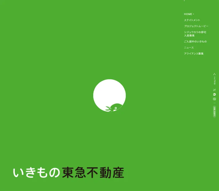
鮮やかな緑と白、巣箱の出入り口を表す円形モチーフが印象的な生物多様性プロジェクトサイト。大きな余白、細身の文字、円形の物件紹介で都市といきものの共生を伝える。
オリジナルサイトを見るIkimono Tokyu Land — Style Reference
A bright green habitat, organized around the small circular entrance to a bird’s home.
Website / Original URL: いきもの東急不動産
Final URL: https://www.tokyu-land.co.jp/ikimono/
Theme: vivid green and white scenes, with a dark wordmark accent; no user-selectable theme was verified.
Inspected: supplied capture session dated September 17, 2026, 04:03 JST — 2026-09-16T19:03:09.691Z.
Viewports: desktop 1440 × 1000 and mobile 390 × 844 CSS pixels.
Scope: three desktop captures showing the opening, circular residence sequence, and closing scene; two mobile captures showing the opening and closing scene; rendered DOM and computed-style samples spanning the main document. Linked editorial pages, residence details, contact forms, and opened menus were not inspected.
Ikimono Tokyu Land is a corporate biodiversity project with editorial content, bird-residence introductions, wildlife figures, and an invitation to collaborate. Its visual identity combines an almost uninterrupted green field, a small white opening at the viewport center, generous empty space, and lightweight Japanese typography. The property vocabulary is playful and specific: birds become residents, and nesting boxes become one-room or maisonette homes.
The strongest spatial relationship is between two very different circle sizes. A white opening remains approximately 124px across on both inspected viewports, while the residence panels measure about 635px on desktop and 312px on mobile. A closing caption connects the small opening to a 27mm nest-box entrance. The desktop navigation occupies the upper-right corner; a separate social rail sits at the far-right edge. Mobile preserves the central opening and moves navigation behind a compact menu control.
How to Read This Reference
- Measured values come from the supplied rendered DOM, bounding rectangles, computed styles, and exposed custom properties. Measurements are rounded for readability unless precision matters.
- Visual estimates describe geometry or appearance visible in the original-page captures without a corresponding element measurement.
- Derived values are calculations from those measurements, such as spacing between two recorded rectangles.
- Recommendations describe a reusable implementation. They do not establish the original site’s CSS formulas, breakpoints, or interaction behavior.
- Several sections appear repeatedly at identical coordinates with different foreground colors. This is consistent with layered presentation, but the precise masking implementation is unverified. Do not turn those repetitions into duplicate editorial sections.
- A measured wrapper color is not always the visible color of its artwork or descendants. Desktop navigation is visibly white on green and green on white even where its anchor wrapper reports black.
- A computed font-family declaration identifies a requested stack, not proof that every named font file loaded.
- The supplied captures show settled sampled states. They do not establish that every delayed reveal, menu, animation, or interaction completed.
Tokens — Colors
Default Palette
| Name | Value | Suggested token | Evidence and role |
|---|---|---|---|
| Habitat Green | #4dad31 |
--color-green |
Measured as rgb(77, 173, 49) on text and the special-content badge; visually matches the dominant green fields and residence circles |
| White | #ffffff |
--color-white |
Measured foreground color; visible as the opening, reversed text, and gallery canvas |
| Black | #000000 |
--color-ink |
Measured on selected headings and wrappers; the graphic wordmark includes a visually dark portion whose exact artwork color was not extracted |
| White veil | rgba(255,255,255,0.2) |
--color-copy-surface |
Measured background of the desktop and mobile URL COPY control |
| Utility gray | #777777 |
--color-utility-muted |
Measured corporate-menu policy links; DOM-only evidence for this menu state |
| Utility pale gray | #ededed |
--color-utility-surface |
Measured on an unnamed circular control associated with the corporate link collection; not a general page surface |
The page’s main palette is green and white. Pale wood and natural bird colors belong to imagery rather than the interface token system. Do not introduce beige panels merely because the birdhouse contains pale timber.
The root exposes --swiper-theme-color: #007aff, but blue is not established as a visible design accent. A library variable alone is not evidence for adding blue controls.
Scene Palettes
| Scene | Canvas | Main foreground | Distinctive treatment |
|---|---|---|---|
| Opening | Green | White, with a dark portion in the wordmark | Small white opening surrounded by broad empty space |
| Residence sequence | White | Green | Large filled green circles and an equally large outlined action circle |
| Closing | Green | White | Central opening, fine measurement marks, small legal text, corporate-menu entry |
| Other document sections | Green/white variants recorded in overlapping DOM layers | Green or white according to layer | Exact visible composition was not captured for every section |
These are page states, not verified selectable themes. Coordinate navigation, rules, and text with the scene beneath them rather than changing only the background.
Tokens — Typography
Main Sans-Serif Stack
Project content declares a stack beginning with Inter, "Noto Sans JP", followed by Japanese system-font aliases, YuGothic, "Yu Gothic Medium", "Yu Gothic", system fonts, "Hiragino Kaku Gothic ProN", Meiryo, and sans-serif.
The body separately declares "Noto Sans JP", YuGothic, YuGothicM, Meiryo, sans-serif, including Japanese aliases in the original declaration. The project’s measured content generally uses weight 300; navigation and small feature badges use 400. The resulting character is light, open, and deliberately unhurried.
The root reports a 10px font size and a Times fallback, but the visible project text overrides that family. Times is not the editorial font of this design.
Graphic Wordmark
The visible title, いきもの東急不動産, is a graphic treatment: the first portion is white and the company-name portion is dark. The inspected h1 has no extracted text and measures 715.75 × 75.17px on desktop and 340.08 × 35.70px on mobile.
Its wrapper’s 29.33px font size does not describe the visible lettering. Preserve the approximately 9.52:1 artwork ratio and use an authorized wordmark asset when available. Do not infer a display-font name from its rounded lettering.
Type Scale
Values below are measured CSS sizes and line heights. They describe text elements unless a wrapper limitation is stated.
| Role | Desktop size / line height | Mobile size / line height | Weight | Tracking |
|---|---|---|---|---|
| Section heading | 67.76 / 121.98px |
33.28 / 59.90px |
300 | Usually 0.08em |
| Statement paragraph | 29.65 / 59.29px |
16.64 / 33.28px |
300 | 0.075em desktop; 0.08em mobile |
| Section paragraph | 23.29 / 41.93px |
14.56 / 26.21px |
300 | 0.08em |
| Residence title | 29.65 / 53.36px |
16.64 / 29.95px |
300 | 0.08em |
| Residence description | 19.06 / 34.31px |
12.48 / 22.46px |
300 | 0.08em |
| Species-count numeral | 84.71 / 118.59px |
41.60 / 58.24px |
300 | Normal |
| Species category and unit | 42.35 / 59.29px |
20.80 / 29.12px |
300 | Normal |
| Special-content badge | 19.06 / 19.06px |
12.48 / 12.48px |
400 | Normal |
| Entrance-size value | 23.29 / 41.93px |
18.72 / 33.70px |
300 | 0.08em |
| Entrance explanation | 14.82 / 23.72px |
12.48 / 19.97px |
300 | 0.08em |
| Navigation wrapper | 14.67px |
14.67px |
400 | 1.76px, approximately 0.12em |
| URL-copy label | 10.59 / 16.94px |
10.40 / 22.88px |
300 | 0.04em desktop; 0.02em mobile |
| Corporate-menu entry | 15.88 / 28.59px |
12.48 / 22.46px |
300 | 0.08em |
The mobile special-content heading is an exception: its measured tracking is approximately 0.026em, tighter than the other section headings. This allows the longer label to fit on one line at the inspected width.
Navigation wrappers report line-height: 0, while their measured rows still have height. This is a wrapper/artwork detail, not a sensible line-height for a new live-text navigation implementation. Use approximately 1.5 for a text adaptation.
Tokens — Spacing & Shapes
The interface uses broad scene spacing, precise circles, and very thin rules. It has little conventional card chrome. The small badge and copy control provide the few clearly measured rounded rectangles.
Spacing Scale
| Use | Desktop | Mobile | Evidence |
|---|---|---|---|
| Main content left inset | 84.70px |
24.95px |
Measured |
| Primary content width | 901.05px |
340.08px |
Measured statement and several section blocks |
| Wider wildlife content width | 1048.23px |
340.08px |
Measured |
| Navigation row separation | About 16.94px clear gap |
About 33.27px clear gap |
Derived from adjacent row rectangles; mobile list is not visibly open |
| Residence title-to-description gap | 12.70px |
8.31px |
Derived |
| Heading-to-paragraph clearance | About 78.70px |
About 23.91px |
Derived from residence and alliance sections |
| Feature-badge padding | 7.41px 12.71px 9.53px |
4.16px 8.32px 5.20px |
Measured |
| Broad action wrapper height | 254.11px |
124.80px |
Measured; visible border path not supplied for every action |
| Broad action horizontal padding | 184.24px |
66.56px |
Measured |
These are component-specific measurements, not proof of a universal spacing grid.
Border Radius
| Element | Value | Evidence |
|---|---|---|
| Central opening | Circle, about 124.24px diameter |
Source custom property plus both viewport captures |
| Residence action circle | 50% |
Measured |
| Residence panel | Circular silhouette | Visible capture; diameter corresponds to measured sequence width |
| Feature badge | 4.24px desktop; 4.16px mobile |
Measured |
| URL-copy pill | 19.06px desktop; 18.72px mobile |
Measured, effectively a capsule at its small dimensions |
| Corporate footer enclosure | Square corners | Visual observation |
Fine dashed or dotted contours are approximately 1px in the captures. Their exact stroke widths and dash arrays were not supplied.
Layout Measurements
| Element | Desktop 1440 × 1000 |
Mobile 390 × 844 |
|---|---|---|
| Document height | 11033.02px |
10281px |
| Opening center | Approximately (720, 500) |
Approximately (195, 422) |
| Opening diameter | 124.24029165814181px source value |
Same source value |
| Wordmark rectangle | (85.75, 842.61), 715.75 × 75.17px |
(24.95, 781.28), 340.08 × 35.70px |
| Promotional link rectangle | (1161.55, 817.89), 192.70 × 108px |
(221.28, 684.72), 143.77 × 78px |
| Desktop navigation | Starts at (1191.17, 80.47); width 164.11px |
Replaced visually by a menu button |
| Mobile menu control | Not shown | (329.70, 11.95), 45.75 × 45.75px |
| Residence sequence item | About 635.28px square |
312px square |
| URL-copy control | 16.94 × 76.23px, vertical |
74.88 × 22.88px, horizontal in DOM |
The opening is about 8.63% of desktop width but 31.86% of mobile width. Its stable pixel diameter is a defining responsive feature.
Components
Opening Scene
Role: introduce the project through space, color, and one small habitat opening.
A full-viewport green field contains a white circle at its center. The desktop capture shows a thin downward arrow, a tiny SCROLL label, and a green bird illustration peeking into the lower edge of the opening. The mobile capture shows the same opening as a plain white circle. The evidence does not establish whether that difference is caused by timing, animation state, or a responsive rule.
Anchor the graphic wordmark near the lower-left edge on desktop. On mobile it spans almost the full content width near the bottom, with approximately 25px side margins. Keep the middle of the page quiet: the wordmark and promotional teaser belong near the edge, leaving the opening isolated.
The visible arrow is a scroll cue. Its click behavior was not tested. A retained 100% value in the DOM does not establish that the white opening is a loading spinner.
Desktop Navigation
Role: provide persistent access to project chapters and linked features.
The navigation is a narrow, unboxed stack in the upper-right corner. The captured entries are HOME, ステイトメント, それはさておき動物, シジュウカラの邸宅 入居募集, ご入居中のいきもの, and アライアンス募集. The feature entry has a small reversed new-content label above it. The bird-residence entry wraps onto two lines.
A small dot follows the active-looking item in the opening, residence, and closing captures. The appearance is verified; the exact active-section detection logic is not. The list stays in the same visible corner across the desktop states, consistent with viewport-anchored navigation.
Its visible color changes with the scene: white over green, green over white. Keep the treatment flat, with no enclosing card, opaque header bar, or shadow.
Mobile Menu Control
Role: keep primary navigation available without consuming the narrow canvas.
The visible control occupies approximately 45.75px square near the top-right corner. Its three thin horizontal strokes are about 25px wide. It has no visible filled button surface.
The DOM contains a mobile navigation list starting around x = 31.19px, plus a horizontal sharing row near the lower edge. Those contents are absent from the supplied closed-menu screenshots. The opened panel, transition, dismissal behavior, and keyboard handling remain unverified.
Social and Copy Rail
Role: provide sharing and social access as a secondary edge utility.
Desktop places a slim vertical rail about 22px from the right edge. It contains a share symbol and vertical シェアする! label, X and Facebook sharing links, an Instagram profile link, small separator marks, and a translucent URL COPY capsule.
The X icon measures about 14.81px square; Facebook and Instagram icons measure about 16.94px. The copy capsule is particularly narrow at 16.94 × 76.23px. These are visible artwork dimensions, not recommended minimum interactive target sizes.
Mobile DOM measurements show a horizontal arrangement with larger icons of approximately 21–24px and a 74.88 × 22.88px copy control. The Instagram destination is a profile, not a share endpoint. Clipboard success, feedback text, and error handling were not tested.
Special-Content Teaser
Role: draw attention to the current editorial feature without breaking the sparse opening composition.
A circular bird photograph sits beside a fine dotted speech bubble containing short white promotional copy. The desktop grouping is approximately 193 × 108px, with the bird on the left and bubble on the right. Mobile reverses the visual arrangement: bubble on the left, bird on the right, above the wordmark.
The photo circle is visually about 94px on desktop and 67px on mobile. The teaser links to /ikimono/sateoki/. Treat the photo and speech bubble as one clear link target; their small text should not become separate competing controls.
Statement Block
Role: explain the project’s relationship between urban life and other living things.
The measured paragraph occupies a broad left-aligned block: 901.05px wide on desktop and 340.08px on mobile. It uses weight 300, doubled line height, and loose tracking. Desktop type is 29.65px; mobile type is 16.64px.
The statement begins below the opening scene in the recorded document, around y = 1144px desktop and 1156px mobile. These coordinates describe sampled layout positions, not recommended hardcoded offsets. Preserve the long, relaxed lines and breathing room while allowing text length to drive height.
Editorial Feature Section
Role: introduce それはさておき動物 and link to its dedicated content.
The DOM establishes a small green badge with white text, a large lightweight heading, a descriptive paragraph, and a broad feature link. The mobile heading uses tighter tracking than other headings.
The content describes a taxi program about pausing to encounter animals and nature in city life. The supplied screenshots do not show the section’s full media treatment, so no video player, poster composition, or playback behavior is asserted here.
Residence Introduction
Role: connect the project’s real-estate metaphor to nesting boxes at an urban rooftop habitat.
The introduction contains the heading シジュウカラの邸宅 入居募集 and a paragraph describing the rooftop location at Tokyu Plaza Omotesando Omokado. Desktop uses one heading line; mobile explicitly breaks the heading before the recruitment phrase.
The introduction leads into three residence types: ワンルームタイプ, 楕円ワンルームタイプ, and メゾネットタイプ. Their titles and descriptions are live text in the supplied DOM. Do not bake these labels into a single gallery screenshot.
Circular Residence Panel
Role: present one birdhouse as a distinctive property.
The desktop middle capture shows a green circle approximately 635px in diameter on a white canvas. A pale wooden maisonette-style birdhouse appears as an isolated realistic object in its upper-middle area. Below it are a centered white residence title and a two-line white description.
The visible house image is approximately 245 × 222px, estimated from the screenshot. Its curved roof, layered edge, entrance hole, and natural material shading supply detail against the flat circle. Preserve the full silhouette and use object-fit: contain in an adaptation.
Adjacent circles touch or nearly touch, and the previous circle is cut by the left viewport edge. This is a continuous horizontal sequence, not a spaced grid of cards. The desktop screenshot verifies a later sequence position; the input does not establish whether movement is driven exclusively by vertical scroll, dragging, or another controller.
Mobile DOM measurements retain horizontal item positions and 312px item widths. A mobile capture of this sequence was not supplied, so its full visible motion and clipping remain unverified.
Circular Residence Link
Role: finish the residence sequence with access to the detail page.
The link uses the same diameter as a residence panel but changes to an unfilled white surface with a fine dashed green circumference. Center 物件をみる above a thin horizontal arrow. In the desktop capture, this circle extends beyond the right viewport edge.
The measured link has border-radius: 50% and points to /ikimono/birdresidence/. Its wrapper’s black computed color does not describe the visibly green label and arrow. Keep this as an oversized continuation of the circle sequence rather than introducing a conventional filled rectangle.
Wildlife Figures and List Entry
Role: show the species recorded at the project’s habitat.
The DOM records 22 bird species and 158 insect species, followed by いきものリストをみる. These figures describe the captured page content; no independent update schedule was verified.
The measured number scale is 84.71px on desktop and 41.60px on mobile, with labels and units at half that size. Typography remains weight 300, so scale rather than boldness creates emphasis.
The supplied original-page screenshots do not show this section. Its exact illustration, framing, and list-open state remain unknown. The list entry has no destination in the extracted href, so do not invent a modal or a separate results page.
Alliance and Contact Section
Role: invite organizations and companies to participate.
The DOM contains a lightweight heading, a short explanatory paragraph, and an お問い合わせ link to https://www.tokyu-land.co.jp/form/contact/. The action wrapper measures 901.05 × 254.11px on desktop and 340.08 × 124.80px on mobile.
Those rectangles establish the action region, not its complete visible border anatomy. On mobile, the element reports a repeating dashed animation. The destination form and any submission behavior were outside the inspection scope.
Closing Measurement Scene
Role: give the recurring white opening a concrete ecological meaning.
The closing scene returns to the full green field and centered white circle. In the mobile capture, a horizontal dashed dimension line spans approximately the opening’s width beneath it. Center the 27mm value below that line, followed by the two-line explanation シジュウカラにとって / 最適な巣箱の出入り口サイズ.
The desktop closing capture shows a vertical measurement marker to the left of the opening; the explanatory text is present in the DOM but not visibly readable in that captured state. Do not assume the desktop annotation always matches the mobile arrangement.
The physical measurement is editorial content. The actual exposed opening size is 124.24px, and the page includes a device-size caveat. Do not promise physical calibration or replace the pixel dimension with a CSS 27mm length.
Corporate Footer and Menu Entry
Role: connect the project to the corporate website while keeping the closing scene sparse.
Desktop places small white legal text at the lower-left edge and a dashed, square-cornered corporate enclosure at the lower-right. The enclosure contains the white company logo and underlined 公式サイトメニュー entry. Mobile centers this enclosure near the bottom edge.
The corporate logo link measures about 127.05 × 22.22px on desktop and 124.80 × 21.83px on mobile. Its destination is the main corporate homepage.
The mobile capture shows the enclosure overlapping portions of the legal text. Record that as a captured layout condition, not a desirable responsive rule. A new implementation should reserve separate space for both.
An associated corporate link collection exists in the DOM. Its link positions form three groups on desktop and two columns on mobile. Its opened appearance and menu behavior were not exercised, so its neutral colors should not be generalized into a verified modal design.
Tokens — Motion & Interaction
| Treatment | Evidence | Verified value or limitation |
|---|---|---|
| Desktop navigation and social links | Computed transition | 0.3s; changed properties and hover endpoints were not supplied |
| Mobile broad action links | Computed animation | 40s linear infinite dashed-animation on feature, wildlife-list, and contact actions |
| Central opening size | Exposed custom properties | --circle-px: 124.24029165814181px and matching unitless --circle-num at both viewports |
| Mask-related state | Exposed custom property | --mask-y: 0px; the name alone does not establish the complete masking algorithm |
| Horizontal residence sequence | Screenshot and offscreen DOM rectangles | Horizontal arrangement and a later visible position are confirmed; timing, easing, and input mapping are unverified |
| Navigation color and active-looking dot | Different captured scenes | Visible state changes are confirmed; transition timing and section-detection logic are unknown |
| Bird and scroll cue inside opening | Opening desktop screenshot | Visible in one capture; animation cycle and mobile visibility rules are unknown |
| Mobile menu, corporate menu, copy feedback, wildlife list | Controls or content present in DOM | Interaction outcomes were not tested |
A computed transition: all without a duration is not evidence of a meaningful animation. Likewise, animation: none on sampled elements does not rule out movement driven by ancestors or JavaScript.
The collection procedure waited for finite visible motion and sampled stability, temporarily paused perpetual animation during readiness checks, and then resumed it. These are capture conditions rather than a motion recording. No scroll-animation library, autoplay interval, spring curve, or exact reveal sequence can be identified from the supplied data.
For an adaptation, keep decorative motion quiet and preserve access to all content without a synchronized scroll effect. Any newly chosen easing or reveal duration should be documented as an implementation decision.
Surfaces
| Layer | Appearance | Role |
|---|---|---|
| Primary habitat canvas | Flat green | Opening, closing, and green presentation layers |
| Alternate canvas | Flat white | Separates the circular residence sequence from the surrounding green scenes |
| Residence surface | Large green circle | Holds one object image and centered text |
| Residence action | White circle with fine green dashed outline | Continues the sequence into a destination link |
| Central opening | Solid white circle | Repeating spatial anchor and nest-entry metaphor |
| Promotional callout | Fine dotted speech-bubble outline | Small editorial announcement beside a bird photo |
| Copy utility | Translucent white capsule | Low-emphasis utility within the social rail |
| Corporate enclosure | Green with fine white dashed edges | Footer branding and access to corporate navigation |
No general shadow-elevation system is visible in the supplied captures. Object shading belongs to the birdhouse image. Structure comes from flat color, circle boundaries, typography, and sparse rules.
Imagery
The imagery connects a simple graphic world to real habitats. Three treatments are visible: a flat two-color bird illustration, a circular natural bird photograph, and a realistic isolated wooden birdhouse. Keep their roles distinct. The illustration belongs inside the white opening, the photograph belongs to the small promotional teaser, and the object image belongs inside the large residence circle.
The birdhouse uses pale wood, a curved roof, a small dark entrance, and subtle material shading. Its production method cannot be established from the capture; describe it as a realistic object image rather than claiming photography or 3D rendering.
Observed Asset References
Asset filenames, download URLs, and file formats were not included in the evidence. The following identifies observed artwork without inventing paths.
| Asset | Observed use | Reuse guidance |
|---|---|---|
| Project wordmark | Lower edge of opening scene | Preserve its two-color lettering and approximately 9.52:1 ratio |
| Bird illustration | Peeking into the white opening in the desktop opening capture | Use crisp flat shapes and crop it within the circular opening |
| Bird photograph | Circular special-content teaser | Keep natural color and the round crop |
| Maisonette birdhouse | Large green residence panel | Preserve the full silhouette and natural material detail |
| Corporate logo | Closing corporate-menu enclosure | Use an authorized brand asset with a suitable text alternative |
| Share and social symbols | Desktop edge rail; mobile DOM utility row | Keep artwork small and simple while enlarging interactive hit areas |
Do not apply pixelated image rendering: this design’s circles, lettering, photography, and object edges appear smooth. Use supplied artwork when authorized; CSS should supply the geometry around it.
Layout & Responsive Behavior
The page is a long document with viewport-scale visual scenes and a horizontal residence sequence. Its sampled document height is about eleven desktop viewports and twelve mobile viewports. Those lengths include presentation spacing and cannot be reconstructed reliably as a stack of equally tall sections.
Desktop content is left aligned rather than centered across the full window. Main paragraphs begin around x = 84.70px, while most use a width near 901px; the wildlife section extends to roughly 1048px. This leaves a substantial right-side region for navigation and visual breathing room.
Mobile reduces the main content width to 340.08px inside approximately 25px margins. The wordmark follows this width, while the small white opening keeps its desktop pixel diameter. Section headings shrink from 67.76px to 33.28px, and section paragraphs shrink from 23.29px to 14.56px.
| Relationship | Desktop observation | Mobile observation |
|---|---|---|
| Main navigation | Visible upper-right stack | Closed-menu icon in supplied screenshots |
| Social utility | Vertical far-right rail | Horizontal row recorded in menu DOM |
| Wordmark | Wide lower-left graphic | Nearly full content width near bottom |
| Promotional teaser | Bird left, bubble right | Bubble left, bird right; above wordmark |
| Central opening | Centered, about 124px | Centered, about 124px |
| Residence panels | About 635px circles | 312px item dimensions in DOM |
| Long headings | Primarily single-line | Residence and wildlife headings break across lines |
| Corporate enclosure | Lower-right edge | Centered near lower edge |
Many measurements can be reproduced using a derived desktop unit of 1440 / 1360 ≈ 1.0588px and a mobile unit of 390 / 375 = 1.04px. For example, 64 × 1.0588 gives the desktop heading size and 32 × 1.04 gives the mobile heading size. This is a useful reconstruction model, not a verified source formula. The actual breakpoint, intermediate layouts, and any original size caps were not supplied.
Maintain the small opening independently from the scalable typography and large circles. A single global scale factor would incorrectly shrink it on mobile.
Do’s and Don’ts
Do
- Keep
#4dad31and white as the dominant scene pair. - Preserve the approximately 124px central opening at both documented viewport sizes.
- Use lightweight sans-serif text, generous line height, and loose Japanese tracking.
- Keep the wordmark near the lower edge of the opening scene.
- Place desktop navigation and sharing utilities in their distinct right-edge positions.
- Use oversized circular residence panels with isolated object imagery and centered captions.
- Continue the residence sequence with an equally large outlined circular link.
- Retain natural bird and wood colors within the otherwise restricted interface palette.
- Distinguish visible screenshot findings from sections known only through the DOM.
- Preserve the semantic connection between the recurring opening and the closing size explanation.
Don’t
- Don’t fill the opening scene with a conventional headline, paragraph, and large rectangular button.
- Don’t replace the circular residence sequence with a generic rounded-card grid.
- Don’t scale the small opening in direct proportion to viewport width.
- Don’t interpret the graphic wordmark’s wrapper font size as its visible type scale.
- Don’t introduce blue because a library custom property contains a blue value.
- Don’t add gradients, glass panels, or general drop-shadow elevation.
- Don’t stretch or crop the birdhouse into a rectangular cover image.
- Don’t reproduce overlapping DOM copies as repeated content for readers or assistive technology.
- Don’t promise dragging, autoplay, clipboard confirmation, or modal behavior without implementing and testing it.
- Don’t reproduce the mobile footer overlap as an intentional design feature.
- Don’t claim that the on-screen circle is physically calibrated to 27mm.
Recommended Implementation Additions
These are recommendations for a new implementation, not verified features of the inspected page.
- Give graphic wordmarks, promotional artwork, and icon-only controls appropriate accessible names. The empty extracted
h1is not enough to determine the original accessible name. - Use semantic links for the documented destinations and buttons for menu, copy, or disclosure actions. Avoid empty
hrefvalues in a new build. - Provide visible keyboard focus, a skip link, and sufficiently large hit areas around the small desktop social artwork.
- Manage focus and expanded state for mobile navigation; hide its links from interaction only when the panel is actually closed.
- Keep one semantic copy of each section. Decorative color or mask duplicates should not create repeated reading order, IDs, or tab stops.
- Provide a readable static flow when scroll synchronization or animation is unavailable. Essential information should not depend on a reveal completing.
- Respect reduced-motion preferences by stopping decorative dash movement and unnecessary transforms while keeping all content visible.
- Check text contrast carefully. The measured green/white pair is approximately
2.9:1, calculated from the colors, so small text needs a higher-contrast treatment in an accessible adaptation. - Reserve footer space and allow legal copy to wrap instead of placing the corporate enclosure over it.
- Keep the entrance-size caveat adjacent to the explanation and avoid describing CSS pixels as a guaranteed physical measurement.
Agent Prompt Guide
Quick Color Reference
- Main green:
#4dad31. - White canvas, reversed text, and central opening:
#ffffff. - Dark accent: confined chiefly to the graphic wordmark and selected text treatments.
- Copy capsule on green:
rgba(255,255,255,0.2). - Rules: fine green on white or white on green, often dashed or dotted.
- Image color: natural pale wood and bird photography; do not convert those colors into general UI surfaces.
Overall Prompt
“Create a corporate biodiversity project site inspired by Ikimono Tokyu Land. Use a vivid green #4dad31 field, white alternate scenes, lightweight Japanese sans-serif text, broad empty space, and a small white circle centered in viewport-scale scenes. Keep that small circle approximately 124px across on desktop and mobile. Place a two-color graphic wordmark near the lower-left edge on desktop and across the lower mobile content area. Add a narrow upper-right desktop navigation stack and a separate far-right sharing rail; use a compact menu control on mobile. Present three birdhouse types in oversized green circles with realistic isolated wooden objects, centered white titles, and short descriptions. Finish the sequence with a white circle outlined in green dashes and a simple arrow. Explain the recurring opening through a closing nest-entry measurement. Treat motion as progressive enhancement and retain a readable semantic document.”
Example Component Prompts
- Opening scene: “A full-height green canvas with a 124px white circle at the exact visual center, ample empty space, and a wide two-color Japanese wordmark near the bottom. A small circular bird photo and dotted speech bubble form one promotional link near the lower-right area. No enclosing header surface or large rectangular CTA.”
- Residence panel: “A 635px green circle on white, containing a complete pale wooden birdhouse silhouette, a centered lightweight white title, and a two-line description. The object occupies roughly two-fifths of the circle width. Adjacent circles form a continuous horizontal sequence without card shadows.”
- Residence destination: “A white circle matching the residence panels in diameter, outlined with a fine dashed green stroke. Center the Japanese label
物件をみるabove a thin right-pointing arrow. Keep the interior mostly empty.” - Mobile opening: “At 390 × 844, retain a 124px central white opening, approximately 25px content margins, a 340px-wide graphic wordmark near the bottom, and a small three-line menu button at the upper-right. Put the bird teaser above the wordmark.”
- Closing explanation: “A green scene with the central white opening and a fine dashed measurement annotation. On mobile, place the dimension line below the circle, followed by
27mmand a short centered explanation. Give the corporate footer and legal copy separate space.”
Quick Start
CSS Custom Properties
This is a reusable adaptation, not recovered source CSS. It uses a conventional document root, viewport-derived units that reproduce many supplied measurements, and an independently sized opening. The 64rem breakpoint and unit caps are recommendations. Fonts and authorized artwork must be supplied separately.
Use .scene for a green viewport scene and .scene--white for its white counterpart. Put .opening inside each relevant scene. The sample residence track uses native horizontal overflow as an accessible baseline; it does not reproduce an unverified scroll controller. The menu rules cover the closed mobile state only, and the application must implement the disclosure.
:root {
  /* Measured colors and observed font-family entries */
  --color-green: #4dad31;
  --color-white: #fff;
  --color-ink: #000;
  --color-copy-surface: rgb(255 255 255 / 20%);
  --font-project: Inter, 'Noto Sans JP', YuGothic,
    'Yu Gothic', Meiryo, sans-serif;

  /* Recommended scaling model; source formulas were not supplied */
  --u: clamp(0.9px, calc(100vw / 375), 1.2px);
  --gutter: calc(24 * var(--u));
  --text-heading: calc(32 * var(--u));
  --text-body: calc(14 * var(--u));
  --text-statement: calc(16 * var(--u));
  --text-room: calc(16 * var(--u));
  --text-caption: calc(12 * var(--u));
  --text-metric: calc(40 * var(--u));
  --text-nav: 14.6667px;
  --leading-body: 1.8;
  --tracking-body: 0.08em;

  /* Opening stays independent of the responsive unit */
  --opening-size: 124.24029165814181px;
  --residence-size: calc(300 * var(--u));
  --brand-width: calc(327 * var(--u));
  --brand-bottom: calc(26 * var(--u));
  --teaser-width: calc(138.24 * var(--u));
  --teaser-bottom: calc(78 * var(--u));
  --action-height: calc(120 * var(--u));
  --rule: 1px;
  --link-duration: 300ms;
}

* {
  box-sizing: border-box;
}

body {
  margin: 0;
}

.ikimono-page {
  color: var(--color-green);
  background: var(--color-white);
  font-family: var(--font-project);
  font-weight: 300;
}

.ikimono-page a {
  color: inherit;
}

.scene {
  position: relative;
  min-height: 100vh;
  min-height: 100svh;
  color: var(--color-white);
  background: var(--color-green);
}

.scene--white {
  color: var(--color-green);
  background: var(--color-white);
}

.opening {
  position: absolute;
  inset: 50% auto auto 50%;
  width: var(--opening-size);
  aspect-ratio: 1;
  overflow: hidden;
  border-radius: 50%;
  background: var(--color-white);
  transform: translate(-50%, -50%);
  pointer-events: none;
}

.brand {
  position: absolute;
  left: var(--gutter);
  bottom: var(--brand-bottom);
  width: min(var(--brand-width), calc(100% - 2 * var(--gutter)));
  margin: 0;
}

.brand img,
.feature-teaser img {
  display: block;
  width: 100%;
  height: auto;
}

.feature-teaser {
  position: absolute;
  right: var(--gutter);
  bottom: var(--teaser-bottom);
  width: var(--teaser-width);
}

.content {
  width: calc(100% - 2 * var(--gutter));
  margin-inline: var(--gutter);
}

.section-title {
  margin: 0;
  font-size: var(--text-heading);
  font-weight: 300;
  line-height: 1.8;
  letter-spacing: 0.08em;
}

.section-copy {
  margin: calc(23 * var(--u)) 0 0;
  font-size: var(--text-body);
  line-height: var(--leading-body);
  letter-spacing: var(--tracking-body);
}

.statement {
  font-size: var(--text-statement);
  line-height: 2;
  letter-spacing: 0.08em;
}

.feature-badge {
  display: inline-flex;
  padding: calc(4 * var(--u)) calc(8 * var(--u))
    calc(5 * var(--u));
  border-radius: calc(4 * var(--u));
  color: var(--color-white);
  background: var(--color-green);
  font-size: var(--text-caption);
  font-weight: 400;
  line-height: 1;
}

/* Native scrolling is a recommended baseline, not a source claim. */
.residence-track {
  display: flex;
  align-items: center;
  min-height: 100vh;
  min-height: 100svh;
  overflow-x: auto;
  gap: 0;
  background: var(--color-white);
  scroll-snap-type: x proximity;
}

.residence-card,
.residence-link {
  flex: 0 0 var(--residence-size);
  width: var(--residence-size);
  height: var(--residence-size);
  border-radius: 50%;
  scroll-snap-align: center;
  text-align: center;
}

.residence-card {
  display: flex;
  flex-direction: column;
  align-items: center;
  justify-content: center;
  color: var(--color-white);
  background: var(--color-green);
}

.residence-image {
  display: block;
  flex: 0 0 auto;
  width: 40%;
  height: 35%;
  object-fit: contain;
}

.residence-title {
  margin: calc(20 * var(--u)) 0 calc(8 * var(--u));
  font-size: var(--text-room);
  font-weight: 300;
  line-height: 1.8;
  letter-spacing: 0.08em;
}

.residence-copy {
  max-width: 84%;
  margin: 0;
  font-size: var(--text-caption);
  line-height: 1.8;
  letter-spacing: 0.08em;
}

.residence-link {
  display: flex;
  flex-direction: column;
  align-items: center;
  justify-content: center;
  gap: calc(24 * var(--u));
  border: var(--rule) dashed var(--color-green);
  color: var(--color-green);
  background: var(--color-white);
  font-size: var(--text-room);
  letter-spacing: 0.08em;
  text-decoration: none;
}

.arrow {
  position: relative;
  display: block;
  width: calc(80 * var(--u));
  height: 1px;
  background: currentColor;
}

.arrow::after {
  content: '';
  position: absolute;
  right: 0;
  top: 50%;
  border-block: 5px solid transparent;
  border-left: 12px solid currentColor;
  transform: translateY(-50%);
}

.metric-number {
  font-size: var(--text-metric);
  font-weight: 300;
  line-height: 1.4;
}

/* Newly specified visible action treatment using the observed motif. */
.section-link {
  display: flex;
  align-items: center;
  justify-content: center;
  min-height: var(--action-height);
  padding: 24px;
  border: var(--rule) dashed currentColor;
  text-align: center;
  text-decoration: none;
}

.desktop-nav {
  display: none;
}

.menu-toggle {
  position: fixed;
  z-index: 30;
  top: calc(11.5 * var(--u));
  right: calc(14 * var(--u));
  display: grid;
  place-items: center;
  width: calc(44 * var(--u));
  height: calc(44 * var(--u));
  padding: 0;
  border: 0;
  color: var(--color-white);
  background: transparent;
  cursor: pointer;
}

.menu-toggle span {
  display: block;
  width: calc(24 * var(--u));
  height: 1px;
  background: currentColor;
  box-shadow: 0 -5px currentColor, 0 5px currentColor;
}

/* Reserve real footer space instead of copying the captured overlap. */
.project-footer {
  display: grid;
  justify-items: center;
  gap: 24px;
  padding: 32px var(--gutter)
    calc(24px + env(safe-area-inset-bottom, 0px));
  color: var(--color-white);
  background: var(--color-green);
}

.project-footer small {
  max-width: 100%;
  text-align: center;
  overflow-wrap: anywhere;
}

.ikimono-page :focus-visible {
  outline: 2px solid var(--color-ink);
  outline-offset: 4px;
}

@media (min-width: 64rem) {
  :root {
    --u: clamp(0.8px, calc(100vw / 1360), 1.2px);
    --gutter: calc(80 * var(--u));
    --text-heading: calc(64 * var(--u));
    --text-body: calc(22 * var(--u));
    --text-statement: calc(28 * var(--u));
    --text-room: calc(28 * var(--u));
    --text-caption: calc(18 * var(--u));
    --text-metric: calc(80 * var(--u));
    --residence-size: calc(600 * var(--u));
    --brand-width: calc(676 * var(--u));
    --brand-bottom: calc(77.65 * var(--u));
    --teaser-width: calc(182 * var(--u));
    --teaser-bottom: calc(70 * var(--u));
    --action-height: calc(240 * var(--u));
  }

  .content {
    width: min(calc(851 * var(--u)), calc(100% - 2 * var(--gutter)));
  }

  .content--wide {
    width: min(calc(990 * var(--u)), calc(100% - 2 * var(--gutter)));
  }

  .section-copy {
    margin-top: calc(74.33 * var(--u));
  }

  .statement {
    letter-spacing: 0.075em;
  }

  .feature-badge {
    padding: calc(7 * var(--u)) calc(12 * var(--u))
      calc(9 * var(--u));
  }

  .residence-title {
    margin-top: calc(30 * var(--u));
    margin-bottom: calc(12 * var(--u));
  }

  .desktop-nav {
    position: fixed;
    z-index: 20;
    top: calc(76 * var(--u));
    right: var(--gutter);
    display: grid;
    gap: calc(16 * var(--u));
    width: calc(155 * var(--u));
    color: var(--color-white);
    font-size: var(--text-nav);
    font-weight: 400;
    line-height: 1.5;
    letter-spacing: 0.12em;
  }

  .desktop-nav a {
    text-decoration: none;
    transition: opacity var(--link-duration);
  }

  .desktop-nav a[aria-current]::after {
    content: '•';
    margin-left: 0.4em;
  }

  /* Apply this state when navigation sits over a white scene. */
  .desktop-nav[data-surface='white'] {
    color: var(--color-green);
  }

  .menu-toggle {
    display: none;
  }

  .project-footer {
    grid-template-columns: 1fr auto;
    align-items: end;
    justify-items: start;
  }
}

@media (prefers-reduced-motion: reduce) {
  .ikimono-page *,
  .ikimono-page *::before,
  .ikimono-page *::after {
    animation: none !important;
    transition: none !important;
    scroll-behavior: auto !important;
  }
}
The sample intentionally separates static geometry from behavior. A complete implementation still needs menu state, actual copy handling, accessible destination labels, and any chosen scroll synchronization. Animated dashed paths require their own SVG or background implementation; the original keyframes were not supplied.
Tailwind v4 Token Mapping
Optional aliases for a project already using Tailwind v4. Define the custom properties above first. This mapping does not imply that the original site uses Tailwind.
@theme inline {
  --color-habitat: var(--color-green);
  --color-opening: var(--color-white);
  --color-ink: #000;

  --font-project: Inter, 'Noto Sans JP', YuGothic,
    'Yu Gothic', Meiryo, sans-serif;

  --text-section: var(--text-heading);
  --text-copy: var(--text-body);
  --text-statement: var(--text-statement);
  --text-residence: var(--text-room);
  --text-small: var(--text-caption);
  --text-count: var(--text-metric);

  --spacing-gutter: var(--gutter);
  --spacing-opening: var(--opening-size);
  --spacing-residence: var(--residence-size);
  --radius-badge: calc(4 * var(--u));
}
Sources & Evidence
- Inspected original and final page: https://www.tokyu-land.co.jp/ikimono/. The supplied browser record reports HTTP
200and no URL change. - Capture timestamp:
2026-09-16T19:03:09.691Z, equivalent to September 17, 2026, 04:03 JST. This reference uses that supplied session rather than claiming a separate live visit. - Visual evidence: three original-page desktop captures at
1440 × 1000and two original-page mobile captures at390 × 844. They establish the opening, desktop residence sequence, closing scenes, and visible navigation differences. - Rendered evidence: page text, link destinations, element rectangles, computed typography, selected colors, transitions, animation declarations, and custom properties at both viewports. Document heights are approximately
11033pxand10281pxrespectively. - Linked destinations recorded on the inspected page: editorial feature, bird residences, contact form, and corporate homepage. Their URLs are supported; their destination designs and behavior were not inspected.
- Capture conditions: initial observation lasted at least five seconds, with bounded waits for loading, finite motion, layout stability, and visible-image decoding. Scrolling traversed intermediate positions. SharedWorkers and service workers were disabled. These conditions do not prove that every delayed state rendered completely.
- Limitations: no complete stylesheet, animation keyframes, asset URL inventory, video recording, verified hover endpoint, opened menu capture, clipboard result, or mobile residence-sequence capture was provided. Proposed CSS formulas, breakpoint, accessibility changes, and native-scroll fallback are explicitly implementation recommendations.
This reference documents the current page shown in the supplied original-site evidence. It preserves the observed green-and-white spatial system while keeping unverified behavior separate from reusable implementation guidance.
# Ikimono Tokyu Land — Style Reference

> A bright green habitat, organized around the small circular entrance to a bird’s home.

**Website / Original URL:** [いきもの東急不動産](https://www.tokyu-land.co.jp/ikimono/)
**Final URL:** [https://www.tokyu-land.co.jp/ikimono/](https://www.tokyu-land.co.jp/ikimono/)
**Theme:** vivid green and white scenes, with a dark wordmark accent; no user-selectable theme was verified.
**Inspected:** supplied capture session dated September 17, 2026, 04:03 JST — `2026-09-16T19:03:09.691Z`.
**Viewports:** desktop `1440 × 1000` and mobile `390 × 844` CSS pixels.
**Scope:** three desktop captures showing the opening, circular residence sequence, and closing scene; two mobile captures showing the opening and closing scene; rendered DOM and computed-style samples spanning the main document. Linked editorial pages, residence details, contact forms, and opened menus were not inspected.

Ikimono Tokyu Land is a corporate biodiversity project with editorial content, bird-residence introductions, wildlife figures, and an invitation to collaborate. Its visual identity combines an almost uninterrupted green field, a small white opening at the viewport center, generous empty space, and lightweight Japanese typography. The property vocabulary is playful and specific: birds become residents, and nesting boxes become one-room or maisonette homes.

The strongest spatial relationship is between two very different circle sizes. A white opening remains approximately 124px across on both inspected viewports, while the residence panels measure about 635px on desktop and 312px on mobile. A closing caption connects the small opening to a `27mm` nest-box entrance. The desktop navigation occupies the upper-right corner; a separate social rail sits at the far-right edge. Mobile preserves the central opening and moves navigation behind a compact menu control.

## How to Read This Reference

- **Measured** values come from the supplied rendered DOM, bounding rectangles, computed styles, and exposed custom properties. Measurements are rounded for readability unless precision matters.
- **Visual estimates** describe geometry or appearance visible in the original-page captures without a corresponding element measurement.
- **Derived** values are calculations from those measurements, such as spacing between two recorded rectangles.
- **Recommendations** describe a reusable implementation. They do not establish the original site’s CSS formulas, breakpoints, or interaction behavior.
- Several sections appear repeatedly at identical coordinates with different foreground colors. This is consistent with layered presentation, but the precise masking implementation is unverified. Do not turn those repetitions into duplicate editorial sections.
- A measured wrapper color is not always the visible color of its artwork or descendants. Desktop navigation is visibly white on green and green on white even where its anchor wrapper reports black.
- A computed font-family declaration identifies a requested stack, not proof that every named font file loaded.
- The supplied captures show settled sampled states. They do not establish that every delayed reveal, menu, animation, or interaction completed.

## Tokens — Colors

### Default Palette

| Name | Value | Suggested token | Evidence and role |
| --- | --- | --- | --- |
| Habitat Green | `#4dad31` | `--color-green` | Measured as `rgb(77, 173, 49)` on text and the special-content badge; visually matches the dominant green fields and residence circles |
| White | `#ffffff` | `--color-white` | Measured foreground color; visible as the opening, reversed text, and gallery canvas |
| Black | `#000000` | `--color-ink` | Measured on selected headings and wrappers; the graphic wordmark includes a visually dark portion whose exact artwork color was not extracted |
| White veil | `rgba(255,255,255,0.2)` | `--color-copy-surface` | Measured background of the desktop and mobile `URL COPY` control |
| Utility gray | `#777777` | `--color-utility-muted` | Measured corporate-menu policy links; DOM-only evidence for this menu state |
| Utility pale gray | `#ededed` | `--color-utility-surface` | Measured on an unnamed circular control associated with the corporate link collection; not a general page surface |

The page’s main palette is green and white. Pale wood and natural bird colors belong to imagery rather than the interface token system. Do not introduce beige panels merely because the birdhouse contains pale timber.

The root exposes `--swiper-theme-color: #007aff`, but blue is not established as a visible design accent. A library variable alone is not evidence for adding blue controls.

### Scene Palettes

| Scene | Canvas | Main foreground | Distinctive treatment |
| --- | --- | --- | --- |
| Opening | Green | White, with a dark portion in the wordmark | Small white opening surrounded by broad empty space |
| Residence sequence | White | Green | Large filled green circles and an equally large outlined action circle |
| Closing | Green | White | Central opening, fine measurement marks, small legal text, corporate-menu entry |
| Other document sections | Green/white variants recorded in overlapping DOM layers | Green or white according to layer | Exact visible composition was not captured for every section |

These are page states, not verified selectable themes. Coordinate navigation, rules, and text with the scene beneath them rather than changing only the background.

## Tokens — Typography

### Main Sans-Serif Stack

Project content declares a stack beginning with `Inter, "Noto Sans JP"`, followed by Japanese system-font aliases, `YuGothic`, `"Yu Gothic Medium"`, `"Yu Gothic"`, system fonts, `"Hiragino Kaku Gothic ProN"`, `Meiryo`, and `sans-serif`.

The body separately declares `"Noto Sans JP", YuGothic, YuGothicM, Meiryo, sans-serif`, including Japanese aliases in the original declaration. The project’s measured content generally uses weight `300`; navigation and small feature badges use `400`. The resulting character is light, open, and deliberately unhurried.

The root reports a `10px` font size and a Times fallback, but the visible project text overrides that family. Times is not the editorial font of this design.

### Graphic Wordmark

The visible title, `いきもの東急不動産`, is a graphic treatment: the first portion is white and the company-name portion is dark. The inspected `h1` has no extracted text and measures `715.75 × 75.17px` on desktop and `340.08 × 35.70px` on mobile.

Its wrapper’s `29.33px` font size does not describe the visible lettering. Preserve the approximately `9.52:1` artwork ratio and use an authorized wordmark asset when available. Do not infer a display-font name from its rounded lettering.

### Type Scale

Values below are measured CSS sizes and line heights. They describe text elements unless a wrapper limitation is stated.

| Role | Desktop size / line height | Mobile size / line height | Weight | Tracking |
| --- | --- | --- | --- | --- |
| Section heading | `67.76 / 121.98px` | `33.28 / 59.90px` | 300 | Usually `0.08em` |
| Statement paragraph | `29.65 / 59.29px` | `16.64 / 33.28px` | 300 | `0.075em` desktop; `0.08em` mobile |
| Section paragraph | `23.29 / 41.93px` | `14.56 / 26.21px` | 300 | `0.08em` |
| Residence title | `29.65 / 53.36px` | `16.64 / 29.95px` | 300 | `0.08em` |
| Residence description | `19.06 / 34.31px` | `12.48 / 22.46px` | 300 | `0.08em` |
| Species-count numeral | `84.71 / 118.59px` | `41.60 / 58.24px` | 300 | Normal |
| Species category and unit | `42.35 / 59.29px` | `20.80 / 29.12px` | 300 | Normal |
| Special-content badge | `19.06 / 19.06px` | `12.48 / 12.48px` | 400 | Normal |
| Entrance-size value | `23.29 / 41.93px` | `18.72 / 33.70px` | 300 | `0.08em` |
| Entrance explanation | `14.82 / 23.72px` | `12.48 / 19.97px` | 300 | `0.08em` |
| Navigation wrapper | `14.67px` | `14.67px` | 400 | `1.76px`, approximately `0.12em` |
| URL-copy label | `10.59 / 16.94px` | `10.40 / 22.88px` | 300 | `0.04em` desktop; `0.02em` mobile |
| Corporate-menu entry | `15.88 / 28.59px` | `12.48 / 22.46px` | 300 | `0.08em` |

The mobile special-content heading is an exception: its measured tracking is approximately `0.026em`, tighter than the other section headings. This allows the longer label to fit on one line at the inspected width.

Navigation wrappers report `line-height: 0`, while their measured rows still have height. This is a wrapper/artwork detail, not a sensible line-height for a new live-text navigation implementation. Use approximately `1.5` for a text adaptation.

## Tokens — Spacing & Shapes

The interface uses broad scene spacing, precise circles, and very thin rules. It has little conventional card chrome. The small badge and copy control provide the few clearly measured rounded rectangles.

### Spacing Scale

| Use | Desktop | Mobile | Evidence |
| --- | --- | --- | --- |
| Main content left inset | `84.70px` | `24.95px` | Measured |
| Primary content width | `901.05px` | `340.08px` | Measured statement and several section blocks |
| Wider wildlife content width | `1048.23px` | `340.08px` | Measured |
| Navigation row separation | About `16.94px` clear gap | About `33.27px` clear gap | Derived from adjacent row rectangles; mobile list is not visibly open |
| Residence title-to-description gap | `12.70px` | `8.31px` | Derived |
| Heading-to-paragraph clearance | About `78.70px` | About `23.91px` | Derived from residence and alliance sections |
| Feature-badge padding | `7.41px 12.71px 9.53px` | `4.16px 8.32px 5.20px` | Measured |
| Broad action wrapper height | `254.11px` | `124.80px` | Measured; visible border path not supplied for every action |
| Broad action horizontal padding | `184.24px` | `66.56px` | Measured |

These are component-specific measurements, not proof of a universal spacing grid.

### Border Radius

| Element | Value | Evidence |
| --- | --- | --- |
| Central opening | Circle, about `124.24px` diameter | Source custom property plus both viewport captures |
| Residence action circle | `50%` | Measured |
| Residence panel | Circular silhouette | Visible capture; diameter corresponds to measured sequence width |
| Feature badge | `4.24px` desktop; `4.16px` mobile | Measured |
| URL-copy pill | `19.06px` desktop; `18.72px` mobile | Measured, effectively a capsule at its small dimensions |
| Corporate footer enclosure | Square corners | Visual observation |

Fine dashed or dotted contours are approximately `1px` in the captures. Their exact stroke widths and dash arrays were not supplied.

### Layout Measurements

| Element | Desktop `1440 × 1000` | Mobile `390 × 844` |
| --- | --- | --- |
| Document height | `11033.02px` | `10281px` |
| Opening center | Approximately `(720, 500)` | Approximately `(195, 422)` |
| Opening diameter | `124.24029165814181px` source value | Same source value |
| Wordmark rectangle | `(85.75, 842.61)`, `715.75 × 75.17px` | `(24.95, 781.28)`, `340.08 × 35.70px` |
| Promotional link rectangle | `(1161.55, 817.89)`, `192.70 × 108px` | `(221.28, 684.72)`, `143.77 × 78px` |
| Desktop navigation | Starts at `(1191.17, 80.47)`; width `164.11px` | Replaced visually by a menu button |
| Mobile menu control | Not shown | `(329.70, 11.95)`, `45.75 × 45.75px` |
| Residence sequence item | About `635.28px` square | `312px` square |
| URL-copy control | `16.94 × 76.23px`, vertical | `74.88 × 22.88px`, horizontal in DOM |

The opening is about `8.63%` of desktop width but `31.86%` of mobile width. Its stable pixel diameter is a defining responsive feature.

## Components

### Opening Scene

**Role:** introduce the project through space, color, and one small habitat opening.

A full-viewport green field contains a white circle at its center. The desktop capture shows a thin downward arrow, a tiny `SCROLL` label, and a green bird illustration peeking into the lower edge of the opening. The mobile capture shows the same opening as a plain white circle. The evidence does not establish whether that difference is caused by timing, animation state, or a responsive rule.

Anchor the graphic wordmark near the lower-left edge on desktop. On mobile it spans almost the full content width near the bottom, with approximately 25px side margins. Keep the middle of the page quiet: the wordmark and promotional teaser belong near the edge, leaving the opening isolated.

The visible arrow is a scroll cue. Its click behavior was not tested. A retained `100%` value in the DOM does not establish that the white opening is a loading spinner.

### Desktop Navigation

**Role:** provide persistent access to project chapters and linked features.

The navigation is a narrow, unboxed stack in the upper-right corner. The captured entries are `HOME`, `ステイトメント`, `それはさておき動物`, `シジュウカラの邸宅 入居募集`, `ご入居中のいきもの`, and `アライアンス募集`. The feature entry has a small reversed new-content label above it. The bird-residence entry wraps onto two lines.

A small dot follows the active-looking item in the opening, residence, and closing captures. The appearance is verified; the exact active-section detection logic is not. The list stays in the same visible corner across the desktop states, consistent with viewport-anchored navigation.

Its visible color changes with the scene: white over green, green over white. Keep the treatment flat, with no enclosing card, opaque header bar, or shadow.

### Mobile Menu Control

**Role:** keep primary navigation available without consuming the narrow canvas.

The visible control occupies approximately `45.75px` square near the top-right corner. Its three thin horizontal strokes are about 25px wide. It has no visible filled button surface.

The DOM contains a mobile navigation list starting around `x = 31.19px`, plus a horizontal sharing row near the lower edge. Those contents are absent from the supplied closed-menu screenshots. The opened panel, transition, dismissal behavior, and keyboard handling remain unverified.

### Social and Copy Rail

**Role:** provide sharing and social access as a secondary edge utility.

Desktop places a slim vertical rail about 22px from the right edge. It contains a share symbol and vertical `シェアする!` label, X and Facebook sharing links, an Instagram profile link, small separator marks, and a translucent `URL COPY` capsule.

The X icon measures about `14.81px` square; Facebook and Instagram icons measure about `16.94px`. The copy capsule is particularly narrow at `16.94 × 76.23px`. These are visible artwork dimensions, not recommended minimum interactive target sizes.

Mobile DOM measurements show a horizontal arrangement with larger icons of approximately 21–24px and a `74.88 × 22.88px` copy control. The Instagram destination is a profile, not a share endpoint. Clipboard success, feedback text, and error handling were not tested.

### Special-Content Teaser

**Role:** draw attention to the current editorial feature without breaking the sparse opening composition.

A circular bird photograph sits beside a fine dotted speech bubble containing short white promotional copy. The desktop grouping is approximately `193 × 108px`, with the bird on the left and bubble on the right. Mobile reverses the visual arrangement: bubble on the left, bird on the right, above the wordmark.

The photo circle is visually about 94px on desktop and 67px on mobile. The teaser links to `/ikimono/sateoki/`. Treat the photo and speech bubble as one clear link target; their small text should not become separate competing controls.

### Statement Block

**Role:** explain the project’s relationship between urban life and other living things.

The measured paragraph occupies a broad left-aligned block: `901.05px` wide on desktop and `340.08px` on mobile. It uses weight `300`, doubled line height, and loose tracking. Desktop type is `29.65px`; mobile type is `16.64px`.

The statement begins below the opening scene in the recorded document, around `y = 1144px` desktop and `1156px` mobile. These coordinates describe sampled layout positions, not recommended hardcoded offsets. Preserve the long, relaxed lines and breathing room while allowing text length to drive height.

### Editorial Feature Section

**Role:** introduce `それはさておき動物` and link to its dedicated content.

The DOM establishes a small green badge with white text, a large lightweight heading, a descriptive paragraph, and a broad feature link. The mobile heading uses tighter tracking than other headings.

The content describes a taxi program about pausing to encounter animals and nature in city life. The supplied screenshots do not show the section’s full media treatment, so no video player, poster composition, or playback behavior is asserted here.

### Residence Introduction

**Role:** connect the project’s real-estate metaphor to nesting boxes at an urban rooftop habitat.

The introduction contains the heading `シジュウカラの邸宅 入居募集` and a paragraph describing the rooftop location at Tokyu Plaza Omotesando Omokado. Desktop uses one heading line; mobile explicitly breaks the heading before the recruitment phrase.

The introduction leads into three residence types: `ワンルームタイプ`, `楕円ワンルームタイプ`, and `メゾネットタイプ`. Their titles and descriptions are live text in the supplied DOM. Do not bake these labels into a single gallery screenshot.

### Circular Residence Panel

**Role:** present one birdhouse as a distinctive property.

The desktop middle capture shows a green circle approximately `635px` in diameter on a white canvas. A pale wooden maisonette-style birdhouse appears as an isolated realistic object in its upper-middle area. Below it are a centered white residence title and a two-line white description.

The visible house image is approximately `245 × 222px`, estimated from the screenshot. Its curved roof, layered edge, entrance hole, and natural material shading supply detail against the flat circle. Preserve the full silhouette and use `object-fit: contain` in an adaptation.

Adjacent circles touch or nearly touch, and the previous circle is cut by the left viewport edge. This is a continuous horizontal sequence, not a spaced grid of cards. The desktop screenshot verifies a later sequence position; the input does not establish whether movement is driven exclusively by vertical scroll, dragging, or another controller.

Mobile DOM measurements retain horizontal item positions and `312px` item widths. A mobile capture of this sequence was not supplied, so its full visible motion and clipping remain unverified.

### Circular Residence Link

**Role:** finish the residence sequence with access to the detail page.

The link uses the same diameter as a residence panel but changes to an unfilled white surface with a fine dashed green circumference. Center `物件をみる` above a thin horizontal arrow. In the desktop capture, this circle extends beyond the right viewport edge.

The measured link has `border-radius: 50%` and points to `/ikimono/birdresidence/`. Its wrapper’s black computed color does not describe the visibly green label and arrow. Keep this as an oversized continuation of the circle sequence rather than introducing a conventional filled rectangle.

### Wildlife Figures and List Entry

**Role:** show the species recorded at the project’s habitat.

The DOM records `22` bird species and `158` insect species, followed by `いきものリストをみる`. These figures describe the captured page content; no independent update schedule was verified.

The measured number scale is `84.71px` on desktop and `41.60px` on mobile, with labels and units at half that size. Typography remains weight `300`, so scale rather than boldness creates emphasis.

The supplied original-page screenshots do not show this section. Its exact illustration, framing, and list-open state remain unknown. The list entry has no destination in the extracted `href`, so do not invent a modal or a separate results page.

### Alliance and Contact Section

**Role:** invite organizations and companies to participate.

The DOM contains a lightweight heading, a short explanatory paragraph, and an `お問い合わせ` link to `https://www.tokyu-land.co.jp/form/contact/`. The action wrapper measures `901.05 × 254.11px` on desktop and `340.08 × 124.80px` on mobile.

Those rectangles establish the action region, not its complete visible border anatomy. On mobile, the element reports a repeating dashed animation. The destination form and any submission behavior were outside the inspection scope.

### Closing Measurement Scene

**Role:** give the recurring white opening a concrete ecological meaning.

The closing scene returns to the full green field and centered white circle. In the mobile capture, a horizontal dashed dimension line spans approximately the opening’s width beneath it. Center the `27mm` value below that line, followed by the two-line explanation `シジュウカラにとって / 最適な巣箱の出入り口サイズ`.

The desktop closing capture shows a vertical measurement marker to the left of the opening; the explanatory text is present in the DOM but not visibly readable in that captured state. Do not assume the desktop annotation always matches the mobile arrangement.

The physical measurement is editorial content. The actual exposed opening size is `124.24px`, and the page includes a device-size caveat. Do not promise physical calibration or replace the pixel dimension with a CSS `27mm` length.

### Corporate Footer and Menu Entry

**Role:** connect the project to the corporate website while keeping the closing scene sparse.

Desktop places small white legal text at the lower-left edge and a dashed, square-cornered corporate enclosure at the lower-right. The enclosure contains the white company logo and underlined `公式サイトメニュー` entry. Mobile centers this enclosure near the bottom edge.

The corporate logo link measures about `127.05 × 22.22px` on desktop and `124.80 × 21.83px` on mobile. Its destination is the main corporate homepage.

The mobile capture shows the enclosure overlapping portions of the legal text. Record that as a captured layout condition, not a desirable responsive rule. A new implementation should reserve separate space for both.

An associated corporate link collection exists in the DOM. Its link positions form three groups on desktop and two columns on mobile. Its opened appearance and menu behavior were not exercised, so its neutral colors should not be generalized into a verified modal design.

## Tokens — Motion & Interaction

| Treatment | Evidence | Verified value or limitation |
| --- | --- | --- |
| Desktop navigation and social links | Computed transition | `0.3s`; changed properties and hover endpoints were not supplied |
| Mobile broad action links | Computed animation | `40s linear infinite dashed-animation` on feature, wildlife-list, and contact actions |
| Central opening size | Exposed custom properties | `--circle-px: 124.24029165814181px` and matching unitless `--circle-num` at both viewports |
| Mask-related state | Exposed custom property | `--mask-y: 0px`; the name alone does not establish the complete masking algorithm |
| Horizontal residence sequence | Screenshot and offscreen DOM rectangles | Horizontal arrangement and a later visible position are confirmed; timing, easing, and input mapping are unverified |
| Navigation color and active-looking dot | Different captured scenes | Visible state changes are confirmed; transition timing and section-detection logic are unknown |
| Bird and scroll cue inside opening | Opening desktop screenshot | Visible in one capture; animation cycle and mobile visibility rules are unknown |
| Mobile menu, corporate menu, copy feedback, wildlife list | Controls or content present in DOM | Interaction outcomes were not tested |

A computed `transition: all` without a duration is not evidence of a meaningful animation. Likewise, `animation: none` on sampled elements does not rule out movement driven by ancestors or JavaScript.

The collection procedure waited for finite visible motion and sampled stability, temporarily paused perpetual animation during readiness checks, and then resumed it. These are capture conditions rather than a motion recording. No scroll-animation library, autoplay interval, spring curve, or exact reveal sequence can be identified from the supplied data.

For an adaptation, keep decorative motion quiet and preserve access to all content without a synchronized scroll effect. Any newly chosen easing or reveal duration should be documented as an implementation decision.

## Surfaces

| Layer | Appearance | Role |
| --- | --- | --- |
| Primary habitat canvas | Flat green | Opening, closing, and green presentation layers |
| Alternate canvas | Flat white | Separates the circular residence sequence from the surrounding green scenes |
| Residence surface | Large green circle | Holds one object image and centered text |
| Residence action | White circle with fine green dashed outline | Continues the sequence into a destination link |
| Central opening | Solid white circle | Repeating spatial anchor and nest-entry metaphor |
| Promotional callout | Fine dotted speech-bubble outline | Small editorial announcement beside a bird photo |
| Copy utility | Translucent white capsule | Low-emphasis utility within the social rail |
| Corporate enclosure | Green with fine white dashed edges | Footer branding and access to corporate navigation |

No general shadow-elevation system is visible in the supplied captures. Object shading belongs to the birdhouse image. Structure comes from flat color, circle boundaries, typography, and sparse rules.

## Imagery

The imagery connects a simple graphic world to real habitats. Three treatments are visible: a flat two-color bird illustration, a circular natural bird photograph, and a realistic isolated wooden birdhouse. Keep their roles distinct. The illustration belongs inside the white opening, the photograph belongs to the small promotional teaser, and the object image belongs inside the large residence circle.

The birdhouse uses pale wood, a curved roof, a small dark entrance, and subtle material shading. Its production method cannot be established from the capture; describe it as a realistic object image rather than claiming photography or 3D rendering.

### Observed Asset References

Asset filenames, download URLs, and file formats were not included in the evidence. The following identifies observed artwork without inventing paths.

| Asset | Observed use | Reuse guidance |
| --- | --- | --- |
| Project wordmark | Lower edge of opening scene | Preserve its two-color lettering and approximately `9.52:1` ratio |
| Bird illustration | Peeking into the white opening in the desktop opening capture | Use crisp flat shapes and crop it within the circular opening |
| Bird photograph | Circular special-content teaser | Keep natural color and the round crop |
| Maisonette birdhouse | Large green residence panel | Preserve the full silhouette and natural material detail |
| Corporate logo | Closing corporate-menu enclosure | Use an authorized brand asset with a suitable text alternative |
| Share and social symbols | Desktop edge rail; mobile DOM utility row | Keep artwork small and simple while enlarging interactive hit areas |

Do not apply pixelated image rendering: this design’s circles, lettering, photography, and object edges appear smooth. Use supplied artwork when authorized; CSS should supply the geometry around it.

## Layout & Responsive Behavior

The page is a long document with viewport-scale visual scenes and a horizontal residence sequence. Its sampled document height is about eleven desktop viewports and twelve mobile viewports. Those lengths include presentation spacing and cannot be reconstructed reliably as a stack of equally tall sections.

Desktop content is left aligned rather than centered across the full window. Main paragraphs begin around `x = 84.70px`, while most use a width near `901px`; the wildlife section extends to roughly `1048px`. This leaves a substantial right-side region for navigation and visual breathing room.

Mobile reduces the main content width to `340.08px` inside approximately 25px margins. The wordmark follows this width, while the small white opening keeps its desktop pixel diameter. Section headings shrink from `67.76px` to `33.28px`, and section paragraphs shrink from `23.29px` to `14.56px`.

| Relationship | Desktop observation | Mobile observation |
| --- | --- | --- |
| Main navigation | Visible upper-right stack | Closed-menu icon in supplied screenshots |
| Social utility | Vertical far-right rail | Horizontal row recorded in menu DOM |
| Wordmark | Wide lower-left graphic | Nearly full content width near bottom |
| Promotional teaser | Bird left, bubble right | Bubble left, bird right; above wordmark |
| Central opening | Centered, about 124px | Centered, about 124px |
| Residence panels | About 635px circles | 312px item dimensions in DOM |
| Long headings | Primarily single-line | Residence and wildlife headings break across lines |
| Corporate enclosure | Lower-right edge | Centered near lower edge |

Many measurements can be reproduced using a derived desktop unit of `1440 / 1360 ≈ 1.0588px` and a mobile unit of `390 / 375 = 1.04px`. For example, `64 × 1.0588` gives the desktop heading size and `32 × 1.04` gives the mobile heading size. This is a useful reconstruction model, not a verified source formula. The actual breakpoint, intermediate layouts, and any original size caps were not supplied.

Maintain the small opening independently from the scalable typography and large circles. A single global scale factor would incorrectly shrink it on mobile.

## Do’s and Don’ts

### Do

- Keep `#4dad31` and white as the dominant scene pair.
- Preserve the approximately 124px central opening at both documented viewport sizes.
- Use lightweight sans-serif text, generous line height, and loose Japanese tracking.
- Keep the wordmark near the lower edge of the opening scene.
- Place desktop navigation and sharing utilities in their distinct right-edge positions.
- Use oversized circular residence panels with isolated object imagery and centered captions.
- Continue the residence sequence with an equally large outlined circular link.
- Retain natural bird and wood colors within the otherwise restricted interface palette.
- Distinguish visible screenshot findings from sections known only through the DOM.
- Preserve the semantic connection between the recurring opening and the closing size explanation.

### Don’t

- Don’t fill the opening scene with a conventional headline, paragraph, and large rectangular button.
- Don’t replace the circular residence sequence with a generic rounded-card grid.
- Don’t scale the small opening in direct proportion to viewport width.
- Don’t interpret the graphic wordmark’s wrapper font size as its visible type scale.
- Don’t introduce blue because a library custom property contains a blue value.
- Don’t add gradients, glass panels, or general drop-shadow elevation.
- Don’t stretch or crop the birdhouse into a rectangular cover image.
- Don’t reproduce overlapping DOM copies as repeated content for readers or assistive technology.
- Don’t promise dragging, autoplay, clipboard confirmation, or modal behavior without implementing and testing it.
- Don’t reproduce the mobile footer overlap as an intentional design feature.
- Don’t claim that the on-screen circle is physically calibrated to 27mm.

## Recommended Implementation Additions

These are recommendations for a new implementation, not verified features of the inspected page.

- Give graphic wordmarks, promotional artwork, and icon-only controls appropriate accessible names. The empty extracted `h1` is not enough to determine the original accessible name.
- Use semantic links for the documented destinations and buttons for menu, copy, or disclosure actions. Avoid empty `href` values in a new build.
- Provide visible keyboard focus, a skip link, and sufficiently large hit areas around the small desktop social artwork.
- Manage focus and expanded state for mobile navigation; hide its links from interaction only when the panel is actually closed.
- Keep one semantic copy of each section. Decorative color or mask duplicates should not create repeated reading order, IDs, or tab stops.
- Provide a readable static flow when scroll synchronization or animation is unavailable. Essential information should not depend on a reveal completing.
- Respect reduced-motion preferences by stopping decorative dash movement and unnecessary transforms while keeping all content visible.
- Check text contrast carefully. The measured green/white pair is approximately `2.9:1`, calculated from the colors, so small text needs a higher-contrast treatment in an accessible adaptation.
- Reserve footer space and allow legal copy to wrap instead of placing the corporate enclosure over it.
- Keep the entrance-size caveat adjacent to the explanation and avoid describing CSS pixels as a guaranteed physical measurement.

## Agent Prompt Guide

### Quick Color Reference

- Main green: `#4dad31`.
- White canvas, reversed text, and central opening: `#ffffff`.
- Dark accent: confined chiefly to the graphic wordmark and selected text treatments.
- Copy capsule on green: `rgba(255,255,255,0.2)`.
- Rules: fine green on white or white on green, often dashed or dotted.
- Image color: natural pale wood and bird photography; do not convert those colors into general UI surfaces.

### Overall Prompt

“Create a corporate biodiversity project site inspired by Ikimono Tokyu Land. Use a vivid green `#4dad31` field, white alternate scenes, lightweight Japanese sans-serif text, broad empty space, and a small white circle centered in viewport-scale scenes. Keep that small circle approximately 124px across on desktop and mobile. Place a two-color graphic wordmark near the lower-left edge on desktop and across the lower mobile content area. Add a narrow upper-right desktop navigation stack and a separate far-right sharing rail; use a compact menu control on mobile. Present three birdhouse types in oversized green circles with realistic isolated wooden objects, centered white titles, and short descriptions. Finish the sequence with a white circle outlined in green dashes and a simple arrow. Explain the recurring opening through a closing nest-entry measurement. Treat motion as progressive enhancement and retain a readable semantic document.”

### Example Component Prompts

1. **Opening scene:** “A full-height green canvas with a 124px white circle at the exact visual center, ample empty space, and a wide two-color Japanese wordmark near the bottom. A small circular bird photo and dotted speech bubble form one promotional link near the lower-right area. No enclosing header surface or large rectangular CTA.”
2. **Residence panel:** “A 635px green circle on white, containing a complete pale wooden birdhouse silhouette, a centered lightweight white title, and a two-line description. The object occupies roughly two-fifths of the circle width. Adjacent circles form a continuous horizontal sequence without card shadows.”
3. **Residence destination:** “A white circle matching the residence panels in diameter, outlined with a fine dashed green stroke. Center the Japanese label `物件をみる` above a thin right-pointing arrow. Keep the interior mostly empty.”
4. **Mobile opening:** “At 390 × 844, retain a 124px central white opening, approximately 25px content margins, a 340px-wide graphic wordmark near the bottom, and a small three-line menu button at the upper-right. Put the bird teaser above the wordmark.”
5. **Closing explanation:** “A green scene with the central white opening and a fine dashed measurement annotation. On mobile, place the dimension line below the circle, followed by `27mm` and a short centered explanation. Give the corporate footer and legal copy separate space.”

## Quick Start

### CSS Custom Properties

This is a reusable adaptation, not recovered source CSS. It uses a conventional document root, viewport-derived units that reproduce many supplied measurements, and an independently sized opening. The `64rem` breakpoint and unit caps are recommendations. Fonts and authorized artwork must be supplied separately.

Use `.scene` for a green viewport scene and `.scene--white` for its white counterpart. Put `.opening` inside each relevant scene. The sample residence track uses native horizontal overflow as an accessible baseline; it does not reproduce an unverified scroll controller. The menu rules cover the closed mobile state only, and the application must implement the disclosure.

```css
:root {
  /* Measured colors and observed font-family entries */
  --color-green: #4dad31;
  --color-white: #fff;
  --color-ink: #000;
  --color-copy-surface: rgb(255 255 255 / 20%);
  --font-project: Inter, 'Noto Sans JP', YuGothic,
    'Yu Gothic', Meiryo, sans-serif;

  /* Recommended scaling model; source formulas were not supplied */
  --u: clamp(0.9px, calc(100vw / 375), 1.2px);
  --gutter: calc(24 * var(--u));
  --text-heading: calc(32 * var(--u));
  --text-body: calc(14 * var(--u));
  --text-statement: calc(16 * var(--u));
  --text-room: calc(16 * var(--u));
  --text-caption: calc(12 * var(--u));
  --text-metric: calc(40 * var(--u));
  --text-nav: 14.6667px;
  --leading-body: 1.8;
  --tracking-body: 0.08em;

  /* Opening stays independent of the responsive unit */
  --opening-size: 124.24029165814181px;
  --residence-size: calc(300 * var(--u));
  --brand-width: calc(327 * var(--u));
  --brand-bottom: calc(26 * var(--u));
  --teaser-width: calc(138.24 * var(--u));
  --teaser-bottom: calc(78 * var(--u));
  --action-height: calc(120 * var(--u));
  --rule: 1px;
  --link-duration: 300ms;
}

* {
  box-sizing: border-box;
}

body {
  margin: 0;
}

.ikimono-page {
  color: var(--color-green);
  background: var(--color-white);
  font-family: var(--font-project);
  font-weight: 300;
}

.ikimono-page a {
  color: inherit;
}

.scene {
  position: relative;
  min-height: 100vh;
  min-height: 100svh;
  color: var(--color-white);
  background: var(--color-green);
}

.scene--white {
  color: var(--color-green);
  background: var(--color-white);
}

.opening {
  position: absolute;
  inset: 50% auto auto 50%;
  width: var(--opening-size);
  aspect-ratio: 1;
  overflow: hidden;
  border-radius: 50%;
  background: var(--color-white);
  transform: translate(-50%, -50%);
  pointer-events: none;
}

.brand {
  position: absolute;
  left: var(--gutter);
  bottom: var(--brand-bottom);
  width: min(var(--brand-width), calc(100% - 2 * var(--gutter)));
  margin: 0;
}

.brand img,
.feature-teaser img {
  display: block;
  width: 100%;
  height: auto;
}

.feature-teaser {
  position: absolute;
  right: var(--gutter);
  bottom: var(--teaser-bottom);
  width: var(--teaser-width);
}

.content {
  width: calc(100% - 2 * var(--gutter));
  margin-inline: var(--gutter);
}

.section-title {
  margin: 0;
  font-size: var(--text-heading);
  font-weight: 300;
  line-height: 1.8;
  letter-spacing: 0.08em;
}

.section-copy {
  margin: calc(23 * var(--u)) 0 0;
  font-size: var(--text-body);
  line-height: var(--leading-body);
  letter-spacing: var(--tracking-body);
}

.statement {
  font-size: var(--text-statement);
  line-height: 2;
  letter-spacing: 0.08em;
}

.feature-badge {
  display: inline-flex;
  padding: calc(4 * var(--u)) calc(8 * var(--u))
    calc(5 * var(--u));
  border-radius: calc(4 * var(--u));
  color: var(--color-white);
  background: var(--color-green);
  font-size: var(--text-caption);
  font-weight: 400;
  line-height: 1;
}

/* Native scrolling is a recommended baseline, not a source claim. */
.residence-track {
  display: flex;
  align-items: center;
  min-height: 100vh;
  min-height: 100svh;
  overflow-x: auto;
  gap: 0;
  background: var(--color-white);
  scroll-snap-type: x proximity;
}

.residence-card,
.residence-link {
  flex: 0 0 var(--residence-size);
  width: var(--residence-size);
  height: var(--residence-size);
  border-radius: 50%;
  scroll-snap-align: center;
  text-align: center;
}

.residence-card {
  display: flex;
  flex-direction: column;
  align-items: center;
  justify-content: center;
  color: var(--color-white);
  background: var(--color-green);
}

.residence-image {
  display: block;
  flex: 0 0 auto;
  width: 40%;
  height: 35%;
  object-fit: contain;
}

.residence-title {
  margin: calc(20 * var(--u)) 0 calc(8 * var(--u));
  font-size: var(--text-room);
  font-weight: 300;
  line-height: 1.8;
  letter-spacing: 0.08em;
}

.residence-copy {
  max-width: 84%;
  margin: 0;
  font-size: var(--text-caption);
  line-height: 1.8;
  letter-spacing: 0.08em;
}

.residence-link {
  display: flex;
  flex-direction: column;
  align-items: center;
  justify-content: center;
  gap: calc(24 * var(--u));
  border: var(--rule) dashed var(--color-green);
  color: var(--color-green);
  background: var(--color-white);
  font-size: var(--text-room);
  letter-spacing: 0.08em;
  text-decoration: none;
}

.arrow {
  position: relative;
  display: block;
  width: calc(80 * var(--u));
  height: 1px;
  background: currentColor;
}

.arrow::after {
  content: '';
  position: absolute;
  right: 0;
  top: 50%;
  border-block: 5px solid transparent;
  border-left: 12px solid currentColor;
  transform: translateY(-50%);
}

.metric-number {
  font-size: var(--text-metric);
  font-weight: 300;
  line-height: 1.4;
}

/* Newly specified visible action treatment using the observed motif. */
.section-link {
  display: flex;
  align-items: center;
  justify-content: center;
  min-height: var(--action-height);
  padding: 24px;
  border: var(--rule) dashed currentColor;
  text-align: center;
  text-decoration: none;
}

.desktop-nav {
  display: none;
}

.menu-toggle {
  position: fixed;
  z-index: 30;
  top: calc(11.5 * var(--u));
  right: calc(14 * var(--u));
  display: grid;
  place-items: center;
  width: calc(44 * var(--u));
  height: calc(44 * var(--u));
  padding: 0;
  border: 0;
  color: var(--color-white);
  background: transparent;
  cursor: pointer;
}

.menu-toggle span {
  display: block;
  width: calc(24 * var(--u));
  height: 1px;
  background: currentColor;
  box-shadow: 0 -5px currentColor, 0 5px currentColor;
}

/* Reserve real footer space instead of copying the captured overlap. */
.project-footer {
  display: grid;
  justify-items: center;
  gap: 24px;
  padding: 32px var(--gutter)
    calc(24px + env(safe-area-inset-bottom, 0px));
  color: var(--color-white);
  background: var(--color-green);
}

.project-footer small {
  max-width: 100%;
  text-align: center;
  overflow-wrap: anywhere;
}

.ikimono-page :focus-visible {
  outline: 2px solid var(--color-ink);
  outline-offset: 4px;
}

@media (min-width: 64rem) {
  :root {
    --u: clamp(0.8px, calc(100vw / 1360), 1.2px);
    --gutter: calc(80 * var(--u));
    --text-heading: calc(64 * var(--u));
    --text-body: calc(22 * var(--u));
    --text-statement: calc(28 * var(--u));
    --text-room: calc(28 * var(--u));
    --text-caption: calc(18 * var(--u));
    --text-metric: calc(80 * var(--u));
    --residence-size: calc(600 * var(--u));
    --brand-width: calc(676 * var(--u));
    --brand-bottom: calc(77.65 * var(--u));
    --teaser-width: calc(182 * var(--u));
    --teaser-bottom: calc(70 * var(--u));
    --action-height: calc(240 * var(--u));
  }

  .content {
    width: min(calc(851 * var(--u)), calc(100% - 2 * var(--gutter)));
  }

  .content--wide {
    width: min(calc(990 * var(--u)), calc(100% - 2 * var(--gutter)));
  }

  .section-copy {
    margin-top: calc(74.33 * var(--u));
  }

  .statement {
    letter-spacing: 0.075em;
  }

  .feature-badge {
    padding: calc(7 * var(--u)) calc(12 * var(--u))
      calc(9 * var(--u));
  }

  .residence-title {
    margin-top: calc(30 * var(--u));
    margin-bottom: calc(12 * var(--u));
  }

  .desktop-nav {
    position: fixed;
    z-index: 20;
    top: calc(76 * var(--u));
    right: var(--gutter);
    display: grid;
    gap: calc(16 * var(--u));
    width: calc(155 * var(--u));
    color: var(--color-white);
    font-size: var(--text-nav);
    font-weight: 400;
    line-height: 1.5;
    letter-spacing: 0.12em;
  }

  .desktop-nav a {
    text-decoration: none;
    transition: opacity var(--link-duration);
  }

  .desktop-nav a[aria-current]::after {
    content: '•';
    margin-left: 0.4em;
  }

  /* Apply this state when navigation sits over a white scene. */
  .desktop-nav[data-surface='white'] {
    color: var(--color-green);
  }

  .menu-toggle {
    display: none;
  }

  .project-footer {
    grid-template-columns: 1fr auto;
    align-items: end;
    justify-items: start;
  }
}

@media (prefers-reduced-motion: reduce) {
  .ikimono-page *,
  .ikimono-page *::before,
  .ikimono-page *::after {
    animation: none !important;
    transition: none !important;
    scroll-behavior: auto !important;
  }
}
```

The sample intentionally separates static geometry from behavior. A complete implementation still needs menu state, actual copy handling, accessible destination labels, and any chosen scroll synchronization. Animated dashed paths require their own SVG or background implementation; the original keyframes were not supplied.

### Tailwind v4 Token Mapping

Optional aliases for a project already using Tailwind v4. Define the custom properties above first. This mapping does not imply that the original site uses Tailwind.

```css
@theme inline {
  --color-habitat: var(--color-green);
  --color-opening: var(--color-white);
  --color-ink: #000;

  --font-project: Inter, 'Noto Sans JP', YuGothic,
    'Yu Gothic', Meiryo, sans-serif;

  --text-section: var(--text-heading);
  --text-copy: var(--text-body);
  --text-statement: var(--text-statement);
  --text-residence: var(--text-room);
  --text-small: var(--text-caption);
  --text-count: var(--text-metric);

  --spacing-gutter: var(--gutter);
  --spacing-opening: var(--opening-size);
  --spacing-residence: var(--residence-size);
  --radius-badge: calc(4 * var(--u));
}
```

## Sources & Evidence

- **Inspected original and final page:** [https://www.tokyu-land.co.jp/ikimono/](https://www.tokyu-land.co.jp/ikimono/). The supplied browser record reports HTTP `200` and no URL change.
- **Capture timestamp:** `2026-09-16T19:03:09.691Z`, equivalent to September 17, 2026, 04:03 JST. This reference uses that supplied session rather than claiming a separate live visit.
- **Visual evidence:** three original-page desktop captures at `1440 × 1000` and two original-page mobile captures at `390 × 844`. They establish the opening, desktop residence sequence, closing scenes, and visible navigation differences.
- **Rendered evidence:** page text, link destinations, element rectangles, computed typography, selected colors, transitions, animation declarations, and custom properties at both viewports. Document heights are approximately `11033px` and `10281px` respectively.
- **Linked destinations recorded on the inspected page:** [editorial feature](https://www.tokyu-land.co.jp/ikimono/sateoki/), [bird residences](https://www.tokyu-land.co.jp/ikimono/birdresidence/), [contact form](https://www.tokyu-land.co.jp/form/contact/), and [corporate homepage](https://www.tokyu-land.co.jp/). Their URLs are supported; their destination designs and behavior were not inspected.
- **Capture conditions:** initial observation lasted at least five seconds, with bounded waits for loading, finite motion, layout stability, and visible-image decoding. Scrolling traversed intermediate positions. SharedWorkers and service workers were disabled. These conditions do not prove that every delayed state rendered completely.
- **Limitations:** no complete stylesheet, animation keyframes, asset URL inventory, video recording, verified hover endpoint, opened menu capture, clipboard result, or mobile residence-sequence capture was provided. Proposed CSS formulas, breakpoint, accessibility changes, and native-scroll fallback are explicitly implementation recommendations.

This reference documents the current page shown in the supplied original-site evidence. It preserves the observed green-and-white spatial system while keeping unverified behavior separate from reusable implementation guidance.