DESIGN REFERENCE
旬(Shun)|貝印の包丁ブランドサイト
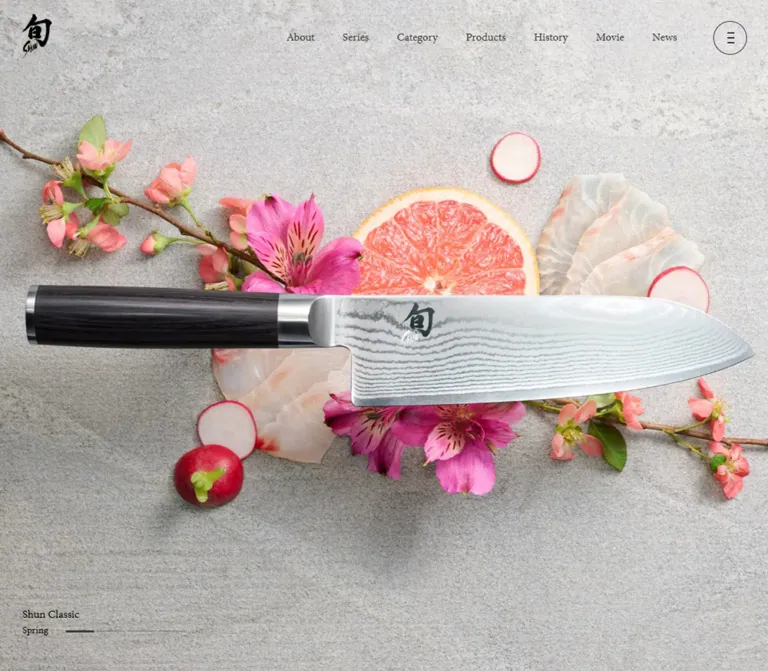
石調の背景に包丁と四季の食材を配した写真、縦書きの日本語、繊細な明朝体が印象的なブランドサイト。広い余白とダークなフッターで、商品紹介から店舗案内までを落ち着いて構成しています。
オリジナルサイトを見るShun / 旬 — Style Reference
Polished steel and seasonal ingredients on stone, framed by restrained serif typography.
Website: Shun brand website Original URL: https://www.kai-group.com/products/brand/shun/ Final URL: https://www.kai-group.com/products/brand/shun/ Response: HTTP 200; original and final URLs are identical. Theme: light photographic and editorial sections, followed by dark information and footer treatments; no user-selectable theme was evidenced. Inspected: September 13, 2026, at 04:26 JST; supplied retrieval timestamp September 12, 2026, at 19:26:19.185 UTC. Viewports: desktop 1440 × 1000 CSS pixels; mobile 390 × 844 CSS pixels. Scope: the current brand homepage. Visual evidence covers desktop and mobile opening compositions, a desktop About/Series/Category boundary, and desktop/mobile retailer and footer views. Rendered DOM and computed styles additionally describe product browsing, History, Movie, and News. Destination pages and expanded controls were not inspected.
Shun presents its knives through Japanese seasonality, material precision, and generous space. The opening image places a large Damascus-pattern blade and dark handle over food and foliage on a pale stone surface. In the desktop capture, orange produce, salmon, maple leaves, and yellow foliage surround a horizontal knife. The mobile capture uses an upright knife with green peppers, citrus, herbs, and small flowers. These are different captured seasonal states; they do not establish a rule assigning particular seasons to particular devices.
The interface contributes very little visual weight. A brush-style brand mark anchors the upper left, small English serif links occupy the upper right on desktop, and a thin circular menu control remains available at both widths. Japanese vertical typography introduces the brand and browsing routes. Farther down, a product rail, editorial destinations, news, and retailers make this a substantial brand and catalog gateway. Purchasing is linked through a separate KAI Online Store destination.
The essential relationship is between expansive photography and quiet navigation. Preserve the blade silhouette, seasonal composition, serif hierarchy, vertical reading rhythm, and transition into a charcoal information area.
How to Read This Reference
- Measured values come from the supplied rendered DOM, computed styles, and element rectangles. Measurements are in CSS pixels unless stated otherwise.
- Visual estimates describe screenshot appearance where computed properties were not supplied. Estimated hexadecimal colors are practical approximations, not sampled source values.
- Derived values are arithmetic relationships between supplied measurements, such as the 15px product-item gap.
- Recommendations describe a new implementation. Breakpoints, accessible control behavior, media ratios, and unverified motion remain recommendations even when included in code.
- Named tokens are descriptive implementation aliases. The evidence exposed only two Swiper custom properties, not a complete source token system.
- Font names below are reported computed family declarations. Font-file loading and the actual face selected for every glyph were not independently verified.
- Coverage varies by component. Product and news geometry is supported by DOM evidence, but their full visual treatments are not shown in the supplied screenshots.
- Rectangle interpretation matters. Several image-containing links have 20–23px inline rectangles. Those heights describe inline boxes and must not be used as image heights. Several headings have empty extracted text, so their inherited font sizes do not measure the visible heading artwork.
Tokens — Colors
Measured Interface Palette
| Name | Value | Suggested token | Evidence and role |
|---|---|---|---|
| Charcoal | #1e1e1e |
--color-ink / --color-dark |
Measured body text; measured retailer and footer backgrounds |
| Navigation Gray | #333333 |
--color-nav |
Measured desktop primary navigation links |
| Footer Gray | #8c8c8c |
--color-muted |
Measured footer links and copyright |
| Soft White | #f0f0f0 |
--color-news-text |
Measured news-title links |
| White | #ffffff |
--color-inverse |
Measured retailer text, telephone/map links, and selected dark-section utility links |
Estimated Surface Aliases
| Name | Approximation | Suggested token | Appropriate use |
|---|---|---|---|
| Pale Editorial Field | #f2f2f2 |
--color-paper |
Starting approximation for the pale About field; the screenshot also contains subtle blurred color |
| Gallery Gray | #d9d9d9 |
--color-gallery |
Approximation for the broad Series/Category surface visible in the intermediate desktop capture |
| Dark Divider | #666666 |
--color-rule-dark |
Approximation for thin horizontal rules on charcoal |
| Stone Ground | No single solid value | Image asset | Fine mottling, directional light, and shadows belong to the photograph |
The body and several sections report transparent backgrounds. Their visible appearance comes from other layers or imagery; transparency is not evidence that every section uses white.
Warm orange and yellow dominate the captured desktop photograph. Green and citrus yellow dominate the mobile photograph. Treat these as image-dependent colors. The evidence does not establish an orange or green action-button system.
The exposed --swiper-theme-color: #007aff is a library variable, with no visible blue control established by the captures. Similarly, browser-blue computed colors on empty image links do not make blue part of the visible palette.
Tokens — Typography
Japanese Body and Supporting Text
Measured family: 'Noto Serif JP', serif.
The body uses regular weight 400, at 16px on desktop and 14px on mobile. This serif treatment continues through product captions, retailer information, footer links, and many English utility labels. Do not assign the English display family to every English phrase merely because it uses Latin characters.
The desktop About copy uses narrow vertical columns with conspicuous spacing between them. At the mobile measurement, those paragraphs become horizontal and use a smaller font with generous leading.
English Navigation and Filters
Measured family: minion-pro, serif.
Desktop primary navigation uses 16px, weight 400. Product filter labels use 18px on desktop and 16px on mobile. The effect is a quiet editorial index with modest text size and very little ornament.
The evidence does not include a font delivery URL or licensing information. Use an authorized font source or retain the serif fallback.
News Text
Measured stack: YakuHanMP, 'Noto Serif JP', serif.
This stack is declared on news-title links. YakuHanMP participates in the Japanese punctuation treatment; it should not be described as a separate large display style.
Brand Mark and Section Headings
The brand mark is visibly brush-like artwork. Its container is an h1, but the inherited 32px desktop or 28px mobile font size does not describe the mark itself.
The desktop About headline and browsing headings appear as composed vertical Japanese lettering with small English labels. Their actual font declarations were not included. Several heading elements have empty extracted text and explicit visual boxes. Preserve the visible composition or use approved assets; do not infer their typography from a default h3 size.
Type Scale
| Role | Desktop | Mobile | Leading / tracking | Status |
|---|---|---|---|---|
| Body | 16px | 14px | Normal | Measured |
| Primary navigation | 16px | Hidden in initial mobile view | Normal; link padding 3px 20px |
Measured |
| About prose | 17px | 12.87px | Desktop 51px, mobile 30.888px; tracking 0.1em |
Measured |
| Product filters | 18px | 16px | Normal | Measured |
| Product captions | 14px | 14px | Two-line boxes measure 40px high; computed leading remains normal | Measured |
| View more / View All | 15px | 14px | Normal; 18px left padding | Measured |
| News-title links | 16px | 14px | 1.6: 25.6px / 22.4px |
Measured |
| Retailer address and telephone | 14px | 14px | 28px / 22.4px | Measured |
| Footer navigation | 14px | 13px | Normal | Measured |
| Copyright | 10px | 10px | Desktop normal; mobile 16px | Measured |
| Hero caption | About 14px | About 12–14px | Compact two-line arrangement | Visual estimate |
| About headline lettering | About 36–40px | Not visually established | Vertical composition | Visual estimate, desktop only |
| Series/Category heading lettering | About 27–30px | Not visually established | Vertical composition | Visual estimate, desktop only |
In vertical About text, the 51px line height primarily establishes the pitch between columns. It should not be interpreted as ordinary horizontal paragraph spacing.
Tokens — Spacing & Shapes
Character: large section intervals, small controls, square media regions, and thin rules.
There is no evidence of a universal spacing scale. The measured values suggest several component-specific systems: 20–30px viewport edges, 15–16px media gaps, and editorial intervals of 120–300px.
Measured Geometry
| Element | Desktop 1440 × 1000 | Mobile 390 × 844 | Interpretation |
|---|---|---|---|
| Header box | 80px high | 80px high | Same sampled height |
| Header brand container | 44 × 64.16px, at (30, 20) |
44 × 64.16px, at (20, 20) |
Brand does not shrink on mobile |
| Menu button | 48 × 48px, at (1362, 30) |
48 × 48px, at (322, 20) |
Same target size; different insets |
| Menu radius | 50% | 50% | Circle |
| Browse media link width | 662px | 330px | Width evidence only; inline height is not media height |
| Browse outer inset | 50px | 30px | Derived from link positions |
| Browse column gap | 16px | Vertically stacked | Derived on desktop |
| Product item width | 375.625px | 235px | Measured repeated item width |
| Product item gap | 15px | 15px | Derived from adjacent x positions |
| First product x position | 205px | 30px | Desktop reserves a left heading rail |
| Product bottom padding | 300px | 160px | Measured section padding |
| News padding | 240px 115.2px 120px |
80px 20px 70px |
Measured |
| Retailer padding | 120px 115.2px 0 |
80px 20px 0 |
Measured |
| Footer padding | 140px 30px 40px |
80px 20px 40px |
Measured |
| Footer link row pitch | 40px | 39px | Derived from link positions |
| Social link width | 20px | 20px | Measured visual link boxes, not a recommended touch target |
The desktop 115.2px section inset equals 8% of the inspected width. That relationship is useful for adaptation, but one measurement does not prove the source uses an 8% rule.
About Column Rhythm
The three desktop prose groups measure 255px, 51px, and 153px wide. Adjacent groups are separated by 34px, derived from their rectangles. At a 17px text size, these correspond to a 3em column pitch and a 2em inter-group gap.
On mobile, the prose boxes start at x = 25px and measure 365px wide. Their measured right edge reaches the viewport boundary. A new implementation should verify punctuation and text containment rather than assuming symmetrical source padding.
Shape Rules
- Main content surfaces and sampled containers have zero corner radius.
- The menu button is the distinctive circular control.
- Divider strokes appear approximately 1px thick; their exact source border widths were not supplied.
- Hero progress marks are fine horizontal segments with a darker, thicker active mark. Exact dimensions and total state count were not measured.
- External-destination marks are small diagonal arrows.
- The lower-right return control combines a horizontal line and an upward chevron.
- Product shadows in the hero belong to the photographic composition. No general card-elevation system is evidenced.
Components
Persistent Brand Header
Role: identity and navigation across a long page.
The header layers a small brand mark and circular menu button over the current surface. The brand sits 30px from the desktop left edge and 20px from the mobile edge. Its top position remains 20px. The menu is 30px from the desktop top/right edges and 20px from both mobile edges.
The initial desktop view adds seven English links: About, Series, Category, Products, History, Movie, and News. Their padded boxes run from approximately x = 733px to x = 1330px, leaving space for the menu button. Each link uses 16px Minion Pro and 3px 20px padding.
The mark and button remain in the supplied scrolled views, which supports a persistent or fixed-looking presentation. Their exact positioning mechanism was not recorded. The full desktop link row is absent in the intermediate and bottom captures; the scroll threshold or state logic is unknown.
On dark sections, the mark and menu strokes appear light. Implement coordinated contrast changes for the mark, icon, and outline. The original asset-switching or blending mechanism is unverified.
Seasonal Hero
Role: communicates the product’s finish and its relationship to seasonal cooking.
The opening screenshot is filled by photography, with the header superimposed. There is no large promotional headline over the knife. A small series/season caption and segmented indicator sit near the lower edge.
In the desktop capture, the knife runs horizontally from approximately x = 185px to x = 1270px. Its roughly 1085px span is about 75% of the viewport width. Orange and yellow ingredients spread around the blade, while stone remains visible around the composition.
In the mobile capture, the knife is upright, with its tip around y = 90px and handle ending around y = 560px. Herbs and produce form a narrow vertical arrangement. The lower portion of the image retains a substantial quiet stone field.
The desktop caption is near the lower left; the mobile caption is near the lower right. Preserve this placement change and use a portrait composition suited to the selected season. A simple crop of a landscape photograph will not reliably preserve the complete knife.
Season labels and progress marks suggest a sequence, but autoplay, timing, input behavior, and transition style are unverified.
About Editorial Composition
Role: establishes the connection between Japanese seasons, food, and knife performance.
The desktop capture shows the headline “四季をあじわい、暮らしを彩る。” in a large vertical composition toward the right. A small vertical English About label accompanies it. Regular Japanese prose occupies finer vertical columns to the left, with separate paragraph groups and broad spacing.
The background is pale and softly blurred, with faint gray and pink tones. The supplied screenshot does not establish the complete background asset or whether all blur is permanent.
A small View more link leads to the About page. Its measured desktop type is 15px with 18px left padding; the associated decorative marker was not separately measured.
The mobile DOM shows horizontal prose: five lines for the opening group, one line for the short middle statement, and three lines for the final group. The mobile headline itself was not visually captured.
The desktop intermediate screenshot cuts the lower copy at the next section’s boundary. Treat this as the captured scroll state and a coverage limitation. A new implementation should keep the full story reachable and readable.
Series and Category Gateways
Role: provides two different ways to explore the knife collection.
Each gateway consists of a centered vertical heading composition, a broad linked media region, and a small centered View more link. The visible Japanese labels are “シリーズから探す” and “包丁の種類から探す”, paired with small English labels.
At desktop, the two 662px media widths sit within 50px outer margins and a 16px gap. Heading containers measure 150 × 154px. On mobile, the gateways stack, their media widths become 330px within 30px side insets, and heading containers measure approximately 110 × 118.17px.
Only the upper edges of the media regions appear in the supplied intermediate capture. Their pale appearance does not establish the final image content or a deliberate empty-card treatment.
Product Heading and Filter Bar
Role: introduces a browsable product selection.
Desktop reserves a narrow heading area at the left. The Products heading box starts at x = 45px, with View All beneath it. The product/filter region begins around x = 205px.
Filter by is followed by Series and Category controls. The two controls use Minion Pro, 18px on desktop and 16px on mobile, with 25px right padding. Their destination is #, and additional options are present in the DOM. No open filter state or filtering result was supplied.
On mobile, the heading is centered above the filter row. View all appears after the product rail rather than beside the heading. Preserve this content-order change when adapting the layout.
Product Rail and Item
Role: offers entry points to individual knife specifications.
The DOM contains seven product entries, including Classic, Classic White, Premier, DualCore, and Nagare Black examples. Each entry has a linked media area and a separate two-line caption combining series and knife type/length. One actual caption is “旬Classic” followed by “三徳 175mm”.
Desktop item widths are 375.625px with 15px gaps. Their starting x positions are 205px, 595.625px, 986.25px, and 1376.875px. This places three full item widths before the fourth begins near the viewport’s right edge, subject to unsampled clipping boundaries.
On mobile, the first item starts at x = 30px and is 235px wide. The second starts at x = 280px, geometrically placing 110px of it within the viewport before accounting for clipping. This supports a horizontally continuing rail rather than a stacked product list.
The supplied evidence does not show the product imagery, navigation arrows, rail controls, or a drag gesture. Preserve the measured rail geometry; verify its interaction separately. Image height cannot be recovered from the short inline anchor rectangles.
History and Movie Destinations
Role: connects product browsing to brand background and film content.
The two destinations share a large side-by-side section. Desktop heading centers are approximately x = 360px and x = 1080px. Mobile centers are x = 97.5px and x = 292.5px, demonstrating that these destinations remain side by side at the inspected phone width.
The combined section is 1000px high on desktop and 500px on mobile. Each destination has a heading composition and View more link. The heading containers define transform and opacity transitions, but the source media and triggered transition were not visually established.
A Movie destination does not by itself establish an embedded player or autoplaying background video on this homepage.
News List
Role: presents dated event announcements.
Five entries are present in the supplied rendered text. Each contains a date, the category label “イベント情報”, and a linked announcement title. Desktop title links are 16px with 25.6px leading; mobile title links are 14px with 22.4px leading.
Desktop reserves a left heading area, with article-title links beginning around x = 585.19px. On mobile, the heading is centered, titles begin at x = 30px, and View more follows the list. The longest title wraps to two lines in the mobile measurement.
The links use near-white #f0f0f0, indicating a light-on-dark treatment. The section itself reports a transparent background, so the exact backing layer was not measured. Do not infer its full imagery or decorative treatment from text colors alone.
Retailer Directory
Role: helps visitors find physical stores and telephone contacts.
The directory uses a measured #1e1e1e background and white text. On desktop, a vertical heading occupies the left, while store blocks form three columns. A fourth store continues beneath the first column.
The store region starts around x = 315.19px. Each desktop block is approximately 325.875px wide, with derived 16px gaps. Content consists of the store name and floor/department, postal address, telephone link, and Google maps link with a small diagonal arrow.
On mobile, all four stores form one column within 20px side margins. Addresses and telephone lines use 14px type with 22.4px leading, compared with 28px leading on desktop. Thin rules separate successive store blocks.
Telephone links are explicitly tel: destinations and map links point to Google Maps. These destinations are confirmed; click outcomes and new-tab behavior were not tested.
Footer
Role: closes the brand experience with navigation, corporate access, and social links.
A thin horizontal rule separates the footer from the directory. Charcoal continues without a raised panel or rounded container. A white brand mark sits at the left; three link groups sit toward the right on desktop.
The first group contains About, Series, Category, and Products. The second contains History, Movie, News, and KAI Online Store. The third contains support and related corporate destinations. A thin vertical rule separates the third group in the desktop capture.
Desktop link-group starting positions are approximately 675px, 875px, and 1106px. On mobile, the brand mark sits above the navigation, while the three groups remain in columns beginning at 20px, 100.5px, and 240.5px. The footer does not become an accordion in the supplied mobile state.
Instagram and X marks sit below the links. They align near the first navigation group on desktop and become centered on mobile. The corporate mark and small copyright occupy the bottom region. The copyright wraps to two lines on mobile.
The original footer names KAI CORPORATION and KAI INDUSTRIES CO., LTD. in its copyright statement. No website production credit is established by the inspected page.
Return-to-Top Affordance
Role: offers a visible return path on the long page.
A fine horizontal stroke and an open upward chevron appear near the lower-right corner of intermediate and bottom views. The graphic is approximately 48px wide on desktop and 40px on mobile, based on the screenshots.
Its activation behavior, scroll duration, and visibility threshold were not supplied. A new implementation should expose it as an accessible link or button with an adequate hit area.
Tokens — Motion & Interaction
Measured Transition Declarations
| Element | Recorded declaration | What is established |
|---|---|---|
| Desktop navigation links | color 0.3s |
A color transition is defined; endpoint colors and trigger were not recorded |
| Menu button | border 0.3s |
Border changes can transition; the expanded menu is unverified |
| About prose | filter 1.8s 0.6s, opacity 0.6s 0.6s |
Filter and opacity transitions have a 600ms delay |
| Product filter controls | background 0.3s |
Background changes can transition; open-state appearance is unknown |
| History/Movie heading containers | transform 0.5s cubic-bezier(0.16, 1, 0.3, 1), opacity 0.4s |
Transform and opacity transitions are defined |
| History/Movie utility links | color 0.3s |
Color transition is defined |
| News heading container | opacity 0.6s |
Opacity transition is defined |
| Map and footer links | color 0.3s |
Color transition is defined |
Rows reporting only transition: all do not provide a useful duration. Likewise, animation: none on sampled elements does not establish that the entire page is static.
Observed States and Limits
- The hero captures show different seasonal labels and photographic compositions, with segmented indicators. They do not document a timed transition.
- The logo and circular menu remain visible over light and dark scrolled content, with contrasting appearances.
- The desktop About region occupies a large scroll footprint, and a captured boundary partially covers its text. Pinning, sticky behavior, scroll interpolation, and animation triggers were not recorded.
- The product geometry demonstrates horizontal continuation. Swipe, drag, snapping, keyboard controls, and autoplay were not exercised.
- Additional navigation/filter content exists in the DOM, but no expanded state was supplied.
- No verified modal, video playback, hover endpoint, focus state, or menu-opening sequence is available.
For an adaptation, use the measured 300–600ms transitions as restrained interface references. The longer About filter treatment should remain optional until its start and end states are verified. Hero sequencing requires a separate interaction specification.
Surfaces
| Surface | Appearance | Evidence and purpose |
|---|---|---|
| Opening photographic field | Pale textured stone with realistic shadows | Visually confirmed; supports steel, food, and foliage |
| About field | Pale gray/white with soft blurred color | Visually confirmed in one intermediate state; complete background implementation unknown |
| Series/Category field | Broad light gray region with pale media edges | Visually confirmed; full media content not captured |
| Product area | Transparent sampled section over an unsampled backing layer | Geometry and text established; final media surface uncertain |
| News area | Near-white link text over a backing layer not directly sampled | Foreground confirmed; full surface appearance unverified |
| Retailer area | Solid #1e1e1e, white text, fine rules |
Computed and visually confirmed |
| Footer | Solid #1e1e1e, #8c8c8c links, white brand mark |
Computed and visually confirmed |
| Header | Transparent overlay with contrasting marks | Visually confirmed across supplied states |
There is no evidenced general system of rounded cards, drop-shadow elevation, pill badges, or colorful filled CTAs. Space, photography, typography, and hairline separators establish hierarchy.
Imagery
The defining imagery is carefully arranged product still life. Preserve the long clean silhouette of the knife, the fine layered steel pattern, the dark handle grain, and the printed brand mark on the blade. The object should feel tangible and precisely lit.
Seasonal food and foliage form an arrangement around the knife rather than an unrelated background collage. In the desktop capture, maple leaves and yellow foliage extend diagonally around orange produce and salmon. The mobile capture uses sliced green peppers, citrus, herbs, and flowering stems to support the upright blade.
The stone surface has fine irregular texture and directional shadow. Replacing it with a flat gray fill removes depth; adding a generic noisy overlay cannot recreate the photographed contact shadows.
Observed Visual Assets
| Asset | Visible characteristics | Evidence limitation |
|---|---|---|
| Desktop opening photograph | Horizontal dark-handled knife, orange/yellow food and foliage, pale stone | Current desktop capture only; image URL not supplied |
| Mobile opening photograph | Upright knife, green ingredients, citrus and herbs | Current mobile capture only; image URL not supplied |
| Shun brand mark | Brush-style Japanese mark with small Latin lettering | Light and dark appearances visible; asset format unknown |
| About headline | Two-column vertical Japanese composition with small English label | Visible desktop lettering; source font/asset not supplied |
| Series/Category headings | Vertical Japanese labels with narrow English companions | Desktop appearance and responsive container sizes supplied |
| Corporate mark | Small geometric KAI mark in muted gray | Visible at the footer bottom |
| Utility marks | Circular menu, diagonal destination arrows, social marks, upward chevron | Appearance visible; original icon files unavailable |
No image paths, SVG source, font-file URLs, or full media manifest were included. Do not invent asset filenames or use product-detail URLs as image URLs.
For a new implementation, obtain authorized photography and brand artwork. Use separate landscape and portrait compositions for each supported seasonal state. Preserve natural image detail with normal photographic rendering; pixelated rendering would be inappropriate.
Layout & Responsive Behavior
Measured Page Footprint
| Region | Desktop | Mobile | Reading |
|---|---|---|---|
| Document height | 10427.89px | 8007.02px | A long brand homepage at both widths |
| About start | y = 2250px | y = 1906.80px | The opening region extends beyond the first visible screen |
| About section height | 3000px | 1067.48px | Strongly different desktop/mobile presentation |
| Series/Category section height | 671.19px | 972.34px | Mobile stacks the two gateways |
| Products section height | 1083.73px | 955.94px | Includes measured bottom padding |
| History/Movie section height | 1000px | 500px | Retains two columns |
| News section height | 888.97px | 831.33px | Heading, copy wrapping, and utility-link placement change |
| Retailer section height | 744px | 954.13px | Three-column desktop directory becomes one column |
| Footer height | 429px | 538px | Logo, navigation, social, and legal regions reorganize |
These are sampled section rectangles, not a recovered scroll-animation model. Do not treat every large height as a fixed blank spacer.
Confirmed Responsive Changes
| Component | Desktop behavior | Mobile behavior |
|---|---|---|
| Header | Full English navigation plus menu | Logo and menu only in initial view |
| Hero knife | Horizontal composition | Upright composition |
| Hero caption | Lower left | Lower right |
| About prose | Vertical columns | Horizontal paragraphs |
| Series/Category | Two columns | One stacked column |
| Products heading | Left of the rail | Centered above filters |
| Product rail | 375.625px items, 15px gaps | 235px items, 15px gaps |
| Products View All | Beside the heading | After the rail |
| History/Movie | Two columns | Still two columns |
| News View more | Beside the main list area | After the list |
| Retailers | Three columns, fourth item wraps | One column |
| Footer links | Three groups to the right of the mark | Three groups below the mark |
| Social links | Aligned with navigation region | Centered |
| Copyright | One line | Two lines |
No tablet viewport or source media query was supplied. Any breakpoint used in a new implementation is a recommendation. Test intermediate widths rather than assuming every section shares one collapse rule.
The fixed-looking header can overlap content: the mobile bottom capture shows the logo over retailer text. Preserve persistent access while checking contrast, content clearance, and focus visibility in a new build.
Do’s and Don’ts
Do
- Make the knife and its finish the primary visual subject.
- Use seasonal ingredients as part of a coherent photographic composition.
- Keep generous stone or pale space around the object and typography.
- Preserve regular serif text, compact English navigation, and vertical Japanese editorial headings.
- Change the About prose to horizontal reading at small widths, as the mobile measurements demonstrate.
- Keep the circular menu at 48px across desktop and mobile.
- Preserve the 15px product-rail gap and the visible sense of horizontal continuation.
- Retain two mobile History/Movie columns and three mobile footer link groups where content fits.
- Use charcoal, white, muted gray, and fine rules for the retailer/footer area.
- Keep browsing, product information, editorial material, and physical-store access distinct and easy to find.
Don’t
- Don’t cover the blade with an oversized headline or a stack of promotional buttons.
- Don’t assign seasonal orange or green to unrelated interface controls.
- Don’t replace the photographed stone and shadows with a flat gray rectangle.
- Don’t imitate the brush logo with an arbitrary Japanese font.
- Don’t infer visible heading typography from empty
h3elements and inherited browser sizes. - Don’t turn every region into rounded cards with soft elevation shadows.
- Don’t force desktop photography into mobile with a crop that cuts off the knife.
- Don’t stack every paired section automatically; responsive rules differ by component.
- Don’t treat pale or partially captured media regions as confirmed empty design elements.
- Don’t claim autoplay, parallax, drag behavior, or an expanded-menu design without additional evidence.
- Don’t use the exposed Swiper blue as a brand accent or its 44px variable as the measured menu size.
Recommended Implementation Additions
These are recommendations for a new implementation, not verified original-site features:
- Give the menu, social controls, season controls, and return-to-top control explicit accessible names. Empty extracted text alone does not establish whether the original already has accessible labels.
- Use buttons for controls that change filter state, with appropriate expanded and selected states. Preserve real links for destinations.
- Make product names part of each product link’s accessible name, even when the visual composition separates image and caption.
- Preserve a 48px menu target and enlarge the hit areas around small social and return icons without enlarging their visible artwork.
- Use a visible focus indicator on both light and dark surfaces. Manage keyboard focus if an overlay menu is implemented.
- Consider a 14px minimum for mobile About prose. This intentionally increases the measured 12.87px text for readability.
- Keep text available without reveal effects. Reduced-motion mode should remove filter/transform entrances and stop any implemented automatic seasonal advance.
- Use approved landscape and portrait image sources, explicit intrinsic dimensions, and responsive delivery. Give the opening image appropriate loading priority and defer distant media.
- Keep rail overflow local to the product region. If horizontal scrolling is implemented, provide keyboard access and an alternative way to reach all products.
- Use semantic heading text or accessible equivalents for graphical headings. Decorative English labels should not duplicate the accessible heading unnecessarily.
- Verify sticky-header overlap and long-story readability at intermediate widths and enlarged text settings.
Agent Prompt Guide
Quick Color Reference
- Primary text and confirmed dark surfaces:
#1e1e1e. - Desktop navigation:
#333333. - Footer links and legal text:
#8c8c8c. - News-title text:
#f0f0f0. - Retailer text and dark-section utility links:
#ffffff. - Pale editorial approximation:
#f2f2f2. - Gallery-gray approximation:
#d9d9d9. - Seasonal color comes from photography, with no evidenced colored CTA system.
Overall Prompt
“Create a Japanese kitchen-knife brand homepage with a full-screen seasonal still life on pale textured stone. Make a long polished Damascus-pattern knife the main subject, surrounded by carefully arranged ingredients and foliage. Use a small brush-style brand mark at upper left, restrained English serif navigation at upper right, and a 48px outlined circular menu. Follow the opening with generous editorial space, vertical Japanese headings, and regular Noto Serif JP body text. Provide Series and Category gateways, a horizontally continuing product rail, paired History and Movie destinations, dated news, a retailer directory, and a charcoal footer. On mobile, use portrait photography, horizontal About prose, stacked browsing gateways, a narrower product rail, and three compact footer link groups. Treat menu behavior and seasonal sequencing as separately specified interactions.”
Example Component Prompts
- Hero: “Compose a precision-lit knife still life on light stone. Keep the full blade and handle visible, with seasonal produce and foliage arranged around them. Reserve unobstructed space for a small upper-left mark, an upper-right circular menu, and a quiet series/season caption near the lower edge. Provide a separately composed portrait version.”
- About: “Build a pale editorial section with a large vertical Japanese headline on the right and fine vertical prose columns to its left. Use 17px regular Noto Serif JP, 51px column pitch, 0.1em tracking, and 34px gaps between paragraph groups. Convert prose to horizontal reading on mobile. Keep every paragraph accessible throughout scrolling.”
- Browsing gateways: “Create two spacious Series and Category destinations with centered vertical heading compositions, broad square-cornered media, and small View more links. At a 1440px viewport, use approximately 662px media widths, 50px outer insets, and a 16px gap. Stack the gateways on a 390px phone with 330px media widths.”
- Product rail: “Use a narrow desktop heading rail beside product browsing. Set product items near 375.625px wide with 15px gaps and regular 14px two-line captions. On a 390px phone, use 235px items starting 30px from the left and retain the next-item continuation. Put View all after the rail on mobile. Specify accessible scrolling and filter behavior separately.”
- Retailers and footer: “Create a charcoal
#1e1e1elower section with white retailer text, fine gray rules, telephone links, and small map arrows. Use three retailer columns on desktop and one on mobile. Follow with a white brand mark, muted#8c8c8cnavigation, three link groups, small social marks, and a quiet copyright line. Retain all three link groups beneath the logo on mobile.”
Quick Start
CSS Custom Properties
This CSS is a reusable adaptation of the evidenced visual system. It uses ordinary document flow; the long opening/About scroll sequence requires a separately verified implementation.
The 900px breakpoint is recommended, not recovered source CSS. The mobile About size is intentionally raised to 14px. Product image ratio 2 / 3, native horizontal scrolling, hover endpoints, and safe-area handling are implementation choices. Supply approved photography, logos, and graphical headings; the CSS does not recreate those assets.
Use .site-header[data-tone='dark'] when its controls sit over a dark field. Supply contrasting logo variants or an approved inline mark that supports currentColor. The original contrast-switching mechanism is unknown.
:root {
  /* Measured colors */
  --color-ink: #1e1e1e;
  --color-dark: #1e1e1e;
  --color-nav: #333333;
  --color-muted: #8c8c8c;
  --color-news-text: #f0f0f0;
  --color-inverse: #fff;

  /* Estimated surface aliases */
  --color-paper: #f2f2f2;
  --color-gallery: #d9d9d9;
  --color-rule-dark: #666;

  /* Declared source families; provision fonts separately */
  --font-jp: 'Noto Serif JP', serif;
  --font-en: minion-pro, serif;
  --font-news: YakuHanMP, 'Noto Serif JP', serif;

  --text-body: 16px;
  --text-story: 17px;
  --text-caption: 14px;
  --text-utility: 15px;
  --text-footer: 14px;
  --text-legal: 10px;
  --tracking-story: 0.1em;

  --edge: 30px;
  --header-height: 80px;
  --menu-size: 48px;
  --product-gap: 15px;
  --browse-gap: 16px;
  --story-group-gap: 34px;
  --rule: 1px;

  --motion-color: 300ms;
  --motion-heading: 500ms cubic-bezier(0.16, 1, 0.3, 1);
  --safe-bottom: env(safe-area-inset-bottom, 0px);
}

* { box-sizing: border-box; }

body {
  margin: 0;
  color: var(--color-ink);
  background: var(--color-paper);
  font-family: var(--font-jp);
  font-size: var(--text-body);
  font-weight: 400;
}

img { display: block; max-width: 100%; }
button { font: inherit; }
a { color: inherit; }

.site-header {
  position: fixed;
  inset: 0 0 auto;
  z-index: 50;
  height: var(--header-height);
  color: var(--color-nav);
  pointer-events: none;
}

.site-header > * { pointer-events: auto; }
.site-header[data-tone='dark'] { color: var(--color-inverse); }

.header-brand {
  position: absolute;
  top: 20px;
  left: var(--edge);
  display: block;
  width: 44px;
}

.header-brand img,
.header-brand svg {
  width: 100%;
  height: auto;
}

.primary-nav {
  position: absolute;
  top: 37.58px;
  right: 110px;
  display: flex;
}

.primary-nav a {
  padding: 3px 20px;
  font-family: var(--font-en);
  font-size: 16px;
  text-decoration: none;
  transition: color var(--motion-color);
}

.menu-toggle {
  position: absolute;
  top: 30px;
  right: var(--edge);
  display: flex;
  flex-direction: column;
  align-items: center;
  justify-content: center;
  gap: 5px;
  width: var(--menu-size);
  height: var(--menu-size);
  padding: 0;
  color: inherit;
  background: transparent;
  border: var(--rule) solid currentColor;
  border-radius: 50%;
  cursor: pointer;
  transition: border-color var(--motion-color);
}

/* Three decorative spans inside an accessibly named button */
.menu-toggle span {
  width: 10px;
  height: 1px;
  background: currentColor;
}

.hero {
  position: relative;
  height: 100vh;
  height: 100svh;
  overflow: hidden;
}

.hero picture {
  position: absolute;
  inset: 0;
  display: block;
}

.hero picture img {
  width: 100%;
  height: 100%;
  object-fit: cover;
}

.hero-caption {
  position: absolute;
  left: 32px;
  bottom: 50px;
  font-size: 14px;
  line-height: 1.5;
}

.hero-caption p { margin: 0; }

.season-status {
  display: flex;
  align-items: center;
  gap: 16px;
}

.season-track {
  display: flex;
  align-items: center;
  gap: 6px;
}

/* Approximate visual marks; control semantics need separate markup */
.season-mark {
  width: 40px;
  height: 1px;
  background: currentColor;
  opacity: 0.25;
}

.season-mark.is-current {
  height: 3px;
  opacity: 1;
}

.story {
  padding: 160px var(--edge);
  background: var(--color-paper);
}

.story-layout {
  display: flex;
  flex-direction: row-reverse;
  justify-content: center;
  align-items: flex-start;
  gap: 72px;
}

/* Live-text heading approximation; source heading font is unverified */
.story-title {
  margin: 0;
  writing-mode: vertical-rl;
  text-orientation: mixed;
  font-size: 38px;
  font-weight: 400;
  line-height: 1.8;
  letter-spacing: 0.1em;
}

.story-copy {
  display: flex;
  flex-direction: row-reverse;
  gap: var(--story-group-gap);
}

.story-copy p {
  height: 450px;
  margin: 0;
  writing-mode: vertical-rl;
  text-orientation: mixed;
  font-size: var(--text-story);
  line-height: 3;
  letter-spacing: var(--tracking-story);
}

.text-link {
  display: inline-flex;
  align-items: center;
  gap: 8px;
  padding-block: 8px;
  font-size: var(--text-utility);
  text-decoration: none;
}

/* Recommended marker, not a recovered source pseudo-element */
.text-link::before {
  content: '';
  width: 10px;
  height: 1px;
  background: currentColor;
}

.browse-grid {
  display: grid;
  grid-template-columns: repeat(2, minmax(0, 1fr));
  gap: var(--browse-gap);
  padding-inline: 50px;
  margin-block: 160px 200px;
}

.browse-card { min-width: 0; text-align: center; }

.browse-heading {
  width: 150px;
  height: 154px;
  margin: 0 auto 54px;
}

.browse-heading img {
  width: 100%;
  height: 100%;
  object-fit: contain;
}

.browse-media { display: block; }
.browse-media img { width: 100%; height: auto; }
.browse-card .text-link { margin-top: 24px; }

.products {
  display: grid;
  grid-template-columns: 160px minmax(0, 1fr);
  padding: 0 0 300px 45px;
}

.product-content { min-width: 0; }

.filter-bar {
  display: flex;
  align-items: center;
  flex-wrap: wrap;
  gap: 24px 50px;
  margin-bottom: 70px;
}

.filter-button {
  padding: 0 25px 0 0;
  color: inherit;
  background: transparent;
  border: 0;
  font-family: var(--font-en);
  font-size: 18px;
  cursor: pointer;
  transition: background-color var(--motion-color);
}

/* Native overflow and proximity snapping are recommended additions */
.product-rail {
  display: flex;
  gap: var(--product-gap);
  overflow-x: auto;
  scroll-snap-type: x proximity;
  padding-bottom: 24px;
}

.product-card {
  flex: 0 0 clamp(235px, 26.1vw, 375.625px);
  min-width: 0;
  scroll-snap-align: start;
}

.product-card a { display: block; text-decoration: none; }

/* Suggested media ratio; the source image ratio was not supplied */
.product-card img {
  width: 100%;
  aspect-ratio: 2 / 3;
  object-fit: contain;
}

.product-caption {
  margin: 24px 0 0;
  font-size: var(--text-caption);
  line-height: 1.45;
}

.product-view-all-mobile { display: none; }

.history-movie {
  display: grid;
  grid-template-columns: repeat(2, minmax(0, 1fr));
  min-height: 1000px;
}

.history-movie > article {
  display: grid;
  align-content: center;
  justify-items: center;
  gap: 80px;
  min-width: 0;
}

.news {
  display: grid;
  grid-template-columns: minmax(160px, 470px) minmax(0, 1fr);
  padding: 240px 8% 120px;
  color: var(--color-news-text);
  background: var(--color-dark);
}

/* Dark news backing is an adaptation consistent with measured text */
.news-item { padding-block: 24px; }
.news-item time { font-size: 14px; }

.news-title {
  font-family: var(--font-news);
  font-size: 16px;
  line-height: 1.6;
  font-weight: 400;
}

.retailers {
  padding: 120px 8% 0;
  color: var(--color-inverse);
  background: var(--color-dark);
}

.retailers-layout {
  display: grid;
  grid-template-columns: 200px minmax(0, 1fr);
}

.store-grid {
  display: grid;
  grid-template-columns: repeat(3, minmax(0, 1fr));
  gap: 16px;
}

.store-card { padding-bottom: 40px; }

.store-card:nth-child(n + 4) {
  padding-top: 24px;
  border-top: var(--rule) solid var(--color-rule-dark);
}

.store-card h3 {
  margin: 0 0 24px;
  font-size: 16px;
  font-weight: 400;
}

.store-card p {
  margin: 0 0 24px;
  font-size: 14px;
  line-height: 2;
}

.store-card a { font-size: 14px; text-decoration: none; }

.site-footer {
  position: relative;
  padding: 140px var(--edge) calc(40px + var(--safe-bottom));
  color: var(--color-muted);
  background: var(--color-dark);
}

.site-footer::before {
  content: '';
  position: absolute;
  top: 0;
  right: var(--edge);
  left: var(--edge);
  height: 1px;
  background: var(--color-rule-dark);
}

.footer-main,
.footer-base {
  display: grid;
  grid-template-columns: minmax(0, 1fr) 735px;
}

.footer-brand { display: block; width: 48px; }
.footer-brand img { width: 100%; height: auto; }

.footer-groups {
  display: grid;
  grid-template-columns: 200px 200px minmax(0, 1fr);
}

.footer-group {
  display: grid;
  align-content: start;
  gap: 20px;
  margin: 0;
  padding: 0;
  list-style: none;
}

.footer-group:last-child {
  padding-left: 30px;
  border-left: 1px solid var(--color-rule-dark);
}

.footer-group a {
  font-size: var(--text-footer);
  line-height: 20px;
  text-decoration: none;
  transition: color var(--motion-color);
}

.footer-base { margin-top: 94px; align-items: center; }

.footer-legal {
  display: flex;
  align-items: center;
  gap: 20px;
}

.footer-legal img { width: 38px; height: auto; }

.footer-legal p {
  margin: 0;
  font-size: var(--text-legal);
  line-height: 1.6;
}

.footer-socials { display: flex; align-items: center; gap: 10px; }
.footer-socials svg { display: block; width: 20px; height: 20px; }

/* Recommended focus and hover endpoints */
:where(a, button):focus-visible {
  outline: 2px solid currentColor;
  outline-offset: 5px;
}

@media (hover: hover) {
  .footer-group a:hover { color: var(--color-inverse); }
  .primary-nav a:hover { text-decoration: underline; text-underline-offset: 5px; }
}

/* Recommended breakpoint; only 390px and 1440px were inspected */
@media (max-width: 900px) {
  :root {
    --edge: 20px;
    --text-body: 14px;
    --text-story: 14px;
    --text-utility: 14px;
    --text-footer: 13px;
  }

  .primary-nav { display: none; }
  .menu-toggle { top: 20px; }
  .hero-caption { right: 20px; left: auto; bottom: 50px; }
  .season-mark { width: 23px; }

  .story { padding: 100px 25px 160px; }
  .story-layout { flex-direction: column; align-items: center; gap: 60px; }
  .story-copy { display: block; width: 100%; }

  .story-copy p {
    height: auto;
    margin: 0 0 2em;
    writing-mode: horizontal-tb;
    line-height: 2.4;
  }

  .browse-grid {
    grid-template-columns: minmax(0, 1fr);
    gap: 120px;
    padding-inline: 30px;
    margin-block: 120px 160px;
  }

  .browse-heading { width: 110px; height: 118px; margin-bottom: 45px; }

  .products { display: block; padding: 0 0 160px; }
  .product-heading { margin-bottom: 60px; text-align: center; }
  .product-view-all-desktop { display: none; }
  .filter-bar { padding-inline: 30px; gap: 24px; }
  .filter-button { font-size: 16px; }
  .product-rail { padding-inline: 30px; scroll-padding-inline: 30px; }
  .product-card { flex-basis: 235px; }
  .product-view-all-mobile { display: block; margin-top: 70px; text-align: center; }

  .history-movie { min-height: 500px; }
  .history-movie > article { gap: 60px; }

  .news { display: block; padding: 80px 20px 70px; }
  .news-heading { margin-bottom: 60px; text-align: center; }
  .news-title { font-size: 14px; }

  .retailers { padding: 80px 20px 0; }
  .retailers-layout { display: block; }
  .retailers-heading { margin-bottom: 60px; text-align: center; }
  .store-grid { grid-template-columns: minmax(0, 1fr); gap: 0; }
  .store-card { padding-block: 20px; }
  .store-card + .store-card { border-top: 1px solid var(--color-rule-dark); }
  .store-card h3 { font-size: 14px; }
  .store-card p { line-height: 1.6; }

  .site-footer { padding-top: 80px; }
  .footer-main { grid-template-columns: minmax(0, 1fr); gap: 40px; }
  .footer-groups { grid-template-columns: 23% 40% 37%; }
  .footer-group:last-child { padding-left: 0; border-left: 0; }
  .footer-group a { line-height: 19px; overflow-wrap: anywhere; }

  .footer-base {
    display: flex;
    flex-direction: column-reverse;
    align-items: center;
    gap: 80px;
    margin-top: 40px;
  }

  .footer-legal { align-self: stretch; gap: 10px; }
  .footer-legal img { width: 30px; }
}

/* Suggested recovery for any progressively added reveal effects */
@media (prefers-reduced-motion: reduce) {
  .primary-nav a,
  .menu-toggle,
  .filter-button,
  .footer-group a,
  [data-reveal] {
    transition: none;
    animation: none;
  }

  [data-reveal] {
    opacity: 1;
    filter: none;
    transform: none;
  }

  .product-rail { scroll-behavior: auto; }
}
The selectors assume semantic links, buttons, lists, and heading elements with the corresponding classes. Place three decorative spans inside the menu button and give the button an accessible label. Use a <picture> element with approved portrait and landscape sources in the hero. Product filters, menu state, header contrast changes, return-to-top behavior, and seasonal playback need separate logic.
Tailwind v4 Token Mapping
Optional aliases for projects already using Tailwind v4. This does not establish that the original site uses Tailwind. Define the custom properties above first.
@theme inline {
  --color-shun-ink: var(--color-ink);
  --color-shun-dark: var(--color-dark);
  --color-shun-muted: var(--color-muted);
  --color-shun-paper: var(--color-paper);
  --color-shun-gallery: var(--color-gallery);
  --color-shun-inverse: var(--color-inverse);

  --font-editorial: var(--font-jp);
  --font-navigation: var(--font-en);

  --text-body: var(--text-body);
  --text-story: var(--text-story);
  --text-caption: var(--text-caption);

  --spacing-page-edge: var(--edge);
  --spacing-menu: var(--menu-size);
  --spacing-product-gap: var(--product-gap);
  --spacing-browse-gap: var(--browse-gap);
}
Sources & Evidence
- Inspected original and final website: Shun brand homepage. Both supplied URLs are identical, with HTTP 200 and page title “旬ブランドサイト - 貝印”.
- Capture time: supplied retrieval timestamp
2026-09-12T19:26:19.185Z, equivalent to September 13, 2026, 04:26:19.185 JST. - Desktop evidence: 1440 × 1000 CSS-pixel viewport; opening photograph, intermediate About/Series/Category view, and retailer/footer view; supplied computed styles and element rectangles across the page.
- Mobile evidence: 390 × 844 CSS-pixel viewport; opening photograph and retailer/footer view; supplied computed styles and element rectangles across the page.
- Original-page destination evidence: rendered links establish About, Series, Category, Products, History, Movie, News, individual knife pages, store access, corporate/support destinations, telephone links, maps, and social destinations. These linked pages were not independently inspected.
- Interaction evidence: supplied scrolled states and transition declarations. No menu, filter, product-rail gesture, video playback, or seasonal transition sequence was exercised in the supplied evidence.
- Readiness limits: the supplied capture procedure waited for document loading, sampled layout/text stability, finite motion, and visible image decoding within bounded time limits. It paused perpetual animations during readiness checks and resumed them afterward. These checks do not prove that delayed media, every reveal state, or every interaction completed. SharedWorkers and service workers were disabled during inspection.
- Analysis limits: no additional browsing, command execution, asset retrieval, font-file inspection, or filesystem access was performed. The reference uses the supplied current-page evidence. Screenshot estimates, derived measurements, and recommended implementation choices are identified separately.
# Shun / 旬 — Style Reference

> Polished steel and seasonal ingredients on stone, framed by restrained serif typography.

**Website:** [Shun brand website](https://www.kai-group.com/products/brand/shun/)
**Original URL:** https://www.kai-group.com/products/brand/shun/
**Final URL:** https://www.kai-group.com/products/brand/shun/
**Response:** HTTP 200; original and final URLs are identical.
**Theme:** light photographic and editorial sections, followed by dark information and footer treatments; no user-selectable theme was evidenced.
**Inspected:** September 13, 2026, at 04:26 JST; supplied retrieval timestamp September 12, 2026, at 19:26:19.185 UTC.
**Viewports:** desktop 1440 × 1000 CSS pixels; mobile 390 × 844 CSS pixels.
**Scope:** the current brand homepage. Visual evidence covers desktop and mobile opening compositions, a desktop About/Series/Category boundary, and desktop/mobile retailer and footer views. Rendered DOM and computed styles additionally describe product browsing, History, Movie, and News. Destination pages and expanded controls were not inspected.

Shun presents its knives through Japanese seasonality, material precision, and generous space. The opening image places a large Damascus-pattern blade and dark handle over food and foliage on a pale stone surface. In the desktop capture, orange produce, salmon, maple leaves, and yellow foliage surround a horizontal knife. The mobile capture uses an upright knife with green peppers, citrus, herbs, and small flowers. These are different captured seasonal states; they do not establish a rule assigning particular seasons to particular devices.

The interface contributes very little visual weight. A brush-style brand mark anchors the upper left, small English serif links occupy the upper right on desktop, and a thin circular menu control remains available at both widths. Japanese vertical typography introduces the brand and browsing routes. Farther down, a product rail, editorial destinations, news, and retailers make this a substantial brand and catalog gateway. Purchasing is linked through a separate KAI Online Store destination.

The essential relationship is between expansive photography and quiet navigation. Preserve the blade silhouette, seasonal composition, serif hierarchy, vertical reading rhythm, and transition into a charcoal information area.

## How to Read This Reference

- **Measured** values come from the supplied rendered DOM, computed styles, and element rectangles. Measurements are in CSS pixels unless stated otherwise.
- **Visual estimates** describe screenshot appearance where computed properties were not supplied. Estimated hexadecimal colors are practical approximations, not sampled source values.
- **Derived** values are arithmetic relationships between supplied measurements, such as the 15px product-item gap.
- **Recommendations** describe a new implementation. Breakpoints, accessible control behavior, media ratios, and unverified motion remain recommendations even when included in code.
- **Named tokens** are descriptive implementation aliases. The evidence exposed only two Swiper custom properties, not a complete source token system.
- **Font names** below are reported computed family declarations. Font-file loading and the actual face selected for every glyph were not independently verified.
- **Coverage varies by component.** Product and news geometry is supported by DOM evidence, but their full visual treatments are not shown in the supplied screenshots.
- **Rectangle interpretation matters.** Several image-containing links have 20–23px inline rectangles. Those heights describe inline boxes and must not be used as image heights. Several headings have empty extracted text, so their inherited font sizes do not measure the visible heading artwork.

## Tokens — Colors

### Measured Interface Palette

| Name | Value | Suggested token | Evidence and role |
| --- | --- | --- | --- |
| Charcoal | `#1e1e1e` | `--color-ink` / `--color-dark` | Measured body text; measured retailer and footer backgrounds |
| Navigation Gray | `#333333` | `--color-nav` | Measured desktop primary navigation links |
| Footer Gray | `#8c8c8c` | `--color-muted` | Measured footer links and copyright |
| Soft White | `#f0f0f0` | `--color-news-text` | Measured news-title links |
| White | `#ffffff` | `--color-inverse` | Measured retailer text, telephone/map links, and selected dark-section utility links |

### Estimated Surface Aliases

| Name | Approximation | Suggested token | Appropriate use |
| --- | --- | --- | --- |
| Pale Editorial Field | `#f2f2f2` | `--color-paper` | Starting approximation for the pale About field; the screenshot also contains subtle blurred color |
| Gallery Gray | `#d9d9d9` | `--color-gallery` | Approximation for the broad Series/Category surface visible in the intermediate desktop capture |
| Dark Divider | `#666666` | `--color-rule-dark` | Approximation for thin horizontal rules on charcoal |
| Stone Ground | No single solid value | Image asset | Fine mottling, directional light, and shadows belong to the photograph |

The body and several sections report transparent backgrounds. Their visible appearance comes from other layers or imagery; transparency is not evidence that every section uses white.

Warm orange and yellow dominate the captured desktop photograph. Green and citrus yellow dominate the mobile photograph. Treat these as image-dependent colors. The evidence does not establish an orange or green action-button system.

The exposed `--swiper-theme-color: #007aff` is a library variable, with no visible blue control established by the captures. Similarly, browser-blue computed colors on empty image links do not make blue part of the visible palette.

## Tokens — Typography

### Japanese Body and Supporting Text

**Measured family:** `'Noto Serif JP', serif`.

The body uses regular weight `400`, at 16px on desktop and 14px on mobile. This serif treatment continues through product captions, retailer information, footer links, and many English utility labels. Do not assign the English display family to every English phrase merely because it uses Latin characters.

The desktop About copy uses narrow vertical columns with conspicuous spacing between them. At the mobile measurement, those paragraphs become horizontal and use a smaller font with generous leading.

### English Navigation and Filters

**Measured family:** `minion-pro, serif`.

Desktop primary navigation uses 16px, weight `400`. Product filter labels use 18px on desktop and 16px on mobile. The effect is a quiet editorial index with modest text size and very little ornament.

The evidence does not include a font delivery URL or licensing information. Use an authorized font source or retain the serif fallback.

### News Text

**Measured stack:** `YakuHanMP, 'Noto Serif JP', serif`.

This stack is declared on news-title links. YakuHanMP participates in the Japanese punctuation treatment; it should not be described as a separate large display style.

### Brand Mark and Section Headings

The brand mark is visibly brush-like artwork. Its container is an `h1`, but the inherited 32px desktop or 28px mobile font size does not describe the mark itself.

The desktop About headline and browsing headings appear as composed vertical Japanese lettering with small English labels. Their actual font declarations were not included. Several heading elements have empty extracted text and explicit visual boxes. Preserve the visible composition or use approved assets; do not infer their typography from a default `h3` size.

### Type Scale

| Role | Desktop | Mobile | Leading / tracking | Status |
| --- | --- | --- | --- | --- |
| Body | 16px | 14px | Normal | Measured |
| Primary navigation | 16px | Hidden in initial mobile view | Normal; link padding `3px 20px` | Measured |
| About prose | 17px | 12.87px | Desktop `51px`, mobile `30.888px`; tracking `0.1em` | Measured |
| Product filters | 18px | 16px | Normal | Measured |
| Product captions | 14px | 14px | Two-line boxes measure 40px high; computed leading remains normal | Measured |
| View more / View All | 15px | 14px | Normal; 18px left padding | Measured |
| News-title links | 16px | 14px | `1.6`: 25.6px / 22.4px | Measured |
| Retailer address and telephone | 14px | 14px | 28px / 22.4px | Measured |
| Footer navigation | 14px | 13px | Normal | Measured |
| Copyright | 10px | 10px | Desktop normal; mobile 16px | Measured |
| Hero caption | About 14px | About 12–14px | Compact two-line arrangement | Visual estimate |
| About headline lettering | About 36–40px | Not visually established | Vertical composition | Visual estimate, desktop only |
| Series/Category heading lettering | About 27–30px | Not visually established | Vertical composition | Visual estimate, desktop only |

In vertical About text, the 51px line height primarily establishes the pitch between columns. It should not be interpreted as ordinary horizontal paragraph spacing.

## Tokens — Spacing & Shapes

**Character:** large section intervals, small controls, square media regions, and thin rules.

There is no evidence of a universal spacing scale. The measured values suggest several component-specific systems: 20–30px viewport edges, 15–16px media gaps, and editorial intervals of 120–300px.

### Measured Geometry

| Element | Desktop 1440 × 1000 | Mobile 390 × 844 | Interpretation |
| --- | --- | --- | --- |
| Header box | 80px high | 80px high | Same sampled height |
| Header brand container | `44 × 64.16px`, at `(30, 20)` | `44 × 64.16px`, at `(20, 20)` | Brand does not shrink on mobile |
| Menu button | `48 × 48px`, at `(1362, 30)` | `48 × 48px`, at `(322, 20)` | Same target size; different insets |
| Menu radius | 50% | 50% | Circle |
| Browse media link width | 662px | 330px | Width evidence only; inline height is not media height |
| Browse outer inset | 50px | 30px | Derived from link positions |
| Browse column gap | 16px | Vertically stacked | Derived on desktop |
| Product item width | 375.625px | 235px | Measured repeated item width |
| Product item gap | 15px | 15px | Derived from adjacent x positions |
| First product x position | 205px | 30px | Desktop reserves a left heading rail |
| Product bottom padding | 300px | 160px | Measured section padding |
| News padding | `240px 115.2px 120px` | `80px 20px 70px` | Measured |
| Retailer padding | `120px 115.2px 0` | `80px 20px 0` | Measured |
| Footer padding | `140px 30px 40px` | `80px 20px 40px` | Measured |
| Footer link row pitch | 40px | 39px | Derived from link positions |
| Social link width | 20px | 20px | Measured visual link boxes, not a recommended touch target |

The desktop 115.2px section inset equals 8% of the inspected width. That relationship is useful for adaptation, but one measurement does not prove the source uses an `8%` rule.

### About Column Rhythm

The three desktop prose groups measure 255px, 51px, and 153px wide. Adjacent groups are separated by 34px, derived from their rectangles. At a 17px text size, these correspond to a 3em column pitch and a 2em inter-group gap.

On mobile, the prose boxes start at x = 25px and measure 365px wide. Their measured right edge reaches the viewport boundary. A new implementation should verify punctuation and text containment rather than assuming symmetrical source padding.

### Shape Rules

- Main content surfaces and sampled containers have zero corner radius.
- The menu button is the distinctive circular control.
- Divider strokes appear approximately 1px thick; their exact source border widths were not supplied.
- Hero progress marks are fine horizontal segments with a darker, thicker active mark. Exact dimensions and total state count were not measured.
- External-destination marks are small diagonal arrows.
- The lower-right return control combines a horizontal line and an upward chevron.
- Product shadows in the hero belong to the photographic composition. No general card-elevation system is evidenced.

## Components

### Persistent Brand Header

**Role:** identity and navigation across a long page.

The header layers a small brand mark and circular menu button over the current surface. The brand sits 30px from the desktop left edge and 20px from the mobile edge. Its top position remains 20px. The menu is 30px from the desktop top/right edges and 20px from both mobile edges.

The initial desktop view adds seven English links: About, Series, Category, Products, History, Movie, and News. Their padded boxes run from approximately x = 733px to x = 1330px, leaving space for the menu button. Each link uses 16px Minion Pro and `3px 20px` padding.

The mark and button remain in the supplied scrolled views, which supports a persistent or fixed-looking presentation. Their exact positioning mechanism was not recorded. The full desktop link row is absent in the intermediate and bottom captures; the scroll threshold or state logic is unknown.

On dark sections, the mark and menu strokes appear light. Implement coordinated contrast changes for the mark, icon, and outline. The original asset-switching or blending mechanism is unverified.

### Seasonal Hero

**Role:** communicates the product’s finish and its relationship to seasonal cooking.

The opening screenshot is filled by photography, with the header superimposed. There is no large promotional headline over the knife. A small series/season caption and segmented indicator sit near the lower edge.

In the desktop capture, the knife runs horizontally from approximately x = 185px to x = 1270px. Its roughly 1085px span is about 75% of the viewport width. Orange and yellow ingredients spread around the blade, while stone remains visible around the composition.

In the mobile capture, the knife is upright, with its tip around y = 90px and handle ending around y = 560px. Herbs and produce form a narrow vertical arrangement. The lower portion of the image retains a substantial quiet stone field.

The desktop caption is near the lower left; the mobile caption is near the lower right. Preserve this placement change and use a portrait composition suited to the selected season. A simple crop of a landscape photograph will not reliably preserve the complete knife.

Season labels and progress marks suggest a sequence, but autoplay, timing, input behavior, and transition style are unverified.

### About Editorial Composition

**Role:** establishes the connection between Japanese seasons, food, and knife performance.

The desktop capture shows the headline “四季をあじわい、暮らしを彩る。” in a large vertical composition toward the right. A small vertical English About label accompanies it. Regular Japanese prose occupies finer vertical columns to the left, with separate paragraph groups and broad spacing.

The background is pale and softly blurred, with faint gray and pink tones. The supplied screenshot does not establish the complete background asset or whether all blur is permanent.

A small View more link leads to the About page. Its measured desktop type is 15px with 18px left padding; the associated decorative marker was not separately measured.

The mobile DOM shows horizontal prose: five lines for the opening group, one line for the short middle statement, and three lines for the final group. The mobile headline itself was not visually captured.

The desktop intermediate screenshot cuts the lower copy at the next section’s boundary. Treat this as the captured scroll state and a coverage limitation. A new implementation should keep the full story reachable and readable.

### Series and Category Gateways

**Role:** provides two different ways to explore the knife collection.

Each gateway consists of a centered vertical heading composition, a broad linked media region, and a small centered View more link. The visible Japanese labels are “シリーズから探す” and “包丁の種類から探す”, paired with small English labels.

At desktop, the two 662px media widths sit within 50px outer margins and a 16px gap. Heading containers measure 150 × 154px. On mobile, the gateways stack, their media widths become 330px within 30px side insets, and heading containers measure approximately 110 × 118.17px.

Only the upper edges of the media regions appear in the supplied intermediate capture. Their pale appearance does not establish the final image content or a deliberate empty-card treatment.

### Product Heading and Filter Bar

**Role:** introduces a browsable product selection.

Desktop reserves a narrow heading area at the left. The Products heading box starts at x = 45px, with View All beneath it. The product/filter region begins around x = 205px.

Filter by is followed by Series and Category controls. The two controls use Minion Pro, 18px on desktop and 16px on mobile, with 25px right padding. Their destination is `#`, and additional options are present in the DOM. No open filter state or filtering result was supplied.

On mobile, the heading is centered above the filter row. View all appears after the product rail rather than beside the heading. Preserve this content-order change when adapting the layout.

### Product Rail and Item

**Role:** offers entry points to individual knife specifications.

The DOM contains seven product entries, including Classic, Classic White, Premier, DualCore, and Nagare Black examples. Each entry has a linked media area and a separate two-line caption combining series and knife type/length. One actual caption is “旬Classic” followed by “三徳 175mm”.

Desktop item widths are 375.625px with 15px gaps. Their starting x positions are 205px, 595.625px, 986.25px, and 1376.875px. This places three full item widths before the fourth begins near the viewport’s right edge, subject to unsampled clipping boundaries.

On mobile, the first item starts at x = 30px and is 235px wide. The second starts at x = 280px, geometrically placing 110px of it within the viewport before accounting for clipping. This supports a horizontally continuing rail rather than a stacked product list.

The supplied evidence does not show the product imagery, navigation arrows, rail controls, or a drag gesture. Preserve the measured rail geometry; verify its interaction separately. Image height cannot be recovered from the short inline anchor rectangles.

### History and Movie Destinations

**Role:** connects product browsing to brand background and film content.

The two destinations share a large side-by-side section. Desktop heading centers are approximately x = 360px and x = 1080px. Mobile centers are x = 97.5px and x = 292.5px, demonstrating that these destinations remain side by side at the inspected phone width.

The combined section is 1000px high on desktop and 500px on mobile. Each destination has a heading composition and View more link. The heading containers define transform and opacity transitions, but the source media and triggered transition were not visually established.

A Movie destination does not by itself establish an embedded player or autoplaying background video on this homepage.

### News List

**Role:** presents dated event announcements.

Five entries are present in the supplied rendered text. Each contains a date, the category label “イベント情報”, and a linked announcement title. Desktop title links are 16px with 25.6px leading; mobile title links are 14px with 22.4px leading.

Desktop reserves a left heading area, with article-title links beginning around x = 585.19px. On mobile, the heading is centered, titles begin at x = 30px, and View more follows the list. The longest title wraps to two lines in the mobile measurement.

The links use near-white `#f0f0f0`, indicating a light-on-dark treatment. The section itself reports a transparent background, so the exact backing layer was not measured. Do not infer its full imagery or decorative treatment from text colors alone.

### Retailer Directory

**Role:** helps visitors find physical stores and telephone contacts.

The directory uses a measured `#1e1e1e` background and white text. On desktop, a vertical heading occupies the left, while store blocks form three columns. A fourth store continues beneath the first column.

The store region starts around x = 315.19px. Each desktop block is approximately 325.875px wide, with derived 16px gaps. Content consists of the store name and floor/department, postal address, telephone link, and Google maps link with a small diagonal arrow.

On mobile, all four stores form one column within 20px side margins. Addresses and telephone lines use 14px type with 22.4px leading, compared with 28px leading on desktop. Thin rules separate successive store blocks.

Telephone links are explicitly `tel:` destinations and map links point to Google Maps. These destinations are confirmed; click outcomes and new-tab behavior were not tested.

### Footer

**Role:** closes the brand experience with navigation, corporate access, and social links.

A thin horizontal rule separates the footer from the directory. Charcoal continues without a raised panel or rounded container. A white brand mark sits at the left; three link groups sit toward the right on desktop.

The first group contains About, Series, Category, and Products. The second contains History, Movie, News, and KAI Online Store. The third contains support and related corporate destinations. A thin vertical rule separates the third group in the desktop capture.

Desktop link-group starting positions are approximately 675px, 875px, and 1106px. On mobile, the brand mark sits above the navigation, while the three groups remain in columns beginning at 20px, 100.5px, and 240.5px. The footer does not become an accordion in the supplied mobile state.

Instagram and X marks sit below the links. They align near the first navigation group on desktop and become centered on mobile. The corporate mark and small copyright occupy the bottom region. The copyright wraps to two lines on mobile.

The original footer names KAI CORPORATION and KAI INDUSTRIES CO., LTD. in its copyright statement. No website production credit is established by the inspected page.

### Return-to-Top Affordance

**Role:** offers a visible return path on the long page.

A fine horizontal stroke and an open upward chevron appear near the lower-right corner of intermediate and bottom views. The graphic is approximately 48px wide on desktop and 40px on mobile, based on the screenshots.

Its activation behavior, scroll duration, and visibility threshold were not supplied. A new implementation should expose it as an accessible link or button with an adequate hit area.

## Tokens — Motion & Interaction

### Measured Transition Declarations

| Element | Recorded declaration | What is established |
| --- | --- | --- |
| Desktop navigation links | `color 0.3s` | A color transition is defined; endpoint colors and trigger were not recorded |
| Menu button | `border 0.3s` | Border changes can transition; the expanded menu is unverified |
| About prose | `filter 1.8s 0.6s, opacity 0.6s 0.6s` | Filter and opacity transitions have a 600ms delay |
| Product filter controls | `background 0.3s` | Background changes can transition; open-state appearance is unknown |
| History/Movie heading containers | `transform 0.5s cubic-bezier(0.16, 1, 0.3, 1), opacity 0.4s` | Transform and opacity transitions are defined |
| History/Movie utility links | `color 0.3s` | Color transition is defined |
| News heading container | `opacity 0.6s` | Opacity transition is defined |
| Map and footer links | `color 0.3s` | Color transition is defined |

Rows reporting only `transition: all` do not provide a useful duration. Likewise, `animation: none` on sampled elements does not establish that the entire page is static.

### Observed States and Limits

- The hero captures show different seasonal labels and photographic compositions, with segmented indicators. They do not document a timed transition.
- The logo and circular menu remain visible over light and dark scrolled content, with contrasting appearances.
- The desktop About region occupies a large scroll footprint, and a captured boundary partially covers its text. Pinning, sticky behavior, scroll interpolation, and animation triggers were not recorded.
- The product geometry demonstrates horizontal continuation. Swipe, drag, snapping, keyboard controls, and autoplay were not exercised.
- Additional navigation/filter content exists in the DOM, but no expanded state was supplied.
- No verified modal, video playback, hover endpoint, focus state, or menu-opening sequence is available.

For an adaptation, use the measured 300–600ms transitions as restrained interface references. The longer About filter treatment should remain optional until its start and end states are verified. Hero sequencing requires a separate interaction specification.

## Surfaces

| Surface | Appearance | Evidence and purpose |
| --- | --- | --- |
| Opening photographic field | Pale textured stone with realistic shadows | Visually confirmed; supports steel, food, and foliage |
| About field | Pale gray/white with soft blurred color | Visually confirmed in one intermediate state; complete background implementation unknown |
| Series/Category field | Broad light gray region with pale media edges | Visually confirmed; full media content not captured |
| Product area | Transparent sampled section over an unsampled backing layer | Geometry and text established; final media surface uncertain |
| News area | Near-white link text over a backing layer not directly sampled | Foreground confirmed; full surface appearance unverified |
| Retailer area | Solid `#1e1e1e`, white text, fine rules | Computed and visually confirmed |
| Footer | Solid `#1e1e1e`, `#8c8c8c` links, white brand mark | Computed and visually confirmed |
| Header | Transparent overlay with contrasting marks | Visually confirmed across supplied states |

There is no evidenced general system of rounded cards, drop-shadow elevation, pill badges, or colorful filled CTAs. Space, photography, typography, and hairline separators establish hierarchy.

## Imagery

The defining imagery is carefully arranged product still life. Preserve the long clean silhouette of the knife, the fine layered steel pattern, the dark handle grain, and the printed brand mark on the blade. The object should feel tangible and precisely lit.

Seasonal food and foliage form an arrangement around the knife rather than an unrelated background collage. In the desktop capture, maple leaves and yellow foliage extend diagonally around orange produce and salmon. The mobile capture uses sliced green peppers, citrus, herbs, and flowering stems to support the upright blade.

The stone surface has fine irregular texture and directional shadow. Replacing it with a flat gray fill removes depth; adding a generic noisy overlay cannot recreate the photographed contact shadows.

### Observed Visual Assets

| Asset | Visible characteristics | Evidence limitation |
| --- | --- | --- |
| Desktop opening photograph | Horizontal dark-handled knife, orange/yellow food and foliage, pale stone | Current desktop capture only; image URL not supplied |
| Mobile opening photograph | Upright knife, green ingredients, citrus and herbs | Current mobile capture only; image URL not supplied |
| Shun brand mark | Brush-style Japanese mark with small Latin lettering | Light and dark appearances visible; asset format unknown |
| About headline | Two-column vertical Japanese composition with small English label | Visible desktop lettering; source font/asset not supplied |
| Series/Category headings | Vertical Japanese labels with narrow English companions | Desktop appearance and responsive container sizes supplied |
| Corporate mark | Small geometric KAI mark in muted gray | Visible at the footer bottom |
| Utility marks | Circular menu, diagonal destination arrows, social marks, upward chevron | Appearance visible; original icon files unavailable |

No image paths, SVG source, font-file URLs, or full media manifest were included. Do not invent asset filenames or use product-detail URLs as image URLs.

For a new implementation, obtain authorized photography and brand artwork. Use separate landscape and portrait compositions for each supported seasonal state. Preserve natural image detail with normal photographic rendering; pixelated rendering would be inappropriate.

## Layout & Responsive Behavior

### Measured Page Footprint

| Region | Desktop | Mobile | Reading |
| --- | --- | --- | --- |
| Document height | 10427.89px | 8007.02px | A long brand homepage at both widths |
| About start | y = 2250px | y = 1906.80px | The opening region extends beyond the first visible screen |
| About section height | 3000px | 1067.48px | Strongly different desktop/mobile presentation |
| Series/Category section height | 671.19px | 972.34px | Mobile stacks the two gateways |
| Products section height | 1083.73px | 955.94px | Includes measured bottom padding |
| History/Movie section height | 1000px | 500px | Retains two columns |
| News section height | 888.97px | 831.33px | Heading, copy wrapping, and utility-link placement change |
| Retailer section height | 744px | 954.13px | Three-column desktop directory becomes one column |
| Footer height | 429px | 538px | Logo, navigation, social, and legal regions reorganize |

These are sampled section rectangles, not a recovered scroll-animation model. Do not treat every large height as a fixed blank spacer.

### Confirmed Responsive Changes

| Component | Desktop behavior | Mobile behavior |
| --- | --- | --- |
| Header | Full English navigation plus menu | Logo and menu only in initial view |
| Hero knife | Horizontal composition | Upright composition |
| Hero caption | Lower left | Lower right |
| About prose | Vertical columns | Horizontal paragraphs |
| Series/Category | Two columns | One stacked column |
| Products heading | Left of the rail | Centered above filters |
| Product rail | 375.625px items, 15px gaps | 235px items, 15px gaps |
| Products View All | Beside the heading | After the rail |
| History/Movie | Two columns | Still two columns |
| News View more | Beside the main list area | After the list |
| Retailers | Three columns, fourth item wraps | One column |
| Footer links | Three groups to the right of the mark | Three groups below the mark |
| Social links | Aligned with navigation region | Centered |
| Copyright | One line | Two lines |

No tablet viewport or source media query was supplied. Any breakpoint used in a new implementation is a recommendation. Test intermediate widths rather than assuming every section shares one collapse rule.

The fixed-looking header can overlap content: the mobile bottom capture shows the logo over retailer text. Preserve persistent access while checking contrast, content clearance, and focus visibility in a new build.

## Do’s and Don’ts

### Do

- Make the knife and its finish the primary visual subject.
- Use seasonal ingredients as part of a coherent photographic composition.
- Keep generous stone or pale space around the object and typography.
- Preserve regular serif text, compact English navigation, and vertical Japanese editorial headings.
- Change the About prose to horizontal reading at small widths, as the mobile measurements demonstrate.
- Keep the circular menu at 48px across desktop and mobile.
- Preserve the 15px product-rail gap and the visible sense of horizontal continuation.
- Retain two mobile History/Movie columns and three mobile footer link groups where content fits.
- Use charcoal, white, muted gray, and fine rules for the retailer/footer area.
- Keep browsing, product information, editorial material, and physical-store access distinct and easy to find.

### Don’t

- Don’t cover the blade with an oversized headline or a stack of promotional buttons.
- Don’t assign seasonal orange or green to unrelated interface controls.
- Don’t replace the photographed stone and shadows with a flat gray rectangle.
- Don’t imitate the brush logo with an arbitrary Japanese font.
- Don’t infer visible heading typography from empty `h3` elements and inherited browser sizes.
- Don’t turn every region into rounded cards with soft elevation shadows.
- Don’t force desktop photography into mobile with a crop that cuts off the knife.
- Don’t stack every paired section automatically; responsive rules differ by component.
- Don’t treat pale or partially captured media regions as confirmed empty design elements.
- Don’t claim autoplay, parallax, drag behavior, or an expanded-menu design without additional evidence.
- Don’t use the exposed Swiper blue as a brand accent or its 44px variable as the measured menu size.

## Recommended Implementation Additions

These are recommendations for a new implementation, not verified original-site features:

- Give the menu, social controls, season controls, and return-to-top control explicit accessible names. Empty extracted text alone does not establish whether the original already has accessible labels.
- Use buttons for controls that change filter state, with appropriate expanded and selected states. Preserve real links for destinations.
- Make product names part of each product link’s accessible name, even when the visual composition separates image and caption.
- Preserve a 48px menu target and enlarge the hit areas around small social and return icons without enlarging their visible artwork.
- Use a visible focus indicator on both light and dark surfaces. Manage keyboard focus if an overlay menu is implemented.
- Consider a 14px minimum for mobile About prose. This intentionally increases the measured 12.87px text for readability.
- Keep text available without reveal effects. Reduced-motion mode should remove filter/transform entrances and stop any implemented automatic seasonal advance.
- Use approved landscape and portrait image sources, explicit intrinsic dimensions, and responsive delivery. Give the opening image appropriate loading priority and defer distant media.
- Keep rail overflow local to the product region. If horizontal scrolling is implemented, provide keyboard access and an alternative way to reach all products.
- Use semantic heading text or accessible equivalents for graphical headings. Decorative English labels should not duplicate the accessible heading unnecessarily.
- Verify sticky-header overlap and long-story readability at intermediate widths and enlarged text settings.

## Agent Prompt Guide

### Quick Color Reference

- Primary text and confirmed dark surfaces: `#1e1e1e`.
- Desktop navigation: `#333333`.
- Footer links and legal text: `#8c8c8c`.
- News-title text: `#f0f0f0`.
- Retailer text and dark-section utility links: `#ffffff`.
- Pale editorial approximation: `#f2f2f2`.
- Gallery-gray approximation: `#d9d9d9`.
- Seasonal color comes from photography, with no evidenced colored CTA system.

### Overall Prompt

“Create a Japanese kitchen-knife brand homepage with a full-screen seasonal still life on pale textured stone. Make a long polished Damascus-pattern knife the main subject, surrounded by carefully arranged ingredients and foliage. Use a small brush-style brand mark at upper left, restrained English serif navigation at upper right, and a 48px outlined circular menu. Follow the opening with generous editorial space, vertical Japanese headings, and regular Noto Serif JP body text. Provide Series and Category gateways, a horizontally continuing product rail, paired History and Movie destinations, dated news, a retailer directory, and a charcoal footer. On mobile, use portrait photography, horizontal About prose, stacked browsing gateways, a narrower product rail, and three compact footer link groups. Treat menu behavior and seasonal sequencing as separately specified interactions.”

### Example Component Prompts

1. **Hero:** “Compose a precision-lit knife still life on light stone. Keep the full blade and handle visible, with seasonal produce and foliage arranged around them. Reserve unobstructed space for a small upper-left mark, an upper-right circular menu, and a quiet series/season caption near the lower edge. Provide a separately composed portrait version.”
2. **About:** “Build a pale editorial section with a large vertical Japanese headline on the right and fine vertical prose columns to its left. Use 17px regular Noto Serif JP, 51px column pitch, 0.1em tracking, and 34px gaps between paragraph groups. Convert prose to horizontal reading on mobile. Keep every paragraph accessible throughout scrolling.”
3. **Browsing gateways:** “Create two spacious Series and Category destinations with centered vertical heading compositions, broad square-cornered media, and small View more links. At a 1440px viewport, use approximately 662px media widths, 50px outer insets, and a 16px gap. Stack the gateways on a 390px phone with 330px media widths.”
4. **Product rail:** “Use a narrow desktop heading rail beside product browsing. Set product items near 375.625px wide with 15px gaps and regular 14px two-line captions. On a 390px phone, use 235px items starting 30px from the left and retain the next-item continuation. Put View all after the rail on mobile. Specify accessible scrolling and filter behavior separately.”
5. **Retailers and footer:** “Create a charcoal `#1e1e1e` lower section with white retailer text, fine gray rules, telephone links, and small map arrows. Use three retailer columns on desktop and one on mobile. Follow with a white brand mark, muted `#8c8c8c` navigation, three link groups, small social marks, and a quiet copyright line. Retain all three link groups beneath the logo on mobile.”

## Quick Start

### CSS Custom Properties

This CSS is a reusable adaptation of the evidenced visual system. It uses ordinary document flow; the long opening/About scroll sequence requires a separately verified implementation.

The 900px breakpoint is recommended, not recovered source CSS. The mobile About size is intentionally raised to 14px. Product image ratio `2 / 3`, native horizontal scrolling, hover endpoints, and safe-area handling are implementation choices. Supply approved photography, logos, and graphical headings; the CSS does not recreate those assets.

Use `.site-header[data-tone='dark']` when its controls sit over a dark field. Supply contrasting logo variants or an approved inline mark that supports `currentColor`. The original contrast-switching mechanism is unknown.

```css
:root {
  /* Measured colors */
  --color-ink: #1e1e1e;
  --color-dark: #1e1e1e;
  --color-nav: #333333;
  --color-muted: #8c8c8c;
  --color-news-text: #f0f0f0;
  --color-inverse: #fff;

  /* Estimated surface aliases */
  --color-paper: #f2f2f2;
  --color-gallery: #d9d9d9;
  --color-rule-dark: #666;

  /* Declared source families; provision fonts separately */
  --font-jp: 'Noto Serif JP', serif;
  --font-en: minion-pro, serif;
  --font-news: YakuHanMP, 'Noto Serif JP', serif;

  --text-body: 16px;
  --text-story: 17px;
  --text-caption: 14px;
  --text-utility: 15px;
  --text-footer: 14px;
  --text-legal: 10px;
  --tracking-story: 0.1em;

  --edge: 30px;
  --header-height: 80px;
  --menu-size: 48px;
  --product-gap: 15px;
  --browse-gap: 16px;
  --story-group-gap: 34px;
  --rule: 1px;

  --motion-color: 300ms;
  --motion-heading: 500ms cubic-bezier(0.16, 1, 0.3, 1);
  --safe-bottom: env(safe-area-inset-bottom, 0px);
}

* { box-sizing: border-box; }

body {
  margin: 0;
  color: var(--color-ink);
  background: var(--color-paper);
  font-family: var(--font-jp);
  font-size: var(--text-body);
  font-weight: 400;
}

img { display: block; max-width: 100%; }
button { font: inherit; }
a { color: inherit; }

.site-header {
  position: fixed;
  inset: 0 0 auto;
  z-index: 50;
  height: var(--header-height);
  color: var(--color-nav);
  pointer-events: none;
}

.site-header > * { pointer-events: auto; }
.site-header[data-tone='dark'] { color: var(--color-inverse); }

.header-brand {
  position: absolute;
  top: 20px;
  left: var(--edge);
  display: block;
  width: 44px;
}

.header-brand img,
.header-brand svg {
  width: 100%;
  height: auto;
}

.primary-nav {
  position: absolute;
  top: 37.58px;
  right: 110px;
  display: flex;
}

.primary-nav a {
  padding: 3px 20px;
  font-family: var(--font-en);
  font-size: 16px;
  text-decoration: none;
  transition: color var(--motion-color);
}

.menu-toggle {
  position: absolute;
  top: 30px;
  right: var(--edge);
  display: flex;
  flex-direction: column;
  align-items: center;
  justify-content: center;
  gap: 5px;
  width: var(--menu-size);
  height: var(--menu-size);
  padding: 0;
  color: inherit;
  background: transparent;
  border: var(--rule) solid currentColor;
  border-radius: 50%;
  cursor: pointer;
  transition: border-color var(--motion-color);
}

/* Three decorative spans inside an accessibly named button */
.menu-toggle span {
  width: 10px;
  height: 1px;
  background: currentColor;
}

.hero {
  position: relative;
  height: 100vh;
  height: 100svh;
  overflow: hidden;
}

.hero picture {
  position: absolute;
  inset: 0;
  display: block;
}

.hero picture img {
  width: 100%;
  height: 100%;
  object-fit: cover;
}

.hero-caption {
  position: absolute;
  left: 32px;
  bottom: 50px;
  font-size: 14px;
  line-height: 1.5;
}

.hero-caption p { margin: 0; }

.season-status {
  display: flex;
  align-items: center;
  gap: 16px;
}

.season-track {
  display: flex;
  align-items: center;
  gap: 6px;
}

/* Approximate visual marks; control semantics need separate markup */
.season-mark {
  width: 40px;
  height: 1px;
  background: currentColor;
  opacity: 0.25;
}

.season-mark.is-current {
  height: 3px;
  opacity: 1;
}

.story {
  padding: 160px var(--edge);
  background: var(--color-paper);
}

.story-layout {
  display: flex;
  flex-direction: row-reverse;
  justify-content: center;
  align-items: flex-start;
  gap: 72px;
}

/* Live-text heading approximation; source heading font is unverified */
.story-title {
  margin: 0;
  writing-mode: vertical-rl;
  text-orientation: mixed;
  font-size: 38px;
  font-weight: 400;
  line-height: 1.8;
  letter-spacing: 0.1em;
}

.story-copy {
  display: flex;
  flex-direction: row-reverse;
  gap: var(--story-group-gap);
}

.story-copy p {
  height: 450px;
  margin: 0;
  writing-mode: vertical-rl;
  text-orientation: mixed;
  font-size: var(--text-story);
  line-height: 3;
  letter-spacing: var(--tracking-story);
}

.text-link {
  display: inline-flex;
  align-items: center;
  gap: 8px;
  padding-block: 8px;
  font-size: var(--text-utility);
  text-decoration: none;
}

/* Recommended marker, not a recovered source pseudo-element */
.text-link::before {
  content: '';
  width: 10px;
  height: 1px;
  background: currentColor;
}

.browse-grid {
  display: grid;
  grid-template-columns: repeat(2, minmax(0, 1fr));
  gap: var(--browse-gap);
  padding-inline: 50px;
  margin-block: 160px 200px;
}

.browse-card { min-width: 0; text-align: center; }

.browse-heading {
  width: 150px;
  height: 154px;
  margin: 0 auto 54px;
}

.browse-heading img {
  width: 100%;
  height: 100%;
  object-fit: contain;
}

.browse-media { display: block; }
.browse-media img { width: 100%; height: auto; }
.browse-card .text-link { margin-top: 24px; }

.products {
  display: grid;
  grid-template-columns: 160px minmax(0, 1fr);
  padding: 0 0 300px 45px;
}

.product-content { min-width: 0; }

.filter-bar {
  display: flex;
  align-items: center;
  flex-wrap: wrap;
  gap: 24px 50px;
  margin-bottom: 70px;
}

.filter-button {
  padding: 0 25px 0 0;
  color: inherit;
  background: transparent;
  border: 0;
  font-family: var(--font-en);
  font-size: 18px;
  cursor: pointer;
  transition: background-color var(--motion-color);
}

/* Native overflow and proximity snapping are recommended additions */
.product-rail {
  display: flex;
  gap: var(--product-gap);
  overflow-x: auto;
  scroll-snap-type: x proximity;
  padding-bottom: 24px;
}

.product-card {
  flex: 0 0 clamp(235px, 26.1vw, 375.625px);
  min-width: 0;
  scroll-snap-align: start;
}

.product-card a { display: block; text-decoration: none; }

/* Suggested media ratio; the source image ratio was not supplied */
.product-card img {
  width: 100%;
  aspect-ratio: 2 / 3;
  object-fit: contain;
}

.product-caption {
  margin: 24px 0 0;
  font-size: var(--text-caption);
  line-height: 1.45;
}

.product-view-all-mobile { display: none; }

.history-movie {
  display: grid;
  grid-template-columns: repeat(2, minmax(0, 1fr));
  min-height: 1000px;
}

.history-movie > article {
  display: grid;
  align-content: center;
  justify-items: center;
  gap: 80px;
  min-width: 0;
}

.news {
  display: grid;
  grid-template-columns: minmax(160px, 470px) minmax(0, 1fr);
  padding: 240px 8% 120px;
  color: var(--color-news-text);
  background: var(--color-dark);
}

/* Dark news backing is an adaptation consistent with measured text */
.news-item { padding-block: 24px; }
.news-item time { font-size: 14px; }

.news-title {
  font-family: var(--font-news);
  font-size: 16px;
  line-height: 1.6;
  font-weight: 400;
}

.retailers {
  padding: 120px 8% 0;
  color: var(--color-inverse);
  background: var(--color-dark);
}

.retailers-layout {
  display: grid;
  grid-template-columns: 200px minmax(0, 1fr);
}

.store-grid {
  display: grid;
  grid-template-columns: repeat(3, minmax(0, 1fr));
  gap: 16px;
}

.store-card { padding-bottom: 40px; }

.store-card:nth-child(n + 4) {
  padding-top: 24px;
  border-top: var(--rule) solid var(--color-rule-dark);
}

.store-card h3 {
  margin: 0 0 24px;
  font-size: 16px;
  font-weight: 400;
}

.store-card p {
  margin: 0 0 24px;
  font-size: 14px;
  line-height: 2;
}

.store-card a { font-size: 14px; text-decoration: none; }

.site-footer {
  position: relative;
  padding: 140px var(--edge) calc(40px + var(--safe-bottom));
  color: var(--color-muted);
  background: var(--color-dark);
}

.site-footer::before {
  content: '';
  position: absolute;
  top: 0;
  right: var(--edge);
  left: var(--edge);
  height: 1px;
  background: var(--color-rule-dark);
}

.footer-main,
.footer-base {
  display: grid;
  grid-template-columns: minmax(0, 1fr) 735px;
}

.footer-brand { display: block; width: 48px; }
.footer-brand img { width: 100%; height: auto; }

.footer-groups {
  display: grid;
  grid-template-columns: 200px 200px minmax(0, 1fr);
}

.footer-group {
  display: grid;
  align-content: start;
  gap: 20px;
  margin: 0;
  padding: 0;
  list-style: none;
}

.footer-group:last-child {
  padding-left: 30px;
  border-left: 1px solid var(--color-rule-dark);
}

.footer-group a {
  font-size: var(--text-footer);
  line-height: 20px;
  text-decoration: none;
  transition: color var(--motion-color);
}

.footer-base { margin-top: 94px; align-items: center; }

.footer-legal {
  display: flex;
  align-items: center;
  gap: 20px;
}

.footer-legal img { width: 38px; height: auto; }

.footer-legal p {
  margin: 0;
  font-size: var(--text-legal);
  line-height: 1.6;
}

.footer-socials { display: flex; align-items: center; gap: 10px; }
.footer-socials svg { display: block; width: 20px; height: 20px; }

/* Recommended focus and hover endpoints */
:where(a, button):focus-visible {
  outline: 2px solid currentColor;
  outline-offset: 5px;
}

@media (hover: hover) {
  .footer-group a:hover { color: var(--color-inverse); }
  .primary-nav a:hover { text-decoration: underline; text-underline-offset: 5px; }
}

/* Recommended breakpoint; only 390px and 1440px were inspected */
@media (max-width: 900px) {
  :root {
    --edge: 20px;
    --text-body: 14px;
    --text-story: 14px;
    --text-utility: 14px;
    --text-footer: 13px;
  }

  .primary-nav { display: none; }
  .menu-toggle { top: 20px; }
  .hero-caption { right: 20px; left: auto; bottom: 50px; }
  .season-mark { width: 23px; }

  .story { padding: 100px 25px 160px; }
  .story-layout { flex-direction: column; align-items: center; gap: 60px; }
  .story-copy { display: block; width: 100%; }

  .story-copy p {
    height: auto;
    margin: 0 0 2em;
    writing-mode: horizontal-tb;
    line-height: 2.4;
  }

  .browse-grid {
    grid-template-columns: minmax(0, 1fr);
    gap: 120px;
    padding-inline: 30px;
    margin-block: 120px 160px;
  }

  .browse-heading { width: 110px; height: 118px; margin-bottom: 45px; }

  .products { display: block; padding: 0 0 160px; }
  .product-heading { margin-bottom: 60px; text-align: center; }
  .product-view-all-desktop { display: none; }
  .filter-bar { padding-inline: 30px; gap: 24px; }
  .filter-button { font-size: 16px; }
  .product-rail { padding-inline: 30px; scroll-padding-inline: 30px; }
  .product-card { flex-basis: 235px; }
  .product-view-all-mobile { display: block; margin-top: 70px; text-align: center; }

  .history-movie { min-height: 500px; }
  .history-movie > article { gap: 60px; }

  .news { display: block; padding: 80px 20px 70px; }
  .news-heading { margin-bottom: 60px; text-align: center; }
  .news-title { font-size: 14px; }

  .retailers { padding: 80px 20px 0; }
  .retailers-layout { display: block; }
  .retailers-heading { margin-bottom: 60px; text-align: center; }
  .store-grid { grid-template-columns: minmax(0, 1fr); gap: 0; }
  .store-card { padding-block: 20px; }
  .store-card + .store-card { border-top: 1px solid var(--color-rule-dark); }
  .store-card h3 { font-size: 14px; }
  .store-card p { line-height: 1.6; }

  .site-footer { padding-top: 80px; }
  .footer-main { grid-template-columns: minmax(0, 1fr); gap: 40px; }
  .footer-groups { grid-template-columns: 23% 40% 37%; }
  .footer-group:last-child { padding-left: 0; border-left: 0; }
  .footer-group a { line-height: 19px; overflow-wrap: anywhere; }

  .footer-base {
    display: flex;
    flex-direction: column-reverse;
    align-items: center;
    gap: 80px;
    margin-top: 40px;
  }

  .footer-legal { align-self: stretch; gap: 10px; }
  .footer-legal img { width: 30px; }
}

/* Suggested recovery for any progressively added reveal effects */
@media (prefers-reduced-motion: reduce) {
  .primary-nav a,
  .menu-toggle,
  .filter-button,
  .footer-group a,
  [data-reveal] {
    transition: none;
    animation: none;
  }

  [data-reveal] {
    opacity: 1;
    filter: none;
    transform: none;
  }

  .product-rail { scroll-behavior: auto; }
}
```

The selectors assume semantic links, buttons, lists, and heading elements with the corresponding classes. Place three decorative spans inside the menu button and give the button an accessible label. Use a `<picture>` element with approved portrait and landscape sources in the hero. Product filters, menu state, header contrast changes, return-to-top behavior, and seasonal playback need separate logic.

### Tailwind v4 Token Mapping

Optional aliases for projects already using Tailwind v4. This does not establish that the original site uses Tailwind. Define the custom properties above first.

```css
@theme inline {
  --color-shun-ink: var(--color-ink);
  --color-shun-dark: var(--color-dark);
  --color-shun-muted: var(--color-muted);
  --color-shun-paper: var(--color-paper);
  --color-shun-gallery: var(--color-gallery);
  --color-shun-inverse: var(--color-inverse);

  --font-editorial: var(--font-jp);
  --font-navigation: var(--font-en);

  --text-body: var(--text-body);
  --text-story: var(--text-story);
  --text-caption: var(--text-caption);

  --spacing-page-edge: var(--edge);
  --spacing-menu: var(--menu-size);
  --spacing-product-gap: var(--product-gap);
  --spacing-browse-gap: var(--browse-gap);
}
```

## Sources & Evidence

- **Inspected original and final website:** [Shun brand homepage](https://www.kai-group.com/products/brand/shun/). Both supplied URLs are identical, with HTTP 200 and page title “旬ブランドサイト - 貝印”.
- **Capture time:** supplied retrieval timestamp `2026-09-12T19:26:19.185Z`, equivalent to September 13, 2026, 04:26:19.185 JST.
- **Desktop evidence:** 1440 × 1000 CSS-pixel viewport; opening photograph, intermediate About/Series/Category view, and retailer/footer view; supplied computed styles and element rectangles across the page.
- **Mobile evidence:** 390 × 844 CSS-pixel viewport; opening photograph and retailer/footer view; supplied computed styles and element rectangles across the page.
- **Original-page destination evidence:** rendered links establish About, Series, Category, Products, History, Movie, News, individual knife pages, store access, corporate/support destinations, telephone links, maps, and social destinations. These linked pages were not independently inspected.
- **Interaction evidence:** supplied scrolled states and transition declarations. No menu, filter, product-rail gesture, video playback, or seasonal transition sequence was exercised in the supplied evidence.
- **Readiness limits:** the supplied capture procedure waited for document loading, sampled layout/text stability, finite motion, and visible image decoding within bounded time limits. It paused perpetual animations during readiness checks and resumed them afterward. These checks do not prove that delayed media, every reveal state, or every interaction completed. SharedWorkers and service workers were disabled during inspection.
- **Analysis limits:** no additional browsing, command execution, asset retrieval, font-file inspection, or filesystem access was performed. The reference uses the supplied current-page evidence. Screenshot estimates, derived measurements, and recommended implementation choices are identified separately.