
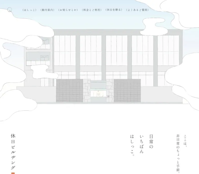
休日ビルヂング — Style Reference
A quiet day off, framed by pale architectural drawings, fine lines, and vertical Japanese prose.
Website: www.kyuujitsu.com
Original URL: https://www.kyuujitsu.com/
Final URL: https://www.kyuujitsu.com/
Theme: light; white canvas, charcoal text, muted illustration, and warm interior photography.
Inspected: September 13, 2026, Japan Standard Time. Supplied capture timestamp: 2026-09-12T17:30:00.809Z, equivalent to September 13 at 02:30:00.809 JST.
Viewports: desktop 1440 × 1000; mobile 390 × 844, in CSS pixels.
Scope: the current official homepage for a bathing, dining, lounge, and hotel complex in Jozankei. Visual evidence covers the opening composition, a desktop hotel showcase, and desktop/mobile directory footers. Rendered DOM evidence covers the longer homepage, including news, facility introductions, visitor guidance, gift links, access information, and navigation. Linked pages and transaction flows were not inspected.
The homepage presents a place to spend time through the same qualities it promotes: space, quiet, modest scale, and attention to small details. A large drawing of the building establishes the setting. White, irregular cloud-like shapes overlap its edges, while pale windows and fine architectural lines keep the illustration light. Below it, vertical Japanese text occupies isolated portions of a broad white field.
The typography remains restrained throughout. Shippori Mincho supplies the Japanese voice; EB Garamond appears in dates and selected Latin text. Most sampled text uses regular weight. Hierarchy comes from writing direction, tracking, column spacing, and placement more than from large or bold headlines.
This is a substantial facility homepage with practical navigation and a long directory footer. Its reusable design principle is the relationship between atmospheric storytelling and clear visitor information: drawn architecture introduces the place, photographs give it material substance, and plain text organizes the details.
How to Read This Reference
- Measured values come from the supplied rendered element rectangles and computed-style fields. Decimal measurements are rounded where additional precision would not help implementation.
- Visual estimates describe screenshot geometry or colors without a corresponding computed measurement. Estimated colors are reusable approximations, not sampled source values.
- Derived values are arithmetic relationships between measured rectangles, such as the gap between two news entries.
- Recommendations describe a new implementation. Breakpoints, accessibility enhancements, replacement CSS shapes, and gallery mechanics below are not verified source behavior.
- Token names and component classes are implementation aliases. The supplied evidence does not establish the original selector names or a custom semantic token system.
- A recorded font-family declaration identifies the requested stack. It does not independently prove which font file supplied every rendered glyph.
- Some labels and outlines appear inside graphical content. An anchor with computed
border-radius: 0can therefore contain a visibly rounded button.
Tokens — Colors
Default Palette
| Name | Value | Evidence | Suggested token | Role |
|---|---|---|---|---|
| White Canvas | #ffffff |
Visually observed white; sampled body and section backgrounds are transparent | --paper |
Page, large margins, footer, and white cloud shapes |
| Charcoal Ink | #4d4d4d |
Measured rgb(77, 77, 77) |
--ink |
Main text, navigation, facility descriptions, and directory links |
| Quiet Gray | #808080 |
Measured rgb(128, 128, 128) |
--muted |
News dates |
| Fine Rule Gray | Approximately #a0a0a0 |
Visual estimate; rules vary in apparent strength | --rule-estimate |
Adaptation of thin dividers and outlined controls |
| Blue Gray Sky | Approximately #a9b9c8 |
Visual estimate from the current opening captures | --sky-estimate |
Upper field of the architectural illustration |
| Pale Building Gray | Approximately #d9dddc |
Visual estimate | --stone-estimate |
Façade structure and pale architectural surfaces |
| Window Ivory | Approximately #fffef5 |
Visual estimate | --window-estimate |
Light window panels and entrance details |
Charcoal Ink is the most important exact color. It keeps text softer than black while remaining clearly legible against white. Quiet Gray is used for secondary information rather than as the default text color.
The illustration contains additional subtle gray, blue, and lavender variation. The hotel photograph introduces dark brown wood, warm lamp light, gray bedding, and deep shadow. These belong to imagery; they do not establish additional interface action colors.
Palette Behavior
The opening artwork carries most of the page's cool color. The subsequent interface returns to white, charcoal, and thin gray outlines. Calls to action usually retain the same quiet palette through an outlined capsule, a small arrow, or a typographic link.
The supplied custom-property inventory includes general WordPress color, gradient, and shadow presets, plus Swiper defaults. Their presence does not establish their use in the visible design. In particular, the recorded blue Swiper theme value is not evidence that the visible white gallery arrow should be blue.
No selectable color themes or dark-mode state were demonstrated.
Tokens — Typography
Japanese Editorial Serif
- Measured family:
Shippori Mincho, serifon the body, desktop navigation, Japanese introductory text, facility descriptions, and most footer text. - Measured weight:
400throughout the sampled roles. - Character: fine strokes, open spacing, and a literary rhythm. Preserve the light appearance without lowering text opacity.
- Primary alias:
--font-ja: 'Shippori Mincho', serif.
The body computes to 16px / 18.4px with 1.6px tracking. This inherited line height is not the paragraph system: individual prose and vertical-text components define substantially more generous line heights.
Latin Editorial Serif
- Measured family:
EB Garamond, serifon news dates and the featured lounge name. - Measured weight:
400. - Roles: small dates and selected Latin identity text.
- Alias:
--font-latin: 'EB Garamond', serif.
Do not apply the lounge's negative tracking to every English label. Its measured title treatment is a specific vertical composition.
Vertical Writing
The screenshots show Japanese text arranged in vertical columns, with the rightmost column read first. The introductory phrase preserves the short source lines 日常の, いちばん, and はしっこ。.
Use writing-mode: vertical-rl for a new implementation. Do not rotate an entire horizontal paragraph. In vertical writing, the large computed line height principally controls the distance between columns, while letter spacing affects the rhythm along each column.
Facility names have unusually open tracking: 0.35em. Introductory copy uses 0.15em. These relationships matter as much as the point sizes.
Type Scale
All values below are measured unless marked otherwise. Sizes and line heights are in CSS pixels.
| Role | Desktop size / line height | Mobile size / line height | Tracking | Family |
|---|---|---|---|---|
| Body default | 16 / 18.4 |
16 / 18.4 |
1.6px |
Shippori Mincho |
| Desktop primary navigation | 16 / 18.4 |
Replaced by compact header | 1.6px |
Shippori Mincho |
| Offscreen mobile menu labels | Not applicable | 14 / 16.1 |
1.96px |
Primarily Shippori Mincho |
| Main introductory phrase | 24 / 52.8 |
22 / 48.4 |
0.15em |
Shippori Mincho |
| Supporting introductory phrase | 18 / 39.6 |
16 / 35.2 |
0.15em |
Shippori Mincho |
| News section label | 17 / 28.9 |
17 / 28.9 |
1.6px |
Shippori Mincho |
| News title | 12 / 20.4 |
12 / 20.4 |
1.6px |
Shippori Mincho |
| News date | 12 / 20.4 |
12 / 20.4 |
1.6px |
EB Garamond |
| Facility description | 15 / 33 |
Generally 14 / 30.8; restaurant retains 15 / 33 |
1.6px |
Shippori Mincho |
| Floor label | 16 / 27.2 |
16 / 27.2 |
1.6px |
Shippori Mincho |
| Japanese facility name | 20 / 34 |
18 / 30.6 |
0.35em |
Shippori Mincho |
| Featured lounge name | 20 / 34 |
18 / 30.6 |
-0.08em |
EB Garamond |
| Visitor guidance examples | 14 / 23.8 |
14 / 23.8 |
1.6px |
Shippori Mincho |
| Directory category | 18 / 30.6 |
18 / 30.6 |
1.6px |
Shippori Mincho |
| Directory region | 16 / 27.2 |
14 / 23.8 |
0.2em |
Shippori Mincho |
| Directory destination | 14 / 23.8 |
14 / 23.8 |
1.82px |
Shippori Mincho |
| Footer utility link | 13 / 14.95 |
13 / 14.95 |
1.95px |
Shippori Mincho |
| Copyright | 10 / 17 |
10 / 17 |
1.4px |
Shippori Mincho |
The main phrase only reduces from 24px to 22px on mobile. The responsive design preserves its presence instead of proportionally shrinking the entire desktop page.
The sampled h1 contains no extracted text and measures 28 × 234px on desktop and approximately 18 × 150.42px on mobile. Its visible identity is graphical. The inherited 16px font size is not a useful measurement of the wordmark itself.
Tokens — Spacing & Shapes
Density: sparse overall, with moderately compact navigation and small informational text. Spacing system: several distinct content widths and carefully placed gaps; no universal source spacing unit was established.
Spacing Scale
| Relationship | Value | Evidence and use |
|---|---|---|
| Desktop navigation gap | 12px |
Derived between successive anchor rectangles |
| News caption inset | 15px |
Measured left offset beneath desktop image region |
| Mobile news row gap | 20px |
Derived vertical separation between entries |
| Directory indentation | 28px |
Measured category/region edge to destination links |
| Deeper directory indentation | Additional 5px |
Measured for nested destinations |
| Directory link rhythm | Approximately 38.8px |
Derived top-to-top interval; combines text line and surrounding space |
| Desktop news column gap | Approximately 34.75px |
Derived from entry positions and widths |
| Standard mobile page gutter | 40px |
Measured for news, access, and directory sections |
| Introductory text-group gap | 100px desktop; 30px mobile |
Derived between the main and supporting vertical paragraphs |
| Desktop directory column gap | Approximately 100.47px |
Derived from column rectangles |
| Footer top padding | 190px desktop; 120px mobile |
Measured computed padding |
| Large section breathing space | Often around 150–190px |
Approximation across selected component boundaries; not a universal source token |
Use the small intervals for information hierarchy and the large intervals for pacing. Applying one uniform gap to every section would flatten the composition.
Border Radius
| Element | Observed appearance | Implementation guidance |
|---|---|---|
| Photographs | Square corners | Use border-radius: 0 |
| News entries | Unboxed content | Keep the image/text group on the page surface |
| Outline destination buttons | Long capsules | A large CSS radius is an approximation of the rendered outline |
| Facility category mark | Circle | Preserve the small enclosed single-character label |
| Header identity | Fine circular line symbol | Use an authorized identity asset |
| Clouds | Irregular organic contours | Use artwork; ordinary rounded rectangles cannot reproduce the silhouette |
| Dividers | Very fine lines, sometimes visibly irregular | Approximately 1px visual weight; source stroke construction is unverified |
Many sampled links compute to zero radius despite visibly rounded artwork inside them. Do not interpret those measurements as square visible buttons.
Layout Measurements
| Element | Desktop at 1440 × 1000 | Mobile at 390 × 844 | Status |
|---|---|---|---|
| Header | 1440 × 106px |
390 × 66px |
Measured |
| Main wide content | 980px, starting at x = 230 |
Common content width 310px, starting at x = 40 |
Measured on representative blocks |
| News section | 965px wide |
310px wide |
Measured |
| Introductory main phrase | 158.39 × 227.70px |
145.17 × 202.41px |
Measured |
| Introductory supporting phrase | 79.19 × 227.70px |
70.38 × 202.41px |
Measured |
| About link | 150 × 44px |
132 × 44px |
Measured |
| Facility overview link | 176 × 44px |
176 × 44px, moved below the facility stories |
Measured |
| Facility detail link | 44 × 106px; hotel 44 × 110px |
112 × 41.25px |
Measured |
| Visitor guidance column | 658px |
Approximately 263.89px |
Measured |
| Gift link area | 980 × 170px |
310 × 310px |
Measured; artwork content not visually inspected |
| Desktop stay shortcut | 34 × 306px |
Replaced by bottom shortcut in the visible mobile footer state | Measured desktop rectangle |
| Mobile stay / pricing shortcuts | Not applicable | 268 × 36px and 77 × 36px |
Measured |
| Footer | Approximately 1599.39px high |
Approximately 3221.53px high |
Measured |
| Full document | Approximately 10133.02px high |
Approximately 12574.25px high |
Measured |
Document height is a consequence of the captured content and layout, not a fixed implementation target.
Components
Application Header
Role: persistent site identity and access to major information sections.
On desktop, a small circular identity sits near the left edge of a wide header interior. Seven horizontal text links follow it, each enclosed in Japanese parentheses: examples include (はしっこ), (館内案内), and (料金とご利用). The navigation uses 16px regular Mincho text, 1.6px tracking, and measured 12px gaps between anchor boxes.
The header measures 106px high. In the opening capture it overlays the illustrated sky. In the scrolled desktop captures it occupies a white area at the top. Its persistence across these frames is visible; the supplied properties do not establish whether the source uses fixed positioning, sticky positioning, or a more conditional implementation.
On mobile, the measured header is 66px high. The scrolled footer capture shows a centered circular mark and a small three-line menu symbol at the right. These are not visibly present in the supplied opening mobile frame, so do not assume identical visibility in every scroll or startup state.
Mobile Navigation Structure
Role: compact access to the same site sections and their facility children.
The mobile DOM includes primary links, an expanded list of facility destinations, an Instagram destination, group information, recruitment, and legal links. Many of these rectangles lie at negative horizontal coordinates, such as x = -370px, in the recorded state.
This supports an offscreen navigation structure, not a claim that the menu was open. The opening gesture, panel animation, close behavior, focus management, and backdrop were not exercised. For a new implementation, keep the menu hierarchy clear and use a properly labeled button for its trigger.
Opening Architectural Scene
Role: establishes the building as the main subject and gives the homepage its atmosphere.
The desktop scene is a broad frontal drawing: pale structural columns, a repeated window grid, tiled and stone entrance walls, and a small central doorway. White cloud-like forms overlap the top and sides, partially conceal the building, and merge into the white page below. Sparse white dots punctuate the blue-gray sky.
In the desktop opening frame, the building's ground line is approximately 750px below the viewport top; cloud contours continue lower, to roughly 886px. These are visual estimates, not a measured hero container height.
The mobile scene fills the 390px width and reaches a ground line around 590px. It crops the façade around the entrance and central bays. The building retains substantial architectural detail instead of being reduced to a miniature full-width elevation.
Preserve fine outlines and low-saturation fills. The drawing should remain the dominant subject; do not place a large opaque text panel across the façade.
Introductory Vertical Composition
Role: articulates the place's identity immediately below the drawing.
The main phrase is 日常の / いちばん / はしっこ。, accompanied by ここは、 / 非日常のちょっと手前。. A separate narrow vertical wordmark sits toward the left.
Desktop anatomy:
- The wordmark starts near
x = 230pxandy = 929px. - The main phrase starts near
x = 872.42pxandy = 932.44px. - The supporting phrase starts near
x = 1130.81px, leaving a 100px gap after the main phrase. - The two text groups share approximately the same vertical extent.
Mobile anatomy:
- The main phrase begins near
x = 104.45px,y = 705.19px. - Supporting copy begins near
x = 279.63px, with a 30px gap between groups. - The wordmark has a smaller measured footprint and a lower starting position.
- A small downward arrow is visible between the drawing and the text, around the horizontal center.
The typography is still vertical on mobile. The composition changes through cropping, offsets, and smaller inter-group space rather than a switch to a centered horizontal slogan.
Everyday-to-Special Concept Block
Role: develops the introductory message and leads to the About page.
The DOM records two groups describing ordinary and special days, with a small central ここ marker. They are followed by a centered outlined destination link to /about/.
On desktop, these labels occupy a relatively narrow area near the page center. On mobile, the two outer groups approach the 40px page gutters. The special-day group reduces to 13px type, while the ordinary-day group remains 16px.
Only text geometry is established here. A connecting diagram, illustration treatment, or interactive response cannot be specified from the supplied evidence.
News Entry
Role: provides current operational and editorial updates without interrupting the quiet hierarchy.
Three entries are recorded. Desktop entries are approximately 215.19px wide and arranged horizontally with approximately 34.75px gaps. Their upper portion precedes a small date and title; the caption begins 15px inward from the entry's left edge.
The date uses 12px EB Garamond in #808080; the title uses 12px Shippori Mincho in #4d4d4d. Both use 20.4px line height. The date box includes 15px top and 10px bottom padding on desktop.
Mobile converts each entry into a horizontal row. The whole row is 310px wide, and the text starts 115px after its left edge. This is consistent with a roughly 100px image region plus a 15px gap, but the image rectangle itself was not supplied. Titles retain 12px type and wrap over more lines. Rows are separated by 20px.
Keep each image, date, and title within one semantic link. The evidence does not establish raised cards, hover shadows, or colored category labels.
Reception Introduction
Role: gives a simple arrival instruction before the facility tour.
A narrow vertical paragraph reads まずは、 / 3階のレセプションへ。. It sits toward the right of the desktop composition and near the horizontal center on mobile.
The measured text is 17px / 28.9px on desktop and 16px / 28.8px on mobile. Its placement and surrounding whitespace make it a pause between news and the facility sequence.
Facility Navigation Rail
Role: links to four facility sections and to the full facility directory.
The desktop showcase capture shows a white horizontal rail immediately below the main header, bounded by fine horizontal lines. It contains four graphical identities with small downward chevrons, followed by the outlined 館内案内一覧へ link.
The four anchor footprints are deliberately unequal: approximately 40 × 89px, 40 × 89px, 185 × 89px, and 18 × 89px. The lounge wordmark occupies a wide slot; the hotel exclamation mark occupies a narrow one. Do not normalize every identity to the same square icon.
Their destinations are #shop01 through #shop04. These are real same-page anchors, though activation and scrolling behavior were not demonstrated.
On mobile, the four footprints reduce to 29 × 58px, 29 × 58px, 131 × 58px, and 11 × 58px. The horizontal gaps derive to 40px. The full-directory link appears after the four facility stories instead of beside these identities.
The desktop rail appears pinned below the main navigation in the hotel capture. Its precise activation range and positioning mechanism remain unverified.
Facility Story
Role: introduces a bathing, dining, lounge, or hotel experience through photography and short vertical prose.
The desktop composition combines a broad photographic area at the left with a sparse text group at the right. The observed hotel story includes:
- A landscape room photograph, with part of an adjacent image visible at the viewport's left edge.
- Fine vertical separator lines around image regions.
- A small white circular next-arrow affordance over the photograph.
- A vertical outlined
見に行くlink beside the image area. - A short vertical description.
- A circular
泊marker, a4Ffloor label, and a multi-column hotel name at the right.
In the supplied frame, the main visible room photograph is approximately 556 × 371px, close to a 3:2 ratio. The previous image fragment is about 170px wide; roughly 42px separates its edge from the main photograph. These are visual estimates.
The facility names use 20px type, 34px line height, and 7px tracking on desktop. Descriptions use 15px type with 33px between vertical columns. The outline detail link is narrow and tall, usually 44 × 106px.
Mobile measurements retain vertical descriptions and names, but the detail link changes to a horizontal 112 × 41.25px footprint below the text. Japanese names reduce to 18px with 6.3px tracking. Most descriptions become 14px; the restaurant retains 15px and uses additional authored line breaks.
The mobile facility photographs are outside the supplied visual frames. Their precise crop and gallery arrangement should remain an implementation decision rather than an asserted observation.
Visitor Guidance
Role: explains arrival, facility use, included items, and the intended atmosphere.
This section switches to conventional horizontal reading. Its heading is [ 過ごし方 ]. A centered column measures 658px on desktop and approximately 263.89px on mobile, making it narrower than the adjacent news or directory sections.
The content includes visitor requirements and two groups describing suitable and unsuitable activities. The example paragraphs use 14px text with 23.8px line height. Desktop examples appear as inline sequences separated by slashes; mobile reflows them into multiple lines, with the supplied rendered text omitting the visible separators in several places.
Keep practical information in a comfortable horizontal reading format. The expressive vertical setting should not be applied indiscriminately to long rules or instructions.
Gift Link and Access Information
Role: connects the visitor to gift information and explains how to reach the facility.
The gift destination is represented by a 980 × 170px link on desktop and a 310 × 310px link on mobile. This is a substantial aspect-ratio change. Its graphical content was not captured in the supplied visual frames, so its illustration, lettering, and crop cannot be reconstructed from these rectangles.
Access information uses plain horizontal text. On desktop, the section label and address sit alongside one another toward the right side of the content area. On mobile, the heading, postal address, and travel notes stack at the 40px page gutter. Address text remains 14px; the smaller mobile travel notes use 13px.
The text confirms a postal address and car/bus guidance. No map interaction or map styling was verified.
Stay and Pricing Shortcuts
Role: provides persistent-looking access to practical visit information in the captured scrolled states.
The desktop stay shortcut is a very narrow vertical capsule near the right edge: 34 × 306px, positioned at x = 1351px, y = 42px in the recorded rectangle. Its destination is /36stay/.
The mobile footer capture shows two horizontal bottom capsules. The stay link measures 268 × 36px, and the pricing link measures 77 × 36px, with a 10px horizontal gap. The pricing destination is /price/#table. Both sit approximately 21–23px above the viewport bottom.
The pricing capsule has a faint speckled decoration in the screenshot. Treat that as a small graphical detail, not a background texture to spread across every control.
These shortcuts are not visibly present in the supplied opening captures. Their visibility conditions were not tested. A new implementation should provide larger interaction areas around the small visible faces and reserve enough bottom space to avoid covering content.
Footer Sitemap and Group Directory
Role: offers a complete site index, practical links, and a substantial directory of associated destinations.
The footer has two distinct structures. Its upper portion contains the site's own navigation, group link, recruitment, legal links, social destinations, address, and TOP link. On desktop, the main sitemap uses narrow vertical text columns. On mobile, it becomes a conventional horizontal-text list.
The lower directory uses three desktop columns beginning at approximately x = 237px, 544.92px, and 905px. Their measured widths are approximately 207.45px, 259.61px, and 298px. These are unequal columns with roughly 100.47px between them.
Category headings use 18px regular Mincho. Region labels use open tracking, and destination links use 14px text. A 28px indentation separates child destinations from the group heading; deeper entries receive another 5px. Hierarchy is conveyed by these offsets, occasional small markers, and large vertical gaps.
Mobile stacks the directory into a single 310px column. The visible footer has fine horizontal separators between major categories. It preserves generous separation and the same 14px destination text rather than compressing the directory into a dense menu.
The current page displays © DAIICHI HOTEL INC. in small text. This is directly visible page content. No production-credit statement is established by the inspected homepage evidence.
Tokens — Motion & Interaction
Recorded Transition Values
| Element or treatment | Recorded value | What is established |
|---|---|---|
| Main introductory phrase | opacity 3s 0.7s, transform 3s 0.7s |
Slow opacity/transform transition with a 700ms delay |
| Supporting introductory phrase | opacity 3s, transform 3s |
Same duration without the recorded delay |
Graphical h1 |
Desktop includes 3s transitions and 0.7s delay; mobile records 3s without delay |
Responsive variation in the declared transition |
| News entries | opacity 3s, transform 3s |
Entry-level reveal styling is defined |
| Facility descriptions, names, and detail links | opacity 3s, transform 3s |
Repeated slow reveal treatment |
| Header | 0.5s |
A transition duration is defined; changed properties and trigger are not supplied |
| Many destination and footer links | 0.5s |
A transition duration is defined; hover endpoint is not established |
| Many other sampled elements | all |
Not sufficient evidence of a visible timed transition |
| Sampled element animation field | none |
Those sampled elements report no named CSS animation at capture time |
The three-second transitions support a slow reveal vocabulary. The evidence does not provide starting transforms, translation distances, easing curves, or trigger code. Do not invent a specific upward slide distance or animation timeline.
Interaction Evidence and Limits
- Primary navigation, facility detail links, news links, same-page facility anchors, and stay/pricing destinations are recorded in the rendered DOM.
- A gallery next-arrow affordance is visible in the desktop hotel capture. Its click result, autoplay, looping, swipe support, and slide duration were not tested.
- The mobile header shows a menu symbol, and an offscreen menu structure is recorded. Opening and closing were not demonstrated.
- The captures establish a persistent header appearance at selected scroll positions. Exact scroll thresholds and hide/show logic are unknown.
- Static cloud shapes and white sky dots do not establish cloud drift, snowfall, parallax, or a time-of-day cycle.
The capture process waited for document readiness, image decoding, and sampled layout stability, with conservative handling of finite animation. Perpetual animation was temporarily paused during readiness checks and then resumed. These precautions improve the usefulness of settled frames, but they do not establish the complete motion design.
For adaptation, use the measured three-second reveal duration selectively. Keep essential text visible by default and remove reveal delays under reduced motion.
Surfaces
| Layer | Appearance | Purpose |
|---|---|---|
| Page canvas | White | Connects atmospheric and practical sections into one continuous document |
| Opening illustration | Pale blue-gray, ivory, and gray fields with fine outlines | Establishes location and mood |
| Scrolled header | White, with fine identity and text | Maintains navigation without a heavy toolbar treatment |
| Facility rail | White strip between fine rules | Separates local navigation from the story sequence |
| Photography | Unrounded rectangular imagery | Introduces material, lighting, and spatial depth |
| Destination controls | White or transparent face, thin capsule outline | Gives links a quiet but recognizable boundary |
| Directory | White with typography, indentation, and selected dividers | Organizes a large amount of information |
There is no observed general elevation system. Structure comes from white space, fine boundaries, image placement, and changes in text direction. Avoid introducing card shadows as a default organizing device.
Imagery
The opening drawing and the interior photograph perform different jobs. The drawing simplifies the building into pale planes and delicate architectural marks; the photograph restores texture, warmth, and depth.
The hotel image shows a softly lit room with a tall cylindrical lamp, dark wood, pale bedding, and a subdued wall. Its crop emphasizes a small group of materials and light sources. The visible adjacent photograph introduces darker reflective surfaces. Neither image depends on bright saturation or a colored overlay.
Use photographs with controlled highlights, quiet compositions, and readable material texture. Preserve their square corners and natural tonal range. Fine linework belongs to the illustration and interface; photographs should remain photographic.
Observed Asset References
The supplied evidence contains no image-source URLs or asset manifest. The following references identify visible or measured asset roles without inventing filenames.
| Asset role | Evidence | Reuse guidance |
|---|---|---|
| Architectural opening scene | Desktop and mobile opening captures | Preserve the façade rhythm, central entrance, and pale linework; source format is unknown |
| White cloud-like framing | Opening captures | Use authorized contour artwork; whether it is a separate layer is unverified |
| Circular identity and vertical wordmark | Header captures and measured h1 footprint |
Preserve as identity artwork when available |
| Four facility identities | Desktop rail capture and anchor measurements | Keep unequal proportions and small downward cues |
| Hotel room photography | Desktop showcase capture | Use a landscape crop close to 3:2 for this composition |
| Capsule outlines and shortcut decoration | Desktop showcase and mobile footer captures | Fine CSS outlines are an approximation; graphical construction is unknown |
| News image regions | Inferred from entry geometry | Obtain the real assets before deciding exact crop or subject |
| Gift graphic | Measured link footprint only | Requires separate desktop/mobile art direction in an adaptation |
Do not replace the architectural drawing with a stock exterior photograph if the goal is to preserve this visual language. Likewise, do not flatten all interior photography into the pale palette of the opening artwork.
Layout & Responsive Behavior
The page combines full-width imagery with three narrower information systems: approximately 980px for broad sections, 965–966px for news and directory content, and 658px for long visitor guidance. On mobile, the common width becomes 310px inside 40px gutters, with the guidance column narrowing further.
Observed Changes
| Area | Desktop | Mobile |
|---|---|---|
| Global navigation | Horizontal parenthesized links | Centered identity and menu symbol in the scrolled state |
| Opening art | Broad façade with surrounding clouds | Cropped central façade and entrance |
| Introductory copy | Vertical groups far to the right of the wordmark | Vertical groups remain; gaps and identity footprint shrink |
| News | Three image-over-caption entries | Stacked rows with image region at left and text at right |
| Facility rail | Four identities plus overview link | Four smaller identities; overview link moves after the stories |
| Facility text | Vertical copy beside photography | Vertical copy retained; detail link becomes horizontal below it |
| Gift destination | Wide shallow area | Square area |
| Access | Heading and details placed alongside one another | Stacked horizontal text |
| Upper footer sitemap | Vertical text columns | Horizontal-text list |
| Group directory | Three unequal columns | One column with category dividers |
| Stay shortcut | Tall capsule at the right edge | Horizontal bottom capsule beside pricing |
The mobile document is about 2441px longer than the desktop document. Much of the difference comes from stacked facilities, longer practical text, and the directory. Preserve this content-driven length rather than forcing a short promotional layout.
Only two viewport widths were supplied. The exact breakpoint locations, tablet arrangement, landscape behavior, browser zoom response, and safe-area rules are unknown.
For a new implementation, introduce compact navigation when the full link row no longer fits. Independently stack content when vertical prose and photographs become cramped. Reserve anchor clearance for both the global header and the facility rail, and ensure bottom shortcuts cannot obscure the last directory links.
Do’s and Don’ts
Do
- Use measured
#4d4d4dfor the main text and#808080for secondary dates. - Keep Japanese type regular, with carefully controlled tracking and column spacing.
- Preserve vertical introductory and facility copy on mobile.
- Pair pale architectural drawing with warm, materially rich interior photography.
- Retain the distinctive parenthesized desktop navigation labels.
- Use different content widths for broad storytelling, news, and long practical text.
- Give facility identities their own proportions instead of identical icon boxes.
- Keep photographs square-cornered and destination controls lightly outlined.
- Preserve indentation and spacing in the substantial directory footer.
- Treat slow reveals as an enhancement to a complete, readable page.
Don’t
- Do not replace the opening scene with a generic headline-and-button banner.
- Do not use large bold sans-serif headings throughout the interface.
- Do not convert every section into rounded cards or add a shadow hierarchy.
- Do not use the generic WordPress or Swiper palette as the site's visible color system.
- Do not scale the entire desktop composition down uniformly for phones.
- Do not rotate horizontal Japanese paragraphs to imitate vertical typesetting.
- Do not give every English label the lounge title's negative letter spacing.
- Do not invent gallery autoplay, cloud animation, menu behavior, or scroll thresholds.
- Do not interpret empty extracted link text as proof of a missing accessible name; graphical children and accessibility attributes were not fully supplied.
- Do not force unknown asset crops, colors, or file formats into supposedly exact source specifications.
Recommended Implementation Additions
These are recommendations for a new implementation, not verified features of the original:
- Supply accessible names for the identity link, facility symbols, gallery controls, menu trigger, and graphical destination links. Check the actual accessibility tree rather than relying on extracted text alone.
- Use semantic headings for facility names and directory categories. Keep vertical text in a logical reading order that works without the visual layout.
- Expand small visible controls to at least a 44px interaction area while preserving their delicate graphical faces.
- Add a clear charcoal focus indicator. Give inline links a detectable hover/focus treatment without introducing a new accent color.
- Make a compact menu keyboard operable, prevent focus from entering its closed offscreen contents, and restore focus when it closes.
- Preserve visible content if reveal scripting fails. Avoid leaving the page locked behind a startup body class.
- Disable long reveal delays and nonessential motion when reduced motion is requested. Provide explicit controls if a gallery is animated.
- Reserve image dimensions, provide appropriate image sizes, and art-direct the mobile opening composition. Keep the initial artwork available promptly and defer lower-page photography where appropriate.
- Test Japanese vertical text, Latin orientation, authored line breaks, text zoom, and narrow screens with the actual fonts loaded.
- Add bottom safe-area clearance and enough document padding for persistent shortcuts.
Agent Prompt Guide
Quick Color Reference
- Main canvas: white, represented as
#ffffff. - Main text: measured
#4d4d4d. - News dates: measured
#808080. - Fine outlines: approximately
#a0a0a0; adjust against actual artwork. - Opening sky: approximately
#a9b9c8. - Building planes: approximately
#d9dddc. - Window light: approximately
#fffef5. - Photograph color: natural warm browns, lamp light, and subdued shadows; no interface accent fill.
Overall Prompt
“Create an official Japanese hospitality facility homepage using a white canvas, charcoal #4d4d4d, regular Shippori Mincho, and EB Garamond for dates and selected Latin identity text. Open with a pale frontal architectural illustration framed by irregular white cloud shapes. Follow it with widely separated vertical Japanese phrases and a narrow vertical wordmark. Use parenthesized desktop navigation, fine rules, small outlined capsule links, and a four-identity facility rail. Present facility photography beside vertical descriptions and floor markers, then switch to horizontal reading for visitor guidance and access. Finish with a substantial directory footer. On mobile, crop the building around its entrance, retain vertical storytelling, convert news to horizontal rows, stack the directory, and provide unobtrusive stay and pricing shortcuts. Preserve white space and avoid card shadows. Treat illustration colors and unmeasured layout details as approximations.”
Example Component Prompts
- Opening and introduction: “A pale blue-gray sky behind a delicately drawn hospitality building, with ivory windows, a small central entrance, and irregular white cloud contours. Below it, place a narrow vertical identity at the left and regular Mincho copy at the right:
日常の / いちばん / はしっこ。. Use 24px type, 2.2 line height, and 0.15em tracking; retain vertical writing at 22px on mobile.” - Facility story: “Create an unboxed editorial facility section with a landscape room photograph and a partially visible neighboring image at the left. At the right, arrange a thin vertical destination capsule, a short vertical description, and a circular category mark above a floor label and openly tracked facility name. Use fine separators, no photo rounding, and warm natural lighting.”
- News: “Create three quiet desktop news entries about 215px wide, each with imagery above a small gray EB Garamond date and a charcoal 12px Mincho title. Use roughly 35px column gaps. At 390px, use 40px page gutters and convert entries into stacked image/text rows with 20px vertical gaps.”
- Directory: “Build a white directory footer with three unequal desktop columns, 18px regular category labels, smaller widely tracked region labels, and 14px destination links indented by 28px. Use about 39px between link starts and generous category separation. Stack it into a 310px mobile column with fine horizontal dividers.”
- Navigation: “Use a small circular identity followed by seven parenthesized Mincho links in a 106px desktop header. In the compact scrolled state, use a 66px white header with the identity centered and a fine three-line menu symbol at the right. Implement accessible menu behavior separately; no opening animation is prescribed by the evidence.”
Quick Start
CSS Custom Properties
This is a usable adaptation, not a recovered stylesheet. Exact typography and selected dimensions come from measurements; illustration colors, CSS-drawn outlines, gallery scrolling, and positioning behavior are recommendations.
Load authorized copies of the named fonts separately. Supply real imagery through image elements or a picture element; no asset paths were provided. Use .page-width for broad content, .news-section for news, and a .reading-column inside .page-width for guidance. A facility story expects .facility-gallery and .facility-content siblings; the content contains .story-link and .facility-copy.
The suggested 80rem compact-header and 64rem stacked-content breakpoints are implementation choices. The gallery below uses native horizontal scrolling; it does not reproduce an unverified source slideshow. A fixed header and section-scoped sticky facility rail approximate the captured scrolled composition.
:root {
  /* Measured interface colors and observed white canvas */
  --paper: #ffffff;
  --ink: #4d4d4d;
  --muted: #808080;

  /* Visual approximations, not measured artwork values */
  --rule-estimate: #a0a0a0;
  --sky-estimate: #a9b9c8;
  --stone-estimate: #d9dddc;
  --window-estimate: #fffef5;

  /* Measured font stacks */
  --font-ja: 'Shippori Mincho', serif;
  --font-latin: 'EB Garamond', serif;
  --weight-regular: 400;
  --tracking-body: 1.6px;
  --tracking-intro: 0.15em;
  --tracking-facility: 0.35em;

  /* Measured reference dimensions */
  --page-width: 980px;
  --news-width: 965px;
  --reading-width: 658px;
  --page-gutter: 40px;
  --header-height: 106px;
  --control-height: 44px;

  /* Recommended shell dimensions */
  --rail-height: 112px;
  --section-space: 160px;
  --rule-width: 1px;
  --radius-pill: 999px;
  --safe-bottom: env(safe-area-inset-bottom, 0px);

  /* Recorded transition durations; easing below is an adaptation */
  --duration-ui: 500ms;
  --duration-reveal: 3s;
  --delay-intro: 700ms;
}

* {
  box-sizing: border-box;
}

html {
  scroll-padding-top: calc(var(--header-height) + 24px);
}

body {
  margin: 0;
  color: var(--ink);
  background: var(--paper);
  font-family: var(--font-ja);
  font-size: 16px;
  font-weight: var(--weight-regular);
  line-height: 1.15;
  letter-spacing: var(--tracking-body);
}

button,
a {
  color: inherit;
}

button {
  font: inherit;
  letter-spacing: inherit;
}

a {
  text-decoration: none;
}

img {
  display: block;
  max-inline-size: 100%;
}

h1,
h2,
h3,
p,
figure {
  margin: 0;
}

h1,
h2,
h3 {
  font-weight: 400;
}

.page-width {
  inline-size: min(
    var(--page-width),
    calc(100% - 2 * var(--page-gutter))
  );
  margin-inline: auto;
}

.section-space {
  margin-block-start: var(--section-space);
}

/* Fixed positioning is a recommended approximation. */
.site-header {
  position: fixed;
  inset: 0 0 auto;
  z-index: 30;
  block-size: var(--header-height);
  background: transparent;
  transition: background-color var(--duration-ui) ease;
}

.site-header.is-scrolled {
  background: var(--paper);
}

.header-inner {
  display: flex;
  align-items: center;
  gap: 82px;
  inline-size: min(1240px, calc(100% - 48px));
  block-size: 100%;
  margin-inline: auto;
}

.brand-mark {
  flex: 0 0 24px;
  inline-size: 24px;
}

.desktop-nav {
  display: flex;
  align-items: center;
  gap: 12px;
  white-space: nowrap;
  font-size: 16px;
  line-height: 1.15;
}

.menu-toggle {
  display: none;
  inline-size: 44px;
  block-size: 44px;
  padding: 12px;
  border: 0;
  background: transparent;
}

/* Use an art-directed image for the opening composition. */
.hero-art {
  block-size: clamp(640px, 61.53vw, 886px);
  overflow: hidden;
  background: var(--paper);
}

.hero-art picture,
.hero-art img {
  display: block;
  inline-size: 100%;
  block-size: 100%;
}

.hero-art img {
  object-fit: cover;
  object-position: center;
}

.intro {
  display: flex;
  align-items: flex-start;
  padding-block-start: 43px;
}

.intro-wordmark {
  flex: 0 0 28px;
  inline-size: 28px;
  margin-inline-end: auto;
}

.intro-copy {
  display: flex;
  align-items: flex-start;
  gap: 100px;
}

.vertical-copy {
  writing-mode: vertical-rl;
  text-orientation: mixed;
}

.intro-main {
  font-size: 24px;
  line-height: 2.2;
  letter-spacing: var(--tracking-intro);
}

.intro-support {
  font-size: 18px;
  line-height: 2.2;
  letter-spacing: var(--tracking-intro);
}

.outline-link {
  display: inline-flex;
  align-items: center;
  justify-content: center;
  min-block-size: var(--control-height);
  padding: 8px 24px;
  border: var(--rule-width) solid var(--rule-estimate);
  border-radius: var(--radius-pill);
  background: var(--paper);
  font-size: 14px;
  line-height: 1.7;
}

.news-section {
  inline-size: min(
    var(--news-width),
    calc(100% - 2 * var(--page-gutter))
  );
  margin-inline: auto;
}

.section-label {
  font-size: 17px;
  line-height: 1.7;
}

.news-grid {
  display: grid;
  grid-template-columns: repeat(3, minmax(0, 215.19px));
  gap: 34.75px;
  margin-block-start: 58px;
}

.news-row {
  display: block;
  min-inline-size: 0;
}

.news-row > img {
  inline-size: 100%;
  aspect-ratio: 215.19 / 148;
  object-fit: cover;
  border-radius: 0;
}

.news-copy {
  padding-inline-start: 15px;
}

.news-date,
.news-title {
  font-size: 12px;
  font-weight: 400;
  line-height: 1.7;
  letter-spacing: 1.6px;
}

.news-date {
  display: block;
  padding-block: 15px 10px;
  color: var(--muted);
  font-family: var(--font-latin);
}

/* Place this rail inside the section containing all four stories. */
.facility-rail {
  position: sticky;
  inset-block-start: var(--header-height);
  z-index: 20;
  min-block-size: var(--rail-height);
  border-block: var(--rule-width) solid var(--rule-estimate);
  background: var(--paper);
}

.facility-rail-inner {
  display: flex;
  align-items: center;
  justify-content: space-between;
  min-block-size: var(--rail-height);
  inline-size: min(850px, calc(100% - 70px));
  margin-inline: auto;
}

.facility-symbol {
  display: grid;
  place-items: center;
  min-block-size: 89px;
  inline-size: 40px;
}

.facility-symbol.is-lounge {
  inline-size: 185px;
}

.facility-symbol.is-hotel {
  inline-size: 18px;
}

.facility-story {
  display: grid;
  grid-template-columns: 55% minmax(0, 1fr);
  align-items: center;
  gap: 28px;
  padding-block: 100px;
  scroll-margin-top: calc(
    var(--header-height) + var(--rail-height) + 24px
  );
}

.facility-gallery {
  position: relative;
  min-inline-size: 0;
  border-inline-end: var(--rule-width) solid var(--rule-estimate);
}

.media-track {
  display: flex;
  gap: 42px;
  overflow-x: auto;
  padding-inline: 24px;
  scroll-snap-type: x proximity;
}

.media-card {
  flex: 0 0 70%;
  min-inline-size: 0;
  scroll-snap-align: end;
}

.media-card img {
  inline-size: 100%;
  aspect-ratio: 3 / 2;
  object-fit: cover;
  border-radius: 0;
}

.facility-content {
  display: grid;
  grid-template-columns: 44px minmax(0, 1fr);
  gap: 54px;
  padding-inline-end: max(40px, calc((100vw - 980px) / 2));
}

.facility-copy {
  display: flex;
  align-items: flex-start;
  justify-content: flex-end;
  gap: 34px;
}

.facility-description {
  padding-block-start: 82px;
  writing-mode: vertical-rl;
  font-size: 15px;
  line-height: 2.2;
  letter-spacing: 1.6px;
}

.facility-identity {
  display: flex;
  flex-direction: column;
  align-items: center;
  gap: 18px;
}

.facility-category {
  display: grid;
  place-items: center;
  inline-size: 64px;
  block-size: 64px;
  border: 1px solid var(--rule-estimate);
  border-radius: 50%;
  font-size: 24px;
}

.facility-floor {
  writing-mode: vertical-rl;
  text-orientation: upright;
  font-size: 16px;
  line-height: 1.7;
}

.facility-name {
  writing-mode: vertical-rl;
  font-size: 20px;
  line-height: 1.7;
  letter-spacing: var(--tracking-facility);
}

.facility-name.is-latin {
  font-family: var(--font-latin);
  letter-spacing: -0.08em;
}

.story-link {
  align-self: end;
  inline-size: 44px;
  min-block-size: 106px;
  padding: 12px 8px;
  writing-mode: vertical-rl;
}

.reading-column {
  inline-size: min(100%, var(--reading-width));
  margin-inline: auto;
  font-size: 14px;
  line-height: 1.7;
}

.reading-column p + p {
  margin-block-start: 24px;
}

.gift-link {
  display: block;
  aspect-ratio: 980 / 170;
}

.gift-link img {
  inline-size: 100%;
  block-size: 100%;
  object-fit: cover;
}

.site-footer {
  padding-block: 190px 80px;
}

.directory {
  display: grid;
  grid-template-columns: 207.45fr 259.61fr 298fr;
  gap: 100.47px;
  inline-size: min(966px, calc(100% - 80px));
  margin-inline: auto;
}

.directory h2 {
  margin-block-end: 30px;
  font-size: 18px;
  line-height: 1.7;
}

.directory h3 {
  margin-block: 48px 20px;
  font-size: 16px;
  line-height: 1.7;
  letter-spacing: 0.2em;
}

.directory ul {
  margin: 0;
  padding-inline-start: 28px;
  list-style: none;
}

.directory li {
  font-size: 14px;
  line-height: 1.7;
  letter-spacing: 1.82px;
}

.directory li + li {
  margin-block-start: 15px;
}

.directory li.is-nested {
  padding-inline-start: 5px;
}

.copyright {
  margin-block-start: 100px;
  font-size: 10px;
  line-height: 1.7;
  letter-spacing: 1.4px;
}

.stay-edge {
  position: fixed;
  inset-block-start: 42px;
  inset-inline-end: 55px;
  z-index: 35;
  inline-size: 34px;
  block-size: 306px;
}

.mobile-shortcuts {
  display: none;
}

/* Content stays visible unless working reveal code opts in. */
.reveal-enabled [data-reveal] {
  transition:
    opacity var(--duration-reveal) ease,
    transform var(--duration-reveal) ease;
}

.reveal-enabled [data-reveal].is-pending {
  opacity: 0;
  transform: translateY(12px);
}

.reveal-enabled .intro-main[data-reveal] {
  transition-delay: var(--delay-intro);
}

/* The 12px movement and easing are recommendations. */
:where(a, button, [tabindex]):focus-visible {
  outline: 2px solid var(--ink);
  outline-offset: 4px;
}

@media (hover: hover) {
  .desktop-nav a:hover,
  .directory a:hover {
    text-decoration: underline;
    text-underline-offset: 5px;
  }
}

@media (max-width: 80rem) {
  :root {
    --header-height: 66px;
  }

  .header-inner {
    display: grid;
    grid-template-columns: 1fr 24px 1fr;
    gap: 0;
    inline-size: calc(100% - 30px);
  }

  .brand-mark {
    grid-column: 2;
  }

  .desktop-nav,
  .stay-edge {
    display: none;
  }

  .menu-toggle {
    display: grid;
    place-items: center;
    grid-column: 3;
    justify-self: end;
  }
}

@media (max-width: 64rem) {
  :root {
    --rail-height: 82px;
  }

  body {
    padding-block-end: calc(88px + var(--safe-bottom));
  }

  .hero-art {
    block-size: 590px;
  }

  .intro {
    padding-block-start: 115px;
  }

  .intro-wordmark {
    flex-basis: 18px;
    inline-size: 18px;
    margin-block-start: 76px;
    margin-inline-start: 10px;
  }

  .intro-copy {
    gap: 30px;
  }

  .intro-main {
    font-size: 22px;
  }

  .intro-support {
    font-size: 16px;
  }

  .news-grid {
    grid-template-columns: minmax(0, 1fr);
    gap: 20px;
    margin-block-start: 30px;
  }

  .news-row {
    display: flex;
    align-items: flex-start;
    gap: 15px;
  }

  .news-row > img {
    flex: 0 0 100px;
    inline-size: 100px;
    block-size: 70px;
  }

  .news-copy {
    min-inline-size: 0;
    padding: 0;
  }

  .news-date {
    padding-block: 0 5px;
  }

  .facility-rail-inner {
    max-inline-size: 320px;
  }

  .facility-symbol {
    inline-size: 29px;
    min-block-size: 58px;
  }

  .facility-symbol.is-lounge {
    inline-size: 131px;
  }

  .facility-symbol.is-hotel {
    inline-size: 11px;
  }

  .facility-rail .overview-link {
    display: none;
  }

  .facility-story {
    grid-template-columns: minmax(0, 1fr);
    gap: 64px;
  }

  .media-card {
    flex-basis: 85%;
  }

  .facility-content {
    display: flex;
    flex-direction: column;
    align-items: center;
    gap: 24px;
    inline-size: calc(100% - 80px);
    margin-inline: auto;
    padding: 0;
  }

  .facility-copy {
    gap: 30px;
  }

  .facility-description {
    font-size: 14px;
  }

  .facility-story.is-restaurant .facility-description {
    font-size: 15px;
  }

  .facility-name {
    font-size: 18px;
  }

  .story-link {
    order: 2;
    align-self: center;
    inline-size: 112px;
    min-block-size: 44px;
    padding: 8px 16px;
    writing-mode: horizontal-tb;
  }

  .reading-column {
    inline-size: 85.13%;
  }

  .gift-link {
    aspect-ratio: 1;
  }

  .site-footer {
    padding-block-start: 120px;
  }

  .directory {
    grid-template-columns: minmax(0, 1fr);
    gap: 0;
  }

  .directory-group {
    padding-block: 40px;
    border-block-end: 1px solid var(--ink);
  }

  .directory h3 {
    font-size: 14px;
  }

  .mobile-shortcuts {
    position: fixed;
    inset-inline: 17.5px;
    inset-block-end: calc(18px + var(--safe-bottom));
    z-index: 40;
    display: grid;
    grid-template-columns: minmax(0, 1fr) 77px;
    gap: 10px;
  }

  /* A 44px hit area surrounds a 36px visible face. */
  .mobile-shortcuts a {
    display: grid;
    align-items: center;
    min-block-size: 44px;
  }

  .shortcut-face {
    display: grid;
    place-items: center;
    min-block-size: 36px;
    padding-inline: 10px;
    border: 1px solid var(--rule-estimate);
    border-radius: var(--radius-pill);
    background: var(--paper);
    font-size: 11px;
    line-height: 1.5;
  }
}

@media (prefers-reduced-motion: reduce) {
  html {
    scroll-behavior: auto;
  }

  .site-header,
  .reveal-enabled [data-reveal] {
    transition: none;
  }

  .reveal-enabled [data-reveal].is-pending {
    opacity: 1;
    transform: none;
  }
}
The menu trigger needs accessible behavior supplied by the application. If gallery arrows are added, connect them to the gallery and label their actions. The is-scrolled and reveal classes also require application logic; no source trigger thresholds are implied by these names. On screens narrower than the inspected 390px viewport, test the vertical introduction and reduce spacing before reducing readable type.
Tailwind v4 Token Mapping
Optional mapping for an implementation already using Tailwind v4. Define the properties above first. This does not imply that the original website uses Tailwind.
@theme inline {
  --color-paper: var(--paper);
  --color-ink: var(--ink);
  --color-muted: var(--muted);
  --color-fine-rule: var(--rule-estimate);
  --color-sky: var(--sky-estimate);
  --color-stone: var(--stone-estimate);
  --color-window: var(--window-estimate);

  --font-editorial: var(--font-ja);
  --font-latin-editorial: var(--font-latin);

  --text-news: 12px;
  --text-directory: 14px;
  --text-body: 16px;
  --text-section: 17px;
  --text-facility: 20px;
  --text-intro: 24px;

  --spacing-page-gutter: var(--page-gutter);
  --spacing-section: var(--section-space);
  --spacing-header: var(--header-height);
  --spacing-control: var(--control-height);

  --radius-capsule: var(--radius-pill);
}
Sources & Evidence
- Inspected original and final website: 休日ビルヂング. Both supplied URLs are identical; the recorded HTTP status is
200. - Capture timestamp:
2026-09-12T17:30:00.809Z, or September 13, 2026 at 02:30:00.809 JST. Individual screenshot timestamps were not supplied separately. - Desktop evidence:
1440 × 1000viewport; three current-page frames showing the opening, hotel showcase, and directory footer; rendered text, links, computed styles, and element rectangles across the document. - Mobile evidence:
390 × 844viewport; two current-page frames showing the opening and directory footer; rendered text, links, computed styles, and element rectangles across the document. - Measurement scope: the supplied computed fields include typography, selected backgrounds, rectangles, transitions, and animation names. They do not include a complete stylesheet, image manifest, accessibility tree, or all positioning properties.
- Interaction scope: the supplied process traversed the page by scrolling and captured settled states. No click-result evidence was provided for the menu, gallery, facility anchors, shortcuts, or external destinations. Linked-page designs were not inspected.
- Capture limitations: readiness checks had finite time limits; delayed content and unexercised behavior remain unverified. SharedWorkers and service workers were disabled during inspection. No additional browsing or local-file inspection was performed for this reference.
This document describes the current homepage represented by the supplied original-page evidence. Measured values, visual approximations, and implementation recommendations are distinguished throughout.
# 休日ビルヂング — Style Reference

> A quiet day off, framed by pale architectural drawings, fine lines, and vertical Japanese prose.

**Website:** [www.kyuujitsu.com](https://www.kyuujitsu.com/)
**Original URL:** https://www.kyuujitsu.com/
**Final URL:** https://www.kyuujitsu.com/
**Theme:** light; white canvas, charcoal text, muted illustration, and warm interior photography.
**Inspected:** September 13, 2026, Japan Standard Time. Supplied capture timestamp: `2026-09-12T17:30:00.809Z`, equivalent to September 13 at 02:30:00.809 JST.
**Viewports:** desktop `1440 × 1000`; mobile `390 × 844`, in CSS pixels.
**Scope:** the current official homepage for a bathing, dining, lounge, and hotel complex in Jozankei. Visual evidence covers the opening composition, a desktop hotel showcase, and desktop/mobile directory footers. Rendered DOM evidence covers the longer homepage, including news, facility introductions, visitor guidance, gift links, access information, and navigation. Linked pages and transaction flows were not inspected.

The homepage presents a place to spend time through the same qualities it promotes: space, quiet, modest scale, and attention to small details. A large drawing of the building establishes the setting. White, irregular cloud-like shapes overlap its edges, while pale windows and fine architectural lines keep the illustration light. Below it, vertical Japanese text occupies isolated portions of a broad white field.

The typography remains restrained throughout. Shippori Mincho supplies the Japanese voice; EB Garamond appears in dates and selected Latin text. Most sampled text uses regular weight. Hierarchy comes from writing direction, tracking, column spacing, and placement more than from large or bold headlines.

This is a substantial facility homepage with practical navigation and a long directory footer. Its reusable design principle is the relationship between atmospheric storytelling and clear visitor information: drawn architecture introduces the place, photographs give it material substance, and plain text organizes the details.

## How to Read This Reference

- **Measured** values come from the supplied rendered element rectangles and computed-style fields. Decimal measurements are rounded where additional precision would not help implementation.
- **Visual estimates** describe screenshot geometry or colors without a corresponding computed measurement. Estimated colors are reusable approximations, not sampled source values.
- **Derived** values are arithmetic relationships between measured rectangles, such as the gap between two news entries.
- **Recommendations** describe a new implementation. Breakpoints, accessibility enhancements, replacement CSS shapes, and gallery mechanics below are not verified source behavior.
- Token names and component classes are implementation aliases. The supplied evidence does not establish the original selector names or a custom semantic token system.
- A recorded font-family declaration identifies the requested stack. It does not independently prove which font file supplied every rendered glyph.
- Some labels and outlines appear inside graphical content. An anchor with computed `border-radius: 0` can therefore contain a visibly rounded button.

## Tokens — Colors

### Default Palette

| Name | Value | Evidence | Suggested token | Role |
| --- | --- | --- | --- | --- |
| White Canvas | `#ffffff` | Visually observed white; sampled body and section backgrounds are transparent | `--paper` | Page, large margins, footer, and white cloud shapes |
| Charcoal Ink | `#4d4d4d` | Measured `rgb(77, 77, 77)` | `--ink` | Main text, navigation, facility descriptions, and directory links |
| Quiet Gray | `#808080` | Measured `rgb(128, 128, 128)` | `--muted` | News dates |
| Fine Rule Gray | Approximately `#a0a0a0` | Visual estimate; rules vary in apparent strength | `--rule-estimate` | Adaptation of thin dividers and outlined controls |
| Blue Gray Sky | Approximately `#a9b9c8` | Visual estimate from the current opening captures | `--sky-estimate` | Upper field of the architectural illustration |
| Pale Building Gray | Approximately `#d9dddc` | Visual estimate | `--stone-estimate` | Façade structure and pale architectural surfaces |
| Window Ivory | Approximately `#fffef5` | Visual estimate | `--window-estimate` | Light window panels and entrance details |

Charcoal Ink is the most important exact color. It keeps text softer than black while remaining clearly legible against white. Quiet Gray is used for secondary information rather than as the default text color.

The illustration contains additional subtle gray, blue, and lavender variation. The hotel photograph introduces dark brown wood, warm lamp light, gray bedding, and deep shadow. These belong to imagery; they do not establish additional interface action colors.

### Palette Behavior

The opening artwork carries most of the page's cool color. The subsequent interface returns to white, charcoal, and thin gray outlines. Calls to action usually retain the same quiet palette through an outlined capsule, a small arrow, or a typographic link.

The supplied custom-property inventory includes general WordPress color, gradient, and shadow presets, plus Swiper defaults. Their presence does not establish their use in the visible design. In particular, the recorded blue Swiper theme value is not evidence that the visible white gallery arrow should be blue.

No selectable color themes or dark-mode state were demonstrated.

## Tokens — Typography

### Japanese Editorial Serif

- **Measured family:** `Shippori Mincho, serif` on the body, desktop navigation, Japanese introductory text, facility descriptions, and most footer text.
- **Measured weight:** `400` throughout the sampled roles.
- **Character:** fine strokes, open spacing, and a literary rhythm. Preserve the light appearance without lowering text opacity.
- **Primary alias:** `--font-ja: 'Shippori Mincho', serif`.

The body computes to `16px / 18.4px` with `1.6px` tracking. This inherited line height is not the paragraph system: individual prose and vertical-text components define substantially more generous line heights.

### Latin Editorial Serif

- **Measured family:** `EB Garamond, serif` on news dates and the featured lounge name.
- **Measured weight:** `400`.
- **Roles:** small dates and selected Latin identity text.
- **Alias:** `--font-latin: 'EB Garamond', serif`.

Do not apply the lounge's negative tracking to every English label. Its measured title treatment is a specific vertical composition.

### Vertical Writing

The screenshots show Japanese text arranged in vertical columns, with the rightmost column read first. The introductory phrase preserves the short source lines `日常の`, `いちばん`, and `はしっこ。`.

Use `writing-mode: vertical-rl` for a new implementation. Do not rotate an entire horizontal paragraph. In vertical writing, the large computed line height principally controls the distance between columns, while letter spacing affects the rhythm along each column.

Facility names have unusually open tracking: `0.35em`. Introductory copy uses `0.15em`. These relationships matter as much as the point sizes.

### Type Scale

All values below are measured unless marked otherwise. Sizes and line heights are in CSS pixels.

| Role | Desktop size / line height | Mobile size / line height | Tracking | Family |
| --- | --- | --- | --- | --- |
| Body default | `16 / 18.4` | `16 / 18.4` | `1.6px` | Shippori Mincho |
| Desktop primary navigation | `16 / 18.4` | Replaced by compact header | `1.6px` | Shippori Mincho |
| Offscreen mobile menu labels | Not applicable | `14 / 16.1` | `1.96px` | Primarily Shippori Mincho |
| Main introductory phrase | `24 / 52.8` | `22 / 48.4` | `0.15em` | Shippori Mincho |
| Supporting introductory phrase | `18 / 39.6` | `16 / 35.2` | `0.15em` | Shippori Mincho |
| News section label | `17 / 28.9` | `17 / 28.9` | `1.6px` | Shippori Mincho |
| News title | `12 / 20.4` | `12 / 20.4` | `1.6px` | Shippori Mincho |
| News date | `12 / 20.4` | `12 / 20.4` | `1.6px` | EB Garamond |
| Facility description | `15 / 33` | Generally `14 / 30.8`; restaurant retains `15 / 33` | `1.6px` | Shippori Mincho |
| Floor label | `16 / 27.2` | `16 / 27.2` | `1.6px` | Shippori Mincho |
| Japanese facility name | `20 / 34` | `18 / 30.6` | `0.35em` | Shippori Mincho |
| Featured lounge name | `20 / 34` | `18 / 30.6` | `-0.08em` | EB Garamond |
| Visitor guidance examples | `14 / 23.8` | `14 / 23.8` | `1.6px` | Shippori Mincho |
| Directory category | `18 / 30.6` | `18 / 30.6` | `1.6px` | Shippori Mincho |
| Directory region | `16 / 27.2` | `14 / 23.8` | `0.2em` | Shippori Mincho |
| Directory destination | `14 / 23.8` | `14 / 23.8` | `1.82px` | Shippori Mincho |
| Footer utility link | `13 / 14.95` | `13 / 14.95` | `1.95px` | Shippori Mincho |
| Copyright | `10 / 17` | `10 / 17` | `1.4px` | Shippori Mincho |

The main phrase only reduces from 24px to 22px on mobile. The responsive design preserves its presence instead of proportionally shrinking the entire desktop page.

The sampled `h1` contains no extracted text and measures `28 × 234px` on desktop and approximately `18 × 150.42px` on mobile. Its visible identity is graphical. The inherited 16px font size is not a useful measurement of the wordmark itself.

## Tokens — Spacing & Shapes

**Density:** sparse overall, with moderately compact navigation and small informational text.
**Spacing system:** several distinct content widths and carefully placed gaps; no universal source spacing unit was established.

### Spacing Scale

| Relationship | Value | Evidence and use |
| --- | --- | --- |
| Desktop navigation gap | `12px` | Derived between successive anchor rectangles |
| News caption inset | `15px` | Measured left offset beneath desktop image region |
| Mobile news row gap | `20px` | Derived vertical separation between entries |
| Directory indentation | `28px` | Measured category/region edge to destination links |
| Deeper directory indentation | Additional `5px` | Measured for nested destinations |
| Directory link rhythm | Approximately `38.8px` | Derived top-to-top interval; combines text line and surrounding space |
| Desktop news column gap | Approximately `34.75px` | Derived from entry positions and widths |
| Standard mobile page gutter | `40px` | Measured for news, access, and directory sections |
| Introductory text-group gap | `100px` desktop; `30px` mobile | Derived between the main and supporting vertical paragraphs |
| Desktop directory column gap | Approximately `100.47px` | Derived from column rectangles |
| Footer top padding | `190px` desktop; `120px` mobile | Measured computed padding |
| Large section breathing space | Often around `150–190px` | Approximation across selected component boundaries; not a universal source token |

Use the small intervals for information hierarchy and the large intervals for pacing. Applying one uniform gap to every section would flatten the composition.

### Border Radius

| Element | Observed appearance | Implementation guidance |
| --- | --- | --- |
| Photographs | Square corners | Use `border-radius: 0` |
| News entries | Unboxed content | Keep the image/text group on the page surface |
| Outline destination buttons | Long capsules | A large CSS radius is an approximation of the rendered outline |
| Facility category mark | Circle | Preserve the small enclosed single-character label |
| Header identity | Fine circular line symbol | Use an authorized identity asset |
| Clouds | Irregular organic contours | Use artwork; ordinary rounded rectangles cannot reproduce the silhouette |
| Dividers | Very fine lines, sometimes visibly irregular | Approximately 1px visual weight; source stroke construction is unverified |

Many sampled links compute to zero radius despite visibly rounded artwork inside them. Do not interpret those measurements as square visible buttons.

### Layout Measurements

| Element | Desktop at 1440 × 1000 | Mobile at 390 × 844 | Status |
| --- | --- | --- | --- |
| Header | `1440 × 106px` | `390 × 66px` | Measured |
| Main wide content | `980px`, starting at `x = 230` | Common content width `310px`, starting at `x = 40` | Measured on representative blocks |
| News section | `965px` wide | `310px` wide | Measured |
| Introductory main phrase | `158.39 × 227.70px` | `145.17 × 202.41px` | Measured |
| Introductory supporting phrase | `79.19 × 227.70px` | `70.38 × 202.41px` | Measured |
| About link | `150 × 44px` | `132 × 44px` | Measured |
| Facility overview link | `176 × 44px` | `176 × 44px`, moved below the facility stories | Measured |
| Facility detail link | `44 × 106px`; hotel `44 × 110px` | `112 × 41.25px` | Measured |
| Visitor guidance column | `658px` | Approximately `263.89px` | Measured |
| Gift link area | `980 × 170px` | `310 × 310px` | Measured; artwork content not visually inspected |
| Desktop stay shortcut | `34 × 306px` | Replaced by bottom shortcut in the visible mobile footer state | Measured desktop rectangle |
| Mobile stay / pricing shortcuts | Not applicable | `268 × 36px` and `77 × 36px` | Measured |
| Footer | Approximately `1599.39px` high | Approximately `3221.53px` high | Measured |
| Full document | Approximately `10133.02px` high | Approximately `12574.25px` high | Measured |

Document height is a consequence of the captured content and layout, not a fixed implementation target.

## Components

### Application Header

**Role:** persistent site identity and access to major information sections.

On desktop, a small circular identity sits near the left edge of a wide header interior. Seven horizontal text links follow it, each enclosed in Japanese parentheses: examples include `(はしっこ)`, `(館内案内)`, and `(料金とご利用)`. The navigation uses 16px regular Mincho text, 1.6px tracking, and measured 12px gaps between anchor boxes.

The header measures 106px high. In the opening capture it overlays the illustrated sky. In the scrolled desktop captures it occupies a white area at the top. Its persistence across these frames is visible; the supplied properties do not establish whether the source uses fixed positioning, sticky positioning, or a more conditional implementation.

On mobile, the measured header is 66px high. The scrolled footer capture shows a centered circular mark and a small three-line menu symbol at the right. These are not visibly present in the supplied opening mobile frame, so do not assume identical visibility in every scroll or startup state.

### Mobile Navigation Structure

**Role:** compact access to the same site sections and their facility children.

The mobile DOM includes primary links, an expanded list of facility destinations, an Instagram destination, group information, recruitment, and legal links. Many of these rectangles lie at negative horizontal coordinates, such as `x = -370px`, in the recorded state.

This supports an offscreen navigation structure, not a claim that the menu was open. The opening gesture, panel animation, close behavior, focus management, and backdrop were not exercised. For a new implementation, keep the menu hierarchy clear and use a properly labeled button for its trigger.

### Opening Architectural Scene

**Role:** establishes the building as the main subject and gives the homepage its atmosphere.

The desktop scene is a broad frontal drawing: pale structural columns, a repeated window grid, tiled and stone entrance walls, and a small central doorway. White cloud-like forms overlap the top and sides, partially conceal the building, and merge into the white page below. Sparse white dots punctuate the blue-gray sky.

In the desktop opening frame, the building's ground line is approximately 750px below the viewport top; cloud contours continue lower, to roughly 886px. These are visual estimates, not a measured hero container height.

The mobile scene fills the 390px width and reaches a ground line around 590px. It crops the façade around the entrance and central bays. The building retains substantial architectural detail instead of being reduced to a miniature full-width elevation.

Preserve fine outlines and low-saturation fills. The drawing should remain the dominant subject; do not place a large opaque text panel across the façade.

### Introductory Vertical Composition

**Role:** articulates the place's identity immediately below the drawing.

The main phrase is `日常の / いちばん / はしっこ。`, accompanied by `ここは、 / 非日常のちょっと手前。`. A separate narrow vertical wordmark sits toward the left.

Desktop anatomy:

- The wordmark starts near `x = 230px` and `y = 929px`.
- The main phrase starts near `x = 872.42px` and `y = 932.44px`.
- The supporting phrase starts near `x = 1130.81px`, leaving a 100px gap after the main phrase.
- The two text groups share approximately the same vertical extent.

Mobile anatomy:

- The main phrase begins near `x = 104.45px`, `y = 705.19px`.
- Supporting copy begins near `x = 279.63px`, with a 30px gap between groups.
- The wordmark has a smaller measured footprint and a lower starting position.
- A small downward arrow is visible between the drawing and the text, around the horizontal center.

The typography is still vertical on mobile. The composition changes through cropping, offsets, and smaller inter-group space rather than a switch to a centered horizontal slogan.

### Everyday-to-Special Concept Block

**Role:** develops the introductory message and leads to the About page.

The DOM records two groups describing ordinary and special days, with a small central `ここ` marker. They are followed by a centered outlined destination link to `/about/`.

On desktop, these labels occupy a relatively narrow area near the page center. On mobile, the two outer groups approach the 40px page gutters. The special-day group reduces to 13px type, while the ordinary-day group remains 16px.

Only text geometry is established here. A connecting diagram, illustration treatment, or interactive response cannot be specified from the supplied evidence.

### News Entry

**Role:** provides current operational and editorial updates without interrupting the quiet hierarchy.

Three entries are recorded. Desktop entries are approximately `215.19px` wide and arranged horizontally with approximately 34.75px gaps. Their upper portion precedes a small date and title; the caption begins 15px inward from the entry's left edge.

The date uses 12px EB Garamond in `#808080`; the title uses 12px Shippori Mincho in `#4d4d4d`. Both use 20.4px line height. The date box includes 15px top and 10px bottom padding on desktop.

Mobile converts each entry into a horizontal row. The whole row is 310px wide, and the text starts 115px after its left edge. This is consistent with a roughly 100px image region plus a 15px gap, but the image rectangle itself was not supplied. Titles retain 12px type and wrap over more lines. Rows are separated by 20px.

Keep each image, date, and title within one semantic link. The evidence does not establish raised cards, hover shadows, or colored category labels.

### Reception Introduction

**Role:** gives a simple arrival instruction before the facility tour.

A narrow vertical paragraph reads `まずは、 / 3階のレセプションへ。`. It sits toward the right of the desktop composition and near the horizontal center on mobile.

The measured text is `17px / 28.9px` on desktop and `16px / 28.8px` on mobile. Its placement and surrounding whitespace make it a pause between news and the facility sequence.

### Facility Navigation Rail

**Role:** links to four facility sections and to the full facility directory.

The desktop showcase capture shows a white horizontal rail immediately below the main header, bounded by fine horizontal lines. It contains four graphical identities with small downward chevrons, followed by the outlined `館内案内一覧へ` link.

The four anchor footprints are deliberately unequal: approximately `40 × 89px`, `40 × 89px`, `185 × 89px`, and `18 × 89px`. The lounge wordmark occupies a wide slot; the hotel exclamation mark occupies a narrow one. Do not normalize every identity to the same square icon.

Their destinations are `#shop01` through `#shop04`. These are real same-page anchors, though activation and scrolling behavior were not demonstrated.

On mobile, the four footprints reduce to `29 × 58px`, `29 × 58px`, `131 × 58px`, and `11 × 58px`. The horizontal gaps derive to 40px. The full-directory link appears after the four facility stories instead of beside these identities.

The desktop rail appears pinned below the main navigation in the hotel capture. Its precise activation range and positioning mechanism remain unverified.

### Facility Story

**Role:** introduces a bathing, dining, lounge, or hotel experience through photography and short vertical prose.

The desktop composition combines a broad photographic area at the left with a sparse text group at the right. The observed hotel story includes:

1. A landscape room photograph, with part of an adjacent image visible at the viewport's left edge.
2. Fine vertical separator lines around image regions.
3. A small white circular next-arrow affordance over the photograph.
4. A vertical outlined `見に行く` link beside the image area.
5. A short vertical description.
6. A circular `泊` marker, a `4F` floor label, and a multi-column hotel name at the right.

In the supplied frame, the main visible room photograph is approximately `556 × 371px`, close to a `3:2` ratio. The previous image fragment is about 170px wide; roughly 42px separates its edge from the main photograph. These are visual estimates.

The facility names use 20px type, 34px line height, and 7px tracking on desktop. Descriptions use 15px type with 33px between vertical columns. The outline detail link is narrow and tall, usually `44 × 106px`.

Mobile measurements retain vertical descriptions and names, but the detail link changes to a horizontal `112 × 41.25px` footprint below the text. Japanese names reduce to 18px with 6.3px tracking. Most descriptions become 14px; the restaurant retains 15px and uses additional authored line breaks.

The mobile facility photographs are outside the supplied visual frames. Their precise crop and gallery arrangement should remain an implementation decision rather than an asserted observation.

### Visitor Guidance

**Role:** explains arrival, facility use, included items, and the intended atmosphere.

This section switches to conventional horizontal reading. Its heading is `[ 過ごし方 ]`. A centered column measures 658px on desktop and approximately 263.89px on mobile, making it narrower than the adjacent news or directory sections.

The content includes visitor requirements and two groups describing suitable and unsuitable activities. The example paragraphs use 14px text with 23.8px line height. Desktop examples appear as inline sequences separated by slashes; mobile reflows them into multiple lines, with the supplied rendered text omitting the visible separators in several places.

Keep practical information in a comfortable horizontal reading format. The expressive vertical setting should not be applied indiscriminately to long rules or instructions.

### Gift Link and Access Information

**Role:** connects the visitor to gift information and explains how to reach the facility.

The gift destination is represented by a `980 × 170px` link on desktop and a `310 × 310px` link on mobile. This is a substantial aspect-ratio change. Its graphical content was not captured in the supplied visual frames, so its illustration, lettering, and crop cannot be reconstructed from these rectangles.

Access information uses plain horizontal text. On desktop, the section label and address sit alongside one another toward the right side of the content area. On mobile, the heading, postal address, and travel notes stack at the 40px page gutter. Address text remains 14px; the smaller mobile travel notes use 13px.

The text confirms a postal address and car/bus guidance. No map interaction or map styling was verified.

### Stay and Pricing Shortcuts

**Role:** provides persistent-looking access to practical visit information in the captured scrolled states.

The desktop stay shortcut is a very narrow vertical capsule near the right edge: `34 × 306px`, positioned at `x = 1351px`, `y = 42px` in the recorded rectangle. Its destination is `/36stay/`.

The mobile footer capture shows two horizontal bottom capsules. The stay link measures `268 × 36px`, and the pricing link measures `77 × 36px`, with a 10px horizontal gap. The pricing destination is `/price/#table`. Both sit approximately 21–23px above the viewport bottom.

The pricing capsule has a faint speckled decoration in the screenshot. Treat that as a small graphical detail, not a background texture to spread across every control.

These shortcuts are not visibly present in the supplied opening captures. Their visibility conditions were not tested. A new implementation should provide larger interaction areas around the small visible faces and reserve enough bottom space to avoid covering content.

### Footer Sitemap and Group Directory

**Role:** offers a complete site index, practical links, and a substantial directory of associated destinations.

The footer has two distinct structures. Its upper portion contains the site's own navigation, group link, recruitment, legal links, social destinations, address, and `TOP` link. On desktop, the main sitemap uses narrow vertical text columns. On mobile, it becomes a conventional horizontal-text list.

The lower directory uses three desktop columns beginning at approximately `x = 237px`, `544.92px`, and `905px`. Their measured widths are approximately 207.45px, 259.61px, and 298px. These are unequal columns with roughly 100.47px between them.

Category headings use 18px regular Mincho. Region labels use open tracking, and destination links use 14px text. A 28px indentation separates child destinations from the group heading; deeper entries receive another 5px. Hierarchy is conveyed by these offsets, occasional small markers, and large vertical gaps.

Mobile stacks the directory into a single 310px column. The visible footer has fine horizontal separators between major categories. It preserves generous separation and the same 14px destination text rather than compressing the directory into a dense menu.

The current page displays `© DAIICHI HOTEL INC.` in small text. This is directly visible page content. No production-credit statement is established by the inspected homepage evidence.

## Tokens — Motion & Interaction

### Recorded Transition Values

| Element or treatment | Recorded value | What is established |
| --- | --- | --- |
| Main introductory phrase | `opacity 3s 0.7s, transform 3s 0.7s` | Slow opacity/transform transition with a 700ms delay |
| Supporting introductory phrase | `opacity 3s, transform 3s` | Same duration without the recorded delay |
| Graphical `h1` | Desktop includes `3s` transitions and `0.7s` delay; mobile records `3s` without delay | Responsive variation in the declared transition |
| News entries | `opacity 3s, transform 3s` | Entry-level reveal styling is defined |
| Facility descriptions, names, and detail links | `opacity 3s, transform 3s` | Repeated slow reveal treatment |
| Header | `0.5s` | A transition duration is defined; changed properties and trigger are not supplied |
| Many destination and footer links | `0.5s` | A transition duration is defined; hover endpoint is not established |
| Many other sampled elements | `all` | Not sufficient evidence of a visible timed transition |
| Sampled element animation field | `none` | Those sampled elements report no named CSS animation at capture time |

The three-second transitions support a slow reveal vocabulary. The evidence does not provide starting transforms, translation distances, easing curves, or trigger code. Do not invent a specific upward slide distance or animation timeline.

### Interaction Evidence and Limits

- Primary navigation, facility detail links, news links, same-page facility anchors, and stay/pricing destinations are recorded in the rendered DOM.
- A gallery next-arrow affordance is visible in the desktop hotel capture. Its click result, autoplay, looping, swipe support, and slide duration were not tested.
- The mobile header shows a menu symbol, and an offscreen menu structure is recorded. Opening and closing were not demonstrated.
- The captures establish a persistent header appearance at selected scroll positions. Exact scroll thresholds and hide/show logic are unknown.
- Static cloud shapes and white sky dots do not establish cloud drift, snowfall, parallax, or a time-of-day cycle.

The capture process waited for document readiness, image decoding, and sampled layout stability, with conservative handling of finite animation. Perpetual animation was temporarily paused during readiness checks and then resumed. These precautions improve the usefulness of settled frames, but they do not establish the complete motion design.

For adaptation, use the measured three-second reveal duration selectively. Keep essential text visible by default and remove reveal delays under reduced motion.

## Surfaces

| Layer | Appearance | Purpose |
| --- | --- | --- |
| Page canvas | White | Connects atmospheric and practical sections into one continuous document |
| Opening illustration | Pale blue-gray, ivory, and gray fields with fine outlines | Establishes location and mood |
| Scrolled header | White, with fine identity and text | Maintains navigation without a heavy toolbar treatment |
| Facility rail | White strip between fine rules | Separates local navigation from the story sequence |
| Photography | Unrounded rectangular imagery | Introduces material, lighting, and spatial depth |
| Destination controls | White or transparent face, thin capsule outline | Gives links a quiet but recognizable boundary |
| Directory | White with typography, indentation, and selected dividers | Organizes a large amount of information |

There is no observed general elevation system. Structure comes from white space, fine boundaries, image placement, and changes in text direction. Avoid introducing card shadows as a default organizing device.

## Imagery

The opening drawing and the interior photograph perform different jobs. The drawing simplifies the building into pale planes and delicate architectural marks; the photograph restores texture, warmth, and depth.

The hotel image shows a softly lit room with a tall cylindrical lamp, dark wood, pale bedding, and a subdued wall. Its crop emphasizes a small group of materials and light sources. The visible adjacent photograph introduces darker reflective surfaces. Neither image depends on bright saturation or a colored overlay.

Use photographs with controlled highlights, quiet compositions, and readable material texture. Preserve their square corners and natural tonal range. Fine linework belongs to the illustration and interface; photographs should remain photographic.

### Observed Asset References

The supplied evidence contains no image-source URLs or asset manifest. The following references identify visible or measured asset roles without inventing filenames.

| Asset role | Evidence | Reuse guidance |
| --- | --- | --- |
| Architectural opening scene | Desktop and mobile opening captures | Preserve the façade rhythm, central entrance, and pale linework; source format is unknown |
| White cloud-like framing | Opening captures | Use authorized contour artwork; whether it is a separate layer is unverified |
| Circular identity and vertical wordmark | Header captures and measured `h1` footprint | Preserve as identity artwork when available |
| Four facility identities | Desktop rail capture and anchor measurements | Keep unequal proportions and small downward cues |
| Hotel room photography | Desktop showcase capture | Use a landscape crop close to 3:2 for this composition |
| Capsule outlines and shortcut decoration | Desktop showcase and mobile footer captures | Fine CSS outlines are an approximation; graphical construction is unknown |
| News image regions | Inferred from entry geometry | Obtain the real assets before deciding exact crop or subject |
| Gift graphic | Measured link footprint only | Requires separate desktop/mobile art direction in an adaptation |

Do not replace the architectural drawing with a stock exterior photograph if the goal is to preserve this visual language. Likewise, do not flatten all interior photography into the pale palette of the opening artwork.

## Layout & Responsive Behavior

The page combines full-width imagery with three narrower information systems: approximately 980px for broad sections, 965–966px for news and directory content, and 658px for long visitor guidance. On mobile, the common width becomes 310px inside 40px gutters, with the guidance column narrowing further.

### Observed Changes

| Area | Desktop | Mobile |
| --- | --- | --- |
| Global navigation | Horizontal parenthesized links | Centered identity and menu symbol in the scrolled state |
| Opening art | Broad façade with surrounding clouds | Cropped central façade and entrance |
| Introductory copy | Vertical groups far to the right of the wordmark | Vertical groups remain; gaps and identity footprint shrink |
| News | Three image-over-caption entries | Stacked rows with image region at left and text at right |
| Facility rail | Four identities plus overview link | Four smaller identities; overview link moves after the stories |
| Facility text | Vertical copy beside photography | Vertical copy retained; detail link becomes horizontal below it |
| Gift destination | Wide shallow area | Square area |
| Access | Heading and details placed alongside one another | Stacked horizontal text |
| Upper footer sitemap | Vertical text columns | Horizontal-text list |
| Group directory | Three unequal columns | One column with category dividers |
| Stay shortcut | Tall capsule at the right edge | Horizontal bottom capsule beside pricing |

The mobile document is about 2441px longer than the desktop document. Much of the difference comes from stacked facilities, longer practical text, and the directory. Preserve this content-driven length rather than forcing a short promotional layout.

Only two viewport widths were supplied. The exact breakpoint locations, tablet arrangement, landscape behavior, browser zoom response, and safe-area rules are unknown.

For a new implementation, introduce compact navigation when the full link row no longer fits. Independently stack content when vertical prose and photographs become cramped. Reserve anchor clearance for both the global header and the facility rail, and ensure bottom shortcuts cannot obscure the last directory links.

## Do’s and Don’ts

### Do

- Use measured `#4d4d4d` for the main text and `#808080` for secondary dates.
- Keep Japanese type regular, with carefully controlled tracking and column spacing.
- Preserve vertical introductory and facility copy on mobile.
- Pair pale architectural drawing with warm, materially rich interior photography.
- Retain the distinctive parenthesized desktop navigation labels.
- Use different content widths for broad storytelling, news, and long practical text.
- Give facility identities their own proportions instead of identical icon boxes.
- Keep photographs square-cornered and destination controls lightly outlined.
- Preserve indentation and spacing in the substantial directory footer.
- Treat slow reveals as an enhancement to a complete, readable page.

### Don’t

- Do not replace the opening scene with a generic headline-and-button banner.
- Do not use large bold sans-serif headings throughout the interface.
- Do not convert every section into rounded cards or add a shadow hierarchy.
- Do not use the generic WordPress or Swiper palette as the site's visible color system.
- Do not scale the entire desktop composition down uniformly for phones.
- Do not rotate horizontal Japanese paragraphs to imitate vertical typesetting.
- Do not give every English label the lounge title's negative letter spacing.
- Do not invent gallery autoplay, cloud animation, menu behavior, or scroll thresholds.
- Do not interpret empty extracted link text as proof of a missing accessible name; graphical children and accessibility attributes were not fully supplied.
- Do not force unknown asset crops, colors, or file formats into supposedly exact source specifications.

## Recommended Implementation Additions

These are recommendations for a new implementation, not verified features of the original:

- Supply accessible names for the identity link, facility symbols, gallery controls, menu trigger, and graphical destination links. Check the actual accessibility tree rather than relying on extracted text alone.
- Use semantic headings for facility names and directory categories. Keep vertical text in a logical reading order that works without the visual layout.
- Expand small visible controls to at least a 44px interaction area while preserving their delicate graphical faces.
- Add a clear charcoal focus indicator. Give inline links a detectable hover/focus treatment without introducing a new accent color.
- Make a compact menu keyboard operable, prevent focus from entering its closed offscreen contents, and restore focus when it closes.
- Preserve visible content if reveal scripting fails. Avoid leaving the page locked behind a startup body class.
- Disable long reveal delays and nonessential motion when reduced motion is requested. Provide explicit controls if a gallery is animated.
- Reserve image dimensions, provide appropriate image sizes, and art-direct the mobile opening composition. Keep the initial artwork available promptly and defer lower-page photography where appropriate.
- Test Japanese vertical text, Latin orientation, authored line breaks, text zoom, and narrow screens with the actual fonts loaded.
- Add bottom safe-area clearance and enough document padding for persistent shortcuts.

## Agent Prompt Guide

### Quick Color Reference

- Main canvas: white, represented as `#ffffff`.
- Main text: measured `#4d4d4d`.
- News dates: measured `#808080`.
- Fine outlines: approximately `#a0a0a0`; adjust against actual artwork.
- Opening sky: approximately `#a9b9c8`.
- Building planes: approximately `#d9dddc`.
- Window light: approximately `#fffef5`.
- Photograph color: natural warm browns, lamp light, and subdued shadows; no interface accent fill.

### Overall Prompt

“Create an official Japanese hospitality facility homepage using a white canvas, charcoal `#4d4d4d`, regular Shippori Mincho, and EB Garamond for dates and selected Latin identity text. Open with a pale frontal architectural illustration framed by irregular white cloud shapes. Follow it with widely separated vertical Japanese phrases and a narrow vertical wordmark. Use parenthesized desktop navigation, fine rules, small outlined capsule links, and a four-identity facility rail. Present facility photography beside vertical descriptions and floor markers, then switch to horizontal reading for visitor guidance and access. Finish with a substantial directory footer. On mobile, crop the building around its entrance, retain vertical storytelling, convert news to horizontal rows, stack the directory, and provide unobtrusive stay and pricing shortcuts. Preserve white space and avoid card shadows. Treat illustration colors and unmeasured layout details as approximations.”

### Example Component Prompts

1. **Opening and introduction:** “A pale blue-gray sky behind a delicately drawn hospitality building, with ivory windows, a small central entrance, and irregular white cloud contours. Below it, place a narrow vertical identity at the left and regular Mincho copy at the right: `日常の / いちばん / はしっこ。`. Use 24px type, 2.2 line height, and 0.15em tracking; retain vertical writing at 22px on mobile.”
2. **Facility story:** “Create an unboxed editorial facility section with a landscape room photograph and a partially visible neighboring image at the left. At the right, arrange a thin vertical destination capsule, a short vertical description, and a circular category mark above a floor label and openly tracked facility name. Use fine separators, no photo rounding, and warm natural lighting.”
3. **News:** “Create three quiet desktop news entries about 215px wide, each with imagery above a small gray EB Garamond date and a charcoal 12px Mincho title. Use roughly 35px column gaps. At 390px, use 40px page gutters and convert entries into stacked image/text rows with 20px vertical gaps.”
4. **Directory:** “Build a white directory footer with three unequal desktop columns, 18px regular category labels, smaller widely tracked region labels, and 14px destination links indented by 28px. Use about 39px between link starts and generous category separation. Stack it into a 310px mobile column with fine horizontal dividers.”
5. **Navigation:** “Use a small circular identity followed by seven parenthesized Mincho links in a 106px desktop header. In the compact scrolled state, use a 66px white header with the identity centered and a fine three-line menu symbol at the right. Implement accessible menu behavior separately; no opening animation is prescribed by the evidence.”

## Quick Start

### CSS Custom Properties

This is a usable adaptation, not a recovered stylesheet. Exact typography and selected dimensions come from measurements; illustration colors, CSS-drawn outlines, gallery scrolling, and positioning behavior are recommendations.

Load authorized copies of the named fonts separately. Supply real imagery through image elements or a `picture` element; no asset paths were provided. Use `.page-width` for broad content, `.news-section` for news, and a `.reading-column` inside `.page-width` for guidance. A facility story expects `.facility-gallery` and `.facility-content` siblings; the content contains `.story-link` and `.facility-copy`.

The suggested `80rem` compact-header and `64rem` stacked-content breakpoints are implementation choices. The gallery below uses native horizontal scrolling; it does not reproduce an unverified source slideshow. A fixed header and section-scoped sticky facility rail approximate the captured scrolled composition.

```css
:root {
  /* Measured interface colors and observed white canvas */
  --paper: #ffffff;
  --ink: #4d4d4d;
  --muted: #808080;

  /* Visual approximations, not measured artwork values */
  --rule-estimate: #a0a0a0;
  --sky-estimate: #a9b9c8;
  --stone-estimate: #d9dddc;
  --window-estimate: #fffef5;

  /* Measured font stacks */
  --font-ja: 'Shippori Mincho', serif;
  --font-latin: 'EB Garamond', serif;
  --weight-regular: 400;
  --tracking-body: 1.6px;
  --tracking-intro: 0.15em;
  --tracking-facility: 0.35em;

  /* Measured reference dimensions */
  --page-width: 980px;
  --news-width: 965px;
  --reading-width: 658px;
  --page-gutter: 40px;
  --header-height: 106px;
  --control-height: 44px;

  /* Recommended shell dimensions */
  --rail-height: 112px;
  --section-space: 160px;
  --rule-width: 1px;
  --radius-pill: 999px;
  --safe-bottom: env(safe-area-inset-bottom, 0px);

  /* Recorded transition durations; easing below is an adaptation */
  --duration-ui: 500ms;
  --duration-reveal: 3s;
  --delay-intro: 700ms;
}

* {
  box-sizing: border-box;
}

html {
  scroll-padding-top: calc(var(--header-height) + 24px);
}

body {
  margin: 0;
  color: var(--ink);
  background: var(--paper);
  font-family: var(--font-ja);
  font-size: 16px;
  font-weight: var(--weight-regular);
  line-height: 1.15;
  letter-spacing: var(--tracking-body);
}

button,
a {
  color: inherit;
}

button {
  font: inherit;
  letter-spacing: inherit;
}

a {
  text-decoration: none;
}

img {
  display: block;
  max-inline-size: 100%;
}

h1,
h2,
h3,
p,
figure {
  margin: 0;
}

h1,
h2,
h3 {
  font-weight: 400;
}

.page-width {
  inline-size: min(
    var(--page-width),
    calc(100% - 2 * var(--page-gutter))
  );
  margin-inline: auto;
}

.section-space {
  margin-block-start: var(--section-space);
}

/* Fixed positioning is a recommended approximation. */
.site-header {
  position: fixed;
  inset: 0 0 auto;
  z-index: 30;
  block-size: var(--header-height);
  background: transparent;
  transition: background-color var(--duration-ui) ease;
}

.site-header.is-scrolled {
  background: var(--paper);
}

.header-inner {
  display: flex;
  align-items: center;
  gap: 82px;
  inline-size: min(1240px, calc(100% - 48px));
  block-size: 100%;
  margin-inline: auto;
}

.brand-mark {
  flex: 0 0 24px;
  inline-size: 24px;
}

.desktop-nav {
  display: flex;
  align-items: center;
  gap: 12px;
  white-space: nowrap;
  font-size: 16px;
  line-height: 1.15;
}

.menu-toggle {
  display: none;
  inline-size: 44px;
  block-size: 44px;
  padding: 12px;
  border: 0;
  background: transparent;
}

/* Use an art-directed image for the opening composition. */
.hero-art {
  block-size: clamp(640px, 61.53vw, 886px);
  overflow: hidden;
  background: var(--paper);
}

.hero-art picture,
.hero-art img {
  display: block;
  inline-size: 100%;
  block-size: 100%;
}

.hero-art img {
  object-fit: cover;
  object-position: center;
}

.intro {
  display: flex;
  align-items: flex-start;
  padding-block-start: 43px;
}

.intro-wordmark {
  flex: 0 0 28px;
  inline-size: 28px;
  margin-inline-end: auto;
}

.intro-copy {
  display: flex;
  align-items: flex-start;
  gap: 100px;
}

.vertical-copy {
  writing-mode: vertical-rl;
  text-orientation: mixed;
}

.intro-main {
  font-size: 24px;
  line-height: 2.2;
  letter-spacing: var(--tracking-intro);
}

.intro-support {
  font-size: 18px;
  line-height: 2.2;
  letter-spacing: var(--tracking-intro);
}

.outline-link {
  display: inline-flex;
  align-items: center;
  justify-content: center;
  min-block-size: var(--control-height);
  padding: 8px 24px;
  border: var(--rule-width) solid var(--rule-estimate);
  border-radius: var(--radius-pill);
  background: var(--paper);
  font-size: 14px;
  line-height: 1.7;
}

.news-section {
  inline-size: min(
    var(--news-width),
    calc(100% - 2 * var(--page-gutter))
  );
  margin-inline: auto;
}

.section-label {
  font-size: 17px;
  line-height: 1.7;
}

.news-grid {
  display: grid;
  grid-template-columns: repeat(3, minmax(0, 215.19px));
  gap: 34.75px;
  margin-block-start: 58px;
}

.news-row {
  display: block;
  min-inline-size: 0;
}

.news-row > img {
  inline-size: 100%;
  aspect-ratio: 215.19 / 148;
  object-fit: cover;
  border-radius: 0;
}

.news-copy {
  padding-inline-start: 15px;
}

.news-date,
.news-title {
  font-size: 12px;
  font-weight: 400;
  line-height: 1.7;
  letter-spacing: 1.6px;
}

.news-date {
  display: block;
  padding-block: 15px 10px;
  color: var(--muted);
  font-family: var(--font-latin);
}

/* Place this rail inside the section containing all four stories. */
.facility-rail {
  position: sticky;
  inset-block-start: var(--header-height);
  z-index: 20;
  min-block-size: var(--rail-height);
  border-block: var(--rule-width) solid var(--rule-estimate);
  background: var(--paper);
}

.facility-rail-inner {
  display: flex;
  align-items: center;
  justify-content: space-between;
  min-block-size: var(--rail-height);
  inline-size: min(850px, calc(100% - 70px));
  margin-inline: auto;
}

.facility-symbol {
  display: grid;
  place-items: center;
  min-block-size: 89px;
  inline-size: 40px;
}

.facility-symbol.is-lounge {
  inline-size: 185px;
}

.facility-symbol.is-hotel {
  inline-size: 18px;
}

.facility-story {
  display: grid;
  grid-template-columns: 55% minmax(0, 1fr);
  align-items: center;
  gap: 28px;
  padding-block: 100px;
  scroll-margin-top: calc(
    var(--header-height) + var(--rail-height) + 24px
  );
}

.facility-gallery {
  position: relative;
  min-inline-size: 0;
  border-inline-end: var(--rule-width) solid var(--rule-estimate);
}

.media-track {
  display: flex;
  gap: 42px;
  overflow-x: auto;
  padding-inline: 24px;
  scroll-snap-type: x proximity;
}

.media-card {
  flex: 0 0 70%;
  min-inline-size: 0;
  scroll-snap-align: end;
}

.media-card img {
  inline-size: 100%;
  aspect-ratio: 3 / 2;
  object-fit: cover;
  border-radius: 0;
}

.facility-content {
  display: grid;
  grid-template-columns: 44px minmax(0, 1fr);
  gap: 54px;
  padding-inline-end: max(40px, calc((100vw - 980px) / 2));
}

.facility-copy {
  display: flex;
  align-items: flex-start;
  justify-content: flex-end;
  gap: 34px;
}

.facility-description {
  padding-block-start: 82px;
  writing-mode: vertical-rl;
  font-size: 15px;
  line-height: 2.2;
  letter-spacing: 1.6px;
}

.facility-identity {
  display: flex;
  flex-direction: column;
  align-items: center;
  gap: 18px;
}

.facility-category {
  display: grid;
  place-items: center;
  inline-size: 64px;
  block-size: 64px;
  border: 1px solid var(--rule-estimate);
  border-radius: 50%;
  font-size: 24px;
}

.facility-floor {
  writing-mode: vertical-rl;
  text-orientation: upright;
  font-size: 16px;
  line-height: 1.7;
}

.facility-name {
  writing-mode: vertical-rl;
  font-size: 20px;
  line-height: 1.7;
  letter-spacing: var(--tracking-facility);
}

.facility-name.is-latin {
  font-family: var(--font-latin);
  letter-spacing: -0.08em;
}

.story-link {
  align-self: end;
  inline-size: 44px;
  min-block-size: 106px;
  padding: 12px 8px;
  writing-mode: vertical-rl;
}

.reading-column {
  inline-size: min(100%, var(--reading-width));
  margin-inline: auto;
  font-size: 14px;
  line-height: 1.7;
}

.reading-column p + p {
  margin-block-start: 24px;
}

.gift-link {
  display: block;
  aspect-ratio: 980 / 170;
}

.gift-link img {
  inline-size: 100%;
  block-size: 100%;
  object-fit: cover;
}

.site-footer {
  padding-block: 190px 80px;
}

.directory {
  display: grid;
  grid-template-columns: 207.45fr 259.61fr 298fr;
  gap: 100.47px;
  inline-size: min(966px, calc(100% - 80px));
  margin-inline: auto;
}

.directory h2 {
  margin-block-end: 30px;
  font-size: 18px;
  line-height: 1.7;
}

.directory h3 {
  margin-block: 48px 20px;
  font-size: 16px;
  line-height: 1.7;
  letter-spacing: 0.2em;
}

.directory ul {
  margin: 0;
  padding-inline-start: 28px;
  list-style: none;
}

.directory li {
  font-size: 14px;
  line-height: 1.7;
  letter-spacing: 1.82px;
}

.directory li + li {
  margin-block-start: 15px;
}

.directory li.is-nested {
  padding-inline-start: 5px;
}

.copyright {
  margin-block-start: 100px;
  font-size: 10px;
  line-height: 1.7;
  letter-spacing: 1.4px;
}

.stay-edge {
  position: fixed;
  inset-block-start: 42px;
  inset-inline-end: 55px;
  z-index: 35;
  inline-size: 34px;
  block-size: 306px;
}

.mobile-shortcuts {
  display: none;
}

/* Content stays visible unless working reveal code opts in. */
.reveal-enabled [data-reveal] {
  transition:
    opacity var(--duration-reveal) ease,
    transform var(--duration-reveal) ease;
}

.reveal-enabled [data-reveal].is-pending {
  opacity: 0;
  transform: translateY(12px);
}

.reveal-enabled .intro-main[data-reveal] {
  transition-delay: var(--delay-intro);
}

/* The 12px movement and easing are recommendations. */
:where(a, button, [tabindex]):focus-visible {
  outline: 2px solid var(--ink);
  outline-offset: 4px;
}

@media (hover: hover) {
  .desktop-nav a:hover,
  .directory a:hover {
    text-decoration: underline;
    text-underline-offset: 5px;
  }
}

@media (max-width: 80rem) {
  :root {
    --header-height: 66px;
  }

  .header-inner {
    display: grid;
    grid-template-columns: 1fr 24px 1fr;
    gap: 0;
    inline-size: calc(100% - 30px);
  }

  .brand-mark {
    grid-column: 2;
  }

  .desktop-nav,
  .stay-edge {
    display: none;
  }

  .menu-toggle {
    display: grid;
    place-items: center;
    grid-column: 3;
    justify-self: end;
  }
}

@media (max-width: 64rem) {
  :root {
    --rail-height: 82px;
  }

  body {
    padding-block-end: calc(88px + var(--safe-bottom));
  }

  .hero-art {
    block-size: 590px;
  }

  .intro {
    padding-block-start: 115px;
  }

  .intro-wordmark {
    flex-basis: 18px;
    inline-size: 18px;
    margin-block-start: 76px;
    margin-inline-start: 10px;
  }

  .intro-copy {
    gap: 30px;
  }

  .intro-main {
    font-size: 22px;
  }

  .intro-support {
    font-size: 16px;
  }

  .news-grid {
    grid-template-columns: minmax(0, 1fr);
    gap: 20px;
    margin-block-start: 30px;
  }

  .news-row {
    display: flex;
    align-items: flex-start;
    gap: 15px;
  }

  .news-row > img {
    flex: 0 0 100px;
    inline-size: 100px;
    block-size: 70px;
  }

  .news-copy {
    min-inline-size: 0;
    padding: 0;
  }

  .news-date {
    padding-block: 0 5px;
  }

  .facility-rail-inner {
    max-inline-size: 320px;
  }

  .facility-symbol {
    inline-size: 29px;
    min-block-size: 58px;
  }

  .facility-symbol.is-lounge {
    inline-size: 131px;
  }

  .facility-symbol.is-hotel {
    inline-size: 11px;
  }

  .facility-rail .overview-link {
    display: none;
  }

  .facility-story {
    grid-template-columns: minmax(0, 1fr);
    gap: 64px;
  }

  .media-card {
    flex-basis: 85%;
  }

  .facility-content {
    display: flex;
    flex-direction: column;
    align-items: center;
    gap: 24px;
    inline-size: calc(100% - 80px);
    margin-inline: auto;
    padding: 0;
  }

  .facility-copy {
    gap: 30px;
  }

  .facility-description {
    font-size: 14px;
  }

  .facility-story.is-restaurant .facility-description {
    font-size: 15px;
  }

  .facility-name {
    font-size: 18px;
  }

  .story-link {
    order: 2;
    align-self: center;
    inline-size: 112px;
    min-block-size: 44px;
    padding: 8px 16px;
    writing-mode: horizontal-tb;
  }

  .reading-column {
    inline-size: 85.13%;
  }

  .gift-link {
    aspect-ratio: 1;
  }

  .site-footer {
    padding-block-start: 120px;
  }

  .directory {
    grid-template-columns: minmax(0, 1fr);
    gap: 0;
  }

  .directory-group {
    padding-block: 40px;
    border-block-end: 1px solid var(--ink);
  }

  .directory h3 {
    font-size: 14px;
  }

  .mobile-shortcuts {
    position: fixed;
    inset-inline: 17.5px;
    inset-block-end: calc(18px + var(--safe-bottom));
    z-index: 40;
    display: grid;
    grid-template-columns: minmax(0, 1fr) 77px;
    gap: 10px;
  }

  /* A 44px hit area surrounds a 36px visible face. */
  .mobile-shortcuts a {
    display: grid;
    align-items: center;
    min-block-size: 44px;
  }

  .shortcut-face {
    display: grid;
    place-items: center;
    min-block-size: 36px;
    padding-inline: 10px;
    border: 1px solid var(--rule-estimate);
    border-radius: var(--radius-pill);
    background: var(--paper);
    font-size: 11px;
    line-height: 1.5;
  }
}

@media (prefers-reduced-motion: reduce) {
  html {
    scroll-behavior: auto;
  }

  .site-header,
  .reveal-enabled [data-reveal] {
    transition: none;
  }

  .reveal-enabled [data-reveal].is-pending {
    opacity: 1;
    transform: none;
  }
}
```

The menu trigger needs accessible behavior supplied by the application. If gallery arrows are added, connect them to the gallery and label their actions. The `is-scrolled` and reveal classes also require application logic; no source trigger thresholds are implied by these names. On screens narrower than the inspected 390px viewport, test the vertical introduction and reduce spacing before reducing readable type.

### Tailwind v4 Token Mapping

Optional mapping for an implementation already using Tailwind v4. Define the properties above first. This does not imply that the original website uses Tailwind.

```css
@theme inline {
  --color-paper: var(--paper);
  --color-ink: var(--ink);
  --color-muted: var(--muted);
  --color-fine-rule: var(--rule-estimate);
  --color-sky: var(--sky-estimate);
  --color-stone: var(--stone-estimate);
  --color-window: var(--window-estimate);

  --font-editorial: var(--font-ja);
  --font-latin-editorial: var(--font-latin);

  --text-news: 12px;
  --text-directory: 14px;
  --text-body: 16px;
  --text-section: 17px;
  --text-facility: 20px;
  --text-intro: 24px;

  --spacing-page-gutter: var(--page-gutter);
  --spacing-section: var(--section-space);
  --spacing-header: var(--header-height);
  --spacing-control: var(--control-height);

  --radius-capsule: var(--radius-pill);
}
```

## Sources & Evidence

- **Inspected original and final website:** [休日ビルヂング](https://www.kyuujitsu.com/). Both supplied URLs are identical; the recorded HTTP status is `200`.
- **Capture timestamp:** `2026-09-12T17:30:00.809Z`, or September 13, 2026 at 02:30:00.809 JST. Individual screenshot timestamps were not supplied separately.
- **Desktop evidence:** `1440 × 1000` viewport; three current-page frames showing the opening, hotel showcase, and directory footer; rendered text, links, computed styles, and element rectangles across the document.
- **Mobile evidence:** `390 × 844` viewport; two current-page frames showing the opening and directory footer; rendered text, links, computed styles, and element rectangles across the document.
- **Measurement scope:** the supplied computed fields include typography, selected backgrounds, rectangles, transitions, and animation names. They do not include a complete stylesheet, image manifest, accessibility tree, or all positioning properties.
- **Interaction scope:** the supplied process traversed the page by scrolling and captured settled states. No click-result evidence was provided for the menu, gallery, facility anchors, shortcuts, or external destinations. Linked-page designs were not inspected.
- **Capture limitations:** readiness checks had finite time limits; delayed content and unexercised behavior remain unverified. SharedWorkers and service workers were disabled during inspection. No additional browsing or local-file inspection was performed for this reference.

This document describes the current homepage represented by the supplied original-page evidence. Measured values, visual approximations, and implementation recommendations are distinguished throughout.