DESIGN REFERENCE
SODATERU Lab:(ソダテルラボ)公式サイト
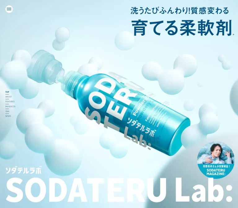
淡い水色とターコイズを基調に、立体的なボトルと分子状の造形を大きく配置。濃紺の見出し、巨大なロゴ、モバイルの縦組みコピーが特徴の柔軟剤ブランドサイト。
オリジナルサイトを見るSODATERU Lab: — Style Reference
A glossy turquoise bottle suspended in a soft molecular world, framed by oversized lettering and laboratory-blue copy.
Website: sodaterulab.jp Original URL: https://sodaterulab.jp/ Final URL: https://sodaterulab.jp/ Theme: light cyan imagery progressing into saturated turquoise, with white identity graphics and dark blue headings. Inspected: September 12, 2026. Supplied capture-session timestamp: 14:30:16 UTC / 23:30:16 JST. Viewports: desktop 1440 × 1000 CSS pixels; mobile 390 × 844 CSS pixels. Scope: the current official fabric-care brand homepage: opening visual, brand statement, benefits, product information, FAQ text, news previews, and footer. Visual captures cover the desktop hero, one desktop feature composition, desktop news/footer, mobile hero, and mobile news/footer. Other sections are supported by rendered DOM and computed-style records. Linked pages and opened control states were not inspected.
SODATERU Lab: presents an everyday laundry product through a combination of tactile softness and scientific imagery. A reflective turquoise bottle dominates the opening screen. White, rounded molecular forms surround it at several apparent depths, while the transparent cap and strong bottle highlights introduce a precise, manufactured character. The background remains extremely light behind the dark blue headline, allowing a very large white wordmark to anchor the lower edge.
Below the opening, the page becomes more saturated. Pale rectangular information panels, towel demonstrations, fine white diagrams, condensed English labels, and dense Japanese explanations sit within the same cyan world. The composition uses offset blocks and substantial empty space. The footer continues the product imagery and background instead of introducing a separate dark band.
This is a brand homepage with product education, support information, editorial previews, and shopping destinations. Its structure should remain useful beyond the opening visual.
How to Read This Reference
- Measured means a value appears in the supplied rendered DOM, computed styles, custom properties, or element rectangles. Measurements are CSS pixels unless stated otherwise.
- Calculated means simple arithmetic from those measurements, such as gaps between two recorded element positions.
- Estimated means a visual approximation from the current-page screenshots. Estimated colors were not obtained through pixel sampling.
- Recommended means an implementation choice for a new adaptation, not verified behavior of the original site.
- Named tokens are descriptive aliases unless a source custom-property name is included.
- Some records include transformed, overlapping, transparent, or potentially concealed elements. A nonzero rectangle does not establish that an element was visibly displayed in that state.
- Static captures establish appearance, but do not establish animation timing, rendering technology, drag behavior, or the result of clicking a control.
Tokens — Colors
Default Palette
| Name | Value | Token / source | Role and evidence |
|---|---|---|---|
| Laboratory Blue | #00517F |
--lab-ink / source --colors-dark-blue |
Measured menu icon, desktop section links, hero-copy container, feature headings, and FAQ answer text |
| Product Blue | #06A8C7 |
--lab-blue / source --colors-blue |
Measured blue product utility-button text; a brand accent, not an exact measurement of every turquoise background |
| White | #FFFFFF |
--lab-white |
Measured body text, menu surface, utility-button surfaces, news text, and footer text; visually used throughout identity graphics |
| Marker Yellow | #E7FF0E |
--lab-yellow / source --colors-yellow |
Declared source accent; a narrow lime-yellow underline is visible within the absorbency feature heading |
| Body Black | #000000 |
--lab-black |
Measured explanatory text inside pale feature panels and refill descriptions |
| Unscented Gray | #2F2F2F |
--lab-gray / source --colors-dark-gray |
Measured utility-button text for the unscented variant |
| Floral Pink | #E14C79 |
--lab-pink / source --colors-pink |
Measured utility-button text for the floral variant |
Atmospheric Colors
These are visual approximations for implementation, not extracted source colors.
| Name | Approximation | Intended use |
|---|---|---|
| Mist | #E7FAFD |
Very pale cyan behind the opening product scene |
| Light Aqua | #A2E7EE |
A starting approximation for the lighter feature background |
| Lower Aqua | #18BED3 |
A starting approximation for the saturated news/footer field |
| Pale Panel | rgba(255,255,255,0.40) |
Approximate translucent-looking feature surface; actual opacity and compositing were not supplied |
The visible atmosphere cannot be reduced to one flat source token. The body and footer report transparent backgrounds, while the screenshots show lighting, gradients, and scene imagery behind them. The placement and implementation of those background layers are not exposed.
Keep dark blue for headline emphasis and important navigation. White identity graphics work at very large sizes; small white text on bright aqua needs separate contrast assessment. Yellow appears as a thin editorial marker, rather than a general button fill.
Product Accents
The recorded utility controls associate blue with Powdery Sabon, pink with Shiny Floral, and dark gray with Unscented. This establishes variant-specific control colors. It does not establish the complete background palette or transition behavior of each product presentation.
Tokens — Typography
Source Font Families
| Role | Declared family | Evidence and character |
|---|---|---|
| Japanese body and general UI | 太ゴB101, sans-serif |
Source --fonts-futo; measured on body copy, product details, news, footer, and utility buttons |
| Japanese display headings | 見出ゴMB1, sans-serif |
Source --fonts-midashi; measured on the brand statement, feature subheadings, and product taglines |
| Condensed Latin labels | TTNormsProCondensedBold, sans-serif |
Source --fonts-tt; measured on section labels, navigation, fragrance names, and footer links |
| Root fallback | System sans-serif stack | Measured on the HTML element; not the principal branded body family |
Many visibly bold roles report font-weight: 400, including the condensed family whose name already identifies a bold cut. Preserve the declared face and weight relationship rather than automatically applying synthetic bold everywhere. The large brand statement reports 700.
These family names are confirmed declarations. Font files, licensing, load success for every glyph, and asset URLs were not independently supplied. The Quick Start therefore declares the known families without inventing font downloads.
Type Scale
Values below are measured font-size / line-height. They describe the recorded text element, not necessarily all nested lettering.
| Role | Desktop | Mobile | Family / additional detail |
|---|---|---|---|
| Root | 10 / 15px |
10.4 / 15.6px |
System fallback |
| Body default | 16 / 24px |
16.64 / 24.96px |
Japanese body family |
| About statement | 101 / 131.3px |
41.6 / 54.08px |
Display family, weight 700; tracking -0.06em |
| Benefits overview heading | 64 / 83.2px |
27.04 / 35.152px |
Japanese body family |
| Numbered-feature heading | 45 / 56.25px |
22.88 / 30.888px |
Display family |
| Benefits overview paragraph | 18 / 32.4px |
13.52 / 24.336px |
Tracking 0.08em |
| Feature explanation | 15 / 27px |
13.52 / 24.336px |
Tracking 0.08em; black in pale panels |
| Feature image note | 11 / 19.8px |
10.4 / 18.72px |
Tracking 0.08em |
| Section label | 40 / 28px |
Usually 33.28 / 23.296px |
Condensed Latin; tracking 0.05em |
| Mobile FEATURES label | — | 37.44 / 26.208px |
Larger than other sampled mobile section labels |
| Fragrance name | 112 / 112px |
57.2 / 57.2px |
Condensed Latin, white |
| Product tagline | 45 / 60.75px |
27.04 / 35.152px |
Japanese display family |
| Main product description | 17 / 25.5px |
13.52 / 20.28px |
White; tracking 0.08em |
| Main product price | 20 / 30px |
13.52 / 20.28px |
White |
| Refill description | 12 / 18px |
11.44 / 16.588px |
Black; tracking 0.08em |
| Refill price | 15 / 15px |
11.44 / 11.44px |
Black |
| News title and date | 15 / 22.5px |
13.52 / 20.28px |
Date tracking 0.05em |
| Desktop section rail | 13 / 26px |
Not visible | Condensed Latin |
| VIEW ALL | 24 / 24px |
18.72 / 18.72px |
Condensed Latin |
| Footer navigation | 18 / 27px |
15.6 / 23.4px |
Condensed Latin; tracking 0.03em |
| Company details | 14 / 22.4px |
13.52 / 21.632px |
Tracking 0.04em |
| Copyright and price note | 11 / 19.8px |
11.44 / 20.592px |
Small supporting copy |
Graphic Lettering and Hero Copy
The Japanese and English identity wrappers contain no extracted text. Their computed body font sizes therefore do not measure the visible logo lettering. Use approved brand artwork when available; recreating the wordmark as ordinary text will not guarantee matching proportions.
The English identity wrapper measures 1350px wide on desktop and 366.06px on mobile. Subtracting its recorded top padding gives approximate content heights of 148.89px and 40.35px respectively. Both produce a calculated aspect ratio near 9.07:1. This is an approximation from wrapper geometry, not a verified intrinsic asset dimension.
The hero-copy container reports ordinary inherited type values while visibly containing much larger lettering. Nested headline measurements were not supplied. Visual estimates are:
- Desktop supporting line: approximately 44–48px.
- Desktop main claim: approximately 96–108px.
- Mobile vertical supporting line: approximately 20–22px.
- Mobile vertical main claim: approximately 44–48px.
The Quick Start uses values within these ranges and labels them as estimates.
Section Labels
Section headings such as FEATURES, PRODUCTS, FAQ, and NEWS have narrow, tall desktop rectangles but wide, short mobile rectangles. For example, desktop PRODUCTS measures about 28 × 210px; its mobile counterpart measures about 175 × 23px. This supports a vertical desktop treatment and a horizontal mobile treatment.
Their computed text color is transparent. The supplied data does not include the stroke, background clipping, pseudo-elements, or other paint mechanism that may make them visible. Do not copy transparent text into a new implementation without providing its visible treatment. A solid-color fallback is recommended.
Tokens — Spacing & Shapes
Responsive Unit
The root is 10px at 1440px wide and 10.4px at 390px wide. Several mobile values are multiples of 1.04: 13 becomes 13.52, 24 becomes 24.96, and 55 becomes 57.2. This is consistent with scaling a 375px reference width to 390px, but the underlying formula was not supplied and should not be presented as verified source CSS.
Declared breakpoint tokens are 769px, 1440px, and 1920px. Only the 390px and 1440px layouts were inspected; the exact media-query assignments and behavior at other widths remain unverified.
Spacing Scale
There is no evidence of one universal spacing scale. These recurring relationships are more useful than inventing a base grid.
| Relationship | Desktop | Mobile | Status |
|---|---|---|---|
| Menu inset, top and left | 32px |
20.797px |
Measured |
| Common content inset | 100px |
24.953px |
Measured on news, product text, and footer content |
| Hero identity side inset | 45px |
11.938px |
Measured |
| Gap before English hero identity | 21px |
10.4px |
Measured wrapper padding |
| Section-rail row step | 28px |
— | Calculated from link positions |
| News-card gap | 40px |
24.953px |
Calculated from card rectangles |
| Footer link gap | 24px |
Two-column arrangement | Calculated desktop gap |
| Feature-panel left inset | About 32px |
Varies by feature | Desktop estimate using the visible panel edge and measured text position |
| Feature heading-to-body gap | 25px |
About 10.39px |
Calculated for the absorbency text block |
| Body-to-image-note gap | 15px |
About 5.19px |
Calculated for the same block |
| News-to-footer breathing room | 260px after card bottoms |
About 187px after VIEW ALL |
Calculated from supplied document rectangles |
Border Radius
| Element | Value or appearance | Evidence |
|---|---|---|
| Menu button | 50% |
Measured |
| Product utility buttons | 0 |
Measured |
| Feature information panel | Square | Visually observed |
| News images and links | Square | Visually observed; link radius is measured as zero |
| Towel comparison labels | Rounded capsules | Visually observed; exact radius unavailable |
| Molecular forms | Organic rounded volumes | Part of scene imagery, not a UI radius system |
Layout Measurements
| Element | Desktop | Mobile |
|---|---|---|
| Document height | About 12,409.08px |
About 10,126.72px |
| Menu button | 44 × 44px |
49.906 × 49.906px |
| Hero claim container | 617.84 × 217px, x 797.16, y 22 |
90.5 × 308.73px, x 278.72, y 23.91 |
| Hero identity wrapper width | 1350px |
366.06px |
| Common content width | 1240px |
About 340.08px |
| Absorbency heading width | 477px |
262.08px |
| Absorbency paragraph width | 409px |
262.08px |
| Refill description width | 184px each |
About 127.95px each |
| News card | 440 × 363px |
208 × 274.67px |
| Footer box | 1440 × 401.41px |
390 × 430.02px |
These document measurements are a captured layout state, not a specification for hardcoded page heights. Transforms and concealed content can affect the relationship between extracted rectangles and visible sections.
Components
Full-Viewport Hero
Role: establish the product, brand name, and central claim immediately.
The desktop scene fills the capture. A large turquoise bottle runs diagonally from the upper-left region toward the lower-right. Its detached transparent cap occupies the upper-left side of the product axis. White molecular forms surround the bottle, including large blurred foreground shapes and smaller distant forms. The product remains sharper than much of the surrounding decoration.
Place the claim in the upper-right, separate from the lower-left Japanese identity and the almost full-width English wordmark. The headline is dark blue; the identity graphics are white. The current desktop composition has no large purchase button competing with the product.
On mobile, the product is cropped substantially at both sides and the claim becomes two vertical text columns near the right edge. The Japanese identity and English wordmark remain horizontal at the bottom. This is an art-directed mobile composition, not merely a smaller desktop hero.
The screenshots support a rendered three-dimensional appearance. They do not establish whether the site uses a static image, video, canvas, WebGL, or several composited layers.
Menu Control and Desktop Section Rail
Role: offer navigation without occupying a conventional header bar.
The menu is a white circular button with three dark blue horizontal strokes. Its recorded desktop size is 44px at a 32px inset. On mobile it grows to approximately 50px and moves to an approximately 21px inset. Its repeated placement in the supplied scroll captures establishes a persistent visual position; the exact positioning declaration is not included.
The desktop rail contains TOP, ABOUT, FEATURES, PRODUCTS, Q&A, and NEWS. It sits at x = 32px around the vertical center, with a 28px row step and short horizontal rules. Active-section emphasis is visible across the supplied frames: the current label is darker while others appear subdued. The underlying opacity values and active-state mechanism are not recorded.
The links point to #main-visual, #about, #features, #products, #faq, and #news. The mobile captures omit the rail and retain the circular menu. No opened menu state was supplied.
Scrolled Brand Overlay
Role: maintain identity while the product story continues.
A white SODATERU Lab: wordmark appears near the top center in both supplied desktop scrolled captures. It overlays the feature and news imagery rather than sitting on a filled header surface. Its visual width is approximately 365px.
Repeated placement supports a persistent overlay treatment, but its visibility trigger and fixed-versus-sticky implementation are unverified. An equivalent top-center overlay is not visible in the supplied mobile footer capture.
Brand Statement and Benefits Overview
Role: connect the product scene to the fabric-care proposition.
The rendered text includes the statement beginning “洗濯で「育てる*」という新発想。” The measured display treatment is 101px on desktop, tight at -0.06em, with 1.3 line height. Mobile uses 41.6px with the same tracking ratio and different text breaks.
The following benefits overview combines a dark blue headline, white explanatory copy, and six benefit labels. The text describes wrinkle prevention, antibacterial/deodorizing performance, reduced indoor-drying odor, damage care, static prevention, and reduced pollen adhesion. These are source product claims, not independently validated performance findings.
The DOM establishes the content and typography. A complete visual capture of this overview was not supplied, so icon geometry, grouping, and intermediate transitions should not be invented.
Numbered Feature Composition
Role: make a technical benefit understandable through a headline, explanation, and visual demonstration.
The supplied desktop feature frame shows item 02. Its anatomy is unusually specific:
- A white number plate sits above the upper-left corner of a pale rectangular text panel.
- A three-line dark blue heading explains absorbency and a non-silicone formulation.
- A narrow lime-yellow underline highlights part of the heading.
- A black explanatory paragraph occupies a narrower measure beneath it.
- A small image qualification appears at the bottom of the text panel.
- A large towel comparison image sits to the upper-right.
- A smaller image of blue liquid being poured onto a towel sits lower and farther left, partially crossing the panel's right boundary.
- A fine white spiral-and-axis diagram occupies the far-left region, with Absorbency, Fluffiness, and Softness labels.
Approximate screenshot geometry: the panel begins around x = 260px and is 541px wide; the number plate is about 150 × 100px. The comparison image is about 502 × 282px at x = 838px. The lower demonstration is about 362 × 204px at x = 742px. These are visual estimates, not measured asset rectangles.
The towel comparison uses small capsule labels, including “未使用” and “ソダテルラボ”. Its gray support surface belongs to the demonstration imagery. The information panel itself has no visible elevation shadow or rounded-card treatment.
The diagram has no supplied numeric scale. Preserve its conceptual role without inventing quantitative data. Retain the visible qualification that the images are based on data and are illustrative.
Mobile DOM measurements show narrower, differently offset feature text: the absorbency block begins around x = 82px with a 262px width. A mobile feature screenshot was not supplied, so the complete image arrangement remains unverified.
Product Variant Stage and Refill Pair
Role: describe fragrance variants, bottle formats, refill options, prices, and usage information.
The DOM includes Powdery Sabon, Shiny Floral, and Unscented. Each has a large white condensed English name, a Japanese display tagline, product description, capacity/price line, and a compact usage button. Two refill descriptions accompany each variant: a standard refill and a larger refill.
Desktop fragrance names use 112px type. Main text starts at x = 100px, while the two recorded refill descriptions begin at x = 867px and x = 1129px, each 184px wide. Mobile main text begins at approximately x = 25px; the refill descriptions remain a pair at approximately x = 37px and x = 225px.
The first two variant headings share the same recorded vertical position at both viewports. This is evidence of a shared or layered presentation region, not three ordinary product sections stacked one after another. The switching trigger, active variant, selection controls, and transitions were not captured.
No product-section screenshot was supplied. Product pack imagery, inactive-state visibility, and the complete stage background must therefore remain unspecified.
Product Utility Buttons
Role: provide focused product details without becoming dominant calls to action.
The “使用量について” control is a white, square-cornered stamp with variant-colored text and a small internal gap. Desktop measurements are approximately 141 × 24px, with 14px type, 7px horizontal padding, and an 8px gap. Mobile measures approximately 124.48 × 28.39px, with 13.52px type and 4.16px horizontal padding/gap.
Mobile records also include “香りの配合” buttons for the two scented variants. Their opened content and desktop treatment are not established by the supplied evidence.
The source declares color 0.3s, background-color 0.3s. No hover endpoint or opened dialog state was supplied. For an adaptation, preserve the compact visible stamp while enlarging its interactive target separately.
FAQ Group
Role: answer practical questions about usage, suitable clothing, infant clothing, static, and product consistency during storage.
Five question prompts appear in the rendered text. Answer paragraphs are also present in the element records, using dark blue type at 15/27px on desktop and 13.52/24.336px on mobile.
The text snapshot primarily exposes question prompts, while some answer rectangles overlap later content positions. Answer presence in the DOM does not prove that those answers were visibly expanded. Accordion behavior, icons, row borders, keyboard interaction, and animation were not verified.
For a new implementation, native disclosures or buttons with explicit expanded states are recommended. Keep the measured typography relationship, but do not describe a particular accordion interaction as an observed feature.
News Preview Rail
Role: connect the brand presentation to current announcements.
Each news item is one unboxed link containing a rectangular image, Japanese title, and date. The current supplied captures show a pink blossom product announcement and a turquoise brand-launch visual. Color enters through the images; there are no visible category badges or raised card surfaces.
Desktop cards are 440px wide with a 40px gap. They begin at x = 100px and x = 580px, leaving substantial space to the right. The images visually approximate 16:9 proportions. Image-to-title spacing is approximately 20px, inferred from the image appearance and recorded text positions.
Mobile cards remain horizontal at 208px wide with a 24.953px gap. The second begins at x = 257.906px and extends about 75.906px beyond the 390px viewport. The visible crop establishes an overflow composition; swipe or drag behavior was not tested.
VIEW ALL combines condensed uppercase text with a small outlined circular arrow. It appears above the cards on desktop and below them, right-aligned, on mobile. Its confirmed destination is /news.
Footer
Role: close the brand story while providing shopping, support, social, and company links.
The footer continues the turquoise field and floating product imagery. Desktop places the Japanese logo at the left and a horizontal navigation group at the right. Social information sits below the navigation, while company information is aligned farther down. An enormous English wordmark crosses the bottom edge and is intentionally cropped by the viewport in the supplied frame.
A tilted bottle rises above the footer content. On mobile, it occupies much of the right side while the Japanese logo, two navigation columns, social link, company details, and small legal copy stack on the left and below. The giant desktop English footer wordmark is not visible in the supplied mobile footer capture.
The six navigation links are TOP, Q&A, NEWS, SHOP LIST, CONTACT US, and PRIVACY POLICY. Mobile columns begin at approximately x = 25px and x = 97px. The Instagram icon appears beneath FOLLOW US.
The inspected footer directly names ステラシード株式会社 and links to stellaseed.jp, supporting its identification as the site operator. No production-credit statement was independently visible in the supplied original-page records.
Tokens — Motion & Interaction
| Treatment | Evidence | What can be concluded |
|---|---|---|
| Product utility control | color 0.3s, background-color 0.3s |
Color transitions are declared; endpoint states were not exercised |
| Footer and social links | opacity 0.2s |
Short opacity transitions are declared; final hover opacity is unknown |
| Sine easing token | cubic-bezier(.37, 0, .63, 1) |
Available as source --easings-ease-in-out-sine; component assignment is unknown |
| Back easing token | cubic-bezier(.34, 1.56, .64, 1) |
Available as source --easings-ease-out-back; use is unverified |
| Snap strictness token | proximity |
A declared variable alone does not prove an active scroll-snap container |
| Section navigation | Confirmed hash-link destinations | In-page navigation is provided; smooth-scroll duration and behavior are unverified |
| Persistent navigation and brand | Repeated positions across captures | Persistent visual placement is observed; exact CSS/JavaScript mechanism is unknown |
| Product and molecular scene | Static views with strong depth cues | Rendering medium, motion path, looping, and scroll synchronization are unknown |
| Product variants | Overlapping recorded positions | A shared presentation region is supported; switching behavior is unknown |
| Menu, FAQ, detail controls | Closed or unexercised states | No verified opening, closing, focus, or dismissal behavior |
Many sampled text elements report animation: none. This does not rule out animation in omitted descendants, images, pseudo-elements, video, canvas, or JavaScript.
The capture process waited for document load, sampled layout/text stability, and image decoding. Perpetual animations were temporarily paused during readiness checks and then resumed. These procedures help obtain settled captures but do not provide a motion recording or prove that delayed content is complete.
Recommended motion direction: if an adaptation adds movement, use restrained floating or depth changes for decoration, preserve readable text, and provide a static reduced-motion alternative. Any duration or scroll choreography chosen for that adaptation is a new implementation decision.
Surfaces
| Layer | Appearance | Purpose |
|---|---|---|
| Opening scene | Pale cyan lighting with soft white volumes | Establish freshness and apparent depth |
| Lower page atmosphere | Increasingly saturated aqua/turquoise | Maintain a continuous brand environment |
| Information panel | Pale, translucent-looking rectangle with square corners | Give black paragraphs and blue headings a stable reading surface |
| Demonstration imagery | Rectangular towel scenes with internal gray supports | Explain a product benefit visually |
| Menu | Solid white circle with blue strokes | Keep navigation visible over complex imagery |
| Utility stamp | White rectangle with variant-colored text | Present compact secondary actions |
| News item | Image and text directly on the background | Keep announcements integrated into the page |
| Footer | Transparent content over the continuing aqua scene | Finish the page without a separate visual theme |
There is no visible general system of raised cards, drop shadows, or rounded containers. Depth belongs primarily to the imagery. The pale information panel does not establish the use of backdrop-filter or glass blur.
Imagery
The principal image language combines glossy product rendering with soft molecular sculpture. Preserve the contrast between the bottle's reflective surface, transparent threaded cap, sharp white package lettering, and the surrounding matte white lobes. Some forms are linked clusters rather than isolated spherical bubbles.
Composition is equally important. The hero product crosses the frame on a strong diagonal; decoration is cropped at the edges; nearer forms are visibly softer; and the pale center gives typography room to remain readable. The mobile product has a stronger apparent diagonal and a different crop. The footer changes the bottle toward an upright tilt and lets it protrude into the preceding space.
The feature demonstration introduces tangible fabric texture. Folded towels, visible loft, and blue liquid provide a material counterpoint to the smooth product scene. Preserve those details when preparing responsive images.
The current seasonal news thumbnail uses pink blossoms and a pink bottle, while the second reuses the turquoise product world. Keep such color changes within editorial imagery or verified product accents.
Observed Asset References
No image, logo, model, video, or font-file URLs were exposed in the supplied evidence. The following are visual identifiers, not network paths or bundled filenames.
| Visual identifier | Where observed | Implementation implication |
|---|---|---|
| Diagonal turquoise bottle and separated cap | Desktop and mobile hero | Prepare responsive art direction; asset format is unknown |
| White molecular clusters | Hero, feature, and footer captures | Preserve varied scale, crop, softness, and apparent depth |
| Japanese and English identity graphics | Hero and desktop footer; Japanese identity in mobile footer | Prefer approved brand artwork over approximate text recreation |
| Towel comparison | Desktop feature capture | Preserve both comparison labels and the fabric silhouette |
| Blue-liquid demonstration | Desktop feature capture | Keep the towel and pouring action legible at smaller sizes |
| Spiral performance diagram | Desktop feature capture | Reproduce as a conceptual graphic without fabricated scales |
| Blossom announcement image | Desktop and mobile news captures | Use the current authorized editorial image |
| Upright tilted bottle | Desktop and mobile footer captures | Reserve composition space independently from navigation hit areas |
The observed appearance does not justify selecting a particular 3D library. Use the least complex authorized asset pipeline that reproduces the required composition and behavior.
Layout & Responsive Behavior
| Relationship | Desktop observation | Mobile observation |
|---|---|---|
| Opening claim | Horizontal, upper-right | Two vertical columns near the right edge |
| Product composition | Broad diagonal with substantial surrounding space | More tightly cropped and strongly diagonal |
| Main identity | Very large white graphic across the lower screen | Same horizontal identity relationship, resized to phone width |
| Menu | 44px circle at 32px inset | About 50px circle at 21px inset |
| Section rail | Persistent at the left | Not visible |
| Section labels | Narrow, tall rectangles | Wide, short rectangles |
| Feature typography | Large headings and wider paragraphs | Smaller headings and narrow, individually offset text blocks |
| Refill information | Two narrow columns to the right of main product copy | Two columns beneath the main copy region |
| News | Two 440px cards with broad unused space at right | 208px cards extending beyond the viewport |
| VIEW ALL | Above the news row | Below the row |
| Footer links | One horizontal row | Two columns of three links |
| Footer identity | Japanese logo plus enormous lower English lettering | Japanese logo visible; lower English lettering not visible in the supplied frame |
The common content inset changes from 100px to approximately 25px. The hero uses a separate, smaller inset of approximately 3.1% of viewport width. Preserve these two alignment systems instead of forcing every element onto one container edge.
Mobile also changes information density. The source uses 13.52px for many paragraphs and 11.44px for refill details. A new implementation should consider a larger minimum for essential reading content; doing so will alter line breaks and section heights.
The document is approximately 12.4 desktop viewport-heights or 12 mobile viewport-heights at the recorded sizes. This indicates an extended product story, but does not prove a fixed number of full-screen panels or mandatory snapping.
Only two widths were inspected. Tablet composition, landscape phones, browser zoom, safe-area behavior, and 1920px layouts remain unverified. Test those conditions before treating the measured endpoints as a complete responsive specification.
Do’s and Don’ts
Do
- Preserve the relationship between a glossy turquoise product and soft white molecular forms.
- Keep dark blue
#00517Fas the principal headline and navigation ink. - Use the exact declared product accents where their roles are supported.
- Keep large white brand graphics separate from compact utility typography.
- Art-direct the mobile hero with vertical Japanese copy and a deliberate product crop.
- Use square pale information panels and offset demonstration images.
- Retain the narrow yellow highlight as a selective emphasis device.
- Preserve actual condensed Latin and Japanese font roles when licensed assets are available.
- Keep news cards unboxed and maintain the visible mobile overflow composition.
- Carry the product imagery and aqua atmosphere into the footer.
- Preserve product-claim footnotes and distinguish illustrations from measured demonstrations.
Don't
- Don't flatten the opening into a small product image beside a generic text column.
- Don't copy the desktop composition onto mobile without changing the headline orientation and image crop.
- Don't treat the source blue token as the exact color of every visible background pixel.
- Don't apply rounded cards and elevation shadows to every information block.
- Don't infer a carousel, autoplay sequence, menu animation, or FAQ transition from static captures.
- Don't place every overlapping product variant on screen simultaneously because all appear in extracted text.
- Don't recreate logo artwork using the wrapper's reported 16px body font size.
- Don't copy transparent section-label text without its visible paint treatment.
- Don't remove supporting qualifications to simplify the composition.
- Don't allow decorative product imagery to intercept links or obscure essential copy.
Recommended Implementation Additions
These are additions for a new implementation, not verified features of the inspected site:
- Give the menu button an accessible name, an expanded state, and a controlled navigation region. Provide keyboard access and focus restoration when it closes.
- Preserve the compact utility-button appearance inside an interactive target of at least 44px height.
- Provide explicit accessible state and keyboard operation for any implemented product switcher. Conceal inactive panels from both interaction and the accessibility tree.
- Use semantic FAQ disclosures with visible focus and correctly associated answers.
- Make overflowing news items reachable through native scrolling and keyboard focus. Test the complete second card at 390px width.
- Check small white text against the actual composited aqua imagery. Dark blue is an available alternative for text that needs stronger contrast.
- Consider a 15px minimum for essential mobile paragraphs, with reflow testing rather than fixed panel heights.
- Use responsive image sources and retain a lightweight static visual when motion is reduced or advanced rendering is unavailable.
- Mark decorative molecular forms as decorative. Give meaningful product and demonstration images useful alternatives without duplicating adjacent copy.
- Keep a meaningful text alternative for the brand identity and preserve a logical heading structure when visible logos are graphics.
Agent Prompt Guide
Quick Color Reference
- Headline and navigation ink:
#00517F. - Source product blue:
#06A8C7. - Main identity and reversed copy:
#FFFFFF. - Thin feature marker:
#E7FF0E. - Floral utility accent:
#E14C79. - Unscented utility accent:
#2F2F2F. - Feature paragraph text:
#000000on a pale panel. - Atmospheric approximation: mist
#E7FAFD, light aqua#A2E7EE, lower aqua#18BED3. - Panel opacity and atmospheric colors are adaptation estimates, not exact source measurements.
Overall Prompt
“Create a fabric-care brand homepage inspired by the current SODATERU Lab: composition. Use an expansive pale cyan hero with an authorized glossy turquoise bottle visual, transparent cap, and soft white molecular forms at several apparent depths. Place dark blue Japanese copy at the upper-right and oversized white brand graphics along the bottom. On mobile, change the claim to vertical Japanese columns and use a deliberately cropped product composition. Continue into a saturated aqua product story with square pale feature panels, offset towel demonstrations, a thin lime-yellow heading marker, condensed English product names, compact white utility stamps, FAQ content, horizontal news previews, and a footer integrated with product imagery. Use the verified Japanese and condensed Latin font families when available. Treat menu, product-switching, and background-motion behavior as implementation decisions requiring separate design and testing.”
Example Component Prompts
- Hero: “Build a full-height pale cyan product scene. Keep a circular white menu control at the upper-left, a dark blue two-level claim at the upper-right, and an almost full-width white wordmark at the bottom. Use approved artwork for the diagonal bottle and molecular forms. At phone width, keep the identity horizontal but set the Japanese claim vertically.”
- Feature 02: “Create an offset feature composition with a white number plate above a square pale panel. Use a dark blue three-line heading, a narrow lime underline, black explanatory copy, and a small qualification. Place a larger folded-towel comparison at the upper-right and a smaller blue-liquid demonstration below it, shifted left. Keep the fine white conceptual diagram separate from the paragraph.”
- Product information: “Use a large condensed white fragrance name above a Japanese display tagline, product description, capacity, and price. Add a compact white usage stamp with a variant-colored label. Present two refill descriptions as a paired group. Keep inactive variants semantically hidden if the implementation uses a shared stage.”
- News rail: “Create unboxed image-title-date links on aqua. At 1440px, use 440px cards with 40px gaps and a 100px starting inset. At 390px, use 208px cards with approximately 25px gaps and retain a partially visible second card. Place VIEW ALL above the desktop row and below the mobile row. Implement accessible native overflow scrolling.”
- Footer: “Continue the aqua scene into the footer. Place a white Japanese identity at left, compact condensed navigation, a small Instagram link, and company information. Let an authorized tilted bottle graphic protrude into the space above. Use two navigation columns on mobile and reserve room so the bottle does not block links.”
Quick Start
CSS Custom Properties
This is a recommended static adaptation, not extracted source CSS. It keeps a conventional root size, uses measured desktop values and selected mobile values, and approximates the atmospheric backgrounds. Mobile feature imagery was not visually supplied, so the example uses a straightforward stacked fallback. Essential mobile paragraph text is increased to 15px.
Use approved images with .hero-art, .brand-ja, and .brand-en. The feature example expects a .feature-column containing .feature-number and .feature-copy, alongside .feature-media containing two figures. Place three spans inside .menu-icon. The utility button expects an inner span so its visible stamp can remain small while its target grows. No asset URLs or font downloads are invented here.
:root {
  /* Exact source colors and measured text colors. */
  --lab-ink: #00517f;
  --lab-blue: #06a8c7;
  --lab-white: #ffffff;
  --lab-yellow: #e7ff0e;
  --lab-pink: #e14c79;
  --lab-gray: #2f2f2f;
  --lab-black: #000000;

  /* Visual approximations, not sampled source colors. */
  --lab-mist: #e7fafd;
  --lab-light-aqua: #a2e7ee;
  --lab-lower-aqua: #18bed3;
  --lab-panel: rgb(255 255 255 / 40%);

  /* Verified family declarations; provide licensed files separately. */
  --lab-font-body: '太ゴB101', sans-serif;
  --lab-font-display: '見出ゴMB1', sans-serif;
  --lab-font-latin: TTNormsProCondensedBold, sans-serif;

  --lab-page-inset: clamp(25px, 6.944vw, 100px);
  --lab-feature-offset: clamp(100px, 18.056vw, 260px);
  --lab-menu-inset: 32px;
  --lab-menu-size: 44px;
  --lab-news-width: 440px;
  --lab-news-gap: 40px;
  --lab-feature-title: clamp(28px, 3.125vw, 45px);
  --lab-copy-size: 15px;
  --lab-product-title: clamp(64px, 7.778vw, 112px);

  /* Declared source durations; endpoints below are recommendations. */
  --lab-control-duration: 300ms;
  --lab-link-duration: 200ms;
  --lab-ease-sine: cubic-bezier(.37, 0, .63, 1);
}

* {
  box-sizing: border-box;
}

body {
  margin: 0;
}

.sodateru-page {
  color: var(--lab-white);
  font-family: var(--lab-font-body);
  font-weight: 400;
  background: linear-gradient(
    180deg,
    var(--lab-mist),
    var(--lab-light-aqua) 35%,
    var(--lab-lower-aqua)
  );
}

.sodateru-page img {
  display: block;
  max-inline-size: 100%;
}

.sodateru-page button,
.sodateru-page a {
  -webkit-tap-highlight-color: transparent;
}

.menu-toggle {
  position: fixed;
  z-index: 50;
  inset-block-start: var(--lab-menu-inset);
  inset-inline-start: var(--lab-menu-inset);
  display: grid;
  place-items: center;
  inline-size: var(--lab-menu-size);
  block-size: var(--lab-menu-size);
  padding: 0;
  border: 0;
  border-radius: 50%;
  color: var(--lab-ink);
  background: var(--lab-white);
  cursor: pointer;
}

.menu-icon {
  display: grid;
  gap: 5px;
  inline-size: 28px;
}

.menu-icon > span {
  display: block;
  block-size: 2px;
  background: currentColor;
}

.section-rail {
  position: fixed;
  z-index: 40;
  inset-inline-start: 32px;
  inset-block-start: 50%;
  transform: translateY(-50%);
  display: grid;
  grid-auto-rows: 28px;
  color: var(--lab-ink);
  font: 400 13px/26px var(--lab-font-latin);
  text-transform: uppercase;
}

.section-rail a {
  position: relative;
  color: inherit;
  text-decoration: none;
  opacity: .55; /* Estimated inactive appearance. */
}

.section-rail a::after {
  content: '';
  position: absolute;
  inset-inline-start: 0;
  inset-block-end: 0;
  inline-size: 21px;
  block-size: 1px;
  background: currentColor;
}

.section-rail a[aria-current='location'] {
  opacity: 1;
}

.hero {
  position: relative;
  min-block-size: 100vh;
  min-block-size: 100svh;
  overflow: hidden;
  isolation: isolate;
  background: var(--lab-mist);
}

.hero-art {
  position: absolute;
  z-index: 0;
  inset: 0;
  inline-size: 100%;
  block-size: 100%;
  object-fit: cover;
  object-position: center;
  pointer-events: none;
}

.hero-claim {
  position: absolute;
  z-index: 1;
  inset-block-start: 22px;
  inset-inline-end: 25px;
  color: var(--lab-ink);
}

.hero-kicker,
.hero-title {
  margin: 0;
  font-family: var(--lab-font-body);
  font-weight: 700;
}

/* Estimated nested headline sizes; wrapper styles do not supply them. */
.hero-kicker {
  font-size: clamp(28px, 3.2vw, 46px);
  line-height: 1.4;
}

.hero-title {
  font-size: clamp(64px, 7.22vw, 104px);
  line-height: 1.3;
}

.hero-brand {
  position: absolute;
  z-index: 1;
  inset-inline: 3.125%;
  inset-block-end: 3.4%;
}

.brand-ja {
  inline-size: 219px; /* Visual estimate for the artwork itself. */
  block-size: auto;
}

.brand-en {
  inline-size: 100%;
  block-size: auto;
  margin-block-start: 21px;
}

.feature-stage {
  display: grid;
  grid-template-columns: minmax(0, 1.078fr) minmax(0, 1fr);
  align-items: start;
  gap: 37px;
  padding: 100px var(--lab-page-inset) 160px var(--lab-feature-offset);
}

.feature-number {
  display: grid;
  place-items: center;
  inline-size: 150px;
  min-block-size: 100px;
  color: var(--lab-ink);
  background: var(--lab-white);
  font: 400 80px/1 var(--lab-font-latin);
}

.feature-copy {
  padding: 26px 32px 32px;
  color: var(--lab-black);
  background: var(--lab-panel);
}

.feature-copy h3 {
  margin: 0 0 25px;
  color: var(--lab-ink);
  font: 400 var(--lab-feature-title)/1.25 var(--lab-font-display);
}

.feature-copy p {
  margin: 0;
  font-size: var(--lab-copy-size);
  line-height: 1.8;
  letter-spacing: .08em;
}

.feature-copy .feature-note {
  margin-block-start: 15px;
  font-size: 11px;
}

.marker {
  color: inherit;
  background: linear-gradient(
    transparent calc(100% - 4px),
    var(--lab-yellow) 0
  );
  box-decoration-break: clone;
  -webkit-box-decoration-break: clone;
}

.feature-media figure {
  margin: 0;
}

.feature-media img {
  inline-size: 100%;
  block-size: auto;
}

/* Approximate the observed offset image composition. */
.feature-media figure + figure {
  inline-size: 72.1%;
  margin-block-start: 46px;
  margin-inline-start: -19.1%;
}

.product-title {
  margin: 0;
  font: 400 var(--lab-product-title)/1 var(--lab-font-latin);
}

.refill-pair {
  display: grid;
  grid-template-columns: repeat(2, minmax(0, 184px));
  gap: 78px;
  color: var(--lab-black);
}

.utility-button {
  --variant-color: var(--lab-blue);
  display: inline-flex;
  align-items: center;
  min-block-size: 44px; /* Recommended larger target. */
  padding: 0;
  border: 0;
  color: var(--variant-color);
  background: transparent;
  font: 400 14px/21px var(--lab-font-body);
  letter-spacing: .08em;
  cursor: pointer;
}

.utility-button[data-variant='floral'] {
  --variant-color: var(--lab-pink);
}

.utility-button[data-variant='unscented'] {
  --variant-color: var(--lab-gray);
}

.utility-button > span {
  display: inline-flex;
  align-items: center;
  gap: 8px;
  padding: .5px 7px;
  background: var(--lab-white);
  transition:
    color var(--lab-control-duration),
    background-color var(--lab-control-duration);
}

.news-section {
  display: flex;
  flex-direction: column;
}

.news-view-all {
  align-self: flex-end;
  margin: 0 var(--lab-page-inset) 40px;
  color: inherit;
  font: 400 24px/1 var(--lab-font-latin);
  text-decoration: none;
  text-transform: uppercase;
}

.news-scroller {
  display: grid;
  grid-auto-flow: column;
  grid-auto-columns: var(--lab-news-width);
  justify-content: start;
  gap: var(--lab-news-gap);
  padding-inline: var(--lab-page-inset);
  overflow-x: auto; /* Recommended reachable overflow behavior. */
  scroll-padding-inline: var(--lab-page-inset);
}

.news-card {
  color: inherit;
  text-decoration: none;
}

.news-card img {
  inline-size: 100%;
  aspect-ratio: 16 / 9; /* Visual approximation. */
  object-fit: cover;
}

.news-card p {
  margin: 20px 0 0;
  font-size: 15px;
  line-height: 1.5;
}

.news-card time {
  display: block;
  margin-block-start: 5px;
  font-size: 15px;
  line-height: 1.5;
  letter-spacing: .05em;
}

.site-footer {
  position: relative;
  margin-block-start: 260px;
  padding: 0 var(--lab-page-inset) 40px;
}

.footer-top {
  display: grid;
  grid-template-columns: minmax(0, 1fr) auto;
  align-items: start;
  gap: 40px;
}

.footer-nav {
  display: flex;
  gap: 24px;
  font: 400 18px/1.5 var(--lab-font-latin);
  letter-spacing: .03em;
  text-transform: uppercase;
}

.footer-nav a {
  color: inherit;
  text-decoration: none;
  transition: opacity var(--lab-link-duration);
}

.decorative-art {
  pointer-events: none;
  user-select: none;
}

/* Recommended hover endpoints; original endpoints were not supplied. */
@media (hover: hover) {
  .utility-button:hover > span {
    color: var(--lab-white);
    background: var(--variant-color);
  }

  .footer-nav a:hover {
    opacity: .65;
  }
}

/* Recommended focus treatment for variable image backgrounds. */
.sodateru-page :focus-visible {
  outline: 3px solid var(--lab-ink);
  outline-offset: 4px;
  box-shadow: 0 0 0 2px var(--lab-white);
}

/* 769px is a declared source breakpoint; these rules are an adaptation. */
@media (max-width: 768px) {
  :root {
    --lab-page-inset: 24.96px;
    --lab-menu-inset: 20.8px;
    --lab-menu-size: 49.92px;
    --lab-news-width: 208px;
    --lab-news-gap: 24.96px;
    --lab-feature-title: 22.88px;
    --lab-product-title: clamp(42px, 14.667vw, 57.2px);
  }

  .section-rail {
    display: none;
  }

  .hero-claim {
    inset-block-start: 23.9px;
    inset-inline-end: 20.8px;
    display: flex;
    flex-direction: row-reverse;
    align-items: flex-start;
    gap: 8px;
  }

  .hero-kicker,
  .hero-title {
    writing-mode: vertical-rl;
    white-space: nowrap;
  }

  .hero-kicker {
    font-size: 20.8px;
    line-height: 1.5;
  }

  .hero-title {
    font-size: 46.8px;
    line-height: 1.1;
  }

  .hero-brand {
    inset-block-end: 1.6%;
  }

  .brand-ja {
    inline-size: 139px;
  }

  .brand-en {
    margin-block-start: 10.4px;
  }

  .feature-stage {
    grid-template-columns: minmax(0, 1fr);
    gap: 32px;
    padding: 80px var(--lab-page-inset);
  }

  .feature-number {
    inline-size: 100px;
    min-block-size: 70px;
    font-size: 56px;
  }

  .feature-copy {
    padding: 20.8px;
  }

  .feature-copy h3 {
    margin-block-end: 10.4px;
    line-height: 1.35;
  }

  .feature-media figure + figure {
    inline-size: 85%;
    margin: 24px 0 0 auto;
  }

  .refill-pair {
    grid-template-columns: repeat(2, minmax(0, 1fr));
    gap: 32px;
  }

  .news-scroller {
    order: 1;
  }

  .news-view-all {
    order: 2;
    margin-block: 36px 0;
    font-size: 18.72px;
  }

  .news-card p {
    margin-block-start: 10.4px;
    font-size: 15px; /* Increased from the measured mobile 13.52px. */
  }

  .news-card time {
    font-size: 13.52px;
  }

  .site-footer {
    margin-block-start: 187px;
  }

  .footer-top {
    grid-template-columns: minmax(0, 1fr);
    gap: 30px;
  }

  .footer-nav {
    display: grid;
    grid-template-rows: repeat(3, auto);
    grid-auto-flow: column;
    justify-content: start;
    gap: 8px 28px;
    font-size: 15.6px;
  }
}

@media (prefers-reduced-motion: reduce) {
  .utility-button > span,
  .footer-nav a {
    transition: none;
  }

  /* Also pause any separately implemented media or scene renderer. */
}
This CSS establishes the visual shell. It does not implement menu state, product selection, FAQ behavior, a scene renderer, or the original desktop section-label paint effect. The static adaptation was not executed or browser-tested during this analysis.
Tailwind v4 Token Mapping
Optional aliases for a project already using Tailwind v4. This is not evidence that the original website uses Tailwind. Define the custom properties above first.
@theme inline {
  --color-lab-ink: var(--lab-ink);
  --color-lab-blue: var(--lab-blue);
  --color-lab-white: var(--lab-white);
  --color-lab-yellow: var(--lab-yellow);
  --color-lab-pink: var(--lab-pink);
  --color-lab-gray: var(--lab-gray);
  --color-lab-mist: var(--lab-mist);
  --color-lab-aqua: var(--lab-lower-aqua);

  --font-lab-body: var(--lab-font-body);
  --font-lab-display: var(--lab-font-display);
  --font-lab-latin: var(--lab-font-latin);

  --text-lab-feature: var(--lab-feature-title);
  --text-lab-product: var(--lab-product-title);
  --text-lab-copy: var(--lab-copy-size);

  --spacing-lab-inset: var(--lab-page-inset);
  --spacing-lab-menu: var(--lab-menu-size);
  --spacing-lab-news: var(--lab-news-width);
  --spacing-lab-news-gap: var(--lab-news-gap);
}
Sources & Evidence
- SODATERU Lab: official homepage: supplied original-page evidence, final URL unchanged, HTTP 200, and page title “【公式】SODATERU Lab:(ソダテルラボ)”.
- Capture session: September 12, 2026,
2026-09-12T14:30:16.445Z, equivalent to 23:30:16.445 JST. Separate timestamps for individual screenshots were not supplied. - Desktop: 1440 × 1000 CSS pixels; three current-page visual captures covering the opening, absorbency feature, and news/footer. Recorded document height approximately 12,409px.
- Mobile: 390 × 844 CSS pixels; two current-page visual captures covering the opening and news/footer. Recorded document height approximately 10,127px.
- Rendered evidence: page text, link destinations, custom properties, computed font families, sizes, colors, transitions, and selected element rectangles at both viewports. These support the measured tables and component descriptions.
- Original-page operator evidence: the inspected footer names ステラシード株式会社 and links to its corporate homepage. That destination was not separately inspected.
- Inspection limitations: no opened menu, exercised FAQ, product switch, usage detail, fragrance detail, hover endpoint, or horizontal news gesture was supplied. Asset URLs, full stylesheets, animation recordings, and rendering-engine details were not provided. SharedWorkers and service workers were disabled during the capture process. Readiness checks do not guarantee delayed-content completeness.
This reference describes the current homepage supported by the supplied captures and rendered records. Measurements, visual estimates, and recommended adaptations are identified separately throughout.
# SODATERU Lab: — Style Reference

> A glossy turquoise bottle suspended in a soft molecular world, framed by oversized lettering and laboratory-blue copy.

**Website:** [sodaterulab.jp](https://sodaterulab.jp/)
**Original URL:** https://sodaterulab.jp/
**Final URL:** https://sodaterulab.jp/
**Theme:** light cyan imagery progressing into saturated turquoise, with white identity graphics and dark blue headings.
**Inspected:** September 12, 2026. Supplied capture-session timestamp: 14:30:16 UTC / 23:30:16 JST.
**Viewports:** desktop 1440 × 1000 CSS pixels; mobile 390 × 844 CSS pixels.
**Scope:** the current official fabric-care brand homepage: opening visual, brand statement, benefits, product information, FAQ text, news previews, and footer. Visual captures cover the desktop hero, one desktop feature composition, desktop news/footer, mobile hero, and mobile news/footer. Other sections are supported by rendered DOM and computed-style records. Linked pages and opened control states were not inspected.

SODATERU Lab: presents an everyday laundry product through a combination of tactile softness and scientific imagery. A reflective turquoise bottle dominates the opening screen. White, rounded molecular forms surround it at several apparent depths, while the transparent cap and strong bottle highlights introduce a precise, manufactured character. The background remains extremely light behind the dark blue headline, allowing a very large white wordmark to anchor the lower edge.

Below the opening, the page becomes more saturated. Pale rectangular information panels, towel demonstrations, fine white diagrams, condensed English labels, and dense Japanese explanations sit within the same cyan world. The composition uses offset blocks and substantial empty space. The footer continues the product imagery and background instead of introducing a separate dark band.

This is a brand homepage with product education, support information, editorial previews, and shopping destinations. Its structure should remain useful beyond the opening visual.

## How to Read This Reference

- **Measured** means a value appears in the supplied rendered DOM, computed styles, custom properties, or element rectangles. Measurements are CSS pixels unless stated otherwise.
- **Calculated** means simple arithmetic from those measurements, such as gaps between two recorded element positions.
- **Estimated** means a visual approximation from the current-page screenshots. Estimated colors were not obtained through pixel sampling.
- **Recommended** means an implementation choice for a new adaptation, not verified behavior of the original site.
- **Named tokens** are descriptive aliases unless a source custom-property name is included.
- Some records include transformed, overlapping, transparent, or potentially concealed elements. A nonzero rectangle does not establish that an element was visibly displayed in that state.
- Static captures establish appearance, but do not establish animation timing, rendering technology, drag behavior, or the result of clicking a control.

## Tokens — Colors

### Default Palette

| Name | Value | Token / source | Role and evidence |
| --- | --- | --- | --- |
| Laboratory Blue | `#00517F` | `--lab-ink` / source `--colors-dark-blue` | Measured menu icon, desktop section links, hero-copy container, feature headings, and FAQ answer text |
| Product Blue | `#06A8C7` | `--lab-blue` / source `--colors-blue` | Measured blue product utility-button text; a brand accent, not an exact measurement of every turquoise background |
| White | `#FFFFFF` | `--lab-white` | Measured body text, menu surface, utility-button surfaces, news text, and footer text; visually used throughout identity graphics |
| Marker Yellow | `#E7FF0E` | `--lab-yellow` / source `--colors-yellow` | Declared source accent; a narrow lime-yellow underline is visible within the absorbency feature heading |
| Body Black | `#000000` | `--lab-black` | Measured explanatory text inside pale feature panels and refill descriptions |
| Unscented Gray | `#2F2F2F` | `--lab-gray` / source `--colors-dark-gray` | Measured utility-button text for the unscented variant |
| Floral Pink | `#E14C79` | `--lab-pink` / source `--colors-pink` | Measured utility-button text for the floral variant |

### Atmospheric Colors

These are **visual approximations for implementation**, not extracted source colors.

| Name | Approximation | Intended use |
| --- | --- | --- |
| Mist | `#E7FAFD` | Very pale cyan behind the opening product scene |
| Light Aqua | `#A2E7EE` | A starting approximation for the lighter feature background |
| Lower Aqua | `#18BED3` | A starting approximation for the saturated news/footer field |
| Pale Panel | `rgba(255,255,255,0.40)` | Approximate translucent-looking feature surface; actual opacity and compositing were not supplied |

The visible atmosphere cannot be reduced to one flat source token. The body and footer report transparent backgrounds, while the screenshots show lighting, gradients, and scene imagery behind them. The placement and implementation of those background layers are not exposed.

Keep dark blue for headline emphasis and important navigation. White identity graphics work at very large sizes; small white text on bright aqua needs separate contrast assessment. Yellow appears as a thin editorial marker, rather than a general button fill.

### Product Accents

The recorded utility controls associate blue with Powdery Sabon, pink with Shiny Floral, and dark gray with Unscented. This establishes variant-specific control colors. It does not establish the complete background palette or transition behavior of each product presentation.

## Tokens — Typography

### Source Font Families

| Role | Declared family | Evidence and character |
| --- | --- | --- |
| Japanese body and general UI | `太ゴB101, sans-serif` | Source `--fonts-futo`; measured on body copy, product details, news, footer, and utility buttons |
| Japanese display headings | `見出ゴMB1, sans-serif` | Source `--fonts-midashi`; measured on the brand statement, feature subheadings, and product taglines |
| Condensed Latin labels | `TTNormsProCondensedBold, sans-serif` | Source `--fonts-tt`; measured on section labels, navigation, fragrance names, and footer links |
| Root fallback | System sans-serif stack | Measured on the HTML element; not the principal branded body family |

Many visibly bold roles report `font-weight: 400`, including the condensed family whose name already identifies a bold cut. Preserve the declared face and weight relationship rather than automatically applying synthetic bold everywhere. The large brand statement reports `700`.

These family names are confirmed declarations. Font files, licensing, load success for every glyph, and asset URLs were not independently supplied. The Quick Start therefore declares the known families without inventing font downloads.

### Type Scale

Values below are measured `font-size / line-height`. They describe the recorded text element, not necessarily all nested lettering.

| Role | Desktop | Mobile | Family / additional detail |
| --- | --- | --- | --- |
| Root | `10 / 15px` | `10.4 / 15.6px` | System fallback |
| Body default | `16 / 24px` | `16.64 / 24.96px` | Japanese body family |
| About statement | `101 / 131.3px` | `41.6 / 54.08px` | Display family, weight 700; tracking `-0.06em` |
| Benefits overview heading | `64 / 83.2px` | `27.04 / 35.152px` | Japanese body family |
| Numbered-feature heading | `45 / 56.25px` | `22.88 / 30.888px` | Display family |
| Benefits overview paragraph | `18 / 32.4px` | `13.52 / 24.336px` | Tracking `0.08em` |
| Feature explanation | `15 / 27px` | `13.52 / 24.336px` | Tracking `0.08em`; black in pale panels |
| Feature image note | `11 / 19.8px` | `10.4 / 18.72px` | Tracking `0.08em` |
| Section label | `40 / 28px` | Usually `33.28 / 23.296px` | Condensed Latin; tracking `0.05em` |
| Mobile FEATURES label | — | `37.44 / 26.208px` | Larger than other sampled mobile section labels |
| Fragrance name | `112 / 112px` | `57.2 / 57.2px` | Condensed Latin, white |
| Product tagline | `45 / 60.75px` | `27.04 / 35.152px` | Japanese display family |
| Main product description | `17 / 25.5px` | `13.52 / 20.28px` | White; tracking `0.08em` |
| Main product price | `20 / 30px` | `13.52 / 20.28px` | White |
| Refill description | `12 / 18px` | `11.44 / 16.588px` | Black; tracking `0.08em` |
| Refill price | `15 / 15px` | `11.44 / 11.44px` | Black |
| News title and date | `15 / 22.5px` | `13.52 / 20.28px` | Date tracking `0.05em` |
| Desktop section rail | `13 / 26px` | Not visible | Condensed Latin |
| VIEW ALL | `24 / 24px` | `18.72 / 18.72px` | Condensed Latin |
| Footer navigation | `18 / 27px` | `15.6 / 23.4px` | Condensed Latin; tracking `0.03em` |
| Company details | `14 / 22.4px` | `13.52 / 21.632px` | Tracking `0.04em` |
| Copyright and price note | `11 / 19.8px` | `11.44 / 20.592px` | Small supporting copy |

### Graphic Lettering and Hero Copy

The Japanese and English identity wrappers contain no extracted text. Their computed body font sizes therefore do not measure the visible logo lettering. Use approved brand artwork when available; recreating the wordmark as ordinary text will not guarantee matching proportions.

The English identity wrapper measures 1350px wide on desktop and 366.06px on mobile. Subtracting its recorded top padding gives approximate content heights of 148.89px and 40.35px respectively. Both produce a **calculated aspect ratio near 9.07:1**. This is an approximation from wrapper geometry, not a verified intrinsic asset dimension.

The hero-copy container reports ordinary inherited type values while visibly containing much larger lettering. Nested headline measurements were not supplied. Visual estimates are:

- Desktop supporting line: approximately 44–48px.
- Desktop main claim: approximately 96–108px.
- Mobile vertical supporting line: approximately 20–22px.
- Mobile vertical main claim: approximately 44–48px.

The Quick Start uses values within these ranges and labels them as estimates.

### Section Labels

Section headings such as FEATURES, PRODUCTS, FAQ, and NEWS have narrow, tall desktop rectangles but wide, short mobile rectangles. For example, desktop PRODUCTS measures about 28 × 210px; its mobile counterpart measures about 175 × 23px. This supports a vertical desktop treatment and a horizontal mobile treatment.

Their computed text color is transparent. The supplied data does not include the stroke, background clipping, pseudo-elements, or other paint mechanism that may make them visible. Do not copy transparent text into a new implementation without providing its visible treatment. A solid-color fallback is recommended.

## Tokens — Spacing & Shapes

### Responsive Unit

The root is 10px at 1440px wide and 10.4px at 390px wide. Several mobile values are multiples of 1.04: 13 becomes 13.52, 24 becomes 24.96, and 55 becomes 57.2. This is consistent with scaling a 375px reference width to 390px, but the underlying formula was not supplied and should not be presented as verified source CSS.

Declared breakpoint tokens are `769px`, `1440px`, and `1920px`. Only the 390px and 1440px layouts were inspected; the exact media-query assignments and behavior at other widths remain unverified.

### Spacing Scale

There is no evidence of one universal spacing scale. These recurring relationships are more useful than inventing a base grid.

| Relationship | Desktop | Mobile | Status |
| --- | --- | --- | --- |
| Menu inset, top and left | `32px` | `20.797px` | Measured |
| Common content inset | `100px` | `24.953px` | Measured on news, product text, and footer content |
| Hero identity side inset | `45px` | `11.938px` | Measured |
| Gap before English hero identity | `21px` | `10.4px` | Measured wrapper padding |
| Section-rail row step | `28px` | — | Calculated from link positions |
| News-card gap | `40px` | `24.953px` | Calculated from card rectangles |
| Footer link gap | `24px` | Two-column arrangement | Calculated desktop gap |
| Feature-panel left inset | About `32px` | Varies by feature | Desktop estimate using the visible panel edge and measured text position |
| Feature heading-to-body gap | `25px` | About `10.39px` | Calculated for the absorbency text block |
| Body-to-image-note gap | `15px` | About `5.19px` | Calculated for the same block |
| News-to-footer breathing room | `260px` after card bottoms | About `187px` after VIEW ALL | Calculated from supplied document rectangles |

### Border Radius

| Element | Value or appearance | Evidence |
| --- | --- | --- |
| Menu button | `50%` | Measured |
| Product utility buttons | `0` | Measured |
| Feature information panel | Square | Visually observed |
| News images and links | Square | Visually observed; link radius is measured as zero |
| Towel comparison labels | Rounded capsules | Visually observed; exact radius unavailable |
| Molecular forms | Organic rounded volumes | Part of scene imagery, not a UI radius system |

### Layout Measurements

| Element | Desktop | Mobile |
| --- | --- | --- |
| Document height | About `12,409.08px` | About `10,126.72px` |
| Menu button | `44 × 44px` | `49.906 × 49.906px` |
| Hero claim container | `617.84 × 217px`, x `797.16`, y `22` | `90.5 × 308.73px`, x `278.72`, y `23.91` |
| Hero identity wrapper width | `1350px` | `366.06px` |
| Common content width | `1240px` | About `340.08px` |
| Absorbency heading width | `477px` | `262.08px` |
| Absorbency paragraph width | `409px` | `262.08px` |
| Refill description width | `184px` each | About `127.95px` each |
| News card | `440 × 363px` | `208 × 274.67px` |
| Footer box | `1440 × 401.41px` | `390 × 430.02px` |

These document measurements are a captured layout state, not a specification for hardcoded page heights. Transforms and concealed content can affect the relationship between extracted rectangles and visible sections.

## Components

### Full-Viewport Hero

**Role:** establish the product, brand name, and central claim immediately.

The desktop scene fills the capture. A large turquoise bottle runs diagonally from the upper-left region toward the lower-right. Its detached transparent cap occupies the upper-left side of the product axis. White molecular forms surround the bottle, including large blurred foreground shapes and smaller distant forms. The product remains sharper than much of the surrounding decoration.

Place the claim in the upper-right, separate from the lower-left Japanese identity and the almost full-width English wordmark. The headline is dark blue; the identity graphics are white. The current desktop composition has no large purchase button competing with the product.

On mobile, the product is cropped substantially at both sides and the claim becomes two vertical text columns near the right edge. The Japanese identity and English wordmark remain horizontal at the bottom. This is an art-directed mobile composition, not merely a smaller desktop hero.

The screenshots support a rendered three-dimensional appearance. They do not establish whether the site uses a static image, video, canvas, WebGL, or several composited layers.

### Menu Control and Desktop Section Rail

**Role:** offer navigation without occupying a conventional header bar.

The menu is a white circular button with three dark blue horizontal strokes. Its recorded desktop size is 44px at a 32px inset. On mobile it grows to approximately 50px and moves to an approximately 21px inset. Its repeated placement in the supplied scroll captures establishes a persistent visual position; the exact positioning declaration is not included.

The desktop rail contains TOP, ABOUT, FEATURES, PRODUCTS, Q&A, and NEWS. It sits at x = 32px around the vertical center, with a 28px row step and short horizontal rules. Active-section emphasis is visible across the supplied frames: the current label is darker while others appear subdued. The underlying opacity values and active-state mechanism are not recorded.

The links point to `#main-visual`, `#about`, `#features`, `#products`, `#faq`, and `#news`. The mobile captures omit the rail and retain the circular menu. No opened menu state was supplied.

### Scrolled Brand Overlay

**Role:** maintain identity while the product story continues.

A white SODATERU Lab: wordmark appears near the top center in both supplied desktop scrolled captures. It overlays the feature and news imagery rather than sitting on a filled header surface. Its visual width is approximately 365px.

Repeated placement supports a persistent overlay treatment, but its visibility trigger and fixed-versus-sticky implementation are unverified. An equivalent top-center overlay is not visible in the supplied mobile footer capture.

### Brand Statement and Benefits Overview

**Role:** connect the product scene to the fabric-care proposition.

The rendered text includes the statement beginning “洗濯で「育てる*」という新発想。” The measured display treatment is 101px on desktop, tight at `-0.06em`, with 1.3 line height. Mobile uses 41.6px with the same tracking ratio and different text breaks.

The following benefits overview combines a dark blue headline, white explanatory copy, and six benefit labels. The text describes wrinkle prevention, antibacterial/deodorizing performance, reduced indoor-drying odor, damage care, static prevention, and reduced pollen adhesion. These are source product claims, not independently validated performance findings.

The DOM establishes the content and typography. A complete visual capture of this overview was not supplied, so icon geometry, grouping, and intermediate transitions should not be invented.

### Numbered Feature Composition

**Role:** make a technical benefit understandable through a headline, explanation, and visual demonstration.

The supplied desktop feature frame shows item 02. Its anatomy is unusually specific:

1. A white number plate sits above the upper-left corner of a pale rectangular text panel.
2. A three-line dark blue heading explains absorbency and a non-silicone formulation.
3. A narrow lime-yellow underline highlights part of the heading.
4. A black explanatory paragraph occupies a narrower measure beneath it.
5. A small image qualification appears at the bottom of the text panel.
6. A large towel comparison image sits to the upper-right.
7. A smaller image of blue liquid being poured onto a towel sits lower and farther left, partially crossing the panel's right boundary.
8. A fine white spiral-and-axis diagram occupies the far-left region, with Absorbency, Fluffiness, and Softness labels.

Approximate screenshot geometry: the panel begins around x = 260px and is 541px wide; the number plate is about 150 × 100px. The comparison image is about 502 × 282px at x = 838px. The lower demonstration is about 362 × 204px at x = 742px. These are visual estimates, not measured asset rectangles.

The towel comparison uses small capsule labels, including “未使用” and “ソダテルラボ”. Its gray support surface belongs to the demonstration imagery. The information panel itself has no visible elevation shadow or rounded-card treatment.

The diagram has no supplied numeric scale. Preserve its conceptual role without inventing quantitative data. Retain the visible qualification that the images are based on data and are illustrative.

Mobile DOM measurements show narrower, differently offset feature text: the absorbency block begins around x = 82px with a 262px width. A mobile feature screenshot was not supplied, so the complete image arrangement remains unverified.

### Product Variant Stage and Refill Pair

**Role:** describe fragrance variants, bottle formats, refill options, prices, and usage information.

The DOM includes Powdery Sabon, Shiny Floral, and Unscented. Each has a large white condensed English name, a Japanese display tagline, product description, capacity/price line, and a compact usage button. Two refill descriptions accompany each variant: a standard refill and a larger refill.

Desktop fragrance names use 112px type. Main text starts at x = 100px, while the two recorded refill descriptions begin at x = 867px and x = 1129px, each 184px wide. Mobile main text begins at approximately x = 25px; the refill descriptions remain a pair at approximately x = 37px and x = 225px.

The first two variant headings share the same recorded vertical position at both viewports. This is evidence of a shared or layered presentation region, not three ordinary product sections stacked one after another. The switching trigger, active variant, selection controls, and transitions were not captured.

No product-section screenshot was supplied. Product pack imagery, inactive-state visibility, and the complete stage background must therefore remain unspecified.

### Product Utility Buttons

**Role:** provide focused product details without becoming dominant calls to action.

The “使用量について” control is a white, square-cornered stamp with variant-colored text and a small internal gap. Desktop measurements are approximately 141 × 24px, with 14px type, 7px horizontal padding, and an 8px gap. Mobile measures approximately 124.48 × 28.39px, with 13.52px type and 4.16px horizontal padding/gap.

Mobile records also include “香りの配合” buttons for the two scented variants. Their opened content and desktop treatment are not established by the supplied evidence.

The source declares `color 0.3s, background-color 0.3s`. No hover endpoint or opened dialog state was supplied. For an adaptation, preserve the compact visible stamp while enlarging its interactive target separately.

### FAQ Group

**Role:** answer practical questions about usage, suitable clothing, infant clothing, static, and product consistency during storage.

Five question prompts appear in the rendered text. Answer paragraphs are also present in the element records, using dark blue type at 15/27px on desktop and 13.52/24.336px on mobile.

The text snapshot primarily exposes question prompts, while some answer rectangles overlap later content positions. Answer presence in the DOM does not prove that those answers were visibly expanded. Accordion behavior, icons, row borders, keyboard interaction, and animation were not verified.

For a new implementation, native disclosures or buttons with explicit expanded states are recommended. Keep the measured typography relationship, but do not describe a particular accordion interaction as an observed feature.

### News Preview Rail

**Role:** connect the brand presentation to current announcements.

Each news item is one unboxed link containing a rectangular image, Japanese title, and date. The current supplied captures show a pink blossom product announcement and a turquoise brand-launch visual. Color enters through the images; there are no visible category badges or raised card surfaces.

Desktop cards are 440px wide with a 40px gap. They begin at x = 100px and x = 580px, leaving substantial space to the right. The images visually approximate 16:9 proportions. Image-to-title spacing is approximately 20px, inferred from the image appearance and recorded text positions.

Mobile cards remain horizontal at 208px wide with a 24.953px gap. The second begins at x = 257.906px and extends about 75.906px beyond the 390px viewport. The visible crop establishes an overflow composition; swipe or drag behavior was not tested.

VIEW ALL combines condensed uppercase text with a small outlined circular arrow. It appears above the cards on desktop and below them, right-aligned, on mobile. Its confirmed destination is `/news`.

### Footer

**Role:** close the brand story while providing shopping, support, social, and company links.

The footer continues the turquoise field and floating product imagery. Desktop places the Japanese logo at the left and a horizontal navigation group at the right. Social information sits below the navigation, while company information is aligned farther down. An enormous English wordmark crosses the bottom edge and is intentionally cropped by the viewport in the supplied frame.

A tilted bottle rises above the footer content. On mobile, it occupies much of the right side while the Japanese logo, two navigation columns, social link, company details, and small legal copy stack on the left and below. The giant desktop English footer wordmark is not visible in the supplied mobile footer capture.

The six navigation links are TOP, Q&A, NEWS, SHOP LIST, CONTACT US, and PRIVACY POLICY. Mobile columns begin at approximately x = 25px and x = 97px. The Instagram icon appears beneath FOLLOW US.

The inspected footer directly names ステラシード株式会社 and links to [stellaseed.jp](https://stellaseed.jp/), supporting its identification as the site operator. No production-credit statement was independently visible in the supplied original-page records.

## Tokens — Motion & Interaction

| Treatment | Evidence | What can be concluded |
| --- | --- | --- |
| Product utility control | `color 0.3s, background-color 0.3s` | Color transitions are declared; endpoint states were not exercised |
| Footer and social links | `opacity 0.2s` | Short opacity transitions are declared; final hover opacity is unknown |
| Sine easing token | `cubic-bezier(.37, 0, .63, 1)` | Available as source `--easings-ease-in-out-sine`; component assignment is unknown |
| Back easing token | `cubic-bezier(.34, 1.56, .64, 1)` | Available as source `--easings-ease-out-back`; use is unverified |
| Snap strictness token | `proximity` | A declared variable alone does not prove an active scroll-snap container |
| Section navigation | Confirmed hash-link destinations | In-page navigation is provided; smooth-scroll duration and behavior are unverified |
| Persistent navigation and brand | Repeated positions across captures | Persistent visual placement is observed; exact CSS/JavaScript mechanism is unknown |
| Product and molecular scene | Static views with strong depth cues | Rendering medium, motion path, looping, and scroll synchronization are unknown |
| Product variants | Overlapping recorded positions | A shared presentation region is supported; switching behavior is unknown |
| Menu, FAQ, detail controls | Closed or unexercised states | No verified opening, closing, focus, or dismissal behavior |

Many sampled text elements report `animation: none`. This does not rule out animation in omitted descendants, images, pseudo-elements, video, canvas, or JavaScript.

The capture process waited for document load, sampled layout/text stability, and image decoding. Perpetual animations were temporarily paused during readiness checks and then resumed. These procedures help obtain settled captures but do not provide a motion recording or prove that delayed content is complete.

**Recommended motion direction:** if an adaptation adds movement, use restrained floating or depth changes for decoration, preserve readable text, and provide a static reduced-motion alternative. Any duration or scroll choreography chosen for that adaptation is a new implementation decision.

## Surfaces

| Layer | Appearance | Purpose |
| --- | --- | --- |
| Opening scene | Pale cyan lighting with soft white volumes | Establish freshness and apparent depth |
| Lower page atmosphere | Increasingly saturated aqua/turquoise | Maintain a continuous brand environment |
| Information panel | Pale, translucent-looking rectangle with square corners | Give black paragraphs and blue headings a stable reading surface |
| Demonstration imagery | Rectangular towel scenes with internal gray supports | Explain a product benefit visually |
| Menu | Solid white circle with blue strokes | Keep navigation visible over complex imagery |
| Utility stamp | White rectangle with variant-colored text | Present compact secondary actions |
| News item | Image and text directly on the background | Keep announcements integrated into the page |
| Footer | Transparent content over the continuing aqua scene | Finish the page without a separate visual theme |

There is no visible general system of raised cards, drop shadows, or rounded containers. Depth belongs primarily to the imagery. The pale information panel does not establish the use of `backdrop-filter` or glass blur.

## Imagery

The principal image language combines glossy product rendering with soft molecular sculpture. Preserve the contrast between the bottle's reflective surface, transparent threaded cap, sharp white package lettering, and the surrounding matte white lobes. Some forms are linked clusters rather than isolated spherical bubbles.

Composition is equally important. The hero product crosses the frame on a strong diagonal; decoration is cropped at the edges; nearer forms are visibly softer; and the pale center gives typography room to remain readable. The mobile product has a stronger apparent diagonal and a different crop. The footer changes the bottle toward an upright tilt and lets it protrude into the preceding space.

The feature demonstration introduces tangible fabric texture. Folded towels, visible loft, and blue liquid provide a material counterpoint to the smooth product scene. Preserve those details when preparing responsive images.

The current seasonal news thumbnail uses pink blossoms and a pink bottle, while the second reuses the turquoise product world. Keep such color changes within editorial imagery or verified product accents.

### Observed Asset References

No image, logo, model, video, or font-file URLs were exposed in the supplied evidence. The following are visual identifiers, not network paths or bundled filenames.

| Visual identifier | Where observed | Implementation implication |
| --- | --- | --- |
| Diagonal turquoise bottle and separated cap | Desktop and mobile hero | Prepare responsive art direction; asset format is unknown |
| White molecular clusters | Hero, feature, and footer captures | Preserve varied scale, crop, softness, and apparent depth |
| Japanese and English identity graphics | Hero and desktop footer; Japanese identity in mobile footer | Prefer approved brand artwork over approximate text recreation |
| Towel comparison | Desktop feature capture | Preserve both comparison labels and the fabric silhouette |
| Blue-liquid demonstration | Desktop feature capture | Keep the towel and pouring action legible at smaller sizes |
| Spiral performance diagram | Desktop feature capture | Reproduce as a conceptual graphic without fabricated scales |
| Blossom announcement image | Desktop and mobile news captures | Use the current authorized editorial image |
| Upright tilted bottle | Desktop and mobile footer captures | Reserve composition space independently from navigation hit areas |

The observed appearance does not justify selecting a particular 3D library. Use the least complex authorized asset pipeline that reproduces the required composition and behavior.

## Layout & Responsive Behavior

| Relationship | Desktop observation | Mobile observation |
| --- | --- | --- |
| Opening claim | Horizontal, upper-right | Two vertical columns near the right edge |
| Product composition | Broad diagonal with substantial surrounding space | More tightly cropped and strongly diagonal |
| Main identity | Very large white graphic across the lower screen | Same horizontal identity relationship, resized to phone width |
| Menu | 44px circle at 32px inset | About 50px circle at 21px inset |
| Section rail | Persistent at the left | Not visible |
| Section labels | Narrow, tall rectangles | Wide, short rectangles |
| Feature typography | Large headings and wider paragraphs | Smaller headings and narrow, individually offset text blocks |
| Refill information | Two narrow columns to the right of main product copy | Two columns beneath the main copy region |
| News | Two 440px cards with broad unused space at right | 208px cards extending beyond the viewport |
| VIEW ALL | Above the news row | Below the row |
| Footer links | One horizontal row | Two columns of three links |
| Footer identity | Japanese logo plus enormous lower English lettering | Japanese logo visible; lower English lettering not visible in the supplied frame |

The common content inset changes from 100px to approximately 25px. The hero uses a separate, smaller inset of approximately 3.1% of viewport width. Preserve these two alignment systems instead of forcing every element onto one container edge.

Mobile also changes information density. The source uses 13.52px for many paragraphs and 11.44px for refill details. A new implementation should consider a larger minimum for essential reading content; doing so will alter line breaks and section heights.

The document is approximately 12.4 desktop viewport-heights or 12 mobile viewport-heights at the recorded sizes. This indicates an extended product story, but does not prove a fixed number of full-screen panels or mandatory snapping.

Only two widths were inspected. Tablet composition, landscape phones, browser zoom, safe-area behavior, and 1920px layouts remain unverified. Test those conditions before treating the measured endpoints as a complete responsive specification.

## Do’s and Don’ts

### Do

- Preserve the relationship between a glossy turquoise product and soft white molecular forms.
- Keep dark blue `#00517F` as the principal headline and navigation ink.
- Use the exact declared product accents where their roles are supported.
- Keep large white brand graphics separate from compact utility typography.
- Art-direct the mobile hero with vertical Japanese copy and a deliberate product crop.
- Use square pale information panels and offset demonstration images.
- Retain the narrow yellow highlight as a selective emphasis device.
- Preserve actual condensed Latin and Japanese font roles when licensed assets are available.
- Keep news cards unboxed and maintain the visible mobile overflow composition.
- Carry the product imagery and aqua atmosphere into the footer.
- Preserve product-claim footnotes and distinguish illustrations from measured demonstrations.

### Don't

- Don't flatten the opening into a small product image beside a generic text column.
- Don't copy the desktop composition onto mobile without changing the headline orientation and image crop.
- Don't treat the source blue token as the exact color of every visible background pixel.
- Don't apply rounded cards and elevation shadows to every information block.
- Don't infer a carousel, autoplay sequence, menu animation, or FAQ transition from static captures.
- Don't place every overlapping product variant on screen simultaneously because all appear in extracted text.
- Don't recreate logo artwork using the wrapper's reported 16px body font size.
- Don't copy transparent section-label text without its visible paint treatment.
- Don't remove supporting qualifications to simplify the composition.
- Don't allow decorative product imagery to intercept links or obscure essential copy.

## Recommended Implementation Additions

These are additions for a new implementation, not verified features of the inspected site:

- Give the menu button an accessible name, an expanded state, and a controlled navigation region. Provide keyboard access and focus restoration when it closes.
- Preserve the compact utility-button appearance inside an interactive target of at least 44px height.
- Provide explicit accessible state and keyboard operation for any implemented product switcher. Conceal inactive panels from both interaction and the accessibility tree.
- Use semantic FAQ disclosures with visible focus and correctly associated answers.
- Make overflowing news items reachable through native scrolling and keyboard focus. Test the complete second card at 390px width.
- Check small white text against the actual composited aqua imagery. Dark blue is an available alternative for text that needs stronger contrast.
- Consider a 15px minimum for essential mobile paragraphs, with reflow testing rather than fixed panel heights.
- Use responsive image sources and retain a lightweight static visual when motion is reduced or advanced rendering is unavailable.
- Mark decorative molecular forms as decorative. Give meaningful product and demonstration images useful alternatives without duplicating adjacent copy.
- Keep a meaningful text alternative for the brand identity and preserve a logical heading structure when visible logos are graphics.

## Agent Prompt Guide

### Quick Color Reference

- Headline and navigation ink: `#00517F`.
- Source product blue: `#06A8C7`.
- Main identity and reversed copy: `#FFFFFF`.
- Thin feature marker: `#E7FF0E`.
- Floral utility accent: `#E14C79`.
- Unscented utility accent: `#2F2F2F`.
- Feature paragraph text: `#000000` on a pale panel.
- Atmospheric approximation: mist `#E7FAFD`, light aqua `#A2E7EE`, lower aqua `#18BED3`.
- Panel opacity and atmospheric colors are adaptation estimates, not exact source measurements.

### Overall Prompt

“Create a fabric-care brand homepage inspired by the current SODATERU Lab: composition. Use an expansive pale cyan hero with an authorized glossy turquoise bottle visual, transparent cap, and soft white molecular forms at several apparent depths. Place dark blue Japanese copy at the upper-right and oversized white brand graphics along the bottom. On mobile, change the claim to vertical Japanese columns and use a deliberately cropped product composition. Continue into a saturated aqua product story with square pale feature panels, offset towel demonstrations, a thin lime-yellow heading marker, condensed English product names, compact white utility stamps, FAQ content, horizontal news previews, and a footer integrated with product imagery. Use the verified Japanese and condensed Latin font families when available. Treat menu, product-switching, and background-motion behavior as implementation decisions requiring separate design and testing.”

### Example Component Prompts

1. **Hero:** “Build a full-height pale cyan product scene. Keep a circular white menu control at the upper-left, a dark blue two-level claim at the upper-right, and an almost full-width white wordmark at the bottom. Use approved artwork for the diagonal bottle and molecular forms. At phone width, keep the identity horizontal but set the Japanese claim vertically.”
2. **Feature 02:** “Create an offset feature composition with a white number plate above a square pale panel. Use a dark blue three-line heading, a narrow lime underline, black explanatory copy, and a small qualification. Place a larger folded-towel comparison at the upper-right and a smaller blue-liquid demonstration below it, shifted left. Keep the fine white conceptual diagram separate from the paragraph.”
3. **Product information:** “Use a large condensed white fragrance name above a Japanese display tagline, product description, capacity, and price. Add a compact white usage stamp with a variant-colored label. Present two refill descriptions as a paired group. Keep inactive variants semantically hidden if the implementation uses a shared stage.”
4. **News rail:** “Create unboxed image-title-date links on aqua. At 1440px, use 440px cards with 40px gaps and a 100px starting inset. At 390px, use 208px cards with approximately 25px gaps and retain a partially visible second card. Place VIEW ALL above the desktop row and below the mobile row. Implement accessible native overflow scrolling.”
5. **Footer:** “Continue the aqua scene into the footer. Place a white Japanese identity at left, compact condensed navigation, a small Instagram link, and company information. Let an authorized tilted bottle graphic protrude into the space above. Use two navigation columns on mobile and reserve room so the bottle does not block links.”

## Quick Start

### CSS Custom Properties

This is a **recommended static adaptation**, not extracted source CSS. It keeps a conventional root size, uses measured desktop values and selected mobile values, and approximates the atmospheric backgrounds. Mobile feature imagery was not visually supplied, so the example uses a straightforward stacked fallback. Essential mobile paragraph text is increased to 15px.

Use approved images with `.hero-art`, `.brand-ja`, and `.brand-en`. The feature example expects a `.feature-column` containing `.feature-number` and `.feature-copy`, alongside `.feature-media` containing two figures. Place three spans inside `.menu-icon`. The utility button expects an inner span so its visible stamp can remain small while its target grows. No asset URLs or font downloads are invented here.

```css
:root {
  /* Exact source colors and measured text colors. */
  --lab-ink: #00517f;
  --lab-blue: #06a8c7;
  --lab-white: #ffffff;
  --lab-yellow: #e7ff0e;
  --lab-pink: #e14c79;
  --lab-gray: #2f2f2f;
  --lab-black: #000000;

  /* Visual approximations, not sampled source colors. */
  --lab-mist: #e7fafd;
  --lab-light-aqua: #a2e7ee;
  --lab-lower-aqua: #18bed3;
  --lab-panel: rgb(255 255 255 / 40%);

  /* Verified family declarations; provide licensed files separately. */
  --lab-font-body: '太ゴB101', sans-serif;
  --lab-font-display: '見出ゴMB1', sans-serif;
  --lab-font-latin: TTNormsProCondensedBold, sans-serif;

  --lab-page-inset: clamp(25px, 6.944vw, 100px);
  --lab-feature-offset: clamp(100px, 18.056vw, 260px);
  --lab-menu-inset: 32px;
  --lab-menu-size: 44px;
  --lab-news-width: 440px;
  --lab-news-gap: 40px;
  --lab-feature-title: clamp(28px, 3.125vw, 45px);
  --lab-copy-size: 15px;
  --lab-product-title: clamp(64px, 7.778vw, 112px);

  /* Declared source durations; endpoints below are recommendations. */
  --lab-control-duration: 300ms;
  --lab-link-duration: 200ms;
  --lab-ease-sine: cubic-bezier(.37, 0, .63, 1);
}

* {
  box-sizing: border-box;
}

body {
  margin: 0;
}

.sodateru-page {
  color: var(--lab-white);
  font-family: var(--lab-font-body);
  font-weight: 400;
  background: linear-gradient(
    180deg,
    var(--lab-mist),
    var(--lab-light-aqua) 35%,
    var(--lab-lower-aqua)
  );
}

.sodateru-page img {
  display: block;
  max-inline-size: 100%;
}

.sodateru-page button,
.sodateru-page a {
  -webkit-tap-highlight-color: transparent;
}

.menu-toggle {
  position: fixed;
  z-index: 50;
  inset-block-start: var(--lab-menu-inset);
  inset-inline-start: var(--lab-menu-inset);
  display: grid;
  place-items: center;
  inline-size: var(--lab-menu-size);
  block-size: var(--lab-menu-size);
  padding: 0;
  border: 0;
  border-radius: 50%;
  color: var(--lab-ink);
  background: var(--lab-white);
  cursor: pointer;
}

.menu-icon {
  display: grid;
  gap: 5px;
  inline-size: 28px;
}

.menu-icon > span {
  display: block;
  block-size: 2px;
  background: currentColor;
}

.section-rail {
  position: fixed;
  z-index: 40;
  inset-inline-start: 32px;
  inset-block-start: 50%;
  transform: translateY(-50%);
  display: grid;
  grid-auto-rows: 28px;
  color: var(--lab-ink);
  font: 400 13px/26px var(--lab-font-latin);
  text-transform: uppercase;
}

.section-rail a {
  position: relative;
  color: inherit;
  text-decoration: none;
  opacity: .55; /* Estimated inactive appearance. */
}

.section-rail a::after {
  content: '';
  position: absolute;
  inset-inline-start: 0;
  inset-block-end: 0;
  inline-size: 21px;
  block-size: 1px;
  background: currentColor;
}

.section-rail a[aria-current='location'] {
  opacity: 1;
}

.hero {
  position: relative;
  min-block-size: 100vh;
  min-block-size: 100svh;
  overflow: hidden;
  isolation: isolate;
  background: var(--lab-mist);
}

.hero-art {
  position: absolute;
  z-index: 0;
  inset: 0;
  inline-size: 100%;
  block-size: 100%;
  object-fit: cover;
  object-position: center;
  pointer-events: none;
}

.hero-claim {
  position: absolute;
  z-index: 1;
  inset-block-start: 22px;
  inset-inline-end: 25px;
  color: var(--lab-ink);
}

.hero-kicker,
.hero-title {
  margin: 0;
  font-family: var(--lab-font-body);
  font-weight: 700;
}

/* Estimated nested headline sizes; wrapper styles do not supply them. */
.hero-kicker {
  font-size: clamp(28px, 3.2vw, 46px);
  line-height: 1.4;
}

.hero-title {
  font-size: clamp(64px, 7.22vw, 104px);
  line-height: 1.3;
}

.hero-brand {
  position: absolute;
  z-index: 1;
  inset-inline: 3.125%;
  inset-block-end: 3.4%;
}

.brand-ja {
  inline-size: 219px; /* Visual estimate for the artwork itself. */
  block-size: auto;
}

.brand-en {
  inline-size: 100%;
  block-size: auto;
  margin-block-start: 21px;
}

.feature-stage {
  display: grid;
  grid-template-columns: minmax(0, 1.078fr) minmax(0, 1fr);
  align-items: start;
  gap: 37px;
  padding: 100px var(--lab-page-inset) 160px var(--lab-feature-offset);
}

.feature-number {
  display: grid;
  place-items: center;
  inline-size: 150px;
  min-block-size: 100px;
  color: var(--lab-ink);
  background: var(--lab-white);
  font: 400 80px/1 var(--lab-font-latin);
}

.feature-copy {
  padding: 26px 32px 32px;
  color: var(--lab-black);
  background: var(--lab-panel);
}

.feature-copy h3 {
  margin: 0 0 25px;
  color: var(--lab-ink);
  font: 400 var(--lab-feature-title)/1.25 var(--lab-font-display);
}

.feature-copy p {
  margin: 0;
  font-size: var(--lab-copy-size);
  line-height: 1.8;
  letter-spacing: .08em;
}

.feature-copy .feature-note {
  margin-block-start: 15px;
  font-size: 11px;
}

.marker {
  color: inherit;
  background: linear-gradient(
    transparent calc(100% - 4px),
    var(--lab-yellow) 0
  );
  box-decoration-break: clone;
  -webkit-box-decoration-break: clone;
}

.feature-media figure {
  margin: 0;
}

.feature-media img {
  inline-size: 100%;
  block-size: auto;
}

/* Approximate the observed offset image composition. */
.feature-media figure + figure {
  inline-size: 72.1%;
  margin-block-start: 46px;
  margin-inline-start: -19.1%;
}

.product-title {
  margin: 0;
  font: 400 var(--lab-product-title)/1 var(--lab-font-latin);
}

.refill-pair {
  display: grid;
  grid-template-columns: repeat(2, minmax(0, 184px));
  gap: 78px;
  color: var(--lab-black);
}

.utility-button {
  --variant-color: var(--lab-blue);
  display: inline-flex;
  align-items: center;
  min-block-size: 44px; /* Recommended larger target. */
  padding: 0;
  border: 0;
  color: var(--variant-color);
  background: transparent;
  font: 400 14px/21px var(--lab-font-body);
  letter-spacing: .08em;
  cursor: pointer;
}

.utility-button[data-variant='floral'] {
  --variant-color: var(--lab-pink);
}

.utility-button[data-variant='unscented'] {
  --variant-color: var(--lab-gray);
}

.utility-button > span {
  display: inline-flex;
  align-items: center;
  gap: 8px;
  padding: .5px 7px;
  background: var(--lab-white);
  transition:
    color var(--lab-control-duration),
    background-color var(--lab-control-duration);
}

.news-section {
  display: flex;
  flex-direction: column;
}

.news-view-all {
  align-self: flex-end;
  margin: 0 var(--lab-page-inset) 40px;
  color: inherit;
  font: 400 24px/1 var(--lab-font-latin);
  text-decoration: none;
  text-transform: uppercase;
}

.news-scroller {
  display: grid;
  grid-auto-flow: column;
  grid-auto-columns: var(--lab-news-width);
  justify-content: start;
  gap: var(--lab-news-gap);
  padding-inline: var(--lab-page-inset);
  overflow-x: auto; /* Recommended reachable overflow behavior. */
  scroll-padding-inline: var(--lab-page-inset);
}

.news-card {
  color: inherit;
  text-decoration: none;
}

.news-card img {
  inline-size: 100%;
  aspect-ratio: 16 / 9; /* Visual approximation. */
  object-fit: cover;
}

.news-card p {
  margin: 20px 0 0;
  font-size: 15px;
  line-height: 1.5;
}

.news-card time {
  display: block;
  margin-block-start: 5px;
  font-size: 15px;
  line-height: 1.5;
  letter-spacing: .05em;
}

.site-footer {
  position: relative;
  margin-block-start: 260px;
  padding: 0 var(--lab-page-inset) 40px;
}

.footer-top {
  display: grid;
  grid-template-columns: minmax(0, 1fr) auto;
  align-items: start;
  gap: 40px;
}

.footer-nav {
  display: flex;
  gap: 24px;
  font: 400 18px/1.5 var(--lab-font-latin);
  letter-spacing: .03em;
  text-transform: uppercase;
}

.footer-nav a {
  color: inherit;
  text-decoration: none;
  transition: opacity var(--lab-link-duration);
}

.decorative-art {
  pointer-events: none;
  user-select: none;
}

/* Recommended hover endpoints; original endpoints were not supplied. */
@media (hover: hover) {
  .utility-button:hover > span {
    color: var(--lab-white);
    background: var(--variant-color);
  }

  .footer-nav a:hover {
    opacity: .65;
  }
}

/* Recommended focus treatment for variable image backgrounds. */
.sodateru-page :focus-visible {
  outline: 3px solid var(--lab-ink);
  outline-offset: 4px;
  box-shadow: 0 0 0 2px var(--lab-white);
}

/* 769px is a declared source breakpoint; these rules are an adaptation. */
@media (max-width: 768px) {
  :root {
    --lab-page-inset: 24.96px;
    --lab-menu-inset: 20.8px;
    --lab-menu-size: 49.92px;
    --lab-news-width: 208px;
    --lab-news-gap: 24.96px;
    --lab-feature-title: 22.88px;
    --lab-product-title: clamp(42px, 14.667vw, 57.2px);
  }

  .section-rail {
    display: none;
  }

  .hero-claim {
    inset-block-start: 23.9px;
    inset-inline-end: 20.8px;
    display: flex;
    flex-direction: row-reverse;
    align-items: flex-start;
    gap: 8px;
  }

  .hero-kicker,
  .hero-title {
    writing-mode: vertical-rl;
    white-space: nowrap;
  }

  .hero-kicker {
    font-size: 20.8px;
    line-height: 1.5;
  }

  .hero-title {
    font-size: 46.8px;
    line-height: 1.1;
  }

  .hero-brand {
    inset-block-end: 1.6%;
  }

  .brand-ja {
    inline-size: 139px;
  }

  .brand-en {
    margin-block-start: 10.4px;
  }

  .feature-stage {
    grid-template-columns: minmax(0, 1fr);
    gap: 32px;
    padding: 80px var(--lab-page-inset);
  }

  .feature-number {
    inline-size: 100px;
    min-block-size: 70px;
    font-size: 56px;
  }

  .feature-copy {
    padding: 20.8px;
  }

  .feature-copy h3 {
    margin-block-end: 10.4px;
    line-height: 1.35;
  }

  .feature-media figure + figure {
    inline-size: 85%;
    margin: 24px 0 0 auto;
  }

  .refill-pair {
    grid-template-columns: repeat(2, minmax(0, 1fr));
    gap: 32px;
  }

  .news-scroller {
    order: 1;
  }

  .news-view-all {
    order: 2;
    margin-block: 36px 0;
    font-size: 18.72px;
  }

  .news-card p {
    margin-block-start: 10.4px;
    font-size: 15px; /* Increased from the measured mobile 13.52px. */
  }

  .news-card time {
    font-size: 13.52px;
  }

  .site-footer {
    margin-block-start: 187px;
  }

  .footer-top {
    grid-template-columns: minmax(0, 1fr);
    gap: 30px;
  }

  .footer-nav {
    display: grid;
    grid-template-rows: repeat(3, auto);
    grid-auto-flow: column;
    justify-content: start;
    gap: 8px 28px;
    font-size: 15.6px;
  }
}

@media (prefers-reduced-motion: reduce) {
  .utility-button > span,
  .footer-nav a {
    transition: none;
  }

  /* Also pause any separately implemented media or scene renderer. */
}
```

This CSS establishes the visual shell. It does not implement menu state, product selection, FAQ behavior, a scene renderer, or the original desktop section-label paint effect. The static adaptation was not executed or browser-tested during this analysis.

### Tailwind v4 Token Mapping

Optional aliases for a project already using Tailwind v4. This is not evidence that the original website uses Tailwind. Define the custom properties above first.

```css
@theme inline {
  --color-lab-ink: var(--lab-ink);
  --color-lab-blue: var(--lab-blue);
  --color-lab-white: var(--lab-white);
  --color-lab-yellow: var(--lab-yellow);
  --color-lab-pink: var(--lab-pink);
  --color-lab-gray: var(--lab-gray);
  --color-lab-mist: var(--lab-mist);
  --color-lab-aqua: var(--lab-lower-aqua);

  --font-lab-body: var(--lab-font-body);
  --font-lab-display: var(--lab-font-display);
  --font-lab-latin: var(--lab-font-latin);

  --text-lab-feature: var(--lab-feature-title);
  --text-lab-product: var(--lab-product-title);
  --text-lab-copy: var(--lab-copy-size);

  --spacing-lab-inset: var(--lab-page-inset);
  --spacing-lab-menu: var(--lab-menu-size);
  --spacing-lab-news: var(--lab-news-width);
  --spacing-lab-news-gap: var(--lab-news-gap);
}
```

## Sources & Evidence

- [SODATERU Lab: official homepage](https://sodaterulab.jp/): supplied original-page evidence, final URL unchanged, HTTP 200, and page title “【公式】SODATERU Lab:(ソダテルラボ)”.
- **Capture session:** September 12, 2026, `2026-09-12T14:30:16.445Z`, equivalent to 23:30:16.445 JST. Separate timestamps for individual screenshots were not supplied.
- **Desktop:** 1440 × 1000 CSS pixels; three current-page visual captures covering the opening, absorbency feature, and news/footer. Recorded document height approximately 12,409px.
- **Mobile:** 390 × 844 CSS pixels; two current-page visual captures covering the opening and news/footer. Recorded document height approximately 10,127px.
- **Rendered evidence:** page text, link destinations, custom properties, computed font families, sizes, colors, transitions, and selected element rectangles at both viewports. These support the measured tables and component descriptions.
- **Original-page operator evidence:** the inspected footer names ステラシード株式会社 and links to [its corporate homepage](https://stellaseed.jp/). That destination was not separately inspected.
- **Inspection limitations:** no opened menu, exercised FAQ, product switch, usage detail, fragrance detail, hover endpoint, or horizontal news gesture was supplied. Asset URLs, full stylesheets, animation recordings, and rendering-engine details were not provided. SharedWorkers and service workers were disabled during the capture process. Readiness checks do not guarantee delayed-content completeness.

This reference describes the current homepage supported by the supplied captures and rendered records. Measurements, visual estimates, and recommended adaptations are identified separately throughout.