DESIGN REFERENCE
博報堂 新卒採用サイト
紙の質感を生かしたグレーの背景に、白い見出し帯と社員写真を配した新卒採用サイト。余白の大きい非対称レイアウトと、黒白の採用導線が特徴です。
オリジナルサイトを見るHAKUHODO RECRUITMENT — Style Reference
An editorial recruitment portal assembled from gray paper, white labels, and candid workplace photographs.
Website: hakusuku.jp/recruit Original URL: https://hakusuku.jp/recruit/ Final URL: https://hakusuku.jp/recruit/ Response: HTTP 200; no redirect recorded. Theme: light, with a neutral interface and full-color photography; no theme selector was evidenced. Inspected: September 12, 2026, at 07:34:56.426 UTC / 16:34:56.426 JST, using the supplied browser observations. Viewports: desktop 1440 × 1000 CSS pixels; mobile 390 × 844 CSS pixels. Scope: the current recruitment home page. Visual evidence covers the desktop opening, employee section, and footer, plus the mobile opening and footer. Rendered text, links, custom properties, and selected element measurements additionally document the manifesto, recruitment opportunities, news, work examples, and employee cards. Lower sections have text/link evidence with less visual coverage. Linked pages and application destinations were not inspected.
The page combines employer storytelling, an editorial content index, and application access. A pale gray canvas develops a visible paper texture in the employee section and mobile opening. White rectangles sit behind navigation, section labels, photo edges, and small metadata tags. Dark charcoal provides text and strong application buttons. Color comes primarily from people, clothing, office materials, and daylight in the photography.
Its defining desktop relationship is an expansive introduction rail beside a denser content grid. At 1440px, section copy occupies roughly 447px on the left, while cards occupy an approximately 844px region on the right. On mobile, the introduction moves above a two-column card grid. The small identity mark and persistent recruitment access give this long page a recognizable frame without enclosing every content item in a card surface.
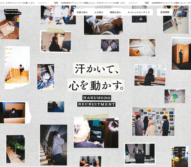
The opening requires a qualification: the supplied desktop frame shows the header above an almost empty gray field. The mobile frame shows a small central collage of overlapping photographic prints. These are the captured states; they do not establish the completed desktop opening or the collage's animation sequence.
How to Read This Reference
- Measured means a value appears in the supplied rendered element measurements or custom properties. Pixel equivalents calculated from viewport units are identified as calculations.
- Visual estimate means an approximate dimension or appearance read from a supplied screenshot. Such estimates are not recovered CSS declarations.
- Recommended adaptation means implementation guidance for a new project, including the Quick Start, accessibility changes, and an illustrative breakpoint.
- Source tokens retain their observed names. Additional aliases are descriptive names introduced by this document.
- Computed font family records the declared stack. The evidence does not include a font-file inventory or confirmation of the specific file used for every glyph.
- DOM presence is not visibility. The evidence includes offscreen navigation, repeated announcement content, and news items extending beyond the apparent collapsed region. Their existence does not prove that every item was visible simultaneously.
The five supplied images are original-page captures. No separate comparison thumbnail was supplied.
Tokens — Colors
Default Palette
| Name | Value | Source token | Role and evidence |
|---|---|---|---|
| Paper gray | #eeeeee |
--color-bg-body |
Measured body background on both viewports; also measured on the manifesto, work, and people sections |
| Charcoal ink | #231f20 |
--color-black, --color-border |
Measured body text and filled action backgrounds |
| White paper | #ffffff |
--color-white |
Measured recruitment-link fill and employee tags; visibly used for navigation blocks, photo mounts, heading strips, and footer |
| Secondary gray | #d6d6d6 |
--color-bg-gray |
Declared source color; a specific visible use is not established by the selected crops |
| Secondary dark | #1f1f1f |
--color-bg-black |
Declared source color; do not replace the measured #231f20 action fill with this automatically |
The paper texture changes local brightness across the gray canvas. #eeeeee is the measured base, not a claim that every visible background pixel has that value. Its texture asset, opacity, and compositing method were not supplied.
Opacity Palette
| Source token | Value | Observed or declared purpose |
|---|---|---|
--color-black07 |
rgba(35,31,32,.07) |
Measured announcement category fill and recruitment-category surfaces |
--color-black10 |
rgba(35,31,32,.1) |
Declared subtle ink tint; component assignment unconfirmed |
--color-black20 |
rgba(35,31,32,.2) |
Declared light rule color; consistent with the faint footer outlines |
--color-black40 |
rgba(35,31,32,.4) |
Measured dates, employee joining information, and work-client captions |
--color-black60 |
rgba(35,31,32,.6) |
Measured secondary links in the sampled sitemap/navigation markup |
--color-white50 |
rgba(255,255,255,.5) |
Declared translucent white; visible assignment unconfirmed |
Keep these as alpha colors when reproducing the measured system. A 40% ink caption composites differently on white and textured gray. It should not become one universal solid gray without checking its background.
There is no evidenced interface accent color. Orange wood, blue clothing, and skin tones belong to the photographs rather than to navigation or category tokens.
Tokens — Typography
Main Interface Family
- Measured stack:
"Shippori Antique", sans-serif. - Measured weight:
400across sampled body text, section headings, employee names, navigation links, and metadata. - Default leading:
1.5for body text. - Character: Japanese text has a distinctive printed quality, with expressive strokes in prominent labels. Preserve the measured family declaration before considering visual substitutes.
- Implementation alias:
--font-interface: "Shippori Antique", sans-serif.
The root HTML element reports Times at 16px, but the body overrides that family. The root value is not evidence that the main interface should use Times.
Identity Artwork
The header identity is a compact two-line mark: white serif-looking lettering on separate black strips reading “Hakuhodo” and “Recruitment.” The footer uses a different, bold black Hakuhodo wordmark inside a thin outlined rectangle.
No font names were supplied for either mark. Treat them as identity artwork and preserve their intrinsic proportions. Do not recreate them by selecting an assumed brand font.
Measured Type Scale
| Role | Desktop at 1440px | Mobile at 390px | Leading / tracking |
|---|---|---|---|
| Body and main navigation | 16.56px, source 1.15vw |
14.43px, source 3.7vw |
1.5; normal tracking |
| Main section label | 45.504px, source 3.16vw |
27.924px, source 7.16vw |
1.3; desktop -.05em, mobile normal |
| Section introduction | 20.736px, source 1.44vw |
16.38px, source 4.2vw |
1.8; normal tracking |
| Employee name | 20.736px |
16.38px |
1.5; normal tracking |
| Announcement, date, joining information | 12.384px, source .86vw |
11.544px, source 2.96vw |
Usually 1.5; news dates use 1.3 |
| Employee metadata tag | 12.384px |
11.544px |
2; tracking -.1em |
| Sampled secondary sitemap link | 12.384px |
11.544px |
2 in navigation groups |
Section labels receive horizontal padding of 7.2px on desktop and approximately 4.797px on mobile. Their measured line boxes are approximately 59.14px and 36.30px high respectively.
Two interpretation details matter:
- The source token
--fs-interview-person-namedoes not match the measured home-page employee headings. Use the actual heading measurements above for these cards. - The manifesto's enclosing H2 reports the body font size, but occupies a much larger box. Child artwork or styling was not included in the sampled evidence. Its visible headline size cannot be reconstructed from that parent measurement alone.
Tokens — Spacing & Shapes
Responsive Grid Unit
The source changes its grid denominator between the two inspected layouts:
/* Observed desktop formula; the captured scrollbar value was 0px. */
--g1: calc((100vw - 0px) / 29);

/* Observed mobile formula. */
--g1: calc((100vw - 0px) / 28);
For the calculations below, g means one source grid unit. At the inspected sizes, desktop g ≈ 49.655px; mobile g ≈ 13.929px.
Spacing and Widths
| Use | Desktop rule / measurement | Mobile rule / measurement |
|---|---|---|
| Main outer inset | 1g ≈ 49.66px |
2g ≈ 27.86px |
| Main inner width | 27g ≈ 1340.69px |
24g ≈ 334.29px |
| Introduction rail | Measured 446.89px, consistent with 9g |
Measured 334.28px, full inner width |
| Introduction-to-content gap | Approximately 1g ≈ 49.66px horizontally |
Introduction precedes content vertically |
| Content region | Measured 844.125px, consistent with 17g |
Measured 334.28px |
| Card columns | Three | Two |
| Card column gap | Approximately .5g ≈ 24.83px |
Approximately 1g ≈ 13.93px |
| Card width | Measured 264.8125px |
Measured 160.1719px |
| Mobile employee row gap | — | Measured approximately 55.70px, consistent with 4g |
| Employee tag gap | Approximately 5.17px |
Approximately 4.80px |
| Desktop news-row padding | Later sampled rows: 24.83px top, 49.66px bottom |
Later sampled rows: 27.86px top and bottom |
The desktop section geometry can be expressed as 9g + 1g + 17g, inside a 27g container. Within the content region, three cards and two half-unit gaps produce the observed card width.
The mobile card width follows (24g - 1g) / 2. This is a real two-column adaptation; the desktop cards are not simply scaled to fit three across.
Shared Vertical Tokens
| Source token | Desktop declaration / calculated value | Mobile declaration / calculated value |
|---|---|---|
--section-top-margin |
8.62vw / 124.13px |
8g / 111.43px |
--section-bottom-margin |
11.49vw / 165.46px |
39.51vw / 154.09px |
--header-height |
2g / 99.31px |
14.81vw / 57.76px |
--news-marquee-height |
2.87vw / 41.33px |
9.88vw / 38.53px |
These shared variables coexist with section-specific spacing. They should not be treated as the measured padding of every section. A separate fixed spacing family based on 30px also appears in the desktop custom properties, but the visible main layout is strongly tied to the viewport grid.
Shapes
| Element | Treatment | Evidence level |
|---|---|---|
| Header navigation and recruitment link | Square white rectangles | Screenshot and measured zero radius |
| Section label | Tight white strip behind dark text | Screenshot; sampled heading background itself is transparent |
| Employee card body | Transparent, square geometry | Measured |
| Photo mount | White surround with varying apparent edge depth | Visual estimate; frame CSS not supplied |
| Metadata tag | Compact white rectangle, zero radius | Measured |
| Main application action | Broad charcoal rectangle, zero radius | Measured and visible in desktop footer |
| Secondary application action | White rectangle with a thin dark outline | Desktop footer screenshot |
| Recruitment carousel arrow | Circular dark control, approximately 62.06px square |
Desktop DOM measurement; radius reported as 1440px |
| Footer corporate panel | Thin light outline, square corners | Screenshot |
Circles are an exception reserved for the sampled carousel arrows. Rounded cards, capsule tags, and a general shadow elevation system are not part of the visible interface.
Components
Announcement Strip
Role: expose a current recruitment announcement before the main navigation.
A narrow white strip spans the viewport. Each repeated unit contains a tinted category stamp, an announcement sentence, and a low-contrast date. The captured category is イベント; the sentence links to a specific event-page anchor.
The strip is measured at 41.3125px high on desktop and 38.5313px on mobile. Announcement text is 12.384px and 11.544px respectively. The category box is approximately 63.91 × 20.73px on desktop and 59.64 × 19.27px on mobile.
The DOM contains five repeated announcement units, including units outside the viewport. The narrow mobile crop clips the long sentence rather than wrapping it into a tall banner. This supports a marquee-style track, but its speed, direction, pause behavior, and implementation were not measured.
Persistent Header
Role: maintain identity, access to the content categories, recruitment information, and the menu control.
Desktop anatomy is a small identity mark at the far left, a white horizontal navigation slab toward the right, a separate white recruitment link, and a three-line menu icon. The primary labels are 仕事を知る, 人を知る, 環境を知る, and スペシャルコンテンツ.
| Part | Desktop measurement | Mobile measurement |
|---|---|---|
| Header box | 1440 × 99.30px, initially below the announcement |
390 × 57.75px, initially below the announcement |
| Identity link | 132.47 × 45.03px; x 28.94px |
90.52 × 30.77px; x 14.42px |
| Recruitment link | 116.92 × 49.64px |
82.80 × 33.69px |
| Menu button | 49.64 × 49.64px |
46.20 × 46.20px |
| Menu inner grid track | 23.75px |
16.95px |
On mobile, the four-category navigation slab disappears from the visible header, leaving the identity, 採用情報, and the menu button. The menu's touch box remains much larger than its visible strokes.
The header stays visible in the supplied scrolled captures after the announcement has left the viewport. A measured transform 0.3s transition supports a positional change, although its precise scroll trigger was not tested.
Navigation Hierarchy
Role: provide detailed routes without putting every page into the compact header.
The DOM includes secondary links under the primary categories and a larger sitemap-like navigation structure. Some sampled navigation elements sit beyond the right edge: around x 1513px on desktop and x 437px on mobile. These are not evidence of a visibly open menu or ordinary horizontal page content.
The hierarchy groups recruitment, news, work, people, environment, and special content. Smaller links use muted ink, while category headings carry greater scale and small directional marks. Preserve this hierarchy when implementing a menu, but do not infer its opening animation, focus behavior, or submenu trigger from the closed-state evidence.
Opening Viewport and Manifesto
Role: establish the employer's visual identity and narrative before the practical content index.
The first section measures exactly one captured viewport in height: 1000px on desktop and 844px on mobile. Its H1, “HAKUHODO RECRUITMENT,” occupies a measured 1 × 1px box rather than a visible display headline.
The mobile screenshot shows a central group of overlapping photo prints. Its envelope is visually estimated at approximately 174 × 190px, centered near (195px, 422px). A tall front print, with a torn-looking lower edge, shows a small figure against orange wooden stairs and a bright interior. Neighboring photographs appear as cropped slivers behind it. The surrounding paper occupies most of the screen.
The desktop opening capture shows an empty gray field below the header. Do not turn that observation into a claim that the intended desktop hero is permanently blank, or invent a full-screen image treatment to fill the gap.
The following manifesto section contains the actual source headline 汗かいて、心を動かす。 and three blocks of Japanese narrative copy. Its text region measures approximately 649.58px wide on desktop and 334.28px on mobile. The sampled section is approximately 3050.64px tall on desktop and 1510.09px on mobile, indicating substantial narrative space. The exact visible lettering and reveal sequence remain unverified.
Section Label and Introduction Rail
Role: introduce a content category while leaving the adjacent region available for browsing.
The desktop label begins at the main left inset, approximately x 49.66px. A white strip closely fits the label, followed by a generous gap and a paragraph set at 20.736px / 1.8. The rail's approximately 446.89px width produces short editorial lines.
In the employee screenshot, 人を知る and its introduction remain high on the left while later employee content appears on the right. This is consistent with a sticky introduction rail. The supplied measurements do not establish the actual positioning rule or pinning threshold; the Quick Start uses sticky positioning as a reconstruction recommendation.
On mobile, the label and paragraph span the 334.28px inner width above the cards. The heading reduces to 27.924px, and the introduction to 16.38px / 1.8.
Recruitment Opportunity and Action Stack
Role: connect the recruitment narrative to an available selection or internship route.
The sampled opportunity links to the business-design internship. Its content includes the opportunity title, employment/category labels, and an application period. The desktop link box measures approximately 415.86 × 355.92px with a white background. The mobile link measures 334.28 × 270.33px; its sampled parent background is transparent, so a white parent surface should not be assumed for that layout.
Desktop DOM evidence includes circular previous/next controls approximately 62.06px in diameter. Their operation, disabled states, and the number of carousel slides were not exercised.
Below the opportunity, a broad schedule action occupies the content width. Two additional actions share the next desktop row. Their heights are approximately 62.06px. On mobile, all three become full-width rows approximately 48.16px high, separated by about 13.92px.
Keep opportunity metadata subordinate to the title and application period. The strongest action treatment is a wide monochrome rectangle rather than a colored promotional badge.
News List
Role: present dated recruitment updates with concise categorization.
The measured desktop news region uses the same right-hand content width as the cards. Dates occupy a narrow left portion; titles and category stamps begin farther to the right. The date is 12.384px in 40% ink. The sampled rows have substantial vertical padding and approximately 1px separation between their boxes.
On mobile, each date, announcement, and category group shares one full-width stack. Dates become 11.544px; the content width is 334.28px.
A もっと見る button is present, measured at approximately 141.97 × 31.09px on desktop and 112.66 × 24.56px on mobile. Additional news nodes extend beyond the apparent initial list region. Do not use their bounding boxes to claim that all seven entries were visible, or that the button fetches data rather than revealing existing content. Its behavior was not tested.
Work Example Card
Role: link an advertising example to its case study and client.
Three work examples appear in the supplied text and geometry: 未来のレモンサワー, 社会課題に、アンサーを。, and カロリーメイト. Desktop links occupy three approximately 264.81px columns. Mobile uses two approximately 160.17px columns, with the third item continuing on the next row.
Each link groups the work presentation with a title and a muted client caption. Client captions use the body size with 1.8 leading and 40% ink. The supplied screenshots do not show these work images, so their subjects, exact crops, and graphic treatments are not established here.
Two broad links beneath the group lead to further examples and job information. Keep these browsing actions aligned to the content region.
Employee Profile Card
Role: make employee stories browsable through a photograph, a name, and compact career context.
The whole card is a link. Its parent has a transparent background and no corner radius. The visible anatomy is:
- An approximately square workplace photograph with a white print-like surround.
- An employee name in dark text.
- A low-contrast joining-year and tenure line.
- Separate white tags for occupation and career band.
The first measured desktop cards are 264.81px wide and approximately 382.86px tall. Names are 20.736px / 1.5; the joining line is 12.384px / 1.5. Tag text is 12.384px / 2, with -.1em tracking and 7.2px horizontal padding. The resulting tag box is approximately 26.92px high.
At 390px, cards are 160.17px wide. Names become 16.38px; tags use 11.544px text and approximately 6.747px horizontal padding. Long occupation tags push the career-band tag onto another line. Consequently, sampled mobile card heights vary between approximately 260.25px and 290.08px. Preserve wrapping and content-dependent height.
The white photo mounts appear slightly wider than the text alignment in the desktop screenshot, with some deeper lower edges. Their exact image and frame CSS was not supplied. A regular 4px white inset in the Quick Start is an approximation, not a measured frame specification.
Crosstalk Group and View-All Link
Role: distinguish conversations between employees from individual profiles.
The desktop screenshot shows a クロストーク subheading followed by another row of mounted photographs. A すべて見る link aligns to the right of the content region, paired with a small dark square containing a light chevron. That square is visually estimated at about 26px on desktop.
The DOM identifies three conversation entries and includes participant names and joining information. The view-all destination uses a tab=crosstalk query parameter. This establishes the destination, not a tab interaction on the inspected home page.
Use the same photographic and typographic family as employee cards, with room for longer conversation titles and several participant lines. Exact mobile crosstalk geometry was not included in the selected measurements.
Environment, Special Content, HR Message, and Q&A
Role: extend company research beyond individual employee stories.
Rendered text establishes four environment routes, three special-content features, a recruitment-team message, and six Q&A prompts. The special-content entries combine a category, a title, and explanatory copy. The Q&A preview includes workplace and career questions, followed by a route to the full FAQ.
These sections belong to the current page's information architecture, but their detailed visual arrangements are not established by the attached crops. Do not invent a bento grid, video player, accordion animation, or illustrated treatment for them. A repeated section label, introductory paragraph, and appropriately sized editorial links would be a recommendation for an extension, not a verified reconstruction.
Footer Sitemap and Corporate Identity
Role: provide a comprehensive route index and a calm closing surface.
The footer changes to clean white. The desktop crop shows a multi-column sitemap, a faint vertical divider, and a corporate identity panel on the right. Small secondary links are gray; category headings are larger and dark. External-window-style symbols appear beside selected utility links.
The right-hand corporate panel is visually estimated at approximately 397 × 124px on desktop. On mobile, the corresponding visible panel is approximately 334 × 114px, aligned with the 28px content inset. A centered black wordmark sits inside a thin, light border.
The mobile footer places special-content links above the corporate panel, then company and policy links beneath it. Large intervals of white space separate these groups and the centered copyright line. The screenshot does not support compressing the footer into a dense utility bar.
Application Matrix
Role: expose application entry points and supporting recruitment routes near the desktop page ending.
The desktop footer contains one full-width charcoal 2028年卒 PRE-ENTRY row, two half-width charcoal My Page rows, and two half-width white outlined rows for internship and alumni-visit routes. Labels are centered and visibly white on the dark actions.
The matrix spans approximately 1340px in the screenshot. The first row is about 83px high, subsequent rows about 62px, and gutters about 5px. The largest dark area belongs to the primary pre-entry route.
A similar application group exists in offscreen navigation markup at both viewports. The supplied mobile footer crop and footer text do not show the repeated footer matrix. Its mobile visibility and access through the menu were not exercised. A new implementation must provide a working route to these actions before omitting a repeated mobile group.
Tokens — Motion & Interaction
| Treatment | Evidence | What can be concluded |
|---|---|---|
| Header position change | Measured transition: transform 0.3s; header remains visible in scrolled crops |
A 300ms transform transition is declared; exact trigger and path were not tested |
| Announcement track | Repeated content, clipped viewport, and offscreen units | Marquee-style structure; duration, direction, and pause behavior unknown |
| Mobile opening collage | One frame of overlapping photographic prints | Layered composition is visible; rotation, sequencing, parallax, and rendering technology are unverified |
| General hover opacity | Source --hover-opacity: .7 |
A hover-related token exists; component selectors and actual hover response were not supplied |
| Current navigation opacity | Source --nav-current-opacity: .5 |
A state token exists; active-state application unverified |
| Recruitment carousel | Two circular desktop buttons in the DOM | Controls exist; slide behavior and mobile alternatives unverified |
| News expansion | もっと見る button and additional news nodes |
Expand/reveal affordance exists; resulting state unverified |
| Menu and subnavigation | Button, secondary links, offscreen navigation groups | Structure exists; opening, closing, keyboard, and focus behavior unverified |
| Q&A | Questions and related links in rendered text | Content exists; an accordion interaction is not established |
Many sampled elements report animation: none and a transition serialization of all without a positive duration. Neither proves that the whole page is static: child elements, pseudo-elements, assets, or script-driven motion may not be represented in that sample.
For a new implementation, retain the measured short header transition and establish separate motion requirements for the collage and ticker. Do not assign elaborate motion to every photograph based on a single still frame.
Surfaces
| Layer | Appearance | Purpose |
|---|---|---|
| Main canvas | Pale gray, with visible paper texture in supplied content/mobile crops | Gives the page a tactile editorial setting |
| Header navigation | White rectangular islands over the current page background | Keeps navigation legible over texture and photography |
| Section label | Closely fitted white strip | Separates the heading from the textured field |
| Photo mount | White surround around full-color photography | Suggests a placed photographic print |
| Card metadata | Transparent card body with individual white tags | Separates taxonomy without enclosing the whole card |
| Primary action | Solid charcoal, visibly light label | Strong application and onward-navigation emphasis |
| Secondary action | White fill, thin dark outline | Lower action priority within the same system |
| Footer | Plain white, fine rules, generous space | Quiet navigation and identity closure |
Avoid adding a universal elevated-card layer. The visible hierarchy comes from spacing, white mounts, ink contrast, and changes between textured gray and clean white.
Imagery
The employee photography feels specific to working life: a person using a tablet, a seated conversation against a brick wall, a phone call under a transparent umbrella, and office scenes framed by glass and wood. Subjects are often occupied or turned toward another person rather than uniformly facing the camera.
Keep photographs in natural color. Their orange timber, blue and black clothing, skin tones, and varied interiors supply contrast against the neutral interface. A blanket grayscale filter would remove an important source of warmth.
Employee images use approximately square crops with clear human subjects and enough surroundings to identify the setting. Crosstalk images extend the same vocabulary to groups. The mobile opening uses narrow overlapping prints and a torn-looking edge, giving familiar workplace photography a more assembled, physical presentation.
The texture should remain quieter than the photographs. Its visible character is fine, irregular gray grain rather than a repeating geometric pattern. The exact source texture cannot be specified from the evidence.
Observed Asset References
| Asset | Evidence | Availability limitation |
|---|---|---|
| Two-line recruitment identity | Desktop and mobile headers | No image URL, SVG markup, or font source supplied |
| Corporate Hakuhodo wordmark | Desktop and mobile footers | No asset path supplied |
| Employee photographs | Desktop employee crop | Subjects and framing visible; source image URLs absent |
| Crosstalk photographs | Lower part of desktop employee crop | Only upper portions of the next image row visible |
| Opening photo collage | Mobile opening crop | One composition frame; constituent asset paths absent |
| Gray paper texture | Desktop employee crop and mobile opening | File, repeat scale, opacity, and compositing method absent |
Use authorized identity and photography assets when available. No original asset filenames are inferred here. CSS can reproduce the layout and mounts; the actual images carry much of the site's character.
Layout & Responsive Behavior
| Relationship | Desktop, 1440 × 1000 | Mobile, 390 × 844 |
|---|---|---|
| Document height | Measured HTML height approximately 16032.36px |
Approximately 12870.03px |
| Opening section | 1000px high; gray field in supplied capture |
844px high; small central photo collage |
| Visible navigation | Identity, four categories, recruitment link, menu | Identity, recruitment link, menu |
| Main content inset | Approximately 49.66px |
Approximately 27.86px |
| Section structure | Left introduction rail plus right content region | Introduction above full-width content |
| Work/profile grids | Three columns | Two columns |
| Opportunity card | Approximately 415.86px wide in the content region |
Approximately 334.28px, full inner width |
| Recruitment action stack | Full-width row followed by paired actions | Three full-width rows |
| Employee tags | Often fit together on one line | Long occupation tags force an additional row |
| Footer corporate panel | Right-hand module in a multi-column sitemap | Full inner-width module below navigation groups |
The mobile layout changes composition as well as scale. The grid denominator changes, content margins become two units, the four-category header disappears, and the introductory rail becomes a block above the grid. Body type remains reasonably close to its desktop size instead of shrinking in direct proportion to screen width.
The employee section is approximately 2119px tall in the desktop measurement and 2362px on mobile, despite the shorter total mobile document. Local wrapping and column count matter more than a uniform page-height ratio.
The supplied data does not reveal the exact media-query breakpoint or intermediate tablet behavior. Any breakpoint used in a new implementation must be treated as a recommendation and checked between the two known viewports.
Several sampled news elements overlap later section coordinates, and some navigation elements are intentionally outside the viewport. Do not reconstruct the entire page by stacking every reported bounding box as normal-flow visible content. Use these measurements for component geometry together with the captured states.
Do’s and Don’ts
Do
- Preserve the gray-paper, white-label, charcoal-ink relationship.
- Keep employee photography in color and retain recognizable workplace settings.
- Build the desktop section around the measured
9g + 1g + 17grelationship. - Switch work and employee grids from three columns to two on mobile.
- Use the measured Shippori Antique stack and predominantly regular weight.
- Keep headings, photo mounts, and tags square and closely fitted to their content.
- Allow employee tags to wrap and cards to take content-dependent heights.
- Maintain a small identity mark and readily available recruitment access.
- Give broad charcoal actions clear hierarchy through width and placement.
- Preserve the clean white footer and its generous intervals.
- Document the opening's incomplete visual evidence separately from the well-supported content system.
Don’t
- Don’t treat the desktop opening's blank capture as a verified permanent hero design.
- Don’t invent a desktop collage sequence, WebGL implementation, or scroll animation.
- Don’t replace the asymmetric desktop structure with equal-width feature columns.
- Don’t turn the employee directory into rounded, shadowed cards.
- Don’t recolor occupation tags with unrelated category colors.
- Don’t force the two mobile metadata tags onto one line.
- Don’t stretch the mobile collage into a full-bleed photograph.
- Don’t use the root element's Times declaration as the main interface font.
- Don’t infer menu visibility or news expansion from DOM presence alone.
- Don’t copy alpha text colors onto new surfaces without checking readability.
Recommended Implementation Additions
These are recommendations for a new implementation, not verified features of the original:
- Give the icon-only menu button an accessible name, an expanded state, and a relationship to its controlled navigation.
- Keep closed offscreen navigation out of the keyboard and accessibility reading order; moving it beyond the viewport is insufficient by itself.
- Provide visible keyboard focus and sufficient touch targets for small view-all links and recruitment controls.
- Offer a static or paused announcement presentation and a reduced-motion version of any collage sequence.
- Make the opening usable when animation or image preparation fails. The primary navigation and following content should remain reachable.
- Apply sensible minimum font sizes at widths below the inspected phone size. Increase contrast for essential metadata where necessary.
- Reserve image dimensions and supply responsive image variants to protect the card grid from layout shifts.
- Use meaningful image alternatives when the photograph conveys information beyond the adjacent employee name; avoid duplicating nearby text unnecessarily.
- Implement opportunity navigation, news expansion, and any FAQ disclosure with semantic controls and explicit state.
- Keep recruitment years and application periods in content data so expired routes can be updated without changing component styling.
Agent Prompt Guide
Quick Color Reference
- Main background:
#eeeeee, with a subtle supplied paper texture. - Main text and filled actions:
#231f20. - Navigation blocks, label strips, photo mounts, tags, and footer:
#ffffff. - Source metadata: charcoal at 40% opacity; secondary navigation: charcoal at 60% opacity.
- Category tint: charcoal at 7% opacity.
- Color accents: supplied by photography rather than interface fills.
Overall Prompt
“Build a Japanese recruitment portal inspired by the observed HAKUHODO RECRUITMENT content system. Use pale gray paper #eeeeee, charcoal #231f20, white rectangular labels and photo mounts, and full-color workplace photography. Use the declared Shippori Antique sans-serif stack at regular weight. At 1440px, place an approximately 447px introduction rail beside an approximately 844px content region, separated by 50px, within 50px page margins. Use three approximately 265px employee cards. At 390px, use approximately 28px page margins, move the introduction above the content, and show two approximately 160px cards. Keep names dark, joining information muted, and occupation and tenure tags independently wrapped. Use compact persistent recruitment navigation and a spacious white footer. Treat the desktop opening and untested menu, carousel, and collage motion as unresolved requirements rather than inventing their behavior.”
Example Component Prompts
- Employee card: “Create a transparent employee-story link with an approximately square color photograph and a small white print mount. Below it, place a regular-weight Japanese name at 20.736px, a 12.384px muted joining line, and two separate white metadata tags. Use square corners and no elevation. On mobile, reduce the name to 16.38px and allow the occupation and tenure tags to occupy separate lines.”
- Section introduction: “Create a desktop editorial section with a left introduction rail and a denser right card grid. Place the source label
人を知るon a tightly fitted white strip at approximately 45.5px, with an approximately 447px paragraph below at 20.736px and 1.8 leading. On a 390px phone, move this introduction above the grid and use a 27.924px heading.” - Header: “Create a small two-line recruitment identity at left, a white slab of four Japanese category links toward the right, a separate white
採用情報link, and a three-line menu control. Keep all surfaces square. On mobile retain only the identity, recruitment link, and menu. Use a 300ms transform transition for a separately implemented scroll-position state.” - Application matrix: “Create a monochrome recruitment action group with one wide charcoal pre-entry link, two charcoal year-specific account links beneath it, and two outlined supporting links in the final row. Use centered labels, approximately 5px desktop gutters, an 83px first row, and 62px subsequent rows. Supply current years as data.”
- Mobile opening composition: “Using supplied workplace photography, compose a small cluster of overlapping prints around the center of a 390 × 844 gray-paper viewport. Aim for a combined envelope near 174 × 190px, with a tall front print and narrower image fragments behind it. Preserve extensive surrounding space. This brief describes a static composition; animation requires a separate specification.”
- Footer: “Create a clean white recruitment footer with grouped dark category headings, smaller gray links, fine separators, and a centered corporate wordmark inside a thin outlined rectangle. On desktop use three navigation areas; on mobile stack groups within approximately 28px margins and preserve large intervals before the corporate panel and copyright.”
Quick Start
CSS Custom Properties
This is a recommended starting implementation, not an extracted stylesheet. It preserves the measured colors and the main proportions at the two captured widths. The 48rem breakpoint, font clamps, sticky rail, 4px photo inset, focus styling, and minimum hit areas are implementation recommendations.
Load the actual font and authorized images separately. --paper-texture intentionally defaults to none because its source URL was not supplied. The header's data-scrolled attribute requires application logic. The CSS does not implement the menu, news disclosure, carousel, or opening animation.
Expected structure: an .editorial-section contains .intro-rail and .section-content; a .profile-grid contains linked .profile-card elements; each card contains .photo-mount, .profile-name, .profile-meta, and .profile-tags.
:root {
  /* Measured source colors. */
  --color-paper: #eeeeee;
  --color-ink: #231f20;
  --color-white: #ffffff;
  --color-gray: #d6d6d6;
  --color-ink-07: rgb(35 31 32 / 7%);
  --color-ink-20: rgb(35 31 32 / 20%);
  --color-ink-40: rgb(35 31 32 / 40%);
  --color-ink-60: rgb(35 31 32 / 60%);
  --paper-texture: none;

  /* Source family; font files must be supplied separately. */
  --font-interface: 'Shippori Antique', sans-serif;
  --weight-regular: 400;

  /* Desktop grid, matching the zero-scrollbar capture. */
  --scrollbar-width: 0px;
  --g: calc((100vw - var(--scrollbar-width)) / 29);
  --page-inset: var(--g);
  --card-gap: calc(.5 * var(--g));
  --card-row-gap: var(--g);
  --header-height: calc(2 * var(--g));
  --ticker-height: 2.87vw;
  --header-inset-left: 2.01vw;
  --header-inset-right: calc(.5 * var(--g));
  --header-gap: calc(.625 * var(--g));
  --brand-width: 9.2vw;
  --recruit-width: 8.12vw;
  --recruit-height: var(--g);
  --menu-size: var(--g);
  --menu-mark-width: 23.75px;

  /* Recommended clamps retain measured values at 1440px. */
  --text-body: clamp(14.43px, 1.15vw, 20px);
  --text-section: clamp(27.924px, 3.16vw, 56px);
  --text-lead: clamp(16.38px, 1.44vw, 24px);
  --text-small: clamp(11.544px, .86vw, 14px);
  --leading-body: 1.5;
  --leading-lead: 1.8;
  --heading-tracking: -.05em;
  --heading-inset: .5vw;

  --name-gap: 1.08vw;
  --meta-gap: .72vw;
  --tags-top-gap: 1.08vw;
  --tag-gap: .36vw;
  --tag-inset: .5vw;
  --tag-height: 1.87vw;
  --action-height: 4.31vw;
  --entry-height: 5.75vw;
  --action-gap: .36vw;
  --company-height: 8.62vw;
  --header-transition: transform 300ms;
}

* {
  box-sizing: border-box;
}

body {
  margin: 0;
  color: var(--color-ink);
  background-color: var(--color-paper);
  background-image: var(--paper-texture);
  font-family: var(--font-interface);
  font-size: var(--text-body);
  font-weight: var(--weight-regular);
  line-height: var(--leading-body);
}

button,
a {
  -webkit-tap-highlight-color: transparent;
}

button {
  font: inherit;
}

a {
  color: inherit;
}

img {
  display: block;
  max-width: 100%;
}

/* Static announcement presentation; source timing is unknown. */
.news-ticker {
  position: absolute;
  inset: 0 0 auto;
  z-index: 50;
  display: flex;
  align-items: center;
  height: var(--ticker-height);
  overflow: hidden;
  background: var(--color-white);
  font-size: var(--text-small);
  text-decoration: none;
}

.news-ticker__track,
.news-ticker__item {
  display: flex;
  align-items: center;
  gap: 1.3em;
  width: max-content;
  flex: none;
  white-space: nowrap;
}

.news-ticker__category {
  padding-inline: .7em;
  background: var(--color-ink-07);
}

.news-ticker time {
  color: var(--color-ink-40);
}

.recruit-header {
  position: fixed;
  inset: var(--ticker-height) 0 auto;
  z-index: 40;
  display: flex;
  align-items: center;
  gap: var(--header-gap);
  height: var(--header-height);
  padding-inline:
    var(--header-inset-left) var(--header-inset-right);
  transition: var(--header-transition);
}

.recruit-header[data-scrolled='true'] {
  transform: translateY(calc(-1 * var(--ticker-height)));
}

.recruit-brand {
  display: block;
  flex: none;
  width: var(--brand-width);
}

.recruit-brand img {
  width: 100%;
  height: auto;
}

.primary-nav {
  display: flex;
  align-items: center;
  gap: var(--g);
  margin-inline-start: auto;
  padding: calc(.25 * var(--g)) calc(.45 * var(--g));
  background: var(--color-white);
}

.primary-nav a {
  white-space: nowrap;
  text-decoration: none;
}

.header-recruit {
  display: grid;
  flex: none;
  place-items: center;
  width: var(--recruit-width);
  min-height: var(--recruit-height);
  background: var(--color-white);
  text-decoration: none;
}

.menu-toggle {
  display: grid;
  flex: none;
  place-items: center;
  width: max(44px, var(--menu-size));
  height: max(44px, var(--menu-size));
  margin-inline-start: var(--header-gap);
  padding: 0;
  border: 0;
  border-radius: 0;
  color: var(--color-ink);
  background: transparent;
  cursor: pointer;
}

.menu-toggle__mark {
  display: grid;
  gap: 4px;
  width: var(--menu-mark-width);
}

.menu-toggle__mark span {
  display: block;
  height: 2px;
  background: currentColor;
}

.opening {
  display: grid;
  place-items: center;
  min-height: 100svh;
}

/* Supply the collage artwork; desktop geometry is unresolved. */
.opening-collage {
  max-width: 100%;
  height: auto;
}

.editorial-section {
  display: grid;
  grid-template-columns: minmax(0, 9fr) minmax(0, 17fr);
  gap: var(--g);
  width: calc(100% - 2 * var(--page-inset));
  margin-inline: auto;
  padding-block: calc(3 * var(--g)) calc(2 * var(--g));
}

/* Recommended reconstruction of the persistent-looking rail. */
.intro-rail {
  position: sticky;
  top: calc(var(--header-height) + var(--g));
  align-self: start;
  min-width: 0;
}

.section-label {
  display: table;
  max-width: 100%;
  margin: 0;
  padding-inline: var(--heading-inset);
  background: var(--color-white);
  font-size: var(--text-section);
  font-weight: var(--weight-regular);
  line-height: 1.3;
  letter-spacing: var(--heading-tracking);
}

.section-intro {
  margin: var(--g) 0 0;
  font-size: var(--text-lead);
  line-height: var(--leading-lead);
}

.section-content {
  min-width: 0;
}

.profile-grid {
  display: grid;
  grid-template-columns: repeat(3, minmax(0, 1fr));
  align-items: start;
  gap: var(--card-row-gap) var(--card-gap);
}

.profile-card {
  display: block;
  min-width: 0;
  text-decoration: none;
}

/* Recommended regular mount; the source frame was not measured. */
.photo-mount {
  aspect-ratio: 1;
  margin: 0;
  padding: 4px;
  background: var(--color-white);
}

.photo-mount img {
  width: 100%;
  height: 100%;
  object-fit: cover;
}

.profile-name {
  margin: var(--name-gap) 0 0;
  font-size: var(--text-lead);
  font-weight: var(--weight-regular);
  line-height: 1.5;
}

.profile-meta {
  margin: var(--meta-gap) 0 0;
  color: var(--color-ink-40);
  font-size: var(--text-small);
  line-height: 1.5;
}

.profile-tags {
  display: flex;
  flex-wrap: wrap;
  align-items: start;
  gap: var(--tag-gap);
  margin-top: var(--tags-top-gap);
}

.profile-tag {
  display: grid;
  place-items: center;
  max-width: 100%;
  min-height: var(--tag-height);
  padding-inline: var(--tag-inset);
  background: var(--color-white);
  font-size: var(--text-small);
  line-height: 2;
  letter-spacing: -.1em;
  overflow-wrap: anywhere;
}

.group-heading {
  display: flex;
  align-items: center;
  justify-content: space-between;
  gap: 1rem;
  margin-bottom: var(--g);
}

.view-all {
  display: inline-flex;
  align-items: center;
  gap: .75em;
  min-height: 44px;
  text-decoration: none;
}

.view-all__arrow {
  display: grid;
  place-items: center;
  width: 1.8vw;
  height: 1.8vw;
  color: var(--color-white);
  background: var(--color-ink);
}

.news-row {
  display: grid;
  grid-template-columns: 5em minmax(0, 1fr);
  gap: calc(.5 * var(--g));
  padding-block: calc(.5 * var(--g)) var(--g);
  border-bottom: 1px solid var(--color-ink-20);
  text-decoration: none;
}

.news-row time {
  color: var(--color-ink-40);
  font-size: var(--text-small);
  line-height: 1.3;
}

.action-grid,
.entry-matrix {
  display: grid;
  grid-template-columns: repeat(2, minmax(0, 1fr));
  gap: var(--action-gap);
}

.action {
  display: grid;
  place-items: center;
  min-height: max(44px, var(--action-height));
  padding: .7em 1em;
  border: 1px solid var(--color-ink);
  border-radius: 0;
  color: var(--color-white);
  background: var(--color-ink);
  text-align: center;
  text-decoration: none;
}

.action--wide {
  grid-column: 1 / -1;
}

.action--entry {
  min-height: max(44px, var(--entry-height));
}

.action--outline {
  color: var(--color-ink);
  background: var(--color-white);
}

.recruit-footer {
  padding: calc(2 * var(--g)) var(--page-inset);
  background: var(--color-white);
}

.footer-grid {
  display: grid;
  grid-template-columns: 9fr 8fr 8fr;
  gap: var(--g);
}

.footer-grid > :first-child {
  padding-right: var(--g);
  border-right: 1px solid var(--color-ink-20);
}

.company-panel {
  display: grid;
  place-items: center;
  min-height: var(--company-height);
  border: 1px solid var(--color-ink-20);
}

.company-panel img {
  width: 38%;
  height: auto;
}

.footer-links {
  display: grid;
  gap: .6em;
  margin-top: 1.5em;
  color: var(--color-ink-60);
  font-size: var(--text-small);
}

.footer-links a {
  text-decoration: none;
}

.entry-matrix {
  margin-top: calc(2 * var(--g));
}

.copyright {
  margin: calc(2 * var(--g)) 0 0;
  color: var(--color-ink-60);
  font-size: var(--text-small);
  text-align: center;
}

/* Optional stronger metadata for contexts requiring more contrast. */
.profile-meta--readable {
  color: var(--color-ink-60);
}

/* Recommended breakpoint; the original threshold was not supplied. */
@media (max-width: 48rem) {
  :root {
    --g: calc((100vw - var(--scrollbar-width)) / 28);
    --page-inset: calc(2 * var(--g));
    --card-gap: var(--g);
    --card-row-gap: calc(4 * var(--g));
    --header-height: 14.81vw;
    --ticker-height: 9.88vw;
    --header-inset-left: 3.7vw;
    --header-inset-right: 2.22vw;
    --header-gap: 1.73vw;
    --brand-width: 23.21vw;
    --recruit-width: 21.23vw;
    --recruit-height: 8.64vw;
    --menu-size: 11.85vw;
    --menu-mark-width: 4.35vw;
    --text-body: clamp(14.43px, 3.7vw, 18px);
    --text-section: clamp(27.924px, 7.16vw, 40px);
    --text-lead: clamp(16.38px, 4.2vw, 22px);
    --text-small: clamp(11.544px, 2.96vw, 14px);
    --heading-tracking: normal;
    --heading-inset: 1.23vw;
    --name-gap: 2.47vw;
    --meta-gap: 2.47vw;
    --tags-top-gap: var(--g);
    --tag-gap: 1.23vw;
    --tag-inset: 1.73vw;
    --tag-height: 6.42vw;
    --action-height: 12.35vw;
    --entry-height: 14.81vw;
    --action-gap: 1.23vw;
    --company-height: 29.14vw;
  }

  .primary-nav {
    display: none;
  }

  .header-recruit {
    margin-inline-start: auto;
  }

  .menu-toggle {
    margin-inline-start: 0;
  }

  .opening-collage {
    width: 44.6vw;
  }

  .editorial-section {
    grid-template-columns: minmax(0, 1fr);
    gap: calc(3 * var(--g));
    padding-block: calc(6 * var(--g));
  }

  .intro-rail {
    position: static;
  }

  .section-intro {
    margin-top: calc(2 * var(--g));
  }

  .profile-grid {
    grid-template-columns: repeat(2, minmax(0, 1fr));
  }

  .view-all__arrow {
    width: 5.4vw;
    height: 5.4vw;
  }

  .news-row {
    grid-template-columns: minmax(0, 1fr);
    gap: var(--g);
    padding-block: calc(2 * var(--g));
  }

  .action-grid {
    grid-template-columns: minmax(0, 1fr);
    gap: var(--g);
  }

  .footer-grid {
    grid-template-columns: minmax(0, 1fr);
    gap: calc(4 * var(--g));
  }

  .footer-grid > :first-child {
    padding-right: 0;
    border-right: 0;
  }

  .copyright {
    margin-top: calc(8 * var(--g));
  }
}

/* Recommended feedback using the observed opacity token value. */
@media (hover: hover) {
  .profile-card:hover,
  .view-all:hover {
    opacity: .7;
  }
}

:where(a, button):focus-visible {
  outline: 2px solid var(--color-ink);
  outline-offset: 4px;
}

@media (prefers-reduced-motion: reduce) {
  .recruit-header {
    transition: none;
  }
}
The entry matrix can be placed in a footer or working navigation panel. This starter does not hide it on mobile because menu behavior is not implemented here; that is an implementation choice rather than a claim about the captured mobile footer. Additional contrast, zoom, intermediate-width, and keyboard checks should accompany integration.
Tailwind v4 Token Mapping
Optional aliases for a project already using Tailwind v4. Define the properties above first. This mapping does not imply that the original site uses Tailwind.
@theme inline {
  --color-paper: #eeeeee;
  --color-ink: #231f20;
  --color-mount: #ffffff;
  --color-muted: rgb(35 31 32 / 40%);
  --color-secondary: rgb(35 31 32 / 60%);
  --font-interface: 'Shippori Antique', sans-serif;
  --text-editorial-body: var(--text-body);
  --text-editorial-section: var(--text-section);
  --text-editorial-lead: var(--text-lead);
  --text-editorial-small: var(--text-small);
  --spacing-grid-unit: var(--g);
  --spacing-page: var(--page-inset);
  --spacing-card-gap: var(--card-gap);
}
Sources & Evidence
- Inspected original and final page: HAKUHODO RECRUITMENT. Both supplied URLs are identical, and the recorded response was HTTP 200.
- Capture record: September 12, 2026, 07:34:56.426 UTC / 16:34:56.426 JST. Desktop viewport: 1440 × 1000; mobile viewport: 390 × 844 CSS pixels.
- Visual evidence: three desktop captures covering the opening, employee/crosstalk content, and footer; two mobile captures covering the opening and footer.
- Rendered evidence: page text, link destinations, custom properties, and selected computed styles and bounding boxes at both viewport sizes. The element samples contain offscreen navigation and do not provide exhaustive child or pseudo-element styles.
- Readiness procedure: the supplied browser record describes at least five seconds of initial observation, bounded waiting for document and visible-image readiness, and checks for finite motion and layout stability. Perpetual animations were paused during readiness checks and then resumed. These procedures do not establish semantic completeness or a complete opening sequence.
- Interaction coverage: scrolling and resulting captures are documented. Menu opening, hover states, carousel navigation, news expansion, FAQ disclosure, and application flows were not exercised in the supplied evidence.
- Inspection limitations: the desktop opening remains visually incomplete or indeterminate; asset URLs, exact texture construction, font files, original breakpoints, and most animation parameters were not supplied. SharedWorkers and service workers were disabled during the browser inspection. No additional browsing or local-file inspection was performed for this reference.
This document describes the supplied current-page evidence. Calculated values, screenshot estimates, and recommended implementation behavior are labeled separately. The CSS is a reusable starting point and was not executed in a browser during this analysis.
# HAKUHODO RECRUITMENT — Style Reference

> An editorial recruitment portal assembled from gray paper, white labels, and candid workplace photographs.

**Website:** [hakusuku.jp/recruit](https://hakusuku.jp/recruit/)
**Original URL:** https://hakusuku.jp/recruit/
**Final URL:** https://hakusuku.jp/recruit/
**Response:** HTTP 200; no redirect recorded.
**Theme:** light, with a neutral interface and full-color photography; no theme selector was evidenced.
**Inspected:** September 12, 2026, at 07:34:56.426 UTC / 16:34:56.426 JST, using the supplied browser observations.
**Viewports:** desktop 1440 × 1000 CSS pixels; mobile 390 × 844 CSS pixels.
**Scope:** the current recruitment home page. Visual evidence covers the desktop opening, employee section, and footer, plus the mobile opening and footer. Rendered text, links, custom properties, and selected element measurements additionally document the manifesto, recruitment opportunities, news, work examples, and employee cards. Lower sections have text/link evidence with less visual coverage. Linked pages and application destinations were not inspected.

The page combines employer storytelling, an editorial content index, and application access. A pale gray canvas develops a visible paper texture in the employee section and mobile opening. White rectangles sit behind navigation, section labels, photo edges, and small metadata tags. Dark charcoal provides text and strong application buttons. Color comes primarily from people, clothing, office materials, and daylight in the photography.

Its defining desktop relationship is an expansive introduction rail beside a denser content grid. At 1440px, section copy occupies roughly 447px on the left, while cards occupy an approximately 844px region on the right. On mobile, the introduction moves above a two-column card grid. The small identity mark and persistent recruitment access give this long page a recognizable frame without enclosing every content item in a card surface.

The opening requires a qualification: the supplied desktop frame shows the header above an almost empty gray field. The mobile frame shows a small central collage of overlapping photographic prints. These are the captured states; they do not establish the completed desktop opening or the collage's animation sequence.

## How to Read This Reference

- **Measured** means a value appears in the supplied rendered element measurements or custom properties. Pixel equivalents calculated from viewport units are identified as calculations.
- **Visual estimate** means an approximate dimension or appearance read from a supplied screenshot. Such estimates are not recovered CSS declarations.
- **Recommended adaptation** means implementation guidance for a new project, including the Quick Start, accessibility changes, and an illustrative breakpoint.
- **Source tokens** retain their observed names. Additional aliases are descriptive names introduced by this document.
- **Computed font family** records the declared stack. The evidence does not include a font-file inventory or confirmation of the specific file used for every glyph.
- **DOM presence is not visibility.** The evidence includes offscreen navigation, repeated announcement content, and news items extending beyond the apparent collapsed region. Their existence does not prove that every item was visible simultaneously.

The five supplied images are original-page captures. No separate comparison thumbnail was supplied.

## Tokens — Colors

### Default Palette

| Name | Value | Source token | Role and evidence |
| --- | --- | --- | --- |
| Paper gray | `#eeeeee` | `--color-bg-body` | Measured body background on both viewports; also measured on the manifesto, work, and people sections |
| Charcoal ink | `#231f20` | `--color-black`, `--color-border` | Measured body text and filled action backgrounds |
| White paper | `#ffffff` | `--color-white` | Measured recruitment-link fill and employee tags; visibly used for navigation blocks, photo mounts, heading strips, and footer |
| Secondary gray | `#d6d6d6` | `--color-bg-gray` | Declared source color; a specific visible use is not established by the selected crops |
| Secondary dark | `#1f1f1f` | `--color-bg-black` | Declared source color; do not replace the measured `#231f20` action fill with this automatically |

The paper texture changes local brightness across the gray canvas. `#eeeeee` is the measured base, not a claim that every visible background pixel has that value. Its texture asset, opacity, and compositing method were not supplied.

### Opacity Palette

| Source token | Value | Observed or declared purpose |
| --- | --- | --- |
| `--color-black07` | `rgba(35,31,32,.07)` | Measured announcement category fill and recruitment-category surfaces |
| `--color-black10` | `rgba(35,31,32,.1)` | Declared subtle ink tint; component assignment unconfirmed |
| `--color-black20` | `rgba(35,31,32,.2)` | Declared light rule color; consistent with the faint footer outlines |
| `--color-black40` | `rgba(35,31,32,.4)` | Measured dates, employee joining information, and work-client captions |
| `--color-black60` | `rgba(35,31,32,.6)` | Measured secondary links in the sampled sitemap/navigation markup |
| `--color-white50` | `rgba(255,255,255,.5)` | Declared translucent white; visible assignment unconfirmed |

Keep these as alpha colors when reproducing the measured system. A 40% ink caption composites differently on white and textured gray. It should not become one universal solid gray without checking its background.

There is no evidenced interface accent color. Orange wood, blue clothing, and skin tones belong to the photographs rather than to navigation or category tokens.

## Tokens — Typography

### Main Interface Family

- **Measured stack:** `"Shippori Antique", sans-serif`.
- **Measured weight:** `400` across sampled body text, section headings, employee names, navigation links, and metadata.
- **Default leading:** `1.5` for body text.
- **Character:** Japanese text has a distinctive printed quality, with expressive strokes in prominent labels. Preserve the measured family declaration before considering visual substitutes.
- **Implementation alias:** `--font-interface: "Shippori Antique", sans-serif`.

The root HTML element reports `Times` at 16px, but the body overrides that family. The root value is not evidence that the main interface should use Times.

### Identity Artwork

The header identity is a compact two-line mark: white serif-looking lettering on separate black strips reading “Hakuhodo” and “Recruitment.” The footer uses a different, bold black Hakuhodo wordmark inside a thin outlined rectangle.

No font names were supplied for either mark. Treat them as identity artwork and preserve their intrinsic proportions. Do not recreate them by selecting an assumed brand font.

### Measured Type Scale

| Role | Desktop at 1440px | Mobile at 390px | Leading / tracking |
| --- | --- | --- | --- |
| Body and main navigation | `16.56px`, source `1.15vw` | `14.43px`, source `3.7vw` | `1.5`; normal tracking |
| Main section label | `45.504px`, source `3.16vw` | `27.924px`, source `7.16vw` | `1.3`; desktop `-.05em`, mobile normal |
| Section introduction | `20.736px`, source `1.44vw` | `16.38px`, source `4.2vw` | `1.8`; normal tracking |
| Employee name | `20.736px` | `16.38px` | `1.5`; normal tracking |
| Announcement, date, joining information | `12.384px`, source `.86vw` | `11.544px`, source `2.96vw` | Usually `1.5`; news dates use `1.3` |
| Employee metadata tag | `12.384px` | `11.544px` | `2`; tracking `-.1em` |
| Sampled secondary sitemap link | `12.384px` | `11.544px` | `2` in navigation groups |

Section labels receive horizontal padding of `7.2px` on desktop and approximately `4.797px` on mobile. Their measured line boxes are approximately `59.14px` and `36.30px` high respectively.

Two interpretation details matter:

- The source token `--fs-interview-person-name` does not match the measured home-page employee headings. Use the actual heading measurements above for these cards.
- The manifesto's enclosing H2 reports the body font size, but occupies a much larger box. Child artwork or styling was not included in the sampled evidence. Its visible headline size cannot be reconstructed from that parent measurement alone.

## Tokens — Spacing & Shapes

### Responsive Grid Unit

The source changes its grid denominator between the two inspected layouts:

```css
/* Observed desktop formula; the captured scrollbar value was 0px. */
--g1: calc((100vw - 0px) / 29);

/* Observed mobile formula. */
--g1: calc((100vw - 0px) / 28);
```

For the calculations below, **g** means one source grid unit. At the inspected sizes, desktop `g ≈ 49.655px`; mobile `g ≈ 13.929px`.

### Spacing and Widths

| Use | Desktop rule / measurement | Mobile rule / measurement |
| --- | --- | --- |
| Main outer inset | `1g ≈ 49.66px` | `2g ≈ 27.86px` |
| Main inner width | `27g ≈ 1340.69px` | `24g ≈ 334.29px` |
| Introduction rail | Measured `446.89px`, consistent with `9g` | Measured `334.28px`, full inner width |
| Introduction-to-content gap | Approximately `1g ≈ 49.66px` horizontally | Introduction precedes content vertically |
| Content region | Measured `844.125px`, consistent with `17g` | Measured `334.28px` |
| Card columns | Three | Two |
| Card column gap | Approximately `.5g ≈ 24.83px` | Approximately `1g ≈ 13.93px` |
| Card width | Measured `264.8125px` | Measured `160.1719px` |
| Mobile employee row gap | — | Measured approximately `55.70px`, consistent with `4g` |
| Employee tag gap | Approximately `5.17px` | Approximately `4.80px` |
| Desktop news-row padding | Later sampled rows: `24.83px` top, `49.66px` bottom | Later sampled rows: `27.86px` top and bottom |

The desktop section geometry can be expressed as `9g + 1g + 17g`, inside a `27g` container. Within the content region, three cards and two half-unit gaps produce the observed card width.

The mobile card width follows `(24g - 1g) / 2`. This is a real two-column adaptation; the desktop cards are not simply scaled to fit three across.

### Shared Vertical Tokens

| Source token | Desktop declaration / calculated value | Mobile declaration / calculated value |
| --- | --- | --- |
| `--section-top-margin` | `8.62vw` / `124.13px` | `8g` / `111.43px` |
| `--section-bottom-margin` | `11.49vw` / `165.46px` | `39.51vw` / `154.09px` |
| `--header-height` | `2g` / `99.31px` | `14.81vw` / `57.76px` |
| `--news-marquee-height` | `2.87vw` / `41.33px` | `9.88vw` / `38.53px` |

These shared variables coexist with section-specific spacing. They should not be treated as the measured padding of every section. A separate fixed spacing family based on 30px also appears in the desktop custom properties, but the visible main layout is strongly tied to the viewport grid.

### Shapes

| Element | Treatment | Evidence level |
| --- | --- | --- |
| Header navigation and recruitment link | Square white rectangles | Screenshot and measured zero radius |
| Section label | Tight white strip behind dark text | Screenshot; sampled heading background itself is transparent |
| Employee card body | Transparent, square geometry | Measured |
| Photo mount | White surround with varying apparent edge depth | Visual estimate; frame CSS not supplied |
| Metadata tag | Compact white rectangle, zero radius | Measured |
| Main application action | Broad charcoal rectangle, zero radius | Measured and visible in desktop footer |
| Secondary application action | White rectangle with a thin dark outline | Desktop footer screenshot |
| Recruitment carousel arrow | Circular dark control, approximately `62.06px` square | Desktop DOM measurement; radius reported as `1440px` |
| Footer corporate panel | Thin light outline, square corners | Screenshot |

Circles are an exception reserved for the sampled carousel arrows. Rounded cards, capsule tags, and a general shadow elevation system are not part of the visible interface.

## Components

### Announcement Strip

**Role:** expose a current recruitment announcement before the main navigation.

A narrow white strip spans the viewport. Each repeated unit contains a tinted category stamp, an announcement sentence, and a low-contrast date. The captured category is `イベント`; the sentence links to a specific event-page anchor.

The strip is measured at `41.3125px` high on desktop and `38.5313px` on mobile. Announcement text is `12.384px` and `11.544px` respectively. The category box is approximately `63.91 × 20.73px` on desktop and `59.64 × 19.27px` on mobile.

The DOM contains five repeated announcement units, including units outside the viewport. The narrow mobile crop clips the long sentence rather than wrapping it into a tall banner. This supports a marquee-style track, but its speed, direction, pause behavior, and implementation were not measured.

### Persistent Header

**Role:** maintain identity, access to the content categories, recruitment information, and the menu control.

Desktop anatomy is a small identity mark at the far left, a white horizontal navigation slab toward the right, a separate white recruitment link, and a three-line menu icon. The primary labels are `仕事を知る`, `人を知る`, `環境を知る`, and `スペシャルコンテンツ`.

| Part | Desktop measurement | Mobile measurement |
| --- | --- | --- |
| Header box | `1440 × 99.30px`, initially below the announcement | `390 × 57.75px`, initially below the announcement |
| Identity link | `132.47 × 45.03px`; x `28.94px` | `90.52 × 30.77px`; x `14.42px` |
| Recruitment link | `116.92 × 49.64px` | `82.80 × 33.69px` |
| Menu button | `49.64 × 49.64px` | `46.20 × 46.20px` |
| Menu inner grid track | `23.75px` | `16.95px` |

On mobile, the four-category navigation slab disappears from the visible header, leaving the identity, `採用情報`, and the menu button. The menu's touch box remains much larger than its visible strokes.

The header stays visible in the supplied scrolled captures after the announcement has left the viewport. A measured `transform 0.3s` transition supports a positional change, although its precise scroll trigger was not tested.

### Navigation Hierarchy

**Role:** provide detailed routes without putting every page into the compact header.

The DOM includes secondary links under the primary categories and a larger sitemap-like navigation structure. Some sampled navigation elements sit beyond the right edge: around x `1513px` on desktop and x `437px` on mobile. These are not evidence of a visibly open menu or ordinary horizontal page content.

The hierarchy groups recruitment, news, work, people, environment, and special content. Smaller links use muted ink, while category headings carry greater scale and small directional marks. Preserve this hierarchy when implementing a menu, but do not infer its opening animation, focus behavior, or submenu trigger from the closed-state evidence.

### Opening Viewport and Manifesto

**Role:** establish the employer's visual identity and narrative before the practical content index.

The first section measures exactly one captured viewport in height: `1000px` on desktop and `844px` on mobile. Its H1, “HAKUHODO RECRUITMENT,” occupies a measured `1 × 1px` box rather than a visible display headline.

The mobile screenshot shows a central group of overlapping photo prints. Its envelope is visually estimated at approximately `174 × 190px`, centered near `(195px, 422px)`. A tall front print, with a torn-looking lower edge, shows a small figure against orange wooden stairs and a bright interior. Neighboring photographs appear as cropped slivers behind it. The surrounding paper occupies most of the screen.

The desktop opening capture shows an empty gray field below the header. Do not turn that observation into a claim that the intended desktop hero is permanently blank, or invent a full-screen image treatment to fill the gap.

The following manifesto section contains the actual source headline `汗かいて、心を動かす。` and three blocks of Japanese narrative copy. Its text region measures approximately `649.58px` wide on desktop and `334.28px` on mobile. The sampled section is approximately `3050.64px` tall on desktop and `1510.09px` on mobile, indicating substantial narrative space. The exact visible lettering and reveal sequence remain unverified.

### Section Label and Introduction Rail

**Role:** introduce a content category while leaving the adjacent region available for browsing.

The desktop label begins at the main left inset, approximately x `49.66px`. A white strip closely fits the label, followed by a generous gap and a paragraph set at `20.736px / 1.8`. The rail's approximately `446.89px` width produces short editorial lines.

In the employee screenshot, `人を知る` and its introduction remain high on the left while later employee content appears on the right. This is consistent with a sticky introduction rail. The supplied measurements do not establish the actual positioning rule or pinning threshold; the Quick Start uses sticky positioning as a reconstruction recommendation.

On mobile, the label and paragraph span the `334.28px` inner width above the cards. The heading reduces to `27.924px`, and the introduction to `16.38px / 1.8`.

### Recruitment Opportunity and Action Stack

**Role:** connect the recruitment narrative to an available selection or internship route.

The sampled opportunity links to the business-design internship. Its content includes the opportunity title, employment/category labels, and an application period. The desktop link box measures approximately `415.86 × 355.92px` with a white background. The mobile link measures `334.28 × 270.33px`; its sampled parent background is transparent, so a white parent surface should not be assumed for that layout.

Desktop DOM evidence includes circular previous/next controls approximately `62.06px` in diameter. Their operation, disabled states, and the number of carousel slides were not exercised.

Below the opportunity, a broad schedule action occupies the content width. Two additional actions share the next desktop row. Their heights are approximately `62.06px`. On mobile, all three become full-width rows approximately `48.16px` high, separated by about `13.92px`.

Keep opportunity metadata subordinate to the title and application period. The strongest action treatment is a wide monochrome rectangle rather than a colored promotional badge.

### News List

**Role:** present dated recruitment updates with concise categorization.

The measured desktop news region uses the same right-hand content width as the cards. Dates occupy a narrow left portion; titles and category stamps begin farther to the right. The date is `12.384px` in 40% ink. The sampled rows have substantial vertical padding and approximately 1px separation between their boxes.

On mobile, each date, announcement, and category group shares one full-width stack. Dates become `11.544px`; the content width is `334.28px`.

A `もっと見る` button is present, measured at approximately `141.97 × 31.09px` on desktop and `112.66 × 24.56px` on mobile. Additional news nodes extend beyond the apparent initial list region. Do not use their bounding boxes to claim that all seven entries were visible, or that the button fetches data rather than revealing existing content. Its behavior was not tested.

### Work Example Card

**Role:** link an advertising example to its case study and client.

Three work examples appear in the supplied text and geometry: `未来のレモンサワー`, `社会課題に、アンサーを。`, and `カロリーメイト`. Desktop links occupy three approximately `264.81px` columns. Mobile uses two approximately `160.17px` columns, with the third item continuing on the next row.

Each link groups the work presentation with a title and a muted client caption. Client captions use the body size with `1.8` leading and 40% ink. The supplied screenshots do not show these work images, so their subjects, exact crops, and graphic treatments are not established here.

Two broad links beneath the group lead to further examples and job information. Keep these browsing actions aligned to the content region.

### Employee Profile Card

**Role:** make employee stories browsable through a photograph, a name, and compact career context.

The whole card is a link. Its parent has a transparent background and no corner radius. The visible anatomy is:

1. An approximately square workplace photograph with a white print-like surround.
2. An employee name in dark text.
3. A low-contrast joining-year and tenure line.
4. Separate white tags for occupation and career band.

The first measured desktop cards are `264.81px` wide and approximately `382.86px` tall. Names are `20.736px / 1.5`; the joining line is `12.384px / 1.5`. Tag text is `12.384px / 2`, with `-.1em` tracking and `7.2px` horizontal padding. The resulting tag box is approximately `26.92px` high.

At 390px, cards are `160.17px` wide. Names become `16.38px`; tags use `11.544px` text and approximately `6.747px` horizontal padding. Long occupation tags push the career-band tag onto another line. Consequently, sampled mobile card heights vary between approximately `260.25px` and `290.08px`. Preserve wrapping and content-dependent height.

The white photo mounts appear slightly wider than the text alignment in the desktop screenshot, with some deeper lower edges. Their exact image and frame CSS was not supplied. A regular 4px white inset in the Quick Start is an approximation, not a measured frame specification.

### Crosstalk Group and View-All Link

**Role:** distinguish conversations between employees from individual profiles.

The desktop screenshot shows a `クロストーク` subheading followed by another row of mounted photographs. A `すべて見る` link aligns to the right of the content region, paired with a small dark square containing a light chevron. That square is visually estimated at about `26px` on desktop.

The DOM identifies three conversation entries and includes participant names and joining information. The view-all destination uses a `tab=crosstalk` query parameter. This establishes the destination, not a tab interaction on the inspected home page.

Use the same photographic and typographic family as employee cards, with room for longer conversation titles and several participant lines. Exact mobile crosstalk geometry was not included in the selected measurements.

### Environment, Special Content, HR Message, and Q&A

**Role:** extend company research beyond individual employee stories.

Rendered text establishes four environment routes, three special-content features, a recruitment-team message, and six Q&A prompts. The special-content entries combine a category, a title, and explanatory copy. The Q&A preview includes workplace and career questions, followed by a route to the full FAQ.

These sections belong to the current page's information architecture, but their detailed visual arrangements are not established by the attached crops. Do not invent a bento grid, video player, accordion animation, or illustrated treatment for them. A repeated section label, introductory paragraph, and appropriately sized editorial links would be a recommendation for an extension, not a verified reconstruction.

### Footer Sitemap and Corporate Identity

**Role:** provide a comprehensive route index and a calm closing surface.

The footer changes to clean white. The desktop crop shows a multi-column sitemap, a faint vertical divider, and a corporate identity panel on the right. Small secondary links are gray; category headings are larger and dark. External-window-style symbols appear beside selected utility links.

The right-hand corporate panel is visually estimated at approximately `397 × 124px` on desktop. On mobile, the corresponding visible panel is approximately `334 × 114px`, aligned with the `28px` content inset. A centered black wordmark sits inside a thin, light border.

The mobile footer places special-content links above the corporate panel, then company and policy links beneath it. Large intervals of white space separate these groups and the centered copyright line. The screenshot does not support compressing the footer into a dense utility bar.

### Application Matrix

**Role:** expose application entry points and supporting recruitment routes near the desktop page ending.

The desktop footer contains one full-width charcoal `2028年卒 PRE-ENTRY` row, two half-width charcoal My Page rows, and two half-width white outlined rows for internship and alumni-visit routes. Labels are centered and visibly white on the dark actions.

The matrix spans approximately `1340px` in the screenshot. The first row is about `83px` high, subsequent rows about `62px`, and gutters about `5px`. The largest dark area belongs to the primary pre-entry route.

A similar application group exists in offscreen navigation markup at both viewports. The supplied mobile footer crop and footer text do not show the repeated footer matrix. Its mobile visibility and access through the menu were not exercised. A new implementation must provide a working route to these actions before omitting a repeated mobile group.

## Tokens — Motion & Interaction

| Treatment | Evidence | What can be concluded |
| --- | --- | --- |
| Header position change | Measured `transition: transform 0.3s`; header remains visible in scrolled crops | A 300ms transform transition is declared; exact trigger and path were not tested |
| Announcement track | Repeated content, clipped viewport, and offscreen units | Marquee-style structure; duration, direction, and pause behavior unknown |
| Mobile opening collage | One frame of overlapping photographic prints | Layered composition is visible; rotation, sequencing, parallax, and rendering technology are unverified |
| General hover opacity | Source `--hover-opacity: .7` | A hover-related token exists; component selectors and actual hover response were not supplied |
| Current navigation opacity | Source `--nav-current-opacity: .5` | A state token exists; active-state application unverified |
| Recruitment carousel | Two circular desktop buttons in the DOM | Controls exist; slide behavior and mobile alternatives unverified |
| News expansion | `もっと見る` button and additional news nodes | Expand/reveal affordance exists; resulting state unverified |
| Menu and subnavigation | Button, secondary links, offscreen navigation groups | Structure exists; opening, closing, keyboard, and focus behavior unverified |
| Q&A | Questions and related links in rendered text | Content exists; an accordion interaction is not established |

Many sampled elements report `animation: none` and a transition serialization of `all` without a positive duration. Neither proves that the whole page is static: child elements, pseudo-elements, assets, or script-driven motion may not be represented in that sample.

For a new implementation, retain the measured short header transition and establish separate motion requirements for the collage and ticker. Do not assign elaborate motion to every photograph based on a single still frame.

## Surfaces

| Layer | Appearance | Purpose |
| --- | --- | --- |
| Main canvas | Pale gray, with visible paper texture in supplied content/mobile crops | Gives the page a tactile editorial setting |
| Header navigation | White rectangular islands over the current page background | Keeps navigation legible over texture and photography |
| Section label | Closely fitted white strip | Separates the heading from the textured field |
| Photo mount | White surround around full-color photography | Suggests a placed photographic print |
| Card metadata | Transparent card body with individual white tags | Separates taxonomy without enclosing the whole card |
| Primary action | Solid charcoal, visibly light label | Strong application and onward-navigation emphasis |
| Secondary action | White fill, thin dark outline | Lower action priority within the same system |
| Footer | Plain white, fine rules, generous space | Quiet navigation and identity closure |

Avoid adding a universal elevated-card layer. The visible hierarchy comes from spacing, white mounts, ink contrast, and changes between textured gray and clean white.

## Imagery

The employee photography feels specific to working life: a person using a tablet, a seated conversation against a brick wall, a phone call under a transparent umbrella, and office scenes framed by glass and wood. Subjects are often occupied or turned toward another person rather than uniformly facing the camera.

Keep photographs in natural color. Their orange timber, blue and black clothing, skin tones, and varied interiors supply contrast against the neutral interface. A blanket grayscale filter would remove an important source of warmth.

Employee images use approximately square crops with clear human subjects and enough surroundings to identify the setting. Crosstalk images extend the same vocabulary to groups. The mobile opening uses narrow overlapping prints and a torn-looking edge, giving familiar workplace photography a more assembled, physical presentation.

The texture should remain quieter than the photographs. Its visible character is fine, irregular gray grain rather than a repeating geometric pattern. The exact source texture cannot be specified from the evidence.

### Observed Asset References

| Asset | Evidence | Availability limitation |
| --- | --- | --- |
| Two-line recruitment identity | Desktop and mobile headers | No image URL, SVG markup, or font source supplied |
| Corporate Hakuhodo wordmark | Desktop and mobile footers | No asset path supplied |
| Employee photographs | Desktop employee crop | Subjects and framing visible; source image URLs absent |
| Crosstalk photographs | Lower part of desktop employee crop | Only upper portions of the next image row visible |
| Opening photo collage | Mobile opening crop | One composition frame; constituent asset paths absent |
| Gray paper texture | Desktop employee crop and mobile opening | File, repeat scale, opacity, and compositing method absent |

Use authorized identity and photography assets when available. No original asset filenames are inferred here. CSS can reproduce the layout and mounts; the actual images carry much of the site's character.

## Layout & Responsive Behavior

| Relationship | Desktop, 1440 × 1000 | Mobile, 390 × 844 |
| --- | --- | --- |
| Document height | Measured HTML height approximately `16032.36px` | Approximately `12870.03px` |
| Opening section | `1000px` high; gray field in supplied capture | `844px` high; small central photo collage |
| Visible navigation | Identity, four categories, recruitment link, menu | Identity, recruitment link, menu |
| Main content inset | Approximately `49.66px` | Approximately `27.86px` |
| Section structure | Left introduction rail plus right content region | Introduction above full-width content |
| Work/profile grids | Three columns | Two columns |
| Opportunity card | Approximately `415.86px` wide in the content region | Approximately `334.28px`, full inner width |
| Recruitment action stack | Full-width row followed by paired actions | Three full-width rows |
| Employee tags | Often fit together on one line | Long occupation tags force an additional row |
| Footer corporate panel | Right-hand module in a multi-column sitemap | Full inner-width module below navigation groups |

The mobile layout changes composition as well as scale. The grid denominator changes, content margins become two units, the four-category header disappears, and the introductory rail becomes a block above the grid. Body type remains reasonably close to its desktop size instead of shrinking in direct proportion to screen width.

The employee section is approximately `2119px` tall in the desktop measurement and `2362px` on mobile, despite the shorter total mobile document. Local wrapping and column count matter more than a uniform page-height ratio.

The supplied data does not reveal the exact media-query breakpoint or intermediate tablet behavior. Any breakpoint used in a new implementation must be treated as a recommendation and checked between the two known viewports.

Several sampled news elements overlap later section coordinates, and some navigation elements are intentionally outside the viewport. Do not reconstruct the entire page by stacking every reported bounding box as normal-flow visible content. Use these measurements for component geometry together with the captured states.

## Do’s and Don’ts

### Do

- Preserve the gray-paper, white-label, charcoal-ink relationship.
- Keep employee photography in color and retain recognizable workplace settings.
- Build the desktop section around the measured `9g + 1g + 17g` relationship.
- Switch work and employee grids from three columns to two on mobile.
- Use the measured Shippori Antique stack and predominantly regular weight.
- Keep headings, photo mounts, and tags square and closely fitted to their content.
- Allow employee tags to wrap and cards to take content-dependent heights.
- Maintain a small identity mark and readily available recruitment access.
- Give broad charcoal actions clear hierarchy through width and placement.
- Preserve the clean white footer and its generous intervals.
- Document the opening's incomplete visual evidence separately from the well-supported content system.

### Don’t

- Don’t treat the desktop opening's blank capture as a verified permanent hero design.
- Don’t invent a desktop collage sequence, WebGL implementation, or scroll animation.
- Don’t replace the asymmetric desktop structure with equal-width feature columns.
- Don’t turn the employee directory into rounded, shadowed cards.
- Don’t recolor occupation tags with unrelated category colors.
- Don’t force the two mobile metadata tags onto one line.
- Don’t stretch the mobile collage into a full-bleed photograph.
- Don’t use the root element's Times declaration as the main interface font.
- Don’t infer menu visibility or news expansion from DOM presence alone.
- Don’t copy alpha text colors onto new surfaces without checking readability.

## Recommended Implementation Additions

These are recommendations for a new implementation, not verified features of the original:

- Give the icon-only menu button an accessible name, an expanded state, and a relationship to its controlled navigation.
- Keep closed offscreen navigation out of the keyboard and accessibility reading order; moving it beyond the viewport is insufficient by itself.
- Provide visible keyboard focus and sufficient touch targets for small view-all links and recruitment controls.
- Offer a static or paused announcement presentation and a reduced-motion version of any collage sequence.
- Make the opening usable when animation or image preparation fails. The primary navigation and following content should remain reachable.
- Apply sensible minimum font sizes at widths below the inspected phone size. Increase contrast for essential metadata where necessary.
- Reserve image dimensions and supply responsive image variants to protect the card grid from layout shifts.
- Use meaningful image alternatives when the photograph conveys information beyond the adjacent employee name; avoid duplicating nearby text unnecessarily.
- Implement opportunity navigation, news expansion, and any FAQ disclosure with semantic controls and explicit state.
- Keep recruitment years and application periods in content data so expired routes can be updated without changing component styling.

## Agent Prompt Guide

### Quick Color Reference

- Main background: `#eeeeee`, with a subtle supplied paper texture.
- Main text and filled actions: `#231f20`.
- Navigation blocks, label strips, photo mounts, tags, and footer: `#ffffff`.
- Source metadata: charcoal at 40% opacity; secondary navigation: charcoal at 60% opacity.
- Category tint: charcoal at 7% opacity.
- Color accents: supplied by photography rather than interface fills.

### Overall Prompt

“Build a Japanese recruitment portal inspired by the observed HAKUHODO RECRUITMENT content system. Use pale gray paper `#eeeeee`, charcoal `#231f20`, white rectangular labels and photo mounts, and full-color workplace photography. Use the declared Shippori Antique sans-serif stack at regular weight. At 1440px, place an approximately 447px introduction rail beside an approximately 844px content region, separated by 50px, within 50px page margins. Use three approximately 265px employee cards. At 390px, use approximately 28px page margins, move the introduction above the content, and show two approximately 160px cards. Keep names dark, joining information muted, and occupation and tenure tags independently wrapped. Use compact persistent recruitment navigation and a spacious white footer. Treat the desktop opening and untested menu, carousel, and collage motion as unresolved requirements rather than inventing their behavior.”

### Example Component Prompts

1. **Employee card:** “Create a transparent employee-story link with an approximately square color photograph and a small white print mount. Below it, place a regular-weight Japanese name at 20.736px, a 12.384px muted joining line, and two separate white metadata tags. Use square corners and no elevation. On mobile, reduce the name to 16.38px and allow the occupation and tenure tags to occupy separate lines.”
2. **Section introduction:** “Create a desktop editorial section with a left introduction rail and a denser right card grid. Place the source label `人を知る` on a tightly fitted white strip at approximately 45.5px, with an approximately 447px paragraph below at 20.736px and 1.8 leading. On a 390px phone, move this introduction above the grid and use a 27.924px heading.”
3. **Header:** “Create a small two-line recruitment identity at left, a white slab of four Japanese category links toward the right, a separate white `採用情報` link, and a three-line menu control. Keep all surfaces square. On mobile retain only the identity, recruitment link, and menu. Use a 300ms transform transition for a separately implemented scroll-position state.”
4. **Application matrix:** “Create a monochrome recruitment action group with one wide charcoal pre-entry link, two charcoal year-specific account links beneath it, and two outlined supporting links in the final row. Use centered labels, approximately 5px desktop gutters, an 83px first row, and 62px subsequent rows. Supply current years as data.”
5. **Mobile opening composition:** “Using supplied workplace photography, compose a small cluster of overlapping prints around the center of a 390 × 844 gray-paper viewport. Aim for a combined envelope near 174 × 190px, with a tall front print and narrower image fragments behind it. Preserve extensive surrounding space. This brief describes a static composition; animation requires a separate specification.”
6. **Footer:** “Create a clean white recruitment footer with grouped dark category headings, smaller gray links, fine separators, and a centered corporate wordmark inside a thin outlined rectangle. On desktop use three navigation areas; on mobile stack groups within approximately 28px margins and preserve large intervals before the corporate panel and copyright.”

## Quick Start

### CSS Custom Properties

This is a recommended starting implementation, not an extracted stylesheet. It preserves the measured colors and the main proportions at the two captured widths. The `48rem` breakpoint, font clamps, sticky rail, 4px photo inset, focus styling, and minimum hit areas are implementation recommendations.

Load the actual font and authorized images separately. `--paper-texture` intentionally defaults to `none` because its source URL was not supplied. The header's `data-scrolled` attribute requires application logic. The CSS does not implement the menu, news disclosure, carousel, or opening animation.

Expected structure: an `.editorial-section` contains `.intro-rail` and `.section-content`; a `.profile-grid` contains linked `.profile-card` elements; each card contains `.photo-mount`, `.profile-name`, `.profile-meta`, and `.profile-tags`.

```css
:root {
  /* Measured source colors. */
  --color-paper: #eeeeee;
  --color-ink: #231f20;
  --color-white: #ffffff;
  --color-gray: #d6d6d6;
  --color-ink-07: rgb(35 31 32 / 7%);
  --color-ink-20: rgb(35 31 32 / 20%);
  --color-ink-40: rgb(35 31 32 / 40%);
  --color-ink-60: rgb(35 31 32 / 60%);
  --paper-texture: none;

  /* Source family; font files must be supplied separately. */
  --font-interface: 'Shippori Antique', sans-serif;
  --weight-regular: 400;

  /* Desktop grid, matching the zero-scrollbar capture. */
  --scrollbar-width: 0px;
  --g: calc((100vw - var(--scrollbar-width)) / 29);
  --page-inset: var(--g);
  --card-gap: calc(.5 * var(--g));
  --card-row-gap: var(--g);
  --header-height: calc(2 * var(--g));
  --ticker-height: 2.87vw;
  --header-inset-left: 2.01vw;
  --header-inset-right: calc(.5 * var(--g));
  --header-gap: calc(.625 * var(--g));
  --brand-width: 9.2vw;
  --recruit-width: 8.12vw;
  --recruit-height: var(--g);
  --menu-size: var(--g);
  --menu-mark-width: 23.75px;

  /* Recommended clamps retain measured values at 1440px. */
  --text-body: clamp(14.43px, 1.15vw, 20px);
  --text-section: clamp(27.924px, 3.16vw, 56px);
  --text-lead: clamp(16.38px, 1.44vw, 24px);
  --text-small: clamp(11.544px, .86vw, 14px);
  --leading-body: 1.5;
  --leading-lead: 1.8;
  --heading-tracking: -.05em;
  --heading-inset: .5vw;

  --name-gap: 1.08vw;
  --meta-gap: .72vw;
  --tags-top-gap: 1.08vw;
  --tag-gap: .36vw;
  --tag-inset: .5vw;
  --tag-height: 1.87vw;
  --action-height: 4.31vw;
  --entry-height: 5.75vw;
  --action-gap: .36vw;
  --company-height: 8.62vw;
  --header-transition: transform 300ms;
}

* {
  box-sizing: border-box;
}

body {
  margin: 0;
  color: var(--color-ink);
  background-color: var(--color-paper);
  background-image: var(--paper-texture);
  font-family: var(--font-interface);
  font-size: var(--text-body);
  font-weight: var(--weight-regular);
  line-height: var(--leading-body);
}

button,
a {
  -webkit-tap-highlight-color: transparent;
}

button {
  font: inherit;
}

a {
  color: inherit;
}

img {
  display: block;
  max-width: 100%;
}

/* Static announcement presentation; source timing is unknown. */
.news-ticker {
  position: absolute;
  inset: 0 0 auto;
  z-index: 50;
  display: flex;
  align-items: center;
  height: var(--ticker-height);
  overflow: hidden;
  background: var(--color-white);
  font-size: var(--text-small);
  text-decoration: none;
}

.news-ticker__track,
.news-ticker__item {
  display: flex;
  align-items: center;
  gap: 1.3em;
  width: max-content;
  flex: none;
  white-space: nowrap;
}

.news-ticker__category {
  padding-inline: .7em;
  background: var(--color-ink-07);
}

.news-ticker time {
  color: var(--color-ink-40);
}

.recruit-header {
  position: fixed;
  inset: var(--ticker-height) 0 auto;
  z-index: 40;
  display: flex;
  align-items: center;
  gap: var(--header-gap);
  height: var(--header-height);
  padding-inline:
    var(--header-inset-left) var(--header-inset-right);
  transition: var(--header-transition);
}

.recruit-header[data-scrolled='true'] {
  transform: translateY(calc(-1 * var(--ticker-height)));
}

.recruit-brand {
  display: block;
  flex: none;
  width: var(--brand-width);
}

.recruit-brand img {
  width: 100%;
  height: auto;
}

.primary-nav {
  display: flex;
  align-items: center;
  gap: var(--g);
  margin-inline-start: auto;
  padding: calc(.25 * var(--g)) calc(.45 * var(--g));
  background: var(--color-white);
}

.primary-nav a {
  white-space: nowrap;
  text-decoration: none;
}

.header-recruit {
  display: grid;
  flex: none;
  place-items: center;
  width: var(--recruit-width);
  min-height: var(--recruit-height);
  background: var(--color-white);
  text-decoration: none;
}

.menu-toggle {
  display: grid;
  flex: none;
  place-items: center;
  width: max(44px, var(--menu-size));
  height: max(44px, var(--menu-size));
  margin-inline-start: var(--header-gap);
  padding: 0;
  border: 0;
  border-radius: 0;
  color: var(--color-ink);
  background: transparent;
  cursor: pointer;
}

.menu-toggle__mark {
  display: grid;
  gap: 4px;
  width: var(--menu-mark-width);
}

.menu-toggle__mark span {
  display: block;
  height: 2px;
  background: currentColor;
}

.opening {
  display: grid;
  place-items: center;
  min-height: 100svh;
}

/* Supply the collage artwork; desktop geometry is unresolved. */
.opening-collage {
  max-width: 100%;
  height: auto;
}

.editorial-section {
  display: grid;
  grid-template-columns: minmax(0, 9fr) minmax(0, 17fr);
  gap: var(--g);
  width: calc(100% - 2 * var(--page-inset));
  margin-inline: auto;
  padding-block: calc(3 * var(--g)) calc(2 * var(--g));
}

/* Recommended reconstruction of the persistent-looking rail. */
.intro-rail {
  position: sticky;
  top: calc(var(--header-height) + var(--g));
  align-self: start;
  min-width: 0;
}

.section-label {
  display: table;
  max-width: 100%;
  margin: 0;
  padding-inline: var(--heading-inset);
  background: var(--color-white);
  font-size: var(--text-section);
  font-weight: var(--weight-regular);
  line-height: 1.3;
  letter-spacing: var(--heading-tracking);
}

.section-intro {
  margin: var(--g) 0 0;
  font-size: var(--text-lead);
  line-height: var(--leading-lead);
}

.section-content {
  min-width: 0;
}

.profile-grid {
  display: grid;
  grid-template-columns: repeat(3, minmax(0, 1fr));
  align-items: start;
  gap: var(--card-row-gap) var(--card-gap);
}

.profile-card {
  display: block;
  min-width: 0;
  text-decoration: none;
}

/* Recommended regular mount; the source frame was not measured. */
.photo-mount {
  aspect-ratio: 1;
  margin: 0;
  padding: 4px;
  background: var(--color-white);
}

.photo-mount img {
  width: 100%;
  height: 100%;
  object-fit: cover;
}

.profile-name {
  margin: var(--name-gap) 0 0;
  font-size: var(--text-lead);
  font-weight: var(--weight-regular);
  line-height: 1.5;
}

.profile-meta {
  margin: var(--meta-gap) 0 0;
  color: var(--color-ink-40);
  font-size: var(--text-small);
  line-height: 1.5;
}

.profile-tags {
  display: flex;
  flex-wrap: wrap;
  align-items: start;
  gap: var(--tag-gap);
  margin-top: var(--tags-top-gap);
}

.profile-tag {
  display: grid;
  place-items: center;
  max-width: 100%;
  min-height: var(--tag-height);
  padding-inline: var(--tag-inset);
  background: var(--color-white);
  font-size: var(--text-small);
  line-height: 2;
  letter-spacing: -.1em;
  overflow-wrap: anywhere;
}

.group-heading {
  display: flex;
  align-items: center;
  justify-content: space-between;
  gap: 1rem;
  margin-bottom: var(--g);
}

.view-all {
  display: inline-flex;
  align-items: center;
  gap: .75em;
  min-height: 44px;
  text-decoration: none;
}

.view-all__arrow {
  display: grid;
  place-items: center;
  width: 1.8vw;
  height: 1.8vw;
  color: var(--color-white);
  background: var(--color-ink);
}

.news-row {
  display: grid;
  grid-template-columns: 5em minmax(0, 1fr);
  gap: calc(.5 * var(--g));
  padding-block: calc(.5 * var(--g)) var(--g);
  border-bottom: 1px solid var(--color-ink-20);
  text-decoration: none;
}

.news-row time {
  color: var(--color-ink-40);
  font-size: var(--text-small);
  line-height: 1.3;
}

.action-grid,
.entry-matrix {
  display: grid;
  grid-template-columns: repeat(2, minmax(0, 1fr));
  gap: var(--action-gap);
}

.action {
  display: grid;
  place-items: center;
  min-height: max(44px, var(--action-height));
  padding: .7em 1em;
  border: 1px solid var(--color-ink);
  border-radius: 0;
  color: var(--color-white);
  background: var(--color-ink);
  text-align: center;
  text-decoration: none;
}

.action--wide {
  grid-column: 1 / -1;
}

.action--entry {
  min-height: max(44px, var(--entry-height));
}

.action--outline {
  color: var(--color-ink);
  background: var(--color-white);
}

.recruit-footer {
  padding: calc(2 * var(--g)) var(--page-inset);
  background: var(--color-white);
}

.footer-grid {
  display: grid;
  grid-template-columns: 9fr 8fr 8fr;
  gap: var(--g);
}

.footer-grid > :first-child {
  padding-right: var(--g);
  border-right: 1px solid var(--color-ink-20);
}

.company-panel {
  display: grid;
  place-items: center;
  min-height: var(--company-height);
  border: 1px solid var(--color-ink-20);
}

.company-panel img {
  width: 38%;
  height: auto;
}

.footer-links {
  display: grid;
  gap: .6em;
  margin-top: 1.5em;
  color: var(--color-ink-60);
  font-size: var(--text-small);
}

.footer-links a {
  text-decoration: none;
}

.entry-matrix {
  margin-top: calc(2 * var(--g));
}

.copyright {
  margin: calc(2 * var(--g)) 0 0;
  color: var(--color-ink-60);
  font-size: var(--text-small);
  text-align: center;
}

/* Optional stronger metadata for contexts requiring more contrast. */
.profile-meta--readable {
  color: var(--color-ink-60);
}

/* Recommended breakpoint; the original threshold was not supplied. */
@media (max-width: 48rem) {
  :root {
    --g: calc((100vw - var(--scrollbar-width)) / 28);
    --page-inset: calc(2 * var(--g));
    --card-gap: var(--g);
    --card-row-gap: calc(4 * var(--g));
    --header-height: 14.81vw;
    --ticker-height: 9.88vw;
    --header-inset-left: 3.7vw;
    --header-inset-right: 2.22vw;
    --header-gap: 1.73vw;
    --brand-width: 23.21vw;
    --recruit-width: 21.23vw;
    --recruit-height: 8.64vw;
    --menu-size: 11.85vw;
    --menu-mark-width: 4.35vw;
    --text-body: clamp(14.43px, 3.7vw, 18px);
    --text-section: clamp(27.924px, 7.16vw, 40px);
    --text-lead: clamp(16.38px, 4.2vw, 22px);
    --text-small: clamp(11.544px, 2.96vw, 14px);
    --heading-tracking: normal;
    --heading-inset: 1.23vw;
    --name-gap: 2.47vw;
    --meta-gap: 2.47vw;
    --tags-top-gap: var(--g);
    --tag-gap: 1.23vw;
    --tag-inset: 1.73vw;
    --tag-height: 6.42vw;
    --action-height: 12.35vw;
    --entry-height: 14.81vw;
    --action-gap: 1.23vw;
    --company-height: 29.14vw;
  }

  .primary-nav {
    display: none;
  }

  .header-recruit {
    margin-inline-start: auto;
  }

  .menu-toggle {
    margin-inline-start: 0;
  }

  .opening-collage {
    width: 44.6vw;
  }

  .editorial-section {
    grid-template-columns: minmax(0, 1fr);
    gap: calc(3 * var(--g));
    padding-block: calc(6 * var(--g));
  }

  .intro-rail {
    position: static;
  }

  .section-intro {
    margin-top: calc(2 * var(--g));
  }

  .profile-grid {
    grid-template-columns: repeat(2, minmax(0, 1fr));
  }

  .view-all__arrow {
    width: 5.4vw;
    height: 5.4vw;
  }

  .news-row {
    grid-template-columns: minmax(0, 1fr);
    gap: var(--g);
    padding-block: calc(2 * var(--g));
  }

  .action-grid {
    grid-template-columns: minmax(0, 1fr);
    gap: var(--g);
  }

  .footer-grid {
    grid-template-columns: minmax(0, 1fr);
    gap: calc(4 * var(--g));
  }

  .footer-grid > :first-child {
    padding-right: 0;
    border-right: 0;
  }

  .copyright {
    margin-top: calc(8 * var(--g));
  }
}

/* Recommended feedback using the observed opacity token value. */
@media (hover: hover) {
  .profile-card:hover,
  .view-all:hover {
    opacity: .7;
  }
}

:where(a, button):focus-visible {
  outline: 2px solid var(--color-ink);
  outline-offset: 4px;
}

@media (prefers-reduced-motion: reduce) {
  .recruit-header {
    transition: none;
  }
}
```

The entry matrix can be placed in a footer or working navigation panel. This starter does not hide it on mobile because menu behavior is not implemented here; that is an implementation choice rather than a claim about the captured mobile footer. Additional contrast, zoom, intermediate-width, and keyboard checks should accompany integration.

### Tailwind v4 Token Mapping

Optional aliases for a project already using Tailwind v4. Define the properties above first. This mapping does not imply that the original site uses Tailwind.

```css
@theme inline {
  --color-paper: #eeeeee;
  --color-ink: #231f20;
  --color-mount: #ffffff;
  --color-muted: rgb(35 31 32 / 40%);
  --color-secondary: rgb(35 31 32 / 60%);
  --font-interface: 'Shippori Antique', sans-serif;
  --text-editorial-body: var(--text-body);
  --text-editorial-section: var(--text-section);
  --text-editorial-lead: var(--text-lead);
  --text-editorial-small: var(--text-small);
  --spacing-grid-unit: var(--g);
  --spacing-page: var(--page-inset);
  --spacing-card-gap: var(--card-gap);
}
```

## Sources & Evidence

- **Inspected original and final page:** [HAKUHODO RECRUITMENT](https://hakusuku.jp/recruit/). Both supplied URLs are identical, and the recorded response was HTTP 200.
- **Capture record:** September 12, 2026, 07:34:56.426 UTC / 16:34:56.426 JST. Desktop viewport: 1440 × 1000; mobile viewport: 390 × 844 CSS pixels.
- **Visual evidence:** three desktop captures covering the opening, employee/crosstalk content, and footer; two mobile captures covering the opening and footer.
- **Rendered evidence:** page text, link destinations, custom properties, and selected computed styles and bounding boxes at both viewport sizes. The element samples contain offscreen navigation and do not provide exhaustive child or pseudo-element styles.
- **Readiness procedure:** the supplied browser record describes at least five seconds of initial observation, bounded waiting for document and visible-image readiness, and checks for finite motion and layout stability. Perpetual animations were paused during readiness checks and then resumed. These procedures do not establish semantic completeness or a complete opening sequence.
- **Interaction coverage:** scrolling and resulting captures are documented. Menu opening, hover states, carousel navigation, news expansion, FAQ disclosure, and application flows were not exercised in the supplied evidence.
- **Inspection limitations:** the desktop opening remains visually incomplete or indeterminate; asset URLs, exact texture construction, font files, original breakpoints, and most animation parameters were not supplied. SharedWorkers and service workers were disabled during the browser inspection. No additional browsing or local-file inspection was performed for this reference.

This document describes the supplied current-page evidence. Calculated values, screenshot estimates, and recommended implementation behavior are labeled separately. The CSS is a reusable starting point and was not executed in a browser during this analysis.