DESIGN REFERENCE
つまりちゃまめ(株式会社柳農産)
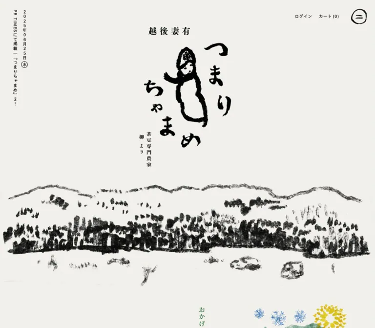
茶豆専門農家のブランド兼ECサイト。生成りの背景に筆文字と手描きの風景を配し、縦書きの説明、商品写真、営業日カレンダーを組み合わせています。
オリジナルサイトを見るTsumari Chamame — Style Reference
A farm shop arranged like an illustrated Japanese broadside: warm paper, expressive brushwork, vertical text, and cool product photography.
Website: tsumari-chamame.com Original URL: https://tsumari-chamame.com/ Final URL: https://tsumari-chamame.com/ Theme: light paper canvas with black ink, selective green accents, and photographic sections. Inspected: September 12, 2026. Supplied observation retrieved at 12:29:34.877 UTC / 21:29:34.877 JST. Viewports: desktop 1440 × 1000 CSS pixels; mobile 390 × 844 CSS pixels. Scope: the current homepage, including its brand opening, award and introduction content, two product links, cooking instructions, business calendar, store information, and footer. Visual evidence consists of three desktop and two mobile captures, supplemented by rendered text, link destinations, and computed element measurements. The expanded menu and linked pages were not inspected.
Tsumari Chamame combines a farm identity with a working online storefront. Its opening is dominated by a hand-lettered brand composition and a black rural panorama. Small account and cart links remain at the upper right. Shopping appears farther down the page through two large photographic panels, followed by an illustrated preparation guide and practical store information.
The design depends on the difference between expressive artwork and restrained typesetting. Brush marks are uneven and materially textured; interface text is small, widely tracked, and carefully aligned. Vertical Japanese writing forms narrow columns within generous empty space. Color arrives through green editorial accents and photography rather than through a collection of filled UI cards.
Desktop and mobile use distinct compositions. The opening mark occupies a much larger fraction of the phone width, product panels stack, product captions move toward the lower image edge, and the footer changes its information order and contrast treatment. Preserve these changes when adapting the design.
How to Read This Reference
- Measured values come from the supplied rendered DOM and computed styles. Tables round most dimensions to two decimal places.
- Visual estimates describe shapes, image colors, or distances visible in the captures but absent from the computed-style evidence. They are not pixel-sampled measurements.
- Derived values are calculations from supplied dimensions, such as the product panels’ 4:5 proportions.
- Recommendations describe an implementation approach. They do not establish the original source CSS, breakpoint, interaction logic, or asset format.
- Token names in this document are implementation aliases. The supplied original custom properties did not expose a complete design-token system.
- Element coordinates are document coordinates unless a screenshot or viewport position is explicitly identified. A scrolled capture can show a different position for persistent elements.
- A computed font-family stack identifies the declaration, not which font file ultimately supplied every glyph.
Tokens — Colors
Default Palette
| Name | Value | Suggested token | Evidence and role |
|---|---|---|---|
| Warm Paper | #f1f0eb |
--color-paper |
Measured HTML and body background at both viewports; opening, cooking guide, and mobile footer information |
| Black Ink | #000000 |
--color-ink |
Measured interface and editorial text; black artwork visually anchors the opening |
| Reversed White | #ffffff |
--color-reverse |
Measured product headings and desktop footer text; also visible in the reversed footer character |
| Farm Green | #357944 |
--color-green |
Measured color of the award heading; a related green appears in the washing illustration |
| Calendar Gray | Approximately #9b9d97 |
--color-muted |
Visual estimate for mobile closed-day rings and muted numerals; exact gray was not supplied |
The paper color is a solid computed background. Its warmth does not prove the presence of a paper-texture image. Most visible texture comes from the brush drawings and photographic subjects.
Photographic Color Fields
| Field | Approximate reference | Role |
|---|---|---|
| Cool blue | Around #8bb9c5 |
The fresh-bean product setting and the cool environment around the roots photograph |
| Pale oat | Around #dbd2b0 |
The miso product setting |
| Ochre and brown | Variable within the photographs | Package lettering, miso, soil, and roots |
These are visual estimates of image content, not measured CSS fills. Use the photographs to supply their variation. A flat blue rectangle cannot reproduce the shadows, packaging, and subtle surface changes of the product image.
Theme Presets
No selectable themes were evidenced. White text over desktop photography and black text on the mobile information area are responsive surface treatments within one identity.
The supplied custom property --swiper-theme-color: #007aff is not evidence of a visible blue brand accent. Likewise, the accompanying navigation-size variable does not establish a visible carousel.
Tokens — Typography
Old-Style Gothic — Interface and Body
Measured source stack:
'I-OTFゴシックオールドPro M', IwaOGoPro-Md,
-apple-system, sans-serif, system-ui
This stack appears on account links, product headings, explanatory paragraphs, store details, and footer links. Computed weight is 500. Tracking is generally 0.13em, which contributes substantially to the quiet, open rhythm.
Use this family relationship for ordinary text when the font is available. The brand’s brush lettering is a separate graphic treatment, not a large version of this font.
Light Gothic — Calendar Information
Measured source stack:
'I-OTFゴシックオールドPro L', IwaOGoPro-Lt,
-apple-system, sans-serif, system-ui
The calendar heading and explanatory legend use this declared light face. Their computed weight is also 500; the face name and the numeric CSS weight describe different aspects of the declaration.
Mincho — Editorial Emphasis
Measured source stack:
'凸版文久見出し明朝 StdN EB',
ToppanBunkyuMidashiMinchoStdN-ExtraBold,
-apple-system, serif, system-ui
This stack appears in the award headings and the large cooking verbs: 洗う, 茹でる, and 冷ます. The pronounced stroke contrast provides emphasis without requiring colored blocks or oversized horizontal headlines.
The sampled CSS weight remains 500, including on this named ExtraBold face. Do not replace that observation with an assumed 700 or 800 declaration.
Artwork Lettering
The hero combines 越後妻有, the brush-lettered brand, a pod-like human figure, and small specialist-farm lettering. The cooking section also includes a brush-lettered title. These visible graphic compositions have no verified standalone font identity in the supplied evidence.
Keep their irregular contours and internal spacing intact. Their empty heading text in the extraction does not establish whether an accessible name or image alternative exists.
Type Scale
All values below are measured computed styles. Desktop and mobile entries use font-size / line-height in CSS pixels.
| Role | Desktop | Mobile | Tracking | Face |
|---|---|---|---|---|
| Account links and guide body | 15.43 / 23.14 |
13.52 / 20.28 |
0.13em |
Medium Gothic |
| Product and store headings | 18.51 / 27.77 |
16.64 / 24.96 |
0.13em |
Medium Gothic |
| Calendar heading | 18.51 / 27.77 |
16.64 / 24.96 |
0.13em |
Light Gothic |
| Green award statement | 22.63 / 22.63 |
16.64 / 16.64 |
0.20em |
Mincho |
| Award name | 18.51 / 24.07 |
15.60 / 20.28 |
0.20em |
Mincho |
| Cooking verbs | 43.20 / 43.20 |
34.32 / 34.32 |
0.13em |
Mincho |
| Store contact and legal links | 15.43 / 29.31 |
12.48 / 23.71 |
0.13em |
Medium Gothic |
| Calendar legend | 13.37 / 20.06 |
12.48 / 18.72 |
0.13em |
Light Gothic |
| Copyright and social link | 12.34 / 18.51 |
12.48 / 18.72 |
0.13em |
Medium Gothic |
Price and purchase-label sizes were not individually supplied. Their appearance is approximately small-caption size in the desktop capture; the Quick Start uses a recommended caption token for them.
Root Size and Vertical Composition
The measured root is 10.2857px on desktop and 10.4px on mobile, with Times inherited at the root. The sampled content elements override that family. Times should therefore not be treated as the principal visible text face.
Many measurements can be normalized against those root sizes: ordinary UI text is approximately 1.5 root units on desktop and 1.3 on mobile; cooking verbs are approximately 4.2 and 3.3 units. These ratios are derived conveniences, not recovered source declarations.
Vertical composition is visually established in the news rail, editorial links, award text, and preparation instructions. For an adaptation, use writing-mode: vertical-rl and authored Japanese line breaks. Do not rotate an entire horizontal paragraph. Keep account links, product information, calendar numerals, and contact details horizontal.
Tokens — Spacing & Shapes
Density: sparse editorial sections, compact utility controls, and edge-to-edge product photography.
Geometry: square photographic panels, thin rules, small outlined purchase pills, and an irregular illustrated menu ring. There is no visible general card-shadow system.
Spacing Scale
| Use | Desktop measurement | Mobile measurement | Interpretation |
|---|---|---|---|
| Utility header top/right inset | 30.84px |
16.63px |
From header bounds |
| Login-to-cart gap | 24.67px |
24.95px |
Derived from link bounds |
| Cart-to-menu gap | 43.19px |
43.67px |
Derived from element bounds |
| Hero top padding | 102.86px |
168.80px |
Computed section padding |
| Product caption left inset | 24.67px |
20.80px |
Heading bounds relative to panel |
| Product inter-panel gap | 2.06px |
0px between stacked panels |
Derived from panel bounds |
| Cooking section horizontal padding | 102.86px |
16.64px |
Computed padding |
| Cooking section top padding | 164.57px |
83.20px |
Computed padding |
| Footer information left inset | 24.67px |
24.95px |
From heading/link bounds |
| Desktop colophon left inset | 16.45px |
— | From copyright bounds |
The mobile hero top padding equals 20% of the inspected viewport height. That equality is observable; a 20vh source rule was not supplied.
Border Radius and Linework
| Element | Treatment | Evidence |
|---|---|---|
| Product panels | Square corners | Visible captures; sampled link radius 0px |
| Menu button | Irregular brush-drawn circle with two short internal strokes | Visible artwork; button’s computed radius is 0px |
| Purchase label | Narrow outlined pill, approximately 102 × 31px on desktop |
Visual estimate |
| Closed-day markers | Thin circles, approximately 28px diameter on mobile |
Visual estimate |
| Calendar month boundary | Thin stepped divider across the shared week | Visible mobile capture |
| Store-information divider | Fine horizontal rule | Visible desktop capture |
The menu’s circle is part of its graphic identity. Setting a generic button to border-radius: 50% will not reproduce its uneven circumference or brush texture.
Layout Measurements
| Element | Desktop | Mobile |
|---|---|---|
| Hero heading/lockup box | 372.31 × 533.86px |
266.47 × 380.42px |
| Hero heading position | x 533.84, y 102.84 |
x 61.77, y 168.80 |
| Menu button box | 61.70 × 61.70px |
47.83 × 47.83px |
| Single product panel | 718.97 × 898.70px |
390 × 487.50px |
| Product aspect ratio | 4:5, derived |
4:5, derived |
| Cooking title graphic box | 154.28 × 473.72px |
83.19 × 255.42px |
| Store-information heading/link span | 353.36px |
340.08px |
| Calendar heading/legend span | 337.72px |
340.08px |
The hero measurement is the composed heading box, including its source padding. It is not a verified intrinsic image size.
Components
Persistent Utility Header
Role: provide account access, cart access, and a menu affordance without occupying a full-width navigation band.
The visible row contains ログイン, カート (0), and the illustrated menu control. It sits at the upper right on paper, over product imagery, and over the desktop footer photograph. Its position is visually persistent across the supplied scroll captures, consistent with fixed positioning; the supplied style summary does not include the original position declaration.
The account and cart links use medium Gothic text, weight 500, and 0.13em tracking. The menu has a larger gap before it than the two text links have between them. All three remain present at 390px width.
The menu button contains a roughly drawn ring and two horizontal brush marks. Preserve that artwork rather than substituting a standard three-line hamburger icon.
The header DOM contains navigation labels including ホーム, 商品一覧, つまりちゃまめのこと, おいしい食べ方, and お知らせ. The open menu’s arrangement, animation, focus handling, and dismissal behavior were not shown.
Brand Opening
Role: establish the farm’s identity before introducing products.
A centered, vertically proportioned graphic combines the regional name, hand-lettered brand, and character. A black landscape spreads across the bottom of the opening section. The landscape is irregular and textured, with broad areas of unprinted paper between marks.
At desktop width, the lockup occupies approximately 26% of the viewport width. On mobile it occupies approximately 68%. This preserves its prominence while leaving room above and below it. The mobile opening does not simply scale every desktop distance by the viewport-width ratio.
The first section is measured at 1121.16px tall on desktop and 866.33px on mobile. Both exceed the captured viewport height. The landscape continues toward or beyond the lower edge of the first capture; this is a document section, not evidence of a transient loading splash.
Visual estimates: the landscape’s upper edge begins around 700px down the desktop capture and around 650px down the mobile capture. Its mobile composition is cropped horizontally rather than reduced into a tiny complete panorama.
Vertical News Rail
Role: expose one current announcement without competing with the central brand.
On desktop, a narrow linked group begins at approximately x 49.36, y 36, measuring 55.47 × 383.38px. The date and announcement run in adjacent vertical columns. The weekday is enclosed by a small circular outline.
The inspected announcement concerns the start of the 2026 harvest’s shipping. Its date and copy are current content, not reusable design tokens.
The rail remains in the mobile DOM but is absent from the mobile rendered text and visible first capture. Treat it as omitted from the observed mobile presentation; its precise hiding rule was not supplied.
Award and Farm Introduction
Role: introduce the farm’s recognition and lead into the brand story.
The rendered text includes おかげさまで、日本一。, the competition name, 最高金賞, and a linked pair of labels: 詳しくみる and つまりちゃまめのこと.
Measured styling establishes green Mincho for the main statement, black Mincho for the award name, and a narrow vertical link group. On mobile, the main statement is arranged in two shorter vertical runs instead of the taller desktop run.
This section occupies 2224.11px on desktop and 1704.36px on mobile. Its full imagery and intervening composition are not visible in the supplied current-page screenshots. Preserve the measured typography and spacious editorial role, but do not invent additional illustration subjects or scene transitions for this area.
Product Photography Panels
Role: connect the brand narrative to two purchasable products.
Each complete panel is an anchor to a product page. The panel contains photography, a product heading, a price line, and the outlined 購入する label. The label is visually button-like, but the evidence identifies the whole panel as the link; it does not establish an immediate add-to-cart action.
On desktop, the two panels sit side by side with a roughly 2px seam. Both have a derived 4:5 aspect ratio. The fresh-bean image uses a cool blue setting, while the miso image uses a warm pale setting. Product packaging remains a major visual subject.
At the initial desktop measurement, headings begin about 24.67px from each panel’s top and left edges. The scrolled desktop capture retains captions near the viewport top while showing a later portion of the product section. This supports caption persistence in that state, but the exact sticky or scroll-dependent mechanism is unverified.
On mobile, each panel is 390 × 487.5px, and they stack without a visible gap. Headings sit in the lower portion of the images with 20.80px side insets. The longer miso heading wraps to two lines. Keep the title, price, and purchase label grouped near the lower edge rather than retaining the desktop top placement.
The current headings contain shipping timing and prices. Allow those strings to change and wrap naturally.
Illustrated Cooking Guide
Role: teach preparation through editorial pacing and simple agricultural drawings.
The section opens with a tall brush-lettered title and two narrow introductory text columns. On desktop, this introduction sits toward the right, while the first instructional composition appears farther left and lower down.
The guide has three steps: その一 / 洗う, その二 / 茹でる, and その三 / 冷ます. Each pairs a large vertical Mincho verb with smaller vertical explanatory text. Their visual arrangement alternates: the washing and cooling headings occupy the right side of their copy groups, while the boiling heading appears on the left.
The supplied desktop capture shows green linework of hands washing beans in a bowl. The other preparation steps are established by the rendered text and measurements; their illustration subjects were not independently visible in the supplied captures.
On mobile, the section becomes substantially taller: 2988.47px, compared with 2441.27px on desktop. The title graphic becomes smaller, but the instructional text remains vertical. The first verb begins well below the introduction, showing that the mobile composition retains deliberate intervals rather than compressing the guide into a tight list.
Vertical Editorial Links
Role: continue the narrative into more detailed pages.
The about link and the later もっと見る / さらにひと手間 link use paired vertical labels. Their measured width is approximately 47.30px on desktop and 43.66px on mobile. They occupy editorial whitespace rather than a conventional horizontal button row.
The provided destinations are /pages/about and /pages/howto. Their page designs were not inspected. Preserve the narrow vertical composition and a clear linked target when reusing this pattern.
Business Calendar
Role: explain online-shop shipping and telephone-service closures.
The calendar combines a small heading, year, oversized month numbers in a left gutter, seven weekday columns, and thin circular closed-day markers. The visible legend establishes that circles refer to shipping and telephone-service closure dates.
The inspected calendar spans September and October 2026 in nine continuous week rows. The week containing September 27–30 and October 1–3 is shared. A stepped thin rule separates the months within that row, instead of presenting two isolated calendar cards.
On mobile, the date matrix is visually about 255px wide, with roughly 36px weekly row spacing and approximately 28px marker circles. These are screenshot estimates. The measured heading and legend span is 340.08px.
On desktop, the calendar uses white text over the roots photograph and appears before the store-information block. On mobile, it uses black text and muted gray circles on paper and appears after the store details and legal links.
Calendar dates and closures must be data-driven. Do not preserve the captured month numbers or circled dates as permanent decoration.
Store Information and Legal Links
Role: make the shop’s operating details and contact routes available within the same visual language.
The store block contains a heading, telephone/shipping hours, telephone number, email, operator, address, and a separated group of business and legal links. The footer identifies its operator as 柳農産; the original page title uses 株式会社柳農産.
Desktop text is white and sits directly over the photograph. Its measured contact/link line-height is 29.31px. Mobile text is black on paper, smaller at 12.48px, and uses 23.71px line-height. The mobile text area is nearly as wide as the desktop information column: approximately 340px versus 353px.
The telephone and email are actual tel: and mailto: links in the evidence. Legal links lead to /pages/notation and /pages/privacy. These destinations were observed, not opened.
Photographic Footer and Colophon
Role: close the page with a physical image of the crop, then provide minimal administrative navigation.
The desktop footer features a close photograph of soil-covered roots against a cool blue environment. A large white version of the character appears over the roots. The calendar and store details occupy a narrow left column, while the photograph supplies most of the page width.
A visually white strip at the bottom separates the copyright on the left from インスタグラム on the right. In the mobile bottom capture, the social link appears above the copyright, both left aligned on paper.
The supplied social link points to the generic https://instagram.com/ URL. No specific brand profile was verified.
The lower mobile footer’s paper treatment is directly visible. The image treatment of the upper mobile footer is outside the supplied captures and should remain unspecified.
Tokens — Motion & Interaction
| Item | Evidence | Supported conclusion |
|---|---|---|
| Utility header | Repeated upper-right placement across scrolled captures | Visually persistent; exact positioning declaration unprovided |
| Desktop product captions | Captions visible near the top of a scrolled product view | Persistence in that state; exact mechanism and boundaries unverified |
| Body animation | 0s linear 1s forwards font_loading |
A zero-duration animation with a one-second delay is declared; keyframe effect was not supplied |
| Sampled content animation | Most supplied elements report none |
No animation declaration on those sampled elements; this does not cover all descendants or scripts |
| Transitions | Summaries report all without usable timing information |
No supported duration or easing token can be extracted |
| Menu | Visible button and navigation text in the DOM | Opening, closing, focus behavior, and animation untested |
| Product links | Product-page destinations supplied | Navigation affordance verified; checkout and cart mutation untested |
| Hover and focus | No corresponding state captures | Visual state treatments unverified |
| Photography and drawings | Settled still captures only | No supported claim of parallax, looping motion, or scroll reveals |
The capture process waited for layout and visible-image readiness and traversed intermediate scroll positions. It also handled animations during readiness checks. This improves the reliability of settled states but does not establish complete interaction coverage.
Recommended motion policy: preserve the graphic texture without adding speculative movement. A static implementation can reproduce the evidenced visual states. If hover feedback is added, use a restrained underline or contrast adjustment. Treat any timing, menu transition, or scroll effect as a new implementation decision.
Surfaces
| Layer | Appearance | Purpose |
|---|---|---|
| Main canvas | Solid warm paper | Connects the opening and instructional content |
| Brand and landscape | Black textured artwork on paper | Establishes identity and a rural setting |
| Editorial accent | Green text and related green linework | Distinguishes award and preparation content |
| Product panels | Full-bleed photography with small white labels | Makes products the primary commercial surface |
| Desktop footer | Roots photograph, white character, white information | Connects practical shop details to the crop |
| Mobile footer information | Paper with black text and gray calendar marks | Provides a readable narrow-screen information area |
| Desktop colophon | Visually white horizontal strip | Separates copyright and social navigation |
Structure comes from whitespace, image boundaries, vertical type, and fine rules. No visible evidence supports a system of raised cards, glass panels, or soft shadow elevations.
Imagery
The artwork has a dry, irregular quality. Black strokes vary in density, and the landscape contains broken edges and scattered marks. The green washing drawing uses similarly imperfect lines. Preserve those textures at adequate resolution; nearest-neighbor pixelation would introduce an unrelated bitmap aesthetic.
The hero figure and wordmark form one recognizable composition. The footer repeats the character in white without repeating the whole opening lockup. This creates continuity between the initial brand scene and the closing roots photograph.
Photography contributes a different material register: paper packaging, the weight and color of miso, fine root fibers, soil, and soft shadows. Favor crops that retain physical detail and useful negative space for the small text overlays.
Observed Asset References
No original asset URLs, intrinsic image dimensions, or file formats were included in the evidence. The references below identify visible subjects without inventing paths.
| Asset or composition | Evidence | Use |
|---|---|---|
| Black brand lockup and character | Desktop and mobile opening captures | Primary identity |
| Black rural panorama | Desktop and mobile opening captures | Lower opening scene; horizontally cropped on mobile |
| Illustrated menu ring | All supplied page captures | Persistent navigation control |
| Fresh-bean packaging on blue | Desktop product capture | First product panel |
| Miso packaging on a pale warm setting | Desktop product capture | Second product panel |
| Brush-lettered cooking title | Desktop guide capture | Section introduction |
| Green hands-and-bowl drawing | Desktop guide capture | Washing instruction |
| Roots photograph and white character | Desktop footer capture | Closing photographic scene |
Use authorized artwork and photographs when implementing this identity. The CSS below defines their containers and relationships; it does not recreate the artwork.
Layout & Responsive Behavior
Page Sequence and Measured Extents
| Section | Desktop start / height | Mobile start / height |
|---|---|---|
| Brand opening | 0 / 1121.16px |
0 / 866.33px |
| Award and introduction | 1121.16 / 2224.11px |
866.33 / 1704.36px |
| Products | 3345.27 / 898.70px |
2570.69 / 975px |
| Cooking guide | 4243.97 / 2441.27px |
3545.69 / 2988.47px |
| Footer | 6685.23 / 1970.94px |
6534.16 / 1839.20px |
| Total document | 8656.17px |
8373.36px |
These are measurements of the captured content, not recommended fixed section heights. Announcements, product copy, calendar data, and content changes can alter them.
Desktop Composition
The opening mark is centered independently of the corner utility header and left news rail. The first commercial section starts after a long editorial introduction. Products fill the width in two equal panels; the cooking guide then returns to paper and asymmetrical arrangements of vertical text and drawings.
The footer maintains a relatively narrow information column against a very large photograph. Avoid stretching that text across the full desktop width merely because space is available.
Mobile Composition
- The utility controls remain horizontal and visible, with a smaller illustrated menu button.
- The news rail is absent from the observed mobile presentation.
- The brand lockup grows from approximately 26% to 68% of viewport width.
- The landscape is cropped to preserve the size and weight of its brush marks.
- The award statement breaks into shorter vertical runs.
- Product panels stack at the same derived 4:5 ratio, and captions move toward the bottom.
- The cooking title shrinks, while the guide becomes taller and retains vertical Japanese text.
- Store information precedes the calendar; both use black text on paper.
- Social navigation and copyright become a left-aligned vertical stack.
The original breakpoint was not supplied. The Quick Start recommends 48rem as an adaptation breakpoint and matches the two known endpoint measurements; it does not claim to recover intermediate original behavior.
In the bottom mobile capture, the persistent utility row overlaps some legal text near the top of the viewport. This shows content passing behind the transparent header. For an adaptation, keep focused links clear of that area and consider a paper backing when the header sits over dense information.
Do’s and Don’ts
Do
- Keep the measured paper color
#f1f0eb, black text, and restrained green accent. - Give the brush-lettered identity enough empty space to remain the opening’s main subject.
- Preserve the uneven menu ring and the material texture of the drawings.
- Use the evidenced Gothic and Mincho roles, including their generous tracking.
- Keep vertical Japanese text as a structural part of the editorial sections.
- Build product panels as large linked photographic surfaces with square corners.
- Retain the 4:5 panel ratio when switching from two columns to a mobile stack.
- Group each product’s heading, price, and outlined purchase label together.
- Preserve the calendar’s continuous weeks, closed-day circles, and shared-month divider.
- Recompose the footer for mobile, including its information order and paper surface.
- Keep dates, shipping information, prices, and calendar closures connected to current data.
Don’t
- Don’t turn the opening into a generic oversized text headline with a large filled CTA.
- Don’t replace the identity artwork with a guessed handwriting font.
- Don’t smooth the brush marks into uniform vector strokes or deliberately pixelate them.
- Don’t introduce rounded floating cards or decorative shadows around every section.
- Don’t treat colors inside photographs as additional global action colors.
- Don’t use the supplied library-blue variable as a verified brand token.
- Don’t make the purchase label a nested button inside an already linked panel.
- Don’t shrink the entire desktop page proportionally to fit mobile.
- Don’t remove all vertical writing merely to simplify the phone layout.
- Don’t treat closed-day circles as selected booking dates.
- Don’t invent a menu animation, image carousel, parallax effect, or exact transition timing.
- Don’t hardcode measured document heights as permanent layout constraints.
Recommended Implementation Additions
These are recommendations for a new implementation, not verified original features:
- Give the illustrated menu button an accessible name, expanded state, and a relationship to its navigation region. Define keyboard and focus behavior once the menu interaction is implemented.
- Provide an accessible brand name for the graphic heading. Mark purely decorative landscape artwork appropriately.
- Keep the whole product panel as one semantic link and the purchase pill as a noninteractive label inside it.
- Add a visible focus indicator that remains readable on both paper and photography. The transparent persistent header should not obscure a focused destination.
- Recheck overlay text contrast for each actual photograph and crop. Use a restrained local treatment if changing imagery reduces readability.
- Implement the calendar with meaningful weekday headings and explicit closed-day descriptions. Circles alone should not be the only available explanation.
- Keep calendar and store information in a deliberate reading order when changing their visual order across breakpoints.
- Allow mobile contact information to wrap and support text enlargement. The observed approximately 12.5px footer type should not become a hard upper limit.
- Supply reduced-motion behavior for any new animation. No specific original motion sequence needs to be preserved from this evidence.
- Test the layout at intermediate widths, landscape orientations, and with longer product headings. Only two viewport sizes were supplied.
Agent Prompt Guide
Quick Color Reference
- Main paper:
#f1f0eb. - Text and primary linework:
#000000. - Reversed labels and desktop photo-footer details:
#ffffff. - Editorial green:
#357944. - Calendar gray: visually estimated near
#9b9d97. - Blue and oat fields belong principally to photographs, not a set of UI cards.
Overall Prompt
“Create a Japanese farm-brand storefront inspired by the supplied Tsumari Chamame reference. Use warm paper #f1f0eb, black ink, a restrained green #357944, textured brush artwork, small widely tracked Gothic interface text, and Mincho editorial headings. Center a tall illustrated brand composition above a broad black rural panorama. Keep login, cart, and an irregular illustrated menu ring at the upper right. Build a long editorial page with vertical Japanese text, two full-bleed 4:5 product photographs, an illustrated preparation guide, and a practical business calendar. On mobile, enlarge the brand relative to the viewport, stack the products, place product captions near the lower edge, and show store details before the calendar in black on paper. Use supplied artwork; do not invent unverified animation or menu states.”
Example Component Prompts
- Brand opening: “A warm-paper opening with a centered tall brush-lettered brand and pod-like character. Place a textured black rural panorama along the bottom. Add a narrow vertical dated announcement at the upper left on desktop and small account/cart controls with an illustrated ring menu at the upper right. Preserve large empty areas.”
- Product panels: “Two edge-to-edge 4:5 product links: fresh-bean packaging against cool blue and miso against pale oat. Use small white headings, a separate price line, and thin outlined purchase pills. Keep square corners and a roughly 2px desktop seam. Stack on mobile and move the copy group toward the lower image edge.”
- Cooking guide: “A paper section with a brush-lettered vertical introduction, green agricultural line drawings, and three preparation steps. Use vertical Mincho verbs around 43px on desktop and 34px on mobile, paired with small tracked Gothic instructions. Alternate the composition of heading and illustration, retaining generous intervals.”
- Calendar: “A compact two-month business calendar with a year and large month numbers in a left gutter, seven weekday columns, thin rings around closed dates, and a stepped separator through the shared month-boundary week. Use calendar data rather than a decorative fixed date arrangement.”
- Footer: “On desktop, place white store information and a business calendar over a detailed roots photograph, with a large white brand character nearer the center. On mobile, present the store details followed by the calendar in black on warm paper. Finish with compact social and copyright text.”
Quick Start
CSS Custom Properties
This is a recommended component scaffold, not recovered original CSS. It keeps a conventional root font size and uses --unit to express ratios derived from the two measured root sizes. The 48rem breakpoint, artwork crop heights, guide spacing, and desktop sticky-caption implementation are recommendations.
Use a single complete brand composition inside .hero-lockup. Each .product-tile should be an anchor containing an image and .product-copy; place the title, price, and noninteractive .purchase-label inside that copy group. A recipe step contains an illustration and .recipe-copy. The footer rules below style the information region; they do not prescribe the unobserved upper mobile footer imagery.
:root {
  /* Measured core colors; gray is a visual approximation. */
  --color-paper: #f1f0eb;
  --color-ink: #000000;
  --color-reverse: #ffffff;
  --color-green: #357944;
  --color-muted: #9b9d97;

  /* Declared source font stacks; font files are not bundled. */
  --face-ui: 'I-OTFゴシックオールドPro M', IwaOGoPro-Md,
    -apple-system, sans-serif, system-ui;
  --face-light: 'I-OTFゴシックオールドPro L', IwaOGoPro-Lt,
    -apple-system, sans-serif, system-ui;
  --face-editorial: '凸版文久見出し明朝 StdN EB',
    ToppanBunkyuMidashiMinchoStdN-ExtraBold,
    -apple-system, serif, system-ui;

  /* Desktop endpoint, normalized from measured values. */
  --unit: 10.2857px;
  --type-ui: calc(1.5 * var(--unit));
  --type-heading: calc(1.8 * var(--unit));
  --type-award: calc(2.2 * var(--unit));
  --type-step: calc(4.2 * var(--unit));
  --type-contact: calc(1.5 * var(--unit));
  --type-caption: calc(1.2 * var(--unit));
  --type-calendar-note: calc(1.3 * var(--unit));
  --tracking-ui: 0.13em;
  --tracking-award: 0.2em;

  --header-edge: calc(3 * var(--unit));
  --menu-size: calc(6 * var(--unit));
  --hero-top: calc(10 * var(--unit));
  --logo-width: 372.31px;
  --logo-height: 533.86px;
  --product-inset: calc(2.4 * var(--unit));
  --guide-inset: calc(10 * var(--unit));
  --guide-top: calc(16 * var(--unit));
  --footer-inset: calc(2.4 * var(--unit));
  --safe-top: env(safe-area-inset-top, 0px);
  --safe-right: env(safe-area-inset-right, 0px);
}

* {
  box-sizing: border-box;
}

body {
  margin: 0;
  color: var(--color-ink);
  background: var(--color-paper);
  font-family: var(--face-ui);
  font-size: var(--type-ui);
  font-weight: 500;
  line-height: 1.5;
  letter-spacing: var(--tracking-ui);
}

img {
  display: block;
  max-width: 100%;
}

a {
  color: inherit;
}

.utility-header {
  position: fixed;
  z-index: 20;
  top: max(var(--header-edge), var(--safe-top));
  right: max(var(--header-edge), var(--safe-right));
  display: flex;
  align-items: center;
  gap: calc(2.4 * var(--unit));
}

.utility-header a {
  white-space: nowrap;
  text-decoration: none;
}

.menu-button {
  width: var(--menu-size);
  height: var(--menu-size);
  margin-inline-start: calc(1.8 * var(--unit));
  padding: 0;
  border: 0;
  border-radius: 0;
  background: transparent;
  color: inherit;
  cursor: pointer;
}

.menu-button img {
  width: 100%;
  height: 100%;
  object-fit: contain;
}

/* The image contains the complete illustrated brand composition. */
.farm-hero {
  position: relative;
  min-height: 1121.16px;
  padding-top: var(--hero-top);
  overflow: clip;
}

.hero-lockup {
  width: var(--logo-width);
  height: var(--logo-height);
  margin: 0 auto;
}

.hero-lockup img {
  width: 100%;
  height: 100%;
  object-fit: contain;
}

/* Crop dimensions are recommended visual approximations. */
.hero-landscape {
  position: absolute;
  inset: auto 0 0;
  width: 100%;
  height: 420px;
  object-fit: cover;
  object-position: center bottom;
}

.news-rail {
  position: absolute;
  top: 36px;
  left: 49.36px;
  display: flex;
  flex-direction: row-reverse;
  gap: 10px;
  text-decoration: none;
}

.news-rail > span {
  writing-mode: vertical-rl;
  text-orientation: upright;
}

.award-heading {
  color: var(--color-green);
  font-family: var(--face-editorial);
  font-size: var(--type-award);
  font-weight: 500;
  line-height: 1;
  letter-spacing: var(--tracking-award);
  writing-mode: vertical-rl;
}

.product-grid {
  display: grid;
  grid-template-columns: repeat(2, minmax(0, 1fr));
  gap: calc(0.2 * var(--unit));
}

.product-tile {
  position: relative;
  display: flow-root;
  aspect-ratio: 4 / 5;
  color: var(--color-reverse);
  text-decoration: none;
}

.product-tile > img {
  position: absolute;
  inset: 0;
  width: 100%;
  height: 100%;
  object-fit: cover;
}

/* Recommended approach to the visible desktop caption persistence. */
.product-copy {
  position: sticky;
  z-index: 1;
  top: var(--product-inset);
  margin: var(--product-inset);
}

.product-copy h2 {
  margin: 0;
  font: inherit;
  font-size: var(--type-heading);
  line-height: 1.5;
}

.product-price {
  margin: 8px 0 18px;
  font-size: var(--type-caption);
}

/* This is a span inside the linked panel, not a nested button. */
.purchase-label {
  display: inline-flex;
  align-items: center;
  justify-content: center;
  min-width: 102px;
  min-height: 31px;
  padding: 4px 20px;
  border: 1px solid currentColor;
  border-radius: 999px;
  font-size: var(--type-caption);
  line-height: 1.5;
}

/* Guide composition is an adaptation, not extracted source layout. */
.cooking-guide {
  display: grid;
  grid-template-columns: minmax(0, 1fr) 240px;
  gap: 96px;
  padding: var(--guide-top) var(--guide-inset) 0;
}

.guide-intro {
  grid-column: 2;
  grid-row: 1;
  display: flex;
  flex-direction: row-reverse;
  align-items: flex-start;
  gap: 36px;
}

.guide-title-art {
  width: 154.28px;
  height: auto;
}

.recipe-steps {
  grid-column: 1;
  grid-row: 1;
  display: grid;
  gap: 120px;
  padding-top: 175px;
}

.recipe-step {
  display: flex;
  align-items: center;
  justify-content: space-between;
  gap: 48px;
}

.recipe-step:nth-child(even) {
  flex-direction: row-reverse;
}

.recipe-illustration {
  width: 45%;
  height: auto;
}

.recipe-copy {
  display: flex;
  flex-direction: row-reverse;
  align-items: flex-start;
  gap: 30px;
}

.recipe-step:nth-child(even) .recipe-copy {
  flex-direction: row;
}

.recipe-copy h3 {
  margin: 0;
  font-family: var(--face-editorial);
  font-size: var(--type-step);
  font-weight: 500;
  line-height: 1;
  writing-mode: vertical-rl;
}

.recipe-copy p,
.vertical-label {
  margin: 0;
  writing-mode: vertical-rl;
  text-orientation: mixed;
}

/* Place this information region over the desktop footer photograph. */
.footer-info {
  position: relative;
  display: grid;
  grid-template-areas: 'calendar' 'store';
  gap: 96px;
  padding: 40px var(--footer-inset) 104px;
  color: var(--color-reverse);
}

.business-calendar {
  grid-area: calendar;
  width: 337.72px;
  max-width: 100%;
  font-family: var(--face-light);
}

.store-info {
  grid-area: store;
  width: 353.36px;
  max-width: 100%;
  font-size: var(--type-contact);
  line-height: 1.9;
}

.footer-info h3 {
  margin: 0 0 36px;
  font-size: var(--type-heading);
  font-weight: 500;
  line-height: 1.5;
}

.store-info a {
  text-decoration: none;
  overflow-wrap: anywhere;
}

.calendar-layout {
  display: grid;
  grid-template-columns: 72px minmax(0, 1fr);
  gap: 12px;
}

.calendar-table {
  width: 100%;
  table-layout: fixed;
  border-collapse: collapse;
  font-size: var(--type-caption);
}

.calendar-table th {
  font-weight: 500;
}

.calendar-table td {
  height: 36.4px;
  padding: 0;
  text-align: center;
}

.calendar-table td > span {
  display: inline-grid;
  place-items: center;
  width: 28px;
  height: 28px;
  border: 1px solid transparent;
  border-radius: 50%;
}

.calendar-table .is-closed > span {
  border-color: currentColor;
  opacity: 0.6;
}

/* Assign month-boundary classes from actual calendar data. */
.calendar-table .month-edge-top {
  border-top: 1px solid currentColor;
}

.calendar-table .month-edge-bottom {
  border-bottom: 1px solid currentColor;
}

.calendar-table .month-edge-left {
  border-left: 1px solid currentColor;
}

.calendar-legend {
  font-size: var(--type-calendar-note);
  line-height: 1.5;
}

.colophon {
  display: flex;
  justify-content: space-between;
  gap: 16px;
  padding: calc(1.6 * var(--unit));
  color: var(--color-ink);
  background: var(--color-reverse);
  font-size: var(--type-caption);
}

.colophon p {
  margin: 0;
}

/* Recommended keyboard focus treatment. */
a:focus-visible,
button:focus-visible {
  outline: 2px solid currentColor;
  outline-offset: 5px;
}

.product-tile:focus-visible {
  outline-color: var(--color-reverse);
  outline-offset: -6px;
}

@media (max-width: 48rem) {
  :root {
    /* Mobile endpoint; the breakpoint itself is recommended. */
    --unit: 10.4px;
    --type-ui: calc(1.3 * var(--unit));
    --type-heading: calc(1.6 * var(--unit));
    --type-award: calc(1.6 * var(--unit));
    --type-step: calc(3.3 * var(--unit));
    --type-contact: calc(1.2 * var(--unit));
    --type-calendar-note: calc(1.2 * var(--unit));
    --header-edge: calc(1.6 * var(--unit));
    --menu-size: calc(4.6 * var(--unit));
    --hero-top: 20svh;
    --logo-width: min(68.325vw, 266.47px);
    --logo-height: auto;
    --product-inset: calc(2 * var(--unit));
    --guide-inset: calc(1.6 * var(--unit));
    --guide-top: calc(8 * var(--unit));
  }

  .farm-hero {
    min-height: 866.33px;
  }

  .hero-lockup {
    aspect-ratio: 266.47 / 380.42;
  }

  .hero-landscape {
    height: 225px;
  }

  .news-rail {
    display: none;
  }

  .product-grid {
    grid-template-columns: minmax(0, 1fr);
    gap: 0;
  }

  .product-copy {
    position: absolute;
    inset: auto var(--product-inset) var(--product-inset);
    margin: 0;
  }

  .cooking-guide {
    grid-template-columns: minmax(0, 1fr);
    gap: 110px;
  }

  .guide-intro,
  .recipe-steps {
    grid-column: auto;
    grid-row: auto;
  }

  .guide-intro {
    justify-content: center;
  }

  .guide-title-art {
    width: 83.19px;
  }

  .recipe-steps {
    padding-top: 0;
  }

  .recipe-step,
  .recipe-step:nth-child(even) {
    flex-direction: column;
    gap: 40px;
  }

  .recipe-illustration {
    width: min(80%, 300px);
  }

  .footer-info {
    grid-template-areas: 'store' 'calendar';
    color: var(--color-ink);
    background: var(--color-paper);
  }

  .business-calendar,
  .store-info {
    width: 100%;
  }

  .calendar-table .is-closed > span {
    border-color: var(--color-muted);
    color: var(--color-muted);
    opacity: 1;
  }

  .colophon {
    flex-direction: column;
    align-items: flex-start;
    padding: var(--footer-inset);
    background: var(--color-paper);
  }

  .colophon .social {
    order: -1;
  }
}
The sample hero minimum heights match the captured endpoints for reference work. For production, derive the opening’s minimum height from its actual artwork, content, and tested viewport behavior. The complete introduction, footer photograph placement, and menu logic require separate implementation.
Tailwind v4 Token Mapping
Optional aliases for a project already using Tailwind v4. These are implementation conveniences, not evidence of the original framework. Define the custom properties above first.
@theme inline {
  --color-paper: #f1f0eb;
  --color-ink: #000000;
  --color-reverse: #ffffff;
  --color-farm-green: #357944;
  --color-calendar-gray: #9b9d97;

  --font-ui: var(--face-ui);
  --font-calendar: var(--face-light);
  --font-editorial: var(--face-editorial);

  --text-body: var(--type-ui);
  --text-section: var(--type-heading);
  --text-step: var(--type-step);
  --text-caption: var(--type-caption);

  --spacing-unit: var(--unit);
  --spacing-product-inset: var(--product-inset);
  --spacing-guide-inset: var(--guide-inset);
  --spacing-menu: var(--menu-size);

  --radius-purchase: 999px;
}
Sources & Evidence
- Original and final website: Tsumari Chamame. The supplied observation records HTTP
200and the same original and final URL. - Capture date: September 12, 2026; observation retrieval timestamp
2026-09-12T12:29:34.877Z. - Desktop evidence: 1440 × 1000 CSS-pixel viewport; three supplied captures covering the opening, product-to-guide transition, and lower photographic footer. Measured document height approximately
8656.17px. - Mobile evidence: 390 × 844 CSS-pixel viewport; two supplied captures covering the opening and lower calendar/footer. Measured document height approximately
8373.36px. - Rendered evidence: page title, visible text, link destinations, element bounds, font stacks, sizes, weights, line heights, tracking, selected colors, padding, and animation/transition summaries for both viewports.
- Inspection process: supplied readiness checks included document load, sampled layout and text stability, visible image decoding, animation handling, and intermediate scroll traversal. Shared and service workers were disabled during capture.
- Limits: no independent browsing was performed for this reference. Linked pages and interactive states were not exercised. Exact source breakpoints, complete stylesheets, image URLs, intrinsic asset dimensions, and animation keyframes were not supplied. The full award/introduction imagery and upper mobile footer were not visually covered.
This reference describes the current supplied homepage evidence. Measured values, visual estimates, derived proportions, and recommended implementation choices are identified separately throughout.
# Tsumari Chamame — Style Reference

> A farm shop arranged like an illustrated Japanese broadside: warm paper, expressive brushwork, vertical text, and cool product photography.

**Website:** [tsumari-chamame.com](https://tsumari-chamame.com/)
**Original URL:** https://tsumari-chamame.com/
**Final URL:** https://tsumari-chamame.com/
**Theme:** light paper canvas with black ink, selective green accents, and photographic sections.
**Inspected:** September 12, 2026. Supplied observation retrieved at 12:29:34.877 UTC / 21:29:34.877 JST.
**Viewports:** desktop 1440 × 1000 CSS pixels; mobile 390 × 844 CSS pixels.
**Scope:** the current homepage, including its brand opening, award and introduction content, two product links, cooking instructions, business calendar, store information, and footer. Visual evidence consists of three desktop and two mobile captures, supplemented by rendered text, link destinations, and computed element measurements. The expanded menu and linked pages were not inspected.

Tsumari Chamame combines a farm identity with a working online storefront. Its opening is dominated by a hand-lettered brand composition and a black rural panorama. Small account and cart links remain at the upper right. Shopping appears farther down the page through two large photographic panels, followed by an illustrated preparation guide and practical store information.

The design depends on the difference between expressive artwork and restrained typesetting. Brush marks are uneven and materially textured; interface text is small, widely tracked, and carefully aligned. Vertical Japanese writing forms narrow columns within generous empty space. Color arrives through green editorial accents and photography rather than through a collection of filled UI cards.

Desktop and mobile use distinct compositions. The opening mark occupies a much larger fraction of the phone width, product panels stack, product captions move toward the lower image edge, and the footer changes its information order and contrast treatment. Preserve these changes when adapting the design.

## How to Read This Reference

- **Measured** values come from the supplied rendered DOM and computed styles. Tables round most dimensions to two decimal places.
- **Visual estimates** describe shapes, image colors, or distances visible in the captures but absent from the computed-style evidence. They are not pixel-sampled measurements.
- **Derived** values are calculations from supplied dimensions, such as the product panels’ 4:5 proportions.
- **Recommendations** describe an implementation approach. They do not establish the original source CSS, breakpoint, interaction logic, or asset format.
- Token names in this document are implementation aliases. The supplied original custom properties did not expose a complete design-token system.
- Element coordinates are document coordinates unless a screenshot or viewport position is explicitly identified. A scrolled capture can show a different position for persistent elements.
- A computed font-family stack identifies the declaration, not which font file ultimately supplied every glyph.

## Tokens — Colors

### Default Palette

| Name | Value | Suggested token | Evidence and role |
| --- | --- | --- | --- |
| Warm Paper | `#f1f0eb` | `--color-paper` | Measured HTML and body background at both viewports; opening, cooking guide, and mobile footer information |
| Black Ink | `#000000` | `--color-ink` | Measured interface and editorial text; black artwork visually anchors the opening |
| Reversed White | `#ffffff` | `--color-reverse` | Measured product headings and desktop footer text; also visible in the reversed footer character |
| Farm Green | `#357944` | `--color-green` | Measured color of the award heading; a related green appears in the washing illustration |
| Calendar Gray | Approximately `#9b9d97` | `--color-muted` | Visual estimate for mobile closed-day rings and muted numerals; exact gray was not supplied |

The paper color is a solid computed background. Its warmth does not prove the presence of a paper-texture image. Most visible texture comes from the brush drawings and photographic subjects.

### Photographic Color Fields

| Field | Approximate reference | Role |
| --- | --- | --- |
| Cool blue | Around `#8bb9c5` | The fresh-bean product setting and the cool environment around the roots photograph |
| Pale oat | Around `#dbd2b0` | The miso product setting |
| Ochre and brown | Variable within the photographs | Package lettering, miso, soil, and roots |

These are visual estimates of image content, not measured CSS fills. Use the photographs to supply their variation. A flat blue rectangle cannot reproduce the shadows, packaging, and subtle surface changes of the product image.

### Theme Presets

No selectable themes were evidenced. White text over desktop photography and black text on the mobile information area are responsive surface treatments within one identity.

The supplied custom property `--swiper-theme-color: #007aff` is not evidence of a visible blue brand accent. Likewise, the accompanying navigation-size variable does not establish a visible carousel.

## Tokens — Typography

### Old-Style Gothic — Interface and Body

**Measured source stack:**

```css
'I-OTFゴシックオールドPro M', IwaOGoPro-Md,
-apple-system, sans-serif, system-ui
```

This stack appears on account links, product headings, explanatory paragraphs, store details, and footer links. Computed weight is `500`. Tracking is generally `0.13em`, which contributes substantially to the quiet, open rhythm.

Use this family relationship for ordinary text when the font is available. The brand’s brush lettering is a separate graphic treatment, not a large version of this font.

### Light Gothic — Calendar Information

**Measured source stack:**

```css
'I-OTFゴシックオールドPro L', IwaOGoPro-Lt,
-apple-system, sans-serif, system-ui
```

The calendar heading and explanatory legend use this declared light face. Their computed weight is also `500`; the face name and the numeric CSS weight describe different aspects of the declaration.

### Mincho — Editorial Emphasis

**Measured source stack:**

```css
'凸版文久見出し明朝 StdN EB',
ToppanBunkyuMidashiMinchoStdN-ExtraBold,
-apple-system, serif, system-ui
```

This stack appears in the award headings and the large cooking verbs: `洗う`, `茹でる`, and `冷ます`. The pronounced stroke contrast provides emphasis without requiring colored blocks or oversized horizontal headlines.

The sampled CSS weight remains `500`, including on this named ExtraBold face. Do not replace that observation with an assumed `700` or `800` declaration.

### Artwork Lettering

The hero combines `越後妻有`, the brush-lettered brand, a pod-like human figure, and small specialist-farm lettering. The cooking section also includes a brush-lettered title. These visible graphic compositions have no verified standalone font identity in the supplied evidence.

Keep their irregular contours and internal spacing intact. Their empty heading text in the extraction does not establish whether an accessible name or image alternative exists.

### Type Scale

All values below are measured computed styles. Desktop and mobile entries use `font-size / line-height` in CSS pixels.

| Role | Desktop | Mobile | Tracking | Face |
| --- | --- | --- | --- | --- |
| Account links and guide body | `15.43 / 23.14` | `13.52 / 20.28` | `0.13em` | Medium Gothic |
| Product and store headings | `18.51 / 27.77` | `16.64 / 24.96` | `0.13em` | Medium Gothic |
| Calendar heading | `18.51 / 27.77` | `16.64 / 24.96` | `0.13em` | Light Gothic |
| Green award statement | `22.63 / 22.63` | `16.64 / 16.64` | `0.20em` | Mincho |
| Award name | `18.51 / 24.07` | `15.60 / 20.28` | `0.20em` | Mincho |
| Cooking verbs | `43.20 / 43.20` | `34.32 / 34.32` | `0.13em` | Mincho |
| Store contact and legal links | `15.43 / 29.31` | `12.48 / 23.71` | `0.13em` | Medium Gothic |
| Calendar legend | `13.37 / 20.06` | `12.48 / 18.72` | `0.13em` | Light Gothic |
| Copyright and social link | `12.34 / 18.51` | `12.48 / 18.72` | `0.13em` | Medium Gothic |

Price and purchase-label sizes were not individually supplied. Their appearance is approximately small-caption size in the desktop capture; the Quick Start uses a recommended caption token for them.

### Root Size and Vertical Composition

The measured root is `10.2857px` on desktop and `10.4px` on mobile, with `Times` inherited at the root. The sampled content elements override that family. Times should therefore not be treated as the principal visible text face.

Many measurements can be normalized against those root sizes: ordinary UI text is approximately `1.5` root units on desktop and `1.3` on mobile; cooking verbs are approximately `4.2` and `3.3` units. These ratios are derived conveniences, not recovered source declarations.

Vertical composition is visually established in the news rail, editorial links, award text, and preparation instructions. For an adaptation, use `writing-mode: vertical-rl` and authored Japanese line breaks. Do not rotate an entire horizontal paragraph. Keep account links, product information, calendar numerals, and contact details horizontal.

## Tokens — Spacing & Shapes

**Density:** sparse editorial sections, compact utility controls, and edge-to-edge product photography.

**Geometry:** square photographic panels, thin rules, small outlined purchase pills, and an irregular illustrated menu ring. There is no visible general card-shadow system.

### Spacing Scale

| Use | Desktop measurement | Mobile measurement | Interpretation |
| --- | --- | --- | --- |
| Utility header top/right inset | `30.84px` | `16.63px` | From header bounds |
| Login-to-cart gap | `24.67px` | `24.95px` | Derived from link bounds |
| Cart-to-menu gap | `43.19px` | `43.67px` | Derived from element bounds |
| Hero top padding | `102.86px` | `168.80px` | Computed section padding |
| Product caption left inset | `24.67px` | `20.80px` | Heading bounds relative to panel |
| Product inter-panel gap | `2.06px` | `0px` between stacked panels | Derived from panel bounds |
| Cooking section horizontal padding | `102.86px` | `16.64px` | Computed padding |
| Cooking section top padding | `164.57px` | `83.20px` | Computed padding |
| Footer information left inset | `24.67px` | `24.95px` | From heading/link bounds |
| Desktop colophon left inset | `16.45px` | — | From copyright bounds |

The mobile hero top padding equals 20% of the inspected viewport height. That equality is observable; a `20vh` source rule was not supplied.

### Border Radius and Linework

| Element | Treatment | Evidence |
| --- | --- | --- |
| Product panels | Square corners | Visible captures; sampled link radius `0px` |
| Menu button | Irregular brush-drawn circle with two short internal strokes | Visible artwork; button’s computed radius is `0px` |
| Purchase label | Narrow outlined pill, approximately `102 × 31px` on desktop | Visual estimate |
| Closed-day markers | Thin circles, approximately `28px` diameter on mobile | Visual estimate |
| Calendar month boundary | Thin stepped divider across the shared week | Visible mobile capture |
| Store-information divider | Fine horizontal rule | Visible desktop capture |

The menu’s circle is part of its graphic identity. Setting a generic button to `border-radius: 50%` will not reproduce its uneven circumference or brush texture.

### Layout Measurements

| Element | Desktop | Mobile |
| --- | --- | --- |
| Hero heading/lockup box | `372.31 × 533.86px` | `266.47 × 380.42px` |
| Hero heading position | `x 533.84, y 102.84` | `x 61.77, y 168.80` |
| Menu button box | `61.70 × 61.70px` | `47.83 × 47.83px` |
| Single product panel | `718.97 × 898.70px` | `390 × 487.50px` |
| Product aspect ratio | `4:5`, derived | `4:5`, derived |
| Cooking title graphic box | `154.28 × 473.72px` | `83.19 × 255.42px` |
| Store-information heading/link span | `353.36px` | `340.08px` |
| Calendar heading/legend span | `337.72px` | `340.08px` |

The hero measurement is the composed heading box, including its source padding. It is not a verified intrinsic image size.

## Components

### Persistent Utility Header

**Role:** provide account access, cart access, and a menu affordance without occupying a full-width navigation band.

The visible row contains `ログイン`, `カート (0)`, and the illustrated menu control. It sits at the upper right on paper, over product imagery, and over the desktop footer photograph. Its position is visually persistent across the supplied scroll captures, consistent with fixed positioning; the supplied style summary does not include the original `position` declaration.

The account and cart links use medium Gothic text, weight `500`, and `0.13em` tracking. The menu has a larger gap before it than the two text links have between them. All three remain present at 390px width.

The menu button contains a roughly drawn ring and two horizontal brush marks. Preserve that artwork rather than substituting a standard three-line hamburger icon.

The header DOM contains navigation labels including `ホーム`, `商品一覧`, `つまりちゃまめのこと`, `おいしい食べ方`, and `お知らせ`. The open menu’s arrangement, animation, focus handling, and dismissal behavior were not shown.

### Brand Opening

**Role:** establish the farm’s identity before introducing products.

A centered, vertically proportioned graphic combines the regional name, hand-lettered brand, and character. A black landscape spreads across the bottom of the opening section. The landscape is irregular and textured, with broad areas of unprinted paper between marks.

At desktop width, the lockup occupies approximately 26% of the viewport width. On mobile it occupies approximately 68%. This preserves its prominence while leaving room above and below it. The mobile opening does not simply scale every desktop distance by the viewport-width ratio.

The first section is measured at `1121.16px` tall on desktop and `866.33px` on mobile. Both exceed the captured viewport height. The landscape continues toward or beyond the lower edge of the first capture; this is a document section, not evidence of a transient loading splash.

**Visual estimates:** the landscape’s upper edge begins around 700px down the desktop capture and around 650px down the mobile capture. Its mobile composition is cropped horizontally rather than reduced into a tiny complete panorama.

### Vertical News Rail

**Role:** expose one current announcement without competing with the central brand.

On desktop, a narrow linked group begins at approximately `x 49.36, y 36`, measuring `55.47 × 383.38px`. The date and announcement run in adjacent vertical columns. The weekday is enclosed by a small circular outline.

The inspected announcement concerns the start of the 2026 harvest’s shipping. Its date and copy are current content, not reusable design tokens.

The rail remains in the mobile DOM but is absent from the mobile rendered text and visible first capture. Treat it as omitted from the observed mobile presentation; its precise hiding rule was not supplied.

### Award and Farm Introduction

**Role:** introduce the farm’s recognition and lead into the brand story.

The rendered text includes `おかげさまで、日本一。`, the competition name, `最高金賞`, and a linked pair of labels: `詳しくみる` and `つまりちゃまめのこと`.

Measured styling establishes green Mincho for the main statement, black Mincho for the award name, and a narrow vertical link group. On mobile, the main statement is arranged in two shorter vertical runs instead of the taller desktop run.

This section occupies `2224.11px` on desktop and `1704.36px` on mobile. Its full imagery and intervening composition are not visible in the supplied current-page screenshots. Preserve the measured typography and spacious editorial role, but do not invent additional illustration subjects or scene transitions for this area.

### Product Photography Panels

**Role:** connect the brand narrative to two purchasable products.

Each complete panel is an anchor to a product page. The panel contains photography, a product heading, a price line, and the outlined `購入する` label. The label is visually button-like, but the evidence identifies the whole panel as the link; it does not establish an immediate add-to-cart action.

On desktop, the two panels sit side by side with a roughly `2px` seam. Both have a derived `4:5` aspect ratio. The fresh-bean image uses a cool blue setting, while the miso image uses a warm pale setting. Product packaging remains a major visual subject.

At the initial desktop measurement, headings begin about `24.67px` from each panel’s top and left edges. The scrolled desktop capture retains captions near the viewport top while showing a later portion of the product section. This supports caption persistence in that state, but the exact sticky or scroll-dependent mechanism is unverified.

On mobile, each panel is `390 × 487.5px`, and they stack without a visible gap. Headings sit in the lower portion of the images with `20.80px` side insets. The longer miso heading wraps to two lines. Keep the title, price, and purchase label grouped near the lower edge rather than retaining the desktop top placement.

The current headings contain shipping timing and prices. Allow those strings to change and wrap naturally.

### Illustrated Cooking Guide

**Role:** teach preparation through editorial pacing and simple agricultural drawings.

The section opens with a tall brush-lettered title and two narrow introductory text columns. On desktop, this introduction sits toward the right, while the first instructional composition appears farther left and lower down.

The guide has three steps: `その一 / 洗う`, `その二 / 茹でる`, and `その三 / 冷ます`. Each pairs a large vertical Mincho verb with smaller vertical explanatory text. Their visual arrangement alternates: the washing and cooling headings occupy the right side of their copy groups, while the boiling heading appears on the left.

The supplied desktop capture shows green linework of hands washing beans in a bowl. The other preparation steps are established by the rendered text and measurements; their illustration subjects were not independently visible in the supplied captures.

On mobile, the section becomes substantially taller: `2988.47px`, compared with `2441.27px` on desktop. The title graphic becomes smaller, but the instructional text remains vertical. The first verb begins well below the introduction, showing that the mobile composition retains deliberate intervals rather than compressing the guide into a tight list.

### Vertical Editorial Links

**Role:** continue the narrative into more detailed pages.

The about link and the later `もっと見る / さらにひと手間` link use paired vertical labels. Their measured width is approximately `47.30px` on desktop and `43.66px` on mobile. They occupy editorial whitespace rather than a conventional horizontal button row.

The provided destinations are `/pages/about` and `/pages/howto`. Their page designs were not inspected. Preserve the narrow vertical composition and a clear linked target when reusing this pattern.

### Business Calendar

**Role:** explain online-shop shipping and telephone-service closures.

The calendar combines a small heading, year, oversized month numbers in a left gutter, seven weekday columns, and thin circular closed-day markers. The visible legend establishes that circles refer to shipping and telephone-service closure dates.

The inspected calendar spans September and October 2026 in nine continuous week rows. The week containing September 27–30 and October 1–3 is shared. A stepped thin rule separates the months within that row, instead of presenting two isolated calendar cards.

On mobile, the date matrix is visually about `255px` wide, with roughly `36px` weekly row spacing and approximately `28px` marker circles. These are screenshot estimates. The measured heading and legend span is `340.08px`.

On desktop, the calendar uses white text over the roots photograph and appears before the store-information block. On mobile, it uses black text and muted gray circles on paper and appears after the store details and legal links.

Calendar dates and closures must be data-driven. Do not preserve the captured month numbers or circled dates as permanent decoration.

### Store Information and Legal Links

**Role:** make the shop’s operating details and contact routes available within the same visual language.

The store block contains a heading, telephone/shipping hours, telephone number, email, operator, address, and a separated group of business and legal links. The footer identifies its operator as `柳農産`; the original page title uses `株式会社柳農産`.

Desktop text is white and sits directly over the photograph. Its measured contact/link line-height is `29.31px`. Mobile text is black on paper, smaller at `12.48px`, and uses `23.71px` line-height. The mobile text area is nearly as wide as the desktop information column: approximately `340px` versus `353px`.

The telephone and email are actual `tel:` and `mailto:` links in the evidence. Legal links lead to `/pages/notation` and `/pages/privacy`. These destinations were observed, not opened.

### Photographic Footer and Colophon

**Role:** close the page with a physical image of the crop, then provide minimal administrative navigation.

The desktop footer features a close photograph of soil-covered roots against a cool blue environment. A large white version of the character appears over the roots. The calendar and store details occupy a narrow left column, while the photograph supplies most of the page width.

A visually white strip at the bottom separates the copyright on the left from `インスタグラム` on the right. In the mobile bottom capture, the social link appears above the copyright, both left aligned on paper.

The supplied social link points to the generic `https://instagram.com/` URL. No specific brand profile was verified.

The lower mobile footer’s paper treatment is directly visible. The image treatment of the upper mobile footer is outside the supplied captures and should remain unspecified.

## Tokens — Motion & Interaction

| Item | Evidence | Supported conclusion |
| --- | --- | --- |
| Utility header | Repeated upper-right placement across scrolled captures | Visually persistent; exact positioning declaration unprovided |
| Desktop product captions | Captions visible near the top of a scrolled product view | Persistence in that state; exact mechanism and boundaries unverified |
| Body animation | `0s linear 1s forwards font_loading` | A zero-duration animation with a one-second delay is declared; keyframe effect was not supplied |
| Sampled content animation | Most supplied elements report `none` | No animation declaration on those sampled elements; this does not cover all descendants or scripts |
| Transitions | Summaries report `all` without usable timing information | No supported duration or easing token can be extracted |
| Menu | Visible button and navigation text in the DOM | Opening, closing, focus behavior, and animation untested |
| Product links | Product-page destinations supplied | Navigation affordance verified; checkout and cart mutation untested |
| Hover and focus | No corresponding state captures | Visual state treatments unverified |
| Photography and drawings | Settled still captures only | No supported claim of parallax, looping motion, or scroll reveals |

The capture process waited for layout and visible-image readiness and traversed intermediate scroll positions. It also handled animations during readiness checks. This improves the reliability of settled states but does not establish complete interaction coverage.

**Recommended motion policy:** preserve the graphic texture without adding speculative movement. A static implementation can reproduce the evidenced visual states. If hover feedback is added, use a restrained underline or contrast adjustment. Treat any timing, menu transition, or scroll effect as a new implementation decision.

## Surfaces

| Layer | Appearance | Purpose |
| --- | --- | --- |
| Main canvas | Solid warm paper | Connects the opening and instructional content |
| Brand and landscape | Black textured artwork on paper | Establishes identity and a rural setting |
| Editorial accent | Green text and related green linework | Distinguishes award and preparation content |
| Product panels | Full-bleed photography with small white labels | Makes products the primary commercial surface |
| Desktop footer | Roots photograph, white character, white information | Connects practical shop details to the crop |
| Mobile footer information | Paper with black text and gray calendar marks | Provides a readable narrow-screen information area |
| Desktop colophon | Visually white horizontal strip | Separates copyright and social navigation |

Structure comes from whitespace, image boundaries, vertical type, and fine rules. No visible evidence supports a system of raised cards, glass panels, or soft shadow elevations.

## Imagery

The artwork has a dry, irregular quality. Black strokes vary in density, and the landscape contains broken edges and scattered marks. The green washing drawing uses similarly imperfect lines. Preserve those textures at adequate resolution; nearest-neighbor pixelation would introduce an unrelated bitmap aesthetic.

The hero figure and wordmark form one recognizable composition. The footer repeats the character in white without repeating the whole opening lockup. This creates continuity between the initial brand scene and the closing roots photograph.

Photography contributes a different material register: paper packaging, the weight and color of miso, fine root fibers, soil, and soft shadows. Favor crops that retain physical detail and useful negative space for the small text overlays.

### Observed Asset References

No original asset URLs, intrinsic image dimensions, or file formats were included in the evidence. The references below identify visible subjects without inventing paths.

| Asset or composition | Evidence | Use |
| --- | --- | --- |
| Black brand lockup and character | Desktop and mobile opening captures | Primary identity |
| Black rural panorama | Desktop and mobile opening captures | Lower opening scene; horizontally cropped on mobile |
| Illustrated menu ring | All supplied page captures | Persistent navigation control |
| Fresh-bean packaging on blue | Desktop product capture | First product panel |
| Miso packaging on a pale warm setting | Desktop product capture | Second product panel |
| Brush-lettered cooking title | Desktop guide capture | Section introduction |
| Green hands-and-bowl drawing | Desktop guide capture | Washing instruction |
| Roots photograph and white character | Desktop footer capture | Closing photographic scene |

Use authorized artwork and photographs when implementing this identity. The CSS below defines their containers and relationships; it does not recreate the artwork.

## Layout & Responsive Behavior

### Page Sequence and Measured Extents

| Section | Desktop start / height | Mobile start / height |
| --- | --- | --- |
| Brand opening | `0 / 1121.16px` | `0 / 866.33px` |
| Award and introduction | `1121.16 / 2224.11px` | `866.33 / 1704.36px` |
| Products | `3345.27 / 898.70px` | `2570.69 / 975px` |
| Cooking guide | `4243.97 / 2441.27px` | `3545.69 / 2988.47px` |
| Footer | `6685.23 / 1970.94px` | `6534.16 / 1839.20px` |
| Total document | `8656.17px` | `8373.36px` |

These are measurements of the captured content, not recommended fixed section heights. Announcements, product copy, calendar data, and content changes can alter them.

### Desktop Composition

The opening mark is centered independently of the corner utility header and left news rail. The first commercial section starts after a long editorial introduction. Products fill the width in two equal panels; the cooking guide then returns to paper and asymmetrical arrangements of vertical text and drawings.

The footer maintains a relatively narrow information column against a very large photograph. Avoid stretching that text across the full desktop width merely because space is available.

### Mobile Composition

- The utility controls remain horizontal and visible, with a smaller illustrated menu button.
- The news rail is absent from the observed mobile presentation.
- The brand lockup grows from approximately 26% to 68% of viewport width.
- The landscape is cropped to preserve the size and weight of its brush marks.
- The award statement breaks into shorter vertical runs.
- Product panels stack at the same derived 4:5 ratio, and captions move toward the bottom.
- The cooking title shrinks, while the guide becomes taller and retains vertical Japanese text.
- Store information precedes the calendar; both use black text on paper.
- Social navigation and copyright become a left-aligned vertical stack.

The original breakpoint was not supplied. The Quick Start recommends `48rem` as an adaptation breakpoint and matches the two known endpoint measurements; it does not claim to recover intermediate original behavior.

In the bottom mobile capture, the persistent utility row overlaps some legal text near the top of the viewport. This shows content passing behind the transparent header. For an adaptation, keep focused links clear of that area and consider a paper backing when the header sits over dense information.

## Do’s and Don’ts

### Do

- Keep the measured paper color `#f1f0eb`, black text, and restrained green accent.
- Give the brush-lettered identity enough empty space to remain the opening’s main subject.
- Preserve the uneven menu ring and the material texture of the drawings.
- Use the evidenced Gothic and Mincho roles, including their generous tracking.
- Keep vertical Japanese text as a structural part of the editorial sections.
- Build product panels as large linked photographic surfaces with square corners.
- Retain the 4:5 panel ratio when switching from two columns to a mobile stack.
- Group each product’s heading, price, and outlined purchase label together.
- Preserve the calendar’s continuous weeks, closed-day circles, and shared-month divider.
- Recompose the footer for mobile, including its information order and paper surface.
- Keep dates, shipping information, prices, and calendar closures connected to current data.

### Don’t

- Don’t turn the opening into a generic oversized text headline with a large filled CTA.
- Don’t replace the identity artwork with a guessed handwriting font.
- Don’t smooth the brush marks into uniform vector strokes or deliberately pixelate them.
- Don’t introduce rounded floating cards or decorative shadows around every section.
- Don’t treat colors inside photographs as additional global action colors.
- Don’t use the supplied library-blue variable as a verified brand token.
- Don’t make the purchase label a nested button inside an already linked panel.
- Don’t shrink the entire desktop page proportionally to fit mobile.
- Don’t remove all vertical writing merely to simplify the phone layout.
- Don’t treat closed-day circles as selected booking dates.
- Don’t invent a menu animation, image carousel, parallax effect, or exact transition timing.
- Don’t hardcode measured document heights as permanent layout constraints.

## Recommended Implementation Additions

These are recommendations for a new implementation, not verified original features:

- Give the illustrated menu button an accessible name, expanded state, and a relationship to its navigation region. Define keyboard and focus behavior once the menu interaction is implemented.
- Provide an accessible brand name for the graphic heading. Mark purely decorative landscape artwork appropriately.
- Keep the whole product panel as one semantic link and the purchase pill as a noninteractive label inside it.
- Add a visible focus indicator that remains readable on both paper and photography. The transparent persistent header should not obscure a focused destination.
- Recheck overlay text contrast for each actual photograph and crop. Use a restrained local treatment if changing imagery reduces readability.
- Implement the calendar with meaningful weekday headings and explicit closed-day descriptions. Circles alone should not be the only available explanation.
- Keep calendar and store information in a deliberate reading order when changing their visual order across breakpoints.
- Allow mobile contact information to wrap and support text enlargement. The observed approximately 12.5px footer type should not become a hard upper limit.
- Supply reduced-motion behavior for any new animation. No specific original motion sequence needs to be preserved from this evidence.
- Test the layout at intermediate widths, landscape orientations, and with longer product headings. Only two viewport sizes were supplied.

## Agent Prompt Guide

### Quick Color Reference

- Main paper: `#f1f0eb`.
- Text and primary linework: `#000000`.
- Reversed labels and desktop photo-footer details: `#ffffff`.
- Editorial green: `#357944`.
- Calendar gray: visually estimated near `#9b9d97`.
- Blue and oat fields belong principally to photographs, not a set of UI cards.

### Overall Prompt

“Create a Japanese farm-brand storefront inspired by the supplied Tsumari Chamame reference. Use warm paper `#f1f0eb`, black ink, a restrained green `#357944`, textured brush artwork, small widely tracked Gothic interface text, and Mincho editorial headings. Center a tall illustrated brand composition above a broad black rural panorama. Keep login, cart, and an irregular illustrated menu ring at the upper right. Build a long editorial page with vertical Japanese text, two full-bleed 4:5 product photographs, an illustrated preparation guide, and a practical business calendar. On mobile, enlarge the brand relative to the viewport, stack the products, place product captions near the lower edge, and show store details before the calendar in black on paper. Use supplied artwork; do not invent unverified animation or menu states.”

### Example Component Prompts

1. **Brand opening:** “A warm-paper opening with a centered tall brush-lettered brand and pod-like character. Place a textured black rural panorama along the bottom. Add a narrow vertical dated announcement at the upper left on desktop and small account/cart controls with an illustrated ring menu at the upper right. Preserve large empty areas.”
2. **Product panels:** “Two edge-to-edge 4:5 product links: fresh-bean packaging against cool blue and miso against pale oat. Use small white headings, a separate price line, and thin outlined purchase pills. Keep square corners and a roughly 2px desktop seam. Stack on mobile and move the copy group toward the lower image edge.”
3. **Cooking guide:** “A paper section with a brush-lettered vertical introduction, green agricultural line drawings, and three preparation steps. Use vertical Mincho verbs around 43px on desktop and 34px on mobile, paired with small tracked Gothic instructions. Alternate the composition of heading and illustration, retaining generous intervals.”
4. **Calendar:** “A compact two-month business calendar with a year and large month numbers in a left gutter, seven weekday columns, thin rings around closed dates, and a stepped separator through the shared month-boundary week. Use calendar data rather than a decorative fixed date arrangement.”
5. **Footer:** “On desktop, place white store information and a business calendar over a detailed roots photograph, with a large white brand character nearer the center. On mobile, present the store details followed by the calendar in black on warm paper. Finish with compact social and copyright text.”

## Quick Start

### CSS Custom Properties

This is a recommended component scaffold, not recovered original CSS. It keeps a conventional root font size and uses `--unit` to express ratios derived from the two measured root sizes. The `48rem` breakpoint, artwork crop heights, guide spacing, and desktop sticky-caption implementation are recommendations.

Use a single complete brand composition inside `.hero-lockup`. Each `.product-tile` should be an anchor containing an image and `.product-copy`; place the title, price, and noninteractive `.purchase-label` inside that copy group. A recipe step contains an illustration and `.recipe-copy`. The footer rules below style the information region; they do not prescribe the unobserved upper mobile footer imagery.

```css
:root {
  /* Measured core colors; gray is a visual approximation. */
  --color-paper: #f1f0eb;
  --color-ink: #000000;
  --color-reverse: #ffffff;
  --color-green: #357944;
  --color-muted: #9b9d97;

  /* Declared source font stacks; font files are not bundled. */
  --face-ui: 'I-OTFゴシックオールドPro M', IwaOGoPro-Md,
    -apple-system, sans-serif, system-ui;
  --face-light: 'I-OTFゴシックオールドPro L', IwaOGoPro-Lt,
    -apple-system, sans-serif, system-ui;
  --face-editorial: '凸版文久見出し明朝 StdN EB',
    ToppanBunkyuMidashiMinchoStdN-ExtraBold,
    -apple-system, serif, system-ui;

  /* Desktop endpoint, normalized from measured values. */
  --unit: 10.2857px;
  --type-ui: calc(1.5 * var(--unit));
  --type-heading: calc(1.8 * var(--unit));
  --type-award: calc(2.2 * var(--unit));
  --type-step: calc(4.2 * var(--unit));
  --type-contact: calc(1.5 * var(--unit));
  --type-caption: calc(1.2 * var(--unit));
  --type-calendar-note: calc(1.3 * var(--unit));
  --tracking-ui: 0.13em;
  --tracking-award: 0.2em;

  --header-edge: calc(3 * var(--unit));
  --menu-size: calc(6 * var(--unit));
  --hero-top: calc(10 * var(--unit));
  --logo-width: 372.31px;
  --logo-height: 533.86px;
  --product-inset: calc(2.4 * var(--unit));
  --guide-inset: calc(10 * var(--unit));
  --guide-top: calc(16 * var(--unit));
  --footer-inset: calc(2.4 * var(--unit));
  --safe-top: env(safe-area-inset-top, 0px);
  --safe-right: env(safe-area-inset-right, 0px);
}

* {
  box-sizing: border-box;
}

body {
  margin: 0;
  color: var(--color-ink);
  background: var(--color-paper);
  font-family: var(--face-ui);
  font-size: var(--type-ui);
  font-weight: 500;
  line-height: 1.5;
  letter-spacing: var(--tracking-ui);
}

img {
  display: block;
  max-width: 100%;
}

a {
  color: inherit;
}

.utility-header {
  position: fixed;
  z-index: 20;
  top: max(var(--header-edge), var(--safe-top));
  right: max(var(--header-edge), var(--safe-right));
  display: flex;
  align-items: center;
  gap: calc(2.4 * var(--unit));
}

.utility-header a {
  white-space: nowrap;
  text-decoration: none;
}

.menu-button {
  width: var(--menu-size);
  height: var(--menu-size);
  margin-inline-start: calc(1.8 * var(--unit));
  padding: 0;
  border: 0;
  border-radius: 0;
  background: transparent;
  color: inherit;
  cursor: pointer;
}

.menu-button img {
  width: 100%;
  height: 100%;
  object-fit: contain;
}

/* The image contains the complete illustrated brand composition. */
.farm-hero {
  position: relative;
  min-height: 1121.16px;
  padding-top: var(--hero-top);
  overflow: clip;
}

.hero-lockup {
  width: var(--logo-width);
  height: var(--logo-height);
  margin: 0 auto;
}

.hero-lockup img {
  width: 100%;
  height: 100%;
  object-fit: contain;
}

/* Crop dimensions are recommended visual approximations. */
.hero-landscape {
  position: absolute;
  inset: auto 0 0;
  width: 100%;
  height: 420px;
  object-fit: cover;
  object-position: center bottom;
}

.news-rail {
  position: absolute;
  top: 36px;
  left: 49.36px;
  display: flex;
  flex-direction: row-reverse;
  gap: 10px;
  text-decoration: none;
}

.news-rail > span {
  writing-mode: vertical-rl;
  text-orientation: upright;
}

.award-heading {
  color: var(--color-green);
  font-family: var(--face-editorial);
  font-size: var(--type-award);
  font-weight: 500;
  line-height: 1;
  letter-spacing: var(--tracking-award);
  writing-mode: vertical-rl;
}

.product-grid {
  display: grid;
  grid-template-columns: repeat(2, minmax(0, 1fr));
  gap: calc(0.2 * var(--unit));
}

.product-tile {
  position: relative;
  display: flow-root;
  aspect-ratio: 4 / 5;
  color: var(--color-reverse);
  text-decoration: none;
}

.product-tile > img {
  position: absolute;
  inset: 0;
  width: 100%;
  height: 100%;
  object-fit: cover;
}

/* Recommended approach to the visible desktop caption persistence. */
.product-copy {
  position: sticky;
  z-index: 1;
  top: var(--product-inset);
  margin: var(--product-inset);
}

.product-copy h2 {
  margin: 0;
  font: inherit;
  font-size: var(--type-heading);
  line-height: 1.5;
}

.product-price {
  margin: 8px 0 18px;
  font-size: var(--type-caption);
}

/* This is a span inside the linked panel, not a nested button. */
.purchase-label {
  display: inline-flex;
  align-items: center;
  justify-content: center;
  min-width: 102px;
  min-height: 31px;
  padding: 4px 20px;
  border: 1px solid currentColor;
  border-radius: 999px;
  font-size: var(--type-caption);
  line-height: 1.5;
}

/* Guide composition is an adaptation, not extracted source layout. */
.cooking-guide {
  display: grid;
  grid-template-columns: minmax(0, 1fr) 240px;
  gap: 96px;
  padding: var(--guide-top) var(--guide-inset) 0;
}

.guide-intro {
  grid-column: 2;
  grid-row: 1;
  display: flex;
  flex-direction: row-reverse;
  align-items: flex-start;
  gap: 36px;
}

.guide-title-art {
  width: 154.28px;
  height: auto;
}

.recipe-steps {
  grid-column: 1;
  grid-row: 1;
  display: grid;
  gap: 120px;
  padding-top: 175px;
}

.recipe-step {
  display: flex;
  align-items: center;
  justify-content: space-between;
  gap: 48px;
}

.recipe-step:nth-child(even) {
  flex-direction: row-reverse;
}

.recipe-illustration {
  width: 45%;
  height: auto;
}

.recipe-copy {
  display: flex;
  flex-direction: row-reverse;
  align-items: flex-start;
  gap: 30px;
}

.recipe-step:nth-child(even) .recipe-copy {
  flex-direction: row;
}

.recipe-copy h3 {
  margin: 0;
  font-family: var(--face-editorial);
  font-size: var(--type-step);
  font-weight: 500;
  line-height: 1;
  writing-mode: vertical-rl;
}

.recipe-copy p,
.vertical-label {
  margin: 0;
  writing-mode: vertical-rl;
  text-orientation: mixed;
}

/* Place this information region over the desktop footer photograph. */
.footer-info {
  position: relative;
  display: grid;
  grid-template-areas: 'calendar' 'store';
  gap: 96px;
  padding: 40px var(--footer-inset) 104px;
  color: var(--color-reverse);
}

.business-calendar {
  grid-area: calendar;
  width: 337.72px;
  max-width: 100%;
  font-family: var(--face-light);
}

.store-info {
  grid-area: store;
  width: 353.36px;
  max-width: 100%;
  font-size: var(--type-contact);
  line-height: 1.9;
}

.footer-info h3 {
  margin: 0 0 36px;
  font-size: var(--type-heading);
  font-weight: 500;
  line-height: 1.5;
}

.store-info a {
  text-decoration: none;
  overflow-wrap: anywhere;
}

.calendar-layout {
  display: grid;
  grid-template-columns: 72px minmax(0, 1fr);
  gap: 12px;
}

.calendar-table {
  width: 100%;
  table-layout: fixed;
  border-collapse: collapse;
  font-size: var(--type-caption);
}

.calendar-table th {
  font-weight: 500;
}

.calendar-table td {
  height: 36.4px;
  padding: 0;
  text-align: center;
}

.calendar-table td > span {
  display: inline-grid;
  place-items: center;
  width: 28px;
  height: 28px;
  border: 1px solid transparent;
  border-radius: 50%;
}

.calendar-table .is-closed > span {
  border-color: currentColor;
  opacity: 0.6;
}

/* Assign month-boundary classes from actual calendar data. */
.calendar-table .month-edge-top {
  border-top: 1px solid currentColor;
}

.calendar-table .month-edge-bottom {
  border-bottom: 1px solid currentColor;
}

.calendar-table .month-edge-left {
  border-left: 1px solid currentColor;
}

.calendar-legend {
  font-size: var(--type-calendar-note);
  line-height: 1.5;
}

.colophon {
  display: flex;
  justify-content: space-between;
  gap: 16px;
  padding: calc(1.6 * var(--unit));
  color: var(--color-ink);
  background: var(--color-reverse);
  font-size: var(--type-caption);
}

.colophon p {
  margin: 0;
}

/* Recommended keyboard focus treatment. */
a:focus-visible,
button:focus-visible {
  outline: 2px solid currentColor;
  outline-offset: 5px;
}

.product-tile:focus-visible {
  outline-color: var(--color-reverse);
  outline-offset: -6px;
}

@media (max-width: 48rem) {
  :root {
    /* Mobile endpoint; the breakpoint itself is recommended. */
    --unit: 10.4px;
    --type-ui: calc(1.3 * var(--unit));
    --type-heading: calc(1.6 * var(--unit));
    --type-award: calc(1.6 * var(--unit));
    --type-step: calc(3.3 * var(--unit));
    --type-contact: calc(1.2 * var(--unit));
    --type-calendar-note: calc(1.2 * var(--unit));
    --header-edge: calc(1.6 * var(--unit));
    --menu-size: calc(4.6 * var(--unit));
    --hero-top: 20svh;
    --logo-width: min(68.325vw, 266.47px);
    --logo-height: auto;
    --product-inset: calc(2 * var(--unit));
    --guide-inset: calc(1.6 * var(--unit));
    --guide-top: calc(8 * var(--unit));
  }

  .farm-hero {
    min-height: 866.33px;
  }

  .hero-lockup {
    aspect-ratio: 266.47 / 380.42;
  }

  .hero-landscape {
    height: 225px;
  }

  .news-rail {
    display: none;
  }

  .product-grid {
    grid-template-columns: minmax(0, 1fr);
    gap: 0;
  }

  .product-copy {
    position: absolute;
    inset: auto var(--product-inset) var(--product-inset);
    margin: 0;
  }

  .cooking-guide {
    grid-template-columns: minmax(0, 1fr);
    gap: 110px;
  }

  .guide-intro,
  .recipe-steps {
    grid-column: auto;
    grid-row: auto;
  }

  .guide-intro {
    justify-content: center;
  }

  .guide-title-art {
    width: 83.19px;
  }

  .recipe-steps {
    padding-top: 0;
  }

  .recipe-step,
  .recipe-step:nth-child(even) {
    flex-direction: column;
    gap: 40px;
  }

  .recipe-illustration {
    width: min(80%, 300px);
  }

  .footer-info {
    grid-template-areas: 'store' 'calendar';
    color: var(--color-ink);
    background: var(--color-paper);
  }

  .business-calendar,
  .store-info {
    width: 100%;
  }

  .calendar-table .is-closed > span {
    border-color: var(--color-muted);
    color: var(--color-muted);
    opacity: 1;
  }

  .colophon {
    flex-direction: column;
    align-items: flex-start;
    padding: var(--footer-inset);
    background: var(--color-paper);
  }

  .colophon .social {
    order: -1;
  }
}
```

The sample hero minimum heights match the captured endpoints for reference work. For production, derive the opening’s minimum height from its actual artwork, content, and tested viewport behavior. The complete introduction, footer photograph placement, and menu logic require separate implementation.

### Tailwind v4 Token Mapping

Optional aliases for a project already using Tailwind v4. These are implementation conveniences, not evidence of the original framework. Define the custom properties above first.

```css
@theme inline {
  --color-paper: #f1f0eb;
  --color-ink: #000000;
  --color-reverse: #ffffff;
  --color-farm-green: #357944;
  --color-calendar-gray: #9b9d97;

  --font-ui: var(--face-ui);
  --font-calendar: var(--face-light);
  --font-editorial: var(--face-editorial);

  --text-body: var(--type-ui);
  --text-section: var(--type-heading);
  --text-step: var(--type-step);
  --text-caption: var(--type-caption);

  --spacing-unit: var(--unit);
  --spacing-product-inset: var(--product-inset);
  --spacing-guide-inset: var(--guide-inset);
  --spacing-menu: var(--menu-size);

  --radius-purchase: 999px;
}
```

## Sources & Evidence

- **Original and final website:** [Tsumari Chamame](https://tsumari-chamame.com/). The supplied observation records HTTP `200` and the same original and final URL.
- **Capture date:** September 12, 2026; observation retrieval timestamp `2026-09-12T12:29:34.877Z`.
- **Desktop evidence:** 1440 × 1000 CSS-pixel viewport; three supplied captures covering the opening, product-to-guide transition, and lower photographic footer. Measured document height approximately `8656.17px`.
- **Mobile evidence:** 390 × 844 CSS-pixel viewport; two supplied captures covering the opening and lower calendar/footer. Measured document height approximately `8373.36px`.
- **Rendered evidence:** page title, visible text, link destinations, element bounds, font stacks, sizes, weights, line heights, tracking, selected colors, padding, and animation/transition summaries for both viewports.
- **Inspection process:** supplied readiness checks included document load, sampled layout and text stability, visible image decoding, animation handling, and intermediate scroll traversal. Shared and service workers were disabled during capture.
- **Limits:** no independent browsing was performed for this reference. Linked pages and interactive states were not exercised. Exact source breakpoints, complete stylesheets, image URLs, intrinsic asset dimensions, and animation keyframes were not supplied. The full award/introduction imagery and upper mobile footer were not visually covered.

This reference describes the current supplied homepage evidence. Measured values, visual estimates, derived proportions, and recommended implementation choices are identified separately throughout.