
DESIGN REFERENCE
GYOKURO STUDIO|映像制作スタジオの企業サイト
全面写真に緑の断片的なラベルを重ね、繊細なセリフ体と等幅書体を組み合わせた企業サイト。非対称の編集的な構成でニュースや制作実績を紹介しています。
オリジナルサイトを見るGYOKURO STUDIO — Style Reference
Cinematic Japanese city imagery, green text fragments, and a quiet editorial voice.
Website: gyokuro-s.com/ja Original URL: https://gyokuro-s.com/ja/ Final URL: https://gyokuro-s.com/ja/ Theme: photographic opening over a black base, followed by black and white editorial sections; no user-selectable theme was demonstrated. Inspected: September 12, 2026, at 13:43:46.557 UTC / 22:43:46.557 JST, using the supplied browser evidence. Viewports: 1440 × 1000 desktop and 390 × 844 mobile, in CSS pixels. Scope: the current Japanese production-studio homepage. Visual evidence covers three desktop opening frames and two mobile opening frames. Rendered DOM and computed-style evidence additionally cover news, studio philosophy, six work entries, contact information, and footer utilities. Destination pages and activated controls were not inspected.
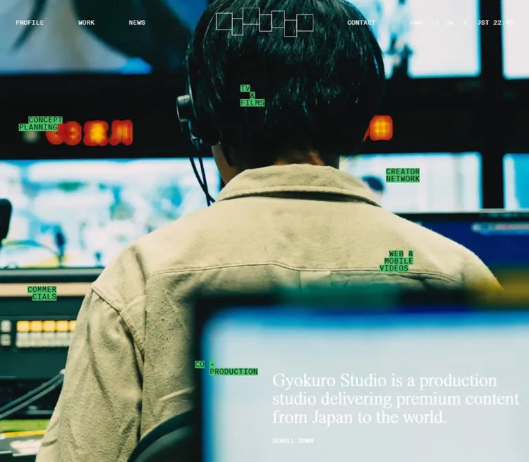
GYOKURO STUDIO presents its identity through a changing photographic opening rather than a large typographic masthead. Cool cyan city views and textured pavement fill the screen. A thin white logo made from connected, vertically offset rectangles sits centrally above the image. Small green-backed capability labels appear at scattered positions, while a light serif statement occupies the lower-right desktop corner.
The rest of the homepage has a more editorial structure. The recorded layout moves from a black news section into white studio statements, a selectively scaled work collection, and an extensive contact footer. Small monospaced headings provide orientation; serif passages carry the studio narrative; sans-serif text handles practical information and project titles. Preserve the contrast between cinematic imagery, compact technical labels, and generous editorial spacing.
How to Read This Reference
- Measured means a value appears in the supplied rendered DOM, custom properties, or computed styles. Measurements describe the recorded state, not every possible animation frame.
- Visually observed means a feature is visible in the supplied original-page captures. Only the opening viewport has this level of visual coverage.
- Estimated means a screenshot-based approximation, such as the green highlight color or visible logo stroke thickness.
- Calculated means a relationship derived from measured bounds, such as the likely 16:9 work-media proportions.
- Recommended means an implementation choice for a new build. Breakpoints, accessible hit areas, fallback surfaces, and unverified interaction behavior are not presented as source facts.
- Token names are descriptive aliases unless explicitly identified as source custom properties. Font stacks are computed declarations; individual font files and actual glyph fallback were not independently checked.
Lower-page rectangles extend far beyond the reported document height. The HTML and body also report zero-height rectangles while the main element matches the viewport. This is compatible with a managed or transformed content container, but the mechanism is not established. Use the recorded relationships as evidence without copying these unusual root dimensions.
Tokens — Colors
Core Palette
| Name | Value | Evidence | Role |
|---|---|---|---|
| Black | #000000 |
Measured; source --c-black: #000 |
Body base, opening section, news section, and text on white sections |
| White | #FFFFFF |
Measured; source --c-white: #fff |
Opening navigation and statement; studio, work, and footer root backgrounds |
| Capability Green | Approximately #4CBE73 |
Visual estimate; no corresponding source variable supplied | Tight highlights immediately behind scattered black capability lettering |
| Copy Control Wash | rgba(0, 0, 0, 0.1) |
Measured on both email-copy buttons | Small neutral pill behind the copy label |
| Cyan Atmosphere | Approximately #69B5BB |
Visual estimate from opening imagery | Photographic color reference, not a measured interface fill |
The source also exposes --c-white-num: 255, 255, 255 and --c-black-num: 0, 0, 0. These are channel values for the same two interface colors, not additional palette entries.
Photographic Color
The opening images contain pale cyan skies, deep teal shadows, off-white concrete, and muted red-orange architectural details. These colors belong to the media. They should not become a collection of unrelated button and section colors.
The dark horizontal areas in some frames change substantially between captures. Their origin could be within the media or a separate visual treatment; the supplied evidence does not resolve that distinction. Do not encode their exact shape as a permanent navigation background or modal veil.
Important lower-page limitation: news links report both a white background and white foreground text. The corresponding final card imagery and compositing are not visible in the supplied captures. This does not establish a white-on-white finished design. The Quick Start uses a black fallback behind these labels until appropriate media and contrast treatment are supplied.
Tokens — Typography
Editorial Serif
- Computed stack:
"Times Now", "Noto Serif JP", serif. - Measured weight:
300across the main statement, section display headings, large Japanese narrative passages, and text links. - Character: light, high-contrast, literary, and relatively compact vertically.
- Role: supplies the studio's voice while leaving the imagery visually dominant.
- Tracking: normal for the opening statement and narrative copy;
-0.03emfor the large bracketed section headings.
Retain the Japanese serif fallback when working with Japanese content. The English interface and Japanese body copy are part of the same editorial hierarchy.
Monospaced Utilities
- Computed family:
"Suisse Intl Mono". - Measured weight:
400. - Role: navigation, section labels, scroll cue, project captions, credits, and clock utilities.
- Tracking: normal in the supplied measurements; uppercase appearance should not be mistaken for added letter spacing.
The original computed stack does not show a fallback. A generic monospace fallback in the Quick Start is a recommendation for a reusable implementation.
Functional Sans Serif
- Computed stack:
"Suisse Intl", "Noto Sans JP", sans-serif. - Measured weight:
400. - Role: work titles placed within media regions, supporting studio explanation, addresses, email addresses, and social links.
- Character: straightforward and legible, subordinate to the editorial serif.
Type Scale
Values are font-size / line-height unless otherwise noted.
| Role | Desktop | Mobile | Family / weight | Evidence notes |
|---|---|---|---|---|
| Base body declaration | 11 / 11px |
11 / 11px |
Editorial / 300 | Source --fs: 11px; HTML itself remains 16px |
| Header navigation | 13 / 13px |
13 / 13px |
Mono / 400 | Mobile retains the same navigation size |
| Opening statement | 38 / 38px |
24 / 24px |
Editorial / 300 | Three lines in both captures |
| Scroll cue | 12 / 12px |
11 / 11px |
Mono / 400 | Measured paragraph, not a demonstrated button |
| Section eyebrow | 13 / 13px |
12 / 12px |
Mono / 400 | NEWS, ORIGINS, SPIRIT, MISSION, CONTACT |
| News introduction | 32 / 32px |
28 / 28px |
Editorial / 300 | Desktop width is an anomalous recorded state |
| News titles, first to fourth | 24/30, 22/27.5, 20/25, 18/22.5px |
18/21.6, 16.5/19.8, 15/18, 13/15.6px |
Editorial / 300 | Type decreases with the staircase cards |
| Bracketed section title | 64 / 64px |
40 / 40px |
Editorial / 300 | Tracking -1.92px and -1.2px, respectively |
| Main Japanese narrative | 32 / 40px |
21 / 25.2px |
Editorial / 300 | ORIGINS, SPIRIT, and MISSION paragraphs |
| Supporting studio explanation | 14 / 23.1px |
11 / 18.15px |
Sans / 400 | Both use a 1.65 line-height ratio |
| Work title within media region | 20 / 22px |
20 / 22px |
Sans / 400 | Does not shrink on mobile |
| Work caption and cooperation line | 11 / 13.2px |
11 / 13.2px |
Mono / 400 | Compact two-part metadata |
| View all / About us / All work | 14 / 14px |
14 / 14px |
Editorial / 300 | Measured link box height 36px |
| Closing statement | 42 / 42px |
24 / 24px |
Editorial / 300 | Three-line text block |
| Closing invitation | 17 / 17px |
13 / 13px |
Sans / 400 | Start your project with us |
| Contact details | 17 / 28.05px |
13 / 21.45px |
Sans / 400 | 1.65 line-height ratio |
| Footer credits | 11 / 13.2px |
11 / 13.2px |
Mono / 400 | Copyright and bottom utilities also use 11px |
| Floating capability labels | Approximately 15–16px |
Approximately 15–16px |
Visually monospaced | Estimate only; these labels lack supplied element measurements |
There is no evidence for making every title bold. The contrast comes primarily from family, size, placement, and background rather than weight changes.
Tokens — Spacing & Shapes
Source page inset: --pad: 32px on desktop and 16px on mobile.
Source base text variable: --fs: 11px at both widths.
Geometry: mostly square, open, and unboxed; small copy controls provide a localized rounded exception.
Spacing Scale
| Use | Desktop | Mobile | Status |
|---|---|---|---|
| Main page inset | 32px |
16px |
Measured source custom property |
| Caption clearance below work media | 6px |
6px |
Calculated from media ratio and caption position |
| Section-label flex gap | 8px |
8px |
Measured; does not identify the adjacent item's appearance |
| Hero statement to scroll cue | 24px |
24px |
Calculated from paragraph bounds |
| Hero cue to viewport bottom | 40px |
20px |
Calculated from bounds |
| Narrative eyebrow to paragraph | 24px |
16px |
Calculated from ORIGINS bounds |
| News top padding | 60px |
60px |
Measured |
| Studio section vertical padding | 120px |
60px |
Measured |
| Work section top / bottom padding | 120 / 240px |
60 / 120px |
Measured |
| Gap between work rows or groups | 120px |
48px |
Calculated from recorded item bounds |
| News staircase height decrement | 60px |
48px |
Calculated; adjacent cards share a bottom edge |
These values describe a combination of fine utility spacing and large editorial intervals. They do not establish a single global spacing-unit formula.
Shapes
| Element | Recorded or estimated shape | Notes |
|---|---|---|
| Header controls | Transparent, unboxed text | Sampled border radius 0 |
| Brand mark | Connected offset outline rectangles | Visible stroke approximately 1px; exact asset geometry unavailable |
| Capability highlights | Tight rectangular strips | No visible pill radius or generous badge padding |
| News and work link wrappers | Radius 0 |
Inner media masking was not independently measured |
| Copy button, desktop | 50 × 20px, radius 10px |
Measured button rectangle |
| Copy button, mobile | 50 × 18px, radius 9px |
Measured button rectangle |
| Text action links | Height 36px, radius 0 |
Border and internal decoration are not established by the extraction |
Opening Layout Measurements
| Element | Desktop: 1440 × 1000 | Mobile: 390 × 844 |
|---|---|---|
| Opening section | 1440 × 1000px |
390 × 844px |
| Header box | 1440 × 93px |
390 × 69px |
| Logo heading/link box | x 620, y 16; 201 × 81.59px |
x 121, y 12; 148 × 60.08px |
| First visible left navigation | PROFILE at 32, 40 |
WORK at 16, 28 |
| Opening statement | x 736, y 810; 510.61 × 114px |
x 16, y 717; 322.5 × 72px |
| Scroll cue | x 736, y 948; 510.61 × 12px |
x 16, y 813; 322.5 × 11px |
The logo's element box is taller than its visible outline drawing. Do not stretch the visible artwork to occupy every pixel of the measured heading rectangle.
Components
Overlay Header
Role: provide navigation and identity without separating the visitor from the opening image.
On desktop, PROFILE, WORK, and NEWS are distributed across the left side. The centered outline logo links to the Japanese homepage. CONTACT appears to the right of the logo, followed by LANG, EN, JA, a slash, and JST time near the right edge. All sampled header text is white, 13px monospaced, with no filled control surface.
The first three link positions are approximately x 32, 234.80, and 412.39px. Their intervening empty gaps are 144px in this desktop sample. A 10vw gap reproduces that particular relationship, but the source formula was not supplied.
On mobile, the visible header becomes WORK, the centered logo, and MENU. The logo width drops from 201px to 148px; the outer inset halves. This is a navigation recomposition, not proportional shrinking of every desktop item.
CONTACT is a button in the DOM, while PROFILE, WORK, NEWS, EN, JA, and the logo are anchors. The contact button's action and any sticky behavior after scrolling were not demonstrated.
Photographic Opening
Role: establish the production studio's visual world before introducing its news and work.
The opening fills the inspected viewport. Supplied frames show textured pavement with soft shadows and a broad Tokyo skyline with Tokyo Tower. The images reach every edge, with interface elements directly overlaid.
The desktop statement reads:
“Gyokuro Studio is a production / studio delivering premium content / from Japan to the world.”
It begins just to the right of the viewport midpoint: 736px, or 50% + 16px, in this sample. Its light serif treatment is substantial but does not dominate the whole screen. A small SCROLL DOWN line sits 24px below the statement.
On mobile, the same three-line statement moves to the lower left. Its measured width is 322.5px, leaving more space on the right than the normal 16px page inset. Keep this compact, left-aligned editorial block rather than expanding it into centered display typography.
The changing images establish temporal variation. The supplied evidence does not identify whether the implementation uses video, an image sequence, a slideshow, or a combination of media and masks.
Floating Capability Labels
Role: add a dispersed production vocabulary and a technical counterpoint to the serif statement.
Labels visible across the original-page frames include CONCEPT PLANNING, TV & FILMS, CREATOR NETWORK, WEB & MOBILE VIDEOS, CO-PRODUCTION, and COMMERCIALS. Their words break across short, offset lines. Bright green strips hug black monospaced lettering rather than filling a shared rectangular panel.
Representative desktop positions in the pavement frame are approximately:
| Label | Left / top | Relative anchor |
|---|---|---|
| CONCEPT PLANNING | 60 / 317px |
4.2% / 31.7% |
| TV & FILMS | 468 / 455px |
32.5% / 45.5% |
| CREATOR NETWORK | 966 / 191px |
67.1% / 19.1% |
| WEB & MOBILE VIDEOS | 978 / 553px |
67.9% / 55.3% |
| CO-PRODUCTION | 581 / 660px |
40.3% / 66% |
These are estimated frame positions, not a verified placement algorithm. Other frames shift some labels horizontally and show partial words. Mobile frames redistribute the visible labels vertically, with some text cropped at the right edge.
No supplied link or button evidence establishes the labels as interactive controls. Treat them as a visual layer unless an implementation has an independent functional requirement. For a new build, essential service information should remain available as complete semantic text elsewhere.
News Staircase
Role: introduce four current news entries with a descending visual hierarchy.
The section starts immediately after the opening: recorded y 1000px on desktop and 844px on mobile. Its background is black, with a NEWS eyebrow, a serif introduction, and a View all anchor.
Four article links form a bottom-aligned staircase in the recorded DOM. Dates and titles belong to the linked card. Headline sizes decrease with card size.
| Card | Desktop width × height | Desktop top | Mobile width × height | Mobile left / top |
|---|---|---|---|---|
| First | 387.25 × 494px |
1407px |
282 × 370px |
16 / 1138px |
| Second | 387.25 × 434px |
1467px |
282 × 322px |
298 / 1186px |
| Third | 300.73 × 374px |
1527px |
219 × 274px |
580 / 1234px |
| Fourth | 300.73 × 314px |
1587px |
219 × 226px |
799 / 1282px |
Desktop cards end at approximately y 1901px; mobile cards end at 1508px. Their recorded horizontal edges touch, with no intervening card gap. Padding changes from 12px 16px 16px on desktop to 20px 24px 24px on mobile.
The mobile sequence extends beyond the viewport rather than becoming a vertical list in the recorded state. Horizontal movement is therefore a reasonable implementation direction, but swipe, drag, scroll snapping, and automatic movement were not exercised.
The desktop introduction is recorded at x 1312px with only 96px width despite 32px type. This unusual offscreen measurement should not become a universal layout rule. The mobile introduction occupies the normal 358px content width.
Studio Narrative: Origins, Spirit, Mission
Role: explain the studio's name, creative principles, and international ambition.
This section switches to a measured white background with black text. It combines small uppercase monospaced labels with substantial Japanese serif passages. The bracketed English title What is [ Gyokuro ] acts as a larger editorial marker.
Desktop text blocks deliberately use different widths and offsets:
| Block | Recorded desktop left / width | Mobile treatment |
|---|---|---|
| ORIGINS paragraph | 146 / 766px |
16 / 358px |
| SPIRIT paragraph | 48 / 652px |
16 / 358px |
| MISSION paragraph | 260 / 424px |
16 / 358px |
| Supporting explanation | 870 / 310px |
141.31 / 232.69px |
The three leading passages become aligned, nearly full-width blocks on mobile. The supporting sans-serif explanation remains a narrow right-aligned column: approximately 65% of the mobile content width. This retained asymmetry is an important responsive detail.
Large blank intervals occur between the recorded passages and title. Their exact visual contents are not established by the screenshots. Preserve deliberate breathing room, but do not invent illustrations or claim that every interval is empty in the finished page.
An About us link concludes the section. Its recorded width is approximately 152.19px and its height is 36px at both viewports.
Work Entry
Role: link to an individual production while distinguishing the work itself from its supporting metadata.
Each entry includes a project title, year, genre text, a title positioned within the media region, and a separate caption with a production-cooperation line. The six current entries are Majority Rules, The Balance, Cooking Rush!, Cash or Splash!, Mega Catch, and Secret Little Assistant, whose Japanese title appears as ひみつのお手伝い.
The measured title within the media region uses white sans-serif text at 20/22px. Its inset is 24px horizontally and 20px vertically on desktop, changing to 16px horizontally on mobile. The year and category text exist in the DOM, but their individual styling and positions were not supplied.
A 16:9 media area followed by a 6px caption gap explains the recorded geometry consistently:
- Desktop featured entry:
558 × 9/16 = 313.875px; the caption starts319.875pxbelow the entry top. - Mobile entry:
358 × 9/16 = 201.375px; the caption starts207.375pxbelow the entry top. - Desktop secondary entry:
255.5 × 9/16 = 143.71875px; the caption starts approximately149.72pxbelow the entry top.
This is a calculated relationship, not a directly supplied aspect-ratio declaration. It is sufficiently consistent to use as the starting implementation ratio.
The caption and cooperation line use black 11/13.2px monospaced text. Cooperation lines have 60px right padding in the recorded styles, which can cause additional wrapping on smaller desktop entries.
Work Collection
Role: prioritize selected projects without giving every item the same visual weight.
The section title is Latest [ Work ], at 64px desktop and 40px mobile, with -0.03em tracking.
On desktop, the first row contains two large 558px entries at x 32 and 850px, leaving a 260px central gap. The second row contains four 255.5px entries at x 32, 405.5, 779, and 1152.5px. Their gaps are 118px.
On mobile, all six entries become a single column at 358px width with approximately 48px between entry bounds. The collection preserves full project titles and cooperation captions. An All work link follows the collection.
The supplied screenshots do not show project media or hover states. Do not infer specific thumbnail artwork, image effects, or reveal behavior from the text and rectangles alone.
Repeated-Text Action Links
Role: provide restrained routes to complete collections and studio information.
View all, About us, and All work each appear twice in the extracted text of a single anchor. Their measured height is 36px, with 14px light serif text. Desktop widths are approximately 143.03px, 152.19px, and 144.72px, respectively.
Duplicated text could support a visual transition or alternate text layer, but its function was not demonstrated. Render one accessible label in a new implementation. If duplicate visual layers are introduced, hide the redundant copy from assistive technology.
Do not infer a pill, outline, arrow shape, or rolling hover animation from the duplicated strings alone.
Closing Statement Region
Role: bridge the project collection and the invitation to collaborate.
The footer contains a centered three-line statement, We deliver / premium Japanese entertainment / worldwide, followed by Start your project with us.
The statement measures 544.28 × 126px at desktop and 311.03 × 72px on mobile. Its horizontal bounds are centered in both viewports. Type changes from 42px to 24px; the supporting invitation changes from 17px to 13px.
Both pieces are white in the computed styles, while the footer root is white. The background or media layer behind this region is not separately recorded. A dark or suitable photographic background is necessary in an adaptation, but its exact source appearance is unverified.
Contact and Business Information
Role: make the studio and business-operation contacts available without introducing a form-heavy interface.
The footer includes a CONTACT block for GYOKURO STUDIO and a BUSINESS OPERATION block labeled NIPPON TV LA. Address, email, and social rows use compact prefixes such as A., E., and S. The page links to a map, Instagram, TikTok, LinkedIn, and the business-operation website.
Measured desktop contact details use 17/28.05px sans-serif text; mobile uses 13/21.45px. The small uppercase section labels retain the monospaced hierarchy. Mobile label positions begin at x 33px, with detail values at x 61px, creating a 28px label-to-value offset.
Two email controls contain Copy and Copied text. Their small gray pill geometry is measured, but successful clipboard interaction and feedback timing were not tested. The sampled email strings are paragraphs, not demonstrated mailto links.
Logo Motion, Clock, and Footer Credits
Role: extend the studio identity into a final collection of practical and creative details.
The DOM contains VIEW LOGO MOTION and a PLAY button, along with art-direction, logo-motion, and sound-design credits. A separate photo credit and a Website by line are also present on the current page. These use compact 11px monospaced text.
EDT and JST appear as buttons near a larger clock composition. The opening header displays JST 22:43, consistent with the retrieval time. Neither clock updates nor time-zone switching were observed.
On desktop, footer information is distributed across distinct horizontal regions. On mobile, the recorded clock controls occur after the logo-motion credits, and the copyright, privacy link, and website credit occupy separate vertical positions. This supports a substantial mobile rearrangement rather than a scaled desktop footer.
Mobile Menu: Evidence Boundary
The initial mobile header shows MENU. Additional DOM text includes CLOSE, navigation labels, language controls, time, and a privacy-policy label. This establishes menu-related content, but not its open-state composition.
No open-menu screenshot, focus behavior, transition duration, or dismissal interaction is available. Any menu implementation in a new build should be explicitly treated as an addition.
Tokens — Motion & Interaction
| Treatment | Evidence | What can be retained |
|---|---|---|
| Body background transition | Measured background-color 0.4s cubic-bezier(0.3, 0.1, 0.1, 1) |
A restrained 400ms surface-color transition |
| Header text-color transition | Measured color 0.4s cubic-bezier(0.3, 0.1, 0.1, 1) |
Matching transition when header contrast state changes |
| Changing photographic opening | Different original-page frames show pavement and city imagery | Temporal variation; media type, duration, and sequence remain unknown |
| Dark horizontal occlusions | Large dark regions differ between frames | Part of the captured visual changes; implementation layer is unresolved |
| Capability fragments | Label positions and visible letter fragments differ between frames | Fragmented, temporally variable lettering; no verified timing or easing |
| Repeated action text | Duplicate labels within single anchors | Possible layered text structure; no demonstrated animation |
| Email copy | Copy and Copied strings within buttons | Intended action and available feedback text; clipboard success untested |
| Logo motion | PLAY button and motion-related credits | Explicit playback affordance; playback and sound behavior untested |
| Time-zone controls | EDT and JST buttons | Available controls; switching outcome untested |
| Mobile menu | MENU button and menu-related DOM | Navigation affordance; open-state behavior untested |
The sampled elements generally report animation: none. This does not exclude animations on descendants, pseudo-elements, media, canvas, or JavaScript-controlled layers. Likewise, a recorded transition value of all does not establish a meaningful duration.
Do not invent a frame rate, looping interval, scroll-scrub relationship, parallax depth, or animation library. For a new build, preserve readable, stable navigation and body copy while concentrating motion in the media and decorative lettering.
Surfaces
| Layer | Evidence-based appearance | Implementation implication |
|---|---|---|
| Opening base | Measured black, visually covered by imagery | Provide a black fallback while media loads |
| Opening navigation | Transparent with white text and outline logo | Keep it visually integrated with the image |
| Capability strips | Green rectangular highlights with black lettering | Small, localized accents rather than full-width panels |
| News section | Measured black with white text | Maintain a distinct dark editorial chapter |
| News link wrappers | White background and white foreground in computed data | Finished media/compositing unresolved; validate actual contrast |
| Studio narrative | Measured white with black text | Open editorial canvas with offset text blocks |
| Work collection | Measured white; transparent link wrappers | Let media and typography establish grouping |
| Footer root | Measured white with black information text | Keep contact information practical and open |
| Copy control | Black at 10% opacity | A small neutral rounded exception |
No general elevated-card system is visible in the opening captures. Sampled wrappers have square corners. Avoid introducing a page-wide shadow and rounding language that competes with the rectilinear identity.
Imagery
The original-page captures show a photographic, cinematic treatment of everyday Japanese surroundings. One desktop frame turns paving joints, surface grain, and soft tree shadows into an almost abstract composition. Other frames use a cyan-tinted skyline with Tokyo Tower as a recognizable landmark.
The crop changes substantially on mobile. Tokyo Tower sits close to the left edge, while sky and city fill the tall screen. This is not a small, uncropped version of the desktop image. Subject placement should be checked separately for wide and tall viewports.
Retain natural texture, nuanced shadows, and restrained color grading. These are continuous-tone images, so normal image rendering is appropriate; pixelated scaling would change the observed character.
Observed Asset References
No asset URLs, video sources, image dimensions, font-file URLs, or logo paths were included in the supplied original-page evidence.
| Asset category | What is established | What remains unavailable |
|---|---|---|
| Opening photographic media | Pavement and Tokyo skyline appear in current captures | File paths, format, sequence, playback settings |
| Outline logo | Centered chain of offset white rectangles | Original SVG or other source asset |
| Capability lettering | Green-backed fragments visible over imagery | Rendering technology and animation source |
| Work media regions | Geometry strongly supports 16:9 proportions | Actual images and their crop rules |
| Closing statement background | White foreground text exists inside the footer | Background asset and compositing |
| Logo motion | A named playback control exists | Media source, playback state, and sound behavior |
Use authorized media and the actual brand asset when available. CSS can reproduce the layout and text relationships, but it cannot supply the identity of the photographic sequence or logo motion.
Layout & Responsive Behavior
Page Sequence
The recorded section order is opening, news, studio narrative, work, and footer.
| Section | Desktop top / height | Mobile top / height |
|---|---|---|
| Opening | 0 / 1000px |
0 / 844px |
| News | 1000 / 902px |
844 / 665px |
| Studio narrative | 1902 / 1962.94px |
1509 / 1530.98px |
| Work | 3864.94 / 1360.61px |
3039.98 / 2021.63px |
| Footer | 5225.55 / 2351.80px |
5061.61 / 3131.66px |
These are recorded coordinate bounds. Their total extents are approximately 7577px and 8193px, but the browser extraction reports document heights of only 1000px and 844px. Do not interpret either figure alone as a verified native scroll range.
Responsive Changes
| System | Desktop | Mobile |
|---|---|---|
| Header | Full navigation, contact, language, and time | WORK and MENU around the logo |
| Page inset | 32px |
16px |
| Opening statement | Lower right, 38px |
Lower left, 24px |
| Capability field | Broadly dispersed | More vertically distributed; some edge clipping |
| News | Four cards fit across the content width | Recorded card sequence extends horizontally beyond the viewport |
| Main studio passages | Different offsets and widths | Shared 358px text width |
| Supporting studio paragraph | Narrow right-side column | Still right aligned at about 65% of content width |
| Work | Two featured entries, then four smaller entries | Six equal-width entries in one column |
| Footer | Information distributed horizontally | Longer vertical arrangement |
Only these two viewport sizes were inspected. The original media-query breakpoints and intermediate interpolation rules are unknown. A recommended build should test intermediate widths for header collisions, long Japanese headlines, and contact-line wrapping.
Do’s and Don’ts
Do
- Keep the opening edge-to-edge and photographic, with a reliable black loading fallback.
- Use the connected outline logo as the central identity anchor.
- Preserve light serif statements, compact monospaced utilities, and functional sans-serif detail text.
- Keep green confined mainly to tight capability highlights.
- Position the opening statement near the lower right on desktop and lower left on mobile.
- Preserve the black-to-white transition between news and studio narrative.
- Use deliberate changes in column width and offset for the studio story.
- Preserve the descending news hierarchy and the two-large/four-small desktop work hierarchy.
- Retain the narrow right-aligned supporting paragraph on mobile.
- Separate verified source values from adaptations, especially for lower-page surfaces and motion.
Don’t
- Don’t replace the production-studio homepage with an unrelated conversion-page structure.
- Don’t turn the green text fragments into large rounded action buttons.
- Don’t replace the outline logo with a typed wordmark when the authentic asset is available.
- Don’t use bold sans-serif typography for every heading.
- Don’t hardcode a single captured dark band as permanent page chrome.
- Don’t assign precise animation durations or interaction semantics to the floating labels without evidence.
- Don’t make all desktop work entries equally sized.
- Don’t reproduce white-on-white news cards from incomplete computed-style evidence.
- Don’t treat clipped decorative fragments as acceptable presentation for essential information.
- Don’t copy the zero-height root rectangles or viewport-sized document-height anomaly into a normal implementation.
Recommended Implementation Additions
These are recommendations for a new implementation, not verified features of the original website:
- Keep essential text and navigation usable while decorative media loads, fails, or pauses.
- Supply a static poster and reduced-motion mode; pause any media or JavaScript animation as well as hiding it visually.
- Maintain text contrast across all media frames. Use a carefully placed local scrim when necessary, and test the thin white serif statement on bright imagery.
- Give the logo link an accessible name. If capability fragments are decorative, hide those fragments from assistive technology and provide complete service information elsewhere.
- Expand small text controls to approximately
44pxinteractive targets without enlarging their visible lettering or gray copy chips. - Implement the mobile menu with an explicit expanded state, keyboard focus handling, Escape dismissal, and focus return.
- Make an adapted horizontal news rail reachable by keyboard and touch. Keep all four articles available when scripting is disabled.
- Announce successful copy feedback politely, and provide an actual email link where useful.
- Consider a larger mobile supporting-body minimum than the observed
11pxwhen adapting the design for substantial reading. - Prefer native document flow unless the original scrolling behavior is independently verified and required.
Agent Prompt Guide
Quick Color Reference
- Structural black:
#000000, measured. - Structural white:
#FFFFFF, measured. - Capability highlight: approximately
#4CBE73, estimated. - Copy-control fill:
rgba(0, 0, 0, 0.1), measured. - Photographic cyan: approximately
#69B5BB, estimated and confined to imagery. - Header and opening statement: white over the media.
- Studio and work text: black over white.
Overall Prompt
“Create a Japanese production-studio homepage inspired by GYOKURO STUDIO's observed composition. Begin with a full-viewport photographic scene using cool cyan city imagery and natural texture. Overlay a centered, thin outlined geometric logo, small white monospaced navigation, scattered green-backed capability fragments, and a light serif statement at the lower right. Use a black news chapter with descending card dimensions, followed by white editorial studio passages with varied column offsets. Present two large featured projects above four smaller projects, with landscape media and tiny monospaced cooperation captions. On mobile, simplify the header to WORK and MENU, move the statement to the lower left, align the main narrative passages, and stack the work entries. Use measured black and white, an estimated green accent, generous section spacing, and restrained typography. Treat media timing and unobserved interaction states as separate implementation decisions.”
Example Component Prompts
- Opening: “Build a 1440 × 1000 photographic opening with white 13px monospaced navigation and a centered 201px outline-logo asset. Place a 38/38px light serif statement at x 736px near the bottom, with a 12px scroll cue 24px below it. At 390 × 844, use a 148px logo and a 24/24px statement at the 16px left inset.”
- Capability label: “Make a small decorative label from short, staggered monospaced lines with green highlights hugging the black letters. Keep square corners and nearly no padding. Use full readable text as the static fallback; do not make the fragment layer a service-navigation control.”
- News sequence: “Create four bottom-aligned news entries whose heights descend by 60px on desktop and 48px on mobile. Start from desktop heights 494, 434, 374, and 314px. Use decreasing light-serif headline sizes and no rounded-card elevation. Supply contrast-safe media surfaces; final source card compositing was not established.”
- Studio narrative: “Set ORIGINS, SPIRIT, and MISSION as small monospaced eyebrows above light Japanese serif passages. Vary desktop offsets and widths. On mobile, align the main passages to a 358px content width but keep the supporting sans-serif explanation right aligned at roughly 65% width.”
- Work collection: “Use two 558px featured project entries followed by four 255.5px secondary entries at a 1440px viewport. Start with 16:9 media, a white 20px sans-serif title inside the media area, then black 11/13.2px monospaced captions 6px below. Stack all projects at 358px width on mobile.”
- Contact details: “Build an open white contact area with small uppercase monospaced headings, A./E./S. row labels, practical sans-serif details, and compact gray copy chips. Keep the visible chip near 50 × 20px while providing a larger accessible hit area.”
Quick Start
CSS Custom Properties
This is a reusable adaptation, not an extraction of the original stylesheet. It preserves measured endpoint sizes and major component relationships. The 1100px breakpoint is recommended, not observed. It uses native document flow, contrast-safe fallback surfaces, and larger action targets.
Load the named fonts only when available and authorized; otherwise the declared fallbacks apply. Supply media through real image or video elements and use the authorized logo asset. No original asset paths are invented here.
:root {
  /* Measured source colors and page inset */
  --c-black: #000;
  --c-white: #fff;
  --pad: 16px;
  --fs: 11px;

  /* Estimated visual accent */
  --capability-green: #4cbe73;
  --copy-wash: rgb(0 0 0 / 10%);

  /* Source families, with reusable fallback additions */
  --font-editorial: 'Times Now', 'Noto Serif JP', serif;
  --font-utility: 'Suisse Intl Mono', ui-monospace, monospace;
  --font-body: 'Suisse Intl', 'Noto Sans JP', sans-serif;

  /* Measured mobile endpoint */
  --header-height: 69px;
  --logo-width: 148px;
  --logo-top: 12px;
  --hero-size: 24px;
  --hero-copy-width: 322.5px;
  --hero-bottom: 20px;
  --cue-size: 11px;
  --label-size: 12px;
  --display-size: 40px;
  --story-size: 21px;
  --story-leading: 1.2;
  --section-space: 60px;
  --work-bottom: 120px;
  --work-gap: 48px;
  --detail-size: 11px;
  --contact-size: 13px;
  --closing-size: 24px;
  --news-height: 370px;
  --news-step: 48px;

  /* Measured transition */
  --surface-duration: 400ms;
  --surface-easing: cubic-bezier(0.3, 0.1, 0.1, 1);
}

* { box-sizing: border-box; }

body {
  margin: 0;
  color: var(--c-black);
  background: var(--c-black);
  font: 300 var(--fs)/1 var(--font-editorial);
  transition: background-color var(--surface-duration)
    var(--surface-easing);
}

button, a { -webkit-tap-highlight-color: transparent; }
button { font: inherit; }
a { color: inherit; }

/* Overlay at the page opening; persistent positioning is unverified. */
.site-header {
  position: absolute;
  inset: 0 0 auto;
  z-index: 10;
  display: flex;
  align-items: center;
  justify-content: space-between;
  height: var(--header-height);
  padding-inline: var(--pad);
  color: var(--c-white);
  font: 400 13px/1 var(--font-utility);
  transition: color var(--surface-duration) var(--surface-easing);
}

.header-desktop { display: none; }
.header-mobile { display: inline-flex; }
.header-nav, .header-tools { align-items: center; gap: 10vw; }

.brand {
  position: absolute;
  top: var(--logo-top);
  left: 50%;
  width: var(--logo-width);
  transform: translateX(-50%);
}

.brand img, .brand svg { display: block; width: 100%; height: auto; }

.nav-control {
  display: inline-grid;
  place-items: center;
  min-height: 44px;
  padding: 0;
  border: 0;
  color: inherit;
  background: transparent;
  text-decoration: none;
  text-transform: uppercase;
  cursor: pointer;
}

/* Stable viewport sizing is an adaptation choice. */
.hero {
  position: relative;
  isolation: isolate;
  min-height: 100svh;
  overflow: hidden;
  color: var(--c-white);
  background: var(--c-black);
}

.hero-scene {
  position: absolute;
  inset: 0;
  z-index: -1;
}

.hero-scene > img, .hero-scene > video {
  position: absolute;
  inset: 0;
  width: 100%;
  height: 100%;
  object-fit: cover;
  object-position: var(--scene-position, center);
}

.hero-copy {
  position: absolute;
  left: var(--pad);
  bottom: calc(var(--hero-bottom) + env(safe-area-inset-bottom, 0px));
  width: min(var(--hero-copy-width), calc(100% - 2 * var(--pad)));
}

.hero-statement {
  margin: 0;
  font: 300 var(--hero-size)/1 var(--font-editorial);
}

.hero-line { display: block; }

.scroll-cue {
  margin: 24px 0 0;
  font: 400 var(--cue-size)/1 var(--font-utility);
}

/* Decorative layer: choose anchors for each composition. */
.capability-field { position: absolute; inset: 0; pointer-events: none; }
.capability {
  position: absolute;
  left: var(--x, 10%);
  top: var(--y, 30%);
  color: var(--c-black);
  font: 400 16px/0.94 var(--font-utility);
}
.capability > span {
  display: table;
  background: var(--capability-green);
}
.capability > span:nth-child(even) { margin-left: 10px; }

.eyebrow {
  margin: 0 0 16px;
  font: 400 var(--label-size)/1 var(--font-utility);
  text-transform: uppercase;
}

.section-title {
  margin: 0 0 var(--section-space);
  font: 300 var(--display-size)/1 var(--font-editorial);
  letter-spacing: -0.03em;
}

.text-link {
  display: inline-flex;
  align-items: center;
  justify-content: center;
  min-height: 44px;
  padding-inline: 12px;
  font: 300 14px/1 var(--font-editorial);
  text-decoration: none;
}

/* Native horizontal access is recommended, not source-verified. */
.news {
  padding: 60px var(--pad) 0;
  color: var(--c-white);
  background: var(--c-black);
}
.news-intro { margin: 0 0 20px; font-size: 28px; line-height: 1; }
.news-rail { overflow-x: auto; }
.news-track {
  display: grid;
  grid-template-columns: 282px 282px 219px 219px;
  align-items: end;
  width: max-content;
  margin-top: 64px;
}
.news-card {
  --step: 0;
  --news-title-size: 18px;
  position: relative;
  isolation: isolate;
  display: flex;
  flex-direction: column;
  justify-content: space-between;
  min-height: calc(var(--news-height) - var(--step) * var(--news-step));
  padding: 20px 24px 24px;
  color: var(--c-white);
  background: var(--c-black);
  border-radius: 0;
  text-decoration: none;
}
.news-card:nth-child(2) { --step: 1; --news-title-size: 16.5px; }
.news-card:nth-child(3) { --step: 2; --news-title-size: 15px; }
.news-card:nth-child(4) { --step: 3; --news-title-size: 13px; }
.news-card-title {
  margin: 0;
  font: 300 var(--news-title-size)/1.2 var(--font-editorial);
}

/* Add tested media layers to news cards before using photographic text. */
.editorial, .works {
  padding: var(--section-space) var(--pad);
  color: var(--c-black);
  background: var(--c-white);
}
.story-block { margin-bottom: var(--section-space); }
.story-lead {
  margin: 0;
  max-width: 766px;
  font: 300 var(--story-size)/var(--story-leading) var(--font-editorial);
}
.editorial-detail {
  width: 65%;
  margin-left: auto;
  font: 400 var(--detail-size)/1.65 var(--font-body);
}
.works { padding-bottom: var(--work-bottom); }
.work-featured, .work-secondary { display: grid; gap: var(--work-gap); }
.work-secondary { margin-top: var(--work-gap); }
.work-entry { display: block; color: inherit; text-decoration: none; }
.work-media {
  position: relative;
  aspect-ratio: 16 / 9;
  overflow: hidden;
  color: var(--c-white);
  background: var(--c-black);
}
.work-media img { display: block; width: 100%; height: 100%; object-fit: cover; }
.work-media-title {
  position: absolute;
  inset: 20px 16px auto;
  margin: 0;
  font: 400 20px/22px var(--font-body);
}
.work-meta { margin-top: 6px; font: 400 11px/1.2 var(--font-utility); }
.work-meta p { margin: 0; }
.work-cooperation { padding-right: 60px; }

/* Contrast-safe closing fallback; original background is unavailable. */
.closing {
  display: grid;
  place-items: center;
  min-height: 100svh;
  padding: var(--pad);
  color: var(--c-white);
  background: var(--c-black);
}
.closing-statement {
  max-width: 544.28px;
  margin: 0;
  font: 300 var(--closing-size)/1 var(--font-editorial);
}
.contact-info {
  padding: 33px;
  color: var(--c-black);
  background: var(--c-white);
  font: 400 var(--contact-size)/1.65 var(--font-body);
}
.contact-row { display: grid; grid-template-columns: 20px minmax(0, 1fr); gap: 8px; }
.contact-row a { overflow-wrap: anywhere; }
.copy-control { min-height: 44px; border: 0; background: transparent; cursor: pointer; }
.copy-chip {
  display: inline-grid;
  place-items: center;
  min-width: 50px;
  height: 18px;
  border-radius: 9px;
  background: var(--copy-wash);
  font-size: 13px;
  line-height: 1;
}

/* Recommended breakpoint; only endpoint measurements were supplied. */
@media (min-width: 1100px) {
  :root {
    --pad: 32px;
    --header-height: 93px;
    --logo-width: 201px;
    --logo-top: 16px;
    --hero-size: 38px;
    --hero-copy-width: 510.609px;
    --hero-bottom: 40px;
    --cue-size: 12px;
    --label-size: 13px;
    --display-size: 64px;
    --story-size: 32px;
    --story-leading: 1.25;
    --section-space: 120px;
    --work-bottom: 240px;
    --work-gap: 120px;
    --detail-size: 14px;
    --contact-size: 17px;
    --closing-size: 42px;
    --news-height: 494px;
    --news-step: 60px;
  }
  .header-mobile { display: none; }
  .header-desktop { display: flex; }
  .hero-copy {
    left: calc(50% + 16px);
    width: min(var(--hero-copy-width), calc(50% - 48px));
  }
  .eyebrow { margin-bottom: 24px; }
  .news-intro { max-width: 420px; font-size: 32px; }
  .news-track {
    width: 100%;
    grid-template-columns: 1.2877fr 1.2877fr 1fr 1fr;
  }
  .news-card { padding: 12px 16px 16px; --news-title-size: 24px; }
  .news-card:nth-child(2) { --news-title-size: 22px; }
  .news-card:nth-child(3) { --news-title-size: 20px; }
  .news-card:nth-child(4) { --news-title-size: 18px; }
  .news-card-title { line-height: 1.25; }
  .editorial-detail { width: 310px; }
  .work-featured {
    grid-template-columns: repeat(2, minmax(0, 40.5523%));
    justify-content: space-between;
  }
  .work-secondary {
    grid-template-columns: repeat(4, minmax(0, 18.5683%));
    justify-content: space-between;
  }
  .work-media-title { inset-inline: 24px; }
  .copy-chip { height: 20px; border-radius: 10px; font-size: 12px; }
}

/* Recommended keyboard visibility, independent of source hover behavior. */
:where(a, button):focus-visible {
  outline: 2px solid currentColor;
  outline-offset: 4px;
}

@media (prefers-reduced-motion: reduce) {
  body, .site-header { transition: none; }
  .hero-scene > video { display: none; }
  .capability { animation: none; transition: none; }
  /* Keep a poster image beneath video and stop playback in application code. */
}
Suggested component nesting:
.herocontains.hero-scene, an optional decorative.capability-field, and.hero-copy..hero-scenecontains an authorized poster image and, if required, a video above it. Set--scene-positionseparately for each crop..capabilitycontains onespanper highlighted line, with--xand--yset per composition..news-railcontains.news-track, whose children are four.news-cardanchors..work-featuredand.work-secondarycontain.work-entryanchors. Each entry contains.work-mediaand.work-meta..copy-controlis the functional button;.copy-chipis its smaller visible label surface.
The CSS intentionally does not invent the original media sequence, news-card compositing, menu overlay, text-reveal effect, clock implementation, or clipboard logic. Those require separate assets and behavior. Supply complete text and static media before adding motion.
Tailwind v4 Token Mapping
Optional mapping for a project already using Tailwind v4. This is not evidence that the original website uses Tailwind. Define the custom properties above first.
@theme inline {
  --color-ink: #000000;
  --color-paper: #ffffff;
  --color-capability: var(--capability-green);
  --color-copy-control: var(--copy-wash);

  --font-display: var(--font-editorial);
  --font-mono: var(--font-utility);
  --font-sans: var(--font-body);

  --text-hero: var(--hero-size);
  --text-section: var(--display-size);
  --text-eyebrow: var(--label-size);
  --text-caption: 11px;
  --text-project-title: 20px;

  --spacing-inset: var(--pad);
  --spacing-section: var(--section-space);
  --spacing-work-gap: var(--work-gap);
  --radius-copy: 10px;
}
Sources & Evidence
- Inspected original and final page: GYOKURO STUDIO Japanese homepage. The supplied browser observation reports HTTP
200with an unchanged final URL. - Capture timestamp: September 12, 2026,
13:43:46.557 UTC, equivalent to22:43:46.557 JST. - Visual coverage: three original-page desktop frames at
1440 × 1000and two original-page mobile frames at390 × 844. These establish the opening imagery, logo appearance, navigation composition, floating labels, and statement placement. - Rendered evidence: page title, visible-text extraction, anchor destinations, element rectangles, source custom properties, and computed typography, colors, padding, radii, and transition declarations at both viewports.
- Content coverage: news, studio narrative, work entries, contact information, business-operation information, motion controls, and footer credits are represented in the supplied DOM. Their final lower-page visual appearance is not covered by the supplied screenshots.
- Inspection procedure: the supplied browser notes describe load, layout-stability, image-decoding, and animation-readiness checks, with finite waiting limits. Perpetual animations were resumed after readiness checks. These checks do not establish complete interaction or delayed-content coverage.
- Interaction boundary: no supplied activation result verifies menu opening, contact navigation, article dragging, project hover effects, clipboard writes, time-zone switching, or logo playback. Linked destinations were recorded but not separately inspected.
- Asset and layout limitations: no original asset paths or full stylesheet were supplied. Viewport-sized document heights conflict with the deeper recorded content bounds, so the scrolling implementation remains unresolved.
This reference describes the current supplied page evidence. Measured endpoint values, screenshot estimates, calculated relationships, and recommended implementation additions are distinguished throughout.
# GYOKURO STUDIO — Style Reference

> Cinematic Japanese city imagery, green text fragments, and a quiet editorial voice.

**Website:** [gyokuro-s.com/ja](https://gyokuro-s.com/ja/)
**Original URL:** https://gyokuro-s.com/ja/
**Final URL:** https://gyokuro-s.com/ja/
**Theme:** photographic opening over a black base, followed by black and white editorial sections; no user-selectable theme was demonstrated.
**Inspected:** September 12, 2026, at 13:43:46.557 UTC / 22:43:46.557 JST, using the supplied browser evidence.
**Viewports:** 1440 × 1000 desktop and 390 × 844 mobile, in CSS pixels.
**Scope:** the current Japanese production-studio homepage. Visual evidence covers three desktop opening frames and two mobile opening frames. Rendered DOM and computed-style evidence additionally cover news, studio philosophy, six work entries, contact information, and footer utilities. Destination pages and activated controls were not inspected.

GYOKURO STUDIO presents its identity through a changing photographic opening rather than a large typographic masthead. Cool cyan city views and textured pavement fill the screen. A thin white logo made from connected, vertically offset rectangles sits centrally above the image. Small green-backed capability labels appear at scattered positions, while a light serif statement occupies the lower-right desktop corner.

The rest of the homepage has a more editorial structure. The recorded layout moves from a black news section into white studio statements, a selectively scaled work collection, and an extensive contact footer. Small monospaced headings provide orientation; serif passages carry the studio narrative; sans-serif text handles practical information and project titles. Preserve the contrast between cinematic imagery, compact technical labels, and generous editorial spacing.

## How to Read This Reference

- **Measured** means a value appears in the supplied rendered DOM, custom properties, or computed styles. Measurements describe the recorded state, not every possible animation frame.
- **Visually observed** means a feature is visible in the supplied original-page captures. Only the opening viewport has this level of visual coverage.
- **Estimated** means a screenshot-based approximation, such as the green highlight color or visible logo stroke thickness.
- **Calculated** means a relationship derived from measured bounds, such as the likely 16:9 work-media proportions.
- **Recommended** means an implementation choice for a new build. Breakpoints, accessible hit areas, fallback surfaces, and unverified interaction behavior are not presented as source facts.
- Token names are descriptive aliases unless explicitly identified as source custom properties. Font stacks are computed declarations; individual font files and actual glyph fallback were not independently checked.

Lower-page rectangles extend far beyond the reported document height. The HTML and body also report zero-height rectangles while the main element matches the viewport. This is compatible with a managed or transformed content container, but the mechanism is not established. Use the recorded relationships as evidence without copying these unusual root dimensions.

## Tokens — Colors

### Core Palette

| Name | Value | Evidence | Role |
| --- | --- | --- | --- |
| Black | `#000000` | Measured; source `--c-black: #000` | Body base, opening section, news section, and text on white sections |
| White | `#FFFFFF` | Measured; source `--c-white: #fff` | Opening navigation and statement; studio, work, and footer root backgrounds |
| Capability Green | Approximately `#4CBE73` | Visual estimate; no corresponding source variable supplied | Tight highlights immediately behind scattered black capability lettering |
| Copy Control Wash | `rgba(0, 0, 0, 0.1)` | Measured on both email-copy buttons | Small neutral pill behind the copy label |
| Cyan Atmosphere | Approximately `#69B5BB` | Visual estimate from opening imagery | Photographic color reference, not a measured interface fill |

The source also exposes `--c-white-num: 255, 255, 255` and `--c-black-num: 0, 0, 0`. These are channel values for the same two interface colors, not additional palette entries.

### Photographic Color

The opening images contain pale cyan skies, deep teal shadows, off-white concrete, and muted red-orange architectural details. These colors belong to the media. They should not become a collection of unrelated button and section colors.

The dark horizontal areas in some frames change substantially between captures. Their origin could be within the media or a separate visual treatment; the supplied evidence does not resolve that distinction. Do not encode their exact shape as a permanent navigation background or modal veil.

**Important lower-page limitation:** news links report both a white background and white foreground text. The corresponding final card imagery and compositing are not visible in the supplied captures. This does not establish a white-on-white finished design. The Quick Start uses a black fallback behind these labels until appropriate media and contrast treatment are supplied.

## Tokens — Typography

### Editorial Serif

- **Computed stack:** `"Times Now", "Noto Serif JP", serif`.
- **Measured weight:** `300` across the main statement, section display headings, large Japanese narrative passages, and text links.
- **Character:** light, high-contrast, literary, and relatively compact vertically.
- **Role:** supplies the studio's voice while leaving the imagery visually dominant.
- **Tracking:** normal for the opening statement and narrative copy; `-0.03em` for the large bracketed section headings.

Retain the Japanese serif fallback when working with Japanese content. The English interface and Japanese body copy are part of the same editorial hierarchy.

### Monospaced Utilities

- **Computed family:** `"Suisse Intl Mono"`.
- **Measured weight:** `400`.
- **Role:** navigation, section labels, scroll cue, project captions, credits, and clock utilities.
- **Tracking:** normal in the supplied measurements; uppercase appearance should not be mistaken for added letter spacing.

The original computed stack does not show a fallback. A generic monospace fallback in the Quick Start is a recommendation for a reusable implementation.

### Functional Sans Serif

- **Computed stack:** `"Suisse Intl", "Noto Sans JP", sans-serif`.
- **Measured weight:** `400`.
- **Role:** work titles placed within media regions, supporting studio explanation, addresses, email addresses, and social links.
- **Character:** straightforward and legible, subordinate to the editorial serif.

### Type Scale

Values are `font-size / line-height` unless otherwise noted.

| Role | Desktop | Mobile | Family / weight | Evidence notes |
| --- | --- | --- | --- | --- |
| Base body declaration | `11 / 11px` | `11 / 11px` | Editorial / 300 | Source `--fs: 11px`; HTML itself remains `16px` |
| Header navigation | `13 / 13px` | `13 / 13px` | Mono / 400 | Mobile retains the same navigation size |
| Opening statement | `38 / 38px` | `24 / 24px` | Editorial / 300 | Three lines in both captures |
| Scroll cue | `12 / 12px` | `11 / 11px` | Mono / 400 | Measured paragraph, not a demonstrated button |
| Section eyebrow | `13 / 13px` | `12 / 12px` | Mono / 400 | NEWS, ORIGINS, SPIRIT, MISSION, CONTACT |
| News introduction | `32 / 32px` | `28 / 28px` | Editorial / 300 | Desktop width is an anomalous recorded state |
| News titles, first to fourth | `24/30`, `22/27.5`, `20/25`, `18/22.5px` | `18/21.6`, `16.5/19.8`, `15/18`, `13/15.6px` | Editorial / 300 | Type decreases with the staircase cards |
| Bracketed section title | `64 / 64px` | `40 / 40px` | Editorial / 300 | Tracking `-1.92px` and `-1.2px`, respectively |
| Main Japanese narrative | `32 / 40px` | `21 / 25.2px` | Editorial / 300 | ORIGINS, SPIRIT, and MISSION paragraphs |
| Supporting studio explanation | `14 / 23.1px` | `11 / 18.15px` | Sans / 400 | Both use a `1.65` line-height ratio |
| Work title within media region | `20 / 22px` | `20 / 22px` | Sans / 400 | Does not shrink on mobile |
| Work caption and cooperation line | `11 / 13.2px` | `11 / 13.2px` | Mono / 400 | Compact two-part metadata |
| View all / About us / All work | `14 / 14px` | `14 / 14px` | Editorial / 300 | Measured link box height `36px` |
| Closing statement | `42 / 42px` | `24 / 24px` | Editorial / 300 | Three-line text block |
| Closing invitation | `17 / 17px` | `13 / 13px` | Sans / 400 | Start your project with us |
| Contact details | `17 / 28.05px` | `13 / 21.45px` | Sans / 400 | `1.65` line-height ratio |
| Footer credits | `11 / 13.2px` | `11 / 13.2px` | Mono / 400 | Copyright and bottom utilities also use `11px` |
| Floating capability labels | Approximately `15–16px` | Approximately `15–16px` | Visually monospaced | Estimate only; these labels lack supplied element measurements |

There is no evidence for making every title bold. The contrast comes primarily from family, size, placement, and background rather than weight changes.

## Tokens — Spacing & Shapes

**Source page inset:** `--pad: 32px` on desktop and `16px` on mobile.
**Source base text variable:** `--fs: 11px` at both widths.
**Geometry:** mostly square, open, and unboxed; small copy controls provide a localized rounded exception.

### Spacing Scale

| Use | Desktop | Mobile | Status |
| --- | --- | --- | --- |
| Main page inset | `32px` | `16px` | Measured source custom property |
| Caption clearance below work media | `6px` | `6px` | Calculated from media ratio and caption position |
| Section-label flex gap | `8px` | `8px` | Measured; does not identify the adjacent item's appearance |
| Hero statement to scroll cue | `24px` | `24px` | Calculated from paragraph bounds |
| Hero cue to viewport bottom | `40px` | `20px` | Calculated from bounds |
| Narrative eyebrow to paragraph | `24px` | `16px` | Calculated from ORIGINS bounds |
| News top padding | `60px` | `60px` | Measured |
| Studio section vertical padding | `120px` | `60px` | Measured |
| Work section top / bottom padding | `120 / 240px` | `60 / 120px` | Measured |
| Gap between work rows or groups | `120px` | `48px` | Calculated from recorded item bounds |
| News staircase height decrement | `60px` | `48px` | Calculated; adjacent cards share a bottom edge |

These values describe a combination of fine utility spacing and large editorial intervals. They do not establish a single global spacing-unit formula.

### Shapes

| Element | Recorded or estimated shape | Notes |
| --- | --- | --- |
| Header controls | Transparent, unboxed text | Sampled border radius `0` |
| Brand mark | Connected offset outline rectangles | Visible stroke approximately `1px`; exact asset geometry unavailable |
| Capability highlights | Tight rectangular strips | No visible pill radius or generous badge padding |
| News and work link wrappers | Radius `0` | Inner media masking was not independently measured |
| Copy button, desktop | `50 × 20px`, radius `10px` | Measured button rectangle |
| Copy button, mobile | `50 × 18px`, radius `9px` | Measured button rectangle |
| Text action links | Height `36px`, radius `0` | Border and internal decoration are not established by the extraction |

### Opening Layout Measurements

| Element | Desktop: 1440 × 1000 | Mobile: 390 × 844 |
| --- | --- | --- |
| Opening section | `1440 × 1000px` | `390 × 844px` |
| Header box | `1440 × 93px` | `390 × 69px` |
| Logo heading/link box | `x 620, y 16; 201 × 81.59px` | `x 121, y 12; 148 × 60.08px` |
| First visible left navigation | PROFILE at `32, 40` | WORK at `16, 28` |
| Opening statement | `x 736, y 810; 510.61 × 114px` | `x 16, y 717; 322.5 × 72px` |
| Scroll cue | `x 736, y 948; 510.61 × 12px` | `x 16, y 813; 322.5 × 11px` |

The logo's element box is taller than its visible outline drawing. Do not stretch the visible artwork to occupy every pixel of the measured heading rectangle.

## Components

### Overlay Header

**Role:** provide navigation and identity without separating the visitor from the opening image.

On desktop, PROFILE, WORK, and NEWS are distributed across the left side. The centered outline logo links to the Japanese homepage. CONTACT appears to the right of the logo, followed by LANG, EN, JA, a slash, and JST time near the right edge. All sampled header text is white, `13px` monospaced, with no filled control surface.

The first three link positions are approximately `x 32`, `234.80`, and `412.39px`. Their intervening empty gaps are `144px` in this desktop sample. A `10vw` gap reproduces that particular relationship, but the source formula was not supplied.

On mobile, the visible header becomes WORK, the centered logo, and MENU. The logo width drops from `201px` to `148px`; the outer inset halves. This is a navigation recomposition, not proportional shrinking of every desktop item.

CONTACT is a button in the DOM, while PROFILE, WORK, NEWS, EN, JA, and the logo are anchors. The contact button's action and any sticky behavior after scrolling were not demonstrated.

### Photographic Opening

**Role:** establish the production studio's visual world before introducing its news and work.

The opening fills the inspected viewport. Supplied frames show textured pavement with soft shadows and a broad Tokyo skyline with Tokyo Tower. The images reach every edge, with interface elements directly overlaid.

The desktop statement reads:

“Gyokuro Studio is a production / studio delivering premium content / from Japan to the world.”

It begins just to the right of the viewport midpoint: `736px`, or `50% + 16px`, in this sample. Its light serif treatment is substantial but does not dominate the whole screen. A small SCROLL DOWN line sits `24px` below the statement.

On mobile, the same three-line statement moves to the lower left. Its measured width is `322.5px`, leaving more space on the right than the normal `16px` page inset. Keep this compact, left-aligned editorial block rather than expanding it into centered display typography.

The changing images establish temporal variation. The supplied evidence does not identify whether the implementation uses video, an image sequence, a slideshow, or a combination of media and masks.

### Floating Capability Labels

**Role:** add a dispersed production vocabulary and a technical counterpoint to the serif statement.

Labels visible across the original-page frames include CONCEPT PLANNING, TV & FILMS, CREATOR NETWORK, WEB & MOBILE VIDEOS, CO-PRODUCTION, and COMMERCIALS. Their words break across short, offset lines. Bright green strips hug black monospaced lettering rather than filling a shared rectangular panel.

Representative desktop positions in the pavement frame are approximately:

| Label | Left / top | Relative anchor |
| --- | --- | --- |
| CONCEPT PLANNING | `60 / 317px` | `4.2% / 31.7%` |
| TV & FILMS | `468 / 455px` | `32.5% / 45.5%` |
| CREATOR NETWORK | `966 / 191px` | `67.1% / 19.1%` |
| WEB & MOBILE VIDEOS | `978 / 553px` | `67.9% / 55.3%` |
| CO-PRODUCTION | `581 / 660px` | `40.3% / 66%` |

These are estimated frame positions, not a verified placement algorithm. Other frames shift some labels horizontally and show partial words. Mobile frames redistribute the visible labels vertically, with some text cropped at the right edge.

No supplied link or button evidence establishes the labels as interactive controls. Treat them as a visual layer unless an implementation has an independent functional requirement. For a new build, essential service information should remain available as complete semantic text elsewhere.

### News Staircase

**Role:** introduce four current news entries with a descending visual hierarchy.

The section starts immediately after the opening: recorded `y 1000px` on desktop and `844px` on mobile. Its background is black, with a NEWS eyebrow, a serif introduction, and a View all anchor.

Four article links form a bottom-aligned staircase in the recorded DOM. Dates and titles belong to the linked card. Headline sizes decrease with card size.

| Card | Desktop width × height | Desktop top | Mobile width × height | Mobile left / top |
| --- | --- | --- | --- | --- |
| First | `387.25 × 494px` | `1407px` | `282 × 370px` | `16 / 1138px` |
| Second | `387.25 × 434px` | `1467px` | `282 × 322px` | `298 / 1186px` |
| Third | `300.73 × 374px` | `1527px` | `219 × 274px` | `580 / 1234px` |
| Fourth | `300.73 × 314px` | `1587px` | `219 × 226px` | `799 / 1282px` |

Desktop cards end at approximately `y 1901px`; mobile cards end at `1508px`. Their recorded horizontal edges touch, with no intervening card gap. Padding changes from `12px 16px 16px` on desktop to `20px 24px 24px` on mobile.

The mobile sequence extends beyond the viewport rather than becoming a vertical list in the recorded state. Horizontal movement is therefore a reasonable implementation direction, but swipe, drag, scroll snapping, and automatic movement were not exercised.

The desktop introduction is recorded at `x 1312px` with only `96px` width despite `32px` type. This unusual offscreen measurement should not become a universal layout rule. The mobile introduction occupies the normal `358px` content width.

### Studio Narrative: Origins, Spirit, Mission

**Role:** explain the studio's name, creative principles, and international ambition.

This section switches to a measured white background with black text. It combines small uppercase monospaced labels with substantial Japanese serif passages. The bracketed English title What is [ Gyokuro ] acts as a larger editorial marker.

Desktop text blocks deliberately use different widths and offsets:

| Block | Recorded desktop left / width | Mobile treatment |
| --- | --- | --- |
| ORIGINS paragraph | `146 / 766px` | `16 / 358px` |
| SPIRIT paragraph | `48 / 652px` | `16 / 358px` |
| MISSION paragraph | `260 / 424px` | `16 / 358px` |
| Supporting explanation | `870 / 310px` | `141.31 / 232.69px` |

The three leading passages become aligned, nearly full-width blocks on mobile. The supporting sans-serif explanation remains a narrow right-aligned column: approximately `65%` of the mobile content width. This retained asymmetry is an important responsive detail.

Large blank intervals occur between the recorded passages and title. Their exact visual contents are not established by the screenshots. Preserve deliberate breathing room, but do not invent illustrations or claim that every interval is empty in the finished page.

An About us link concludes the section. Its recorded width is approximately `152.19px` and its height is `36px` at both viewports.

### Work Entry

**Role:** link to an individual production while distinguishing the work itself from its supporting metadata.

Each entry includes a project title, year, genre text, a title positioned within the media region, and a separate caption with a production-cooperation line. The six current entries are Majority Rules, The Balance, Cooking Rush!, Cash or Splash!, Mega Catch, and Secret Little Assistant, whose Japanese title appears as ひみつのお手伝い.

The measured title within the media region uses white sans-serif text at `20/22px`. Its inset is `24px` horizontally and `20px` vertically on desktop, changing to `16px` horizontally on mobile. The year and category text exist in the DOM, but their individual styling and positions were not supplied.

A `16:9` media area followed by a `6px` caption gap explains the recorded geometry consistently:

- Desktop featured entry: `558 × 9/16 = 313.875px`; the caption starts `319.875px` below the entry top.
- Mobile entry: `358 × 9/16 = 201.375px`; the caption starts `207.375px` below the entry top.
- Desktop secondary entry: `255.5 × 9/16 = 143.71875px`; the caption starts approximately `149.72px` below the entry top.

This is a calculated relationship, not a directly supplied `aspect-ratio` declaration. It is sufficiently consistent to use as the starting implementation ratio.

The caption and cooperation line use black `11/13.2px` monospaced text. Cooperation lines have `60px` right padding in the recorded styles, which can cause additional wrapping on smaller desktop entries.

### Work Collection

**Role:** prioritize selected projects without giving every item the same visual weight.

The section title is Latest [ Work ], at `64px` desktop and `40px` mobile, with `-0.03em` tracking.

On desktop, the first row contains two large `558px` entries at `x 32` and `850px`, leaving a `260px` central gap. The second row contains four `255.5px` entries at `x 32`, `405.5`, `779`, and `1152.5px`. Their gaps are `118px`.

On mobile, all six entries become a single column at `358px` width with approximately `48px` between entry bounds. The collection preserves full project titles and cooperation captions. An All work link follows the collection.

The supplied screenshots do not show project media or hover states. Do not infer specific thumbnail artwork, image effects, or reveal behavior from the text and rectangles alone.

### Repeated-Text Action Links

**Role:** provide restrained routes to complete collections and studio information.

View all, About us, and All work each appear twice in the extracted text of a single anchor. Their measured height is `36px`, with `14px` light serif text. Desktop widths are approximately `143.03px`, `152.19px`, and `144.72px`, respectively.

Duplicated text could support a visual transition or alternate text layer, but its function was not demonstrated. Render one accessible label in a new implementation. If duplicate visual layers are introduced, hide the redundant copy from assistive technology.

Do not infer a pill, outline, arrow shape, or rolling hover animation from the duplicated strings alone.

### Closing Statement Region

**Role:** bridge the project collection and the invitation to collaborate.

The footer contains a centered three-line statement, We deliver / premium Japanese entertainment / worldwide, followed by Start your project with us.

The statement measures `544.28 × 126px` at desktop and `311.03 × 72px` on mobile. Its horizontal bounds are centered in both viewports. Type changes from `42px` to `24px`; the supporting invitation changes from `17px` to `13px`.

Both pieces are white in the computed styles, while the footer root is white. The background or media layer behind this region is not separately recorded. A dark or suitable photographic background is necessary in an adaptation, but its exact source appearance is unverified.

### Contact and Business Information

**Role:** make the studio and business-operation contacts available without introducing a form-heavy interface.

The footer includes a CONTACT block for GYOKURO STUDIO and a BUSINESS OPERATION block labeled NIPPON TV LA. Address, email, and social rows use compact prefixes such as A., E., and S. The page links to a map, Instagram, TikTok, LinkedIn, and the business-operation website.

Measured desktop contact details use `17/28.05px` sans-serif text; mobile uses `13/21.45px`. The small uppercase section labels retain the monospaced hierarchy. Mobile label positions begin at `x 33px`, with detail values at `x 61px`, creating a `28px` label-to-value offset.

Two email controls contain Copy and Copied text. Their small gray pill geometry is measured, but successful clipboard interaction and feedback timing were not tested. The sampled email strings are paragraphs, not demonstrated mailto links.

### Logo Motion, Clock, and Footer Credits

**Role:** extend the studio identity into a final collection of practical and creative details.

The DOM contains VIEW LOGO MOTION and a PLAY button, along with art-direction, logo-motion, and sound-design credits. A separate photo credit and a Website by line are also present on the current page. These use compact `11px` monospaced text.

EDT and JST appear as buttons near a larger clock composition. The opening header displays JST 22:43, consistent with the retrieval time. Neither clock updates nor time-zone switching were observed.

On desktop, footer information is distributed across distinct horizontal regions. On mobile, the recorded clock controls occur after the logo-motion credits, and the copyright, privacy link, and website credit occupy separate vertical positions. This supports a substantial mobile rearrangement rather than a scaled desktop footer.

### Mobile Menu: Evidence Boundary

The initial mobile header shows MENU. Additional DOM text includes CLOSE, navigation labels, language controls, time, and a privacy-policy label. This establishes menu-related content, but not its open-state composition.

No open-menu screenshot, focus behavior, transition duration, or dismissal interaction is available. Any menu implementation in a new build should be explicitly treated as an addition.

## Tokens — Motion & Interaction

| Treatment | Evidence | What can be retained |
| --- | --- | --- |
| Body background transition | Measured `background-color 0.4s cubic-bezier(0.3, 0.1, 0.1, 1)` | A restrained 400ms surface-color transition |
| Header text-color transition | Measured `color 0.4s cubic-bezier(0.3, 0.1, 0.1, 1)` | Matching transition when header contrast state changes |
| Changing photographic opening | Different original-page frames show pavement and city imagery | Temporal variation; media type, duration, and sequence remain unknown |
| Dark horizontal occlusions | Large dark regions differ between frames | Part of the captured visual changes; implementation layer is unresolved |
| Capability fragments | Label positions and visible letter fragments differ between frames | Fragmented, temporally variable lettering; no verified timing or easing |
| Repeated action text | Duplicate labels within single anchors | Possible layered text structure; no demonstrated animation |
| Email copy | Copy and Copied strings within buttons | Intended action and available feedback text; clipboard success untested |
| Logo motion | PLAY button and motion-related credits | Explicit playback affordance; playback and sound behavior untested |
| Time-zone controls | EDT and JST buttons | Available controls; switching outcome untested |
| Mobile menu | MENU button and menu-related DOM | Navigation affordance; open-state behavior untested |

The sampled elements generally report `animation: none`. This does not exclude animations on descendants, pseudo-elements, media, canvas, or JavaScript-controlled layers. Likewise, a recorded transition value of `all` does not establish a meaningful duration.

Do not invent a frame rate, looping interval, scroll-scrub relationship, parallax depth, or animation library. For a new build, preserve readable, stable navigation and body copy while concentrating motion in the media and decorative lettering.

## Surfaces

| Layer | Evidence-based appearance | Implementation implication |
| --- | --- | --- |
| Opening base | Measured black, visually covered by imagery | Provide a black fallback while media loads |
| Opening navigation | Transparent with white text and outline logo | Keep it visually integrated with the image |
| Capability strips | Green rectangular highlights with black lettering | Small, localized accents rather than full-width panels |
| News section | Measured black with white text | Maintain a distinct dark editorial chapter |
| News link wrappers | White background and white foreground in computed data | Finished media/compositing unresolved; validate actual contrast |
| Studio narrative | Measured white with black text | Open editorial canvas with offset text blocks |
| Work collection | Measured white; transparent link wrappers | Let media and typography establish grouping |
| Footer root | Measured white with black information text | Keep contact information practical and open |
| Copy control | Black at 10% opacity | A small neutral rounded exception |

No general elevated-card system is visible in the opening captures. Sampled wrappers have square corners. Avoid introducing a page-wide shadow and rounding language that competes with the rectilinear identity.

## Imagery

The original-page captures show a photographic, cinematic treatment of everyday Japanese surroundings. One desktop frame turns paving joints, surface grain, and soft tree shadows into an almost abstract composition. Other frames use a cyan-tinted skyline with Tokyo Tower as a recognizable landmark.

The crop changes substantially on mobile. Tokyo Tower sits close to the left edge, while sky and city fill the tall screen. This is not a small, uncropped version of the desktop image. Subject placement should be checked separately for wide and tall viewports.

Retain natural texture, nuanced shadows, and restrained color grading. These are continuous-tone images, so normal image rendering is appropriate; pixelated scaling would change the observed character.

### Observed Asset References

No asset URLs, video sources, image dimensions, font-file URLs, or logo paths were included in the supplied original-page evidence.

| Asset category | What is established | What remains unavailable |
| --- | --- | --- |
| Opening photographic media | Pavement and Tokyo skyline appear in current captures | File paths, format, sequence, playback settings |
| Outline logo | Centered chain of offset white rectangles | Original SVG or other source asset |
| Capability lettering | Green-backed fragments visible over imagery | Rendering technology and animation source |
| Work media regions | Geometry strongly supports 16:9 proportions | Actual images and their crop rules |
| Closing statement background | White foreground text exists inside the footer | Background asset and compositing |
| Logo motion | A named playback control exists | Media source, playback state, and sound behavior |

Use authorized media and the actual brand asset when available. CSS can reproduce the layout and text relationships, but it cannot supply the identity of the photographic sequence or logo motion.

## Layout & Responsive Behavior

### Page Sequence

The recorded section order is opening, news, studio narrative, work, and footer.

| Section | Desktop top / height | Mobile top / height |
| --- | --- | --- |
| Opening | `0 / 1000px` | `0 / 844px` |
| News | `1000 / 902px` | `844 / 665px` |
| Studio narrative | `1902 / 1962.94px` | `1509 / 1530.98px` |
| Work | `3864.94 / 1360.61px` | `3039.98 / 2021.63px` |
| Footer | `5225.55 / 2351.80px` | `5061.61 / 3131.66px` |

These are recorded coordinate bounds. Their total extents are approximately `7577px` and `8193px`, but the browser extraction reports document heights of only `1000px` and `844px`. Do not interpret either figure alone as a verified native scroll range.

### Responsive Changes

| System | Desktop | Mobile |
| --- | --- | --- |
| Header | Full navigation, contact, language, and time | WORK and MENU around the logo |
| Page inset | `32px` | `16px` |
| Opening statement | Lower right, `38px` | Lower left, `24px` |
| Capability field | Broadly dispersed | More vertically distributed; some edge clipping |
| News | Four cards fit across the content width | Recorded card sequence extends horizontally beyond the viewport |
| Main studio passages | Different offsets and widths | Shared `358px` text width |
| Supporting studio paragraph | Narrow right-side column | Still right aligned at about 65% of content width |
| Work | Two featured entries, then four smaller entries | Six equal-width entries in one column |
| Footer | Information distributed horizontally | Longer vertical arrangement |

Only these two viewport sizes were inspected. The original media-query breakpoints and intermediate interpolation rules are unknown. A recommended build should test intermediate widths for header collisions, long Japanese headlines, and contact-line wrapping.

## Do’s and Don’ts

### Do

- Keep the opening edge-to-edge and photographic, with a reliable black loading fallback.
- Use the connected outline logo as the central identity anchor.
- Preserve light serif statements, compact monospaced utilities, and functional sans-serif detail text.
- Keep green confined mainly to tight capability highlights.
- Position the opening statement near the lower right on desktop and lower left on mobile.
- Preserve the black-to-white transition between news and studio narrative.
- Use deliberate changes in column width and offset for the studio story.
- Preserve the descending news hierarchy and the two-large/four-small desktop work hierarchy.
- Retain the narrow right-aligned supporting paragraph on mobile.
- Separate verified source values from adaptations, especially for lower-page surfaces and motion.

### Don’t

- Don’t replace the production-studio homepage with an unrelated conversion-page structure.
- Don’t turn the green text fragments into large rounded action buttons.
- Don’t replace the outline logo with a typed wordmark when the authentic asset is available.
- Don’t use bold sans-serif typography for every heading.
- Don’t hardcode a single captured dark band as permanent page chrome.
- Don’t assign precise animation durations or interaction semantics to the floating labels without evidence.
- Don’t make all desktop work entries equally sized.
- Don’t reproduce white-on-white news cards from incomplete computed-style evidence.
- Don’t treat clipped decorative fragments as acceptable presentation for essential information.
- Don’t copy the zero-height root rectangles or viewport-sized document-height anomaly into a normal implementation.

## Recommended Implementation Additions

These are recommendations for a new implementation, not verified features of the original website:

- Keep essential text and navigation usable while decorative media loads, fails, or pauses.
- Supply a static poster and reduced-motion mode; pause any media or JavaScript animation as well as hiding it visually.
- Maintain text contrast across all media frames. Use a carefully placed local scrim when necessary, and test the thin white serif statement on bright imagery.
- Give the logo link an accessible name. If capability fragments are decorative, hide those fragments from assistive technology and provide complete service information elsewhere.
- Expand small text controls to approximately `44px` interactive targets without enlarging their visible lettering or gray copy chips.
- Implement the mobile menu with an explicit expanded state, keyboard focus handling, Escape dismissal, and focus return.
- Make an adapted horizontal news rail reachable by keyboard and touch. Keep all four articles available when scripting is disabled.
- Announce successful copy feedback politely, and provide an actual email link where useful.
- Consider a larger mobile supporting-body minimum than the observed `11px` when adapting the design for substantial reading.
- Prefer native document flow unless the original scrolling behavior is independently verified and required.

## Agent Prompt Guide

### Quick Color Reference

- Structural black: `#000000`, measured.
- Structural white: `#FFFFFF`, measured.
- Capability highlight: approximately `#4CBE73`, estimated.
- Copy-control fill: `rgba(0, 0, 0, 0.1)`, measured.
- Photographic cyan: approximately `#69B5BB`, estimated and confined to imagery.
- Header and opening statement: white over the media.
- Studio and work text: black over white.

### Overall Prompt

“Create a Japanese production-studio homepage inspired by GYOKURO STUDIO's observed composition. Begin with a full-viewport photographic scene using cool cyan city imagery and natural texture. Overlay a centered, thin outlined geometric logo, small white monospaced navigation, scattered green-backed capability fragments, and a light serif statement at the lower right. Use a black news chapter with descending card dimensions, followed by white editorial studio passages with varied column offsets. Present two large featured projects above four smaller projects, with landscape media and tiny monospaced cooperation captions. On mobile, simplify the header to WORK and MENU, move the statement to the lower left, align the main narrative passages, and stack the work entries. Use measured black and white, an estimated green accent, generous section spacing, and restrained typography. Treat media timing and unobserved interaction states as separate implementation decisions.”

### Example Component Prompts

1. **Opening:** “Build a 1440 × 1000 photographic opening with white 13px monospaced navigation and a centered 201px outline-logo asset. Place a 38/38px light serif statement at x 736px near the bottom, with a 12px scroll cue 24px below it. At 390 × 844, use a 148px logo and a 24/24px statement at the 16px left inset.”
2. **Capability label:** “Make a small decorative label from short, staggered monospaced lines with green highlights hugging the black letters. Keep square corners and nearly no padding. Use full readable text as the static fallback; do not make the fragment layer a service-navigation control.”
3. **News sequence:** “Create four bottom-aligned news entries whose heights descend by 60px on desktop and 48px on mobile. Start from desktop heights 494, 434, 374, and 314px. Use decreasing light-serif headline sizes and no rounded-card elevation. Supply contrast-safe media surfaces; final source card compositing was not established.”
4. **Studio narrative:** “Set ORIGINS, SPIRIT, and MISSION as small monospaced eyebrows above light Japanese serif passages. Vary desktop offsets and widths. On mobile, align the main passages to a 358px content width but keep the supporting sans-serif explanation right aligned at roughly 65% width.”
5. **Work collection:** “Use two 558px featured project entries followed by four 255.5px secondary entries at a 1440px viewport. Start with 16:9 media, a white 20px sans-serif title inside the media area, then black 11/13.2px monospaced captions 6px below. Stack all projects at 358px width on mobile.”
6. **Contact details:** “Build an open white contact area with small uppercase monospaced headings, A./E./S. row labels, practical sans-serif details, and compact gray copy chips. Keep the visible chip near 50 × 20px while providing a larger accessible hit area.”

## Quick Start

### CSS Custom Properties

This is a reusable adaptation, not an extraction of the original stylesheet. It preserves measured endpoint sizes and major component relationships. The `1100px` breakpoint is recommended, not observed. It uses native document flow, contrast-safe fallback surfaces, and larger action targets.

Load the named fonts only when available and authorized; otherwise the declared fallbacks apply. Supply media through real image or video elements and use the authorized logo asset. No original asset paths are invented here.

```css
:root {
  /* Measured source colors and page inset */
  --c-black: #000;
  --c-white: #fff;
  --pad: 16px;
  --fs: 11px;

  /* Estimated visual accent */
  --capability-green: #4cbe73;
  --copy-wash: rgb(0 0 0 / 10%);

  /* Source families, with reusable fallback additions */
  --font-editorial: 'Times Now', 'Noto Serif JP', serif;
  --font-utility: 'Suisse Intl Mono', ui-monospace, monospace;
  --font-body: 'Suisse Intl', 'Noto Sans JP', sans-serif;

  /* Measured mobile endpoint */
  --header-height: 69px;
  --logo-width: 148px;
  --logo-top: 12px;
  --hero-size: 24px;
  --hero-copy-width: 322.5px;
  --hero-bottom: 20px;
  --cue-size: 11px;
  --label-size: 12px;
  --display-size: 40px;
  --story-size: 21px;
  --story-leading: 1.2;
  --section-space: 60px;
  --work-bottom: 120px;
  --work-gap: 48px;
  --detail-size: 11px;
  --contact-size: 13px;
  --closing-size: 24px;
  --news-height: 370px;
  --news-step: 48px;

  /* Measured transition */
  --surface-duration: 400ms;
  --surface-easing: cubic-bezier(0.3, 0.1, 0.1, 1);
}

* { box-sizing: border-box; }

body {
  margin: 0;
  color: var(--c-black);
  background: var(--c-black);
  font: 300 var(--fs)/1 var(--font-editorial);
  transition: background-color var(--surface-duration)
    var(--surface-easing);
}

button, a { -webkit-tap-highlight-color: transparent; }
button { font: inherit; }
a { color: inherit; }

/* Overlay at the page opening; persistent positioning is unverified. */
.site-header {
  position: absolute;
  inset: 0 0 auto;
  z-index: 10;
  display: flex;
  align-items: center;
  justify-content: space-between;
  height: var(--header-height);
  padding-inline: var(--pad);
  color: var(--c-white);
  font: 400 13px/1 var(--font-utility);
  transition: color var(--surface-duration) var(--surface-easing);
}

.header-desktop { display: none; }
.header-mobile { display: inline-flex; }
.header-nav, .header-tools { align-items: center; gap: 10vw; }

.brand {
  position: absolute;
  top: var(--logo-top);
  left: 50%;
  width: var(--logo-width);
  transform: translateX(-50%);
}

.brand img, .brand svg { display: block; width: 100%; height: auto; }

.nav-control {
  display: inline-grid;
  place-items: center;
  min-height: 44px;
  padding: 0;
  border: 0;
  color: inherit;
  background: transparent;
  text-decoration: none;
  text-transform: uppercase;
  cursor: pointer;
}

/* Stable viewport sizing is an adaptation choice. */
.hero {
  position: relative;
  isolation: isolate;
  min-height: 100svh;
  overflow: hidden;
  color: var(--c-white);
  background: var(--c-black);
}

.hero-scene {
  position: absolute;
  inset: 0;
  z-index: -1;
}

.hero-scene > img, .hero-scene > video {
  position: absolute;
  inset: 0;
  width: 100%;
  height: 100%;
  object-fit: cover;
  object-position: var(--scene-position, center);
}

.hero-copy {
  position: absolute;
  left: var(--pad);
  bottom: calc(var(--hero-bottom) + env(safe-area-inset-bottom, 0px));
  width: min(var(--hero-copy-width), calc(100% - 2 * var(--pad)));
}

.hero-statement {
  margin: 0;
  font: 300 var(--hero-size)/1 var(--font-editorial);
}

.hero-line { display: block; }

.scroll-cue {
  margin: 24px 0 0;
  font: 400 var(--cue-size)/1 var(--font-utility);
}

/* Decorative layer: choose anchors for each composition. */
.capability-field { position: absolute; inset: 0; pointer-events: none; }
.capability {
  position: absolute;
  left: var(--x, 10%);
  top: var(--y, 30%);
  color: var(--c-black);
  font: 400 16px/0.94 var(--font-utility);
}
.capability > span {
  display: table;
  background: var(--capability-green);
}
.capability > span:nth-child(even) { margin-left: 10px; }

.eyebrow {
  margin: 0 0 16px;
  font: 400 var(--label-size)/1 var(--font-utility);
  text-transform: uppercase;
}

.section-title {
  margin: 0 0 var(--section-space);
  font: 300 var(--display-size)/1 var(--font-editorial);
  letter-spacing: -0.03em;
}

.text-link {
  display: inline-flex;
  align-items: center;
  justify-content: center;
  min-height: 44px;
  padding-inline: 12px;
  font: 300 14px/1 var(--font-editorial);
  text-decoration: none;
}

/* Native horizontal access is recommended, not source-verified. */
.news {
  padding: 60px var(--pad) 0;
  color: var(--c-white);
  background: var(--c-black);
}
.news-intro { margin: 0 0 20px; font-size: 28px; line-height: 1; }
.news-rail { overflow-x: auto; }
.news-track {
  display: grid;
  grid-template-columns: 282px 282px 219px 219px;
  align-items: end;
  width: max-content;
  margin-top: 64px;
}
.news-card {
  --step: 0;
  --news-title-size: 18px;
  position: relative;
  isolation: isolate;
  display: flex;
  flex-direction: column;
  justify-content: space-between;
  min-height: calc(var(--news-height) - var(--step) * var(--news-step));
  padding: 20px 24px 24px;
  color: var(--c-white);
  background: var(--c-black);
  border-radius: 0;
  text-decoration: none;
}
.news-card:nth-child(2) { --step: 1; --news-title-size: 16.5px; }
.news-card:nth-child(3) { --step: 2; --news-title-size: 15px; }
.news-card:nth-child(4) { --step: 3; --news-title-size: 13px; }
.news-card-title {
  margin: 0;
  font: 300 var(--news-title-size)/1.2 var(--font-editorial);
}

/* Add tested media layers to news cards before using photographic text. */
.editorial, .works {
  padding: var(--section-space) var(--pad);
  color: var(--c-black);
  background: var(--c-white);
}
.story-block { margin-bottom: var(--section-space); }
.story-lead {
  margin: 0;
  max-width: 766px;
  font: 300 var(--story-size)/var(--story-leading) var(--font-editorial);
}
.editorial-detail {
  width: 65%;
  margin-left: auto;
  font: 400 var(--detail-size)/1.65 var(--font-body);
}
.works { padding-bottom: var(--work-bottom); }
.work-featured, .work-secondary { display: grid; gap: var(--work-gap); }
.work-secondary { margin-top: var(--work-gap); }
.work-entry { display: block; color: inherit; text-decoration: none; }
.work-media {
  position: relative;
  aspect-ratio: 16 / 9;
  overflow: hidden;
  color: var(--c-white);
  background: var(--c-black);
}
.work-media img { display: block; width: 100%; height: 100%; object-fit: cover; }
.work-media-title {
  position: absolute;
  inset: 20px 16px auto;
  margin: 0;
  font: 400 20px/22px var(--font-body);
}
.work-meta { margin-top: 6px; font: 400 11px/1.2 var(--font-utility); }
.work-meta p { margin: 0; }
.work-cooperation { padding-right: 60px; }

/* Contrast-safe closing fallback; original background is unavailable. */
.closing {
  display: grid;
  place-items: center;
  min-height: 100svh;
  padding: var(--pad);
  color: var(--c-white);
  background: var(--c-black);
}
.closing-statement {
  max-width: 544.28px;
  margin: 0;
  font: 300 var(--closing-size)/1 var(--font-editorial);
}
.contact-info {
  padding: 33px;
  color: var(--c-black);
  background: var(--c-white);
  font: 400 var(--contact-size)/1.65 var(--font-body);
}
.contact-row { display: grid; grid-template-columns: 20px minmax(0, 1fr); gap: 8px; }
.contact-row a { overflow-wrap: anywhere; }
.copy-control { min-height: 44px; border: 0; background: transparent; cursor: pointer; }
.copy-chip {
  display: inline-grid;
  place-items: center;
  min-width: 50px;
  height: 18px;
  border-radius: 9px;
  background: var(--copy-wash);
  font-size: 13px;
  line-height: 1;
}

/* Recommended breakpoint; only endpoint measurements were supplied. */
@media (min-width: 1100px) {
  :root {
    --pad: 32px;
    --header-height: 93px;
    --logo-width: 201px;
    --logo-top: 16px;
    --hero-size: 38px;
    --hero-copy-width: 510.609px;
    --hero-bottom: 40px;
    --cue-size: 12px;
    --label-size: 13px;
    --display-size: 64px;
    --story-size: 32px;
    --story-leading: 1.25;
    --section-space: 120px;
    --work-bottom: 240px;
    --work-gap: 120px;
    --detail-size: 14px;
    --contact-size: 17px;
    --closing-size: 42px;
    --news-height: 494px;
    --news-step: 60px;
  }
  .header-mobile { display: none; }
  .header-desktop { display: flex; }
  .hero-copy {
    left: calc(50% + 16px);
    width: min(var(--hero-copy-width), calc(50% - 48px));
  }
  .eyebrow { margin-bottom: 24px; }
  .news-intro { max-width: 420px; font-size: 32px; }
  .news-track {
    width: 100%;
    grid-template-columns: 1.2877fr 1.2877fr 1fr 1fr;
  }
  .news-card { padding: 12px 16px 16px; --news-title-size: 24px; }
  .news-card:nth-child(2) { --news-title-size: 22px; }
  .news-card:nth-child(3) { --news-title-size: 20px; }
  .news-card:nth-child(4) { --news-title-size: 18px; }
  .news-card-title { line-height: 1.25; }
  .editorial-detail { width: 310px; }
  .work-featured {
    grid-template-columns: repeat(2, minmax(0, 40.5523%));
    justify-content: space-between;
  }
  .work-secondary {
    grid-template-columns: repeat(4, minmax(0, 18.5683%));
    justify-content: space-between;
  }
  .work-media-title { inset-inline: 24px; }
  .copy-chip { height: 20px; border-radius: 10px; font-size: 12px; }
}

/* Recommended keyboard visibility, independent of source hover behavior. */
:where(a, button):focus-visible {
  outline: 2px solid currentColor;
  outline-offset: 4px;
}

@media (prefers-reduced-motion: reduce) {
  body, .site-header { transition: none; }
  .hero-scene > video { display: none; }
  .capability { animation: none; transition: none; }
  /* Keep a poster image beneath video and stop playback in application code. */
}
```

Suggested component nesting:

- `.hero` contains `.hero-scene`, an optional decorative `.capability-field`, and `.hero-copy`.
- `.hero-scene` contains an authorized poster image and, if required, a video above it. Set `--scene-position` separately for each crop.
- `.capability` contains one `span` per highlighted line, with `--x` and `--y` set per composition.
- `.news-rail` contains `.news-track`, whose children are four `.news-card` anchors.
- `.work-featured` and `.work-secondary` contain `.work-entry` anchors. Each entry contains `.work-media` and `.work-meta`.
- `.copy-control` is the functional button; `.copy-chip` is its smaller visible label surface.

The CSS intentionally does not invent the original media sequence, news-card compositing, menu overlay, text-reveal effect, clock implementation, or clipboard logic. Those require separate assets and behavior. Supply complete text and static media before adding motion.

### Tailwind v4 Token Mapping

Optional mapping for a project already using Tailwind v4. This is not evidence that the original website uses Tailwind. Define the custom properties above first.

```css
@theme inline {
  --color-ink: #000000;
  --color-paper: #ffffff;
  --color-capability: var(--capability-green);
  --color-copy-control: var(--copy-wash);

  --font-display: var(--font-editorial);
  --font-mono: var(--font-utility);
  --font-sans: var(--font-body);

  --text-hero: var(--hero-size);
  --text-section: var(--display-size);
  --text-eyebrow: var(--label-size);
  --text-caption: 11px;
  --text-project-title: 20px;

  --spacing-inset: var(--pad);
  --spacing-section: var(--section-space);
  --spacing-work-gap: var(--work-gap);
  --radius-copy: 10px;
}
```

## Sources & Evidence

- **Inspected original and final page:** [GYOKURO STUDIO Japanese homepage](https://gyokuro-s.com/ja/). The supplied browser observation reports HTTP `200` with an unchanged final URL.
- **Capture timestamp:** September 12, 2026, `13:43:46.557 UTC`, equivalent to `22:43:46.557 JST`.
- **Visual coverage:** three original-page desktop frames at `1440 × 1000` and two original-page mobile frames at `390 × 844`. These establish the opening imagery, logo appearance, navigation composition, floating labels, and statement placement.
- **Rendered evidence:** page title, visible-text extraction, anchor destinations, element rectangles, source custom properties, and computed typography, colors, padding, radii, and transition declarations at both viewports.
- **Content coverage:** news, studio narrative, work entries, contact information, business-operation information, motion controls, and footer credits are represented in the supplied DOM. Their final lower-page visual appearance is not covered by the supplied screenshots.
- **Inspection procedure:** the supplied browser notes describe load, layout-stability, image-decoding, and animation-readiness checks, with finite waiting limits. Perpetual animations were resumed after readiness checks. These checks do not establish complete interaction or delayed-content coverage.
- **Interaction boundary:** no supplied activation result verifies menu opening, contact navigation, article dragging, project hover effects, clipboard writes, time-zone switching, or logo playback. Linked destinations were recorded but not separately inspected.
- **Asset and layout limitations:** no original asset paths or full stylesheet were supplied. Viewport-sized document heights conflict with the deeper recorded content bounds, so the scrolling implementation remains unresolved.

This reference describes the current supplied page evidence. Measured endpoint values, screenshot estimates, calculated relationships, and recommended implementation additions are distinguished throughout.