
DESIGN REFERENCE
Another Side of Japan|地域の魅力を世界へ届ける映像サイト
日本の地域資源を映像で発信する公式サイト。全面的な映像表現、大きなロゴ、白黒のセクション切り替え、赤いブランドアクセントが特徴です。
オリジナルサイトを見るAnother Side of Japan — Style Reference
Cinematic views of Japan framed by a monumental wordmark and a restrained black-and-white interface.
Website: Another Side of Japan
Original URL: https://asj.tyo.co.jp/
Final URL: https://asj.tyo.co.jp/
Response: HTTP 200; no redirect recorded.
Theme: alternating white, black, and charcoal sections, with red concentrated in the brand artwork.
Inspected: September 17, 2026, at 04:30 JST. Supplied retrieval timestamp: 2026-09-16T19:30:33.871Z.
Viewports: desktop 1440 × 1000 and mobile 390 × 844 CSS pixels.
Scope: the current homepage, using three desktop captures, two mobile captures, and supplied rendered text, links, element bounds, and computed styles. Visual captures cover the opening hero, the desktop format-production section, and closing/footer states. Other homepage sections are documented from DOM evidence where available. Linked pages, open menus, movie dialogs, expanded FAQ answers, and form flows were not inspected.
Another Side of Japan is a service and content website for a film project promoting Japanese destinations and regional culture. Its homepage combines an immersive opening with service explanations, distribution information, audience data, film cases, news, collaboration options, and contact routes. The design should retain this breadth rather than reducing the site to a single conversion screen.
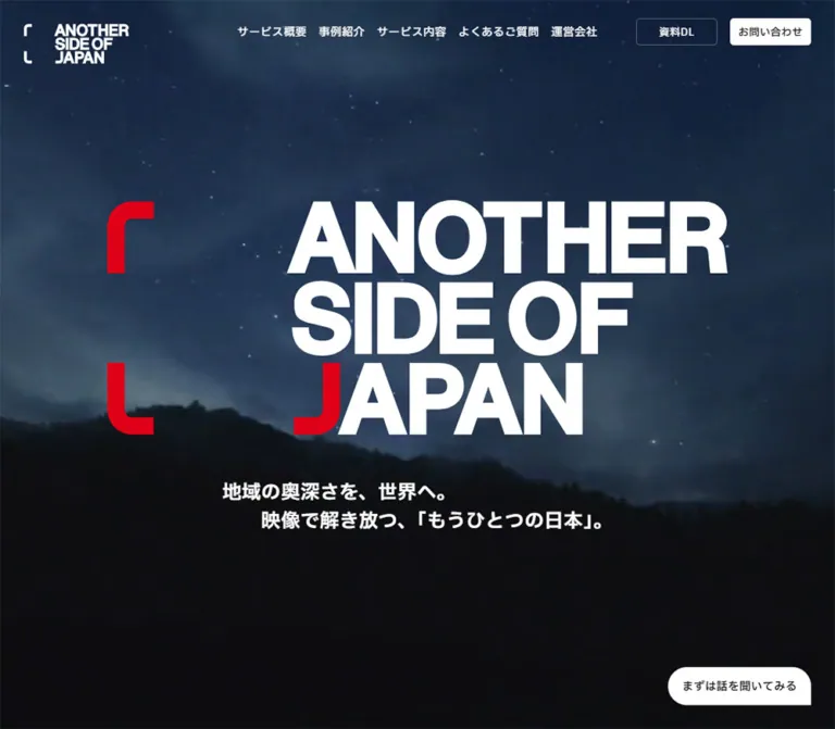
The strongest visual relationship is between expansive photographic scenery and exceptionally large brand artwork. Desktop opens over a cool-toned aerial city view; mobile shows a dark forest scene. A stacked white wordmark and red bracket-like forms dominate both. Navigation and conversion controls stay small around that centerpiece.
Below the opening, large monochrome sections establish a slower editorial rhythm. White service and case-study areas alternate with black distribution content, a charcoal format-production section, and pale-gray collaboration content. The closing city image reconnects the business information to the opening atmosphere. Two broad contact panels then bridge into a dark footer.
How to Read This Reference
- Measured means explicitly present in the supplied computed styles or element bounds. Mobile values such as
24.0084pxare rounded to24pxwhere that improves readability. - Calculated means derived from measured coordinates, dimensions, or ratios. For example, three
304pxbuttons inside a960pxregion leave two24pxhorizontal gaps. - Estimated means visually judged from the supplied captures. Logo bounds, footer geometry, the red brand color, and the scrolled header surface fall into this category unless otherwise stated.
- Recommended means a practical implementation choice, not a verified feature of the original website.
- Named tokens and example classes are reusable aliases. They are not claimed to be original source variables or selectors.
- Text extraction includes some elements that are hidden, offscreen, or part of inactive interface states. Their presence does not prove simultaneous visibility.
- Some early sections share viewport-relative coordinates in the DOM sample. Do not reconstruct their scroll behavior by adding all reported heights together.
Tokens — Colors
Default Palette
| Name | Value | Suggested token | Evidence and role |
|---|---|---|---|
| Primary Ink | #111111 |
--color-ink |
Measured body text and format-section background; visually consistent with the footer canvas |
| Deep Black | #000000 |
--color-black |
Measured global-distribution section background |
| White | #ffffff |
--color-white |
Measured light sections, reversed text, account pills, and opening contact controls |
| Soft Gray | #f3f3f3 |
--color-soft |
Measured collaboration-section background |
| Control Charcoal | #333333 |
--color-control |
Measured dark controls; visually consistent with the selected section pill and closing contact panel |
| Secondary Text | #666666 |
--color-muted |
Measured case subtitles and news dates |
| Section Caption Gray | #999999 |
--color-caption |
Measured desktop English section captions |
| Brand Red | approximately #e60020 |
--color-brand |
Visual estimate from current logo artwork; not a measured CSS color |
| Scrolled Header Gray | approximately #e5e7e8 |
--color-header |
Visual approximation; captured appearance varies with the underlying scene |
The red is an identity accent, not the default action color. The main buttons use white, near-black, and charcoal. Red appears primarily in the large brand mark and its smaller variants. Social-platform artwork introduces small native color accents, particularly in the TikTok and Douyin marks.
The blue city and green forest belong to imagery. They should not become persistent UI accent colors.
Palette Behavior
The opening header uses white navigation over imagery. In the scrolled captures, it becomes a light strip with dark navigation and a dark/red logo. This is an observed state change, not evidence of a user-selectable theme.
Generic --wp--preset-* colors, gradients, and shadows appear in the supplied custom properties. Their presence does not establish their use in the visible design. In particular, the preset red #cf2e2e is not evidence for the logo's red, and the preset shadow collection should not become a general elevation system.
Tokens — Typography
Primary Japanese Sans
- Computed stack:
'IBM Plex Sans JP', sans-serif. - Body weight:
500. - Major heading weight:
700. - Default desktop size:
14pxwith25.9pxline height. - Default tracking:
0.56px, approximately0.04emat the base size. - Character: clear, substantial Japanese sans-serif typography, with generous leading in explanatory copy.
These are computed font-family declarations. The supplied evidence does not include font-file URLs or a separate verification of which font file rendered every glyph.
Latin Numerals and Utility Exceptions
'Be Vietnam Pro', 'IBM Plex Sans JP', sans-serif is measured on collaboration numbers and certain carousel-related link wrappers. The collaboration numbers use weight 700. This does not establish Be Vietnam Pro as the font for the large logo or every English heading.
The mobile MENU control uses an Arial declaration. Its visible label is approximately 14px, weight 500.
The root element reports Times, but the body overrides it. Times is not part of the visible page's primary typography system.
Brand Artwork
The stacked ANOTHER / SIDE OF / JAPAN composition is brand artwork. Its compressed letter spacing, red corner forms, red initial letter treatment, and registered mark should be preserved as an authorized asset.
Do not rebuild this centerpiece by choosing a bold font and adjusting tracking. No font name for the logo is established by the supplied evidence.
Type Scale
Values below are measured except where explicitly marked estimated.
| Role | Desktop | Mobile | Weight and notes |
|---|---|---|---|
| Base UI | 14 / 25.9px |
approximately 14 / 25.91px |
500; generally 0.56px tracking |
| Desktop header action | 13 / 24.05px |
Hidden from the closed mobile header | 500 |
| Main section heading | 42 / 59.64px |
24 / 36.01px |
700 |
| Hero statement | 24 / 36px |
16 / 25.61px |
700 |
| Main explanatory copy | 18 / 33.3px |
14 / 25.91px |
500 |
| Introductory service copy | 18 / 36px |
14 / 25.91px |
500 |
| Distribution subsection heading | 26 / 41.86px |
18 / 28.99px |
700; account heading uses slightly different leading |
| Supporting distribution copy | 16 / 29.6px |
13 / 24.06px |
500 |
| Platform statistics | 16 / 29.6px |
15 / 27.76px |
500; normal tracking |
| Case title | 16 / 24px |
14 / 21.01px |
500 |
| Case subtitle | 12 / 18px |
11 / 16.51px |
500; #666666, normal tracking |
| Case tie-up label | 11 / 16.5px |
10 / 15.01px |
500 |
| NEWS display label | 46 / 85.1px |
30 / 55.52px |
Desktop 700; mobile 500 |
| News title | 16 / 29.6px |
14 / 21.01px |
500 |
| News date | 14 / 25.9px |
11 / 20.36px |
500; secondary gray |
| Collaboration title | 22 / 40.7px |
16 / 29.61px |
700 |
| Collaboration number | 16 / 29.6px |
14 / 25.91px |
Be Vietnam Pro stack, 700 |
| Section navigation label | 14 / 25.9px |
11 / 20.36px |
Mobile label uses normal tracking |
| Floating contact label | 14 / 25.9px |
12 / 22.21px |
500 |
| Footnote | 12 / 22.2px |
12 / 22.21px |
500 |
| Closing action label | approximately 20–22px |
approximately 16px |
Screenshot estimate |
The sampled parent of the monthly-viewer figure reports 20px on desktop and 16px on mobile. Its larger overall bounds suggest additional internal treatment, but the numeric descendants were not measured. Do not use those parent values as a verified size for the prominent digits.
The original root is 10px on desktop and approximately 10.0035px at the inspected mobile width. The underlying responsive formula was not supplied. The Quick Start uses explicit pixel-based tokens so it does not depend on guessing that formula.
Tokens — Spacing & Shapes
Spacing Scale
The evidence supports a practical set of recurring intervals rather than a single proven mathematical spacing system.
| Use | Desktop | Mobile | Status |
|---|---|---|---|
| Initial logo inset | 30px top and left |
20px top and left |
Measured |
| Main content side margins | 180px at 1440px |
20px at 390px |
Measured |
| Nested information side margins | 240px from viewport |
40px from viewport |
Measured |
| Primary nav link gaps | 30px |
Not applicable in closed header | Calculated |
| Header action gap | 16px |
Not applicable in closed header | Calculated |
| Major section padding | 160px |
80px |
Measured for cases and collaboration |
| First service-heading top padding | 100px |
70px |
Measured |
| Format heading-to-copy gap | 60px |
32px |
Calculated from element bounds |
| Account-button column gaps | 24px |
15px |
Calculated |
| Account-button row gaps | 24px |
15px |
Calculated |
| Case-media gap | 60px |
30px |
Calculated |
| Case image-to-caption gap | 16px |
16px |
Calculated |
| News-row top padding | 48px |
32px |
Measured |
| Collaboration column gap | 40px |
Single column | Calculated |
| Collaboration row gap | Not established for all rows | 20px |
Mobile measured |
| Floating contact edge clearance | 30px |
16px |
Calculated |
Border Radius
| Element | Value | Evidence |
|---|---|---|
| Desktop header action | 5px |
Computed |
| Desktop collaboration row | 10px |
Computed |
| Mobile collaboration row | approximately 4px |
Computed |
| Account links | 9999px |
Computed pill geometry |
| Section-navigation items | approximately 640px |
Computed pill geometry |
| Circular carousel controls | 50% |
Computed |
| Desktop floating contact | 48px 48px 0px |
Computed three-value shorthand |
| Mobile floating contact | approximately 8px 8px 0px |
Computed three-value shorthand |
| Closing action panels | approximately 8px |
Screenshot estimate |
| Format-section media corner | approximately 8px |
Screenshot estimate |
The floating contact shorthand leaves the lower-right corner square while rounding the other three. Preserve that detail instead of replacing the control with a fully rounded generic pill. CSS radius normalization affects the final curves at a 48px element height.
Layout Measurements
| Element | Desktop | Mobile | Evidence |
|---|---|---|---|
| Hero | 1440 × 1000px |
390 × 844px |
Measured; fills the inspected viewport |
| Initial header logo link | 132 × 50.59px |
110.03 × 41.61px |
Measured |
| Initial desktop navigation height | 80px |
— | Measured link hit areas |
| Scrolled header strip | approximately 64px high |
approximately 54px high |
Screenshot estimate; mobile menu button measures 54px |
| Mobile menu control | — | approximately 80 × 54px |
Measured |
| Main hero logo | approximately 780 × 294px |
approximately 320 × 122px |
Screenshot estimate |
| Main content width | 1080px |
350px |
Measured |
| Nested information width | 960px |
310px |
Measured |
| Format copy column | 470px |
350px paragraph |
Measured |
| Desktop section-navigation shell | approximately 640 × 64px |
Not visually captured | Screenshot estimate |
| Section-navigation item | 188 × 48px |
approximately 108–116 × 24px |
Measured |
| Account link | 304 × 56px |
147.5 × 48px |
Measured |
| Case media | 840 × 472.5px |
300 × 168.75px |
Measured; exact 16:9 ratio |
| Standard archive link | 300 × 65px |
approximately 270 × 65px for cases |
Measured |
| Collaboration link | 520 × 112px |
350 × 64px |
Measured |
| Closing action panel | approximately 510 × 176px |
approximately 350 × 80px |
Screenshot estimate |
| Footer logo | approximately 240 × 90px |
approximately 240 × 90px |
Screenshot estimate |
| Expanded floating contact | 180 × 48px |
approximately 160 × 48px |
Measured |
| Compact floating contact | approximately 48 × 48px |
approximately 48 × 48px |
Screenshot estimate |
Components
Header and Primary Navigation
Role: maintain identity, site navigation, and direct access to downloads and inquiries.
The opening desktop header places a compact white logo at the upper left, six navigation items across the center, and two small actions at the right. At 1440px, the first navigation item begins at approximately x = 420px. The right actions occupy 122 × 34px each, separated by 16px, with a 30px right inset.
The download action, 資料DL, is transparent with a fine light outline. お問い合わせ has a white fill and dark text. Navigation uses 14px medium text, while these actions use 13px.
In the scrolled captures, a roughly 64px light strip replaces the transparent appearance. The logo becomes dark/red, the primary navigation becomes dark, and the contact action becomes dark-filled. The service item has a thin bottom indicator in the format-section capture. Blur and exact background opacity are not established.
The semantic HEADER wrapper reports zero height in the sample; visible children supply the header geometry. That zero must not be interpreted as the height of the visible navigation.
Mobile Header and Menu Affordance
Role: preserve the brand while reducing navigation density.
At 390px, the visible header contains only the logo and MENU. The menu control occupies the rightmost 80 × 54px, with a short horizontal rule at the top and a small dot beside the label. The opening logo begins at (20, 20); the scrolled footer capture shows a more compact logo positioned roughly 7px from the top and left.
The mobile DOM contains two 167 × 64px action links and a list of approximately 350 × 61px navigation rows, including TOP. These do not appear over the closed hero capture. They are evidence of menu content and geometry, not evidence of a successfully exercised open-menu state.
Opening behavior, dismissal, focus handling, and the menu backdrop remain unverified.
Full-Viewport Hero
Role: establish the project's film identity before explaining the service.
The hero is a full-bleed scene with centered brand artwork. On desktop, the estimated logo bounds run from approximately x = 330 to 1110, beginning near y = 294. The two-line Japanese statement starts around y = 648.
The source statement is:
地域の奥深さを、世界へ。
映像で解き放つ、「もうひとつの日本」。
The second line is visually indented. The statement uses 24px / 36px, weight 700, on desktop and approximately 16px / 25.6px on mobile.
On mobile, the logo starts near y = 248. The statement follows near y = 399, and an outlined circular play affordance appears beneath it. The circle is approximately 80px across, with a white triangle and the caption FULL MOVIE. Its link targets #fv-sp-modal. A separate #fv-modal link exists in the DOM.
The forest capture darkens substantially toward the bottom, creating a quiet field around the movie control. The actual overlay formula is not supplied. A graduated dark overlay is a reasonable reconstruction technique, but its values must be treated as recommendations.
The provided captures show different background scenes. They do not establish whether that difference comes from playback timing, responsive media selection, or another state.
Contextual Section Navigation
Role: connect three service chapters within the long homepage.
The three links are ハイエンドな映像, グローバルに発信, and 長尺&ショート動画, targeting #highend, #global, and #opt.
In the desktop format-section capture, they sit in a pale pill approximately 640 × 64px, centered 30px above the viewport bottom. The active third item is a dark pill with white text. Each measured desktop item is 188 × 48px; the visible shell has approximately 8px padding and 30px gaps.
This navigation is not visible inside the opening desktop capture. Its initial DOM bounds are below the viewport. Treat it as contextual navigation, not an always-visible second header.
Mobile labels reduce to approximately 11px, with 24px-high item boxes. Their placement in an active mobile section was not visually captured. The controls are anchors; a tab-panel interaction model is not established.
Service Introduction
Role: explain the relationship between film quality, international distribution, and regional tourism.
The measured section uses a white background, a centered 42px heading, explanatory copy, a compact Produced by label, and a company-page link. Its main copy spans the 1080px content region and uses 18px / 36px.
On mobile, the heading becomes 24px / 36px, the copy becomes 14px / 25.9px, and explicit line breaks produce a more vertically paced introduction. The company link is approximately 270 × 65px, compared with 300 × 65px on desktop.
The section's measured extent is 2500px on desktop and approximately 2001px on mobile. Its overlap with opening coordinates means this is not reliable evidence for a simple static block of that height. Recreating a pinned or layered sequence requires additional observation.
Global Distribution and Audience Evidence
Role: show international distribution channels and support the service proposition with audience information.
This section is measured as pure black with white text. A 1080px outer content region contains a 960px inner information region. At mobile width those become 350px and 310px respectively.
The platform overview contains six services: YouTube, bilibili, Xiaohongshu, Instagram, TikTok, and Douyin. Desktop statistic positions form three columns and two rows. Mobile positions form six vertically arranged rows with approximately 56px between corresponding text positions.
A separate set of six official-account links uses white pills with dark content. Desktop uses three columns of 304 × 56px. Mobile uses two columns of 147.5 × 48px; the recorded ordering runs down the left column through YouTube, bilibili, and Xiaohongshu, then down the right through Instagram, TikTok, and Douyin.
Further headings identify data usage, viewer/follower distribution, monthly viewers, follower age, and gender ratio. The page reports 308,074人, with a March 2026 note referencing YouTube and TikTok data. This is source content, not an independently verified statistic.
The map and demographic graphics themselves are not visible in the supplied screenshots or fully described by the sampled elements. Their chart types, colors, legends, and animation should not be invented.
Format-Production Feature
Role: explain production of both landscape long-form and portrait short-form material.
The desktop capture uses a near-black #111111 field with substantial empty space. A centered 470px-wide text column begins around x = 485. Its four-line heading uses 42px / 59.64px, weight 700:
配信プラットフォームに
最適化し、
長尺とショート動画を
まとめて制作
An 18px / 33.3px paragraph follows after a measured 60px gap. A rounded river image appears at the lower left of the capture, partly outside the viewport. The contextual navigation sits across the bottom, with its third item selected.
The DOM records additional media-related labels to the left and right at different vertical positions. That supports a distributed media composition, but does not prove parallax or a specific motion path.
On mobile, the heading becomes 24px / 36px, the paragraph occupies 350px, and the heading-to-paragraph gap becomes 32px. The section's measured extent contracts from 1800px to approximately 677px. Tiny captions inside the media presentation scale to approximately 6.6px and 4.8px; they are not suitable reference sizes for ordinary readable interface copy.
Case-Study Film Track
Role: let visitors inspect film work and navigate to detailed project pages.
The desktop case area has a white background and 160px vertical padding. A large Japanese heading is paired with the quieter CASE STUDIES label. The measured film links form a horizontal track: 840px-wide, 16:9 media regions separated by 60px. One central item occupies x = 300–1140, leaving partial neighboring items at both edges.
Each case combines:
- A film link targeting a case-specific fragment such as
#detail-modal416. - An optional small
タイアップlabel. - An English project title.
- A smaller gray Japanese subtitle.
- A separate case-page destination, with
詳しく見るvisible on desktop.
The supplied content includes Akiyoshidai, Narai-juku, Arita ware, Onomichi, and the Shimanami/Yumeshima routes. These are content entries, not interchangeable decorative cards.
Mobile media is 300 × 168.75px, with 30px gaps. The centered item starts near x = 45, leaving about 15px of the adjacent media visible beyond each gap. This preserves the horizontal sequence instead of turning the films into a vertical card list.
The desktop and mobile DOM samples have different centered entries. This does not establish automatic advancement, a swipe gesture, or a breakpoint-dependent starting index. Carousel controls and modal targets exist, but their behavior was not exercised.
News List
Role: provide dated proof of activity and recognition.
Desktop has a 150px heading rail at x = 180, followed by a 60px gap and an 870px-wide article region. The three measured article links are approximately 237px high, with 48px top padding. Text starts 280px into the article region, leaving space for media at the left. Actual thumbnail bounds were not supplied.
Each entry combines a date, category labels, a title, and 詳しく見る. Dates and titles remain typographically modest; the large NEWS label supplies the section's hierarchy.
On mobile, NEWS and the Japanese heading sit alongside each other above the list. Article rows become 350px wide and approximately 149px high, with 32px top padding. Text begins approximately 156px into each row. The title region is 42px high at a 21px line height; the sample alone does not establish its overflow or truncation rule.
Category labels appear in desktop rendered text but not the mobile visible-text extract, although they remain in raw link content. Their mobile visibility should be checked before reproducing them.
Collaboration Menu
Role: expose six concrete ways to work with the project.
A #f3f3f3 section separates collaboration options from the preceding editorial content. Desktop uses a 510px heading region and a 510px explanatory region, separated by 60px. The secondary desktop label is literally COLLABOLATION in the supplied source.
The links use white surfaces with two-digit numbers and bold Japanese names. Desktop rows measure 520 × 112px with 10px corners, arranged in two columns separated by 40px. The number sits in a narrow leading region; the main label begins approximately 88px from the row's left edge.
On mobile, rows become 350 × 64px, use approximately 4px corners, and stack with 20px gaps. Their labels begin approximately 59.5px from the left edge. Numbers reduce from 16px to 14px, while labels reduce from 22px to 16px.
The six destinations cover tie-up production/distribution, asset use, sponsorship, product placement, technical cooperation, and project design. Their links target corresponding fragments on /collabo/.
The source declares transitions for border, background, color, and box-shadow. It does not supply the resulting hover values. A permanent shadow or a specific hover elevation should not be inferred.
FAQ
Role: answer practical questions about delivery, production flow, and pricing.
Three question links are present, covering footage delivery and secondary use, production workflow, and the pricing structure. Their sampled destinations are #.
No expanded answer, toggle icon, opening animation, or keyboard behavior is established. For a new implementation, a semantic disclosure pattern is appropriate, but should be labeled as an addition rather than a reconstruction of verified behavior.
Closing Contact Panels
Role: turn the site's film and service narrative into two clear next steps.
The desktop closing capture returns to an aerial city image behind a centered heading and paragraph. The heading reads 映像で変える地方、日本. Below it, two broad panels lead to /download/ and /contact/.
The panels are approximately 510 × 176px, with a 60px gap. The download panel is white with dark text; the contact panel is charcoal with white text. Each has a left-aligned label, a short dotted vertical separator, and a right-pointing arrow. Their lower edges extend approximately 78px below the image boundary into the dark footer area.
On mobile, they become two approximately 350 × 80px panels with a 20px vertical gap. Labels begin about 30px inside the panel. The arrow occupies a narrow right-hand area, separated by the same short dotted rule.
These are broad destination links, not form fields or dialog submit buttons. Their scale provides a deliberate ending to the long page.
Footer
Role: repeat the identity, connect visitors to distribution channels, and expose secondary navigation.
The footer is visually near-black. On desktop, a short Japanese positioning sentence and a roughly 240px-wide logo sit at the left. Six social-platform marks form a horizontal row to the right, near the lower edge of the logo. Copyright and nine compact text links sit beneath.
On mobile, the footer becomes centered and vertically sequenced: positioning sentence, logo, social strip, wrapping navigation, and copyright. The logo remains approximately 240px wide rather than shrinking in proportion to the viewport.
The mobile social strip spans the 350px content width and is bounded by thin horizontal rules. All six marks remain in one row. Navigation wraps across three lines in the supplied capture, with the privacy link on the final line. Copyright is small and muted; matching its low contrast is not necessary in an accessible adaptation.
Persistent Contact Shortcut
Role: keep the contact destination reachable throughout the page.
The opening control reads まずは話を聞いてみる. Desktop measures 180 × 48px, with 30px right and bottom clearances. Mobile measures approximately 160 × 48px, with 16px clearances and a smaller 12px label.
In the scrolled captures, it contracts to an approximately 48px square containing an envelope outline. Its three-rounded-corner silhouette remains recognizable. The destination is /contact/; the envelope is not evidence of a mailto: action.
The width transition is declared in CSS, and expanded/compact states are visible in the captures. The exact scroll threshold is not supplied.
Tokens — Motion & Interaction
The shared measured easing is cubic-bezier(0.55, 0.05, 0.22, 0.99). It supplies a consistent rhythm across otherwise restrained interface changes.
| Treatment | Supplied computed declaration | What is established |
|---|---|---|
| Header identity visibility | opacity 1.2s, visibility 1.2s |
Declared on the identity wrapper; triggering sequence unverified |
| Header logo geometry | margin 0.6s, width 0.6s |
Supports compact-header changes |
| Desktop navigation height | height 0.6s |
Opening and compact states are visually different |
| Header action styling | border 0.6s, background 0.6s, color 0.6s |
Transition properties known; individual hover endpoints unverified |
| Floating contact | width 0.6s, background 0.6s |
Expanded and compact appearances supplied |
| Section-navigation items | color 0.4s, background 0.4s, opacity 0.4s |
A selected dark item is visible in the format capture |
| Section-navigation labels | opacity 0.6s |
Declaration only |
| Hero section | opacity 0.6s |
Declaration only; no measured fade sequence |
| Account links | opacity 0.6s |
Declaration only; final hover opacity unknown |
| Collaboration rows | border, background, color, box-shadow, each 0.6s |
No demonstrated hover values |
| Circular carousel controls | color, background, opacity, each 0.4s |
Controls exist; activation was not tested |
A computed transition: all without a supplied nonzero duration is not proof of animation. Likewise, animation: none on sampled text elements does not establish that media or JavaScript-driven elements are static.
Verified interaction evidence: captured scroll positions show a compact light header, an active contextual navigation item, and a compact contact shortcut. Link destinations establish page navigation and movie-fragment targets.
Unverified: background playback properties, autoplay, looping, audio state, scroll scrubbing, parallax, carousel timing, drag/swipe behavior, movie-dialog layout, menu opening, FAQ disclosure, and reduced-motion handling.
Use measured durations where their purpose is clear. Do not add elaborate scroll choreography solely because the page contains large media and generous vertical space.
Surfaces
| Layer | Appearance | Purpose |
|---|---|---|
| Opening stage | Full-bleed photographic scene with white/red branding | Emotional introduction |
| Light editorial content | White with near-black text | Service explanation, films, and news |
| Distribution stage | Pure black with white typography | Global reach and audience evidence |
| Format stage | #111111 with white text and scattered media |
Explain landscape and portrait production |
| Collaboration section | #f3f3f3 with white link rows |
Organize partnership options |
| Scrolled header | Light gray appearance with dark controls | Preserve readable navigation |
| Contextual navigation | Pale outer pill with dark selected item | Indicate the current service chapter |
| Closing actions | One white panel and one charcoal panel | Distinguish download and contact routes |
| Footer | Near-black, white logo and platform marks | Brand closure and utility navigation |
There is no demonstrated site-wide card-shadow system. Hierarchy comes primarily from full-width color changes, photographic scale, spacing, and strong typography. A declared shadow transition on collaboration links does not justify shadows on every component.
Imagery
The current captures establish three useful visual subjects: a dense aerial cityscape, a forest with a dominant tree trunk, and a rocky river with greenery and a bridge. The images retain real photographic detail and natural texture. They are neither duotone illustrations nor heavily abstracted graphics.
The desktop city scene has cool cyan and blue tones. Mobile forest imagery is darker and greener, allowing the white logo and statement to stand out. The format-section river crop is much smaller and partially outside the captured viewport, creating contrast with the centered copy.
Use imagery with enough quiet area and tonal depth for large white artwork. Test the logo against the brightest and darkest parts of any moving sequence, not just a convenient poster frame.
Observed Asset References
No image filenames, video source URLs, font-file URLs, or logo asset paths were supplied. The following identifies asset roles without inventing endpoints.
| Asset role | Evidence | Reuse guidance |
|---|---|---|
| Large brand artwork | Desktop and mobile hero captures | Preserve the complete composition, including red forms and registered mark |
| Header logo variants | White opening state; dark/red scrolled state | Use authorized variants rather than applying a filter to every color |
| City background | Desktop opening and closing captures | Use a high-resolution scene that tolerates full-bleed cropping |
| Forest background | Mobile opening capture | Preserve legibility through crop choice and controlled darkening |
| River media | Desktop format-section capture | Keep the photographic texture and modest corner radius |
| Film thumbnails | Measured 16:9 case-media bounds | Populate with actual project imagery; do not infer unseen crops |
| Social-platform artwork | Desktop and mobile footer captures | Preserve recognizable silhouettes and native small color accents |
| Arrow and envelope symbols | Closing panels and floating contact | Simple line-based symbols; no icon-library identity established |
For a new implementation, provide authorized assets and responsive crops separately. CSS can reproduce the shell and proportions, but cannot recreate the project's identity through generic substitute lettering.
Layout & Responsive Behavior
The desktop content width is 1080px at a 1440px viewport, leaving 180px margins. Nested distribution information is 960px wide, producing an additional 60px inset on each side. Mobile uses 20px main gutters and another 20px inset for nested information.
| Pattern | Desktop evidence | Mobile evidence |
|---|---|---|
| Global navigation | Six center links and two right actions | Logo plus MENU |
| Hero statement | 24px, two lines |
16px, two lines |
| Movie affordance | Fragment target present; labeled circle not visible in supplied opening | Explicit circle and FULL MOVIE label |
| Main headings | 42px |
24px |
| Section padding | Commonly 160px |
Commonly 80px |
| Platform overview | Three columns across two rows | Six vertical rows |
| Account links | Three columns across two rows | Two columns across three rows |
| Demographic headings | Two parallel regions | Vertically separated regions |
| Film track | 840px media, 60px gaps |
300px media, 30px gaps |
| News heading | Left rail | Inline heading pair above list |
| Collaboration links | Two columns | One column |
| Closing actions | Two large panels side by side | Two shorter panels stacked |
| Footer | Brand left, socials right | Centered stack with ruled social strip |
| Floating contact | 180px expanded width | 160px expanded width |
The measured document height is approximately 13,565px on desktop and 10,765px on mobile. Mobile is shorter overall even though some data content becomes taller. This reflects substantial changes in the large presentation sections; uniform scaling would not reproduce the page.
Only two viewport widths were inspected. Exact media-query thresholds, tablet layouts, and intermediate fluid formulas are unknown. The Quick Start's 1200px compact-header threshold and 767px content breakpoint are recommendations chosen for practical fit.
Preserve ordinary document scrolling in a basic adaptation. A fixed viewport application shell would be inappropriate for this multi-section website. Add any pinned presentation only after its behavior has been separately verified.
Do’s and Don’ts
Do
- Make the complete brand artwork the visual center of the opening.
- Keep the hero full bleed and approximately one viewport high.
- Use IBM Plex Sans JP as the declared primary stack, with medium body text and bold Japanese headings.
- Preserve the distinction between pure black distribution content and the charcoal format stage.
- Keep primary actions monochrome; let red remain concentrated in the brand.
- Use the 1080px/960px desktop content hierarchy and 20px/40px mobile insets.
- Preserve the horizontal 16:9 case sequence and visible neighboring items.
- Retain separate movie and project-detail destinations.
- Let collaboration rows become shorter, sharper-cornered, and single-column on mobile.
- Preserve the closing panels' label, dotted separator, and arrow anatomy.
- Keep the footer logo substantial on mobile and all six platform marks recognizable.
- Distinguish hidden DOM content from visible interface states.
Don’t
- Don’t replace the brand artwork with an oversized generic font.
- Don’t turn every action red or introduce a new blue/green interface accent from the photography.
- Don’t apply rounded cards, shadows, or glass blur to every section.
- Don’t assume the scrolled header uses blur merely because it appears pale over imagery.
- Don’t force the desktop navigation into the 390px header.
- Don’t turn the film sequence into a generic three-column card grid.
- Don’t stretch landscape film images into portrait crops.
- Don’t copy generic preset gradients and shadows into the visible design system.
- Don’t hardcode observed 1800px or 2500px section extents as unexplained empty spacers.
- Don’t claim autoplay, parallax, scroll scrubbing, or modal behavior without additional evidence.
- Don’t promote tiny internal media captions into a normal text-size standard.
- Don’t make the floating envelope open email when the observed destination is the contact page.
Recommended Implementation Additions
These are recommendations for a new implementation, not verified original features:
- Provide a stable poster image and a clear pause option for decorative background motion. Respect reduced-motion preferences before starting playback.
- Keep audible playback behind an explicit user action. A movie link alone does not establish an audio policy.
- Give the compact contact control a persistent accessible name even when its visible label disappears.
- Give
MENUan expanded state and controlled-region relationship. If it opens an overlay, support Escape, focus return, and appropriate focus containment. - Keep movie controls separate from project-detail links; avoid nested anchors.
- Support keyboard navigation in the case track and expose useful current-item information if it becomes a scripted carousel.
- Implement FAQ disclosure with semantic controls and accessible expanded states.
- Increase touch hit areas around the measured 24px mobile section-navigation items without making the labels visually oversized.
- Keep fixed controls clear of safe areas and prevent them from obscuring footer links.
- Improve muted footer text contrast while retaining its secondary hierarchy.
- Supply descriptive alternatives for meaningful project imagery; treat decorative background frames as decorative.
- Reserve media dimensions to avoid layout shifts, and load below-the-fold imagery according to its actual visibility.
Agent Prompt Guide
Quick Color Reference
- Main ink and format stage:
#111111. - Distribution stage:
#000000. - Light content, account links, and download panel:
#ffffff. - Collaboration background:
#f3f3f3. - Selected pills and dark contact panel:
#333333. - Case subtitles and dates:
#666666. - Secondary desktop section captions:
#999999. - Brand red approximation:
#e60020; use the authorized artwork as the final authority. - Primary action language: monochrome contrast, fine outlines, simple arrows, and restrained corners.
Overall Prompt
“Create a film-led Japanese service website inspired by the current Another Side of Japan homepage. Use a full-viewport photographic opening, a large authorized stacked white/red brand asset, a two-line bold Japanese statement, and compact navigation. Alternate white editorial sections, a pure-black global-distribution section, a charcoal format-production feature, and pale-gray collaboration content. Use IBM Plex Sans JP, 42px desktop headings, 24px mobile headings, 1080px desktop content, and 20px mobile gutters. Present films in a horizontal 16:9 sequence with neighboring items partially visible. Finish with two broad monochrome destination panels and a dark footer with six social marks. Preserve the expanded-to-compact contact shortcut. Treat motion, menu behavior, and media playback as separate implementation decisions requiring explicit specification.”
Example Component Prompts
- Hero: “Build a 1440 × 1000 reference composition with full-bleed aerial imagery, an approximately 780px-wide supplied white/red logo, and a 24px bold Japanese statement below. At 390 × 844, use an approximately 320px-wide logo, 16px statement, and an 80px outlined movie circle. Preserve the artwork rather than typesetting a replacement.”
- Header: “Use a transparent opening header with a 132px logo, six centered 14px navigation links, and two 122 × 34px actions. Provide a compact light state with dark navigation. On narrow screens, show the logo and an 80 × 54px MENU control with a short top rule and dot.”
- Format feature: “Create a spacious #111111 section with a centered 470px copy column. Use a four-line 42px bold heading and 18px body text separated by 60px. Place real landscape/portrait media around the copy without inventing parallax. Add a pale three-item section-navigation pill with the third item dark.”
- Film track: “Create a white case-study section with 840 × 472.5px desktop media and 60px gaps. On mobile, use 300 × 168.75px media, 30px gaps, and a centered item with narrow neighbor glimpses. Place the English title and smaller gray Japanese subtitle below; keep film playback and detail navigation separate.”
- Collaboration row: “Create a white numbered destination row on #f3f3f3. Desktop size is 520 × 112px with 10px corners, a bold 16px Latin number, and a bold 22px Japanese title. Mobile size is 350 × 64px with 4px corners, a 14px number, and a 16px title.”
- Closing and footer: “Place a white download panel and a charcoal contact panel across the lower edge of a city image. Each desktop panel is approximately 510 × 176px, with a left label, short dotted divider, and arrow. Stack them at 350 × 80px on mobile. Continue into a dark footer with a 240px brand asset and one row of six platform marks.”
Quick Start
CSS Custom Properties
This is an implementation scaffold, not recovered source CSS. Measured typography and geometry are retained where practical. Header/footer surface approximations, breakpoints, the hero overlay, hover endpoints, and simplified section flow are recommendations.
Load the declared fonts through an authorized font setup. Supply brand variants and media through markup; no original asset URLs were available. The example intentionally avoids reproducing unverified pinning or carousel automation.
:root {
  /* Measured interface colors; brand and header are approximations. */
  --color-ink: #111111;
  --color-black: #000000;
  --color-white: #ffffff;
  --color-soft: #f3f3f3;
  --color-control: #333333;
  --color-muted: #666666;
  --color-caption: #999999;
  --color-brand: #e60020;
  --color-header: #e5e7e8;

  --font-body: 'IBM Plex Sans JP', sans-serif;
  --font-number: 'Be Vietnam Pro', 'IBM Plex Sans JP', sans-serif;
  --font-menu: Arial, sans-serif;
  --text-body: 14px;
  --text-lead: 18px;
  --text-heading: 42px;
  --leading-body: 1.85;
  --leading-heading: 1.42;
  --tracking-ui: 0.56px;

  --content-width: 1080px;
  --inner-width: 960px;
  --gutter: 30px;
  --section-space: 160px;
  --case-width: min(840px, calc(100vw - 90px));
  --case-gap: 60px;
  --radius-control: 5px;
  --radius-row: 10px;
  --radius-panel: 8px;

  --ease-site: cubic-bezier(0.55, 0.05, 0.22, 0.99);
  --motion-short: 400ms;
  --motion-ui: 600ms;
  --motion-identity: 1200ms;
}

* { box-sizing: border-box; }
body { margin: 0; }
img, video { max-width: 100%; }
button, a { -webkit-tap-highlight-color: transparent; }
[hidden] { display: none !important; }

.asj-page {
  color: var(--color-ink);
  background: var(--color-white);
  font-family: var(--font-body);
  font-size: var(--text-body);
  font-weight: 500;
  line-height: var(--leading-body);
  letter-spacing: var(--tracking-ui);
}

.asj-page a { color: inherit; text-decoration: none; }
.asj-page :focus-visible {
  outline: 2px solid currentColor;
  outline-offset: 4px;
}
.asj-page section[id] { scroll-margin-top: 90px; }

.container {
  width: min(var(--content-width), calc(100% - 2 * var(--gutter)));
  margin-inline: auto;
}
/* Place this inside .container to reproduce the nested inset. */
.inner-container {
  width: min(var(--inner-width), calc(100% - 2 * var(--gutter)));
  margin-inline: auto;
}
.section { padding-block: var(--section-space); }
.section--black { color: white; background: var(--color-black); }
.section--charcoal { color: white; background: var(--color-ink); }
.section--soft { background: var(--color-soft); }
.section-title {
  margin: 0;
  font-size: var(--text-heading);
  font-weight: 700;
  line-height: var(--leading-heading);
}
.lead { font-size: var(--text-lead); line-height: 1.85; }

.site-header {
  --header-height: 80px;
  position: fixed;
  inset: 0 0 auto;
  z-index: 40;
  display: grid;
  grid-template-columns: 260px minmax(0, 1fr) 260px;
  height: var(--header-height);
  padding-inline: 30px;
  color: white;
  transition: background var(--motion-ui) var(--ease-site),
              color var(--motion-ui) var(--ease-site);
}
.site-brand {
  display: block;
  width: 132px;
  margin-top: 30px;
  transition: width var(--motion-ui) var(--ease-site),
              margin var(--motion-ui) var(--ease-site);
}
.site-brand img { display: block; width: 100%; }
.desktop-nav { display: flex; justify-self: center; gap: 30px; }
.desktop-nav a {
  display: flex;
  align-items: center;
  height: var(--header-height);
  white-space: nowrap;
  transition: height var(--motion-ui) var(--ease-site);
}
.desktop-nav a[aria-current] { border-bottom: 2px solid currentColor; }
.header-actions { display: flex; gap: 16px; margin-top: 23px; }
.header-action {
  display: grid;
  place-items: center;
  width: 122px;
  height: 34px;
  border: 1px solid rgb(255 255 255 / 35%);
  border-radius: var(--radius-control);
  font-size: 13px;
}
.header-action--filled { background: white; color: #111 !important; }
.menu-button { display: none; }

/* The application supplies this state and the appropriate logo asset. */
.site-header.is-scrolled {
  --header-height: 64px;
  color: var(--color-ink);
  background: var(--color-header);
}
.site-header.is-scrolled .site-brand { width: 104px; margin-top: 14px; }
.site-header.is-scrolled .header-actions { margin-top: 15px; }
.site-header.is-scrolled .header-action { border-color: rgb(17 17 17 / 30%); }
.site-header.is-scrolled .header-action--filled {
  background: var(--color-ink);
  color: white !important;
}

.hero {
  position: relative;
  isolation: isolate;
  display: grid;
  place-items: center;
  min-height: 100vh;
  min-height: 100svh;
  overflow: hidden;
  color: white;
  background: var(--color-ink);
}
.hero__media, .hero__shade {
  position: absolute;
  inset: 0;
  width: 100%;
  height: 100%;
}
.hero__media { z-index: -2; object-fit: cover; }
/* Recommended overlay; tune against the supplied imagery. */
.hero__shade {
  z-index: -1;
  background: linear-gradient(rgb(0 0 0 / 8%), rgb(0 0 0 / 38%));
}
.hero__inner { width: min(780px, calc(100% - 40px)); text-align: center; }
.hero__logo { display: block; width: 100%; margin-inline: auto; }
.hero__copy {
  display: table;
  max-width: 100%;
  margin: 60px auto 0;
  text-align: left;
  font-size: 24px;
  font-weight: 700;
  line-height: 1.5;
}
.hero__copy span { display: block; }
/* Use spans without additional leading full-width spaces. */
.hero__copy span + span { padding-left: 2em; }
.hero__movie { display: none; }

.format-feature {
  display: grid;
  place-items: center;
  min-height: 100svh;
  padding-block: 100px;
  color: white;
  background: var(--color-ink);
}
.format-feature__copy { width: min(470px, calc(100% - 40px)); }
.format-feature__copy .lead { margin: 60px 0 0; letter-spacing: normal; }

.section-nav {
  position: fixed;
  left: 50%;
  bottom: 30px;
  z-index: 30;
  display: flex;
  gap: 30px;
  width: 640px;
  padding: 8px;
  transform: translateX(-50%);
  border-radius: 999px;
  background: #efefef;
  color: var(--color-ink);
}
.section-nav a {
  display: grid;
  place-items: center;
  width: 188px;
  min-height: 48px;
  border-radius: 999px;
  transition: color var(--motion-short) var(--ease-site),
              background var(--motion-short) var(--ease-site);
}
.section-nav a[aria-current='location'] {
  color: white;
  background: var(--color-control);
}

.account-grid {
  display: grid;
  grid-template-columns: repeat(3, minmax(0, 1fr));
  gap: 24px;
}
.account-link {
  display: flex;
  align-items: center;
  justify-content: center;
  gap: 8px;
  min-height: 56px;
  border-radius: 9999px;
  color: var(--color-ink) !important;
  background: white;
}

/* Native scrolling is a recommended alternative to unverified automation. */
.case-track {
  display: flex;
  gap: var(--case-gap);
  overflow-x: auto;
  overscroll-behavior-inline: contain;
  scroll-snap-type: x mandatory;
  padding-inline: calc((100% - var(--case-width)) / 2);
}
.case-card { flex: 0 0 var(--case-width); scroll-snap-align: center; }
.case-card__media {
  display: block;
  width: 100%;
  aspect-ratio: 16 / 9;
  object-fit: cover;
}
.case-card__caption { margin-top: 16px; }
.case-card__title { margin: 0; font-size: 16px; line-height: 1.5; }
.case-card__subtitle {
  margin: 16px 0 0;
  color: var(--color-muted);
  font-size: 12px;
  line-height: 1.5;
  letter-spacing: normal;
}

.collaboration-grid {
  display: grid;
  grid-template-columns: repeat(2, minmax(0, 1fr));
  gap: 40px;
}
.collaboration-link {
  display: grid;
  grid-template-columns: 17% minmax(0, 1fr);
  align-items: center;
  min-height: 112px;
  border-radius: var(--radius-row);
  background: white;
}
.collaboration-link__number {
  text-align: center;
  font-family: var(--font-number);
  font-size: 16px;
  font-weight: 700;
}
.collaboration-link__title { padding-right: 24px; font-size: 22px; font-weight: 700; }

.closing { position: relative; isolation: isolate; padding-top: 110px; color: white; }
.closing__backdrop {
  position: absolute;
  z-index: -1;
  inset: 0 0 auto;
  width: 100%;
  height: calc(100% - 78px);
  object-fit: cover;
}
.closing__intro { text-align: center; }
.closing__actions { display: grid; grid-template-columns: 1fr 1fr; gap: 60px; margin-top: 72px; }
.action-panel {
  display: flex;
  align-items: center;
  min-height: 176px;
  padding-left: 60px;
  border-radius: var(--radius-panel);
  background: white;
  color: var(--color-ink) !important;
  font-size: 20px;
}
.action-panel--dark { background: var(--color-control); color: white !important; }
.action-panel__label { flex: 1; }
.action-panel__end {
  display: grid;
  place-items: center;
  flex: 0 0 200px;
  height: 14px;
  border-left: 1px dotted currentColor;
  line-height: 1;
}

.site-footer { padding: 80px 0 110px; color: white; background: var(--color-ink); }
.footer-top { display: flex; justify-content: space-between; align-items: flex-end; gap: 40px; }
.footer-brand img { display: block; width: 240px; margin-top: 14px; }
.footer-tagline { margin: 0; font-size: 14px; }
.social-links { display: flex; align-items: center; gap: 30px; }
.social-links a { display: grid; place-items: center; min-height: 44px; }
.social-links img { display: block; height: 24px; width: auto; }
.footer-bottom { display: flex; justify-content: space-between; gap: 24px; margin-top: 64px; }
.footer-links { display: flex; flex-wrap: wrap; gap: 12px 16px; font-size: 12px; }
.footer-copyright { color: #999; font-size: 12px; }

.contact-float {
  position: fixed;
  right: max(30px, env(safe-area-inset-right, 0px));
  bottom: max(30px, env(safe-area-inset-bottom, 0px));
  z-index: 50;
  display: flex;
  align-items: center;
  justify-content: center;
  width: 180px;
  height: 48px;
  border-radius: 48px 48px 0;
  color: var(--color-ink) !important;
  background: white;
  white-space: nowrap;
  transition: width var(--motion-ui) var(--ease-site),
              background var(--motion-ui) var(--ease-site);
}
.contact-float__icon { display: none; width: 18px; height: 18px; }
.contact-float.is-compact { width: 48px; }
.contact-float.is-compact .contact-float__label { display: none; }
.contact-float.is-compact .contact-float__icon { display: block; }

/* Recommended threshold; the original breakpoint was not supplied. */
@media (max-width: 1200px) {
  .site-header, .site-header.is-scrolled {
    --header-height: 54px;
    display: flex;
    justify-content: space-between;
    padding-inline: 0;
  }
  .site-brand { width: 110px; margin: 20px 0 0 20px; }
  .site-header.is-scrolled .site-brand { width: 104px; margin: 7px 0 0 7px; }
  .desktop-nav, .header-actions { display: none; }
  .menu-button {
    display: flex;
    align-items: center;
    gap: 18px;
    width: 80px;
    height: 54px;
    padding: 0;
    border: 0;
    border-top: 2px solid currentColor;
    color: inherit;
    background: none;
    font: 500 14px var(--font-menu);
  }
  .menu-button::after { content: '•'; }
}

@media (max-width: 767px) {
  :root {
    --gutter: 20px;
    --section-space: 80px;
    --text-heading: 24px;
    --text-lead: 14px;
    --leading-heading: 1.5;
    --case-gap: 30px;
    --radius-row: 4px;
  }
  .hero__logo { width: min(320px, 100%); }
  .hero__copy { margin-top: 30px; font-size: 16px; line-height: 1.6; }
  .hero__shade { background: linear-gradient(rgb(0 0 0 / 12%), rgb(0 0 0 / 78%)); }
  .hero__movie { display: flex; flex-direction: column; align-items: center; gap: 8px; margin-top: 60px; }
  .hero__movie-circle { display: grid; place-items: center; width: 80px; height: 80px; border: 1px solid rgb(255 255 255 / 35%); border-radius: 50%; }
  .hero__movie-label { font-size: 12px; line-height: 1; }
  .format-feature { min-height: auto; padding-block: 80px; }
  .format-feature__copy .lead { margin-top: 32px; }
  .section-nav { width: calc(100% - 16px); gap: 0; justify-content: space-between; bottom: 80px; }
  .section-nav a { width: auto; min-height: 24px; padding-inline: 10px; font-size: 11px; letter-spacing: normal; }
  .account-grid { grid-template-columns: repeat(2, minmax(0, 1fr)); grid-template-rows: repeat(3, auto); grid-auto-flow: column; gap: 15px; }
  .account-link { min-height: 48px; gap: 6px; }
  .case-card__title { font-size: 14px; }
  .case-card__subtitle { font-size: 11px; }
  .collaboration-grid { grid-template-columns: 1fr; gap: 20px; }
  .collaboration-link { min-height: 64px; }
  .collaboration-link__number { font-size: 14px; }
  .collaboration-link__title { font-size: 16px; }
  .closing { padding-top: 80px; }
  .closing__backdrop { height: calc(100% - 132px); }
  .closing__actions { grid-template-columns: 1fr; gap: 20px; margin-top: 48px; }
  .action-panel { min-height: 80px; padding-left: 30px; font-size: 16px; }
  .action-panel__end { flex-basis: 80px; }
  .site-footer { padding-top: 48px; }
  .footer-top { flex-direction: column; align-items: center; gap: 48px; }
  .footer-brand { text-align: center; }
  .footer-brand img { margin-inline: auto; }
  .footer-tagline { font-size: 12px; }
  .social-links { width: 100%; justify-content: space-between; gap: 6px; padding-block: 10px; border-block: 1px solid #2c2c2c; }
  .social-links a { min-width: 44px; }
  .social-links img { height: 16px; }
  .footer-bottom { flex-direction: column-reverse; align-items: center; margin-top: 48px; gap: 48px; }
  .footer-links { justify-content: center; }
  .contact-float { right: max(16px, env(safe-area-inset-right, 0px)); bottom: max(16px, env(safe-area-inset-bottom, 0px)); width: 160px; border-radius: 8px 8px 0; font-size: 12px; }
}

/* Recommended hover endpoint, not a measured original state. */
@media (hover: hover) {
  .account-link:hover { opacity: 0.85; }
}

@media (prefers-reduced-motion: reduce) {
  .asj-page *, .asj-page *::before, .asj-page *::after {
    transition-duration: 0.01ms !important;
    animation-duration: 0.01ms !important;
    animation-iteration-count: 1 !important;
    scroll-behavior: auto !important;
  }
}
Use .site-header.is-scrolled, .contact-float.is-compact, and the section navigation's hidden state only when the application has established the corresponding context. The CSS does not invent the original scroll thresholds. The mobile navigation's 80px bottom clearance is a recommended placement above the contact shortcut, not a measured source position.
Place the closing block on a near-black parent background so the portion below its photograph joins the footer. The backdrop should be decorative; essential information remains in HTML.
A closing-panel markup example:
<a class='action-panel' href='/download/'>
  <span class='action-panel__label'>資料ダウンロード</span>
  <span class='action-panel__end' aria-hidden='true'>→</span>
</a>
Media playback, poster fallback, reduced-motion video handling, menu disclosure, movie dialogs, and any scripted carousel require separate behavior. Reducing CSS transition duration does not pause a video.
Tailwind v4 Token Mapping
Optional aliases for a project already using Tailwind v4. This does not identify the original site's framework. Define the custom properties above first.
@theme inline {
  --color-asj-ink: var(--color-ink);
  --color-asj-black: var(--color-black);
  --color-asj-white: var(--color-white);
  --color-asj-soft: var(--color-soft);
  --color-asj-control: var(--color-control);
  --color-asj-muted: var(--color-muted);
  --color-asj-brand: var(--color-brand);

  --font-japanese: var(--font-body);
  --font-numerals: var(--font-number);

  --text-asj-body: var(--text-body);
  --text-asj-lead: var(--text-lead);
  --text-asj-heading: var(--text-heading);

  --spacing-asj-gutter: var(--gutter);
  --spacing-asj-section: var(--section-space);
  --radius-asj-control: var(--radius-control);
  --radius-asj-row: var(--radius-row);
  --radius-asj-panel: var(--radius-panel);
  --ease-asj: var(--ease-site);
}
Sources & Evidence
- Inspected original and final page: https://asj.tyo.co.jp/, HTTP 200. Original and final URLs are identical in the supplied record.
- Capture date:
2026-09-16T19:30:33.871Z, equivalent to September 17, 2026, at 04:30 JST. - Desktop evidence:
1440 × 1000CSS pixels; three supplied captures showing the opening hero, format-production section, and closing/footer. Supplied document height: approximately 13,565px. - Mobile evidence:
390 × 844CSS pixels; two supplied captures showing the opening hero and footer. Supplied document height: approximately 10,765px. - Rendered evidence: current page title and text, navigation destinations, movie-fragment targets, sampled element rectangles, computed font stacks and sizes, colors, padding, radii, and transition declarations.
- Recorded capture procedure: an initial observation of at least five seconds, bounded waits for load/layout/text stability and image decoding, and traversal of intermediate scroll positions. Perpetual animations were temporarily paused during readiness checks and resumed. These checks do not prove that every delayed element or interactive state was exercised.
- Inspection limits: no additional browsing, file inspection, or command execution was used to create this reference. Linked destinations were not independently inspected. Asset source URLs, complete stylesheets, exact breakpoints, hover endpoints, playback configuration, open overlays, and FAQ answers were not supplied. SharedWorkers and service workers were disabled during the recorded inspection.
This document describes the current homepage represented by the supplied inspection. Measurements apply to those captured states; estimates and implementation recommendations are labeled separately.
# Another Side of Japan — Style Reference

> Cinematic views of Japan framed by a monumental wordmark and a restrained black-and-white interface.

**Website:** [Another Side of Japan](https://asj.tyo.co.jp/)
**Original URL:** https://asj.tyo.co.jp/
**Final URL:** https://asj.tyo.co.jp/
**Response:** HTTP 200; no redirect recorded.
**Theme:** alternating white, black, and charcoal sections, with red concentrated in the brand artwork.
**Inspected:** September 17, 2026, at 04:30 JST. Supplied retrieval timestamp: `2026-09-16T19:30:33.871Z`.
**Viewports:** desktop `1440 × 1000` and mobile `390 × 844` CSS pixels.
**Scope:** the current homepage, using three desktop captures, two mobile captures, and supplied rendered text, links, element bounds, and computed styles. Visual captures cover the opening hero, the desktop format-production section, and closing/footer states. Other homepage sections are documented from DOM evidence where available. Linked pages, open menus, movie dialogs, expanded FAQ answers, and form flows were not inspected.

Another Side of Japan is a service and content website for a film project promoting Japanese destinations and regional culture. Its homepage combines an immersive opening with service explanations, distribution information, audience data, film cases, news, collaboration options, and contact routes. The design should retain this breadth rather than reducing the site to a single conversion screen.

The strongest visual relationship is between expansive photographic scenery and exceptionally large brand artwork. Desktop opens over a cool-toned aerial city view; mobile shows a dark forest scene. A stacked white wordmark and red bracket-like forms dominate both. Navigation and conversion controls stay small around that centerpiece.

Below the opening, large monochrome sections establish a slower editorial rhythm. White service and case-study areas alternate with black distribution content, a charcoal format-production section, and pale-gray collaboration content. The closing city image reconnects the business information to the opening atmosphere. Two broad contact panels then bridge into a dark footer.

## How to Read This Reference

- **Measured** means explicitly present in the supplied computed styles or element bounds. Mobile values such as `24.0084px` are rounded to `24px` where that improves readability.
- **Calculated** means derived from measured coordinates, dimensions, or ratios. For example, three `304px` buttons inside a `960px` region leave two `24px` horizontal gaps.
- **Estimated** means visually judged from the supplied captures. Logo bounds, footer geometry, the red brand color, and the scrolled header surface fall into this category unless otherwise stated.
- **Recommended** means a practical implementation choice, not a verified feature of the original website.
- Named tokens and example classes are reusable aliases. They are not claimed to be original source variables or selectors.
- Text extraction includes some elements that are hidden, offscreen, or part of inactive interface states. Their presence does not prove simultaneous visibility.
- Some early sections share viewport-relative coordinates in the DOM sample. Do not reconstruct their scroll behavior by adding all reported heights together.

## Tokens — Colors

### Default Palette

| Name | Value | Suggested token | Evidence and role |
| --- | --- | --- | --- |
| Primary Ink | `#111111` | `--color-ink` | Measured body text and format-section background; visually consistent with the footer canvas |
| Deep Black | `#000000` | `--color-black` | Measured global-distribution section background |
| White | `#ffffff` | `--color-white` | Measured light sections, reversed text, account pills, and opening contact controls |
| Soft Gray | `#f3f3f3` | `--color-soft` | Measured collaboration-section background |
| Control Charcoal | `#333333` | `--color-control` | Measured dark controls; visually consistent with the selected section pill and closing contact panel |
| Secondary Text | `#666666` | `--color-muted` | Measured case subtitles and news dates |
| Section Caption Gray | `#999999` | `--color-caption` | Measured desktop English section captions |
| Brand Red | approximately `#e60020` | `--color-brand` | Visual estimate from current logo artwork; not a measured CSS color |
| Scrolled Header Gray | approximately `#e5e7e8` | `--color-header` | Visual approximation; captured appearance varies with the underlying scene |

The red is an identity accent, not the default action color. The main buttons use white, near-black, and charcoal. Red appears primarily in the large brand mark and its smaller variants. Social-platform artwork introduces small native color accents, particularly in the TikTok and Douyin marks.

The blue city and green forest belong to imagery. They should not become persistent UI accent colors.

### Palette Behavior

The opening header uses white navigation over imagery. In the scrolled captures, it becomes a light strip with dark navigation and a dark/red logo. This is an observed state change, not evidence of a user-selectable theme.

Generic `--wp--preset-*` colors, gradients, and shadows appear in the supplied custom properties. Their presence does not establish their use in the visible design. In particular, the preset red `#cf2e2e` is not evidence for the logo's red, and the preset shadow collection should not become a general elevation system.

## Tokens — Typography

### Primary Japanese Sans

- **Computed stack:** `'IBM Plex Sans JP', sans-serif`.
- **Body weight:** `500`.
- **Major heading weight:** `700`.
- **Default desktop size:** `14px` with `25.9px` line height.
- **Default tracking:** `0.56px`, approximately `0.04em` at the base size.
- **Character:** clear, substantial Japanese sans-serif typography, with generous leading in explanatory copy.

These are computed font-family declarations. The supplied evidence does not include font-file URLs or a separate verification of which font file rendered every glyph.

### Latin Numerals and Utility Exceptions

`'Be Vietnam Pro', 'IBM Plex Sans JP', sans-serif` is measured on collaboration numbers and certain carousel-related link wrappers. The collaboration numbers use weight `700`. This does not establish Be Vietnam Pro as the font for the large logo or every English heading.

The mobile `MENU` control uses an Arial declaration. Its visible label is approximately `14px`, weight `500`.

The root element reports Times, but the body overrides it. Times is not part of the visible page's primary typography system.

### Brand Artwork

The stacked ANOTHER / SIDE OF / JAPAN composition is brand artwork. Its compressed letter spacing, red corner forms, red initial letter treatment, and registered mark should be preserved as an authorized asset.

Do not rebuild this centerpiece by choosing a bold font and adjusting tracking. No font name for the logo is established by the supplied evidence.

### Type Scale

Values below are measured except where explicitly marked estimated.

| Role | Desktop | Mobile | Weight and notes |
| --- | --- | --- | --- |
| Base UI | `14 / 25.9px` | approximately `14 / 25.91px` | `500`; generally `0.56px` tracking |
| Desktop header action | `13 / 24.05px` | Hidden from the closed mobile header | `500` |
| Main section heading | `42 / 59.64px` | `24 / 36.01px` | `700` |
| Hero statement | `24 / 36px` | `16 / 25.61px` | `700` |
| Main explanatory copy | `18 / 33.3px` | `14 / 25.91px` | `500` |
| Introductory service copy | `18 / 36px` | `14 / 25.91px` | `500` |
| Distribution subsection heading | `26 / 41.86px` | `18 / 28.99px` | `700`; account heading uses slightly different leading |
| Supporting distribution copy | `16 / 29.6px` | `13 / 24.06px` | `500` |
| Platform statistics | `16 / 29.6px` | `15 / 27.76px` | `500`; normal tracking |
| Case title | `16 / 24px` | `14 / 21.01px` | `500` |
| Case subtitle | `12 / 18px` | `11 / 16.51px` | `500`; `#666666`, normal tracking |
| Case tie-up label | `11 / 16.5px` | `10 / 15.01px` | `500` |
| NEWS display label | `46 / 85.1px` | `30 / 55.52px` | Desktop `700`; mobile `500` |
| News title | `16 / 29.6px` | `14 / 21.01px` | `500` |
| News date | `14 / 25.9px` | `11 / 20.36px` | `500`; secondary gray |
| Collaboration title | `22 / 40.7px` | `16 / 29.61px` | `700` |
| Collaboration number | `16 / 29.6px` | `14 / 25.91px` | Be Vietnam Pro stack, `700` |
| Section navigation label | `14 / 25.9px` | `11 / 20.36px` | Mobile label uses normal tracking |
| Floating contact label | `14 / 25.9px` | `12 / 22.21px` | `500` |
| Footnote | `12 / 22.2px` | `12 / 22.21px` | `500` |
| Closing action label | approximately `20–22px` | approximately `16px` | Screenshot estimate |

The sampled parent of the monthly-viewer figure reports `20px` on desktop and `16px` on mobile. Its larger overall bounds suggest additional internal treatment, but the numeric descendants were not measured. Do not use those parent values as a verified size for the prominent digits.

The original root is `10px` on desktop and approximately `10.0035px` at the inspected mobile width. The underlying responsive formula was not supplied. The Quick Start uses explicit pixel-based tokens so it does not depend on guessing that formula.

## Tokens — Spacing & Shapes

### Spacing Scale

The evidence supports a practical set of recurring intervals rather than a single proven mathematical spacing system.

| Use | Desktop | Mobile | Status |
| --- | --- | --- | --- |
| Initial logo inset | `30px` top and left | `20px` top and left | Measured |
| Main content side margins | `180px` at 1440px | `20px` at 390px | Measured |
| Nested information side margins | `240px` from viewport | `40px` from viewport | Measured |
| Primary nav link gaps | `30px` | Not applicable in closed header | Calculated |
| Header action gap | `16px` | Not applicable in closed header | Calculated |
| Major section padding | `160px` | `80px` | Measured for cases and collaboration |
| First service-heading top padding | `100px` | `70px` | Measured |
| Format heading-to-copy gap | `60px` | `32px` | Calculated from element bounds |
| Account-button column gaps | `24px` | `15px` | Calculated |
| Account-button row gaps | `24px` | `15px` | Calculated |
| Case-media gap | `60px` | `30px` | Calculated |
| Case image-to-caption gap | `16px` | `16px` | Calculated |
| News-row top padding | `48px` | `32px` | Measured |
| Collaboration column gap | `40px` | Single column | Calculated |
| Collaboration row gap | Not established for all rows | `20px` | Mobile measured |
| Floating contact edge clearance | `30px` | `16px` | Calculated |

### Border Radius

| Element | Value | Evidence |
| --- | --- | --- |
| Desktop header action | `5px` | Computed |
| Desktop collaboration row | `10px` | Computed |
| Mobile collaboration row | approximately `4px` | Computed |
| Account links | `9999px` | Computed pill geometry |
| Section-navigation items | approximately `640px` | Computed pill geometry |
| Circular carousel controls | `50%` | Computed |
| Desktop floating contact | `48px 48px 0px` | Computed three-value shorthand |
| Mobile floating contact | approximately `8px 8px 0px` | Computed three-value shorthand |
| Closing action panels | approximately `8px` | Screenshot estimate |
| Format-section media corner | approximately `8px` | Screenshot estimate |

The floating contact shorthand leaves the lower-right corner square while rounding the other three. Preserve that detail instead of replacing the control with a fully rounded generic pill. CSS radius normalization affects the final curves at a 48px element height.

### Layout Measurements

| Element | Desktop | Mobile | Evidence |
| --- | --- | --- | --- |
| Hero | `1440 × 1000px` | `390 × 844px` | Measured; fills the inspected viewport |
| Initial header logo link | `132 × 50.59px` | `110.03 × 41.61px` | Measured |
| Initial desktop navigation height | `80px` | — | Measured link hit areas |
| Scrolled header strip | approximately `64px` high | approximately `54px` high | Screenshot estimate; mobile menu button measures 54px |
| Mobile menu control | — | approximately `80 × 54px` | Measured |
| Main hero logo | approximately `780 × 294px` | approximately `320 × 122px` | Screenshot estimate |
| Main content width | `1080px` | `350px` | Measured |
| Nested information width | `960px` | `310px` | Measured |
| Format copy column | `470px` | `350px` paragraph | Measured |
| Desktop section-navigation shell | approximately `640 × 64px` | Not visually captured | Screenshot estimate |
| Section-navigation item | `188 × 48px` | approximately `108–116 × 24px` | Measured |
| Account link | `304 × 56px` | `147.5 × 48px` | Measured |
| Case media | `840 × 472.5px` | `300 × 168.75px` | Measured; exact `16:9` ratio |
| Standard archive link | `300 × 65px` | approximately `270 × 65px` for cases | Measured |
| Collaboration link | `520 × 112px` | `350 × 64px` | Measured |
| Closing action panel | approximately `510 × 176px` | approximately `350 × 80px` | Screenshot estimate |
| Footer logo | approximately `240 × 90px` | approximately `240 × 90px` | Screenshot estimate |
| Expanded floating contact | `180 × 48px` | approximately `160 × 48px` | Measured |
| Compact floating contact | approximately `48 × 48px` | approximately `48 × 48px` | Screenshot estimate |

## Components

### Header and Primary Navigation

**Role:** maintain identity, site navigation, and direct access to downloads and inquiries.

The opening desktop header places a compact white logo at the upper left, six navigation items across the center, and two small actions at the right. At 1440px, the first navigation item begins at approximately `x = 420px`. The right actions occupy `122 × 34px` each, separated by `16px`, with a `30px` right inset.

The download action, `資料DL`, is transparent with a fine light outline. `お問い合わせ` has a white fill and dark text. Navigation uses `14px` medium text, while these actions use `13px`.

In the scrolled captures, a roughly 64px light strip replaces the transparent appearance. The logo becomes dark/red, the primary navigation becomes dark, and the contact action becomes dark-filled. The service item has a thin bottom indicator in the format-section capture. Blur and exact background opacity are not established.

The semantic `HEADER` wrapper reports zero height in the sample; visible children supply the header geometry. That zero must not be interpreted as the height of the visible navigation.

### Mobile Header and Menu Affordance

**Role:** preserve the brand while reducing navigation density.

At 390px, the visible header contains only the logo and `MENU`. The menu control occupies the rightmost `80 × 54px`, with a short horizontal rule at the top and a small dot beside the label. The opening logo begins at `(20, 20)`; the scrolled footer capture shows a more compact logo positioned roughly 7px from the top and left.

The mobile DOM contains two `167 × 64px` action links and a list of approximately `350 × 61px` navigation rows, including `TOP`. These do not appear over the closed hero capture. They are evidence of menu content and geometry, not evidence of a successfully exercised open-menu state.

Opening behavior, dismissal, focus handling, and the menu backdrop remain unverified.

### Full-Viewport Hero

**Role:** establish the project's film identity before explaining the service.

The hero is a full-bleed scene with centered brand artwork. On desktop, the estimated logo bounds run from approximately `x = 330` to `1110`, beginning near `y = 294`. The two-line Japanese statement starts around `y = 648`.

The source statement is:

> 地域の奥深さを、世界へ。
> 映像で解き放つ、「もうひとつの日本」。

The second line is visually indented. The statement uses `24px / 36px`, weight `700`, on desktop and approximately `16px / 25.6px` on mobile.

On mobile, the logo starts near `y = 248`. The statement follows near `y = 399`, and an outlined circular play affordance appears beneath it. The circle is approximately 80px across, with a white triangle and the caption `FULL MOVIE`. Its link targets `#fv-sp-modal`. A separate `#fv-modal` link exists in the DOM.

The forest capture darkens substantially toward the bottom, creating a quiet field around the movie control. The actual overlay formula is not supplied. A graduated dark overlay is a reasonable reconstruction technique, but its values must be treated as recommendations.

The provided captures show different background scenes. They do not establish whether that difference comes from playback timing, responsive media selection, or another state.

### Contextual Section Navigation

**Role:** connect three service chapters within the long homepage.

The three links are `ハイエンドな映像`, `グローバルに発信`, and `長尺&ショート動画`, targeting `#highend`, `#global`, and `#opt`.

In the desktop format-section capture, they sit in a pale pill approximately `640 × 64px`, centered 30px above the viewport bottom. The active third item is a dark pill with white text. Each measured desktop item is `188 × 48px`; the visible shell has approximately 8px padding and 30px gaps.

This navigation is not visible inside the opening desktop capture. Its initial DOM bounds are below the viewport. Treat it as contextual navigation, not an always-visible second header.

Mobile labels reduce to approximately `11px`, with 24px-high item boxes. Their placement in an active mobile section was not visually captured. The controls are anchors; a tab-panel interaction model is not established.

### Service Introduction

**Role:** explain the relationship between film quality, international distribution, and regional tourism.

The measured section uses a white background, a centered `42px` heading, explanatory copy, a compact `Produced by` label, and a company-page link. Its main copy spans the 1080px content region and uses `18px / 36px`.

On mobile, the heading becomes `24px / 36px`, the copy becomes `14px / 25.9px`, and explicit line breaks produce a more vertically paced introduction. The company link is approximately `270 × 65px`, compared with `300 × 65px` on desktop.

The section's measured extent is 2500px on desktop and approximately 2001px on mobile. Its overlap with opening coordinates means this is not reliable evidence for a simple static block of that height. Recreating a pinned or layered sequence requires additional observation.

### Global Distribution and Audience Evidence

**Role:** show international distribution channels and support the service proposition with audience information.

This section is measured as pure black with white text. A 1080px outer content region contains a 960px inner information region. At mobile width those become 350px and 310px respectively.

The platform overview contains six services: YouTube, bilibili, Xiaohongshu, Instagram, TikTok, and Douyin. Desktop statistic positions form three columns and two rows. Mobile positions form six vertically arranged rows with approximately 56px between corresponding text positions.

A separate set of six official-account links uses white pills with dark content. Desktop uses three columns of `304 × 56px`. Mobile uses two columns of `147.5 × 48px`; the recorded ordering runs down the left column through YouTube, bilibili, and Xiaohongshu, then down the right through Instagram, TikTok, and Douyin.

Further headings identify data usage, viewer/follower distribution, monthly viewers, follower age, and gender ratio. The page reports `308,074人`, with a March 2026 note referencing YouTube and TikTok data. This is source content, not an independently verified statistic.

The map and demographic graphics themselves are not visible in the supplied screenshots or fully described by the sampled elements. Their chart types, colors, legends, and animation should not be invented.

### Format-Production Feature

**Role:** explain production of both landscape long-form and portrait short-form material.

The desktop capture uses a near-black `#111111` field with substantial empty space. A centered 470px-wide text column begins around `x = 485`. Its four-line heading uses `42px / 59.64px`, weight `700`:

> 配信プラットフォームに
> 最適化し、
> 長尺とショート動画を
> まとめて制作

An `18px / 33.3px` paragraph follows after a measured 60px gap. A rounded river image appears at the lower left of the capture, partly outside the viewport. The contextual navigation sits across the bottom, with its third item selected.

The DOM records additional media-related labels to the left and right at different vertical positions. That supports a distributed media composition, but does not prove parallax or a specific motion path.

On mobile, the heading becomes `24px / 36px`, the paragraph occupies 350px, and the heading-to-paragraph gap becomes 32px. The section's measured extent contracts from 1800px to approximately 677px. Tiny captions inside the media presentation scale to approximately 6.6px and 4.8px; they are not suitable reference sizes for ordinary readable interface copy.

### Case-Study Film Track

**Role:** let visitors inspect film work and navigate to detailed project pages.

The desktop case area has a white background and 160px vertical padding. A large Japanese heading is paired with the quieter `CASE STUDIES` label. The measured film links form a horizontal track: 840px-wide, 16:9 media regions separated by 60px. One central item occupies `x = 300–1140`, leaving partial neighboring items at both edges.

Each case combines:

1. A film link targeting a case-specific fragment such as `#detail-modal416`.
2. An optional small `タイアップ` label.
3. An English project title.
4. A smaller gray Japanese subtitle.
5. A separate case-page destination, with `詳しく見る` visible on desktop.

The supplied content includes Akiyoshidai, Narai-juku, Arita ware, Onomichi, and the Shimanami/Yumeshima routes. These are content entries, not interchangeable decorative cards.

Mobile media is `300 × 168.75px`, with 30px gaps. The centered item starts near `x = 45`, leaving about 15px of the adjacent media visible beyond each gap. This preserves the horizontal sequence instead of turning the films into a vertical card list.

The desktop and mobile DOM samples have different centered entries. This does not establish automatic advancement, a swipe gesture, or a breakpoint-dependent starting index. Carousel controls and modal targets exist, but their behavior was not exercised.

### News List

**Role:** provide dated proof of activity and recognition.

Desktop has a 150px heading rail at `x = 180`, followed by a 60px gap and an 870px-wide article region. The three measured article links are approximately 237px high, with 48px top padding. Text starts 280px into the article region, leaving space for media at the left. Actual thumbnail bounds were not supplied.

Each entry combines a date, category labels, a title, and `詳しく見る`. Dates and titles remain typographically modest; the large `NEWS` label supplies the section's hierarchy.

On mobile, `NEWS` and the Japanese heading sit alongside each other above the list. Article rows become 350px wide and approximately 149px high, with 32px top padding. Text begins approximately 156px into each row. The title region is 42px high at a 21px line height; the sample alone does not establish its overflow or truncation rule.

Category labels appear in desktop rendered text but not the mobile visible-text extract, although they remain in raw link content. Their mobile visibility should be checked before reproducing them.

### Collaboration Menu

**Role:** expose six concrete ways to work with the project.

A `#f3f3f3` section separates collaboration options from the preceding editorial content. Desktop uses a 510px heading region and a 510px explanatory region, separated by 60px. The secondary desktop label is literally `COLLABOLATION` in the supplied source.

The links use white surfaces with two-digit numbers and bold Japanese names. Desktop rows measure `520 × 112px` with 10px corners, arranged in two columns separated by 40px. The number sits in a narrow leading region; the main label begins approximately 88px from the row's left edge.

On mobile, rows become `350 × 64px`, use approximately 4px corners, and stack with 20px gaps. Their labels begin approximately 59.5px from the left edge. Numbers reduce from 16px to 14px, while labels reduce from 22px to 16px.

The six destinations cover tie-up production/distribution, asset use, sponsorship, product placement, technical cooperation, and project design. Their links target corresponding fragments on `/collabo/`.

The source declares transitions for border, background, color, and box-shadow. It does not supply the resulting hover values. A permanent shadow or a specific hover elevation should not be inferred.

### FAQ

**Role:** answer practical questions about delivery, production flow, and pricing.

Three question links are present, covering footage delivery and secondary use, production workflow, and the pricing structure. Their sampled destinations are `#`.

No expanded answer, toggle icon, opening animation, or keyboard behavior is established. For a new implementation, a semantic disclosure pattern is appropriate, but should be labeled as an addition rather than a reconstruction of verified behavior.

### Closing Contact Panels

**Role:** turn the site's film and service narrative into two clear next steps.

The desktop closing capture returns to an aerial city image behind a centered heading and paragraph. The heading reads `映像で変える地方、日本`. Below it, two broad panels lead to `/download/` and `/contact/`.

The panels are approximately `510 × 176px`, with a 60px gap. The download panel is white with dark text; the contact panel is charcoal with white text. Each has a left-aligned label, a short dotted vertical separator, and a right-pointing arrow. Their lower edges extend approximately 78px below the image boundary into the dark footer area.

On mobile, they become two approximately `350 × 80px` panels with a 20px vertical gap. Labels begin about 30px inside the panel. The arrow occupies a narrow right-hand area, separated by the same short dotted rule.

These are broad destination links, not form fields or dialog submit buttons. Their scale provides a deliberate ending to the long page.

### Footer

**Role:** repeat the identity, connect visitors to distribution channels, and expose secondary navigation.

The footer is visually near-black. On desktop, a short Japanese positioning sentence and a roughly 240px-wide logo sit at the left. Six social-platform marks form a horizontal row to the right, near the lower edge of the logo. Copyright and nine compact text links sit beneath.

On mobile, the footer becomes centered and vertically sequenced: positioning sentence, logo, social strip, wrapping navigation, and copyright. The logo remains approximately 240px wide rather than shrinking in proportion to the viewport.

The mobile social strip spans the 350px content width and is bounded by thin horizontal rules. All six marks remain in one row. Navigation wraps across three lines in the supplied capture, with the privacy link on the final line. Copyright is small and muted; matching its low contrast is not necessary in an accessible adaptation.

### Persistent Contact Shortcut

**Role:** keep the contact destination reachable throughout the page.

The opening control reads `まずは話を聞いてみる`. Desktop measures `180 × 48px`, with 30px right and bottom clearances. Mobile measures approximately `160 × 48px`, with 16px clearances and a smaller 12px label.

In the scrolled captures, it contracts to an approximately 48px square containing an envelope outline. Its three-rounded-corner silhouette remains recognizable. The destination is `/contact/`; the envelope is not evidence of a `mailto:` action.

The width transition is declared in CSS, and expanded/compact states are visible in the captures. The exact scroll threshold is not supplied.

## Tokens — Motion & Interaction

The shared measured easing is `cubic-bezier(0.55, 0.05, 0.22, 0.99)`. It supplies a consistent rhythm across otherwise restrained interface changes.

| Treatment | Supplied computed declaration | What is established |
| --- | --- | --- |
| Header identity visibility | `opacity 1.2s`, `visibility 1.2s` | Declared on the identity wrapper; triggering sequence unverified |
| Header logo geometry | `margin 0.6s`, `width 0.6s` | Supports compact-header changes |
| Desktop navigation height | `height 0.6s` | Opening and compact states are visually different |
| Header action styling | `border 0.6s`, `background 0.6s`, `color 0.6s` | Transition properties known; individual hover endpoints unverified |
| Floating contact | `width 0.6s`, `background 0.6s` | Expanded and compact appearances supplied |
| Section-navigation items | `color 0.4s`, `background 0.4s`, `opacity 0.4s` | A selected dark item is visible in the format capture |
| Section-navigation labels | `opacity 0.6s` | Declaration only |
| Hero section | `opacity 0.6s` | Declaration only; no measured fade sequence |
| Account links | `opacity 0.6s` | Declaration only; final hover opacity unknown |
| Collaboration rows | `border`, `background`, `color`, `box-shadow`, each `0.6s` | No demonstrated hover values |
| Circular carousel controls | `color`, `background`, `opacity`, each `0.4s` | Controls exist; activation was not tested |

A computed `transition: all` without a supplied nonzero duration is not proof of animation. Likewise, `animation: none` on sampled text elements does not establish that media or JavaScript-driven elements are static.

**Verified interaction evidence:** captured scroll positions show a compact light header, an active contextual navigation item, and a compact contact shortcut. Link destinations establish page navigation and movie-fragment targets.

**Unverified:** background playback properties, autoplay, looping, audio state, scroll scrubbing, parallax, carousel timing, drag/swipe behavior, movie-dialog layout, menu opening, FAQ disclosure, and reduced-motion handling.

Use measured durations where their purpose is clear. Do not add elaborate scroll choreography solely because the page contains large media and generous vertical space.

## Surfaces

| Layer | Appearance | Purpose |
| --- | --- | --- |
| Opening stage | Full-bleed photographic scene with white/red branding | Emotional introduction |
| Light editorial content | White with near-black text | Service explanation, films, and news |
| Distribution stage | Pure black with white typography | Global reach and audience evidence |
| Format stage | `#111111` with white text and scattered media | Explain landscape and portrait production |
| Collaboration section | `#f3f3f3` with white link rows | Organize partnership options |
| Scrolled header | Light gray appearance with dark controls | Preserve readable navigation |
| Contextual navigation | Pale outer pill with dark selected item | Indicate the current service chapter |
| Closing actions | One white panel and one charcoal panel | Distinguish download and contact routes |
| Footer | Near-black, white logo and platform marks | Brand closure and utility navigation |

There is no demonstrated site-wide card-shadow system. Hierarchy comes primarily from full-width color changes, photographic scale, spacing, and strong typography. A declared shadow transition on collaboration links does not justify shadows on every component.

## Imagery

The current captures establish three useful visual subjects: a dense aerial cityscape, a forest with a dominant tree trunk, and a rocky river with greenery and a bridge. The images retain real photographic detail and natural texture. They are neither duotone illustrations nor heavily abstracted graphics.

The desktop city scene has cool cyan and blue tones. Mobile forest imagery is darker and greener, allowing the white logo and statement to stand out. The format-section river crop is much smaller and partially outside the captured viewport, creating contrast with the centered copy.

Use imagery with enough quiet area and tonal depth for large white artwork. Test the logo against the brightest and darkest parts of any moving sequence, not just a convenient poster frame.

### Observed Asset References

No image filenames, video source URLs, font-file URLs, or logo asset paths were supplied. The following identifies asset roles without inventing endpoints.

| Asset role | Evidence | Reuse guidance |
| --- | --- | --- |
| Large brand artwork | Desktop and mobile hero captures | Preserve the complete composition, including red forms and registered mark |
| Header logo variants | White opening state; dark/red scrolled state | Use authorized variants rather than applying a filter to every color |
| City background | Desktop opening and closing captures | Use a high-resolution scene that tolerates full-bleed cropping |
| Forest background | Mobile opening capture | Preserve legibility through crop choice and controlled darkening |
| River media | Desktop format-section capture | Keep the photographic texture and modest corner radius |
| Film thumbnails | Measured 16:9 case-media bounds | Populate with actual project imagery; do not infer unseen crops |
| Social-platform artwork | Desktop and mobile footer captures | Preserve recognizable silhouettes and native small color accents |
| Arrow and envelope symbols | Closing panels and floating contact | Simple line-based symbols; no icon-library identity established |

For a new implementation, provide authorized assets and responsive crops separately. CSS can reproduce the shell and proportions, but cannot recreate the project's identity through generic substitute lettering.

## Layout & Responsive Behavior

The desktop content width is 1080px at a 1440px viewport, leaving 180px margins. Nested distribution information is 960px wide, producing an additional 60px inset on each side. Mobile uses 20px main gutters and another 20px inset for nested information.

| Pattern | Desktop evidence | Mobile evidence |
| --- | --- | --- |
| Global navigation | Six center links and two right actions | Logo plus `MENU` |
| Hero statement | `24px`, two lines | `16px`, two lines |
| Movie affordance | Fragment target present; labeled circle not visible in supplied opening | Explicit circle and `FULL MOVIE` label |
| Main headings | `42px` | `24px` |
| Section padding | Commonly `160px` | Commonly `80px` |
| Platform overview | Three columns across two rows | Six vertical rows |
| Account links | Three columns across two rows | Two columns across three rows |
| Demographic headings | Two parallel regions | Vertically separated regions |
| Film track | `840px` media, `60px` gaps | `300px` media, `30px` gaps |
| News heading | Left rail | Inline heading pair above list |
| Collaboration links | Two columns | One column |
| Closing actions | Two large panels side by side | Two shorter panels stacked |
| Footer | Brand left, socials right | Centered stack with ruled social strip |
| Floating contact | 180px expanded width | 160px expanded width |

The measured document height is approximately `13,565px` on desktop and `10,765px` on mobile. Mobile is shorter overall even though some data content becomes taller. This reflects substantial changes in the large presentation sections; uniform scaling would not reproduce the page.

Only two viewport widths were inspected. Exact media-query thresholds, tablet layouts, and intermediate fluid formulas are unknown. The Quick Start's 1200px compact-header threshold and 767px content breakpoint are recommendations chosen for practical fit.

Preserve ordinary document scrolling in a basic adaptation. A fixed viewport application shell would be inappropriate for this multi-section website. Add any pinned presentation only after its behavior has been separately verified.

## Do’s and Don’ts

### Do

- Make the complete brand artwork the visual center of the opening.
- Keep the hero full bleed and approximately one viewport high.
- Use IBM Plex Sans JP as the declared primary stack, with medium body text and bold Japanese headings.
- Preserve the distinction between pure black distribution content and the charcoal format stage.
- Keep primary actions monochrome; let red remain concentrated in the brand.
- Use the 1080px/960px desktop content hierarchy and 20px/40px mobile insets.
- Preserve the horizontal 16:9 case sequence and visible neighboring items.
- Retain separate movie and project-detail destinations.
- Let collaboration rows become shorter, sharper-cornered, and single-column on mobile.
- Preserve the closing panels' label, dotted separator, and arrow anatomy.
- Keep the footer logo substantial on mobile and all six platform marks recognizable.
- Distinguish hidden DOM content from visible interface states.

### Don’t

- Don’t replace the brand artwork with an oversized generic font.
- Don’t turn every action red or introduce a new blue/green interface accent from the photography.
- Don’t apply rounded cards, shadows, or glass blur to every section.
- Don’t assume the scrolled header uses blur merely because it appears pale over imagery.
- Don’t force the desktop navigation into the 390px header.
- Don’t turn the film sequence into a generic three-column card grid.
- Don’t stretch landscape film images into portrait crops.
- Don’t copy generic preset gradients and shadows into the visible design system.
- Don’t hardcode observed 1800px or 2500px section extents as unexplained empty spacers.
- Don’t claim autoplay, parallax, scroll scrubbing, or modal behavior without additional evidence.
- Don’t promote tiny internal media captions into a normal text-size standard.
- Don’t make the floating envelope open email when the observed destination is the contact page.

## Recommended Implementation Additions

These are recommendations for a new implementation, not verified original features:

- Provide a stable poster image and a clear pause option for decorative background motion. Respect reduced-motion preferences before starting playback.
- Keep audible playback behind an explicit user action. A movie link alone does not establish an audio policy.
- Give the compact contact control a persistent accessible name even when its visible label disappears.
- Give `MENU` an expanded state and controlled-region relationship. If it opens an overlay, support Escape, focus return, and appropriate focus containment.
- Keep movie controls separate from project-detail links; avoid nested anchors.
- Support keyboard navigation in the case track and expose useful current-item information if it becomes a scripted carousel.
- Implement FAQ disclosure with semantic controls and accessible expanded states.
- Increase touch hit areas around the measured 24px mobile section-navigation items without making the labels visually oversized.
- Keep fixed controls clear of safe areas and prevent them from obscuring footer links.
- Improve muted footer text contrast while retaining its secondary hierarchy.
- Supply descriptive alternatives for meaningful project imagery; treat decorative background frames as decorative.
- Reserve media dimensions to avoid layout shifts, and load below-the-fold imagery according to its actual visibility.

## Agent Prompt Guide

### Quick Color Reference

- Main ink and format stage: `#111111`.
- Distribution stage: `#000000`.
- Light content, account links, and download panel: `#ffffff`.
- Collaboration background: `#f3f3f3`.
- Selected pills and dark contact panel: `#333333`.
- Case subtitles and dates: `#666666`.
- Secondary desktop section captions: `#999999`.
- Brand red approximation: `#e60020`; use the authorized artwork as the final authority.
- Primary action language: monochrome contrast, fine outlines, simple arrows, and restrained corners.

### Overall Prompt

“Create a film-led Japanese service website inspired by the current Another Side of Japan homepage. Use a full-viewport photographic opening, a large authorized stacked white/red brand asset, a two-line bold Japanese statement, and compact navigation. Alternate white editorial sections, a pure-black global-distribution section, a charcoal format-production feature, and pale-gray collaboration content. Use IBM Plex Sans JP, 42px desktop headings, 24px mobile headings, 1080px desktop content, and 20px mobile gutters. Present films in a horizontal 16:9 sequence with neighboring items partially visible. Finish with two broad monochrome destination panels and a dark footer with six social marks. Preserve the expanded-to-compact contact shortcut. Treat motion, menu behavior, and media playback as separate implementation decisions requiring explicit specification.”

### Example Component Prompts

1. **Hero:** “Build a 1440 × 1000 reference composition with full-bleed aerial imagery, an approximately 780px-wide supplied white/red logo, and a 24px bold Japanese statement below. At 390 × 844, use an approximately 320px-wide logo, 16px statement, and an 80px outlined movie circle. Preserve the artwork rather than typesetting a replacement.”
2. **Header:** “Use a transparent opening header with a 132px logo, six centered 14px navigation links, and two 122 × 34px actions. Provide a compact light state with dark navigation. On narrow screens, show the logo and an 80 × 54px MENU control with a short top rule and dot.”
3. **Format feature:** “Create a spacious #111111 section with a centered 470px copy column. Use a four-line 42px bold heading and 18px body text separated by 60px. Place real landscape/portrait media around the copy without inventing parallax. Add a pale three-item section-navigation pill with the third item dark.”
4. **Film track:** “Create a white case-study section with 840 × 472.5px desktop media and 60px gaps. On mobile, use 300 × 168.75px media, 30px gaps, and a centered item with narrow neighbor glimpses. Place the English title and smaller gray Japanese subtitle below; keep film playback and detail navigation separate.”
5. **Collaboration row:** “Create a white numbered destination row on #f3f3f3. Desktop size is 520 × 112px with 10px corners, a bold 16px Latin number, and a bold 22px Japanese title. Mobile size is 350 × 64px with 4px corners, a 14px number, and a 16px title.”
6. **Closing and footer:** “Place a white download panel and a charcoal contact panel across the lower edge of a city image. Each desktop panel is approximately 510 × 176px, with a left label, short dotted divider, and arrow. Stack them at 350 × 80px on mobile. Continue into a dark footer with a 240px brand asset and one row of six platform marks.”

## Quick Start

### CSS Custom Properties

This is an implementation scaffold, not recovered source CSS. Measured typography and geometry are retained where practical. Header/footer surface approximations, breakpoints, the hero overlay, hover endpoints, and simplified section flow are recommendations.

Load the declared fonts through an authorized font setup. Supply brand variants and media through markup; no original asset URLs were available. The example intentionally avoids reproducing unverified pinning or carousel automation.

```css
:root {
  /* Measured interface colors; brand and header are approximations. */
  --color-ink: #111111;
  --color-black: #000000;
  --color-white: #ffffff;
  --color-soft: #f3f3f3;
  --color-control: #333333;
  --color-muted: #666666;
  --color-caption: #999999;
  --color-brand: #e60020;
  --color-header: #e5e7e8;

  --font-body: 'IBM Plex Sans JP', sans-serif;
  --font-number: 'Be Vietnam Pro', 'IBM Plex Sans JP', sans-serif;
  --font-menu: Arial, sans-serif;
  --text-body: 14px;
  --text-lead: 18px;
  --text-heading: 42px;
  --leading-body: 1.85;
  --leading-heading: 1.42;
  --tracking-ui: 0.56px;

  --content-width: 1080px;
  --inner-width: 960px;
  --gutter: 30px;
  --section-space: 160px;
  --case-width: min(840px, calc(100vw - 90px));
  --case-gap: 60px;
  --radius-control: 5px;
  --radius-row: 10px;
  --radius-panel: 8px;

  --ease-site: cubic-bezier(0.55, 0.05, 0.22, 0.99);
  --motion-short: 400ms;
  --motion-ui: 600ms;
  --motion-identity: 1200ms;
}

* { box-sizing: border-box; }
body { margin: 0; }
img, video { max-width: 100%; }
button, a { -webkit-tap-highlight-color: transparent; }
[hidden] { display: none !important; }

.asj-page {
  color: var(--color-ink);
  background: var(--color-white);
  font-family: var(--font-body);
  font-size: var(--text-body);
  font-weight: 500;
  line-height: var(--leading-body);
  letter-spacing: var(--tracking-ui);
}

.asj-page a { color: inherit; text-decoration: none; }
.asj-page :focus-visible {
  outline: 2px solid currentColor;
  outline-offset: 4px;
}
.asj-page section[id] { scroll-margin-top: 90px; }

.container {
  width: min(var(--content-width), calc(100% - 2 * var(--gutter)));
  margin-inline: auto;
}
/* Place this inside .container to reproduce the nested inset. */
.inner-container {
  width: min(var(--inner-width), calc(100% - 2 * var(--gutter)));
  margin-inline: auto;
}
.section { padding-block: var(--section-space); }
.section--black { color: white; background: var(--color-black); }
.section--charcoal { color: white; background: var(--color-ink); }
.section--soft { background: var(--color-soft); }
.section-title {
  margin: 0;
  font-size: var(--text-heading);
  font-weight: 700;
  line-height: var(--leading-heading);
}
.lead { font-size: var(--text-lead); line-height: 1.85; }

.site-header {
  --header-height: 80px;
  position: fixed;
  inset: 0 0 auto;
  z-index: 40;
  display: grid;
  grid-template-columns: 260px minmax(0, 1fr) 260px;
  height: var(--header-height);
  padding-inline: 30px;
  color: white;
  transition: background var(--motion-ui) var(--ease-site),
              color var(--motion-ui) var(--ease-site);
}
.site-brand {
  display: block;
  width: 132px;
  margin-top: 30px;
  transition: width var(--motion-ui) var(--ease-site),
              margin var(--motion-ui) var(--ease-site);
}
.site-brand img { display: block; width: 100%; }
.desktop-nav { display: flex; justify-self: center; gap: 30px; }
.desktop-nav a {
  display: flex;
  align-items: center;
  height: var(--header-height);
  white-space: nowrap;
  transition: height var(--motion-ui) var(--ease-site);
}
.desktop-nav a[aria-current] { border-bottom: 2px solid currentColor; }
.header-actions { display: flex; gap: 16px; margin-top: 23px; }
.header-action {
  display: grid;
  place-items: center;
  width: 122px;
  height: 34px;
  border: 1px solid rgb(255 255 255 / 35%);
  border-radius: var(--radius-control);
  font-size: 13px;
}
.header-action--filled { background: white; color: #111 !important; }
.menu-button { display: none; }

/* The application supplies this state and the appropriate logo asset. */
.site-header.is-scrolled {
  --header-height: 64px;
  color: var(--color-ink);
  background: var(--color-header);
}
.site-header.is-scrolled .site-brand { width: 104px; margin-top: 14px; }
.site-header.is-scrolled .header-actions { margin-top: 15px; }
.site-header.is-scrolled .header-action { border-color: rgb(17 17 17 / 30%); }
.site-header.is-scrolled .header-action--filled {
  background: var(--color-ink);
  color: white !important;
}

.hero {
  position: relative;
  isolation: isolate;
  display: grid;
  place-items: center;
  min-height: 100vh;
  min-height: 100svh;
  overflow: hidden;
  color: white;
  background: var(--color-ink);
}
.hero__media, .hero__shade {
  position: absolute;
  inset: 0;
  width: 100%;
  height: 100%;
}
.hero__media { z-index: -2; object-fit: cover; }
/* Recommended overlay; tune against the supplied imagery. */
.hero__shade {
  z-index: -1;
  background: linear-gradient(rgb(0 0 0 / 8%), rgb(0 0 0 / 38%));
}
.hero__inner { width: min(780px, calc(100% - 40px)); text-align: center; }
.hero__logo { display: block; width: 100%; margin-inline: auto; }
.hero__copy {
  display: table;
  max-width: 100%;
  margin: 60px auto 0;
  text-align: left;
  font-size: 24px;
  font-weight: 700;
  line-height: 1.5;
}
.hero__copy span { display: block; }
/* Use spans without additional leading full-width spaces. */
.hero__copy span + span { padding-left: 2em; }
.hero__movie { display: none; }

.format-feature {
  display: grid;
  place-items: center;
  min-height: 100svh;
  padding-block: 100px;
  color: white;
  background: var(--color-ink);
}
.format-feature__copy { width: min(470px, calc(100% - 40px)); }
.format-feature__copy .lead { margin: 60px 0 0; letter-spacing: normal; }

.section-nav {
  position: fixed;
  left: 50%;
  bottom: 30px;
  z-index: 30;
  display: flex;
  gap: 30px;
  width: 640px;
  padding: 8px;
  transform: translateX(-50%);
  border-radius: 999px;
  background: #efefef;
  color: var(--color-ink);
}
.section-nav a {
  display: grid;
  place-items: center;
  width: 188px;
  min-height: 48px;
  border-radius: 999px;
  transition: color var(--motion-short) var(--ease-site),
              background var(--motion-short) var(--ease-site);
}
.section-nav a[aria-current='location'] {
  color: white;
  background: var(--color-control);
}

.account-grid {
  display: grid;
  grid-template-columns: repeat(3, minmax(0, 1fr));
  gap: 24px;
}
.account-link {
  display: flex;
  align-items: center;
  justify-content: center;
  gap: 8px;
  min-height: 56px;
  border-radius: 9999px;
  color: var(--color-ink) !important;
  background: white;
}

/* Native scrolling is a recommended alternative to unverified automation. */
.case-track {
  display: flex;
  gap: var(--case-gap);
  overflow-x: auto;
  overscroll-behavior-inline: contain;
  scroll-snap-type: x mandatory;
  padding-inline: calc((100% - var(--case-width)) / 2);
}
.case-card { flex: 0 0 var(--case-width); scroll-snap-align: center; }
.case-card__media {
  display: block;
  width: 100%;
  aspect-ratio: 16 / 9;
  object-fit: cover;
}
.case-card__caption { margin-top: 16px; }
.case-card__title { margin: 0; font-size: 16px; line-height: 1.5; }
.case-card__subtitle {
  margin: 16px 0 0;
  color: var(--color-muted);
  font-size: 12px;
  line-height: 1.5;
  letter-spacing: normal;
}

.collaboration-grid {
  display: grid;
  grid-template-columns: repeat(2, minmax(0, 1fr));
  gap: 40px;
}
.collaboration-link {
  display: grid;
  grid-template-columns: 17% minmax(0, 1fr);
  align-items: center;
  min-height: 112px;
  border-radius: var(--radius-row);
  background: white;
}
.collaboration-link__number {
  text-align: center;
  font-family: var(--font-number);
  font-size: 16px;
  font-weight: 700;
}
.collaboration-link__title { padding-right: 24px; font-size: 22px; font-weight: 700; }

.closing { position: relative; isolation: isolate; padding-top: 110px; color: white; }
.closing__backdrop {
  position: absolute;
  z-index: -1;
  inset: 0 0 auto;
  width: 100%;
  height: calc(100% - 78px);
  object-fit: cover;
}
.closing__intro { text-align: center; }
.closing__actions { display: grid; grid-template-columns: 1fr 1fr; gap: 60px; margin-top: 72px; }
.action-panel {
  display: flex;
  align-items: center;
  min-height: 176px;
  padding-left: 60px;
  border-radius: var(--radius-panel);
  background: white;
  color: var(--color-ink) !important;
  font-size: 20px;
}
.action-panel--dark { background: var(--color-control); color: white !important; }
.action-panel__label { flex: 1; }
.action-panel__end {
  display: grid;
  place-items: center;
  flex: 0 0 200px;
  height: 14px;
  border-left: 1px dotted currentColor;
  line-height: 1;
}

.site-footer { padding: 80px 0 110px; color: white; background: var(--color-ink); }
.footer-top { display: flex; justify-content: space-between; align-items: flex-end; gap: 40px; }
.footer-brand img { display: block; width: 240px; margin-top: 14px; }
.footer-tagline { margin: 0; font-size: 14px; }
.social-links { display: flex; align-items: center; gap: 30px; }
.social-links a { display: grid; place-items: center; min-height: 44px; }
.social-links img { display: block; height: 24px; width: auto; }
.footer-bottom { display: flex; justify-content: space-between; gap: 24px; margin-top: 64px; }
.footer-links { display: flex; flex-wrap: wrap; gap: 12px 16px; font-size: 12px; }
.footer-copyright { color: #999; font-size: 12px; }

.contact-float {
  position: fixed;
  right: max(30px, env(safe-area-inset-right, 0px));
  bottom: max(30px, env(safe-area-inset-bottom, 0px));
  z-index: 50;
  display: flex;
  align-items: center;
  justify-content: center;
  width: 180px;
  height: 48px;
  border-radius: 48px 48px 0;
  color: var(--color-ink) !important;
  background: white;
  white-space: nowrap;
  transition: width var(--motion-ui) var(--ease-site),
              background var(--motion-ui) var(--ease-site);
}
.contact-float__icon { display: none; width: 18px; height: 18px; }
.contact-float.is-compact { width: 48px; }
.contact-float.is-compact .contact-float__label { display: none; }
.contact-float.is-compact .contact-float__icon { display: block; }

/* Recommended threshold; the original breakpoint was not supplied. */
@media (max-width: 1200px) {
  .site-header, .site-header.is-scrolled {
    --header-height: 54px;
    display: flex;
    justify-content: space-between;
    padding-inline: 0;
  }
  .site-brand { width: 110px; margin: 20px 0 0 20px; }
  .site-header.is-scrolled .site-brand { width: 104px; margin: 7px 0 0 7px; }
  .desktop-nav, .header-actions { display: none; }
  .menu-button {
    display: flex;
    align-items: center;
    gap: 18px;
    width: 80px;
    height: 54px;
    padding: 0;
    border: 0;
    border-top: 2px solid currentColor;
    color: inherit;
    background: none;
    font: 500 14px var(--font-menu);
  }
  .menu-button::after { content: '•'; }
}

@media (max-width: 767px) {
  :root {
    --gutter: 20px;
    --section-space: 80px;
    --text-heading: 24px;
    --text-lead: 14px;
    --leading-heading: 1.5;
    --case-gap: 30px;
    --radius-row: 4px;
  }
  .hero__logo { width: min(320px, 100%); }
  .hero__copy { margin-top: 30px; font-size: 16px; line-height: 1.6; }
  .hero__shade { background: linear-gradient(rgb(0 0 0 / 12%), rgb(0 0 0 / 78%)); }
  .hero__movie { display: flex; flex-direction: column; align-items: center; gap: 8px; margin-top: 60px; }
  .hero__movie-circle { display: grid; place-items: center; width: 80px; height: 80px; border: 1px solid rgb(255 255 255 / 35%); border-radius: 50%; }
  .hero__movie-label { font-size: 12px; line-height: 1; }
  .format-feature { min-height: auto; padding-block: 80px; }
  .format-feature__copy .lead { margin-top: 32px; }
  .section-nav { width: calc(100% - 16px); gap: 0; justify-content: space-between; bottom: 80px; }
  .section-nav a { width: auto; min-height: 24px; padding-inline: 10px; font-size: 11px; letter-spacing: normal; }
  .account-grid { grid-template-columns: repeat(2, minmax(0, 1fr)); grid-template-rows: repeat(3, auto); grid-auto-flow: column; gap: 15px; }
  .account-link { min-height: 48px; gap: 6px; }
  .case-card__title { font-size: 14px; }
  .case-card__subtitle { font-size: 11px; }
  .collaboration-grid { grid-template-columns: 1fr; gap: 20px; }
  .collaboration-link { min-height: 64px; }
  .collaboration-link__number { font-size: 14px; }
  .collaboration-link__title { font-size: 16px; }
  .closing { padding-top: 80px; }
  .closing__backdrop { height: calc(100% - 132px); }
  .closing__actions { grid-template-columns: 1fr; gap: 20px; margin-top: 48px; }
  .action-panel { min-height: 80px; padding-left: 30px; font-size: 16px; }
  .action-panel__end { flex-basis: 80px; }
  .site-footer { padding-top: 48px; }
  .footer-top { flex-direction: column; align-items: center; gap: 48px; }
  .footer-brand { text-align: center; }
  .footer-brand img { margin-inline: auto; }
  .footer-tagline { font-size: 12px; }
  .social-links { width: 100%; justify-content: space-between; gap: 6px; padding-block: 10px; border-block: 1px solid #2c2c2c; }
  .social-links a { min-width: 44px; }
  .social-links img { height: 16px; }
  .footer-bottom { flex-direction: column-reverse; align-items: center; margin-top: 48px; gap: 48px; }
  .footer-links { justify-content: center; }
  .contact-float { right: max(16px, env(safe-area-inset-right, 0px)); bottom: max(16px, env(safe-area-inset-bottom, 0px)); width: 160px; border-radius: 8px 8px 0; font-size: 12px; }
}

/* Recommended hover endpoint, not a measured original state. */
@media (hover: hover) {
  .account-link:hover { opacity: 0.85; }
}

@media (prefers-reduced-motion: reduce) {
  .asj-page *, .asj-page *::before, .asj-page *::after {
    transition-duration: 0.01ms !important;
    animation-duration: 0.01ms !important;
    animation-iteration-count: 1 !important;
    scroll-behavior: auto !important;
  }
}
```

Use `.site-header.is-scrolled`, `.contact-float.is-compact`, and the section navigation's `hidden` state only when the application has established the corresponding context. The CSS does not invent the original scroll thresholds. The mobile navigation's 80px bottom clearance is a recommended placement above the contact shortcut, not a measured source position.

Place the closing block on a near-black parent background so the portion below its photograph joins the footer. The backdrop should be decorative; essential information remains in HTML.

A closing-panel markup example:

```html
<a class='action-panel' href='/download/'>
  <span class='action-panel__label'>資料ダウンロード</span>
  <span class='action-panel__end' aria-hidden='true'>→</span>
</a>
```

Media playback, poster fallback, reduced-motion video handling, menu disclosure, movie dialogs, and any scripted carousel require separate behavior. Reducing CSS transition duration does not pause a video.

### Tailwind v4 Token Mapping

Optional aliases for a project already using Tailwind v4. This does not identify the original site's framework. Define the custom properties above first.

```css
@theme inline {
  --color-asj-ink: var(--color-ink);
  --color-asj-black: var(--color-black);
  --color-asj-white: var(--color-white);
  --color-asj-soft: var(--color-soft);
  --color-asj-control: var(--color-control);
  --color-asj-muted: var(--color-muted);
  --color-asj-brand: var(--color-brand);

  --font-japanese: var(--font-body);
  --font-numerals: var(--font-number);

  --text-asj-body: var(--text-body);
  --text-asj-lead: var(--text-lead);
  --text-asj-heading: var(--text-heading);

  --spacing-asj-gutter: var(--gutter);
  --spacing-asj-section: var(--section-space);
  --radius-asj-control: var(--radius-control);
  --radius-asj-row: var(--radius-row);
  --radius-asj-panel: var(--radius-panel);
  --ease-asj: var(--ease-site);
}
```

## Sources & Evidence

- **Inspected original and final page:** [https://asj.tyo.co.jp/](https://asj.tyo.co.jp/), HTTP 200. Original and final URLs are identical in the supplied record.
- **Capture date:** `2026-09-16T19:30:33.871Z`, equivalent to September 17, 2026, at 04:30 JST.
- **Desktop evidence:** `1440 × 1000` CSS pixels; three supplied captures showing the opening hero, format-production section, and closing/footer. Supplied document height: approximately 13,565px.
- **Mobile evidence:** `390 × 844` CSS pixels; two supplied captures showing the opening hero and footer. Supplied document height: approximately 10,765px.
- **Rendered evidence:** current page title and text, navigation destinations, movie-fragment targets, sampled element rectangles, computed font stacks and sizes, colors, padding, radii, and transition declarations.
- **Recorded capture procedure:** an initial observation of at least five seconds, bounded waits for load/layout/text stability and image decoding, and traversal of intermediate scroll positions. Perpetual animations were temporarily paused during readiness checks and resumed. These checks do not prove that every delayed element or interactive state was exercised.
- **Inspection limits:** no additional browsing, file inspection, or command execution was used to create this reference. Linked destinations were not independently inspected. Asset source URLs, complete stylesheets, exact breakpoints, hover endpoints, playback configuration, open overlays, and FAQ answers were not supplied. SharedWorkers and service workers were disabled during the recorded inspection.

This document describes the current homepage represented by the supplied inspection. Measurements apply to those captured states; estimates and implementation recommendations are labeled separately.