
DESIGN REFERENCE
Next 10 Chairs|椅子とデザイナーのコレクションサイト
巨大な黒いワードマークと素材感豊かな家具写真が印象的なコレクションサイト。淡いグレーの製品一覧、日英併記の紹介文、大きな文字のフッターを組み合わせたミニマルな構成。
オリジナルサイトを見るNext 10 Chairs — Style Reference
A furniture exhibition presented through monumental lettering, quiet gray surfaces, and tactile studio photography.
Website / original URL: next10chairs.com Final URL: https://www.next10chairs.com/ Theme: light; white editorial sections and pale gray catalog/footer surfaces. Inspected: September 17, 2026, 04:42 JST. The supplied retrieval timestamp is September 16, 2026, 19:42:39.389 UTC. Viewports: 1440 × 1000 desktop and 390 × 844 mobile, in CSS pixels. Scope: the current homepage: persistent header, opening imagery, bilingual project introduction, Stories link, 2024 product/designer directory, linked catalog cards, and footer. Other pages and the opened mobile menu were not inspected.
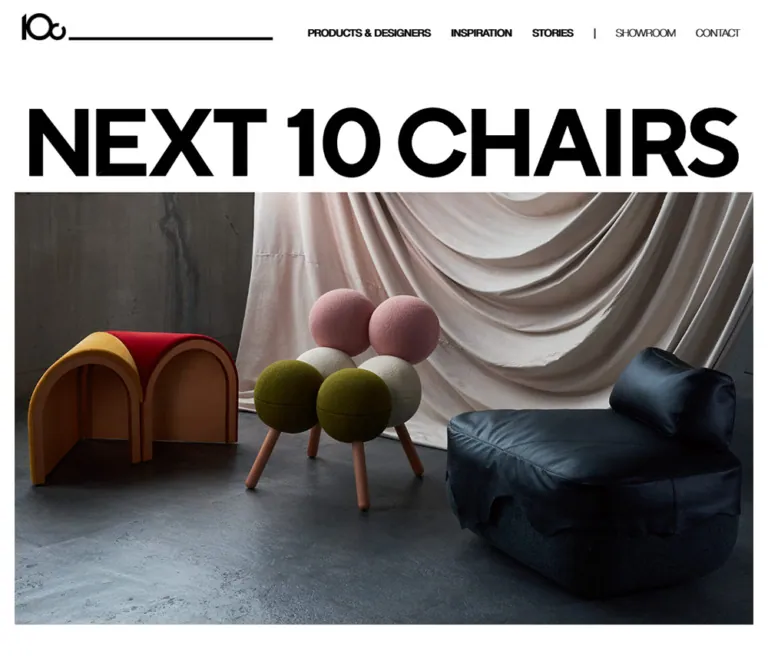
Next 10 Chairs presents experimental furniture as a collection with an editorial identity. An enormous black wordmark nearly spans the desktop viewport, followed by a broad photograph of chairs against draped fabric. Small navigation labels, thin rules, and compact captions provide a precise counterpoint to the scale of the objects and lettering.
The catalog connects each object to its creator through an unusual image pairing: a large color furniture photograph occupies the left portion of a tile, while a smaller monochrome portrait sits flush against its upper-right edge. A chair silhouette, bilingual designer name, and fine oversized plus complete the entry. The footer changes scale again, enlarging navigation into a typographic composition above small contact information and a large white symbol.
This is a collection and project homepage with routes to products, inspiration, stories, showroom information, and contact. Its reusable character comes from these relationships: large artwork against small labels, tightly aligned images against generous section spacing, and neutral interface colors against richly textured furniture.
How to Read This Reference
- Measured values come from the supplied rendered DOM and computed-style records. No additional website visit or file inspection was performed for this reference.
- Calculated values are arithmetic derived from measured rectangles, such as the distance between adjacent cards.
- Estimated values describe visible geometry in the supplied original-page screenshots. They are not pixel-sampled colors or recovered stylesheet declarations.
- Recommended values and behaviors belong to the reusable implementation. They are explicitly separated from existing-site findings.
- All custom property names introduced here are implementation aliases unless marked as source variables.
- The desktop evidence includes opening, catalog, and footer captures. The mobile screenshots show the opening and footer; mobile catalog geometry is supported by DOM measurements.
- Some extracted link strings include duplicated labels or embedded stylesheet text. These are structural or extraction details, not additional visible copy.
Tokens — Colors
Default Palette
| Name | Value | Suggested token | Evidence and role |
|---|---|---|---|
| White | #ffffff |
--n10-white |
Measured main background; visible opening and editorial canvas; white footer symbol |
| Exhibition Gray | #e2e3dd |
--n10-stone |
Measured body background; visually consistent with catalog and footer fields |
| Black | #000000 |
--n10-black |
Measured section-label and Stories text; visible wordmarks, fine rules, and plus marks |
| Text Charcoal | #333333 |
--n10-text |
Measured introduction text and numerous component wrappers |
| Year Charcoal | #282828 |
--n10-year |
Measured large 2024 heading |
| Navigation Gray | #aeaeae |
--n10-muted |
Measured oversized footer navigation |
| Contact Gray | #696969 |
--n10-contact |
Measured company name, addresses, phone, privacy link, and copyright |
The catalog links themselves have transparent computed backgrounds. Their visible pale gray field comes from surrounding or underlying structure that was not separately sampled. Using Exhibition Gray directly on reconstructed cards is a practical visual adaptation.
The header requires similar care: sampled navigation text nodes report white, while the screenshots show dark lettering over the white page. The supplied properties do not establish the compositing mechanism responsible. Match the rendered dark appearance for a static implementation; do not copy white text onto a white header or invent a specific blend-mode system.
Palette Boundaries
Warm wood, cream upholstery, blue-gray fabric, olive green, pink, and dark leather appear within the current photography. These are object colors, not evidence of an interface accent system. Keep links, controls, and section labels neutral.
Source loading variables include --rebranding-loading-bg: #e5e5e5 and --rebranding-loading-bar: #222. A visible loading composition was not supplied, so these should not replace the main palette. The numerous transparent --g-color-* values likewise do not demonstrate a visible gradient treatment.
No alternate color theme or theme selector is established by the evidence.
Tokens — Typography
English Typography
Measured family: Helvetica Neue.
The site uses a broad range of weights within this restrained sans-serif system. Main header links use weight 500; Showroom and Contact use 100. English introduction headings use 600, body copy uses 500, and desktop footer navigation uses 500.
The generic Times family recorded on the root and body is not the visible editorial typeface. Sampled content nodes override it. Do not introduce serif typography based on that inherited root value.
Japanese Typography
Two named Japanese families are present in source variables and computed styles:
| Source family | Source variable | Confirmed use |
|---|---|---|
見出ゴMB31 JIS2004 |
--s-font-06a7943c |
Japanese introduction heading and body |
中ゴシックBBB JIS2004 |
--s-font-08a668d5 |
Japanese footer address |
Helvetica Neue, 見出ゴMB31 JIS2004 |
--s-font-91bb5113 |
Product captions |
Helvetica Neue, 中ゴシックBBB JIS2004 |
--s-font-0abf343b |
Declared mixed-language stack; individual use not established here |
Helvetica Neue |
--s-font-bdae692d |
English typography |
The Japanese introduction looks substantial, but its measured weight is 400 in the named display family. Preserve the family/weight relationship rather than assuming a conventional bold weight.
The Quick Start adds system fallbacks for portability. It does not include or provision these fonts.
Brand Wordmark
The visible NEXT 10 CHAIRS lettering is much heavier and larger than the ordinary text scale. In the desktop opening, its visible bounds are approximately 1360 × 133px, beginning around x=40, y=168.
There is no corresponding measured text node that establishes its font family or font size. An empty-text H1 elsewhere in the introduction measures 200 × 67px; its computed 32px font size must not be assigned to the opening wordmark.
Treat the wordmark as supplied brand artwork when available. A live-text approximation needs optical fitting, but it should remain clearly identified as an approximation.
Type Scale
| Role | Desktop | Mobile | Weight / tracking | Evidence |
|---|---|---|---|---|
| Primary header labels | 14px / 19.6px |
Replaced visually by menu button | 500, normal tracking |
Measured |
| Showroom / Contact header labels | 14px / 19.6px |
Not visible in closed header | 100 |
Measured |
| Japanese introduction heading | 21px / 31.5px |
Same | 400, 1.05px tracking |
Measured |
| Japanese introduction body | 16px / 32px |
Same | 400, 0.8px tracking |
Measured |
| English introduction heading | 18px / 27px |
Same | 600 |
Measured |
| English introduction body | 14px / 21px |
Same | 500 |
Measured |
| Stories text link | 18px / 25.2px |
Same | 600 |
Measured |
| Catalog section label | 14px / 14px |
Same | 500 |
Measured |
| Catalog year | 52px / 52px |
Same | 500, -2.6px tracking |
Measured |
| Product caption | 10px / 10px |
Same | 500 |
Measured |
| Designer name on card | Approximately 20px |
Not individually sampled | Medium appearance | Desktop screenshot estimate |
| Japanese designer name | Approximately 10px |
Not individually sampled | Regular appearance | Desktop screenshot estimate |
| Compact designer directory | Approximately 11–12px visible text |
Text child not sampled | Medium appearance | Screenshot estimate; wrapper font size is not a reliable child measurement |
| Footer Products & Designers | 60px / 60px |
36px / 36px, two lines |
500 desktop; 700 mobile |
Measured |
| Other large footer links | 60px / 60px |
36px / 36px |
500 |
Measured |
| Footer slash separators | 60px / 60px |
Absent from visible mobile layout | 100 |
Measured desktop |
| Footer year | 12px / 21.6px |
Same | 500, -0.6px tracking |
Measured |
| Company name | 12px / 19.2px |
Same | 600 |
Measured |
| Address / phone | 10px / 16px |
Same | English 500; Japanese address 600 |
Measured |
| Privacy / copyright | 12px / 14.4px |
Same | 100 |
Measured |
The scale is intentionally discontinuous. Tiny captions sit beneath substantial photographs, while the footer links become display typography. Enlarging every secondary label would weaken this hierarchy.
Tokens — Spacing & Shapes
The layout uses multiple inset systems rather than one universal container: 30px for the desktop header, 40px for opening imagery and footer, 80px for introduction text, and 24px inside catalog cards.
Spacing Scale
| Use | Value | Status |
|---|---|---|
| Desktop card column separation | 2px |
Calculated from adjacent card rectangles |
| Mobile card separation | 2px vertically |
Calculated from consecutive card rectangles |
| Small internal card gap | 4px |
Measured wrapper gap |
| Main directory column gap | 4px |
Calculated between 120px links |
| Header label padding | 8px 8px 0 |
Measured desktop text nodes |
| Desktop header-link separation | 12px between link boxes |
Calculated |
| Mobile page / header / footer inset | 20px |
Header measured; imagery visually estimated; footer positions measured |
| Card padding | 24px |
Measured at both viewports |
| Mobile introduction inset | 24px |
Measured text positions |
| Desktop header inset | 30px |
Measured |
| Desktop opening / footer inset | 40px |
Opening visually estimated; footer positions measured |
| Desktop card row separation | 40px |
Calculated |
| Introduction heading-to-body gap | 45px |
Calculated at both viewports |
| Desktop introduction left inset | 80px |
Measured |
| Space after final catalog row/slot | 178px |
Calculated to the end of main at both viewports |
Border Radius
All sampled interface boxes have border-radius: 0. Photographs, portraits, tiles, and navigation regions are visibly square-cornered. Rounded chair forms belong to the photographs; they do not imply rounded interface cards.
There is no visible general shadow or elevation system. Fine black rules, white gutters, and flat surface changes provide separation.
Layout Measurements
| Element | Desktop: 1440 × 1000 | Mobile: 390 × 844 | Evidence |
|---|---|---|---|
| Header | 1440 × 55px |
390 × 45px |
Measured |
| Header symbol link | 60 × 37.16px, x=30 |
42 × 26px, x=20 |
Measured |
| Header brand rule | Approximately x=94–748, 4px thick | Approximately x=66–296, 2px thick | Screenshot estimate |
| Mobile menu button | Not visible | 54 × 34px, x=316, y=5.5 |
Measured |
| Opening photograph width | Approximately 1360px |
Approximately 350px |
Screenshot estimate |
| First visible photograph top | Approximately y=322 | Approximately y=227 | Screenshot estimate |
| Japanese body width | 324.98px |
324.98px |
Measured |
| English body width | 420px |
342px |
Measured |
| First catalog card | 478.61 × 480.41px |
390 × 405.41px |
Measured |
| Card inner width | 430.61px |
342px |
Calculated after padding |
| Footer text wordmark link | 516 × 50.34px |
350 × 34.41px |
Measured |
| Footer symbol artwork | Approximately 240 × 149px |
Approximately 240 × 149px |
Screenshot estimate |
| Main document region | 4456.38px high |
7556.66px high |
Measured |
| Complete document | 5145.14px high |
8567.48px high |
Measured |
| Footer region | Approximately 688.77px high |
Approximately 1010.83px high |
Calculated from document and main heights |
These heights describe the captured content. They are not fixed-height requirements for a reusable page.
Components
Persistent Header
Role: compact identity and access to the collection's main destinations.
The header combines a small brand symbol with a long horizontal rule. On desktop, this group occupies the left portion of the viewport, followed by a 40px measured header gap and a row of navigation links. The rule aligns near the symbol's bottom edge rather than forming a full-width border beneath all navigation.
The labels are PRODUCTS & DESIGNERS, INSPIRATION, STORIES, SHOWROOM, and CONTACT. A thin vertical separator precedes Showroom. The first three links have more typographic weight than the last two.
The header remains at the top of the supplied scrolled catalog and footer screenshots. This establishes a persistent visual treatment; the supplied computed-property subset does not distinguish fixed positioning from another implementation.
At 390px, the header becomes 45px high, its symbol shrinks to 42 × 26px, and the navigation row is replaced by a two-line menu button. The button has 12px padding and an 8px internal gap. Its visible lines are approximately 30px wide and 1px thick.
The desktop catalog capture shows content passing behind the header, including a collision with the section heading. For a new implementation, add anchor clearance and verify contrast over photographs rather than treating the overlap as a required interaction.
Opening Wordmark and Photography
Role: introduce the collection through scale and material presence.
The desktop opening has a broad white interval beneath the header, a nearly edge-to-edge black NEXT 10 CHAIRS wordmark, and a large photograph immediately below. The image begins at approximately x=40, y=322 and extends beyond the first viewport.
The current desktop image shows three chairs with markedly different structures: a low angular upholstered chair, a wood-and-metal lounge chair, and a slender wooden chair. Draped fabric spans the backdrop; a dark floor anchors their legs and shadows. The image is not covered with body text or a prominent button.
The supplied mobile opening is materially different. The large wordmark is not visible in that frame. Two landscape photographs appear flush together within 20px side margins, approximately from y=227 to y=634. The upper image contains a close, elevated arrangement of furniture; the lower image shows colorful sculptural seats beside a dark lounge chair.
The evidence does not establish why the mobile wordmark is absent, or whether the images change over time. Do not label this a slideshow, scroll animation, or intentional title-hiding rule without further observation.
Bilingual Project Introduction
Role: articulate the project while maintaining the visual emphasis on furniture.
The Japanese heading reads 10人と10脚で / 描く未来。 and occupies two lines. Its body uses generous 32px leading at a 16px font size, creating a deliberate reading rhythm within an approximately 325px column.
On desktop, the Japanese column starts at x=80. The English column starts at x=580. Their headings share y=1198.56, but their text widths and line heights differ. The English heading uses 18px semibold type; its body is 14px with 21px leading across 420px.
On mobile, both language blocks start at x=24. The Japanese heading begins at y=694.25; the English heading follows later at y=1282.25. The Japanese body retains its measured width and type size. The English body narrows to 342px, and its heading changes from two lines to three.
Preserve both language blocks as editorial content. No language-switching control was established.
Stories Link
Role: lead from the project explanation to related editorial content.
The Stories anchor measures 440 × 40px on desktop and 342 × 40px on mobile. Its label uses 18px / 25.2px, weight 600, with 8px vertical padding.
The destination is /stories. Duplicate label nodes occur in the DOM, but the supplied evidence does not show their hover or transition endpoints. A reconstruction can use one semantic text label until the original interaction is verified.
Collection Index
Role: provide a compact text directory before the visual catalog.
The section begins with a two-line PRODUCTS & DESIGNERS label at 14px and a tightly tracked 2024 immediately beneath it at 52px. On desktop, the designer directory sits to the right in three columns of 120px link boxes, separated by 4px.
On mobile, the title/year group appears first and the directory moves below it. The directory uses two 120px columns. Measured positions place its first column at x=30, slightly inside the section label's x=20 alignment.
Names link directly to individual product/designer pages. This is a directory of navigation links; no filtering behavior was exercised or established.
Product and Designer Card
Role: connect an object, its author, and a detail destination in one linked composition.
The desktop cards form three columns across the full viewport. Each card link has 24px padding, square corners, and a pale gray visible field. Its contents follow this anatomy:
- Image pair: a large color chair photograph at left and a smaller monochrome designer portrait at upper right, with their edges touching.
- Product caption: a small 10px label directly beneath the chair image.
- Identity row: a chair silhouette at left, a thin vertical divider, English designer name, and smaller Japanese name.
- Detail cue: a fine plus approximately 44 × 44px at the far right.
In the first desktop card, the chair image is approximately 323 × 364px and the portrait approximately 108 × 138px. Their widths suggest a 3:1 division of the 431px inner width. The space under the shorter portrait stays gray; the chair photograph does not expand across it.
The entire card is an anchor. The plus is therefore evidence of a detail affordance, not evidence of an accordion or inline expansion. Keep it decorative inside the link in a reusable implementation.
The mobile DOM establishes a single column of 390px-wide cards, each approximately 405.41px high, with the same 24px padding. The exact mobile image subregions were not individually sampled. Applying the desktop 3:1 image division to the measured 342px inner width would produce 256.5px and 85.5px columns; this is an implementation inference, not a separately measured mobile portrait.
Observed Catalog Content
The homepage contains eleven named entries, despite the project's numerical name and introductory wording. Keep the catalog data-driven rather than truncating it to ten.
| Product | Designer | Linked route |
|---|---|---|
| SKIN CHAIR | Kei Sasaki | /PD/202401 |
| Tabula | Masaaki Iwamoto | /PD/202402 |
| Robin Chair | Shogo Onodera | /PD/202403 |
| PARADOX Lounge Chair | Yosuke Kinoshita | /PD/202404 |
| TAN | Shuhei Kamiya | /PD/202405 |
| Upcycle Identity Series | Daisuke Sugawara | /PD/202406 |
| AGUMU Chair | DE-SIGN INC. | /PD/202407 |
| Vault chair | Tomohiro Hata | /PD/202408 |
| Wind Stories 01 | Takaaki Fuji | /PD/202409 |
| fly chair | Motosuke Mandai | /PD/202410 |
| Seasons | Yu Momoeda | /PD/202411 |
An additional unlabeled anchor points to /PD/nextis2025. It occupies a final catalog slot, but the evidence does not establish a visible label or its destination content. Do not invent promotional copy for it. These names identify furniture creators, not website production credits.
Oversized Footer Navigation
Role: provide a second, highly visible site directory and a strong closing composition.
A pale gray field begins after 178px of white space beneath the catalog. The footer opens with a black text wordmark, followed by PRODUCTS & DESIGNERS in large gray type. A small year and two-column designer directory sit below.
Desktop navigation then forms two lines: INSPIRATION / STORIES and SHOWROOM / CONTACT. Link text is 60px with 60px leading; the slash separators use a notably lighter weight. The footer leaves substantial space around this navigation.
At 390px, the Products & Designers link becomes 36px bold and wraps to two lines. The other major links use 36px medium text, each on its own line. The slash separators are absent from the visible mobile composition.
The footer designer directory remains two columns. Its measured link boxes expand from 120px on desktop to approximately 134.84px on mobile, while the gap decreases from 40px to 20px.
Company and Contact Block
Role: provide practical project contact information and a restrained colophon.
The inspected footer names DE-SIGN INC. and displays Japanese and English address blocks, telephone and fax information, a privacy link, and copyright. These are direct original-page findings.
On desktop, the Japanese address, English address, telephone block, and symbol/legal block spread across the width. The small contact typography is gray and mostly 10px. A large white symbol occupies the lower-right area above the legal text.
On mobile, these elements stack at a 20px left inset. The contact area starts 80px after the last major navigation link. The Japanese and English address blocks have 24px between their measured boxes; another 50px separates the English address from the phone block. The white symbol then becomes a prominent left-aligned closing image.
The telephone is a tel: link. The privacy link points to an external policy page; that destination was not inspected and does not independently establish another operator identity.
Mobile Menu Button
Role: compact access to navigation at narrow widths.
Only the closed two-line button is evidenced. There is no supplied opened-menu screenshot, animation trace, focus behavior, or dismissal result. Any proposed drawer, full-screen menu, or overlay is an implementation addition and should be labeled accordingly.
Tokens — Motion & Interaction
| Treatment | Evidence | Supported conclusion |
|---|---|---|
| General element transition | 0.3s cubic-bezier(0.4, 0.4, 0, 1) on many sampled elements |
A shared transition duration and easing are declared |
| Body background transition | background 0.5s cubic-bezier(0.4, 0.4, 0, 1) |
Background changes have a declared transition; their trigger was not established |
| Gradient custom-property transitions | Repeated --g-angle, --g-color-*, and --g-position-* entries |
Transition infrastructure exists; no visible gradient animation is demonstrated |
| Sampled animation property | none |
Those nodes had no declared CSS animation in the sample; this does not rule out JavaScript or descendant motion |
| Header persistence | Visible at the top of scrolled screenshots | Navigation remains visually available while content scrolls |
| Repeated navigation text | Two vertically adjacent label nodes in several anchors | Structural evidence only; a rolling hover effect is not verified |
| Product cards | Anchors with /PD/... destinations |
Cards provide detail-page navigation, not verified expansion |
| Product directory link | /#product-and-designers |
Same-page anchor destination exists; scrolling behavior was not exercised |
| Mobile menu | Closed button captured | Opening, closing, and transition behavior remain unverified |
| Opening imagery | Different compositions at supplied desktop/mobile views | Responsive image presentation differs; timing and automatic rotation remain unverified |
Recommended adaptation: reuse the measured 300ms easing for modest color or underline feedback. Avoid adding image zoom, rotating plus signs, parallax, automatic carousels, or animated text replacement as if they were observed features.
The capture process waited for document loading, sampled layout/text stability, visible image decoding, and finite visible or potentially revealing motion within time limits. Perpetual animations were temporarily paused during readiness checks and resumed. These checks improve screenshot reliability but do not prove that all delayed states or interactions were inspected.
Surfaces
| Layer | Appearance | Structural purpose |
|---|---|---|
| Opening and introduction | White | Gives photographs and black lettering maximum separation |
| Header | Transparent sampled background; dark rendered marks | Allows the compact identity strip to persist over page content |
| Catalog tiles | Pale gray visible field | Unifies photographs, portraits, silhouettes, and labels |
| Catalog separators | Narrow white vertical gaps; wider desktop row gaps | Defines the repeated three-column composition |
| Pre-footer interval | White, 178px measured by subtraction | Separates the dense catalog from the final navigation field |
| Footer | Pale gray | Holds oversized navigation and compact contact information |
| Footer symbol | White artwork | Creates a large quiet counterweight to the black opening wordmark |
No modal surface, raised panel, glass layer, or rounded button system is established by the captures.
Imagery
The photography supplies most of the site's color, texture, and emotional weight. Furniture is photographed as designed objects: angular wood structures, exposed metal legs, soft upholstery, leather folds, woven surfaces, and sculptural volumes remain clearly legible.
The shared setting is a subdued studio with draped cloth and a concrete or dark floor. Soft directional illumination reveals construction and material without turning the photographs into bright retail cutouts. Full-chair views establish silhouettes; closer compositions emphasize grain, fabric, curves, and junctions.
Designer portraits use monochrome photography with tightly framed faces or upper bodies. Their smaller scale and placement at the upper-right edge establish authorship while keeping the chair photograph dominant.
The small chair symbols are object-specific silhouettes or line drawings. Preserve their relationship to each product instead of replacing them with one generic furniture icon. Fine plus signs and straight rules provide the remaining visual vocabulary.
Observed Asset References
| Asset role | Current-page placement | Reuse guidance |
|---|---|---|
| Compact brand symbol | Persistent header; enlarged white version in footer | Use supplied brand artwork; keep aspect ratio intact |
| Text wordmark | Large desktop opening; smaller footer home link | Preserve distinctive letterforms and tight proportions |
| Group furniture photograph | Desktop opening | Retain broad composition, draped backdrop, and floor shadows |
| Two landscape furniture compositions | Supplied mobile opening | Preserve the flush vertical pairing visible in that frame |
| Individual furniture photographs | Catalog, left image region | Keep consistent display proportions while checking each crop |
| Monochrome portraits | Catalog, upper-right image region | Top-align with the corresponding product image |
| Chair silhouettes | Catalog identity rows | Associate the correct symbol with each object |
No complete image-source manifest is included in the evidence. Some extracted strings contain truncated CMS asset paths, which are insufficient for reliable asset URLs. This reference therefore does not invent filenames or downloadable paths.
Use authorized artwork or newly supplied project assets. CSS can recreate the composition, but the wordmark, furniture photographs, and individual silhouettes carry much of the identity.
Layout & Responsive Behavior
| Relationship | Desktop observation | Mobile observation |
|---|---|---|
| Header | 55px high, symbol/rule plus text navigation | 45px high, smaller symbol/rule plus menu button |
| Opening | Very large visible wordmark above one broad photographed composition | Wordmark not visible in supplied frame; two landscape photographs stacked |
| Introduction | Japanese and English arranged side by side | Japanese block precedes English block |
| Introduction typography | Japanese 21px/16px; English 18px/14px | Sizes retained rather than proportionally reduced |
| Collection index | Title/year beside three-column name directory | Title/year above two-column name directory |
| Catalog | Three columns, 2px horizontal and 40px vertical gaps | One column, 2px vertical gaps |
| Card padding | 24px | 24px |
| Footer navigation | 60px links, paired with slashes | 36px links, stacked; Products & Designers becomes bold |
| Footer contacts | Distributed horizontally | Stacked with deliberate vertical spacing |
| Footer symbol | Lower right, approximately 240px wide | Left aligned, approximately the same width |
The card arrangement changes while much of the typography and internal spacing remains constant. Mobile is therefore a longer editorial sequence, not a miniature desktop layout. Its measured document height is approximately 8567px compared with 5145px on desktop.
A source fragment includes a max-width: 840px rule for responsive line-break handling. This proves that an 840px breakpoint exists for that specific behavior; it does not establish the breakpoint for every layout change. No tablet viewport was supplied.
For a new implementation, a three/two/one-column progression is reasonable between the inspected endpoints, but the intermediate two-column state must be labeled as a recommendation. Avoid hardcoding complete document heights or source y-coordinates; let content and image proportions produce the page length.
Do’s and Don’ts
Do
- Preserve the contrast between the enormous black wordmark and compact functional typography.
- Keep the white editorial canvas distinct from the pale gray catalog and footer.
- Maintain the symbol-and-rule relationship in the persistent header.
- Pair each chair photograph with a smaller monochrome creator portrait aligned to its top edge.
- Keep product captions small and place designer names in a clearly separated identity row.
- Use square corners, fine strokes, and flat surfaces.
- Preserve the measured Japanese and English typography as separate systems.
- Retain the 24px card padding across desktop and mobile.
- Let the footer act as a large typographic directory with small practical information beneath it.
- Populate the catalog from the actual available records, including the eleven named entries currently present.
Don’t
- Do not add prices, shopping controls, or purchase CTAs without a product requirement; they are not part of the inspected homepage.
- Do not crop every photograph into a generic square or enlarge portraits to compete with the furniture.
- Do not round the cards, add soft shadows, or introduce a saturated interface accent.
- Do not replace product-specific chair silhouettes with unrelated icon-library symbols.
- Do not apply the root
Timesdeclaration to visible headings or body copy. - Do not infer the opening wordmark's font from the unrelated empty-text H1 measurement.
- Do not treat the card plus as proof of an accordion.
- Do not duplicate navigation labels in accessible text merely because duplicate nodes appear in the DOM.
- Do not infer a carousel, hover roll, or menu animation from static frames and generic transitions.
- Do not assume the missing mobile wordmark or unlabeled final catalog slot expresses a confirmed design intention.
Recommended Implementation Additions
These are recommendations for a new implementation, not verified original-site features:
- Give the home-symbol link and mobile menu button explicit accessible names. Use
aria-expandedandaria-controlsif a menu is implemented. - Make each product tile one semantic link. Mark the plus and redundant chair icon as decorative to avoid multiple conflicting targets.
- Preserve a meaningful document H1 even when a wordmark is an image or visually absent in a mobile composition.
- Provide useful furniture image alternatives; avoid repeating the full adjacent designer/product label in every portrait alternative.
- Add visible keyboard focus, keyboard-operable navigation, and header-aware
scroll-margin-topfor the catalog anchor. - Increase the mobile menu's effective target to at least 44px high while retaining the thin two-line appearance. The measured original button is 34px high.
- Check footer-link contrast. The measured light gray
#aeaeaeis visually subtle against the pale gray field; a darker accessible variant can preserve hierarchy through scale and weight. - Consider a 12px minimum for essential captions or contact information in a production adaptation. The source uses several 10px roles.
- Reserve image dimensions, provide responsive image sizes, and lazy-load later catalog photography without delaying the opening image.
- Support reduced motion for any added transitions. If automatic image changes are introduced, provide pause behavior and do not describe them as recovered original behavior.
Agent Prompt Guide
Quick Color Reference
- Editorial canvas:
#ffffff. - Catalog and footer adaptation:
#e2e3dd. - Wordmarks, rules, plus signs, and strong labels:
#000000. - Introduction and normal text:
#333333. - Large footer links: source
#aeaeae; review contrast for new work. - Contact information:
#696969. - Additional colors belong to furniture photography rather than interface controls.
Overall Prompt
“Create an editorial furniture collection homepage inspired by the observed Next 10 Chairs composition. Use a white canvas, a monumental black wordmark, a compact persistent header with a small symbol connected to a long horizontal rule, and broad photographs of experimental chairs against draped fabric. Follow with separate Japanese and English project statements. Build a full-width three-column desktop catalog on pale gray surfaces, using 24px card padding, large color chair photographs, smaller monochrome creator portraits attached at the upper right, tiny product captions, bilingual designer names, chair silhouettes, and fine oversized plus signs. Collapse the catalog to one column on a narrow phone while retaining the internal padding. Finish with a pale gray footer containing oversized gray navigation, a compact designer directory, small contact details, and a large white symbol. Keep all corners square and use no elevation shadows. Treat unverified motion and menu behavior as new design decisions.”
Example Component Prompts
- Header: “Build a 55px desktop header with 30px horizontal padding, a 60px-wide brand symbol, a flexible black rule aligned to its lower edge, and small 14px Helvetica Neue navigation at the right. Use lighter weights for Showroom and Contact. On a 390px phone, use a 45px header, 20px side padding, a 42px symbol, and a thin two-line menu control.”
- Product card: “Create a square-cornered pale gray furniture tile with 24px padding. Divide the media row approximately 3:1: a tall color chair photograph on the left and a shorter monochrome designer portrait flush against its upper-right edge. Below, use a 10px product caption and an identity row with a tiny chair silhouette, vertical rule, 20px designer name, smaller Japanese name, and a 44px fine-stroke plus. Make the whole tile one link.”
- Bilingual introduction: “Arrange a narrow Japanese statement and a wider English statement in separate desktop columns. Use Japanese 21px headings and 16px body text with 32px leading and 0.05em tracking. Use English 18px semibold headings and 14px medium body text with 21px leading. Keep 45px between each heading and body. Stack the languages on mobile with 24px side padding.”
- Footer: “Create a flat pale gray footer with a black text wordmark, 60px gray navigation, a small two-column designer directory, and paired links separated by thin slashes. Distribute compact contact blocks across the desktop base and place a large white symbol at the right. On mobile, use 36px navigation on separate lines, remove the slashes, and stack contacts and symbol at the left.”
- Photography direction: “Photograph sculptural contemporary seating in a quiet studio with draped cream fabric, a subdued floor, directional soft light, visible wood grain and upholstery texture, and grounded shadows. Preserve differences in construction and silhouette. Pair individual objects with restrained monochrome creator portraits.”
Quick Start
CSS Custom Properties
This is an implementation scaffold, not recovered source CSS. It uses measured palette and type values, an estimated 3:1 card-media division, and semantic class names. Supply the actual authorized image and wordmark assets through markup.
The mobile opening rules reproduce the supplied frame as a static adaptation: they visually hide the wordmark while preserving its accessible heading and show a two-image composition. This is not a claim that the source intentionally hides that wordmark. The 1100px and 600px layout breakpoints, intermediate two-column catalog, accessible menu target, and hover/focus treatments are recommendations.
Expected structure: a header containing a brand group and navigation; an opening H1 containing wordmark artwork; separate desktop/mobile media containers; introduction language blocks; a directory; linked cards containing media, caption, and identity row; and a footer with navigation and contact columns.
:root {
  /* Measured colors; direct surface application is an adaptation. */
  --n10-white: #ffffff;
  --n10-stone: #e2e3dd;
  --n10-black: #000000;
  --n10-text: #333333;
  --n10-year: #282828;
  --n10-muted: #aeaeae;
  --n10-contact: #696969;

  /* Observed families with recommended system fallbacks. */
  --n10-font-en: 'Helvetica Neue', Helvetica, Arial, sans-serif;
  --n10-font-ja-display: '見出ゴMB31 JIS2004', sans-serif;
  --n10-font-ja-body: '中ゴシックBBB JIS2004', sans-serif;

  --n10-header-height: 55px;
  --n10-header-inset: 30px;
  --n10-page-inset: 40px;
  --n10-intro-inset: 80px;
  --n10-card-inset: 24px;
  --n10-column-gap: 2px;
  --n10-row-gap: 40px;
  --n10-footer-type: 60px;
  --n10-rule: 1px;
  --n10-ease: cubic-bezier(0.4, 0.4, 0, 1);
  --n10-duration: 300ms;
}

* { box-sizing: border-box; }

body {
  margin: 0;
  color: var(--n10-text);
  background: var(--n10-stone);
  font-family: var(--n10-font-en);
}

a { color: inherit; }
img { display: block; max-width: 100%; }
button { font: inherit; }

.n10-header {
  position: fixed;
  inset: 0 0 auto;
  z-index: 20;
  display: flex;
  align-items: flex-end;
  gap: 40px;
  height: var(--n10-header-height);
  padding-inline: var(--n10-header-inset);
  color: var(--n10-black);
  background: transparent;
}

.n10-brand {
  display: flex;
  flex: 1;
  min-width: 0;
  align-items: flex-end;
  gap: 4px;
}

.n10-brand-symbol {
  flex: 0 0 60px;
  width: 60px;
  height: 37.16px;
}

.n10-brand-symbol img {
  width: 100%;
  height: 100%;
  object-fit: contain;
}

.n10-brand-rule {
  flex: 1;
  height: 4px;
  background: currentColor;
}

.n10-desktop-nav {
  display: flex;
  align-items: flex-end;
  gap: 12px;
}

.n10-desktop-nav a,
.n10-nav-divider {
  padding: 8px 8px 0;
  font-size: 14px;
  font-weight: 500;
  line-height: 1.4;
  text-decoration: none;
  white-space: nowrap;
}

.n10-desktop-nav .is-light,
.n10-nav-divider { font-weight: 100; }

.n10-menu-button {
  display: none;
  flex: 0 0 54px;
  align-self: center;
  align-items: center;
  justify-content: center;
  flex-direction: column;
  gap: 8px;
  width: 54px;
  min-height: 44px;
  padding: 12px;
  border: 0;
  border-radius: 0;
  background: transparent;
  color: inherit;
  cursor: pointer;
}

.n10-menu-button span {
  width: 30px;
  height: 1px;
  background: currentColor;
}

.n10-main {
  padding-top: var(--n10-header-height);
  background: var(--n10-white);
}

.n10-opening {
  margin-inline: var(--n10-page-inset);
  padding-top: 112px;
}

.n10-hero-title { margin: 0 0 22px; }
.n10-hero-title img { width: 100%; height: auto; }
.n10-opening-media img { width: 100%; height: auto; }
.n10-opening-media--mobile { display: none; }

.n10-intro {
  display: grid;
  grid-template-columns: minmax(0, 420px) minmax(0, 420px);
  gap: 80px;
  margin-top: 80px;
  padding-inline: var(--n10-intro-inset);
}

.n10-intro h2,
.n10-intro p { margin: 0; }
.n10-intro h2 + p { margin-top: 45px; }

.n10-intro-ja {
  font-family: var(--n10-font-ja-display);
  font-weight: 400;
  letter-spacing: 0.05em;
}

.n10-intro-ja h2 {
  font-size: 21px;
  font-weight: 400;
  line-height: 1.5;
}

.n10-intro-ja p {
  max-width: 325px;
  font-size: 16px;
  line-height: 2;
}

.n10-intro-en h2 {
  max-width: 396px;
  font-size: 18px;
  font-weight: 600;
  line-height: 1.5;
}

.n10-intro-en p {
  font-size: 14px;
  font-weight: 500;
  line-height: 1.5;
}

.n10-stories-link {
  display: flex;
  align-items: center;
  min-height: 40px;
  padding-block: 8px;
  color: var(--n10-black);
  font-size: 18px;
  font-weight: 600;
  line-height: 1.4;
  text-decoration: none;
}

.n10-catalog {
  padding-bottom: 178px;
  scroll-margin-top: calc(var(--n10-header-height) + 24px);
}

.n10-catalog-index {
  display: grid;
  grid-template-columns: 105.25px minmax(0, 368px);
  align-items: start;
  gap: 50px;
  margin-block: 160px 40px;
  padding-inline: var(--n10-page-inset);
}

.n10-section-label {
  margin: 0;
  color: var(--n10-black);
  font-size: 14px;
  font-weight: 500;
  line-height: 1;
}

.n10-year {
  margin: 0;
  color: var(--n10-year);
  font-size: 52px;
  font-weight: 500;
  line-height: 1;
  letter-spacing: -0.05em;
}

.n10-directory {
  display: grid;
  grid-template-columns: repeat(3, 120px);
  gap: 4px;
}

.n10-directory a {
  color: var(--n10-contact);
  font-size: 11px;
  font-weight: 500;
  line-height: 1.8;
  text-decoration: none;
}

.n10-product-grid {
  display: grid;
  grid-template-columns: repeat(3, minmax(0, 1fr));
  gap: var(--n10-row-gap) var(--n10-column-gap);
  background: var(--n10-white);
}

.n10-product-card {
  display: block;
  min-width: 0;
  padding: var(--n10-card-inset);
  color: var(--n10-text);
  background: var(--n10-stone);
  border-radius: 0;
  text-decoration: none;
}

/* Image proportions are estimated from the desktop capture. */
.n10-card-media {
  display: grid;
  grid-template-columns: 3fr 1fr;
  align-items: start;
}

.n10-chair-photo {
  width: 100%;
  aspect-ratio: 323 / 364.4;
  object-fit: cover;
}

.n10-designer-photo {
  width: 100%;
  aspect-ratio: 108 / 138;
  object-fit: cover;
}

.n10-product-caption {
  margin: 4px 0 10px;
  font-family: var(--n10-font-en), var(--n10-font-ja-display);
  font-size: 10px;
  font-weight: 500;
  line-height: 1;
}

.n10-card-identity {
  display: flex;
  align-items: center;
  min-height: 44px;
}

.n10-chair-icon {
  display: grid;
  flex: 0 0 49px;
  place-items: center;
  height: 38px;
  border-right: 1px solid var(--n10-black);
}

.n10-chair-icon img {
  width: 31px;
  height: 31px;
  object-fit: contain;
}

.n10-designer-names {
  flex: 1;
  min-width: 0;
  padding-inline: 8px;
}

.n10-designer-name {
  display: block;
  font-size: 20px;
  font-weight: 500;
  line-height: 1.2;
}

.n10-designer-name-ja {
  display: block;
  margin-top: 3px;
  font-family: var(--n10-font-ja-body);
  font-size: 10px;
  line-height: 1.4;
}

.n10-plus {
  position: relative;
  flex: 0 0 44px;
  width: 44px;
  height: 44px;
  color: var(--n10-black);
}

.n10-plus::before,
.n10-plus::after {
  content: '';
  position: absolute;
  top: 50%;
  left: 50%;
  background: currentColor;
  transform: translate(-50%, -50%);
}

.n10-plus::before { width: 44px; height: 1px; }
.n10-plus::after { width: 1px; height: 44px; }

.n10-footer {
  padding: 40px var(--n10-page-inset);
  background: var(--n10-stone);
}

.n10-footer-wordmark {
  display: block;
  width: min(516px, 100%);
}

.n10-footer-wordmark img { width: 100%; height: auto; }

.n10-footer-link {
  display: block;
  color: var(--n10-muted);
  font-size: var(--n10-footer-type);
  font-weight: 500;
  line-height: 1;
  text-decoration: none;
}

.n10-footer-directory {
  display: grid;
  grid-template-columns: auto minmax(0, 280px);
  gap: 40px;
  margin-block: 10px;
}

.n10-footer-directory .n10-directory {
  grid-template-columns: repeat(2, 120px);
  gap: 4px 40px;
}

.n10-footer-directory .n10-directory a {
  font-size: 12px;
  line-height: 1.4;
}

.n10-footer-year {
  margin: 0;
  color: var(--n10-black);
  font-size: 12px;
  font-weight: 500;
  line-height: 1.8;
  letter-spacing: -0.05em;
}

.n10-footer-pair {
  display: flex;
  align-items: baseline;
  gap: 4px;
  margin-top: 4px;
}

.n10-footer-slash {
  color: var(--n10-muted);
  font-size: var(--n10-footer-type);
  font-weight: 100;
  line-height: 1;
}

.n10-footer-contact {
  display: grid;
  grid-template-columns: 1.15fr 1.08fr 0.65fr 240px;
  align-items: end;
  gap: 40px;
  margin-top: 28px;
  color: var(--n10-contact);
}

.n10-footer-contact p,
.n10-footer-contact address {
  margin: 0;
  font-size: 10px;
  font-style: normal;
  font-weight: 500;
  line-height: 1.6;
}

.n10-footer-contact .n10-company-name {
  margin-bottom: 19px;
  font-size: 12px;
  font-weight: 600;
  line-height: 1.6;
}

.n10-address-ja {
  font-family: var(--n10-font-ja-body);
}

.n10-footer-contact a { text-decoration: none; }

.n10-footer-symbol {
  width: 240px;
  height: auto;
  margin-bottom: 36px;
}

.n10-footer-contact .n10-legal {
  font-size: 12px;
  font-weight: 100;
  line-height: 1.2;
}

/* Recommended feedback; original hover endpoints are unverified. */
.n10-footer-link {
  transition: color var(--n10-duration) var(--n10-ease);
}

@media (hover: hover) {
  .n10-footer-link:hover { color: var(--n10-black); }
  .n10-directory a:hover,
  .n10-stories-link:hover,
  .n10-desktop-nav a:hover { text-decoration: underline; }
}

:where(a, button):focus-visible {
  outline: 2px solid var(--n10-black);
  outline-offset: 4px;
}

/* Recommended intermediate layout; no tablet capture was supplied. */
@media (max-width: 1100px) {
  .n10-desktop-nav { display: none; }
  .n10-menu-button { display: flex; }
  .n10-product-grid { grid-template-columns: repeat(2, minmax(0, 1fr)); }
  .n10-intro { grid-template-columns: repeat(2, minmax(0, 1fr)); gap: 40px; }
  .n10-footer-contact { grid-template-columns: repeat(2, minmax(0, 1fr)); }
}

@media (max-width: 600px) {
  :root {
    --n10-header-height: 45px;
    --n10-header-inset: 20px;
    --n10-page-inset: 20px;
    --n10-intro-inset: 24px;
    --n10-row-gap: 2px;
    --n10-footer-type: 36px;
  }

  .n10-header { gap: 20px; }
  .n10-brand-symbol { flex-basis: 42px; width: 42px; height: 26px; }
  .n10-brand-rule { height: 2px; }
  .n10-opening { padding-top: 182px; }

  /* Static adaptation of the supplied mobile frame, not a source rule. */
  .n10-hero-title {
    position: absolute;
    width: 1px;
    height: 1px;
    margin: -1px;
    overflow: hidden;
    clip-path: inset(50%);
    white-space: nowrap;
  }

  .n10-opening-media--desktop { display: none; }
  .n10-opening-media--mobile { display: grid; gap: 0; }
  .n10-intro { grid-template-columns: 1fr; gap: 80px; margin-top: 60px; }
  .n10-catalog-index { grid-template-columns: 1fr; gap: 30px; }
  .n10-catalog-index .n10-directory { margin-left: 10px; }
  .n10-directory { grid-template-columns: repeat(2, 120px); }
  .n10-product-grid { grid-template-columns: minmax(0, 1fr); }
  .n10-footer { padding-block: 24px; }
  .n10-footer-products { margin-top: 8px; font-weight: 700; }
  .n10-footer-pair { flex-direction: column; align-items: flex-start; }
  .n10-footer-slash { display: none; }
  .n10-footer-directory { grid-template-columns: auto minmax(0, 1fr); gap: 36px; }
  .n10-footer-directory .n10-directory {
    grid-template-columns: repeat(2, minmax(0, 1fr));
    column-gap: 20px;
  }
  .n10-footer-contact { grid-template-columns: 1fr; gap: 24px; margin-top: 80px; }
  .n10-footer-phone,
  .n10-footer-signature { margin-top: 26px; }
}

@media (prefers-reduced-motion: reduce) {
  .n10-footer-link { transition: none; }
  html { scroll-behavior: auto; }
}
Use a white version of the supplied footer symbol rather than assuming a CSS filter can reproduce every asset. Likewise, use actual monochrome portrait assets when available; the capture does not establish whether their grayscale treatment is authored into the files or applied in CSS.
The scaffold does not implement menu state, image sequencing, or navigation transitions. Those behaviors require separate requirements and verification. Its text sizes intentionally preserve several small source roles; apply the accessibility recommendations when adapting the design for production.
Tailwind v4 Token Mapping
Optional aliases for an existing Tailwind v4 project. This does not claim that the inspected website uses Tailwind. Define the custom properties above first.
@theme inline {
  --color-n10-white: var(--n10-white);
  --color-n10-stone: var(--n10-stone);
  --color-n10-black: var(--n10-black);
  --color-n10-text: var(--n10-text);
  --color-n10-muted: var(--n10-muted);
  --color-n10-contact: var(--n10-contact);

  --font-editorial: var(--n10-font-en);
  --font-japanese-display: var(--n10-font-ja-display);
  --font-japanese-body: var(--n10-font-ja-body);

  --text-product-caption: 10px;
  --text-navigation: 14px;
  --text-intro-ja: 16px;
  --text-intro-en-heading: 18px;
  --text-intro-ja-heading: 21px;
  --text-collection-year: 52px;
  --text-footer-navigation: var(--n10-footer-type);

  --spacing-card-inset: var(--n10-card-inset);
  --spacing-page-inset: var(--n10-page-inset);
  --spacing-catalog-column: var(--n10-column-gap);
  --spacing-catalog-row: var(--n10-row-gap);
  --radius-flat: 0px;
  --ease-editorial: var(--n10-ease);
}
Sources & Evidence
- Inspected original and final page: Next 10 Chairs. The supplied browser record reports HTTP 200 with no URL change.
- Capture timestamp:
2026-09-16T19:42:39.389Z, equivalent to September 17, 2026, 04:42:39.389 JST. - Desktop evidence: three supplied 1440 × 1000 screenshots covering the opening, catalog, and footer, plus rendered text, link destinations, custom properties, and computed-style/rectangle records. Measured document height: 5145.14px.
- Mobile evidence: two supplied 390 × 844 screenshots covering the opening and footer, plus rendered text and measured layout records for the introduction, index, catalog, and footer. Measured document height: 8567.48px.
- Observed navigation structure: homepage links to
/#product-and-designers,/inspiration,/stories,/showroom,/contact, and the listed/PD/...routes. These destinations establish information architecture; their page designs were not inspected. - Interaction evidence: scrolling captures demonstrate header persistence and lower-page composition. No menu activation, card activation, hover sequence, or keyboard traversal result was supplied.
- Inspection limits: only two viewport sizes were measured; complete stylesheets, image manifests, font files, compositing rules, and animation timelines were not supplied. Readiness checks used finite time limits, and service workers and SharedWorkers were disabled during inspection. Delayed content and unexercised states remain unverified.
This reference describes the current homepage represented by the supplied original-page evidence. Numerical source measurements, screenshot estimates, and reusable implementation choices are identified separately throughout.
# Next 10 Chairs — Style Reference

> A furniture exhibition presented through monumental lettering, quiet gray surfaces, and tactile studio photography.

**Website / original URL:** [next10chairs.com](https://www.next10chairs.com/)
**Final URL:** [https://www.next10chairs.com/](https://www.next10chairs.com/)
**Theme:** light; white editorial sections and pale gray catalog/footer surfaces.
**Inspected:** September 17, 2026, 04:42 JST. The supplied retrieval timestamp is September 16, 2026, 19:42:39.389 UTC.
**Viewports:** 1440 × 1000 desktop and 390 × 844 mobile, in CSS pixels.
**Scope:** the current homepage: persistent header, opening imagery, bilingual project introduction, Stories link, 2024 product/designer directory, linked catalog cards, and footer. Other pages and the opened mobile menu were not inspected.

Next 10 Chairs presents experimental furniture as a collection with an editorial identity. An enormous black wordmark nearly spans the desktop viewport, followed by a broad photograph of chairs against draped fabric. Small navigation labels, thin rules, and compact captions provide a precise counterpoint to the scale of the objects and lettering.

The catalog connects each object to its creator through an unusual image pairing: a large color furniture photograph occupies the left portion of a tile, while a smaller monochrome portrait sits flush against its upper-right edge. A chair silhouette, bilingual designer name, and fine oversized plus complete the entry. The footer changes scale again, enlarging navigation into a typographic composition above small contact information and a large white symbol.

This is a collection and project homepage with routes to products, inspiration, stories, showroom information, and contact. Its reusable character comes from these relationships: large artwork against small labels, tightly aligned images against generous section spacing, and neutral interface colors against richly textured furniture.

## How to Read This Reference

- **Measured** values come from the supplied rendered DOM and computed-style records. No additional website visit or file inspection was performed for this reference.
- **Calculated** values are arithmetic derived from measured rectangles, such as the distance between adjacent cards.
- **Estimated** values describe visible geometry in the supplied original-page screenshots. They are not pixel-sampled colors or recovered stylesheet declarations.
- **Recommended** values and behaviors belong to the reusable implementation. They are explicitly separated from existing-site findings.
- All custom property names introduced here are implementation aliases unless marked as source variables.
- The desktop evidence includes opening, catalog, and footer captures. The mobile screenshots show the opening and footer; mobile catalog geometry is supported by DOM measurements.
- Some extracted link strings include duplicated labels or embedded stylesheet text. These are structural or extraction details, not additional visible copy.

## Tokens — Colors

### Default Palette

| Name | Value | Suggested token | Evidence and role |
| --- | --- | --- | --- |
| White | `#ffffff` | `--n10-white` | Measured main background; visible opening and editorial canvas; white footer symbol |
| Exhibition Gray | `#e2e3dd` | `--n10-stone` | Measured body background; visually consistent with catalog and footer fields |
| Black | `#000000` | `--n10-black` | Measured section-label and Stories text; visible wordmarks, fine rules, and plus marks |
| Text Charcoal | `#333333` | `--n10-text` | Measured introduction text and numerous component wrappers |
| Year Charcoal | `#282828` | `--n10-year` | Measured large `2024` heading |
| Navigation Gray | `#aeaeae` | `--n10-muted` | Measured oversized footer navigation |
| Contact Gray | `#696969` | `--n10-contact` | Measured company name, addresses, phone, privacy link, and copyright |

The catalog links themselves have transparent computed backgrounds. Their visible pale gray field comes from surrounding or underlying structure that was not separately sampled. Using Exhibition Gray directly on reconstructed cards is a practical visual adaptation.

The header requires similar care: sampled navigation text nodes report white, while the screenshots show dark lettering over the white page. The supplied properties do not establish the compositing mechanism responsible. Match the rendered dark appearance for a static implementation; do not copy white text onto a white header or invent a specific blend-mode system.

### Palette Boundaries

Warm wood, cream upholstery, blue-gray fabric, olive green, pink, and dark leather appear within the current photography. These are object colors, not evidence of an interface accent system. Keep links, controls, and section labels neutral.

Source loading variables include `--rebranding-loading-bg: #e5e5e5` and `--rebranding-loading-bar: #222`. A visible loading composition was not supplied, so these should not replace the main palette. The numerous transparent `--g-color-*` values likewise do not demonstrate a visible gradient treatment.

No alternate color theme or theme selector is established by the evidence.

## Tokens — Typography

### English Typography

**Measured family:** `Helvetica Neue`.

The site uses a broad range of weights within this restrained sans-serif system. Main header links use weight `500`; Showroom and Contact use `100`. English introduction headings use `600`, body copy uses `500`, and desktop footer navigation uses `500`.

The generic `Times` family recorded on the root and body is not the visible editorial typeface. Sampled content nodes override it. Do not introduce serif typography based on that inherited root value.

### Japanese Typography

Two named Japanese families are present in source variables and computed styles:

| Source family | Source variable | Confirmed use |
| --- | --- | --- |
| `見出ゴMB31 JIS2004` | `--s-font-06a7943c` | Japanese introduction heading and body |
| `中ゴシックBBB JIS2004` | `--s-font-08a668d5` | Japanese footer address |
| `Helvetica Neue`, `見出ゴMB31 JIS2004` | `--s-font-91bb5113` | Product captions |
| `Helvetica Neue`, `中ゴシックBBB JIS2004` | `--s-font-0abf343b` | Declared mixed-language stack; individual use not established here |
| `Helvetica Neue` | `--s-font-bdae692d` | English typography |

The Japanese introduction looks substantial, but its measured weight is `400` in the named display family. Preserve the family/weight relationship rather than assuming a conventional bold weight.

The Quick Start adds system fallbacks for portability. It does not include or provision these fonts.

### Brand Wordmark

The visible `NEXT 10 CHAIRS` lettering is much heavier and larger than the ordinary text scale. In the desktop opening, its visible bounds are approximately 1360 × 133px, beginning around x=40, y=168.

There is no corresponding measured text node that establishes its font family or font size. An empty-text H1 elsewhere in the introduction measures 200 × 67px; its computed `32px` font size must not be assigned to the opening wordmark.

Treat the wordmark as supplied brand artwork when available. A live-text approximation needs optical fitting, but it should remain clearly identified as an approximation.

### Type Scale

| Role | Desktop | Mobile | Weight / tracking | Evidence |
| --- | --- | --- | --- | --- |
| Primary header labels | `14px / 19.6px` | Replaced visually by menu button | `500`, normal tracking | Measured |
| Showroom / Contact header labels | `14px / 19.6px` | Not visible in closed header | `100` | Measured |
| Japanese introduction heading | `21px / 31.5px` | Same | `400`, `1.05px` tracking | Measured |
| Japanese introduction body | `16px / 32px` | Same | `400`, `0.8px` tracking | Measured |
| English introduction heading | `18px / 27px` | Same | `600` | Measured |
| English introduction body | `14px / 21px` | Same | `500` | Measured |
| Stories text link | `18px / 25.2px` | Same | `600` | Measured |
| Catalog section label | `14px / 14px` | Same | `500` | Measured |
| Catalog year | `52px / 52px` | Same | `500`, `-2.6px` tracking | Measured |
| Product caption | `10px / 10px` | Same | `500` | Measured |
| Designer name on card | Approximately `20px` | Not individually sampled | Medium appearance | Desktop screenshot estimate |
| Japanese designer name | Approximately `10px` | Not individually sampled | Regular appearance | Desktop screenshot estimate |
| Compact designer directory | Approximately `11–12px` visible text | Text child not sampled | Medium appearance | Screenshot estimate; wrapper font size is not a reliable child measurement |
| Footer Products & Designers | `60px / 60px` | `36px / 36px`, two lines | `500` desktop; `700` mobile | Measured |
| Other large footer links | `60px / 60px` | `36px / 36px` | `500` | Measured |
| Footer slash separators | `60px / 60px` | Absent from visible mobile layout | `100` | Measured desktop |
| Footer year | `12px / 21.6px` | Same | `500`, `-0.6px` tracking | Measured |
| Company name | `12px / 19.2px` | Same | `600` | Measured |
| Address / phone | `10px / 16px` | Same | English `500`; Japanese address `600` | Measured |
| Privacy / copyright | `12px / 14.4px` | Same | `100` | Measured |

The scale is intentionally discontinuous. Tiny captions sit beneath substantial photographs, while the footer links become display typography. Enlarging every secondary label would weaken this hierarchy.

## Tokens — Spacing & Shapes

The layout uses multiple inset systems rather than one universal container: 30px for the desktop header, 40px for opening imagery and footer, 80px for introduction text, and 24px inside catalog cards.

### Spacing Scale

| Use | Value | Status |
| --- | --- | --- |
| Desktop card column separation | `2px` | Calculated from adjacent card rectangles |
| Mobile card separation | `2px` vertically | Calculated from consecutive card rectangles |
| Small internal card gap | `4px` | Measured wrapper gap |
| Main directory column gap | `4px` | Calculated between 120px links |
| Header label padding | `8px 8px 0` | Measured desktop text nodes |
| Desktop header-link separation | `12px` between link boxes | Calculated |
| Mobile page / header / footer inset | `20px` | Header measured; imagery visually estimated; footer positions measured |
| Card padding | `24px` | Measured at both viewports |
| Mobile introduction inset | `24px` | Measured text positions |
| Desktop header inset | `30px` | Measured |
| Desktop opening / footer inset | `40px` | Opening visually estimated; footer positions measured |
| Desktop card row separation | `40px` | Calculated |
| Introduction heading-to-body gap | `45px` | Calculated at both viewports |
| Desktop introduction left inset | `80px` | Measured |
| Space after final catalog row/slot | `178px` | Calculated to the end of main at both viewports |

### Border Radius

All sampled interface boxes have `border-radius: 0`. Photographs, portraits, tiles, and navigation regions are visibly square-cornered. Rounded chair forms belong to the photographs; they do not imply rounded interface cards.

There is no visible general shadow or elevation system. Fine black rules, white gutters, and flat surface changes provide separation.

### Layout Measurements

| Element | Desktop: 1440 × 1000 | Mobile: 390 × 844 | Evidence |
| --- | --- | --- | --- |
| Header | `1440 × 55px` | `390 × 45px` | Measured |
| Header symbol link | `60 × 37.16px`, x=30 | `42 × 26px`, x=20 | Measured |
| Header brand rule | Approximately x=94–748, 4px thick | Approximately x=66–296, 2px thick | Screenshot estimate |
| Mobile menu button | Not visible | `54 × 34px`, x=316, y=5.5 | Measured |
| Opening photograph width | Approximately `1360px` | Approximately `350px` | Screenshot estimate |
| First visible photograph top | Approximately y=322 | Approximately y=227 | Screenshot estimate |
| Japanese body width | `324.98px` | `324.98px` | Measured |
| English body width | `420px` | `342px` | Measured |
| First catalog card | `478.61 × 480.41px` | `390 × 405.41px` | Measured |
| Card inner width | `430.61px` | `342px` | Calculated after padding |
| Footer text wordmark link | `516 × 50.34px` | `350 × 34.41px` | Measured |
| Footer symbol artwork | Approximately `240 × 149px` | Approximately `240 × 149px` | Screenshot estimate |
| Main document region | `4456.38px` high | `7556.66px` high | Measured |
| Complete document | `5145.14px` high | `8567.48px` high | Measured |
| Footer region | Approximately `688.77px` high | Approximately `1010.83px` high | Calculated from document and main heights |

These heights describe the captured content. They are not fixed-height requirements for a reusable page.

## Components

### Persistent Header

**Role:** compact identity and access to the collection's main destinations.

The header combines a small brand symbol with a long horizontal rule. On desktop, this group occupies the left portion of the viewport, followed by a 40px measured header gap and a row of navigation links. The rule aligns near the symbol's bottom edge rather than forming a full-width border beneath all navigation.

The labels are `PRODUCTS & DESIGNERS`, `INSPIRATION`, `STORIES`, `SHOWROOM`, and `CONTACT`. A thin vertical separator precedes Showroom. The first three links have more typographic weight than the last two.

The header remains at the top of the supplied scrolled catalog and footer screenshots. This establishes a persistent visual treatment; the supplied computed-property subset does not distinguish fixed positioning from another implementation.

At 390px, the header becomes 45px high, its symbol shrinks to 42 × 26px, and the navigation row is replaced by a two-line menu button. The button has 12px padding and an 8px internal gap. Its visible lines are approximately 30px wide and 1px thick.

The desktop catalog capture shows content passing behind the header, including a collision with the section heading. For a new implementation, add anchor clearance and verify contrast over photographs rather than treating the overlap as a required interaction.

### Opening Wordmark and Photography

**Role:** introduce the collection through scale and material presence.

The desktop opening has a broad white interval beneath the header, a nearly edge-to-edge black `NEXT 10 CHAIRS` wordmark, and a large photograph immediately below. The image begins at approximately x=40, y=322 and extends beyond the first viewport.

The current desktop image shows three chairs with markedly different structures: a low angular upholstered chair, a wood-and-metal lounge chair, and a slender wooden chair. Draped fabric spans the backdrop; a dark floor anchors their legs and shadows. The image is not covered with body text or a prominent button.

The supplied mobile opening is materially different. The large wordmark is not visible in that frame. Two landscape photographs appear flush together within 20px side margins, approximately from y=227 to y=634. The upper image contains a close, elevated arrangement of furniture; the lower image shows colorful sculptural seats beside a dark lounge chair.

The evidence does not establish why the mobile wordmark is absent, or whether the images change over time. Do not label this a slideshow, scroll animation, or intentional title-hiding rule without further observation.

### Bilingual Project Introduction

**Role:** articulate the project while maintaining the visual emphasis on furniture.

The Japanese heading reads `10人と10脚で / 描く未来。` and occupies two lines. Its body uses generous 32px leading at a 16px font size, creating a deliberate reading rhythm within an approximately 325px column.

On desktop, the Japanese column starts at x=80. The English column starts at x=580. Their headings share y=1198.56, but their text widths and line heights differ. The English heading uses 18px semibold type; its body is 14px with 21px leading across 420px.

On mobile, both language blocks start at x=24. The Japanese heading begins at y=694.25; the English heading follows later at y=1282.25. The Japanese body retains its measured width and type size. The English body narrows to 342px, and its heading changes from two lines to three.

Preserve both language blocks as editorial content. No language-switching control was established.

### Stories Link

**Role:** lead from the project explanation to related editorial content.

The Stories anchor measures 440 × 40px on desktop and 342 × 40px on mobile. Its label uses `18px / 25.2px`, weight `600`, with 8px vertical padding.

The destination is `/stories`. Duplicate label nodes occur in the DOM, but the supplied evidence does not show their hover or transition endpoints. A reconstruction can use one semantic text label until the original interaction is verified.

### Collection Index

**Role:** provide a compact text directory before the visual catalog.

The section begins with a two-line `PRODUCTS & DESIGNERS` label at 14px and a tightly tracked `2024` immediately beneath it at 52px. On desktop, the designer directory sits to the right in three columns of 120px link boxes, separated by 4px.

On mobile, the title/year group appears first and the directory moves below it. The directory uses two 120px columns. Measured positions place its first column at x=30, slightly inside the section label's x=20 alignment.

Names link directly to individual product/designer pages. This is a directory of navigation links; no filtering behavior was exercised or established.

### Product and Designer Card

**Role:** connect an object, its author, and a detail destination in one linked composition.

The desktop cards form three columns across the full viewport. Each card link has 24px padding, square corners, and a pale gray visible field. Its contents follow this anatomy:

1. **Image pair:** a large color chair photograph at left and a smaller monochrome designer portrait at upper right, with their edges touching.
2. **Product caption:** a small 10px label directly beneath the chair image.
3. **Identity row:** a chair silhouette at left, a thin vertical divider, English designer name, and smaller Japanese name.
4. **Detail cue:** a fine plus approximately 44 × 44px at the far right.

In the first desktop card, the chair image is approximately 323 × 364px and the portrait approximately 108 × 138px. Their widths suggest a 3:1 division of the 431px inner width. The space under the shorter portrait stays gray; the chair photograph does not expand across it.

The entire card is an anchor. The plus is therefore evidence of a detail affordance, not evidence of an accordion or inline expansion. Keep it decorative inside the link in a reusable implementation.

The mobile DOM establishes a single column of 390px-wide cards, each approximately 405.41px high, with the same 24px padding. The exact mobile image subregions were not individually sampled. Applying the desktop 3:1 image division to the measured 342px inner width would produce 256.5px and 85.5px columns; this is an implementation inference, not a separately measured mobile portrait.

### Observed Catalog Content

The homepage contains eleven named entries, despite the project's numerical name and introductory wording. Keep the catalog data-driven rather than truncating it to ten.

| Product | Designer | Linked route |
| --- | --- | --- |
| SKIN CHAIR | Kei Sasaki | `/PD/202401` |
| Tabula | Masaaki Iwamoto | `/PD/202402` |
| Robin Chair | Shogo Onodera | `/PD/202403` |
| PARADOX Lounge Chair | Yosuke Kinoshita | `/PD/202404` |
| TAN | Shuhei Kamiya | `/PD/202405` |
| Upcycle Identity Series | Daisuke Sugawara | `/PD/202406` |
| AGUMU Chair | DE-SIGN INC. | `/PD/202407` |
| Vault chair | Tomohiro Hata | `/PD/202408` |
| Wind Stories 01 | Takaaki Fuji | `/PD/202409` |
| fly chair | Motosuke Mandai | `/PD/202410` |
| Seasons | Yu Momoeda | `/PD/202411` |

An additional unlabeled anchor points to `/PD/nextis2025`. It occupies a final catalog slot, but the evidence does not establish a visible label or its destination content. Do not invent promotional copy for it. These names identify furniture creators, not website production credits.

### Oversized Footer Navigation

**Role:** provide a second, highly visible site directory and a strong closing composition.

A pale gray field begins after 178px of white space beneath the catalog. The footer opens with a black text wordmark, followed by `PRODUCTS & DESIGNERS` in large gray type. A small year and two-column designer directory sit below.

Desktop navigation then forms two lines: `INSPIRATION / STORIES` and `SHOWROOM / CONTACT`. Link text is 60px with 60px leading; the slash separators use a notably lighter weight. The footer leaves substantial space around this navigation.

At 390px, the Products & Designers link becomes 36px bold and wraps to two lines. The other major links use 36px medium text, each on its own line. The slash separators are absent from the visible mobile composition.

The footer designer directory remains two columns. Its measured link boxes expand from 120px on desktop to approximately 134.84px on mobile, while the gap decreases from 40px to 20px.

### Company and Contact Block

**Role:** provide practical project contact information and a restrained colophon.

The inspected footer names `DE-SIGN INC.` and displays Japanese and English address blocks, telephone and fax information, a privacy link, and copyright. These are direct original-page findings.

On desktop, the Japanese address, English address, telephone block, and symbol/legal block spread across the width. The small contact typography is gray and mostly 10px. A large white symbol occupies the lower-right area above the legal text.

On mobile, these elements stack at a 20px left inset. The contact area starts 80px after the last major navigation link. The Japanese and English address blocks have 24px between their measured boxes; another 50px separates the English address from the phone block. The white symbol then becomes a prominent left-aligned closing image.

The telephone is a `tel:` link. The privacy link points to an external policy page; that destination was not inspected and does not independently establish another operator identity.

### Mobile Menu Button

**Role:** compact access to navigation at narrow widths.

Only the closed two-line button is evidenced. There is no supplied opened-menu screenshot, animation trace, focus behavior, or dismissal result. Any proposed drawer, full-screen menu, or overlay is an implementation addition and should be labeled accordingly.

## Tokens — Motion & Interaction

| Treatment | Evidence | Supported conclusion |
| --- | --- | --- |
| General element transition | `0.3s cubic-bezier(0.4, 0.4, 0, 1)` on many sampled elements | A shared transition duration and easing are declared |
| Body background transition | `background 0.5s cubic-bezier(0.4, 0.4, 0, 1)` | Background changes have a declared transition; their trigger was not established |
| Gradient custom-property transitions | Repeated `--g-angle`, `--g-color-*`, and `--g-position-*` entries | Transition infrastructure exists; no visible gradient animation is demonstrated |
| Sampled animation property | `none` | Those nodes had no declared CSS animation in the sample; this does not rule out JavaScript or descendant motion |
| Header persistence | Visible at the top of scrolled screenshots | Navigation remains visually available while content scrolls |
| Repeated navigation text | Two vertically adjacent label nodes in several anchors | Structural evidence only; a rolling hover effect is not verified |
| Product cards | Anchors with `/PD/...` destinations | Cards provide detail-page navigation, not verified expansion |
| Product directory link | `/#product-and-designers` | Same-page anchor destination exists; scrolling behavior was not exercised |
| Mobile menu | Closed button captured | Opening, closing, and transition behavior remain unverified |
| Opening imagery | Different compositions at supplied desktop/mobile views | Responsive image presentation differs; timing and automatic rotation remain unverified |

**Recommended adaptation:** reuse the measured 300ms easing for modest color or underline feedback. Avoid adding image zoom, rotating plus signs, parallax, automatic carousels, or animated text replacement as if they were observed features.

The capture process waited for document loading, sampled layout/text stability, visible image decoding, and finite visible or potentially revealing motion within time limits. Perpetual animations were temporarily paused during readiness checks and resumed. These checks improve screenshot reliability but do not prove that all delayed states or interactions were inspected.

## Surfaces

| Layer | Appearance | Structural purpose |
| --- | --- | --- |
| Opening and introduction | White | Gives photographs and black lettering maximum separation |
| Header | Transparent sampled background; dark rendered marks | Allows the compact identity strip to persist over page content |
| Catalog tiles | Pale gray visible field | Unifies photographs, portraits, silhouettes, and labels |
| Catalog separators | Narrow white vertical gaps; wider desktop row gaps | Defines the repeated three-column composition |
| Pre-footer interval | White, 178px measured by subtraction | Separates the dense catalog from the final navigation field |
| Footer | Pale gray | Holds oversized navigation and compact contact information |
| Footer symbol | White artwork | Creates a large quiet counterweight to the black opening wordmark |

No modal surface, raised panel, glass layer, or rounded button system is established by the captures.

## Imagery

The photography supplies most of the site's color, texture, and emotional weight. Furniture is photographed as designed objects: angular wood structures, exposed metal legs, soft upholstery, leather folds, woven surfaces, and sculptural volumes remain clearly legible.

The shared setting is a subdued studio with draped cloth and a concrete or dark floor. Soft directional illumination reveals construction and material without turning the photographs into bright retail cutouts. Full-chair views establish silhouettes; closer compositions emphasize grain, fabric, curves, and junctions.

Designer portraits use monochrome photography with tightly framed faces or upper bodies. Their smaller scale and placement at the upper-right edge establish authorship while keeping the chair photograph dominant.

The small chair symbols are object-specific silhouettes or line drawings. Preserve their relationship to each product instead of replacing them with one generic furniture icon. Fine plus signs and straight rules provide the remaining visual vocabulary.

### Observed Asset References

| Asset role | Current-page placement | Reuse guidance |
| --- | --- | --- |
| Compact brand symbol | Persistent header; enlarged white version in footer | Use supplied brand artwork; keep aspect ratio intact |
| Text wordmark | Large desktop opening; smaller footer home link | Preserve distinctive letterforms and tight proportions |
| Group furniture photograph | Desktop opening | Retain broad composition, draped backdrop, and floor shadows |
| Two landscape furniture compositions | Supplied mobile opening | Preserve the flush vertical pairing visible in that frame |
| Individual furniture photographs | Catalog, left image region | Keep consistent display proportions while checking each crop |
| Monochrome portraits | Catalog, upper-right image region | Top-align with the corresponding product image |
| Chair silhouettes | Catalog identity rows | Associate the correct symbol with each object |

No complete image-source manifest is included in the evidence. Some extracted strings contain truncated CMS asset paths, which are insufficient for reliable asset URLs. This reference therefore does not invent filenames or downloadable paths.

Use authorized artwork or newly supplied project assets. CSS can recreate the composition, but the wordmark, furniture photographs, and individual silhouettes carry much of the identity.

## Layout & Responsive Behavior

| Relationship | Desktop observation | Mobile observation |
| --- | --- | --- |
| Header | 55px high, symbol/rule plus text navigation | 45px high, smaller symbol/rule plus menu button |
| Opening | Very large visible wordmark above one broad photographed composition | Wordmark not visible in supplied frame; two landscape photographs stacked |
| Introduction | Japanese and English arranged side by side | Japanese block precedes English block |
| Introduction typography | Japanese 21px/16px; English 18px/14px | Sizes retained rather than proportionally reduced |
| Collection index | Title/year beside three-column name directory | Title/year above two-column name directory |
| Catalog | Three columns, 2px horizontal and 40px vertical gaps | One column, 2px vertical gaps |
| Card padding | 24px | 24px |
| Footer navigation | 60px links, paired with slashes | 36px links, stacked; Products & Designers becomes bold |
| Footer contacts | Distributed horizontally | Stacked with deliberate vertical spacing |
| Footer symbol | Lower right, approximately 240px wide | Left aligned, approximately the same width |

The card arrangement changes while much of the typography and internal spacing remains constant. Mobile is therefore a longer editorial sequence, not a miniature desktop layout. Its measured document height is approximately 8567px compared with 5145px on desktop.

A source fragment includes a `max-width: 840px` rule for responsive line-break handling. This proves that an 840px breakpoint exists for that specific behavior; it does not establish the breakpoint for every layout change. No tablet viewport was supplied.

For a new implementation, a three/two/one-column progression is reasonable between the inspected endpoints, but the intermediate two-column state must be labeled as a recommendation. Avoid hardcoding complete document heights or source y-coordinates; let content and image proportions produce the page length.

## Do’s and Don’ts

### Do

- Preserve the contrast between the enormous black wordmark and compact functional typography.
- Keep the white editorial canvas distinct from the pale gray catalog and footer.
- Maintain the symbol-and-rule relationship in the persistent header.
- Pair each chair photograph with a smaller monochrome creator portrait aligned to its top edge.
- Keep product captions small and place designer names in a clearly separated identity row.
- Use square corners, fine strokes, and flat surfaces.
- Preserve the measured Japanese and English typography as separate systems.
- Retain the 24px card padding across desktop and mobile.
- Let the footer act as a large typographic directory with small practical information beneath it.
- Populate the catalog from the actual available records, including the eleven named entries currently present.

### Don’t

- Do not add prices, shopping controls, or purchase CTAs without a product requirement; they are not part of the inspected homepage.
- Do not crop every photograph into a generic square or enlarge portraits to compete with the furniture.
- Do not round the cards, add soft shadows, or introduce a saturated interface accent.
- Do not replace product-specific chair silhouettes with unrelated icon-library symbols.
- Do not apply the root `Times` declaration to visible headings or body copy.
- Do not infer the opening wordmark's font from the unrelated empty-text H1 measurement.
- Do not treat the card plus as proof of an accordion.
- Do not duplicate navigation labels in accessible text merely because duplicate nodes appear in the DOM.
- Do not infer a carousel, hover roll, or menu animation from static frames and generic transitions.
- Do not assume the missing mobile wordmark or unlabeled final catalog slot expresses a confirmed design intention.

## Recommended Implementation Additions

These are recommendations for a new implementation, not verified original-site features:

- Give the home-symbol link and mobile menu button explicit accessible names. Use `aria-expanded` and `aria-controls` if a menu is implemented.
- Make each product tile one semantic link. Mark the plus and redundant chair icon as decorative to avoid multiple conflicting targets.
- Preserve a meaningful document H1 even when a wordmark is an image or visually absent in a mobile composition.
- Provide useful furniture image alternatives; avoid repeating the full adjacent designer/product label in every portrait alternative.
- Add visible keyboard focus, keyboard-operable navigation, and header-aware `scroll-margin-top` for the catalog anchor.
- Increase the mobile menu's effective target to at least 44px high while retaining the thin two-line appearance. The measured original button is 34px high.
- Check footer-link contrast. The measured light gray `#aeaeae` is visually subtle against the pale gray field; a darker accessible variant can preserve hierarchy through scale and weight.
- Consider a 12px minimum for essential captions or contact information in a production adaptation. The source uses several 10px roles.
- Reserve image dimensions, provide responsive image sizes, and lazy-load later catalog photography without delaying the opening image.
- Support reduced motion for any added transitions. If automatic image changes are introduced, provide pause behavior and do not describe them as recovered original behavior.

## Agent Prompt Guide

### Quick Color Reference

- Editorial canvas: `#ffffff`.
- Catalog and footer adaptation: `#e2e3dd`.
- Wordmarks, rules, plus signs, and strong labels: `#000000`.
- Introduction and normal text: `#333333`.
- Large footer links: source `#aeaeae`; review contrast for new work.
- Contact information: `#696969`.
- Additional colors belong to furniture photography rather than interface controls.

### Overall Prompt

“Create an editorial furniture collection homepage inspired by the observed Next 10 Chairs composition. Use a white canvas, a monumental black wordmark, a compact persistent header with a small symbol connected to a long horizontal rule, and broad photographs of experimental chairs against draped fabric. Follow with separate Japanese and English project statements. Build a full-width three-column desktop catalog on pale gray surfaces, using 24px card padding, large color chair photographs, smaller monochrome creator portraits attached at the upper right, tiny product captions, bilingual designer names, chair silhouettes, and fine oversized plus signs. Collapse the catalog to one column on a narrow phone while retaining the internal padding. Finish with a pale gray footer containing oversized gray navigation, a compact designer directory, small contact details, and a large white symbol. Keep all corners square and use no elevation shadows. Treat unverified motion and menu behavior as new design decisions.”

### Example Component Prompts

1. **Header:** “Build a 55px desktop header with 30px horizontal padding, a 60px-wide brand symbol, a flexible black rule aligned to its lower edge, and small 14px Helvetica Neue navigation at the right. Use lighter weights for Showroom and Contact. On a 390px phone, use a 45px header, 20px side padding, a 42px symbol, and a thin two-line menu control.”
2. **Product card:** “Create a square-cornered pale gray furniture tile with 24px padding. Divide the media row approximately 3:1: a tall color chair photograph on the left and a shorter monochrome designer portrait flush against its upper-right edge. Below, use a 10px product caption and an identity row with a tiny chair silhouette, vertical rule, 20px designer name, smaller Japanese name, and a 44px fine-stroke plus. Make the whole tile one link.”
3. **Bilingual introduction:** “Arrange a narrow Japanese statement and a wider English statement in separate desktop columns. Use Japanese 21px headings and 16px body text with 32px leading and 0.05em tracking. Use English 18px semibold headings and 14px medium body text with 21px leading. Keep 45px between each heading and body. Stack the languages on mobile with 24px side padding.”
4. **Footer:** “Create a flat pale gray footer with a black text wordmark, 60px gray navigation, a small two-column designer directory, and paired links separated by thin slashes. Distribute compact contact blocks across the desktop base and place a large white symbol at the right. On mobile, use 36px navigation on separate lines, remove the slashes, and stack contacts and symbol at the left.”
5. **Photography direction:** “Photograph sculptural contemporary seating in a quiet studio with draped cream fabric, a subdued floor, directional soft light, visible wood grain and upholstery texture, and grounded shadows. Preserve differences in construction and silhouette. Pair individual objects with restrained monochrome creator portraits.”

## Quick Start

### CSS Custom Properties

This is an implementation scaffold, not recovered source CSS. It uses measured palette and type values, an estimated 3:1 card-media division, and semantic class names. Supply the actual authorized image and wordmark assets through markup.

The mobile opening rules reproduce the supplied frame as a **static adaptation**: they visually hide the wordmark while preserving its accessible heading and show a two-image composition. This is not a claim that the source intentionally hides that wordmark. The 1100px and 600px layout breakpoints, intermediate two-column catalog, accessible menu target, and hover/focus treatments are recommendations.

Expected structure: a header containing a brand group and navigation; an opening H1 containing wordmark artwork; separate desktop/mobile media containers; introduction language blocks; a directory; linked cards containing media, caption, and identity row; and a footer with navigation and contact columns.

```css
:root {
  /* Measured colors; direct surface application is an adaptation. */
  --n10-white: #ffffff;
  --n10-stone: #e2e3dd;
  --n10-black: #000000;
  --n10-text: #333333;
  --n10-year: #282828;
  --n10-muted: #aeaeae;
  --n10-contact: #696969;

  /* Observed families with recommended system fallbacks. */
  --n10-font-en: 'Helvetica Neue', Helvetica, Arial, sans-serif;
  --n10-font-ja-display: '見出ゴMB31 JIS2004', sans-serif;
  --n10-font-ja-body: '中ゴシックBBB JIS2004', sans-serif;

  --n10-header-height: 55px;
  --n10-header-inset: 30px;
  --n10-page-inset: 40px;
  --n10-intro-inset: 80px;
  --n10-card-inset: 24px;
  --n10-column-gap: 2px;
  --n10-row-gap: 40px;
  --n10-footer-type: 60px;
  --n10-rule: 1px;
  --n10-ease: cubic-bezier(0.4, 0.4, 0, 1);
  --n10-duration: 300ms;
}

* { box-sizing: border-box; }

body {
  margin: 0;
  color: var(--n10-text);
  background: var(--n10-stone);
  font-family: var(--n10-font-en);
}

a { color: inherit; }
img { display: block; max-width: 100%; }
button { font: inherit; }

.n10-header {
  position: fixed;
  inset: 0 0 auto;
  z-index: 20;
  display: flex;
  align-items: flex-end;
  gap: 40px;
  height: var(--n10-header-height);
  padding-inline: var(--n10-header-inset);
  color: var(--n10-black);
  background: transparent;
}

.n10-brand {
  display: flex;
  flex: 1;
  min-width: 0;
  align-items: flex-end;
  gap: 4px;
}

.n10-brand-symbol {
  flex: 0 0 60px;
  width: 60px;
  height: 37.16px;
}

.n10-brand-symbol img {
  width: 100%;
  height: 100%;
  object-fit: contain;
}

.n10-brand-rule {
  flex: 1;
  height: 4px;
  background: currentColor;
}

.n10-desktop-nav {
  display: flex;
  align-items: flex-end;
  gap: 12px;
}

.n10-desktop-nav a,
.n10-nav-divider {
  padding: 8px 8px 0;
  font-size: 14px;
  font-weight: 500;
  line-height: 1.4;
  text-decoration: none;
  white-space: nowrap;
}

.n10-desktop-nav .is-light,
.n10-nav-divider { font-weight: 100; }

.n10-menu-button {
  display: none;
  flex: 0 0 54px;
  align-self: center;
  align-items: center;
  justify-content: center;
  flex-direction: column;
  gap: 8px;
  width: 54px;
  min-height: 44px;
  padding: 12px;
  border: 0;
  border-radius: 0;
  background: transparent;
  color: inherit;
  cursor: pointer;
}

.n10-menu-button span {
  width: 30px;
  height: 1px;
  background: currentColor;
}

.n10-main {
  padding-top: var(--n10-header-height);
  background: var(--n10-white);
}

.n10-opening {
  margin-inline: var(--n10-page-inset);
  padding-top: 112px;
}

.n10-hero-title { margin: 0 0 22px; }
.n10-hero-title img { width: 100%; height: auto; }
.n10-opening-media img { width: 100%; height: auto; }
.n10-opening-media--mobile { display: none; }

.n10-intro {
  display: grid;
  grid-template-columns: minmax(0, 420px) minmax(0, 420px);
  gap: 80px;
  margin-top: 80px;
  padding-inline: var(--n10-intro-inset);
}

.n10-intro h2,
.n10-intro p { margin: 0; }
.n10-intro h2 + p { margin-top: 45px; }

.n10-intro-ja {
  font-family: var(--n10-font-ja-display);
  font-weight: 400;
  letter-spacing: 0.05em;
}

.n10-intro-ja h2 {
  font-size: 21px;
  font-weight: 400;
  line-height: 1.5;
}

.n10-intro-ja p {
  max-width: 325px;
  font-size: 16px;
  line-height: 2;
}

.n10-intro-en h2 {
  max-width: 396px;
  font-size: 18px;
  font-weight: 600;
  line-height: 1.5;
}

.n10-intro-en p {
  font-size: 14px;
  font-weight: 500;
  line-height: 1.5;
}

.n10-stories-link {
  display: flex;
  align-items: center;
  min-height: 40px;
  padding-block: 8px;
  color: var(--n10-black);
  font-size: 18px;
  font-weight: 600;
  line-height: 1.4;
  text-decoration: none;
}

.n10-catalog {
  padding-bottom: 178px;
  scroll-margin-top: calc(var(--n10-header-height) + 24px);
}

.n10-catalog-index {
  display: grid;
  grid-template-columns: 105.25px minmax(0, 368px);
  align-items: start;
  gap: 50px;
  margin-block: 160px 40px;
  padding-inline: var(--n10-page-inset);
}

.n10-section-label {
  margin: 0;
  color: var(--n10-black);
  font-size: 14px;
  font-weight: 500;
  line-height: 1;
}

.n10-year {
  margin: 0;
  color: var(--n10-year);
  font-size: 52px;
  font-weight: 500;
  line-height: 1;
  letter-spacing: -0.05em;
}

.n10-directory {
  display: grid;
  grid-template-columns: repeat(3, 120px);
  gap: 4px;
}

.n10-directory a {
  color: var(--n10-contact);
  font-size: 11px;
  font-weight: 500;
  line-height: 1.8;
  text-decoration: none;
}

.n10-product-grid {
  display: grid;
  grid-template-columns: repeat(3, minmax(0, 1fr));
  gap: var(--n10-row-gap) var(--n10-column-gap);
  background: var(--n10-white);
}

.n10-product-card {
  display: block;
  min-width: 0;
  padding: var(--n10-card-inset);
  color: var(--n10-text);
  background: var(--n10-stone);
  border-radius: 0;
  text-decoration: none;
}

/* Image proportions are estimated from the desktop capture. */
.n10-card-media {
  display: grid;
  grid-template-columns: 3fr 1fr;
  align-items: start;
}

.n10-chair-photo {
  width: 100%;
  aspect-ratio: 323 / 364.4;
  object-fit: cover;
}

.n10-designer-photo {
  width: 100%;
  aspect-ratio: 108 / 138;
  object-fit: cover;
}

.n10-product-caption {
  margin: 4px 0 10px;
  font-family: var(--n10-font-en), var(--n10-font-ja-display);
  font-size: 10px;
  font-weight: 500;
  line-height: 1;
}

.n10-card-identity {
  display: flex;
  align-items: center;
  min-height: 44px;
}

.n10-chair-icon {
  display: grid;
  flex: 0 0 49px;
  place-items: center;
  height: 38px;
  border-right: 1px solid var(--n10-black);
}

.n10-chair-icon img {
  width: 31px;
  height: 31px;
  object-fit: contain;
}

.n10-designer-names {
  flex: 1;
  min-width: 0;
  padding-inline: 8px;
}

.n10-designer-name {
  display: block;
  font-size: 20px;
  font-weight: 500;
  line-height: 1.2;
}

.n10-designer-name-ja {
  display: block;
  margin-top: 3px;
  font-family: var(--n10-font-ja-body);
  font-size: 10px;
  line-height: 1.4;
}

.n10-plus {
  position: relative;
  flex: 0 0 44px;
  width: 44px;
  height: 44px;
  color: var(--n10-black);
}

.n10-plus::before,
.n10-plus::after {
  content: '';
  position: absolute;
  top: 50%;
  left: 50%;
  background: currentColor;
  transform: translate(-50%, -50%);
}

.n10-plus::before { width: 44px; height: 1px; }
.n10-plus::after { width: 1px; height: 44px; }

.n10-footer {
  padding: 40px var(--n10-page-inset);
  background: var(--n10-stone);
}

.n10-footer-wordmark {
  display: block;
  width: min(516px, 100%);
}

.n10-footer-wordmark img { width: 100%; height: auto; }

.n10-footer-link {
  display: block;
  color: var(--n10-muted);
  font-size: var(--n10-footer-type);
  font-weight: 500;
  line-height: 1;
  text-decoration: none;
}

.n10-footer-directory {
  display: grid;
  grid-template-columns: auto minmax(0, 280px);
  gap: 40px;
  margin-block: 10px;
}

.n10-footer-directory .n10-directory {
  grid-template-columns: repeat(2, 120px);
  gap: 4px 40px;
}

.n10-footer-directory .n10-directory a {
  font-size: 12px;
  line-height: 1.4;
}

.n10-footer-year {
  margin: 0;
  color: var(--n10-black);
  font-size: 12px;
  font-weight: 500;
  line-height: 1.8;
  letter-spacing: -0.05em;
}

.n10-footer-pair {
  display: flex;
  align-items: baseline;
  gap: 4px;
  margin-top: 4px;
}

.n10-footer-slash {
  color: var(--n10-muted);
  font-size: var(--n10-footer-type);
  font-weight: 100;
  line-height: 1;
}

.n10-footer-contact {
  display: grid;
  grid-template-columns: 1.15fr 1.08fr 0.65fr 240px;
  align-items: end;
  gap: 40px;
  margin-top: 28px;
  color: var(--n10-contact);
}

.n10-footer-contact p,
.n10-footer-contact address {
  margin: 0;
  font-size: 10px;
  font-style: normal;
  font-weight: 500;
  line-height: 1.6;
}

.n10-footer-contact .n10-company-name {
  margin-bottom: 19px;
  font-size: 12px;
  font-weight: 600;
  line-height: 1.6;
}

.n10-address-ja {
  font-family: var(--n10-font-ja-body);
}

.n10-footer-contact a { text-decoration: none; }

.n10-footer-symbol {
  width: 240px;
  height: auto;
  margin-bottom: 36px;
}

.n10-footer-contact .n10-legal {
  font-size: 12px;
  font-weight: 100;
  line-height: 1.2;
}

/* Recommended feedback; original hover endpoints are unverified. */
.n10-footer-link {
  transition: color var(--n10-duration) var(--n10-ease);
}

@media (hover: hover) {
  .n10-footer-link:hover { color: var(--n10-black); }
  .n10-directory a:hover,
  .n10-stories-link:hover,
  .n10-desktop-nav a:hover { text-decoration: underline; }
}

:where(a, button):focus-visible {
  outline: 2px solid var(--n10-black);
  outline-offset: 4px;
}

/* Recommended intermediate layout; no tablet capture was supplied. */
@media (max-width: 1100px) {
  .n10-desktop-nav { display: none; }
  .n10-menu-button { display: flex; }
  .n10-product-grid { grid-template-columns: repeat(2, minmax(0, 1fr)); }
  .n10-intro { grid-template-columns: repeat(2, minmax(0, 1fr)); gap: 40px; }
  .n10-footer-contact { grid-template-columns: repeat(2, minmax(0, 1fr)); }
}

@media (max-width: 600px) {
  :root {
    --n10-header-height: 45px;
    --n10-header-inset: 20px;
    --n10-page-inset: 20px;
    --n10-intro-inset: 24px;
    --n10-row-gap: 2px;
    --n10-footer-type: 36px;
  }

  .n10-header { gap: 20px; }
  .n10-brand-symbol { flex-basis: 42px; width: 42px; height: 26px; }
  .n10-brand-rule { height: 2px; }
  .n10-opening { padding-top: 182px; }

  /* Static adaptation of the supplied mobile frame, not a source rule. */
  .n10-hero-title {
    position: absolute;
    width: 1px;
    height: 1px;
    margin: -1px;
    overflow: hidden;
    clip-path: inset(50%);
    white-space: nowrap;
  }

  .n10-opening-media--desktop { display: none; }
  .n10-opening-media--mobile { display: grid; gap: 0; }
  .n10-intro { grid-template-columns: 1fr; gap: 80px; margin-top: 60px; }
  .n10-catalog-index { grid-template-columns: 1fr; gap: 30px; }
  .n10-catalog-index .n10-directory { margin-left: 10px; }
  .n10-directory { grid-template-columns: repeat(2, 120px); }
  .n10-product-grid { grid-template-columns: minmax(0, 1fr); }
  .n10-footer { padding-block: 24px; }
  .n10-footer-products { margin-top: 8px; font-weight: 700; }
  .n10-footer-pair { flex-direction: column; align-items: flex-start; }
  .n10-footer-slash { display: none; }
  .n10-footer-directory { grid-template-columns: auto minmax(0, 1fr); gap: 36px; }
  .n10-footer-directory .n10-directory {
    grid-template-columns: repeat(2, minmax(0, 1fr));
    column-gap: 20px;
  }
  .n10-footer-contact { grid-template-columns: 1fr; gap: 24px; margin-top: 80px; }
  .n10-footer-phone,
  .n10-footer-signature { margin-top: 26px; }
}

@media (prefers-reduced-motion: reduce) {
  .n10-footer-link { transition: none; }
  html { scroll-behavior: auto; }
}
```

Use a white version of the supplied footer symbol rather than assuming a CSS filter can reproduce every asset. Likewise, use actual monochrome portrait assets when available; the capture does not establish whether their grayscale treatment is authored into the files or applied in CSS.

The scaffold does not implement menu state, image sequencing, or navigation transitions. Those behaviors require separate requirements and verification. Its text sizes intentionally preserve several small source roles; apply the accessibility recommendations when adapting the design for production.

### Tailwind v4 Token Mapping

Optional aliases for an existing Tailwind v4 project. This does not claim that the inspected website uses Tailwind. Define the custom properties above first.

```css
@theme inline {
  --color-n10-white: var(--n10-white);
  --color-n10-stone: var(--n10-stone);
  --color-n10-black: var(--n10-black);
  --color-n10-text: var(--n10-text);
  --color-n10-muted: var(--n10-muted);
  --color-n10-contact: var(--n10-contact);

  --font-editorial: var(--n10-font-en);
  --font-japanese-display: var(--n10-font-ja-display);
  --font-japanese-body: var(--n10-font-ja-body);

  --text-product-caption: 10px;
  --text-navigation: 14px;
  --text-intro-ja: 16px;
  --text-intro-en-heading: 18px;
  --text-intro-ja-heading: 21px;
  --text-collection-year: 52px;
  --text-footer-navigation: var(--n10-footer-type);

  --spacing-card-inset: var(--n10-card-inset);
  --spacing-page-inset: var(--n10-page-inset);
  --spacing-catalog-column: var(--n10-column-gap);
  --spacing-catalog-row: var(--n10-row-gap);
  --radius-flat: 0px;
  --ease-editorial: var(--n10-ease);
}
```

## Sources & Evidence

- **Inspected original and final page:** [Next 10 Chairs](https://www.next10chairs.com/). The supplied browser record reports HTTP 200 with no URL change.
- **Capture timestamp:** `2026-09-16T19:42:39.389Z`, equivalent to September 17, 2026, 04:42:39.389 JST.
- **Desktop evidence:** three supplied 1440 × 1000 screenshots covering the opening, catalog, and footer, plus rendered text, link destinations, custom properties, and computed-style/rectangle records. Measured document height: 5145.14px.
- **Mobile evidence:** two supplied 390 × 844 screenshots covering the opening and footer, plus rendered text and measured layout records for the introduction, index, catalog, and footer. Measured document height: 8567.48px.
- **Observed navigation structure:** homepage links to `/#product-and-designers`, `/inspiration`, `/stories`, `/showroom`, `/contact`, and the listed `/PD/...` routes. These destinations establish information architecture; their page designs were not inspected.
- **Interaction evidence:** scrolling captures demonstrate header persistence and lower-page composition. No menu activation, card activation, hover sequence, or keyboard traversal result was supplied.
- **Inspection limits:** only two viewport sizes were measured; complete stylesheets, image manifests, font files, compositing rules, and animation timelines were not supplied. Readiness checks used finite time limits, and service workers and SharedWorkers were disabled during inspection. Delayed content and unexercised states remain unverified.

This reference describes the current homepage represented by the supplied original-page evidence. Numerical source measurements, screenshot estimates, and reusable implementation choices are identified separately throughout.