DESIGN REFERENCE
Goodpatch グッドパッチ採用サイト
社員やオフィスの写真を主役に、青と白・薄灰色、丸いCTA、豊富な職種・カルチャー情報で構成した採用サイト。
オリジナルサイトを見るGoodpatch Careers — Style Reference
A spacious recruitment editorial, grounded in real workplace photography and a clear blue navigation system.
Website: careers.goodpatch.com
Original URL: https://careers.goodpatch.com/
Final URL: https://careers.goodpatch.com/
Theme: light, with a photographic opening and white or pale-gray content sections
Inspected: September 12, 2026; supplied capture record timestamp 2026-09-12T12:40:12.684Z, equivalent to 21:40:12 JST
Viewports: 1440 × 1000 and 390 × 844 CSS pixels
Scope: the current recruitment homepage, including its opening, role discovery, company and culture introductions, people and workstyle content, editorial links, hiring directory, footer, and visible persistent controls. Visual evidence comprises three desktop and two mobile captures; supplied rendered DOM and computed styles extend across additional sections.
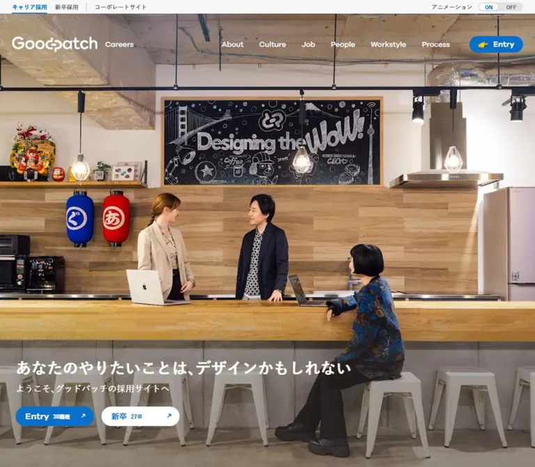
Goodpatch Careers combines a warm, inhabited workplace with a restrained interface. The opening fills the screen with an office kitchen: wood, exposed services, pendant lights, a chalkboard, and people in conversation. White identity and copy sit over the image. Saturated blue identifies recruitment actions and section headings; charcoal text, white surfaces, and pale gray carry the longer reading experience.
The page is a substantial recruitment website entrance. Six navigation categories lead into company information, culture, roles, people, workstyle, and hiring process. Its rhythm alternates broad editorial sections with compact links and a detailed vacancy directory. Large photographs establish atmosphere, while small rounded buttons keep navigation approachable. Occasional sticker-like artwork and emoji add informality without changing the underlying grid.
How to Read This Reference
- Measured means a value appears in the supplied rendered element geometry or computed styles.
- Derived means simple arithmetic from measured geometry, such as column gaps or content width.
- Visual estimate means an approximate reading of the supplied original-page screenshots. It is not an extracted CSS declaration or sampled color.
- Recommended identifies implementation guidance for a new build. Breakpoints, unspecified image crops, and accessibility additions belong to this category.
- Named tokens are reusable aliases unless explicitly identified as source custom properties.
- Screenshots establish visible appearance. DOM text establishes content and link destinations, but text or nonzero bounds alone do not prove that a submenu was visibly open.
- This document uses the supplied evidence only. Destination pages, font files, media assets, and additional interaction states were not independently opened.
Tokens — Colors
Default Palette
| Name | Value | Suggested token | Role and evidence |
|---|---|---|---|
| Recruitment Blue | #096fc8 |
--gp-blue |
Measured CTA fill, active career tab, section headings, and blue links |
| Charcoal | #393d40 |
--gp-ink |
Measured body text and mobile menu-circle background |
| Pale Canvas | #f7f7f7 |
--gp-canvas |
Measured body background and several major content sections |
| White | #ffffff |
--gp-paper |
Measured editorial sections, reversed navigation, and secondary hero CTA |
| Subnavigation Gray | #374151 |
--gp-subnav |
Measured text on sampled desktop submenu links; submenu visibility was not tested |
| Inactive Gray | #666666 |
--gp-muted |
Measured OFF label |
| Close-Control Gray | #f3f4f6 |
--gp-control |
Measured circular close-button background beside the desktop blog teaser |
| Teaser Black | #000000 |
--gp-teaser-ink |
Measured floating article-title text |
| Sticker Pink | Approximately #ee6aa5 |
--gp-sticker-pink |
Visual estimate of the small Workstyle sticker; decorative artwork, not a general action color |
Two additional source custom properties were reported: --clr-gray-10: #f5f8fc and --clr-gray-30: #e0e0e0. Their presence is measured, but their use on particular visible components is not established. The Quick Start uses the latter as a recommended fine-rule color.
Color Distribution
Blue is concentrated in headings, arrows, links, and pill buttons. The office image supplies most of the opening's warm color. Preserve that separation: wood tones belong to photography, while navigation retains a consistent blue.
The header wordmark appears white over the hero and charcoal/blue in the footer. Parent text color measurements do not necessarily describe the fill of embedded logo artwork. Use an appropriate supplied logo variant rather than recoloring the entire brand container indiscriminately.
Only a light presentation is evidenced. The ON/OFF control is labeled for animation; it is not a theme selector.
Tokens — Typography
Japanese Reading Text
Measured computed family: "A+EqpB-游ゴシック体 Pr6N M", NoChattering.
The body uses this stack at 16px / 24px, weight 500. Many actual paragraphs are smaller: feature descriptions use 15px on desktop and 14px on mobile, while role descriptions use 13px at both inspected widths. This produces an information-rich page without heavy visual density.
Japanese Emphasis
Measured computed family: "A+EqpB-游ゴシック体 Pr6N B", NoChattering.
The B family appears on role titles, emphasized introductory text, and the hero-copy wrapper. Its computed weight is often still 500. The distinction between M and B is therefore part of the family selection; replacing it with one font and a blanket weight value may change the appearance.
English Navigation and Headings
Measured computed family: "My Galano Grotesque", "A+EqpB-游ゴシック体 Pr6N B", NoChattering.
English headings have a rounded geometric character. Navigation uses 15px at weight 500; major section headings use 32px at weight 600 or 700. Smaller category headings such as People use 24px at weight 600.
These are reported CSS family names. No font-file URLs, font-loading definitions, or licensing terms were supplied. NoChattering is retained as an observed fallback name; its implementation is unverified. System stacks in the source custom properties are not evidence that those stacks rendered the sampled body copy.
Type Scale
| Role | Desktop | Mobile | Weight or family | Evidence |
|---|---|---|---|---|
| Root and body baseline | 16 / 24px |
16 / 24px |
M family, 500 | Measured |
| Utility navigation | 12 / 12px |
12 / 12px |
M family; active tab uses B | Measured |
| Animation label | 12 / 12px |
10 / 10px |
M family | Measured |
| ON/OFF labels | 10 / 10px |
10 / 10px |
B family | Measured |
| Desktop primary navigation | 15 / 22.5px |
Not visible | English stack, 500 | Measured |
| Hero headline | Approximately 32 / 38.4px |
Approximately 32 / 38.4px, three visible lines |
B family on wrapper | Visual estimate supported by line-box geometry |
| Hero subtitle | Approximately 18 / 18px |
Approximately 18 / 18px |
M family on wrapper | Visual estimate; rendered box is 18px high |
| Major English headings | 32 / 38.4px |
32 / 38.4px |
English stack, 600–700 | Measured |
| Hiring-section heading | 32 / 41.6px |
32 / 41.6px, two lines |
English stack, 600 | Measured |
| People category heading | 24 / 24px |
24 / 24px |
English stack, 600 | Measured |
| Japanese category caption | 13 / 13px |
13 / 13px |
B family | Measured for People |
| Role title | 16 / 24px |
16 / 24px |
B family | Measured |
| Role description | 13 / 19.5px |
13 / 19.5px |
M family | Measured |
| Feature description | 15 / 22.5px |
14 / 21px |
M family | Measured |
| Belief statement | 18 / 32.4px |
14 / 25.2px |
M family | Measured |
| Editorial article title | 15 / 25.5px |
15 / 25.5px |
M family | Measured |
| Floating/introductory blog title | 12 / 20.4px |
11 / 16.5px |
M family | Measured on respective teaser presentations |
| Library feature title | 24 / 36px |
24 / 36px |
English/B stack, 600 | Measured |
| Mobile vacancy link | Not sampled in supplied desktop styles | 14 / 21px |
M family | Measured |
The belief statement uses 0.04em tracking: 0.72px at 18px on desktop and 0.56px at 14px on mobile. Most other sampled text has normal tracking.
Hero measurement caveat: its parent paragraphs report font-size: 0px and line-height: 0px, while their rendered boxes contain visible lettering. The extracted text also contains duplicate headline and subtitle strings. Child styling and duplication semantics were not supplied. Do not implement an invisible headline or expose duplicate accessible text by copying those parent values.
Tokens — Spacing & Shapes
Root scale: conventional 16px root size, measured at both viewports. Density: generous section spacing, moderate reading widths, compact controls, and tightly organized secondary links.
Spacing Scale
| Use | Value | Evidence |
|---|---|---|
| Small control and icon gap | 8px |
Measured CTA gap and mobile brand-related controls |
| Mobile brand gap | 10px |
Measured logo-link layout |
| Desktop text-link icon gap | 12px |
Measured feature-link layout |
| Standard control horizontal padding | 16px |
Measured feature and role CTAs |
| Desktop hero CTA gap | 16px |
Derived from x=160/336 and 160px widths |
| Mobile hero CTA gap | 8px |
Derived from x=24/192 and 160px widths |
| Mobile page gutter | 24px |
Measured throughout supplied mobile geometry |
| Description-to-feature-CTA gap | 20px |
Derived from feature paragraph and CTA bounds |
| Desktop navigation gap | 32px |
Derived between adjacent top-level links |
| Desktop role-column gap | 40px |
Derived from 250px columns on 290px intervals |
| Mobile role-column gap | 12px |
Derived from 165px columns at x=24 and 201 |
| Feature CTA-to-link-grid gap | 60px desktop; 40px mobile |
Derived from CTA bottom to first secondary-link row |
| Standard section padding | 100px desktop; 60px mobile |
Measured on Roles, People, Workstyle, and Pick Up |
| Belief section bottom padding | 80px desktop; 40px mobile |
Measured |
| Desktop feature-column gap | About 100px |
Derived using text geometry and visually estimated image width |
Border Radius
| Element | Value | Evidence |
|---|---|---|
| Filled and secondary pill CTAs | 1000px desktop; 844px mobile |
Measured; both render as capsules |
| Menu circle | 9999px |
Measured, 52 × 52px box |
| Blog close circle | 9999px |
Measured, 28 × 28px box |
| Inline article-title link | 4px |
Measured on the link itself, not its entire card |
| Library enlargement icon control | 6.4px |
Measured |
| Large photographs | About 16px |
Visual estimate |
| Desktop floating blog panel | About 16px |
Visual estimate |
| Vacancy rows and section boundaries | Visually square | Screenshot observation; structure comes from rules and spacing |
Layout Measurements
| Element | Desktop at 1440 × 1000 | Mobile at 390 × 844 |
|---|---|---|
| Primary content width | 1120px, x=160 |
342px, x=24 |
| Outside content margin | 160px |
24px |
| Utility strip | 28px high |
28px high |
| Header element bounds | 1440 × 154.5px |
390 × 28px; visible brand sits below these bounds |
| Brand link, including Careers | 249.4 × 32px, gap 16px |
194.5 × 23.8px, gap 10px |
| Header Entry | 110 × 34px |
Absent from the initial top navigation |
| Hero Entry and graduate CTA | Each 160 × 40px |
Each 160 × 48px |
| Role columns | Four at 250px |
Two at 165px |
| Feature-copy width | 490.25px |
342px |
| Secondary feature-link columns | Two at 237.125px, gap 16px |
Two at 163px, gap 16px |
| Belief text column | 600px, centered at x=420 |
342px, x=24 |
| Mobile menu control | Not shown | 52 × 52px, x=314, y=688 |
| Cookie bar | Approximately 72px high |
Approximately 80px high |
| Reported document height | 12,101px |
15,622px |
The document heights describe the inspected content state, not a target height to hardcode. Vacancy counts, article titles, fonts, and expanded groups can change the total.
Components
Utility Strip and Primary Header
Role: distinguish career recruitment, graduate recruitment, and the corporate website while providing broad topic navigation.
The 28px utility strip places three compact Japanese links at the content container's left edge. The active career link is blue and uses the B family. A thin vertical separator precedes the corporate link. Desktop animation controls sit at the far right.
Below it, the desktop brand link begins at x=160, y≈75. The white wordmark and Careers suffix face six white navigation links: About, Culture, Job, People, Workstyle, and Process. An Entry capsule terminates the row at x=1170. Its leading pointing-hand symbol adds a small informal cue.
The supplied DOM includes topic sublinks under the primary categories. Their presence supports a hierarchy, but no visible dropdown state or hover trigger was captured. The header defines a transform transition and is absent from the supplied lower desktop screenshots; its exact scroll-return behavior remains unverified.
On mobile, the utility links retain their 12px size. The brand moves to x=24, y≈52. The animation label and switch sit alongside it over the image. The six-link horizontal navigation is absent, and a separate floating menu circle provides the visible navigation affordance.
Animation Selector
Role: expose a page-level motion preference.
A small label sits beside the segmented control on desktop and above it on mobile. The combined ON/OFF button width is approximately 91.8px, and both button boxes are 18px high. ON is blue in the captured state; OFF is gray. A white selected capsule appears within a pale-gray track.
The control is visibly present, but its effect, persistence, keyboard behavior, and relationship to operating-system reduced-motion preferences were not exercised.
Photographic Hero
Role: introduce the workplace and present two recruitment routes.
The visible scene centers on a wooden counter, three people, and a chalkboard reading “Designing the Wow!” Exposed ceiling services and pendant lights occupy the upper area, leaving room for the navigation. The lower image is visibly darkened enough to support white copy; the exact overlay declaration was not supplied.
The headline is “あなたのやりたいことは、デザインかもしれない”, followed by “ようこそ、グッドパッチの採用サイトへ”. At desktop, the headline begins at x=160, y≈778 and fits on one line. The subtitle begins at y=830, followed by the CTA row at y=876.
On mobile, the headline begins at x=24, y≈591 and occupies three lines. The mobile text extraction includes a break before “デザインかもしれない”; the preceding phrase also wraps at the narrow width. Keep the approximately 32px display scale and allow this wrapping rather than reducing the whole hero proportionally.
The phone image is substantially cropped horizontally. The central speaker and chalkboard remain prominent while the people at either edge are partly clipped. The exact source asset, media type, object-position rule, playback state, and poster behavior are not available.
Recruitment Pills
Role: provide recognizable, repeated paths to applications and supporting information.
The basic anatomy is a capsule, a main label, optional small supporting text, and a directional icon. Primary pills use blue with white content. The graduate pill uses white with blue content. Hero and footer variants include a smaller vacancy count or graduate-year label.
Measured variants include:
- Header Entry: 110 × 34px, padding
8px 12px, gap 8px. - Role Entry: 130 × 34px, padding
8px 16px, gap 8px. - Hero Entry: 160 × 40px desktop and 160 × 48px mobile, padding
8px 16px 8px 20px. - View Survey: approximately 135.4 × 34px.
- View Overview: 152 × 34px.
Horizontal arrows accompany internal feature navigation; northeast arrows appear on application and external editorial links. Preserve the destination distinction through semantics and labeling as well as iconography.
The captured page reports 46 roles. The hero graduate CTA shows “27卒・28卒”, while the footer shows “27卒”. These are content-state observations, not permanent tokens.
Role Discovery Grid
Role: help candidates identify a professional route before entering the complete vacancy list.
The section opens with “We’re Hiring For 46 Roles.” in blue, followed by a short Japanese introduction. Six role entries cover UI/UX design, service design, product management, project management, sales, and engineering.
Each entry's evidenced content order is an English role identifier, Japanese title, short description, Entry action, and a secondary role-information link. The first four entries occupy one desktop row. Sales and engineering occupy the first two positions on the second row; the All Our Roles content occupies the remaining two-column area.
Geometry establishes four 250px columns with 40px gaps on desktop and two 165px columns with 12px gaps on mobile. The all-roles area spans the two mobile columns. Role artwork is not visible in the supplied screenshots and its asset styling was not included; do not invent its subjects or animation.
On mobile, titles and descriptions wrap independently. For example, the first two role CTAs occur at different vertical positions because their descriptions have different line counts. Uniformly bottom-aligned buttons would be an implementation change.
Belief Statement
Role: provide an editorial pause explaining the recruitment site's intent.
A white section follows the gray role area. Its blue 32px English heading and small Japanese subtitle sit within the main container. The longer statement uses a centered 600px reading column on desktop, with 18px type, 1.8 line height, and 0.04em tracking.
On mobile, the reading column expands to the available 342px and changes to 14px with the same 1.8 line-height ratio. The result is a quiet, readable passage between more visual navigation sections. Do not reproduce uninspected content between the subtitle and paragraph based solely on their large vertical separation.
Company, Culture, Workstyle, and Process Features
Role: introduce a subject, offer a principal overview, and expose useful deeper links.
The visible Workstyle example pairs a large rounded workplace photograph on the left with text on the right. The photograph is approximately 530px wide; text begins at x≈790 and occupies 490.25px. The generous gap makes the feature feel like an editorial spread.
The text stack contains a small decorative sticker, blue English category label, compact Japanese category caption, larger Japanese feature title, a short description, a blue View button, and a secondary link grid. Workstyle's pink sticker reads “大事なやつだ”. Its irregular outlined lettering is artwork rather than an ordinary pink heading.
About, Culture, Workstyle, and Process share measured right-column positions and CTA/link-grid relationships. Their specific artwork is not all shown. Reuse the evidenced content hierarchy without assuming every section has the same photograph or sticker.
Secondary links form two columns at both inspected widths. Desktop row starts are 44px apart for simple labels; mobile starts are generally 42px apart, increasing when text wraps. At mobile, the copy spans the full content width. The exact mobile ordering of photographs relative to text is not established by the supplied captures.
People Image Links
Role: lead into employee interviews and group discussions.
The desktop capture shows two broad, rounded photographs: an employee beside a laptop and a group conversing on a blue sofa. Their visible widths are approximately 536px with a 48px central gap. Captions sit below the images and include a small blue arrow inside a fine outlined circle.
The DOM preserves side-by-side caption positions on mobile and reduces caption text from 16px to 13px. The mobile image bounds were not supplied, so equal two-column images are a reasonable implementation interpretation rather than a measured image rule.
Pick Up Editorial Cards
Role: connect candidates to timely articles and videos.
The content includes a platform label, article title, and publication date for each item. Desktop article text positions repeat on 284px intervals. Combined with their 212px text widths and 28px inferred inner insets, this is consistent with 268px cards separated by 16px gaps; the card-wrapper CSS itself was not supplied.
On mobile, article-title x positions extend to 352, 668, and 984px, beyond the 390px viewport. This supports a horizontal track rather than a vertically stacked list. Swipe handling, snapping, active-card scaling, pagination, and automatic advance remain unverified.
Goodpatch Library
Role: group longer media and ongoing publishing channels.
The section uses a pale-gray background and a blue 32px heading. Its main media feature includes an enlargement-icon button, a 24px title, descriptive text, and a View Larger button. Additional content introduces the blog, X, note, and YouTube channel.
Desktop geometry places the main feature at the left and channel content in a two-column arrangement at the right. On mobile, the main feature becomes full width and the channel descriptions remain in two columns, with 133px inner text widths.
The enlargement icon has a measured translucent-black background, white glyph, and 6.4px radius. No enlarged view, modal, playback sequence, or fullscreen API behavior was captured.
Hiring Callout and Vacancy Directory
Role: convert interest into a specific application.
The callout repeats the current role count and offers a recruitment-details link. Mobile computed styles establish a white 24px heading, white 14px supporting text, and a white 48px-high CTA with blue text. The enclosing callout surface was not included in the sampled styles, so its exact fill or imagery is unverified.
The directory groups links under Open Position, Design, Product & Project Management, Business, Engineering, and Corporate & HR. The desktop footer-adjacent capture shows two columns, each approximately 520px wide, separated by about 80px. Each row combines a small brand-like mark, job title, a right-edge blue northeast arrow, and a fine bottom rule.
Mobile vacancy rows span 342px and use 14px text, 21px line height, and 16px vertical padding. Sampled rows are 54px or 74px high depending on wrapping. Category labels are buttons in the mobile DOM, with their content currently present below them. Collapse and expansion were not tested.
Desktop Floating Blog Teaser
Role: maintain a visible editorial invitation while the page scrolls.
A white panel stays at the same lower-right viewport position across the desktop captures. It is approximately 180px wide, 24px from the right edge, and contains a platform header, landscape photograph, short title, and blue external-link arrow. The title area has approximately 16px horizontal inset.
A separate 28px close circle sits above the panel's upper-right corner. The panel bottom is approximately 14px above the cookie bar. Repeated screenshot positions support viewport anchoring, although the actual position declaration was not supplied. Dismissal and persistence were not exercised.
On mobile, a corresponding article title appears near document y=938, before the role section at y=1014. It is not visible as a fixed right-side panel in the supplied mobile screenshots.
Footer and Mobile Floating Controls
Role: provide a complete sitemap and continued access to recruitment.
The desktop footer is white. A charcoal/blue logo and Careers label sit left; career and graduate pills sit right. Six link columns below repeat the primary information architecture. Fine rules, small text, and broad whitespace provide structure without card backgrounds.
The lower mobile capture shows full-width footer groups, indented links, and minus marks beside Workstyle and Process. Social links follow a fine divider: X, YouTube, note, and a blue Goodpatch Blog wordmark. Contact, corporate, privacy, and security links form a compact lower utility area.
A 52px charcoal menu circle sits 24px from the right edge. In the lower mobile capture, an approximately 110 × 44px blue Entry capsule appears beside it. The initial hero capture shows the menu circle alone. The trigger for displaying the additional Entry capsule is unverified.
The footer capture documents expanded-looking navigation groups. Opening the floating menu was not recorded. The source footer also spells one category “Cluture”; use the normal “Culture” spelling in a new implementation.
Cookie Consent Bar
Role: present a privacy-policy link and two explicit consent choices.
A full-width white band remains at the bottom of every supplied original-page capture. On desktop it is approximately 72px high, with the message aligned to the main content rail and two 140 × 48px buttons at the right. The rejection action is white with a thin gray outline; acceptance is blue with white text.
On mobile, the band is approximately 80px high. A narrow text block sits left, with two approximately 70 × 44px buttons to its right. The message becomes very small, approximately 9–10px by visual estimate. The privacy-policy link remains underlined, and the message ends with prayer and cookie emoji.
Observed obstruction: mobile hero CTAs occupy y=768–816, while the visible cookie bar begins around y=764. The actions exist in the DOM but are covered in this captured state. This is a useful implementation constraint: measure persistent overlays and keep essential actions reachable. Consent submission, storage, dismissal, and later-page behavior were not tested.
Tokens — Motion & Interaction
| Treatment | Evidence | What it establishes | Limit |
|---|---|---|---|
| Header movement | transform 0.3s cubic-bezier(0.4, 0, 0.2, 1) |
A defined short transform transition | Trigger and travel distance unverified |
| CTA and submenu feedback | Color-related properties at 0.15s cubic-bezier(0.4, 0, 0.2, 1) |
Fast color transitions are defined | Actual hover and pressed colors not captured |
| Article-link feedback | Color-related properties at 0.3s cubic-bezier(0.4, 0, 0.2, 1) |
Slower editorial-link transitions are defined | No inspected hover comparison |
| Animation selector | ON/OFF buttons; ON visibly selected | Explicit motion preference affordance | Its effect and persistence untested |
| Mobile article track | Multiple item bounds extend horizontally beyond the viewport | Horizontal arrangement | Gesture, snapping, and autoplay behavior untested |
| Enlarged library media | Enlargement icon and View Larger button | Explicit enlargement affordance | Resulting view untested |
| Menu, close, and category controls | Visible controls or button elements | Available action targets | Their state transitions untested |
Many sampled elements report animation: none. This does not prove that the hero, descendants, embedded media, or artwork are static. Similarly, a bare transition: all entry without a duration does not establish a visible transition.
The supplied capture procedure waited for document load, visible image decoding, and sampled layout/text stability, with finite timing limits. Perpetual animations were paused during readiness checks and resumed afterward. A still capture therefore cannot establish a loop's timing, choreography, or media format.
For a new implementation, retain short color feedback and an explicit motion preference. Any additional image zoom, staggered entrance, parallax, or automatic carousel advance would be a recommendation requiring separate design decisions.
Surfaces
| Layer | Appearance | Purpose |
|---|---|---|
| Hero | Full-width workplace imagery with white content | Immediate atmosphere and identity |
| Main canvas | #f7f7f7 |
Role discovery, workstyle/process, library, and directory surroundings |
| Editorial section | White | Belief statement, People, and Pick Up |
| Photograph | Softly rounded image boundary | Human detail within a disciplined grid |
| CTA | Blue or white capsule | Repeated navigation and recruitment actions |
| Vacancy list | Transparent rows with fine gray rules | Dense, scannable role information |
| Floating article panel | White rounded surface | Persistent editorial invitation on desktop |
| Consent band | White, with subtle upper separation | Persistent privacy choices |
There is no visible general-purpose shadow elevation system. The cookie band has a faint upper separation in the captures, but no exact shadow value was supplied. Keep broad sections flat and avoid introducing shadows around every content group.
Imagery
Photography conveys actual working conditions: people conversing, laptops in use, shared seating, desks, and an office kitchen. The framing includes environmental detail rather than isolating every person against a blank background. Wood, cream, and exposed materials warm the opening; blue partitions and upholstery echo the interface accent in later images.
The hero is a wide scene adapted through cropping. Interior images have rounded corners and sit within a white or gray editorial grid. Keep faces and conversational relationships legible when choosing responsive crops. Do not force every image into an identical ratio if that removes the scene's purpose.
The small pink Workstyle sticker contributes a different visual register: irregular lettering, a white outline, and a compact placement above the category label. Use this kind of decorative emphasis sparingly. The typography, spacing, and photographs remain the primary system.
Observed Asset References
No image, video, logo, or font asset URLs were included in the supplied evidence. The following are visual references, not inferred filenames.
| Visual reference | Evidence location | Treatment |
|---|---|---|
| Office kitchen and chalkboard | Desktop and mobile opening captures | Full-width background; strong mobile horizontal crop |
| Employee beside a laptop | Desktop People fragment | Broad rounded photograph |
| Group discussion on blue seating | Desktop People fragment | Companion photograph in a two-column pair |
| Employee at a desk beside a blue partition | Desktop Workstyle capture | Large rounded image beside editorial copy |
| Small team around a screen | Desktop blog teaser | Landscape thumbnail inside a compact panel |
| Pink Workstyle sticker | Desktop Workstyle capture | Small irregular outlined lettering |
| White and charcoal/blue wordmarks | Opening and footer captures | Separate treatments for photographic and light surfaces |
Use authorized original assets when available. The evidence does not establish whether any particular photograph or hero frame is AI-generated, nor whether the hero is implemented as an image or video.
Layout & Responsive Behavior
The desktop page repeatedly returns to a centered 1120px content width. At 1440px, this leaves 160px margins. Mobile uses 24px gutters and a 342px content width. These two observed states are consistent with a capped container, but the original media-query thresholds were not supplied.
| Pattern | Desktop observation | Mobile observation |
|---|---|---|
| Primary navigation | Six horizontal links plus Entry | Horizontal category links absent; floating menu circle visible |
| Animation preference | In utility strip | Beside the brand over the image |
| Hero copy | One headline line near the bottom | Three headline lines at a similar 32px visual scale |
| Hero actions | 160 × 40px, 16px gap | 160 × 48px, 8px gap; covered by consent in the capture |
| Role discovery | Four columns | Two columns, with natural text wrapping |
| All-roles panel | Remaining two positions of the second row | Spans both columns beneath the six roles |
| Editorial reading column | Centered 600px | Full available 342px |
| Feature copy | Right-hand 490.25px column | Full available 342px; media order unverified |
| Secondary feature links | Two columns | Two columns retained |
| People entry captions | Two side-by-side positions | Two side-by-side positions, smaller type |
| Pick Up | Four horizontally distributed items | Items continue beyond the viewport on a horizontal track |
| Library | Large feature left, channel content right | Large feature followed by two-column channel content |
| Vacancy directory | Two columns in the visible desktop category | Single-column rows; category labels are buttons |
| Footer | Six simultaneous link columns | Vertically arranged, expanded-looking groups |
| Blog teaser | Repeated lower-right viewport position | Corresponding teaser content below the opening |
Standard section padding changes from 100px to 60px. This reduces whitespace without compressing every component: 32px English headings, 24px category headings, 13px role descriptions, and 34px feature buttons retain their sizes across the measured widths.
The page remains a long document. Its mobile height increases despite smaller section padding because columns, text, and footer groups occupy more vertical space. Avoid reducing it to a short promotional layout that discards the deeper information architecture.
Recommended breakpoint: use approximately 1024px as an initial implementation threshold for desktop navigation and the four-column role grid, then validate intermediate widths with actual labels and licensed fonts. This is a starting point, not an observed source breakpoint.
Do’s and Don’ts
Do
- Preserve the measured blue
#096fc8, charcoal#393d40, white, and pale-gray hierarchy. - Use workplace photography with visible environmental context and human interaction.
- Align desktop content to a 1120px container and mobile content to 24px gutters.
- Combine geometric English headings with the evidenced Japanese M/B family distinction when those fonts are available.
- Retain compact pill CTAs with smaller supporting counts and clear directional icons.
- Preserve the four-column desktop and two-column mobile role grid.
- Keep detailed information accessible through secondary links, the vacancy directory, and the footer sitemap.
- Use large section spacing and restrained rounded image corners.
- Treat role counts, graduate years, and editorial dates as live content.
- Keep the visible motion preference understandable and functional when implementing motion.
Don’t
- Don’t replace the recruitment content hierarchy with a generic sequence of feature cards.
- Don’t use photographic wood tones as additional UI action colors.
- Don’t invent role illustrations, hero playback behavior, dropdown choreography, or modal designs from missing evidence.
- Don’t shrink all typography on mobile; several major sizes remain unchanged.
- Don’t turn the two-column mobile role grid into a single column without identifying that as a design change.
- Don’t infer a visible open submenu from extracted link text alone.
- Don’t copy the hero wrapper's zero font size or duplicated strings into accessible content.
- Don’t place persistent banners or floating controls over essential recruitment actions.
- Don’t infer a card's radius from the 4px radius measured on its title link.
- Don’t add glass surfaces, heavy shadows, or decorative motion throughout the page.
Recommended Implementation Additions
These are recommendations for a new implementation, not verified original behavior:
- Measure consent-banner height and coordinate it with the floating menu, Entry control, article panel, and hero actions. Recheck at text zoom and with longer translations.
- Increase mobile consent-message readability and allow the band to grow vertically rather than squeezing its text into approximately 9–10px lettering.
- Give the animation preference an explicit selected state, initialize it from reduced-motion preferences where appropriate, and connect it to actual media and animation controls.
- Keep one accessible hero headline. Mark purely decorative duplicate text layers as hidden from assistive technology.
- Retain the observed skip-link concept and make its focused presentation visible. Its current focus state was not inspected.
- Use keyboard-operable controls with descriptive names for the menu, teaser close button, enlargement button, and any horizontal-track navigation.
- Provide
aria-expandedand an associated content region for interactive navigation and vacancy groups. Choose focus management according to the actual menu presentation. - Increase the effective touch area around compact 18px animation controls and 28px close controls without changing their visible proportions unnecessarily.
- Supply responsive media sources and intentional focal points. Provide a static poster or image alternative if the hero uses moving media.
- Keep repeated vacancy counts and graduate-year labels consistent through shared content fields.
Agent Prompt Guide
Quick Color Reference
- Primary actions and section headings:
#096fc8. - Main reading text and mobile menu circle:
#393d40. - Main pale canvas:
#f7f7f7. - Editorial sections, footer, and secondary hero action:
#ffffff. - Recommended fine rules:
#e0e0e0, a reported source variable whose specific visible usage is unverified. - Decorative accent: a small pink sticker treatment, approximately
#ee6aa5; keep it out of the general CTA system.
Overall Prompt
“Create a substantial Japanese recruitment homepage inspired by the supplied Goodpatch Careers reference. Use real workplace photography, blue #096fc8, charcoal #393d40, white, and pale gray #f7f7f7. Open with an immersive office scene, white identity and copy, a compact utility strip, and desktop topic navigation. Use a centered 1120px content container, generous 100px desktop section padding, geometric English headings, and clear Japanese reading text. Build six role entries, editorial company and culture introductions, people and workstyle features, article links, a complete vacancy directory, and a comprehensive footer. At 390px, use 24px gutters, a two-column role grid, 60px section padding, and a circular menu control. Treat unverified motion and media behavior as separate implementation decisions.”
Example Component Prompts
- Hero: “Use a wide office-kitchen photograph with three colleagues in conversation, a wooden counter, and a prominent chalkboard. Place a white brand lockup and navigation above, with a lower-left Japanese headline near 32px, a short subtitle, and blue/white recruitment pills. On mobile, crop around the central conversation and retain the headline scale. Keep actions clear of consent and floating controls.”
- Role grid: “Build four 250px role columns with 40px gaps inside a 1120px container. Each entry includes a Japanese 16px title, 13px description, centered blue Entry pill, and secondary information link. At 390px, use two 165px columns with a 12px gap. Use supplied role artwork only.”
- Workstyle feature: “Pair a large rounded workplace photograph with a text column separated by about 100px. Stack a small irregular pink sticker, blue English category heading, compact Japanese caption, larger Japanese topic title, short description, blue View Survey pill, and a two-column secondary-link grid. Keep the surface pale gray and flat.”
- Vacancy directory: “Create category-grouped job links with a small leading mark, flexible Japanese title, right-aligned blue northeast arrow, and fine bottom divider. Use two columns on desktop and full-width rows on mobile. Allow long titles to wrap and preserve 16px vertical row padding.”
- Footer: “Use a white footer with a charcoal/blue brand lockup, recruitment pills, and six desktop sitemap columns. On mobile, arrange category groups vertically with indented links, followed by recognizable social marks and compact corporate links. Keep the floating menu visually distinct and prevent overlap with consent controls.”
Quick Start
CSS Custom Properties
This CSS is an adaptation of the measured palette, typography, and layout relationships. Font files and original media are not bundled. The 1024px breakpoint, image radius, square feature crop, mobile article scrolling, and footer column proportions are recommendations. The hero type size is an estimate supported by its rendered line boxes.
The component classes cover the visual shell and content layouts. Menu state, media playback, consent handling, accordion behavior, and persistent overlay placement require application logic. If persistent overlays are added, coordinate their measured height with hero actions before using the captured bottom offsets.
:root {
  /* Measured visible colors */
  --gp-blue: #096fc8;
  --gp-ink: #393d40;
  --gp-canvas: #f7f7f7;
  --gp-paper: #ffffff;
  --gp-muted: #666666;
  --gp-control: #f3f4f6;

  /* Source variable reused as a recommended rule color */
  --gp-rule: #e0e0e0;

  /* Observed names followed by recommended system fallbacks */
  --gp-font-ja: 'A+EqpB-游ゴシック体 Pr6N M',
    NoChattering, 'Yu Gothic', system-ui, sans-serif;
  --gp-font-ja-bold: 'A+EqpB-游ゴシック体 Pr6N B',
    NoChattering, 'Yu Gothic', system-ui, sans-serif;
  --gp-font-en: 'My Galano Grotesque',
    'A+EqpB-游ゴシック体 Pr6N B', NoChattering,
    'Yu Gothic', system-ui, sans-serif;

  /* Measured layout values */
  --gp-content: 1120px;
  --gp-gutter: 24px;
  --gp-section-space: 100px;
  --gp-role-gap: 40px;
  --gp-utility-height: 28px;

  /* Recommended aliases for visible geometry */
  --gp-radius-media: 16px;
  --gp-radius-pill: 9999px;
  --gp-feature-gap: 100px;

  /* Measured transition timing */
  --gp-ease: cubic-bezier(0.4, 0, 0.2, 1);
  --gp-fast: 150ms;
  --gp-normal: 300ms;
}

* { box-sizing: border-box; }

html { font-size: 16px; }

body {
  margin: 0;
  color: var(--gp-ink);
  background: var(--gp-canvas);
  font-family: var(--gp-font-ja);
  font-size: 16px;
  font-weight: 500;
  line-height: 1.5;
}

img { display: block; max-width: 100%; }
button, a { -webkit-tap-highlight-color: transparent; }
button { font: inherit; }
a { color: inherit; }
[hidden] { display: none !important; }

.gp-container {
  width: min(var(--gp-content), calc(100% - 2 * var(--gp-gutter)));
  margin-inline: auto;
}

.gp-section { padding-block: var(--gp-section-space); }
.gp-section--white { background: var(--gp-paper); }

.gp-section-title {
  margin: 0 0 16px;
  color: var(--gp-blue);
  font: 600 1.2 / 1 var(--gp-font-en);
  font-size: 32px;
  line-height: 1.2;
}

.gp-category-title {
  margin: 0 0 8px;
  color: var(--gp-blue);
  font-family: var(--gp-font-en);
  font-size: 24px;
  font-weight: 600;
  line-height: 1;
}

.gp-category-caption {
  margin: 0;
  font-family: var(--gp-font-ja-bold);
  font-size: 13px;
  line-height: 1;
}

.gp-hero {
  position: relative;
  isolation: isolate;
  min-height: 100svh;
  color: var(--gp-paper);
  background: var(--gp-ink);
}

.gp-hero__media {
  position: absolute;
  inset: 0;
  z-index: -2;
  width: 100%;
  height: 100%;
  object-fit: cover;
  object-position: center;
}

.gp-hero::after {
  /* Recommended approximation; original overlay CSS was not supplied. */
  content: '';
  position: absolute;
  inset: 0;
  z-index: -1;
  background: linear-gradient(
    180deg, rgb(0 0 0 / 0.08) 40%, rgb(0 0 0 / 0.42)
  );
}

.gp-utility {
  min-height: var(--gp-utility-height);
  color: var(--gp-ink);
  background: var(--gp-canvas);
  font-size: 12px;
  line-height: 1;
}

.gp-utility__inner,
.gp-utility__links {
  display: flex;
  align-items: center;
  gap: 16px;
}

.gp-utility__inner { justify-content: space-between; }
.gp-utility a { padding-block: 8px; text-decoration: none; }
.gp-utility [aria-current='page'] { color: var(--gp-blue); }

.gp-hero-nav {
  display: flex;
  align-items: center;
  justify-content: space-between;
  min-height: 126.5px;
  gap: 32px;
}

.gp-brand {
  display: inline-flex;
  align-items: center;
  gap: 16px;
  text-decoration: none;
}

.gp-brand__logo { width: 176px; height: auto; }
.gp-brand__suffix { font: 500 15px / 1.5 var(--gp-font-en); }

.gp-primary-nav {
  display: flex;
  align-items: center;
  gap: 32px;
  font: 500 15px / 1.5 var(--gp-font-en);
}

.gp-primary-nav a { text-decoration: none; }

.gp-hero__copy {
  position: absolute;
  left: 50%;
  bottom: 84px;
  transform: translateX(-50%);
}

.gp-hero__title {
  margin: 0;
  font-family: var(--gp-font-ja-bold);
  font-size: 32px;
  font-weight: 500;
  line-height: 1.2;
}

.gp-hero__subtitle {
  margin: 14px 0 28px;
  font-size: 18px;
  line-height: 1;
}

.gp-hero__actions { display: flex; flex-wrap: wrap; gap: 16px; }
.gp-mobile-break { display: none; }

.gp-pill {
  display: inline-flex;
  align-items: center;
  justify-content: center;
  gap: 8px;
  min-height: 34px;
  padding: 8px 16px;
  border: 1px solid transparent;
  border-radius: var(--gp-radius-pill);
  color: var(--gp-paper);
  background: var(--gp-blue);
  font-size: 16px;
  line-height: 1;
  text-decoration: none;
  cursor: pointer;
  transition:
    color var(--gp-fast) var(--gp-ease),
    background-color var(--gp-fast) var(--gp-ease),
    border-color var(--gp-fast) var(--gp-ease);
}

.gp-pill--secondary {
  color: var(--gp-blue);
  background: var(--gp-paper);
}

.gp-pill--outline { border-color: var(--gp-rule); }
.gp-pill--role { width: 130px; }
.gp-pill--hero { width: 160px; min-height: 40px; padding-left: 20px; }
.gp-pill__label { font-family: var(--gp-font-en); }
.gp-pill__meta { font-size: 10px; }
.gp-pill__arrow { margin-left: auto; }

.gp-role-grid {
  display: grid;
  grid-template-columns: repeat(4, minmax(0, 1fr));
  column-gap: var(--gp-role-gap);
  row-gap: 64px; /* Recommended; exact row gap was not supplied. */
}

.gp-role-card { min-width: 0; }
.gp-role-card__media { width: 100%; height: auto; }

.gp-role-card h3 {
  margin: 0 0 8px;
  font: 500 16px / 24px var(--gp-font-ja-bold);
}

.gp-role-card p {
  margin: 0 0 24px;
  font-size: 13px;
  line-height: 19.5px;
}

.gp-role-card__actions {
  display: grid;
  justify-items: center;
  gap: 16px;
}

.gp-role-card__more { color: var(--gp-blue); font-size: 13px; }
.gp-all-roles { grid-column: span 2; }

.gp-belief {
  max-width: 600px;
  margin-inline: auto;
  font-size: 18px;
  line-height: 1.8;
  letter-spacing: 0.04em;
}

.gp-feature {
  display: grid;
  grid-template-columns: minmax(0, 530fr) minmax(0, 490fr);
  gap: var(--gp-feature-gap);
  align-items: center;
}

.gp-feature__media {
  width: 100%;
  aspect-ratio: 1; /* Recommended crop; full source height is unmeasured. */
  object-fit: cover;
  border-radius: var(--gp-radius-media);
}

.gp-feature__copy { min-width: 0; }
.gp-feature__description { font-size: 15px; line-height: 1.5; }

.gp-feature__links {
  display: grid;
  grid-template-columns: repeat(2, minmax(0, 1fr));
  gap: 20px 16px;
  margin-top: 60px;
}

.gp-feature__links a {
  display: flex;
  align-items: flex-start;
  gap: 12px;
  text-decoration: none;
}

.gp-people-grid {
  display: grid;
  grid-template-columns: repeat(2, minmax(0, 1fr));
  gap: 48px;
}

.gp-people-grid img { width: 100%; border-radius: var(--gp-radius-media); }

.gp-pickup-track {
  display: grid;
  grid-template-columns: repeat(4, minmax(0, 1fr));
  gap: 16px;
}

.gp-editorial-card { min-width: 0; }
.gp-editorial-card__copy { padding: 28px; }
.gp-editorial-card__title { font-size: 15px; line-height: 1.7; }

.gp-job-grid {
  display: grid;
  grid-template-columns: repeat(2, minmax(0, 1fr));
  column-gap: 80px;
}

.gp-job-link {
  display: grid;
  grid-template-columns: 20px minmax(0, 1fr) 14px;
  align-items: center;
  gap: 8px;
  padding-block: 16px;
  border-bottom: 1px solid var(--gp-rule);
  font-size: 15px;
  line-height: 1.5;
  text-decoration: none;
}

.gp-job-link__arrow { color: var(--gp-blue); }

.gp-footer { padding-block: 80px; background: var(--gp-paper); }

.gp-footer-grid {
  display: grid;
  /* Recommended proportions approximating the visible sitemap. */
  grid-template-columns: 1.4fr 1.3fr 1fr 0.75fr 1fr 0.7fr;
  gap: 32px;
}

.gp-footer a { text-decoration: none; }
.gp-footer-links { display: grid; gap: 6px; font-size: 13px; }

.gp-menu-button {
  display: grid;
  place-items: center;
  width: 52px;
  height: 52px;
  padding: 8px;
  border: 0;
  border-radius: 50%;
  color: var(--gp-paper);
  background: var(--gp-ink);
  cursor: pointer;
}

/* Recommended focus treatment; the original focused state was not captured. */
:where(a, button, summary):focus-visible {
  outline: 3px solid var(--gp-blue);
  outline-offset: 4px;
}

.gp-hero :where(a, button):focus-visible {
  outline-color: var(--gp-paper);
}

@media (max-width: 1023px) {
  :root {
    --gp-section-space: 60px;
    --gp-role-gap: 12px;
    --gp-feature-gap: 32px;
  }

  .gp-primary-nav { display: none; }
  .gp-hero-nav { min-height: 72px; gap: 16px; }
  .gp-brand { gap: 10px; }
  .gp-brand__logo { width: 132px; }
  .gp-hero__copy { bottom: 28px; }
  .gp-hero__subtitle { margin-top: 16px; }
  .gp-hero__actions { gap: 8px; }
  .gp-pill--hero { min-height: 48px; }
  .gp-mobile-break { display: initial; }

  .gp-role-grid { grid-template-columns: repeat(2, minmax(0, 1fr)); }
  .gp-belief { font-size: 14px; }
  .gp-feature { grid-template-columns: minmax(0, 1fr); }
  .gp-feature__description { font-size: 14px; }
  .gp-feature__links { margin-top: 40px; }
  .gp-feature__links a { gap: 8px; }
  .gp-people-grid { gap: 12px; }

  .gp-pickup-track {
    /* Recommended native scrolling for the evidenced horizontal arrangement. */
    grid-template-columns: none;
    grid-auto-flow: column;
    grid-auto-columns: min(300px, 85vw);
    overflow-x: auto;
    scroll-snap-type: x proximity;
  }

  .gp-editorial-card { scroll-snap-align: start; }
  .gp-job-grid { grid-template-columns: minmax(0, 1fr); }
  .gp-job-link { font-size: 14px; line-height: 21px; }
  .gp-footer { padding-block: 60px; }
  .gp-footer-grid { grid-template-columns: minmax(0, 1fr); }
  .gp-footer-links { padding-left: 32px; gap: 16px; }
}

/* Recommended reduced-motion treatment for this CSS adaptation. */
@media (prefers-reduced-motion: reduce) {
  .gp-pill { transition: none; }
  .gp-pickup-track { scroll-behavior: auto; }
}
Place the utility strip and hero navigation inside .gp-hero, followed by .gp-hero__copy.gp-container. Supply the background image or video through .gp-hero__media. A .gp-mobile-break element before the second Japanese headline phrase reproduces the evidenced mobile break opportunity. Use real anchors for navigation and buttons for state changes.
The CSS does not load proprietary fonts or invent asset paths. Provide authorized font definitions separately; fallback fonts will change text widths and may alter wrapping. The reduced-motion rule above affects the included CSS only; JavaScript animations and media playback need their own handling.
Tailwind v4 Token Mapping
Optional mapping for a project already using Tailwind v4. These names are implementation aliases. The source contains Tailwind-style custom properties, but the evidence does not establish a framework version.
@theme inline {
  --color-recruit-blue: var(--gp-blue);
  --color-recruit-ink: var(--gp-ink);
  --color-recruit-canvas: var(--gp-canvas);
  --color-recruit-paper: var(--gp-paper);
  --color-recruit-rule: var(--gp-rule);

  --font-recruit-body: var(--gp-font-ja);
  --font-recruit-bold: var(--gp-font-ja-bold);
  --font-recruit-heading: var(--gp-font-en);

  --text-recruit-caption: 13px;
  --text-recruit-body: 15px;
  --text-recruit-category: 24px;
  --text-recruit-section: 32px;

  --spacing-recruit-gutter: var(--gp-gutter);
  --spacing-recruit-section: var(--gp-section-space);
  --radius-recruit-media: var(--gp-radius-media);
  --radius-recruit-pill: var(--gp-radius-pill);
}
Sources & Evidence
- Inspected original and final page: Goodpatch Careers. The supplied record reports HTTP 200 and an unchanged final URL.
- Capture record: September 12, 2026, timestamp
2026-09-12T12:40:12.684Z. The supplied viewport records are 1440 × 1000 and 390 × 844 CSS pixels. - Visual scope: desktop opening, People/Workstyle transition, and vacancy-directory/footer area; mobile opening and lower footer. These captures establish photography, visible color distribution, cropping, persistent controls, and selected layout relationships.
- Rendered evidence: supplied page text, link destinations, element bounds, computed colors, font stacks, sizes, line heights, padding, gaps, radii, transition declarations, and reported document heights. Additional sections are described from this evidence with visual limitations identified above.
- Identity evidence on the inspected page: the footer reads “© Goodpatch Inc. All Rights Reserved.” and links to the corporate website. No named production-credit claims are made in this document.
- Interaction scope: scrolling to supplied capture positions and the resulting visible states are documented. No menu opening, consent submission, animation toggle, article-track gesture, teaser dismissal, or media enlargement action is recorded.
- Inspection limitations: source stylesheet files, image/video URLs, font files, intermediate responsive widths, focused/hovered states, and destination-page designs were not supplied. Capture readiness checks had finite limits and do not establish the completeness of delayed content or motion. SharedWorkers and service workers were disabled during the supplied inspection.
Measured values describe this captured current-page state. Visual estimates and implementation recommendations are explicitly separated throughout the reference.
# Goodpatch Careers — Style Reference

> A spacious recruitment editorial, grounded in real workplace photography and a clear blue navigation system.

**Website:** [careers.goodpatch.com](https://careers.goodpatch.com/)
**Original URL:** https://careers.goodpatch.com/
**Final URL:** https://careers.goodpatch.com/
**Theme:** light, with a photographic opening and white or pale-gray content sections
**Inspected:** September 12, 2026; supplied capture record timestamp `2026-09-12T12:40:12.684Z`, equivalent to 21:40:12 JST
**Viewports:** 1440 × 1000 and 390 × 844 CSS pixels
**Scope:** the current recruitment homepage, including its opening, role discovery, company and culture introductions, people and workstyle content, editorial links, hiring directory, footer, and visible persistent controls. Visual evidence comprises three desktop and two mobile captures; supplied rendered DOM and computed styles extend across additional sections.

Goodpatch Careers combines a warm, inhabited workplace with a restrained interface. The opening fills the screen with an office kitchen: wood, exposed services, pendant lights, a chalkboard, and people in conversation. White identity and copy sit over the image. Saturated blue identifies recruitment actions and section headings; charcoal text, white surfaces, and pale gray carry the longer reading experience.

The page is a substantial recruitment website entrance. Six navigation categories lead into company information, culture, roles, people, workstyle, and hiring process. Its rhythm alternates broad editorial sections with compact links and a detailed vacancy directory. Large photographs establish atmosphere, while small rounded buttons keep navigation approachable. Occasional sticker-like artwork and emoji add informality without changing the underlying grid.

## How to Read This Reference

- **Measured** means a value appears in the supplied rendered element geometry or computed styles.
- **Derived** means simple arithmetic from measured geometry, such as column gaps or content width.
- **Visual estimate** means an approximate reading of the supplied original-page screenshots. It is not an extracted CSS declaration or sampled color.
- **Recommended** identifies implementation guidance for a new build. Breakpoints, unspecified image crops, and accessibility additions belong to this category.
- **Named tokens** are reusable aliases unless explicitly identified as source custom properties.
- Screenshots establish visible appearance. DOM text establishes content and link destinations, but text or nonzero bounds alone do not prove that a submenu was visibly open.
- This document uses the supplied evidence only. Destination pages, font files, media assets, and additional interaction states were not independently opened.

## Tokens — Colors

### Default Palette

| Name | Value | Suggested token | Role and evidence |
| --- | --- | --- | --- |
| Recruitment Blue | `#096fc8` | `--gp-blue` | Measured CTA fill, active career tab, section headings, and blue links |
| Charcoal | `#393d40` | `--gp-ink` | Measured body text and mobile menu-circle background |
| Pale Canvas | `#f7f7f7` | `--gp-canvas` | Measured body background and several major content sections |
| White | `#ffffff` | `--gp-paper` | Measured editorial sections, reversed navigation, and secondary hero CTA |
| Subnavigation Gray | `#374151` | `--gp-subnav` | Measured text on sampled desktop submenu links; submenu visibility was not tested |
| Inactive Gray | `#666666` | `--gp-muted` | Measured OFF label |
| Close-Control Gray | `#f3f4f6` | `--gp-control` | Measured circular close-button background beside the desktop blog teaser |
| Teaser Black | `#000000` | `--gp-teaser-ink` | Measured floating article-title text |
| Sticker Pink | Approximately `#ee6aa5` | `--gp-sticker-pink` | Visual estimate of the small Workstyle sticker; decorative artwork, not a general action color |

Two additional source custom properties were reported: `--clr-gray-10: #f5f8fc` and `--clr-gray-30: #e0e0e0`. Their presence is measured, but their use on particular visible components is not established. The Quick Start uses the latter as a recommended fine-rule color.

### Color Distribution

Blue is concentrated in headings, arrows, links, and pill buttons. The office image supplies most of the opening's warm color. Preserve that separation: wood tones belong to photography, while navigation retains a consistent blue.

The header wordmark appears white over the hero and charcoal/blue in the footer. Parent text color measurements do not necessarily describe the fill of embedded logo artwork. Use an appropriate supplied logo variant rather than recoloring the entire brand container indiscriminately.

Only a light presentation is evidenced. The ON/OFF control is labeled for animation; it is not a theme selector.

## Tokens — Typography

### Japanese Reading Text

**Measured computed family:** `"A+EqpB-游ゴシック体 Pr6N M", NoChattering`.

The body uses this stack at `16px / 24px`, weight `500`. Many actual paragraphs are smaller: feature descriptions use 15px on desktop and 14px on mobile, while role descriptions use 13px at both inspected widths. This produces an information-rich page without heavy visual density.

### Japanese Emphasis

**Measured computed family:** `"A+EqpB-游ゴシック体 Pr6N B", NoChattering`.

The B family appears on role titles, emphasized introductory text, and the hero-copy wrapper. Its computed weight is often still `500`. The distinction between M and B is therefore part of the family selection; replacing it with one font and a blanket weight value may change the appearance.

### English Navigation and Headings

**Measured computed family:** `"My Galano Grotesque", "A+EqpB-游ゴシック体 Pr6N B", NoChattering`.

English headings have a rounded geometric character. Navigation uses 15px at weight 500; major section headings use 32px at weight 600 or 700. Smaller category headings such as People use 24px at weight 600.

These are reported CSS family names. No font-file URLs, font-loading definitions, or licensing terms were supplied. `NoChattering` is retained as an observed fallback name; its implementation is unverified. System stacks in the source custom properties are not evidence that those stacks rendered the sampled body copy.

### Type Scale

| Role | Desktop | Mobile | Weight or family | Evidence |
| --- | --- | --- | --- | --- |
| Root and body baseline | `16 / 24px` | `16 / 24px` | M family, 500 | Measured |
| Utility navigation | `12 / 12px` | `12 / 12px` | M family; active tab uses B | Measured |
| Animation label | `12 / 12px` | `10 / 10px` | M family | Measured |
| ON/OFF labels | `10 / 10px` | `10 / 10px` | B family | Measured |
| Desktop primary navigation | `15 / 22.5px` | Not visible | English stack, 500 | Measured |
| Hero headline | Approximately `32 / 38.4px` | Approximately `32 / 38.4px`, three visible lines | B family on wrapper | Visual estimate supported by line-box geometry |
| Hero subtitle | Approximately `18 / 18px` | Approximately `18 / 18px` | M family on wrapper | Visual estimate; rendered box is 18px high |
| Major English headings | `32 / 38.4px` | `32 / 38.4px` | English stack, 600–700 | Measured |
| Hiring-section heading | `32 / 41.6px` | `32 / 41.6px`, two lines | English stack, 600 | Measured |
| People category heading | `24 / 24px` | `24 / 24px` | English stack, 600 | Measured |
| Japanese category caption | `13 / 13px` | `13 / 13px` | B family | Measured for People |
| Role title | `16 / 24px` | `16 / 24px` | B family | Measured |
| Role description | `13 / 19.5px` | `13 / 19.5px` | M family | Measured |
| Feature description | `15 / 22.5px` | `14 / 21px` | M family | Measured |
| Belief statement | `18 / 32.4px` | `14 / 25.2px` | M family | Measured |
| Editorial article title | `15 / 25.5px` | `15 / 25.5px` | M family | Measured |
| Floating/introductory blog title | `12 / 20.4px` | `11 / 16.5px` | M family | Measured on respective teaser presentations |
| Library feature title | `24 / 36px` | `24 / 36px` | English/B stack, 600 | Measured |
| Mobile vacancy link | Not sampled in supplied desktop styles | `14 / 21px` | M family | Measured |

The belief statement uses `0.04em` tracking: 0.72px at 18px on desktop and 0.56px at 14px on mobile. Most other sampled text has normal tracking.

**Hero measurement caveat:** its parent paragraphs report `font-size: 0px` and `line-height: 0px`, while their rendered boxes contain visible lettering. The extracted text also contains duplicate headline and subtitle strings. Child styling and duplication semantics were not supplied. Do not implement an invisible headline or expose duplicate accessible text by copying those parent values.

## Tokens — Spacing & Shapes

**Root scale:** conventional 16px root size, measured at both viewports.
**Density:** generous section spacing, moderate reading widths, compact controls, and tightly organized secondary links.

### Spacing Scale

| Use | Value | Evidence |
| --- | --- | --- |
| Small control and icon gap | `8px` | Measured CTA gap and mobile brand-related controls |
| Mobile brand gap | `10px` | Measured logo-link layout |
| Desktop text-link icon gap | `12px` | Measured feature-link layout |
| Standard control horizontal padding | `16px` | Measured feature and role CTAs |
| Desktop hero CTA gap | `16px` | Derived from x=160/336 and 160px widths |
| Mobile hero CTA gap | `8px` | Derived from x=24/192 and 160px widths |
| Mobile page gutter | `24px` | Measured throughout supplied mobile geometry |
| Description-to-feature-CTA gap | `20px` | Derived from feature paragraph and CTA bounds |
| Desktop navigation gap | `32px` | Derived between adjacent top-level links |
| Desktop role-column gap | `40px` | Derived from 250px columns on 290px intervals |
| Mobile role-column gap | `12px` | Derived from 165px columns at x=24 and 201 |
| Feature CTA-to-link-grid gap | `60px` desktop; `40px` mobile | Derived from CTA bottom to first secondary-link row |
| Standard section padding | `100px` desktop; `60px` mobile | Measured on Roles, People, Workstyle, and Pick Up |
| Belief section bottom padding | `80px` desktop; `40px` mobile | Measured |
| Desktop feature-column gap | About `100px` | Derived using text geometry and visually estimated image width |

### Border Radius

| Element | Value | Evidence |
| --- | --- | --- |
| Filled and secondary pill CTAs | `1000px` desktop; `844px` mobile | Measured; both render as capsules |
| Menu circle | `9999px` | Measured, 52 × 52px box |
| Blog close circle | `9999px` | Measured, 28 × 28px box |
| Inline article-title link | `4px` | Measured on the link itself, not its entire card |
| Library enlargement icon control | `6.4px` | Measured |
| Large photographs | About `16px` | Visual estimate |
| Desktop floating blog panel | About `16px` | Visual estimate |
| Vacancy rows and section boundaries | Visually square | Screenshot observation; structure comes from rules and spacing |

### Layout Measurements

| Element | Desktop at 1440 × 1000 | Mobile at 390 × 844 |
| --- | --- | --- |
| Primary content width | `1120px`, x=160 | `342px`, x=24 |
| Outside content margin | `160px` | `24px` |
| Utility strip | `28px` high | `28px` high |
| Header element bounds | `1440 × 154.5px` | `390 × 28px`; visible brand sits below these bounds |
| Brand link, including Careers | `249.4 × 32px`, gap 16px | `194.5 × 23.8px`, gap 10px |
| Header Entry | `110 × 34px` | Absent from the initial top navigation |
| Hero Entry and graduate CTA | Each `160 × 40px` | Each `160 × 48px` |
| Role columns | Four at `250px` | Two at `165px` |
| Feature-copy width | `490.25px` | `342px` |
| Secondary feature-link columns | Two at `237.125px`, gap 16px | Two at `163px`, gap 16px |
| Belief text column | `600px`, centered at x=420 | `342px`, x=24 |
| Mobile menu control | Not shown | `52 × 52px`, x=314, y=688 |
| Cookie bar | Approximately `72px` high | Approximately `80px` high |
| Reported document height | `12,101px` | `15,622px` |

The document heights describe the inspected content state, not a target height to hardcode. Vacancy counts, article titles, fonts, and expanded groups can change the total.

## Components

### Utility Strip and Primary Header

**Role:** distinguish career recruitment, graduate recruitment, and the corporate website while providing broad topic navigation.

The 28px utility strip places three compact Japanese links at the content container's left edge. The active career link is blue and uses the B family. A thin vertical separator precedes the corporate link. Desktop animation controls sit at the far right.

Below it, the desktop brand link begins at x=160, y≈75. The white wordmark and Careers suffix face six white navigation links: About, Culture, Job, People, Workstyle, and Process. An Entry capsule terminates the row at x=1170. Its leading pointing-hand symbol adds a small informal cue.

The supplied DOM includes topic sublinks under the primary categories. Their presence supports a hierarchy, but no visible dropdown state or hover trigger was captured. The header defines a transform transition and is absent from the supplied lower desktop screenshots; its exact scroll-return behavior remains unverified.

On mobile, the utility links retain their 12px size. The brand moves to x=24, y≈52. The animation label and switch sit alongside it over the image. The six-link horizontal navigation is absent, and a separate floating menu circle provides the visible navigation affordance.

### Animation Selector

**Role:** expose a page-level motion preference.

A small label sits beside the segmented control on desktop and above it on mobile. The combined ON/OFF button width is approximately 91.8px, and both button boxes are 18px high. ON is blue in the captured state; OFF is gray. A white selected capsule appears within a pale-gray track.

The control is visibly present, but its effect, persistence, keyboard behavior, and relationship to operating-system reduced-motion preferences were not exercised.

### Photographic Hero

**Role:** introduce the workplace and present two recruitment routes.

The visible scene centers on a wooden counter, three people, and a chalkboard reading “Designing the Wow!” Exposed ceiling services and pendant lights occupy the upper area, leaving room for the navigation. The lower image is visibly darkened enough to support white copy; the exact overlay declaration was not supplied.

The headline is “あなたのやりたいことは、デザインかもしれない”, followed by “ようこそ、グッドパッチの採用サイトへ”. At desktop, the headline begins at x=160, y≈778 and fits on one line. The subtitle begins at y=830, followed by the CTA row at y=876.

On mobile, the headline begins at x=24, y≈591 and occupies three lines. The mobile text extraction includes a break before “デザインかもしれない”; the preceding phrase also wraps at the narrow width. Keep the approximately 32px display scale and allow this wrapping rather than reducing the whole hero proportionally.

The phone image is substantially cropped horizontally. The central speaker and chalkboard remain prominent while the people at either edge are partly clipped. The exact source asset, media type, object-position rule, playback state, and poster behavior are not available.

### Recruitment Pills

**Role:** provide recognizable, repeated paths to applications and supporting information.

The basic anatomy is a capsule, a main label, optional small supporting text, and a directional icon. Primary pills use blue with white content. The graduate pill uses white with blue content. Hero and footer variants include a smaller vacancy count or graduate-year label.

Measured variants include:

- Header Entry: 110 × 34px, padding `8px 12px`, gap 8px.
- Role Entry: 130 × 34px, padding `8px 16px`, gap 8px.
- Hero Entry: 160 × 40px desktop and 160 × 48px mobile, padding `8px 16px 8px 20px`.
- View Survey: approximately 135.4 × 34px.
- View Overview: 152 × 34px.

Horizontal arrows accompany internal feature navigation; northeast arrows appear on application and external editorial links. Preserve the destination distinction through semantics and labeling as well as iconography.

The captured page reports 46 roles. The hero graduate CTA shows “27卒・28卒”, while the footer shows “27卒”. These are content-state observations, not permanent tokens.

### Role Discovery Grid

**Role:** help candidates identify a professional route before entering the complete vacancy list.

The section opens with “We’re Hiring For 46 Roles.” in blue, followed by a short Japanese introduction. Six role entries cover UI/UX design, service design, product management, project management, sales, and engineering.

Each entry's evidenced content order is an English role identifier, Japanese title, short description, Entry action, and a secondary role-information link. The first four entries occupy one desktop row. Sales and engineering occupy the first two positions on the second row; the All Our Roles content occupies the remaining two-column area.

Geometry establishes four 250px columns with 40px gaps on desktop and two 165px columns with 12px gaps on mobile. The all-roles area spans the two mobile columns. Role artwork is not visible in the supplied screenshots and its asset styling was not included; do not invent its subjects or animation.

On mobile, titles and descriptions wrap independently. For example, the first two role CTAs occur at different vertical positions because their descriptions have different line counts. Uniformly bottom-aligned buttons would be an implementation change.

### Belief Statement

**Role:** provide an editorial pause explaining the recruitment site's intent.

A white section follows the gray role area. Its blue 32px English heading and small Japanese subtitle sit within the main container. The longer statement uses a centered 600px reading column on desktop, with 18px type, 1.8 line height, and 0.04em tracking.

On mobile, the reading column expands to the available 342px and changes to 14px with the same 1.8 line-height ratio. The result is a quiet, readable passage between more visual navigation sections. Do not reproduce uninspected content between the subtitle and paragraph based solely on their large vertical separation.

### Company, Culture, Workstyle, and Process Features

**Role:** introduce a subject, offer a principal overview, and expose useful deeper links.

The visible Workstyle example pairs a large rounded workplace photograph on the left with text on the right. The photograph is approximately 530px wide; text begins at x≈790 and occupies 490.25px. The generous gap makes the feature feel like an editorial spread.

The text stack contains a small decorative sticker, blue English category label, compact Japanese category caption, larger Japanese feature title, a short description, a blue View button, and a secondary link grid. Workstyle's pink sticker reads “大事なやつだ”. Its irregular outlined lettering is artwork rather than an ordinary pink heading.

About, Culture, Workstyle, and Process share measured right-column positions and CTA/link-grid relationships. Their specific artwork is not all shown. Reuse the evidenced content hierarchy without assuming every section has the same photograph or sticker.

Secondary links form two columns at both inspected widths. Desktop row starts are 44px apart for simple labels; mobile starts are generally 42px apart, increasing when text wraps. At mobile, the copy spans the full content width. The exact mobile ordering of photographs relative to text is not established by the supplied captures.

### People Image Links

**Role:** lead into employee interviews and group discussions.

The desktop capture shows two broad, rounded photographs: an employee beside a laptop and a group conversing on a blue sofa. Their visible widths are approximately 536px with a 48px central gap. Captions sit below the images and include a small blue arrow inside a fine outlined circle.

The DOM preserves side-by-side caption positions on mobile and reduces caption text from 16px to 13px. The mobile image bounds were not supplied, so equal two-column images are a reasonable implementation interpretation rather than a measured image rule.

### Pick Up Editorial Cards

**Role:** connect candidates to timely articles and videos.

The content includes a platform label, article title, and publication date for each item. Desktop article text positions repeat on 284px intervals. Combined with their 212px text widths and 28px inferred inner insets, this is consistent with 268px cards separated by 16px gaps; the card-wrapper CSS itself was not supplied.

On mobile, article-title x positions extend to 352, 668, and 984px, beyond the 390px viewport. This supports a horizontal track rather than a vertically stacked list. Swipe handling, snapping, active-card scaling, pagination, and automatic advance remain unverified.

### Goodpatch Library

**Role:** group longer media and ongoing publishing channels.

The section uses a pale-gray background and a blue 32px heading. Its main media feature includes an enlargement-icon button, a 24px title, descriptive text, and a View Larger button. Additional content introduces the blog, X, note, and YouTube channel.

Desktop geometry places the main feature at the left and channel content in a two-column arrangement at the right. On mobile, the main feature becomes full width and the channel descriptions remain in two columns, with 133px inner text widths.

The enlargement icon has a measured translucent-black background, white glyph, and 6.4px radius. No enlarged view, modal, playback sequence, or fullscreen API behavior was captured.

### Hiring Callout and Vacancy Directory

**Role:** convert interest into a specific application.

The callout repeats the current role count and offers a recruitment-details link. Mobile computed styles establish a white 24px heading, white 14px supporting text, and a white 48px-high CTA with blue text. The enclosing callout surface was not included in the sampled styles, so its exact fill or imagery is unverified.

The directory groups links under Open Position, Design, Product & Project Management, Business, Engineering, and Corporate & HR. The desktop footer-adjacent capture shows two columns, each approximately 520px wide, separated by about 80px. Each row combines a small brand-like mark, job title, a right-edge blue northeast arrow, and a fine bottom rule.

Mobile vacancy rows span 342px and use 14px text, 21px line height, and 16px vertical padding. Sampled rows are 54px or 74px high depending on wrapping. Category labels are buttons in the mobile DOM, with their content currently present below them. Collapse and expansion were not tested.

### Desktop Floating Blog Teaser

**Role:** maintain a visible editorial invitation while the page scrolls.

A white panel stays at the same lower-right viewport position across the desktop captures. It is approximately 180px wide, 24px from the right edge, and contains a platform header, landscape photograph, short title, and blue external-link arrow. The title area has approximately 16px horizontal inset.

A separate 28px close circle sits above the panel's upper-right corner. The panel bottom is approximately 14px above the cookie bar. Repeated screenshot positions support viewport anchoring, although the actual `position` declaration was not supplied. Dismissal and persistence were not exercised.

On mobile, a corresponding article title appears near document y=938, before the role section at y=1014. It is not visible as a fixed right-side panel in the supplied mobile screenshots.

### Footer and Mobile Floating Controls

**Role:** provide a complete sitemap and continued access to recruitment.

The desktop footer is white. A charcoal/blue logo and Careers label sit left; career and graduate pills sit right. Six link columns below repeat the primary information architecture. Fine rules, small text, and broad whitespace provide structure without card backgrounds.

The lower mobile capture shows full-width footer groups, indented links, and minus marks beside Workstyle and Process. Social links follow a fine divider: X, YouTube, note, and a blue Goodpatch Blog wordmark. Contact, corporate, privacy, and security links form a compact lower utility area.

A 52px charcoal menu circle sits 24px from the right edge. In the lower mobile capture, an approximately 110 × 44px blue Entry capsule appears beside it. The initial hero capture shows the menu circle alone. The trigger for displaying the additional Entry capsule is unverified.

The footer capture documents expanded-looking navigation groups. Opening the floating menu was not recorded. The source footer also spells one category “Cluture”; use the normal “Culture” spelling in a new implementation.

### Cookie Consent Bar

**Role:** present a privacy-policy link and two explicit consent choices.

A full-width white band remains at the bottom of every supplied original-page capture. On desktop it is approximately 72px high, with the message aligned to the main content rail and two 140 × 48px buttons at the right. The rejection action is white with a thin gray outline; acceptance is blue with white text.

On mobile, the band is approximately 80px high. A narrow text block sits left, with two approximately 70 × 44px buttons to its right. The message becomes very small, approximately 9–10px by visual estimate. The privacy-policy link remains underlined, and the message ends with prayer and cookie emoji.

**Observed obstruction:** mobile hero CTAs occupy y=768–816, while the visible cookie bar begins around y=764. The actions exist in the DOM but are covered in this captured state. This is a useful implementation constraint: measure persistent overlays and keep essential actions reachable. Consent submission, storage, dismissal, and later-page behavior were not tested.

## Tokens — Motion & Interaction

| Treatment | Evidence | What it establishes | Limit |
| --- | --- | --- | --- |
| Header movement | `transform 0.3s cubic-bezier(0.4, 0, 0.2, 1)` | A defined short transform transition | Trigger and travel distance unverified |
| CTA and submenu feedback | Color-related properties at `0.15s cubic-bezier(0.4, 0, 0.2, 1)` | Fast color transitions are defined | Actual hover and pressed colors not captured |
| Article-link feedback | Color-related properties at `0.3s cubic-bezier(0.4, 0, 0.2, 1)` | Slower editorial-link transitions are defined | No inspected hover comparison |
| Animation selector | ON/OFF buttons; ON visibly selected | Explicit motion preference affordance | Its effect and persistence untested |
| Mobile article track | Multiple item bounds extend horizontally beyond the viewport | Horizontal arrangement | Gesture, snapping, and autoplay behavior untested |
| Enlarged library media | Enlargement icon and View Larger button | Explicit enlargement affordance | Resulting view untested |
| Menu, close, and category controls | Visible controls or button elements | Available action targets | Their state transitions untested |

Many sampled elements report `animation: none`. This does not prove that the hero, descendants, embedded media, or artwork are static. Similarly, a bare `transition: all` entry without a duration does not establish a visible transition.

The supplied capture procedure waited for document load, visible image decoding, and sampled layout/text stability, with finite timing limits. Perpetual animations were paused during readiness checks and resumed afterward. A still capture therefore cannot establish a loop's timing, choreography, or media format.

For a new implementation, retain short color feedback and an explicit motion preference. Any additional image zoom, staggered entrance, parallax, or automatic carousel advance would be a recommendation requiring separate design decisions.

## Surfaces

| Layer | Appearance | Purpose |
| --- | --- | --- |
| Hero | Full-width workplace imagery with white content | Immediate atmosphere and identity |
| Main canvas | `#f7f7f7` | Role discovery, workstyle/process, library, and directory surroundings |
| Editorial section | White | Belief statement, People, and Pick Up |
| Photograph | Softly rounded image boundary | Human detail within a disciplined grid |
| CTA | Blue or white capsule | Repeated navigation and recruitment actions |
| Vacancy list | Transparent rows with fine gray rules | Dense, scannable role information |
| Floating article panel | White rounded surface | Persistent editorial invitation on desktop |
| Consent band | White, with subtle upper separation | Persistent privacy choices |

There is no visible general-purpose shadow elevation system. The cookie band has a faint upper separation in the captures, but no exact shadow value was supplied. Keep broad sections flat and avoid introducing shadows around every content group.

## Imagery

Photography conveys actual working conditions: people conversing, laptops in use, shared seating, desks, and an office kitchen. The framing includes environmental detail rather than isolating every person against a blank background. Wood, cream, and exposed materials warm the opening; blue partitions and upholstery echo the interface accent in later images.

The hero is a wide scene adapted through cropping. Interior images have rounded corners and sit within a white or gray editorial grid. Keep faces and conversational relationships legible when choosing responsive crops. Do not force every image into an identical ratio if that removes the scene's purpose.

The small pink Workstyle sticker contributes a different visual register: irregular lettering, a white outline, and a compact placement above the category label. Use this kind of decorative emphasis sparingly. The typography, spacing, and photographs remain the primary system.

### Observed Asset References

No image, video, logo, or font asset URLs were included in the supplied evidence. The following are visual references, not inferred filenames.

| Visual reference | Evidence location | Treatment |
| --- | --- | --- |
| Office kitchen and chalkboard | Desktop and mobile opening captures | Full-width background; strong mobile horizontal crop |
| Employee beside a laptop | Desktop People fragment | Broad rounded photograph |
| Group discussion on blue seating | Desktop People fragment | Companion photograph in a two-column pair |
| Employee at a desk beside a blue partition | Desktop Workstyle capture | Large rounded image beside editorial copy |
| Small team around a screen | Desktop blog teaser | Landscape thumbnail inside a compact panel |
| Pink Workstyle sticker | Desktop Workstyle capture | Small irregular outlined lettering |
| White and charcoal/blue wordmarks | Opening and footer captures | Separate treatments for photographic and light surfaces |

Use authorized original assets when available. The evidence does not establish whether any particular photograph or hero frame is AI-generated, nor whether the hero is implemented as an image or video.

## Layout & Responsive Behavior

The desktop page repeatedly returns to a centered 1120px content width. At 1440px, this leaves 160px margins. Mobile uses 24px gutters and a 342px content width. These two observed states are consistent with a capped container, but the original media-query thresholds were not supplied.

| Pattern | Desktop observation | Mobile observation |
| --- | --- | --- |
| Primary navigation | Six horizontal links plus Entry | Horizontal category links absent; floating menu circle visible |
| Animation preference | In utility strip | Beside the brand over the image |
| Hero copy | One headline line near the bottom | Three headline lines at a similar 32px visual scale |
| Hero actions | 160 × 40px, 16px gap | 160 × 48px, 8px gap; covered by consent in the capture |
| Role discovery | Four columns | Two columns, with natural text wrapping |
| All-roles panel | Remaining two positions of the second row | Spans both columns beneath the six roles |
| Editorial reading column | Centered 600px | Full available 342px |
| Feature copy | Right-hand 490.25px column | Full available 342px; media order unverified |
| Secondary feature links | Two columns | Two columns retained |
| People entry captions | Two side-by-side positions | Two side-by-side positions, smaller type |
| Pick Up | Four horizontally distributed items | Items continue beyond the viewport on a horizontal track |
| Library | Large feature left, channel content right | Large feature followed by two-column channel content |
| Vacancy directory | Two columns in the visible desktop category | Single-column rows; category labels are buttons |
| Footer | Six simultaneous link columns | Vertically arranged, expanded-looking groups |
| Blog teaser | Repeated lower-right viewport position | Corresponding teaser content below the opening |

Standard section padding changes from 100px to 60px. This reduces whitespace without compressing every component: 32px English headings, 24px category headings, 13px role descriptions, and 34px feature buttons retain their sizes across the measured widths.

The page remains a long document. Its mobile height increases despite smaller section padding because columns, text, and footer groups occupy more vertical space. Avoid reducing it to a short promotional layout that discards the deeper information architecture.

**Recommended breakpoint:** use approximately 1024px as an initial implementation threshold for desktop navigation and the four-column role grid, then validate intermediate widths with actual labels and licensed fonts. This is a starting point, not an observed source breakpoint.

## Do’s and Don’ts

### Do

- Preserve the measured blue `#096fc8`, charcoal `#393d40`, white, and pale-gray hierarchy.
- Use workplace photography with visible environmental context and human interaction.
- Align desktop content to a 1120px container and mobile content to 24px gutters.
- Combine geometric English headings with the evidenced Japanese M/B family distinction when those fonts are available.
- Retain compact pill CTAs with smaller supporting counts and clear directional icons.
- Preserve the four-column desktop and two-column mobile role grid.
- Keep detailed information accessible through secondary links, the vacancy directory, and the footer sitemap.
- Use large section spacing and restrained rounded image corners.
- Treat role counts, graduate years, and editorial dates as live content.
- Keep the visible motion preference understandable and functional when implementing motion.

### Don’t

- Don’t replace the recruitment content hierarchy with a generic sequence of feature cards.
- Don’t use photographic wood tones as additional UI action colors.
- Don’t invent role illustrations, hero playback behavior, dropdown choreography, or modal designs from missing evidence.
- Don’t shrink all typography on mobile; several major sizes remain unchanged.
- Don’t turn the two-column mobile role grid into a single column without identifying that as a design change.
- Don’t infer a visible open submenu from extracted link text alone.
- Don’t copy the hero wrapper's zero font size or duplicated strings into accessible content.
- Don’t place persistent banners or floating controls over essential recruitment actions.
- Don’t infer a card's radius from the 4px radius measured on its title link.
- Don’t add glass surfaces, heavy shadows, or decorative motion throughout the page.

## Recommended Implementation Additions

These are recommendations for a new implementation, not verified original behavior:

- Measure consent-banner height and coordinate it with the floating menu, Entry control, article panel, and hero actions. Recheck at text zoom and with longer translations.
- Increase mobile consent-message readability and allow the band to grow vertically rather than squeezing its text into approximately 9–10px lettering.
- Give the animation preference an explicit selected state, initialize it from reduced-motion preferences where appropriate, and connect it to actual media and animation controls.
- Keep one accessible hero headline. Mark purely decorative duplicate text layers as hidden from assistive technology.
- Retain the observed skip-link concept and make its focused presentation visible. Its current focus state was not inspected.
- Use keyboard-operable controls with descriptive names for the menu, teaser close button, enlargement button, and any horizontal-track navigation.
- Provide `aria-expanded` and an associated content region for interactive navigation and vacancy groups. Choose focus management according to the actual menu presentation.
- Increase the effective touch area around compact 18px animation controls and 28px close controls without changing their visible proportions unnecessarily.
- Supply responsive media sources and intentional focal points. Provide a static poster or image alternative if the hero uses moving media.
- Keep repeated vacancy counts and graduate-year labels consistent through shared content fields.

## Agent Prompt Guide

### Quick Color Reference

- Primary actions and section headings: `#096fc8`.
- Main reading text and mobile menu circle: `#393d40`.
- Main pale canvas: `#f7f7f7`.
- Editorial sections, footer, and secondary hero action: `#ffffff`.
- Recommended fine rules: `#e0e0e0`, a reported source variable whose specific visible usage is unverified.
- Decorative accent: a small pink sticker treatment, approximately `#ee6aa5`; keep it out of the general CTA system.

### Overall Prompt

“Create a substantial Japanese recruitment homepage inspired by the supplied Goodpatch Careers reference. Use real workplace photography, blue `#096fc8`, charcoal `#393d40`, white, and pale gray `#f7f7f7`. Open with an immersive office scene, white identity and copy, a compact utility strip, and desktop topic navigation. Use a centered 1120px content container, generous 100px desktop section padding, geometric English headings, and clear Japanese reading text. Build six role entries, editorial company and culture introductions, people and workstyle features, article links, a complete vacancy directory, and a comprehensive footer. At 390px, use 24px gutters, a two-column role grid, 60px section padding, and a circular menu control. Treat unverified motion and media behavior as separate implementation decisions.”

### Example Component Prompts

1. **Hero:** “Use a wide office-kitchen photograph with three colleagues in conversation, a wooden counter, and a prominent chalkboard. Place a white brand lockup and navigation above, with a lower-left Japanese headline near 32px, a short subtitle, and blue/white recruitment pills. On mobile, crop around the central conversation and retain the headline scale. Keep actions clear of consent and floating controls.”
2. **Role grid:** “Build four 250px role columns with 40px gaps inside a 1120px container. Each entry includes a Japanese 16px title, 13px description, centered blue Entry pill, and secondary information link. At 390px, use two 165px columns with a 12px gap. Use supplied role artwork only.”
3. **Workstyle feature:** “Pair a large rounded workplace photograph with a text column separated by about 100px. Stack a small irregular pink sticker, blue English category heading, compact Japanese caption, larger Japanese topic title, short description, blue View Survey pill, and a two-column secondary-link grid. Keep the surface pale gray and flat.”
4. **Vacancy directory:** “Create category-grouped job links with a small leading mark, flexible Japanese title, right-aligned blue northeast arrow, and fine bottom divider. Use two columns on desktop and full-width rows on mobile. Allow long titles to wrap and preserve 16px vertical row padding.”
5. **Footer:** “Use a white footer with a charcoal/blue brand lockup, recruitment pills, and six desktop sitemap columns. On mobile, arrange category groups vertically with indented links, followed by recognizable social marks and compact corporate links. Keep the floating menu visually distinct and prevent overlap with consent controls.”

## Quick Start

### CSS Custom Properties

This CSS is an adaptation of the measured palette, typography, and layout relationships. Font files and original media are not bundled. The 1024px breakpoint, image radius, square feature crop, mobile article scrolling, and footer column proportions are recommendations. The hero type size is an estimate supported by its rendered line boxes.

The component classes cover the visual shell and content layouts. Menu state, media playback, consent handling, accordion behavior, and persistent overlay placement require application logic. If persistent overlays are added, coordinate their measured height with hero actions before using the captured bottom offsets.

```css
:root {
  /* Measured visible colors */
  --gp-blue: #096fc8;
  --gp-ink: #393d40;
  --gp-canvas: #f7f7f7;
  --gp-paper: #ffffff;
  --gp-muted: #666666;
  --gp-control: #f3f4f6;

  /* Source variable reused as a recommended rule color */
  --gp-rule: #e0e0e0;

  /* Observed names followed by recommended system fallbacks */
  --gp-font-ja: 'A+EqpB-游ゴシック体 Pr6N M',
    NoChattering, 'Yu Gothic', system-ui, sans-serif;
  --gp-font-ja-bold: 'A+EqpB-游ゴシック体 Pr6N B',
    NoChattering, 'Yu Gothic', system-ui, sans-serif;
  --gp-font-en: 'My Galano Grotesque',
    'A+EqpB-游ゴシック体 Pr6N B', NoChattering,
    'Yu Gothic', system-ui, sans-serif;

  /* Measured layout values */
  --gp-content: 1120px;
  --gp-gutter: 24px;
  --gp-section-space: 100px;
  --gp-role-gap: 40px;
  --gp-utility-height: 28px;

  /* Recommended aliases for visible geometry */
  --gp-radius-media: 16px;
  --gp-radius-pill: 9999px;
  --gp-feature-gap: 100px;

  /* Measured transition timing */
  --gp-ease: cubic-bezier(0.4, 0, 0.2, 1);
  --gp-fast: 150ms;
  --gp-normal: 300ms;
}

* { box-sizing: border-box; }

html { font-size: 16px; }

body {
  margin: 0;
  color: var(--gp-ink);
  background: var(--gp-canvas);
  font-family: var(--gp-font-ja);
  font-size: 16px;
  font-weight: 500;
  line-height: 1.5;
}

img { display: block; max-width: 100%; }
button, a { -webkit-tap-highlight-color: transparent; }
button { font: inherit; }
a { color: inherit; }
[hidden] { display: none !important; }

.gp-container {
  width: min(var(--gp-content), calc(100% - 2 * var(--gp-gutter)));
  margin-inline: auto;
}

.gp-section { padding-block: var(--gp-section-space); }
.gp-section--white { background: var(--gp-paper); }

.gp-section-title {
  margin: 0 0 16px;
  color: var(--gp-blue);
  font: 600 1.2 / 1 var(--gp-font-en);
  font-size: 32px;
  line-height: 1.2;
}

.gp-category-title {
  margin: 0 0 8px;
  color: var(--gp-blue);
  font-family: var(--gp-font-en);
  font-size: 24px;
  font-weight: 600;
  line-height: 1;
}

.gp-category-caption {
  margin: 0;
  font-family: var(--gp-font-ja-bold);
  font-size: 13px;
  line-height: 1;
}

.gp-hero {
  position: relative;
  isolation: isolate;
  min-height: 100svh;
  color: var(--gp-paper);
  background: var(--gp-ink);
}

.gp-hero__media {
  position: absolute;
  inset: 0;
  z-index: -2;
  width: 100%;
  height: 100%;
  object-fit: cover;
  object-position: center;
}

.gp-hero::after {
  /* Recommended approximation; original overlay CSS was not supplied. */
  content: '';
  position: absolute;
  inset: 0;
  z-index: -1;
  background: linear-gradient(
    180deg, rgb(0 0 0 / 0.08) 40%, rgb(0 0 0 / 0.42)
  );
}

.gp-utility {
  min-height: var(--gp-utility-height);
  color: var(--gp-ink);
  background: var(--gp-canvas);
  font-size: 12px;
  line-height: 1;
}

.gp-utility__inner,
.gp-utility__links {
  display: flex;
  align-items: center;
  gap: 16px;
}

.gp-utility__inner { justify-content: space-between; }
.gp-utility a { padding-block: 8px; text-decoration: none; }
.gp-utility [aria-current='page'] { color: var(--gp-blue); }

.gp-hero-nav {
  display: flex;
  align-items: center;
  justify-content: space-between;
  min-height: 126.5px;
  gap: 32px;
}

.gp-brand {
  display: inline-flex;
  align-items: center;
  gap: 16px;
  text-decoration: none;
}

.gp-brand__logo { width: 176px; height: auto; }
.gp-brand__suffix { font: 500 15px / 1.5 var(--gp-font-en); }

.gp-primary-nav {
  display: flex;
  align-items: center;
  gap: 32px;
  font: 500 15px / 1.5 var(--gp-font-en);
}

.gp-primary-nav a { text-decoration: none; }

.gp-hero__copy {
  position: absolute;
  left: 50%;
  bottom: 84px;
  transform: translateX(-50%);
}

.gp-hero__title {
  margin: 0;
  font-family: var(--gp-font-ja-bold);
  font-size: 32px;
  font-weight: 500;
  line-height: 1.2;
}

.gp-hero__subtitle {
  margin: 14px 0 28px;
  font-size: 18px;
  line-height: 1;
}

.gp-hero__actions { display: flex; flex-wrap: wrap; gap: 16px; }
.gp-mobile-break { display: none; }

.gp-pill {
  display: inline-flex;
  align-items: center;
  justify-content: center;
  gap: 8px;
  min-height: 34px;
  padding: 8px 16px;
  border: 1px solid transparent;
  border-radius: var(--gp-radius-pill);
  color: var(--gp-paper);
  background: var(--gp-blue);
  font-size: 16px;
  line-height: 1;
  text-decoration: none;
  cursor: pointer;
  transition:
    color var(--gp-fast) var(--gp-ease),
    background-color var(--gp-fast) var(--gp-ease),
    border-color var(--gp-fast) var(--gp-ease);
}

.gp-pill--secondary {
  color: var(--gp-blue);
  background: var(--gp-paper);
}

.gp-pill--outline { border-color: var(--gp-rule); }
.gp-pill--role { width: 130px; }
.gp-pill--hero { width: 160px; min-height: 40px; padding-left: 20px; }
.gp-pill__label { font-family: var(--gp-font-en); }
.gp-pill__meta { font-size: 10px; }
.gp-pill__arrow { margin-left: auto; }

.gp-role-grid {
  display: grid;
  grid-template-columns: repeat(4, minmax(0, 1fr));
  column-gap: var(--gp-role-gap);
  row-gap: 64px; /* Recommended; exact row gap was not supplied. */
}

.gp-role-card { min-width: 0; }
.gp-role-card__media { width: 100%; height: auto; }

.gp-role-card h3 {
  margin: 0 0 8px;
  font: 500 16px / 24px var(--gp-font-ja-bold);
}

.gp-role-card p {
  margin: 0 0 24px;
  font-size: 13px;
  line-height: 19.5px;
}

.gp-role-card__actions {
  display: grid;
  justify-items: center;
  gap: 16px;
}

.gp-role-card__more { color: var(--gp-blue); font-size: 13px; }
.gp-all-roles { grid-column: span 2; }

.gp-belief {
  max-width: 600px;
  margin-inline: auto;
  font-size: 18px;
  line-height: 1.8;
  letter-spacing: 0.04em;
}

.gp-feature {
  display: grid;
  grid-template-columns: minmax(0, 530fr) minmax(0, 490fr);
  gap: var(--gp-feature-gap);
  align-items: center;
}

.gp-feature__media {
  width: 100%;
  aspect-ratio: 1; /* Recommended crop; full source height is unmeasured. */
  object-fit: cover;
  border-radius: var(--gp-radius-media);
}

.gp-feature__copy { min-width: 0; }
.gp-feature__description { font-size: 15px; line-height: 1.5; }

.gp-feature__links {
  display: grid;
  grid-template-columns: repeat(2, minmax(0, 1fr));
  gap: 20px 16px;
  margin-top: 60px;
}

.gp-feature__links a {
  display: flex;
  align-items: flex-start;
  gap: 12px;
  text-decoration: none;
}

.gp-people-grid {
  display: grid;
  grid-template-columns: repeat(2, minmax(0, 1fr));
  gap: 48px;
}

.gp-people-grid img { width: 100%; border-radius: var(--gp-radius-media); }

.gp-pickup-track {
  display: grid;
  grid-template-columns: repeat(4, minmax(0, 1fr));
  gap: 16px;
}

.gp-editorial-card { min-width: 0; }
.gp-editorial-card__copy { padding: 28px; }
.gp-editorial-card__title { font-size: 15px; line-height: 1.7; }

.gp-job-grid {
  display: grid;
  grid-template-columns: repeat(2, minmax(0, 1fr));
  column-gap: 80px;
}

.gp-job-link {
  display: grid;
  grid-template-columns: 20px minmax(0, 1fr) 14px;
  align-items: center;
  gap: 8px;
  padding-block: 16px;
  border-bottom: 1px solid var(--gp-rule);
  font-size: 15px;
  line-height: 1.5;
  text-decoration: none;
}

.gp-job-link__arrow { color: var(--gp-blue); }

.gp-footer { padding-block: 80px; background: var(--gp-paper); }

.gp-footer-grid {
  display: grid;
  /* Recommended proportions approximating the visible sitemap. */
  grid-template-columns: 1.4fr 1.3fr 1fr 0.75fr 1fr 0.7fr;
  gap: 32px;
}

.gp-footer a { text-decoration: none; }
.gp-footer-links { display: grid; gap: 6px; font-size: 13px; }

.gp-menu-button {
  display: grid;
  place-items: center;
  width: 52px;
  height: 52px;
  padding: 8px;
  border: 0;
  border-radius: 50%;
  color: var(--gp-paper);
  background: var(--gp-ink);
  cursor: pointer;
}

/* Recommended focus treatment; the original focused state was not captured. */
:where(a, button, summary):focus-visible {
  outline: 3px solid var(--gp-blue);
  outline-offset: 4px;
}

.gp-hero :where(a, button):focus-visible {
  outline-color: var(--gp-paper);
}

@media (max-width: 1023px) {
  :root {
    --gp-section-space: 60px;
    --gp-role-gap: 12px;
    --gp-feature-gap: 32px;
  }

  .gp-primary-nav { display: none; }
  .gp-hero-nav { min-height: 72px; gap: 16px; }
  .gp-brand { gap: 10px; }
  .gp-brand__logo { width: 132px; }
  .gp-hero__copy { bottom: 28px; }
  .gp-hero__subtitle { margin-top: 16px; }
  .gp-hero__actions { gap: 8px; }
  .gp-pill--hero { min-height: 48px; }
  .gp-mobile-break { display: initial; }

  .gp-role-grid { grid-template-columns: repeat(2, minmax(0, 1fr)); }
  .gp-belief { font-size: 14px; }
  .gp-feature { grid-template-columns: minmax(0, 1fr); }
  .gp-feature__description { font-size: 14px; }
  .gp-feature__links { margin-top: 40px; }
  .gp-feature__links a { gap: 8px; }
  .gp-people-grid { gap: 12px; }

  .gp-pickup-track {
    /* Recommended native scrolling for the evidenced horizontal arrangement. */
    grid-template-columns: none;
    grid-auto-flow: column;
    grid-auto-columns: min(300px, 85vw);
    overflow-x: auto;
    scroll-snap-type: x proximity;
  }

  .gp-editorial-card { scroll-snap-align: start; }
  .gp-job-grid { grid-template-columns: minmax(0, 1fr); }
  .gp-job-link { font-size: 14px; line-height: 21px; }
  .gp-footer { padding-block: 60px; }
  .gp-footer-grid { grid-template-columns: minmax(0, 1fr); }
  .gp-footer-links { padding-left: 32px; gap: 16px; }
}

/* Recommended reduced-motion treatment for this CSS adaptation. */
@media (prefers-reduced-motion: reduce) {
  .gp-pill { transition: none; }
  .gp-pickup-track { scroll-behavior: auto; }
}
```

Place the utility strip and hero navigation inside `.gp-hero`, followed by `.gp-hero__copy.gp-container`. Supply the background image or video through `.gp-hero__media`. A `.gp-mobile-break` element before the second Japanese headline phrase reproduces the evidenced mobile break opportunity. Use real anchors for navigation and buttons for state changes.

The CSS does not load proprietary fonts or invent asset paths. Provide authorized font definitions separately; fallback fonts will change text widths and may alter wrapping. The reduced-motion rule above affects the included CSS only; JavaScript animations and media playback need their own handling.

### Tailwind v4 Token Mapping

Optional mapping for a project already using Tailwind v4. These names are implementation aliases. The source contains Tailwind-style custom properties, but the evidence does not establish a framework version.

```css
@theme inline {
  --color-recruit-blue: var(--gp-blue);
  --color-recruit-ink: var(--gp-ink);
  --color-recruit-canvas: var(--gp-canvas);
  --color-recruit-paper: var(--gp-paper);
  --color-recruit-rule: var(--gp-rule);

  --font-recruit-body: var(--gp-font-ja);
  --font-recruit-bold: var(--gp-font-ja-bold);
  --font-recruit-heading: var(--gp-font-en);

  --text-recruit-caption: 13px;
  --text-recruit-body: 15px;
  --text-recruit-category: 24px;
  --text-recruit-section: 32px;

  --spacing-recruit-gutter: var(--gp-gutter);
  --spacing-recruit-section: var(--gp-section-space);
  --radius-recruit-media: var(--gp-radius-media);
  --radius-recruit-pill: var(--gp-radius-pill);
}
```

## Sources & Evidence

- **Inspected original and final page:** [Goodpatch Careers](https://careers.goodpatch.com/). The supplied record reports HTTP 200 and an unchanged final URL.
- **Capture record:** September 12, 2026, timestamp `2026-09-12T12:40:12.684Z`. The supplied viewport records are 1440 × 1000 and 390 × 844 CSS pixels.
- **Visual scope:** desktop opening, People/Workstyle transition, and vacancy-directory/footer area; mobile opening and lower footer. These captures establish photography, visible color distribution, cropping, persistent controls, and selected layout relationships.
- **Rendered evidence:** supplied page text, link destinations, element bounds, computed colors, font stacks, sizes, line heights, padding, gaps, radii, transition declarations, and reported document heights. Additional sections are described from this evidence with visual limitations identified above.
- **Identity evidence on the inspected page:** the footer reads “© Goodpatch Inc. All Rights Reserved.” and links to the corporate website. No named production-credit claims are made in this document.
- **Interaction scope:** scrolling to supplied capture positions and the resulting visible states are documented. No menu opening, consent submission, animation toggle, article-track gesture, teaser dismissal, or media enlargement action is recorded.
- **Inspection limitations:** source stylesheet files, image/video URLs, font files, intermediate responsive widths, focused/hovered states, and destination-page designs were not supplied. Capture readiness checks had finite limits and do not establish the completeness of delayed content or motion. SharedWorkers and service workers were disabled during the supplied inspection.

Measured values describe this captured current-page state. Visual estimates and implementation recommendations are explicitly separated throughout the reference.