
DESIGN REFERENCE
キチナングループ|物流を軸としたロジスティクスサービス
白地と青を基調に、斜めに連なる現場写真、大きな欧文見出し、数値カード、濃紺の多階層フッターを組み合わせた物流企業のコーポレートサイト。
オリジナルサイトを見るKICHINAN GROUP — Style Reference
A spacious corporate homepage built from ascending blue geometry, working people, and clearly organized operational detail.
Website: kichinan.co.jp
Original URL: https://www.kichinan.co.jp/
Final URL: https://www.kichinan.co.jp/
Theme: white main canvas, blue emphasis, and a deep navy footer; no selectable theme was verified.
Inspected: September 17, 2026, at 05:08:46 JST. The supplied retrieval timestamp is September 16, 2026, at 20:08:46.854 UTC.
Viewports: desktop 1440 × 1000 and mobile 390 × 844 CSS pixels.
Scope: the current corporate homepage, using the supplied opening, company-statistics, and footer captures, together with rendered text, links, element rectangles, computed styles, and custom properties. Linked destination pages were not inspected.
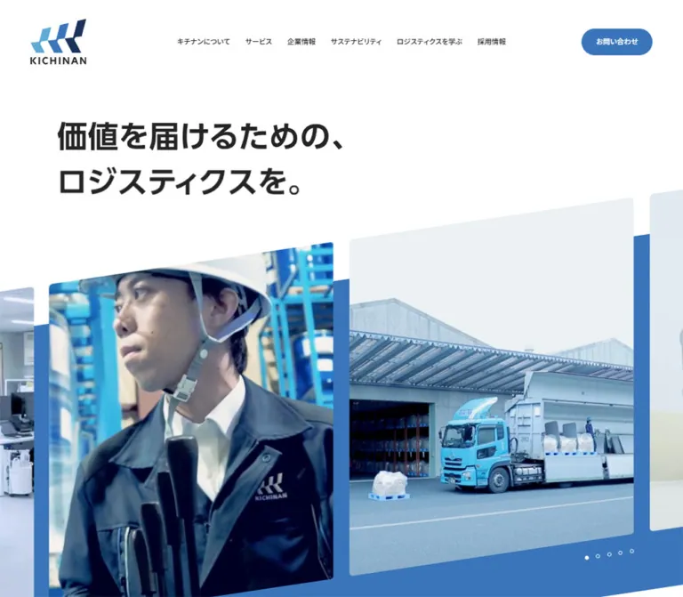
KICHINAN combines a broad corporate information structure with a distinctive geometric opening. A bold Japanese statement sits in extensive white space. Below it, large photographic frames rise diagonally toward the right over a matching blue field. The photographs show employees, offices, machinery, and industrial work. This brings human activity into an otherwise precise, orderly interface.
The rest of the page alternates brand narrative, service navigation, operational evidence, editorial content, news, recruitment, and contact information. Small Japanese section labels sit above much larger English headings. Pale blue containers organize numerical evidence, while the navy footer becomes a substantial directory of the business.
The mobile design changes the composition: the hero photographs stack vertically, the full header navigation becomes a circular menu control, service navigation becomes a vertical sequence, and footer links form two columns above a centered identity block.
How to Read This Reference
- Measured means a value appears in the supplied computed styles or element rectangles. Measurements refer to the stated viewport, not every possible screen size.
- Source token means a custom property was supplied. Its existence does not prove that every component uses it.
- Visual estimate means a dimension or treatment was assessed from the original-page screenshots. Hero typography, photographic geometry, statistics cards, and much of the footer fall into this category.
- Recommendation means an implementation choice for reuse. The Quick Start is an adaptation, not recovered production CSS.
- The DOM includes duplicate navigation, character-separated labels, and inactive panel content. Some elements have rectangles despite not appearing in the screenshot. Do not render all extracted nodes simultaneously.
- No menu opening, search submission, service selection, carousel control, or keyboard interaction was demonstrated in the supplied evidence.
Tokens — Colors
Default Palette
| Name | Value | Source or implementation token | Role and evidence |
|---|---|---|---|
| Canvas White | #ffffff |
Source --color-bg, --color-white |
Measured body background; also visible in cards and reversed branding |
| Logistics Blue | #3a75bb |
Source --wp--preset--color--primary; alias --kg-blue |
Measured contact buttons, selected service control, and English section heading; visually anchors the hero field |
| Deep Navy | #1a335b |
Source --color-navy |
Matches the large footer field; the footer itself was not included in the element-style sample |
| Sky Blue | #5eaad7 |
Source --color-sky |
Secondary brand color, visually associated with the light logo segment and footer category accents |
| Pale Blue Surface | #edf5fc |
Alias --kg-pale |
Measured inactive service-control background; a closely matching pale field appears behind the statistics cards |
| Selected Sky | #dfeef7 |
Source --color-sky-selected |
Declared supporting color; its exact visible application was not established |
| Main Text | #242424 |
Source --wp--preset--color--base; alias --kg-ink |
Measured body and primary navigation text |
| Dark Gray | #4a4a4a |
Source --color-dark |
Suitable match for the visible process-arrow bars and search glyph; those assignments are visual estimates |
| Muted Gray | #a4a4a4 |
Source --wp--preset--color--gray |
Measured mobile statistics date note |
| Navy Rule | #485c7c |
Source --color-navy-light |
Visually consistent with footer dividers; exact rule application is unverified |
| Light Gray | #dbdbdb |
Source --color-gray-light |
Declared neutral support token; component assignment not established |
Blue carries both brand identity and navigation emphasis. The page does not depend on a separate bright conversion color. Contact links remain within the same blue family as the corporate headings and numerical evidence.
The navy footer is a structural section of the light page, not evidence of a dark-mode setting. Generic CMS gradients, shadow presets, and additional color variables in the extraction are not evidence that those treatments appear in the inspected design.
Tokens — Typography
Japanese Interface and Body
- Measured family:
"Noto Sans JP", sans-serif. - Body weight:
400. - Desktop navigation weight:
500. - Service titles:
500. - Small Japanese section labels:
700. - Character: clear, restrained Japanese sans-serif typography, with generous paragraph leading and compact utility text.
Computed family names establish the declared styling. Font-file URLs and independent font-loading verification were not supplied.
English Headings and Number Labels
- Measured family:
Outfit, sans-serif. - Measured weight:
600for large English headings and small service-number capsules. - Role: gives the page a recognizable display voice through labels such as
Our Service,Company Info,Client, andJournal. - Statistics: the large numerals visually fit this geometric family, but their individual computed font declarations were not supplied. Outfit is a reasonable implementation recommendation for those numerals.
The English headings were extracted as individual letters on separate lines. This reflects the markup structure; the page should not display these words as vertical stacks of letters.
Hero Statement
The screenshots show the two-line statement:
価値を届けるための、
ロジスティクスを。
Its appearance is a heavy Japanese sans serif. The extracted hero paragraph has no text, so its actual text-rendering mechanism and font face cannot be confirmed. It may involve an image, vector, or another graphical treatment. For a live-text adaptation, Noto Sans JP at weight 700 is a recommendation, not a recovered headline declaration.
Type Scale
| Role | Desktop | Mobile | Weight / family | Evidence |
|---|---|---|---|---|
| General body | 16px / 28px |
13.52px / 23.66px |
400, Noto Sans JP |
Measured |
| Opening narrative | 18px / 40.5px |
16.64px / 33.28px |
400, Noto Sans JP |
Measured |
| Primary navigation | 15px / 21px |
Replaced by menu control | 500, Noto Sans JP |
Measured |
| Japanese section eyebrow | 12px / 12px |
10.4px / 10.4px |
700, Noto Sans JP |
Measured |
| Large English section heading | 88px / 88px |
52px / 52px |
600, Outfit |
Measured for Our Service; mobile Company Info and Journal also confirmed |
| Client English heading | Not supplied | 37.44px / 37.44px |
600, Outfit |
Measured |
| Expanded service title | 48px / 60px |
24.96px / 31.2px |
500, Noto Sans JP |
Measured |
| Mobile service summary title | Not applicable | 16.64px / 24.96px |
500, Noto Sans JP |
Measured |
| Service-number capsule | 10px / 10px |
9.36px / 9.36px |
600, Outfit |
Measured |
| Standard pill-link label | 16px / 22.4px |
13.52px / 18.928px |
400, Noto Sans JP |
Measured |
| Mobile article title, featured | Not supplied | 16.64px / 24.96px |
500, Noto Sans JP |
Measured |
| Mobile article title, secondary | Not supplied | 14.56px / 21.84px |
500, Noto Sans JP |
Measured |
| Mobile note | Not supplied | 10.4px / 18.2px |
400, Noto Sans JP |
Measured |
| Hero statement | Approximately 64px, with about 96px line spacing |
Approximately 32px, with about 50px line spacing |
Heavy Japanese sans-serif appearance | Visual estimate |
| Statistics numerals | Approximately 80px |
Not established | Geometric sans-serif appearance | Visual estimate |
| Footer links | Approximately 12–15px |
Approximately 11–14px |
Mostly bold sans-serif appearance | Visual estimate |
Most sampled text has normal letter spacing. Although tracking variables from 0.01em to 0.2em exist, the evidence does not support applying wide tracking throughout the page.
Tokens — Spacing & Shapes
Source Unit System
The original uses different computed root sizes at the two inspected widths.
| Property | Desktop at 1440px | Mobile at 390px | Interpretation |
|---|---|---|---|
| Root font size | 10px |
5.2px |
Measured |
Source --padding |
12rem |
5.1rem |
Resolves to 120px and 26.52px respectively |
Source --r |
0.8rem |
0.8rem |
Resolves to 8px and 4.16px; both appear on measured service controls |
| Body font size | 16px |
13.52px |
Use the computed size when reproducing text |
Source --font-size-base |
16px |
26px |
The mobile variable is not the final computed body size |
| Declared breakpoints | 768px, 1024px, 1728px |
Same declarations | Exact component switching rules were not supplied |
| Source maximum-view token | 1728px |
1728px |
Does not independently establish a 1728px content container |
Only two root-size samples are available. A complete fluid scaling formula cannot be reconstructed from them. The Quick Start therefore uses ordinary CSS-pixel dimensions and leaves the document root unchanged.
Spacing Scale
| Use | Desktop measurement | Mobile measurement or limitation |
|---|---|---|
| Main content gutter | 120px |
26.52px |
| Opening narrative left edge | 160px |
51.47px |
| Gap between narrative paragraphs | 34px |
Approximately 24.95px |
| Narrative-to-about-link gap | 64px |
Approximately 49.91px |
| Desktop navigation item gap | 32px |
Not applicable |
| Standard pill padding | 20px 24px |
13.52px 18.72px |
| Service-tab gap | 5px |
Summary rows are stacked instead |
| Service-tab padding | 24px |
Different summary-card structure |
| Service-panel vertical padding | 80px |
Full equivalent not established |
| Service-to-company section separation | 160px |
Approximately 102.95px |
| Statistics-board inset | Approximately 64px |
Not visually established |
| Statistics-card gap | Approximately 20px |
Not visually established |
The spacing is intentionally uneven by role: broad gaps separate major narratives, while navigation and service taxonomies remain compact. A universal tight card grid would lose this rhythm.
Border Radius and Geometry
| Element | Value | Evidence |
|---|---|---|
| Contact and standard link pills | 999px |
Measured |
| Mobile menu button | 50% |
Measured |
| Desktop service tabs | 8px 8px 0 0 |
Measured |
| Mobile service summaries | 4.16px |
Measured |
| Statistics cards | Approximately 8px |
Visual estimate |
| Hero photographic corners | Small rounded corners, approximately 4–8px |
Visual estimate |
| Hero rising edge | Approximately 8.4° upward toward the right |
Estimate from screenshot geometry |
| Process connectors | Rectangular bars with pointed right ends | Visible in company-information capture |
Keep the different shape families distinct: pills for actions, circles for compact utilities, lightly rounded rectangles for content, and diagonal edges for brand imagery.
Key Layout Measurements
| Element | Desktop | Mobile |
|---|---|---|
| Main content width | 1200px |
Approximately 336.97px |
| Header logo link | 118 × 96px at x64, y25.91 |
Approximately 76.44 × 62.17px at x24.95, y29.11 |
| Header contact pill | 150 × 56px |
Not shown in the closed mobile header |
| Search-control wrapper | 48 × 48px |
Not shown in the closed mobile header |
| Menu button | Not shown in the opening desktop capture | Approximately 58.23 × 58.23px at x302.66, y33.27 |
| Desktop service tab | 236 × 134px, five across |
Replaced by summary rows |
| Mobile service summary | Not applicable | Approximately 336.97 × 106.08px; engineering row is slightly taller |
| Desktop service panel | 1200 × 610px |
Different vertical arrangement |
| Statistics board | Approximately 1200 × 532px |
Card arrangement not supplied |
| Statistics card | Approximately 344 × 192px |
Not established |
The measured header element itself has zero height because its visible children are positioned independently. This does not mean the visible header has no footprint. Use the logo and control bounds when interpreting its composition.
Components
Corporate Header
Role: provide direct access to the business, facilities, services, group, sustainability, editorial content, recruitment, contact, and search.
The desktop header is white and visually unboxed. The multicolor logo sits well to the left of the navigation. Seven text links form a single horizontal row; the blue contact pill and dark search glyph finish the sequence.
The contact pill is 150 × 56px, with white 15px medium-weight text. Navigation anchors have 60px-high measured boxes, creating larger interaction regions than the visible labels suggest. No prominent divider or shadow appears under the header.
At mobile width, the logo shrinks and the navigation row disappears from the visible opening. A blue circular button contains two short white horizontal strokes. The same control appears at the same viewport position in the footer capture, supporting a persistent-control interpretation. Its exact positioning declaration was not supplied.
Navigation Substructures
Role: organize secondary destinations without placing all of them in the opening header row.
The desktop DOM includes secondary groups for company information, facilities, services, and sustainability. Sampled submenu headings use blue 25px type, while destination tiles have approximately 372 × 92px rectangles and 25px padding.
These substructures are not visible in the closed-header screenshots. Their opening trigger, background imagery, keyboard behavior, and animation remain unverified. Duplicate offscreen header nodes also appear in the extraction; they are not proof that two headers should be visible.
The mobile DOM contains a separate navigation structure with larger 20.8px primary labels and smaller secondary links. The mobile menu was not shown open.
Hero Statement and Diagonal Media
Role: establish the promise of delivering value through logistics while showing the people and workplaces behind it.
The headline occupies its own white region above the photographs. Preserve the two-line Japanese composition and its strong left alignment. There is no visible hero CTA crowding this opening statement.
On desktop, the first substantially visible frame spans approximately 600px, followed by a gap of roughly 33px and another similarly wide frame. Additional imagery is clipped at the viewport edges. The frame tops rise by about 88px over a 600px width, corresponding to an angle near 8.4°.
The blue background follows the same rising direction. This shared angle is the important relationship: the photographs and blue field belong to one composition.
On mobile, two images stack vertically inside approximately 18px side margins. Each is about 354px wide. Its upper edge rises roughly 52px from left to right, and the vertical visible side is about 230px high. Around 20px of blue separates the parallel edges of the two frames.
Five small pagination indicators appear near the lower-right edge of the mobile hero. One is filled white and the others are outlined. This supports a multi-item media presentation, but autoplay, slide duration, direction, click behavior, and the media format are unverified.
Implementation recommendation: create the sloping frame geometry with clipping or a skewed wrapper and a counter-transformed image. Keep people and machinery visually upright. Do not rotate the entire photograph and its contents as a substitute for the frame treatment.
Opening Narrative
Role: introduce the company's supporting role in its customers' growth.
Three paragraphs precede a blue about link. The text begins slightly inside the main content grid: 160px from the desktop left edge, compared with the normal 120px gutter. Mobile preserves this extra inset, starting at approximately 51.47px instead of 26.52px.
The prose uses unusually open leading: 18px / 40.5px on desktop and 16.64px / 33.28px on mobile. Line breaks change between viewports. Preserve deliberate phrase grouping without forcing desktop line lengths onto a narrow screen.
Bilingual Section Heading
Role: make a long corporate homepage easy to scan.
The component has a small bold Japanese label above a much larger blue English display label, followed by explanatory body copy. The English heading is the dominant visual element even though the Japanese label is the sampled semantic h2.
For Our Service, desktop uses 12px Japanese text above 88px Outfit. The label begins at x120; a section-list pill sits to the right. On mobile, the English heading becomes 52px, the Japanese label becomes 10.4px, and the list action moves below the explanatory paragraph.
Use the same relationship for company information and editorial sections. The mobile Client heading is a smaller 37.44px variant with introductory copy beside it.
For a new implementation, a single accessible heading can contain both language treatments while retaining the visual hierarchy.
Primary Link Pill
Role: lead to a full section or contact destination.
A solid blue capsule with white Japanese text and generous horizontal padding. Standard section pills measure about 68.19px high on desktop and 49.92px on mobile. Width follows the label: the service-list link is about 201.41px on desktop and 164.66px on mobile.
Several anchors contain duplicated labels in the DOM. Only one label is visibly presented in the supplied captures. A text-swap effect is possible, but its mechanics were not demonstrated. Reusable markup should expose one accessible name even if decorative text layers are added.
Desktop Service Selector
Role: explain five business areas while keeping their detailed link sets organized.
Five numbered buttons occupy the full 1200px content width. Each is 236px wide, with 5px gaps. Their 134px height accommodates multi-line category names. Rounded top corners connect them visually to the shared panel below.
The first category, 物流, is selected in the supplied state. Its button is blue; the other buttons are pale blue. The associated detail panel contains a small Outfit number capsule, a 48px Japanese title, supporting copy, and a two-column list of service destinations.
The measured text column is 516px wide, beginning 24px inside the panel. Link columns are 258px wide. The full panel is 610px high with 80px vertical padding. The supplied sample does not establish the appearance of every remaining panel region or its imagery.
Other service panels occupy the same desktop coordinates and have opacity/visibility transitions. Treat these as alternative states, not five consecutive full-width panels.
Mobile Service Summaries
Role: adapt the five service categories to a narrow screen.
The mobile layout contains stacked summary links, each approximately 337px wide. The sampled grid divides into 141.44px and 195.53px columns. The number and title are in the right-hand area. The left-hand region's exact media treatment was not included in the screenshots.
The first summary is blue, followed by its detail region. The remaining summary sections are only about 106px high in the sampled layout. Their detail descendants also appear in the extracted DOM, but this is not evidence that all details are visibly expanded.
The summary elements have real service destination URLs. Do not assume they are exclusively accordion toggles. Any intercepted navigation or separate expansion control requires further interaction evidence.
Business-Area Diagram
Role: explain the company's position across procurement, manufacturing, storage, processing, and delivery.
The visible lower portion uses a pale blue container, white process blocks with thin blue outlines, small plus marks, and dark horizontal arrows. The full rendered text confirms stages running from raw materials and semifinished goods through production and product logistics to the customer.
The labels 原料調達 and 物流資材供給 sit inside dark arrow bars with pointed right ends. Different shades of blue distinguish process groups without introducing unrelated category colors.
Only the lower portion of this diagram was visually captured. The complete diagram's desktop geometry and mobile navigation behavior are not established. The plus symbols alone do not prove an expandable interaction.
Statistics Board
Role: communicate operational scale through a compact, comparable set of figures.
A pale blue rectangular board contains six white cards in a three-column, two-row desktop grid. Each card has a small centered dark label above a large blue number. Units remain small and dark. The first card accommodates two numbers with separate vertical unit labels.
The screenshot supports approximately 64px outer padding, 20px gaps, 344 × 192px cards, and 8px corner radii. There are no visible drop shadows.
| Source label | Displayed value | Composition |
|---|---|---|
営業所・倉庫数 |
47 offices and 24 warehouses |
Two figures in one card |
社員・スタッフ数 |
1,100 |
Small 名 unit |
お取引企業様数 |
600 |
Small 社 unit |
倉庫総平米数 |
41,667 |
Printed unit is 坪 |
トラック台数 |
150 |
Small 台 unit |
関連会社数 |
12 |
Small 社 unit |
The board is explicitly dated to the end of May 2024. These are displayed historical figures, not verified September 2026 operating totals. The warehouse-area label refers to square meters while the printed unit is 坪; preserve that distinction when documenting the source, and verify the intended label before reusing the data.
Client List
Role: support credibility through named business relationships.
The desktop crop shows a plain multi-column list of company names with small blue bullet dots. This is a text directory rather than a grid of customer logos. Keep the typography, bullets, and spacing consistent with the site's restrained corporate presentation.
On mobile, the Client heading and short introductory copy sit beside each other according to the measured rectangles. Exact mobile list-column geometry was not supplied.
Journal and Keyword Links
Role: connect the corporate site to practical logistics knowledge.
The DOM establishes article links grouped by transport, warehouse storage, and logistics outsourcing, plus five keyword links and an article-index action. Mobile headings and article titles are measured as white, indicating a reversed text treatment. The containing background color was not included in the sampled elements, so its exact fill should not be asserted from inherited text alone.
The mobile article layout has a featured item measuring about 363.48px wide from the standard left gutter to the viewport edge. Secondary items form two columns of about 162.25px, separated by approximately 12.47px.
Keyword links are small capsules with 11.44px medium-weight text, 5.72px 11.44px padding, and a 999px radius. Their transparent computed backgrounds do not establish their border styling.
Article-image contents and asset paths were not supplied. Avoid borrowing imagery from unrelated sections to complete this component description.
News, Recruitment, and Contact
Role: serve ongoing corporate communication, hiring, and business inquiries.
The news structure contains a date, category, and title for each linked item. Five entries were included in the rendered text. Recruitment has explanatory copy and a destination link. Contact combines a Japanese label, the English word Contact, a short invitation, and the action お問い合わせする.
These sections are confirmed by rendered content and URLs, but their full visual layouts were not captured. Do not infer specific recruitment photography, news dividers, or contact-banner dimensions. The desktop footer capture shows only a narrow blue rounded strip from the preceding region.
Directory Footer
Role: provide comprehensive navigation and close with a strong corporate identity.
The desktop footer is a deep navy field with white content and muted horizontal rules. Its inner content follows the approximately 1200px main width. A broad left identity region contains the slogan in vertical Japanese writing, a white logo, the company name, and contact details.
The navigation begins around x480. Corporate destinations form one column; services occupy three further columns with smaller sky-blue category labels and white destination links. Additional destination links form a horizontal row near the bottom, followed by legal links and copyright.
The original footer independently identifies キチナングループ株式会社 and provides its Ube, Yamaguchi address, telephone, and fax information.
In the mobile footer crop, navigation uses two columns of approximately 162px with a 12px gap and roughly 27px outside gutters. The identity block follows below the navigation and is centered. The white logo is approximately 104px wide. Address and copyright text are much smaller than navigation labels.
The mobile crop does not show the entire footer. It does not establish whether the vertical slogan is absent elsewhere, and it should not be used to remove service links that are present in the rendered page.
Tokens — Motion & Interaction
| Treatment | Evidence | Practical interpretation |
|---|---|---|
| Navigation and pill color transitions | 0.08s for color, background color, border color, fill, and stroke |
Short feedback is declared; target hover colors were not demonstrated |
| Search wrapper transition | 0.15s |
Duration is supplied, but the changed property and resulting state are not established |
| Desktop service panel | opacity 0.2s; inactive panels include delayed visibility changes |
Supports a short fade between alternative panels; activation was not exercised |
| Mobile Japanese section eyebrow | opacity 0.3s 0.5s |
A 300ms opacity transition with 500ms delay is declared; trigger and choreography are unverified |
| Mobile menu contact wrapper | Zero-duration opacity/transform changes after 0.2s |
Evidence of delayed state handling, not a verified menu-opening animation |
| Character-separated navigation and headings | Individual characters appear in the extraction | Compatible with character-level effects, but no sequence or stagger timing is established |
| Hero pagination | Five visible indicators in the mobile capture | Multiple media positions are suggested; timing, input handling, and autoplay are unverified |
| Persistent mobile menu control | Same visible viewport position in opening and footer captures | Persistent placement is supported; exact CSS and scrolling behavior were not supplied |
The source declares several easing curves, including --ease-power3-out: cubic-bezier(0.165, 0.84, 0.44, 1) and --ease-expo-out: cubic-bezier(0.19, 1, 0.22, 1). No supplied component binding proves where these curves apply.
Most sampled nodes report animation: none. This does not rule out JavaScript animation, media playback, transitions, or animation on unsampled descendants.
The capture process waited for document readiness, finite visible motion, sampled layout/text stability, and image decoding within stated limits. Perpetual animations were paused during readiness checks and then resumed. These measures do not establish complete interaction behavior or the absence of later content.
Surfaces
| Layer | Appearance | Function |
|---|---|---|
| Main canvas | Solid white | Gives the typography and photography room |
| Hero field | Solid brand blue with a rising upper edge | Unifies the diagonal image composition |
| Inactive service controls | Pale blue | Groups alternatives without competing with the selected item |
| Statistics board | Pale blue, visually close to #edf5fc |
Creates one shared data region |
| Statistics cards | White, lightly rounded, without visible elevation | Makes large figures easy to compare |
| Process arrows | Dark gray with white text | Explains directional flow |
| Footer | Deep navy with white links, sky accents, and muted rules | Holds a dense sitemap and identity block |
No general shadow-based elevation system is visible in the supplied captures. Shape, spacing, color fields, and rules provide the hierarchy.
Imagery
The current opening captures use workplace photography: an employee portrait, an office with desks and windows, close industrial machinery, and a worker within a production environment. Images have a cool visual cast that sits comfortably beside the blue palette. A specific filter or grading implementation cannot be identified from screenshots alone.
The framing is more distinctive than any single photograph. Desktop uses oversized adjacent frames with clipped neighbors; mobile stacks two working scenes. The sloping top and bottom edges echo the ascending geometry of the brand mark. Keep subjects recognizable within both crops.
The logo contains ascending angular forms in light blue, medium blue, and navy, with the KICHINAN wordmark beneath. The footer uses a white version. Use an approved logo asset rather than approximating its letterforms with ordinary text.
Observed Asset References
No image, video, SVG, or font-file URLs were included in the supplied asset evidence. The following inventory records visible uses without inventing paths.
| Asset type | Observed use | Evidence limit |
|---|---|---|
| Multicolor brand mark | Desktop and mobile opening header | Asset path and format unavailable |
| White brand mark | Desktop and mobile footer | Asset path and format unavailable |
| Employee and office imagery | Desktop hero frames | Media format and sequence unavailable |
| Machinery and production imagery | Mobile hero frames | Still image versus video frame unverified |
| Hero statement graphic or text treatment | Two-line opening statement | Rendering mechanism and exact font unavailable |
| Process diagram | Company-information region | Only its lower part is visible in the screenshot |
Layout & Responsive Behavior
The measured document heights are approximately 9792px on desktop and 11085px on mobile. This is a long corporate homepage with several distinct information functions.
| Area | Desktop observation | Mobile observation | Confidence |
|---|---|---|---|
| Header | Full link row, contact pill, search glyph | Small logo and circular menu control | Screenshot and computed measurements |
| Hero statement | Large two-line statement with broad white margins | Same two-line composition at roughly half the visual type size | Screenshot |
| Hero photography | Horizontal sequence with partial neighboring frames | Two stacked diagonal frames | Screenshot |
| Main content | 1200px wide with 120px gutters |
About 337px wide with 26.52px gutters |
Measured |
| Narrative | Extra 40px inset beyond the main gutter |
Extra approximately 24.95px inset |
Measured |
| Section action | Can sit beside the large English heading | Moves below the explanatory copy | Measured for services |
| Service navigation | Five horizontal buttons and overlapping alternative panels | Stacked summary links with first detail region occupying space | Measured; activation behavior unverified |
| Statistics | Three columns and two rows | Card geometry not captured | Desktop screenshot only |
| Journal | Exact desktop grid unavailable | One large feature and two-column secondary items | Mobile measurements |
| Footer | Left identity area and broad multi-column directory | Two-column links and centered identity beneath | Screenshot |
Do not derive every mobile dimension by multiplying desktop values by one scale factor. Body text, display headings, controls, gutters, and component arrangements change differently.
The source breakpoint declarations identify 768px, 1024px, and 1728px, but the exact media-query conditions were not supplied. Tablet, intermediate desktop widths, landscape phones, and screens wider than 1440px remain unverified.
Do’s and Don’ts
Do
- Preserve the white, primary-blue, and deep-navy hierarchy.
- Align the hero photographs and blue field to the same rising diagonal.
- Keep the two-line opening statement visually separate from the media.
- Use Noto Sans JP for measured Japanese interface roles and Outfit for English section headings.
- Pair very small Japanese section labels with much larger English display text.
- Keep generous narrative leading and the extra left inset.
- Group the six statistics in one pale board with large blue numbers and small dark units.
- Retain the full breadth of corporate, service, editorial, recruitment, and contact navigation.
- Recompose service navigation and footer columns for mobile.
- Distinguish visible states from inactive elements found in the DOM.
Don’t
- Don’t reduce the site to a single conversion funnel or remove its directory function.
- Don’t flatten the diagonal hero into ordinary horizontal image cards.
- Don’t tilt people or text merely to create the sloped frame silhouette.
- Don’t add colorful category badges, glossy gradients, or pervasive drop shadows.
- Don’t make every heading a large Japanese headline; the bilingual size contrast is central.
- Don’t render duplicated CTA labels twice or expose every inactive service panel.
- Don’t treat character-separated extraction as vertical navigation typography.
- Don’t apply a conventional root size to copied source rem values without conversion.
- Don’t infer hover destinations, autoplay timing, count-up effects, or mobile accordion behavior from appearance alone.
- Don’t present the displayed May 2024 statistics as newly verified operating figures.
Recommended Implementation Additions
These are recommendations for a new implementation, not verified features of the original:
- Give the menu and search controls accessible names. Manage
aria-expanded, focus placement, Escape behavior, and background focus only when an actual menu or dialog is implemented. - Preserve one accessible heading/name when using character spans, duplicated animated labels, or a graphical hero statement.
- If service controls switch panels, implement a coherent keyboard model and keep inactive content out of the focus order. Preserve actual destination links where navigation is intended.
- If the hero advances automatically, provide pause controls, meaningful slide state, and a reduced-motion alternative. Static images are a suitable fallback.
- Give tiny pagination indicators larger invisible hit areas while retaining their small visual dots.
- Consider a
14–16pxminimum for general mobile reading text; the measured body size is13.52px. Increase legal and footer text where usability requires it. - Keep a dense process diagram readable through a labeled scroll region or an alternate linear explanation instead of uniformly shrinking all labels.
- Store statistics with their unit and reporting date. Verify the warehouse-area label/unit pairing before publishing reused content.
- Preserve image focal points separately for desktop and mobile crops, and provide meaningful alternatives for informational images.
Agent Prompt Guide
Quick Color Reference
- Main canvas and cards:
#ffffff. - Main text:
#242424. - Primary links, English headings, and numerical emphasis:
#3a75bb. - Pale grouping surface:
#edf5fc. - Footer field:
#1a335b. - Secondary brand accent:
#5eaad7. - Footer-rule approximation using a declared source color:
#485c7c. - Secondary note text:
#a4a4a4.
Overall Prompt
“Create a Japanese logistics corporate homepage inspired by the current KICHINAN composition. Use a white canvas, brand blue #3a75bb, deep navy #1a335b, Noto Sans JP body text, and large Outfit English headings. Begin with a bold two-line Japanese statement in open white space. Place large workplace photographs in frames whose edges rise about 8.4 degrees to the right, over a matching blue field. Follow with generous narrative copy, five service categories, a business-process diagram, six numerical cards inside a pale blue board, client names, logistics articles, news, recruitment, and contact. Finish with a substantial navy directory footer. On mobile, stack the hero imagery, replace the full header with a circular menu control, and recompose navigation into compact vertical and two-column structures. Treat unverified interactions as implementation decisions rather than recovered behavior.”
Example Component Prompts
- Hero: “A white corporate opening with a heavy, left-aligned Japanese statement on two lines. Below it, oversized workplace photographs sit in rounded frames with parallel edges rising to the right. Continue the angle through a solid blue background. Keep photographic subjects upright and reveal partial neighboring frames on desktop.”
- Section heading: “A small bold Japanese section label above an 88px blue Outfit heading on desktop, reduced to 52px on a 390px phone. Add restrained Japanese explanatory copy. Place the blue section-list pill beside the heading on desktop and below the copy on mobile.”
- Service selector: “Five equal numbered tabs across a 1200px content region, with 5px gaps and rounded top corners. Use primary blue for the selected category and pale blue for alternatives. The detail region has a number capsule, a large Japanese title, concise copy, and a two-column destination list.”
- Statistics board: “A pale blue board with 64px desktop inset and six white cards arranged three by two. Use about 20px gaps, modest 8px corners, centered dark labels, approximately 80px blue numerals, and small dark units. Keep the reporting date visible at the lower right. Do not add shadows or decorative icons.”
- Mobile service summary: “A roughly 337px-wide, lightly rounded summary with a 42/58 split between media and information regions. Place a small numbered capsule above a medium Japanese category title. Use blue for the current summary and pale blue for alternatives. Preserve destination semantics unless a separate expansion interaction is specified.”
- Footer: “A deep navy corporate directory with white links, small sky-blue service-category labels, and muted horizontal rules. Use a vertical Japanese slogan and white logo in a broad left identity area on desktop. Recompose links into two columns on mobile and center the company identity below them.”
Quick Start
CSS Custom Properties
This CSS is an implementation adaptation using a conventional document root. Exact colors and several desktop/mobile measurements come from the supplied evidence. The hero construction, container cap, intermediate breakpoints, hover target, and mobile statistics grid are recommendations.
Use .kg as the page wrapper. Place .kg-logo, .kg-nav, and .kg-header-tools inside .kg-header. Place image frames inside .kg-hero-track; each frame contains an image. Section-heading, service-panel, statistics, and footer classes can be used independently.
The example styles a static media composition. Menu state, panel selection, search, carousel behavior, asset loading, and font delivery require separate implementation. Supply authorized image and logo assets; no asset paths were recovered.
:root {
  /* Source-supported palette */
  --kg-white: #ffffff;
  --kg-ink: #242424;
  --kg-blue: #3a75bb;
  --kg-navy: #1a335b;
  --kg-sky: #5eaad7;
  --kg-pale: #edf5fc;
  --kg-muted: #a4a4a4;
  --kg-rule: #485c7c;

  /* Measured font declarations; font loading is separate */
  --kg-font-jp: 'Noto Sans JP', sans-serif;
  --kg-font-en: 'Outfit', sans-serif;
  --kg-body-size: 16px;
  --kg-body-leading: 1.75;
  --kg-display-size: 88px;

  /* Desktop reference dimensions */
  --kg-gutter: 120px;
  --kg-content-max: 1200px;
  --kg-radius: 8px;
  --kg-pill-radius: 999px;
  --kg-section-gap: 160px;
  --kg-fast: 80ms;
  --kg-panel-fade: 200ms;

  /* Estimated hero geometry */
  --kg-rise: -8.4deg;
  --kg-counter-rise: 8.4deg;
}

.kg,
.kg *,
.kg *::before,
.kg *::after {
  box-sizing: border-box;
}

.kg {
  margin: 0;
  color: var(--kg-ink);
  background: var(--kg-white);
  font-family: var(--kg-font-jp);
  font-size: var(--kg-body-size);
  font-weight: 400;
  line-height: var(--kg-body-leading);
}

.kg img {
  display: block;
  max-width: 100%;
}

.kg button {
  font: inherit;
}

.kg [hidden] {
  display: none !important;
}

.kg-container {
  width: min(
    calc(100% - var(--kg-gutter) - var(--kg-gutter)),
    var(--kg-content-max)
  );
  margin-inline: auto;
}

.kg-header {
  display: flex;
  align-items: center;
  gap: 32px;
  min-height: 148px;
  padding: 26px 32px 26px 64px;
  background: var(--kg-white);
}

.kg-logo {
  display: block;
  flex: 0 0 auto;
  width: 118px;
}

.kg-logo img {
  width: 100%;
  height: auto;
}

.kg-nav {
  display: flex;
  align-items: center;
  gap: clamp(12px, 2.22vw, 32px);
  margin-inline: auto 0;
}

.kg-nav a {
  display: flex;
  align-items: center;
  min-height: 60px;
  color: var(--kg-ink);
  font-size: 15px;
  font-weight: 500;
  line-height: 1.4;
  white-space: nowrap;
  text-decoration: none;
  transition: color var(--kg-fast);
}

.kg-header-tools {
  display: flex;
  align-items: center;
  gap: 32px;
}

.kg-pill {
  display: inline-flex;
  align-items: center;
  justify-content: center;
  gap: 16px;
  min-height: 68.19px;
  padding: 20px 24px;
  border: 0;
  border-radius: var(--kg-pill-radius);
  color: var(--kg-white);
  background: var(--kg-blue);
  font-size: 16px;
  line-height: 1.4;
  text-align: center;
  text-decoration: none;
  cursor: pointer;
  transition:
    color var(--kg-fast),
    background-color var(--kg-fast);
}

.kg-header .kg-pill {
  width: 150px;
  min-height: 56px;
  padding: 0 20px;
  font-size: 15px;
  font-weight: 500;
}

.kg-search {
  display: grid;
  place-items: center;
  width: 48px;
  height: 48px;
  padding: 0;
  border: 0;
  border-radius: 50%;
  color: #4a4a4a;
  background: var(--kg-white);
}

.kg-menu-button {
  position: fixed;
  top: 33.27px;
  right: 29.11px;
  z-index: 100;
  display: none;
  width: 58.23px;
  height: 58.23px;
  padding: 0;
  border: 0;
  border-radius: 50%;
  color: var(--kg-white);
  background: var(--kg-blue);
  cursor: pointer;
}

.kg-menu-button::before,
.kg-menu-button::after {
  content: '';
  position: absolute;
  left: 50%;
  width: 22px;
  height: 2px;
  background: currentColor;
  transform: translateX(-50%);
}

.kg-menu-button::before { top: 24px; }
.kg-menu-button::after { top: 31px; }

/* Live-text approximation of the graphical hero statement */
.kg-hero-title {
  margin-block: 96px 0;
  font-size: 64px;
  font-weight: 700;
  line-height: 1.5;
}

.kg-hero-title span {
  display: block;
}

/* Static diagonal composition; not a carousel implementation */
.kg-hero-media {
  position: relative;
  isolation: isolate;
  overflow: hidden;
  margin-top: 40px;
  padding-block: 120px 80px;
}

.kg-hero-media::before {
  content: '';
  position: absolute;
  z-index: -1;
  inset: 210px -10% -160px;
  background: var(--kg-blue);
  transform: skewY(var(--kg-rise));
  transform-origin: left top;
}

.kg-hero-track {
  display: flex;
  gap: 34px;
  width: max-content;
  margin-left: 7.15vw;
  transform: skewY(var(--kg-rise));
  transform-origin: left top;
}

.kg-hero-frame {
  flex: 0 0 auto;
  width: min(41.667vw, 600px);
  margin: 0;
  overflow: hidden;
  aspect-ratio: 1;
  border-radius: var(--kg-radius);
}

.kg-hero-frame img {
  width: 100%;
  height: 100%;
  object-fit: cover;
  transform: skewY(var(--kg-counter-rise)) scale(1.22);
}

.kg-narrative {
  padding-left: 40px;
  font-size: 18px;
  line-height: 2.25;
}

.kg-narrative p {
  margin: 0 0 34px;
}

.kg-narrative .kg-pill {
  margin-top: 30px;
}

.kg-section {
  margin-block: var(--kg-section-gap);
}

.kg-section-head {
  display: grid;
  grid-template-columns: minmax(0, 1fr) auto;
  align-items: center;
  gap: 24px;
}

.kg-eyebrow {
  margin: 0 0 12px;
  font-size: 12px;
  font-weight: 700;
  line-height: 1;
}

.kg-display {
  margin: 0;
  color: var(--kg-blue);
  font-family: var(--kg-font-en);
  font-size: var(--kg-display-size);
  font-weight: 600;
  line-height: 1;
}

.kg-section-description {
  grid-column: 1 / -1;
  margin: 0;
}

.kg-service-tabs {
  display: grid;
  grid-template-columns: repeat(5, minmax(0, 1fr));
  gap: 5px;
  margin-top: 64px;
}

.kg-service-tab {
  display: flex;
  flex-direction: column;
  align-items: flex-start;
  justify-content: center;
  gap: 12px;
  min-height: 134px;
  padding: 24px;
  border: 0;
  border-radius: 8px 8px 0 0;
  color: var(--kg-ink);
  background: var(--kg-pale);
  text-align: left;
  cursor: pointer;
}

.kg-service-tab[aria-selected='true'] {
  color: var(--kg-white);
  background: var(--kg-blue);
}

/* Blue panel fill is an adaptation; parent fill was not sampled */
.kg-service-panel {
  display: grid;
  grid-template-columns: repeat(2, minmax(0, 1fr));
  gap: 120px;
  min-height: 610px;
  padding: 80px 24px;
  color: var(--kg-white);
  background: var(--kg-blue);
  transition: opacity var(--kg-panel-fade);
}

.kg-service-number {
  display: inline-block;
  padding: 4px 9px;
  border: 1px solid currentColor;
  border-radius: var(--kg-pill-radius);
  font-family: var(--kg-font-en);
  font-size: 10px;
  font-weight: 600;
  line-height: 1;
}

.kg-service-title {
  margin: 4px 0 24px;
  font-size: 48px;
  font-weight: 500;
  line-height: 1.25;
}

.kg-service-links {
  display: grid;
  grid-template-columns: repeat(2, minmax(0, 1fr));
  gap: 12px 0;
  padding: 0;
  list-style: none;
}

.kg-service-links a {
  color: inherit;
  text-decoration: none;
}

.kg-service-summary {
  display: grid;
  grid-template-columns: 42% 58%;
  min-height: 106.08px;
  overflow: hidden;
  border-radius: 4.16px;
  color: var(--kg-ink);
  background: var(--kg-pale);
  text-decoration: none;
}

.kg-service-summary.is-current {
  color: var(--kg-white);
  background: var(--kg-blue);
}

.kg-service-summary__content {
  padding: 16.64px;
}

/* Desktop statistics geometry is estimated from the screenshot */
.kg-stats {
  padding: 64px;
  background: var(--kg-pale);
}

.kg-stats-grid {
  display: grid;
  grid-template-columns: repeat(3, minmax(0, 1fr));
  gap: 20px;
}

.kg-stat {
  display: grid;
  align-content: center;
  justify-items: center;
  gap: 16px;
  min-height: 192px;
  padding: 24px 16px;
  border-radius: 8px;
  background: var(--kg-white);
  text-align: center;
}

.kg-stat-label {
  margin: 0;
  font-size: 18px;
  font-weight: 500;
}

.kg-stat-value {
  margin: 0;
  color: var(--kg-blue);
  font-family: var(--kg-font-en);
  font-size: 80px;
  font-weight: 600;
  line-height: 1;
}

.kg-stat-unit {
  margin-left: 4px;
  color: var(--kg-ink);
  font-family: var(--kg-font-jp);
  font-size: 16px;
}

.kg-stats-note {
  margin: 24px 0 0;
  color: var(--kg-muted);
  font-size: 12px;
  text-align: right;
}

.kg-footer {
  padding-block: 120px 96px;
  color: var(--kg-white);
  background: var(--kg-navy);
}

.kg-footer-layout {
  display: grid;
  grid-template-columns: 264px minmax(0, 1fr);
  gap: 96px;
}

.kg-footer-navigation {
  display: grid;
  grid-template-columns: 192px minmax(0, 1fr);
  gap: 24px;
}

.kg-footer-services {
  display: grid;
  grid-template-columns: repeat(3, minmax(0, 1fr));
  gap: 24px;
}

.kg-footer-group {
  padding-top: 32px;
  border-top: 1px solid var(--kg-rule);
}

.kg-footer-group h3 {
  margin: 0 0 24px;
  font-size: 15px;
}

.kg-footer-category {
  color: var(--kg-sky);
  font-size: 12px;
}

.kg-footer ul {
  margin: 0;
  padding: 0;
  list-style: none;
}

.kg-footer a {
  color: inherit;
  font-size: 13px;
  font-weight: 700;
  line-height: 2.2;
  text-decoration: none;
}

.kg-footer-logo {
  width: 140px;
}

/* Recommended feedback targets; original hover colors unverified */
@media (hover: hover) {
  .kg-nav a:hover { color: var(--kg-blue); }
  .kg-pill:hover { background: var(--kg-navy); }
  .kg-footer a:hover { text-decoration: underline; }
}

.kg :focus-visible {
  outline: 3px solid var(--kg-navy);
  outline-offset: 4px;
}

.kg-footer :focus-visible {
  outline-color: var(--kg-white);
}

/* Recommended intermediate layout; not a recovered breakpoint */
@media (max-width: 1199px) {
  :root { --kg-gutter: 40px; }
  .kg-nav,
  .kg-header-tools { display: none; }
  .kg-menu-button { display: block; }
  .kg-footer-layout { grid-template-columns: 1fr; gap: 64px; }
  .kg-service-panel { gap: 48px; }
}

@media (max-width: 767px) {
  :root {
    --kg-gutter: 26.52px;
    --kg-body-size: 13.52px;
    --kg-display-size: 52px;
    --kg-section-gap: 104px;
  }

  .kg-header {
    min-height: 120px;
    padding: 29.11px 24.95px;
    align-items: flex-start;
  }

  .kg-logo { width: 76.44px; }

  .kg-hero-title {
    margin-top: 48px;
    font-size: 32px;
    line-height: 1.55;
  }

  .kg-hero-media {
    margin-top: 32px;
    padding-block: 54px 40px;
  }

  .kg-hero-media::before { inset: 98px -10% -100px; }

  .kg-hero-track {
    display: grid;
    gap: 20px;
    width: calc(100% - 36px);
    margin-inline: 18px;
  }

  .kg-hero-frame {
    width: 100%;
    aspect-ratio: 354 / 230;
    border-radius: 4.16px;
  }

  .kg-hero-frame img {
    transform: skewY(var(--kg-counter-rise)) scale(1.3);
  }

  .kg-narrative {
    padding-left: 24.95px;
    font-size: 16.64px;
    line-height: 2;
  }

  .kg-narrative p { margin-bottom: 24.95px; }
  .kg-narrative .kg-pill { margin-top: 24.95px; }

  .kg-section-head {
    grid-template-columns: minmax(0, 1fr);
    gap: 20px;
  }

  .kg-section-head > .kg-pill {
    grid-row: 3;
    justify-self: start;
  }

  .kg-eyebrow {
    margin-bottom: 7.8px;
    font-size: 10.4px;
  }

  .kg-pill {
    min-height: 49.92px;
    padding: 13.52px 18.72px;
    font-size: 13.52px;
  }

  .kg-service-tabs { display: none; }

  .kg-service-panel {
    grid-template-columns: minmax(0, 1fr);
    gap: 24px;
    min-height: 0;
    padding: 50px var(--kg-gutter);
  }

  .kg-service-title {
    font-size: 24.96px;
    line-height: 1.25;
  }

  .kg-service-number { font-size: 9.36px; }
  .kg-service-links { gap: 16.64px; }

  /* Recommended mobile statistics layout; not visually verified */
  .kg-stats { padding: 32px 24px; }
  .kg-stats-grid { grid-template-columns: 1fr; gap: 16px; }
  .kg-stat { min-height: 160px; }
  .kg-stat-label { font-size: 15px; }
  .kg-stat-value { font-size: 56px; }
  .kg-stats-note { font-size: 10.4px; }

  .kg-footer { padding-block: 64px; }
  .kg-footer-layout { gap: 72px; }
  .kg-footer-brand { order: 2; text-align: center; }
  .kg-footer-logo { width: 104px; margin-inline: auto; }

  .kg-footer-navigation,
  .kg-footer-services {
    grid-template-columns: repeat(2, minmax(0, 1fr));
    gap: 12px;
  }

  .kg-footer-services { grid-column: 1 / -1; }
  .kg-footer-group { padding-top: 24px; }
  .kg-footer a { font-size: 12px; }
}

/* Recommended reduced-motion support for these components */
@media (prefers-reduced-motion: reduce) {
  .kg-nav a,
  .kg-pill,
  .kg-service-panel {
    transition: none;
  }
}
For the statistics markup, separate the number from its unit so their sizes can differ without using an image:
<article class='kg-stat'>
  <h3 class='kg-stat-label'>社員・スタッフ数</h3>
  <p class='kg-stat-value'>
    1,100<span class='kg-stat-unit'>名</span>
  </p>
</article>
This reproduces the visible number/unit anatomy. Keep the reporting date on the surrounding board and use current approved content in a new project.
Tailwind v4 Token Mapping
Optional aliases for a project already using Tailwind v4. This is not evidence that the original site uses Tailwind. Define the custom properties above first.
@theme inline {
  --color-canvas: var(--kg-white);
  --color-ink: var(--kg-ink);
  --color-brand: var(--kg-blue);
  --color-navy: var(--kg-navy);
  --color-sky: var(--kg-sky);
  --color-pale: var(--kg-pale);
  --color-muted: var(--kg-muted);

  --font-japanese: var(--kg-font-jp);
  --font-display: var(--kg-font-en);

  --text-body: var(--kg-body-size);
  --text-display: var(--kg-display-size);
  --spacing-page-gutter: var(--kg-gutter);
  --spacing-section: var(--kg-section-gap);
  --radius-card: var(--kg-radius);
  --radius-pill: var(--kg-pill-radius);
}
Sources & Evidence
- Original and final page: KICHINAN GROUP. The supplied browser observation reports HTTP
200and identical original/final URLs. - Capture time:
2026-09-16T20:08:46.854Z, equivalent to September 17, 2026, at 05:08:46.854 JST. - Desktop evidence: three original-page captures at
1440 × 1000, showing the opening, a company-information/statistics region, and the footer. Supplied rendered measurements report a document height of approximately9792.19px. - Mobile evidence: two original-page captures at
390 × 844, showing the opening and lower footer. Supplied rendered measurements report a document height of approximately11085.19px. - Style evidence: rendered text and link destinations, root/body styles, selected element rectangles, font-family declarations, transitions, and custom properties at both viewports. Measurements for later sections are less complete, particularly on desktop.
- Interaction evidence: page loading and scrolling were part of the supplied capture process. No demonstrated menu opening, search use, service switching, carousel activation, hover sequence, form submission, or keyboard navigation was supplied.
- Inspection limits: asset URLs, full production stylesheets, JavaScript behavior, intermediate responsive states, and linked-page designs were not provided. No additional browsing or file access was performed for this reference.
This document describes the current homepage evidenced by the supplied original-page captures and rendered data. Visual estimates and implementation recommendations are identified separately from measured values.
# KICHINAN GROUP — Style Reference

> A spacious corporate homepage built from ascending blue geometry, working people, and clearly organized operational detail.

**Website:** [kichinan.co.jp](https://www.kichinan.co.jp/)
**Original URL:** https://www.kichinan.co.jp/
**Final URL:** https://www.kichinan.co.jp/
**Theme:** white main canvas, blue emphasis, and a deep navy footer; no selectable theme was verified.
**Inspected:** September 17, 2026, at 05:08:46 JST. The supplied retrieval timestamp is September 16, 2026, at 20:08:46.854 UTC.
**Viewports:** desktop `1440 × 1000` and mobile `390 × 844` CSS pixels.
**Scope:** the current corporate homepage, using the supplied opening, company-statistics, and footer captures, together with rendered text, links, element rectangles, computed styles, and custom properties. Linked destination pages were not inspected.

KICHINAN combines a broad corporate information structure with a distinctive geometric opening. A bold Japanese statement sits in extensive white space. Below it, large photographic frames rise diagonally toward the right over a matching blue field. The photographs show employees, offices, machinery, and industrial work. This brings human activity into an otherwise precise, orderly interface.

The rest of the page alternates brand narrative, service navigation, operational evidence, editorial content, news, recruitment, and contact information. Small Japanese section labels sit above much larger English headings. Pale blue containers organize numerical evidence, while the navy footer becomes a substantial directory of the business.

The mobile design changes the composition: the hero photographs stack vertically, the full header navigation becomes a circular menu control, service navigation becomes a vertical sequence, and footer links form two columns above a centered identity block.

## How to Read This Reference

- **Measured** means a value appears in the supplied computed styles or element rectangles. Measurements refer to the stated viewport, not every possible screen size.
- **Source token** means a custom property was supplied. Its existence does not prove that every component uses it.
- **Visual estimate** means a dimension or treatment was assessed from the original-page screenshots. Hero typography, photographic geometry, statistics cards, and much of the footer fall into this category.
- **Recommendation** means an implementation choice for reuse. The Quick Start is an adaptation, not recovered production CSS.
- The DOM includes duplicate navigation, character-separated labels, and inactive panel content. Some elements have rectangles despite not appearing in the screenshot. Do not render all extracted nodes simultaneously.
- No menu opening, search submission, service selection, carousel control, or keyboard interaction was demonstrated in the supplied evidence.

## Tokens — Colors

### Default Palette

| Name | Value | Source or implementation token | Role and evidence |
| --- | --- | --- | --- |
| Canvas White | `#ffffff` | Source `--color-bg`, `--color-white` | Measured body background; also visible in cards and reversed branding |
| Logistics Blue | `#3a75bb` | Source `--wp--preset--color--primary`; alias `--kg-blue` | Measured contact buttons, selected service control, and English section heading; visually anchors the hero field |
| Deep Navy | `#1a335b` | Source `--color-navy` | Matches the large footer field; the footer itself was not included in the element-style sample |
| Sky Blue | `#5eaad7` | Source `--color-sky` | Secondary brand color, visually associated with the light logo segment and footer category accents |
| Pale Blue Surface | `#edf5fc` | Alias `--kg-pale` | Measured inactive service-control background; a closely matching pale field appears behind the statistics cards |
| Selected Sky | `#dfeef7` | Source `--color-sky-selected` | Declared supporting color; its exact visible application was not established |
| Main Text | `#242424` | Source `--wp--preset--color--base`; alias `--kg-ink` | Measured body and primary navigation text |
| Dark Gray | `#4a4a4a` | Source `--color-dark` | Suitable match for the visible process-arrow bars and search glyph; those assignments are visual estimates |
| Muted Gray | `#a4a4a4` | Source `--wp--preset--color--gray` | Measured mobile statistics date note |
| Navy Rule | `#485c7c` | Source `--color-navy-light` | Visually consistent with footer dividers; exact rule application is unverified |
| Light Gray | `#dbdbdb` | Source `--color-gray-light` | Declared neutral support token; component assignment not established |

Blue carries both brand identity and navigation emphasis. The page does not depend on a separate bright conversion color. Contact links remain within the same blue family as the corporate headings and numerical evidence.

The navy footer is a structural section of the light page, not evidence of a dark-mode setting. Generic CMS gradients, shadow presets, and additional color variables in the extraction are not evidence that those treatments appear in the inspected design.

## Tokens — Typography

### Japanese Interface and Body

- **Measured family:** `"Noto Sans JP", sans-serif`.
- **Body weight:** `400`.
- **Desktop navigation weight:** `500`.
- **Service titles:** `500`.
- **Small Japanese section labels:** `700`.
- **Character:** clear, restrained Japanese sans-serif typography, with generous paragraph leading and compact utility text.

Computed family names establish the declared styling. Font-file URLs and independent font-loading verification were not supplied.

### English Headings and Number Labels

- **Measured family:** `Outfit, sans-serif`.
- **Measured weight:** `600` for large English headings and small service-number capsules.
- **Role:** gives the page a recognizable display voice through labels such as `Our Service`, `Company Info`, `Client`, and `Journal`.
- **Statistics:** the large numerals visually fit this geometric family, but their individual computed font declarations were not supplied. Outfit is a reasonable implementation recommendation for those numerals.

The English headings were extracted as individual letters on separate lines. This reflects the markup structure; the page should not display these words as vertical stacks of letters.

### Hero Statement

The screenshots show the two-line statement:

`価値を届けるための、`

`ロジスティクスを。`

Its appearance is a heavy Japanese sans serif. The extracted hero paragraph has no text, so its actual text-rendering mechanism and font face cannot be confirmed. It may involve an image, vector, or another graphical treatment. For a live-text adaptation, Noto Sans JP at weight `700` is a recommendation, not a recovered headline declaration.

### Type Scale

| Role | Desktop | Mobile | Weight / family | Evidence |
| --- | --- | --- | --- | --- |
| General body | `16px / 28px` | `13.52px / 23.66px` | `400`, Noto Sans JP | Measured |
| Opening narrative | `18px / 40.5px` | `16.64px / 33.28px` | `400`, Noto Sans JP | Measured |
| Primary navigation | `15px / 21px` | Replaced by menu control | `500`, Noto Sans JP | Measured |
| Japanese section eyebrow | `12px / 12px` | `10.4px / 10.4px` | `700`, Noto Sans JP | Measured |
| Large English section heading | `88px / 88px` | `52px / 52px` | `600`, Outfit | Measured for Our Service; mobile Company Info and Journal also confirmed |
| Client English heading | Not supplied | `37.44px / 37.44px` | `600`, Outfit | Measured |
| Expanded service title | `48px / 60px` | `24.96px / 31.2px` | `500`, Noto Sans JP | Measured |
| Mobile service summary title | Not applicable | `16.64px / 24.96px` | `500`, Noto Sans JP | Measured |
| Service-number capsule | `10px / 10px` | `9.36px / 9.36px` | `600`, Outfit | Measured |
| Standard pill-link label | `16px / 22.4px` | `13.52px / 18.928px` | `400`, Noto Sans JP | Measured |
| Mobile article title, featured | Not supplied | `16.64px / 24.96px` | `500`, Noto Sans JP | Measured |
| Mobile article title, secondary | Not supplied | `14.56px / 21.84px` | `500`, Noto Sans JP | Measured |
| Mobile note | Not supplied | `10.4px / 18.2px` | `400`, Noto Sans JP | Measured |
| Hero statement | Approximately `64px`, with about `96px` line spacing | Approximately `32px`, with about `50px` line spacing | Heavy Japanese sans-serif appearance | Visual estimate |
| Statistics numerals | Approximately `80px` | Not established | Geometric sans-serif appearance | Visual estimate |
| Footer links | Approximately `12–15px` | Approximately `11–14px` | Mostly bold sans-serif appearance | Visual estimate |

Most sampled text has normal letter spacing. Although tracking variables from `0.01em` to `0.2em` exist, the evidence does not support applying wide tracking throughout the page.

## Tokens — Spacing & Shapes

### Source Unit System

The original uses different computed root sizes at the two inspected widths.

| Property | Desktop at 1440px | Mobile at 390px | Interpretation |
| --- | --- | --- | --- |
| Root font size | `10px` | `5.2px` | Measured |
| Source `--padding` | `12rem` | `5.1rem` | Resolves to `120px` and `26.52px` respectively |
| Source `--r` | `0.8rem` | `0.8rem` | Resolves to `8px` and `4.16px`; both appear on measured service controls |
| Body font size | `16px` | `13.52px` | Use the computed size when reproducing text |
| Source `--font-size-base` | `16px` | `26px` | The mobile variable is not the final computed body size |
| Declared breakpoints | `768px`, `1024px`, `1728px` | Same declarations | Exact component switching rules were not supplied |
| Source maximum-view token | `1728px` | `1728px` | Does not independently establish a 1728px content container |

Only two root-size samples are available. A complete fluid scaling formula cannot be reconstructed from them. The Quick Start therefore uses ordinary CSS-pixel dimensions and leaves the document root unchanged.

### Spacing Scale

| Use | Desktop measurement | Mobile measurement or limitation |
| --- | --- | --- |
| Main content gutter | `120px` | `26.52px` |
| Opening narrative left edge | `160px` | `51.47px` |
| Gap between narrative paragraphs | `34px` | Approximately `24.95px` |
| Narrative-to-about-link gap | `64px` | Approximately `49.91px` |
| Desktop navigation item gap | `32px` | Not applicable |
| Standard pill padding | `20px 24px` | `13.52px 18.72px` |
| Service-tab gap | `5px` | Summary rows are stacked instead |
| Service-tab padding | `24px` | Different summary-card structure |
| Service-panel vertical padding | `80px` | Full equivalent not established |
| Service-to-company section separation | `160px` | Approximately `102.95px` |
| Statistics-board inset | Approximately `64px` | Not visually established |
| Statistics-card gap | Approximately `20px` | Not visually established |

The spacing is intentionally uneven by role: broad gaps separate major narratives, while navigation and service taxonomies remain compact. A universal tight card grid would lose this rhythm.

### Border Radius and Geometry

| Element | Value | Evidence |
| --- | --- | --- |
| Contact and standard link pills | `999px` | Measured |
| Mobile menu button | `50%` | Measured |
| Desktop service tabs | `8px 8px 0 0` | Measured |
| Mobile service summaries | `4.16px` | Measured |
| Statistics cards | Approximately `8px` | Visual estimate |
| Hero photographic corners | Small rounded corners, approximately `4–8px` | Visual estimate |
| Hero rising edge | Approximately `8.4°` upward toward the right | Estimate from screenshot geometry |
| Process connectors | Rectangular bars with pointed right ends | Visible in company-information capture |

Keep the different shape families distinct: pills for actions, circles for compact utilities, lightly rounded rectangles for content, and diagonal edges for brand imagery.

### Key Layout Measurements

| Element | Desktop | Mobile |
| --- | --- | --- |
| Main content width | `1200px` | Approximately `336.97px` |
| Header logo link | `118 × 96px` at `x64, y25.91` | Approximately `76.44 × 62.17px` at `x24.95, y29.11` |
| Header contact pill | `150 × 56px` | Not shown in the closed mobile header |
| Search-control wrapper | `48 × 48px` | Not shown in the closed mobile header |
| Menu button | Not shown in the opening desktop capture | Approximately `58.23 × 58.23px` at `x302.66, y33.27` |
| Desktop service tab | `236 × 134px`, five across | Replaced by summary rows |
| Mobile service summary | Not applicable | Approximately `336.97 × 106.08px`; engineering row is slightly taller |
| Desktop service panel | `1200 × 610px` | Different vertical arrangement |
| Statistics board | Approximately `1200 × 532px` | Card arrangement not supplied |
| Statistics card | Approximately `344 × 192px` | Not established |

The measured header element itself has zero height because its visible children are positioned independently. This does not mean the visible header has no footprint. Use the logo and control bounds when interpreting its composition.

## Components

### Corporate Header

**Role:** provide direct access to the business, facilities, services, group, sustainability, editorial content, recruitment, contact, and search.

The desktop header is white and visually unboxed. The multicolor logo sits well to the left of the navigation. Seven text links form a single horizontal row; the blue contact pill and dark search glyph finish the sequence.

The contact pill is `150 × 56px`, with white `15px` medium-weight text. Navigation anchors have `60px`-high measured boxes, creating larger interaction regions than the visible labels suggest. No prominent divider or shadow appears under the header.

At mobile width, the logo shrinks and the navigation row disappears from the visible opening. A blue circular button contains two short white horizontal strokes. The same control appears at the same viewport position in the footer capture, supporting a persistent-control interpretation. Its exact positioning declaration was not supplied.

### Navigation Substructures

**Role:** organize secondary destinations without placing all of them in the opening header row.

The desktop DOM includes secondary groups for company information, facilities, services, and sustainability. Sampled submenu headings use blue `25px` type, while destination tiles have approximately `372 × 92px` rectangles and `25px` padding.

These substructures are not visible in the closed-header screenshots. Their opening trigger, background imagery, keyboard behavior, and animation remain unverified. Duplicate offscreen header nodes also appear in the extraction; they are not proof that two headers should be visible.

The mobile DOM contains a separate navigation structure with larger `20.8px` primary labels and smaller secondary links. The mobile menu was not shown open.

### Hero Statement and Diagonal Media

**Role:** establish the promise of delivering value through logistics while showing the people and workplaces behind it.

The headline occupies its own white region above the photographs. Preserve the two-line Japanese composition and its strong left alignment. There is no visible hero CTA crowding this opening statement.

On desktop, the first substantially visible frame spans approximately `600px`, followed by a gap of roughly `33px` and another similarly wide frame. Additional imagery is clipped at the viewport edges. The frame tops rise by about `88px` over a `600px` width, corresponding to an angle near `8.4°`.

The blue background follows the same rising direction. This shared angle is the important relationship: the photographs and blue field belong to one composition.

On mobile, two images stack vertically inside approximately `18px` side margins. Each is about `354px` wide. Its upper edge rises roughly `52px` from left to right, and the vertical visible side is about `230px` high. Around `20px` of blue separates the parallel edges of the two frames.

Five small pagination indicators appear near the lower-right edge of the mobile hero. One is filled white and the others are outlined. This supports a multi-item media presentation, but autoplay, slide duration, direction, click behavior, and the media format are unverified.

**Implementation recommendation:** create the sloping frame geometry with clipping or a skewed wrapper and a counter-transformed image. Keep people and machinery visually upright. Do not rotate the entire photograph and its contents as a substitute for the frame treatment.

### Opening Narrative

**Role:** introduce the company's supporting role in its customers' growth.

Three paragraphs precede a blue about link. The text begins slightly inside the main content grid: `160px` from the desktop left edge, compared with the normal `120px` gutter. Mobile preserves this extra inset, starting at approximately `51.47px` instead of `26.52px`.

The prose uses unusually open leading: `18px / 40.5px` on desktop and `16.64px / 33.28px` on mobile. Line breaks change between viewports. Preserve deliberate phrase grouping without forcing desktop line lengths onto a narrow screen.

### Bilingual Section Heading

**Role:** make a long corporate homepage easy to scan.

The component has a small bold Japanese label above a much larger blue English display label, followed by explanatory body copy. The English heading is the dominant visual element even though the Japanese label is the sampled semantic `h2`.

For `Our Service`, desktop uses `12px` Japanese text above `88px` Outfit. The label begins at `x120`; a section-list pill sits to the right. On mobile, the English heading becomes `52px`, the Japanese label becomes `10.4px`, and the list action moves below the explanatory paragraph.

Use the same relationship for company information and editorial sections. The mobile `Client` heading is a smaller `37.44px` variant with introductory copy beside it.

For a new implementation, a single accessible heading can contain both language treatments while retaining the visual hierarchy.

### Primary Link Pill

**Role:** lead to a full section or contact destination.

A solid blue capsule with white Japanese text and generous horizontal padding. Standard section pills measure about `68.19px` high on desktop and `49.92px` on mobile. Width follows the label: the service-list link is about `201.41px` on desktop and `164.66px` on mobile.

Several anchors contain duplicated labels in the DOM. Only one label is visibly presented in the supplied captures. A text-swap effect is possible, but its mechanics were not demonstrated. Reusable markup should expose one accessible name even if decorative text layers are added.

### Desktop Service Selector

**Role:** explain five business areas while keeping their detailed link sets organized.

Five numbered buttons occupy the full `1200px` content width. Each is `236px` wide, with `5px` gaps. Their `134px` height accommodates multi-line category names. Rounded top corners connect them visually to the shared panel below.

The first category, `物流`, is selected in the supplied state. Its button is blue; the other buttons are pale blue. The associated detail panel contains a small Outfit number capsule, a `48px` Japanese title, supporting copy, and a two-column list of service destinations.

The measured text column is `516px` wide, beginning `24px` inside the panel. Link columns are `258px` wide. The full panel is `610px` high with `80px` vertical padding. The supplied sample does not establish the appearance of every remaining panel region or its imagery.

Other service panels occupy the same desktop coordinates and have opacity/visibility transitions. Treat these as alternative states, not five consecutive full-width panels.

### Mobile Service Summaries

**Role:** adapt the five service categories to a narrow screen.

The mobile layout contains stacked summary links, each approximately `337px` wide. The sampled grid divides into `141.44px` and `195.53px` columns. The number and title are in the right-hand area. The left-hand region's exact media treatment was not included in the screenshots.

The first summary is blue, followed by its detail region. The remaining summary sections are only about `106px` high in the sampled layout. Their detail descendants also appear in the extracted DOM, but this is not evidence that all details are visibly expanded.

The summary elements have real service destination URLs. Do not assume they are exclusively accordion toggles. Any intercepted navigation or separate expansion control requires further interaction evidence.

### Business-Area Diagram

**Role:** explain the company's position across procurement, manufacturing, storage, processing, and delivery.

The visible lower portion uses a pale blue container, white process blocks with thin blue outlines, small plus marks, and dark horizontal arrows. The full rendered text confirms stages running from raw materials and semifinished goods through production and product logistics to the customer.

The labels `原料調達` and `物流資材供給` sit inside dark arrow bars with pointed right ends. Different shades of blue distinguish process groups without introducing unrelated category colors.

Only the lower portion of this diagram was visually captured. The complete diagram's desktop geometry and mobile navigation behavior are not established. The plus symbols alone do not prove an expandable interaction.

### Statistics Board

**Role:** communicate operational scale through a compact, comparable set of figures.

A pale blue rectangular board contains six white cards in a three-column, two-row desktop grid. Each card has a small centered dark label above a large blue number. Units remain small and dark. The first card accommodates two numbers with separate vertical unit labels.

The screenshot supports approximately `64px` outer padding, `20px` gaps, `344 × 192px` cards, and `8px` corner radii. There are no visible drop shadows.

| Source label | Displayed value | Composition |
| --- | --- | --- |
| `営業所・倉庫数` | `47` offices and `24` warehouses | Two figures in one card |
| `社員・スタッフ数` | `1,100` | Small `名` unit |
| `お取引企業様数` | `600` | Small `社` unit |
| `倉庫総平米数` | `41,667` | Printed unit is `坪` |
| `トラック台数` | `150` | Small `台` unit |
| `関連会社数` | `12` | Small `社` unit |

The board is explicitly dated to the end of May 2024. These are displayed historical figures, not verified September 2026 operating totals. The warehouse-area label refers to square meters while the printed unit is `坪`; preserve that distinction when documenting the source, and verify the intended label before reusing the data.

### Client List

**Role:** support credibility through named business relationships.

The desktop crop shows a plain multi-column list of company names with small blue bullet dots. This is a text directory rather than a grid of customer logos. Keep the typography, bullets, and spacing consistent with the site's restrained corporate presentation.

On mobile, the `Client` heading and short introductory copy sit beside each other according to the measured rectangles. Exact mobile list-column geometry was not supplied.

### Journal and Keyword Links

**Role:** connect the corporate site to practical logistics knowledge.

The DOM establishes article links grouped by transport, warehouse storage, and logistics outsourcing, plus five keyword links and an article-index action. Mobile headings and article titles are measured as white, indicating a reversed text treatment. The containing background color was not included in the sampled elements, so its exact fill should not be asserted from inherited text alone.

The mobile article layout has a featured item measuring about `363.48px` wide from the standard left gutter to the viewport edge. Secondary items form two columns of about `162.25px`, separated by approximately `12.47px`.

Keyword links are small capsules with `11.44px` medium-weight text, `5.72px 11.44px` padding, and a `999px` radius. Their transparent computed backgrounds do not establish their border styling.

Article-image contents and asset paths were not supplied. Avoid borrowing imagery from unrelated sections to complete this component description.

### News, Recruitment, and Contact

**Role:** serve ongoing corporate communication, hiring, and business inquiries.

The news structure contains a date, category, and title for each linked item. Five entries were included in the rendered text. Recruitment has explanatory copy and a destination link. Contact combines a Japanese label, the English word `Contact`, a short invitation, and the action `お問い合わせする`.

These sections are confirmed by rendered content and URLs, but their full visual layouts were not captured. Do not infer specific recruitment photography, news dividers, or contact-banner dimensions. The desktop footer capture shows only a narrow blue rounded strip from the preceding region.

### Directory Footer

**Role:** provide comprehensive navigation and close with a strong corporate identity.

The desktop footer is a deep navy field with white content and muted horizontal rules. Its inner content follows the approximately `1200px` main width. A broad left identity region contains the slogan in vertical Japanese writing, a white logo, the company name, and contact details.

The navigation begins around `x480`. Corporate destinations form one column; services occupy three further columns with smaller sky-blue category labels and white destination links. Additional destination links form a horizontal row near the bottom, followed by legal links and copyright.

The original footer independently identifies `キチナングループ株式会社` and provides its Ube, Yamaguchi address, telephone, and fax information.

In the mobile footer crop, navigation uses two columns of approximately `162px` with a `12px` gap and roughly `27px` outside gutters. The identity block follows below the navigation and is centered. The white logo is approximately `104px` wide. Address and copyright text are much smaller than navigation labels.

The mobile crop does not show the entire footer. It does not establish whether the vertical slogan is absent elsewhere, and it should not be used to remove service links that are present in the rendered page.

## Tokens — Motion & Interaction

| Treatment | Evidence | Practical interpretation |
| --- | --- | --- |
| Navigation and pill color transitions | `0.08s` for color, background color, border color, fill, and stroke | Short feedback is declared; target hover colors were not demonstrated |
| Search wrapper transition | `0.15s` | Duration is supplied, but the changed property and resulting state are not established |
| Desktop service panel | `opacity 0.2s`; inactive panels include delayed visibility changes | Supports a short fade between alternative panels; activation was not exercised |
| Mobile Japanese section eyebrow | `opacity 0.3s 0.5s` | A 300ms opacity transition with 500ms delay is declared; trigger and choreography are unverified |
| Mobile menu contact wrapper | Zero-duration opacity/transform changes after `0.2s` | Evidence of delayed state handling, not a verified menu-opening animation |
| Character-separated navigation and headings | Individual characters appear in the extraction | Compatible with character-level effects, but no sequence or stagger timing is established |
| Hero pagination | Five visible indicators in the mobile capture | Multiple media positions are suggested; timing, input handling, and autoplay are unverified |
| Persistent mobile menu control | Same visible viewport position in opening and footer captures | Persistent placement is supported; exact CSS and scrolling behavior were not supplied |

The source declares several easing curves, including `--ease-power3-out: cubic-bezier(0.165, 0.84, 0.44, 1)` and `--ease-expo-out: cubic-bezier(0.19, 1, 0.22, 1)`. No supplied component binding proves where these curves apply.

Most sampled nodes report `animation: none`. This does not rule out JavaScript animation, media playback, transitions, or animation on unsampled descendants.

The capture process waited for document readiness, finite visible motion, sampled layout/text stability, and image decoding within stated limits. Perpetual animations were paused during readiness checks and then resumed. These measures do not establish complete interaction behavior or the absence of later content.

## Surfaces

| Layer | Appearance | Function |
| --- | --- | --- |
| Main canvas | Solid white | Gives the typography and photography room |
| Hero field | Solid brand blue with a rising upper edge | Unifies the diagonal image composition |
| Inactive service controls | Pale blue | Groups alternatives without competing with the selected item |
| Statistics board | Pale blue, visually close to `#edf5fc` | Creates one shared data region |
| Statistics cards | White, lightly rounded, without visible elevation | Makes large figures easy to compare |
| Process arrows | Dark gray with white text | Explains directional flow |
| Footer | Deep navy with white links, sky accents, and muted rules | Holds a dense sitemap and identity block |

No general shadow-based elevation system is visible in the supplied captures. Shape, spacing, color fields, and rules provide the hierarchy.

## Imagery

The current opening captures use workplace photography: an employee portrait, an office with desks and windows, close industrial machinery, and a worker within a production environment. Images have a cool visual cast that sits comfortably beside the blue palette. A specific filter or grading implementation cannot be identified from screenshots alone.

The framing is more distinctive than any single photograph. Desktop uses oversized adjacent frames with clipped neighbors; mobile stacks two working scenes. The sloping top and bottom edges echo the ascending geometry of the brand mark. Keep subjects recognizable within both crops.

The logo contains ascending angular forms in light blue, medium blue, and navy, with the KICHINAN wordmark beneath. The footer uses a white version. Use an approved logo asset rather than approximating its letterforms with ordinary text.

### Observed Asset References

No image, video, SVG, or font-file URLs were included in the supplied asset evidence. The following inventory records visible uses without inventing paths.

| Asset type | Observed use | Evidence limit |
| --- | --- | --- |
| Multicolor brand mark | Desktop and mobile opening header | Asset path and format unavailable |
| White brand mark | Desktop and mobile footer | Asset path and format unavailable |
| Employee and office imagery | Desktop hero frames | Media format and sequence unavailable |
| Machinery and production imagery | Mobile hero frames | Still image versus video frame unverified |
| Hero statement graphic or text treatment | Two-line opening statement | Rendering mechanism and exact font unavailable |
| Process diagram | Company-information region | Only its lower part is visible in the screenshot |

## Layout & Responsive Behavior

The measured document heights are approximately `9792px` on desktop and `11085px` on mobile. This is a long corporate homepage with several distinct information functions.

| Area | Desktop observation | Mobile observation | Confidence |
| --- | --- | --- | --- |
| Header | Full link row, contact pill, search glyph | Small logo and circular menu control | Screenshot and computed measurements |
| Hero statement | Large two-line statement with broad white margins | Same two-line composition at roughly half the visual type size | Screenshot |
| Hero photography | Horizontal sequence with partial neighboring frames | Two stacked diagonal frames | Screenshot |
| Main content | `1200px` wide with `120px` gutters | About `337px` wide with `26.52px` gutters | Measured |
| Narrative | Extra `40px` inset beyond the main gutter | Extra approximately `24.95px` inset | Measured |
| Section action | Can sit beside the large English heading | Moves below the explanatory copy | Measured for services |
| Service navigation | Five horizontal buttons and overlapping alternative panels | Stacked summary links with first detail region occupying space | Measured; activation behavior unverified |
| Statistics | Three columns and two rows | Card geometry not captured | Desktop screenshot only |
| Journal | Exact desktop grid unavailable | One large feature and two-column secondary items | Mobile measurements |
| Footer | Left identity area and broad multi-column directory | Two-column links and centered identity beneath | Screenshot |

Do not derive every mobile dimension by multiplying desktop values by one scale factor. Body text, display headings, controls, gutters, and component arrangements change differently.

The source breakpoint declarations identify `768px`, `1024px`, and `1728px`, but the exact media-query conditions were not supplied. Tablet, intermediate desktop widths, landscape phones, and screens wider than 1440px remain unverified.

## Do’s and Don’ts

### Do

- Preserve the white, primary-blue, and deep-navy hierarchy.
- Align the hero photographs and blue field to the same rising diagonal.
- Keep the two-line opening statement visually separate from the media.
- Use Noto Sans JP for measured Japanese interface roles and Outfit for English section headings.
- Pair very small Japanese section labels with much larger English display text.
- Keep generous narrative leading and the extra left inset.
- Group the six statistics in one pale board with large blue numbers and small dark units.
- Retain the full breadth of corporate, service, editorial, recruitment, and contact navigation.
- Recompose service navigation and footer columns for mobile.
- Distinguish visible states from inactive elements found in the DOM.

### Don’t

- Don’t reduce the site to a single conversion funnel or remove its directory function.
- Don’t flatten the diagonal hero into ordinary horizontal image cards.
- Don’t tilt people or text merely to create the sloped frame silhouette.
- Don’t add colorful category badges, glossy gradients, or pervasive drop shadows.
- Don’t make every heading a large Japanese headline; the bilingual size contrast is central.
- Don’t render duplicated CTA labels twice or expose every inactive service panel.
- Don’t treat character-separated extraction as vertical navigation typography.
- Don’t apply a conventional root size to copied source rem values without conversion.
- Don’t infer hover destinations, autoplay timing, count-up effects, or mobile accordion behavior from appearance alone.
- Don’t present the displayed May 2024 statistics as newly verified operating figures.

## Recommended Implementation Additions

These are recommendations for a new implementation, not verified features of the original:

- Give the menu and search controls accessible names. Manage `aria-expanded`, focus placement, Escape behavior, and background focus only when an actual menu or dialog is implemented.
- Preserve one accessible heading/name when using character spans, duplicated animated labels, or a graphical hero statement.
- If service controls switch panels, implement a coherent keyboard model and keep inactive content out of the focus order. Preserve actual destination links where navigation is intended.
- If the hero advances automatically, provide pause controls, meaningful slide state, and a reduced-motion alternative. Static images are a suitable fallback.
- Give tiny pagination indicators larger invisible hit areas while retaining their small visual dots.
- Consider a `14–16px` minimum for general mobile reading text; the measured body size is `13.52px`. Increase legal and footer text where usability requires it.
- Keep a dense process diagram readable through a labeled scroll region or an alternate linear explanation instead of uniformly shrinking all labels.
- Store statistics with their unit and reporting date. Verify the warehouse-area label/unit pairing before publishing reused content.
- Preserve image focal points separately for desktop and mobile crops, and provide meaningful alternatives for informational images.

## Agent Prompt Guide

### Quick Color Reference

- Main canvas and cards: `#ffffff`.
- Main text: `#242424`.
- Primary links, English headings, and numerical emphasis: `#3a75bb`.
- Pale grouping surface: `#edf5fc`.
- Footer field: `#1a335b`.
- Secondary brand accent: `#5eaad7`.
- Footer-rule approximation using a declared source color: `#485c7c`.
- Secondary note text: `#a4a4a4`.

### Overall Prompt

“Create a Japanese logistics corporate homepage inspired by the current KICHINAN composition. Use a white canvas, brand blue #3a75bb, deep navy #1a335b, Noto Sans JP body text, and large Outfit English headings. Begin with a bold two-line Japanese statement in open white space. Place large workplace photographs in frames whose edges rise about 8.4 degrees to the right, over a matching blue field. Follow with generous narrative copy, five service categories, a business-process diagram, six numerical cards inside a pale blue board, client names, logistics articles, news, recruitment, and contact. Finish with a substantial navy directory footer. On mobile, stack the hero imagery, replace the full header with a circular menu control, and recompose navigation into compact vertical and two-column structures. Treat unverified interactions as implementation decisions rather than recovered behavior.”

### Example Component Prompts

1. **Hero:** “A white corporate opening with a heavy, left-aligned Japanese statement on two lines. Below it, oversized workplace photographs sit in rounded frames with parallel edges rising to the right. Continue the angle through a solid blue background. Keep photographic subjects upright and reveal partial neighboring frames on desktop.”
2. **Section heading:** “A small bold Japanese section label above an 88px blue Outfit heading on desktop, reduced to 52px on a 390px phone. Add restrained Japanese explanatory copy. Place the blue section-list pill beside the heading on desktop and below the copy on mobile.”
3. **Service selector:** “Five equal numbered tabs across a 1200px content region, with 5px gaps and rounded top corners. Use primary blue for the selected category and pale blue for alternatives. The detail region has a number capsule, a large Japanese title, concise copy, and a two-column destination list.”
4. **Statistics board:** “A pale blue board with 64px desktop inset and six white cards arranged three by two. Use about 20px gaps, modest 8px corners, centered dark labels, approximately 80px blue numerals, and small dark units. Keep the reporting date visible at the lower right. Do not add shadows or decorative icons.”
5. **Mobile service summary:** “A roughly 337px-wide, lightly rounded summary with a 42/58 split between media and information regions. Place a small numbered capsule above a medium Japanese category title. Use blue for the current summary and pale blue for alternatives. Preserve destination semantics unless a separate expansion interaction is specified.”
6. **Footer:** “A deep navy corporate directory with white links, small sky-blue service-category labels, and muted horizontal rules. Use a vertical Japanese slogan and white logo in a broad left identity area on desktop. Recompose links into two columns on mobile and center the company identity below them.”

## Quick Start

### CSS Custom Properties

This CSS is an implementation adaptation using a conventional document root. Exact colors and several desktop/mobile measurements come from the supplied evidence. The hero construction, container cap, intermediate breakpoints, hover target, and mobile statistics grid are recommendations.

Use `.kg` as the page wrapper. Place `.kg-logo`, `.kg-nav`, and `.kg-header-tools` inside `.kg-header`. Place image frames inside `.kg-hero-track`; each frame contains an image. Section-heading, service-panel, statistics, and footer classes can be used independently.

The example styles a static media composition. Menu state, panel selection, search, carousel behavior, asset loading, and font delivery require separate implementation. Supply authorized image and logo assets; no asset paths were recovered.

```css
:root {
  /* Source-supported palette */
  --kg-white: #ffffff;
  --kg-ink: #242424;
  --kg-blue: #3a75bb;
  --kg-navy: #1a335b;
  --kg-sky: #5eaad7;
  --kg-pale: #edf5fc;
  --kg-muted: #a4a4a4;
  --kg-rule: #485c7c;

  /* Measured font declarations; font loading is separate */
  --kg-font-jp: 'Noto Sans JP', sans-serif;
  --kg-font-en: 'Outfit', sans-serif;
  --kg-body-size: 16px;
  --kg-body-leading: 1.75;
  --kg-display-size: 88px;

  /* Desktop reference dimensions */
  --kg-gutter: 120px;
  --kg-content-max: 1200px;
  --kg-radius: 8px;
  --kg-pill-radius: 999px;
  --kg-section-gap: 160px;
  --kg-fast: 80ms;
  --kg-panel-fade: 200ms;

  /* Estimated hero geometry */
  --kg-rise: -8.4deg;
  --kg-counter-rise: 8.4deg;
}

.kg,
.kg *,
.kg *::before,
.kg *::after {
  box-sizing: border-box;
}

.kg {
  margin: 0;
  color: var(--kg-ink);
  background: var(--kg-white);
  font-family: var(--kg-font-jp);
  font-size: var(--kg-body-size);
  font-weight: 400;
  line-height: var(--kg-body-leading);
}

.kg img {
  display: block;
  max-width: 100%;
}

.kg button {
  font: inherit;
}

.kg [hidden] {
  display: none !important;
}

.kg-container {
  width: min(
    calc(100% - var(--kg-gutter) - var(--kg-gutter)),
    var(--kg-content-max)
  );
  margin-inline: auto;
}

.kg-header {
  display: flex;
  align-items: center;
  gap: 32px;
  min-height: 148px;
  padding: 26px 32px 26px 64px;
  background: var(--kg-white);
}

.kg-logo {
  display: block;
  flex: 0 0 auto;
  width: 118px;
}

.kg-logo img {
  width: 100%;
  height: auto;
}

.kg-nav {
  display: flex;
  align-items: center;
  gap: clamp(12px, 2.22vw, 32px);
  margin-inline: auto 0;
}

.kg-nav a {
  display: flex;
  align-items: center;
  min-height: 60px;
  color: var(--kg-ink);
  font-size: 15px;
  font-weight: 500;
  line-height: 1.4;
  white-space: nowrap;
  text-decoration: none;
  transition: color var(--kg-fast);
}

.kg-header-tools {
  display: flex;
  align-items: center;
  gap: 32px;
}

.kg-pill {
  display: inline-flex;
  align-items: center;
  justify-content: center;
  gap: 16px;
  min-height: 68.19px;
  padding: 20px 24px;
  border: 0;
  border-radius: var(--kg-pill-radius);
  color: var(--kg-white);
  background: var(--kg-blue);
  font-size: 16px;
  line-height: 1.4;
  text-align: center;
  text-decoration: none;
  cursor: pointer;
  transition:
    color var(--kg-fast),
    background-color var(--kg-fast);
}

.kg-header .kg-pill {
  width: 150px;
  min-height: 56px;
  padding: 0 20px;
  font-size: 15px;
  font-weight: 500;
}

.kg-search {
  display: grid;
  place-items: center;
  width: 48px;
  height: 48px;
  padding: 0;
  border: 0;
  border-radius: 50%;
  color: #4a4a4a;
  background: var(--kg-white);
}

.kg-menu-button {
  position: fixed;
  top: 33.27px;
  right: 29.11px;
  z-index: 100;
  display: none;
  width: 58.23px;
  height: 58.23px;
  padding: 0;
  border: 0;
  border-radius: 50%;
  color: var(--kg-white);
  background: var(--kg-blue);
  cursor: pointer;
}

.kg-menu-button::before,
.kg-menu-button::after {
  content: '';
  position: absolute;
  left: 50%;
  width: 22px;
  height: 2px;
  background: currentColor;
  transform: translateX(-50%);
}

.kg-menu-button::before { top: 24px; }
.kg-menu-button::after { top: 31px; }

/* Live-text approximation of the graphical hero statement */
.kg-hero-title {
  margin-block: 96px 0;
  font-size: 64px;
  font-weight: 700;
  line-height: 1.5;
}

.kg-hero-title span {
  display: block;
}

/* Static diagonal composition; not a carousel implementation */
.kg-hero-media {
  position: relative;
  isolation: isolate;
  overflow: hidden;
  margin-top: 40px;
  padding-block: 120px 80px;
}

.kg-hero-media::before {
  content: '';
  position: absolute;
  z-index: -1;
  inset: 210px -10% -160px;
  background: var(--kg-blue);
  transform: skewY(var(--kg-rise));
  transform-origin: left top;
}

.kg-hero-track {
  display: flex;
  gap: 34px;
  width: max-content;
  margin-left: 7.15vw;
  transform: skewY(var(--kg-rise));
  transform-origin: left top;
}

.kg-hero-frame {
  flex: 0 0 auto;
  width: min(41.667vw, 600px);
  margin: 0;
  overflow: hidden;
  aspect-ratio: 1;
  border-radius: var(--kg-radius);
}

.kg-hero-frame img {
  width: 100%;
  height: 100%;
  object-fit: cover;
  transform: skewY(var(--kg-counter-rise)) scale(1.22);
}

.kg-narrative {
  padding-left: 40px;
  font-size: 18px;
  line-height: 2.25;
}

.kg-narrative p {
  margin: 0 0 34px;
}

.kg-narrative .kg-pill {
  margin-top: 30px;
}

.kg-section {
  margin-block: var(--kg-section-gap);
}

.kg-section-head {
  display: grid;
  grid-template-columns: minmax(0, 1fr) auto;
  align-items: center;
  gap: 24px;
}

.kg-eyebrow {
  margin: 0 0 12px;
  font-size: 12px;
  font-weight: 700;
  line-height: 1;
}

.kg-display {
  margin: 0;
  color: var(--kg-blue);
  font-family: var(--kg-font-en);
  font-size: var(--kg-display-size);
  font-weight: 600;
  line-height: 1;
}

.kg-section-description {
  grid-column: 1 / -1;
  margin: 0;
}

.kg-service-tabs {
  display: grid;
  grid-template-columns: repeat(5, minmax(0, 1fr));
  gap: 5px;
  margin-top: 64px;
}

.kg-service-tab {
  display: flex;
  flex-direction: column;
  align-items: flex-start;
  justify-content: center;
  gap: 12px;
  min-height: 134px;
  padding: 24px;
  border: 0;
  border-radius: 8px 8px 0 0;
  color: var(--kg-ink);
  background: var(--kg-pale);
  text-align: left;
  cursor: pointer;
}

.kg-service-tab[aria-selected='true'] {
  color: var(--kg-white);
  background: var(--kg-blue);
}

/* Blue panel fill is an adaptation; parent fill was not sampled */
.kg-service-panel {
  display: grid;
  grid-template-columns: repeat(2, minmax(0, 1fr));
  gap: 120px;
  min-height: 610px;
  padding: 80px 24px;
  color: var(--kg-white);
  background: var(--kg-blue);
  transition: opacity var(--kg-panel-fade);
}

.kg-service-number {
  display: inline-block;
  padding: 4px 9px;
  border: 1px solid currentColor;
  border-radius: var(--kg-pill-radius);
  font-family: var(--kg-font-en);
  font-size: 10px;
  font-weight: 600;
  line-height: 1;
}

.kg-service-title {
  margin: 4px 0 24px;
  font-size: 48px;
  font-weight: 500;
  line-height: 1.25;
}

.kg-service-links {
  display: grid;
  grid-template-columns: repeat(2, minmax(0, 1fr));
  gap: 12px 0;
  padding: 0;
  list-style: none;
}

.kg-service-links a {
  color: inherit;
  text-decoration: none;
}

.kg-service-summary {
  display: grid;
  grid-template-columns: 42% 58%;
  min-height: 106.08px;
  overflow: hidden;
  border-radius: 4.16px;
  color: var(--kg-ink);
  background: var(--kg-pale);
  text-decoration: none;
}

.kg-service-summary.is-current {
  color: var(--kg-white);
  background: var(--kg-blue);
}

.kg-service-summary__content {
  padding: 16.64px;
}

/* Desktop statistics geometry is estimated from the screenshot */
.kg-stats {
  padding: 64px;
  background: var(--kg-pale);
}

.kg-stats-grid {
  display: grid;
  grid-template-columns: repeat(3, minmax(0, 1fr));
  gap: 20px;
}

.kg-stat {
  display: grid;
  align-content: center;
  justify-items: center;
  gap: 16px;
  min-height: 192px;
  padding: 24px 16px;
  border-radius: 8px;
  background: var(--kg-white);
  text-align: center;
}

.kg-stat-label {
  margin: 0;
  font-size: 18px;
  font-weight: 500;
}

.kg-stat-value {
  margin: 0;
  color: var(--kg-blue);
  font-family: var(--kg-font-en);
  font-size: 80px;
  font-weight: 600;
  line-height: 1;
}

.kg-stat-unit {
  margin-left: 4px;
  color: var(--kg-ink);
  font-family: var(--kg-font-jp);
  font-size: 16px;
}

.kg-stats-note {
  margin: 24px 0 0;
  color: var(--kg-muted);
  font-size: 12px;
  text-align: right;
}

.kg-footer {
  padding-block: 120px 96px;
  color: var(--kg-white);
  background: var(--kg-navy);
}

.kg-footer-layout {
  display: grid;
  grid-template-columns: 264px minmax(0, 1fr);
  gap: 96px;
}

.kg-footer-navigation {
  display: grid;
  grid-template-columns: 192px minmax(0, 1fr);
  gap: 24px;
}

.kg-footer-services {
  display: grid;
  grid-template-columns: repeat(3, minmax(0, 1fr));
  gap: 24px;
}

.kg-footer-group {
  padding-top: 32px;
  border-top: 1px solid var(--kg-rule);
}

.kg-footer-group h3 {
  margin: 0 0 24px;
  font-size: 15px;
}

.kg-footer-category {
  color: var(--kg-sky);
  font-size: 12px;
}

.kg-footer ul {
  margin: 0;
  padding: 0;
  list-style: none;
}

.kg-footer a {
  color: inherit;
  font-size: 13px;
  font-weight: 700;
  line-height: 2.2;
  text-decoration: none;
}

.kg-footer-logo {
  width: 140px;
}

/* Recommended feedback targets; original hover colors unverified */
@media (hover: hover) {
  .kg-nav a:hover { color: var(--kg-blue); }
  .kg-pill:hover { background: var(--kg-navy); }
  .kg-footer a:hover { text-decoration: underline; }
}

.kg :focus-visible {
  outline: 3px solid var(--kg-navy);
  outline-offset: 4px;
}

.kg-footer :focus-visible {
  outline-color: var(--kg-white);
}

/* Recommended intermediate layout; not a recovered breakpoint */
@media (max-width: 1199px) {
  :root { --kg-gutter: 40px; }
  .kg-nav,
  .kg-header-tools { display: none; }
  .kg-menu-button { display: block; }
  .kg-footer-layout { grid-template-columns: 1fr; gap: 64px; }
  .kg-service-panel { gap: 48px; }
}

@media (max-width: 767px) {
  :root {
    --kg-gutter: 26.52px;
    --kg-body-size: 13.52px;
    --kg-display-size: 52px;
    --kg-section-gap: 104px;
  }

  .kg-header {
    min-height: 120px;
    padding: 29.11px 24.95px;
    align-items: flex-start;
  }

  .kg-logo { width: 76.44px; }

  .kg-hero-title {
    margin-top: 48px;
    font-size: 32px;
    line-height: 1.55;
  }

  .kg-hero-media {
    margin-top: 32px;
    padding-block: 54px 40px;
  }

  .kg-hero-media::before { inset: 98px -10% -100px; }

  .kg-hero-track {
    display: grid;
    gap: 20px;
    width: calc(100% - 36px);
    margin-inline: 18px;
  }

  .kg-hero-frame {
    width: 100%;
    aspect-ratio: 354 / 230;
    border-radius: 4.16px;
  }

  .kg-hero-frame img {
    transform: skewY(var(--kg-counter-rise)) scale(1.3);
  }

  .kg-narrative {
    padding-left: 24.95px;
    font-size: 16.64px;
    line-height: 2;
  }

  .kg-narrative p { margin-bottom: 24.95px; }
  .kg-narrative .kg-pill { margin-top: 24.95px; }

  .kg-section-head {
    grid-template-columns: minmax(0, 1fr);
    gap: 20px;
  }

  .kg-section-head > .kg-pill {
    grid-row: 3;
    justify-self: start;
  }

  .kg-eyebrow {
    margin-bottom: 7.8px;
    font-size: 10.4px;
  }

  .kg-pill {
    min-height: 49.92px;
    padding: 13.52px 18.72px;
    font-size: 13.52px;
  }

  .kg-service-tabs { display: none; }

  .kg-service-panel {
    grid-template-columns: minmax(0, 1fr);
    gap: 24px;
    min-height: 0;
    padding: 50px var(--kg-gutter);
  }

  .kg-service-title {
    font-size: 24.96px;
    line-height: 1.25;
  }

  .kg-service-number { font-size: 9.36px; }
  .kg-service-links { gap: 16.64px; }

  /* Recommended mobile statistics layout; not visually verified */
  .kg-stats { padding: 32px 24px; }
  .kg-stats-grid { grid-template-columns: 1fr; gap: 16px; }
  .kg-stat { min-height: 160px; }
  .kg-stat-label { font-size: 15px; }
  .kg-stat-value { font-size: 56px; }
  .kg-stats-note { font-size: 10.4px; }

  .kg-footer { padding-block: 64px; }
  .kg-footer-layout { gap: 72px; }
  .kg-footer-brand { order: 2; text-align: center; }
  .kg-footer-logo { width: 104px; margin-inline: auto; }

  .kg-footer-navigation,
  .kg-footer-services {
    grid-template-columns: repeat(2, minmax(0, 1fr));
    gap: 12px;
  }

  .kg-footer-services { grid-column: 1 / -1; }
  .kg-footer-group { padding-top: 24px; }
  .kg-footer a { font-size: 12px; }
}

/* Recommended reduced-motion support for these components */
@media (prefers-reduced-motion: reduce) {
  .kg-nav a,
  .kg-pill,
  .kg-service-panel {
    transition: none;
  }
}
```

For the statistics markup, separate the number from its unit so their sizes can differ without using an image:

```html
<article class='kg-stat'>
  <h3 class='kg-stat-label'>社員・スタッフ数</h3>
  <p class='kg-stat-value'>
    1,100<span class='kg-stat-unit'>名</span>
  </p>
</article>
```

This reproduces the visible number/unit anatomy. Keep the reporting date on the surrounding board and use current approved content in a new project.

### Tailwind v4 Token Mapping

Optional aliases for a project already using Tailwind v4. This is not evidence that the original site uses Tailwind. Define the custom properties above first.

```css
@theme inline {
  --color-canvas: var(--kg-white);
  --color-ink: var(--kg-ink);
  --color-brand: var(--kg-blue);
  --color-navy: var(--kg-navy);
  --color-sky: var(--kg-sky);
  --color-pale: var(--kg-pale);
  --color-muted: var(--kg-muted);

  --font-japanese: var(--kg-font-jp);
  --font-display: var(--kg-font-en);

  --text-body: var(--kg-body-size);
  --text-display: var(--kg-display-size);
  --spacing-page-gutter: var(--kg-gutter);
  --spacing-section: var(--kg-section-gap);
  --radius-card: var(--kg-radius);
  --radius-pill: var(--kg-pill-radius);
}
```

## Sources & Evidence

- **Original and final page:** [KICHINAN GROUP](https://www.kichinan.co.jp/). The supplied browser observation reports HTTP `200` and identical original/final URLs.
- **Capture time:** `2026-09-16T20:08:46.854Z`, equivalent to September 17, 2026, at 05:08:46.854 JST.
- **Desktop evidence:** three original-page captures at `1440 × 1000`, showing the opening, a company-information/statistics region, and the footer. Supplied rendered measurements report a document height of approximately `9792.19px`.
- **Mobile evidence:** two original-page captures at `390 × 844`, showing the opening and lower footer. Supplied rendered measurements report a document height of approximately `11085.19px`.
- **Style evidence:** rendered text and link destinations, root/body styles, selected element rectangles, font-family declarations, transitions, and custom properties at both viewports. Measurements for later sections are less complete, particularly on desktop.
- **Interaction evidence:** page loading and scrolling were part of the supplied capture process. No demonstrated menu opening, search use, service switching, carousel activation, hover sequence, form submission, or keyboard navigation was supplied.
- **Inspection limits:** asset URLs, full production stylesheets, JavaScript behavior, intermediate responsive states, and linked-page designs were not provided. No additional browsing or file access was performed for this reference.

This document describes the current homepage evidenced by the supplied original-page captures and rendered data. Visual estimates and implementation recommendations are identified separately from measured values.