DESIGN REFERENCE
BOTANIST|フレグランスコレクション’25 フルーツトマトとローズマリーの香り
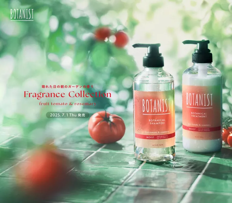
朝の庭を思わせる商品写真とグリーンに、鮮やかな赤を合わせた特設サイト。全画面の導入、中央に絞った縦長コンテンツ、固定ナビゲーションで香りと商品を紹介します。
オリジナルサイトを見るBOTANIST / Fragrance Collection ’25 — Style Reference
Morning garden light, green glazed tiles, and tomato-red lettering around a narrow product story.
Website: BOTANIST — Fragrance Collection ’25 Original URL: https://botanistofficial.com/special/limited/25tomato/ Final URL: https://botanistofficial.com/special/limited/25tomato/ Theme: botanical greens, white, and vivid red; photographic and pale textured scenes vary by page state. Inspected: September 13, 2026, at 01:48 JST. Supplied retrieval timestamp: September 12, 2026, 16:48:07.984 UTC. Viewports: desktop 1440 × 1000 and mobile 390 × 844 CSS pixels. Scope: the current product collection page, including its opening composition, desktop side framing, a fragrance-stage capture, closing scenes, and rendered DOM/computed-style evidence for the concept, ingredients, product lineup, campaign, and dormant overlay content.
BOTANIST presents its fruit tomato and rosemary collection through luminous product photography. Green ceramic tiles, soft foliage, reflected water, red fruit, and translucent bottles create a tactile setting. Fine English serif lettering adds elegance; Japanese sans-serif text carries explanations, product names, and practical information. Saturated red connects the collection title, product labeling, navigation controls, and conversion actions.
The defining layout has two desktop compositions. The opening photograph fills the screen, with copy on the left and bottles on the right. Later captures place the story in a 500px central strip, surrounded by persistent identity and navigation. Mobile gives that story the full screen width, retains a circular menu control, and introduces compact campaign and purchase controls near the bottom in the closing capture.
The page still contains July 2025 launch and campaign information. This reference describes the page served at inspection time; those dates do not establish current campaign eligibility or product availability.
How to Read This Reference
- Measured values come from the supplied rendered DOM, computed styles, and element rectangles at the two inspected viewports.
- Visual estimates come from the five original-page screenshots. They are explicitly identified and are not exact color samples or stylesheet values.
- Derived values are calculations from measurements, such as the width of the desktop side regions.
- Named tokens are implementation aliases unless a source custom property is explicitly shown.
- Recommendations describe a new implementation. They do not establish features or behavior of the original page.
- DOM presence is not proof of visibility. Some elements lie outside the viewport, several variants occupy the same coordinates, and modal containers have zero-height document footprints. Their measurements describe prepared content, not verified open states.
- The supplied evidence does not include original image URLs, a font-file inventory, JavaScript implementation, or a complete interaction recording.
Tokens — Colors
Default Palette
These hexadecimal values are exact conversions of supplied computed RGB values.
| Name | Value | Suggested token | Observed role |
|---|---|---|---|
| Botanical Base | #97bf99 |
--color-botanical |
Body background at both viewports; underlying green canvas |
| Tomato Red | #e50819 |
--color-tomato |
Collection lettering wrappers, desktop purchase button, mobile menu button, campaign actions, and selected content headings |
| White | #ffffff |
--color-white |
Reversed text and icons; campaign instruction panel; small emphasis labels |
| Garden Green | #337b4b |
--color-garden |
Campaign subsection heading strips and the DOM-resident Skip control |
| Mobile Purchase Green | #3b6c4b |
--color-purchase-mobile |
Persistent mobile purchase button |
| Deep Charcoal | #2d2d2d |
--color-ink |
Product information text and the fragrance-change section’s underlying background |
| Reading Gray | #454545 |
--color-reading |
Campaign instructions and terms text |
| Footnote Gray | #5c5c5c |
--color-muted |
Product and ingredient qualifications on light surfaces |
The photograph supplies many additional greens, pale yellow-green highlights, coral bottle labels, and nearly black pump tops. These are image colors, not evidence of additional interface tokens. Likewise, a transparent element over a photograph does not have the photograph’s color as its own CSS background.
Contextual Color States
| Captured context | Appearance | Evidence strength |
|---|---|---|
| Opening scene | Bright garden photograph with red collection lettering and a white brand mark | Screenshot observation |
| Intermediate desktop framing | Pale green texture, very large thin circular outlines, red-orange discs entering from below, red left-side identity, and white navigation | Screenshot observation; decorative fill values were not supplied |
| Closing desktop framing | Deep green tile photograph with leafy shadows; left identity and navigation both white | Screenshot observation |
| Fragrance content | White copy and fine white geometry over subdued photographic imagery | Screenshot observation; underlying section background measured as #2d2d2d |
| Campaign instructions | White rectangular panel with gray text and a red action | Computed styles |
For a temporary visual approximation, a dark leafy green around #244f3b and a tomato-disc orange-red around #d54525 are reasonable estimates. Replace them with approved artwork when available. They are not measured source tokens.
No user-selectable theme control was established. The changing scenes belong to the page presentation, rather than a verified light/dark theme system.
Tokens — Typography
Japanese Body and Utility Text
Measured source family: 'Zen Kaku Gothic New', 'ヒラギノ角ゴ ProN W3', Meiryo, sans-serif.
The supplied styles declare Zen Kaku Gothic New first. They do not prove which fallback rendered every glyph or provide a font download URL.
- Regular prose uses weight
400. - Japanese section headings, product category headings, and product choice labels commonly use
700. - Standard body leading is
1.8. - General tracking is
0.03em. - Footnotes use
1.5leading and0.01emtracking. - Terms paragraphs use
1.5leading and tighter-0.02emtracking.
The loose prose leading is important: it lets a narrow column feel calm even when the text spans several lines.
English Collection Lettering
The visible “Fragrance Collection,” “fruit tomato & rosemary,” and numbered navigation have a fine serif appearance. Their DOM wrappers nevertheless inherit the Japanese sans-serif stack and ordinary body font sizes.
Treat these as artwork-like display treatments. Wrapper font measurements do not identify the visible letterforms. The evidence does not establish their exact typeface or whether each treatment is implemented with paths, images, or other descendants.
Preserve approved lettering assets when available. For a prototype, Georgia, 'Times New Roman', serif is a recommended substitute, not an attribution of the original font. Keep the weight regular, retain fine strokes, and avoid replacing the lettering with heavy sans-serif headings.
The source variable --mh--font-family--en contains an empty quoted string. It does not identify an English font.
Brand Mark
The BOTANIST wordmark is tall, narrow, white, and underlined in the opening captures. Its visible proportions are distinctive. The surrounding H1 inherits sans-serif styles, which should not be used to reconstruct the logo as plain text.
Type Scale
These are computed text styles. Dimensions of graphic lettering are listed separately below.
| Role | Desktop size / line height | Mobile size / line height | Weight | Tracking |
|---|---|---|---|---|
| Main prose | 19.95 / 35.91px |
15 / 27px |
400 | 0.03em |
| Secondary explanatory prose | 18.62 / 33.516px |
14 / 25.2px |
400 | 0.03em |
| Feature eyebrow | 22.61 / 33.915px |
17 / 25.5px |
400 | 0.03em |
| Feature heading | 29.26 / 39.501px |
22 / 29.7px |
700 | 0.03em |
| Fragrance introduction heading | 31.92 / 47.88px |
24 / 36px |
700 | 0.03em |
| Fragrance ingredient names | 23.94 / 35.91px |
18 / 27px |
400 | 0.03em |
| Product category heading | 26.6 / 39.9px |
20 / 30px |
700 | 0.03em |
| Product choice button wrapper | 19.95 / 29.925px |
16 / 24px |
700 | 0.5985px / 0.45px |
| Qualification note | 15.96 / 23.94px |
12 / 18px |
400 | 0.01em |
| Campaign terms paragraph | 17.29 / 25.935px |
13 / 19.5px |
400 | -0.02em |
| Campaign action | 21.28 / 31.92px |
16 / 24px |
400 | 0.03em |
| Desktop side utility links | 11 / 16.5px |
Not measured in the closing footer | 400 | 0.03em |
The mobile purchase button wrapper computes to 16px, but its visible nested label appears smaller in the screenshot. Do not equate wrapper font size with every descendant’s rendered text size.
Display-Lettering Bounds
| Element | Desktop rectangle | Mobile rectangle | Interpretation |
|---|---|---|---|
| Opening brand mark | 108 × 57.59px |
61 × 32.53px |
Measured linked wordmark box |
| Opening Japanese strapline | 318.75 × 20.83px |
268.31 × 17.53px |
Measured wrapper around the visible treatment |
| Opening collection title | 540 × 55.69px |
332.80 × 34.31px |
Graphic/display bounds, not font size |
| Opening scent subtitle | 352.50 × 24.75px |
251.67 × 17.67px |
Graphic/display bounds |
| Desktop left-side collection title | 410 × 42.28px |
Side rail absent | Separate, smaller identity treatment |
| Lineup heading wrapper | 420 × 69.91px |
327.63 × 53.80px |
Display heading container; visible font not identified |
Prototype estimates: start with approximately 54px English hero text on desktop and 32px on mobile, then match the supplied graphic’s width and rhythm. Do not describe these estimates as measured source font sizes.
Tokens — Spacing & Shapes
Responsive Unit
The measured root font size is 13.3px on desktop and 10px on mobile. Many ordinary text values therefore differ by exactly 1.33×.
Geometry follows a different ratio: the story column changes from 500px to 390px, approximately 1.282×. Body typography, percentage-based insets, viewport-height scenes, and fixed utility controls are separate sizing systems.
The complete source root-size formula was not supplied. A reproduction should preserve the measured endpoints without claiming an unverified fluid formula.
Spacing Scale
The following source custom properties were present. Their existence does not prove that every component uses them.
| Source spacing suffix | Desktop | Mobile |
|---|---|---|
--mh--space--x2s |
10px |
5px |
--mh--space--xs |
20px |
10px |
--mh--space--sm |
30px |
15px |
--mh--space--md |
40px |
20px |
--mh--space--lg |
50px |
25px |
--mh--space--xl |
60px |
30px |
--mh--space--x2l |
70px |
35px |
--mh--space--x3l |
80px |
40px |
Padding variables do not all halve. For example, --mh--padding--xs remains 20px, while --mh--padding--md changes from 40px to 30px. Avoid applying one scaling rule to every spacing token.
Layout Measurements
| Element | Desktop 1440 × 1000 | Mobile 390 × 844 |
|---|---|---|
| Central story width | 500px, from x=470 to x=970 |
390px, full viewport width |
| Standard inner content | 420px |
Approximately 327.6px |
| Standard horizontal inset | 40px per side |
Approximately 31.2px per side |
| Side regions | 470px each, derived |
Absent from the visible composition |
| Header box | Full viewport framing box | 68px high |
| Opening brand position | x=50, y=41 | x=20, y≈19.73 |
| Menu toggle | Not visible in desktop captures | 44 × 44px, x=334, y=12 |
| Desktop navigation link boxes | 221 × 25px |
Offscreen menu content in supplied DOM |
| Desktop navigation row pitch | Approximately 42.67px |
Offscreen row pitch approximately 46.97px |
| Primary desktop purchase button | 250 × 54px |
Replaced by compact bottom control |
| Floating campaign link | 335 × 50px, x=40, y=910 |
250 × 45px, x=20, y=789 |
| Floating mobile purchase | Not applicable | 95 × 40px, x=275, y=789 |
| Product choice | 200 × 311.03px |
156 × 250.5px |
| Gap between paired product choices | 20px |
Approximately 15.59px |
| Fragrance navigation dot | Approximately 13.3px diameter |
10px diameter |
| Document height | Approximately 22,512.97px |
Approximately 18,354.36px |
The 8% inset is independently supported by --mh--contents--padding--side: 8%. It leaves 84% of the story width for ordinary content.
Document height includes staged presentation and prepared content. It is not a recommended fixed page height.
Border Radius
| Element | Observed treatment | Reusable interpretation |
|---|---|---|
| Mobile menu button | 50% |
True circle |
| Fragrance and ingredient dots | 50% |
True circles |
| Purchase and campaign action buttons | Large computed radii, including 179.55px and 191.52px |
Use a capsule radius such as 999px |
| Floating campaign link | 144px desktop; 135px mobile |
Long outlined capsule |
| Resource-reuse label | 50% on a wide rectangle |
Ellipse, not an ordinary rounded rectangle |
| Product choice buttons | 0 |
Square-cornered, transparent choices |
| Campaign instruction panel | 0 |
Plain rectangular reading surface |
Fine decorative outlines appear approximately 1px thick in the screenshots. Border widths were not included in the supplied computed-style records.
Components
Opening Product Scene
Role: establish the scent and product identity before the detailed story.
Use a photograph that reaches all four viewport edges. At desktop, the two pump bottles occupy the right side while the collection lockup sits in open light on the left. The lower portion is green tile, with water reflections and a blurred foreground tomato. Foliage supplies depth behind the products.
The copy has three levels: a short Japanese strapline, the English collection title, and the smaller scent subtitle. The desktop title box begins at x=150 and y≈469.45. The complete three-line group occupies approximately y=435–565, centered around the viewport’s vertical midpoint.
Mobile changes the composition: the title is above the bottle pair, not beside it. The strapline starts at y≈186.44, the collection title at y≈214.36, and the subtitle at y≈259.06. Keep enough bright foliage behind this group for red lettering to remain distinct.
The original-page mobile opening capture has no visible bottom campaign dock. Later captures do. Treat this as state-dependent presentation; the evidence does not establish the exact reveal trigger.
Persistent Desktop Identity
Role: retain the collection identity while a narrow story progresses through the center.
The left side places a two-line collection lockup around the vertical midpoint. Its main title is 410px wide within a 470px side region, leaving approximately 30px on either side.
In the pale textured capture the lettering is red. In the tile-backed closing capture it is white. Preserve this contrast relationship when changing the surrounding scene.
The opening brand mark is a separate identity element. Do not force the small BOTANIST wordmark and the large collection lockup into one conventional navigation bar.
Desktop Section Navigation
Role: provide direct access to the page’s six main sections.
The right side contains a numbered vertical list:
- Top —
#top - Concept —
#concept - Fragrance —
#fragrance - Summer Limited —
#limited - Line up —
#lineup - Campaign —
#campaign
Small two-digit numbers align beside larger white serif-style labels. There are no card backgrounds around the links. At the inspected desktop size, the first link begins at y≈338.81 and the final link at y≈552.17.
A red 購入する button sits 30px below the final link’s bottom edge. It is 250 × 54px, with a white cart symbol toward the left and the text near the center. This button is separate from the anchor list.
The links’ destinations and opacity transition declarations are verified. Clicking them, the scrolling trajectory, and active-section tracking were not tested in the supplied evidence.
Mobile Header and Menu Control
Role: preserve compact brand access and navigation without desktop side regions.
The opening header overlays the image. Its measured height is 68px, but it is not shown as an opaque 68px strip. The small brand mark sits 20px from the left. A 44px red circular menu control sits 12px from the top and right, containing two fine white horizontal strokes.
The menu control remains visible in the mobile closing capture, while the opening brand mark is no longer visible there.
The mobile DOM contains navigation and identity content positioned to the right of the viewport. This supports the presence of a prepared offscreen menu state. Its open appearance, transition direction, focus behavior, and dismissal interactions were not captured.
Floating Campaign Link and Mobile Purchase Control
Role: keep campaign and purchase access close at hand during the story.
The campaign link is a transparent capsule with a thin white outline. It contains the launch-campaign label and a small red oval carrying #イガイにトマト. Its content is clipped horizontally in the supplied captures. Repeated DOM content is consistent with a ticker implementation, but a loop duration and continuous movement were not verified.
Desktop anchors this capsule 40px from the left and bottom. Mobile places it 20px from the left and 10px from the bottom, with a green purchase capsule alongside it.
At 390px, the two controls use 250px + 5px gap + 95px, fitting between 20px side margins. Their top edges align, although the campaign link is 45px high and the purchase button is 40px high.
Keep this compact distinction: the desktop purchase action is red and roomy; the persistent mobile purchase action is green and smaller. A new implementation should enlarge the mobile button’s effective touch area without making the visual dock dominate the image.
Concept and Feature Sections
Role: move from the sensory introduction into scent and hair-care benefits.
The DOM establishes a short Japanese garden narrative followed by two feature sections: the fragrance and the moisturizing benefit. The main text stays inside the 84%-width content area.
Measured feature anatomy consists of an illustration region followed by a text header. The header stacks a regular eyebrow, a modest gap, and a bold two-line Japanese heading. Desktop headings use 29.26px type with 39.501px leading; mobile uses 22px with 29.7px leading.
The full feature sections measure approximately 420 × 475.98px on desktop and 327.63 × 371.30px on mobile. Their complete artwork was not shown in the supplied screenshots, so an exact visual arrangement beyond these measured containers is not established.
Fragrance Change Presentation
Role: explain the progression of the scent through three stages.
The inspected intermediate screenshot shows an elliptical ingredient photograph inside a much larger thin white circular outline. A photograph of hair and a light garment sits behind it, subdued enough to support white text.
Below the ingredient image are three small circular indicators. The third is filled in the captured state. Under the circular composition, a left-aligned paragraph explains the woody and amber finish, followed by a smaller qualification note.
Visual estimates from the desktop screenshot: the large circular outline is approximately 450px across within the 500px column; the ingredient oval is approximately 266 × 156px. These are not supplied stylesheet dimensions.
The three DOM variants describe herbal/citrus opening notes, tomato/floral notes, and woody notes. They share several measured positions, indicating alternate presentation states rather than three ordinary vertically stacked cards. The dot links target #change01, #change02, and #change03.
The whole fragrance-change section measures 3000px high on desktop and 2532px on mobile—exactly three inspected viewport heights. This is consistent with a staged presentation, but it does not prove the precise scroll-pinning or slide mechanism.
Summer Limited Ingredient Presentation
Role: connect the seasonal scent to product ingredients and benefits.
The DOM contains two variants under “Summer Limited.” One pairs tomato seed oil with rosemary leaf water; the other references olive fruit oil and coix seed extract. Two circular anchor controls target #limited01 and #limited02.
The content variants share the same measured rectangle and declare 0.6-second opacity transitions. Within the first variant, the resource-reuse label is a white ellipse with red bold text. It measures approximately 225.89 × 45.20px on desktop and 169.84 × 34px on mobile.
Keep the hierarchy of section lettering, benefit heading, paired ingredients, one small emphasis label, and qualifications. Exact ingredient-image crops and the visual transition between variants remain unverified.
Product Lineup
Role: make the collection’s choices and prices understandable within the narrow story.
The lineup contains three categories: shampoo/treatment, special care, and body soap. Each category has a red bold Japanese heading, a darker benefit statement, product choice buttons, and a small qualification note.
The first category presents two paired-product choices. The second presents hair mask and hair oil choices. The final category centers one body-soap choice. These are actual button elements, not only decorative product pictures.
Two-column geometry is retained on mobile. Desktop uses 200px choices separated by 20px inside a 420px region. Mobile uses 156px choices separated by approximately 15.6px inside a 327.6px region.
The buttons have transparent computed backgrounds, square corners, bold labels, and generous image space. Their padding is 13.3px 9.31px 23.94px on desktop and 10px 7px 18px on mobile. Keep the image above the variant name and price. Exact image dimensions were not supplied.
Observed prices range from ¥1,100 for body soap to ¥1,870 for hair oil. Treat them as inspected content, not reusable fixed design tokens or confirmation of current retail pricing.
Campaign Information
Role: explain the launch promotion and its application process.
The DOM establishes this sequence: collection label, large “Campaign” lettering, a small white quantity-limit label, Japanese campaign heading, square promotional-image region, introduction, period, prizes, application instructions, and terms.
The square image region measures 420 × 420px on desktop and approximately 327.63 × 327.63px on mobile. Its actual artwork was not visible in the supplied screenshots.
Subsection headings such as 応募期間, 当選賞品, and 応募方法 use full-width green strips with white text. A white rectangular instruction panel then contains darker prose and a red Xで応募する capsule action.
Measured panel padding is 33.25px 22.61px 37.24px on desktop and 25px 17px 28px on mobile. The action inside is approximately 374.78 × 67.83px on desktop and 293.63 × 51px on mobile.
The terms are present in the DOM with smaller, tighter text. Their positions extend beyond the reported main flow, so the evidence does not establish whether the entire terms region is expanded, clipped, or independently scrollable in the captured state.
Purchase and Movie Overlays
Role: prepared access to retail destinations and concept media.
The DOM contains a concept-movie section, a collection purchase section, product-specific sections, and Close buttons. Their parent sections have zero-height document footprints; no open-overlay screenshot was supplied.
The collection purchase content includes four retailer destinations: the official store, Rakuten, Amazon, and Yahoo Shopping. Prepared retailer links form a two-column arrangement. Measured link boxes are approximately 215.35 × 53.19px on desktop and 150.70 × 40px on mobile, with red fills and capsule radii.
Prepared header widths are 700px for the desktop collection purchase content and approximately 348.39px on mobile. The movie header is 800px wide on desktop. Close controls measure 26 × 26px.
These measurements can inform a reconstruction, but they do not prove an overlay’s backdrop, opening animation, focus trap, scroll lock, playback behavior, or successful retailer navigation.
Closing Product Scene and Footer
Role: finish the story by returning to the opening product world.
The closing scene repeats the product photograph and red collection lettering in the central column. On desktop, the surrounding screen shows a separate large-scale tile photograph. The left identity and right navigation remain white over this darker background.
Inside the closing image, center the X, Instagram, and link-copy symbols, then the three utility links—CONTACT, COMPANY, and PRIVACY POLICY—and finally the copyright line. The image continues behind these elements; there is no separate heavy footer panel.
The desktop side region also retains its own smaller social and utility controls. Its social boxes are measured at 20px, whereas the central closing icons appear larger. The central icons are visually approximately 38px on desktop and 29px on mobile; these are screenshot estimates.
The mobile closing capture keeps the circular menu at the top right and the compact campaign/purchase dock at the bottom. Reserve clearance so the footer remains reachable above that dock.
Tokens — Motion & Interaction
Measured Transition Declarations
| Element or treatment | Supplied value | What is established |
|---|---|---|
| Desktop navigation and social links | opacity 0.3s |
An opacity transition is declared; the target opacity was not supplied |
| Opening brand wrapper | opacity 0.3s 0.3s plus visibility transition |
Delayed opacity handling exists |
| Opening Japanese strapline | opacity 0.9s |
A longer fade is declared |
| Summer Limited variants | opacity 0.6s |
Variants support opacity changes |
| Mobile Summer Limited container | opacity 0.6s 0.3s |
The mobile container adds a 0.3-second delay |
| Lineup headings and supporting text | opacity 0.3s, transform 0.3s |
Reveal-related properties are declared; displacement is unknown |
| Campaign content groups | opacity 0.3s, transform 0.3s on several groups |
Short opacity/transform transitions exist |
| Retailer and campaign actions | background-color 0.3s |
Fill-color changes are supported; end colors were not verified |
Source Timing Tokens
| Source variable | Value |
|---|---|
--mh--duration01 |
0.3s |
--mh--duration02 |
0.6s |
--mh--duration03 |
0.9s |
--mh--duration04 |
1.2s |
--mh--easing01 |
ease |
--mh--easing02 |
cubic-bezier(0.1, 0.7, 0.4, 1) |
--mh--easing03 |
cubic-bezier(0.03, 0.9, 0.15, 1) |
--mh--easing04 |
cubic-bezier(1, 0, 0.87, 0.86) |
--mh--easing05 |
cubic-bezier(0.3, 0.1, 0.36, 1.15) |
These timing tokens are available in the supplied styles. Their assignment to every scene or interaction is not established.
Motion Evidence and Limits
The captures establish different opening, intermediate, and closing compositions. Overlapping fragrance variants, transformed offscreen content, large section heights, and a DOM-resident Skip control are consistent with a staged experience. They do not establish an exact intro duration, parallax formula, autoplay interval, or animation library.
The sampled elements report animation: none. This does not exclude animation on unmeasured descendants, pseudo-elements, media, or JavaScript-controlled transforms. Likewise, a bare transition: all without a nonzero duration is not evidence of visible animation.
No click outcome was supplied for the mobile menu, purchase buttons, fragrance dots, copy control, or movie. Clipboard feedback, hover end states, keyboard navigation, and reduced-motion behavior remain unverified.
Recommended motion approach: use brief fades and restrained transforms, with the image composition doing most of the work. Keep all content available in a static or reduced-motion mode. Avoid inventing a compulsory long opening sequence from the presence of Skip alone.
Surfaces
| Layer | Appearance | Purpose |
|---|---|---|
| Opening canvas | Full-bleed garden photography | Immediate product and scent identity |
| Desktop side scene | Pale texture with circular motifs, or dark green tile photography | Maintain atmosphere outside the narrow story |
| Story column | Edge-to-edge image and color sections | Carry the sequential narrative |
| Fragrance stage | Subdued photograph, white circles, white copy | Make scent progression legible without conventional cards |
| Product choice | Transparent, square-cornered button surface | Let packaging and labels carry the hierarchy |
| Campaign instruction panel | White rectangle with gray text | Separate procedural reading from the image-led story |
| Primary actions | Red capsules; green for the compact mobile purchase control | Provide clear conversion access |
| Floating campaign link | Transparent outlined capsule with red oval detail | Persistent access with limited visual mass |
The supplied screenshots do not show a general shadow-based elevation system. Structure comes from image boundaries, color changes, thin geometry, and selective white reading panels.
Imagery
Photography carries most of the identity. The interface should feel like products placed in an actual sunlit garden, with photographic depth and material detail.
- Light: diffuse morning brightness, pale bokeh, translucent leaves, and soft but visible foliage shadows.
- Materials: wet glazed tiles, clear bottle walls, white treatment contents, black pumps, and matte printed labels.
- Color: many natural greens around a smaller set of red focal points—fruit, labels, and typography.
- Composition: foreground blur, a sharply readable product pair, and soft background foliage. Keep the bottle silhouettes and label hierarchy recognizable.
- Responsive art direction: desktop places copy beside the products; mobile places it above them. Choose or crop images for those distinct text zones.
- Supporting imagery: an oval botanical detail sits inside a larger circular outline over a subdued lifestyle photograph in the captured fragrance stage.
Do not simulate the whole garden with a generic green gradient. CSS can reproduce the geometry and controls; it cannot supply the tile reflections, packaging, or photographic atmosphere.
Observed Asset References
No original asset URLs or filenames were supplied. The references below identify visual roles, not downloadable source paths.
| Asset role | Original-page evidence | Implementation guidance |
|---|---|---|
| Landscape product scene | Desktop opening capture | Preserve the open copy area at left and product pair at right |
| Portrait product scene | Mobile opening and closing captures; desktop central closing scene | Keep both pumps, labels, and the tile foreground within the crop |
| Tile background with leafy shadows | Desktop closing side regions | Use photographic perspective and irregular reflections |
| Pale green texture and large circular motifs | Intermediate desktop side regions | Keep texture subtle and geometry much larger than controls |
| Woody ingredient oval | Intermediate fragrance capture | Use an elliptical crop inside the fine circular composition |
| Lifestyle backdrop | Intermediate fragrance capture | Reduce visual contrast behind white explanatory copy |
| Collection lettering and brand mark | Opening, side identity, and closing captures | Preserve authorized artwork; exact font and format are unverified |
Layout & Responsive Behavior
Desktop Composition
At 1440px, the story is 500px wide and centered at x=470. The side regions each occupy 470px. Ordinary story text uses 40px side insets, leaving a 420px reading width.
The opening scene is a distinct full-width composition. The later central-column layout must not be applied indiscriminately to the opening photograph. Conversely, the product story should not expand into a wide desktop grid simply because the opening fills the screen.
The left identity, right navigation, lower-left campaign capsule, and lower-right utility links hold consistent positions between the supplied intermediate and closing screenshots. They function visually as persistent desktop framing. Their exact position declarations were not included.
Mobile Composition
At 390px, the story occupies the full viewport width. The 8% text inset becomes approximately 31.2px. Desktop side regions disappear from view, while a small overlay header and circular menu control take their place.
The product choices remain two columns. The compact dock uses asymmetric widths for the long campaign label and short purchase action. The closing footer remains centered within the photograph.
The observed mobile variables include --vh: 8.44px and --vw: 3.9px, matching one percent of the captured viewport dimensions. This establishes viewport-derived sizing values at inspection time, but not how they respond to browser-toolbar changes.
Breakpoints and Height Behavior
The declared breakpoint tokens are 375, 640, 768, 940, and 1240px. The supplied evidence does not identify which media query switches each component. Only the 1440px and 390px endpoints were visually inspected.
Several regions are tied to viewport height. The opening section measures one viewport high at both sizes; the fragrance-change section measures three. The campaign section has a top padding equal to one inspected viewport height. These values help explain the long document and should not be copied as arbitrary blank spacers without the associated presentation behavior.
Recommended adaptation: use a centered maximum-width story, percentage insets, dedicated portrait/landscape imagery, and normal document scrolling as a reliable base. Add staged presentation only when its complete state changes and fallback behavior are implemented.
Do’s and Don’ts
Do
- Anchor the visual system in botanical photography,
#97bf99,#e50819, and white. - Preserve the difference between the full-width opening and the narrow desktop story.
- Keep the desktop story close to 500px and ordinary content close to 84% of that width.
- Pair fine English display lettering with readable Japanese sans-serif prose.
- Retain the two-column product choices on mobile.
- Use red and green purchase treatments in their observed desktop/mobile contexts.
- Keep circular outlines large and delicate, and action capsules compact and solid.
- Repeat the product world in the closing scene so the footer feels connected to the opening.
- Preserve qualifications near the related product and ingredient claims.
Don’t
- Don’t turn the entire page into a wide card grid or add a conventional opaque desktop header.
- Don’t infer the English display font from its inherited sans-serif wrapper style.
- Don’t replace garden photography with stock gradients or generic leaf icons.
- Don’t add rounded white cards and shadows to every product choice.
- Don’t crop away pump tops, packaging labels, or the bright text zone in mobile artwork.
- Don’t scale all typography, geometry, and utilities by the same factor.
- Don’t treat offscreen menu or overlay rectangles as verified open-state screenshots.
- Don’t invent ticker speeds, scroll-pinning behavior, modal animations, or movie autoplay.
- Don’t reproduce the long document by inserting fixed empty sections without their associated content.
Recommended Implementation Additions
These are recommendations for a new implementation, not verified original features.
- Give the menu, copy control, cart action, and fragrance dots explicit accessible names. Decorative duplicates of ticker text should be hidden from assistive technology.
- Preserve the 10–13px visual dots while expanding their effective targets to at least 44px. Apply the same principle to the 20px social icons and 26px Close controls.
- Provide visible keyboard focus, Escape dismissal, focus return, and appropriate focus containment for any implemented menu or modal.
- Keep fragrance content readable without animation. Respect reduced-motion preferences and avoid hiding essential text until a timeline finishes.
- Add safe-area clearance to mobile fixed controls and enough document padding to prevent overlap with the closing footer.
- Use responsive image sources with explicit dimensions. Prioritize the opening image and defer supporting imagery that is well below it.
- Keep product imagery and collection lettering as separate assets where practical, with equivalent text alternatives for graphic headings.
- For a new campaign, make its date and availability state explicit. The inspected July 2025 wording should not be copied as a current offer.
Agent Prompt Guide
Quick Color Reference
- Base canvas:
#97bf99. - Collection accent and major red actions:
#e50819. - Reversed text, icons, and reading-panel background:
#ffffff. - Campaign heading strips:
#337b4b. - Compact mobile purchase action:
#3b6c4b. - Product text and dark fragrance underlay:
#2d2d2d. - Campaign reading text:
#454545; qualifications on light surfaces:#5c5c5c. - Photographic greens and red-orange decorative discs are artwork colors, not interchangeable interface tokens.
Overall Prompt
“Create a botanical product collection page with a luminous garden photograph, green glazed tiles, tomatoes, and a readable pair of pump bottles. Use vivid red #e50819 for fine English collection lettering and selected actions, with white navigation and Japanese sans-serif prose. Start with a full-screen desktop photograph that places copy on the left and products on the right. Continue into a centered 500px story column with persistent collection identity at left and six numbered section links plus a red purchase capsule at right. On mobile, use the full screen width, position the collection lettering above the products, show a 44px circular red menu control, and introduce a compact outlined campaign link beside a dark-green purchase button during the story. Preserve photographic texture, restrained circular geometry, and a closing scene that repeats the product world.”
Example Component Prompts
- Opening scene: “A full-bleed morning garden product photograph with translucent bottles on wet green tiles. At desktop, place a three-level red collection lockup in the open left side. At mobile, use portrait art direction with the lockup above both bottles. White narrow brand mark in the upper-left corner.”
- Desktop framing: “Center a 500px story strip between equal side regions. Put a fine two-line collection lockup midway down the left side. On the right, stack six numbered serif-style navigation labels and a 250 × 54px red purchase capsule. Keep the background photographic or subtly textured.”
- Fragrance stage: “White Japanese prose over a subdued lifestyle photograph, with a botanical ingredient image cropped into an oval inside a much larger thin white circle. Add three small outlined dots, one filled, and a small qualification beneath the paragraph. Do not invent autoplay.”
- Product choices: “An 84%-width content region with a red Japanese category heading, a dark benefit statement, and two transparent square-cornered product buttons. Keep the image above a bold variant name and price. Preserve two columns at 390px, with approximately 156px choices and a 16px gap.”
- Mobile action dock: “A fixed bottom row with a thin white outlined campaign capsule, clipped single-line content, and a red hashtag oval. Place a smaller dark-green purchase capsule with a white cart icon beside it. Keep 20px side margins and safe-area clearance.”
- Closing footer: “Repeat the portrait product photograph behind centered white social symbols, three small utility links, and a copyright line. On desktop, surround the central photograph with a darker tile image and persistent side navigation. Keep footer content clear of mobile floating controls.”
Quick Start
CSS Custom Properties
This is a recommended adaptation, not extracted source CSS. It keeps a conventional document root, reproduces the measured endpoint proportions, and uses a proposed 940px framing breakpoint from the declared breakpoint set. The actual source switching threshold was not verified.
Use .botanical-page as the wrapper. Place an opening .product-scene before .story-column; place a .closing-scene inside the story column. Image elements inside .scene-media supply approved photography. .rail-left, .rail-right, .brand-mark, .menu-toggle, and .floating-actions are optional sibling controls.
The application can add .is-framed after leaving the opening to expose persistent framing. That class is an implementation convention, not a discovered source class. English display typography below is a fallback; replace it with approved lettering assets for closer correspondence.
:root {
  /* Exact colors from supplied computed styles */
  --color-botanical: #97bf99;
  --color-tomato: #e50819;
  --color-white: #ffffff;
  --color-garden: #337b4b;
  --color-purchase-mobile: #3b6c4b;
  --color-ink: #2d2d2d;
  --color-reading: #454545;
  --color-muted: #5c5c5c;

  /* Declared body stack; display stack is a substitute */
  --font-body: 'Zen Kaku Gothic New', 'ヒラギノ角ゴ ProN W3', Meiryo, sans-serif;
  --font-display: Georgia, 'Times New Roman', serif;
  --type-scale: 1;
  --text-body: calc(15px * var(--type-scale));
  --text-small: calc(14px * var(--type-scale));
  --text-note: calc(12px * var(--type-scale));
  --text-heading: calc(22px * var(--type-scale));
  --text-category: calc(20px * var(--type-scale));
  --leading-body: 1.8;
  --tracking-body: 0.03em;

  /* Geometry derived from the two inspected layouts */
  --story-width: min(100vw, 500px);
  --story-inset: calc(var(--story-width) * 0.08);
  --product-gap: calc(var(--story-width) * 0.04);
  --space-xs: 10px;
  --space-sm: 15px;
  --space-md: 20px;
  --space-lg: 30px;
  --radius-pill: 999px;
  --safe-bottom: env(safe-area-inset-bottom, 0px);

  /* Source timing values, selectively reused */
  --duration-fast: 0.3s;
  --duration-scene: 0.6s;
  --ease-soft: cubic-bezier(0.1, 0.7, 0.4, 1);
}

* {
  box-sizing: border-box;
}

body {
  margin: 0;
  background: var(--color-botanical);
}

.botanical-page {
  position: relative;
  isolation: isolate;
  color: var(--color-white);
  font-family: var(--font-body);
  font-size: var(--text-body);
  line-height: var(--leading-body);
  letter-spacing: var(--tracking-body);
}

.botanical-page button,
.botanical-page a {
  -webkit-tap-highlight-color: transparent;
}

.botanical-page button {
  font: inherit;
  letter-spacing: inherit;
}

.story-column {
  position: relative;
  width: var(--story-width);
  margin-inline: auto;
  container-type: inline-size;
}

.story-inner {
  width: 84%;
  margin-inline: auto;
}

.product-scene,
.closing-scene {
  position: relative;
  min-height: 100vh;
  min-height: 100svh;
  overflow: hidden;
  background: var(--color-botanical);
}

.scene-media {
  position: absolute;
  inset: 0;
}

.scene-media img {
  display: block;
  width: 100%;
  height: 100%;
  object-fit: cover;
  object-position: center;
}

.hero-lockup {
  position: absolute;
  top: 22.1%;
  left: 7.33%;
  width: 85.34%;
  color: var(--color-tomato);
  text-align: center;
}

.hero-eyebrow {
  margin: 0 0 11px;
  font-size: 17px;
  font-weight: 700;
  line-height: 1.1;
  letter-spacing: 0.08em;
}

.hero-title {
  margin: 0;
  font-family: var(--font-display);
  font-size: 32px;
  font-weight: 400;
  line-height: 1.08;
  letter-spacing: 0;
}

.hero-subtitle {
  margin: 11px 0 0;
  font-family: var(--font-display);
  font-size: 19px;
  line-height: 1.15;
  letter-spacing: 0.06em;
}

.brand-mark {
  position: absolute;
  z-index: 10;
  top: 20px;
  left: 20px;
  display: block;
  width: 61px;
}

.brand-mark img {
  display: block;
  width: 100%;
  height: auto;
}

.menu-toggle {
  position: fixed;
  z-index: 30;
  top: 12px;
  right: 12px;
  display: grid;
  align-content: center;
  justify-items: center;
  gap: 6px;
  width: 44px;
  height: 44px;
  padding: 0;
  border: 0;
  border-radius: 50%;
  color: var(--color-white);
  background: var(--color-tomato);
  cursor: pointer;
}

.menu-toggle::before,
.menu-toggle::after {
  content: '';
  width: 18px;
  height: 1px;
  background: currentColor;
}

.desktop-rail {
  display: none;
}

.pill-action {
  display: inline-flex;
  align-items: center;
  justify-content: center;
  gap: 12px;
  min-height: 51px;
  padding: 0 20px 2px;
  border: 0;
  border-radius: var(--radius-pill);
  color: var(--color-white);
  background: var(--color-tomato);
  text-decoration: none;
  cursor: pointer;
  transition: background-color var(--duration-fast);
}

.floating-actions {
  position: fixed;
  z-index: 25;
  right: 20px;
  bottom: calc(10px + var(--safe-bottom));
  left: 20px;
  display: grid;
  grid-template-columns: minmax(0, 1fr) 95px;
  align-items: start;
  gap: 5px;
  visibility: hidden;
}

.is-framed .floating-actions {
  visibility: visible;
}

.campaign-ticker {
  display: flex;
  align-items: center;
  gap: 10px;
  height: 45px;
  overflow: hidden;
  padding-inline: 12px;
  border: 1px solid currentColor;
  border-radius: var(--radius-pill);
  color: var(--color-white);
  font-size: 15px;
  text-decoration: none;
  white-space: nowrap;
}

.campaign-badge {
  flex: none;
  padding: 5px 10px;
  border-radius: 50%;
  color: var(--color-white);
  background: var(--color-tomato);
  font-size: 10px;
  line-height: 1.1;
  text-align: center;
}

.floating-purchase {
  /* Recommended 44px target; observed visual height was 40px */
  min-height: 44px;
  padding-inline: 8px;
  gap: 6px;
  background: var(--color-purchase-mobile);
  font-size: 13px;
}

.feature-heading {
  margin: 0;
  font-size: var(--text-heading);
  font-weight: 700;
  line-height: 1.35;
}

.story-copy {
  margin-block: var(--space-md);
  font-size: var(--text-body);
  line-height: var(--leading-body);
}

.qualification {
  font-size: var(--text-note);
  line-height: 1.5;
  letter-spacing: 0.01em;
}

.fragrance-panel {
  position: relative;
  padding-block: 60px;
  color: var(--color-white);
  background: var(--color-ink);
}

.note-orbit {
  /* Visual approximation of the captured circle */
  display: grid;
  place-content: center;
  justify-items: center;
  gap: 20px;
  width: 90%;
  aspect-ratio: 1;
  margin-inline: auto;
  border: 1px solid currentColor;
  border-radius: 50%;
}

.note-image {
  width: 59%;
  aspect-ratio: 1.7;
  object-fit: cover;
  border-radius: 50%;
}

.note-controls {
  display: flex;
  justify-content: center;
  gap: 0;
}

.note-control {
  /* Expanded hit area around a small visual marker */
  display: grid;
  place-items: center;
  width: 44px;
  height: 44px;
  border: 0;
  color: inherit;
  background: transparent;
}

.note-control::before {
  content: '';
  width: calc(10px * var(--type-scale));
  height: calc(10px * var(--type-scale));
  border: 1px solid currentColor;
  border-radius: 50%;
}

.note-control[aria-current='true']::before {
  background: currentColor;
}

.lineup-section {
  padding-block: calc(var(--story-width) * 0.2);
  color: var(--color-ink);
}

.category-title {
  margin: 0 0 var(--space-sm);
  padding-block: calc(9px * var(--type-scale));
  color: var(--color-tomato);
  font-size: var(--text-category);
  line-height: 1.5;
}

.product-grid {
  display: grid;
  grid-template-columns: repeat(2, minmax(0, 1fr));
  gap: var(--product-gap);
}

.product-choice {
  display: flex;
  flex-direction: column;
  align-items: center;
  min-width: 0;
  min-height: 250.5px;
  padding: calc(10px * var(--type-scale))
    calc(7px * var(--type-scale))
    calc(18px * var(--type-scale));
  border: 0;
  border-radius: 0;
  color: var(--color-ink);
  background: transparent;
  font-size: max(16px, var(--text-body));
  font-weight: 700;
  line-height: 1.5;
  text-align: center;
  cursor: pointer;
}

.product-choice img {
  display: block;
  width: 100%;
  height: 170px;
  margin-bottom: 10px;
  object-fit: contain;
}

.product-grid--single {
  display: flex;
  justify-content: center;
}

.product-grid--single .product-choice {
  width: calc((100% - var(--product-gap)) / 2);
}

.campaign-section-label {
  margin: 0 0 var(--space-md);
  padding: 0.1em;
  color: var(--color-white);
  background: var(--color-garden);
  font-size: var(--text-body);
  font-weight: 400;
  line-height: 1.5;
  text-align: center;
}

.campaign-panel {
  padding: calc(25px * var(--type-scale))
    calc(17px * var(--type-scale))
    calc(28px * var(--type-scale));
  color: var(--color-reading);
  background: var(--color-white);
}

.campaign-panel .pill-action {
  width: 100%;
}

.closing-scene .hero-lockup {
  top: 13%;
}

.closing-footer {
  position: relative;
  z-index: 1;
  padding: 78svh 8% calc(70px + var(--safe-bottom));
  text-align: center;
}

.social-links,
.footer-links {
  display: flex;
  justify-content: center;
  align-items: center;
  gap: 24px;
}

.social-links a,
.social-links button {
  display: grid;
  place-items: center;
  width: 44px;
  height: 44px;
  border: 0;
  color: inherit;
  background: transparent;
}

.footer-links {
  margin-top: 20px;
  font-size: 11px;
}

.footer-links a {
  color: inherit;
  text-decoration: none;
}

.botanical-page :focus-visible {
  outline: 2px solid currentColor;
  outline-offset: 4px;
}

@media (min-width: 940px) {
  /* Proposed framing threshold; only endpoints were inspected */
  :root {
    --type-scale: 1.33;
    --space-xs: 20px;
    --space-sm: 30px;
    --space-md: 40px;
    --space-lg: 60px;
  }

  .brand-mark {
    top: 41px;
    left: 50px;
    width: 108px;
  }

  .menu-toggle {
    display: none;
  }

  .product-scene > .hero-lockup {
    top: 50%;
    left: 10.4167%;
    width: 540px;
    transform: translateY(-50%);
  }

  .product-scene .hero-title {
    font-size: 54px;
  }

  .product-scene .hero-eyebrow {
    font-size: 20px;
  }

  .product-scene .hero-subtitle {
    font-size: 27px;
  }

  .is-framed .desktop-rail {
    position: fixed;
    z-index: 20;
    inset-block: 0;
    display: block;
    width: calc((100vw - 500px) / 2);
    pointer-events: none;
  }

  .desktop-rail a,
  .desktop-rail button {
    pointer-events: auto;
  }

  .rail-left {
    left: 0;
  }

  .rail-right {
    right: 0;
  }

  .rail-lockup {
    position: absolute;
    top: 50%;
    right: 30px;
    left: 30px;
    transform: translateY(-50%);
    text-align: center;
  }

  .rail-navigation {
    position: absolute;
    top: 50%;
    left: 50%;
    width: 250px;
    max-width: calc(100% - 30px);
    transform: translate(-50%, -50%);
  }

  .section-nav {
    display: grid;
    gap: 17.67px;
    margin: 0 14.5px 30px;
  }

  .section-nav a {
    display: flex;
    align-items: baseline;
    gap: 12px;
    min-height: 25px;
    color: inherit;
    font-family: var(--font-display);
    font-size: 26px;
    line-height: 1;
    text-decoration: none;
    letter-spacing: 0;
  }

  .section-nav .number {
    font-size: 14px;
  }

  .rail-navigation .pill-action {
    width: 100%;
    min-height: 54px;
  }

  .floating-actions {
    right: auto;
    bottom: 40px;
    left: 40px;
    width: 335px;
    grid-template-columns: 1fr;
  }

  .campaign-ticker {
    height: 50px;
    font-size: 16px;
  }

  .floating-purchase {
    display: none;
  }

  .product-choice {
    min-height: 311px;
  }

  .product-choice img {
    height: 215px;
  }

  .closing-scene .hero-title {
    font-size: 42px;
  }
}

@media (prefers-reduced-motion: reduce) {
  .botanical-page *,
  .botanical-page *::before,
  .botanical-page *::after {
    animation: none !important;
    transition: none !important;
    scroll-behavior: auto !important;
  }
}
The product image heights, substitute display sizes, closing-footer spacing, and large-circle proportions in this starter are recommendations. Original image URLs, brand artwork, responsive image sources, and state logic must be supplied separately. The CSS intentionally provides a usable static shell; it does not claim to implement the original intro, menu, purchase overlays, or fragrance timeline.
Tailwind v4 Token Mapping
Optional aliases for a project that already uses Tailwind v4. This does not imply that the original page uses Tailwind. Define the custom properties above first.
@theme inline {
  --color-botanical: #97bf99;
  --color-tomato: #e50819;
  --color-garden: #337b4b;
  --color-purchase-mobile: #3b6c4b;
  --color-ink: #2d2d2d;
  --color-reading: #454545;
  --color-muted: #5c5c5c;

  --font-body: 'Zen Kaku Gothic New', 'ヒラギノ角ゴ ProN W3', Meiryo, sans-serif;
  --font-display: Georgia, 'Times New Roman', serif;

  --text-story: calc(15px * var(--type-scale));
  --text-note: calc(12px * var(--type-scale));
  --text-feature: calc(22px * var(--type-scale));
  --text-category: calc(20px * var(--type-scale));

  --spacing-story-inset: var(--story-inset);
  --spacing-product-gap: var(--product-gap);
  --radius-capsule: 999px;
}
Sources & Evidence
- Inspected original page: BOTANIST — Fragrance Collection ’25.
- Final page: https://botanistofficial.com/special/limited/25tomato/. The supplied inspection reports HTTP 200 and no URL change.
- Capture date: September 13, 2026, 01:48 JST; retrieval timestamp September 12, 2026, 16:48:07.984 UTC.
- Visual evidence: three desktop captures at 1440 × 1000 and two mobile captures at 390 × 844, covering opening, intermediate fragrance framing, and closing compositions.
- Rendered evidence: page text, link destinations, source custom properties, computed typography/colors/transitions, and element rectangles for both viewports. Product and campaign details beyond the visible screenshots are identified as DOM-based observations.
- Inspection procedure supplied with the evidence: the initial observation lasted at least five seconds. Readiness checks covered document load, finite animations, sampled layout/text stability, and image decoding, with a 15-second overall limit and a five-second pending-image limit. Scroll traversal allowed up to ten seconds per position and accepted settled snap positions. Perpetual animations were temporarily paused during readiness checks and resumed afterward. SharedWorkers and service workers were disabled.
- Limits: settled captures do not prove semantic completeness. No separate click recording, open-menu capture, open-purchase capture, movie playback verification, clipboard result, complete asset inventory, or full stylesheet/JavaScript inspection was provided. Intermediate viewport behavior remains untested.
This reference documents the current supplied page evidence. It separates measured source values, visual estimates, derived geometry, and implementation recommendations throughout.
# BOTANIST / Fragrance Collection ’25 — Style Reference

> Morning garden light, green glazed tiles, and tomato-red lettering around a narrow product story.

**Website:** [BOTANIST — Fragrance Collection ’25](https://botanistofficial.com/special/limited/25tomato/)
**Original URL:** https://botanistofficial.com/special/limited/25tomato/
**Final URL:** https://botanistofficial.com/special/limited/25tomato/
**Theme:** botanical greens, white, and vivid red; photographic and pale textured scenes vary by page state.
**Inspected:** September 13, 2026, at 01:48 JST. Supplied retrieval timestamp: September 12, 2026, 16:48:07.984 UTC.
**Viewports:** desktop 1440 × 1000 and mobile 390 × 844 CSS pixels.
**Scope:** the current product collection page, including its opening composition, desktop side framing, a fragrance-stage capture, closing scenes, and rendered DOM/computed-style evidence for the concept, ingredients, product lineup, campaign, and dormant overlay content.

BOTANIST presents its fruit tomato and rosemary collection through luminous product photography. Green ceramic tiles, soft foliage, reflected water, red fruit, and translucent bottles create a tactile setting. Fine English serif lettering adds elegance; Japanese sans-serif text carries explanations, product names, and practical information. Saturated red connects the collection title, product labeling, navigation controls, and conversion actions.

The defining layout has two desktop compositions. The opening photograph fills the screen, with copy on the left and bottles on the right. Later captures place the story in a 500px central strip, surrounded by persistent identity and navigation. Mobile gives that story the full screen width, retains a circular menu control, and introduces compact campaign and purchase controls near the bottom in the closing capture.

The page still contains July 2025 launch and campaign information. This reference describes the page served at inspection time; those dates do not establish current campaign eligibility or product availability.

## How to Read This Reference

- **Measured values** come from the supplied rendered DOM, computed styles, and element rectangles at the two inspected viewports.
- **Visual estimates** come from the five original-page screenshots. They are explicitly identified and are not exact color samples or stylesheet values.
- **Derived values** are calculations from measurements, such as the width of the desktop side regions.
- **Named tokens** are implementation aliases unless a source custom property is explicitly shown.
- **Recommendations** describe a new implementation. They do not establish features or behavior of the original page.
- **DOM presence is not proof of visibility.** Some elements lie outside the viewport, several variants occupy the same coordinates, and modal containers have zero-height document footprints. Their measurements describe prepared content, not verified open states.
- The supplied evidence does not include original image URLs, a font-file inventory, JavaScript implementation, or a complete interaction recording.

## Tokens — Colors

### Default Palette

These hexadecimal values are exact conversions of supplied computed RGB values.

| Name | Value | Suggested token | Observed role |
| --- | --- | --- | --- |
| Botanical Base | `#97bf99` | `--color-botanical` | Body background at both viewports; underlying green canvas |
| Tomato Red | `#e50819` | `--color-tomato` | Collection lettering wrappers, desktop purchase button, mobile menu button, campaign actions, and selected content headings |
| White | `#ffffff` | `--color-white` | Reversed text and icons; campaign instruction panel; small emphasis labels |
| Garden Green | `#337b4b` | `--color-garden` | Campaign subsection heading strips and the DOM-resident Skip control |
| Mobile Purchase Green | `#3b6c4b` | `--color-purchase-mobile` | Persistent mobile purchase button |
| Deep Charcoal | `#2d2d2d` | `--color-ink` | Product information text and the fragrance-change section’s underlying background |
| Reading Gray | `#454545` | `--color-reading` | Campaign instructions and terms text |
| Footnote Gray | `#5c5c5c` | `--color-muted` | Product and ingredient qualifications on light surfaces |

The photograph supplies many additional greens, pale yellow-green highlights, coral bottle labels, and nearly black pump tops. These are image colors, not evidence of additional interface tokens. Likewise, a transparent element over a photograph does not have the photograph’s color as its own CSS background.

### Contextual Color States

| Captured context | Appearance | Evidence strength |
| --- | --- | --- |
| Opening scene | Bright garden photograph with red collection lettering and a white brand mark | Screenshot observation |
| Intermediate desktop framing | Pale green texture, very large thin circular outlines, red-orange discs entering from below, red left-side identity, and white navigation | Screenshot observation; decorative fill values were not supplied |
| Closing desktop framing | Deep green tile photograph with leafy shadows; left identity and navigation both white | Screenshot observation |
| Fragrance content | White copy and fine white geometry over subdued photographic imagery | Screenshot observation; underlying section background measured as `#2d2d2d` |
| Campaign instructions | White rectangular panel with gray text and a red action | Computed styles |

For a temporary visual approximation, a dark leafy green around `#244f3b` and a tomato-disc orange-red around `#d54525` are reasonable **estimates**. Replace them with approved artwork when available. They are not measured source tokens.

No user-selectable theme control was established. The changing scenes belong to the page presentation, rather than a verified light/dark theme system.

## Tokens — Typography

### Japanese Body and Utility Text

**Measured source family:** `'Zen Kaku Gothic New', 'ヒラギノ角ゴ ProN W3', Meiryo, sans-serif`.

The supplied styles declare Zen Kaku Gothic New first. They do not prove which fallback rendered every glyph or provide a font download URL.

- Regular prose uses weight `400`.
- Japanese section headings, product category headings, and product choice labels commonly use `700`.
- Standard body leading is `1.8`.
- General tracking is `0.03em`.
- Footnotes use `1.5` leading and `0.01em` tracking.
- Terms paragraphs use `1.5` leading and tighter `-0.02em` tracking.

The loose prose leading is important: it lets a narrow column feel calm even when the text spans several lines.

### English Collection Lettering

The visible “Fragrance Collection,” “fruit tomato & rosemary,” and numbered navigation have a fine serif appearance. Their DOM wrappers nevertheless inherit the Japanese sans-serif stack and ordinary body font sizes.

Treat these as **artwork-like display treatments**. Wrapper font measurements do not identify the visible letterforms. The evidence does not establish their exact typeface or whether each treatment is implemented with paths, images, or other descendants.

Preserve approved lettering assets when available. For a prototype, `Georgia, 'Times New Roman', serif` is a **recommended substitute**, not an attribution of the original font. Keep the weight regular, retain fine strokes, and avoid replacing the lettering with heavy sans-serif headings.

The source variable `--mh--font-family--en` contains an empty quoted string. It does not identify an English font.

### Brand Mark

The BOTANIST wordmark is tall, narrow, white, and underlined in the opening captures. Its visible proportions are distinctive. The surrounding `H1` inherits sans-serif styles, which should not be used to reconstruct the logo as plain text.

### Type Scale

These are computed text styles. Dimensions of graphic lettering are listed separately below.

| Role | Desktop size / line height | Mobile size / line height | Weight | Tracking |
| --- | --- | --- | --- | --- |
| Main prose | `19.95 / 35.91px` | `15 / 27px` | 400 | `0.03em` |
| Secondary explanatory prose | `18.62 / 33.516px` | `14 / 25.2px` | 400 | `0.03em` |
| Feature eyebrow | `22.61 / 33.915px` | `17 / 25.5px` | 400 | `0.03em` |
| Feature heading | `29.26 / 39.501px` | `22 / 29.7px` | 700 | `0.03em` |
| Fragrance introduction heading | `31.92 / 47.88px` | `24 / 36px` | 700 | `0.03em` |
| Fragrance ingredient names | `23.94 / 35.91px` | `18 / 27px` | 400 | `0.03em` |
| Product category heading | `26.6 / 39.9px` | `20 / 30px` | 700 | `0.03em` |
| Product choice button wrapper | `19.95 / 29.925px` | `16 / 24px` | 700 | `0.5985px / 0.45px` |
| Qualification note | `15.96 / 23.94px` | `12 / 18px` | 400 | `0.01em` |
| Campaign terms paragraph | `17.29 / 25.935px` | `13 / 19.5px` | 400 | `-0.02em` |
| Campaign action | `21.28 / 31.92px` | `16 / 24px` | 400 | `0.03em` |
| Desktop side utility links | `11 / 16.5px` | Not measured in the closing footer | 400 | `0.03em` |

The mobile purchase button wrapper computes to 16px, but its visible nested label appears smaller in the screenshot. Do not equate wrapper font size with every descendant’s rendered text size.

### Display-Lettering Bounds

| Element | Desktop rectangle | Mobile rectangle | Interpretation |
| --- | --- | --- | --- |
| Opening brand mark | `108 × 57.59px` | `61 × 32.53px` | Measured linked wordmark box |
| Opening Japanese strapline | `318.75 × 20.83px` | `268.31 × 17.53px` | Measured wrapper around the visible treatment |
| Opening collection title | `540 × 55.69px` | `332.80 × 34.31px` | Graphic/display bounds, not font size |
| Opening scent subtitle | `352.50 × 24.75px` | `251.67 × 17.67px` | Graphic/display bounds |
| Desktop left-side collection title | `410 × 42.28px` | Side rail absent | Separate, smaller identity treatment |
| Lineup heading wrapper | `420 × 69.91px` | `327.63 × 53.80px` | Display heading container; visible font not identified |

**Prototype estimates:** start with approximately 54px English hero text on desktop and 32px on mobile, then match the supplied graphic’s width and rhythm. Do not describe these estimates as measured source font sizes.

## Tokens — Spacing & Shapes

### Responsive Unit

The measured root font size is `13.3px` on desktop and `10px` on mobile. Many ordinary text values therefore differ by exactly `1.33×`.

Geometry follows a different ratio: the story column changes from 500px to 390px, approximately `1.282×`. Body typography, percentage-based insets, viewport-height scenes, and fixed utility controls are separate sizing systems.

The complete source root-size formula was not supplied. A reproduction should preserve the measured endpoints without claiming an unverified fluid formula.

### Spacing Scale

The following source custom properties were present. Their existence does not prove that every component uses them.

| Source spacing suffix | Desktop | Mobile |
| --- | --- | --- |
| `--mh--space--x2s` | `10px` | `5px` |
| `--mh--space--xs` | `20px` | `10px` |
| `--mh--space--sm` | `30px` | `15px` |
| `--mh--space--md` | `40px` | `20px` |
| `--mh--space--lg` | `50px` | `25px` |
| `--mh--space--xl` | `60px` | `30px` |
| `--mh--space--x2l` | `70px` | `35px` |
| `--mh--space--x3l` | `80px` | `40px` |

Padding variables do not all halve. For example, `--mh--padding--xs` remains 20px, while `--mh--padding--md` changes from 40px to 30px. Avoid applying one scaling rule to every spacing token.

### Layout Measurements

| Element | Desktop 1440 × 1000 | Mobile 390 × 844 |
| --- | --- | --- |
| Central story width | `500px`, from x=470 to x=970 | `390px`, full viewport width |
| Standard inner content | `420px` | Approximately `327.6px` |
| Standard horizontal inset | `40px` per side | Approximately `31.2px` per side |
| Side regions | `470px` each, derived | Absent from the visible composition |
| Header box | Full viewport framing box | `68px` high |
| Opening brand position | x=50, y=41 | x=20, y≈19.73 |
| Menu toggle | Not visible in desktop captures | `44 × 44px`, x=334, y=12 |
| Desktop navigation link boxes | `221 × 25px` | Offscreen menu content in supplied DOM |
| Desktop navigation row pitch | Approximately `42.67px` | Offscreen row pitch approximately `46.97px` |
| Primary desktop purchase button | `250 × 54px` | Replaced by compact bottom control |
| Floating campaign link | `335 × 50px`, x=40, y=910 | `250 × 45px`, x=20, y=789 |
| Floating mobile purchase | Not applicable | `95 × 40px`, x=275, y=789 |
| Product choice | `200 × 311.03px` | `156 × 250.5px` |
| Gap between paired product choices | `20px` | Approximately `15.59px` |
| Fragrance navigation dot | Approximately `13.3px` diameter | `10px` diameter |
| Document height | Approximately `22,512.97px` | Approximately `18,354.36px` |

The 8% inset is independently supported by `--mh--contents--padding--side: 8%`. It leaves 84% of the story width for ordinary content.

Document height includes staged presentation and prepared content. It is not a recommended fixed page height.

### Border Radius

| Element | Observed treatment | Reusable interpretation |
| --- | --- | --- |
| Mobile menu button | `50%` | True circle |
| Fragrance and ingredient dots | `50%` | True circles |
| Purchase and campaign action buttons | Large computed radii, including `179.55px` and `191.52px` | Use a capsule radius such as `999px` |
| Floating campaign link | `144px` desktop; `135px` mobile | Long outlined capsule |
| Resource-reuse label | `50%` on a wide rectangle | Ellipse, not an ordinary rounded rectangle |
| Product choice buttons | `0` | Square-cornered, transparent choices |
| Campaign instruction panel | `0` | Plain rectangular reading surface |

Fine decorative outlines appear approximately 1px thick in the screenshots. Border widths were not included in the supplied computed-style records.

## Components

### Opening Product Scene

**Role:** establish the scent and product identity before the detailed story.

Use a photograph that reaches all four viewport edges. At desktop, the two pump bottles occupy the right side while the collection lockup sits in open light on the left. The lower portion is green tile, with water reflections and a blurred foreground tomato. Foliage supplies depth behind the products.

The copy has three levels: a short Japanese strapline, the English collection title, and the smaller scent subtitle. The desktop title box begins at x=150 and y≈469.45. The complete three-line group occupies approximately y=435–565, centered around the viewport’s vertical midpoint.

Mobile changes the composition: the title is above the bottle pair, not beside it. The strapline starts at y≈186.44, the collection title at y≈214.36, and the subtitle at y≈259.06. Keep enough bright foliage behind this group for red lettering to remain distinct.

The original-page mobile opening capture has no visible bottom campaign dock. Later captures do. Treat this as state-dependent presentation; the evidence does not establish the exact reveal trigger.

### Persistent Desktop Identity

**Role:** retain the collection identity while a narrow story progresses through the center.

The left side places a two-line collection lockup around the vertical midpoint. Its main title is 410px wide within a 470px side region, leaving approximately 30px on either side.

In the pale textured capture the lettering is red. In the tile-backed closing capture it is white. Preserve this contrast relationship when changing the surrounding scene.

The opening brand mark is a separate identity element. Do not force the small BOTANIST wordmark and the large collection lockup into one conventional navigation bar.

### Desktop Section Navigation

**Role:** provide direct access to the page’s six main sections.

The right side contains a numbered vertical list:

1. Top — `#top`
2. Concept — `#concept`
3. Fragrance — `#fragrance`
4. Summer Limited — `#limited`
5. Line up — `#lineup`
6. Campaign — `#campaign`

Small two-digit numbers align beside larger white serif-style labels. There are no card backgrounds around the links. At the inspected desktop size, the first link begins at y≈338.81 and the final link at y≈552.17.

A red `購入する` button sits 30px below the final link’s bottom edge. It is 250 × 54px, with a white cart symbol toward the left and the text near the center. This button is separate from the anchor list.

The links’ destinations and opacity transition declarations are verified. Clicking them, the scrolling trajectory, and active-section tracking were not tested in the supplied evidence.

### Mobile Header and Menu Control

**Role:** preserve compact brand access and navigation without desktop side regions.

The opening header overlays the image. Its measured height is 68px, but it is not shown as an opaque 68px strip. The small brand mark sits 20px from the left. A 44px red circular menu control sits 12px from the top and right, containing two fine white horizontal strokes.

The menu control remains visible in the mobile closing capture, while the opening brand mark is no longer visible there.

The mobile DOM contains navigation and identity content positioned to the right of the viewport. This supports the presence of a prepared offscreen menu state. Its open appearance, transition direction, focus behavior, and dismissal interactions were not captured.

### Floating Campaign Link and Mobile Purchase Control

**Role:** keep campaign and purchase access close at hand during the story.

The campaign link is a transparent capsule with a thin white outline. It contains the launch-campaign label and a small red oval carrying `#イガイにトマト`. Its content is clipped horizontally in the supplied captures. Repeated DOM content is consistent with a ticker implementation, but a loop duration and continuous movement were not verified.

Desktop anchors this capsule 40px from the left and bottom. Mobile places it 20px from the left and 10px from the bottom, with a green purchase capsule alongside it.

At 390px, the two controls use 250px + 5px gap + 95px, fitting between 20px side margins. Their top edges align, although the campaign link is 45px high and the purchase button is 40px high.

Keep this compact distinction: the desktop purchase action is red and roomy; the persistent mobile purchase action is green and smaller. A new implementation should enlarge the mobile button’s effective touch area without making the visual dock dominate the image.

### Concept and Feature Sections

**Role:** move from the sensory introduction into scent and hair-care benefits.

The DOM establishes a short Japanese garden narrative followed by two feature sections: the fragrance and the moisturizing benefit. The main text stays inside the 84%-width content area.

Measured feature anatomy consists of an illustration region followed by a text header. The header stacks a regular eyebrow, a modest gap, and a bold two-line Japanese heading. Desktop headings use 29.26px type with 39.501px leading; mobile uses 22px with 29.7px leading.

The full feature sections measure approximately 420 × 475.98px on desktop and 327.63 × 371.30px on mobile. Their complete artwork was not shown in the supplied screenshots, so an exact visual arrangement beyond these measured containers is not established.

### Fragrance Change Presentation

**Role:** explain the progression of the scent through three stages.

The inspected intermediate screenshot shows an elliptical ingredient photograph inside a much larger thin white circular outline. A photograph of hair and a light garment sits behind it, subdued enough to support white text.

Below the ingredient image are three small circular indicators. The third is filled in the captured state. Under the circular composition, a left-aligned paragraph explains the woody and amber finish, followed by a smaller qualification note.

**Visual estimates from the desktop screenshot:** the large circular outline is approximately 450px across within the 500px column; the ingredient oval is approximately 266 × 156px. These are not supplied stylesheet dimensions.

The three DOM variants describe herbal/citrus opening notes, tomato/floral notes, and woody notes. They share several measured positions, indicating alternate presentation states rather than three ordinary vertically stacked cards. The dot links target `#change01`, `#change02`, and `#change03`.

The whole fragrance-change section measures 3000px high on desktop and 2532px on mobile—exactly three inspected viewport heights. This is consistent with a staged presentation, but it does not prove the precise scroll-pinning or slide mechanism.

### Summer Limited Ingredient Presentation

**Role:** connect the seasonal scent to product ingredients and benefits.

The DOM contains two variants under “Summer Limited.” One pairs tomato seed oil with rosemary leaf water; the other references olive fruit oil and coix seed extract. Two circular anchor controls target `#limited01` and `#limited02`.

The content variants share the same measured rectangle and declare 0.6-second opacity transitions. Within the first variant, the resource-reuse label is a white ellipse with red bold text. It measures approximately 225.89 × 45.20px on desktop and 169.84 × 34px on mobile.

Keep the hierarchy of section lettering, benefit heading, paired ingredients, one small emphasis label, and qualifications. Exact ingredient-image crops and the visual transition between variants remain unverified.

### Product Lineup

**Role:** make the collection’s choices and prices understandable within the narrow story.

The lineup contains three categories: shampoo/treatment, special care, and body soap. Each category has a red bold Japanese heading, a darker benefit statement, product choice buttons, and a small qualification note.

The first category presents two paired-product choices. The second presents hair mask and hair oil choices. The final category centers one body-soap choice. These are actual button elements, not only decorative product pictures.

Two-column geometry is retained on mobile. Desktop uses 200px choices separated by 20px inside a 420px region. Mobile uses 156px choices separated by approximately 15.6px inside a 327.6px region.

The buttons have transparent computed backgrounds, square corners, bold labels, and generous image space. Their padding is `13.3px 9.31px 23.94px` on desktop and `10px 7px 18px` on mobile. Keep the image above the variant name and price. Exact image dimensions were not supplied.

Observed prices range from ¥1,100 for body soap to ¥1,870 for hair oil. Treat them as inspected content, not reusable fixed design tokens or confirmation of current retail pricing.

### Campaign Information

**Role:** explain the launch promotion and its application process.

The DOM establishes this sequence: collection label, large “Campaign” lettering, a small white quantity-limit label, Japanese campaign heading, square promotional-image region, introduction, period, prizes, application instructions, and terms.

The square image region measures 420 × 420px on desktop and approximately 327.63 × 327.63px on mobile. Its actual artwork was not visible in the supplied screenshots.

Subsection headings such as `応募期間`, `当選賞品`, and `応募方法` use full-width green strips with white text. A white rectangular instruction panel then contains darker prose and a red `Xで応募する` capsule action.

Measured panel padding is `33.25px 22.61px 37.24px` on desktop and `25px 17px 28px` on mobile. The action inside is approximately 374.78 × 67.83px on desktop and 293.63 × 51px on mobile.

The terms are present in the DOM with smaller, tighter text. Their positions extend beyond the reported main flow, so the evidence does not establish whether the entire terms region is expanded, clipped, or independently scrollable in the captured state.

### Purchase and Movie Overlays

**Role:** prepared access to retail destinations and concept media.

The DOM contains a concept-movie section, a collection purchase section, product-specific sections, and Close buttons. Their parent sections have zero-height document footprints; no open-overlay screenshot was supplied.

The collection purchase content includes four retailer destinations: the official store, Rakuten, Amazon, and Yahoo Shopping. Prepared retailer links form a two-column arrangement. Measured link boxes are approximately 215.35 × 53.19px on desktop and 150.70 × 40px on mobile, with red fills and capsule radii.

Prepared header widths are 700px for the desktop collection purchase content and approximately 348.39px on mobile. The movie header is 800px wide on desktop. Close controls measure 26 × 26px.

These measurements can inform a reconstruction, but they do not prove an overlay’s backdrop, opening animation, focus trap, scroll lock, playback behavior, or successful retailer navigation.

### Closing Product Scene and Footer

**Role:** finish the story by returning to the opening product world.

The closing scene repeats the product photograph and red collection lettering in the central column. On desktop, the surrounding screen shows a separate large-scale tile photograph. The left identity and right navigation remain white over this darker background.

Inside the closing image, center the X, Instagram, and link-copy symbols, then the three utility links—CONTACT, COMPANY, and PRIVACY POLICY—and finally the copyright line. The image continues behind these elements; there is no separate heavy footer panel.

The desktop side region also retains its own smaller social and utility controls. Its social boxes are measured at 20px, whereas the central closing icons appear larger. The central icons are visually approximately 38px on desktop and 29px on mobile; these are screenshot estimates.

The mobile closing capture keeps the circular menu at the top right and the compact campaign/purchase dock at the bottom. Reserve clearance so the footer remains reachable above that dock.

## Tokens — Motion & Interaction

### Measured Transition Declarations

| Element or treatment | Supplied value | What is established |
| --- | --- | --- |
| Desktop navigation and social links | `opacity 0.3s` | An opacity transition is declared; the target opacity was not supplied |
| Opening brand wrapper | `opacity 0.3s 0.3s` plus visibility transition | Delayed opacity handling exists |
| Opening Japanese strapline | `opacity 0.9s` | A longer fade is declared |
| Summer Limited variants | `opacity 0.6s` | Variants support opacity changes |
| Mobile Summer Limited container | `opacity 0.6s 0.3s` | The mobile container adds a 0.3-second delay |
| Lineup headings and supporting text | `opacity 0.3s, transform 0.3s` | Reveal-related properties are declared; displacement is unknown |
| Campaign content groups | `opacity 0.3s, transform 0.3s` on several groups | Short opacity/transform transitions exist |
| Retailer and campaign actions | `background-color 0.3s` | Fill-color changes are supported; end colors were not verified |

### Source Timing Tokens

| Source variable | Value |
| --- | --- |
| `--mh--duration01` | `0.3s` |
| `--mh--duration02` | `0.6s` |
| `--mh--duration03` | `0.9s` |
| `--mh--duration04` | `1.2s` |
| `--mh--easing01` | `ease` |
| `--mh--easing02` | `cubic-bezier(0.1, 0.7, 0.4, 1)` |
| `--mh--easing03` | `cubic-bezier(0.03, 0.9, 0.15, 1)` |
| `--mh--easing04` | `cubic-bezier(1, 0, 0.87, 0.86)` |
| `--mh--easing05` | `cubic-bezier(0.3, 0.1, 0.36, 1.15)` |

These timing tokens are available in the supplied styles. Their assignment to every scene or interaction is not established.

### Motion Evidence and Limits

The captures establish different opening, intermediate, and closing compositions. Overlapping fragrance variants, transformed offscreen content, large section heights, and a DOM-resident Skip control are consistent with a staged experience. They do not establish an exact intro duration, parallax formula, autoplay interval, or animation library.

The sampled elements report `animation: none`. This does not exclude animation on unmeasured descendants, pseudo-elements, media, or JavaScript-controlled transforms. Likewise, a bare `transition: all` without a nonzero duration is not evidence of visible animation.

No click outcome was supplied for the mobile menu, purchase buttons, fragrance dots, copy control, or movie. Clipboard feedback, hover end states, keyboard navigation, and reduced-motion behavior remain unverified.

**Recommended motion approach:** use brief fades and restrained transforms, with the image composition doing most of the work. Keep all content available in a static or reduced-motion mode. Avoid inventing a compulsory long opening sequence from the presence of Skip alone.

## Surfaces

| Layer | Appearance | Purpose |
| --- | --- | --- |
| Opening canvas | Full-bleed garden photography | Immediate product and scent identity |
| Desktop side scene | Pale texture with circular motifs, or dark green tile photography | Maintain atmosphere outside the narrow story |
| Story column | Edge-to-edge image and color sections | Carry the sequential narrative |
| Fragrance stage | Subdued photograph, white circles, white copy | Make scent progression legible without conventional cards |
| Product choice | Transparent, square-cornered button surface | Let packaging and labels carry the hierarchy |
| Campaign instruction panel | White rectangle with gray text | Separate procedural reading from the image-led story |
| Primary actions | Red capsules; green for the compact mobile purchase control | Provide clear conversion access |
| Floating campaign link | Transparent outlined capsule with red oval detail | Persistent access with limited visual mass |

The supplied screenshots do not show a general shadow-based elevation system. Structure comes from image boundaries, color changes, thin geometry, and selective white reading panels.

## Imagery

Photography carries most of the identity. The interface should feel like products placed in an actual sunlit garden, with photographic depth and material detail.

- **Light:** diffuse morning brightness, pale bokeh, translucent leaves, and soft but visible foliage shadows.
- **Materials:** wet glazed tiles, clear bottle walls, white treatment contents, black pumps, and matte printed labels.
- **Color:** many natural greens around a smaller set of red focal points—fruit, labels, and typography.
- **Composition:** foreground blur, a sharply readable product pair, and soft background foliage. Keep the bottle silhouettes and label hierarchy recognizable.
- **Responsive art direction:** desktop places copy beside the products; mobile places it above them. Choose or crop images for those distinct text zones.
- **Supporting imagery:** an oval botanical detail sits inside a larger circular outline over a subdued lifestyle photograph in the captured fragrance stage.

Do not simulate the whole garden with a generic green gradient. CSS can reproduce the geometry and controls; it cannot supply the tile reflections, packaging, or photographic atmosphere.

### Observed Asset References

No original asset URLs or filenames were supplied. The references below identify visual roles, not downloadable source paths.

| Asset role | Original-page evidence | Implementation guidance |
| --- | --- | --- |
| Landscape product scene | Desktop opening capture | Preserve the open copy area at left and product pair at right |
| Portrait product scene | Mobile opening and closing captures; desktop central closing scene | Keep both pumps, labels, and the tile foreground within the crop |
| Tile background with leafy shadows | Desktop closing side regions | Use photographic perspective and irregular reflections |
| Pale green texture and large circular motifs | Intermediate desktop side regions | Keep texture subtle and geometry much larger than controls |
| Woody ingredient oval | Intermediate fragrance capture | Use an elliptical crop inside the fine circular composition |
| Lifestyle backdrop | Intermediate fragrance capture | Reduce visual contrast behind white explanatory copy |
| Collection lettering and brand mark | Opening, side identity, and closing captures | Preserve authorized artwork; exact font and format are unverified |

## Layout & Responsive Behavior

### Desktop Composition

At 1440px, the story is 500px wide and centered at x=470. The side regions each occupy 470px. Ordinary story text uses 40px side insets, leaving a 420px reading width.

The opening scene is a distinct full-width composition. The later central-column layout must not be applied indiscriminately to the opening photograph. Conversely, the product story should not expand into a wide desktop grid simply because the opening fills the screen.

The left identity, right navigation, lower-left campaign capsule, and lower-right utility links hold consistent positions between the supplied intermediate and closing screenshots. They function visually as persistent desktop framing. Their exact `position` declarations were not included.

### Mobile Composition

At 390px, the story occupies the full viewport width. The 8% text inset becomes approximately 31.2px. Desktop side regions disappear from view, while a small overlay header and circular menu control take their place.

The product choices remain two columns. The compact dock uses asymmetric widths for the long campaign label and short purchase action. The closing footer remains centered within the photograph.

The observed mobile variables include `--vh: 8.44px` and `--vw: 3.9px`, matching one percent of the captured viewport dimensions. This establishes viewport-derived sizing values at inspection time, but not how they respond to browser-toolbar changes.

### Breakpoints and Height Behavior

The declared breakpoint tokens are 375, 640, 768, 940, and 1240px. The supplied evidence does not identify which media query switches each component. Only the 1440px and 390px endpoints were visually inspected.

Several regions are tied to viewport height. The opening section measures one viewport high at both sizes; the fragrance-change section measures three. The campaign section has a top padding equal to one inspected viewport height. These values help explain the long document and should not be copied as arbitrary blank spacers without the associated presentation behavior.

**Recommended adaptation:** use a centered maximum-width story, percentage insets, dedicated portrait/landscape imagery, and normal document scrolling as a reliable base. Add staged presentation only when its complete state changes and fallback behavior are implemented.

## Do’s and Don’ts

### Do

- Anchor the visual system in botanical photography, `#97bf99`, `#e50819`, and white.
- Preserve the difference between the full-width opening and the narrow desktop story.
- Keep the desktop story close to 500px and ordinary content close to 84% of that width.
- Pair fine English display lettering with readable Japanese sans-serif prose.
- Retain the two-column product choices on mobile.
- Use red and green purchase treatments in their observed desktop/mobile contexts.
- Keep circular outlines large and delicate, and action capsules compact and solid.
- Repeat the product world in the closing scene so the footer feels connected to the opening.
- Preserve qualifications near the related product and ingredient claims.

### Don’t

- Don’t turn the entire page into a wide card grid or add a conventional opaque desktop header.
- Don’t infer the English display font from its inherited sans-serif wrapper style.
- Don’t replace garden photography with stock gradients or generic leaf icons.
- Don’t add rounded white cards and shadows to every product choice.
- Don’t crop away pump tops, packaging labels, or the bright text zone in mobile artwork.
- Don’t scale all typography, geometry, and utilities by the same factor.
- Don’t treat offscreen menu or overlay rectangles as verified open-state screenshots.
- Don’t invent ticker speeds, scroll-pinning behavior, modal animations, or movie autoplay.
- Don’t reproduce the long document by inserting fixed empty sections without their associated content.

## Recommended Implementation Additions

These are recommendations for a new implementation, not verified original features.

- Give the menu, copy control, cart action, and fragrance dots explicit accessible names. Decorative duplicates of ticker text should be hidden from assistive technology.
- Preserve the 10–13px visual dots while expanding their effective targets to at least 44px. Apply the same principle to the 20px social icons and 26px Close controls.
- Provide visible keyboard focus, Escape dismissal, focus return, and appropriate focus containment for any implemented menu or modal.
- Keep fragrance content readable without animation. Respect reduced-motion preferences and avoid hiding essential text until a timeline finishes.
- Add safe-area clearance to mobile fixed controls and enough document padding to prevent overlap with the closing footer.
- Use responsive image sources with explicit dimensions. Prioritize the opening image and defer supporting imagery that is well below it.
- Keep product imagery and collection lettering as separate assets where practical, with equivalent text alternatives for graphic headings.
- For a new campaign, make its date and availability state explicit. The inspected July 2025 wording should not be copied as a current offer.

## Agent Prompt Guide

### Quick Color Reference

- Base canvas: `#97bf99`.
- Collection accent and major red actions: `#e50819`.
- Reversed text, icons, and reading-panel background: `#ffffff`.
- Campaign heading strips: `#337b4b`.
- Compact mobile purchase action: `#3b6c4b`.
- Product text and dark fragrance underlay: `#2d2d2d`.
- Campaign reading text: `#454545`; qualifications on light surfaces: `#5c5c5c`.
- Photographic greens and red-orange decorative discs are artwork colors, not interchangeable interface tokens.

### Overall Prompt

“Create a botanical product collection page with a luminous garden photograph, green glazed tiles, tomatoes, and a readable pair of pump bottles. Use vivid red `#e50819` for fine English collection lettering and selected actions, with white navigation and Japanese sans-serif prose. Start with a full-screen desktop photograph that places copy on the left and products on the right. Continue into a centered 500px story column with persistent collection identity at left and six numbered section links plus a red purchase capsule at right. On mobile, use the full screen width, position the collection lettering above the products, show a 44px circular red menu control, and introduce a compact outlined campaign link beside a dark-green purchase button during the story. Preserve photographic texture, restrained circular geometry, and a closing scene that repeats the product world.”

### Example Component Prompts

1. **Opening scene:** “A full-bleed morning garden product photograph with translucent bottles on wet green tiles. At desktop, place a three-level red collection lockup in the open left side. At mobile, use portrait art direction with the lockup above both bottles. White narrow brand mark in the upper-left corner.”
2. **Desktop framing:** “Center a 500px story strip between equal side regions. Put a fine two-line collection lockup midway down the left side. On the right, stack six numbered serif-style navigation labels and a 250 × 54px red purchase capsule. Keep the background photographic or subtly textured.”
3. **Fragrance stage:** “White Japanese prose over a subdued lifestyle photograph, with a botanical ingredient image cropped into an oval inside a much larger thin white circle. Add three small outlined dots, one filled, and a small qualification beneath the paragraph. Do not invent autoplay.”
4. **Product choices:** “An 84%-width content region with a red Japanese category heading, a dark benefit statement, and two transparent square-cornered product buttons. Keep the image above a bold variant name and price. Preserve two columns at 390px, with approximately 156px choices and a 16px gap.”
5. **Mobile action dock:** “A fixed bottom row with a thin white outlined campaign capsule, clipped single-line content, and a red hashtag oval. Place a smaller dark-green purchase capsule with a white cart icon beside it. Keep 20px side margins and safe-area clearance.”
6. **Closing footer:** “Repeat the portrait product photograph behind centered white social symbols, three small utility links, and a copyright line. On desktop, surround the central photograph with a darker tile image and persistent side navigation. Keep footer content clear of mobile floating controls.”

## Quick Start

### CSS Custom Properties

This is a **recommended adaptation**, not extracted source CSS. It keeps a conventional document root, reproduces the measured endpoint proportions, and uses a proposed 940px framing breakpoint from the declared breakpoint set. The actual source switching threshold was not verified.

Use `.botanical-page` as the wrapper. Place an opening `.product-scene` before `.story-column`; place a `.closing-scene` inside the story column. Image elements inside `.scene-media` supply approved photography. `.rail-left`, `.rail-right`, `.brand-mark`, `.menu-toggle`, and `.floating-actions` are optional sibling controls.

The application can add `.is-framed` after leaving the opening to expose persistent framing. That class is an implementation convention, not a discovered source class. English display typography below is a fallback; replace it with approved lettering assets for closer correspondence.

```css
:root {
  /* Exact colors from supplied computed styles */
  --color-botanical: #97bf99;
  --color-tomato: #e50819;
  --color-white: #ffffff;
  --color-garden: #337b4b;
  --color-purchase-mobile: #3b6c4b;
  --color-ink: #2d2d2d;
  --color-reading: #454545;
  --color-muted: #5c5c5c;

  /* Declared body stack; display stack is a substitute */
  --font-body: 'Zen Kaku Gothic New', 'ヒラギノ角ゴ ProN W3', Meiryo, sans-serif;
  --font-display: Georgia, 'Times New Roman', serif;
  --type-scale: 1;
  --text-body: calc(15px * var(--type-scale));
  --text-small: calc(14px * var(--type-scale));
  --text-note: calc(12px * var(--type-scale));
  --text-heading: calc(22px * var(--type-scale));
  --text-category: calc(20px * var(--type-scale));
  --leading-body: 1.8;
  --tracking-body: 0.03em;

  /* Geometry derived from the two inspected layouts */
  --story-width: min(100vw, 500px);
  --story-inset: calc(var(--story-width) * 0.08);
  --product-gap: calc(var(--story-width) * 0.04);
  --space-xs: 10px;
  --space-sm: 15px;
  --space-md: 20px;
  --space-lg: 30px;
  --radius-pill: 999px;
  --safe-bottom: env(safe-area-inset-bottom, 0px);

  /* Source timing values, selectively reused */
  --duration-fast: 0.3s;
  --duration-scene: 0.6s;
  --ease-soft: cubic-bezier(0.1, 0.7, 0.4, 1);
}

* {
  box-sizing: border-box;
}

body {
  margin: 0;
  background: var(--color-botanical);
}

.botanical-page {
  position: relative;
  isolation: isolate;
  color: var(--color-white);
  font-family: var(--font-body);
  font-size: var(--text-body);
  line-height: var(--leading-body);
  letter-spacing: var(--tracking-body);
}

.botanical-page button,
.botanical-page a {
  -webkit-tap-highlight-color: transparent;
}

.botanical-page button {
  font: inherit;
  letter-spacing: inherit;
}

.story-column {
  position: relative;
  width: var(--story-width);
  margin-inline: auto;
  container-type: inline-size;
}

.story-inner {
  width: 84%;
  margin-inline: auto;
}

.product-scene,
.closing-scene {
  position: relative;
  min-height: 100vh;
  min-height: 100svh;
  overflow: hidden;
  background: var(--color-botanical);
}

.scene-media {
  position: absolute;
  inset: 0;
}

.scene-media img {
  display: block;
  width: 100%;
  height: 100%;
  object-fit: cover;
  object-position: center;
}

.hero-lockup {
  position: absolute;
  top: 22.1%;
  left: 7.33%;
  width: 85.34%;
  color: var(--color-tomato);
  text-align: center;
}

.hero-eyebrow {
  margin: 0 0 11px;
  font-size: 17px;
  font-weight: 700;
  line-height: 1.1;
  letter-spacing: 0.08em;
}

.hero-title {
  margin: 0;
  font-family: var(--font-display);
  font-size: 32px;
  font-weight: 400;
  line-height: 1.08;
  letter-spacing: 0;
}

.hero-subtitle {
  margin: 11px 0 0;
  font-family: var(--font-display);
  font-size: 19px;
  line-height: 1.15;
  letter-spacing: 0.06em;
}

.brand-mark {
  position: absolute;
  z-index: 10;
  top: 20px;
  left: 20px;
  display: block;
  width: 61px;
}

.brand-mark img {
  display: block;
  width: 100%;
  height: auto;
}

.menu-toggle {
  position: fixed;
  z-index: 30;
  top: 12px;
  right: 12px;
  display: grid;
  align-content: center;
  justify-items: center;
  gap: 6px;
  width: 44px;
  height: 44px;
  padding: 0;
  border: 0;
  border-radius: 50%;
  color: var(--color-white);
  background: var(--color-tomato);
  cursor: pointer;
}

.menu-toggle::before,
.menu-toggle::after {
  content: '';
  width: 18px;
  height: 1px;
  background: currentColor;
}

.desktop-rail {
  display: none;
}

.pill-action {
  display: inline-flex;
  align-items: center;
  justify-content: center;
  gap: 12px;
  min-height: 51px;
  padding: 0 20px 2px;
  border: 0;
  border-radius: var(--radius-pill);
  color: var(--color-white);
  background: var(--color-tomato);
  text-decoration: none;
  cursor: pointer;
  transition: background-color var(--duration-fast);
}

.floating-actions {
  position: fixed;
  z-index: 25;
  right: 20px;
  bottom: calc(10px + var(--safe-bottom));
  left: 20px;
  display: grid;
  grid-template-columns: minmax(0, 1fr) 95px;
  align-items: start;
  gap: 5px;
  visibility: hidden;
}

.is-framed .floating-actions {
  visibility: visible;
}

.campaign-ticker {
  display: flex;
  align-items: center;
  gap: 10px;
  height: 45px;
  overflow: hidden;
  padding-inline: 12px;
  border: 1px solid currentColor;
  border-radius: var(--radius-pill);
  color: var(--color-white);
  font-size: 15px;
  text-decoration: none;
  white-space: nowrap;
}

.campaign-badge {
  flex: none;
  padding: 5px 10px;
  border-radius: 50%;
  color: var(--color-white);
  background: var(--color-tomato);
  font-size: 10px;
  line-height: 1.1;
  text-align: center;
}

.floating-purchase {
  /* Recommended 44px target; observed visual height was 40px */
  min-height: 44px;
  padding-inline: 8px;
  gap: 6px;
  background: var(--color-purchase-mobile);
  font-size: 13px;
}

.feature-heading {
  margin: 0;
  font-size: var(--text-heading);
  font-weight: 700;
  line-height: 1.35;
}

.story-copy {
  margin-block: var(--space-md);
  font-size: var(--text-body);
  line-height: var(--leading-body);
}

.qualification {
  font-size: var(--text-note);
  line-height: 1.5;
  letter-spacing: 0.01em;
}

.fragrance-panel {
  position: relative;
  padding-block: 60px;
  color: var(--color-white);
  background: var(--color-ink);
}

.note-orbit {
  /* Visual approximation of the captured circle */
  display: grid;
  place-content: center;
  justify-items: center;
  gap: 20px;
  width: 90%;
  aspect-ratio: 1;
  margin-inline: auto;
  border: 1px solid currentColor;
  border-radius: 50%;
}

.note-image {
  width: 59%;
  aspect-ratio: 1.7;
  object-fit: cover;
  border-radius: 50%;
}

.note-controls {
  display: flex;
  justify-content: center;
  gap: 0;
}

.note-control {
  /* Expanded hit area around a small visual marker */
  display: grid;
  place-items: center;
  width: 44px;
  height: 44px;
  border: 0;
  color: inherit;
  background: transparent;
}

.note-control::before {
  content: '';
  width: calc(10px * var(--type-scale));
  height: calc(10px * var(--type-scale));
  border: 1px solid currentColor;
  border-radius: 50%;
}

.note-control[aria-current='true']::before {
  background: currentColor;
}

.lineup-section {
  padding-block: calc(var(--story-width) * 0.2);
  color: var(--color-ink);
}

.category-title {
  margin: 0 0 var(--space-sm);
  padding-block: calc(9px * var(--type-scale));
  color: var(--color-tomato);
  font-size: var(--text-category);
  line-height: 1.5;
}

.product-grid {
  display: grid;
  grid-template-columns: repeat(2, minmax(0, 1fr));
  gap: var(--product-gap);
}

.product-choice {
  display: flex;
  flex-direction: column;
  align-items: center;
  min-width: 0;
  min-height: 250.5px;
  padding: calc(10px * var(--type-scale))
    calc(7px * var(--type-scale))
    calc(18px * var(--type-scale));
  border: 0;
  border-radius: 0;
  color: var(--color-ink);
  background: transparent;
  font-size: max(16px, var(--text-body));
  font-weight: 700;
  line-height: 1.5;
  text-align: center;
  cursor: pointer;
}

.product-choice img {
  display: block;
  width: 100%;
  height: 170px;
  margin-bottom: 10px;
  object-fit: contain;
}

.product-grid--single {
  display: flex;
  justify-content: center;
}

.product-grid--single .product-choice {
  width: calc((100% - var(--product-gap)) / 2);
}

.campaign-section-label {
  margin: 0 0 var(--space-md);
  padding: 0.1em;
  color: var(--color-white);
  background: var(--color-garden);
  font-size: var(--text-body);
  font-weight: 400;
  line-height: 1.5;
  text-align: center;
}

.campaign-panel {
  padding: calc(25px * var(--type-scale))
    calc(17px * var(--type-scale))
    calc(28px * var(--type-scale));
  color: var(--color-reading);
  background: var(--color-white);
}

.campaign-panel .pill-action {
  width: 100%;
}

.closing-scene .hero-lockup {
  top: 13%;
}

.closing-footer {
  position: relative;
  z-index: 1;
  padding: 78svh 8% calc(70px + var(--safe-bottom));
  text-align: center;
}

.social-links,
.footer-links {
  display: flex;
  justify-content: center;
  align-items: center;
  gap: 24px;
}

.social-links a,
.social-links button {
  display: grid;
  place-items: center;
  width: 44px;
  height: 44px;
  border: 0;
  color: inherit;
  background: transparent;
}

.footer-links {
  margin-top: 20px;
  font-size: 11px;
}

.footer-links a {
  color: inherit;
  text-decoration: none;
}

.botanical-page :focus-visible {
  outline: 2px solid currentColor;
  outline-offset: 4px;
}

@media (min-width: 940px) {
  /* Proposed framing threshold; only endpoints were inspected */
  :root {
    --type-scale: 1.33;
    --space-xs: 20px;
    --space-sm: 30px;
    --space-md: 40px;
    --space-lg: 60px;
  }

  .brand-mark {
    top: 41px;
    left: 50px;
    width: 108px;
  }

  .menu-toggle {
    display: none;
  }

  .product-scene > .hero-lockup {
    top: 50%;
    left: 10.4167%;
    width: 540px;
    transform: translateY(-50%);
  }

  .product-scene .hero-title {
    font-size: 54px;
  }

  .product-scene .hero-eyebrow {
    font-size: 20px;
  }

  .product-scene .hero-subtitle {
    font-size: 27px;
  }

  .is-framed .desktop-rail {
    position: fixed;
    z-index: 20;
    inset-block: 0;
    display: block;
    width: calc((100vw - 500px) / 2);
    pointer-events: none;
  }

  .desktop-rail a,
  .desktop-rail button {
    pointer-events: auto;
  }

  .rail-left {
    left: 0;
  }

  .rail-right {
    right: 0;
  }

  .rail-lockup {
    position: absolute;
    top: 50%;
    right: 30px;
    left: 30px;
    transform: translateY(-50%);
    text-align: center;
  }

  .rail-navigation {
    position: absolute;
    top: 50%;
    left: 50%;
    width: 250px;
    max-width: calc(100% - 30px);
    transform: translate(-50%, -50%);
  }

  .section-nav {
    display: grid;
    gap: 17.67px;
    margin: 0 14.5px 30px;
  }

  .section-nav a {
    display: flex;
    align-items: baseline;
    gap: 12px;
    min-height: 25px;
    color: inherit;
    font-family: var(--font-display);
    font-size: 26px;
    line-height: 1;
    text-decoration: none;
    letter-spacing: 0;
  }

  .section-nav .number {
    font-size: 14px;
  }

  .rail-navigation .pill-action {
    width: 100%;
    min-height: 54px;
  }

  .floating-actions {
    right: auto;
    bottom: 40px;
    left: 40px;
    width: 335px;
    grid-template-columns: 1fr;
  }

  .campaign-ticker {
    height: 50px;
    font-size: 16px;
  }

  .floating-purchase {
    display: none;
  }

  .product-choice {
    min-height: 311px;
  }

  .product-choice img {
    height: 215px;
  }

  .closing-scene .hero-title {
    font-size: 42px;
  }
}

@media (prefers-reduced-motion: reduce) {
  .botanical-page *,
  .botanical-page *::before,
  .botanical-page *::after {
    animation: none !important;
    transition: none !important;
    scroll-behavior: auto !important;
  }
}
```

The product image heights, substitute display sizes, closing-footer spacing, and large-circle proportions in this starter are recommendations. Original image URLs, brand artwork, responsive image sources, and state logic must be supplied separately. The CSS intentionally provides a usable static shell; it does not claim to implement the original intro, menu, purchase overlays, or fragrance timeline.

### Tailwind v4 Token Mapping

Optional aliases for a project that already uses Tailwind v4. This does not imply that the original page uses Tailwind. Define the custom properties above first.

```css
@theme inline {
  --color-botanical: #97bf99;
  --color-tomato: #e50819;
  --color-garden: #337b4b;
  --color-purchase-mobile: #3b6c4b;
  --color-ink: #2d2d2d;
  --color-reading: #454545;
  --color-muted: #5c5c5c;

  --font-body: 'Zen Kaku Gothic New', 'ヒラギノ角ゴ ProN W3', Meiryo, sans-serif;
  --font-display: Georgia, 'Times New Roman', serif;

  --text-story: calc(15px * var(--type-scale));
  --text-note: calc(12px * var(--type-scale));
  --text-feature: calc(22px * var(--type-scale));
  --text-category: calc(20px * var(--type-scale));

  --spacing-story-inset: var(--story-inset);
  --spacing-product-gap: var(--product-gap);
  --radius-capsule: 999px;
}
```

## Sources & Evidence

- **Inspected original page:** [BOTANIST — Fragrance Collection ’25](https://botanistofficial.com/special/limited/25tomato/).
- **Final page:** https://botanistofficial.com/special/limited/25tomato/. The supplied inspection reports HTTP 200 and no URL change.
- **Capture date:** September 13, 2026, 01:48 JST; retrieval timestamp September 12, 2026, 16:48:07.984 UTC.
- **Visual evidence:** three desktop captures at 1440 × 1000 and two mobile captures at 390 × 844, covering opening, intermediate fragrance framing, and closing compositions.
- **Rendered evidence:** page text, link destinations, source custom properties, computed typography/colors/transitions, and element rectangles for both viewports. Product and campaign details beyond the visible screenshots are identified as DOM-based observations.
- **Inspection procedure supplied with the evidence:** the initial observation lasted at least five seconds. Readiness checks covered document load, finite animations, sampled layout/text stability, and image decoding, with a 15-second overall limit and a five-second pending-image limit. Scroll traversal allowed up to ten seconds per position and accepted settled snap positions. Perpetual animations were temporarily paused during readiness checks and resumed afterward. SharedWorkers and service workers were disabled.
- **Limits:** settled captures do not prove semantic completeness. No separate click recording, open-menu capture, open-purchase capture, movie playback verification, clipboard result, complete asset inventory, or full stylesheet/JavaScript inspection was provided. Intermediate viewport behavior remains untested.

This reference documents the current supplied page evidence. It separates measured source values, visual estimates, derived geometry, and implementation recommendations throughout.