DESIGN REFERENCE
syncity|境界を越え、未来をデザインする
チャコールの背景に鮮やかな写真を重ね、細身の欧文と明朝体を組み合わせたコーポレートサイト。大きな余白、縦長のストーリーカード、控えめな矩形操作部が特徴。
オリジナルサイトを見るsyncity — Style Reference
A dark photographic gallery with restrained English typography and spacious Japanese editorial text.
Website: syncity.co.jp Original URL: https://syncity.co.jp/ Final URL: https://syncity.co.jp/ Theme: dark in both supplied viewport samples; no theme selector evidenced Inspected: September 12, 2026; supplied browser evidence retrieved at 14:13:38.766 UTC, or 23:13:38.766 JST Viewports: 1440 × 1000 and 390 × 844 CSS pixels Scope: the current corporate homepage. Visual evidence covers the desktop Service hero state, Story section, desktop footer, mobile Project hero state, and a lower mobile navigation/footer region. Rendered DOM and computed styles additionally cover Contents, Statement, Service, Projects, and parts of Story. Later sections have text and link evidence but limited component measurements.
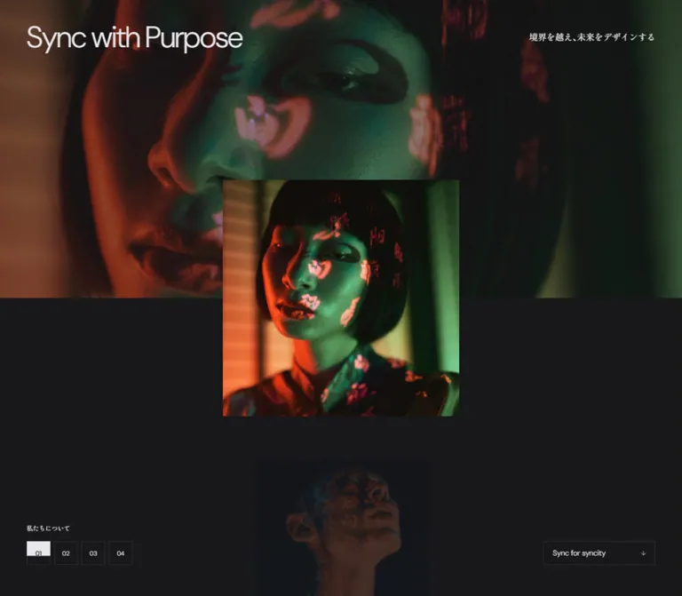
syncity gives photography most of the visual weight. The opening composition repeats a photographic scene at two scales: a wide, dark crop across the upper half of the viewport and a clearer square image crossing into the charcoal area below. Saturated projected light, close crops, and substantial empty space make the homepage feel like a moving exhibition. Small outlined controls sit at the edges instead of competing with the imagery.
The typography balances light DM Sans with Shippori Mincho B1 and Japanese Mincho fallbacks. English provides navigation, short labels, and the changing “Sync with” heading; Japanese carries the statement, service descriptions, and section identity. The long page moves through company information, capabilities, projects, client stories, culture, editorial content, and contact links. Its structure supports exploration across a corporate website.
How to Read This Reference
- Measured means a value appears in the supplied rendered DOM, bounding rectangles, or computed styles. Measurements describe the sampled state, not every animation frame.
- Visual estimate means an approximate reading of a supplied current-page capture. Image bounds, some footer geometry, and several painted control colors fall into this category.
- Calculated means arithmetic based on measured values. A matching equation does not establish the original stylesheet formula.
- Recommended means an implementation choice for reuse. The Quick Start breakpoint, image positioning rules, accessibility additions, and some surface treatments are adaptations.
- Token names are descriptive aliases unless explicitly identified as source custom properties.
Some DOM elements have overlapping rectangles, offscreen positions, or 1 × 1 boxes. These can represent hidden headings, inactive panels, clipped content, or transformed descendants. Their presence does not prove that all extracted text was simultaneously visible. The supplied record contains no explicit click, hover, drag, or consent-dismissal test.
Tokens — Colors
Default Palette
| Name | Value | Suggested token | Evidence and role |
|---|---|---|---|
| Main Charcoal | #18181b |
--color-canvas |
Measured: HTML, body, hero, Service, and Projects backgrounds |
| Section Charcoal | #212124 |
--color-surface |
Measured: Contents and Story backgrounds; visually consistent with the lighter dark section field |
| Pale Text | #e7e7eb |
--color-text |
Measured: primary text color throughout the sampled DOM |
| Muted Gray | #68686d |
--color-muted |
Measured: secondary section labels and Story category text |
| Translucent Pale | rgba(230,230,234,.5) |
--color-soft-source |
Measured: selected secondary labels; its visible result depends on the backdrop |
| Directory Surface | rgba(24,24,27,.8) |
--color-directory-source |
Measured: desktop Contents links |
| Fine Rule | Approximately #303033 |
--color-rule |
Visual estimate: outlined controls and mobile navigation separators |
| Notice Black | Approximately #000000 |
--color-notice |
Visual estimate: cookie notice background |
| Pale Action Fill | Approximately #e7e7eb |
--color-action |
Visual estimate: the selected hero number, Contact, and OK appear pale in the captures; this alias reuses the measured text color |
The interface has a neutral palette. Orange, teal, green, blue, purple, and red belong primarily to photographs. They should not automatically become category colors, navigation accents, or button fills.
The Contact anchor reports a background of rgba(230,230,234,.2), while its captured painted surface appears much lighter. Descendant or pseudo-element painting was not supplied. Preserve this distinction: the parent background is a measured declaration, while the final pale button treatment is a visual observation.
The supplied --tw-ring-color value is a utility default, not evidence of a blue brand accent. Likewise, empty filter variables do not establish a blur or color-filter treatment.
Theme Presets
Only the dark appearance is evidenced. No alternate palette, light mode, or user-controlled theme behavior was inspected.
Tokens — Typography
Japanese Editorial Text — Shippori Mincho B1 Stack
The computed body family is:
YakuHanMP, 'Shippori Mincho B1', 'Hiragino Mincho ProN W3',
'ヒラギノ明朝 ProN W3', 'Hiragino Mincho ProN', 游明朝, YuMincho,
HG明朝E, 'MS PMincho', 'MS Mincho', serif
The body defaults to 16px / 24px, weight 500. Individual paragraphs and display lines override this. The statement uses particularly open leading, while short service descriptions remain compact.
This is a declared computed stack. The evidence does not independently establish which downloaded font supplied every glyph. Preserve the Mincho character and the observed weight hierarchy without claiming universal font availability.
English Display and Utility Text — DM Sans Stack
The computed English stack is:
'DM Sans', YakuHanJP, 'Helvetica Neue', Arial,
'Hiragino Kaku Gothic ProN', 'Hiragino Sans', Meiryo, sans-serif
The hero uses weight 300; measured English labels generally use 400. Negative tracking of -0.02em appears frequently in small labels and in the desktop hero heading. The mobile hero heading returns to normal tracking.
The lowercase wordmark occupies a measured 58 × 17px link area at both widths. Its asset format and letter construction are not established by the inherited font on that anchor. Do not recreate the logo by assuming that inherited Mincho typography describes its appearance.
Type Scale
Values below are measured unless explicitly marked as estimates. Sizes and line heights are in CSS pixels.
| Role | Desktop | Mobile | Weight / tracking |
|---|---|---|---|
| Visible “Sync with” heading | 48 / 58 |
32 / 42 |
300; desktop -0.02em, mobile normal |
| Hero Japanese tagline | 14 / 24 |
13 / 23 |
Desktop 500, mobile 400 |
| Statement heading | 32 / 52 |
24 / 40 |
400; 0.04em |
| Statement paragraphs | 16 / 38 |
14 / 34 |
Desktop 500, mobile 400 |
| Service section Japanese heading | 26 / 36 |
22 / 32 |
500; 0.04em |
| Service section English caption | 10 / 14 |
12 / 16 |
400; -0.02em |
| Section-location label in header | 12 / 18 |
12 / 18 |
400; -0.02em |
| Service introduction | 12 / 24 |
13 / 28 |
400; normal tracking |
| Service card English label | 10 / 12 |
12 / 14 |
400; -0.02em |
| Service card Japanese title | 18 / 28 |
18 / 28 |
500; normal tracking |
| Service card description | 12 / 24 |
12 / 24 |
400; normal tracking |
| Story client name | Approximately 20px visually |
20 / 26 |
Mobile measured 400 |
| Story company subtitle | Not sampled | 12 / 18 |
400; -0.02em |
| Story category | Approximately 10px visually |
12 / 18 |
Mobile measured 400, -0.02em |
| Story quotation in DOM | Not sampled | 13 / 29 |
500; 0.02em; visibility state unverified |
| Culture character | 32 / 42 |
28 / 38 |
400 |
| Culture English label | 10 / 14 |
10 / 14 |
400; -0.02em |
| Magazine directory title | 18 / 24 |
18 / 24 |
400 |
The hero's semantic H1 occupies a hidden 1 × 1px box. Its inherited 16px font is not the visible headline size. Similarly, an anchor's inherited 16px Mincho declaration should not override the smaller sans-serif label visibly painted inside it.
Tokens — Spacing & Shapes
Responsive Unit
The source exposes separate desktop and mobile grid variables:
| Source property | At 1440 × 1000 | At 390 × 844 |
|---|---|---|
--gridPC |
1.125px |
0.3046875px |
--gridSP |
3.84px |
1.04px |
--vw |
14.4px |
3.9px |
--vh and --svh |
10px |
8.44px |
Both samples are numerically consistent with:
/* Calculated equivalents; original formulas were not supplied. */
--grid-pc: calc(100vw / 1280);
--grid-sp: calc(100vw / 375);
The measured outer margins equal 50 × --gridPC on desktop and 25 × --gridSP on mobile: 56.25px and 26px, respectively. Typography does not simply scale with either grid unit. The root remains 16px, while many text roles switch to discrete mobile values.
Spacing Scale
| Use | Desktop | Mobile | Evidence |
|---|---|---|---|
| Main horizontal inset | 56.25px |
26px |
Measured |
| Hero number gap | 6px |
Not established | Calculated from button rectangles |
| Contents link inner inset | 20px 22.5px |
Header 18px 20px |
Measured; different component arrangements |
| Contents header separation | Not reliably established | 10px |
Calculated from 61px rows advancing by 71px |
| Service card text inset | 30px horizontally |
20px horizontally |
Calculated from child and parent positions |
| Service card gap | Approximately 20px |
25px |
Calculated |
| Story card gap | Approximately 20px |
25px |
Desktop visual estimate; mobile calculated |
| Contents section padding | 170px top, 50px bottom |
88px top, 80px bottom |
Measured |
| Service section padding | 220px top and bottom |
130px top, 80px bottom |
Measured |
| Hero bottom action clearance | 50px |
30px |
Calculated from action rectangles |
The spacing system alternates between tiny control gaps and large section intervals. A uniform compact rhythm would lose the observed pacing.
Border Radius
| Element | Treatment | Evidence |
|---|---|---|
| Hero number buttons and navigation controls | 0 |
Measured |
| Contents links and service cards | 0 |
Measured |
| Story card links | 0 |
Measured on mobile; visually square on desktop |
| Hero imagery and cookie notice | Square corners | Visual observation |
No general rounded-card or shadow-elevation system is evident. Fine rules, image edges, and subtle background changes provide separation.
Layout Measurements
| Element | Desktop | Mobile | Evidence |
|---|---|---|---|
| Document height | 13,244px |
14,015.125px |
Measured state; not a target height |
| Hero region | 1440 × 1000px |
390 × 844px |
Measured |
| Content width inside main margins | 1327.5px |
338px |
Calculated |
| Wordmark link | 58 × 17px, at 691,52 |
58 × 17px, at 166,35 |
Measured |
| Main menu control | 39 × 39px |
81.3 × 39px, including text |
Measured |
| Contact control | 131 × 38px |
Not visible in the sampled top navigation | Measured desktop |
| Hero numbers | 38 × 38px each |
Visible geometry obscured or unmeasured | Measured desktop |
| Standard outlined link | 180 × 38px |
162 × 38px |
Measured examples |
| Hero background image band | Approximately 500px high |
Approximately 422px high |
Visual estimates; both near half the viewport |
| Hero foreground image | Approximately 376 × 376px, at 532,329 |
Approximately 286 × 286px, at 52,280 |
Visual estimates |
| Statement text column | 480px, starting at x 480 |
338px, starting at x 26 |
Measured |
| Service cards | Approximately 429.16 × 477px |
338 × 325px |
Measured |
| Story cards | Approximately 318 × 477px |
312 × 468px |
Desktop visual estimate; mobile measured |
| Culture strip tile | 360 × 135px |
390 × 91.516px |
Measured Contents instance |
| Cookie notice | Approximately 502 × 71px |
Full width, approximately 105px high |
Visual estimates; text-dependent |
Components
Global Header
Role: maintain orientation and access to the site's main destinations while browsing the long homepage.
In the desktop Story capture, a small section label sits at the left, the syncity wordmark is centered on the viewport, and About, Service, Project, Contact, and a compact menu symbol occupy the right. Service and Project are buttons in the DOM; About and Contact are links. Small plus symbols accompany the expandable navigation labels.
The desktop controls begin at y 42px. The Contact rectangle is 131 × 38px; the menu control is 39 × 39px. Use three alignment regions so unequal left and right content does not shift the centered logo.
On mobile, the brand retains its 58 × 17px size, while the right-hand control combines “Menu” with a square symbol. The desktop link group is absent from the visible mobile header. Repeated header placement in lower captures supports a persistent visual role, but the exact fixed/sticky implementation and hero-to-header visibility threshold were not supplied.
Layered Photographic Hero
Role: introduce four major entry points through a shared visual composition.
The hero occupies one measured viewport at both sizes. Its visible headline sits near the upper-left margin. On desktop, the Japanese tagline aligns near the upper-right edge; on mobile it moves below the English heading.
The upper image fills approximately half the viewport height. A square image sits on the central vertical axis and crosses the boundary between photograph and plain charcoal. The desktop Service capture shows a close portrait with projected lettering, orange light on the face and neck, and a teal-black environment. The mobile Project capture shows a person leaning toward a bright blue eye image under red and green light.
The background and foreground use related photographic content with different crops. The foreground is clearer and more saturated than the surrounding wide image. Neither image has a decorative border, rounded frame, or visible shadow.
A smaller, much darker image fragment appears farther down the central axis. Its exact function and animation sequence are unverified. Treat it as an observed secondary image layer, not proof of a specific next-slide preview interaction.
Hero Entry Selector
Role: identify the current hero entry and expose the site's primary destinations.
The desktop capture shows four square number controls at the lower left. 02 has a pale fill and dark text; the other numbers have transparent dark interiors and fine outlines. A small Japanese label sits above the group. At the lower right, “Sync for syncity” sits inside a 180 × 38px outlined rectangle with a small downward arrow.
| Entry | Heading suffix in DOM | Japanese label | Recorded destination |
|---|---|---|---|
| 01 | Purpose | 私たちについて |
/about/ |
| 02 | Service | 提供するサービス |
/service/ |
| 03 | Project | 実績 |
/project/ |
| 04 | Story | 成功の物語 |
External Story collection |
“Sync for syncity” links to #--Contents. Multiple heading and link layers exist in the DOM. The captures establish different current panels, but do not establish autoplay timing, number-button behavior, or the transition between those panels.
On mobile, the Contents link measures 162 × 38px at x 202, y 776. The cookie notice covers this lower hero area in the supplied capture. Do not conclude that the obscured controls were removed from the mobile page.
Contents Directory
Role: provide a compact map of About, Service, Project, Story, Culture, and Studio.
The desktop section uses the lighter #212124 field and measured translucent charcoal link surfaces. Each category contains its main destination and relevant sublinks. The supplied desktop link rectangles overlap and extend beyond the viewport, so they are not a reliable static six-column grid specification.
The mobile DOM instead exposes six category buttons, each 338 × 61px, separated by 10px. Headers use 18px 20px padding and a 10px internal gap. Associated sublinks have 298px widths and approximately 50px row heights. Their overlapping recorded positions do not demonstrate expanded panels; the structure supports disclosure-style navigation, but the toggle action was not tested.
A culture image strip and a compact magazine link follow the category directory. The magazine link measures 384 × 90px on desktop and 338 × 88px on mobile.
Statement
Role: create a quiet reading interval for the company's design philosophy.
The visible statement begins with 境界を越え、未来をデザインする。 split over two lines. The text column is 480px wide and centered on desktop, then expands to the mobile content width of 338px.
Use the measured Japanese title scale of 32px / 52px on desktop and 24px / 40px on mobile, with 0.04em tracking. Paragraphs use exceptionally open 38px and 34px line heights. Paragraph-group breaks add another line of air. The outlined About link aligns with the text column's left edge.
The measured Statement region is much taller than the prose alone. Its desktop height is 2344px; mobile is 1843px. The supplied screenshots do not show the preceding visual treatment. Preserve the narrow reading column and generous pacing, but do not reproduce the unexplained space as a fixed blank spacer.
Service Grid
Role: organize three complementary capabilities with parallel content anatomy.
Each service link contains a small English category, a Japanese title, a short Japanese explanation, and three English capability lines. The categories are Brand Design, Digital Design, and Business Design. The Japanese card titles remain 18px / 28px at both widths.
Desktop cards form a measured three-column row, approximately 429.16px wide with 20px gaps. Mobile cards stack at 338px wide and 325px high with 25px gaps. Horizontal text insets reduce from approximately 30px to 20px.
The section header also reorganizes: desktop distributes the title, description, and Service top link across the width; mobile places them in a vertical sequence above the cards. The mobile English category label grows from 10px to 12px, demonstrating that small labels are not simply scaled down with the screen.
Some desktop text descendants have bounds wider than their card parent. Clipping or transformation details were not supplied. Use the outer card measurements and content hierarchy as reliable guidance; the exact media treatment and hidden states remain unverified.
Project Showcase
Role: feature selected client work and link to the complete project index.
The DOM records four project entries, including corporate-site work and a recruitment site, plus numbered navigation and “View all projects.” The mobile showcase occupies 390 × 844px; its full-area project links share the same rectangle, consistent with layered panel content.
Mobile client titles use 18px / 24px, weight 500, with 0.02em tracking. The index link is positioned at the lower right and measures 162 × 38px.
The attached captures do not show this showcase's project imagery. The Project-themed opening hero should not be treated as a screenshot of the lower project showcase. Image aspect ratios, transitions, and panel-selection behavior here are unverified.
Story Rail and Portrait Card
Role: present client experiences through people and editorial links.
The desktop Story section uses #212124. A left introduction occupies roughly the first third of the page. The portrait rail begins near x 506px, with the introduction title and first portrait aligned near y 259px in the supplied capture. Two full cards and part of a third are visible, indicating horizontal continuation.
Each card is a tall 2:3 photograph with square corners. Client names appear near the upper-left corner in light sans-serif text. A smaller company line sits beneath. Category labels sit near the lower-left edge, and a small outlined northeast-arrow square appears near the lower right. The photograph remains the card surface; there is no separate caption panel beneath it.
The desktop capture shows ContentAge, monopo tokyo, and YL Projects. Portraits retain their natural office or interview setting and are visibly subdued beneath the text. Additional Story entries exist in the DOM.
Mobile measurements establish 312 × 468px cards, 25px gaps, and approximately 25px inner side padding. The first card begins at x 26px; the second begins at x 363px, leaving a narrow continuation visible at the viewport edge. The heading and description precede the rail vertically.
Quotation text exists inside the card DOM but is not visible in the desktop resting capture. Its reveal mechanism is unknown. Previous/next arrow affordances are visible on desktop, and “Drag” exists in extracted text; neither establishes a tested drag implementation.
Culture Image Strip
Role: connect the site's four culture concepts to distinct photographic scenes.
Desktop tiles form a full-width strip of four 360 × 135px images. Each centers a large Japanese character over a small English label:
融— Synthesis環— Yield叢— Nest間— Connect
The current footer capture shows purple-lit portraiture, an orange circular light with a silhouette, vivid flowers, and a seated figure in an architectural interior. Keep these scenes as separate images with a common dark treatment.
The measured mobile Contents instance becomes four stacked, full-width rows, each approximately 91.516px high. Characters move to x 26px; English labels sit beside them at x 76px. The character size reduces from 32px to 28px. This is a genuine composition change, not a four-column strip squeezed onto a phone.
Magazine, About, and Contact Entries
Role: extend the homepage into editorial reading, company information, and enquiries.
The DOM includes a Magazine introduction and eight article links categorized as Knowledge, Column, or Interview. It also records an About entry headed “Sync with Your purpose,” a “Sync with us” contact entry, and a “Document download” entry.
These sections have content and destination evidence, but their complete painted layouts are not supplied. Do not infer article image ratios, card grids, or large button geometry from their text alone.
The contact entry points to /contact/. The recorded Document download href is the homepage itself; no downloaded file or completed download action was verified. A new implementation needs an actual destination before presenting it as a working download.
Footer and Mobile Navigation Rows
Role: expose the wider site structure, social link, address, and policy information.
The desktop footer begins with a Home breadcrumb area, followed by the culture strip. Below it, the left region holds the Japanese statement, Follow Us / Instagram, and Access. The right region organizes the sitemap into three columns, with headings brighter than their small sublinks. Privacy Policy and ©syncity sit at the lower left; Page top sits at the lower right.
The lower mobile capture shows a single column of Japanese category rows, approximately 60px high, separated by fine horizontal rules. Expandable-looking rows end in small outlined plus squares. Reading and contact entries appear as plain rows without the same plus treatment. Social information, a wrapped address, and Privacy Policy follow with generous vertical spacing.
The page contains repeated directory structures for different navigation contexts. The mobile capture alone does not conclusively distinguish a footer instance from a global-menu instance. Its visible row styling is reliable; an asserted menu-opening action is not.
Cookie Notice
Role: display the site's cookie statement and policy link with an OK control.
On desktop, the black notice is approximately 502px wide and centered near the bottom, with a 50px bottom clearance. Small Japanese copy occupies the left; a pale 120 × 34px button sits on the right. The privacy-policy link is underlined. Corners remain square and there is no visible shadow.
On mobile, the notice spans the viewport width at the bottom. The first sentence stretches across the notice, while the remaining policy text and OK button share the lower area. It overlaps the hero's lower controls in the capture.
The notice remains present across the supplied images. Dismissal, persistence, cookie categories, and any page-wide dimming behavior were not tested. Do not explain the entire dark visual treatment as a consent backdrop without evidence.
Tokens — Motion & Interaction
The most consistent measured easing is cubic-bezier(0.2, 0.1, 0, 1). The source combines relatively short control feedback with longer text transforms.
| Target | Measured transition | What the evidence establishes |
|---|---|---|
| Desktop About / Service / Project controls | Opacity 0.4s with the shared easing |
A declared opacity transition; final hover state unverified |
| Hero number controls | Color, background, border, decoration, fill, and stroke 0.4s |
Declared palette transitions; a selected pale state is visible |
| Hero Japanese tagline | Transform 1s, delay 0.2s |
Declared transform timing; travel distance and trigger unknown |
| Mobile Service and Story Japanese section titles | Transform 1s |
Declared title movement |
| Mobile English section captions | Transform 1s, delay 0.08s |
Declared delayed movement relative to the Japanese heading |
| Mobile section introductions | Opacity 0.8s and transform 1s, delay 0.16s |
Declared staggered appearance treatment |
| Mobile service English labels | Opacity 0.8s, transform 1s; delays 0, 0.08, 0.16s |
Measured progression across the three cards |
| Mobile service Japanese titles | Same durations; delays 0.04, 0.12, 0.20s |
Measured stagger after the English labels |
| Mobile Story name and company line | Transform 0.5s |
Declared text transform; interactive cause unverified |
Many sampled elements report animation: none and a generic transition: all without a useful duration. Those values neither establish a running animation nor rule out JavaScript-driven movement on other layers.
The browser record describes initial observation and scroll traversal, with readiness checks that temporarily pause perpetual animations. Still captures and computed transitions do not reveal hero autoplay intervals, parallax strength, easing for image changes, drag inertia, menu choreography, or scroll-snap behavior. A utility value containing proximity alone is insufficient to prove active page snapping.
For reuse, retain the measured easing and stagger relationships where appropriate. Choose image motion separately and label it as an adaptation until an actual sequence is available.
Surfaces
| Layer | Appearance | Structural role |
|---|---|---|
| Main canvas | Solid #18181b |
Hero lower field, Statement surroundings, Service, and Projects |
| Alternate section | Solid #212124 |
Contents and Story separation |
| Directory item | Measured translucent charcoal | Groups navigation within the lighter section |
| Photographic surface | Full image, square edges, visibly subdued color | Hero, Story portraits, and culture tiles |
| Outlined control | Transparent dark interior, fine gray edge | Numbers, arrows, and section links |
| Selected / prominent control | Pale fill with dark visible label | Selected hero number, Contact, and OK in captures |
| Cookie notice | Black rectangle above the page | Persistent informational overlay in the supplied states |
Depth comes chiefly from image scale, overlap, and contrast. A soft-shadow card system would add a visual language that is not evidenced here.
Imagery
Use photography with strong direction of light, close framing, and enough dark area to support small pale text. The Service hero's projected lettering follows the photographed face and neck; the mobile Project scene combines a blue eye image with red and green light. These effects belong to the artwork. Recreating them with arbitrary live text floating over a stock portrait would not preserve the same composition.
The hero's repeated scene at different scales is the central image relationship. The wide version establishes atmosphere and crops aggressively; the square foreground version gives the subject a clearer presence. Match their focal points deliberately and test the two crops independently.
Story imagery has a different job: recognizable interview portraits in real surroundings. Preserve faces, posture, and context. Use the dark treatment to support the interface, without making important names or categories disappear.
Observed Asset References
No usable image asset URLs or complete font-file URLs were included in the supplied evidence. The following are visual references, not downloadable paths.
| Image family | Current-page evidence | Reuse guidance |
|---|---|---|
| Service hero portrait | Desktop hero capture | Prepare coordinated wide and square crops |
| Project hero scene | Mobile hero capture | Preserve the person, blue eye image, and red/green lighting relationship |
| Story portraits | Desktop Story capture | Use portrait crops close to 2:3 |
| Culture scenes | Desktop footer capture | Prepare short panoramic desktop crops and separately composed mobile row crops |
| Secondary hero image fragment | Desktop and mobile hero captures | Match its subdued appearance only; sequence behavior is unknown |
Use authorized photography or create new assets for a new project. The Quick Start uses explicit project-local placeholder filenames and does not imply that those files exist on the original site.
Layout & Responsive Behavior
| Relationship | Desktop evidence | Mobile evidence |
|---|---|---|
| Main gutter | 56.25px, about 3.90625vw |
26px, about 6.6667vw |
| Hero heading / tagline | Opposite sides of the top row | Stacked at the left |
| Hero foreground image | Approximately 26.1% of viewport width | Approximately 73.3% of viewport width |
| Main navigation | Multiple right-side controls | Menu label plus compact symbol |
| Statement | Centered 480px column |
338px column aligned to page margins |
| Service introduction | Distributed across the section width | Vertical heading, description, and link |
| Service cards | Three columns | Three stacked cards |
| Story layout | Left introduction beside portrait rail | Introduction above portrait rail |
| Story card proportions | Approximately 318 × 477px |
Measured 312 × 468px; horizontal continuation retained |
| Culture strip | Four columns with centered stacked labels | Four rows with side-by-side labels in the measured Contents instance |
| Footer navigation | Multiple sitemap columns | Single-column rows in the lower mobile capture |
| Cookie notice | Centered floating rectangle | Full-width bottom notice |
The 2:3 Story cards remain nearly the same physical size across the two widths. Mobile adapts the surrounding layout rather than shrinking the cards into small thumbnails. This relationship is especially useful when recreating the design.
The document remains long at both widths, but its measured height changes by only about 771px. Several regions shorten while stacked content elsewhere grows. Do not implement responsiveness by multiplying the entire desktop layout by a single scale factor.
Only two viewport widths were supplied. The breakpoint between these arrangements, intermediate tablet layouts, landscape behavior, safe-area handling, and zoom behavior are unverified. The Quick Start's 768px breakpoint is a recommendation.
Do’s and Don’ts
Do
- Keep
#18181band#212124distinct; their subtle alternation structures the page. - Pair light DM Sans display text with Japanese Mincho editorial text.
- Preserve the wide-photo / square-photo overlap in the hero.
- Let photographic lighting carry the saturated color.
- Keep numbers, arrows, and section links rectangular and modest in scale.
- Use open line spacing for the Statement and compact text for utility labels.
- Retain the Story rail's tall portraits and partially visible next card.
- Recompose mobile culture tiles into horizontal rows with left-aligned labels.
- Maintain the centered wordmark independently of navigation width.
- Separate measured transition durations from unverified interaction behavior.
Don't
- Don't replace the corporate page hierarchy with a single conversion-focused layout.
- Don't use bold, oversized sans-serif text for every Japanese heading.
- Don't introduce rounded portrait cards, pill navigation, or elevated white panels.
- Don't turn the photographs' red and green light into a general UI color system.
- Don't treat every text node in a layered DOM as simultaneously visible.
- Don't infer a static overlapping grid from offscreen or transformed link rectangles.
- Don't invent image filenames, production credits, autoplay timing, or a completed download action.
- Don't describe untested quote reveals, plus controls, or drag labels as verified interactions.
- Don't shrink the mobile Story cards enough to lose their portrait emphasis.
Recommended Implementation Additions
These are recommendations for a new implementation, not verified features of the original:
- Use accessible names for icon-only arrows and the menu symbol. Number selectors should identify both the entry number and destination or panel title.
- Connect disclosure buttons to their panels with
aria-expandedandaria-controls. Keep inactive panels out of the keyboard sequence. - Make the portrait rail operable with links and explicit previous/next controls; dragging should be optional.
- Raise contrast for essential secondary text. The source gray and half-opacity company subtitles can be difficult to read on dark or photographic backgrounds.
- Respect reduced motion and expose all essential copy without waiting for reveal animation. If a hero rotates automatically in a new implementation, provide a pause control.
- Reserve space for a fixed cookie notice or reposition lower controls while it is visible. Test wrapping and bottom safe areas on small screens.
- Use meaningful image alternatives where photography conveys content. Repeated decorative background crops can have empty alternatives when the foreground already supplies the relevant description.
- Load authorized font files explicitly and provide stable image dimensions. Verify the intended crop at both supplied viewport sizes.
Agent Prompt Guide
Quick Color Reference
- Main page:
#18181b. - Alternate section:
#212124. - Primary text:
#e7e7eb. - Source secondary labels:
#68686d. - Approximate rules:
#303033. - Prominent control appearance: pale gray with charcoal text.
- Saturated color: supplied by photographs, not a separate button palette.
Overall Prompt
“Create a Japanese design company's corporate homepage inspired by the observed syncity composition. Use a charcoal #18181b canvas, slightly lighter #212124 sections, pale #e7e7eb text, light DM Sans English headings, and Shippori Mincho B1 Japanese text. Open with a viewport-height photographic composition: a dark wide crop across the upper half and a clearer square image centered across its lower edge. Place a restrained ‘Sync with’ heading at the upper left, a Japanese tagline at the upper right on desktop and beneath the heading on mobile, four small square number controls, and an outlined Contents link. Continue through a company directory, a narrow spacious statement, three service cards, project entries, a horizontal rail of tall interview portraits, four culture images, editorial links, and a detailed footer. Keep corners square, rules fine, and whitespace generous. On mobile, stack services and culture tiles while retaining large horizontally continuing Story cards. Use the measured 400ms control timing and 800–1000ms text transition vocabulary; treat unverified image motion as a separate implementation decision.”
Example Component Prompts
- Hero: “At 1440 × 1000, place the English heading at a 56.25px left inset using DM Sans 300 at 48/58. Let a wide dark photograph end near y 500 and overlap it with an approximately 376px square image centered near x 720. At 390 × 844, use a 26px gutter, 32/42 heading, tagline below, and approximately 286px square foreground image.”
- Statement: “Set Japanese philosophical copy in a centered 480px column, with a 32/52 Mincho title and 16/38 body text. On mobile, use the 338px content width, a 24/40 title, and 14/34 paragraphs. Align a square outlined About link with the column.”
- Story card: “Create a square-cornered 2:3 interview portrait card with a light 20px sans-serif client name at the upper left, a smaller company subtitle, bottom category text, and a tiny outlined northeast arrow. Use 312 × 468px cards and 25px gaps on a 390px phone, leaving part of the next card visible.”
- Culture strip: “Build four dark photographic links labeled
融,環,叢, and間, with Synthesis, Yield, Nest, and Connect beneath. Desktop tiles are 360 × 135px. On mobile, change to full-width shallow rows, with the 28px character at x 26 and the small English label beside it.” - Navigation: “Keep the 58 × 17px wordmark centered independently of neighboring content. Desktop has a small left section marker and a right group with About, Service plus, Project plus, a pale rectangular Contact link, and a square menu control. Mobile retains the centered identity and a Menu label beside the square symbol.”
Quick Start
CSS Custom Properties
This is a static implementation starting point. Colors, font roles, and many dimensions come from the supplied measurements. The breakpoint, hero image formulas, image shading, footer grid, and accessibility treatment are recommended adaptations. Class names are new aliases. No original asset URLs or font downloads are assumed.
The hero image positions approximate the supplied frames; they do not reconstruct the site's animation. The host application must manage panel selection, header visibility, disclosures, rail controls, and notice dismissal.
:root {
  color-scheme: dark;

  /* Measured colors */
  --color-canvas: #18181b;
  --color-surface: #212124;
  --color-text: #e7e7eb;
  --color-muted: #68686d;
  --color-soft-source: rgba(230, 230, 234, 0.5);

  /* Visual approximations and a recommended readable subtitle color */
  --color-rule: #303033;
  --color-notice: #000;
  --color-action: #e7e7eb;
  --color-readable: #aaaab2;

  /* Computed family names; load authorized font files separately */
  --font-editorial: YakuHanMP, 'Shippori Mincho B1',
    'Hiragino Mincho ProN W3', 'Hiragino Mincho ProN',
    YuMincho, 'MS PMincho', 'MS Mincho', serif;
  --font-sans: 'DM Sans', YakuHanJP, 'Helvetica Neue', Arial,
    'Hiragino Kaku Gothic ProN', 'Hiragino Sans', Meiryo, sans-serif;

  /* Calculated equivalents of the sampled grid variables */
  --grid-pc: calc(100vw / 1280);
  --grid-sp: calc(100vw / 375);
  --gutter: calc(var(--grid-pc) * 50);

  --text-hero: 48px;
  --leading-hero: 58px;
  --tracking-hero: -0.02em;
  --text-section: 26px;
  --leading-section: 36px;
  --text-caption: 10px;
  --leading-caption: 14px;
  --text-statement-title: 32px;
  --leading-statement-title: 52px;
  --text-statement: 16px;
  --leading-statement: 38px;

  --section-top: 220px;
  --section-bottom: 220px;
  --card-gap: 20px;
  --link-width: 180px;
  --control-height: 38px;
  --rule-width: 1px;
  --radius: 0px;

  /* Approximate hero geometry from the current screenshots */
  --hero-image-size: clamp(286px, 26.1111vw, 440px);
  --hero-echo-ratio: 0.745;
  --hero-echo-gap: 72px;
  --hero-bottom: 50px;

  /* Measured transition vocabulary */
  --ease-sync: cubic-bezier(0.2, 0.1, 0, 1);
  --duration-control: 400ms;
  --duration-fade: 800ms;
  --duration-reveal: 1000ms;
}

* { box-sizing: border-box; }
[hidden] { display: none !important; }

body {
  margin: 0;
  background: var(--color-canvas);
  color: var(--color-text);
  font: 500 16px / 1.5 var(--font-editorial);
}

img { display: block; max-width: 100%; }
a { color: inherit; }
button { font: inherit; }

.sync-page :focus-visible {
  outline: 2px solid var(--color-text);
  outline-offset: 4px;
}

.site-header {
  position: fixed;
  inset: 0 0 auto;
  z-index: 40;
  display: grid;
  grid-template-columns: minmax(0, 1fr) auto minmax(0, 1fr);
  align-items: center;
  padding: 42px var(--gutter) 4px;
  background: var(--color-surface);
}

.site-brand { justify-self: center; }
.site-brand img { width: 58px; height: 17px; }

.section-marker,
.site-nav,
.mobile-menu {
  font: 400 12px / 18px var(--font-sans);
  letter-spacing: -0.02em;
}

.site-nav {
  display: flex;
  justify-content: flex-end;
  align-items: center;
  gap: 20px;
}

.mobile-menu { display: none; }

.rect-link,
.square-control {
  display: inline-flex;
  align-items: center;
  justify-content: space-between;
  min-height: var(--control-height);
  border: var(--rule-width) solid var(--color-rule);
  border-radius: var(--radius);
  color: var(--color-text);
  background: transparent;
  font: 400 12px / 18px var(--font-sans);
  text-decoration: none;
  cursor: pointer;
  transition:
    color var(--duration-control) var(--ease-sync),
    background-color var(--duration-control) var(--ease-sync),
    border-color var(--duration-control) var(--ease-sync);
}

.rect-link { width: var(--link-width); padding: 0 14px; }
.square-control { width: 38px; padding: 0; justify-content: center; }

.rect-link--filled,
.square-control[aria-pressed='true'] {
  color: var(--color-canvas);
  background: var(--color-action);
  border-color: var(--color-action);
}

.site-contact { width: 131px; justify-content: center; }

.hero {
  position: relative;
  min-height: 100svh;
  overflow: hidden;
  background: var(--color-canvas);
}

.hero-backdrop {
  position: absolute;
  inset: 0 0 auto;
  width: 100%;
  height: 50svh;
  object-fit: cover;
  object-position: var(--hero-backdrop-position, 50% 50%);
  opacity: 0.6; /* Recommended approximation; not a measured opacity. */
}

.hero-heading {
  position: absolute;
  z-index: 2;
  top: 31px;
  left: var(--gutter);
  margin: 0;
  font: 300 var(--text-hero) / var(--leading-hero) var(--font-sans);
  letter-spacing: var(--tracking-hero);
}

.hero-tagline {
  position: absolute;
  z-index: 2;
  top: 48px;
  right: var(--gutter);
  margin: 0;
  font: 500 14px / 24px var(--font-editorial);
}

.hero-foreground {
  position: absolute;
  z-index: 1;
  top: 33svh;
  left: 50%;
  width: var(--hero-image-size);
  aspect-ratio: 1;
  transform: translateX(-50%);
  object-fit: cover;
  object-position: var(--hero-foreground-position, 50% 50%);
}

.hero-echo {
  position: absolute;
  top: calc(33svh + var(--hero-image-size) + var(--hero-echo-gap));
  left: 50%;
  width: calc(var(--hero-image-size) * var(--hero-echo-ratio));
  aspect-ratio: 1;
  transform: translateX(-50%);
  object-fit: cover;
  opacity: 0.14; /* Recommended approximation of the dim image fragment. */
}

.hero-controls {
  position: absolute;
  z-index: 3;
  inset-inline: var(--gutter);
  bottom: var(--hero-bottom);
  display: flex;
  align-items: flex-end;
  justify-content: space-between;
  gap: 20px;
}

.hero-numbers { display: flex; gap: 6px; }
.hero-entry-label { margin: 0 0 12px; font-size: 10px; line-height: 16px; }

.content-section {
  padding: var(--section-top) var(--gutter) var(--section-bottom);
}

.content-section--alternate { background: var(--color-surface); }

.section-title {
  margin: 0;
  font: 500 var(--text-section) / var(--leading-section) var(--font-editorial);
  letter-spacing: 0.04em;
}

.section-caption {
  margin: 10px 0 0;
  color: var(--color-muted);
  font: 400 var(--text-caption) / var(--leading-caption) var(--font-sans);
  letter-spacing: -0.02em;
}

.statement-copy {
  width: min(480px, calc(100% - var(--gutter) * 2));
  margin-inline: auto;
  font-size: var(--text-statement);
  line-height: var(--leading-statement);
}

.statement-copy h2 {
  margin: 0 0 1.5em;
  font-size: var(--text-statement-title);
  line-height: var(--leading-statement-title);
  font-weight: 400;
  letter-spacing: 0.04em;
}

.statement-copy p { margin: 0 0 1em; }

.service-grid {
  display: grid;
  grid-template-columns: repeat(3, minmax(0, 1fr));
  gap: var(--card-gap);
  margin-top: 80px;
}

.service-card {
  min-height: 477px;
  padding: 30px;
  color: inherit;
  text-decoration: none;
  border-top: 1px solid var(--color-rule); /* Recommended static boundary. */
}

.service-card h3 { margin: 7px 0 20px; font-size: 18px; line-height: 28px; }
.service-card p { font-size: 12px; line-height: 24px; }
.service-card .service-label {
  font: 400 10px / 12px var(--font-sans);
  letter-spacing: -0.02em;
  color: var(--color-soft-source);
}

.story {
  display: grid;
  grid-template-columns: calc(var(--grid-pc) * 400) minmax(0, 1fr);
  padding: 220px 0 220px var(--gutter);
  background: var(--color-surface);
}

.story-intro { padding-right: 50px; }
.story-description { margin: 50px 0; font-size: 12px; line-height: 24px; }

.story-rail {
  display: flex;
  gap: 20px;
  min-width: 0;
  overflow-x: auto;
  padding: 0 var(--gutter) 12px 0;
  margin: 0;
  list-style: none;
}

.story-rail > li { flex: 0 0 22.083333vw; }

.story-card {
  position: relative;
  isolation: isolate;
  display: flex;
  flex-direction: column;
  width: 100%;
  aspect-ratio: 2 / 3;
  padding: 30px;
  overflow: hidden;
  color: var(--color-text);
  text-decoration: none;
}

.story-card img {
  position: absolute;
  z-index: -2;
  inset: 0;
  width: 100%;
  height: 100%;
  object-fit: cover;
}

.story-card::before {
  content: '';
  position: absolute;
  z-index: -1;
  inset: 0;
  background: rgba(0, 0, 0, 0.25); /* Recommended; tune for each image. */
}

.story-name { margin: 0; font: 400 20px / 26px var(--font-sans); }
.story-company {
  margin: 7px 0 0;
  color: var(--color-readable); /* Recommended contrast improvement. */
  font-size: 12px;
  line-height: 18px;
}

.story-card-bottom {
  display: flex;
  align-items: flex-end;
  justify-content: space-between;
  gap: 12px;
  margin-top: auto;
  font: 400 12px / 18px var(--font-sans);
}

.story-arrow {
  display: grid;
  place-items: center;
  flex: 0 0 25px;
  width: 25px;
  height: 25px;
  border: 1px solid currentColor;
}

.culture-strip { display: grid; grid-template-columns: repeat(4, 1fr); }
.culture-tile {
  position: relative;
  isolation: isolate;
  display: flex;
  flex-direction: column;
  align-items: center;
  justify-content: center;
  min-height: 135px;
  text-decoration: none;
}

.culture-tile img {
  position: absolute;
  z-index: -1;
  inset: 0;
  width: 100%;
  height: 100%;
  object-fit: cover;
  opacity: 0.6; /* Recommended approximation. */
}

.culture-character { font: 400 32px / 42px var(--font-editorial); }
.culture-label { margin-top: 5px; font: 400 10px / 14px var(--font-sans); }

.footer-main {
  display: grid;
  grid-template-columns: repeat(2, minmax(0, 1fr));
  gap: 22.5px;
  padding: 50px var(--gutter) 160px;
}

.footer-groups { display: grid; grid-template-columns: repeat(3, 1fr); gap: 40px 22.5px; }
.footer-row { color: inherit; text-decoration: none; }

.cookie-notice {
  position: fixed;
  z-index: 100;
  bottom: 50px;
  left: 50%;
  transform: translateX(-50%);
  display: grid;
  grid-template-columns: minmax(0, 1fr) 120px;
  align-items: center;
  gap: 20px;
  width: 502px;
  max-width: calc(100% - 40px);
  min-height: 71px;
  padding: 15px 20px;
  background: var(--color-notice);
  font: 400 10px / 20px var(--font-editorial);
}

.cookie-copy { margin: 0; }
.cookie-lead, .cookie-detail { display: block; }
.cookie-notice a { text-decoration: underline; text-underline-offset: 3px; }
.cookie-ok {
  min-height: 34px;
  border: 0;
  border-radius: 0;
  background: var(--color-action);
  color: var(--color-canvas);
  font: 400 10px / 16px var(--font-sans);
  cursor: pointer;
}

/* Recommended breakpoint; the original breakpoint was not supplied. */
@media (max-width: 767px) {
  :root {
    --gutter: calc(var(--grid-sp) * 25);
    --text-hero: 32px;
    --leading-hero: 42px;
    --tracking-hero: normal;
    --text-section: 22px;
    --leading-section: 32px;
    --text-caption: 12px;
    --leading-caption: 16px;
    --text-statement-title: 24px;
    --leading-statement-title: 40px;
    --text-statement: 14px;
    --leading-statement: 34px;
    --section-top: 130px;
    --section-bottom: 80px;
    --card-gap: 25px;
    --link-width: 162px;
    --hero-image-size: calc(100vw - var(--gutter) * 4);
    --hero-echo-ratio: 0.43;
    --hero-echo-gap: 50px;
    --hero-bottom: 30px;
  }

  .site-header { padding-top: 25.5px; }
  .site-nav { display: none; }
  .mobile-menu { display: flex; justify-self: end; align-items: center; gap: 12px; }
  .hero-heading { top: 25px; }
  .hero-tagline { top: 75px; right: auto; left: var(--gutter); font: 400 13px / 23px var(--font-editorial); }
  .hero-controls { gap: 10px; }
  .statement-copy { font-weight: 400; }
  .service-grid { grid-template-columns: 1fr; margin-top: 50px; }
  .service-card { min-height: 325px; padding: 23px 20px; }
  .service-card .service-label { font-size: 12px; line-height: 14px; }

  .story { display: block; padding: 130px var(--gutter) 80px; }
  .story-intro { padding: 0; }
  .story-description { margin: 33px 0 30px; font-size: 13px; line-height: 28px; }
  .story-rail { gap: 25px; margin-top: 50px; margin-right: calc(var(--gutter) * -1); }
  .story-rail > li { flex-basis: 80vw; }
  .story-card { padding: 26px 25px 25px; }

  .culture-strip { grid-template-columns: 1fr; }
  .culture-tile {
    min-height: 23.4667vw;
    flex-direction: row;
    justify-content: flex-start;
    gap: 22px;
    padding-inline: var(--gutter);
  }
  .culture-character { font-size: 28px; line-height: 38px; }
  .culture-label { margin: 0; }

  .footer-main { grid-template-columns: 1fr; gap: 50px; }
  .footer-groups { grid-template-columns: 1fr; gap: 0; }
  .footer-row { display: flex; align-items: center; justify-content: space-between; min-height: 60px; border-bottom: 1px solid var(--color-rule); }

  .cookie-notice {
    inset: auto 0 0;
    transform: none;
    width: 100%;
    max-width: none;
    gap: 8px 14px;
    padding: 16px 20px calc(20px + env(safe-area-inset-bottom, 0px));
    font-size: 11px;
    line-height: 22px;
  }
  .cookie-copy { display: contents; }
  .cookie-lead { grid-column: 1 / -1; }
  .cookie-detail { grid-column: 1; }
  .cookie-ok { grid-column: 2; grid-row: 2; }
}

/* Recommended reduced-motion baseline for these components. */
@media (prefers-reduced-motion: reduce) {
  .sync-page *, .sync-page *::before, .sync-page *::after {
    animation: none !important;
    transition: none !important;
    scroll-behavior: auto !important;
  }
}
Minimal Component Markup
The filenames below are placeholders for authorized local assets. This demonstrates the layered hero and portrait-card anatomy; it does not implement a carousel. Only mount the active hero panel, or explicitly manage inactive-panel visibility and focusability.
<main class="sync-page">
  <section class="hero" aria-labelledby="hero-title">
    <img class="hero-backdrop" src="hero-wide.jpg" alt="">
    <h1 class="hero-heading" id="hero-title">Sync with Service</h1>
    <p class="hero-tagline" lang="ja">境界を越え、未来をデザインする</p>
    <a href="/service/" aria-label="Explore our services">
      <img class="hero-foreground" src="hero-square.jpg"
        alt="Portrait illuminated by orange lettering and teal light">
    </a>
    <div class="hero-controls">
      <a class="rect-link" href="/service/">Service <span aria-hidden="true">↗</span></a>
      <a class="rect-link" href="#contents">Sync for syncity <span aria-hidden="true">↓</span></a>
    </div>
  </section>

  <section class="story" aria-labelledby="story-title">
    <div class="story-intro">
      <h2 class="section-title" id="story-title" lang="ja">成功の物語</h2>
      <p class="section-caption">Story</p>
      <p class="story-description">Conversations about the work and what it made possible.</p>
    </div>
    <ul class="story-rail" aria-label="Client stories">
      <li>
        <a class="story-card" href="/stories/example/">
          <img src="client-portrait.jpg" alt="Client photographed in their studio"
            width="624" height="936" loading="lazy">
          <h3 class="story-name">Example Studio</h3>
          <p class="story-company">Example company</p>
          <div class="story-card-bottom">
            <span>#Digital Design</span>
            <span class="story-arrow" aria-hidden="true">↗</span>
          </div>
        </a>
      </li>
    </ul>
  </section>
</main>
The simplified hero markup uses ordinary destination links. Add numbered buttons only when panel state is implemented. If using the fixed notice CSS, the host layout should reserve the notice's current height and keep lower controls reachable. The snippets have not been rendered or executed as part of this evidence-only analysis.
Tailwind v4 Token Mapping
Optional aliases for a project already using Tailwind v4. This is not a claim about the original site's framework or framework version. Define the custom properties above first.
@theme inline {
  --color-canvas: #18181b;
  --color-surface: #212124;
  --color-ink: #e7e7eb;
  --color-muted: #68686d;
  --color-rule: #303033;

  --font-editorial: YakuHanMP, 'Shippori Mincho B1', YuMincho, serif;
  --font-utility: 'DM Sans', YakuHanJP, 'Helvetica Neue', Arial, sans-serif;

  --text-display: var(--text-hero);
  --text-section-heading: var(--text-section);
  --text-utility-caption: var(--text-caption);

  --spacing-page: var(--gutter);
  --spacing-section-start: var(--section-top);
  --spacing-section-end: var(--section-bottom);
  --spacing-card-gap: var(--card-gap);
  --radius-card: 0px;
}
Sources & Evidence
- Inspected original and final website: https://syncity.co.jp/. The supplied browser record reports HTTP
200, with no URL change. - Capture package retrieval time: September 12, 2026,
14:13:38.766 UTC/23:13:38.766 JST. No separate timestamp for each screenshot was provided. - Desktop evidence:
1440 × 1000CSS pixels; current Service hero state, Story portraits, and footer captures, plus homepage rendered text, links, custom properties, and sampled computed element styles. Recorded document height:13,244px. - Mobile evidence:
390 × 844CSS pixels; current Project hero state and lower navigation/footer capture, plus homepage rendered text, links, custom properties, and sampled element styles. Recorded document height: approximately14,015.125px. - Inspection method described by the supplied record: initial observation of at least five seconds, readiness checks for document and visible image loading, finite-animation and layout stability checks, and scrolling through intermediate positions. These checks do not establish semantic completeness or expose every delayed state.
- Interaction limits: no explicit menu opening, disclosure expansion, hover, drag, numbered-panel selection, cookie dismissal, file download, or destination-page inspection was documented. Transition values are computed-style evidence, not a recording of the complete motion sequence.
- Rendering limits: image URLs, complete font files, relevant pseudo-element styles, and much of the later-page geometry were not supplied. Some sampled bounds overlap or belong to hidden or inactive content. SharedWorkers and service workers were disabled during the supplied browser inspection.
This document analyzes the supplied current homepage evidence. No fresh browsing, command execution, or additional file inspection was performed. Visual estimates and reusable CSS choices are labeled separately from measured source values.
# syncity — Style Reference

> A dark photographic gallery with restrained English typography and spacious Japanese editorial text.

**Website:** [syncity.co.jp](https://syncity.co.jp/)
**Original URL:** https://syncity.co.jp/
**Final URL:** https://syncity.co.jp/
**Theme:** dark in both supplied viewport samples; no theme selector evidenced
**Inspected:** September 12, 2026; supplied browser evidence retrieved at 14:13:38.766 UTC, or 23:13:38.766 JST
**Viewports:** 1440 × 1000 and 390 × 844 CSS pixels
**Scope:** the current corporate homepage. Visual evidence covers the desktop Service hero state, Story section, desktop footer, mobile Project hero state, and a lower mobile navigation/footer region. Rendered DOM and computed styles additionally cover Contents, Statement, Service, Projects, and parts of Story. Later sections have text and link evidence but limited component measurements.

syncity gives photography most of the visual weight. The opening composition repeats a photographic scene at two scales: a wide, dark crop across the upper half of the viewport and a clearer square image crossing into the charcoal area below. Saturated projected light, close crops, and substantial empty space make the homepage feel like a moving exhibition. Small outlined controls sit at the edges instead of competing with the imagery.

The typography balances light DM Sans with Shippori Mincho B1 and Japanese Mincho fallbacks. English provides navigation, short labels, and the changing “Sync with” heading; Japanese carries the statement, service descriptions, and section identity. The long page moves through company information, capabilities, projects, client stories, culture, editorial content, and contact links. Its structure supports exploration across a corporate website.

## How to Read This Reference

- **Measured** means a value appears in the supplied rendered DOM, bounding rectangles, or computed styles. Measurements describe the sampled state, not every animation frame.
- **Visual estimate** means an approximate reading of a supplied current-page capture. Image bounds, some footer geometry, and several painted control colors fall into this category.
- **Calculated** means arithmetic based on measured values. A matching equation does not establish the original stylesheet formula.
- **Recommended** means an implementation choice for reuse. The Quick Start breakpoint, image positioning rules, accessibility additions, and some surface treatments are adaptations.
- **Token names** are descriptive aliases unless explicitly identified as source custom properties.

Some DOM elements have overlapping rectangles, offscreen positions, or 1 × 1 boxes. These can represent hidden headings, inactive panels, clipped content, or transformed descendants. Their presence does not prove that all extracted text was simultaneously visible. The supplied record contains no explicit click, hover, drag, or consent-dismissal test.

## Tokens — Colors

### Default Palette

| Name | Value | Suggested token | Evidence and role |
| --- | --- | --- | --- |
| Main Charcoal | `#18181b` | `--color-canvas` | **Measured:** HTML, body, hero, Service, and Projects backgrounds |
| Section Charcoal | `#212124` | `--color-surface` | **Measured:** Contents and Story backgrounds; visually consistent with the lighter dark section field |
| Pale Text | `#e7e7eb` | `--color-text` | **Measured:** primary text color throughout the sampled DOM |
| Muted Gray | `#68686d` | `--color-muted` | **Measured:** secondary section labels and Story category text |
| Translucent Pale | `rgba(230,230,234,.5)` | `--color-soft-source` | **Measured:** selected secondary labels; its visible result depends on the backdrop |
| Directory Surface | `rgba(24,24,27,.8)` | `--color-directory-source` | **Measured:** desktop Contents links |
| Fine Rule | Approximately `#303033` | `--color-rule` | **Visual estimate:** outlined controls and mobile navigation separators |
| Notice Black | Approximately `#000000` | `--color-notice` | **Visual estimate:** cookie notice background |
| Pale Action Fill | Approximately `#e7e7eb` | `--color-action` | **Visual estimate:** the selected hero number, Contact, and OK appear pale in the captures; this alias reuses the measured text color |

The interface has a neutral palette. Orange, teal, green, blue, purple, and red belong primarily to photographs. They should not automatically become category colors, navigation accents, or button fills.

The Contact anchor reports a background of `rgba(230,230,234,.2)`, while its captured painted surface appears much lighter. Descendant or pseudo-element painting was not supplied. Preserve this distinction: the parent background is a measured declaration, while the final pale button treatment is a visual observation.

The supplied `--tw-ring-color` value is a utility default, not evidence of a blue brand accent. Likewise, empty filter variables do not establish a blur or color-filter treatment.

### Theme Presets

Only the dark appearance is evidenced. No alternate palette, light mode, or user-controlled theme behavior was inspected.

## Tokens — Typography

### Japanese Editorial Text — Shippori Mincho B1 Stack

The computed body family is:

```css
YakuHanMP, 'Shippori Mincho B1', 'Hiragino Mincho ProN W3',
'ヒラギノ明朝 ProN W3', 'Hiragino Mincho ProN', 游明朝, YuMincho,
HG明朝E, 'MS PMincho', 'MS Mincho', serif
```

The body defaults to `16px / 24px`, weight `500`. Individual paragraphs and display lines override this. The statement uses particularly open leading, while short service descriptions remain compact.

This is a declared computed stack. The evidence does not independently establish which downloaded font supplied every glyph. Preserve the Mincho character and the observed weight hierarchy without claiming universal font availability.

### English Display and Utility Text — DM Sans Stack

The computed English stack is:

```css
'DM Sans', YakuHanJP, 'Helvetica Neue', Arial,
'Hiragino Kaku Gothic ProN', 'Hiragino Sans', Meiryo, sans-serif
```

The hero uses weight `300`; measured English labels generally use `400`. Negative tracking of `-0.02em` appears frequently in small labels and in the desktop hero heading. The mobile hero heading returns to normal tracking.

The lowercase wordmark occupies a measured `58 × 17px` link area at both widths. Its asset format and letter construction are not established by the inherited font on that anchor. Do not recreate the logo by assuming that inherited Mincho typography describes its appearance.

### Type Scale

Values below are measured unless explicitly marked as estimates. Sizes and line heights are in CSS pixels.

| Role | Desktop | Mobile | Weight / tracking |
| --- | --- | --- | --- |
| Visible “Sync with” heading | `48 / 58` | `32 / 42` | `300`; desktop `-0.02em`, mobile normal |
| Hero Japanese tagline | `14 / 24` | `13 / 23` | Desktop `500`, mobile `400` |
| Statement heading | `32 / 52` | `24 / 40` | `400`; `0.04em` |
| Statement paragraphs | `16 / 38` | `14 / 34` | Desktop `500`, mobile `400` |
| Service section Japanese heading | `26 / 36` | `22 / 32` | `500`; `0.04em` |
| Service section English caption | `10 / 14` | `12 / 16` | `400`; `-0.02em` |
| Section-location label in header | `12 / 18` | `12 / 18` | `400`; `-0.02em` |
| Service introduction | `12 / 24` | `13 / 28` | `400`; normal tracking |
| Service card English label | `10 / 12` | `12 / 14` | `400`; `-0.02em` |
| Service card Japanese title | `18 / 28` | `18 / 28` | `500`; normal tracking |
| Service card description | `12 / 24` | `12 / 24` | `400`; normal tracking |
| Story client name | Approximately `20px` visually | `20 / 26` | Mobile measured `400` |
| Story company subtitle | Not sampled | `12 / 18` | `400`; `-0.02em` |
| Story category | Approximately `10px` visually | `12 / 18` | Mobile measured `400`, `-0.02em` |
| Story quotation in DOM | Not sampled | `13 / 29` | `500`; `0.02em`; visibility state unverified |
| Culture character | `32 / 42` | `28 / 38` | `400` |
| Culture English label | `10 / 14` | `10 / 14` | `400`; `-0.02em` |
| Magazine directory title | `18 / 24` | `18 / 24` | `400` |

The hero's semantic H1 occupies a hidden `1 × 1px` box. Its inherited `16px` font is not the visible headline size. Similarly, an anchor's inherited `16px` Mincho declaration should not override the smaller sans-serif label visibly painted inside it.

## Tokens — Spacing & Shapes

### Responsive Unit

The source exposes separate desktop and mobile grid variables:

| Source property | At 1440 × 1000 | At 390 × 844 |
| --- | --- | --- |
| `--gridPC` | `1.125px` | `0.3046875px` |
| `--gridSP` | `3.84px` | `1.04px` |
| `--vw` | `14.4px` | `3.9px` |
| `--vh` and `--svh` | `10px` | `8.44px` |

Both samples are numerically consistent with:

```css
/* Calculated equivalents; original formulas were not supplied. */
--grid-pc: calc(100vw / 1280);
--grid-sp: calc(100vw / 375);
```

The measured outer margins equal `50 × --gridPC` on desktop and `25 × --gridSP` on mobile: `56.25px` and `26px`, respectively. Typography does not simply scale with either grid unit. The root remains `16px`, while many text roles switch to discrete mobile values.

### Spacing Scale

| Use | Desktop | Mobile | Evidence |
| --- | --- | --- | --- |
| Main horizontal inset | `56.25px` | `26px` | Measured |
| Hero number gap | `6px` | Not established | Calculated from button rectangles |
| Contents link inner inset | `20px 22.5px` | Header `18px 20px` | Measured; different component arrangements |
| Contents header separation | Not reliably established | `10px` | Calculated from 61px rows advancing by 71px |
| Service card text inset | `30px` horizontally | `20px` horizontally | Calculated from child and parent positions |
| Service card gap | Approximately `20px` | `25px` | Calculated |
| Story card gap | Approximately `20px` | `25px` | Desktop visual estimate; mobile calculated |
| Contents section padding | `170px` top, `50px` bottom | `88px` top, `80px` bottom | Measured |
| Service section padding | `220px` top and bottom | `130px` top, `80px` bottom | Measured |
| Hero bottom action clearance | `50px` | `30px` | Calculated from action rectangles |

The spacing system alternates between tiny control gaps and large section intervals. A uniform compact rhythm would lose the observed pacing.

### Border Radius

| Element | Treatment | Evidence |
| --- | --- | --- |
| Hero number buttons and navigation controls | `0` | Measured |
| Contents links and service cards | `0` | Measured |
| Story card links | `0` | Measured on mobile; visually square on desktop |
| Hero imagery and cookie notice | Square corners | Visual observation |

No general rounded-card or shadow-elevation system is evident. Fine rules, image edges, and subtle background changes provide separation.

### Layout Measurements

| Element | Desktop | Mobile | Evidence |
| --- | --- | --- | --- |
| Document height | `13,244px` | `14,015.125px` | Measured state; not a target height |
| Hero region | `1440 × 1000px` | `390 × 844px` | Measured |
| Content width inside main margins | `1327.5px` | `338px` | Calculated |
| Wordmark link | `58 × 17px`, at `691,52` | `58 × 17px`, at `166,35` | Measured |
| Main menu control | `39 × 39px` | `81.3 × 39px`, including text | Measured |
| Contact control | `131 × 38px` | Not visible in the sampled top navigation | Measured desktop |
| Hero numbers | `38 × 38px` each | Visible geometry obscured or unmeasured | Measured desktop |
| Standard outlined link | `180 × 38px` | `162 × 38px` | Measured examples |
| Hero background image band | Approximately `500px` high | Approximately `422px` high | Visual estimates; both near half the viewport |
| Hero foreground image | Approximately `376 × 376px`, at `532,329` | Approximately `286 × 286px`, at `52,280` | Visual estimates |
| Statement text column | `480px`, starting at x `480` | `338px`, starting at x `26` | Measured |
| Service cards | Approximately `429.16 × 477px` | `338 × 325px` | Measured |
| Story cards | Approximately `318 × 477px` | `312 × 468px` | Desktop visual estimate; mobile measured |
| Culture strip tile | `360 × 135px` | `390 × 91.516px` | Measured Contents instance |
| Cookie notice | Approximately `502 × 71px` | Full width, approximately `105px` high | Visual estimates; text-dependent |

## Components

### Global Header

**Role:** maintain orientation and access to the site's main destinations while browsing the long homepage.

In the desktop Story capture, a small section label sits at the left, the `syncity` wordmark is centered on the viewport, and About, Service, Project, Contact, and a compact menu symbol occupy the right. Service and Project are buttons in the DOM; About and Contact are links. Small plus symbols accompany the expandable navigation labels.

The desktop controls begin at y `42px`. The Contact rectangle is `131 × 38px`; the menu control is `39 × 39px`. Use three alignment regions so unequal left and right content does not shift the centered logo.

On mobile, the brand retains its `58 × 17px` size, while the right-hand control combines “Menu” with a square symbol. The desktop link group is absent from the visible mobile header. Repeated header placement in lower captures supports a persistent visual role, but the exact fixed/sticky implementation and hero-to-header visibility threshold were not supplied.

### Layered Photographic Hero

**Role:** introduce four major entry points through a shared visual composition.

The hero occupies one measured viewport at both sizes. Its visible headline sits near the upper-left margin. On desktop, the Japanese tagline aligns near the upper-right edge; on mobile it moves below the English heading.

The upper image fills approximately half the viewport height. A square image sits on the central vertical axis and crosses the boundary between photograph and plain charcoal. The desktop Service capture shows a close portrait with projected lettering, orange light on the face and neck, and a teal-black environment. The mobile Project capture shows a person leaning toward a bright blue eye image under red and green light.

The background and foreground use related photographic content with different crops. The foreground is clearer and more saturated than the surrounding wide image. Neither image has a decorative border, rounded frame, or visible shadow.

A smaller, much darker image fragment appears farther down the central axis. Its exact function and animation sequence are unverified. Treat it as an observed secondary image layer, not proof of a specific next-slide preview interaction.

### Hero Entry Selector

**Role:** identify the current hero entry and expose the site's primary destinations.

The desktop capture shows four square number controls at the lower left. `02` has a pale fill and dark text; the other numbers have transparent dark interiors and fine outlines. A small Japanese label sits above the group. At the lower right, “Sync for syncity” sits inside a `180 × 38px` outlined rectangle with a small downward arrow.

| Entry | Heading suffix in DOM | Japanese label | Recorded destination |
| --- | --- | --- | --- |
| 01 | Purpose | `私たちについて` | `/about/` |
| 02 | Service | `提供するサービス` | `/service/` |
| 03 | Project | `実績` | `/project/` |
| 04 | Story | `成功の物語` | External Story collection |

“Sync for syncity” links to `#--Contents`. Multiple heading and link layers exist in the DOM. The captures establish different current panels, but do not establish autoplay timing, number-button behavior, or the transition between those panels.

On mobile, the Contents link measures `162 × 38px` at x `202`, y `776`. The cookie notice covers this lower hero area in the supplied capture. Do not conclude that the obscured controls were removed from the mobile page.

### Contents Directory

**Role:** provide a compact map of About, Service, Project, Story, Culture, and Studio.

The desktop section uses the lighter `#212124` field and measured translucent charcoal link surfaces. Each category contains its main destination and relevant sublinks. The supplied desktop link rectangles overlap and extend beyond the viewport, so they are not a reliable static six-column grid specification.

The mobile DOM instead exposes six category buttons, each `338 × 61px`, separated by `10px`. Headers use `18px 20px` padding and a `10px` internal gap. Associated sublinks have `298px` widths and approximately `50px` row heights. Their overlapping recorded positions do not demonstrate expanded panels; the structure supports disclosure-style navigation, but the toggle action was not tested.

A culture image strip and a compact magazine link follow the category directory. The magazine link measures `384 × 90px` on desktop and `338 × 88px` on mobile.

### Statement

**Role:** create a quiet reading interval for the company's design philosophy.

The visible statement begins with `境界を越え、未来をデザインする。` split over two lines. The text column is `480px` wide and centered on desktop, then expands to the mobile content width of `338px`.

Use the measured Japanese title scale of `32px / 52px` on desktop and `24px / 40px` on mobile, with `0.04em` tracking. Paragraphs use exceptionally open `38px` and `34px` line heights. Paragraph-group breaks add another line of air. The outlined About link aligns with the text column's left edge.

The measured Statement region is much taller than the prose alone. Its desktop height is `2344px`; mobile is `1843px`. The supplied screenshots do not show the preceding visual treatment. Preserve the narrow reading column and generous pacing, but do not reproduce the unexplained space as a fixed blank spacer.

### Service Grid

**Role:** organize three complementary capabilities with parallel content anatomy.

Each service link contains a small English category, a Japanese title, a short Japanese explanation, and three English capability lines. The categories are Brand Design, Digital Design, and Business Design. The Japanese card titles remain `18px / 28px` at both widths.

Desktop cards form a measured three-column row, approximately `429.16px` wide with `20px` gaps. Mobile cards stack at `338px` wide and `325px` high with `25px` gaps. Horizontal text insets reduce from approximately `30px` to `20px`.

The section header also reorganizes: desktop distributes the title, description, and Service top link across the width; mobile places them in a vertical sequence above the cards. The mobile English category label grows from `10px` to `12px`, demonstrating that small labels are not simply scaled down with the screen.

Some desktop text descendants have bounds wider than their card parent. Clipping or transformation details were not supplied. Use the outer card measurements and content hierarchy as reliable guidance; the exact media treatment and hidden states remain unverified.

### Project Showcase

**Role:** feature selected client work and link to the complete project index.

The DOM records four project entries, including corporate-site work and a recruitment site, plus numbered navigation and “View all projects.” The mobile showcase occupies `390 × 844px`; its full-area project links share the same rectangle, consistent with layered panel content.

Mobile client titles use `18px / 24px`, weight `500`, with `0.02em` tracking. The index link is positioned at the lower right and measures `162 × 38px`.

The attached captures do not show this showcase's project imagery. The Project-themed opening hero should not be treated as a screenshot of the lower project showcase. Image aspect ratios, transitions, and panel-selection behavior here are unverified.

### Story Rail and Portrait Card

**Role:** present client experiences through people and editorial links.

The desktop Story section uses `#212124`. A left introduction occupies roughly the first third of the page. The portrait rail begins near x `506px`, with the introduction title and first portrait aligned near y `259px` in the supplied capture. Two full cards and part of a third are visible, indicating horizontal continuation.

Each card is a tall `2:3` photograph with square corners. Client names appear near the upper-left corner in light sans-serif text. A smaller company line sits beneath. Category labels sit near the lower-left edge, and a small outlined northeast-arrow square appears near the lower right. The photograph remains the card surface; there is no separate caption panel beneath it.

The desktop capture shows ContentAge, monopo tokyo, and YL Projects. Portraits retain their natural office or interview setting and are visibly subdued beneath the text. Additional Story entries exist in the DOM.

Mobile measurements establish `312 × 468px` cards, `25px` gaps, and approximately `25px` inner side padding. The first card begins at x `26px`; the second begins at x `363px`, leaving a narrow continuation visible at the viewport edge. The heading and description precede the rail vertically.

Quotation text exists inside the card DOM but is not visible in the desktop resting capture. Its reveal mechanism is unknown. Previous/next arrow affordances are visible on desktop, and “Drag” exists in extracted text; neither establishes a tested drag implementation.

### Culture Image Strip

**Role:** connect the site's four culture concepts to distinct photographic scenes.

Desktop tiles form a full-width strip of four `360 × 135px` images. Each centers a large Japanese character over a small English label:

- `融` — Synthesis
- `環` — Yield
- `叢` — Nest
- `間` — Connect

The current footer capture shows purple-lit portraiture, an orange circular light with a silhouette, vivid flowers, and a seated figure in an architectural interior. Keep these scenes as separate images with a common dark treatment.

The measured mobile Contents instance becomes four stacked, full-width rows, each approximately `91.516px` high. Characters move to x `26px`; English labels sit beside them at x `76px`. The character size reduces from `32px` to `28px`. This is a genuine composition change, not a four-column strip squeezed onto a phone.

### Magazine, About, and Contact Entries

**Role:** extend the homepage into editorial reading, company information, and enquiries.

The DOM includes a Magazine introduction and eight article links categorized as Knowledge, Column, or Interview. It also records an About entry headed “Sync with Your purpose,” a “Sync with us” contact entry, and a “Document download” entry.

These sections have content and destination evidence, but their complete painted layouts are not supplied. Do not infer article image ratios, card grids, or large button geometry from their text alone.

The contact entry points to `/contact/`. The recorded Document download href is the homepage itself; no downloaded file or completed download action was verified. A new implementation needs an actual destination before presenting it as a working download.

### Footer and Mobile Navigation Rows

**Role:** expose the wider site structure, social link, address, and policy information.

The desktop footer begins with a Home breadcrumb area, followed by the culture strip. Below it, the left region holds the Japanese statement, Follow Us / Instagram, and Access. The right region organizes the sitemap into three columns, with headings brighter than their small sublinks. Privacy Policy and `©syncity` sit at the lower left; Page top sits at the lower right.

The lower mobile capture shows a single column of Japanese category rows, approximately `60px` high, separated by fine horizontal rules. Expandable-looking rows end in small outlined plus squares. Reading and contact entries appear as plain rows without the same plus treatment. Social information, a wrapped address, and Privacy Policy follow with generous vertical spacing.

The page contains repeated directory structures for different navigation contexts. The mobile capture alone does not conclusively distinguish a footer instance from a global-menu instance. Its visible row styling is reliable; an asserted menu-opening action is not.

### Cookie Notice

**Role:** display the site's cookie statement and policy link with an OK control.

On desktop, the black notice is approximately `502px` wide and centered near the bottom, with a `50px` bottom clearance. Small Japanese copy occupies the left; a pale `120 × 34px` button sits on the right. The privacy-policy link is underlined. Corners remain square and there is no visible shadow.

On mobile, the notice spans the viewport width at the bottom. The first sentence stretches across the notice, while the remaining policy text and OK button share the lower area. It overlaps the hero's lower controls in the capture.

The notice remains present across the supplied images. Dismissal, persistence, cookie categories, and any page-wide dimming behavior were not tested. Do not explain the entire dark visual treatment as a consent backdrop without evidence.

## Tokens — Motion & Interaction

The most consistent measured easing is `cubic-bezier(0.2, 0.1, 0, 1)`. The source combines relatively short control feedback with longer text transforms.

| Target | Measured transition | What the evidence establishes |
| --- | --- | --- |
| Desktop About / Service / Project controls | Opacity `0.4s` with the shared easing | A declared opacity transition; final hover state unverified |
| Hero number controls | Color, background, border, decoration, fill, and stroke `0.4s` | Declared palette transitions; a selected pale state is visible |
| Hero Japanese tagline | Transform `1s`, delay `0.2s` | Declared transform timing; travel distance and trigger unknown |
| Mobile Service and Story Japanese section titles | Transform `1s` | Declared title movement |
| Mobile English section captions | Transform `1s`, delay `0.08s` | Declared delayed movement relative to the Japanese heading |
| Mobile section introductions | Opacity `0.8s` and transform `1s`, delay `0.16s` | Declared staggered appearance treatment |
| Mobile service English labels | Opacity `0.8s`, transform `1s`; delays `0`, `0.08`, `0.16s` | Measured progression across the three cards |
| Mobile service Japanese titles | Same durations; delays `0.04`, `0.12`, `0.20s` | Measured stagger after the English labels |
| Mobile Story name and company line | Transform `0.5s` | Declared text transform; interactive cause unverified |

Many sampled elements report `animation: none` and a generic `transition: all` without a useful duration. Those values neither establish a running animation nor rule out JavaScript-driven movement on other layers.

The browser record describes initial observation and scroll traversal, with readiness checks that temporarily pause perpetual animations. Still captures and computed transitions do not reveal hero autoplay intervals, parallax strength, easing for image changes, drag inertia, menu choreography, or scroll-snap behavior. A utility value containing `proximity` alone is insufficient to prove active page snapping.

For reuse, retain the measured easing and stagger relationships where appropriate. Choose image motion separately and label it as an adaptation until an actual sequence is available.

## Surfaces

| Layer | Appearance | Structural role |
| --- | --- | --- |
| Main canvas | Solid `#18181b` | Hero lower field, Statement surroundings, Service, and Projects |
| Alternate section | Solid `#212124` | Contents and Story separation |
| Directory item | Measured translucent charcoal | Groups navigation within the lighter section |
| Photographic surface | Full image, square edges, visibly subdued color | Hero, Story portraits, and culture tiles |
| Outlined control | Transparent dark interior, fine gray edge | Numbers, arrows, and section links |
| Selected / prominent control | Pale fill with dark visible label | Selected hero number, Contact, and OK in captures |
| Cookie notice | Black rectangle above the page | Persistent informational overlay in the supplied states |

Depth comes chiefly from image scale, overlap, and contrast. A soft-shadow card system would add a visual language that is not evidenced here.

## Imagery

Use photography with strong direction of light, close framing, and enough dark area to support small pale text. The Service hero's projected lettering follows the photographed face and neck; the mobile Project scene combines a blue eye image with red and green light. These effects belong to the artwork. Recreating them with arbitrary live text floating over a stock portrait would not preserve the same composition.

The hero's repeated scene at different scales is the central image relationship. The wide version establishes atmosphere and crops aggressively; the square foreground version gives the subject a clearer presence. Match their focal points deliberately and test the two crops independently.

Story imagery has a different job: recognizable interview portraits in real surroundings. Preserve faces, posture, and context. Use the dark treatment to support the interface, without making important names or categories disappear.

### Observed Asset References

No usable image asset URLs or complete font-file URLs were included in the supplied evidence. The following are visual references, not downloadable paths.

| Image family | Current-page evidence | Reuse guidance |
| --- | --- | --- |
| Service hero portrait | Desktop hero capture | Prepare coordinated wide and square crops |
| Project hero scene | Mobile hero capture | Preserve the person, blue eye image, and red/green lighting relationship |
| Story portraits | Desktop Story capture | Use portrait crops close to `2:3` |
| Culture scenes | Desktop footer capture | Prepare short panoramic desktop crops and separately composed mobile row crops |
| Secondary hero image fragment | Desktop and mobile hero captures | Match its subdued appearance only; sequence behavior is unknown |

Use authorized photography or create new assets for a new project. The Quick Start uses explicit project-local placeholder filenames and does not imply that those files exist on the original site.

## Layout & Responsive Behavior

| Relationship | Desktop evidence | Mobile evidence |
| --- | --- | --- |
| Main gutter | `56.25px`, about `3.90625vw` | `26px`, about `6.6667vw` |
| Hero heading / tagline | Opposite sides of the top row | Stacked at the left |
| Hero foreground image | Approximately 26.1% of viewport width | Approximately 73.3% of viewport width |
| Main navigation | Multiple right-side controls | Menu label plus compact symbol |
| Statement | Centered `480px` column | `338px` column aligned to page margins |
| Service introduction | Distributed across the section width | Vertical heading, description, and link |
| Service cards | Three columns | Three stacked cards |
| Story layout | Left introduction beside portrait rail | Introduction above portrait rail |
| Story card proportions | Approximately `318 × 477px` | Measured `312 × 468px`; horizontal continuation retained |
| Culture strip | Four columns with centered stacked labels | Four rows with side-by-side labels in the measured Contents instance |
| Footer navigation | Multiple sitemap columns | Single-column rows in the lower mobile capture |
| Cookie notice | Centered floating rectangle | Full-width bottom notice |

The `2:3` Story cards remain nearly the same physical size across the two widths. Mobile adapts the surrounding layout rather than shrinking the cards into small thumbnails. This relationship is especially useful when recreating the design.

The document remains long at both widths, but its measured height changes by only about 771px. Several regions shorten while stacked content elsewhere grows. Do not implement responsiveness by multiplying the entire desktop layout by a single scale factor.

Only two viewport widths were supplied. The breakpoint between these arrangements, intermediate tablet layouts, landscape behavior, safe-area handling, and zoom behavior are unverified. The Quick Start's `768px` breakpoint is a recommendation.

## Do’s and Don’ts

### Do

- Keep `#18181b` and `#212124` distinct; their subtle alternation structures the page.
- Pair light DM Sans display text with Japanese Mincho editorial text.
- Preserve the wide-photo / square-photo overlap in the hero.
- Let photographic lighting carry the saturated color.
- Keep numbers, arrows, and section links rectangular and modest in scale.
- Use open line spacing for the Statement and compact text for utility labels.
- Retain the Story rail's tall portraits and partially visible next card.
- Recompose mobile culture tiles into horizontal rows with left-aligned labels.
- Maintain the centered wordmark independently of navigation width.
- Separate measured transition durations from unverified interaction behavior.

### Don't

- Don't replace the corporate page hierarchy with a single conversion-focused layout.
- Don't use bold, oversized sans-serif text for every Japanese heading.
- Don't introduce rounded portrait cards, pill navigation, or elevated white panels.
- Don't turn the photographs' red and green light into a general UI color system.
- Don't treat every text node in a layered DOM as simultaneously visible.
- Don't infer a static overlapping grid from offscreen or transformed link rectangles.
- Don't invent image filenames, production credits, autoplay timing, or a completed download action.
- Don't describe untested quote reveals, plus controls, or drag labels as verified interactions.
- Don't shrink the mobile Story cards enough to lose their portrait emphasis.

## Recommended Implementation Additions

These are recommendations for a new implementation, not verified features of the original:

- Use accessible names for icon-only arrows and the menu symbol. Number selectors should identify both the entry number and destination or panel title.
- Connect disclosure buttons to their panels with `aria-expanded` and `aria-controls`. Keep inactive panels out of the keyboard sequence.
- Make the portrait rail operable with links and explicit previous/next controls; dragging should be optional.
- Raise contrast for essential secondary text. The source gray and half-opacity company subtitles can be difficult to read on dark or photographic backgrounds.
- Respect reduced motion and expose all essential copy without waiting for reveal animation. If a hero rotates automatically in a new implementation, provide a pause control.
- Reserve space for a fixed cookie notice or reposition lower controls while it is visible. Test wrapping and bottom safe areas on small screens.
- Use meaningful image alternatives where photography conveys content. Repeated decorative background crops can have empty alternatives when the foreground already supplies the relevant description.
- Load authorized font files explicitly and provide stable image dimensions. Verify the intended crop at both supplied viewport sizes.

## Agent Prompt Guide

### Quick Color Reference

- Main page: `#18181b`.
- Alternate section: `#212124`.
- Primary text: `#e7e7eb`.
- Source secondary labels: `#68686d`.
- Approximate rules: `#303033`.
- Prominent control appearance: pale gray with charcoal text.
- Saturated color: supplied by photographs, not a separate button palette.

### Overall Prompt

“Create a Japanese design company's corporate homepage inspired by the observed syncity composition. Use a charcoal `#18181b` canvas, slightly lighter `#212124` sections, pale `#e7e7eb` text, light DM Sans English headings, and Shippori Mincho B1 Japanese text. Open with a viewport-height photographic composition: a dark wide crop across the upper half and a clearer square image centered across its lower edge. Place a restrained ‘Sync with’ heading at the upper left, a Japanese tagline at the upper right on desktop and beneath the heading on mobile, four small square number controls, and an outlined Contents link. Continue through a company directory, a narrow spacious statement, three service cards, project entries, a horizontal rail of tall interview portraits, four culture images, editorial links, and a detailed footer. Keep corners square, rules fine, and whitespace generous. On mobile, stack services and culture tiles while retaining large horizontally continuing Story cards. Use the measured 400ms control timing and 800–1000ms text transition vocabulary; treat unverified image motion as a separate implementation decision.”

### Example Component Prompts

1. **Hero:** “At 1440 × 1000, place the English heading at a 56.25px left inset using DM Sans 300 at 48/58. Let a wide dark photograph end near y 500 and overlap it with an approximately 376px square image centered near x 720. At 390 × 844, use a 26px gutter, 32/42 heading, tagline below, and approximately 286px square foreground image.”
2. **Statement:** “Set Japanese philosophical copy in a centered 480px column, with a 32/52 Mincho title and 16/38 body text. On mobile, use the 338px content width, a 24/40 title, and 14/34 paragraphs. Align a square outlined About link with the column.”
3. **Story card:** “Create a square-cornered 2:3 interview portrait card with a light 20px sans-serif client name at the upper left, a smaller company subtitle, bottom category text, and a tiny outlined northeast arrow. Use 312 × 468px cards and 25px gaps on a 390px phone, leaving part of the next card visible.”
4. **Culture strip:** “Build four dark photographic links labeled `融`, `環`, `叢`, and `間`, with Synthesis, Yield, Nest, and Connect beneath. Desktop tiles are 360 × 135px. On mobile, change to full-width shallow rows, with the 28px character at x 26 and the small English label beside it.”
5. **Navigation:** “Keep the 58 × 17px wordmark centered independently of neighboring content. Desktop has a small left section marker and a right group with About, Service plus, Project plus, a pale rectangular Contact link, and a square menu control. Mobile retains the centered identity and a Menu label beside the square symbol.”

## Quick Start

### CSS Custom Properties

This is a static implementation starting point. Colors, font roles, and many dimensions come from the supplied measurements. The breakpoint, hero image formulas, image shading, footer grid, and accessibility treatment are recommended adaptations. Class names are new aliases. No original asset URLs or font downloads are assumed.

The hero image positions approximate the supplied frames; they do not reconstruct the site's animation. The host application must manage panel selection, header visibility, disclosures, rail controls, and notice dismissal.

```css
:root {
  color-scheme: dark;

  /* Measured colors */
  --color-canvas: #18181b;
  --color-surface: #212124;
  --color-text: #e7e7eb;
  --color-muted: #68686d;
  --color-soft-source: rgba(230, 230, 234, 0.5);

  /* Visual approximations and a recommended readable subtitle color */
  --color-rule: #303033;
  --color-notice: #000;
  --color-action: #e7e7eb;
  --color-readable: #aaaab2;

  /* Computed family names; load authorized font files separately */
  --font-editorial: YakuHanMP, 'Shippori Mincho B1',
    'Hiragino Mincho ProN W3', 'Hiragino Mincho ProN',
    YuMincho, 'MS PMincho', 'MS Mincho', serif;
  --font-sans: 'DM Sans', YakuHanJP, 'Helvetica Neue', Arial,
    'Hiragino Kaku Gothic ProN', 'Hiragino Sans', Meiryo, sans-serif;

  /* Calculated equivalents of the sampled grid variables */
  --grid-pc: calc(100vw / 1280);
  --grid-sp: calc(100vw / 375);
  --gutter: calc(var(--grid-pc) * 50);

  --text-hero: 48px;
  --leading-hero: 58px;
  --tracking-hero: -0.02em;
  --text-section: 26px;
  --leading-section: 36px;
  --text-caption: 10px;
  --leading-caption: 14px;
  --text-statement-title: 32px;
  --leading-statement-title: 52px;
  --text-statement: 16px;
  --leading-statement: 38px;

  --section-top: 220px;
  --section-bottom: 220px;
  --card-gap: 20px;
  --link-width: 180px;
  --control-height: 38px;
  --rule-width: 1px;
  --radius: 0px;

  /* Approximate hero geometry from the current screenshots */
  --hero-image-size: clamp(286px, 26.1111vw, 440px);
  --hero-echo-ratio: 0.745;
  --hero-echo-gap: 72px;
  --hero-bottom: 50px;

  /* Measured transition vocabulary */
  --ease-sync: cubic-bezier(0.2, 0.1, 0, 1);
  --duration-control: 400ms;
  --duration-fade: 800ms;
  --duration-reveal: 1000ms;
}

* { box-sizing: border-box; }
[hidden] { display: none !important; }

body {
  margin: 0;
  background: var(--color-canvas);
  color: var(--color-text);
  font: 500 16px / 1.5 var(--font-editorial);
}

img { display: block; max-width: 100%; }
a { color: inherit; }
button { font: inherit; }

.sync-page :focus-visible {
  outline: 2px solid var(--color-text);
  outline-offset: 4px;
}

.site-header {
  position: fixed;
  inset: 0 0 auto;
  z-index: 40;
  display: grid;
  grid-template-columns: minmax(0, 1fr) auto minmax(0, 1fr);
  align-items: center;
  padding: 42px var(--gutter) 4px;
  background: var(--color-surface);
}

.site-brand { justify-self: center; }
.site-brand img { width: 58px; height: 17px; }

.section-marker,
.site-nav,
.mobile-menu {
  font: 400 12px / 18px var(--font-sans);
  letter-spacing: -0.02em;
}

.site-nav {
  display: flex;
  justify-content: flex-end;
  align-items: center;
  gap: 20px;
}

.mobile-menu { display: none; }

.rect-link,
.square-control {
  display: inline-flex;
  align-items: center;
  justify-content: space-between;
  min-height: var(--control-height);
  border: var(--rule-width) solid var(--color-rule);
  border-radius: var(--radius);
  color: var(--color-text);
  background: transparent;
  font: 400 12px / 18px var(--font-sans);
  text-decoration: none;
  cursor: pointer;
  transition:
    color var(--duration-control) var(--ease-sync),
    background-color var(--duration-control) var(--ease-sync),
    border-color var(--duration-control) var(--ease-sync);
}

.rect-link { width: var(--link-width); padding: 0 14px; }
.square-control { width: 38px; padding: 0; justify-content: center; }

.rect-link--filled,
.square-control[aria-pressed='true'] {
  color: var(--color-canvas);
  background: var(--color-action);
  border-color: var(--color-action);
}

.site-contact { width: 131px; justify-content: center; }

.hero {
  position: relative;
  min-height: 100svh;
  overflow: hidden;
  background: var(--color-canvas);
}

.hero-backdrop {
  position: absolute;
  inset: 0 0 auto;
  width: 100%;
  height: 50svh;
  object-fit: cover;
  object-position: var(--hero-backdrop-position, 50% 50%);
  opacity: 0.6; /* Recommended approximation; not a measured opacity. */
}

.hero-heading {
  position: absolute;
  z-index: 2;
  top: 31px;
  left: var(--gutter);
  margin: 0;
  font: 300 var(--text-hero) / var(--leading-hero) var(--font-sans);
  letter-spacing: var(--tracking-hero);
}

.hero-tagline {
  position: absolute;
  z-index: 2;
  top: 48px;
  right: var(--gutter);
  margin: 0;
  font: 500 14px / 24px var(--font-editorial);
}

.hero-foreground {
  position: absolute;
  z-index: 1;
  top: 33svh;
  left: 50%;
  width: var(--hero-image-size);
  aspect-ratio: 1;
  transform: translateX(-50%);
  object-fit: cover;
  object-position: var(--hero-foreground-position, 50% 50%);
}

.hero-echo {
  position: absolute;
  top: calc(33svh + var(--hero-image-size) + var(--hero-echo-gap));
  left: 50%;
  width: calc(var(--hero-image-size) * var(--hero-echo-ratio));
  aspect-ratio: 1;
  transform: translateX(-50%);
  object-fit: cover;
  opacity: 0.14; /* Recommended approximation of the dim image fragment. */
}

.hero-controls {
  position: absolute;
  z-index: 3;
  inset-inline: var(--gutter);
  bottom: var(--hero-bottom);
  display: flex;
  align-items: flex-end;
  justify-content: space-between;
  gap: 20px;
}

.hero-numbers { display: flex; gap: 6px; }
.hero-entry-label { margin: 0 0 12px; font-size: 10px; line-height: 16px; }

.content-section {
  padding: var(--section-top) var(--gutter) var(--section-bottom);
}

.content-section--alternate { background: var(--color-surface); }

.section-title {
  margin: 0;
  font: 500 var(--text-section) / var(--leading-section) var(--font-editorial);
  letter-spacing: 0.04em;
}

.section-caption {
  margin: 10px 0 0;
  color: var(--color-muted);
  font: 400 var(--text-caption) / var(--leading-caption) var(--font-sans);
  letter-spacing: -0.02em;
}

.statement-copy {
  width: min(480px, calc(100% - var(--gutter) * 2));
  margin-inline: auto;
  font-size: var(--text-statement);
  line-height: var(--leading-statement);
}

.statement-copy h2 {
  margin: 0 0 1.5em;
  font-size: var(--text-statement-title);
  line-height: var(--leading-statement-title);
  font-weight: 400;
  letter-spacing: 0.04em;
}

.statement-copy p { margin: 0 0 1em; }

.service-grid {
  display: grid;
  grid-template-columns: repeat(3, minmax(0, 1fr));
  gap: var(--card-gap);
  margin-top: 80px;
}

.service-card {
  min-height: 477px;
  padding: 30px;
  color: inherit;
  text-decoration: none;
  border-top: 1px solid var(--color-rule); /* Recommended static boundary. */
}

.service-card h3 { margin: 7px 0 20px; font-size: 18px; line-height: 28px; }
.service-card p { font-size: 12px; line-height: 24px; }
.service-card .service-label {
  font: 400 10px / 12px var(--font-sans);
  letter-spacing: -0.02em;
  color: var(--color-soft-source);
}

.story {
  display: grid;
  grid-template-columns: calc(var(--grid-pc) * 400) minmax(0, 1fr);
  padding: 220px 0 220px var(--gutter);
  background: var(--color-surface);
}

.story-intro { padding-right: 50px; }
.story-description { margin: 50px 0; font-size: 12px; line-height: 24px; }

.story-rail {
  display: flex;
  gap: 20px;
  min-width: 0;
  overflow-x: auto;
  padding: 0 var(--gutter) 12px 0;
  margin: 0;
  list-style: none;
}

.story-rail > li { flex: 0 0 22.083333vw; }

.story-card {
  position: relative;
  isolation: isolate;
  display: flex;
  flex-direction: column;
  width: 100%;
  aspect-ratio: 2 / 3;
  padding: 30px;
  overflow: hidden;
  color: var(--color-text);
  text-decoration: none;
}

.story-card img {
  position: absolute;
  z-index: -2;
  inset: 0;
  width: 100%;
  height: 100%;
  object-fit: cover;
}

.story-card::before {
  content: '';
  position: absolute;
  z-index: -1;
  inset: 0;
  background: rgba(0, 0, 0, 0.25); /* Recommended; tune for each image. */
}

.story-name { margin: 0; font: 400 20px / 26px var(--font-sans); }
.story-company {
  margin: 7px 0 0;
  color: var(--color-readable); /* Recommended contrast improvement. */
  font-size: 12px;
  line-height: 18px;
}

.story-card-bottom {
  display: flex;
  align-items: flex-end;
  justify-content: space-between;
  gap: 12px;
  margin-top: auto;
  font: 400 12px / 18px var(--font-sans);
}

.story-arrow {
  display: grid;
  place-items: center;
  flex: 0 0 25px;
  width: 25px;
  height: 25px;
  border: 1px solid currentColor;
}

.culture-strip { display: grid; grid-template-columns: repeat(4, 1fr); }
.culture-tile {
  position: relative;
  isolation: isolate;
  display: flex;
  flex-direction: column;
  align-items: center;
  justify-content: center;
  min-height: 135px;
  text-decoration: none;
}

.culture-tile img {
  position: absolute;
  z-index: -1;
  inset: 0;
  width: 100%;
  height: 100%;
  object-fit: cover;
  opacity: 0.6; /* Recommended approximation. */
}

.culture-character { font: 400 32px / 42px var(--font-editorial); }
.culture-label { margin-top: 5px; font: 400 10px / 14px var(--font-sans); }

.footer-main {
  display: grid;
  grid-template-columns: repeat(2, minmax(0, 1fr));
  gap: 22.5px;
  padding: 50px var(--gutter) 160px;
}

.footer-groups { display: grid; grid-template-columns: repeat(3, 1fr); gap: 40px 22.5px; }
.footer-row { color: inherit; text-decoration: none; }

.cookie-notice {
  position: fixed;
  z-index: 100;
  bottom: 50px;
  left: 50%;
  transform: translateX(-50%);
  display: grid;
  grid-template-columns: minmax(0, 1fr) 120px;
  align-items: center;
  gap: 20px;
  width: 502px;
  max-width: calc(100% - 40px);
  min-height: 71px;
  padding: 15px 20px;
  background: var(--color-notice);
  font: 400 10px / 20px var(--font-editorial);
}

.cookie-copy { margin: 0; }
.cookie-lead, .cookie-detail { display: block; }
.cookie-notice a { text-decoration: underline; text-underline-offset: 3px; }
.cookie-ok {
  min-height: 34px;
  border: 0;
  border-radius: 0;
  background: var(--color-action);
  color: var(--color-canvas);
  font: 400 10px / 16px var(--font-sans);
  cursor: pointer;
}

/* Recommended breakpoint; the original breakpoint was not supplied. */
@media (max-width: 767px) {
  :root {
    --gutter: calc(var(--grid-sp) * 25);
    --text-hero: 32px;
    --leading-hero: 42px;
    --tracking-hero: normal;
    --text-section: 22px;
    --leading-section: 32px;
    --text-caption: 12px;
    --leading-caption: 16px;
    --text-statement-title: 24px;
    --leading-statement-title: 40px;
    --text-statement: 14px;
    --leading-statement: 34px;
    --section-top: 130px;
    --section-bottom: 80px;
    --card-gap: 25px;
    --link-width: 162px;
    --hero-image-size: calc(100vw - var(--gutter) * 4);
    --hero-echo-ratio: 0.43;
    --hero-echo-gap: 50px;
    --hero-bottom: 30px;
  }

  .site-header { padding-top: 25.5px; }
  .site-nav { display: none; }
  .mobile-menu { display: flex; justify-self: end; align-items: center; gap: 12px; }
  .hero-heading { top: 25px; }
  .hero-tagline { top: 75px; right: auto; left: var(--gutter); font: 400 13px / 23px var(--font-editorial); }
  .hero-controls { gap: 10px; }
  .statement-copy { font-weight: 400; }
  .service-grid { grid-template-columns: 1fr; margin-top: 50px; }
  .service-card { min-height: 325px; padding: 23px 20px; }
  .service-card .service-label { font-size: 12px; line-height: 14px; }

  .story { display: block; padding: 130px var(--gutter) 80px; }
  .story-intro { padding: 0; }
  .story-description { margin: 33px 0 30px; font-size: 13px; line-height: 28px; }
  .story-rail { gap: 25px; margin-top: 50px; margin-right: calc(var(--gutter) * -1); }
  .story-rail > li { flex-basis: 80vw; }
  .story-card { padding: 26px 25px 25px; }

  .culture-strip { grid-template-columns: 1fr; }
  .culture-tile {
    min-height: 23.4667vw;
    flex-direction: row;
    justify-content: flex-start;
    gap: 22px;
    padding-inline: var(--gutter);
  }
  .culture-character { font-size: 28px; line-height: 38px; }
  .culture-label { margin: 0; }

  .footer-main { grid-template-columns: 1fr; gap: 50px; }
  .footer-groups { grid-template-columns: 1fr; gap: 0; }
  .footer-row { display: flex; align-items: center; justify-content: space-between; min-height: 60px; border-bottom: 1px solid var(--color-rule); }

  .cookie-notice {
    inset: auto 0 0;
    transform: none;
    width: 100%;
    max-width: none;
    gap: 8px 14px;
    padding: 16px 20px calc(20px + env(safe-area-inset-bottom, 0px));
    font-size: 11px;
    line-height: 22px;
  }
  .cookie-copy { display: contents; }
  .cookie-lead { grid-column: 1 / -1; }
  .cookie-detail { grid-column: 1; }
  .cookie-ok { grid-column: 2; grid-row: 2; }
}

/* Recommended reduced-motion baseline for these components. */
@media (prefers-reduced-motion: reduce) {
  .sync-page *, .sync-page *::before, .sync-page *::after {
    animation: none !important;
    transition: none !important;
    scroll-behavior: auto !important;
  }
}
```

### Minimal Component Markup

The filenames below are placeholders for authorized local assets. This demonstrates the layered hero and portrait-card anatomy; it does not implement a carousel. Only mount the active hero panel, or explicitly manage inactive-panel visibility and focusability.

```html
<main class="sync-page">
  <section class="hero" aria-labelledby="hero-title">
    <img class="hero-backdrop" src="hero-wide.jpg" alt="">
    <h1 class="hero-heading" id="hero-title">Sync with Service</h1>
    <p class="hero-tagline" lang="ja">境界を越え、未来をデザインする</p>
    <a href="/service/" aria-label="Explore our services">
      <img class="hero-foreground" src="hero-square.jpg"
        alt="Portrait illuminated by orange lettering and teal light">
    </a>
    <div class="hero-controls">
      <a class="rect-link" href="/service/">Service <span aria-hidden="true">↗</span></a>
      <a class="rect-link" href="#contents">Sync for syncity <span aria-hidden="true">↓</span></a>
    </div>
  </section>

  <section class="story" aria-labelledby="story-title">
    <div class="story-intro">
      <h2 class="section-title" id="story-title" lang="ja">成功の物語</h2>
      <p class="section-caption">Story</p>
      <p class="story-description">Conversations about the work and what it made possible.</p>
    </div>
    <ul class="story-rail" aria-label="Client stories">
      <li>
        <a class="story-card" href="/stories/example/">
          <img src="client-portrait.jpg" alt="Client photographed in their studio"
            width="624" height="936" loading="lazy">
          <h3 class="story-name">Example Studio</h3>
          <p class="story-company">Example company</p>
          <div class="story-card-bottom">
            <span>#Digital Design</span>
            <span class="story-arrow" aria-hidden="true">↗</span>
          </div>
        </a>
      </li>
    </ul>
  </section>
</main>
```

The simplified hero markup uses ordinary destination links. Add numbered buttons only when panel state is implemented. If using the fixed notice CSS, the host layout should reserve the notice's current height and keep lower controls reachable. The snippets have not been rendered or executed as part of this evidence-only analysis.

### Tailwind v4 Token Mapping

Optional aliases for a project already using Tailwind v4. This is not a claim about the original site's framework or framework version. Define the custom properties above first.

```css
@theme inline {
  --color-canvas: #18181b;
  --color-surface: #212124;
  --color-ink: #e7e7eb;
  --color-muted: #68686d;
  --color-rule: #303033;

  --font-editorial: YakuHanMP, 'Shippori Mincho B1', YuMincho, serif;
  --font-utility: 'DM Sans', YakuHanJP, 'Helvetica Neue', Arial, sans-serif;

  --text-display: var(--text-hero);
  --text-section-heading: var(--text-section);
  --text-utility-caption: var(--text-caption);

  --spacing-page: var(--gutter);
  --spacing-section-start: var(--section-top);
  --spacing-section-end: var(--section-bottom);
  --spacing-card-gap: var(--card-gap);
  --radius-card: 0px;
}
```

## Sources & Evidence

- **Inspected original and final website:** [https://syncity.co.jp/](https://syncity.co.jp/). The supplied browser record reports HTTP `200`, with no URL change.
- **Capture package retrieval time:** September 12, 2026, `14:13:38.766 UTC` / `23:13:38.766 JST`. No separate timestamp for each screenshot was provided.
- **Desktop evidence:** `1440 × 1000` CSS pixels; current Service hero state, Story portraits, and footer captures, plus homepage rendered text, links, custom properties, and sampled computed element styles. Recorded document height: `13,244px`.
- **Mobile evidence:** `390 × 844` CSS pixels; current Project hero state and lower navigation/footer capture, plus homepage rendered text, links, custom properties, and sampled element styles. Recorded document height: approximately `14,015.125px`.
- **Inspection method described by the supplied record:** initial observation of at least five seconds, readiness checks for document and visible image loading, finite-animation and layout stability checks, and scrolling through intermediate positions. These checks do not establish semantic completeness or expose every delayed state.
- **Interaction limits:** no explicit menu opening, disclosure expansion, hover, drag, numbered-panel selection, cookie dismissal, file download, or destination-page inspection was documented. Transition values are computed-style evidence, not a recording of the complete motion sequence.
- **Rendering limits:** image URLs, complete font files, relevant pseudo-element styles, and much of the later-page geometry were not supplied. Some sampled bounds overlap or belong to hidden or inactive content. SharedWorkers and service workers were disabled during the supplied browser inspection.

This document analyzes the supplied current homepage evidence. No fresh browsing, command execution, or additional file inspection was performed. Visual estimates and reusable CSS choices are labeled separately from measured source values.