
DESIGN REFERENCE
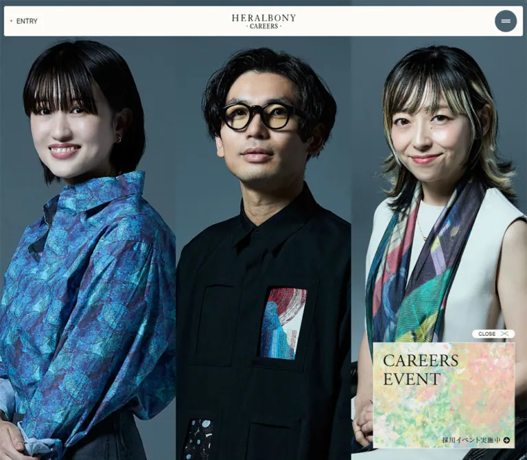
ヘラルボニー採用サイト — 3分割ポートレートと端正なナビゲーション
画面いっぱいの人物写真を3列に並べ、白いヘッダーと青灰色の操作ボタンを重ねた採用サイト。スマートフォンでも3分割を保つ大胆なトリミングと、控えめな文字組みが特徴です。
オリジナルサイトを見るHERALBONY CAREERS — Style Reference
Three monumental portraits beneath a narrow, quiet navigation bar.
Website: www.heralbony.jp/careers/ Final URL: www.heralbony.jp/careers Theme: full-color portrait photography with a light navigation surface and dark blue-gray controls; no theme selector was established. Inspected: supplied captures retrieved September 17, 2026, at 04:40:05.560 JST — September 16, 2026, at 19:40:05.560 UTC. Viewports: 1440 × 1000 desktop and 390 × 844 mobile, in CSS pixels. Scope: the current careers homepage, its visible portrait stage and header, plus supplied rendered DOM measurements for company navigation, project links, employee stories, recruitment links, and footer content. Expanded navigation, article pages, and interaction states were not visually demonstrated.
HERALBONY CAREERS gives nearly the entire opening screen to people. Three adjacent portraits create a continuous photographic field: cool studio backgrounds, dark tailoring, natural skin tones, and expressive patterned clothing. A near-white bar sits close to the top edge, carrying a centered serif wordmark and small navigation controls. The contrast is deliberate: large, detailed photographs against compact, restrained interface typography.
The most distinctive responsive decision is to preserve all three portrait columns on a narrow phone. Each column becomes a tall, tightly cropped strip rather than stacking into a list. Faces, clothing, and hands remain fragments of larger portraits. The header changes its arrangement while retaining its 60px visible height.
This is a recruitment-site homepage with links to company information, employee perspectives, projects, working conditions, and applications. The available evidence supports a viewport-filling opening composition; it does not establish a conventional sequence of vertically stacked homepage sections.
How to Read This Reference
- Measured means a value appears in the supplied rendered DOM or computed-style evidence.
- Calculated means a value follows directly from recorded dimensions or coordinates.
- Visual estimate means an approximate reading of the supplied screenshots, without pixel sampling or the underlying declaration.
- DOM-only means content or geometry was recorded, but the corresponding component is absent from the visible captures. Its bounds do not prove visibility, stacking order, or an opened state.
- Recommended means guidance for a new implementation, including the CSS below. It is not a claim about the original site's behavior.
- All
--hb-*names are implementation aliases. The supplied custom-property collection was empty; original token names and stylesheet rules were not provided.
The three desktop captures show the same visible composition, as do the two mobile captures. They should not be treated as evidence of five different interaction states.
Tokens — Colors
Default Palette
| Name | Value | Suggested token | Evidence and role |
|---|---|---|---|
| Warm page base | #f3f2ec |
--hb-paper |
Measured body background at both viewports; mostly covered by photography in the opening state |
| Primary ink | #151819 |
--hb-ink |
Measured body and navigation text color |
| Event white | #ffffff |
--hb-event-surface |
Measured background of the DOM-only recruitment-event link |
| Header near-white | Approximately #fbfaf7 |
--hb-header |
Visual estimate for the visible header strip; its painted child surface was not included in the style sample |
| Control slate | Approximately #354c56 |
--hb-slate |
Visual estimate for the menu disc and desktop application pill |
| Studio midtone | Approximately #4f6670 |
--hb-photo-fallback |
Visual approximation of a photographic background tone, suitable only as a loading fallback |
The photographic background is not a uniform CSS fill. Lighting, shadows, and differences between images produce a range of blue-gray tones. Likewise, the vivid green garment and multicolored textile panels belong to the photographs; they do not establish a green primary-button token.
Several measured anchors have transparent backgrounds even though their visible controls are filled. This indicates that sampling the anchor alone does not identify all painted descendants or pseudo-elements. Preserve the distinction between measured text styles and visually estimated control surfaces.
Article Foreground Variants
The employee-story links have content-specific computed foreground colors. These are DOM-only text colors, not verified card backgrounds or selectable themes.
| MY ISSUE identifier | Measured foreground | MY ISSUE identifier | Measured foreground |
|---|---|---|---|
001 |
#b3e1f1 |
002 |
#3a0813 |
004 |
#e2e2e2 |
005 |
#005942 |
006, 012 |
#bbd8e8 |
007 |
#d1eaba |
008 |
#b0401a |
009 |
#203549 |
010 |
#1c357e |
011 |
#c0daa5 |
013, 017 |
#ffffff |
015 |
#e3f6fa |
016 |
#761b2a |
018 |
#08254b |
020 |
#dd5a5a |
019 |
#8cf2ac |
022 |
#a9aeb2 |
— | — |
Keep these colors attached to their content when reproducing the supplied records. Their contrast cannot be assessed without the corresponding painted card surfaces. Do not repurpose the entire set as a general interface palette.
Tokens — Typography
Primary Interface Stack
Measured family: aktiv-grotesk, ryo-gothic-plusn, sans-serif.
The body, desktop navigation, section labels, project titles, and sampled employee-story headings use this computed stack. Regular weight 400 predominates. Small text leaves the portraits visually dominant.
The body is 13px with a 13px computed line height at both viewports. That compact line height is useful evidence for the interface, but should not automatically become the paragraph style for new long-form content.
A computed font-family declaration identifies the requested stack, not which font supplied every rendered glyph. Font files and per-glyph fallback were not included.
Editorial Event Typography
The DOM-only event component supplies two additional measured stacks:
- English event label:
adobe-garamond-pro, serif, weight400,16px / 18.24px, tracking0.48pxor0.03em. - Japanese event heading:
fot-matisse-pron, sans-serif, weight500, tracking0.06em. Desktop uses15px / 24px; mobile uses13px / 20.8px.
These measurements apply to the event component. They do not identify the typeface used to draw the brand wordmark.
Brand Wordmark
The visible identity consists of widely spaced serif capitals above a smaller CAREERS line with centered dot ornaments. Its measured link box is 163 × 36px on desktop and 126 × 28px on mobile.
Treat the wordmark as supplied brand artwork. The anchor's inherited 13px sans-serif declaration does not describe the lettering visible inside it. Neither the artwork format nor its source URL was supplied.
Mobile Entry Control
The recorded mobile ENTRY button uses Arial, 13.3333px, weight 400, and normal line height. The screenshot shows a small plus mark before the label. Its action was not exercised.
Type Scale
| Role | Desktop | Mobile | Weight | Tracking | Evidence |
|---|---|---|---|---|---|
| Interface body and ordinary links | 13px / 13px |
Same | 400 |
Normal | Measured |
| Desktop primary navigation | 13px / 13px |
Hidden in the supplied mobile state | 400 |
Normal | Measured and visible |
| Mobile ENTRY button | Not visible | 13.3333px / normal |
400 |
Normal | Measured and visible |
| Index section labels | 15px / 15px |
Same | 400 |
0.15px |
DOM-only |
| Project titles | 11px / 14.3px |
Same | 400 |
Normal | DOM-only |
| Employee-story headline declaration | 15.21px / 15.21px |
Same reported declaration | 400 |
Normal | DOM-only; final scaling unresolved |
| CAREERS EVENT label | 16px / 18.24px |
Same | 400 |
0.48px |
DOM-only |
| Japanese event heading | 15px / 24px |
13px / 20.8px |
500 |
0.9px / 0.78px |
DOM-only |
| Peatix utility label | 9px / 13.5px |
10px / 15px |
400 |
Normal | DOM-only |
Some employee-headline rectangles shrink to exactly 75% of their desktop dimensions while retaining the same reported font size. For example, one heading changes from approximately 44.78 × 144px to 33.59 × 108px. Additional scaling is plausible, but the relevant transform and writing-mode properties were not supplied. Do not equate the mobile 15.21px declaration with a verified final visual size.
The HTML root has a measured 10px font size. The Quick Start uses explicit pixel measurements and does not require changing a project's root size.
Tokens — Spacing & Shapes
Character: very tight outer margins, a shallow navigation bar, edge-to-edge photographs, and almost no visible decorative framing.
Spacing Scale
| Use | Desktop | Mobile | Status |
|---|---|---|---|
| Header horizontal inset | 6px |
8px |
Measured header padding |
| Header top inset | 6px |
12px |
Measured header padding |
| Gap between desktop navigation links | 16px |
Not applicable | Calculated from adjacent anchor bounds |
| Desktop menu-to-navigation separation | 8px |
Not applicable | Calculated from menu and first-link bounds |
| Desktop entry pill to strip's right edge | 12px |
Not applicable | Calculated |
| Space between portrait columns | 0px |
0px |
Screenshot observation |
| Gap between project links | 8px |
12px |
Calculated from DOM-only bounds |
| Gap between employee-story links | 8px |
12px |
Calculated from DOM-only bounds |
| Mobile company-index side inset | Not applicable | 20px |
DOM-only bounds |
| Mobile company-index row gap | Not applicable | 20px |
Calculated from DOM-only bounds |
| Project-link bottom padding | 20px |
20px |
Measured |
Border Radius
| Element | Treatment | Evidence |
|---|---|---|
| Portrait panels | Square, uninterrupted image edges | Visible |
| Header strip | Approximately 3px corner radius |
Visual estimate |
| Menu disc | Circle | Visible; estimated diameter below |
| Desktop application control | Fully rounded pill; approximately 17px radius for a 34px height |
Visual estimate plus measured height |
| Sampled project and company anchors | 0px |
Measured on anchors; descendant styling not established |
No general card-shadow system is visible in the opening composition. Separation comes from light versus dark surfaces and the hard boundaries between photographs.
Layout Measurements
| Element | At 1440 × 1000 | At 390 × 844 | Evidence |
|---|---|---|---|
| Visible portrait stage | Fills 1440 × 1000px |
Fills 390 × 844px |
Screenshot |
| Each visible portrait column | Approximately 480px wide |
130px wide |
Calculated thirds, consistent with screenshot boundaries |
| Visible header strip | Approximately 1428 × 60px, at (6, 6) |
Approximately 374 × 60px, at (8, 12) |
Screenshot and recorded padding/control bounds |
| Header wrapper | 1440 × 110px |
390 × 116px |
Measured; not the painted strip's height |
| Brand link | 163 × 36px, at (639, 18) |
126 × 28px, at (132, 29) |
Measured |
| Menu button box | 60 × 60px, at (6, 6) |
68 × 60px, at (314, 12) |
Measured |
| Visible menu disc | Approximately 36px diameter |
Approximately 44px diameter |
Visual estimate |
| Desktop application anchor | 162 × 34px, at (1260, 19) |
Not visible | Measured |
| Mobile ENTRY button | Not visible | Approximately 58.63 × 17px, at (16, 33.5) |
Measured |
| Document height | 1000px |
844px |
Measured |
| Body bounding width | 10560px |
2860px |
Measured; wider than the visible frame |
The 110px and 116px wrapper heights must not become the visible bar height. The captures show a 60px strip with transparent or otherwise unpainted wrapper space beyond it.
Components
Portrait Stage
Role: establishes the careers site's identity through people and their clothing.
Three tall portrait panels sit flush against one another and extend to every viewport edge. The photography continues behind the header. There are no visible card gutters, captions, arrows, pagination dots, or large marketing headlines in the supplied opening state.
On desktop, each panel is broad enough to show most of a torso. The left portrait features a green patterned garment, the center portrait combines a dark jacket with a graphic top, and the right portrait features a dark shirt with rectangular artwork inserts. Cool backgrounds visually connect the separate images.
On mobile, the same three-column relationship becomes a sequence of narrow vertical crops. Preserve image proportions and crop each image independently. Stretching a photograph to fit its strip would distort faces and garment patterns.
Recommended implementation anatomy: a viewport-height grid containing three clipped image panels. Use object-fit: cover and provide per-image focal-position overrides. This reproduces the visible frame; it does not establish how the source advances through additional portraits.
Desktop Header
Role: keeps navigation and recruitment access available without competing with the photography.
The near-white strip begins 6px from the top and sides. Its visible height is 60px. The left side contains a circular menu symbol within a larger 60 × 60px button box, followed by six small links:
会社について, MY ISSUE, プロジェクト, 働き方, 求める人材, and 採用情報.
The first link starts at x = 74px; successive links have 16px of calculated separation. The brand sits near the exact viewport center. A dark slate application pill sits at the far right and displays 募集職種・エントリー.
Center the brand independently of the unequal left and right content widths. A simple space-between row would center it only within the remaining space and can shift it visibly.
The header overlays the photographs in the captures. Its persistence during scrolling was not tested, so fixed positioning is not an established source behavior.
Mobile Header
Role: preserves identity and the two main utilities within a narrow screen.
The strip moves to 8px side insets and a 12px top inset. The centered wordmark shrinks to 126 × 28px. The left utility becomes the visible + ENTRY label. The menu control moves to the right, where its button box is 68 × 60px and its visible disc is approximately 44px across.
The full desktop link row and right-hand application pill are absent from the visible mobile header. This is a rearrangement of priorities, not a proportional shrinking of the desktop row.
The recorded ENTRY element is a button, while recruitment anchors elsewhere point to https://herp.careers/v1/heralbonyco. The evidence does not establish whether pressing ENTRY reveals another control or navigates directly. Implement that action explicitly instead of assuming the button is already a direct link.
Menu Symbol
Role: compact navigation affordance.
The visible mark is two short, light horizontal strokes centered inside a dark circular disc. The disc is inset within a larger transparent button rectangle. Keep those two geometries separate: the painted circle is smaller than the recorded interaction box.
The captured button has no text content. Its accessible name and expanded-state attributes were not supplied. Opening, closing, and icon transformation were not demonstrated.
Company Navigation Group — DOM Only
Role: provides access to company information and recruitment guidance.
The recorded content includes an ABOUT US label and four primary destinations: company information, desired people, work style, and recruitment information. Work style has benefits and team links; recruitment has FAQ and selection-flow links.
Desktop primary-link bounds form two columns, each approximately 344.23px wide, with about 6.97px between them. The first row begins at y = 213px; a second row begins around y = 427.91px. Individual links are approximately 183px high.
Mobile bounds form one column at x = 20px, with 350px width. The first three primary links are approximately 133.20px high and separated by 20px. Their sublinks occupy positions near the lower part of their associated rows.
These are measured content boxes, not verified thumbnail dimensions. The available screenshots show portraits over this area, so neither the open panel's surface treatment nor its final layering is established.
Recruitment Event Link — DOM Only
Role: leads to recruitment events on Peatix.
The recorded link points to https://heralbony-event.peatix.com/events and contains the two-line CAREERS EVENT label, 採用イベント情報, and a small Peatix label.
Its measured white anchor is approximately 695.44 × 94px on desktop and 350 × 94px on mobile. The English label uses the measured Garamond stack. The Japanese heading uses the measured Matisse stack and becomes smaller on mobile.
The element is not visible in the supplied original-page captures. No floating placement, close control, promotional illustration, or appearance timing is established for the current visible state.
Project Rail — DOM Only
Role: connects prospective applicants with examples of the organization's work.
Each recorded link contains a category and a project title. Categories include art-produce, project, collaboration, and award-exhibition. Destinations use anchors on the projects page, such as /careers/projects/#project_4422.
Desktop anchors are 167px wide, with adjacent origins 175px apart. Mobile anchors are 133px wide, with origins 145px apart. This yields gaps of 8px and 12px respectively. Every sampled project anchor has 20px of bottom padding.
Titles use 11px / 14.3px, regular weight, and wrap naturally. Recorded link heights vary with title length: approximately 262.59–276.89px on desktop and 223.59–237.89px on mobile.
The same ten project records appear repeatedly in the supplied DOM. This is consistent with duplicated rail content, but it does not prove an autoplay direction, speed, or carousel library. Image source URLs and image-element bounds were not included.
Employee Story Rail — DOM Only
Role: presents individual perspectives through the MY ISSUE series.
Each compact link pairs a three-digit identifier with a personal statement. The supplied identifiers are non-contiguous; retain the recorded identifiers rather than renumbering the stories. Examples include 001, 013, 019, 020, and 022.
Desktop link bounds are 211 × 212px, with 8px between adjacent links. Mobile bounds are approximately 169 × 167.17px, with 12px between links. Computed foreground colors vary by story, as listed in the color table.
Headlines have narrow, tall bounding boxes, compatible with a vertical Japanese composition. However, writing mode was not captured and the cards are not visible in the screenshots. Their exact text orientation remains unverified.
A separate set of larger article links contains a statement, MY ISSUE / identifier, employee name, and job title. Those fields establish the content anatomy, but the supplied opening frame does not show their typography or reveal behavior. Do not add permanently visible portrait captions merely because the text exists in the DOM.
Recruitment and Footer Links — DOM Only
Role: provides applications and related organizational channels.
The recorded content includes an application link, X, NOTE, INSTAGRAM, CORPORATE WEBSITE, and © 2024 HERALBONY Co., Ltd. The corporate destination is https://www.heralbony.jp/.
No footer rectangle or visible footer state was supplied. Its DOM position does not prove a conventional footer below the portrait stage. The copyright year is page content, not the inspection date.
Tokens — Motion & Interaction
The supplied evidence establishes controls and link destinations more clearly than motion. No original duration, easing curve, drag response, or menu transition can be reproduced confidently from this record.
| Feature | Evidence | What remains unverified |
|---|---|---|
| Portrait presentation | Three adjacent panels in both viewports; body extends horizontally | Autoplay, swipe, drag, wheel mapping, direction, timing, and active-item behavior |
| Menu control | Visible two-line circular affordance and measured button box | Opened state, transition, focus handling, and closing behavior |
| Mobile ENTRY | A measured button and visible plus-prefixed label | Whether it expands recruitment choices or performs navigation |
| Desktop recruitment action | Recorded anchor to the external recruitment service | Hover, pressed state, and new-tab behavior |
| Repeated navigation text | Several anchors contain two copies of a label; screenshots display one | Whether duplication supports animated text replacement |
| Project and story rails | Repeated records and offscreen horizontal coordinates | Whether they move automatically or respond to input |
| Article metadata | Statements, names, roles, and Read Article text occur in the DOM | Hover reveal, custom cursor, touch equivalent, and display timing |
| Sampled animation styles | Sampled elements report animation: none; transition output is all |
Descendant, ancestor, pseudo-element, and script-driven motion; transition duration is unavailable |
The capture procedure waited for finite motion and layout stability, and temporarily paused perpetual animation during readiness checks. That procedure does not demonstrate that a particular animation was present, nor does a stable screenshot prove the entire page is static.
Recommended behavior for a new implementation: begin with a stable three-panel presentation. If gallery movement is added, provide a clear manual path to each story and preserve a static reduced-motion mode. A restrained 120–180ms feedback transition can suit the small controls, but that range is a recommendation, not a measured source token.
Repeated text should produce one accessible label. If duplicated spans are used for a visual effect, hide the decorative copy from assistive technology.
Surfaces
| Layer | Appearance | Evidence and purpose |
|---|---|---|
| Underlying page | Warm neutral #f3f2ec |
Measured body background; mostly concealed in the opening frame |
| Main visual field | Full-color photography | Visible; provides almost all texture and visual density |
| Header | Opaque near-white strip with subtly rounded corners | Visible; separates small controls from detailed imagery |
| Menu and desktop application control | Dark slate disc and pill | Visible; compact, high-contrast action surfaces |
| Event link | White rectangular anchor | DOM-only computed background |
| Secondary index links | Transparent sampled anchor backgrounds | Final image, descendant, and surrounding surfaces are unresolved |
Keep the photographic field free of unnecessary glass effects, gradients, and shadows. The supplied opening state has enough separation through the light header, dark controls, and portrait boundaries.
Imagery
The opening visual language is studio portraiture with strong textile detail. Subjects occupy most of their panels, with limited negative space and a cool, coordinated backdrop. Dark clothing allows small artwork panels to become focal details; the large green garment provides a stronger block of color in the captured arrangement.
Retain natural photographic texture. Skin, hair, glasses, woven fabric, printed patterns, and hands should remain sharp enough to reward close viewing. The interface contributes little ornament because the clothing already supplies it.
Mobile cropping is central to the effect. At 390px wide, each portrait has only 130px of horizontal space but occupies the full 844px height. The viewer sees selected parts of faces and bodies rather than three reduced, fully contained photographs. A centered crop is a useful starting point, but focal placement must be checked against the actual assets.
Observed Asset References
The evidence does not contain image src values, logo paths, native image dimensions, or font-file URLs. No original asset paths can be listed reliably.
| Asset | Established evidence | Implementation guidance |
|---|---|---|
| Opening portraits | Visible in desktop captures 1–3 and mobile captures 4–5 | Use authorized portrait assets and set focal positions individually |
| HERALBONY CAREERS wordmark | Visible; link bounds measured at both sizes | Use supplied brand artwork rather than recreating its lettering from an assumed font |
| Menu symbol | Visible as two short horizontal strokes | CSS or a small vector can reproduce the geometry |
| Project media | Project links and their outer bounds exist in the DOM | Obtain actual media before determining image crop or aspect ratio |
| Employee-story media | Article links, headline bounds, and foreground colors are recorded | Confirm final card appearance before selecting background treatments |
The original photography is responsible for much of the identity. Matching only the header and replacing the portraits with loosely related stock photographs will not reproduce the same visual result.
Layout & Responsive Behavior
Desktop Composition
At 1440 × 1000, the stage presents three approximately 480px-wide portrait columns. The header occupies only 60px of visible height and leaves a 6px outer edge. Its navigation group remains toward the left, its logo stays centered, and its application pill sits at the far right.
There is no visible lower content section in these captures. The reported document height is exactly the viewport height.
Mobile Composition
At 390 × 844, the portrait columns remain side by side at 130px each. Their calculated width-to-height ratio changes from approximately 0.48 on desktop to 0.154 on mobile. That dramatic narrowing explains the much tighter crops.
The visible bar stays 60px high, but its side insets become 8px and its top inset becomes 12px. The wordmark is approximately 77% of its desktop width. The menu disc becomes larger rather than smaller, while the primary link row disappears and the entry utility moves left.
No source breakpoint was supplied. The Quick Start uses 1200px as a recommended threshold for the full desktop navigation arrangement; it is not an extracted media query.
Horizontal Extent
The measured body width is 10560px on desktop and 2860px on mobile. Both satisfy:
body width = 22 × (viewport width / 3)
10560 = 22 × 480
2860  = 22 × 130
This is consistent with a horizontal structure containing 22 portrait-width slots. It is a calculated relationship, not proof of the exact track implementation. The visual target is three visible columns; do not create uncontrolled document overflow merely to reproduce the body measurement.
Secondary Content
The company navigation changes from two desktop columns to one mobile column in the DOM measurements. Project and employee-story items become narrower, while their horizontal gaps increase from 8px to 12px.
Some DOM-only rectangles overlap or extend beyond the recorded document height. Their coordinates cannot be assembled into a reliable screenshot of an open navigation panel. Treat these values as component-level measurements, and verify the surrounding layout before reproducing it.
For a new implementation, independently scrollable navigation can keep all links reachable on a short phone. This is a recommendation; internal scrolling and scroll locking were not verified on the source.
Do’s and Don’ts
Do
- Make the portraits the dominant content of the opening frame.
- Preserve three equal-width columns on both inspected screen sizes.
- Crop portraits independently and review face and garment placement on mobile.
- Keep the visible navigation strip 60px high at the inspected sizes.
- Center the brand independently of the surrounding controls.
- Separate the menu's painted circle from its larger button box.
- Use the measured sans-serif stack for compact interface text.
- Preserve the wordmark as brand artwork.
- Keep story identifiers and content-specific foreground colors attached to their records.
- Label secondary-component styling and untested interactions according to their evidence limits.
Don’t
- Don't turn the opening frame into a generic headline-and-button recruitment banner.
- Don't stack the three portraits vertically on mobile when matching this composition.
- Don't reduce each portrait until the entire photograph fits inside a narrow strip.
- Don't stretch photographs or add unnecessary image filters.
- Don't turn the source's transparent 110px or 116px header wrapper into a solid bar of that height.
- Don't assign the event label's Garamond family to the wordmark without evidence.
- Don't treat offscreen DOM text as content proven visible in the opening frame.
- Don't invent carousel timings, hover reveals, menu animations, or a particular animation library.
- Don't interpret every article foreground color as a button or background token.
- Don't reproduce duplicated labels as repeated visible or accessible text.
Recommended Implementation Additions
These are recommendations for a new implementation, not verified features of the original:
- Give the menu an explicit accessible name,
aria-expanded, and a relationship to its navigation panel. Support Escape and return focus to the trigger after closing. - Increase the mobile ENTRY control's effective target height to at least 44px while preserving its small visual label. The recorded source button's text box is only 17px high.
- Provide visible keyboard focus on the portrait links and small header controls.
- Keep names, roles, and article destinations available without hover. If visual captions appear only in an expanded state, provide equivalent accessible link names.
- Offer a paused or static presentation when reduced motion is requested. Any script-driven autoplay must honor that preference separately from CSS.
- Deduplicate repeated rail content in the accessibility tree and tab order.
- Preserve a readable, scrollable navigation state at increased text sizes and on short screens.
- Reserve image dimensions before loading, prioritize the initially visible portraits, and defer additional rail images until needed.
- Load the recorded fonts only when available for the implementation; maintain sensible fallbacks and test their width against the centered logo.
Agent Prompt Guide
Quick Color Reference
- Underlying page: measured
#f3f2ec. - Primary interface text: measured
#151819. - Event-link surface: measured
#ffffff. - Visible header approximation:
#fbfaf7. - Menu and application-control approximation:
#354c56. - Photographic slate fallback: approximately
#4f6670; retain the actual photographs' tonal variation. - Strong green and multicolored accents belong to clothing and artwork, not a global action palette.
Overall Prompt
“Create a recruitment-site homepage inspired by the supplied HERALBONY CAREERS composition. Fill the viewport with three adjacent studio portraits, with no gutters or rounded image corners. Use cool blue-gray photographic backgrounds, natural skin texture, dark tailoring, and expressive patterned garments. Overlay a near-white 60px navigation bar with tiny outer margins. Center supplied serif brand artwork independently of navigation. At 1440 × 1000, show a left circular menu control and six compact links, with a dark slate recruitment pill on the right. At 390 × 844, retain three 130px portrait strips, move the menu to the right, and show a small + ENTRY utility on the left. Keep the initial photographic frame free of added large headlines and captions. Use the measured typography where available, and treat unspecified gallery and menu behavior as implementation decisions requiring explicit design.”
Example Component Prompts
- Desktop header: “Build a near-white strip inset 6px from a 1440px viewport, with a 60px visible height. Place a roughly 36px slate menu disc inside a 60px button box. Begin 13px navigation text at x = 74px, with 16px gaps. Center a 163 × 36px supplied logo. Place a 162 × 34px slate application pill 12px inside the strip's right edge. Use only subtle corner rounding and no visible elevation shadow.”
- Mobile header: “At 390px width, use 8px side insets and a 12px top inset around a 60px bar. Center a 126 × 28px logo. Put + ENTRY on the left and a 44px slate menu disc inside a 68 × 60px button box on the right. Preserve the small labels while providing accessible hit targets.”
- Portrait stage: “Create three equal-width image panels filling the viewport height. Use independent cover crops with adjustable focal positions. At 390 × 844, each panel must remain 130px wide. Preserve natural photographic proportions, sharp fabric patterns, and square panel edges.”
- Project rail adaptation: “Using the supplied DOM measurements, create simple linked project items with category text and regular 11px titles at 1.3 line height. Use 167px item widths and 8px gaps on desktop, changing to 133px widths and 12px gaps on mobile. Do not invent image aspect ratios or automatic movement; select those after obtaining media and interaction requirements.”
- Accessible navigation addition: “Design an explicitly controlled navigation panel for the recorded company, work-style, recruitment, project, and employee-story links. Use the measured warm base and ink colors. Preserve all destinations, avoid duplicate accessible labels, and allow the panel to scroll on a phone. Treat this as a new implementation decision because its open appearance was not supplied.”
Quick Start
CSS Custom Properties
This CSS reproduces the visible three-panel frame and header proportions. It also supplies basic sizing for the DOM-only rails. It is an adaptation using new selectors, not an extraction of the source stylesheet.
Expected anatomy: .careers-shell contains a .portrait-stage with three .portrait-panel links, each containing an image, and a sibling .careers-header. The header contains .menu-toggle > .menu-disc, .desktop-nav, .brand > img, .entry-desktop, and .entry-mobile. Use actual authorized image and wordmark assets; no original asset paths were supplied.
Menu opening, article routing, and any gallery movement require their own implementation. The mobile ENTRY class can style a button or link, but choose semantics according to the action actually implemented.
:root {
  /* Measured computed colors */
  --hb-paper: #f3f2ec;
  --hb-ink: #151819;
  --hb-event-surface: #ffffff;

  /* Visual approximations, not extracted source declarations */
  --hb-header: #fbfaf7;
  --hb-slate: #354c56;
  --hb-photo-fallback: #4f6670;

  /* Recorded font stacks; font files must be supplied separately */
  --hb-font-ui: 'aktiv-grotesk', 'ryo-gothic-plusn', sans-serif;
  --hb-font-event-en: 'adobe-garamond-pro', serif;
  --hb-font-event-ja: 'fot-matisse-pron', sans-serif;

  --hb-text-ui: 13px;
  --hb-text-section: 15px;
  --hb-text-project: 11px;

  /* Mobile geometry */
  --hb-topbar-height: 60px;
  --hb-inset-x: 8px;
  --hb-inset-y: 12px;
  --hb-brand-width: 126px;
  --hb-brand-height: 28px;
  --hb-menu-hit-width: 68px;
  --hb-menu-disc: 44px;
  --hb-header-radius: 3px;

  /* DOM-only rail measurements */
  --hb-project-width: 133px;
  --hb-issue-width: 169px;
  --hb-issue-height: 167.17px;
  --hb-rail-gap: 12px;
}

* {
  box-sizing: border-box;
}

body {
  margin: 0;
  color: var(--hb-ink);
  background: var(--hb-paper);
  font-family: var(--hb-font-ui);
  font-size: var(--hb-text-ui);
  font-weight: 400;
  /* Recommended for new body copy; source body reports 1 */
  line-height: 1.5;
}

.careers-shell {
  position: relative;
  isolation: isolate;
  width: 100%;
}

.portrait-stage {
  display: grid;
  grid-template-columns: repeat(3, minmax(0, 1fr));
  gap: 0;
  height: 100vh;
  /* Recommended stable mobile viewport behavior */
  height: 100svh;
  overflow: hidden;
  background: var(--hb-photo-fallback);
}

.portrait-panel {
  position: relative;
  display: block;
  min-width: 0;
  height: 100%;
  overflow: hidden;
  border-radius: 0;
  color: inherit;
  text-decoration: none;
}

.portrait-panel img {
  display: block;
  width: 100%;
  height: 100%;
  object-fit: cover;
  /* Tune each panel against its actual photograph */
  object-position: var(--portrait-position, 50% 50%);
}

.careers-header {
  position: absolute;
  z-index: 20;
  top: max(var(--hb-inset-y), env(safe-area-inset-top, 0px));
  left: max(var(--hb-inset-x), env(safe-area-inset-left, 0px));
  right: max(var(--hb-inset-x), env(safe-area-inset-right, 0px));
  display: grid;
  grid-template-columns: minmax(0, 1fr) auto minmax(0, 1fr);
  align-items: center;
  height: var(--hb-topbar-height);
  border-radius: var(--hb-header-radius);
  background: var(--hb-header);
  color: var(--hb-ink);
  line-height: 1;
}

.brand {
  grid-column: 2;
  grid-row: 1;
  display: block;
  width: var(--hb-brand-width);
  height: var(--hb-brand-height);
  /* Optical offset matching the supplied mobile bounds */
  transform: translateY(1px);
}

.brand img {
  display: block;
  width: 100%;
  height: 100%;
  object-fit: contain;
}

.menu-toggle {
  grid-column: 3;
  grid-row: 1;
  justify-self: end;
  display: grid;
  place-items: center;
  width: var(--hb-menu-hit-width);
  height: var(--hb-topbar-height);
  padding: 0;
  border: 0;
  appearance: none;
  background: transparent;
  cursor: pointer;
}

.menu-disc {
  position: relative;
  display: block;
  width: var(--hb-menu-disc);
  height: var(--hb-menu-disc);
  border-radius: 50%;
  background: var(--hb-slate);
}

.menu-disc::before,
.menu-disc::after {
  content: '';
  position: absolute;
  left: 50%;
  width: 18px;
  height: 1px;
  transform: translateX(-50%);
  background: var(--hb-header);
}

.menu-disc::before {
  top: calc(50% - 2px);
}

.menu-disc::after {
  top: calc(50% + 2px);
}

.entry-mobile {
  grid-column: 1;
  grid-row: 1;
  justify-self: start;
  position: relative;
  display: inline-flex;
  align-items: center;
  min-height: 44px; /* Recommended larger hit target */
  margin-left: 8px;
  padding: 0 0 0 17px;
  border: 0;
  background: transparent;
  color: var(--hb-ink);
  font: 400 13.3333px/1 Arial, sans-serif;
  text-decoration: none;
  text-transform: uppercase;
  cursor: pointer;
}

.entry-mobile::before {
  content: '+';
  position: absolute;
  left: 3px;
  font-size: 10px;
}

.desktop-nav,
.entry-desktop {
  display: none;
}

/* Optional secondary components: structure, not a verified open state */
.index-heading {
  margin: 0;
  font-size: var(--hb-text-section);
  font-weight: 400;
  line-height: 1;
  letter-spacing: 0.01em;
}

.project-rail,
.issue-rail {
  display: flex;
  gap: var(--hb-rail-gap);
  overflow-x: auto;
  /* Manual scrolling is an adaptation, not observed source behavior */
}

.project-card {
  flex: 0 0 var(--hb-project-width);
  padding-bottom: 20px;
  border-radius: 0;
  color: var(--hb-ink);
  text-decoration: none;
}

.project-card h3 {
  margin: 0;
  font-size: var(--hb-text-project);
  font-weight: 400;
  line-height: 1.3;
}

.issue-card {
  flex: 0 0 var(--hb-issue-width);
  min-height: var(--hb-issue-height);
  color: var(--article-ink, var(--hb-ink));
  text-decoration: none;
  /* Supply the corresponding media before using light text colors */
}

.event-link {
  display: flex;
  align-items: center;
  min-height: 94px;
  background: var(--hb-event-surface);
  color: var(--hb-ink);
  text-decoration: none;
}

.event-label {
  font-family: var(--hb-font-event-en);
  font-size: 16px;
  font-weight: 400;
  line-height: 1.14;
  letter-spacing: 0.03em;
}

.event-title {
  font-family: var(--hb-font-event-ja);
  font-size: 13px;
  font-weight: 500;
  line-height: 1.6;
  letter-spacing: 0.06em;
}

/* Recommended breakpoint; the source media query is unknown */
@media (min-width: 1200px) {
  :root {
    --hb-inset-x: 6px;
    --hb-inset-y: 6px;
    --hb-brand-width: 163px;
    --hb-brand-height: 36px;
    --hb-menu-hit-width: 60px;
    --hb-menu-disc: 36px;
    --hb-project-width: 167px;
    --hb-issue-width: 211px;
    --hb-issue-height: 212px;
    --hb-rail-gap: 8px;
  }

  .careers-header {
    grid-template-columns: 60px minmax(0, 1fr) auto;
  }

  .menu-toggle {
    grid-column: 1;
    justify-self: start;
  }

  .brand {
    position: absolute;
    left: 50%;
    top: 50%;
    transform: translate(-50%, -50%);
  }

  .desktop-nav {
    grid-column: 2;
    grid-row: 1;
    justify-self: start;
    display: flex;
    align-items: center;
    gap: 16px;
    margin-left: 8px;
    white-space: nowrap;
  }

  .desktop-nav a {
    display: inline-flex;
    align-items: center;
    min-height: 19px;
    color: var(--hb-ink);
    font-size: 13px;
    line-height: 1;
    text-decoration: none;
  }

  .entry-desktop {
    grid-column: 3;
    grid-row: 1;
    display: inline-flex;
    align-items: center;
    justify-content: center;
    width: 162px;
    height: 34px;
    margin-right: 12px;
    border-radius: 999px;
    background: var(--hb-slate);
    color: var(--hb-header);
    font-size: 13px;
    line-height: 1;
    text-decoration: none;
    white-space: nowrap;
  }

  .entry-mobile {
    display: none;
  }

  .event-title {
    font-size: 15px;
  }
}

/* Recommended keyboard feedback */
.careers-header :focus-visible {
  outline: 2px solid var(--hb-ink);
  outline-offset: 3px;
}

.portrait-panel:focus-visible {
  outline: 3px solid var(--hb-header);
  outline-offset: -6px;
}

/* Keep a semantic page heading available without adding visual copy */
.sr-only {
  position: absolute;
  width: 1px;
  height: 1px;
  padding: 0;
  overflow: hidden;
  clip-path: inset(50%);
  white-space: nowrap;
  border: 0;
}
The CSS intentionally does not recreate the measured oversized body. Additional portraits should live inside a controlled track if gallery behavior is implemented. The photographed garments and brand artwork must come from real assets; CSS cannot provide those details.
Tailwind v4 Token Mapping
Optional mapping for a project already using Tailwind v4. Define the properties above first. This does not imply that the original website uses Tailwind.
@theme inline {
  --color-hb-paper: var(--hb-paper);
  --color-hb-ink: var(--hb-ink);
  --color-hb-header: var(--hb-header);
  --color-hb-slate: var(--hb-slate);
  --color-hb-event: var(--hb-event-surface);

  --font-hb-ui: var(--hb-font-ui);
  --font-hb-event-en: var(--hb-font-event-en);
  --font-hb-event-ja: var(--hb-font-event-ja);

  --text-hb-ui: 13px;
  --text-hb-section: 15px;
  --text-hb-project: 11px;

  --spacing-hb-header: var(--hb-topbar-height);
  --spacing-hb-rail-gap: var(--hb-rail-gap);
  --spacing-hb-project: var(--hb-project-width);
  --spacing-hb-issue: var(--hb-issue-width);

  --radius-hb-header: var(--hb-header-radius);
}
Sources & Evidence
- Original requested page: HERALBONY CAREERS.
- Final recorded page: HERALBONY CAREERS, HTTP
200. The URL differs only by its trailing slash; page title, brand, and recruitment content retain the same identity. - Capture timestamp:
2026-09-16T19:40:05.560Z, equivalent to September 17, 2026, at04:40:05.560JST. This is the supplied retrieval timestamp, not an independently repeated visit. - Desktop evidence: three supplied original-page captures at
1440 × 1000, plus rendered text, link destinations, element rectangles, and computed styles. - Mobile evidence: two supplied original-page captures at
390 × 844, plus the corresponding rendered DOM measurements. - Interaction evidence: link destinations and control elements were recorded. No supplied opened-menu, clicked-entry, hovered-portrait, dragged-gallery, or completed-navigation state establishes their resulting behavior.
- Capture limitations: the collection waited for load, finite visible or potentially revealing motion, sampled layout/text stability, and image decoding within bounded time limits. Perpetual animation was temporarily paused during readiness checks and then resumed. SharedWorkers and service workers were disabled. These procedures do not establish semantic completeness or exclude delayed content.
- Style limitations: source stylesheets, image URLs, font files, original custom-property names, complete visibility/stacking information, and motion timings were not included. Screenshot-only colors and shapes are marked as estimates. Secondary components are explicitly marked DOM-only.
This reference describes the current supplied page state. The portrait frame and header have direct visual support; secondary navigation geometry has narrower DOM support. The Quick Start and accessibility additions are implementation recommendations, not claims of additional tested source behavior.
# HERALBONY CAREERS — Style Reference

> Three monumental portraits beneath a narrow, quiet navigation bar.

**Website:** [www.heralbony.jp/careers/](https://www.heralbony.jp/careers/)
**Final URL:** [www.heralbony.jp/careers](https://www.heralbony.jp/careers)
**Theme:** full-color portrait photography with a light navigation surface and dark blue-gray controls; no theme selector was established.
**Inspected:** supplied captures retrieved September 17, 2026, at 04:40:05.560 JST — September 16, 2026, at 19:40:05.560 UTC.
**Viewports:** 1440 × 1000 desktop and 390 × 844 mobile, in CSS pixels.
**Scope:** the current careers homepage, its visible portrait stage and header, plus supplied rendered DOM measurements for company navigation, project links, employee stories, recruitment links, and footer content. Expanded navigation, article pages, and interaction states were not visually demonstrated.

HERALBONY CAREERS gives nearly the entire opening screen to people. Three adjacent portraits create a continuous photographic field: cool studio backgrounds, dark tailoring, natural skin tones, and expressive patterned clothing. A near-white bar sits close to the top edge, carrying a centered serif wordmark and small navigation controls. The contrast is deliberate: large, detailed photographs against compact, restrained interface typography.

The most distinctive responsive decision is to preserve all three portrait columns on a narrow phone. Each column becomes a tall, tightly cropped strip rather than stacking into a list. Faces, clothing, and hands remain fragments of larger portraits. The header changes its arrangement while retaining its 60px visible height.

This is a recruitment-site homepage with links to company information, employee perspectives, projects, working conditions, and applications. The available evidence supports a viewport-filling opening composition; it does not establish a conventional sequence of vertically stacked homepage sections.

## How to Read This Reference

- **Measured** means a value appears in the supplied rendered DOM or computed-style evidence.
- **Calculated** means a value follows directly from recorded dimensions or coordinates.
- **Visual estimate** means an approximate reading of the supplied screenshots, without pixel sampling or the underlying declaration.
- **DOM-only** means content or geometry was recorded, but the corresponding component is absent from the visible captures. Its bounds do not prove visibility, stacking order, or an opened state.
- **Recommended** means guidance for a new implementation, including the CSS below. It is not a claim about the original site's behavior.
- All `--hb-*` names are implementation aliases. The supplied custom-property collection was empty; original token names and stylesheet rules were not provided.

The three desktop captures show the same visible composition, as do the two mobile captures. They should not be treated as evidence of five different interaction states.

## Tokens — Colors

### Default Palette

| Name | Value | Suggested token | Evidence and role |
| --- | --- | --- | --- |
| Warm page base | `#f3f2ec` | `--hb-paper` | Measured body background at both viewports; mostly covered by photography in the opening state |
| Primary ink | `#151819` | `--hb-ink` | Measured body and navigation text color |
| Event white | `#ffffff` | `--hb-event-surface` | Measured background of the DOM-only recruitment-event link |
| Header near-white | Approximately `#fbfaf7` | `--hb-header` | Visual estimate for the visible header strip; its painted child surface was not included in the style sample |
| Control slate | Approximately `#354c56` | `--hb-slate` | Visual estimate for the menu disc and desktop application pill |
| Studio midtone | Approximately `#4f6670` | `--hb-photo-fallback` | Visual approximation of a photographic background tone, suitable only as a loading fallback |

The photographic background is not a uniform CSS fill. Lighting, shadows, and differences between images produce a range of blue-gray tones. Likewise, the vivid green garment and multicolored textile panels belong to the photographs; they do not establish a green primary-button token.

Several measured anchors have transparent backgrounds even though their visible controls are filled. This indicates that sampling the anchor alone does not identify all painted descendants or pseudo-elements. Preserve the distinction between measured text styles and visually estimated control surfaces.

### Article Foreground Variants

The employee-story links have content-specific computed foreground colors. These are **DOM-only text colors**, not verified card backgrounds or selectable themes.

| MY ISSUE identifier | Measured foreground | MY ISSUE identifier | Measured foreground |
| --- | --- | --- | --- |
| `001` | `#b3e1f1` | `002` | `#3a0813` |
| `004` | `#e2e2e2` | `005` | `#005942` |
| `006`, `012` | `#bbd8e8` | `007` | `#d1eaba` |
| `008` | `#b0401a` | `009` | `#203549` |
| `010` | `#1c357e` | `011` | `#c0daa5` |
| `013`, `017` | `#ffffff` | `015` | `#e3f6fa` |
| `016` | `#761b2a` | `018` | `#08254b` |
| `020` | `#dd5a5a` | `019` | `#8cf2ac` |
| `022` | `#a9aeb2` | — | — |

Keep these colors attached to their content when reproducing the supplied records. Their contrast cannot be assessed without the corresponding painted card surfaces. Do not repurpose the entire set as a general interface palette.

## Tokens — Typography

### Primary Interface Stack

**Measured family:** `aktiv-grotesk, ryo-gothic-plusn, sans-serif`.

The body, desktop navigation, section labels, project titles, and sampled employee-story headings use this computed stack. Regular weight `400` predominates. Small text leaves the portraits visually dominant.

The body is `13px` with a `13px` computed line height at both viewports. That compact line height is useful evidence for the interface, but should not automatically become the paragraph style for new long-form content.

A computed font-family declaration identifies the requested stack, not which font supplied every rendered glyph. Font files and per-glyph fallback were not included.

### Editorial Event Typography

The DOM-only event component supplies two additional measured stacks:

- **English event label:** `adobe-garamond-pro, serif`, weight `400`, `16px / 18.24px`, tracking `0.48px` or `0.03em`.
- **Japanese event heading:** `fot-matisse-pron, sans-serif`, weight `500`, tracking `0.06em`. Desktop uses `15px / 24px`; mobile uses `13px / 20.8px`.

These measurements apply to the event component. They do not identify the typeface used to draw the brand wordmark.

### Brand Wordmark

The visible identity consists of widely spaced serif capitals above a smaller CAREERS line with centered dot ornaments. Its measured link box is `163 × 36px` on desktop and `126 × 28px` on mobile.

Treat the wordmark as supplied brand artwork. The anchor's inherited `13px` sans-serif declaration does not describe the lettering visible inside it. Neither the artwork format nor its source URL was supplied.

### Mobile Entry Control

The recorded mobile ENTRY button uses `Arial`, `13.3333px`, weight `400`, and normal line height. The screenshot shows a small plus mark before the label. Its action was not exercised.

### Type Scale

| Role | Desktop | Mobile | Weight | Tracking | Evidence |
| --- | --- | --- | --- | --- | --- |
| Interface body and ordinary links | `13px / 13px` | Same | `400` | Normal | Measured |
| Desktop primary navigation | `13px / 13px` | Hidden in the supplied mobile state | `400` | Normal | Measured and visible |
| Mobile ENTRY button | Not visible | `13.3333px / normal` | `400` | Normal | Measured and visible |
| Index section labels | `15px / 15px` | Same | `400` | `0.15px` | DOM-only |
| Project titles | `11px / 14.3px` | Same | `400` | Normal | DOM-only |
| Employee-story headline declaration | `15.21px / 15.21px` | Same reported declaration | `400` | Normal | DOM-only; final scaling unresolved |
| CAREERS EVENT label | `16px / 18.24px` | Same | `400` | `0.48px` | DOM-only |
| Japanese event heading | `15px / 24px` | `13px / 20.8px` | `500` | `0.9px` / `0.78px` | DOM-only |
| Peatix utility label | `9px / 13.5px` | `10px / 15px` | `400` | Normal | DOM-only |

Some employee-headline rectangles shrink to exactly 75% of their desktop dimensions while retaining the same reported font size. For example, one heading changes from approximately `44.78 × 144px` to `33.59 × 108px`. Additional scaling is plausible, but the relevant transform and writing-mode properties were not supplied. Do not equate the mobile `15.21px` declaration with a verified final visual size.

The HTML root has a measured `10px` font size. The Quick Start uses explicit pixel measurements and does not require changing a project's root size.

## Tokens — Spacing & Shapes

**Character:** very tight outer margins, a shallow navigation bar, edge-to-edge photographs, and almost no visible decorative framing.

### Spacing Scale

| Use | Desktop | Mobile | Status |
| --- | --- | --- | --- |
| Header horizontal inset | `6px` | `8px` | Measured header padding |
| Header top inset | `6px` | `12px` | Measured header padding |
| Gap between desktop navigation links | `16px` | Not applicable | Calculated from adjacent anchor bounds |
| Desktop menu-to-navigation separation | `8px` | Not applicable | Calculated from menu and first-link bounds |
| Desktop entry pill to strip's right edge | `12px` | Not applicable | Calculated |
| Space between portrait columns | `0px` | `0px` | Screenshot observation |
| Gap between project links | `8px` | `12px` | Calculated from DOM-only bounds |
| Gap between employee-story links | `8px` | `12px` | Calculated from DOM-only bounds |
| Mobile company-index side inset | Not applicable | `20px` | DOM-only bounds |
| Mobile company-index row gap | Not applicable | `20px` | Calculated from DOM-only bounds |
| Project-link bottom padding | `20px` | `20px` | Measured |

### Border Radius

| Element | Treatment | Evidence |
| --- | --- | --- |
| Portrait panels | Square, uninterrupted image edges | Visible |
| Header strip | Approximately `3px` corner radius | Visual estimate |
| Menu disc | Circle | Visible; estimated diameter below |
| Desktop application control | Fully rounded pill; approximately `17px` radius for a `34px` height | Visual estimate plus measured height |
| Sampled project and company anchors | `0px` | Measured on anchors; descendant styling not established |

No general card-shadow system is visible in the opening composition. Separation comes from light versus dark surfaces and the hard boundaries between photographs.

### Layout Measurements

| Element | At 1440 × 1000 | At 390 × 844 | Evidence |
| --- | --- | --- | --- |
| Visible portrait stage | Fills `1440 × 1000px` | Fills `390 × 844px` | Screenshot |
| Each visible portrait column | Approximately `480px` wide | `130px` wide | Calculated thirds, consistent with screenshot boundaries |
| Visible header strip | Approximately `1428 × 60px`, at `(6, 6)` | Approximately `374 × 60px`, at `(8, 12)` | Screenshot and recorded padding/control bounds |
| Header wrapper | `1440 × 110px` | `390 × 116px` | Measured; not the painted strip's height |
| Brand link | `163 × 36px`, at `(639, 18)` | `126 × 28px`, at `(132, 29)` | Measured |
| Menu button box | `60 × 60px`, at `(6, 6)` | `68 × 60px`, at `(314, 12)` | Measured |
| Visible menu disc | Approximately `36px` diameter | Approximately `44px` diameter | Visual estimate |
| Desktop application anchor | `162 × 34px`, at `(1260, 19)` | Not visible | Measured |
| Mobile ENTRY button | Not visible | Approximately `58.63 × 17px`, at `(16, 33.5)` | Measured |
| Document height | `1000px` | `844px` | Measured |
| Body bounding width | `10560px` | `2860px` | Measured; wider than the visible frame |

The `110px` and `116px` wrapper heights must not become the visible bar height. The captures show a 60px strip with transparent or otherwise unpainted wrapper space beyond it.

## Components

### Portrait Stage

**Role:** establishes the careers site's identity through people and their clothing.

Three tall portrait panels sit flush against one another and extend to every viewport edge. The photography continues behind the header. There are no visible card gutters, captions, arrows, pagination dots, or large marketing headlines in the supplied opening state.

On desktop, each panel is broad enough to show most of a torso. The left portrait features a green patterned garment, the center portrait combines a dark jacket with a graphic top, and the right portrait features a dark shirt with rectangular artwork inserts. Cool backgrounds visually connect the separate images.

On mobile, the same three-column relationship becomes a sequence of narrow vertical crops. Preserve image proportions and crop each image independently. Stretching a photograph to fit its strip would distort faces and garment patterns.

**Recommended implementation anatomy:** a viewport-height grid containing three clipped image panels. Use `object-fit: cover` and provide per-image focal-position overrides. This reproduces the visible frame; it does not establish how the source advances through additional portraits.

### Desktop Header

**Role:** keeps navigation and recruitment access available without competing with the photography.

The near-white strip begins 6px from the top and sides. Its visible height is 60px. The left side contains a circular menu symbol within a larger `60 × 60px` button box, followed by six small links:

`会社について`, `MY ISSUE`, `プロジェクト`, `働き方`, `求める人材`, and `採用情報`.

The first link starts at `x = 74px`; successive links have 16px of calculated separation. The brand sits near the exact viewport center. A dark slate application pill sits at the far right and displays `募集職種・エントリー`.

Center the brand independently of the unequal left and right content widths. A simple `space-between` row would center it only within the remaining space and can shift it visibly.

The header overlays the photographs in the captures. Its persistence during scrolling was not tested, so fixed positioning is not an established source behavior.

### Mobile Header

**Role:** preserves identity and the two main utilities within a narrow screen.

The strip moves to 8px side insets and a 12px top inset. The centered wordmark shrinks to `126 × 28px`. The left utility becomes the visible `+ ENTRY` label. The menu control moves to the right, where its button box is `68 × 60px` and its visible disc is approximately 44px across.

The full desktop link row and right-hand application pill are absent from the visible mobile header. This is a rearrangement of priorities, not a proportional shrinking of the desktop row.

The recorded ENTRY element is a button, while recruitment anchors elsewhere point to `https://herp.careers/v1/heralbonyco`. The evidence does not establish whether pressing ENTRY reveals another control or navigates directly. Implement that action explicitly instead of assuming the button is already a direct link.

### Menu Symbol

**Role:** compact navigation affordance.

The visible mark is two short, light horizontal strokes centered inside a dark circular disc. The disc is inset within a larger transparent button rectangle. Keep those two geometries separate: the painted circle is smaller than the recorded interaction box.

The captured button has no text content. Its accessible name and expanded-state attributes were not supplied. Opening, closing, and icon transformation were not demonstrated.

### Company Navigation Group — DOM Only

**Role:** provides access to company information and recruitment guidance.

The recorded content includes an ABOUT US label and four primary destinations: company information, desired people, work style, and recruitment information. Work style has benefits and team links; recruitment has FAQ and selection-flow links.

Desktop primary-link bounds form two columns, each approximately `344.23px` wide, with about `6.97px` between them. The first row begins at `y = 213px`; a second row begins around `y = 427.91px`. Individual links are approximately `183px` high.

Mobile bounds form one column at `x = 20px`, with `350px` width. The first three primary links are approximately `133.20px` high and separated by 20px. Their sublinks occupy positions near the lower part of their associated rows.

These are measured content boxes, not verified thumbnail dimensions. The available screenshots show portraits over this area, so neither the open panel's surface treatment nor its final layering is established.

### Recruitment Event Link — DOM Only

**Role:** leads to recruitment events on Peatix.

The recorded link points to `https://heralbony-event.peatix.com/events` and contains the two-line CAREERS EVENT label, `採用イベント情報`, and a small Peatix label.

Its measured white anchor is approximately `695.44 × 94px` on desktop and `350 × 94px` on mobile. The English label uses the measured Garamond stack. The Japanese heading uses the measured Matisse stack and becomes smaller on mobile.

The element is not visible in the supplied original-page captures. No floating placement, close control, promotional illustration, or appearance timing is established for the current visible state.

### Project Rail — DOM Only

**Role:** connects prospective applicants with examples of the organization's work.

Each recorded link contains a category and a project title. Categories include `art-produce`, `project`, `collaboration`, and `award-exhibition`. Destinations use anchors on the projects page, such as `/careers/projects/#project_4422`.

Desktop anchors are 167px wide, with adjacent origins 175px apart. Mobile anchors are 133px wide, with origins 145px apart. This yields gaps of 8px and 12px respectively. Every sampled project anchor has 20px of bottom padding.

Titles use `11px / 14.3px`, regular weight, and wrap naturally. Recorded link heights vary with title length: approximately `262.59–276.89px` on desktop and `223.59–237.89px` on mobile.

The same ten project records appear repeatedly in the supplied DOM. This is consistent with duplicated rail content, but it does not prove an autoplay direction, speed, or carousel library. Image source URLs and image-element bounds were not included.

### Employee Story Rail — DOM Only

**Role:** presents individual perspectives through the MY ISSUE series.

Each compact link pairs a three-digit identifier with a personal statement. The supplied identifiers are non-contiguous; retain the recorded identifiers rather than renumbering the stories. Examples include `001`, `013`, `019`, `020`, and `022`.

Desktop link bounds are `211 × 212px`, with 8px between adjacent links. Mobile bounds are approximately `169 × 167.17px`, with 12px between links. Computed foreground colors vary by story, as listed in the color table.

Headlines have narrow, tall bounding boxes, compatible with a vertical Japanese composition. However, writing mode was not captured and the cards are not visible in the screenshots. Their exact text orientation remains unverified.

A separate set of larger article links contains a statement, `MY ISSUE /` identifier, employee name, and job title. Those fields establish the content anatomy, but the supplied opening frame does not show their typography or reveal behavior. Do not add permanently visible portrait captions merely because the text exists in the DOM.

### Recruitment and Footer Links — DOM Only

**Role:** provides applications and related organizational channels.

The recorded content includes an application link, X, NOTE, INSTAGRAM, CORPORATE WEBSITE, and `© 2024 HERALBONY Co., Ltd.` The corporate destination is `https://www.heralbony.jp/`.

No footer rectangle or visible footer state was supplied. Its DOM position does not prove a conventional footer below the portrait stage. The copyright year is page content, not the inspection date.

## Tokens — Motion & Interaction

The supplied evidence establishes controls and link destinations more clearly than motion. No original duration, easing curve, drag response, or menu transition can be reproduced confidently from this record.

| Feature | Evidence | What remains unverified |
| --- | --- | --- |
| Portrait presentation | Three adjacent panels in both viewports; body extends horizontally | Autoplay, swipe, drag, wheel mapping, direction, timing, and active-item behavior |
| Menu control | Visible two-line circular affordance and measured button box | Opened state, transition, focus handling, and closing behavior |
| Mobile ENTRY | A measured button and visible plus-prefixed label | Whether it expands recruitment choices or performs navigation |
| Desktop recruitment action | Recorded anchor to the external recruitment service | Hover, pressed state, and new-tab behavior |
| Repeated navigation text | Several anchors contain two copies of a label; screenshots display one | Whether duplication supports animated text replacement |
| Project and story rails | Repeated records and offscreen horizontal coordinates | Whether they move automatically or respond to input |
| Article metadata | Statements, names, roles, and Read Article text occur in the DOM | Hover reveal, custom cursor, touch equivalent, and display timing |
| Sampled animation styles | Sampled elements report `animation: none`; transition output is `all` | Descendant, ancestor, pseudo-element, and script-driven motion; transition duration is unavailable |

The capture procedure waited for finite motion and layout stability, and temporarily paused perpetual animation during readiness checks. That procedure does not demonstrate that a particular animation was present, nor does a stable screenshot prove the entire page is static.

**Recommended behavior for a new implementation:** begin with a stable three-panel presentation. If gallery movement is added, provide a clear manual path to each story and preserve a static reduced-motion mode. A restrained `120–180ms` feedback transition can suit the small controls, but that range is a recommendation, not a measured source token.

Repeated text should produce one accessible label. If duplicated spans are used for a visual effect, hide the decorative copy from assistive technology.

## Surfaces

| Layer | Appearance | Evidence and purpose |
| --- | --- | --- |
| Underlying page | Warm neutral `#f3f2ec` | Measured body background; mostly concealed in the opening frame |
| Main visual field | Full-color photography | Visible; provides almost all texture and visual density |
| Header | Opaque near-white strip with subtly rounded corners | Visible; separates small controls from detailed imagery |
| Menu and desktop application control | Dark slate disc and pill | Visible; compact, high-contrast action surfaces |
| Event link | White rectangular anchor | DOM-only computed background |
| Secondary index links | Transparent sampled anchor backgrounds | Final image, descendant, and surrounding surfaces are unresolved |

Keep the photographic field free of unnecessary glass effects, gradients, and shadows. The supplied opening state has enough separation through the light header, dark controls, and portrait boundaries.

## Imagery

The opening visual language is studio portraiture with strong textile detail. Subjects occupy most of their panels, with limited negative space and a cool, coordinated backdrop. Dark clothing allows small artwork panels to become focal details; the large green garment provides a stronger block of color in the captured arrangement.

Retain natural photographic texture. Skin, hair, glasses, woven fabric, printed patterns, and hands should remain sharp enough to reward close viewing. The interface contributes little ornament because the clothing already supplies it.

Mobile cropping is central to the effect. At 390px wide, each portrait has only 130px of horizontal space but occupies the full 844px height. The viewer sees selected parts of faces and bodies rather than three reduced, fully contained photographs. A centered crop is a useful starting point, but focal placement must be checked against the actual assets.

### Observed Asset References

The evidence does not contain image `src` values, logo paths, native image dimensions, or font-file URLs. No original asset paths can be listed reliably.

| Asset | Established evidence | Implementation guidance |
| --- | --- | --- |
| Opening portraits | Visible in desktop captures 1–3 and mobile captures 4–5 | Use authorized portrait assets and set focal positions individually |
| HERALBONY CAREERS wordmark | Visible; link bounds measured at both sizes | Use supplied brand artwork rather than recreating its lettering from an assumed font |
| Menu symbol | Visible as two short horizontal strokes | CSS or a small vector can reproduce the geometry |
| Project media | Project links and their outer bounds exist in the DOM | Obtain actual media before determining image crop or aspect ratio |
| Employee-story media | Article links, headline bounds, and foreground colors are recorded | Confirm final card appearance before selecting background treatments |

The original photography is responsible for much of the identity. Matching only the header and replacing the portraits with loosely related stock photographs will not reproduce the same visual result.

## Layout & Responsive Behavior

### Desktop Composition

At 1440 × 1000, the stage presents three approximately 480px-wide portrait columns. The header occupies only 60px of visible height and leaves a 6px outer edge. Its navigation group remains toward the left, its logo stays centered, and its application pill sits at the far right.

There is no visible lower content section in these captures. The reported document height is exactly the viewport height.

### Mobile Composition

At 390 × 844, the portrait columns remain side by side at 130px each. Their calculated width-to-height ratio changes from approximately `0.48` on desktop to `0.154` on mobile. That dramatic narrowing explains the much tighter crops.

The visible bar stays 60px high, but its side insets become 8px and its top inset becomes 12px. The wordmark is approximately 77% of its desktop width. The menu disc becomes larger rather than smaller, while the primary link row disappears and the entry utility moves left.

No source breakpoint was supplied. The Quick Start uses 1200px as a **recommended** threshold for the full desktop navigation arrangement; it is not an extracted media query.

### Horizontal Extent

The measured body width is `10560px` on desktop and `2860px` on mobile. Both satisfy:

```text
body width = 22 × (viewport width / 3)
10560 = 22 × 480
2860  = 22 × 130
```

This is consistent with a horizontal structure containing 22 portrait-width slots. It is a calculated relationship, not proof of the exact track implementation. The visual target is three visible columns; do not create uncontrolled document overflow merely to reproduce the body measurement.

### Secondary Content

The company navigation changes from two desktop columns to one mobile column in the DOM measurements. Project and employee-story items become narrower, while their horizontal gaps increase from 8px to 12px.

Some DOM-only rectangles overlap or extend beyond the recorded document height. Their coordinates cannot be assembled into a reliable screenshot of an open navigation panel. Treat these values as component-level measurements, and verify the surrounding layout before reproducing it.

For a new implementation, independently scrollable navigation can keep all links reachable on a short phone. This is a recommendation; internal scrolling and scroll locking were not verified on the source.

## Do’s and Don’ts

### Do

- Make the portraits the dominant content of the opening frame.
- Preserve three equal-width columns on both inspected screen sizes.
- Crop portraits independently and review face and garment placement on mobile.
- Keep the visible navigation strip 60px high at the inspected sizes.
- Center the brand independently of the surrounding controls.
- Separate the menu's painted circle from its larger button box.
- Use the measured sans-serif stack for compact interface text.
- Preserve the wordmark as brand artwork.
- Keep story identifiers and content-specific foreground colors attached to their records.
- Label secondary-component styling and untested interactions according to their evidence limits.

### Don’t

- Don't turn the opening frame into a generic headline-and-button recruitment banner.
- Don't stack the three portraits vertically on mobile when matching this composition.
- Don't reduce each portrait until the entire photograph fits inside a narrow strip.
- Don't stretch photographs or add unnecessary image filters.
- Don't turn the source's transparent 110px or 116px header wrapper into a solid bar of that height.
- Don't assign the event label's Garamond family to the wordmark without evidence.
- Don't treat offscreen DOM text as content proven visible in the opening frame.
- Don't invent carousel timings, hover reveals, menu animations, or a particular animation library.
- Don't interpret every article foreground color as a button or background token.
- Don't reproduce duplicated labels as repeated visible or accessible text.

## Recommended Implementation Additions

These are recommendations for a new implementation, not verified features of the original:

- Give the menu an explicit accessible name, `aria-expanded`, and a relationship to its navigation panel. Support Escape and return focus to the trigger after closing.
- Increase the mobile ENTRY control's effective target height to at least 44px while preserving its small visual label. The recorded source button's text box is only 17px high.
- Provide visible keyboard focus on the portrait links and small header controls.
- Keep names, roles, and article destinations available without hover. If visual captions appear only in an expanded state, provide equivalent accessible link names.
- Offer a paused or static presentation when reduced motion is requested. Any script-driven autoplay must honor that preference separately from CSS.
- Deduplicate repeated rail content in the accessibility tree and tab order.
- Preserve a readable, scrollable navigation state at increased text sizes and on short screens.
- Reserve image dimensions before loading, prioritize the initially visible portraits, and defer additional rail images until needed.
- Load the recorded fonts only when available for the implementation; maintain sensible fallbacks and test their width against the centered logo.

## Agent Prompt Guide

### Quick Color Reference

- Underlying page: measured `#f3f2ec`.
- Primary interface text: measured `#151819`.
- Event-link surface: measured `#ffffff`.
- Visible header approximation: `#fbfaf7`.
- Menu and application-control approximation: `#354c56`.
- Photographic slate fallback: approximately `#4f6670`; retain the actual photographs' tonal variation.
- Strong green and multicolored accents belong to clothing and artwork, not a global action palette.

### Overall Prompt

“Create a recruitment-site homepage inspired by the supplied HERALBONY CAREERS composition. Fill the viewport with three adjacent studio portraits, with no gutters or rounded image corners. Use cool blue-gray photographic backgrounds, natural skin texture, dark tailoring, and expressive patterned garments. Overlay a near-white 60px navigation bar with tiny outer margins. Center supplied serif brand artwork independently of navigation. At 1440 × 1000, show a left circular menu control and six compact links, with a dark slate recruitment pill on the right. At 390 × 844, retain three 130px portrait strips, move the menu to the right, and show a small + ENTRY utility on the left. Keep the initial photographic frame free of added large headlines and captions. Use the measured typography where available, and treat unspecified gallery and menu behavior as implementation decisions requiring explicit design.”

### Example Component Prompts

1. **Desktop header:** “Build a near-white strip inset 6px from a 1440px viewport, with a 60px visible height. Place a roughly 36px slate menu disc inside a 60px button box. Begin 13px navigation text at x = 74px, with 16px gaps. Center a 163 × 36px supplied logo. Place a 162 × 34px slate application pill 12px inside the strip's right edge. Use only subtle corner rounding and no visible elevation shadow.”
2. **Mobile header:** “At 390px width, use 8px side insets and a 12px top inset around a 60px bar. Center a 126 × 28px logo. Put + ENTRY on the left and a 44px slate menu disc inside a 68 × 60px button box on the right. Preserve the small labels while providing accessible hit targets.”
3. **Portrait stage:** “Create three equal-width image panels filling the viewport height. Use independent cover crops with adjustable focal positions. At 390 × 844, each panel must remain 130px wide. Preserve natural photographic proportions, sharp fabric patterns, and square panel edges.”
4. **Project rail adaptation:** “Using the supplied DOM measurements, create simple linked project items with category text and regular 11px titles at 1.3 line height. Use 167px item widths and 8px gaps on desktop, changing to 133px widths and 12px gaps on mobile. Do not invent image aspect ratios or automatic movement; select those after obtaining media and interaction requirements.”
5. **Accessible navigation addition:** “Design an explicitly controlled navigation panel for the recorded company, work-style, recruitment, project, and employee-story links. Use the measured warm base and ink colors. Preserve all destinations, avoid duplicate accessible labels, and allow the panel to scroll on a phone. Treat this as a new implementation decision because its open appearance was not supplied.”

## Quick Start

### CSS Custom Properties

This CSS reproduces the visible three-panel frame and header proportions. It also supplies basic sizing for the DOM-only rails. It is an adaptation using new selectors, not an extraction of the source stylesheet.

Expected anatomy: `.careers-shell` contains a `.portrait-stage` with three `.portrait-panel` links, each containing an image, and a sibling `.careers-header`. The header contains `.menu-toggle > .menu-disc`, `.desktop-nav`, `.brand > img`, `.entry-desktop`, and `.entry-mobile`. Use actual authorized image and wordmark assets; no original asset paths were supplied.

Menu opening, article routing, and any gallery movement require their own implementation. The mobile ENTRY class can style a button or link, but choose semantics according to the action actually implemented.

```css
:root {
  /* Measured computed colors */
  --hb-paper: #f3f2ec;
  --hb-ink: #151819;
  --hb-event-surface: #ffffff;

  /* Visual approximations, not extracted source declarations */
  --hb-header: #fbfaf7;
  --hb-slate: #354c56;
  --hb-photo-fallback: #4f6670;

  /* Recorded font stacks; font files must be supplied separately */
  --hb-font-ui: 'aktiv-grotesk', 'ryo-gothic-plusn', sans-serif;
  --hb-font-event-en: 'adobe-garamond-pro', serif;
  --hb-font-event-ja: 'fot-matisse-pron', sans-serif;

  --hb-text-ui: 13px;
  --hb-text-section: 15px;
  --hb-text-project: 11px;

  /* Mobile geometry */
  --hb-topbar-height: 60px;
  --hb-inset-x: 8px;
  --hb-inset-y: 12px;
  --hb-brand-width: 126px;
  --hb-brand-height: 28px;
  --hb-menu-hit-width: 68px;
  --hb-menu-disc: 44px;
  --hb-header-radius: 3px;

  /* DOM-only rail measurements */
  --hb-project-width: 133px;
  --hb-issue-width: 169px;
  --hb-issue-height: 167.17px;
  --hb-rail-gap: 12px;
}

* {
  box-sizing: border-box;
}

body {
  margin: 0;
  color: var(--hb-ink);
  background: var(--hb-paper);
  font-family: var(--hb-font-ui);
  font-size: var(--hb-text-ui);
  font-weight: 400;
  /* Recommended for new body copy; source body reports 1 */
  line-height: 1.5;
}

.careers-shell {
  position: relative;
  isolation: isolate;
  width: 100%;
}

.portrait-stage {
  display: grid;
  grid-template-columns: repeat(3, minmax(0, 1fr));
  gap: 0;
  height: 100vh;
  /* Recommended stable mobile viewport behavior */
  height: 100svh;
  overflow: hidden;
  background: var(--hb-photo-fallback);
}

.portrait-panel {
  position: relative;
  display: block;
  min-width: 0;
  height: 100%;
  overflow: hidden;
  border-radius: 0;
  color: inherit;
  text-decoration: none;
}

.portrait-panel img {
  display: block;
  width: 100%;
  height: 100%;
  object-fit: cover;
  /* Tune each panel against its actual photograph */
  object-position: var(--portrait-position, 50% 50%);
}

.careers-header {
  position: absolute;
  z-index: 20;
  top: max(var(--hb-inset-y), env(safe-area-inset-top, 0px));
  left: max(var(--hb-inset-x), env(safe-area-inset-left, 0px));
  right: max(var(--hb-inset-x), env(safe-area-inset-right, 0px));
  display: grid;
  grid-template-columns: minmax(0, 1fr) auto minmax(0, 1fr);
  align-items: center;
  height: var(--hb-topbar-height);
  border-radius: var(--hb-header-radius);
  background: var(--hb-header);
  color: var(--hb-ink);
  line-height: 1;
}

.brand {
  grid-column: 2;
  grid-row: 1;
  display: block;
  width: var(--hb-brand-width);
  height: var(--hb-brand-height);
  /* Optical offset matching the supplied mobile bounds */
  transform: translateY(1px);
}

.brand img {
  display: block;
  width: 100%;
  height: 100%;
  object-fit: contain;
}

.menu-toggle {
  grid-column: 3;
  grid-row: 1;
  justify-self: end;
  display: grid;
  place-items: center;
  width: var(--hb-menu-hit-width);
  height: var(--hb-topbar-height);
  padding: 0;
  border: 0;
  appearance: none;
  background: transparent;
  cursor: pointer;
}

.menu-disc {
  position: relative;
  display: block;
  width: var(--hb-menu-disc);
  height: var(--hb-menu-disc);
  border-radius: 50%;
  background: var(--hb-slate);
}

.menu-disc::before,
.menu-disc::after {
  content: '';
  position: absolute;
  left: 50%;
  width: 18px;
  height: 1px;
  transform: translateX(-50%);
  background: var(--hb-header);
}

.menu-disc::before {
  top: calc(50% - 2px);
}

.menu-disc::after {
  top: calc(50% + 2px);
}

.entry-mobile {
  grid-column: 1;
  grid-row: 1;
  justify-self: start;
  position: relative;
  display: inline-flex;
  align-items: center;
  min-height: 44px; /* Recommended larger hit target */
  margin-left: 8px;
  padding: 0 0 0 17px;
  border: 0;
  background: transparent;
  color: var(--hb-ink);
  font: 400 13.3333px/1 Arial, sans-serif;
  text-decoration: none;
  text-transform: uppercase;
  cursor: pointer;
}

.entry-mobile::before {
  content: '+';
  position: absolute;
  left: 3px;
  font-size: 10px;
}

.desktop-nav,
.entry-desktop {
  display: none;
}

/* Optional secondary components: structure, not a verified open state */
.index-heading {
  margin: 0;
  font-size: var(--hb-text-section);
  font-weight: 400;
  line-height: 1;
  letter-spacing: 0.01em;
}

.project-rail,
.issue-rail {
  display: flex;
  gap: var(--hb-rail-gap);
  overflow-x: auto;
  /* Manual scrolling is an adaptation, not observed source behavior */
}

.project-card {
  flex: 0 0 var(--hb-project-width);
  padding-bottom: 20px;
  border-radius: 0;
  color: var(--hb-ink);
  text-decoration: none;
}

.project-card h3 {
  margin: 0;
  font-size: var(--hb-text-project);
  font-weight: 400;
  line-height: 1.3;
}

.issue-card {
  flex: 0 0 var(--hb-issue-width);
  min-height: var(--hb-issue-height);
  color: var(--article-ink, var(--hb-ink));
  text-decoration: none;
  /* Supply the corresponding media before using light text colors */
}

.event-link {
  display: flex;
  align-items: center;
  min-height: 94px;
  background: var(--hb-event-surface);
  color: var(--hb-ink);
  text-decoration: none;
}

.event-label {
  font-family: var(--hb-font-event-en);
  font-size: 16px;
  font-weight: 400;
  line-height: 1.14;
  letter-spacing: 0.03em;
}

.event-title {
  font-family: var(--hb-font-event-ja);
  font-size: 13px;
  font-weight: 500;
  line-height: 1.6;
  letter-spacing: 0.06em;
}

/* Recommended breakpoint; the source media query is unknown */
@media (min-width: 1200px) {
  :root {
    --hb-inset-x: 6px;
    --hb-inset-y: 6px;
    --hb-brand-width: 163px;
    --hb-brand-height: 36px;
    --hb-menu-hit-width: 60px;
    --hb-menu-disc: 36px;
    --hb-project-width: 167px;
    --hb-issue-width: 211px;
    --hb-issue-height: 212px;
    --hb-rail-gap: 8px;
  }

  .careers-header {
    grid-template-columns: 60px minmax(0, 1fr) auto;
  }

  .menu-toggle {
    grid-column: 1;
    justify-self: start;
  }

  .brand {
    position: absolute;
    left: 50%;
    top: 50%;
    transform: translate(-50%, -50%);
  }

  .desktop-nav {
    grid-column: 2;
    grid-row: 1;
    justify-self: start;
    display: flex;
    align-items: center;
    gap: 16px;
    margin-left: 8px;
    white-space: nowrap;
  }

  .desktop-nav a {
    display: inline-flex;
    align-items: center;
    min-height: 19px;
    color: var(--hb-ink);
    font-size: 13px;
    line-height: 1;
    text-decoration: none;
  }

  .entry-desktop {
    grid-column: 3;
    grid-row: 1;
    display: inline-flex;
    align-items: center;
    justify-content: center;
    width: 162px;
    height: 34px;
    margin-right: 12px;
    border-radius: 999px;
    background: var(--hb-slate);
    color: var(--hb-header);
    font-size: 13px;
    line-height: 1;
    text-decoration: none;
    white-space: nowrap;
  }

  .entry-mobile {
    display: none;
  }

  .event-title {
    font-size: 15px;
  }
}

/* Recommended keyboard feedback */
.careers-header :focus-visible {
  outline: 2px solid var(--hb-ink);
  outline-offset: 3px;
}

.portrait-panel:focus-visible {
  outline: 3px solid var(--hb-header);
  outline-offset: -6px;
}

/* Keep a semantic page heading available without adding visual copy */
.sr-only {
  position: absolute;
  width: 1px;
  height: 1px;
  padding: 0;
  overflow: hidden;
  clip-path: inset(50%);
  white-space: nowrap;
  border: 0;
}
```

The CSS intentionally does not recreate the measured oversized body. Additional portraits should live inside a controlled track if gallery behavior is implemented. The photographed garments and brand artwork must come from real assets; CSS cannot provide those details.

### Tailwind v4 Token Mapping

Optional mapping for a project already using Tailwind v4. Define the properties above first. This does not imply that the original website uses Tailwind.

```css
@theme inline {
  --color-hb-paper: var(--hb-paper);
  --color-hb-ink: var(--hb-ink);
  --color-hb-header: var(--hb-header);
  --color-hb-slate: var(--hb-slate);
  --color-hb-event: var(--hb-event-surface);

  --font-hb-ui: var(--hb-font-ui);
  --font-hb-event-en: var(--hb-font-event-en);
  --font-hb-event-ja: var(--hb-font-event-ja);

  --text-hb-ui: 13px;
  --text-hb-section: 15px;
  --text-hb-project: 11px;

  --spacing-hb-header: var(--hb-topbar-height);
  --spacing-hb-rail-gap: var(--hb-rail-gap);
  --spacing-hb-project: var(--hb-project-width);
  --spacing-hb-issue: var(--hb-issue-width);

  --radius-hb-header: var(--hb-header-radius);
}
```

## Sources & Evidence

- **Original requested page:** [HERALBONY CAREERS](https://www.heralbony.jp/careers/).
- **Final recorded page:** [HERALBONY CAREERS](https://www.heralbony.jp/careers), HTTP `200`. The URL differs only by its trailing slash; page title, brand, and recruitment content retain the same identity.
- **Capture timestamp:** `2026-09-16T19:40:05.560Z`, equivalent to September 17, 2026, at `04:40:05.560` JST. This is the supplied retrieval timestamp, not an independently repeated visit.
- **Desktop evidence:** three supplied original-page captures at `1440 × 1000`, plus rendered text, link destinations, element rectangles, and computed styles.
- **Mobile evidence:** two supplied original-page captures at `390 × 844`, plus the corresponding rendered DOM measurements.
- **Interaction evidence:** link destinations and control elements were recorded. No supplied opened-menu, clicked-entry, hovered-portrait, dragged-gallery, or completed-navigation state establishes their resulting behavior.
- **Capture limitations:** the collection waited for load, finite visible or potentially revealing motion, sampled layout/text stability, and image decoding within bounded time limits. Perpetual animation was temporarily paused during readiness checks and then resumed. SharedWorkers and service workers were disabled. These procedures do not establish semantic completeness or exclude delayed content.
- **Style limitations:** source stylesheets, image URLs, font files, original custom-property names, complete visibility/stacking information, and motion timings were not included. Screenshot-only colors and shapes are marked as estimates. Secondary components are explicitly marked DOM-only.

This reference describes the current supplied page state. The portrait frame and header have direct visual support; secondary navigation geometry has narrower DOM support. The Quick Start and accessibility additions are implementation recommendations, not claims of additional tested source behavior.