
DESIGN REFERENCE
三和ペイント|青い曲線と写真で伝えるコーポレートサイト
青のグラデーションと大きな曲線、爽やかな写真、大胆な英字見出しが特徴。外壁・屋根塗装の事業紹介から企業情報、採用情報までを広い余白でつなぐ企業サイト。
オリジナルサイトを見るSanwa Paint — Style Reference
Bright photography carried through a spacious corporate homepage by a sweeping blue ribbon.
Original URL: https://www.sanwa-paint.jp/
Final URL: https://www.sanwa-paint.jp/
Theme: white canvas, navy typography, vivid blue accents, and large blue-to-cyan gradient fields.
Inspected: September 17, 2026, at 03:49 JST; supplied retrieval timestamp: 2026-09-16T18:49:30.109Z.
Viewports: desktop 1440 × 1000 and mobile 390 × 844 CSS pixels.
Scope: the current corporate homepage: header, hero, introductory message, services, company navigation, recruitment, news, closing brand panel, footer, and chat launcher. Visual evidence includes three desktop captures and two mobile captures, supplemented by rendered DOM and computed styles. Linked pages and opened menu/chat states were not inspected.
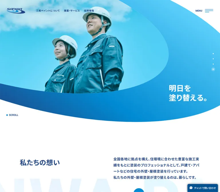
Sanwa Paint combines an orderly corporate information structure with an unusually expressive blue frame. The hero photograph sits inside a broad asymmetric opening, surrounded by a gradient ribbon that curves toward the two-line slogan, 明日を / 塗り替える。. The same curved language returns behind overlapping company photographs. Large English section headings provide scale, while Japanese labels, thin dividers, and small circular arrows keep navigation precise.
The page serves several audiences: homeowners exploring painting services, visitors researching the company, prospective employees, and people looking for news or contact routes. Its homepage structure reflects those purposes. Preserve that breadth when adapting the design: the defining experience is a sequence of spacious information sections connected by photography, typography, and blue geometry.
How to Read This Reference
- Measured means a value appears in the supplied rendered DOM, computed styles, or element rectangles. Measurements apply to the two inspected viewports.
- Visual estimate means an approximate dimension or color inferred from the supplied original-page captures. It is not an exact pixel sample or recovered CSS declaration.
- Recommended means an implementation choice for a new build. Suggested breakpoints, gradient stops, clipping paths, hover effects, and accessibility improvements fall into this category.
- Named tokens are reusable aliases unless an original custom property is explicitly identified.
- Element rectangles are not glyph measurements. Some text elements have boxes taller than their declared line heights. Use the computed type values for typography and the rectangles for layout.
- DOM presence does not establish visibility. The evidence includes an extensive navigation subtree that is not visible in the closed-menu captures. Its declarations help describe information hierarchy, but do not verify the opened menu's appearance or behavior.
Tokens — Colors
Default Palette
| Name | Value | Suggested token | Evidence and role |
|---|---|---|---|
| Corporate Navy | #204483 |
--brand-ink |
Measured navigation, message text, Japanese headings, and company links; also declared as --wp--preset--color--blue |
| Action Blue | #008ad2 |
--brand-blue |
Measured large English headings; declared as --wp--preset--color--light-blue; visually consistent with circular arrows |
| White | #ffffff |
--page-white |
Measured body background and reversed hero/footer text |
| Body Charcoal | #333333 |
--body-ink |
Measured default body and service-description color |
| Light Rule | #e5eaf0 |
--rule-light |
Declared source preset; visually compatible with company-list dividers, whose exact stroke color was not separately measured |
| Chat Blue | #005290 |
--chat-blue |
Measured chat-button background on both viewports |
| Sky Gradient End | Approximately #59d4f7 |
--brand-sky |
Visual estimate for the brightest ribbon/footer region; exact gradient stops were not supplied |
| Faint Brand Lettering | Very pale blue on white | --brand-ghost |
Visible behind the introductory heading in the mobile capture; exact fill and opacity unmeasured |
The large blue regions are gradients, not flat Action Blue. The desktop footer moves from deep navy toward brighter blue and cyan; the hero ribbon uses a related progression around its curved silhouette. A practical approximation is:
/* Recommended approximation, not the recovered source gradient. */
--brand-gradient: linear-gradient(
  60deg,
  #204483 0%,
  #008ad2 55%,
  #59d4f7 100%
);
The declared WordPress presets include numerous unrelated colors, gradients, and shadows. Their presence does not establish their use on this homepage. Do not incorporate the whole preset collection into the visual system.
Color Distribution
White is the main reading surface. Navy carries navigation and brand statements. Vivid blue provides large English headings and directional controls. White reverses out of the hero ribbon, recruitment content, closing brand region, and footer.
The chat launcher is a separate, darker utility surface. Green, yellow, and gold occur inside the footer's promotional badge artwork; they are not general interface accents. No theme switch or alternate color mode is evidenced.
Tokens — Typography
Japanese Content and Brand Statements
Measured declaration: 'Noto Sans JP', sans-serif.
The body uses weight 500; prominent statements, section labels, company links, and primary footer links use 700. Supporting certification and policy text uses 400. Japanese typography is firm and compact, with generous paragraph leading and restrained tracking.
The HTML root remains 16px in both snapshots. The mobile body changes to 12px; this is not a globally reduced root-size system.
English Display Headings and Navigation
Measured declaration: Heebo, sans-serif.
Heebo is declared on the large English section headings, closing brand lettering, and navigation subtree. Display headings use weight 700 with approximately 0.02em tracking. The navigation also declares Heebo for Japanese labels, but the font-family property does not identify the actual fallback used to render Japanese glyphs.
The reference establishes the declared families, not the delivery mechanism, loaded font files, or glyph-level font selection.
Chat Typography
The chat launcher declares Arial, sans-serif, weight 400, with a 14px desktop size and 10.5px mobile size. Treat this as widget styling, rather than the site's principal type family.
Type Scale
All values below are measured declarations. Desktop and mobile columns show font-size / line-height.
| Role | Desktop | Mobile | Weight | Tracking |
|---|---|---|---|---|
| Default body and service copy | 16 / 27.2px |
12 / 20.4px |
500 |
0.8 / 0.6px |
| Hero slogan | 47.952 / 55.504px |
27.963 / 32.367px |
700 |
0.8 / 0.6px |
| Introductory Japanese heading | 40 / 52px |
26 / 33.8px |
700 |
0.8 / 0.6px |
| Introductory statement | 20 / 36px |
14 / 25.2px |
700 |
0.8 / 0.6px |
| Japanese section label | 20 / 26px |
14 / 18.2px |
700 |
0.8 / 0.6px |
| Business display heading | 150 / 135px |
56 / 50.4px |
700 |
3 / 1.12px |
| Company display heading | 150 / 150px |
56 / 56px |
700 |
3 / 1.12px |
| Recruitment and news display headings | 80 / 80px |
48 / 48px |
700 |
1.6 / 0.96px |
| Company navigation | 20 / 26px |
16 / 20.8px |
700 |
0.8 / 0.6px |
| Section destination link | 18 / 25.2px |
16 / 22.4px |
700 |
Normal |
| Closing brand lettering | 214.992 / 182.743px |
111.969 / 95.174px |
700 |
4.300 / 2.239px |
| Footer slogan | 64 / 73.6px |
36 / 41.4px |
700 |
1.28 / 0.6px |
| Footer primary links | 16 / 22.4px |
14 / 19.6px |
700 |
0.8 / 0.6px |
| Footer policy links | 14 / 23.8px |
12 / 20.4px |
400 |
0.8 / 0.6px |
| Certification caption | 14 / 21px |
10 / 15px |
400 |
0.8 / 0.6px |
Desktop header links use Heebo at 14px / 18.2px, weight 700, with 10px 12px padding. Menu-subtree primary links declare 26px / 33.8px on desktop and 22px / 28.6px on mobile; secondary links remain 14px / 18.2px. These menu measurements do not constitute a verified opened-menu screenshot.
The typography deliberately has several scales: huge English labels, smaller Japanese context labels, bold introductory prose, and compact supporting copy. Flattening those roles to one heading size would remove much of the page's identity.
Tokens — Spacing & Shapes
Density: generous section spacing with compact navigation details. Primary geometry: large asymmetric curves, rounded photographic corners, thin rules, and circular directional controls.
Layout Rails
| Element | Desktop measurement | Mobile measurement |
|---|---|---|
| Header horizontal inset | 40px |
24px |
| Main wide content rail | 1280px, starting at x = 80 |
342px, starting at x = 24 |
| Inner message/news rail | 1060px, starting at x = 190 |
Generally 342px, starting at x = 24 |
| Header logo link | 108 × 32px |
108 × 32px |
| Header height | 128.19px |
96px |
| Hero section height | 820.80px |
663px |
| Introductory copy column | 510px at x = 740 |
280.44px at x = 85.56 |
| Service link width | 619.52px each |
342px |
| Company link column | 399.36px at x = 850.55 |
342px at x = 24 |
| Section destination control height | 64px |
48px |
| Recruitment section height | 680px |
Approximately 600px |
| Footer height | 899.61px |
1122.61px |
Two desktop rails are important. The services and large section headings occupy the wider rail; the message and news sit on a more inset rail. Mobile largely consolidates them to 24px side margins, while retaining a distinctive extra indent for the introductory paragraph.
Spacing Rhythm
| Use | Desktop | Mobile | Evidence |
|---|---|---|---|
| Message section padding, top / bottom | 179 / 140px |
92 / 80px |
Measured |
| Gap between service columns | 40.97px |
Stacked with 40px between link rectangles |
Calculated from measured rectangles |
| Company row height | 70px |
60px |
Measured link rectangle |
| Company row pitch | 80px |
64px |
Calculated from successive row positions |
| Gap after service section before company | 162px |
80px |
Calculated |
| Gap after recruitment before news | 150px |
80px |
Calculated |
| News row vertical padding | 45px |
31px |
Measured |
| Footer padding, top / bottom | 120 / 74px |
81 / 60px |
Measured |
These values reveal a rhythm rather than a strict universal spacing grid. Use 24, 40, 48, 64, 80, and approximately 150px as useful implementation steps, but retain the component-specific exceptions.
Shape Scale
| Element | Value | Status |
|---|---|---|
| Company photograph corners | Approximately 20px |
Visual estimate |
| Recruitment upper corners | 60px desktop; 30px mobile |
Measured |
| Closing image-panel upper corners | Approximately 60px desktop; 30px mobile |
Measured values contain minor fractional rounding |
| Main destination circles | Approximately 64px desktop; 48px mobile |
Desktop circle visible; corresponding link heights measured |
| Small company-row arrow circle | Approximately 24px desktop |
Visual estimate |
| Hero pagination button box | 23.89px desktop; 15.98px mobile |
Measured; visible dot is smaller |
| Desktop chat corners | 8px 8px 0 0 |
Measured |
| Mobile chat corners | 23px |
Measured |
The hero curve is a custom silhouette, not a large rounded rectangle. The lower company graphic is a broad loop that extends beyond the content rail. Preserve their proportions and direction; a generic wave divider is an incomplete substitute.
Components
Global Header
Anatomy: logo link → three desktop navigation links → right-aligned MENU control with a three-line icon.
The header overlays the hero without an opaque background in the initial captures. On desktop, the logo begins at (40, 48.09) and the first navigation link box begins at x = 200. The menu control ends at x = 1400, keeping the same 40px outer inset.
On mobile, the logo stays 108 × 32px and moves to (24, 32). The three desktop links disappear from the visible header, leaving the logo and menu control. The menu box starts near x = 262.19 and ends at 366.
The mobile footer capture still shows the navy header logo and menu over the footer. The supplied desktop lower-page captures do not show the header. This supports a difference in sampled scroll states, but does not establish the original fixed/sticky positioning rule or hide-on-scroll logic.
Menu Information Structure
The rendered navigation subtree contains primary groups for company information, services, recruitment, news, FAQ, and contact. Service links include painting categories, consultation services, work examples, and inspection routes. Contact links distinguish document requests, several estimate/inspection routes, partner recruitment, and general inquiries.
Desktop measurements place the subtree's principal content between x = 190 and 1000, with several columns. Mobile measurements place groups sequentially within a 310px region starting at x = 40.
White text and size hierarchy are measured in that subtree. Its opened backdrop, entrance direction, focus handling, scroll locking, and dismissal behavior remain unverified. Do not infer an accordion or a particular overlay animation from the link list alone.
Hero Ribbon and Photography
Anatomy: full-width section → gradient silhouette → separately cropped photograph → white slogan → pagination → lower-left scroll cue.
The desktop capture shows a parent and child on a sofa inside the large photographic opening. The mobile capture shows two helmeted employees under a bright sky. Both use a cool cyan photographic treatment and the same surrounding brand geometry.
On desktop, the photograph spans the upper-left and center; its lower curve reaches roughly y = 613. The ribbon continues below it to approximately y = 800, while the measured hero section ends at 820.80px. The slogan sits to the right at approximately (1104.81, 533.28).
On mobile, the opening becomes tall and narrow. The photograph's lower edge reaches roughly y = 500; the outer blue shape reaches approximately y = 620, within a 663px section. The slogan moves to approximately (218.13, 506.45), keeping its two-line composition over the ribbon.
The visual edge positions above are estimates from the captures. The original clipping or masking mechanism was not included. An SVG clip path is a suitable implementation recommendation, not a claim about the source code.
Hero Pagination and Scroll Cue
Four pagination buttons form a vertical column near the right edge. The desktop capture highlights the third marker; mobile highlights the fourth. The active marker has a translucent circular halo around a small white dot. Inactive markers remain tiny white dots.
Desktop button centers are approximately 31.64px apart; mobile centers are approximately 21.36px apart. Measured button boxes shrink from about 24px to 16px. The visible glyphs are smaller than those boxes.
The SCROLL link combines a small blue dot and a compact navy label in the white space below the photograph. Its destination is #message. The link target is verified; smooth scrolling was not exercised.
The different selected markers and photographs establish multiple hero states. They do not establish autoplay timing, swipe support, transition style, or whether image selection was user-driven.
Introductory Message
Anatomy: Japanese heading → bold explanatory paragraph → VIEW MORE destination link, with faint oversized brand lettering visible behind the mobile heading.
Desktop uses a split composition: the heading starts at x = 190, while the paragraph and link start at x = 740. The paragraph is 510px wide and uses 20px / 36px bold navy type.
Mobile stacks the heading above the copy, but the paragraph does not become fully flush with it. The heading begins at 24px; the copy and link begin at approximately 85.56px, creating a 61.56px additional indent. The paragraph ends at the common 366px right edge.
The destination is the company philosophy page. The faint background lettering is decorative and should remain subordinate to readable text.
Bilingual Section Heading
Anatomy: small Japanese context label → much larger English display heading.
The measured markup uses a Japanese h2 followed by an English h3. Business and company headings use the largest section scale: 150px desktop and 56px mobile. Recruitment and news use the smaller 80px / 48px scale.
The business heading is explicitly split into two lines. Its line height is 0.9, tighter than the company heading's 1.0. The rendered text evidence presents the English section labels in uppercase. Preserve the strongly separated Japanese and English roles rather than giving both equal visual weight.
Service Links
Two large linked regions represent 外壁塗装 and 屋根塗装. Each link includes the service label and a supporting paragraph, and points to its respective service detail page.
Desktop places them side by side: each link is approximately 619.52 × 560.84px, with a 40.97px gap. Mobile stacks two 342 × 332.19px regions, separated by 40px.
Descriptions use charcoal body text and sit near the bottom of each region. Their measured desktop height is approximately 54.38px; mobile descriptions occupy approximately 40.78px.
A full service-section screenshot and the internal media elements were not supplied. Exact image crops, service-label construction, and internal arrow placement are therefore unverified. The reusable structure should preserve the measured broad linked regions and supporting text without inventing a particular card shell.
Company Photo Composition
The desktop company capture has two photographs layered over a blue loop:
- A large city-and-sky image, approximately
510 × 585px, beginning nearx = 189in the capture. - A smaller white helmet image, approximately
290 × 334px, beginning nearx = 80and overlapping the city photograph's lower-left area. - A gradient loop behind both images, extending to the viewport's left edge and reaching approximately
x = 850.
The photographs have approximately 20px corner radii. They are not enclosed in cards or separated with heavy shadows. Overlap, cropping, and the ribbon create depth.
The city image connects the company to the wider residential environment; the helmet supplies a close, tangible brand detail. Both are strongly cooled toward cyan. Mobile photograph dimensions and overlap geometry were not included in the supplied captures or sampled image rectangles.
Company Navigation List
Six rows lead to philosophy, the representative's message, company profile, locations, initiatives, and CSR.
Each desktop row uses bold 20px navy text, a thin pale divider, and a small blue circle containing a white chevron at the right edge. The list is approximately 399.36px wide. Link rectangles are 70px high on an 80px pitch.
Mobile makes the list 342px wide, lowers the text to 16px, and uses 60px links on a 64px pitch. All six rows remain available; the DOM does not indicate a collapsed mobile accordion.
A larger COMPANY destination link follows the list. It is aligned toward the right on desktop and starts at the common 24px content inset on mobile.
Label-and-Circle Destination Link
Anatomy: uppercase text label → small horizontal gap → large filled circular arrow.
This pattern appears as VIEW MORE, BUSINESS・SERVICE, COMPANY, and ALL NEWS. Desktop link height is 64px; mobile height is 48px. Text is navy on white sections and white in recruitment.
The company capture clearly shows the large blue circle and white chevron, with an approximately 16px label-to-circle gap. Keep the entire label-and-circle group as one link target. The circle is part of the link's anatomy, not an unrelated icon button.
Recruitment Section
A full-width section uses rounded upper corners, centered white content, a small Japanese label, an English display heading, one supporting sentence, and VIEW MORE.
Measured height is 680px desktop and approximately 600px mobile. The upper corner radii change from 60px to 30px. The content group is about 414px wide on desktop and 311px on mobile.
A photographic strip at the section's upper boundary is visible in the desktop company capture. The full recruitment photograph, crop, and contrast-overlay recipe were not supplied. White foreground type is measured, but the exact background implementation remains unverified.
News List
Three article links are present, each containing a category, date, and title. The observed entries are dated August 3, July 17, and June 1, 2026.
Desktop rows occupy the 1060px inner rail, declare display: flex, and use 45px vertical padding. Their heights are approximately 120.19px, with an approximately 1px separation between successive rectangles.
Mobile rows occupy 342px, change to display: block, and use 31px vertical padding. Their heights are approximately 123.39px. The category/date/title grouping therefore gains vertical structure instead of simply shrinking horizontally.
ALL NEWS sits beside the heading area on desktop, but follows the articles on mobile. Preserve that change in reading order and destination placement.
Closing Brand Panel
A broad closing section precedes the footer. The DOM records very large white SANWA PAINT lettering and rounded upper corners. Its measured height is approximately 600px desktop and 450px mobile.
Desktop lettering uses approximately 215px Heebo with tight 0.85 leading. Mobile uses approximately 112px, with the words arranged over two lines in the rendered text evidence. The mobile text rectangle spans from x = -24 to 414, wider than the viewport.
The top of the desktop footer capture includes a strip of the preceding photograph, showing a worker and helmet. The complete brand-panel composition is not visible in the supplied screenshots. Letter-by-letter animation is not established by the separated text nodes.
Corporate Footer
The footer is a large gradient field with a fine white divider near its top. It repeats the slogan as a substantial white statement and places the company identity, social icons, navigation, trust graphics, and policies in a separate information region.
Desktop layout:
- Slogan begins at
x = 80, using64pxbold type. - The white logo/company-name link begins at
x = 630and measures304 × 24px. - Instagram and YouTube symbols sit below in approximately
42pxlink boxes. - Primary navigation forms a vertical list below the social icons.
- An ISO graphic and two-line caption sit to the right of that list, with a promotional badge below.
- Policy links form a smaller secondary list.
- Copyright sits at the lower left;
PAGE TOPand a white circular arrow sit at the lower right.
The visible identity reads 三和ペイント株式会社, supported by the original-page footer itself.
Mobile reorganizes the footer into a long sequence at 24px side margins: slogan, company identity, social links, primary navigation, trust graphics, policies, and copyright. The footer slogan is present in the DOM even though the supplied bottom capture starts farther down. Do not infer that it is hidden on mobile.
PAGE TOP changes to a vertical label above a 48px white circular control along the right side. The measured link group is 48 × 139.63px. Its target is #; scrolling animation was not verified.
The social icons are recognizable in the capture, while their links use shortened URLs. The final social destinations were not resolved.
Persistent Chat Launcher
The launcher stays at the lower-right edge in the supplied captures and uses a white speech-bubble icon plus チャットで問い合わせ.
| Property | Desktop | Mobile |
|---|---|---|
| Box | 179.47 × 46px |
143.11 × 46px |
| Right inset | 12px |
12px |
| Bottom inset | 0px |
12px |
| Background | #005290 |
#005290 |
| Radius | 8px 8px 0 0 |
23px |
| Declared type | Arial, 14px |
Arial, 10.5px |
A soft shadow is visible, but its source value was not included. This is the clearest raised surface in the supplied page captures. The opened chat panel and service provider are unverified.
Tokens — Motion & Interaction
Recorded Transition Declarations
| Element | Supplied transition value | What can be concluded |
|---|---|---|
| Header | 1s |
A transition duration is declared; changed properties and scroll trigger are unknown |
| Logo and many navigation/footer links | 0.4s |
Transition styling exists; the actual hover appearance was not captured |
| Main destination links | 0.4s |
A short transition is declared; no verified translation, inversion, or scale effect |
| Menu button | 0.3s |
Control has transition styling; opened-menu motion is unknown |
| Hero pagination buttons | 0.5s |
Pagination has transition styling; this is not the slideshow duration |
| News links | 0.4s |
Row links have transition styling; hover state unverified |
| Many other sampled elements | all |
No positive duration is shown in these records; this alone is not evidence of animation |
Sampled elements generally report animation: none. That does not exclude JavaScript animation, unsampled children, pseudo-elements, or a carousel driven outside CSS keyframes.
Verified Affordances and Limits
| Affordance | Evidence | Limit |
|---|---|---|
| Hero slide navigation | Four buttons and different highlighted markers in captures | Click result, autoplay, swiping, and transition timing untested |
| Introductory scroll link | Anchor to #message |
Smooth-scroll behavior untested |
| Menu | Visible button and populated navigation subtree | Open/close sequence, backdrop, keyboard behavior, and focus management untested |
| Section and article navigation | Concrete link destinations in rendered DOM | Destination pages were not opened |
| Page top | Anchor to # |
Motion and header response untested |
| Chat | Visible button in multiple capture positions | Opened widget and message flow untested |
For a new implementation, use restrained 200–400ms feedback for color or small arrow movement. If a rotating hero is implemented, provide explicit pause behavior and reduced-motion support. These are recommendations, not recovered source interactions.
Surfaces
| Layer | Appearance | Structural purpose |
|---|---|---|
| Main canvas | White | Makes photography, typography, and curves dominant |
| Text sections | White with navy or charcoal type | Corporate information and reading |
| Hero ribbon | Large blue-to-cyan gradient silhouette | Frames photography and carries the slogan |
| Company decoration | Broad gradient loop behind images | Repeats the brand shape and connects overlapping photographs |
| Navigation rows | Unfilled, fine pale separators | Makes destination lists clear without card containers |
| Photo panels | Image surfaces with selective rounded corners | Adds human and environmental context |
| Footer | Full-width blue gradient with white text | Strong closing brand field and detailed navigation |
| Chat launcher | Dark blue with visible soft shadow | Persistent utility separated from the page surface |
The supplied captures do not establish a general card-elevation system. Depth mostly comes from overlap and silhouette. Reserve strong rounding for photographs, large panel tops, and circular controls.
Imagery
The original-page captures show three complementary photographic subjects: domestic life, employees, and the built environment. The family photograph emphasizes the lived result of home maintenance. The employee photograph uses helmets, workwear, and an upward gaze against the sky. The cityscape communicates scale, while the helmet close-up makes the company mark tangible.
The shared treatment is bright, cool, and cyan-biased. Whites remain luminous; skies and blue workwear receive strong emphasis. The photos are continuous-tone images, without halftone, grain, or pixel-art treatment. Exact grading, filters, and blend modes were not supplied.
For a new build, choose images with usable negative space and compose their subjects for the actual mask. Desktop and mobile should have separately reviewed crops. Scaling a desktop crop uniformly into the narrow mobile opening risks removing faces or helmets.
Observed Asset References
No original image filenames, image URLs, or srcset values were included in the supplied evidence. The references below identify visible assets without inventing paths.
| Asset | Original-page evidence | Treatment |
|---|---|---|
| Navy SANWA logo | Desktop and mobile headers | Compact blue mark, 108 × 32px link box |
| White logo and company name | Desktop and mobile footer | Horizontal identity, 304 × 24px link box |
| Parent and child on sofa | Desktop hero | Wide photograph within curved opening |
| Two helmeted employees | Mobile hero | Tall crop with cyan sky and blue workwear |
| City and sky | Desktop company section | Large rounded portrait-oriented crop |
| Branded white helmet | Desktop company section | Smaller rounded image overlapping the city photograph |
| Worker/helmet photograph strip | Immediately above desktop footer | Visible portion of the preceding image section |
| ISO graphic and promotional badge | Desktop and mobile footer | Distinct image assets with their own internal colors |
| Instagram and YouTube symbols | Footer | White social marks; destination redirects unverified |
Use authorized original assets where available. For an independent adaptation, retain the photographic subject relationships and crop discipline without inventing company marks or certification artwork.
Layout & Responsive Behavior
The measured document height is approximately 7033px on desktop and 6276px on mobile. Mobile is narrower but not dramatically longer: several desktop spaces and display sizes reduce, even as services and footer information stack.
Section Progression
| Section | Desktop top / height | Mobile top / height |
|---|---|---|
| Hero | 0 / 820.80px |
0 / 663px |
| Introductory message | 820.80 / 562px |
663 / 493.72px |
| Services | 1534.80 / 1114.84px |
1158.72 / 996.31px |
| Company | 2811.64 / 1112.94px |
2235.03 / 1049.83px |
| Recruitment | 4001.47 / 680px |
3364.84 / 599.97px |
| News | 4831.47 / 553.56px |
4044.81 / 577.36px |
| Closing brand panel | 5533.92 / 599.89px |
4703.13 / 449.97px |
| Footer | 6133.81 / 899.61px |
5153.09 / 1122.61px |
Positions are measured from the document top. Gaps between rectangles are part of the composition; they should not be mistaken for missing sections.
Observed Responsive Changes
- Desktop header navigation disappears, while the logo retains its size.
- Hero geometry changes from a wide opening to a tall opening; the slogan remains on the lower-right ribbon.
- The introductory layout stacks but preserves a right-indented paragraph.
- Services change from two columns to one.
- Company links move to the common full-width mobile content rail.
- Large section headings reduce from
150pxto56px, while recruitment/news reduce from80pxto48px. - News changes from flex rows to block rows, and
ALL NEWSmoves below the articles. - Footer information becomes a vertical sequence, and
PAGE TOPturns vertically. - Chat changes from an edge-attached tab to a floating pill.
Only two widths were inspected. Exact source breakpoints and intermediate layouts are unknown. A 48rem breakpoint in the Quick Start is a recommended starting point, not a recovered media query.
The mobile business-heading rectangle extends from x = 24 to 422, and the closing brand text extends beyond both sides of the viewport. These measurements establish oversized boxes, not necessarily horizontal page scrolling. If reproducing decorative overflow, clip it locally and keep readable content and controls inside the viewport.
Do’s and Don’ts
Do
- Preserve navy
#204483, blue#008ad2, and white as the core interface palette. - Use a carefully shaped ribbon around the hero photograph and a related loop behind company imagery.
- Keep photography bright and cool, with faces and helmets protected by deliberate mobile crops.
- Pair small Japanese labels with substantially larger English headings.
- Retain the distinction between the wide desktop rail and the more inset message/news rail.
- Preserve the mobile introductory paragraph's extra indent.
- Use thin rules and circular chevrons for company navigation.
- Keep section destinations as one label-and-circle link.
- Allow generous white intervals between major sections.
- Treat the large gradient footer as a major part of the identity.
- Preserve the different desktop and mobile chat shapes.
Don't
- Don't replace the hero silhouette with a rounded rectangle or a small decorative wave.
- Don't turn every content group into a shadowed card.
- Don't replace the information-rich corporate hierarchy with a single conversion funnel.
- Don't infer used colors or shadows from the entire WordPress preset inventory.
- Don't shrink the mobile logo merely because the surrounding layout narrows.
- Don't give Japanese labels and English display headings the same scale.
- Don't infer a hidden mobile footer slogan from a capture that begins farther down the footer.
- Don't claim carousel autoplay, parallax, text animation, or menu behavior without interaction evidence.
- Don't invent original asset paths, font-loading details, or production credits.
- Don't copy tiny pagination targets without reviewing their usability.
Recommended Implementation Additions
These are recommendations for a new implementation, not verified features of the inspected page:
- Give the menu an accessible name,
aria-expanded, an associated panel, keyboard dismissal, and appropriate focus handling. - Enlarge pagination hit areas while keeping the visible dots small. Expose the selected slide and provide a pause control if slides advance automatically.
- Review the original
12pxmobile body copy and10pxcertification caption for the intended audience. Increasing reading copy to14–16pxmay be appropriate. - Add visible keyboard focus styles that work on both white sections and the blue footer.
- Keep decorative curves and oversized background lettering out of the accessibility tree.
- Provide informative alternatives for meaningful photographs; use empty alternatives for purely decorative duplicates.
- Reserve space around the floating chat launcher and account for mobile safe-area insets.
- Test the persistent mobile header over lower-page content. The sampled footer shows overlap, so a new build should define an explicit readable header state.
- Honor reduced-motion preferences in both CSS and any carousel JavaScript.
- Validate intermediate widths and text enlargement, especially long English headings and the indented introductory paragraph.
Agent Prompt Guide
Quick Color Reference
- Canvas:
#ffffff. - Brand text and navigation:
#204483. - English display headings and directional circles:
#008ad2. - Body descriptions:
#333333. - Fine separators: source preset
#e5eaf0, subject to visual verification. - Chat launcher:
#005290. - Gradient: navy through vivid blue to a bright cyan endpoint;
#59d4f7is an approximate endpoint. - Main action anatomy: navy label beside a blue circular chevron.
Overall Prompt
“Create a Japanese corporate homepage for a residential painting company using a white canvas, navy #204483, vivid blue #008ad2, and large blue-to-cyan gradient shapes. Frame bright, cool-toned photography with a sweeping asymmetric ribbon rather than a rectangular hero. Place a compact logo and desktop navigation over the photograph, with a MENU control at the right. Set the two-line slogan 明日を / 塗り替える。 in bold white Japanese type on the lower-right ribbon. Build spacious sections for the company's message, services, company information, recruitment, and news. Pair small Japanese labels with very large Heebo English headings. Use fine list dividers, circular chevrons, overlapping rounded company photographs, and a substantial gradient footer. On mobile, keep 24px gutters, stack services, retain the introductory copy's extra indent, and change the chat tab to a floating pill. Treat unverified animations and interactions as implementation decisions.”
Example Component Prompts
- Hero: “Create a wide photographic hero inside an asymmetric curved opening, surrounded by a navy-to-cyan ribbon. Place the white Japanese slogan at the lower right, four small vertical pagination markers along the right edge, and a SCROLL link in the white space below the image. Supply a separately composed tall mobile crop.”
- Company section: “Place a large cyan-toned city photograph behind a smaller branded-helmet close-up. Use approximately 20px image corners and a broad gradient loop behind the overlap. To the right, create six navy text links with fine pale dividers and small blue circular chevrons. Finish with a larger COMPANY label-and-circle link.”
- Introductory statement: “Use a 1060px desktop inner rail with a bold Japanese heading on the left and 510px of bold navy explanatory copy on the right. On a 390px phone, use 24px page gutters but indent the paragraph to about 86px from the left. Keep a VIEW MORE link below the paragraph.”
- News: “Create three generous article rows containing category, date, and title. Use a 1060px desktop rail with horizontal row structure, then stack each row's metadata and title on mobile. Move ALL NEWS from the heading area to below the list on mobile.”
- Footer: “Build a large blue gradient footer with a white divider, a bold two-line slogan, company identity, white social marks, vertical navigation, trust graphics, and a smaller policy list. On desktop, separate the slogan and information columns; on mobile, stack them and place a vertical PAGE TOP label above a white circular arrow at the right.”
Quick Start
CSS Custom Properties
This is a reusable adaptation calibrated to the two supplied viewports. Exact source colors and typography are retained where measured. The gradient, clip paths, intermediate scaling, 48rem breakpoint, and hover feedback are recommendations. Photo radius and shadow values are approximations.
The CSS does not load fonts, implement menu behavior, rotate slides, or provide a chat service. Supply the actual font files and authorized imagery separately. The sample retains the measured mobile body size; increase it if your reading requirements call for larger text.
:root {
  /* Measured colors. */
  --brand-ink: #204483;
  --brand-blue: #008ad2;
  --page-white: #fff;
  --body-ink: #333;
  --rule-light: #e5eaf0;
  --chat-blue: #005290;

  /* Estimated decorative colors and gradient. */
  --brand-sky: #59d4f7;
  --brand-ghost: rgb(0 138 210 / 0.045);
  --brand-gradient: linear-gradient(
    60deg, var(--brand-ink), var(--brand-blue) 55%, var(--brand-sky)
  );

  /* Measured declared families; font delivery is separate. */
  --font-jp: 'Noto Sans JP', sans-serif;
  --font-latin: Heebo, sans-serif;
  --font-chat: Arial, sans-serif;
  --body-size: 16px;
  --body-leading: 1.7;
  --body-tracking: 0.8px;
  --display-large: clamp(56px, 10.4167vw, 150px);
  --display-small: 80px;

  /* Responsive interpolation is an adaptation. */
  --gutter: clamp(24px, 5.5556vw, 80px);
  --header-gutter: clamp(24px, 2.7778vw, 40px);
  --rail-wide: 1280px;
  --rail-inner: 1060px;
  --section-gap: 150px;
  --control-size: 64px;
  --photo-radius: 20px;
  --panel-radius: 60px;
  --link-motion: 300ms ease;
}

* { box-sizing: border-box; }
html { font-size: 16px; }
body {
  margin: 0;
  color: var(--body-ink);
  background: var(--page-white);
  font-family: var(--font-jp);
  font-size: var(--body-size);
  font-weight: 500;
  line-height: var(--body-leading);
  letter-spacing: var(--body-tracking);
}
img { display: block; max-width: 100%; }
button { font: inherit; }
a { color: inherit; }

.wrap {
  width: min(var(--rail-wide), calc(100% - 2 * var(--gutter)));
  margin-inline: auto;
}
.wrap--inner { max-width: var(--rail-inner); }
.section + .section { margin-top: var(--section-gap); }

/* Initial overlay state; scroll-dependent header behavior is separate. */
.site-header {
  position: absolute;
  inset: 0 0 auto;
  z-index: 20;
  display: flex;
  align-items: center;
  gap: 52px;
  height: 128.19px;
  padding-inline: var(--header-gutter);
  color: var(--brand-ink);
}
.site-logo { flex: 0 0 108px; width: 108px; height: 32px; }
.site-logo img { width: 100%; height: 100%; object-fit: contain; }
.desktop-nav { display: flex; }
.desktop-nav a {
  padding: 10px 12px;
  font: 700 14px/1.3 var(--font-latin);
  text-decoration: none;
}
.menu-button {
  display: inline-flex;
  align-items: center;
  gap: 16px;
  min-height: 44px;
  margin-left: auto;
  padding: 0;
  border: 0;
  color: inherit;
  background: transparent;
  cursor: pointer;
}
.menu-lines { display: grid; gap: 6px; width: 48px; }
.menu-lines span { height: 2px; background: var(--brand-blue); }
.menu-lines span:last-child { width: 50%; }

.shape-definitions {
  position: absolute;
  width: 0;
  height: 0;
  overflow: hidden;
  pointer-events: none;
}
.hero {
  position: relative;
  isolation: isolate;
  height: clamp(680px, 57vw, 900px);
}
.hero-ribbon,
.hero-photo {
  position: absolute;
  inset: 0;
  width: 100%;
  height: 100%;
}
.hero-ribbon {
  background: var(--brand-gradient);
  clip-path: url(#ribbon-desktop);
}
.hero-photo {
  object-fit: cover;
  object-position: var(--hero-photo-position, 45% 45%);
  clip-path: url(#photo-desktop);
}
.hero-copy {
  position: absolute;
  top: 65%;
  right: 5.6%;
  margin: 0;
  color: white;
  font-size: clamp(28px, 3.33vw, 48px);
  font-weight: 700;
  line-height: 1.16;
}
.hero-copy span { display: block; }
.scroll-hint {
  position: absolute;
  top: 90.2%;
  left: var(--header-gutter);
  display: inline-flex;
  align-items: center;
  gap: 8px;
  color: var(--brand-ink);
  font: 700 14px/1 var(--font-latin);
  text-decoration: none;
}
.scroll-hint::before {
  content: '';
  width: 10px;
  height: 10px;
  border-radius: 50%;
  background: var(--brand-blue);
}
.hero-pagination {
  position: absolute;
  top: 41.3%;
  right: 2.2%;
  display: grid;
  gap: 8px;
}
.hero-pagination button {
  display: grid;
  place-items: center;
  width: 24px;
  height: 24px;
  padding: 0;
  border: 0;
  border-radius: 50%;
  background: transparent;
  cursor: pointer;
}
.hero-pagination button::before {
  content: '';
  width: 6px;
  height: 6px;
  border-radius: 50%;
  background: white;
}
.hero-pagination button[aria-pressed='true'] {
  background: rgb(255 255 255 / 0.25);
}

.section-label {
  margin: 0 0 18px;
  color: var(--brand-ink);
  font-size: 20px;
  font-weight: 700;
  line-height: 1.3;
}
.section-title {
  margin: 0;
  color: var(--brand-blue);
  font: 700 var(--display-large)/1 var(--font-latin);
  letter-spacing: 0.02em;
  text-transform: uppercase;
}
.section-title--business { line-height: 0.9; }
.section-title--small { font-size: var(--display-small); }

.message { padding-block: 179px 140px; }
.message-layout {
  display: grid;
  grid-template-columns: 1fr 510px;
  gap: 40px;
}
.message-title {
  margin: 0;
  color: var(--brand-ink);
  font-size: 40px;
  line-height: 1.3;
}
.message-copy {
  color: var(--brand-ink);
  font-size: 20px;
  font-weight: 700;
  line-height: 1.8;
}
.message-copy p { margin: 0 0 40px; }

.round-link {
  display: inline-flex;
  align-items: center;
  gap: 16px;
  color: var(--brand-ink);
  font-size: 18px;
  font-weight: 700;
  line-height: 1.4;
  letter-spacing: normal;
  text-decoration: none;
}
.round-link .disc {
  display: grid;
  place-items: center;
  flex: 0 0 var(--control-size);
  width: var(--control-size);
  height: var(--control-size);
  border-radius: 50%;
  color: white;
  background: var(--brand-blue);
  transition: transform var(--link-motion);
}
.disc::before {
  content: '';
  width: 7px;
  height: 7px;
  border-top: 2px solid currentColor;
  border-right: 2px solid currentColor;
  transform: rotate(45deg);
}
.round-link--reverse { color: white; }
.round-link--reverse .disc { color: var(--brand-blue); background: white; }

.services-grid {
  display: grid;
  grid-template-columns: repeat(2, minmax(0, 1fr));
  gap: 40px;
  margin-top: 64px;
}
.service-link { display: block; text-decoration: none; }
.service-link p { margin-bottom: 0; }

.company-layout {
  display: grid;
  grid-template-columns: minmax(0, 510fr) minmax(0, 400fr);
  gap: clamp(40px, 10.4167vw, 150px);
  align-items: start;
}
.company-photo { width: 100%; border-radius: var(--photo-radius); }
.company-list { margin: 0; padding: 0; list-style: none; }
.company-list li + li { margin-top: 10px; }
.company-link {
  display: flex;
  align-items: center;
  justify-content: space-between;
  min-height: 70px;
  padding-block: 10px;
  border-bottom: 1px solid var(--rule-light);
  color: var(--brand-ink);
  font-size: 20px;
  font-weight: 700;
  line-height: 1.3;
  text-decoration: none;
}
.company-link .disc {
  display: grid;
  place-items: center;
  width: 24px;
  height: 24px;
  border-radius: 50%;
  color: white;
  background: var(--brand-blue);
}
.company-link .disc::before { width: 4px; height: 4px; border-width: 1px; }

.recruit {
  display: grid;
  place-items: center;
  min-height: 680px;
  padding: 80px var(--gutter);
  border-radius: var(--panel-radius) var(--panel-radius) 0 0;
  color: white;
  background-color: var(--brand-ink);
  background-image: var(--recruit-image, none);
  background-size: cover;
  background-position: center;
  text-align: center;
}
.recruit .section-label,
.recruit .section-title { color: inherit; }

.news-row {
  display: flex;
  align-items: baseline;
  gap: 32px;
  padding-block: 45px;
  border-bottom: 1px solid var(--rule-light);
  text-decoration: none;
}
.news-row .news-title { flex: 1; }

.site-footer {
  padding-block: 120px 74px;
  color: white;
  background: var(--brand-gradient);
}
.footer-grid {
  display: grid;
  grid-template-columns: 430px minmax(0, 1fr);
  gap: 120px;
  padding-top: 60px;
  border-top: 1px solid rgb(255 255 255 / 0.65);
}
.footer-slogan {
  margin: 0;
  font-size: 64px;
  font-weight: 700;
  line-height: 1.15;
  letter-spacing: 0.02em;
}
.footer-nav { display: grid; gap: 8px; }
.footer-nav a {
  padding-block: 3px;
  font-size: 16px;
  font-weight: 700;
  line-height: 1.4;
  text-decoration: none;
}
.footer-policy { font-size: 14px; font-weight: 400; }

.chat-launcher {
  position: fixed;
  right: 12px;
  bottom: 0;
  z-index: 40;
  display: flex;
  align-items: center;
  justify-content: center;
  gap: 8px;
  width: 179.47px;
  height: 46px;
  padding-inline: 12px;
  border: 0;
  border-radius: 8px 8px 0 0;
  color: white;
  background: var(--chat-blue);
  font: 400 14px/1 var(--font-chat);
  box-shadow: 0 2px 12px rgb(0 0 0 / 0.3);
}

/* Recommended feedback and focus, not observed source states. */
@media (hover: hover) {
  .round-link:hover .disc { transform: translateX(3px); }
}
a:focus-visible,
button:focus-visible {
  outline: 3px solid currentColor;
  outline-offset: 5px;
}
.hero-pagination button:focus-visible { outline-color: white; }

/* Recommended breakpoint; only the endpoint layouts were inspected. */
@media (max-width: 48rem) {
  :root {
    --gutter: 24px;
    --header-gutter: 24px;
    --body-size: 12px;
    --body-tracking: 0.6px;
    --display-large: 56px;
    --display-small: 48px;
    --section-gap: 80px;
    --control-size: 48px;
    --panel-radius: 30px;
  }
  .site-header { height: 96px; gap: 24px; }
  .desktop-nav { display: none; }
  .hero { height: clamp(600px, 170vw, 740px); }
  .hero-ribbon { clip-path: url(#ribbon-mobile); }
  .hero-photo {
    clip-path: url(#photo-mobile);
    object-position: var(--hero-photo-position-mobile, 60% 40%);
  }
  .hero-copy { top: 76.4%; right: 5.8%; font-size: 28px; }
  .scroll-hint { top: 91.6%; }
  .hero-pagination { top: 43%; right: 4.6%; gap: 5.4px; }
  .hero-pagination button { width: 16px; height: 16px; }
  .hero-pagination button::before { width: 4px; height: 4px; }
  .section-label { font-size: 14px; margin-bottom: 17px; }
  .message { padding-block: 92px 80px; }
  .message-layout { grid-template-columns: 1fr; gap: 57px; }
  .message-title { font-size: 26px; }
  .message-copy {
    width: 82%;
    margin-left: auto;
    font-size: 14px;
  }
  .message-copy p { margin-bottom: 24px; }
  .round-link { font-size: 16px; }
  .services-grid { grid-template-columns: 1fr; margin-top: 40px; }
  .company-layout { grid-template-columns: 1fr; gap: 48px; }
  .company-list li + li { margin-top: 4px; }
  .company-link { min-height: 60px; font-size: 16px; }
  .recruit { min-height: 600px; }
  .news-row { display: block; padding-block: 31px; }
  .news-row .news-title { display: block; margin-top: 12px; }
  .site-footer { padding-block: 81px 60px; }
  .footer-grid { grid-template-columns: 1fr; gap: 64px; padding-top: 33px; }
  .footer-slogan { font-size: 36px; letter-spacing: 0.6px; }
  .footer-nav a { font-size: 14px; }
  .footer-policy { font-size: 12px; }
  .chat-launcher {
    bottom: max(12px, env(safe-area-inset-bottom, 0px));
    width: 143.11px;
    border-radius: 23px;
    font-size: 10.5px;
  }
}

/* Deliberate accessibility addition: larger targets change dot spacing. */
@media (pointer: coarse) {
  .hero-pagination { gap: 0; }
  .hero-pagination button { width: 44px; height: 44px; }
}
@media (prefers-reduced-motion: reduce) {
  .round-link .disc { transition: none; }
  html { scroll-behavior: auto; }
}
Hero Shape Markup
These paths approximate the supplied silhouettes; they are not extracted original assets. Place the SVG definitions in the document before the hero. Replace YOUR_AUTHORIZED_IMAGE_URL with a real image. Wire the pagination to an implemented carousel, or omit those controls for a static hero.
<svg class='shape-definitions' aria-hidden='true' focusable='false'>
  <defs>
    <clipPath id='ribbon-desktop' clipPathUnits='objectBoundingBox'>
      <path d='M0 0H.774C.86 .075 .94 .18 1 .269V.843C.8 1.06 .4 1.01 0 .793Z'/>
    </clipPath>
    <clipPath id='photo-desktop' clipPathUnits='objectBoundingBox'>
      <path d='M0 0H.54C.68 .13 .79 .31 .765 .46C.75 .69 .4 .86 0 .667Z'/>
    </clipPath>
    <clipPath id='ribbon-mobile' clipPathUnits='objectBoundingBox'>
      <path d='M0 0H.81L1 .13V.92C.7 .985 .34 .85 0 .78Z'/>
    </clipPath>
    <clipPath id='photo-mobile' clipPathUnits='objectBoundingBox'>
      <path d='M0 0H.433C.63 .12 .87 .29 .867 .5C.88 .72 .63 .82 0 .698Z'/>
    </clipPath>
  </defs>
</svg>

<section class='hero' aria-label='Company introduction'>
  <div class='hero-ribbon' aria-hidden='true'></div>
  <img class='hero-photo' src='YOUR_AUTHORIZED_IMAGE_URL' alt=''>
  <p class='hero-copy' lang='ja'>
    <span>明日を</span>
    <span>塗り替える。</span>
  </p>
  <a class='scroll-hint' href='#message'>SCROLL</a>
  <div class='hero-pagination' role='group' aria-label='Hero slides'>
    <button type='button' aria-label='Show slide 1' aria-pressed='true'></button>
    <button type='button' aria-label='Show slide 2' aria-pressed='false'></button>
    <button type='button' aria-label='Show slide 3' aria-pressed='false'></button>
    <button type='button' aria-label='Show slide 4' aria-pressed='false'></button>
  </div>
</section>

<!-- Reusable destination-link anatomy. -->
<a class='round-link' href='/company/'>
  <span>COMPANY</span>
  <span class='disc' aria-hidden='true'></span>
</a>
The sample uses an empty image alternative for a decorative hero image. If the selected photograph communicates information beyond the surrounding copy, provide a meaningful alternative instead. Add the real #message section so the scroll link has a destination.
Tailwind v4 Token Mapping
Optional mapping for an implementation already using Tailwind v4. This does not imply that the original site uses Tailwind. Define the custom properties above first.
@theme inline {
  --color-brand-ink: var(--brand-ink);
  --color-brand-blue: var(--brand-blue);
  --color-brand-sky: var(--brand-sky);
  --color-page: var(--page-white);
  --color-body: var(--body-ink);
  --color-rule: var(--rule-light);
  --color-chat: var(--chat-blue);

  --font-sans: var(--font-jp);
  --font-display: var(--font-latin);
  --text-section-display: var(--display-large);
  --text-section-small: var(--display-small);

  --spacing-page-gutter: var(--gutter);
  --spacing-section-gap: var(--section-gap);
  --spacing-action-circle: var(--control-size);
  --radius-photo: var(--photo-radius);
  --radius-panel: var(--panel-radius);
}
Sources & Evidence
- Original and final page: https://www.sanwa-paint.jp/, reported HTTP
200, with unchanged original/final URL and consistent company identity. - Capture timestamp:
2026-09-16T18:49:30.109Z, corresponding to September 17, 2026, at 03:49 JST. - Desktop evidence:
1440 × 1000viewport, approximately7033pxdocument height; supplied hero, company-section, and footer captures; rendered text, links, custom properties, computed typography, transitions, and element rectangles. - Mobile evidence:
390 × 844viewport, approximately6276pxdocument height; supplied hero and lower-footer captures; corresponding rendered DOM and computed styles. - Original-page destinations: company, service, recruitment, news, policy,
#message, and#links are recorded in the rendered page. Their destination pages were not separately inspected. - Capture limitations: the supplied process reports at least five seconds of initial observation and bounded waits for layout, image decoding, and finite animations. Perpetual animations were paused during readiness checks and then resumed. These checks do not establish that every delayed state was captured. SharedWorkers and service workers were disabled.
- Interaction limitations: no opened menu, opened chat, hover/focus sequence, slider transition recording, or destination-page interaction was supplied. Transition declarations and static states are distinguished from tested behavior throughout this reference.
- Asset limitations: original image URLs, font files, exact gradient declarations, masking implementation, and complete mobile company imagery were not included. Visual approximations and implementation recommendations are explicitly labeled.
This reference describes the current homepage represented by the supplied original-page evidence. No additional browsing or local-file inspection was performed.
# Sanwa Paint — Style Reference

> Bright photography carried through a spacious corporate homepage by a sweeping blue ribbon.

**Original URL:** [https://www.sanwa-paint.jp/](https://www.sanwa-paint.jp/)
**Final URL:** [https://www.sanwa-paint.jp/](https://www.sanwa-paint.jp/)
**Theme:** white canvas, navy typography, vivid blue accents, and large blue-to-cyan gradient fields.
**Inspected:** September 17, 2026, at 03:49 JST; supplied retrieval timestamp: `2026-09-16T18:49:30.109Z`.
**Viewports:** desktop `1440 × 1000` and mobile `390 × 844` CSS pixels.
**Scope:** the current corporate homepage: header, hero, introductory message, services, company navigation, recruitment, news, closing brand panel, footer, and chat launcher. Visual evidence includes three desktop captures and two mobile captures, supplemented by rendered DOM and computed styles. Linked pages and opened menu/chat states were not inspected.

Sanwa Paint combines an orderly corporate information structure with an unusually expressive blue frame. The hero photograph sits inside a broad asymmetric opening, surrounded by a gradient ribbon that curves toward the two-line slogan, `明日を / 塗り替える。`. The same curved language returns behind overlapping company photographs. Large English section headings provide scale, while Japanese labels, thin dividers, and small circular arrows keep navigation precise.

The page serves several audiences: homeowners exploring painting services, visitors researching the company, prospective employees, and people looking for news or contact routes. Its homepage structure reflects those purposes. Preserve that breadth when adapting the design: the defining experience is a sequence of spacious information sections connected by photography, typography, and blue geometry.

## How to Read This Reference

- **Measured** means a value appears in the supplied rendered DOM, computed styles, or element rectangles. Measurements apply to the two inspected viewports.
- **Visual estimate** means an approximate dimension or color inferred from the supplied original-page captures. It is not an exact pixel sample or recovered CSS declaration.
- **Recommended** means an implementation choice for a new build. Suggested breakpoints, gradient stops, clipping paths, hover effects, and accessibility improvements fall into this category.
- **Named tokens** are reusable aliases unless an original custom property is explicitly identified.
- **Element rectangles are not glyph measurements.** Some text elements have boxes taller than their declared line heights. Use the computed type values for typography and the rectangles for layout.
- **DOM presence does not establish visibility.** The evidence includes an extensive navigation subtree that is not visible in the closed-menu captures. Its declarations help describe information hierarchy, but do not verify the opened menu's appearance or behavior.

## Tokens — Colors

### Default Palette

| Name | Value | Suggested token | Evidence and role |
| --- | --- | --- | --- |
| Corporate Navy | `#204483` | `--brand-ink` | Measured navigation, message text, Japanese headings, and company links; also declared as `--wp--preset--color--blue` |
| Action Blue | `#008ad2` | `--brand-blue` | Measured large English headings; declared as `--wp--preset--color--light-blue`; visually consistent with circular arrows |
| White | `#ffffff` | `--page-white` | Measured body background and reversed hero/footer text |
| Body Charcoal | `#333333` | `--body-ink` | Measured default body and service-description color |
| Light Rule | `#e5eaf0` | `--rule-light` | Declared source preset; visually compatible with company-list dividers, whose exact stroke color was not separately measured |
| Chat Blue | `#005290` | `--chat-blue` | Measured chat-button background on both viewports |
| Sky Gradient End | Approximately `#59d4f7` | `--brand-sky` | Visual estimate for the brightest ribbon/footer region; exact gradient stops were not supplied |
| Faint Brand Lettering | Very pale blue on white | `--brand-ghost` | Visible behind the introductory heading in the mobile capture; exact fill and opacity unmeasured |

The large blue regions are gradients, not flat Action Blue. The desktop footer moves from deep navy toward brighter blue and cyan; the hero ribbon uses a related progression around its curved silhouette. A practical approximation is:

```css
/* Recommended approximation, not the recovered source gradient. */
--brand-gradient: linear-gradient(
  60deg,
  #204483 0%,
  #008ad2 55%,
  #59d4f7 100%
);
```

The declared WordPress presets include numerous unrelated colors, gradients, and shadows. Their presence does not establish their use on this homepage. Do not incorporate the whole preset collection into the visual system.

### Color Distribution

White is the main reading surface. Navy carries navigation and brand statements. Vivid blue provides large English headings and directional controls. White reverses out of the hero ribbon, recruitment content, closing brand region, and footer.

The chat launcher is a separate, darker utility surface. Green, yellow, and gold occur inside the footer's promotional badge artwork; they are not general interface accents. No theme switch or alternate color mode is evidenced.

## Tokens — Typography

### Japanese Content and Brand Statements

**Measured declaration:** `'Noto Sans JP', sans-serif`.

The body uses weight `500`; prominent statements, section labels, company links, and primary footer links use `700`. Supporting certification and policy text uses `400`. Japanese typography is firm and compact, with generous paragraph leading and restrained tracking.

The HTML root remains `16px` in both snapshots. The mobile body changes to `12px`; this is not a globally reduced root-size system.

### English Display Headings and Navigation

**Measured declaration:** `Heebo, sans-serif`.

Heebo is declared on the large English section headings, closing brand lettering, and navigation subtree. Display headings use weight `700` with approximately `0.02em` tracking. The navigation also declares Heebo for Japanese labels, but the font-family property does not identify the actual fallback used to render Japanese glyphs.

The reference establishes the declared families, not the delivery mechanism, loaded font files, or glyph-level font selection.

### Chat Typography

The chat launcher declares `Arial, sans-serif`, weight `400`, with a `14px` desktop size and `10.5px` mobile size. Treat this as widget styling, rather than the site's principal type family.

### Type Scale

All values below are measured declarations. Desktop and mobile columns show `font-size / line-height`.

| Role | Desktop | Mobile | Weight | Tracking |
| --- | --- | --- | --- | --- |
| Default body and service copy | `16 / 27.2px` | `12 / 20.4px` | `500` | `0.8 / 0.6px` |
| Hero slogan | `47.952 / 55.504px` | `27.963 / 32.367px` | `700` | `0.8 / 0.6px` |
| Introductory Japanese heading | `40 / 52px` | `26 / 33.8px` | `700` | `0.8 / 0.6px` |
| Introductory statement | `20 / 36px` | `14 / 25.2px` | `700` | `0.8 / 0.6px` |
| Japanese section label | `20 / 26px` | `14 / 18.2px` | `700` | `0.8 / 0.6px` |
| Business display heading | `150 / 135px` | `56 / 50.4px` | `700` | `3 / 1.12px` |
| Company display heading | `150 / 150px` | `56 / 56px` | `700` | `3 / 1.12px` |
| Recruitment and news display headings | `80 / 80px` | `48 / 48px` | `700` | `1.6 / 0.96px` |
| Company navigation | `20 / 26px` | `16 / 20.8px` | `700` | `0.8 / 0.6px` |
| Section destination link | `18 / 25.2px` | `16 / 22.4px` | `700` | Normal |
| Closing brand lettering | `214.992 / 182.743px` | `111.969 / 95.174px` | `700` | `4.300 / 2.239px` |
| Footer slogan | `64 / 73.6px` | `36 / 41.4px` | `700` | `1.28 / 0.6px` |
| Footer primary links | `16 / 22.4px` | `14 / 19.6px` | `700` | `0.8 / 0.6px` |
| Footer policy links | `14 / 23.8px` | `12 / 20.4px` | `400` | `0.8 / 0.6px` |
| Certification caption | `14 / 21px` | `10 / 15px` | `400` | `0.8 / 0.6px` |

Desktop header links use Heebo at `14px / 18.2px`, weight `700`, with `10px 12px` padding. Menu-subtree primary links declare `26px / 33.8px` on desktop and `22px / 28.6px` on mobile; secondary links remain `14px / 18.2px`. These menu measurements do not constitute a verified opened-menu screenshot.

The typography deliberately has several scales: huge English labels, smaller Japanese context labels, bold introductory prose, and compact supporting copy. Flattening those roles to one heading size would remove much of the page's identity.

## Tokens — Spacing & Shapes

**Density:** generous section spacing with compact navigation details.
**Primary geometry:** large asymmetric curves, rounded photographic corners, thin rules, and circular directional controls.

### Layout Rails

| Element | Desktop measurement | Mobile measurement |
| --- | --- | --- |
| Header horizontal inset | `40px` | `24px` |
| Main wide content rail | `1280px`, starting at `x = 80` | `342px`, starting at `x = 24` |
| Inner message/news rail | `1060px`, starting at `x = 190` | Generally `342px`, starting at `x = 24` |
| Header logo link | `108 × 32px` | `108 × 32px` |
| Header height | `128.19px` | `96px` |
| Hero section height | `820.80px` | `663px` |
| Introductory copy column | `510px` at `x = 740` | `280.44px` at `x = 85.56` |
| Service link width | `619.52px` each | `342px` |
| Company link column | `399.36px` at `x = 850.55` | `342px` at `x = 24` |
| Section destination control height | `64px` | `48px` |
| Recruitment section height | `680px` | Approximately `600px` |
| Footer height | `899.61px` | `1122.61px` |

Two desktop rails are important. The services and large section headings occupy the wider rail; the message and news sit on a more inset rail. Mobile largely consolidates them to `24px` side margins, while retaining a distinctive extra indent for the introductory paragraph.

### Spacing Rhythm

| Use | Desktop | Mobile | Evidence |
| --- | --- | --- | --- |
| Message section padding, top / bottom | `179 / 140px` | `92 / 80px` | Measured |
| Gap between service columns | `40.97px` | Stacked with `40px` between link rectangles | Calculated from measured rectangles |
| Company row height | `70px` | `60px` | Measured link rectangle |
| Company row pitch | `80px` | `64px` | Calculated from successive row positions |
| Gap after service section before company | `162px` | `80px` | Calculated |
| Gap after recruitment before news | `150px` | `80px` | Calculated |
| News row vertical padding | `45px` | `31px` | Measured |
| Footer padding, top / bottom | `120 / 74px` | `81 / 60px` | Measured |

These values reveal a rhythm rather than a strict universal spacing grid. Use `24`, `40`, `48`, `64`, `80`, and approximately `150px` as useful implementation steps, but retain the component-specific exceptions.

### Shape Scale

| Element | Value | Status |
| --- | --- | --- |
| Company photograph corners | Approximately `20px` | Visual estimate |
| Recruitment upper corners | `60px` desktop; `30px` mobile | Measured |
| Closing image-panel upper corners | Approximately `60px` desktop; `30px` mobile | Measured values contain minor fractional rounding |
| Main destination circles | Approximately `64px` desktop; `48px` mobile | Desktop circle visible; corresponding link heights measured |
| Small company-row arrow circle | Approximately `24px` desktop | Visual estimate |
| Hero pagination button box | `23.89px` desktop; `15.98px` mobile | Measured; visible dot is smaller |
| Desktop chat corners | `8px 8px 0 0` | Measured |
| Mobile chat corners | `23px` | Measured |

The hero curve is a custom silhouette, not a large rounded rectangle. The lower company graphic is a broad loop that extends beyond the content rail. Preserve their proportions and direction; a generic wave divider is an incomplete substitute.

## Components

### Global Header

**Anatomy:** logo link → three desktop navigation links → right-aligned `MENU` control with a three-line icon.

The header overlays the hero without an opaque background in the initial captures. On desktop, the logo begins at `(40, 48.09)` and the first navigation link box begins at `x = 200`. The menu control ends at `x = 1400`, keeping the same `40px` outer inset.

On mobile, the logo stays `108 × 32px` and moves to `(24, 32)`. The three desktop links disappear from the visible header, leaving the logo and menu control. The menu box starts near `x = 262.19` and ends at `366`.

The mobile footer capture still shows the navy header logo and menu over the footer. The supplied desktop lower-page captures do not show the header. This supports a difference in sampled scroll states, but does not establish the original fixed/sticky positioning rule or hide-on-scroll logic.

### Menu Information Structure

The rendered navigation subtree contains primary groups for company information, services, recruitment, news, FAQ, and contact. Service links include painting categories, consultation services, work examples, and inspection routes. Contact links distinguish document requests, several estimate/inspection routes, partner recruitment, and general inquiries.

Desktop measurements place the subtree's principal content between `x = 190` and `1000`, with several columns. Mobile measurements place groups sequentially within a `310px` region starting at `x = 40`.

White text and size hierarchy are measured in that subtree. Its opened backdrop, entrance direction, focus handling, scroll locking, and dismissal behavior remain unverified. Do not infer an accordion or a particular overlay animation from the link list alone.

### Hero Ribbon and Photography

**Anatomy:** full-width section → gradient silhouette → separately cropped photograph → white slogan → pagination → lower-left scroll cue.

The desktop capture shows a parent and child on a sofa inside the large photographic opening. The mobile capture shows two helmeted employees under a bright sky. Both use a cool cyan photographic treatment and the same surrounding brand geometry.

On desktop, the photograph spans the upper-left and center; its lower curve reaches roughly `y = 613`. The ribbon continues below it to approximately `y = 800`, while the measured hero section ends at `820.80px`. The slogan sits to the right at approximately `(1104.81, 533.28)`.

On mobile, the opening becomes tall and narrow. The photograph's lower edge reaches roughly `y = 500`; the outer blue shape reaches approximately `y = 620`, within a `663px` section. The slogan moves to approximately `(218.13, 506.45)`, keeping its two-line composition over the ribbon.

The visual edge positions above are estimates from the captures. The original clipping or masking mechanism was not included. An SVG clip path is a suitable implementation recommendation, not a claim about the source code.

### Hero Pagination and Scroll Cue

Four pagination buttons form a vertical column near the right edge. The desktop capture highlights the third marker; mobile highlights the fourth. The active marker has a translucent circular halo around a small white dot. Inactive markers remain tiny white dots.

Desktop button centers are approximately `31.64px` apart; mobile centers are approximately `21.36px` apart. Measured button boxes shrink from about `24px` to `16px`. The visible glyphs are smaller than those boxes.

The `SCROLL` link combines a small blue dot and a compact navy label in the white space below the photograph. Its destination is `#message`. The link target is verified; smooth scrolling was not exercised.

The different selected markers and photographs establish multiple hero states. They do not establish autoplay timing, swipe support, transition style, or whether image selection was user-driven.

### Introductory Message

**Anatomy:** Japanese heading → bold explanatory paragraph → `VIEW MORE` destination link, with faint oversized brand lettering visible behind the mobile heading.

Desktop uses a split composition: the heading starts at `x = 190`, while the paragraph and link start at `x = 740`. The paragraph is `510px` wide and uses `20px / 36px` bold navy type.

Mobile stacks the heading above the copy, but the paragraph does not become fully flush with it. The heading begins at `24px`; the copy and link begin at approximately `85.56px`, creating a `61.56px` additional indent. The paragraph ends at the common `366px` right edge.

The destination is the company philosophy page. The faint background lettering is decorative and should remain subordinate to readable text.

### Bilingual Section Heading

**Anatomy:** small Japanese context label → much larger English display heading.

The measured markup uses a Japanese `h2` followed by an English `h3`. Business and company headings use the largest section scale: `150px` desktop and `56px` mobile. Recruitment and news use the smaller `80px / 48px` scale.

The business heading is explicitly split into two lines. Its line height is `0.9`, tighter than the company heading's `1.0`. The rendered text evidence presents the English section labels in uppercase. Preserve the strongly separated Japanese and English roles rather than giving both equal visual weight.

### Service Links

Two large linked regions represent `外壁塗装` and `屋根塗装`. Each link includes the service label and a supporting paragraph, and points to its respective service detail page.

Desktop places them side by side: each link is approximately `619.52 × 560.84px`, with a `40.97px` gap. Mobile stacks two `342 × 332.19px` regions, separated by `40px`.

Descriptions use charcoal body text and sit near the bottom of each region. Their measured desktop height is approximately `54.38px`; mobile descriptions occupy approximately `40.78px`.

A full service-section screenshot and the internal media elements were not supplied. Exact image crops, service-label construction, and internal arrow placement are therefore unverified. The reusable structure should preserve the measured broad linked regions and supporting text without inventing a particular card shell.

### Company Photo Composition

The desktop company capture has two photographs layered over a blue loop:

- A large city-and-sky image, approximately `510 × 585px`, beginning near `x = 189` in the capture.
- A smaller white helmet image, approximately `290 × 334px`, beginning near `x = 80` and overlapping the city photograph's lower-left area.
- A gradient loop behind both images, extending to the viewport's left edge and reaching approximately `x = 850`.

The photographs have approximately `20px` corner radii. They are not enclosed in cards or separated with heavy shadows. Overlap, cropping, and the ribbon create depth.

The city image connects the company to the wider residential environment; the helmet supplies a close, tangible brand detail. Both are strongly cooled toward cyan. Mobile photograph dimensions and overlap geometry were not included in the supplied captures or sampled image rectangles.

### Company Navigation List

Six rows lead to philosophy, the representative's message, company profile, locations, initiatives, and CSR.

Each desktop row uses bold `20px` navy text, a thin pale divider, and a small blue circle containing a white chevron at the right edge. The list is approximately `399.36px` wide. Link rectangles are `70px` high on an `80px` pitch.

Mobile makes the list `342px` wide, lowers the text to `16px`, and uses `60px` links on a `64px` pitch. All six rows remain available; the DOM does not indicate a collapsed mobile accordion.

A larger `COMPANY` destination link follows the list. It is aligned toward the right on desktop and starts at the common `24px` content inset on mobile.

### Label-and-Circle Destination Link

**Anatomy:** uppercase text label → small horizontal gap → large filled circular arrow.

This pattern appears as `VIEW MORE`, `BUSINESS・SERVICE`, `COMPANY`, and `ALL NEWS`. Desktop link height is `64px`; mobile height is `48px`. Text is navy on white sections and white in recruitment.

The company capture clearly shows the large blue circle and white chevron, with an approximately `16px` label-to-circle gap. Keep the entire label-and-circle group as one link target. The circle is part of the link's anatomy, not an unrelated icon button.

### Recruitment Section

A full-width section uses rounded upper corners, centered white content, a small Japanese label, an English display heading, one supporting sentence, and `VIEW MORE`.

Measured height is `680px` desktop and approximately `600px` mobile. The upper corner radii change from `60px` to `30px`. The content group is about `414px` wide on desktop and `311px` on mobile.

A photographic strip at the section's upper boundary is visible in the desktop company capture. The full recruitment photograph, crop, and contrast-overlay recipe were not supplied. White foreground type is measured, but the exact background implementation remains unverified.

### News List

Three article links are present, each containing a category, date, and title. The observed entries are dated August 3, July 17, and June 1, 2026.

Desktop rows occupy the `1060px` inner rail, declare `display: flex`, and use `45px` vertical padding. Their heights are approximately `120.19px`, with an approximately `1px` separation between successive rectangles.

Mobile rows occupy `342px`, change to `display: block`, and use `31px` vertical padding. Their heights are approximately `123.39px`. The category/date/title grouping therefore gains vertical structure instead of simply shrinking horizontally.

`ALL NEWS` sits beside the heading area on desktop, but follows the articles on mobile. Preserve that change in reading order and destination placement.

### Closing Brand Panel

A broad closing section precedes the footer. The DOM records very large white `SANWA PAINT` lettering and rounded upper corners. Its measured height is approximately `600px` desktop and `450px` mobile.

Desktop lettering uses approximately `215px` Heebo with tight `0.85` leading. Mobile uses approximately `112px`, with the words arranged over two lines in the rendered text evidence. The mobile text rectangle spans from `x = -24` to `414`, wider than the viewport.

The top of the desktop footer capture includes a strip of the preceding photograph, showing a worker and helmet. The complete brand-panel composition is not visible in the supplied screenshots. Letter-by-letter animation is not established by the separated text nodes.

### Corporate Footer

The footer is a large gradient field with a fine white divider near its top. It repeats the slogan as a substantial white statement and places the company identity, social icons, navigation, trust graphics, and policies in a separate information region.

Desktop layout:

- Slogan begins at `x = 80`, using `64px` bold type.
- The white logo/company-name link begins at `x = 630` and measures `304 × 24px`.
- Instagram and YouTube symbols sit below in approximately `42px` link boxes.
- Primary navigation forms a vertical list below the social icons.
- An ISO graphic and two-line caption sit to the right of that list, with a promotional badge below.
- Policy links form a smaller secondary list.
- Copyright sits at the lower left; `PAGE TOP` and a white circular arrow sit at the lower right.

The visible identity reads `三和ペイント株式会社`, supported by the original-page footer itself.

Mobile reorganizes the footer into a long sequence at `24px` side margins: slogan, company identity, social links, primary navigation, trust graphics, policies, and copyright. The footer slogan is present in the DOM even though the supplied bottom capture starts farther down. Do not infer that it is hidden on mobile.

`PAGE TOP` changes to a vertical label above a `48px` white circular control along the right side. The measured link group is `48 × 139.63px`. Its target is `#`; scrolling animation was not verified.

The social icons are recognizable in the capture, while their links use shortened URLs. The final social destinations were not resolved.

### Persistent Chat Launcher

The launcher stays at the lower-right edge in the supplied captures and uses a white speech-bubble icon plus `チャットで問い合わせ`.

| Property | Desktop | Mobile |
| --- | --- | --- |
| Box | `179.47 × 46px` | `143.11 × 46px` |
| Right inset | `12px` | `12px` |
| Bottom inset | `0px` | `12px` |
| Background | `#005290` | `#005290` |
| Radius | `8px 8px 0 0` | `23px` |
| Declared type | Arial, `14px` | Arial, `10.5px` |

A soft shadow is visible, but its source value was not included. This is the clearest raised surface in the supplied page captures. The opened chat panel and service provider are unverified.

## Tokens — Motion & Interaction

### Recorded Transition Declarations

| Element | Supplied transition value | What can be concluded |
| --- | --- | --- |
| Header | `1s` | A transition duration is declared; changed properties and scroll trigger are unknown |
| Logo and many navigation/footer links | `0.4s` | Transition styling exists; the actual hover appearance was not captured |
| Main destination links | `0.4s` | A short transition is declared; no verified translation, inversion, or scale effect |
| Menu button | `0.3s` | Control has transition styling; opened-menu motion is unknown |
| Hero pagination buttons | `0.5s` | Pagination has transition styling; this is not the slideshow duration |
| News links | `0.4s` | Row links have transition styling; hover state unverified |
| Many other sampled elements | `all` | No positive duration is shown in these records; this alone is not evidence of animation |

Sampled elements generally report `animation: none`. That does not exclude JavaScript animation, unsampled children, pseudo-elements, or a carousel driven outside CSS keyframes.

### Verified Affordances and Limits

| Affordance | Evidence | Limit |
| --- | --- | --- |
| Hero slide navigation | Four buttons and different highlighted markers in captures | Click result, autoplay, swiping, and transition timing untested |
| Introductory scroll link | Anchor to `#message` | Smooth-scroll behavior untested |
| Menu | Visible button and populated navigation subtree | Open/close sequence, backdrop, keyboard behavior, and focus management untested |
| Section and article navigation | Concrete link destinations in rendered DOM | Destination pages were not opened |
| Page top | Anchor to `#` | Motion and header response untested |
| Chat | Visible button in multiple capture positions | Opened widget and message flow untested |

For a new implementation, use restrained `200–400ms` feedback for color or small arrow movement. If a rotating hero is implemented, provide explicit pause behavior and reduced-motion support. These are recommendations, not recovered source interactions.

## Surfaces

| Layer | Appearance | Structural purpose |
| --- | --- | --- |
| Main canvas | White | Makes photography, typography, and curves dominant |
| Text sections | White with navy or charcoal type | Corporate information and reading |
| Hero ribbon | Large blue-to-cyan gradient silhouette | Frames photography and carries the slogan |
| Company decoration | Broad gradient loop behind images | Repeats the brand shape and connects overlapping photographs |
| Navigation rows | Unfilled, fine pale separators | Makes destination lists clear without card containers |
| Photo panels | Image surfaces with selective rounded corners | Adds human and environmental context |
| Footer | Full-width blue gradient with white text | Strong closing brand field and detailed navigation |
| Chat launcher | Dark blue with visible soft shadow | Persistent utility separated from the page surface |

The supplied captures do not establish a general card-elevation system. Depth mostly comes from overlap and silhouette. Reserve strong rounding for photographs, large panel tops, and circular controls.

## Imagery

The original-page captures show three complementary photographic subjects: domestic life, employees, and the built environment. The family photograph emphasizes the lived result of home maintenance. The employee photograph uses helmets, workwear, and an upward gaze against the sky. The cityscape communicates scale, while the helmet close-up makes the company mark tangible.

The shared treatment is bright, cool, and cyan-biased. Whites remain luminous; skies and blue workwear receive strong emphasis. The photos are continuous-tone images, without halftone, grain, or pixel-art treatment. Exact grading, filters, and blend modes were not supplied.

For a new build, choose images with usable negative space and compose their subjects for the actual mask. Desktop and mobile should have separately reviewed crops. Scaling a desktop crop uniformly into the narrow mobile opening risks removing faces or helmets.

### Observed Asset References

No original image filenames, image URLs, or `srcset` values were included in the supplied evidence. The references below identify visible assets without inventing paths.

| Asset | Original-page evidence | Treatment |
| --- | --- | --- |
| Navy SANWA logo | Desktop and mobile headers | Compact blue mark, `108 × 32px` link box |
| White logo and company name | Desktop and mobile footer | Horizontal identity, `304 × 24px` link box |
| Parent and child on sofa | Desktop hero | Wide photograph within curved opening |
| Two helmeted employees | Mobile hero | Tall crop with cyan sky and blue workwear |
| City and sky | Desktop company section | Large rounded portrait-oriented crop |
| Branded white helmet | Desktop company section | Smaller rounded image overlapping the city photograph |
| Worker/helmet photograph strip | Immediately above desktop footer | Visible portion of the preceding image section |
| ISO graphic and promotional badge | Desktop and mobile footer | Distinct image assets with their own internal colors |
| Instagram and YouTube symbols | Footer | White social marks; destination redirects unverified |

Use authorized original assets where available. For an independent adaptation, retain the photographic subject relationships and crop discipline without inventing company marks or certification artwork.

## Layout & Responsive Behavior

The measured document height is approximately `7033px` on desktop and `6276px` on mobile. Mobile is narrower but not dramatically longer: several desktop spaces and display sizes reduce, even as services and footer information stack.

### Section Progression

| Section | Desktop top / height | Mobile top / height |
| --- | --- | --- |
| Hero | `0 / 820.80px` | `0 / 663px` |
| Introductory message | `820.80 / 562px` | `663 / 493.72px` |
| Services | `1534.80 / 1114.84px` | `1158.72 / 996.31px` |
| Company | `2811.64 / 1112.94px` | `2235.03 / 1049.83px` |
| Recruitment | `4001.47 / 680px` | `3364.84 / 599.97px` |
| News | `4831.47 / 553.56px` | `4044.81 / 577.36px` |
| Closing brand panel | `5533.92 / 599.89px` | `4703.13 / 449.97px` |
| Footer | `6133.81 / 899.61px` | `5153.09 / 1122.61px` |

Positions are measured from the document top. Gaps between rectangles are part of the composition; they should not be mistaken for missing sections.

### Observed Responsive Changes

- Desktop header navigation disappears, while the logo retains its size.
- Hero geometry changes from a wide opening to a tall opening; the slogan remains on the lower-right ribbon.
- The introductory layout stacks but preserves a right-indented paragraph.
- Services change from two columns to one.
- Company links move to the common full-width mobile content rail.
- Large section headings reduce from `150px` to `56px`, while recruitment/news reduce from `80px` to `48px`.
- News changes from flex rows to block rows, and `ALL NEWS` moves below the articles.
- Footer information becomes a vertical sequence, and `PAGE TOP` turns vertically.
- Chat changes from an edge-attached tab to a floating pill.

Only two widths were inspected. Exact source breakpoints and intermediate layouts are unknown. A `48rem` breakpoint in the Quick Start is a recommended starting point, not a recovered media query.

The mobile business-heading rectangle extends from `x = 24` to `422`, and the closing brand text extends beyond both sides of the viewport. These measurements establish oversized boxes, not necessarily horizontal page scrolling. If reproducing decorative overflow, clip it locally and keep readable content and controls inside the viewport.

## Do’s and Don’ts

### Do

- Preserve navy `#204483`, blue `#008ad2`, and white as the core interface palette.
- Use a carefully shaped ribbon around the hero photograph and a related loop behind company imagery.
- Keep photography bright and cool, with faces and helmets protected by deliberate mobile crops.
- Pair small Japanese labels with substantially larger English headings.
- Retain the distinction between the wide desktop rail and the more inset message/news rail.
- Preserve the mobile introductory paragraph's extra indent.
- Use thin rules and circular chevrons for company navigation.
- Keep section destinations as one label-and-circle link.
- Allow generous white intervals between major sections.
- Treat the large gradient footer as a major part of the identity.
- Preserve the different desktop and mobile chat shapes.

### Don't

- Don't replace the hero silhouette with a rounded rectangle or a small decorative wave.
- Don't turn every content group into a shadowed card.
- Don't replace the information-rich corporate hierarchy with a single conversion funnel.
- Don't infer used colors or shadows from the entire WordPress preset inventory.
- Don't shrink the mobile logo merely because the surrounding layout narrows.
- Don't give Japanese labels and English display headings the same scale.
- Don't infer a hidden mobile footer slogan from a capture that begins farther down the footer.
- Don't claim carousel autoplay, parallax, text animation, or menu behavior without interaction evidence.
- Don't invent original asset paths, font-loading details, or production credits.
- Don't copy tiny pagination targets without reviewing their usability.

## Recommended Implementation Additions

These are recommendations for a new implementation, not verified features of the inspected page:

- Give the menu an accessible name, `aria-expanded`, an associated panel, keyboard dismissal, and appropriate focus handling.
- Enlarge pagination hit areas while keeping the visible dots small. Expose the selected slide and provide a pause control if slides advance automatically.
- Review the original `12px` mobile body copy and `10px` certification caption for the intended audience. Increasing reading copy to `14–16px` may be appropriate.
- Add visible keyboard focus styles that work on both white sections and the blue footer.
- Keep decorative curves and oversized background lettering out of the accessibility tree.
- Provide informative alternatives for meaningful photographs; use empty alternatives for purely decorative duplicates.
- Reserve space around the floating chat launcher and account for mobile safe-area insets.
- Test the persistent mobile header over lower-page content. The sampled footer shows overlap, so a new build should define an explicit readable header state.
- Honor reduced-motion preferences in both CSS and any carousel JavaScript.
- Validate intermediate widths and text enlargement, especially long English headings and the indented introductory paragraph.

## Agent Prompt Guide

### Quick Color Reference

- Canvas: `#ffffff`.
- Brand text and navigation: `#204483`.
- English display headings and directional circles: `#008ad2`.
- Body descriptions: `#333333`.
- Fine separators: source preset `#e5eaf0`, subject to visual verification.
- Chat launcher: `#005290`.
- Gradient: navy through vivid blue to a bright cyan endpoint; `#59d4f7` is an approximate endpoint.
- Main action anatomy: navy label beside a blue circular chevron.

### Overall Prompt

“Create a Japanese corporate homepage for a residential painting company using a white canvas, navy `#204483`, vivid blue `#008ad2`, and large blue-to-cyan gradient shapes. Frame bright, cool-toned photography with a sweeping asymmetric ribbon rather than a rectangular hero. Place a compact logo and desktop navigation over the photograph, with a MENU control at the right. Set the two-line slogan `明日を / 塗り替える。` in bold white Japanese type on the lower-right ribbon. Build spacious sections for the company's message, services, company information, recruitment, and news. Pair small Japanese labels with very large Heebo English headings. Use fine list dividers, circular chevrons, overlapping rounded company photographs, and a substantial gradient footer. On mobile, keep 24px gutters, stack services, retain the introductory copy's extra indent, and change the chat tab to a floating pill. Treat unverified animations and interactions as implementation decisions.”

### Example Component Prompts

1. **Hero:** “Create a wide photographic hero inside an asymmetric curved opening, surrounded by a navy-to-cyan ribbon. Place the white Japanese slogan at the lower right, four small vertical pagination markers along the right edge, and a SCROLL link in the white space below the image. Supply a separately composed tall mobile crop.”
2. **Company section:** “Place a large cyan-toned city photograph behind a smaller branded-helmet close-up. Use approximately 20px image corners and a broad gradient loop behind the overlap. To the right, create six navy text links with fine pale dividers and small blue circular chevrons. Finish with a larger COMPANY label-and-circle link.”
3. **Introductory statement:** “Use a 1060px desktop inner rail with a bold Japanese heading on the left and 510px of bold navy explanatory copy on the right. On a 390px phone, use 24px page gutters but indent the paragraph to about 86px from the left. Keep a VIEW MORE link below the paragraph.”
4. **News:** “Create three generous article rows containing category, date, and title. Use a 1060px desktop rail with horizontal row structure, then stack each row's metadata and title on mobile. Move ALL NEWS from the heading area to below the list on mobile.”
5. **Footer:** “Build a large blue gradient footer with a white divider, a bold two-line slogan, company identity, white social marks, vertical navigation, trust graphics, and a smaller policy list. On desktop, separate the slogan and information columns; on mobile, stack them and place a vertical PAGE TOP label above a white circular arrow at the right.”

## Quick Start

### CSS Custom Properties

This is a reusable adaptation calibrated to the two supplied viewports. Exact source colors and typography are retained where measured. The gradient, clip paths, intermediate scaling, `48rem` breakpoint, and hover feedback are recommendations. Photo radius and shadow values are approximations.

The CSS does not load fonts, implement menu behavior, rotate slides, or provide a chat service. Supply the actual font files and authorized imagery separately. The sample retains the measured mobile body size; increase it if your reading requirements call for larger text.

```css
:root {
  /* Measured colors. */
  --brand-ink: #204483;
  --brand-blue: #008ad2;
  --page-white: #fff;
  --body-ink: #333;
  --rule-light: #e5eaf0;
  --chat-blue: #005290;

  /* Estimated decorative colors and gradient. */
  --brand-sky: #59d4f7;
  --brand-ghost: rgb(0 138 210 / 0.045);
  --brand-gradient: linear-gradient(
    60deg, var(--brand-ink), var(--brand-blue) 55%, var(--brand-sky)
  );

  /* Measured declared families; font delivery is separate. */
  --font-jp: 'Noto Sans JP', sans-serif;
  --font-latin: Heebo, sans-serif;
  --font-chat: Arial, sans-serif;
  --body-size: 16px;
  --body-leading: 1.7;
  --body-tracking: 0.8px;
  --display-large: clamp(56px, 10.4167vw, 150px);
  --display-small: 80px;

  /* Responsive interpolation is an adaptation. */
  --gutter: clamp(24px, 5.5556vw, 80px);
  --header-gutter: clamp(24px, 2.7778vw, 40px);
  --rail-wide: 1280px;
  --rail-inner: 1060px;
  --section-gap: 150px;
  --control-size: 64px;
  --photo-radius: 20px;
  --panel-radius: 60px;
  --link-motion: 300ms ease;
}

* { box-sizing: border-box; }
html { font-size: 16px; }
body {
  margin: 0;
  color: var(--body-ink);
  background: var(--page-white);
  font-family: var(--font-jp);
  font-size: var(--body-size);
  font-weight: 500;
  line-height: var(--body-leading);
  letter-spacing: var(--body-tracking);
}
img { display: block; max-width: 100%; }
button { font: inherit; }
a { color: inherit; }

.wrap {
  width: min(var(--rail-wide), calc(100% - 2 * var(--gutter)));
  margin-inline: auto;
}
.wrap--inner { max-width: var(--rail-inner); }
.section + .section { margin-top: var(--section-gap); }

/* Initial overlay state; scroll-dependent header behavior is separate. */
.site-header {
  position: absolute;
  inset: 0 0 auto;
  z-index: 20;
  display: flex;
  align-items: center;
  gap: 52px;
  height: 128.19px;
  padding-inline: var(--header-gutter);
  color: var(--brand-ink);
}
.site-logo { flex: 0 0 108px; width: 108px; height: 32px; }
.site-logo img { width: 100%; height: 100%; object-fit: contain; }
.desktop-nav { display: flex; }
.desktop-nav a {
  padding: 10px 12px;
  font: 700 14px/1.3 var(--font-latin);
  text-decoration: none;
}
.menu-button {
  display: inline-flex;
  align-items: center;
  gap: 16px;
  min-height: 44px;
  margin-left: auto;
  padding: 0;
  border: 0;
  color: inherit;
  background: transparent;
  cursor: pointer;
}
.menu-lines { display: grid; gap: 6px; width: 48px; }
.menu-lines span { height: 2px; background: var(--brand-blue); }
.menu-lines span:last-child { width: 50%; }

.shape-definitions {
  position: absolute;
  width: 0;
  height: 0;
  overflow: hidden;
  pointer-events: none;
}
.hero {
  position: relative;
  isolation: isolate;
  height: clamp(680px, 57vw, 900px);
}
.hero-ribbon,
.hero-photo {
  position: absolute;
  inset: 0;
  width: 100%;
  height: 100%;
}
.hero-ribbon {
  background: var(--brand-gradient);
  clip-path: url(#ribbon-desktop);
}
.hero-photo {
  object-fit: cover;
  object-position: var(--hero-photo-position, 45% 45%);
  clip-path: url(#photo-desktop);
}
.hero-copy {
  position: absolute;
  top: 65%;
  right: 5.6%;
  margin: 0;
  color: white;
  font-size: clamp(28px, 3.33vw, 48px);
  font-weight: 700;
  line-height: 1.16;
}
.hero-copy span { display: block; }
.scroll-hint {
  position: absolute;
  top: 90.2%;
  left: var(--header-gutter);
  display: inline-flex;
  align-items: center;
  gap: 8px;
  color: var(--brand-ink);
  font: 700 14px/1 var(--font-latin);
  text-decoration: none;
}
.scroll-hint::before {
  content: '';
  width: 10px;
  height: 10px;
  border-radius: 50%;
  background: var(--brand-blue);
}
.hero-pagination {
  position: absolute;
  top: 41.3%;
  right: 2.2%;
  display: grid;
  gap: 8px;
}
.hero-pagination button {
  display: grid;
  place-items: center;
  width: 24px;
  height: 24px;
  padding: 0;
  border: 0;
  border-radius: 50%;
  background: transparent;
  cursor: pointer;
}
.hero-pagination button::before {
  content: '';
  width: 6px;
  height: 6px;
  border-radius: 50%;
  background: white;
}
.hero-pagination button[aria-pressed='true'] {
  background: rgb(255 255 255 / 0.25);
}

.section-label {
  margin: 0 0 18px;
  color: var(--brand-ink);
  font-size: 20px;
  font-weight: 700;
  line-height: 1.3;
}
.section-title {
  margin: 0;
  color: var(--brand-blue);
  font: 700 var(--display-large)/1 var(--font-latin);
  letter-spacing: 0.02em;
  text-transform: uppercase;
}
.section-title--business { line-height: 0.9; }
.section-title--small { font-size: var(--display-small); }

.message { padding-block: 179px 140px; }
.message-layout {
  display: grid;
  grid-template-columns: 1fr 510px;
  gap: 40px;
}
.message-title {
  margin: 0;
  color: var(--brand-ink);
  font-size: 40px;
  line-height: 1.3;
}
.message-copy {
  color: var(--brand-ink);
  font-size: 20px;
  font-weight: 700;
  line-height: 1.8;
}
.message-copy p { margin: 0 0 40px; }

.round-link {
  display: inline-flex;
  align-items: center;
  gap: 16px;
  color: var(--brand-ink);
  font-size: 18px;
  font-weight: 700;
  line-height: 1.4;
  letter-spacing: normal;
  text-decoration: none;
}
.round-link .disc {
  display: grid;
  place-items: center;
  flex: 0 0 var(--control-size);
  width: var(--control-size);
  height: var(--control-size);
  border-radius: 50%;
  color: white;
  background: var(--brand-blue);
  transition: transform var(--link-motion);
}
.disc::before {
  content: '';
  width: 7px;
  height: 7px;
  border-top: 2px solid currentColor;
  border-right: 2px solid currentColor;
  transform: rotate(45deg);
}
.round-link--reverse { color: white; }
.round-link--reverse .disc { color: var(--brand-blue); background: white; }

.services-grid {
  display: grid;
  grid-template-columns: repeat(2, minmax(0, 1fr));
  gap: 40px;
  margin-top: 64px;
}
.service-link { display: block; text-decoration: none; }
.service-link p { margin-bottom: 0; }

.company-layout {
  display: grid;
  grid-template-columns: minmax(0, 510fr) minmax(0, 400fr);
  gap: clamp(40px, 10.4167vw, 150px);
  align-items: start;
}
.company-photo { width: 100%; border-radius: var(--photo-radius); }
.company-list { margin: 0; padding: 0; list-style: none; }
.company-list li + li { margin-top: 10px; }
.company-link {
  display: flex;
  align-items: center;
  justify-content: space-between;
  min-height: 70px;
  padding-block: 10px;
  border-bottom: 1px solid var(--rule-light);
  color: var(--brand-ink);
  font-size: 20px;
  font-weight: 700;
  line-height: 1.3;
  text-decoration: none;
}
.company-link .disc {
  display: grid;
  place-items: center;
  width: 24px;
  height: 24px;
  border-radius: 50%;
  color: white;
  background: var(--brand-blue);
}
.company-link .disc::before { width: 4px; height: 4px; border-width: 1px; }

.recruit {
  display: grid;
  place-items: center;
  min-height: 680px;
  padding: 80px var(--gutter);
  border-radius: var(--panel-radius) var(--panel-radius) 0 0;
  color: white;
  background-color: var(--brand-ink);
  background-image: var(--recruit-image, none);
  background-size: cover;
  background-position: center;
  text-align: center;
}
.recruit .section-label,
.recruit .section-title { color: inherit; }

.news-row {
  display: flex;
  align-items: baseline;
  gap: 32px;
  padding-block: 45px;
  border-bottom: 1px solid var(--rule-light);
  text-decoration: none;
}
.news-row .news-title { flex: 1; }

.site-footer {
  padding-block: 120px 74px;
  color: white;
  background: var(--brand-gradient);
}
.footer-grid {
  display: grid;
  grid-template-columns: 430px minmax(0, 1fr);
  gap: 120px;
  padding-top: 60px;
  border-top: 1px solid rgb(255 255 255 / 0.65);
}
.footer-slogan {
  margin: 0;
  font-size: 64px;
  font-weight: 700;
  line-height: 1.15;
  letter-spacing: 0.02em;
}
.footer-nav { display: grid; gap: 8px; }
.footer-nav a {
  padding-block: 3px;
  font-size: 16px;
  font-weight: 700;
  line-height: 1.4;
  text-decoration: none;
}
.footer-policy { font-size: 14px; font-weight: 400; }

.chat-launcher {
  position: fixed;
  right: 12px;
  bottom: 0;
  z-index: 40;
  display: flex;
  align-items: center;
  justify-content: center;
  gap: 8px;
  width: 179.47px;
  height: 46px;
  padding-inline: 12px;
  border: 0;
  border-radius: 8px 8px 0 0;
  color: white;
  background: var(--chat-blue);
  font: 400 14px/1 var(--font-chat);
  box-shadow: 0 2px 12px rgb(0 0 0 / 0.3);
}

/* Recommended feedback and focus, not observed source states. */
@media (hover: hover) {
  .round-link:hover .disc { transform: translateX(3px); }
}
a:focus-visible,
button:focus-visible {
  outline: 3px solid currentColor;
  outline-offset: 5px;
}
.hero-pagination button:focus-visible { outline-color: white; }

/* Recommended breakpoint; only the endpoint layouts were inspected. */
@media (max-width: 48rem) {
  :root {
    --gutter: 24px;
    --header-gutter: 24px;
    --body-size: 12px;
    --body-tracking: 0.6px;
    --display-large: 56px;
    --display-small: 48px;
    --section-gap: 80px;
    --control-size: 48px;
    --panel-radius: 30px;
  }
  .site-header { height: 96px; gap: 24px; }
  .desktop-nav { display: none; }
  .hero { height: clamp(600px, 170vw, 740px); }
  .hero-ribbon { clip-path: url(#ribbon-mobile); }
  .hero-photo {
    clip-path: url(#photo-mobile);
    object-position: var(--hero-photo-position-mobile, 60% 40%);
  }
  .hero-copy { top: 76.4%; right: 5.8%; font-size: 28px; }
  .scroll-hint { top: 91.6%; }
  .hero-pagination { top: 43%; right: 4.6%; gap: 5.4px; }
  .hero-pagination button { width: 16px; height: 16px; }
  .hero-pagination button::before { width: 4px; height: 4px; }
  .section-label { font-size: 14px; margin-bottom: 17px; }
  .message { padding-block: 92px 80px; }
  .message-layout { grid-template-columns: 1fr; gap: 57px; }
  .message-title { font-size: 26px; }
  .message-copy {
    width: 82%;
    margin-left: auto;
    font-size: 14px;
  }
  .message-copy p { margin-bottom: 24px; }
  .round-link { font-size: 16px; }
  .services-grid { grid-template-columns: 1fr; margin-top: 40px; }
  .company-layout { grid-template-columns: 1fr; gap: 48px; }
  .company-list li + li { margin-top: 4px; }
  .company-link { min-height: 60px; font-size: 16px; }
  .recruit { min-height: 600px; }
  .news-row { display: block; padding-block: 31px; }
  .news-row .news-title { display: block; margin-top: 12px; }
  .site-footer { padding-block: 81px 60px; }
  .footer-grid { grid-template-columns: 1fr; gap: 64px; padding-top: 33px; }
  .footer-slogan { font-size: 36px; letter-spacing: 0.6px; }
  .footer-nav a { font-size: 14px; }
  .footer-policy { font-size: 12px; }
  .chat-launcher {
    bottom: max(12px, env(safe-area-inset-bottom, 0px));
    width: 143.11px;
    border-radius: 23px;
    font-size: 10.5px;
  }
}

/* Deliberate accessibility addition: larger targets change dot spacing. */
@media (pointer: coarse) {
  .hero-pagination { gap: 0; }
  .hero-pagination button { width: 44px; height: 44px; }
}
@media (prefers-reduced-motion: reduce) {
  .round-link .disc { transition: none; }
  html { scroll-behavior: auto; }
}
```

### Hero Shape Markup

These paths approximate the supplied silhouettes; they are not extracted original assets. Place the SVG definitions in the document before the hero. Replace `YOUR_AUTHORIZED_IMAGE_URL` with a real image. Wire the pagination to an implemented carousel, or omit those controls for a static hero.

```html
<svg class='shape-definitions' aria-hidden='true' focusable='false'>
  <defs>
    <clipPath id='ribbon-desktop' clipPathUnits='objectBoundingBox'>
      <path d='M0 0H.774C.86 .075 .94 .18 1 .269V.843C.8 1.06 .4 1.01 0 .793Z'/>
    </clipPath>
    <clipPath id='photo-desktop' clipPathUnits='objectBoundingBox'>
      <path d='M0 0H.54C.68 .13 .79 .31 .765 .46C.75 .69 .4 .86 0 .667Z'/>
    </clipPath>
    <clipPath id='ribbon-mobile' clipPathUnits='objectBoundingBox'>
      <path d='M0 0H.81L1 .13V.92C.7 .985 .34 .85 0 .78Z'/>
    </clipPath>
    <clipPath id='photo-mobile' clipPathUnits='objectBoundingBox'>
      <path d='M0 0H.433C.63 .12 .87 .29 .867 .5C.88 .72 .63 .82 0 .698Z'/>
    </clipPath>
  </defs>
</svg>

<section class='hero' aria-label='Company introduction'>
  <div class='hero-ribbon' aria-hidden='true'></div>
  <img class='hero-photo' src='YOUR_AUTHORIZED_IMAGE_URL' alt=''>
  <p class='hero-copy' lang='ja'>
    <span>明日を</span>
    <span>塗り替える。</span>
  </p>
  <a class='scroll-hint' href='#message'>SCROLL</a>
  <div class='hero-pagination' role='group' aria-label='Hero slides'>
    <button type='button' aria-label='Show slide 1' aria-pressed='true'></button>
    <button type='button' aria-label='Show slide 2' aria-pressed='false'></button>
    <button type='button' aria-label='Show slide 3' aria-pressed='false'></button>
    <button type='button' aria-label='Show slide 4' aria-pressed='false'></button>
  </div>
</section>

<!-- Reusable destination-link anatomy. -->
<a class='round-link' href='/company/'>
  <span>COMPANY</span>
  <span class='disc' aria-hidden='true'></span>
</a>
```

The sample uses an empty image alternative for a decorative hero image. If the selected photograph communicates information beyond the surrounding copy, provide a meaningful alternative instead. Add the real `#message` section so the scroll link has a destination.

### Tailwind v4 Token Mapping

Optional mapping for an implementation already using Tailwind v4. This does not imply that the original site uses Tailwind. Define the custom properties above first.

```css
@theme inline {
  --color-brand-ink: var(--brand-ink);
  --color-brand-blue: var(--brand-blue);
  --color-brand-sky: var(--brand-sky);
  --color-page: var(--page-white);
  --color-body: var(--body-ink);
  --color-rule: var(--rule-light);
  --color-chat: var(--chat-blue);

  --font-sans: var(--font-jp);
  --font-display: var(--font-latin);
  --text-section-display: var(--display-large);
  --text-section-small: var(--display-small);

  --spacing-page-gutter: var(--gutter);
  --spacing-section-gap: var(--section-gap);
  --spacing-action-circle: var(--control-size);
  --radius-photo: var(--photo-radius);
  --radius-panel: var(--panel-radius);
}
```

## Sources & Evidence

- **Original and final page:** [https://www.sanwa-paint.jp/](https://www.sanwa-paint.jp/), reported HTTP `200`, with unchanged original/final URL and consistent company identity.
- **Capture timestamp:** `2026-09-16T18:49:30.109Z`, corresponding to September 17, 2026, at 03:49 JST.
- **Desktop evidence:** `1440 × 1000` viewport, approximately `7033px` document height; supplied hero, company-section, and footer captures; rendered text, links, custom properties, computed typography, transitions, and element rectangles.
- **Mobile evidence:** `390 × 844` viewport, approximately `6276px` document height; supplied hero and lower-footer captures; corresponding rendered DOM and computed styles.
- **Original-page destinations:** company, service, recruitment, news, policy, `#message`, and `#` links are recorded in the rendered page. Their destination pages were not separately inspected.
- **Capture limitations:** the supplied process reports at least five seconds of initial observation and bounded waits for layout, image decoding, and finite animations. Perpetual animations were paused during readiness checks and then resumed. These checks do not establish that every delayed state was captured. SharedWorkers and service workers were disabled.
- **Interaction limitations:** no opened menu, opened chat, hover/focus sequence, slider transition recording, or destination-page interaction was supplied. Transition declarations and static states are distinguished from tested behavior throughout this reference.
- **Asset limitations:** original image URLs, font files, exact gradient declarations, masking implementation, and complete mobile company imagery were not included. Visual approximations and implementation recommendations are explicitly labeled.

This reference describes the current homepage represented by the supplied original-page evidence. No additional browsing or local-file inspection was performed.