
DESIGN REFERENCE
Diffar公式|モノクロの世界に鮮やかな香りを浮かべる通販サイト
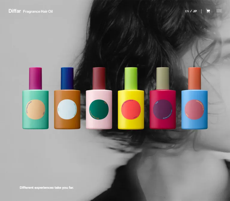
モノクロのヘアビジュアルと立体的な商品画像を重ねたフレグランスブランドの公式通販サイト。小さな白文字、広い余白、画面を大きく使う商品紹介が特徴です。
オリジナルサイトを見るDiffar — Style Reference
Sculptural fragrance packaging suspended over monochrome hair portraits, with a small white storefront interface at the edges.
Website: diffar.jp Original URL: https://diffar.jp/ Final URL: https://diffar.jp/ Theme: white interface elements over dark-to-silver photographic scenes; saturated color belongs primarily to the products. Inspected: supplied browser capture dated September 17, 2026, 04:18:20 JST — September 16, 2026, 19:18:20.101 UTC. Viewports: 1440 × 1000 desktop and 390 × 844 mobile, in CSS pixels. Scope: the current Japanese homepage, including the opening product compositions, eleven product chapters, About section, footer, and navigation elements present in the rendered DOM. Open-menu appearance and linked pages were not inspected.
Diffar combines a fragrance brand presentation with a working storefront. Large monochrome portraits, hair, and textured photographic surfaces form the environment. Colorful bottles and jars sit directly over that environment without cards or framing panels. Their crisp silhouettes and dimensional highlights provide the visual emphasis; headings and controls remain comparatively small.
The page unfolds as a long sequence of individual product scenes. On desktop, a single product occupies the left side while its category, number, name, price, description, and outlined Detail link occupy the right. The final About scene moves the text to the upper left and leaves most of the photograph exposed. A transparent header keeps the wordmark, language links, cart, and menu visually consistent across the supplied captures.
How to Read This Reference
- Measured values come from the supplied rendered DOM, computed styles, element rectangles, and runtime custom properties. Coordinates in that evidence are document coordinates at the initial scroll position unless otherwise stated.
- Observed appearance comes from the five current desktop/mobile screenshots. A screenshot establishes a visible state, not its animation mechanism.
- Estimated values describe visual bounds or approximate artwork colors. They are not exact asset dimensions, sampled pixels, or official brand specifications.
- Derived values are calculations from measured rectangles, such as a text column occupying approximately 84% of the mobile viewport.
- Recommended values and behaviors belong to the implementation guidance and starter CSS. They are not claims about the original source.
- Token names are descriptive implementation aliases unless explicitly identified as recorded source properties. Declared font families do not prove which font supplied every rendered glyph.
Tokens — Colors
Default Palette
| Name | Value | Suggested token | Evidence and role |
|---|---|---|---|
| Canvas Gray | #606060 |
--color-canvas |
Measured BODY background at both viewports; visible photography frequently covers it |
| Interface White | #ffffff |
--color-ink |
Measured text color for content, active language, and Detail links; white icons and outlines are visually consistent with it |
| Inactive Language Gray | #b7b3b3 |
--color-muted |
Measured EN link color on the Japanese page |
| Transparent Surface | transparent |
--color-surface |
Measured header, product sections, Detail links, About section, and footer backgrounds |
The underlying body gray is not a substitute for the image layer. The opening desktop scene is nearly black in substantial areas, while the product and About captures contain broad silver-gray regions. These tonal differences belong to the imagery and compositing, not a verified theme switch.
Some empty image or icon anchors report browser-default blue in their computed text color. Their visible artwork is not blue interface text. Do not promote that inherited anchor color into a design token.
Product Color Accents
These approximate colors describe the current captures only. They are useful for art direction, but should not recolor supplied product assets or become global button colors.
| Descriptive accent | Approximate value | Visible use |
|---|---|---|
| Clear Blue | #42a7d5 |
Floral Floral bottle and the blue balm lid |
| Warm Orange | #e55c32 |
Floral Floral cap; a deeper orange appears on a balm jar |
| Perfume Red | #ac2334 |
Left bottle in the desktop opening group |
| Deep Green | #2b382b |
Middle perfume bottle |
| Soft Lilac | #aa9ac7 |
Middle dropper collar |
| Balm Cream | #e9d7a6 |
Right balm lid in the mobile opening composition |
Packaging also introduces mustard yellow, strong green, muted mauve, and contrasting geometric labels. These colors are localized to objects. The surrounding interface stays white and neutral, making different product families coexist without a new UI palette for each one.
Tokens — Typography
Declared Interface Stack
The measured BODY and most English labels use:
font-family: YakuHanJP, basis-grotesque, source-han-sans-japanese,
  sans-serif, Helvetica, 'Helvetica Neue', Arial, Verdana;
font-weight: 600;
letter-spacing: -0.42px;
This gives the interface a compact, moderately heavy grotesque character. It is used for product names, the opening slogan, navigation, Detail links, and About headings. The source stack places a generic family before several named fallbacks; retain that distinction when documenting the source, but test the actual fallback rendering in a new implementation.
The wordmark is presented through an empty-text home link containing artwork. Its typeface is not established by the link's inherited font family. Reuse authorized logo artwork rather than recreating it from an assumed font.
Japanese Descriptive Copy
Product descriptions and About paragraphs declare a separate stack:
font-family: '游ゴシック体', 'Yu Gothic', YuGothic,
  'ヒラギノ角ゴシック Pro', 'Hiragino Kaku Gothic Pro',
  'メイリオ', Meiryo, Osaka, 'MS Pゴシック',
  'MS PGothic', sans-serif;
The measured weight is 700. Desktop paragraphs use 15px / 24px with 0.3px tracking; mobile paragraphs use 13px / 20.8px with 0.26px tracking. Both resolve to a 1.6 line-height ratio and 0.02em letter spacing.
The English verse inside the perfume-oil descriptions also uses this paragraph stack. Preserve its explicit four-line structure rather than treating the concatenated text in some element records as one continuous sentence.
Type Scale
| Role | Desktop | Mobile | Weight | Tracking / evidence |
|---|---|---|---|---|
| Inherited interface base | 14px / 14px |
14px / 14px |
600 | -0.42px; measured |
| Inactive language | 16px / 16px |
13px / 13px |
600 | -0.42px; measured |
| Active language | 16px / 16px |
13px / 13px |
700 | 0.32px / 0.26px; measured |
| Opening slogan | 18px / 24.48px |
15px / 20.4px |
600 | -0.42px; measured |
| Product name | 20px / 20px |
16px / 16px |
600 | -0.42px; measured |
| Product description | 15px / 24px |
13px / 20.8px |
700 | 0.02em; measured |
| Product Detail link | 16px / 16px |
16px / 16px |
600 | -0.42px; measured |
| About heading | 24px / 24px |
20px / 20px |
600 | -0.42px; measured |
| About inline links | 18px / 18px |
16px / 16px |
600 | Measured; inline rectangle height is slightly larger than line-height |
| Copyright | 16px / 16px |
12px / 12px |
600 | -0.42px; measured |
| Legal links | 12px / 12px |
11px / 11px |
700 | 0.28px at both viewports; measured |
| Product category | Approximately 15–16px |
Not separately measured | Unverified | Desktop visual estimate |
| Product number | Approximately 28px |
Not separately measured | Unverified | Desktop visual estimate |
| Price | Approximately 20px |
Not separately measured | Unverified | Desktop visual estimate |
The HTML root reports 10px, but the table gives resolved CSS pixels. A new implementation can retain a conventional root size and use these explicit tokens. The root's reported Times family is not the visible content typography.
Tokens — Spacing & Shapes
There is no verified universal spacing unit. The interface uses several precise edge insets, compact text gaps, and much larger scene dimensions. Preserve those relationships instead of forcing everything onto one spacing scale.
Spacing Scale
| Use | Desktop | Mobile | Status |
|---|---|---|---|
| Home-link left inset | 40px |
20px |
Measured |
| Header height | 102px |
62px |
Measured |
| Menu button box | 60 × 60px |
60 × 60px |
Measured |
| Opening slogan left inset | 45px |
20px |
Measured |
| Product paragraph width | 537.83px |
327.59px |
Measured |
| Product paragraph left edge | 720px |
31.20px |
Measured |
| Description-to-Detail gap | 40px |
20px |
Derived from measured rectangles |
| About left inset | 90px |
30px |
Measured |
| About text width | 420px |
330px |
Measured |
| About heading top inset within its section | 120px |
120px |
Derived from measured rectangles |
| About heading-to-first-paragraph gap | 25px |
15px |
Derived |
| About paragraph gap | 15px |
13px |
Derived |
| Gap between About links | Approximately 18.45px |
Approximately 18.45px |
Derived from inline rectangles |
| Footer copyright left inset | 30px |
20px |
Measured |
Border Radius
| Element | Treatment | Evidence |
|---|---|---|
| Product Detail link | Square corners | Measured border-radius: 0 and visible outline |
| Header controls | Unboxed; no visible rounded container | Screenshots and measured transparent backgrounds |
| Product scenes | No card boundary | Screenshots |
| Product bottles and jars | Rounded object geometry | Artwork, not CSS component radius |
| Instagram symbol | Rounded camera outline | Icon artwork, not a surface system |
Layout Measurements
| Element | Desktop observation | Mobile observation |
|---|---|---|
| Entire document | 1440 × 14201px |
390 × 14177px |
| Opening section | 1000px tall |
1100px tall |
| First product section | Starts at 1100px; 1200px tall |
Same recorded start and height |
| Subsequent product sections | Generally 1100px tall |
Generally 1100px tall |
| About section | Starts at 13200px; 1000px tall |
Starts at 13300px; 844px tall |
| Footer | Starts at 14115px; 86px tall |
Starts at 14089px; 88px tall |
| Product Detail link | 202 × 48px |
Approximately 329.59 × 48px |
The mobile Detail rectangle is two pixels wider than its paragraph column. This is consistent with an additional border around a content-width box, but the supplied records do not include the necessary box-sizing and border-width declarations to prove that mechanism. A new implementation should use border-box sizing and keep the outline within its intended column.
Components
Application Header
Role: persistent visual identity and access to language, shopping, and navigation.
The header has no visible background strip or bottom rule. It sits directly over the image. Place the white Diffar wordmark at the left and a compact utility group at the right in this order: EN, slash, JP, vertical divider, cart, two-line menu symbol.
On desktop, the home-link rectangle is 200 × 20px at (40, 41). The visible wordmark occupies only the left portion of that rectangle. On mobile, the home-link rectangle is approximately 44.8 × 16px at (20, 23). Do not scale the desktop artwork to the full 200px link width.
The cart artwork/link rectangle measures approximately 20 × 18.81px on desktop and 18 × 16.94px on mobile. The menu's visible two-line glyph is approximately 24px wide, while its measured button target is 60 × 60px at both sizes.
EN is muted gray; JP is white and heavier. Their recorded destinations are https://diffar.net/ and https://diffar.jp/. This establishes separate language URLs, not an observed in-place language switch. The cart points to /cart.
The header appears at the same viewport edge in the opening, product, and About screenshots. Its exact CSS positioning mechanism was not included in the measured properties; fixed positioning in the starter is an implementation choice consistent with that appearance.
Opening Product Composition
Role: introduce the product objects before introducing detailed sales information.
The desktop opening capture presents three dropper bottles over an almost-black hair portrait. Their links point to Aerial Parlance, Vector Grammar, and Pulse Rhyme. Each measured link is approximately 239.03 × 350px, and the three adjacent boxes span approximately 717.09px, centered horizontally. Their top edge is 315px; the row's vertical center is 490px.
The visible bottle silhouettes are narrower than these link boxes—roughly 145 × 325px each by visual estimate. Apparent gaps between products therefore include transparent space inside the artwork or its layout. Do not add large CSS gaps without checking the assets' transparent margins.
The mobile opening capture presents two balm jars, with links to Fresh Moss and Rooted Bloom. Each link measures approximately 163.80 × 195px; together they occupy 84% of the viewport width, starting at 31.20px. Their top edge is 407.5px. The actual jar silhouettes are approximately 120 × 133px each.
The different groups are observed states, not proof that desktop always shows perfume and mobile always shows balm. Responsive selection, timed rotation, and another selection mechanism cannot be distinguished from these captures.
The slogan, “Different experiences take you far.”, is a small lower-left H2. On desktop its rectangle starts at (45, 930.53) and ends 45px above the section bottom. On mobile it starts at y = 949.61px, below the initial 844px viewport. Its absence from that screenshot does not mean it was removed.
Product Chapter
Role: give one fragrance a large visual scene and a direct route to its detail page.
The main sequence contains six Fragrance Hair Oil products, two Fragrance Multi Balms, and three Perfume Oil products. Each repeats the same information anatomy:
- Product image or visual on the left side of the desktop scene.
- Small category label.
- Product number, product name, and price with the tax label “(税込)”.
- Descriptive copy or a short English verse.
- An outlined Detail link.
The supplied Floral Floral screenshot is the clearest visible example. A blue bottle with an orange cap and circular rose-colored label occupies approximately 194 × 458px, centered near x = 402px. These are visual silhouette estimates, not asset dimensions. The right-hand text starts at x = 720px and extends to approximately 1258px.
The number 61705 is visually larger than the Floral Floral name. The price ¥8,800 sits toward the far right of the identity row. The paragraph and button share the left edge of the copy column. The category begins above this row, leaving a clear hierarchy without oversized display typography.
Desktop descriptions occupy either two or three 24px lines for the measured hair-oil entries. Perfume verses occupy four lines, measured at 96px total. Their deliberate line breaks contribute to the editorial character.
On mobile, the product H2 begins at the same 31.20px left edge as the paragraph. Most product names occur approximately 605px into their section, compared with approximately 368px on desktop. This supports a lower, single-column information region. The exact mobile product-number and price arrangement was not separately measured or shown in a supplied product screenshot.
Outlined Detail Link
Role: quiet but recognizable product navigation.
Use a transparent rectangle, white label, thin white outline, and square corners. The desktop measured box is 202 × 48px; the screenshot suggests a 1px outline. Its measured vertical padding is 15px, and its type is 16px / 16px, weight 600.
On mobile, the link expands to approximately the text-column width while retaining its 48px height and 16px label. It follows the paragraph after 20px rather than the desktop 40px.
Desktop computed styles declare background 0.2s, color 0.2s. No hovered capture establishes the resulting colors. A white-fill/dark-text hover is a reasonable recommendation, not an observed endpoint.
About Section
Role: close the product sequence with brand philosophy and links to further exploration.
The background is a large monochrome crop of straight hair and a shoulder, with soft overlapping edges. A narrow text block sits over it without a backing card. The desktop block starts 90px from the left and 120px into the section; its width is 420px.
The content consists of the heading About Diffar, three Japanese paragraphs, and underlined Detail and Products links. The first two paragraphs occupy three lines each at both sampled sizes. The final paragraph is one line. Mobile narrows the block to 330px with 30px side insets and reduces body text to 13px.
The About Detail link points to /pages/details, whereas a separate navigation Detail link points to /pages/detail. Preserve this recorded distinction when documenting the original. Neither destination was opened, so they should not be silently normalized or assumed equivalent.
Footer
Role: legal navigation and the brand's social link.
Desktop places copyright and two underlined legal links in a horizontal group near the lower left, with the Instagram symbol toward the right. The footer itself has a transparent measured background and an 86px rectangle.
Mobile uses a first row for copyright and a second row for “プライバシーポリシー” and “特商法に基づく表示”. The Instagram symbol remains at the lower right. Copyright reduces from 16px to 12px and legal text from 12px to 11px.
A darker band is visible behind the mobile footer. The sampled FOOTER background is still transparent, so the responsible image, parent, or compositing layer and its opacity are not established. Treat any black translucent footer fill in a recreation as an approximation.
Navigation Content — DOM Evidence Only
The rendered DOM includes Detail, Products, Shop&Salon List, eleven product entries, Discovery Mouillette Set, FAQ, Shopping Cart, Login, Privacy Policy, Transaction, Contact, and Instagram.
Desktop navigation product links have measured rectangles around 320px wide and form a vertical sequence at x = 50px. Mobile product-image links form three columns, approximately 106.5px wide with 15px horizontal gaps. The mobile top-level navigation links measure 350 × 70px and begin at x = 20px.
These rectangles describe content present in the DOM, not a visually inspected open menu. Its backdrop, entrance animation, focus behavior, scrolling, and close treatment remain unverified. Do not import the navigation's three-column mobile arrangement into the homepage's full-scene product sequence.
Tokens — Motion & Interaction
| Treatment | Recorded evidence | What it establishes |
|---|---|---|
| Product-section opacity | opacity 0.6s |
A 600ms transition is declared; trigger and endpoint were not supplied |
| Product-section filter | filter 0.6s cubic-bezier(0.5, 1, 0.89, 1) |
A filter transition is declared; blur amount or other filter values are unknown |
| Product-section transform | transform 0.6s cubic-bezier(0.5, 1, 0.89, 1) |
A transform transition is declared; direction and distance are unknown |
| Desktop Detail feedback | background 0.2s, color 0.2s |
Background and text can transition over 200ms; hover colors were not observed |
| Mobile Detail feedback | Reported as all, without an explicit duration in the supplied record |
Insufficient evidence for a timed mobile effect |
| Scroll coordination | Source properties include --scroll, --scrollPx, and numbered section offsets |
Runtime scroll-related values exist; their update algorithm was not supplied |
| Opening product-group variation | Three perfume bottles on desktop; two balms on mobile | Different captured content states; no established carousel, autoplay interval, or responsive selection rule |
| Photographic softness and overlapping edges | Visible in screenshots | An image treatment; not proof of video, parallax, or animated blur |
The source records --wHeightPx: 1000px on desktop and 844px on mobile, while --wHeightFixedPx remains 1000px in both observations. This is a runtime snapshot, not proof that every fresh mobile load is authored around a permanently hardcoded 1000px viewport.
The supplied browser process waited for finite motion and layout stability, paused perpetual animations during readiness checks, and resumed them afterward. It does not provide a playback recording. Background format, loop duration, audio, object rotation, and scroll-synchronized media remain unverified.
For an extension, retain the measured 600ms transition family where appropriate, but choose and label new motion distances explicitly. Content should remain available without animation or script-driven reveal states.
Surfaces
| Layer | Appearance | Purpose |
|---|---|---|
| Base canvas | Solid #606060 |
Neutral fallback beneath imagery |
| Photographic environment | Full-width monochrome portrait, hair, or texture | Establishes atmosphere and continuous scene scale |
| Product objects | Saturated cutouts with dimensional lighting | Main visual emphasis and product differentiation |
| Header and content | White text and icons over transparent surfaces | Keeps the environment visible |
| Product action | Thin rectangular outline with transparent interior | Navigation without introducing a competing color block |
| About content | Unboxed narrow text column | Editorial brand statement |
| Mobile footer region | Visually darker background behind small legal text | Separation at the page ending; exact compositing unverified |
No general card, rounded-panel, or UI shadow system is visible. Shadows and highlights belong primarily to the product artwork. Do not replace that object lighting with large CSS drop shadows around rectangular image containers.
Imagery
The current visual language depends on the contrast between intimate monochrome hair imagery and highly colored packaging. Backgrounds fill the frame, crop aggressively, and retain blur, grain, and tonal variation. They do not behave like small editorial thumbnails.
Products are presented as isolated objects with clean edges. The desktop droppers have differently colored bodies, collars, and bulbs. The mobile balms combine contrasting lids and jars with inverted triangular graphics. The Floral Floral bottle uses a tall cap and a circular label. These geometric package details carry the visual identity more strongly than decorative interface graphics.
The images look dimensional, but their production method is not established. Do not claim live 3D, WebGL, or a particular rendering pipeline. Photography, prerendered imagery, and other asset formats cannot be distinguished from the supplied stills.
Observed Asset References
No image-file paths, video sources, or asset manifests were supplied. The URLs below identify linked products, not downloadable image files.
| Asset group | Current evidence | Navigation association |
|---|---|---|
| Three dropper bottles | Desktop opening capture | /products/13556, /products/23729, /products/33902 |
| Blue bottle with orange cap | Desktop Floral Floral chapter | /products/61705 |
| Two colorful balm jars | Mobile opening capture | /products/14310, /products/24511 |
| Monochrome hair and portrait backgrounds | Opening and product captures | Homepage scene imagery; file URLs unavailable |
| Long-hair and shoulder background | Desktop and mobile About captures | Homepage About scene; file URL unavailable |
| Wordmark, cart, menu, Instagram symbols | Current header and footer captures | Artwork implementation and file URLs unavailable |
For implementation, use authorized transparent product assets with object-fit: contain. Use background imagery with object-fit: cover and tune crop position per viewport. Keep any grayscale filter or darkening layer on the background alone; applying it to the entire scene would also desaturate the products.
Layout & Responsive Behavior
Desktop Composition
The homepage is a long storefront sequence rather than a conventional card catalog. Its recorded height is 14,201px at a 1000px-tall viewport. Product sections generally occupy 1100px of document space, so their layout cannot be summarized as exactly one viewport per product.
The opening scene centers a compact row of objects and leaves substantial space above and below it. Product chapters use a left visual and a right information region. The measured text begins exactly at 50% of viewport width and occupies approximately 37.35% of viewport width. This leaves approximately 12.65% of the viewport beyond the text's right edge.
The About scene switches to a 420px column on the left. Header utilities and the footer continue to use edge alignment, creating a separate perimeter system from the product text columns.
Mobile Composition
At 390px width, the header becomes 62px tall, with a 20px wordmark inset and smaller language text. The menu button remains 60px square. The opening product group occupies 84% of the viewport width.
Product prose also measures approximately 84% of viewport width, with 8% side insets. Product titles reduce to 16px; paragraphs reduce to 13px; Detail links remain 16px and become nearly full-column width. The About column instead uses explicit 30px insets, producing a 330px width.
The opening section remains 1100px tall in the mobile evidence, exceeding the 844px viewport. Its slogan lies below the first screen. Most product chapters also remain 1100px tall. The near-equal desktop and mobile document heights therefore reflect the recorded scene spacing, not proportional scaling by viewport height.
Section Overlap and Capture Position
Desktop About begins at 13200px, while the last product section's measured rectangle extends to 13300px. The rectangles overlap by 100px. Mobile About begins at 13300px, where the final product section ends. These coordinates should not be added as if every section were a simple, non-overlapping flow block.
The mobile document's maximum scroll position is 14177 − 844 = 13333px. At that position, an About heading at document y = 13420px appears approximately 87px from the viewport top, even though it sits 120px into its own section. This explains the higher-looking About heading in the final mobile screenshot.
No intermediate-width viewport was supplied. The breakpoint, landscape behavior, safe-area handling, and browser-toolbar resizing behavior are unknown. The starter's 760px breakpoint is a recommendation, not a recovered source value.
Do’s and Don’ts
Do
- Let monochrome imagery fill the scene and reserve saturated color for the product objects.
- Keep the header transparent, compact, and aligned to the outer edges.
- Preserve the distinction between artwork bounds and larger clickable product boxes.
- Use small, semibold grotesque labels and bold Japanese paragraphs with a 1.6 line-height ratio.
- Keep product number, name, price, description, and Detail link grouped as one information unit.
- Maintain the measured desktop relationship between the left product and the copy starting at half the viewport width.
- Expand product Detail links to the mobile text-column width.
- Keep About as a narrow, unboxed editorial block with underlined links.
- Preserve intentional line breaks in the perfume descriptions.
- Treat scene timing and background playback as separate questions from a screenshot's visual appearance.
Don’t
- Don’t turn the homepage into a dense product-card grid or a generic campaign page.
- Don’t introduce oversized marketing headings that compete with the objects.
- Don’t convert packaging colors into a rainbow of interface buttons and badges.
- Don’t place white cards, glass panels, pill buttons, or decorative shadows behind the copy.
- Don’t stretch product images or crop their caps, droppers, or jar lids to fill a box.
- Don’t apply grayscale or darkening to the product layer.
- Don’t assume the desktop/mobile opening groups establish a viewport-specific product rule.
- Don’t claim autoplay, parallax, live 3D, or a particular menu animation without further evidence.
- Don’t hide the mobile slogan simply because it is outside the initial screenshot.
- Don’t copy runtime section offsets into a new page without accounting for changed content and viewport behavior.
Recommended Implementation Additions
These are recommendations for a new implementation, not verified features of the original:
- Give the logo, cart, menu, Instagram link, and product-image links meaningful accessible names. Empty extracted link text does not establish whether accessible names already exist.
- Provide visible keyboard focus and sufficiently large targets for small language and cart controls. Preserve the compact icon appearance while increasing the interactive area.
- Expose menu state with
aria-expandedandaria-controls; implement appropriate focus management once the navigation behavior is defined. - Test white text against every background crop. Add a local image scrim when necessary, keeping colored products above it.
- Support reduced motion. If moving background media is introduced, provide a usable still frame and any necessary pause control.
- Keep content readable at text zoom. The original 13px mobile prose can be increased to 14–15px if accessibility goals outweigh exact density matching.
- Use ordinary links for product and language navigation, and keep product content reachable if scroll enhancement fails.
- Load the initial scene efficiently and defer distant scene media. Preserve dimensions so images do not shift the text during loading.
- Verify both
/pages/detailand/pages/detailsbefore choosing the destination for a new implementation.
Agent Prompt Guide
Quick Color Reference
- Base canvas: measured
#606060. - Text, outlines, and visible utility artwork: white.
- Inactive EN label: measured
#b7b3b3. - Product color: supplied full-color artwork, not a global action token.
- Background: monochrome photography ranging from near-black to silver-gray.
- Primary product action: transparent, square, thin white outline.
Overall Prompt
“Create a fragrance brand storefront inspired by the current Diffar homepage. Use full-scene monochrome hair portraits and textured photographs, with isolated, saturated product bottles or jars floating above them. Keep a small transparent header with a white wordmark on the left and language, cart, and two-line menu controls on the right. Present products in a long sequence of individual scenes. On desktop, place the product on the left and a compact white information column beginning at the horizontal midpoint: category, prominent product number, smaller name, price, descriptive copy, and a square outlined Detail link. Finish with a narrow About block over a hair photograph and a small legal footer. Preserve broad negative space and restrained typography. Do not invent background playback or opening-product rotation.”
Example Component Prompts
- Opening composition: “Center three colorful dropper-bottle cutouts over a dark monochrome hair portrait. Keep each object inside a larger transparent link box, with no card or caption below it. Add a small lower-left slogan and a transparent white utility header. Preserve the artwork's internal transparent margins.”
- Product chapter: “Build a full-width fragrance scene with a blue bottle and orange cap at the left and a 538px white text column starting at x=720 in a 1440px viewport. Use a small category, a visually larger number, a 20px name, right-aligned price, 15px/24px Japanese copy, and a 202×48px outlined Detail link.”
- Mobile product information: “Use an approximately 84%-wide information column with 8% side insets. Set product names at 16px and descriptive copy at 13px/20.8px. Place a full-column, 48px-high outlined Detail link 20px below the copy. Allow identity and price to wrap; their exact original mobile arrangement is unverified.”
- About scene: “Place a 420px-wide text block 90px from the desktop left edge over a full-frame monochrome hair photograph. Use a 24px heading, three bold Japanese paragraphs, and two underlined links. At 390px width, use 30px insets, a 20px heading, and 13px/20.8px copy.”
- Motion extension: “Use the observed 600ms opacity, filter, and transform transition family as a starting point. Select new reveal distances explicitly, keep all content visible without enhancement, and provide reduced-motion behavior. Do not imply that the original animation endpoints were measured.”
Quick Start
CSS Custom Properties
This is a static, reusable adaptation rather than recovered site code. It reproduces the main typography, columns, object layering, and controls. Product chapters use normal content flow instead of recreating the original scroll coordination or overlapping document rectangles. The 760px breakpoint, optional scrim, mobile product flow, and hover endpoint are recommendations.
Use .diffar-scene for each image-backed section, with a background image in .diffar-scene__background. Keep products and content in separate foreground elements. The opening group accepts whichever product set is supplied; this CSS does not switch product categories by viewport. Image paths and licensed font files must be provided by the implementer.
:root {
  /* Measured interface colors */
  --color-canvas: #606060;
  --color-ink: #ffffff;
  --color-muted: #b7b3b3;

  /* Declared source stacks; font files are not supplied */
  --font-ui: YakuHanJP, basis-grotesque,
    source-han-sans-japanese, sans-serif,
    Helvetica, 'Helvetica Neue', Arial, Verdana;
  --font-prose: '游ゴシック体', 'Yu Gothic', YuGothic,
    'ヒラギノ角ゴシック Pro', 'Hiragino Kaku Gothic Pro',
    'メイリオ', Meiryo, Osaka, 'MS Pゴシック',
    'MS PGothic', sans-serif;

  --text-language: 16px;
  --text-product: 20px;
  --text-prose: 15px;
  --text-about: 24px;
  --text-about-link: 18px;
  --text-slogan: 18px;
  --tracking-ui: -0.42px;
  --tracking-prose: 0.02em;
  --leading-prose: 1.6;

  --header-height: 102px;
  --header-inset: 40px;
  --about-inset: 90px;
  --about-width: 420px;
  --about-heading-gap: 25px;
  --copy-action-gap: 40px;
  --detail-width: 202px;
  --detail-height: 48px;
  --radius-control: 0;

  /* Recorded transition timing, not recorded endpoints */
  --motion-scene: 600ms;
  --ease-scene: cubic-bezier(0.5, 1, 0.89, 1);
  --motion-control: 200ms;
}

* { box-sizing: border-box; }
body { margin: 0; }

.diffar-page {
  color: var(--color-ink);
  background: var(--color-canvas);
  font-family: var(--font-ui);
  font-size: 14px;
  font-weight: 600;
  line-height: 1;
  letter-spacing: var(--tracking-ui);
}

.diffar-page a { color: inherit; }
.diffar-page button { font: inherit; }

.diffar-header {
  position: fixed;
  z-index: 20;
  inset: 0 0 auto;
  height: var(--header-height);
  display: flex;
  align-items: center;
  justify-content: space-between;
  padding-inline: var(--header-inset)
    calc(var(--header-inset) - 20px);
  background: transparent;
}

.diffar-home {
  display: flex;
  align-items: center;
  width: 200px;
  text-decoration: none;
}

.diffar-logo {
  display: block;
  width: auto;
  height: 20px;
}

.diffar-utilities,
.diffar-language {
  display: flex;
  align-items: center;
}

.diffar-utilities { gap: 20px; }
.diffar-language { gap: 5px; }

.diffar-language a {
  display: inline-flex;
  align-items: center;
  min-height: 44px;
  font-size: var(--text-language);
  text-decoration: none;
  color: var(--color-muted);
}

.diffar-language [aria-current] {
  color: var(--color-ink);
  font-weight: 700;
  letter-spacing: 0.02em;
}

.diffar-divider {
  width: 1px;
  height: 18px;
  background: currentColor;
}

.diffar-cart {
  display: grid;
  place-items: center;
  width: 44px;
  height: 44px;
  margin-inline: -12px;
}

.diffar-cart svg { width: 20px; height: auto; }

.diffar-menu-toggle {
  display: grid;
  place-content: center;
  gap: 6px;
  width: 60px;
  height: 60px;
  margin-left: -10px;
  padding: 0;
  border: 0;
  border-radius: 0;
  color: inherit;
  background: transparent;
  cursor: pointer;
}

.diffar-menu-toggle span {
  display: block;
  width: 24px;
  height: 2px;
  background: currentColor;
}

.diffar-scene {
  position: relative;
  isolation: isolate;
  min-height: 100vh;
  min-height: 100svh;
  background: var(--color-canvas);
}

.diffar-scene__background {
  position: absolute;
  z-index: 0;
  inset: 0;
  width: 100%;
  height: 100%;
  object-fit: cover;
  object-position: var(--image-position, center);
  filter: grayscale(1);
  pointer-events: none;
}

.diffar-scene::after {
  /* Optional contrast aid; opacity is a new design choice */
  content: '';
  position: absolute;
  z-index: 1;
  inset: 0;
  background: rgb(0 0 0 / var(--scene-scrim, 0));
  pointer-events: none;
}

.diffar-opening__products {
  position: absolute;
  z-index: 2;
  left: 50%;
  top: 49%;
  transform: translate(-50%, -50%);
  display: flex;
  width: min(717px, 84%);
  height: 350px;
}

.diffar-opening__products a {
  display: flex;
  flex: 1 1 0;
  min-width: 0;
}

.diffar-opening__products img {
  display: block;
  width: 100%;
  height: 100%;
  object-fit: contain;
}

.diffar-slogan {
  position: absolute;
  z-index: 2;
  left: 45px;
  bottom: 45px;
  margin: 0;
  font-size: var(--text-slogan);
  font-weight: 600;
  line-height: 1.36;
}

.diffar-product-stage {
  position: relative;
  z-index: 2;
  display: grid;
  grid-template-columns: 1fr 1fr;
  align-items: center;
  min-height: 100vh;
  min-height: 100svh;
  padding-block: 102px 202px;
}

.diffar-product-visual {
  display: grid;
  place-items: center;
  padding-left: 5.8vw;
}

.diffar-product-visual img {
  display: block;
  width: min(100%, var(--product-width, 240px));
  height: var(--product-height, 458px);
  object-fit: contain;
}

.diffar-product-copy {
  width: 74.7%;
  min-width: 0;
}

.diffar-category {
  /* Visual approximation; category size was not sampled */
  margin: 0 0 20px;
  font-size: 15px;
  line-height: 1.2;
}

.diffar-product-meta {
  display: flex;
  flex-wrap: wrap;
  align-items: baseline;
  gap: 12px 16px;
  margin-bottom: 25px;
}

.diffar-product-number {
  /* Visual approximation */
  font-size: 28px;
  line-height: 1;
}

.diffar-product-name {
  margin: 0;
  font-size: var(--text-product);
  font-weight: 600;
  line-height: 1;
}

.diffar-price {
  margin-left: auto;
  font-size: 20px;
  white-space: nowrap;
}

.diffar-price small { font-size: 12px; }

.diffar-prose {
  font-family: var(--font-prose);
  font-size: var(--text-prose);
  font-weight: 700;
  line-height: var(--leading-prose);
  letter-spacing: var(--tracking-prose);
}

.diffar-prose p { margin: 0 0 1em; }
.diffar-prose p:last-child { margin-bottom: 0; }

.diffar-detail {
  display: grid;
  place-items: center;
  width: var(--detail-width);
  min-height: var(--detail-height);
  margin-top: var(--copy-action-gap);
  padding: 15px 0;
  border: 1px solid currentColor;
  border-radius: var(--radius-control);
  background: transparent;
  font-size: 16px;
  line-height: 16px;
  text-decoration: none;
  transition: background var(--motion-control),
    color var(--motion-control);
}

.diffar-about {
  display: flex;
  flex-direction: column;
  padding-top: 120px;
}

.diffar-about-copy {
  position: relative;
  z-index: 2;
  width: var(--about-width);
  max-width: calc(100% - 60px);
  margin-left: var(--about-inset);
}

.diffar-about-title {
  margin: 0 0 var(--about-heading-gap);
  font-size: var(--text-about);
  font-weight: 600;
  line-height: 1;
}

.diffar-about-links {
  display: flex;
  gap: 18.45px;
  margin-top: 24px;
  font-size: var(--text-about-link);
}

.diffar-about-links a,
.diffar-legal a {
  text-decoration: underline;
  text-underline-offset: 2px;
}

.diffar-footer {
  position: relative;
  z-index: 2;
  display: flex;
  align-items: center;
  gap: 22px;
  margin-top: auto;
  padding: 40px 30px 30px;
}

.diffar-copyright {
  margin: 0;
  font-size: 16px;
  line-height: 16px;
}

.diffar-legal {
  display: flex;
  flex-wrap: wrap;
  gap: 15px;
  font-family: var(--font-prose);
  font-size: 12px;
  font-weight: 700;
  line-height: 1;
  letter-spacing: 0.28px;
}

.diffar-instagram { margin-left: auto; }
.diffar-instagram svg { width: 26px; height: 26px; }

/* Recommended feedback; original hover endpoint is unknown */
@media (hover: hover) {
  .diffar-detail:hover {
    color: var(--color-canvas);
    background: var(--color-ink);
  }
}

.diffar-page :focus-visible {
  outline: 2px solid currentColor;
  outline-offset: 4px;
}

/* Recommended breakpoint; mobile dimensions follow the capture */
@media (max-width: 760px) {
  :root {
    --header-height: 62px;
    --header-inset: 20px;
    --text-language: 13px;
    --text-product: 16px;
    --text-prose: 13px;
    --text-about: 20px;
    --text-about-link: 16px;
    --text-slogan: 15px;
    --about-inset: 30px;
    --about-width: 330px;
    --about-heading-gap: 15px;
    --copy-action-gap: 20px;
    --detail-width: 100%;
  }

  .diffar-home { width: auto; }
  .diffar-logo { height: 16px; }
  .diffar-utilities { gap: 15px; }
  .diffar-cart svg { width: 18px; }
  .diffar-cart { margin-inline: -13px; }
  .diffar-menu-toggle { margin-left: -2px; }

  .diffar-opening {
    /* Capture-specific static approximation, not a source formula */
    min-height: max(1100px, 100svh);
  }

  .diffar-opening__products {
    top: 505px;
    width: 84%;
    height: 195px;
  }

  .diffar-slogan {
    left: 20px;
    top: 949.6px;
    bottom: auto;
  }

  .diffar-product-stage {
    display: flex;
    flex-direction: column;
    align-items: stretch;
    justify-content: center;
    gap: 40px;
    padding: 100px 8% 80px;
  }

  .diffar-product-visual { padding: 0; }
  .diffar-product-visual img { height: 350px; }
  .diffar-product-copy { width: 100%; }

  .diffar-product-meta {
    /* Recommended wrapping; exact original mobile row is unknown */
    gap: 10px 14px;
  }

  .diffar-footer {
    display: block;
    padding: 20px 20px 21px;
    margin-top: max(60px, 10vh);
    /* Approximation of the visible darker mobile footer region */
    background: rgb(0 0 0 / 0.35);
  }

  .diffar-copyright {
    margin-bottom: 24px;
    font-size: 12px;
    line-height: 12px;
  }

  .diffar-legal {
    gap: 10px;
    padding-right: 50px;
    font-size: 11px;
  }

  .diffar-instagram {
    position: absolute;
    right: 20px;
    bottom: 20px;
  }
}

@media (prefers-reduced-motion: reduce) {
  .diffar-page *,
  .diffar-page *::before,
  .diffar-page *::after {
    animation: none !important;
    transition: none !important;
    scroll-behavior: auto !important;
  }
}
Use a product-specific --product-width and --product-height to accommodate different packaging silhouettes and transparent asset margins. For example, the Floral Floral visible silhouette suggests about 194 × 458px on desktop, while the dropper group uses larger link boxes around narrower objects.
The reduced-motion CSS covers CSS effects only. Any future video, canvas, or script-driven animation needs a corresponding reduced-motion implementation.
Tailwind v4 Token Mapping
Optional aliases for a project already using Tailwind v4. This does not imply that the original site uses Tailwind. Define the custom properties above first.
@theme inline {
  --color-diffar-canvas: var(--color-canvas);
  --color-diffar-ink: var(--color-ink);
  --color-diffar-muted: var(--color-muted);

  --font-diffar-ui: var(--font-ui);
  --font-diffar-prose: var(--font-prose);

  --text-diffar-product: var(--text-product);
  --text-diffar-prose: var(--text-prose);
  --text-diffar-about: var(--text-about);
  --text-diffar-slogan: var(--text-slogan);

  --spacing-diffar-header: var(--header-height);
  --spacing-diffar-inset: var(--header-inset);
  --spacing-diffar-action: var(--detail-height);
  --radius-diffar-control: 0px;
}
Sources & Evidence
- Inspected original and final website: Diffar official Japanese homepage. The supplied observation reports HTTP 200 and the same original and final URL.
- Capture timestamp: September 16, 2026, 19:18:20.101 UTC, equivalent to September 17, 2026, 04:18:20.101 JST.
- Desktop evidence: 1440 × 1000 viewport; opening perfume composition, Floral Floral product scene, and About/footer screenshots, plus rendered DOM, computed styles, links, element rectangles, and runtime custom properties. Recorded document height: 14,201px.
- Mobile evidence: 390 × 844 viewport; opening balm composition and About/footer screenshots, plus the same categories of DOM evidence. Recorded document height: 14,177px.
- Capture procedure: the supplied browser process observed the initial page for at least five seconds, waited for finite motion and layout/text stability within a bounded readiness period, checked visible image decoding, and traversed intermediate scroll positions. These checks do not guarantee all delayed content or interaction states were exercised.
- Interaction limits: menu opening, hover outcomes, cart behavior, product-detail pages, language destinations, and legal pages were not visually exercised in the supplied evidence. Navigation URLs establish link targets only.
- Media and font limits: image/video source URLs, media playback timing, exact font-file loading, and per-glyph font selection were not supplied. No live-3D or video mechanism is established by the screenshots.
- Environment limits: SharedWorkers and service workers were disabled during the supplied inspection. No additional browsing, command execution, or file inspection was performed for this analysis.
This reference describes the homepage delivered in the supplied current capture. Estimates and recommended implementation behavior are marked separately from measured source values.
# Diffar — Style Reference

> Sculptural fragrance packaging suspended over monochrome hair portraits, with a small white storefront interface at the edges.

**Website:** [diffar.jp](https://diffar.jp/)
**Original URL:** https://diffar.jp/
**Final URL:** https://diffar.jp/
**Theme:** white interface elements over dark-to-silver photographic scenes; saturated color belongs primarily to the products.
**Inspected:** supplied browser capture dated September 17, 2026, 04:18:20 JST — September 16, 2026, 19:18:20.101 UTC.
**Viewports:** 1440 × 1000 desktop and 390 × 844 mobile, in CSS pixels.
**Scope:** the current Japanese homepage, including the opening product compositions, eleven product chapters, About section, footer, and navigation elements present in the rendered DOM. Open-menu appearance and linked pages were not inspected.

Diffar combines a fragrance brand presentation with a working storefront. Large monochrome portraits, hair, and textured photographic surfaces form the environment. Colorful bottles and jars sit directly over that environment without cards or framing panels. Their crisp silhouettes and dimensional highlights provide the visual emphasis; headings and controls remain comparatively small.

The page unfolds as a long sequence of individual product scenes. On desktop, a single product occupies the left side while its category, number, name, price, description, and outlined Detail link occupy the right. The final About scene moves the text to the upper left and leaves most of the photograph exposed. A transparent header keeps the wordmark, language links, cart, and menu visually consistent across the supplied captures.

## How to Read This Reference

- **Measured** values come from the supplied rendered DOM, computed styles, element rectangles, and runtime custom properties. Coordinates in that evidence are document coordinates at the initial scroll position unless otherwise stated.
- **Observed** appearance comes from the five current desktop/mobile screenshots. A screenshot establishes a visible state, not its animation mechanism.
- **Estimated** values describe visual bounds or approximate artwork colors. They are not exact asset dimensions, sampled pixels, or official brand specifications.
- **Derived** values are calculations from measured rectangles, such as a text column occupying approximately 84% of the mobile viewport.
- **Recommended** values and behaviors belong to the implementation guidance and starter CSS. They are not claims about the original source.
- Token names are descriptive implementation aliases unless explicitly identified as recorded source properties. Declared font families do not prove which font supplied every rendered glyph.

## Tokens — Colors

### Default Palette

| Name | Value | Suggested token | Evidence and role |
| --- | --- | --- | --- |
| Canvas Gray | `#606060` | `--color-canvas` | Measured BODY background at both viewports; visible photography frequently covers it |
| Interface White | `#ffffff` | `--color-ink` | Measured text color for content, active language, and Detail links; white icons and outlines are visually consistent with it |
| Inactive Language Gray | `#b7b3b3` | `--color-muted` | Measured EN link color on the Japanese page |
| Transparent Surface | `transparent` | `--color-surface` | Measured header, product sections, Detail links, About section, and footer backgrounds |

The underlying body gray is not a substitute for the image layer. The opening desktop scene is nearly black in substantial areas, while the product and About captures contain broad silver-gray regions. These tonal differences belong to the imagery and compositing, not a verified theme switch.

Some empty image or icon anchors report browser-default blue in their computed text color. Their visible artwork is not blue interface text. Do not promote that inherited anchor color into a design token.

### Product Color Accents

These approximate colors describe the current captures only. They are useful for art direction, but should not recolor supplied product assets or become global button colors.

| Descriptive accent | Approximate value | Visible use |
| --- | --- | --- |
| Clear Blue | `#42a7d5` | Floral Floral bottle and the blue balm lid |
| Warm Orange | `#e55c32` | Floral Floral cap; a deeper orange appears on a balm jar |
| Perfume Red | `#ac2334` | Left bottle in the desktop opening group |
| Deep Green | `#2b382b` | Middle perfume bottle |
| Soft Lilac | `#aa9ac7` | Middle dropper collar |
| Balm Cream | `#e9d7a6` | Right balm lid in the mobile opening composition |

Packaging also introduces mustard yellow, strong green, muted mauve, and contrasting geometric labels. These colors are localized to objects. The surrounding interface stays white and neutral, making different product families coexist without a new UI palette for each one.

## Tokens — Typography

### Declared Interface Stack

The measured BODY and most English labels use:

```css
font-family: YakuHanJP, basis-grotesque, source-han-sans-japanese,
  sans-serif, Helvetica, 'Helvetica Neue', Arial, Verdana;
font-weight: 600;
letter-spacing: -0.42px;
```

This gives the interface a compact, moderately heavy grotesque character. It is used for product names, the opening slogan, navigation, Detail links, and About headings. The source stack places a generic family before several named fallbacks; retain that distinction when documenting the source, but test the actual fallback rendering in a new implementation.

The wordmark is presented through an empty-text home link containing artwork. Its typeface is not established by the link's inherited font family. Reuse authorized logo artwork rather than recreating it from an assumed font.

### Japanese Descriptive Copy

Product descriptions and About paragraphs declare a separate stack:

```css
font-family: '游ゴシック体', 'Yu Gothic', YuGothic,
  'ヒラギノ角ゴシック Pro', 'Hiragino Kaku Gothic Pro',
  'メイリオ', Meiryo, Osaka, 'MS Pゴシック',
  'MS PGothic', sans-serif;
```

The measured weight is `700`. Desktop paragraphs use `15px / 24px` with `0.3px` tracking; mobile paragraphs use `13px / 20.8px` with `0.26px` tracking. Both resolve to a `1.6` line-height ratio and `0.02em` letter spacing.

The English verse inside the perfume-oil descriptions also uses this paragraph stack. Preserve its explicit four-line structure rather than treating the concatenated text in some element records as one continuous sentence.

### Type Scale

| Role | Desktop | Mobile | Weight | Tracking / evidence |
| --- | --- | --- | --- | --- |
| Inherited interface base | `14px / 14px` | `14px / 14px` | 600 | `-0.42px`; measured |
| Inactive language | `16px / 16px` | `13px / 13px` | 600 | `-0.42px`; measured |
| Active language | `16px / 16px` | `13px / 13px` | 700 | `0.32px` / `0.26px`; measured |
| Opening slogan | `18px / 24.48px` | `15px / 20.4px` | 600 | `-0.42px`; measured |
| Product name | `20px / 20px` | `16px / 16px` | 600 | `-0.42px`; measured |
| Product description | `15px / 24px` | `13px / 20.8px` | 700 | `0.02em`; measured |
| Product Detail link | `16px / 16px` | `16px / 16px` | 600 | `-0.42px`; measured |
| About heading | `24px / 24px` | `20px / 20px` | 600 | `-0.42px`; measured |
| About inline links | `18px / 18px` | `16px / 16px` | 600 | Measured; inline rectangle height is slightly larger than line-height |
| Copyright | `16px / 16px` | `12px / 12px` | 600 | `-0.42px`; measured |
| Legal links | `12px / 12px` | `11px / 11px` | 700 | `0.28px` at both viewports; measured |
| Product category | Approximately `15–16px` | Not separately measured | Unverified | Desktop visual estimate |
| Product number | Approximately `28px` | Not separately measured | Unverified | Desktop visual estimate |
| Price | Approximately `20px` | Not separately measured | Unverified | Desktop visual estimate |

The HTML root reports `10px`, but the table gives resolved CSS pixels. A new implementation can retain a conventional root size and use these explicit tokens. The root's reported Times family is not the visible content typography.

## Tokens — Spacing & Shapes

There is no verified universal spacing unit. The interface uses several precise edge insets, compact text gaps, and much larger scene dimensions. Preserve those relationships instead of forcing everything onto one spacing scale.

### Spacing Scale

| Use | Desktop | Mobile | Status |
| --- | --- | --- | --- |
| Home-link left inset | `40px` | `20px` | Measured |
| Header height | `102px` | `62px` | Measured |
| Menu button box | `60 × 60px` | `60 × 60px` | Measured |
| Opening slogan left inset | `45px` | `20px` | Measured |
| Product paragraph width | `537.83px` | `327.59px` | Measured |
| Product paragraph left edge | `720px` | `31.20px` | Measured |
| Description-to-Detail gap | `40px` | `20px` | Derived from measured rectangles |
| About left inset | `90px` | `30px` | Measured |
| About text width | `420px` | `330px` | Measured |
| About heading top inset within its section | `120px` | `120px` | Derived from measured rectangles |
| About heading-to-first-paragraph gap | `25px` | `15px` | Derived |
| About paragraph gap | `15px` | `13px` | Derived |
| Gap between About links | Approximately `18.45px` | Approximately `18.45px` | Derived from inline rectangles |
| Footer copyright left inset | `30px` | `20px` | Measured |

### Border Radius

| Element | Treatment | Evidence |
| --- | --- | --- |
| Product Detail link | Square corners | Measured `border-radius: 0` and visible outline |
| Header controls | Unboxed; no visible rounded container | Screenshots and measured transparent backgrounds |
| Product scenes | No card boundary | Screenshots |
| Product bottles and jars | Rounded object geometry | Artwork, not CSS component radius |
| Instagram symbol | Rounded camera outline | Icon artwork, not a surface system |

### Layout Measurements

| Element | Desktop observation | Mobile observation |
| --- | --- | --- |
| Entire document | `1440 × 14201px` | `390 × 14177px` |
| Opening section | `1000px` tall | `1100px` tall |
| First product section | Starts at `1100px`; `1200px` tall | Same recorded start and height |
| Subsequent product sections | Generally `1100px` tall | Generally `1100px` tall |
| About section | Starts at `13200px`; `1000px` tall | Starts at `13300px`; `844px` tall |
| Footer | Starts at `14115px`; `86px` tall | Starts at `14089px`; `88px` tall |
| Product Detail link | `202 × 48px` | Approximately `329.59 × 48px` |

The mobile Detail rectangle is two pixels wider than its paragraph column. This is consistent with an additional border around a content-width box, but the supplied records do not include the necessary box-sizing and border-width declarations to prove that mechanism. A new implementation should use border-box sizing and keep the outline within its intended column.

## Components

### Application Header

**Role:** persistent visual identity and access to language, shopping, and navigation.

The header has no visible background strip or bottom rule. It sits directly over the image. Place the white Diffar wordmark at the left and a compact utility group at the right in this order: EN, slash, JP, vertical divider, cart, two-line menu symbol.

On desktop, the home-link rectangle is `200 × 20px` at `(40, 41)`. The visible wordmark occupies only the left portion of that rectangle. On mobile, the home-link rectangle is approximately `44.8 × 16px` at `(20, 23)`. Do not scale the desktop artwork to the full 200px link width.

The cart artwork/link rectangle measures approximately `20 × 18.81px` on desktop and `18 × 16.94px` on mobile. The menu's visible two-line glyph is approximately 24px wide, while its measured button target is `60 × 60px` at both sizes.

EN is muted gray; JP is white and heavier. Their recorded destinations are `https://diffar.net/` and `https://diffar.jp/`. This establishes separate language URLs, not an observed in-place language switch. The cart points to `/cart`.

The header appears at the same viewport edge in the opening, product, and About screenshots. Its exact CSS positioning mechanism was not included in the measured properties; fixed positioning in the starter is an implementation choice consistent with that appearance.

### Opening Product Composition

**Role:** introduce the product objects before introducing detailed sales information.

The desktop opening capture presents three dropper bottles over an almost-black hair portrait. Their links point to Aerial Parlance, Vector Grammar, and Pulse Rhyme. Each measured link is approximately `239.03 × 350px`, and the three adjacent boxes span approximately `717.09px`, centered horizontally. Their top edge is `315px`; the row's vertical center is `490px`.

The visible bottle silhouettes are narrower than these link boxes—roughly `145 × 325px` each by visual estimate. Apparent gaps between products therefore include transparent space inside the artwork or its layout. Do not add large CSS gaps without checking the assets' transparent margins.

The mobile opening capture presents two balm jars, with links to Fresh Moss and Rooted Bloom. Each link measures approximately `163.80 × 195px`; together they occupy 84% of the viewport width, starting at `31.20px`. Their top edge is `407.5px`. The actual jar silhouettes are approximately `120 × 133px` each.

The different groups are observed states, not proof that desktop always shows perfume and mobile always shows balm. Responsive selection, timed rotation, and another selection mechanism cannot be distinguished from these captures.

The slogan, “Different experiences take you far.”, is a small lower-left H2. On desktop its rectangle starts at `(45, 930.53)` and ends 45px above the section bottom. On mobile it starts at `y = 949.61px`, below the initial 844px viewport. Its absence from that screenshot does not mean it was removed.

### Product Chapter

**Role:** give one fragrance a large visual scene and a direct route to its detail page.

The main sequence contains six Fragrance Hair Oil products, two Fragrance Multi Balms, and three Perfume Oil products. Each repeats the same information anatomy:

1. Product image or visual on the left side of the desktop scene.
2. Small category label.
3. Product number, product name, and price with the tax label “(税込)”.
4. Descriptive copy or a short English verse.
5. An outlined Detail link.

The supplied Floral Floral screenshot is the clearest visible example. A blue bottle with an orange cap and circular rose-colored label occupies approximately `194 × 458px`, centered near `x = 402px`. These are visual silhouette estimates, not asset dimensions. The right-hand text starts at `x = 720px` and extends to approximately `1258px`.

The number `61705` is visually larger than the `Floral Floral` name. The price `¥8,800` sits toward the far right of the identity row. The paragraph and button share the left edge of the copy column. The category begins above this row, leaving a clear hierarchy without oversized display typography.

Desktop descriptions occupy either two or three 24px lines for the measured hair-oil entries. Perfume verses occupy four lines, measured at 96px total. Their deliberate line breaks contribute to the editorial character.

On mobile, the product H2 begins at the same `31.20px` left edge as the paragraph. Most product names occur approximately 605px into their section, compared with approximately 368px on desktop. This supports a lower, single-column information region. The exact mobile product-number and price arrangement was not separately measured or shown in a supplied product screenshot.

### Outlined Detail Link

**Role:** quiet but recognizable product navigation.

Use a transparent rectangle, white label, thin white outline, and square corners. The desktop measured box is `202 × 48px`; the screenshot suggests a 1px outline. Its measured vertical padding is `15px`, and its type is `16px / 16px`, weight 600.

On mobile, the link expands to approximately the text-column width while retaining its 48px height and 16px label. It follows the paragraph after 20px rather than the desktop 40px.

Desktop computed styles declare `background 0.2s, color 0.2s`. No hovered capture establishes the resulting colors. A white-fill/dark-text hover is a reasonable recommendation, not an observed endpoint.

### About Section

**Role:** close the product sequence with brand philosophy and links to further exploration.

The background is a large monochrome crop of straight hair and a shoulder, with soft overlapping edges. A narrow text block sits over it without a backing card. The desktop block starts 90px from the left and 120px into the section; its width is 420px.

The content consists of the heading `About Diffar`, three Japanese paragraphs, and underlined `Detail` and `Products` links. The first two paragraphs occupy three lines each at both sampled sizes. The final paragraph is one line. Mobile narrows the block to 330px with 30px side insets and reduces body text to 13px.

The About Detail link points to `/pages/details`, whereas a separate navigation Detail link points to `/pages/detail`. Preserve this recorded distinction when documenting the original. Neither destination was opened, so they should not be silently normalized or assumed equivalent.

### Footer

**Role:** legal navigation and the brand's social link.

Desktop places copyright and two underlined legal links in a horizontal group near the lower left, with the Instagram symbol toward the right. The footer itself has a transparent measured background and an 86px rectangle.

Mobile uses a first row for copyright and a second row for “プライバシーポリシー” and “特商法に基づく表示”. The Instagram symbol remains at the lower right. Copyright reduces from 16px to 12px and legal text from 12px to 11px.

A darker band is visible behind the mobile footer. The sampled FOOTER background is still transparent, so the responsible image, parent, or compositing layer and its opacity are not established. Treat any black translucent footer fill in a recreation as an approximation.

### Navigation Content — DOM Evidence Only

The rendered DOM includes Detail, Products, Shop&Salon List, eleven product entries, Discovery Mouillette Set, FAQ, Shopping Cart, Login, Privacy Policy, Transaction, Contact, and Instagram.

Desktop navigation product links have measured rectangles around 320px wide and form a vertical sequence at `x = 50px`. Mobile product-image links form three columns, approximately `106.5px` wide with 15px horizontal gaps. The mobile top-level navigation links measure `350 × 70px` and begin at `x = 20px`.

These rectangles describe content present in the DOM, not a visually inspected open menu. Its backdrop, entrance animation, focus behavior, scrolling, and close treatment remain unverified. Do not import the navigation's three-column mobile arrangement into the homepage's full-scene product sequence.

## Tokens — Motion & Interaction

| Treatment | Recorded evidence | What it establishes |
| --- | --- | --- |
| Product-section opacity | `opacity 0.6s` | A 600ms transition is declared; trigger and endpoint were not supplied |
| Product-section filter | `filter 0.6s cubic-bezier(0.5, 1, 0.89, 1)` | A filter transition is declared; blur amount or other filter values are unknown |
| Product-section transform | `transform 0.6s cubic-bezier(0.5, 1, 0.89, 1)` | A transform transition is declared; direction and distance are unknown |
| Desktop Detail feedback | `background 0.2s, color 0.2s` | Background and text can transition over 200ms; hover colors were not observed |
| Mobile Detail feedback | Reported as `all`, without an explicit duration in the supplied record | Insufficient evidence for a timed mobile effect |
| Scroll coordination | Source properties include `--scroll`, `--scrollPx`, and numbered section offsets | Runtime scroll-related values exist; their update algorithm was not supplied |
| Opening product-group variation | Three perfume bottles on desktop; two balms on mobile | Different captured content states; no established carousel, autoplay interval, or responsive selection rule |
| Photographic softness and overlapping edges | Visible in screenshots | An image treatment; not proof of video, parallax, or animated blur |

The source records `--wHeightPx: 1000px` on desktop and `844px` on mobile, while `--wHeightFixedPx` remains `1000px` in both observations. This is a runtime snapshot, not proof that every fresh mobile load is authored around a permanently hardcoded 1000px viewport.

The supplied browser process waited for finite motion and layout stability, paused perpetual animations during readiness checks, and resumed them afterward. It does not provide a playback recording. Background format, loop duration, audio, object rotation, and scroll-synchronized media remain unverified.

For an extension, retain the measured 600ms transition family where appropriate, but choose and label new motion distances explicitly. Content should remain available without animation or script-driven reveal states.

## Surfaces

| Layer | Appearance | Purpose |
| --- | --- | --- |
| Base canvas | Solid `#606060` | Neutral fallback beneath imagery |
| Photographic environment | Full-width monochrome portrait, hair, or texture | Establishes atmosphere and continuous scene scale |
| Product objects | Saturated cutouts with dimensional lighting | Main visual emphasis and product differentiation |
| Header and content | White text and icons over transparent surfaces | Keeps the environment visible |
| Product action | Thin rectangular outline with transparent interior | Navigation without introducing a competing color block |
| About content | Unboxed narrow text column | Editorial brand statement |
| Mobile footer region | Visually darker background behind small legal text | Separation at the page ending; exact compositing unverified |

No general card, rounded-panel, or UI shadow system is visible. Shadows and highlights belong primarily to the product artwork. Do not replace that object lighting with large CSS drop shadows around rectangular image containers.

## Imagery

The current visual language depends on the contrast between intimate monochrome hair imagery and highly colored packaging. Backgrounds fill the frame, crop aggressively, and retain blur, grain, and tonal variation. They do not behave like small editorial thumbnails.

Products are presented as isolated objects with clean edges. The desktop droppers have differently colored bodies, collars, and bulbs. The mobile balms combine contrasting lids and jars with inverted triangular graphics. The Floral Floral bottle uses a tall cap and a circular label. These geometric package details carry the visual identity more strongly than decorative interface graphics.

The images look dimensional, but their production method is not established. Do not claim live 3D, WebGL, or a particular rendering pipeline. Photography, prerendered imagery, and other asset formats cannot be distinguished from the supplied stills.

### Observed Asset References

No image-file paths, video sources, or asset manifests were supplied. The URLs below identify linked products, not downloadable image files.

| Asset group | Current evidence | Navigation association |
| --- | --- | --- |
| Three dropper bottles | Desktop opening capture | `/products/13556`, `/products/23729`, `/products/33902` |
| Blue bottle with orange cap | Desktop Floral Floral chapter | `/products/61705` |
| Two colorful balm jars | Mobile opening capture | `/products/14310`, `/products/24511` |
| Monochrome hair and portrait backgrounds | Opening and product captures | Homepage scene imagery; file URLs unavailable |
| Long-hair and shoulder background | Desktop and mobile About captures | Homepage About scene; file URL unavailable |
| Wordmark, cart, menu, Instagram symbols | Current header and footer captures | Artwork implementation and file URLs unavailable |

For implementation, use authorized transparent product assets with `object-fit: contain`. Use background imagery with `object-fit: cover` and tune crop position per viewport. Keep any grayscale filter or darkening layer on the background alone; applying it to the entire scene would also desaturate the products.

## Layout & Responsive Behavior

### Desktop Composition

The homepage is a long storefront sequence rather than a conventional card catalog. Its recorded height is 14,201px at a 1000px-tall viewport. Product sections generally occupy 1100px of document space, so their layout cannot be summarized as exactly one viewport per product.

The opening scene centers a compact row of objects and leaves substantial space above and below it. Product chapters use a left visual and a right information region. The measured text begins exactly at 50% of viewport width and occupies approximately 37.35% of viewport width. This leaves approximately 12.65% of the viewport beyond the text's right edge.

The About scene switches to a 420px column on the left. Header utilities and the footer continue to use edge alignment, creating a separate perimeter system from the product text columns.

### Mobile Composition

At 390px width, the header becomes 62px tall, with a 20px wordmark inset and smaller language text. The menu button remains 60px square. The opening product group occupies 84% of the viewport width.

Product prose also measures approximately 84% of viewport width, with 8% side insets. Product titles reduce to 16px; paragraphs reduce to 13px; Detail links remain 16px and become nearly full-column width. The About column instead uses explicit 30px insets, producing a 330px width.

The opening section remains 1100px tall in the mobile evidence, exceeding the 844px viewport. Its slogan lies below the first screen. Most product chapters also remain 1100px tall. The near-equal desktop and mobile document heights therefore reflect the recorded scene spacing, not proportional scaling by viewport height.

### Section Overlap and Capture Position

Desktop About begins at `13200px`, while the last product section's measured rectangle extends to `13300px`. The rectangles overlap by 100px. Mobile About begins at `13300px`, where the final product section ends. These coordinates should not be added as if every section were a simple, non-overlapping flow block.

The mobile document's maximum scroll position is `14177 − 844 = 13333px`. At that position, an About heading at document `y = 13420px` appears approximately 87px from the viewport top, even though it sits 120px into its own section. This explains the higher-looking About heading in the final mobile screenshot.

No intermediate-width viewport was supplied. The breakpoint, landscape behavior, safe-area handling, and browser-toolbar resizing behavior are unknown. The starter's 760px breakpoint is a recommendation, not a recovered source value.

## Do’s and Don’ts

### Do

- Let monochrome imagery fill the scene and reserve saturated color for the product objects.
- Keep the header transparent, compact, and aligned to the outer edges.
- Preserve the distinction between artwork bounds and larger clickable product boxes.
- Use small, semibold grotesque labels and bold Japanese paragraphs with a 1.6 line-height ratio.
- Keep product number, name, price, description, and Detail link grouped as one information unit.
- Maintain the measured desktop relationship between the left product and the copy starting at half the viewport width.
- Expand product Detail links to the mobile text-column width.
- Keep About as a narrow, unboxed editorial block with underlined links.
- Preserve intentional line breaks in the perfume descriptions.
- Treat scene timing and background playback as separate questions from a screenshot's visual appearance.

### Don’t

- Don’t turn the homepage into a dense product-card grid or a generic campaign page.
- Don’t introduce oversized marketing headings that compete with the objects.
- Don’t convert packaging colors into a rainbow of interface buttons and badges.
- Don’t place white cards, glass panels, pill buttons, or decorative shadows behind the copy.
- Don’t stretch product images or crop their caps, droppers, or jar lids to fill a box.
- Don’t apply grayscale or darkening to the product layer.
- Don’t assume the desktop/mobile opening groups establish a viewport-specific product rule.
- Don’t claim autoplay, parallax, live 3D, or a particular menu animation without further evidence.
- Don’t hide the mobile slogan simply because it is outside the initial screenshot.
- Don’t copy runtime section offsets into a new page without accounting for changed content and viewport behavior.

## Recommended Implementation Additions

These are recommendations for a new implementation, not verified features of the original:

- Give the logo, cart, menu, Instagram link, and product-image links meaningful accessible names. Empty extracted link text does not establish whether accessible names already exist.
- Provide visible keyboard focus and sufficiently large targets for small language and cart controls. Preserve the compact icon appearance while increasing the interactive area.
- Expose menu state with `aria-expanded` and `aria-controls`; implement appropriate focus management once the navigation behavior is defined.
- Test white text against every background crop. Add a local image scrim when necessary, keeping colored products above it.
- Support reduced motion. If moving background media is introduced, provide a usable still frame and any necessary pause control.
- Keep content readable at text zoom. The original 13px mobile prose can be increased to 14–15px if accessibility goals outweigh exact density matching.
- Use ordinary links for product and language navigation, and keep product content reachable if scroll enhancement fails.
- Load the initial scene efficiently and defer distant scene media. Preserve dimensions so images do not shift the text during loading.
- Verify both `/pages/detail` and `/pages/details` before choosing the destination for a new implementation.

## Agent Prompt Guide

### Quick Color Reference

- Base canvas: measured `#606060`.
- Text, outlines, and visible utility artwork: white.
- Inactive EN label: measured `#b7b3b3`.
- Product color: supplied full-color artwork, not a global action token.
- Background: monochrome photography ranging from near-black to silver-gray.
- Primary product action: transparent, square, thin white outline.

### Overall Prompt

“Create a fragrance brand storefront inspired by the current Diffar homepage. Use full-scene monochrome hair portraits and textured photographs, with isolated, saturated product bottles or jars floating above them. Keep a small transparent header with a white wordmark on the left and language, cart, and two-line menu controls on the right. Present products in a long sequence of individual scenes. On desktop, place the product on the left and a compact white information column beginning at the horizontal midpoint: category, prominent product number, smaller name, price, descriptive copy, and a square outlined Detail link. Finish with a narrow About block over a hair photograph and a small legal footer. Preserve broad negative space and restrained typography. Do not invent background playback or opening-product rotation.”

### Example Component Prompts

1. **Opening composition:** “Center three colorful dropper-bottle cutouts over a dark monochrome hair portrait. Keep each object inside a larger transparent link box, with no card or caption below it. Add a small lower-left slogan and a transparent white utility header. Preserve the artwork's internal transparent margins.”
2. **Product chapter:** “Build a full-width fragrance scene with a blue bottle and orange cap at the left and a 538px white text column starting at x=720 in a 1440px viewport. Use a small category, a visually larger number, a 20px name, right-aligned price, 15px/24px Japanese copy, and a 202×48px outlined Detail link.”
3. **Mobile product information:** “Use an approximately 84%-wide information column with 8% side insets. Set product names at 16px and descriptive copy at 13px/20.8px. Place a full-column, 48px-high outlined Detail link 20px below the copy. Allow identity and price to wrap; their exact original mobile arrangement is unverified.”
4. **About scene:** “Place a 420px-wide text block 90px from the desktop left edge over a full-frame monochrome hair photograph. Use a 24px heading, three bold Japanese paragraphs, and two underlined links. At 390px width, use 30px insets, a 20px heading, and 13px/20.8px copy.”
5. **Motion extension:** “Use the observed 600ms opacity, filter, and transform transition family as a starting point. Select new reveal distances explicitly, keep all content visible without enhancement, and provide reduced-motion behavior. Do not imply that the original animation endpoints were measured.”

## Quick Start

### CSS Custom Properties

This is a static, reusable adaptation rather than recovered site code. It reproduces the main typography, columns, object layering, and controls. Product chapters use normal content flow instead of recreating the original scroll coordination or overlapping document rectangles. The 760px breakpoint, optional scrim, mobile product flow, and hover endpoint are recommendations.

Use `.diffar-scene` for each image-backed section, with a background image in `.diffar-scene__background`. Keep products and content in separate foreground elements. The opening group accepts whichever product set is supplied; this CSS does not switch product categories by viewport. Image paths and licensed font files must be provided by the implementer.

```css
:root {
  /* Measured interface colors */
  --color-canvas: #606060;
  --color-ink: #ffffff;
  --color-muted: #b7b3b3;

  /* Declared source stacks; font files are not supplied */
  --font-ui: YakuHanJP, basis-grotesque,
    source-han-sans-japanese, sans-serif,
    Helvetica, 'Helvetica Neue', Arial, Verdana;
  --font-prose: '游ゴシック体', 'Yu Gothic', YuGothic,
    'ヒラギノ角ゴシック Pro', 'Hiragino Kaku Gothic Pro',
    'メイリオ', Meiryo, Osaka, 'MS Pゴシック',
    'MS PGothic', sans-serif;

  --text-language: 16px;
  --text-product: 20px;
  --text-prose: 15px;
  --text-about: 24px;
  --text-about-link: 18px;
  --text-slogan: 18px;
  --tracking-ui: -0.42px;
  --tracking-prose: 0.02em;
  --leading-prose: 1.6;

  --header-height: 102px;
  --header-inset: 40px;
  --about-inset: 90px;
  --about-width: 420px;
  --about-heading-gap: 25px;
  --copy-action-gap: 40px;
  --detail-width: 202px;
  --detail-height: 48px;
  --radius-control: 0;

  /* Recorded transition timing, not recorded endpoints */
  --motion-scene: 600ms;
  --ease-scene: cubic-bezier(0.5, 1, 0.89, 1);
  --motion-control: 200ms;
}

* { box-sizing: border-box; }
body { margin: 0; }

.diffar-page {
  color: var(--color-ink);
  background: var(--color-canvas);
  font-family: var(--font-ui);
  font-size: 14px;
  font-weight: 600;
  line-height: 1;
  letter-spacing: var(--tracking-ui);
}

.diffar-page a { color: inherit; }
.diffar-page button { font: inherit; }

.diffar-header {
  position: fixed;
  z-index: 20;
  inset: 0 0 auto;
  height: var(--header-height);
  display: flex;
  align-items: center;
  justify-content: space-between;
  padding-inline: var(--header-inset)
    calc(var(--header-inset) - 20px);
  background: transparent;
}

.diffar-home {
  display: flex;
  align-items: center;
  width: 200px;
  text-decoration: none;
}

.diffar-logo {
  display: block;
  width: auto;
  height: 20px;
}

.diffar-utilities,
.diffar-language {
  display: flex;
  align-items: center;
}

.diffar-utilities { gap: 20px; }
.diffar-language { gap: 5px; }

.diffar-language a {
  display: inline-flex;
  align-items: center;
  min-height: 44px;
  font-size: var(--text-language);
  text-decoration: none;
  color: var(--color-muted);
}

.diffar-language [aria-current] {
  color: var(--color-ink);
  font-weight: 700;
  letter-spacing: 0.02em;
}

.diffar-divider {
  width: 1px;
  height: 18px;
  background: currentColor;
}

.diffar-cart {
  display: grid;
  place-items: center;
  width: 44px;
  height: 44px;
  margin-inline: -12px;
}

.diffar-cart svg { width: 20px; height: auto; }

.diffar-menu-toggle {
  display: grid;
  place-content: center;
  gap: 6px;
  width: 60px;
  height: 60px;
  margin-left: -10px;
  padding: 0;
  border: 0;
  border-radius: 0;
  color: inherit;
  background: transparent;
  cursor: pointer;
}

.diffar-menu-toggle span {
  display: block;
  width: 24px;
  height: 2px;
  background: currentColor;
}

.diffar-scene {
  position: relative;
  isolation: isolate;
  min-height: 100vh;
  min-height: 100svh;
  background: var(--color-canvas);
}

.diffar-scene__background {
  position: absolute;
  z-index: 0;
  inset: 0;
  width: 100%;
  height: 100%;
  object-fit: cover;
  object-position: var(--image-position, center);
  filter: grayscale(1);
  pointer-events: none;
}

.diffar-scene::after {
  /* Optional contrast aid; opacity is a new design choice */
  content: '';
  position: absolute;
  z-index: 1;
  inset: 0;
  background: rgb(0 0 0 / var(--scene-scrim, 0));
  pointer-events: none;
}

.diffar-opening__products {
  position: absolute;
  z-index: 2;
  left: 50%;
  top: 49%;
  transform: translate(-50%, -50%);
  display: flex;
  width: min(717px, 84%);
  height: 350px;
}

.diffar-opening__products a {
  display: flex;
  flex: 1 1 0;
  min-width: 0;
}

.diffar-opening__products img {
  display: block;
  width: 100%;
  height: 100%;
  object-fit: contain;
}

.diffar-slogan {
  position: absolute;
  z-index: 2;
  left: 45px;
  bottom: 45px;
  margin: 0;
  font-size: var(--text-slogan);
  font-weight: 600;
  line-height: 1.36;
}

.diffar-product-stage {
  position: relative;
  z-index: 2;
  display: grid;
  grid-template-columns: 1fr 1fr;
  align-items: center;
  min-height: 100vh;
  min-height: 100svh;
  padding-block: 102px 202px;
}

.diffar-product-visual {
  display: grid;
  place-items: center;
  padding-left: 5.8vw;
}

.diffar-product-visual img {
  display: block;
  width: min(100%, var(--product-width, 240px));
  height: var(--product-height, 458px);
  object-fit: contain;
}

.diffar-product-copy {
  width: 74.7%;
  min-width: 0;
}

.diffar-category {
  /* Visual approximation; category size was not sampled */
  margin: 0 0 20px;
  font-size: 15px;
  line-height: 1.2;
}

.diffar-product-meta {
  display: flex;
  flex-wrap: wrap;
  align-items: baseline;
  gap: 12px 16px;
  margin-bottom: 25px;
}

.diffar-product-number {
  /* Visual approximation */
  font-size: 28px;
  line-height: 1;
}

.diffar-product-name {
  margin: 0;
  font-size: var(--text-product);
  font-weight: 600;
  line-height: 1;
}

.diffar-price {
  margin-left: auto;
  font-size: 20px;
  white-space: nowrap;
}

.diffar-price small { font-size: 12px; }

.diffar-prose {
  font-family: var(--font-prose);
  font-size: var(--text-prose);
  font-weight: 700;
  line-height: var(--leading-prose);
  letter-spacing: var(--tracking-prose);
}

.diffar-prose p { margin: 0 0 1em; }
.diffar-prose p:last-child { margin-bottom: 0; }

.diffar-detail {
  display: grid;
  place-items: center;
  width: var(--detail-width);
  min-height: var(--detail-height);
  margin-top: var(--copy-action-gap);
  padding: 15px 0;
  border: 1px solid currentColor;
  border-radius: var(--radius-control);
  background: transparent;
  font-size: 16px;
  line-height: 16px;
  text-decoration: none;
  transition: background var(--motion-control),
    color var(--motion-control);
}

.diffar-about {
  display: flex;
  flex-direction: column;
  padding-top: 120px;
}

.diffar-about-copy {
  position: relative;
  z-index: 2;
  width: var(--about-width);
  max-width: calc(100% - 60px);
  margin-left: var(--about-inset);
}

.diffar-about-title {
  margin: 0 0 var(--about-heading-gap);
  font-size: var(--text-about);
  font-weight: 600;
  line-height: 1;
}

.diffar-about-links {
  display: flex;
  gap: 18.45px;
  margin-top: 24px;
  font-size: var(--text-about-link);
}

.diffar-about-links a,
.diffar-legal a {
  text-decoration: underline;
  text-underline-offset: 2px;
}

.diffar-footer {
  position: relative;
  z-index: 2;
  display: flex;
  align-items: center;
  gap: 22px;
  margin-top: auto;
  padding: 40px 30px 30px;
}

.diffar-copyright {
  margin: 0;
  font-size: 16px;
  line-height: 16px;
}

.diffar-legal {
  display: flex;
  flex-wrap: wrap;
  gap: 15px;
  font-family: var(--font-prose);
  font-size: 12px;
  font-weight: 700;
  line-height: 1;
  letter-spacing: 0.28px;
}

.diffar-instagram { margin-left: auto; }
.diffar-instagram svg { width: 26px; height: 26px; }

/* Recommended feedback; original hover endpoint is unknown */
@media (hover: hover) {
  .diffar-detail:hover {
    color: var(--color-canvas);
    background: var(--color-ink);
  }
}

.diffar-page :focus-visible {
  outline: 2px solid currentColor;
  outline-offset: 4px;
}

/* Recommended breakpoint; mobile dimensions follow the capture */
@media (max-width: 760px) {
  :root {
    --header-height: 62px;
    --header-inset: 20px;
    --text-language: 13px;
    --text-product: 16px;
    --text-prose: 13px;
    --text-about: 20px;
    --text-about-link: 16px;
    --text-slogan: 15px;
    --about-inset: 30px;
    --about-width: 330px;
    --about-heading-gap: 15px;
    --copy-action-gap: 20px;
    --detail-width: 100%;
  }

  .diffar-home { width: auto; }
  .diffar-logo { height: 16px; }
  .diffar-utilities { gap: 15px; }
  .diffar-cart svg { width: 18px; }
  .diffar-cart { margin-inline: -13px; }
  .diffar-menu-toggle { margin-left: -2px; }

  .diffar-opening {
    /* Capture-specific static approximation, not a source formula */
    min-height: max(1100px, 100svh);
  }

  .diffar-opening__products {
    top: 505px;
    width: 84%;
    height: 195px;
  }

  .diffar-slogan {
    left: 20px;
    top: 949.6px;
    bottom: auto;
  }

  .diffar-product-stage {
    display: flex;
    flex-direction: column;
    align-items: stretch;
    justify-content: center;
    gap: 40px;
    padding: 100px 8% 80px;
  }

  .diffar-product-visual { padding: 0; }
  .diffar-product-visual img { height: 350px; }
  .diffar-product-copy { width: 100%; }

  .diffar-product-meta {
    /* Recommended wrapping; exact original mobile row is unknown */
    gap: 10px 14px;
  }

  .diffar-footer {
    display: block;
    padding: 20px 20px 21px;
    margin-top: max(60px, 10vh);
    /* Approximation of the visible darker mobile footer region */
    background: rgb(0 0 0 / 0.35);
  }

  .diffar-copyright {
    margin-bottom: 24px;
    font-size: 12px;
    line-height: 12px;
  }

  .diffar-legal {
    gap: 10px;
    padding-right: 50px;
    font-size: 11px;
  }

  .diffar-instagram {
    position: absolute;
    right: 20px;
    bottom: 20px;
  }
}

@media (prefers-reduced-motion: reduce) {
  .diffar-page *,
  .diffar-page *::before,
  .diffar-page *::after {
    animation: none !important;
    transition: none !important;
    scroll-behavior: auto !important;
  }
}
```

Use a product-specific `--product-width` and `--product-height` to accommodate different packaging silhouettes and transparent asset margins. For example, the Floral Floral visible silhouette suggests about 194 × 458px on desktop, while the dropper group uses larger link boxes around narrower objects.

The reduced-motion CSS covers CSS effects only. Any future video, canvas, or script-driven animation needs a corresponding reduced-motion implementation.

### Tailwind v4 Token Mapping

Optional aliases for a project already using Tailwind v4. This does not imply that the original site uses Tailwind. Define the custom properties above first.

```css
@theme inline {
  --color-diffar-canvas: var(--color-canvas);
  --color-diffar-ink: var(--color-ink);
  --color-diffar-muted: var(--color-muted);

  --font-diffar-ui: var(--font-ui);
  --font-diffar-prose: var(--font-prose);

  --text-diffar-product: var(--text-product);
  --text-diffar-prose: var(--text-prose);
  --text-diffar-about: var(--text-about);
  --text-diffar-slogan: var(--text-slogan);

  --spacing-diffar-header: var(--header-height);
  --spacing-diffar-inset: var(--header-inset);
  --spacing-diffar-action: var(--detail-height);
  --radius-diffar-control: 0px;
}
```

## Sources & Evidence

- **Inspected original and final website:** [Diffar official Japanese homepage](https://diffar.jp/). The supplied observation reports HTTP 200 and the same original and final URL.
- **Capture timestamp:** September 16, 2026, 19:18:20.101 UTC, equivalent to September 17, 2026, 04:18:20.101 JST.
- **Desktop evidence:** 1440 × 1000 viewport; opening perfume composition, Floral Floral product scene, and About/footer screenshots, plus rendered DOM, computed styles, links, element rectangles, and runtime custom properties. Recorded document height: 14,201px.
- **Mobile evidence:** 390 × 844 viewport; opening balm composition and About/footer screenshots, plus the same categories of DOM evidence. Recorded document height: 14,177px.
- **Capture procedure:** the supplied browser process observed the initial page for at least five seconds, waited for finite motion and layout/text stability within a bounded readiness period, checked visible image decoding, and traversed intermediate scroll positions. These checks do not guarantee all delayed content or interaction states were exercised.
- **Interaction limits:** menu opening, hover outcomes, cart behavior, product-detail pages, language destinations, and legal pages were not visually exercised in the supplied evidence. Navigation URLs establish link targets only.
- **Media and font limits:** image/video source URLs, media playback timing, exact font-file loading, and per-glyph font selection were not supplied. No live-3D or video mechanism is established by the screenshots.
- **Environment limits:** SharedWorkers and service workers were disabled during the supplied inspection. No additional browsing, command execution, or file inspection was performed for this analysis.

This reference describes the homepage delivered in the supplied current capture. Estimates and recommended implementation behavior are marked separately from measured source values.