
DESIGN REFERENCE
LIBERATE 2周年記念イベント「We Are Neighbors」
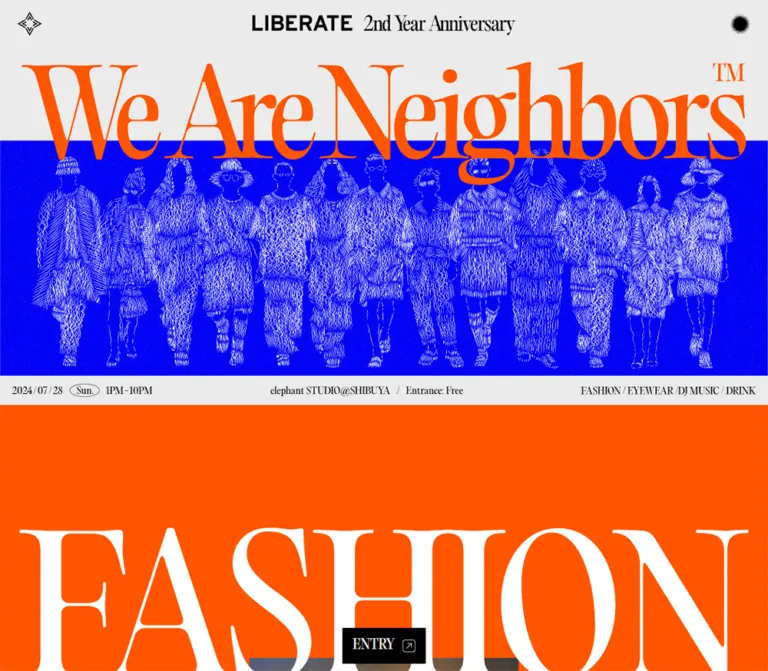
鮮烈なオレンジと青、大きなセリフ体、人物の線画を組み合わせた周年イベントサイト。スマートフォンでは見出しや開催情報を再構成し、縦長の構成で出演者や次期プロジェクトを紹介しています。
オリジナルサイトを見るLIBERATE 2nd Year Anniversary — Style Reference
An anniversary poster extended into a long scroll of electric color, fashion linework, and oversized editorial lettering.
Original URL: liberate-group.com/2ndyear
Final URL: liberate-group.com/2ndyear — unchanged, HTTP 200
Theme: light-gray foundation with orange, black, and electric-blue chapters
Inspected: September 17, 2026, at 05:34:43 JST; supplied browser retrieval timestamp: 2026-09-16T20:34:43.253Z
Viewports: desktop 1440 × 1000 and mobile 390 × 844 CSS pixels
Scope: the currently served anniversary event page, including its opening composition, program sections, next-project presentation, event outline, and closing identity. Visual evidence contains three desktop captures and two mobile captures; rendered DOM measurements cover the longer page. Linked pages and external destinations were not inspected.
The site presents LIBERATE’s second-anniversary event through a graphic language closer to a fashion poster than a conventional information page. Bright orange lettering overlaps a blue panorama of finely drawn figures. A quiet gray header holds a small anniversary identity, while the main title nearly fills the available width. Thin, high-contrast serif lettering alternates with the heavy sans-serif LIBERATE wordmark.
The page develops through large color fields: orange for the fashion program, black for DJ information, gray for drinks, and blue for the next-project presentation. Compact labels and short descriptions sit beneath much larger names and graphics. Practical event details appear later in ruled label/value rows. An enormous orange angular motif and an enlarged anniversary identity close the experience.
The displayed event date is July 28, 2024. This reference describes the page currently served at the inspected URL; the past event date is not evidence that the website is discontinued.
How to Read This Reference
- Measured values come from the supplied rendered DOM and computed-style records at the two inspected viewports.
- Visual estimates describe proportions and image boundaries visible in the original-page captures. They are not recovered CSS declarations.
- Derived equivalents express measured dimensions as viewport units or ratios. Matching a formula at the inspected sizes does not prove the original stylesheet uses that formula.
- Recommended values and behavior belong to the reusable implementation, not to verified original-site behavior.
- Token names below are implementation aliases. The supplied custom-property extraction was empty; no original token system was established.
- The record contains settled screenshots and sampled styles, not a complete interaction recording. Motion, control functions, asset formats, and untested responsive widths remain limited by that evidence.
Tokens — Colors
Primary Palette
| Name | Measured value | Suggested token | Role |
|---|---|---|---|
| Light Gray | #EBEBEB / rgb(235, 235, 235) |
--color-paper |
Body, header, drinks section, project interlude, and desktop outline/footer surfaces |
| Event Orange | #FF5500 / rgb(255, 85, 0) |
--color-orange |
Fashion chapter; visually matched by the opening title and closing angular motif |
| Electric Blue | #0000FF / rgb(0, 0, 255) |
--color-blue |
Next-project section; visually matched by the opening illustration field |
| Black | #000000 |
--color-ink |
Main text, DJ chapter, dark links, and identity graphics |
| White | #FFFFFF |
--color-white |
Reversed chapter text, light action surface, and the architectural presentation board |
| Secondary Ink | rgba(0, 0, 0, 0.6) |
--color-muted |
Address text in the event outline |
The hexadecimal values above are exact for the sampled elements. Color assignments to unsampled artwork are visual correspondences, not independent pixel measurements.
Color Relationships
Orange, blue, black, and gray form large uninterrupted surfaces. Their scale matters: these colors organize entire chapters rather than decorate small badges. White typography reverses out of orange, black, and blue; black typography returns on gray.
The opening title deliberately crosses the gray/blue boundary. Keep that overlap strong and slightly confrontational. Do not isolate the title inside a separate white card.
The white floor-plan board is a rectangular presentation surface within the blue field. It is visually distinct from the gray page canvas. No general gradient or card-elevation system is evident in the captures. The small black header disc has a soft perimeter, but this is an isolated graphic detail.
Tokens — Typography
Editorial Serif — Main Content
- Measured family declaration:
EO, "Noto Serif JP", serif. - Measured weight:
300throughout the sampled main-content text. - Measured default size:
16px, with25.6pxline height. - Measured tracking:
normal. - Character: narrow, high-contrast serif forms with very fine hairlines and emphatic vertical strokes.
EO is the family identifier exposed by the computed styles. Its commercial name, font-file source, and licensing were not supplied. Do not expand that alias into an assumed typeface name. The presence of Noto Serif JP in the stack does not establish which individual glyphs used that fallback.
Outline Serif
- Measured family declaration:
EO-L, "Noto Serif JP", serif. - Measured weight:
300. - Role: event-outline headings, labels, address, venue/operator information, and compact links.
Preserve the distinction between the EO and EO-L declarations when the authorized fonts are available. Their exact relationship was not established.
Identity and Artwork Lettering
The header and closing identity combine a heavy sans-serif LIBERATE wordmark with a fine serif anniversary line. Their sampled containers have no extracted text. The hero title is also visible without a corresponding text measurement in the supplied element list.
Treat these areas as graphic-led identity elements. Their appearance is observable; their actual font names, asset formats, and internal markup are not. Reusing authorized identity artwork will be more faithful than guessing the bold wordmark font.
The root element reports Times at 10px, and the body reports Times at 16px with weight 700. These are overridden by the sampled header/main/footer styles. They do not describe the dominant visible editorial typography.
Type Scale
| Role | Desktop measurement | Mobile measurement | Family and notes |
|---|---|---|---|
| Main inherited text | 16px / 25.6px |
16px / 25.6px |
EO, weight 300 |
| Chapter label, supporting sentence, floor/time note | 18px / 28.8px |
12px / 19.2px |
EO; normal tracking |
| Brand, DJ, and drinks lists | 95.04px / 114.048px |
24px / 28.8px |
EO; desktop size equals 6.6vw at 1440px |
| Concept title and “Coming Soon...” | 95.04px / 114.048px |
24px / 28.8px |
Same scale as the program lists |
| “Our Next” / “Project” | 403.2px / 645.12px |
109.2px / 174.72px |
Size equals 28vw at both inspected widths |
| Large action’s inner label | 21px / 33.6px |
21px / 33.6px |
Button text does not shrink with chapter copy |
| “OUTLINE” | 57.6px / 51.84px |
No rendered heading measurement | EO-L; tight 0.9 line height |
| “イベント概要” | 32px / 51.2px |
No rendered heading measurement | EO-L |
| Outline labels and venue/operator text | 18px / 28.8px |
18px / 28.8px |
Remains larger than mobile chapter annotations |
| Address | 14px / 22.4px |
14px / 22.4px |
Secondary ink |
| Compact outline-link label | 15px / 24px |
12px / 19.2px |
Inner label, not the anchor’s inherited size |
Hero estimate: the desktop title reads as approximately 230–260px display type, while the two mobile lines read as approximately 95–105px. These are optical estimates, not measured font sizes. The Quick Start uses an approximate text treatment and should be checked against the actual licensed font or title artwork.
Tokens — Spacing & Shapes
Spacing Scale
| Use | Desktop | Mobile | Evidence status |
|---|---|---|---|
| Header height | 65px |
48px |
Measured |
| Main-content start from document top | 85px |
65px |
Measured |
| Clearance between header bottom and main start | 20px |
17px |
Derived from measured positions |
| Major chapter vertical padding | 230.4px |
93.6px |
Measured; equivalents are 16vw and 24vw respectively |
| Wide brand-list side inset | 36px |
9.75px |
Measured; both equal 2.5vw |
| Typical gap between chapter label, list, and description | About 30.24px |
About 12.47px |
Derived from adjacent rectangles; floor/time notes use closer spacing |
| Large action padding | 12px 24px |
12px 24px |
Measured |
| Large action internal gap | 10px |
10px |
Measured |
| Compact action padding | 6px 12px |
6px 12px |
Measured |
| Outline left/right visual inset | 50px at the heading’s left edge |
30px |
Desktop left edge measured; mobile 330px content width confirms both sides |
| Outline label column | 240px |
75px |
Measured |
| Outline label/value separation | 16px |
0px between column rectangles |
Derived from measured positions |
| Footer vertical padding | 0px on sampled footer |
30px |
Measured; internal artwork positioning is separate |
The design combines very large chapter breathing room with dense practical information. A uniform spacing scale applied everywhere would weaken this contrast.
Border Radius
| Element | Treatment | Evidence |
|---|---|---|
| Large and compact action links | 0px radius |
Measured |
| Main section surfaces | Square, edge to edge | Measured containers and captures |
| Floor-plan presentation board | Square corners | Visual observation |
| Weekday marker | Thin outlined ellipse | Visible in opening captures; stroke width not measured |
| Header disc | Circular silhouette with soft edge | Visual observation; function unverified |
Rounded cards and pill-shaped primary actions are not part of the observed system.
Layout Measurements
| Element | Desktop | Mobile |
|---|---|---|
| Full document height | About 21,418.22px |
10,271px |
| Header anniversary-link rectangle | 360 × 27.73px, x = 540px |
180 × 13.86px, x = 105px |
| Opening section rectangle | 1440 × 632.13px |
390 × 632px |
| Fashion chapter height | 2206.84px |
1230px |
| DJ chapter height | 1883.44px |
1101.70px |
| Drinks chapter height | 1742.53px |
1018.83px |
| Next-project interlude height | 2000px |
844px |
| Blue project section height | 10,173.53px |
3753.06px |
| Event-outline section height | 1680.36px |
1451.59px |
| Footer height | 1000px |
167.02px |
These are captured layout results, not a recommendation to assign fixed heights to whole chapters. Internal media, whitespace, and responsive content collectively produce these dimensions.
Components
Persistent Anniversary Header
Role: maintain identity while the page’s visual chapters change.
A full-width gray strip carries three visual anchors: a small black geometric emblem at left, the anniversary identity in the center, and a black disc at right. The center identity remains aligned to the viewport center. It measures 360px wide on desktop and 180px on mobile.
The header appears at the top in the opening, project, and closing captures. This supports persistent positioning, although the supplied style excerpt does not include its position declaration. Its height changes from 65px to 48px.
The center identity is a verified link to the current anniversary URL. The left emblem and right disc have no established destination or behavior in the evidence. Do not describe the disc as a menu, sound switch, theme toggle, or custom cursor.
Recommended structure: three balanced layout regions, with independent centering of the identity. If a side graphic is interactive in a new implementation, give it an explicit name and a usable target without enlarging its visible artwork.
Opening Poster
Role: communicate the event identity before the detailed program begins.
The desktop composition has four layers:
- Gray space beneath the header.
- A nearly full-width orange “We Are Neighbors” title with a small trademark mark.
- A blue panorama of fashion figures rendered in dense white linework.
- A gray information strip immediately below the illustration.
The title overlaps the upper edge of the blue field. In the desktop capture, that blue field begins around y = 235px and ends around y = 677px. These are visual estimates. The title’s descenders remain visibly connected to the illustration area.
On mobile, the title becomes two lines: “We Are” above “Neighbors.” The blue image field begins around y = 201px and ends around y = 546px. The crowd is cropped to a central group, with partial figures at the edges. It is not scaled down until every desktop figure fits.
Preserve the title-to-image overlap and central crop independently. The supplied evidence does not establish whether responsive artwork, live text, or a combination produces the original composition.
Opening Event Strip
Role: make date, time, venue, admission, and program categories available immediately.
Desktop uses a shallow strip, visually about 55px high. Date and time sit at left; venue and free admission sit near the middle; categories align at right. A thin oval encloses the weekday.
Mobile reorganizes this information into a compact poster block about 160px high. The date becomes the largest element. Time occupies the next line at left, venue/admission sit below it, and the four program categories stack at right.
The visible event content includes July 28, 2024, 1PM–10PM, elephant STUDIO at Shibuya, and free entrance. Use distinct elements for date, time, location, admission, and categories when rebuilding this structure. The current extraction does not establish accessible text equivalents for all opening artwork.
Program Chapter
Role: present fashion, music, and drinks as separate visual chapters.
The shared information anatomy is a small uppercase label, a much larger list, one supporting sentence, an optional action, and an optional floor/time note. Content is centered. The sampled large lists have a 95%-viewport-width available region where needed.
| Chapter | Surface and text | Verified content structure |
|---|---|---|
| Fashion | Orange with white text | “BRAND”; seven participating brands; short description; “Detail”; second-floor hours |
| DJ | Black with white text | “DJ”; five names; short description; first-floor hours |
| Drinks | Gray with black text | “LINE UP”; four drinks; short description |
The fashion section begins around document y = 731.52px on desktop and 704.80px on mobile. The current mobile capture shows the upper part of a very large white “FASHION” heading entering the viewport below the orange breathing room.
The supplied screenshots do not show all internal media in these chapters. Their computed heights establish the long-form scale, but not the appearance or count of every illustration.
Program Name Lists
Role: make participants themselves the typographic centerpiece.
Desktop names are set in thin serif lettering at 95.04px / 114.048px, separated by slashes and allowed to wrap into large centered lines. The fashion list includes SEVESKIG, GEN IZAWA, NaNo Art, Edwina Hörl, TEKI, 71 MICHAEL, and RETROSUPERFUTURE.
Mobile changes the relationship substantially: list type becomes 24px / 28.8px, and names are presented vertically. The DJ list is five lines tall, and the drinks list is four lines tall. Visible mobile text suppresses the desktop slash-separated presentation even though the sampled underlying text includes separators.
Use a semantic list with responsive separators in an adaptation. Do not create a card for every participant; the shared text field is an important part of the design.
Rectangular Action Links
Role: offer a small number of concrete next steps within the editorial sequence.
The large “Detail” link has a black surface, white inner label, 12px vertical and 24px horizontal padding, a 10px internal gap, and square corners. Its measured rectangle is approximately 125.5 × 57.59px at both viewports. The actual label is 21px, despite the anchor reporting an inherited 18px size.
“Follow on Instagram” uses the inverse surface: white fill and black inner label. It measures approximately 251.45 × 57.59px at both viewports. The anchor’s own white text declaration does not describe the visible black child label.
Compact outline links use 6px/12px padding. Their label size changes from 15px on desktop to 12px on mobile, producing heights of 36px and approximately 31.19px respectively.
Verified destinations:
| Visible link | Destination | Verification limit |
|---|---|---|
| Header identity | Anniversary page | Destination read from rendered link |
| “Detail” / “詳細へ” | https://liberate-group.com/2ndyear/brand.html |
Detail page not opened |
| “Follow on Instagram” | https://www.instagram.com/uni_tokyo_/ |
External profile not opened |
| “地図を見る” | https://maps.app.goo.gl/SANZxxJevotgHajx9 |
Map not opened |
| “Webサイトへ” | https://liberate-group.com/ |
Corporate homepage not opened |
Next-Project Interlude
Role: separate the event program from the project announcement with a dramatic typographic pause.
“Our Next” and “Project” use a measured size equivalent to 28vw. Their line height is 1.6, producing unusually large line boxes. The containing section measures two desktop viewport heights and one mobile viewport height at the captured sizes.
In the sampled state, “Our Next” begins at x = 1152px on desktop and 312px on mobile—80% of the viewport width. “Project” extends from a negative x position and ends at 20% of the viewport width. This establishes an offscreen composition. It does not establish how the words enter, leave, or respond to scrolling.
If reproducing this idea without additional motion evidence, provide a readable static composition first. Do not leave essential text permanently outside the viewport.
Blue Project Presentation
Role: introduce the next concept through an extended architectural presentation.
The entire section uses exact electric blue. Its verified text sequence includes a small “CONCEPT” label, “Stylish & Cool Neighbor,” a short announcement sentence, and a concluding “Coming Soon...” with an Instagram link.
The desktop project capture shows a large white presentation board centered horizontally. It is approximately 864px wide—60% of the viewport—and 648px high, giving a 4:3 ratio. These dimensions are estimated from the screenshot, not a measured image element.
The board contains an axonometric retail-space rendering: gray walls, dark tiled flooring, a stone-like counter, blue highlights, and small spatial labels. Preserve the entire diagram. Cropping it as a photographic cover would remove useful context.
The blue section is much longer than this single board. The evidence does not identify every intermediate frame, image, or transition. Mobile presentation-board sizing was not visually captured.
Event Outline
Role: provide the practical facts and complete participant roster.
Desktop places the bilingual heading at left and label/value rows to its right. The heading begins at x = 50px. Row labels begin near x = 397.30px, occupy 240px, and are followed by a 16px gap before values at x = 653.30px.
The mobile layout keeps two columns inside 30px side margins: a 75px label column and a 255px value column. It does not turn every row into a separate card. The “OUTLINE” and Japanese heading have no rendered mobile measurement and are absent from the extracted visible mobile text.
Rows cover date, venue, operator, brands, DJs, and staff. The page explicitly identifies “株式会社LIBERATE” under “運営” and links to the corporate homepage. The Staff list is an event roster; it is not evidence of website-production credits.
The lower mobile capture shows fine horizontal dividers and an orange angular background passing behind the roster. The mobile outline section reports a transparent background, allowing the surrounding graphic composition to remain visible. The exact decorative layer mechanism was not supplied.
Closing Identity
Role: end the page with a final poster-scale brand impression.
On desktop, the footer occupies a full 1000px viewport height. A broad orange angular ribbon cuts across the gray field, while a huge black LIBERATE wordmark and serif anniversary line occupy the lower portion. The angular shape reads as a left-pointing form in the captured desktop composition.
On mobile, the measured footer is only about 167px high, including 30px top and bottom padding. The identity fits within the narrow content width, while the orange motif visually extends behind the preceding roster and forms a downward-pointing shape.
Do not reduce this to a conventional footer containing a small logo and columns of navigation. Its purpose is a final graphic statement. Use authorized artwork where available; neither its font construction nor its exact vector path was supplied.
Tokens — Motion & Interaction
| Evidence | Measured or observed state | What can be concluded |
|---|---|---|
| Header and sampled links | Transition summary 0.2s ease-in |
A short eased transition is declared; its changed properties and endpoints were not established |
| Sampled elements | animation: none |
No CSS keyframe animation is reported on those elements; this does not rule out scripts, nested artwork, or unsampled elements |
| Project-interlude words | Large positive and negative horizontal positions | Offscreen placement is verified; movement direction, trigger, duration, and easing are not |
| Header across captures | Remains visible at the top | Persistent appearance is supported; exact positioning implementation is not in the style excerpt |
| Links | Rendered href values |
Destinations are known; clicks and resulting states were not tested |
| Header disc | Black circle with soft edge | Appearance only; no function verified |
| Fashion figure linework | Dense, irregular contours | Texture is visible; animation cannot be inferred from its appearance |
The supplied browser procedure waited for document readiness, visible-image decoding, finite motion, and sampled layout stability within bounded limits. It temporarily paused perpetual animations during readiness checks and resumed them afterward. This helps produce settled captures but does not establish complete motion behavior.
Recommended adaptation: use restrained 200ms feedback on links. Introduce scroll-driven movement only when it has a readable static state and a reduced-motion alternative. Do not invent autoplay audio, a menu overlay, parallax timing, or a specific animation library.
Surfaces
| Surface | Appearance | Purpose |
|---|---|---|
| Header and opening ground | Flat light gray | Quiet frame for the identity and oversized title |
| Hero illustration | Electric blue with white linework | Main image impact |
| Fashion chapter | Solid orange with reversed text | Fashion program emphasis |
| DJ chapter | Solid black with reversed text | Separate music chapter |
| Drinks chapter | Light gray with black text | Return to a lighter editorial rhythm |
| Project presentation | Solid electric blue | Distinct world for the next concept |
| Architectural board | White, square rectangle | Present the spatial rendering without cropping |
| Outline | Gray on desktop; transparent sampled mobile container | Practical information integrated with the closing graphic |
| Actions | Flat black or white rectangles | Strong but compact link affordances |
Depth comes from overlap, scale, contrasting color fields, and the dimensional content of the architectural rendering. Interface surfaces remain flat.
Imagery
The opening illustration depicts a row of fashion figures through thin white contours against saturated blue. Dense wavering lines describe garments, hats, hair, and faces. This gives the artwork a rough, energetic texture while the surrounding layout stays geometrically clean.
Desktop shows the panoramic group. Mobile retains the figures’ scale and crops the center. Preserve the visual density of the linework; smoothing it into generic outline people would remove much of the page’s character.
The architectural image has a different job. It is an informative axonometric diagram on white, with visible spatial labels and restrained gray materials. Blue accents connect it to the surrounding section. Keep its labels and complete footprint visible.
The closing chevron is large, flat, and sharply edged. It acts as composition rather than a small icon or button arrow.
Observed Asset References
No asset URLs or filenames were included in the supplied evidence. The following are visual asset roles, not inferred file paths.
| Asset role | Observed form | Reuse guidance |
|---|---|---|
| Header emblem | Small black geometric insignia | Preserve its detailed silhouette |
| Anniversary identity | Bold LIBERATE plus fine serif anniversary line | Prefer authorized original artwork |
| Header disc | Black circular mark with soft perimeter | Preserve only its verified appearance |
| Opening title | Large orange serif lettering with trademark | Retain desktop/mobile composition and overlap |
| Fashion panorama | White fashion linework on blue | Crop centrally on mobile; do not stretch figures |
| Retail-space diagram | Axonometric rendering on a white 4:3 board | Use contain-style fitting |
| Closing motif | Oversized orange angular ribbon | Treat as a decorative background layer |
The evidence does not establish whether these assets are SVGs, raster images, video, or DOM-drawn graphics. Do not introduce image-rendering: pixelated; the observed texture is fine linework, not a demonstrated pixel-art treatment.
Layout & Responsive Behavior
Desktop
The page is a continuous vertical sequence spanning the viewport width. The opening title remains on one line, the fashion group is panoramic, and the event strip reads horizontally. Major chapter padding reaches 230.4px above and below the content region.
Large name lists use 95.04px serif type and slash separators. The outline opens into a wider editorial arrangement with a separate title region and broad label columns. The closing identity becomes a full-screen composition.
The blue project section accounts for a particularly large portion of the measured document height. Preserve its role as an extended presentation, but do not reproduce its total height by inserting arbitrary empty space.
Mobile
At 390px wide, the design changes composition rather than merely shrinking:
- Header height decreases to 48px, and the central identity halves to 180px wide.
- The opening title wraps to two deliberate lines.
- The fashion image becomes a central crop approximately 344px high.
- The event strip expands vertically, enlarging the date and stacking categories.
- Program lists become one-name-per-line presentations at 24px.
- Chapter annotations decrease from 18px to 12px, while large action labels remain 21px.
- Major chapter padding becomes 93.6px, equivalent to 24% of the mobile width.
- Outline rows retain two columns with 30px outside margins and 75px labels.
- The closing identity becomes a short ending within the larger orange/gray background composition.
Responsive Limits
Only 1440px and 390px widths were inspected. The actual breakpoint, tablet behavior, intermediate title wrapping, orientation changes, and minimum supported width are unknown. The 767px breakpoint in the Quick Start is a recommended starting point, not a recovered source value.
The mobile architectural gallery was not visually captured. The Quick Start’s wider mobile board is a recommendation to preserve readable detail, not an observation.
Do’s and Don’ts
Do
- Use exact orange
#FF5500, blue#0000FF, and gray#EBEBEBas the primary large surfaces. - Pair fine, high-contrast serif text with the heavy LIBERATE identity.
- Preserve the orange title’s overlap with the blue illustration.
- Maintain a panoramic desktop crowd and a central mobile crop.
- Give chapters generous space while keeping the information hierarchy simple.
- Use large participant names as content, with small supporting labels.
- Recompose event details for mobile rather than compressing the desktop strip.
- Keep action links square, compact, and strongly contrasting.
- Preserve the complete architectural drawing and its white board.
- Let the closing angular motif remain much larger than ordinary interface elements.
Don’t
- Don’t turn program names into a grid of rounded cards.
- Don’t replace the line-drawn fashion figures with generic stock photography or smooth outline icons.
- Don’t invent a commercial font name for
EOorEO-L. - Don’t assume lettering within identity artwork uses the main-content font.
- Don’t infer motion from distorted linework or offscreen text positions.
- Don’t assign an unverified function to the black header disc.
- Don’t crop the architectural diagram using a photographic cover treatment.
- Don’t copy entire measured section heights as fixed CSS heights.
- Don’t treat event staff as website-production credits.
- Don’t present the 2024 event date or the page’s “Coming Soon...” copy as a verified current business announcement.
Recommended Implementation Additions
These are recommendations for a new implementation, not verified features of the original page:
- Provide a semantic heading and readable text equivalents for essential information carried by graphical titles or artwork.
- Give informational images useful alternative text and mark purely decorative motifs accordingly.
- Preserve a meaningful heading hierarchy even when a visual section heading is hidden on mobile.
- Give interactive icon-only controls accessible names; leave decorative header graphics noninteractive.
- Provide clear keyboard focus states for every link.
- Increase the effective target size of compact mobile links toward 44px without necessarily enlarging the visible black rectangle.
- Review 12px mobile annotations and thin serif strokes on real devices. A 14–16px minimum is a reasonable accessibility adaptation for supporting copy.
- Keep essential small text on high-contrast combinations. White on orange is visually characteristic but needs separate contrast assessment for ordinary text sizes.
- Supply a static, readable alternative to any newly added offscreen or scroll-driven typography.
- Use responsive image sources and explicit image dimensions where possible. Keep the opening image available promptly and defer lower-page media appropriately.
Agent Prompt Guide
Quick Color Reference
- Canvas and header:
#EBEBEB. - Fashion chapter and major graphic accent:
#FF5500. - Hero image field and project section:
#0000FF. - Main ink and DJ chapter:
#000000. - Reversed text and presentation board:
#FFFFFF. - Address text: black at 60% opacity.
- Actions: square black/white rectangles, not rounded colored pills.
Overall Prompt
“Create an anniversary event microsite inspired by LIBERATE’s We Are Neighbors page. Use a light-gray canvas, vivid orange and pure-blue full-width chapters, thin high-contrast serif display lettering, and a heavy sans-serif brand identity. Keep a compact centered anniversary header visible above the long page. Open with an oversized orange title overlapping a blue panorama of white fashion linework. Add a compact event-information strip, centered typographic program lists, an extended blue architectural presentation, ruled event-outline rows, and an oversized orange angular closing graphic. On mobile, split the title into two lines, crop the crowd centrally, enlarge and stack event details, and put participant names on separate lines. Use square action links and flat surfaces. Treat motion and header-disc behavior as unspecified unless separately provided.”
Example Component Prompts
- Opening poster: “Build a gray event hero with orange high-contrast serif lettering spanning almost the whole desktop width. Overlap its lower strokes with a full-width blue field of finely drawn white fashion figures. On a 390px phone, place We Are and Neighbors on separate lines and retain a central crop of the figures.”
- Program chapter: “Create an orange fashion section with generous vertical space, a small centered BRAND label, a large thin-serif participant list, a short white supporting sentence, a square black Detail link, and a smaller floor/time note. Use slash-separated lines on desktop and stacked names on mobile.”
- Architectural presentation: “Place an uncropped axonometric retail-space drawing on a white 4:3 board inside a pure-blue section. The board occupies about 60% of a 1440px desktop viewport. Preserve small room labels and avoid shadows or rounded corners. Choose a wider mobile treatment for readability.”
- Event outline: “Make a restrained two-column event roster in thin serif type. At 390px, use 30px side margins, a 75px label column, and a flexible value column. Separate rows with fine rules and use small square black links. Allow a large orange decorative motif behind the lower roster.”
- Closing identity: “End with a large black LIBERATE wordmark and fine serif anniversary line over light gray and a broad orange angular ribbon. Make the desktop ending a full-screen poster and the mobile identity a compact block. Use supplied identity artwork instead of guessing its font.”
Quick Start
CSS Custom Properties
This scaffold combines measured colors, typography declarations, spacing, and component relationships with explicitly approximate hero sizing and a recommended breakpoint. It is not the recovered stylesheet. It retains a conventional 16px root instead of copying the source’s 10px root.
The hero expects two title spans, followed by a crowd image container. The event strip expects separate date, time, venue/admission, and category elements. Program names should be list items. Outline rows should use dt/dd pairs. Supply authorized images and font files separately; no asset URLs or font-loading declarations are invented here.
The textual hero sizing is an optical approximation. The closing motif and exact identity lettering should be supplied as artwork. No unverified scroll choreography is implemented.
:root {
  /* Measured palette; these token names are adaptation aliases. */
  --color-paper: #ebebeb;
  --color-orange: #ff5500;
  --color-blue: #0000ff;
  --color-ink: #000000;
  --color-white: #ffffff;
  --color-muted: rgb(0 0 0 / 60%);

  /* Observed family declarations; font files must be supplied separately. */
  --font-editorial: 'EO', 'Noto Serif JP', serif;
  --font-outline: 'EO-L', 'Noto Serif JP', serif;

  --header-height: 65px;
  --hero-clearance: 20px;
  --chapter-space: 16vw;
  --copy-gap: 2.1vw;
  --text-list: 6.6vw;
  --text-label: 18px;
  --text-action: 21px;
  --text-small-action: 15px;
  --motion-link: 200ms ease-in;

  /* Recommended divider approximation. */
  --color-rule: rgb(0 0 0 / 14%);
}

* { box-sizing: border-box; }
html { font-size: 16px; }
body {
  margin: 0;
  color: var(--color-ink);
  background: var(--color-paper);
  font: 300 16px/1.6 var(--font-editorial);
}

.site-header {
  position: fixed;
  inset: 0 0 auto;
  z-index: 20;
  display: grid;
  grid-template-columns: 44px minmax(0, 1fr) 44px;
  align-items: center;
  height: var(--header-height);
  padding-inline: 22px;
  background: var(--color-paper);
}
.header-side {
  display: grid;
  place-items: center;
  width: 44px;
  height: 44px;
}
.header-side img {
  display: block;
  max-width: 32px;
  max-height: 32px;
}
.anniversary-link {
  justify-self: center;
  width: 360px;
  max-width: 100%;
}
.anniversary-link img {
  display: block;
  width: 100%;
  height: auto;
}
.page {
  padding-top: calc(var(--header-height) + var(--hero-clearance));
  overflow-x: clip;
}

/* Approximate live-text hero: tune against the authorized lettering. */
.hero-title {
  position: relative;
  z-index: 1;
  margin: 0 2.1% -3vw;
  color: var(--color-orange);
  font-size: 17vw;
  font-weight: 300;
  line-height: .79;
  white-space: nowrap;
}
.hero-title > span { white-space: nowrap; }
.hero-figures {
  height: 30.7vw;
  overflow: hidden;
  background: var(--color-blue);
}
.hero-figures img {
  display: block;
  width: 100%;
  height: 100%;
  object-fit: cover;
  object-position: center;
}
.event-strip {
  display: grid;
  grid-template-columns: auto auto minmax(0, 1fr) auto;
  align-items: center;
  gap: 0 12px;
  min-height: 55px;
  padding: 10px 22px;
  font-size: 20px;
  line-height: 1.2;
}
.event-strip p { margin: 0; }
.event-place { justify-self: center; }
.weekday {
  display: inline-block;
  padding-inline: .35em;
  border: 1px solid currentColor;
  border-radius: 50%;
}

.chapter { padding-block: var(--chapter-space); }
.chapter--fashion {
  color: var(--color-white);
  background: var(--color-orange);
}
.chapter--dj {
  color: var(--color-white);
  background: var(--color-ink);
}
.chapter--drinks {
  color: var(--color-ink);
  background: var(--color-paper);
}
.chapter--project {
  color: var(--color-white);
  background: var(--color-blue);
}
.chapter-copy {
  display: grid;
  justify-items: center;
  gap: var(--copy-gap);
  width: 95%;
  margin-inline: auto;
  text-align: center;
}
.chapter-copy p { margin: 0; }
.chapter-label,
.chapter-note,
.chapter-time {
  font-size: var(--text-label);
  line-height: 1.6;
}
.name-list,
.concept-title {
  margin: 0;
  padding: 0;
  list-style: none;
  font-size: var(--text-list);
  font-weight: 300;
  line-height: 1.2;
}
.name-list li { display: inline; }
.name-list li + li::before { content: ' / '; }
.chapter-media {
  display: block;
  max-width: 100%;
  height: auto;
  margin-inline: auto;
}

.action {
  display: inline-flex;
  align-items: center;
  justify-content: center;
  gap: 10px;
  width: fit-content;
  max-width: 100%;
  padding: 12px 24px;
  border: 0;
  border-radius: 0;
  color: var(--color-white);
  background: var(--color-ink);
  font: 300 var(--text-action)/1.6 var(--font-editorial);
  text-decoration: none;
  transition: color var(--motion-link),
              background-color var(--motion-link);
}
.action--light {
  color: var(--color-ink);
  background: var(--color-white);
}
.action--small {
  padding: 6px 12px;
  font-family: var(--font-outline);
  font-size: var(--text-small-action);
}

/* Recommended feedback; the original hover endpoints were not recorded. */
@media (hover: hover) {
  .action:hover {
    color: var(--color-ink);
    background: var(--color-paper);
  }
}
a:focus-visible,
button:focus-visible {
  outline: 2px solid currentColor;
  outline-offset: 4px;
}

.project-word {
  margin: 0;
  font-size: 28vw;
  font-weight: 300;
  line-height: 1.6;
}
.project-figure {
  width: 60%;
  aspect-ratio: 4 / 3;
  margin-inline: auto;
  background: var(--color-white);
}
.project-figure img {
  display: block;
  width: 100%;
  height: 100%;
  object-fit: contain;
}

.outline { padding-top: var(--chapter-space); }
.outline-layout {
  display: grid;
  grid-template-columns: 227.3px minmax(0, 1fr);
  gap: 120px;
  margin-inline: 50px;
  font-family: var(--font-outline);
}
.outline-title {
  margin: 0;
  font-size: 4vw;
  font-weight: 300;
  line-height: .9;
}
.outline-title small {
  display: block;
  font-size: 32px;
  line-height: 1.6;
}
.outline-details { margin: 0; }
.outline-row {
  display: grid;
  grid-template-columns: 240px minmax(0, 1fr);
  gap: 16px;
  padding-block: 24px;
  border-top: 1px solid var(--color-rule);
}
.outline-row dt,
.outline-row dd {
  margin: 0;
  font-size: 18px;
  line-height: 1.6;
}
.outline-row .address {
  color: var(--color-muted);
  font-size: 14px;
  line-height: 1.6;
}

/* Supply the identity and decorative motif as separate authorized artwork. */
.closing {
  position: relative;
  display: flex;
  align-items: flex-end;
  min-height: 100vh;
  overflow: clip;
}
.closing-logo {
  position: relative;
  z-index: 1;
  display: block;
  width: 100%;
  height: auto;
}

/* Recommended breakpoint; only the two endpoint viewports were inspected. */
@media (max-width: 767px) {
  :root {
    --header-height: 48px;
    --hero-clearance: 17px;
    --chapter-space: 24vw;
    --copy-gap: 3.2vw;
    --text-list: 24px;
    --text-label: 12px;
    --text-small-action: 12px;
  }
  .site-header { padding-inline: 12px; }
  .header-side img { max-width: 22px; max-height: 22px; }
  .anniversary-link { width: 180px; }
  .hero-title {
    margin-inline: 5%;
    margin-bottom: -7vw;
    font-size: 26.2vw;
    line-height: .8;
    text-align: center;
    white-space: normal;
  }
  .hero-title > span { display: block; }
  .hero-figures { height: 344px; }
  .event-strip {
    grid-template-columns: minmax(0, 1fr) auto;
    gap: 4px 8px;
    min-height: 160px;
    padding: 8px 10px;
  }
  .event-date {
    grid-column: 1 / -1;
    font-size: clamp(38px, 13.3vw, 56px);
  }
  .weekday { font-size: .65em; }
  .event-time { grid-column: 1; font-size: 32px; }
  .event-place {
    grid-column: 1;
    justify-self: start;
    font-size: 18px;
  }
  .event-types {
    grid-column: 2;
    grid-row: 2 / span 2;
    align-self: start;
    font-size: 16px;
    line-height: 1.35;
    text-align: right;
  }
  .event-types span { display: block; }
  .name-list li { display: block; }
  .name-list li + li::before { content: none; }

  /* Recommended mobile board width; no mobile gallery capture was supplied. */
  .project-figure { width: 90%; }
  .outline-layout { display: block; margin-inline: 30px; }
  .outline-row { grid-template-columns: 75px minmax(0, 1fr); gap: 0; }

  /* Recommended semantic retention of the visually omitted heading. */
  .outline-title {
    position: absolute;
    width: 1px;
    height: 1px;
    margin: -1px;
    padding: 0;
    overflow: hidden;
    clip-path: inset(50%);
    white-space: nowrap;
  }
  .closing { min-height: 0; padding: 30px; }
}

@media (prefers-reduced-motion: reduce) {
  .site-header,
  .action { transition: none; }
}
The scaffold intentionally leaves chapter-media heights content-driven. Place the title artwork, program imagery, and project boards before their related copy. Preserve the measured hierarchy without adding blank spacer elements to force the captured total document height.
Tailwind v4 Token Mapping
Optional aliases for a project already using Tailwind v4. This is not evidence that the original page uses Tailwind. Define the custom properties above first.
@theme inline {
  --color-paper: #ebebeb;
  --color-event-orange: #ff5500;
  --color-electric-blue: #0000ff;
  --color-ink: #000000;
  --color-reverse: #ffffff;

  --font-display: 'EO', 'Noto Serif JP', serif;
  --font-detail: 'EO-L', 'Noto Serif JP', serif;

  --text-program: var(--text-list);
  --text-annotation: var(--text-label);
  --text-action-label: 21px;
  --spacing-chapter: var(--chapter-space);
  --spacing-copy: var(--copy-gap);
  --radius-action: 0px;
}
Sources & Evidence
- LIBERATE 2nd Year Anniversary — We Are Neighbors: original and final URL, HTTP 200, page title, rendered text, link destinations, element rectangles, and computed-style values supplied in the browser observation.
- Capture time:
2026-09-16T20:34:43.253Z, equivalent to September 17, 2026, 05:34:43 JST. - Desktop evidence:
1440 × 1000CSS pixels; supplied captures of the opening poster, architectural presentation, and closing identity; DOM measurements spanning the approximately 21,418px document. - Mobile evidence:
390 × 844CSS pixels; supplied captures of the opening poster and lower roster/closing identity; DOM measurements spanning the 10,271px document. - Inspection limits: no complete stylesheet, font-file metadata, asset URLs, animation recording, hover sequence, click outcomes, or intermediate viewport tests were supplied. Linked pages were not inspected. SharedWorkers and service workers were disabled during the supplied browser inspection.
This reference uses the supplied current-page browser record. Exact values are identified as measured; screenshot proportions, derived formulas, and implementation recommendations are distinguished throughout.
# LIBERATE 2nd Year Anniversary — Style Reference

> An anniversary poster extended into a long scroll of electric color, fashion linework, and oversized editorial lettering.

**Original URL:** [liberate-group.com/2ndyear](https://liberate-group.com/2ndyear/)
**Final URL:** [liberate-group.com/2ndyear](https://liberate-group.com/2ndyear/) — unchanged, HTTP 200
**Theme:** light-gray foundation with orange, black, and electric-blue chapters
**Inspected:** September 17, 2026, at 05:34:43 JST; supplied browser retrieval timestamp: `2026-09-16T20:34:43.253Z`
**Viewports:** desktop `1440 × 1000` and mobile `390 × 844` CSS pixels
**Scope:** the currently served anniversary event page, including its opening composition, program sections, next-project presentation, event outline, and closing identity. Visual evidence contains three desktop captures and two mobile captures; rendered DOM measurements cover the longer page. Linked pages and external destinations were not inspected.

The site presents LIBERATE’s second-anniversary event through a graphic language closer to a fashion poster than a conventional information page. Bright orange lettering overlaps a blue panorama of finely drawn figures. A quiet gray header holds a small anniversary identity, while the main title nearly fills the available width. Thin, high-contrast serif lettering alternates with the heavy sans-serif LIBERATE wordmark.

The page develops through large color fields: orange for the fashion program, black for DJ information, gray for drinks, and blue for the next-project presentation. Compact labels and short descriptions sit beneath much larger names and graphics. Practical event details appear later in ruled label/value rows. An enormous orange angular motif and an enlarged anniversary identity close the experience.

The displayed event date is July 28, 2024. This reference describes the page currently served at the inspected URL; the past event date is not evidence that the website is discontinued.

## How to Read This Reference

- **Measured** values come from the supplied rendered DOM and computed-style records at the two inspected viewports.
- **Visual estimates** describe proportions and image boundaries visible in the original-page captures. They are not recovered CSS declarations.
- **Derived equivalents** express measured dimensions as viewport units or ratios. Matching a formula at the inspected sizes does not prove the original stylesheet uses that formula.
- **Recommended** values and behavior belong to the reusable implementation, not to verified original-site behavior.
- Token names below are implementation aliases. The supplied custom-property extraction was empty; no original token system was established.
- The record contains settled screenshots and sampled styles, not a complete interaction recording. Motion, control functions, asset formats, and untested responsive widths remain limited by that evidence.

## Tokens — Colors

### Primary Palette

| Name | Measured value | Suggested token | Role |
| --- | --- | --- | --- |
| Light Gray | `#EBEBEB` / `rgb(235, 235, 235)` | `--color-paper` | Body, header, drinks section, project interlude, and desktop outline/footer surfaces |
| Event Orange | `#FF5500` / `rgb(255, 85, 0)` | `--color-orange` | Fashion chapter; visually matched by the opening title and closing angular motif |
| Electric Blue | `#0000FF` / `rgb(0, 0, 255)` | `--color-blue` | Next-project section; visually matched by the opening illustration field |
| Black | `#000000` | `--color-ink` | Main text, DJ chapter, dark links, and identity graphics |
| White | `#FFFFFF` | `--color-white` | Reversed chapter text, light action surface, and the architectural presentation board |
| Secondary Ink | `rgba(0, 0, 0, 0.6)` | `--color-muted` | Address text in the event outline |

The hexadecimal values above are exact for the sampled elements. Color assignments to unsampled artwork are visual correspondences, not independent pixel measurements.

### Color Relationships

Orange, blue, black, and gray form large uninterrupted surfaces. Their scale matters: these colors organize entire chapters rather than decorate small badges. White typography reverses out of orange, black, and blue; black typography returns on gray.

The opening title deliberately crosses the gray/blue boundary. Keep that overlap strong and slightly confrontational. Do not isolate the title inside a separate white card.

The white floor-plan board is a rectangular presentation surface within the blue field. It is visually distinct from the gray page canvas. No general gradient or card-elevation system is evident in the captures. The small black header disc has a soft perimeter, but this is an isolated graphic detail.

## Tokens — Typography

### Editorial Serif — Main Content

- **Measured family declaration:** `EO, "Noto Serif JP", serif`.
- **Measured weight:** `300` throughout the sampled main-content text.
- **Measured default size:** `16px`, with `25.6px` line height.
- **Measured tracking:** `normal`.
- **Character:** narrow, high-contrast serif forms with very fine hairlines and emphatic vertical strokes.

`EO` is the family identifier exposed by the computed styles. Its commercial name, font-file source, and licensing were not supplied. Do not expand that alias into an assumed typeface name. The presence of `Noto Serif JP` in the stack does not establish which individual glyphs used that fallback.

### Outline Serif

- **Measured family declaration:** `EO-L, "Noto Serif JP", serif`.
- **Measured weight:** `300`.
- **Role:** event-outline headings, labels, address, venue/operator information, and compact links.

Preserve the distinction between the `EO` and `EO-L` declarations when the authorized fonts are available. Their exact relationship was not established.

### Identity and Artwork Lettering

The header and closing identity combine a heavy sans-serif LIBERATE wordmark with a fine serif anniversary line. Their sampled containers have no extracted text. The hero title is also visible without a corresponding text measurement in the supplied element list.

Treat these areas as graphic-led identity elements. Their appearance is observable; their actual font names, asset formats, and internal markup are not. Reusing authorized identity artwork will be more faithful than guessing the bold wordmark font.

The root element reports `Times` at `10px`, and the body reports `Times` at `16px` with weight `700`. These are overridden by the sampled header/main/footer styles. They do not describe the dominant visible editorial typography.

### Type Scale

| Role | Desktop measurement | Mobile measurement | Family and notes |
| --- | --- | --- | --- |
| Main inherited text | `16px / 25.6px` | `16px / 25.6px` | `EO`, weight `300` |
| Chapter label, supporting sentence, floor/time note | `18px / 28.8px` | `12px / 19.2px` | `EO`; normal tracking |
| Brand, DJ, and drinks lists | `95.04px / 114.048px` | `24px / 28.8px` | `EO`; desktop size equals `6.6vw` at 1440px |
| Concept title and “Coming Soon...” | `95.04px / 114.048px` | `24px / 28.8px` | Same scale as the program lists |
| “Our Next” / “Project” | `403.2px / 645.12px` | `109.2px / 174.72px` | Size equals `28vw` at both inspected widths |
| Large action’s inner label | `21px / 33.6px` | `21px / 33.6px` | Button text does not shrink with chapter copy |
| “OUTLINE” | `57.6px / 51.84px` | No rendered heading measurement | `EO-L`; tight `0.9` line height |
| “イベント概要” | `32px / 51.2px` | No rendered heading measurement | `EO-L` |
| Outline labels and venue/operator text | `18px / 28.8px` | `18px / 28.8px` | Remains larger than mobile chapter annotations |
| Address | `14px / 22.4px` | `14px / 22.4px` | Secondary ink |
| Compact outline-link label | `15px / 24px` | `12px / 19.2px` | Inner label, not the anchor’s inherited size |

**Hero estimate:** the desktop title reads as approximately 230–260px display type, while the two mobile lines read as approximately 95–105px. These are optical estimates, not measured font sizes. The Quick Start uses an approximate text treatment and should be checked against the actual licensed font or title artwork.

## Tokens — Spacing & Shapes

### Spacing Scale

| Use | Desktop | Mobile | Evidence status |
| --- | --- | --- | --- |
| Header height | `65px` | `48px` | Measured |
| Main-content start from document top | `85px` | `65px` | Measured |
| Clearance between header bottom and main start | `20px` | `17px` | Derived from measured positions |
| Major chapter vertical padding | `230.4px` | `93.6px` | Measured; equivalents are `16vw` and `24vw` respectively |
| Wide brand-list side inset | `36px` | `9.75px` | Measured; both equal `2.5vw` |
| Typical gap between chapter label, list, and description | About `30.24px` | About `12.47px` | Derived from adjacent rectangles; floor/time notes use closer spacing |
| Large action padding | `12px 24px` | `12px 24px` | Measured |
| Large action internal gap | `10px` | `10px` | Measured |
| Compact action padding | `6px 12px` | `6px 12px` | Measured |
| Outline left/right visual inset | `50px` at the heading’s left edge | `30px` | Desktop left edge measured; mobile 330px content width confirms both sides |
| Outline label column | `240px` | `75px` | Measured |
| Outline label/value separation | `16px` | `0px` between column rectangles | Derived from measured positions |
| Footer vertical padding | `0px` on sampled footer | `30px` | Measured; internal artwork positioning is separate |

The design combines very large chapter breathing room with dense practical information. A uniform spacing scale applied everywhere would weaken this contrast.

### Border Radius

| Element | Treatment | Evidence |
| --- | --- | --- |
| Large and compact action links | `0px` radius | Measured |
| Main section surfaces | Square, edge to edge | Measured containers and captures |
| Floor-plan presentation board | Square corners | Visual observation |
| Weekday marker | Thin outlined ellipse | Visible in opening captures; stroke width not measured |
| Header disc | Circular silhouette with soft edge | Visual observation; function unverified |

Rounded cards and pill-shaped primary actions are not part of the observed system.

### Layout Measurements

| Element | Desktop | Mobile |
| --- | --- | --- |
| Full document height | About `21,418.22px` | `10,271px` |
| Header anniversary-link rectangle | `360 × 27.73px`, x = `540px` | `180 × 13.86px`, x = `105px` |
| Opening section rectangle | `1440 × 632.13px` | `390 × 632px` |
| Fashion chapter height | `2206.84px` | `1230px` |
| DJ chapter height | `1883.44px` | `1101.70px` |
| Drinks chapter height | `1742.53px` | `1018.83px` |
| Next-project interlude height | `2000px` | `844px` |
| Blue project section height | `10,173.53px` | `3753.06px` |
| Event-outline section height | `1680.36px` | `1451.59px` |
| Footer height | `1000px` | `167.02px` |

These are captured layout results, not a recommendation to assign fixed heights to whole chapters. Internal media, whitespace, and responsive content collectively produce these dimensions.

## Components

### Persistent Anniversary Header

**Role:** maintain identity while the page’s visual chapters change.

A full-width gray strip carries three visual anchors: a small black geometric emblem at left, the anniversary identity in the center, and a black disc at right. The center identity remains aligned to the viewport center. It measures 360px wide on desktop and 180px on mobile.

The header appears at the top in the opening, project, and closing captures. This supports persistent positioning, although the supplied style excerpt does not include its `position` declaration. Its height changes from 65px to 48px.

The center identity is a verified link to the current anniversary URL. The left emblem and right disc have no established destination or behavior in the evidence. Do not describe the disc as a menu, sound switch, theme toggle, or custom cursor.

**Recommended structure:** three balanced layout regions, with independent centering of the identity. If a side graphic is interactive in a new implementation, give it an explicit name and a usable target without enlarging its visible artwork.

### Opening Poster

**Role:** communicate the event identity before the detailed program begins.

The desktop composition has four layers:

1. Gray space beneath the header.
2. A nearly full-width orange “We Are Neighbors” title with a small trademark mark.
3. A blue panorama of fashion figures rendered in dense white linework.
4. A gray information strip immediately below the illustration.

The title overlaps the upper edge of the blue field. In the desktop capture, that blue field begins around y = 235px and ends around y = 677px. These are visual estimates. The title’s descenders remain visibly connected to the illustration area.

On mobile, the title becomes two lines: “We Are” above “Neighbors.” The blue image field begins around y = 201px and ends around y = 546px. The crowd is cropped to a central group, with partial figures at the edges. It is not scaled down until every desktop figure fits.

Preserve the title-to-image overlap and central crop independently. The supplied evidence does not establish whether responsive artwork, live text, or a combination produces the original composition.

### Opening Event Strip

**Role:** make date, time, venue, admission, and program categories available immediately.

Desktop uses a shallow strip, visually about 55px high. Date and time sit at left; venue and free admission sit near the middle; categories align at right. A thin oval encloses the weekday.

Mobile reorganizes this information into a compact poster block about 160px high. The date becomes the largest element. Time occupies the next line at left, venue/admission sit below it, and the four program categories stack at right.

The visible event content includes July 28, 2024, 1PM–10PM, elephant STUDIO at Shibuya, and free entrance. Use distinct elements for date, time, location, admission, and categories when rebuilding this structure. The current extraction does not establish accessible text equivalents for all opening artwork.

### Program Chapter

**Role:** present fashion, music, and drinks as separate visual chapters.

The shared information anatomy is a small uppercase label, a much larger list, one supporting sentence, an optional action, and an optional floor/time note. Content is centered. The sampled large lists have a 95%-viewport-width available region where needed.

| Chapter | Surface and text | Verified content structure |
| --- | --- | --- |
| Fashion | Orange with white text | “BRAND”; seven participating brands; short description; “Detail”; second-floor hours |
| DJ | Black with white text | “DJ”; five names; short description; first-floor hours |
| Drinks | Gray with black text | “LINE UP”; four drinks; short description |

The fashion section begins around document y = 731.52px on desktop and 704.80px on mobile. The current mobile capture shows the upper part of a very large white “FASHION” heading entering the viewport below the orange breathing room.

The supplied screenshots do not show all internal media in these chapters. Their computed heights establish the long-form scale, but not the appearance or count of every illustration.

### Program Name Lists

**Role:** make participants themselves the typographic centerpiece.

Desktop names are set in thin serif lettering at `95.04px / 114.048px`, separated by slashes and allowed to wrap into large centered lines. The fashion list includes SEVESKIG, GEN IZAWA, NaNo Art, Edwina Hörl, TEKI, 71 MICHAEL, and RETROSUPERFUTURE.

Mobile changes the relationship substantially: list type becomes `24px / 28.8px`, and names are presented vertically. The DJ list is five lines tall, and the drinks list is four lines tall. Visible mobile text suppresses the desktop slash-separated presentation even though the sampled underlying text includes separators.

Use a semantic list with responsive separators in an adaptation. Do not create a card for every participant; the shared text field is an important part of the design.

### Rectangular Action Links

**Role:** offer a small number of concrete next steps within the editorial sequence.

The large “Detail” link has a black surface, white inner label, 12px vertical and 24px horizontal padding, a 10px internal gap, and square corners. Its measured rectangle is approximately `125.5 × 57.59px` at both viewports. The actual label is 21px, despite the anchor reporting an inherited 18px size.

“Follow on Instagram” uses the inverse surface: white fill and black inner label. It measures approximately `251.45 × 57.59px` at both viewports. The anchor’s own white text declaration does not describe the visible black child label.

Compact outline links use 6px/12px padding. Their label size changes from 15px on desktop to 12px on mobile, producing heights of 36px and approximately 31.19px respectively.

Verified destinations:

| Visible link | Destination | Verification limit |
| --- | --- | --- |
| Header identity | Anniversary page | Destination read from rendered link |
| “Detail” / “詳細へ” | `https://liberate-group.com/2ndyear/brand.html` | Detail page not opened |
| “Follow on Instagram” | `https://www.instagram.com/uni_tokyo_/` | External profile not opened |
| “地図を見る” | `https://maps.app.goo.gl/SANZxxJevotgHajx9` | Map not opened |
| “Webサイトへ” | `https://liberate-group.com/` | Corporate homepage not opened |

### Next-Project Interlude

**Role:** separate the event program from the project announcement with a dramatic typographic pause.

“Our Next” and “Project” use a measured size equivalent to `28vw`. Their line height is `1.6`, producing unusually large line boxes. The containing section measures two desktop viewport heights and one mobile viewport height at the captured sizes.

In the sampled state, “Our Next” begins at x = 1152px on desktop and 312px on mobile—80% of the viewport width. “Project” extends from a negative x position and ends at 20% of the viewport width. This establishes an offscreen composition. It does not establish how the words enter, leave, or respond to scrolling.

If reproducing this idea without additional motion evidence, provide a readable static composition first. Do not leave essential text permanently outside the viewport.

### Blue Project Presentation

**Role:** introduce the next concept through an extended architectural presentation.

The entire section uses exact electric blue. Its verified text sequence includes a small “CONCEPT” label, “Stylish & Cool Neighbor,” a short announcement sentence, and a concluding “Coming Soon...” with an Instagram link.

The desktop project capture shows a large white presentation board centered horizontally. It is approximately 864px wide—60% of the viewport—and 648px high, giving a 4:3 ratio. These dimensions are estimated from the screenshot, not a measured image element.

The board contains an axonometric retail-space rendering: gray walls, dark tiled flooring, a stone-like counter, blue highlights, and small spatial labels. Preserve the entire diagram. Cropping it as a photographic cover would remove useful context.

The blue section is much longer than this single board. The evidence does not identify every intermediate frame, image, or transition. Mobile presentation-board sizing was not visually captured.

### Event Outline

**Role:** provide the practical facts and complete participant roster.

Desktop places the bilingual heading at left and label/value rows to its right. The heading begins at x = 50px. Row labels begin near x = 397.30px, occupy 240px, and are followed by a 16px gap before values at x = 653.30px.

The mobile layout keeps two columns inside 30px side margins: a 75px label column and a 255px value column. It does not turn every row into a separate card. The “OUTLINE” and Japanese heading have no rendered mobile measurement and are absent from the extracted visible mobile text.

Rows cover date, venue, operator, brands, DJs, and staff. The page explicitly identifies “株式会社LIBERATE” under “運営” and links to the corporate homepage. The Staff list is an event roster; it is not evidence of website-production credits.

The lower mobile capture shows fine horizontal dividers and an orange angular background passing behind the roster. The mobile outline section reports a transparent background, allowing the surrounding graphic composition to remain visible. The exact decorative layer mechanism was not supplied.

### Closing Identity

**Role:** end the page with a final poster-scale brand impression.

On desktop, the footer occupies a full 1000px viewport height. A broad orange angular ribbon cuts across the gray field, while a huge black LIBERATE wordmark and serif anniversary line occupy the lower portion. The angular shape reads as a left-pointing form in the captured desktop composition.

On mobile, the measured footer is only about 167px high, including 30px top and bottom padding. The identity fits within the narrow content width, while the orange motif visually extends behind the preceding roster and forms a downward-pointing shape.

Do not reduce this to a conventional footer containing a small logo and columns of navigation. Its purpose is a final graphic statement. Use authorized artwork where available; neither its font construction nor its exact vector path was supplied.

## Tokens — Motion & Interaction

| Evidence | Measured or observed state | What can be concluded |
| --- | --- | --- |
| Header and sampled links | Transition summary `0.2s ease-in` | A short eased transition is declared; its changed properties and endpoints were not established |
| Sampled elements | `animation: none` | No CSS keyframe animation is reported on those elements; this does not rule out scripts, nested artwork, or unsampled elements |
| Project-interlude words | Large positive and negative horizontal positions | Offscreen placement is verified; movement direction, trigger, duration, and easing are not |
| Header across captures | Remains visible at the top | Persistent appearance is supported; exact positioning implementation is not in the style excerpt |
| Links | Rendered `href` values | Destinations are known; clicks and resulting states were not tested |
| Header disc | Black circle with soft edge | Appearance only; no function verified |
| Fashion figure linework | Dense, irregular contours | Texture is visible; animation cannot be inferred from its appearance |

The supplied browser procedure waited for document readiness, visible-image decoding, finite motion, and sampled layout stability within bounded limits. It temporarily paused perpetual animations during readiness checks and resumed them afterward. This helps produce settled captures but does not establish complete motion behavior.

**Recommended adaptation:** use restrained 200ms feedback on links. Introduce scroll-driven movement only when it has a readable static state and a reduced-motion alternative. Do not invent autoplay audio, a menu overlay, parallax timing, or a specific animation library.

## Surfaces

| Surface | Appearance | Purpose |
| --- | --- | --- |
| Header and opening ground | Flat light gray | Quiet frame for the identity and oversized title |
| Hero illustration | Electric blue with white linework | Main image impact |
| Fashion chapter | Solid orange with reversed text | Fashion program emphasis |
| DJ chapter | Solid black with reversed text | Separate music chapter |
| Drinks chapter | Light gray with black text | Return to a lighter editorial rhythm |
| Project presentation | Solid electric blue | Distinct world for the next concept |
| Architectural board | White, square rectangle | Present the spatial rendering without cropping |
| Outline | Gray on desktop; transparent sampled mobile container | Practical information integrated with the closing graphic |
| Actions | Flat black or white rectangles | Strong but compact link affordances |

Depth comes from overlap, scale, contrasting color fields, and the dimensional content of the architectural rendering. Interface surfaces remain flat.

## Imagery

The opening illustration depicts a row of fashion figures through thin white contours against saturated blue. Dense wavering lines describe garments, hats, hair, and faces. This gives the artwork a rough, energetic texture while the surrounding layout stays geometrically clean.

Desktop shows the panoramic group. Mobile retains the figures’ scale and crops the center. Preserve the visual density of the linework; smoothing it into generic outline people would remove much of the page’s character.

The architectural image has a different job. It is an informative axonometric diagram on white, with visible spatial labels and restrained gray materials. Blue accents connect it to the surrounding section. Keep its labels and complete footprint visible.

The closing chevron is large, flat, and sharply edged. It acts as composition rather than a small icon or button arrow.

### Observed Asset References

No asset URLs or filenames were included in the supplied evidence. The following are visual asset roles, not inferred file paths.

| Asset role | Observed form | Reuse guidance |
| --- | --- | --- |
| Header emblem | Small black geometric insignia | Preserve its detailed silhouette |
| Anniversary identity | Bold LIBERATE plus fine serif anniversary line | Prefer authorized original artwork |
| Header disc | Black circular mark with soft perimeter | Preserve only its verified appearance |
| Opening title | Large orange serif lettering with trademark | Retain desktop/mobile composition and overlap |
| Fashion panorama | White fashion linework on blue | Crop centrally on mobile; do not stretch figures |
| Retail-space diagram | Axonometric rendering on a white 4:3 board | Use contain-style fitting |
| Closing motif | Oversized orange angular ribbon | Treat as a decorative background layer |

The evidence does not establish whether these assets are SVGs, raster images, video, or DOM-drawn graphics. Do not introduce `image-rendering: pixelated`; the observed texture is fine linework, not a demonstrated pixel-art treatment.

## Layout & Responsive Behavior

### Desktop

The page is a continuous vertical sequence spanning the viewport width. The opening title remains on one line, the fashion group is panoramic, and the event strip reads horizontally. Major chapter padding reaches 230.4px above and below the content region.

Large name lists use 95.04px serif type and slash separators. The outline opens into a wider editorial arrangement with a separate title region and broad label columns. The closing identity becomes a full-screen composition.

The blue project section accounts for a particularly large portion of the measured document height. Preserve its role as an extended presentation, but do not reproduce its total height by inserting arbitrary empty space.

### Mobile

At 390px wide, the design changes composition rather than merely shrinking:

- Header height decreases to 48px, and the central identity halves to 180px wide.
- The opening title wraps to two deliberate lines.
- The fashion image becomes a central crop approximately 344px high.
- The event strip expands vertically, enlarging the date and stacking categories.
- Program lists become one-name-per-line presentations at 24px.
- Chapter annotations decrease from 18px to 12px, while large action labels remain 21px.
- Major chapter padding becomes 93.6px, equivalent to 24% of the mobile width.
- Outline rows retain two columns with 30px outside margins and 75px labels.
- The closing identity becomes a short ending within the larger orange/gray background composition.

### Responsive Limits

Only 1440px and 390px widths were inspected. The actual breakpoint, tablet behavior, intermediate title wrapping, orientation changes, and minimum supported width are unknown. The 767px breakpoint in the Quick Start is a recommended starting point, not a recovered source value.

The mobile architectural gallery was not visually captured. The Quick Start’s wider mobile board is a recommendation to preserve readable detail, not an observation.

## Do’s and Don’ts

### Do

- Use exact orange `#FF5500`, blue `#0000FF`, and gray `#EBEBEB` as the primary large surfaces.
- Pair fine, high-contrast serif text with the heavy LIBERATE identity.
- Preserve the orange title’s overlap with the blue illustration.
- Maintain a panoramic desktop crowd and a central mobile crop.
- Give chapters generous space while keeping the information hierarchy simple.
- Use large participant names as content, with small supporting labels.
- Recompose event details for mobile rather than compressing the desktop strip.
- Keep action links square, compact, and strongly contrasting.
- Preserve the complete architectural drawing and its white board.
- Let the closing angular motif remain much larger than ordinary interface elements.

### Don’t

- Don’t turn program names into a grid of rounded cards.
- Don’t replace the line-drawn fashion figures with generic stock photography or smooth outline icons.
- Don’t invent a commercial font name for `EO` or `EO-L`.
- Don’t assume lettering within identity artwork uses the main-content font.
- Don’t infer motion from distorted linework or offscreen text positions.
- Don’t assign an unverified function to the black header disc.
- Don’t crop the architectural diagram using a photographic cover treatment.
- Don’t copy entire measured section heights as fixed CSS heights.
- Don’t treat event staff as website-production credits.
- Don’t present the 2024 event date or the page’s “Coming Soon...” copy as a verified current business announcement.

## Recommended Implementation Additions

These are recommendations for a new implementation, not verified features of the original page:

- Provide a semantic heading and readable text equivalents for essential information carried by graphical titles or artwork.
- Give informational images useful alternative text and mark purely decorative motifs accordingly.
- Preserve a meaningful heading hierarchy even when a visual section heading is hidden on mobile.
- Give interactive icon-only controls accessible names; leave decorative header graphics noninteractive.
- Provide clear keyboard focus states for every link.
- Increase the effective target size of compact mobile links toward 44px without necessarily enlarging the visible black rectangle.
- Review 12px mobile annotations and thin serif strokes on real devices. A 14–16px minimum is a reasonable accessibility adaptation for supporting copy.
- Keep essential small text on high-contrast combinations. White on orange is visually characteristic but needs separate contrast assessment for ordinary text sizes.
- Supply a static, readable alternative to any newly added offscreen or scroll-driven typography.
- Use responsive image sources and explicit image dimensions where possible. Keep the opening image available promptly and defer lower-page media appropriately.

## Agent Prompt Guide

### Quick Color Reference

- Canvas and header: `#EBEBEB`.
- Fashion chapter and major graphic accent: `#FF5500`.
- Hero image field and project section: `#0000FF`.
- Main ink and DJ chapter: `#000000`.
- Reversed text and presentation board: `#FFFFFF`.
- Address text: black at 60% opacity.
- Actions: square black/white rectangles, not rounded colored pills.

### Overall Prompt

“Create an anniversary event microsite inspired by LIBERATE’s We Are Neighbors page. Use a light-gray canvas, vivid orange and pure-blue full-width chapters, thin high-contrast serif display lettering, and a heavy sans-serif brand identity. Keep a compact centered anniversary header visible above the long page. Open with an oversized orange title overlapping a blue panorama of white fashion linework. Add a compact event-information strip, centered typographic program lists, an extended blue architectural presentation, ruled event-outline rows, and an oversized orange angular closing graphic. On mobile, split the title into two lines, crop the crowd centrally, enlarge and stack event details, and put participant names on separate lines. Use square action links and flat surfaces. Treat motion and header-disc behavior as unspecified unless separately provided.”

### Example Component Prompts

1. **Opening poster:** “Build a gray event hero with orange high-contrast serif lettering spanning almost the whole desktop width. Overlap its lower strokes with a full-width blue field of finely drawn white fashion figures. On a 390px phone, place We Are and Neighbors on separate lines and retain a central crop of the figures.”
2. **Program chapter:** “Create an orange fashion section with generous vertical space, a small centered BRAND label, a large thin-serif participant list, a short white supporting sentence, a square black Detail link, and a smaller floor/time note. Use slash-separated lines on desktop and stacked names on mobile.”
3. **Architectural presentation:** “Place an uncropped axonometric retail-space drawing on a white 4:3 board inside a pure-blue section. The board occupies about 60% of a 1440px desktop viewport. Preserve small room labels and avoid shadows or rounded corners. Choose a wider mobile treatment for readability.”
4. **Event outline:** “Make a restrained two-column event roster in thin serif type. At 390px, use 30px side margins, a 75px label column, and a flexible value column. Separate rows with fine rules and use small square black links. Allow a large orange decorative motif behind the lower roster.”
5. **Closing identity:** “End with a large black LIBERATE wordmark and fine serif anniversary line over light gray and a broad orange angular ribbon. Make the desktop ending a full-screen poster and the mobile identity a compact block. Use supplied identity artwork instead of guessing its font.”

## Quick Start

### CSS Custom Properties

This scaffold combines measured colors, typography declarations, spacing, and component relationships with explicitly approximate hero sizing and a recommended breakpoint. It is not the recovered stylesheet. It retains a conventional 16px root instead of copying the source’s 10px root.

The hero expects two title spans, followed by a crowd image container. The event strip expects separate date, time, venue/admission, and category elements. Program names should be list items. Outline rows should use `dt`/`dd` pairs. Supply authorized images and font files separately; no asset URLs or font-loading declarations are invented here.

The textual hero sizing is an optical approximation. The closing motif and exact identity lettering should be supplied as artwork. No unverified scroll choreography is implemented.

```css
:root {
  /* Measured palette; these token names are adaptation aliases. */
  --color-paper: #ebebeb;
  --color-orange: #ff5500;
  --color-blue: #0000ff;
  --color-ink: #000000;
  --color-white: #ffffff;
  --color-muted: rgb(0 0 0 / 60%);

  /* Observed family declarations; font files must be supplied separately. */
  --font-editorial: 'EO', 'Noto Serif JP', serif;
  --font-outline: 'EO-L', 'Noto Serif JP', serif;

  --header-height: 65px;
  --hero-clearance: 20px;
  --chapter-space: 16vw;
  --copy-gap: 2.1vw;
  --text-list: 6.6vw;
  --text-label: 18px;
  --text-action: 21px;
  --text-small-action: 15px;
  --motion-link: 200ms ease-in;

  /* Recommended divider approximation. */
  --color-rule: rgb(0 0 0 / 14%);
}

* { box-sizing: border-box; }
html { font-size: 16px; }
body {
  margin: 0;
  color: var(--color-ink);
  background: var(--color-paper);
  font: 300 16px/1.6 var(--font-editorial);
}

.site-header {
  position: fixed;
  inset: 0 0 auto;
  z-index: 20;
  display: grid;
  grid-template-columns: 44px minmax(0, 1fr) 44px;
  align-items: center;
  height: var(--header-height);
  padding-inline: 22px;
  background: var(--color-paper);
}
.header-side {
  display: grid;
  place-items: center;
  width: 44px;
  height: 44px;
}
.header-side img {
  display: block;
  max-width: 32px;
  max-height: 32px;
}
.anniversary-link {
  justify-self: center;
  width: 360px;
  max-width: 100%;
}
.anniversary-link img {
  display: block;
  width: 100%;
  height: auto;
}
.page {
  padding-top: calc(var(--header-height) + var(--hero-clearance));
  overflow-x: clip;
}

/* Approximate live-text hero: tune against the authorized lettering. */
.hero-title {
  position: relative;
  z-index: 1;
  margin: 0 2.1% -3vw;
  color: var(--color-orange);
  font-size: 17vw;
  font-weight: 300;
  line-height: .79;
  white-space: nowrap;
}
.hero-title > span { white-space: nowrap; }
.hero-figures {
  height: 30.7vw;
  overflow: hidden;
  background: var(--color-blue);
}
.hero-figures img {
  display: block;
  width: 100%;
  height: 100%;
  object-fit: cover;
  object-position: center;
}
.event-strip {
  display: grid;
  grid-template-columns: auto auto minmax(0, 1fr) auto;
  align-items: center;
  gap: 0 12px;
  min-height: 55px;
  padding: 10px 22px;
  font-size: 20px;
  line-height: 1.2;
}
.event-strip p { margin: 0; }
.event-place { justify-self: center; }
.weekday {
  display: inline-block;
  padding-inline: .35em;
  border: 1px solid currentColor;
  border-radius: 50%;
}

.chapter { padding-block: var(--chapter-space); }
.chapter--fashion {
  color: var(--color-white);
  background: var(--color-orange);
}
.chapter--dj {
  color: var(--color-white);
  background: var(--color-ink);
}
.chapter--drinks {
  color: var(--color-ink);
  background: var(--color-paper);
}
.chapter--project {
  color: var(--color-white);
  background: var(--color-blue);
}
.chapter-copy {
  display: grid;
  justify-items: center;
  gap: var(--copy-gap);
  width: 95%;
  margin-inline: auto;
  text-align: center;
}
.chapter-copy p { margin: 0; }
.chapter-label,
.chapter-note,
.chapter-time {
  font-size: var(--text-label);
  line-height: 1.6;
}
.name-list,
.concept-title {
  margin: 0;
  padding: 0;
  list-style: none;
  font-size: var(--text-list);
  font-weight: 300;
  line-height: 1.2;
}
.name-list li { display: inline; }
.name-list li + li::before { content: ' / '; }
.chapter-media {
  display: block;
  max-width: 100%;
  height: auto;
  margin-inline: auto;
}

.action {
  display: inline-flex;
  align-items: center;
  justify-content: center;
  gap: 10px;
  width: fit-content;
  max-width: 100%;
  padding: 12px 24px;
  border: 0;
  border-radius: 0;
  color: var(--color-white);
  background: var(--color-ink);
  font: 300 var(--text-action)/1.6 var(--font-editorial);
  text-decoration: none;
  transition: color var(--motion-link),
              background-color var(--motion-link);
}
.action--light {
  color: var(--color-ink);
  background: var(--color-white);
}
.action--small {
  padding: 6px 12px;
  font-family: var(--font-outline);
  font-size: var(--text-small-action);
}

/* Recommended feedback; the original hover endpoints were not recorded. */
@media (hover: hover) {
  .action:hover {
    color: var(--color-ink);
    background: var(--color-paper);
  }
}
a:focus-visible,
button:focus-visible {
  outline: 2px solid currentColor;
  outline-offset: 4px;
}

.project-word {
  margin: 0;
  font-size: 28vw;
  font-weight: 300;
  line-height: 1.6;
}
.project-figure {
  width: 60%;
  aspect-ratio: 4 / 3;
  margin-inline: auto;
  background: var(--color-white);
}
.project-figure img {
  display: block;
  width: 100%;
  height: 100%;
  object-fit: contain;
}

.outline { padding-top: var(--chapter-space); }
.outline-layout {
  display: grid;
  grid-template-columns: 227.3px minmax(0, 1fr);
  gap: 120px;
  margin-inline: 50px;
  font-family: var(--font-outline);
}
.outline-title {
  margin: 0;
  font-size: 4vw;
  font-weight: 300;
  line-height: .9;
}
.outline-title small {
  display: block;
  font-size: 32px;
  line-height: 1.6;
}
.outline-details { margin: 0; }
.outline-row {
  display: grid;
  grid-template-columns: 240px minmax(0, 1fr);
  gap: 16px;
  padding-block: 24px;
  border-top: 1px solid var(--color-rule);
}
.outline-row dt,
.outline-row dd {
  margin: 0;
  font-size: 18px;
  line-height: 1.6;
}
.outline-row .address {
  color: var(--color-muted);
  font-size: 14px;
  line-height: 1.6;
}

/* Supply the identity and decorative motif as separate authorized artwork. */
.closing {
  position: relative;
  display: flex;
  align-items: flex-end;
  min-height: 100vh;
  overflow: clip;
}
.closing-logo {
  position: relative;
  z-index: 1;
  display: block;
  width: 100%;
  height: auto;
}

/* Recommended breakpoint; only the two endpoint viewports were inspected. */
@media (max-width: 767px) {
  :root {
    --header-height: 48px;
    --hero-clearance: 17px;
    --chapter-space: 24vw;
    --copy-gap: 3.2vw;
    --text-list: 24px;
    --text-label: 12px;
    --text-small-action: 12px;
  }
  .site-header { padding-inline: 12px; }
  .header-side img { max-width: 22px; max-height: 22px; }
  .anniversary-link { width: 180px; }
  .hero-title {
    margin-inline: 5%;
    margin-bottom: -7vw;
    font-size: 26.2vw;
    line-height: .8;
    text-align: center;
    white-space: normal;
  }
  .hero-title > span { display: block; }
  .hero-figures { height: 344px; }
  .event-strip {
    grid-template-columns: minmax(0, 1fr) auto;
    gap: 4px 8px;
    min-height: 160px;
    padding: 8px 10px;
  }
  .event-date {
    grid-column: 1 / -1;
    font-size: clamp(38px, 13.3vw, 56px);
  }
  .weekday { font-size: .65em; }
  .event-time { grid-column: 1; font-size: 32px; }
  .event-place {
    grid-column: 1;
    justify-self: start;
    font-size: 18px;
  }
  .event-types {
    grid-column: 2;
    grid-row: 2 / span 2;
    align-self: start;
    font-size: 16px;
    line-height: 1.35;
    text-align: right;
  }
  .event-types span { display: block; }
  .name-list li { display: block; }
  .name-list li + li::before { content: none; }

  /* Recommended mobile board width; no mobile gallery capture was supplied. */
  .project-figure { width: 90%; }
  .outline-layout { display: block; margin-inline: 30px; }
  .outline-row { grid-template-columns: 75px minmax(0, 1fr); gap: 0; }

  /* Recommended semantic retention of the visually omitted heading. */
  .outline-title {
    position: absolute;
    width: 1px;
    height: 1px;
    margin: -1px;
    padding: 0;
    overflow: hidden;
    clip-path: inset(50%);
    white-space: nowrap;
  }
  .closing { min-height: 0; padding: 30px; }
}

@media (prefers-reduced-motion: reduce) {
  .site-header,
  .action { transition: none; }
}
```

The scaffold intentionally leaves chapter-media heights content-driven. Place the title artwork, program imagery, and project boards before their related copy. Preserve the measured hierarchy without adding blank spacer elements to force the captured total document height.

### Tailwind v4 Token Mapping

Optional aliases for a project already using Tailwind v4. This is not evidence that the original page uses Tailwind. Define the custom properties above first.

```css
@theme inline {
  --color-paper: #ebebeb;
  --color-event-orange: #ff5500;
  --color-electric-blue: #0000ff;
  --color-ink: #000000;
  --color-reverse: #ffffff;

  --font-display: 'EO', 'Noto Serif JP', serif;
  --font-detail: 'EO-L', 'Noto Serif JP', serif;

  --text-program: var(--text-list);
  --text-annotation: var(--text-label);
  --text-action-label: 21px;
  --spacing-chapter: var(--chapter-space);
  --spacing-copy: var(--copy-gap);
  --radius-action: 0px;
}
```

## Sources & Evidence

- [LIBERATE 2nd Year Anniversary — We Are Neighbors](https://liberate-group.com/2ndyear/): original and final URL, HTTP 200, page title, rendered text, link destinations, element rectangles, and computed-style values supplied in the browser observation.
- **Capture time:** `2026-09-16T20:34:43.253Z`, equivalent to September 17, 2026, 05:34:43 JST.
- **Desktop evidence:** `1440 × 1000` CSS pixels; supplied captures of the opening poster, architectural presentation, and closing identity; DOM measurements spanning the approximately 21,418px document.
- **Mobile evidence:** `390 × 844` CSS pixels; supplied captures of the opening poster and lower roster/closing identity; DOM measurements spanning the 10,271px document.
- **Inspection limits:** no complete stylesheet, font-file metadata, asset URLs, animation recording, hover sequence, click outcomes, or intermediate viewport tests were supplied. Linked pages were not inspected. SharedWorkers and service workers were disabled during the supplied browser inspection.

This reference uses the supplied current-page browser record. Exact values are identified as measured; screenshot proportions, derived formulas, and implementation recommendations are distinguished throughout.