DESIGN REFERENCE
ハンサムなあの子の秘密は、足元の乙女心。|靴下屋 × FUDGE.jp
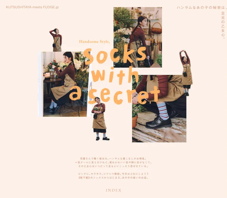
靴下屋とFUDGE.jpによるソックス特集。クリーム色の余白に写真と人物の切り抜きを重ね、オレンジの手書き風タイトルを配置。商品ごとの配色と、スマートフォンで組み替わるコラージュが特徴です。
オリジナルサイトを見るKUTSUSHITAYA meets FUDGE.jp — Socks with a secret — Style Reference
A fashion story assembled from warm paper, everyday photographs, and oversized apricot handwriting.
Website: tabio.com/jp/fudge02 Original URL: https://tabio.com/jp/fudge02/ Final URL: https://tabio.com/jp/fudge02/ Theme: light editorial presentation, with distinct color fields within the story; no theme selector was evidenced. Inspected: September 12, 2026, at 05:52 JST; supplied retrieval timestamp: September 11, 2026, 20:52:33.071 UTC. Viewports: 1440 × 1000 desktop and 390 × 844 mobile, in CSS pixels. Scope: the current shoppable fashion editorial, documented through three desktop captures, two mobile captures, and rendered text, links, and selected computed styles spanning the document at both sizes. Visual coverage includes the opening collage, the desktop silver-sock feature, and the closing credits. Other sections are partly documented by DOM evidence rather than screenshots.
The page presents socks through a continuing fashion story. A model working around flowers, cafés, and neighborhood storefronts supplies the narrative thread. Navy and white clothing, dark leather shoes, silver glitter, and dusty pink knitwear make small changes at the ankle feel significant.
Its strongest signature is the opening collage: three rectangular photographs, three isolated figures, large distressed orange lettering, and an L-shaped Japanese headline on a pale cream field. Photography and lettering overlap without cards, frames, or shadows. The mobile version deliberately rearranges this composition and moves the collaboration label to the bottom of the opening screen.
Below the cover, the page combines an introduction, four section links, product and styling stories, shopping destinations, wardrobe information, and a photographic credit finale. This is an editorial with commerce connections; its structure should follow the story and imagery rather than a generic sequence of marketing components.
How to Read This Reference
- Measured means a value appears in the supplied rendered DOM or computed-style evidence. Measurements of anchors describe their reported rectangles, not necessarily their inner artwork or complete touch targets.
- Visual estimate means a size, position, color, or treatment was estimated from a supplied screenshot. No pixel-sampling tool was used. Estimated hexadecimal colors are reproduction starting points, not extracted source tokens.
- Calculated means simple arithmetic based on measured values, such as a navigation group's width or its inter-item gap.
- Recommended means an implementation choice for a new build. Breakpoints, clipping polygons, accessibility adjustments, and the Quick Start layout rules are recommendations unless explicitly identified otherwise.
- Named tokens are descriptive aliases. The evidence did not expose an editorial design-token system.
- Coordinates taken from screenshots are relative to that screenshot. DOM link coordinates are document coordinates in the supplied inspection.
- Font families were measured on selected links. Those measurements do not identify the lettering in the title artwork or the condensed credits.
Tokens — Colors
Default Palette
| Name | Value | Suggested token | Evidence | Role |
|---|---|---|---|---|
| Cream Paper | #fcf0e7 |
--ref-paper |
Visual estimate | Opening canvas and negative space around the collage |
| Apricot Lettering | #ffb15f |
--ref-apricot |
Visual estimate | Oversized Socks with a secret lettering and its small serif introduction |
| Soft Peach | #e1a083 |
--ref-peach |
Visual estimate | Collaboration label and Japanese cover headline |
| Silver Gray | #b5b7bf |
--ref-silver |
Visual estimate | Full-width background of the photographed glitter-sock feature |
| Pale Lime | #d7ffac |
--ref-lime |
Visual estimate | Glitter Socks lettering, price, and explanatory text on the gray feature |
| Olive Copy | #77755f |
--ref-olive |
Visual estimate | Wardrobe information and the visible Day. 3 label on white |
| Contact Mint | #6ccbc0 |
--ref-mint |
Measured: rgb(108, 203, 192) |
Supplier website links in the lower information area |
| White | #ffffff |
--ref-white |
Visual estimate | Narrative and wardrobe surfaces; reversed finale lettering |
The palette operates by section. Cream and apricot establish the cover; gray and pale lime distinguish the silver-sock feature; white gives wardrobe information a quieter setting. Do not extend the gray-and-lime pairing to every product section: the other sections' complete palettes were not supplied visually.
The visible cover lettering and the small lime paragraph have deliberately soft contrast. Reproducing the appearance and making small essential text comfortably readable are separate decisions. A darker text option is recommended for a new implementation and is identified in the Quick Start.
Two supplied custom properties, --swiper-theme-color: #007aff and --swiper-navigation-size: 44px, are library-related declarations. They do not establish a visible blue accent, 44px navigation controls, or an operating carousel. Likewise, default blue computed on empty-text anchors is not evidence of blue lettering in the photographed design.
Tokens — Typography
Japanese Interface and Link Text
Measured family: YakuHanJP, "Zen Kaku Gothic New", sans-serif.
This stack appears on the four section anchors, product destinations, and some supplier links. Section and product anchors report 16px, with weight 400 on desktop and 500 on mobile. Their extracted text is empty, so these inherited values should not be used to size the visible image lettering.
Two sampled supplier links use the same stack at 13px on desktop and 12px on mobile, weight 500, with a 21px line height. This is direct evidence for the small information typography, not proof that all paragraphs share those exact settings.
Latin Supplier Links
Measured family: acumin-pro, sans-serif.
Several Latin website addresses use this stack at weight 400, 13px on desktop and 12px on mobile, with a 21px line height. The computed declaration was supplied; font-file delivery and actual fallback resolution were not separately verified.
Display Lettering
The title uses irregular, broad orange strokes, worn patches, loose spacing, and intentionally uneven letter placement. Its three-line arrangement reads Socks / with / a secret. This is a composition to preserve as artwork, rather than a heading to approximate with an arbitrary handwritten font.
The small Handsome Style, introduction has a bold serif appearance. The Glitter Socks title uses much lighter handwritten strokes, an upward-slanting arrangement, and individual underlines. These are two different lettering treatments.
The exact typefaces and image-versus-text implementation of these elements are unverified. Their wording is visible in the screenshots but absent from the extracted body text.
Credit Typography
The finale pairs the white FUDGE.jp wordmark with a narrow, condensed credit treatment. Role labels are smaller than the names. The font is unidentified; the measured acumin-pro supplier-link stack must not be attributed to the credits without further evidence.
The credits are also absent from the supplied extracted text. They may be composed as artwork or rendered through elements outside that extraction. Use authorized artwork or verify the original font before attempting a close typographic recreation.
Type Scale
| Role | Desktop | Mobile | Status and implementation meaning |
|---|---|---|---|
| Section and product anchor inheritance | 16px, weight 400 |
16px, weight 500 |
Measured; empty text means this is not a display-art size |
| Latin supplier addresses | 13px / 21px, weight 400 |
12px / 21px, weight 400 |
Measured; acumin-pro, sans-serif |
| Sampled Japanese-stack supplier addresses | 13px / 21px, weight 500 |
12px / 21px, weight 500 |
Measured; YakuHanJP and Zen Kaku Gothic New stack |
| Collaboration label | About 22px |
About 14–15px |
Visual estimate; regular sans-serif appearance |
| Japanese cover headline | About 21–22px |
About 14px |
Visual estimate; visibly tracked, with horizontal and vertical runs |
Handsome Style, |
About 24px |
About 14px |
Visual estimate; bold serif appearance |
| Main title composition | About 580 × 380px |
About 310 × 210px |
Visual footprint, not a font-size measurement |
| Silver feature price | About 19–20px |
Not visually supplied | Visual estimate; serif appearance |
| Silver feature paragraph | About 13px, roughly 19px leading |
Not visually supplied | Visual estimate; small, lightly tracked text |
| Wardrobe description | Not visually supplied | About 12px / 21px |
Visual estimate from the final mobile capture |
| Finale credit labels and names | About 14px labels and 18–20px names |
About 12px labels and 16px names |
Visual estimates; condensed appearance |
The root and body report a 16px Times default, but styled descendants override it. This is not evidence that the page's overall typography should be recreated with Times.
Tokens — Spacing & Shapes
Observed character: large editorial gaps, overlapping image planes, compact information text, and almost no decorative container chrome.
No systematic spacing scale was exposed. A practical new implementation can use 8, 16, 24, 40, 64, 96, 128px as a working scale, while allowing percentage positioning inside the cover. These values are recommendations, not recovered source tokens.
Measured Navigation Geometry
| Element | Desktop: 1440px wide | Mobile: 390px wide | Evidence |
|---|---|---|---|
| Four-section navigation arrangement | Four entries in one row | Two columns and two rows | Measured anchor positions |
| Individual entry rectangle | About 168.48 × 256.83px |
121.75 × 188.36px |
Measured |
| Overall group width | 756px, from x=342 to x=1098 |
253.5px, from x=68.25 to x=321.75 |
Calculated |
| Horizontal gap | About 27.36px |
10px |
Calculated |
| Gap between mobile rows | Not applicable | About 45.48px |
Calculated from the anchor rectangles |
| Group start | Document y≈1243.98 | Document y≈1134.38 | Measured |
| First three product-link widths | 272px |
About 248px |
Measured inline-anchor rectangles |
| Fourth product-link width | 232px |
About 330px |
Measured inline-anchor rectangles |
| Related-destination widths | 338px |
312px |
Measured inline-anchor rectangles |
Several commerce anchors report line-height: 0px and a rectangle only 24px high. Their visible inner artwork was not included in the element sample. Do not treat these heights as verified button heights, banner dimensions, or accessible hit areas.
Cover Geometry
The following are visual estimates of visible bounds, not source CSS declarations.
| Element | Desktop capture | Mobile capture |
|---|---|---|
| Silver-sock photograph | x≈711, y≈45; 304 × 379px |
x≈193, y≈60; 154 × 192px |
| Café photograph | x≈236, y≈324; 340 × 409px |
Visible area x≈0, y≈273; 135 × 210px, with the composition cropped at the left viewport edge |
| Storefront photograph | x≈828, y≈471; 340 × 423px |
x≈216, y≈390; 174 × 216px |
| Main lettering | Central overlap, approximately x=430–1010 | Approximately x=40–350, across the middle of the collage |
| Collaboration label | Upper left, approximately x=38, y=36 | Lower left, approximately x=19, y=811 |
| Lower walking figure | Extends to approximately y=858 | Extends to approximately y=613 |
The mobile cover leaves a large unoccupied cream area below the lowest figure before the collaboration label. Preserve that pause; filling it with an invented CTA would change the opening rhythm.
Shape Vocabulary
| Element | Observed treatment |
|---|---|
| Cover photographs | Rectangular, square-cornered, without visible frames or shadows |
| Isolated figures | Silhouette edges follow the body and clothing |
| Silver-sock feature photograph | Irregular, angular cut-paper outline |
| Handwritten labels | Uneven strokes and nonuniform baselines; no enclosing pill |
| Story boundaries | Changes in photograph or background color rather than raised containers |
| Credit finale | Full-width photograph with centered reversed lettering |
The angular crop may be a prepared image, mask, or CSS clipping treatment. Its implementation was not supplied. The polygon in the Quick Start is an approximate reconstruction.
Components
Editorial Cover
Role: establish the collaboration, story, and visual tone before the product details.
The cover contains three rectangular photographs and three isolated views of the same model. A seated figure overlaps the upper edge of the café photograph. A standing figure holding flowers sits near the right-side photographs. A walking figure crosses the lower part of the title composition.
The orange title overlaps the photographs rather than occupying a separate text column. It remains the strongest graphic element even though the images contain considerable detail. The cream background connects the otherwise disconnected pieces and gives each silhouette room to read.
A useful implementation stack is: background, rectangular photographs, main lettering, selected foreground cutouts, then small identity text. This is a recommended layering model, not a recovered DOM order. Fine-tune individual overlaps against both supplied cover captures.
No conventional navigation bar, cart control, or primary purchase button is visible in either opening capture.
Collaboration Label and Japanese Headline
Role: provide identity around the collage without creating a navigation strip.
KUTSUSHITAYA meets FUDGE.jp appears in peach at the desktop upper left. On mobile it appears near the lower-left corner of the opening view. The evidence establishes the changed placement, but not whether it is implemented by repositioning one element or switching responsive assets.
The headline ハンサムなあの子の秘密は、足元の乙女心。 forms an L shape: the first clause runs horizontally across the upper right, and the final clause descends vertically near the right edge. It keeps the same basic reading arrangement on mobile at a smaller size.
For a new implementation, separate the horizontal and vertical runs and use writing-mode: vertical-rl on the latter. Keep the full sentence in a sensible accessible reading order.
Story Introduction
Role: explain the character and connect her clothing to the sock selection.
The extracted text describes a florist who favors handsome outfits while quietly enjoying pretty colors and patterns at her feet. A second paragraph introduces pink, glitter, and stripes.
Desktop text extraction includes deliberate line divisions that are absent in the mobile version. This is consistent with responsive handling of the introduction, although the exact <br> rules and paragraph widths were not supplied. Avoid hardcoding desktop line breaks into narrow-screen copy.
The introduction's complete visual layout is outside the supplied screenshots. Do not infer its font size, alignment, decorative assets, or entrance behavior from its wording alone.
Four-Section Index
Role: jump to the four product-story sections.
The page exposes real anchors to #sec1, #sec2, #sec3, and #sec4. Their measured tall rectangles sit in a centered four-item row on desktop and a centered two-by-two arrangement on mobile.
Their extracted text is empty. The geometry is consistent with image-led navigation, but the inner artwork, visible captions, and accessible names were not supplied. Preserve the measured grouping without inventing a text-tab interface or carousel.
A new implementation can use a CSS grid to reproduce this arrangement even though the sampled source anchors themselves report display: inline.
Product-Story Sequence
Role: alternate material detail, styling narrative, and a route to the corresponding product.
The DOM establishes the following sequence. English labels in the first column are descriptive aliases, not verified original section headings.
| Story alias | Source product wording | Displayed price | Product destination |
|---|---|---|---|
| Ribbed stripes | プレッピーリブボーダーソックス |
¥1,210 |
/jp/detail/011141609/ |
| Silver glitter | ラメゴム長ショートソックス |
¥880 |
/jp/detail/011132682/ |
| Pink cotton rib | 太リブコットンソックス クルー |
¥880 |
/jp/detail/011141618/ |
| Relaxed dots | 履き口ゆったりくるくるドットクルー |
¥1210 |
/jp/detail/011141577/ |
The first three products have both material-oriented descriptions and longer outfit narratives. The fourth description includes a suggested styling context. Preserve this difference instead of forcing every section into the same number of cards or paragraphs.
Full visual treatment is supplied only for the silver feature and portions of adjacent and closing content. The DOM confirms the other products and destinations, but not their complete layouts or color systems.
Silver Glitter Feature
Role: isolate the sock texture and give this product a distinct visual chapter.
A flat gray field spans the desktop viewport. An approximately 450 × 570px photograph sits near the horizontal center, beginning around y=29 in the supplied capture. Its outline resembles an unevenly cut sheet: a diagonal upper-left edge, slightly sloping top, angled right edge, and faceted lower corners.
The photograph shows silver socks, white clothing, and black buckled loafers against concrete. Pale-lime Glitter Socks lettering overlaps its lower-right region and extends beyond the photographic edge. Each word has an informal underline. Do not contain the lettering inside the photograph or replace the cut shape with a rounded rectangle.
Below the image, ¥880 begins around x=306 and the small explanatory paragraph begins around x=624. The paragraph spans roughly 510px and three lines. A centered metadata region of approximately 828px is a useful reconstruction, with a narrow price column and a wider description column.
The gray field ends around y=784 in this screenshot. These are capture-relative bounds: the top of the screenshot does not independently establish the full section's document start.
Styling Photography and Narrative
Role: show the socks as part of clothing and everyday activity.
The DOM pairs the glitter socks with navy and white clothing, striped socks with a work outfit, and pink socks with a khaki outfit. These descriptions establish the content relationship, while the photographs supply texture and atmosphere.
Immediately below the supplied gray feature, a photograph enters from the left and occupies about 753px of the 1440px view; white occupies the remaining width. Only the beginning of that spread is visible. An image-and-copy split is a reasonable reusable component, but the complete column layout and subsequent sequence cannot be recovered from this slice alone.
The product-link x positions vary substantially across desktop sections. On mobile, the first three link rectangles converge on centered widths of about 248px. This supports a more staggered desktop composition and a more regular mobile commerce rhythm without proving the exact arrangement of every photograph.
Product and Related Destinations
Role: connect the editorial to shopping and further reading.
Four product-detail links are present, followed by a product search destination at /jp/search/?keyword=2608fudge&order_type=1 and a related feature at https://fudge.jp/fashion/feature/397864/.
Their text extraction is empty, so visible labels, arrows, button fills, and hover treatments are unverified. The measured destination widths are useful layout references; they are not enough to recreate the artwork of those links.
For a new build, retain real links and supply descriptive accessible names. Do not invent a cart drawer, checkout interaction, or sticky shopping bar as part of a faithful reconstruction.
Supplier and Wardrobe Information
Role: document the clothing and shopping references behind the looks.
The lower DOM contains supplier names, telephone details, website links, and three outfit lists. Small mint website addresses introduce the clearest measured functional accent in the page.
The final mobile capture shows a Day. 3 label above an olive paragraph on white. Its content column begins around x=70 and is approximately 250px wide. The label combines a modest serif word with a noticeably larger numeral. The paragraph lists jacket, trousers, top, and shoes, and finishes before the full-width credit photograph begins around y=188 in that capture.
Keep these dense references visually quiet and readable. Long supplier URLs need wrapping on small screens; the supplied measurements place some text close to the mobile viewport edge.
Photographic Credit Finale
Role: end the editorial with a tactile product image and compact production attribution.
A close-up photograph of dusty-pink ribbed socks and dark brown shoes fills the available width. Warm wooden cabinetry and a textured concrete floor surround the footwear. The desktop image includes much more lateral context; the mobile crop concentrates on the leg, sock, and shoe.
The white FUDGE.jp wordmark and credit block remain centered within the photograph. The desktop photograph is visible from approximately y=51 to y=995 in its capture. On mobile it begins around y=188 and continues to the bottom of the 844px capture. These visible proportions are compatible with a centered cover crop, but the actual object-fit or background-image rule is unknown.
The following credits are independently legible in the supplied current-page screenshots:
| Source role | Visible credit |
|---|---|
| photograph | Kojima Yohei |
| styling | Kitagawa Saori |
| hair & make-up | Mogi Misuzu |
| model | Ogawa Rina |
| edit & text | Yanase Rei |
| design & develop | VIA BO, RINK |
| cooperation | El Sur, MODeL T, BREWBOOKS |
Use the photograph as the surface, without a separate opaque credit card. If the credits are reproduced as an image, provide an equivalent accessible text representation without duplicating the lettering visibly.
Tokens — Motion & Interaction
The evidence documents settled views and link destinations, not a tested animation sequence. Static overlaps must not be described as parallax or scroll-driven movement.
| Treatment | Evidence | What can be concluded |
|---|---|---|
| Long-page scrolling | Multiple captured positions and document heights at both viewports | The page supports a long vertical editorial sequence |
| Section navigation | Four hrefs targeting #sec1 through #sec4 |
In-page destinations exist; activation, scrolling duration, and easing were not tested |
| Product navigation | Four product-detail hrefs | Shopping destinations exist; their target pages and post-click behavior were not inspected |
| Related shopping and reading | Search and external feature hrefs | Further destinations exist; tab behavior is unknown |
| Hover and focus | No exercised states supplied | No hover opacity, underline animation, scaling, or focus style can be claimed |
| Sampled CSS animation | Sampled elements report animation: none |
No animation is established on those elements; this does not describe every descendant or script |
| Sampled transition field | Reports all, without useful duration or easing evidence |
No nonzero transition or timing token is established |
| Carousel behavior | Only Swiper-related root properties were supplied | A functioning slider, autoplay, arrows, and swipe gestures remain unverified |
| Cover entrance or parallax | Still captures only | Unverified |
The capture procedure waited for document load, visible image decoding, finite animation readiness, and sampled layout stability. Initial observation lasted at least five seconds. Perpetual animation was paused during readiness checks and then resumed. This reduces the chance of documenting an unfinished frame, but does not establish the absence of motion or delayed content.
Recommended motion for an adaptation: start with the static composition. If feedback is needed, use a restrained 150–200ms opacity transition on real links. Optional entrance effects should preserve reading order, avoid delaying essential text, and have a reduced-motion equivalent. These timings are recommendations, not recovered site values.
Surfaces
| Surface | Appearance | Function |
|---|---|---|
| Opening canvas | Flat warm cream | Connects separate photographic fragments and supports large empty areas |
| Rectangular photographs | Natural photographic tones, square edges | Establish setting, outfit, and continuity |
| Figure cutouts | Silhouette boundary over cream or photographs | Introduce depth and an informal pasted-paper feeling |
| Silver feature | Flat gray with pale-lime details | Creates a distinct product-focused pause |
| Information regions | White with small olive or mint text | Accommodate descriptions, references, and wardrobe lists |
| Finale | Full-width photograph with white lettering | Closes the story and carries production credits |
No general shadow-elevation or rounded-card system is visible in the supplied captures. Separation comes from image boundaries, whitespace, overlap, and section color changes.
Imagery
The photographs feel observational and tactile. Flowers, a printed headscarf, loose white trousers, navy layers, worn interiors, storefront plants, and polished leather shoes place the socks in a coherent everyday world. Natural-looking light and restrained colors allow knit texture and small color accents to carry the product emphasis. The exact photographic grading and filters are unknown.
The same model appears at multiple scales within the opening: a large environmental portrait, a detail of the feet, and smaller cutout figures. This repetition creates a sequence of moments within one composition. Replacing the figures with unrelated models or generic product packshots would lose that continuity.
Keep photographic edges crisp and texture intact. Use normal photographic image rendering, not pixelated scaling. Preserve realistic anatomy and fabric detail in isolated figures; their cut edges should follow clothing rather than sit inside generic blob masks.
Observed Asset References
No original image src values, asset filenames, font-file URLs, or mask paths were included in the evidence. The references below identify visible assets without inventing paths.
| Asset | Supplied evidence | Important properties |
|---|---|---|
| Opening title artwork | Desktop capture 1; mobile capture 4 | Three lines, apricot color, irregular distressed strokes |
| Silver-sock cover photograph | Captures 1 and 4 | Portrait crop; white garment, silver socks, black buckled shoes |
| Café portrait | Captures 1 and 4 | Environmental fashion photograph; visibly cropped at the mobile left edge |
| Storefront photograph | Captures 1 and 4 | Portrait crop with walking figure and neighborhood context |
| Three isolated model poses | Captures 1 and 4 | Seated, flower-holding, and walking silhouettes |
| Angular silver-sock feature | Desktop capture 2 | Faceted crop; photographic texture remains natural |
Glitter Socks lettering |
Desktop capture 2 | Pale lime, angled handwritten words and underlines |
| Pink-sock finale | Desktop capture 3; mobile capture 5 | Wide environmental view on desktop and tight portrait crop on mobile |
| Wordmark and credits | Captures 3 and 5 | White, centered, condensed credit lettering |
Use original artwork when authorized and available. CSS can recreate the composition and surfaces, but the lettering and recurring photographic subject carry much of the identity.
Layout & Responsive Behavior
Desktop
The 1440 × 1000 opening is an asymmetric composition distributed across the viewport. Small identity text occupies the upper corners, while the main collage sits lower and toward the middle. Individual photographs remain moderate in size rather than becoming one full-bleed hero image.
The section index forms a centered 756px row. Later content expands and contracts: the silver product detail is centered within a full-width colored section, the next visible photograph starts at the left edge, and the finale fills the width. Do not force these different compositions into one fixed content-column template.
The measured document height is approximately 9791.23px.
Mobile
The 390 × 844 cover changes placement and relative scale. The upper sock photograph is about 39.5% of the viewport width, compared with about 21.1% on desktop. The café photograph reaches beyond the left edge; the storefront image sits on the lower right; and the title crosses both. This is a recomposition, not a proportional shrink of a desktop poster.
The Japanese headline remains near the upper right. The collaboration label moves to the bottom left. A substantial cream area separates the lower walking figure from that label. The exact viewport-height formula is unknown, even though the supplied framing fills the opening view.
The index switches to two columns. Product links become mostly centered, and related destinations use a measured width of 312px, leaving 39px on either side. The wardrobe paragraph remains a narrow reading block. The finale changes its photographic crop while keeping the credits centered.
The measured document height is approximately 11389.48px, about 16% longer than desktop. This supports significant reflow; it does not reveal the exact rules for every intermediate section.
Implementation Boundaries
Only two viewport sizes were inspected. The breakpoint, tablet arrangement, landscape behavior, safe-area handling, and behavior during browser-toolbar changes are unverified.
A breakpoint near 48rem is a reasonable starting recommendation for the two documented compositions. Use separate mobile placement rules for the cover, preserve intrinsic image proportions, and test widths between 390px and 1440px. Do not claim the suggested breakpoint as original CSS.
Do’s and Don’ts
Do
- Preserve the relationship between cream space, large apricot lettering, and smaller photographic fragments.
- Recompose the cover for mobile, including the left-edge photograph crop and lower collaboration label.
- Use the same photographic subject across environmental shots, details, and isolated figures.
- Keep the cover photographs square-cornered and free of visible shadows.
- Preserve the angular cut-paper shape of the silver-sock image.
- Let the pale-lime product lettering extend beyond the photographic crop.
- Keep typography roles distinct: distressed title artwork, delicate handwritten labels, small information text, and condensed credits.
- Maintain four section destinations and the documented four-to-two-column navigation change.
- Treat product descriptions and wardrobe information as editorial content with real shopping links.
- Retain the centered white credit block over a responsive photographic crop.
- Label estimated colors and recommended layout rules when handing the reference to another implementer.
Don’t
- Do not replace the opening with a standard centered heading, one background photograph, and a large conversion button.
- Do not shrink the desktop collage uniformly to fit a phone.
- Do not fill the intentional mobile cream space with extra badges or controls.
- Do not replace custom lettering with an arbitrary handwritten font and call it an exact match.
- Do not turn every photograph or product section into a rounded card.
- Do not add glossy gradients, floating shadows, glass surfaces, or decorative interface icons to the composition.
- Do not infer a carousel from the presence of Swiper custom properties.
- Do not infer visible blue controls from default anchor colors.
- Do not claim animation, hover behavior, sticky elements, or checkout interactions that were not exercised.
- Do not apply the silver chapter's colors to unseen sections as though their palettes were verified.
- Do not use empty anchor text as proof that accessible names are absent; descendant alternatives were not supplied.
Recommended Implementation Additions
These are recommendations for a new implementation, not verified original features:
- Provide one semantic main heading and text alternatives for meaningful photographic and lettering assets. Repeated decorative cutouts can use empty alternative text.
- Give section links and image-based shopping destinations clear accessible names. Keep keyboard focus visible against both pale surfaces and photographs.
- Expand small inline destinations to comfortable hit areas, preferably at least 44px high, without enlarging their artwork unnecessarily.
- Use darker text for essential descriptions on gray. The supplied pale-lime treatment is visually low contrast; test final colors and actual image assets before choosing accessible text colors.
- Keep small Japanese prose readable. A 14px or larger size is a practical adaptation even where the reference appears smaller.
- Allow long supplier addresses to wrap and verify that information remains inside the mobile viewport.
- Reserve image dimensions to reduce layout movement. Supply appropriate image sizes and crops for the cover and finale, and prioritize imagery visible in the opening view.
- Limit overflow clipping to the collage or deliberately masked artwork, so it does not hide focus outlines or long information text elsewhere.
- Keep the complete editorial usable without entrance animations. Respect reduced-motion preferences if motion is added.
- Verify intermediate widths, 200% text zoom, keyboard navigation, image failures, and the narrow-screen credit crop.
Agent Prompt Guide
Quick Color Reference
All colors below are visual approximations except the measured mint link color.
- Cover paper:
#fcf0e7. - Main lettering:
#ffb15f. - Small cover identity text:
#e1a083. - Silver chapter surface:
#b5b7bf. - Silver chapter display accent:
#d7ffac. - Wardrobe-copy approximation:
#77755f. - Measured supplier-link accent:
#6ccbc0. - Finale lettering: white.
- Recommended accessible body-text alternative:
#45453b; this is an addition, not an observed token.
Overall Prompt
“Create a shoppable fashion editorial inspired by KUTSUSHITAYA meets FUDGE.jp, using a warm cream opening, oversized distressed apricot title artwork, and a collage of three rectangular photographs plus three isolated poses of one recurring model. Keep the photographs natural and tactile, with navy and white clothing, flowers, neighborhood interiors, leather shoes, and sock details. Place small peach collaboration text at the desktop upper left and an L-shaped Japanese headline at the upper right. Build a long editorial sequence with a four-entry section index, product details, outfit narratives, wardrobe references, and a full-width photographic credit finale. Recompose the cover for mobile, moving the collaboration text to the lower left and preserving a large cream pause beneath the collage. Use the supplied visual estimates as starting colors and keep unverified interactions out of the reconstruction.”
Example Component Prompts
- Desktop cover: “Arrange three square-cornered portrait photographs on cream: a sock detail high near the center-right, a café portrait lower left, and a storefront lower right. Overlap them with large orange
Socks with a secretartwork and three small isolated model poses. Use no cards, shadows, or enclosing frames.” - Mobile cover: “At 390px wide, move the sock detail to the upper right, let the café photograph crop against the left viewport edge, and place the storefront below on the right. Layer the orange title through the middle and a walking cutout across its lower area. Put the collaboration label near the bottom left and retain the broad empty cream area above it.”
- Silver product chapter: “Use a flat silver-gray section with an approximately 450-by-570 desktop photograph clipped into an angular paper shape. Add pale-lime handwritten
Glitter Socksartwork extending from its lower-right edge. Below, align a small serif price with a separate wider description column. Use a darker description color if implementing the recommended readable variant.” - Section index: “Build four image-led section links in a centered desktop row about 756px wide, with roughly 27px gaps. At 390px, use a centered 253.5px two-column group with 10px column gaps and approximately 45px between rows. Give every link a meaningful accessible name.”
- Wardrobe information: “Present compact outfit references on white with quiet olive text and restrained serif day numbering. Keep the mobile reading block narrow and use the measured mint accent for supplier website links. Allow long addresses to wrap.”
- Credit finale: “Fill the section with a close-up of pink ribbed socks and dark brown shoes against wood and concrete. Center a white publication wordmark and seven compact credit rows over the photograph. Use a tighter portrait crop on mobile while preserving the visible sock, shoe, and centered lettering.”
Quick Start
CSS Custom Properties
This is a new implementation scaffold, not recovered source CSS. It approximates the two supplied cover compositions and the silver feature. The font stacks on links and mint link color are evidence-based; other palette values and layout rules are estimates or recommendations.
The scaffold uses darker long-form product copy and a 14px prose size as explicit readability improvements. The display artwork retains the estimated original accent colors. The credit font remains a generic placeholder until an authorized asset or verified font is available.
Expected anatomy:
.hero-canvascontains the collaboration label, headline, serif introduction, title artwork, three photographic images, and three cutout images..chapter-indexcontains four real links with image children..product-figurecontains the clipped photograph and overlapping lettering artwork;.product-metacontains price and description..look-spreadcontains a photograph and.look-spread__copy..credit-finalecontains a background image and centered credit content.
:root {
  /* Visual estimates, except for the measured mint link color. */
  --ref-paper: #fcf0e7;
  --ref-apricot: #ffb15f;
  --ref-peach: #e1a083;
  --ref-silver: #b5b7bf;
  --ref-lime: #d7ffac;
  --ref-olive: #77755f;
  --ref-mint: #6ccbc0;
  --ref-white: #ffffff;

  /* Recommended readable alternative for essential copy. */
  --ref-readable: #45453b;

  /* Measured on selected links; font files are not bundled here. */
  --font-jp: YakuHanJP, 'Zen Kaku Gothic New', sans-serif;
  --font-latin: 'acumin-pro', sans-serif;
  --font-editorial: serif;
  --font-credits: sans-serif;

  /* Recommended working scale. */
  --space-xs: 8px;
  --space-sm: 16px;
  --space-md: 24px;
  --space-lg: 40px;
  --space-xl: 64px;
  --space-2xl: 96px;
  --space-3xl: 128px;

  --cover-max: 90rem;
  --index-max: 47.25rem;
  --text-prose: 0.875rem;
  --text-contact: 13px;
}

.fashion-editorial,
.fashion-editorial * {
  box-sizing: border-box;
}

.fashion-editorial {
  color: var(--ref-readable);
  background: var(--ref-white);
  font-family: var(--font-jp);
  font-weight: 400;
}

.fashion-editorial img {
  display: block;
  max-inline-size: 100%;
}

.sr-only {
  position: absolute;
  inline-size: 1px;
  block-size: 1px;
  padding: 0;
  margin: -1px;
  overflow: hidden;
  clip-path: inset(50%);
  white-space: nowrap;
  border: 0;
}

/* Approximate desktop cover placement at 1440 by 1000. */
.hero {
  overflow: clip;
  background: var(--ref-paper);
}

.hero-canvas {
  position: relative;
  inline-size: min(100%, var(--cover-max));
  aspect-ratio: 36 / 25;
  min-block-size: 100svh;
  margin-inline: auto;
}

.hero-brand {
  position: absolute;
  z-index: 5;
  inset-block-start: 3.2%;
  inset-inline-start: 2.64%;
  margin: 0;
  color: var(--ref-peach);
  font-family: var(--font-latin);
  font-size: clamp(14px, 1.53vw, 22px);
  line-height: 1.2;
}

.hero-tagline {
  position: absolute;
  z-index: 5;
  inset-block-start: 3.5%;
  inset-inline-end: 2%;
  margin: 0;
  color: var(--ref-peach);
  font-size: clamp(14px, 1.53vw, 22px);
  font-weight: 500;
  line-height: 1.4;
  letter-spacing: 0.16em;
  text-align: end;
}

.hero-tagline__vertical {
  display: block;
  margin-block-start: 8px;
  margin-inline-start: auto;
  writing-mode: vertical-rl;
}

.hero-kicker {
  position: absolute;
  z-index: 3;
  inset-inline-start: 34.4%;
  inset-block-start: 24.8%;
  margin: 0;
  color: var(--ref-apricot);
  font-family: var(--font-editorial);
  font-size: clamp(16px, 1.67vw, 24px);
  font-weight: 700;
  letter-spacing: 0.04em;
}

.hero-title {
  position: absolute;
  z-index: 3;
  inset-inline-start: 29.9%;
  inset-block-start: 27.8%;
  inline-size: 40.5%;
  margin: 0;
}

.hero-title img {
  inline-size: 100%;
}

.hero-photo,
.hero-cutout {
  position: absolute;
  block-size: auto;
}

.hero-photo {
  z-index: 1;
  object-fit: cover;
  border-radius: 0;
}

.hero-detail {
  left: 49.375%;
  top: 4.5%;
  width: 21.11%;
  aspect-ratio: 4 / 5;
}

.hero-cafe {
  left: 16.39%;
  top: 32.4%;
  width: 23.61%;
  aspect-ratio: 340 / 409;
}

.hero-storefront {
  left: 57.5%;
  top: 47.1%;
  width: 23.61%;
  aspect-ratio: 340 / 423;
}

.hero-cutout {
  z-index: 4;
  object-fit: contain;
}

.hero-seated {
  left: 22.9%;
  top: 14%;
  width: 7.5%;
}

.hero-flowers {
  left: 74.2%;
  top: 36.1%;
  width: 9.1%;
}

.hero-walking {
  left: 40.4%;
  top: 60%;
  width: 9%;
}

/* Grid is an implementation choice based on measured positions. */
.chapter-index {
  display: grid;
  grid-template-columns: repeat(4, minmax(0, 1fr));
  gap: 27.36px;
  inline-size: min(52.5%, var(--index-max));
  margin-inline: auto;
}

.chapter-index a,
.chapter-index img {
  display: block;
  inline-size: 100%;
}

/* Approximate the photographed silver chapter. */
.product-panel {
  padding-block: 30px 32px;
  background: var(--ref-silver);
}

.product-figure {
  position: relative;
  inline-size: min(31.25vw, 450px);
  aspect-ratio: 450 / 570;
  margin: 0 auto;
}

.product-crop {
  inline-size: 100%;
  block-size: 100%;
  object-fit: cover;
  clip-path: polygon(
    28% 0%, 97% 3.5%, 100% 42%,
    86% 97%, 57% 100%, 9% 84%, 0% 25%
  );
}

.product-label {
  position: absolute;
  left: 74%;
  top: 78%;
  width: 62%;
  /* Use artwork with its own lettering angle and underlines. */
}

.product-meta {
  display: grid;
  grid-template-columns: 240px minmax(0, 1fr);
  gap: 78px;
  inline-size: min(828px, calc(100% - 48px));
  margin: var(--space-2xl) auto 0;
  color: var(--ref-readable);
}

.product-price {
  margin: 0;
  font-family: var(--font-editorial);
  font-size: 20px;
  line-height: 1.4;
  letter-spacing: 0.06em;
}

.product-description {
  margin: 0;
  font-size: var(--text-prose);
  line-height: 1.7;
}

/* Suggested abstraction; the complete original spread is unverified. */
.look-spread {
  display: grid;
  grid-template-columns: 52.3% minmax(0, 1fr);
  background: var(--ref-white);
}

.look-spread > img {
  inline-size: 100%;
  block-size: auto;
}

.look-spread__copy {
  align-self: center;
  padding: clamp(24px, 6vw, 88px);
  font-size: var(--text-prose);
  line-height: 1.85;
}

.product-link {
  display: inline-flex;
  align-items: center;
  min-block-size: 44px;
  color: inherit;
  text-underline-offset: 0.2em;
}

.trade-credits {
  font-size: var(--text-contact);
  line-height: 21px;
  overflow-wrap: anywhere;
}

.trade-credits a {
  color: var(--ref-mint);
}

.trade-credits .latin-address {
  font-family: var(--font-latin);
  font-weight: 400;
}

/* Centered crop is a recommendation consistent with the captures. */
.credit-finale {
  position: relative;
  display: grid;
  place-items: center;
  aspect-ratio: 1440 / 944;
  min-block-size: 40rem;
  color: var(--ref-white);
  background: var(--ref-readable);
  text-align: center;
}

.credit-background {
  position: absolute;
  inset: 0;
  inline-size: 100%;
  block-size: 100%;
  object-fit: cover;
  object-position: center;
}

.credit-content {
  position: relative;
  z-index: 1;
  inline-size: min(88%, 24rem);
  font-family: var(--font-credits);
  font-size: 14px;
  line-height: 1.9;
}

.credit-logo {
  inline-size: 170px;
  margin: 0 auto 26px;
}

.credit-line {
  margin: 0;
}

.credit-line strong {
  font-size: 1.25em;
  font-weight: 400;
}

.fashion-editorial :focus-visible {
  outline: 2px solid var(--ref-readable);
  outline-offset: 4px;
}

.credit-finale :focus-visible {
  outline-color: var(--ref-white);
}

/* Recommended breakpoint; only the endpoint views were inspected. */
@media (max-width: 48rem) {
  .hero-canvas {
    aspect-ratio: auto;
    block-size: max(100svh, 52.75rem);
  }

  .hero-brand {
    top: auto;
    bottom: 18px;
    left: 19px;
    font-size: 14px;
  }

  .hero-tagline {
    top: 19px;
    right: 18px;
    font-size: 14px;
    letter-spacing: 0.11em;
  }

  .hero-kicker {
    left: 19.2%;
    top: 35%;
    font-size: 14px;
  }

  .hero-title {
    left: 10.7%;
    top: 36.8%;
    width: 79.5%;
  }

  .hero-detail {
    left: 49.5%;
    top: 7.1%;
    width: 39.5%;
  }

  .hero-cafe {
    left: -10.2%;
    top: 32.35%;
    width: 44.8%;
  }

  .hero-storefront {
    left: 55.38%;
    top: 46.21%;
    width: 44.62%;
  }

  .hero-seated {
    left: 12%;
    top: 5.8%;
    width: 17%;
  }

  .hero-flowers {
    left: 72%;
    top: 22.3%;
    width: 20%;
  }

  .hero-walking {
    left: 27%;
    top: 52.8%;
    width: 22%;
  }

  .chapter-index {
    grid-template-columns: repeat(2, minmax(0, 1fr));
    inline-size: 65%;
    column-gap: 10px;
    row-gap: 45.48px;
  }

  /* Mobile silver-section layout is recommended, not observed. */
  .product-figure {
    inline-size: 72%;
  }

  .product-label {
    left: 58%;
    top: 80%;
    width: 60%;
  }

  .product-meta {
    grid-template-columns: 1fr;
    gap: 16px;
    margin-block-start: 64px;
  }

  .look-spread {
    grid-template-columns: 1fr;
  }

  .look-spread__copy {
    padding: 32px 10%;
  }

  .trade-credits {
    --text-contact: 12px;
  }

  .credit-finale {
    aspect-ratio: 390 / 656;
    min-block-size: 0;
  }

  .credit-content {
    font-size: 12px;
  }

  .credit-logo {
    inline-size: 145px;
    margin-block-end: 24px;
  }
}

@media (prefers-reduced-motion: reduce) {
  .fashion-editorial * {
    animation: none !important;
    transition: none !important;
    scroll-behavior: auto !important;
  }
}
A minimal product-section example follows. The filenames are placeholders for assets in a new project, not observed original paths. The English paragraph is example adaptation copy. Keep the visible lettering graphic separate from the clipped photograph.
<section id="sec2" class="product-panel" aria-labelledby="glitter-heading">
  <h2 id="glitter-heading" class="sr-only">Glitter Socks</h2>
  <figure class="product-figure">
    <img
      class="product-crop"
      src="project-glitter-photo.jpg"
      width="450"
      height="570"
      alt="Silver glitter socks with black buckled loafers and white clothing."
    >
    <img
      class="product-label"
      src="project-glitter-lettering.svg"
      alt=""
    >
  </figure>
  <div class="product-meta">
    <p class="product-price">¥880</p>
    <p class="product-description">
      A subtle glitter finish brings a small highlight to navy layers,
      white trousers, and dark leather shoes.
    </p>
  </div>
</section>
Tailwind v4 Token Mapping
Optional aliases for a project already using Tailwind v4. This does not imply that the original page uses Tailwind. Define the custom properties above first.
@theme inline {
  --color-paper: var(--ref-paper);
  --color-apricot: var(--ref-apricot);
  --color-peach: var(--ref-peach);
  --color-silver: var(--ref-silver);
  --color-lime: var(--ref-lime);
  --color-olive: var(--ref-olive);
  --color-mint: var(--ref-mint);
  --color-readable: var(--ref-readable);

  --font-body: var(--font-jp);
  --font-address: var(--font-latin);
  --font-display-serif: var(--font-editorial);

  --text-prose: 0.875rem;
  --spacing-editorial-gap: 6rem;
  --spacing-editorial-inset: 1.5rem;
}
Sources & Evidence
- Inspected original and final page: KUTSUSHITAYA meets FUDGE.jp. Both URLs are identical; the supplied response status is HTTP 200.
- Capture timestamp: September 11, 2026, at
20:52:33.071 UTC, equivalent to September 12 at05:52:33.071 JST. This reference analyzes that supplied current-page inspection rather than reconstructing another version. - Desktop evidence: 1440 × 1000 CSS pixels. Capture 1 shows the opening collage; capture 2 shows the silver-sock feature and the beginning of the following photographic region; capture 3 shows the photographic credit finale.
- Mobile evidence: 390 × 844 CSS pixels. Capture 4 shows the recomposed opening; capture 5 shows the end of the third wardrobe list and the credit finale.
- Rendered DOM and computed styles: full extracted story text, section and commerce destinations, supplier links, document heights, selected anchor rectangles, selected font stacks, sizes and weights, mint link color, and two library-related custom properties at both viewport sizes.
- Interaction scope: capture preparation included loading and stability checks and traversal between scroll positions. Link activation, hover, keyboard navigation, purchases, and any slider controls were not exercised in the supplied evidence.
- Inspection limitations: the screenshots do not visually cover every section. Original image paths, complete stylesheets, font files, breakpoint declarations, animation timing, and source mask geometry were not supplied. SharedWorkers and service workers were disabled during the browser inspection. Delayed content and unexercised behaviors remain unverified.
No additional browsing, commands, or file access were used to prepare this reference. Measurements, visual estimates, and recommended adaptations are distinguished throughout.
# KUTSUSHITAYA meets FUDGE.jp — Socks with a secret — Style Reference

> A fashion story assembled from warm paper, everyday photographs, and oversized apricot handwriting.

**Website:** [tabio.com/jp/fudge02](https://tabio.com/jp/fudge02/)
**Original URL:** https://tabio.com/jp/fudge02/
**Final URL:** https://tabio.com/jp/fudge02/
**Theme:** light editorial presentation, with distinct color fields within the story; no theme selector was evidenced.
**Inspected:** September 12, 2026, at 05:52 JST; supplied retrieval timestamp: September 11, 2026, 20:52:33.071 UTC.
**Viewports:** 1440 × 1000 desktop and 390 × 844 mobile, in CSS pixels.
**Scope:** the current shoppable fashion editorial, documented through three desktop captures, two mobile captures, and rendered text, links, and selected computed styles spanning the document at both sizes. Visual coverage includes the opening collage, the desktop silver-sock feature, and the closing credits. Other sections are partly documented by DOM evidence rather than screenshots.

The page presents socks through a continuing fashion story. A model working around flowers, cafés, and neighborhood storefronts supplies the narrative thread. Navy and white clothing, dark leather shoes, silver glitter, and dusty pink knitwear make small changes at the ankle feel significant.

Its strongest signature is the opening collage: three rectangular photographs, three isolated figures, large distressed orange lettering, and an L-shaped Japanese headline on a pale cream field. Photography and lettering overlap without cards, frames, or shadows. The mobile version deliberately rearranges this composition and moves the collaboration label to the bottom of the opening screen.

Below the cover, the page combines an introduction, four section links, product and styling stories, shopping destinations, wardrobe information, and a photographic credit finale. This is an editorial with commerce connections; its structure should follow the story and imagery rather than a generic sequence of marketing components.

## How to Read This Reference

- **Measured** means a value appears in the supplied rendered DOM or computed-style evidence. Measurements of anchors describe their reported rectangles, not necessarily their inner artwork or complete touch targets.
- **Visual estimate** means a size, position, color, or treatment was estimated from a supplied screenshot. No pixel-sampling tool was used. Estimated hexadecimal colors are reproduction starting points, not extracted source tokens.
- **Calculated** means simple arithmetic based on measured values, such as a navigation group's width or its inter-item gap.
- **Recommended** means an implementation choice for a new build. Breakpoints, clipping polygons, accessibility adjustments, and the Quick Start layout rules are recommendations unless explicitly identified otherwise.
- **Named tokens** are descriptive aliases. The evidence did not expose an editorial design-token system.
- Coordinates taken from screenshots are relative to that screenshot. DOM link coordinates are document coordinates in the supplied inspection.
- Font families were measured on selected links. Those measurements do not identify the lettering in the title artwork or the condensed credits.

## Tokens — Colors

### Default Palette

| Name | Value | Suggested token | Evidence | Role |
| --- | --- | --- | --- | --- |
| Cream Paper | `#fcf0e7` | `--ref-paper` | Visual estimate | Opening canvas and negative space around the collage |
| Apricot Lettering | `#ffb15f` | `--ref-apricot` | Visual estimate | Oversized `Socks with a secret` lettering and its small serif introduction |
| Soft Peach | `#e1a083` | `--ref-peach` | Visual estimate | Collaboration label and Japanese cover headline |
| Silver Gray | `#b5b7bf` | `--ref-silver` | Visual estimate | Full-width background of the photographed glitter-sock feature |
| Pale Lime | `#d7ffac` | `--ref-lime` | Visual estimate | `Glitter Socks` lettering, price, and explanatory text on the gray feature |
| Olive Copy | `#77755f` | `--ref-olive` | Visual estimate | Wardrobe information and the visible `Day. 3` label on white |
| Contact Mint | `#6ccbc0` | `--ref-mint` | Measured: `rgb(108, 203, 192)` | Supplier website links in the lower information area |
| White | `#ffffff` | `--ref-white` | Visual estimate | Narrative and wardrobe surfaces; reversed finale lettering |

The palette operates by section. Cream and apricot establish the cover; gray and pale lime distinguish the silver-sock feature; white gives wardrobe information a quieter setting. Do not extend the gray-and-lime pairing to every product section: the other sections' complete palettes were not supplied visually.

The visible cover lettering and the small lime paragraph have deliberately soft contrast. Reproducing the appearance and making small essential text comfortably readable are separate decisions. A darker text option is recommended for a new implementation and is identified in the Quick Start.

Two supplied custom properties, `--swiper-theme-color: #007aff` and `--swiper-navigation-size: 44px`, are library-related declarations. They do not establish a visible blue accent, 44px navigation controls, or an operating carousel. Likewise, default blue computed on empty-text anchors is not evidence of blue lettering in the photographed design.

## Tokens — Typography

### Japanese Interface and Link Text

**Measured family:** `YakuHanJP, "Zen Kaku Gothic New", sans-serif`.

This stack appears on the four section anchors, product destinations, and some supplier links. Section and product anchors report `16px`, with weight `400` on desktop and `500` on mobile. Their extracted text is empty, so these inherited values should not be used to size the visible image lettering.

Two sampled supplier links use the same stack at `13px` on desktop and `12px` on mobile, weight `500`, with a `21px` line height. This is direct evidence for the small information typography, not proof that all paragraphs share those exact settings.

### Latin Supplier Links

**Measured family:** `acumin-pro, sans-serif`.

Several Latin website addresses use this stack at weight `400`, `13px` on desktop and `12px` on mobile, with a `21px` line height. The computed declaration was supplied; font-file delivery and actual fallback resolution were not separately verified.

### Display Lettering

The title uses irregular, broad orange strokes, worn patches, loose spacing, and intentionally uneven letter placement. Its three-line arrangement reads `Socks / with / a secret`. This is a composition to preserve as artwork, rather than a heading to approximate with an arbitrary handwritten font.

The small `Handsome Style,` introduction has a bold serif appearance. The `Glitter Socks` title uses much lighter handwritten strokes, an upward-slanting arrangement, and individual underlines. These are two different lettering treatments.

The exact typefaces and image-versus-text implementation of these elements are unverified. Their wording is visible in the screenshots but absent from the extracted body text.

### Credit Typography

The finale pairs the white `FUDGE.jp` wordmark with a narrow, condensed credit treatment. Role labels are smaller than the names. The font is unidentified; the measured `acumin-pro` supplier-link stack must not be attributed to the credits without further evidence.

The credits are also absent from the supplied extracted text. They may be composed as artwork or rendered through elements outside that extraction. Use authorized artwork or verify the original font before attempting a close typographic recreation.

### Type Scale

| Role | Desktop | Mobile | Status and implementation meaning |
| --- | --- | --- | --- |
| Section and product anchor inheritance | `16px`, weight `400` | `16px`, weight `500` | Measured; empty text means this is not a display-art size |
| Latin supplier addresses | `13px / 21px`, weight `400` | `12px / 21px`, weight `400` | Measured; `acumin-pro, sans-serif` |
| Sampled Japanese-stack supplier addresses | `13px / 21px`, weight `500` | `12px / 21px`, weight `500` | Measured; YakuHanJP and Zen Kaku Gothic New stack |
| Collaboration label | About `22px` | About `14–15px` | Visual estimate; regular sans-serif appearance |
| Japanese cover headline | About `21–22px` | About `14px` | Visual estimate; visibly tracked, with horizontal and vertical runs |
| `Handsome Style,` | About `24px` | About `14px` | Visual estimate; bold serif appearance |
| Main title composition | About `580 × 380px` | About `310 × 210px` | Visual footprint, not a font-size measurement |
| Silver feature price | About `19–20px` | Not visually supplied | Visual estimate; serif appearance |
| Silver feature paragraph | About `13px`, roughly `19px` leading | Not visually supplied | Visual estimate; small, lightly tracked text |
| Wardrobe description | Not visually supplied | About `12px / 21px` | Visual estimate from the final mobile capture |
| Finale credit labels and names | About `14px` labels and `18–20px` names | About `12px` labels and `16px` names | Visual estimates; condensed appearance |

The root and body report a `16px` Times default, but styled descendants override it. This is not evidence that the page's overall typography should be recreated with Times.

## Tokens — Spacing & Shapes

**Observed character:** large editorial gaps, overlapping image planes, compact information text, and almost no decorative container chrome.

No systematic spacing scale was exposed. A practical new implementation can use `8, 16, 24, 40, 64, 96, 128px` as a working scale, while allowing percentage positioning inside the cover. These values are recommendations, not recovered source tokens.

### Measured Navigation Geometry

| Element | Desktop: 1440px wide | Mobile: 390px wide | Evidence |
| --- | --- | --- | --- |
| Four-section navigation arrangement | Four entries in one row | Two columns and two rows | Measured anchor positions |
| Individual entry rectangle | About `168.48 × 256.83px` | `121.75 × 188.36px` | Measured |
| Overall group width | `756px`, from x=342 to x=1098 | `253.5px`, from x=68.25 to x=321.75 | Calculated |
| Horizontal gap | About `27.36px` | `10px` | Calculated |
| Gap between mobile rows | Not applicable | About `45.48px` | Calculated from the anchor rectangles |
| Group start | Document y≈1243.98 | Document y≈1134.38 | Measured |
| First three product-link widths | `272px` | About `248px` | Measured inline-anchor rectangles |
| Fourth product-link width | `232px` | About `330px` | Measured inline-anchor rectangles |
| Related-destination widths | `338px` | `312px` | Measured inline-anchor rectangles |

Several commerce anchors report `line-height: 0px` and a rectangle only `24px` high. Their visible inner artwork was not included in the element sample. Do not treat these heights as verified button heights, banner dimensions, or accessible hit areas.

### Cover Geometry

The following are visual estimates of visible bounds, not source CSS declarations.

| Element | Desktop capture | Mobile capture |
| --- | --- | --- |
| Silver-sock photograph | x≈711, y≈45; `304 × 379px` | x≈193, y≈60; `154 × 192px` |
| Café photograph | x≈236, y≈324; `340 × 409px` | Visible area x≈0, y≈273; `135 × 210px`, with the composition cropped at the left viewport edge |
| Storefront photograph | x≈828, y≈471; `340 × 423px` | x≈216, y≈390; `174 × 216px` |
| Main lettering | Central overlap, approximately x=430–1010 | Approximately x=40–350, across the middle of the collage |
| Collaboration label | Upper left, approximately x=38, y=36 | Lower left, approximately x=19, y=811 |
| Lower walking figure | Extends to approximately y=858 | Extends to approximately y=613 |

The mobile cover leaves a large unoccupied cream area below the lowest figure before the collaboration label. Preserve that pause; filling it with an invented CTA would change the opening rhythm.

### Shape Vocabulary

| Element | Observed treatment |
| --- | --- |
| Cover photographs | Rectangular, square-cornered, without visible frames or shadows |
| Isolated figures | Silhouette edges follow the body and clothing |
| Silver-sock feature photograph | Irregular, angular cut-paper outline |
| Handwritten labels | Uneven strokes and nonuniform baselines; no enclosing pill |
| Story boundaries | Changes in photograph or background color rather than raised containers |
| Credit finale | Full-width photograph with centered reversed lettering |

The angular crop may be a prepared image, mask, or CSS clipping treatment. Its implementation was not supplied. The polygon in the Quick Start is an approximate reconstruction.

## Components

### Editorial Cover

**Role:** establish the collaboration, story, and visual tone before the product details.

The cover contains three rectangular photographs and three isolated views of the same model. A seated figure overlaps the upper edge of the café photograph. A standing figure holding flowers sits near the right-side photographs. A walking figure crosses the lower part of the title composition.

The orange title overlaps the photographs rather than occupying a separate text column. It remains the strongest graphic element even though the images contain considerable detail. The cream background connects the otherwise disconnected pieces and gives each silhouette room to read.

A useful implementation stack is: background, rectangular photographs, main lettering, selected foreground cutouts, then small identity text. This is a recommended layering model, not a recovered DOM order. Fine-tune individual overlaps against both supplied cover captures.

No conventional navigation bar, cart control, or primary purchase button is visible in either opening capture.

### Collaboration Label and Japanese Headline

**Role:** provide identity around the collage without creating a navigation strip.

`KUTSUSHITAYA meets FUDGE.jp` appears in peach at the desktop upper left. On mobile it appears near the lower-left corner of the opening view. The evidence establishes the changed placement, but not whether it is implemented by repositioning one element or switching responsive assets.

The headline `ハンサムなあの子の秘密は、足元の乙女心。` forms an L shape: the first clause runs horizontally across the upper right, and the final clause descends vertically near the right edge. It keeps the same basic reading arrangement on mobile at a smaller size.

For a new implementation, separate the horizontal and vertical runs and use `writing-mode: vertical-rl` on the latter. Keep the full sentence in a sensible accessible reading order.

### Story Introduction

**Role:** explain the character and connect her clothing to the sock selection.

The extracted text describes a florist who favors handsome outfits while quietly enjoying pretty colors and patterns at her feet. A second paragraph introduces pink, glitter, and stripes.

Desktop text extraction includes deliberate line divisions that are absent in the mobile version. This is consistent with responsive handling of the introduction, although the exact `<br>` rules and paragraph widths were not supplied. Avoid hardcoding desktop line breaks into narrow-screen copy.

The introduction's complete visual layout is outside the supplied screenshots. Do not infer its font size, alignment, decorative assets, or entrance behavior from its wording alone.

### Four-Section Index

**Role:** jump to the four product-story sections.

The page exposes real anchors to `#sec1`, `#sec2`, `#sec3`, and `#sec4`. Their measured tall rectangles sit in a centered four-item row on desktop and a centered two-by-two arrangement on mobile.

Their extracted text is empty. The geometry is consistent with image-led navigation, but the inner artwork, visible captions, and accessible names were not supplied. Preserve the measured grouping without inventing a text-tab interface or carousel.

A new implementation can use a CSS grid to reproduce this arrangement even though the sampled source anchors themselves report `display: inline`.

### Product-Story Sequence

**Role:** alternate material detail, styling narrative, and a route to the corresponding product.

The DOM establishes the following sequence. English labels in the first column are descriptive aliases, not verified original section headings.

| Story alias | Source product wording | Displayed price | Product destination |
| --- | --- | --- | --- |
| Ribbed stripes | `プレッピーリブボーダーソックス` | `¥1,210` | `/jp/detail/011141609/` |
| Silver glitter | `ラメゴム長ショートソックス` | `¥880` | `/jp/detail/011132682/` |
| Pink cotton rib | `太リブコットンソックス クルー` | `¥880` | `/jp/detail/011141618/` |
| Relaxed dots | `履き口ゆったりくるくるドットクルー` | `¥1210` | `/jp/detail/011141577/` |

The first three products have both material-oriented descriptions and longer outfit narratives. The fourth description includes a suggested styling context. Preserve this difference instead of forcing every section into the same number of cards or paragraphs.

Full visual treatment is supplied only for the silver feature and portions of adjacent and closing content. The DOM confirms the other products and destinations, but not their complete layouts or color systems.

### Silver Glitter Feature

**Role:** isolate the sock texture and give this product a distinct visual chapter.

A flat gray field spans the desktop viewport. An approximately `450 × 570px` photograph sits near the horizontal center, beginning around y=29 in the supplied capture. Its outline resembles an unevenly cut sheet: a diagonal upper-left edge, slightly sloping top, angled right edge, and faceted lower corners.

The photograph shows silver socks, white clothing, and black buckled loafers against concrete. Pale-lime `Glitter Socks` lettering overlaps its lower-right region and extends beyond the photographic edge. Each word has an informal underline. Do not contain the lettering inside the photograph or replace the cut shape with a rounded rectangle.

Below the image, `¥880` begins around x=306 and the small explanatory paragraph begins around x=624. The paragraph spans roughly 510px and three lines. A centered metadata region of approximately 828px is a useful reconstruction, with a narrow price column and a wider description column.

The gray field ends around y=784 in this screenshot. These are capture-relative bounds: the top of the screenshot does not independently establish the full section's document start.

### Styling Photography and Narrative

**Role:** show the socks as part of clothing and everyday activity.

The DOM pairs the glitter socks with navy and white clothing, striped socks with a work outfit, and pink socks with a khaki outfit. These descriptions establish the content relationship, while the photographs supply texture and atmosphere.

Immediately below the supplied gray feature, a photograph enters from the left and occupies about 753px of the 1440px view; white occupies the remaining width. Only the beginning of that spread is visible. An image-and-copy split is a reasonable reusable component, but the complete column layout and subsequent sequence cannot be recovered from this slice alone.

The product-link x positions vary substantially across desktop sections. On mobile, the first three link rectangles converge on centered widths of about 248px. This supports a more staggered desktop composition and a more regular mobile commerce rhythm without proving the exact arrangement of every photograph.

### Product and Related Destinations

**Role:** connect the editorial to shopping and further reading.

Four product-detail links are present, followed by a product search destination at `/jp/search/?keyword=2608fudge&order_type=1` and a related feature at `https://fudge.jp/fashion/feature/397864/`.

Their text extraction is empty, so visible labels, arrows, button fills, and hover treatments are unverified. The measured destination widths are useful layout references; they are not enough to recreate the artwork of those links.

For a new build, retain real links and supply descriptive accessible names. Do not invent a cart drawer, checkout interaction, or sticky shopping bar as part of a faithful reconstruction.

### Supplier and Wardrobe Information

**Role:** document the clothing and shopping references behind the looks.

The lower DOM contains supplier names, telephone details, website links, and three outfit lists. Small mint website addresses introduce the clearest measured functional accent in the page.

The final mobile capture shows a `Day. 3` label above an olive paragraph on white. Its content column begins around x=70 and is approximately 250px wide. The label combines a modest serif word with a noticeably larger numeral. The paragraph lists jacket, trousers, top, and shoes, and finishes before the full-width credit photograph begins around y=188 in that capture.

Keep these dense references visually quiet and readable. Long supplier URLs need wrapping on small screens; the supplied measurements place some text close to the mobile viewport edge.

### Photographic Credit Finale

**Role:** end the editorial with a tactile product image and compact production attribution.

A close-up photograph of dusty-pink ribbed socks and dark brown shoes fills the available width. Warm wooden cabinetry and a textured concrete floor surround the footwear. The desktop image includes much more lateral context; the mobile crop concentrates on the leg, sock, and shoe.

The white `FUDGE.jp` wordmark and credit block remain centered within the photograph. The desktop photograph is visible from approximately y=51 to y=995 in its capture. On mobile it begins around y=188 and continues to the bottom of the 844px capture. These visible proportions are compatible with a centered cover crop, but the actual `object-fit` or background-image rule is unknown.

The following credits are independently legible in the supplied current-page screenshots:

| Source role | Visible credit |
| --- | --- |
| photograph | Kojima Yohei |
| styling | Kitagawa Saori |
| hair & make-up | Mogi Misuzu |
| model | Ogawa Rina |
| edit & text | Yanase Rei |
| design & develop | VIA BO, RINK |
| cooperation | El Sur, MODeL T, BREWBOOKS |

Use the photograph as the surface, without a separate opaque credit card. If the credits are reproduced as an image, provide an equivalent accessible text representation without duplicating the lettering visibly.

## Tokens — Motion & Interaction

The evidence documents settled views and link destinations, not a tested animation sequence. Static overlaps must not be described as parallax or scroll-driven movement.

| Treatment | Evidence | What can be concluded |
| --- | --- | --- |
| Long-page scrolling | Multiple captured positions and document heights at both viewports | The page supports a long vertical editorial sequence |
| Section navigation | Four hrefs targeting `#sec1` through `#sec4` | In-page destinations exist; activation, scrolling duration, and easing were not tested |
| Product navigation | Four product-detail hrefs | Shopping destinations exist; their target pages and post-click behavior were not inspected |
| Related shopping and reading | Search and external feature hrefs | Further destinations exist; tab behavior is unknown |
| Hover and focus | No exercised states supplied | No hover opacity, underline animation, scaling, or focus style can be claimed |
| Sampled CSS animation | Sampled elements report `animation: none` | No animation is established on those elements; this does not describe every descendant or script |
| Sampled transition field | Reports `all`, without useful duration or easing evidence | No nonzero transition or timing token is established |
| Carousel behavior | Only Swiper-related root properties were supplied | A functioning slider, autoplay, arrows, and swipe gestures remain unverified |
| Cover entrance or parallax | Still captures only | Unverified |

The capture procedure waited for document load, visible image decoding, finite animation readiness, and sampled layout stability. Initial observation lasted at least five seconds. Perpetual animation was paused during readiness checks and then resumed. This reduces the chance of documenting an unfinished frame, but does not establish the absence of motion or delayed content.

**Recommended motion for an adaptation:** start with the static composition. If feedback is needed, use a restrained `150–200ms` opacity transition on real links. Optional entrance effects should preserve reading order, avoid delaying essential text, and have a reduced-motion equivalent. These timings are recommendations, not recovered site values.

## Surfaces

| Surface | Appearance | Function |
| --- | --- | --- |
| Opening canvas | Flat warm cream | Connects separate photographic fragments and supports large empty areas |
| Rectangular photographs | Natural photographic tones, square edges | Establish setting, outfit, and continuity |
| Figure cutouts | Silhouette boundary over cream or photographs | Introduce depth and an informal pasted-paper feeling |
| Silver feature | Flat gray with pale-lime details | Creates a distinct product-focused pause |
| Information regions | White with small olive or mint text | Accommodate descriptions, references, and wardrobe lists |
| Finale | Full-width photograph with white lettering | Closes the story and carries production credits |

No general shadow-elevation or rounded-card system is visible in the supplied captures. Separation comes from image boundaries, whitespace, overlap, and section color changes.

## Imagery

The photographs feel observational and tactile. Flowers, a printed headscarf, loose white trousers, navy layers, worn interiors, storefront plants, and polished leather shoes place the socks in a coherent everyday world. Natural-looking light and restrained colors allow knit texture and small color accents to carry the product emphasis. The exact photographic grading and filters are unknown.

The same model appears at multiple scales within the opening: a large environmental portrait, a detail of the feet, and smaller cutout figures. This repetition creates a sequence of moments within one composition. Replacing the figures with unrelated models or generic product packshots would lose that continuity.

Keep photographic edges crisp and texture intact. Use normal photographic image rendering, not pixelated scaling. Preserve realistic anatomy and fabric detail in isolated figures; their cut edges should follow clothing rather than sit inside generic blob masks.

### Observed Asset References

No original image `src` values, asset filenames, font-file URLs, or mask paths were included in the evidence. The references below identify visible assets without inventing paths.

| Asset | Supplied evidence | Important properties |
| --- | --- | --- |
| Opening title artwork | Desktop capture 1; mobile capture 4 | Three lines, apricot color, irregular distressed strokes |
| Silver-sock cover photograph | Captures 1 and 4 | Portrait crop; white garment, silver socks, black buckled shoes |
| Café portrait | Captures 1 and 4 | Environmental fashion photograph; visibly cropped at the mobile left edge |
| Storefront photograph | Captures 1 and 4 | Portrait crop with walking figure and neighborhood context |
| Three isolated model poses | Captures 1 and 4 | Seated, flower-holding, and walking silhouettes |
| Angular silver-sock feature | Desktop capture 2 | Faceted crop; photographic texture remains natural |
| `Glitter Socks` lettering | Desktop capture 2 | Pale lime, angled handwritten words and underlines |
| Pink-sock finale | Desktop capture 3; mobile capture 5 | Wide environmental view on desktop and tight portrait crop on mobile |
| Wordmark and credits | Captures 3 and 5 | White, centered, condensed credit lettering |

Use original artwork when authorized and available. CSS can recreate the composition and surfaces, but the lettering and recurring photographic subject carry much of the identity.

## Layout & Responsive Behavior

### Desktop

The 1440 × 1000 opening is an asymmetric composition distributed across the viewport. Small identity text occupies the upper corners, while the main collage sits lower and toward the middle. Individual photographs remain moderate in size rather than becoming one full-bleed hero image.

The section index forms a centered 756px row. Later content expands and contracts: the silver product detail is centered within a full-width colored section, the next visible photograph starts at the left edge, and the finale fills the width. Do not force these different compositions into one fixed content-column template.

The measured document height is approximately `9791.23px`.

### Mobile

The 390 × 844 cover changes placement and relative scale. The upper sock photograph is about 39.5% of the viewport width, compared with about 21.1% on desktop. The café photograph reaches beyond the left edge; the storefront image sits on the lower right; and the title crosses both. This is a recomposition, not a proportional shrink of a desktop poster.

The Japanese headline remains near the upper right. The collaboration label moves to the bottom left. A substantial cream area separates the lower walking figure from that label. The exact viewport-height formula is unknown, even though the supplied framing fills the opening view.

The index switches to two columns. Product links become mostly centered, and related destinations use a measured width of 312px, leaving 39px on either side. The wardrobe paragraph remains a narrow reading block. The finale changes its photographic crop while keeping the credits centered.

The measured document height is approximately `11389.48px`, about 16% longer than desktop. This supports significant reflow; it does not reveal the exact rules for every intermediate section.

### Implementation Boundaries

Only two viewport sizes were inspected. The breakpoint, tablet arrangement, landscape behavior, safe-area handling, and behavior during browser-toolbar changes are unverified.

A breakpoint near `48rem` is a reasonable starting recommendation for the two documented compositions. Use separate mobile placement rules for the cover, preserve intrinsic image proportions, and test widths between 390px and 1440px. Do not claim the suggested breakpoint as original CSS.

## Do’s and Don’ts

### Do

- Preserve the relationship between cream space, large apricot lettering, and smaller photographic fragments.
- Recompose the cover for mobile, including the left-edge photograph crop and lower collaboration label.
- Use the same photographic subject across environmental shots, details, and isolated figures.
- Keep the cover photographs square-cornered and free of visible shadows.
- Preserve the angular cut-paper shape of the silver-sock image.
- Let the pale-lime product lettering extend beyond the photographic crop.
- Keep typography roles distinct: distressed title artwork, delicate handwritten labels, small information text, and condensed credits.
- Maintain four section destinations and the documented four-to-two-column navigation change.
- Treat product descriptions and wardrobe information as editorial content with real shopping links.
- Retain the centered white credit block over a responsive photographic crop.
- Label estimated colors and recommended layout rules when handing the reference to another implementer.

### Don’t

- Do not replace the opening with a standard centered heading, one background photograph, and a large conversion button.
- Do not shrink the desktop collage uniformly to fit a phone.
- Do not fill the intentional mobile cream space with extra badges or controls.
- Do not replace custom lettering with an arbitrary handwritten font and call it an exact match.
- Do not turn every photograph or product section into a rounded card.
- Do not add glossy gradients, floating shadows, glass surfaces, or decorative interface icons to the composition.
- Do not infer a carousel from the presence of Swiper custom properties.
- Do not infer visible blue controls from default anchor colors.
- Do not claim animation, hover behavior, sticky elements, or checkout interactions that were not exercised.
- Do not apply the silver chapter's colors to unseen sections as though their palettes were verified.
- Do not use empty anchor text as proof that accessible names are absent; descendant alternatives were not supplied.

## Recommended Implementation Additions

These are recommendations for a new implementation, not verified original features:

- Provide one semantic main heading and text alternatives for meaningful photographic and lettering assets. Repeated decorative cutouts can use empty alternative text.
- Give section links and image-based shopping destinations clear accessible names. Keep keyboard focus visible against both pale surfaces and photographs.
- Expand small inline destinations to comfortable hit areas, preferably at least 44px high, without enlarging their artwork unnecessarily.
- Use darker text for essential descriptions on gray. The supplied pale-lime treatment is visually low contrast; test final colors and actual image assets before choosing accessible text colors.
- Keep small Japanese prose readable. A 14px or larger size is a practical adaptation even where the reference appears smaller.
- Allow long supplier addresses to wrap and verify that information remains inside the mobile viewport.
- Reserve image dimensions to reduce layout movement. Supply appropriate image sizes and crops for the cover and finale, and prioritize imagery visible in the opening view.
- Limit overflow clipping to the collage or deliberately masked artwork, so it does not hide focus outlines or long information text elsewhere.
- Keep the complete editorial usable without entrance animations. Respect reduced-motion preferences if motion is added.
- Verify intermediate widths, 200% text zoom, keyboard navigation, image failures, and the narrow-screen credit crop.

## Agent Prompt Guide

### Quick Color Reference

All colors below are visual approximations except the measured mint link color.

- Cover paper: `#fcf0e7`.
- Main lettering: `#ffb15f`.
- Small cover identity text: `#e1a083`.
- Silver chapter surface: `#b5b7bf`.
- Silver chapter display accent: `#d7ffac`.
- Wardrobe-copy approximation: `#77755f`.
- Measured supplier-link accent: `#6ccbc0`.
- Finale lettering: white.
- Recommended accessible body-text alternative: `#45453b`; this is an addition, not an observed token.

### Overall Prompt

“Create a shoppable fashion editorial inspired by KUTSUSHITAYA meets FUDGE.jp, using a warm cream opening, oversized distressed apricot title artwork, and a collage of three rectangular photographs plus three isolated poses of one recurring model. Keep the photographs natural and tactile, with navy and white clothing, flowers, neighborhood interiors, leather shoes, and sock details. Place small peach collaboration text at the desktop upper left and an L-shaped Japanese headline at the upper right. Build a long editorial sequence with a four-entry section index, product details, outfit narratives, wardrobe references, and a full-width photographic credit finale. Recompose the cover for mobile, moving the collaboration text to the lower left and preserving a large cream pause beneath the collage. Use the supplied visual estimates as starting colors and keep unverified interactions out of the reconstruction.”

### Example Component Prompts

1. **Desktop cover:** “Arrange three square-cornered portrait photographs on cream: a sock detail high near the center-right, a café portrait lower left, and a storefront lower right. Overlap them with large orange `Socks with a secret` artwork and three small isolated model poses. Use no cards, shadows, or enclosing frames.”
2. **Mobile cover:** “At 390px wide, move the sock detail to the upper right, let the café photograph crop against the left viewport edge, and place the storefront below on the right. Layer the orange title through the middle and a walking cutout across its lower area. Put the collaboration label near the bottom left and retain the broad empty cream area above it.”
3. **Silver product chapter:** “Use a flat silver-gray section with an approximately 450-by-570 desktop photograph clipped into an angular paper shape. Add pale-lime handwritten `Glitter Socks` artwork extending from its lower-right edge. Below, align a small serif price with a separate wider description column. Use a darker description color if implementing the recommended readable variant.”
4. **Section index:** “Build four image-led section links in a centered desktop row about 756px wide, with roughly 27px gaps. At 390px, use a centered 253.5px two-column group with 10px column gaps and approximately 45px between rows. Give every link a meaningful accessible name.”
5. **Wardrobe information:** “Present compact outfit references on white with quiet olive text and restrained serif day numbering. Keep the mobile reading block narrow and use the measured mint accent for supplier website links. Allow long addresses to wrap.”
6. **Credit finale:** “Fill the section with a close-up of pink ribbed socks and dark brown shoes against wood and concrete. Center a white publication wordmark and seven compact credit rows over the photograph. Use a tighter portrait crop on mobile while preserving the visible sock, shoe, and centered lettering.”

## Quick Start

### CSS Custom Properties

This is a new implementation scaffold, not recovered source CSS. It approximates the two supplied cover compositions and the silver feature. The font stacks on links and mint link color are evidence-based; other palette values and layout rules are estimates or recommendations.

The scaffold uses darker long-form product copy and a 14px prose size as explicit readability improvements. The display artwork retains the estimated original accent colors. The credit font remains a generic placeholder until an authorized asset or verified font is available.

Expected anatomy:

- `.hero-canvas` contains the collaboration label, headline, serif introduction, title artwork, three photographic images, and three cutout images.
- `.chapter-index` contains four real links with image children.
- `.product-figure` contains the clipped photograph and overlapping lettering artwork; `.product-meta` contains price and description.
- `.look-spread` contains a photograph and `.look-spread__copy`.
- `.credit-finale` contains a background image and centered credit content.

```css
:root {
  /* Visual estimates, except for the measured mint link color. */
  --ref-paper: #fcf0e7;
  --ref-apricot: #ffb15f;
  --ref-peach: #e1a083;
  --ref-silver: #b5b7bf;
  --ref-lime: #d7ffac;
  --ref-olive: #77755f;
  --ref-mint: #6ccbc0;
  --ref-white: #ffffff;

  /* Recommended readable alternative for essential copy. */
  --ref-readable: #45453b;

  /* Measured on selected links; font files are not bundled here. */
  --font-jp: YakuHanJP, 'Zen Kaku Gothic New', sans-serif;
  --font-latin: 'acumin-pro', sans-serif;
  --font-editorial: serif;
  --font-credits: sans-serif;

  /* Recommended working scale. */
  --space-xs: 8px;
  --space-sm: 16px;
  --space-md: 24px;
  --space-lg: 40px;
  --space-xl: 64px;
  --space-2xl: 96px;
  --space-3xl: 128px;

  --cover-max: 90rem;
  --index-max: 47.25rem;
  --text-prose: 0.875rem;
  --text-contact: 13px;
}

.fashion-editorial,
.fashion-editorial * {
  box-sizing: border-box;
}

.fashion-editorial {
  color: var(--ref-readable);
  background: var(--ref-white);
  font-family: var(--font-jp);
  font-weight: 400;
}

.fashion-editorial img {
  display: block;
  max-inline-size: 100%;
}

.sr-only {
  position: absolute;
  inline-size: 1px;
  block-size: 1px;
  padding: 0;
  margin: -1px;
  overflow: hidden;
  clip-path: inset(50%);
  white-space: nowrap;
  border: 0;
}

/* Approximate desktop cover placement at 1440 by 1000. */
.hero {
  overflow: clip;
  background: var(--ref-paper);
}

.hero-canvas {
  position: relative;
  inline-size: min(100%, var(--cover-max));
  aspect-ratio: 36 / 25;
  min-block-size: 100svh;
  margin-inline: auto;
}

.hero-brand {
  position: absolute;
  z-index: 5;
  inset-block-start: 3.2%;
  inset-inline-start: 2.64%;
  margin: 0;
  color: var(--ref-peach);
  font-family: var(--font-latin);
  font-size: clamp(14px, 1.53vw, 22px);
  line-height: 1.2;
}

.hero-tagline {
  position: absolute;
  z-index: 5;
  inset-block-start: 3.5%;
  inset-inline-end: 2%;
  margin: 0;
  color: var(--ref-peach);
  font-size: clamp(14px, 1.53vw, 22px);
  font-weight: 500;
  line-height: 1.4;
  letter-spacing: 0.16em;
  text-align: end;
}

.hero-tagline__vertical {
  display: block;
  margin-block-start: 8px;
  margin-inline-start: auto;
  writing-mode: vertical-rl;
}

.hero-kicker {
  position: absolute;
  z-index: 3;
  inset-inline-start: 34.4%;
  inset-block-start: 24.8%;
  margin: 0;
  color: var(--ref-apricot);
  font-family: var(--font-editorial);
  font-size: clamp(16px, 1.67vw, 24px);
  font-weight: 700;
  letter-spacing: 0.04em;
}

.hero-title {
  position: absolute;
  z-index: 3;
  inset-inline-start: 29.9%;
  inset-block-start: 27.8%;
  inline-size: 40.5%;
  margin: 0;
}

.hero-title img {
  inline-size: 100%;
}

.hero-photo,
.hero-cutout {
  position: absolute;
  block-size: auto;
}

.hero-photo {
  z-index: 1;
  object-fit: cover;
  border-radius: 0;
}

.hero-detail {
  left: 49.375%;
  top: 4.5%;
  width: 21.11%;
  aspect-ratio: 4 / 5;
}

.hero-cafe {
  left: 16.39%;
  top: 32.4%;
  width: 23.61%;
  aspect-ratio: 340 / 409;
}

.hero-storefront {
  left: 57.5%;
  top: 47.1%;
  width: 23.61%;
  aspect-ratio: 340 / 423;
}

.hero-cutout {
  z-index: 4;
  object-fit: contain;
}

.hero-seated {
  left: 22.9%;
  top: 14%;
  width: 7.5%;
}

.hero-flowers {
  left: 74.2%;
  top: 36.1%;
  width: 9.1%;
}

.hero-walking {
  left: 40.4%;
  top: 60%;
  width: 9%;
}

/* Grid is an implementation choice based on measured positions. */
.chapter-index {
  display: grid;
  grid-template-columns: repeat(4, minmax(0, 1fr));
  gap: 27.36px;
  inline-size: min(52.5%, var(--index-max));
  margin-inline: auto;
}

.chapter-index a,
.chapter-index img {
  display: block;
  inline-size: 100%;
}

/* Approximate the photographed silver chapter. */
.product-panel {
  padding-block: 30px 32px;
  background: var(--ref-silver);
}

.product-figure {
  position: relative;
  inline-size: min(31.25vw, 450px);
  aspect-ratio: 450 / 570;
  margin: 0 auto;
}

.product-crop {
  inline-size: 100%;
  block-size: 100%;
  object-fit: cover;
  clip-path: polygon(
    28% 0%, 97% 3.5%, 100% 42%,
    86% 97%, 57% 100%, 9% 84%, 0% 25%
  );
}

.product-label {
  position: absolute;
  left: 74%;
  top: 78%;
  width: 62%;
  /* Use artwork with its own lettering angle and underlines. */
}

.product-meta {
  display: grid;
  grid-template-columns: 240px minmax(0, 1fr);
  gap: 78px;
  inline-size: min(828px, calc(100% - 48px));
  margin: var(--space-2xl) auto 0;
  color: var(--ref-readable);
}

.product-price {
  margin: 0;
  font-family: var(--font-editorial);
  font-size: 20px;
  line-height: 1.4;
  letter-spacing: 0.06em;
}

.product-description {
  margin: 0;
  font-size: var(--text-prose);
  line-height: 1.7;
}

/* Suggested abstraction; the complete original spread is unverified. */
.look-spread {
  display: grid;
  grid-template-columns: 52.3% minmax(0, 1fr);
  background: var(--ref-white);
}

.look-spread > img {
  inline-size: 100%;
  block-size: auto;
}

.look-spread__copy {
  align-self: center;
  padding: clamp(24px, 6vw, 88px);
  font-size: var(--text-prose);
  line-height: 1.85;
}

.product-link {
  display: inline-flex;
  align-items: center;
  min-block-size: 44px;
  color: inherit;
  text-underline-offset: 0.2em;
}

.trade-credits {
  font-size: var(--text-contact);
  line-height: 21px;
  overflow-wrap: anywhere;
}

.trade-credits a {
  color: var(--ref-mint);
}

.trade-credits .latin-address {
  font-family: var(--font-latin);
  font-weight: 400;
}

/* Centered crop is a recommendation consistent with the captures. */
.credit-finale {
  position: relative;
  display: grid;
  place-items: center;
  aspect-ratio: 1440 / 944;
  min-block-size: 40rem;
  color: var(--ref-white);
  background: var(--ref-readable);
  text-align: center;
}

.credit-background {
  position: absolute;
  inset: 0;
  inline-size: 100%;
  block-size: 100%;
  object-fit: cover;
  object-position: center;
}

.credit-content {
  position: relative;
  z-index: 1;
  inline-size: min(88%, 24rem);
  font-family: var(--font-credits);
  font-size: 14px;
  line-height: 1.9;
}

.credit-logo {
  inline-size: 170px;
  margin: 0 auto 26px;
}

.credit-line {
  margin: 0;
}

.credit-line strong {
  font-size: 1.25em;
  font-weight: 400;
}

.fashion-editorial :focus-visible {
  outline: 2px solid var(--ref-readable);
  outline-offset: 4px;
}

.credit-finale :focus-visible {
  outline-color: var(--ref-white);
}

/* Recommended breakpoint; only the endpoint views were inspected. */
@media (max-width: 48rem) {
  .hero-canvas {
    aspect-ratio: auto;
    block-size: max(100svh, 52.75rem);
  }

  .hero-brand {
    top: auto;
    bottom: 18px;
    left: 19px;
    font-size: 14px;
  }

  .hero-tagline {
    top: 19px;
    right: 18px;
    font-size: 14px;
    letter-spacing: 0.11em;
  }

  .hero-kicker {
    left: 19.2%;
    top: 35%;
    font-size: 14px;
  }

  .hero-title {
    left: 10.7%;
    top: 36.8%;
    width: 79.5%;
  }

  .hero-detail {
    left: 49.5%;
    top: 7.1%;
    width: 39.5%;
  }

  .hero-cafe {
    left: -10.2%;
    top: 32.35%;
    width: 44.8%;
  }

  .hero-storefront {
    left: 55.38%;
    top: 46.21%;
    width: 44.62%;
  }

  .hero-seated {
    left: 12%;
    top: 5.8%;
    width: 17%;
  }

  .hero-flowers {
    left: 72%;
    top: 22.3%;
    width: 20%;
  }

  .hero-walking {
    left: 27%;
    top: 52.8%;
    width: 22%;
  }

  .chapter-index {
    grid-template-columns: repeat(2, minmax(0, 1fr));
    inline-size: 65%;
    column-gap: 10px;
    row-gap: 45.48px;
  }

  /* Mobile silver-section layout is recommended, not observed. */
  .product-figure {
    inline-size: 72%;
  }

  .product-label {
    left: 58%;
    top: 80%;
    width: 60%;
  }

  .product-meta {
    grid-template-columns: 1fr;
    gap: 16px;
    margin-block-start: 64px;
  }

  .look-spread {
    grid-template-columns: 1fr;
  }

  .look-spread__copy {
    padding: 32px 10%;
  }

  .trade-credits {
    --text-contact: 12px;
  }

  .credit-finale {
    aspect-ratio: 390 / 656;
    min-block-size: 0;
  }

  .credit-content {
    font-size: 12px;
  }

  .credit-logo {
    inline-size: 145px;
    margin-block-end: 24px;
  }
}

@media (prefers-reduced-motion: reduce) {
  .fashion-editorial * {
    animation: none !important;
    transition: none !important;
    scroll-behavior: auto !important;
  }
}
```

A minimal product-section example follows. The filenames are placeholders for assets in a new project, not observed original paths. The English paragraph is example adaptation copy. Keep the visible lettering graphic separate from the clipped photograph.

```html
<section id="sec2" class="product-panel" aria-labelledby="glitter-heading">
  <h2 id="glitter-heading" class="sr-only">Glitter Socks</h2>
  <figure class="product-figure">
    <img
      class="product-crop"
      src="project-glitter-photo.jpg"
      width="450"
      height="570"
      alt="Silver glitter socks with black buckled loafers and white clothing."
    >
    <img
      class="product-label"
      src="project-glitter-lettering.svg"
      alt=""
    >
  </figure>
  <div class="product-meta">
    <p class="product-price">¥880</p>
    <p class="product-description">
      A subtle glitter finish brings a small highlight to navy layers,
      white trousers, and dark leather shoes.
    </p>
  </div>
</section>
```

### Tailwind v4 Token Mapping

Optional aliases for a project already using Tailwind v4. This does not imply that the original page uses Tailwind. Define the custom properties above first.

```css
@theme inline {
  --color-paper: var(--ref-paper);
  --color-apricot: var(--ref-apricot);
  --color-peach: var(--ref-peach);
  --color-silver: var(--ref-silver);
  --color-lime: var(--ref-lime);
  --color-olive: var(--ref-olive);
  --color-mint: var(--ref-mint);
  --color-readable: var(--ref-readable);

  --font-body: var(--font-jp);
  --font-address: var(--font-latin);
  --font-display-serif: var(--font-editorial);

  --text-prose: 0.875rem;
  --spacing-editorial-gap: 6rem;
  --spacing-editorial-inset: 1.5rem;
}
```

## Sources & Evidence

- **Inspected original and final page:** [KUTSUSHITAYA meets FUDGE.jp](https://tabio.com/jp/fudge02/). Both URLs are identical; the supplied response status is HTTP 200.
- **Capture timestamp:** September 11, 2026, at `20:52:33.071 UTC`, equivalent to September 12 at `05:52:33.071 JST`. This reference analyzes that supplied current-page inspection rather than reconstructing another version.
- **Desktop evidence:** 1440 × 1000 CSS pixels. Capture 1 shows the opening collage; capture 2 shows the silver-sock feature and the beginning of the following photographic region; capture 3 shows the photographic credit finale.
- **Mobile evidence:** 390 × 844 CSS pixels. Capture 4 shows the recomposed opening; capture 5 shows the end of the third wardrobe list and the credit finale.
- **Rendered DOM and computed styles:** full extracted story text, section and commerce destinations, supplier links, document heights, selected anchor rectangles, selected font stacks, sizes and weights, mint link color, and two library-related custom properties at both viewport sizes.
- **Interaction scope:** capture preparation included loading and stability checks and traversal between scroll positions. Link activation, hover, keyboard navigation, purchases, and any slider controls were not exercised in the supplied evidence.
- **Inspection limitations:** the screenshots do not visually cover every section. Original image paths, complete stylesheets, font files, breakpoint declarations, animation timing, and source mask geometry were not supplied. SharedWorkers and service workers were disabled during the browser inspection. Delayed content and unexercised behaviors remain unverified.

No additional browsing, commands, or file access were used to prepare this reference. Measurements, visual estimates, and recommended adaptations are distinguished throughout.