
DESIGN REFERENCE
Haruulala organic|2024 ホリデー特設サイト
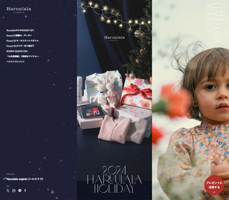
固定ナビ、縦長の商品ストーリー、子どもの写真を並べた3カラム構成。繊細な欧文タイトル、雪の装飾、紺・緑・赤の配色でホリデーの温かさを表現した特設サイト。
オリジナルサイトを見る2024 Haruulala HOLIDAY — Style Reference
A narrow holiday gift story framed by snowy slate blue and intimate childhood photography.
Original URL: haruulala.life/holiday2024 Final URL: haruulala.life/holiday2024 Theme: a winter-colored exterior, dark festive giveaway sections, and light shopping and brand sections. Inspected: September 17, 2026, 03:49:31 JST; September 16, 2026, 18:49:31 UTC, according to the supplied browser record. Viewports: desktop 1440 × 1000 and mobile 390 × 844 CSS pixels. Scope: the current holiday page, including its opening composition, desktop navigation and photographic panel, giveaway content, seasonal product links, personalization section, brand introduction, and mobile footer. Five original-page screenshots provide visual coverage of the opening, an intermediate desktop position, and the ending; rendered DOM measurements cover the longer content sequence.
Haruulala presents its holiday collection as a long, carefully composed gift story. On desktop, a narrow central column sits between a persistent navigation panel and a full-height photographic panel. The left side is quiet and spacious; the center carries the detailed narrative; the right side supplies a large emotional image. On mobile, the central story becomes the entire screen, with a small menu control above it and brand utilities moved into the footer.
The identity comes from a specific contrast: extremely fine white campaign lettering against substantial Japanese sans-serif text, dark blue fabric against soft organic cotton, and restrained interface chrome around colorful floral products. Christmas lights, gift ribbons, knitwear, and small snow-like marks establish the season without turning every interface element into an ornament.
The page currently remains available, but the giveaway is closed. Repeated gray pills read “応募は終了しました”. Product and official-site links remain in the rendered content. The reference describes this current state.
How to Read This Reference
- Measured means a value comes directly from the supplied rendered DOM or computed styles. Dimensions are CSS pixels unless stated otherwise.
- Calculated means a value is derived from those measurements, such as the relationship between the desktop content width and the mobile width.
- Estimated means a visual approximation from an original-page screenshot. Estimated hex colors are implementation targets, not sampled or source-declared values.
- Recommended means guidance for a new implementation. Breakpoints, hover effects, accessibility additions, and unverified animation choices are labeled accordingly.
- Token names below are descriptive aliases. They are not claimed to be original CSS variable names.
- The supplied evidence contains computed styles and element bounds, not a complete stylesheet, image manifest, or interaction recording. A declared transition is not proof of the exact visual effect it produces.
Tokens — Colors
Default Palette
| Name | Value | Suggested token | Evidence and role |
|---|---|---|---|
| Navigation Slate | Approximately #50596f |
--color-rail |
Estimated from the large desktop navigation panel |
| Winter Slate | Approximately #414a5a |
--color-winter |
Estimated from the mobile footer and the band beneath the hero photograph |
| Midnight Navy | #16182e |
--color-navy |
Measured background of the first giveaway section |
| Evergreen | #294c2f |
--color-green |
Measured background of the second giveaway section |
| Holiday Red | #b22423 |
--color-red |
Measured background of the third giveaway section |
| White | #ffffff |
--color-white |
Measured light sections, reversed copy, and link surfaces |
| Body Black | #000000 |
--color-text |
Measured body copy on light sections |
| Link Ink | #1b1b1b |
--color-ink |
Measured product and outlined-action link color |
| Quiet Lavender Gray | #b7b8c3 |
--color-muted-on-dark |
Measured introductory copy and supporting text in the navy section |
| Utility Gray | #9b9b9b |
--color-utility |
Measured “Official Site” and “SNS” labels |
| Campaign Gold | #ad9754 |
--color-gold |
Measured date text, “11.07-12.07” |
| Note Gray | #3c3c3c |
--color-note |
Measured giveaway notes on a light surface |
| Mobile Navigation Ink | #484848 |
--color-menu-ink |
Measured mobile navigation links; their open visual state was not captured |
| Closed-State Gray | Approximately #b5b5b5 |
--color-closed |
Estimated from the visible closed-entry pill |
| Pale Blue Gray | Approximately #e5edef |
--color-pale |
Estimated from the section below the white brand interlude |
| Fine Outline | Approximately #b9b9b9 |
--color-outline |
Estimated from the large outlined return link |
The three giveaway backgrounds provide a deliberate navy → green → red progression. They occupy whole sections, with photography and centered copy placed directly on the color field. Keep them distinct from the quieter slate used for persistent framing.
White has several roles: reversed navigation, hairline campaign lettering, clear shopping surfaces, and generous pauses between denser photographic sections. Gold is a small date accent. It is not a general button color.
The supplied custom properties include a blue --swiper-theme-color, but no visible blue interface treatment is established by the screenshots. Do not promote an unused library variable into the design palette.
Tokens — Typography
Japanese Body and Navigation
Measured computed stack: "Zen Kaku Gothic New", sans-serif.
Most narrative copy uses weight 500. Desktop navigation uses 600, while the official-site link and selected headings use 700. Normal letter spacing and a body line height of 1.5 keep the Japanese copy compact but comfortable.
Paragraphs commonly use short, intentional lines and centered alignment. Preserve the rhythm of the original copy blocks rather than stretching them into wide desktop paragraphs.
English Utilities and Dates
Measured computed stack: Alata, sans-serif.
This appears on small utility labels, the campaign date, and the mobile copyright line. Utility labels are 10px / 20px, weight 400, in both measured layouts. The campaign date is substantially larger and uses the muted gold accent.
The evidence establishes computed font-family declarations. It does not separately identify the font file used for every rendered glyph.
Brand and Campaign Lettering
The Haruulala wordmark has a serif appearance with a small, widely spaced “organic” line. The campaign title is much more delicate: elongated hairline strokes, large arcs, and overlapping letterforms arranged as “2024 / HARUULALA / HOLIDAY”.
No font name for either graphic treatment is supplied. Treat them as brand artwork unless a verified font or source asset becomes available. The empty-text H1 wrapper has a computed size of 10px, but its visible title occupies a large graphic area; that wrapper value is not the campaign lettering size.
Type Scale
Desktop measurements below refer to the 464.125px central story, except where a fixed panel is explicitly named.
| Role | Mobile | Desktop | Weight / leading | Evidence |
|---|---|---|---|---|
| Utility label | 10px |
10px |
400 / 20px |
Measured; Alata |
| Giveaway note | 10px |
11.9008px |
500 / 1.5 |
Measured |
| Supporting product copy | 14px |
16.6612px |
500 / 1.5 |
Measured |
| Product-pair caption | 14px |
16.6612px |
500 / 1.5 |
Measured |
| Main narrative copy | 16px |
19.0413px |
500 / 1.5 |
Measured |
| Prize variant details | 16px |
19.0413px |
500 / 1.3 |
Measured |
| Opening emotional copy | 18px |
21.4215px |
500 / 1.5 |
Measured |
| Main product statement | 20px |
23.8017px |
500 / 1.5 |
Measured |
| Personalization heading | 22px |
26.1818px |
700 / 1.5 |
Measured |
| Campaign date | 23px |
27.3719px |
400 / 1.5 |
Measured; Alata |
| Brand introduction heading | 16px |
19.0413px |
700 / 1.5 |
Measured |
| Official-site link | 16px |
16px |
700 / 1 |
Measured |
| Navigation link | 18px |
12.5px |
600 / 1 |
Measured; mobile open state not visually verified |
| Large pill lettering | Approximately 18px |
Approximately 20–22px |
Visually bold | Estimated; child lettering styles were not supplied |
Large and compact action wrappers themselves report 10px type. Their visible lettering may be styled by descendants or graphics. Do not copy the wrapper font size as the final label size.
Tokens — Spacing & Shapes
Content Scaling
The central story is 390px wide on mobile and 464.125px wide on desktop. Their ratio is approximately 1.1901.
Many content measurements follow this same relationship:
16pxbody copy becomes19.0413px.80pxsection spacing becomes95.2066px.- A
280pxaction becomes approximately333.219pxwide. - A
290pxcampaign title becomes approximately345.109pxwide.
For the reusable CSS, 1u is one design pixel at a 390px story width. At the inspected desktop width, 1u ≈ 1.1901px. This is a calculated adaptation, not a recovered source variable or proof of the original responsive formula.
Spacing Scale
| Use | Mobile measurement | Desktop measurement | Interpretation |
|---|---|---|---|
| Compact-link padding and gap | 8px |
9.52066px |
Small product-view links |
| Giveaway-heading side inset | 10px |
About 11.9px |
Wide heading artwork within the story |
| Large-link internal gap | 12px |
14.281px |
Label-to-arrow spacing |
| Common content inset | 20px |
About 23.8px |
Product captions and personalization text |
| Paragraph separation | 24px |
About 28.56px |
Several closing narrative paragraphs |
| Main title side inset | 50px |
About 59.5px |
Calculated from measured H1 bounds |
| Large-link outside inset | 55px |
About 65.45px |
Centers a 280u action within a 390u story |
| Large separation | 60px |
About 71.4px |
Copy-to-action gap near the ending |
| Giveaway section opening space | 80px |
95.2066px |
Measured first-section top padding |
| About section bottom padding | 100px |
71.405px |
An actual responsive exception to proportional scaling |
Desktop navigation uses a separate rhythm: a 40px left inset, 12.5px line boxes, and a 32.5px row pitch. The resulting gap between row boxes is 20px.
Shapes
| Element | Shape | Evidence |
|---|---|---|
| Main story and photographic panels | Rectangular, flush edges | Visible in all relevant captures |
| Section surfaces | Square corners | Measured section radius 0px |
| Product-pair containers | Square, adjacent halves | Measured link radius 0px |
| Large outlined actions | Full pill | Radius 60px mobile; 71.405px desktop |
| Compact product-view actions | Full pill | Same radius declarations, despite shorter height |
| Closed-entry treatment | Full gray pill | Visible screenshot; exact radius not extracted |
| Menu mark | Two short horizontal strokes | Visible on mobile |
There is no visible general card-shadow system. Separation comes from full-width color changes, photography, generous spacing, and occasional thin outlines.
Components
Desktop Navigation Panel
Role: keeps the full story index and brand utilities available while the central content advances.
At 1440px wide, the left panel occupies approximately 487.94px. Its arrangement stays in place across the three desktop captures, supporting viewport-persistent behavior.
The anatomy is:
- A white Haruulala wordmark near the upper-left corner, approximately
40pxfrom the left. - Seven short section links beginning around
y = 182px. - Small red downward arrows immediately following the link wording.
- A large area of quiet slate and snow decoration.
- Official-site and social utilities near the bottom.
The navigation links target #lead, #p01, #p02, #p03, #season, #name, and #about. These destinations are present in the rendered links. Smooth scrolling, active-section highlighting, and click behavior were not separately exercised.
Keep the arrows close to their labels. They are not right-aligned chevrons at the panel edge. The narrow text cluster and broad empty field are part of the composition.
Desktop Photographic Panel
Role: supplies an emotional companion image to the detailed product story.
The right panel begins at x ≈ 952.06px and fills the remaining 487.94px. Photography reaches every edge and uses a strong portrait crop. In the opening frame, the child's face sits toward the right edge, while the floral garment fills the lower portion.
A thin white campaign lockup sits near the upper-right corner in a vertical arrangement. Preserve its independent placement and large negative space; do not place it inside a conventional caption box.
Different captures show a child in a gray cardigan and a red gift still life. One frame contains blended imagery. This supports the presence of multiple photographic states, but does not establish whether changes are automatic, scroll-driven, or otherwise triggered.
Mobile Menu Control
Role: replaces the permanently exposed desktop index.
A small two-stroke mark appears near the upper-right corner, approximately 24px wide, with roughly 20px of right clearance for the visible strokes. It is white over the hero and black over the white ending section.
The supplied mobile captures show the closed state. Although mobile navigation elements have measured bounds and 18px dark text, those measurements do not prove that the menu was visibly open. Drawer color, opening direction, dismissal behavior, focus handling, and the method used to change icon color remain unverified.
For a new implementation, place the small visible mark inside a minimum 44 × 44px button and give it an explicit accessible name.
Opening Hero
Role: presents the full holiday collection as one composed still life.
The hero photograph is a tall, full-width image within the central column. Dark fabric, warm string lights, and a Christmas tree frame patterned gift boxes, soft rabbit toys, printed bottles, and folded pink and gray cardigans. The small Haruulala mark sits above the products.
The campaign title is placed near the bottom, crossing the boundary between the photograph and a slate-colored lower band. This overlap is a defining feature.
| Measurement | Mobile | Desktop |
|---|---|---|
| Story width | 390px |
464.125px |
| H1 graphic bounds | 290 × 143.531px |
345.109 × 170.797px |
| H1 top | 664px |
785.781px |
| H1 left, relative to story | 50px |
59.5px |
| First introductory paragraph begins | 844px |
1000px |
| Photograph-to-slate boundary | Approximately 744px |
Approximately 881px |
The first copy begins exactly at the recorded viewport bottom in both layouts. The measurements are consistent with a viewport-height opening stage. The original height formula was not supplied.
Do not enlarge the fine campaign lettering into a heavy typographic headline. Its scale is large, but its visual weight is extremely light.
Opening Copy and Giveaway Introduction
Role: connects the product still life to the seasonal gift message and campaign details.
The introduction uses centered, short-line copy. Muted lavender-gray text introduces the organic cotton babywear; larger white text describes a first Christmas together. The message then moves into a light giveaway introduction with the gold date and small explanatory notes.
The first giveaway introduction occupies approximately 646.38px vertically on mobile and 768.81px on desktop. Its sequence is heading artwork, invitation copy, date, closed-entry status, and two small notes.
The surviving invitation copy and date are part of the current page, but the visible closed status takes precedence. Do not infer that entries are available because introductory wording still invites participation.
Giveaway Chapter
Role: gives each limited item a distinct, immersive presentation.
The three chapters are:
| Chapter | Surface | Content evidenced in the rendered page |
|---|---|---|
| Present 01 | Midnight Navy | Embroidered cardigan, organic cotton description, gray and pink variants, size and recipient counts |
| Present 02 | Evergreen | Patterned 500ml thermal bottles, practical description, navy and white variants, recipient counts |
| Present 03 | Holiday Red | Patterned holiday origami set, quantity information, recipient count |
Each chapter combines a broad heading area, generous product imagery, a smaller supporting statement, a larger centered product statement, variant information, and a repeated closed-entry pill.
The first two chapters place variant text in alternating horizontal positions rather than a uniform list. On mobile, cardigan details appear around x = 228.59px and x = 20px; bottle details appear around x = 60px and x = 222.48px. Preserve this composed relationship between imagery and labels.
The supplied section rectangles overlap vertically by 190px on mobile and approximately 226.11px on desktop. This is measured geometry, not evidence for a particular negative-margin, clipping, or decorative-transition implementation. Inspect transition artwork before reproducing that overlap.
Closed-Entry Pill
Role: communicates the current campaign state.
The visible control-like shape has a medium-gray fill, bold white “応募は終了しました” lettering, and a small white right arrow. In the desktop intermediate capture it is approximately 334 × 72px, closely matching the large-action proportions elsewhere.
The supplied link list contains no giveaway application destination. Whether the original markup formally disables an interactive element is not established. In a new implementation, expose this as an unavailable status rather than a working application link, and ensure the text remains readable.
Brand Interlude
Role: creates a pause between the giveaway chapters and the shopping story.
After the red section, a tall white field centers the Haruulala wordmark with substantial space around it. In the supplied intermediate desktop frame, this white region is approximately 410px high. A narrow dark slate separator follows, then a pale blue-gray section with a red gift photograph.
This is a visual reset, not a card. Preserve the uninterrupted white surface and the small scale of the centered logo.
Seasonal Editorial Feature
Role: introduces recommended gifts through photography and compact editorial text.
The DOM shows three substantial feature sections for gift sets, coordinated blouses, and sleepers. Each contains a product-view link, a tall heading block, and a separate copy block.
Their composition alternates sides. On mobile, heading blocks appear at x = 276px, then x = 50px, then x = 276px, each approximately 64px wide. Copy occupies the opposite side. The unusually tall, narrow bounds are consistent with vertical editorial typography or graphic text, but neither writing-mode declarations nor a screenshot of these exact blocks was supplied. Verify the setting before recreating it.
Compact white links reading “このアイテムを見る” sit toward one side of the feature image. Their measured bounds are 158 × 30px on mobile and approximately 188.03 × 35.31px on desktop, with an 8u internal gap and padding.
Paired Product Links
Role: offers two concrete shopping choices inside the seasonal story.
The pair remains two columns in both measured layouts. Each mobile link occupies 195px, exactly half the story width; each desktop link occupies 232.0625px.
The mobile link bounds are 195 × 336px. Product captions are inset 20px, use 14px / 21px medium-weight text, and wrap over three lines. The rendered prices are ¥10,450 and ¥10,010, followed by tax notation.
The caption begins 215px below the link's top, which is consistent with a square image and a small gap, but the image rectangle itself was not supplied. Keep image proportions flexible until the actual asset is available.
Use a flush two-column arrangement with square corners. Avoid enclosing each item in a raised, rounded card.
Personalization Section
Role: connects a practical embroidery service to the emotional meaning of a child's name.
The section begins with a photographic area carrying the white heading “「お名前刺繍」で特別なアイテムへ”. Its measured mobile heading is 22px / 33px, weight 700, positioned 30px from the left edge.
The following white area contains centered 16px / 24px copy with a 20px horizontal inset, a shorter closing message, and a large outlined link reading “アイテムをチェック”. The link points to the gift-set category in the supplied DOM.
The action measures 280 × 60px on mobile and approximately 333.219 × 71.016px on desktop. It has a fine gray outline, dark lettering, and a small red arrow.
Brand Introduction and Return Link
Role: closes the story with brand values and a route to the main website.
The ending combines a photographic montage, an organic-looking emblem and wordmark, a bold brand heading, and centered paragraphs on white. Broad gaps separate the statements about children, the future, and the earth.
The heading uses the same size as the body, but weight 700 instead of 500. Hierarchy comes from spacing and weight rather than a large heading scale.
The final “TOPページはこちら” link repeats the large outlined-action pattern and points to https://haruulala.life/. In the mobile layout, the section leaves 100px below this action before the footer begins. The desktop section has a smaller measured bottom padding of approximately 71.4px.
Mobile Footer
Role: restores the brand utilities that were persistently visible on desktop.
The footer uses dark winter slate with snow-like decoration. It contains the white wordmark, “Official Site”, the bold official-site link, “SNS”, four social marks, and a small right-aligned copyright line.
The footer begins at document position y ≈ 14185.61px; the document ends at 14518.67px. Its calculated height is approximately 333.06px. Utility text begins at x = 42px, distinct from the central story's usual 20px inset.
The rendered links include X, Instagram, Facebook, and LINE. Verify the mapping between each visible icon, destination, and accessible name when implementing them; the extracted link order alone is not a visual icon mapping.
Tokens — Motion & Interaction
| Treatment | Evidence | What can be stated |
|---|---|---|
| Navigation and product-link transitions | Computed 0.3s |
A transition duration is defined; hover properties and end states were not supplied |
| Campaign H1 entrance | Computed 1s 0.8s |
A one-second transition with a 0.8-second delay is declared; exact property and initial state are unknown |
| Other sampled text and sections | Mostly animation: none |
No keyframe animation is reported on those sampled elements |
| Right-panel image changes | Different photographs and one blended frame | Multiple image states exist; a crossfade is plausible but its trigger and timing are unverified |
| Snow decoration | Visible flakes and soft specks | Decorative texture is established; speed, direction, particle count, and animation mechanism are not measured |
| Section navigation | Seven fragment destinations | In-page targets exist; smooth-scroll behavior and active-link tracking are unverified |
| Mobile menu | Closed control visible; navigation nodes measured | Open-state behavior and keyboard handling are unverified |
| Shopping actions | Product/category URLs in DOM | Destination addresses are evidenced; destination pages were not inspected |
The global variables --animate-duration: 1s, --animate-delay: 1s, and --animate-repeat: 1 are present. Their presence does not establish that every section uses those settings. Similarly, a computed transition property of all without a supplied duration is not evidence of a visible animation.
For a new implementation, keep movement secondary to photography and text. A slow decorative drift or quiet image dissolve would be a recommendation, not a measured reproduction. Retain readable static states and disable nonessential movement when reduced motion is requested.
Surfaces
| Layer | Appearance | Purpose |
|---|---|---|
| Desktop navigation | Muted slate with sparse snow-like texture | Persistent orientation and brand links |
| Hero base and mobile footer | Darker winter slate | Connects the opening and ending |
| Right photographic panel | Edge-to-edge portrait photography | Emotional scale and seasonal atmosphere |
| Giveaway chapters | Solid navy, green, and red | Distinguishes the three gifts |
| Brand interlude | Clear white field | Creates a deliberate pause |
| Seasonal introduction | Pale blue-gray surface | Softens the transition toward shopping content |
| Personalization and brand copy | White with black text | Supports longer reading |
| Shopping link | White pill, dark lettering, small arrow | Compact route to product details |
| Closing action | White pill with a fine gray outline and red arrow | Larger, quieter destination link |
| Closed-entry status | Gray pill with white lettering | Communicates campaign closure |
Photography can contain natural shadows, light bloom, and soft focus. These are image characteristics, not evidence for UI box shadows or glass effects.
Imagery
The central hero is a composed holiday still life, while the right panel uses close, natural portraits of young children. The combination lets product detail and family emotion coexist without crowding the narrow reading column.
Key image characteristics:
- Deep navy cloth, warm fairy lights, dark greenery, and metallic ornaments establish the opening scene.
- Floral wrapping and garments provide most of the multicolor detail.
- Soft rabbit toys, blush knitwear, gray knitwear, and organic cotton create a tactile impression.
- Red ribbons and red tabletop photography supply strong seasonal accents.
- Child portraits use shallow depth of field and close crops. Facial detail and garment pattern remain more prominent than the background.
- White brand pauses and tiny snow marks balance the photographic density.
The large right-side crop is intentionally different from a product catalog thumbnail. On desktop, a face can approach or pass the viewport edge. The central product imagery should preserve the important gift arrangement instead of applying the same aggressive crop everywhere.
Observed Asset References
No image source URLs, original filenames, intrinsic dimensions, or file formats were included in the supplied evidence. The references below identify visible assets and their roles without inventing download paths.
| Visual asset | Where observed | Reuse guidance |
|---|---|---|
| Holiday collection still life | Desktop and mobile opening | Preserve the tall composition, dark cloth, lights, and layered gifts |
| Main campaign title artwork | Opening H1 area | Keep fine white strokes and the overlap across the image boundary |
| Haruulala wordmark | Navigation, hero, white interlude, mobile footer | Use verified brand artwork in the appropriate light or dark version |
| Child in floral clothing | Opening right panel | Use a full-height portrait crop with the subject toward the right |
| Child in gray cardigan | Intermediate desktop right panel | Preserve soft lighting and the intimate crop |
| Red gift still life | Lower desktop content and right-panel state | Keep floral packaging and ribbon as focal details |
| Photo montage and organic emblem | Brand introduction | Preserve their relationship to the centered brand heading |
| Snow-like texture | Desktop left panel and mobile footer | Keep low contrast and avoid obscuring labels |
| Social marks | Desktop utilities and mobile footer | Use recognizable brand marks and verified destinations |
Use authorized photography and brand graphics when available. CSS can reproduce the spatial system, but generic product images will not recreate the distinctive composition.
Layout & Responsive Behavior
Desktop Structure
At 1440 × 1000, the page divides into three contiguous vertical regions:
| Region | Start x | Width | Share of viewport |
|---|---|---|---|
| Left navigation | 0px |
Approximately 487.94px |
Approximately 33.88% |
| Central story | 487.9375px |
464.125px |
Approximately 32.23% |
| Right photography | 952.0625px |
Approximately 487.94px |
Approximately 33.88% |
There are no visible gutters between them. The central column remains narrow throughout the story, including shopping and brand content. It does not expand into a conventional wide desktop catalog.
The outer panels retain their viewport placement across the desktop captures while the middle content changes. This supports a fixed-panel implementation, although the panels' actual position declarations were not included in the extracted elements.
The measured document height is 16791.109px. The page is a long scrolling document, not a single-screen application with a short internal feed.
Mobile Structure
At 390 × 844, the central story occupies the full 390px width. The desktop side panels are absent from the visible layout. The top-right menu control persists across the supplied opening and ending views, and brand utilities appear in the bottom footer.
The measured document height is 14518.672px. The two product links remain side by side at 195px each. Large actions remain 280px wide, with 55px on either side.
Typography and central spacing are generally smaller than desktop by the same factor as the story width. Navigation behaves differently: its computed mobile labels are larger than desktop labels, reflecting a separate menu treatment.
Limits of Responsive Evidence
Only the 1440px and 390px widths were supplied. The exact breakpoint, tablet composition, landscape behavior, safe-area handling, and width formula are unknown.
For a new implementation, a breakpoint near 1024px is a reasonable starting point for introducing the two fixed panels. The Quick Start uses a recommended bounded desktop story width that matches the observed 1440px layout. Test intermediate widths rather than treating this adaptation as recovered source CSS.
Do not scale the entire desktop interface as a single unit. The central narrative scales proportionally, while the desktop rail inset, utility labels, and official-site link use their own measured sizes.
Do’s and Don’ts
Do
- Preserve the three-part desktop composition and the narrow central story.
- Let the central story fill the mobile viewport.
- Use the measured navy, green, and red for the giveaway chapters.
- Keep Japanese copy substantial and readable beside delicate campaign artwork.
- Preserve the title's overlap between the hero photograph and slate band.
- Use short centered paragraphs with intentional line breaks.
- Give photography generous uninterrupted space.
- Maintain square image and section edges, reserving rounded shapes for action pills.
- Keep arrows small and close to their labels.
- Represent the current giveaway as closed while retaining ordinary shopping links.
- Move brand utilities into a textured mobile footer.
Don’t
- Don’t turn the desktop layout into a wide hero followed by a generic card grid.
- Don’t infer the campaign display font from a
10pxH1 wrapper. - Don’t assign an invented font name to the brand or campaign lettering.
- Don’t replace the quiet slate frame with the brighter colors found inside product photographs.
- Don’t use gold as a general CTA fill; its measured role is the campaign date.
- Don’t apply the same crop strategy to the hero still life and the right-side portraits.
- Don’t invent a working entry form for a closed campaign.
- Don’t claim exact snowfall timing, automatic slides, or scroll-linked transitions without additional evidence.
- Don’t reproduce section overlap from bounding boxes alone when its visual transition assets are unavailable.
Recommended Implementation Additions
These are recommendations for a new implementation, not verified features of the inspected page:
- Give the graphic H1 a meaningful text alternative. Keep decorative repetitions of the campaign title out of the accessibility tree.
- Implement the mobile menu as a named button with
aria-expandedandaria-controls; provide keyboard operation and appropriate focus handling for the chosen menu pattern. - Preserve a minimum
44pxtouch target around the small menu mark and compact product links. - Add visible focus outlines that remain clear on both dark photography and white sections.
- Treat closed-entry content as a readable unavailable status. Check its text contrast rather than assuming disabled styling makes contrast irrelevant.
- Verify social icon labels and destinations individually.
- Keep snow and other decorative layers noninteractive with
pointer-events: none. - Provide a static reduced-motion state for decorative movement and photographic transitions.
- Reserve image dimensions to prevent the long story from shifting during loading. Prioritize the opening hero and load distant imagery progressively.
- Test Japanese line wrapping at narrower widths, enlarged text settings, and intermediate tablet sizes. Avoid making essential body text smaller solely to preserve a photograph's proportions.
Agent Prompt Guide
Quick Color Reference
- Desktop navigation: approximately
#50596f. - Hero lower band and mobile footer: approximately
#414a5a. - Giveaway chapters:
#16182e,#294c2f, and#b22423. - Reading sections: white with black or
#1b1b1btext. - Secondary text on dark:
#b7b8c3. - Small utility labels:
#9b9b9b. - Campaign date:
#ad9754. - Large destination link: white pill, fine gray outline, dark lettering, small red arrow.
- Closed campaign status: gray pill; preserve the unavailable state.
Overall Prompt
“Create a Japanese holiday collection page for an organic baby and children's clothing brand. At a 1440px desktop viewport, place a roughly 464px scrolling story between two roughly 488px persistent side panels. Use a muted slate navigation panel on the left and full-height child photography on the right. Begin the story with a dark holiday still life containing warm string lights, floral gift boxes, soft toys, and knitwear. Overlay extremely fine white campaign artwork across the photograph's lower edge into a slate band. Use Zen Kaku Gothic New for Japanese copy and Alata for small English utilities and dates. Continue through navy, evergreen, and holiday-red gift sections, then light editorial shopping and brand sections. Keep imagery square-edged, copy centered, and actions pill-shaped. On mobile, show only the full-width story, a small accessible menu control, and a slate footer. The giveaway is closed; shopping links remain available. Treat decorative motion as optional and support a static state.”
Example Component Prompts
- Desktop frame: “Build three flush vertical regions with no gutters. Use a 464px story at a 1440px viewport, equal side regions, a left index with a 40px inset, and right-side portrait photography. Keep the index near the upper-left and brand utilities near the lower-left.”
- Hero: “Compose a portrait holiday still life on dark blue fabric. Position fine white campaign lettering across the image-to-slate boundary, approximately 290px wide in a 390px story. Keep the large title visually light and preserve the product arrangement.”
- Giveaway chapter: “Use one uninterrupted festive background color, generous vertical spacing, centered Japanese copy, large product imagery, and variant labels arranged beside their products. End with a gray unavailable-status pill reading ‘応募は終了しました’.”
- Shopping pair: “Place two square-edged product links side by side inside a narrow story. At 390px, each occupies 195px. Use compact medium-weight Japanese captions with 20px side insets, followed by price and tax notation. Keep the surface flat.”
- Closing section: “Create a spacious white brand statement with a modest bold heading, centered 16px/24px Japanese paragraphs, and a 280px by 60px outlined return link with a small red arrow. Follow it with a dark slate footer carrying the wordmark, official-site link, and social marks.”
Quick Start
CSS Custom Properties
This is a reusable adaptation, not the original stylesheet. It matches the supplied viewport proportions while retaining a conventional root font size. The 1024px breakpoint, desktop width bounds, label-size approximations, hover opacity, and accessibility treatments are recommendations.
Expected structure: .story contains .hero, giveaway .chapter sections, shopping content, .about, and .mobile-footer. The .site-rail and .portrait-rail are sibling panels. Use real links and authorized assets. The menu behavior, image sequencing, snow artwork, and overlapping chapter transitions require separate implementation.
:root {
  /* Measured content colors */
  --color-navy: #16182e;
  --color-green: #294c2f;
  --color-red: #b22423;
  --color-white: #ffffff;
  --color-text: #000000;
  --color-ink: #1b1b1b;
  --color-muted-on-dark: #b7b8c3;
  --color-utility: #9b9b9b;
  --color-gold: #ad9754;
  --color-note: #3c3c3c;

  /* Screenshot estimates */
  --color-rail: #50596f;
  --color-winter: #414a5a;
  --color-pale: #e5edef;
  --color-closed: #b5b5b5;
  --color-outline: #b9b9b9;

  /* Computed font stacks; font files must be supplied separately */
  --font-body: 'Zen Kaku Gothic New', sans-serif;
  --font-utility: Alata, sans-serif;

  /* Calculated adaptation based on the 390px story */
  --story-width: 100vw;
  --u: calc(var(--story-width) / 390);
  --wing-width: calc((100vw - var(--story-width)) / 2);

  --text-small: calc(14 * var(--u));
  --text-body: calc(16 * var(--u));
  --text-lead: calc(18 * var(--u));
  --text-product: calc(20 * var(--u));
  --text-heading: calc(22 * var(--u));
  --text-date: calc(23 * var(--u));
  --space-inset: calc(20 * var(--u));
  --space-paragraph: calc(24 * var(--u));
  --space-section: calc(80 * var(--u));
  --radius-pill: 999px;
  --duration-link: 300ms;
}

* {
  box-sizing: border-box;
}

body.holiday-page {
  margin: 0;
  color: var(--color-text);
  background: var(--color-winter);
  font-family: var(--font-body);
  font-size: var(--text-body);
  font-weight: 500;
  line-height: 1.5;
}

.story {
  position: relative;
  width: var(--story-width);
  margin-inline: auto;
  background: var(--color-white);
}

.story img {
  display: block;
  max-width: 100%;
}

.site-rail,
.portrait-rail {
  display: none;
}

.hero {
  position: relative;
  height: 100vh;
  height: 100svh;
  background: var(--color-winter);
}

.hero__photo {
  position: absolute;
  inset: 0 0 auto;
  width: 100%;
  height: calc(100% - 100 * var(--u));
  object-fit: cover;
  object-position: center;
}

.hero__title {
  position: absolute;
  top: calc(100% - 180 * var(--u));
  left: 50%;
  width: calc(290 * var(--u));
  margin: 0;
  transform: translateX(-50%);
}

.hero__title img {
  width: 100%;
  height: auto;
}

.copy {
  margin: 0;
  padding-inline: var(--space-inset);
  font-size: var(--text-body);
  line-height: 1.5;
  text-align: center;
}

.copy + .copy {
  margin-top: var(--space-paragraph);
}

.copy--lead {
  font-size: var(--text-lead);
}

.copy--muted {
  color: var(--color-muted-on-dark);
}

.chapter {
  position: relative;
  padding-block: var(--space-section);
  color: var(--color-white);
}

.chapter--navy { background: var(--color-navy); }
.chapter--green { background: var(--color-green); }
.chapter--red { background: var(--color-red); }

.chapter__support {
  font-size: var(--text-small);
  line-height: 1.5;
  text-align: center;
}

.chapter__statement {
  font-size: var(--text-product);
  line-height: 1.5;
  text-align: center;
}

.campaign-date {
  color: var(--color-gold);
  font-family: var(--font-utility);
  font-size: var(--text-date);
  font-weight: 400;
  line-height: 1.5;
  text-align: center;
}

.pill,
.campaign-status {
  display: flex;
  align-items: center;
  justify-content: center;
  gap: calc(12 * var(--u));
  width: calc(280 * var(--u));
  max-width: calc(100% - 40 * var(--u));
  height: calc(60 * var(--u));
  margin-inline: auto;
  padding-inline: calc(21 * var(--u));
  border-radius: var(--radius-pill);
  font-family: var(--font-body);
  /* Recommended approximation of the visible label size */
  font-size: calc(18 * var(--u));
  font-weight: 700;
  line-height: 1.2;
  text-align: center;
}

.pill {
  position: relative;
  border: 1px solid var(--color-outline);
  color: var(--color-ink);
  background: var(--color-white);
  text-decoration: none;
  transition: opacity var(--duration-link);
}

.pill__arrow {
  flex: none;
  color: var(--color-red);
  font-weight: 400;
}

.pill--compact {
  width: calc(158 * var(--u));
  height: calc(30 * var(--u));
  gap: calc(8 * var(--u));
  border-color: transparent;
  font-size: calc(12 * var(--u));
}

/* Recommended extra touch area around the small visible pill */
.pill--compact::after {
  position: absolute;
  inset: -7px 0;
  content: '';
}

.campaign-status {
  border: 0;
  background: var(--color-closed);
  /* Recommended contrast improvement; the capture uses white text */
  color: var(--color-ink);
}

.product-pair {
  display: grid;
  grid-template-columns: repeat(2, minmax(0, 1fr));
}

.product-link {
  min-width: 0;
  color: var(--color-ink);
  text-decoration: none;
}

.product-link img {
  width: 100%;
  height: auto;
}

.product-link__caption {
  margin: var(--space-inset) 0 0;
  padding-inline: var(--space-inset);
  font-size: var(--text-small);
  line-height: 1.5;
}

.about {
  padding-bottom: calc(100 * var(--u));
  background: var(--color-white);
  text-align: center;
}

.about__heading {
  font-size: var(--text-body);
  font-weight: 700;
  line-height: 1.5;
}

.about .pill {
  margin-top: calc(60 * var(--u));
}

.mobile-footer {
  position: relative;
  padding: 90px 20px 22px 42px;
  color: var(--color-white);
  background: var(--color-winter);
}

.utility-label {
  margin: 0;
  color: var(--color-utility);
  font: 400 10px / 20px var(--font-utility);
}

.official-link {
  color: inherit;
  font-size: 16px;
  font-weight: 700;
  line-height: 1;
  text-decoration: none;
}

.snow-decoration {
  position: absolute;
  inset: 0;
  overflow: hidden;
  pointer-events: none;
}

/* The visual mark sits inside a recommended 44px target. */
.mobile-menu-toggle {
  position: fixed;
  z-index: 30;
  top: 14px;
  right: 10px;
  display: flex;
  flex-direction: column;
  align-items: center;
  justify-content: center;
  gap: 6px;
  width: 44px;
  height: 44px;
  padding: 0;
  border: 0;
  color: var(--color-text);
  background: transparent;
  cursor: pointer;
}

.mobile-menu-toggle::before,
.mobile-menu-toggle::after {
  width: 24px;
  height: 3px;
  background: currentColor;
  content: '';
}

/* Apply through the chosen section-contrast behavior. */
.mobile-menu-toggle.on-dark {
  color: var(--color-white);
}

.holiday-page :focus-visible {
  outline: 2px solid currentColor;
  outline-offset: 4px;
}

/* Recommended hover effect; only the duration is source-measured. */
@media (hover: hover) {
  .pill:hover,
  .product-link:hover {
    opacity: 0.78;
  }
}

/* Recommended breakpoint and bounds; matches the captured desktop. */
@media (min-width: 1024px) {
  :root {
    --story-width: clamp(390px, 32.231vw, 520px);
  }

  .site-rail {
    position: fixed;
    inset: 0 auto 0 0;
    display: flex;
    flex-direction: column;
    width: var(--wing-width);
    padding: 40px;
    color: var(--color-white);
    background: var(--color-rail);
  }

  .rail-logo {
    display: block;
    width: 152px;
    max-width: 100%;
    height: auto;
  }

  .rail-nav {
    display: grid;
    gap: 20px;
    margin-top: 100px;
  }

  .rail-nav a {
    display: flex;
    align-items: center;
    gap: 8px;
    color: inherit;
    font-size: 12.5px;
    font-weight: 600;
    line-height: 1;
    text-decoration: none;
    transition: opacity var(--duration-link);
  }

  .rail-nav__arrow {
    color: var(--color-red);
  }

  .rail-utilities {
    margin-top: auto;
  }

  .portrait-rail {
    position: fixed;
    inset: 0 0 0 auto;
    display: block;
    width: var(--wing-width);
    overflow: hidden;
    background: var(--color-winter);
  }

  .portrait-rail__photo {
    width: 100%;
    height: 100%;
    object-fit: cover;
  }

  .portrait-rail__title {
    position: absolute;
    top: 20px;
    right: 18px;
    width: 124px;
    height: auto;
  }

  .about {
    padding-bottom: calc(60 * var(--u));
  }

  .mobile-menu-toggle,
  .mobile-footer {
    display: none;
  }
}

@media (prefers-reduced-motion: reduce) {
  html {
    scroll-behavior: auto;
  }

  .holiday-page *,
  .holiday-page *::before,
  .holiday-page *::after {
    animation: none !important;
    transition-duration: 0s !important;
  }
}
The CSS deliberately does not manufacture a campaign font or assume a snow/slideshow mechanism. Supply the graphic title with an accessible heading alternative, confirm whether a hero asset already contains the small brand mark, and connect the mobile control to a complete navigation implementation.
Tailwind v4 Token Mapping
Optional aliases for a project already using Tailwind v4. This is not evidence that the original site uses Tailwind. Define the properties above before using these mappings.
@theme inline {
  --color-holiday-rail: var(--color-rail);
  --color-holiday-winter: var(--color-winter);
  --color-holiday-navy: var(--color-navy);
  --color-holiday-green: var(--color-green);
  --color-holiday-red: var(--color-red);
  --color-holiday-gold: var(--color-gold);
  --color-holiday-ink: var(--color-ink);
  --color-holiday-muted: var(--color-muted-on-dark);

  --font-holiday: var(--font-body);
  --font-holiday-utility: var(--font-utility);

  --text-holiday-small: var(--text-small);
  --text-holiday-body: var(--text-body);
  --text-holiday-lead: var(--text-lead);
  --text-holiday-product: var(--text-product);
  --text-holiday-heading: var(--text-heading);

  --spacing-holiday-inset: var(--space-inset);
  --spacing-holiday-section: var(--space-section);
  --spacing-holiday-story: var(--story-width);
  --radius-holiday-pill: 999px;
}
Sources & Evidence
- Original and final page: 2024 Haruulala HOLIDAY. The supplied browser record reports HTTP
200, the same original and final URL, and the title “2024 Haruulala HOLIDAY | Haruulala organic”. - Capture date: September 16, 2026,
18:49:31 UTC, equivalent to September 17, 2026,03:49:31 JST. Individual screenshot timestamps were not provided. - Desktop evidence: three original-page screenshots at
1440 × 1000, plus rendered text, links, computed styles, and element rectangles. Measured document height:16791.109375px. - Mobile evidence: two original-page screenshots at
390 × 844, plus corresponding rendered DOM evidence. Measured document height:14518.671875px. - Interaction scope: initial observation and scrolling through intermediate positions were reported. Menu opening, link activation, keyboard navigation, hover states, and slideshow controls were not documented as exercised.
- Capture readiness: the provided procedure waited for document loading, image decoding, finite animation settling, and sampled layout/text stability within bounded time limits. Perpetual animation was paused for readiness checks and resumed. These checks do not prove that every delayed state or animation was observed.
- Inspection limitations: no complete stylesheet, asset manifest, image source paths, menu-open capture, or temporal motion recording was supplied. SharedWorkers and service workers were disabled during the inspection. Product URLs and the official-site destination were observed as links; their destination pages were not separately analyzed.
This reference is based on the supplied current-page inspection artifacts. Exact values, visual estimates, calculated proportions, and implementation recommendations are distinguished throughout.
# 2024 Haruulala HOLIDAY — Style Reference

> A narrow holiday gift story framed by snowy slate blue and intimate childhood photography.

**Original URL:** [haruulala.life/holiday2024](https://haruulala.life/holiday2024/)
**Final URL:** [haruulala.life/holiday2024](https://haruulala.life/holiday2024/)
**Theme:** a winter-colored exterior, dark festive giveaway sections, and light shopping and brand sections.
**Inspected:** September 17, 2026, 03:49:31 JST; September 16, 2026, 18:49:31 UTC, according to the supplied browser record.
**Viewports:** desktop 1440 × 1000 and mobile 390 × 844 CSS pixels.
**Scope:** the current holiday page, including its opening composition, desktop navigation and photographic panel, giveaway content, seasonal product links, personalization section, brand introduction, and mobile footer. Five original-page screenshots provide visual coverage of the opening, an intermediate desktop position, and the ending; rendered DOM measurements cover the longer content sequence.

Haruulala presents its holiday collection as a long, carefully composed gift story. On desktop, a narrow central column sits between a persistent navigation panel and a full-height photographic panel. The left side is quiet and spacious; the center carries the detailed narrative; the right side supplies a large emotional image. On mobile, the central story becomes the entire screen, with a small menu control above it and brand utilities moved into the footer.

The identity comes from a specific contrast: extremely fine white campaign lettering against substantial Japanese sans-serif text, dark blue fabric against soft organic cotton, and restrained interface chrome around colorful floral products. Christmas lights, gift ribbons, knitwear, and small snow-like marks establish the season without turning every interface element into an ornament.

The page currently remains available, but the giveaway is closed. Repeated gray pills read “応募は終了しました”. Product and official-site links remain in the rendered content. The reference describes this current state.

## How to Read This Reference

- **Measured** means a value comes directly from the supplied rendered DOM or computed styles. Dimensions are CSS pixels unless stated otherwise.
- **Calculated** means a value is derived from those measurements, such as the relationship between the desktop content width and the mobile width.
- **Estimated** means a visual approximation from an original-page screenshot. Estimated hex colors are implementation targets, not sampled or source-declared values.
- **Recommended** means guidance for a new implementation. Breakpoints, hover effects, accessibility additions, and unverified animation choices are labeled accordingly.
- Token names below are descriptive aliases. They are not claimed to be original CSS variable names.
- The supplied evidence contains computed styles and element bounds, not a complete stylesheet, image manifest, or interaction recording. A declared transition is not proof of the exact visual effect it produces.

## Tokens — Colors

### Default Palette

| Name | Value | Suggested token | Evidence and role |
| --- | --- | --- | --- |
| Navigation Slate | Approximately `#50596f` | `--color-rail` | Estimated from the large desktop navigation panel |
| Winter Slate | Approximately `#414a5a` | `--color-winter` | Estimated from the mobile footer and the band beneath the hero photograph |
| Midnight Navy | `#16182e` | `--color-navy` | Measured background of the first giveaway section |
| Evergreen | `#294c2f` | `--color-green` | Measured background of the second giveaway section |
| Holiday Red | `#b22423` | `--color-red` | Measured background of the third giveaway section |
| White | `#ffffff` | `--color-white` | Measured light sections, reversed copy, and link surfaces |
| Body Black | `#000000` | `--color-text` | Measured body copy on light sections |
| Link Ink | `#1b1b1b` | `--color-ink` | Measured product and outlined-action link color |
| Quiet Lavender Gray | `#b7b8c3` | `--color-muted-on-dark` | Measured introductory copy and supporting text in the navy section |
| Utility Gray | `#9b9b9b` | `--color-utility` | Measured “Official Site” and “SNS” labels |
| Campaign Gold | `#ad9754` | `--color-gold` | Measured date text, “11.07-12.07” |
| Note Gray | `#3c3c3c` | `--color-note` | Measured giveaway notes on a light surface |
| Mobile Navigation Ink | `#484848` | `--color-menu-ink` | Measured mobile navigation links; their open visual state was not captured |
| Closed-State Gray | Approximately `#b5b5b5` | `--color-closed` | Estimated from the visible closed-entry pill |
| Pale Blue Gray | Approximately `#e5edef` | `--color-pale` | Estimated from the section below the white brand interlude |
| Fine Outline | Approximately `#b9b9b9` | `--color-outline` | Estimated from the large outlined return link |

The three giveaway backgrounds provide a deliberate navy → green → red progression. They occupy whole sections, with photography and centered copy placed directly on the color field. Keep them distinct from the quieter slate used for persistent framing.

White has several roles: reversed navigation, hairline campaign lettering, clear shopping surfaces, and generous pauses between denser photographic sections. Gold is a small date accent. It is not a general button color.

The supplied custom properties include a blue `--swiper-theme-color`, but no visible blue interface treatment is established by the screenshots. Do not promote an unused library variable into the design palette.

## Tokens — Typography

### Japanese Body and Navigation

**Measured computed stack:** `"Zen Kaku Gothic New", sans-serif`.

Most narrative copy uses weight `500`. Desktop navigation uses `600`, while the official-site link and selected headings use `700`. Normal letter spacing and a body line height of `1.5` keep the Japanese copy compact but comfortable.

Paragraphs commonly use short, intentional lines and centered alignment. Preserve the rhythm of the original copy blocks rather than stretching them into wide desktop paragraphs.

### English Utilities and Dates

**Measured computed stack:** `Alata, sans-serif`.

This appears on small utility labels, the campaign date, and the mobile copyright line. Utility labels are `10px / 20px`, weight `400`, in both measured layouts. The campaign date is substantially larger and uses the muted gold accent.

The evidence establishes computed font-family declarations. It does not separately identify the font file used for every rendered glyph.

### Brand and Campaign Lettering

The Haruulala wordmark has a serif appearance with a small, widely spaced “organic” line. The campaign title is much more delicate: elongated hairline strokes, large arcs, and overlapping letterforms arranged as “2024 / HARUULALA / HOLIDAY”.

No font name for either graphic treatment is supplied. Treat them as brand artwork unless a verified font or source asset becomes available. The empty-text H1 wrapper has a computed size of `10px`, but its visible title occupies a large graphic area; that wrapper value is not the campaign lettering size.

### Type Scale

Desktop measurements below refer to the 464.125px central story, except where a fixed panel is explicitly named.

| Role | Mobile | Desktop | Weight / leading | Evidence |
| --- | --- | --- | --- | --- |
| Utility label | `10px` | `10px` | `400 / 20px` | Measured; Alata |
| Giveaway note | `10px` | `11.9008px` | `500 / 1.5` | Measured |
| Supporting product copy | `14px` | `16.6612px` | `500 / 1.5` | Measured |
| Product-pair caption | `14px` | `16.6612px` | `500 / 1.5` | Measured |
| Main narrative copy | `16px` | `19.0413px` | `500 / 1.5` | Measured |
| Prize variant details | `16px` | `19.0413px` | `500 / 1.3` | Measured |
| Opening emotional copy | `18px` | `21.4215px` | `500 / 1.5` | Measured |
| Main product statement | `20px` | `23.8017px` | `500 / 1.5` | Measured |
| Personalization heading | `22px` | `26.1818px` | `700 / 1.5` | Measured |
| Campaign date | `23px` | `27.3719px` | `400 / 1.5` | Measured; Alata |
| Brand introduction heading | `16px` | `19.0413px` | `700 / 1.5` | Measured |
| Official-site link | `16px` | `16px` | `700 / 1` | Measured |
| Navigation link | `18px` | `12.5px` | `600 / 1` | Measured; mobile open state not visually verified |
| Large pill lettering | Approximately `18px` | Approximately `20–22px` | Visually bold | Estimated; child lettering styles were not supplied |

Large and compact action wrappers themselves report `10px` type. Their visible lettering may be styled by descendants or graphics. Do not copy the wrapper font size as the final label size.

## Tokens — Spacing & Shapes

### Content Scaling

The central story is `390px` wide on mobile and `464.125px` wide on desktop. Their ratio is approximately `1.1901`.

Many content measurements follow this same relationship:

- `16px` body copy becomes `19.0413px`.
- `80px` section spacing becomes `95.2066px`.
- A `280px` action becomes approximately `333.219px` wide.
- A `290px` campaign title becomes approximately `345.109px` wide.

For the reusable CSS, **1u is one design pixel at a 390px story width**. At the inspected desktop width, `1u ≈ 1.1901px`. This is a calculated adaptation, not a recovered source variable or proof of the original responsive formula.

### Spacing Scale

| Use | Mobile measurement | Desktop measurement | Interpretation |
| --- | --- | --- | --- |
| Compact-link padding and gap | `8px` | `9.52066px` | Small product-view links |
| Giveaway-heading side inset | `10px` | About `11.9px` | Wide heading artwork within the story |
| Large-link internal gap | `12px` | `14.281px` | Label-to-arrow spacing |
| Common content inset | `20px` | About `23.8px` | Product captions and personalization text |
| Paragraph separation | `24px` | About `28.56px` | Several closing narrative paragraphs |
| Main title side inset | `50px` | About `59.5px` | Calculated from measured H1 bounds |
| Large-link outside inset | `55px` | About `65.45px` | Centers a 280u action within a 390u story |
| Large separation | `60px` | About `71.4px` | Copy-to-action gap near the ending |
| Giveaway section opening space | `80px` | `95.2066px` | Measured first-section top padding |
| About section bottom padding | `100px` | `71.405px` | An actual responsive exception to proportional scaling |

Desktop navigation uses a separate rhythm: a `40px` left inset, `12.5px` line boxes, and a `32.5px` row pitch. The resulting gap between row boxes is `20px`.

### Shapes

| Element | Shape | Evidence |
| --- | --- | --- |
| Main story and photographic panels | Rectangular, flush edges | Visible in all relevant captures |
| Section surfaces | Square corners | Measured section radius `0px` |
| Product-pair containers | Square, adjacent halves | Measured link radius `0px` |
| Large outlined actions | Full pill | Radius `60px` mobile; `71.405px` desktop |
| Compact product-view actions | Full pill | Same radius declarations, despite shorter height |
| Closed-entry treatment | Full gray pill | Visible screenshot; exact radius not extracted |
| Menu mark | Two short horizontal strokes | Visible on mobile |

There is no visible general card-shadow system. Separation comes from full-width color changes, photography, generous spacing, and occasional thin outlines.

## Components

### Desktop Navigation Panel

**Role:** keeps the full story index and brand utilities available while the central content advances.

At 1440px wide, the left panel occupies approximately `487.94px`. Its arrangement stays in place across the three desktop captures, supporting viewport-persistent behavior.

The anatomy is:

1. A white Haruulala wordmark near the upper-left corner, approximately `40px` from the left.
2. Seven short section links beginning around `y = 182px`.
3. Small red downward arrows immediately following the link wording.
4. A large area of quiet slate and snow decoration.
5. Official-site and social utilities near the bottom.

The navigation links target `#lead`, `#p01`, `#p02`, `#p03`, `#season`, `#name`, and `#about`. These destinations are present in the rendered links. Smooth scrolling, active-section highlighting, and click behavior were not separately exercised.

Keep the arrows close to their labels. They are not right-aligned chevrons at the panel edge. The narrow text cluster and broad empty field are part of the composition.

### Desktop Photographic Panel

**Role:** supplies an emotional companion image to the detailed product story.

The right panel begins at `x ≈ 952.06px` and fills the remaining `487.94px`. Photography reaches every edge and uses a strong portrait crop. In the opening frame, the child's face sits toward the right edge, while the floral garment fills the lower portion.

A thin white campaign lockup sits near the upper-right corner in a vertical arrangement. Preserve its independent placement and large negative space; do not place it inside a conventional caption box.

Different captures show a child in a gray cardigan and a red gift still life. One frame contains blended imagery. This supports the presence of multiple photographic states, but does not establish whether changes are automatic, scroll-driven, or otherwise triggered.

### Mobile Menu Control

**Role:** replaces the permanently exposed desktop index.

A small two-stroke mark appears near the upper-right corner, approximately `24px` wide, with roughly `20px` of right clearance for the visible strokes. It is white over the hero and black over the white ending section.

The supplied mobile captures show the closed state. Although mobile navigation elements have measured bounds and `18px` dark text, those measurements do not prove that the menu was visibly open. Drawer color, opening direction, dismissal behavior, focus handling, and the method used to change icon color remain unverified.

For a new implementation, place the small visible mark inside a minimum `44 × 44px` button and give it an explicit accessible name.

### Opening Hero

**Role:** presents the full holiday collection as one composed still life.

The hero photograph is a tall, full-width image within the central column. Dark fabric, warm string lights, and a Christmas tree frame patterned gift boxes, soft rabbit toys, printed bottles, and folded pink and gray cardigans. The small Haruulala mark sits above the products.

The campaign title is placed near the bottom, crossing the boundary between the photograph and a slate-colored lower band. This overlap is a defining feature.

| Measurement | Mobile | Desktop |
| --- | --- | --- |
| Story width | `390px` | `464.125px` |
| H1 graphic bounds | `290 × 143.531px` | `345.109 × 170.797px` |
| H1 top | `664px` | `785.781px` |
| H1 left, relative to story | `50px` | `59.5px` |
| First introductory paragraph begins | `844px` | `1000px` |
| Photograph-to-slate boundary | Approximately `744px` | Approximately `881px` |

The first copy begins exactly at the recorded viewport bottom in both layouts. The measurements are consistent with a viewport-height opening stage. The original height formula was not supplied.

Do not enlarge the fine campaign lettering into a heavy typographic headline. Its scale is large, but its visual weight is extremely light.

### Opening Copy and Giveaway Introduction

**Role:** connects the product still life to the seasonal gift message and campaign details.

The introduction uses centered, short-line copy. Muted lavender-gray text introduces the organic cotton babywear; larger white text describes a first Christmas together. The message then moves into a light giveaway introduction with the gold date and small explanatory notes.

The first giveaway introduction occupies approximately `646.38px` vertically on mobile and `768.81px` on desktop. Its sequence is heading artwork, invitation copy, date, closed-entry status, and two small notes.

The surviving invitation copy and date are part of the current page, but the visible closed status takes precedence. Do not infer that entries are available because introductory wording still invites participation.

### Giveaway Chapter

**Role:** gives each limited item a distinct, immersive presentation.

The three chapters are:

| Chapter | Surface | Content evidenced in the rendered page |
| --- | --- | --- |
| Present 01 | Midnight Navy | Embroidered cardigan, organic cotton description, gray and pink variants, size and recipient counts |
| Present 02 | Evergreen | Patterned 500ml thermal bottles, practical description, navy and white variants, recipient counts |
| Present 03 | Holiday Red | Patterned holiday origami set, quantity information, recipient count |

Each chapter combines a broad heading area, generous product imagery, a smaller supporting statement, a larger centered product statement, variant information, and a repeated closed-entry pill.

The first two chapters place variant text in alternating horizontal positions rather than a uniform list. On mobile, cardigan details appear around `x = 228.59px` and `x = 20px`; bottle details appear around `x = 60px` and `x = 222.48px`. Preserve this composed relationship between imagery and labels.

The supplied section rectangles overlap vertically by `190px` on mobile and approximately `226.11px` on desktop. This is measured geometry, not evidence for a particular negative-margin, clipping, or decorative-transition implementation. Inspect transition artwork before reproducing that overlap.

### Closed-Entry Pill

**Role:** communicates the current campaign state.

The visible control-like shape has a medium-gray fill, bold white “応募は終了しました” lettering, and a small white right arrow. In the desktop intermediate capture it is approximately `334 × 72px`, closely matching the large-action proportions elsewhere.

The supplied link list contains no giveaway application destination. Whether the original markup formally disables an interactive element is not established. In a new implementation, expose this as an unavailable status rather than a working application link, and ensure the text remains readable.

### Brand Interlude

**Role:** creates a pause between the giveaway chapters and the shopping story.

After the red section, a tall white field centers the Haruulala wordmark with substantial space around it. In the supplied intermediate desktop frame, this white region is approximately `410px` high. A narrow dark slate separator follows, then a pale blue-gray section with a red gift photograph.

This is a visual reset, not a card. Preserve the uninterrupted white surface and the small scale of the centered logo.

### Seasonal Editorial Feature

**Role:** introduces recommended gifts through photography and compact editorial text.

The DOM shows three substantial feature sections for gift sets, coordinated blouses, and sleepers. Each contains a product-view link, a tall heading block, and a separate copy block.

Their composition alternates sides. On mobile, heading blocks appear at `x = 276px`, then `x = 50px`, then `x = 276px`, each approximately `64px` wide. Copy occupies the opposite side. The unusually tall, narrow bounds are consistent with vertical editorial typography or graphic text, but neither writing-mode declarations nor a screenshot of these exact blocks was supplied. Verify the setting before recreating it.

Compact white links reading “このアイテムを見る” sit toward one side of the feature image. Their measured bounds are `158 × 30px` on mobile and approximately `188.03 × 35.31px` on desktop, with an `8u` internal gap and padding.

### Paired Product Links

**Role:** offers two concrete shopping choices inside the seasonal story.

The pair remains two columns in both measured layouts. Each mobile link occupies `195px`, exactly half the story width; each desktop link occupies `232.0625px`.

The mobile link bounds are `195 × 336px`. Product captions are inset `20px`, use `14px / 21px` medium-weight text, and wrap over three lines. The rendered prices are `¥10,450` and `¥10,010`, followed by tax notation.

The caption begins `215px` below the link's top, which is consistent with a square image and a small gap, but the image rectangle itself was not supplied. Keep image proportions flexible until the actual asset is available.

Use a flush two-column arrangement with square corners. Avoid enclosing each item in a raised, rounded card.

### Personalization Section

**Role:** connects a practical embroidery service to the emotional meaning of a child's name.

The section begins with a photographic area carrying the white heading “「お名前刺繍」で特別なアイテムへ”. Its measured mobile heading is `22px / 33px`, weight `700`, positioned `30px` from the left edge.

The following white area contains centered `16px / 24px` copy with a `20px` horizontal inset, a shorter closing message, and a large outlined link reading “アイテムをチェック”. The link points to the gift-set category in the supplied DOM.

The action measures `280 × 60px` on mobile and approximately `333.219 × 71.016px` on desktop. It has a fine gray outline, dark lettering, and a small red arrow.

### Brand Introduction and Return Link

**Role:** closes the story with brand values and a route to the main website.

The ending combines a photographic montage, an organic-looking emblem and wordmark, a bold brand heading, and centered paragraphs on white. Broad gaps separate the statements about children, the future, and the earth.

The heading uses the same size as the body, but weight `700` instead of `500`. Hierarchy comes from spacing and weight rather than a large heading scale.

The final “TOPページはこちら” link repeats the large outlined-action pattern and points to `https://haruulala.life/`. In the mobile layout, the section leaves `100px` below this action before the footer begins. The desktop section has a smaller measured bottom padding of approximately `71.4px`.

### Mobile Footer

**Role:** restores the brand utilities that were persistently visible on desktop.

The footer uses dark winter slate with snow-like decoration. It contains the white wordmark, “Official Site”, the bold official-site link, “SNS”, four social marks, and a small right-aligned copyright line.

The footer begins at document position `y ≈ 14185.61px`; the document ends at `14518.67px`. Its calculated height is approximately `333.06px`. Utility text begins at `x = 42px`, distinct from the central story's usual `20px` inset.

The rendered links include X, Instagram, Facebook, and LINE. Verify the mapping between each visible icon, destination, and accessible name when implementing them; the extracted link order alone is not a visual icon mapping.

## Tokens — Motion & Interaction

| Treatment | Evidence | What can be stated |
| --- | --- | --- |
| Navigation and product-link transitions | Computed `0.3s` | A transition duration is defined; hover properties and end states were not supplied |
| Campaign H1 entrance | Computed `1s 0.8s` | A one-second transition with a 0.8-second delay is declared; exact property and initial state are unknown |
| Other sampled text and sections | Mostly `animation: none` | No keyframe animation is reported on those sampled elements |
| Right-panel image changes | Different photographs and one blended frame | Multiple image states exist; a crossfade is plausible but its trigger and timing are unverified |
| Snow decoration | Visible flakes and soft specks | Decorative texture is established; speed, direction, particle count, and animation mechanism are not measured |
| Section navigation | Seven fragment destinations | In-page targets exist; smooth-scroll behavior and active-link tracking are unverified |
| Mobile menu | Closed control visible; navigation nodes measured | Open-state behavior and keyboard handling are unverified |
| Shopping actions | Product/category URLs in DOM | Destination addresses are evidenced; destination pages were not inspected |

The global variables `--animate-duration: 1s`, `--animate-delay: 1s`, and `--animate-repeat: 1` are present. Their presence does not establish that every section uses those settings. Similarly, a computed transition property of `all` without a supplied duration is not evidence of a visible animation.

For a new implementation, keep movement secondary to photography and text. A slow decorative drift or quiet image dissolve would be a recommendation, not a measured reproduction. Retain readable static states and disable nonessential movement when reduced motion is requested.

## Surfaces

| Layer | Appearance | Purpose |
| --- | --- | --- |
| Desktop navigation | Muted slate with sparse snow-like texture | Persistent orientation and brand links |
| Hero base and mobile footer | Darker winter slate | Connects the opening and ending |
| Right photographic panel | Edge-to-edge portrait photography | Emotional scale and seasonal atmosphere |
| Giveaway chapters | Solid navy, green, and red | Distinguishes the three gifts |
| Brand interlude | Clear white field | Creates a deliberate pause |
| Seasonal introduction | Pale blue-gray surface | Softens the transition toward shopping content |
| Personalization and brand copy | White with black text | Supports longer reading |
| Shopping link | White pill, dark lettering, small arrow | Compact route to product details |
| Closing action | White pill with a fine gray outline and red arrow | Larger, quieter destination link |
| Closed-entry status | Gray pill with white lettering | Communicates campaign closure |

Photography can contain natural shadows, light bloom, and soft focus. These are image characteristics, not evidence for UI box shadows or glass effects.

## Imagery

The central hero is a composed holiday still life, while the right panel uses close, natural portraits of young children. The combination lets product detail and family emotion coexist without crowding the narrow reading column.

Key image characteristics:

- Deep navy cloth, warm fairy lights, dark greenery, and metallic ornaments establish the opening scene.
- Floral wrapping and garments provide most of the multicolor detail.
- Soft rabbit toys, blush knitwear, gray knitwear, and organic cotton create a tactile impression.
- Red ribbons and red tabletop photography supply strong seasonal accents.
- Child portraits use shallow depth of field and close crops. Facial detail and garment pattern remain more prominent than the background.
- White brand pauses and tiny snow marks balance the photographic density.

The large right-side crop is intentionally different from a product catalog thumbnail. On desktop, a face can approach or pass the viewport edge. The central product imagery should preserve the important gift arrangement instead of applying the same aggressive crop everywhere.

### Observed Asset References

No image source URLs, original filenames, intrinsic dimensions, or file formats were included in the supplied evidence. The references below identify visible assets and their roles without inventing download paths.

| Visual asset | Where observed | Reuse guidance |
| --- | --- | --- |
| Holiday collection still life | Desktop and mobile opening | Preserve the tall composition, dark cloth, lights, and layered gifts |
| Main campaign title artwork | Opening H1 area | Keep fine white strokes and the overlap across the image boundary |
| Haruulala wordmark | Navigation, hero, white interlude, mobile footer | Use verified brand artwork in the appropriate light or dark version |
| Child in floral clothing | Opening right panel | Use a full-height portrait crop with the subject toward the right |
| Child in gray cardigan | Intermediate desktop right panel | Preserve soft lighting and the intimate crop |
| Red gift still life | Lower desktop content and right-panel state | Keep floral packaging and ribbon as focal details |
| Photo montage and organic emblem | Brand introduction | Preserve their relationship to the centered brand heading |
| Snow-like texture | Desktop left panel and mobile footer | Keep low contrast and avoid obscuring labels |
| Social marks | Desktop utilities and mobile footer | Use recognizable brand marks and verified destinations |

Use authorized photography and brand graphics when available. CSS can reproduce the spatial system, but generic product images will not recreate the distinctive composition.

## Layout & Responsive Behavior

### Desktop Structure

At 1440 × 1000, the page divides into three contiguous vertical regions:

| Region | Start x | Width | Share of viewport |
| --- | --- | --- | --- |
| Left navigation | `0px` | Approximately `487.94px` | Approximately `33.88%` |
| Central story | `487.9375px` | `464.125px` | Approximately `32.23%` |
| Right photography | `952.0625px` | Approximately `487.94px` | Approximately `33.88%` |

There are no visible gutters between them. The central column remains narrow throughout the story, including shopping and brand content. It does not expand into a conventional wide desktop catalog.

The outer panels retain their viewport placement across the desktop captures while the middle content changes. This supports a fixed-panel implementation, although the panels' actual `position` declarations were not included in the extracted elements.

The measured document height is `16791.109px`. The page is a long scrolling document, not a single-screen application with a short internal feed.

### Mobile Structure

At 390 × 844, the central story occupies the full `390px` width. The desktop side panels are absent from the visible layout. The top-right menu control persists across the supplied opening and ending views, and brand utilities appear in the bottom footer.

The measured document height is `14518.672px`. The two product links remain side by side at `195px` each. Large actions remain `280px` wide, with `55px` on either side.

Typography and central spacing are generally smaller than desktop by the same factor as the story width. Navigation behaves differently: its computed mobile labels are larger than desktop labels, reflecting a separate menu treatment.

### Limits of Responsive Evidence

Only the 1440px and 390px widths were supplied. The exact breakpoint, tablet composition, landscape behavior, safe-area handling, and width formula are unknown.

For a new implementation, a breakpoint near `1024px` is a reasonable starting point for introducing the two fixed panels. The Quick Start uses a recommended bounded desktop story width that matches the observed 1440px layout. Test intermediate widths rather than treating this adaptation as recovered source CSS.

Do not scale the entire desktop interface as a single unit. The central narrative scales proportionally, while the desktop rail inset, utility labels, and official-site link use their own measured sizes.

## Do’s and Don’ts

### Do

- Preserve the three-part desktop composition and the narrow central story.
- Let the central story fill the mobile viewport.
- Use the measured navy, green, and red for the giveaway chapters.
- Keep Japanese copy substantial and readable beside delicate campaign artwork.
- Preserve the title's overlap between the hero photograph and slate band.
- Use short centered paragraphs with intentional line breaks.
- Give photography generous uninterrupted space.
- Maintain square image and section edges, reserving rounded shapes for action pills.
- Keep arrows small and close to their labels.
- Represent the current giveaway as closed while retaining ordinary shopping links.
- Move brand utilities into a textured mobile footer.

### Don’t

- Don’t turn the desktop layout into a wide hero followed by a generic card grid.
- Don’t infer the campaign display font from a `10px` H1 wrapper.
- Don’t assign an invented font name to the brand or campaign lettering.
- Don’t replace the quiet slate frame with the brighter colors found inside product photographs.
- Don’t use gold as a general CTA fill; its measured role is the campaign date.
- Don’t apply the same crop strategy to the hero still life and the right-side portraits.
- Don’t invent a working entry form for a closed campaign.
- Don’t claim exact snowfall timing, automatic slides, or scroll-linked transitions without additional evidence.
- Don’t reproduce section overlap from bounding boxes alone when its visual transition assets are unavailable.

## Recommended Implementation Additions

These are recommendations for a new implementation, not verified features of the inspected page:

- Give the graphic H1 a meaningful text alternative. Keep decorative repetitions of the campaign title out of the accessibility tree.
- Implement the mobile menu as a named button with `aria-expanded` and `aria-controls`; provide keyboard operation and appropriate focus handling for the chosen menu pattern.
- Preserve a minimum `44px` touch target around the small menu mark and compact product links.
- Add visible focus outlines that remain clear on both dark photography and white sections.
- Treat closed-entry content as a readable unavailable status. Check its text contrast rather than assuming disabled styling makes contrast irrelevant.
- Verify social icon labels and destinations individually.
- Keep snow and other decorative layers noninteractive with `pointer-events: none`.
- Provide a static reduced-motion state for decorative movement and photographic transitions.
- Reserve image dimensions to prevent the long story from shifting during loading. Prioritize the opening hero and load distant imagery progressively.
- Test Japanese line wrapping at narrower widths, enlarged text settings, and intermediate tablet sizes. Avoid making essential body text smaller solely to preserve a photograph's proportions.

## Agent Prompt Guide

### Quick Color Reference

- Desktop navigation: approximately `#50596f`.
- Hero lower band and mobile footer: approximately `#414a5a`.
- Giveaway chapters: `#16182e`, `#294c2f`, and `#b22423`.
- Reading sections: white with black or `#1b1b1b` text.
- Secondary text on dark: `#b7b8c3`.
- Small utility labels: `#9b9b9b`.
- Campaign date: `#ad9754`.
- Large destination link: white pill, fine gray outline, dark lettering, small red arrow.
- Closed campaign status: gray pill; preserve the unavailable state.

### Overall Prompt

“Create a Japanese holiday collection page for an organic baby and children's clothing brand. At a 1440px desktop viewport, place a roughly 464px scrolling story between two roughly 488px persistent side panels. Use a muted slate navigation panel on the left and full-height child photography on the right. Begin the story with a dark holiday still life containing warm string lights, floral gift boxes, soft toys, and knitwear. Overlay extremely fine white campaign artwork across the photograph's lower edge into a slate band. Use Zen Kaku Gothic New for Japanese copy and Alata for small English utilities and dates. Continue through navy, evergreen, and holiday-red gift sections, then light editorial shopping and brand sections. Keep imagery square-edged, copy centered, and actions pill-shaped. On mobile, show only the full-width story, a small accessible menu control, and a slate footer. The giveaway is closed; shopping links remain available. Treat decorative motion as optional and support a static state.”

### Example Component Prompts

1. **Desktop frame:** “Build three flush vertical regions with no gutters. Use a 464px story at a 1440px viewport, equal side regions, a left index with a 40px inset, and right-side portrait photography. Keep the index near the upper-left and brand utilities near the lower-left.”
2. **Hero:** “Compose a portrait holiday still life on dark blue fabric. Position fine white campaign lettering across the image-to-slate boundary, approximately 290px wide in a 390px story. Keep the large title visually light and preserve the product arrangement.”
3. **Giveaway chapter:** “Use one uninterrupted festive background color, generous vertical spacing, centered Japanese copy, large product imagery, and variant labels arranged beside their products. End with a gray unavailable-status pill reading ‘応募は終了しました’.”
4. **Shopping pair:** “Place two square-edged product links side by side inside a narrow story. At 390px, each occupies 195px. Use compact medium-weight Japanese captions with 20px side insets, followed by price and tax notation. Keep the surface flat.”
5. **Closing section:** “Create a spacious white brand statement with a modest bold heading, centered 16px/24px Japanese paragraphs, and a 280px by 60px outlined return link with a small red arrow. Follow it with a dark slate footer carrying the wordmark, official-site link, and social marks.”

## Quick Start

### CSS Custom Properties

This is a reusable adaptation, not the original stylesheet. It matches the supplied viewport proportions while retaining a conventional root font size. The `1024px` breakpoint, desktop width bounds, label-size approximations, hover opacity, and accessibility treatments are recommendations.

Expected structure: `.story` contains `.hero`, giveaway `.chapter` sections, shopping content, `.about`, and `.mobile-footer`. The `.site-rail` and `.portrait-rail` are sibling panels. Use real links and authorized assets. The menu behavior, image sequencing, snow artwork, and overlapping chapter transitions require separate implementation.

```css
:root {
  /* Measured content colors */
  --color-navy: #16182e;
  --color-green: #294c2f;
  --color-red: #b22423;
  --color-white: #ffffff;
  --color-text: #000000;
  --color-ink: #1b1b1b;
  --color-muted-on-dark: #b7b8c3;
  --color-utility: #9b9b9b;
  --color-gold: #ad9754;
  --color-note: #3c3c3c;

  /* Screenshot estimates */
  --color-rail: #50596f;
  --color-winter: #414a5a;
  --color-pale: #e5edef;
  --color-closed: #b5b5b5;
  --color-outline: #b9b9b9;

  /* Computed font stacks; font files must be supplied separately */
  --font-body: 'Zen Kaku Gothic New', sans-serif;
  --font-utility: Alata, sans-serif;

  /* Calculated adaptation based on the 390px story */
  --story-width: 100vw;
  --u: calc(var(--story-width) / 390);
  --wing-width: calc((100vw - var(--story-width)) / 2);

  --text-small: calc(14 * var(--u));
  --text-body: calc(16 * var(--u));
  --text-lead: calc(18 * var(--u));
  --text-product: calc(20 * var(--u));
  --text-heading: calc(22 * var(--u));
  --text-date: calc(23 * var(--u));
  --space-inset: calc(20 * var(--u));
  --space-paragraph: calc(24 * var(--u));
  --space-section: calc(80 * var(--u));
  --radius-pill: 999px;
  --duration-link: 300ms;
}

* {
  box-sizing: border-box;
}

body.holiday-page {
  margin: 0;
  color: var(--color-text);
  background: var(--color-winter);
  font-family: var(--font-body);
  font-size: var(--text-body);
  font-weight: 500;
  line-height: 1.5;
}

.story {
  position: relative;
  width: var(--story-width);
  margin-inline: auto;
  background: var(--color-white);
}

.story img {
  display: block;
  max-width: 100%;
}

.site-rail,
.portrait-rail {
  display: none;
}

.hero {
  position: relative;
  height: 100vh;
  height: 100svh;
  background: var(--color-winter);
}

.hero__photo {
  position: absolute;
  inset: 0 0 auto;
  width: 100%;
  height: calc(100% - 100 * var(--u));
  object-fit: cover;
  object-position: center;
}

.hero__title {
  position: absolute;
  top: calc(100% - 180 * var(--u));
  left: 50%;
  width: calc(290 * var(--u));
  margin: 0;
  transform: translateX(-50%);
}

.hero__title img {
  width: 100%;
  height: auto;
}

.copy {
  margin: 0;
  padding-inline: var(--space-inset);
  font-size: var(--text-body);
  line-height: 1.5;
  text-align: center;
}

.copy + .copy {
  margin-top: var(--space-paragraph);
}

.copy--lead {
  font-size: var(--text-lead);
}

.copy--muted {
  color: var(--color-muted-on-dark);
}

.chapter {
  position: relative;
  padding-block: var(--space-section);
  color: var(--color-white);
}

.chapter--navy { background: var(--color-navy); }
.chapter--green { background: var(--color-green); }
.chapter--red { background: var(--color-red); }

.chapter__support {
  font-size: var(--text-small);
  line-height: 1.5;
  text-align: center;
}

.chapter__statement {
  font-size: var(--text-product);
  line-height: 1.5;
  text-align: center;
}

.campaign-date {
  color: var(--color-gold);
  font-family: var(--font-utility);
  font-size: var(--text-date);
  font-weight: 400;
  line-height: 1.5;
  text-align: center;
}

.pill,
.campaign-status {
  display: flex;
  align-items: center;
  justify-content: center;
  gap: calc(12 * var(--u));
  width: calc(280 * var(--u));
  max-width: calc(100% - 40 * var(--u));
  height: calc(60 * var(--u));
  margin-inline: auto;
  padding-inline: calc(21 * var(--u));
  border-radius: var(--radius-pill);
  font-family: var(--font-body);
  /* Recommended approximation of the visible label size */
  font-size: calc(18 * var(--u));
  font-weight: 700;
  line-height: 1.2;
  text-align: center;
}

.pill {
  position: relative;
  border: 1px solid var(--color-outline);
  color: var(--color-ink);
  background: var(--color-white);
  text-decoration: none;
  transition: opacity var(--duration-link);
}

.pill__arrow {
  flex: none;
  color: var(--color-red);
  font-weight: 400;
}

.pill--compact {
  width: calc(158 * var(--u));
  height: calc(30 * var(--u));
  gap: calc(8 * var(--u));
  border-color: transparent;
  font-size: calc(12 * var(--u));
}

/* Recommended extra touch area around the small visible pill */
.pill--compact::after {
  position: absolute;
  inset: -7px 0;
  content: '';
}

.campaign-status {
  border: 0;
  background: var(--color-closed);
  /* Recommended contrast improvement; the capture uses white text */
  color: var(--color-ink);
}

.product-pair {
  display: grid;
  grid-template-columns: repeat(2, minmax(0, 1fr));
}

.product-link {
  min-width: 0;
  color: var(--color-ink);
  text-decoration: none;
}

.product-link img {
  width: 100%;
  height: auto;
}

.product-link__caption {
  margin: var(--space-inset) 0 0;
  padding-inline: var(--space-inset);
  font-size: var(--text-small);
  line-height: 1.5;
}

.about {
  padding-bottom: calc(100 * var(--u));
  background: var(--color-white);
  text-align: center;
}

.about__heading {
  font-size: var(--text-body);
  font-weight: 700;
  line-height: 1.5;
}

.about .pill {
  margin-top: calc(60 * var(--u));
}

.mobile-footer {
  position: relative;
  padding: 90px 20px 22px 42px;
  color: var(--color-white);
  background: var(--color-winter);
}

.utility-label {
  margin: 0;
  color: var(--color-utility);
  font: 400 10px / 20px var(--font-utility);
}

.official-link {
  color: inherit;
  font-size: 16px;
  font-weight: 700;
  line-height: 1;
  text-decoration: none;
}

.snow-decoration {
  position: absolute;
  inset: 0;
  overflow: hidden;
  pointer-events: none;
}

/* The visual mark sits inside a recommended 44px target. */
.mobile-menu-toggle {
  position: fixed;
  z-index: 30;
  top: 14px;
  right: 10px;
  display: flex;
  flex-direction: column;
  align-items: center;
  justify-content: center;
  gap: 6px;
  width: 44px;
  height: 44px;
  padding: 0;
  border: 0;
  color: var(--color-text);
  background: transparent;
  cursor: pointer;
}

.mobile-menu-toggle::before,
.mobile-menu-toggle::after {
  width: 24px;
  height: 3px;
  background: currentColor;
  content: '';
}

/* Apply through the chosen section-contrast behavior. */
.mobile-menu-toggle.on-dark {
  color: var(--color-white);
}

.holiday-page :focus-visible {
  outline: 2px solid currentColor;
  outline-offset: 4px;
}

/* Recommended hover effect; only the duration is source-measured. */
@media (hover: hover) {
  .pill:hover,
  .product-link:hover {
    opacity: 0.78;
  }
}

/* Recommended breakpoint and bounds; matches the captured desktop. */
@media (min-width: 1024px) {
  :root {
    --story-width: clamp(390px, 32.231vw, 520px);
  }

  .site-rail {
    position: fixed;
    inset: 0 auto 0 0;
    display: flex;
    flex-direction: column;
    width: var(--wing-width);
    padding: 40px;
    color: var(--color-white);
    background: var(--color-rail);
  }

  .rail-logo {
    display: block;
    width: 152px;
    max-width: 100%;
    height: auto;
  }

  .rail-nav {
    display: grid;
    gap: 20px;
    margin-top: 100px;
  }

  .rail-nav a {
    display: flex;
    align-items: center;
    gap: 8px;
    color: inherit;
    font-size: 12.5px;
    font-weight: 600;
    line-height: 1;
    text-decoration: none;
    transition: opacity var(--duration-link);
  }

  .rail-nav__arrow {
    color: var(--color-red);
  }

  .rail-utilities {
    margin-top: auto;
  }

  .portrait-rail {
    position: fixed;
    inset: 0 0 0 auto;
    display: block;
    width: var(--wing-width);
    overflow: hidden;
    background: var(--color-winter);
  }

  .portrait-rail__photo {
    width: 100%;
    height: 100%;
    object-fit: cover;
  }

  .portrait-rail__title {
    position: absolute;
    top: 20px;
    right: 18px;
    width: 124px;
    height: auto;
  }

  .about {
    padding-bottom: calc(60 * var(--u));
  }

  .mobile-menu-toggle,
  .mobile-footer {
    display: none;
  }
}

@media (prefers-reduced-motion: reduce) {
  html {
    scroll-behavior: auto;
  }

  .holiday-page *,
  .holiday-page *::before,
  .holiday-page *::after {
    animation: none !important;
    transition-duration: 0s !important;
  }
}
```

The CSS deliberately does not manufacture a campaign font or assume a snow/slideshow mechanism. Supply the graphic title with an accessible heading alternative, confirm whether a hero asset already contains the small brand mark, and connect the mobile control to a complete navigation implementation.

### Tailwind v4 Token Mapping

Optional aliases for a project already using Tailwind v4. This is not evidence that the original site uses Tailwind. Define the properties above before using these mappings.

```css
@theme inline {
  --color-holiday-rail: var(--color-rail);
  --color-holiday-winter: var(--color-winter);
  --color-holiday-navy: var(--color-navy);
  --color-holiday-green: var(--color-green);
  --color-holiday-red: var(--color-red);
  --color-holiday-gold: var(--color-gold);
  --color-holiday-ink: var(--color-ink);
  --color-holiday-muted: var(--color-muted-on-dark);

  --font-holiday: var(--font-body);
  --font-holiday-utility: var(--font-utility);

  --text-holiday-small: var(--text-small);
  --text-holiday-body: var(--text-body);
  --text-holiday-lead: var(--text-lead);
  --text-holiday-product: var(--text-product);
  --text-holiday-heading: var(--text-heading);

  --spacing-holiday-inset: var(--space-inset);
  --spacing-holiday-section: var(--space-section);
  --spacing-holiday-story: var(--story-width);
  --radius-holiday-pill: 999px;
}
```

## Sources & Evidence

- **Original and final page:** [2024 Haruulala HOLIDAY](https://haruulala.life/holiday2024/). The supplied browser record reports HTTP `200`, the same original and final URL, and the title “2024 Haruulala HOLIDAY | Haruulala organic”.
- **Capture date:** September 16, 2026, `18:49:31 UTC`, equivalent to September 17, 2026, `03:49:31 JST`. Individual screenshot timestamps were not provided.
- **Desktop evidence:** three original-page screenshots at `1440 × 1000`, plus rendered text, links, computed styles, and element rectangles. Measured document height: `16791.109375px`.
- **Mobile evidence:** two original-page screenshots at `390 × 844`, plus corresponding rendered DOM evidence. Measured document height: `14518.671875px`.
- **Interaction scope:** initial observation and scrolling through intermediate positions were reported. Menu opening, link activation, keyboard navigation, hover states, and slideshow controls were not documented as exercised.
- **Capture readiness:** the provided procedure waited for document loading, image decoding, finite animation settling, and sampled layout/text stability within bounded time limits. Perpetual animation was paused for readiness checks and resumed. These checks do not prove that every delayed state or animation was observed.
- **Inspection limitations:** no complete stylesheet, asset manifest, image source paths, menu-open capture, or temporal motion recording was supplied. SharedWorkers and service workers were disabled during the inspection. Product URLs and the official-site destination were observed as links; their destination pages were not separately analyzed.

This reference is based on the supplied current-page inspection artifacts. Exact values, visual estimates, calculated proportions, and implementation recommendations are distinguished throughout.