DESIGN REFERENCE
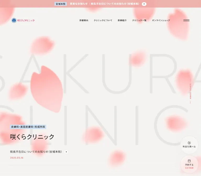
咲くらクリニック|桜の花びらと大きな余白が印象的な医療サイト
淡い桜色の花びらと巨大な背景文字を主役に、症状別の診療一覧を整然と配置。透過ヘッダーと予約導線を備えた、やさしく落ち着いたクリニックサイト。
オリジナルサイトを見るSakura Clinic / 咲くらクリニック — Style Reference
Soft cherry-blossom petals above a precise, spacious directory of medical care.
Original URL: https://www.sakura-clinic.jp/
Final URL: https://www.sakura-clinic.jp/
Theme: light main canvas with a dark, two-tone footer; no theme selector was evidenced.
Inspected: September 13, 2026, 02:31 JST. Supplied retrieval timestamp: 2026-09-12T17:31:03.107Z.
Viewports: desktop 1440 × 1000 and mobile 390 × 844 CSS pixels.
Scope: the current clinic homepage, using three desktop captures, two mobile captures, and rendered DOM/computed-style samples at both widths. Visual coverage includes the hero, part of the treatment directory, the beginning of the staff section, a partial shop banner, and the footer. DOM text additionally establishes the clinic list and news content. Linked pages and expanded navigation states were not inspected.
Sakura Clinic combines a warm off-white canvas, dark brown-gray text, restrained coral accents, and a large composition of pink petals. Extremely pale, oversized “SAKURA CLINIC” lettering provides scale behind a comparatively modest Japanese heading. The blue crest and bright pink wordmark remain distinct from the softer colors used throughout the interface.
This is a substantial clinic information hub. Two treatment directories organize care by symptoms and cosmetic concerns, followed by staff, locations, notices, shopping, and support links. Its practical identity depends on the relationship between expressive artwork and orderly information: generous space around sections, compact treatment links inside lightly rounded panels, persistent navigation, and pricing/reservation access that changes shape on mobile.
How to Read This Reference
- Measured values come directly from the supplied rendered DOM and computed styles. Values in tables are sometimes rounded to three decimals.
- Calculated values are arithmetic based on supplied measurements, such as the difference between adjacent row positions.
- Visual estimates describe screenshot appearance or geometry without a corresponding computed property. Approximate hex colors are implementation targets, not pixel-sampling results.
- Recommendations and all new token names are adaptations for reuse. The original responsive formulas, complete stylesheet, and component class names were not supplied.
- Visibility matters: the DOM includes duplicate navigation, branch menus, and utility panels that are absent from the corresponding screenshots. Their text and declarations establish available structure, but their rectangles do not prove an expanded state was visible.
- Motion evidence is limited: scrolling produced persistent-header and utility-control states. No click, hover, menu-opening, or time-series petal animation results were supplied.
Tokens — Colors
Default Palette
| Name | Value | Suggested token | Evidence and role |
|---|---|---|---|
| Warm Canvas | #f5f3f2 |
--color-canvas |
Measured BODY background at both viewports; the dominant page field. |
| Brown Ink | #322c2c |
--color-ink |
Measured BODY, heading, and navigation text. Visually close to the darker footer panel. |
| Secondary Ink | rgba(50, 44, 44, 0.8) |
--color-ink-muted |
Measured treatment-link and search-helper text. Preserve the alpha rather than treating it as a universal solid gray. |
| Soft Coral | #ec7e79 |
--color-accent |
Measured hero date and desktop scroll label. A reference for the small coral accents seen elsewhere. |
| Warm White | #fffefd |
--color-surface |
Measured fill on sampled branch-choice links and text on the skip link. A suitable approximation for the visible near-white treatment panels. |
| Translucent White | rgba(255, 254, 253, 0.4) |
--color-glass |
Measured on DOM-resident navigation cards. The persistent header and action controls also appear translucent, but their exact opacity was not supplied. |
| Announcement Pink | approximately #efb4af |
--color-announcement |
Visual estimate for the full-width announcement strip. |
| Label Blue | approximately #cee3f7 |
--color-label |
Visual estimate for the small specialty highlight and branch badge. |
| Directory Blue | approximately #79aeea |
--color-marker |
Visual estimate for the tiny treatment-list markers. |
| Quiet Rule | approximately #e4dfdc |
--color-rule |
Visual estimate for dividers, panel edges, and circular-control outlines. |
| Background Lettering | approximately #e8e6e4 |
--color-backdrop-type |
Visual estimate; intentionally close to the canvas color. |
| Footer Ash | approximately #4b4241 |
--color-footer-soft |
Visual estimate for the lighter blog/FAQ/social footer panel. |
| Footer Depth | approximately #322c2c |
--color-footer-deep |
Visual estimate for the sitemap panel, consistent with the measured ink color. |
Artwork and Brand Colors
The petals vary from a warmer pink near #ffaeaf to a pale blush near #ffd8d7. These are visual approximations of shaded artwork, not verified gradient stops. Their notched silhouettes and uneven orientation are more important than a perfectly uniform fill.
The logo adds a saturated blue crest and vivid pink Japanese wordmark. Approximate reference colors are #0056aa and #ff2874; retain an authorized logo asset instead of rebuilding it from these estimates.
Palette behavior: blue is a small informational accent, coral marks dates and utilities, and pink carries the decorative identity. Large areas remain neutral. The dark footer is a permanent page section, not evidence of a dark theme.
The supplied --fc-* custom properties describe calendar-related UI defaults. No calendar is visible in the inspected homepage captures, so those values are excluded from the homepage palette.
Tokens — Typography
Japanese Interface — Ryo Gothic PlusN
- Measured stack:
ryo-gothic-plusn, sans-serif. - Observed weights:
400for body text and treatment links;500for navigation, category labels, and headings. - Character: measured, open, and relatively light. Hierarchy comes largely from size and spacing, with little reliance on heavy bold text.
- Suggested alias:
--font-japanese.
The family is supported by computed styles, rather than guessed from the screenshots. Font files and loading configuration were not supplied. An implementation must obtain appropriate font access or use an explicitly acknowledged fallback.
Latin Labels and Dates — Brandon Grotesque
- Measured stack:
brandon-grotesque, sans-serif. - Observed weight:
500on sampled Latin labels and dates. - Verified uses: the hero date, desktop “SCROLL DOWN,” and “Search by symptoms” / “Search by troubles.”
- Suggested alias:
--font-latin.
The staff section visually uses the coral label “Doctor&Staff,” but that particular element’s computed font was not included. Reusing the verified Latin family there is a reasonable implementation recommendation.
Utility Controls and Decorative Lettering
Some sampled buttons report Arial, including the hamburger and DOM-resident mobile utility controls. Do not interpret those samples as evidence that the entire navigation uses Arial. For a new implementation, explicitly inheriting the interface font on buttons avoids accidental browser-default typography.
The giant background lettering is not represented by a measured text element in the supplied sample. Its exact font, font size, weight, and rendering method are unknown. Treat it as decorative artwork or a carefully calibrated text approximation.
Type Scale
Sizes and line heights below are measured unless marked as visual estimates.
| Role | Desktop size / line height | Mobile size / line height | Weight | Tracking |
|---|---|---|---|---|
| Base body | 12.6 / 22.68px |
12.901 / 23.221px |
400 |
1.210px desktop; 1.238px mobile |
| Visible desktop navigation | 12.6 / 22.68px |
Hidden in the mobile capture | 500 |
1.210px |
| Hero specialty line | 14.4 / 25.92px |
12.901 / 23.221px |
500 |
Inherited body tracking |
| Hero H1 | 43.2 / 77.76px |
31.756 / 57.160px |
500 |
Inherited body tracking |
| Hero date | 13 / 23.4px |
12.901 / 23.221px |
500 |
Inherited body tracking |
| Directory section H2 | 25.2 / 40.32px |
19.847 / 31.756px |
500 |
Inherited body tracking |
| Japanese search helper | 14.4 / 25.92px |
13.893 / 25.008px |
500 |
Inherited body tracking |
| English search helper | 16.2 / 29.16px |
13.893 / 25.008px |
500 |
0.04em |
| Leading category labels | 18 / 32.4px |
17.863 / 32.153px |
500 |
Inherited body tracking |
| Secondary category labels | 16.2 / 29.16px |
14.886 / 26.794px |
500 |
Inherited body tracking |
| Treatment links | 13.5 / 24.3px |
12.901 / 23.221px |
400 |
Inherited body tracking |
| Desktop scroll label | 10.8 / 19.44px |
Not visible | 500 |
1.210px |
| Visible utility captions | Approximately 11–12px |
Approximately 11–12px |
Visually medium | Not measured for the visible controls |
Most sampled text has a 1.8 line-height ratio; section H2s use 1.6. The hero’s generous line box is part of its airy composition.
The inherited letter spacing is approximately 0.096em at BODY size, but it remains a pixel value on larger headings. Applying 0.096em separately to every heading would produce substantially wider tracking than observed.
The root element remains 16px at both inspected widths. The many fractional dimensions do not justify inventing a custom root-unit formula.
Tokens — Spacing & Shapes
Density: expansive at section level, compact inside treatment lists. Geometry: small-radius white panels, thin dividers, tiny arrow capsules, and circular desktop utilities.
Spacing Scale
| Use | Desktop | Mobile | Basis |
|---|---|---|---|
| Main section inset | 72px |
19.844px |
Measured section-heading x positions |
| Hero copy inset | 70.188–71.984px |
19.844px |
Measured hero text/link positions |
| Treatment marker-to-link inset | Approximately 16.188px |
Approximately 15.875px |
Calculated from category and link x positions |
| Space between single-line treatment rows | Approximately 7.2px |
Approximately 7.94px |
Calculated from link positions and heights |
| Desktop navigation link inset | 12.6px per side |
Not applicable | Measured padding |
| Desktop navigation icon gap | 7.2px |
Not applicable | Measured inline-flex gap |
| Hero specialty-to-H1 gap | 14.391px |
12.891px |
Calculated between element boxes |
| H1-to-featured-notice gap | 50.391px |
31.75px |
Calculated between element boxes |
| Main start to first section H2 | 144px |
95.266px |
Calculated from MAIN and H2 positions |
| Thin gutters between directory panels | Approximately 3–4px |
Panel-edge geometry not visually captured | Desktop screenshot estimate |
| Empty interval before staff eyebrow | Approximately 260px |
Not visually captured | Estimate from the supplied desktop middle capture |
These values describe two observed endpoints. They do not establish a single interpolation rule between them.
Border Radius
| Element | Reference | Evidence |
|---|---|---|
| Treatment panels | Approximately 7–8px |
Visible desktop corners |
| Compact persistent header | Approximately 8px |
Desktop and mobile screenshot estimate |
| Mobile action bar | Approximately 8px |
Screenshot estimate |
| Desktop price/reservation controls | Circle | Screenshot observation |
| Small arrow carriers | Fully rounded capsule | Screenshot observation |
| DOM-resident navigation cards | 10.8px desktop; 7.939px mobile |
Measured, expanded state not visually verified |
| DOM-resident mobile branch choices | Fully rounded | Measured extremely large radius; use 999px rather than copying the serialized value |
Layout Measurements
| Element | Desktop 1440 × 1000 |
Mobile 390 × 844 |
Evidence |
|---|---|---|---|
| Document height | 7718.219px |
10648.563px |
Measured HTML/BODY boxes; rounded reported heights are 7718 and 10649 |
| Announcement strip height | Approximately 44.984px |
Approximately 41.063px |
Calculated from the header’s starting y position |
| Initial HEADER box | 1440 × 164.375px |
390 × 105.188px |
Measured, including its internal padding |
| Initial logo link width | 162px |
142.891px |
Measured inline anchor width |
| Visible logo artwork height | Approximately 35px |
Approximately 31px |
Screenshot estimate; the anchor’s 13px line box does not measure the image height |
| Hamburger button box | 43.188 × 43.188px |
31.75 × 31.75px |
Measured |
| Compact header | Approximately x 20, y 20, width 1400, height 88px |
Approximately x 4, y 4, width 382, height 65px |
Scrolled screenshot estimate |
| Hero copy width | 491.406px |
350.297px |
Measured text container widths |
| Hero specialty origin | x 70.188, y 634.172px |
x 19.844, y 483.641px |
Measured |
| H1 origin | x 70.188, y 674.484px |
x 19.844, y 519.75px |
Measured |
| MAIN start | y 1079.75px |
y 894.969px |
Measured |
| Wide treatment-link box | Approximately 315.016px |
326.5px |
Measured; excludes the preceding marker area |
| Narrow secondary desktop treatment-link box | 123.5px |
Expands to 326.5px |
Measured symptom-directory links |
| Desktop utility circles | Approximately 108px diameter, 8px vertical gap |
Replaced by a shared bar | Screenshot estimate |
| Mobile utility bar | Not applicable | Approximately x 8, y 782, width 374, height 54px |
Screenshot estimate |
| Footer primary columns | Two 720px halves |
Full-width stacked panels | Screenshot observation |
Components
Announcement Strip
Role: promotes a current operational notice before the main navigation.
A shallow pink strip spans the full viewport. On desktop, its content forms a compact centered row: pale blue branch badge, important-notice label, notice title, and a small white arrow capsule. The measured linked row is about 499.156px wide and begins at x 470.422px.
The visible notice is “【土曜日午後 外来診療開始のお知らせ】,” associated with “安城本院.” It is separate from the reservation-system notice featured within the hero.
On mobile, the content stays on a single line and is clipped at the viewport edges. The DOM contains two approximately 489px copies positioned consecutively, which suggests a repeating announcement track. Its motion, timing, direction, and pause behavior were not demonstrated.
Global Header
Role: preserves identity and access to the site’s main destinations.
At the top of the page, the header is visually open over the hero. The logo sits at the left. Desktop navigation contains treatment information, clinic information, doctors, clinic locations, and the external shop. A fine vertical separator precedes a two-stroke hamburger at the far right.
The hamburger remains present on desktop alongside the text navigation. It is therefore a broader navigation control, not merely a substitute shown on small screens.
After scrolling, the header becomes a compact floating rounded rectangle. Its translucent surface allows underlying content to remain faintly visible, particularly over the shop image and dark footer. Both viewports show this persistent compact state. The exact positioning property, scroll threshold, opacity, and blur radius were not supplied.
On mobile, only the logo and hamburger are visible. Preserve their horizontal separation and the relatively small logo; avoid turning the header into a tall centered brand block.
Floral Hero
Role: establishes the clinic’s soft visual identity while keeping the site name and important notice readable.
The desktop composition places a loose ring of large cherry-blossom petals roughly within x 313–1148px and y 73–914px. This is a screenshot estimate, not an asset bounding-box measurement. The petals have small notches, irregular silhouettes, pink shading, and varied rotations.
Behind them, two enormous lines of pale lettering occupy much of the viewport. Their visible glyph height is approximately 225px on desktop and 190px on mobile; the actual CSS font size is unknown. The lettering functions as a background field rather than a headline to be read in full at every width.
The foreground copy sits low and left. Its anatomy is:
- A compact blue highlight behind “皮膚科・美容皮膚科・形成外科.”
- The medium-weight H1 “咲くらクリニック.”
- A separate linked operational notice with an arrow capsule.
- A small coral date.
- A quiet horizontal rule beneath the news area.
Desktop adds a vertical “SCROLL DOWN” link near the right edge. The mobile capture omits that link and crops the oversized decorative composition at both sides. The Japanese title remains fully readable and left aligned.
Featured Hero Notice
Role: gives one important update a stable place within the visual opening.
The current item concerns a reservation-system change and is dated 2026.03.31. On desktop, its measured link box is approximately 489.609 × 60.109px. On mobile it becomes approximately 350.297 × 85.125px, with the headline wrapping across two visible lines.
The arrow stays beside the headline area while the date occupies its own line below. This is a text link with a small directional carrier, not a filled promotional button.
Directory Section Heading
Role: establishes the type of care and the organizing principle of the links below.
Each directory begins with a Japanese H2, a smaller Japanese helper, and a Latin translation. The first section uses “皮膚科・形成外科,” “症状から探す,” and “Search by symptoms.” The second uses “美容皮膚科,” “お悩みから探す,” and “Search by troubles.”
Desktop aligns all three parts across one horizontal band: section title at the left, helper next, and English wording at the far right. The first desktop H2 begins at x 72px; the English label ends at x 1368px.
Mobile places the H2 on its own line. Below it, the Japanese helper remains left aligned while its English counterpart sits at the right. This is a deliberate two-row arrangement, not a uniformly shrunken desktop heading.
Despite the word “Search,” the supplied interface evidence shows categorized links, not an input field or live filtering control.
Treatment Directory Panel
Role: groups related conditions or procedures into a readable set of destinations.
The visible desktop panels use a near-white fill, small corner radius, and almost touching edges separated by narrow canvas-colored gutters. Internal padding is much larger than the gutter. Category labels sit above a fine horizontal rule; links below have tiny blue markers at the left and small gray arrows aligned at the right.
The first symptom row contains three wide groups: “かゆみ・赤み,” “いたみ,” and “できもの.” The subsequent five category-label positions are spaced approximately 287.281px apart, supporting a five-column secondary arrangement at the inspected desktop width. Its narrow 123.5px link boxes cause longer names to wrap.
The cosmetic directory contains nine groups. The leading three use larger category labels and longer treatment lists; the six secondary groups occupy two further rows of three in the supplied desktop capture. Short groups still retain substantial interior space, giving the grid a calm, aligned appearance.
For a wide desktop panel, the measured label origin is x 75.594px, and links start at x 91.781px. Visible panel edges suggest approximately 72px horizontal internal padding. On mobile, the category origin is x 23.813px, with links at x 39.688px.
Single-line treatment links repeat every approximately 31.484px on desktop and 31.156px on mobile. Multi-line entries increase their own height rather than being truncated to a fixed single-line row.
Implementation guidance: model each group as a heading and a list of independent links. The source samples category labels as paragraphs; using properly nested headings in a new implementation improves document navigation while retaining the visual treatment.
Doctor and Staff Introduction
Role: introduces the people behind the clinic after the extensive treatment directory.
The supplied desktop middle capture shows a large quiet interval before a coral “Doctor&Staff” eyebrow. The Japanese heading and a short explanatory paragraph occupy the left portion. Portrait imagery begins to the right, around x 598px, with at least two adjacent image panels partially visible.
The image tops show neutral backgrounds and naturally photographed faces. The full portraits, their captions, image aspect ratios, and any sequence behavior are outside the supplied visual coverage. A link to the complete staff page is present in the DOM.
Preserve the shift from dense link groups to a more spacious editorial introduction. Do not infer a carousel solely because several portraits sit beside one another.
Clinic List and News
Role: connects visitors to a physical clinic and communicates operational updates.
The DOM establishes four clinic entries, each combining a branch name and postal address: Anjo, Shinjuku South Exit, Osaka, and Sapporo. These link to their corresponding clinic pages.
The news section contains four notices in the supplied text, each with a title, date, and branch label. The desktop extraction places the all-news link before the entries; the mobile extraction places it after them. This is evidence of responsive presentation order, not proof of a particular CSS ordering technique.
These sections are not visually exposed in the supplied captures. Their exact cards, image treatment, column counts, and internal spacing should remain unclaimed. A practical extension can reuse the verified text hierarchy, quiet rules, and small branch labels.
Shop Promotion
Role: introduces the clinic’s external skincare shop.
A partial desktop capture shows a centered image panel approximately 856px wide, with softly rounded corners, muted blue-gray photography, and white overlaid copy. The DOM supplies the complete message about selected skincare and a shop link.
Only part of the image is visible, so the exact photographic subject, complete banner height, crop, and asset format are unknown. There is no evidence here of a homepage product grid or checkout interface.
Split Footer
Role: consolidates support, social links, branch navigation, and legal information.
Desktop uses two equal-width dark panels. The left panel is the lighter brown-gray; the right panel is deeper and close to the main ink color. Each has about 72px horizontal inset.
The left side stacks a blog introduction and an FAQ introduction. Each combines a medium-size title, a short description, and a small white arrow capsule aligned toward the far right. A long thin rule divides the two destinations. Below, five Instagram links form a compact two-column arrangement, with the last item on its own row. Each uses a small circular gray icon carrier.
The right side begins with two navigation columns. The left contains general site destinations; the right contains clinic navigation and a separate partner-clinic link. A horizontal rule precedes the online-shop link. Legal links sit near the bottom in a smaller horizontal row.
On mobile, the two color panels stack vertically. Social links form one vertical list with a generous left inset. The deeper sitemap panel retains two columns, with branch links arranged compactly inside the right column. The long partner name wraps across lines. Legal links remain visible above the persistent action bar.
Pricing and Reservation Utilities
Role: keeps the two most practical visitor actions available during a long page visit.
Desktop shows two approximately 108px circular controls stacked near the lower-right corner. Each uses a thin outline, translucent pale fill, a coral line icon, and a small dark caption. Pricing sits above reservations. The reservation control adds the smaller coral qualifier “完全予約制.”
Mobile combines them into one rounded bar approximately 374 × 54px, inset about 8px from the sides and bottom. The controls become horizontal icon-and-label groups; the reservation qualifier sits inline as “(完全予約制).” Both top and footer mobile captures show the bar in the same viewport position.
The DOM contains four branch-specific pricing links and four reservation links. The controls therefore expose a clinic-selection structure, but no opening interaction was captured. Do not assume that tapping a utility immediately navigates to one default branch.
Navigation and Branch Selection Structure
Role: provides access to the full site beyond the compact visible header.
DOM-resident content includes general navigation, legal links, clinic links, pricing destinations, and reservation destinations. Sampled desktop clinic cards have a translucent white fill, 36px padding, and a 10.8px radius. Mobile samples use smaller cards and pill-shaped branch links.
These measurements belong to elements not shown as open in the supplied screenshots. They can inform a component inventory, but they do not establish the menu’s overlay appearance, opening direction, focus behavior, backdrop, or animation.
Tokens — Motion & Interaction
| Treatment | Evidence | What can be reused confidently |
|---|---|---|
| Ordinary links | Sampled computed transition shorthand is 0.3s |
A 300ms interaction duration is source-supported; changed properties and visible hover outcomes are unknown. |
| Some mobile utility buttons | color 0.2s linear in sampled DOM-resident controls |
A 200ms linear color transition exists in those samples; it is not proof of the visible dock’s complete behavior. |
| Header compaction | Open initial header and compact persistent header appear in separate scroll captures | Reproduce the two visual states; threshold, easing, and duration require a new implementation decision. |
| Persistent action controls | Same viewport-edge placement across initial and footer captures | Maintain availability while scrolling; exact source positioning CSS was not supplied. |
| Announcement repetition | Two mobile copies with consecutive horizontal positions | A repeating track is suggested, but movement and timing remain unverified. |
| Petal composition | Static desktop and mobile captures show petals | Shapes, shading, placement, and responsive cropping are observable; trajectories, looping, speed, and rendering technology are not. |
| Scroll link | Desktop anchor targets #home |
The destination is verified; smooth scrolling is not. |
| Menu and branch selectors | Buttons and destination links exist in DOM | Preserve the destinations; expanded appearance and keyboard behavior need implementation and testing. |
The sampled animation: none values apply to the listed elements. They do not prove the absence of parent animations, pseudo-element effects, SVG animation, or script-driven graphics. Similarly, a serialized transition: all without a demonstrated duration is not evidence of a visible animated transition.
The capture process waited for initial loading and layout stability, paused perpetual animations during readiness checks, and resumed them afterward. It is not a recording of all motion. Recommended adaptations should start with a complete static hero and add optional movement only after the artwork and interaction requirements are established.
Surfaces
| Layer | Appearance | Structural purpose |
|---|---|---|
| Page canvas | Solid warm off-white | Connects the hero, directories, and editorial sections. |
| Decorative hero | Pale oversized lettering and shaded pink petals | Adds scale and identity without becoming a text container. |
| Treatment panels | Near-white, small-radius surfaces with thin internal rules | Organizes a large number of links. |
| Persistent header | Translucent rounded strip with fine edge | Keeps navigation legible over changing page content. |
| Persistent utilities | Translucent outlined circles or a shared mobile bar | Separates action controls from the document beneath them. |
| Footer support panel | Lighter brown-gray with white text | Houses blog, FAQ, and social destinations. |
| Footer sitemap panel | Deeper brown-gray with white text and subdued rules | Finishes the page with compact navigation. |
The visible panels do not depend on pronounced elevation shadows. Separation comes chiefly from fill differences, negative space, rules, and the contrast between light content and the dark footer. Translucency is concentrated in persistent controls rather than applied to every content panel.
Imagery
The opening artwork is an abstract floral identity system rather than a clinical photograph. Individual cherry-blossom petals vary in orientation and size, forming an approximately circular composition on desktop. Soft pink shading adds volume without heavy outlines. The mobile crop allows petals and giant lettering to extend beyond the viewport while keeping the actual Japanese heading inside its content inset.
Photography enters later. The visible portion of the staff section uses straightforward portraits against quiet neutral backgrounds. The shop banner contributes a muted blue-gray photographic surface under white text. Neither requires the decorative softness of the hero to be applied as a global image blur.
Small icons remain functional: two horizontal menu strokes, directional arrows inside white capsules, a price symbol, a calendar outline, social marks, and an external-destination symbol. Their size and restraint matter more than adopting a large decorative icon set.
Observed Asset References
No image URLs, filenames, SVG source, or animation assets were supplied. The following inventory identifies visible assets without inventing paths.
| Asset | Observed appearance | Availability and limits |
|---|---|---|
| Clinic logo | Blue circular crest beside a vivid pink Japanese wordmark | Visible at both widths; source asset URL unknown. |
| Hero petals | Notched pink silhouettes with soft shading | Composition visible; asset format and motion implementation unknown. |
| Giant English lettering | Extremely pale, thin, oversized two-line background | Rendering method and exact font unknown. |
| Staff portraits | At least two partially visible faces against neutral backgrounds | Full crops, captions, and source URLs unavailable. |
| Shop image | Partial muted blue-gray photographic banner | Full subject and dimensions unavailable. |
| Utility and navigation icons | Small line symbols and capsule arrows | Visible appearance only; no confirmed icon library. |
Use authorized brand and photographic assets where available. The CSS below reproduces the interface shell; it does not supply the clinic’s original artwork.
Layout & Responsive Behavior
The desktop page combines multiple layout densities. A nearly viewport-sized decorative opening gives way to a full-width treatment grid, then to editorial and institutional content. Standard headings use approximately 5% side insets, while the treatment panels sit close to the viewport edges and provide their own large internal padding.
The symptoms directory changes from three leading columns plus five narrower secondary columns to a single column on mobile. The mobile computed category positions share the same x coordinate and advance vertically. Cosmetic treatment groups likewise stack sequentially. This preserves the content rather than replacing it with an unverified accordion.
| Behavior | Desktop observation | Mobile observation |
|---|---|---|
| Header navigation | Five text destinations plus hamburger | Logo and hamburger only |
| Hero artwork | Large ring-like composition broadly visible | Oversized composition cropped horizontally |
| Main H1 | 43.2px |
31.756px |
| Body type | 12.6px |
12.901px; slightly larger, not proportionally reduced |
| Section title band | Japanese title, helper, and English label across one row | H2 above a separate bilingual helper row |
| Treatment groups | Multiple columns with variable widths | One column with wider link boxes |
| Featured notice | One visible headline line | Two visible headline lines |
| Pricing and reservations | Two circular controls at lower right | Shared horizontal bottom bar |
| Footer | Two equal-width color panels | Color panels stacked; sitemap retains two columns |
The document grows by approximately 2930px on mobile, or about 38%, based on the supplied element heights. This reflects genuine reflow and stacking, not a shortened mobile content set.
The exact breakpoint is unknown. The Quick Start uses 60rem as a recommended implementation threshold and calibrates sizes to the inspected endpoints. Intermediate widths, landscape phones, browser zoom, and safe-area behavior need separate testing.
Keep the hero decorative layer clipped independently from the document. Preserve room below content for the mobile action bar, and apply scroll clearance so anchored sections do not disappear beneath the compact header.
Do’s and Don’ts
Do
- Keep the warm canvas
#f5f3f2, brown ink#322c2c, and measured coral#ec7e79as the core interface colors. - Preserve the distinction between saturated logo colors and softer page accents.
- Use the pale giant lettering as background scale, with the Japanese H1 remaining readable and comparatively modest.
- Maintain the lower-left hero copy and allow decorative artwork to crop on mobile.
- Organize treatment content into category labels, thin rules, small blue markers, and independently linked rows.
- Preserve medium-weight headings and generous line heights instead of adding heavy bold text throughout.
- Keep substantial section spacing alongside compact treatment-row rhythm.
- Reconfigure persistent pricing and reservation access into the mobile bottom bar.
- Maintain the footer’s two related dark tones and its compact navigation structure.
- Separate measured values from visual estimates and new interaction decisions.
Don’t
- Don’t reduce the homepage to a short promotion that omits the treatment directory, locations, and operational information.
- Don’t center the foreground hero copy or enlarge it until it competes with the decorative lettering.
- Don’t turn every panel into a heavily rounded, shadowed card.
- Don’t apply pink gradients, translucent fills, or blur across the entire content system.
- Don’t treat the blue directory markers as evidence for a large blue primary CTA.
- Don’t flatten the original three-plus-five symptoms arrangement into an assumed uniform desktop grid.
- Don’t force long treatment names into fixed single-line heights or truncate them without another readable path.
- Don’t infer an accordion, carousel, modal design, or petal animation from DOM text alone.
- Don’t copy hidden-element coordinates as though those elements were visible over the hero.
- Don’t use the root element’s Times declaration or unrelated calendar variables as the homepage’s visual identity.
Recommended Implementation Additions
These are recommendations for a new implementation, not verified original features:
- Preserve the existing skip-link destination pattern and make the link clearly visible on keyboard focus. Its focus state was not captured.
- Give the hamburger and utility controls accessible names, expanded states, and keyboard-operable branch selection. Restore focus when a menu closes.
- Increase the mobile hamburger hit area from the measured
31.75pxbox to at least44px, retaining approximately 32px visual strokes. - Consider a readable typography mode with
14–16pxbody text and larger touch rows. This will change the measured document height and should be treated as an intentional adaptation. - Use meaningful category headings and list semantics. Keep each treatment destination independently focusable.
- Exclude decorative petals and background lettering from the accessibility tree, and prevent them from intercepting pointer events.
- Make the full announcement available without relying on a clipped or moving line. If duplicates are used for a loop, prevent duplicate keyboard stops and repeated announcements.
- Provide a static reduced-motion hero and a pause mechanism for any continuous decorative movement introduced later.
- Check small coral text and translucent-control contrast over both footer colors and photography. A darker accent or more opaque surface may be needed for essential labels.
- Reserve bottom safe-area clearance and sufficient final-page padding for the mobile utility bar.
Agent Prompt Guide
Quick Color Reference
- Main canvas: measured
#f5f3f2. - Main text: measured
#322c2c. - Secondary treatment text: measured
rgba(50, 44, 44, 0.8). - Dates and small accents: measured
#ec7e79. - Near-white surfaces: use
#fffefd, a measured source color whose application to visible treatment panels is an approximation. - Announcement strip: approximately
#efb4af. - Specialty highlight: approximately
#cee3f7. - Treatment markers: approximately
#79aeea. - Footer panels: approximately
#4b4241and#322c2c.
Overall Prompt
“Create a Japanese clinic information homepage inspired by Sakura Clinic’s current visual system. Use a warm off-white canvas, brown-gray text, small coral utility accents, and a blue-and-pink brand asset. Build a spacious opening with very pale oversized two-line English lettering and softly shaded cherry-blossom petals, placing a compact Japanese specialty highlight, medium-weight clinic title, and dated operational notice low on the left. Follow it with detailed treatment directories made of near-white, lightly rounded panels with small blue markers, thin rules, and compact text links. Use Ryo Gothic PlusN for Japanese and Brandon Grotesque for verified Latin-label roles when appropriately available. Keep navigation persistent in a translucent compact header after scrolling. Use two outlined circular utilities on desktop and a shared pricing/reservation bar on mobile. Finish with a two-tone brown footer. Preserve all directory content on mobile and crop only the decorative hero layer. Treat animation as a separately specified enhancement.”
Example Component Prompts
- Hero: “A warm off-white clinic opening with a loose ring of shaded pink cherry-blossom petals, extremely pale giant background lettering, and left-aligned Japanese copy near the lower portion. Add a small blue specialty highlight, a 43px medium-weight desktop title, a dated text notice, and a tiny white arrow capsule. At 390px, use an approximately 32px title and crop the background composition at both sides.”
- Treatment panel: “A near-white panel with approximately 8px corners, generous internal padding, a medium-weight Japanese category label, a thin warm-gray divider, and compact links marked by tiny blue dots. Align small gray arrows at the far right. Let long names wrap naturally and retain the approximately 31px single-line row rhythm.”
- Persistent header: “A wide rounded translucent header inset 20px from the desktop viewport, with a small logo at left, restrained Japanese navigation, a fine separator, and a two-stroke hamburger at right. On mobile use a compact logo-and-menu strip inset about 4px. Define the scroll threshold separately.”
- Action controls: “Two approximately 108px outlined translucent circles stacked at the desktop lower-right corner, each with a small coral icon and dark caption. Combine them into a 54px-high mobile bottom bar. Pricing and reservations must each expose four clinic-specific destinations.”
- Footer: “Two equal desktop panels in related brown-gray tones. Put blog and FAQ introductions with white arrow capsules and Instagram links on the lighter left side. Put a two-column sitemap, clinic links, shop destination, and legal links on the darker right side. Stack the panels on mobile while keeping a compact two-column sitemap.”
Quick Start
CSS Custom Properties
This is an endpoint-calibrated adaptation, not the original stylesheet. Measured text and palette values are preserved where available. Surface estimates, a 60rem breakpoint, blur strength, focus styling, and native disclosure controls are implementation recommendations.
Keep the root at its normal browser size. Load the named fonts separately if available. Supply authorized artwork inside .hero-art; .hero-type is only a decorative text surrogate because the original lettering’s rendering method is unknown. Set aria-hidden="true" on both decorative layers.
The .is-compact header class requires application logic tied to scrolling; its source threshold was not established. No petal or announcement animation is invented here.
:root {
  /* Measured source colors */
  --color-canvas: #f5f3f2;
  --color-ink: #322c2c;
  --color-ink-muted: rgb(50 44 44 / 0.8);
  --color-accent: #ec7e79;
  --color-surface: #fffefd;

  /* Visual approximations and adaptation choices */
  --color-announcement: #efb4af;
  --color-label: #cee3f7;
  --color-marker: #79aeea;
  --color-rule: #e4dfdc;
  --color-backdrop-type: #e8e6e4;
  --color-footer-soft: #4b4241;
  --color-footer-deep: #322c2c;
  --color-glass: rgb(255 254 253 / 0.4);

  /* Verified family stacks; font loading is separate */
  --font-japanese: 'ryo-gothic-plusn', sans-serif;
  --font-latin: 'brandon-grotesque', sans-serif;
  --text-body: 12.6px;
  --text-link: 13.5px;
  --text-kicker: 14.4px;
  --text-h1: 43.2px;
  --text-h2: 25.2px;
  --text-category: 18px;
  --text-category-small: 16.2px;
  --text-helper: 16.2px;
  --tracking-body: 1.2096px;
  --leading-body: 1.8;

  /* Calibrated desktop geometry */
  --page-inset: 72px;
  --panel-inset: 72px;
  --grid-gap: 3.6px;
  --row-gap: 7.2px;
  --section-space: 144px;
  --notice-height: 45px;
  --radius-panel: 8px;
  --action-size: 108px;
  --safe-bottom: env(safe-area-inset-bottom, 0px);
  --motion-link: 300ms;
}

* { box-sizing: border-box; }
body {
  margin: 0;
  color: var(--color-ink);
  background: var(--color-canvas);
  font-family: var(--font-japanese);
  font-size: var(--text-body);
  font-weight: 400;
  line-height: var(--leading-body);
  letter-spacing: var(--tracking-body);
}
button, summary { font: inherit; letter-spacing: inherit; }
a { color: inherit; }
img { display: block; max-width: 100%; }
:where(h1, h2, h3, p) { margin-top: 0; }
:where(h1, h2, h3) { font-weight: 500; }
:where(a, button, summary):focus-visible {
  outline: 2px solid currentColor;
  outline-offset: 4px;
}
section[id] { scroll-margin-top: 120px; }

.announcement {
  min-height: var(--notice-height);
  display: flex;
  align-items: center;
  justify-content: center;
  padding: 8px 20px;
  background: var(--color-announcement);
}
.announcement a {
  display: inline-flex;
  align-items: center;
  gap: 21.6px;
  text-decoration: none;
}
.branch-badge, .hero-kicker span {
  padding: 2px 6px;
  color: var(--color-ink);
  background: var(--color-label);
}
.arrow-capsule {
  display: inline-grid;
  place-items: center;
  flex: 0 0 auto;
  width: 28px;
  height: 20px;
  border-radius: 999px;
  color: var(--color-ink);
  background: var(--color-surface);
  font-size: 11px;
  letter-spacing: 0;
}

.site-header {
  position: absolute;
  inset: var(--notice-height) 0 auto;
  z-index: 40;
  padding: 20px;
}
.header-inner {
  display: flex;
  align-items: center;
  min-height: 124px;
  padding-inline: 54px;
  border: 1px solid transparent;
  border-radius: var(--radius-panel);
}
.brand { flex: 0 0 auto; }
.brand img { width: 162px; height: auto; }
.primary-nav {
  display: flex;
  align-items: center;
  gap: 13.5px;
  margin-left: auto;
}
.primary-nav a {
  padding-inline: 12.6px;
  text-decoration: none;
  font-weight: 500;
}
.menu-toggle {
  display: grid;
  align-content: center;
  gap: 6.3px;
  width: 44px;
  height: 44px;
  margin-left: 72px;
  padding: 0;
  border: 0;
  color: var(--color-ink);
  background: transparent;
  cursor: pointer;
}
.menu-toggle span {
  display: block;
  width: 100%;
  height: 2px;
  background: currentColor;
}
.site-header.is-compact {
  position: fixed;
  inset: 20px 20px auto;
  padding: 0;
}
.is-compact .header-inner {
  min-height: 88px;
  padding-inline: 36px;
  border-color: var(--color-rule);
  background: var(--color-surface);
}

.hero {
  position: relative;
  isolation: isolate;
  min-height: calc(100svh + 35px);
  overflow: hidden;
}
.hero-art, .hero-type {
  position: absolute;
  z-index: -1;
  pointer-events: none;
}
.hero-art { inset: 0; }
.hero-art img {
  position: absolute;
  top: 25px;
  left: 50%;
  width: 840px;
  max-width: none;
  transform: translateX(-50%);
}
.hero-type {
  /* Decorative approximation, not a verified source font treatment */
  top: 225px;
  left: 50%;
  width: max-content;
  min-width: 100%;
  transform: translateX(-50%);
  color: var(--color-backdrop-type);
  font-family: var(--font-latin);
  font-size: clamp(275px, 23vw, 332px);
  font-weight: 300;
  line-height: 0.9;
  text-align: center;
  white-space: nowrap;
}
.hero-copy {
  position: relative;
  width: min(491.4px, calc(100% - 2 * var(--page-inset)));
  margin-inline: var(--page-inset);
  padding-top: clamp(420px, 58.9vh, 640px);
  padding-bottom: 120px;
}
.hero-kicker {
  margin-bottom: 14.4px;
  font-size: var(--text-kicker);
  font-weight: 500;
}
.hero h1 {
  margin: 0 0 50.4px;
  font-size: var(--text-h1);
  line-height: 1.8;
}
.hero-news {
  display: block;
  padding-bottom: 36px;
  border-bottom: 1px solid var(--color-rule);
  text-decoration: none;
}
.hero-news-title {
  display: flex;
  align-items: center;
  gap: 12px;
}
.hero-news-title > span:first-child { flex: 1; min-width: 0; }
.hero-news time {
  display: block;
  margin-top: 14px;
  color: var(--color-accent);
  font-family: var(--font-latin);
  font-size: 13px;
  font-weight: 500;
}

.directory { padding-top: var(--section-space); }
.section-heading {
  display: flex;
  align-items: center;
  gap: 36px;
  margin: 0 var(--page-inset) 90px;
}
.section-heading h2 {
  flex: 0 0 auto;
  margin: 0;
  font-size: var(--text-h2);
  line-height: 1.6;
}
.section-helper {
  display: flex;
  align-items: center;
  justify-content: space-between;
  gap: 20px;
  flex: 1;
  color: var(--color-ink-muted);
  font-weight: 500;
}
.section-helper .latin {
  font-family: var(--font-latin);
  font-size: var(--text-helper);
  letter-spacing: 0.04em;
}
.category-grid {
  --columns: 3;
  display: grid;
  grid-template-columns: repeat(var(--columns), minmax(0, 1fr));
  gap: var(--grid-gap);
  padding: var(--grid-gap);
}
.category-grid--secondary { --columns: 5; }
.category-card {
  min-width: 0;
  padding: 43.2px var(--panel-inset) 54px;
  border-radius: var(--radius-panel);
  background: var(--color-surface);
}
.category-card h3 {
  margin: 0 0 23px;
  padding-bottom: 20px;
  border-bottom: 1px solid var(--color-rule);
  font-size: var(--text-category-small);
  line-height: 1.8;
}
.category-card--primary h3 {
  margin-bottom: 31.8px;
  padding-bottom: 31.2px;
  font-size: var(--text-category);
}
.treatment-list {
  display: grid;
  gap: var(--row-gap);
  margin: 0;
  padding: 0;
  list-style: none;
}
.treatment-list a {
  display: grid;
  grid-template-columns: 4px minmax(0, 1fr) 10px;
  align-items: baseline;
  gap: 12px;
  color: var(--color-ink-muted);
  font-size: var(--text-link);
  line-height: 1.8;
  text-decoration: none;
  transition: color var(--motion-link);
}
.treatment-list a::before {
  content: '';
  width: 4px;
  height: 4px;
  border-radius: 1px;
  background: var(--color-marker);
  align-self: start;
  margin-top: 0.8em;
}
.treatment-list .row-arrow { font-size: 10px; }

.editorial-section {
  margin-block: 240px 144px;
  padding-inline: var(--page-inset);
}
.eyebrow {
  margin-bottom: 18px;
  color: var(--color-accent);
  font-family: var(--font-latin);
  font-size: 16px;
  font-weight: 500;
}
.footer {
  display: grid;
  grid-template-columns: repeat(2, minmax(0, 1fr));
  color: var(--color-surface);
}
.footer-panel { padding: 144px var(--page-inset) 36px; }
.footer-panel--support { background: var(--color-footer-soft); }
.footer-panel--sitemap { background: var(--color-footer-deep); }
.footer-nav {
  display: grid;
  grid-template-columns: repeat(2, minmax(0, 1fr));
  gap: 36px;
}
.footer-rule {
  margin-block: 48px 36px;
  border: 0;
  border-top: 1px solid rgb(255 254 253 / 0.3);
}
.footer a { text-decoration: none; }

/* Native disclosures are a recommended branch-selector implementation */
.action-dock {
  position: fixed;
  right: 18px;
  bottom: 18px;
  z-index: 50;
  display: grid;
  gap: 8px;
}
.action-dock details { position: relative; }
.action-dock summary {
  display: flex;
  flex-direction: column;
  justify-content: center;
  align-items: center;
  gap: 4px;
  width: var(--action-size);
  height: var(--action-size);
  padding: 12px;
  border: 1px solid var(--color-rule);
  border-radius: 50%;
  background: var(--color-surface);
  font-size: 11px;
  line-height: 1.5;
  list-style: none;
  cursor: pointer;
}
.action-dock summary::-webkit-details-marker { display: none; }
.action-symbol, .action-note { color: var(--color-accent); }
.action-symbol { font-size: 18px; line-height: 1; }
.action-note { font-size: 10px; }
.branch-choices {
  position: absolute;
  right: calc(100% + 12px);
  bottom: 0;
  display: grid;
  min-width: 180px;
  padding: 12px;
  border: 1px solid var(--color-rule);
  border-radius: var(--radius-panel);
  background: var(--color-surface);
}
.branch-choices a {
  min-height: 44px;
  padding: 10px 12px;
  text-decoration: none;
}

@supports ((backdrop-filter: blur(1px)) or (-webkit-backdrop-filter: blur(1px))) {
  .is-compact .header-inner, .action-dock summary {
    /* Blur strength and its use here are adaptation choices */
    background: var(--color-glass);
    -webkit-backdrop-filter: blur(16px);
    backdrop-filter: blur(16px);
  }
}

@media (hover: hover) {
  /* Recommended feedback; source hover outcomes were not captured */
  .treatment-list a:hover { color: var(--color-ink); }
  .treatment-list a:hover .row-label,
  .primary-nav a:hover { text-decoration: underline; }
}

@media (max-width: 60rem) {
  :root {
    --text-body: 12.9008px;
    --text-link: 12.9008px;
    --text-kicker: 12.9008px;
    --text-h1: 31.7557px;
    --text-h2: 19.8473px;
    --text-category: 17.8626px;
    --text-category-small: 14.8855px;
    --text-helper: 13.8931px;
    --tracking-body: 1.23847px;
    --page-inset: 19.8473px;
    --panel-inset: 19.8473px;
    --row-gap: 7.9389px;
    --section-space: 95.27px;
    --notice-height: 41px;
  }
  body { padding-bottom: calc(70px + var(--safe-bottom)); }
  section[id] { scroll-margin-top: 84px; }
  .announcement a { gap: 12px; }
  /* Let essential notice text wrap instead of requiring a marquee */
  .announcement { font-size: 12px; }
  .site-header { padding: 4px; }
  .header-inner { min-height: 97px; padding-inline: 20px; }
  .brand img { width: 142.89px; }
  .primary-nav { display: none; }
  .menu-toggle { margin-left: auto; justify-items: center; }
  .menu-toggle span { width: 32px; }
  .site-header.is-compact { inset: 4px 4px auto; }
  .is-compact .header-inner { min-height: 65px; padding-inline: 16px; }
  .hero { min-height: calc(100svh + 10px); }
  .hero-art img { top: 40px; width: 700px; }
  .hero-type { top: 175px; font-size: 275px; }
  .hero-copy { padding-top: max(400px, 52.44vh); }
  .hero-kicker { margin-bottom: 12.9px; }
  .hero h1 { margin-bottom: 31.75px; }
  .hero-news { padding-bottom: 24px; }
  .hero-news time { font-size: var(--text-body); }
  .section-heading {
    display: block;
    margin-bottom: 64px;
  }
  .section-helper { margin-top: 23.8px; gap: 12px; }
  .category-grid { --columns: 1; }
  .category-card { padding-block: 36px 44px; }
  .category-card h3 { padding-bottom: 15.9px; margin-bottom: 15.9px; }
  .category-card--primary h3 {
    padding-bottom: 21.7px;
    margin-bottom: 21.7px;
  }
  .editorial-section { margin-block: 120px 96px; }
  .footer { grid-template-columns: minmax(0, 1fr); }
  .footer-panel { padding: 64px var(--page-inset) 36px; }
  .footer-nav { gap: 24px; }
  .action-dock {
    right: 8px;
    left: 8px;
    bottom: calc(8px + var(--safe-bottom));
    grid-template-columns: 1fr 1fr;
    gap: 0;
    border: 1px solid var(--color-rule);
    border-radius: var(--radius-panel);
    background: var(--color-surface);
  }
  .action-dock details { position: static; }
  .action-dock summary {
    flex-direction: row;
    flex-wrap: wrap;
    gap: 6px;
    width: auto;
    min-height: 54px;
    height: auto;
    padding: 8px 4px;
    border: 0;
    border-radius: 0;
    background: transparent;
    -webkit-backdrop-filter: none;
    backdrop-filter: none;
  }
  .branch-choices {
    right: 0;
    left: 0;
    bottom: calc(100% + 8px);
    grid-template-columns: repeat(2, minmax(0, 1fr));
  }
}

@media (prefers-reduced-motion: reduce) {
  .treatment-list a { transition: none; }
}
Minimal Component Markup
The following markup demonstrates independent treatment links and two native branch selectors. Native disclosures are a recommended substitute for unspecified source interaction logic. The plain symbols are placeholders for decorative, authorized or newly drawn line icons.
<article class="category-card">
  <h3>赤み</h3>
  <ul class="treatment-list">
    <li>
      <a href="https://www.sakura-clinic.jp/menu/natf9jbd-7m/">
        <span class="row-label">Vビーム</span>
        <span class="row-arrow" aria-hidden="true">→</span>
      </a>
    </li>
    <li>
      <a href="https://www.sakura-clinic.jp/menu/1ey4lqsu_55o/">
        <span class="row-label">ノーリス</span>
        <span class="row-arrow" aria-hidden="true">→</span>
      </a>
    </li>
  </ul>
</article>

<nav class="action-dock" aria-label="Clinic services">
  <details name="clinic-service">
    <summary>
      <span class="action-symbol" aria-hidden="true">¥</span>
      <span>料金を調べる</span>
    </summary>
    <div class="branch-choices">
      <a href="https://www.sakura-clinic.jp/anjo/price/">安城本院</a>
      <a href="https://www.sakura-clinic.jp/tokyo/price/">新宿南口</a>
      <a href="https://www.sakura-clinic.jp/osaka/price/">大阪院</a>
      <a href="https://www.sakura-clinic.jp/sapporo/price/">札幌院</a>
    </div>
  </details>
  <details name="clinic-service">
    <summary>
      <span class="action-symbol" aria-hidden="true">□</span>
      <span>予約する</span>
      <small class="action-note">完全予約制</small>
    </summary>
    <div class="branch-choices">
      <a href="https://www.sakura-clinic.jp/anjo/reservation/">安城本院</a>
      <a href="https://www.sakura-clinic.jp/tokyo/reservation/">新宿南口</a>
      <a href="https://www.sakura-clinic.jp/osaka/reservation/">大阪院</a>
      <a href="https://www.sakura-clinic.jp/sapporo/reservation/">札幌院</a>
    </div>
  </details>
</nav>
The mobile announcement is allowed to wrap in this adaptation, and utility hit areas and end-of-page clearance are deliberately increased. Those accessibility choices can move subsequent content away from the recorded screenshot coordinates. The snippets have not been executed or browser-tested as part of this evidence-only analysis.
Tailwind v4 Token Mapping
Optional mapping for a project already using Tailwind v4. It is not evidence that the original site uses Tailwind. Define the custom properties above first.
@theme inline {
  --color-clinic-canvas: var(--color-canvas);
  --color-clinic-ink: var(--color-ink);
  --color-clinic-muted: var(--color-ink-muted);
  --color-clinic-accent: var(--color-accent);
  --color-clinic-surface: var(--color-surface);
  --color-clinic-label: var(--color-label);
  --color-clinic-marker: var(--color-marker);
  --color-clinic-rule: var(--color-rule);

  --font-clinic: var(--font-japanese);
  --font-clinic-latin: var(--font-latin);

  --text-clinic-body: var(--text-body);
  --text-clinic-link: var(--text-link);
  --text-clinic-title: var(--text-h1);
  --text-clinic-section: var(--text-h2);
  --text-clinic-category: var(--text-category);

  --spacing-clinic-inset: var(--page-inset);
  --spacing-clinic-panel: var(--panel-inset);
  --spacing-clinic-row: var(--row-gap);
  --spacing-clinic-section: var(--section-space);
  --radius-clinic-panel: var(--radius-panel);
}
Sources & Evidence
- Sakura Clinic homepage: original and final inspected URL; reported HTTP status
200. This page is the authority for the identity, content, and current design described here. - Capture date: supplied retrieval timestamp
2026-09-12T17:31:03.107Z, equivalent to September 13, 2026, 02:31 JST. No new browsing was performed for this reference. - Desktop evidence: three supplied captures at
1440 × 1000, covering the initial hero, a treatment-directory/staff transition, and the lower page/footer. Computed-style and geometry samples establish typography, colors, link destinations, and initial document positions. - Mobile evidence: two supplied captures at
390 × 844, covering the initial hero and footer. Rendered DOM measurements additionally establish stacked treatment groups and mobile text sizes. - Observed state changes: scrolling exposes a compact persistent header and retains viewport-edge pricing/reservation controls. No expanded menu, opened branch selector, hover outcome, or destination-page result was supplied.
- Inspection limits: the element samples do not include every visible component, image asset URLs, full stylesheet rules, or temporal animation traces. Some sampled elements belong to navigation structures absent from the visible state. Image and layout readiness checks had finite limits and do not prove all delayed content was revealed. SharedWorkers and service workers were disabled during the supplied inspection.
This reference describes the current homepage represented by the supplied evidence. Measurements, screenshot estimates, calculated relationships, and recommended implementation behavior are distinguished throughout.
# Sakura Clinic / 咲くらクリニック — Style Reference

> Soft cherry-blossom petals above a precise, spacious directory of medical care.

**Original URL:** [https://www.sakura-clinic.jp/](https://www.sakura-clinic.jp/)
**Final URL:** [https://www.sakura-clinic.jp/](https://www.sakura-clinic.jp/)
**Theme:** light main canvas with a dark, two-tone footer; no theme selector was evidenced.
**Inspected:** September 13, 2026, 02:31 JST. Supplied retrieval timestamp: `2026-09-12T17:31:03.107Z`.
**Viewports:** desktop `1440 × 1000` and mobile `390 × 844` CSS pixels.
**Scope:** the current clinic homepage, using three desktop captures, two mobile captures, and rendered DOM/computed-style samples at both widths. Visual coverage includes the hero, part of the treatment directory, the beginning of the staff section, a partial shop banner, and the footer. DOM text additionally establishes the clinic list and news content. Linked pages and expanded navigation states were not inspected.

Sakura Clinic combines a warm off-white canvas, dark brown-gray text, restrained coral accents, and a large composition of pink petals. Extremely pale, oversized “SAKURA CLINIC” lettering provides scale behind a comparatively modest Japanese heading. The blue crest and bright pink wordmark remain distinct from the softer colors used throughout the interface.

This is a substantial clinic information hub. Two treatment directories organize care by symptoms and cosmetic concerns, followed by staff, locations, notices, shopping, and support links. Its practical identity depends on the relationship between expressive artwork and orderly information: generous space around sections, compact treatment links inside lightly rounded panels, persistent navigation, and pricing/reservation access that changes shape on mobile.

## How to Read This Reference

- **Measured** values come directly from the supplied rendered DOM and computed styles. Values in tables are sometimes rounded to three decimals.
- **Calculated** values are arithmetic based on supplied measurements, such as the difference between adjacent row positions.
- **Visual estimates** describe screenshot appearance or geometry without a corresponding computed property. Approximate hex colors are implementation targets, not pixel-sampling results.
- **Recommendations** and all new token names are adaptations for reuse. The original responsive formulas, complete stylesheet, and component class names were not supplied.
- **Visibility matters:** the DOM includes duplicate navigation, branch menus, and utility panels that are absent from the corresponding screenshots. Their text and declarations establish available structure, but their rectangles do not prove an expanded state was visible.
- **Motion evidence is limited:** scrolling produced persistent-header and utility-control states. No click, hover, menu-opening, or time-series petal animation results were supplied.

## Tokens — Colors

### Default Palette

| Name | Value | Suggested token | Evidence and role |
| --- | --- | --- | --- |
| Warm Canvas | `#f5f3f2` | `--color-canvas` | Measured BODY background at both viewports; the dominant page field. |
| Brown Ink | `#322c2c` | `--color-ink` | Measured BODY, heading, and navigation text. Visually close to the darker footer panel. |
| Secondary Ink | `rgba(50, 44, 44, 0.8)` | `--color-ink-muted` | Measured treatment-link and search-helper text. Preserve the alpha rather than treating it as a universal solid gray. |
| Soft Coral | `#ec7e79` | `--color-accent` | Measured hero date and desktop scroll label. A reference for the small coral accents seen elsewhere. |
| Warm White | `#fffefd` | `--color-surface` | Measured fill on sampled branch-choice links and text on the skip link. A suitable approximation for the visible near-white treatment panels. |
| Translucent White | `rgba(255, 254, 253, 0.4)` | `--color-glass` | Measured on DOM-resident navigation cards. The persistent header and action controls also appear translucent, but their exact opacity was not supplied. |
| Announcement Pink | approximately `#efb4af` | `--color-announcement` | Visual estimate for the full-width announcement strip. |
| Label Blue | approximately `#cee3f7` | `--color-label` | Visual estimate for the small specialty highlight and branch badge. |
| Directory Blue | approximately `#79aeea` | `--color-marker` | Visual estimate for the tiny treatment-list markers. |
| Quiet Rule | approximately `#e4dfdc` | `--color-rule` | Visual estimate for dividers, panel edges, and circular-control outlines. |
| Background Lettering | approximately `#e8e6e4` | `--color-backdrop-type` | Visual estimate; intentionally close to the canvas color. |
| Footer Ash | approximately `#4b4241` | `--color-footer-soft` | Visual estimate for the lighter blog/FAQ/social footer panel. |
| Footer Depth | approximately `#322c2c` | `--color-footer-deep` | Visual estimate for the sitemap panel, consistent with the measured ink color. |

### Artwork and Brand Colors

The petals vary from a warmer pink near `#ffaeaf` to a pale blush near `#ffd8d7`. These are visual approximations of shaded artwork, not verified gradient stops. Their notched silhouettes and uneven orientation are more important than a perfectly uniform fill.

The logo adds a saturated blue crest and vivid pink Japanese wordmark. Approximate reference colors are `#0056aa` and `#ff2874`; retain an authorized logo asset instead of rebuilding it from these estimates.

**Palette behavior:** blue is a small informational accent, coral marks dates and utilities, and pink carries the decorative identity. Large areas remain neutral. The dark footer is a permanent page section, not evidence of a dark theme.

The supplied `--fc-*` custom properties describe calendar-related UI defaults. No calendar is visible in the inspected homepage captures, so those values are excluded from the homepage palette.

## Tokens — Typography

### Japanese Interface — Ryo Gothic PlusN

- **Measured stack:** `ryo-gothic-plusn, sans-serif`.
- **Observed weights:** `400` for body text and treatment links; `500` for navigation, category labels, and headings.
- **Character:** measured, open, and relatively light. Hierarchy comes largely from size and spacing, with little reliance on heavy bold text.
- **Suggested alias:** `--font-japanese`.

The family is supported by computed styles, rather than guessed from the screenshots. Font files and loading configuration were not supplied. An implementation must obtain appropriate font access or use an explicitly acknowledged fallback.

### Latin Labels and Dates — Brandon Grotesque

- **Measured stack:** `brandon-grotesque, sans-serif`.
- **Observed weight:** `500` on sampled Latin labels and dates.
- **Verified uses:** the hero date, desktop “SCROLL DOWN,” and “Search by symptoms” / “Search by troubles.”
- **Suggested alias:** `--font-latin`.

The staff section visually uses the coral label “Doctor&Staff,” but that particular element’s computed font was not included. Reusing the verified Latin family there is a reasonable implementation recommendation.

### Utility Controls and Decorative Lettering

Some sampled buttons report `Arial`, including the hamburger and DOM-resident mobile utility controls. Do not interpret those samples as evidence that the entire navigation uses Arial. For a new implementation, explicitly inheriting the interface font on buttons avoids accidental browser-default typography.

The giant background lettering is not represented by a measured text element in the supplied sample. Its exact font, font size, weight, and rendering method are unknown. Treat it as decorative artwork or a carefully calibrated text approximation.

### Type Scale

Sizes and line heights below are measured unless marked as visual estimates.

| Role | Desktop size / line height | Mobile size / line height | Weight | Tracking |
| --- | --- | --- | --- | --- |
| Base body | `12.6 / 22.68px` | `12.901 / 23.221px` | `400` | `1.210px` desktop; `1.238px` mobile |
| Visible desktop navigation | `12.6 / 22.68px` | Hidden in the mobile capture | `500` | `1.210px` |
| Hero specialty line | `14.4 / 25.92px` | `12.901 / 23.221px` | `500` | Inherited body tracking |
| Hero H1 | `43.2 / 77.76px` | `31.756 / 57.160px` | `500` | Inherited body tracking |
| Hero date | `13 / 23.4px` | `12.901 / 23.221px` | `500` | Inherited body tracking |
| Directory section H2 | `25.2 / 40.32px` | `19.847 / 31.756px` | `500` | Inherited body tracking |
| Japanese search helper | `14.4 / 25.92px` | `13.893 / 25.008px` | `500` | Inherited body tracking |
| English search helper | `16.2 / 29.16px` | `13.893 / 25.008px` | `500` | `0.04em` |
| Leading category labels | `18 / 32.4px` | `17.863 / 32.153px` | `500` | Inherited body tracking |
| Secondary category labels | `16.2 / 29.16px` | `14.886 / 26.794px` | `500` | Inherited body tracking |
| Treatment links | `13.5 / 24.3px` | `12.901 / 23.221px` | `400` | Inherited body tracking |
| Desktop scroll label | `10.8 / 19.44px` | Not visible | `500` | `1.210px` |
| Visible utility captions | Approximately `11–12px` | Approximately `11–12px` | Visually medium | Not measured for the visible controls |

Most sampled text has a `1.8` line-height ratio; section H2s use `1.6`. The hero’s generous line box is part of its airy composition.

The inherited letter spacing is approximately `0.096em` at BODY size, but it remains a pixel value on larger headings. Applying `0.096em` separately to every heading would produce substantially wider tracking than observed.

The root element remains `16px` at both inspected widths. The many fractional dimensions do not justify inventing a custom root-unit formula.

## Tokens — Spacing & Shapes

**Density:** expansive at section level, compact inside treatment lists.
**Geometry:** small-radius white panels, thin dividers, tiny arrow capsules, and circular desktop utilities.

### Spacing Scale

| Use | Desktop | Mobile | Basis |
| --- | --- | --- | --- |
| Main section inset | `72px` | `19.844px` | Measured section-heading x positions |
| Hero copy inset | `70.188–71.984px` | `19.844px` | Measured hero text/link positions |
| Treatment marker-to-link inset | Approximately `16.188px` | Approximately `15.875px` | Calculated from category and link x positions |
| Space between single-line treatment rows | Approximately `7.2px` | Approximately `7.94px` | Calculated from link positions and heights |
| Desktop navigation link inset | `12.6px` per side | Not applicable | Measured padding |
| Desktop navigation icon gap | `7.2px` | Not applicable | Measured inline-flex gap |
| Hero specialty-to-H1 gap | `14.391px` | `12.891px` | Calculated between element boxes |
| H1-to-featured-notice gap | `50.391px` | `31.75px` | Calculated between element boxes |
| Main start to first section H2 | `144px` | `95.266px` | Calculated from MAIN and H2 positions |
| Thin gutters between directory panels | Approximately `3–4px` | Panel-edge geometry not visually captured | Desktop screenshot estimate |
| Empty interval before staff eyebrow | Approximately `260px` | Not visually captured | Estimate from the supplied desktop middle capture |

These values describe two observed endpoints. They do not establish a single interpolation rule between them.

### Border Radius

| Element | Reference | Evidence |
| --- | --- | --- |
| Treatment panels | Approximately `7–8px` | Visible desktop corners |
| Compact persistent header | Approximately `8px` | Desktop and mobile screenshot estimate |
| Mobile action bar | Approximately `8px` | Screenshot estimate |
| Desktop price/reservation controls | Circle | Screenshot observation |
| Small arrow carriers | Fully rounded capsule | Screenshot observation |
| DOM-resident navigation cards | `10.8px` desktop; `7.939px` mobile | Measured, expanded state not visually verified |
| DOM-resident mobile branch choices | Fully rounded | Measured extremely large radius; use `999px` rather than copying the serialized value |

### Layout Measurements

| Element | Desktop `1440 × 1000` | Mobile `390 × 844` | Evidence |
| --- | --- | --- | --- |
| Document height | `7718.219px` | `10648.563px` | Measured HTML/BODY boxes; rounded reported heights are 7718 and 10649 |
| Announcement strip height | Approximately `44.984px` | Approximately `41.063px` | Calculated from the header’s starting y position |
| Initial HEADER box | `1440 × 164.375px` | `390 × 105.188px` | Measured, including its internal padding |
| Initial logo link width | `162px` | `142.891px` | Measured inline anchor width |
| Visible logo artwork height | Approximately `35px` | Approximately `31px` | Screenshot estimate; the anchor’s 13px line box does not measure the image height |
| Hamburger button box | `43.188 × 43.188px` | `31.75 × 31.75px` | Measured |
| Compact header | Approximately x `20`, y `20`, width `1400`, height `88px` | Approximately x `4`, y `4`, width `382`, height `65px` | Scrolled screenshot estimate |
| Hero copy width | `491.406px` | `350.297px` | Measured text container widths |
| Hero specialty origin | x `70.188`, y `634.172px` | x `19.844`, y `483.641px` | Measured |
| H1 origin | x `70.188`, y `674.484px` | x `19.844`, y `519.75px` | Measured |
| MAIN start | y `1079.75px` | y `894.969px` | Measured |
| Wide treatment-link box | Approximately `315.016px` | `326.5px` | Measured; excludes the preceding marker area |
| Narrow secondary desktop treatment-link box | `123.5px` | Expands to `326.5px` | Measured symptom-directory links |
| Desktop utility circles | Approximately `108px` diameter, `8px` vertical gap | Replaced by a shared bar | Screenshot estimate |
| Mobile utility bar | Not applicable | Approximately x `8`, y `782`, width `374`, height `54px` | Screenshot estimate |
| Footer primary columns | Two `720px` halves | Full-width stacked panels | Screenshot observation |

## Components

### Announcement Strip

**Role:** promotes a current operational notice before the main navigation.

A shallow pink strip spans the full viewport. On desktop, its content forms a compact centered row: pale blue branch badge, important-notice label, notice title, and a small white arrow capsule. The measured linked row is about `499.156px` wide and begins at x `470.422px`.

The visible notice is “【土曜日午後 外来診療開始のお知らせ】,” associated with “安城本院.” It is separate from the reservation-system notice featured within the hero.

On mobile, the content stays on a single line and is clipped at the viewport edges. The DOM contains two approximately `489px` copies positioned consecutively, which suggests a repeating announcement track. Its motion, timing, direction, and pause behavior were not demonstrated.

### Global Header

**Role:** preserves identity and access to the site’s main destinations.

At the top of the page, the header is visually open over the hero. The logo sits at the left. Desktop navigation contains treatment information, clinic information, doctors, clinic locations, and the external shop. A fine vertical separator precedes a two-stroke hamburger at the far right.

The hamburger remains present on desktop alongside the text navigation. It is therefore a broader navigation control, not merely a substitute shown on small screens.

After scrolling, the header becomes a compact floating rounded rectangle. Its translucent surface allows underlying content to remain faintly visible, particularly over the shop image and dark footer. Both viewports show this persistent compact state. The exact positioning property, scroll threshold, opacity, and blur radius were not supplied.

On mobile, only the logo and hamburger are visible. Preserve their horizontal separation and the relatively small logo; avoid turning the header into a tall centered brand block.

### Floral Hero

**Role:** establishes the clinic’s soft visual identity while keeping the site name and important notice readable.

The desktop composition places a loose ring of large cherry-blossom petals roughly within x `313–1148px` and y `73–914px`. This is a screenshot estimate, not an asset bounding-box measurement. The petals have small notches, irregular silhouettes, pink shading, and varied rotations.

Behind them, two enormous lines of pale lettering occupy much of the viewport. Their visible glyph height is approximately `225px` on desktop and `190px` on mobile; the actual CSS font size is unknown. The lettering functions as a background field rather than a headline to be read in full at every width.

The foreground copy sits low and left. Its anatomy is:

1. A compact blue highlight behind “皮膚科・美容皮膚科・形成外科.”
2. The medium-weight H1 “咲くらクリニック.”
3. A separate linked operational notice with an arrow capsule.
4. A small coral date.
5. A quiet horizontal rule beneath the news area.

Desktop adds a vertical “SCROLL DOWN” link near the right edge. The mobile capture omits that link and crops the oversized decorative composition at both sides. The Japanese title remains fully readable and left aligned.

### Featured Hero Notice

**Role:** gives one important update a stable place within the visual opening.

The current item concerns a reservation-system change and is dated `2026.03.31`. On desktop, its measured link box is approximately `489.609 × 60.109px`. On mobile it becomes approximately `350.297 × 85.125px`, with the headline wrapping across two visible lines.

The arrow stays beside the headline area while the date occupies its own line below. This is a text link with a small directional carrier, not a filled promotional button.

### Directory Section Heading

**Role:** establishes the type of care and the organizing principle of the links below.

Each directory begins with a Japanese H2, a smaller Japanese helper, and a Latin translation. The first section uses “皮膚科・形成外科,” “症状から探す,” and “Search by symptoms.” The second uses “美容皮膚科,” “お悩みから探す,” and “Search by troubles.”

Desktop aligns all three parts across one horizontal band: section title at the left, helper next, and English wording at the far right. The first desktop H2 begins at x `72px`; the English label ends at x `1368px`.

Mobile places the H2 on its own line. Below it, the Japanese helper remains left aligned while its English counterpart sits at the right. This is a deliberate two-row arrangement, not a uniformly shrunken desktop heading.

Despite the word “Search,” the supplied interface evidence shows categorized links, not an input field or live filtering control.

### Treatment Directory Panel

**Role:** groups related conditions or procedures into a readable set of destinations.

The visible desktop panels use a near-white fill, small corner radius, and almost touching edges separated by narrow canvas-colored gutters. Internal padding is much larger than the gutter. Category labels sit above a fine horizontal rule; links below have tiny blue markers at the left and small gray arrows aligned at the right.

The first symptom row contains three wide groups: “かゆみ・赤み,” “いたみ,” and “できもの.” The subsequent five category-label positions are spaced approximately `287.281px` apart, supporting a five-column secondary arrangement at the inspected desktop width. Its narrow `123.5px` link boxes cause longer names to wrap.

The cosmetic directory contains nine groups. The leading three use larger category labels and longer treatment lists; the six secondary groups occupy two further rows of three in the supplied desktop capture. Short groups still retain substantial interior space, giving the grid a calm, aligned appearance.

For a wide desktop panel, the measured label origin is x `75.594px`, and links start at x `91.781px`. Visible panel edges suggest approximately `72px` horizontal internal padding. On mobile, the category origin is x `23.813px`, with links at x `39.688px`.

Single-line treatment links repeat every approximately `31.484px` on desktop and `31.156px` on mobile. Multi-line entries increase their own height rather than being truncated to a fixed single-line row.

**Implementation guidance:** model each group as a heading and a list of independent links. The source samples category labels as paragraphs; using properly nested headings in a new implementation improves document navigation while retaining the visual treatment.

### Doctor and Staff Introduction

**Role:** introduces the people behind the clinic after the extensive treatment directory.

The supplied desktop middle capture shows a large quiet interval before a coral “Doctor&Staff” eyebrow. The Japanese heading and a short explanatory paragraph occupy the left portion. Portrait imagery begins to the right, around x `598px`, with at least two adjacent image panels partially visible.

The image tops show neutral backgrounds and naturally photographed faces. The full portraits, their captions, image aspect ratios, and any sequence behavior are outside the supplied visual coverage. A link to the complete staff page is present in the DOM.

Preserve the shift from dense link groups to a more spacious editorial introduction. Do not infer a carousel solely because several portraits sit beside one another.

### Clinic List and News

**Role:** connects visitors to a physical clinic and communicates operational updates.

The DOM establishes four clinic entries, each combining a branch name and postal address: Anjo, Shinjuku South Exit, Osaka, and Sapporo. These link to their corresponding clinic pages.

The news section contains four notices in the supplied text, each with a title, date, and branch label. The desktop extraction places the all-news link before the entries; the mobile extraction places it after them. This is evidence of responsive presentation order, not proof of a particular CSS ordering technique.

These sections are not visually exposed in the supplied captures. Their exact cards, image treatment, column counts, and internal spacing should remain unclaimed. A practical extension can reuse the verified text hierarchy, quiet rules, and small branch labels.

### Shop Promotion

**Role:** introduces the clinic’s external skincare shop.

A partial desktop capture shows a centered image panel approximately `856px` wide, with softly rounded corners, muted blue-gray photography, and white overlaid copy. The DOM supplies the complete message about selected skincare and a shop link.

Only part of the image is visible, so the exact photographic subject, complete banner height, crop, and asset format are unknown. There is no evidence here of a homepage product grid or checkout interface.

### Split Footer

**Role:** consolidates support, social links, branch navigation, and legal information.

Desktop uses two equal-width dark panels. The left panel is the lighter brown-gray; the right panel is deeper and close to the main ink color. Each has about `72px` horizontal inset.

The left side stacks a blog introduction and an FAQ introduction. Each combines a medium-size title, a short description, and a small white arrow capsule aligned toward the far right. A long thin rule divides the two destinations. Below, five Instagram links form a compact two-column arrangement, with the last item on its own row. Each uses a small circular gray icon carrier.

The right side begins with two navigation columns. The left contains general site destinations; the right contains clinic navigation and a separate partner-clinic link. A horizontal rule precedes the online-shop link. Legal links sit near the bottom in a smaller horizontal row.

On mobile, the two color panels stack vertically. Social links form one vertical list with a generous left inset. The deeper sitemap panel retains two columns, with branch links arranged compactly inside the right column. The long partner name wraps across lines. Legal links remain visible above the persistent action bar.

### Pricing and Reservation Utilities

**Role:** keeps the two most practical visitor actions available during a long page visit.

Desktop shows two approximately `108px` circular controls stacked near the lower-right corner. Each uses a thin outline, translucent pale fill, a coral line icon, and a small dark caption. Pricing sits above reservations. The reservation control adds the smaller coral qualifier “完全予約制.”

Mobile combines them into one rounded bar approximately `374 × 54px`, inset about `8px` from the sides and bottom. The controls become horizontal icon-and-label groups; the reservation qualifier sits inline as “(完全予約制).” Both top and footer mobile captures show the bar in the same viewport position.

The DOM contains four branch-specific pricing links and four reservation links. The controls therefore expose a clinic-selection structure, but no opening interaction was captured. Do not assume that tapping a utility immediately navigates to one default branch.

### Navigation and Branch Selection Structure

**Role:** provides access to the full site beyond the compact visible header.

DOM-resident content includes general navigation, legal links, clinic links, pricing destinations, and reservation destinations. Sampled desktop clinic cards have a translucent white fill, `36px` padding, and a `10.8px` radius. Mobile samples use smaller cards and pill-shaped branch links.

These measurements belong to elements not shown as open in the supplied screenshots. They can inform a component inventory, but they do not establish the menu’s overlay appearance, opening direction, focus behavior, backdrop, or animation.

## Tokens — Motion & Interaction

| Treatment | Evidence | What can be reused confidently |
| --- | --- | --- |
| Ordinary links | Sampled computed transition shorthand is `0.3s` | A 300ms interaction duration is source-supported; changed properties and visible hover outcomes are unknown. |
| Some mobile utility buttons | `color 0.2s linear` in sampled DOM-resident controls | A 200ms linear color transition exists in those samples; it is not proof of the visible dock’s complete behavior. |
| Header compaction | Open initial header and compact persistent header appear in separate scroll captures | Reproduce the two visual states; threshold, easing, and duration require a new implementation decision. |
| Persistent action controls | Same viewport-edge placement across initial and footer captures | Maintain availability while scrolling; exact source positioning CSS was not supplied. |
| Announcement repetition | Two mobile copies with consecutive horizontal positions | A repeating track is suggested, but movement and timing remain unverified. |
| Petal composition | Static desktop and mobile captures show petals | Shapes, shading, placement, and responsive cropping are observable; trajectories, looping, speed, and rendering technology are not. |
| Scroll link | Desktop anchor targets `#home` | The destination is verified; smooth scrolling is not. |
| Menu and branch selectors | Buttons and destination links exist in DOM | Preserve the destinations; expanded appearance and keyboard behavior need implementation and testing. |

The sampled `animation: none` values apply to the listed elements. They do not prove the absence of parent animations, pseudo-element effects, SVG animation, or script-driven graphics. Similarly, a serialized `transition: all` without a demonstrated duration is not evidence of a visible animated transition.

The capture process waited for initial loading and layout stability, paused perpetual animations during readiness checks, and resumed them afterward. It is not a recording of all motion. Recommended adaptations should start with a complete static hero and add optional movement only after the artwork and interaction requirements are established.

## Surfaces

| Layer | Appearance | Structural purpose |
| --- | --- | --- |
| Page canvas | Solid warm off-white | Connects the hero, directories, and editorial sections. |
| Decorative hero | Pale oversized lettering and shaded pink petals | Adds scale and identity without becoming a text container. |
| Treatment panels | Near-white, small-radius surfaces with thin internal rules | Organizes a large number of links. |
| Persistent header | Translucent rounded strip with fine edge | Keeps navigation legible over changing page content. |
| Persistent utilities | Translucent outlined circles or a shared mobile bar | Separates action controls from the document beneath them. |
| Footer support panel | Lighter brown-gray with white text | Houses blog, FAQ, and social destinations. |
| Footer sitemap panel | Deeper brown-gray with white text and subdued rules | Finishes the page with compact navigation. |

The visible panels do not depend on pronounced elevation shadows. Separation comes chiefly from fill differences, negative space, rules, and the contrast between light content and the dark footer. Translucency is concentrated in persistent controls rather than applied to every content panel.

## Imagery

The opening artwork is an abstract floral identity system rather than a clinical photograph. Individual cherry-blossom petals vary in orientation and size, forming an approximately circular composition on desktop. Soft pink shading adds volume without heavy outlines. The mobile crop allows petals and giant lettering to extend beyond the viewport while keeping the actual Japanese heading inside its content inset.

Photography enters later. The visible portion of the staff section uses straightforward portraits against quiet neutral backgrounds. The shop banner contributes a muted blue-gray photographic surface under white text. Neither requires the decorative softness of the hero to be applied as a global image blur.

Small icons remain functional: two horizontal menu strokes, directional arrows inside white capsules, a price symbol, a calendar outline, social marks, and an external-destination symbol. Their size and restraint matter more than adopting a large decorative icon set.

### Observed Asset References

No image URLs, filenames, SVG source, or animation assets were supplied. The following inventory identifies visible assets without inventing paths.

| Asset | Observed appearance | Availability and limits |
| --- | --- | --- |
| Clinic logo | Blue circular crest beside a vivid pink Japanese wordmark | Visible at both widths; source asset URL unknown. |
| Hero petals | Notched pink silhouettes with soft shading | Composition visible; asset format and motion implementation unknown. |
| Giant English lettering | Extremely pale, thin, oversized two-line background | Rendering method and exact font unknown. |
| Staff portraits | At least two partially visible faces against neutral backgrounds | Full crops, captions, and source URLs unavailable. |
| Shop image | Partial muted blue-gray photographic banner | Full subject and dimensions unavailable. |
| Utility and navigation icons | Small line symbols and capsule arrows | Visible appearance only; no confirmed icon library. |

Use authorized brand and photographic assets where available. The CSS below reproduces the interface shell; it does not supply the clinic’s original artwork.

## Layout & Responsive Behavior

The desktop page combines multiple layout densities. A nearly viewport-sized decorative opening gives way to a full-width treatment grid, then to editorial and institutional content. Standard headings use approximately 5% side insets, while the treatment panels sit close to the viewport edges and provide their own large internal padding.

The symptoms directory changes from three leading columns plus five narrower secondary columns to a single column on mobile. The mobile computed category positions share the same x coordinate and advance vertically. Cosmetic treatment groups likewise stack sequentially. This preserves the content rather than replacing it with an unverified accordion.

| Behavior | Desktop observation | Mobile observation |
| --- | --- | --- |
| Header navigation | Five text destinations plus hamburger | Logo and hamburger only |
| Hero artwork | Large ring-like composition broadly visible | Oversized composition cropped horizontally |
| Main H1 | `43.2px` | `31.756px` |
| Body type | `12.6px` | `12.901px`; slightly larger, not proportionally reduced |
| Section title band | Japanese title, helper, and English label across one row | H2 above a separate bilingual helper row |
| Treatment groups | Multiple columns with variable widths | One column with wider link boxes |
| Featured notice | One visible headline line | Two visible headline lines |
| Pricing and reservations | Two circular controls at lower right | Shared horizontal bottom bar |
| Footer | Two equal-width color panels | Color panels stacked; sitemap retains two columns |

The document grows by approximately `2930px` on mobile, or about 38%, based on the supplied element heights. This reflects genuine reflow and stacking, not a shortened mobile content set.

The exact breakpoint is unknown. The Quick Start uses `60rem` as a recommended implementation threshold and calibrates sizes to the inspected endpoints. Intermediate widths, landscape phones, browser zoom, and safe-area behavior need separate testing.

Keep the hero decorative layer clipped independently from the document. Preserve room below content for the mobile action bar, and apply scroll clearance so anchored sections do not disappear beneath the compact header.

## Do’s and Don’ts

### Do

- Keep the warm canvas `#f5f3f2`, brown ink `#322c2c`, and measured coral `#ec7e79` as the core interface colors.
- Preserve the distinction between saturated logo colors and softer page accents.
- Use the pale giant lettering as background scale, with the Japanese H1 remaining readable and comparatively modest.
- Maintain the lower-left hero copy and allow decorative artwork to crop on mobile.
- Organize treatment content into category labels, thin rules, small blue markers, and independently linked rows.
- Preserve medium-weight headings and generous line heights instead of adding heavy bold text throughout.
- Keep substantial section spacing alongside compact treatment-row rhythm.
- Reconfigure persistent pricing and reservation access into the mobile bottom bar.
- Maintain the footer’s two related dark tones and its compact navigation structure.
- Separate measured values from visual estimates and new interaction decisions.

### Don’t

- Don’t reduce the homepage to a short promotion that omits the treatment directory, locations, and operational information.
- Don’t center the foreground hero copy or enlarge it until it competes with the decorative lettering.
- Don’t turn every panel into a heavily rounded, shadowed card.
- Don’t apply pink gradients, translucent fills, or blur across the entire content system.
- Don’t treat the blue directory markers as evidence for a large blue primary CTA.
- Don’t flatten the original three-plus-five symptoms arrangement into an assumed uniform desktop grid.
- Don’t force long treatment names into fixed single-line heights or truncate them without another readable path.
- Don’t infer an accordion, carousel, modal design, or petal animation from DOM text alone.
- Don’t copy hidden-element coordinates as though those elements were visible over the hero.
- Don’t use the root element’s Times declaration or unrelated calendar variables as the homepage’s visual identity.

## Recommended Implementation Additions

These are recommendations for a new implementation, not verified original features:

- Preserve the existing skip-link destination pattern and make the link clearly visible on keyboard focus. Its focus state was not captured.
- Give the hamburger and utility controls accessible names, expanded states, and keyboard-operable branch selection. Restore focus when a menu closes.
- Increase the mobile hamburger hit area from the measured `31.75px` box to at least `44px`, retaining approximately 32px visual strokes.
- Consider a readable typography mode with `14–16px` body text and larger touch rows. This will change the measured document height and should be treated as an intentional adaptation.
- Use meaningful category headings and list semantics. Keep each treatment destination independently focusable.
- Exclude decorative petals and background lettering from the accessibility tree, and prevent them from intercepting pointer events.
- Make the full announcement available without relying on a clipped or moving line. If duplicates are used for a loop, prevent duplicate keyboard stops and repeated announcements.
- Provide a static reduced-motion hero and a pause mechanism for any continuous decorative movement introduced later.
- Check small coral text and translucent-control contrast over both footer colors and photography. A darker accent or more opaque surface may be needed for essential labels.
- Reserve bottom safe-area clearance and sufficient final-page padding for the mobile utility bar.

## Agent Prompt Guide

### Quick Color Reference

- Main canvas: measured `#f5f3f2`.
- Main text: measured `#322c2c`.
- Secondary treatment text: measured `rgba(50, 44, 44, 0.8)`.
- Dates and small accents: measured `#ec7e79`.
- Near-white surfaces: use `#fffefd`, a measured source color whose application to visible treatment panels is an approximation.
- Announcement strip: approximately `#efb4af`.
- Specialty highlight: approximately `#cee3f7`.
- Treatment markers: approximately `#79aeea`.
- Footer panels: approximately `#4b4241` and `#322c2c`.

### Overall Prompt

“Create a Japanese clinic information homepage inspired by Sakura Clinic’s current visual system. Use a warm off-white canvas, brown-gray text, small coral utility accents, and a blue-and-pink brand asset. Build a spacious opening with very pale oversized two-line English lettering and softly shaded cherry-blossom petals, placing a compact Japanese specialty highlight, medium-weight clinic title, and dated operational notice low on the left. Follow it with detailed treatment directories made of near-white, lightly rounded panels with small blue markers, thin rules, and compact text links. Use Ryo Gothic PlusN for Japanese and Brandon Grotesque for verified Latin-label roles when appropriately available. Keep navigation persistent in a translucent compact header after scrolling. Use two outlined circular utilities on desktop and a shared pricing/reservation bar on mobile. Finish with a two-tone brown footer. Preserve all directory content on mobile and crop only the decorative hero layer. Treat animation as a separately specified enhancement.”

### Example Component Prompts

1. **Hero:** “A warm off-white clinic opening with a loose ring of shaded pink cherry-blossom petals, extremely pale giant background lettering, and left-aligned Japanese copy near the lower portion. Add a small blue specialty highlight, a 43px medium-weight desktop title, a dated text notice, and a tiny white arrow capsule. At 390px, use an approximately 32px title and crop the background composition at both sides.”
2. **Treatment panel:** “A near-white panel with approximately 8px corners, generous internal padding, a medium-weight Japanese category label, a thin warm-gray divider, and compact links marked by tiny blue dots. Align small gray arrows at the far right. Let long names wrap naturally and retain the approximately 31px single-line row rhythm.”
3. **Persistent header:** “A wide rounded translucent header inset 20px from the desktop viewport, with a small logo at left, restrained Japanese navigation, a fine separator, and a two-stroke hamburger at right. On mobile use a compact logo-and-menu strip inset about 4px. Define the scroll threshold separately.”
4. **Action controls:** “Two approximately 108px outlined translucent circles stacked at the desktop lower-right corner, each with a small coral icon and dark caption. Combine them into a 54px-high mobile bottom bar. Pricing and reservations must each expose four clinic-specific destinations.”
5. **Footer:** “Two equal desktop panels in related brown-gray tones. Put blog and FAQ introductions with white arrow capsules and Instagram links on the lighter left side. Put a two-column sitemap, clinic links, shop destination, and legal links on the darker right side. Stack the panels on mobile while keeping a compact two-column sitemap.”

## Quick Start

### CSS Custom Properties

This is an endpoint-calibrated adaptation, not the original stylesheet. Measured text and palette values are preserved where available. Surface estimates, a `60rem` breakpoint, blur strength, focus styling, and native disclosure controls are implementation recommendations.

Keep the root at its normal browser size. Load the named fonts separately if available. Supply authorized artwork inside `.hero-art`; `.hero-type` is only a decorative text surrogate because the original lettering’s rendering method is unknown. Set `aria-hidden="true"` on both decorative layers.

The `.is-compact` header class requires application logic tied to scrolling; its source threshold was not established. No petal or announcement animation is invented here.

```css
:root {
  /* Measured source colors */
  --color-canvas: #f5f3f2;
  --color-ink: #322c2c;
  --color-ink-muted: rgb(50 44 44 / 0.8);
  --color-accent: #ec7e79;
  --color-surface: #fffefd;

  /* Visual approximations and adaptation choices */
  --color-announcement: #efb4af;
  --color-label: #cee3f7;
  --color-marker: #79aeea;
  --color-rule: #e4dfdc;
  --color-backdrop-type: #e8e6e4;
  --color-footer-soft: #4b4241;
  --color-footer-deep: #322c2c;
  --color-glass: rgb(255 254 253 / 0.4);

  /* Verified family stacks; font loading is separate */
  --font-japanese: 'ryo-gothic-plusn', sans-serif;
  --font-latin: 'brandon-grotesque', sans-serif;
  --text-body: 12.6px;
  --text-link: 13.5px;
  --text-kicker: 14.4px;
  --text-h1: 43.2px;
  --text-h2: 25.2px;
  --text-category: 18px;
  --text-category-small: 16.2px;
  --text-helper: 16.2px;
  --tracking-body: 1.2096px;
  --leading-body: 1.8;

  /* Calibrated desktop geometry */
  --page-inset: 72px;
  --panel-inset: 72px;
  --grid-gap: 3.6px;
  --row-gap: 7.2px;
  --section-space: 144px;
  --notice-height: 45px;
  --radius-panel: 8px;
  --action-size: 108px;
  --safe-bottom: env(safe-area-inset-bottom, 0px);
  --motion-link: 300ms;
}

* { box-sizing: border-box; }
body {
  margin: 0;
  color: var(--color-ink);
  background: var(--color-canvas);
  font-family: var(--font-japanese);
  font-size: var(--text-body);
  font-weight: 400;
  line-height: var(--leading-body);
  letter-spacing: var(--tracking-body);
}
button, summary { font: inherit; letter-spacing: inherit; }
a { color: inherit; }
img { display: block; max-width: 100%; }
:where(h1, h2, h3, p) { margin-top: 0; }
:where(h1, h2, h3) { font-weight: 500; }
:where(a, button, summary):focus-visible {
  outline: 2px solid currentColor;
  outline-offset: 4px;
}
section[id] { scroll-margin-top: 120px; }

.announcement {
  min-height: var(--notice-height);
  display: flex;
  align-items: center;
  justify-content: center;
  padding: 8px 20px;
  background: var(--color-announcement);
}
.announcement a {
  display: inline-flex;
  align-items: center;
  gap: 21.6px;
  text-decoration: none;
}
.branch-badge, .hero-kicker span {
  padding: 2px 6px;
  color: var(--color-ink);
  background: var(--color-label);
}
.arrow-capsule {
  display: inline-grid;
  place-items: center;
  flex: 0 0 auto;
  width: 28px;
  height: 20px;
  border-radius: 999px;
  color: var(--color-ink);
  background: var(--color-surface);
  font-size: 11px;
  letter-spacing: 0;
}

.site-header {
  position: absolute;
  inset: var(--notice-height) 0 auto;
  z-index: 40;
  padding: 20px;
}
.header-inner {
  display: flex;
  align-items: center;
  min-height: 124px;
  padding-inline: 54px;
  border: 1px solid transparent;
  border-radius: var(--radius-panel);
}
.brand { flex: 0 0 auto; }
.brand img { width: 162px; height: auto; }
.primary-nav {
  display: flex;
  align-items: center;
  gap: 13.5px;
  margin-left: auto;
}
.primary-nav a {
  padding-inline: 12.6px;
  text-decoration: none;
  font-weight: 500;
}
.menu-toggle {
  display: grid;
  align-content: center;
  gap: 6.3px;
  width: 44px;
  height: 44px;
  margin-left: 72px;
  padding: 0;
  border: 0;
  color: var(--color-ink);
  background: transparent;
  cursor: pointer;
}
.menu-toggle span {
  display: block;
  width: 100%;
  height: 2px;
  background: currentColor;
}
.site-header.is-compact {
  position: fixed;
  inset: 20px 20px auto;
  padding: 0;
}
.is-compact .header-inner {
  min-height: 88px;
  padding-inline: 36px;
  border-color: var(--color-rule);
  background: var(--color-surface);
}

.hero {
  position: relative;
  isolation: isolate;
  min-height: calc(100svh + 35px);
  overflow: hidden;
}
.hero-art, .hero-type {
  position: absolute;
  z-index: -1;
  pointer-events: none;
}
.hero-art { inset: 0; }
.hero-art img {
  position: absolute;
  top: 25px;
  left: 50%;
  width: 840px;
  max-width: none;
  transform: translateX(-50%);
}
.hero-type {
  /* Decorative approximation, not a verified source font treatment */
  top: 225px;
  left: 50%;
  width: max-content;
  min-width: 100%;
  transform: translateX(-50%);
  color: var(--color-backdrop-type);
  font-family: var(--font-latin);
  font-size: clamp(275px, 23vw, 332px);
  font-weight: 300;
  line-height: 0.9;
  text-align: center;
  white-space: nowrap;
}
.hero-copy {
  position: relative;
  width: min(491.4px, calc(100% - 2 * var(--page-inset)));
  margin-inline: var(--page-inset);
  padding-top: clamp(420px, 58.9vh, 640px);
  padding-bottom: 120px;
}
.hero-kicker {
  margin-bottom: 14.4px;
  font-size: var(--text-kicker);
  font-weight: 500;
}
.hero h1 {
  margin: 0 0 50.4px;
  font-size: var(--text-h1);
  line-height: 1.8;
}
.hero-news {
  display: block;
  padding-bottom: 36px;
  border-bottom: 1px solid var(--color-rule);
  text-decoration: none;
}
.hero-news-title {
  display: flex;
  align-items: center;
  gap: 12px;
}
.hero-news-title > span:first-child { flex: 1; min-width: 0; }
.hero-news time {
  display: block;
  margin-top: 14px;
  color: var(--color-accent);
  font-family: var(--font-latin);
  font-size: 13px;
  font-weight: 500;
}

.directory { padding-top: var(--section-space); }
.section-heading {
  display: flex;
  align-items: center;
  gap: 36px;
  margin: 0 var(--page-inset) 90px;
}
.section-heading h2 {
  flex: 0 0 auto;
  margin: 0;
  font-size: var(--text-h2);
  line-height: 1.6;
}
.section-helper {
  display: flex;
  align-items: center;
  justify-content: space-between;
  gap: 20px;
  flex: 1;
  color: var(--color-ink-muted);
  font-weight: 500;
}
.section-helper .latin {
  font-family: var(--font-latin);
  font-size: var(--text-helper);
  letter-spacing: 0.04em;
}
.category-grid {
  --columns: 3;
  display: grid;
  grid-template-columns: repeat(var(--columns), minmax(0, 1fr));
  gap: var(--grid-gap);
  padding: var(--grid-gap);
}
.category-grid--secondary { --columns: 5; }
.category-card {
  min-width: 0;
  padding: 43.2px var(--panel-inset) 54px;
  border-radius: var(--radius-panel);
  background: var(--color-surface);
}
.category-card h3 {
  margin: 0 0 23px;
  padding-bottom: 20px;
  border-bottom: 1px solid var(--color-rule);
  font-size: var(--text-category-small);
  line-height: 1.8;
}
.category-card--primary h3 {
  margin-bottom: 31.8px;
  padding-bottom: 31.2px;
  font-size: var(--text-category);
}
.treatment-list {
  display: grid;
  gap: var(--row-gap);
  margin: 0;
  padding: 0;
  list-style: none;
}
.treatment-list a {
  display: grid;
  grid-template-columns: 4px minmax(0, 1fr) 10px;
  align-items: baseline;
  gap: 12px;
  color: var(--color-ink-muted);
  font-size: var(--text-link);
  line-height: 1.8;
  text-decoration: none;
  transition: color var(--motion-link);
}
.treatment-list a::before {
  content: '';
  width: 4px;
  height: 4px;
  border-radius: 1px;
  background: var(--color-marker);
  align-self: start;
  margin-top: 0.8em;
}
.treatment-list .row-arrow { font-size: 10px; }

.editorial-section {
  margin-block: 240px 144px;
  padding-inline: var(--page-inset);
}
.eyebrow {
  margin-bottom: 18px;
  color: var(--color-accent);
  font-family: var(--font-latin);
  font-size: 16px;
  font-weight: 500;
}
.footer {
  display: grid;
  grid-template-columns: repeat(2, minmax(0, 1fr));
  color: var(--color-surface);
}
.footer-panel { padding: 144px var(--page-inset) 36px; }
.footer-panel--support { background: var(--color-footer-soft); }
.footer-panel--sitemap { background: var(--color-footer-deep); }
.footer-nav {
  display: grid;
  grid-template-columns: repeat(2, minmax(0, 1fr));
  gap: 36px;
}
.footer-rule {
  margin-block: 48px 36px;
  border: 0;
  border-top: 1px solid rgb(255 254 253 / 0.3);
}
.footer a { text-decoration: none; }

/* Native disclosures are a recommended branch-selector implementation */
.action-dock {
  position: fixed;
  right: 18px;
  bottom: 18px;
  z-index: 50;
  display: grid;
  gap: 8px;
}
.action-dock details { position: relative; }
.action-dock summary {
  display: flex;
  flex-direction: column;
  justify-content: center;
  align-items: center;
  gap: 4px;
  width: var(--action-size);
  height: var(--action-size);
  padding: 12px;
  border: 1px solid var(--color-rule);
  border-radius: 50%;
  background: var(--color-surface);
  font-size: 11px;
  line-height: 1.5;
  list-style: none;
  cursor: pointer;
}
.action-dock summary::-webkit-details-marker { display: none; }
.action-symbol, .action-note { color: var(--color-accent); }
.action-symbol { font-size: 18px; line-height: 1; }
.action-note { font-size: 10px; }
.branch-choices {
  position: absolute;
  right: calc(100% + 12px);
  bottom: 0;
  display: grid;
  min-width: 180px;
  padding: 12px;
  border: 1px solid var(--color-rule);
  border-radius: var(--radius-panel);
  background: var(--color-surface);
}
.branch-choices a {
  min-height: 44px;
  padding: 10px 12px;
  text-decoration: none;
}

@supports ((backdrop-filter: blur(1px)) or (-webkit-backdrop-filter: blur(1px))) {
  .is-compact .header-inner, .action-dock summary {
    /* Blur strength and its use here are adaptation choices */
    background: var(--color-glass);
    -webkit-backdrop-filter: blur(16px);
    backdrop-filter: blur(16px);
  }
}

@media (hover: hover) {
  /* Recommended feedback; source hover outcomes were not captured */
  .treatment-list a:hover { color: var(--color-ink); }
  .treatment-list a:hover .row-label,
  .primary-nav a:hover { text-decoration: underline; }
}

@media (max-width: 60rem) {
  :root {
    --text-body: 12.9008px;
    --text-link: 12.9008px;
    --text-kicker: 12.9008px;
    --text-h1: 31.7557px;
    --text-h2: 19.8473px;
    --text-category: 17.8626px;
    --text-category-small: 14.8855px;
    --text-helper: 13.8931px;
    --tracking-body: 1.23847px;
    --page-inset: 19.8473px;
    --panel-inset: 19.8473px;
    --row-gap: 7.9389px;
    --section-space: 95.27px;
    --notice-height: 41px;
  }
  body { padding-bottom: calc(70px + var(--safe-bottom)); }
  section[id] { scroll-margin-top: 84px; }
  .announcement a { gap: 12px; }
  /* Let essential notice text wrap instead of requiring a marquee */
  .announcement { font-size: 12px; }
  .site-header { padding: 4px; }
  .header-inner { min-height: 97px; padding-inline: 20px; }
  .brand img { width: 142.89px; }
  .primary-nav { display: none; }
  .menu-toggle { margin-left: auto; justify-items: center; }
  .menu-toggle span { width: 32px; }
  .site-header.is-compact { inset: 4px 4px auto; }
  .is-compact .header-inner { min-height: 65px; padding-inline: 16px; }
  .hero { min-height: calc(100svh + 10px); }
  .hero-art img { top: 40px; width: 700px; }
  .hero-type { top: 175px; font-size: 275px; }
  .hero-copy { padding-top: max(400px, 52.44vh); }
  .hero-kicker { margin-bottom: 12.9px; }
  .hero h1 { margin-bottom: 31.75px; }
  .hero-news { padding-bottom: 24px; }
  .hero-news time { font-size: var(--text-body); }
  .section-heading {
    display: block;
    margin-bottom: 64px;
  }
  .section-helper { margin-top: 23.8px; gap: 12px; }
  .category-grid { --columns: 1; }
  .category-card { padding-block: 36px 44px; }
  .category-card h3 { padding-bottom: 15.9px; margin-bottom: 15.9px; }
  .category-card--primary h3 {
    padding-bottom: 21.7px;
    margin-bottom: 21.7px;
  }
  .editorial-section { margin-block: 120px 96px; }
  .footer { grid-template-columns: minmax(0, 1fr); }
  .footer-panel { padding: 64px var(--page-inset) 36px; }
  .footer-nav { gap: 24px; }
  .action-dock {
    right: 8px;
    left: 8px;
    bottom: calc(8px + var(--safe-bottom));
    grid-template-columns: 1fr 1fr;
    gap: 0;
    border: 1px solid var(--color-rule);
    border-radius: var(--radius-panel);
    background: var(--color-surface);
  }
  .action-dock details { position: static; }
  .action-dock summary {
    flex-direction: row;
    flex-wrap: wrap;
    gap: 6px;
    width: auto;
    min-height: 54px;
    height: auto;
    padding: 8px 4px;
    border: 0;
    border-radius: 0;
    background: transparent;
    -webkit-backdrop-filter: none;
    backdrop-filter: none;
  }
  .branch-choices {
    right: 0;
    left: 0;
    bottom: calc(100% + 8px);
    grid-template-columns: repeat(2, minmax(0, 1fr));
  }
}

@media (prefers-reduced-motion: reduce) {
  .treatment-list a { transition: none; }
}
```

### Minimal Component Markup

The following markup demonstrates independent treatment links and two native branch selectors. Native disclosures are a recommended substitute for unspecified source interaction logic. The plain symbols are placeholders for decorative, authorized or newly drawn line icons.

```html
<article class="category-card">
  <h3>赤み</h3>
  <ul class="treatment-list">
    <li>
      <a href="https://www.sakura-clinic.jp/menu/natf9jbd-7m/">
        <span class="row-label">Vビーム</span>
        <span class="row-arrow" aria-hidden="true">→</span>
      </a>
    </li>
    <li>
      <a href="https://www.sakura-clinic.jp/menu/1ey4lqsu_55o/">
        <span class="row-label">ノーリス</span>
        <span class="row-arrow" aria-hidden="true">→</span>
      </a>
    </li>
  </ul>
</article>

<nav class="action-dock" aria-label="Clinic services">
  <details name="clinic-service">
    <summary>
      <span class="action-symbol" aria-hidden="true">¥</span>
      <span>料金を調べる</span>
    </summary>
    <div class="branch-choices">
      <a href="https://www.sakura-clinic.jp/anjo/price/">安城本院</a>
      <a href="https://www.sakura-clinic.jp/tokyo/price/">新宿南口</a>
      <a href="https://www.sakura-clinic.jp/osaka/price/">大阪院</a>
      <a href="https://www.sakura-clinic.jp/sapporo/price/">札幌院</a>
    </div>
  </details>
  <details name="clinic-service">
    <summary>
      <span class="action-symbol" aria-hidden="true">□</span>
      <span>予約する</span>
      <small class="action-note">完全予約制</small>
    </summary>
    <div class="branch-choices">
      <a href="https://www.sakura-clinic.jp/anjo/reservation/">安城本院</a>
      <a href="https://www.sakura-clinic.jp/tokyo/reservation/">新宿南口</a>
      <a href="https://www.sakura-clinic.jp/osaka/reservation/">大阪院</a>
      <a href="https://www.sakura-clinic.jp/sapporo/reservation/">札幌院</a>
    </div>
  </details>
</nav>
```

The mobile announcement is allowed to wrap in this adaptation, and utility hit areas and end-of-page clearance are deliberately increased. Those accessibility choices can move subsequent content away from the recorded screenshot coordinates. The snippets have not been executed or browser-tested as part of this evidence-only analysis.

### Tailwind v4 Token Mapping

Optional mapping for a project already using Tailwind v4. It is not evidence that the original site uses Tailwind. Define the custom properties above first.

```css
@theme inline {
  --color-clinic-canvas: var(--color-canvas);
  --color-clinic-ink: var(--color-ink);
  --color-clinic-muted: var(--color-ink-muted);
  --color-clinic-accent: var(--color-accent);
  --color-clinic-surface: var(--color-surface);
  --color-clinic-label: var(--color-label);
  --color-clinic-marker: var(--color-marker);
  --color-clinic-rule: var(--color-rule);

  --font-clinic: var(--font-japanese);
  --font-clinic-latin: var(--font-latin);

  --text-clinic-body: var(--text-body);
  --text-clinic-link: var(--text-link);
  --text-clinic-title: var(--text-h1);
  --text-clinic-section: var(--text-h2);
  --text-clinic-category: var(--text-category);

  --spacing-clinic-inset: var(--page-inset);
  --spacing-clinic-panel: var(--panel-inset);
  --spacing-clinic-row: var(--row-gap);
  --spacing-clinic-section: var(--section-space);
  --radius-clinic-panel: var(--radius-panel);
}
```

## Sources & Evidence

- [Sakura Clinic homepage](https://www.sakura-clinic.jp/): original and final inspected URL; reported HTTP status `200`. This page is the authority for the identity, content, and current design described here.
- **Capture date:** supplied retrieval timestamp `2026-09-12T17:31:03.107Z`, equivalent to September 13, 2026, 02:31 JST. No new browsing was performed for this reference.
- **Desktop evidence:** three supplied captures at `1440 × 1000`, covering the initial hero, a treatment-directory/staff transition, and the lower page/footer. Computed-style and geometry samples establish typography, colors, link destinations, and initial document positions.
- **Mobile evidence:** two supplied captures at `390 × 844`, covering the initial hero and footer. Rendered DOM measurements additionally establish stacked treatment groups and mobile text sizes.
- **Observed state changes:** scrolling exposes a compact persistent header and retains viewport-edge pricing/reservation controls. No expanded menu, opened branch selector, hover outcome, or destination-page result was supplied.
- **Inspection limits:** the element samples do not include every visible component, image asset URLs, full stylesheet rules, or temporal animation traces. Some sampled elements belong to navigation structures absent from the visible state. Image and layout readiness checks had finite limits and do not prove all delayed content was revealed. SharedWorkers and service workers were disabled during the supplied inspection.

This reference describes the current homepage represented by the supplied evidence. Measurements, screenshot estimates, calculated relationships, and recommended implementation behavior are distinguished throughout.