DESIGN REFERENCE
J-CAT株式会社
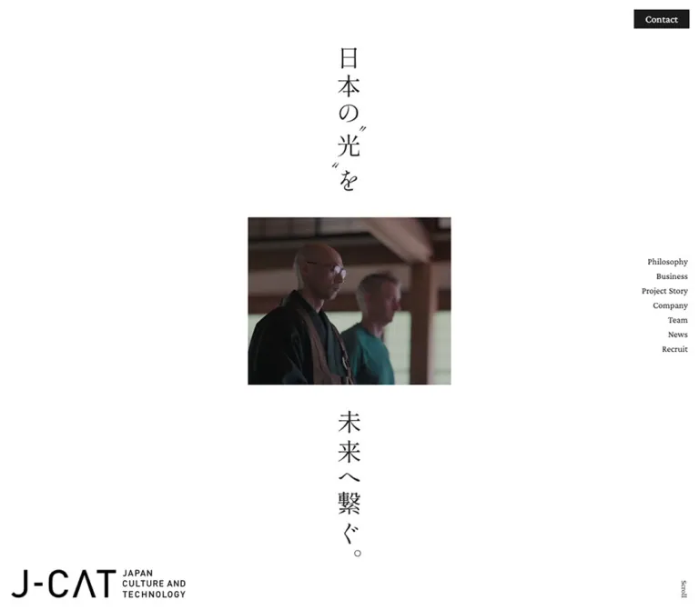
広い余白と縦書きのコピーに、日本文化を伝える写真を配したコーポレートサイト。繊細な欧文セリフ体と明朝体、白から濃灰へ切り替わるフッターが特徴。
オリジナルサイトを見るJ-CAT — Style Reference
A quiet corporate editorial: vertical Japanese writing, a small window into cultural experience, and generous white space.
Website: j-cat.co.jp
Original URL: https://j-cat.co.jp/
Final URL: https://j-cat.co.jp/
Theme: white main canvas with a charcoal footer; no theme selector was evidenced.
Inspected: September 12, 2026. Supplied retrieval timestamp: 2026-09-12T07:01:37.333Z, equivalent to 16:01:37 JST.
Viewports: desktop 1440 × 1000 and mobile 390 × 844 CSS pixels.
Scope: the current corporate homepage. Visual evidence covers the desktop opening, Shop/Award Program area, desktop footer, mobile opening, and mobile footer. Rendered text and computed styles additionally cover the introductory narrative, Services, Project Story, Partner, News, Media, and Recruit. Linked destination pages and expanded menus were not inspected.
J-CAT presents Japanese cultural experiences through restraint. The opening places the statement “日本の“光”を未来へ繋ぐ。” around a small rectangular media window, with identity and navigation held near the viewport edges. White space does most of the compositional work. Woodland greens, incense utensils, timber, and a deep blue interior enter through photography, while interface colors remain predominantly neutral.
The longer homepage develops into an editorial corporate directory. Fine English serif headings introduce Japanese explanations, numbered services, physical locations, an award program, project stories, news, and recruitment. Its strongest typographic relationship is between light Crimson Pro headings, Shippori Mincho B1 statements, and compact Gothic MB101 body text. The footer closes with a large contact panel beside a ruled directory, reversing the interface to white on charcoal.
How to Read This Reference
- Measured means a value explicitly present in the supplied computed styles or element rectangles. These measurements describe the recorded state, rather than an independently repeated inspection.
- Visual estimate means a dimension, color, or treatment judged from the supplied screenshots. These values are approximate and were not obtained through pixel-sampling tools.
- Derived means arithmetic based on measured or estimated values, such as column gaps or media-area percentages.
- Recommendation means an implementation choice for a new project. The Quick Start is an adaptation, not recovered source code.
- DOM-only identifies components whose text or geometry was supplied without a corresponding detailed screenshot.
- Source custom properties are distinguished from reusable aliases. The existence of a source variable does not establish that it is used visibly on this page.
Some sampled anchors and heading containers report generic sans-serif styles even though their visible child lettering is serif. Likewise, several desktop heading rectangles are much taller than their declared line height. Use directly sampled text styles for typography and screenshots for visible composition; do not turn those container rectangles into font-size or line-height tokens.
The supplied DOM and screenshots are separate recorded states. In particular, Shop image placement and some vertical coordinates do not support a single reliable pixel map of the entire page. Local component relationships are more dependable than subtracting arbitrary document coordinates across captures.
Tokens — Colors
Default Palette
| Name | Value | Reusable alias | Evidence and role |
|---|---|---|---|
| White | #ffffff |
--color-page |
Measured body background and reversed text; source --s-color-569c5f81 |
| Near Black | #1b1b1b |
--color-ink |
Measured content text and filled Contact controls; source --s-color-aa99756d |
| Wrapper Gray | #333333 |
--color-wrapper |
Measured on many layout wrappers; source --s-color-1494a0d2. It does not override more specific child text colors |
| News Surface | #f7f7f7 |
--color-soft |
Measured News card background; source --s-color-21a7fc0b |
| Light Rule | #dadada |
--color-rule |
Source --s-color-b9b3f5ca; visually consistent with the fine Shop/Award divisions, although those borders were not individually sampled |
| Footer Charcoal | #212121 |
--color-footer |
Measured footer background at both viewports |
| Contact Charcoal | #373737 |
--color-contact |
Measured footer contact-panel background at both viewports |
| Dark Rule | approximately #4a4a4a |
--color-rule-dark |
Visual estimate of footer dividers; use as an adaptation value |
The two footer grays are separate surfaces: #212121 spans the page, while #373737 forms the contact destination. Preserve this modest difference instead of adding shadow elevation.
The source also defines #777777, #465860, #b32d2d, and a slate gradient. Their visible assignments are not established by the supplied captures. They should not become a general accent system merely because they appear in the variable inventory.
Color Distribution
The opening is overwhelmingly white. Based on estimated media bounds, the photograph occupies about 8.0% of the desktop viewport and 12.7% of the mobile viewport. Its relatively small area makes the natural color more noticeable.
Maintain this hierarchy when adapting the design: neutral interface, concentrated photographic color, and a substantial dark closing section. There is no evidenced colorful primary-action treatment.
Tokens — Typography
Crimson Pro — English Editorial Headings
Measured family: "Crimson Pro", corresponding to source --s-font-2c9e9d13.
Major section headings use weight 200; secondary headings and sampled footer links use 300. Tracking is gently positive: 0.04em on major headings, 0.02em on secondary headings, and 0.05em on footer directory labels.
This is a light, literary hierarchy. Larger type gains presence through scale and surrounding space rather than bold weight. Services, Project Story, News, and Recruit share the larger tier; Shop, Award Program, Partner, and Media share the smaller tier.
Shippori Mincho B1 — Japanese Statements
Measured family: "Shippori Mincho B1", corresponding to source --s-font-7089ad43.
Direct samples establish this family on Japanese service statements, story captions, recruitment copy headings, contact headings, and introductory narrative paragraphs. Most statements use weight 500; the contact heading uses 400. Statement tracking is usually -0.03em.
The opening slogan visibly has a Mincho character, but its own text-node style was not supplied. Using Shippori Mincho B1 for that slogan is a sensible adaptation, not a verified assignment.
Gothic MB101 R — Japanese Body and Utility Text
Measured family: "ゴシックMB101 R JIS2004", corresponding to source --s-font-238ffc71.
This family is directly recorded on body paragraphs, location notes, article titles, contact explanations, and copyright text. Weight is 400, generally with 0.04em tracking. Body text remains small while line spacing is generous, keeping dense Japanese explanations calm and readable.
The observed family name should be retained when the font is available. A generic sans-serif fallback is an implementation substitute; it will alter line lengths and wrapping.
Navigation and Brand Lettering
The English opening and header links visibly use serif lettering. Their sampled anchor wrappers report 16px sans-serif, which does not identify the actual child typeface. Crimson Pro is verified for several footer labels and can be reused for a coherent navigation adaptation, but its use in the header is not independently established.
The J-CAT wordmark is an identity graphic with a compact three-line English descriptor. Its empty-text H1 wrapper does not establish a logo font. Preserve the graphic and its proportions instead of rebuilding it as ordinary typed text.
Type Scale
Values below are measured computed styles unless explicitly marked as estimates. Sizes and line heights are CSS pixels.
| Role | Desktop size / line height | Mobile size / line height | Weight | Tracking |
|---|---|---|---|---|
| Major English section heading | 57 / 57 |
43 / 43 |
200 |
0.04em |
| Secondary English section heading | 40 / 44 |
30 / 45 |
300 |
0.02em |
| Award program title | 31 / 44.02 |
23 / 25.07 |
300 |
0.02em |
| Award partnership line | 19 / 19 |
15 / 15 |
300 |
0.02em |
| Japanese service statement, directly sampled examples | 23 / 37.03 |
17 / 27.03 |
500 |
-0.03em |
| Project Story caption | 23 / 37.03 |
15 / 25.05 |
500 |
-0.03em |
| Recruitment statement | 23 / 37.03 |
18 / 30.96 |
500 |
-0.03em |
| Main introductory explanation | 16 / 38.08 |
13 / 28.99 |
400 |
0.04em |
| Introductory narrative, DOM-only state | 17 / 36.04 |
14 / 27.02 |
500 |
-0.06em desktop; -0.07em mobile |
| Standard service, award, and recruitment body | 14 / 28 |
12 / 23.04 |
400 |
0.04em |
| Services summary | 14 / 26.04 |
12 / 23.04 |
400 |
0.04em |
| Shop location note | 14 / 26.04 |
12 / 20.04 |
400 |
0.04em |
| News card title | 15 / 27 |
12 / 20.04 |
400 |
0.04em |
| Media list title | 14 / 26.04 |
12 / 20.04 |
400 |
0.04em |
| Contact heading | 26 / 40.04 |
20 / 40 |
400 |
-0.03em |
| Sampled footer primary labels | 22 / 22 |
18 / 18 |
300 |
0.05em |
| Copyright | 10 / 10 |
10 / 10 |
400 |
0.04em |
| Opening vertical slogan | approximately 38–42px |
approximately 28–30px |
Visually regular | Not measured |
Do not use the generic 18.72px / 700 H3 wrapper samples to replace the visibly refined Shop titles or to normalize every service heading. The actual child styles were not included for those examples.
Tokens — Spacing & Shapes
Density: broad section spacing around compact typography and controls. Base system: no consistent source spacing unit was established. The values below are component measurements, not a discovered universal scale.
Spacing Scale
| Use | Desktop | Mobile | Evidence |
|---|---|---|---|
| Main content side margin | 150px |
24px |
Measured across multiple sections |
| Opening brand edge inset | 20px left, 22px bottom |
18px right, 21px top |
Measured H1 graphic rectangle |
| Opening navigation row pitch | 26px |
22px |
Derived from consecutive link positions |
| Header navigation gap | min(2.462vw, 32px) |
Desktop navigation not exposed in the same arrangement | Explicit source rule; 32px at 1440px |
| Section label to detail-column offset | 194px |
Label moves above content | Derived from x=150 and x=344 |
| Shop card gap | approximately 46px |
Different compact arrangement | Desktop screenshot estimate |
| News grid gap | 40px horizontally and vertically |
16px vertically |
Derived from card rectangles |
| Service statement to paragraph | 15px |
10px |
Derived from directly sampled text rectangles |
| Contact panel padding | 40px |
40px |
Measured |
| Footer contact-to-directory separation | 100px to directory start |
40px after contact panel |
Derived; desktop includes the right column's inner inset |
| Footer outer contact inset | 24px |
48px top and 24px sides |
Derived from footer and panel rectangles |
| Award section padding | 116px top, 188px bottom |
63px top, 88px bottom |
Measured |
| News section top padding | 188px |
96px |
Measured |
| Media section top padding | 112px |
64px |
Measured |
Large desktop section intervals often fall around 112–188px; mobile equivalents commonly fall around 64–96px. These are useful adaptation ranges, but different sections retain individual values.
Border Radius
| Element | Value | Status |
|---|---|---|
| Filled opening/header Contact control | 0 |
Measured |
| News cards | 0 |
Measured |
| Shop photographs and award frame | Square | Visually observed |
| Service and award detail controls | 100px |
Measured source radius, producing a pill |
| Footer contact panel | 3px |
Measured |
| Footer contact outline | Fully rounded ends | Visually observed |
The page combines square photographic/content surfaces with a few pill-shaped detail actions. Rounding is selective rather than a site-wide card treatment.
Layout Measurements
| Element | Desktop, 1440 × 1000 | Mobile, 390 × 844 |
|---|---|---|
| Recorded document height | 11278.875px |
10437.875px |
| First narrative section | 2285px high |
1788px high |
| Main repeated content span | 1140px, from x=150 to 1290 |
342px, from x=24 to 366 |
| Opening media, visual estimate | 418 × 276px, at approximately (511, 356) |
241 × 173px, at approximately (130, 326) |
| Opening wordmark wrapper | 310 × 50px, at (20, 928) |
186 × 30px, at (186, 21) |
| Opening Contact control | 99 × 34px, at (1324, 17) |
64 × 25px, at (309, 802) |
| Desktop header | 1440 × 68px |
Header wrapper reports zero height in the recorded opening state |
| Header brand link | 168 × 27px |
Separate compact link reports approximately 124 × 19.92px |
| Header Contact control | 142 × 68px |
Separate menu-button rectangle is 50 × 50px; visibility is state-dependent |
| Service paragraph width | Approximately 515px |
310px, beginning at x=40 |
| Story link bounds | Approximately 723 × 506px |
Approximately 345 × 278px |
| News cards | 550px wide; sampled heights 161–188px |
342px wide; sampled heights approximately 125–156px |
| Footer | 911px high |
Approximately 985.89px high |
| Footer contact panel | Approximately 533.69 × 863px |
Approximately 342 × 279.09px |
| Footer primary row | 64px link area with approximately 65px row pitch |
49px link area with approximately 50px row pitch |
| Footer Business row | 137px link area |
123px link area |
The first narrative section is substantially taller than the opening viewport. Its section height should not be used as the height of the initial white composition.
Components
Opening Composition
Role: establish identity and the cultural theme before introducing business detail.
The desktop composition has five distinct parts: vertical Japanese copy above the media, a centered media rectangle, the continuation of the copy below it, the large wordmark at bottom left, and navigation at the right edge. A separate black Contact control occupies the top-right corner. A tiny vertical Scroll label sits near the lower-right edge.
The media is modest, approximately 418px wide within a 1440px viewport. Its edges are square, with no visible frame or shadow. The two copy segments share the same central vertical axis, and the image interrupts that axis rather than acting as a full background.
On mobile, the slogan becomes one continuous column near the upper-left edge. The wordmark moves to the upper right. The media shifts rightward to approximately x=130, retaining substantial empty space above and below. Navigation forms a compact bottom-right stack, followed by Contact; Scroll moves to the bottom left.
Implementation recommendation: use real vertical writing with writing-mode: vertical-rl and typographic punctuation handling. Keep a coherent accessible reading order even if the desktop display separates the sentence into two visual segments. Do not reproduce vertical Japanese by rotating an ordinary horizontal line.
Opening Navigation
Role: expose the site's main destinations while preserving the sparse opening.
The seven visible destinations are Philosophy, Business, Project Story, Company, Team, News, and Recruit. They are unboxed and right-aligned. Their measured row pitch is 26px on desktop and 22px on mobile. There is no visible hamburger control in the supplied mobile opening screenshot.
Contact uses a small rectangular near-black fill with reversed serif lettering. Its measured desktop opening size is 99 × 34px; mobile reduces it to 64 × 25px. Treat these as the observed visual sizes. A new implementation should revisit touch-target spacing before adopting the mobile dimensions unchanged.
Corporate Header
Role: provide a compact navigation strip in later desktop page states.
The desktop Shop/Award and footer captures show the wordmark at the top left, a horizontal navigation group toward the right, and a full-height black Contact block at the far edge. The measured header height is 68px, with a 20px left inset and a 168 × 27px brand link. Contact is 142px wide.
The supplied source includes visibility rules for #header, body.header-visible, and #header.is-visible. This supports a conditional header state, consistent with the different opening and scrolled screenshots. The exact activation threshold and scroll-direction behavior are unverified.
The header wrapper has a transparent computed background. In the Shop capture, section titles visibly intersect the navigation strip. Record that overlap as part of the captured state, not as a spacing pattern to reproduce deliberately.
On mobile, the DOM records a separate 50 × 50px near-black menu button and a compact brand link. The button is not visibly exposed in the provided opening or footer capture. Its opened panel, icon, keyboard behavior, and activation conditions are unknown.
Introductory Narrative
Role: connect the cultural opening to the company's purpose.
The DOM contains two white Mincho paragraphs about Japanese traditions and carrying their value into the future, plus a Philosophy link labeled “What Drives Us :” and “私たちの目指す未来とは”. Those paragraphs are not visible in the supplied white opening screenshot, so they should be treated as a separate recorded narrative state whose full presentation remains unverified.
Desktop paragraph widths are approximately 352px and 369px, placed in separated columns. Mobile places both in a narrow right-hand column around x=163, with widths around 197px. The sampled narrative type changes from 17 / 36.04px to 14 / 27.02px.
A following introductory explanation uses Gothic MB101 R and a centered narrow measure: approximately 466px on desktop and 270px on mobile. Its source text changes line breaks between viewports. Preserve deliberate editorial line lengths rather than widening this paragraph to the main section container.
Services Section
Role: explain the business through three distinct offerings.
DOM-only detail: the section begins with the large Services heading, a Japanese summary, and a pill-shaped overview link. Desktop places the overview action near the right side of the content span; mobile centers it below the summary. The mobile Services heading is also centered.
The service sequence is numbered 01, 02, and 03, with Otonami, Wabunka, and Produce as the named offerings. Each includes a Japanese statement, supporting paragraph, and a detail destination. The first two lead to their respective service websites; Produce leads to project stories.
Directly sampled service paragraphs occupy approximately 515px on desktop and 310px on mobile. Mobile paragraphs begin at x=40, creating a deeper inset than the standard 24px section margin. Detail controls move from the right edge of the desktop text column to the left edge of the mobile text column.
The desktop “Service List” label is recorded at the far right and is absent from the mobile rendered-text summary. Its exact decorative arrangement is not sufficiently shown to reproduce beyond that observation.
Pill Detail Control
Role: provide a restrained secondary destination.
Service controls have transparent computed backgrounds, 100px corner radii, and measured heights of 46px on desktop and 40px on mobile. The service overview is about 152px wide on desktop and 135px on mobile. English View More controls are about 147px and 130px wide respectively.
Text and an additional visual element are separated by a 15–16px source gap. The supplied evidence does not identify every child icon. Do not invent a universal arrow shape from the wrapper measurements.
The award detail control is smaller: approximately 142 × 34px on desktop and 132 × 33px on mobile. A fine outlined pill is a suitable reusable treatment, visually established by the footer action; individual service-control border colors were not sampled.
Shop Location
Role: introduce the two physical venues.
The desktop Shop block uses a section label at the left and two equal venue columns to its right. The photographs are approximately 450 × 251px, with a 46px gap. Each venue has a serif name above the photograph and a short Japanese access note below.
Otonami Lounge Tokyo shows a timber-framed entrance with a white curtain and a view into the retail/lounge interior. EnCounter by Otonami shows blue chairs and a counter beneath a softly illuminated display recess. The photographs carry distinct material and color identities while retaining the same rectangular presentation.
The DOM confirms the notes “大丸東京店 10F / 東京駅直結” and “三越前駅 徒歩3分”. These are compact supporting information rather than badges or prominent booking actions.
On mobile, venue titles occupy successive rows at x=24. Location notes shift to approximately x=207–211, suggesting a compact arrangement beside the lower visual portion of each entry. Image rectangles were not supplied for that mobile area, so the exact media/text split remains an inference. Avoid assuming two full-width photo cards simply stack unchanged.
Award Program Feature
Role: present a named initiative as a single editorial feature.
A full-width fine divider separates this area from Shop. The desktop heading sits above a large square-cornered outlined panel, approximately 1137px wide in the capture. A vertical divider creates an approximately 400px-wide left region containing the award graphic. The right region contains the title, partnership line, Japanese explanation, and a small detail link.
“Destinations of the Year” is directly measured at 31px Crimson Pro, weight 300. The following “Forbes JAPAN × J-CAT” line is 19px. Supporting text returns to the standard 14 / 28px Gothic body style. In the screenshot, the content starts around x=628, roughly 74px beyond the vertical divider.
The mobile DOM places the feature title and explanation at the standard 24px left margin, below the earlier visual area. Type reduces to 23px for the title and 15px for the partnership line. The desktop frame's complete mobile border treatment is not visible in the supplied screenshots.
Project Story Rail
Role: connect the business proposition to individual editorial stories.
DOM-only detail: five linked entries are present, numbered Vol. 01 through Vol. 05. Each combines a story destination, Japanese caption, and Read More label. The major section heading and captions have measured white text.
Desktop link rectangles share the same vertical position and begin at x=167, 1247, 2327, 3407, and 4487. Their derived horizontal stride is 1080px, or 75% of the desktop viewport. Mobile entries begin at x=24, 414, 804, 1194, and 1584, giving a 390px stride, equal to the mobile viewport width.
This establishes a horizontal sequence extending beyond the viewport. It does not establish whether users advance it through drag, buttons, wheel input, automatic progression, or scroll-linked animation. Do not implement any one of those as a claimed reproduction without further evidence.
The anchor dimensions include text and controls; they are not reliable photograph aspect ratios. On mobile, the caption width is 273px within a 345px link, and Read More is represented on two lines in the rendered text.
News Card
Role: present recent announcements with dates and category information.
DOM-only detail: six news items form a desktop two-column arrangement. Each card is 550px wide, with a 40px column gap. Recorded row heights vary with content, from 161px to 188px. All use a measured #f7f7f7 background and zero border radius.
The first title begins 36px inside its card. Its measured box is about 318px wide, including 32px right padding, leaving roughly 286px for the actual text. The cards also contain date/category information; image-background declarations appear in the mobile evidence, but the exact thumbnail geometry is not directly sampled.
Mobile changes to one 342px-wide column with 16px gaps. The title begins 20px inside each card, and its 208px-wide box includes 24px right padding. Text is 12 / 20.04px. The remaining width accommodates the accompanying visual region, but its precise size should be treated as an adaptation decision.
Keep category and date metadata subordinate. The site's evidenced hierarchy is a pale rectangular content surface, compact metadata, and a multiline Japanese title.
Media List
Role: provide a denser index of press coverage.
DOM-only detail: the desktop Media heading occupies the left label column while linked rows span 946px from x=344 to 1290. Date/category information precedes the article title; the title starts at x=634. Source row padding is 31px 0, with a 40px horizontal gap.
Mobile rows span the 342px content width. Date/category information moves above the title, which returns to x=24. Recorded heights are approximately 89px for shorter entries and 109px for the longer first entry. Source padding is 23px above and 26px below.
The list destination uses the paired labels Media List and View All Media. A comparable News List / View All News destination follows the news cards. These are editorial index links rather than large filled calls to action.
Recruit Block
Role: introduce recruitment within the corporate narrative.
DOM-only detail: desktop positions the large Recruit heading at the standard left margin and the Japanese statement, body copy, and destination in a right-hand region beginning around x=538. Mobile centers the English heading and the short Japanese statement, while the paragraph uses the standard full content width.
The mobile statement is 18 / 30.96px, slightly larger than the 17px mobile service statements. The closing destination pairs “Get in touch :” with “採用情報を見る”. It links to recruitment rather than to the general contact page.
Footer Contact Panel
Role: provide a broad destination for business inquiries, media requests, and service questions.
The desktop panel occupies approximately 534 × 863px inside a 24px footer inset. It uses #373737, a 3px radius, and no visible shadow. A narrow 334px text group is centered inside the tall panel.
Its anatomy is a small English Contact label, a Japanese “お問い合わせ” heading, a left-aligned explanatory paragraph, and a full-width outlined pill reading “お問い合わせはこちら”. The visible pill is approximately 334 × 46px. White text and a fine white outline establish the hierarchy.
The DOM identifies the whole panel as a link to /contact. For a semantic adaptation, use a single anchor around the content and make the pill a styled noninteractive child; avoid placing a second anchor inside the panel link.
Mobile changes the panel to approximately 342 × 279px, with 40px padding. Its inner text is about 263px wide, the Japanese heading becomes 20px, and the visible outline action is approximately 262 × 40px. The supplied mobile screenshot begins partway through this panel; its full dimensions come from the DOM.
Footer Directory and Legal Row
Role: expose the corporate structure and service destinations at the end of the page.
The desktop directory begins around x=658 and spans approximately 682px. Thin gray rules divide primary rows. Labels are white, lightly tracked Crimson Pro, with sampled values of 22px and weight 300.
Business is taller than the other rows. Its primary label sits at the left, while Otonami, Wabunka, Wabunka Enterprise, and Produce form a smaller list at the right. The first three show small outbound-style glyphs in the screenshot. Recruit also shows that glyph, although its recorded href remains on the original domain. The glyph alone does not prove a new tab or external destination.
On mobile, the contact panel is followed by 40px of separation and then the directory. Regular rows have about a 50px pitch. Business retains its left-label/right-sublink arrangement and occupies approximately 124px including its divider. The sublinks begin at x=232 within the 342px-wide directory.
A reversed J-CAT graphic follows the directory, approximately 218px wide on desktop and 160px wide on mobile by visual estimate. Beneath it are the privacy-policy link, travel-agency terms link, and a small copyright line. The mobile capture keeps these three legal items on one line, using very small type.
Tokens — Motion & Interaction
The evidence establishes several CSS transition declarations and one animation rule. It does not provide a temporal recording of most effects.
| Treatment | Recorded value or evidence | What is established | Limitation |
|---|---|---|---|
| Body background | 0.5s cubic-bezier(0.4, 0.4, 0, 1) |
A background transition is declared | Trigger and color sequence are unknown |
| Header and mobile menu control | 0.6s cubic-bezier(0.4, 0, 0.2, 1) |
Transition declarations and conditional visibility rules exist | Exact reveal threshold and motion path are unverified |
| English section headings | 0.8s cubic-bezier(0.22, 1, 0.36, 1) |
A shared heading transition is declared | Reveal direction, transform distance, and staggering are unknown |
| Pill controls, News cards, Media rows | 0.4s cubic-bezier(0.4, 0, 0.2, 1) |
Shared interactive transition timing | Hover/focus endpoint styles were not captured |
| Sampled footer text links | 0.4s cubic-bezier(0.4, 0.4, 0, 1) |
A related footer-link transition exists | The visible effect was not exercised |
| Recruitment/footer strip rule | slideLeft 224s linear 0s infinite |
Embedded CSS targets #footer_recruit_slider ul, translating from 0 to -100% |
Runtime visibility, complete media-query overrides, and actual looping were not verified |
| Opening media | Different cultural subjects appear in desktop and mobile captures | The two captured media states differ | Video playback, looping, autoplay, sound, and synchronization are unverified |
| Repeated Contact / Read More text | Duplicate labels occur in extracted link text | Multiple label representations exist in the DOM | This does not prove a rolling-text hover animation |
| Project Story sequence | Horizontal offscreen link positions | A horizontal arrangement is recorded | Navigation mechanism and autoplay remain unknown |
The repeated --g-* entries in transition strings are generated property declarations, not evidence that the visible page uses an animated multicolor gradient. Similarly, animation: none on a sampled wrapper does not rule out motion on descendants or through JavaScript.
Recommended adaptation: retain the source's restrained 400–800ms transition range for subtle opacity, border, or short transform changes. Specify the properties being animated instead of copying broad generated transition lists. Keep the normal content visible until an enhancement has successfully initialized.
Surfaces
| Layer | Appearance | Purpose |
|---|---|---|
| Main canvas | Pure white | Provides the opening's extensive empty space and the main editorial background |
| Editorial content | White with image boundaries and occasional fine rules | Separates sections without enclosing everything in cards |
| News card | Flat #f7f7f7, square corners |
Distinguishes repeated announcements |
| Award feature | White, fine rectangular outline, desktop vertical divider | Gives one initiative a contained editorial treatment |
| Contact utility | Near-black rectangle with reversed text | Small, persistent destination emphasis |
| Footer | Full-width #212121 |
Creates a clear closing region |
| Footer contact destination | #373737, 3px radius |
Distinguishes the inquiry area through tonal contrast |
| Footer directory | Same charcoal as footer, fine lighter rules | Organizes destinations without separate card surfaces |
There is no visible general shadow-elevation system in the supplied captures. Shape, spacing, rules, and tonal contrast establish grouping.
Imagery
The observed imagery is material and place-specific: woodland light, a person within greenery, an incense vessel on tatami, timber joinery, a white entrance curtain, blue counter seating, and softly illuminated display objects. These subjects connect the cultural proposition to physical experience.
The opening media appears relatively dark and subdued against white. This is a visual observation, not proof of a CSS brightness filter. Preserve natural lighting and photographic texture; avoid applying a blanket desaturation or dark overlay to every image.
Desktop venue photographs use broad landscape crops with architectural lines kept clear. The opening has a different crop: approximately 1.51:1 on desktop and 1.39:1 on mobile, based on screenshot estimates. Do not enforce a universal 16:9 ratio across all image roles.
The award graphic is a separate branded composition containing an emblem and typography. It should remain an intact graphic rather than being reconstructed from generic icons and text.
Observed Asset References
Complete asset URLs were not supplied for the visible imagery. The references below identify the observed subjects and locations without inventing filenames.
| Asset | Evidence location | Observed use |
|---|---|---|
| J-CAT identity graphic | Opening, desktop header, and both footer captures | Black or reversed wordmark with a compact English descriptor |
| Woodland scene | Desktop opening capture | Small centered landscape media window |
| Incense scene | Mobile opening capture | Right-offset media window showing a vessel, tatami, and a person in the background |
| Otonami Lounge Tokyo entrance | Desktop Shop capture | Landscape venue photograph beneath its name |
| EnCounter by Otonami interior | Desktop Shop capture | Landscape counter photograph with blue seating |
| Destinations of the Year graphic | Desktop Award Program capture | Left side of the outlined initiative panel |
| Story and News backgrounds | Partial background-image declarations in the rendered evidence | Confirms image-bearing elements; complete files and all depicted subjects are unavailable |
For a new implementation, select authorized images with comparable composition and subject matter. The CSS shell cannot supply the specificity of the places, objects, and identity artwork.
Layout & Responsive Behavior
Desktop Structure
The opening uses the viewport as a composition, while most subsequent sections use a repeated 1140px content span. A useful derived desktop grid is a 148px label column, a 46px gap, and a 946px detail region. It accounts for the observed x=150 section-label alignment and x=344 detail alignment. Within Shop, the detail region divides into two approximately 450px columns with a 46px gap.
Not every section uses that grid. News occupies two 550px columns across the full content span. Recruit starts its text farther right, near x=538. The footer has a separate, wider two-region composition, with a tall contact destination and an inset directory.
Mobile Recomposition
Mobile retains the same principal content and five story entries, but changes alignment and density substantially.
| Area | Recorded mobile behavior |
|---|---|
| Opening slogan | Continuous vertical column near the left edge |
| Opening wordmark | Moves from bottom left to top right |
| Opening media | Moves rightward; remains smaller than full width |
| Opening navigation | Moves to bottom right, with Contact below |
| Scroll label | Moves from lower right to lower left |
| Services introduction | Heading and overview action centered |
| Service details | 310px-wide text blocks with 40px side insets; actions left-aligned |
| Shop | Venue entries follow vertically; access notes are shifted into a right-hand region |
| Award feature | Title and explanatory text use the standard 24px left margin below the visual area |
| Project Story | Link stride changes from 1080px to 390px; captions become smaller |
| News | Two desktop columns become one column with 16px gaps |
| Media | Metadata sits above titles instead of sharing the desktop row arrangement |
| Recruit | English heading and Japanese statement become centered |
| Footer | Tall side-by-side panel/directory become a short contact panel followed by the directory |
Breakpoints and Reflow
An explicit max-width: 1280px rule appears in the supplied responsive line-break CSS. The complete breakpoint system was not provided. This is not enough to identify the exact threshold for the header, footer, or content-column changes.
The Quick Start uses 1024px as a recommended layout breakpoint, chosen for a practical adaptation. It is not attributed to the source. Intermediate tablet widths, short landscape screens, browser text enlargement, and dynamic mobile browser chrome require separate testing.
Use content-driven heights for service, news, and footer text. The recorded document is actually shorter on mobile despite stacking more content, because spacing and component dimensions also change. Scaling the desktop document proportionally would not reproduce this behavior.
Do’s and Don’ts
Do
- Preserve the opening's small media window and extensive white surroundings.
- Treat the vertical slogan, brand graphic, navigation, and Scroll label as separate compositional anchors.
- Recompose the opening for mobile, including the top-right brand and bottom-right navigation.
- Use light Crimson Pro for verified English heading roles and Mincho typography for Japanese statements.
- Keep body text compact with generous line height and slightly positive tracking.
- Preserve the distinction between major 57/43px headings and secondary 40/30px headings.
- Use square photographs, flat News surfaces, and fine editorial rules.
- Keep outlined pills selective and the small Contact utility rectangular.
- Retain the two footer charcoal values and the Business row's nested service destinations.
- Preserve meaningful differences between the Shop, News, Media, and Story layouts.
Don't
- Don't expand the opening image into a full-screen background by default.
- Don't move every opening element into a centered marketing stack.
- Don't replace the site's typographic hierarchy with bold sans-serif headings throughout.
- Don't infer a font from a generic anchor or heading wrapper when its visible children differ.
- Don't apply large radii, floating shadows, or colorful badges to every content item.
- Don't use a source-defined red or slate color as an evidenced primary accent without a visible assignment.
- Don't treat horizontal Story geometry as proof of autoplay, dragging, or scroll hijacking.
- Don't reproduce the Shop/header overlap as an intentional layout requirement.
- Don't force desktop line breaks, widths, or footer height onto mobile.
- Don't flatten the corporate homepage into a single-purpose conversion page; its services, stories, news, and directory are central to its structure.
Recommended Implementation Additions
These are recommendations for a new implementation, not verified features of the original:
- Give the brand graphic a meaningful accessible name, especially when it is the only content of an H1 or home link.
- Keep one accessible reading of the opening sentence if its visual desktop presentation uses separate segments.
- Increase or carefully space the small opening navigation targets. Preserve the visual restraint while meeting touch-target requirements; a 44px target is a useful design goal when the layout permits it.
- Provide a visible focus indicator on white and charcoal surfaces. Do not depend solely on a subtle opacity change.
- Make a fixed header's relationship to content explicit through an opaque surface, appropriate offsets, or both. Ensure focused content is not obscured.
- If a menu is implemented, give it an accessible name, an expanded state, predictable focus behavior, and keyboard dismissal.
- If the Story rail is interactive, provide keyboard-operable navigation and a clear way to reach all five entries. Retain ordinary links as a fallback.
- If media or a recruitment strip moves continuously, provide reduced-motion behavior and an appropriate pause mechanism. Do not assume the supplied static frames establish a complete media-control design.
- Reserve image dimensions before loading and select responsive crops deliberately, especially for the offset mobile opening image.
- Allow legal links to wrap at smaller widths or larger text settings, even though they share one line in the supplied mobile capture.
- Keep all primary content accessible when animation initialization fails. Add visual reveals progressively instead of making visibility depend on scripts.
Agent Prompt Guide
Quick Color Reference
- Main page:
#ffffff. - Main text and filled Contact utilities:
#1b1b1b. - News surfaces:
#f7f7f7. - Light rules: source neutral
#dadada, suitable for adaptation. - Footer:
#212121. - Footer contact panel:
#373737. - Reversed text:
#ffffff. - Footer dividers: approximately
#4a4a4a, an estimated adaptation value. - Photographic color: woodland green, timber, muted textiles, and deep blue interiors; no fixed UI accent is required.
Overall Prompt
“Create a Japanese corporate homepage inspired by the current J-CAT reference. Begin with a spacious white viewport, vertical Japanese copy, and a small square-cornered cultural photograph at the center. On desktop, split the visual sentence above and below the photograph, place the wordmark at bottom left, and right-align a compact navigation stack near the right edge. On mobile, use one continuous vertical sentence at upper left, the wordmark at upper right, a right-offset photograph, and navigation at bottom right. Continue with light Crimson Pro section headings, Japanese Mincho statements, compact Gothic body text, numbered services, venue photography, an outlined award feature, project stories, pale square News cards, a Media list, and recruitment. Close with a #212121 footer, a #373737 contact panel, and a ruled directory. Treat unverified motion and menu behavior as implementation decisions, and keep all content accessible without animation.”
Example Component Prompts
- Opening: “At 1440 × 1000, compose a white opening with an approximately 418 × 276px cultural image around the viewport center, a narrow vertical Japanese statement above and below it, a 310 × 50px wordmark at bottom left, and compact navigation at the far right. Use no image border or shadow. At 390 × 844, move the brand to upper right and use an approximately 241 × 173px image offset toward the right.”
- Shop: “Build an editorial venue section inside a 1140px desktop span. Reserve a narrow left column for the 40px light-serif Shop heading, then show two 450px-wide landscape venue photographs with about 46px between them. Put a serif venue name above each photograph and small Japanese access information below. Keep the surfaces white and corners square.”
- Award feature: “Create one outlined white feature panel with a roughly 400px left graphic region and a wider text region divided by a hairline. Use a 31px light Crimson Pro title, a 19px partnership line, Japanese 14/28px body text, and a small pill destination. On mobile, place the text below the graphic at a 24px page inset.”
- News: “Create flat #f7f7f7 announcement cards with square corners, compact category/date metadata, multiline Japanese titles, and an accompanying visual region. Use two 550px columns with a 40px gap on desktop; switch to a 342px single column with 16px gaps on mobile. Let height respond to content.”
- Footer: “Use a full-width #212121 footer. On desktop, place a tall #373737 contact link panel at left and a ruled directory at right. Inside the panel, center a narrow group with Contact, a Japanese inquiry heading, body text, and a white outlined pill. On mobile, shorten the panel and place the directory below it. Keep Business expanded into a right-hand list of four service destinations.”
- Motion: “Use measured source timing as a reference: 400ms for small interactive changes, 600ms for conditional header visibility, and 800ms for restrained heading transitions. Define any movement distances as new design choices. Keep content visible by default and support reduced motion. Do not add automatic Story progression without a product requirement.”
Quick Start
CSS Custom Properties
This is a reusable adaptation with a conventional root font size. It reproduces the principal visual relationships rather than the source's generated selectors or complete animation system. Font files, identity artwork, photographs, and application behavior must be supplied separately.
The opening media proportions and positioning are screenshot estimates. The 1024px breakpoint, header's opaque white surface, some intermediate spacing, and News visual-column widths are recommendations. Measured typography, primary colors, and several desktop/mobile dimensions are retained.
Suggested structure:
.jcat-pagewraps the page..site-headercontains.header-brand,.desktop-nav, and an optional.menu-button. An implementation may add.is-visibleafter its chosen opening threshold..herocontains.hero-titlewith.hero-line--beforeand.hero-line--after,.hero-media,.hero-brand,.hero-nav,.hero-contact, and.hero-scroll..section-railcontains a section heading and a detail region such as.shop-listor.media-list..site-footercontains one.contact-panelanchor and.footer-side. The latter contains.footer-navand.footer-meta.- Use a noninteractive
.pillchild inside the contact-panel anchor. Elsewhere,.pillcan be applied to a normal destination link.
:root {
  /* Measured colors; dark divider is a visual approximation. */
  --color-page: #ffffff;
  --color-ink: #1b1b1b;
  --color-soft: #f7f7f7;
  --color-rule: #dadada;
  --color-footer: #212121;
  --color-contact: #373737;
  --color-rule-dark: #4a4a4a;

  /* Observed family names; actual font files are supplied separately. */
  --font-editorial: 'Crimson Pro', serif;
  --font-jp-serif: 'Shippori Mincho B1', serif;
  --font-body: 'ゴシックMB101 R JIS2004', sans-serif;

  --text-major: 57px;
  --text-secondary: 40px;
  --text-statement: 23px;
  --text-body: 14px;
  --text-news: 15px;
  --leading-body: 2;
  --leading-statement: 1.61;
  --tracking-body: 0.04em;
  --tracking-statement: -0.03em;

  --content-width: 1140px;
  --page-gutter: 24px;
  --rail-width: 148px;
  --rail-gap: 46px;
  --section-space: 116px;
  --news-gap: 40px;
  --control-height: 46px;
  --radius-panel: 3px;
  --radius-pill: 100px;

  /* Durations and easing functions recorded in the source. */
  --ease-ui: cubic-bezier(0.4, 0, 0.2, 1);
  --ease-soft: cubic-bezier(0.4, 0.4, 0, 1);
  --ease-heading: cubic-bezier(0.22, 1, 0.36, 1);
  --duration-ui: 400ms;
  --duration-header: 600ms;
  --duration-heading: 800ms;
}

* {
  box-sizing: border-box;
}

body.jcat-page {
  margin: 0;
  color: var(--color-ink);
  background: var(--color-page);
  font-family: var(--font-body);
  font-size: var(--text-body);
  line-height: var(--leading-body);
  letter-spacing: var(--tracking-body);
}

.jcat-page a {
  color: inherit;
}

.jcat-page img,
.jcat-page video {
  display: block;
  max-width: 100%;
}

.container {
  width: min(
    var(--content-width),
    calc(100% - 2 * var(--page-gutter))
  );
  margin-inline: auto;
}

.section {
  padding-block: var(--section-space);
}

.section-rail {
  display: grid;
  grid-template-columns: var(--rail-width) minmax(0, 1fr);
  gap: var(--rail-gap);
}

.section-title,
.section-title--secondary {
  margin: 0;
  font-family: var(--font-editorial);
  font-weight: 200;
  font-size: var(--text-major);
  line-height: 1;
  letter-spacing: 0.04em;
}

.section-title--secondary {
  font-size: var(--text-secondary);
  font-weight: 300;
  line-height: 1.1;
  letter-spacing: 0.02em;
}

.jp-statement {
  margin: 0 0 15px;
  font-family: var(--font-jp-serif);
  font-size: var(--text-statement);
  font-weight: 500;
  line-height: var(--leading-statement);
  letter-spacing: var(--tracking-statement);
}

.body-copy {
  margin: 0;
}

/* Recommended header surface; visibility requires application state. */
.site-header {
  position: fixed;
  inset: 0 0 auto;
  z-index: 30;
  display: flex;
  align-items: center;
  justify-content: space-between;
  height: 68px;
  padding-left: 20px;
  background: var(--color-page);
  opacity: 0;
  visibility: hidden;
  transition: opacity var(--duration-header) var(--ease-ui);
}

.site-header.is-visible {
  opacity: 1;
  visibility: visible;
}

.header-brand {
  width: 168px;
  flex-shrink: 0;
}

.desktop-nav {
  display: flex;
  align-items: center;
  gap: min(2.462vw, 32px);
  font: 400 18px / 1 var(--font-editorial);
  letter-spacing: normal;
}

.desktop-nav a {
  text-decoration: none;
}

.header-contact {
  display: grid;
  place-items: center;
  width: 142px;
  height: 68px;
  color: var(--color-page) !important;
  background: var(--color-ink);
}

.menu-button {
  display: none;
}

/* Opening positions approximate the supplied 1440 x 1000 capture. */
.hero {
  position: relative;
  height: max(760px, 100svh);
  background: var(--color-page);
}

.hero-title {
  margin: 0;
  font-family: var(--font-jp-serif);
  font-size: 40px;
  font-weight: 400;
  line-height: 1.2;
  letter-spacing: 0.12em;
}

.hero-title > span {
  position: absolute;
  left: 50%;
  writing-mode: vertical-rl;
  text-orientation: mixed;
  white-space: nowrap;
  transform: translateX(-50%);
}

.hero-line--before {
  top: 7.5%;
}

.hero-line--after {
  top: 67.3%;
}

.hero-media {
  position: absolute;
  top: 35.6%;
  left: 50%;
  width: min(29.03vw, 418px);
  aspect-ratio: 418 / 276;
  margin: 0;
  transform: translateX(-50%);
}

.hero-media > img,
.hero-media > video {
  width: 100%;
  height: 100%;
  object-fit: cover;
}

.hero-brand {
  position: absolute;
  left: 20px;
  bottom: 22px;
  width: 310px;
}

.hero-nav {
  position: absolute;
  top: 41.4%;
  right: 20px;
  display: grid;
  justify-items: end;
  gap: 10px;
  font: 400 16px / 16px var(--font-editorial);
  letter-spacing: normal;
}

.hero-nav a {
  text-decoration: none;
}

.hero-contact {
  position: absolute;
  top: 17px;
  right: 17px;
  display: grid;
  place-items: center;
  width: 99px;
  height: 34px;
  color: var(--color-page) !important;
  background: var(--color-ink);
  font: 400 18px / 1 var(--font-editorial);
  letter-spacing: normal;
  text-decoration: none;
}

.hero-scroll {
  position: absolute;
  right: 20px;
  bottom: 22px;
  writing-mode: vertical-rl;
  font: 400 12px / 1 var(--font-editorial);
  letter-spacing: normal;
}

.pill {
  display: inline-flex;
  align-items: center;
  justify-content: center;
  gap: 15px;
  min-height: var(--control-height);
  padding: 10px 15px;
  border: 1px solid currentColor;
  border-radius: var(--radius-pill);
  background: transparent;
  font-size: var(--text-body);
  line-height: 1.4;
  text-decoration: none;
  transition:
    color var(--duration-ui) var(--ease-ui),
    background-color var(--duration-ui) var(--ease-ui);
}

.shop-list {
  display: grid;
  grid-template-columns: repeat(2, minmax(0, 1fr));
  gap: 46px;
}

.shop-item {
  min-width: 0;
}

.shop-name {
  margin: 0 0 34px;
  font: 300 31px / 1.2 var(--font-editorial);
  letter-spacing: 0.02em;
}

.shop-image {
  width: 100%;
  aspect-ratio: 450 / 251;
  object-fit: cover;
}

.shop-location {
  margin: 31px 0 0;
  line-height: 1.86;
}

.award-section {
  padding-block: 116px 188px;
  border-top: 1px solid var(--color-rule);
}

.award-panel {
  display: grid;
  grid-template-columns: minmax(0, 400px) minmax(0, 1fr);
  margin-top: 40px;
  border: 1px solid var(--color-rule);
}

.award-visual {
  display: grid;
  place-items: center;
  padding: 48px;
  border-right: 1px solid var(--color-rule);
}

.award-copy {
  padding: 88px 72px;
}

.award-title {
  margin: 0;
  font: 300 31px / 1.42 var(--font-editorial);
  letter-spacing: 0.02em;
}

.award-partnership {
  margin: 6px 0 37px;
  font: 300 19px / 1 var(--font-editorial);
  letter-spacing: 0.02em;
}

.award-copy .pill {
  min-height: 34px;
  margin-top: 39px;
  padding: 6px 12px;
}

.news-grid {
  display: grid;
  grid-template-columns: repeat(2, minmax(0, 1fr));
  gap: var(--news-gap);
}

/* The visual-column proportion is an adaptation of the text bounds. */
.news-item {
  display: grid;
  grid-template-columns: minmax(0, 1fr) 35.64%;
  min-width: 0;
  background: var(--color-soft);
  text-decoration: none;
}

.news-info {
  min-width: 0;
  padding: 28px 32px 28px 36px;
}

.news-meta {
  margin-bottom: 12px;
  font-size: 11px;
  line-height: 1.5;
}

.news-title {
  margin: 0;
  font-size: var(--text-news);
  font-weight: 400;
  line-height: 1.8;
}

.news-image {
  width: 100%;
  height: 100%;
  object-fit: cover;
}

.media-item {
  display: grid;
  grid-template-columns: 250px minmax(0, 1fr);
  gap: 40px;
  padding-block: 31px;
  border-bottom: 1px solid var(--color-rule);
  text-decoration: none;
}

.site-footer {
  display: grid;
  grid-template-columns: minmax(0, 38.34%) minmax(0, 1fr);
  gap: 40px;
  min-height: 911px;
  padding: 24px;
  color: var(--color-page);
  background: var(--color-footer);
}

.contact-panel {
  display: grid;
  place-items: center;
  padding: 40px;
  border-radius: var(--radius-panel);
  background: var(--color-contact);
  text-decoration: none;
}

.contact-inner {
  width: min(334px, 100%);
}

.contact-eyebrow {
  margin: 0;
  text-align: center;
  font: 300 16px / 16px var(--font-editorial);
}

.contact-title {
  margin: 10px 0 31px;
  text-align: center;
  font: 400 26px / 1.54 var(--font-jp-serif);
  letter-spacing: -0.03em;
}

.contact-panel .pill {
  display: flex;
  width: 100%;
  margin-top: 39px;
}

.footer-side {
  display: flex;
  flex-direction: column;
  min-width: 0;
  padding: 82px 15px 14px 0;
}

.footer-nav {
  margin-inline: 60px 61px;
  font: 300 22px / 1 var(--font-editorial);
  letter-spacing: 0.05em;
}

.footer-nav ul {
  margin: 0;
  padding: 0;
  list-style: none;
}

.footer-nav > ul > li {
  border-top: 1px solid var(--color-rule-dark);
}

.footer-nav > ul > li:last-child {
  border-bottom: 1px solid var(--color-rule-dark);
}

.footer-row {
  display: flex;
  align-items: center;
  justify-content: space-between;
  min-height: 64px;
  padding-inline: 2px;
  text-decoration: none;
}

.footer-business {
  display: flex;
  align-items: flex-start;
  justify-content: space-between;
  gap: 24px;
  min-height: 137px;
  padding: 21px 0 21px 2px;
}

.footer-business > a,
.footer-subnav a {
  text-decoration: none;
}

.footer-subnav {
  display: grid;
  gap: 9px;
  font-size: 16px;
  line-height: 16px;
  letter-spacing: 0.02em;
}

.footer-meta {
  margin-top: auto;
}

.footer-logo {
  width: 218px;
}

.legal-row {
  display: flex;
  flex-wrap: wrap;
  align-items: center;
  gap: 12px 20px;
  margin-top: 22px;
  font-size: 10px;
  line-height: 1.5;
}

.legal-row a {
  text-decoration: none;
}

.legal-row small {
  margin-left: auto;
  font-size: inherit;
}

/* Recommended feedback; original hover endpoints were not captured. */
@media (hover: hover) {
  .pill:hover,
  .contact-panel:hover .pill {
    color: var(--color-page);
    background: var(--color-ink);
  }

  .contact-panel:hover .pill {
    color: var(--color-footer);
    background: var(--color-page);
  }

  .hero-nav a:hover,
  .footer-row:hover {
    text-decoration: underline;
    text-underline-offset: 0.2em;
  }
}

.jcat-page :focus-visible {
  outline: 2px solid currentColor;
  outline-offset: 5px;
}

/* Recommended breakpoint, not a recovered source threshold. */
@media (max-width: 1024px) {
  :root {
    --text-major: 43px;
    --text-secondary: 30px;
    --text-statement: 17px;
    --text-body: 12px;
    --text-news: 12px;
    --leading-body: 1.92;
    --leading-statement: 1.59;
    --section-space: 64px;
    --news-gap: 16px;
    --control-height: 40px;
  }

  .section-rail,
  .shop-list,
  .news-grid {
    grid-template-columns: minmax(0, 1fr);
  }

  .section-rail {
    gap: 31px;
  }

  .section-title--secondary {
    line-height: 1.5;
  }

  .site-header {
    height: 50px;
    padding-left: 15px;
  }

  .header-brand {
    width: 124px;
  }

  .desktop-nav {
    display: none;
  }

  .menu-button {
    display: grid;
    place-items: center;
    width: 50px;
    height: 50px;
    border: 0;
    color: var(--color-page);
    background: var(--color-ink);
  }

  .hero {
    height: max(740px, 100svh);
  }

  .hero-title {
    position: absolute;
    top: 18px;
    left: 20px;
    writing-mode: vertical-rl;
    font-size: 30px;
    line-height: 1.2;
    letter-spacing: 0.08em;
  }

  .hero-title > span {
    position: static;
    display: inline;
    writing-mode: inherit;
    transform: none;
  }

  .hero-media {
    top: 38.63%;
    right: 19px;
    left: auto;
    width: min(61.8vw, 418px);
    aspect-ratio: 241 / 173;
    transform: none;
  }

  .hero-brand {
    top: 21px;
    right: 18px;
    bottom: auto;
    left: auto;
    width: 186px;
  }

  .hero-nav {
    top: auto;
    right: 18px;
    bottom: 53px;
    gap: 7px;
    font-size: 15px;
    line-height: 15px;
  }

  .hero-contact {
    top: auto;
    bottom: 17px;
    width: 64px;
    height: 25px;
    font-size: 15px;
  }

  .hero-scroll {
    right: auto;
    bottom: 18px;
    left: 20px;
  }

  .service-copy {
    margin-inline: 16px;
  }

  .jp-statement {
    margin-bottom: 10px;
  }

  /* Mobile Shop split is inferred from the access-note positions. */
  .shop-item {
    display: grid;
    grid-template-columns: 48% minmax(0, 1fr);
    align-items: center;
    gap: 20px;
  }

  .shop-name {
    grid-column: 1 / -1;
    margin: 0;
    font-size: 23px;
  }

  .shop-location {
    margin: 0;
    line-height: 1.67;
  }

  .award-section {
    padding-block: 63px 88px;
  }

  .award-panel {
    grid-template-columns: minmax(0, 1fr);
    border: 0;
  }

  .award-visual {
    padding: 32px;
    border-right: 0;
  }

  .award-copy {
    padding: 24px 0 0;
  }

  .award-title {
    font-size: 23px;
    line-height: 1.09;
  }

  .award-partnership {
    margin: 8px 0 22px;
    font-size: 15px;
  }

  .award-copy .pill {
    margin-top: 25px;
    min-height: 33px;
  }

  .news-item {
    grid-template-columns: minmax(0, 1fr) min(114px, 33.34%);
  }

  .news-info {
    padding: 19px 24px 19px 20px;
  }

  .news-title {
    line-height: 1.67;
  }

  .media-item {
    grid-template-columns: minmax(0, 1fr);
    gap: 12px;
    padding-block: 23px 26px;
  }

  .site-footer {
    grid-template-columns: minmax(0, 1fr);
    min-height: 0;
    padding: 48px 24px 33px;
  }

  .contact-eyebrow {
    font-size: 12px;
    line-height: 12px;
  }

  .contact-title {
    margin: 0 0 13px;
    font-size: 20px;
    line-height: 40px;
  }

  .contact-panel .pill {
    margin-top: 25px;
  }

  .footer-side {
    padding: 0;
  }

  .footer-nav {
    margin: 0;
    font-size: 18px;
  }

  .footer-row {
    min-height: 49px;
  }

  .footer-business {
    min-height: 123px;
    padding-block: 15px;
  }

  .footer-subnav {
    flex: 0 1 134px;
    gap: 11px;
    font-size: 14px;
    line-height: 14px;
  }

  .footer-meta {
    margin-top: 48px;
  }

  .footer-logo {
    width: 160px;
  }

  .legal-row {
    margin-top: 26px;
  }
}

/* Recommended motion override for this adaptation. */
@media (prefers-reduced-motion: reduce) {
  .site-header,
  .pill {
    transition: none;
  }

  .recruit-strip {
    animation: none;
    transform: none;
  }
}
The CSS intentionally leaves Story navigation and heading-reveal choreography to an explicit implementation. A static heading already has the correct typography; hidden starting states should be introduced only with a tested enhancement. The recruitment-strip override is a hook for a future moving strip, not a claim that such an element is included in this starter.
The mobile opening dimensions preserve the observed compact controls. Before production use, adjust the layout for the chosen accessibility target sizes and test shorter screens, text enlargement, and intermediate widths.
Tailwind v4 Token Mapping
Optional mapping for a project already using Tailwind v4. These aliases do not imply that the inspected site uses Tailwind. Define the custom properties above first.
@theme inline {
  --color-page: #ffffff;
  --color-ink: #1b1b1b;
  --color-soft: #f7f7f7;
  --color-rule: #dadada;
  --color-footer: #212121;
  --color-contact: #373737;
  --color-footer-rule: #4a4a4a;

  --font-editorial: 'Crimson Pro', serif;
  --font-statement: 'Shippori Mincho B1', serif;
  --font-copy: 'ゴシックMB101 R JIS2004', sans-serif;

  --text-display: var(--text-major);
  --text-section: var(--text-secondary);
  --text-statement: var(--text-statement-size, 23px);
  --text-copy: var(--text-body);

  --spacing-page-inset: 24px;
  --spacing-rail: 148px;
  --spacing-editorial-gap: 46px;
  --spacing-section: var(--section-space);
  --spacing-control: var(--control-height);

  --radius-contact-panel: 3px;
  --radius-pill: 100px;
}

/* Separate alias avoids referring a theme token to itself. */
:root {
  --text-statement-size: 23px;
}

@media (max-width: 1024px) {
  :root {
    --text-statement-size: 17px;
  }
}
Sources & Evidence
- Inspected original and final page: J-CAT. Both supplied URLs are
https://j-cat.co.jp/; the recorded HTTP status is200. - Capture-set retrieval: September 12, 2026,
07:01:37.333 UTC/16:01:37.333 JST. Separate timestamps for individual screenshots were not provided. - Desktop evidence: three supplied captures at
1440 × 1000, showing the opening, Shop/Award Program area, and footer. Rendered DOM includes text, link destinations, custom properties, computed typography, surface colors, spacing, transition declarations, and element rectangles. - Mobile evidence: two supplied captures at
390 × 844, showing the opening and footer, accompanied by equivalent rendered DOM evidence across the homepage. - Identity evidence: the page title is “J-CAT株式会社”; the visible footer reads “© J-CAT Inc.” No original-page production-credit statement was supplied.
- Recorded inspection behavior: initial loading, automated readiness checks, and scrolling for captures. The observation notes describe an initial wait of at least five seconds, bounded image/layout checks, and temporary pausing of perpetual animation during readiness checks.
- Limitations: no additional browsing, commands, file inspection, or interaction tests were performed for this reference. Menu opening, link activation, keyboard behavior, hover endpoints, complete media playback, Story controls, and reduced-motion behavior remain unverified. Readiness checks do not establish that every delayed state was captured.
This reference describes the current homepage represented by the supplied evidence. Computed values, visual estimates, derived geometry, and recommended implementation choices are identified separately throughout.
# J-CAT — Style Reference

> A quiet corporate editorial: vertical Japanese writing, a small window into cultural experience, and generous white space.

**Website:** [j-cat.co.jp](https://j-cat.co.jp/)
**Original URL:** https://j-cat.co.jp/
**Final URL:** https://j-cat.co.jp/
**Theme:** white main canvas with a charcoal footer; no theme selector was evidenced.
**Inspected:** September 12, 2026. Supplied retrieval timestamp: `2026-09-12T07:01:37.333Z`, equivalent to 16:01:37 JST.
**Viewports:** desktop `1440 × 1000` and mobile `390 × 844` CSS pixels.
**Scope:** the current corporate homepage. Visual evidence covers the desktop opening, Shop/Award Program area, desktop footer, mobile opening, and mobile footer. Rendered text and computed styles additionally cover the introductory narrative, Services, Project Story, Partner, News, Media, and Recruit. Linked destination pages and expanded menus were not inspected.

J-CAT presents Japanese cultural experiences through restraint. The opening places the statement “日本の“光”を未来へ繋ぐ。” around a small rectangular media window, with identity and navigation held near the viewport edges. White space does most of the compositional work. Woodland greens, incense utensils, timber, and a deep blue interior enter through photography, while interface colors remain predominantly neutral.

The longer homepage develops into an editorial corporate directory. Fine English serif headings introduce Japanese explanations, numbered services, physical locations, an award program, project stories, news, and recruitment. Its strongest typographic relationship is between light Crimson Pro headings, Shippori Mincho B1 statements, and compact Gothic MB101 body text. The footer closes with a large contact panel beside a ruled directory, reversing the interface to white on charcoal.

## How to Read This Reference

- **Measured** means a value explicitly present in the supplied computed styles or element rectangles. These measurements describe the recorded state, rather than an independently repeated inspection.
- **Visual estimate** means a dimension, color, or treatment judged from the supplied screenshots. These values are approximate and were not obtained through pixel-sampling tools.
- **Derived** means arithmetic based on measured or estimated values, such as column gaps or media-area percentages.
- **Recommendation** means an implementation choice for a new project. The Quick Start is an adaptation, not recovered source code.
- **DOM-only** identifies components whose text or geometry was supplied without a corresponding detailed screenshot.
- Source custom properties are distinguished from reusable aliases. The existence of a source variable does not establish that it is used visibly on this page.

Some sampled anchors and heading containers report generic `sans-serif` styles even though their visible child lettering is serif. Likewise, several desktop heading rectangles are much taller than their declared line height. Use directly sampled text styles for typography and screenshots for visible composition; do not turn those container rectangles into font-size or line-height tokens.

The supplied DOM and screenshots are separate recorded states. In particular, Shop image placement and some vertical coordinates do not support a single reliable pixel map of the entire page. Local component relationships are more dependable than subtracting arbitrary document coordinates across captures.

## Tokens — Colors

### Default Palette

| Name | Value | Reusable alias | Evidence and role |
| --- | --- | --- | --- |
| White | `#ffffff` | `--color-page` | Measured body background and reversed text; source `--s-color-569c5f81` |
| Near Black | `#1b1b1b` | `--color-ink` | Measured content text and filled Contact controls; source `--s-color-aa99756d` |
| Wrapper Gray | `#333333` | `--color-wrapper` | Measured on many layout wrappers; source `--s-color-1494a0d2`. It does not override more specific child text colors |
| News Surface | `#f7f7f7` | `--color-soft` | Measured News card background; source `--s-color-21a7fc0b` |
| Light Rule | `#dadada` | `--color-rule` | Source `--s-color-b9b3f5ca`; visually consistent with the fine Shop/Award divisions, although those borders were not individually sampled |
| Footer Charcoal | `#212121` | `--color-footer` | Measured footer background at both viewports |
| Contact Charcoal | `#373737` | `--color-contact` | Measured footer contact-panel background at both viewports |
| Dark Rule | approximately `#4a4a4a` | `--color-rule-dark` | Visual estimate of footer dividers; use as an adaptation value |

The two footer grays are separate surfaces: `#212121` spans the page, while `#373737` forms the contact destination. Preserve this modest difference instead of adding shadow elevation.

The source also defines `#777777`, `#465860`, `#b32d2d`, and a slate gradient. Their visible assignments are not established by the supplied captures. They should not become a general accent system merely because they appear in the variable inventory.

### Color Distribution

The opening is overwhelmingly white. Based on estimated media bounds, the photograph occupies about **8.0% of the desktop viewport** and **12.7% of the mobile viewport**. Its relatively small area makes the natural color more noticeable.

Maintain this hierarchy when adapting the design: neutral interface, concentrated photographic color, and a substantial dark closing section. There is no evidenced colorful primary-action treatment.

## Tokens — Typography

### Crimson Pro — English Editorial Headings

**Measured family:** `"Crimson Pro"`, corresponding to source `--s-font-2c9e9d13`.

Major section headings use weight `200`; secondary headings and sampled footer links use `300`. Tracking is gently positive: `0.04em` on major headings, `0.02em` on secondary headings, and `0.05em` on footer directory labels.

This is a light, literary hierarchy. Larger type gains presence through scale and surrounding space rather than bold weight. Services, Project Story, News, and Recruit share the larger tier; Shop, Award Program, Partner, and Media share the smaller tier.

### Shippori Mincho B1 — Japanese Statements

**Measured family:** `"Shippori Mincho B1"`, corresponding to source `--s-font-7089ad43`.

Direct samples establish this family on Japanese service statements, story captions, recruitment copy headings, contact headings, and introductory narrative paragraphs. Most statements use weight `500`; the contact heading uses `400`. Statement tracking is usually `-0.03em`.

The opening slogan visibly has a Mincho character, but its own text-node style was not supplied. Using Shippori Mincho B1 for that slogan is a sensible adaptation, not a verified assignment.

### Gothic MB101 R — Japanese Body and Utility Text

**Measured family:** `"ゴシックMB101 R JIS2004"`, corresponding to source `--s-font-238ffc71`.

This family is directly recorded on body paragraphs, location notes, article titles, contact explanations, and copyright text. Weight is `400`, generally with `0.04em` tracking. Body text remains small while line spacing is generous, keeping dense Japanese explanations calm and readable.

The observed family name should be retained when the font is available. A generic sans-serif fallback is an implementation substitute; it will alter line lengths and wrapping.

### Navigation and Brand Lettering

The English opening and header links visibly use serif lettering. Their sampled anchor wrappers report `16px sans-serif`, which does not identify the actual child typeface. Crimson Pro is verified for several footer labels and can be reused for a coherent navigation adaptation, but its use in the header is not independently established.

The J-CAT wordmark is an identity graphic with a compact three-line English descriptor. Its empty-text H1 wrapper does not establish a logo font. Preserve the graphic and its proportions instead of rebuilding it as ordinary typed text.

### Type Scale

Values below are **measured computed styles** unless explicitly marked as estimates. Sizes and line heights are CSS pixels.

| Role | Desktop size / line height | Mobile size / line height | Weight | Tracking |
| --- | --- | --- | --- | --- |
| Major English section heading | `57 / 57` | `43 / 43` | `200` | `0.04em` |
| Secondary English section heading | `40 / 44` | `30 / 45` | `300` | `0.02em` |
| Award program title | `31 / 44.02` | `23 / 25.07` | `300` | `0.02em` |
| Award partnership line | `19 / 19` | `15 / 15` | `300` | `0.02em` |
| Japanese service statement, directly sampled examples | `23 / 37.03` | `17 / 27.03` | `500` | `-0.03em` |
| Project Story caption | `23 / 37.03` | `15 / 25.05` | `500` | `-0.03em` |
| Recruitment statement | `23 / 37.03` | `18 / 30.96` | `500` | `-0.03em` |
| Main introductory explanation | `16 / 38.08` | `13 / 28.99` | `400` | `0.04em` |
| Introductory narrative, DOM-only state | `17 / 36.04` | `14 / 27.02` | `500` | `-0.06em` desktop; `-0.07em` mobile |
| Standard service, award, and recruitment body | `14 / 28` | `12 / 23.04` | `400` | `0.04em` |
| Services summary | `14 / 26.04` | `12 / 23.04` | `400` | `0.04em` |
| Shop location note | `14 / 26.04` | `12 / 20.04` | `400` | `0.04em` |
| News card title | `15 / 27` | `12 / 20.04` | `400` | `0.04em` |
| Media list title | `14 / 26.04` | `12 / 20.04` | `400` | `0.04em` |
| Contact heading | `26 / 40.04` | `20 / 40` | `400` | `-0.03em` |
| Sampled footer primary labels | `22 / 22` | `18 / 18` | `300` | `0.05em` |
| Copyright | `10 / 10` | `10 / 10` | `400` | `0.04em` |
| Opening vertical slogan | approximately `38–42px` | approximately `28–30px` | Visually regular | Not measured |

Do not use the generic `18.72px / 700` H3 wrapper samples to replace the visibly refined Shop titles or to normalize every service heading. The actual child styles were not included for those examples.

## Tokens — Spacing & Shapes

**Density:** broad section spacing around compact typography and controls.
**Base system:** no consistent source spacing unit was established. The values below are component measurements, not a discovered universal scale.

### Spacing Scale

| Use | Desktop | Mobile | Evidence |
| --- | --- | --- | --- |
| Main content side margin | `150px` | `24px` | Measured across multiple sections |
| Opening brand edge inset | `20px` left, `22px` bottom | `18px` right, `21px` top | Measured H1 graphic rectangle |
| Opening navigation row pitch | `26px` | `22px` | Derived from consecutive link positions |
| Header navigation gap | `min(2.462vw, 32px)` | Desktop navigation not exposed in the same arrangement | Explicit source rule; `32px` at 1440px |
| Section label to detail-column offset | `194px` | Label moves above content | Derived from `x=150` and `x=344` |
| Shop card gap | approximately `46px` | Different compact arrangement | Desktop screenshot estimate |
| News grid gap | `40px` horizontally and vertically | `16px` vertically | Derived from card rectangles |
| Service statement to paragraph | `15px` | `10px` | Derived from directly sampled text rectangles |
| Contact panel padding | `40px` | `40px` | Measured |
| Footer contact-to-directory separation | `100px` to directory start | `40px` after contact panel | Derived; desktop includes the right column's inner inset |
| Footer outer contact inset | `24px` | `48px` top and `24px` sides | Derived from footer and panel rectangles |
| Award section padding | `116px` top, `188px` bottom | `63px` top, `88px` bottom | Measured |
| News section top padding | `188px` | `96px` | Measured |
| Media section top padding | `112px` | `64px` | Measured |

Large desktop section intervals often fall around `112–188px`; mobile equivalents commonly fall around `64–96px`. These are useful adaptation ranges, but different sections retain individual values.

### Border Radius

| Element | Value | Status |
| --- | --- | --- |
| Filled opening/header Contact control | `0` | Measured |
| News cards | `0` | Measured |
| Shop photographs and award frame | Square | Visually observed |
| Service and award detail controls | `100px` | Measured source radius, producing a pill |
| Footer contact panel | `3px` | Measured |
| Footer contact outline | Fully rounded ends | Visually observed |

The page combines square photographic/content surfaces with a few pill-shaped detail actions. Rounding is selective rather than a site-wide card treatment.

### Layout Measurements

| Element | Desktop, 1440 × 1000 | Mobile, 390 × 844 |
| --- | --- | --- |
| Recorded document height | `11278.875px` | `10437.875px` |
| First narrative section | `2285px` high | `1788px` high |
| Main repeated content span | `1140px`, from `x=150` to `1290` | `342px`, from `x=24` to `366` |
| Opening media, visual estimate | `418 × 276px`, at approximately `(511, 356)` | `241 × 173px`, at approximately `(130, 326)` |
| Opening wordmark wrapper | `310 × 50px`, at `(20, 928)` | `186 × 30px`, at `(186, 21)` |
| Opening Contact control | `99 × 34px`, at `(1324, 17)` | `64 × 25px`, at `(309, 802)` |
| Desktop header | `1440 × 68px` | Header wrapper reports zero height in the recorded opening state |
| Header brand link | `168 × 27px` | Separate compact link reports approximately `124 × 19.92px` |
| Header Contact control | `142 × 68px` | Separate menu-button rectangle is `50 × 50px`; visibility is state-dependent |
| Service paragraph width | Approximately `515px` | `310px`, beginning at `x=40` |
| Story link bounds | Approximately `723 × 506px` | Approximately `345 × 278px` |
| News cards | `550px` wide; sampled heights `161–188px` | `342px` wide; sampled heights approximately `125–156px` |
| Footer | `911px` high | Approximately `985.89px` high |
| Footer contact panel | Approximately `533.69 × 863px` | Approximately `342 × 279.09px` |
| Footer primary row | `64px` link area with approximately `65px` row pitch | `49px` link area with approximately `50px` row pitch |
| Footer Business row | `137px` link area | `123px` link area |

The first narrative section is substantially taller than the opening viewport. Its section height should not be used as the height of the initial white composition.

## Components

### Opening Composition

**Role:** establish identity and the cultural theme before introducing business detail.

The desktop composition has five distinct parts: vertical Japanese copy above the media, a centered media rectangle, the continuation of the copy below it, the large wordmark at bottom left, and navigation at the right edge. A separate black Contact control occupies the top-right corner. A tiny vertical Scroll label sits near the lower-right edge.

The media is modest, approximately 418px wide within a 1440px viewport. Its edges are square, with no visible frame or shadow. The two copy segments share the same central vertical axis, and the image interrupts that axis rather than acting as a full background.

On mobile, the slogan becomes one continuous column near the upper-left edge. The wordmark moves to the upper right. The media shifts rightward to approximately `x=130`, retaining substantial empty space above and below. Navigation forms a compact bottom-right stack, followed by Contact; Scroll moves to the bottom left.

**Implementation recommendation:** use real vertical writing with `writing-mode: vertical-rl` and typographic punctuation handling. Keep a coherent accessible reading order even if the desktop display separates the sentence into two visual segments. Do not reproduce vertical Japanese by rotating an ordinary horizontal line.

### Opening Navigation

**Role:** expose the site's main destinations while preserving the sparse opening.

The seven visible destinations are Philosophy, Business, Project Story, Company, Team, News, and Recruit. They are unboxed and right-aligned. Their measured row pitch is 26px on desktop and 22px on mobile. There is no visible hamburger control in the supplied mobile opening screenshot.

Contact uses a small rectangular near-black fill with reversed serif lettering. Its measured desktop opening size is 99 × 34px; mobile reduces it to 64 × 25px. Treat these as the observed visual sizes. A new implementation should revisit touch-target spacing before adopting the mobile dimensions unchanged.

### Corporate Header

**Role:** provide a compact navigation strip in later desktop page states.

The desktop Shop/Award and footer captures show the wordmark at the top left, a horizontal navigation group toward the right, and a full-height black Contact block at the far edge. The measured header height is 68px, with a 20px left inset and a 168 × 27px brand link. Contact is 142px wide.

The supplied source includes visibility rules for `#header`, `body.header-visible`, and `#header.is-visible`. This supports a conditional header state, consistent with the different opening and scrolled screenshots. The exact activation threshold and scroll-direction behavior are unverified.

The header wrapper has a transparent computed background. In the Shop capture, section titles visibly intersect the navigation strip. Record that overlap as part of the captured state, not as a spacing pattern to reproduce deliberately.

On mobile, the DOM records a separate 50 × 50px near-black menu button and a compact brand link. The button is not visibly exposed in the provided opening or footer capture. Its opened panel, icon, keyboard behavior, and activation conditions are unknown.

### Introductory Narrative

**Role:** connect the cultural opening to the company's purpose.

The DOM contains two white Mincho paragraphs about Japanese traditions and carrying their value into the future, plus a Philosophy link labeled “What Drives Us :” and “私たちの目指す未来とは”. Those paragraphs are not visible in the supplied white opening screenshot, so they should be treated as a separate recorded narrative state whose full presentation remains unverified.

Desktop paragraph widths are approximately 352px and 369px, placed in separated columns. Mobile places both in a narrow right-hand column around `x=163`, with widths around 197px. The sampled narrative type changes from 17 / 36.04px to 14 / 27.02px.

A following introductory explanation uses Gothic MB101 R and a centered narrow measure: approximately 466px on desktop and 270px on mobile. Its source text changes line breaks between viewports. Preserve deliberate editorial line lengths rather than widening this paragraph to the main section container.

### Services Section

**Role:** explain the business through three distinct offerings.

**DOM-only detail:** the section begins with the large Services heading, a Japanese summary, and a pill-shaped overview link. Desktop places the overview action near the right side of the content span; mobile centers it below the summary. The mobile Services heading is also centered.

The service sequence is numbered `01`, `02`, and `03`, with Otonami, Wabunka, and Produce as the named offerings. Each includes a Japanese statement, supporting paragraph, and a detail destination. The first two lead to their respective service websites; Produce leads to project stories.

Directly sampled service paragraphs occupy approximately 515px on desktop and 310px on mobile. Mobile paragraphs begin at `x=40`, creating a deeper inset than the standard 24px section margin. Detail controls move from the right edge of the desktop text column to the left edge of the mobile text column.

The desktop “Service List” label is recorded at the far right and is absent from the mobile rendered-text summary. Its exact decorative arrangement is not sufficiently shown to reproduce beyond that observation.

### Pill Detail Control

**Role:** provide a restrained secondary destination.

Service controls have transparent computed backgrounds, 100px corner radii, and measured heights of 46px on desktop and 40px on mobile. The service overview is about 152px wide on desktop and 135px on mobile. English View More controls are about 147px and 130px wide respectively.

Text and an additional visual element are separated by a 15–16px source gap. The supplied evidence does not identify every child icon. Do not invent a universal arrow shape from the wrapper measurements.

The award detail control is smaller: approximately 142 × 34px on desktop and 132 × 33px on mobile. A fine outlined pill is a suitable reusable treatment, visually established by the footer action; individual service-control border colors were not sampled.

### Shop Location

**Role:** introduce the two physical venues.

The desktop Shop block uses a section label at the left and two equal venue columns to its right. The photographs are approximately 450 × 251px, with a 46px gap. Each venue has a serif name above the photograph and a short Japanese access note below.

Otonami Lounge Tokyo shows a timber-framed entrance with a white curtain and a view into the retail/lounge interior. EnCounter by Otonami shows blue chairs and a counter beneath a softly illuminated display recess. The photographs carry distinct material and color identities while retaining the same rectangular presentation.

The DOM confirms the notes “大丸東京店 10F / 東京駅直結” and “三越前駅 徒歩3分”. These are compact supporting information rather than badges or prominent booking actions.

On mobile, venue titles occupy successive rows at `x=24`. Location notes shift to approximately `x=207–211`, suggesting a compact arrangement beside the lower visual portion of each entry. Image rectangles were not supplied for that mobile area, so the exact media/text split remains an inference. Avoid assuming two full-width photo cards simply stack unchanged.

### Award Program Feature

**Role:** present a named initiative as a single editorial feature.

A full-width fine divider separates this area from Shop. The desktop heading sits above a large square-cornered outlined panel, approximately 1137px wide in the capture. A vertical divider creates an approximately 400px-wide left region containing the award graphic. The right region contains the title, partnership line, Japanese explanation, and a small detail link.

“Destinations of the Year” is directly measured at 31px Crimson Pro, weight 300. The following “Forbes JAPAN × J-CAT” line is 19px. Supporting text returns to the standard 14 / 28px Gothic body style. In the screenshot, the content starts around `x=628`, roughly 74px beyond the vertical divider.

The mobile DOM places the feature title and explanation at the standard 24px left margin, below the earlier visual area. Type reduces to 23px for the title and 15px for the partnership line. The desktop frame's complete mobile border treatment is not visible in the supplied screenshots.

### Project Story Rail

**Role:** connect the business proposition to individual editorial stories.

**DOM-only detail:** five linked entries are present, numbered Vol. 01 through Vol. 05. Each combines a story destination, Japanese caption, and Read More label. The major section heading and captions have measured white text.

Desktop link rectangles share the same vertical position and begin at `x=167`, `1247`, `2327`, `3407`, and `4487`. Their **derived horizontal stride is 1080px**, or 75% of the desktop viewport. Mobile entries begin at `x=24`, `414`, `804`, `1194`, and `1584`, giving a **390px stride**, equal to the mobile viewport width.

This establishes a horizontal sequence extending beyond the viewport. It does not establish whether users advance it through drag, buttons, wheel input, automatic progression, or scroll-linked animation. Do not implement any one of those as a claimed reproduction without further evidence.

The anchor dimensions include text and controls; they are not reliable photograph aspect ratios. On mobile, the caption width is 273px within a 345px link, and Read More is represented on two lines in the rendered text.

### News Card

**Role:** present recent announcements with dates and category information.

**DOM-only detail:** six news items form a desktop two-column arrangement. Each card is 550px wide, with a 40px column gap. Recorded row heights vary with content, from 161px to 188px. All use a measured `#f7f7f7` background and zero border radius.

The first title begins 36px inside its card. Its measured box is about 318px wide, including 32px right padding, leaving roughly 286px for the actual text. The cards also contain date/category information; image-background declarations appear in the mobile evidence, but the exact thumbnail geometry is not directly sampled.

Mobile changes to one 342px-wide column with 16px gaps. The title begins 20px inside each card, and its 208px-wide box includes 24px right padding. Text is 12 / 20.04px. The remaining width accommodates the accompanying visual region, but its precise size should be treated as an adaptation decision.

Keep category and date metadata subordinate. The site's evidenced hierarchy is a pale rectangular content surface, compact metadata, and a multiline Japanese title.

### Media List

**Role:** provide a denser index of press coverage.

**DOM-only detail:** the desktop Media heading occupies the left label column while linked rows span 946px from `x=344` to `1290`. Date/category information precedes the article title; the title starts at `x=634`. Source row padding is `31px 0`, with a 40px horizontal gap.

Mobile rows span the 342px content width. Date/category information moves above the title, which returns to `x=24`. Recorded heights are approximately 89px for shorter entries and 109px for the longer first entry. Source padding is 23px above and 26px below.

The list destination uses the paired labels Media List and View All Media. A comparable News List / View All News destination follows the news cards. These are editorial index links rather than large filled calls to action.

### Recruit Block

**Role:** introduce recruitment within the corporate narrative.

**DOM-only detail:** desktop positions the large Recruit heading at the standard left margin and the Japanese statement, body copy, and destination in a right-hand region beginning around `x=538`. Mobile centers the English heading and the short Japanese statement, while the paragraph uses the standard full content width.

The mobile statement is 18 / 30.96px, slightly larger than the 17px mobile service statements. The closing destination pairs “Get in touch :” with “採用情報を見る”. It links to recruitment rather than to the general contact page.

### Footer Contact Panel

**Role:** provide a broad destination for business inquiries, media requests, and service questions.

The desktop panel occupies approximately 534 × 863px inside a 24px footer inset. It uses `#373737`, a 3px radius, and no visible shadow. A narrow 334px text group is centered inside the tall panel.

Its anatomy is a small English Contact label, a Japanese “お問い合わせ” heading, a left-aligned explanatory paragraph, and a full-width outlined pill reading “お問い合わせはこちら”. The visible pill is approximately 334 × 46px. White text and a fine white outline establish the hierarchy.

The DOM identifies the whole panel as a link to `/contact`. For a semantic adaptation, use a single anchor around the content and make the pill a styled noninteractive child; avoid placing a second anchor inside the panel link.

Mobile changes the panel to approximately 342 × 279px, with 40px padding. Its inner text is about 263px wide, the Japanese heading becomes 20px, and the visible outline action is approximately 262 × 40px. The supplied mobile screenshot begins partway through this panel; its full dimensions come from the DOM.

### Footer Directory and Legal Row

**Role:** expose the corporate structure and service destinations at the end of the page.

The desktop directory begins around `x=658` and spans approximately 682px. Thin gray rules divide primary rows. Labels are white, lightly tracked Crimson Pro, with sampled values of 22px and weight 300.

Business is taller than the other rows. Its primary label sits at the left, while Otonami, Wabunka, Wabunka Enterprise, and Produce form a smaller list at the right. The first three show small outbound-style glyphs in the screenshot. Recruit also shows that glyph, although its recorded href remains on the original domain. The glyph alone does not prove a new tab or external destination.

On mobile, the contact panel is followed by 40px of separation and then the directory. Regular rows have about a 50px pitch. Business retains its left-label/right-sublink arrangement and occupies approximately 124px including its divider. The sublinks begin at `x=232` within the 342px-wide directory.

A reversed J-CAT graphic follows the directory, approximately 218px wide on desktop and 160px wide on mobile by visual estimate. Beneath it are the privacy-policy link, travel-agency terms link, and a small copyright line. The mobile capture keeps these three legal items on one line, using very small type.

## Tokens — Motion & Interaction

The evidence establishes several CSS transition declarations and one animation rule. It does not provide a temporal recording of most effects.

| Treatment | Recorded value or evidence | What is established | Limitation |
| --- | --- | --- | --- |
| Body background | `0.5s cubic-bezier(0.4, 0.4, 0, 1)` | A background transition is declared | Trigger and color sequence are unknown |
| Header and mobile menu control | `0.6s cubic-bezier(0.4, 0, 0.2, 1)` | Transition declarations and conditional visibility rules exist | Exact reveal threshold and motion path are unverified |
| English section headings | `0.8s cubic-bezier(0.22, 1, 0.36, 1)` | A shared heading transition is declared | Reveal direction, transform distance, and staggering are unknown |
| Pill controls, News cards, Media rows | `0.4s cubic-bezier(0.4, 0, 0.2, 1)` | Shared interactive transition timing | Hover/focus endpoint styles were not captured |
| Sampled footer text links | `0.4s cubic-bezier(0.4, 0.4, 0, 1)` | A related footer-link transition exists | The visible effect was not exercised |
| Recruitment/footer strip rule | `slideLeft 224s linear 0s infinite` | Embedded CSS targets `#footer_recruit_slider ul`, translating from `0` to `-100%` | Runtime visibility, complete media-query overrides, and actual looping were not verified |
| Opening media | Different cultural subjects appear in desktop and mobile captures | The two captured media states differ | Video playback, looping, autoplay, sound, and synchronization are unverified |
| Repeated Contact / Read More text | Duplicate labels occur in extracted link text | Multiple label representations exist in the DOM | This does not prove a rolling-text hover animation |
| Project Story sequence | Horizontal offscreen link positions | A horizontal arrangement is recorded | Navigation mechanism and autoplay remain unknown |

The repeated `--g-*` entries in transition strings are generated property declarations, not evidence that the visible page uses an animated multicolor gradient. Similarly, `animation: none` on a sampled wrapper does not rule out motion on descendants or through JavaScript.

**Recommended adaptation:** retain the source's restrained 400–800ms transition range for subtle opacity, border, or short transform changes. Specify the properties being animated instead of copying broad generated transition lists. Keep the normal content visible until an enhancement has successfully initialized.

## Surfaces

| Layer | Appearance | Purpose |
| --- | --- | --- |
| Main canvas | Pure white | Provides the opening's extensive empty space and the main editorial background |
| Editorial content | White with image boundaries and occasional fine rules | Separates sections without enclosing everything in cards |
| News card | Flat `#f7f7f7`, square corners | Distinguishes repeated announcements |
| Award feature | White, fine rectangular outline, desktop vertical divider | Gives one initiative a contained editorial treatment |
| Contact utility | Near-black rectangle with reversed text | Small, persistent destination emphasis |
| Footer | Full-width `#212121` | Creates a clear closing region |
| Footer contact destination | `#373737`, 3px radius | Distinguishes the inquiry area through tonal contrast |
| Footer directory | Same charcoal as footer, fine lighter rules | Organizes destinations without separate card surfaces |

There is no visible general shadow-elevation system in the supplied captures. Shape, spacing, rules, and tonal contrast establish grouping.

## Imagery

The observed imagery is material and place-specific: woodland light, a person within greenery, an incense vessel on tatami, timber joinery, a white entrance curtain, blue counter seating, and softly illuminated display objects. These subjects connect the cultural proposition to physical experience.

The opening media appears relatively dark and subdued against white. This is a visual observation, not proof of a CSS brightness filter. Preserve natural lighting and photographic texture; avoid applying a blanket desaturation or dark overlay to every image.

Desktop venue photographs use broad landscape crops with architectural lines kept clear. The opening has a different crop: approximately `1.51:1` on desktop and `1.39:1` on mobile, based on screenshot estimates. Do not enforce a universal 16:9 ratio across all image roles.

The award graphic is a separate branded composition containing an emblem and typography. It should remain an intact graphic rather than being reconstructed from generic icons and text.

### Observed Asset References

Complete asset URLs were not supplied for the visible imagery. The references below identify the observed subjects and locations without inventing filenames.

| Asset | Evidence location | Observed use |
| --- | --- | --- |
| J-CAT identity graphic | Opening, desktop header, and both footer captures | Black or reversed wordmark with a compact English descriptor |
| Woodland scene | Desktop opening capture | Small centered landscape media window |
| Incense scene | Mobile opening capture | Right-offset media window showing a vessel, tatami, and a person in the background |
| Otonami Lounge Tokyo entrance | Desktop Shop capture | Landscape venue photograph beneath its name |
| EnCounter by Otonami interior | Desktop Shop capture | Landscape counter photograph with blue seating |
| Destinations of the Year graphic | Desktop Award Program capture | Left side of the outlined initiative panel |
| Story and News backgrounds | Partial background-image declarations in the rendered evidence | Confirms image-bearing elements; complete files and all depicted subjects are unavailable |

For a new implementation, select authorized images with comparable composition and subject matter. The CSS shell cannot supply the specificity of the places, objects, and identity artwork.

## Layout & Responsive Behavior

### Desktop Structure

The opening uses the viewport as a composition, while most subsequent sections use a repeated 1140px content span. A useful **derived desktop grid** is a 148px label column, a 46px gap, and a 946px detail region. It accounts for the observed `x=150` section-label alignment and `x=344` detail alignment. Within Shop, the detail region divides into two approximately 450px columns with a 46px gap.

Not every section uses that grid. News occupies two 550px columns across the full content span. Recruit starts its text farther right, near `x=538`. The footer has a separate, wider two-region composition, with a tall contact destination and an inset directory.

### Mobile Recomposition

Mobile retains the same principal content and five story entries, but changes alignment and density substantially.

| Area | Recorded mobile behavior |
| --- | --- |
| Opening slogan | Continuous vertical column near the left edge |
| Opening wordmark | Moves from bottom left to top right |
| Opening media | Moves rightward; remains smaller than full width |
| Opening navigation | Moves to bottom right, with Contact below |
| Scroll label | Moves from lower right to lower left |
| Services introduction | Heading and overview action centered |
| Service details | 310px-wide text blocks with 40px side insets; actions left-aligned |
| Shop | Venue entries follow vertically; access notes are shifted into a right-hand region |
| Award feature | Title and explanatory text use the standard 24px left margin below the visual area |
| Project Story | Link stride changes from 1080px to 390px; captions become smaller |
| News | Two desktop columns become one column with 16px gaps |
| Media | Metadata sits above titles instead of sharing the desktop row arrangement |
| Recruit | English heading and Japanese statement become centered |
| Footer | Tall side-by-side panel/directory become a short contact panel followed by the directory |

### Breakpoints and Reflow

An explicit `max-width: 1280px` rule appears in the supplied responsive line-break CSS. The complete breakpoint system was not provided. This is not enough to identify the exact threshold for the header, footer, or content-column changes.

The Quick Start uses **1024px as a recommended layout breakpoint**, chosen for a practical adaptation. It is not attributed to the source. Intermediate tablet widths, short landscape screens, browser text enlargement, and dynamic mobile browser chrome require separate testing.

Use content-driven heights for service, news, and footer text. The recorded document is actually shorter on mobile despite stacking more content, because spacing and component dimensions also change. Scaling the desktop document proportionally would not reproduce this behavior.

## Do’s and Don’ts

### Do

- Preserve the opening's small media window and extensive white surroundings.
- Treat the vertical slogan, brand graphic, navigation, and Scroll label as separate compositional anchors.
- Recompose the opening for mobile, including the top-right brand and bottom-right navigation.
- Use light Crimson Pro for verified English heading roles and Mincho typography for Japanese statements.
- Keep body text compact with generous line height and slightly positive tracking.
- Preserve the distinction between major 57/43px headings and secondary 40/30px headings.
- Use square photographs, flat News surfaces, and fine editorial rules.
- Keep outlined pills selective and the small Contact utility rectangular.
- Retain the two footer charcoal values and the Business row's nested service destinations.
- Preserve meaningful differences between the Shop, News, Media, and Story layouts.

### Don't

- Don't expand the opening image into a full-screen background by default.
- Don't move every opening element into a centered marketing stack.
- Don't replace the site's typographic hierarchy with bold sans-serif headings throughout.
- Don't infer a font from a generic anchor or heading wrapper when its visible children differ.
- Don't apply large radii, floating shadows, or colorful badges to every content item.
- Don't use a source-defined red or slate color as an evidenced primary accent without a visible assignment.
- Don't treat horizontal Story geometry as proof of autoplay, dragging, or scroll hijacking.
- Don't reproduce the Shop/header overlap as an intentional layout requirement.
- Don't force desktop line breaks, widths, or footer height onto mobile.
- Don't flatten the corporate homepage into a single-purpose conversion page; its services, stories, news, and directory are central to its structure.

## Recommended Implementation Additions

These are recommendations for a new implementation, not verified features of the original:

- Give the brand graphic a meaningful accessible name, especially when it is the only content of an H1 or home link.
- Keep one accessible reading of the opening sentence if its visual desktop presentation uses separate segments.
- Increase or carefully space the small opening navigation targets. Preserve the visual restraint while meeting touch-target requirements; a 44px target is a useful design goal when the layout permits it.
- Provide a visible focus indicator on white and charcoal surfaces. Do not depend solely on a subtle opacity change.
- Make a fixed header's relationship to content explicit through an opaque surface, appropriate offsets, or both. Ensure focused content is not obscured.
- If a menu is implemented, give it an accessible name, an expanded state, predictable focus behavior, and keyboard dismissal.
- If the Story rail is interactive, provide keyboard-operable navigation and a clear way to reach all five entries. Retain ordinary links as a fallback.
- If media or a recruitment strip moves continuously, provide reduced-motion behavior and an appropriate pause mechanism. Do not assume the supplied static frames establish a complete media-control design.
- Reserve image dimensions before loading and select responsive crops deliberately, especially for the offset mobile opening image.
- Allow legal links to wrap at smaller widths or larger text settings, even though they share one line in the supplied mobile capture.
- Keep all primary content accessible when animation initialization fails. Add visual reveals progressively instead of making visibility depend on scripts.

## Agent Prompt Guide

### Quick Color Reference

- Main page: `#ffffff`.
- Main text and filled Contact utilities: `#1b1b1b`.
- News surfaces: `#f7f7f7`.
- Light rules: source neutral `#dadada`, suitable for adaptation.
- Footer: `#212121`.
- Footer contact panel: `#373737`.
- Reversed text: `#ffffff`.
- Footer dividers: approximately `#4a4a4a`, an estimated adaptation value.
- Photographic color: woodland green, timber, muted textiles, and deep blue interiors; no fixed UI accent is required.

### Overall Prompt

“Create a Japanese corporate homepage inspired by the current J-CAT reference. Begin with a spacious white viewport, vertical Japanese copy, and a small square-cornered cultural photograph at the center. On desktop, split the visual sentence above and below the photograph, place the wordmark at bottom left, and right-align a compact navigation stack near the right edge. On mobile, use one continuous vertical sentence at upper left, the wordmark at upper right, a right-offset photograph, and navigation at bottom right. Continue with light Crimson Pro section headings, Japanese Mincho statements, compact Gothic body text, numbered services, venue photography, an outlined award feature, project stories, pale square News cards, a Media list, and recruitment. Close with a #212121 footer, a #373737 contact panel, and a ruled directory. Treat unverified motion and menu behavior as implementation decisions, and keep all content accessible without animation.”

### Example Component Prompts

1. **Opening:** “At 1440 × 1000, compose a white opening with an approximately 418 × 276px cultural image around the viewport center, a narrow vertical Japanese statement above and below it, a 310 × 50px wordmark at bottom left, and compact navigation at the far right. Use no image border or shadow. At 390 × 844, move the brand to upper right and use an approximately 241 × 173px image offset toward the right.”
2. **Shop:** “Build an editorial venue section inside a 1140px desktop span. Reserve a narrow left column for the 40px light-serif Shop heading, then show two 450px-wide landscape venue photographs with about 46px between them. Put a serif venue name above each photograph and small Japanese access information below. Keep the surfaces white and corners square.”
3. **Award feature:** “Create one outlined white feature panel with a roughly 400px left graphic region and a wider text region divided by a hairline. Use a 31px light Crimson Pro title, a 19px partnership line, Japanese 14/28px body text, and a small pill destination. On mobile, place the text below the graphic at a 24px page inset.”
4. **News:** “Create flat #f7f7f7 announcement cards with square corners, compact category/date metadata, multiline Japanese titles, and an accompanying visual region. Use two 550px columns with a 40px gap on desktop; switch to a 342px single column with 16px gaps on mobile. Let height respond to content.”
5. **Footer:** “Use a full-width #212121 footer. On desktop, place a tall #373737 contact link panel at left and a ruled directory at right. Inside the panel, center a narrow group with Contact, a Japanese inquiry heading, body text, and a white outlined pill. On mobile, shorten the panel and place the directory below it. Keep Business expanded into a right-hand list of four service destinations.”
6. **Motion:** “Use measured source timing as a reference: 400ms for small interactive changes, 600ms for conditional header visibility, and 800ms for restrained heading transitions. Define any movement distances as new design choices. Keep content visible by default and support reduced motion. Do not add automatic Story progression without a product requirement.”

## Quick Start

### CSS Custom Properties

This is a reusable adaptation with a conventional root font size. It reproduces the principal visual relationships rather than the source's generated selectors or complete animation system. Font files, identity artwork, photographs, and application behavior must be supplied separately.

The opening media proportions and positioning are screenshot estimates. The 1024px breakpoint, header's opaque white surface, some intermediate spacing, and News visual-column widths are recommendations. Measured typography, primary colors, and several desktop/mobile dimensions are retained.

Suggested structure:

- `.jcat-page` wraps the page.
- `.site-header` contains `.header-brand`, `.desktop-nav`, and an optional `.menu-button`. An implementation may add `.is-visible` after its chosen opening threshold.
- `.hero` contains `.hero-title` with `.hero-line--before` and `.hero-line--after`, `.hero-media`, `.hero-brand`, `.hero-nav`, `.hero-contact`, and `.hero-scroll`.
- `.section-rail` contains a section heading and a detail region such as `.shop-list` or `.media-list`.
- `.site-footer` contains one `.contact-panel` anchor and `.footer-side`. The latter contains `.footer-nav` and `.footer-meta`.
- Use a noninteractive `.pill` child inside the contact-panel anchor. Elsewhere, `.pill` can be applied to a normal destination link.

```css
:root {
  /* Measured colors; dark divider is a visual approximation. */
  --color-page: #ffffff;
  --color-ink: #1b1b1b;
  --color-soft: #f7f7f7;
  --color-rule: #dadada;
  --color-footer: #212121;
  --color-contact: #373737;
  --color-rule-dark: #4a4a4a;

  /* Observed family names; actual font files are supplied separately. */
  --font-editorial: 'Crimson Pro', serif;
  --font-jp-serif: 'Shippori Mincho B1', serif;
  --font-body: 'ゴシックMB101 R JIS2004', sans-serif;

  --text-major: 57px;
  --text-secondary: 40px;
  --text-statement: 23px;
  --text-body: 14px;
  --text-news: 15px;
  --leading-body: 2;
  --leading-statement: 1.61;
  --tracking-body: 0.04em;
  --tracking-statement: -0.03em;

  --content-width: 1140px;
  --page-gutter: 24px;
  --rail-width: 148px;
  --rail-gap: 46px;
  --section-space: 116px;
  --news-gap: 40px;
  --control-height: 46px;
  --radius-panel: 3px;
  --radius-pill: 100px;

  /* Durations and easing functions recorded in the source. */
  --ease-ui: cubic-bezier(0.4, 0, 0.2, 1);
  --ease-soft: cubic-bezier(0.4, 0.4, 0, 1);
  --ease-heading: cubic-bezier(0.22, 1, 0.36, 1);
  --duration-ui: 400ms;
  --duration-header: 600ms;
  --duration-heading: 800ms;
}

* {
  box-sizing: border-box;
}

body.jcat-page {
  margin: 0;
  color: var(--color-ink);
  background: var(--color-page);
  font-family: var(--font-body);
  font-size: var(--text-body);
  line-height: var(--leading-body);
  letter-spacing: var(--tracking-body);
}

.jcat-page a {
  color: inherit;
}

.jcat-page img,
.jcat-page video {
  display: block;
  max-width: 100%;
}

.container {
  width: min(
    var(--content-width),
    calc(100% - 2 * var(--page-gutter))
  );
  margin-inline: auto;
}

.section {
  padding-block: var(--section-space);
}

.section-rail {
  display: grid;
  grid-template-columns: var(--rail-width) minmax(0, 1fr);
  gap: var(--rail-gap);
}

.section-title,
.section-title--secondary {
  margin: 0;
  font-family: var(--font-editorial);
  font-weight: 200;
  font-size: var(--text-major);
  line-height: 1;
  letter-spacing: 0.04em;
}

.section-title--secondary {
  font-size: var(--text-secondary);
  font-weight: 300;
  line-height: 1.1;
  letter-spacing: 0.02em;
}

.jp-statement {
  margin: 0 0 15px;
  font-family: var(--font-jp-serif);
  font-size: var(--text-statement);
  font-weight: 500;
  line-height: var(--leading-statement);
  letter-spacing: var(--tracking-statement);
}

.body-copy {
  margin: 0;
}

/* Recommended header surface; visibility requires application state. */
.site-header {
  position: fixed;
  inset: 0 0 auto;
  z-index: 30;
  display: flex;
  align-items: center;
  justify-content: space-between;
  height: 68px;
  padding-left: 20px;
  background: var(--color-page);
  opacity: 0;
  visibility: hidden;
  transition: opacity var(--duration-header) var(--ease-ui);
}

.site-header.is-visible {
  opacity: 1;
  visibility: visible;
}

.header-brand {
  width: 168px;
  flex-shrink: 0;
}

.desktop-nav {
  display: flex;
  align-items: center;
  gap: min(2.462vw, 32px);
  font: 400 18px / 1 var(--font-editorial);
  letter-spacing: normal;
}

.desktop-nav a {
  text-decoration: none;
}

.header-contact {
  display: grid;
  place-items: center;
  width: 142px;
  height: 68px;
  color: var(--color-page) !important;
  background: var(--color-ink);
}

.menu-button {
  display: none;
}

/* Opening positions approximate the supplied 1440 x 1000 capture. */
.hero {
  position: relative;
  height: max(760px, 100svh);
  background: var(--color-page);
}

.hero-title {
  margin: 0;
  font-family: var(--font-jp-serif);
  font-size: 40px;
  font-weight: 400;
  line-height: 1.2;
  letter-spacing: 0.12em;
}

.hero-title > span {
  position: absolute;
  left: 50%;
  writing-mode: vertical-rl;
  text-orientation: mixed;
  white-space: nowrap;
  transform: translateX(-50%);
}

.hero-line--before {
  top: 7.5%;
}

.hero-line--after {
  top: 67.3%;
}

.hero-media {
  position: absolute;
  top: 35.6%;
  left: 50%;
  width: min(29.03vw, 418px);
  aspect-ratio: 418 / 276;
  margin: 0;
  transform: translateX(-50%);
}

.hero-media > img,
.hero-media > video {
  width: 100%;
  height: 100%;
  object-fit: cover;
}

.hero-brand {
  position: absolute;
  left: 20px;
  bottom: 22px;
  width: 310px;
}

.hero-nav {
  position: absolute;
  top: 41.4%;
  right: 20px;
  display: grid;
  justify-items: end;
  gap: 10px;
  font: 400 16px / 16px var(--font-editorial);
  letter-spacing: normal;
}

.hero-nav a {
  text-decoration: none;
}

.hero-contact {
  position: absolute;
  top: 17px;
  right: 17px;
  display: grid;
  place-items: center;
  width: 99px;
  height: 34px;
  color: var(--color-page) !important;
  background: var(--color-ink);
  font: 400 18px / 1 var(--font-editorial);
  letter-spacing: normal;
  text-decoration: none;
}

.hero-scroll {
  position: absolute;
  right: 20px;
  bottom: 22px;
  writing-mode: vertical-rl;
  font: 400 12px / 1 var(--font-editorial);
  letter-spacing: normal;
}

.pill {
  display: inline-flex;
  align-items: center;
  justify-content: center;
  gap: 15px;
  min-height: var(--control-height);
  padding: 10px 15px;
  border: 1px solid currentColor;
  border-radius: var(--radius-pill);
  background: transparent;
  font-size: var(--text-body);
  line-height: 1.4;
  text-decoration: none;
  transition:
    color var(--duration-ui) var(--ease-ui),
    background-color var(--duration-ui) var(--ease-ui);
}

.shop-list {
  display: grid;
  grid-template-columns: repeat(2, minmax(0, 1fr));
  gap: 46px;
}

.shop-item {
  min-width: 0;
}

.shop-name {
  margin: 0 0 34px;
  font: 300 31px / 1.2 var(--font-editorial);
  letter-spacing: 0.02em;
}

.shop-image {
  width: 100%;
  aspect-ratio: 450 / 251;
  object-fit: cover;
}

.shop-location {
  margin: 31px 0 0;
  line-height: 1.86;
}

.award-section {
  padding-block: 116px 188px;
  border-top: 1px solid var(--color-rule);
}

.award-panel {
  display: grid;
  grid-template-columns: minmax(0, 400px) minmax(0, 1fr);
  margin-top: 40px;
  border: 1px solid var(--color-rule);
}

.award-visual {
  display: grid;
  place-items: center;
  padding: 48px;
  border-right: 1px solid var(--color-rule);
}

.award-copy {
  padding: 88px 72px;
}

.award-title {
  margin: 0;
  font: 300 31px / 1.42 var(--font-editorial);
  letter-spacing: 0.02em;
}

.award-partnership {
  margin: 6px 0 37px;
  font: 300 19px / 1 var(--font-editorial);
  letter-spacing: 0.02em;
}

.award-copy .pill {
  min-height: 34px;
  margin-top: 39px;
  padding: 6px 12px;
}

.news-grid {
  display: grid;
  grid-template-columns: repeat(2, minmax(0, 1fr));
  gap: var(--news-gap);
}

/* The visual-column proportion is an adaptation of the text bounds. */
.news-item {
  display: grid;
  grid-template-columns: minmax(0, 1fr) 35.64%;
  min-width: 0;
  background: var(--color-soft);
  text-decoration: none;
}

.news-info {
  min-width: 0;
  padding: 28px 32px 28px 36px;
}

.news-meta {
  margin-bottom: 12px;
  font-size: 11px;
  line-height: 1.5;
}

.news-title {
  margin: 0;
  font-size: var(--text-news);
  font-weight: 400;
  line-height: 1.8;
}

.news-image {
  width: 100%;
  height: 100%;
  object-fit: cover;
}

.media-item {
  display: grid;
  grid-template-columns: 250px minmax(0, 1fr);
  gap: 40px;
  padding-block: 31px;
  border-bottom: 1px solid var(--color-rule);
  text-decoration: none;
}

.site-footer {
  display: grid;
  grid-template-columns: minmax(0, 38.34%) minmax(0, 1fr);
  gap: 40px;
  min-height: 911px;
  padding: 24px;
  color: var(--color-page);
  background: var(--color-footer);
}

.contact-panel {
  display: grid;
  place-items: center;
  padding: 40px;
  border-radius: var(--radius-panel);
  background: var(--color-contact);
  text-decoration: none;
}

.contact-inner {
  width: min(334px, 100%);
}

.contact-eyebrow {
  margin: 0;
  text-align: center;
  font: 300 16px / 16px var(--font-editorial);
}

.contact-title {
  margin: 10px 0 31px;
  text-align: center;
  font: 400 26px / 1.54 var(--font-jp-serif);
  letter-spacing: -0.03em;
}

.contact-panel .pill {
  display: flex;
  width: 100%;
  margin-top: 39px;
}

.footer-side {
  display: flex;
  flex-direction: column;
  min-width: 0;
  padding: 82px 15px 14px 0;
}

.footer-nav {
  margin-inline: 60px 61px;
  font: 300 22px / 1 var(--font-editorial);
  letter-spacing: 0.05em;
}

.footer-nav ul {
  margin: 0;
  padding: 0;
  list-style: none;
}

.footer-nav > ul > li {
  border-top: 1px solid var(--color-rule-dark);
}

.footer-nav > ul > li:last-child {
  border-bottom: 1px solid var(--color-rule-dark);
}

.footer-row {
  display: flex;
  align-items: center;
  justify-content: space-between;
  min-height: 64px;
  padding-inline: 2px;
  text-decoration: none;
}

.footer-business {
  display: flex;
  align-items: flex-start;
  justify-content: space-between;
  gap: 24px;
  min-height: 137px;
  padding: 21px 0 21px 2px;
}

.footer-business > a,
.footer-subnav a {
  text-decoration: none;
}

.footer-subnav {
  display: grid;
  gap: 9px;
  font-size: 16px;
  line-height: 16px;
  letter-spacing: 0.02em;
}

.footer-meta {
  margin-top: auto;
}

.footer-logo {
  width: 218px;
}

.legal-row {
  display: flex;
  flex-wrap: wrap;
  align-items: center;
  gap: 12px 20px;
  margin-top: 22px;
  font-size: 10px;
  line-height: 1.5;
}

.legal-row a {
  text-decoration: none;
}

.legal-row small {
  margin-left: auto;
  font-size: inherit;
}

/* Recommended feedback; original hover endpoints were not captured. */
@media (hover: hover) {
  .pill:hover,
  .contact-panel:hover .pill {
    color: var(--color-page);
    background: var(--color-ink);
  }

  .contact-panel:hover .pill {
    color: var(--color-footer);
    background: var(--color-page);
  }

  .hero-nav a:hover,
  .footer-row:hover {
    text-decoration: underline;
    text-underline-offset: 0.2em;
  }
}

.jcat-page :focus-visible {
  outline: 2px solid currentColor;
  outline-offset: 5px;
}

/* Recommended breakpoint, not a recovered source threshold. */
@media (max-width: 1024px) {
  :root {
    --text-major: 43px;
    --text-secondary: 30px;
    --text-statement: 17px;
    --text-body: 12px;
    --text-news: 12px;
    --leading-body: 1.92;
    --leading-statement: 1.59;
    --section-space: 64px;
    --news-gap: 16px;
    --control-height: 40px;
  }

  .section-rail,
  .shop-list,
  .news-grid {
    grid-template-columns: minmax(0, 1fr);
  }

  .section-rail {
    gap: 31px;
  }

  .section-title--secondary {
    line-height: 1.5;
  }

  .site-header {
    height: 50px;
    padding-left: 15px;
  }

  .header-brand {
    width: 124px;
  }

  .desktop-nav {
    display: none;
  }

  .menu-button {
    display: grid;
    place-items: center;
    width: 50px;
    height: 50px;
    border: 0;
    color: var(--color-page);
    background: var(--color-ink);
  }

  .hero {
    height: max(740px, 100svh);
  }

  .hero-title {
    position: absolute;
    top: 18px;
    left: 20px;
    writing-mode: vertical-rl;
    font-size: 30px;
    line-height: 1.2;
    letter-spacing: 0.08em;
  }

  .hero-title > span {
    position: static;
    display: inline;
    writing-mode: inherit;
    transform: none;
  }

  .hero-media {
    top: 38.63%;
    right: 19px;
    left: auto;
    width: min(61.8vw, 418px);
    aspect-ratio: 241 / 173;
    transform: none;
  }

  .hero-brand {
    top: 21px;
    right: 18px;
    bottom: auto;
    left: auto;
    width: 186px;
  }

  .hero-nav {
    top: auto;
    right: 18px;
    bottom: 53px;
    gap: 7px;
    font-size: 15px;
    line-height: 15px;
  }

  .hero-contact {
    top: auto;
    bottom: 17px;
    width: 64px;
    height: 25px;
    font-size: 15px;
  }

  .hero-scroll {
    right: auto;
    bottom: 18px;
    left: 20px;
  }

  .service-copy {
    margin-inline: 16px;
  }

  .jp-statement {
    margin-bottom: 10px;
  }

  /* Mobile Shop split is inferred from the access-note positions. */
  .shop-item {
    display: grid;
    grid-template-columns: 48% minmax(0, 1fr);
    align-items: center;
    gap: 20px;
  }

  .shop-name {
    grid-column: 1 / -1;
    margin: 0;
    font-size: 23px;
  }

  .shop-location {
    margin: 0;
    line-height: 1.67;
  }

  .award-section {
    padding-block: 63px 88px;
  }

  .award-panel {
    grid-template-columns: minmax(0, 1fr);
    border: 0;
  }

  .award-visual {
    padding: 32px;
    border-right: 0;
  }

  .award-copy {
    padding: 24px 0 0;
  }

  .award-title {
    font-size: 23px;
    line-height: 1.09;
  }

  .award-partnership {
    margin: 8px 0 22px;
    font-size: 15px;
  }

  .award-copy .pill {
    margin-top: 25px;
    min-height: 33px;
  }

  .news-item {
    grid-template-columns: minmax(0, 1fr) min(114px, 33.34%);
  }

  .news-info {
    padding: 19px 24px 19px 20px;
  }

  .news-title {
    line-height: 1.67;
  }

  .media-item {
    grid-template-columns: minmax(0, 1fr);
    gap: 12px;
    padding-block: 23px 26px;
  }

  .site-footer {
    grid-template-columns: minmax(0, 1fr);
    min-height: 0;
    padding: 48px 24px 33px;
  }

  .contact-eyebrow {
    font-size: 12px;
    line-height: 12px;
  }

  .contact-title {
    margin: 0 0 13px;
    font-size: 20px;
    line-height: 40px;
  }

  .contact-panel .pill {
    margin-top: 25px;
  }

  .footer-side {
    padding: 0;
  }

  .footer-nav {
    margin: 0;
    font-size: 18px;
  }

  .footer-row {
    min-height: 49px;
  }

  .footer-business {
    min-height: 123px;
    padding-block: 15px;
  }

  .footer-subnav {
    flex: 0 1 134px;
    gap: 11px;
    font-size: 14px;
    line-height: 14px;
  }

  .footer-meta {
    margin-top: 48px;
  }

  .footer-logo {
    width: 160px;
  }

  .legal-row {
    margin-top: 26px;
  }
}

/* Recommended motion override for this adaptation. */
@media (prefers-reduced-motion: reduce) {
  .site-header,
  .pill {
    transition: none;
  }

  .recruit-strip {
    animation: none;
    transform: none;
  }
}
```

The CSS intentionally leaves Story navigation and heading-reveal choreography to an explicit implementation. A static heading already has the correct typography; hidden starting states should be introduced only with a tested enhancement. The recruitment-strip override is a hook for a future moving strip, not a claim that such an element is included in this starter.

The mobile opening dimensions preserve the observed compact controls. Before production use, adjust the layout for the chosen accessibility target sizes and test shorter screens, text enlargement, and intermediate widths.

### Tailwind v4 Token Mapping

Optional mapping for a project already using Tailwind v4. These aliases do not imply that the inspected site uses Tailwind. Define the custom properties above first.

```css
@theme inline {
  --color-page: #ffffff;
  --color-ink: #1b1b1b;
  --color-soft: #f7f7f7;
  --color-rule: #dadada;
  --color-footer: #212121;
  --color-contact: #373737;
  --color-footer-rule: #4a4a4a;

  --font-editorial: 'Crimson Pro', serif;
  --font-statement: 'Shippori Mincho B1', serif;
  --font-copy: 'ゴシックMB101 R JIS2004', sans-serif;

  --text-display: var(--text-major);
  --text-section: var(--text-secondary);
  --text-statement: var(--text-statement-size, 23px);
  --text-copy: var(--text-body);

  --spacing-page-inset: 24px;
  --spacing-rail: 148px;
  --spacing-editorial-gap: 46px;
  --spacing-section: var(--section-space);
  --spacing-control: var(--control-height);

  --radius-contact-panel: 3px;
  --radius-pill: 100px;
}

/* Separate alias avoids referring a theme token to itself. */
:root {
  --text-statement-size: 23px;
}

@media (max-width: 1024px) {
  :root {
    --text-statement-size: 17px;
  }
}
```

## Sources & Evidence

- **Inspected original and final page:** [J-CAT](https://j-cat.co.jp/). Both supplied URLs are `https://j-cat.co.jp/`; the recorded HTTP status is `200`.
- **Capture-set retrieval:** September 12, 2026, `07:01:37.333 UTC` / `16:01:37.333 JST`. Separate timestamps for individual screenshots were not provided.
- **Desktop evidence:** three supplied captures at `1440 × 1000`, showing the opening, Shop/Award Program area, and footer. Rendered DOM includes text, link destinations, custom properties, computed typography, surface colors, spacing, transition declarations, and element rectangles.
- **Mobile evidence:** two supplied captures at `390 × 844`, showing the opening and footer, accompanied by equivalent rendered DOM evidence across the homepage.
- **Identity evidence:** the page title is “J-CAT株式会社”; the visible footer reads “© J-CAT Inc.” No original-page production-credit statement was supplied.
- **Recorded inspection behavior:** initial loading, automated readiness checks, and scrolling for captures. The observation notes describe an initial wait of at least five seconds, bounded image/layout checks, and temporary pausing of perpetual animation during readiness checks.
- **Limitations:** no additional browsing, commands, file inspection, or interaction tests were performed for this reference. Menu opening, link activation, keyboard behavior, hover endpoints, complete media playback, Story controls, and reduced-motion behavior remain unverified. Readiness checks do not establish that every delayed state was captured.

This reference describes the current homepage represented by the supplied evidence. Computed values, visual estimates, derived geometry, and recommended implementation choices are identified separately throughout.