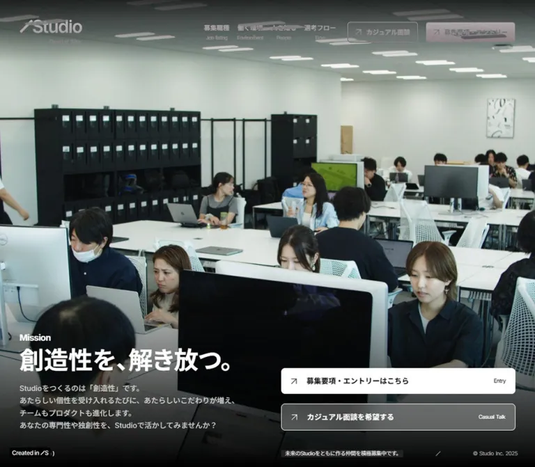
DESIGN REFERENCE
Studio株式会社 採用サイト
オフィスや社員の写真を大きく使い、黒・白・グレーと日英併記の文字組みで構成した採用サイト。広い余白、職種一覧の罫線、明確な応募導線が特徴。
オリジナルサイトを見るStudio Careers — Style Reference
A monochrome recruitment editorial framed by workplace photography, generous space, and precise bilingual navigation.
Website: studio.inc/career
Original URL: https://studio.inc/career
Final URL: https://studio.inc/career
Response: HTTP 200; unchanged URL
Theme: light-gray editorial sections, a black photographic opening, a charcoal job directory, and a white footer
Inspected: September 12, 2026, at 14:44:17 UTC / 23:44:17 JST
Viewports: 1440 × 1000 desktop and 390 × 844 mobile, in CSS pixels
Scope: the current careers index, including its opening, company introduction, employee interviews, technical interview carousel, job listings, leadership, workplace introduction, recruitment messages, closing image strip, and corporate footer. Linked pages and external application forms were not inspected.
Studio's careers page presents recruitment through its people, workplace, and approach to making a product. The opening gives nearly the entire viewport to workplace imagery. A small logo and compact navigation occupy the top edge; the mission and two application routes sit near the bottom. The interface uses neutral colors, allowing the cool daylight, foliage, furniture, and warm architectural lighting inside the images to provide its color.
Below the opening, the page behaves as a substantial corporate recruitment index. English section labels precede larger Japanese headings. Desktop layouts place a narrow heading area beside wider editorial content, with different proportions for interviews, job rows, and leadership profiles. White rounded cards are reserved for technical interviews; other content mostly sits directly on its section background. The strongest transition is the charcoal job directory followed by the pale-gray leadership section.
How to Read This Reference
- Measured means a value appears in the supplied rendered DOM, computed styles, or element rectangles. These measurements were collected by the supplied browser inspection, not by a separate visit for this document.
- Calculated means a value follows from those measurements, such as the gap between adjacent cards or the remaining width of an image column.
- Estimated means a visual approximation from the supplied original-page screenshots. Image dimensions, gradient stops, and some headline details fall into this category.
- Recommended means an implementation choice for a new page. The Quick Start combines measured tokens with explicitly identified approximations and accessible additions.
- Descriptive CSS aliases below are new names. Source custom properties are identified separately.
- The desktop screenshots cover the opening, the job-to-leadership transition, and the closing gallery/footer. Mobile screenshots cover the opening and closing gallery/footer. Intermediate components also have substantial DOM evidence, but their complete visual composition is not shown in the supplied captures.
- Different opening scenes appear in the desktop and mobile captures. This establishes variation in captured imagery, but does not establish whether the cause is playback timing, responsive asset selection, or another mechanism.
Tokens — Colors
Core Palette
| Name | Value | Suggested token | Evidence and role |
|---|---|---|---|
| Editorial Gray | #eaeaea |
--color-canvas |
Measured body background at both widths; source --s-color-89a85259: #eaeaeaff. Visible behind leadership profiles. |
| Charcoal | #222222 |
--color-ink / --color-dark-section |
Measured editorial text and job-section background. Source --s-color-87bc0976 and --s-color-__COLOR_STYLE_TEXT. |
| Opening Black | #000000 |
--color-black |
Measured opening-section background. Also appears in leadership text. Source primary color is black. |
| White | #ffffff |
--color-white |
Measured primary opening CTA and technical interview cards; visually confirmed footer background. |
| Reversed Heading | #f7f7f7 |
--color-on-dark |
Measured job-section heading and section label; source --s-color-f183cea1: #f7f7f7ff. |
| Action Ink | #111111 |
--color-action-ink |
Measured primary CTA text and leadership social-circle fill. |
| Opening Body | #cecece |
--color-hero-body |
Measured mission paragraph color at both widths. |
| Quiet Metadata | #acacac |
--color-meta-source |
Measured Position/Name labels, technical interview category labels, and opening copyright. |
| Header Tint | rgba(224, 224, 224, 0.1) |
--surface-header-secondary |
Measured secondary header CTA background. |
| Opening CTA Tint | rgba(224, 224, 224, 0.3) |
--surface-hero-secondary |
Measured secondary opening CTA background, with white text and a visible fine outline. |
The eight-digit source colors ending in ff are fully opaque. Their six-digit equivalents above preserve the same appearance.
The secondary opening CTA is translucent. Its apparent gray changes with the image and dark overlay beneath it. Do not sample that composite appearance and treat it as a universal solid background color.
Additional Declared Neutrals
The supplied custom properties also declare #555555, #666666, #707070, #e6e6e6, #f5f5f5, and white aliases. Their presence confirms a broader neutral palette, but does not establish a specific visible component role for every value. In particular, #e6e6e6 should not replace the measured body background of #eaeaea.
Recommended accessibility adjustment: use #666666 for secondary text on pale surfaces when the original #acacac is too faint. Preserve the lighter value only where its contrast is sufficient for its use.
Photographic Color
Cool blue-gray windows, muted upholstery, green foliage, natural skin tones, and a warm diagonal light are visible in the original captures. These are image colors, not interface accent tokens. The page does not need a colored application button to reproduce its hierarchy.
Tokens — Typography
Main Interface Family
- Measured family:
Inter, 'Noto Sans JP'on Japanese navigation, section headings, interview titles, job titles, and most paragraphs. - Source custom property:
--s-font-0fba208c: Inter,'Noto Sans JP'. - Weights:
400for editorial paragraphs,500for navigation and mission body text, and700for headings and action labels. - Recommended implementation stack:
Inter, 'Noto Sans JP', sans-serif.
English Labels and Names
- Measured family:
Interon section eyebrows, English action captions, executive names, role labels, and several metadata elements. - Source custom property:
--s-font-baa25ec7: Inter. - English eyebrows and small utility captions often use negative tracking, usually equivalent to
-0.05em. - Japanese article titles use a small positive value,
0.01em, while technical interview titles use-0.02em.
Some Japanese leadership biographies report only Inter as their computed family. The actual Japanese fallback font is not identified by that declaration. A new implementation should explicitly supply a Japanese-capable fallback.
Logo and Icons
The slash-and-Studio wordmark is a brand graphic with a small Recruit Site subtitle. Its typeface is not identified by the supplied evidence. Use an appropriate brand asset when authorized rather than reconstructing the logo with ordinary text.
Font Awesome 6 Free and Brands variables are declared. Social symbols are visible in the footer, while carousel controls expose icon strings such as arrow_back and pause. These facts do not identify the font or rendering method of every individual icon.
Type Scale
All entries below are measured unless marked as estimates. Sizes describe the text element itself, not a surrounding container.
| Role | Desktop | Mobile | Weight | Line height | Tracking |
|---|---|---|---|---|---|
| Navigation, Japanese | 13px |
Hidden in closed header | 500 |
18.2px |
Normal |
| Navigation, English | 10px |
Hidden in closed header | 400 |
14px |
-0.5px |
| Header CTA label | 13px |
Hidden in closed header | 700 |
18.2px |
Normal |
| Mission headline, estimated visible size | About 48–50px |
About 30–32px |
Visually bold | Leaf value unavailable | Unverified |
| Mission eyebrow, estimated | About 18px |
About 14px |
Visually semibold | Unverified | Unverified |
| Mission paragraph | 15px |
12px |
500 |
25.5px / 20.4px |
Normal |
| Main CTA, Japanese | 15px |
15px |
700 |
21px |
Normal |
| Main CTA, English | 11px |
11px |
400 |
11px |
-0.55px |
| Scroll caption | 11px |
11px |
400 |
15.4px |
-0.55px |
| Opening copyright | 11px |
10px |
400 |
11px / 10px |
-0.55px / -0.5px |
| Section eyebrow | 20px |
14px |
600 |
28px / 19.6px |
-1px / -0.7px |
| People, Jobs, and CxO heading | 48px |
28px |
700 |
67.2px / 39.2px |
Normal |
| Company and Environment heading | 42px |
28px |
700 |
58.8px / 39.2px |
Normal |
| Company and Environment body | 14px |
14px |
400 |
23.8px |
Normal |
| Employee interview title | 20px |
18px |
700 |
28px / 25.2px |
0.2px / 0.18px |
| Employee Position metadata | 13px |
12px |
400 |
19.5px / 18px |
Normal |
| Employee Name metadata | 13px |
13px |
400 |
19.5px |
Normal |
| Tech Interview section title | 48px |
24px |
700 |
67.2px / 33.6px |
Normal |
| Technical interview title | 24px |
16px |
700 |
33.6px / 22.4px |
-0.48px / -0.32px |
| Technical interview category | 13px |
11px |
400 |
19.5px / 16.5px |
-0.02em |
| Technical interview attribution | 12px |
11px |
700 |
16.8px / 15.4px |
-0.02em |
| Job title | 18px |
18px |
700 |
27px |
Normal |
| Executive role | 12px |
12px |
600 |
16.8px |
Normal |
| Executive name | 20px |
20px |
700 |
28px |
Normal |
| Executive biography | 13px |
13px |
400 |
20.8px |
Normal |
| Recruitment challenge title | Not included | 20px |
700 |
28px |
Normal |
| Recruitment challenge body | Not included | 15px |
400 |
25.5px |
Normal |
| Footer navigation, estimated | About 16px |
About 14px |
Visually regular | About 30–32px row rhythm |
Unverified |
Headline measurement limitation: the H1 wrapper reports 32px at both widths, but contains separately styled text. Its desktop box is about 449.56 × 83.19px, and its mobile box is 358 × 59.59px. The wrapper's font size is not proof that the visible desktop headline is 32px. Use the screenshot estimate for the headline and keep it separate from confirmed leaf-level typography.
Tokens — Spacing & Shapes
The page uses compact internal spacing inside a much more generous section rhythm. There is no evidence of a single fluid unit controlling every dimension.
Spacing Scale
| Use | Desktop | Mobile | Status |
|---|---|---|---|
| Main page gutter | 40px |
16px |
Measured on sections and header |
| Header padding | 40px |
20px 16px 16px |
Measured |
| Navigation label gap | 4px |
Closed navigation hidden | Measured |
| Gap between navigation items | 20px |
— | Calculated from adjacent link rectangles |
| Hero heading internal gap | 8px |
8px |
Measured wrapper gap |
| Hero heading to paragraph | 20px |
16px |
Calculated |
| Hero CTA internal gap | 12px |
12px |
Measured |
| Gap between hero CTAs | 20px |
12px |
Calculated |
| Hero CTA padding | 16px 20px |
16px |
Measured |
| English eyebrow to section heading | 20px |
20px |
Calculated |
| Employee card internal gap | 20px |
20px |
Measured |
| Employee card separation | 40px horizontally |
40px vertically |
Calculated |
| Technical card padding | 24px 24px 32px |
20px 20px 28px |
Measured |
| Technical card main gap | 16px |
20px |
Measured |
| Carousel control gap | 12px |
12px |
Calculated |
| Company section padding | 100px 40px 120px |
104px 16px |
Measured |
| Job section padding | 200px 40px 190px |
104px 16px |
Measured |
| CxO and Environment section top padding | 180px |
104px |
Measured |
| Footer horizontal inset | About 64px |
About 24px |
Screenshot estimate |
Border Radius and Rules
| Element | Value | Evidence |
|---|---|---|
| Section backgrounds and employee card links | 0 |
Measured |
| Header CTA | 6px |
Measured |
| Large CTA | 8px |
Measured |
| Technical interview card | 12px desktop; 8px mobile |
Measured |
| Carousel control | 50%, within 36 × 36px |
Measured |
| Executive social link | 50%, within 32 × 32px |
Measured |
| Job photograph corners | About 4px |
Screenshot estimate |
| Executive portrait corners | Square | Screenshot observation |
| Job dividers and outlined CTAs | About 1px |
Visual estimate; complete border declarations were not supplied |
Layout Measurements
| Element | Desktop | Mobile | Interpretation |
|---|---|---|---|
| Opening section | 1440 × 1000px |
390 × 844px |
Exactly one supplied viewport in both captures |
| Header box | 1440 × 132.58px |
390 × 80px |
Transparent overlay header |
| Logo link | 129 × 52.58px |
96 × 39.13px |
Includes the identity lockup |
| Menu button | Not shown | 44 × 44px at (330, 20) |
Closed state only |
| Mission text width | 449.56px |
358px |
Narrow desktop column; full mobile content width |
| Primary hero CTA | 480 × 53px at (920, 761) |
358 × 53px at (16, 649) |
Button height is retained |
| Secondary hero CTA | 480 × 55px at (920, 834) |
358 × 55px at (16, 714) |
Outline contributes to its taller outer box |
| Employee card | 311.28 × 562.09px |
358px wide; about 158–183px high |
Vertical desktop card becomes a compact horizontal row |
| Technical interview card | 752px wide; about 685.5px high |
306.19px wide; about 364.6px high |
Large desktop feature and narrower mobile carousel item |
| Executive biography column | 487.19px |
358px |
Two columns become one |
| Complete document | About 9898px high |
About 11033px high |
Content-dependent measurements, not target fixed heights |
Components
Recruitment Header
Role: persistent identity, recruitment navigation, and direct application access.
The desktop header places the Studio lockup at (40, 40). Four bilingual navigation items begin around x = 722, followed by two small CTAs. Japanese labels sit above English captions with a 4px gap. The compact secondary action precedes the white primary action.
The observed routes are:
| Label | Destination type |
|---|---|
募集職種 / Job listing |
Same-page #job-listing anchor |
働く環境 / Environment |
/career/workstyle |
人を知る / People |
/career/interview |
選考フロー / Flow |
/career/flow |
カジュアル面談 |
External casual-interview form |
募集要項・エントリー |
External job directory |
The header remains visible at the same top position in the supplied scrolled screenshots. This supports a viewport-persistent treatment. Its exact position declaration and color-switching mechanism were not included.
On mobile, the desktop navigation and header CTAs disappear from the visible link inventory. The logo shrinks to 96px wide, and a 44px menu button appears on the right. Its graphic consists of three fine horizontal lines, approximately 40px wide in the screenshot. No open-menu state is supplied.
Full-Viewport Mission Opening
Role: establish the workplace and recruitment proposition before the editorial content begins.
The desktop capture shows a lounge with exposed ceiling geometry, skyline windows, soft gray seating, a large circular table, and a central bonsai. A diagonal warm light traverses the image. The photograph fills the viewport behind the header and content.
The mission occupies the bottom-left column. Its H1 starts at y ≈ 686.42; the paragraph starts at y ≈ 789.61. The line 創造性を、解き放つ。 carries the main emphasis. The text is left aligned, with a smaller Mission eyebrow and a four-line desktop paragraph.
The right column holds two wide actions and a tiny recruitment-status/copyright line. The broad unoccupied center preserves the photographic composition.
A dark fade creates a readable base for the text. The lower edge reaches black, while the top is also subdued behind navigation. This gradient is visually observed; exact stops, opacity, and layer structure are unavailable.
The mobile capture shows a close view of a workstation. The mission starts around y = 408, followed by its paragraph, the scroll caption, two full-width actions, and the small bottom metadata. Treat this as a separately composed narrow layout. The evidence does not establish that this workstation scene is a mobile-only asset.
Bilingual Action Link
Role: consistently connect editorial interest to a destination.
The large action has three parts:
- A thin diagonal arrow at the left.
- A bold Japanese label occupying the flexible middle area.
- A small English caption aligned at the far right.
The primary opening action is white with #111111 text. The secondary action uses translucent gray, white text, and a fine white outline. Both use an 8px radius, 12px internal gap, and 15px / 21px Japanese text. English captions remain 11px on mobile.
The pattern recurs in the Interview and Environment links. These measured links are transparent over the light page rather than white-filled opening buttons. A later All Positions action uses a charcoal fill with white text.
These elements are anchors. Their supplied href values establish destination intent; no completed navigation or form behavior was tested.
Scroll Caption and Opening Microcopy
Role: provide a quiet reading cue and recruitment status.
( Scroll Down ) is rendered as a paragraph, not an anchor in the supplied evidence. It uses 11px Inter with negative tracking. Do not automatically implement it as a scroll button.
The recruitment-status sentence appears over a narrow dark backing in the screenshots. A small slash separates parts of the bottom composition. Desktop copyright sits at the far right; mobile copyright moves to a separate line at the left and becomes 10px.
The visible 2025 is source UI content. It does not establish the page's inspection date or the date of its present design.
Bilingual Section Heading
Role: make long-page navigation legible while maintaining the editorial hierarchy.
The English eyebrow appears above the Japanese title. Standard desktop labels use 20px / 28px, weight 600, and -1px tracking. A 20px gap precedes the Japanese heading.
People, Jobs, and CxO use 48px Japanese headings. Company and Environment use 42px. At 390px, these become 28px; the English eyebrow becomes 14px. The visual ordering should remain clear even when the source DOM order differs from the rendered arrangement.
Company Introduction
Role: explain the product and the organization's approach to creativity.
The desktop section starts immediately after the 1000px opening. Its measured height is about 688.88px, with 100px top and 120px bottom padding. The title begins at the normal 40px gutter, while its 320px-wide body is inset to x = 80.
On mobile, heading and body align to x = 16. The body expands to 358px, retains 14px / 23.8px typography, and begins 48px below the heading box. The section uses 104px top and bottom padding.
The available measurements do not identify all of the section's media geometry. Do not infer the content of unmeasured image regions from empty space alone.
Employee Interview Card
Role: introduce individual perspectives through article links.
Desktop has three cards to the right of the section heading area. Their left edges are approximately 385.61, 736.89, and 1088.17px, with 40px gaps. Each card is 311.28px wide and has no background fill, outer padding, or rounded container.
The anatomy is media, a bold Japanese article title, then two label/value rows for Position and Name. The first title occupies three lines at 20px / 28px. Metadata uses 13px / 19.5px; quiet labels contrast with darker values.
Calculated media allowance: subtracting the 20px internal gap from the distance between card top and title top leaves about 389.09px. Against a 311.28px width, this is consistent with a 4:5 portrait region. The image itself was not separately measured, so this ratio is an inference.
On mobile, the three links stack vertically with 40px separation. Each becomes a compact row with media at the left and text at the right. Text starts at x ≈ 141.91, leaving a calculated media-column allowance of approximately 105.91px after the 20px gap. Titles become 18px; long titles increase row height instead of being forced into equal-height boxes.
Technical Interview Feature and Carousel
Role: provide a deeper editorial view of engineering and craft.
The desktop introduction starts at x = 80 and is 488px wide. The measured in-view card starts at x = 608, leaving a 40px separation. Cards are white, 752px wide, and use 12px corners with 24px 24px 32px padding.
Card anatomy is a large landscape image, category/series metadata, bold article title, smaller interviewee attribution, and a diagonal-arrow detail cue. This is the page's most explicit card treatment.
The DOM contains four distinct linked articles plus repeated instances positioned outside the viewport. This is consistent with a looping carousel structure; it is not evidence of seven unique articles.
On mobile, the introduction precedes the cards. Its body remains 15px / 25.5px. The measured central card is 306.19px wide at x ≈ 41.91, leaving nearly equal side space within the 390px viewport. Adjacent card positions establish a 16px gap. Corners reduce to 8px; padding becomes 20px 20px 28px.
Three 36px circular controls sit below the carousel with 12px gaps: previous, pause/play, and next. Their existence is confirmed. Autoplay timing, transitions between slides, dragging, keyboard behavior, and the result of pressing pause were not verified.
Job Directory
Role: expose the current set of recruitment destinations in a structured, high-contrast section.
The job section uses #222222, with pale headings, white role titles, and fine horizontal dividers. It spans about 1555px vertically on desktop and uses unusually generous 200px top and 190px bottom padding.
The supplied desktop screenshot shows an approximately 840px-wide list extending from x = 560 to 1400. A 160px square photograph sits at its left. The title and detail cue begin around x = 920. Successive measured job-title positions are 241px apart; the visible row geometry is consistent with a 160px image, about 40px vertical padding, and a thin divider.
The left Job listing / 募集職種 heading remains visible beside the final row in the scrolled screenshot. This suggests a sticky heading rail, with its eyebrow around 180px from the viewport top. The exact sticky rule is not supplied; top: 180px is a reasonable implementation approximation, not a measured declaration.
The content includes one casual-interview entry and four job roles. Each exposes a 詳細を見る anchor to its corresponding external page. Do not assume the entire row is clickable: the supplied DOM specifically identifies the detail text as the link.
On mobile, the heading moves above the entries, and section padding becomes 104px 16px. Job titles remain 18px / 27px, beginning at x = 56. The long Technical Account Manager title wraps to two lines. Typical title-to-title distances are 251px, increasing to 278px after that wrapped title. Mobile image dimensions are not available in the supplied element sample.
Leadership Profile
Role: introduce the leadership team with a quieter, factual presentation.
The pale-gray section begins after the job directory. Desktop uses a heading area on the left and two profile columns beginning around x = 385.61 and 912.80. Each biography is approximately 487.19px wide, with a 40px gap between columns.
Each profile combines a square monochrome portrait, a small role, a bold English name, and a black circular X link aligned toward the right. The visible portraits are approximately 100px square. The name block begins about 30px to the right of the portrait. Biography text follows underneath across the column.
Role, name, and biography are measured at 12px / 16.8px, 20px / 28px, and 13px / 20.8px, respectively. Social circles are 32px at both widths.
Mobile profiles form one vertical sequence. Role and name align at x = 16, with the social link at x = 342; biography text spans 358px. Portrait dimensions on mobile are unverified. The section grows from approximately 648px on desktop to 1623px on mobile because the profiles are no longer arranged in two columns.
Workplace Introduction
Role: connect the recruitment message to working conditions and the physical environment.
The desktop section uses 180px top padding. The heading sits at x = 80, while its short 410px body is offset to x = 250. This staggered alignment gives the content an editorial composition.
Mobile resets heading and paragraph to the 16px gutter. Typography becomes 28px for the heading, with 14px / 23.8px body text. The final Environment action is 480 × 55px and right aligned on desktop, becoming 358 × 55px on mobile.
Image content is present in the rendered section, but the supplied asset reference is truncated and the intermediate composition is not shown in a screenshot. Exact image arrangement and crop behavior remain unverified.
Recruitment Challenges and Casual Conversation
Role: explain the work being recruited for and offer a lower-commitment conversation route.
The rendered text identifies three challenges: strengthening referral recruitment and corporate operations, advancing BtoB product development, and extending enterprise technical support. An All Positions action follows. A separate invitation explains the casual conversation option.
Mobile measurements show 20px / 28px challenge headings and 15px / 25.5px paragraphs within a 326px text width beginning at x = 32. The main introductory statement uses 22px / 30.8px. The casual-conversation statement uses 24px / 33.6px and wraps across two lines.
The mobile All Positions link is 326 × 55px, charcoal with white text and 8px corners. The section wrapper uses 104px top padding and a 104px gap between its major children. Wrapper colors and complete desktop geometry for these lower components were not captured; avoid assigning unverified card surfaces or image layouts to them.
Closing Photo Strip
Role: end the recruitment narrative with a broad impression of daily workplace life.
The supplied captures show two edge-to-edge rows of adjoining photographs. Subjects include lounge furniture, conversations, groups of employees, office interiors, and foliage. Tiles have square edges and no visible gutters.
The lower desktop row contains tiles approximately 372px square; the mobile lower row contains tiles approximately 168px square. Rows have different horizontal offsets, creating a staggered collage. The strip extends beyond the viewport horizontally.
Only the trailing portion of the strip is visible in the end-of-page screenshots. Its visible heights of approximately 518px on desktop and 265px on mobile are not measurements of the complete gallery height. Automatic movement, direction, speed, and pause behavior are unverified.
Corporate Footer
Role: reconnect the careers index to the wider company, product, community, and contact information.
The footer changes to white and uses plain black text links. Desktop has four approximately equal columns beginning at x = 64, 392, 720, and 1048: corporate navigation, community/social links, related product/editorial links, and Access.
The social column combines small monochrome symbols with text. Related-site links use small outgoing-arrow marks. The Access block contains a postal address as text; no map interaction is shown. A subtle horizontal rule separates the navigation region from the copyright area.
Mobile reorganizes the footer into two upper columns. Corporate links occupy the left; community and social links occupy the right. Service Site, Studio Blog, and Privacy policy continue below the left group. Access moves to a full-width block underneath. The inset increases from the main page's 16px to approximately 24px.
Tokens — Motion & Interaction
| Treatment | Evidence | Safe interpretation |
|---|---|---|
| General element transitions | Measured 0.3s cubic-bezier(0.4, 0.4, 0, 1) on many elements |
A shared 300ms transition vocabulary exists. Triggered properties and end states are not demonstrated. |
| Body background | Measured background 0.5s cubic-bezier(0.4, 0.4, 0, 1) |
Background changes are configured to transition over 500ms; the trigger is unverified. |
| Gradient custom properties | Many --g-* properties appear in transition lists |
These are implementation declarations, not proof of visibly animated gradients on each component. |
| Header persistence | Header remains at the top in opening and scrolled captures | Reproduce persistent access; exact fixed/sticky implementation is unverified. |
| Job heading persistence | Heading remains beside a late job row | Consistent with a sticky section heading; exact offset and boundary logic are inferred. |
| Technical carousel | Repeated offscreen cards and previous/pause/next buttons | Carousel structure is confirmed; playback speed, swipe support, and button outcomes are unverified. |
| Opening imagery | Different scenes in the two original captures | Media variation is visible; video element, duration, looping, sound, and playback policy are unverified. |
| Closing image strip | Offset rows and horizontally clipped tiles | Static composition is confirmed; marquee behavior is unverified. |
| Navigation and applications | Rendered anchors and destinations | Link intent is confirmed; destination loading and submission were not exercised. |
| Mobile menu | Measured button and closed screenshot | Open state, overlay, focus management, and transition are unverified. |
The sampled elements report animation: none. That does not rule out video, JavaScript-driven movement, transitions, or animated descendants outside the sample.
For a new implementation, use the observed easing for small color and opacity changes. Treat hover states, automatic media, and carousel movement as separate design decisions until their intended behavior is specified. Do not introduce scroll-linked parallax merely because the page contains large imagery.
Surfaces
| Surface | Appearance | Structural role |
|---|---|---|
| Opening | Black base, full-bleed workplace imagery, dark fade | Establishes atmosphere and supports reversed content |
| Editorial canvas | #eaeaea with dark text |
Company, people, leadership, and workplace content |
| Employee links | Transparent, unboxed | Lets media and typography define the content group |
| Technical interview card | White with 12px / 8px corners |
Distinguishes the engineering editorial feature |
| Job directory | Solid #222222, pale text, fine rules |
Gives recruitment destinations a distinct section identity |
| Opening primary action | White with dark text | Highest action contrast |
| Opening secondary action | Translucent neutral fill and white outline | Clearly available secondary route |
| Footer | White with black links and a subtle divider | Calm corporate navigation and address information |
No broad shadow-based elevation system is visible in the original captures. Separation comes from section color, spacing, photograph edges, and rules. The technical interview cards are a specific exception to the otherwise mostly unboxed editorial content.
Imagery
Photography carries the identity of this reference. Use real workspaces, informal conversations, people at desks, carefully observed interiors, and material details. The current desktop opening emphasizes spatial depth: ceiling lines, the diagonal light, skyline windows, and a central organic object. The mobile opening emphasizes the act of working through a close workstation view.
The closing collage uses a softer documentary register. Faces, seating, meeting areas, and foliage sit beside one another without captions or decorative frames. Leadership portraits switch to monochrome, giving that section a more formal tone without changing the interface palette.
Cropping Guidance
- Opening: use a cover treatment with a deliberately chosen focal point. Check the content-safe region behind both the mission and the action column.
- Employee interviews: a portrait region is supported by the calculated desktop geometry; verify individual crops before committing to a shared ratio.
- Technical interviews: supplied image dimensions are approximately
3:2. This is a landscape editorial image, not a square avatar. - Job thumbnails: preserve the approximately square desktop crop and modest corner radius.
- Leadership: retain square monochrome portraits and consistent face scale.
- Closing strip: maintain adjoining rectangular tiles, varied subjects, and staggered row offsets.
These photographs should use normal image interpolation. Pixelated rendering, heavy duotone processing, and decorative image masks are not supported by the inspected design.
Observed Asset References
The following complete URLs appear in the rendered original-page evidence. They identify technical interview images; they were not independently downloaded for this document.


Complete opening-media, wordmark, leadership, and closing-strip URLs are not available in the supplied evidence. Supply appropriate authorized assets when implementing these components.
Layout & Responsive Behavior
Desktop Composition
The page uses the available width with 40px outer gutters. Its editorial sections do not all share the same internal column split:
- Employee interviews and leadership begin their main content around
x = 385.61. - The job list begins around
x = 560, reserving more space for the left heading area. - The technical feature uses a
488pxintroduction and a752pxcard region separated by40px, within an additional inset. - Repeated large editorial actions align to the right and measure
480pxwide.
Preserving these differences matters. A single equal-column grid would flatten the original page's hierarchy.
Mobile Recomposition
| Component | Confirmed narrow-screen change |
|---|---|
| Header | Navigation and small CTAs give way to a compact logo and 44px menu button |
| Opening | Mission, scroll caption, actions, and metadata form one vertical sequence |
| Main actions | Width becomes 358px; Japanese label size stays 15px |
| Mission body | Drops from 15px to 12px, while keeping 1.7 line height |
| Main section headings | Reduce to 28px; English eyebrows reduce to 14px |
| Company body | Resets its desktop inset and fills the 358px content width |
| Employee interviews | Three vertical desktop cards become three horizontal media/text rows |
| Technical feature | Intro moves above a centered 306.19px carousel card |
| Jobs | Heading precedes the entries; role text stays 18px and wraps when necessary |
| Leadership | Two columns become a single sequence; names and biographies retain their sizes |
| Environment | Staggered desktop text alignment resets to the main gutter |
| Footer | Four columns become two link groups with related links and Access below |
The full page becomes only about 1135px taller on mobile despite the narrower width. This reflects deliberate changes such as compact employee rows, reduced section spacing, and smaller technical cards, rather than uniformly stacking full-size desktop components.
The original breakpoint thresholds and intermediate-width formulas are not supplied. The Quick Start uses a recommended 64rem structural breakpoint, with a smaller fallback for very narrow screens. These are implementation choices, not recovered source media queries.
For short viewports and enlarged text, allow the opening to exceed one viewport. Its exact one-screen fit at the inspected sizes should not become a fixed-height clipping constraint.
Do’s and Don’ts
Do
- Build the interface around
#eaeaea,#222222, black, and white. - Let the photography provide the color and most of the visual impact.
- Preserve the slash wordmark and compact Recruit Site lockup with an appropriate asset.
- Keep the desktop mission at the lower left and the two actions at the lower right.
- Retain Japanese-first action labels with small English captions aligned at the far edge.
- Use English eyebrows above larger Japanese section headings.
- Preserve different desktop column proportions for people, jobs, and leadership.
- Keep employee links unboxed and technical interview cards visibly white and rounded.
- Use long fine rules and substantial row spacing in the charcoal job directory.
- Recompose employee interviews into compact horizontal rows on mobile.
- Keep leadership names and body text readable instead of shrinking the entire desktop layout.
- End with adjoining workplace images and a spacious white corporate footer.
Don't
- Don't reduce this recruitment index to a hero and one application panel.
- Don't add a bright brand-colored CTA unsupported by the neutral interface.
- Don't place every section inside an identical rounded card.
- Don't replace the architectural and documentary imagery with generic abstract graphics.
- Don't infer an exact video or marquee implementation from still captures.
- Don't treat the H1 wrapper's
32pxdeclaration as the desktop headline size. - Don't reproduce raw icon strings as visible button labels.
- Don't make every job row clickable without choosing that behavior explicitly.
- Don't hardcode captured page heights or force long titles onto one line.
- Don't claim an open-menu, hover, focus, or carousel state that was not exercised.
Recommended Implementation Additions
These are recommendations for a new implementation, not verified features of the original page:
- Give the mobile menu button an accessible name,
aria-expanded, and an associated controlled region. Implement keyboard navigation and focus return for its chosen open state. - Give carousel controls and executive social links meaningful accessible names. Expand the effective hit area of the
32pxand36pxcircles to at least44pxwithout enlarging the visible graphic unnecessarily. - Use a visible focus indicator on all links and controls, including transparent editorial actions.
- Improve pale metadata contrast on light backgrounds where needed. Check header contrast over each image region and each section tone.
- Use semantic headings for the technical feature and recruitment statements even where the supplied implementation uses paragraphs for visual titles.
- Add a static poster and reduced-motion mode if background video or automatic gallery movement is introduced. Provide a usable pause control for continuing automatic movement.
- Keep carousel content reachable without autoplay, and avoid exposing duplicate loop items as repeated keyboard stops.
- Provide contextual alternative text for informative photographs. Decorative repetitions can use empty alternatives.
- Apply anchor scroll clearance for the persistent header. Verify layout at increased text size and in a short landscape viewport.
Agent Prompt Guide
Quick Color Reference
- Editorial canvas:
#eaeaea. - Main text and job-directory background:
#222222. - Opening base:
#000000. - Primary opening CTA, technical cards, and footer:
#ffffff. - Primary CTA text and executive social circles:
#111111. - Opening body:
#cecece. - Job-section headings:
#f7f7f7. - Secondary opening CTA:
rgba(224, 224, 224, 0.3)with white text and a fine outline. - Secondary text on light surfaces: source
#acacac; recommended accessible alternative#666666.
Overall Prompt
“Create a Japanese technology-company careers index inspired by Studio's current recruitment page. Use a black photographic opening, pale-gray #eaeaea editorial sections, a charcoal #222222 job directory, and a white corporate footer. Use Inter with Noto Sans JP for Japanese content. Place a compact brand lockup at the upper left and bilingual navigation with two small recruitment actions at the upper right. Keep the mission low on the left and two 480px-wide action links low on the right, each with a thin diagonal arrow, bold Japanese label, and tiny English caption. Build a substantial page with company context, employee stories, technical interviews, job roles, leadership, workplace information, and recruitment invitations. Use generous section spacing and varied desktop heading/content proportions. On mobile, use 16px gutters, stacked hero actions, 28px section headings, compact employee media/text rows, and single-column leadership profiles. Preserve the documentary photography and understated neutral UI.”
Example Component Prompts
- Opening: “Design a full-viewport workplace photograph with a dark bottom fade. Keep the skyline, furniture, and architectural depth visible. Place Mission above
創造性を、解き放つ。at the lower left, followed by quiet gray body text. Put white Entry and outlined translucent Casual Talk links at the lower right. Stack these beneath the copy on a 390px screen.” - Employee story: “Create an unboxed interview link on a pale-gray surface. On desktop use a portrait media region, a bold 20px Japanese title, and small Position/Name metadata rows. At mobile width convert it into a roughly 106px media column beside a flexible text column, with an 18px title and 40px between stories.”
- Job directory: “Create a full-width charcoal recruitment section with a large bilingual title in a left rail. On desktop place square 160px employee photographs in a wide right-hand list, with 18px role titles, small diagonal-arrow detail links, and fine horizontal dividers. Approximate 241px regular row spacing. Stack content on mobile and allow long role names to wrap.”
- Leadership: “Place monochrome square portraits directly on pale gray. Pair each with a small executive role, bold 20px English name, and a small black circular social link. Add a 13px biography beneath. Use two columns beside the section title on desktop and one vertical sequence on mobile.”
- Technical interview: “Build a white editorial card with a large landscape image, muted category metadata, bold title, compact interviewee attribution, and a detail cue. Use 12px corners and 24px side padding on desktop; 8px corners and 20px side padding on mobile. Put three small circular previous, pause, and next controls underneath, with accessible hit areas and explicit behavior.”
- Closing area: “Create two staggered rows of adjoining workplace photographs with square edges and no gutters, followed by a plain white footer. Use four desktop link columns and a two-column mobile arrangement with Access below. Keep social icons black, links understated, and the final copyright separated by a subtle rule.”
Quick Start
CSS Custom Properties
This is an implementation foundation, not the original stylesheet. Exact colors, measured body sizes, action dimensions, and key radii are retained. Headline sizing, gradient stops, grid percentages, sticky positioning, photo-strip geometry, hover feedback, and breakpoint thresholds are adaptations.
Load Inter and Noto Sans JP separately from an appropriate font source. Supply images through image or picture elements. The CSS includes no assumed original media URLs or automatic playback.
Expected opening structure: .career-hero contains .hero-media and .hero-content; the latter contains .hero-copy and .hero-actions. The action group contains .hero-buttons and .hero-meta. Section layouts pair .section-label with their content region.
:root {
  /* Measured palette, with descriptive aliases. */
  --color-canvas: #eaeaea;
  --color-ink: #222222;
  --color-black: #000000;
  --color-white: #ffffff;
  --color-action-ink: #111111;
  --color-on-dark: #f7f7f7;
  --color-hero-body: #cecece;
  --color-meta-source: #acacac;
  --color-meta-readable: #666666;
  --surface-header-secondary: rgb(224 224 224 / 10%);
  --surface-hero-secondary: rgb(224 224 224 / 30%);

  /* The generic fallbacks are implementation additions. */
  --font-ui: Inter, 'Noto Sans JP', sans-serif;
  --font-latin: Inter, sans-serif;
  --text-body: 14px;
  --text-section: 48px;
  --text-section-compact: 42px;
  --text-eyebrow: 20px;
  --text-action: 15px;
  --text-caption: 11px;
  --leading-body: 1.7;
  --leading-heading: 1.4;
  --tracking-latin: -0.05em;

  --gutter: 40px;
  --space-small: 8px;
  --space-control: 12px;
  --space-content: 20px;
  --space-column: 40px;
  --section-large: 180px;
  --action-width: 480px;
  --radius-header-action: 6px;
  --radius-action: 8px;
  --radius-tech-card: 12px;
  --ease-site: cubic-bezier(0.4, 0.4, 0, 1);
  --motion-ui: 300ms;
  --motion-background: 500ms;

  /* Estimated image geometry for the static closing strip. */
  --strip-tile: clamp(168px, 25.833vw, 372px);
}

* { box-sizing: border-box; }
body {
  margin: 0;
  color: var(--color-ink);
  background: var(--color-canvas);
  font: 400 var(--text-body) / var(--leading-body) var(--font-ui);
}
img { display: block; max-width: 100%; }
a { color: inherit; }
button { font: inherit; }
h1, h2, h3, p, figure, dl, dd { margin: 0; }

/* Recommended persistent-header implementation. */
.career-header {
  position: fixed;
  inset: 0 0 auto;
  z-index: 50;
  display: flex;
  align-items: center;
  gap: 40px;
  padding: 40px;
  color: white;
  transition: color var(--motion-ui) var(--ease-site);
}
.career-header[data-tone='dark'] { color: var(--color-ink); }
.brand { flex: 0 0 129px; width: 129px; }
.brand img { width: 100%; height: auto; }
.desktop-nav, .header-actions {
  display: flex;
  align-items: center;
  gap: 20px;
}
.desktop-nav { margin-inline-start: auto; }
.nav-item {
  display: grid;
  gap: 4px;
  text-align: center;
  text-decoration: none;
}
.nav-item__ja { font-size: 13px; font-weight: 500; line-height: 1.4; }
.nav-item__en {
  font: 400 10px / 1.4 var(--font-latin);
  letter-spacing: var(--tracking-latin);
  opacity: 0.85;
}
.header-action {
  display: inline-flex;
  align-items: center;
  gap: 10px;
  padding: 11px 15px;
  border: 1px solid currentColor;
  border-radius: var(--radius-header-action);
  background: var(--surface-header-secondary);
  font-size: 13px;
  font-weight: 700;
  line-height: 1.4;
  text-decoration: none;
}
.header-action--primary { color: #222; background: white; border-color: white; }
.menu-toggle {
  display: none;
  width: 44px;
  height: 44px;
  padding: 2px;
  border: 0;
  color: inherit;
  background: transparent;
}
.menu-toggle span { width: 40px; height: 1px; background: currentColor; }

.career-hero {
  position: relative;
  isolation: isolate;
  display: flex;
  flex-direction: column;
  min-height: 100vh;
  min-height: 100svh;
  color: white;
  background: black;
}
.hero-media {
  position: absolute;
  inset: 0;
  z-index: -2;
  width: 100%;
  height: 100%;
  object-fit: cover;
  object-position: var(--hero-focal-point, 50% 50%);
}
.career-hero::before {
  /* Estimated fades; tune against the chosen image. */
  content: '';
  position: absolute;
  inset: 0;
  z-index: -1;
  pointer-events: none;
  background:
    linear-gradient(to bottom, rgb(0 0 0 / 45%), transparent 30%),
    linear-gradient(to bottom, transparent 45%, rgb(0 0 0 / 60%) 82%, black);
}
.hero-content {
  display: grid;
  grid-template-columns: minmax(0, 450px) minmax(0, 480px);
  justify-content: space-between;
  align-items: end;
  gap: 40px;
  width: 100%;
  margin-top: auto;
  padding: 160px var(--gutter) 56px;
}
.hero-copy h1 { display: grid; gap: 8px; }
.hero-kicker { font: 600 18px / 1.4 var(--font-latin); }
.hero-headline {
  /* Approximation: the headline leaf was not sampled. */
  font-size: 48px;
  font-weight: 700;
  line-height: 1.05;
}
.hero-lead { margin-top: 20px; color: #cecece; font-size: 15px; font-weight: 500; }
.hero-scroll { margin-top: 37px; font: 400 11px / 1.4 var(--font-latin); letter-spacing: -0.05em; }
.hero-buttons { display: grid; gap: 20px; }
.hero-meta {
  display: flex;
  align-items: center;
  justify-content: space-between;
  gap: 12px;
  margin-top: 40px;
  font: 400 11px / 1.4 var(--font-ui);
  letter-spacing: -0.05em;
}
.hero-status { padding-inline: 8px; background: rgb(34 34 34 / 65%); }
.hero-copyright { color: #acacac; white-space: nowrap; }

.action-link {
  display: flex;
  align-items: center;
  gap: 12px;
  width: 100%;
  padding: 16px 20px;
  border: 0;
  border-radius: 8px;
  text-decoration: none;
  transition: background-color 300ms var(--ease-site);
}
.action-link__arrow { flex: 0 0 20px; width: 20px; height: 20px; }
.action-link__label { flex: 1; min-width: 0; font-size: 15px; font-weight: 700; line-height: 21px; }
.action-link__caption { flex: none; font: 400 11px / 1 var(--font-latin); letter-spacing: -0.05em; }
.action-link--primary { color: #111; background: white; }
.action-link--secondary { color: white; background: var(--surface-hero-secondary); border: 1px solid white; }
.action-link--outline { color: #111; background: transparent; border: 1px solid currentColor; }
.action-link--dark { color: white; background: #222; border: 1px solid #222; }
.section-action { width: min(100%, var(--action-width)); margin: 48px 0 0 auto; }

.career-section { padding: var(--section-large) var(--gutter) 0; }
.section-eyebrow { margin-bottom: 20px; font: 600 var(--text-eyebrow) / 1.4 var(--font-latin); letter-spacing: -0.05em; }
.section-heading { font-size: var(--text-section); font-weight: 700; line-height: 1.4; }
.section-heading--compact { font-size: var(--text-section-compact); }
.editorial-layout {
  /* Approximates the measured desktop heading/content split. */
  display: grid;
  grid-template-columns: minmax(180px, 22.47%) minmax(0, 1fr);
  gap: 40px;
}
.people-grid { display: grid; grid-template-columns: repeat(3, minmax(0, 1fr)); gap: 40px; }
.person-story { display: flex; flex-direction: column; gap: 20px; min-width: 0; text-decoration: none; }
.person-story__image { width: 100%; aspect-ratio: 4 / 5; object-fit: cover; }
.person-story__title { font-size: 20px; font-weight: 700; line-height: 1.4; letter-spacing: 0.01em; }
.person-story__meta { display: grid; grid-template-columns: 50px minmax(0, 1fr); gap: 10px 56px; margin-top: 20px; font-size: 13px; line-height: 1.5; }
.person-story__meta dt { color: var(--color-meta-readable); }

.tech-layout { display: grid; grid-template-columns: minmax(0, 38.125%) minmax(0, 1fr); gap: 40px; margin-inline: 40px; }
.tech-intro p { margin-top: 20px; font-size: 15px; line-height: 1.7; }
.tech-rail {
  /* Recommended native-scroll fallback; autoplay is separate. */
  display: flex;
  gap: 16px;
  overflow-x: auto;
  scroll-snap-type: x mandatory;
}
.tech-card { flex: 0 0 100%; min-width: 0; padding: 24px 24px 32px; border-radius: 12px; background: white; text-decoration: none; scroll-snap-align: center; }
.tech-card__image { width: 100%; aspect-ratio: 3 / 2; object-fit: cover; }
.tech-card__category { margin-top: 16px; color: var(--color-meta-readable); font-size: 13px; line-height: 1.5; letter-spacing: -0.02em; }
.tech-card__title { margin-top: 16px; font-size: 24px; font-weight: 700; line-height: 1.4; letter-spacing: -0.02em; }
.tech-card__byline { margin-top: 8px; font-size: 12px; font-weight: 700; line-height: 1.4; }
.tech-card__detail { display: block; margin-top: 32px; font-size: 13px; font-weight: 700; }
.tech-controls { display: flex; justify-content: center; gap: 12px; margin-top: 20px; }
.round-control { position: relative; display: grid; place-items: center; width: 36px; height: 36px; padding: 0; border: 0; border-radius: 50%; background: white; color: black; }
.round-control::after { content: ''; position: absolute; inset: -4px; }

.jobs { padding: 200px var(--gutter) 190px; color: #f7f7f7; background: #222; }
.jobs-layout { display: grid; grid-template-columns: minmax(0, 35.294%) minmax(0, 1fr); gap: 40px; }
.jobs .section-label { position: sticky; top: 180px; align-self: start; }
.job-row { display: grid; grid-template-columns: minmax(160px, 1fr) minmax(0, 480px); align-items: center; gap: 40px; padding-block: 40px; border-bottom: 1px solid currentColor; }
.job-row:first-child { padding-top: 0; }
.job-photo { width: 160px; aspect-ratio: 1; object-fit: cover; border-radius: 4px; }
.job-title { color: white; font-size: 18px; font-weight: 700; line-height: 1.5; }
.job-detail { display: inline-flex; align-items: center; gap: 20px; margin-top: 10px; color: white; font-size: 13px; font-weight: 700; line-height: 1.4; text-decoration: none; }

.leadership-grid { display: grid; grid-template-columns: repeat(2, minmax(0, 1fr)); gap: 40px; }
.leader-top { display: grid; grid-template-columns: 100px minmax(0, 1fr) 32px; align-items: center; gap: 30px; }
.leader-photo { width: 100px; aspect-ratio: 1; object-fit: cover; }
.leader-role { font: 600 12px / 1.4 var(--font-latin); }
.leader-name { margin-top: 8px; font: 700 20px / 1.4 var(--font-latin); }
.leader-bio { margin-top: 20px; color: black; font-size: 13px; line-height: 1.6; }
.social-circle { position: relative; display: grid; place-items: center; width: 32px; height: 32px; border-radius: 50%; color: white; background: #111; text-decoration: none; }
.social-circle::after { content: ''; position: absolute; inset: -6px; }

.photo-strip { overflow: hidden; }
.photo-track { display: flex; width: max-content; }
.photo-track:nth-child(2) { transform: translateX(calc(var(--strip-tile) * -0.65)); }
.photo-track img { width: var(--strip-tile); height: var(--strip-tile); object-fit: cover; }

.career-footer { color: black; background: white; }
.footer-grid { display: grid; grid-template-areas: 'primary social related access'; grid-template-columns: repeat(4, minmax(0, 1fr)); padding: 96px 64px 40px; }
.footer-primary { grid-area: primary; }
.footer-social { grid-area: social; }
.footer-related { grid-area: related; }
.footer-access { grid-area: access; }
.footer-list { display: grid; align-content: start; gap: 8px; }
.footer-list a { display: flex; align-items: center; gap: 12px; font-size: 16px; line-height: 24px; text-decoration: none; }
.footer-access p { margin-top: 20px; font-size: 14px; line-height: 1.7; }
.footer-copyright { padding: 48px 64px 96px; border-top: 1px solid #eeeeee; font-size: 13px; line-height: 16px; }

/* Recommended feedback and anchor clearance. */
:where(a, button):focus-visible { outline: 2px solid currentColor; outline-offset: 4px; }
#job-listing { scroll-margin-top: 140px; }
@media (hover: hover) {
  .action-link--primary:hover { background: #eaeaea; }
  .footer-list a:hover, .job-detail:hover { text-decoration: underline; text-underline-offset: 4px; }
}

/* Recommended structural breakpoint; source threshold unavailable. */
@media (max-width: 64rem) {
  :root { --gutter: 16px; --section-large: 104px; --text-section: 28px; --text-section-compact: 28px; --text-eyebrow: 14px; }
  .career-header { gap: 12px; padding: 20px 16px 16px; }
  .brand { flex-basis: 96px; width: 96px; }
  .desktop-nav, .header-actions { display: none; }
  .menu-toggle { display: flex; flex-direction: column; align-items: center; justify-content: center; gap: 4px; margin-left: auto; }
  .hero-content { grid-template-columns: minmax(0, 1fr); gap: 24px; padding: 100px 16px max(16px, env(safe-area-inset-bottom)); }
  .career-hero::before { background: linear-gradient(to bottom, rgb(0 0 0 / 20%), transparent 28%, black 63%); }
  .hero-kicker { font-size: 14px; }
  .hero-headline { font-size: 32px; line-height: 1; }
  .hero-lead { margin-top: 16px; font-size: 12px; line-height: 1.7; }
  .hero-scroll { margin-top: 24px; }
  .hero-buttons { gap: 12px; }
  .hero-meta { flex-wrap: wrap; margin-top: 24px; }
  .hero-copyright { flex-basis: 100%; font-size: 10px; line-height: 1; }
  .action-link { padding: 16px; }
  .action-link__arrow { flex-basis: 12px; width: 12px; }
  .editorial-layout, .jobs-layout, .tech-layout { grid-template-columns: minmax(0, 1fr); gap: 48px; }
  .people-grid, .leadership-grid { grid-template-columns: minmax(0, 1fr); }
  .person-story { display: grid; grid-template-columns: minmax(0, 1fr) minmax(0, 2.19fr); align-items: start; }
  .person-story__content { padding-top: 20px; }
  .person-story__title { font-size: 18px; }
  .person-story__meta { grid-template-columns: 46px minmax(0, 1fr); gap: 5px 36px; }
  .person-story__meta dd { overflow-wrap: anywhere; }
  .tech-layout { margin-inline: 0; gap: 40px; }
  .tech-layout .section-heading { font-size: 24px; }
  .tech-rail { padding-inline: 26px; scroll-padding-inline: 26px; }
  .tech-card { padding: 20px 20px 28px; border-radius: 8px; }
  .tech-card__category { margin-top: 20px; font-size: 11px; }
  .tech-card__title { margin-top: 12px; font-size: 16px; }
  .tech-card__byline { margin-top: 6px; font-size: 11px; }
  .tech-card__detail { font-size: 12px; }
  .jobs { padding: 104px 16px; }
  .jobs .section-label { position: static; }
  .job-row { grid-template-columns: minmax(0, 1fr); gap: 14px; padding-block: 32px; }
  .job-meta { margin-inline-start: 40px; }
  .job-photo { width: 120px; /* Recommended mobile size, not measured. */ }
  .leader-top { grid-template-columns: minmax(0, 1fr) 32px; gap: 20px; }
  .leader-photo { grid-column: 1 / -1; }
  .footer-grid { grid-template-areas: 'primary social' 'related social' 'access access'; grid-template-columns: repeat(2, minmax(0, 1fr)); padding: 48px 24px; }
  .footer-list a { font-size: 14px; line-height: 22px; }
  .footer-related { margin-top: 8px; }
  .footer-access { margin-top: 44px; }
  .footer-access p { font-size: 12px; }
  .footer-copyright { margin-inline: 24px; padding: 24px 0 48px; }
  #job-listing { scroll-margin-top: 96px; }
}

@media (max-width: 22rem) {
  /* Recommended accommodation for smaller screens and long labels. */
  .action-link { flex-wrap: wrap; }
  .action-link__label { flex-basis: calc(100% - 24px); }
  .action-link__caption { margin-inline-start: 24px; }
  .person-story__meta { grid-template-columns: 1fr; gap: 2px; }
}

@media (prefers-reduced-motion: reduce) {
  .career-header, .action-link { transition: none; }
  .tech-rail { scroll-behavior: auto; }
  /* Pause any separately implemented automatic media in application code. */
}
The data-tone attribute is a recommended explicit way to manage header contrast. Its switching logic and mobile menu behavior require implementation. The native carousel fallback above provides horizontal access; only render its optional previous/pause/next controls once their behavior is connected.
Action Markup
This complete fragment uses the observed primary application destination and the three-part action anatomy. The SVG is a replacement arrow drawing, not an extracted source asset.
<a class="action-link action-link--primary"
   href="https://herp.careers/v1/studio">
  <svg class="action-link__arrow" viewBox="0 0 20 20"
       fill="none" aria-hidden="true">
    <path d="M4 16 16 4M4 4h12v12"
          stroke="currentColor" stroke-width="1.2" />
  </svg>
  <span class="action-link__label" lang="ja">
    募集要項・エントリーはこちら
  </span>
  <span class="action-link__caption" lang="en">Entry</span>
</a>
Tailwind v4 Token Mapping
Optional aliases for a project already using Tailwind v4. This is not evidence that the original page uses Tailwind. Define the custom properties above first.
@theme inline {
  --color-career-canvas: var(--color-canvas);
  --color-career-ink: var(--color-ink);
  --color-career-action-ink: var(--color-action-ink);
  --color-career-on-dark: var(--color-on-dark);
  --color-career-muted: var(--color-meta-readable);
  --font-career: var(--font-ui);
  --font-career-latin: var(--font-latin);
  --text-career-section: var(--text-section);
  --text-career-eyebrow: var(--text-eyebrow);
  --text-career-action: var(--text-action);
  --text-career-caption: var(--text-caption);
  --spacing-career-gutter: var(--gutter);
  --spacing-career-section: var(--section-large);
  --radius-career-action: var(--radius-action);
  --radius-career-card: var(--radius-tech-card);
  --ease-career: var(--ease-site);
}
Sources & Evidence
- Studio Careers: original and final inspected URL, HTTP 200, page title, rendered text, link destinations, custom properties, computed styles, and element rectangles supplied with the task.
- Capture timestamp: September 12, 2026,
14:44:17.391Z, equivalent to23:44:17.391JST. - Desktop evidence: 1440 × 1000 CSS-pixel viewport; opening screenshot, scrolled job/leadership screenshot, and closing photo-strip/footer screenshot. Measured document height was approximately
9898px. - Mobile evidence: 390 × 844 CSS-pixel viewport; opening and closing photo-strip/footer screenshots, plus rendered measurements for intermediate sections. Measured document height was approximately
11033px. - Inspection method supplied: initial observation of at least five seconds, document/image readiness checks, finite-motion and layout-stability checks, and scrolling through intermediate positions. Perpetual animations were paused during readiness checks and then resumed. These checks do not guarantee that delayed content or every interaction state was observed.
- Interaction limits: no supplied click results, open-menu capture, hover/focus inspection, carousel-control test, video playback properties, or confirmed gallery-motion timing. Exact responsive breakpoints, several image rectangles, and headline leaf styles are unavailable.
- Attribution boundary: the inspected page title and corporate footer support the Studio company identity. The supplied original-page evidence does not establish production credits.
This reference describes the current page represented by the supplied original-site evidence. Measurements are capture-specific; estimates and recommended implementation choices are identified where they are used.
# Studio Careers — Style Reference

> A monochrome recruitment editorial framed by workplace photography, generous space, and precise bilingual navigation.

**Website:** [studio.inc/career](https://studio.inc/career)
**Original URL:** https://studio.inc/career
**Final URL:** https://studio.inc/career
**Response:** HTTP 200; unchanged URL
**Theme:** light-gray editorial sections, a black photographic opening, a charcoal job directory, and a white footer
**Inspected:** September 12, 2026, at 14:44:17 UTC / 23:44:17 JST
**Viewports:** 1440 × 1000 desktop and 390 × 844 mobile, in CSS pixels
**Scope:** the current careers index, including its opening, company introduction, employee interviews, technical interview carousel, job listings, leadership, workplace introduction, recruitment messages, closing image strip, and corporate footer. Linked pages and external application forms were not inspected.

Studio's careers page presents recruitment through its people, workplace, and approach to making a product. The opening gives nearly the entire viewport to workplace imagery. A small logo and compact navigation occupy the top edge; the mission and two application routes sit near the bottom. The interface uses neutral colors, allowing the cool daylight, foliage, furniture, and warm architectural lighting inside the images to provide its color.

Below the opening, the page behaves as a substantial corporate recruitment index. English section labels precede larger Japanese headings. Desktop layouts place a narrow heading area beside wider editorial content, with different proportions for interviews, job rows, and leadership profiles. White rounded cards are reserved for technical interviews; other content mostly sits directly on its section background. The strongest transition is the charcoal job directory followed by the pale-gray leadership section.

## How to Read This Reference

- **Measured** means a value appears in the supplied rendered DOM, computed styles, or element rectangles. These measurements were collected by the supplied browser inspection, not by a separate visit for this document.
- **Calculated** means a value follows from those measurements, such as the gap between adjacent cards or the remaining width of an image column.
- **Estimated** means a visual approximation from the supplied original-page screenshots. Image dimensions, gradient stops, and some headline details fall into this category.
- **Recommended** means an implementation choice for a new page. The Quick Start combines measured tokens with explicitly identified approximations and accessible additions.
- Descriptive CSS aliases below are new names. Source custom properties are identified separately.
- The desktop screenshots cover the opening, the job-to-leadership transition, and the closing gallery/footer. Mobile screenshots cover the opening and closing gallery/footer. Intermediate components also have substantial DOM evidence, but their complete visual composition is not shown in the supplied captures.
- Different opening scenes appear in the desktop and mobile captures. This establishes variation in captured imagery, but does not establish whether the cause is playback timing, responsive asset selection, or another mechanism.

## Tokens — Colors

### Core Palette

| Name | Value | Suggested token | Evidence and role |
| --- | --- | --- | --- |
| Editorial Gray | `#eaeaea` | `--color-canvas` | Measured body background at both widths; source `--s-color-89a85259: #eaeaeaff`. Visible behind leadership profiles. |
| Charcoal | `#222222` | `--color-ink` / `--color-dark-section` | Measured editorial text and job-section background. Source `--s-color-87bc0976` and `--s-color-__COLOR_STYLE_TEXT`. |
| Opening Black | `#000000` | `--color-black` | Measured opening-section background. Also appears in leadership text. Source primary color is black. |
| White | `#ffffff` | `--color-white` | Measured primary opening CTA and technical interview cards; visually confirmed footer background. |
| Reversed Heading | `#f7f7f7` | `--color-on-dark` | Measured job-section heading and section label; source `--s-color-f183cea1: #f7f7f7ff`. |
| Action Ink | `#111111` | `--color-action-ink` | Measured primary CTA text and leadership social-circle fill. |
| Opening Body | `#cecece` | `--color-hero-body` | Measured mission paragraph color at both widths. |
| Quiet Metadata | `#acacac` | `--color-meta-source` | Measured Position/Name labels, technical interview category labels, and opening copyright. |
| Header Tint | `rgba(224, 224, 224, 0.1)` | `--surface-header-secondary` | Measured secondary header CTA background. |
| Opening CTA Tint | `rgba(224, 224, 224, 0.3)` | `--surface-hero-secondary` | Measured secondary opening CTA background, with white text and a visible fine outline. |

The eight-digit source colors ending in `ff` are fully opaque. Their six-digit equivalents above preserve the same appearance.

The secondary opening CTA is translucent. Its apparent gray changes with the image and dark overlay beneath it. Do not sample that composite appearance and treat it as a universal solid background color.

### Additional Declared Neutrals

The supplied custom properties also declare `#555555`, `#666666`, `#707070`, `#e6e6e6`, `#f5f5f5`, and white aliases. Their presence confirms a broader neutral palette, but does not establish a specific visible component role for every value. In particular, `#e6e6e6` should not replace the measured body background of `#eaeaea`.

**Recommended accessibility adjustment:** use `#666666` for secondary text on pale surfaces when the original `#acacac` is too faint. Preserve the lighter value only where its contrast is sufficient for its use.

### Photographic Color

Cool blue-gray windows, muted upholstery, green foliage, natural skin tones, and a warm diagonal light are visible in the original captures. These are image colors, not interface accent tokens. The page does not need a colored application button to reproduce its hierarchy.

## Tokens — Typography

### Main Interface Family

- **Measured family:** `Inter, 'Noto Sans JP'` on Japanese navigation, section headings, interview titles, job titles, and most paragraphs.
- **Source custom property:** `--s-font-0fba208c: Inter,'Noto Sans JP'`.
- **Weights:** `400` for editorial paragraphs, `500` for navigation and mission body text, and `700` for headings and action labels.
- **Recommended implementation stack:** `Inter, 'Noto Sans JP', sans-serif`.

### English Labels and Names

- **Measured family:** `Inter` on section eyebrows, English action captions, executive names, role labels, and several metadata elements.
- **Source custom property:** `--s-font-baa25ec7: Inter`.
- English eyebrows and small utility captions often use **negative tracking**, usually equivalent to `-0.05em`.
- Japanese article titles use a small positive value, `0.01em`, while technical interview titles use `-0.02em`.

Some Japanese leadership biographies report only `Inter` as their computed family. The actual Japanese fallback font is not identified by that declaration. A new implementation should explicitly supply a Japanese-capable fallback.

### Logo and Icons

The slash-and-Studio wordmark is a brand graphic with a small Recruit Site subtitle. Its typeface is not identified by the supplied evidence. Use an appropriate brand asset when authorized rather than reconstructing the logo with ordinary text.

Font Awesome 6 Free and Brands variables are declared. Social symbols are visible in the footer, while carousel controls expose icon strings such as `arrow_back` and `pause`. These facts do not identify the font or rendering method of every individual icon.

### Type Scale

All entries below are measured unless marked as estimates. Sizes describe the text element itself, not a surrounding container.

| Role | Desktop | Mobile | Weight | Line height | Tracking |
| --- | --- | --- | --- | --- | --- |
| Navigation, Japanese | `13px` | Hidden in closed header | `500` | `18.2px` | Normal |
| Navigation, English | `10px` | Hidden in closed header | `400` | `14px` | `-0.5px` |
| Header CTA label | `13px` | Hidden in closed header | `700` | `18.2px` | Normal |
| Mission headline, estimated visible size | About `48–50px` | About `30–32px` | Visually bold | Leaf value unavailable | Unverified |
| Mission eyebrow, estimated | About `18px` | About `14px` | Visually semibold | Unverified | Unverified |
| Mission paragraph | `15px` | `12px` | `500` | `25.5px` / `20.4px` | Normal |
| Main CTA, Japanese | `15px` | `15px` | `700` | `21px` | Normal |
| Main CTA, English | `11px` | `11px` | `400` | `11px` | `-0.55px` |
| Scroll caption | `11px` | `11px` | `400` | `15.4px` | `-0.55px` |
| Opening copyright | `11px` | `10px` | `400` | `11px` / `10px` | `-0.55px` / `-0.5px` |
| Section eyebrow | `20px` | `14px` | `600` | `28px` / `19.6px` | `-1px` / `-0.7px` |
| People, Jobs, and CxO heading | `48px` | `28px` | `700` | `67.2px` / `39.2px` | Normal |
| Company and Environment heading | `42px` | `28px` | `700` | `58.8px` / `39.2px` | Normal |
| Company and Environment body | `14px` | `14px` | `400` | `23.8px` | Normal |
| Employee interview title | `20px` | `18px` | `700` | `28px` / `25.2px` | `0.2px` / `0.18px` |
| Employee Position metadata | `13px` | `12px` | `400` | `19.5px` / `18px` | Normal |
| Employee Name metadata | `13px` | `13px` | `400` | `19.5px` | Normal |
| Tech Interview section title | `48px` | `24px` | `700` | `67.2px` / `33.6px` | Normal |
| Technical interview title | `24px` | `16px` | `700` | `33.6px` / `22.4px` | `-0.48px` / `-0.32px` |
| Technical interview category | `13px` | `11px` | `400` | `19.5px` / `16.5px` | `-0.02em` |
| Technical interview attribution | `12px` | `11px` | `700` | `16.8px` / `15.4px` | `-0.02em` |
| Job title | `18px` | `18px` | `700` | `27px` | Normal |
| Executive role | `12px` | `12px` | `600` | `16.8px` | Normal |
| Executive name | `20px` | `20px` | `700` | `28px` | Normal |
| Executive biography | `13px` | `13px` | `400` | `20.8px` | Normal |
| Recruitment challenge title | Not included | `20px` | `700` | `28px` | Normal |
| Recruitment challenge body | Not included | `15px` | `400` | `25.5px` | Normal |
| Footer navigation, estimated | About `16px` | About `14px` | Visually regular | About `30–32px` row rhythm | Unverified |

**Headline measurement limitation:** the H1 wrapper reports `32px` at both widths, but contains separately styled text. Its desktop box is about `449.56 × 83.19px`, and its mobile box is `358 × 59.59px`. The wrapper's font size is not proof that the visible desktop headline is 32px. Use the screenshot estimate for the headline and keep it separate from confirmed leaf-level typography.

## Tokens — Spacing & Shapes

The page uses compact internal spacing inside a much more generous section rhythm. There is no evidence of a single fluid unit controlling every dimension.

### Spacing Scale

| Use | Desktop | Mobile | Status |
| --- | --- | --- | --- |
| Main page gutter | `40px` | `16px` | Measured on sections and header |
| Header padding | `40px` | `20px 16px 16px` | Measured |
| Navigation label gap | `4px` | Closed navigation hidden | Measured |
| Gap between navigation items | `20px` | — | Calculated from adjacent link rectangles |
| Hero heading internal gap | `8px` | `8px` | Measured wrapper gap |
| Hero heading to paragraph | `20px` | `16px` | Calculated |
| Hero CTA internal gap | `12px` | `12px` | Measured |
| Gap between hero CTAs | `20px` | `12px` | Calculated |
| Hero CTA padding | `16px 20px` | `16px` | Measured |
| English eyebrow to section heading | `20px` | `20px` | Calculated |
| Employee card internal gap | `20px` | `20px` | Measured |
| Employee card separation | `40px` horizontally | `40px` vertically | Calculated |
| Technical card padding | `24px 24px 32px` | `20px 20px 28px` | Measured |
| Technical card main gap | `16px` | `20px` | Measured |
| Carousel control gap | `12px` | `12px` | Calculated |
| Company section padding | `100px 40px 120px` | `104px 16px` | Measured |
| Job section padding | `200px 40px 190px` | `104px 16px` | Measured |
| CxO and Environment section top padding | `180px` | `104px` | Measured |
| Footer horizontal inset | About `64px` | About `24px` | Screenshot estimate |

### Border Radius and Rules

| Element | Value | Evidence |
| --- | --- | --- |
| Section backgrounds and employee card links | `0` | Measured |
| Header CTA | `6px` | Measured |
| Large CTA | `8px` | Measured |
| Technical interview card | `12px` desktop; `8px` mobile | Measured |
| Carousel control | `50%`, within `36 × 36px` | Measured |
| Executive social link | `50%`, within `32 × 32px` | Measured |
| Job photograph corners | About `4px` | Screenshot estimate |
| Executive portrait corners | Square | Screenshot observation |
| Job dividers and outlined CTAs | About `1px` | Visual estimate; complete border declarations were not supplied |

### Layout Measurements

| Element | Desktop | Mobile | Interpretation |
| --- | --- | --- | --- |
| Opening section | `1440 × 1000px` | `390 × 844px` | Exactly one supplied viewport in both captures |
| Header box | `1440 × 132.58px` | `390 × 80px` | Transparent overlay header |
| Logo link | `129 × 52.58px` | `96 × 39.13px` | Includes the identity lockup |
| Menu button | Not shown | `44 × 44px` at `(330, 20)` | Closed state only |
| Mission text width | `449.56px` | `358px` | Narrow desktop column; full mobile content width |
| Primary hero CTA | `480 × 53px` at `(920, 761)` | `358 × 53px` at `(16, 649)` | Button height is retained |
| Secondary hero CTA | `480 × 55px` at `(920, 834)` | `358 × 55px` at `(16, 714)` | Outline contributes to its taller outer box |
| Employee card | `311.28 × 562.09px` | `358px` wide; about `158–183px` high | Vertical desktop card becomes a compact horizontal row |
| Technical interview card | `752px` wide; about `685.5px` high | `306.19px` wide; about `364.6px` high | Large desktop feature and narrower mobile carousel item |
| Executive biography column | `487.19px` | `358px` | Two columns become one |
| Complete document | About `9898px` high | About `11033px` high | Content-dependent measurements, not target fixed heights |

## Components

### Recruitment Header

**Role:** persistent identity, recruitment navigation, and direct application access.

The desktop header places the Studio lockup at `(40, 40)`. Four bilingual navigation items begin around `x = 722`, followed by two small CTAs. Japanese labels sit above English captions with a `4px` gap. The compact secondary action precedes the white primary action.

The observed routes are:

| Label | Destination type |
| --- | --- |
| `募集職種` / Job listing | Same-page `#job-listing` anchor |
| `働く環境` / Environment | `/career/workstyle` |
| `人を知る` / People | `/career/interview` |
| `選考フロー` / Flow | `/career/flow` |
| `カジュアル面談` | External casual-interview form |
| `募集要項・エントリー` | External job directory |

The header remains visible at the same top position in the supplied scrolled screenshots. This supports a viewport-persistent treatment. Its exact `position` declaration and color-switching mechanism were not included.

On mobile, the desktop navigation and header CTAs disappear from the visible link inventory. The logo shrinks to `96px` wide, and a `44px` menu button appears on the right. Its graphic consists of three fine horizontal lines, approximately `40px` wide in the screenshot. No open-menu state is supplied.

### Full-Viewport Mission Opening

**Role:** establish the workplace and recruitment proposition before the editorial content begins.

The desktop capture shows a lounge with exposed ceiling geometry, skyline windows, soft gray seating, a large circular table, and a central bonsai. A diagonal warm light traverses the image. The photograph fills the viewport behind the header and content.

The mission occupies the bottom-left column. Its H1 starts at `y ≈ 686.42`; the paragraph starts at `y ≈ 789.61`. The line `創造性を、解き放つ。` carries the main emphasis. The text is left aligned, with a smaller Mission eyebrow and a four-line desktop paragraph.

The right column holds two wide actions and a tiny recruitment-status/copyright line. The broad unoccupied center preserves the photographic composition.

A dark fade creates a readable base for the text. The lower edge reaches black, while the top is also subdued behind navigation. This gradient is visually observed; exact stops, opacity, and layer structure are unavailable.

The mobile capture shows a close view of a workstation. The mission starts around `y = 408`, followed by its paragraph, the scroll caption, two full-width actions, and the small bottom metadata. Treat this as a separately composed narrow layout. The evidence does not establish that this workstation scene is a mobile-only asset.

### Bilingual Action Link

**Role:** consistently connect editorial interest to a destination.

The large action has three parts:

1. A thin diagonal arrow at the left.
2. A bold Japanese label occupying the flexible middle area.
3. A small English caption aligned at the far right.

The primary opening action is white with `#111111` text. The secondary action uses translucent gray, white text, and a fine white outline. Both use an `8px` radius, `12px` internal gap, and `15px / 21px` Japanese text. English captions remain `11px` on mobile.

The pattern recurs in the Interview and Environment links. These measured links are transparent over the light page rather than white-filled opening buttons. A later All Positions action uses a charcoal fill with white text.

These elements are anchors. Their supplied `href` values establish destination intent; no completed navigation or form behavior was tested.

### Scroll Caption and Opening Microcopy

**Role:** provide a quiet reading cue and recruitment status.

`( Scroll Down )` is rendered as a paragraph, not an anchor in the supplied evidence. It uses `11px` Inter with negative tracking. Do not automatically implement it as a scroll button.

The recruitment-status sentence appears over a narrow dark backing in the screenshots. A small slash separates parts of the bottom composition. Desktop copyright sits at the far right; mobile copyright moves to a separate line at the left and becomes `10px`.

The visible `2025` is source UI content. It does not establish the page's inspection date or the date of its present design.

### Bilingual Section Heading

**Role:** make long-page navigation legible while maintaining the editorial hierarchy.

The English eyebrow appears above the Japanese title. Standard desktop labels use `20px / 28px`, weight `600`, and `-1px` tracking. A `20px` gap precedes the Japanese heading.

People, Jobs, and CxO use `48px` Japanese headings. Company and Environment use `42px`. At 390px, these become `28px`; the English eyebrow becomes `14px`. The visual ordering should remain clear even when the source DOM order differs from the rendered arrangement.

### Company Introduction

**Role:** explain the product and the organization's approach to creativity.

The desktop section starts immediately after the `1000px` opening. Its measured height is about `688.88px`, with `100px` top and `120px` bottom padding. The title begins at the normal `40px` gutter, while its `320px`-wide body is inset to `x = 80`.

On mobile, heading and body align to `x = 16`. The body expands to `358px`, retains `14px / 23.8px` typography, and begins `48px` below the heading box. The section uses `104px` top and bottom padding.

The available measurements do not identify all of the section's media geometry. Do not infer the content of unmeasured image regions from empty space alone.

### Employee Interview Card

**Role:** introduce individual perspectives through article links.

Desktop has three cards to the right of the section heading area. Their left edges are approximately `385.61`, `736.89`, and `1088.17px`, with `40px` gaps. Each card is `311.28px` wide and has no background fill, outer padding, or rounded container.

The anatomy is media, a bold Japanese article title, then two label/value rows for Position and Name. The first title occupies three lines at `20px / 28px`. Metadata uses `13px / 19.5px`; quiet labels contrast with darker values.

**Calculated media allowance:** subtracting the `20px` internal gap from the distance between card top and title top leaves about `389.09px`. Against a `311.28px` width, this is consistent with a `4:5` portrait region. The image itself was not separately measured, so this ratio is an inference.

On mobile, the three links stack vertically with `40px` separation. Each becomes a compact row with media at the left and text at the right. Text starts at `x ≈ 141.91`, leaving a calculated media-column allowance of approximately `105.91px` after the `20px` gap. Titles become `18px`; long titles increase row height instead of being forced into equal-height boxes.

### Technical Interview Feature and Carousel

**Role:** provide a deeper editorial view of engineering and craft.

The desktop introduction starts at `x = 80` and is `488px` wide. The measured in-view card starts at `x = 608`, leaving a `40px` separation. Cards are white, `752px` wide, and use `12px` corners with `24px 24px 32px` padding.

Card anatomy is a large landscape image, category/series metadata, bold article title, smaller interviewee attribution, and a diagonal-arrow detail cue. This is the page's most explicit card treatment.

The DOM contains four distinct linked articles plus repeated instances positioned outside the viewport. This is consistent with a looping carousel structure; it is not evidence of seven unique articles.

On mobile, the introduction precedes the cards. Its body remains `15px / 25.5px`. The measured central card is `306.19px` wide at `x ≈ 41.91`, leaving nearly equal side space within the `390px` viewport. Adjacent card positions establish a `16px` gap. Corners reduce to `8px`; padding becomes `20px 20px 28px`.

Three `36px` circular controls sit below the carousel with `12px` gaps: previous, pause/play, and next. Their existence is confirmed. Autoplay timing, transitions between slides, dragging, keyboard behavior, and the result of pressing pause were not verified.

### Job Directory

**Role:** expose the current set of recruitment destinations in a structured, high-contrast section.

The job section uses `#222222`, with pale headings, white role titles, and fine horizontal dividers. It spans about `1555px` vertically on desktop and uses unusually generous `200px` top and `190px` bottom padding.

The supplied desktop screenshot shows an approximately `840px`-wide list extending from `x = 560` to `1400`. A `160px` square photograph sits at its left. The title and detail cue begin around `x = 920`. Successive measured job-title positions are `241px` apart; the visible row geometry is consistent with a `160px` image, about `40px` vertical padding, and a thin divider.

The left Job listing / `募集職種` heading remains visible beside the final row in the scrolled screenshot. This suggests a sticky heading rail, with its eyebrow around `180px` from the viewport top. The exact sticky rule is not supplied; `top: 180px` is a reasonable implementation approximation, not a measured declaration.

The content includes one casual-interview entry and four job roles. Each exposes a `詳細を見る` anchor to its corresponding external page. Do not assume the entire row is clickable: the supplied DOM specifically identifies the detail text as the link.

On mobile, the heading moves above the entries, and section padding becomes `104px 16px`. Job titles remain `18px / 27px`, beginning at `x = 56`. The long Technical Account Manager title wraps to two lines. Typical title-to-title distances are `251px`, increasing to `278px` after that wrapped title. Mobile image dimensions are not available in the supplied element sample.

### Leadership Profile

**Role:** introduce the leadership team with a quieter, factual presentation.

The pale-gray section begins after the job directory. Desktop uses a heading area on the left and two profile columns beginning around `x = 385.61` and `912.80`. Each biography is approximately `487.19px` wide, with a `40px` gap between columns.

Each profile combines a square monochrome portrait, a small role, a bold English name, and a black circular X link aligned toward the right. The visible portraits are approximately `100px` square. The name block begins about `30px` to the right of the portrait. Biography text follows underneath across the column.

Role, name, and biography are measured at `12px / 16.8px`, `20px / 28px`, and `13px / 20.8px`, respectively. Social circles are `32px` at both widths.

Mobile profiles form one vertical sequence. Role and name align at `x = 16`, with the social link at `x = 342`; biography text spans `358px`. Portrait dimensions on mobile are unverified. The section grows from approximately `648px` on desktop to `1623px` on mobile because the profiles are no longer arranged in two columns.

### Workplace Introduction

**Role:** connect the recruitment message to working conditions and the physical environment.

The desktop section uses `180px` top padding. The heading sits at `x = 80`, while its short `410px` body is offset to `x = 250`. This staggered alignment gives the content an editorial composition.

Mobile resets heading and paragraph to the `16px` gutter. Typography becomes `28px` for the heading, with `14px / 23.8px` body text. The final Environment action is `480 × 55px` and right aligned on desktop, becoming `358 × 55px` on mobile.

Image content is present in the rendered section, but the supplied asset reference is truncated and the intermediate composition is not shown in a screenshot. Exact image arrangement and crop behavior remain unverified.

### Recruitment Challenges and Casual Conversation

**Role:** explain the work being recruited for and offer a lower-commitment conversation route.

The rendered text identifies three challenges: strengthening referral recruitment and corporate operations, advancing BtoB product development, and extending enterprise technical support. An All Positions action follows. A separate invitation explains the casual conversation option.

Mobile measurements show `20px / 28px` challenge headings and `15px / 25.5px` paragraphs within a `326px` text width beginning at `x = 32`. The main introductory statement uses `22px / 30.8px`. The casual-conversation statement uses `24px / 33.6px` and wraps across two lines.

The mobile All Positions link is `326 × 55px`, charcoal with white text and `8px` corners. The section wrapper uses `104px` top padding and a `104px` gap between its major children. Wrapper colors and complete desktop geometry for these lower components were not captured; avoid assigning unverified card surfaces or image layouts to them.

### Closing Photo Strip

**Role:** end the recruitment narrative with a broad impression of daily workplace life.

The supplied captures show two edge-to-edge rows of adjoining photographs. Subjects include lounge furniture, conversations, groups of employees, office interiors, and foliage. Tiles have square edges and no visible gutters.

The lower desktop row contains tiles approximately `372px` square; the mobile lower row contains tiles approximately `168px` square. Rows have different horizontal offsets, creating a staggered collage. The strip extends beyond the viewport horizontally.

Only the trailing portion of the strip is visible in the end-of-page screenshots. Its visible heights of approximately `518px` on desktop and `265px` on mobile are not measurements of the complete gallery height. Automatic movement, direction, speed, and pause behavior are unverified.

### Corporate Footer

**Role:** reconnect the careers index to the wider company, product, community, and contact information.

The footer changes to white and uses plain black text links. Desktop has four approximately equal columns beginning at `x = 64`, `392`, `720`, and `1048`: corporate navigation, community/social links, related product/editorial links, and Access.

The social column combines small monochrome symbols with text. Related-site links use small outgoing-arrow marks. The Access block contains a postal address as text; no map interaction is shown. A subtle horizontal rule separates the navigation region from the copyright area.

Mobile reorganizes the footer into two upper columns. Corporate links occupy the left; community and social links occupy the right. Service Site, Studio Blog, and Privacy policy continue below the left group. Access moves to a full-width block underneath. The inset increases from the main page's `16px` to approximately `24px`.

## Tokens — Motion & Interaction

| Treatment | Evidence | Safe interpretation |
| --- | --- | --- |
| General element transitions | Measured `0.3s cubic-bezier(0.4, 0.4, 0, 1)` on many elements | A shared 300ms transition vocabulary exists. Triggered properties and end states are not demonstrated. |
| Body background | Measured `background 0.5s cubic-bezier(0.4, 0.4, 0, 1)` | Background changes are configured to transition over 500ms; the trigger is unverified. |
| Gradient custom properties | Many `--g-*` properties appear in transition lists | These are implementation declarations, not proof of visibly animated gradients on each component. |
| Header persistence | Header remains at the top in opening and scrolled captures | Reproduce persistent access; exact fixed/sticky implementation is unverified. |
| Job heading persistence | Heading remains beside a late job row | Consistent with a sticky section heading; exact offset and boundary logic are inferred. |
| Technical carousel | Repeated offscreen cards and previous/pause/next buttons | Carousel structure is confirmed; playback speed, swipe support, and button outcomes are unverified. |
| Opening imagery | Different scenes in the two original captures | Media variation is visible; video element, duration, looping, sound, and playback policy are unverified. |
| Closing image strip | Offset rows and horizontally clipped tiles | Static composition is confirmed; marquee behavior is unverified. |
| Navigation and applications | Rendered anchors and destinations | Link intent is confirmed; destination loading and submission were not exercised. |
| Mobile menu | Measured button and closed screenshot | Open state, overlay, focus management, and transition are unverified. |

The sampled elements report `animation: none`. That does not rule out video, JavaScript-driven movement, transitions, or animated descendants outside the sample.

For a new implementation, use the observed easing for small color and opacity changes. Treat hover states, automatic media, and carousel movement as separate design decisions until their intended behavior is specified. Do not introduce scroll-linked parallax merely because the page contains large imagery.

## Surfaces

| Surface | Appearance | Structural role |
| --- | --- | --- |
| Opening | Black base, full-bleed workplace imagery, dark fade | Establishes atmosphere and supports reversed content |
| Editorial canvas | `#eaeaea` with dark text | Company, people, leadership, and workplace content |
| Employee links | Transparent, unboxed | Lets media and typography define the content group |
| Technical interview card | White with `12px` / `8px` corners | Distinguishes the engineering editorial feature |
| Job directory | Solid `#222222`, pale text, fine rules | Gives recruitment destinations a distinct section identity |
| Opening primary action | White with dark text | Highest action contrast |
| Opening secondary action | Translucent neutral fill and white outline | Clearly available secondary route |
| Footer | White with black links and a subtle divider | Calm corporate navigation and address information |

No broad shadow-based elevation system is visible in the original captures. Separation comes from section color, spacing, photograph edges, and rules. The technical interview cards are a specific exception to the otherwise mostly unboxed editorial content.

## Imagery

Photography carries the identity of this reference. Use real workspaces, informal conversations, people at desks, carefully observed interiors, and material details. The current desktop opening emphasizes spatial depth: ceiling lines, the diagonal light, skyline windows, and a central organic object. The mobile opening emphasizes the act of working through a close workstation view.

The closing collage uses a softer documentary register. Faces, seating, meeting areas, and foliage sit beside one another without captions or decorative frames. Leadership portraits switch to monochrome, giving that section a more formal tone without changing the interface palette.

### Cropping Guidance

- **Opening:** use a cover treatment with a deliberately chosen focal point. Check the content-safe region behind both the mission and the action column.
- **Employee interviews:** a portrait region is supported by the calculated desktop geometry; verify individual crops before committing to a shared ratio.
- **Technical interviews:** supplied image dimensions are approximately `3:2`. This is a landscape editorial image, not a square avatar.
- **Job thumbnails:** preserve the approximately square desktop crop and modest corner radius.
- **Leadership:** retain square monochrome portraits and consistent face scale.
- **Closing strip:** maintain adjoining rectangular tiles, varied subjects, and staggered row offsets.

These photographs should use normal image interpolation. Pixelated rendering, heavy duotone processing, and decorative image masks are not supported by the inspected design.

### Observed Asset References

The following complete URLs appear in the rendered original-page evidence. They identify technical interview images; they were not independently downloaded for this document.

| Image association | Observed URL |
| --- | --- |
| Studio collaboration interview | https://storage.googleapis.com/studio-design-asset-files/projects/d7Wl6b8zqV/s-5976x3984_v-frms_webp_e225f7d8-a88c-4772-a27a-7a6b95b64389_small.webp |
| W3C interview, part 2 | https://storage.googleapis.com/studio-design-asset-files/projects/d7Wl6b8zqV/s-2000x1334_v-frms_webp_e53cbda4-15c5-465e-a50a-9496b481e299_small.webp |
| W3C interview, part 1 | https://storage.googleapis.com/studio-design-asset-files/projects/d7Wl6b8zqV/s-2000x1334_v-frms_webp_ff80cbc1-b3e1-4c54-a599-8a2b7cbe9b81_small.webp |
| W3C director interview | https://storage.googleapis.com/studio-design-asset-files/projects/d7Wl6b8zqV/s-4000x2667_v-frms_webp_3d59ede1-79cd-4ec9-902f-242ce6c7cf3a_small.webp |

Complete opening-media, wordmark, leadership, and closing-strip URLs are not available in the supplied evidence. Supply appropriate authorized assets when implementing these components.

## Layout & Responsive Behavior

### Desktop Composition

The page uses the available width with `40px` outer gutters. Its editorial sections do not all share the same internal column split:

- Employee interviews and leadership begin their main content around `x = 385.61`.
- The job list begins around `x = 560`, reserving more space for the left heading area.
- The technical feature uses a `488px` introduction and a `752px` card region separated by `40px`, within an additional inset.
- Repeated large editorial actions align to the right and measure `480px` wide.

Preserving these differences matters. A single equal-column grid would flatten the original page's hierarchy.

### Mobile Recomposition

| Component | Confirmed narrow-screen change |
| --- | --- |
| Header | Navigation and small CTAs give way to a compact logo and `44px` menu button |
| Opening | Mission, scroll caption, actions, and metadata form one vertical sequence |
| Main actions | Width becomes `358px`; Japanese label size stays `15px` |
| Mission body | Drops from `15px` to `12px`, while keeping `1.7` line height |
| Main section headings | Reduce to `28px`; English eyebrows reduce to `14px` |
| Company body | Resets its desktop inset and fills the `358px` content width |
| Employee interviews | Three vertical desktop cards become three horizontal media/text rows |
| Technical feature | Intro moves above a centered `306.19px` carousel card |
| Jobs | Heading precedes the entries; role text stays `18px` and wraps when necessary |
| Leadership | Two columns become a single sequence; names and biographies retain their sizes |
| Environment | Staggered desktop text alignment resets to the main gutter |
| Footer | Four columns become two link groups with related links and Access below |

The full page becomes only about `1135px` taller on mobile despite the narrower width. This reflects deliberate changes such as compact employee rows, reduced section spacing, and smaller technical cards, rather than uniformly stacking full-size desktop components.

The original breakpoint thresholds and intermediate-width formulas are not supplied. The Quick Start uses a recommended `64rem` structural breakpoint, with a smaller fallback for very narrow screens. These are implementation choices, not recovered source media queries.

For short viewports and enlarged text, allow the opening to exceed one viewport. Its exact one-screen fit at the inspected sizes should not become a fixed-height clipping constraint.

## Do’s and Don’ts

### Do

- Build the interface around `#eaeaea`, `#222222`, black, and white.
- Let the photography provide the color and most of the visual impact.
- Preserve the slash wordmark and compact Recruit Site lockup with an appropriate asset.
- Keep the desktop mission at the lower left and the two actions at the lower right.
- Retain Japanese-first action labels with small English captions aligned at the far edge.
- Use English eyebrows above larger Japanese section headings.
- Preserve different desktop column proportions for people, jobs, and leadership.
- Keep employee links unboxed and technical interview cards visibly white and rounded.
- Use long fine rules and substantial row spacing in the charcoal job directory.
- Recompose employee interviews into compact horizontal rows on mobile.
- Keep leadership names and body text readable instead of shrinking the entire desktop layout.
- End with adjoining workplace images and a spacious white corporate footer.

### Don't

- Don't reduce this recruitment index to a hero and one application panel.
- Don't add a bright brand-colored CTA unsupported by the neutral interface.
- Don't place every section inside an identical rounded card.
- Don't replace the architectural and documentary imagery with generic abstract graphics.
- Don't infer an exact video or marquee implementation from still captures.
- Don't treat the H1 wrapper's `32px` declaration as the desktop headline size.
- Don't reproduce raw icon strings as visible button labels.
- Don't make every job row clickable without choosing that behavior explicitly.
- Don't hardcode captured page heights or force long titles onto one line.
- Don't claim an open-menu, hover, focus, or carousel state that was not exercised.

## Recommended Implementation Additions

These are recommendations for a new implementation, not verified features of the original page:

- Give the mobile menu button an accessible name, `aria-expanded`, and an associated controlled region. Implement keyboard navigation and focus return for its chosen open state.
- Give carousel controls and executive social links meaningful accessible names. Expand the effective hit area of the `32px` and `36px` circles to at least `44px` without enlarging the visible graphic unnecessarily.
- Use a visible focus indicator on all links and controls, including transparent editorial actions.
- Improve pale metadata contrast on light backgrounds where needed. Check header contrast over each image region and each section tone.
- Use semantic headings for the technical feature and recruitment statements even where the supplied implementation uses paragraphs for visual titles.
- Add a static poster and reduced-motion mode if background video or automatic gallery movement is introduced. Provide a usable pause control for continuing automatic movement.
- Keep carousel content reachable without autoplay, and avoid exposing duplicate loop items as repeated keyboard stops.
- Provide contextual alternative text for informative photographs. Decorative repetitions can use empty alternatives.
- Apply anchor scroll clearance for the persistent header. Verify layout at increased text size and in a short landscape viewport.

## Agent Prompt Guide

### Quick Color Reference

- Editorial canvas: `#eaeaea`.
- Main text and job-directory background: `#222222`.
- Opening base: `#000000`.
- Primary opening CTA, technical cards, and footer: `#ffffff`.
- Primary CTA text and executive social circles: `#111111`.
- Opening body: `#cecece`.
- Job-section headings: `#f7f7f7`.
- Secondary opening CTA: `rgba(224, 224, 224, 0.3)` with white text and a fine outline.
- Secondary text on light surfaces: source `#acacac`; recommended accessible alternative `#666666`.

### Overall Prompt

“Create a Japanese technology-company careers index inspired by Studio's current recruitment page. Use a black photographic opening, pale-gray `#eaeaea` editorial sections, a charcoal `#222222` job directory, and a white corporate footer. Use Inter with Noto Sans JP for Japanese content. Place a compact brand lockup at the upper left and bilingual navigation with two small recruitment actions at the upper right. Keep the mission low on the left and two 480px-wide action links low on the right, each with a thin diagonal arrow, bold Japanese label, and tiny English caption. Build a substantial page with company context, employee stories, technical interviews, job roles, leadership, workplace information, and recruitment invitations. Use generous section spacing and varied desktop heading/content proportions. On mobile, use 16px gutters, stacked hero actions, 28px section headings, compact employee media/text rows, and single-column leadership profiles. Preserve the documentary photography and understated neutral UI.”

### Example Component Prompts

1. **Opening:** “Design a full-viewport workplace photograph with a dark bottom fade. Keep the skyline, furniture, and architectural depth visible. Place Mission above `創造性を、解き放つ。` at the lower left, followed by quiet gray body text. Put white Entry and outlined translucent Casual Talk links at the lower right. Stack these beneath the copy on a 390px screen.”
2. **Employee story:** “Create an unboxed interview link on a pale-gray surface. On desktop use a portrait media region, a bold 20px Japanese title, and small Position/Name metadata rows. At mobile width convert it into a roughly 106px media column beside a flexible text column, with an 18px title and 40px between stories.”
3. **Job directory:** “Create a full-width charcoal recruitment section with a large bilingual title in a left rail. On desktop place square 160px employee photographs in a wide right-hand list, with 18px role titles, small diagonal-arrow detail links, and fine horizontal dividers. Approximate 241px regular row spacing. Stack content on mobile and allow long role names to wrap.”
4. **Leadership:** “Place monochrome square portraits directly on pale gray. Pair each with a small executive role, bold 20px English name, and a small black circular social link. Add a 13px biography beneath. Use two columns beside the section title on desktop and one vertical sequence on mobile.”
5. **Technical interview:** “Build a white editorial card with a large landscape image, muted category metadata, bold title, compact interviewee attribution, and a detail cue. Use 12px corners and 24px side padding on desktop; 8px corners and 20px side padding on mobile. Put three small circular previous, pause, and next controls underneath, with accessible hit areas and explicit behavior.”
6. **Closing area:** “Create two staggered rows of adjoining workplace photographs with square edges and no gutters, followed by a plain white footer. Use four desktop link columns and a two-column mobile arrangement with Access below. Keep social icons black, links understated, and the final copyright separated by a subtle rule.”

## Quick Start

### CSS Custom Properties

This is an implementation foundation, not the original stylesheet. Exact colors, measured body sizes, action dimensions, and key radii are retained. Headline sizing, gradient stops, grid percentages, sticky positioning, photo-strip geometry, hover feedback, and breakpoint thresholds are adaptations.

Load Inter and Noto Sans JP separately from an appropriate font source. Supply images through image or picture elements. The CSS includes no assumed original media URLs or automatic playback.

Expected opening structure: `.career-hero` contains `.hero-media` and `.hero-content`; the latter contains `.hero-copy` and `.hero-actions`. The action group contains `.hero-buttons` and `.hero-meta`. Section layouts pair `.section-label` with their content region.

```css
:root {
  /* Measured palette, with descriptive aliases. */
  --color-canvas: #eaeaea;
  --color-ink: #222222;
  --color-black: #000000;
  --color-white: #ffffff;
  --color-action-ink: #111111;
  --color-on-dark: #f7f7f7;
  --color-hero-body: #cecece;
  --color-meta-source: #acacac;
  --color-meta-readable: #666666;
  --surface-header-secondary: rgb(224 224 224 / 10%);
  --surface-hero-secondary: rgb(224 224 224 / 30%);

  /* The generic fallbacks are implementation additions. */
  --font-ui: Inter, 'Noto Sans JP', sans-serif;
  --font-latin: Inter, sans-serif;
  --text-body: 14px;
  --text-section: 48px;
  --text-section-compact: 42px;
  --text-eyebrow: 20px;
  --text-action: 15px;
  --text-caption: 11px;
  --leading-body: 1.7;
  --leading-heading: 1.4;
  --tracking-latin: -0.05em;

  --gutter: 40px;
  --space-small: 8px;
  --space-control: 12px;
  --space-content: 20px;
  --space-column: 40px;
  --section-large: 180px;
  --action-width: 480px;
  --radius-header-action: 6px;
  --radius-action: 8px;
  --radius-tech-card: 12px;
  --ease-site: cubic-bezier(0.4, 0.4, 0, 1);
  --motion-ui: 300ms;
  --motion-background: 500ms;

  /* Estimated image geometry for the static closing strip. */
  --strip-tile: clamp(168px, 25.833vw, 372px);
}

* { box-sizing: border-box; }
body {
  margin: 0;
  color: var(--color-ink);
  background: var(--color-canvas);
  font: 400 var(--text-body) / var(--leading-body) var(--font-ui);
}
img { display: block; max-width: 100%; }
a { color: inherit; }
button { font: inherit; }
h1, h2, h3, p, figure, dl, dd { margin: 0; }

/* Recommended persistent-header implementation. */
.career-header {
  position: fixed;
  inset: 0 0 auto;
  z-index: 50;
  display: flex;
  align-items: center;
  gap: 40px;
  padding: 40px;
  color: white;
  transition: color var(--motion-ui) var(--ease-site);
}
.career-header[data-tone='dark'] { color: var(--color-ink); }
.brand { flex: 0 0 129px; width: 129px; }
.brand img { width: 100%; height: auto; }
.desktop-nav, .header-actions {
  display: flex;
  align-items: center;
  gap: 20px;
}
.desktop-nav { margin-inline-start: auto; }
.nav-item {
  display: grid;
  gap: 4px;
  text-align: center;
  text-decoration: none;
}
.nav-item__ja { font-size: 13px; font-weight: 500; line-height: 1.4; }
.nav-item__en {
  font: 400 10px / 1.4 var(--font-latin);
  letter-spacing: var(--tracking-latin);
  opacity: 0.85;
}
.header-action {
  display: inline-flex;
  align-items: center;
  gap: 10px;
  padding: 11px 15px;
  border: 1px solid currentColor;
  border-radius: var(--radius-header-action);
  background: var(--surface-header-secondary);
  font-size: 13px;
  font-weight: 700;
  line-height: 1.4;
  text-decoration: none;
}
.header-action--primary { color: #222; background: white; border-color: white; }
.menu-toggle {
  display: none;
  width: 44px;
  height: 44px;
  padding: 2px;
  border: 0;
  color: inherit;
  background: transparent;
}
.menu-toggle span { width: 40px; height: 1px; background: currentColor; }

.career-hero {
  position: relative;
  isolation: isolate;
  display: flex;
  flex-direction: column;
  min-height: 100vh;
  min-height: 100svh;
  color: white;
  background: black;
}
.hero-media {
  position: absolute;
  inset: 0;
  z-index: -2;
  width: 100%;
  height: 100%;
  object-fit: cover;
  object-position: var(--hero-focal-point, 50% 50%);
}
.career-hero::before {
  /* Estimated fades; tune against the chosen image. */
  content: '';
  position: absolute;
  inset: 0;
  z-index: -1;
  pointer-events: none;
  background:
    linear-gradient(to bottom, rgb(0 0 0 / 45%), transparent 30%),
    linear-gradient(to bottom, transparent 45%, rgb(0 0 0 / 60%) 82%, black);
}
.hero-content {
  display: grid;
  grid-template-columns: minmax(0, 450px) minmax(0, 480px);
  justify-content: space-between;
  align-items: end;
  gap: 40px;
  width: 100%;
  margin-top: auto;
  padding: 160px var(--gutter) 56px;
}
.hero-copy h1 { display: grid; gap: 8px; }
.hero-kicker { font: 600 18px / 1.4 var(--font-latin); }
.hero-headline {
  /* Approximation: the headline leaf was not sampled. */
  font-size: 48px;
  font-weight: 700;
  line-height: 1.05;
}
.hero-lead { margin-top: 20px; color: #cecece; font-size: 15px; font-weight: 500; }
.hero-scroll { margin-top: 37px; font: 400 11px / 1.4 var(--font-latin); letter-spacing: -0.05em; }
.hero-buttons { display: grid; gap: 20px; }
.hero-meta {
  display: flex;
  align-items: center;
  justify-content: space-between;
  gap: 12px;
  margin-top: 40px;
  font: 400 11px / 1.4 var(--font-ui);
  letter-spacing: -0.05em;
}
.hero-status { padding-inline: 8px; background: rgb(34 34 34 / 65%); }
.hero-copyright { color: #acacac; white-space: nowrap; }

.action-link {
  display: flex;
  align-items: center;
  gap: 12px;
  width: 100%;
  padding: 16px 20px;
  border: 0;
  border-radius: 8px;
  text-decoration: none;
  transition: background-color 300ms var(--ease-site);
}
.action-link__arrow { flex: 0 0 20px; width: 20px; height: 20px; }
.action-link__label { flex: 1; min-width: 0; font-size: 15px; font-weight: 700; line-height: 21px; }
.action-link__caption { flex: none; font: 400 11px / 1 var(--font-latin); letter-spacing: -0.05em; }
.action-link--primary { color: #111; background: white; }
.action-link--secondary { color: white; background: var(--surface-hero-secondary); border: 1px solid white; }
.action-link--outline { color: #111; background: transparent; border: 1px solid currentColor; }
.action-link--dark { color: white; background: #222; border: 1px solid #222; }
.section-action { width: min(100%, var(--action-width)); margin: 48px 0 0 auto; }

.career-section { padding: var(--section-large) var(--gutter) 0; }
.section-eyebrow { margin-bottom: 20px; font: 600 var(--text-eyebrow) / 1.4 var(--font-latin); letter-spacing: -0.05em; }
.section-heading { font-size: var(--text-section); font-weight: 700; line-height: 1.4; }
.section-heading--compact { font-size: var(--text-section-compact); }
.editorial-layout {
  /* Approximates the measured desktop heading/content split. */
  display: grid;
  grid-template-columns: minmax(180px, 22.47%) minmax(0, 1fr);
  gap: 40px;
}
.people-grid { display: grid; grid-template-columns: repeat(3, minmax(0, 1fr)); gap: 40px; }
.person-story { display: flex; flex-direction: column; gap: 20px; min-width: 0; text-decoration: none; }
.person-story__image { width: 100%; aspect-ratio: 4 / 5; object-fit: cover; }
.person-story__title { font-size: 20px; font-weight: 700; line-height: 1.4; letter-spacing: 0.01em; }
.person-story__meta { display: grid; grid-template-columns: 50px minmax(0, 1fr); gap: 10px 56px; margin-top: 20px; font-size: 13px; line-height: 1.5; }
.person-story__meta dt { color: var(--color-meta-readable); }

.tech-layout { display: grid; grid-template-columns: minmax(0, 38.125%) minmax(0, 1fr); gap: 40px; margin-inline: 40px; }
.tech-intro p { margin-top: 20px; font-size: 15px; line-height: 1.7; }
.tech-rail {
  /* Recommended native-scroll fallback; autoplay is separate. */
  display: flex;
  gap: 16px;
  overflow-x: auto;
  scroll-snap-type: x mandatory;
}
.tech-card { flex: 0 0 100%; min-width: 0; padding: 24px 24px 32px; border-radius: 12px; background: white; text-decoration: none; scroll-snap-align: center; }
.tech-card__image { width: 100%; aspect-ratio: 3 / 2; object-fit: cover; }
.tech-card__category { margin-top: 16px; color: var(--color-meta-readable); font-size: 13px; line-height: 1.5; letter-spacing: -0.02em; }
.tech-card__title { margin-top: 16px; font-size: 24px; font-weight: 700; line-height: 1.4; letter-spacing: -0.02em; }
.tech-card__byline { margin-top: 8px; font-size: 12px; font-weight: 700; line-height: 1.4; }
.tech-card__detail { display: block; margin-top: 32px; font-size: 13px; font-weight: 700; }
.tech-controls { display: flex; justify-content: center; gap: 12px; margin-top: 20px; }
.round-control { position: relative; display: grid; place-items: center; width: 36px; height: 36px; padding: 0; border: 0; border-radius: 50%; background: white; color: black; }
.round-control::after { content: ''; position: absolute; inset: -4px; }

.jobs { padding: 200px var(--gutter) 190px; color: #f7f7f7; background: #222; }
.jobs-layout { display: grid; grid-template-columns: minmax(0, 35.294%) minmax(0, 1fr); gap: 40px; }
.jobs .section-label { position: sticky; top: 180px; align-self: start; }
.job-row { display: grid; grid-template-columns: minmax(160px, 1fr) minmax(0, 480px); align-items: center; gap: 40px; padding-block: 40px; border-bottom: 1px solid currentColor; }
.job-row:first-child { padding-top: 0; }
.job-photo { width: 160px; aspect-ratio: 1; object-fit: cover; border-radius: 4px; }
.job-title { color: white; font-size: 18px; font-weight: 700; line-height: 1.5; }
.job-detail { display: inline-flex; align-items: center; gap: 20px; margin-top: 10px; color: white; font-size: 13px; font-weight: 700; line-height: 1.4; text-decoration: none; }

.leadership-grid { display: grid; grid-template-columns: repeat(2, minmax(0, 1fr)); gap: 40px; }
.leader-top { display: grid; grid-template-columns: 100px minmax(0, 1fr) 32px; align-items: center; gap: 30px; }
.leader-photo { width: 100px; aspect-ratio: 1; object-fit: cover; }
.leader-role { font: 600 12px / 1.4 var(--font-latin); }
.leader-name { margin-top: 8px; font: 700 20px / 1.4 var(--font-latin); }
.leader-bio { margin-top: 20px; color: black; font-size: 13px; line-height: 1.6; }
.social-circle { position: relative; display: grid; place-items: center; width: 32px; height: 32px; border-radius: 50%; color: white; background: #111; text-decoration: none; }
.social-circle::after { content: ''; position: absolute; inset: -6px; }

.photo-strip { overflow: hidden; }
.photo-track { display: flex; width: max-content; }
.photo-track:nth-child(2) { transform: translateX(calc(var(--strip-tile) * -0.65)); }
.photo-track img { width: var(--strip-tile); height: var(--strip-tile); object-fit: cover; }

.career-footer { color: black; background: white; }
.footer-grid { display: grid; grid-template-areas: 'primary social related access'; grid-template-columns: repeat(4, minmax(0, 1fr)); padding: 96px 64px 40px; }
.footer-primary { grid-area: primary; }
.footer-social { grid-area: social; }
.footer-related { grid-area: related; }
.footer-access { grid-area: access; }
.footer-list { display: grid; align-content: start; gap: 8px; }
.footer-list a { display: flex; align-items: center; gap: 12px; font-size: 16px; line-height: 24px; text-decoration: none; }
.footer-access p { margin-top: 20px; font-size: 14px; line-height: 1.7; }
.footer-copyright { padding: 48px 64px 96px; border-top: 1px solid #eeeeee; font-size: 13px; line-height: 16px; }

/* Recommended feedback and anchor clearance. */
:where(a, button):focus-visible { outline: 2px solid currentColor; outline-offset: 4px; }
#job-listing { scroll-margin-top: 140px; }
@media (hover: hover) {
  .action-link--primary:hover { background: #eaeaea; }
  .footer-list a:hover, .job-detail:hover { text-decoration: underline; text-underline-offset: 4px; }
}

/* Recommended structural breakpoint; source threshold unavailable. */
@media (max-width: 64rem) {
  :root { --gutter: 16px; --section-large: 104px; --text-section: 28px; --text-section-compact: 28px; --text-eyebrow: 14px; }
  .career-header { gap: 12px; padding: 20px 16px 16px; }
  .brand { flex-basis: 96px; width: 96px; }
  .desktop-nav, .header-actions { display: none; }
  .menu-toggle { display: flex; flex-direction: column; align-items: center; justify-content: center; gap: 4px; margin-left: auto; }
  .hero-content { grid-template-columns: minmax(0, 1fr); gap: 24px; padding: 100px 16px max(16px, env(safe-area-inset-bottom)); }
  .career-hero::before { background: linear-gradient(to bottom, rgb(0 0 0 / 20%), transparent 28%, black 63%); }
  .hero-kicker { font-size: 14px; }
  .hero-headline { font-size: 32px; line-height: 1; }
  .hero-lead { margin-top: 16px; font-size: 12px; line-height: 1.7; }
  .hero-scroll { margin-top: 24px; }
  .hero-buttons { gap: 12px; }
  .hero-meta { flex-wrap: wrap; margin-top: 24px; }
  .hero-copyright { flex-basis: 100%; font-size: 10px; line-height: 1; }
  .action-link { padding: 16px; }
  .action-link__arrow { flex-basis: 12px; width: 12px; }
  .editorial-layout, .jobs-layout, .tech-layout { grid-template-columns: minmax(0, 1fr); gap: 48px; }
  .people-grid, .leadership-grid { grid-template-columns: minmax(0, 1fr); }
  .person-story { display: grid; grid-template-columns: minmax(0, 1fr) minmax(0, 2.19fr); align-items: start; }
  .person-story__content { padding-top: 20px; }
  .person-story__title { font-size: 18px; }
  .person-story__meta { grid-template-columns: 46px minmax(0, 1fr); gap: 5px 36px; }
  .person-story__meta dd { overflow-wrap: anywhere; }
  .tech-layout { margin-inline: 0; gap: 40px; }
  .tech-layout .section-heading { font-size: 24px; }
  .tech-rail { padding-inline: 26px; scroll-padding-inline: 26px; }
  .tech-card { padding: 20px 20px 28px; border-radius: 8px; }
  .tech-card__category { margin-top: 20px; font-size: 11px; }
  .tech-card__title { margin-top: 12px; font-size: 16px; }
  .tech-card__byline { margin-top: 6px; font-size: 11px; }
  .tech-card__detail { font-size: 12px; }
  .jobs { padding: 104px 16px; }
  .jobs .section-label { position: static; }
  .job-row { grid-template-columns: minmax(0, 1fr); gap: 14px; padding-block: 32px; }
  .job-meta { margin-inline-start: 40px; }
  .job-photo { width: 120px; /* Recommended mobile size, not measured. */ }
  .leader-top { grid-template-columns: minmax(0, 1fr) 32px; gap: 20px; }
  .leader-photo { grid-column: 1 / -1; }
  .footer-grid { grid-template-areas: 'primary social' 'related social' 'access access'; grid-template-columns: repeat(2, minmax(0, 1fr)); padding: 48px 24px; }
  .footer-list a { font-size: 14px; line-height: 22px; }
  .footer-related { margin-top: 8px; }
  .footer-access { margin-top: 44px; }
  .footer-access p { font-size: 12px; }
  .footer-copyright { margin-inline: 24px; padding: 24px 0 48px; }
  #job-listing { scroll-margin-top: 96px; }
}

@media (max-width: 22rem) {
  /* Recommended accommodation for smaller screens and long labels. */
  .action-link { flex-wrap: wrap; }
  .action-link__label { flex-basis: calc(100% - 24px); }
  .action-link__caption { margin-inline-start: 24px; }
  .person-story__meta { grid-template-columns: 1fr; gap: 2px; }
}

@media (prefers-reduced-motion: reduce) {
  .career-header, .action-link { transition: none; }
  .tech-rail { scroll-behavior: auto; }
  /* Pause any separately implemented automatic media in application code. */
}
```

The `data-tone` attribute is a recommended explicit way to manage header contrast. Its switching logic and mobile menu behavior require implementation. The native carousel fallback above provides horizontal access; only render its optional previous/pause/next controls once their behavior is connected.

### Action Markup

This complete fragment uses the observed primary application destination and the three-part action anatomy. The SVG is a replacement arrow drawing, not an extracted source asset.

```html
<a class="action-link action-link--primary"
   href="https://herp.careers/v1/studio">
  <svg class="action-link__arrow" viewBox="0 0 20 20"
       fill="none" aria-hidden="true">
    <path d="M4 16 16 4M4 4h12v12"
          stroke="currentColor" stroke-width="1.2" />
  </svg>
  <span class="action-link__label" lang="ja">
    募集要項・エントリーはこちら
  </span>
  <span class="action-link__caption" lang="en">Entry</span>
</a>
```

### Tailwind v4 Token Mapping

Optional aliases for a project already using Tailwind v4. This is not evidence that the original page uses Tailwind. Define the custom properties above first.

```css
@theme inline {
  --color-career-canvas: var(--color-canvas);
  --color-career-ink: var(--color-ink);
  --color-career-action-ink: var(--color-action-ink);
  --color-career-on-dark: var(--color-on-dark);
  --color-career-muted: var(--color-meta-readable);
  --font-career: var(--font-ui);
  --font-career-latin: var(--font-latin);
  --text-career-section: var(--text-section);
  --text-career-eyebrow: var(--text-eyebrow);
  --text-career-action: var(--text-action);
  --text-career-caption: var(--text-caption);
  --spacing-career-gutter: var(--gutter);
  --spacing-career-section: var(--section-large);
  --radius-career-action: var(--radius-action);
  --radius-career-card: var(--radius-tech-card);
  --ease-career: var(--ease-site);
}
```

## Sources & Evidence

- [Studio Careers](https://studio.inc/career): original and final inspected URL, HTTP 200, page title, rendered text, link destinations, custom properties, computed styles, and element rectangles supplied with the task.
- **Capture timestamp:** September 12, 2026, `14:44:17.391Z`, equivalent to `23:44:17.391` JST.
- **Desktop evidence:** 1440 × 1000 CSS-pixel viewport; opening screenshot, scrolled job/leadership screenshot, and closing photo-strip/footer screenshot. Measured document height was approximately `9898px`.
- **Mobile evidence:** 390 × 844 CSS-pixel viewport; opening and closing photo-strip/footer screenshots, plus rendered measurements for intermediate sections. Measured document height was approximately `11033px`.
- **Inspection method supplied:** initial observation of at least five seconds, document/image readiness checks, finite-motion and layout-stability checks, and scrolling through intermediate positions. Perpetual animations were paused during readiness checks and then resumed. These checks do not guarantee that delayed content or every interaction state was observed.
- **Interaction limits:** no supplied click results, open-menu capture, hover/focus inspection, carousel-control test, video playback properties, or confirmed gallery-motion timing. Exact responsive breakpoints, several image rectangles, and headline leaf styles are unavailable.
- **Attribution boundary:** the inspected page title and corporate footer support the Studio company identity. The supplied original-page evidence does not establish production credits.

This reference describes the current page represented by the supplied original-site evidence. Measurements are capture-specific; estimates and recommended implementation choices are identified where they are used.