DESIGN REFERENCE
ベネッセのDX戦略
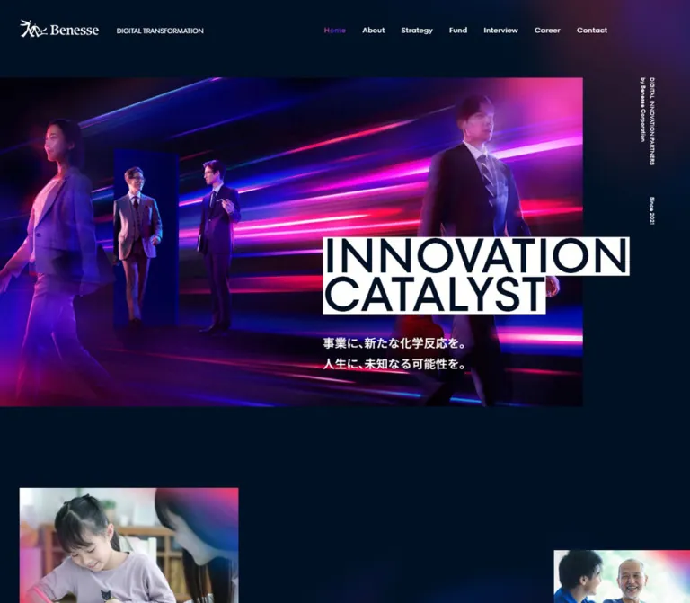
濃紺の背景にネオンの光跡と白帯の大見出しを組み合わせたDX戦略サイト。縦向きのセクション見出し、人物写真を重ねたインタビュー一覧、余白を生かした非対称レイアウトが特徴です。
オリジナルサイトを見るBenesse Digital Transformation — Style Reference
A midnight-blue corporate DX hub with neon light trails, oversized headline strips, and human stories.
Website / original URL: benesse.co.jp/digital Final URL: https://www.benesse.co.jp/digital/ Response: HTTP 200; original and final URLs are identical. Theme: dark navy throughout the supplied views; no alternative theme was observed. Inspected: supplied browser evidence captured September 13, 2026, at 02:29 JST; retrieval timestamp September 12, 2026, 17:29:41.387 UTC. Viewports: desktop 1440 × 1000 and mobile 390 × 844 CSS pixels. Scope: the current corporate DX homepage, including its opening composition, organization and strategy introductions, interview index and taxonomy links, recruitment section, contact entry, association banner, and footer. Visual captures cover desktop opening, interview cards, and footer, plus mobile opening and footer. Rendered DOM measurements cover the full page. Destination pages and an opened mobile menu were not inspected.
Benesse presents digital transformation through people and education. A nearly black blue canvas supports white typography, concentrated magenta-to-violet accents, and photographic compositions. The opening pairs four business figures with luminous horizontal trails and a doorway-like blue frame. Two white strips carrying INNOVATION and CATALYST interrupt the photograph at a deliberately large scale.
Below the opening, the rhythm becomes editorial: long Japanese paragraphs, English section labels, substantial empty space, and interview photography with smaller portraits layered over it. Desktop headings occupy alternating outer rails, while the interview grid sits noticeably right of center. Contact and recruitment are part of a broader corporate information system with separate About, Strategy, Interview, Career, and Contact destinations.
How to Read This Reference
- Measured means a value appears in the supplied rendered DOM, computed styles, or custom-property export. Coordinates refer to the relevant document unless explicitly described as screenshot estimates.
- Estimated means a visual dimension or treatment is read from a supplied current-page capture. Image rectangles, some corner radii, and atmospheric effects fall into this category.
- Calculated means a value is derived from measured numbers, such as a column gap or alpha composite.
- Recommended means an implementation choice for reuse. It is not a claim about the original implementation.
- Named tokens are descriptive aliases unless a source custom property is explicitly identified.
- Only two viewport widths were measured. The breakpoint token is known, but the complete interpolation formulas between viewports are not.
- DOM text and geometry can exist for hidden content. Mobile navigation entries in the export do not establish that the menu was open in the capture.
Tokens — Colors
Default Palette
| Name | Value | Source token | Role and evidence |
|---|---|---|---|
| Midnight Navy | #001125 |
--colors-black |
Measured body background; the dominant page canvas. Despite the source name, this is blue-black rather than neutral black. |
| White | #ffffff |
--colors-white |
Measured body and link text; visually also the hero headline strips and logo treatment. |
| Electric Blue | #3152ff |
--colors-blue |
Measured BRAND label color; blue dots distinguish brand metadata in the visible cards. |
| Signal Red | #ff0340 |
--colors-red |
Measured CATEGORY label color; corresponding category dots appear pink-red in the cards. |
| Transparent White / 10% | rgba(255,255,255,.1) |
--colors-very-pale-white |
Measured filter-chip and mobile-menu-button fill; useful for quiet surface separation. |
| Transparent White / 30% | rgba(255,255,255,.3) |
--colors-pale-white |
Declared translucent white token; a suitable approximation for subdued rules, although individual rule styles were not exported. |
| Slate Overlay | rgba(26,41,59,.5) |
--colors-light-black |
Declared dark translucent surface token. Its assignment to a particular visible panel is unverified. |
| Muted Lavender | #7a82a9 |
--colors-gray-dark, --colors-border-dark |
Declared text/border aliases; not a dominant visible fill. |
| Pale Lavender | #bec4e4 |
--colors-gray-light, --colors-border-light |
Declared supporting aliases; use selectively rather than replacing the observed white text. |
| Cool Off-White | #e5e7f0 |
--colors-bg-white |
Declared token; no large surface using it is established by these captures. |
Accent Gradient
The supplied source variable is exact:
--colors-gradient-background: linear-gradient(
  90deg,
  #ff2e9f,
  rgba(213, 43, 255, .91) 32%,
  rgba(153, 22, 250, .95) 63%,
  rgba(78, 49, 255, .97) 90%
);
The visible Interview and Contact labels use colored lettering with a pink, violet, and blue character. The active Home link is also visibly accented. Its sampled text color is transparent, which is consistent with a clipped background treatment; the export does not include the complete painting rules for its descendants or pseudo-elements.
Keep the gradient concentrated in headings, small graphic marks, and peripheral atmosphere. White remains the working text color. The photograph contains a broader luminous spectrum, but those photographic colors should not become unrelated interface tokens.
Surface Interpretation
The interview panel and association band appear close to a dark slate tone, approximately #1a293b. This is a visual estimate, not an exported flat background value. Independently, compositing 10% white over #001125 calculates to approximately #1a293b, making that overlay a practical reproduction choice.
Do not treat every dark source token as interchangeable. The declared half-transparent Slate Overlay would produce a different result when placed directly over navy. Nested transparent layers also change the final appearance.
Tokens — Typography
Japanese Body — Noto Sans JP
- Measured family:
"Noto Sans JP", "Noto Sans JP Fallback". - Declared general stack:
"Noto Sans JP", "Noto Sans JP Fallback", sans-serif. - Roles: Japanese prose, interview summaries, brand chips, supporting statements, and legal links.
- Weights observed: 300 for legal links, 400 for prose, 500 for the opening Japanese statement, and 700 for recruitment copy and chips.
- Character: clear and restrained, with unusually generous leading in the organization and strategy passages.
English Navigation and Section Labels — ttForts
- Measured family:
ttForts, "ttForts Fallback", sans-serif. - Source aliases:
--fonts-ttand--font-tt-forts. - Roles: primary navigation, section names, CTA labels, taxonomy headings, the recruitment display heading, and the association title.
- Weights observed: 400, 500, and 700 depending on role.
- Character: clean geometric forms that remain light even at a large scale.
The family name is supported by computed styles. Font-file URLs, licensing details, and the definition of the named fallback faces were not supplied. Do not invent an @font-face source or substitute a supposedly identical commercial font name.
Hero Heading Caveat
The sampled hero H2 reports Noto Sans JP, 400 weight, and a 100px desktop size. Its visible dark lettering and white strips belong to a more detailed rendered composition whose inner elements were not sampled. The exact inner-span font and background declarations therefore remain unverified.
The reusable CSS below uses the observed English family for the display strips as an explicitly recommended approximation. The original Benesse wordmark should remain an image or approved vector asset; it is not ordinary text to recreate with a serif font.
Type Scale
Sizes and leading below are measured CSS pixels. The mobile menu row is DOM evidence only.
| Role | Desktop size / leading | Mobile size / leading | Weight | Notes |
|---|---|---|---|---|
| Hero H2 wrapper | 100 / 80px |
52 / 41.6px |
400 | Tight two-line composition; inner span styling unmeasured. |
| Hero Japanese statement | 24 / 42px |
18.72 / 33.696px |
500 | Two deliberate lines in both opening captures. |
| English section heading | 64 / 96px |
38.48 / 57.72px |
400 | Usually -.02em tracking; Interview uses normal tracking. |
| Organization prose | 16 / 40px |
13.52 / 31.096px |
400 | Desktop leading is 2.5 times the type size. |
| Strategy prose | 16 / 40px |
13.52 / 32.1776px |
400 | Mobile leading differs slightly from organization prose. |
| Interview summary | 14 / 25.2px |
12.48 / 22.464px |
400 | Consistent 1.8 leading. |
| Header navigation | 16 / 24px |
Not visible in the closed header | 500 | English family. |
| Mobile menu links | Not applicable | 20.8 / 24.96px |
400 | Exported menu content; opening behavior untested. |
| CTA label | 18 / 18px |
15.6 / 15.6px |
500 | Height comes primarily from the control box. |
| FILTER | 36 / 36px |
23.4 / 23.4px |
400 | Distinct utility heading below the stories. |
| CATEGORY / BRAND | 18 / 27px |
13.52 / 20.28px |
500 | .02em tracking. |
| Filter-chip label | 12 / 12px |
12.48 / 12.48px |
700 | Mobile chip text is slightly larger, not uniformly scaled down. |
| Recruitment display | 100 / 80px |
55.12 / 44.096px |
500 | -.03em tracking; three lines. |
| Recruitment supporting copy | 18 / 39.6px |
13.52 / 34.7464px |
700 | Mobile copy wraps into three lines. |
| Association title | 32 / 48px |
24.96 / 37.44px |
400 | English uppercase with an external-link arrow. |
| Vertical hero annotation | 12 / 18px |
9.36 / 14.04px |
400 | Small supporting identity and date information. |
| Footer navigation | 18 / 27px |
13.52 / 20.28px |
500 | Two groups at both widths. |
| Footer legal links | 14 / 21px |
9.36 / 14.04px |
300 | A readability improvement is recommended for reuse. |
The body carries measured letter spacing of 0.48px on desktop and 0.4056px on mobile, equivalent to .03em at its respective body sizes. Some descendants inherit those absolute computed values even when their own type is larger.
Tokens — Spacing & Shapes
Source Unit and Breakpoint
The root font size is 10px at 1440px wide and 5.2px at 390px wide. These are measurements, not a complete responsive formula. The mobile value is mathematically consistent with a 750-unit design canvas, but that alone does not prove the original root declaration.
The exported desktop breakpoint is 751px, under both --breakpoints-pc and --sizes-breakpoint-pc.
| Source variable | Desktop | Mobile | Interpretation |
|---|---|---|---|
--spacing-px, --sizes-px |
18rem → 180px |
4rem → 20.8px |
Matches the main text and footer left insets in the respective layouts. |
--sizes-header-height, --spacing-header-height |
12.8rem → 128px |
10.1rem → 52.52px |
Declared sizing tokens; neither should be mistaken for the measured header rectangle or total opening clearance. |
Do not copy numeric source rem values into a conventional 16px-root project. The Quick Start uses explicit CSS-pixel tokens and recommended fluid interpolation instead.
Spacing Scale
| Relationship | Desktop | Mobile | Evidence |
|---|---|---|---|
| Main content left inset | 180px |
20.8px |
Measured prose/footer positions. |
| Header horizontal padding | 40px left, 170px right |
20.8px both sides |
Measured. |
| Header logo-to-descriptor gap | 36px |
14.04px within a stacked lockup |
Measured link gap; direction is visible in captures. |
| Desktop navigation gap | 34px |
Replaced by menu control | Calculated from consecutive link rectangles. |
| Hero heading-to-copy gap | 38px |
About 42.11px |
Calculated between measured boxes. |
| Organization prose-to-CTA gap | 50px |
About 42.63px |
Calculated. |
| Strategy prose-to-CTA gap | 50px |
About 31.19px |
Calculated. |
| Interview column gap | 92px |
Single column | Calculated from x=320, width 427, and next column x=839. |
| Right interview-column offset | 80px |
Removed | Measured differences between corresponding card tops. |
| Interview image-to-summary | About 15px |
Media composition unmeasured | Desktop image boundary is screenshot-estimated. |
| Consecutive mobile cards | About 41.6px between anchor boxes |
41.6px |
Calculated from mobile DOM positions. |
| Desktop filter-chip horizontal gap | 18px |
About 10.4px |
Calculated from filter-link rectangles. |
| Footer top padding | 102px |
106.6px |
Measured; substantial breathing room survives mobile. |
Border Radius
| Element | Value | Status |
|---|---|---|
| Hero photograph and headline strips | Square corners | Visually observed. |
| Interview main photograph | Approximately 10px |
Screenshot estimate. |
| Overlapping portrait | Approximately 8px |
Screenshot estimate. |
| Shared interview panel, upper-left corner | Approximately 12px |
Screenshot estimate. |
| Filter chips | 4px desktop; 4.16px mobile |
Measured. |
| CTA links | Fully rounded capsule | Measured extremely large radius; normalize to 999px in reuse. |
| Mobile menu button | 50% on a 52 × 52px box |
Measured. |
| Association logo tile | Approximately 8px desktop |
Screenshot estimate. |
Layout Measurements
| Element | Desktop 1440 × 1000 | Mobile 390 × 844 |
|---|---|---|
| Document height | 7088.19px |
7712.56px |
| Header rectangle | y=40, height 38px |
y=19.23, height 68.09px |
| Hero photograph | Approximately 1200 × 677px, starting at (0,160) |
Approximately 325 × 367px, starting near (0,101) |
| Hero heading wrapper | (665,488), 775 × 159px |
(20.80,443.53), 348.41 × 82.67px |
| Hero supporting-copy wrapper | (665,685), 775 × 84px |
(20.80,568.31), 348.41 × 67.38px |
| Typical desktop content span | 1080px, from x=180 to 1260 |
348.41px, with 20.8px side insets |
| Interview content span | 946px, from x=320 to 1266 |
Card width 304.75px, starting at x=42.63 |
| Interview card width | 427px |
304.75px |
| Standard More detail link | 240 × 60px |
249.59 × 62.39px |
| All interview link | 946 × 60px |
306.81 × 52px |
| Contact us link | 240 × 60px |
303.67 × 52px |
| Association link region | 1080 × 178px |
390 × 210.22px |
| Footer | Height 498px |
Height 636.44px |
The hero heading's measured wrapper is wider than its painted white strips. Do not render a single white rectangle across the entire 775px wrapper: the visible bands follow the lengths of the two words.
Components
Corporate Header
Role: identity and navigation across the DX site.
On desktop, the white Benesse logo sits at the far left with DIGITAL TRANSFORMATION on the same horizontal line. Six English links occupy the right: Home, About, Strategy, Interview, Career, and Contact. The active Home label carries the accent treatment. There is no enclosing navigation pill or header divider in the opening capture.
The header uses a measured flex layout. Its logo link starts at (40,40) and measures approximately 379 × 38px; the first navigation link begins near x=757.39. On mobile, the descriptor moves below the logo and the navigation is represented by a translucent circular menu button at (317.20,27.28), measuring 52 × 52px.
The header is absent from the lower-page captures. Whether it scrolls away normally or hides through scroll logic is unverified. A transform/opacity/visibility transition exists, but its trigger is not established.
Hero Composition
Role: communicate the site's transformation theme and establish visual identity.
The desktop photograph occupies roughly five sixths of the viewport width, flush with the left edge. A navy rail remains on the right. Four people are arranged at different scales within an environment of electric blue and pink trails. The white headline strips sit toward the lower right and extend beyond the photograph into the navy margin.
The composition has five distinct layers:
- A navy page canvas with a restrained corner glow.
- A wide photographic scene with square edges.
- A narrow vertical annotation reading DIGITAL INNOVATION PARTNERS, by Benesse Corporation, and Since 2021.
- Two white strips carrying INNOVATION and CATALYST in dark lettering.
- A white Japanese statement beneath the strips: “事業に、新たな化学反応を。人生に、未知なる可能性を。”
On mobile, the photograph becomes a tall composition approximately 325px wide, while the annotation still occupies the right rail. The headline moves to the left inset, overlapping the photograph's lower edge and continuing below it. The supporting copy sits entirely on navy. This is a recomposed mobile opening, not a uniform reduction of the desktop layout.
Section Heading and Graphic Mark
Role: provide a recurring English identifier without consuming the central reading column.
Desktop Who we are and Interview occupy the left outer rail; Our Strategy and Career occupy the right. Their tall, narrow measured rectangles support the rotated presentation, and the Interview capture visibly confirms sideways English lettering. Contact uses a normal horizontal heading within its row.
The visible Interview label is accompanied by a small cluster of offset blue, violet, and pink rectangular blocks. These crisp shapes counterbalance the soft photographic light trails. Exact construction and dimensions of the mark were not exported.
Mobile section headings are horizontal, generally aligned to the 20.8px content inset, at 38.48px. Preserve this change of orientation rather than squeezing a vertical rail into the phone layout.
Organization and Strategy Introductions
Role: explain the team's purpose and operating model, with links to deeper pages.
The rendered content establishes two editorial sections: Who we are and Our Strategy. On desktop, the organization prose is placed on the right at x=734, while strategy prose starts at x=180. Text widths are approximately 526px and 512px respectively. Paragraphs use 16px Japanese text with 40px leading, producing calm, spacious reading blocks.
Each section ends with a 240 × 60px More detail capsule leading to /digital/about/ or /digital/strategy/. On mobile, the prose uses the standard 348.41px content width and precedes a slightly wider 249.59 × 62.39px capsule.
A learning photograph is visible entering the mobile opening near x=131, y=685, cropped by the right viewport edge. The complete imagery arrangement of these sections is not supplied, so additional image positions or animation sequences should not be inferred.
Outline CTA
Role: provide a consistent secondary navigation action across sections.
The desktop anatomy is a 240 × 60px transparent capsule, a fine white outline, an 18px medium-weight English label on the left, and a simple arrow on the right. The measured padding is 8px 25px 8px 32px. More detail, View career, and Contact us share this family.
Width changes according to context: All interview spans the desktop story collection, and the mobile contact link is wider than the standard mobile More detail link. Do not apply one global button width to every CTA.
The outline is visually observed; exact border CSS was not included. The computed color transition lasts 400ms, but the hover color endpoint and arrow movement were not tested.
Interview Card
Role: link a business-transformation story to both its subject matter and the person behind it.
The entire card is one link to an interview detail page. A wide topic photograph or product image sits above a Japanese summary. A smaller portrait overlaps the main image near its lower-right corner and continues down beside the summary. Compact category and brand tags follow the text.
Desktop anatomy:
- Main image: approximately
427 × 240px, close to 16:9, with gently rounded corners. - Portrait: approximately
120 × 160px, close to 3:4, with rounded corners and about a 26px inset from the main image's right edge. - Portrait position: begins approximately 190px below the card top, crossing the main image's lower edge by about 110px.
- Summary: measured
14px / 25.2px, with180pxright padding inside the 427px box, leaving 247px of text width beside the portrait. - Tags: small translucent rectangles with white labels and colored dots; they remain subordinate to the story.
The current collection contains six links, including stories about career ownership, classroom tools, engineering collaboration, publicity, AI, and organizational change. The first visible cards use product imagery, a child in a classroom, a worktable with laptops, and an audience at a presentation.
On mobile, cards form a single column at x=42.63, width 304.75px. Summary right padding becomes zero. The summary begins about 213.19px below each card's top, but the individual mobile image and portrait boxes were not exported or visually captured. Preserve the full-width summary and treat the Quick Start's mobile portrait position as a recommendation.
Interview Collection Surface
Role: group stories while retaining the page's asymmetric composition.
The desktop story area occupies a shared slate-toned surface whose left edge appears near x=235, with a fine outline and rounded upper-left corner. Some imagery extends above the panel's top boundary. Cards themselves do not have separate filled containers or elevation shadows.
The first desktop column starts at x=320; the second starts at x=839 and 80px lower. Subsequent starts in either column are 490px apart. The DOM allocates 480px to the left card and 400px to its offset right counterpart, giving the pair the same ending position.
Keep the visible stagger deliberate. Avoid random masonry ordering or a uniform row of centered cards. The mobile DOM establishes sequential stacking in the same story order, with roughly 41.6px between card anchor boxes.
Interview Taxonomy Links
Role: route readers to category and brand archives.
FILTER introduces two groups. CATEGORY is red and precedes BUSINESS, DATA, TECHNOLOGY, and ORGANIZATION. BRAND is blue and precedes seven labels, including “ミライシード”, “進研ゼミ”, Udemy, and “こどもちゃれんじ”.
These are anchors with explicit archive destinations under /digital/interview/category/ and /digital/interview/brand/. There is no supplied evidence that selecting them filters the six cards in place.
Desktop chips are 24px high, with 4px radii, 12px bold labels, and 10% white fills. Mobile filter chips measure about 27.55px high and wrap into multiple rows within a narrower region. An All interview outline link follows the groups.
Within story cards, use noninteractive metadata spans inside the card link. Separate filter chips can be anchors. This avoids nested links in a new implementation.
Recruitment Section
Role: invite prospective transformation specialists to explore careers.
The exported content includes Career, a three-line WANTED! / INNOVATION / CATALYST heading, supporting Japanese copy, and View career linking to /digital/career/. The heading is measured at 100px on desktop and 55.12px on mobile, with 0.8 leading and negative tracking.
Desktop supporting copy and the CTA begin at x=739, forming a second alignment to the right of the display text. Mobile retains some asymmetry: the display starts at x=20.80, but supporting copy and the 210.59px-wide CTA begin at x=159.11.
JOIN OUR TEAM! appears four times in the text export. This suggests a repeated graphic treatment, but it does not establish an animated marquee, its direction, or its speed. The full recruitment visual was not supplied as a dedicated capture.
Contact Row
Role: provide an entry point for interview and speaking inquiries.
Desktop Contact is a large gradient label on the left, followed by a single Japanese explanatory line and a 240 × 60px Contact us capsule on the right. The measured x positions are 180, 620.39, and 1020 respectively. Wide space around the row keeps the footer transition calm.
Mobile stacks the heading and explanation at the main inset. The CTA is centered below them at x=43.16, width 303.67px, height 52px. Its route is a separate contact page; no inline form is shown.
Association Banner
Role: provide a related external destination before the footer.
A full-width slate band contains GENERATIVE AI JAPAN, an upward-right arrow, a short Japanese description, and a black logo tile. The observed destination is https://generativeaijapan.or.jp/; its contents were not inspected.
Desktop uses a 1080px inner link region and a right-hand logo tile approximately 240 × 128px. On mobile, the title occupies the upper row; a roughly 203px-wide description and a smaller tile, approximately 130 × 78px, share the area below. The overall mobile link region is 210.22px tall with 41.6px 20.8px padding.
The background glow remains peripheral: stronger toward the left in the desktop lower capture and toward the right in the mobile capture. Exact gradient positioning rules are unverified.
Footer
Role: repeat identity and site navigation, then expose corporate, privacy, related recruitment, and social destinations.
The footer returns to the main navy canvas. On desktop, a larger Benesse lockup sits left, and navigation is divided into two groups on the right: Home / About / Strategy / Interview and Career / Contact. A related recruitment link sits lower left. Corporate and privacy links occupy the lower right beside LinkedIn and note icons. Copyright text identifies Benesse Corporation.
Mobile preserves the logo and descriptor on one row. The two navigation groups move below and remain left aligned. A large vertical interval separates them from the related recruitment and legal links. Social icons sit at the bottom right, with copyright at the bottom left.
Social link boxes measure 24px on desktop and approximately 28.08px on mobile. Their visible glyph size does not establish the full accessible hit area. The small mobile legal text is measured at 9.36px; a larger minimum is recommended when adapting the design.
Tokens — Motion & Interaction
The evidence contains settled captures and computed transition declarations, not recordings of complete interactions.
| Element or token | Supplied value | What is established | What remains unverified |
|---|---|---|---|
| Header | transform, opacity, visibility: 0.5s cubic-bezier(.37,0,.53,1) |
A coordinated visibility transition is declared. | Scroll trigger, sticky behavior, and entry/exit sequence. |
| Body | --scroll-delayed 0.6s |
A custom property is transitioned. | Which visual layers consume it; actual parallax behavior. |
| Desktop navigation | color 0.3s |
Color changes are transition-ready. | Hover endpoint and active-state animation. |
| Outline CTA | color 0.4s |
Text-color transition is declared. | Fill inversion, arrow movement, and focus appearance. |
| Filter chip | background-color 0.3s, color 0.3s |
Both fill and label can transition. | Exact hover colors or a selected state. |
| Association title and description | color 0.5s |
Color transition exists. | Full link-hover treatment. |
| Footer text links | color 0.2s |
Short color transition exists. | Hover endpoint. |
| Footer social links | transform 0.2s ease-in-out |
A transform transition exists. | Transform magnitude and trigger. |
| Named easing: ease-out-back | cubic-bezier(.34,1.56,.64,1) |
Source token exists. | Assignment to a visible component. |
| Named easing: mask-out | cubic-bezier(.77,0,.175,1) |
Source token exists. | Any particular mask reveal. |
| Named easing: ease-parallax | cubic-bezier(.22,1,.36,1) |
Source token exists. | Actual scroll-linked movement. |
Navigation, story cards, CTA links, taxonomy links, and external links have explicit href values. Their destinations are known from the DOM; activation and destination-page behavior were not tested.
Most sampled elements report animation: none. This does not prove the entire page is static: descendants, pseudo-elements, imagery, or script-driven transforms can behave differently. Likewise, neon trails in a still image are not evidence of moving video.
The capture process waited for document load, visible image decoding, sampled layout/text stability, and finite motion where detected. Perpetual animations were temporarily paused during readiness checks and resumed afterward. Those precautions improve screenshot stability but do not establish animation duration, sequence, or semantic completeness.
Surfaces
| Layer | Appearance | Purpose |
|---|---|---|
| Page canvas | Solid #001125 |
Maintains continuity across the long page. |
| Peripheral atmosphere | Diffuse pink, violet, and blue glow with visible texture | Extends the hero's lighting language into quieter areas. |
| Hero image | Square-edged photographic rectangle | Supplies the dominant color and human presence. |
| Headline strips | White, square, fitted to each line | Separate oversized dark words from busy imagery. |
| Shared story panel | Slate tone, fine border, rounded upper-left edge | Groups the editorial collection without boxing every story. |
| Metadata chip | 10% white fill, small radius | Provides taxonomy information at low visual weight. |
| CTA | Transparent capsule with a fine white outline | Creates an action hierarchy without a bright filled-button system. |
| Association band | Full-width slate area with a black logo tile | Separates the external relationship link from the footer. |
There is no general card-shadow hierarchy in the supplied views. Depth comes primarily from photographic overlap, luminous imagery, translucency, and changes in surface tone.
Imagery
The hero combines business portraiture with a constructed light environment. Pink and violet streaks run mostly horizontally, with some diagonal perspective. Different figure scales, a blue rectangular frame, and forward walking poses create a sense of movement even in a still capture. Keep recognizable faces and full-body silhouettes legible against the effects.
Editorial imagery is more natural and task-specific: educational products, children learning, collaborative work, and business presentations. The small portrait overlay connects an abstract transformation topic to a particular person. Subtle colored light treatments recur on portrait corners, tying everyday photography back to the opening.
The mobile hero retains the cast across a much narrower, taller composition. A simple centered crop of a 16:9 desktop photograph would likely lose important figures. Use approved mobile artwork or deliberate responsive art direction; separate image files or picture sources are not proven by the supplied export.
Observed Asset References
No image source URLs, asset filenames, or font-file URLs were supplied. The following inventory identifies visible roles without inventing paths.
| Asset role | Visible evidence | Reuse guidance |
|---|---|---|
| Benesse identity | White logo in desktop/mobile header and footer | Use approved logo artwork; preserve proportions. |
| Hero scene | Four business figures, blue frame, vivid light trails | Provide desktop and mobile compositions that preserve the people and right annotation rail. |
| Learning photograph | Child and adult visible below the mobile opening | Keep the natural human subject and deliberate edge crop. |
| Interview subject images | Products, classroom, laptops, presentation audience | Use meaningful topic imagery rather than repeating generic office portraits. |
| Interview portraits | Smaller vertical photographs overlapping the topic images | Maintain consistent proportions and avoid covering faces or text. |
| Association mark | Black tile with GENERATIVE AI JAPAN identity | Treat black as part of the supplied mark, not a new global canvas color. |
| Related recruitment identity | White graphic/text lockup above lower footer links | Use the actual supplied brand asset when available. |
| Social marks | LinkedIn and note | Preserve recognizable silhouettes and give links accessible names. |
Layout & Responsive Behavior
The central responsive move is recomposition. Type sizes change, but so do orientation, alignment, image proportions, and the relationship between overlapping elements.
| Region | Desktop observation | Mobile observation |
|---|---|---|
| Header | Logo and descriptor inline; six visible links | Stacked identity; circular menu control |
| Hero image | Wide left-aligned scene, approximately 83.3% of viewport width | Tall scene retaining approximately the same width share |
| Hero headline | Lower-right overlay extending beyond image | Left-inset overlay crossing the image's bottom edge |
| Hero annotation | Narrow vertical right rail | Vertical right rail retained at a smaller type size |
| Section labels | Alternating outer rails | Horizontal headings near the main left inset |
| Introductory prose | Alternating left/right content regions | Single text column with generous leading |
| Interviews | Two columns with an 80px stagger | One sequential column; summary right padding removed |
| Taxonomy | Broad category and brand rows | Multiple wrapped rows |
| Recruitment | Display left; supporting copy right | Display spans most width; copy and CTA remain offset right |
| Contact | Heading, explanation, CTA in one row | Stacked content with a wider centered CTA |
| Association band | Text left, large logo tile right | Title above a description/tile arrangement |
| Footer | Identity left, navigation right, utilities along bottom | Identity above two navigation groups; utilities near the bottom |
At 390px wide, the main inset is 20.8px, but interview cards use a deeper inset of about 42.63px. That nested width is intentional. Do not flatten every region to one identical mobile container.
The mobile page is only about 624px taller than the desktop document despite stacking the interview grid. Other sections reduce their dimensions and rearrange spacing. Reproducing desktop gaps unchanged on mobile would therefore produce a materially different page length.
Recommended intermediate-width behavior: use the observed 751px breakpoint as the primary orientation change, then test widths immediately around it. The supplied evidence does not establish tablet navigation fit or exact scaling at 768, 1024, or 1280px. Let text flow naturally and reduce offsets before allowing overlap or horizontal overflow.
Do’s and Don’ts
Do
- Keep
#001125as the continuous canvas and white as the main reading color. - Concentrate pink, violet, and blue in the hero, gradient labels, small marks, and peripheral glow.
- Fit each white hero strip to its own word rather than filling the whole heading wrapper.
- Preserve the mix of large English display labels and airy Japanese prose.
- Keep the desktop section rails and deliberately offset interview collection.
- Pair story imagery with a smaller person portrait, reserving space beside the desktop summary.
- Distinguish red category metadata from blue brand metadata.
- Use outline capsules with context-specific widths.
- Recompose the mobile hero and turn section headings horizontal.
- Preserve the substantial mobile footer spacing and two navigation groups.
- Treat archive chips as links to the observed destination types.
Don't
- Don't replace the corporate information hierarchy with a single conversion funnel.
- Don't turn the page background into neutral black or cover every section in a bright gradient.
- Don't put every interview inside its own elevated, filled card.
- Don't force the staggered desktop stories into equal visual rows.
- Don't leave desktop portrait-reservation padding on mobile summaries.
- Don't crop the mobile hero without checking the people, headline strips, and annotation rail together.
- Don't copy source rem numbers into a 16px-root stylesheet.
- Don't infer an open menu from hidden DOM links or an animated marquee from repeated text.
- Don't describe the current header as fixed or sticky without testing it.
- Don't rebuild the Benesse logo with ordinary text or invent missing asset URLs.
Recommended Implementation Additions
These are recommendations for a new implementation, not verified features of the inspected page.
- Keep headings and supporting copy as real text. Maintain the hero's two-line art direction without rasterizing the entire message.
- Give the menu button an accessible name,
aria-expanded, andaria-controls. Implement keyboard access, Escape handling, and focus restoration when adding its panel. - Use a logical heading hierarchy. The sampled hero is an H2 and story summaries are paragraphs; a new site can improve semantics while preserving appearance.
- Add visible focus indicators to white-outline controls, image cards, taxonomy links, and social icons.
- Increase small mobile legal text and provide generous hit areas for chips and social links. The visible 24–28px glyph or chip height need not be the full target size.
- Preserve text labels alongside red/blue taxonomy indicators so color is supplementary.
- Keep essential copy out of bright photographic regions and test gradient text contrast at its least contrasting point.
- Use reduced-motion behavior for any subsequently implemented reveal, parallax, or repeating text treatment. Keep content visible when animation is disabled.
- Supply responsive image sources and intrinsic dimensions. Prioritize the hero image and defer below-the-fold images without hiding their reserved layout space.
- Test long Japanese titles with portrait overlays, font fallbacks, and text zoom. Remove decorative offsets before allowing text collisions.
Agent Prompt Guide
Quick Color Reference
- Canvas:
#001125. - Primary text and headline strips:
#ffffff. - Headline-strip lettering: navy.
- Category signal:
#ff0340. - Brand signal:
#3152ff. - Accent: the supplied pink-to-violet-to-blue gradient.
- Quiet surfaces: 10% white over navy; approximately
#1a293bwhen composited directly. - Primary action shape: a transparent white-outline capsule, not a saturated filled rectangle.
Overall Prompt
“Create a corporate digital-transformation homepage inspired by the current Benesse Digital Transformation page. Use a continuous midnight navy #001125 canvas, white text, Noto Sans JP for Japanese reading content, and the declared ttForts family for English navigation and section labels when available. Establish a photographic hero with business figures and magenta, violet, and blue light trails. Place INNOVATION and CATALYST on separate fitted white strips with dark lettering. Keep a narrow vertical identity rail on the right. Build spacious editorial introductions, alternating desktop section rails, a right-offset two-column interview collection with overlapping portraits, small red category and blue brand indicators, outline capsule links, recruitment content, and a restrained footer. At mobile widths, recompose the hero, turn section headings horizontal, stack the stories, and preserve deliberate nested insets. Treat motion as an additional specification rather than inventing behavior from still images.”
Example Component Prompts
- Hero: “At a 1440px desktop width, place a roughly 1200 × 677px neon business photograph against navy, beginning 160px from the top. Position two tightly stacked white headline strips near x=665 and y=488. Put the Japanese support copy below and vertical identity text in the far-right rail. On a 390px phone, use a tall 325px-wide art-directed scene and move the strips across its lower edge at the left content inset.”
- Interview card: “Create a 427px-wide linked story with a rounded 16:9 topic photograph, a 120 × 160px portrait overlapping its lower-right edge, and 14px Japanese summary text with 25.2px leading. Reserve 180px to the summary's right for the portrait. Add small translucent metadata tags with red category and blue brand dots. Use no individual card background or shadow.”
- Interview collection: “Arrange two story columns with a 92px gap and an 80px downward offset in the right column. Place them on one quiet slate surface with a rounded upper-left edge. Keep the section heading vertically in the outer left rail. At mobile width, use one centered column about 305px wide and remove the summary's portrait-side padding.”
- Contact and association band: “Use a large gradient Contact heading, restrained Japanese inquiry text, and a 240 × 60px white-outline capsule. Follow with a full-width slate band containing GENERATIVE AI JAPAN, an external arrow, short descriptive text, and a black logo tile. Stack the contact content on mobile while retaining a compact text-and-logo arrangement in the association band.”
- Footer: “Create a spacious navy footer with a white corporate lockup, two groups of English navigation links, a related recruitment link, small legal text, copyright, and LinkedIn/note icons. On mobile, place the identity above navigation and preserve a generous interval before lower utility content.”
Quick Start
CSS Custom Properties
This is an implementation starter, not extracted source CSS. It preserves the measured desktop/mobile type endpoints and the main component relationships while keeping a conventional root font size. Fluid interpolation, hover fills, focus styling, intermediate-width behavior, and the mobile portrait placement are recommendations.
Load authorized font and image assets separately. No font-file or image-source URLs were supplied. The hero needs a .hero-media image wrapper, .hero-rail, .hero-heading containing two .headline-strip spans separated by a line break, and .hero-copy. An interview card contains .interview-media with cover and portrait images, followed by .interview-title and .interview-tags.
:root {
  /* Measured source colors and declared families */
  --color-canvas: #001125;
  --color-text: #fff;
  --color-category: #ff0340;
  --color-brand: #3152ff;
  --color-surface: rgb(255 255 255 / 10%);
  --color-rule: rgb(255 255 255 / 30%);
  --color-muted: #bec4e4;
  --gradient-accent: linear-gradient(
    90deg,
    #ff2e9f,
    rgba(213, 43, 255, .91) 32%,
    rgba(153, 22, 250, .95) 63%,
    rgba(78, 49, 255, .97) 90%
  );
  --font-body: 'Noto Sans JP', 'Noto Sans JP Fallback', sans-serif;
  --font-latin: 'ttForts', 'ttForts Fallback', sans-serif;

  /* Recommended interpolation between measured sizes */
  --gutter: clamp(24px, 12.5vw, 180px);
  --text-body: 16px;
  --text-hero: clamp(52px, 6.944444vw, 100px);
  --text-section: clamp(38.48px, 4.444444vw, 64px);
  --text-story: 14px;
  --text-cta: 18px;
  --text-chip: 12px;
  --radius-image: 10px;
  --radius-portrait: 8px;
  --radius-chip: 4px;
  --radius-pill: 999px;
  --motion-header: .5s cubic-bezier(.37, 0, .53, 1);
}

* { box-sizing: border-box; }

body {
  margin: 0;
  background: var(--color-canvas);
  color: var(--color-text);
  font-family: var(--font-body);
  font-size: var(--text-body);
  line-height: 1.5;
  letter-spacing: .03em;
}

img { display: block; max-width: 100%; }
a { color: inherit; }
button { font: inherit; }

.content-width {
  width: min(calc(100% - 2 * var(--gutter)), 1080px);
  margin-inline: auto;
}

.gradient-text {
  color: #d52bff;
}

@supports (background-clip: text) {
  .gradient-text {
    background: var(--gradient-accent);
    background-clip: text;
    color: transparent;
  }
}

/* Initial header placement; scroll behavior needs separate logic. */
.dx-header {
  position: absolute;
  z-index: 10;
  inset: 40px 0 auto;
  display: flex;
  align-items: center;
  justify-content: space-between;
  gap: 15px;
  padding-inline: 40px clamp(40px, 11.805556vw, 170px);
  transition:
    transform var(--motion-header),
    opacity var(--motion-header),
    visibility var(--motion-header);
}

.brand {
  display: flex;
  align-items: center;
  gap: 36px;
  text-decoration: none;
}

.brand img { width: 164px; height: auto; }

.brand-label {
  font-family: var(--font-latin);
  font-size: 14px;
  line-height: 1;
  letter-spacing: 0;
  white-space: nowrap;
}

.primary-nav {
  display: flex;
  gap: clamp(14px, 2.361111vw, 34px);
}

.primary-nav a {
  font: 500 16px/1.5 var(--font-latin);
  letter-spacing: 0;
  text-decoration: none;
  transition: color .3s;
}

.menu-toggle {
  display: none;
  width: 52px;
  height: 52px;
  padding: 0;
  border: 1px solid var(--color-rule);
  border-radius: 50%;
  color: var(--color-text);
  background: var(--color-surface);
  cursor: pointer;
}

/* Atmosphere is an approximation, not an extracted image effect. */
.dx-hero {
  position: relative;
  min-height: min(69.444444vw, 1000px);
  padding-top: min(11.111111vw, 160px);
  background: radial-gradient(
    ellipse at 100% 0%,
    rgb(153 22 250 / 20%),
    transparent 28%
  );
}

.hero-media {
  width: 83.333333%;
  aspect-ratio: 1200 / 677;
  overflow: hidden;
}

.hero-media img {
  width: 100%;
  height: 100%;
  object-fit: cover;
}

.hero-rail {
  position: absolute;
  top: min(11.111111vw, 160px);
  right: 4.8%;
  display: flex;
  gap: 65px;
  margin: 0;
  writing-mode: vertical-rl;
  font: 400 12px/1.5 var(--font-latin);
  letter-spacing: 0;
}

.hero-heading {
  position: absolute;
  top: min(33.888889vw, 488px);
  left: 46.180556%;
  width: 53.819444%;
  margin: 0;
  font-size: var(--text-hero);
  font-weight: 400;
  line-height: .8;
  letter-spacing: 0;
}

.headline-strip {
  display: inline-block;
  padding-inline: .025em;
  color: var(--color-canvas);
  background: #fff;
  font-family: var(--font-latin);
  white-space: nowrap;
}

.hero-copy {
  position: absolute;
  top: min(47.569444vw, 685px);
  left: 46.180556%;
  margin: 0;
  font-size: clamp(18px, 1.666667vw, 24px);
  font-weight: 500;
  line-height: 1.75;
}

.section-heading {
  margin: 0;
  font: 400 var(--text-section)/1.5 var(--font-latin);
  letter-spacing: -.02em;
}

.section-heading--rail {
  position: absolute;
  inset: 0 auto auto 4.444444%;
  writing-mode: vertical-rl;
  text-orientation: sideways;
}

.section-heading--right {
  inset-inline: auto 4.444444%;
}

.prose {
  max-width: 526px;
  margin: 0;
  font-size: 16px;
  line-height: 2.5;
}

.outline-link {
  display: inline-flex;
  align-items: center;
  justify-content: space-between;
  gap: 20px;
  width: 240px;
  max-width: 100%;
  min-height: 60px;
  padding: 8px 25px 8px 32px;
  border: 1px solid #fff;
  border-radius: var(--radius-pill);
  color: #fff;
  background: transparent;
  font: 500 var(--text-cta)/1 var(--font-latin);
  letter-spacing: 0;
  text-decoration: none;
  transition: color .4s, background-color .4s;
}

.outline-link .arrow {
  flex: none;
  font-size: 24px;
  line-height: 1;
}

.outline-link--wide { width: 100%; }

.interview-section {
  position: relative;
  isolation: isolate;
  padding-bottom: 60px;
}

.interview-section::before {
  content: '';
  position: absolute;
  z-index: -1;
  inset: 140px 0 0 max(20px, calc(50% - 485px));
  border: 1px solid var(--color-rule);
  border-right: 0;
  border-radius: 12px 0 0 0;
  background: var(--color-surface);
}

.interview-content {
  width: min(946px, calc(100% - 48px));
  margin-inline: auto;
}

.interview-grid {
  display: grid;
  grid-template-columns: repeat(2, minmax(0, 1fr));
  align-items: start;
  column-gap: clamp(32px, 6.388889vw, 92px);
  row-gap: 10px;
}

.interview-card {
  display: block;
  min-width: 0;
  min-height: 480px;
  text-decoration: none;
}

.interview-card:nth-child(even) {
  min-height: 400px;
  margin-top: 80px;
}

.interview-media {
  position: relative;
  margin-bottom: 15px;
}

.interview-cover {
  width: 100%;
  aspect-ratio: 16 / 9;
  border-radius: var(--radius-image);
  object-fit: cover;
}

.interview-person {
  position: absolute;
  right: 26px;
  bottom: -110px;
  width: 120px;
  aspect-ratio: 3 / 4;
  border-radius: var(--radius-portrait);
  object-fit: cover;
}

.interview-title {
  margin: 0;
  padding-right: 180px;
  font-size: var(--text-story);
  font-weight: 400;
  line-height: 1.8;
}

.interview-tags,
.filter-links {
  display: flex;
  flex-wrap: wrap;
  gap: 12px 18px;
}

.interview-tags { margin-top: 18px; }

.tag {
  display: inline-flex;
  align-items: center;
  gap: 6px;
  min-height: 24px;
  padding: 6px 9px;
  border-radius: var(--radius-chip);
  background: var(--color-surface);
  color: #fff;
  font-size: var(--text-chip);
  font-weight: 700;
  line-height: 1;
  letter-spacing: 0;
  text-decoration: none;
  transition: background-color .3s, color .3s;
}

.tag::before {
  content: '';
  flex: none;
  width: 8px;
  height: 8px;
  border-radius: 50%;
  background: var(--tag-color, var(--color-category));
}

.tag--category { font-family: var(--font-latin); }
.tag--brand { --tag-color: var(--color-brand); }

.filter-title {
  margin: 0 0 40px;
  font: 400 36px/1 var(--font-latin);
}

.filter-group { margin-bottom: 48px; }

.filter-group-label {
  margin: 0 0 12px;
  color: var(--color-category);
  font: 500 18px/1.5 var(--font-latin);
  letter-spacing: .02em;
}

.filter-group-label--brand { color: var(--color-brand); }

.contact-row {
  display: grid;
  grid-template-columns: 1fr auto 240px;
  align-items: center;
  gap: 78px;
  padding-block: 110px 130px;
}

.contact-row p { margin: 0; line-height: 2.5; }

.partner-band { background: var(--color-surface); }

.partner-link {
  display: grid;
  grid-template-columns: 1fr 240px;
  align-items: center;
  gap: 40px;
  padding-block: 25px;
  text-decoration: none;
}

.partner-title {
  margin: 0 0 7px;
  font: 400 32px/1.5 var(--font-latin);
  letter-spacing: 0;
}

.partner-copy { margin: 0; font-size: 14px; }

.partner-logo {
  width: 240px;
  aspect-ratio: 15 / 8;
  border-radius: 8px;
  object-fit: contain;
  background: #000;
}

.dx-footer { padding-block: 102px 65px; }

.footer-top {
  display: flex;
  justify-content: space-between;
  align-items: flex-start;
  gap: 60px;
}

.dx-footer .brand { gap: 48px; }
.dx-footer .brand img { width: 208px; }

.footer-nav {
  display: grid;
  grid-template-columns: repeat(2, max-content);
  gap: 56px;
}

.footer-nav-group { display: grid; gap: 27px; }

.footer-nav a {
  font: 500 18px/1.5 var(--font-latin);
  text-decoration: none;
  transition: color .2s;
}

.footer-bottom {
  display: flex;
  flex-wrap: wrap;
  align-items: flex-end;
  justify-content: space-between;
  gap: 24px;
  margin-top: 80px;
}

.social-links { display: flex; gap: 14px; }

.social-links a {
  display: grid;
  place-items: center;
  min-width: 44px;
  min-height: 44px;
}

.social-links img { width: 24px; }

/* Recommended interaction endpoints and focus treatment. */
@media (hover: hover) {
  .outline-link:hover {
    color: var(--color-canvas);
    background: #fff;
  }
  .filter-links .tag:hover {
    background: rgb(255 255 255 / 24%);
  }
}

:where(a, button):focus-visible {
  outline: 2px solid #fff;
  outline-offset: 5px;
}

/* Recommended accommodations where desktop content is tighter. */
@media (min-width: 751px) and (max-width: 1099px) {
  .brand { gap: 16px; }
  .dx-header .brand-label { display: none; }
  .contact-row { gap: 24px; }
  .interview-person { right: 14px; width: 90px; bottom: -85px; }
  .interview-title { padding-right: 115px; }
}

@media (min-width: 1100px) {
  .interview-content { margin-inline-start: calc(50% - 400px); }
}

/* The 751px boundary is an observed source token. */
@media (max-width: 750px) {
  :root {
    --gutter: 20.8px;
    --text-body: 13.52px;
    --text-hero: clamp(40px, 13.333333vw, 70px);
    --text-section: 38.48px;
    --text-story: 12.48px;
    --text-cta: 15.6px;
    --text-chip: 12.48px;
    --radius-chip: 4.16px;
  }

  .dx-header {
    top: 19.23px;
    padding-inline: var(--gutter);
  }
  .dx-header .brand {
    flex-direction: column;
    align-items: flex-start;
    gap: 14.04px;
    padding-top: 7.28px;
  }
  .dx-header .brand img { width: 136.75px; }
  .brand-label { font-size: 10.4px; }
  .primary-nav { display: none; }
  .menu-toggle { display: grid; place-items: center; }

  .dx-hero {
    min-height: 685px;
    padding-top: 101px;
  }
  .hero-media { aspect-ratio: 325 / 367; }
  .hero-rail {
    top: 97.75px;
    right: 16.75px;
    gap: 41.6px;
    font-size: 9.36px;
    line-height: 1.5;
  }
  .hero-heading {
    top: calc(101px + 87.8295vw);
    left: var(--gutter);
    width: calc(100% - 2 * var(--gutter));
  }
  .hero-copy {
    position: relative;
    top: auto;
    left: auto;
    margin: 100px var(--gutter) 49px;
    font-size: 18.72px;
    line-height: 1.8;
  }

  .section-heading--rail,
  .section-heading--right {
    position: static;
    writing-mode: horizontal-tb;
    text-orientation: mixed;
  }
  .prose { max-width: none; font-size: 13.52px; line-height: 2.3; }
  .prose--strategy { line-height: 2.38; }
  .outline-link {
    width: 249.6px;
    min-height: 62.4px;
    padding: 10.4px 27.04px 11.44px 33.28px;
  }
  .outline-link--wide { width: 100%; min-height: 52px; }

  .interview-section::before {
    inset: 150px var(--gutter) 0;
    border-right: 1px solid var(--color-rule);
    border-radius: 12px;
  }
  .interview-section > .section-heading {
    margin-inline: var(--gutter);
  }
  .interview-content {
    width: min(78.141026vw, 440px);
    margin-inline: auto;
  }
  .interview-grid { grid-template-columns: 1fr; gap: 41.6px; }
  .interview-card,
  .interview-card:nth-child(even) {
    min-height: 0;
    margin-top: 0;
  }
  .interview-media { margin-bottom: 41.6px; }
  /* Recommended mobile portrait placement; not directly measured. */
  .interview-person { width: 72px; right: 16px; bottom: -25px; }
  .interview-title { padding-right: 0; }
  .interview-tags { margin-top: 13.52px; }
  .filter-links { gap: 15.08px 10.4px; }
  .tag { min-height: 27.55px; padding: 7.3px 8.32px; }
  .filter-title { margin-top: 41.6px; font-size: 23.4px; }
  .filter-group-label { font-size: 13.52px; }

  .contact-row {
    grid-template-columns: 1fr;
    gap: 20px;
    padding-block: 32px 79px;
  }
  .contact-row p { line-height: 1.8; }
  .contact-row .outline-link {
    justify-self: center;
    width: min(303.67px, 100%);
    min-height: 52px;
    margin-top: 33px;
  }

  .partner-link {
    width: 100%;
    grid-template-columns: minmax(0, 1fr) 130px;
    gap: 16.6px 15px;
    padding: 41.6px var(--gutter);
  }
  .partner-text { display: contents; }
  .partner-title { grid-column: 1 / -1; margin: 0; font-size: 24.96px; }
  .partner-copy { font-size: 13.52px; line-height: 1.8; }
  .partner-logo { width: 130px; aspect-ratio: 5 / 3; }

  .dx-footer { padding-block: 106.6px 41.6px; }
  .footer-top { display: block; }
  .dx-footer .brand { gap: 31.2px; }
  .dx-footer .brand img { width: 140px; }
  .dx-footer .brand-label { font-size: 9.36px; }
  .footer-nav {
    justify-content: start;
    column-gap: 54px;
    margin-top: 60px;
  }
  .footer-nav-group { gap: 31.6px; }
  .footer-nav a { font-size: 13.52px; }
  .footer-bottom { margin-top: 104px; }
  .social-links img { width: 28.08px; }
}

/* Preserve visible content if added motion is disabled. */
@media (prefers-reduced-motion: reduce) {
  .dx-header,
  .primary-nav a,
  .outline-link,
  .tag,
  .footer-nav a {
    transition: none;
  }
}
The menu button still requires an actual controlled menu implementation. The snippet deliberately provides no inferred scroll-hiding logic, image animation, or repeating-text motion. For a longer hero heading, adjust the art direction and type scale rather than relying on the fixed source words to fit arbitrary copy.
Tailwind v4 Token Mapping
Optional aliases for a project already using Tailwind v4. This is not evidence that the original site uses Tailwind. Define the preceding custom properties first.
@theme inline {
  --color-dx-canvas: var(--color-canvas);
  --color-dx-text: var(--color-text);
  --color-dx-category: var(--color-category);
  --color-dx-brand: var(--color-brand);
  --color-dx-surface: var(--color-surface);
  --color-dx-rule: var(--color-rule);

  --font-dx-body: var(--font-body);
  --font-dx-latin: var(--font-latin);

  --text-dx-body: var(--text-body);
  --text-dx-hero: var(--text-hero);
  --text-dx-section: var(--text-section);
  --text-dx-story: var(--text-story);
  --text-dx-cta: var(--text-cta);
  --text-dx-chip: var(--text-chip);

  --spacing-dx-page: var(--gutter);
  --radius-dx-image: var(--radius-image);
  --radius-dx-portrait: var(--radius-portrait);
  --radius-dx-chip: var(--radius-chip);
  --radius-dx-pill: var(--radius-pill);
}
Sources & Evidence
- Original and final page: Benesse Digital Transformation. The supplied response is HTTP 200 with no URL change; the rendered page title is “ベネッセのDX戦略”.
- Capture record: September 12, 2026,
17:29:41.387Z, equivalent to September 13, 2026,02:29:41.387in Japan. Individual screenshot timestamps were not supplied separately. - Desktop: 1440 × 1000 CSS pixels; three current-page captures show the opening, an interview-grid region, and the contact/banner/footer region. The DOM document height is approximately 7088.19px.
- Mobile: 390 × 844 CSS pixels; two current-page captures show the opening and lower banner/footer. The DOM document height is approximately 7712.56px.
- Measurement authority: supplied rendered text, href values, element rectangles, computed font/color/layout/transition values, and exported custom properties. Calculated gaps and estimated image dimensions are identified in the relevant sections.
- Observed navigation structure: links to About, Strategy, Interview, Career, Contact, interview detail and archive routes, corporate information, privacy, related recruitment, and social destinations. Link targets are evidence of routing intent; destination pages were not inspected.
- Inspection limitations: no independently exercised hover states, opened-menu capture, form submission, keyboard interaction, or motion recording was supplied. Full imagery for the organization, strategy, recruitment, filter region, and mobile story cards is not visually documented. Asset URLs and inner hero-span styles were not included.
- Capture conditions: readiness checks awaited loading, image decoding, finite motion where detected, and sampled stability; scrolling traversed intermediate positions. SharedWorkers and service workers were disabled. These conditions do not rule out delayed content or behavior outside the sampled states.
This reference analyzes the supplied current-page evidence. CSS adaptations, responsive interpolation, accessible enhancements, and suggested interactions are implementation guidance rather than verified original behavior.
# Benesse Digital Transformation — Style Reference

> A midnight-blue corporate DX hub with neon light trails, oversized headline strips, and human stories.

**Website / original URL:** [benesse.co.jp/digital](https://www.benesse.co.jp/digital/)
**Final URL:** [https://www.benesse.co.jp/digital/](https://www.benesse.co.jp/digital/)
**Response:** HTTP 200; original and final URLs are identical.
**Theme:** dark navy throughout the supplied views; no alternative theme was observed.
**Inspected:** supplied browser evidence captured September 13, 2026, at 02:29 JST; retrieval timestamp September 12, 2026, 17:29:41.387 UTC.
**Viewports:** desktop 1440 × 1000 and mobile 390 × 844 CSS pixels.
**Scope:** the current corporate DX homepage, including its opening composition, organization and strategy introductions, interview index and taxonomy links, recruitment section, contact entry, association banner, and footer. Visual captures cover desktop opening, interview cards, and footer, plus mobile opening and footer. Rendered DOM measurements cover the full page. Destination pages and an opened mobile menu were not inspected.

Benesse presents digital transformation through people and education. A nearly black blue canvas supports white typography, concentrated magenta-to-violet accents, and photographic compositions. The opening pairs four business figures with luminous horizontal trails and a doorway-like blue frame. Two white strips carrying INNOVATION and CATALYST interrupt the photograph at a deliberately large scale.

Below the opening, the rhythm becomes editorial: long Japanese paragraphs, English section labels, substantial empty space, and interview photography with smaller portraits layered over it. Desktop headings occupy alternating outer rails, while the interview grid sits noticeably right of center. Contact and recruitment are part of a broader corporate information system with separate About, Strategy, Interview, Career, and Contact destinations.

## How to Read This Reference

- **Measured** means a value appears in the supplied rendered DOM, computed styles, or custom-property export. Coordinates refer to the relevant document unless explicitly described as screenshot estimates.
- **Estimated** means a visual dimension or treatment is read from a supplied current-page capture. Image rectangles, some corner radii, and atmospheric effects fall into this category.
- **Calculated** means a value is derived from measured numbers, such as a column gap or alpha composite.
- **Recommended** means an implementation choice for reuse. It is not a claim about the original implementation.
- **Named tokens** are descriptive aliases unless a source custom property is explicitly identified.
- Only two viewport widths were measured. The breakpoint token is known, but the complete interpolation formulas between viewports are not.
- DOM text and geometry can exist for hidden content. Mobile navigation entries in the export do not establish that the menu was open in the capture.

## Tokens — Colors

### Default Palette

| Name | Value | Source token | Role and evidence |
| --- | --- | --- | --- |
| Midnight Navy | `#001125` | `--colors-black` | Measured body background; the dominant page canvas. Despite the source name, this is blue-black rather than neutral black. |
| White | `#ffffff` | `--colors-white` | Measured body and link text; visually also the hero headline strips and logo treatment. |
| Electric Blue | `#3152ff` | `--colors-blue` | Measured BRAND label color; blue dots distinguish brand metadata in the visible cards. |
| Signal Red | `#ff0340` | `--colors-red` | Measured CATEGORY label color; corresponding category dots appear pink-red in the cards. |
| Transparent White / 10% | `rgba(255,255,255,.1)` | `--colors-very-pale-white` | Measured filter-chip and mobile-menu-button fill; useful for quiet surface separation. |
| Transparent White / 30% | `rgba(255,255,255,.3)` | `--colors-pale-white` | Declared translucent white token; a suitable approximation for subdued rules, although individual rule styles were not exported. |
| Slate Overlay | `rgba(26,41,59,.5)` | `--colors-light-black` | Declared dark translucent surface token. Its assignment to a particular visible panel is unverified. |
| Muted Lavender | `#7a82a9` | `--colors-gray-dark`, `--colors-border-dark` | Declared text/border aliases; not a dominant visible fill. |
| Pale Lavender | `#bec4e4` | `--colors-gray-light`, `--colors-border-light` | Declared supporting aliases; use selectively rather than replacing the observed white text. |
| Cool Off-White | `#e5e7f0` | `--colors-bg-white` | Declared token; no large surface using it is established by these captures. |

### Accent Gradient

The supplied source variable is exact:

```css
--colors-gradient-background: linear-gradient(
  90deg,
  #ff2e9f,
  rgba(213, 43, 255, .91) 32%,
  rgba(153, 22, 250, .95) 63%,
  rgba(78, 49, 255, .97) 90%
);
```

The visible Interview and Contact labels use colored lettering with a pink, violet, and blue character. The active Home link is also visibly accented. Its sampled text color is transparent, which is consistent with a clipped background treatment; the export does not include the complete painting rules for its descendants or pseudo-elements.

Keep the gradient concentrated in headings, small graphic marks, and peripheral atmosphere. White remains the working text color. The photograph contains a broader luminous spectrum, but those photographic colors should not become unrelated interface tokens.

### Surface Interpretation

The interview panel and association band appear close to a dark slate tone, approximately `#1a293b`. This is a visual estimate, not an exported flat background value. Independently, compositing 10% white over `#001125` calculates to approximately `#1a293b`, making that overlay a practical reproduction choice.

Do not treat every dark source token as interchangeable. The declared half-transparent Slate Overlay would produce a different result when placed directly over navy. Nested transparent layers also change the final appearance.

## Tokens — Typography

### Japanese Body — Noto Sans JP

- **Measured family:** `"Noto Sans JP", "Noto Sans JP Fallback"`.
- **Declared general stack:** `"Noto Sans JP", "Noto Sans JP Fallback", sans-serif`.
- **Roles:** Japanese prose, interview summaries, brand chips, supporting statements, and legal links.
- **Weights observed:** 300 for legal links, 400 for prose, 500 for the opening Japanese statement, and 700 for recruitment copy and chips.
- **Character:** clear and restrained, with unusually generous leading in the organization and strategy passages.

### English Navigation and Section Labels — ttForts

- **Measured family:** `ttForts, "ttForts Fallback", sans-serif`.
- **Source aliases:** `--fonts-tt` and `--font-tt-forts`.
- **Roles:** primary navigation, section names, CTA labels, taxonomy headings, the recruitment display heading, and the association title.
- **Weights observed:** 400, 500, and 700 depending on role.
- **Character:** clean geometric forms that remain light even at a large scale.

The family name is supported by computed styles. Font-file URLs, licensing details, and the definition of the named fallback faces were not supplied. Do not invent an `@font-face` source or substitute a supposedly identical commercial font name.

### Hero Heading Caveat

The sampled hero H2 reports Noto Sans JP, 400 weight, and a 100px desktop size. Its visible dark lettering and white strips belong to a more detailed rendered composition whose inner elements were not sampled. The exact inner-span font and background declarations therefore remain unverified.

The reusable CSS below uses the observed English family for the display strips as an explicitly recommended approximation. The original Benesse wordmark should remain an image or approved vector asset; it is not ordinary text to recreate with a serif font.

### Type Scale

Sizes and leading below are measured CSS pixels. The mobile menu row is DOM evidence only.

| Role | Desktop size / leading | Mobile size / leading | Weight | Notes |
| --- | --- | --- | --- | --- |
| Hero H2 wrapper | `100 / 80px` | `52 / 41.6px` | 400 | Tight two-line composition; inner span styling unmeasured. |
| Hero Japanese statement | `24 / 42px` | `18.72 / 33.696px` | 500 | Two deliberate lines in both opening captures. |
| English section heading | `64 / 96px` | `38.48 / 57.72px` | 400 | Usually `-.02em` tracking; Interview uses normal tracking. |
| Organization prose | `16 / 40px` | `13.52 / 31.096px` | 400 | Desktop leading is 2.5 times the type size. |
| Strategy prose | `16 / 40px` | `13.52 / 32.1776px` | 400 | Mobile leading differs slightly from organization prose. |
| Interview summary | `14 / 25.2px` | `12.48 / 22.464px` | 400 | Consistent 1.8 leading. |
| Header navigation | `16 / 24px` | Not visible in the closed header | 500 | English family. |
| Mobile menu links | Not applicable | `20.8 / 24.96px` | 400 | Exported menu content; opening behavior untested. |
| CTA label | `18 / 18px` | `15.6 / 15.6px` | 500 | Height comes primarily from the control box. |
| FILTER | `36 / 36px` | `23.4 / 23.4px` | 400 | Distinct utility heading below the stories. |
| CATEGORY / BRAND | `18 / 27px` | `13.52 / 20.28px` | 500 | `.02em` tracking. |
| Filter-chip label | `12 / 12px` | `12.48 / 12.48px` | 700 | Mobile chip text is slightly larger, not uniformly scaled down. |
| Recruitment display | `100 / 80px` | `55.12 / 44.096px` | 500 | `-.03em` tracking; three lines. |
| Recruitment supporting copy | `18 / 39.6px` | `13.52 / 34.7464px` | 700 | Mobile copy wraps into three lines. |
| Association title | `32 / 48px` | `24.96 / 37.44px` | 400 | English uppercase with an external-link arrow. |
| Vertical hero annotation | `12 / 18px` | `9.36 / 14.04px` | 400 | Small supporting identity and date information. |
| Footer navigation | `18 / 27px` | `13.52 / 20.28px` | 500 | Two groups at both widths. |
| Footer legal links | `14 / 21px` | `9.36 / 14.04px` | 300 | A readability improvement is recommended for reuse. |

The body carries measured letter spacing of `0.48px` on desktop and `0.4056px` on mobile, equivalent to `.03em` at its respective body sizes. Some descendants inherit those absolute computed values even when their own type is larger.

## Tokens — Spacing & Shapes

### Source Unit and Breakpoint

The root font size is **10px at 1440px wide** and **5.2px at 390px wide**. These are measurements, not a complete responsive formula. The mobile value is mathematically consistent with a 750-unit design canvas, but that alone does not prove the original root declaration.

The exported desktop breakpoint is **751px**, under both `--breakpoints-pc` and `--sizes-breakpoint-pc`.

| Source variable | Desktop | Mobile | Interpretation |
| --- | --- | --- | --- |
| `--spacing-px`, `--sizes-px` | `18rem` → `180px` | `4rem` → `20.8px` | Matches the main text and footer left insets in the respective layouts. |
| `--sizes-header-height`, `--spacing-header-height` | `12.8rem` → `128px` | `10.1rem` → `52.52px` | Declared sizing tokens; neither should be mistaken for the measured header rectangle or total opening clearance. |

Do not copy numeric source rem values into a conventional 16px-root project. The Quick Start uses explicit CSS-pixel tokens and recommended fluid interpolation instead.

### Spacing Scale

| Relationship | Desktop | Mobile | Evidence |
| --- | --- | --- | --- |
| Main content left inset | `180px` | `20.8px` | Measured prose/footer positions. |
| Header horizontal padding | `40px` left, `170px` right | `20.8px` both sides | Measured. |
| Header logo-to-descriptor gap | `36px` | `14.04px` within a stacked lockup | Measured link gap; direction is visible in captures. |
| Desktop navigation gap | `34px` | Replaced by menu control | Calculated from consecutive link rectangles. |
| Hero heading-to-copy gap | `38px` | About `42.11px` | Calculated between measured boxes. |
| Organization prose-to-CTA gap | `50px` | About `42.63px` | Calculated. |
| Strategy prose-to-CTA gap | `50px` | About `31.19px` | Calculated. |
| Interview column gap | `92px` | Single column | Calculated from `x=320`, width `427`, and next column `x=839`. |
| Right interview-column offset | `80px` | Removed | Measured differences between corresponding card tops. |
| Interview image-to-summary | About `15px` | Media composition unmeasured | Desktop image boundary is screenshot-estimated. |
| Consecutive mobile cards | About `41.6px` between anchor boxes | `41.6px` | Calculated from mobile DOM positions. |
| Desktop filter-chip horizontal gap | `18px` | About `10.4px` | Calculated from filter-link rectangles. |
| Footer top padding | `102px` | `106.6px` | Measured; substantial breathing room survives mobile. |

### Border Radius

| Element | Value | Status |
| --- | --- | --- |
| Hero photograph and headline strips | Square corners | Visually observed. |
| Interview main photograph | Approximately `10px` | Screenshot estimate. |
| Overlapping portrait | Approximately `8px` | Screenshot estimate. |
| Shared interview panel, upper-left corner | Approximately `12px` | Screenshot estimate. |
| Filter chips | `4px` desktop; `4.16px` mobile | Measured. |
| CTA links | Fully rounded capsule | Measured extremely large radius; normalize to `999px` in reuse. |
| Mobile menu button | `50%` on a `52 × 52px` box | Measured. |
| Association logo tile | Approximately `8px` desktop | Screenshot estimate. |

### Layout Measurements

| Element | Desktop 1440 × 1000 | Mobile 390 × 844 |
| --- | --- | --- |
| Document height | `7088.19px` | `7712.56px` |
| Header rectangle | `y=40`, height `38px` | `y=19.23`, height `68.09px` |
| Hero photograph | Approximately `1200 × 677px`, starting at `(0,160)` | Approximately `325 × 367px`, starting near `(0,101)` |
| Hero heading wrapper | `(665,488)`, `775 × 159px` | `(20.80,443.53)`, `348.41 × 82.67px` |
| Hero supporting-copy wrapper | `(665,685)`, `775 × 84px` | `(20.80,568.31)`, `348.41 × 67.38px` |
| Typical desktop content span | `1080px`, from `x=180` to `1260` | `348.41px`, with `20.8px` side insets |
| Interview content span | `946px`, from `x=320` to `1266` | Card width `304.75px`, starting at `x=42.63` |
| Interview card width | `427px` | `304.75px` |
| Standard More detail link | `240 × 60px` | `249.59 × 62.39px` |
| All interview link | `946 × 60px` | `306.81 × 52px` |
| Contact us link | `240 × 60px` | `303.67 × 52px` |
| Association link region | `1080 × 178px` | `390 × 210.22px` |
| Footer | Height `498px` | Height `636.44px` |

The hero heading's measured wrapper is wider than its painted white strips. Do not render a single white rectangle across the entire 775px wrapper: the visible bands follow the lengths of the two words.

## Components

### Corporate Header

**Role:** identity and navigation across the DX site.

On desktop, the white Benesse logo sits at the far left with DIGITAL TRANSFORMATION on the same horizontal line. Six English links occupy the right: Home, About, Strategy, Interview, Career, and Contact. The active Home label carries the accent treatment. There is no enclosing navigation pill or header divider in the opening capture.

The header uses a measured flex layout. Its logo link starts at `(40,40)` and measures approximately `379 × 38px`; the first navigation link begins near `x=757.39`. On mobile, the descriptor moves below the logo and the navigation is represented by a translucent circular menu button at `(317.20,27.28)`, measuring `52 × 52px`.

The header is absent from the lower-page captures. Whether it scrolls away normally or hides through scroll logic is unverified. A transform/opacity/visibility transition exists, but its trigger is not established.

### Hero Composition

**Role:** communicate the site's transformation theme and establish visual identity.

The desktop photograph occupies roughly five sixths of the viewport width, flush with the left edge. A navy rail remains on the right. Four people are arranged at different scales within an environment of electric blue and pink trails. The white headline strips sit toward the lower right and extend beyond the photograph into the navy margin.

The composition has five distinct layers:

1. A navy page canvas with a restrained corner glow.
2. A wide photographic scene with square edges.
3. A narrow vertical annotation reading DIGITAL INNOVATION PARTNERS, by Benesse Corporation, and Since 2021.
4. Two white strips carrying INNOVATION and CATALYST in dark lettering.
5. A white Japanese statement beneath the strips: “事業に、新たな化学反応を。人生に、未知なる可能性を。”

On mobile, the photograph becomes a tall composition approximately 325px wide, while the annotation still occupies the right rail. The headline moves to the left inset, overlapping the photograph's lower edge and continuing below it. The supporting copy sits entirely on navy. This is a recomposed mobile opening, not a uniform reduction of the desktop layout.

### Section Heading and Graphic Mark

**Role:** provide a recurring English identifier without consuming the central reading column.

Desktop Who we are and Interview occupy the left outer rail; Our Strategy and Career occupy the right. Their tall, narrow measured rectangles support the rotated presentation, and the Interview capture visibly confirms sideways English lettering. Contact uses a normal horizontal heading within its row.

The visible Interview label is accompanied by a small cluster of offset blue, violet, and pink rectangular blocks. These crisp shapes counterbalance the soft photographic light trails. Exact construction and dimensions of the mark were not exported.

Mobile section headings are horizontal, generally aligned to the `20.8px` content inset, at `38.48px`. Preserve this change of orientation rather than squeezing a vertical rail into the phone layout.

### Organization and Strategy Introductions

**Role:** explain the team's purpose and operating model, with links to deeper pages.

The rendered content establishes two editorial sections: Who we are and Our Strategy. On desktop, the organization prose is placed on the right at `x=734`, while strategy prose starts at `x=180`. Text widths are approximately 526px and 512px respectively. Paragraphs use 16px Japanese text with 40px leading, producing calm, spacious reading blocks.

Each section ends with a 240 × 60px More detail capsule leading to `/digital/about/` or `/digital/strategy/`. On mobile, the prose uses the standard 348.41px content width and precedes a slightly wider 249.59 × 62.39px capsule.

A learning photograph is visible entering the mobile opening near `x=131`, `y=685`, cropped by the right viewport edge. The complete imagery arrangement of these sections is not supplied, so additional image positions or animation sequences should not be inferred.

### Outline CTA

**Role:** provide a consistent secondary navigation action across sections.

The desktop anatomy is a 240 × 60px transparent capsule, a fine white outline, an 18px medium-weight English label on the left, and a simple arrow on the right. The measured padding is `8px 25px 8px 32px`. More detail, View career, and Contact us share this family.

Width changes according to context: All interview spans the desktop story collection, and the mobile contact link is wider than the standard mobile More detail link. Do not apply one global button width to every CTA.

The outline is visually observed; exact border CSS was not included. The computed color transition lasts 400ms, but the hover color endpoint and arrow movement were not tested.

### Interview Card

**Role:** link a business-transformation story to both its subject matter and the person behind it.

The entire card is one link to an interview detail page. A wide topic photograph or product image sits above a Japanese summary. A smaller portrait overlaps the main image near its lower-right corner and continues down beside the summary. Compact category and brand tags follow the text.

Desktop anatomy:

- Main image: approximately `427 × 240px`, close to 16:9, with gently rounded corners.
- Portrait: approximately `120 × 160px`, close to 3:4, with rounded corners and about a 26px inset from the main image's right edge.
- Portrait position: begins approximately 190px below the card top, crossing the main image's lower edge by about 110px.
- Summary: measured `14px / 25.2px`, with `180px` right padding inside the 427px box, leaving 247px of text width beside the portrait.
- Tags: small translucent rectangles with white labels and colored dots; they remain subordinate to the story.

The current collection contains six links, including stories about career ownership, classroom tools, engineering collaboration, publicity, AI, and organizational change. The first visible cards use product imagery, a child in a classroom, a worktable with laptops, and an audience at a presentation.

On mobile, cards form a single column at `x=42.63`, width `304.75px`. Summary right padding becomes zero. The summary begins about 213.19px below each card's top, but the individual mobile image and portrait boxes were not exported or visually captured. Preserve the full-width summary and treat the Quick Start's mobile portrait position as a recommendation.

### Interview Collection Surface

**Role:** group stories while retaining the page's asymmetric composition.

The desktop story area occupies a shared slate-toned surface whose left edge appears near `x=235`, with a fine outline and rounded upper-left corner. Some imagery extends above the panel's top boundary. Cards themselves do not have separate filled containers or elevation shadows.

The first desktop column starts at `x=320`; the second starts at `x=839` and 80px lower. Subsequent starts in either column are 490px apart. The DOM allocates 480px to the left card and 400px to its offset right counterpart, giving the pair the same ending position.

Keep the visible stagger deliberate. Avoid random masonry ordering or a uniform row of centered cards. The mobile DOM establishes sequential stacking in the same story order, with roughly 41.6px between card anchor boxes.

### Interview Taxonomy Links

**Role:** route readers to category and brand archives.

FILTER introduces two groups. CATEGORY is red and precedes BUSINESS, DATA, TECHNOLOGY, and ORGANIZATION. BRAND is blue and precedes seven labels, including “ミライシード”, “進研ゼミ”, Udemy, and “こどもちゃれんじ”.

These are anchors with explicit archive destinations under `/digital/interview/category/` and `/digital/interview/brand/`. There is no supplied evidence that selecting them filters the six cards in place.

Desktop chips are 24px high, with 4px radii, 12px bold labels, and 10% white fills. Mobile filter chips measure about 27.55px high and wrap into multiple rows within a narrower region. An All interview outline link follows the groups.

Within story cards, use noninteractive metadata spans inside the card link. Separate filter chips can be anchors. This avoids nested links in a new implementation.

### Recruitment Section

**Role:** invite prospective transformation specialists to explore careers.

The exported content includes Career, a three-line WANTED! / INNOVATION / CATALYST heading, supporting Japanese copy, and View career linking to `/digital/career/`. The heading is measured at 100px on desktop and 55.12px on mobile, with 0.8 leading and negative tracking.

Desktop supporting copy and the CTA begin at `x=739`, forming a second alignment to the right of the display text. Mobile retains some asymmetry: the display starts at `x=20.80`, but supporting copy and the 210.59px-wide CTA begin at `x=159.11`.

JOIN OUR TEAM! appears four times in the text export. This suggests a repeated graphic treatment, but it does not establish an animated marquee, its direction, or its speed. The full recruitment visual was not supplied as a dedicated capture.

### Contact Row

**Role:** provide an entry point for interview and speaking inquiries.

Desktop Contact is a large gradient label on the left, followed by a single Japanese explanatory line and a 240 × 60px Contact us capsule on the right. The measured x positions are 180, 620.39, and 1020 respectively. Wide space around the row keeps the footer transition calm.

Mobile stacks the heading and explanation at the main inset. The CTA is centered below them at `x=43.16`, width `303.67px`, height `52px`. Its route is a separate contact page; no inline form is shown.

### Association Banner

**Role:** provide a related external destination before the footer.

A full-width slate band contains GENERATIVE AI JAPAN, an upward-right arrow, a short Japanese description, and a black logo tile. The observed destination is `https://generativeaijapan.or.jp/`; its contents were not inspected.

Desktop uses a 1080px inner link region and a right-hand logo tile approximately 240 × 128px. On mobile, the title occupies the upper row; a roughly 203px-wide description and a smaller tile, approximately 130 × 78px, share the area below. The overall mobile link region is 210.22px tall with `41.6px 20.8px` padding.

The background glow remains peripheral: stronger toward the left in the desktop lower capture and toward the right in the mobile capture. Exact gradient positioning rules are unverified.

### Footer

**Role:** repeat identity and site navigation, then expose corporate, privacy, related recruitment, and social destinations.

The footer returns to the main navy canvas. On desktop, a larger Benesse lockup sits left, and navigation is divided into two groups on the right: Home / About / Strategy / Interview and Career / Contact. A related recruitment link sits lower left. Corporate and privacy links occupy the lower right beside LinkedIn and note icons. Copyright text identifies Benesse Corporation.

Mobile preserves the logo and descriptor on one row. The two navigation groups move below and remain left aligned. A large vertical interval separates them from the related recruitment and legal links. Social icons sit at the bottom right, with copyright at the bottom left.

Social link boxes measure 24px on desktop and approximately 28.08px on mobile. Their visible glyph size does not establish the full accessible hit area. The small mobile legal text is measured at 9.36px; a larger minimum is recommended when adapting the design.

## Tokens — Motion & Interaction

The evidence contains settled captures and computed transition declarations, not recordings of complete interactions.

| Element or token | Supplied value | What is established | What remains unverified |
| --- | --- | --- | --- |
| Header | `transform`, `opacity`, `visibility`: `0.5s cubic-bezier(.37,0,.53,1)` | A coordinated visibility transition is declared. | Scroll trigger, sticky behavior, and entry/exit sequence. |
| Body | `--scroll-delayed 0.6s` | A custom property is transitioned. | Which visual layers consume it; actual parallax behavior. |
| Desktop navigation | `color 0.3s` | Color changes are transition-ready. | Hover endpoint and active-state animation. |
| Outline CTA | `color 0.4s` | Text-color transition is declared. | Fill inversion, arrow movement, and focus appearance. |
| Filter chip | `background-color 0.3s, color 0.3s` | Both fill and label can transition. | Exact hover colors or a selected state. |
| Association title and description | `color 0.5s` | Color transition exists. | Full link-hover treatment. |
| Footer text links | `color 0.2s` | Short color transition exists. | Hover endpoint. |
| Footer social links | `transform 0.2s ease-in-out` | A transform transition exists. | Transform magnitude and trigger. |
| Named easing: ease-out-back | `cubic-bezier(.34,1.56,.64,1)` | Source token exists. | Assignment to a visible component. |
| Named easing: mask-out | `cubic-bezier(.77,0,.175,1)` | Source token exists. | Any particular mask reveal. |
| Named easing: ease-parallax | `cubic-bezier(.22,1,.36,1)` | Source token exists. | Actual scroll-linked movement. |

Navigation, story cards, CTA links, taxonomy links, and external links have explicit href values. Their destinations are known from the DOM; activation and destination-page behavior were not tested.

Most sampled elements report `animation: none`. This does not prove the entire page is static: descendants, pseudo-elements, imagery, or script-driven transforms can behave differently. Likewise, neon trails in a still image are not evidence of moving video.

The capture process waited for document load, visible image decoding, sampled layout/text stability, and finite motion where detected. Perpetual animations were temporarily paused during readiness checks and resumed afterward. Those precautions improve screenshot stability but do not establish animation duration, sequence, or semantic completeness.

## Surfaces

| Layer | Appearance | Purpose |
| --- | --- | --- |
| Page canvas | Solid `#001125` | Maintains continuity across the long page. |
| Peripheral atmosphere | Diffuse pink, violet, and blue glow with visible texture | Extends the hero's lighting language into quieter areas. |
| Hero image | Square-edged photographic rectangle | Supplies the dominant color and human presence. |
| Headline strips | White, square, fitted to each line | Separate oversized dark words from busy imagery. |
| Shared story panel | Slate tone, fine border, rounded upper-left edge | Groups the editorial collection without boxing every story. |
| Metadata chip | 10% white fill, small radius | Provides taxonomy information at low visual weight. |
| CTA | Transparent capsule with a fine white outline | Creates an action hierarchy without a bright filled-button system. |
| Association band | Full-width slate area with a black logo tile | Separates the external relationship link from the footer. |

There is no general card-shadow hierarchy in the supplied views. Depth comes primarily from photographic overlap, luminous imagery, translucency, and changes in surface tone.

## Imagery

The hero combines business portraiture with a constructed light environment. Pink and violet streaks run mostly horizontally, with some diagonal perspective. Different figure scales, a blue rectangular frame, and forward walking poses create a sense of movement even in a still capture. Keep recognizable faces and full-body silhouettes legible against the effects.

Editorial imagery is more natural and task-specific: educational products, children learning, collaborative work, and business presentations. The small portrait overlay connects an abstract transformation topic to a particular person. Subtle colored light treatments recur on portrait corners, tying everyday photography back to the opening.

The mobile hero retains the cast across a much narrower, taller composition. A simple centered crop of a 16:9 desktop photograph would likely lose important figures. Use approved mobile artwork or deliberate responsive art direction; separate image files or picture sources are not proven by the supplied export.

### Observed Asset References

No image source URLs, asset filenames, or font-file URLs were supplied. The following inventory identifies visible roles without inventing paths.

| Asset role | Visible evidence | Reuse guidance |
| --- | --- | --- |
| Benesse identity | White logo in desktop/mobile header and footer | Use approved logo artwork; preserve proportions. |
| Hero scene | Four business figures, blue frame, vivid light trails | Provide desktop and mobile compositions that preserve the people and right annotation rail. |
| Learning photograph | Child and adult visible below the mobile opening | Keep the natural human subject and deliberate edge crop. |
| Interview subject images | Products, classroom, laptops, presentation audience | Use meaningful topic imagery rather than repeating generic office portraits. |
| Interview portraits | Smaller vertical photographs overlapping the topic images | Maintain consistent proportions and avoid covering faces or text. |
| Association mark | Black tile with GENERATIVE AI JAPAN identity | Treat black as part of the supplied mark, not a new global canvas color. |
| Related recruitment identity | White graphic/text lockup above lower footer links | Use the actual supplied brand asset when available. |
| Social marks | LinkedIn and note | Preserve recognizable silhouettes and give links accessible names. |

## Layout & Responsive Behavior

The central responsive move is **recomposition**. Type sizes change, but so do orientation, alignment, image proportions, and the relationship between overlapping elements.

| Region | Desktop observation | Mobile observation |
| --- | --- | --- |
| Header | Logo and descriptor inline; six visible links | Stacked identity; circular menu control |
| Hero image | Wide left-aligned scene, approximately 83.3% of viewport width | Tall scene retaining approximately the same width share |
| Hero headline | Lower-right overlay extending beyond image | Left-inset overlay crossing the image's bottom edge |
| Hero annotation | Narrow vertical right rail | Vertical right rail retained at a smaller type size |
| Section labels | Alternating outer rails | Horizontal headings near the main left inset |
| Introductory prose | Alternating left/right content regions | Single text column with generous leading |
| Interviews | Two columns with an 80px stagger | One sequential column; summary right padding removed |
| Taxonomy | Broad category and brand rows | Multiple wrapped rows |
| Recruitment | Display left; supporting copy right | Display spans most width; copy and CTA remain offset right |
| Contact | Heading, explanation, CTA in one row | Stacked content with a wider centered CTA |
| Association band | Text left, large logo tile right | Title above a description/tile arrangement |
| Footer | Identity left, navigation right, utilities along bottom | Identity above two navigation groups; utilities near the bottom |

At 390px wide, the main inset is 20.8px, but interview cards use a deeper inset of about 42.63px. That nested width is intentional. Do not flatten every region to one identical mobile container.

The mobile page is only about 624px taller than the desktop document despite stacking the interview grid. Other sections reduce their dimensions and rearrange spacing. Reproducing desktop gaps unchanged on mobile would therefore produce a materially different page length.

**Recommended intermediate-width behavior:** use the observed 751px breakpoint as the primary orientation change, then test widths immediately around it. The supplied evidence does not establish tablet navigation fit or exact scaling at 768, 1024, or 1280px. Let text flow naturally and reduce offsets before allowing overlap or horizontal overflow.

## Do’s and Don’ts

### Do

- Keep `#001125` as the continuous canvas and white as the main reading color.
- Concentrate pink, violet, and blue in the hero, gradient labels, small marks, and peripheral glow.
- Fit each white hero strip to its own word rather than filling the whole heading wrapper.
- Preserve the mix of large English display labels and airy Japanese prose.
- Keep the desktop section rails and deliberately offset interview collection.
- Pair story imagery with a smaller person portrait, reserving space beside the desktop summary.
- Distinguish red category metadata from blue brand metadata.
- Use outline capsules with context-specific widths.
- Recompose the mobile hero and turn section headings horizontal.
- Preserve the substantial mobile footer spacing and two navigation groups.
- Treat archive chips as links to the observed destination types.

### Don't

- Don't replace the corporate information hierarchy with a single conversion funnel.
- Don't turn the page background into neutral black or cover every section in a bright gradient.
- Don't put every interview inside its own elevated, filled card.
- Don't force the staggered desktop stories into equal visual rows.
- Don't leave desktop portrait-reservation padding on mobile summaries.
- Don't crop the mobile hero without checking the people, headline strips, and annotation rail together.
- Don't copy source rem numbers into a 16px-root stylesheet.
- Don't infer an open menu from hidden DOM links or an animated marquee from repeated text.
- Don't describe the current header as fixed or sticky without testing it.
- Don't rebuild the Benesse logo with ordinary text or invent missing asset URLs.

## Recommended Implementation Additions

These are recommendations for a new implementation, not verified features of the inspected page.

- Keep headings and supporting copy as real text. Maintain the hero's two-line art direction without rasterizing the entire message.
- Give the menu button an accessible name, `aria-expanded`, and `aria-controls`. Implement keyboard access, Escape handling, and focus restoration when adding its panel.
- Use a logical heading hierarchy. The sampled hero is an H2 and story summaries are paragraphs; a new site can improve semantics while preserving appearance.
- Add visible focus indicators to white-outline controls, image cards, taxonomy links, and social icons.
- Increase small mobile legal text and provide generous hit areas for chips and social links. The visible 24–28px glyph or chip height need not be the full target size.
- Preserve text labels alongside red/blue taxonomy indicators so color is supplementary.
- Keep essential copy out of bright photographic regions and test gradient text contrast at its least contrasting point.
- Use reduced-motion behavior for any subsequently implemented reveal, parallax, or repeating text treatment. Keep content visible when animation is disabled.
- Supply responsive image sources and intrinsic dimensions. Prioritize the hero image and defer below-the-fold images without hiding their reserved layout space.
- Test long Japanese titles with portrait overlays, font fallbacks, and text zoom. Remove decorative offsets before allowing text collisions.

## Agent Prompt Guide

### Quick Color Reference

- Canvas: `#001125`.
- Primary text and headline strips: `#ffffff`.
- Headline-strip lettering: navy.
- Category signal: `#ff0340`.
- Brand signal: `#3152ff`.
- Accent: the supplied pink-to-violet-to-blue gradient.
- Quiet surfaces: 10% white over navy; approximately `#1a293b` when composited directly.
- Primary action shape: a transparent white-outline capsule, not a saturated filled rectangle.

### Overall Prompt

“Create a corporate digital-transformation homepage inspired by the current Benesse Digital Transformation page. Use a continuous midnight navy `#001125` canvas, white text, Noto Sans JP for Japanese reading content, and the declared ttForts family for English navigation and section labels when available. Establish a photographic hero with business figures and magenta, violet, and blue light trails. Place INNOVATION and CATALYST on separate fitted white strips with dark lettering. Keep a narrow vertical identity rail on the right. Build spacious editorial introductions, alternating desktop section rails, a right-offset two-column interview collection with overlapping portraits, small red category and blue brand indicators, outline capsule links, recruitment content, and a restrained footer. At mobile widths, recompose the hero, turn section headings horizontal, stack the stories, and preserve deliberate nested insets. Treat motion as an additional specification rather than inventing behavior from still images.”

### Example Component Prompts

1. **Hero:** “At a 1440px desktop width, place a roughly 1200 × 677px neon business photograph against navy, beginning 160px from the top. Position two tightly stacked white headline strips near x=665 and y=488. Put the Japanese support copy below and vertical identity text in the far-right rail. On a 390px phone, use a tall 325px-wide art-directed scene and move the strips across its lower edge at the left content inset.”
2. **Interview card:** “Create a 427px-wide linked story with a rounded 16:9 topic photograph, a 120 × 160px portrait overlapping its lower-right edge, and 14px Japanese summary text with 25.2px leading. Reserve 180px to the summary's right for the portrait. Add small translucent metadata tags with red category and blue brand dots. Use no individual card background or shadow.”
3. **Interview collection:** “Arrange two story columns with a 92px gap and an 80px downward offset in the right column. Place them on one quiet slate surface with a rounded upper-left edge. Keep the section heading vertically in the outer left rail. At mobile width, use one centered column about 305px wide and remove the summary's portrait-side padding.”
4. **Contact and association band:** “Use a large gradient Contact heading, restrained Japanese inquiry text, and a 240 × 60px white-outline capsule. Follow with a full-width slate band containing GENERATIVE AI JAPAN, an external arrow, short descriptive text, and a black logo tile. Stack the contact content on mobile while retaining a compact text-and-logo arrangement in the association band.”
5. **Footer:** “Create a spacious navy footer with a white corporate lockup, two groups of English navigation links, a related recruitment link, small legal text, copyright, and LinkedIn/note icons. On mobile, place the identity above navigation and preserve a generous interval before lower utility content.”

## Quick Start

### CSS Custom Properties

This is an implementation starter, not extracted source CSS. It preserves the measured desktop/mobile type endpoints and the main component relationships while keeping a conventional root font size. Fluid interpolation, hover fills, focus styling, intermediate-width behavior, and the mobile portrait placement are recommendations.

Load authorized font and image assets separately. No font-file or image-source URLs were supplied. The hero needs a `.hero-media` image wrapper, `.hero-rail`, `.hero-heading` containing two `.headline-strip` spans separated by a line break, and `.hero-copy`. An interview card contains `.interview-media` with cover and portrait images, followed by `.interview-title` and `.interview-tags`.

```css
:root {
  /* Measured source colors and declared families */
  --color-canvas: #001125;
  --color-text: #fff;
  --color-category: #ff0340;
  --color-brand: #3152ff;
  --color-surface: rgb(255 255 255 / 10%);
  --color-rule: rgb(255 255 255 / 30%);
  --color-muted: #bec4e4;
  --gradient-accent: linear-gradient(
    90deg,
    #ff2e9f,
    rgba(213, 43, 255, .91) 32%,
    rgba(153, 22, 250, .95) 63%,
    rgba(78, 49, 255, .97) 90%
  );
  --font-body: 'Noto Sans JP', 'Noto Sans JP Fallback', sans-serif;
  --font-latin: 'ttForts', 'ttForts Fallback', sans-serif;

  /* Recommended interpolation between measured sizes */
  --gutter: clamp(24px, 12.5vw, 180px);
  --text-body: 16px;
  --text-hero: clamp(52px, 6.944444vw, 100px);
  --text-section: clamp(38.48px, 4.444444vw, 64px);
  --text-story: 14px;
  --text-cta: 18px;
  --text-chip: 12px;
  --radius-image: 10px;
  --radius-portrait: 8px;
  --radius-chip: 4px;
  --radius-pill: 999px;
  --motion-header: .5s cubic-bezier(.37, 0, .53, 1);
}

* { box-sizing: border-box; }

body {
  margin: 0;
  background: var(--color-canvas);
  color: var(--color-text);
  font-family: var(--font-body);
  font-size: var(--text-body);
  line-height: 1.5;
  letter-spacing: .03em;
}

img { display: block; max-width: 100%; }
a { color: inherit; }
button { font: inherit; }

.content-width {
  width: min(calc(100% - 2 * var(--gutter)), 1080px);
  margin-inline: auto;
}

.gradient-text {
  color: #d52bff;
}

@supports (background-clip: text) {
  .gradient-text {
    background: var(--gradient-accent);
    background-clip: text;
    color: transparent;
  }
}

/* Initial header placement; scroll behavior needs separate logic. */
.dx-header {
  position: absolute;
  z-index: 10;
  inset: 40px 0 auto;
  display: flex;
  align-items: center;
  justify-content: space-between;
  gap: 15px;
  padding-inline: 40px clamp(40px, 11.805556vw, 170px);
  transition:
    transform var(--motion-header),
    opacity var(--motion-header),
    visibility var(--motion-header);
}

.brand {
  display: flex;
  align-items: center;
  gap: 36px;
  text-decoration: none;
}

.brand img { width: 164px; height: auto; }

.brand-label {
  font-family: var(--font-latin);
  font-size: 14px;
  line-height: 1;
  letter-spacing: 0;
  white-space: nowrap;
}

.primary-nav {
  display: flex;
  gap: clamp(14px, 2.361111vw, 34px);
}

.primary-nav a {
  font: 500 16px/1.5 var(--font-latin);
  letter-spacing: 0;
  text-decoration: none;
  transition: color .3s;
}

.menu-toggle {
  display: none;
  width: 52px;
  height: 52px;
  padding: 0;
  border: 1px solid var(--color-rule);
  border-radius: 50%;
  color: var(--color-text);
  background: var(--color-surface);
  cursor: pointer;
}

/* Atmosphere is an approximation, not an extracted image effect. */
.dx-hero {
  position: relative;
  min-height: min(69.444444vw, 1000px);
  padding-top: min(11.111111vw, 160px);
  background: radial-gradient(
    ellipse at 100% 0%,
    rgb(153 22 250 / 20%),
    transparent 28%
  );
}

.hero-media {
  width: 83.333333%;
  aspect-ratio: 1200 / 677;
  overflow: hidden;
}

.hero-media img {
  width: 100%;
  height: 100%;
  object-fit: cover;
}

.hero-rail {
  position: absolute;
  top: min(11.111111vw, 160px);
  right: 4.8%;
  display: flex;
  gap: 65px;
  margin: 0;
  writing-mode: vertical-rl;
  font: 400 12px/1.5 var(--font-latin);
  letter-spacing: 0;
}

.hero-heading {
  position: absolute;
  top: min(33.888889vw, 488px);
  left: 46.180556%;
  width: 53.819444%;
  margin: 0;
  font-size: var(--text-hero);
  font-weight: 400;
  line-height: .8;
  letter-spacing: 0;
}

.headline-strip {
  display: inline-block;
  padding-inline: .025em;
  color: var(--color-canvas);
  background: #fff;
  font-family: var(--font-latin);
  white-space: nowrap;
}

.hero-copy {
  position: absolute;
  top: min(47.569444vw, 685px);
  left: 46.180556%;
  margin: 0;
  font-size: clamp(18px, 1.666667vw, 24px);
  font-weight: 500;
  line-height: 1.75;
}

.section-heading {
  margin: 0;
  font: 400 var(--text-section)/1.5 var(--font-latin);
  letter-spacing: -.02em;
}

.section-heading--rail {
  position: absolute;
  inset: 0 auto auto 4.444444%;
  writing-mode: vertical-rl;
  text-orientation: sideways;
}

.section-heading--right {
  inset-inline: auto 4.444444%;
}

.prose {
  max-width: 526px;
  margin: 0;
  font-size: 16px;
  line-height: 2.5;
}

.outline-link {
  display: inline-flex;
  align-items: center;
  justify-content: space-between;
  gap: 20px;
  width: 240px;
  max-width: 100%;
  min-height: 60px;
  padding: 8px 25px 8px 32px;
  border: 1px solid #fff;
  border-radius: var(--radius-pill);
  color: #fff;
  background: transparent;
  font: 500 var(--text-cta)/1 var(--font-latin);
  letter-spacing: 0;
  text-decoration: none;
  transition: color .4s, background-color .4s;
}

.outline-link .arrow {
  flex: none;
  font-size: 24px;
  line-height: 1;
}

.outline-link--wide { width: 100%; }

.interview-section {
  position: relative;
  isolation: isolate;
  padding-bottom: 60px;
}

.interview-section::before {
  content: '';
  position: absolute;
  z-index: -1;
  inset: 140px 0 0 max(20px, calc(50% - 485px));
  border: 1px solid var(--color-rule);
  border-right: 0;
  border-radius: 12px 0 0 0;
  background: var(--color-surface);
}

.interview-content {
  width: min(946px, calc(100% - 48px));
  margin-inline: auto;
}

.interview-grid {
  display: grid;
  grid-template-columns: repeat(2, minmax(0, 1fr));
  align-items: start;
  column-gap: clamp(32px, 6.388889vw, 92px);
  row-gap: 10px;
}

.interview-card {
  display: block;
  min-width: 0;
  min-height: 480px;
  text-decoration: none;
}

.interview-card:nth-child(even) {
  min-height: 400px;
  margin-top: 80px;
}

.interview-media {
  position: relative;
  margin-bottom: 15px;
}

.interview-cover {
  width: 100%;
  aspect-ratio: 16 / 9;
  border-radius: var(--radius-image);
  object-fit: cover;
}

.interview-person {
  position: absolute;
  right: 26px;
  bottom: -110px;
  width: 120px;
  aspect-ratio: 3 / 4;
  border-radius: var(--radius-portrait);
  object-fit: cover;
}

.interview-title {
  margin: 0;
  padding-right: 180px;
  font-size: var(--text-story);
  font-weight: 400;
  line-height: 1.8;
}

.interview-tags,
.filter-links {
  display: flex;
  flex-wrap: wrap;
  gap: 12px 18px;
}

.interview-tags { margin-top: 18px; }

.tag {
  display: inline-flex;
  align-items: center;
  gap: 6px;
  min-height: 24px;
  padding: 6px 9px;
  border-radius: var(--radius-chip);
  background: var(--color-surface);
  color: #fff;
  font-size: var(--text-chip);
  font-weight: 700;
  line-height: 1;
  letter-spacing: 0;
  text-decoration: none;
  transition: background-color .3s, color .3s;
}

.tag::before {
  content: '';
  flex: none;
  width: 8px;
  height: 8px;
  border-radius: 50%;
  background: var(--tag-color, var(--color-category));
}

.tag--category { font-family: var(--font-latin); }
.tag--brand { --tag-color: var(--color-brand); }

.filter-title {
  margin: 0 0 40px;
  font: 400 36px/1 var(--font-latin);
}

.filter-group { margin-bottom: 48px; }

.filter-group-label {
  margin: 0 0 12px;
  color: var(--color-category);
  font: 500 18px/1.5 var(--font-latin);
  letter-spacing: .02em;
}

.filter-group-label--brand { color: var(--color-brand); }

.contact-row {
  display: grid;
  grid-template-columns: 1fr auto 240px;
  align-items: center;
  gap: 78px;
  padding-block: 110px 130px;
}

.contact-row p { margin: 0; line-height: 2.5; }

.partner-band { background: var(--color-surface); }

.partner-link {
  display: grid;
  grid-template-columns: 1fr 240px;
  align-items: center;
  gap: 40px;
  padding-block: 25px;
  text-decoration: none;
}

.partner-title {
  margin: 0 0 7px;
  font: 400 32px/1.5 var(--font-latin);
  letter-spacing: 0;
}

.partner-copy { margin: 0; font-size: 14px; }

.partner-logo {
  width: 240px;
  aspect-ratio: 15 / 8;
  border-radius: 8px;
  object-fit: contain;
  background: #000;
}

.dx-footer { padding-block: 102px 65px; }

.footer-top {
  display: flex;
  justify-content: space-between;
  align-items: flex-start;
  gap: 60px;
}

.dx-footer .brand { gap: 48px; }
.dx-footer .brand img { width: 208px; }

.footer-nav {
  display: grid;
  grid-template-columns: repeat(2, max-content);
  gap: 56px;
}

.footer-nav-group { display: grid; gap: 27px; }

.footer-nav a {
  font: 500 18px/1.5 var(--font-latin);
  text-decoration: none;
  transition: color .2s;
}

.footer-bottom {
  display: flex;
  flex-wrap: wrap;
  align-items: flex-end;
  justify-content: space-between;
  gap: 24px;
  margin-top: 80px;
}

.social-links { display: flex; gap: 14px; }

.social-links a {
  display: grid;
  place-items: center;
  min-width: 44px;
  min-height: 44px;
}

.social-links img { width: 24px; }

/* Recommended interaction endpoints and focus treatment. */
@media (hover: hover) {
  .outline-link:hover {
    color: var(--color-canvas);
    background: #fff;
  }
  .filter-links .tag:hover {
    background: rgb(255 255 255 / 24%);
  }
}

:where(a, button):focus-visible {
  outline: 2px solid #fff;
  outline-offset: 5px;
}

/* Recommended accommodations where desktop content is tighter. */
@media (min-width: 751px) and (max-width: 1099px) {
  .brand { gap: 16px; }
  .dx-header .brand-label { display: none; }
  .contact-row { gap: 24px; }
  .interview-person { right: 14px; width: 90px; bottom: -85px; }
  .interview-title { padding-right: 115px; }
}

@media (min-width: 1100px) {
  .interview-content { margin-inline-start: calc(50% - 400px); }
}

/* The 751px boundary is an observed source token. */
@media (max-width: 750px) {
  :root {
    --gutter: 20.8px;
    --text-body: 13.52px;
    --text-hero: clamp(40px, 13.333333vw, 70px);
    --text-section: 38.48px;
    --text-story: 12.48px;
    --text-cta: 15.6px;
    --text-chip: 12.48px;
    --radius-chip: 4.16px;
  }

  .dx-header {
    top: 19.23px;
    padding-inline: var(--gutter);
  }
  .dx-header .brand {
    flex-direction: column;
    align-items: flex-start;
    gap: 14.04px;
    padding-top: 7.28px;
  }
  .dx-header .brand img { width: 136.75px; }
  .brand-label { font-size: 10.4px; }
  .primary-nav { display: none; }
  .menu-toggle { display: grid; place-items: center; }

  .dx-hero {
    min-height: 685px;
    padding-top: 101px;
  }
  .hero-media { aspect-ratio: 325 / 367; }
  .hero-rail {
    top: 97.75px;
    right: 16.75px;
    gap: 41.6px;
    font-size: 9.36px;
    line-height: 1.5;
  }
  .hero-heading {
    top: calc(101px + 87.8295vw);
    left: var(--gutter);
    width: calc(100% - 2 * var(--gutter));
  }
  .hero-copy {
    position: relative;
    top: auto;
    left: auto;
    margin: 100px var(--gutter) 49px;
    font-size: 18.72px;
    line-height: 1.8;
  }

  .section-heading--rail,
  .section-heading--right {
    position: static;
    writing-mode: horizontal-tb;
    text-orientation: mixed;
  }
  .prose { max-width: none; font-size: 13.52px; line-height: 2.3; }
  .prose--strategy { line-height: 2.38; }
  .outline-link {
    width: 249.6px;
    min-height: 62.4px;
    padding: 10.4px 27.04px 11.44px 33.28px;
  }
  .outline-link--wide { width: 100%; min-height: 52px; }

  .interview-section::before {
    inset: 150px var(--gutter) 0;
    border-right: 1px solid var(--color-rule);
    border-radius: 12px;
  }
  .interview-section > .section-heading {
    margin-inline: var(--gutter);
  }
  .interview-content {
    width: min(78.141026vw, 440px);
    margin-inline: auto;
  }
  .interview-grid { grid-template-columns: 1fr; gap: 41.6px; }
  .interview-card,
  .interview-card:nth-child(even) {
    min-height: 0;
    margin-top: 0;
  }
  .interview-media { margin-bottom: 41.6px; }
  /* Recommended mobile portrait placement; not directly measured. */
  .interview-person { width: 72px; right: 16px; bottom: -25px; }
  .interview-title { padding-right: 0; }
  .interview-tags { margin-top: 13.52px; }
  .filter-links { gap: 15.08px 10.4px; }
  .tag { min-height: 27.55px; padding: 7.3px 8.32px; }
  .filter-title { margin-top: 41.6px; font-size: 23.4px; }
  .filter-group-label { font-size: 13.52px; }

  .contact-row {
    grid-template-columns: 1fr;
    gap: 20px;
    padding-block: 32px 79px;
  }
  .contact-row p { line-height: 1.8; }
  .contact-row .outline-link {
    justify-self: center;
    width: min(303.67px, 100%);
    min-height: 52px;
    margin-top: 33px;
  }

  .partner-link {
    width: 100%;
    grid-template-columns: minmax(0, 1fr) 130px;
    gap: 16.6px 15px;
    padding: 41.6px var(--gutter);
  }
  .partner-text { display: contents; }
  .partner-title { grid-column: 1 / -1; margin: 0; font-size: 24.96px; }
  .partner-copy { font-size: 13.52px; line-height: 1.8; }
  .partner-logo { width: 130px; aspect-ratio: 5 / 3; }

  .dx-footer { padding-block: 106.6px 41.6px; }
  .footer-top { display: block; }
  .dx-footer .brand { gap: 31.2px; }
  .dx-footer .brand img { width: 140px; }
  .dx-footer .brand-label { font-size: 9.36px; }
  .footer-nav {
    justify-content: start;
    column-gap: 54px;
    margin-top: 60px;
  }
  .footer-nav-group { gap: 31.6px; }
  .footer-nav a { font-size: 13.52px; }
  .footer-bottom { margin-top: 104px; }
  .social-links img { width: 28.08px; }
}

/* Preserve visible content if added motion is disabled. */
@media (prefers-reduced-motion: reduce) {
  .dx-header,
  .primary-nav a,
  .outline-link,
  .tag,
  .footer-nav a {
    transition: none;
  }
}
```

The menu button still requires an actual controlled menu implementation. The snippet deliberately provides no inferred scroll-hiding logic, image animation, or repeating-text motion. For a longer hero heading, adjust the art direction and type scale rather than relying on the fixed source words to fit arbitrary copy.

### Tailwind v4 Token Mapping

Optional aliases for a project already using Tailwind v4. This is not evidence that the original site uses Tailwind. Define the preceding custom properties first.

```css
@theme inline {
  --color-dx-canvas: var(--color-canvas);
  --color-dx-text: var(--color-text);
  --color-dx-category: var(--color-category);
  --color-dx-brand: var(--color-brand);
  --color-dx-surface: var(--color-surface);
  --color-dx-rule: var(--color-rule);

  --font-dx-body: var(--font-body);
  --font-dx-latin: var(--font-latin);

  --text-dx-body: var(--text-body);
  --text-dx-hero: var(--text-hero);
  --text-dx-section: var(--text-section);
  --text-dx-story: var(--text-story);
  --text-dx-cta: var(--text-cta);
  --text-dx-chip: var(--text-chip);

  --spacing-dx-page: var(--gutter);
  --radius-dx-image: var(--radius-image);
  --radius-dx-portrait: var(--radius-portrait);
  --radius-dx-chip: var(--radius-chip);
  --radius-dx-pill: var(--radius-pill);
}
```

## Sources & Evidence

- **Original and final page:** [Benesse Digital Transformation](https://www.benesse.co.jp/digital/). The supplied response is HTTP 200 with no URL change; the rendered page title is “ベネッセのDX戦略”.
- **Capture record:** September 12, 2026, `17:29:41.387Z`, equivalent to September 13, 2026, `02:29:41.387` in Japan. Individual screenshot timestamps were not supplied separately.
- **Desktop:** 1440 × 1000 CSS pixels; three current-page captures show the opening, an interview-grid region, and the contact/banner/footer region. The DOM document height is approximately 7088.19px.
- **Mobile:** 390 × 844 CSS pixels; two current-page captures show the opening and lower banner/footer. The DOM document height is approximately 7712.56px.
- **Measurement authority:** supplied rendered text, href values, element rectangles, computed font/color/layout/transition values, and exported custom properties. Calculated gaps and estimated image dimensions are identified in the relevant sections.
- **Observed navigation structure:** links to About, Strategy, Interview, Career, Contact, interview detail and archive routes, corporate information, privacy, related recruitment, and social destinations. Link targets are evidence of routing intent; destination pages were not inspected.
- **Inspection limitations:** no independently exercised hover states, opened-menu capture, form submission, keyboard interaction, or motion recording was supplied. Full imagery for the organization, strategy, recruitment, filter region, and mobile story cards is not visually documented. Asset URLs and inner hero-span styles were not included.
- **Capture conditions:** readiness checks awaited loading, image decoding, finite motion where detected, and sampled stability; scrolling traversed intermediate positions. SharedWorkers and service workers were disabled. These conditions do not rule out delayed content or behavior outside the sampled states.

This reference analyzes the supplied current-page evidence. CSS adaptations, responsive interpolation, accessible enhancements, and suggested interactions are implementation guidance rather than verified original behavior.