DESIGN REFERENCE
ハルウララ|2025年アーリースプリング特集
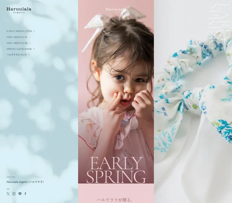
淡い水色とピンク、子ども服の写真、繊細なセリフ体が印象的な春の特集ページ。PCでは中央の縦長コンテンツを左右の固定パネルが囲み、スマートフォンでは一列に展開。
オリジナルサイトを見るHaruulala organic / 2025 EARLY SPRING — Style Reference
A narrow spring fashion story framed by misty blue foliage, floral cotton, and soft pink portraiture.
Original URL: haruulala.life/earlyspring2025
Final URL: haruulala.life/earlyspring2025
Theme: light, with blush editorial sections and white shopping sections
Inspected: September 13, 2026, Japan Standard Time; supplied retrieval timestamp: September 12, 2026, at 19:16:08.941 UTC
Viewports: desktop 1440 × 1000 and mobile 390 × 844 CSS pixels
Scope: the current seasonal feature served at the 2025 campaign URL: opening portrait, introductory story, two new-arrival features, two product tiles, seven styling entries, brand statement, desktop side panels, and mobile footer. Visual evidence consists of three desktop captures and two mobile captures, supplemented by rendered text, links, and element measurements throughout the document.
Haruulala organic presents its spring collection as a photographic editorial with direct shopping links. A child in a pale pink floral dress fills the opening frame; a delicate, oversized EARLY SPRING title sits against the darker bottom of the photograph. Pale blue foliage, small red arrows, fine serif lettering, and generous white intervals create a quiet seasonal rhythm. Product names and prices remain practical and readable within that atmosphere.
The defining desktop composition has three vertical regions: a persistent navigation panel on the left, a narrow scrolling story in the center, and a persistent photographic panel on the right. On mobile, the central story becomes the full page width, a two-line menu control occupies the upper-right corner, and the blue brand/contact treatment appears at the end of the document. Preserve this relationship between intimate content width and expansive surrounding imagery.
How to Read This Reference
- Measured values come from the supplied rendered DOM and computed-style evidence. Coordinates are CSS pixels. Section coordinates are document positions unless stated otherwise.
- Observed visual details come from the five original-page captures. Not every section measured in the DOM has a corresponding detailed screenshot.
- Estimated values describe visible colors, graphic sizes, or treatments whose exact declarations were not supplied. They are explicitly labeled.
- Calculated values are arithmetic derived from measurements, such as column margins and scale ratios. They do not establish the original CSS formula.
- Recommended behavior and CSS are guidance for a new implementation. They are not claims about untested original interactions.
- Token names are descriptive implementation aliases. The supplied custom properties do not expose a complete brand token system.
- Computed styles on a link or heading wrapper do not necessarily describe its child lettering, image, SVG, or accessible name. This distinction matters for the campaign title, navigation, and buttons.
Tokens — Colors
Default Palette
| Name | Value | Suggested token | Evidence and role |
|---|---|---|---|
| Blush field | #ebcfd1 |
--color-blush |
Measured rgb(235, 207, 209) on the long introductory section |
| Display blush | #ebcfd2 |
--color-display-blush |
Measured on the NEW ARRIVAL heading; one blue-channel step lighter than the section field |
| Rose text | #a36a71 |
--color-rose |
Measured on the opening Japanese heading and its English caption |
| White | #ffffff |
--color-paper |
Measured on arrivals, styling, About, and filled pill links |
| Blue-gray ink | #58757e |
--color-blue-ink |
Measured on desktop navigation links, the official-site link, and mobile copyright |
| Muted blue-gray | #8da2a9 |
--color-muted |
Measured on Official Site and SNS captions |
| Deep teal | #476a6e |
--color-teal |
Measured on the Japanese styling heading |
| Sage text | #729582 |
--color-sage |
Measured on a later English editorial caption |
| Product ink | #1b1b1b |
--color-ink |
Measured on product and action-link wrappers |
| Body black | #000000 |
--color-black |
Measured on brand-statement text |
| Mobile navigation gray | #484848 |
--color-menu-ink |
Measured on mobile navigation links that are absent from the closed-menu screenshots |
| Mist blue | Approximately #d9f1f6 |
--color-mist |
Visual estimate for a fallback behind the blue foliage imagery; the actual panel contains substantial tonal variation |
| Arrow red | Approximately #bd3933 |
--color-arrow |
Visual estimate for the small directional arrows |
| Outline gray | Approximately #bdbdbd |
--color-rule |
Visual estimate for the fine outline around the large destination buttons |
Color Behavior
Pink is primarily an editorial field and display-text color. It is not a universal button fill. Shopping links use white surfaces, dark labels, and a small red arrow. Blue-gray belongs to the surrounding identity/navigation system, while black carries the product information and brand statement.
The left desktop panel and mobile footer are photographic or textured blue surfaces. Their blurred leafy shadows and fine speckling should not be represented as a single exact background hex. The hero also has a visibly darker rose treatment toward its lower edge; the evidence does not establish whether that treatment is baked into the image or applied as an overlay.
Only a light presentation is evidenced. The supplied --swiper-theme-color: #007aff is a library-level value, not evidence that bright blue is used as a visible brand accent. No theme selector was observed.
Tokens — Typography
Japanese Text — Zen Kaku Gothic New
- Computed family:
'Zen Kaku Gothic New', sans-serif. - Measured weights:
500for introductory, product, styling, and brand body text;600on navigation-link wrappers;700on the brand heading and official-site link. - Character: clean Japanese sans-serif with a restrained, friendly tone. It anchors the photographic and serif elements without adding decorative complexity.
- Important limitation: the body itself computes to
10px / 20px, but visible content has numerous explicit overrides. Do not reproduce every paragraph at 10px.
English Editorial Text — Cormorant Infant
- Computed family:
'Cormorant Infant', serif. - Measured weight:
300. - Confirmed roles: the English spring captions and the large
NEW ARRIVALheading. - Character: slender, elegant serif lettering with a fashion-editorial quality.
- Display treatment: the arrivals heading has unusually tight leading and negative tracking. This treatment is appropriate for its short two-line English title, not for body copy.
Utility Captions — Alata
- Computed family:
Alata, sans-serif. - Size and leading:
10px / 20pxat both inspected widths. - Weight:
400. - Roles:
Official Site,SNS, and the mobile copyright line.
These fixed-size captions are an exception to the central story’s otherwise extensive proportional scaling.
Campaign Lettering and Wordmarks
The opening EARLY SPRING title is visibly a large, fine serif composition. Its H1 has an empty extracted text value and a measurable graphic-sized box. The supplied evidence does not expose the font or asset used inside that heading. The repeated right-panel title and the Haruulala wordmarks likewise should be treated as authored graphic elements until their implementation is verified.
Desktop English navigation looks serif-like in the capture, while its anchor wrappers compute to Zen Kaku Gothic New. Child styles or graphic lettering were not included in the sample. Preserve the observed appearance, but do not assign a definitive navigation-lettering font from the wrapper alone.
Type Scale
| Role | At 390px | At 1440px | Weight / leading | Evidence |
|---|---|---|---|---|
| Root and body base | 10px |
10px |
400; body 20px line height |
Measured base, not the universal visible text size |
| Utility captions | 10px |
10px |
Alata 400 / 20px |
Measured |
| Opening Japanese heading | 22px |
26.1818px |
500 / 1.4 |
Measured |
| Opening English caption | 13px |
15.4711px |
Cormorant Infant 300 / 1 |
Measured |
| Later English caption | 18px |
21.4215px |
Cormorant Infant 300 / 1 |
Measured |
NEW ARRIVAL |
80px |
95.2066px |
Cormorant Infant 300 / 0.7 |
Measured |
| Arrivals tracking | -4.8px |
-5.7124px |
Equivalent to -0.06em |
Measured and calculated |
| Product name | 14px |
16.6612px |
500 / 1.5 |
Measured |
| Styling heading | 16px |
19.0413px |
500 / 1.5 |
Measured |
| Brand heading | 16px |
19.0413px |
700 / 1.5 |
Measured |
| Brand paragraphs | 16px |
19.0413px |
500 / 1.5 |
Measured |
| Official-site link | 16px |
16px |
700 / 1 |
Measured |
| Navigation anchor wrapper | 20px |
16.23px |
600 / 1 |
Measured; mobile open state not captured |
| Product price | Not separately measured | Approximately 20px visually |
Bold, with smaller tax text | Estimate from desktop product capture |
| Hero title box | 316 × 140px |
376.06 × 166.61px |
Graphic bounds, not a font size | Measured |
Most measured text uses normal letter spacing. Reserve negative tracking for the confirmed display heading.
Tokens — Spacing & Shapes
Density: sparse editorial spacing around large photographs, with compact purchase links and simple product information.
Scaling observation: the desktop story is approximately 1.190× the mobile story width. Many central-column text sizes, insets, and image dimensions follow the same ratio. The original sizing formula and breakpoint were not supplied.
Spacing Scale
| Use | Mobile | Desktop | Evidence |
|---|---|---|---|
| Small product-pill padding and gap | 8px |
9.5207px |
Measured |
LOOK internal gap |
9px |
10.7107px |
Measured |
| Large destination-button gap | 12px |
14.281px |
Measured |
| Product-copy horizontal inset | 20px |
23.80px |
Calculated from measured positions |
| Styling-media side inset | 30px |
35.69px |
Calculated from measured positions |
| Arrivals top padding | 40px |
47.6033px |
Measured |
| Opening heading top interval | 70px |
83.30px |
Calculated from section and heading positions |
| Brand heading to first paragraph | 70px |
83.30px |
Calculated from element bounds |
| Brand paragraph separation | 24px |
Approximately 28.55px |
Calculated from successive bounds |
| Styling section bottom padding | 100px |
119.008px |
Measured |
| About section bottom padding | 100px |
71.405px |
Measured responsive exception |
| Desktop navigation left inset | — | 40px |
Measured |
| Desktop navigation row interval | — | 36.23px |
Calculated; approximately 16.23px text plus 20px separation |
| Mobile footer content left inset | 42px |
— | Measured |
Border Radius
| Element | Treatment | Evidence |
|---|---|---|
| Photographs and product tiles | Square corners | Visible in captures |
| Small product links | 60px mobile; 71.405px desktop declared radius |
Measured; effectively a capsule at the much smaller element height |
| Large destination links | Same declared radii | Measured |
| Product and styling containers | No visible rounded card shell | Observed; sampled wrappers have zero radius |
| Large destination-link outline | Fine gray stroke, approximately 1px | Visual estimate |
There is no visible general-purpose shadow or elevation system. Separation comes from photograph edges, white space, colored sections, and occasional fine outlines.
Layout Measurements
| Element | Desktop: 1440 × 1000 | Mobile: 390 × 844 |
|---|---|---|
| Story column | x = 487.94px, width 464.13px |
x = 0, width 390px |
| Each desktop side region | Approximately 487.94px wide, calculated |
Not visible in the closed page layout |
| Hero bottom | y = 880.98px |
y = 744px |
| Hero title | x = 531.97px, y = 714.38px, 376.06 × 166.61px |
x = 37px, y = 604px, 316 × 140px |
| Product tile | 232.06 × 374.84px link bounds |
195 × 315px link bounds |
| Styling media link | 392.75 × 444.52px |
330 × 373.5px |
| Small product pill | 188.03 × 33.31px |
158 × 28px |
| Large destination pill | 333.22 × 71.02px |
280 × 60px |
| Document height | 13714.63px, reported rounded as 13715 |
11903.19px, reported rounded as 11903 |
| Mobile footer | Not present as an equivalent visible end block | Approximately 333.30px high |
The desktop center occupies approximately 32.23% of the viewport. It is slightly narrower than either side region; this is not an equal-thirds grid.
Components
Desktop Navigation Panel
Role: persistent identity, section navigation, and routes to the main shop and social accounts.
A pale blue foliage image fills the left region. The black Haruulala wordmark sits near the upper-left corner, approximately 40px from the left edge. Its visible width is roughly 150px, a visual estimate rather than a measured asset dimension.
Five vertically stacked links begin at x = 40px, y = 182.38px:
EARLY SPRING ITEM→#leadNEW ARRIVAL 01.→#newNEW ARRIVAL 02.→#new02SPRING LOOK BOOK→#styleハルウララについて→#about
Small red downward arrows sit after the labels. Links are unboxed, without card backgrounds or separators. The panel remains in the same viewport position across the supplied desktop scroll captures; the evidence supports persistent behavior, although its exact positioning declaration was not sampled.
The lower-left contact group contains a small Official Site caption, a heavier brand link, an SNS caption, and X, Instagram, LINE, and Facebook symbols. The first caption’s measured box starts at y = 843px in the 1000px-high desktop viewport. Social-link origins are approximately x = 40, 76, 113, 150.59px.
Desktop Photographic Panel
Role: sustain the collection’s atmosphere while the central content advances.
The right region fills the viewport height with a tightly cropped photograph and large, pale, vertically oriented EARLY SPRING lettering near the upper-right edge. One supplied state shows a child in a colorful floral outfit by a bright window; another shows a blue floral hair accessory on white fabric.
The region persists while the center moves. Different photographs are evidenced, but the trigger is unknown: the captures do not establish autoplay, scroll synchronization, a carousel interval, or a transition style. A static image is the safest baseline for a new implementation until that behavior is separately verified.
Opening Portrait
Role: introduce the collection through a single expressive fashion photograph.
An edge-to-edge portrait shows a child facing the camera, hands near the cheeks, wearing a pale pink floral dress and a large ribbon. The close crop gives the face and fabric more space than interface text. A small white brand wordmark sits near the top center. Large two-line campaign lettering meets the bottom edge of the photograph.
On mobile, the frame is 390 × 744px; the title occupies 316 × 140px and begins 37px from the left. On desktop, the same composition expands into the 464.13px story column. The measured desktop height is slightly less than a strict proportional enlargement of the mobile height.
The opening photograph is not a universal 100vh hero: its bottom is at 744px within an 844px mobile viewport, and at about 881px within a 1000px desktop viewport. Both opening captures reveal the following pink section.
Introductory Story
Role: establish the season before presenting products.
The section starts directly below the hero with a solid blush field. Its opening Japanese heading is centered, rose-colored, and intentionally broken into three lines. An example from the source is ハルウララが贈る、 / ひと足早い春の / おとずれ。 The smaller English caption below uses Cormorant Infant at weight 300.
The entire lead section measures approximately 2868.39px high on mobile and 3413.47px on desktop. Later measured content includes a narrow, tall Japanese text region and an offset English caption in sage. Their bounds suggest an editorial arrangement beyond a simple centered text stack, but their exact child styling and surrounding image composition were not fully captured.
Preserve the distinction between a long visual introduction and the subsequent white shopping section. Do not interpret the absence of a detailed screenshot as evidence that the intervening area is blank.
New-Arrival Feature
Role: connect collection imagery to a specific shopping destination.
The arrivals section has a white background and a large, two-line NEW ARRIVAL heading in pale blush. At mobile width the heading uses 80px type, 56px line height, and -4.8px tracking.
Two feature groups are identified by 01. and 02.. The first product pill is aligned near the lower-right of its feature, at mobile x = 212px; the second is aligned near the lower-left, at x = 20px. Both are 158 × 28px, with white fill, dark lettering, and a small red right arrow. The source label is このアイテムを見る.
The second feature’s oversized pale blue 02. visibly overlaps the boundary between its photograph and the following white area. The exact numeral font and size were not supplied. Treat it as an editorial marker rather than a conventional badge.
The observed product destinations are ordinary links to the brand’s shop. The first points to a gift-set page; the second points to a collection-design page. No in-page purchase modal or cart behavior was demonstrated.
Two-Product Row
Role: present the featured dresses with names, sizes, and prices.
Two equally sized links sit side by side, including on the inspected phone. Each consists of a square product photograph above a white information area. There is no horizontal gutter between the image cells. The desktop capture shows a pale blue floral dress on the left and a pale pink floral dress on the right, photographed flat against near-white backgrounds.
At mobile width, each tile is 195px wide. Product copy starts 20px inside the tile and 20px below the square image. Names use 14px / 21px, weight 500, and wrap to two lines. Desktop values scale to approximately 16.66px / 24.99px with a 23.8px inset.
The captured content pairs ラッフルカラーワンピース(80cm-100cm) with ¥4,950, and トラペーズライン ワンピース(80cm-120cm) with ¥5,500. A smaller (税込) note follows each price. These are capture-time examples, not a guarantee of future product availability or pricing.
Keep prices visually subordinate to the photographs but stronger than descriptive copy. Avoid adding colored price chips or separate raised card shells.
Styling Introduction and Seven Look Entries
Role: extend the products into a sequential collection lookbook.
The styling section begins after the product row. A supplied desktop capture shows the start of a cool, softly focused photographic introduction with a centered brand wordmark. The measured Japanese styling heading sits toward the right side of the mobile story: x = 230px, width 112px, at 16px / 24px in deep teal.
Seven repeated entries follow. Their anatomy is supported by rendered bounds and links, although detailed screenshots of all seven outfits were not supplied:
- A narrow vertical
STYLING 01.throughSTYLING 07.label near the upper-left or upper-right of the media. - A linked media rectangle measuring
330 × 373.5pxon mobile, inset 30px from each story edge. - A separate
LOOKlink below the image, alternating between right and left alignment. - Generous vertical separation before the following entry.
The first image begins at mobile document y = 6727.39px; successive image starts are 493.5px apart. Odd entries place their vertical label on the left and LOOK on the right; even entries reverse that placement. The media rectangle itself stays centered. Do not mistake the alternating annotations for alternating image widths.
The LOOK links have a measured 9px internal gap on mobile and no rounded background. Both media and accompanying action link point to the relevant shop destination. After the seventh entry, a large outlined 他のアイテムを見る button links to the main site.
Brand Statement
Role: close the collection with the brand’s identity and stated values.
The desktop end capture shows a strip of photographic fragments above a white area, with a looping organic emblem and Haruulala wordmark overlapping the transition. Beneath it, a centered two-line brand heading introduces a series of short Japanese paragraphs.
The source describes an organic-cotton baby and children’s brand with colorful patterns, then expresses hopes for children’s future and the environment. These are the page’s brand statements; the inspected material does not establish independent certification claims.
Body text uses black Zen Kaku Gothic New at 16px / 24px, weight 500 on mobile, and approximately 19.04px / 28.56px on desktop. The heading uses weight 700. Paragraph breaks create substantial pauses without extra rules, icons, or colored panels.
A centered outlined TOPページはこちら link follows the final paragraph. It measures 280 × 60px on mobile and approximately 333.22 × 71.02px on desktop. The label is visually bold, with a small red arrow. Its label’s own computed font was not supplied separately from the anchor wrapper.
Mobile Menu Control
Role: provide navigation access after the desktop panel disappears.
The closed-state control consists of two horizontal bars, approximately 24px wide, near the upper-right corner. It appears in both the opening and end-of-page mobile captures, supporting persistent placement. It looks teal over the hero and black over the white closing section; the mechanism governing that difference was not supplied.
Mobile navigation anchors remain in the rendered evidence with 20px computed type and 50px row intervals, but they are not visible in the supplied screenshots. This does not prove that the menu was opened. Menu background, opening motion, dismissal, focus management, and scroll locking remain unverified.
Mobile Footer
Role: restore the surrounding brand atmosphere at the end of the single-column page.
The footer begins after the white About section and is approximately 333.3px high. It reuses the blue foliage treatment seen on desktop. A small black wordmark sits above Official Site, the bold brand link, SNS, and the four social symbols. A tiny blue-gray copyright line is aligned toward the lower-right.
The measured footer text starts 42px from the left. Utility captions remain 10px, and the brand link remains 16px, rather than following the story’s proportional scale. The wordmark is visually about 108px wide; that is an estimate.
Tokens — Motion & Interaction
| Element or behavior | Supplied evidence | What can be concluded |
|---|---|---|
| Hero heading | 2s cubic-bezier(0.22, 1, 0.36, 1) 1.2s forwards kvTtlAnimation |
A named two-second animation with a 1.2-second delay is declared on the title box |
| Opening English caption | 1.2s ease-out 1.4s transition |
Duration, easing, and delay are measured; changed properties and trigger are not supplied |
| Later English caption | 1s ease-out transition |
A one-second transition is declared; its visual path is unverified |
| Navigation, product, social, and destination links | 0.3s transition |
Short feedback is declared; exact hover property and end state are unknown |
| Desktop side panels | Stable viewport placement across scroll captures | Persistent visual framing is observed; exact fixed/sticky implementation is unknown |
| Right-panel photography | Different images in current captures | Multiple states exist; switching trigger, timing, and transition are unknown |
| Section navigation | Five same-page hash destinations | Intended anchor destinations are established; smooth scrolling and active-link feedback were not tested |
| Product and look actions | Rendered shop URLs | Destination links are established; resulting pages and commerce behavior were not inspected |
| Mobile menu | Closed control plus navigation-link geometry | A navigation affordance exists; the open interaction was not captured |
The supplied --animate-duration: 1s, --animate-delay: 1s, and --animate-repeat: 1 are generic custom properties. They should not override the specific measured title animation. Similarly, the presence of Swiper variables does not prove that a visible region is an operable slider.
The captures were taken after readiness checks that awaited finite visible or potentially revealing motion and image decoding within stated limits. Perpetual animations were temporarily paused during those checks and then resumed. Consequently, settled screenshots are useful for layout but cannot establish the complete motion sequence. Keyframes, hover states, menu actions, keyboard behavior, and reduced-motion handling were not supplied.
Recommended adaptation: keep motion restrained. A title reveal can use the measured duration and easing with a modest opacity/translation effect, explicitly understood as new keyframes. Keep links around 300ms if using subtle feedback. Leave background photography static unless a verified image-change behavior is required.
Surfaces
| Layer | Appearance | Function |
|---|---|---|
| Desktop left frame | Pale blue foliage texture, blue-gray navigation | Identity and persistent orientation |
| Desktop right frame | Full-height photographic crop with pale title lettering | Seasonal atmosphere |
| Hero | Pink portrait with a darker lower region | Primary emotional introduction |
| Lead story | Solid blush with rose and occasional sage text | Editorial continuity |
| Shopping and styling | White, square images, dark text | Product clarity |
| Small product action | White capsule, dark label, red arrow | Compact link over photography |
| Large destination action | White capsule with fine gray outline | Clear section-ending route |
| Brand statement | White with centered black text | Quiet closing emphasis |
| Mobile footer | Blue foliage surface | Reintroduces the desktop framing palette |
Use image edges and section color changes to organize the page. Shadows, thick borders, and rounded photographic cards would introduce a surface system not present in the evidence.
Imagery
Photography carries most of the identity. The opening combines a natural expression, close facial framing, softly lit skin, a large hair ribbon, and a delicate pink floral garment. The right panel uses either a candid scene by a bright window or a close detail of blue floral fabric. Product photography is cleaner and more descriptive, showing complete garment silhouettes against pale backgrounds.
The key relationships are pink against blue, close portrait against fabric detail, and atmospheric photography against clear product documentation. Floral prints provide the saturated color within otherwise subdued surroundings. Preserve their texture and color variation rather than recoloring every photograph into a uniform pastel wash.
The blue foliage treatment contains broad blurred shadows and fine texture. It should remain soft and photographic. A repeated crisp leaf icon pattern would change its character.
Observed Asset References
No image src, srcset, background-image URL, SVG path, or font-file URL was included in the supplied evidence. The following inventory therefore identifies visible roles without inventing asset filenames.
| Asset role | Evidence | Implementation treatment |
|---|---|---|
| Pink portrait hero | Desktop and mobile opening captures | Preserve the face, hands, ribbon, and title clearance when cropping |
| Blue foliage background | Desktop left panel and mobile footer | Use an authorized image with soft blur and natural tonal variation |
| Window-side child photograph | Current desktop right-panel captures | Full-height crop; keep the subject positioned toward the outer right |
| Blue floral accessory photograph | Current desktop end capture | Preserve fabric texture and the bow/accessory silhouette |
| Two dress flat-lays | Desktop product capture | Square cells with complete garments visible |
| Styling introduction imagery | Start visible in the desktop product capture | Soft blue photographic treatment with brand wordmark |
| Seven styling media regions | Rendered linked-media bounds and numbered entries | Obtain the actual assets before deciding detailed crops |
| Closing photo strip and emblem | Desktop brand-statement capture | Retain their overlap and organic line quality |
| Haruulala wordmarks | Header, hero, closing area, and mobile footer | Use approved brand artwork; do not approximate the logo with an unrelated font |
| Social symbols and directional arrows | Desktop panel and mobile footer/actions | Retain modest scale and restrained stroke weight |
Use normal photographic interpolation, not pixelated rendering. Provide explicit image dimensions or aspect ratios so loading does not disturb the long editorial sequence.
Layout & Responsive Behavior
Desktop Composition
At 1440px, the story begins at x = 487.94px and ends at x = 952.06px. Both surrounding regions are therefore about 487.94px wide. The side panels stay visually stationary while the center advances through a document more than 13,700px tall.
The central content is not widened into a conventional desktop product grid. Its mobile-like proportions are essential: two product tiles remain small, styling photographs remain stacked, and the brand statement stays centered in a narrow strip.
Mobile Composition
At 390px, the story fills the viewport. Desktop side imagery and navigation are absent from the closed page. The hero retains the same portrait and title composition, the product row retains two columns, and the lookbook retains a single sequential list.
The menu control remains near the upper-right corner. The blue identity/contact area becomes a footer in the normal document flow. About receives 100px of bottom padding on mobile, compared with about 71.4px on desktop, so the page ending is not a uniform scaled copy.
Measured Document Map
| Region | Desktop start / height | Mobile start / height |
|---|---|---|
| Opening frame | 0 / 880.98px |
0 / 744px |
| Lead section | 880.98 / 3413.47px |
744 / 2868.39px |
| Interval before arrivals | Approximately 315.36px |
265px |
| Arrivals | 4609.81 / 2431.23px |
3877.39 / 2043px |
| Styling | 7041.05 / 5248.36px |
5920.39 / 4411.5px |
| About | 12289.41 / 1425.22px |
10331.89 / 1238px |
| Mobile footer | No equivalent end block evidenced | 11569.89 / 333.30px |
The interval before arrivals is a difference between recorded section boxes. Its wrapper and contents were not identified; it must not be implemented automatically as blank padding.
Scaling and Breakpoint Limits
Dividing 464.125 by 390 gives approximately 1.190. Product-name size, styling width, major insets, and most central-section dimensions are consistent with this ratio. That supports a shared proportional design grid, but two viewports cannot reveal the actual CSS breakpoint, desktop width cap, or behavior at intermediate widths.
The CSS below recommends a 1000px desktop breakpoint and a bounded desktop column. Those are adaptation choices. Tablet, landscape-phone, short-desktop, text-zoom, and browser safe-area behavior were not visually tested.
Do’s and Don’ts
Do
- Keep the desktop story narrow and centered between broad photographic regions.
- Preserve the full-width mobile story and the two-column dress row.
- Use the measured blush, rose, blue-gray, and white colors for their specific roles.
- Pair Japanese sans-serif text with the confirmed light Cormorant Infant editorial headings.
- Keep the hero title as a carefully composed graphic until its implementation is verified.
- Let photography, fabric patterns, and the child’s expression carry the visual impact.
- Maintain square image edges and generous editorial intervals.
- Alternate styling labels and
LOOKalignment while keeping media centered. - Use small red arrows as directional details within restrained links.
- Reintroduce the blue foliage treatment in the mobile footer.
- Preserve the observed section order and clearly identify new responsive assumptions.
Don’t
- Don’t turn the desktop view into equal-width thirds or a wide central catalog.
- Don’t collapse the observed mobile product pair into one column without a deliberate usability reason.
- Don’t replace photographic foliage with flat blue alone when matching the visual identity.
- Don’t add shadows, floating cards, thick borders, or rounded photographs throughout the page.
- Don’t use saturated pink as the default action-button fill.
- Don’t apply the body’s computed 10px base to all visible copy.
- Don’t assume that every serif-looking graphic uses Cormorant Infant.
- Don’t infer autoplay, parallax, menu animation, or a carousel from still captures or library variables.
- Don’t compress the seven styling entries into a desktop thumbnail grid.
- Don’t treat the year in the URL as evidence that the currently served page is unavailable.
Recommended Implementation Additions
These are recommendations for a new implementation, not verified original features:
- Give the campaign a meaningful accessible
H1. If the title is artwork, provide one text equivalent and hide purely decorative repeats from assistive technology. - Use a real button for the mobile menu with an accessible name,
aria-expanded, andaria-controls. Manage focus and Escape dismissal according to the actual panel implementation. - Expand small product pills, social icons, and the menu control to comfortable touch targets, ideally around 44px, while preserving their visible proportions where possible.
- Add visible keyboard focus. For repeated
LOOKlinks, include the styling number or product name in the accessible name. - Check rose-on-blush and muted-caption contrast with the actual loaded fonts and image backgrounds. Darken essential text if necessary.
- Preserve 16px mobile brand body copy and allow Japanese text to wrap at narrower widths and enlarged text settings.
- Offer reduced-motion behavior and ensure content remains visible if animation scripts fail.
- Reserve dimensions for every large image. Load the opening portrait promptly and defer below-fold photography without causing layout shifts.
- Treat the right-side image as decorative when the central story already communicates its content. Avoid duplicate announcements of repeated campaign lettering.
- Test the chosen breakpoint at intermediate widths and short viewport heights before relying on persistent desktop navigation.
Agent Prompt Guide
Quick Color Reference
- Editorial field:
#ebcfd1. - Large arrivals lettering:
#ebcfd2. - Introductory text:
#a36a71. - Navigation and brand links:
#58757e. - Utility captions:
#8da2a9. - Styling heading:
#476a6e. - Main shopping surface:
#ffffff; product ink:#1b1b1b. - Foliage fallback: approximately
#d9f1f6, supported by photographic texture. - Arrow accent: approximately
#bd3933, used sparingly.
Overall Prompt
“Create a seasonal baby and children’s fashion editorial inspired by Haruulala organic’s current EARLY SPRING page. On desktop, place a narrow scrolling story between a persistent pale-blue foliage navigation panel and a full-height photographic panel. At 1440px, target a central width near 464px; on a 390px phone, use the full width. Open with a close pink portrait, a small centered white wordmark, and delicate two-line campaign lettering at the image’s lower edge. Follow with blush storytelling, white new-arrival features, two square dress tiles, seven sequential styling photographs, and a centered brand statement. Use Zen Kaku Gothic New for measured Japanese text roles, light Cormorant Infant for editorial English, and Alata for tiny utility captions. Keep images square-cornered, spacing generous, arrows small and red, and buttons white capsules. Treat unverified menu and image-change behavior as implementation decisions.”
Example Component Prompts
- Desktop frame: “At 1440px, center a roughly 464px story between two roughly 488px side regions. Put blue foliage, a black brand wordmark, five unboxed section links, and a bottom contact group on the left. Put a soft photographic crop and pale rotated campaign lettering on the right. Keep the story moving independently in the document while the side framing remains visually persistent.”
- Portrait hero: “Create a 390 × 744 mobile composition using an approved portrait of a child in a pale pink floral garment. Preserve the face, hands, and ribbon. Center a small white wordmark near the top and place approved two-line title artwork in a 316 × 140 region aligned to the bottom, with 37px side margins.”
- Product pair: “Build two flush 195px-wide dress links inside a 390px story. Each has a square flat-lay photograph, then 20px-inset Japanese copy at 14px/21px, a bold price, and a smaller tax note. Use white surfaces and square corners with no shadow.”
- Lookbook entry: “Use a centered 330 × 373.5 photograph with 30px story margins. Place a narrow vertical styling-number label near its top edge. Put an unboxed LOOK link below, alternating right and left alignment across seven entries while the image width stays constant.”
- Closing section: “Use centered black Japanese text at 16px/24px on white, with clear paragraph pauses. Finish with a 280 × 60 outlined capsule labeled TOPページはこちら and a small red arrow, then a blue foliage footer containing the wordmark, official-site link, social symbols, and tiny copyright.”
Quick Start
CSS Custom Properties
This is an implementation scaffold, not recovered source CSS. It reproduces the principal measured proportions at the two inspected widths while retaining a conventional browser root size. The 1000px breakpoint, 520px column cap, fallback colors, hover effect, and animation keyframes are recommendations. Fonts must be loaded separately; image variables and image elements must use approved assets.
Expected structure: .desktop-rail and .desktop-scene sit alongside .story. The story contains .hero, .lead, .arrivals, the product and lookbook elements, .about, and .mobile-footer. Use actual anchors for destinations and a button for .mobile-menu-toggle. The stylesheet does not implement an unobserved menu panel or image slideshow.
:root {
  /* Measured interface colors */
  --color-paper: #ffffff;
  --color-blush: #ebcfd1;
  --color-display-blush: #ebcfd2;
  --color-rose: #a36a71;
  --color-blue-ink: #58757e;
  --color-muted: #8da2a9;
  --color-teal: #476a6e;
  --color-sage: #729582;
  --color-ink: #1b1b1b;

  /* Visual estimates for this adaptation */
  --color-mist: #d9f1f6;
  --color-arrow: #bd3933;
  --color-rule: #bdbdbd;

  /* Observed computed font stacks; load font files separately */
  --font-body: 'Zen Kaku Gothic New', sans-serif;
  --font-editorial: 'Cormorant Infant', serif;
  --font-utility: Alata, sans-serif;

  /* Recommended scaling model, not the original CSS formula */
  --story-width: 100vw;
  --u: calc(var(--story-width) / 390);
  --rail-width: calc((100vw - var(--story-width)) / 2);
  --text-body: calc(16 * var(--u));
  --text-product: calc(14 * var(--u));
  --text-lead: calc(22 * var(--u));
  --text-display: calc(80 * var(--u));
  --space-inset: calc(20 * var(--u));
  --space-look: calc(30 * var(--u));
  --radius-pill: calc(60 * var(--u));
  --motion-link: 300ms;
  --motion-title: 2s cubic-bezier(0.22, 1, 0.36, 1) 1.2s;

  /* Assign an approved background image in the host project */
  --foliage-image: none;
}

* { box-sizing: border-box; }

body {
  margin: 0;
  color: var(--color-ink);
  background: var(--color-paper);
  font-family: var(--font-body);
}

img { display: block; max-inline-size: 100%; }
a { color: inherit; }

.story {
  position: relative;
  inline-size: var(--story-width);
  max-inline-size: 100%;
  margin-inline: auto;
  background: var(--color-paper);
}

.desktop-rail,
.desktop-scene { display: none; }

.hero {
  position: relative;
  aspect-ratio: 390 / 744;
  overflow: hidden;
}

.hero__image {
  inline-size: 100%;
  block-size: 100%;
  object-fit: cover;
}

/* Optional approximation; omit if the image includes the wash. */
.hero::after {
  content: '';
  position: absolute;
  inset: 0;
  pointer-events: none;
  background: linear-gradient(
    to top,
    rgb(92 43 51 / 0.58),
    transparent 42%
  );
}

.hero__brand,
.hero__title {
  position: absolute;
  z-index: 1;
  inset-inline-start: 50%;
  transform: translateX(-50%);
}

.hero__brand {
  inset-block-start: calc(26 * var(--u));
  inline-size: calc(106 * var(--u));
}

.hero__title {
  inset-block-end: 0;
  inline-size: calc(316 * var(--u));
  margin: 0;
}

.hero__title img { inline-size: 100%; block-size: auto; }

.lead {
  padding-block-start: calc(70 * var(--u));
  color: var(--color-rose);
  background: var(--color-blush);
  text-align: center;
}

.lead__heading {
  margin: 0;
  font-size: var(--text-lead);
  font-weight: 500;
  line-height: 1.4;
}

.lead__english {
  margin-block: calc(26 * var(--u)) 0;
  font-family: var(--font-editorial);
  font-size: calc(13 * var(--u));
  font-weight: 300;
  line-height: 1;
}

.arrivals {
  padding-block: calc(40 * var(--u)) calc(80 * var(--u));
  background: var(--color-paper);
}

.section-display {
  margin: 0;
  color: var(--color-display-blush);
  font-family: var(--font-editorial);
  font-size: var(--text-display);
  font-weight: 300;
  line-height: 0.7;
  letter-spacing: -0.06em;
  text-align: center;
}

.product-feature { position: relative; }

.product-pill {
  display: inline-flex;
  align-items: center;
  justify-content: center;
  gap: calc(8 * var(--u));
  inline-size: calc(158 * var(--u));
  min-block-size: calc(28 * var(--u));
  padding: calc(8 * var(--u));
  border-radius: var(--radius-pill);
  background: var(--color-paper);
  color: var(--color-ink);
  /* Recommended label size; child font was not sampled. */
  font-size: calc(12 * var(--u));
  font-weight: 700;
  line-height: 1;
  text-decoration: none;
}

.action-arrow { color: var(--color-arrow); }

.product-grid {
  display: grid;
  grid-template-columns: repeat(2, minmax(0, 1fr));
  gap: 0;
}

.product { min-inline-size: 0; text-decoration: none; }

.product__image {
  inline-size: 100%;
  aspect-ratio: 1;
  object-fit: contain;
}

.product__copy { padding: var(--space-inset); }

.product__name {
  margin: 0;
  font-size: var(--text-product);
  font-weight: 500;
  line-height: 1.5;
  overflow-wrap: anywhere;
}

.product__price {
  margin-block: calc(16 * var(--u)) 0;
  /* Recommended approximation from the visible price treatment. */
  font-size: calc(18 * var(--u));
  font-weight: 700;
}

.product__tax { font-size: 0.65em; font-weight: 400; }

.look-list {
  margin: 0;
  padding: 0 var(--space-look) calc(100 * var(--u));
  list-style: none;
}

.look {
  position: relative;
  padding-block-start: calc(20 * var(--u));
  margin-block-end: calc(66 * var(--u));
}

.look__media {
  display: block;
  aspect-ratio: 330 / 373.5;
}

.look__media img {
  inline-size: 100%;
  block-size: 100%;
  object-fit: cover;
}

.look__label {
  position: absolute;
  inset-block-start: 0;
  inset-inline-start: calc(20 * var(--u));
  margin: 0;
  /* Recommended rendering for the observed vertical label bounds. */
  writing-mode: vertical-rl;
  font-size: var(--text-body);
  line-height: 1;
}

.look__link {
  display: flex;
  align-items: center;
  gap: calc(9 * var(--u));
  inline-size: max-content;
  margin-block-start: calc(14 * var(--u));
  margin-inline-start: auto;
  font-size: var(--text-body);
  line-height: 1.25;
  text-decoration: none;
}

.look:nth-child(even) .look__label {
  inset-inline-start: auto;
  inset-inline-end: calc(20 * var(--u));
}

.look:nth-child(even) .look__link {
  margin-inline-start: 0;
  margin-inline-end: auto;
}

.about {
  padding-block-end: calc(100 * var(--u));
  color: #000;
  text-align: center;
}

.about__heading,
.about__copy p {
  font-size: var(--text-body);
  line-height: 1.5;
}

.about__heading { margin: 0; font-weight: 700; }
.about__copy { margin-block-start: calc(70 * var(--u)); }
.about__copy p { margin: 0; font-weight: 500; }
.about__copy p + p { margin-block-start: calc(24 * var(--u)); }

.destination-pill {
  display: flex;
  align-items: center;
  justify-content: center;
  gap: calc(12 * var(--u));
  inline-size: calc(280 * var(--u));
  max-inline-size: calc(100% - 32px);
  min-block-size: calc(60 * var(--u));
  margin-inline: auto;
  padding: calc(21 * var(--u));
  border: 1px solid var(--color-rule);
  border-radius: var(--radius-pill);
  color: var(--color-ink);
  background: var(--color-paper);
  font-size: var(--text-body);
  font-weight: 700;
  line-height: 1;
  text-decoration: none;
}

.about__copy + .destination-pill {
  margin-block-start: calc(60 * var(--u));
}

.mobile-menu-toggle {
  position: fixed;
  z-index: 10;
  inset-block-start: max(14px, env(safe-area-inset-top));
  inset-inline-end: 10px;
  display: grid;
  place-items: center;
  inline-size: 44px;
  block-size: 44px;
  padding: 0;
  border: 0;
  color: var(--color-teal);
  background: transparent;
  cursor: pointer;
}

.mobile-menu-toggle::before {
  content: '';
  inline-size: 24px;
  block-size: 12px;
  background:
    linear-gradient(currentColor, currentColor) top / 100% 3px no-repeat,
    linear-gradient(currentColor, currentColor) bottom / 100% 3px no-repeat;
}

.mobile-footer {
  min-block-size: 333px;
  padding: 80px 20px 22px 42px;
  color: var(--color-blue-ink);
  background-color: var(--color-mist);
  background-image: var(--foliage-image);
  background-position: center;
  background-size: cover;
}

.utility-caption {
  color: var(--color-muted);
  font-family: var(--font-utility);
  font-size: 10px;
  font-weight: 400;
  line-height: 20px;
}

.official-link { font-size: 16px; font-weight: 700; }

/* Recommended breakpoint and width cap; not recovered source rules. */
@media (min-width: 1000px) {
  :root {
    --story-width: clamp(390px, 32.2309vw, 520px);
  }

  .desktop-rail,
  .desktop-scene {
    display: block;
    position: fixed;
    inset-block: 0;
    inline-size: var(--rail-width);
  }

  .desktop-rail {
    inset-inline-start: 0;
    padding: 40px;
    overflow-y: auto;
    color: var(--color-blue-ink);
    background: var(--color-mist) var(--foliage-image) center / cover;
  }

  .desktop-rail__inner {
    display: flex;
    flex-direction: column;
    min-block-size: 100%;
  }

  .desktop-rail__nav {
    display: grid;
    gap: 20px;
    margin-block-start: 100px;
  }

  .desktop-rail__nav a {
    font-size: 16.23px;
    font-weight: 600;
    line-height: 1;
    text-decoration: none;
  }

  .desktop-rail__contacts {
    margin-block-start: auto;
    padding-block-start: 40px;
  }

  .desktop-scene { inset-inline-end: 0; overflow: hidden; }

  .desktop-scene__image {
    inline-size: 100%;
    block-size: 100%;
    object-fit: cover;
  }

  .hero { aspect-ratio: 464.125 / 880.984; }
  .hero__brand { inset-block-start: calc(40 * var(--u)); }
  .about { padding-block-end: calc(60 * var(--u)); }
  .mobile-menu-toggle,
  .mobile-footer { display: none; }
}

/* Optional new keyframes using the measured title timing. */
.motion-enabled .hero__title {
  animation: reference-title-enter var(--motion-title) both;
}

@keyframes reference-title-enter {
  from { opacity: 0; transform: translate(-50%, 12px); }
  to { opacity: 1; transform: translate(-50%, 0); }
}

/* Recommended feedback; original transition end states are unknown. */
a { transition: opacity var(--motion-link); }

@media (hover: hover) {
  a:hover { opacity: 0.75; }
}

:where(a, button):focus-visible {
  outline: 2px solid var(--color-ink);
  outline-offset: 4px;
}

@media (prefers-reduced-motion: reduce) {
  .motion-enabled .hero__title { animation: none; }
  a { transition: none; }
}
The scaffold intentionally leaves the long lead-story collage, approved title graphics, numbered feature artwork, menu panel, and image-change mechanism to explicit implementation. It should not be padded to the measured document height without the corresponding content. The small pill dimensions reproduce observed visual geometry; enlarge interaction targets when implementing the accessibility recommendations.
Tailwind v4 Token Mapping
Optional aliases for a project already using Tailwind v4. This is not evidence that the original page uses Tailwind. Define the custom properties above first.
@theme inline {
  --color-paper: var(--color-paper);
  --color-spring-blush: var(--color-blush);
  --color-spring-rose: var(--color-rose);
  --color-spring-blue: var(--color-blue-ink);
  --color-spring-teal: var(--color-teal);
  --color-spring-arrow: var(--color-arrow);

  --font-japanese: var(--font-body);
  --font-editorial: 'Cormorant Infant', serif;
  --font-utility: Alata, sans-serif;

  --text-story: var(--text-body);
  --text-product-name: var(--text-product);
  --text-season-heading: var(--text-lead);
  --text-season-display: var(--text-display);

  --spacing-story-inset: var(--space-inset);
  --spacing-look-inset: var(--space-look);
  --radius-season-pill: var(--radius-pill);
}
Sources & Evidence
- Current original and final campaign URL: supplied HTTP 200 result, rendered title
2025 EARLY SPRING | Haruulala organic, page text, destination links, element rectangles, and computed-style samples. - Capture date: retrieval timestamp
2026-09-12T19:16:08.941Z, equivalent to September 13, 2026, at 04:16:08.941 JST. This document analyzes that supplied current inspection rather than claiming a separate live visit. - Desktop evidence:
1440 × 1000CSS pixels; opening, product-row, and brand-statement captures. Rendered document height approximately13714.63px. - Mobile evidence:
390 × 844CSS pixels; opening and closing/footer captures. Rendered document height approximately11903.19px. - Original-site links: the rendered campaign identifies Haruulala organic’s main site and supplies same-page section anchors, product/design destinations, and social links. These destinations were not separately opened for this analysis.
- Inspection method supplied: initial observation of at least five seconds; document, layout, text, motion, and image-readiness checks with finite time limits; traversal through intermediate scroll positions. SharedWorkers and service workers were disabled.
- Limits: no original stylesheet files, asset URLs, animation keyframes, complete descendant styles, open-menu capture, hover demonstration, keyboard test, intermediate viewport, or commerce interaction was supplied. Different right-panel images are evidenced, but their switching mechanism is unknown. Readiness checks do not establish semantic completeness or rule out delayed content.
This reference describes the page currently served at the supplied campaign URL. Measured declarations, visual estimates, calculated proportions, and recommended implementation choices are identified separately throughout.
# Haruulala organic / 2025 EARLY SPRING — Style Reference

> A narrow spring fashion story framed by misty blue foliage, floral cotton, and soft pink portraiture.

**Original URL:** [haruulala.life/earlyspring2025](https://haruulala.life/earlyspring2025/)
**Final URL:** [haruulala.life/earlyspring2025](https://haruulala.life/earlyspring2025/)
**Theme:** light, with blush editorial sections and white shopping sections
**Inspected:** September 13, 2026, Japan Standard Time; supplied retrieval timestamp: September 12, 2026, at 19:16:08.941 UTC
**Viewports:** desktop `1440 × 1000` and mobile `390 × 844` CSS pixels
**Scope:** the current seasonal feature served at the 2025 campaign URL: opening portrait, introductory story, two new-arrival features, two product tiles, seven styling entries, brand statement, desktop side panels, and mobile footer. Visual evidence consists of three desktop captures and two mobile captures, supplemented by rendered text, links, and element measurements throughout the document.

Haruulala organic presents its spring collection as a photographic editorial with direct shopping links. A child in a pale pink floral dress fills the opening frame; a delicate, oversized `EARLY SPRING` title sits against the darker bottom of the photograph. Pale blue foliage, small red arrows, fine serif lettering, and generous white intervals create a quiet seasonal rhythm. Product names and prices remain practical and readable within that atmosphere.

The defining desktop composition has three vertical regions: a persistent navigation panel on the left, a narrow scrolling story in the center, and a persistent photographic panel on the right. On mobile, the central story becomes the full page width, a two-line menu control occupies the upper-right corner, and the blue brand/contact treatment appears at the end of the document. Preserve this relationship between intimate content width and expansive surrounding imagery.

## How to Read This Reference

- **Measured** values come from the supplied rendered DOM and computed-style evidence. Coordinates are CSS pixels. Section coordinates are document positions unless stated otherwise.
- **Observed** visual details come from the five original-page captures. Not every section measured in the DOM has a corresponding detailed screenshot.
- **Estimated** values describe visible colors, graphic sizes, or treatments whose exact declarations were not supplied. They are explicitly labeled.
- **Calculated** values are arithmetic derived from measurements, such as column margins and scale ratios. They do not establish the original CSS formula.
- **Recommended** behavior and CSS are guidance for a new implementation. They are not claims about untested original interactions.
- Token names are descriptive implementation aliases. The supplied custom properties do not expose a complete brand token system.
- Computed styles on a link or heading wrapper do not necessarily describe its child lettering, image, SVG, or accessible name. This distinction matters for the campaign title, navigation, and buttons.

## Tokens — Colors

### Default Palette

| Name | Value | Suggested token | Evidence and role |
| --- | --- | --- | --- |
| Blush field | `#ebcfd1` | `--color-blush` | Measured `rgb(235, 207, 209)` on the long introductory section |
| Display blush | `#ebcfd2` | `--color-display-blush` | Measured on the `NEW ARRIVAL` heading; one blue-channel step lighter than the section field |
| Rose text | `#a36a71` | `--color-rose` | Measured on the opening Japanese heading and its English caption |
| White | `#ffffff` | `--color-paper` | Measured on arrivals, styling, About, and filled pill links |
| Blue-gray ink | `#58757e` | `--color-blue-ink` | Measured on desktop navigation links, the official-site link, and mobile copyright |
| Muted blue-gray | `#8da2a9` | `--color-muted` | Measured on `Official Site` and `SNS` captions |
| Deep teal | `#476a6e` | `--color-teal` | Measured on the Japanese styling heading |
| Sage text | `#729582` | `--color-sage` | Measured on a later English editorial caption |
| Product ink | `#1b1b1b` | `--color-ink` | Measured on product and action-link wrappers |
| Body black | `#000000` | `--color-black` | Measured on brand-statement text |
| Mobile navigation gray | `#484848` | `--color-menu-ink` | Measured on mobile navigation links that are absent from the closed-menu screenshots |
| Mist blue | Approximately `#d9f1f6` | `--color-mist` | Visual estimate for a fallback behind the blue foliage imagery; the actual panel contains substantial tonal variation |
| Arrow red | Approximately `#bd3933` | `--color-arrow` | Visual estimate for the small directional arrows |
| Outline gray | Approximately `#bdbdbd` | `--color-rule` | Visual estimate for the fine outline around the large destination buttons |

### Color Behavior

Pink is primarily an editorial field and display-text color. It is not a universal button fill. Shopping links use white surfaces, dark labels, and a small red arrow. Blue-gray belongs to the surrounding identity/navigation system, while black carries the product information and brand statement.

The left desktop panel and mobile footer are photographic or textured blue surfaces. Their blurred leafy shadows and fine speckling should not be represented as a single exact background hex. The hero also has a visibly darker rose treatment toward its lower edge; the evidence does not establish whether that treatment is baked into the image or applied as an overlay.

Only a light presentation is evidenced. The supplied `--swiper-theme-color: #007aff` is a library-level value, not evidence that bright blue is used as a visible brand accent. No theme selector was observed.

## Tokens — Typography

### Japanese Text — Zen Kaku Gothic New

- **Computed family:** `'Zen Kaku Gothic New', sans-serif`.
- **Measured weights:** `500` for introductory, product, styling, and brand body text; `600` on navigation-link wrappers; `700` on the brand heading and official-site link.
- **Character:** clean Japanese sans-serif with a restrained, friendly tone. It anchors the photographic and serif elements without adding decorative complexity.
- **Important limitation:** the body itself computes to `10px / 20px`, but visible content has numerous explicit overrides. Do not reproduce every paragraph at 10px.

### English Editorial Text — Cormorant Infant

- **Computed family:** `'Cormorant Infant', serif`.
- **Measured weight:** `300`.
- **Confirmed roles:** the English spring captions and the large `NEW ARRIVAL` heading.
- **Character:** slender, elegant serif lettering with a fashion-editorial quality.
- **Display treatment:** the arrivals heading has unusually tight leading and negative tracking. This treatment is appropriate for its short two-line English title, not for body copy.

### Utility Captions — Alata

- **Computed family:** `Alata, sans-serif`.
- **Size and leading:** `10px / 20px` at both inspected widths.
- **Weight:** `400`.
- **Roles:** `Official Site`, `SNS`, and the mobile copyright line.

These fixed-size captions are an exception to the central story’s otherwise extensive proportional scaling.

### Campaign Lettering and Wordmarks

The opening `EARLY SPRING` title is visibly a large, fine serif composition. Its `H1` has an empty extracted text value and a measurable graphic-sized box. The supplied evidence does not expose the font or asset used inside that heading. The repeated right-panel title and the Haruulala wordmarks likewise should be treated as authored graphic elements until their implementation is verified.

Desktop English navigation looks serif-like in the capture, while its anchor wrappers compute to Zen Kaku Gothic New. Child styles or graphic lettering were not included in the sample. Preserve the observed appearance, but do not assign a definitive navigation-lettering font from the wrapper alone.

### Type Scale

| Role | At 390px | At 1440px | Weight / leading | Evidence |
| --- | --- | --- | --- | --- |
| Root and body base | `10px` | `10px` | `400`; body `20px` line height | Measured base, not the universal visible text size |
| Utility captions | `10px` | `10px` | Alata `400 / 20px` | Measured |
| Opening Japanese heading | `22px` | `26.1818px` | `500 / 1.4` | Measured |
| Opening English caption | `13px` | `15.4711px` | Cormorant Infant `300 / 1` | Measured |
| Later English caption | `18px` | `21.4215px` | Cormorant Infant `300 / 1` | Measured |
| `NEW ARRIVAL` | `80px` | `95.2066px` | Cormorant Infant `300 / 0.7` | Measured |
| Arrivals tracking | `-4.8px` | `-5.7124px` | Equivalent to `-0.06em` | Measured and calculated |
| Product name | `14px` | `16.6612px` | `500 / 1.5` | Measured |
| Styling heading | `16px` | `19.0413px` | `500 / 1.5` | Measured |
| Brand heading | `16px` | `19.0413px` | `700 / 1.5` | Measured |
| Brand paragraphs | `16px` | `19.0413px` | `500 / 1.5` | Measured |
| Official-site link | `16px` | `16px` | `700 / 1` | Measured |
| Navigation anchor wrapper | `20px` | `16.23px` | `600 / 1` | Measured; mobile open state not captured |
| Product price | Not separately measured | Approximately `20px` visually | Bold, with smaller tax text | Estimate from desktop product capture |
| Hero title box | `316 × 140px` | `376.06 × 166.61px` | Graphic bounds, not a font size | Measured |

Most measured text uses normal letter spacing. Reserve negative tracking for the confirmed display heading.

## Tokens — Spacing & Shapes

**Density:** sparse editorial spacing around large photographs, with compact purchase links and simple product information.

**Scaling observation:** the desktop story is approximately `1.190×` the mobile story width. Many central-column text sizes, insets, and image dimensions follow the same ratio. The original sizing formula and breakpoint were not supplied.

### Spacing Scale

| Use | Mobile | Desktop | Evidence |
| --- | --- | --- | --- |
| Small product-pill padding and gap | `8px` | `9.5207px` | Measured |
| `LOOK` internal gap | `9px` | `10.7107px` | Measured |
| Large destination-button gap | `12px` | `14.281px` | Measured |
| Product-copy horizontal inset | `20px` | `23.80px` | Calculated from measured positions |
| Styling-media side inset | `30px` | `35.69px` | Calculated from measured positions |
| Arrivals top padding | `40px` | `47.6033px` | Measured |
| Opening heading top interval | `70px` | `83.30px` | Calculated from section and heading positions |
| Brand heading to first paragraph | `70px` | `83.30px` | Calculated from element bounds |
| Brand paragraph separation | `24px` | Approximately `28.55px` | Calculated from successive bounds |
| Styling section bottom padding | `100px` | `119.008px` | Measured |
| About section bottom padding | `100px` | `71.405px` | Measured responsive exception |
| Desktop navigation left inset | — | `40px` | Measured |
| Desktop navigation row interval | — | `36.23px` | Calculated; approximately 16.23px text plus 20px separation |
| Mobile footer content left inset | `42px` | — | Measured |

### Border Radius

| Element | Treatment | Evidence |
| --- | --- | --- |
| Photographs and product tiles | Square corners | Visible in captures |
| Small product links | `60px` mobile; `71.405px` desktop declared radius | Measured; effectively a capsule at the much smaller element height |
| Large destination links | Same declared radii | Measured |
| Product and styling containers | No visible rounded card shell | Observed; sampled wrappers have zero radius |
| Large destination-link outline | Fine gray stroke, approximately 1px | Visual estimate |

There is no visible general-purpose shadow or elevation system. Separation comes from photograph edges, white space, colored sections, and occasional fine outlines.

### Layout Measurements

| Element | Desktop: 1440 × 1000 | Mobile: 390 × 844 |
| --- | --- | --- |
| Story column | `x = 487.94px`, width `464.13px` | `x = 0`, width `390px` |
| Each desktop side region | Approximately `487.94px` wide, calculated | Not visible in the closed page layout |
| Hero bottom | `y = 880.98px` | `y = 744px` |
| Hero title | `x = 531.97px`, `y = 714.38px`, `376.06 × 166.61px` | `x = 37px`, `y = 604px`, `316 × 140px` |
| Product tile | `232.06 × 374.84px` link bounds | `195 × 315px` link bounds |
| Styling media link | `392.75 × 444.52px` | `330 × 373.5px` |
| Small product pill | `188.03 × 33.31px` | `158 × 28px` |
| Large destination pill | `333.22 × 71.02px` | `280 × 60px` |
| Document height | `13714.63px`, reported rounded as 13715 | `11903.19px`, reported rounded as 11903 |
| Mobile footer | Not present as an equivalent visible end block | Approximately `333.30px` high |

The desktop center occupies approximately `32.23%` of the viewport. It is slightly narrower than either side region; this is not an equal-thirds grid.

## Components

### Desktop Navigation Panel

**Role:** persistent identity, section navigation, and routes to the main shop and social accounts.

A pale blue foliage image fills the left region. The black Haruulala wordmark sits near the upper-left corner, approximately 40px from the left edge. Its visible width is roughly 150px, a visual estimate rather than a measured asset dimension.

Five vertically stacked links begin at `x = 40px`, `y = 182.38px`:

1. `EARLY SPRING ITEM` → `#lead`
2. `NEW ARRIVAL 01.` → `#new`
3. `NEW ARRIVAL 02.` → `#new02`
4. `SPRING LOOK BOOK` → `#style`
5. `ハルウララについて` → `#about`

Small red downward arrows sit after the labels. Links are unboxed, without card backgrounds or separators. The panel remains in the same viewport position across the supplied desktop scroll captures; the evidence supports persistent behavior, although its exact positioning declaration was not sampled.

The lower-left contact group contains a small `Official Site` caption, a heavier brand link, an `SNS` caption, and X, Instagram, LINE, and Facebook symbols. The first caption’s measured box starts at `y = 843px` in the 1000px-high desktop viewport. Social-link origins are approximately `x = 40, 76, 113, 150.59px`.

### Desktop Photographic Panel

**Role:** sustain the collection’s atmosphere while the central content advances.

The right region fills the viewport height with a tightly cropped photograph and large, pale, vertically oriented `EARLY SPRING` lettering near the upper-right edge. One supplied state shows a child in a colorful floral outfit by a bright window; another shows a blue floral hair accessory on white fabric.

The region persists while the center moves. Different photographs are evidenced, but the trigger is unknown: the captures do not establish autoplay, scroll synchronization, a carousel interval, or a transition style. A static image is the safest baseline for a new implementation until that behavior is separately verified.

### Opening Portrait

**Role:** introduce the collection through a single expressive fashion photograph.

An edge-to-edge portrait shows a child facing the camera, hands near the cheeks, wearing a pale pink floral dress and a large ribbon. The close crop gives the face and fabric more space than interface text. A small white brand wordmark sits near the top center. Large two-line campaign lettering meets the bottom edge of the photograph.

On mobile, the frame is `390 × 744px`; the title occupies `316 × 140px` and begins 37px from the left. On desktop, the same composition expands into the `464.13px` story column. The measured desktop height is slightly less than a strict proportional enlargement of the mobile height.

The opening photograph is not a universal `100vh` hero: its bottom is at 744px within an 844px mobile viewport, and at about 881px within a 1000px desktop viewport. Both opening captures reveal the following pink section.

### Introductory Story

**Role:** establish the season before presenting products.

The section starts directly below the hero with a solid blush field. Its opening Japanese heading is centered, rose-colored, and intentionally broken into three lines. An example from the source is `ハルウララが贈る、 / ひと足早い春の / おとずれ。` The smaller English caption below uses Cormorant Infant at weight 300.

The entire lead section measures approximately `2868.39px` high on mobile and `3413.47px` on desktop. Later measured content includes a narrow, tall Japanese text region and an offset English caption in sage. Their bounds suggest an editorial arrangement beyond a simple centered text stack, but their exact child styling and surrounding image composition were not fully captured.

Preserve the distinction between a long visual introduction and the subsequent white shopping section. Do not interpret the absence of a detailed screenshot as evidence that the intervening area is blank.

### New-Arrival Feature

**Role:** connect collection imagery to a specific shopping destination.

The arrivals section has a white background and a large, two-line `NEW ARRIVAL` heading in pale blush. At mobile width the heading uses `80px` type, `56px` line height, and `-4.8px` tracking.

Two feature groups are identified by `01.` and `02.`. The first product pill is aligned near the lower-right of its feature, at mobile `x = 212px`; the second is aligned near the lower-left, at `x = 20px`. Both are `158 × 28px`, with white fill, dark lettering, and a small red right arrow. The source label is `このアイテムを見る`.

The second feature’s oversized pale blue `02.` visibly overlaps the boundary between its photograph and the following white area. The exact numeral font and size were not supplied. Treat it as an editorial marker rather than a conventional badge.

The observed product destinations are ordinary links to the brand’s shop. The first points to a gift-set page; the second points to a collection-design page. No in-page purchase modal or cart behavior was demonstrated.

### Two-Product Row

**Role:** present the featured dresses with names, sizes, and prices.

Two equally sized links sit side by side, including on the inspected phone. Each consists of a square product photograph above a white information area. There is no horizontal gutter between the image cells. The desktop capture shows a pale blue floral dress on the left and a pale pink floral dress on the right, photographed flat against near-white backgrounds.

At mobile width, each tile is 195px wide. Product copy starts 20px inside the tile and 20px below the square image. Names use `14px / 21px`, weight 500, and wrap to two lines. Desktop values scale to approximately `16.66px / 24.99px` with a 23.8px inset.

The captured content pairs `ラッフルカラーワンピース(80cm-100cm)` with `¥4,950`, and `トラペーズライン ワンピース(80cm-120cm)` with `¥5,500`. A smaller `(税込)` note follows each price. These are capture-time examples, not a guarantee of future product availability or pricing.

Keep prices visually subordinate to the photographs but stronger than descriptive copy. Avoid adding colored price chips or separate raised card shells.

### Styling Introduction and Seven Look Entries

**Role:** extend the products into a sequential collection lookbook.

The styling section begins after the product row. A supplied desktop capture shows the start of a cool, softly focused photographic introduction with a centered brand wordmark. The measured Japanese styling heading sits toward the right side of the mobile story: `x = 230px`, width `112px`, at `16px / 24px` in deep teal.

Seven repeated entries follow. Their anatomy is supported by rendered bounds and links, although detailed screenshots of all seven outfits were not supplied:

- A narrow vertical `STYLING 01.` through `STYLING 07.` label near the upper-left or upper-right of the media.
- A linked media rectangle measuring `330 × 373.5px` on mobile, inset 30px from each story edge.
- A separate `LOOK` link below the image, alternating between right and left alignment.
- Generous vertical separation before the following entry.

The first image begins at mobile document `y = 6727.39px`; successive image starts are `493.5px` apart. Odd entries place their vertical label on the left and `LOOK` on the right; even entries reverse that placement. The media rectangle itself stays centered. Do not mistake the alternating annotations for alternating image widths.

The `LOOK` links have a measured 9px internal gap on mobile and no rounded background. Both media and accompanying action link point to the relevant shop destination. After the seventh entry, a large outlined `他のアイテムを見る` button links to the main site.

### Brand Statement

**Role:** close the collection with the brand’s identity and stated values.

The desktop end capture shows a strip of photographic fragments above a white area, with a looping organic emblem and Haruulala wordmark overlapping the transition. Beneath it, a centered two-line brand heading introduces a series of short Japanese paragraphs.

The source describes an organic-cotton baby and children’s brand with colorful patterns, then expresses hopes for children’s future and the environment. These are the page’s brand statements; the inspected material does not establish independent certification claims.

Body text uses black Zen Kaku Gothic New at `16px / 24px`, weight 500 on mobile, and approximately `19.04px / 28.56px` on desktop. The heading uses weight 700. Paragraph breaks create substantial pauses without extra rules, icons, or colored panels.

A centered outlined `TOPページはこちら` link follows the final paragraph. It measures `280 × 60px` on mobile and approximately `333.22 × 71.02px` on desktop. The label is visually bold, with a small red arrow. Its label’s own computed font was not supplied separately from the anchor wrapper.

### Mobile Menu Control

**Role:** provide navigation access after the desktop panel disappears.

The closed-state control consists of two horizontal bars, approximately 24px wide, near the upper-right corner. It appears in both the opening and end-of-page mobile captures, supporting persistent placement. It looks teal over the hero and black over the white closing section; the mechanism governing that difference was not supplied.

Mobile navigation anchors remain in the rendered evidence with 20px computed type and 50px row intervals, but they are not visible in the supplied screenshots. This does not prove that the menu was opened. Menu background, opening motion, dismissal, focus management, and scroll locking remain unverified.

### Mobile Footer

**Role:** restore the surrounding brand atmosphere at the end of the single-column page.

The footer begins after the white About section and is approximately 333.3px high. It reuses the blue foliage treatment seen on desktop. A small black wordmark sits above `Official Site`, the bold brand link, `SNS`, and the four social symbols. A tiny blue-gray copyright line is aligned toward the lower-right.

The measured footer text starts 42px from the left. Utility captions remain 10px, and the brand link remains 16px, rather than following the story’s proportional scale. The wordmark is visually about 108px wide; that is an estimate.

## Tokens — Motion & Interaction

| Element or behavior | Supplied evidence | What can be concluded |
| --- | --- | --- |
| Hero heading | `2s cubic-bezier(0.22, 1, 0.36, 1) 1.2s forwards kvTtlAnimation` | A named two-second animation with a 1.2-second delay is declared on the title box |
| Opening English caption | `1.2s ease-out 1.4s` transition | Duration, easing, and delay are measured; changed properties and trigger are not supplied |
| Later English caption | `1s ease-out` transition | A one-second transition is declared; its visual path is unverified |
| Navigation, product, social, and destination links | `0.3s` transition | Short feedback is declared; exact hover property and end state are unknown |
| Desktop side panels | Stable viewport placement across scroll captures | Persistent visual framing is observed; exact fixed/sticky implementation is unknown |
| Right-panel photography | Different images in current captures | Multiple states exist; switching trigger, timing, and transition are unknown |
| Section navigation | Five same-page hash destinations | Intended anchor destinations are established; smooth scrolling and active-link feedback were not tested |
| Product and look actions | Rendered shop URLs | Destination links are established; resulting pages and commerce behavior were not inspected |
| Mobile menu | Closed control plus navigation-link geometry | A navigation affordance exists; the open interaction was not captured |

The supplied `--animate-duration: 1s`, `--animate-delay: 1s`, and `--animate-repeat: 1` are generic custom properties. They should not override the specific measured title animation. Similarly, the presence of Swiper variables does not prove that a visible region is an operable slider.

The captures were taken after readiness checks that awaited finite visible or potentially revealing motion and image decoding within stated limits. Perpetual animations were temporarily paused during those checks and then resumed. Consequently, settled screenshots are useful for layout but cannot establish the complete motion sequence. Keyframes, hover states, menu actions, keyboard behavior, and reduced-motion handling were not supplied.

**Recommended adaptation:** keep motion restrained. A title reveal can use the measured duration and easing with a modest opacity/translation effect, explicitly understood as new keyframes. Keep links around 300ms if using subtle feedback. Leave background photography static unless a verified image-change behavior is required.

## Surfaces

| Layer | Appearance | Function |
| --- | --- | --- |
| Desktop left frame | Pale blue foliage texture, blue-gray navigation | Identity and persistent orientation |
| Desktop right frame | Full-height photographic crop with pale title lettering | Seasonal atmosphere |
| Hero | Pink portrait with a darker lower region | Primary emotional introduction |
| Lead story | Solid blush with rose and occasional sage text | Editorial continuity |
| Shopping and styling | White, square images, dark text | Product clarity |
| Small product action | White capsule, dark label, red arrow | Compact link over photography |
| Large destination action | White capsule with fine gray outline | Clear section-ending route |
| Brand statement | White with centered black text | Quiet closing emphasis |
| Mobile footer | Blue foliage surface | Reintroduces the desktop framing palette |

Use image edges and section color changes to organize the page. Shadows, thick borders, and rounded photographic cards would introduce a surface system not present in the evidence.

## Imagery

Photography carries most of the identity. The opening combines a natural expression, close facial framing, softly lit skin, a large hair ribbon, and a delicate pink floral garment. The right panel uses either a candid scene by a bright window or a close detail of blue floral fabric. Product photography is cleaner and more descriptive, showing complete garment silhouettes against pale backgrounds.

The key relationships are pink against blue, close portrait against fabric detail, and atmospheric photography against clear product documentation. Floral prints provide the saturated color within otherwise subdued surroundings. Preserve their texture and color variation rather than recoloring every photograph into a uniform pastel wash.

The blue foliage treatment contains broad blurred shadows and fine texture. It should remain soft and photographic. A repeated crisp leaf icon pattern would change its character.

### Observed Asset References

No image `src`, `srcset`, background-image URL, SVG path, or font-file URL was included in the supplied evidence. The following inventory therefore identifies visible roles without inventing asset filenames.

| Asset role | Evidence | Implementation treatment |
| --- | --- | --- |
| Pink portrait hero | Desktop and mobile opening captures | Preserve the face, hands, ribbon, and title clearance when cropping |
| Blue foliage background | Desktop left panel and mobile footer | Use an authorized image with soft blur and natural tonal variation |
| Window-side child photograph | Current desktop right-panel captures | Full-height crop; keep the subject positioned toward the outer right |
| Blue floral accessory photograph | Current desktop end capture | Preserve fabric texture and the bow/accessory silhouette |
| Two dress flat-lays | Desktop product capture | Square cells with complete garments visible |
| Styling introduction imagery | Start visible in the desktop product capture | Soft blue photographic treatment with brand wordmark |
| Seven styling media regions | Rendered linked-media bounds and numbered entries | Obtain the actual assets before deciding detailed crops |
| Closing photo strip and emblem | Desktop brand-statement capture | Retain their overlap and organic line quality |
| Haruulala wordmarks | Header, hero, closing area, and mobile footer | Use approved brand artwork; do not approximate the logo with an unrelated font |
| Social symbols and directional arrows | Desktop panel and mobile footer/actions | Retain modest scale and restrained stroke weight |

Use normal photographic interpolation, not pixelated rendering. Provide explicit image dimensions or aspect ratios so loading does not disturb the long editorial sequence.

## Layout & Responsive Behavior

### Desktop Composition

At 1440px, the story begins at `x = 487.94px` and ends at `x = 952.06px`. Both surrounding regions are therefore about 487.94px wide. The side panels stay visually stationary while the center advances through a document more than 13,700px tall.

The central content is not widened into a conventional desktop product grid. Its mobile-like proportions are essential: two product tiles remain small, styling photographs remain stacked, and the brand statement stays centered in a narrow strip.

### Mobile Composition

At 390px, the story fills the viewport. Desktop side imagery and navigation are absent from the closed page. The hero retains the same portrait and title composition, the product row retains two columns, and the lookbook retains a single sequential list.

The menu control remains near the upper-right corner. The blue identity/contact area becomes a footer in the normal document flow. About receives 100px of bottom padding on mobile, compared with about 71.4px on desktop, so the page ending is not a uniform scaled copy.

### Measured Document Map

| Region | Desktop start / height | Mobile start / height |
| --- | --- | --- |
| Opening frame | `0 / 880.98px` | `0 / 744px` |
| Lead section | `880.98 / 3413.47px` | `744 / 2868.39px` |
| Interval before arrivals | Approximately `315.36px` | `265px` |
| Arrivals | `4609.81 / 2431.23px` | `3877.39 / 2043px` |
| Styling | `7041.05 / 5248.36px` | `5920.39 / 4411.5px` |
| About | `12289.41 / 1425.22px` | `10331.89 / 1238px` |
| Mobile footer | No equivalent end block evidenced | `11569.89 / 333.30px` |

The interval before arrivals is a difference between recorded section boxes. Its wrapper and contents were not identified; it must not be implemented automatically as blank padding.

### Scaling and Breakpoint Limits

Dividing `464.125` by `390` gives approximately `1.190`. Product-name size, styling width, major insets, and most central-section dimensions are consistent with this ratio. That supports a shared proportional design grid, but two viewports cannot reveal the actual CSS breakpoint, desktop width cap, or behavior at intermediate widths.

The CSS below recommends a 1000px desktop breakpoint and a bounded desktop column. Those are adaptation choices. Tablet, landscape-phone, short-desktop, text-zoom, and browser safe-area behavior were not visually tested.

## Do’s and Don’ts

### Do

- Keep the desktop story narrow and centered between broad photographic regions.
- Preserve the full-width mobile story and the two-column dress row.
- Use the measured blush, rose, blue-gray, and white colors for their specific roles.
- Pair Japanese sans-serif text with the confirmed light Cormorant Infant editorial headings.
- Keep the hero title as a carefully composed graphic until its implementation is verified.
- Let photography, fabric patterns, and the child’s expression carry the visual impact.
- Maintain square image edges and generous editorial intervals.
- Alternate styling labels and `LOOK` alignment while keeping media centered.
- Use small red arrows as directional details within restrained links.
- Reintroduce the blue foliage treatment in the mobile footer.
- Preserve the observed section order and clearly identify new responsive assumptions.

### Don’t

- Don’t turn the desktop view into equal-width thirds or a wide central catalog.
- Don’t collapse the observed mobile product pair into one column without a deliberate usability reason.
- Don’t replace photographic foliage with flat blue alone when matching the visual identity.
- Don’t add shadows, floating cards, thick borders, or rounded photographs throughout the page.
- Don’t use saturated pink as the default action-button fill.
- Don’t apply the body’s computed 10px base to all visible copy.
- Don’t assume that every serif-looking graphic uses Cormorant Infant.
- Don’t infer autoplay, parallax, menu animation, or a carousel from still captures or library variables.
- Don’t compress the seven styling entries into a desktop thumbnail grid.
- Don’t treat the year in the URL as evidence that the currently served page is unavailable.

## Recommended Implementation Additions

These are recommendations for a new implementation, not verified original features:

- Give the campaign a meaningful accessible `H1`. If the title is artwork, provide one text equivalent and hide purely decorative repeats from assistive technology.
- Use a real button for the mobile menu with an accessible name, `aria-expanded`, and `aria-controls`. Manage focus and Escape dismissal according to the actual panel implementation.
- Expand small product pills, social icons, and the menu control to comfortable touch targets, ideally around 44px, while preserving their visible proportions where possible.
- Add visible keyboard focus. For repeated `LOOK` links, include the styling number or product name in the accessible name.
- Check rose-on-blush and muted-caption contrast with the actual loaded fonts and image backgrounds. Darken essential text if necessary.
- Preserve 16px mobile brand body copy and allow Japanese text to wrap at narrower widths and enlarged text settings.
- Offer reduced-motion behavior and ensure content remains visible if animation scripts fail.
- Reserve dimensions for every large image. Load the opening portrait promptly and defer below-fold photography without causing layout shifts.
- Treat the right-side image as decorative when the central story already communicates its content. Avoid duplicate announcements of repeated campaign lettering.
- Test the chosen breakpoint at intermediate widths and short viewport heights before relying on persistent desktop navigation.

## Agent Prompt Guide

### Quick Color Reference

- Editorial field: `#ebcfd1`.
- Large arrivals lettering: `#ebcfd2`.
- Introductory text: `#a36a71`.
- Navigation and brand links: `#58757e`.
- Utility captions: `#8da2a9`.
- Styling heading: `#476a6e`.
- Main shopping surface: `#ffffff`; product ink: `#1b1b1b`.
- Foliage fallback: approximately `#d9f1f6`, supported by photographic texture.
- Arrow accent: approximately `#bd3933`, used sparingly.

### Overall Prompt

“Create a seasonal baby and children’s fashion editorial inspired by Haruulala organic’s current EARLY SPRING page. On desktop, place a narrow scrolling story between a persistent pale-blue foliage navigation panel and a full-height photographic panel. At 1440px, target a central width near 464px; on a 390px phone, use the full width. Open with a close pink portrait, a small centered white wordmark, and delicate two-line campaign lettering at the image’s lower edge. Follow with blush storytelling, white new-arrival features, two square dress tiles, seven sequential styling photographs, and a centered brand statement. Use Zen Kaku Gothic New for measured Japanese text roles, light Cormorant Infant for editorial English, and Alata for tiny utility captions. Keep images square-cornered, spacing generous, arrows small and red, and buttons white capsules. Treat unverified menu and image-change behavior as implementation decisions.”

### Example Component Prompts

1. **Desktop frame:** “At 1440px, center a roughly 464px story between two roughly 488px side regions. Put blue foliage, a black brand wordmark, five unboxed section links, and a bottom contact group on the left. Put a soft photographic crop and pale rotated campaign lettering on the right. Keep the story moving independently in the document while the side framing remains visually persistent.”
2. **Portrait hero:** “Create a 390 × 744 mobile composition using an approved portrait of a child in a pale pink floral garment. Preserve the face, hands, and ribbon. Center a small white wordmark near the top and place approved two-line title artwork in a 316 × 140 region aligned to the bottom, with 37px side margins.”
3. **Product pair:** “Build two flush 195px-wide dress links inside a 390px story. Each has a square flat-lay photograph, then 20px-inset Japanese copy at 14px/21px, a bold price, and a smaller tax note. Use white surfaces and square corners with no shadow.”
4. **Lookbook entry:** “Use a centered 330 × 373.5 photograph with 30px story margins. Place a narrow vertical styling-number label near its top edge. Put an unboxed LOOK link below, alternating right and left alignment across seven entries while the image width stays constant.”
5. **Closing section:** “Use centered black Japanese text at 16px/24px on white, with clear paragraph pauses. Finish with a 280 × 60 outlined capsule labeled TOPページはこちら and a small red arrow, then a blue foliage footer containing the wordmark, official-site link, social symbols, and tiny copyright.”

## Quick Start

### CSS Custom Properties

This is an implementation scaffold, not recovered source CSS. It reproduces the principal measured proportions at the two inspected widths while retaining a conventional browser root size. The 1000px breakpoint, 520px column cap, fallback colors, hover effect, and animation keyframes are recommendations. Fonts must be loaded separately; image variables and image elements must use approved assets.

Expected structure: `.desktop-rail` and `.desktop-scene` sit alongside `.story`. The story contains `.hero`, `.lead`, `.arrivals`, the product and lookbook elements, `.about`, and `.mobile-footer`. Use actual anchors for destinations and a button for `.mobile-menu-toggle`. The stylesheet does not implement an unobserved menu panel or image slideshow.

```css
:root {
  /* Measured interface colors */
  --color-paper: #ffffff;
  --color-blush: #ebcfd1;
  --color-display-blush: #ebcfd2;
  --color-rose: #a36a71;
  --color-blue-ink: #58757e;
  --color-muted: #8da2a9;
  --color-teal: #476a6e;
  --color-sage: #729582;
  --color-ink: #1b1b1b;

  /* Visual estimates for this adaptation */
  --color-mist: #d9f1f6;
  --color-arrow: #bd3933;
  --color-rule: #bdbdbd;

  /* Observed computed font stacks; load font files separately */
  --font-body: 'Zen Kaku Gothic New', sans-serif;
  --font-editorial: 'Cormorant Infant', serif;
  --font-utility: Alata, sans-serif;

  /* Recommended scaling model, not the original CSS formula */
  --story-width: 100vw;
  --u: calc(var(--story-width) / 390);
  --rail-width: calc((100vw - var(--story-width)) / 2);
  --text-body: calc(16 * var(--u));
  --text-product: calc(14 * var(--u));
  --text-lead: calc(22 * var(--u));
  --text-display: calc(80 * var(--u));
  --space-inset: calc(20 * var(--u));
  --space-look: calc(30 * var(--u));
  --radius-pill: calc(60 * var(--u));
  --motion-link: 300ms;
  --motion-title: 2s cubic-bezier(0.22, 1, 0.36, 1) 1.2s;

  /* Assign an approved background image in the host project */
  --foliage-image: none;
}

* { box-sizing: border-box; }

body {
  margin: 0;
  color: var(--color-ink);
  background: var(--color-paper);
  font-family: var(--font-body);
}

img { display: block; max-inline-size: 100%; }
a { color: inherit; }

.story {
  position: relative;
  inline-size: var(--story-width);
  max-inline-size: 100%;
  margin-inline: auto;
  background: var(--color-paper);
}

.desktop-rail,
.desktop-scene { display: none; }

.hero {
  position: relative;
  aspect-ratio: 390 / 744;
  overflow: hidden;
}

.hero__image {
  inline-size: 100%;
  block-size: 100%;
  object-fit: cover;
}

/* Optional approximation; omit if the image includes the wash. */
.hero::after {
  content: '';
  position: absolute;
  inset: 0;
  pointer-events: none;
  background: linear-gradient(
    to top,
    rgb(92 43 51 / 0.58),
    transparent 42%
  );
}

.hero__brand,
.hero__title {
  position: absolute;
  z-index: 1;
  inset-inline-start: 50%;
  transform: translateX(-50%);
}

.hero__brand {
  inset-block-start: calc(26 * var(--u));
  inline-size: calc(106 * var(--u));
}

.hero__title {
  inset-block-end: 0;
  inline-size: calc(316 * var(--u));
  margin: 0;
}

.hero__title img { inline-size: 100%; block-size: auto; }

.lead {
  padding-block-start: calc(70 * var(--u));
  color: var(--color-rose);
  background: var(--color-blush);
  text-align: center;
}

.lead__heading {
  margin: 0;
  font-size: var(--text-lead);
  font-weight: 500;
  line-height: 1.4;
}

.lead__english {
  margin-block: calc(26 * var(--u)) 0;
  font-family: var(--font-editorial);
  font-size: calc(13 * var(--u));
  font-weight: 300;
  line-height: 1;
}

.arrivals {
  padding-block: calc(40 * var(--u)) calc(80 * var(--u));
  background: var(--color-paper);
}

.section-display {
  margin: 0;
  color: var(--color-display-blush);
  font-family: var(--font-editorial);
  font-size: var(--text-display);
  font-weight: 300;
  line-height: 0.7;
  letter-spacing: -0.06em;
  text-align: center;
}

.product-feature { position: relative; }

.product-pill {
  display: inline-flex;
  align-items: center;
  justify-content: center;
  gap: calc(8 * var(--u));
  inline-size: calc(158 * var(--u));
  min-block-size: calc(28 * var(--u));
  padding: calc(8 * var(--u));
  border-radius: var(--radius-pill);
  background: var(--color-paper);
  color: var(--color-ink);
  /* Recommended label size; child font was not sampled. */
  font-size: calc(12 * var(--u));
  font-weight: 700;
  line-height: 1;
  text-decoration: none;
}

.action-arrow { color: var(--color-arrow); }

.product-grid {
  display: grid;
  grid-template-columns: repeat(2, minmax(0, 1fr));
  gap: 0;
}

.product { min-inline-size: 0; text-decoration: none; }

.product__image {
  inline-size: 100%;
  aspect-ratio: 1;
  object-fit: contain;
}

.product__copy { padding: var(--space-inset); }

.product__name {
  margin: 0;
  font-size: var(--text-product);
  font-weight: 500;
  line-height: 1.5;
  overflow-wrap: anywhere;
}

.product__price {
  margin-block: calc(16 * var(--u)) 0;
  /* Recommended approximation from the visible price treatment. */
  font-size: calc(18 * var(--u));
  font-weight: 700;
}

.product__tax { font-size: 0.65em; font-weight: 400; }

.look-list {
  margin: 0;
  padding: 0 var(--space-look) calc(100 * var(--u));
  list-style: none;
}

.look {
  position: relative;
  padding-block-start: calc(20 * var(--u));
  margin-block-end: calc(66 * var(--u));
}

.look__media {
  display: block;
  aspect-ratio: 330 / 373.5;
}

.look__media img {
  inline-size: 100%;
  block-size: 100%;
  object-fit: cover;
}

.look__label {
  position: absolute;
  inset-block-start: 0;
  inset-inline-start: calc(20 * var(--u));
  margin: 0;
  /* Recommended rendering for the observed vertical label bounds. */
  writing-mode: vertical-rl;
  font-size: var(--text-body);
  line-height: 1;
}

.look__link {
  display: flex;
  align-items: center;
  gap: calc(9 * var(--u));
  inline-size: max-content;
  margin-block-start: calc(14 * var(--u));
  margin-inline-start: auto;
  font-size: var(--text-body);
  line-height: 1.25;
  text-decoration: none;
}

.look:nth-child(even) .look__label {
  inset-inline-start: auto;
  inset-inline-end: calc(20 * var(--u));
}

.look:nth-child(even) .look__link {
  margin-inline-start: 0;
  margin-inline-end: auto;
}

.about {
  padding-block-end: calc(100 * var(--u));
  color: #000;
  text-align: center;
}

.about__heading,
.about__copy p {
  font-size: var(--text-body);
  line-height: 1.5;
}

.about__heading { margin: 0; font-weight: 700; }
.about__copy { margin-block-start: calc(70 * var(--u)); }
.about__copy p { margin: 0; font-weight: 500; }
.about__copy p + p { margin-block-start: calc(24 * var(--u)); }

.destination-pill {
  display: flex;
  align-items: center;
  justify-content: center;
  gap: calc(12 * var(--u));
  inline-size: calc(280 * var(--u));
  max-inline-size: calc(100% - 32px);
  min-block-size: calc(60 * var(--u));
  margin-inline: auto;
  padding: calc(21 * var(--u));
  border: 1px solid var(--color-rule);
  border-radius: var(--radius-pill);
  color: var(--color-ink);
  background: var(--color-paper);
  font-size: var(--text-body);
  font-weight: 700;
  line-height: 1;
  text-decoration: none;
}

.about__copy + .destination-pill {
  margin-block-start: calc(60 * var(--u));
}

.mobile-menu-toggle {
  position: fixed;
  z-index: 10;
  inset-block-start: max(14px, env(safe-area-inset-top));
  inset-inline-end: 10px;
  display: grid;
  place-items: center;
  inline-size: 44px;
  block-size: 44px;
  padding: 0;
  border: 0;
  color: var(--color-teal);
  background: transparent;
  cursor: pointer;
}

.mobile-menu-toggle::before {
  content: '';
  inline-size: 24px;
  block-size: 12px;
  background:
    linear-gradient(currentColor, currentColor) top / 100% 3px no-repeat,
    linear-gradient(currentColor, currentColor) bottom / 100% 3px no-repeat;
}

.mobile-footer {
  min-block-size: 333px;
  padding: 80px 20px 22px 42px;
  color: var(--color-blue-ink);
  background-color: var(--color-mist);
  background-image: var(--foliage-image);
  background-position: center;
  background-size: cover;
}

.utility-caption {
  color: var(--color-muted);
  font-family: var(--font-utility);
  font-size: 10px;
  font-weight: 400;
  line-height: 20px;
}

.official-link { font-size: 16px; font-weight: 700; }

/* Recommended breakpoint and width cap; not recovered source rules. */
@media (min-width: 1000px) {
  :root {
    --story-width: clamp(390px, 32.2309vw, 520px);
  }

  .desktop-rail,
  .desktop-scene {
    display: block;
    position: fixed;
    inset-block: 0;
    inline-size: var(--rail-width);
  }

  .desktop-rail {
    inset-inline-start: 0;
    padding: 40px;
    overflow-y: auto;
    color: var(--color-blue-ink);
    background: var(--color-mist) var(--foliage-image) center / cover;
  }

  .desktop-rail__inner {
    display: flex;
    flex-direction: column;
    min-block-size: 100%;
  }

  .desktop-rail__nav {
    display: grid;
    gap: 20px;
    margin-block-start: 100px;
  }

  .desktop-rail__nav a {
    font-size: 16.23px;
    font-weight: 600;
    line-height: 1;
    text-decoration: none;
  }

  .desktop-rail__contacts {
    margin-block-start: auto;
    padding-block-start: 40px;
  }

  .desktop-scene { inset-inline-end: 0; overflow: hidden; }

  .desktop-scene__image {
    inline-size: 100%;
    block-size: 100%;
    object-fit: cover;
  }

  .hero { aspect-ratio: 464.125 / 880.984; }
  .hero__brand { inset-block-start: calc(40 * var(--u)); }
  .about { padding-block-end: calc(60 * var(--u)); }
  .mobile-menu-toggle,
  .mobile-footer { display: none; }
}

/* Optional new keyframes using the measured title timing. */
.motion-enabled .hero__title {
  animation: reference-title-enter var(--motion-title) both;
}

@keyframes reference-title-enter {
  from { opacity: 0; transform: translate(-50%, 12px); }
  to { opacity: 1; transform: translate(-50%, 0); }
}

/* Recommended feedback; original transition end states are unknown. */
a { transition: opacity var(--motion-link); }

@media (hover: hover) {
  a:hover { opacity: 0.75; }
}

:where(a, button):focus-visible {
  outline: 2px solid var(--color-ink);
  outline-offset: 4px;
}

@media (prefers-reduced-motion: reduce) {
  .motion-enabled .hero__title { animation: none; }
  a { transition: none; }
}
```

The scaffold intentionally leaves the long lead-story collage, approved title graphics, numbered feature artwork, menu panel, and image-change mechanism to explicit implementation. It should not be padded to the measured document height without the corresponding content. The small pill dimensions reproduce observed visual geometry; enlarge interaction targets when implementing the accessibility recommendations.

### Tailwind v4 Token Mapping

Optional aliases for a project already using Tailwind v4. This is not evidence that the original page uses Tailwind. Define the custom properties above first.

```css
@theme inline {
  --color-paper: var(--color-paper);
  --color-spring-blush: var(--color-blush);
  --color-spring-rose: var(--color-rose);
  --color-spring-blue: var(--color-blue-ink);
  --color-spring-teal: var(--color-teal);
  --color-spring-arrow: var(--color-arrow);

  --font-japanese: var(--font-body);
  --font-editorial: 'Cormorant Infant', serif;
  --font-utility: Alata, sans-serif;

  --text-story: var(--text-body);
  --text-product-name: var(--text-product);
  --text-season-heading: var(--text-lead);
  --text-season-display: var(--text-display);

  --spacing-story-inset: var(--space-inset);
  --spacing-look-inset: var(--space-look);
  --radius-season-pill: var(--radius-pill);
}
```

## Sources & Evidence

- [Current original and final campaign URL](https://haruulala.life/earlyspring2025/): supplied HTTP 200 result, rendered title `2025 EARLY SPRING | Haruulala organic`, page text, destination links, element rectangles, and computed-style samples.
- **Capture date:** retrieval timestamp `2026-09-12T19:16:08.941Z`, equivalent to September 13, 2026, at 04:16:08.941 JST. This document analyzes that supplied current inspection rather than claiming a separate live visit.
- **Desktop evidence:** `1440 × 1000` CSS pixels; opening, product-row, and brand-statement captures. Rendered document height approximately `13714.63px`.
- **Mobile evidence:** `390 × 844` CSS pixels; opening and closing/footer captures. Rendered document height approximately `11903.19px`.
- **Original-site links:** the rendered campaign identifies [Haruulala organic’s main site](https://haruulala.life/) and supplies same-page section anchors, product/design destinations, and social links. These destinations were not separately opened for this analysis.
- **Inspection method supplied:** initial observation of at least five seconds; document, layout, text, motion, and image-readiness checks with finite time limits; traversal through intermediate scroll positions. SharedWorkers and service workers were disabled.
- **Limits:** no original stylesheet files, asset URLs, animation keyframes, complete descendant styles, open-menu capture, hover demonstration, keyboard test, intermediate viewport, or commerce interaction was supplied. Different right-panel images are evidenced, but their switching mechanism is unknown. Readiness checks do not establish semantic completeness or rule out delayed content.

This reference describes the page currently served at the supplied campaign URL. Measured declarations, visual estimates, calculated proportions, and recommended implementation choices are identified separately throughout.