DESIGN REFERENCE
JUNNI|2026年 新年のお年玉
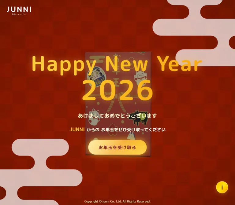
深い赤の市松状背景に淡い雲形と金色の丸ゴシックを組み合わせた年賀サイト。向きを変えるお年玉袋の立体表現と、光をまとったボタンが印象的。
オリジナルサイトを見るJUNNI / Happy New Year 2026 — Style Reference
A glowing New Year greeting layered over a red gift packet and a textured vermilion stage.
Website: nenga2026.junni.dev
Original URL: https://nenga2026.junni.dev/
Final URL: https://nenga2026.junni.dev/
Theme: one observed red-and-gold appearance
Inspected: September 12, 2026, using the supplied browser inspection; record timestamp 2026-09-12T12:19:03.030Z, equivalent to 21:19:03.030 JST.
Viewports: desktop 1440 × 1000 CSS pixels; mobile 390 × 844 CSS pixels.
Scope: the current opening greeting, represented by three desktop captures and two mobile captures, with rendered DOM and computed-style evidence. Includes the brand link, greeting, primary button, information button, decorative packet, corner motifs, and copyright. Post-click screens were not supplied.
This page presents a seasonal greeting as a single immersive scene. A deep, warm red field carries a subdued checker pattern and fine horizontal texture. Pale cloud ornaments enter from opposite corners. In the center, a shaded red gift packet sits behind oversized gold lettering, cream Japanese copy, and a luminous pill button. Rounded typography gives the ceremonial red-and-gold palette an approachable character.
The central message is the structural anchor. Its complete stack is vertically centered in both measured viewports, while the logo, information control, and copyright occupy the perimeter. Mobile preserves this composition through deliberate line wrapping and smaller spacing. The result is a compact greeting experience with an invitation to continue; the evidence does not establish what happens after either button is activated.
How to Read This Reference
- Measured values come directly from the supplied element rectangles and computed styles. Dimensions are CSS pixels unless stated otherwise.
- Declared values are recorded CSS custom properties. Their presence does not prove that a particular visible element uses them.
- Estimated values describe visual appearance in the five current-page captures. Estimated colors are approximate visual matches, not pixel samples.
- Recommended values and code are implementation guidance. They are not recovered source code.
- Named tokens are descriptive aliases unless a source property is explicitly identified.
- The measured root font size is
16px, so ordinaryremconversion applies. - An element's computed
coloror transparentbackgroundmay differ from its visible composite appearance. Child elements, background images, masks, pseudo-elements, and rendering layers were not fully recorded.
Tokens — Colors
Default Palette
| Name | Value | Evidence | Role / suggested token |
|---|---|---|---|
| Foundation Red | #7f1d1d |
Measured on html; also measured as primary-button text |
Underlying page background and action lettering; --color-red-base |
| Visible Vermilion | Approximately #951d05 |
Visual estimate | A useful approximation of the warmer rendered field; --color-scene-red |
| Light Gold | #fcd34d |
Declared in --gradient-gold, --color-gold-300, and --color-accent-tertiary |
Light stops in the gold vocabulary; --color-gold-light |
| Main Gold | #fbbf24 |
Declared within the gold gradient and glow | Mid-tone gold for emphasis; --color-gold |
| Amber Gold | #f59e0b |
Declared in --gradient-gold, --color-gold-500, and --color-accent-secondary |
Deeper gold shading; --color-gold-deep |
| Warm White | #fffbeb |
Measured body and invitation text; source --color-gold-50 |
Primary light copy; --color-cream |
| Soft Cream | #fef3c7 |
Measured greeting and copyright text; source --color-foreground-secondary |
Secondary light copy; --color-cream-muted |
| Cloud Blush | Approximately #d9bdb5 |
Visual estimate | Large flat corner ornaments; --color-cloud |
| Button Highlight | Approximately #ffe18a |
Visual estimate | Pale end of the visible action fill; --color-action-light |
| Button Gold | Approximately #ffd34f |
Visual estimate | Saturated end of the visible action fill; --color-action-gold |
| Information Yellow | Approximately #ffcf00 |
Visual estimate | Small information control; --color-info |
Keep the distinction between foundation and composite color. The recorded root background is #7f1d1d, but the screenshots show a warmer, textured red scene above it. The supplied evidence does not identify every layer responsible for that result. Using only the root color will produce a flatter, more burgundy appearance.
The heading is visibly gold even though its parent h1 reports cream text. Both buttons report transparent backgrounds even though their visible faces are filled. Describe those surfaces by their rendered appearance, while keeping the implementation mechanism unverified.
Gold Gradient and Glow
The following custom properties were supplied exactly, with formatting normalized:
--gradient-gold: linear-gradient(
  135deg,
  #fcd34d 0%,
  #fbbf24 25%,
  #f59e0b 50%,
  #fbbf24 75%,
  #fcd34d 100%
);

--shadow-gold:
  0 0 20px #fbbf2480,
  0 0 40px #fbbf244d;
The glow uses two concentric soft shadows: approximately 50% opacity at 20px blur and 30% at 40px blur. This is a declared token; the exact keyframes and active shadow values at capture time were not recorded.
The primary button appears paler than the deepest stop in the declared gold gradient. For a reconstruction, give the title and button separate gradient tokens rather than assuming they share an identical fill.
Theme Presets
Only the red-and-gold appearance is evidenced. No theme selector or alternate palette was inspected. Other declared colors, including bamboo green, plum, crimson, and neutral scales, are not evidence of additional visible themes.
Tokens — Typography
Rounded Sans — Greeting and Interface
- Computed family:
'M PLUS Rounded 1c', sans-serifon the body, heading, paragraphs, and buttons. - Measured weights:
900for the heading,700for greeting copy and the primary action, and400for the footer and body default. - Character: rounded terminals, substantial strokes, and friendly Japanese letterforms. The English greeting and Japanese copy belong to the same soft typographic world.
- Implementation alias:
--font-rounded: 'M PLUS Rounded 1c', sans-serif. - Loading limitation: the computed family is recorded, but font-file URLs and successful font-resource loading were not separately supplied.
A 'Shippori Mincho', serif custom property exists, but none of the measured visible text uses it. It should not become the main typeface merely because the page has a traditional New Year theme.
The logo is a separate visual mark. Its anchor inherits the rounded font stack, but that does not identify the typeface or construction of the logo artwork.
Type Scale
| Role | Desktop | Mobile | Weight | Tracking | Evidence |
|---|---|---|---|---|---|
| Body default | 16px / 24px |
16px / 24px |
400 |
Normal | Measured |
| Heading parent | 96px / 120px |
48px / 60px |
900 |
4.8px / 2.4px, both 0.05em |
Measured |
| Year numerals | Approximately 128px |
Approximately 60px |
Visually heavy | Child value unavailable | Visual estimate; child styles not supplied |
| Japanese greeting | 24px / 32px |
18px / 28px |
700 |
0.6px / 0.45px, both 0.025em |
Measured |
| Invitation paragraph | 20px / 32.5px |
16px / 26px |
700 |
Normal | Measured |
| Highlighted JUNNI within invitation | Approximately 24px |
Approximately 20px |
Visually bold | Not recorded separately | Visual estimate |
| Primary action | 20px / 28px |
18px / 28px |
700 |
2px / 1.8px, both 0.1em |
Measured |
| Information-button parent | 16px / 24px |
16px / 24px |
400 |
Normal | Measured; visible inner glyph styling unavailable |
| Copyright | 14px / 20px |
12px / 16px |
400 |
Normal | Measured |
The heading's total box is 256px tall on desktop and 184px on mobile. These values include its internal line structure; they are not the line height of every span. In particular, the large year should not be assigned the parent font size without checking the visual result.
Copy Hierarchy
The visible sequence is concise:
Happy New Year, followed by2026.あけましておめでとうございます.JUNNIからのお年玉をぜひ受け取ってください.お年玉を受け取る.
Gold is used for the main greeting and the JUNNI emphasis inside the invitation. Cream carries the supporting Japanese text. Keep the action label dark red so the button remains a filled, readable object within the gold lighting.
Tokens — Spacing & Shapes
Observed rhythm: repeated 32px gaps on desktop and 24px gaps on mobile.
Suggested base unit: 4px, an implementation interpretation consistent with many recorded dimensions.
Density: a compact central stack surrounded by large areas of decorative red space.
Spacing Scale
| Use | Desktop | Mobile | Evidence |
|---|---|---|---|
| Gap between heading, greeting, invitation, and action | 32px |
24px |
Calculated from measured adjacent rectangles |
| Logo top offset | 32px |
24px |
Measured |
| Logo left offset | 32px |
Centered | Measured |
| Primary-action vertical padding | 20px |
16px |
Measured |
| Primary-action horizontal padding | 48px |
40px |
Measured |
| Information control right clearance | 32px |
24px |
Calculated from measured rectangles |
| Information control bottom clearance | 56px |
48px |
Calculated from measured rectangles |
| Copyright bottom clearance | 8px |
8px |
Calculated from measured rectangles |
| Main text-column side clearance | Approximately 317.22px |
48px |
Measured at the supplied widths |
Border Radius
| Element | Appearance | Implementation guidance |
|---|---|---|
| Primary action | Fully rounded capsule | Use 9999px; the source computes an extremely large radius |
| Information control | Circle | Equal width and height with 50% or a full radius |
| Cloud ornaments | Broad capsules connected by narrow curved necks | Use a continuous silhouette rather than separate rounded cards |
| Packet | Thin rectangular object with perspective | Preserve sharp artwork boundaries and visible depth |
| Page and text regions | Unboxed | Do not introduce a general panel-radius system |
Layout Measurements
| Element | Desktop: 1440 × 1000 | Mobile: 390 × 844 |
|---|---|---|
| Document | 1440 × 1000px |
390 × 844px |
| Complete greeting stack | Top 256.75px, bottom 743.25px; height 486.5px |
Top 210px, bottom 634px; height 424px |
| Stack vertical center | 500px |
422px |
| Heading rectangle | x 317.22, y 256.75, 805.55 × 256px |
x 48, y 210, 294 × 184px |
| Greeting rectangle | y 544.75, height 32px |
y 418, height 28px |
| Invitation rectangle | y 608.75, height 34.5px |
y 470, height 80px |
| Primary action | x 583.98, y 675.25, 272 × 68px |
x 75.80, y 574, 238.41 × 60px |
| Brand anchor | x 32, y 32, 112 × 40.03px |
x 147, y 24, 96 × 34.31px |
| Information control | x 1352, y 888, 56 × 56px |
x 318, y 748, 48 × 48px |
| Copyright | x 566.31, y 972, 307.38 × 20px |
x 63.27, y 820, 263.47 × 16px |
The exact midpoint agreement is strong evidence for centering the entire text-and-action stack, rather than positioning the heading independently with a fixed top offset.
Components
Full-Viewport Greeting Stage
Role: contains the opening experience and establishes its festive atmosphere.
The observed document height equals the viewport height at both sizes. No lower content section is present in the sampled opening state. The composition consists of a textured background, corner silhouettes, central packet imagery, centered message, and peripheral controls.
The main copy has no card, border, or opaque backing. Its contrast comes from bright lettering over a subdued scene. The packet remains visible through the open spaces around and between the text.
Recommended construction: use a relatively positioned stage with a minimum viewport height and a centered content stack. Separate the background, decorations, artwork, and interface into layers. Allow the stage to grow on short screens or with enlarged text; the observed viewport fit should not become a clipping requirement.
Brand Link
Role: provides identity and a route to the main JUNNI website.
The white JUNNI mark includes a tiny tagline beneath it. On desktop, its 112 × 40.03px anchor sits 32px from the top and left. On mobile, it becomes 96 × 34.31px and is centered 24px below the top edge.
The recorded destination is https://junni.co.jp/. The link was not followed in the supplied inspection. Its extracted text is empty, so its accessible name cannot be determined from the text inventory alone.
Use the authorized logo artwork where available. A plain-text JUNNI fallback can establish a working shell but will not reproduce the original mark and tagline.
Greeting Title
Role: announces the year and provides the dominant visual hierarchy.
One semantic h1 contains the English greeting and year. Desktop presents Happy New Year on one line with the larger 2026 beneath it. At 390px, the English phrase occupies two lines: Happy New, then Year, followed by the numerals.
The parent uses weight 900, a line-height ratio of 1.25, and 0.05em tracking. The gold treatment is visually luminous, with deeper amber and lighter yellow regions. The parent color alone does not explain that appearance.
Keep the title transparent over the packet. In an adaptation, gradient-clipped text is a practical technique, but it is not confirmed as the original implementation.
Japanese Greeting
Role: supplies a direct, readable seasonal message beneath the large English title.
The exact label is あけましておめでとうございます. It uses cream #fef3c7, weight 700, and restrained 0.025em tracking. It remains a single line at both supplied viewports.
Its top edge is 32px below the desktop heading box and 24px below the mobile heading box. Preserve that clear separation so the smaller Japanese line does not become visually attached to the large numerals.
Invitation Paragraph
Role: connects the greeting to the primary action.
The JUNNI name is gold and visibly larger than the surrounding cream text. Desktop keeps the invitation on one line. Mobile uses three centered lines:
JUNNIからのお年玉をぜひ受け取ってください
The paragraph's measured height is slightly larger than a simple multiple of its parent line height: 34.5px versus 32.5px on desktop, and 80px versus 78px on mobile. Mixed-size inline text is consistent with that result, although the child styles were not supplied.
Treat the line grouping as part of the mobile composition. Arbitrary wrapping can leave short Japanese fragments isolated and alter the vertical balance.
Primary Action
Role: offers the next step using the label お年玉を受け取る.
Anatomy:
- Native
buttonelement. - Pale yellow-to-gold visible face.
- Dark red
#7f1d1dlettering. - Fully rounded capsule silhouette.
- Wide horizontal padding and
0.1emtracking. - Soft gold light extending beyond the button edge.
- A recorded repeating
pulse-goldanimation.
Desktop dimensions are 272 × 68px, with 20px 48px padding and 20px / 28px text. Mobile dimensions are approximately 238.41 × 60px, with 16px 40px padding and 18px / 28px text.
The dimensions are consistent with content-driven sizing. For the eight-character label, desktop text and tracking contribute approximately 176px, plus 96px horizontal padding. Avoid forcing the mobile button to span the full screen: its visible side space is important to the composition.
Activation was not inspected. The label establishes an invitation to receive an New Year gift, but no prize mechanics, monetary outcome, navigation destination, or next-screen design is evidenced.
Information Control
Role: a secondary information affordance at the lower right.
A bright yellow circular face contains a dark i glyph and a fine luminous edge. It measures 56px on desktop and 48px on mobile. Its bottom clearance is larger than its right clearance, leaving room for the copyright below.
The button parent's computed color and font do not identify the visible glyph's inner styling. Its destination or panel contents were not inspected. Do not infer a modal layout, instructions, sound controls, or credits from the presence of this icon.
Copyright
Role: quiet ownership text at the bottom of the stage.
The exact visible text is Copyright © junni Co., Ltd. All Rights Reserved. It is centered, cream, and regular weight, with a bottom clearance of 8px in both captures. Desktop uses 14px / 20px; mobile uses 12px / 16px.
It sits directly on the red scene without a footer bar or separating rule. This observed copyright does not establish production roles.
Corner Cloud Ornaments
Role: frames the central greeting with a recognizable Japanese decorative motif.
Pale, flat silhouettes enter from the upper-right and lower-left corners. Each combines broad horizontal capsules with narrow curved connectors. Their shapes are intentionally cropped by the viewport.
The visible motifs occupy roughly 384px horizontally and 310px vertically on desktop, and roughly 170px by 134px on mobile. These are screenshot estimates, not DOM measurements. The mobile treatment remains substantial instead of shrinking in direct proportion to viewport width.
Keep their edges clean and their fill subdued. They should frame the warm scene without competing with the gold message.
Tokens — Motion & Interaction
| Element / treatment | Recorded value or visual evidence | What can be concluded |
|---|---|---|
| Heading entrance | gold-spread, 1.5s, cubic-bezier(0, 0, 0.2, 1), 0.2s delay, forwards |
A finite entrance animation is declared; exact keyframes are unavailable |
| Japanese greeting entrance | fade-in-up, 1s, same easing, 0.8s delay, forwards |
A staggered entrance is declared; travel distance is unknown |
| Invitation entrance | fade-in-up, 1s, same easing, 1.2s delay, forwards |
The invitation enters later than the greeting |
| Primary-action pulse | pulse-gold, 2s, cubic-bezier(0.4, 0, 0.2, 1), infinite |
A recurring attention effect is declared; exact animated properties were not supplied |
| Primary-action transition | 0.3s cubic-bezier(0.4, 0, 0.2, 1) |
Transition timing is recorded; hover and pressed endpoints are unverified |
| Information-control transition | 0.3s cubic-bezier(0.4, 0, 0.2, 1) |
Timing is recorded; interaction states are unverified |
| Brand-link transition | 1s cubic-bezier(0.4, 0, 0.2, 1) |
A transition is declared; no specific visible transition was exercised |
| Packet orientation | Different front, narrow-edge, and reverse-facing appearances across supplied captures | The imagery changes orientation; rendering method, trigger, period, and easing are unknown |
The declared entrance schedule gives the scene a hierarchy: the title begins at 0.2 seconds, the Japanese greeting at 0.8 seconds, and the invitation at 1.2 seconds. Assuming ordinary uninterrupted playback, their respective end times would be 1.7, 1.8, and 2.2 seconds. These are calculations from declarations, not independently measured playback events.
The packet changes appearance without a corresponding rearrangement of the measured text stack. A reconstruction should therefore animate within a stable artwork layer, preserving message geometry.
The supplied captures do not establish whether the packet is rendered with WebGL, CSS transforms, video, or another method. They also do not establish automatic rotation versus input-responsive motion. Do not assign an invented rotation speed or claim drag interaction.
Interaction coverage: button elements and the brand-link destination are recorded. There are no supplied click results, hover captures, keyboard tests, sound observations, or reduced-motion tests.
Surfaces
| Layer | Appearance | Purpose |
|---|---|---|
| Foundation | Deep red | Underlying full-page color |
| Scene field | Warmer red, low-contrast checker pattern, fine horizontal texture | Adds depth without introducing separate sections |
| Corner decoration | Flat pale blush | Frames the stage and suggests traditional cloud ornament |
| Packet | Darkened red illustration with perspective, shading, and thin edges | Main decorative object behind the greeting |
| Text region | Transparent | Keeps copy integrated with the scene |
| Primary action | Pale gold gradient and broad warm halo | Highest-priority interactive surface |
| Information control | More saturated yellow circle with a luminous edge | Compact secondary utility |
| Copyright region | Transparent red background | Quiet closing detail |
Glow is selective. It emphasizes the action and gold presentation; there is no observed card-elevation system, glass panel, or general-purpose shadow around content blocks.
The checker pattern is subtle enough to read as material. A useful visual estimate is roughly 80px cells on desktop and 40–45px cells on mobile. Its actual construction and repeat dimensions were not supplied.
Imagery
The packet is a narrow portrait object with a red illustrated face. The visible front contains gold Japanese lettering, a decorative knot resembling mizuhiki, floral marks, beckoning-cat figures, a daruma-like face, and small animal silhouettes. These details carry the New Year identity more specifically than the surrounding CSS shapes.
Across desktop captures, the packet presents different projected widths, visible edges, and shaded faces. A narrow strip of banknote-like imagery extends beneath it. The evidence does not identify a denomination or establish that the offered experience transfers money.
The mobile front-facing captures show the decorated panel more clearly, approximately 130–165px wide and around 310px tall depending on orientation. Its top is near the lower portion of the English title, and its lower edge reaches the action area. These are projected screenshot dimensions, not intrinsic asset sizes.
Desktop shows a substantially taller projected object, reaching well above the title and below the button. Do not derive its intrinsic aspect ratio from one angled frame. Perspective and pose change the visible bounds.
The artwork is relatively subdued behind the text. Preserve this hierarchy through suitable lighting, grading, or a contrast treatment in a new implementation. The original shading and compositing values are not available.
Observed Asset References
No direct image URLs, model URLs, font-file URLs, or original asset filenames were included in the evidence.
| Visual asset | Evidence available | Reuse guidance |
|---|---|---|
| JUNNI logo and small tagline | Visible in both viewport sizes; enclosing link measured | Insert authorized logo artwork; do not infer its font from the anchor |
| Illustrated gift packet and banknote-like strip | Multiple visible orientations | Use an authorized image or renderer; preserve illustration detail and shading |
| Cloud silhouettes | Visible in opposite corners | A simple SVG approximation can reproduce their structural role |
| Checker and horizontal texture | Visible across the red scene | Low-contrast CSS layers can approximate the appearance |
| Information glyph | Visible inside a native button | Supply a clear accessible label; exact inner glyph styling is unknown |
The CSS shell can reproduce the layout, typography, and lighting vocabulary. It cannot recover the packet illustration or its animation implementation from screenshots alone.
Layout & Responsive Behavior
Centered Message Stack
The full stack is centered horizontally and vertically at both inspected sizes. Desktop extends from y = 256.75 to 743.25, centered at 500. Mobile extends from y = 210 to 634, centered at 422.
Use this relationship as the primary layout rule. A fixed heading offset would become incorrect when mobile wrapping increases the number of lines.
Desktop Composition
The main heading spans approximately 806px. The greeting and invitation remain on one line, and every stack gap is 32px. The logo anchors the upper-left corner, leaving the title independent of a conventional navigation bar.
The cloud ornaments and wide red margins balance the central text. The packet remains behind it as a changing visual layer. The information control is inset from the lower-right edge, above the centered copyright.
Mobile Composition
At 390 × 844:
- The logo moves to the top center and decreases from 112px to 96px wide.
- The text column is 294px wide, leaving 48px on each side.
- The heading parent halves from 96px to 48px.
- The English greeting wraps to two lines; the year remains a separate line.
- The invitation becomes three centered lines.
- Stack gaps decrease from 32px to 24px.
- The action shrinks modestly to about 238px wide, retaining generous padding.
- The information button decreases to 48px and moves to 24px from the right and 48px from the bottom.
- The copyright decreases to 12px while retaining its 8px bottom clearance.
- The packet occupies a shorter central region relative to the viewport.
The original breakpoint rules were not supplied. No intermediate width, landscape phone, browser-toolbar transition, or enlarged-text layout was inspected. The CSS below uses an explicitly recommended 64rem breakpoint and permits document growth on shorter screens.
The measured corner positions establish visual anchoring, but their original position declarations were not recorded. Absolute positioning within the stage is sufficient for the opening-state adaptation; fixed positioning should not be claimed as an observed source rule.
Do’s and Don’ts
Do
- Center the whole greeting-and-action stack as one unit.
- Preserve the 32px desktop and 24px mobile spacing rhythm.
- Use the recorded rounded sans-serif stack and heavy heading weight.
- Keep the large English greeting gold and the supporting Japanese copy cream.
- Emphasize JUNNI within the invitation without turning it into a separate badge.
- Keep the primary action a content-sized pill with dark red lettering and a soft gold halo.
- Let the packet remain visible behind the message while controlling its contrast.
- Preserve the cropped cloud silhouettes in opposite corners.
- Reflow the mobile invitation into meaningful short lines.
- Keep utilities visually separate from the central invitation.
Don’t
- Do not turn the greeting into a generic sequence of feature sections and cards.
- Do not place an opaque white panel behind the central copy.
- Do not substitute a serif heading because an unused serif token is declared.
- Do not treat the heading parent's cream color as its final visible appearance.
- Do not apply the darkest gold gradient stop indiscriminately to the pale button face.
- Do not enlarge the packet until it obscures the greeting or competes with the action.
- Do not replace the subtle texture with a high-contrast checkerboard.
- Do not stretch the mobile action across the full viewport.
- Do not invent prize results, information-dialog contents, sound, or drag controls.
- Do not infer a rendering engine, asset path, or rotation period from the still captures.
Recommended Implementation Additions
These are recommendations for a new implementation, not verified features of the inspected page:
- Give the logo link an explicit accessible name and label the information button with its actual purpose.
- Preserve native button semantics and provide visible keyboard focus for all controls.
- Mark purely decorative clouds and packet imagery as hidden from assistive technology. If later interaction makes the packet meaningful, provide an appropriate text equivalent.
- Respect
prefers-reduced-motion: stop recurring glow animation and provide a stable packet pose. Any canvas or video renderer must handle this preference separately from CSS. - Keep essential text and controls available if artwork or fonts fail to load.
- Use minimum viewport height and natural document growth so short screens, larger fonts, and zoom do not clip content.
- Account for device safe areas around the footer and corner utility.
- Check contrast against the brightest packet poses and every button-gradient region, not just against the underlying red token.
- Connect the action and information buttons to explicitly specified behavior; their post-click experience cannot be reconstructed from this evidence.
Agent Prompt Guide
Quick Color Reference
- Exact underlying red:
#7f1d1d. - Approximate rendered scene red:
#951d05. - Declared gold sequence:
#fcd34d,#fbbf24,#f59e0b,#fbbf24,#fcd34d. - Main light copy:
#fffbeb; greeting and copyright:#fef3c7. - Approximate corner-cloud fill:
#d9bdb5. - Approximate action face:
#ffe18ato#ffd34f, with#7f1d1dtext. - Declared glow:
0 0 20px #fbbf2480, 0 0 40px #fbbf244d.
Overall Prompt
“Create a full-viewport 2026 New Year greeting for JUNNI. Use a warm deep-red scene with a restrained checker texture, fine horizontal grain, and pale blush cloud silhouettes cropped at the upper-right and lower-left corners. Center a transparent message stack over a shaded illustrated red gift packet. Set Happy New Year in heavy M PLUS Rounded 1c, with larger 2026 numerals beneath it, using luminous gold lettering. Add cream Japanese greeting text, a short invitation with JUNNI emphasized in gold, and a pale-gold pill labeled お年玉を受け取る. Use 32px stack gaps on desktop and 24px on mobile. Move the white logo from the upper-left to the top center on phones. Keep a small yellow information circle at the lower right and a small centered copyright near the bottom. Maintain readable text throughout any artwork motion.”
Example Component Prompts
- Greeting stack: “Build one vertically centered stack containing a gold English heading, larger year, cream Japanese greeting, short invitation, and gold pill action. Use 96px heading type on the desktop reference and 48px on the mobile reference. On a 390px screen, use a 294px text column and wrap Happy New Year into two lines before the year.”
- Primary action: “Create a content-sized pill labeled お年玉を受け取る with dark red lettering, a pale yellow-gold gradient, and a broad soft gold halo. Desktop padding is 20px 48px with 20px type; mobile padding is 16px 40px with 18px type. Use 0.1em tracking and preserve native button semantics.”
- Decorative scene: “Place a subdued illustrated red gift packet behind the central greeting, keeping its gold knot, lucky figures, and floral details visible. Provide a dedicated artwork layer so pose changes do not move the text. Use an authorized asset or renderer; the source rendering method and rotation timing are unspecified.”
- Cloud frame: “Draw two flat pale-blush cloud silhouettes with wide rounded horizontal lobes joined by narrow curved necks. Crop them into opposite corners. Approximate their visible size as 384px wide on the desktop reference and 170px on mobile.”
- Mobile utilities: “Center a 96px-wide brand mark 24px from the top. Place a 48px yellow information circle 24px from the right and 48px above the bottom. Keep the 12px copyright centered 8px above the bottom, with safe-area adjustments and enough room for text enlargement.”
Quick Start
CSS Custom Properties
This is a usable shell adaptation, not the original stylesheet. Measured typography, padding, gaps, and control dimensions are retained. Composite colors, cloud geometry, artwork-slot dimensions, breakpoint choice, and keyframe contents are explicitly reconstructed.
The larger year is estimated at 128px on desktop and 60px on mobile. Suggested 8px and 4px internal year gaps reproduce the measured heading heights when the intended font and wrapping are available. Confirm those details against the supplied captures after loading the font.
:root {
  /* Recorded source values */
  --color-red-base: #7f1d1d;
  --color-gold-light: #fcd34d;
  --color-gold: #fbbf24;
  --color-gold-deep: #f59e0b;
  --color-cream: #fffbeb;
  --color-cream-muted: #fef3c7;
  --font-rounded: 'M PLUS Rounded 1c', sans-serif;
  --gradient-gold: linear-gradient(
    135deg,
    #fcd34d 0%,
    #fbbf24 25%,
    #f59e0b 50%,
    #fbbf24 75%,
    #fcd34d 100%
  );
  --shadow-gold:
    0 0 20px #fbbf2480,
    0 0 40px #fbbf244d;

  /* Visual estimates for the visible composite surfaces */
  --color-scene-red: #951d05;
  --color-cloud: #d9bdb5;
  --color-action-light: #ffe18a;
  --color-action-gold: #ffd34f;
  --color-info: #ffcf00;
  --gradient-action: linear-gradient(
    110deg,
    var(--color-action-light),
    var(--color-action-gold)
  );

  /* Measured mobile geometry */
  --stack-gap: 24px;
  --title-size: 48px;
  --greeting-size: 18px;
  --greeting-leading: 28px;
  --invitation-size: 16px;
  --action-size: 18px;
  --action-pad-y: 16px;
  --action-pad-x: 40px;
  --info-size: 48px;
  --edge-inset: 24px;
  --info-bottom: 48px;
  --radius-pill: 9999px;

  /* Estimated internal type and decorative proportions */
  --year-size: 60px;
  --year-gap: 4px;
  --cloud-width: 170px;
  --pattern-tile: 88px;

  /* Recorded timing vocabulary */
  --ease-enter: cubic-bezier(0, 0, 0.2, 1);
  --ease-ui: cubic-bezier(0.4, 0, 0.2, 1);
}

* {
  box-sizing: border-box;
}

html {
  background: var(--color-red-base);
}

body {
  margin: 0;
}

.new-year-stage {
  position: relative;
  isolation: isolate;
  display: grid;
  place-items: center;
  min-height: 100vh;
  min-height: 100svh;
  padding-block: 96px;
  overflow-x: clip;
  color: var(--color-cream);
  background: var(--color-scene-red);
  font-family: var(--font-rounded);
  font-size: 16px;
  line-height: 1.5;
}

/* Recommended approximation of the checker field and fine texture. */
.new-year-stage::before {
  content: '';
  position: absolute;
  inset: 0;
  z-index: 0;
  pointer-events: none;
  background-image:
    repeating-linear-gradient(
      0deg,
      transparent 0 3px,
      rgb(45 5 0 / 0.045) 3px 4px
    ),
    conic-gradient(
      rgb(255 86 0 / 0.055) 25%,
      transparent 0 50%,
      rgb(255 86 0 / 0.055) 0 75%,
      transparent 0
    );
  background-size: auto, var(--pattern-tile) var(--pattern-tile);
}

.cloud {
  position: absolute;
  z-index: 0;
  display: block;
  width: var(--cloud-width);
  height: auto;
  fill: var(--color-cloud);
  pointer-events: none;
}

.cloud--lower {
  left: 0;
  bottom: 0;
}

.cloud--upper {
  right: 0;
  top: 0;
  transform: rotate(180deg);
}

/* Integration slot, not a measurement of the original model. */
.envelope-stage {
  position: absolute;
  z-index: 1;
  top: 50%;
  left: 50%;
  width: 180px;
  height: 320px;
  transform: translate(-50%, -50%);
  pointer-events: none;
}

.envelope-stage > :is(img, video, canvas) {
  display: block;
  width: 100%;
  height: 100%;
  object-fit: contain;
}

.brand {
  position: absolute;
  z-index: 3;
  top: 24px;
  left: 50%;
  width: 96px;
  height: 34.3125px;
  transform: translateX(-50%);
  color: #fff;
  text-decoration: none;
}

.brand img {
  display: block;
  width: 100%;
  height: auto;
}

/* Text fallback only; replace with authorized logo artwork. */
.brand-wordmark {
  display: block;
  font-size: 28px;
  font-weight: 700;
  line-height: 1;
  letter-spacing: 0.1em;
}

.greeting-content {
  position: relative;
  z-index: 2;
  display: flex;
  flex-direction: column;
  align-items: center;
  gap: var(--stack-gap);
  width: max-content;
  max-width: calc(100% - 96px);
  text-align: center;
}

.greeting-title,
.greeting-copy,
.invitation {
  width: 100%;
  margin: 0;
}

.greeting-title {
  font-size: var(--title-size);
  font-weight: 900;
  line-height: 1.25;
  letter-spacing: 0.05em;
  animation: title-reveal 1.5s var(--ease-enter) 0.2s both;
}

.greeting-title > span {
  display: block;
  color: var(--color-gold);
}

/* Gradient clipping is a reconstruction choice. */
@supports (background-clip: text) or (-webkit-background-clip: text) {
  .greeting-title > span {
    background: var(--gradient-gold);
    background-clip: text;
    -webkit-background-clip: text;
    color: transparent;
  }
}

.greeting-title .year {
  width: max-content;
  margin: var(--year-gap) auto 0;
  font-size: var(--year-size);
  line-height: 1;
}

.greeting-copy {
  color: var(--color-cream-muted);
  font-size: var(--greeting-size);
  font-weight: 700;
  line-height: var(--greeting-leading);
  letter-spacing: 0.025em;
  animation: copy-reveal 1s var(--ease-enter) 0.8s both;
}

.invitation {
  font-size: var(--invitation-size);
  font-weight: 700;
  line-height: 1.625;
  animation: copy-reveal 1s var(--ease-enter) 1.2s both;
}

/* Estimated child styling; parent values above are measured. */
.invitation strong {
  color: var(--color-gold);
  font-size: 20px;
  line-height: 28px;
}

.claim-button {
  display: inline-block;
  max-width: 100%;
  padding: var(--action-pad-y) var(--action-pad-x);
  border: 0;
  border-radius: var(--radius-pill);
  color: var(--color-red-base);
  background: var(--gradient-action);
  box-shadow: var(--shadow-gold);
  font-family: var(--font-rounded);
  font-size: var(--action-size);
  font-weight: 700;
  line-height: 28px;
  letter-spacing: 0.1em;
  cursor: pointer;
  transition: filter 0.3s var(--ease-ui);
  animation: action-glow 2s var(--ease-ui) infinite;
}

.info-button {
  position: absolute;
  z-index: 3;
  right: calc(var(--edge-inset) + env(safe-area-inset-right, 0px));
  bottom: calc(var(--info-bottom) + env(safe-area-inset-bottom, 0px));
  display: grid;
  place-items: center;
  width: var(--info-size);
  height: var(--info-size);
  padding: 0;
  border: 2px solid var(--color-gold-light);
  border-radius: 50%;
  color: #92400e;
  background: var(--color-info);
  box-shadow: 0 0 18px #fbbf244d;
  font: inherit;
  cursor: pointer;
  transition: filter 0.3s var(--ease-ui);
}

/* Visible glyph approximation; inner source styles were unavailable. */
.info-button span {
  font-size: 26px;
  font-weight: 700;
  line-height: 1;
}

.copyright {
  position: absolute;
  z-index: 3;
  right: 12px;
  bottom: calc(8px + env(safe-area-inset-bottom, 0px));
  left: 12px;
  margin: 0;
  color: var(--color-cream-muted);
  font-size: 12px;
  font-weight: 400;
  line-height: 16px;
  text-align: center;
}

/* Recommended focus and hover behavior; not observed source states. */
.new-year-stage :is(a, button):focus-visible {
  outline: 2px solid var(--color-cream);
  outline-offset: 6px;
}

@media (hover: hover) {
  .claim-button:hover,
  .info-button:hover {
    filter: brightness(1.06);
  }
}

/* Recommended breakpoint; the original breakpoint was not supplied. */
@media (min-width: 64rem) {
  :root {
    --stack-gap: 32px;
    --title-size: 96px;
    --greeting-size: 24px;
    --greeting-leading: 32px;
    --invitation-size: 20px;
    --action-size: 20px;
    --action-pad-y: 20px;
    --action-pad-x: 48px;
    --info-size: 56px;
    --edge-inset: 32px;
    --info-bottom: 56px;
    --year-size: 128px;
    --year-gap: 8px;
    --cloud-width: 384px;
    --pattern-tile: 160px;
  }

  .brand {
    top: 32px;
    left: 32px;
    width: 112px;
    height: 40.03125px;
    transform: none;
  }

  .brand-wordmark {
    font-size: 32px;
  }

  .invitation strong {
    font-size: 24px;
    line-height: 32px;
  }

  .mobile-break {
    display: none;
  }

  .envelope-stage {
    width: 340px;
    height: min(74svh, 740px);
  }

  .copyright {
    font-size: 14px;
    line-height: 20px;
  }
}

/* Recommended accommodation for narrower, uninspected screens. */
@media (max-width: 359px) {
  .greeting-content {
    max-width: calc(100% - 32px);
  }

  .greeting-title {
    font-size: 40px;
  }
}

/* Timing follows the evidence; keyframe contents are approximations. */
@keyframes title-reveal {
  from { opacity: 0; }
  to { opacity: 1; }
}

@keyframes copy-reveal {
  from { opacity: 0; transform: translateY(12px); }
  to { opacity: 1; transform: translateY(0); }
}

@keyframes action-glow {
  0%, 100% { box-shadow: var(--shadow-gold); }
  50% {
    box-shadow:
      0 0 26px #fbbf24a6,
      0 0 52px #fbbf2466;
  }
}

@media (prefers-reduced-motion: reduce) {
  .greeting-title,
  .greeting-copy,
  .invitation,
  .claim-button {
    animation: none;
  }

  .new-year-stage :is(a, button) {
    transition: none;
  }
}
Minimal Component Markup
The cloud path below is an illustrative approximation. The artwork slot is intentionally an integration point: insert an authorized packet image or renderer without using an invented asset URL. Load the intended font separately. The buttons require application handlers; this markup does not invent their results.
<main class='new-year-stage'>
  <svg class='cloud cloud--lower'
       viewBox='0 0 384 312'
       aria-hidden='true'
       focusable='false'>
    <defs>
      <!-- Simplified cloud silhouette, not recovered source artwork. -->
      <path id='cloud-motif' d='M94 0h187a40 40 0 0 1 0 80h-36a32 32 0 0 0 0 64h99a40 40 0 0 1 0 80H111a32 32 0 0 0 0 64h124a40 40 0 0 1 40 40H-40v-40h37a32 32 0 0 0 0-64h-77v-80H130a32 32 0 0 0 0-64H94a40 40 0 0 1 0-80Z'/>
    </defs>
    <use href='#cloud-motif'/>
  </svg>

  <svg class='cloud cloud--upper'
       viewBox='0 0 384 312'
       aria-hidden='true'
       focusable='false'>
    <use href='#cloud-motif'/>
  </svg>

  <a class='brand' href='https://junni.co.jp/' aria-label='JUNNI website'>
    <!-- Replace this fallback with the authorized logo and tagline. -->
    <span class='brand-wordmark'>JUNNI</span>
  </a>

  <div class='envelope-stage' aria-hidden='true'>
    <!-- Mount an authorized decorative image or renderer here. -->
  </div>

  <div class='greeting-content'>
    <h1 class='greeting-title' lang='en'>
      <span>Happy New Year</span>
      <span class='year'>2026</span>
    </h1>
    <p class='greeting-copy' lang='ja'>あけましておめでとうございます</p>
    <p class='invitation' lang='ja'>
      <strong>JUNNI</strong> からの<br class='mobile-break'>
      お年玉を<br class='mobile-break'>
      ぜひ受け取ってください
    </p>
    <button class='claim-button' type='button' lang='ja'>お年玉を受け取る</button>
  </div>

  <button class='info-button' type='button' aria-label='Information'>
    <span aria-hidden='true'>i</span>
  </button>

  <p class='copyright' lang='en'>Copyright © junni Co., Ltd. All Rights Reserved.</p>
</main>
Tailwind v4 Token Mapping
Optional aliases for an implementation already using Tailwind v4. Define the custom properties above first. This mapping is an adaptation, not evidence of the original component architecture.
@theme inline {
  --color-nenga-red: var(--color-scene-red);
  --color-nenga-ink: var(--color-red-base);
  --color-nenga-gold: var(--color-gold);
  --color-nenga-gold-light: var(--color-gold-light);
  --color-nenga-cream: var(--color-cream);
  --color-nenga-cream-muted: var(--color-cream-muted);
  --color-nenga-cloud: var(--color-cloud);

  --font-greeting: var(--font-rounded);
  --text-greeting-title: var(--title-size);
  --text-greeting-copy: var(--greeting-size);
  --text-greeting-action: var(--action-size);

  --spacing-greeting-gap: var(--stack-gap);
  --spacing-greeting-edge: var(--edge-inset);
  --spacing-greeting-info: var(--info-size);

  --radius-greeting-pill: 9999px;
  --shadow-greeting-gold: var(--shadow-gold);
}
Sources & Evidence
- Current JUNNI New Year page: original and final URL are identical; supplied response status is HTTP 200. Rendered document title:
Happy New Year 2026 | JUNNIからの新年のお年玉. - Inspection record: September 12, 2026,
2026-09-12T12:19:03.030Z. Individual screenshot timestamps were not provided. - Desktop evidence: three current-page captures at
1440 × 1000, plus rendered text, link destination, computed styles, custom properties, and element rectangles. Document height is 1000px. - Mobile evidence: two current-page captures at
390 × 844, with the equivalent DOM and style evidence. Document height is 844px. - Motion evidence: recorded CSS animation declarations and changing packet orientation across captures. Exact packet timing and animation keyframes were not supplied.
- Browser preparation: the supplied process waited for document loading, image readiness, finite animations, and sampled layout/text stability within its stated limits. Perpetual animations were temporarily paused during readiness checks and resumed. These checks do not prove that all delayed or interaction-dependent content was exposed.
- Inspection limitations: no button activation, hover, keyboard, sound, reduced-motion, or intermediate-viewport results were supplied. Complete stylesheets, asset URLs, child-element styles, and rendering-engine details were unavailable. SharedWorkers and service workers were disabled during the supplied inspection.
This reference describes the current opening state supported by those observations. Measurements, visual estimates, and recommended implementation choices remain explicitly separated throughout.
# JUNNI / Happy New Year 2026 — Style Reference

> A glowing New Year greeting layered over a red gift packet and a textured vermilion stage.

**Website:** [nenga2026.junni.dev](https://nenga2026.junni.dev/)
**Original URL:** https://nenga2026.junni.dev/
**Final URL:** https://nenga2026.junni.dev/
**Theme:** one observed red-and-gold appearance
**Inspected:** September 12, 2026, using the supplied browser inspection; record timestamp `2026-09-12T12:19:03.030Z`, equivalent to 21:19:03.030 JST.
**Viewports:** desktop `1440 × 1000` CSS pixels; mobile `390 × 844` CSS pixels.
**Scope:** the current opening greeting, represented by three desktop captures and two mobile captures, with rendered DOM and computed-style evidence. Includes the brand link, greeting, primary button, information button, decorative packet, corner motifs, and copyright. Post-click screens were not supplied.

This page presents a seasonal greeting as a single immersive scene. A deep, warm red field carries a subdued checker pattern and fine horizontal texture. Pale cloud ornaments enter from opposite corners. In the center, a shaded red gift packet sits behind oversized gold lettering, cream Japanese copy, and a luminous pill button. Rounded typography gives the ceremonial red-and-gold palette an approachable character.

The central message is the structural anchor. Its complete stack is vertically centered in both measured viewports, while the logo, information control, and copyright occupy the perimeter. Mobile preserves this composition through deliberate line wrapping and smaller spacing. The result is a compact greeting experience with an invitation to continue; the evidence does not establish what happens after either button is activated.

## How to Read This Reference

- **Measured** values come directly from the supplied element rectangles and computed styles. Dimensions are CSS pixels unless stated otherwise.
- **Declared** values are recorded CSS custom properties. Their presence does not prove that a particular visible element uses them.
- **Estimated** values describe visual appearance in the five current-page captures. Estimated colors are approximate visual matches, not pixel samples.
- **Recommended** values and code are implementation guidance. They are not recovered source code.
- **Named tokens** are descriptive aliases unless a source property is explicitly identified.
- The measured root font size is `16px`, so ordinary `rem` conversion applies.
- An element's computed `color` or transparent `background` may differ from its visible composite appearance. Child elements, background images, masks, pseudo-elements, and rendering layers were not fully recorded.

## Tokens — Colors

### Default Palette

| Name | Value | Evidence | Role / suggested token |
| --- | --- | --- | --- |
| Foundation Red | `#7f1d1d` | Measured on `html`; also measured as primary-button text | Underlying page background and action lettering; `--color-red-base` |
| Visible Vermilion | Approximately `#951d05` | Visual estimate | A useful approximation of the warmer rendered field; `--color-scene-red` |
| Light Gold | `#fcd34d` | Declared in `--gradient-gold`, `--color-gold-300`, and `--color-accent-tertiary` | Light stops in the gold vocabulary; `--color-gold-light` |
| Main Gold | `#fbbf24` | Declared within the gold gradient and glow | Mid-tone gold for emphasis; `--color-gold` |
| Amber Gold | `#f59e0b` | Declared in `--gradient-gold`, `--color-gold-500`, and `--color-accent-secondary` | Deeper gold shading; `--color-gold-deep` |
| Warm White | `#fffbeb` | Measured body and invitation text; source `--color-gold-50` | Primary light copy; `--color-cream` |
| Soft Cream | `#fef3c7` | Measured greeting and copyright text; source `--color-foreground-secondary` | Secondary light copy; `--color-cream-muted` |
| Cloud Blush | Approximately `#d9bdb5` | Visual estimate | Large flat corner ornaments; `--color-cloud` |
| Button Highlight | Approximately `#ffe18a` | Visual estimate | Pale end of the visible action fill; `--color-action-light` |
| Button Gold | Approximately `#ffd34f` | Visual estimate | Saturated end of the visible action fill; `--color-action-gold` |
| Information Yellow | Approximately `#ffcf00` | Visual estimate | Small information control; `--color-info` |

**Keep the distinction between foundation and composite color.** The recorded root background is `#7f1d1d`, but the screenshots show a warmer, textured red scene above it. The supplied evidence does not identify every layer responsible for that result. Using only the root color will produce a flatter, more burgundy appearance.

The heading is visibly gold even though its parent `h1` reports cream text. Both buttons report transparent backgrounds even though their visible faces are filled. Describe those surfaces by their rendered appearance, while keeping the implementation mechanism unverified.

### Gold Gradient and Glow

The following custom properties were supplied exactly, with formatting normalized:

```css
--gradient-gold: linear-gradient(
  135deg,
  #fcd34d 0%,
  #fbbf24 25%,
  #f59e0b 50%,
  #fbbf24 75%,
  #fcd34d 100%
);

--shadow-gold:
  0 0 20px #fbbf2480,
  0 0 40px #fbbf244d;
```

The glow uses two concentric soft shadows: approximately 50% opacity at 20px blur and 30% at 40px blur. This is a declared token; the exact keyframes and active shadow values at capture time were not recorded.

The primary button appears paler than the deepest stop in the declared gold gradient. For a reconstruction, give the title and button separate gradient tokens rather than assuming they share an identical fill.

### Theme Presets

Only the red-and-gold appearance is evidenced. No theme selector or alternate palette was inspected. Other declared colors, including bamboo green, plum, crimson, and neutral scales, are not evidence of additional visible themes.

## Tokens — Typography

### Rounded Sans — Greeting and Interface

- **Computed family:** `'M PLUS Rounded 1c', sans-serif` on the body, heading, paragraphs, and buttons.
- **Measured weights:** `900` for the heading, `700` for greeting copy and the primary action, and `400` for the footer and body default.
- **Character:** rounded terminals, substantial strokes, and friendly Japanese letterforms. The English greeting and Japanese copy belong to the same soft typographic world.
- **Implementation alias:** `--font-rounded: 'M PLUS Rounded 1c', sans-serif`.
- **Loading limitation:** the computed family is recorded, but font-file URLs and successful font-resource loading were not separately supplied.

A `'Shippori Mincho', serif` custom property exists, but none of the measured visible text uses it. It should not become the main typeface merely because the page has a traditional New Year theme.

The logo is a separate visual mark. Its anchor inherits the rounded font stack, but that does not identify the typeface or construction of the logo artwork.

### Type Scale

| Role | Desktop | Mobile | Weight | Tracking | Evidence |
| --- | --- | --- | --- | --- | --- |
| Body default | `16px / 24px` | `16px / 24px` | `400` | Normal | Measured |
| Heading parent | `96px / 120px` | `48px / 60px` | `900` | `4.8px` / `2.4px`, both `0.05em` | Measured |
| Year numerals | Approximately `128px` | Approximately `60px` | Visually heavy | Child value unavailable | Visual estimate; child styles not supplied |
| Japanese greeting | `24px / 32px` | `18px / 28px` | `700` | `0.6px` / `0.45px`, both `0.025em` | Measured |
| Invitation paragraph | `20px / 32.5px` | `16px / 26px` | `700` | Normal | Measured |
| Highlighted JUNNI within invitation | Approximately `24px` | Approximately `20px` | Visually bold | Not recorded separately | Visual estimate |
| Primary action | `20px / 28px` | `18px / 28px` | `700` | `2px` / `1.8px`, both `0.1em` | Measured |
| Information-button parent | `16px / 24px` | `16px / 24px` | `400` | Normal | Measured; visible inner glyph styling unavailable |
| Copyright | `14px / 20px` | `12px / 16px` | `400` | Normal | Measured |

The heading's total box is `256px` tall on desktop and `184px` on mobile. These values include its internal line structure; they are not the line height of every span. In particular, the large year should not be assigned the parent font size without checking the visual result.

### Copy Hierarchy

The visible sequence is concise:

1. `Happy New Year`, followed by `2026`.
2. `あけましておめでとうございます`.
3. `JUNNIからのお年玉をぜひ受け取ってください`.
4. `お年玉を受け取る`.

Gold is used for the main greeting and the JUNNI emphasis inside the invitation. Cream carries the supporting Japanese text. Keep the action label dark red so the button remains a filled, readable object within the gold lighting.

## Tokens — Spacing & Shapes

**Observed rhythm:** repeated 32px gaps on desktop and 24px gaps on mobile.
**Suggested base unit:** `4px`, an implementation interpretation consistent with many recorded dimensions.
**Density:** a compact central stack surrounded by large areas of decorative red space.

### Spacing Scale

| Use | Desktop | Mobile | Evidence |
| --- | --- | --- | --- |
| Gap between heading, greeting, invitation, and action | `32px` | `24px` | Calculated from measured adjacent rectangles |
| Logo top offset | `32px` | `24px` | Measured |
| Logo left offset | `32px` | Centered | Measured |
| Primary-action vertical padding | `20px` | `16px` | Measured |
| Primary-action horizontal padding | `48px` | `40px` | Measured |
| Information control right clearance | `32px` | `24px` | Calculated from measured rectangles |
| Information control bottom clearance | `56px` | `48px` | Calculated from measured rectangles |
| Copyright bottom clearance | `8px` | `8px` | Calculated from measured rectangles |
| Main text-column side clearance | Approximately `317.22px` | `48px` | Measured at the supplied widths |

### Border Radius

| Element | Appearance | Implementation guidance |
| --- | --- | --- |
| Primary action | Fully rounded capsule | Use `9999px`; the source computes an extremely large radius |
| Information control | Circle | Equal width and height with `50%` or a full radius |
| Cloud ornaments | Broad capsules connected by narrow curved necks | Use a continuous silhouette rather than separate rounded cards |
| Packet | Thin rectangular object with perspective | Preserve sharp artwork boundaries and visible depth |
| Page and text regions | Unboxed | Do not introduce a general panel-radius system |

### Layout Measurements

| Element | Desktop: 1440 × 1000 | Mobile: 390 × 844 |
| --- | --- | --- |
| Document | `1440 × 1000px` | `390 × 844px` |
| Complete greeting stack | Top `256.75px`, bottom `743.25px`; height `486.5px` | Top `210px`, bottom `634px`; height `424px` |
| Stack vertical center | `500px` | `422px` |
| Heading rectangle | `x 317.22`, `y 256.75`, `805.55 × 256px` | `x 48`, `y 210`, `294 × 184px` |
| Greeting rectangle | `y 544.75`, height `32px` | `y 418`, height `28px` |
| Invitation rectangle | `y 608.75`, height `34.5px` | `y 470`, height `80px` |
| Primary action | `x 583.98`, `y 675.25`, `272 × 68px` | `x 75.80`, `y 574`, `238.41 × 60px` |
| Brand anchor | `x 32`, `y 32`, `112 × 40.03px` | `x 147`, `y 24`, `96 × 34.31px` |
| Information control | `x 1352`, `y 888`, `56 × 56px` | `x 318`, `y 748`, `48 × 48px` |
| Copyright | `x 566.31`, `y 972`, `307.38 × 20px` | `x 63.27`, `y 820`, `263.47 × 16px` |

The exact midpoint agreement is strong evidence for centering the entire text-and-action stack, rather than positioning the heading independently with a fixed top offset.

## Components

### Full-Viewport Greeting Stage

**Role:** contains the opening experience and establishes its festive atmosphere.

The observed document height equals the viewport height at both sizes. No lower content section is present in the sampled opening state. The composition consists of a textured background, corner silhouettes, central packet imagery, centered message, and peripheral controls.

The main copy has no card, border, or opaque backing. Its contrast comes from bright lettering over a subdued scene. The packet remains visible through the open spaces around and between the text.

**Recommended construction:** use a relatively positioned stage with a minimum viewport height and a centered content stack. Separate the background, decorations, artwork, and interface into layers. Allow the stage to grow on short screens or with enlarged text; the observed viewport fit should not become a clipping requirement.

### Brand Link

**Role:** provides identity and a route to the main JUNNI website.

The white JUNNI mark includes a tiny tagline beneath it. On desktop, its `112 × 40.03px` anchor sits 32px from the top and left. On mobile, it becomes `96 × 34.31px` and is centered 24px below the top edge.

The recorded destination is `https://junni.co.jp/`. The link was not followed in the supplied inspection. Its extracted text is empty, so its accessible name cannot be determined from the text inventory alone.

Use the authorized logo artwork where available. A plain-text JUNNI fallback can establish a working shell but will not reproduce the original mark and tagline.

### Greeting Title

**Role:** announces the year and provides the dominant visual hierarchy.

One semantic `h1` contains the English greeting and year. Desktop presents `Happy New Year` on one line with the larger `2026` beneath it. At 390px, the English phrase occupies two lines: `Happy New`, then `Year`, followed by the numerals.

The parent uses weight `900`, a line-height ratio of `1.25`, and `0.05em` tracking. The gold treatment is visually luminous, with deeper amber and lighter yellow regions. The parent color alone does not explain that appearance.

Keep the title transparent over the packet. In an adaptation, gradient-clipped text is a practical technique, but it is not confirmed as the original implementation.

### Japanese Greeting

**Role:** supplies a direct, readable seasonal message beneath the large English title.

The exact label is `あけましておめでとうございます`. It uses cream `#fef3c7`, weight `700`, and restrained `0.025em` tracking. It remains a single line at both supplied viewports.

Its top edge is 32px below the desktop heading box and 24px below the mobile heading box. Preserve that clear separation so the smaller Japanese line does not become visually attached to the large numerals.

### Invitation Paragraph

**Role:** connects the greeting to the primary action.

The JUNNI name is gold and visibly larger than the surrounding cream text. Desktop keeps the invitation on one line. Mobile uses three centered lines:

- `JUNNIからの`
- `お年玉を`
- `ぜひ受け取ってください`

The paragraph's measured height is slightly larger than a simple multiple of its parent line height: `34.5px` versus `32.5px` on desktop, and `80px` versus `78px` on mobile. Mixed-size inline text is consistent with that result, although the child styles were not supplied.

Treat the line grouping as part of the mobile composition. Arbitrary wrapping can leave short Japanese fragments isolated and alter the vertical balance.

### Primary Action

**Role:** offers the next step using the label `お年玉を受け取る`.

Anatomy:

- Native `button` element.
- Pale yellow-to-gold visible face.
- Dark red `#7f1d1d` lettering.
- Fully rounded capsule silhouette.
- Wide horizontal padding and `0.1em` tracking.
- Soft gold light extending beyond the button edge.
- A recorded repeating `pulse-gold` animation.

Desktop dimensions are `272 × 68px`, with `20px 48px` padding and `20px / 28px` text. Mobile dimensions are approximately `238.41 × 60px`, with `16px 40px` padding and `18px / 28px` text.

The dimensions are consistent with content-driven sizing. For the eight-character label, desktop text and tracking contribute approximately 176px, plus 96px horizontal padding. Avoid forcing the mobile button to span the full screen: its visible side space is important to the composition.

Activation was not inspected. The label establishes an invitation to receive an New Year gift, but no prize mechanics, monetary outcome, navigation destination, or next-screen design is evidenced.

### Information Control

**Role:** a secondary information affordance at the lower right.

A bright yellow circular face contains a dark `i` glyph and a fine luminous edge. It measures 56px on desktop and 48px on mobile. Its bottom clearance is larger than its right clearance, leaving room for the copyright below.

The button parent's computed color and font do not identify the visible glyph's inner styling. Its destination or panel contents were not inspected. Do not infer a modal layout, instructions, sound controls, or credits from the presence of this icon.

### Copyright

**Role:** quiet ownership text at the bottom of the stage.

The exact visible text is `Copyright © junni Co., Ltd. All Rights Reserved.` It is centered, cream, and regular weight, with a bottom clearance of 8px in both captures. Desktop uses `14px / 20px`; mobile uses `12px / 16px`.

It sits directly on the red scene without a footer bar or separating rule. This observed copyright does not establish production roles.

### Corner Cloud Ornaments

**Role:** frames the central greeting with a recognizable Japanese decorative motif.

Pale, flat silhouettes enter from the upper-right and lower-left corners. Each combines broad horizontal capsules with narrow curved connectors. Their shapes are intentionally cropped by the viewport.

The visible motifs occupy roughly 384px horizontally and 310px vertically on desktop, and roughly 170px by 134px on mobile. These are screenshot estimates, not DOM measurements. The mobile treatment remains substantial instead of shrinking in direct proportion to viewport width.

Keep their edges clean and their fill subdued. They should frame the warm scene without competing with the gold message.

## Tokens — Motion & Interaction

| Element / treatment | Recorded value or visual evidence | What can be concluded |
| --- | --- | --- |
| Heading entrance | `gold-spread`, `1.5s`, `cubic-bezier(0, 0, 0.2, 1)`, `0.2s` delay, `forwards` | A finite entrance animation is declared; exact keyframes are unavailable |
| Japanese greeting entrance | `fade-in-up`, `1s`, same easing, `0.8s` delay, `forwards` | A staggered entrance is declared; travel distance is unknown |
| Invitation entrance | `fade-in-up`, `1s`, same easing, `1.2s` delay, `forwards` | The invitation enters later than the greeting |
| Primary-action pulse | `pulse-gold`, `2s`, `cubic-bezier(0.4, 0, 0.2, 1)`, infinite | A recurring attention effect is declared; exact animated properties were not supplied |
| Primary-action transition | `0.3s cubic-bezier(0.4, 0, 0.2, 1)` | Transition timing is recorded; hover and pressed endpoints are unverified |
| Information-control transition | `0.3s cubic-bezier(0.4, 0, 0.2, 1)` | Timing is recorded; interaction states are unverified |
| Brand-link transition | `1s cubic-bezier(0.4, 0, 0.2, 1)` | A transition is declared; no specific visible transition was exercised |
| Packet orientation | Different front, narrow-edge, and reverse-facing appearances across supplied captures | The imagery changes orientation; rendering method, trigger, period, and easing are unknown |

The declared entrance schedule gives the scene a hierarchy: the title begins at 0.2 seconds, the Japanese greeting at 0.8 seconds, and the invitation at 1.2 seconds. Assuming ordinary uninterrupted playback, their respective end times would be 1.7, 1.8, and 2.2 seconds. These are calculations from declarations, not independently measured playback events.

The packet changes appearance without a corresponding rearrangement of the measured text stack. A reconstruction should therefore animate within a stable artwork layer, preserving message geometry.

The supplied captures do not establish whether the packet is rendered with WebGL, CSS transforms, video, or another method. They also do not establish automatic rotation versus input-responsive motion. Do not assign an invented rotation speed or claim drag interaction.

**Interaction coverage:** button elements and the brand-link destination are recorded. There are no supplied click results, hover captures, keyboard tests, sound observations, or reduced-motion tests.

## Surfaces

| Layer | Appearance | Purpose |
| --- | --- | --- |
| Foundation | Deep red | Underlying full-page color |
| Scene field | Warmer red, low-contrast checker pattern, fine horizontal texture | Adds depth without introducing separate sections |
| Corner decoration | Flat pale blush | Frames the stage and suggests traditional cloud ornament |
| Packet | Darkened red illustration with perspective, shading, and thin edges | Main decorative object behind the greeting |
| Text region | Transparent | Keeps copy integrated with the scene |
| Primary action | Pale gold gradient and broad warm halo | Highest-priority interactive surface |
| Information control | More saturated yellow circle with a luminous edge | Compact secondary utility |
| Copyright region | Transparent red background | Quiet closing detail |

Glow is selective. It emphasizes the action and gold presentation; there is no observed card-elevation system, glass panel, or general-purpose shadow around content blocks.

The checker pattern is subtle enough to read as material. A useful visual estimate is roughly 80px cells on desktop and 40–45px cells on mobile. Its actual construction and repeat dimensions were not supplied.

## Imagery

The packet is a narrow portrait object with a red illustrated face. The visible front contains gold Japanese lettering, a decorative knot resembling mizuhiki, floral marks, beckoning-cat figures, a daruma-like face, and small animal silhouettes. These details carry the New Year identity more specifically than the surrounding CSS shapes.

Across desktop captures, the packet presents different projected widths, visible edges, and shaded faces. A narrow strip of banknote-like imagery extends beneath it. The evidence does not identify a denomination or establish that the offered experience transfers money.

The mobile front-facing captures show the decorated panel more clearly, approximately 130–165px wide and around 310px tall depending on orientation. Its top is near the lower portion of the English title, and its lower edge reaches the action area. These are projected screenshot dimensions, not intrinsic asset sizes.

Desktop shows a substantially taller projected object, reaching well above the title and below the button. Do not derive its intrinsic aspect ratio from one angled frame. Perspective and pose change the visible bounds.

The artwork is relatively subdued behind the text. Preserve this hierarchy through suitable lighting, grading, or a contrast treatment in a new implementation. The original shading and compositing values are not available.

### Observed Asset References

No direct image URLs, model URLs, font-file URLs, or original asset filenames were included in the evidence.

| Visual asset | Evidence available | Reuse guidance |
| --- | --- | --- |
| JUNNI logo and small tagline | Visible in both viewport sizes; enclosing link measured | Insert authorized logo artwork; do not infer its font from the anchor |
| Illustrated gift packet and banknote-like strip | Multiple visible orientations | Use an authorized image or renderer; preserve illustration detail and shading |
| Cloud silhouettes | Visible in opposite corners | A simple SVG approximation can reproduce their structural role |
| Checker and horizontal texture | Visible across the red scene | Low-contrast CSS layers can approximate the appearance |
| Information glyph | Visible inside a native button | Supply a clear accessible label; exact inner glyph styling is unknown |

The CSS shell can reproduce the layout, typography, and lighting vocabulary. It cannot recover the packet illustration or its animation implementation from screenshots alone.

## Layout & Responsive Behavior

### Centered Message Stack

The full stack is centered horizontally and vertically at both inspected sizes. Desktop extends from `y = 256.75` to `743.25`, centered at 500. Mobile extends from `y = 210` to `634`, centered at 422.

Use this relationship as the primary layout rule. A fixed heading offset would become incorrect when mobile wrapping increases the number of lines.

### Desktop Composition

The main heading spans approximately 806px. The greeting and invitation remain on one line, and every stack gap is 32px. The logo anchors the upper-left corner, leaving the title independent of a conventional navigation bar.

The cloud ornaments and wide red margins balance the central text. The packet remains behind it as a changing visual layer. The information control is inset from the lower-right edge, above the centered copyright.

### Mobile Composition

At `390 × 844`:

- The logo moves to the top center and decreases from 112px to 96px wide.
- The text column is 294px wide, leaving 48px on each side.
- The heading parent halves from 96px to 48px.
- The English greeting wraps to two lines; the year remains a separate line.
- The invitation becomes three centered lines.
- Stack gaps decrease from 32px to 24px.
- The action shrinks modestly to about 238px wide, retaining generous padding.
- The information button decreases to 48px and moves to 24px from the right and 48px from the bottom.
- The copyright decreases to 12px while retaining its 8px bottom clearance.
- The packet occupies a shorter central region relative to the viewport.

The original breakpoint rules were not supplied. No intermediate width, landscape phone, browser-toolbar transition, or enlarged-text layout was inspected. The CSS below uses an explicitly recommended `64rem` breakpoint and permits document growth on shorter screens.

The measured corner positions establish visual anchoring, but their original `position` declarations were not recorded. Absolute positioning within the stage is sufficient for the opening-state adaptation; fixed positioning should not be claimed as an observed source rule.

## Do’s and Don’ts

### Do

- Center the whole greeting-and-action stack as one unit.
- Preserve the 32px desktop and 24px mobile spacing rhythm.
- Use the recorded rounded sans-serif stack and heavy heading weight.
- Keep the large English greeting gold and the supporting Japanese copy cream.
- Emphasize JUNNI within the invitation without turning it into a separate badge.
- Keep the primary action a content-sized pill with dark red lettering and a soft gold halo.
- Let the packet remain visible behind the message while controlling its contrast.
- Preserve the cropped cloud silhouettes in opposite corners.
- Reflow the mobile invitation into meaningful short lines.
- Keep utilities visually separate from the central invitation.

### Don’t

- Do not turn the greeting into a generic sequence of feature sections and cards.
- Do not place an opaque white panel behind the central copy.
- Do not substitute a serif heading because an unused serif token is declared.
- Do not treat the heading parent's cream color as its final visible appearance.
- Do not apply the darkest gold gradient stop indiscriminately to the pale button face.
- Do not enlarge the packet until it obscures the greeting or competes with the action.
- Do not replace the subtle texture with a high-contrast checkerboard.
- Do not stretch the mobile action across the full viewport.
- Do not invent prize results, information-dialog contents, sound, or drag controls.
- Do not infer a rendering engine, asset path, or rotation period from the still captures.

## Recommended Implementation Additions

These are recommendations for a new implementation, not verified features of the inspected page:

- Give the logo link an explicit accessible name and label the information button with its actual purpose.
- Preserve native button semantics and provide visible keyboard focus for all controls.
- Mark purely decorative clouds and packet imagery as hidden from assistive technology. If later interaction makes the packet meaningful, provide an appropriate text equivalent.
- Respect `prefers-reduced-motion`: stop recurring glow animation and provide a stable packet pose. Any canvas or video renderer must handle this preference separately from CSS.
- Keep essential text and controls available if artwork or fonts fail to load.
- Use minimum viewport height and natural document growth so short screens, larger fonts, and zoom do not clip content.
- Account for device safe areas around the footer and corner utility.
- Check contrast against the brightest packet poses and every button-gradient region, not just against the underlying red token.
- Connect the action and information buttons to explicitly specified behavior; their post-click experience cannot be reconstructed from this evidence.

## Agent Prompt Guide

### Quick Color Reference

- Exact underlying red: `#7f1d1d`.
- Approximate rendered scene red: `#951d05`.
- Declared gold sequence: `#fcd34d`, `#fbbf24`, `#f59e0b`, `#fbbf24`, `#fcd34d`.
- Main light copy: `#fffbeb`; greeting and copyright: `#fef3c7`.
- Approximate corner-cloud fill: `#d9bdb5`.
- Approximate action face: `#ffe18a` to `#ffd34f`, with `#7f1d1d` text.
- Declared glow: `0 0 20px #fbbf2480, 0 0 40px #fbbf244d`.

### Overall Prompt

“Create a full-viewport 2026 New Year greeting for JUNNI. Use a warm deep-red scene with a restrained checker texture, fine horizontal grain, and pale blush cloud silhouettes cropped at the upper-right and lower-left corners. Center a transparent message stack over a shaded illustrated red gift packet. Set Happy New Year in heavy M PLUS Rounded 1c, with larger 2026 numerals beneath it, using luminous gold lettering. Add cream Japanese greeting text, a short invitation with JUNNI emphasized in gold, and a pale-gold pill labeled お年玉を受け取る. Use 32px stack gaps on desktop and 24px on mobile. Move the white logo from the upper-left to the top center on phones. Keep a small yellow information circle at the lower right and a small centered copyright near the bottom. Maintain readable text throughout any artwork motion.”

### Example Component Prompts

1. **Greeting stack:** “Build one vertically centered stack containing a gold English heading, larger year, cream Japanese greeting, short invitation, and gold pill action. Use 96px heading type on the desktop reference and 48px on the mobile reference. On a 390px screen, use a 294px text column and wrap Happy New Year into two lines before the year.”
2. **Primary action:** “Create a content-sized pill labeled お年玉を受け取る with dark red lettering, a pale yellow-gold gradient, and a broad soft gold halo. Desktop padding is 20px 48px with 20px type; mobile padding is 16px 40px with 18px type. Use 0.1em tracking and preserve native button semantics.”
3. **Decorative scene:** “Place a subdued illustrated red gift packet behind the central greeting, keeping its gold knot, lucky figures, and floral details visible. Provide a dedicated artwork layer so pose changes do not move the text. Use an authorized asset or renderer; the source rendering method and rotation timing are unspecified.”
4. **Cloud frame:** “Draw two flat pale-blush cloud silhouettes with wide rounded horizontal lobes joined by narrow curved necks. Crop them into opposite corners. Approximate their visible size as 384px wide on the desktop reference and 170px on mobile.”
5. **Mobile utilities:** “Center a 96px-wide brand mark 24px from the top. Place a 48px yellow information circle 24px from the right and 48px above the bottom. Keep the 12px copyright centered 8px above the bottom, with safe-area adjustments and enough room for text enlargement.”

## Quick Start

### CSS Custom Properties

This is a usable shell adaptation, not the original stylesheet. Measured typography, padding, gaps, and control dimensions are retained. Composite colors, cloud geometry, artwork-slot dimensions, breakpoint choice, and keyframe contents are explicitly reconstructed.

The larger year is estimated at 128px on desktop and 60px on mobile. Suggested 8px and 4px internal year gaps reproduce the measured heading heights when the intended font and wrapping are available. Confirm those details against the supplied captures after loading the font.

```css
:root {
  /* Recorded source values */
  --color-red-base: #7f1d1d;
  --color-gold-light: #fcd34d;
  --color-gold: #fbbf24;
  --color-gold-deep: #f59e0b;
  --color-cream: #fffbeb;
  --color-cream-muted: #fef3c7;
  --font-rounded: 'M PLUS Rounded 1c', sans-serif;
  --gradient-gold: linear-gradient(
    135deg,
    #fcd34d 0%,
    #fbbf24 25%,
    #f59e0b 50%,
    #fbbf24 75%,
    #fcd34d 100%
  );
  --shadow-gold:
    0 0 20px #fbbf2480,
    0 0 40px #fbbf244d;

  /* Visual estimates for the visible composite surfaces */
  --color-scene-red: #951d05;
  --color-cloud: #d9bdb5;
  --color-action-light: #ffe18a;
  --color-action-gold: #ffd34f;
  --color-info: #ffcf00;
  --gradient-action: linear-gradient(
    110deg,
    var(--color-action-light),
    var(--color-action-gold)
  );

  /* Measured mobile geometry */
  --stack-gap: 24px;
  --title-size: 48px;
  --greeting-size: 18px;
  --greeting-leading: 28px;
  --invitation-size: 16px;
  --action-size: 18px;
  --action-pad-y: 16px;
  --action-pad-x: 40px;
  --info-size: 48px;
  --edge-inset: 24px;
  --info-bottom: 48px;
  --radius-pill: 9999px;

  /* Estimated internal type and decorative proportions */
  --year-size: 60px;
  --year-gap: 4px;
  --cloud-width: 170px;
  --pattern-tile: 88px;

  /* Recorded timing vocabulary */
  --ease-enter: cubic-bezier(0, 0, 0.2, 1);
  --ease-ui: cubic-bezier(0.4, 0, 0.2, 1);
}

* {
  box-sizing: border-box;
}

html {
  background: var(--color-red-base);
}

body {
  margin: 0;
}

.new-year-stage {
  position: relative;
  isolation: isolate;
  display: grid;
  place-items: center;
  min-height: 100vh;
  min-height: 100svh;
  padding-block: 96px;
  overflow-x: clip;
  color: var(--color-cream);
  background: var(--color-scene-red);
  font-family: var(--font-rounded);
  font-size: 16px;
  line-height: 1.5;
}

/* Recommended approximation of the checker field and fine texture. */
.new-year-stage::before {
  content: '';
  position: absolute;
  inset: 0;
  z-index: 0;
  pointer-events: none;
  background-image:
    repeating-linear-gradient(
      0deg,
      transparent 0 3px,
      rgb(45 5 0 / 0.045) 3px 4px
    ),
    conic-gradient(
      rgb(255 86 0 / 0.055) 25%,
      transparent 0 50%,
      rgb(255 86 0 / 0.055) 0 75%,
      transparent 0
    );
  background-size: auto, var(--pattern-tile) var(--pattern-tile);
}

.cloud {
  position: absolute;
  z-index: 0;
  display: block;
  width: var(--cloud-width);
  height: auto;
  fill: var(--color-cloud);
  pointer-events: none;
}

.cloud--lower {
  left: 0;
  bottom: 0;
}

.cloud--upper {
  right: 0;
  top: 0;
  transform: rotate(180deg);
}

/* Integration slot, not a measurement of the original model. */
.envelope-stage {
  position: absolute;
  z-index: 1;
  top: 50%;
  left: 50%;
  width: 180px;
  height: 320px;
  transform: translate(-50%, -50%);
  pointer-events: none;
}

.envelope-stage > :is(img, video, canvas) {
  display: block;
  width: 100%;
  height: 100%;
  object-fit: contain;
}

.brand {
  position: absolute;
  z-index: 3;
  top: 24px;
  left: 50%;
  width: 96px;
  height: 34.3125px;
  transform: translateX(-50%);
  color: #fff;
  text-decoration: none;
}

.brand img {
  display: block;
  width: 100%;
  height: auto;
}

/* Text fallback only; replace with authorized logo artwork. */
.brand-wordmark {
  display: block;
  font-size: 28px;
  font-weight: 700;
  line-height: 1;
  letter-spacing: 0.1em;
}

.greeting-content {
  position: relative;
  z-index: 2;
  display: flex;
  flex-direction: column;
  align-items: center;
  gap: var(--stack-gap);
  width: max-content;
  max-width: calc(100% - 96px);
  text-align: center;
}

.greeting-title,
.greeting-copy,
.invitation {
  width: 100%;
  margin: 0;
}

.greeting-title {
  font-size: var(--title-size);
  font-weight: 900;
  line-height: 1.25;
  letter-spacing: 0.05em;
  animation: title-reveal 1.5s var(--ease-enter) 0.2s both;
}

.greeting-title > span {
  display: block;
  color: var(--color-gold);
}

/* Gradient clipping is a reconstruction choice. */
@supports (background-clip: text) or (-webkit-background-clip: text) {
  .greeting-title > span {
    background: var(--gradient-gold);
    background-clip: text;
    -webkit-background-clip: text;
    color: transparent;
  }
}

.greeting-title .year {
  width: max-content;
  margin: var(--year-gap) auto 0;
  font-size: var(--year-size);
  line-height: 1;
}

.greeting-copy {
  color: var(--color-cream-muted);
  font-size: var(--greeting-size);
  font-weight: 700;
  line-height: var(--greeting-leading);
  letter-spacing: 0.025em;
  animation: copy-reveal 1s var(--ease-enter) 0.8s both;
}

.invitation {
  font-size: var(--invitation-size);
  font-weight: 700;
  line-height: 1.625;
  animation: copy-reveal 1s var(--ease-enter) 1.2s both;
}

/* Estimated child styling; parent values above are measured. */
.invitation strong {
  color: var(--color-gold);
  font-size: 20px;
  line-height: 28px;
}

.claim-button {
  display: inline-block;
  max-width: 100%;
  padding: var(--action-pad-y) var(--action-pad-x);
  border: 0;
  border-radius: var(--radius-pill);
  color: var(--color-red-base);
  background: var(--gradient-action);
  box-shadow: var(--shadow-gold);
  font-family: var(--font-rounded);
  font-size: var(--action-size);
  font-weight: 700;
  line-height: 28px;
  letter-spacing: 0.1em;
  cursor: pointer;
  transition: filter 0.3s var(--ease-ui);
  animation: action-glow 2s var(--ease-ui) infinite;
}

.info-button {
  position: absolute;
  z-index: 3;
  right: calc(var(--edge-inset) + env(safe-area-inset-right, 0px));
  bottom: calc(var(--info-bottom) + env(safe-area-inset-bottom, 0px));
  display: grid;
  place-items: center;
  width: var(--info-size);
  height: var(--info-size);
  padding: 0;
  border: 2px solid var(--color-gold-light);
  border-radius: 50%;
  color: #92400e;
  background: var(--color-info);
  box-shadow: 0 0 18px #fbbf244d;
  font: inherit;
  cursor: pointer;
  transition: filter 0.3s var(--ease-ui);
}

/* Visible glyph approximation; inner source styles were unavailable. */
.info-button span {
  font-size: 26px;
  font-weight: 700;
  line-height: 1;
}

.copyright {
  position: absolute;
  z-index: 3;
  right: 12px;
  bottom: calc(8px + env(safe-area-inset-bottom, 0px));
  left: 12px;
  margin: 0;
  color: var(--color-cream-muted);
  font-size: 12px;
  font-weight: 400;
  line-height: 16px;
  text-align: center;
}

/* Recommended focus and hover behavior; not observed source states. */
.new-year-stage :is(a, button):focus-visible {
  outline: 2px solid var(--color-cream);
  outline-offset: 6px;
}

@media (hover: hover) {
  .claim-button:hover,
  .info-button:hover {
    filter: brightness(1.06);
  }
}

/* Recommended breakpoint; the original breakpoint was not supplied. */
@media (min-width: 64rem) {
  :root {
    --stack-gap: 32px;
    --title-size: 96px;
    --greeting-size: 24px;
    --greeting-leading: 32px;
    --invitation-size: 20px;
    --action-size: 20px;
    --action-pad-y: 20px;
    --action-pad-x: 48px;
    --info-size: 56px;
    --edge-inset: 32px;
    --info-bottom: 56px;
    --year-size: 128px;
    --year-gap: 8px;
    --cloud-width: 384px;
    --pattern-tile: 160px;
  }

  .brand {
    top: 32px;
    left: 32px;
    width: 112px;
    height: 40.03125px;
    transform: none;
  }

  .brand-wordmark {
    font-size: 32px;
  }

  .invitation strong {
    font-size: 24px;
    line-height: 32px;
  }

  .mobile-break {
    display: none;
  }

  .envelope-stage {
    width: 340px;
    height: min(74svh, 740px);
  }

  .copyright {
    font-size: 14px;
    line-height: 20px;
  }
}

/* Recommended accommodation for narrower, uninspected screens. */
@media (max-width: 359px) {
  .greeting-content {
    max-width: calc(100% - 32px);
  }

  .greeting-title {
    font-size: 40px;
  }
}

/* Timing follows the evidence; keyframe contents are approximations. */
@keyframes title-reveal {
  from { opacity: 0; }
  to { opacity: 1; }
}

@keyframes copy-reveal {
  from { opacity: 0; transform: translateY(12px); }
  to { opacity: 1; transform: translateY(0); }
}

@keyframes action-glow {
  0%, 100% { box-shadow: var(--shadow-gold); }
  50% {
    box-shadow:
      0 0 26px #fbbf24a6,
      0 0 52px #fbbf2466;
  }
}

@media (prefers-reduced-motion: reduce) {
  .greeting-title,
  .greeting-copy,
  .invitation,
  .claim-button {
    animation: none;
  }

  .new-year-stage :is(a, button) {
    transition: none;
  }
}
```

### Minimal Component Markup

The cloud path below is an illustrative approximation. The artwork slot is intentionally an integration point: insert an authorized packet image or renderer without using an invented asset URL. Load the intended font separately. The buttons require application handlers; this markup does not invent their results.

```html
<main class='new-year-stage'>
  <svg class='cloud cloud--lower'
       viewBox='0 0 384 312'
       aria-hidden='true'
       focusable='false'>
    <defs>
      <!-- Simplified cloud silhouette, not recovered source artwork. -->
      <path id='cloud-motif' d='M94 0h187a40 40 0 0 1 0 80h-36a32 32 0 0 0 0 64h99a40 40 0 0 1 0 80H111a32 32 0 0 0 0 64h124a40 40 0 0 1 40 40H-40v-40h37a32 32 0 0 0 0-64h-77v-80H130a32 32 0 0 0 0-64H94a40 40 0 0 1 0-80Z'/>
    </defs>
    <use href='#cloud-motif'/>
  </svg>

  <svg class='cloud cloud--upper'
       viewBox='0 0 384 312'
       aria-hidden='true'
       focusable='false'>
    <use href='#cloud-motif'/>
  </svg>

  <a class='brand' href='https://junni.co.jp/' aria-label='JUNNI website'>
    <!-- Replace this fallback with the authorized logo and tagline. -->
    <span class='brand-wordmark'>JUNNI</span>
  </a>

  <div class='envelope-stage' aria-hidden='true'>
    <!-- Mount an authorized decorative image or renderer here. -->
  </div>

  <div class='greeting-content'>
    <h1 class='greeting-title' lang='en'>
      <span>Happy New Year</span>
      <span class='year'>2026</span>
    </h1>
    <p class='greeting-copy' lang='ja'>あけましておめでとうございます</p>
    <p class='invitation' lang='ja'>
      <strong>JUNNI</strong> からの<br class='mobile-break'>
      お年玉を<br class='mobile-break'>
      ぜひ受け取ってください
    </p>
    <button class='claim-button' type='button' lang='ja'>お年玉を受け取る</button>
  </div>

  <button class='info-button' type='button' aria-label='Information'>
    <span aria-hidden='true'>i</span>
  </button>

  <p class='copyright' lang='en'>Copyright © junni Co., Ltd. All Rights Reserved.</p>
</main>
```

### Tailwind v4 Token Mapping

Optional aliases for an implementation already using Tailwind v4. Define the custom properties above first. This mapping is an adaptation, not evidence of the original component architecture.

```css
@theme inline {
  --color-nenga-red: var(--color-scene-red);
  --color-nenga-ink: var(--color-red-base);
  --color-nenga-gold: var(--color-gold);
  --color-nenga-gold-light: var(--color-gold-light);
  --color-nenga-cream: var(--color-cream);
  --color-nenga-cream-muted: var(--color-cream-muted);
  --color-nenga-cloud: var(--color-cloud);

  --font-greeting: var(--font-rounded);
  --text-greeting-title: var(--title-size);
  --text-greeting-copy: var(--greeting-size);
  --text-greeting-action: var(--action-size);

  --spacing-greeting-gap: var(--stack-gap);
  --spacing-greeting-edge: var(--edge-inset);
  --spacing-greeting-info: var(--info-size);

  --radius-greeting-pill: 9999px;
  --shadow-greeting-gold: var(--shadow-gold);
}
```

## Sources & Evidence

- [Current JUNNI New Year page](https://nenga2026.junni.dev/): original and final URL are identical; supplied response status is HTTP 200. Rendered document title: `Happy New Year 2026 | JUNNIからの新年のお年玉`.
- **Inspection record:** September 12, 2026, `2026-09-12T12:19:03.030Z`. Individual screenshot timestamps were not provided.
- **Desktop evidence:** three current-page captures at `1440 × 1000`, plus rendered text, link destination, computed styles, custom properties, and element rectangles. Document height is 1000px.
- **Mobile evidence:** two current-page captures at `390 × 844`, with the equivalent DOM and style evidence. Document height is 844px.
- **Motion evidence:** recorded CSS animation declarations and changing packet orientation across captures. Exact packet timing and animation keyframes were not supplied.
- **Browser preparation:** the supplied process waited for document loading, image readiness, finite animations, and sampled layout/text stability within its stated limits. Perpetual animations were temporarily paused during readiness checks and resumed. These checks do not prove that all delayed or interaction-dependent content was exposed.
- **Inspection limitations:** no button activation, hover, keyboard, sound, reduced-motion, or intermediate-viewport results were supplied. Complete stylesheets, asset URLs, child-element styles, and rendering-engine details were unavailable. SharedWorkers and service workers were disabled during the supplied inspection.

This reference describes the current opening state supported by those observations. Measurements, visual estimates, and recommended implementation choices remain explicitly separated throughout.