DESIGN REFERENCE
Somewhere yet|写真で旅するウェブジャーナル
旅の写真を大きく見せるフォトジャーナル。巨大なセリフ体のワードマーク、明朝体の本文、右端の縦型ナビゲーションと淡いグレーの余白が、雑誌のような静かな世界観をつくる。
オリジナルサイトを見るSomewhere yet — Style Reference
A travel photo journal with the scale of a magazine cover and the quiet margins of a personal notebook.
Website: somewhereyet.world Original URL: https://somewhereyet.world/ Final URL: https://somewhereyet.world/ Theme: light gray canvas, black display lettering, charcoal reading text, full-color photography, and a pale blue circular announcement. Inspected: September 13, 2026, Japan Standard Time. Supplied retrieval timestamp: September 12, 2026, at 19:40:39.094 UTC, equivalent to September 13 at 04:40:39.094 JST. Viewports: desktop 1440 × 1000 CSS px; mobile 390 × 844 CSS px. Scope: the current homepage: featured issue cover, updates, Issues archive, Somewhere next promotion, SideTrails links, media entry buttons, About, Profile, Contact, and closing wordmark. Visual evidence consists of three desktop captures and two mobile captures, supplemented by rendered DOM measurements across the homepage. Linked articles, the separate quiz experience, contact form, and media playback were not inspected.
Somewhere yet presents travel as a sequence of photographs and dated observations. The homepage opens with an almost full-width photograph, small issue information in its upper-left corner, and an exceptionally large black wordmark crossing the lower edge. A narrow vertical navigation rail stays at the right edge across the supplied scroll captures. The interface leaves most of the visual work to the photographs and typography.
Below the opening cover, the page changes rhythm several times: compact editorial updates, panoramic issue links, a white photo-selection promotion, paired SideTrails entries, large media rectangles, and a spacious personal introduction. The page is a journal index with several reading paths. Its strongest reusable qualities are the contrast between tiny metadata and monumental lettering, the persistent edge navigation, and the alternation between dense photographs and open gray space.
How to Read This Reference
- Measured means a value supplied in the rendered DOM or computed-style evidence. Measurements are CSS pixels unless stated otherwise.
- Calculated means arithmetic applied to those measurements, such as aspect ratios, gaps, or viewport percentages. A matching percentage does not establish the original CSS formula.
- Visual estimate means an approximate reading of the current desktop or mobile capture. Estimated lettering bounds are not computed font sizes.
- Recommended means an implementation choice for a new project. The CSS and prompts below are adaptations, not recovered source code.
- Token names are descriptive aliases. Original custom properties are identified explicitly where relevant.
- Element samples include offscreen repeated cover entries. Negative horizontal coordinates describe neighboring entries, not a page whose visible content begins thousands of pixels outside the viewport.
- The mobile opening capture shows metadata, branding, and the announcement ring over gray, without a visible main photograph. The evidence does not establish whether this was caused by asset loading, visibility logic, or another rendering condition.
Tokens — Colors
Default Palette
| Name | Value | Suggested token | Role and evidence |
|---|---|---|---|
| Journal Gray | #e7e7e7 |
--color-canvas |
Measured BODY background at both viewports; the dominant exposed canvas |
| Cover Black | #000000 |
--color-ink |
Measured featured-issue text and quiz CTA fill; visually consistent with the large wordmarks |
| Reading Charcoal | #333333 |
--color-copy |
Measured navigation, updates, issue-list text, and footer copy |
| Paper White | #ffffff |
--color-white |
Measured CTA lettering; the promotion band also appears white in the desktop capture |
| Announcement Blue | approximately #80bfff |
--color-announcement |
Visual estimate of the circular issue announcement in current desktop and mobile captures; exact source color was not supplied |
| Media Base | #eeeeee |
--color-media-base |
Measured background of the two media buttons; this does not establish the appearance of loaded poster imagery |
The gray is neutral and flat. The desert photograph contributes pale stone, peach, and sky blue; other photographs supply stronger greens, turquoise, and darker blues. These image colors should remain photographic content rather than becoming additional UI categories or button colors.
Declared Values Without a Verified Visible Role
The original custom-property set also includes #272727, #ababab, and linear-gradient(135deg, #dcf2fbff, #ddd8d6ff). Their application to the pictured components was not established. Do not substitute that gradient for the measured solid BODY background.
The loading-related declarations include #e5e5e5 and #222. They are not evidence that the settled homepage uses a separate loading-colored surface system. No theme selector or alternate color mode was verified.
Tokens — Typography
Instrument Serif — Confirmed Latin Navigation and Profile Name
Measured family: Instrument Serif, weight 400.
It appears on the vertical navigation labels, copyright, and the Latin profile name. Its narrow proportions and high stroke contrast allow a long label such as 90 seconds Journeys to occupy very little horizontal space when turned vertically.
The large brand lettering, promotion title, and About headings have a related editorial character, but their computed font families are absent from the supplied element sample. Their exact construction may involve artwork or other elements. Do not assign a confirmed font to them based on resemblance alone.
EB Garamond — Issue Numbers and Editorial Metadata
Measured family: EB Garamond.
Use it to understand the numerals and small editorial labels:
- Featured issue numbers use weight
500. - Issue-list numbers use weight
600. - Update and SideTrails labels use weight
800. - Featured-cover dates and small card dates use weight
400.
This gives dates and issue references a literary tone without making them compete with the photography.
Japanese Mincho — Titles and Reading Text
The measured source families include:
石井明朝オールドスタイルかな B: featured and archive issue titles.石井明朝オールドスタイルかな M: update descriptions, About text, quiz copy, and CTA text.石井明朝オールドスタイルかな R: desktop profile prose and archive dates.
The mobile profile prose is measured in the M family rather than the desktop R family. The face names and CSS numeric weights are separate facts: the featured title uses the B family at computed weight 400, while archive titles use the same family at 600.
Other font names appear in global custom properties, but a declaration alone does not prove use in the inspected components. The generic sans-serif values on link wrappers also do not describe the typography of their nested text.
Type Scale
All values in this table are measured unless marked as visual estimates.
| Role | Desktop size / line height | Mobile size / line height | Weight and tracking |
|---|---|---|---|
| Vertical navigation | 15.84 / 15.84px |
12.48 / 12.48px |
Instrument Serif 400; 0.02em |
| Rail copyright | 9.36 / 13.104px |
9.75 / 13.65px |
Instrument Serif 400; normal tracking |
| Featured issue number | 40.32 / 60.48px |
23.4 / 35.1px |
EB Garamond 500 |
| Featured Japanese title | 23.04 / 32.256px |
15.6 / 21.84px |
B family 400; -0.05em |
| Featured date | 14.4 / 14.4px |
11.7 / 11.7px |
EB Garamond 400 |
| Archive issue number | 40.32 / 56.448px |
23.4 / 32.76px |
EB Garamond 600 |
| Archive Japanese title | 23.04 / 32.256px |
15.6 / 21.84px |
B family 600; -0.05em |
| Archive date | 14.4 / 20.16px |
11.7 / 16.38px |
R family 500 |
| Update / SideTrails label | 14.4 / 14.4px |
13.65 / 13.65px |
EB Garamond 800 |
| Update / SideTrails copy | 14.4 / 28.8px |
13.65 / 20.475px |
M family 400 |
| Update / SideTrails date | 11.952 / 11.952px |
13.65 / 13.65px |
EB Garamond 400 |
| Quiz explanatory copy | 25.92 / 46.656px |
13.65 / 24.57px |
M family 400 |
| Quiz CTA label | 28.8 / 57.6px |
15.6 / 28.08px |
M family 400; 0.05em |
| About prose | 14.4 / 28.8px |
13.65 / 24.57px |
M family 400; 0.05em |
| Profile prose | 14.4 / 28.8px |
13.65 / 27.3px |
R on desktop, M on mobile; 0.05em |
| Japanese profile name | 14.4 / 28.8px |
15.6 / 18.72px |
M family 400; 0.05em desktop, 0.1em mobile |
| Latin profile name | 14.4 / 14.4px |
13.65 / 13.65px |
Instrument Serif 400 |
| About / Profile / Contact headings | Approximately 36–40px |
Approximately 22–24px |
Visual estimates; exact family and line height unverified |
Display lettering: the desktop opening wordmark has roughly 210–225px of visible vertical ink near the viewport bottom. The footer wordmark has roughly 140px of visible ink on desktop and around 50px on mobile. These describe screenshot appearance, not CSS font sizes. The diagonal stroke in the first rounded lowercase letter and the final comma are distinctive brand details.
The evidence does not support a single proportional scaling rule. For example, update dates become larger on mobile while issue numbers become smaller. The root remains a measured 16px; there is no evidence of an unusually scaled root unit.
Tokens — Spacing & Shapes
The geometry combines very narrow internal gaps with substantial spacing between content groups. Corners remain square. The circular announcement is formed by lettering around an open center rather than a filled badge.
Spacing Scale
| Use | Desktop | Mobile | Evidence |
|---|---|---|---|
| Featured metadata top inset | 20px |
12px |
Measured text-box coordinates |
| Featured metadata left inset | 28px |
18.531px |
Measured |
| Featured number-to-title gap | 4px |
4px |
Calculated between line boxes |
| Featured title-to-date gap | 10px |
10px |
Calculated |
| Archive metadata top inset | 19px |
8px |
Calculated relative to issue link |
| Archive metadata left inset | 28.094px |
14.813px |
Measured relative to issue link |
| Archive row separation | 4px |
4px |
Calculated from consecutive rectangles |
| Navigation start / link separation | 16px / 16px |
16px / 16px |
Measured start, calculated gaps |
| Small card metadata gaps | 8px |
8px |
Calculated between label, copy, and date |
| Quiz CTA padding | 8px 24px |
8px 16px |
Measured |
| Quiz copy-to-CTA gap | 32px |
16px |
Calculated |
| Media entry separation | 32px |
24px |
Calculated |
| Main editorial left inset | 72px |
Varies by section | Measured; desktop equals 5vw at this viewport |
| About text left inset | 57.609px |
39px |
Measured; approximately 4vw and 10vw respectively |
| Profile icon horizontal gap | 16px |
36px |
Calculated between icon rectangles |
Several desktop content groups are separated by 240px between their measured content boxes. These intervals can include section lettering, so they should not automatically be reproduced as 240px of empty padding.
Border Radius and Edges
| Element | Treatment |
|---|---|
| Cover and archive links | Measured 0px radius |
| Update and SideTrails links | Measured 0px radius |
| Quiz CTA | Measured 0px radius; solid black rectangle |
| Media buttons | Measured 0px radius |
| Contact and support links | Visually thin underlines; approximately 1px |
| Announcement | Open circular text arrangement; no visible filled disc |
There is no visible general shadow or elevated-card system in the supplied captures. Photograph boundaries, spacing, type scale, and the white promotion band provide the hierarchy.
Layout Measurements
| Element | Desktop | Mobile | Interpretation |
|---|---|---|---|
| Document height | 7663.422px |
6123px |
Measured rendered document |
| Featured cover link | 1404 × 1000px |
370.5 × 844px |
Full viewport height at both samples |
| Cover width as viewport share | 97.5% |
95% |
Calculated equivalents, not recovered CSS |
| Right-side header | 30 × 1000px, x = 1410 |
15.594 × 844px, x = 374.406 |
Measured wrapper; some children extend beyond its left edge |
| Archive issue link | 1404 × 468px |
370.5 × 267px |
Desktop ratio exactly 3:1; mobile approximately 1.388:1 |
| Update card width | 454.172px |
177.594px |
Three columns in desktop sample; two columns in mobile sample |
| Quiz image link | 673.906 × 336.953px |
351 × 196px |
Desktop exactly 2:1; mobile approximately 1.791:1 |
| Quiz CTA | 583.188 × 73.594px |
351 × 44.063px |
Fluid width and reduced mobile height |
| First media button | 984.953 × 554.422px |
351 × 197.563px |
Approximately 16:9 |
| About text width | 635.891px |
312px |
Mobile equals 80vw at the sampled width |
| Footer region | 1440 × 1063.203px |
390 × 1423.625px |
Mobile footer is taller despite the shorter page |
| Closing SECTION box | 1440 × 163.203px |
390 × 64.953px |
Measured final section; not a font-size measurement |
Components
Persistent Right-Side Navigation
Role: a compact index that leaves the photographic field almost uninterrupted.
The right edge contains five links in order: Issues, SideTrails, 90 seconds Journeys, About, and Contact. The first four reference homepage anchors; Contact points to /contact. Each Latin label reads downward along the rail, with rotated letterforms rather than upright characters stacked one per line.
Place the copyright and Instagram icon near the bottom of the same rail. The Instagram artwork is measured at 14 × 14px on both viewports. In the initial desktop sample it sits at y = 970; on mobile it sits at y = 814, leaving 16px beneath it in both cases.
The rail occupies the same viewport-relative position in the supplied opening and lower-page captures. Fixed positioning is a reasonable implementation inference, though the supplied computed-style fields do not include position. Its header wrapper has a transparent background; the gray visible behind it should not be misreported as a measured opaque header fill.
Featured Issue Cover
Role: the homepage's main entrance into a travel issue.
The active desktop entry is #01-2, with the source title トルクメニスタン旅行記 後篇 and date 2024.12.27. The photograph spans 1404px of the 1440px viewport and fills the viewport height. It shows a broad, pale landscape with a blue sky and layered rock formations. The extensive low-detail sky gives the black metadata a quiet, readable setting.
The component has three visual layers:
- A full-area photographic link to the issue.
- An upper-left stack of issue number, Japanese title, and date.
- A large lower-edge wordmark with a pale blue circular announcement nearby.
The measured photographic link has 88px bottom padding. The evidence does not establish that this value positions the wordmark; treat it as a property of the link wrapper.
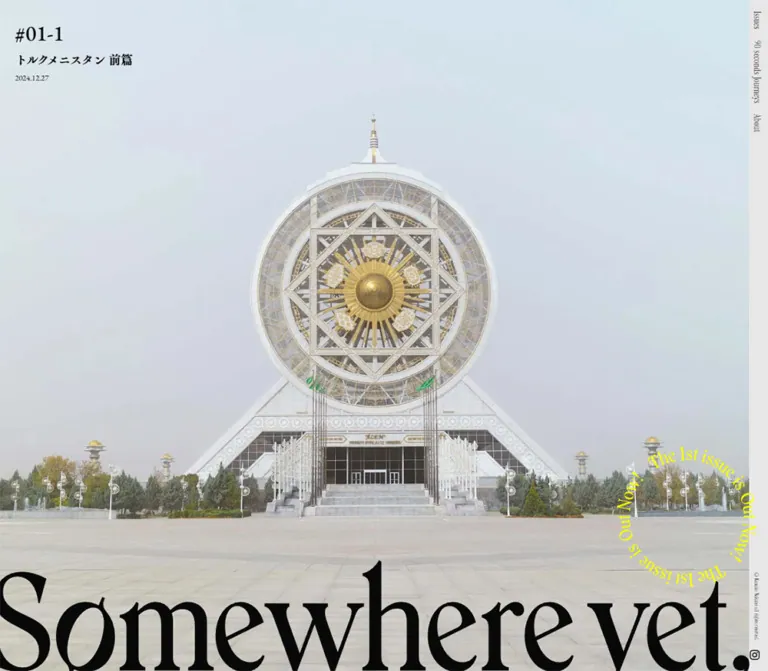
The mobile active entry is #01-1. Its metadata is present at x ≈ 18.53, y = 12, while the photograph is not visible in that capture. The cover area still measures 370.5 × 844px. Preserve the observed geometry when documenting the site, but do not turn an unexplained missing image into a design requirement.
Opening Wordmark and Circular Announcement
Role: brand identity and a small editorial release signal.
On desktop, the black Somewhere yet, lettering stretches across the photograph's lower edge, reaching the viewport boundaries. It functions as a cover masthead rather than an ordinary paragraph heading. In the mobile capture the large lettering wraps or is divided across lines, with Some visible above the beginning of where; part of the composition extends below the viewport.
The circular announcement appears near the lower-right area. Its visible source wording includes The 2nd issue is Out Now!. The estimated outer diameter is about 175–190px on desktop and 140–150px on mobile. Its open center allows the image or gray canvas to remain visible.
A static circle does not establish rotation. Neither rotation timing nor click behavior for this announcement was supplied. A new implementation can use SVG text on a circular path, but that is a recommended construction, not a verified source mechanism.
Updates Grid
Role: recent releases and selected editorial entries immediately after the cover.
The desktop DOM contains three adjacent update links beginning at y = 1040: the quiz announcement and two Botswana issue entries. Each link is approximately 454.17px wide, with about 2.75px between neighboring rectangles. The first begins at x = 72; the final rectangle reaches the viewport's right edge.
The anatomy is a large image region followed by a short bold Latin label, Japanese description or title, and date. The metadata is unboxed and left aligned. Small 8px intervals separate the text roles.
The mobile sample contains four entries in two rows of two, adding a SideTrails entry. Cards begin at x ≈ 31.2 and 212.4, with a 24px gap between rows. The image-area proportions also change: mobile label offsets are consistent with approximately square image regions, although the image elements themselves were not measured separately.
This is a content adaptation as well as a column change. Do not assume the desktop and mobile update inventories are identical.
Issues Archive Strip
Role: direct access to the four issue installments.
The archive is a vertical stack of wide photographic links. Desktop entries measure exactly 1404 × 468px, separated by 4px. Each repeats the issue number, Japanese title, and date near the upper-left corner.
The sampled order is Botswana part two, Botswana part one, Turkmenistan part two, and Turkmenistan part one. The issue number is the most prominent metadata element; the Japanese title remains substantially smaller. Labels sit over the image without a rounded caption panel.
On mobile each entry becomes 370.5 × 267px. The Turkmenistan title is explicitly split before the part label in the archive, while the featured mobile title remains on one line. These contexts have different wrapping rules.
The desktop capture above the quiz promotion shows the lower portion of the architectural photograph used by the final archive entry. The other archive compositions are supported by DOM and asset references, but are not all visible in the supplied screenshots.
Somewhere next Promotion
Role: a distinct invitation to choose travel photographs and enter a separate quiz experience.
A white horizontal band interrupts the gray journal canvas. In the desktop capture its visible height is approximately 417px, with roughly 40px of white space above and below the main content.
The left side is a tightly joined photographic mosaic, visually arranged as four columns by three rows. The images include sea, city, architecture, mountain, bird, snow, and tropical scenes. There are no visible gutters or rounded tile corners.
The right side stacks:
- The large black
Somewhere next,wordmark. - Two lines of Japanese explanatory copy.
- A full-width black link labeled
診断する, with a long white line arrow toward its right edge.
The measured left image link begins at x = 72 and ends at approximately 745.91; the right content begins at x ≈ 784.81, producing a calculated gap of about 38.91px. The right CTA ends at x = 1368, preserving a 72px right margin.
The CTA is a navigation link to https://next.somewhereyet.world/. The image link occupying the mosaic position instead points to a SideTrails article on note.com in both DOM samples. That destination difference should be reviewed when adapting the component; do not assume the entire white band shares one action.
On mobile, the image comes before the copy and CTA. Both image and CTA are 351px wide with a 19.5px left inset. The CTA height drops to approximately 44px, and explanatory copy drops from 25.92px to 13.65px.
SideTrails Entries
Role: related shorter travel writing hosted outside the main journal.
Two large links pair an image region with a compact editorial caption. Each caption contains a bold SideTrails number, a Japanese destination title, and a date. The link destinations are note.com articles about Malacca and Penang.
The desktop rectangles are approximately 680px and 677px wide, beginning at x = 72 and 762.84. The mobile layout retains two columns, with each link approximately 193.83px wide. Mobile captions are inset approximately 15.5px from their card edges and wrap over multiple lines.
Calculated label offsets are consistent with landscape image regions on desktop and square image regions on mobile. This is an inference from surrounding geometry, not a direct intrinsic-image measurement.
90 seconds Journeys Media Entries
Role: entry points into short travel media.
The supplied DOM records two large semantic BUTTON elements in the media region. On desktop they are approximately 985 × 554px, aligned at x = 72, with 32px between them. On mobile they become approximately 351 × 197px, aligned at x = 19.5, with a 24px gap.
The rectangles are approximately 16:9 and have a measured #eeeeee base background. Mobile evidence also includes a background-asset reference whose filename contains 90x90, but the complete URL and its precise visual role are unavailable.
No playback interaction was exercised. Player controls, audio behavior, modal behavior, captions, and autoplay must remain unverified. Empty extracted text does not prove that the buttons lack accessible names, because those attributes were not included in the evidence.
About and Profile
Role: explains the publication and introduces its author.
The original About text identifies the journal as a project by Kanako Nakane, with photographs and writing collected from travel. This is direct homepage evidence for the publication's identity.
On desktop the text column begins at x ≈ 57.61 and measures approximately 635.89px wide. Large English headings separate About, Profile, and Contact. Small Japanese prose has a measured 28.8px line height, creating a relaxed reading rhythm despite a 14.4px font size.
The profile name is presented in Japanese and Latin on one row. The measured gap between the Japanese name and Kanako Nakane is 24px on desktop and 16px on mobile. A short biography follows, then three small social symbols: Instagram, note, and X.
The desktop right side is a looser visual composition: a photograph of an aerial landscape and rainbow, a smaller photograph containing a person beside a bare tree in a desert setting, and large cropped English words including known,, seen,, and been,. The larger visible photograph is approximately 416 × 277px; the lower image is partially clipped by the right edge. These are visual estimates from the capture.
The mobile lower-page capture shows a single 312px text column at x = 39, with no photographs beside it. This does not prove that footer imagery is hidden: the entire mobile footer is taller, and the supplied capture covers its lower portion. Avoid inferring the missing upper arrangement.
Contact, Support, and Closing Wordmark
Role: quiet next steps and a final repetition of the journal identity.
Contact uses the source label お問い合わせはこちらから。 as a simple underlined link to /contact. A separate support link, ご支援いただけますと嬉しいです。, appears farther below. Neither is presented as a filled promotional button.
The support link is separated from the preceding contact link box by a calculated 70px on desktop and approximately 50.63px on mobile. The empty space matters: the two actions read as individual personal invitations.
The page ends with another very large black Somewhere yet, wordmark. It is smaller than the opening desktop masthead but still dominates the closing edge. On mobile it spans almost the full screen width on one line, unlike the opening wordmark's multiline crop.
Tokens — Motion & Interaction
The supplied material establishes link destinations and transition declarations more clearly than it establishes motion sequences.
| Treatment | Evidence | What can safely be stated |
|---|---|---|
| General component transitions | Computed 0.3s cubic-bezier(0.4, 0.4, 0, 1) on many elements |
A shared 300ms transition declaration exists; the changed property and trigger are not established for each component |
| BODY background transition | background 0.5s cubic-bezier(0.4, 0.4, 0, 1) |
Background changes can transition over 500ms; a theme switch was not observed |
| Desktop profile Instagram transition | Same 300ms curve with a 0.5s delay |
A delayed declaration exists; an entrance animation was not visually verified |
| Featured issue sequence | Repeated issue links at horizontal intervals of 1404px desktop and 370.5px mobile | Structure is consistent with a looping horizontal cover sequence; autoplay interval, swipe support, and controls remain unverified |
| Circular announcement | Static circular lettering in captures | Rotation, hover effects, and click target are unknown |
| Navigation | Four homepage anchor URLs and a Contact route | Destinations are known; smooth scrolling and active-link states were not tested |
| Media entries | Two BUTTON elements | A media affordance is present; playback results are unknown |
| Sampled element animations | animation: none on listed elements |
No keyframe animation is reported for those sampled elements; this does not exclude ancestor, pseudo-element, SVG, or script-driven motion |
The capture process waited for finite motion and temporarily paused perpetual animation during readiness checks, then resumed it. Still captures therefore cannot establish a complete motion timeline.
Recommended adaptation: begin with static covers, a static announcement ring, and native links. Add cover sequencing only when its controls, pause behavior, and keyboard operation are specified. Restrict new transitions to named properties instead of copying a broad transition: all pattern.
Surfaces
| Layer | Appearance | Structural role |
|---|---|---|
| Page canvas | Solid #e7e7e7 |
Connects the editorial sections and frames photographs |
| Featured cover | Full-color photograph with black overlaid labels | Main issue entrance |
| Archive strip | Repeated square-edged image fields | Makes the issue collection easy to scan |
| Editorial cards | Transparent caption area on the gray canvas | Keeps updates visually light |
| Quiz promotion | White band | Separates the photograph-selection invitation from the journal archive |
| Quiz CTA | Black rectangle with white label and arrow | Strongest filled action in the pictured interface |
| Media base | Measured pale gray #eeeeee |
Base of media entry buttons; loaded poster appearance unverified |
| Footer | Gray canvas, open text blocks, scattered photographs, large lettering | Personal introduction and closing identity |
The page gains depth through overlap and changes of scale. It does not need a material elevation scale, decorative shadows, or multiple nested panels.
Imagery
Photography is the central content, with several distinct framing strategies:
- Opening cover: an immersive landscape with enough low-detail space for metadata. In the desktop capture, pale sky and distant terrain occupy much of the upper image.
- Archive: broad image strips that retain a recognizable destination while supporting a small text stack.
- Quiz mosaic: a dense assortment of contrasting scenes. Adjacent blue, green, warm architectural, and snowy images make selection feel visual and intuitive.
- Footer: personal travel fragments at different sizes, placed asymmetrically beside text and oversized words.
The supplied captures show natural photographic detail and substantial tonal variation. There is no evidence of a uniform duotone filter, pixelated rendering, or a global dark overlay. Preserve the photographs' individual color relationships.
For a new implementation, provide separate portrait and landscape cover assets where appropriate. The original DOM references different image filenames between desktop and mobile, which supports deliberate asset variation even though the mobile opening image did not appear in its capture.
Observed Asset References
The evidence exposes one complete icon URL and several truncated photographic URLs. Filename dimensions below are identifiers contained in the supplied references, not independently decoded intrinsic sizes.
| Asset role | Available evidence | Practical implication |
|---|---|---|
| Desktop featured photographs | Filename markers include 2400x1539, 1273x816, and 2808x1800 |
Landscape source variants are referenced |
| Mobile featured photographs | Filename markers include 720x1800 |
Separate tall variants are referenced |
| Desktop archive imagery | A filename marker includes 2448x816 |
A panoramic source variant is referenced |
| Mobile archive imagery | Markers include 1224x816, 720x540, and 720x538 |
Archive variants differ from the tall opening assets |
| Instagram symbol | Complete SVG URL below; rendered at 14 × 14px |
A supplied small vector asset is used |
| Wordmarks, footer photographs, and mosaic | Visible in captures; complete asset URLs unavailable | Obtain authorized originals or create clearly separate replacements |
Complete Instagram asset URL recorded in the original rendered page:
https://storage.googleapis.com/studio-design-asset-files/projects/Kwa5L81JqX/s-14x14_5c9e5599-dd10-4056-8a89-d8af10eb65dc.svg
No photographic URL should be reconstructed from a truncated identifier. The stylesheet can reproduce composition and spacing, but exact brand artwork and travel photography require appropriate assets.
Layout & Responsive Behavior
Desktop Composition
The opening cover and archive use 1404px of the 1440px viewport, leaving 36px at the right. The navigation wrapper occupies the final 30px, with a 6px interval between the cover edge and the wrapper's left edge.
Other sections have their own alignment systems. Updates and SideTrails begin at 72px and can extend to the viewport's right edge. The quiz promotion is more balanced, with 72px outer margins and two unequal columns. Media entries occupy only about 985px of the width. The About text begins farther left, at approximately 58px.
These differences are part of the editorial composition. A single centered max-width container would flatten the page's changing rhythm.
Mobile Composition
At 390px wide, the opening and archive links use 370.5px, equivalent to 95% of the viewport. The navigation remains vertical instead of becoming a hamburger menu in the supplied captures.
The responsive transformations are component-specific:
| Component | Desktop | Mobile |
|---|---|---|
| Featured cover | Full-height photograph visible | Full-height geometry retained; main photograph not visible in capture |
| Opening wordmark | Very large single-line composition | Large multiline or segmented composition, cropped by the viewport |
| Updates | Three columns and three sampled entries | Two columns across two rows, with a fourth sampled entry |
| Issues | 3:1 panoramic links |
Taller 370.5 × 267px links |
| Quiz promotion | Mosaic beside copy and CTA | Image before copy and CTA |
| SideTrails | Two wide entries | Two narrower entries retained |
| Media | Approximately 985px wide | 351px wide |
| About / Profile | Text beside a separate visual composition | Single text column in the supplied lower capture |
| Closing wordmark | Large but narrower than the opening masthead | Nearly full-width, single-line closing mark |
Mobile does not mean every dimension shrinks. Update dates increase to 13.65px, the Japanese profile name increases to 15.6px, and social-icon gaps expand from 16px to 36px. About and profile paragraphs also use different mobile line-height ratios: 1.8 and 2 respectively.
Breakpoints and Overflow
The supplied stylesheet excerpt shows a max-width: 1200px rule for conditional line breaks. It does not expose the complete breakpoint system or establish the breakpoint responsible for each layout change. Only the two stated viewports were inspected.
Some content rectangles reach the viewport's right edge while the rail occupies that edge. Decorative lettering is also visibly clipped. For an adaptation, confine deliberate clipping to display artwork and photographs; preserve complete readable text and usable focus indicators. The example's 768px breakpoint is a recommendation.
Do’s and Don’ts
Do
- Keep the neutral
#e7e7e7canvas distinct from the white quiz band. - Let full-color photography occupy substantial areas of the page.
- Preserve the strong scale contrast between display lettering and small issue metadata.
- Use the measured Latin and Japanese font roles where the appropriate fonts are available.
- Retain square corners and the 4px separation between archive images.
- Keep the vertical edge navigation recognizable across viewport sizes.
- Give different editorial sections their own widths and alignments.
- Preserve the black rectangular quiz CTA and its long, restrained arrow.
- Allow Japanese text to wrap by context, including separate cover and archive rules.
- Distinguish the large opening wordmark from the more compact closing wordmark.
- Treat missing mobile imagery and untested motion as evidence limitations.
Don’t
- Do not replace the journal's issue structure with generic feature cards, pricing blocks, or repeated conversion buttons.
- Do not round every photograph or add shadows to create artificial hierarchy.
- Do not assume the wordmark is ordinary Instrument Serif text merely because navigation uses that font.
- Do not use every declared global font or color as an active design token.
- Do not reproduce the mobile gray cover as an intentional permanent image-free layout.
- Do not invent automatic rotation, parallax, swipe gestures, or video autoplay from static captures.
- Do not make every mobile section a single column; updates and SideTrails retain two columns in the evidence.
- Do not force the same crop onto full-height covers, panoramic archives, and mobile image panels.
- Do not place essential copy or keyboard focus underneath decorative lettering or the navigation rail.
- Do not infer website production responsibility from a person's general professional biography or employer link.
Recommended Implementation Additions
These are recommendations for a new implementation, not verified original-site features:
- Provide accessible names for icon links and media buttons, plus visible keyboard focus.
- Keep the rail visually narrow while providing adequate hit areas. If larger hit areas require more space, reserve that space in the content layout or offer an additional accessible navigation presentation.
- Include a skip link and use semantic headings even when visible section titles are supplied as artwork.
- Give decorative repetitions of the wordmark empty alternatives; expose the publication name once as meaningful text.
- Use meaningful image alternatives for editorial photographs. If a photograph is the sole link content, ensure the destination can be understood without seeing it.
- Load the first cover reliably and reserve image dimensions. Use responsive image sources and lazy loading for later photographs.
- Review the promotion mosaic's destination separately from the quiz CTA, since the supplied DOM assigns them different URLs.
- If covers advance automatically, provide pause and previous/next controls, remove duplicated offscreen entries from keyboard navigation, and honor reduced-motion preferences.
- Offer captions and explicit playback controls when implementing the short-travel media section.
- Test navigation overlap, Japanese wrapping, image loading, and text zoom at both inspected widths and at intermediate sizes.
Agent Prompt Guide
Quick Color Reference
- Main canvas:
#e7e7e7. - Display lettering and quiz CTA fill:
#000000. - Reading text and navigation:
#333333. - Promotion surface and reversed CTA text:
#ffffff. - Circular release lettering: approximately
#80bfff; an estimated adaptation value. - Photograph colors remain inside imagery rather than defining additional interface themes.
Overall Prompt
“Create an editorial travel photo journal inspired by the current Somewhere yet homepage. Use a flat light-gray canvas, full-color destination photography, square image edges, small dated issue metadata, and exceptionally large black serif brand lettering near the opening and closing edges. Add a narrow right-side navigation rail with downward-reading Latin labels and a small copyright and social icon near its bottom. Alternate compact updates, panoramic issue links, a white photo-mosaic promotion with a black rectangular CTA, paired shorter stories, large media entries, and a spacious author introduction. Use EB Garamond for issue numbers and editorial labels, Instrument Serif for small Latin navigation, and an appropriate Japanese Mincho face for prose. Treat brand artwork separately from ordinary type. Keep any unspecified motion static.”
Example Component Prompts
- Featured issue: “Build a viewport-height photographic cover with a 28px left and 20px top metadata inset at 1440px. Stack a 40.32px EB Garamond issue number, a 23.04px Japanese Mincho title, and a 14.4px date. Place oversized black brand artwork along the lower edge and a small pale-blue circular release announcement toward the right. Keep the navigation rail outside the main photographic width.”
- Issue archive: “Create four square-edged photographic issue links in one vertical stack. At desktop, use 3:1 panels separated by 4px, with issue information at the upper left. At 390px, use panels around 370.5 × 267px and reduce the issue number to 23.4px. Allow the Japanese installment label to break onto its own line.”
- Quiz promotion: “Design a white editorial band with a gapless four-by-three photo mosaic on the left and a large serif promotion mark, two lines of Japanese copy, and a black rectangular link on the right. Use the label ‘診断する’ and a long white line arrow. Stack the image above the text on mobile and keep the CTA approximately 44px high.”
- Author section: “Place small, generously led Japanese prose under large English About, Profile, and Contact headings on a gray canvas. Pair Japanese and Latin name labels, followed by three tiny social symbols. On desktop, arrange two travel photographs and cropped oversized English words to the right. Keep the mobile reading column clear and about 312px wide at a 390px viewport.”
- Responsive review: “Check the implementation at 1440 × 1000 and 390 × 844. Preserve two-column mobile updates and shorter-story entries, stack the quiz promotion, use taller archive crops, and keep the vertical navigation reachable. Report missing image states separately from intended responsive behavior.”
Quick Start
CSS Custom Properties
This CSS uses measured colors and sampled type sizes, with recommended fluid interpolation, font fallbacks, and a 768px breakpoint. It is an implementation starting point, not the original stylesheet. Load the named fonts through an authorized source; the Japanese family strings below quote measured source names. Brand sizes are approximations for text fallbacks and should be replaced by authorized artwork for closer correspondence.
:root {
  /* Measured colors, except the estimated announcement blue. */
  --color-canvas: #e7e7e7;
  --color-ink: #000;
  --color-copy: #333;
  --color-white: #fff;
  --color-announcement: #80bfff;
  --color-media-base: #eee;

  /* Observed families with recommended generic fallbacks. */
  --font-latin: 'Instrument Serif', serif;
  --font-index: 'EB Garamond', serif;
  --font-jp: '石井明朝オールドスタイルかな M', serif;
  --font-jp-regular: '石井明朝オールドスタイルかな R', serif;
  --font-jp-title: '石井明朝オールドスタイルかな B', serif;

  /* Recommended interpolation: matches the desktop sample at 1440px. */
  --text-nav: clamp(12.48px, 1.1vw, 18px);
  --text-issue: clamp(23.4px, 2.8vw, 56px);
  --text-issue-title: clamp(15.6px, 1.6vw, 30px);
  --text-date: clamp(11.7px, 1vw, 18px);
  --text-body: clamp(13.65px, 1vw, 18px);
  --text-card-date: clamp(11.952px, .83vw, 15px);
  --text-promo: clamp(13.65px, 1.8vw, 32px);
  --text-cta: clamp(15.6px, 2vw, 36px);

  --rail-width: 30px;
  --edge-reserve: max(36px, 2.5vw);
  --editorial-inset: 5vw;
  --section-space: clamp(100px, 16.667vw, 240px);
  --rule: 1px;
  --radius: 0;

  /* Source transition timing; property selection below is recommended. */
  --ease-editorial: cubic-bezier(.4, .4, 0, 1);
  --duration-ui: 300ms;
  --duration-background: 500ms;
}

* { box-sizing: border-box; }

body {
  margin: 0;
  color: var(--color-copy);
  background: var(--color-canvas);
  font-family: var(--font-jp);
  font-size: var(--text-body);
  line-height: 2;
}

a { color: inherit; }
img { display: block; max-width: 100%; }
button { font: inherit; }

:where(a, button):focus-visible {
  outline: 2px solid currentColor;
  outline-offset: 4px;
}

/* Persistent rail: transparent, as measured on its source wrapper. */
.side-rail {
  position: fixed;
  z-index: 20;
  inset: 0 0 0 auto;
  width: var(--rail-width);
  height: 100dvh;
  display: flex;
  flex-direction: column;
  align-items: center;
  padding-block: 16px max(16px, env(safe-area-inset-bottom));
  color: var(--color-copy);
}

.side-rail nav {
  display: flex;
  flex-direction: column;
  align-items: center;
  gap: 16px;
}

.side-rail nav a {
  writing-mode: vertical-rl;
  text-orientation: mixed;
  font-family: var(--font-latin);
  font-size: var(--text-nav);
  line-height: 1;
  letter-spacing: .02em;
  text-decoration: none;
}

.rail-bottom {
  margin-top: auto;
  display: flex;
  flex-direction: column;
  align-items: center;
  gap: 14px;
}

.rail-copyright {
  margin: 0;
  writing-mode: vertical-rl;
  font: 400 9.36px / 1.4 var(--font-latin);
}

.rail-social img { width: 14px; height: 14px; }

.cover {
  position: relative;
  isolation: isolate;
  width: calc(100% - var(--edge-reserve));
  min-height: 100svh;
  overflow: clip;
  color: var(--color-ink);
  background: var(--color-canvas);
}

.cover-link {
  position: absolute;
  inset: 0;
  display: block;
}

.cover-link img,
.issue-link > img {
  width: 100%;
  height: 100%;
  object-fit: cover;
  object-position: var(--photo-position, center);
}

.cover-link:focus-visible {
  outline-offset: -6px;
}

.cover-meta {
  position: absolute;
  z-index: 2;
  top: 20px;
  left: 28px;
  max-width: calc(100% - 56px);
  pointer-events: none;
}

.issue-number {
  margin: 0;
  font: 500 var(--text-issue) / 1.5 var(--font-index);
}

.issue-title {
  margin: 4px 0 10px;
  font: 400 var(--text-issue-title) / 1.4 var(--font-jp-title);
  letter-spacing: -.05em;
}

.issue-date {
  margin: 0;
  font: 400 var(--text-date) / 1 var(--font-index);
}

/* Text approximation only: this is not a verified wordmark font. */
.brand-fallback {
  position: absolute;
  z-index: 3;
  left: -.02em;
  bottom: -.06em;
  margin: 0;
  font: 400 20vw / .84 var(--font-latin);
  letter-spacing: -.055em;
  white-space: nowrap;
  pointer-events: none;
}

.release-ring {
  position: absolute;
  z-index: 4;
  right: 0;
  bottom: 13vh;
  width: 180px;
  aspect-ratio: 1;
  color: var(--color-announcement);
  pointer-events: none;
}

.release-ring svg { display: block; width: 100%; height: 100%; }
.release-ring text { fill: currentColor; font-family: var(--font-latin); }

/* Recommended containment keeps functional cards clear of the rail. */
.update-grid,
.sidetrail-grid {
  display: grid;
  gap: 24px 4px;
  margin: 40px var(--edge-reserve) var(--section-space)
    var(--editorial-inset);
}

.update-grid { grid-template-columns: repeat(3, minmax(0, 1fr)); }
.sidetrail-grid { grid-template-columns: repeat(2, minmax(0, 1fr)); }

.editorial-card { min-width: 0; text-decoration: none; }
.editorial-card > img { width: 100%; aspect-ratio: 3 / 2; object-fit: cover; }
.editorial-card .card-copy { margin-top: 16px; }
.card-label { margin: 0; font: 800 var(--text-body) / 1 var(--font-index); }
.card-title { margin: 8px 0; font-size: var(--text-body); line-height: 2; }
.card-date { font: 400 var(--text-card-date) / 1 var(--font-index); }

.issue-list {
  width: calc(100% - var(--edge-reserve));
  display: grid;
  gap: 4px;
}

.issue-link {
  position: relative;
  display: block;
  aspect-ratio: 3 / 1;
  color: var(--color-copy);
  text-decoration: none;
}

.issue-link .cover-meta { top: 19px; left: 2%; }
.issue-link .issue-number { font-weight: 600; line-height: 1.4; }
.issue-link .issue-title { margin: 2px 0 8px; font-weight: 600; }
.issue-link .issue-date { font-family: var(--font-jp-regular); line-height: 1.4; }

.quiz-band {
  margin-block: 180px;
  padding: 40px 5vw;
  background: var(--color-white);
}

.quiz-inner {
  display: grid;
  grid-template-columns: minmax(0, 52fr) minmax(0, 45fr);
  gap: 3%;
  align-items: end;
}

.quiz-image { width: 100%; aspect-ratio: 2 / 1; object-fit: cover; }

.quiz-brand {
  margin: 0 0 24px;
  color: var(--color-ink);
  font: 400 clamp(40px, 6.5vw, 110px) / 1 var(--font-latin);
  letter-spacing: -.04em;
}

.quiz-copy { margin: 0; font-size: var(--text-promo); line-height: 1.8; }

.quiz-cta {
  display: flex;
  align-items: center;
  justify-content: space-between;
  gap: 24px;
  margin-top: 32px;
  padding: 8px 24px;
  background: var(--color-ink);
  color: var(--color-white);
  font-size: var(--text-cta);
  line-height: 2;
  letter-spacing: .05em;
  text-decoration: none;
}

.cta-arrow {
  position: relative;
  flex: 0 0 clamp(48px, 7.5vw, 108px);
  border-top: 2px solid currentColor;
}

.cta-arrow::after {
  content: '';
  position: absolute;
  right: 0;
  top: -2px;
  width: 20px;
  border-top: 2px solid currentColor;
  transform: rotate(45deg);
  transform-origin: right center;
}

.media-list {
  display: grid;
  gap: 32px;
  width: min(68.4vw, calc(100% - 10vw));
  margin: var(--section-space) 0 var(--section-space) 5vw;
}

.media-entry {
  display: block;
  width: 100%;
  aspect-ratio: 16 / 9;
  padding: 0;
  border: 0;
  border-radius: 0;
  background: var(--color-media-base);
  cursor: pointer;
}

.about-layout {
  display: grid;
  grid-template-columns: minmax(0, 636px) minmax(0, 1fr);
  gap: 8vw;
  padding-inline: 4vw var(--edge-reserve);
}

.about-copy h2 {
  margin: 0 0 20px;
  color: var(--color-ink);
  font: 400 clamp(24px, 2.7vw, 40px) / 1 var(--font-latin);
}

.about-copy p { margin: 0; letter-spacing: .05em; }
.about-block + .about-block { margin-top: 70px; }
.profile-name { display: flex; align-items: baseline; gap: 24px; margin-bottom: 16px; }
.profile-name .latin { font: 400 var(--text-body) / 1 var(--font-latin); }
.profile-copy { font-family: var(--font-jp-regular); }
.social-links { display: flex; gap: 16px; margin-top: 16px; }
.social-links img { height: 14px; width: auto; }
.text-link { text-underline-offset: 8px; text-decoration-thickness: 1px; }
.support-link { display: inline-block; margin-top: 70px; }

/* Artwork arrangement is project-specific; keep it outside reading text. */
.about-art { position: relative; min-height: 600px; }
.about-art img { width: 75%; margin: 160px 0 0 auto; }
.about-art img + img { width: 48%; margin-top: 32px; }

.closing-brand {
  margin: 100px 0 0;
  overflow: clip;
  color: var(--color-ink);
  font: 400 13vw / .9 var(--font-latin);
  letter-spacing: -.055em;
  white-space: nowrap;
}

@media (max-width: 768px) {
  :root {
    --rail-width: 4vw;
    --edge-reserve: 5vw;
    --text-nav: 12.48px;
    --text-issue: 23.4px;
    --text-issue-title: 15.6px;
    --text-date: 11.7px;
    --text-body: 13.65px;
    --text-card-date: 13.65px;
    --text-promo: 13.65px;
    --text-cta: 15.6px;
    --section-space: 150px;
  }

  .rail-copyright { font-size: 9.75px; }
  .rail-bottom { gap: 6px; }
  .cover-meta { top: 12px; left: 5%; max-width: 90%; }
  .brand-fallback { top: 80svh; bottom: auto; font-size: 33vw; }
  .brand-fallback span { display: block; }
  .release-ring { width: 145px; bottom: 30px; }

  .update-grid { grid-template-columns: repeat(2, minmax(0, 1fr)); }
  .update-grid { margin-left: 8vw; }
  .sidetrail-grid { margin-left: 0; }
  .editorial-card > img { aspect-ratio: 1; }
  .card-title { line-height: 1.5; }

  .issue-link { aspect-ratio: auto; min-height: 267px; }
  .issue-link > img { position: absolute; inset: 0; }
  .issue-link .cover-meta { top: 8px; left: 4%; }
  .issue-link .issue-title { margin-bottom: 4px; }
  .issue-link .issue-part { display: block; }

  .quiz-band { margin-block: 140px; padding: 32px 5vw; }
  .quiz-inner { grid-template-columns: 1fr; gap: 24px; }
  .quiz-image { aspect-ratio: 351 / 196; }
  .quiz-brand { margin-bottom: 20px; }
  .quiz-cta { margin-top: 16px; padding: 8px 16px; line-height: 1.8; }

  .media-list { width: 90vw; gap: 24px; }
  .about-layout { display: flex; flex-direction: column; padding-inline: 10vw; }
  .about-art { order: -1; min-height: 0; }
  .about-art img { margin-top: 0; }
  .about-copy { line-height: 1.8; }
  .profile-copy { font-family: var(--font-jp); line-height: 2; }
  .profile-name { gap: 16px; }
  .profile-name .japanese { font-size: 15.6px; letter-spacing: .1em; }
  .social-links { gap: 36px; }
  .support-link { margin-top: 50px; }
  .closing-brand { margin-top: 135px; font-size: 17vw; }
}

/* Optional adaptation: reserve more room for larger navigation targets. */
@media (pointer: coarse) {
  body.comfortable-navigation { --edge-reserve: 44px; --rail-width: 44px; }
  .comfortable-navigation .side-rail nav a {
    min-width: 44px;
    min-height: 44px;
    display: flex;
    align-items: center;
    justify-content: center;
  }
}

@media (prefers-reduced-motion: no-preference) {
  .quiz-cta {
    transition: background-color var(--duration-ui) var(--ease-editorial);
  }
}

@media (hover: hover) {
  /* Recommended feedback, not an observed original hover state. */
  .quiz-cta:hover { background-color: var(--color-copy); }
  .side-rail nav a:hover { text-decoration: underline; }
}
The optional comfortable-navigation class deliberately increases the rail's footprint. The default rail sizing follows the visual reference more closely but should be evaluated for touch use.
Minimal Component Markup
The asset paths here are integration placeholders, not URLs recovered from the original page. Replace them with authorized photography and brand artwork. The cover uses a plain-text brand approximation, and the circular lettering remains static.
<section class='cover' aria-labelledby='journal-title'>
  <a class='cover-link' href='/01_turkmenistan_2'
     aria-label='Read issue 01-2: Turkmenistan, part two'>
    <picture>
      <source media='(max-width: 768px)'
              srcset='/assets/travel-cover-portrait.webp'>
      <img src='/assets/travel-cover-landscape.webp'
           alt='Pale rock formations beneath a wide blue sky'
           fetchpriority='high'>
    </picture>
  </a>

  <div class='cover-meta'>
    <p class='issue-number'>#01-2</p>
    <p class='issue-title' lang='ja'>トルクメニスタン旅行記 後篇</p>
    <p class='issue-date'><time datetime='2024-12-27'>2024.12.27</time></p>
  </div>

  <h1 id='journal-title' class='brand-fallback'>
    <span>Some</span><span>where yet,</span>
  </h1>

  <div class='release-ring' role='img' aria-label='The second issue is out now'>
    <svg viewBox='0 0 200 200' aria-hidden='true'>
      <defs>
        <path id='release-circle'
              d='M100 20a80 80 0 1 1 0 160a80 80 0 1 1 0-160'/>
      </defs>
      <text font-size='21'>
        <textPath href='#release-circle' textLength='503' lengthAdjust='spacing'>
          The 2nd issue is Out Now! The 2nd issue is Out Now!
        </textPath>
      </text>
    </svg>
  </div>
</section>

<section class='quiz-band' aria-labelledby='quiz-heading'>
  <div class='quiz-inner'>
    <img class='quiz-image' src='/assets/travel-mosaic.webp'
         alt='A mosaic of cities, mountains, wildlife, and coastlines'
         loading='lazy'>
    <div>
      <h2 id='quiz-heading' class='quiz-brand'>Somewhere next,</h2>
      <p class='quiz-copy' lang='ja'>
        「好き」な写真を選ぶだけ。<br>
        言葉にできない「好き」から出会う、直感の旅診断。
      </p>
      <a class='quiz-cta' href='https://next.somewhereyet.world/' lang='ja'>
        <span>診断する</span>
        <span class='cta-arrow' aria-hidden='true'></span>
      </a>
    </div>
  </div>
</section>
The mosaic is intentionally noninteractive in this example until its destination is specified. Media playback and cover sequencing need separate functional implementation; this CSS does not imply either behavior.
Tailwind v4 Token Mapping
Optional aliases for a project already using Tailwind v4. This is not evidence that the original site uses Tailwind. Define the custom properties above first.
@theme inline {
  --color-journal: var(--color-canvas);
  --color-editorial-ink: var(--color-ink);
  --color-editorial-copy: var(--color-copy);
  --color-release: var(--color-announcement);
  --color-promotion: var(--color-white);

  --font-editorial: var(--font-latin);
  --font-metadata: var(--font-index);
  --font-reading: var(--font-jp);

  --text-navigation: var(--text-nav);
  --text-issue-number: var(--text-issue);
  --text-issue-heading: var(--text-issue-title);
  --text-journal-body: var(--text-body);
  --text-promotion-copy: var(--text-promo);
  --text-promotion-action: var(--text-cta);

  --spacing-editorial: var(--editorial-inset);
  --spacing-section: var(--section-space);
  --radius-editorial: 0px;
}
Sources & Evidence
- Inspected original and final page: Somewhere yet. The supplied observation reports HTTP
200and identical original/final URLs. - Capture session: supplied retrieval timestamp
2026-09-12T19:40:39.094Z, corresponding to September 13, 2026, in Japan. Separate timestamps for individual screenshots were not supplied. - Desktop evidence: 1440 × 1000 CSS px; opening issue cover, middle-page quiz promotion and adjacent archive image, and lower About/Profile/Contact composition. Rendered document height approximately 7663.42px.
- Mobile evidence: 390 × 844 CSS px; opening cover state and lower About/Profile/Contact composition. Rendered document height 6123px.
- Rendered DOM and computed styles: supplied measurements for navigation, cover entries, update links, issue strips, quiz CTA, SideTrails links, media buttons, and footer text. These establish the numeric tokens and link destinations used above.
- Original-page identity: the rendered About section identifies Kanako Nakane as the person behind the journal; the rail includes the same name in its copyright.
- Observed navigation scope: homepage anchors and destination URLs were recorded. No supplied evidence establishes completed clicks, hover states, keyboard behavior, media playback, or the separate quiz flow.
- Inspection limitations: the readiness process included document-load, finite-motion, layout-stability, and image-decoding waits within stated time limits. These checks do not establish semantic completeness. SharedWorkers and service workers were disabled. The mobile opening photograph is absent from its capture despite image references in the DOM. Some photographic URLs are truncated, and several display elements lack computed typography samples.
This reference describes the current homepage represented by the supplied original-page captures and rendered evidence. Estimated display sizes, the announcement-blue approximation, and the reusable CSS are explicitly adaptations. No additional browsing or file access was used to produce the reference.
# Somewhere yet — Style Reference

> A travel photo journal with the scale of a magazine cover and the quiet margins of a personal notebook.

**Website:** [somewhereyet.world](https://somewhereyet.world/)
**Original URL:** https://somewhereyet.world/
**Final URL:** https://somewhereyet.world/
**Theme:** light gray canvas, black display lettering, charcoal reading text, full-color photography, and a pale blue circular announcement.
**Inspected:** September 13, 2026, Japan Standard Time. Supplied retrieval timestamp: September 12, 2026, at 19:40:39.094 UTC, equivalent to September 13 at 04:40:39.094 JST.
**Viewports:** desktop **1440 × 1000 CSS px**; mobile **390 × 844 CSS px**.
**Scope:** the current homepage: featured issue cover, updates, Issues archive, Somewhere next promotion, SideTrails links, media entry buttons, About, Profile, Contact, and closing wordmark. Visual evidence consists of three desktop captures and two mobile captures, supplemented by rendered DOM measurements across the homepage. Linked articles, the separate quiz experience, contact form, and media playback were not inspected.

Somewhere yet presents travel as a sequence of photographs and dated observations. The homepage opens with an almost full-width photograph, small issue information in its upper-left corner, and an exceptionally large black wordmark crossing the lower edge. A narrow vertical navigation rail stays at the right edge across the supplied scroll captures. The interface leaves most of the visual work to the photographs and typography.

Below the opening cover, the page changes rhythm several times: compact editorial updates, panoramic issue links, a white photo-selection promotion, paired SideTrails entries, large media rectangles, and a spacious personal introduction. The page is a journal index with several reading paths. Its strongest reusable qualities are the contrast between tiny metadata and monumental lettering, the persistent edge navigation, and the alternation between dense photographs and open gray space.

## How to Read This Reference

- **Measured** means a value supplied in the rendered DOM or computed-style evidence. Measurements are CSS pixels unless stated otherwise.
- **Calculated** means arithmetic applied to those measurements, such as aspect ratios, gaps, or viewport percentages. A matching percentage does not establish the original CSS formula.
- **Visual estimate** means an approximate reading of the current desktop or mobile capture. Estimated lettering bounds are not computed font sizes.
- **Recommended** means an implementation choice for a new project. The CSS and prompts below are adaptations, not recovered source code.
- Token names are descriptive aliases. Original custom properties are identified explicitly where relevant.
- Element samples include offscreen repeated cover entries. Negative horizontal coordinates describe neighboring entries, not a page whose visible content begins thousands of pixels outside the viewport.
- The mobile opening capture shows metadata, branding, and the announcement ring over gray, without a visible main photograph. The evidence does not establish whether this was caused by asset loading, visibility logic, or another rendering condition.

## Tokens — Colors

### Default Palette

| Name | Value | Suggested token | Role and evidence |
| --- | --- | --- | --- |
| Journal Gray | `#e7e7e7` | `--color-canvas` | Measured BODY background at both viewports; the dominant exposed canvas |
| Cover Black | `#000000` | `--color-ink` | Measured featured-issue text and quiz CTA fill; visually consistent with the large wordmarks |
| Reading Charcoal | `#333333` | `--color-copy` | Measured navigation, updates, issue-list text, and footer copy |
| Paper White | `#ffffff` | `--color-white` | Measured CTA lettering; the promotion band also appears white in the desktop capture |
| Announcement Blue | approximately `#80bfff` | `--color-announcement` | Visual estimate of the circular issue announcement in current desktop and mobile captures; exact source color was not supplied |
| Media Base | `#eeeeee` | `--color-media-base` | Measured background of the two media buttons; this does not establish the appearance of loaded poster imagery |

The gray is neutral and flat. The desert photograph contributes pale stone, peach, and sky blue; other photographs supply stronger greens, turquoise, and darker blues. These image colors should remain photographic content rather than becoming additional UI categories or button colors.

### Declared Values Without a Verified Visible Role

The original custom-property set also includes `#272727`, `#ababab`, and `linear-gradient(135deg, #dcf2fbff, #ddd8d6ff)`. Their application to the pictured components was not established. Do not substitute that gradient for the measured solid BODY background.

The loading-related declarations include `#e5e5e5` and `#222`. They are not evidence that the settled homepage uses a separate loading-colored surface system. No theme selector or alternate color mode was verified.

## Tokens — Typography

### Instrument Serif — Confirmed Latin Navigation and Profile Name

**Measured family:** `Instrument Serif`, weight `400`.

It appears on the vertical navigation labels, copyright, and the Latin profile name. Its narrow proportions and high stroke contrast allow a long label such as `90 seconds Journeys` to occupy very little horizontal space when turned vertically.

The large brand lettering, promotion title, and About headings have a related editorial character, but their computed font families are absent from the supplied element sample. Their exact construction may involve artwork or other elements. Do not assign a confirmed font to them based on resemblance alone.

### EB Garamond — Issue Numbers and Editorial Metadata

**Measured family:** `EB Garamond`.

Use it to understand the numerals and small editorial labels:

- Featured issue numbers use weight `500`.
- Issue-list numbers use weight `600`.
- Update and SideTrails labels use weight `800`.
- Featured-cover dates and small card dates use weight `400`.

This gives dates and issue references a literary tone without making them compete with the photography.

### Japanese Mincho — Titles and Reading Text

The measured source families include:

- `石井明朝オールドスタイルかな B`: featured and archive issue titles.
- `石井明朝オールドスタイルかな M`: update descriptions, About text, quiz copy, and CTA text.
- `石井明朝オールドスタイルかな R`: desktop profile prose and archive dates.

The mobile profile prose is measured in the M family rather than the desktop R family. The face names and CSS numeric weights are separate facts: the featured title uses the B family at computed weight `400`, while archive titles use the same family at `600`.

Other font names appear in global custom properties, but a declaration alone does not prove use in the inspected components. The generic `sans-serif` values on link wrappers also do not describe the typography of their nested text.

### Type Scale

All values in this table are measured unless marked as visual estimates.

| Role | Desktop size / line height | Mobile size / line height | Weight and tracking |
| --- | --- | --- | --- |
| Vertical navigation | `15.84 / 15.84px` | `12.48 / 12.48px` | Instrument Serif `400`; `0.02em` |
| Rail copyright | `9.36 / 13.104px` | `9.75 / 13.65px` | Instrument Serif `400`; normal tracking |
| Featured issue number | `40.32 / 60.48px` | `23.4 / 35.1px` | EB Garamond `500` |
| Featured Japanese title | `23.04 / 32.256px` | `15.6 / 21.84px` | B family `400`; `-0.05em` |
| Featured date | `14.4 / 14.4px` | `11.7 / 11.7px` | EB Garamond `400` |
| Archive issue number | `40.32 / 56.448px` | `23.4 / 32.76px` | EB Garamond `600` |
| Archive Japanese title | `23.04 / 32.256px` | `15.6 / 21.84px` | B family `600`; `-0.05em` |
| Archive date | `14.4 / 20.16px` | `11.7 / 16.38px` | R family `500` |
| Update / SideTrails label | `14.4 / 14.4px` | `13.65 / 13.65px` | EB Garamond `800` |
| Update / SideTrails copy | `14.4 / 28.8px` | `13.65 / 20.475px` | M family `400` |
| Update / SideTrails date | `11.952 / 11.952px` | `13.65 / 13.65px` | EB Garamond `400` |
| Quiz explanatory copy | `25.92 / 46.656px` | `13.65 / 24.57px` | M family `400` |
| Quiz CTA label | `28.8 / 57.6px` | `15.6 / 28.08px` | M family `400`; `0.05em` |
| About prose | `14.4 / 28.8px` | `13.65 / 24.57px` | M family `400`; `0.05em` |
| Profile prose | `14.4 / 28.8px` | `13.65 / 27.3px` | R on desktop, M on mobile; `0.05em` |
| Japanese profile name | `14.4 / 28.8px` | `15.6 / 18.72px` | M family `400`; `0.05em` desktop, `0.1em` mobile |
| Latin profile name | `14.4 / 14.4px` | `13.65 / 13.65px` | Instrument Serif `400` |
| About / Profile / Contact headings | Approximately `36–40px` | Approximately `22–24px` | Visual estimates; exact family and line height unverified |

**Display lettering:** the desktop opening wordmark has roughly 210–225px of visible vertical ink near the viewport bottom. The footer wordmark has roughly 140px of visible ink on desktop and around 50px on mobile. These describe screenshot appearance, not CSS font sizes. The diagonal stroke in the first rounded lowercase letter and the final comma are distinctive brand details.

The evidence does not support a single proportional scaling rule. For example, update dates become larger on mobile while issue numbers become smaller. The root remains a measured `16px`; there is no evidence of an unusually scaled root unit.

## Tokens — Spacing & Shapes

The geometry combines very narrow internal gaps with substantial spacing between content groups. Corners remain square. The circular announcement is formed by lettering around an open center rather than a filled badge.

### Spacing Scale

| Use | Desktop | Mobile | Evidence |
| --- | --- | --- | --- |
| Featured metadata top inset | `20px` | `12px` | Measured text-box coordinates |
| Featured metadata left inset | `28px` | `18.531px` | Measured |
| Featured number-to-title gap | `4px` | `4px` | Calculated between line boxes |
| Featured title-to-date gap | `10px` | `10px` | Calculated |
| Archive metadata top inset | `19px` | `8px` | Calculated relative to issue link |
| Archive metadata left inset | `28.094px` | `14.813px` | Measured relative to issue link |
| Archive row separation | `4px` | `4px` | Calculated from consecutive rectangles |
| Navigation start / link separation | `16px` / `16px` | `16px` / `16px` | Measured start, calculated gaps |
| Small card metadata gaps | `8px` | `8px` | Calculated between label, copy, and date |
| Quiz CTA padding | `8px 24px` | `8px 16px` | Measured |
| Quiz copy-to-CTA gap | `32px` | `16px` | Calculated |
| Media entry separation | `32px` | `24px` | Calculated |
| Main editorial left inset | `72px` | Varies by section | Measured; desktop equals `5vw` at this viewport |
| About text left inset | `57.609px` | `39px` | Measured; approximately `4vw` and `10vw` respectively |
| Profile icon horizontal gap | `16px` | `36px` | Calculated between icon rectangles |

Several desktop content groups are separated by 240px between their measured content boxes. These intervals can include section lettering, so they should not automatically be reproduced as 240px of empty padding.

### Border Radius and Edges

| Element | Treatment |
| --- | --- |
| Cover and archive links | Measured `0px` radius |
| Update and SideTrails links | Measured `0px` radius |
| Quiz CTA | Measured `0px` radius; solid black rectangle |
| Media buttons | Measured `0px` radius |
| Contact and support links | Visually thin underlines; approximately `1px` |
| Announcement | Open circular text arrangement; no visible filled disc |

There is no visible general shadow or elevated-card system in the supplied captures. Photograph boundaries, spacing, type scale, and the white promotion band provide the hierarchy.

### Layout Measurements

| Element | Desktop | Mobile | Interpretation |
| --- | --- | --- | --- |
| Document height | `7663.422px` | `6123px` | Measured rendered document |
| Featured cover link | `1404 × 1000px` | `370.5 × 844px` | Full viewport height at both samples |
| Cover width as viewport share | `97.5%` | `95%` | Calculated equivalents, not recovered CSS |
| Right-side header | `30 × 1000px`, x = `1410` | `15.594 × 844px`, x = `374.406` | Measured wrapper; some children extend beyond its left edge |
| Archive issue link | `1404 × 468px` | `370.5 × 267px` | Desktop ratio exactly `3:1`; mobile approximately `1.388:1` |
| Update card width | `454.172px` | `177.594px` | Three columns in desktop sample; two columns in mobile sample |
| Quiz image link | `673.906 × 336.953px` | `351 × 196px` | Desktop exactly `2:1`; mobile approximately `1.791:1` |
| Quiz CTA | `583.188 × 73.594px` | `351 × 44.063px` | Fluid width and reduced mobile height |
| First media button | `984.953 × 554.422px` | `351 × 197.563px` | Approximately `16:9` |
| About text width | `635.891px` | `312px` | Mobile equals `80vw` at the sampled width |
| Footer region | `1440 × 1063.203px` | `390 × 1423.625px` | Mobile footer is taller despite the shorter page |
| Closing SECTION box | `1440 × 163.203px` | `390 × 64.953px` | Measured final section; not a font-size measurement |

## Components

### Persistent Right-Side Navigation

**Role:** a compact index that leaves the photographic field almost uninterrupted.

The right edge contains five links in order: `Issues`, `SideTrails`, `90 seconds Journeys`, `About`, and `Contact`. The first four reference homepage anchors; Contact points to `/contact`. Each Latin label reads downward along the rail, with rotated letterforms rather than upright characters stacked one per line.

Place the copyright and Instagram icon near the bottom of the same rail. The Instagram artwork is measured at `14 × 14px` on both viewports. In the initial desktop sample it sits at y = `970`; on mobile it sits at y = `814`, leaving 16px beneath it in both cases.

The rail occupies the same viewport-relative position in the supplied opening and lower-page captures. Fixed positioning is a reasonable implementation inference, though the supplied computed-style fields do not include `position`. Its header wrapper has a transparent background; the gray visible behind it should not be misreported as a measured opaque header fill.

### Featured Issue Cover

**Role:** the homepage's main entrance into a travel issue.

The active desktop entry is `#01-2`, with the source title `トルクメニスタン旅行記 後篇` and date `2024.12.27`. The photograph spans 1404px of the 1440px viewport and fills the viewport height. It shows a broad, pale landscape with a blue sky and layered rock formations. The extensive low-detail sky gives the black metadata a quiet, readable setting.

The component has three visual layers:

1. A full-area photographic link to the issue.
2. An upper-left stack of issue number, Japanese title, and date.
3. A large lower-edge wordmark with a pale blue circular announcement nearby.

The measured photographic link has `88px` bottom padding. The evidence does not establish that this value positions the wordmark; treat it as a property of the link wrapper.

The mobile active entry is `#01-1`. Its metadata is present at x ≈ `18.53`, y = `12`, while the photograph is not visible in that capture. The cover area still measures `370.5 × 844px`. Preserve the observed geometry when documenting the site, but do not turn an unexplained missing image into a design requirement.

### Opening Wordmark and Circular Announcement

**Role:** brand identity and a small editorial release signal.

On desktop, the black `Somewhere yet,` lettering stretches across the photograph's lower edge, reaching the viewport boundaries. It functions as a cover masthead rather than an ordinary paragraph heading. In the mobile capture the large lettering wraps or is divided across lines, with `Some` visible above the beginning of `where`; part of the composition extends below the viewport.

The circular announcement appears near the lower-right area. Its visible source wording includes `The 2nd issue is Out Now!`. The estimated outer diameter is about 175–190px on desktop and 140–150px on mobile. Its open center allows the image or gray canvas to remain visible.

A static circle does not establish rotation. Neither rotation timing nor click behavior for this announcement was supplied. A new implementation can use SVG text on a circular path, but that is a recommended construction, not a verified source mechanism.

### Updates Grid

**Role:** recent releases and selected editorial entries immediately after the cover.

The desktop DOM contains three adjacent update links beginning at y = `1040`: the quiz announcement and two Botswana issue entries. Each link is approximately `454.17px` wide, with about `2.75px` between neighboring rectangles. The first begins at x = `72`; the final rectangle reaches the viewport's right edge.

The anatomy is a large image region followed by a short bold Latin label, Japanese description or title, and date. The metadata is unboxed and left aligned. Small 8px intervals separate the text roles.

The mobile sample contains four entries in two rows of two, adding a SideTrails entry. Cards begin at x ≈ `31.2` and `212.4`, with a 24px gap between rows. The image-area proportions also change: mobile label offsets are consistent with approximately square image regions, although the image elements themselves were not measured separately.

This is a content adaptation as well as a column change. Do not assume the desktop and mobile update inventories are identical.

### Issues Archive Strip

**Role:** direct access to the four issue installments.

The archive is a vertical stack of wide photographic links. Desktop entries measure exactly `1404 × 468px`, separated by 4px. Each repeats the issue number, Japanese title, and date near the upper-left corner.

The sampled order is Botswana part two, Botswana part one, Turkmenistan part two, and Turkmenistan part one. The issue number is the most prominent metadata element; the Japanese title remains substantially smaller. Labels sit over the image without a rounded caption panel.

On mobile each entry becomes `370.5 × 267px`. The Turkmenistan title is explicitly split before the part label in the archive, while the featured mobile title remains on one line. These contexts have different wrapping rules.

The desktop capture above the quiz promotion shows the lower portion of the architectural photograph used by the final archive entry. The other archive compositions are supported by DOM and asset references, but are not all visible in the supplied screenshots.

### Somewhere next Promotion

**Role:** a distinct invitation to choose travel photographs and enter a separate quiz experience.

A white horizontal band interrupts the gray journal canvas. In the desktop capture its visible height is approximately 417px, with roughly 40px of white space above and below the main content.

The left side is a tightly joined photographic mosaic, visually arranged as four columns by three rows. The images include sea, city, architecture, mountain, bird, snow, and tropical scenes. There are no visible gutters or rounded tile corners.

The right side stacks:

1. The large black `Somewhere next,` wordmark.
2. Two lines of Japanese explanatory copy.
3. A full-width black link labeled `診断する`, with a long white line arrow toward its right edge.

The measured left image link begins at x = `72` and ends at approximately `745.91`; the right content begins at x ≈ `784.81`, producing a calculated gap of about `38.91px`. The right CTA ends at x = `1368`, preserving a 72px right margin.

The CTA is a navigation link to `https://next.somewhereyet.world/`. The image link occupying the mosaic position instead points to a SideTrails article on note.com in both DOM samples. That destination difference should be reviewed when adapting the component; do not assume the entire white band shares one action.

On mobile, the image comes before the copy and CTA. Both image and CTA are 351px wide with a 19.5px left inset. The CTA height drops to approximately 44px, and explanatory copy drops from 25.92px to 13.65px.

### SideTrails Entries

**Role:** related shorter travel writing hosted outside the main journal.

Two large links pair an image region with a compact editorial caption. Each caption contains a bold `SideTrails` number, a Japanese destination title, and a date. The link destinations are note.com articles about Malacca and Penang.

The desktop rectangles are approximately 680px and 677px wide, beginning at x = `72` and `762.84`. The mobile layout retains two columns, with each link approximately `193.83px` wide. Mobile captions are inset approximately 15.5px from their card edges and wrap over multiple lines.

Calculated label offsets are consistent with landscape image regions on desktop and square image regions on mobile. This is an inference from surrounding geometry, not a direct intrinsic-image measurement.

### 90 seconds Journeys Media Entries

**Role:** entry points into short travel media.

The supplied DOM records two large semantic BUTTON elements in the media region. On desktop they are approximately `985 × 554px`, aligned at x = `72`, with 32px between them. On mobile they become approximately `351 × 197px`, aligned at x = `19.5`, with a 24px gap.

The rectangles are approximately 16:9 and have a measured `#eeeeee` base background. Mobile evidence also includes a background-asset reference whose filename contains `90x90`, but the complete URL and its precise visual role are unavailable.

No playback interaction was exercised. Player controls, audio behavior, modal behavior, captions, and autoplay must remain unverified. Empty extracted text does not prove that the buttons lack accessible names, because those attributes were not included in the evidence.

### About and Profile

**Role:** explains the publication and introduces its author.

The original About text identifies the journal as a project by Kanako Nakane, with photographs and writing collected from travel. This is direct homepage evidence for the publication's identity.

On desktop the text column begins at x ≈ `57.61` and measures approximately `635.89px` wide. Large English headings separate About, Profile, and Contact. Small Japanese prose has a measured 28.8px line height, creating a relaxed reading rhythm despite a 14.4px font size.

The profile name is presented in Japanese and Latin on one row. The measured gap between the Japanese name and `Kanako Nakane` is 24px on desktop and 16px on mobile. A short biography follows, then three small social symbols: Instagram, note, and X.

The desktop right side is a looser visual composition: a photograph of an aerial landscape and rainbow, a smaller photograph containing a person beside a bare tree in a desert setting, and large cropped English words including `known,`, `seen,`, and `been,`. The larger visible photograph is approximately `416 × 277px`; the lower image is partially clipped by the right edge. These are visual estimates from the capture.

The mobile lower-page capture shows a single 312px text column at x = `39`, with no photographs beside it. This does not prove that footer imagery is hidden: the entire mobile footer is taller, and the supplied capture covers its lower portion. Avoid inferring the missing upper arrangement.

### Contact, Support, and Closing Wordmark

**Role:** quiet next steps and a final repetition of the journal identity.

Contact uses the source label `お問い合わせはこちらから。` as a simple underlined link to `/contact`. A separate support link, `ご支援いただけますと嬉しいです。`, appears farther below. Neither is presented as a filled promotional button.

The support link is separated from the preceding contact link box by a calculated 70px on desktop and approximately 50.63px on mobile. The empty space matters: the two actions read as individual personal invitations.

The page ends with another very large black `Somewhere yet,` wordmark. It is smaller than the opening desktop masthead but still dominates the closing edge. On mobile it spans almost the full screen width on one line, unlike the opening wordmark's multiline crop.

## Tokens — Motion & Interaction

The supplied material establishes link destinations and transition declarations more clearly than it establishes motion sequences.

| Treatment | Evidence | What can safely be stated |
| --- | --- | --- |
| General component transitions | Computed `0.3s cubic-bezier(0.4, 0.4, 0, 1)` on many elements | A shared 300ms transition declaration exists; the changed property and trigger are not established for each component |
| BODY background transition | `background 0.5s cubic-bezier(0.4, 0.4, 0, 1)` | Background changes can transition over 500ms; a theme switch was not observed |
| Desktop profile Instagram transition | Same 300ms curve with a `0.5s` delay | A delayed declaration exists; an entrance animation was not visually verified |
| Featured issue sequence | Repeated issue links at horizontal intervals of 1404px desktop and 370.5px mobile | Structure is consistent with a looping horizontal cover sequence; autoplay interval, swipe support, and controls remain unverified |
| Circular announcement | Static circular lettering in captures | Rotation, hover effects, and click target are unknown |
| Navigation | Four homepage anchor URLs and a Contact route | Destinations are known; smooth scrolling and active-link states were not tested |
| Media entries | Two BUTTON elements | A media affordance is present; playback results are unknown |
| Sampled element animations | `animation: none` on listed elements | No keyframe animation is reported for those sampled elements; this does not exclude ancestor, pseudo-element, SVG, or script-driven motion |

The capture process waited for finite motion and temporarily paused perpetual animation during readiness checks, then resumed it. Still captures therefore cannot establish a complete motion timeline.

**Recommended adaptation:** begin with static covers, a static announcement ring, and native links. Add cover sequencing only when its controls, pause behavior, and keyboard operation are specified. Restrict new transitions to named properties instead of copying a broad `transition: all` pattern.

## Surfaces

| Layer | Appearance | Structural role |
| --- | --- | --- |
| Page canvas | Solid `#e7e7e7` | Connects the editorial sections and frames photographs |
| Featured cover | Full-color photograph with black overlaid labels | Main issue entrance |
| Archive strip | Repeated square-edged image fields | Makes the issue collection easy to scan |
| Editorial cards | Transparent caption area on the gray canvas | Keeps updates visually light |
| Quiz promotion | White band | Separates the photograph-selection invitation from the journal archive |
| Quiz CTA | Black rectangle with white label and arrow | Strongest filled action in the pictured interface |
| Media base | Measured pale gray `#eeeeee` | Base of media entry buttons; loaded poster appearance unverified |
| Footer | Gray canvas, open text blocks, scattered photographs, large lettering | Personal introduction and closing identity |

The page gains depth through overlap and changes of scale. It does not need a material elevation scale, decorative shadows, or multiple nested panels.

## Imagery

Photography is the central content, with several distinct framing strategies:

- **Opening cover:** an immersive landscape with enough low-detail space for metadata. In the desktop capture, pale sky and distant terrain occupy much of the upper image.
- **Archive:** broad image strips that retain a recognizable destination while supporting a small text stack.
- **Quiz mosaic:** a dense assortment of contrasting scenes. Adjacent blue, green, warm architectural, and snowy images make selection feel visual and intuitive.
- **Footer:** personal travel fragments at different sizes, placed asymmetrically beside text and oversized words.

The supplied captures show natural photographic detail and substantial tonal variation. There is no evidence of a uniform duotone filter, pixelated rendering, or a global dark overlay. Preserve the photographs' individual color relationships.

For a new implementation, provide separate portrait and landscape cover assets where appropriate. The original DOM references different image filenames between desktop and mobile, which supports deliberate asset variation even though the mobile opening image did not appear in its capture.

### Observed Asset References

The evidence exposes one complete icon URL and several truncated photographic URLs. Filename dimensions below are identifiers contained in the supplied references, not independently decoded intrinsic sizes.

| Asset role | Available evidence | Practical implication |
| --- | --- | --- |
| Desktop featured photographs | Filename markers include `2400x1539`, `1273x816`, and `2808x1800` | Landscape source variants are referenced |
| Mobile featured photographs | Filename markers include `720x1800` | Separate tall variants are referenced |
| Desktop archive imagery | A filename marker includes `2448x816` | A panoramic source variant is referenced |
| Mobile archive imagery | Markers include `1224x816`, `720x540`, and `720x538` | Archive variants differ from the tall opening assets |
| Instagram symbol | Complete SVG URL below; rendered at `14 × 14px` | A supplied small vector asset is used |
| Wordmarks, footer photographs, and mosaic | Visible in captures; complete asset URLs unavailable | Obtain authorized originals or create clearly separate replacements |

Complete Instagram asset URL recorded in the original rendered page:

`https://storage.googleapis.com/studio-design-asset-files/projects/Kwa5L81JqX/s-14x14_5c9e5599-dd10-4056-8a89-d8af10eb65dc.svg`

No photographic URL should be reconstructed from a truncated identifier. The stylesheet can reproduce composition and spacing, but exact brand artwork and travel photography require appropriate assets.

## Layout & Responsive Behavior

### Desktop Composition

The opening cover and archive use 1404px of the 1440px viewport, leaving 36px at the right. The navigation wrapper occupies the final 30px, with a 6px interval between the cover edge and the wrapper's left edge.

Other sections have their own alignment systems. Updates and SideTrails begin at 72px and can extend to the viewport's right edge. The quiz promotion is more balanced, with 72px outer margins and two unequal columns. Media entries occupy only about 985px of the width. The About text begins farther left, at approximately 58px.

These differences are part of the editorial composition. A single centered max-width container would flatten the page's changing rhythm.

### Mobile Composition

At 390px wide, the opening and archive links use 370.5px, equivalent to 95% of the viewport. The navigation remains vertical instead of becoming a hamburger menu in the supplied captures.

The responsive transformations are component-specific:

| Component | Desktop | Mobile |
| --- | --- | --- |
| Featured cover | Full-height photograph visible | Full-height geometry retained; main photograph not visible in capture |
| Opening wordmark | Very large single-line composition | Large multiline or segmented composition, cropped by the viewport |
| Updates | Three columns and three sampled entries | Two columns across two rows, with a fourth sampled entry |
| Issues | `3:1` panoramic links | Taller `370.5 × 267px` links |
| Quiz promotion | Mosaic beside copy and CTA | Image before copy and CTA |
| SideTrails | Two wide entries | Two narrower entries retained |
| Media | Approximately 985px wide | 351px wide |
| About / Profile | Text beside a separate visual composition | Single text column in the supplied lower capture |
| Closing wordmark | Large but narrower than the opening masthead | Nearly full-width, single-line closing mark |

Mobile does not mean every dimension shrinks. Update dates increase to 13.65px, the Japanese profile name increases to 15.6px, and social-icon gaps expand from 16px to 36px. About and profile paragraphs also use different mobile line-height ratios: 1.8 and 2 respectively.

### Breakpoints and Overflow

The supplied stylesheet excerpt shows a `max-width: 1200px` rule for conditional line breaks. It does not expose the complete breakpoint system or establish the breakpoint responsible for each layout change. Only the two stated viewports were inspected.

Some content rectangles reach the viewport's right edge while the rail occupies that edge. Decorative lettering is also visibly clipped. For an adaptation, confine deliberate clipping to display artwork and photographs; preserve complete readable text and usable focus indicators. The example's 768px breakpoint is a recommendation.

## Do’s and Don’ts

### Do

- Keep the neutral `#e7e7e7` canvas distinct from the white quiz band.
- Let full-color photography occupy substantial areas of the page.
- Preserve the strong scale contrast between display lettering and small issue metadata.
- Use the measured Latin and Japanese font roles where the appropriate fonts are available.
- Retain square corners and the 4px separation between archive images.
- Keep the vertical edge navigation recognizable across viewport sizes.
- Give different editorial sections their own widths and alignments.
- Preserve the black rectangular quiz CTA and its long, restrained arrow.
- Allow Japanese text to wrap by context, including separate cover and archive rules.
- Distinguish the large opening wordmark from the more compact closing wordmark.
- Treat missing mobile imagery and untested motion as evidence limitations.

### Don’t

- Do not replace the journal's issue structure with generic feature cards, pricing blocks, or repeated conversion buttons.
- Do not round every photograph or add shadows to create artificial hierarchy.
- Do not assume the wordmark is ordinary Instrument Serif text merely because navigation uses that font.
- Do not use every declared global font or color as an active design token.
- Do not reproduce the mobile gray cover as an intentional permanent image-free layout.
- Do not invent automatic rotation, parallax, swipe gestures, or video autoplay from static captures.
- Do not make every mobile section a single column; updates and SideTrails retain two columns in the evidence.
- Do not force the same crop onto full-height covers, panoramic archives, and mobile image panels.
- Do not place essential copy or keyboard focus underneath decorative lettering or the navigation rail.
- Do not infer website production responsibility from a person's general professional biography or employer link.

## Recommended Implementation Additions

These are recommendations for a new implementation, not verified original-site features:

- Provide accessible names for icon links and media buttons, plus visible keyboard focus.
- Keep the rail visually narrow while providing adequate hit areas. If larger hit areas require more space, reserve that space in the content layout or offer an additional accessible navigation presentation.
- Include a skip link and use semantic headings even when visible section titles are supplied as artwork.
- Give decorative repetitions of the wordmark empty alternatives; expose the publication name once as meaningful text.
- Use meaningful image alternatives for editorial photographs. If a photograph is the sole link content, ensure the destination can be understood without seeing it.
- Load the first cover reliably and reserve image dimensions. Use responsive image sources and lazy loading for later photographs.
- Review the promotion mosaic's destination separately from the quiz CTA, since the supplied DOM assigns them different URLs.
- If covers advance automatically, provide pause and previous/next controls, remove duplicated offscreen entries from keyboard navigation, and honor reduced-motion preferences.
- Offer captions and explicit playback controls when implementing the short-travel media section.
- Test navigation overlap, Japanese wrapping, image loading, and text zoom at both inspected widths and at intermediate sizes.

## Agent Prompt Guide

### Quick Color Reference

- Main canvas: `#e7e7e7`.
- Display lettering and quiz CTA fill: `#000000`.
- Reading text and navigation: `#333333`.
- Promotion surface and reversed CTA text: `#ffffff`.
- Circular release lettering: approximately `#80bfff`; an estimated adaptation value.
- Photograph colors remain inside imagery rather than defining additional interface themes.

### Overall Prompt

“Create an editorial travel photo journal inspired by the current Somewhere yet homepage. Use a flat light-gray canvas, full-color destination photography, square image edges, small dated issue metadata, and exceptionally large black serif brand lettering near the opening and closing edges. Add a narrow right-side navigation rail with downward-reading Latin labels and a small copyright and social icon near its bottom. Alternate compact updates, panoramic issue links, a white photo-mosaic promotion with a black rectangular CTA, paired shorter stories, large media entries, and a spacious author introduction. Use EB Garamond for issue numbers and editorial labels, Instrument Serif for small Latin navigation, and an appropriate Japanese Mincho face for prose. Treat brand artwork separately from ordinary type. Keep any unspecified motion static.”

### Example Component Prompts

1. **Featured issue:** “Build a viewport-height photographic cover with a 28px left and 20px top metadata inset at 1440px. Stack a 40.32px EB Garamond issue number, a 23.04px Japanese Mincho title, and a 14.4px date. Place oversized black brand artwork along the lower edge and a small pale-blue circular release announcement toward the right. Keep the navigation rail outside the main photographic width.”
2. **Issue archive:** “Create four square-edged photographic issue links in one vertical stack. At desktop, use 3:1 panels separated by 4px, with issue information at the upper left. At 390px, use panels around 370.5 × 267px and reduce the issue number to 23.4px. Allow the Japanese installment label to break onto its own line.”
3. **Quiz promotion:** “Design a white editorial band with a gapless four-by-three photo mosaic on the left and a large serif promotion mark, two lines of Japanese copy, and a black rectangular link on the right. Use the label ‘診断する’ and a long white line arrow. Stack the image above the text on mobile and keep the CTA approximately 44px high.”
4. **Author section:** “Place small, generously led Japanese prose under large English About, Profile, and Contact headings on a gray canvas. Pair Japanese and Latin name labels, followed by three tiny social symbols. On desktop, arrange two travel photographs and cropped oversized English words to the right. Keep the mobile reading column clear and about 312px wide at a 390px viewport.”
5. **Responsive review:** “Check the implementation at 1440 × 1000 and 390 × 844. Preserve two-column mobile updates and shorter-story entries, stack the quiz promotion, use taller archive crops, and keep the vertical navigation reachable. Report missing image states separately from intended responsive behavior.”

## Quick Start

### CSS Custom Properties

This CSS uses measured colors and sampled type sizes, with recommended fluid interpolation, font fallbacks, and a 768px breakpoint. It is an implementation starting point, not the original stylesheet. Load the named fonts through an authorized source; the Japanese family strings below quote measured source names. Brand sizes are approximations for text fallbacks and should be replaced by authorized artwork for closer correspondence.

```css
:root {
  /* Measured colors, except the estimated announcement blue. */
  --color-canvas: #e7e7e7;
  --color-ink: #000;
  --color-copy: #333;
  --color-white: #fff;
  --color-announcement: #80bfff;
  --color-media-base: #eee;

  /* Observed families with recommended generic fallbacks. */
  --font-latin: 'Instrument Serif', serif;
  --font-index: 'EB Garamond', serif;
  --font-jp: '石井明朝オールドスタイルかな M', serif;
  --font-jp-regular: '石井明朝オールドスタイルかな R', serif;
  --font-jp-title: '石井明朝オールドスタイルかな B', serif;

  /* Recommended interpolation: matches the desktop sample at 1440px. */
  --text-nav: clamp(12.48px, 1.1vw, 18px);
  --text-issue: clamp(23.4px, 2.8vw, 56px);
  --text-issue-title: clamp(15.6px, 1.6vw, 30px);
  --text-date: clamp(11.7px, 1vw, 18px);
  --text-body: clamp(13.65px, 1vw, 18px);
  --text-card-date: clamp(11.952px, .83vw, 15px);
  --text-promo: clamp(13.65px, 1.8vw, 32px);
  --text-cta: clamp(15.6px, 2vw, 36px);

  --rail-width: 30px;
  --edge-reserve: max(36px, 2.5vw);
  --editorial-inset: 5vw;
  --section-space: clamp(100px, 16.667vw, 240px);
  --rule: 1px;
  --radius: 0;

  /* Source transition timing; property selection below is recommended. */
  --ease-editorial: cubic-bezier(.4, .4, 0, 1);
  --duration-ui: 300ms;
  --duration-background: 500ms;
}

* { box-sizing: border-box; }

body {
  margin: 0;
  color: var(--color-copy);
  background: var(--color-canvas);
  font-family: var(--font-jp);
  font-size: var(--text-body);
  line-height: 2;
}

a { color: inherit; }
img { display: block; max-width: 100%; }
button { font: inherit; }

:where(a, button):focus-visible {
  outline: 2px solid currentColor;
  outline-offset: 4px;
}

/* Persistent rail: transparent, as measured on its source wrapper. */
.side-rail {
  position: fixed;
  z-index: 20;
  inset: 0 0 0 auto;
  width: var(--rail-width);
  height: 100dvh;
  display: flex;
  flex-direction: column;
  align-items: center;
  padding-block: 16px max(16px, env(safe-area-inset-bottom));
  color: var(--color-copy);
}

.side-rail nav {
  display: flex;
  flex-direction: column;
  align-items: center;
  gap: 16px;
}

.side-rail nav a {
  writing-mode: vertical-rl;
  text-orientation: mixed;
  font-family: var(--font-latin);
  font-size: var(--text-nav);
  line-height: 1;
  letter-spacing: .02em;
  text-decoration: none;
}

.rail-bottom {
  margin-top: auto;
  display: flex;
  flex-direction: column;
  align-items: center;
  gap: 14px;
}

.rail-copyright {
  margin: 0;
  writing-mode: vertical-rl;
  font: 400 9.36px / 1.4 var(--font-latin);
}

.rail-social img { width: 14px; height: 14px; }

.cover {
  position: relative;
  isolation: isolate;
  width: calc(100% - var(--edge-reserve));
  min-height: 100svh;
  overflow: clip;
  color: var(--color-ink);
  background: var(--color-canvas);
}

.cover-link {
  position: absolute;
  inset: 0;
  display: block;
}

.cover-link img,
.issue-link > img {
  width: 100%;
  height: 100%;
  object-fit: cover;
  object-position: var(--photo-position, center);
}

.cover-link:focus-visible {
  outline-offset: -6px;
}

.cover-meta {
  position: absolute;
  z-index: 2;
  top: 20px;
  left: 28px;
  max-width: calc(100% - 56px);
  pointer-events: none;
}

.issue-number {
  margin: 0;
  font: 500 var(--text-issue) / 1.5 var(--font-index);
}

.issue-title {
  margin: 4px 0 10px;
  font: 400 var(--text-issue-title) / 1.4 var(--font-jp-title);
  letter-spacing: -.05em;
}

.issue-date {
  margin: 0;
  font: 400 var(--text-date) / 1 var(--font-index);
}

/* Text approximation only: this is not a verified wordmark font. */
.brand-fallback {
  position: absolute;
  z-index: 3;
  left: -.02em;
  bottom: -.06em;
  margin: 0;
  font: 400 20vw / .84 var(--font-latin);
  letter-spacing: -.055em;
  white-space: nowrap;
  pointer-events: none;
}

.release-ring {
  position: absolute;
  z-index: 4;
  right: 0;
  bottom: 13vh;
  width: 180px;
  aspect-ratio: 1;
  color: var(--color-announcement);
  pointer-events: none;
}

.release-ring svg { display: block; width: 100%; height: 100%; }
.release-ring text { fill: currentColor; font-family: var(--font-latin); }

/* Recommended containment keeps functional cards clear of the rail. */
.update-grid,
.sidetrail-grid {
  display: grid;
  gap: 24px 4px;
  margin: 40px var(--edge-reserve) var(--section-space)
    var(--editorial-inset);
}

.update-grid { grid-template-columns: repeat(3, minmax(0, 1fr)); }
.sidetrail-grid { grid-template-columns: repeat(2, minmax(0, 1fr)); }

.editorial-card { min-width: 0; text-decoration: none; }
.editorial-card > img { width: 100%; aspect-ratio: 3 / 2; object-fit: cover; }
.editorial-card .card-copy { margin-top: 16px; }
.card-label { margin: 0; font: 800 var(--text-body) / 1 var(--font-index); }
.card-title { margin: 8px 0; font-size: var(--text-body); line-height: 2; }
.card-date { font: 400 var(--text-card-date) / 1 var(--font-index); }

.issue-list {
  width: calc(100% - var(--edge-reserve));
  display: grid;
  gap: 4px;
}

.issue-link {
  position: relative;
  display: block;
  aspect-ratio: 3 / 1;
  color: var(--color-copy);
  text-decoration: none;
}

.issue-link .cover-meta { top: 19px; left: 2%; }
.issue-link .issue-number { font-weight: 600; line-height: 1.4; }
.issue-link .issue-title { margin: 2px 0 8px; font-weight: 600; }
.issue-link .issue-date { font-family: var(--font-jp-regular); line-height: 1.4; }

.quiz-band {
  margin-block: 180px;
  padding: 40px 5vw;
  background: var(--color-white);
}

.quiz-inner {
  display: grid;
  grid-template-columns: minmax(0, 52fr) minmax(0, 45fr);
  gap: 3%;
  align-items: end;
}

.quiz-image { width: 100%; aspect-ratio: 2 / 1; object-fit: cover; }

.quiz-brand {
  margin: 0 0 24px;
  color: var(--color-ink);
  font: 400 clamp(40px, 6.5vw, 110px) / 1 var(--font-latin);
  letter-spacing: -.04em;
}

.quiz-copy { margin: 0; font-size: var(--text-promo); line-height: 1.8; }

.quiz-cta {
  display: flex;
  align-items: center;
  justify-content: space-between;
  gap: 24px;
  margin-top: 32px;
  padding: 8px 24px;
  background: var(--color-ink);
  color: var(--color-white);
  font-size: var(--text-cta);
  line-height: 2;
  letter-spacing: .05em;
  text-decoration: none;
}

.cta-arrow {
  position: relative;
  flex: 0 0 clamp(48px, 7.5vw, 108px);
  border-top: 2px solid currentColor;
}

.cta-arrow::after {
  content: '';
  position: absolute;
  right: 0;
  top: -2px;
  width: 20px;
  border-top: 2px solid currentColor;
  transform: rotate(45deg);
  transform-origin: right center;
}

.media-list {
  display: grid;
  gap: 32px;
  width: min(68.4vw, calc(100% - 10vw));
  margin: var(--section-space) 0 var(--section-space) 5vw;
}

.media-entry {
  display: block;
  width: 100%;
  aspect-ratio: 16 / 9;
  padding: 0;
  border: 0;
  border-radius: 0;
  background: var(--color-media-base);
  cursor: pointer;
}

.about-layout {
  display: grid;
  grid-template-columns: minmax(0, 636px) minmax(0, 1fr);
  gap: 8vw;
  padding-inline: 4vw var(--edge-reserve);
}

.about-copy h2 {
  margin: 0 0 20px;
  color: var(--color-ink);
  font: 400 clamp(24px, 2.7vw, 40px) / 1 var(--font-latin);
}

.about-copy p { margin: 0; letter-spacing: .05em; }
.about-block + .about-block { margin-top: 70px; }
.profile-name { display: flex; align-items: baseline; gap: 24px; margin-bottom: 16px; }
.profile-name .latin { font: 400 var(--text-body) / 1 var(--font-latin); }
.profile-copy { font-family: var(--font-jp-regular); }
.social-links { display: flex; gap: 16px; margin-top: 16px; }
.social-links img { height: 14px; width: auto; }
.text-link { text-underline-offset: 8px; text-decoration-thickness: 1px; }
.support-link { display: inline-block; margin-top: 70px; }

/* Artwork arrangement is project-specific; keep it outside reading text. */
.about-art { position: relative; min-height: 600px; }
.about-art img { width: 75%; margin: 160px 0 0 auto; }
.about-art img + img { width: 48%; margin-top: 32px; }

.closing-brand {
  margin: 100px 0 0;
  overflow: clip;
  color: var(--color-ink);
  font: 400 13vw / .9 var(--font-latin);
  letter-spacing: -.055em;
  white-space: nowrap;
}

@media (max-width: 768px) {
  :root {
    --rail-width: 4vw;
    --edge-reserve: 5vw;
    --text-nav: 12.48px;
    --text-issue: 23.4px;
    --text-issue-title: 15.6px;
    --text-date: 11.7px;
    --text-body: 13.65px;
    --text-card-date: 13.65px;
    --text-promo: 13.65px;
    --text-cta: 15.6px;
    --section-space: 150px;
  }

  .rail-copyright { font-size: 9.75px; }
  .rail-bottom { gap: 6px; }
  .cover-meta { top: 12px; left: 5%; max-width: 90%; }
  .brand-fallback { top: 80svh; bottom: auto; font-size: 33vw; }
  .brand-fallback span { display: block; }
  .release-ring { width: 145px; bottom: 30px; }

  .update-grid { grid-template-columns: repeat(2, minmax(0, 1fr)); }
  .update-grid { margin-left: 8vw; }
  .sidetrail-grid { margin-left: 0; }
  .editorial-card > img { aspect-ratio: 1; }
  .card-title { line-height: 1.5; }

  .issue-link { aspect-ratio: auto; min-height: 267px; }
  .issue-link > img { position: absolute; inset: 0; }
  .issue-link .cover-meta { top: 8px; left: 4%; }
  .issue-link .issue-title { margin-bottom: 4px; }
  .issue-link .issue-part { display: block; }

  .quiz-band { margin-block: 140px; padding: 32px 5vw; }
  .quiz-inner { grid-template-columns: 1fr; gap: 24px; }
  .quiz-image { aspect-ratio: 351 / 196; }
  .quiz-brand { margin-bottom: 20px; }
  .quiz-cta { margin-top: 16px; padding: 8px 16px; line-height: 1.8; }

  .media-list { width: 90vw; gap: 24px; }
  .about-layout { display: flex; flex-direction: column; padding-inline: 10vw; }
  .about-art { order: -1; min-height: 0; }
  .about-art img { margin-top: 0; }
  .about-copy { line-height: 1.8; }
  .profile-copy { font-family: var(--font-jp); line-height: 2; }
  .profile-name { gap: 16px; }
  .profile-name .japanese { font-size: 15.6px; letter-spacing: .1em; }
  .social-links { gap: 36px; }
  .support-link { margin-top: 50px; }
  .closing-brand { margin-top: 135px; font-size: 17vw; }
}

/* Optional adaptation: reserve more room for larger navigation targets. */
@media (pointer: coarse) {
  body.comfortable-navigation { --edge-reserve: 44px; --rail-width: 44px; }
  .comfortable-navigation .side-rail nav a {
    min-width: 44px;
    min-height: 44px;
    display: flex;
    align-items: center;
    justify-content: center;
  }
}

@media (prefers-reduced-motion: no-preference) {
  .quiz-cta {
    transition: background-color var(--duration-ui) var(--ease-editorial);
  }
}

@media (hover: hover) {
  /* Recommended feedback, not an observed original hover state. */
  .quiz-cta:hover { background-color: var(--color-copy); }
  .side-rail nav a:hover { text-decoration: underline; }
}
```

The optional `comfortable-navigation` class deliberately increases the rail's footprint. The default rail sizing follows the visual reference more closely but should be evaluated for touch use.

### Minimal Component Markup

The asset paths here are integration placeholders, not URLs recovered from the original page. Replace them with authorized photography and brand artwork. The cover uses a plain-text brand approximation, and the circular lettering remains static.

```html
<section class='cover' aria-labelledby='journal-title'>
  <a class='cover-link' href='/01_turkmenistan_2'
     aria-label='Read issue 01-2: Turkmenistan, part two'>
    <picture>
      <source media='(max-width: 768px)'
              srcset='/assets/travel-cover-portrait.webp'>
      <img src='/assets/travel-cover-landscape.webp'
           alt='Pale rock formations beneath a wide blue sky'
           fetchpriority='high'>
    </picture>
  </a>

  <div class='cover-meta'>
    <p class='issue-number'>#01-2</p>
    <p class='issue-title' lang='ja'>トルクメニスタン旅行記 後篇</p>
    <p class='issue-date'><time datetime='2024-12-27'>2024.12.27</time></p>
  </div>

  <h1 id='journal-title' class='brand-fallback'>
    <span>Some</span><span>where yet,</span>
  </h1>

  <div class='release-ring' role='img' aria-label='The second issue is out now'>
    <svg viewBox='0 0 200 200' aria-hidden='true'>
      <defs>
        <path id='release-circle'
              d='M100 20a80 80 0 1 1 0 160a80 80 0 1 1 0-160'/>
      </defs>
      <text font-size='21'>
        <textPath href='#release-circle' textLength='503' lengthAdjust='spacing'>
          The 2nd issue is Out Now! The 2nd issue is Out Now!
        </textPath>
      </text>
    </svg>
  </div>
</section>

<section class='quiz-band' aria-labelledby='quiz-heading'>
  <div class='quiz-inner'>
    <img class='quiz-image' src='/assets/travel-mosaic.webp'
         alt='A mosaic of cities, mountains, wildlife, and coastlines'
         loading='lazy'>
    <div>
      <h2 id='quiz-heading' class='quiz-brand'>Somewhere next,</h2>
      <p class='quiz-copy' lang='ja'>
        「好き」な写真を選ぶだけ。<br>
        言葉にできない「好き」から出会う、直感の旅診断。
      </p>
      <a class='quiz-cta' href='https://next.somewhereyet.world/' lang='ja'>
        <span>診断する</span>
        <span class='cta-arrow' aria-hidden='true'></span>
      </a>
    </div>
  </div>
</section>
```

The mosaic is intentionally noninteractive in this example until its destination is specified. Media playback and cover sequencing need separate functional implementation; this CSS does not imply either behavior.

### Tailwind v4 Token Mapping

Optional aliases for a project already using Tailwind v4. This is not evidence that the original site uses Tailwind. Define the custom properties above first.

```css
@theme inline {
  --color-journal: var(--color-canvas);
  --color-editorial-ink: var(--color-ink);
  --color-editorial-copy: var(--color-copy);
  --color-release: var(--color-announcement);
  --color-promotion: var(--color-white);

  --font-editorial: var(--font-latin);
  --font-metadata: var(--font-index);
  --font-reading: var(--font-jp);

  --text-navigation: var(--text-nav);
  --text-issue-number: var(--text-issue);
  --text-issue-heading: var(--text-issue-title);
  --text-journal-body: var(--text-body);
  --text-promotion-copy: var(--text-promo);
  --text-promotion-action: var(--text-cta);

  --spacing-editorial: var(--editorial-inset);
  --spacing-section: var(--section-space);
  --radius-editorial: 0px;
}
```

## Sources & Evidence

- **Inspected original and final page:** [Somewhere yet](https://somewhereyet.world/). The supplied observation reports HTTP `200` and identical original/final URLs.
- **Capture session:** supplied retrieval timestamp `2026-09-12T19:40:39.094Z`, corresponding to September 13, 2026, in Japan. Separate timestamps for individual screenshots were not supplied.
- **Desktop evidence:** 1440 × 1000 CSS px; opening issue cover, middle-page quiz promotion and adjacent archive image, and lower About/Profile/Contact composition. Rendered document height approximately 7663.42px.
- **Mobile evidence:** 390 × 844 CSS px; opening cover state and lower About/Profile/Contact composition. Rendered document height 6123px.
- **Rendered DOM and computed styles:** supplied measurements for navigation, cover entries, update links, issue strips, quiz CTA, SideTrails links, media buttons, and footer text. These establish the numeric tokens and link destinations used above.
- **Original-page identity:** the rendered [About section](https://somewhereyet.world/#about) identifies Kanako Nakane as the person behind the journal; the rail includes the same name in its copyright.
- **Observed navigation scope:** homepage anchors and destination URLs were recorded. No supplied evidence establishes completed clicks, hover states, keyboard behavior, media playback, or the separate quiz flow.
- **Inspection limitations:** the readiness process included document-load, finite-motion, layout-stability, and image-decoding waits within stated time limits. These checks do not establish semantic completeness. SharedWorkers and service workers were disabled. The mobile opening photograph is absent from its capture despite image references in the DOM. Some photographic URLs are truncated, and several display elements lack computed typography samples.

This reference describes the current homepage represented by the supplied original-page captures and rendered evidence. Estimated display sizes, the announcement-blue approximation, and the reusable CSS are explicitly adaptations. No additional browsing or file access was used to produce the reference.