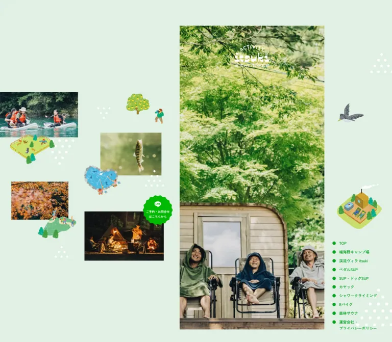
DESIGN REFERENCE
五木のアウトドア部|五木村端海野キャンプ場とアクティビティ情報
淡いミント色の背景に自然写真と素朴なイラストを散りばめたアウトドア情報サイト。PCでは右寄せの細いコンテンツ列と常設ナビゲーション、スマートフォンでは画面いっぱいの縦長構成を採用しています。
オリジナルサイトを見るItsuki Outdoor / 五木のアウトドア部 — Style Reference
A narrow outdoor guide surrounded by a playful landscape of photographs, painted miniatures, and mint-colored space.
Website: itsuki-outdoor.com Original URL: https://itsuki-outdoor.com/ Final URL: https://itsuki-outdoor.com/ Theme: a light mint canvas, vivid green identity, colorful activity panels, and a charcoal footer. No theme selector was evidenced. Inspected: September 12, 2026, 05:38 JST. The supplied retrieval timestamp is September 11, 2026, 20:38:39.009 UTC. Viewports: desktop 1440 × 1000 and mobile 390 × 844 CSS pixels. Scope: the current homepage: opening photography, desktop collage and navigation, introductory content, eight accommodation/activity entries, reservation links, social banners, and footer. Three desktop captures and two mobile captures were supplied, together with rendered text, links, element bounds, and computed styles. Linked detail pages and external destinations were not inspected.
Itsuki Outdoor introduces camping, accommodation, and outdoor activities in 五木村 through a combination of documentary photography and small, textured illustrations. Pale mint gives the desktop composition breathing room; saturated greens connect the wordmark, navigation, introduction, and reservation system. Orange, yellow, and light green make the activity content feel lively without displacing the natural scenery.
The defining feature is the relationship between a 460px content strip positioned right of center and a much larger decorative desktop canvas. Photographs of cycling, river activities, camping, and sauna experiences sit at deliberately irregular positions around miniature painted landscapes. On mobile, that surrounding composition disappears from view and the content becomes a full-width, vertically scrolling website. This is a homepage and activity directory with separate destination pages, rather than an isolated campaign page.
How to Read This Reference
- Measured values come from the supplied rendered DOM and computed-style evidence. Decimal values are usually rounded to two places below.
- Visual estimates describe screenshot geometry, colors, textures, and shapes where no corresponding computed property was supplied. Estimated hex colors are reproduction starting points, not pixel samples.
- Calculated values are relationships derived from the two measured viewport layouts. They do not establish the original stylesheet formula.
- Recommended values and behaviors belong to the reusable implementation, including its intermediate breakpoint, focus treatment, and reduced-motion handling.
- Token names are descriptive aliases. The only supplied source custom property is
--c_key1: #12AA34. - The evidence is strongest for the opening composition, the SUP panel, and the footer. Other activity descriptions and links are documented in the DOM, but their complete visual panels were not individually pictured.
- Computed font-family declarations identify the requested stack; the evidence does not independently establish which font files were downloaded or which face rendered every glyph.
Tokens — Colors
Default Palette
| Name | Value | Token | Evidence and role |
|---|---|---|---|
| Mint canvas | #e0f1e4 |
--color-canvas |
Measured body background, rgb(224, 241, 228); the expansive desktop backdrop |
| Navigation green | #00a420 |
--color-forest |
Measured desktop navigation text and introduction background |
| Brand green | #12aa34 |
--color-brand / source --c_key1 |
Measured source variable, alternating detail links, and reservation-section text |
| Activity orange | #ff6600 |
--color-orange |
Measured alternating detail-link color, including the SUP entry; also visible in its title treatment |
| Body black | #000000 |
--color-ink |
Measured activity-description text |
| White | #ffffff |
--color-white |
Measured introduction/footer text and reservation-button background; also visible in logos and dot decorations |
| Footer charcoal | #313231 |
--color-footer |
Measured footer background, rgb(49, 50, 49) |
The two measured greens have different roles. The canvas is mint, the navigation and introduction use #00a420, and the supplied brand variable is #12aa34. Keeping these distinctions is more faithful than replacing every green with a single token.
Supporting Artwork Colors
| Name | Approximate value | Evidence and use |
|---|---|---|
| Reservation lime | #00c300 |
Visual estimate for the vivid desktop reservation seal and mobile edge tab |
| Activity yellow | #ffeb80 |
Visual estimate for the panel immediately above the pictured SUP entry |
| Activity pale green | #b4ed9e |
Visual estimate for the textured SUP panel |
| Social pink | #ff4777 |
Visual estimate for the colored side of the outdoor-club Instagram banner |
| Footer divider | White at roughly 10% opacity | Recommended approximation of the faint rules visible in the charcoal footer |
The yellow and pale-green activity surfaces contain irregular white wear and speckling. Their appearance is not a flat color alone. The visible social banners use colored fades into photography; this treatment is localized to the banners. No complete palette mapping for all eight activity panels was supplied.
Tokens — Typography
Japanese Sans-Serif — Reading and Navigation
Computed stack:
'Zen Kaku Gothic Antique', 'Noto Sans JP',
'Hiragino Kaku Gothic Pro', 'ヒラギノ角ゴ Pro W3', sans-serif
The primary reading voice is a substantial Japanese sans-serif. Most sampled text uses weight 500, including activity paragraphs and footer information. The reservation heading and its main link use 700. Do not infer a bold weight solely from the strong appearance of Japanese strokes in the screenshots.
The root is measured at 10px, but the actual content is considerably larger. Activity paragraphs use approximately 19.63px on desktop and 16.64px on mobile. The root size is therefore an implementation convention, not a recommendation to render body copy at 10px.
Wordmark and Illustrated Lettering
The identity combines an arched ACTIVITY label, a chunky lowercase itsuki wordmark, and the subtitle 五木のアウトドア部. White versions sit over hero photography and in the footer; a larger green version appears in the desktop collage.
Treat this as supplied graphic artwork. The empty extracted text of the H1 does not identify a display font or prove that the logo lacks an accessible name. Likewise, the playful English lettering around the SUP photograph should be preserved as artwork rather than approximated with an invented font attribution.
Type Scale
| Role | Desktop measurement | Mobile measurement | Weight and rhythm |
|---|---|---|---|
| Activity description | 19.6267px |
16.64px |
500; line height 2 |
Detail link, 詳しく見る |
19.6267px |
16.64px |
500; line height 2 |
| Introduction paragraph | 19.6267px |
16.64px |
500; line height 2.25 |
| Reservation heading | 24.5333px |
20.8px |
700; line height 1 |
| Reservation explanation | 20.8533px |
17.68px |
500; line height about 1.647; tracking 0.03em |
| Main reservation link | 17.1733px |
14.56px |
700; line height 1 |
| Footer information | 17.1733px |
14.56px |
500; line height 2 |
| Footer links | 17.1733px |
14.56px |
500; line height 1 inside taller rows |
| Copyright | 14.72px |
12.48px |
500; line height 1 |
| Desktop navigation | 12px / 19.92px |
Not visible in this form | 500; normal tracking |
| Mobile navigation definitions | Not applicable | 14px / 14px |
500; measured in DOM, open state not pictured |
The activity text occupies approximately 19 full-width Japanese characters per line at both inspected widths. Its spacious leading and narrow measure are central to the reading rhythm. Avoid widening the desktop paragraphs merely because more screen space is available.
Tokens — Spacing & Shapes
Calculated Content Unit
Many measurements fit a column-relative unit:
u = content-column width / 375
Desktop: 460 / 375 = 1.226667px
Mobile: 390 / 375 = 1.04px
For example, 16u reproduces the measured body sizes, 14u reproduces footer text, and 12u reproduces the main reservation button's radius. This is a useful calculated implementation model, not a recovered source declaration.
Not everything follows this unit. The hero logo is 109px wide in both views, the description-to-detail-wrapper gap is 30px in both, and desktop navigation uses a separate compact scale.
Spacing Scale
| Use | Desktop | Mobile | Interpretation |
|---|---|---|---|
| Introduction side inset | 27.60px |
23.41px |
Approximately 6% of the strip |
| Activity-copy side inset | 39.86px |
33.80px |
Approximately 8.667% of the strip |
| Social-section side inset | 16.56px |
14.05px |
Approximately 3.6% of the strip |
| Footer side inset | 46px |
39px |
Exactly 10% of the strip |
| Detail-wrapper padding | 12.2667px |
10.4px |
Fits 10u |
| Description-to-detail-wrapper gap | 30px |
30px |
Fixed in sampled entries |
| Introduction top padding | 79.72px |
67.59px |
Approximately 65u |
| Introduction bottom padding | 61.33px |
52px |
Approximately 50u |
| Footer top inset to information | 52.73px |
44.72px |
Approximately 43u |
| Desktop navigation row increment | 27.92px |
— | 19.92px line box plus 8px separation |
Border Radius and Shape
| Element | Treatment | Evidence |
|---|---|---|
| Main content strip | Square edges | Visible in desktop captures |
| Decorative photographs | Predominantly square rectangular crops | Screenshot observation |
| Detail-link frame | Fine crossed-corner rules; no rounded container | Screenshot observation |
| Main reservation button | 14.72px desktop; 12.48px mobile |
Computed radius |
| Instagram banners | About 12px desktop; 10px mobile |
Visual estimate |
| Desktop reservation seal | Scalloped circular silhouette | Screenshot; its anchor itself has measured 50% radius |
| Mobile reservation tab | Tall rectangle with softly rounded left corners | Screenshot observation |
| Mobile menu symbol | Small mountain-like green silhouette with white horizontal strokes | Screenshot observation |
The scalloped seal is not explained by the anchor's border-radius: 50%. Preserve its artwork or an equivalent custom silhouette instead of substituting a plain circular button.
Layout Measurements
| Element | Desktop, 1440 × 1000 | Mobile, 390 × 844 |
|---|---|---|
| Content origin | x = 753.53px, y = 41px |
x = 0, y = 0 |
| Content width | 460px |
390px |
| Opening media region | Approximately 460 × 919px |
390 × 844px |
| Hero logo box | 109 × 71.59px |
109 × 71.59px |
| Hero logo top relative to opening | 61px |
61px |
| Activity-copy width | 380.27px |
322.39px |
| Detail wrapper | 380.27 × 88.31px |
322.39 × 74.88px |
| Inner detail anchor | 355.73 × 63.78px |
301.61 × 54.09px |
| Main reservation anchor | 363.08 × 71.14px |
307.83 × 60.31px |
| Footer | 460 × 631.75px |
390 × 536.25px |
| Footer content width | 368px |
312px |
| Footer logo | 147.19 × 96.69px |
124.80 × 81.97px |
| Total document height | About 10,549px |
About 9,087px |
The opening height is calculated from the introduction's measured start position. It follows the viewport more closely than the content-unit scale.
Components
Desktop Landscape Composition
Role: establish the setting while keeping the actual content easy to locate.
The desktop shell places a narrow content strip to the right of a loose photographic collage. Photography, illustration, the green wordmark, and white dot clusters occupy the mint background without enclosing cards or a conventional alignment grid.
The two later desktop captures retain the same surrounding scene while showing different portions of the main content. This supports a visually persistent surround. The initial capture has a different assortment and placement of photographs and illustrations; the supplied evidence does not establish how that change is triggered.
Approximate geometry of the later desktop scene:
| Item | Position at 1440 × 1000 | Approximate size |
|---|---|---|
| Cycling photograph | x 56, y 282 |
256 × 181px |
| Stream-climbing photograph | x 464, y 81 |
242 × 294px |
| Sunlit forest photograph | x 0, y 676 |
333 × 208px |
| Sauna photograph | x 415, y 619 |
232 × 155px |
| Green wordmark | x 256, y 442 |
About 183 × 116px |
Small illustrated scenes overlap photo edges or float between them. Their imperfect outlines, textured fills, and miniature people make the collage feel like a map of possible experiences. The generous empty mint areas are intentional parts of the composition.
Desktop Navigation
Role: persistent access to the homepage, accommodation, activities, and operator/privacy information.
Ten links form a compact vertical list near the lower-right edge. Each is preceded by a solid green dot. All visible dots share the same filled treatment; an active-item indicator was not established.
The labels start at x = 1260.53px. The first link begins at y = 674.86px; the final two-line link ends at y = 966px. Text is 12px / 19.92px, weight 500, in #00a420. Dot size is visually about 10px.
These are page links, not evidenced section-scroll controls:
| Source label | Destination | Measured detail-link accent |
|---|---|---|
端海野キャンプ場 |
/camp/ |
Brand green |
渓流ヴィラ itsuki |
/villa/ |
Orange |
ペダルSUP |
/p-sup/ |
Brand green |
SUP・ドッグSUP |
/sup/ |
Orange |
カヤック |
/kayak/ |
Brand green |
シャワークライミング |
/s-climbing/ |
Orange |
Eバイク |
/e-bike/ |
Brand green |
森林サウナ |
/f-sauna/ |
Orange |
The remaining links are TOP to / and 運営会社・プライバシーポリシー to /privacy/. The destination pages themselves were not inspected.
Opening Photography and Logo
Role: introduce the outdoor setting through imagery before explanatory copy.
A tall photographic opening fills the content strip. The desktop capture shows three people seated outside a small wooden sauna structure beneath dense foliage. The mobile capture shows a red vehicle, a tent, and camping equipment in woodland.
The white identity is centered horizontally, 61px below the opening's top, and remains 109px wide in both layouts. The opening contains no visible large promotional headline or boxed feature list.
The difference in subjects between captures does not prove separate responsive assets, a timed carousel, or video playback. Preserve the tall crop and environmental emphasis; treat sequence and timing as unverified.
Green Introduction
Role: explain the place and the range of experiences.
The first section after the opening uses measured #00a420 with white text. Its paragraph is 88% of the strip width, with line height 2.25. The measured section is approximately 1726.66px tall on desktop and 1463.92px on mobile.
An image-based heading appears above the paragraph in the element inventory. Its measured bounds differ unusually between states: about 213 × 54.90px on desktop and 300.97 × 77.56px on mobile, with an 800ms overshoot transition declared. Do not turn these two bounding boxes into a definitive responsive heading-size rule; the desktop element may be in a different reveal state.
The inventory does not expose all intervening media or decoration. Rebuild the complete section from actual assets when available, rather than inserting unexplained blank space to reach its measured total height.
Activity Feature Panel
Role: introduce one accommodation option or activity and link to its dedicated page.
The homepage contains eight entries in the same order as the navigation. Each has descriptive Japanese copy and one 詳しく見る link. The fully pictured SUP example shows the intended visual anatomy:
- A full-width pale-green surface with distressed white texture.
- A large photograph of a person and dog on a paddleboard, cropped into a broad rectangle.
- A small painted paddleboard illustration overlapping the photograph's upper-left area.
- An orange, slightly rotated title capsule with a short speech-tail shape, reading
SUP・ドッグSUP. - Playful orange English lettering overlapping the photograph's lower edge.
- A black description in a narrow text block with generous double leading.
- A spacious orange detail link framed by fine intersecting rules.
The photograph occupies most of the panel width and reaches close to its right edge. Its lower-left corner is visibly rounded. The title, decorative lettering, and illustration break the photograph's rectangle; they should not be flattened into a generic heading-above-card arrangement.
The description and link widths are measured across all entries. The full visual anatomy and color assignment of every other panel are not equally documented.
Crossed-Rule Detail Link
Role: provide a clear onward route without a filled button dominating each activity.
The source places a flex anchor inside a padded paragraph wrapper. The wrapper measures 380.27 × 88.31px on desktop and 322.39 × 74.88px on mobile. Its inner anchor is approximately 355.73 × 63.78px and 301.61 × 54.09px, respectively.
The visible frame resembles four thin lines that extend slightly beyond their intersections. It has square geometry, no shadow, and a transparent center. The label is centered and shares the entry's green or orange accent. The source sequence alternates those link colors across the eight entries.
A 30px gap separates the description from the wrapper at both inspected widths. Preserve that breathing room and keep the full inner region interactive.
Persistent Reservation Access
Role: keep inquiry and booking access available while browsing.
On desktop, a bright green scalloped seal sits to the left of the content strip at measured x = 599.20px, y = 602.50px, sized 115 × 113px. It contains a white LINE mark and short Japanese reservation copy. Its position remains consistent in the supplied desktop captures.
On mobile, this becomes a vertical edge tab at x = 345px, y = 63px, with a measured parent box of 45 × 165.5px. The white LINE mark sits above vertically arranged copy. The tab is visible in both the opening and footer captures.
Both formats link to https://line.me/R/ti/p/@700zbppy/. The destination and any handoff to the LINE application were not exercised.
Some image-based anchors have extracted 15px inline boxes. Those line boxes are not reliable measurements of the complete visible artwork or effective hit area.
Mobile Menu Control and Navigation Definitions
Role: replace the desktop link list with compact navigation access.
The screenshots show a small green mountain-shaped control near the upper-right corner, above the reservation tab. It contains white horizontal menu strokes and remains visible in the footer capture. Its visible silhouette is approximately 48px wide and 32px high; its complete hit target was not measured.
The mobile DOM contains white navigation text at 14px, 58px-tall link boxes, and a two-column arrangement for the eight accommodation/activity links. Each column is about 166.39px wide inside a 332.80px region with 28.59px side insets. TOP and the operator/privacy link span the region. Operator information follows.
These definitions suggest the intended menu layout, but the supplied screenshots show the closed presentation. Opening, backdrop appearance, closing behavior, keyboard focus, and scroll locking are unverified. Nonzero element bounds alone do not prove that those links were visible.
General Reception Section
Role: consolidate inquiry and reservation access after the activity sequence.
The heading 五木のアウトドア部総合受付 is measured at 24.53px desktop and 20.8px mobile, weight 700. Supporting copy uses approximately 20.85px and 17.68px, with slightly expanded tracking.
The primary link reads お問い合わせ・ご予約はこちらから. It is a white rounded rectangle with green text, approximately 363.08 × 71.14px on desktop and 307.83 × 60.31px on mobile. Its radius follows 12u in the calculated scale.
The section's computed background is transparent. Its complete decorative surroundings were not pictured, so a specific background illustration should not be invented from the text inventory.
Instagram Banners
Role: lead visitors to current campsite and activity updates.
Two wide rounded banners sit on white immediately above the footer. The first combines green with the campsite photograph featuring a red vehicle and tent. The second combines pink with a photograph of two people enjoying an activity. White Instagram symbols and labels occupy the more saturated left side.
The banners are approximately 427px wide on desktop and 362px on mobile, with a visual aspect ratio near 3.16:1. Their gap is about 20px desktop and 17px mobile. Labels and fades may be composited artwork or separate layers; the supplied inventory does not settle that implementation detail.
The recorded destinations are the campsite and outdoor-club Instagram accounts. No feed widget, carousel, or social loading behavior was demonstrated.
Operator Footer
Role: provide practical operator information and repeat the site's contact routes.
A #313231 block terminates the same narrow content strip on desktop and spans the screen on mobile. Its inner content is exactly 80% of the strip width.
The first block presents the operator heading, 合同会社なちゅらら, address, and telephone number in four lines. This operator identity is supported directly by the original-page footer. Three link rows follow: campsite Instagram, outdoor-club Instagram, and LINE inquiries/reservations. Small white icons align at the left; faint full-width rules divide the rows.
Rows measure about 60.09px high on desktop and 50.95px on mobile, excluding the adjacent fine divider. After a generous gap, a centered white wordmark appears above a small copyright line. The footer has no visible card containers or shadow effects.
Tokens — Motion & Interaction
| Treatment | Supplied evidence | What can be concluded |
|---|---|---|
| Introductory graphic transition | 0.8s cubic-bezier(0.68, -0.6, 0.32, 1.6) |
An overshooting timing curve is declared; property, trigger, and endpoints are not established |
| Introduction paragraph transition | 0.6s cubic-bezier(0.37, 0, 0.63, 1) |
A smoother transition is declared; visible start/end states were not supplied |
| Links | Serialized as 0.2s, font-size |
A 200ms transition declaration exists; do not infer a font enlargement or specific hover effect |
| Desktop surround | Same composition in the two later scrolled captures | Supports visually persistent decoration and controls; positioning mechanism was not supplied |
| Initial versus later collage | Different photographs and miniature scenes | State variation is visible; autoplay, scrolling, timing, and sequencing remain uncertain |
| Opening media | Different desktop/mobile subjects | Media variation is evidenced; slideshow or video behavior is not |
| Mobile menu | Closed control pictured; navigation definitions in DOM | Opening and closing interactions were not tested |
| Detail, social, and reservation links | Concrete href values in the rendered page |
Destinations are known; destination loading and interaction results were not tested |
Sampled elements report animation: none. That does not rule out transitions, script-driven changes, animation inside image assets, or animation on unsampled elements. Similarly, a bare transition: all entry is not evidence of visible animation without a nonzero duration and a state change.
The capture process waited for document loading, visible image decoding, and sampled layout/text stability, and conservatively waited for relevant finite animations. Perpetual animations were temporarily paused for readiness checks and then resumed. These procedures improve capture stability but do not provide an animation timeline or establish semantic completeness.
For an adaptation, use the measured 200ms link timing and reserve the 800ms overshoot character for selected illustrated elements. Any proposed reveal offset, autoplay interval, or parallax distance must be labeled as a new design choice.
Surfaces
| Layer | Appearance | Function |
|---|---|---|
| Desktop canvas | Flat pale mint | Holds photography, miniature illustrations, wordmark, and navigation |
| Opening | Full photographic crop | Immediate sense of place |
| Introduction | Saturated green with white content | Strong transition into the site's explanation |
| Activity panel | Colored field with worn white texture | Groups one experience without a conventional floating card |
| Detail action | Transparent center and thin accent rules | Clear onward navigation |
| Reservation action | White rounded rectangle with green text | Stronger contact emphasis within the content |
| Social area | White field with colorful photo banners | Separates update channels from activity descriptions |
| Footer | Flat charcoal with white text and faint rules | Practical information and closing identity |
There is no visible general-purpose elevation system. Layering comes from overlapping images, painted illustrations, colored fields, and irregular silhouettes. Keep shadows out of the default component vocabulary.
Imagery
Photography is the primary evidence of the experience: forest light, clear river water, camping equipment, orange life jackets, dogs, bicycles, and people relaxing outside a wooden sauna. Images are rich in natural green and show activities taking place, rather than presenting isolated products on blank backgrounds.
Illustrations create a second, smaller scale. Campsites, fishing ponds, cabins, dog areas, paddlers, birds, and tiny people are drawn with irregular contours, flat painted areas, and visible grain. Some miniature landscapes have an oblique, map-like viewpoint. They should retain this textured character rather than becoming uniformly smooth outline icons.
White dot clusters form triangular patterns in the mint space. Their dots are visually about 8–10px across, with larger gaps between them. These are decorative motifs; the separate green navigation dots belong to the link list.
Observed Asset References
No image src manifest or original asset paths were supplied. The following inventory identifies visible assets without inventing filenames or formats.
| Asset | Observed appearance and use |
|---|---|
| White hero identity | Arched English label, lowercase wordmark, Japanese subtitle; 109px wide |
| Green desktop identity | Larger version within the decorative collage |
| White footer identity | Centered closing mark; about 147px desktop and 125px mobile |
| Opening photography | Woodland sauna scene on desktop; red vehicle and tent on mobile |
| Surround photographs | River activity, fishing, autumn foliage, campfire, cycling, stream climbing, forest light, sauna |
| Painted miniature scenes | Camping, water activities, fishing, dog areas, cabins, and landscape fragments |
| SUP feature artwork | Person-and-dog photograph, paddleboard illustration, orange title and English lettering |
| White triangular dot clusters | Repeated decoration throughout the desktop background |
| Reservation artwork | Scalloped desktop seal and narrow mobile LINE tab |
| Social banners | Green campsite banner and pink outdoor-club banner |
| Utility symbols | Instagram, LINE, and the mountain-shaped menu mark |
Use authorized original assets when available. Keep photographic rendering smooth; do not apply image-rendering: pixelated. The artwork's roughness comes from its painted texture, not enlarged bitmap pixels.
Layout & Responsive Behavior
At 1440px wide, the content strip starts at x = 753.53px, about 52.33% of the viewport width, and ends at x = 1213.53px. It is deliberately right of center. The remaining right-side space holds navigation; the much larger left side holds the collage and reservation seal.
The opening starts 41px below the viewport top. The bottom desktop capture leaves approximately 40px below the footer. The middle capture also shows a top gutter around the visible strip; the exact clipping or framing implementation cannot be recovered from the supplied properties.
On mobile, the main content starts at the top-left and fills all 390px. The desktop collage and visible right-hand list are absent. The opening reaches the viewport's 844px height, while the logo preserves its 109px width and 61px top offset. Reservation access becomes the narrow right-edge tab, and navigation becomes the compact mountain-shaped control.
Most reading dimensions scale by the column-width ratio, 460 / 390 ≈ 1.17949. This explains the matching paragraph line counts and proportional footer. The opening height, persistent controls, and some fixed gaps behave separately. The overall document is therefore not a uniformly scaled screenshot.
Only these two viewport widths were inspected. The original breakpoint, tablet treatment, intermediate margins, orientation behavior, and safe-area handling are unknown. The Quick Start recommends a centered strip below a 1360px desktop-composition breakpoint, then recreates the measured right offset above it. That is an implementation decision, not a source finding.
The page is a long scrolling document. Do not introduce an independently scrolling phone mockup or a nested content scroller merely because the desktop content resembles a mobile-width strip.
Do’s and Don’ts
Do
- Preserve the relationship between the narrow content strip and the spacious desktop landscape.
- Keep the exact measured mint, two greens, orange, and charcoal in their documented roles.
- Use documentary outdoor photography with enough surrounding scenery to establish place.
- Combine large photographs with smaller textured illustrations and white dot clusters.
- Retain the logo artwork and its compact placement over the opening image.
- Keep activity copy narrow, medium weight, and generously double-spaced.
- Let title stickers and illustrations overlap the SUP photograph.
- Use transparent crossed-rule detail links instead of filling every action.
- Keep booking access visually persistent, with distinct desktop and mobile forms.
- Continue the narrow column through the social section and footer on desktop.
- Preserve actual page destinations and the eight-entry information order.
Don't
- Don't center the desktop strip or expand it into a wide feature grid when reproducing the inspected composition.
- Don't treat the surrounding collage as a grid of clickable cards without evidence.
- Don't replace the painted miniatures with generic outline icons or emoji.
- Don't invent a font for the wordmark or illustrated English lettering.
- Don't assign every text element weight 700; most measured text is 500.
- Don't equate the 10px root with the visible body-text size.
- Don't make the desktop seal a plain circle or the mobile menu a standard rectangular toolbar.
- Don't introduce glossy shadows, glass effects, or gradients across all components.
- Don't interpret navigation dots as a scrollspy or progress system.
- Don't claim a carousel, parallax effect, menu animation, or hover transformation from still captures alone.
- Don't fabricate missing image paths or fill unpictured sections with arbitrary decorative content.
Recommended Implementation Additions
These are recommendations for a new implementation, not verified features of the original:
- Give the logo link, image-based booking controls, social banners, and menu control meaningful accessible names. Empty extracted anchor text alone does not establish whether those names currently exist.
- Use a real button for menu toggling, with an expanded state and a controlled navigation region. If implemented as a modal drawer, provide Escape handling, appropriate focus containment, and focus return.
- Keep the menu's hit target at least 44px high even if its visible mountain silhouette is smaller.
- Mark purely decorative collage assets and dot patterns as decorative, while giving meaningful activity photographs useful alternative text.
- Add visible keyboard focus. Use a darker green for focus or interaction text where contrast testing requires it.
- Check green and orange small text against their actual surfaces. The observed palette is a visual reference, not an accessibility certification.
- Ensure the mobile edge tab does not prevent access to banner links, focus indicators, or text at narrow widths and increased text size.
- Preserve essential text as HTML where possible, even when decorative copies appear within artwork.
- Supply reduced-motion alternatives and keep content visible if reveal scripts fail.
- Reserve image dimensions to avoid layout shifts. Prioritize the opening image and defer below-fold assets; avoid downloading a large desktop collage unnecessarily on mobile.
- Test at intermediate widths, with browser text enlargement, and with device safe areas before adopting the proposed breakpoint.
Agent Prompt Guide
Quick Color Reference
- Desktop canvas:
#e0f1e4. - Desktop navigation and introduction background:
#00a420. - Brand and reception text:
#12aa34. - Alternating activity accent:
#ff6600. - Main activity copy: black.
- Footer:
#313231with white text and subtle rules. - Pale-green and yellow activity surfaces: textured artwork; hex approximations are secondary.
- Bright reservation seal/tab: approximately
#00c300, visually estimated.
Overall Prompt
“Create an outdoor tourism homepage inspired by Itsuki Outdoor. On a 1440px desktop, place a 460px content strip at about x=754px against a pale mint canvas, with a loose collage of forest, cycling, river, camping, and sauna photographs to the left. Add textured painted miniature landscapes, a green graphic wordmark, white triangular dot clusters, a compact green link list on the lower right, and a bright scalloped LINE reservation seal beside the strip. Begin the strip with tall environmental photography and a small centered white logo. Follow with a green introduction and eight vertically stacked accommodation/activity entries. Use narrow Japanese sans-serif copy with double leading, overlapping illustrated title treatments, and crossed-rule detail links. Finish with reservation access, two colorful Instagram photo banners, and a charcoal operator footer. On mobile, use the full screen width, remove the outer collage, and retain a mountain-shaped menu control and a narrow green reservation tab at the right edge. Treat motion sequencing as a separate decision because the reference does not establish it.”
Example Component Prompts
- Desktop surround: “Compose separate rectangular outdoor photographs on pale mint with large irregular gaps. Add small painted campsite and water-activity scenes that overlap selected edges, a green graphic wordmark, and white triangular dot patterns. Keep the 460px reading strip clearly separated to the right. No card shadows.”
- SUP feature: “Create a pale-green panel with worn white texture, a broad person-and-dog paddleboard photograph, a small illustrated paddler overlapping its upper-left edge, an orange tilted title capsule reading
SUP・ドッグSUP, and playful orange artwork near the photograph's lower edge. Follow with narrow black copy and a centered orange crossed-rule詳しく見るlink.” - Reservation access: “Use an approximately 115px scalloped green seal on desktop with a white LINE mark and compact Japanese copy. On mobile, replace it with a 45px-wide, approximately 166px-tall edge tab, positioned below the menu symbol. Preserve an accessible link name and a usable focus indicator.”
- Footer: “Build a charcoal footer within the same narrow content strip. Use 10% horizontal padding, white Japanese sans-serif operator information, three icon-and-label rows divided by faint lines, then a centered white graphic wordmark and small copyright text. Use no card containers.”
- Detail link: “Make a transparent, generous text link with four thin accent rules extending slightly beyond their corner intersections. Center
詳しく見る; use the same green or orange as the activity title, square geometry, and no shadow.”
Quick Start
CSS Custom Properties
This is a reusable approximation, not recovered source code. It reproduces measured colors and many proportions while keeping a conventional root font size. The u unit is calculated from the strip width. The 1360px breakpoint, intermediate centered layout, supporting color estimates, and interactive feedback are recommendations.
Use .site-strip around the main content and footer. Keep .desktop-scene, .desktop-nav, and the persistent controls outside it. Supply actual image assets for logos, photographs, illustrations, and the scalloped reservation seal; none are bundled here. The CSS establishes the closed mobile presentation, while menu state and focus behavior require separate implementation.
:root {
  /* Measured palette */
  --color-canvas: #e0f1e4;
  --color-forest: #00a420;
  --color-brand: #12aa34;
  --color-orange: #ff6600;
  --color-ink: #000000;
  --color-white: #ffffff;
  --color-footer: #313231;

  /* Visual estimates; replace with authorized artwork where available */
  --color-booking: #00c300;
  --color-panel-yellow: #ffeb80;
  --color-panel-green: #b4ed9e;

  --font-site: 'Zen Kaku Gothic Antique', 'Noto Sans JP',
    'Hiragino Kaku Gothic Pro', 'ヒラギノ角ゴ Pro W3', sans-serif;

  /* Calculated scaling model, not an original source declaration */
  --strip-width: min(100vw, 460px);
  --u: calc(var(--strip-width) / 375);
  --text-body: calc(16 * var(--u));
  --text-heading: calc(20 * var(--u));
  --text-footer: calc(14 * var(--u));
  --text-small: calc(12 * var(--u));
  --radius-booking: calc(12 * var(--u));

  /* Timing values evidenced in computed styles */
  --motion-link: 200ms;
  --motion-pop: 800ms cubic-bezier(0.68, -0.6, 0.32, 1.6);
  --motion-copy: 600ms cubic-bezier(0.37, 0, 0.63, 1);
}

* { box-sizing: border-box; }

body {
  margin: 0;
  color: var(--color-ink);
  background: var(--color-canvas);
  font-family: var(--font-site);
  font-size: var(--text-body);
  font-weight: 500;
  line-height: 2;
}

img { display: block; max-width: 100%; }
a { color: inherit; }
button { font: inherit; }

.site-strip {
  position: relative;
  z-index: 1;
  width: var(--strip-width);
  margin-inline: auto;
}

.desktop-scene,
.desktop-nav,
.line-badge { display: none; }

.hero {
  position: relative;
  height: 100vh;
  height: 100svh;
  overflow: hidden;
}

.hero__photo {
  width: 100%;
  height: 100%;
  object-fit: cover;
  object-position: var(--hero-focus, 50% 50%);
}

.hero__logo {
  position: absolute;
  top: 61px;
  left: 50%;
  width: 109px;
  transform: translateX(-50%);
}

.intro {
  padding-block: calc(65 * var(--u)) calc(50 * var(--u));
  color: var(--color-white);
  background: var(--color-forest);
}

.intro__copy {
  width: 88%;
  margin-inline: auto;
  font-size: var(--text-body);
  line-height: 2.25;
}

/* Activity geometry beyond the measured copy block is an adaptation. */
.activity {
  --accent: var(--color-brand);
  --panel: var(--color-panel-yellow);
  padding-block: calc(40 * var(--u));
  background-color: var(--panel);
  background-image: var(--activity-texture, none);
}

.activity--sup {
  --accent: var(--color-orange);
  --panel: var(--color-panel-green);
}

.activity__visual {
  position: relative;
  width: 93.3%;
  margin: 0 0 calc(24 * var(--u)) auto;
}

.activity__photo {
  width: 100%;
  aspect-ratio: 1.42;
  object-fit: cover;
  border-bottom-left-radius: calc(14 * var(--u));
}

.activity__illustration {
  position: absolute;
  top: calc(-45 * var(--u));
  left: 0;
  width: 43%;
  pointer-events: none;
}

.activity__title {
  position: absolute;
  top: calc(-25 * var(--u));
  right: 4%;
  margin: 0;
  padding: calc(8 * var(--u)) calc(16 * var(--u));
  border-radius: 999px;
  color: var(--color-white);
  background: var(--accent);
  font-size: calc(20 * var(--u));
  font-weight: 700;
  line-height: 1.4;
  transform: rotate(9deg);
}

.activity__title::after {
  content: '';
  position: absolute;
  right: 15%;
  bottom: -9px;
  border-top: 12px solid var(--accent);
  border-right: 12px solid transparent;
}

.activity__copy {
  width: 82.6667%;
  margin-inline: auto;
  font-size: var(--text-body);
  line-height: 2;
}

.activity__copy > p { margin: 0; }

.detail-frame {
  margin-top: 30px;
  padding: calc(10 * var(--u));
  color: var(--accent);
}

.detail-link {
  position: relative;
  display: flex;
  align-items: center;
  justify-content: center;
  min-height: calc(52 * var(--u));
  text-align: center;
  text-decoration: none;
  transition: color var(--motion-link);
}

/* Recommended construction for the visible crossed-corner rules */
.detail-link::before,
.detail-link::after {
  content: '';
  position: absolute;
  pointer-events: none;
}

.detail-link::before {
  inset: -6px 0;
  border-inline: 1px solid currentColor;
}

.detail-link::after {
  inset: 0 -6px;
  border-block: 1px solid currentColor;
}

.reception {
  padding-block: calc(40 * var(--u));
  color: var(--color-brand);
}

.reception__heading {
  width: 92.8%;
  margin-inline: auto;
  font-size: var(--text-heading);
  font-weight: 700;
  line-height: 1;
  text-align: center;
}

.reception__body {
  width: 78.93%;
  margin-inline: auto;
  font-size: calc(17 * var(--u));
  line-height: 1.647;
  letter-spacing: 0.03em;
}

.reception__link {
  display: flex;
  align-items: center;
  justify-content: center;
  min-height: calc(58 * var(--u));
  padding: 12px;
  border-radius: var(--radius-booking);
  background: var(--color-white);
  font-size: var(--text-footer);
  font-weight: 700;
  line-height: 1.4;
  letter-spacing: normal;
  text-align: center;
  text-decoration: none;
}

.social {
  display: grid;
  gap: calc(16 * var(--u));
  padding: calc(24 * var(--u)) 3.6% calc(36 * var(--u));
  background: var(--color-white);
}

.social-card {
  display: block;
  overflow: hidden;
  border-radius: calc(10 * var(--u));
}

.social-card img {
  width: 100%;
  aspect-ratio: 3.16;
  object-fit: cover;
}

.site-footer {
  padding: calc(43 * var(--u)) 10% calc(30 * var(--u));
  color: var(--color-white);
  background: var(--color-footer);
  font-size: var(--text-footer);
}

.footer-company {
  margin: 0 0 calc(18 * var(--u));
  line-height: 2;
}

.footer-links {
  border-top: 1px solid rgb(255 255 255 / 10%);
}

.footer-link {
  display: flex;
  align-items: center;
  gap: calc(20 * var(--u));
  min-height: calc(49 * var(--u));
  padding-left: calc(6 * var(--u));
  border-bottom: 1px solid rgb(255 255 255 / 10%);
  line-height: 1.4;
  text-decoration: none;
}

.footer-link__icon {
  flex: 0 0 auto;
  width: calc(18 * var(--u));
}

.footer-logo {
  width: calc(120 * var(--u));
  margin: calc(47 * var(--u)) auto calc(26 * var(--u));
}

.footer-copyright {
  margin: 0;
  font-size: var(--text-small);
  line-height: 1;
  text-align: center;
}

/* Closed mobile controls; menu behavior requires separate scripting. */
.mobile-menu-button {
  position: fixed;
  z-index: 20;
  top: max(18px, env(safe-area-inset-top, 0px));
  right: max(18px, env(safe-area-inset-right, 0px));
  width: 50px;
  min-height: 44px;
  padding: 0;
  border: 0;
  background: transparent;
  cursor: pointer;
}

.mobile-menu-button::before {
  content: '';
  position: absolute;
  inset: 0 1px 12px;
  background: var(--color-forest);
  clip-path: polygon(38% 0, 62% 0, 100% 100%, 0 100%);
}

.mobile-menu-button::after {
  content: '';
  position: absolute;
  top: 17px;
  left: 13px;
  width: 24px;
  height: 1px;
  background: white;
  box-shadow: 0 -6px white, 0 6px white;
}

.line-tab {
  position: fixed;
  z-index: 20;
  top: calc(63px + env(safe-area-inset-top, 0px));
  right: 0;
  display: flex;
  flex-direction: column;
  align-items: center;
  gap: 8px;
  width: 45px;
  min-height: 165.5px;
  padding: 10px 6px;
  border-radius: 5px 0 0 5px;
  color: white;
  background: var(--color-booking);
  text-decoration: none;
}

.line-tab__icon { width: 24px; }

.line-tab__label {
  writing-mode: vertical-rl;
  text-orientation: upright;
  font-size: 11px;
  font-weight: 700;
  line-height: 1.35;
}

/* Recommended breakpoint; only 1440px and 390px were inspected. */
@media (min-width: 1360px) {
  .site-strip {
    margin: 41px 0 40px calc(50vw + 33.53125px);
  }

  .hero { height: calc(100svh - 81px); }

  .desktop-scene {
    position: fixed;
    z-index: 0;
    inset: 0;
    display: block;
    pointer-events: none;
  }

  /* Set normalized positions per asset from the visual geometry table. */
  .scene-item {
    position: absolute;
    left: var(--x);
    top: var(--y);
    width: var(--w);
    aspect-ratio: var(--ratio, auto);
    object-fit: cover;
  }

  .desktop-nav {
    position: fixed;
    z-index: 10;
    left: calc(50vw + 540.53125px);
    bottom: 34px;
    display: block;
    width: 120px;
    color: var(--color-forest);
    font-size: 12px;
    line-height: 1.66;
  }

  .desktop-nav a {
    position: relative;
    display: block;
    margin-bottom: 8px;
    text-decoration: none;
  }

  .desktop-nav a:last-child { margin-bottom: 0; }

  .desktop-nav a::before {
    content: '';
    position: absolute;
    top: 5px;
    left: -21.5px;
    width: 10px;
    height: 10px;
    border-radius: 50%;
    background: currentColor;
  }

  .line-badge {
    position: fixed;
    z-index: 20;
    top: 60.25vh;
    left: calc(50vw - 120.8px);
    display: block;
    width: 115px;
    height: 113px;
  }

  .line-badge img { width: 100%; height: 100%; }
  .mobile-menu-button, .line-tab { display: none; }
}

/* Recommended feedback, not an observed hover-state reconstruction */
@media (hover: hover) {
  .detail-link:hover,
  .desktop-nav a:hover,
  .footer-link:hover {
    text-decoration: underline;
    text-underline-offset: 0.25em;
  }
}

:where(a, button):focus-visible {
  outline: 3px solid #075e20;
  outline-offset: 4px;
}

.site-footer a:focus-visible { outline-color: white; }

.sr-only {
  position: absolute;
  width: 1px;
  height: 1px;
  padding: 0;
  overflow: hidden;
  clip-path: inset(50%);
  white-space: nowrap;
  border: 0;
}

@media (prefers-reduced-motion: reduce) {
  .intro__heading,
  .intro__copy,
  .scene-item,
  .detail-link {
    animation: none !important;
    transition: none !important;
  }
}
The scene variables are percentages of its fixed viewport container. For example, the later desktop climbing photograph can begin with --x: 32.22%; --y: 8.1%; --w: 16.81%; --ratio: 242 / 294. Those values reproduce one photographed state; they do not specify an original animation path.
The CSS deliberately does not force the full introduction or activity sequence to the recorded document height. Actual image dimensions, text, artwork, and section content should determine that height. The subtle texture and graphic lettering still require real assets.
Tailwind v4 Token Mapping
Optional aliases for a project that already uses Tailwind v4. This does not imply that the original website uses Tailwind. Define the calculated unit and font stack above first.
@theme inline {
  --color-canvas: #e0f1e4;
  --color-forest: #00a420;
  --color-brand: #12aa34;
  --color-activity-orange: #ff6600;
  --color-footer: #313231;

  --font-outdoor: var(--font-site);
  --text-copy: calc(16 * var(--u));
  --text-reception: calc(20 * var(--u));
  --text-contact: calc(14 * var(--u));
  --text-copyright: calc(12 * var(--u));

  --spacing-unit: var(--u);
  --spacing-detail-inset: calc(10 * var(--u));
  --radius-reservation: calc(12 * var(--u));
}
Sources & Evidence
- Inspected original and final website: https://itsuki-outdoor.com/. Both URLs are identical; the supplied response status is HTTP 200.
- Capture timestamp: September 11, 2026, 20:38:39.009 UTC, corresponding to September 12, 2026, 05:38:39.009 JST. Separate timestamps for individual screenshots were not supplied.
- Desktop evidence: three 1440 × 1000 captures showing the opening, a middle SUP section, and the terminal social/footer region; rendered document height approximately 10,549px.
- Mobile evidence: two 390 × 844 captures showing the opening and terminal social/footer region; rendered document height approximately 9,087px.
- Rendered evidence: page title, full homepage text, destination links, sampled element bounds, computed typography and colors, transition declarations, and source variable
--c_key1. - Original-page operator evidence: the visible footer identifies
合同会社なちゅららand repeats that name in the copyright line. - Inspection limits: no additional browsing was performed for this reference. No original asset manifest, complete stylesheet, font-loading record, opened mobile-menu capture, hover/focus capture, destination-page inspection, or animation timeline was supplied. SharedWorkers and service workers were disabled during the provided inspection.
This reference describes the current supplied homepage evidence. CSS aliases, intermediate responsive behavior, accessible enhancements, and any suggested animation implementation are explicitly adaptations rather than claims about the original source.
# Itsuki Outdoor / 五木のアウトドア部 — Style Reference

> A narrow outdoor guide surrounded by a playful landscape of photographs, painted miniatures, and mint-colored space.

**Website:** [itsuki-outdoor.com](https://itsuki-outdoor.com/)
**Original URL:** https://itsuki-outdoor.com/
**Final URL:** https://itsuki-outdoor.com/
**Theme:** a light mint canvas, vivid green identity, colorful activity panels, and a charcoal footer. No theme selector was evidenced.
**Inspected:** September 12, 2026, 05:38 JST. The supplied retrieval timestamp is September 11, 2026, 20:38:39.009 UTC.
**Viewports:** desktop **1440 × 1000** and mobile **390 × 844** CSS pixels.
**Scope:** the current homepage: opening photography, desktop collage and navigation, introductory content, eight accommodation/activity entries, reservation links, social banners, and footer. Three desktop captures and two mobile captures were supplied, together with rendered text, links, element bounds, and computed styles. Linked detail pages and external destinations were not inspected.

Itsuki Outdoor introduces camping, accommodation, and outdoor activities in 五木村 through a combination of documentary photography and small, textured illustrations. Pale mint gives the desktop composition breathing room; saturated greens connect the wordmark, navigation, introduction, and reservation system. Orange, yellow, and light green make the activity content feel lively without displacing the natural scenery.

The defining feature is the relationship between a **460px content strip positioned right of center** and a much larger decorative desktop canvas. Photographs of cycling, river activities, camping, and sauna experiences sit at deliberately irregular positions around miniature painted landscapes. On mobile, that surrounding composition disappears from view and the content becomes a full-width, vertically scrolling website. This is a homepage and activity directory with separate destination pages, rather than an isolated campaign page.

## How to Read This Reference

- **Measured** values come from the supplied rendered DOM and computed-style evidence. Decimal values are usually rounded to two places below.
- **Visual estimates** describe screenshot geometry, colors, textures, and shapes where no corresponding computed property was supplied. Estimated hex colors are reproduction starting points, not pixel samples.
- **Calculated** values are relationships derived from the two measured viewport layouts. They do not establish the original stylesheet formula.
- **Recommended** values and behaviors belong to the reusable implementation, including its intermediate breakpoint, focus treatment, and reduced-motion handling.
- Token names are descriptive aliases. The only supplied source custom property is `--c_key1: #12AA34`.
- The evidence is strongest for the opening composition, the SUP panel, and the footer. Other activity descriptions and links are documented in the DOM, but their complete visual panels were not individually pictured.
- Computed font-family declarations identify the requested stack; the evidence does not independently establish which font files were downloaded or which face rendered every glyph.

## Tokens — Colors

### Default Palette

| Name | Value | Token | Evidence and role |
| --- | --- | --- | --- |
| Mint canvas | `#e0f1e4` | `--color-canvas` | Measured body background, `rgb(224, 241, 228)`; the expansive desktop backdrop |
| Navigation green | `#00a420` | `--color-forest` | Measured desktop navigation text and introduction background |
| Brand green | `#12aa34` | `--color-brand` / source `--c_key1` | Measured source variable, alternating detail links, and reservation-section text |
| Activity orange | `#ff6600` | `--color-orange` | Measured alternating detail-link color, including the SUP entry; also visible in its title treatment |
| Body black | `#000000` | `--color-ink` | Measured activity-description text |
| White | `#ffffff` | `--color-white` | Measured introduction/footer text and reservation-button background; also visible in logos and dot decorations |
| Footer charcoal | `#313231` | `--color-footer` | Measured footer background, `rgb(49, 50, 49)` |

The two measured greens have different roles. The canvas is mint, the navigation and introduction use `#00a420`, and the supplied brand variable is `#12aa34`. Keeping these distinctions is more faithful than replacing every green with a single token.

### Supporting Artwork Colors

| Name | Approximate value | Evidence and use |
| --- | --- | --- |
| Reservation lime | `#00c300` | Visual estimate for the vivid desktop reservation seal and mobile edge tab |
| Activity yellow | `#ffeb80` | Visual estimate for the panel immediately above the pictured SUP entry |
| Activity pale green | `#b4ed9e` | Visual estimate for the textured SUP panel |
| Social pink | `#ff4777` | Visual estimate for the colored side of the outdoor-club Instagram banner |
| Footer divider | White at roughly 10% opacity | Recommended approximation of the faint rules visible in the charcoal footer |

The yellow and pale-green activity surfaces contain irregular white wear and speckling. Their appearance is not a flat color alone. The visible social banners use colored fades into photography; this treatment is localized to the banners. No complete palette mapping for all eight activity panels was supplied.

## Tokens — Typography

### Japanese Sans-Serif — Reading and Navigation

**Computed stack:**

```css
'Zen Kaku Gothic Antique', 'Noto Sans JP',
'Hiragino Kaku Gothic Pro', 'ヒラギノ角ゴ Pro W3', sans-serif
```

The primary reading voice is a substantial Japanese sans-serif. Most sampled text uses **weight 500**, including activity paragraphs and footer information. The reservation heading and its main link use **700**. Do not infer a bold weight solely from the strong appearance of Japanese strokes in the screenshots.

The root is measured at `10px`, but the actual content is considerably larger. Activity paragraphs use approximately 19.63px on desktop and 16.64px on mobile. The root size is therefore an implementation convention, not a recommendation to render body copy at 10px.

### Wordmark and Illustrated Lettering

The identity combines an arched `ACTIVITY` label, a chunky lowercase `itsuki` wordmark, and the subtitle `五木のアウトドア部`. White versions sit over hero photography and in the footer; a larger green version appears in the desktop collage.

Treat this as supplied graphic artwork. The empty extracted text of the H1 does not identify a display font or prove that the logo lacks an accessible name. Likewise, the playful English lettering around the SUP photograph should be preserved as artwork rather than approximated with an invented font attribution.

### Type Scale

| Role | Desktop measurement | Mobile measurement | Weight and rhythm |
| --- | --- | --- | --- |
| Activity description | `19.6267px` | `16.64px` | 500; line height `2` |
| Detail link, `詳しく見る` | `19.6267px` | `16.64px` | 500; line height `2` |
| Introduction paragraph | `19.6267px` | `16.64px` | 500; line height `2.25` |
| Reservation heading | `24.5333px` | `20.8px` | 700; line height `1` |
| Reservation explanation | `20.8533px` | `17.68px` | 500; line height about `1.647`; tracking `0.03em` |
| Main reservation link | `17.1733px` | `14.56px` | 700; line height `1` |
| Footer information | `17.1733px` | `14.56px` | 500; line height `2` |
| Footer links | `17.1733px` | `14.56px` | 500; line height `1` inside taller rows |
| Copyright | `14.72px` | `12.48px` | 500; line height `1` |
| Desktop navigation | `12px / 19.92px` | Not visible in this form | 500; normal tracking |
| Mobile navigation definitions | Not applicable | `14px / 14px` | 500; measured in DOM, open state not pictured |

The activity text occupies approximately **19 full-width Japanese characters per line** at both inspected widths. Its spacious leading and narrow measure are central to the reading rhythm. Avoid widening the desktop paragraphs merely because more screen space is available.

## Tokens — Spacing & Shapes

### Calculated Content Unit

Many measurements fit a column-relative unit:

```text
u = content-column width / 375
Desktop: 460 / 375 = 1.226667px
Mobile: 390 / 375 = 1.04px
```

For example, `16u` reproduces the measured body sizes, `14u` reproduces footer text, and `12u` reproduces the main reservation button's radius. This is a useful **calculated implementation model**, not a recovered source declaration.

Not everything follows this unit. The hero logo is 109px wide in both views, the description-to-detail-wrapper gap is 30px in both, and desktop navigation uses a separate compact scale.

### Spacing Scale

| Use | Desktop | Mobile | Interpretation |
| --- | --- | --- | --- |
| Introduction side inset | `27.60px` | `23.41px` | Approximately 6% of the strip |
| Activity-copy side inset | `39.86px` | `33.80px` | Approximately 8.667% of the strip |
| Social-section side inset | `16.56px` | `14.05px` | Approximately 3.6% of the strip |
| Footer side inset | `46px` | `39px` | Exactly 10% of the strip |
| Detail-wrapper padding | `12.2667px` | `10.4px` | Fits `10u` |
| Description-to-detail-wrapper gap | `30px` | `30px` | Fixed in sampled entries |
| Introduction top padding | `79.72px` | `67.59px` | Approximately `65u` |
| Introduction bottom padding | `61.33px` | `52px` | Approximately `50u` |
| Footer top inset to information | `52.73px` | `44.72px` | Approximately `43u` |
| Desktop navigation row increment | `27.92px` | — | `19.92px` line box plus `8px` separation |

### Border Radius and Shape

| Element | Treatment | Evidence |
| --- | --- | --- |
| Main content strip | Square edges | Visible in desktop captures |
| Decorative photographs | Predominantly square rectangular crops | Screenshot observation |
| Detail-link frame | Fine crossed-corner rules; no rounded container | Screenshot observation |
| Main reservation button | `14.72px` desktop; `12.48px` mobile | Computed radius |
| Instagram banners | About `12px` desktop; `10px` mobile | Visual estimate |
| Desktop reservation seal | Scalloped circular silhouette | Screenshot; its anchor itself has measured `50%` radius |
| Mobile reservation tab | Tall rectangle with softly rounded left corners | Screenshot observation |
| Mobile menu symbol | Small mountain-like green silhouette with white horizontal strokes | Screenshot observation |

The scalloped seal is not explained by the anchor's `border-radius: 50%`. Preserve its artwork or an equivalent custom silhouette instead of substituting a plain circular button.

### Layout Measurements

| Element | Desktop, 1440 × 1000 | Mobile, 390 × 844 |
| --- | --- | --- |
| Content origin | `x = 753.53px`, `y = 41px` | `x = 0`, `y = 0` |
| Content width | `460px` | `390px` |
| Opening media region | Approximately `460 × 919px` | `390 × 844px` |
| Hero logo box | `109 × 71.59px` | `109 × 71.59px` |
| Hero logo top relative to opening | `61px` | `61px` |
| Activity-copy width | `380.27px` | `322.39px` |
| Detail wrapper | `380.27 × 88.31px` | `322.39 × 74.88px` |
| Inner detail anchor | `355.73 × 63.78px` | `301.61 × 54.09px` |
| Main reservation anchor | `363.08 × 71.14px` | `307.83 × 60.31px` |
| Footer | `460 × 631.75px` | `390 × 536.25px` |
| Footer content width | `368px` | `312px` |
| Footer logo | `147.19 × 96.69px` | `124.80 × 81.97px` |
| Total document height | About `10,549px` | About `9,087px` |

The opening height is calculated from the introduction's measured start position. It follows the viewport more closely than the content-unit scale.

## Components

### Desktop Landscape Composition

**Role:** establish the setting while keeping the actual content easy to locate.

The desktop shell places a narrow content strip to the right of a loose photographic collage. Photography, illustration, the green wordmark, and white dot clusters occupy the mint background without enclosing cards or a conventional alignment grid.

The two later desktop captures retain the same surrounding scene while showing different portions of the main content. This supports a visually persistent surround. The initial capture has a different assortment and placement of photographs and illustrations; the supplied evidence does not establish how that change is triggered.

Approximate geometry of the later desktop scene:

| Item | Position at 1440 × 1000 | Approximate size |
| --- | --- | --- |
| Cycling photograph | `x 56`, `y 282` | `256 × 181px` |
| Stream-climbing photograph | `x 464`, `y 81` | `242 × 294px` |
| Sunlit forest photograph | `x 0`, `y 676` | `333 × 208px` |
| Sauna photograph | `x 415`, `y 619` | `232 × 155px` |
| Green wordmark | `x 256`, `y 442` | About `183 × 116px` |

Small illustrated scenes overlap photo edges or float between them. Their imperfect outlines, textured fills, and miniature people make the collage feel like a map of possible experiences. The generous empty mint areas are intentional parts of the composition.

### Desktop Navigation

**Role:** persistent access to the homepage, accommodation, activities, and operator/privacy information.

Ten links form a compact vertical list near the lower-right edge. Each is preceded by a solid green dot. All visible dots share the same filled treatment; an active-item indicator was not established.

The labels start at `x = 1260.53px`. The first link begins at `y = 674.86px`; the final two-line link ends at `y = 966px`. Text is `12px / 19.92px`, weight 500, in `#00a420`. Dot size is visually about 10px.

These are page links, not evidenced section-scroll controls:

| Source label | Destination | Measured detail-link accent |
| --- | --- | --- |
| `端海野キャンプ場` | `/camp/` | Brand green |
| `渓流ヴィラ itsuki` | `/villa/` | Orange |
| `ペダルSUP` | `/p-sup/` | Brand green |
| `SUP・ドッグSUP` | `/sup/` | Orange |
| `カヤック` | `/kayak/` | Brand green |
| `シャワークライミング` | `/s-climbing/` | Orange |
| `Eバイク` | `/e-bike/` | Brand green |
| `森林サウナ` | `/f-sauna/` | Orange |

The remaining links are `TOP` to `/` and `運営会社・プライバシーポリシー` to `/privacy/`. The destination pages themselves were not inspected.

### Opening Photography and Logo

**Role:** introduce the outdoor setting through imagery before explanatory copy.

A tall photographic opening fills the content strip. The desktop capture shows three people seated outside a small wooden sauna structure beneath dense foliage. The mobile capture shows a red vehicle, a tent, and camping equipment in woodland.

The white identity is centered horizontally, 61px below the opening's top, and remains 109px wide in both layouts. The opening contains no visible large promotional headline or boxed feature list.

The difference in subjects between captures does not prove separate responsive assets, a timed carousel, or video playback. Preserve the tall crop and environmental emphasis; treat sequence and timing as unverified.

### Green Introduction

**Role:** explain the place and the range of experiences.

The first section after the opening uses measured `#00a420` with white text. Its paragraph is 88% of the strip width, with line height `2.25`. The measured section is approximately 1726.66px tall on desktop and 1463.92px on mobile.

An image-based heading appears above the paragraph in the element inventory. Its measured bounds differ unusually between states: about `213 × 54.90px` on desktop and `300.97 × 77.56px` on mobile, with an 800ms overshoot transition declared. Do not turn these two bounding boxes into a definitive responsive heading-size rule; the desktop element may be in a different reveal state.

The inventory does not expose all intervening media or decoration. Rebuild the complete section from actual assets when available, rather than inserting unexplained blank space to reach its measured total height.

### Activity Feature Panel

**Role:** introduce one accommodation option or activity and link to its dedicated page.

The homepage contains eight entries in the same order as the navigation. Each has descriptive Japanese copy and one `詳しく見る` link. The fully pictured SUP example shows the intended visual anatomy:

1. A full-width pale-green surface with distressed white texture.
2. A large photograph of a person and dog on a paddleboard, cropped into a broad rectangle.
3. A small painted paddleboard illustration overlapping the photograph's upper-left area.
4. An orange, slightly rotated title capsule with a short speech-tail shape, reading `SUP・ドッグSUP`.
5. Playful orange English lettering overlapping the photograph's lower edge.
6. A black description in a narrow text block with generous double leading.
7. A spacious orange detail link framed by fine intersecting rules.

The photograph occupies most of the panel width and reaches close to its right edge. Its lower-left corner is visibly rounded. The title, decorative lettering, and illustration break the photograph's rectangle; they should not be flattened into a generic heading-above-card arrangement.

The description and link widths are measured across all entries. The full visual anatomy and color assignment of every other panel are not equally documented.

### Crossed-Rule Detail Link

**Role:** provide a clear onward route without a filled button dominating each activity.

The source places a flex anchor inside a padded paragraph wrapper. The wrapper measures `380.27 × 88.31px` on desktop and `322.39 × 74.88px` on mobile. Its inner anchor is approximately `355.73 × 63.78px` and `301.61 × 54.09px`, respectively.

The visible frame resembles four thin lines that extend slightly beyond their intersections. It has square geometry, no shadow, and a transparent center. The label is centered and shares the entry's green or orange accent. The source sequence alternates those link colors across the eight entries.

A 30px gap separates the description from the wrapper at both inspected widths. Preserve that breathing room and keep the full inner region interactive.

### Persistent Reservation Access

**Role:** keep inquiry and booking access available while browsing.

On desktop, a bright green scalloped seal sits to the left of the content strip at measured `x = 599.20px`, `y = 602.50px`, sized `115 × 113px`. It contains a white LINE mark and short Japanese reservation copy. Its position remains consistent in the supplied desktop captures.

On mobile, this becomes a vertical edge tab at `x = 345px`, `y = 63px`, with a measured parent box of `45 × 165.5px`. The white LINE mark sits above vertically arranged copy. The tab is visible in both the opening and footer captures.

Both formats link to `https://line.me/R/ti/p/@700zbppy/`. The destination and any handoff to the LINE application were not exercised.

Some image-based anchors have extracted 15px inline boxes. Those line boxes are not reliable measurements of the complete visible artwork or effective hit area.

### Mobile Menu Control and Navigation Definitions

**Role:** replace the desktop link list with compact navigation access.

The screenshots show a small green mountain-shaped control near the upper-right corner, above the reservation tab. It contains white horizontal menu strokes and remains visible in the footer capture. Its visible silhouette is approximately 48px wide and 32px high; its complete hit target was not measured.

The mobile DOM contains white navigation text at 14px, 58px-tall link boxes, and a two-column arrangement for the eight accommodation/activity links. Each column is about 166.39px wide inside a 332.80px region with 28.59px side insets. `TOP` and the operator/privacy link span the region. Operator information follows.

These definitions suggest the intended menu layout, but the supplied screenshots show the closed presentation. Opening, backdrop appearance, closing behavior, keyboard focus, and scroll locking are unverified. Nonzero element bounds alone do not prove that those links were visible.

### General Reception Section

**Role:** consolidate inquiry and reservation access after the activity sequence.

The heading `五木のアウトドア部総合受付` is measured at 24.53px desktop and 20.8px mobile, weight 700. Supporting copy uses approximately 20.85px and 17.68px, with slightly expanded tracking.

The primary link reads `お問い合わせ・ご予約はこちらから`. It is a white rounded rectangle with green text, approximately `363.08 × 71.14px` on desktop and `307.83 × 60.31px` on mobile. Its radius follows `12u` in the calculated scale.

The section's computed background is transparent. Its complete decorative surroundings were not pictured, so a specific background illustration should not be invented from the text inventory.

### Instagram Banners

**Role:** lead visitors to current campsite and activity updates.

Two wide rounded banners sit on white immediately above the footer. The first combines green with the campsite photograph featuring a red vehicle and tent. The second combines pink with a photograph of two people enjoying an activity. White Instagram symbols and labels occupy the more saturated left side.

The banners are approximately 427px wide on desktop and 362px on mobile, with a visual aspect ratio near `3.16:1`. Their gap is about 20px desktop and 17px mobile. Labels and fades may be composited artwork or separate layers; the supplied inventory does not settle that implementation detail.

The recorded destinations are the campsite and outdoor-club Instagram accounts. No feed widget, carousel, or social loading behavior was demonstrated.

### Operator Footer

**Role:** provide practical operator information and repeat the site's contact routes.

A `#313231` block terminates the same narrow content strip on desktop and spans the screen on mobile. Its inner content is exactly 80% of the strip width.

The first block presents the operator heading, `合同会社なちゅらら`, address, and telephone number in four lines. This operator identity is supported directly by the original-page footer. Three link rows follow: campsite Instagram, outdoor-club Instagram, and LINE inquiries/reservations. Small white icons align at the left; faint full-width rules divide the rows.

Rows measure about 60.09px high on desktop and 50.95px on mobile, excluding the adjacent fine divider. After a generous gap, a centered white wordmark appears above a small copyright line. The footer has no visible card containers or shadow effects.

## Tokens — Motion & Interaction

| Treatment | Supplied evidence | What can be concluded |
| --- | --- | --- |
| Introductory graphic transition | `0.8s cubic-bezier(0.68, -0.6, 0.32, 1.6)` | An overshooting timing curve is declared; property, trigger, and endpoints are not established |
| Introduction paragraph transition | `0.6s cubic-bezier(0.37, 0, 0.63, 1)` | A smoother transition is declared; visible start/end states were not supplied |
| Links | Serialized as `0.2s, font-size` | A 200ms transition declaration exists; do not infer a font enlargement or specific hover effect |
| Desktop surround | Same composition in the two later scrolled captures | Supports visually persistent decoration and controls; positioning mechanism was not supplied |
| Initial versus later collage | Different photographs and miniature scenes | State variation is visible; autoplay, scrolling, timing, and sequencing remain uncertain |
| Opening media | Different desktop/mobile subjects | Media variation is evidenced; slideshow or video behavior is not |
| Mobile menu | Closed control pictured; navigation definitions in DOM | Opening and closing interactions were not tested |
| Detail, social, and reservation links | Concrete `href` values in the rendered page | Destinations are known; destination loading and interaction results were not tested |

Sampled elements report `animation: none`. That does not rule out transitions, script-driven changes, animation inside image assets, or animation on unsampled elements. Similarly, a bare `transition: all` entry is not evidence of visible animation without a nonzero duration and a state change.

The capture process waited for document loading, visible image decoding, and sampled layout/text stability, and conservatively waited for relevant finite animations. Perpetual animations were temporarily paused for readiness checks and then resumed. These procedures improve capture stability but do not provide an animation timeline or establish semantic completeness.

For an adaptation, use the measured 200ms link timing and reserve the 800ms overshoot character for selected illustrated elements. Any proposed reveal offset, autoplay interval, or parallax distance must be labeled as a new design choice.

## Surfaces

| Layer | Appearance | Function |
| --- | --- | --- |
| Desktop canvas | Flat pale mint | Holds photography, miniature illustrations, wordmark, and navigation |
| Opening | Full photographic crop | Immediate sense of place |
| Introduction | Saturated green with white content | Strong transition into the site's explanation |
| Activity panel | Colored field with worn white texture | Groups one experience without a conventional floating card |
| Detail action | Transparent center and thin accent rules | Clear onward navigation |
| Reservation action | White rounded rectangle with green text | Stronger contact emphasis within the content |
| Social area | White field with colorful photo banners | Separates update channels from activity descriptions |
| Footer | Flat charcoal with white text and faint rules | Practical information and closing identity |

There is no visible general-purpose elevation system. Layering comes from overlapping images, painted illustrations, colored fields, and irregular silhouettes. Keep shadows out of the default component vocabulary.

## Imagery

Photography is the primary evidence of the experience: forest light, clear river water, camping equipment, orange life jackets, dogs, bicycles, and people relaxing outside a wooden sauna. Images are rich in natural green and show activities taking place, rather than presenting isolated products on blank backgrounds.

Illustrations create a second, smaller scale. Campsites, fishing ponds, cabins, dog areas, paddlers, birds, and tiny people are drawn with irregular contours, flat painted areas, and visible grain. Some miniature landscapes have an oblique, map-like viewpoint. They should retain this textured character rather than becoming uniformly smooth outline icons.

White dot clusters form triangular patterns in the mint space. Their dots are visually about 8–10px across, with larger gaps between them. These are decorative motifs; the separate green navigation dots belong to the link list.

### Observed Asset References

No image `src` manifest or original asset paths were supplied. The following inventory identifies visible assets without inventing filenames or formats.

| Asset | Observed appearance and use |
| --- | --- |
| White hero identity | Arched English label, lowercase wordmark, Japanese subtitle; 109px wide |
| Green desktop identity | Larger version within the decorative collage |
| White footer identity | Centered closing mark; about 147px desktop and 125px mobile |
| Opening photography | Woodland sauna scene on desktop; red vehicle and tent on mobile |
| Surround photographs | River activity, fishing, autumn foliage, campfire, cycling, stream climbing, forest light, sauna |
| Painted miniature scenes | Camping, water activities, fishing, dog areas, cabins, and landscape fragments |
| SUP feature artwork | Person-and-dog photograph, paddleboard illustration, orange title and English lettering |
| White triangular dot clusters | Repeated decoration throughout the desktop background |
| Reservation artwork | Scalloped desktop seal and narrow mobile LINE tab |
| Social banners | Green campsite banner and pink outdoor-club banner |
| Utility symbols | Instagram, LINE, and the mountain-shaped menu mark |

Use authorized original assets when available. Keep photographic rendering smooth; do not apply `image-rendering: pixelated`. The artwork's roughness comes from its painted texture, not enlarged bitmap pixels.

## Layout & Responsive Behavior

At 1440px wide, the content strip starts at `x = 753.53px`, about 52.33% of the viewport width, and ends at `x = 1213.53px`. It is deliberately right of center. The remaining right-side space holds navigation; the much larger left side holds the collage and reservation seal.

The opening starts 41px below the viewport top. The bottom desktop capture leaves approximately 40px below the footer. The middle capture also shows a top gutter around the visible strip; the exact clipping or framing implementation cannot be recovered from the supplied properties.

On mobile, the main content starts at the top-left and fills all 390px. The desktop collage and visible right-hand list are absent. The opening reaches the viewport's 844px height, while the logo preserves its 109px width and 61px top offset. Reservation access becomes the narrow right-edge tab, and navigation becomes the compact mountain-shaped control.

Most reading dimensions scale by the column-width ratio, `460 / 390 ≈ 1.17949`. This explains the matching paragraph line counts and proportional footer. The opening height, persistent controls, and some fixed gaps behave separately. The overall document is therefore not a uniformly scaled screenshot.

Only these two viewport widths were inspected. The original breakpoint, tablet treatment, intermediate margins, orientation behavior, and safe-area handling are unknown. The Quick Start recommends a centered strip below a 1360px desktop-composition breakpoint, then recreates the measured right offset above it. That is an implementation decision, not a source finding.

The page is a long scrolling document. Do not introduce an independently scrolling phone mockup or a nested content scroller merely because the desktop content resembles a mobile-width strip.

## Do’s and Don’ts

### Do

- Preserve the relationship between the narrow content strip and the spacious desktop landscape.
- Keep the exact measured mint, two greens, orange, and charcoal in their documented roles.
- Use documentary outdoor photography with enough surrounding scenery to establish place.
- Combine large photographs with smaller textured illustrations and white dot clusters.
- Retain the logo artwork and its compact placement over the opening image.
- Keep activity copy narrow, medium weight, and generously double-spaced.
- Let title stickers and illustrations overlap the SUP photograph.
- Use transparent crossed-rule detail links instead of filling every action.
- Keep booking access visually persistent, with distinct desktop and mobile forms.
- Continue the narrow column through the social section and footer on desktop.
- Preserve actual page destinations and the eight-entry information order.

### Don't

- Don't center the desktop strip or expand it into a wide feature grid when reproducing the inspected composition.
- Don't treat the surrounding collage as a grid of clickable cards without evidence.
- Don't replace the painted miniatures with generic outline icons or emoji.
- Don't invent a font for the wordmark or illustrated English lettering.
- Don't assign every text element weight 700; most measured text is 500.
- Don't equate the 10px root with the visible body-text size.
- Don't make the desktop seal a plain circle or the mobile menu a standard rectangular toolbar.
- Don't introduce glossy shadows, glass effects, or gradients across all components.
- Don't interpret navigation dots as a scrollspy or progress system.
- Don't claim a carousel, parallax effect, menu animation, or hover transformation from still captures alone.
- Don't fabricate missing image paths or fill unpictured sections with arbitrary decorative content.

## Recommended Implementation Additions

These are recommendations for a new implementation, not verified features of the original:

- Give the logo link, image-based booking controls, social banners, and menu control meaningful accessible names. Empty extracted anchor text alone does not establish whether those names currently exist.
- Use a real button for menu toggling, with an expanded state and a controlled navigation region. If implemented as a modal drawer, provide Escape handling, appropriate focus containment, and focus return.
- Keep the menu's hit target at least 44px high even if its visible mountain silhouette is smaller.
- Mark purely decorative collage assets and dot patterns as decorative, while giving meaningful activity photographs useful alternative text.
- Add visible keyboard focus. Use a darker green for focus or interaction text where contrast testing requires it.
- Check green and orange small text against their actual surfaces. The observed palette is a visual reference, not an accessibility certification.
- Ensure the mobile edge tab does not prevent access to banner links, focus indicators, or text at narrow widths and increased text size.
- Preserve essential text as HTML where possible, even when decorative copies appear within artwork.
- Supply reduced-motion alternatives and keep content visible if reveal scripts fail.
- Reserve image dimensions to avoid layout shifts. Prioritize the opening image and defer below-fold assets; avoid downloading a large desktop collage unnecessarily on mobile.
- Test at intermediate widths, with browser text enlargement, and with device safe areas before adopting the proposed breakpoint.

## Agent Prompt Guide

### Quick Color Reference

- Desktop canvas: `#e0f1e4`.
- Desktop navigation and introduction background: `#00a420`.
- Brand and reception text: `#12aa34`.
- Alternating activity accent: `#ff6600`.
- Main activity copy: black.
- Footer: `#313231` with white text and subtle rules.
- Pale-green and yellow activity surfaces: textured artwork; hex approximations are secondary.
- Bright reservation seal/tab: approximately `#00c300`, visually estimated.

### Overall Prompt

“Create an outdoor tourism homepage inspired by Itsuki Outdoor. On a 1440px desktop, place a 460px content strip at about x=754px against a pale mint canvas, with a loose collage of forest, cycling, river, camping, and sauna photographs to the left. Add textured painted miniature landscapes, a green graphic wordmark, white triangular dot clusters, a compact green link list on the lower right, and a bright scalloped LINE reservation seal beside the strip. Begin the strip with tall environmental photography and a small centered white logo. Follow with a green introduction and eight vertically stacked accommodation/activity entries. Use narrow Japanese sans-serif copy with double leading, overlapping illustrated title treatments, and crossed-rule detail links. Finish with reservation access, two colorful Instagram photo banners, and a charcoal operator footer. On mobile, use the full screen width, remove the outer collage, and retain a mountain-shaped menu control and a narrow green reservation tab at the right edge. Treat motion sequencing as a separate decision because the reference does not establish it.”

### Example Component Prompts

1. **Desktop surround:** “Compose separate rectangular outdoor photographs on pale mint with large irregular gaps. Add small painted campsite and water-activity scenes that overlap selected edges, a green graphic wordmark, and white triangular dot patterns. Keep the 460px reading strip clearly separated to the right. No card shadows.”
2. **SUP feature:** “Create a pale-green panel with worn white texture, a broad person-and-dog paddleboard photograph, a small illustrated paddler overlapping its upper-left edge, an orange tilted title capsule reading `SUP・ドッグSUP`, and playful orange artwork near the photograph's lower edge. Follow with narrow black copy and a centered orange crossed-rule `詳しく見る` link.”
3. **Reservation access:** “Use an approximately 115px scalloped green seal on desktop with a white LINE mark and compact Japanese copy. On mobile, replace it with a 45px-wide, approximately 166px-tall edge tab, positioned below the menu symbol. Preserve an accessible link name and a usable focus indicator.”
4. **Footer:** “Build a charcoal footer within the same narrow content strip. Use 10% horizontal padding, white Japanese sans-serif operator information, three icon-and-label rows divided by faint lines, then a centered white graphic wordmark and small copyright text. Use no card containers.”
5. **Detail link:** “Make a transparent, generous text link with four thin accent rules extending slightly beyond their corner intersections. Center `詳しく見る`; use the same green or orange as the activity title, square geometry, and no shadow.”

## Quick Start

### CSS Custom Properties

This is a reusable approximation, not recovered source code. It reproduces measured colors and many proportions while keeping a conventional root font size. The `u` unit is calculated from the strip width. The 1360px breakpoint, intermediate centered layout, supporting color estimates, and interactive feedback are recommendations.

Use `.site-strip` around the main content and footer. Keep `.desktop-scene`, `.desktop-nav`, and the persistent controls outside it. Supply actual image assets for logos, photographs, illustrations, and the scalloped reservation seal; none are bundled here. The CSS establishes the closed mobile presentation, while menu state and focus behavior require separate implementation.

```css
:root {
  /* Measured palette */
  --color-canvas: #e0f1e4;
  --color-forest: #00a420;
  --color-brand: #12aa34;
  --color-orange: #ff6600;
  --color-ink: #000000;
  --color-white: #ffffff;
  --color-footer: #313231;

  /* Visual estimates; replace with authorized artwork where available */
  --color-booking: #00c300;
  --color-panel-yellow: #ffeb80;
  --color-panel-green: #b4ed9e;

  --font-site: 'Zen Kaku Gothic Antique', 'Noto Sans JP',
    'Hiragino Kaku Gothic Pro', 'ヒラギノ角ゴ Pro W3', sans-serif;

  /* Calculated scaling model, not an original source declaration */
  --strip-width: min(100vw, 460px);
  --u: calc(var(--strip-width) / 375);
  --text-body: calc(16 * var(--u));
  --text-heading: calc(20 * var(--u));
  --text-footer: calc(14 * var(--u));
  --text-small: calc(12 * var(--u));
  --radius-booking: calc(12 * var(--u));

  /* Timing values evidenced in computed styles */
  --motion-link: 200ms;
  --motion-pop: 800ms cubic-bezier(0.68, -0.6, 0.32, 1.6);
  --motion-copy: 600ms cubic-bezier(0.37, 0, 0.63, 1);
}

* { box-sizing: border-box; }

body {
  margin: 0;
  color: var(--color-ink);
  background: var(--color-canvas);
  font-family: var(--font-site);
  font-size: var(--text-body);
  font-weight: 500;
  line-height: 2;
}

img { display: block; max-width: 100%; }
a { color: inherit; }
button { font: inherit; }

.site-strip {
  position: relative;
  z-index: 1;
  width: var(--strip-width);
  margin-inline: auto;
}

.desktop-scene,
.desktop-nav,
.line-badge { display: none; }

.hero {
  position: relative;
  height: 100vh;
  height: 100svh;
  overflow: hidden;
}

.hero__photo {
  width: 100%;
  height: 100%;
  object-fit: cover;
  object-position: var(--hero-focus, 50% 50%);
}

.hero__logo {
  position: absolute;
  top: 61px;
  left: 50%;
  width: 109px;
  transform: translateX(-50%);
}

.intro {
  padding-block: calc(65 * var(--u)) calc(50 * var(--u));
  color: var(--color-white);
  background: var(--color-forest);
}

.intro__copy {
  width: 88%;
  margin-inline: auto;
  font-size: var(--text-body);
  line-height: 2.25;
}

/* Activity geometry beyond the measured copy block is an adaptation. */
.activity {
  --accent: var(--color-brand);
  --panel: var(--color-panel-yellow);
  padding-block: calc(40 * var(--u));
  background-color: var(--panel);
  background-image: var(--activity-texture, none);
}

.activity--sup {
  --accent: var(--color-orange);
  --panel: var(--color-panel-green);
}

.activity__visual {
  position: relative;
  width: 93.3%;
  margin: 0 0 calc(24 * var(--u)) auto;
}

.activity__photo {
  width: 100%;
  aspect-ratio: 1.42;
  object-fit: cover;
  border-bottom-left-radius: calc(14 * var(--u));
}

.activity__illustration {
  position: absolute;
  top: calc(-45 * var(--u));
  left: 0;
  width: 43%;
  pointer-events: none;
}

.activity__title {
  position: absolute;
  top: calc(-25 * var(--u));
  right: 4%;
  margin: 0;
  padding: calc(8 * var(--u)) calc(16 * var(--u));
  border-radius: 999px;
  color: var(--color-white);
  background: var(--accent);
  font-size: calc(20 * var(--u));
  font-weight: 700;
  line-height: 1.4;
  transform: rotate(9deg);
}

.activity__title::after {
  content: '';
  position: absolute;
  right: 15%;
  bottom: -9px;
  border-top: 12px solid var(--accent);
  border-right: 12px solid transparent;
}

.activity__copy {
  width: 82.6667%;
  margin-inline: auto;
  font-size: var(--text-body);
  line-height: 2;
}

.activity__copy > p { margin: 0; }

.detail-frame {
  margin-top: 30px;
  padding: calc(10 * var(--u));
  color: var(--accent);
}

.detail-link {
  position: relative;
  display: flex;
  align-items: center;
  justify-content: center;
  min-height: calc(52 * var(--u));
  text-align: center;
  text-decoration: none;
  transition: color var(--motion-link);
}

/* Recommended construction for the visible crossed-corner rules */
.detail-link::before,
.detail-link::after {
  content: '';
  position: absolute;
  pointer-events: none;
}

.detail-link::before {
  inset: -6px 0;
  border-inline: 1px solid currentColor;
}

.detail-link::after {
  inset: 0 -6px;
  border-block: 1px solid currentColor;
}

.reception {
  padding-block: calc(40 * var(--u));
  color: var(--color-brand);
}

.reception__heading {
  width: 92.8%;
  margin-inline: auto;
  font-size: var(--text-heading);
  font-weight: 700;
  line-height: 1;
  text-align: center;
}

.reception__body {
  width: 78.93%;
  margin-inline: auto;
  font-size: calc(17 * var(--u));
  line-height: 1.647;
  letter-spacing: 0.03em;
}

.reception__link {
  display: flex;
  align-items: center;
  justify-content: center;
  min-height: calc(58 * var(--u));
  padding: 12px;
  border-radius: var(--radius-booking);
  background: var(--color-white);
  font-size: var(--text-footer);
  font-weight: 700;
  line-height: 1.4;
  letter-spacing: normal;
  text-align: center;
  text-decoration: none;
}

.social {
  display: grid;
  gap: calc(16 * var(--u));
  padding: calc(24 * var(--u)) 3.6% calc(36 * var(--u));
  background: var(--color-white);
}

.social-card {
  display: block;
  overflow: hidden;
  border-radius: calc(10 * var(--u));
}

.social-card img {
  width: 100%;
  aspect-ratio: 3.16;
  object-fit: cover;
}

.site-footer {
  padding: calc(43 * var(--u)) 10% calc(30 * var(--u));
  color: var(--color-white);
  background: var(--color-footer);
  font-size: var(--text-footer);
}

.footer-company {
  margin: 0 0 calc(18 * var(--u));
  line-height: 2;
}

.footer-links {
  border-top: 1px solid rgb(255 255 255 / 10%);
}

.footer-link {
  display: flex;
  align-items: center;
  gap: calc(20 * var(--u));
  min-height: calc(49 * var(--u));
  padding-left: calc(6 * var(--u));
  border-bottom: 1px solid rgb(255 255 255 / 10%);
  line-height: 1.4;
  text-decoration: none;
}

.footer-link__icon {
  flex: 0 0 auto;
  width: calc(18 * var(--u));
}

.footer-logo {
  width: calc(120 * var(--u));
  margin: calc(47 * var(--u)) auto calc(26 * var(--u));
}

.footer-copyright {
  margin: 0;
  font-size: var(--text-small);
  line-height: 1;
  text-align: center;
}

/* Closed mobile controls; menu behavior requires separate scripting. */
.mobile-menu-button {
  position: fixed;
  z-index: 20;
  top: max(18px, env(safe-area-inset-top, 0px));
  right: max(18px, env(safe-area-inset-right, 0px));
  width: 50px;
  min-height: 44px;
  padding: 0;
  border: 0;
  background: transparent;
  cursor: pointer;
}

.mobile-menu-button::before {
  content: '';
  position: absolute;
  inset: 0 1px 12px;
  background: var(--color-forest);
  clip-path: polygon(38% 0, 62% 0, 100% 100%, 0 100%);
}

.mobile-menu-button::after {
  content: '';
  position: absolute;
  top: 17px;
  left: 13px;
  width: 24px;
  height: 1px;
  background: white;
  box-shadow: 0 -6px white, 0 6px white;
}

.line-tab {
  position: fixed;
  z-index: 20;
  top: calc(63px + env(safe-area-inset-top, 0px));
  right: 0;
  display: flex;
  flex-direction: column;
  align-items: center;
  gap: 8px;
  width: 45px;
  min-height: 165.5px;
  padding: 10px 6px;
  border-radius: 5px 0 0 5px;
  color: white;
  background: var(--color-booking);
  text-decoration: none;
}

.line-tab__icon { width: 24px; }

.line-tab__label {
  writing-mode: vertical-rl;
  text-orientation: upright;
  font-size: 11px;
  font-weight: 700;
  line-height: 1.35;
}

/* Recommended breakpoint; only 1440px and 390px were inspected. */
@media (min-width: 1360px) {
  .site-strip {
    margin: 41px 0 40px calc(50vw + 33.53125px);
  }

  .hero { height: calc(100svh - 81px); }

  .desktop-scene {
    position: fixed;
    z-index: 0;
    inset: 0;
    display: block;
    pointer-events: none;
  }

  /* Set normalized positions per asset from the visual geometry table. */
  .scene-item {
    position: absolute;
    left: var(--x);
    top: var(--y);
    width: var(--w);
    aspect-ratio: var(--ratio, auto);
    object-fit: cover;
  }

  .desktop-nav {
    position: fixed;
    z-index: 10;
    left: calc(50vw + 540.53125px);
    bottom: 34px;
    display: block;
    width: 120px;
    color: var(--color-forest);
    font-size: 12px;
    line-height: 1.66;
  }

  .desktop-nav a {
    position: relative;
    display: block;
    margin-bottom: 8px;
    text-decoration: none;
  }

  .desktop-nav a:last-child { margin-bottom: 0; }

  .desktop-nav a::before {
    content: '';
    position: absolute;
    top: 5px;
    left: -21.5px;
    width: 10px;
    height: 10px;
    border-radius: 50%;
    background: currentColor;
  }

  .line-badge {
    position: fixed;
    z-index: 20;
    top: 60.25vh;
    left: calc(50vw - 120.8px);
    display: block;
    width: 115px;
    height: 113px;
  }

  .line-badge img { width: 100%; height: 100%; }
  .mobile-menu-button, .line-tab { display: none; }
}

/* Recommended feedback, not an observed hover-state reconstruction */
@media (hover: hover) {
  .detail-link:hover,
  .desktop-nav a:hover,
  .footer-link:hover {
    text-decoration: underline;
    text-underline-offset: 0.25em;
  }
}

:where(a, button):focus-visible {
  outline: 3px solid #075e20;
  outline-offset: 4px;
}

.site-footer a:focus-visible { outline-color: white; }

.sr-only {
  position: absolute;
  width: 1px;
  height: 1px;
  padding: 0;
  overflow: hidden;
  clip-path: inset(50%);
  white-space: nowrap;
  border: 0;
}

@media (prefers-reduced-motion: reduce) {
  .intro__heading,
  .intro__copy,
  .scene-item,
  .detail-link {
    animation: none !important;
    transition: none !important;
  }
}
```

The scene variables are percentages of its fixed viewport container. For example, the later desktop climbing photograph can begin with `--x: 32.22%; --y: 8.1%; --w: 16.81%; --ratio: 242 / 294`. Those values reproduce one photographed state; they do not specify an original animation path.

The CSS deliberately does not force the full introduction or activity sequence to the recorded document height. Actual image dimensions, text, artwork, and section content should determine that height. The subtle texture and graphic lettering still require real assets.

### Tailwind v4 Token Mapping

Optional aliases for a project that already uses Tailwind v4. This does not imply that the original website uses Tailwind. Define the calculated unit and font stack above first.

```css
@theme inline {
  --color-canvas: #e0f1e4;
  --color-forest: #00a420;
  --color-brand: #12aa34;
  --color-activity-orange: #ff6600;
  --color-footer: #313231;

  --font-outdoor: var(--font-site);
  --text-copy: calc(16 * var(--u));
  --text-reception: calc(20 * var(--u));
  --text-contact: calc(14 * var(--u));
  --text-copyright: calc(12 * var(--u));

  --spacing-unit: var(--u);
  --spacing-detail-inset: calc(10 * var(--u));
  --radius-reservation: calc(12 * var(--u));
}
```

## Sources & Evidence

- **Inspected original and final website:** [https://itsuki-outdoor.com/](https://itsuki-outdoor.com/). Both URLs are identical; the supplied response status is HTTP 200.
- **Capture timestamp:** September 11, 2026, 20:38:39.009 UTC, corresponding to September 12, 2026, 05:38:39.009 JST. Separate timestamps for individual screenshots were not supplied.
- **Desktop evidence:** three 1440 × 1000 captures showing the opening, a middle SUP section, and the terminal social/footer region; rendered document height approximately 10,549px.
- **Mobile evidence:** two 390 × 844 captures showing the opening and terminal social/footer region; rendered document height approximately 9,087px.
- **Rendered evidence:** page title, full homepage text, destination links, sampled element bounds, computed typography and colors, transition declarations, and source variable `--c_key1`.
- **Original-page operator evidence:** the visible footer identifies `合同会社なちゅらら` and repeats that name in the copyright line.
- **Inspection limits:** no additional browsing was performed for this reference. No original asset manifest, complete stylesheet, font-loading record, opened mobile-menu capture, hover/focus capture, destination-page inspection, or animation timeline was supplied. SharedWorkers and service workers were disabled during the provided inspection.

This reference describes the current supplied homepage evidence. CSS aliases, intermediate responsive behavior, accessible enhancements, and any suggested animation implementation are explicitly adaptations rather than claims about the original source.