DESIGN REFERENCE
コクヨ|好奇心を人生に
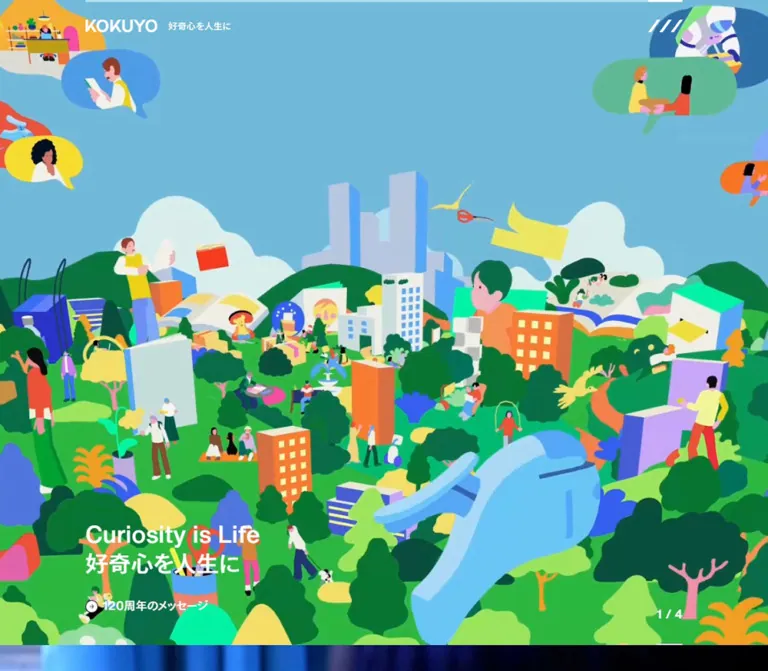
鮮やかなイラストと実写映像を大きく見せるコクヨの企業サイト。白いロゴと斜線のメニュー、左下のコピー、事業への導線とニュースを組み合わせています。
オリジナルサイトを見るKOKUYO — Style Reference
Everyday tools become a colorful moving world, framed by quiet corporate typography.
Original URL: https://www.kokuyo.com/ Final URL: https://www.kokuyo.com/ Theme: a white corporate foundation with scene-dependent white or charcoal foregrounds. Inspected: September 12, 2026, from supplied browser evidence retrieved at 13:54:45.211 UTC / 22:54:45.211 JST. Viewports: desktop 1440 × 1000 CSS pixels; mobile 390 × 844 CSS pixels. Scope: the current Japanese corporate homepage: three campaign chapters, business and editorial navigation, four news groups, important notices, footer, and visible consent panel. Screenshots directly show the first and third chapters. The second chapter and lower-page layout are documented from rendered DOM and computed styles.
KOKUYO opens with expansive imagery and remarkably little interface chrome. A white wordmark, a small Japanese brand statement, and three diagonal menu strokes sit over the scene. A short message occupies the lower left; a fraction at the lower right identifies the current chapter. A pale green notice strip introduces a separate, practical information layer above the imagery.
The first chapter combines people, buildings, trees, stationery, oversized hands, and packages in flat, saturated illustration. The third uses photographic learning scenes: a teal Campus notebook, musicians in a school ensemble, and close views of everyday activity. The visual identity comes from the relationship between these expressive scenes and the restrained, consistently aligned interface.
This is a corporate gateway with substantial navigation depth. After the three chapters, the page changes to compact business entries, editorial destinations, news, public notices, and a comprehensive footer. Preserve that transition from brand storytelling to useful information when adapting the design.
How to Read This Reference
- Measured means a value appears in the supplied computed styles or element rectangles. Measurements are CSS pixels unless stated otherwise.
- Calculated means arithmetic applied to those measurements or supplied CSS expressions.
- Estimated means a visual approximation from the original-page screenshots. Estimated colors and headline sizes are not exact source tokens.
- Declared means a custom property exists in the evidence; its presence alone does not establish where it is painted.
- Recommended means an implementation decision for a new project, rather than a verified original behavior.
- The source uses an unusually small root unit: 1 source rem = 1px on desktop and approximately 0.955882px on mobile. The Quick Start keeps a conventional root and expresses source geometry through
--u. - Several headings and links report the tiny root font size on their outer wrappers. Their visible lettering is styled elsewhere. Do not treat those wrapper values as the actual display type size.
- Lower-page rectangles establish arrangement and dimensions, but do not expose every image, clipping layer, or interactive state.
Tokens — Colors
Default Palette
The source uses OKLCH extensively. Preserve these exact values where supported; the descriptive aliases below are implementation names.
| Name | Exact source value | Source property | Evidence and role |
|---|---|---|---|
| White | oklch(1 0 0) / #ffffff |
--white100 |
Measured body, portal section, and footer background |
| Primary charcoal | oklch(0.2718 0.001 0) |
--primary |
Measured body text, second-chapter foreground, navigation, and news |
| Background gray | oklch(0.95 0 0) |
--gray_bg |
Measured chapter fallback surfaces and lower notice rows; approximately #eeeeee |
| Button gray | oklch(0.85 0 0) |
--gray_btn |
Measured interior destination background |
| Secondary text | oklch(0.51 0 0) |
--gray_text |
Measured company-introduction description and small home link |
| Line gray | oklch(0.9 0 200) |
--gray_line |
Declared separator token; individual painted rules were not sampled |
| Fresh green | oklch(0.9026 0.1342 125.82) |
--green |
Declared; visually consistent with the notice strip, but its binding was not supplied |
| Brand blue | oklch(0.79 0.14 221) |
--brand_blue, --keycolor |
Declared brand/key color; do not assume it fills every blue area in the media |
| Pale green | oklch(0.9696 0.0696 125.09) |
--subcolor |
Declared secondary color; exact component assignment unverified |
The notice strip looks approximately #cdef91 in the supplied screenshots. This is a visual estimate, not a pixel sample or an exact conversion of the declared green. Likewise, the illustrated blue and pink vary between frames; approximate search-palette colors should not replace the source OKLCH tokens.
Extended Declared Palette
The page exposes a broad palette suitable for its illustrated world. These are available source variables, not evidence of a user-selectable theme system.
| Family | Source token | Exact value |
|---|---|---|
| Brand red | --brand_red |
oklch(0.72 0.16 20) |
| Brand pink | --brand_pink |
oklch(0.84 0.12 337) |
| Brand green | --brand_green |
oklch(0.73 0.17 159) |
| Lemon | --lemon |
oklch(0.9383 0.0838 98.18) |
| Cream | --cream |
oklch(0.9899 0.0354 113.89) |
| Salmon | --salmon |
oklch(0.82 0.1 18) |
| Apricot | --apricot |
oklch(0.82 0.15 65) |
| Lavender | --lavender |
oklch(0.85 0.12 300) |
| Purple | --purple |
oklch(0.82 0.09 269) |
| Cyan | --cyan |
oklch(0.8641 0.1011 167.47) |
| Mint | --mint |
oklch(0.9 0.15 140) |
| Cloud | --cloud |
oklch(0.9148 0.0357 190.03) |
The source also declares primary charcoal at 10%, 20%, 40%, and 60% opacity. These are useful semantic primitives, but they do not establish the opacity of the photographic shading.
Foreground and Media Contrast
The first and third chapter sections explicitly compute to white text. The second chapter computes to primary charcoal. Corresponding header layers follow the same light/dark distinction.
The photographic captures are dark enough to carry white copy, especially around the lower left. Whether that darkness comes from media grading, a separate overlay, or both is not exposed. A directional scrim is a reasonable implementation recommendation, with its strength tested against actual footage.
The coral buttons in the consent panel belong to a separate utility overlay. Do not promote that coral into the main site's general action color.
Tokens — Typography
Main Site Stack
Measured computed family: hnr, HelveticaNowText, TazuganeGothicStdN, sans-serif.
The same stack appears on the body, campaign wrappers, navigation, news, and footer. The evidence does not include font-face definitions, font files, or a per-glyph resolved-font report. Preserve hnr as an unexplained source alias; do not expand it into an invented family name.
The visible character is a clean sans serif, with compact Japanese text and a direct English headline. Display messages look substantially heavier than the regular descriptions. The wordmark is graphical identity; its shape should come from an authorized brand asset rather than ordinary typed text.
Measured Text Styles
| Role | Desktop | Mobile | Weight | Evidence |
|---|---|---|---|---|
| Campaign supporting copy | 17px / 24px |
16.25px / 22.9412px |
500 |
Direct computed text style |
| Business-entry description | 17px / 24px |
14.3382px / 21.0294px |
400 |
Direct computed text style |
| News group heading | 19px / 28px |
16.25px / 22.9412px |
500 |
Direct computed text style |
| Footer category heading | 19px / 28px |
18.1618px / 26.7647px |
500 |
Direct computed text style |
| Footer subordinate link | 15px / 22px |
14.3382px / 21.0294px |
400 |
Direct computed text style |
| Small footer-area home link | 13px / 18px |
12.4265px / 17.2059px |
700 |
Direct computed text style |
These sampled text elements use normal letter spacing. There is no evidence for a site-wide tracked uppercase treatment.
Display Type and Graphical Labels
| Element | Measured geometry | Visual estimate or implementation guidance |
|---|---|---|
| First chapter heading, desktop | 327.44 × 93.67px |
Approximately 40–44px visible type, arranged as two lines |
| Third chapter heading, desktop | 232.81 × 93.67px |
Approximately 40–44px visible type, two short Japanese lines |
| Chapter heading, mobile | 336.47 × 73.89px wrapper |
Approximately 30–34px visible type; wrapper width is not glyph width |
| Chapter counter | Approximately 49–53px wide on desktop | Approximately 22–24px visible type; exact child font style unavailable |
| Notice text | Compact one-line desktop treatment | Approximately 14–16px visually; exact child style unavailable |
| Main wordmark | About 135px wide desktop; 96.53px mobile | Use the brand asset, not a font substitution |
The Quick Start uses a recommended 44px desktop headline and approximately 32.5px mobile headline at the inspected widths. Those choices approximate the screenshots; they are not extracted source font sizes.
Tokens — Spacing & Shapes
Responsive Unit
The supplied custom properties evaluate to these scaling expressions:
/* Expressions simplified from the supplied custom properties. */
/* Desktop: width is expressed as a number of CSS pixels. */
--scale: min(1.5, viewportWidth / 1440);

/* Mobile sample. */
--scale: viewportWidth / 408;
The actual source uses tan(atan2(...)) to obtain a unitless viewport-width value. The computed root confirms the result at both inspected widths:
- At 1440px:
1 source rem = 1px. - At 390px:
1 source rem = 390 / 408px ≈ 0.955882px.
A 768px desktop/mobile boundary is present in the supplied notice-related CSS. Tablet and intermediate-width behavior were not visually inspected. A --maxscreenwidth: 1920px variable appears in the desktop data, but its complete application is not shown.
Spacing Scale
| Source property | Source value | At 1440px | At 390px |
|---|---|---|---|
--space8 |
8rem |
8px | 7.65px |
--space16 |
16rem |
16px | 15.29px |
--space24 |
24rem |
24px | 22.94px |
--space32 |
32rem |
32px | 30.59px |
--space48 |
48rem |
48px | 45.88px |
--space64 |
64rem |
64px | 61.18px |
--space80 |
80rem |
80px | 76.47px |
--space96 |
96rem |
96px | 91.76px |
--space112 |
112rem |
112px | 107.06px |
--space144 |
144rem |
144px | 137.65px |
These are token conversions, not a claim that each component keeps the same token on mobile. For example, the sampled major section gap changes from 80px on desktop to approximately 45.88px on mobile.
Layout Measurements
| Element | Desktop 1440 × 1000 | Mobile 390 × 844 |
|---|---|---|
| Chapter section | 1440 × 952px |
390 × 844px |
| Three-chapter region | 2856px high | 2532px high |
| Notice band | Approximately 50px high | Approximately 86–87px high |
| Header box | Approximately 96.98px high | Approximately 73.64px high |
| Header and hero text left edge | 160px | 26.75px |
| Right edge of counter alignment | Approximately 1280px | 363.25px |
| First heading top | 653.13px within chapter | 604.53px within chapter |
| Supporting-copy top | 789.88px within chapter | 704.31px within chapter |
| Counter wrapper top | 884.75px within chapter | 779.70px within chapter |
| Portal outer left edge | Approximately 72.02px | 11.47px |
| Portal text inset, company entry | 104px from viewport left | 26.75px from viewport left |
| News content width | Approximately 621px per column | 336.5px |
| Footer vertical padding | 72px | 30.59px |
| Reported document height | 5390px | 6011px |
The chapter begins at document y=0 beneath the notice/header layers. Do not add the notice height to the measured chapter height. On desktop, the first chapter ends at y=952, leaving a 48px glimpse of the following region in the 1000px viewport. On mobile it fills the full 844px viewport.
Shapes and Edges
Sampled chapter sections, portal anchors, interior entry, news links, notice rows, and footer use a 0px border radius. Large layout regions are rectangular. The header menu provides a distinctive diagonal motif without enclosing it in a rounded badge.
The consent overlay is an exception: visually estimated small corner rounding, a soft shadow, and pill-shaped action buttons. Keep that exception confined to its utility layer.
Components
Important Notice Strip
Role: surface a current public warning before visitors enter the brand experience.
A pale green strip spans the viewport. Desktop content aligns to the 160px hero gutter and combines a small circled information symbol, the label 重要なお知らせ, a thin vertical divider, and a linked warning. The observed link leads to a specific company notice.
On mobile, the label occupies the first line and the warning occupies a second line. Both align at x≈26.75px. The screenshot truncates the warning with an ellipsis while the DOM retains the complete link text. The band grows to approximately 86–87px.
Implementation guidance: allow the linked text to shrink using min-width: 0; keep the complete accessible text even when the visible line is truncated. Treat the band height as part of header positioning.
Brand Header
Role: maintain identity and provide a compact navigation entry point.
The visible header contains three elements: a KOKUYO wordmark at left, a smaller linked brand statement beside it, and the diagonal menu symbol at right. Its background is transparent over the campaign media.
Measured desktop geometry includes a roughly 135px wordmark container, a 130px statement-link box, and an 85.30 × 42.98px menu button. The menu button has 10px padding. Mobile uses a 96.53px wordmark container, a 95.58px statement-link box, and a 61.17 × 34.41px menu button with approximately 9.56px padding.
The symbol consists of three parallel white diagonal strokes, slanting upward to the right. It is visually wider and flatter than a conventional three-horizontal-line menu.
The evidence includes repeated light and dark header layers aligned to the same viewport position. This supports scene-specific contrast handling. It does not establish the complete clipping or positioning implementation. A new implementation can use one semantic header with an active foreground state.
The menu's open layout, focus behavior, and animation were not supplied. An empty extracted button text is not proof that the original button lacks an accessible name.
Campaign Chapter Sequence
Role: present three distinct brand or product stories before the corporate portal.
The DOM places three equally sized chapters at y=0, 952, and 1904 on desktop, and y=0, 844, and 1688 on mobile. This is concrete evidence of a vertical chapter sequence. A timed horizontal carousel is not established.
| Chapter | Source heading | Destination label | Foreground |
|---|---|---|---|
| 1 | Curiosity is Life / 好奇心を人生に |
120周年のメッセージ |
White |
| 2 | CI/VIを / リニューアルしました |
新CI・VI開発ストーリー |
Primary charcoal |
| 3 | まなびかたを / もっと明るく |
キャンパスについて |
White |
Each chapter combines a full-width media plane, a short lower-left headline, an optional two-line description, a text destination, and a lower-right fraction. The second chapter has no supporting paragraph in the supplied content; its heading starts lower accordingly.
Only the first and third chapter imagery is directly visible in the supplied original-page captures. The second chapter's media composition cannot be described reliably from its heading alone.
Campaign Copy and Destination
Role: give the visitor a clear editorial entry point without covering much of the scene.
The first desktop heading begins at x=160 and y≈653.13. Its measured box ends at y≈746.80; the supporting paragraph begins at y≈789.88, leaving approximately 43.08px between those measured boxes. On mobile, the corresponding gap is approximately 25.89px.
The first campaign destination anchor has a large rectangle encompassing the copy area: approximately 359.44 × 282.88px on desktop and 367.05 × 224.17px on mobile. Its left edge extends about 16 source units beyond the heading alignment. These bounds support a generous click region around the message rather than only a tiny label target.
The destination remains an unboxed text treatment. Preserve this restrained hierarchy: short message first, explanation second, destination last. The visible consent overlay obscures much of the destination area, so its exact icon detail is not recoverable from these captures.
Chapter Counter
Role: orient the visitor within the three-story opening.
The visible labels are 1 / 3, 2 / 3, and 3 / 3. They align to the right content edge, with approximately 48px bottom padding on desktop and 45.88px on mobile. A short white edge mark is visible near the chapter bottom in the supplied screenshots.
The counter is extracted as a paragraph, not a button. Seeking, clicking, or dragging it was not demonstrated. The bottom mark's timing or progress semantics are also unverified.
Business Navigation Portal
Role: connect the brand opening to the company's actual business areas.
The portal begins after the three chapters. Desktop geometry establishes an asymmetric arrangement inside an approximately 1296px-wide region:
- A left region approximately 832px wide.
- A right region approximately 408px wide.
- Approximately 56px between those regions.
- Two 408px business entries within the left region, separated by 16px.
The company-introduction entry spans the left region and measures approximately 832 × 288px. Beneath it, 文具, 家具, 空間, and 通販 occupy two rows of 408 × 144px entries. An インテリア destination spans the left region below them and measures approximately 832 × 112px.
The business entries combine a category title, a concise two-line description, a small button, and related link content. Some subordinate links have negative x coordinates in the sampled state. Their presence in extracted text does not mean that every sublink was visibly expanded. The button's exact reveal behavior was not exercised.
On mobile, the company entry becomes approximately 367.06 × 167px. The four principal business entries become single-column rows approximately 367.06 × 85px, with roughly 8.64px between successive rows. Their descriptions still occupy a compact area toward the right. This preserves a category/description relationship inside each entry rather than turning every row into a tall centered card.
Editorial Destinations and Utility Links
Role: offer broader exploration alongside the business directory.
Desktop places the future-scenario destination at approximately x=960, y=2968, with a 408 × 192px rectangle. The magazine entry sits below it with the same width and height. Utility links follow in two columns of approximately 192px, separated horizontally by about 24px.
The utility destinations are news, sustainability, IR, recruitment, and customer support. Their sampled desktop link boxes are approximately 57.89px high.
Mobile places the magazine after the interior entry and the future-scenario destination after the magazine. Both have approximately 367 × 167px boxes. Utility links then form full-width rows, each approximately 336.5 × 47.11px.
This is an observed responsive ordering change. Preserve meaningful reading order and keyboard order when recreating it.
News Groups
Role: make frequently updated corporate information easy to scan.
Four groups appear: ニュースリリース, IRニュース, お知らせ, and 重要なお知らせ. Each has a medium-weight heading, an 一覧 link, and two current entries in the supplied state.
Desktop uses two columns of approximately 621px, with a roughly 54px central gap. An entry combines a date, category, and title in a compact row. The sampled first news anchor is approximately 621 × 17.23px, and the next begins about 31.22px later.
Mobile stacks the groups. Entry rectangles become approximately 336.5 × 77.27px, with 19.12px top padding, 18.16px bottom padding, and an 11.47px gap. These measurements support a more vertically separated metadata/title arrangement, although the exact child layout was not included.
The feed is informational and text-led. Use semantic dates and links. The original DOM exposes document destinations for IR items, but their contents were not inspected.
Lower Important-Notice Rows
Role: retain access to ongoing product and corporate notices outside the dated news feed.
Three broad rows use the measured background gray and square corners. Desktop rows are approximately 1296 × 62.20px with 24px padding. They are separated by about 1px.
On mobile, the first two rows grow to approximately 367.06 × 101.52px. The third is about 57.89px high. Padding is approximately 22.94px. Let content determine row height; a fixed desktop height would not accommodate the mobile arrangement.
Footer
Role: provide a durable directory, policy access, and language/region navigation.
The footer returns to a white surface and uses medium-weight category headings above smaller regular links. Desktop sampled category columns are approximately 144px wide. Vertical padding is 72px.
Mobile reduces vertical padding to approximately 30.59px. Category headings appear in closely spaced rows with adjacent buttons around 30.58px square. This suggests disclosure controls, but no opened/closed transition was supplied. Some measured descendant rectangles overlap other rows, so they cannot be used as proof that all submenu text was simultaneously visible.
The full extracted footer includes the brand statement, social links, privacy and usage policies, privacy settings, Japanese/English choices, region selection, and a KOKUYO copyright line.
Consent Panel
Role: collect cookie preferences while leaving the page visible.
All supplied original-page screenshots show a white panel at the bottom left. Its visual dimensions are approximately 316 × 220px on both desktop and mobile. It contains a small close control, a shallow bordered text area, three coral pill buttons labeled Privacy Settings, Reject All, and OK, and a small provider mark.
The buttons are visually about 260 × 24px, separated by approximately 6px. Text is around 11px. These are screenshot estimates; this panel's computed styles were not included.
At 390px wide, the panel occupies about 81% of the viewport width and approximately 26% of its height. Its top edge at y≈624 overlaps the campaign heading, which starts near y≈605. Treat that obstruction as a captured integration issue to account for in a new implementation. Consent changes, closing behavior, and settings-panel contents were not tested.
Tokens — Motion & Interaction
| Treatment | Evidence | What can be concluded |
|---|---|---|
| Header transform | 0.4s cubic-bezier(0, 0.5, 0, 1) |
Exact declared transition; triggering state unverified |
| Header height | 0.4s cubic-bezier(0, 0.5, 0, 1) |
Exact declared transition; supports coordinated header geometry changes |
| Chapter progression | Three stacked section rectangles and numbered captures | Vertical story structure is verified; snap configuration and input handling are not |
| Third-chapter media | Notebook and ensemble scenes appear with the same 3 / 3 label |
Changing media content is evidenced; playback format, cadence, looping, and audio are unknown |
| First-chapter illustration | Different compositions appear in desktop and mobile captures | Illustration is observed; timing versus responsive asset selection cannot be separated |
| Chapter foreground changes | White / charcoal / white computed section colors | Contrast changes by chapter; transition method is unknown |
| Portal and footer controls | Buttons and subordinate links exist in the DOM | Interactive affordances exist; actual disclosure behavior remains unverified |
| Consent controls | Labels are visible and text explains intended choices | The offered choices are known; resulting states were not exercised |
Most sampled elements report animation: none. That does not establish a motion-free site: media playback, descendant animations, and script-driven transforms are outside that narrow reading. Similarly, a runtime --durationrate: 0 value does not prove a global reduced-motion policy.
The collection process waited for load and sampled stability, with finite time limits, and temporarily paused perpetual animations during readiness checks. It is not a frame-by-frame motion study. No reliable durations are available for media scenes, chapter transitions, menu opening, or text reveals.
Recommended adaptation: use the measured 400ms easing for header state changes. Keep other interface transitions restrained and brief. Offer a visible way to pause prolonged motion, and retain a static poster plus readable copy when motion is reduced. Do not invent scroll-synchronized film playback from the available evidence.
Surfaces
| Layer | Appearance | Structural purpose |
|---|---|---|
| Notice strip | Pale green, dark text | Public information above the brand experience |
| Campaign media | Full-width illustration or photography | Main visual and emotional content |
| Header and campaign copy | Transparent background; white or charcoal details | Identity, orientation, and destination access |
| Portal canvas | Measured white background | Organizes business and editorial destinations |
| Interior destination | Measured medium-light neutral gray | Distinct rectangular navigation entry |
| News area | White, compact dark text | Scannable current information |
| Important-notice rows | Light neutral gray | Groups persistent notices |
| Footer | White with dark/gray type | Dense but orderly site directory |
| Consent overlay | White, small rounding, soft shadow, coral pills | Independent preference interface |
The sampled main components have square geometry. Their transparent anchor backgrounds do not prove the absence of decorative descendants or media layers. Avoid inventing a detailed lower-page color-card system from the token list alone.
Imagery
Illustrated Brand World
The first original desktop capture shows a large globe above packages, oversized hands, small buildings, trees, storage shelves, and stationery-related objects. The mobile capture shows people among greenery and buildings, with an oversized pair of scissors.
Use broad, flat shapes; simplified people; exaggerated object scale; vivid greens and blues; yellow, orange, lavender, and pink accents; and occasional thin outline details. The compositions are dense but organized around large recognizable silhouettes. People and everyday tools connect the corporate scale to individual activity.
The media reaches the viewport edges and continues behind the header and text. A portrait crop changes which objects remain visible. Do not reproduce the entire wide scene as a tiny contained image on a phone.
Photographic Learning Scenes
The third chapter shows a shallow-focus Campus notebook close-up and a school ensemble in warm light. Another mobile frame is tightly cropped around an arm and wrist. The framing emphasizes lived activity and tactile detail.
Preserve the depth of field, natural lighting, and environmental context. The interface remains white and consistent while the shot changes. Plan for changing contrast throughout the footage, not only in a single poster frame.
Observed Asset References
No image source URLs, video source URLs, poster paths, intrinsic media dimensions, or font-file URLs were included in the supplied evidence. They cannot be listed as verified assets.
The following are observed link destinations, not media files or independently inspected pages:
| Destination | URL |
|---|---|
| Anniversary and brand message | https://www.kokuyo.com/special/curiosity-is-life/ |
| CI/VI development story | https://www.kokuyo.com/magazine/kokuyo/special-ci-renewal/ |
| Campus introduction | https://www.kokuyo.com/stationery/lp/campus/ |
Use authorized media with a deliberate crop for each viewport. The shell can be recreated in CSS, but the illustrated scenes and photographic direction carry much of this design's identity.
Layout & Responsive Behavior
The page combines two alignment systems. Desktop campaign copy and identity align at x=160, while the lower portal begins near x=72. The portal therefore uses more of the available width. On mobile, outer panel rectangles start at x≈11.47, while their readable text, header identity, and news align at x≈26.75.
The mobile design changes composition rather than shrinking everything uniformly:
- The notice becomes two rows and increases in height.
- The wordmark and statement reduce in size; the diagonal menu remains at the right.
- Chapters become a full viewport high, compared with 952px inside the inspected 1000px desktop viewport.
- Campaign headlines retain two-line arrangements and move to a wider text wrapper relative to the screen.
- Four business entries move from a two-column arrangement to compact single-column rows.
- Magazine and future-scenario destinations change their relative visual placement.
- Corporate utility links become a single column.
- News groups stack and individual news entries become taller.
- Footer heading rows gain adjacent buttons; their interaction states are unverified.
- The consent panel stays approximately the same absolute size and consequently obscures much more of the mobile composition.
The sampled body height grows from approximately 5389.19px to 6010.23px even though the chapter region becomes shorter. The expanded lower-page flow accounts for that difference.
Only these two widths were inspected. Treat interpolation, landscape behavior, browser toolbar changes, text zoom, and very narrow screens as implementation testing requirements. The source unit calculation alone is insufficient evidence for all intermediate layouts.
Do’s and Don’ts
Do
- Lead with expansive illustrated or photographic scenes and a compact identity overlay.
- Keep the first and third chapter copy white, with a deliberate contrast strategy for changing media.
- Preserve the three diagonal menu strokes as a recognizable visual motif.
- Align campaign messages to a consistent lower-left gutter and counters to the opposite edge.
- Keep the current three-chapter structure when documenting this inspected page.
- Use exact OKLCH values for verified interface tokens.
- Separate the wide corporate portal gutter from the narrower campaign alignment.
- Preserve compact category/description relationships inside mobile business rows.
- Let mobile news and notice entries grow with their content.
- Keep source-unit conversions explicit when adapting the layout.
- Distinguish media-frame changes from verified scroll or carousel behavior.
Don’t
- Don't reduce the corporate homepage to a single campaign with no business directory or news.
- Don't replace the large scenes with a grid of small decorative thumbnails.
- Don't give every portal entry large rounded corners and floating shadows.
- Don't use the consent panel's coral pills as the site's primary CTA system.
- Don't apply a conventional 16px rem to copied values such as
144remor80rem. - Don't report a wrapper's 1px font size as the visible headline size.
- Don't infer expanded submenus from extracted offscreen links.
- Don't invent an automatic carousel, swipe action, progress timer, or synchronized media timeline.
- Don't assume desktop and mobile captures represent the same media timestamp.
- Don't preserve a mobile overlay collision merely because it appears in the reference.
Recommended Implementation Additions
These are recommendations for an adaptation, not verified original features:
- Use one semantic header and update its contrast state with the active chapter. Keep decorative duplicates out of the accessibility tree if visual layering requires them.
- Give the diagonal menu an explicit accessible name, a controlled expanded state, keyboard support, and a complete focus-management strategy.
- Expand compact menu, disclosure, and consent hit areas toward at least 44 × 44px without enlarging their visual symbols unnecessarily.
- Provide keyboard navigation and a pause option for prolonged moving content. Honor reduced motion in both CSS and media playback code.
- Keep campaign text and destination links available when video cannot load.
- Make inactive portal submenus inert or otherwise remove hidden controls from sequential keyboard navigation.
- Preserve meaningful heading order and keep navigation buttons separate from destination links.
- Retain the full warning text for assistive technology when visually truncating the mobile notice.
- Avoid covering the campaign message with the consent panel. A reserved layout region or a deliberate initial consent state is preferable to accidental overlap.
- Test the source-inspired scaling at 200% zoom and intermediate widths; impose readable text minimums where required.
Agent Prompt Guide
Quick Color Reference
- Main canvas:
#ffffff. - Primary text:
oklch(0.2718 0.001 0). - Neutral notice rows:
oklch(0.95 0 0). - Interior navigation surface:
oklch(0.85 0 0). - Secondary text:
oklch(0.51 0 0). - Notice-strip adaptation:
oklch(0.9026 0.1342 125.82); source token is exact, component assignment is an informed approximation. - Brand blue token:
oklch(0.79 0.14 221). - Campaign interface: white over illustrated and photographic scenes, charcoal for the second chapter.
- Main destination treatment: unboxed text within a generous linked message region.
Overall Prompt
“Create a Japanese corporate homepage inspired by KOKUYO's current visual structure. Open with three vertically arranged, nearly full-screen campaign chapters. Use expressive flat illustration and warm photographic learning scenes, a compact white wordmark and brand statement at the upper left, three parallel diagonal strokes for the menu at the upper right, short lower-left messages, and lower-right chapter fractions. Place a pale green notice strip above the media. Follow the storytelling with a white business portal: a broad company entry, compact stationery/furniture/space/business-supply entries, editorial destinations, corporate utility links, four news groups, persistent notices, and a detailed footer. Use square geometry, the supplied OKLCH palette, restrained sans-serif typography, and explicit mobile reflow. Treat media playback and menu behavior as implementation decisions that require their own specification.”
Example Component Prompts
- Campaign chapter: “A 1440px-wide scene approximately 952px high at a 1000px viewport, with illustration reaching the edges. Align white campaign copy 160px from the left, near the lower third. Place the chapter fraction on the opposite gutter. Use a short headline, two supporting lines, and an unboxed destination.”
- Header: “A transparent identity row over imagery: graphical wordmark, small Japanese brand statement, and a right-aligned menu made from three diagonal strokes. At 390px, align content around 27px from each edge and retain the same hierarchy.”
- Business portal: “A white corporate directory with an approximately 832px primary region and 408px editorial region separated by 56px at the desktop reference width. Use square rectangular entries, concise descriptions, and compact controls. Reflow business entries into wide shallow rows on mobile.”
- News group: “A modest medium-weight heading with a small archive link, followed by two date/category/title entries. Use two group columns on desktop and stack them on mobile. Increase mobile row spacing while keeping the treatment text-led and neutral.”
- Illustration brief: “Build a colorful everyday world from simplified people, trees, buildings, stationery, packages, and oversized hands. Use flat saturated shapes and occasional fine outlines. Compose separate safe areas for desktop and portrait crops so the brand identity and short message remain legible.”
Quick Start
CSS Custom Properties
This is a recommended implementation scaffold, not the original stylesheet. Exact source colors and measured text styles are retained where available. Headline sizes, a photographic scrim, minimum target sizes, and some layout rules are adaptations.
The source geometry is expressed through --u while ordinary rem values continue to follow the user's browser font size. Classes describe the components above. Supply your own authorized logo and media. Menu logic, chapter state, media controls, consent handling, and footer disclosures require separate implementation.
:root {
  /* Exact source colors. */
  --color-page: #fff;
  --color-ink: oklch(0.2718 0.001 0);
  --color-muted: oklch(0.51 0 0);
  --color-gray-bg: oklch(0.95 0 0);
  --color-gray-button: oklch(0.85 0 0);
  --color-rule: oklch(0.9 0 200);
  --color-brand-blue: oklch(0.79 0.14 221);
  --color-brand-pink: oklch(0.84 0.12 337);
  --color-brand-green: oklch(0.73 0.17 159);

  /* Recommended notice mapping to a declared source color. */
  --color-notice: oklch(0.9026 0.1342 125.82);

  /* Observed stack; font files are not included. */
  --font-site-stack: hnr, HelveticaNowText,
    TazuganeGothicStdN, sans-serif;

  /* Source-inspired geometry without a tiny root font. */
  --u: min(1.5px, calc(100vw / 1440));
  --space-8: calc(8 * var(--u));
  --space-16: calc(16 * var(--u));
  --space-24: calc(24 * var(--u));
  --space-32: calc(32 * var(--u));
  --space-48: calc(48 * var(--u));
  --space-80: calc(80 * var(--u));
  --space-112: calc(112 * var(--u));

  --hero-inset: calc(160 * var(--u));
  --portal-inset: calc(72 * var(--u));
  --notice-height: calc(50 * var(--u));
  --header-height: calc(97 * var(--u));

  /* Text floors are recommended accessibility additions. */
  --text-body: max(1rem, calc(17 * var(--u)));
  --text-description: max(0.875rem, calc(17 * var(--u)));
  --text-section: max(1rem, calc(19 * var(--u)));
  --text-small: max(0.875rem, calc(15 * var(--u)));
  --text-hero: max(2rem, calc(44 * var(--u)));

  /* Exact sampled header transition. */
  --motion-header: 400ms cubic-bezier(0, 0.5, 0, 1);
}

* {
  box-sizing: border-box;
}

body {
  margin: 0;
  color: var(--color-ink);
  background: var(--color-page);
  font-family: var(--font-site-stack);
}

button,
input {
  font: inherit;
}

.kokuyo-reference a {
  color: inherit;
}

.important-notice {
  position: fixed;
  inset: 0 0 auto;
  z-index: 30;
  min-height: var(--notice-height);
  display: flex;
  align-items: center;
  padding-inline: var(--hero-inset);
  color: var(--color-ink);
  background: var(--color-notice);
  font-size: 1rem;
}

.notice-label {
  display: flex;
  flex: none;
  align-items: center;
  gap: var(--space-8);
  padding-right: var(--space-16);
  border-right: 1px solid rgb(0 0 0 / 15%);
  font-weight: 600;
}

.notice-link {
  min-width: 0;
  margin-left: var(--space-16);
  overflow: hidden;
  white-space: nowrap;
  text-overflow: ellipsis;
  text-decoration: none;
}

.brand-header {
  position: fixed;
  inset: var(--notice-height) 0 auto;
  z-index: 20;
  height: var(--header-height);
  display: flex;
  align-items: center;
  gap: calc(20 * var(--u));
  padding-inline: var(--hero-inset);
  color: #fff;
  transition:
    transform var(--motion-header),
    height var(--motion-header);
}

/* Set this attribute from the active chapter or content region. */
.brand-header[data-tone='ink'] {
  color: var(--color-ink);
}

.brand-logo {
  display: block;
  width: calc(135 * var(--u));
  height: auto;
}

.brand-statement {
  width: calc(130 * var(--u));
  font-size: max(0.75rem, calc(17 * var(--u)));
  font-weight: 600;
  text-decoration: none;
}

.menu-button {
  display: grid;
  place-items: center;
  margin-left: auto;
  padding: calc(10 * var(--u));
  min-width: 44px;
  min-height: 44px;
  border: 0;
  color: inherit;
  background: transparent;
  cursor: pointer;
}

/* Three decorative span elements inside an accessible button. */
.menu-slashes {
  width: calc(65 * var(--u));
  height: calc(23 * var(--u));
  display: flex;
  justify-content: space-around;
}

.menu-slashes span {
  width: calc(6 * var(--u));
  height: 100%;
  background: currentColor;
  transform: skewX(-38deg);
}

.chapter {
  position: relative;
  isolation: isolate;
  min-height: 38rem;
  height: calc(100vh - 48 * var(--u));
  height: calc(100svh - 48 * var(--u));
  color: #fff;
  background: var(--color-gray-bg);
}

.chapter[data-tone='ink'] {
  color: var(--color-ink);
}

.chapter-media {
  position: absolute;
  inset: 0;
  z-index: -2;
  width: 100%;
  height: 100%;
  object-fit: cover;
  object-position: var(--media-position, 50% 50%);
}

/* Recommended contrast layer; tune against the actual footage. */
.chapter--photographic::before {
  content: '';
  position: absolute;
  inset: 0;
  z-index: -1;
  background: linear-gradient(
    to top,
    rgb(0 0 0 / 48%),
    rgb(0 0 0 / 8%) 75%
  );
  pointer-events: none;
}

.chapter-link {
  position: absolute;
  left: calc(var(--hero-inset) - var(--space-16));
  bottom: var(--space-32);
  max-width: calc(100% - 2 * var(--hero-inset));
  display: block;
  padding: var(--space-16);
  text-decoration: none;
}

.chapter-title {
  margin: 0;
  font-size: var(--text-hero);
  font-weight: 600;
  line-height: 1.2;
}

.chapter-description {
  margin: var(--space-32) 0 0;
  font-size: var(--text-body);
  font-weight: 500;
  line-height: calc(24 / 17);
}

.chapter-destination {
  display: block;
  margin-top: calc(40 * var(--u));
  font-size: max(1rem, calc(22 * var(--u)));
  font-weight: 600;
  line-height: 1.2;
}

.chapter-counter {
  position: absolute;
  right: var(--hero-inset);
  bottom: var(--space-48);
  margin: 0;
  font-size: max(1.25rem, calc(24 * var(--u)));
  font-weight: 600;
  line-height: 1;
}

.portal {
  padding: var(--space-112) var(--portal-inset);
  background: var(--color-page);
}

.portal-grid {
  display: grid;
  grid-template-columns: minmax(0, 832fr) minmax(0, 408fr);
  gap: calc(56 * var(--u));
}

.portal-primary {
  display: grid;
  grid-template-columns: repeat(2, minmax(0, 1fr));
  gap: var(--space-16);
  align-content: start;
}

.portal-secondary {
  display: flex;
  flex-direction: column;
  gap: var(--space-16);
}

.portal-entry {
  display: block;
  min-width: 0;
  padding: var(--space-32);
  border-radius: 0;
  text-decoration: none;
}

.portal-entry--company {
  grid-column: 1 / -1;
  min-height: calc(288 * var(--u));
}

.portal-entry--business {
  min-height: calc(144 * var(--u));
}

.portal-entry--interior {
  grid-column: 1 / -1;
  min-height: calc(112 * var(--u));
  background: var(--color-gray-button);
}

.portal-entry--editorial {
  min-height: calc(192 * var(--u));
}

.portal-entry-top {
  display: flex;
  align-items: flex-start;
  justify-content: space-between;
  gap: var(--space-16);
}

.portal-entry-title {
  margin: 0;
  font-size: max(1.25rem, calc(24 * var(--u)));
  font-weight: 500;
}

.portal-entry-description {
  margin: 0;
  font-size: var(--text-description);
  line-height: calc(24 / 17);
}

.utility-links {
  display: grid;
  grid-template-columns: repeat(2, minmax(0, 1fr));
  column-gap: var(--space-24);
}

.utility-links a {
  display: block;
  padding-block: calc(20 * var(--u)) calc(22 * var(--u));
  font-size: var(--text-small);
  text-decoration: none;
}

.news-grid {
  display: grid;
  grid-template-columns: repeat(2, minmax(0, 1fr));
  gap: var(--space-80) calc(54 * var(--u));
  margin-top: var(--space-80);
}

.news-heading-row {
  display: flex;
  align-items: center;
  justify-content: space-between;
  gap: var(--space-16);
  margin-bottom: calc(30 * var(--u));
}

.news-heading {
  margin: 0;
  font-size: var(--text-section);
  font-weight: 500;
  line-height: calc(28 / 19);
}

.news-list {
  display: grid;
  gap: calc(14 * var(--u));
  margin: 0;
  padding: 0;
  list-style: none;
}

/* Child-column widths are recommended, not extracted values. */
.news-row {
  display: grid;
  grid-template-columns: auto auto minmax(0, 1fr);
  gap: var(--space-8);
  font-size: var(--text-small);
  line-height: 1.5;
  text-decoration: none;
}

.notice-row {
  display: flex;
  align-items: center;
  justify-content: space-between;
  gap: var(--space-24);
  margin-top: 1px;
  padding: var(--space-24);
  background: var(--color-gray-bg);
  font-size: var(--text-small);
  text-decoration: none;
}

.site-footer {
  padding: calc(72 * var(--u)) var(--hero-inset);
  background: var(--color-page);
}

.footer-heading {
  font-size: max(1rem, calc(19 * var(--u)));
  font-weight: 500;
  line-height: calc(28 / 19);
}

.footer-link {
  font-size: var(--text-small);
  line-height: calc(22 / 15);
}

/* Recommended focus treatment. */
.kokuyo-reference :focus-visible {
  outline: 3px solid currentColor;
  outline-offset: 4px;
}

@media (max-width: 767px) {
  :root {
    --u: calc(100vw / 408);
    --hero-inset: calc(28 * var(--u));
    --portal-inset: calc(12 * var(--u));
    --notice-height: calc(90 * var(--u));
    --header-height: calc(77 * var(--u));
    --text-hero: max(1.875rem, calc(34 * var(--u)));
    --text-description: max(0.875rem, calc(15 * var(--u)));
    --text-section: max(1rem, calc(17 * var(--u)));
  }

  .important-notice {
    display: grid;
    align-content: center;
    gap: calc(14 * var(--u));
    font-size: max(0.8125rem, calc(14 * var(--u)));
  }

  .notice-label {
    padding: 0;
    border: 0;
  }

  .notice-link {
    margin: 0;
  }

  .brand-header {
    gap: calc(15 * var(--u));
  }

  .brand-logo {
    width: calc(101 * var(--u));
  }

  .brand-statement {
    width: calc(100 * var(--u));
    font-size: 0.75rem;
  }

  .menu-slashes {
    width: calc(44 * var(--u));
    height: calc(16 * var(--u));
  }

  .menu-slashes span {
    width: calc(4 * var(--u));
  }

  .chapter {
    height: 100vh;
    height: 100svh;
  }

  .chapter-link {
    right: calc(var(--hero-inset) - var(--space-16));
    max-width: none;
  }

  .chapter-description {
    margin-top: var(--space-24);
  }

  .chapter-destination {
    margin-top: var(--space-32);
  }

  .portal {
    padding-block: calc(76 * var(--u)) var(--space-48);
  }

  .portal-grid,
  .portal-primary,
  .utility-links,
  .news-grid {
    grid-template-columns: minmax(0, 1fr);
  }

  .portal-grid {
    gap: var(--space-16);
  }

  .portal-primary {
    gap: calc(9 * var(--u));
  }

  .portal-entry {
    padding: var(--space-16);
  }

  .portal-entry--company,
  .portal-entry--editorial {
    min-height: calc(175 * var(--u));
  }

  .portal-entry--business {
    min-height: calc(89 * var(--u));
  }

  .portal-entry--interior {
    min-height: calc(91 * var(--u));
  }

  .portal-entry-description {
    line-height: calc(22 / 15);
  }

  .utility-links,
  .news-grid {
    margin-inline: var(--space-16);
  }

  .news-grid {
    margin-top: var(--space-48);
    row-gap: var(--space-48);
  }

  .news-list {
    gap: 0;
  }

  .news-row {
    grid-template-columns: auto 1fr;
    gap: calc(12 * var(--u)) var(--space-8);
    padding-block: calc(20 * var(--u)) calc(19 * var(--u));
  }

  .news-row-title {
    grid-column: 1 / -1;
  }

  .notice-row {
    align-items: flex-start;
    flex-direction: column;
  }

  .site-footer {
    padding-block: var(--space-32);
  }
}

@media (prefers-reduced-motion: reduce) {
  .brand-header {
    transition: none;
  }

  /* Media playback must also honor this preference in its controller. */
}
The scaffold reproduces the principal geometry at the reference widths, not every original layer. In particular, wire the header's position and foreground state to the active region, use deliberate desktop/mobile ordering for editorial destinations, and test tall text before relying on lower-left absolute positioning. The source-specific media and unsampled interactive states remain separate work.
Tailwind v4 Token Mapping
Optional mapping for an existing Tailwind v4 project. It does not imply that the original website uses Tailwind. Define the custom properties above first.
@theme inline {
  --color-page: #fff;
  --color-ink: oklch(0.2718 0.001 0);
  --color-muted: oklch(0.51 0 0);
  --color-notice: oklch(0.9026 0.1342 125.82);
  --color-neutral-surface: oklch(0.95 0 0);
  --color-brand-blue: oklch(0.79 0.14 221);

  --font-site: var(--font-site-stack);

  --text-campaign: var(--text-hero);
  --text-supporting: var(--text-body);
  --text-directory: var(--text-description);
  --text-news-heading: var(--text-section);

  --spacing-unit: var(--u);
  --spacing-hero-gutter: var(--hero-inset);
  --spacing-portal-gutter: var(--portal-inset);
  --spacing-section-gap: var(--space-80);

  --radius-panel: 0px;
}
Sources & Evidence
- Original and final page: https://www.kokuyo.com/. The supplied browser observation reports HTTP 200 with unchanged original/final URL and the title
コクヨ|好奇心を人生に. - Capture record: September 12, 2026, 13:54:45.211 UTC / 22:54:45.211 JST. Supplied original-page evidence includes three desktop captures at 1440 × 1000 and two mobile captures at 390 × 844.
- Rendered evidence: page text, destination links, desktop/mobile element rectangles, computed font stacks and text styles, custom properties, chapter foregrounds, backgrounds, and header transitions. These establish the measured tokens and responsive arrangements above.
- Identity: the inspected page includes the KOKUYO copyright statement and a structured identity naming
コクヨ株式会社. This supports the operator identity independently of any external project credits. - Motion evidence: different photographic scenes are visible within the third chapter. No interaction trace establishes media cadence, automatic chapter advancement, menu opening, disclosure outcomes, consent outcomes, or audio behavior.
- Inspection limits: screenshots directly cover the first and third chapters; the second and lower sections rely on DOM evidence. Media URLs, complete stylesheets, font-face definitions, intermediate viewports, accessible-name computations, and opened overlays were not supplied. Linked destinations were not independently inspected for this reference.
This reference describes the current supplied homepage evidence. Source measurements, visual estimates, derived calculations, and implementation recommendations are identified separately throughout.
# KOKUYO — Style Reference

> Everyday tools become a colorful moving world, framed by quiet corporate typography.

**Original URL:** [https://www.kokuyo.com/](https://www.kokuyo.com/)
**Final URL:** [https://www.kokuyo.com/](https://www.kokuyo.com/)
**Theme:** a white corporate foundation with scene-dependent white or charcoal foregrounds.
**Inspected:** September 12, 2026, from supplied browser evidence retrieved at 13:54:45.211 UTC / 22:54:45.211 JST.
**Viewports:** desktop 1440 × 1000 CSS pixels; mobile 390 × 844 CSS pixels.
**Scope:** the current Japanese corporate homepage: three campaign chapters, business and editorial navigation, four news groups, important notices, footer, and visible consent panel. Screenshots directly show the first and third chapters. The second chapter and lower-page layout are documented from rendered DOM and computed styles.

KOKUYO opens with expansive imagery and remarkably little interface chrome. A white wordmark, a small Japanese brand statement, and three diagonal menu strokes sit over the scene. A short message occupies the lower left; a fraction at the lower right identifies the current chapter. A pale green notice strip introduces a separate, practical information layer above the imagery.

The first chapter combines people, buildings, trees, stationery, oversized hands, and packages in flat, saturated illustration. The third uses photographic learning scenes: a teal Campus notebook, musicians in a school ensemble, and close views of everyday activity. The visual identity comes from the relationship between these expressive scenes and the restrained, consistently aligned interface.

This is a corporate gateway with substantial navigation depth. After the three chapters, the page changes to compact business entries, editorial destinations, news, public notices, and a comprehensive footer. Preserve that transition from brand storytelling to useful information when adapting the design.

## How to Read This Reference

- **Measured** means a value appears in the supplied computed styles or element rectangles. Measurements are CSS pixels unless stated otherwise.
- **Calculated** means arithmetic applied to those measurements or supplied CSS expressions.
- **Estimated** means a visual approximation from the original-page screenshots. Estimated colors and headline sizes are not exact source tokens.
- **Declared** means a custom property exists in the evidence; its presence alone does not establish where it is painted.
- **Recommended** means an implementation decision for a new project, rather than a verified original behavior.
- The source uses an unusually small root unit: **1 source rem = 1px on desktop and approximately 0.955882px on mobile**. The Quick Start keeps a conventional root and expresses source geometry through `--u`.
- Several headings and links report the tiny root font size on their outer wrappers. Their visible lettering is styled elsewhere. Do not treat those wrapper values as the actual display type size.
- Lower-page rectangles establish arrangement and dimensions, but do not expose every image, clipping layer, or interactive state.

## Tokens — Colors

### Default Palette

The source uses OKLCH extensively. Preserve these exact values where supported; the descriptive aliases below are implementation names.

| Name | Exact source value | Source property | Evidence and role |
| --- | --- | --- | --- |
| White | `oklch(1 0 0)` / `#ffffff` | `--white100` | Measured body, portal section, and footer background |
| Primary charcoal | `oklch(0.2718 0.001 0)` | `--primary` | Measured body text, second-chapter foreground, navigation, and news |
| Background gray | `oklch(0.95 0 0)` | `--gray_bg` | Measured chapter fallback surfaces and lower notice rows; approximately `#eeeeee` |
| Button gray | `oklch(0.85 0 0)` | `--gray_btn` | Measured interior destination background |
| Secondary text | `oklch(0.51 0 0)` | `--gray_text` | Measured company-introduction description and small home link |
| Line gray | `oklch(0.9 0 200)` | `--gray_line` | Declared separator token; individual painted rules were not sampled |
| Fresh green | `oklch(0.9026 0.1342 125.82)` | `--green` | Declared; visually consistent with the notice strip, but its binding was not supplied |
| Brand blue | `oklch(0.79 0.14 221)` | `--brand_blue`, `--keycolor` | Declared brand/key color; do not assume it fills every blue area in the media |
| Pale green | `oklch(0.9696 0.0696 125.09)` | `--subcolor` | Declared secondary color; exact component assignment unverified |

The notice strip looks approximately `#cdef91` in the supplied screenshots. This is a visual estimate, not a pixel sample or an exact conversion of the declared green. Likewise, the illustrated blue and pink vary between frames; approximate search-palette colors should not replace the source OKLCH tokens.

### Extended Declared Palette

The page exposes a broad palette suitable for its illustrated world. These are available source variables, not evidence of a user-selectable theme system.

| Family | Source token | Exact value |
| --- | --- | --- |
| Brand red | `--brand_red` | `oklch(0.72 0.16 20)` |
| Brand pink | `--brand_pink` | `oklch(0.84 0.12 337)` |
| Brand green | `--brand_green` | `oklch(0.73 0.17 159)` |
| Lemon | `--lemon` | `oklch(0.9383 0.0838 98.18)` |
| Cream | `--cream` | `oklch(0.9899 0.0354 113.89)` |
| Salmon | `--salmon` | `oklch(0.82 0.1 18)` |
| Apricot | `--apricot` | `oklch(0.82 0.15 65)` |
| Lavender | `--lavender` | `oklch(0.85 0.12 300)` |
| Purple | `--purple` | `oklch(0.82 0.09 269)` |
| Cyan | `--cyan` | `oklch(0.8641 0.1011 167.47)` |
| Mint | `--mint` | `oklch(0.9 0.15 140)` |
| Cloud | `--cloud` | `oklch(0.9148 0.0357 190.03)` |

The source also declares primary charcoal at 10%, 20%, 40%, and 60% opacity. These are useful semantic primitives, but they do not establish the opacity of the photographic shading.

### Foreground and Media Contrast

The first and third chapter sections explicitly compute to white text. The second chapter computes to primary charcoal. Corresponding header layers follow the same light/dark distinction.

The photographic captures are dark enough to carry white copy, especially around the lower left. Whether that darkness comes from media grading, a separate overlay, or both is not exposed. A directional scrim is a reasonable implementation recommendation, with its strength tested against actual footage.

The coral buttons in the consent panel belong to a separate utility overlay. Do not promote that coral into the main site's general action color.

## Tokens — Typography

### Main Site Stack

**Measured computed family:** `hnr, HelveticaNowText, TazuganeGothicStdN, sans-serif`.

The same stack appears on the body, campaign wrappers, navigation, news, and footer. The evidence does not include font-face definitions, font files, or a per-glyph resolved-font report. Preserve `hnr` as an unexplained source alias; do not expand it into an invented family name.

The visible character is a clean sans serif, with compact Japanese text and a direct English headline. Display messages look substantially heavier than the regular descriptions. The wordmark is graphical identity; its shape should come from an authorized brand asset rather than ordinary typed text.

### Measured Text Styles

| Role | Desktop | Mobile | Weight | Evidence |
| --- | --- | --- | --- | --- |
| Campaign supporting copy | `17px / 24px` | `16.25px / 22.9412px` | `500` | Direct computed text style |
| Business-entry description | `17px / 24px` | `14.3382px / 21.0294px` | `400` | Direct computed text style |
| News group heading | `19px / 28px` | `16.25px / 22.9412px` | `500` | Direct computed text style |
| Footer category heading | `19px / 28px` | `18.1618px / 26.7647px` | `500` | Direct computed text style |
| Footer subordinate link | `15px / 22px` | `14.3382px / 21.0294px` | `400` | Direct computed text style |
| Small footer-area home link | `13px / 18px` | `12.4265px / 17.2059px` | `700` | Direct computed text style |

These sampled text elements use normal letter spacing. There is no evidence for a site-wide tracked uppercase treatment.

### Display Type and Graphical Labels

| Element | Measured geometry | Visual estimate or implementation guidance |
| --- | --- | --- |
| First chapter heading, desktop | `327.44 × 93.67px` | Approximately 40–44px visible type, arranged as two lines |
| Third chapter heading, desktop | `232.81 × 93.67px` | Approximately 40–44px visible type, two short Japanese lines |
| Chapter heading, mobile | `336.47 × 73.89px` wrapper | Approximately 30–34px visible type; wrapper width is not glyph width |
| Chapter counter | Approximately 49–53px wide on desktop | Approximately 22–24px visible type; exact child font style unavailable |
| Notice text | Compact one-line desktop treatment | Approximately 14–16px visually; exact child style unavailable |
| Main wordmark | About 135px wide desktop; 96.53px mobile | Use the brand asset, not a font substitution |

The Quick Start uses a recommended 44px desktop headline and approximately 32.5px mobile headline at the inspected widths. Those choices approximate the screenshots; they are not extracted source font sizes.

## Tokens — Spacing & Shapes

### Responsive Unit

The supplied custom properties evaluate to these scaling expressions:

```css
/* Expressions simplified from the supplied custom properties. */
/* Desktop: width is expressed as a number of CSS pixels. */
--scale: min(1.5, viewportWidth / 1440);

/* Mobile sample. */
--scale: viewportWidth / 408;
```

The actual source uses `tan(atan2(...))` to obtain a unitless viewport-width value. The computed root confirms the result at both inspected widths:

- At 1440px: `1 source rem = 1px`.
- At 390px: `1 source rem = 390 / 408px ≈ 0.955882px`.

A 768px desktop/mobile boundary is present in the supplied notice-related CSS. Tablet and intermediate-width behavior were not visually inspected. A `--maxscreenwidth: 1920px` variable appears in the desktop data, but its complete application is not shown.

### Spacing Scale

| Source property | Source value | At 1440px | At 390px |
| --- | --- | --- | --- |
| `--space8` | `8rem` | 8px | 7.65px |
| `--space16` | `16rem` | 16px | 15.29px |
| `--space24` | `24rem` | 24px | 22.94px |
| `--space32` | `32rem` | 32px | 30.59px |
| `--space48` | `48rem` | 48px | 45.88px |
| `--space64` | `64rem` | 64px | 61.18px |
| `--space80` | `80rem` | 80px | 76.47px |
| `--space96` | `96rem` | 96px | 91.76px |
| `--space112` | `112rem` | 112px | 107.06px |
| `--space144` | `144rem` | 144px | 137.65px |

These are token conversions, not a claim that each component keeps the same token on mobile. For example, the sampled major section gap changes from 80px on desktop to approximately 45.88px on mobile.

### Layout Measurements

| Element | Desktop 1440 × 1000 | Mobile 390 × 844 |
| --- | --- | --- |
| Chapter section | `1440 × 952px` | `390 × 844px` |
| Three-chapter region | 2856px high | 2532px high |
| Notice band | Approximately 50px high | Approximately 86–87px high |
| Header box | Approximately 96.98px high | Approximately 73.64px high |
| Header and hero text left edge | 160px | 26.75px |
| Right edge of counter alignment | Approximately 1280px | 363.25px |
| First heading top | 653.13px within chapter | 604.53px within chapter |
| Supporting-copy top | 789.88px within chapter | 704.31px within chapter |
| Counter wrapper top | 884.75px within chapter | 779.70px within chapter |
| Portal outer left edge | Approximately 72.02px | 11.47px |
| Portal text inset, company entry | 104px from viewport left | 26.75px from viewport left |
| News content width | Approximately 621px per column | 336.5px |
| Footer vertical padding | 72px | 30.59px |
| Reported document height | 5390px | 6011px |

The chapter begins at document y=0 beneath the notice/header layers. Do not add the notice height to the measured chapter height. On desktop, the first chapter ends at y=952, leaving a 48px glimpse of the following region in the 1000px viewport. On mobile it fills the full 844px viewport.

### Shapes and Edges

Sampled chapter sections, portal anchors, interior entry, news links, notice rows, and footer use a **0px border radius**. Large layout regions are rectangular. The header menu provides a distinctive diagonal motif without enclosing it in a rounded badge.

The consent overlay is an exception: visually estimated small corner rounding, a soft shadow, and pill-shaped action buttons. Keep that exception confined to its utility layer.

## Components

### Important Notice Strip

**Role:** surface a current public warning before visitors enter the brand experience.

A pale green strip spans the viewport. Desktop content aligns to the 160px hero gutter and combines a small circled information symbol, the label `重要なお知らせ`, a thin vertical divider, and a linked warning. The observed link leads to a specific company notice.

On mobile, the label occupies the first line and the warning occupies a second line. Both align at x≈26.75px. The screenshot truncates the warning with an ellipsis while the DOM retains the complete link text. The band grows to approximately 86–87px.

**Implementation guidance:** allow the linked text to shrink using `min-width: 0`; keep the complete accessible text even when the visible line is truncated. Treat the band height as part of header positioning.

### Brand Header

**Role:** maintain identity and provide a compact navigation entry point.

The visible header contains three elements: a KOKUYO wordmark at left, a smaller linked brand statement beside it, and the diagonal menu symbol at right. Its background is transparent over the campaign media.

Measured desktop geometry includes a roughly 135px wordmark container, a 130px statement-link box, and an 85.30 × 42.98px menu button. The menu button has 10px padding. Mobile uses a 96.53px wordmark container, a 95.58px statement-link box, and a 61.17 × 34.41px menu button with approximately 9.56px padding.

The symbol consists of three parallel white diagonal strokes, slanting upward to the right. It is visually wider and flatter than a conventional three-horizontal-line menu.

The evidence includes repeated light and dark header layers aligned to the same viewport position. This supports scene-specific contrast handling. It does not establish the complete clipping or positioning implementation. A new implementation can use one semantic header with an active foreground state.

The menu's open layout, focus behavior, and animation were not supplied. An empty extracted button text is not proof that the original button lacks an accessible name.

### Campaign Chapter Sequence

**Role:** present three distinct brand or product stories before the corporate portal.

The DOM places three equally sized chapters at y=0, 952, and 1904 on desktop, and y=0, 844, and 1688 on mobile. This is concrete evidence of a vertical chapter sequence. A timed horizontal carousel is not established.

| Chapter | Source heading | Destination label | Foreground |
| --- | --- | --- | --- |
| 1 | `Curiosity is Life` / `好奇心を人生に` | `120周年のメッセージ` | White |
| 2 | `CI/VIを` / `リニューアルしました` | `新CI・VI開発ストーリー` | Primary charcoal |
| 3 | `まなびかたを` / `もっと明るく` | `キャンパスについて` | White |

Each chapter combines a full-width media plane, a short lower-left headline, an optional two-line description, a text destination, and a lower-right fraction. The second chapter has no supporting paragraph in the supplied content; its heading starts lower accordingly.

Only the first and third chapter imagery is directly visible in the supplied original-page captures. The second chapter's media composition cannot be described reliably from its heading alone.

### Campaign Copy and Destination

**Role:** give the visitor a clear editorial entry point without covering much of the scene.

The first desktop heading begins at x=160 and y≈653.13. Its measured box ends at y≈746.80; the supporting paragraph begins at y≈789.88, leaving approximately 43.08px between those measured boxes. On mobile, the corresponding gap is approximately 25.89px.

The first campaign destination anchor has a large rectangle encompassing the copy area: approximately 359.44 × 282.88px on desktop and 367.05 × 224.17px on mobile. Its left edge extends about 16 source units beyond the heading alignment. These bounds support a generous click region around the message rather than only a tiny label target.

The destination remains an unboxed text treatment. Preserve this restrained hierarchy: short message first, explanation second, destination last. The visible consent overlay obscures much of the destination area, so its exact icon detail is not recoverable from these captures.

### Chapter Counter

**Role:** orient the visitor within the three-story opening.

The visible labels are `1 / 3`, `2 / 3`, and `3 / 3`. They align to the right content edge, with approximately 48px bottom padding on desktop and 45.88px on mobile. A short white edge mark is visible near the chapter bottom in the supplied screenshots.

The counter is extracted as a paragraph, not a button. Seeking, clicking, or dragging it was not demonstrated. The bottom mark's timing or progress semantics are also unverified.

### Business Navigation Portal

**Role:** connect the brand opening to the company's actual business areas.

The portal begins after the three chapters. Desktop geometry establishes an asymmetric arrangement inside an approximately 1296px-wide region:

- A left region approximately 832px wide.
- A right region approximately 408px wide.
- Approximately 56px between those regions.
- Two 408px business entries within the left region, separated by 16px.

The company-introduction entry spans the left region and measures approximately 832 × 288px. Beneath it, `文具`, `家具`, `空間`, and `通販` occupy two rows of 408 × 144px entries. An `インテリア` destination spans the left region below them and measures approximately 832 × 112px.

The business entries combine a category title, a concise two-line description, a small button, and related link content. Some subordinate links have negative x coordinates in the sampled state. Their presence in extracted text does not mean that every sublink was visibly expanded. The button's exact reveal behavior was not exercised.

On mobile, the company entry becomes approximately 367.06 × 167px. The four principal business entries become single-column rows approximately 367.06 × 85px, with roughly 8.64px between successive rows. Their descriptions still occupy a compact area toward the right. This preserves a category/description relationship inside each entry rather than turning every row into a tall centered card.

### Editorial Destinations and Utility Links

**Role:** offer broader exploration alongside the business directory.

Desktop places the future-scenario destination at approximately x=960, y=2968, with a 408 × 192px rectangle. The magazine entry sits below it with the same width and height. Utility links follow in two columns of approximately 192px, separated horizontally by about 24px.

The utility destinations are news, sustainability, IR, recruitment, and customer support. Their sampled desktop link boxes are approximately 57.89px high.

Mobile places the magazine after the interior entry and the future-scenario destination after the magazine. Both have approximately 367 × 167px boxes. Utility links then form full-width rows, each approximately 336.5 × 47.11px.

This is an observed responsive ordering change. Preserve meaningful reading order and keyboard order when recreating it.

### News Groups

**Role:** make frequently updated corporate information easy to scan.

Four groups appear: `ニュースリリース`, `IRニュース`, `お知らせ`, and `重要なお知らせ`. Each has a medium-weight heading, an `一覧` link, and two current entries in the supplied state.

Desktop uses two columns of approximately 621px, with a roughly 54px central gap. An entry combines a date, category, and title in a compact row. The sampled first news anchor is approximately 621 × 17.23px, and the next begins about 31.22px later.

Mobile stacks the groups. Entry rectangles become approximately 336.5 × 77.27px, with 19.12px top padding, 18.16px bottom padding, and an 11.47px gap. These measurements support a more vertically separated metadata/title arrangement, although the exact child layout was not included.

The feed is informational and text-led. Use semantic dates and links. The original DOM exposes document destinations for IR items, but their contents were not inspected.

### Lower Important-Notice Rows

**Role:** retain access to ongoing product and corporate notices outside the dated news feed.

Three broad rows use the measured background gray and square corners. Desktop rows are approximately 1296 × 62.20px with 24px padding. They are separated by about 1px.

On mobile, the first two rows grow to approximately 367.06 × 101.52px. The third is about 57.89px high. Padding is approximately 22.94px. Let content determine row height; a fixed desktop height would not accommodate the mobile arrangement.

### Footer

**Role:** provide a durable directory, policy access, and language/region navigation.

The footer returns to a white surface and uses medium-weight category headings above smaller regular links. Desktop sampled category columns are approximately 144px wide. Vertical padding is 72px.

Mobile reduces vertical padding to approximately 30.59px. Category headings appear in closely spaced rows with adjacent buttons around 30.58px square. This suggests disclosure controls, but no opened/closed transition was supplied. Some measured descendant rectangles overlap other rows, so they cannot be used as proof that all submenu text was simultaneously visible.

The full extracted footer includes the brand statement, social links, privacy and usage policies, privacy settings, Japanese/English choices, region selection, and a KOKUYO copyright line.

### Consent Panel

**Role:** collect cookie preferences while leaving the page visible.

All supplied original-page screenshots show a white panel at the bottom left. Its visual dimensions are approximately **316 × 220px** on both desktop and mobile. It contains a small close control, a shallow bordered text area, three coral pill buttons labeled `Privacy Settings`, `Reject All`, and `OK`, and a small provider mark.

The buttons are visually about 260 × 24px, separated by approximately 6px. Text is around 11px. These are screenshot estimates; this panel's computed styles were not included.

At 390px wide, the panel occupies about 81% of the viewport width and approximately 26% of its height. Its top edge at y≈624 overlaps the campaign heading, which starts near y≈605. Treat that obstruction as a captured integration issue to account for in a new implementation. Consent changes, closing behavior, and settings-panel contents were not tested.

## Tokens — Motion & Interaction

| Treatment | Evidence | What can be concluded |
| --- | --- | --- |
| Header transform | `0.4s cubic-bezier(0, 0.5, 0, 1)` | Exact declared transition; triggering state unverified |
| Header height | `0.4s cubic-bezier(0, 0.5, 0, 1)` | Exact declared transition; supports coordinated header geometry changes |
| Chapter progression | Three stacked section rectangles and numbered captures | Vertical story structure is verified; snap configuration and input handling are not |
| Third-chapter media | Notebook and ensemble scenes appear with the same `3 / 3` label | Changing media content is evidenced; playback format, cadence, looping, and audio are unknown |
| First-chapter illustration | Different compositions appear in desktop and mobile captures | Illustration is observed; timing versus responsive asset selection cannot be separated |
| Chapter foreground changes | White / charcoal / white computed section colors | Contrast changes by chapter; transition method is unknown |
| Portal and footer controls | Buttons and subordinate links exist in the DOM | Interactive affordances exist; actual disclosure behavior remains unverified |
| Consent controls | Labels are visible and text explains intended choices | The offered choices are known; resulting states were not exercised |

Most sampled elements report `animation: none`. That does not establish a motion-free site: media playback, descendant animations, and script-driven transforms are outside that narrow reading. Similarly, a runtime `--durationrate: 0` value does not prove a global reduced-motion policy.

The collection process waited for load and sampled stability, with finite time limits, and temporarily paused perpetual animations during readiness checks. It is not a frame-by-frame motion study. No reliable durations are available for media scenes, chapter transitions, menu opening, or text reveals.

**Recommended adaptation:** use the measured 400ms easing for header state changes. Keep other interface transitions restrained and brief. Offer a visible way to pause prolonged motion, and retain a static poster plus readable copy when motion is reduced. Do not invent scroll-synchronized film playback from the available evidence.

## Surfaces

| Layer | Appearance | Structural purpose |
| --- | --- | --- |
| Notice strip | Pale green, dark text | Public information above the brand experience |
| Campaign media | Full-width illustration or photography | Main visual and emotional content |
| Header and campaign copy | Transparent background; white or charcoal details | Identity, orientation, and destination access |
| Portal canvas | Measured white background | Organizes business and editorial destinations |
| Interior destination | Measured medium-light neutral gray | Distinct rectangular navigation entry |
| News area | White, compact dark text | Scannable current information |
| Important-notice rows | Light neutral gray | Groups persistent notices |
| Footer | White with dark/gray type | Dense but orderly site directory |
| Consent overlay | White, small rounding, soft shadow, coral pills | Independent preference interface |

The sampled main components have square geometry. Their transparent anchor backgrounds do not prove the absence of decorative descendants or media layers. Avoid inventing a detailed lower-page color-card system from the token list alone.

## Imagery

### Illustrated Brand World

The first original desktop capture shows a large globe above packages, oversized hands, small buildings, trees, storage shelves, and stationery-related objects. The mobile capture shows people among greenery and buildings, with an oversized pair of scissors.

Use broad, flat shapes; simplified people; exaggerated object scale; vivid greens and blues; yellow, orange, lavender, and pink accents; and occasional thin outline details. The compositions are dense but organized around large recognizable silhouettes. People and everyday tools connect the corporate scale to individual activity.

The media reaches the viewport edges and continues behind the header and text. A portrait crop changes which objects remain visible. Do not reproduce the entire wide scene as a tiny contained image on a phone.

### Photographic Learning Scenes

The third chapter shows a shallow-focus Campus notebook close-up and a school ensemble in warm light. Another mobile frame is tightly cropped around an arm and wrist. The framing emphasizes lived activity and tactile detail.

Preserve the depth of field, natural lighting, and environmental context. The interface remains white and consistent while the shot changes. Plan for changing contrast throughout the footage, not only in a single poster frame.

### Observed Asset References

No image source URLs, video source URLs, poster paths, intrinsic media dimensions, or font-file URLs were included in the supplied evidence. They cannot be listed as verified assets.

The following are **observed link destinations**, not media files or independently inspected pages:

| Destination | URL |
| --- | --- |
| Anniversary and brand message | [https://www.kokuyo.com/special/curiosity-is-life/](https://www.kokuyo.com/special/curiosity-is-life/) |
| CI/VI development story | [https://www.kokuyo.com/magazine/kokuyo/special-ci-renewal/](https://www.kokuyo.com/magazine/kokuyo/special-ci-renewal/) |
| Campus introduction | [https://www.kokuyo.com/stationery/lp/campus/](https://www.kokuyo.com/stationery/lp/campus/) |

Use authorized media with a deliberate crop for each viewport. The shell can be recreated in CSS, but the illustrated scenes and photographic direction carry much of this design's identity.

## Layout & Responsive Behavior

The page combines two alignment systems. Desktop campaign copy and identity align at x=160, while the lower portal begins near x=72. The portal therefore uses more of the available width. On mobile, outer panel rectangles start at x≈11.47, while their readable text, header identity, and news align at x≈26.75.

The mobile design changes composition rather than shrinking everything uniformly:

- The notice becomes two rows and increases in height.
- The wordmark and statement reduce in size; the diagonal menu remains at the right.
- Chapters become a full viewport high, compared with 952px inside the inspected 1000px desktop viewport.
- Campaign headlines retain two-line arrangements and move to a wider text wrapper relative to the screen.
- Four business entries move from a two-column arrangement to compact single-column rows.
- Magazine and future-scenario destinations change their relative visual placement.
- Corporate utility links become a single column.
- News groups stack and individual news entries become taller.
- Footer heading rows gain adjacent buttons; their interaction states are unverified.
- The consent panel stays approximately the same absolute size and consequently obscures much more of the mobile composition.

The sampled body height grows from approximately 5389.19px to 6010.23px even though the chapter region becomes shorter. The expanded lower-page flow accounts for that difference.

Only these two widths were inspected. Treat interpolation, landscape behavior, browser toolbar changes, text zoom, and very narrow screens as implementation testing requirements. The source unit calculation alone is insufficient evidence for all intermediate layouts.

## Do’s and Don’ts

### Do

- Lead with expansive illustrated or photographic scenes and a compact identity overlay.
- Keep the first and third chapter copy white, with a deliberate contrast strategy for changing media.
- Preserve the three diagonal menu strokes as a recognizable visual motif.
- Align campaign messages to a consistent lower-left gutter and counters to the opposite edge.
- Keep the current three-chapter structure when documenting this inspected page.
- Use exact OKLCH values for verified interface tokens.
- Separate the wide corporate portal gutter from the narrower campaign alignment.
- Preserve compact category/description relationships inside mobile business rows.
- Let mobile news and notice entries grow with their content.
- Keep source-unit conversions explicit when adapting the layout.
- Distinguish media-frame changes from verified scroll or carousel behavior.

### Don’t

- Don't reduce the corporate homepage to a single campaign with no business directory or news.
- Don't replace the large scenes with a grid of small decorative thumbnails.
- Don't give every portal entry large rounded corners and floating shadows.
- Don't use the consent panel's coral pills as the site's primary CTA system.
- Don't apply a conventional 16px rem to copied values such as `144rem` or `80rem`.
- Don't report a wrapper's 1px font size as the visible headline size.
- Don't infer expanded submenus from extracted offscreen links.
- Don't invent an automatic carousel, swipe action, progress timer, or synchronized media timeline.
- Don't assume desktop and mobile captures represent the same media timestamp.
- Don't preserve a mobile overlay collision merely because it appears in the reference.

## Recommended Implementation Additions

These are recommendations for an adaptation, not verified original features:

- Use one semantic header and update its contrast state with the active chapter. Keep decorative duplicates out of the accessibility tree if visual layering requires them.
- Give the diagonal menu an explicit accessible name, a controlled expanded state, keyboard support, and a complete focus-management strategy.
- Expand compact menu, disclosure, and consent hit areas toward at least 44 × 44px without enlarging their visual symbols unnecessarily.
- Provide keyboard navigation and a pause option for prolonged moving content. Honor reduced motion in both CSS and media playback code.
- Keep campaign text and destination links available when video cannot load.
- Make inactive portal submenus inert or otherwise remove hidden controls from sequential keyboard navigation.
- Preserve meaningful heading order and keep navigation buttons separate from destination links.
- Retain the full warning text for assistive technology when visually truncating the mobile notice.
- Avoid covering the campaign message with the consent panel. A reserved layout region or a deliberate initial consent state is preferable to accidental overlap.
- Test the source-inspired scaling at 200% zoom and intermediate widths; impose readable text minimums where required.

## Agent Prompt Guide

### Quick Color Reference

- Main canvas: `#ffffff`.
- Primary text: `oklch(0.2718 0.001 0)`.
- Neutral notice rows: `oklch(0.95 0 0)`.
- Interior navigation surface: `oklch(0.85 0 0)`.
- Secondary text: `oklch(0.51 0 0)`.
- Notice-strip adaptation: `oklch(0.9026 0.1342 125.82)`; source token is exact, component assignment is an informed approximation.
- Brand blue token: `oklch(0.79 0.14 221)`.
- Campaign interface: white over illustrated and photographic scenes, charcoal for the second chapter.
- Main destination treatment: unboxed text within a generous linked message region.

### Overall Prompt

“Create a Japanese corporate homepage inspired by KOKUYO's current visual structure. Open with three vertically arranged, nearly full-screen campaign chapters. Use expressive flat illustration and warm photographic learning scenes, a compact white wordmark and brand statement at the upper left, three parallel diagonal strokes for the menu at the upper right, short lower-left messages, and lower-right chapter fractions. Place a pale green notice strip above the media. Follow the storytelling with a white business portal: a broad company entry, compact stationery/furniture/space/business-supply entries, editorial destinations, corporate utility links, four news groups, persistent notices, and a detailed footer. Use square geometry, the supplied OKLCH palette, restrained sans-serif typography, and explicit mobile reflow. Treat media playback and menu behavior as implementation decisions that require their own specification.”

### Example Component Prompts

1. **Campaign chapter:** “A 1440px-wide scene approximately 952px high at a 1000px viewport, with illustration reaching the edges. Align white campaign copy 160px from the left, near the lower third. Place the chapter fraction on the opposite gutter. Use a short headline, two supporting lines, and an unboxed destination.”
2. **Header:** “A transparent identity row over imagery: graphical wordmark, small Japanese brand statement, and a right-aligned menu made from three diagonal strokes. At 390px, align content around 27px from each edge and retain the same hierarchy.”
3. **Business portal:** “A white corporate directory with an approximately 832px primary region and 408px editorial region separated by 56px at the desktop reference width. Use square rectangular entries, concise descriptions, and compact controls. Reflow business entries into wide shallow rows on mobile.”
4. **News group:** “A modest medium-weight heading with a small archive link, followed by two date/category/title entries. Use two group columns on desktop and stack them on mobile. Increase mobile row spacing while keeping the treatment text-led and neutral.”
5. **Illustration brief:** “Build a colorful everyday world from simplified people, trees, buildings, stationery, packages, and oversized hands. Use flat saturated shapes and occasional fine outlines. Compose separate safe areas for desktop and portrait crops so the brand identity and short message remain legible.”

## Quick Start

### CSS Custom Properties

This is a **recommended implementation scaffold**, not the original stylesheet. Exact source colors and measured text styles are retained where available. Headline sizes, a photographic scrim, minimum target sizes, and some layout rules are adaptations.

The source geometry is expressed through `--u` while ordinary rem values continue to follow the user's browser font size. Classes describe the components above. Supply your own authorized logo and media. Menu logic, chapter state, media controls, consent handling, and footer disclosures require separate implementation.

```css
:root {
  /* Exact source colors. */
  --color-page: #fff;
  --color-ink: oklch(0.2718 0.001 0);
  --color-muted: oklch(0.51 0 0);
  --color-gray-bg: oklch(0.95 0 0);
  --color-gray-button: oklch(0.85 0 0);
  --color-rule: oklch(0.9 0 200);
  --color-brand-blue: oklch(0.79 0.14 221);
  --color-brand-pink: oklch(0.84 0.12 337);
  --color-brand-green: oklch(0.73 0.17 159);

  /* Recommended notice mapping to a declared source color. */
  --color-notice: oklch(0.9026 0.1342 125.82);

  /* Observed stack; font files are not included. */
  --font-site-stack: hnr, HelveticaNowText,
    TazuganeGothicStdN, sans-serif;

  /* Source-inspired geometry without a tiny root font. */
  --u: min(1.5px, calc(100vw / 1440));
  --space-8: calc(8 * var(--u));
  --space-16: calc(16 * var(--u));
  --space-24: calc(24 * var(--u));
  --space-32: calc(32 * var(--u));
  --space-48: calc(48 * var(--u));
  --space-80: calc(80 * var(--u));
  --space-112: calc(112 * var(--u));

  --hero-inset: calc(160 * var(--u));
  --portal-inset: calc(72 * var(--u));
  --notice-height: calc(50 * var(--u));
  --header-height: calc(97 * var(--u));

  /* Text floors are recommended accessibility additions. */
  --text-body: max(1rem, calc(17 * var(--u)));
  --text-description: max(0.875rem, calc(17 * var(--u)));
  --text-section: max(1rem, calc(19 * var(--u)));
  --text-small: max(0.875rem, calc(15 * var(--u)));
  --text-hero: max(2rem, calc(44 * var(--u)));

  /* Exact sampled header transition. */
  --motion-header: 400ms cubic-bezier(0, 0.5, 0, 1);
}

* {
  box-sizing: border-box;
}

body {
  margin: 0;
  color: var(--color-ink);
  background: var(--color-page);
  font-family: var(--font-site-stack);
}

button,
input {
  font: inherit;
}

.kokuyo-reference a {
  color: inherit;
}

.important-notice {
  position: fixed;
  inset: 0 0 auto;
  z-index: 30;
  min-height: var(--notice-height);
  display: flex;
  align-items: center;
  padding-inline: var(--hero-inset);
  color: var(--color-ink);
  background: var(--color-notice);
  font-size: 1rem;
}

.notice-label {
  display: flex;
  flex: none;
  align-items: center;
  gap: var(--space-8);
  padding-right: var(--space-16);
  border-right: 1px solid rgb(0 0 0 / 15%);
  font-weight: 600;
}

.notice-link {
  min-width: 0;
  margin-left: var(--space-16);
  overflow: hidden;
  white-space: nowrap;
  text-overflow: ellipsis;
  text-decoration: none;
}

.brand-header {
  position: fixed;
  inset: var(--notice-height) 0 auto;
  z-index: 20;
  height: var(--header-height);
  display: flex;
  align-items: center;
  gap: calc(20 * var(--u));
  padding-inline: var(--hero-inset);
  color: #fff;
  transition:
    transform var(--motion-header),
    height var(--motion-header);
}

/* Set this attribute from the active chapter or content region. */
.brand-header[data-tone='ink'] {
  color: var(--color-ink);
}

.brand-logo {
  display: block;
  width: calc(135 * var(--u));
  height: auto;
}

.brand-statement {
  width: calc(130 * var(--u));
  font-size: max(0.75rem, calc(17 * var(--u)));
  font-weight: 600;
  text-decoration: none;
}

.menu-button {
  display: grid;
  place-items: center;
  margin-left: auto;
  padding: calc(10 * var(--u));
  min-width: 44px;
  min-height: 44px;
  border: 0;
  color: inherit;
  background: transparent;
  cursor: pointer;
}

/* Three decorative span elements inside an accessible button. */
.menu-slashes {
  width: calc(65 * var(--u));
  height: calc(23 * var(--u));
  display: flex;
  justify-content: space-around;
}

.menu-slashes span {
  width: calc(6 * var(--u));
  height: 100%;
  background: currentColor;
  transform: skewX(-38deg);
}

.chapter {
  position: relative;
  isolation: isolate;
  min-height: 38rem;
  height: calc(100vh - 48 * var(--u));
  height: calc(100svh - 48 * var(--u));
  color: #fff;
  background: var(--color-gray-bg);
}

.chapter[data-tone='ink'] {
  color: var(--color-ink);
}

.chapter-media {
  position: absolute;
  inset: 0;
  z-index: -2;
  width: 100%;
  height: 100%;
  object-fit: cover;
  object-position: var(--media-position, 50% 50%);
}

/* Recommended contrast layer; tune against the actual footage. */
.chapter--photographic::before {
  content: '';
  position: absolute;
  inset: 0;
  z-index: -1;
  background: linear-gradient(
    to top,
    rgb(0 0 0 / 48%),
    rgb(0 0 0 / 8%) 75%
  );
  pointer-events: none;
}

.chapter-link {
  position: absolute;
  left: calc(var(--hero-inset) - var(--space-16));
  bottom: var(--space-32);
  max-width: calc(100% - 2 * var(--hero-inset));
  display: block;
  padding: var(--space-16);
  text-decoration: none;
}

.chapter-title {
  margin: 0;
  font-size: var(--text-hero);
  font-weight: 600;
  line-height: 1.2;
}

.chapter-description {
  margin: var(--space-32) 0 0;
  font-size: var(--text-body);
  font-weight: 500;
  line-height: calc(24 / 17);
}

.chapter-destination {
  display: block;
  margin-top: calc(40 * var(--u));
  font-size: max(1rem, calc(22 * var(--u)));
  font-weight: 600;
  line-height: 1.2;
}

.chapter-counter {
  position: absolute;
  right: var(--hero-inset);
  bottom: var(--space-48);
  margin: 0;
  font-size: max(1.25rem, calc(24 * var(--u)));
  font-weight: 600;
  line-height: 1;
}

.portal {
  padding: var(--space-112) var(--portal-inset);
  background: var(--color-page);
}

.portal-grid {
  display: grid;
  grid-template-columns: minmax(0, 832fr) minmax(0, 408fr);
  gap: calc(56 * var(--u));
}

.portal-primary {
  display: grid;
  grid-template-columns: repeat(2, minmax(0, 1fr));
  gap: var(--space-16);
  align-content: start;
}

.portal-secondary {
  display: flex;
  flex-direction: column;
  gap: var(--space-16);
}

.portal-entry {
  display: block;
  min-width: 0;
  padding: var(--space-32);
  border-radius: 0;
  text-decoration: none;
}

.portal-entry--company {
  grid-column: 1 / -1;
  min-height: calc(288 * var(--u));
}

.portal-entry--business {
  min-height: calc(144 * var(--u));
}

.portal-entry--interior {
  grid-column: 1 / -1;
  min-height: calc(112 * var(--u));
  background: var(--color-gray-button);
}

.portal-entry--editorial {
  min-height: calc(192 * var(--u));
}

.portal-entry-top {
  display: flex;
  align-items: flex-start;
  justify-content: space-between;
  gap: var(--space-16);
}

.portal-entry-title {
  margin: 0;
  font-size: max(1.25rem, calc(24 * var(--u)));
  font-weight: 500;
}

.portal-entry-description {
  margin: 0;
  font-size: var(--text-description);
  line-height: calc(24 / 17);
}

.utility-links {
  display: grid;
  grid-template-columns: repeat(2, minmax(0, 1fr));
  column-gap: var(--space-24);
}

.utility-links a {
  display: block;
  padding-block: calc(20 * var(--u)) calc(22 * var(--u));
  font-size: var(--text-small);
  text-decoration: none;
}

.news-grid {
  display: grid;
  grid-template-columns: repeat(2, minmax(0, 1fr));
  gap: var(--space-80) calc(54 * var(--u));
  margin-top: var(--space-80);
}

.news-heading-row {
  display: flex;
  align-items: center;
  justify-content: space-between;
  gap: var(--space-16);
  margin-bottom: calc(30 * var(--u));
}

.news-heading {
  margin: 0;
  font-size: var(--text-section);
  font-weight: 500;
  line-height: calc(28 / 19);
}

.news-list {
  display: grid;
  gap: calc(14 * var(--u));
  margin: 0;
  padding: 0;
  list-style: none;
}

/* Child-column widths are recommended, not extracted values. */
.news-row {
  display: grid;
  grid-template-columns: auto auto minmax(0, 1fr);
  gap: var(--space-8);
  font-size: var(--text-small);
  line-height: 1.5;
  text-decoration: none;
}

.notice-row {
  display: flex;
  align-items: center;
  justify-content: space-between;
  gap: var(--space-24);
  margin-top: 1px;
  padding: var(--space-24);
  background: var(--color-gray-bg);
  font-size: var(--text-small);
  text-decoration: none;
}

.site-footer {
  padding: calc(72 * var(--u)) var(--hero-inset);
  background: var(--color-page);
}

.footer-heading {
  font-size: max(1rem, calc(19 * var(--u)));
  font-weight: 500;
  line-height: calc(28 / 19);
}

.footer-link {
  font-size: var(--text-small);
  line-height: calc(22 / 15);
}

/* Recommended focus treatment. */
.kokuyo-reference :focus-visible {
  outline: 3px solid currentColor;
  outline-offset: 4px;
}

@media (max-width: 767px) {
  :root {
    --u: calc(100vw / 408);
    --hero-inset: calc(28 * var(--u));
    --portal-inset: calc(12 * var(--u));
    --notice-height: calc(90 * var(--u));
    --header-height: calc(77 * var(--u));
    --text-hero: max(1.875rem, calc(34 * var(--u)));
    --text-description: max(0.875rem, calc(15 * var(--u)));
    --text-section: max(1rem, calc(17 * var(--u)));
  }

  .important-notice {
    display: grid;
    align-content: center;
    gap: calc(14 * var(--u));
    font-size: max(0.8125rem, calc(14 * var(--u)));
  }

  .notice-label {
    padding: 0;
    border: 0;
  }

  .notice-link {
    margin: 0;
  }

  .brand-header {
    gap: calc(15 * var(--u));
  }

  .brand-logo {
    width: calc(101 * var(--u));
  }

  .brand-statement {
    width: calc(100 * var(--u));
    font-size: 0.75rem;
  }

  .menu-slashes {
    width: calc(44 * var(--u));
    height: calc(16 * var(--u));
  }

  .menu-slashes span {
    width: calc(4 * var(--u));
  }

  .chapter {
    height: 100vh;
    height: 100svh;
  }

  .chapter-link {
    right: calc(var(--hero-inset) - var(--space-16));
    max-width: none;
  }

  .chapter-description {
    margin-top: var(--space-24);
  }

  .chapter-destination {
    margin-top: var(--space-32);
  }

  .portal {
    padding-block: calc(76 * var(--u)) var(--space-48);
  }

  .portal-grid,
  .portal-primary,
  .utility-links,
  .news-grid {
    grid-template-columns: minmax(0, 1fr);
  }

  .portal-grid {
    gap: var(--space-16);
  }

  .portal-primary {
    gap: calc(9 * var(--u));
  }

  .portal-entry {
    padding: var(--space-16);
  }

  .portal-entry--company,
  .portal-entry--editorial {
    min-height: calc(175 * var(--u));
  }

  .portal-entry--business {
    min-height: calc(89 * var(--u));
  }

  .portal-entry--interior {
    min-height: calc(91 * var(--u));
  }

  .portal-entry-description {
    line-height: calc(22 / 15);
  }

  .utility-links,
  .news-grid {
    margin-inline: var(--space-16);
  }

  .news-grid {
    margin-top: var(--space-48);
    row-gap: var(--space-48);
  }

  .news-list {
    gap: 0;
  }

  .news-row {
    grid-template-columns: auto 1fr;
    gap: calc(12 * var(--u)) var(--space-8);
    padding-block: calc(20 * var(--u)) calc(19 * var(--u));
  }

  .news-row-title {
    grid-column: 1 / -1;
  }

  .notice-row {
    align-items: flex-start;
    flex-direction: column;
  }

  .site-footer {
    padding-block: var(--space-32);
  }
}

@media (prefers-reduced-motion: reduce) {
  .brand-header {
    transition: none;
  }

  /* Media playback must also honor this preference in its controller. */
}
```

The scaffold reproduces the principal geometry at the reference widths, not every original layer. In particular, wire the header's position and foreground state to the active region, use deliberate desktop/mobile ordering for editorial destinations, and test tall text before relying on lower-left absolute positioning. The source-specific media and unsampled interactive states remain separate work.

### Tailwind v4 Token Mapping

Optional mapping for an existing Tailwind v4 project. It does not imply that the original website uses Tailwind. Define the custom properties above first.

```css
@theme inline {
  --color-page: #fff;
  --color-ink: oklch(0.2718 0.001 0);
  --color-muted: oklch(0.51 0 0);
  --color-notice: oklch(0.9026 0.1342 125.82);
  --color-neutral-surface: oklch(0.95 0 0);
  --color-brand-blue: oklch(0.79 0.14 221);

  --font-site: var(--font-site-stack);

  --text-campaign: var(--text-hero);
  --text-supporting: var(--text-body);
  --text-directory: var(--text-description);
  --text-news-heading: var(--text-section);

  --spacing-unit: var(--u);
  --spacing-hero-gutter: var(--hero-inset);
  --spacing-portal-gutter: var(--portal-inset);
  --spacing-section-gap: var(--space-80);

  --radius-panel: 0px;
}
```

## Sources & Evidence

- **Original and final page:** [https://www.kokuyo.com/](https://www.kokuyo.com/). The supplied browser observation reports HTTP 200 with unchanged original/final URL and the title `コクヨ|好奇心を人生に`.
- **Capture record:** September 12, 2026, 13:54:45.211 UTC / 22:54:45.211 JST. Supplied original-page evidence includes three desktop captures at 1440 × 1000 and two mobile captures at 390 × 844.
- **Rendered evidence:** page text, destination links, desktop/mobile element rectangles, computed font stacks and text styles, custom properties, chapter foregrounds, backgrounds, and header transitions. These establish the measured tokens and responsive arrangements above.
- **Identity:** the inspected page includes the KOKUYO copyright statement and a structured identity naming `コクヨ株式会社`. This supports the operator identity independently of any external project credits.
- **Motion evidence:** different photographic scenes are visible within the third chapter. No interaction trace establishes media cadence, automatic chapter advancement, menu opening, disclosure outcomes, consent outcomes, or audio behavior.
- **Inspection limits:** screenshots directly cover the first and third chapters; the second and lower sections rely on DOM evidence. Media URLs, complete stylesheets, font-face definitions, intermediate viewports, accessible-name computations, and opened overlays were not supplied. Linked destinations were not independently inspected for this reference.

This reference describes the current supplied homepage evidence. Source measurements, visual estimates, derived calculations, and implementation recommendations are identified separately throughout.