DESIGN REFERENCE
たんぽぽグループ|長崎県大村市の保育・子育て支援
生成りの背景と深緑の文字、黄色のロゴを軸に、こどもたちの日常写真と手描きの風景イラストを組み合わせた福祉グループの公式サイト。縦書きのコピー、事業所案内、採用情報をやさしく整理しています。
オリジナルサイトを見るTanpopo Group — Style Reference
Everyday childcare photography, green lettering on warm paper, and a painted landscape full of dandelions.
Website: www.tanpopoen.net Original URL: https://www.tanpopoen.net/ Final URL: https://www.tanpopoen.net/ Theme: a light presentation with warm paper, forest green, brown text, and yellow accents. Inspected: September 12, 2026, at 08:02:05 UTC / 17:02:05 JST, according to the supplied browser record. Viewports: desktop 1440 × 1000 CSS pixels; mobile 390 × 844 CSS pixels. Scope: the current group homepage, including the photographic opening, introduction, childcare philosophy, support categories, facility directory, recruitment section, news, and illustrated footer. Visual evidence consists of three desktop captures and two mobile captures; rendered DOM and computed-style records cover additional homepage sections. Linked pages and expanded navigation states were not inspected.
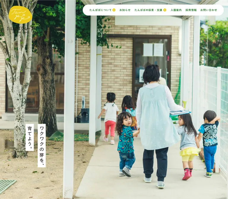
Tanpopo Group presents a network of childcare and community support services through people, place, and everyday activity. The opening desktop photograph fills the screen with a teacher walking alongside children. A yellow hand-lettered brand mark sits at the upper left, while a white navigation capsule floats across the upper right. The short message “ワクワクの芽を、育てよう。” appears as two separate vertical paper strips, leaving most of the photograph unobstructed.
Below the opening, the page becomes a long, spacious institutional homepage. Green headings and links organize brown narrative text, photographic service cards, practical facility information, recruitment copy, and dated news. A fine paper-like texture softens the pale background. The footer expands into a painted coastal landscape containing dandelions, hills, water, birds, a plane, and a train. Photography supplies lived experience; illustration supplies warmth and a sense of place.
The mobile composition changes substantially. The captured opening uses a close-up photograph of a smiling child, with the brand near the photograph’s lower edge and the vertical message at the lower right. Service cards become a two-column grid, news becomes a compact horizontal list, and the footer preserves readable contact information above a shallow landscape.
How to Read This Reference
- Measured means a value appears in the supplied computed styles or element rectangles. Measurements refer to the two inspected viewports, not every possible screen size.
- Calculated means a value is derived directly from measured rectangles, such as a gap between adjacent cards.
- Estimated means a visible dimension or treatment is judged from a supplied screenshot. These estimates are explicitly identified.
- Declared means a source custom property exists, but its use on a particular visible element was not established.
- Recommended means guidance for a new implementation. The CSS and agent prompts are adaptations, not recovered source code.
- Empty text fields, image lettering, and inherited font properties must be interpreted together with the screenshots. A heading wrapper’s computed font size does not establish the size or typeface of artwork inside it.
- Only the supplied original-page evidence informs the design observations. No additional browsing, file inspection, or interaction testing was performed for this reference.
Tokens — Colors
Default Palette
| Name | Value | Source token | Evidence and role |
|---|---|---|---|
| Warm Paper | #F9F9F4 |
--color-bg |
Measured body background at both viewports; the main canvas behind the textured appearance |
| Leaf Green | #1A6D1D |
--color-green |
Measured headings, service links, facility names, and filled directory/news links |
| Brown Ink | #3F2E1A |
--color-text |
Measured body and footer text; warmer than neutral black |
| Milk White | #FEFFF8 |
--color-white |
Measured mobile directory background; also declared as a general source color |
| Pure White | #FFFFFF |
Literal computed color | Measured lettering on filled green links; the precise fill of the white-looking desktop navigation and cards was not sampled |
| Deep Green | #205A21 |
--color-green-dark |
Declared supporting green; the exact mapping to individual controls was not sampled |
| Soft Green | #8EAB8D |
--color-green-light |
Declared supporting green; do not treat it as an established disabled-state color |
| Muted Brown | #71665B |
--color-brown |
Declared; visually compatible with the inactive directory labels, but that assignment was not measured |
| Warm Gray | #D0CDC5 |
--color-gray |
Declared; pale gray rules appear in the directory |
| Standard Rule | #DBDBDB |
--color-border |
Declared border color; suitable for reproducing the light news separators |
| Light Rule | #EAEAEA |
--color-border-light |
Declared subtle border color |
| Dark Rule | #888888 |
--color-border-dark |
Declared darker border color; exact assignment to dotted facility rules was not sampled |
| Golden Yellow | #EABC3C |
--color-yellow-text |
Declared yellow; a useful adaptation for the thin golden category and tab accents |
| Button Yellow | #F4D946 |
--color-yellow-btn |
Declared yellow; recommended for small supporting action details in an adaptation |
| Marker Yellow | #FFE45E |
--color-yellow-marker |
Declared highlight color; avoid assuming every yellow graphic uses it |
| Pale Shadow Tint | #EFF2E2 |
--color-box-shadow |
Declared only; the captures do not establish a general shadow-based elevation system |
Accent Discipline
Green carries most interface meaning: headings, navigation lettering, linked facility names, small social icons, and filled destination links. Brown carries longer reading passages and contact information. Yellow is concentrated in the brand and small line or circular accents.
The logo’s saturated yellow belongs to its artwork. None of the three declared CSS yellows has been established as the exact logo fill. Keep the logo asset intact when reproducing the original identity.
The footer introduces bright cyan water, blue mountains, multiple greens, yellow flowers, and small red transport details. These are illustration colors, not evidence for a larger interface palette. Do not distribute them across unrelated buttons or category badges.
Generic CMS palette, gradient, and shadow presets appear in the custom-property record. Their presence does not establish their use in this homepage’s visual system.
Tokens — Typography
Japanese Gothic — Narrative and General Interface
Computed leading family: dnp-shuei-gothic-gin-std.
The source stack continues through Yu Gothic Medium, YuGothic, Hiragino Sans, Hiragino Kaku Gothic ProN, Meiryo, and sans-serif, including Japanese-language aliases. Narrative headings and paragraphs use weight 400; service titles and several practical links use 600.
The character comes from moderate sizes, loose tracking, and unusually generous paragraph leading. The main introduction is 19px with 43.7px line height on desktop. Its green heading is only 32px, but 6.4px tracking and 57.6px leading give it presence without a large display scale.
Rounded Gothic — News and Selected Controls
Computed leading family: dnp-shuei-mgothic-std.
This family appears on news titles, the filled directory destination link, and mobile navigation text in the DOM record. News titles use weight 600. Its use is selective; the evidence does not support assigning the rounded family to every heading.
English Accent Family
Declared token: --font-gothic-en: 'mundial-narrow-variable', sans-serif.
The homepage includes English subtitles such as “Our support,” “Tanpopo Recruit,” and “News.” The English family token is present, but the supplied element samples do not isolate those child labels. Their precise family, weight, and size therefore remain unverified.
A computed font-family stack records the requested family order. It does not independently prove which font rendered every glyph or provide the font files or licensing rights.
Brand and Vertical Message
The logo and wordmarks contain distinctive drawn lettering. The hero message also needs visual treatment separate from its sampled heading wrapper: the wrapper has empty extracted text and line-height: 0px, while the visible strips contain brown lettering.
Do not reproduce these graphics by blindly applying the wrapper’s green color or nominal font size. Use authorized artwork when matching the original. A live-text version using vertical writing is a recommended alternative for a new implementation, not a verified description of the source asset format.
Type Scale
Values below are measured CSS pixels. Each size entry is font size / line height. Tracking is shown separately.
| Role | Desktop size / line | Mobile size / line | Desktop → mobile tracking | Weight |
|---|---|---|---|---|
| Body base | 16 / 16px |
14.56 / 14.56px |
Normal | 400 |
| Introduction and philosophy heading | 32 / 57.6px |
19.76 / 35.568px |
6.4 → 3.5568px |
400 |
| Introduction and philosophy paragraph | 19 / 43.7px |
13.52 / 27.04px |
2.66 → 1.4872px |
400 |
| Narrative destination link | 19 / 19px |
15.6 / 28.08px |
1.9 → 1.248px |
400 |
| Support, recruitment, and news heading wrapper | 24 / 24px |
21.84 / 21.84px |
Normal on sampled wrapper | 400 |
| Support card title | 19 / 19px |
14.56 / 14.56px |
2.66 → 1.456px for most mobile titles |
600 |
| Facility-directory heading | 21 / 21px |
15.6 / 15.6px |
2.94 → 1.872px |
400 |
| Facility name | 15.5 / 27.9px |
14.56 / 26.208px |
0.62 → 1.1648px |
600 → 400 |
| Filled directory destination | 17 / 17px |
14.56 / 14.56px |
3.74 → 1.456px |
600 |
| Recruitment lead | 25 / 50px |
19.76 / 37.544px |
3.75 → 3.3592px |
400 |
| Recruitment paragraph | 18 / 43.2px |
13.52 / 28.392px |
3.06 → 2.1632px |
400 |
| News title | 16.5 / 28.05px |
14.56 / 23.296px |
1.98 → 1.1648px |
600 |
| Footer contact guidance | 14 / 28px |
11.44 / 20.592px |
0.98 → 0.8008px |
400 |
| Footer operator line | 12 / 12px |
11.44 / 20.592px |
1.2 → 0.6864px |
400 |
| Footer external destination | 14 / 14px |
10.4 / 19.76px |
2.24 → 1.248px |
400 |
The longer mobile support title “子育て支援・一時保育” uses tighter measured tracking of 0.8736px. This is a useful example of fitting a long Japanese label through local tracking adjustments rather than reducing the entire type system.
The body’s base line height is not the reading rhythm to copy. Paragraphs override it with approximately 2–2.4 line-height ratios. Similarly, some graphical headings and compact links report zero line height; a new live-text implementation should use normal, explicit line boxes.
Tokens — Spacing & Shapes
Responsive Unit
The inspected root font size is 1px on desktop and 1.04px on mobile. Consequently, one source rem is much smaller than a conventional browser rem.
| Source property | Desktop declaration | Mobile declaration |
|---|---|---|
--width-mid |
1440 |
375 |
--width-min |
1240px |
360px |
--width-max |
1800px |
9999px |
--size-max-over |
max(calc(100vw / 1440), calc(1240px / 1440)) |
max(calc(100vw / 375), calc(360px / 375)) |
At the inspected widths, the last expression evaluates to 1px and 1.04px, respectively, matching the measured root sizes. The complete root-sizing rule and breakpoint declarations were not supplied, so this does not establish all intermediate or maximum-width behavior.
For adaptation, use a separate length token such as --u while retaining a conventional root font size. Do not copy source-sized rem numbers into a project where 1rem = 16px.
Spacing Scale
| Use | Desktop | Mobile | Evidence |
|---|---|---|---|
| Support card horizontal gap | 16px |
About 14.55px |
Calculated from adjacent card rectangles |
| Support card top/side padding | 20px |
10.4px |
Measured |
| Support card bottom padding | 35px |
22.88px |
Measured |
| Heading-to-paragraph gap in introduction | 24px |
About 12.47px |
Calculated |
| Gap between introduction paragraphs | 12px |
About 9.36px |
Calculated |
| Support heading bottom to card row | 80px |
About 41.59px |
Calculated |
| Support cards to directory section | 100px |
About 62.4px |
Calculated to the next section’s outer box |
| News grid horizontal gap | 44px |
Replaced by a list | Calculated |
| News grid row gap | 70px |
Replaced by rules and row padding | Calculated from the tallest first-row card |
| Mobile news-row padding | — | 22.88px 6.24px |
Measured |
| Mobile narrative side inset | — | 39.52px |
Measured |
| Mobile support outer inset | — | 19.5px |
Measured |
| Mobile recruitment/news inset | — | 29.25px |
Measured |
This is not a single uniform spacing scale. Narrative passages, service cards, and news each use a different container width and density. Preserve those relationships rather than forcing every section onto the same narrow mobile gutter.
Border Radius
| Element | Value | Status |
|---|---|---|
| Desktop navigation capsule | About 34px, half its height |
Screenshot estimate |
| Support-card visible surface | About 16px |
Screenshot estimate; the sampled anchor itself reports 0px |
| Mobile directory outer panel | 6.24px |
Measured |
| Filled directory link | 100px desktop; 104px mobile |
Measured; both produce pill ends |
| News archive link | 100px desktop; 104px mobile |
Measured |
| Facility count badge | Fully rounded ends | Screenshot observation; exact radius not sampled |
| Support photograph | Square corners | Screenshot observation |
The white rounded card appearance does not contradict the anchor’s transparent background and zero radius. The visible treatment can belong to another layer; that layer was not isolated in the evidence.
Layout Measurements
| Element | Desktop at 1440 × 1000 | Mobile at 390 × 844 |
|---|---|---|
| Document height | About 8291.94px |
6968.75px |
| Main element height | About 7232.39px |
6343.25px |
| Support/directory outer width | 1160px, starting at x=140 |
Support cards occupy 351px, starting at x=19.5 |
| Narrative outer section | 1140px, starting at x=150 |
Full width with 39.52px side padding |
| Narrative text box | 1130px measured wrapper width |
About 310.97px |
| Support card | 278 × 389.39px |
About 168.22 × 279.57px |
| News desktop card | About 350.66px wide |
Horizontal row about 343.97px wide |
| Desktop opening brand-mark anchor | 147 × 113px, at 53,35 |
Opening mark anchor about 109.19 × 74.63px, at 29.11,703.59 |
| Opening wordmark anchor | 165 × 41px, at 45,166 |
About 109.19 × 26.95px, at 24.95,791.98 |
| Footer section height | About 1059.55px |
625.5px |
A wide measured text wrapper does not mean each prose line fills it. The rendered copy contains deliberate line breaks, especially on desktop.
Components
Desktop Identity and Navigation
Role: persistent access to the organization’s main destinations while keeping photography prominent.
The opening contains two separately linked identity elements: the yellow mark and the wordmark beneath it. At the initial desktop position, the mark is 147 × 113px; the wordmark is 165 × 41px, with its top at 166px.
The visible navigation capsule starts around x=533, y=29, ends near x=1414, and is 68px tall. Its approximate overall width is 881px. It has a white-looking fill, rounded ends, green labels, and small yellow circles containing plus marks beside two expandable-looking entries.
The six visible labels are “たんぽぽについて,” “おしらせ,” “たんぽぽの保育・支援,” “入園案内,” “採用情報,” and “お問い合わせ.” The first and third entries are buttons in the sampled DOM; the other four are destination links. A typical simple navigation link has measured padding of 25px 13px 26px.
In the lower desktop captures, navigation remains at the top of the viewport. The yellow mark remains visible but appears larger, while the separate wordmark is absent. This supports a persistent header with a changed scrolled presentation. The precise positioning mechanism and changeover threshold were not recorded.
Mobile Brand and Menu Trigger
Role: retain identity without placing the full desktop navigation over a narrow photograph.
The mobile opening places the yellow mark around y=704 and the wordmark around y=792. The photograph ends at approximately y=730, so the mark overlaps the transition into the paper background.
A two-line dark-green menu symbol sits near the upper right. Its visible strokes are approximately 35px wide; the interactive hit area was not measured. In the lower mobile capture, the mark has moved to the upper left and the menu symbol remains at the upper right. These are distinct captured states, not evidence of a particular animation sequence.
The mobile DOM includes a navigation subtree containing a news teaser, organization links, service links, admission, recruitment, contact details, and an external care-service link. The screenshots do not show that panel expanded. Its open appearance, focus handling, scroll locking, and opening direction are unverified.
Photographic Hero and Vertical Catchphrase
Role: establish the experience of care before presenting institutional detail.
The desktop opening is almost entirely a full-bleed photograph. Trees and building structure occupy the left; the teacher and children move through the right and center. The white navigation and small identity graphics avoid forming a large opaque header across the photograph.
The phrase “ワクワクの芽を、育てよう。” is split into two vertical strips. The longer strip sits to the right of the shorter strip. On desktop, the visible strips begin near y=570; their widths are approximately 51px, with a roughly 24px gap. Their visible lettering is brown on white.
The mobile screenshot uses a close-up of a smiling child. The message moves to the lower right, beginning near y=652, with strips approximately 31px wide. It extends below the photograph into the paper region. This overlap links the photographic opening to the content surface.
The desktop and mobile photographs differ. The evidence does not establish whether that difference comes from responsive asset selection, a changing hero sequence, or capture timing. Reproduce the observed crop when matching a specific capture; verify the original selection behavior before implementing a slideshow.
Introduction and Childcare Philosophy
Role: explain the group’s identity and its approach to children before presenting facilities.
The introduction begins with “たんぽぽのように、つながって、ひろがって。” The next narrative section begins with “こどもが主役になって あそぶ・まなぶ・たべる。” Both use regular-weight green headings, brown paragraphs, and a small group of green destination links.
On desktop, the measured heading is 32px / 1.8 with 0.2em tracking. Paragraphs are 19px / 2.3 with 0.14em tracking. Links sit side by side below the prose and reserve 44px of left padding for a leading graphic or marker; the exact marker in these sections is not visible in the supplied captures.
On mobile, the same narrative pattern uses a roughly 311px text box, headings at 19.76px, and paragraphs at 13.52px / 2. Destination links stack vertically and reserve 31.2px at the left.
These sections are documented primarily through DOM geometry and text. Their complete surrounding imagery and intermediate visual composition were not supplied, so do not infer an illustration arrangement from empty areas in the element record.
Support Category Card
Role: provide four equal entry points into the group’s services.
The desktop anatomy is clearly visible:
- A softly rounded white-looking surface.
- A square-cornered activity photograph inset by
20px. - A centered green service title with a thin golden underline.
- A short green explanatory sentence.
- A small outlined pill showing the number of facilities.
Each entire card is an anchor. At the inspected desktop width, four cards occupy a 1160px row with 16px gaps. Each card is 278px wide and about 389.39px tall. The photograph is approximately 238 × 190px, an estimated ratio near 5:4.
The four categories and recorded counts are “こども園・保育園” — 4, “子育て支援・一時保育” — 3, “放課後児童クラブ等” — 6, and “障がい児通所支援” — 7. Counts are content, not permanent decorative numbers.
On mobile, the measured card positions establish a two-by-two grid. Cards are about 168.22px wide, with 10.4px top and side padding. The rendered text includes deliberate two-line descriptions. The complete mobile card interior is not shown in the supplied screenshots, so its exact image crop and visual ordering should not be asserted from DOM text order alone.
Facility Directory
Role: turn broad service categories into practical names, addresses, and contact information.
On desktop, “事業所一覧” sits above a large pale panel. Four equally sized category selectors span its top. Each selector has a short horizontal rule near its upper edge and a centered two-line label. The first category has green lettering and a golden rule; the others use muted lettering and gray rules.
The visible first-category panel contains four facility rows. Each row aligns a linked green facility name, a brown address, telephone/fax information, and an optional Instagram icon. The name column is measured at 320px wide. The repeated desktop row pitch is approximately 58.89px. Fine dotted rules separate the rows.
A green pill-shaped link sits below the list. It is measured at 1054 × 53px, with 17px rounded-gothic text and 18px 20px padding.
On mobile, the directory outer section is 351px wide, has 36.4px 20.8px padding, a measured #FEFFF8 background, and 6.24px corners. Facility names and contact details occupy vertically distributed positions rather than the desktop’s single horizontal row. The text separates postal codes from street addresses.
The supplied mobile record contains directory descendants extending beyond the sampled section’s bounding box. Its reported 627.16px height must not be copied as a fixed content height. The evidence does not settle internal overflow, panel sizing, or the exact mobile category-selector arrangement.
The category strip looks like a tab interface, but switching categories was not exercised. Only the initially visible nursery-category content is verified.
Directional Text Link and Filled Pill
Role: distinguish exploratory links from direct category destinations.
Narrative links remain unboxed: green text, generous tracking, and reserved space for a leading mark. Their measured desktop height is 32px; mobile links are approximately 36.38px tall and stack vertically.
Filled links are used more selectively. The directory destination is a wide green pill with white text. The news archive action “一覧を見る” is a smaller green pill, about 114.25 × 38px on desktop and 102.44 × 32.78px on mobile.
The hierarchy comes from context and scale. It does not require a different accent color for every destination.
Recruitment Block
Role: present teaching as a relationship with children and colleagues, then lead to recruitment information and interviews.
The desktop recruitment section spans the viewport. Its lower text composition has a heading and lead at the left, with explanatory paragraphs and destination links at the right. The measured lead is approximately 401px wide; the paragraph column begins at x=632 and is 658px wide.
The lead uses 25px / 2 green text. Paragraphs use 18px / 2.4 brown text. The two destination links are “採用情報” and “先生インタビュー.”
On mobile, the content stacks within a 331.5px column beginning at x=29.25. The lead becomes 19.76px / 1.9; paragraphs become 13.52px / 2.1. The links also stack.
The section’s upper visual area is not shown in the supplied screenshots. Its media subject, crop, and animation should remain unspecified.
News Item
Role: communicate current organizational activity with a consistent title, date, and category structure.
The desktop DOM establishes a three-column grid with cards approximately 350.66px wide and 44px horizontal gaps. Five linked entries occupy two rows. Each item groups its media area with a green title, a date, and a category label. News titles use the rounded-gothic stack at 16.5px / 1.7, weight 600.
The mobile capture shows the alternate anatomy: a thumbnail at the left, and a title, tracked date, and white rounded category badge at the right. The visible thumbnail is approximately 115 × 83px; its ratio is an estimate. The text starts around x=168.59, while the image begins around x=29.25.
Each mobile anchor is approximately 343.97px wide, with 22.88px vertical padding. Thin horizontal rules separate entries. Row heights vary with title length, from about 127.59px to 168.63px; they are not fixed-height tiles.
The dates use a dotted format such as 2025.12.10. Category labels retain a leading hash, such as “#全ての園・施設.” These are content labels inside a linked item; separate badge-filter behavior was not established.
Illustrated Footer
Role: finish the long homepage with contact clarity and a memorable sense of place.
The desktop footer is approximately 1060px tall. Its brand and contact block sits toward the left, surrounded by pale sky. Across the bottom, dense yellow dandelions rise in the foreground; blue water and mountains occupy the middle distance; a town and train sit along the lower right. A branch with a bird enters from the right above the water, and a small plane crosses the open sky.
The illustration’s upper area fades visually into the paper canvas. This is an observed appearance, not evidence for a particular CSS gradient or layered-asset technique.
The footer lists an address in Omura, directs telephone inquiries to individual facilities, and independently identifies the operators as “社会福祉法人とみのはら福祉会/NPO法人トライアングル・サークル.” It also links to “高齢者介護部門ウェブサイト.” This attribution is supported by the inspected homepage itself.
On mobile, the footer is about 625.5px tall. The brand and contact information remain above the busier landscape, with a substantial paper interval after the last news row. The landscape occupies approximately the bottom 190–210px of the supplied capture. Copyright changes from a horizontal line near the desktop’s lower left to a vertical line near the mobile right edge.
Tokens — Motion & Interaction
| Element or behavior | Evidence | What can be concluded |
|---|---|---|
| Brand-mark anchor | Measured 0.4s cubic-bezier(0.165, 0.84, 0.44, 1) transition |
A 400ms eased transition is declared; changed properties were not isolated |
| Separate wordmark anchor | Measured 0.1s ease-out transition |
A short transition is declared; no exact fade or movement sequence was recorded |
| Desktop navigation links and buttons | Measured 0.15s ease-out transition |
A short response treatment is declared; the hover endpoint was not captured |
| Desktop cards, narrative links, and filled links | Measured 0.15s ease-out transition |
Timing is available, but color, opacity, or transform endpoints remain unverified |
| Many mobile links | Transition recorded as all, with no nonzero duration supplied |
No timed mobile effect can be established from that entry alone |
| Sampled element animations | animation: none |
No named CSS animation was recorded on those elements; this does not exclude descendants, pseudo-elements, or JavaScript effects |
| Header across scrolled captures | Persistent top navigation; changed brand presentation | Multiple scroll states are visible; exact threshold and positioning implementation are unknown |
| Hero photographs | Different desktop and mobile captured subjects | Asset variation exists; autoplay, slide count, interval, and crossfade are unverified |
| Directory selectors | First category visually emphasized | Initial state is visible; switching and keyboard behavior are unverified |
| Mobile menu | Closed trigger visible; menu content present in DOM | Information architecture is recorded; expanded appearance and interaction are unverified |
| Footer illustration | Static painted scene visible | Movement of the plane, birds, train, or landscape is not established |
The source exposes a large easing vocabulary, including exponential and back curves. Unused declarations should not become animation requirements.
The supplied inspection waited for initial rendering, image decoding, and sampled layout stability, and traversed intermediate scroll positions. Perpetual animation handling during capture means still images cannot establish normal playback behavior. A transition: all entry by itself is also insufficient evidence for visible motion.
For a new implementation, short 150ms ease-out link responses and a restrained 400ms brand-state transition are reasonable adaptations. Their endpoints should be chosen and documented as new behavior.
Surfaces
| Layer | Appearance | Function |
|---|---|---|
| Main canvas | Warm off-white with fine paper-like grain | Connects narrative sections and reduces the sterility of large empty areas |
| Photographic opening | Full-bleed natural-color image | Carries the initial emotional and visual weight |
| Header capsule | White-looking rounded bar over photography or paper | Maintains navigation legibility without a full-width opaque header |
| Vertical message strips | Narrow white rectangles with brown lettering | Protects the short message while preserving most of the image |
| Support cards | Rounded white-looking surfaces, square photographs | Groups four equivalent service destinations |
| Facility panel | Pale surface, category rules, dotted rows | Supports detailed practical information |
| Filled destination link | Green capsule with white lettering | Gives direct navigation a stronger visual weight |
| Footer | Paper transitioning into a painted landscape | Combines contact information with a distinctive closing scene |
No pronounced elevation shadows are visible in the supplied captures. Separation relies on white surfaces, rounded boundaries, spacing, rules, and image edges. The footer’s atmospheric color transition should remain part of the illustrated setting rather than becoming a general glossy surface effect.
Imagery
Photography Direction
The photographs depict activity: walking with a teacher, children playing or learning, adults supporting young children, and interactions inside rooms with warm wooden details. The desktop hero includes substantial environmental context. The mobile opening instead creates intimacy through a very close facial crop.
For new photography, preserve natural light, ordinary clothing, real facilities, and visible relationships between people. Plan crops around faces and gestures while allowing some architectural context. Keep enough resolution for the large opening image; the visible softness comes from light and color, not deliberate pixelation.
The hero is not consistently a neutral image with text centered over it. Subject placement and the separate message strips form a specific composition. Select photographs with suitable quiet areas instead of relying on a dark overlay to make any image work.
Illustration Direction
The footer resembles opaque paint or gouache: irregular foliage, layered mountain silhouettes, visible brush texture, small simplified buildings, and dense repeated flowers. Its perspective moves from large foreground dandelions to a distant coastal town.
The large right-hand branch and bird balance the left-hand text block on desktop. On mobile, the same visual vocabulary is compressed into a shallow bottom scene. Preserve these compositional roles when commissioning a new illustration.
A CSS gradient can help blend an illustration into paper, but cannot replace the painted landscape. Likewise, a generic flower icon pattern does not reproduce the foreground’s depth and density.
Observed Asset References
Exact original image URLs and file formats were not included in the supplied evidence. The following is a visual inventory, not an asset-path manifest.
| Asset | Original-page evidence | Distinctive treatment |
|---|---|---|
| Desktop opening photograph | Desktop opening capture | Teacher and children walking through a tree-lined facility entrance |
| Mobile opening photograph | Mobile opening capture | Close crop of a smiling child wearing a patterned head covering |
| Support photographs | Desktop support/directory capture | Four activity photographs with square corners and approximately 5:4 visible crops |
| Yellow brand mark and wordmarks | Opening, scrolled, and footer captures | Irregular yellow shape, white drawn lettering, separate dark group name |
| Paper texture | Support, footer, and mobile lower-page captures | Fine, low-contrast grain across the pale canvas |
| Coastal footer landscape | Desktop and mobile footer captures | Dandelions, water, hills, town, train, plane, birds, and a branch |
| News thumbnail | Mobile lower-page capture | Small rectangular media area; the renewal item uses a brand graphic |
| Small interface marks | Navigation and directory captures | Yellow plus circles, green social symbols, and a small external-link indicator |
Do not invent filenames or assume these visuals are SVG, JPEG, video, or layered sprites. Authorized original assets or newly commissioned equivalents must be supplied separately.
Layout & Responsive Behavior
Page Sequence
The DOM establishes this order: photographic opening, group introduction, childcare philosophy, support categories and facility directory, recruitment, news, and footer. It is a multi-purpose organizational homepage with several destinations and audience needs.
Desktop narrative sections use broad spacing and intentional line breaks. More operational sections become denser: four category cards, a directory with aligned contact columns, and three news columns. The footer then opens back out into a large landscape.
Observed Changes
| Area | Desktop | Mobile |
|---|---|---|
| Opening image | Environmental scene fills the captured viewport | Different close-up scene ends around y=730; image-selection mechanism unknown |
| Initial identity | Upper-left mark and wordmark | Mark and wordmark near the lower edge of the opening image |
| Navigation | Persistent white capsule with six entries | Two-line menu trigger; expanded state not captured |
| Catchphrase | Two vertical strips at lower left | Smaller strips at lower right, overlapping the paper region |
| Narrative links | Side by side | Stacked |
| Support categories | Four columns | Two columns and two rows |
| Facility information | Name, address, contact, and social link aligned horizontally | Detail positions stack vertically; exact panel overflow remains unresolved |
| Recruitment text | Lead and paragraph columns | One column |
| News | Three-column grid | Thumbnail-and-text rows with separators |
| Footer copyright | Horizontal near lower left | Vertical near right edge |
Implementation Boundaries
The actual breakpoint values were not supplied. Only 1440px and 390px layouts were recorded; tablet widths, landscape phones, and very wide screens remain untested.
Mobile does not use one universal gutter: support cards begin at 19.5px, news and recruitment around 29.25px, and narrative text at 39.52px. This stepped inset system is a meaningful part of the layout.
Do not use the measured document heights as implementation targets. Text changes, fonts, image loading, and accessible type adjustments will change the page length. In particular, the mobile directory’s sampled outer height is not a reliable content-sizing constraint.
Do’s and Don’ts
Do
- Keep Warm Paper
#F9F9F4, Leaf Green#1A6D1D, and Brown Ink#3F2E1Aas the core interface relationship. - Let candid photographs carry the opening, with enough environmental detail to communicate everyday care.
- Preserve the two separate vertical message strips and their different desktop/mobile placement.
- Use regular-weight narrative headings with generous tracking and line height.
- Distinguish the Japanese body family from the rounded family used on news and selected controls.
- Keep service categories equally weighted, with photographs, short descriptions, and compact count pills.
- Preserve the desktop directory’s practical name/address/contact alignment.
- Change news from a desktop grid to horizontal mobile rows.
- Maintain different mobile gutters for narrative, service, and news content.
- Reserve busy illustration for the lower footer, leaving the contact block on quiet paper or sky.
- Treat photographs, logo lettering, and painted artwork as assets with their own composition.
Don't
- Don't turn the homepage into a sequence of oversized conversion banners.
- Don't make every section a rounded card; the narrative areas depend on open paper.
- Don't replace warm brown body text with cool gray throughout.
- Don't apply the footer’s entire color range to buttons and badges.
- Don't infer the logo yellow from a similarly named CSS token.
- Don't assign a generic geometric sans-serif to every role while claiming a faithful match.
- Don't use source rem numbers with a conventional 16px root.
- Don't assume the hero is an autoplay carousel from two different captured images.
- Don't invent menu, tab, hover, or illustration-animation behavior.
- Don't force the mobile directory into its sampled outer height.
- Don't substitute stock vector hills and uniform flower icons for the painted footer’s texture and depth.
Recommended Implementation Additions
These are recommendations for a new implementation, not verified features of the original website:
- Give the menu trigger an accessible name, a reliable
aria-expandedstate, and a touch target of at least44 × 44px. Its visible strokes can remain small. - If the facility selectors switch panels, implement a complete keyboard-operable tab pattern. If they navigate, use ordinary links instead.
- Keep facility names, addresses, and telephone numbers selectable as text. Use appropriate telephone links where useful.
- Verify accessible names on the brand, graphical navigation labels, and Instagram links. Empty sampled text does not establish whether accessible naming already exists.
- Use meaningful alternatives for informative photographs and avoid redundant announcements for decorative artwork.
- Consider a larger mobile text floor for the measured
10.4–11.44pxfooter details and the13.52pxnarrative copy. Recheck wrapping and page length after the change. - Provide a visible green focus outline and communicate selection through more than color alone.
- Keep inactive menu content out of keyboard navigation and manage focus when opening and closing an overlay.
- If a changing hero is implemented, provide reduced-motion behavior and verify whether a pause control is needed. Do not add autoplay solely for visual resemblance.
- Reserve image dimensions, prioritize the first visible hero image, and defer lower-page imagery without hiding essential content during loading.
Agent Prompt Guide
Quick Color Reference
- Main paper:
#F9F9F4. - Primary headings, links, and filled destinations:
#1A6D1D. - Long-form and contact text:
#3F2E1A. - Pale panel:
#FEFFF8. - Filled-link lettering:
#FFFFFF. - Supporting golden line:
#EABC3C, as an adaptation from a declared source token. - Small yellow action detail:
#F4D946, as an adaptation from a declared source token. - Logo yellow and landscape colors: preserve within supplied artwork; exact asset colors were not measured.
Overall Prompt
“Create a Japanese community childcare organization homepage with warm paper #F9F9F4, deep green headings and links #1A6D1D, and brown body text #3F2E1A. Open with a full-bleed candid childcare photograph, a small irregular yellow brand mark, a white capsule navigation at the upper right, and two narrow vertical white message strips reading ‘ワクワクの芽を、育てよう。’ Use spacious regular-weight Japanese gothic narrative headings, tracked text, and generous paragraph leading. Follow with four photographic service cards, a practical facility directory, recruitment content, and dated news. On mobile, place the opening brand near the image’s lower edge, use a small menu trigger, change service cards to two columns, and turn news into thumbnail-and-text rows. End with a painted coastal landscape of dandelions, hills, water, birds, and small transport details, keeping contact information above the busy artwork. Use supplied or commissioned assets and label any new interaction behavior explicitly.”
Example Component Prompts
- Opening composition: “At a 1440 × 1000 desktop viewport, use an environmental photograph with a teacher and children toward the center-right. Place the brand at the upper left and an approximately 881 × 68px white capsule navigation at the upper right. Put two vertical brown-text paper strips near the lower left. Avoid covering the image with a large text panel. For mobile, compose the photograph and identity around the lower image boundary rather than scaling down the desktop layout.”
- Service card: “Create a 278px-wide pale card with an estimated 16px corner radius, a square-cornered photograph inset by 20px, a centered 19px semibold green Japanese title, a thin golden underline, one short description, and a small green outlined facility-count pill. Make the entire card a link. Arrange four cards with 16px gaps on desktop and two columns on a 390px phone.”
- Facility directory: “Build a pale facility panel with four equal desktop category selectors. Show the active category through green text and a golden top rule. Below it, align linked names, addresses, telephone/fax details, and optional social links in compact rows separated by dotted rules. End with a full-width green pill destination. On narrow screens, stack each facility’s details and allow content-driven height. Implement tab behavior only if panel switching is required.”
- Mobile news row: “Create a warm-paper news list with a roughly 115 × 83px thumbnail at left and a green rounded-gothic title, dotted-format date, and small white category badge at right. Use approximately 23px vertical padding and a fine gray separator. Let rows grow with the title. At desktop width, use three columns with 44px horizontal gaps.”
- Illustrated footer: “Design a spacious footer with a small group wordmark and brown contact text on quiet pale sky. Anchor a textured painted landscape to the bottom: large yellow dandelions in front, green slopes, cyan water, layered blue mountains, a small coastal town, and restrained bird, plane, and train details. Use a branch entering from the right to balance the desktop text. On mobile, retain the text above a shallow landscape and place copyright vertically along the right edge.”
Quick Start
CSS Custom Properties
This is a reusable adaptation of the measured proportions. It keeps a conventional root font size and uses --u for dimensions related to the source’s tiny unit. Colors and selected type values come from the record; surface radii, asset composition, hover endpoints, and the 78rem breakpoint are recommendations.
The CSS expects corresponding semantic elements: a header with brand and navigation, a hero containing a picture and two message spans, linked service cards, a directory, linked news items, and a footer. Asset slots default to none; no original file paths are implied. Supply photographs through ordinary image or picture elements. An application may set data-scrolled on the page wrapper to enable the suggested alternate mobile brand state; the original threshold is unknown.
:root {
  /* Source colors with descriptive implementation aliases. */
  --color-paper: #f9f9f4;
  --color-surface: #fefff8;
  --color-white: #ffffff;
  --color-green: #1a6d1d;
  --color-green-dark: #205a21;
  --color-ink: #3f2e1a;
  --color-muted: #71665b;
  --color-rule: #dbdbdb;
  --color-rule-dark: #888888;
  --color-gold: #eabc3c;
  --color-yellow: #f4d946;

  /* Abbreviated source stacks; font files require separate setup. */
  --font-body: 'dnp-shuei-gothic-gin-std', 'Yu Gothic Medium',
    YuGothic, 'Hiragino Sans', 'Hiragino Kaku Gothic ProN',
    Meiryo, sans-serif;
  --font-rounded: 'dnp-shuei-mgothic-std', 'Yu Gothic Medium',
    YuGothic, 'Hiragino Sans', Meiryo, sans-serif;
  --font-english: 'mundial-narrow-variable', sans-serif;

  --u: 1px;
  --content-wide: 1160px;
  --content-standard: 1140px;
  --radius-card: 16px;
  --radius-panel: 6px;
  --radius-pill: 999px;
  --motion-fast: 150ms ease-out;
  --motion-brand: 400ms cubic-bezier(0.165, 0.84, 0.44, 1);

  /* Optional authorized or newly commissioned image assets. */
  --paper-texture: none;
  --footer-art: none;
}

* { box-sizing: border-box; }
html { font-size: 100%; }
body { margin: 0; }

.tanpopo-page {
  color: var(--color-ink);
  background-color: var(--color-paper);
  background-image: var(--paper-texture);
  font: 400 16px/1.8 var(--font-body);
}

.tanpopo-page img {
  display: block;
  max-width: 100%;
}

.tanpopo-page a { color: var(--color-green); }
.tanpopo-page button { font: inherit; }
.tanpopo-page [hidden] { display: none !important; }

.content-wide {
  width: min(calc(100% - 48px), var(--content-wide));
  margin-inline: auto;
}

.content-standard {
  width: min(calc(100% - 48px), var(--content-standard));
  margin-inline: auto;
}

.brand {
  position: fixed;
  z-index: 30;
  top: 35px;
  left: 45px;
  width: 165px;
}

.brand-mark {
  width: 147px;
  margin-inline: 8px;
  transition: transform var(--motion-brand);
}

.brand-wordmark {
  width: 165px;
  margin-top: 18px;
}

.desktop-nav {
  position: fixed;
  z-index: 30;
  top: 29px;
  right: 26px;
  display: flex;
  align-items: center;
  justify-content: space-between;
  gap: 20px;
  width: 881px;
  min-height: 68px;
  padding-inline: 43px;
  border-radius: var(--radius-pill);
  background: var(--color-white);
}

.desktop-nav a,
.desktop-nav button {
  display: inline-flex;
  align-items: center;
  gap: 7px;
  min-height: 44px;
  padding: 0;
  border: 0;
  color: var(--color-green);
  background: transparent;
  font-size: 16px;
  font-weight: 600;
  letter-spacing: 0.08em;
  text-decoration: none;
}

.nav-plus {
  display: inline-grid;
  place-items: center;
  width: 18px;
  height: 18px;
  border-radius: 50%;
  color: var(--color-white);
  background: var(--color-yellow);
  line-height: 1;
}

.menu-toggle { display: none; }

.hero {
  position: relative;
  height: 100svh;
  min-height: 640px;
}

.hero-media {
  display: block;
  width: 100%;
  height: 100%;
}

.hero-media img {
  width: 100%;
  height: 100%;
  object-fit: cover;
  object-position: var(--hero-position, center);
}

/* Live-text adaptation of the graphical message strips. */
.hero-copy {
  position: absolute;
  top: 57%;
  left: 160px;
  display: flex;
  flex-direction: row-reverse;
  align-items: flex-start;
  gap: 24px;
  margin: 0;
  color: var(--color-ink);
}

.hero-copy > span {
  padding: 12px 5px;
  background: var(--color-white);
  font-size: 28px;
  font-weight: 400;
  line-height: 1.5;
  letter-spacing: 0.08em;
  writing-mode: vertical-rl;
  text-orientation: upright;
}

.narrative {
  width: min(calc(100% - 48px), var(--content-standard));
  margin: 150px auto 100px;
  padding-left: 10px;
}

.narrative h2 {
  margin: 0 0 24px;
  color: var(--color-green);
  font-size: 32px;
  font-weight: 400;
  line-height: 1.8;
  letter-spacing: 0.2em;
}

.narrative p {
  margin: 0 0 12px;
  font-size: 19px;
  line-height: 2.3;
  letter-spacing: 0.14em;
}

.text-links {
  display: flex;
  flex-wrap: wrap;
  gap: 12px 29px;
  margin-top: 40px;
}

/* Supply the leading mark as a decorative child asset. */
.text-link {
  position: relative;
  display: inline-block;
  padding: 7px 0 6px 44px;
  font-size: 19px;
  line-height: 1;
  letter-spacing: 0.1em;
  text-decoration: none;
}

.text-link > .link-mark {
  position: absolute;
  left: 0;
  top: 50%;
  transform: translateY(-50%);
}

.service-grid {
  display: grid;
  grid-template-columns: repeat(4, minmax(0, 1fr));
  gap: 16px;
}

.service-card {
  display: flex;
  flex-direction: column;
  align-items: center;
  padding: 20px 20px 35px;
  border-radius: var(--radius-card);
  background: var(--color-white);
  text-align: center;
  text-decoration: none;
}

.service-card > img {
  width: 100%;
  aspect-ratio: 5 / 4;
  object-fit: cover;
}

.service-card h3 {
  margin: 32px 0 16px;
  font-size: 19px;
  font-weight: 600;
  line-height: 1.5;
  letter-spacing: 0.14em;
}

.service-card h3 > span {
  padding-bottom: 4px;
  border-bottom: 1px solid var(--color-gold);
}

.service-card p {
  margin: 0 0 18px;
  font-size: 16px;
  line-height: 1.8;
  letter-spacing: 0.08em;
}

.count-pill {
  display: inline-block;
  margin-top: auto;
  padding: 3px 21px;
  border: 1px solid currentColor;
  border-radius: var(--radius-pill);
  font-size: 14px;
  font-weight: 600;
  line-height: 1.5;
  letter-spacing: 0.12em;
}

.directory { margin-top: 100px; }
.directory-panel { background: var(--color-surface); }

.directory-tabs {
  display: grid;
  grid-template-columns: repeat(4, minmax(0, 1fr));
}

.directory-tab {
  position: relative;
  min-height: 132px;
  padding: 28px 12px;
  border: 1px solid var(--color-paper);
  color: var(--color-muted);
  background: transparent;
  font-weight: 600;
  line-height: 1.8;
  letter-spacing: 0.12em;
}

.directory-tab::before {
  position: absolute;
  inset: 8px 10px auto;
  height: 4px;
  border-radius: 2px;
  background: #d0cdc5;
  content: '';
}

.directory-tab[aria-selected='true'] {
  color: var(--color-green);
}

.directory-tab[aria-selected='true']::before {
  background: var(--color-gold);
}

.directory-content { padding: 48px 53px 60px; }

.facility-row {
  display: grid;
  grid-template-columns: 320px minmax(0, 1fr) auto 28px;
  gap: 0 12px;
  align-items: center;
  padding: 15px 10px;
  border-bottom: 1px dotted var(--color-rule-dark);
  font-size: 14px;
  line-height: 1.8;
}

.facility-name {
  margin: 0;
  font-size: 15.5px;
  font-weight: 600;
  letter-spacing: 0.04em;
}

.pill-link {
  display: block;
  margin-top: 36px;
  padding: 18px 20px;
  border-radius: var(--radius-pill);
  color: var(--color-white) !important;
  background: var(--color-green);
  font: 600 17px/1 var(--font-rounded);
  letter-spacing: 0.22em;
  text-align: center;
  text-decoration: none;
}

.recruit-copy {
  display: grid;
  grid-template-columns: 401px minmax(0, 1fr);
  gap: 81px;
}

.recruit-lead {
  margin: 0;
  color: var(--color-green);
  font-size: 25px;
  font-weight: 400;
  line-height: 2;
  letter-spacing: 0.15em;
}

.recruit-body p {
  font-size: 18px;
  line-height: 2.4;
  letter-spacing: 0.17em;
}

.news-grid {
  display: grid;
  grid-template-columns: repeat(3, minmax(0, 1fr));
  gap: 70px 44px;
}

.news-item { text-decoration: none; }

.news-image {
  width: 100%;
  aspect-ratio: 1.37;
  object-fit: cover;
}

.news-title {
  margin: 20px 0 8px;
  font: 600 16.5px/1.7 var(--font-rounded);
  letter-spacing: 0.12em;
}

/* Date and badge dimensions are adaptation values. */
.news-date {
  display: block;
  margin-bottom: 10px;
  font-size: 12px;
  font-weight: 600;
  letter-spacing: 0.16em;
}

.news-tag {
  display: inline-block;
  padding: 3px 9px;
  border-radius: var(--radius-pill);
  background: var(--color-white);
  font-size: 12px;
  line-height: 1.4;
}

.site-footer {
  position: relative;
  min-height: 1060px;
  padding: 360px 5.4vw 100px;
  background-image: var(--footer-art);
  background-position: center bottom;
  background-repeat: no-repeat;
  background-size: 100% auto;
}

.footer-info { max-width: 420px; }
.footer-brand { width: 270px; margin-bottom: 24px; }

.footer-info p {
  font-size: 14px;
  line-height: 2;
  letter-spacing: 0.07em;
}

.footer-copyright {
  position: absolute;
  left: 44px;
  bottom: 40px;
  font-size: 14px;
  letter-spacing: 0.1em;
}

/* Recommended breakpoint; the original breakpoint is unknown. */
@media (max-width: 78rem) {
  .tanpopo-page {
    /* Matches 1.04px at 390px; the upper cap is an adaptation. */
    --u: clamp(0.96px, 0.266667vw, 1.25px);
    font-size: calc(14 * var(--u));
  }

  .content-wide { width: 90%; }
  .content-standard { width: 85%; }
  .desktop-nav { display: none; }

  .brand {
    position: absolute;
    top: calc(100svh - 135 * var(--u));
    left: calc(24 * var(--u));
    width: calc(105 * var(--u));
  }

  .brand-mark {
    width: calc(95 * var(--u));
    margin-inline: calc(4 * var(--u));
  }

  .brand-wordmark {
    width: calc(105 * var(--u));
    margin-top: calc(13 * var(--u));
  }

  .tanpopo-page[data-scrolled] .brand {
    position: fixed;
    top: calc(15 * var(--u));
    left: calc(20 * var(--u));
  }

  .tanpopo-page[data-scrolled] .brand-mark {
    width: calc(108 * var(--u));
    max-width: none;
    margin: 0;
  }

  .tanpopo-page[data-scrolled] .brand-wordmark { display: none; }

  .menu-toggle {
    position: fixed;
    z-index: 40;
    top: 20px;
    right: 26px;
    display: grid;
    place-content: center;
    gap: 6px;
    width: 48px;
    height: 44px;
    padding: 0;
    border: 0;
    color: var(--color-green-dark);
    background: transparent;
  }

  .menu-toggle::before,
  .menu-toggle::after {
    width: 35px;
    height: 3px;
    background: currentColor;
    content: '';
  }

  .hero { min-height: 0; }
  .hero-media { height: calc(100% - 110 * var(--u)); }

  .hero-copy {
    top: auto;
    right: calc(40 * var(--u));
    bottom: 22px;
    left: auto;
    gap: calc(15 * var(--u));
  }

  .hero-copy > span {
    padding: 8px 3px;
    font-size: 17.5px;
    line-height: 1.4;
  }

  .narrative {
    width: 100%;
    margin-block: calc(90 * var(--u));
    padding-inline: calc(38 * var(--u));
  }

  .narrative h2 {
    margin-bottom: calc(12 * var(--u));
    font-size: calc(19 * var(--u));
    line-height: 1.8;
    letter-spacing: 0.18em;
  }

  .narrative p {
    font-size: calc(13 * var(--u));
    line-height: 2;
    letter-spacing: 0.11em;
  }

  .text-links {
    flex-direction: column;
    align-items: flex-start;
    gap: 0;
    margin-top: calc(22 * var(--u));
  }

  .text-link {
    padding: calc(4 * var(--u)) 0 calc(4 * var(--u))
      calc(30 * var(--u));
    font-size: calc(15 * var(--u));
    line-height: 1.8;
    letter-spacing: 0.08em;
  }

  .service-grid {
    grid-template-columns: repeat(2, minmax(0, 1fr));
    gap: calc(14 * var(--u));
  }

  .service-card {
    padding: calc(10 * var(--u)) calc(10 * var(--u))
      calc(22 * var(--u));
  }

  .service-card h3 {
    margin-top: calc(20 * var(--u));
    font-size: calc(14 * var(--u));
    letter-spacing: 0.06em;
  }

  .service-card p {
    font-size: calc(13 * var(--u));
    line-height: 1.8;
  }

  .count-pill { font-size: 12px; }

  .directory {
    margin-top: calc(60 * var(--u));
    padding: calc(35 * var(--u)) calc(20 * var(--u));
    border-radius: calc(6 * var(--u));
    background: var(--color-surface);
  }

  /* Recommended narrow-screen selector layout, not observed. */
  .directory-tabs {
    grid-template-columns: repeat(2, minmax(0, 1fr));
  }

  .directory-tab {
    min-height: 80px;
    padding: 20px 8px 12px;
    font-size: 13px;
  }

  .directory-content { padding: 24px 8px 0; }

  .facility-row {
    grid-template-columns: minmax(0, 1fr);
    gap: 8px;
    padding: 20px 0;
    overflow-wrap: anywhere;
  }

  .facility-name {
    font-size: calc(14 * var(--u));
    font-weight: 400;
    letter-spacing: 0.08em;
  }

  .pill-link {
    padding: calc(14 * var(--u)) calc(20 * var(--u));
    font-size: calc(14 * var(--u));
    line-height: 1.4;
    letter-spacing: 0.1em;
  }

  .recruit-copy { grid-template-columns: 1fr; gap: 20px; }

  .recruit-lead {
    font-size: calc(19 * var(--u));
    line-height: 1.9;
    letter-spacing: 0.17em;
  }

  .recruit-body p {
    font-size: calc(13 * var(--u));
    line-height: 2.1;
    letter-spacing: 0.16em;
  }

  .news-grid { display: block; }

  .news-item {
    display: grid;
    grid-template-columns: 34.7% minmax(0, 1fr);
    gap: calc(23.5 * var(--u));
    margin-inline: calc(-6 * var(--u));
    padding: calc(22 * var(--u)) calc(6 * var(--u));
    border-bottom: 1px solid var(--color-rule);
  }

  .news-title {
    margin: 0 0 5px;
    font-size: calc(14 * var(--u));
    line-height: 1.6;
    letter-spacing: 0.08em;
  }

  .site-footer {
    min-height: 625px;
    padding: calc(185 * var(--u)) calc(28 * var(--u)) 195px;
  }

  .footer-info { width: 220px; max-width: calc(100% - 30px); }
  .footer-brand { width: 208px; }

  .footer-info p {
    /* Recommended readability floor above the measured 11.44px. */
    font-size: max(12px, calc(11 * var(--u)));
    line-height: 1.8;
  }

  .footer-copyright {
    top: calc(215 * var(--u));
    right: calc(20 * var(--u));
    bottom: auto;
    left: auto;
    font-size: 10.4px;
    writing-mode: vertical-rl;
  }
}

/* Recommended interaction endpoints; source endpoints were not captured. */
@media (hover: hover) {
  .text-link,
  .news-item,
  .service-card { transition: opacity var(--motion-fast); }
  .text-link:hover,
  .news-item:hover,
  .service-card:hover { opacity: 0.82; }
  .pill-link:hover { background: var(--color-green-dark); }
}

.tanpopo-page :focus-visible {
  outline: 2px solid var(--color-green);
  outline-offset: 4px;
}

@media (prefers-reduced-motion: reduce) {
  .tanpopo-page *,
  .tanpopo-page *::before,
  .tanpopo-page *::after {
    animation: none !important;
    transition: none !important;
    scroll-behavior: auto !important;
  }
}
The service-card interior, two-column mobile selector arrangement, live-text hero message, and footer asset scaling in this starter are deliberate implementation choices where exact source behavior is unavailable. Let cards and directory panels grow with their content. Menu opening, tab switching, image selection, and scroll-state detection require separate implementation and testing.
Tailwind v4 Token Mapping
Optional mapping for a project already using Tailwind v4. These aliases do not imply that the original website uses Tailwind. Keep the component-specific tracking, line heights, and responsive structure from the CSS above.
@theme inline {
  --color-paper: #f9f9f4;
  --color-milk: #fefff8;
  --color-leaf: #1a6d1d;
  --color-leaf-dark: #205a21;
  --color-brown-ink: #3f2e1a;
  --color-gold-line: #eabc3c;
  --color-yellow-detail: #f4d946;
  --color-soft-rule: #dbdbdb;

  --font-narrative: var(--font-body);
  --font-friendly: var(--font-rounded);
  --font-english-accent: var(--font-english);

  --text-narrative: 19px;
  --text-narrative-title: 32px;
  --text-service-title: 19px;
  --text-news-title: 16.5px;

  --spacing-source-unit: var(--u);
  --spacing-service-gap: 16px;
  --spacing-news-gap: 44px;

  --radius-service: 16px;
  --radius-directory: 6px;
  --radius-capsule: 999px;
}
Sources & Evidence
- Inspected original and final homepage: https://www.tanpopoen.net/. The supplied record reports HTTP
200and no URL change. - Capture record timestamp:
2026-09-12T08:02:05.155Z, equivalent to September 12, 2026, at 17:02:05.155 JST. - Desktop evidence: three 1440 × 1000 captures showing the opening, support cards and facility directory, and footer. The DOM record supplies additional narrative, recruitment, and news measurements.
- Mobile evidence: two 390 × 844 captures showing the opening and the end of the news list with the footer. The DOM record supplies category-grid positions, directory details, recruitment text, navigation content, and news-row measurements.
- Computed evidence: source color and font custom properties, element rectangles, typography, padding, radii, link destinations, and transition declarations. Derived gaps are identified as calculations; screenshot-only dimensions are identified as estimates.
- Observed state changes: scrolling produced captures with persistent navigation or menu controls and different brand placement. No supplied click sequence verifies menu expansion, directory switching, hover endpoints, or a hero slideshow.
- Inspection limits: only the homepage and two viewport sizes are covered. Asset URLs, full stylesheets, font-loading results, expanded overlays, keyboard behavior, intermediate breakpoints, and animation sequences were not supplied. Some mobile directory rectangles do not form a reliable fixed-height containment model.
This reference describes the current homepage represented by the supplied capture record. The CSS, accessibility additions, and responsive choices beyond those two captured widths are recommendations for a new implementation.
# Tanpopo Group — Style Reference

> Everyday childcare photography, green lettering on warm paper, and a painted landscape full of dandelions.

**Website:** [www.tanpopoen.net](https://www.tanpopoen.net/)
**Original URL:** https://www.tanpopoen.net/
**Final URL:** https://www.tanpopoen.net/
**Theme:** a light presentation with warm paper, forest green, brown text, and yellow accents.
**Inspected:** September 12, 2026, at 08:02:05 UTC / 17:02:05 JST, according to the supplied browser record.
**Viewports:** desktop 1440 × 1000 CSS pixels; mobile 390 × 844 CSS pixels.
**Scope:** the current group homepage, including the photographic opening, introduction, childcare philosophy, support categories, facility directory, recruitment section, news, and illustrated footer. Visual evidence consists of three desktop captures and two mobile captures; rendered DOM and computed-style records cover additional homepage sections. Linked pages and expanded navigation states were not inspected.

Tanpopo Group presents a network of childcare and community support services through people, place, and everyday activity. The opening desktop photograph fills the screen with a teacher walking alongside children. A yellow hand-lettered brand mark sits at the upper left, while a white navigation capsule floats across the upper right. The short message “ワクワクの芽を、育てよう。” appears as two separate vertical paper strips, leaving most of the photograph unobstructed.

Below the opening, the page becomes a long, spacious institutional homepage. Green headings and links organize brown narrative text, photographic service cards, practical facility information, recruitment copy, and dated news. A fine paper-like texture softens the pale background. The footer expands into a painted coastal landscape containing dandelions, hills, water, birds, a plane, and a train. Photography supplies lived experience; illustration supplies warmth and a sense of place.

The mobile composition changes substantially. The captured opening uses a close-up photograph of a smiling child, with the brand near the photograph’s lower edge and the vertical message at the lower right. Service cards become a two-column grid, news becomes a compact horizontal list, and the footer preserves readable contact information above a shallow landscape.

## How to Read This Reference

- **Measured** means a value appears in the supplied computed styles or element rectangles. Measurements refer to the two inspected viewports, not every possible screen size.
- **Calculated** means a value is derived directly from measured rectangles, such as a gap between adjacent cards.
- **Estimated** means a visible dimension or treatment is judged from a supplied screenshot. These estimates are explicitly identified.
- **Declared** means a source custom property exists, but its use on a particular visible element was not established.
- **Recommended** means guidance for a new implementation. The CSS and agent prompts are adaptations, not recovered source code.
- Empty text fields, image lettering, and inherited font properties must be interpreted together with the screenshots. A heading wrapper’s computed font size does not establish the size or typeface of artwork inside it.
- Only the supplied original-page evidence informs the design observations. No additional browsing, file inspection, or interaction testing was performed for this reference.

## Tokens — Colors

### Default Palette

| Name | Value | Source token | Evidence and role |
| --- | --- | --- | --- |
| Warm Paper | `#F9F9F4` | `--color-bg` | Measured body background at both viewports; the main canvas behind the textured appearance |
| Leaf Green | `#1A6D1D` | `--color-green` | Measured headings, service links, facility names, and filled directory/news links |
| Brown Ink | `#3F2E1A` | `--color-text` | Measured body and footer text; warmer than neutral black |
| Milk White | `#FEFFF8` | `--color-white` | Measured mobile directory background; also declared as a general source color |
| Pure White | `#FFFFFF` | Literal computed color | Measured lettering on filled green links; the precise fill of the white-looking desktop navigation and cards was not sampled |
| Deep Green | `#205A21` | `--color-green-dark` | Declared supporting green; the exact mapping to individual controls was not sampled |
| Soft Green | `#8EAB8D` | `--color-green-light` | Declared supporting green; do not treat it as an established disabled-state color |
| Muted Brown | `#71665B` | `--color-brown` | Declared; visually compatible with the inactive directory labels, but that assignment was not measured |
| Warm Gray | `#D0CDC5` | `--color-gray` | Declared; pale gray rules appear in the directory |
| Standard Rule | `#DBDBDB` | `--color-border` | Declared border color; suitable for reproducing the light news separators |
| Light Rule | `#EAEAEA` | `--color-border-light` | Declared subtle border color |
| Dark Rule | `#888888` | `--color-border-dark` | Declared darker border color; exact assignment to dotted facility rules was not sampled |
| Golden Yellow | `#EABC3C` | `--color-yellow-text` | Declared yellow; a useful adaptation for the thin golden category and tab accents |
| Button Yellow | `#F4D946` | `--color-yellow-btn` | Declared yellow; recommended for small supporting action details in an adaptation |
| Marker Yellow | `#FFE45E` | `--color-yellow-marker` | Declared highlight color; avoid assuming every yellow graphic uses it |
| Pale Shadow Tint | `#EFF2E2` | `--color-box-shadow` | Declared only; the captures do not establish a general shadow-based elevation system |

### Accent Discipline

Green carries most interface meaning: headings, navigation lettering, linked facility names, small social icons, and filled destination links. Brown carries longer reading passages and contact information. Yellow is concentrated in the brand and small line or circular accents.

The logo’s saturated yellow belongs to its artwork. None of the three declared CSS yellows has been established as the exact logo fill. Keep the logo asset intact when reproducing the original identity.

The footer introduces bright cyan water, blue mountains, multiple greens, yellow flowers, and small red transport details. These are illustration colors, not evidence for a larger interface palette. Do not distribute them across unrelated buttons or category badges.

Generic CMS palette, gradient, and shadow presets appear in the custom-property record. Their presence does not establish their use in this homepage’s visual system.

## Tokens — Typography

### Japanese Gothic — Narrative and General Interface

**Computed leading family:** `dnp-shuei-gothic-gin-std`.

The source stack continues through Yu Gothic Medium, YuGothic, Hiragino Sans, Hiragino Kaku Gothic ProN, Meiryo, and sans-serif, including Japanese-language aliases. Narrative headings and paragraphs use weight `400`; service titles and several practical links use `600`.

The character comes from moderate sizes, loose tracking, and unusually generous paragraph leading. The main introduction is `19px` with `43.7px` line height on desktop. Its green heading is only `32px`, but `6.4px` tracking and `57.6px` leading give it presence without a large display scale.

### Rounded Gothic — News and Selected Controls

**Computed leading family:** `dnp-shuei-mgothic-std`.

This family appears on news titles, the filled directory destination link, and mobile navigation text in the DOM record. News titles use weight `600`. Its use is selective; the evidence does not support assigning the rounded family to every heading.

### English Accent Family

**Declared token:** `--font-gothic-en: 'mundial-narrow-variable', sans-serif`.

The homepage includes English subtitles such as “Our support,” “Tanpopo Recruit,” and “News.” The English family token is present, but the supplied element samples do not isolate those child labels. Their precise family, weight, and size therefore remain unverified.

A computed font-family stack records the requested family order. It does not independently prove which font rendered every glyph or provide the font files or licensing rights.

### Brand and Vertical Message

The logo and wordmarks contain distinctive drawn lettering. The hero message also needs visual treatment separate from its sampled heading wrapper: the wrapper has empty extracted text and `line-height: 0px`, while the visible strips contain brown lettering.

Do not reproduce these graphics by blindly applying the wrapper’s green color or nominal font size. Use authorized artwork when matching the original. A live-text version using vertical writing is a recommended alternative for a new implementation, not a verified description of the source asset format.

### Type Scale

Values below are measured CSS pixels. Each size entry is **font size / line height**. Tracking is shown separately.

| Role | Desktop size / line | Mobile size / line | Desktop → mobile tracking | Weight |
| --- | --- | --- | --- | --- |
| Body base | `16 / 16px` | `14.56 / 14.56px` | Normal | `400` |
| Introduction and philosophy heading | `32 / 57.6px` | `19.76 / 35.568px` | `6.4 → 3.5568px` | `400` |
| Introduction and philosophy paragraph | `19 / 43.7px` | `13.52 / 27.04px` | `2.66 → 1.4872px` | `400` |
| Narrative destination link | `19 / 19px` | `15.6 / 28.08px` | `1.9 → 1.248px` | `400` |
| Support, recruitment, and news heading wrapper | `24 / 24px` | `21.84 / 21.84px` | Normal on sampled wrapper | `400` |
| Support card title | `19 / 19px` | `14.56 / 14.56px` | `2.66 → 1.456px` for most mobile titles | `600` |
| Facility-directory heading | `21 / 21px` | `15.6 / 15.6px` | `2.94 → 1.872px` | `400` |
| Facility name | `15.5 / 27.9px` | `14.56 / 26.208px` | `0.62 → 1.1648px` | `600 → 400` |
| Filled directory destination | `17 / 17px` | `14.56 / 14.56px` | `3.74 → 1.456px` | `600` |
| Recruitment lead | `25 / 50px` | `19.76 / 37.544px` | `3.75 → 3.3592px` | `400` |
| Recruitment paragraph | `18 / 43.2px` | `13.52 / 28.392px` | `3.06 → 2.1632px` | `400` |
| News title | `16.5 / 28.05px` | `14.56 / 23.296px` | `1.98 → 1.1648px` | `600` |
| Footer contact guidance | `14 / 28px` | `11.44 / 20.592px` | `0.98 → 0.8008px` | `400` |
| Footer operator line | `12 / 12px` | `11.44 / 20.592px` | `1.2 → 0.6864px` | `400` |
| Footer external destination | `14 / 14px` | `10.4 / 19.76px` | `2.24 → 1.248px` | `400` |

The longer mobile support title “子育て支援・一時保育” uses tighter measured tracking of `0.8736px`. This is a useful example of fitting a long Japanese label through local tracking adjustments rather than reducing the entire type system.

The body’s base line height is not the reading rhythm to copy. Paragraphs override it with approximately `2–2.4` line-height ratios. Similarly, some graphical headings and compact links report zero line height; a new live-text implementation should use normal, explicit line boxes.

## Tokens — Spacing & Shapes

### Responsive Unit

The inspected root font size is `1px` on desktop and `1.04px` on mobile. Consequently, one source `rem` is much smaller than a conventional browser rem.

| Source property | Desktop declaration | Mobile declaration |
| --- | --- | --- |
| `--width-mid` | `1440` | `375` |
| `--width-min` | `1240px` | `360px` |
| `--width-max` | `1800px` | `9999px` |
| `--size-max-over` | `max(calc(100vw / 1440), calc(1240px / 1440))` | `max(calc(100vw / 375), calc(360px / 375))` |

At the inspected widths, the last expression evaluates to `1px` and `1.04px`, respectively, matching the measured root sizes. The complete root-sizing rule and breakpoint declarations were not supplied, so this does not establish all intermediate or maximum-width behavior.

For adaptation, use a separate length token such as `--u` while retaining a conventional root font size. Do not copy source-sized rem numbers into a project where `1rem = 16px`.

### Spacing Scale

| Use | Desktop | Mobile | Evidence |
| --- | --- | --- | --- |
| Support card horizontal gap | `16px` | About `14.55px` | Calculated from adjacent card rectangles |
| Support card top/side padding | `20px` | `10.4px` | Measured |
| Support card bottom padding | `35px` | `22.88px` | Measured |
| Heading-to-paragraph gap in introduction | `24px` | About `12.47px` | Calculated |
| Gap between introduction paragraphs | `12px` | About `9.36px` | Calculated |
| Support heading bottom to card row | `80px` | About `41.59px` | Calculated |
| Support cards to directory section | `100px` | About `62.4px` | Calculated to the next section’s outer box |
| News grid horizontal gap | `44px` | Replaced by a list | Calculated |
| News grid row gap | `70px` | Replaced by rules and row padding | Calculated from the tallest first-row card |
| Mobile news-row padding | — | `22.88px 6.24px` | Measured |
| Mobile narrative side inset | — | `39.52px` | Measured |
| Mobile support outer inset | — | `19.5px` | Measured |
| Mobile recruitment/news inset | — | `29.25px` | Measured |

This is not a single uniform spacing scale. Narrative passages, service cards, and news each use a different container width and density. Preserve those relationships rather than forcing every section onto the same narrow mobile gutter.

### Border Radius

| Element | Value | Status |
| --- | --- | --- |
| Desktop navigation capsule | About `34px`, half its height | Screenshot estimate |
| Support-card visible surface | About `16px` | Screenshot estimate; the sampled anchor itself reports `0px` |
| Mobile directory outer panel | `6.24px` | Measured |
| Filled directory link | `100px` desktop; `104px` mobile | Measured; both produce pill ends |
| News archive link | `100px` desktop; `104px` mobile | Measured |
| Facility count badge | Fully rounded ends | Screenshot observation; exact radius not sampled |
| Support photograph | Square corners | Screenshot observation |

The white rounded card appearance does not contradict the anchor’s transparent background and zero radius. The visible treatment can belong to another layer; that layer was not isolated in the evidence.

### Layout Measurements

| Element | Desktop at 1440 × 1000 | Mobile at 390 × 844 |
| --- | --- | --- |
| Document height | About `8291.94px` | `6968.75px` |
| Main element height | About `7232.39px` | `6343.25px` |
| Support/directory outer width | `1160px`, starting at `x=140` | Support cards occupy `351px`, starting at `x=19.5` |
| Narrative outer section | `1140px`, starting at `x=150` | Full width with `39.52px` side padding |
| Narrative text box | `1130px` measured wrapper width | About `310.97px` |
| Support card | `278 × 389.39px` | About `168.22 × 279.57px` |
| News desktop card | About `350.66px` wide | Horizontal row about `343.97px` wide |
| Desktop opening brand-mark anchor | `147 × 113px`, at `53,35` | Opening mark anchor about `109.19 × 74.63px`, at `29.11,703.59` |
| Opening wordmark anchor | `165 × 41px`, at `45,166` | About `109.19 × 26.95px`, at `24.95,791.98` |
| Footer section height | About `1059.55px` | `625.5px` |

A wide measured text wrapper does not mean each prose line fills it. The rendered copy contains deliberate line breaks, especially on desktop.

## Components

### Desktop Identity and Navigation

**Role:** persistent access to the organization’s main destinations while keeping photography prominent.

The opening contains two separately linked identity elements: the yellow mark and the wordmark beneath it. At the initial desktop position, the mark is `147 × 113px`; the wordmark is `165 × 41px`, with its top at `166px`.

The visible navigation capsule starts around `x=533, y=29`, ends near `x=1414`, and is `68px` tall. Its approximate overall width is `881px`. It has a white-looking fill, rounded ends, green labels, and small yellow circles containing plus marks beside two expandable-looking entries.

The six visible labels are “たんぽぽについて,” “おしらせ,” “たんぽぽの保育・支援,” “入園案内,” “採用情報,” and “お問い合わせ.” The first and third entries are buttons in the sampled DOM; the other four are destination links. A typical simple navigation link has measured padding of `25px 13px 26px`.

In the lower desktop captures, navigation remains at the top of the viewport. The yellow mark remains visible but appears larger, while the separate wordmark is absent. This supports a persistent header with a changed scrolled presentation. The precise positioning mechanism and changeover threshold were not recorded.

### Mobile Brand and Menu Trigger

**Role:** retain identity without placing the full desktop navigation over a narrow photograph.

The mobile opening places the yellow mark around `y=704` and the wordmark around `y=792`. The photograph ends at approximately `y=730`, so the mark overlaps the transition into the paper background.

A two-line dark-green menu symbol sits near the upper right. Its visible strokes are approximately `35px` wide; the interactive hit area was not measured. In the lower mobile capture, the mark has moved to the upper left and the menu symbol remains at the upper right. These are distinct captured states, not evidence of a particular animation sequence.

The mobile DOM includes a navigation subtree containing a news teaser, organization links, service links, admission, recruitment, contact details, and an external care-service link. The screenshots do not show that panel expanded. Its open appearance, focus handling, scroll locking, and opening direction are unverified.

### Photographic Hero and Vertical Catchphrase

**Role:** establish the experience of care before presenting institutional detail.

The desktop opening is almost entirely a full-bleed photograph. Trees and building structure occupy the left; the teacher and children move through the right and center. The white navigation and small identity graphics avoid forming a large opaque header across the photograph.

The phrase “ワクワクの芽を、育てよう。” is split into two vertical strips. The longer strip sits to the right of the shorter strip. On desktop, the visible strips begin near `y=570`; their widths are approximately `51px`, with a roughly `24px` gap. Their visible lettering is brown on white.

The mobile screenshot uses a close-up of a smiling child. The message moves to the lower right, beginning near `y=652`, with strips approximately `31px` wide. It extends below the photograph into the paper region. This overlap links the photographic opening to the content surface.

The desktop and mobile photographs differ. The evidence does not establish whether that difference comes from responsive asset selection, a changing hero sequence, or capture timing. Reproduce the observed crop when matching a specific capture; verify the original selection behavior before implementing a slideshow.

### Introduction and Childcare Philosophy

**Role:** explain the group’s identity and its approach to children before presenting facilities.

The introduction begins with “たんぽぽのように、つながって、ひろがって。” The next narrative section begins with “こどもが主役になって あそぶ・まなぶ・たべる。” Both use regular-weight green headings, brown paragraphs, and a small group of green destination links.

On desktop, the measured heading is `32px / 1.8` with `0.2em` tracking. Paragraphs are `19px / 2.3` with `0.14em` tracking. Links sit side by side below the prose and reserve `44px` of left padding for a leading graphic or marker; the exact marker in these sections is not visible in the supplied captures.

On mobile, the same narrative pattern uses a roughly `311px` text box, headings at `19.76px`, and paragraphs at `13.52px / 2`. Destination links stack vertically and reserve `31.2px` at the left.

These sections are documented primarily through DOM geometry and text. Their complete surrounding imagery and intermediate visual composition were not supplied, so do not infer an illustration arrangement from empty areas in the element record.

### Support Category Card

**Role:** provide four equal entry points into the group’s services.

The desktop anatomy is clearly visible:

1. A softly rounded white-looking surface.
2. A square-cornered activity photograph inset by `20px`.
3. A centered green service title with a thin golden underline.
4. A short green explanatory sentence.
5. A small outlined pill showing the number of facilities.

Each entire card is an anchor. At the inspected desktop width, four cards occupy a `1160px` row with `16px` gaps. Each card is `278px` wide and about `389.39px` tall. The photograph is approximately `238 × 190px`, an estimated ratio near `5:4`.

The four categories and recorded counts are “こども園・保育園” — 4, “子育て支援・一時保育” — 3, “放課後児童クラブ等” — 6, and “障がい児通所支援” — 7. Counts are content, not permanent decorative numbers.

On mobile, the measured card positions establish a two-by-two grid. Cards are about `168.22px` wide, with `10.4px` top and side padding. The rendered text includes deliberate two-line descriptions. The complete mobile card interior is not shown in the supplied screenshots, so its exact image crop and visual ordering should not be asserted from DOM text order alone.

### Facility Directory

**Role:** turn broad service categories into practical names, addresses, and contact information.

On desktop, “事業所一覧” sits above a large pale panel. Four equally sized category selectors span its top. Each selector has a short horizontal rule near its upper edge and a centered two-line label. The first category has green lettering and a golden rule; the others use muted lettering and gray rules.

The visible first-category panel contains four facility rows. Each row aligns a linked green facility name, a brown address, telephone/fax information, and an optional Instagram icon. The name column is measured at `320px` wide. The repeated desktop row pitch is approximately `58.89px`. Fine dotted rules separate the rows.

A green pill-shaped link sits below the list. It is measured at `1054 × 53px`, with `17px` rounded-gothic text and `18px 20px` padding.

On mobile, the directory outer section is `351px` wide, has `36.4px 20.8px` padding, a measured `#FEFFF8` background, and `6.24px` corners. Facility names and contact details occupy vertically distributed positions rather than the desktop’s single horizontal row. The text separates postal codes from street addresses.

The supplied mobile record contains directory descendants extending beyond the sampled section’s bounding box. Its reported `627.16px` height must not be copied as a fixed content height. The evidence does not settle internal overflow, panel sizing, or the exact mobile category-selector arrangement.

The category strip looks like a tab interface, but switching categories was not exercised. Only the initially visible nursery-category content is verified.

### Directional Text Link and Filled Pill

**Role:** distinguish exploratory links from direct category destinations.

Narrative links remain unboxed: green text, generous tracking, and reserved space for a leading mark. Their measured desktop height is `32px`; mobile links are approximately `36.38px` tall and stack vertically.

Filled links are used more selectively. The directory destination is a wide green pill with white text. The news archive action “一覧を見る” is a smaller green pill, about `114.25 × 38px` on desktop and `102.44 × 32.78px` on mobile.

The hierarchy comes from context and scale. It does not require a different accent color for every destination.

### Recruitment Block

**Role:** present teaching as a relationship with children and colleagues, then lead to recruitment information and interviews.

The desktop recruitment section spans the viewport. Its lower text composition has a heading and lead at the left, with explanatory paragraphs and destination links at the right. The measured lead is approximately `401px` wide; the paragraph column begins at `x=632` and is `658px` wide.

The lead uses `25px / 2` green text. Paragraphs use `18px / 2.4` brown text. The two destination links are “採用情報” and “先生インタビュー.”

On mobile, the content stacks within a `331.5px` column beginning at `x=29.25`. The lead becomes `19.76px / 1.9`; paragraphs become `13.52px / 2.1`. The links also stack.

The section’s upper visual area is not shown in the supplied screenshots. Its media subject, crop, and animation should remain unspecified.

### News Item

**Role:** communicate current organizational activity with a consistent title, date, and category structure.

The desktop DOM establishes a three-column grid with cards approximately `350.66px` wide and `44px` horizontal gaps. Five linked entries occupy two rows. Each item groups its media area with a green title, a date, and a category label. News titles use the rounded-gothic stack at `16.5px / 1.7`, weight `600`.

The mobile capture shows the alternate anatomy: a thumbnail at the left, and a title, tracked date, and white rounded category badge at the right. The visible thumbnail is approximately `115 × 83px`; its ratio is an estimate. The text starts around `x=168.59`, while the image begins around `x=29.25`.

Each mobile anchor is approximately `343.97px` wide, with `22.88px` vertical padding. Thin horizontal rules separate entries. Row heights vary with title length, from about `127.59px` to `168.63px`; they are not fixed-height tiles.

The dates use a dotted format such as `2025.12.10`. Category labels retain a leading hash, such as “#全ての園・施設.” These are content labels inside a linked item; separate badge-filter behavior was not established.

### Illustrated Footer

**Role:** finish the long homepage with contact clarity and a memorable sense of place.

The desktop footer is approximately `1060px` tall. Its brand and contact block sits toward the left, surrounded by pale sky. Across the bottom, dense yellow dandelions rise in the foreground; blue water and mountains occupy the middle distance; a town and train sit along the lower right. A branch with a bird enters from the right above the water, and a small plane crosses the open sky.

The illustration’s upper area fades visually into the paper canvas. This is an observed appearance, not evidence for a particular CSS gradient or layered-asset technique.

The footer lists an address in Omura, directs telephone inquiries to individual facilities, and independently identifies the operators as “社会福祉法人とみのはら福祉会/NPO法人トライアングル・サークル.” It also links to “高齢者介護部門ウェブサイト.” This attribution is supported by the inspected homepage itself.

On mobile, the footer is about `625.5px` tall. The brand and contact information remain above the busier landscape, with a substantial paper interval after the last news row. The landscape occupies approximately the bottom `190–210px` of the supplied capture. Copyright changes from a horizontal line near the desktop’s lower left to a vertical line near the mobile right edge.

## Tokens — Motion & Interaction

| Element or behavior | Evidence | What can be concluded |
| --- | --- | --- |
| Brand-mark anchor | Measured `0.4s cubic-bezier(0.165, 0.84, 0.44, 1)` transition | A 400ms eased transition is declared; changed properties were not isolated |
| Separate wordmark anchor | Measured `0.1s ease-out` transition | A short transition is declared; no exact fade or movement sequence was recorded |
| Desktop navigation links and buttons | Measured `0.15s ease-out` transition | A short response treatment is declared; the hover endpoint was not captured |
| Desktop cards, narrative links, and filled links | Measured `0.15s ease-out` transition | Timing is available, but color, opacity, or transform endpoints remain unverified |
| Many mobile links | Transition recorded as `all`, with no nonzero duration supplied | No timed mobile effect can be established from that entry alone |
| Sampled element animations | `animation: none` | No named CSS animation was recorded on those elements; this does not exclude descendants, pseudo-elements, or JavaScript effects |
| Header across scrolled captures | Persistent top navigation; changed brand presentation | Multiple scroll states are visible; exact threshold and positioning implementation are unknown |
| Hero photographs | Different desktop and mobile captured subjects | Asset variation exists; autoplay, slide count, interval, and crossfade are unverified |
| Directory selectors | First category visually emphasized | Initial state is visible; switching and keyboard behavior are unverified |
| Mobile menu | Closed trigger visible; menu content present in DOM | Information architecture is recorded; expanded appearance and interaction are unverified |
| Footer illustration | Static painted scene visible | Movement of the plane, birds, train, or landscape is not established |

The source exposes a large easing vocabulary, including exponential and back curves. Unused declarations should not become animation requirements.

The supplied inspection waited for initial rendering, image decoding, and sampled layout stability, and traversed intermediate scroll positions. Perpetual animation handling during capture means still images cannot establish normal playback behavior. A `transition: all` entry by itself is also insufficient evidence for visible motion.

For a new implementation, short `150ms ease-out` link responses and a restrained `400ms` brand-state transition are reasonable adaptations. Their endpoints should be chosen and documented as new behavior.

## Surfaces

| Layer | Appearance | Function |
| --- | --- | --- |
| Main canvas | Warm off-white with fine paper-like grain | Connects narrative sections and reduces the sterility of large empty areas |
| Photographic opening | Full-bleed natural-color image | Carries the initial emotional and visual weight |
| Header capsule | White-looking rounded bar over photography or paper | Maintains navigation legibility without a full-width opaque header |
| Vertical message strips | Narrow white rectangles with brown lettering | Protects the short message while preserving most of the image |
| Support cards | Rounded white-looking surfaces, square photographs | Groups four equivalent service destinations |
| Facility panel | Pale surface, category rules, dotted rows | Supports detailed practical information |
| Filled destination link | Green capsule with white lettering | Gives direct navigation a stronger visual weight |
| Footer | Paper transitioning into a painted landscape | Combines contact information with a distinctive closing scene |

No pronounced elevation shadows are visible in the supplied captures. Separation relies on white surfaces, rounded boundaries, spacing, rules, and image edges. The footer’s atmospheric color transition should remain part of the illustrated setting rather than becoming a general glossy surface effect.

## Imagery

### Photography Direction

The photographs depict activity: walking with a teacher, children playing or learning, adults supporting young children, and interactions inside rooms with warm wooden details. The desktop hero includes substantial environmental context. The mobile opening instead creates intimacy through a very close facial crop.

For new photography, preserve natural light, ordinary clothing, real facilities, and visible relationships between people. Plan crops around faces and gestures while allowing some architectural context. Keep enough resolution for the large opening image; the visible softness comes from light and color, not deliberate pixelation.

The hero is not consistently a neutral image with text centered over it. Subject placement and the separate message strips form a specific composition. Select photographs with suitable quiet areas instead of relying on a dark overlay to make any image work.

### Illustration Direction

The footer resembles opaque paint or gouache: irregular foliage, layered mountain silhouettes, visible brush texture, small simplified buildings, and dense repeated flowers. Its perspective moves from large foreground dandelions to a distant coastal town.

The large right-hand branch and bird balance the left-hand text block on desktop. On mobile, the same visual vocabulary is compressed into a shallow bottom scene. Preserve these compositional roles when commissioning a new illustration.

A CSS gradient can help blend an illustration into paper, but cannot replace the painted landscape. Likewise, a generic flower icon pattern does not reproduce the foreground’s depth and density.

### Observed Asset References

Exact original image URLs and file formats were not included in the supplied evidence. The following is a visual inventory, not an asset-path manifest.

| Asset | Original-page evidence | Distinctive treatment |
| --- | --- | --- |
| Desktop opening photograph | Desktop opening capture | Teacher and children walking through a tree-lined facility entrance |
| Mobile opening photograph | Mobile opening capture | Close crop of a smiling child wearing a patterned head covering |
| Support photographs | Desktop support/directory capture | Four activity photographs with square corners and approximately `5:4` visible crops |
| Yellow brand mark and wordmarks | Opening, scrolled, and footer captures | Irregular yellow shape, white drawn lettering, separate dark group name |
| Paper texture | Support, footer, and mobile lower-page captures | Fine, low-contrast grain across the pale canvas |
| Coastal footer landscape | Desktop and mobile footer captures | Dandelions, water, hills, town, train, plane, birds, and a branch |
| News thumbnail | Mobile lower-page capture | Small rectangular media area; the renewal item uses a brand graphic |
| Small interface marks | Navigation and directory captures | Yellow plus circles, green social symbols, and a small external-link indicator |

Do not invent filenames or assume these visuals are SVG, JPEG, video, or layered sprites. Authorized original assets or newly commissioned equivalents must be supplied separately.

## Layout & Responsive Behavior

### Page Sequence

The DOM establishes this order: photographic opening, group introduction, childcare philosophy, support categories and facility directory, recruitment, news, and footer. It is a multi-purpose organizational homepage with several destinations and audience needs.

Desktop narrative sections use broad spacing and intentional line breaks. More operational sections become denser: four category cards, a directory with aligned contact columns, and three news columns. The footer then opens back out into a large landscape.

### Observed Changes

| Area | Desktop | Mobile |
| --- | --- | --- |
| Opening image | Environmental scene fills the captured viewport | Different close-up scene ends around `y=730`; image-selection mechanism unknown |
| Initial identity | Upper-left mark and wordmark | Mark and wordmark near the lower edge of the opening image |
| Navigation | Persistent white capsule with six entries | Two-line menu trigger; expanded state not captured |
| Catchphrase | Two vertical strips at lower left | Smaller strips at lower right, overlapping the paper region |
| Narrative links | Side by side | Stacked |
| Support categories | Four columns | Two columns and two rows |
| Facility information | Name, address, contact, and social link aligned horizontally | Detail positions stack vertically; exact panel overflow remains unresolved |
| Recruitment text | Lead and paragraph columns | One column |
| News | Three-column grid | Thumbnail-and-text rows with separators |
| Footer copyright | Horizontal near lower left | Vertical near right edge |

### Implementation Boundaries

The actual breakpoint values were not supplied. Only 1440px and 390px layouts were recorded; tablet widths, landscape phones, and very wide screens remain untested.

Mobile does not use one universal gutter: support cards begin at `19.5px`, news and recruitment around `29.25px`, and narrative text at `39.52px`. This stepped inset system is a meaningful part of the layout.

Do not use the measured document heights as implementation targets. Text changes, fonts, image loading, and accessible type adjustments will change the page length. In particular, the mobile directory’s sampled outer height is not a reliable content-sizing constraint.

## Do’s and Don’ts

### Do

- Keep Warm Paper `#F9F9F4`, Leaf Green `#1A6D1D`, and Brown Ink `#3F2E1A` as the core interface relationship.
- Let candid photographs carry the opening, with enough environmental detail to communicate everyday care.
- Preserve the two separate vertical message strips and their different desktop/mobile placement.
- Use regular-weight narrative headings with generous tracking and line height.
- Distinguish the Japanese body family from the rounded family used on news and selected controls.
- Keep service categories equally weighted, with photographs, short descriptions, and compact count pills.
- Preserve the desktop directory’s practical name/address/contact alignment.
- Change news from a desktop grid to horizontal mobile rows.
- Maintain different mobile gutters for narrative, service, and news content.
- Reserve busy illustration for the lower footer, leaving the contact block on quiet paper or sky.
- Treat photographs, logo lettering, and painted artwork as assets with their own composition.

### Don't

- Don't turn the homepage into a sequence of oversized conversion banners.
- Don't make every section a rounded card; the narrative areas depend on open paper.
- Don't replace warm brown body text with cool gray throughout.
- Don't apply the footer’s entire color range to buttons and badges.
- Don't infer the logo yellow from a similarly named CSS token.
- Don't assign a generic geometric sans-serif to every role while claiming a faithful match.
- Don't use source rem numbers with a conventional 16px root.
- Don't assume the hero is an autoplay carousel from two different captured images.
- Don't invent menu, tab, hover, or illustration-animation behavior.
- Don't force the mobile directory into its sampled outer height.
- Don't substitute stock vector hills and uniform flower icons for the painted footer’s texture and depth.

## Recommended Implementation Additions

These are recommendations for a new implementation, not verified features of the original website:

- Give the menu trigger an accessible name, a reliable `aria-expanded` state, and a touch target of at least `44 × 44px`. Its visible strokes can remain small.
- If the facility selectors switch panels, implement a complete keyboard-operable tab pattern. If they navigate, use ordinary links instead.
- Keep facility names, addresses, and telephone numbers selectable as text. Use appropriate telephone links where useful.
- Verify accessible names on the brand, graphical navigation labels, and Instagram links. Empty sampled text does not establish whether accessible naming already exists.
- Use meaningful alternatives for informative photographs and avoid redundant announcements for decorative artwork.
- Consider a larger mobile text floor for the measured `10.4–11.44px` footer details and the `13.52px` narrative copy. Recheck wrapping and page length after the change.
- Provide a visible green focus outline and communicate selection through more than color alone.
- Keep inactive menu content out of keyboard navigation and manage focus when opening and closing an overlay.
- If a changing hero is implemented, provide reduced-motion behavior and verify whether a pause control is needed. Do not add autoplay solely for visual resemblance.
- Reserve image dimensions, prioritize the first visible hero image, and defer lower-page imagery without hiding essential content during loading.

## Agent Prompt Guide

### Quick Color Reference

- Main paper: `#F9F9F4`.
- Primary headings, links, and filled destinations: `#1A6D1D`.
- Long-form and contact text: `#3F2E1A`.
- Pale panel: `#FEFFF8`.
- Filled-link lettering: `#FFFFFF`.
- Supporting golden line: `#EABC3C`, as an adaptation from a declared source token.
- Small yellow action detail: `#F4D946`, as an adaptation from a declared source token.
- Logo yellow and landscape colors: preserve within supplied artwork; exact asset colors were not measured.

### Overall Prompt

“Create a Japanese community childcare organization homepage with warm paper `#F9F9F4`, deep green headings and links `#1A6D1D`, and brown body text `#3F2E1A`. Open with a full-bleed candid childcare photograph, a small irregular yellow brand mark, a white capsule navigation at the upper right, and two narrow vertical white message strips reading ‘ワクワクの芽を、育てよう。’ Use spacious regular-weight Japanese gothic narrative headings, tracked text, and generous paragraph leading. Follow with four photographic service cards, a practical facility directory, recruitment content, and dated news. On mobile, place the opening brand near the image’s lower edge, use a small menu trigger, change service cards to two columns, and turn news into thumbnail-and-text rows. End with a painted coastal landscape of dandelions, hills, water, birds, and small transport details, keeping contact information above the busy artwork. Use supplied or commissioned assets and label any new interaction behavior explicitly.”

### Example Component Prompts

1. **Opening composition:** “At a 1440 × 1000 desktop viewport, use an environmental photograph with a teacher and children toward the center-right. Place the brand at the upper left and an approximately 881 × 68px white capsule navigation at the upper right. Put two vertical brown-text paper strips near the lower left. Avoid covering the image with a large text panel. For mobile, compose the photograph and identity around the lower image boundary rather than scaling down the desktop layout.”
2. **Service card:** “Create a 278px-wide pale card with an estimated 16px corner radius, a square-cornered photograph inset by 20px, a centered 19px semibold green Japanese title, a thin golden underline, one short description, and a small green outlined facility-count pill. Make the entire card a link. Arrange four cards with 16px gaps on desktop and two columns on a 390px phone.”
3. **Facility directory:** “Build a pale facility panel with four equal desktop category selectors. Show the active category through green text and a golden top rule. Below it, align linked names, addresses, telephone/fax details, and optional social links in compact rows separated by dotted rules. End with a full-width green pill destination. On narrow screens, stack each facility’s details and allow content-driven height. Implement tab behavior only if panel switching is required.”
4. **Mobile news row:** “Create a warm-paper news list with a roughly 115 × 83px thumbnail at left and a green rounded-gothic title, dotted-format date, and small white category badge at right. Use approximately 23px vertical padding and a fine gray separator. Let rows grow with the title. At desktop width, use three columns with 44px horizontal gaps.”
5. **Illustrated footer:** “Design a spacious footer with a small group wordmark and brown contact text on quiet pale sky. Anchor a textured painted landscape to the bottom: large yellow dandelions in front, green slopes, cyan water, layered blue mountains, a small coastal town, and restrained bird, plane, and train details. Use a branch entering from the right to balance the desktop text. On mobile, retain the text above a shallow landscape and place copyright vertically along the right edge.”

## Quick Start

### CSS Custom Properties

This is a reusable adaptation of the measured proportions. It keeps a conventional root font size and uses `--u` for dimensions related to the source’s tiny unit. Colors and selected type values come from the record; surface radii, asset composition, hover endpoints, and the `78rem` breakpoint are recommendations.

The CSS expects corresponding semantic elements: a header with brand and navigation, a hero containing a picture and two message spans, linked service cards, a directory, linked news items, and a footer. Asset slots default to `none`; no original file paths are implied. Supply photographs through ordinary image or picture elements. An application may set `data-scrolled` on the page wrapper to enable the suggested alternate mobile brand state; the original threshold is unknown.

```css
:root {
  /* Source colors with descriptive implementation aliases. */
  --color-paper: #f9f9f4;
  --color-surface: #fefff8;
  --color-white: #ffffff;
  --color-green: #1a6d1d;
  --color-green-dark: #205a21;
  --color-ink: #3f2e1a;
  --color-muted: #71665b;
  --color-rule: #dbdbdb;
  --color-rule-dark: #888888;
  --color-gold: #eabc3c;
  --color-yellow: #f4d946;

  /* Abbreviated source stacks; font files require separate setup. */
  --font-body: 'dnp-shuei-gothic-gin-std', 'Yu Gothic Medium',
    YuGothic, 'Hiragino Sans', 'Hiragino Kaku Gothic ProN',
    Meiryo, sans-serif;
  --font-rounded: 'dnp-shuei-mgothic-std', 'Yu Gothic Medium',
    YuGothic, 'Hiragino Sans', Meiryo, sans-serif;
  --font-english: 'mundial-narrow-variable', sans-serif;

  --u: 1px;
  --content-wide: 1160px;
  --content-standard: 1140px;
  --radius-card: 16px;
  --radius-panel: 6px;
  --radius-pill: 999px;
  --motion-fast: 150ms ease-out;
  --motion-brand: 400ms cubic-bezier(0.165, 0.84, 0.44, 1);

  /* Optional authorized or newly commissioned image assets. */
  --paper-texture: none;
  --footer-art: none;
}

* { box-sizing: border-box; }
html { font-size: 100%; }
body { margin: 0; }

.tanpopo-page {
  color: var(--color-ink);
  background-color: var(--color-paper);
  background-image: var(--paper-texture);
  font: 400 16px/1.8 var(--font-body);
}

.tanpopo-page img {
  display: block;
  max-width: 100%;
}

.tanpopo-page a { color: var(--color-green); }
.tanpopo-page button { font: inherit; }
.tanpopo-page [hidden] { display: none !important; }

.content-wide {
  width: min(calc(100% - 48px), var(--content-wide));
  margin-inline: auto;
}

.content-standard {
  width: min(calc(100% - 48px), var(--content-standard));
  margin-inline: auto;
}

.brand {
  position: fixed;
  z-index: 30;
  top: 35px;
  left: 45px;
  width: 165px;
}

.brand-mark {
  width: 147px;
  margin-inline: 8px;
  transition: transform var(--motion-brand);
}

.brand-wordmark {
  width: 165px;
  margin-top: 18px;
}

.desktop-nav {
  position: fixed;
  z-index: 30;
  top: 29px;
  right: 26px;
  display: flex;
  align-items: center;
  justify-content: space-between;
  gap: 20px;
  width: 881px;
  min-height: 68px;
  padding-inline: 43px;
  border-radius: var(--radius-pill);
  background: var(--color-white);
}

.desktop-nav a,
.desktop-nav button {
  display: inline-flex;
  align-items: center;
  gap: 7px;
  min-height: 44px;
  padding: 0;
  border: 0;
  color: var(--color-green);
  background: transparent;
  font-size: 16px;
  font-weight: 600;
  letter-spacing: 0.08em;
  text-decoration: none;
}

.nav-plus {
  display: inline-grid;
  place-items: center;
  width: 18px;
  height: 18px;
  border-radius: 50%;
  color: var(--color-white);
  background: var(--color-yellow);
  line-height: 1;
}

.menu-toggle { display: none; }

.hero {
  position: relative;
  height: 100svh;
  min-height: 640px;
}

.hero-media {
  display: block;
  width: 100%;
  height: 100%;
}

.hero-media img {
  width: 100%;
  height: 100%;
  object-fit: cover;
  object-position: var(--hero-position, center);
}

/* Live-text adaptation of the graphical message strips. */
.hero-copy {
  position: absolute;
  top: 57%;
  left: 160px;
  display: flex;
  flex-direction: row-reverse;
  align-items: flex-start;
  gap: 24px;
  margin: 0;
  color: var(--color-ink);
}

.hero-copy > span {
  padding: 12px 5px;
  background: var(--color-white);
  font-size: 28px;
  font-weight: 400;
  line-height: 1.5;
  letter-spacing: 0.08em;
  writing-mode: vertical-rl;
  text-orientation: upright;
}

.narrative {
  width: min(calc(100% - 48px), var(--content-standard));
  margin: 150px auto 100px;
  padding-left: 10px;
}

.narrative h2 {
  margin: 0 0 24px;
  color: var(--color-green);
  font-size: 32px;
  font-weight: 400;
  line-height: 1.8;
  letter-spacing: 0.2em;
}

.narrative p {
  margin: 0 0 12px;
  font-size: 19px;
  line-height: 2.3;
  letter-spacing: 0.14em;
}

.text-links {
  display: flex;
  flex-wrap: wrap;
  gap: 12px 29px;
  margin-top: 40px;
}

/* Supply the leading mark as a decorative child asset. */
.text-link {
  position: relative;
  display: inline-block;
  padding: 7px 0 6px 44px;
  font-size: 19px;
  line-height: 1;
  letter-spacing: 0.1em;
  text-decoration: none;
}

.text-link > .link-mark {
  position: absolute;
  left: 0;
  top: 50%;
  transform: translateY(-50%);
}

.service-grid {
  display: grid;
  grid-template-columns: repeat(4, minmax(0, 1fr));
  gap: 16px;
}

.service-card {
  display: flex;
  flex-direction: column;
  align-items: center;
  padding: 20px 20px 35px;
  border-radius: var(--radius-card);
  background: var(--color-white);
  text-align: center;
  text-decoration: none;
}

.service-card > img {
  width: 100%;
  aspect-ratio: 5 / 4;
  object-fit: cover;
}

.service-card h3 {
  margin: 32px 0 16px;
  font-size: 19px;
  font-weight: 600;
  line-height: 1.5;
  letter-spacing: 0.14em;
}

.service-card h3 > span {
  padding-bottom: 4px;
  border-bottom: 1px solid var(--color-gold);
}

.service-card p {
  margin: 0 0 18px;
  font-size: 16px;
  line-height: 1.8;
  letter-spacing: 0.08em;
}

.count-pill {
  display: inline-block;
  margin-top: auto;
  padding: 3px 21px;
  border: 1px solid currentColor;
  border-radius: var(--radius-pill);
  font-size: 14px;
  font-weight: 600;
  line-height: 1.5;
  letter-spacing: 0.12em;
}

.directory { margin-top: 100px; }
.directory-panel { background: var(--color-surface); }

.directory-tabs {
  display: grid;
  grid-template-columns: repeat(4, minmax(0, 1fr));
}

.directory-tab {
  position: relative;
  min-height: 132px;
  padding: 28px 12px;
  border: 1px solid var(--color-paper);
  color: var(--color-muted);
  background: transparent;
  font-weight: 600;
  line-height: 1.8;
  letter-spacing: 0.12em;
}

.directory-tab::before {
  position: absolute;
  inset: 8px 10px auto;
  height: 4px;
  border-radius: 2px;
  background: #d0cdc5;
  content: '';
}

.directory-tab[aria-selected='true'] {
  color: var(--color-green);
}

.directory-tab[aria-selected='true']::before {
  background: var(--color-gold);
}

.directory-content { padding: 48px 53px 60px; }

.facility-row {
  display: grid;
  grid-template-columns: 320px minmax(0, 1fr) auto 28px;
  gap: 0 12px;
  align-items: center;
  padding: 15px 10px;
  border-bottom: 1px dotted var(--color-rule-dark);
  font-size: 14px;
  line-height: 1.8;
}

.facility-name {
  margin: 0;
  font-size: 15.5px;
  font-weight: 600;
  letter-spacing: 0.04em;
}

.pill-link {
  display: block;
  margin-top: 36px;
  padding: 18px 20px;
  border-radius: var(--radius-pill);
  color: var(--color-white) !important;
  background: var(--color-green);
  font: 600 17px/1 var(--font-rounded);
  letter-spacing: 0.22em;
  text-align: center;
  text-decoration: none;
}

.recruit-copy {
  display: grid;
  grid-template-columns: 401px minmax(0, 1fr);
  gap: 81px;
}

.recruit-lead {
  margin: 0;
  color: var(--color-green);
  font-size: 25px;
  font-weight: 400;
  line-height: 2;
  letter-spacing: 0.15em;
}

.recruit-body p {
  font-size: 18px;
  line-height: 2.4;
  letter-spacing: 0.17em;
}

.news-grid {
  display: grid;
  grid-template-columns: repeat(3, minmax(0, 1fr));
  gap: 70px 44px;
}

.news-item { text-decoration: none; }

.news-image {
  width: 100%;
  aspect-ratio: 1.37;
  object-fit: cover;
}

.news-title {
  margin: 20px 0 8px;
  font: 600 16.5px/1.7 var(--font-rounded);
  letter-spacing: 0.12em;
}

/* Date and badge dimensions are adaptation values. */
.news-date {
  display: block;
  margin-bottom: 10px;
  font-size: 12px;
  font-weight: 600;
  letter-spacing: 0.16em;
}

.news-tag {
  display: inline-block;
  padding: 3px 9px;
  border-radius: var(--radius-pill);
  background: var(--color-white);
  font-size: 12px;
  line-height: 1.4;
}

.site-footer {
  position: relative;
  min-height: 1060px;
  padding: 360px 5.4vw 100px;
  background-image: var(--footer-art);
  background-position: center bottom;
  background-repeat: no-repeat;
  background-size: 100% auto;
}

.footer-info { max-width: 420px; }
.footer-brand { width: 270px; margin-bottom: 24px; }

.footer-info p {
  font-size: 14px;
  line-height: 2;
  letter-spacing: 0.07em;
}

.footer-copyright {
  position: absolute;
  left: 44px;
  bottom: 40px;
  font-size: 14px;
  letter-spacing: 0.1em;
}

/* Recommended breakpoint; the original breakpoint is unknown. */
@media (max-width: 78rem) {
  .tanpopo-page {
    /* Matches 1.04px at 390px; the upper cap is an adaptation. */
    --u: clamp(0.96px, 0.266667vw, 1.25px);
    font-size: calc(14 * var(--u));
  }

  .content-wide { width: 90%; }
  .content-standard { width: 85%; }
  .desktop-nav { display: none; }

  .brand {
    position: absolute;
    top: calc(100svh - 135 * var(--u));
    left: calc(24 * var(--u));
    width: calc(105 * var(--u));
  }

  .brand-mark {
    width: calc(95 * var(--u));
    margin-inline: calc(4 * var(--u));
  }

  .brand-wordmark {
    width: calc(105 * var(--u));
    margin-top: calc(13 * var(--u));
  }

  .tanpopo-page[data-scrolled] .brand {
    position: fixed;
    top: calc(15 * var(--u));
    left: calc(20 * var(--u));
  }

  .tanpopo-page[data-scrolled] .brand-mark {
    width: calc(108 * var(--u));
    max-width: none;
    margin: 0;
  }

  .tanpopo-page[data-scrolled] .brand-wordmark { display: none; }

  .menu-toggle {
    position: fixed;
    z-index: 40;
    top: 20px;
    right: 26px;
    display: grid;
    place-content: center;
    gap: 6px;
    width: 48px;
    height: 44px;
    padding: 0;
    border: 0;
    color: var(--color-green-dark);
    background: transparent;
  }

  .menu-toggle::before,
  .menu-toggle::after {
    width: 35px;
    height: 3px;
    background: currentColor;
    content: '';
  }

  .hero { min-height: 0; }
  .hero-media { height: calc(100% - 110 * var(--u)); }

  .hero-copy {
    top: auto;
    right: calc(40 * var(--u));
    bottom: 22px;
    left: auto;
    gap: calc(15 * var(--u));
  }

  .hero-copy > span {
    padding: 8px 3px;
    font-size: 17.5px;
    line-height: 1.4;
  }

  .narrative {
    width: 100%;
    margin-block: calc(90 * var(--u));
    padding-inline: calc(38 * var(--u));
  }

  .narrative h2 {
    margin-bottom: calc(12 * var(--u));
    font-size: calc(19 * var(--u));
    line-height: 1.8;
    letter-spacing: 0.18em;
  }

  .narrative p {
    font-size: calc(13 * var(--u));
    line-height: 2;
    letter-spacing: 0.11em;
  }

  .text-links {
    flex-direction: column;
    align-items: flex-start;
    gap: 0;
    margin-top: calc(22 * var(--u));
  }

  .text-link {
    padding: calc(4 * var(--u)) 0 calc(4 * var(--u))
      calc(30 * var(--u));
    font-size: calc(15 * var(--u));
    line-height: 1.8;
    letter-spacing: 0.08em;
  }

  .service-grid {
    grid-template-columns: repeat(2, minmax(0, 1fr));
    gap: calc(14 * var(--u));
  }

  .service-card {
    padding: calc(10 * var(--u)) calc(10 * var(--u))
      calc(22 * var(--u));
  }

  .service-card h3 {
    margin-top: calc(20 * var(--u));
    font-size: calc(14 * var(--u));
    letter-spacing: 0.06em;
  }

  .service-card p {
    font-size: calc(13 * var(--u));
    line-height: 1.8;
  }

  .count-pill { font-size: 12px; }

  .directory {
    margin-top: calc(60 * var(--u));
    padding: calc(35 * var(--u)) calc(20 * var(--u));
    border-radius: calc(6 * var(--u));
    background: var(--color-surface);
  }

  /* Recommended narrow-screen selector layout, not observed. */
  .directory-tabs {
    grid-template-columns: repeat(2, minmax(0, 1fr));
  }

  .directory-tab {
    min-height: 80px;
    padding: 20px 8px 12px;
    font-size: 13px;
  }

  .directory-content { padding: 24px 8px 0; }

  .facility-row {
    grid-template-columns: minmax(0, 1fr);
    gap: 8px;
    padding: 20px 0;
    overflow-wrap: anywhere;
  }

  .facility-name {
    font-size: calc(14 * var(--u));
    font-weight: 400;
    letter-spacing: 0.08em;
  }

  .pill-link {
    padding: calc(14 * var(--u)) calc(20 * var(--u));
    font-size: calc(14 * var(--u));
    line-height: 1.4;
    letter-spacing: 0.1em;
  }

  .recruit-copy { grid-template-columns: 1fr; gap: 20px; }

  .recruit-lead {
    font-size: calc(19 * var(--u));
    line-height: 1.9;
    letter-spacing: 0.17em;
  }

  .recruit-body p {
    font-size: calc(13 * var(--u));
    line-height: 2.1;
    letter-spacing: 0.16em;
  }

  .news-grid { display: block; }

  .news-item {
    display: grid;
    grid-template-columns: 34.7% minmax(0, 1fr);
    gap: calc(23.5 * var(--u));
    margin-inline: calc(-6 * var(--u));
    padding: calc(22 * var(--u)) calc(6 * var(--u));
    border-bottom: 1px solid var(--color-rule);
  }

  .news-title {
    margin: 0 0 5px;
    font-size: calc(14 * var(--u));
    line-height: 1.6;
    letter-spacing: 0.08em;
  }

  .site-footer {
    min-height: 625px;
    padding: calc(185 * var(--u)) calc(28 * var(--u)) 195px;
  }

  .footer-info { width: 220px; max-width: calc(100% - 30px); }
  .footer-brand { width: 208px; }

  .footer-info p {
    /* Recommended readability floor above the measured 11.44px. */
    font-size: max(12px, calc(11 * var(--u)));
    line-height: 1.8;
  }

  .footer-copyright {
    top: calc(215 * var(--u));
    right: calc(20 * var(--u));
    bottom: auto;
    left: auto;
    font-size: 10.4px;
    writing-mode: vertical-rl;
  }
}

/* Recommended interaction endpoints; source endpoints were not captured. */
@media (hover: hover) {
  .text-link,
  .news-item,
  .service-card { transition: opacity var(--motion-fast); }
  .text-link:hover,
  .news-item:hover,
  .service-card:hover { opacity: 0.82; }
  .pill-link:hover { background: var(--color-green-dark); }
}

.tanpopo-page :focus-visible {
  outline: 2px solid var(--color-green);
  outline-offset: 4px;
}

@media (prefers-reduced-motion: reduce) {
  .tanpopo-page *,
  .tanpopo-page *::before,
  .tanpopo-page *::after {
    animation: none !important;
    transition: none !important;
    scroll-behavior: auto !important;
  }
}
```

The service-card interior, two-column mobile selector arrangement, live-text hero message, and footer asset scaling in this starter are deliberate implementation choices where exact source behavior is unavailable. Let cards and directory panels grow with their content. Menu opening, tab switching, image selection, and scroll-state detection require separate implementation and testing.

### Tailwind v4 Token Mapping

Optional mapping for a project already using Tailwind v4. These aliases do not imply that the original website uses Tailwind. Keep the component-specific tracking, line heights, and responsive structure from the CSS above.

```css
@theme inline {
  --color-paper: #f9f9f4;
  --color-milk: #fefff8;
  --color-leaf: #1a6d1d;
  --color-leaf-dark: #205a21;
  --color-brown-ink: #3f2e1a;
  --color-gold-line: #eabc3c;
  --color-yellow-detail: #f4d946;
  --color-soft-rule: #dbdbdb;

  --font-narrative: var(--font-body);
  --font-friendly: var(--font-rounded);
  --font-english-accent: var(--font-english);

  --text-narrative: 19px;
  --text-narrative-title: 32px;
  --text-service-title: 19px;
  --text-news-title: 16.5px;

  --spacing-source-unit: var(--u);
  --spacing-service-gap: 16px;
  --spacing-news-gap: 44px;

  --radius-service: 16px;
  --radius-directory: 6px;
  --radius-capsule: 999px;
}
```

## Sources & Evidence

- **Inspected original and final homepage:** [https://www.tanpopoen.net/](https://www.tanpopoen.net/). The supplied record reports HTTP `200` and no URL change.
- **Capture record timestamp:** `2026-09-12T08:02:05.155Z`, equivalent to September 12, 2026, at 17:02:05.155 JST.
- **Desktop evidence:** three 1440 × 1000 captures showing the opening, support cards and facility directory, and footer. The DOM record supplies additional narrative, recruitment, and news measurements.
- **Mobile evidence:** two 390 × 844 captures showing the opening and the end of the news list with the footer. The DOM record supplies category-grid positions, directory details, recruitment text, navigation content, and news-row measurements.
- **Computed evidence:** source color and font custom properties, element rectangles, typography, padding, radii, link destinations, and transition declarations. Derived gaps are identified as calculations; screenshot-only dimensions are identified as estimates.
- **Observed state changes:** scrolling produced captures with persistent navigation or menu controls and different brand placement. No supplied click sequence verifies menu expansion, directory switching, hover endpoints, or a hero slideshow.
- **Inspection limits:** only the homepage and two viewport sizes are covered. Asset URLs, full stylesheets, font-loading results, expanded overlays, keyboard behavior, intermediate breakpoints, and animation sequences were not supplied. Some mobile directory rectangles do not form a reliable fixed-height containment model.

This reference describes the current homepage represented by the supplied capture record. The CSS, accessibility additions, and responsive choices beyond those two captured widths are recommendations for a new implementation.