DESIGN REFERENCE
ハイブリッドホーム|住まいの総合リフォーム・サービス
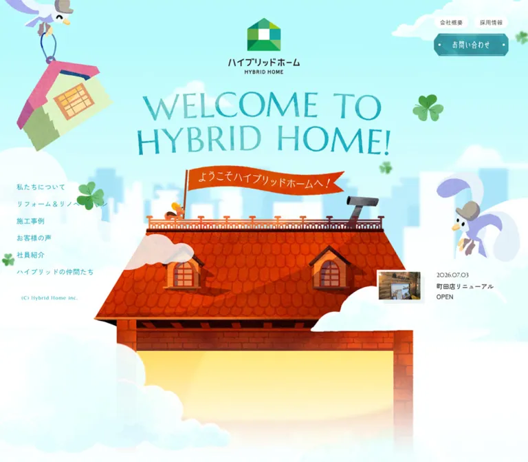
水色の空と絵本風の家を縦にたどる住宅リフォーム会社のサイト。質感のあるイラスト、鳥のキャラクター、額縁入りの社員写真、看板風ボタンを組み合わせ、親しみやすい世界観をつくっています。
オリジナルサイトを見るHybrid Home — Style Reference
A renovation company introduced through an illustrated house, from a cloud-wrapped roof to a garden mailbox.
Website: hybridhome.co.jp Original URL: https://www.hybridhome.co.jp/ Final URL: https://www.hybridhome.co.jp/ Theme: light; pale cyan scenery, white information surfaces, teal controls, and burnt-orange accents. Inspected: September 12, 2026, using the supplied browser capture record retrieved at 07:28:26.935 UTC / 16:28:26.935 JST. Viewports: 1440 × 1000 and 390 × 844 CSS pixels. Scope: the current corporate homepage: opening composition, navigation appearances, introduction, project track, renovation/staff/partner sections, news, and footer. Visual evidence consists of three desktop captures and two mobile captures; rendered DOM measurements cover additional sections. Linked destination pages and opened-menu states were not inspected.
Hybrid Home makes its subject into its page structure. Visitors begin above a red tiled roof, pass through an illustrated building, and finish beside a garden and mailbox. Pale cyan sky, white clouds, textured brickwork, domestic objects, and bird characters establish a friendly storybook world. Real staff portraits appear inside painted frames, connecting the illustration to the people behind the business.
The interface remains recognizably corporate. Service navigation, project links, dated news, recruitment, office addresses, and contact routes sit within the scenery. Small Japanese sans-serif text provides clarity; custom welcome lettering and illustrated signs carry the expressive scale. The result depends on composition and artwork more than on a reusable grid of cards.
How to Read This Reference
- Measured means a value supplied by the rendered DOM or computed-style evidence. Measurements are CSS pixels unless stated otherwise.
- Declared means an exact source custom property was supplied, but its use on a particular visible object may be unverified.
- Estimated means a visual approximation from the attached screenshots. These values are not pixel samples or recovered CSS rules.
- Calculated means arithmetic based on supplied measurements or declarations.
- Recommended means an implementation choice for reuse, including the CSS starter and its breakpoint.
- Descriptive token names are adaptation aliases. Original property names are identified separately.
The element inventory includes navigation nodes with layout rectangles even though an opened menu is absent from the screenshots. A rectangle alone does not establish visibility. Likewise, empty heading text and tiny inherited font sizes do not describe the lettering inside graphic headings.
Tokens — Colors
Default Palette
| Name | Value | Adaptation token | Evidence and role |
|---|---|---|---|
| Scene Cyan | #b9fbfc |
--color-scene |
Measured background of the project, renovation, staff, and partner sections. |
| Footer Sky | #c5fcfd |
--color-sky |
Measured footer background; source --base-bg-color05. |
| Cloud White | #ffffff |
--color-white |
Measured utility-pill background; declared --base-color-white. Also visually matches the large footer panel. |
| Warm Ink | #29221f |
--color-ink |
Measured main text color; source --base-text-color and --base-color-black. |
| Deep Teal Text | #1e525a |
--color-ink-teal |
Measured introduction and news-title color; source --base-text-color02. |
| Navigation Cyan | #14a5b6 |
--color-nav |
Measured hero navigation, hero copyright, and mobile MENU color. |
| Action Teal | #1f858b |
--color-action |
Measured introduction, staff, and news button surfaces; source --base-btn-color01. |
| Action Orange | #c93c02 |
--color-action-orange |
Measured project-list, renovation, and partner button surfaces. |
| Contact Turquoise | #3da4a3 |
--color-contact |
Measured footer contact-button surface; source --base-btn-color03. |
The large scenery is more varied than these flat colors. Clouds partially wash out the sky; roof tiles range from orange to dark red; brickwork contains multiple warm shades. Preserve those variations in artwork rather than approximating the entire illustration with flat token fills.
Supporting Source Colors
| Source property | Exact declaration | Evidence boundary |
|---|---|---|
--base-color-uchi |
#c13e02 |
Interior-feature color declaration. It differs from the measured #c93c02 action surface. |
--base-color-soto |
#32a4ab |
Exterior-feature color declaration; visually consistent with the teal feature sign. |
--base-color-green |
#32929e |
Available teal; a reasonable plaque approximation, but the plaque's rendered fill was not separately measured. |
--base-color-wood |
#6d240e |
Available dark wood tone; exact assignment to illustrated wood is unverified. |
--base-shadow-color |
#ade2e3 |
Available pale cyan shadow color; does not establish a general elevation system. |
--base-btn-color01-hv |
#137a80 |
Declared teal hover color; the hovered state was not captured. |
--base-btn-color02-hv |
#a22200 |
Declared orange hover color; the hovered state was not captured. |
A separate --theme-color: #b93937 is declared. It should not replace the visibly dominant cyan and teal palette. No theme selector or alternate color mode is evidenced.
Tokens — Typography
Japanese Interface and Body Copy
Measured leading stack: "Zen Kaku Gothic New", "Zen Kaku Gothic Antique", "Hiragino Kaku Gothic Pro", …, "Yu Gothic", YuGothic, Meiryo, …, sans-serif.
The source also declares --gothic: "Zen Kaku Gothic New","Zen Kaku Gothic Antique",sans-serif. Computed family lists establish the intended stack, not which font file supplied every glyph.
Weights are restrained: 400 for hero navigation and utility pills, and predominantly 500 for paragraphs, project titles, news titles, office information, and footer links. Large expanses of illustration are balanced by comparatively small, carefully spaced text.
Latin Utility Type
Marcellus, sans-serif is measured on the desktop hero copyright and mobile MENU. Its lightly classical letterforms add a distinct accent without taking over Japanese text.
Dates and the ending copyright also look editorial in the screenshots, but their family was not separately measured. Do not extend the confirmed Marcellus assignment to every Latin string as an observed fact.
--line-seed: "LINE Seed JP", sans-serif is declared. None of the supplied sampled text establishes its use in a visible component.
Artwork Lettering
The logo, two-line WELCOME TO HYBRID HOME!, Japanese welcome flag, and several section headings appear as graphic lettering. Their heading elements return empty text in the supplied extraction. This supports treating them as graphic components; it does not identify their font or prove that accessible image names are missing.
Keep the uneven edges, narrow letter shapes, and subtle color variation of the welcome artwork. A bold geometric sans-serif heading would materially change the opening composition.
Type Scale
| Role | Desktop measurement | Mobile measurement | Weight / spacing |
|---|---|---|---|
| Hero navigation | 16px / 16px |
Not visible in the closed mobile state | 400; 0.64px tracking, equivalent to 0.04em. |
| Hero company/recruit pills | 13px / 13px |
Not visible in the closed mobile state | 400; 0.52px tracking. |
Mobile MENU |
Not applicable | 17px / 17px |
Marcellus, 500. |
| Hero copyright | 11px / 11px |
Not visible in the mobile hero | Marcellus, 400; 1.43px tracking. |
| Hero news title | 15px / 24px |
14px / 22.4px |
500. |
| Introduction paragraph | 15.36px / 34.56px |
13.65px / 32.175px |
500; -0.1em tracking. |
| Renovation/staff paragraph | 15.36px / 34.56px |
13.65px / 32.175px |
500; normal tracking. |
| Partner paragraph | 15.36px / 34.56px |
13.65px / 32.175px |
500; -0.05em tracking. |
| Project title | 19.2px / 19.2px |
15.6px / 15.6px |
500. |
| Main news title | 17.28px / 28.8px |
First: 15.6px / 27.04px; others: 14.625px / 25.35px |
500. |
| Footer company information | 13.44px / 24.96px |
12.675px / 21.45px |
500; desktop tracking about 0.04em. |
| Office name | 15.36px / 15.36px |
13.65px / 13.65px |
500. |
| Office address | 12.48px / 24.96px |
12.675px / 21.45px |
500. |
| Main footer link | 14.4px / 14.4px |
12.1875px / 12.1875px |
500. |
| Map label | 13px / 13px |
14px / 14px |
500. |
The desktop prose line-height ratio is 2.25; mobile is approximately 2.36. This unusually airy rhythm helps short paragraphs sit comfortably inside busy scenes.
Recommendation: retain generous leading but use a 15–16px minimum for new mobile body copy. Keep normal tracking for unfamiliar or longer text. The source's compressed introduction tracking and one-line project-title leading should not be copied indiscriminately.
Root Size and Source Font Tokens
The measured root is 10px on desktop and approximately 10.3701px on mobile. Body wrappers inherit 6.25px and 6.48131px, respectively, while visible text components declare their own sizes. These tiny wrapper values are not a recommended reading size.
Example source declarations:
/* Supplied desktop declarations */
--fz14: max(1.4rem, 12px);
--fz18: max(1.8rem, 16px);

/* Supplied mobile declarations */
--fz14: clamp(1.4rem, calc(14 * calc(100vw / 400)), 1.6rem);
--fz18: clamp(1.8rem, calc(18 * calc(100vw / 400)), 2rem);
At the measured mobile root, the lower bound of --fz14 is approximately 14.52px; it therefore cannot explain the measured 13.65px prose by itself. Use component measurements and confirmed formulas separately.
Tokens — Spacing & Shapes
Responsive Units
The supplied source declares:
--vwPC: calc(100vw / 1500);
--vwSP: calc(100vw / 400);
--base-sp-width: 400;
At the inspected widths, these units calculate to 0.96px and 0.975px. Many component measurements are consistent with dimensions multiplied by these units. This does not establish every original selector or breakpoint.
Spacing Scale
| Relationship | Desktop | Mobile | Status |
|---|---|---|---|
| Hero logo top | 48px |
33.625px |
Measured. |
| Logo box to welcome-heading box | 48px |
About 56.06px |
Calculated from measured bounds. |
| Welcome heading to flag composite | About 26.88px |
About 23.41px |
Calculated from measured bounds. |
| Hero navigation row pitch | 40px |
Not applicable | Calculated; 16px text height plus 24px separation. |
| Company/recruit pill gap | 12px |
Not applicable | Calculated from measured positions. |
| Hero news outer inset | 48px from right |
19.5px on both sides |
Measured/calculated. |
| Typical mobile paragraph inset | Not uniform | 34.125–39px |
Measured; approximately 8.75–10vw. |
| Project-card horizontal gap | About 57.59px |
29.25px |
Calculated from consecutive card positions. |
| Project-card vertical stagger | 60px |
39px |
Measured relative offset in the sampled track. |
| Footer section top padding | 192px |
52px |
Measured computed padding. |
| Footer office-column gap | About 29.03px |
Offices stack | Calculated from measured bounds. |
Shapes
| Element | Geometry | Evidence |
|---|---|---|
| Main section action | 240 × 57.59px; radius 28.8px |
Measured desktop. |
| Main section action on mobile | 224.25 × 53.81px |
Measured. Declared radii vary between approximately 29.25px and 48.75px; both render as fully rounded ends at this height. |
| Hero utility pill | About 82.09 × 30px; radius 999px |
Measured. |
| Hero contact plaque | About 176.19 × 52.13px |
Measured box; clipped corners, inset border, and side dots are visual observations. |
| Footer contact surface | About 268.8 × 54.7px desktop; 224.25 × 44.84px mobile |
Measured visible inner surface. The mobile outer anchor is wider at 273px. |
| Map control | About 138.19 × 27px desktop; 142.42 × 28px mobile |
Measured; radius 15px. |
| Desktop footer panel | Approximately 1344px wide with 48px side margins |
Screenshot estimate; container bounds were not supplied. |
| Footer panel corners | Approximately 60–65px desktop; 30–32px mobile |
Screenshot estimate. |
| Staff portrait frames | Alternating tall and near-square frames, roughly 190px wide in the supplied desktop scene |
Screenshot estimate. |
The geometry has two distinct registers: soft pills and white panels for interface surfaces, and angular roofs, rectangular picture frames, bricks, and clipped signs within the illustrated world.
Components
Opening Identity and Welcome Composition
Role: establish the company and invite exploration of its illustrated house.
The desktop logo is centered above two lines of large teal welcome lettering. An orange flag sits beneath it, attached to a pole beside a small character on the roof railing. The main roof fills the lower center. Clouds overlap its edges, while a faint city skyline provides a distant layer.
The logo combines a geometric green/teal house mark, a Japanese company name, and an English line. Its crisp geometry contrasts with the textured scenery.
| Graphic wrapper | Desktop bounds | Mobile bounds |
|---|---|---|
| Logo / H1 | x 623.05, y 48; 193.91 × 153.58px |
x 121.14, y 33.63; 147.70 × 116.98px |
| Welcome / H2 | x 373.92, y 249.58; 692.16 × 173.75px |
x 35.59, y 206.67; 318.81 × 80.03px |
| Flag composite / H3 | x 448.78, y 450.20; 492.47 × 151.67px |
x 32.17, y 310.11; 297.38 × 91.58px |
These are graphic-wrapper measurements, not font sizes. The flag wrapper includes more than its orange cloth.
The opening does not lead with a conventional sales paragraph and large conversion block. Identity, scenery, navigation, and a recent update share the viewport. Preserve that hierarchy when adapting the composition.
Desktop Hero Navigation
Role: provide direct access to the company's main information areas without enclosing the opening in a header bar.
Six teal text links form a vertical rail beginning at x ≈ 45.11px, y ≈ 541.75px. They include 私たちについて, リフォーム&リノベーション, 施工事例, お客様の声, 社員紹介, and ハイブリッドの仲間たち.
Each line uses 16px regular text, 0.04em tracking, and a 40px vertical pitch. Small tracked copyright text sits below the rail. The links remain visually unboxed over the pale cloud area.
At the upper right, two white utility pills sit above a teal contact plaque. The plaque has cut corners, an inset light outline, two small bolt-like dots, and narrow white Japanese lettering. Its link points to /contact/.
Persistent Desktop Header
Role: retain navigation once the visitor is viewing the house interior or footer.
The two scrolled desktop captures show a horizontal logo at the left and a white navigation strip across the upper right. The strip is approximately 69px tall in the screenshots, with a rounded lower-left junction. Main links are compact dark text; company and recruitment controls become dark pills with light text; contact remains a teal plaque.
The header remains at the viewport top in those captures. Its exact fixed/sticky implementation, appearance threshold, and transition were not supplied. The declared --head-mt: 100px is a source spacing variable, not a measurement of the visible strip's height.
Mobile Menu Trigger and Unopened Navigation
Role: replace the desktop navigation rail and horizontal strip at narrow widths.
The mobile trigger consists of thin cyan horizontal strokes followed by MENU. The text measures 17px in Marcellus and begins at approximately x 320.22px, y 33px. The same top-right treatment appears in the mobile ending capture.
The DOM contains a separate navigation structure with 16px, weight 500 links, generally 57px tall and 20px vertical padding. Its principal rows measure 312px wide at a 39px inset; some utility rows divide into two 151.125px columns.
Those measurements document the underlying navigation structure, not an observed open-menu appearance. Opening, closing, background treatment, focus behavior, and scroll locking remain unverified.
Hero News Teaser
Role: expose a current update without interrupting the welcome scene.
A small landscape illustration sits to the left of a date and Japanese title. The thumbnail has a slightly offset pale backing rectangle, resembling a layered print. The linked item is dated August 19, 2026 and points to /news/570/.
Desktop places the teaser near the lower right at x 1027.20px, y 735.20px, measuring 364.80 × 86.39px. Mobile moves it below the roof into a full-width cloud band: x 19.5px, y 606.83px, measuring 351 × 67.5px.
Keep the date and title as real text. The visible thumbnail is approximately 115 × 78px on desktop and 94 × 63px on mobile; these image dimensions are visual estimates, not DOM measurements.
Illustrated House Sections
Role: turn services and company information into rooms within one continuous setting.
The supplied interior capture shows thick orange brick dividers and dark floor beams. An upper area includes stairs, a pale green wall, and a turquoise/cream diamond-patterned floor. Below, an illustrated kitchen occupies the left: shelving, pendant lights, a cook, a small white-and-blue character, and a pizza oven with a curling plume of steam.
The right-hand wall holds real staff portraits. Architectural structure supplies the section boundary; it is not merely a background image behind a uniform card grid.
For implementation, separate the building shell, room illustration, semantic text, and controls. Keep readable content clear of high-detail brickwork and foreground characters. Exact scene layering and asset boundaries were not included in the evidence.
Introduction and Service Copy
Role: explain the company's approach within the illustrated journey.
The introduction contains short paragraphs about caring for the home and the life lived within it, followed by a teal 私たちについて action. Desktop copy begins around x 116.16px and occupies approximately 508.8px; mobile uses a 312px column at x 39px.
The renovation section uses a wider desktop paragraph of approximately 633.58px. Its orange 詳細ページへ action aligns toward the paragraph's right edge. The staff section uses teal and aligns its action to the left. Partner content returns to orange; on mobile its action is centered.
This varying alignment is part of each scene's composition. Avoid forcing every paragraph and button into the same centered stack.
The supplied text repeats renovation wording in the section whose action points to /staff/. Preserve the destination-based identification of that section; do not invent missing staff-specific copy as an observation.
Rounded Section Action
Role: move from a short homepage introduction to a detailed page.
An outer link contains a rounded colored surface, a light inset stroke, a label, and a bold right arrow. The desktop surface is 240 × 57.59px, with a measured 38px left inset on the sampled inner element. The screenshot shows white lettering, even though the sampled parent retains an inherited dark text color.
Teal serves the introduction, staff, and news routes. Burnt orange serves project browsing, renovation, and partner routes. Footer contact uses a lighter turquoise variant.
The visible finish is subtly mottled rather than a glossy gradient. CSS can approximate the pill and inset stroke; the textured treatment requires appropriate artwork or a restrained texture layer.
Featured Project Track
Role: introduce selected work while providing access to the complete case-study index.
The desktop structure places a heading and index action on the left, with a horizontal project region beginning at x 474px and extending to the viewport's right edge. The region has 30px left padding. Each recorded project link contains a title, hashtag categories, and a locality beneath an upper visual region.
Measured cards are approximately 345.59 × 374.56px, separated horizontally by 57.59px. One position is raised 60px relative to neighboring cards. On mobile, cards become 273 × 303.05px, with 29.25px gaps and a 39px stagger. The track starts at x 39px; the next card begins at x 341.25px, leaving a partial next item within the viewport width.
The same three destinations appear three times in the DOM, with offscreen positions. This supports a repeated horizontal-track structure. Autoplay, dragging, controls, and looping behavior were not directly demonstrated.
On mobile, the index action moves beneath the track and centers at x 82.875px. Its inner surface measures 224.25 × 53.81px. The enclosing anchor has a zero-height rectangle in the sample, so use the visible inner element for geometry; do not copy that wrapper anomaly.
The supplied screenshots do not show this section's actual image crops. Use the measured card structure confidently, but treat thumbnail styling and a suggested 4:3 image ratio as implementation recommendations.
Staff Portrait Wall
Role: connect the playful setting with real people.
Four portrait frames are visible across the right side of the interior capture, with the fourth partly cropped by the viewport. Blue frames are taller; cream frames are shorter and sit lower. Natural-color portraits retain dark, softly blurred outdoor backgrounds.
The frame sequence resembles pictures hung on a pale wall. Keep the stagger, substantial painted frame widths, and uncircular photography. The evidence does not establish whether portraits are individually linked or animated.
News List
Role: provide practical, dated updates after the main company story.
Desktop has a right-side list beginning at x 650.41px, approximately 668.14px wide. Three measured entries are about 154.25px tall and combine a visual region with date/category/title information. A section heading and teal index action sit above the list.
Mobile changes the hierarchy. The first item is a larger block, approximately 312 × 293.52px, with title information below its upper content. The next two entries remain compact horizontal rows at 351 × 78px. The mobile index label is visibly shortened to 一覧へ, while the extracted link retains the longer label.
Do not reduce this to three identical mobile cards. The first-item emphasis is a measurable responsive distinction.
Footer Information Panel
Role: gather contact, office details, and comprehensive navigation at the end of the story.
A large white panel with generous rounded corners sits over the cyan garden scene. Desktop uses a brand/contact column at left and a wider information area at right.
The left group contains the stacked logo, company name, business hours, turquoise contact action, two angled feature signs, and an outlined Instagram control. The visible feature labels are うちリノ特集 and そとリノ特集.
The right group contains three office columns above a fine cyan divider and three navigation groups below. Each office combines a medium-weight heading, compact address and telephone lines, and an outlined GOOGLE MAP pill with a teal pin protruding above its upper edge.
Measured desktop office columns are about 257.03px wide, beginning at x 495.64px, 781.70px, and 1067.77px. Footer link rows advance approximately 31.67px vertically.
On mobile, company/contact information comes first, followed by all three offices in one column. Office content is 273px wide at x 58.5px. Their headings begin approximately 210px apart. The sitemap then uses a main-link column and a narrower blog-category column.
The mobile footer logo wrapper is 190.61 × 29.23px, indicating a horizontal treatment rather than a scaled copy of the desktop 193.91 × 153.58px stacked mark.
The label メールでお問い合わせ links to /contact/; the evidence does not show a mailto: action. All three recorded map controls share one destination URL. A new implementation should verify office-specific destinations instead of copying them blindly.
Page Top and Garden Ending
Role: close the illustrated journey and provide a route back to the beginning.
Desktop combines circular PAGE TOP lettering and an upward arrow with a bird perched on a large mailbox. The recorded /#top anchor is approximately 172.80 × 366.67px, encompassing the tall decorative composition.
On mobile, the measured top link becomes an 86.28px square circle near the lower sitemap. The house, red car, vegetable garden, bird, and mailbox appear farther down as a large ending scene. The source does not establish a separate mailbox contact action.
The ending copyright also changes placement: a single white line overlays the desktop garden, while mobile uses two teal lines in a broad sky interval above the house. Keep this breathing space and the large foreground mailbox; shrinking the desktop footer as a whole would lose the mobile ending.
Tokens — Motion & Interaction
| Treatment | Supplied evidence | Interpretation and limit |
|---|---|---|
| General links | 0.4s cubic-bezier(0.215, 0.61, 0.355, 1) |
Measured transition declaration; changed properties and endpoints are not established for every link. |
| Hero/footer text links | padding-left 0.4s |
Measured; suggests horizontal feedback, but the final padding was not captured. |
| Utility pills | Background and color, 0.4s cubic-bezier(0.39, 0.575, 0.565, 1) |
Measured transition; hovered colors were not visually tested. |
| Rounded action surfaces | Background, 0.4s cubic-bezier(0.39, 0.575, 0.565, 1) |
Measured on sampled inner surfaces. |
| Hero news title | Color, 0.4s cubic-bezier(0.39, 0.575, 0.565, 1) |
Measured declaration. |
| Map controls | Color and border, 0.4s cubic-bezier(0.39, 0.575, 0.565, 1) |
Measured declaration. |
| Scale transition token | transform 0.8s cubic-bezier(0.215, 0.61, 0.355, 1) |
Declared --transition-scale; attachment to a particular visible object is unverified. |
| Desktop navigation change | Different hero and scrolled appearances | Visually evidenced states; threshold and transition duration unknown. |
| Project repetition | Repeated links and offscreen track positions | Structural evidence; autoplay, drag, and loop timing unknown. |
| Leaves, birds, clouds, steam, and circular lettering | Visible in static captures | Motion paths, parallax, rotation, and durations cannot be established. |
| Mobile menu | Trigger and navigation DOM present | Open/close behavior was not exercised. |
| Page top | Anchor points to /#top |
Destination evidenced; smooth scrolling not demonstrated. |
Most sampled headings and links report animation: none. This does not prove that their descendants, pseudo-elements, or decorative assets are static.
The capture process waited for document readiness, visible image decoding, and sampled layout stability. Perpetual animations were paused during readiness checks and resumed afterward. The supplied still images do not preserve enough temporal evidence to describe specific decorative motion.
Recommended adaptation: use the confirmed 400ms interaction cadence for small color changes. If decorative motion is added, make it subtle, independently pausable where necessary, and removable with reduced-motion preferences. Do not present invented parallax or autoplay as a recovered site feature.
Surfaces
| Layer | Appearance | Function |
|---|---|---|
| Distant scenery | Pale cyan sky, faint skyline, softened clouds | Gives depth and keeps the opening airy. |
| Building shell | Textured red/orange roof and brickwork, dark beams | Establishes continuity between sections. |
| Room interiors | Pale green, mint, and cream planes with domestic detail | Provides quieter areas for text and portraits. |
| Foreground decoration | Birds, leaves, flag, steam, garden, mailbox | Connects adjacent regions through overlap and scale. |
| Primary actions | Teal or orange pills with light inset strokes | Creates recognizable routes through the scene. |
| Utility navigation | White or dark compact pills; clipped contact plaque | Separates practical corporate controls from scenery. |
| Footer information | Large white rounded panel | Creates a calm, readable conclusion. |
| Small outlined utilities | White fill, fine dark border, teal or brand icon | Supports maps and social access without heavy visual weight. |
There is no visually dominant card-shadow system. Depth primarily comes from the illustration, architectural layering, offset thumbnail backing, frames, and foreground overlap.
Imagery
The artwork resembles textured cut paper and painted picture-book scenery. Colors vary within shapes; roof shingles and bricks remain individually legible; leaves have soft edges and warm highlights. White clouds sometimes overlap the building like paper cutouts. The treatment should remain smooth at display size, with visible material texture rather than deliberately pixelated raster edges.
The recurring bird is white with lavender-blue wings and tail, a yellow-orange beak, and a gray hat. It appears in different relationships to the house: carrying a small hanging house near the opening, flying beside the roof, and perching on the mailbox at the end. These repeated motifs create continuity without requiring identical placement.
The house is domestic and slightly theatrical: red roof tiles, dormer windows, exposed room sections, shelves, a kitchen oven, a garage, garden beds, and a small red car. Real portrait photography is integrated through painted frames rather than recolored into illustration.
Observed Asset References
No image source URLs, asset filenames, intrinsic sizes, or image-format inventory were supplied. The following identifies visible asset roles without inventing paths.
| Asset role | Observed evidence | Implementation guidance |
|---|---|---|
| Stacked brand mark | Desktop/mobile hero and desktop footer | Preserve the geometric house mark and both name lines. |
| Horizontal brand mark | Scrolled desktop header; mobile footer wrapper proportions | Provide a dedicated responsive variant. |
| Welcome lettering | Two-line teal graphic in both hero captures | Preserve its aspect ratio and irregular lettering. |
| Welcome flag composite | Orange flag, pole, and small roof character | Keep it distinct from ordinary text and buttons. |
| Roof and skyline | Both opening captures | Recompose the roof crop for mobile without distorting it. |
| Interior architecture | Desktop middle capture | Preserve the relationship between brick dividers, rooms, and content. |
| Staff portraits and frames | Desktop middle capture | Use natural-color portraits within substantial alternating frames. |
| Current-news illustration | Both hero captures | Pair a landscape image with live date/title text. |
| Footer garden and mailbox | Desktop and mobile ending captures | Use separate placement rules for background scenery and foreground mascot. |
| Contact and feature signs | Hero/header/footer captures | Preserve clipped or angled edges and restrained texture. |
Use original assets only when authorized and available. For a new brand, commission a coherent replacement set; CSS alone will not reproduce the identity carried by this illustration system.
Layout & Responsive Behavior
Measured Page Structure
Positions below are document coordinates from the supplied DOM snapshot, rounded to the nearest pixel. They identify section extents, not permanent implementation heights.
| Section | Desktop start / height | Mobile start / height |
|---|---|---|
| Opening hero | 0 / 956px |
0 / 589px |
| Following visual transition | 956 / 1056px |
589 / 390px |
| Introduction | 2012 / 1516px |
979 / 1876px |
| Featured projects | 3528 / 986px |
2855 / 887px |
| Renovation | 4514 / 1177px |
3743 / 1969px |
| Staff | 5691 / 1174px |
5712 / 1800px |
| Partners | 6865 / 1237px |
7512 / 2150px |
| News | 8102 / 1087px |
9662 / 1623px |
| Ending visual section | 9189 / 1634px |
11285 / 944px |
| Footer | 10823 / 1002px |
12229 / 2131px |
Total measured document height is approximately 11825.22px on desktop and 14359.89px on mobile. Mobile is about 21.4% longer. The long mobile rooms reflect recomposition and stacking rather than proportional shrinking.
Responsive Rules Visible in the Evidence
| Area | Desktop | Mobile |
|---|---|---|
| Primary navigation | Hero rail; horizontal strip in scrolled captures | Top-right MENU. |
| Hero logo | Centered stacked mark, about 194px wide |
Remains substantial at about 148px wide. |
| Welcome graphic | About 692px wide, or 48.1% of viewport |
About 319px wide, or 81.7% of viewport. |
| Roof | Central building with broad scenery at the sides | Extends across the viewport with tighter architectural crop. |
| Hero news | Lower-right overlay within the opening region | Below the measured hero boundary in the cloud band. |
| Body copy | Asymmetric columns distributed across room scenes | Mostly 312–321.75px columns with generous leading. |
| Project index action | Beside the horizontal project region | Below the track, centered. |
| News | Three similarly sized horizontal entries | One larger stacked item, then two compact rows. |
| Office information | Three columns | One vertical sequence. |
| Footer sitemap | Three groups across the right area | Main links plus a narrower blog column. |
| Ending artwork | Panel overlaps much of the garden scene | House and mailbox remain large below the panel and copyright. |
The logo, welcome lettering, and flag have different scale relationships between viewports. Use independent responsive sizing rather than a single transform on the entire hero.
The exact source breakpoint is unavailable. The CSS starter uses 1200px as a recommended point to switch from the dense desktop navigation to the compact trigger. Validate intermediate widths, text zoom, and longer labels before choosing a production breakpoint.
Do’s and Don’ts
Do
- Preserve the sequence from sky and roof through interior rooms to garden and mailbox.
- Keep cyan scenery dominant, with white reading surfaces and localized teal/orange actions.
- Use the supplied Japanese font stack for ordinary interface text when the fonts are available.
- Treat welcome lettering, logos, and illustrated signs as graphic assets with their own proportions.
- Retain the measured airy paragraph rhythm while maintaining readable mobile text sizes.
- Integrate staff photography into the house through substantial, staggered frames.
- Preserve the horizontal project presentation and mobile index action beneath it.
- Give desktop and mobile footer compositions separate layout rules.
- Keep dates, titles, addresses, and navigation as semantic text.
- Distinguish a declared transition from an interaction that was actually demonstrated.
Don’t
- Don’t replace the room sequence with identical white feature cards.
- Don’t turn every button orange; the teal/orange distribution varies by destination.
- Don’t equate
--theme-colorwith the visible dominant palette. - Don’t interpret
6.25pxheading-wrapper styles as the size of the welcome lettering. - Don’t replace the textured artwork with flat geometric clip art or pixelated rendering.
- Don’t shrink the whole desktop page to fit a phone.
- Don’t crop away the roof, characters, and architectural joins that explain the scene.
- Don’t assign invented fonts to graphic lettering.
- Don’t assume the project track autoplays or the circular text rotates.
- Don’t give the mailbox a contact interaction solely because of its subject.
- Don’t hardcode the recorded document heights as mandatory blank space.
Recommended Implementation Additions
These are recommendations for a new implementation, not verified original features:
- Give graphic headings meaningful accessible names. The empty extracted heading text warrants checking image alternatives, not assuming they are absent.
- Implement
MENUas a button with an expanded state and controlled navigation region. Support keyboard operation, Escape, and sensible focus return. - Preserve visible focus rings around illustrated controls; apply clipping to their decorative layers rather than the entire focusable element.
- Expand small map/social controls to at least a
44pxtouch target while retaining their compact visible appearance where appropriate. - Use a readable mobile body minimum and allow longer project titles to wrap with at least
1.3line-height. - Keep decorative scene layers out of the accessibility tree and prevent them from intercepting pointer events.
- For any looping project implementation, prevent duplicated slides from producing repeated keyboard stops or repeated screen-reader content.
- Provide a usable static or manually scrollable project track when animation is disabled.
- Reserve intrinsic image dimensions to prevent late artwork decoding from shifting the long composition. Prioritize opening artwork and defer later scenes appropriately.
- Verify each office's map destination independently; the supplied links repeat one URL.
- Check the overlap between the persistent mobile menu and the footer's page-top control, which appear close together in the ending capture.
Agent Prompt Guide
Quick Color Reference
- Main scene:
#b9fbfc. - Footer sky:
#c5fcfd. - Clouds and information panel:
#ffffff. - Main text:
#29221f; secondary dark teal:#1e525a. - Hero navigation:
#14a5b6. - Main teal action:
#1f858b. - Main orange action:
#c93c02. - Footer contact:
#3da4a3. - Roof, brick, leaves, and garden colors should vary naturally within illustrated assets.
Overall Prompt
“Create a Japanese renovation-company homepage organized as a continuous illustrated house. Begin with pale cyan sky, a centered stacked brand mark, irregular teal welcome lettering, an orange welcome flag, clouds, birds, and a red tiled roof. Continue through rooms separated by textured brickwork and beams. Combine small Zen Kaku Gothic-style Japanese interface text with generous paragraph leading, staggered framed staff portraits, a horizontal project track, dated news, and teal or burnt-orange pill actions with light inset strokes and bold arrows. Finish with a large white rounded information panel over a garden and mailbox scene. On mobile, use a top-right MENU trigger, individually resize the hero graphics, move the project index action below the track, stack offices, and expose a large house-and-mailbox ending. Keep all essential content usable without decorative motion.”
Example Component Prompts
- Hero: “Compose a cyan storybook sky around a red tiled roof. Center a compact stacked logo above two lines of irregular teal welcome lettering. Place an orange Japanese welcome flag below it. Add cloud overlap, a distant city silhouette, a hat-wearing bird, and scattered warm leaves. Keep desktop navigation at the left and contact utilities at the upper right.”
- Room section: “Build a cutaway domestic room with textured orange brick dividers, dark beams, pale walls, and detailed illustrated furniture. Reserve a calm area for short Japanese copy with generous leading. Integrate the content into the architecture without enclosing it in a generic card.”
- Action: “Create a 240 × 58px teal or burnt-orange pill with a fine light inset contour, a white Japanese label such as 詳細ページへ, and a bold right arrow. Use restrained surface texture and no large drop shadow. Reduce it to approximately 224 × 54px on a 390px phone.”
- Project track: “Create a horizontal row of project links, each with an image region, Japanese title, hashtag categories, and locality. Use approximately 346px desktop cards with 58px gaps and one raised position. On a 390px phone use 273px cards, 29px gaps, and a partial next card. Put 事例一覧へ below the mobile track. Use manual scrolling unless autoplay is separately specified.”
- Portrait wall: “Place natural-color staff portraits in alternating blue and cream painted frames on a pale mint wall. Alternate taller and shorter frames with staggered top edges. Surround them with house architecture, including a nearby illustrated kitchen.”
- Footer: “Create a large white rounded panel over cyan garden scenery. On desktop place brand/contact information at left, three office columns at upper right, and sitemap groups below a thin cyan rule. Add a circular PAGE TOP arrow and a bird on a mailbox. On mobile stack offices, use a horizontal logo, and place the large house and mailbox scene below the panel and two-line copyright.”
Quick Start
CSS Custom Properties
This is a recommended adaptation, not recovered source CSS. It keeps a conventional root size, reuses measured colors and representative dimensions, and makes mobile prose more readable. The 1200px breakpoint, manually scrollable track, hover endpoints, and focus treatment are implementation choices.
Artwork must be supplied separately through authorized assets. No asset paths are assumed. Use distinct responsive artwork where the composition or logo changes; the classes below do not synthesize the house illustration.
:root {
  /* Exact source-derived colors */
  --color-scene: #b9fbfc;
  --color-sky: #c5fcfd;
  --color-white: #ffffff;
  --color-ink: #29221f;
  --color-ink-teal: #1e525a;
  --color-nav: #14a5b6;
  --color-action: #1f858b;
  --color-action-orange: #c93c02;
  --color-contact: #3da4a3;
  --color-action-hover: #137a80;
  --color-orange-hover: #a22200;

  /* Declared source color used as a plaque approximation */
  --color-plaque: #32929e;

  /* Shortened versions of confirmed font stacks */
  --font-jp: 'Zen Kaku Gothic New', 'Zen Kaku Gothic Antique',
    'Hiragino Kaku Gothic Pro', 'Yu Gothic', Meiryo, sans-serif;
  --font-latin: Marcellus, sans-serif;

  /* Confirmed viewport-unit declarations */
  --pc: calc(100vw / 1500);
  --sp: calc(100vw / 400);

  /* Adaptation values matching the measured desktop proportions */
  --page-gutter: calc(50 * var(--pc));
  --button-width: calc(250 * var(--pc));
  --button-height: calc(60 * var(--pc));
  --project-width: calc(360 * var(--pc));
  --project-gap: calc(60 * var(--pc));
  --project-rise: 60px;

  /* Screenshot estimates and recommended readable type bounds */
  --panel-radius: 64px;
  --text-body: clamp(0.9375rem, calc(16 * var(--pc)), 1.125rem);
  --leading-body: 2.25;

  /* Measured transition curves */
  --ease-link: cubic-bezier(0.215, 0.61, 0.355, 1);
  --ease-color: cubic-bezier(0.39, 0.575, 0.565, 1);
  --duration-link: 400ms;
}

* { box-sizing: border-box; }
html { font-size: 100%; }
body {
  margin: 0;
  color: var(--color-ink);
  background: var(--color-sky);
  font-family: var(--font-jp);
  font-size: 1rem;
}

img, svg { max-width: 100%; }
a { color: inherit; }
button { font: inherit; }
[hidden] { display: none !important; }

.hh-page :focus-visible {
  outline: 3px solid var(--color-ink-teal);
  outline-offset: 5px;
}

/* Attach decorative images to these noninteractive layers. */
.hh-decoration {
  pointer-events: none;
  user-select: none;
}

.hh-hero {
  position: relative;
  isolation: isolate;
  min-height: calc(996 * var(--pc));
  padding-top: calc(50 * var(--pc));
  background: var(--color-scene);
}

.hh-hero-brand {
  position: relative;
  z-index: 2;
  width: calc(202 * var(--pc));
  margin: 0 auto;
}

.hh-welcome {
  position: relative;
  z-index: 2;
  width: calc(721 * var(--pc));
  margin: calc(50 * var(--pc)) auto 0;
}

.hh-hero-brand img,
.hh-welcome img,
.hh-flag img {
  display: block;
  width: 100%;
  height: auto;
}

.hh-flag {
  position: relative;
  z-index: 2;
  width: calc(513 * var(--pc));
  margin: calc(28 * var(--pc)) auto 0;
  transform: translateX(calc(-26 * var(--pc)));
}

.hh-hero-nav {
  position: absolute;
  z-index: 4;
  top: calc(564.3 * var(--pc));
  left: 3.133vw;
  display: grid;
  gap: 24px;
}

.hh-hero-nav a {
  color: var(--color-nav);
  font-size: 16px;
  line-height: 1;
  letter-spacing: 0.04em;
  text-decoration: none;
  transition: padding-left var(--duration-link);
}

.hh-hero-utilities {
  position: absolute;
  z-index: 4;
  top: calc(45 * var(--pc));
  right: 3.715vw;
  display: grid;
  grid-template-columns: 1fr 1fr;
  gap: 12px;
}

.hh-utility-pill {
  display: inline-flex;
  align-items: center;
  justify-content: center;
  min-height: 30px;
  padding-inline: 14px;
  border-radius: 999px;
  background: var(--color-white);
  font-size: 13px;
  letter-spacing: 0.04em;
  text-decoration: none;
}

/* Clip the painted layer, preserving the link's focus outline. */
.hh-contact-plaque {
  position: relative;
  isolation: isolate;
  grid-column: 1 / -1;
  display: grid;
  place-items: center;
  min-height: 52px;
  padding-inline: 24px;
  color: white;
  text-decoration: none;
}

.hh-contact-plaque::before {
  content: '';
  position: absolute;
  z-index: -1;
  inset: 0;
  background: var(--color-plaque);
  clip-path: polygon(8% 0, 92% 0, 100% 28%, 100% 72%,
    92% 100%, 8% 100%, 0 72%, 0 28%);
}

/* Recommended state hook; appearance threshold needs implementation. */
.hh-scroll-header {
  position: fixed;
  z-index: 30;
  inset: 0 0 auto;
  display: flex;
  align-items: center;
  min-height: 69px;
}

.hh-scroll-header__brand {
  flex: 0 0 22.43%;
  padding-left: 40px;
}

.hh-scroll-header__nav {
  flex: 1;
  display: flex;
  align-items: center;
  justify-content: space-between;
  gap: 12px;
  min-height: 69px;
  padding: 10px 36px;
  border-bottom-left-radius: 32px;
  background: white;
  font-size: 13px;
}

.hh-scroll-header__nav a { text-decoration: none; }
.hh-menu-trigger { display: none; }

.hh-news-teaser {
  position: absolute;
  z-index: 5;
  top: calc(765.84 * var(--pc));
  right: var(--page-gutter);
  display: grid;
  grid-template-columns: 120px minmax(0, 1fr);
  align-items: center;
  gap: 43px;
  width: calc(380 * var(--pc));
  color: var(--color-ink);
  text-decoration: none;
}

.hh-news-teaser img {
  display: block;
  width: 100%;
  height: auto;
  box-shadow: 8px 8px 0 #e8f4f4;
}

.hh-news-teaser p {
  margin: 6px 0 0;
  font-size: 15px;
  font-weight: 500;
  line-height: 1.6;
}

/* Author each room's artwork and copy position independently. */
.hh-room {
  position: relative;
  isolation: isolate;
  display: grid;
  background: var(--color-scene);
}

.hh-room__art {
  grid-area: 1 / 1;
  display: block;
  width: 100%;
  height: auto;
}

.hh-room__copy {
  grid-area: 1 / 1;
  z-index: 2;
  align-self: end;
  width: min(44vw, 640px);
  margin: 0 0 10vw 8vw;
}

.hh-room__copy--right {
  justify-self: end;
  margin-inline: 0 13vw;
}

.hh-prose {
  margin: 0 0 2.5rem;
  font-size: var(--text-body);
  font-weight: 500;
  line-height: var(--leading-body);
  overflow-wrap: anywhere;
}

.hh-button {
  --button-fill: var(--color-action);
  --button-hover: var(--color-action-hover);
  position: relative;
  display: inline-flex;
  align-items: center;
  justify-content: space-between;
  gap: 20px;
  width: var(--button-width);
  max-width: 100%;
  min-height: var(--button-height);
  padding: 12px 20px 12px 38px;
  border-radius: 999px;
  color: white;
  background: var(--button-fill);
  font-size: 18px;
  font-weight: 500;
  line-height: 1.4;
  text-decoration: none;
  transition: background var(--duration-link) var(--ease-color);
}

.hh-button::before {
  content: '';
  position: absolute;
  inset: 4px;
  border: 1px solid rgb(255 255 255 / 80%);
  border-right-color: transparent;
  border-radius: inherit;
  pointer-events: none;
}

.hh-button svg { flex: 0 0 20px; width: 20px; height: 20px; }
.hh-button--orange {
  --button-fill: var(--color-action-orange);
  --button-hover: var(--color-orange-hover);
}
.hh-button--contact { --button-fill: var(--color-contact); }

.hh-projects {
  display: grid;
  grid-template-columns: 240px minmax(0, 1fr);
  gap: 90px;
  padding-left: 10vw;
  background: var(--color-scene);
}

/* Manual scrolling and snapping are recommended adaptations. */
.hh-project-track {
  display: flex;
  align-items: flex-start;
  gap: var(--project-gap);
  min-width: 0;
  padding: var(--project-rise) 24px 24px 30px;
  overflow-x: auto;
  scroll-snap-type: x proximity;
  scroll-padding-inline: 30px;
}

.hh-project-card {
  flex: 0 0 var(--project-width);
  min-width: 0;
  color: var(--color-ink);
  text-decoration: none;
  scroll-snap-align: start;
}

.hh-project-card:nth-child(3n) {
  transform: translateY(calc(-1 * var(--project-rise)));
}

/* Suggested image ratio; original image bounds were not supplied. */
.hh-project-card img {
  display: block;
  width: 100%;
  aspect-ratio: 4 / 3;
  object-fit: cover;
}

.hh-project-card h3 {
  margin: 16px 0 12px;
  font-size: calc(20 * var(--pc));
  font-weight: 500;
  line-height: 1.35;
}

.hh-project-card p {
  margin: 6px 0;
  font-size: 13px;
  line-height: 1.7;
}

.hh-footer {
  position: relative;
  padding-top: calc(200 * var(--pc));
  background: var(--color-sky);
}

.hh-footer-panel {
  position: relative;
  z-index: 2;
  display: grid;
  grid-template-columns: calc(280 * var(--pc)) minmax(0, 1fr);
  gap: calc(116.3 * var(--pc));
  margin-inline: var(--page-gutter);
  padding: calc(70 * var(--pc));
  border-radius: var(--panel-radius);
  background: white;
}

.hh-footer-brand { text-align: center; }
.hh-offices {
  display: grid;
  grid-template-columns: repeat(3, minmax(0, 1fr));
  gap: calc(30.25 * var(--pc));
}

.hh-office h3 {
  margin: 0 0 20px;
  font-size: calc(16 * var(--pc));
  font-weight: 500;
}

.hh-office address {
  font-size: 13px;
  font-style: normal;
  font-weight: 500;
  line-height: 1.9;
  overflow-wrap: anywhere;
}

/* Larger targets are a recommended accessibility addition. */
.hh-map-link {
  display: inline-flex;
  align-items: center;
  justify-content: center;
  gap: 8px;
  min-height: 44px;
  margin-top: 16px;
  padding-inline: 20px;
  border: 1px solid var(--color-ink);
  border-radius: 999px;
  font-size: 13px;
  text-decoration: none;
}

.hh-footer-links {
  display: grid;
  grid-template-columns: repeat(3, minmax(0, 1fr));
  gap: 24px;
  margin-top: 56px;
  padding-top: 44px;
  border-top: 1px solid #9dd1d0;
}

.hh-footer-links a {
  display: block;
  padding-block: 7px;
  font-size: 14px;
  line-height: 1.5;
  text-decoration: none;
}

@media (hover: hover) {
  .hh-button:hover { background: var(--button-hover); }
  .hh-hero-nav a:hover { padding-left: 6px; }
}

/* Recommended breakpoint, not a recovered source media query. */
@media (max-width: 1199px) {
  :root {
    --page-gutter: calc(20 * var(--sp));
    --button-width: min(224.25px, calc(230 * var(--sp)));
    --button-height: 54px;
    --project-width: min(360px, 70vw);
    --project-gap: 7.5vw;
    --project-rise: min(60px, 10vw);
    --panel-radius: 32px;
    --text-body: 15px;
    --leading-body: 2.15;
  }

  .hh-hero-nav,
  .hh-hero-utilities,
  .hh-scroll-header { display: none; }

  .hh-menu-trigger {
    position: fixed;
    z-index: 40;
    top: max(20px, env(safe-area-inset-top, 0px));
    right: var(--page-gutter);
    display: inline-flex;
    align-items: center;
    gap: 8px;
    min-height: 44px;
    padding: 0;
    border: 0;
    color: var(--color-nav);
    background: transparent;
    font-family: var(--font-latin);
    font-size: 17px;
    cursor: pointer;
  }

  .hh-hero {
    min-height: min(900px, 151.14vw);
    padding-top: min(48px, 8.622vw);
  }

  .hh-hero-brand { width: min(194px, 37.873vw); }
  .hh-welcome {
    width: min(692px, 81.747vw);
    margin-top: min(72px, 14.375vw);
  }
  .hh-flag {
    width: min(492px, 76.25vw);
    margin-top: min(32px, 6vw);
    transform: translateX(-3.625vw);
  }

  .hh-news-teaser {
    top: calc(100% + 18px);
    right: var(--page-gutter);
    left: var(--page-gutter);
    width: auto;
    grid-template-columns: min(120px, 25vw) minmax(0, 1fr);
    gap: 23px;
  }
  .hh-news-teaser p { font-size: 14px; }

  /* Keep a real following region so the teaser cannot cover copy. */
  .hh-sky-transition { min-height: max(220px, 100vw); }

  .hh-room__art { grid-area: auto; }
  .hh-room__copy,
  .hh-room__copy--right {
    grid-area: auto;
    justify-self: stretch;
    width: auto;
    margin: 40px 8.75vw 64px;
  }

  .hh-button { font-size: 16px; }
  .hh-projects {
    grid-template-columns: minmax(0, 1fr);
    gap: 24px;
    padding-left: 10vw;
  }
  .hh-project-track {
    padding-left: 0;
    scroll-padding-inline: 0;
  }
  .hh-project-card h3 { font-size: 16px; }
  .hh-projects__index {
    justify-self: center;
    margin-right: 10vw;
  }

  .hh-footer { padding-top: 52px; }
  .hh-footer-panel {
    grid-template-columns: minmax(0, 1fr);
    gap: 64px;
    padding: 60px 10vw 48px;
  }
  .hh-offices {
    grid-template-columns: minmax(0, 1fr);
    gap: 64px;
  }
  .hh-office h3 { font-size: 14px; }
  .hh-footer-links {
    grid-template-columns: minmax(0, 1.35fr) minmax(0, 1fr);
    gap: 16px;
  }
}

@media (prefers-reduced-motion: reduce) {
  .hh-page *,
  .hh-page *::before,
  .hh-page *::after {
    animation: none !important;
    transition: none !important;
    scroll-behavior: auto !important;
  }
}
The mobile room rule intentionally uses normal document flow as a robust starting point. Matching the original room compositions requires individual art direction and responsive assets. Do not recover their layouts by inserting thousands of pixels of unexplained padding.
A usable action example:
<a class="hh-button hh-button--orange" href="/works/">
  <span>事例一覧へ</span>
  <svg viewBox="0 0 24 24" aria-hidden="true" focusable="false">
    <path d="M5 12h13M13 6l6 6-6 6"
      fill="none" stroke="currentColor" stroke-width="4"
      stroke-linecap="round" stroke-linejoin="round" />
  </svg>
</a>
Use semantic links for page destinations and buttons for menu state changes. The example arrow and inset stroke are CSS/SVG approximations, not extracted assets.
Tailwind v4 Token Mapping
Optional aliases for a project already using Tailwind v4. Define the custom properties above first. This does not imply that the inspected site uses Tailwind.
@theme inline {
  --color-scene: #b9fbfc;
  --color-sky: #c5fcfd;
  --color-ink: #29221f;
  --color-ink-teal: #1e525a;
  --color-nav: #14a5b6;
  --color-action: #1f858b;
  --color-action-orange: #c93c02;
  --color-contact: #3da4a3;

  --font-japanese: var(--font-jp);
  --font-editorial: var(--font-latin);
  --spacing-scene-gutter: var(--page-gutter);
  --spacing-project: var(--project-width);
  --radius-scene-panel: var(--panel-radius);
}
Sources & Evidence
- Inspected original website: Hybrid Home. Original and final URLs are identical; the supplied response status is HTTP
200. - Capture record: September 12, 2026, retrieved at
2026-09-12T07:28:26.935Z. Separate timestamps for individual screenshots were not supplied. - Desktop evidence:
1440 × 1000CSS-pixel viewport; opening, interior, and footer captures; measured document height approximately11825.22px. - Mobile evidence:
390 × 844CSS-pixel viewport; opening and ending captures; measured document height approximately14359.89px. - Rendered evidence: page title, text, link destinations, custom properties, element rectangles, typography, colors, padding, radii, and transition declarations supplied with the homepage observation.
- Observed states: opening and scrolled page appearances. The record describes traversal through intermediate scroll positions and readiness checks, but does not provide opened menus, exercised hover states, carousel manipulation, or a motion recording.
- Inspection limits: no additional browsing or file access was performed for this reference. Linked pages were not inspected. Asset URLs, complete stylesheets, media queries, event handlers, accessibility-tree results, and individual decorative animation timings were not supplied.
All measurements describe the captured current homepage. Screenshot estimates, calculated relationships, and implementation recommendations are identified separately; delayed content and unexercised interactions remain unverified.
# Hybrid Home — Style Reference

> A renovation company introduced through an illustrated house, from a cloud-wrapped roof to a garden mailbox.

**Website:** [hybridhome.co.jp](https://www.hybridhome.co.jp/)
**Original URL:** https://www.hybridhome.co.jp/
**Final URL:** https://www.hybridhome.co.jp/
**Theme:** light; pale cyan scenery, white information surfaces, teal controls, and burnt-orange accents.
**Inspected:** September 12, 2026, using the supplied browser capture record retrieved at 07:28:26.935 UTC / 16:28:26.935 JST.
**Viewports:** 1440 × 1000 and 390 × 844 CSS pixels.
**Scope:** the current corporate homepage: opening composition, navigation appearances, introduction, project track, renovation/staff/partner sections, news, and footer. Visual evidence consists of three desktop captures and two mobile captures; rendered DOM measurements cover additional sections. Linked destination pages and opened-menu states were not inspected.

Hybrid Home makes its subject into its page structure. Visitors begin above a red tiled roof, pass through an illustrated building, and finish beside a garden and mailbox. Pale cyan sky, white clouds, textured brickwork, domestic objects, and bird characters establish a friendly storybook world. Real staff portraits appear inside painted frames, connecting the illustration to the people behind the business.

The interface remains recognizably corporate. Service navigation, project links, dated news, recruitment, office addresses, and contact routes sit within the scenery. Small Japanese sans-serif text provides clarity; custom welcome lettering and illustrated signs carry the expressive scale. The result depends on composition and artwork more than on a reusable grid of cards.

## How to Read This Reference

- **Measured** means a value supplied by the rendered DOM or computed-style evidence. Measurements are CSS pixels unless stated otherwise.
- **Declared** means an exact source custom property was supplied, but its use on a particular visible object may be unverified.
- **Estimated** means a visual approximation from the attached screenshots. These values are not pixel samples or recovered CSS rules.
- **Calculated** means arithmetic based on supplied measurements or declarations.
- **Recommended** means an implementation choice for reuse, including the CSS starter and its breakpoint.
- Descriptive token names are adaptation aliases. Original property names are identified separately.

The element inventory includes navigation nodes with layout rectangles even though an opened menu is absent from the screenshots. A rectangle alone does not establish visibility. Likewise, empty heading text and tiny inherited font sizes do not describe the lettering inside graphic headings.

## Tokens — Colors

### Default Palette

| Name | Value | Adaptation token | Evidence and role |
| --- | --- | --- | --- |
| Scene Cyan | `#b9fbfc` | `--color-scene` | Measured background of the project, renovation, staff, and partner sections. |
| Footer Sky | `#c5fcfd` | `--color-sky` | Measured footer background; source `--base-bg-color05`. |
| Cloud White | `#ffffff` | `--color-white` | Measured utility-pill background; declared `--base-color-white`. Also visually matches the large footer panel. |
| Warm Ink | `#29221f` | `--color-ink` | Measured main text color; source `--base-text-color` and `--base-color-black`. |
| Deep Teal Text | `#1e525a` | `--color-ink-teal` | Measured introduction and news-title color; source `--base-text-color02`. |
| Navigation Cyan | `#14a5b6` | `--color-nav` | Measured hero navigation, hero copyright, and mobile `MENU` color. |
| Action Teal | `#1f858b` | `--color-action` | Measured introduction, staff, and news button surfaces; source `--base-btn-color01`. |
| Action Orange | `#c93c02` | `--color-action-orange` | Measured project-list, renovation, and partner button surfaces. |
| Contact Turquoise | `#3da4a3` | `--color-contact` | Measured footer contact-button surface; source `--base-btn-color03`. |

The large scenery is more varied than these flat colors. Clouds partially wash out the sky; roof tiles range from orange to dark red; brickwork contains multiple warm shades. Preserve those variations in artwork rather than approximating the entire illustration with flat token fills.

### Supporting Source Colors

| Source property | Exact declaration | Evidence boundary |
| --- | --- | --- |
| `--base-color-uchi` | `#c13e02` | Interior-feature color declaration. It differs from the measured `#c93c02` action surface. |
| `--base-color-soto` | `#32a4ab` | Exterior-feature color declaration; visually consistent with the teal feature sign. |
| `--base-color-green` | `#32929e` | Available teal; a reasonable plaque approximation, but the plaque's rendered fill was not separately measured. |
| `--base-color-wood` | `#6d240e` | Available dark wood tone; exact assignment to illustrated wood is unverified. |
| `--base-shadow-color` | `#ade2e3` | Available pale cyan shadow color; does not establish a general elevation system. |
| `--base-btn-color01-hv` | `#137a80` | Declared teal hover color; the hovered state was not captured. |
| `--base-btn-color02-hv` | `#a22200` | Declared orange hover color; the hovered state was not captured. |

A separate `--theme-color: #b93937` is declared. It should not replace the visibly dominant cyan and teal palette. No theme selector or alternate color mode is evidenced.

## Tokens — Typography

### Japanese Interface and Body Copy

**Measured leading stack:** `"Zen Kaku Gothic New", "Zen Kaku Gothic Antique", "Hiragino Kaku Gothic Pro", …, "Yu Gothic", YuGothic, Meiryo, …, sans-serif`.

The source also declares `--gothic: "Zen Kaku Gothic New","Zen Kaku Gothic Antique",sans-serif`. Computed family lists establish the intended stack, not which font file supplied every glyph.

Weights are restrained: `400` for hero navigation and utility pills, and predominantly `500` for paragraphs, project titles, news titles, office information, and footer links. Large expanses of illustration are balanced by comparatively small, carefully spaced text.

### Latin Utility Type

`Marcellus, sans-serif` is measured on the desktop hero copyright and mobile `MENU`. Its lightly classical letterforms add a distinct accent without taking over Japanese text.

Dates and the ending copyright also look editorial in the screenshots, but their family was not separately measured. Do not extend the confirmed Marcellus assignment to every Latin string as an observed fact.

`--line-seed: "LINE Seed JP", sans-serif` is declared. None of the supplied sampled text establishes its use in a visible component.

### Artwork Lettering

The logo, two-line `WELCOME TO HYBRID HOME!`, Japanese welcome flag, and several section headings appear as graphic lettering. Their heading elements return empty text in the supplied extraction. This supports treating them as graphic components; it does not identify their font or prove that accessible image names are missing.

Keep the uneven edges, narrow letter shapes, and subtle color variation of the welcome artwork. A bold geometric sans-serif heading would materially change the opening composition.

### Type Scale

| Role | Desktop measurement | Mobile measurement | Weight / spacing |
| --- | --- | --- | --- |
| Hero navigation | `16px / 16px` | Not visible in the closed mobile state | `400`; `0.64px` tracking, equivalent to `0.04em`. |
| Hero company/recruit pills | `13px / 13px` | Not visible in the closed mobile state | `400`; `0.52px` tracking. |
| Mobile `MENU` | Not applicable | `17px / 17px` | Marcellus, `500`. |
| Hero copyright | `11px / 11px` | Not visible in the mobile hero | Marcellus, `400`; `1.43px` tracking. |
| Hero news title | `15px / 24px` | `14px / 22.4px` | `500`. |
| Introduction paragraph | `15.36px / 34.56px` | `13.65px / 32.175px` | `500`; `-0.1em` tracking. |
| Renovation/staff paragraph | `15.36px / 34.56px` | `13.65px / 32.175px` | `500`; normal tracking. |
| Partner paragraph | `15.36px / 34.56px` | `13.65px / 32.175px` | `500`; `-0.05em` tracking. |
| Project title | `19.2px / 19.2px` | `15.6px / 15.6px` | `500`. |
| Main news title | `17.28px / 28.8px` | First: `15.6px / 27.04px`; others: `14.625px / 25.35px` | `500`. |
| Footer company information | `13.44px / 24.96px` | `12.675px / 21.45px` | `500`; desktop tracking about `0.04em`. |
| Office name | `15.36px / 15.36px` | `13.65px / 13.65px` | `500`. |
| Office address | `12.48px / 24.96px` | `12.675px / 21.45px` | `500`. |
| Main footer link | `14.4px / 14.4px` | `12.1875px / 12.1875px` | `500`. |
| Map label | `13px / 13px` | `14px / 14px` | `500`. |

The desktop prose line-height ratio is `2.25`; mobile is approximately `2.36`. This unusually airy rhythm helps short paragraphs sit comfortably inside busy scenes.

**Recommendation:** retain generous leading but use a 15–16px minimum for new mobile body copy. Keep normal tracking for unfamiliar or longer text. The source's compressed introduction tracking and one-line project-title leading should not be copied indiscriminately.

### Root Size and Source Font Tokens

The measured root is `10px` on desktop and approximately `10.3701px` on mobile. Body wrappers inherit `6.25px` and `6.48131px`, respectively, while visible text components declare their own sizes. These tiny wrapper values are not a recommended reading size.

Example source declarations:

```css
/* Supplied desktop declarations */
--fz14: max(1.4rem, 12px);
--fz18: max(1.8rem, 16px);

/* Supplied mobile declarations */
--fz14: clamp(1.4rem, calc(14 * calc(100vw / 400)), 1.6rem);
--fz18: clamp(1.8rem, calc(18 * calc(100vw / 400)), 2rem);
```

At the measured mobile root, the lower bound of `--fz14` is approximately `14.52px`; it therefore cannot explain the measured `13.65px` prose by itself. Use component measurements and confirmed formulas separately.

## Tokens — Spacing & Shapes

### Responsive Units

The supplied source declares:

```css
--vwPC: calc(100vw / 1500);
--vwSP: calc(100vw / 400);
--base-sp-width: 400;
```

At the inspected widths, these units calculate to `0.96px` and `0.975px`. Many component measurements are consistent with dimensions multiplied by these units. This does not establish every original selector or breakpoint.

### Spacing Scale

| Relationship | Desktop | Mobile | Status |
| --- | --- | --- | --- |
| Hero logo top | `48px` | `33.625px` | Measured. |
| Logo box to welcome-heading box | `48px` | About `56.06px` | Calculated from measured bounds. |
| Welcome heading to flag composite | About `26.88px` | About `23.41px` | Calculated from measured bounds. |
| Hero navigation row pitch | `40px` | Not applicable | Calculated; `16px` text height plus `24px` separation. |
| Company/recruit pill gap | `12px` | Not applicable | Calculated from measured positions. |
| Hero news outer inset | `48px` from right | `19.5px` on both sides | Measured/calculated. |
| Typical mobile paragraph inset | Not uniform | `34.125–39px` | Measured; approximately `8.75–10vw`. |
| Project-card horizontal gap | About `57.59px` | `29.25px` | Calculated from consecutive card positions. |
| Project-card vertical stagger | `60px` | `39px` | Measured relative offset in the sampled track. |
| Footer section top padding | `192px` | `52px` | Measured computed padding. |
| Footer office-column gap | About `29.03px` | Offices stack | Calculated from measured bounds. |

### Shapes

| Element | Geometry | Evidence |
| --- | --- | --- |
| Main section action | `240 × 57.59px`; radius `28.8px` | Measured desktop. |
| Main section action on mobile | `224.25 × 53.81px` | Measured. Declared radii vary between approximately `29.25px` and `48.75px`; both render as fully rounded ends at this height. |
| Hero utility pill | About `82.09 × 30px`; radius `999px` | Measured. |
| Hero contact plaque | About `176.19 × 52.13px` | Measured box; clipped corners, inset border, and side dots are visual observations. |
| Footer contact surface | About `268.8 × 54.7px` desktop; `224.25 × 44.84px` mobile | Measured visible inner surface. The mobile outer anchor is wider at `273px`. |
| Map control | About `138.19 × 27px` desktop; `142.42 × 28px` mobile | Measured; radius `15px`. |
| Desktop footer panel | Approximately `1344px` wide with `48px` side margins | Screenshot estimate; container bounds were not supplied. |
| Footer panel corners | Approximately `60–65px` desktop; `30–32px` mobile | Screenshot estimate. |
| Staff portrait frames | Alternating tall and near-square frames, roughly `190px` wide in the supplied desktop scene | Screenshot estimate. |

The geometry has two distinct registers: soft pills and white panels for interface surfaces, and angular roofs, rectangular picture frames, bricks, and clipped signs within the illustrated world.

## Components

### Opening Identity and Welcome Composition

**Role:** establish the company and invite exploration of its illustrated house.

The desktop logo is centered above two lines of large teal welcome lettering. An orange flag sits beneath it, attached to a pole beside a small character on the roof railing. The main roof fills the lower center. Clouds overlap its edges, while a faint city skyline provides a distant layer.

The logo combines a geometric green/teal house mark, a Japanese company name, and an English line. Its crisp geometry contrasts with the textured scenery.

| Graphic wrapper | Desktop bounds | Mobile bounds |
| --- | --- | --- |
| Logo / H1 | `x 623.05, y 48; 193.91 × 153.58px` | `x 121.14, y 33.63; 147.70 × 116.98px` |
| Welcome / H2 | `x 373.92, y 249.58; 692.16 × 173.75px` | `x 35.59, y 206.67; 318.81 × 80.03px` |
| Flag composite / H3 | `x 448.78, y 450.20; 492.47 × 151.67px` | `x 32.17, y 310.11; 297.38 × 91.58px` |

These are graphic-wrapper measurements, not font sizes. The flag wrapper includes more than its orange cloth.

The opening does not lead with a conventional sales paragraph and large conversion block. Identity, scenery, navigation, and a recent update share the viewport. Preserve that hierarchy when adapting the composition.

### Desktop Hero Navigation

**Role:** provide direct access to the company's main information areas without enclosing the opening in a header bar.

Six teal text links form a vertical rail beginning at `x ≈ 45.11px`, `y ≈ 541.75px`. They include `私たちについて`, `リフォーム&リノベーション`, `施工事例`, `お客様の声`, `社員紹介`, and `ハイブリッドの仲間たち`.

Each line uses `16px` regular text, `0.04em` tracking, and a `40px` vertical pitch. Small tracked copyright text sits below the rail. The links remain visually unboxed over the pale cloud area.

At the upper right, two white utility pills sit above a teal contact plaque. The plaque has cut corners, an inset light outline, two small bolt-like dots, and narrow white Japanese lettering. Its link points to `/contact/`.

### Persistent Desktop Header

**Role:** retain navigation once the visitor is viewing the house interior or footer.

The two scrolled desktop captures show a horizontal logo at the left and a white navigation strip across the upper right. The strip is approximately `69px` tall in the screenshots, with a rounded lower-left junction. Main links are compact dark text; company and recruitment controls become dark pills with light text; contact remains a teal plaque.

The header remains at the viewport top in those captures. Its exact fixed/sticky implementation, appearance threshold, and transition were not supplied. The declared `--head-mt: 100px` is a source spacing variable, not a measurement of the visible strip's height.

### Mobile Menu Trigger and Unopened Navigation

**Role:** replace the desktop navigation rail and horizontal strip at narrow widths.

The mobile trigger consists of thin cyan horizontal strokes followed by `MENU`. The text measures `17px` in Marcellus and begins at approximately `x 320.22px`, `y 33px`. The same top-right treatment appears in the mobile ending capture.

The DOM contains a separate navigation structure with `16px`, weight `500` links, generally `57px` tall and `20px` vertical padding. Its principal rows measure `312px` wide at a `39px` inset; some utility rows divide into two `151.125px` columns.

Those measurements document the underlying navigation structure, not an observed open-menu appearance. Opening, closing, background treatment, focus behavior, and scroll locking remain unverified.

### Hero News Teaser

**Role:** expose a current update without interrupting the welcome scene.

A small landscape illustration sits to the left of a date and Japanese title. The thumbnail has a slightly offset pale backing rectangle, resembling a layered print. The linked item is dated August 19, 2026 and points to `/news/570/`.

Desktop places the teaser near the lower right at `x 1027.20px`, `y 735.20px`, measuring `364.80 × 86.39px`. Mobile moves it below the roof into a full-width cloud band: `x 19.5px`, `y 606.83px`, measuring `351 × 67.5px`.

Keep the date and title as real text. The visible thumbnail is approximately `115 × 78px` on desktop and `94 × 63px` on mobile; these image dimensions are visual estimates, not DOM measurements.

### Illustrated House Sections

**Role:** turn services and company information into rooms within one continuous setting.

The supplied interior capture shows thick orange brick dividers and dark floor beams. An upper area includes stairs, a pale green wall, and a turquoise/cream diamond-patterned floor. Below, an illustrated kitchen occupies the left: shelving, pendant lights, a cook, a small white-and-blue character, and a pizza oven with a curling plume of steam.

The right-hand wall holds real staff portraits. Architectural structure supplies the section boundary; it is not merely a background image behind a uniform card grid.

For implementation, separate the building shell, room illustration, semantic text, and controls. Keep readable content clear of high-detail brickwork and foreground characters. Exact scene layering and asset boundaries were not included in the evidence.

### Introduction and Service Copy

**Role:** explain the company's approach within the illustrated journey.

The introduction contains short paragraphs about caring for the home and the life lived within it, followed by a teal `私たちについて` action. Desktop copy begins around `x 116.16px` and occupies approximately `508.8px`; mobile uses a `312px` column at `x 39px`.

The renovation section uses a wider desktop paragraph of approximately `633.58px`. Its orange `詳細ページへ` action aligns toward the paragraph's right edge. The staff section uses teal and aligns its action to the left. Partner content returns to orange; on mobile its action is centered.

This varying alignment is part of each scene's composition. Avoid forcing every paragraph and button into the same centered stack.

The supplied text repeats renovation wording in the section whose action points to `/staff/`. Preserve the destination-based identification of that section; do not invent missing staff-specific copy as an observation.

### Rounded Section Action

**Role:** move from a short homepage introduction to a detailed page.

An outer link contains a rounded colored surface, a light inset stroke, a label, and a bold right arrow. The desktop surface is `240 × 57.59px`, with a measured `38px` left inset on the sampled inner element. The screenshot shows white lettering, even though the sampled parent retains an inherited dark text color.

Teal serves the introduction, staff, and news routes. Burnt orange serves project browsing, renovation, and partner routes. Footer contact uses a lighter turquoise variant.

The visible finish is subtly mottled rather than a glossy gradient. CSS can approximate the pill and inset stroke; the textured treatment requires appropriate artwork or a restrained texture layer.

### Featured Project Track

**Role:** introduce selected work while providing access to the complete case-study index.

The desktop structure places a heading and index action on the left, with a horizontal project region beginning at `x 474px` and extending to the viewport's right edge. The region has `30px` left padding. Each recorded project link contains a title, hashtag categories, and a locality beneath an upper visual region.

Measured cards are approximately `345.59 × 374.56px`, separated horizontally by `57.59px`. One position is raised `60px` relative to neighboring cards. On mobile, cards become `273 × 303.05px`, with `29.25px` gaps and a `39px` stagger. The track starts at `x 39px`; the next card begins at `x 341.25px`, leaving a partial next item within the viewport width.

The same three destinations appear three times in the DOM, with offscreen positions. This supports a repeated horizontal-track structure. Autoplay, dragging, controls, and looping behavior were not directly demonstrated.

On mobile, the index action moves beneath the track and centers at `x 82.875px`. Its inner surface measures `224.25 × 53.81px`. The enclosing anchor has a zero-height rectangle in the sample, so use the visible inner element for geometry; do not copy that wrapper anomaly.

The supplied screenshots do not show this section's actual image crops. Use the measured card structure confidently, but treat thumbnail styling and a suggested `4:3` image ratio as implementation recommendations.

### Staff Portrait Wall

**Role:** connect the playful setting with real people.

Four portrait frames are visible across the right side of the interior capture, with the fourth partly cropped by the viewport. Blue frames are taller; cream frames are shorter and sit lower. Natural-color portraits retain dark, softly blurred outdoor backgrounds.

The frame sequence resembles pictures hung on a pale wall. Keep the stagger, substantial painted frame widths, and uncircular photography. The evidence does not establish whether portraits are individually linked or animated.

### News List

**Role:** provide practical, dated updates after the main company story.

Desktop has a right-side list beginning at `x 650.41px`, approximately `668.14px` wide. Three measured entries are about `154.25px` tall and combine a visual region with date/category/title information. A section heading and teal index action sit above the list.

Mobile changes the hierarchy. The first item is a larger block, approximately `312 × 293.52px`, with title information below its upper content. The next two entries remain compact horizontal rows at `351 × 78px`. The mobile index label is visibly shortened to `一覧へ`, while the extracted link retains the longer label.

Do not reduce this to three identical mobile cards. The first-item emphasis is a measurable responsive distinction.

### Footer Information Panel

**Role:** gather contact, office details, and comprehensive navigation at the end of the story.

A large white panel with generous rounded corners sits over the cyan garden scene. Desktop uses a brand/contact column at left and a wider information area at right.

The left group contains the stacked logo, company name, business hours, turquoise contact action, two angled feature signs, and an outlined Instagram control. The visible feature labels are `うちリノ特集` and `そとリノ特集`.

The right group contains three office columns above a fine cyan divider and three navigation groups below. Each office combines a medium-weight heading, compact address and telephone lines, and an outlined `GOOGLE MAP` pill with a teal pin protruding above its upper edge.

Measured desktop office columns are about `257.03px` wide, beginning at `x 495.64px`, `781.70px`, and `1067.77px`. Footer link rows advance approximately `31.67px` vertically.

On mobile, company/contact information comes first, followed by all three offices in one column. Office content is `273px` wide at `x 58.5px`. Their headings begin approximately `210px` apart. The sitemap then uses a main-link column and a narrower blog-category column.

The mobile footer logo wrapper is `190.61 × 29.23px`, indicating a horizontal treatment rather than a scaled copy of the desktop `193.91 × 153.58px` stacked mark.

The label `メールでお問い合わせ` links to `/contact/`; the evidence does not show a `mailto:` action. All three recorded map controls share one destination URL. A new implementation should verify office-specific destinations instead of copying them blindly.

### Page Top and Garden Ending

**Role:** close the illustrated journey and provide a route back to the beginning.

Desktop combines circular `PAGE TOP` lettering and an upward arrow with a bird perched on a large mailbox. The recorded `/#top` anchor is approximately `172.80 × 366.67px`, encompassing the tall decorative composition.

On mobile, the measured top link becomes an `86.28px` square circle near the lower sitemap. The house, red car, vegetable garden, bird, and mailbox appear farther down as a large ending scene. The source does not establish a separate mailbox contact action.

The ending copyright also changes placement: a single white line overlays the desktop garden, while mobile uses two teal lines in a broad sky interval above the house. Keep this breathing space and the large foreground mailbox; shrinking the desktop footer as a whole would lose the mobile ending.

## Tokens — Motion & Interaction

| Treatment | Supplied evidence | Interpretation and limit |
| --- | --- | --- |
| General links | `0.4s cubic-bezier(0.215, 0.61, 0.355, 1)` | Measured transition declaration; changed properties and endpoints are not established for every link. |
| Hero/footer text links | `padding-left 0.4s` | Measured; suggests horizontal feedback, but the final padding was not captured. |
| Utility pills | Background and color, `0.4s cubic-bezier(0.39, 0.575, 0.565, 1)` | Measured transition; hovered colors were not visually tested. |
| Rounded action surfaces | Background, `0.4s cubic-bezier(0.39, 0.575, 0.565, 1)` | Measured on sampled inner surfaces. |
| Hero news title | Color, `0.4s cubic-bezier(0.39, 0.575, 0.565, 1)` | Measured declaration. |
| Map controls | Color and border, `0.4s cubic-bezier(0.39, 0.575, 0.565, 1)` | Measured declaration. |
| Scale transition token | `transform 0.8s cubic-bezier(0.215, 0.61, 0.355, 1)` | Declared `--transition-scale`; attachment to a particular visible object is unverified. |
| Desktop navigation change | Different hero and scrolled appearances | Visually evidenced states; threshold and transition duration unknown. |
| Project repetition | Repeated links and offscreen track positions | Structural evidence; autoplay, drag, and loop timing unknown. |
| Leaves, birds, clouds, steam, and circular lettering | Visible in static captures | Motion paths, parallax, rotation, and durations cannot be established. |
| Mobile menu | Trigger and navigation DOM present | Open/close behavior was not exercised. |
| Page top | Anchor points to `/#top` | Destination evidenced; smooth scrolling not demonstrated. |

Most sampled headings and links report `animation: none`. This does not prove that their descendants, pseudo-elements, or decorative assets are static.

The capture process waited for document readiness, visible image decoding, and sampled layout stability. Perpetual animations were paused during readiness checks and resumed afterward. The supplied still images do not preserve enough temporal evidence to describe specific decorative motion.

**Recommended adaptation:** use the confirmed 400ms interaction cadence for small color changes. If decorative motion is added, make it subtle, independently pausable where necessary, and removable with reduced-motion preferences. Do not present invented parallax or autoplay as a recovered site feature.

## Surfaces

| Layer | Appearance | Function |
| --- | --- | --- |
| Distant scenery | Pale cyan sky, faint skyline, softened clouds | Gives depth and keeps the opening airy. |
| Building shell | Textured red/orange roof and brickwork, dark beams | Establishes continuity between sections. |
| Room interiors | Pale green, mint, and cream planes with domestic detail | Provides quieter areas for text and portraits. |
| Foreground decoration | Birds, leaves, flag, steam, garden, mailbox | Connects adjacent regions through overlap and scale. |
| Primary actions | Teal or orange pills with light inset strokes | Creates recognizable routes through the scene. |
| Utility navigation | White or dark compact pills; clipped contact plaque | Separates practical corporate controls from scenery. |
| Footer information | Large white rounded panel | Creates a calm, readable conclusion. |
| Small outlined utilities | White fill, fine dark border, teal or brand icon | Supports maps and social access without heavy visual weight. |

There is no visually dominant card-shadow system. Depth primarily comes from the illustration, architectural layering, offset thumbnail backing, frames, and foreground overlap.

## Imagery

The artwork resembles textured cut paper and painted picture-book scenery. Colors vary within shapes; roof shingles and bricks remain individually legible; leaves have soft edges and warm highlights. White clouds sometimes overlap the building like paper cutouts. The treatment should remain smooth at display size, with visible material texture rather than deliberately pixelated raster edges.

The recurring bird is white with lavender-blue wings and tail, a yellow-orange beak, and a gray hat. It appears in different relationships to the house: carrying a small hanging house near the opening, flying beside the roof, and perching on the mailbox at the end. These repeated motifs create continuity without requiring identical placement.

The house is domestic and slightly theatrical: red roof tiles, dormer windows, exposed room sections, shelves, a kitchen oven, a garage, garden beds, and a small red car. Real portrait photography is integrated through painted frames rather than recolored into illustration.

### Observed Asset References

No image source URLs, asset filenames, intrinsic sizes, or image-format inventory were supplied. The following identifies visible asset roles without inventing paths.

| Asset role | Observed evidence | Implementation guidance |
| --- | --- | --- |
| Stacked brand mark | Desktop/mobile hero and desktop footer | Preserve the geometric house mark and both name lines. |
| Horizontal brand mark | Scrolled desktop header; mobile footer wrapper proportions | Provide a dedicated responsive variant. |
| Welcome lettering | Two-line teal graphic in both hero captures | Preserve its aspect ratio and irregular lettering. |
| Welcome flag composite | Orange flag, pole, and small roof character | Keep it distinct from ordinary text and buttons. |
| Roof and skyline | Both opening captures | Recompose the roof crop for mobile without distorting it. |
| Interior architecture | Desktop middle capture | Preserve the relationship between brick dividers, rooms, and content. |
| Staff portraits and frames | Desktop middle capture | Use natural-color portraits within substantial alternating frames. |
| Current-news illustration | Both hero captures | Pair a landscape image with live date/title text. |
| Footer garden and mailbox | Desktop and mobile ending captures | Use separate placement rules for background scenery and foreground mascot. |
| Contact and feature signs | Hero/header/footer captures | Preserve clipped or angled edges and restrained texture. |

Use original assets only when authorized and available. For a new brand, commission a coherent replacement set; CSS alone will not reproduce the identity carried by this illustration system.

## Layout & Responsive Behavior

### Measured Page Structure

Positions below are document coordinates from the supplied DOM snapshot, rounded to the nearest pixel. They identify section extents, not permanent implementation heights.

| Section | Desktop start / height | Mobile start / height |
| --- | --- | --- |
| Opening hero | `0 / 956px` | `0 / 589px` |
| Following visual transition | `956 / 1056px` | `589 / 390px` |
| Introduction | `2012 / 1516px` | `979 / 1876px` |
| Featured projects | `3528 / 986px` | `2855 / 887px` |
| Renovation | `4514 / 1177px` | `3743 / 1969px` |
| Staff | `5691 / 1174px` | `5712 / 1800px` |
| Partners | `6865 / 1237px` | `7512 / 2150px` |
| News | `8102 / 1087px` | `9662 / 1623px` |
| Ending visual section | `9189 / 1634px` | `11285 / 944px` |
| Footer | `10823 / 1002px` | `12229 / 2131px` |

Total measured document height is approximately `11825.22px` on desktop and `14359.89px` on mobile. Mobile is about `21.4%` longer. The long mobile rooms reflect recomposition and stacking rather than proportional shrinking.

### Responsive Rules Visible in the Evidence

| Area | Desktop | Mobile |
| --- | --- | --- |
| Primary navigation | Hero rail; horizontal strip in scrolled captures | Top-right `MENU`. |
| Hero logo | Centered stacked mark, about `194px` wide | Remains substantial at about `148px` wide. |
| Welcome graphic | About `692px` wide, or `48.1%` of viewport | About `319px` wide, or `81.7%` of viewport. |
| Roof | Central building with broad scenery at the sides | Extends across the viewport with tighter architectural crop. |
| Hero news | Lower-right overlay within the opening region | Below the measured hero boundary in the cloud band. |
| Body copy | Asymmetric columns distributed across room scenes | Mostly `312–321.75px` columns with generous leading. |
| Project index action | Beside the horizontal project region | Below the track, centered. |
| News | Three similarly sized horizontal entries | One larger stacked item, then two compact rows. |
| Office information | Three columns | One vertical sequence. |
| Footer sitemap | Three groups across the right area | Main links plus a narrower blog column. |
| Ending artwork | Panel overlaps much of the garden scene | House and mailbox remain large below the panel and copyright. |

The logo, welcome lettering, and flag have different scale relationships between viewports. Use independent responsive sizing rather than a single transform on the entire hero.

The exact source breakpoint is unavailable. The CSS starter uses `1200px` as a **recommended** point to switch from the dense desktop navigation to the compact trigger. Validate intermediate widths, text zoom, and longer labels before choosing a production breakpoint.

## Do’s and Don’ts

### Do

- Preserve the sequence from sky and roof through interior rooms to garden and mailbox.
- Keep cyan scenery dominant, with white reading surfaces and localized teal/orange actions.
- Use the supplied Japanese font stack for ordinary interface text when the fonts are available.
- Treat welcome lettering, logos, and illustrated signs as graphic assets with their own proportions.
- Retain the measured airy paragraph rhythm while maintaining readable mobile text sizes.
- Integrate staff photography into the house through substantial, staggered frames.
- Preserve the horizontal project presentation and mobile index action beneath it.
- Give desktop and mobile footer compositions separate layout rules.
- Keep dates, titles, addresses, and navigation as semantic text.
- Distinguish a declared transition from an interaction that was actually demonstrated.

### Don’t

- Don’t replace the room sequence with identical white feature cards.
- Don’t turn every button orange; the teal/orange distribution varies by destination.
- Don’t equate `--theme-color` with the visible dominant palette.
- Don’t interpret `6.25px` heading-wrapper styles as the size of the welcome lettering.
- Don’t replace the textured artwork with flat geometric clip art or pixelated rendering.
- Don’t shrink the whole desktop page to fit a phone.
- Don’t crop away the roof, characters, and architectural joins that explain the scene.
- Don’t assign invented fonts to graphic lettering.
- Don’t assume the project track autoplays or the circular text rotates.
- Don’t give the mailbox a contact interaction solely because of its subject.
- Don’t hardcode the recorded document heights as mandatory blank space.

## Recommended Implementation Additions

These are recommendations for a new implementation, not verified original features:

- Give graphic headings meaningful accessible names. The empty extracted heading text warrants checking image alternatives, not assuming they are absent.
- Implement `MENU` as a button with an expanded state and controlled navigation region. Support keyboard operation, Escape, and sensible focus return.
- Preserve visible focus rings around illustrated controls; apply clipping to their decorative layers rather than the entire focusable element.
- Expand small map/social controls to at least a `44px` touch target while retaining their compact visible appearance where appropriate.
- Use a readable mobile body minimum and allow longer project titles to wrap with at least `1.3` line-height.
- Keep decorative scene layers out of the accessibility tree and prevent them from intercepting pointer events.
- For any looping project implementation, prevent duplicated slides from producing repeated keyboard stops or repeated screen-reader content.
- Provide a usable static or manually scrollable project track when animation is disabled.
- Reserve intrinsic image dimensions to prevent late artwork decoding from shifting the long composition. Prioritize opening artwork and defer later scenes appropriately.
- Verify each office's map destination independently; the supplied links repeat one URL.
- Check the overlap between the persistent mobile menu and the footer's page-top control, which appear close together in the ending capture.

## Agent Prompt Guide

### Quick Color Reference

- Main scene: `#b9fbfc`.
- Footer sky: `#c5fcfd`.
- Clouds and information panel: `#ffffff`.
- Main text: `#29221f`; secondary dark teal: `#1e525a`.
- Hero navigation: `#14a5b6`.
- Main teal action: `#1f858b`.
- Main orange action: `#c93c02`.
- Footer contact: `#3da4a3`.
- Roof, brick, leaves, and garden colors should vary naturally within illustrated assets.

### Overall Prompt

“Create a Japanese renovation-company homepage organized as a continuous illustrated house. Begin with pale cyan sky, a centered stacked brand mark, irregular teal welcome lettering, an orange welcome flag, clouds, birds, and a red tiled roof. Continue through rooms separated by textured brickwork and beams. Combine small Zen Kaku Gothic-style Japanese interface text with generous paragraph leading, staggered framed staff portraits, a horizontal project track, dated news, and teal or burnt-orange pill actions with light inset strokes and bold arrows. Finish with a large white rounded information panel over a garden and mailbox scene. On mobile, use a top-right MENU trigger, individually resize the hero graphics, move the project index action below the track, stack offices, and expose a large house-and-mailbox ending. Keep all essential content usable without decorative motion.”

### Example Component Prompts

1. **Hero:** “Compose a cyan storybook sky around a red tiled roof. Center a compact stacked logo above two lines of irregular teal welcome lettering. Place an orange Japanese welcome flag below it. Add cloud overlap, a distant city silhouette, a hat-wearing bird, and scattered warm leaves. Keep desktop navigation at the left and contact utilities at the upper right.”
2. **Room section:** “Build a cutaway domestic room with textured orange brick dividers, dark beams, pale walls, and detailed illustrated furniture. Reserve a calm area for short Japanese copy with generous leading. Integrate the content into the architecture without enclosing it in a generic card.”
3. **Action:** “Create a 240 × 58px teal or burnt-orange pill with a fine light inset contour, a white Japanese label such as 詳細ページへ, and a bold right arrow. Use restrained surface texture and no large drop shadow. Reduce it to approximately 224 × 54px on a 390px phone.”
4. **Project track:** “Create a horizontal row of project links, each with an image region, Japanese title, hashtag categories, and locality. Use approximately 346px desktop cards with 58px gaps and one raised position. On a 390px phone use 273px cards, 29px gaps, and a partial next card. Put 事例一覧へ below the mobile track. Use manual scrolling unless autoplay is separately specified.”
5. **Portrait wall:** “Place natural-color staff portraits in alternating blue and cream painted frames on a pale mint wall. Alternate taller and shorter frames with staggered top edges. Surround them with house architecture, including a nearby illustrated kitchen.”
6. **Footer:** “Create a large white rounded panel over cyan garden scenery. On desktop place brand/contact information at left, three office columns at upper right, and sitemap groups below a thin cyan rule. Add a circular PAGE TOP arrow and a bird on a mailbox. On mobile stack offices, use a horizontal logo, and place the large house and mailbox scene below the panel and two-line copyright.”

## Quick Start

### CSS Custom Properties

This is a recommended adaptation, not recovered source CSS. It keeps a conventional root size, reuses measured colors and representative dimensions, and makes mobile prose more readable. The `1200px` breakpoint, manually scrollable track, hover endpoints, and focus treatment are implementation choices.

Artwork must be supplied separately through authorized assets. No asset paths are assumed. Use distinct responsive artwork where the composition or logo changes; the classes below do not synthesize the house illustration.

```css
:root {
  /* Exact source-derived colors */
  --color-scene: #b9fbfc;
  --color-sky: #c5fcfd;
  --color-white: #ffffff;
  --color-ink: #29221f;
  --color-ink-teal: #1e525a;
  --color-nav: #14a5b6;
  --color-action: #1f858b;
  --color-action-orange: #c93c02;
  --color-contact: #3da4a3;
  --color-action-hover: #137a80;
  --color-orange-hover: #a22200;

  /* Declared source color used as a plaque approximation */
  --color-plaque: #32929e;

  /* Shortened versions of confirmed font stacks */
  --font-jp: 'Zen Kaku Gothic New', 'Zen Kaku Gothic Antique',
    'Hiragino Kaku Gothic Pro', 'Yu Gothic', Meiryo, sans-serif;
  --font-latin: Marcellus, sans-serif;

  /* Confirmed viewport-unit declarations */
  --pc: calc(100vw / 1500);
  --sp: calc(100vw / 400);

  /* Adaptation values matching the measured desktop proportions */
  --page-gutter: calc(50 * var(--pc));
  --button-width: calc(250 * var(--pc));
  --button-height: calc(60 * var(--pc));
  --project-width: calc(360 * var(--pc));
  --project-gap: calc(60 * var(--pc));
  --project-rise: 60px;

  /* Screenshot estimates and recommended readable type bounds */
  --panel-radius: 64px;
  --text-body: clamp(0.9375rem, calc(16 * var(--pc)), 1.125rem);
  --leading-body: 2.25;

  /* Measured transition curves */
  --ease-link: cubic-bezier(0.215, 0.61, 0.355, 1);
  --ease-color: cubic-bezier(0.39, 0.575, 0.565, 1);
  --duration-link: 400ms;
}

* { box-sizing: border-box; }
html { font-size: 100%; }
body {
  margin: 0;
  color: var(--color-ink);
  background: var(--color-sky);
  font-family: var(--font-jp);
  font-size: 1rem;
}

img, svg { max-width: 100%; }
a { color: inherit; }
button { font: inherit; }
[hidden] { display: none !important; }

.hh-page :focus-visible {
  outline: 3px solid var(--color-ink-teal);
  outline-offset: 5px;
}

/* Attach decorative images to these noninteractive layers. */
.hh-decoration {
  pointer-events: none;
  user-select: none;
}

.hh-hero {
  position: relative;
  isolation: isolate;
  min-height: calc(996 * var(--pc));
  padding-top: calc(50 * var(--pc));
  background: var(--color-scene);
}

.hh-hero-brand {
  position: relative;
  z-index: 2;
  width: calc(202 * var(--pc));
  margin: 0 auto;
}

.hh-welcome {
  position: relative;
  z-index: 2;
  width: calc(721 * var(--pc));
  margin: calc(50 * var(--pc)) auto 0;
}

.hh-hero-brand img,
.hh-welcome img,
.hh-flag img {
  display: block;
  width: 100%;
  height: auto;
}

.hh-flag {
  position: relative;
  z-index: 2;
  width: calc(513 * var(--pc));
  margin: calc(28 * var(--pc)) auto 0;
  transform: translateX(calc(-26 * var(--pc)));
}

.hh-hero-nav {
  position: absolute;
  z-index: 4;
  top: calc(564.3 * var(--pc));
  left: 3.133vw;
  display: grid;
  gap: 24px;
}

.hh-hero-nav a {
  color: var(--color-nav);
  font-size: 16px;
  line-height: 1;
  letter-spacing: 0.04em;
  text-decoration: none;
  transition: padding-left var(--duration-link);
}

.hh-hero-utilities {
  position: absolute;
  z-index: 4;
  top: calc(45 * var(--pc));
  right: 3.715vw;
  display: grid;
  grid-template-columns: 1fr 1fr;
  gap: 12px;
}

.hh-utility-pill {
  display: inline-flex;
  align-items: center;
  justify-content: center;
  min-height: 30px;
  padding-inline: 14px;
  border-radius: 999px;
  background: var(--color-white);
  font-size: 13px;
  letter-spacing: 0.04em;
  text-decoration: none;
}

/* Clip the painted layer, preserving the link's focus outline. */
.hh-contact-plaque {
  position: relative;
  isolation: isolate;
  grid-column: 1 / -1;
  display: grid;
  place-items: center;
  min-height: 52px;
  padding-inline: 24px;
  color: white;
  text-decoration: none;
}

.hh-contact-plaque::before {
  content: '';
  position: absolute;
  z-index: -1;
  inset: 0;
  background: var(--color-plaque);
  clip-path: polygon(8% 0, 92% 0, 100% 28%, 100% 72%,
    92% 100%, 8% 100%, 0 72%, 0 28%);
}

/* Recommended state hook; appearance threshold needs implementation. */
.hh-scroll-header {
  position: fixed;
  z-index: 30;
  inset: 0 0 auto;
  display: flex;
  align-items: center;
  min-height: 69px;
}

.hh-scroll-header__brand {
  flex: 0 0 22.43%;
  padding-left: 40px;
}

.hh-scroll-header__nav {
  flex: 1;
  display: flex;
  align-items: center;
  justify-content: space-between;
  gap: 12px;
  min-height: 69px;
  padding: 10px 36px;
  border-bottom-left-radius: 32px;
  background: white;
  font-size: 13px;
}

.hh-scroll-header__nav a { text-decoration: none; }
.hh-menu-trigger { display: none; }

.hh-news-teaser {
  position: absolute;
  z-index: 5;
  top: calc(765.84 * var(--pc));
  right: var(--page-gutter);
  display: grid;
  grid-template-columns: 120px minmax(0, 1fr);
  align-items: center;
  gap: 43px;
  width: calc(380 * var(--pc));
  color: var(--color-ink);
  text-decoration: none;
}

.hh-news-teaser img {
  display: block;
  width: 100%;
  height: auto;
  box-shadow: 8px 8px 0 #e8f4f4;
}

.hh-news-teaser p {
  margin: 6px 0 0;
  font-size: 15px;
  font-weight: 500;
  line-height: 1.6;
}

/* Author each room's artwork and copy position independently. */
.hh-room {
  position: relative;
  isolation: isolate;
  display: grid;
  background: var(--color-scene);
}

.hh-room__art {
  grid-area: 1 / 1;
  display: block;
  width: 100%;
  height: auto;
}

.hh-room__copy {
  grid-area: 1 / 1;
  z-index: 2;
  align-self: end;
  width: min(44vw, 640px);
  margin: 0 0 10vw 8vw;
}

.hh-room__copy--right {
  justify-self: end;
  margin-inline: 0 13vw;
}

.hh-prose {
  margin: 0 0 2.5rem;
  font-size: var(--text-body);
  font-weight: 500;
  line-height: var(--leading-body);
  overflow-wrap: anywhere;
}

.hh-button {
  --button-fill: var(--color-action);
  --button-hover: var(--color-action-hover);
  position: relative;
  display: inline-flex;
  align-items: center;
  justify-content: space-between;
  gap: 20px;
  width: var(--button-width);
  max-width: 100%;
  min-height: var(--button-height);
  padding: 12px 20px 12px 38px;
  border-radius: 999px;
  color: white;
  background: var(--button-fill);
  font-size: 18px;
  font-weight: 500;
  line-height: 1.4;
  text-decoration: none;
  transition: background var(--duration-link) var(--ease-color);
}

.hh-button::before {
  content: '';
  position: absolute;
  inset: 4px;
  border: 1px solid rgb(255 255 255 / 80%);
  border-right-color: transparent;
  border-radius: inherit;
  pointer-events: none;
}

.hh-button svg { flex: 0 0 20px; width: 20px; height: 20px; }
.hh-button--orange {
  --button-fill: var(--color-action-orange);
  --button-hover: var(--color-orange-hover);
}
.hh-button--contact { --button-fill: var(--color-contact); }

.hh-projects {
  display: grid;
  grid-template-columns: 240px minmax(0, 1fr);
  gap: 90px;
  padding-left: 10vw;
  background: var(--color-scene);
}

/* Manual scrolling and snapping are recommended adaptations. */
.hh-project-track {
  display: flex;
  align-items: flex-start;
  gap: var(--project-gap);
  min-width: 0;
  padding: var(--project-rise) 24px 24px 30px;
  overflow-x: auto;
  scroll-snap-type: x proximity;
  scroll-padding-inline: 30px;
}

.hh-project-card {
  flex: 0 0 var(--project-width);
  min-width: 0;
  color: var(--color-ink);
  text-decoration: none;
  scroll-snap-align: start;
}

.hh-project-card:nth-child(3n) {
  transform: translateY(calc(-1 * var(--project-rise)));
}

/* Suggested image ratio; original image bounds were not supplied. */
.hh-project-card img {
  display: block;
  width: 100%;
  aspect-ratio: 4 / 3;
  object-fit: cover;
}

.hh-project-card h3 {
  margin: 16px 0 12px;
  font-size: calc(20 * var(--pc));
  font-weight: 500;
  line-height: 1.35;
}

.hh-project-card p {
  margin: 6px 0;
  font-size: 13px;
  line-height: 1.7;
}

.hh-footer {
  position: relative;
  padding-top: calc(200 * var(--pc));
  background: var(--color-sky);
}

.hh-footer-panel {
  position: relative;
  z-index: 2;
  display: grid;
  grid-template-columns: calc(280 * var(--pc)) minmax(0, 1fr);
  gap: calc(116.3 * var(--pc));
  margin-inline: var(--page-gutter);
  padding: calc(70 * var(--pc));
  border-radius: var(--panel-radius);
  background: white;
}

.hh-footer-brand { text-align: center; }
.hh-offices {
  display: grid;
  grid-template-columns: repeat(3, minmax(0, 1fr));
  gap: calc(30.25 * var(--pc));
}

.hh-office h3 {
  margin: 0 0 20px;
  font-size: calc(16 * var(--pc));
  font-weight: 500;
}

.hh-office address {
  font-size: 13px;
  font-style: normal;
  font-weight: 500;
  line-height: 1.9;
  overflow-wrap: anywhere;
}

/* Larger targets are a recommended accessibility addition. */
.hh-map-link {
  display: inline-flex;
  align-items: center;
  justify-content: center;
  gap: 8px;
  min-height: 44px;
  margin-top: 16px;
  padding-inline: 20px;
  border: 1px solid var(--color-ink);
  border-radius: 999px;
  font-size: 13px;
  text-decoration: none;
}

.hh-footer-links {
  display: grid;
  grid-template-columns: repeat(3, minmax(0, 1fr));
  gap: 24px;
  margin-top: 56px;
  padding-top: 44px;
  border-top: 1px solid #9dd1d0;
}

.hh-footer-links a {
  display: block;
  padding-block: 7px;
  font-size: 14px;
  line-height: 1.5;
  text-decoration: none;
}

@media (hover: hover) {
  .hh-button:hover { background: var(--button-hover); }
  .hh-hero-nav a:hover { padding-left: 6px; }
}

/* Recommended breakpoint, not a recovered source media query. */
@media (max-width: 1199px) {
  :root {
    --page-gutter: calc(20 * var(--sp));
    --button-width: min(224.25px, calc(230 * var(--sp)));
    --button-height: 54px;
    --project-width: min(360px, 70vw);
    --project-gap: 7.5vw;
    --project-rise: min(60px, 10vw);
    --panel-radius: 32px;
    --text-body: 15px;
    --leading-body: 2.15;
  }

  .hh-hero-nav,
  .hh-hero-utilities,
  .hh-scroll-header { display: none; }

  .hh-menu-trigger {
    position: fixed;
    z-index: 40;
    top: max(20px, env(safe-area-inset-top, 0px));
    right: var(--page-gutter);
    display: inline-flex;
    align-items: center;
    gap: 8px;
    min-height: 44px;
    padding: 0;
    border: 0;
    color: var(--color-nav);
    background: transparent;
    font-family: var(--font-latin);
    font-size: 17px;
    cursor: pointer;
  }

  .hh-hero {
    min-height: min(900px, 151.14vw);
    padding-top: min(48px, 8.622vw);
  }

  .hh-hero-brand { width: min(194px, 37.873vw); }
  .hh-welcome {
    width: min(692px, 81.747vw);
    margin-top: min(72px, 14.375vw);
  }
  .hh-flag {
    width: min(492px, 76.25vw);
    margin-top: min(32px, 6vw);
    transform: translateX(-3.625vw);
  }

  .hh-news-teaser {
    top: calc(100% + 18px);
    right: var(--page-gutter);
    left: var(--page-gutter);
    width: auto;
    grid-template-columns: min(120px, 25vw) minmax(0, 1fr);
    gap: 23px;
  }
  .hh-news-teaser p { font-size: 14px; }

  /* Keep a real following region so the teaser cannot cover copy. */
  .hh-sky-transition { min-height: max(220px, 100vw); }

  .hh-room__art { grid-area: auto; }
  .hh-room__copy,
  .hh-room__copy--right {
    grid-area: auto;
    justify-self: stretch;
    width: auto;
    margin: 40px 8.75vw 64px;
  }

  .hh-button { font-size: 16px; }
  .hh-projects {
    grid-template-columns: minmax(0, 1fr);
    gap: 24px;
    padding-left: 10vw;
  }
  .hh-project-track {
    padding-left: 0;
    scroll-padding-inline: 0;
  }
  .hh-project-card h3 { font-size: 16px; }
  .hh-projects__index {
    justify-self: center;
    margin-right: 10vw;
  }

  .hh-footer { padding-top: 52px; }
  .hh-footer-panel {
    grid-template-columns: minmax(0, 1fr);
    gap: 64px;
    padding: 60px 10vw 48px;
  }
  .hh-offices {
    grid-template-columns: minmax(0, 1fr);
    gap: 64px;
  }
  .hh-office h3 { font-size: 14px; }
  .hh-footer-links {
    grid-template-columns: minmax(0, 1.35fr) minmax(0, 1fr);
    gap: 16px;
  }
}

@media (prefers-reduced-motion: reduce) {
  .hh-page *,
  .hh-page *::before,
  .hh-page *::after {
    animation: none !important;
    transition: none !important;
    scroll-behavior: auto !important;
  }
}
```

The mobile room rule intentionally uses normal document flow as a robust starting point. Matching the original room compositions requires individual art direction and responsive assets. Do not recover their layouts by inserting thousands of pixels of unexplained padding.

A usable action example:

```html
<a class="hh-button hh-button--orange" href="/works/">
  <span>事例一覧へ</span>
  <svg viewBox="0 0 24 24" aria-hidden="true" focusable="false">
    <path d="M5 12h13M13 6l6 6-6 6"
      fill="none" stroke="currentColor" stroke-width="4"
      stroke-linecap="round" stroke-linejoin="round" />
  </svg>
</a>
```

Use semantic links for page destinations and buttons for menu state changes. The example arrow and inset stroke are CSS/SVG approximations, not extracted assets.

### Tailwind v4 Token Mapping

Optional aliases for a project already using Tailwind v4. Define the custom properties above first. This does not imply that the inspected site uses Tailwind.

```css
@theme inline {
  --color-scene: #b9fbfc;
  --color-sky: #c5fcfd;
  --color-ink: #29221f;
  --color-ink-teal: #1e525a;
  --color-nav: #14a5b6;
  --color-action: #1f858b;
  --color-action-orange: #c93c02;
  --color-contact: #3da4a3;

  --font-japanese: var(--font-jp);
  --font-editorial: var(--font-latin);
  --spacing-scene-gutter: var(--page-gutter);
  --spacing-project: var(--project-width);
  --radius-scene-panel: var(--panel-radius);
}
```

## Sources & Evidence

- **Inspected original website:** [Hybrid Home](https://www.hybridhome.co.jp/). Original and final URLs are identical; the supplied response status is HTTP `200`.
- **Capture record:** September 12, 2026, retrieved at `2026-09-12T07:28:26.935Z`. Separate timestamps for individual screenshots were not supplied.
- **Desktop evidence:** `1440 × 1000` CSS-pixel viewport; opening, interior, and footer captures; measured document height approximately `11825.22px`.
- **Mobile evidence:** `390 × 844` CSS-pixel viewport; opening and ending captures; measured document height approximately `14359.89px`.
- **Rendered evidence:** page title, text, link destinations, custom properties, element rectangles, typography, colors, padding, radii, and transition declarations supplied with the homepage observation.
- **Observed states:** opening and scrolled page appearances. The record describes traversal through intermediate scroll positions and readiness checks, but does not provide opened menus, exercised hover states, carousel manipulation, or a motion recording.
- **Inspection limits:** no additional browsing or file access was performed for this reference. Linked pages were not inspected. Asset URLs, complete stylesheets, media queries, event handlers, accessibility-tree results, and individual decorative animation timings were not supplied.

All measurements describe the captured current homepage. Screenshot estimates, calculated relationships, and implementation recommendations are identified separately; delayed content and unexercised interactions remain unverified.